Transcripts
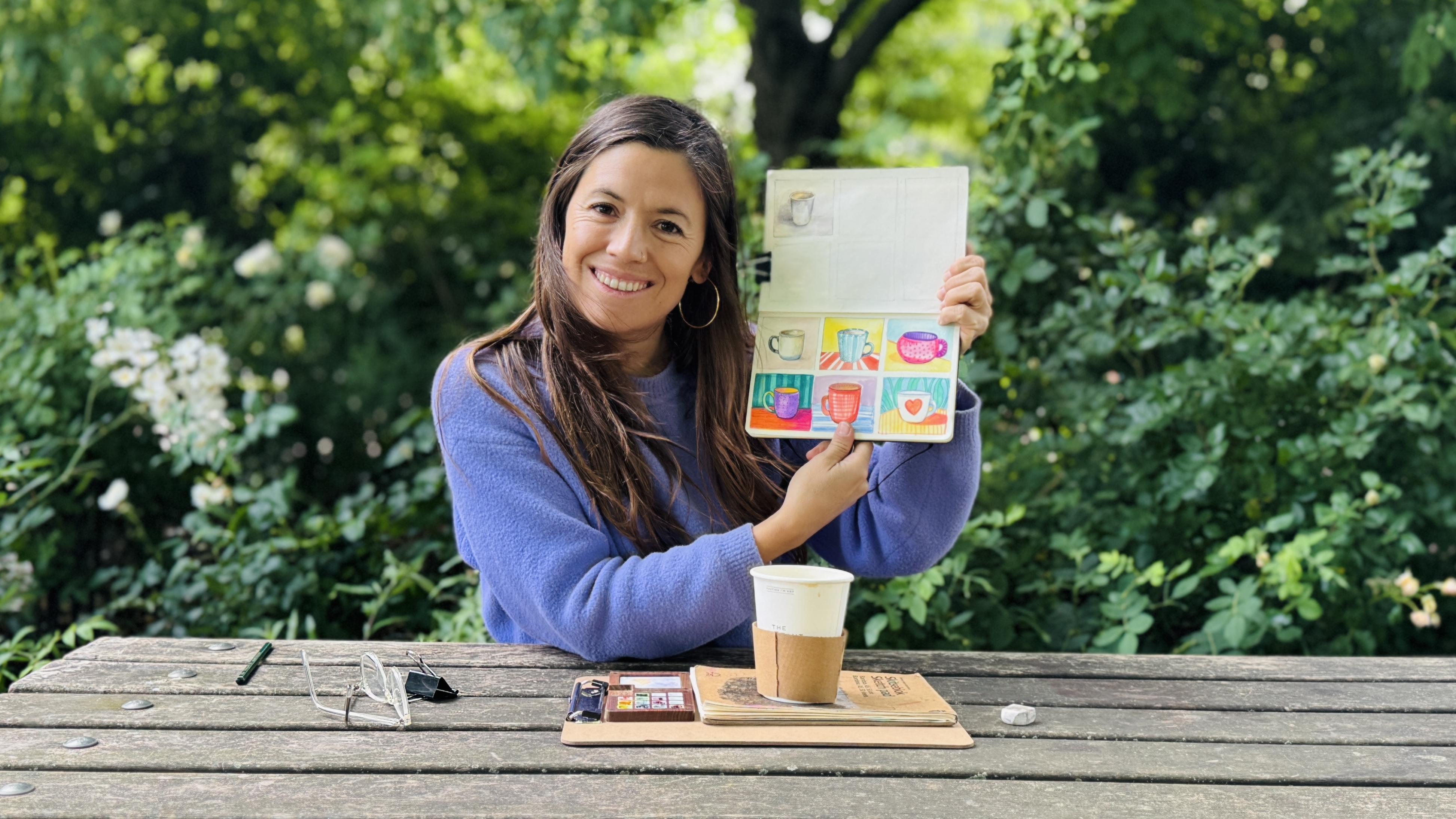
1. Introduction: Hi, everyone. I'm Sylvia Spina. I'm an artist and
designer and guess what? I absolutely love sketchbooks. As an artist, I have
found that keeping a regular sketchbook
practice is one of the best ways to improve
your artistic skills. It strengthens your
observation skills, helps you understand
composition, and improves how you translate what you
see onto the page. Over time, it also builds
your confidence and it helps you develop
your personal style in a really natural,
playful way. This class, we're going
to grab one object, and we're going to
represent it four or five times mixing watercolor
with another technique. In my case, it's
going to be a MG, but it can be any other
object of your choice. So initially, I was going to create this class
from my studio, but I had a trip
to London coming up and realized most
of my sketching happens whilst I'm out on a train in cafes,
waiting for friends. Or anytime I have a
few spare minutes and I have my
sketchbook with me. I thought, You
know what? Why not make this class reflect that? I decided to film
everything on the go. This class welcomes
all skill levels. Having some basic
experience with watercolor will definitely help you follow along more easily. But that's it, I've designed this class with all
skill levels in mind. I'm creating this class
for everyone who wants to build a regular
sketching habit. I won't be teaching step
by step techniques, but I will show
you how I sketch, mix materials, and make
creative decisions. Insights that can support
your art practice and get you sketching
regularly because by doing so, you're going to see a progress
in your drawing skills. You're going to be able to test different styles, get confident. And in the process of doing so, you'll discover that sketchbooks can become a really
great company. Before we dive in, make
sure to follow me here on Skillshare to stay
updated on new classes, giveaways I host and
stuff like that. And I'll be thrilled to have you join my online community. If you'd like to stay in touch, I send out a newsletter every few months where I share the things
that are inspiring me, quotes, creative reflections, thoughts on being an
artist in today's world. I also include updates on digital products I'm working
on class announcements, occasional giveaways, and
some lovely freebies. And since I'm deep into
sketching at the moment, I've started sharing
new sketchbook spreads, technique, tips and ideas
for painting from life. So if you're a fret, I'd
love to have you there. Okay, when you're ready, grab your sketchbook and
see you in class.
2. Your Project: Alright, let's talk about
your class project. We're going to grab one object, and we're going to
represent it four or five times mixing watercolor
with another technique. In my case, it's
going to be a mug. At home, you'll have to choose
one object that you want. If you want to join me in
painting or sketching a mug, go for it, but it can
also be a pair of keys, a plant, your favorite cup, a pair of sunglasses, a fruit, really anything that's nearby and that you would enjoy looking at more than once. Choosing a mug
because I'm going to probably be stopping for a
lot of coffees in the strip, and then I thought
that it was a very practical object
to draw is easy, but also because they
come in all shapes and sizes with different
surfaces and patterns. Some are glossy, some are t, and all of that affects
how they reflect light. It's also a great object to
practice observing angles, curves, shadows, and how
light interacts with form. You can complete your project,
however it suits you. You can complete all your
sketches in one sitting or follow along with me by
doing one sketch a day. Taking it day by day helps you stay consistent
without pressure, and stopping whilst
you're still enjoying it means you'll be more excited
to come back the next day. It's a great way to build a sustainable and
joyful sketching habit. What matters most is that you
start sketching regularly. Once you finish, why don't
you take a photograph of your quick sketch and start uploading your project into
the gallery of this class? I would love to see
it and give you feedback as you
complete each exercise. So I would love to see what
you do if you want to tell me a little bit about your sketch and where were you
when you made it? Maybe even take, context
photo, I would love that. In the next lesson, I'm going to take you through
the materials that we're going to be
using in this class. Mm.
3. Tools & Materials: To take this class,
you're going to need the following tools
or materials. So, I am going to be using
this really cheap sketchbook. It's been giving me a lot of freedom when it comes to testing different techniques
and not being too attached to the result
of what I'm painting. Any sketchbook that you
want to use, please use it. If you've never
used sketchbooks, I would advise buying a
really affordable one because you will be less
afraid of making mistakes. And then it will become more fun to paint on it. If you don't want to use a sketchbook or you
don't have one, you can also use watercolor
paper in any format. I bought this a six block and
just took some pages off. So if you want, you can also use smaller papers to
create each exercise. Now, for painting tools, I'm going to be using my
portable watercolor palette, which is amazing. I love it. I have some water with me here. So this is a water spray
bottle that I can use to clean my palette because
it's already very dirty. I was just painting
a minute ago. I'm going to be using a pencil. I have a six B pencil here, which I quite like because
it's a very soft pencil. So when I draw, I can
go dark really quickly without making much of an
effort or marking the paper. I would advise you to
use either an HB, two B, three B. I don't like the
pencils except for when I don't want the pencil marks to be noticeable on a watercolor
pure painting, for instance. Using colour pencils. I'm going to be using brush markers. They don't have to
be brush markers. They can be regular markers. I have water brush here to paint with my watercolors
and absorbent paper. I'm also going to be
using this black ink, water resistant pen and a fountain pen that I
also brought with me. And I think that's
it for this class. There's a little squirrel in front of me, and
I have to film it.
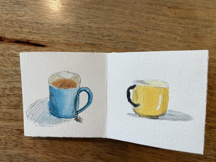
4. Exploring Volume: Watercolour and Pencil: I am saying hi from
Hyde Park in London. I found a coffee shop, and this is where I'm going
to create my first sketch. I just bought myself a T, and we are going to be sketching this paper
mag with pencil. And then using watercolors, we're going to add a
bit of color to it. For this sketch, we're going to be focusing on the
important things. This text just came with the Mg and I thought that
it was a reminder of how important is to know how to represent volume when you
create your sketches. I'm going to be using
a six B pencil, but at home, you can
use anything above HB. Going to be using my
watercolors, water brush. I might use a normal brush. Here I have my spray
bottle to clean this part of the palette
if it gets dirty, absorbent paper, and
my beloved sketchbook. So this sketchbook
is falling apart a little bit because of how
much I've been using it. So what I'm doing lately is just grab a page that
is not too dirty. And then I just use a clip to keep all my
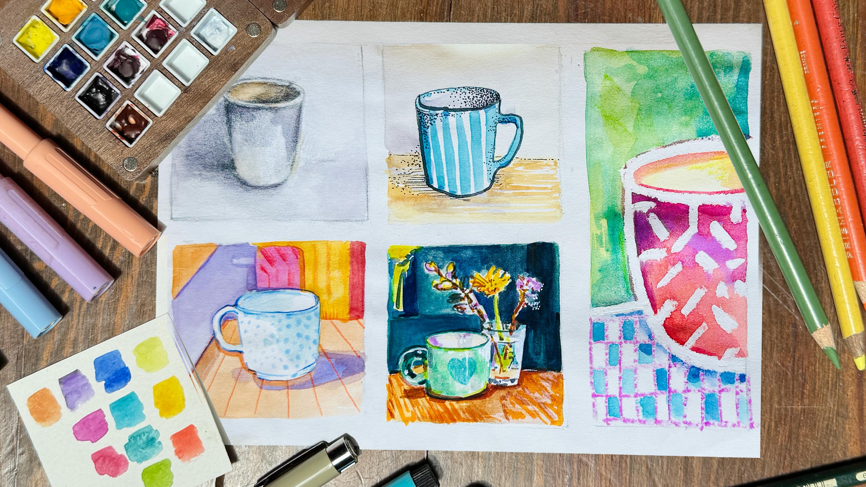
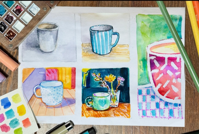
sketches together. Going to start by sectioning my paper using four
squares and one rectangle. You can section your paper
as you wish and even use different pages for
each of the exercises. In each of these squares,
I'm going to be mixing my watercolors with
a second tool. To begin, we're going to look at how to sketch a
mug or any kind of container that holds liquid by breaking it down into
simple steps and shapes. So when you tilt a mug, you can see this
oval on the top. And then you have these
vertical or diagonal lines. In this case, they are diagonal, and I can see how inclined they are by putting my
pencil on the side. Checking angles
with your pencil is a great tool when you're painting or drawing
from real life. On the bottom, you
have this half circle. Now, of course, all of these proportions
change when you tilt the cap and it's something
that you can pay attention to when you're
developing your sketch. I'm going to place the
photograph of what I'm copying here on the right
side hand of the screen. But just so you know,
I will leave all of these photographs in the project and resources gallery
of this class. So I'm going to
start by creating two marks to make sure that I don't surpass the limits of my paper and I have
a good composition. And then I'm going to
a line that is going to serve me as a guide to
create a straight oval. Since we're using pencil, don't be afraid to erase
as many times as you need. As by doing so, you will be learning how to
represent a mag, and all the next exercises will become much easier to start. From there, I'm going to bring these two lateral lines down, which are going to
be slightly angled. And lastly, I'm going to create this curved circle down here. Now, even so this is already looking like some object
that could hold liquid, I don't think it looks
like my paper cup. So I'm going to
redraw this circle and angle the lateral
lines a little bit more so that my drawing resembles the object
that's in front of me. Byangling these
lines, I feel that it's now looking more
similar to my paper cup, and I'm lastly going to finish
perfecting a few details. Also want to apologize
for the camera focus. In this part. I had a
few technical issues. I couldn't fix whilst filming. I hope it's not too
distracting and that you're still able to follow
along with the process. Before we start sketching, let's take a few
seconds to observe the light and shadow
of this paper cup. So even if this cup
has a creamy color, I can sense there has
been some teether because this area is more yellow
and is darker in tone, in value than this border. So this border is
actually quite light. Is receiving a lot of
light on this area. And this one is a
little bit darker. Now, I feel it's
hard to know because the background is a
little bit distracting. So what I'm going to do
is I'm going to fold the paper and put it
behind my cup so that analyzing the values of
these white light grays and pale colors become a little
bit more easy to understand. This area here is darker
than the background. And then you can
see that this area here is actually a bit
lighter than the background. The inner circle
is more saturated as in more yellow
than the background. And when it comes to the
body of the paper cup, this area here is darker
than the background. So there is some
sort of contrast. Down here is reduced. There's not so much contrast
between this edge here, this bottom edge and the paper. But when you go to
the background, there's some area here which
is also hard to define. This is more contrasted
and on the whole, this area here is lighter and this area here
has been more shadow. So without getting too
cut on that analysis, I am going to try to shade those things in my sketch
in my quick sketch. Okay, so I'm going to start
slowly analyzing the shadows. There's, for example,
some darker area here, and I can notice that the border of the oval changes
quite a lot in volume. At the moment, it is
a little bit dirty, so I'm going to refine it. While editing this class, I was very tempted to speed
up the parts where I sketch, refine and build the shadows. But I felt that this lesson
shouldn't be rushed. I want you to see the process in real time and hear
the thoughts I have as I figure out how to represent volume through
lights and shadow. Also, since it's one of those cloudy but sunny
days typically in London, the light of my cup
changes quite a bit. So my drawing might not match the reference photo
exactly, but hopefully, seeing how I analyze
the lights slowly, help you understand the thinking behind sketching from life. The light has changed a bit, so now the background is a bit darker and has this
kind of shaded area. Then inside this
part of the mug, the mug, I keep saying the
mug the paper cups darker. And that one is lighter. This bottom area of the
paper mug is darker and then the opposite area is darker and it goes like an opposite and that's what's
creating the volume. Now, there is some shadow
below this border, which might be too strong
in there, but I don't care. This is just an exercise. This area here is also a bit
darker than the background. There is some a bit more
of shaded area down here. And since the paper
is like I did fold this paper to avoid the
background distractions. I mean, like, that's not
where that should be, actually, because now
it's looking like weird. So I'm just going
to put it higher a little bit, like around here. Remember, this is my object, and this is me trying to analyze the lights and shadows of it, but you can make this as simple or as
complicated as you want. This is a sketchbook, so this is not about doing
things right or wrong, but rather learning to analyze what you're watching if that's what you want to do. And the whole point
of this class is to share with you my
sketchbook process. Sometimes I'm a bit more strict with analyzing and learning. And sometimes I just give myself freedom do whatever I want. Sorry, my thing blew away. Okay, so this I think
is good for now. I have basically analyzed
where the shadows are. So this could be a
bit darker here. There is a darker area
below that border. This is quite high
contrasted steel, maybe I could make this darker on the
other side of the mug, this edge here is darker
than the background. Corner is much lighter, maybe I could use my
eraser to lighten that up. And when it comes to
the oval up here, this area is certainly
lighter than this area. Before when the light
was coming this way, this area of the mug was
darker than this area. Now having compared my
drawing to the cap, I can polish the last details. Okay, so that's it for now. And now, what I'm
going to use is my watercolors to
color these bits. So as you can see, my brush is very dirty. So that's why I enjoy having
spray battle with me. So I can clean my
brush and my palette. So before cleaning
my brush completely, I'm going to use this kind of dirty color which is already there to add a tiny bit
more of shadows to my mk. Since this paper mk is light gray and the
background is white, this sketch is not going
to have a ton of color. I'm here as well.
Now, as we saw, the inner area of
the mug was a little bit more orange because
I had been drinking tea, and the tea sometimes can
be a little bit orange. So I'm just going to
give that kind of, like, saturation to my mug. And there. Okay. And then I am going to
maybe use a bit more purple and blue to create
more shading around my back. So as you can see, I started
analyzing the shades, the light areas and dark
areas with my pencil, but then now I'm just with
my watercolor enjoying giving a bit more of color and saturation to my
painting my sketch, let's not call this
painting because it's not. Adding a bit of
color and layering in a softer texture
with watercolor, my sketch starts to feel more alive and more finished,
which I really like. But if your sketch already has strong shadows from
a soft pencil, it's important to take it slow with the watercolors
and know when to stop. Water can lift and
move the graphite, and if you go over the
same area too much, it can make the drawing
look muddy or too dark. One tip when
combining pencil and watercolor is to
let the pencil do the heavy lifting
for the shadows and use the watercolor to add subtle color and atmosphere rather than trying to
paint over everything. That is my first
exercise for this class. Pencil and watercolor. Once you finish, why don't
you take a photograph of your quick sketch and start uploading your project into
the gallery of this class? I would love to see
it and give you feedback as you
complete each exercise. So I would love to see what
you do if you want to tell me a little bit about your sketch and where were you
when you made it, maybe even take context
photo, I would love that. In the next lesson,
we're going to be using watercolor mixed
with black ink pen.
5. From Memory to Sketch: Watercolour and Ink: Today, I'm saying
hi from Brixton. I met a friend for lunch. She's already headed off, and I thought this would be the perfect spot to film
my second exercise. I've got a few quiet hours before meeting at
six, and honestly, I couldn't think
of a better way to spend them than sitting
down to sketch. Welcome to Day two. I am in a really cool market. I'll show you around
a little bit. And I ordered a coffee, a latte, thinking that it was
gonna be coming in a mug. But it didn't. It
arrived in a glass. Not sure I want to
draw this glass. Like I'm so not inspired by it. But then I thought, Whiles I was walking through the market, I found this really cute shop that had these beautiful mugs. And so this would be a
great opportunity to show you another approach that I have when I carry my sketchbook. There are times that I do want to copy what's
in front of me, either to challenge myself, learn something
new or because I'm very inspired by
something beautiful. But there are other times
where it is an actual object or scene which inspires me
to sit down and create. So in this case, I'm
going to use one of these mags to inspire my sketch. Today, I'm going to be combining watercolor with black ink. I brought this plastic bag with a fountain pen, if
that's how we call it. So you just clip
this thing here. And there is some black
ink in this little jar. Is waterproof black ink. Now, I also brought this
black ink pen number three, which is also waterproof. Normally, I use
the black ink pen, but I'm excited to try
this fountain pen. For this new exercise, I'm going to be using
the second square. Even if I want to use black ink, I am going to start by making a simple drawing
with my pencil. So once more, I'm going
to draw the top oval, and this time it is not
going to go on the center of my square but
rather to the left. This way, I make sure that I have a bit of space
for this handle. Having analyzed how
to represent a mug on the first exercise
has definitely made drawing this
second one much easier. I'm very excited to try out this new fountain
pen that I bought, so I'm going to give it a go. The cool thing about
these fountain pens is that they can give you
two strengths of line. With the frontal part,
you get a thicker line, and if you use the back
of the fountain pen, then you'll achieve
a thinner line. As I said, the ink that I put inside of this
jar is waterproof. Since this ink is waterproof, I don't have to worry about it moving when I add my
watercolors later. It will stay right
there where it is, no bleeding or smudging. Okay, now that my
silhouette is complete, I'm going to switch
to a black ink pen and start adding some
shadows using dots. This technique of
mixing black ink with watercolor is widely
used in illustration, especially in more graphic
or stylized approach. This time, I am not coping
directly from real life. Instead, I'm using
what I learned when sketching the
paper cup earlier, applying the same
logic to build volume. And this is one of the great
things about observation. When you take time in your sketchbook to
really study something, you start to internalize it. You memorize how
to represent it. So the next time you
draw a similar object, even with a completely
different tool, you already have a sense
of how to approach it. Okay, I'm done with
the black ink, and I'm going to erase
the pencil marks. Okay, now I'm going to
move on to the fun part. Although the black ink pen
was also a lot of fun. I'm going to use one of
these beautiful striped mugs as inspiration to paint my
sketch with watercolor. I'm going to start by
clearing my palette with my spray bottle and a napkin
that was on my table, and I am going to be choosing a bright blue to
decorate my mug. This is the one that is
drawing my attention the most, and so I'm going
to use it because when you create something
from your imagination, you can do whatever you want. So choose the color
that you like. If you want to use a different
pattern, please go for it. If you have a g at home, that means anything
to you and it has a special graphic
or something specific, and you want to be
inspired by that. Awesome. If you are
up for it when you upload your sketch to the
project and resources gallery, please let me know
where did you sketch this second object and if
it means anything to you. I want to paint some
shadows inside the mac, so I'm going to mix
purple with buntiena to create this warm,
desaturated gray. Actually, to make it gray, I'm going to add a little bit
of ultramarine blue to it. Maybe this is a bit too dark, so I'm going to lighten
it a little bit, and I'm also going to
add a few shadows in some areas of the
frontal part of the mug. Now I'm going to move on
to painting the table. I'm mixing a warm, bright brown, mixing a bit of cadmium
yellow with bunt sienna. This time, I'm
going to be taking inspiration from the texture of the table that I'm
currently sitting at. As you can see, I have been
combining different sources. Some elements are
based on memory, and others, like the table, are drawn from real life. That's the beauty of
working in a sketchbook. You can mix things up. You might copy certain
details from observation, add in textures or ideas
you've seen elsewhere, or even invent parts
from your imagination. Okay, this is
looking really nice, but I feel that it's missing
something in the background. So using a very light pale tone, I'm going to add some
shadows to the background, making sure I don't
sur my square. I hope that you're enjoying this second exercise of mixing black ink pen
with watercolor. Once you finish your sketch, please upload it to the project and
resources gallery of this class. I
would love to see it. If you're up for it, feel free to tell me a bit
about your process. Where did you create your sketch and what sparked
your inspiration. Did you combine real
life references with your imagination or something
that caught your eye? I always love reading these little stories
behind your drawings, and they truly make my day. In the next lesson,
will be mixing color pencils with
watercolors. See you there.
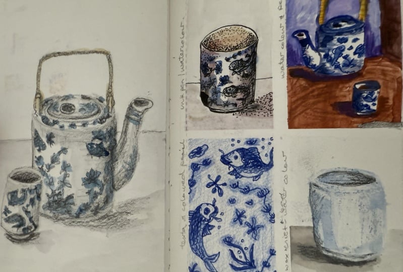
6. Negative Space: Watercolour and Coloured Pencils: Now we're flying from
London to Majorca, where I'm visiting a friend
that I haven't seen in ages. I'm in a beautiful
town called Suji. I'll be filming this next
exercise from his house. Hi there, and welcome to the third exercise
where we're going to be using color pencils
and watercolor. Now, whilst I was designing
the third exercise, I was thinking,
What concepts are very helpful whilst
I sketch on the go? Sometimes I start with
pencil and I map things out, but there's a lot of
times where I rather start painting straight
with watercolors without any pencil marks
and use concepts such as negative space to help me in the process of getting
the proportions right. After blocking the
main elements, I go ahead and use color pencils or color markers to
add the details. This is the mag that is going
to inspire my sketch today. If you want to follow along, remember that I'm going to
be leaving this photograph along the other Gs in the
project and resources gallery. Before I start, let me explain
what is negative space. In this image, the
negative space is everything around the mac, the light gray wall behind it, the space inside the handle, and even the soft
shadows on the table. By paying attention
to the spaces around the object rather than
the object itself, it actually becomes easier to
get the proportions right. This concept can
be really helpful when you're sketching
things from real life. To keep this exercise fan, I'm going to be choosing
random strong colors for each of the negative
space sections. Going to start by painting
the gray wall behind it, and for that, I'm going to
be using this light purple. Even if I don't want
to use any pencil, I am going to create a few
marks to make sure that I can fit the mug within the space and have a
decent coposition. I basically want to make sure
that I can fit the handle. That's fine. Now
I'm going to start painting the gray
wall behind it. So you know, the perspective
that I'm seeing in real life is a little bit different than the one
on the photograph. But I hope that by highlighting
the spaces that I am painting on the photograph
using that bright pink, you will understand better how to approach the
negative space. Right now, I'm not thinking
about the G but rather analyzing the angles and curves that compose this
area of the wall. In the previous exercises, we focused on how to
represent the object itself. This time, we're starting with the background and approaching
it in a more abstract way. Instead of thinking, Oh, I'm painting a wall
or this is a table, I'm focusing on the shapes, the angles, the curves, and the length of each section. I'm paying attention to how each area relates to
the others around it. It's less about the parts and more about observing
how they fit together. And you will see how after
painting the whole background, the shape of the g
will be revealed. As you can see,
with this sketch, I am not going for a
realistic approach, but I'm going to use
random bright colors to represent each of the
blocks that compose the negative space
that's around the mug. Even if I want to go
for bright colors, I'm going to still
follow somehow a logic. So I used this kind of desaturated purple
for the gray wall, and I'm going to be using this bright orange
for the table. Now, instead of painting
the whole table, I am going to take in
account this soft shadow, and I'm going to
paint it in purple. And then I'm going to
prepare a bit more of this orange to finish the
top part of the table. I'm also going to
paint this part, which is inside the handle. I am paying attention
to the angles, and when I struggle
to define one, what I'm doing is
closing one eye, closing the other, and
trying to understand where, for example, the table ends and continue the
table on the other side. Now, the same way I took in
account the first shadow, I am also going to
reserve the space to paint the shadow that the wall is creating over the table. As you can see, the shape
of the mug is being revealed by me just paying
attention to what's behind it. I'm very tempted to
speed up this video, but I think it is
good for you to see the speed at which
I am painting this. I'm going to soften this
shadow a little bit. This is not a hard
shadow, but a soft one, and I'm going to use that mix to paint this
darker area of the table. Now I'm going to move on to the top part and paint
what's behind the table. There is a radiator behind the table and a wooden
wardrobe behind it, and I'm going to make it a
little bit more abstract. Whilst painting this exercise, I'm giving myself the freedom to pick colors that I
like intuitively. See how by representing the negative spaces
around the Mg, without focusing on
the object itself, this one has been revealed and the proportions
are well achieved. Before moving on to using the color pencils
to add details, I am going to use a tiny bit of this aquamarine blue to paint a few shadows that will help me represent the Mugs volume. For the first time since
I started this sketch, I am observing the MOG. And since this time the G
is actually in front of me, I am going to follow the
lights and shadows I am observing instead of what I learned in the first exercise. Actually, this time,
inside the mug, it is the left part which is
darker than the right one. Okay, I'm done with
the watercolors, and so I'm going to move on
to using the color pencils. I'm going to start giving a few details to my
composition here and there, both in the mug and
in the background. I'm going to start
with this light blue and add some details to the mug. Combining watercolor with
color pencils is amazing. This approach of painting the negative space and then moving on to giving details with the color pencils is
really enjoyable and it creates quite a modern
illustrative style. Combining watercolor
and colored pencils open up some really
fun possibilities. Watercolor gives you
a soft fluid base, while color pencils let you
at fine details, textures, and vibrant highlights,
things that are often hard to achieve
with watercolors alone. You can start with a
detailed pencil drawing and add subtle washes for a fluid effect or
layer pencil over dry paint to sharpen and define your work
as I'm doing now. Even so the g that I use as reference didn't
have anything on it. I want to draw a dot pattern
on it to make it more fun. I'm going to put
more pressure on my pencil to make the
dots darker where there's a shady area and draw them
softly and lighter where there's light reflected on my g to respect the volume that
I've already achieved. I find this technique
very enjoyable and I love experimenting with
it on my sketchbooks. As always, I would love to
see what you created mixing color pencils and watercolor or even mixing other techniques. If you're up for it, why
don't you take a photo of it and upload it to the
project and resources gallery? When you're ready, move on to
the next lesson where we're going to be using watercolor
with brush markers.
7. Sketching from Photos: Watercolour and Markers: O Hi. I'm saying hi today
from Palma Majorca. I was gonna grab a
bus. Long story short. I missed a bus. I sat down on a cafe where I had to
wait for the next bus. I sat on a table where
there was a very cute mug. And then I thought,
since I have 20 minutes, I can sketch my fourth exercise right here due to a
lamp being on top, the shadows on the table
were too pronounced, so then I was a bit discouraged. But then I thought, What if I take a photograph of this beautiful mug with
these beautiful flowers, go back to my friend's house and film the
exercise from there. This is another approach that
I have a lot of the time. There are sometimes where it's not convenient to draw on site, so I have to take
a photo and then I just draw it from the
pump. So there you go. That's another approach for
my sketchbook practice. And this is what we're going to do for the fourth exercise. Okay, so I have my
photograph here. I've increased the
contrast a little, and one of the great things
about taking a photo is that you can play with
the composition beforehand. Using the crop tool,
you can decide exactly where you want
each object to be placed. As always, I'll leave this image in the project and
resources gallery for you. Today, we're working with
watercolors and color markers, and I'll be using the fourth
square for this exercise. These are the markers I
packed before traveling, so I'm working with
a limited palette, which I actually find
quite interesting. It wasn't planned to
match this photo, but sometimes that is
the fun part using what you have and finding creative
ways to make it work. Right now, I'm starting by
roughly placing each element, the mug, the flowers, the glass, and the
eucalyptus stem very softly with the pencil just
to lay out the composition. When you're creating
a sketch or painting, you don't have to copy
things exactly as they are. You get to decide
what to emphasize. Maybe you want to make the mug a bit larger
like I'm doing in this case or move an element slightly to the side
to balance the layout. In this case, I want the mug to be the center of attention, and I've enlarged in comparison to the other elements
which appear on the photo. I usually make those decisions
during the pencil phase. I like to take my time here, just observing and adjusting the elements until the
sketch feels balanced. And only when I'm
happy with the sketch, I start adding watercolor. See how my pencil sketch is
nothing too complicated, doesn't have any
shadows or lights, but I'm happy with the
placement and size of the mug, the glass, and the flowers. I've mixed a bit of green with aquamarine creating a
light green tone that I'm going to be varying
as I paint the g. See how I am not just filling in the
entire shape all at once, but I'm taking in account the light that is being
reflected on the porcelain, which is coming from the window on the right side of the table. I'm painting slowly and I'm being mindful of where I live. The white areas as once covered, they will be very
difficult to recover. If you keep referring back to the photograph
while you work, you can start to notice the
subtle variations in color. Now that I have the
middle green laid down, I'm going to prepare
a darker one, mixing a bit more
of aquamarine with ultramarine blue to start painting the darker
areas of the mug. Try to be aware of things
like color temperature, too. This is something I'll go into more detail when I
paint the table. This scene, I'm
keeping the watercolor face quite simple and focusing mostly on placing the base colors and
some of the values. In the MAC, for example, I've already laid down the light green as
the middle tone. I have left some white
paper as the lightest tone, and now I'm starting to add in a few darker areas
to build contrast. Because my palette is so small, I prefer to work in blocks of
colors as much as possible. That way, I don't have
to waste any paint. If I had a larger palette, I'd probably move onto
the table by now. But since I've already
mixed this green, I'll keep going and start painting the
background instead. At the same time, I'm using the negative space as a way
to check and fix proportions, especially around the G. I'm leaving a very thin
white gap between the background and
the MCs handle because both areas
are quite dark, and that little
white line is what's going to help me separate
the two visually. Now, as I move on to the
eucalyptus and the flowers, I'm still thinking in
terms of negative space. There's a high
contrast area here. The flowers are
catching a lot of light whilst the background
behind them is very dark. So instead of painting
the flowers directly, I'm focusing on the shapes of the spaces between the
stems and the petals. And by painting those
negative spaces carefully, the flowers will start
to emerge on their own. Instead of making the background very dark from the beginning, I'm gradually darkening
the whole scene as I develop the painting. I started by placing
a rich dark green, and now I am mixing
ultramarine blue with a bit of pn sienna
to create a deeper tone. With this mix, I'm going to paint some of this
background here, still leaving some
white areas where I will place a few colored spots, which will be the flowers
behind the main subject. This new darker tone helps push the
background further back, making the objects in the
foreground stand out more. It's a way of creating
contrast and giving the sketch a bit more volume and depth without having to
outline everything. You can make your sketches as simple or as elaborate
as you want. This is my personal process. This is the personal
process that I go through when I paint
on sketchbooks. I really like practicing my painting skills even when I paint little
scenes like this. Now I'm going to
paint the table. The right hand side of the table is receiving the light
from the window, so I'm going to paint it
with a bit of burned sienna. Now, towards the other side, I'm going to mix a bit
of yellow to the burn Siena to achieve a
more saturated yellow. This part of the table is being lightened by the lights
inside the restaurant, which comes from light bulbs, so the temperature
is much warmer. Lastly, I'm going to use a more saturated orange to create some texture on the
table without overdoing it. Okay, so since this
is an exercise that is meant to combine color
markers with watercolor, I'm going to stop the watercolor here and grab my markers. Going to start by
painting the flowers and finding colors that
match the watercolor. One thing I love about superposing markers
with watercolor is that the markers are
also quite transparent. Of course, there are some colors which are a little bit
brighter and opaque, but I find that most of them
are still quite transparent. So they complement the
watercolor very well. They're great for
creating details or making some areas more
saturated than others. I'm going to use this orange to create some
texture on the table. You know, for example, I didn't bring a very thin brush with me, so creating these thin
lines with a brush, maybe it would be a little bit
more difficult to control. It's not just about control, but also about the graphic
style that you can achieve by mixing markers
with watercolors. Instead of outlining everything which you could very well do, I'm using my markers
to give some pops of color and definition
here and there. Okay, so I could consider
this painting finished. And actually, when I was
editing the footage, I felt like I could have
stopped the painting earlier. You know, sometimes
while you're painting, it is hard to know when to stop. But then I tried
something interesting. I turned both the
reference photo and my painting into
black and white. And that's when I
noticed something. The original photo has a lot more contrast
than my painting. Even though my painting has a nice variety of
colors and saturation, when you see it in gray
scale, the values, meaning how light or dark each area is, aren't
that different. It still feels a bit flat. That's probably why whilst I
was working on this piece, I found myself wanting to add some really dark tones
to bring it to life. These are the kind things you start noticing as you develop
your painting skills. Often when we work
in watercolor, there's a tendency to
stop before reaching those deep darks
and as a result, the painting can look a bit
washed out or undefined. It can feel a little bit
daunting to go that dark, but that's exactly what
sketchbooks are for. We're not working on a final
piece, we're learning, experimenting, and adding
tools to our skill set. Here I'm darkening the
whole background quite a bit because I really
want the main subjects, the glass, the flowers, and the mug to stand out. Now if I switch the image
to black and white, you can clearly see that the
contrast is much better. The painting looks closer to the reference now in
terms of value range. To finish it off, I'm
using a dark marker to add a few final touches
just to keep the style more graphic and illustrative
and a bit less painterly. Once you start building a style with a painting, it's good. It's a good exercise to try to maintain that style
all the way through. And since this is meant to be a combination of
watercolor and markers, it's nice to bring back
those graphing details. After all, it is what gives
this piece its character. I also found a white gel
pen in my pencil case, so I'm using it to bring back
a few of the highlights. Even though I tried
to leave some of those light areas
unpainted at the start, adding them back in now really helps increase
contrast and volume. I hope you're enjoying
this exercise and that you're painting your own
version of the reference. See you in the next lesson.
8. Resist & Reveal: Watercolour and Wax Crayons: Mm hmm. Hello again. I am now back in Barcelona, the city, where I live, and this is where I'm going
to record our final exercise. Today, I'm saying hi from my studio and back
from my travels, and I'm excited to wrap up this class
right here at my desk. I have my watercolor set, my exercise page, and today, I'm going to be
using wax crayons, which is something I keep
in this plastic box. For this sketch, I'm using
a rectangular frame, which is a bit different from the squares we used in
previous exercises. Sometimes changing the format or ratio of your frame can actually push you to think more creatively about how to
compose your drawing. So since this is a rectangle, I'm giving myself
both the freedom and challenge to try
something different. The earlier sketches, I placed the mug in the center with
a background behind it. But this time, because wax
crayons create thicker, more expressive lines, I want to keep things
simple and bold. I have decided to do a
close up of the mug, and I'm feeling brave today. I'm not going to sketch
it out in pencil first. I'm going straight with
a white wax crayon, which means you probably
can't see what I'm doing yet, but that's the fun part. As I paint, the
crayon drawing will start to magically appear
through the watercolor. I'll include a little table
line in the background, and I think I'm
going to decorate the mug with a simple
abstract pattern. Just some diagonal lines, nothing too detailed
because with wax, the lines are quite thick and
hard to control precisely, which is part of the charm. The thickness of the wax
lines make this medium great for bigger bolder shapes
rather than tiny details. That's also why I have scaled up my drawing a bit
compared to the others. Now for the fun part, let's start adding color. Since I am not copying from
a photo or real life setup, I'm going to choose
colors intuitively. Having said this,
I do like to pause and think for a second
before I start mixing. So I feel that today I'm feeling
this magenta and orange. Yep, that's good. I like it. So I'm going to use this one. I wanted to include
wax crayons in this class because I love how they interact
with watercolor. Since wax is oil based, it naturally repels water, which means that when
you paint over it, the watercolor won't stick
to those waxy areas. It creates this beautiful
resist effect where your drawing starts to reveal itself as you add color on top. It's a really fun and
expressive way to layer media and
experiment with texture. Okay, now, my mug is done, and I'm very tempted to use another wax color to add a bit more of
details onto the table. So I'm going to use this
pink cute pink Nucraon which is giving me a bit of a thinner line because
of how squared it is. Once I have lost the tip, I won't don't think I'll be able to achieve
these thin lines. Because I want to do a
more illustrative style, I'm not going to think
about perspective. So the lines are straight, both horizontally
and vertically. And now I'm going
to go ahead and fill some of these
squares in blue. As you can see, I
didn't went and developed the whole
drawing first with wax, but you can mix it up by completing parts of
the composition. And once you're done, you
can move to the other one. I quite like this
checkered background. Now I'm going to move
to the background, and I want to simulate as I'm painting outdoors,
not in my studio. I want to be back in
Kensington Gardens. So I'm going to just do a bit of a blurry green background to simulate that this mug is
outside on a summer day. When painting over wax, it's important to know
that the watercolor will pull and separate
around the wax marks. That's totally normal, and it is what it creates that beautiful
contrast and texture. The paint flows into the
paper but not into the wax, leaving behind crisp,
resistant lines. This technique is really fun
for creating hidden shapes, spontaneous patterns, or
playful layering effects. It's especially great for looser more expressive
sketches where you want to combine drawing and painting
in a nontraditional way. I'm going to add a bit more of shadows to my painting to
give it a bit more volume, but because that's my style, I always like my paintings
to have a bit of volume. And that's it. We have
finished all the exercises, which means that this class
has now come to an end. Before you go, I have decided to add one more bonus
lesson for this class, a little peek into my
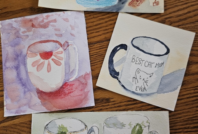
current sketchbook. It's messy, affordable, and
I'm totally in love with it. In it, I've continued mixing these same materials
in my daily sketches. Hopefully, it will
inspire you to carry your sketchbook with you
too wherever you are. See you in the next lesson.
9. Touring My Finished Sketchbook: Mm hm. I've officially reached the last page
of this sketchbook, and I have to say,
it's the one that got me back into
sketching regularly. I am so grateful for it. It gave me the space
to explore, to play, and to create joyfully without putting too much
pressure on the results. Because I wasn't too
precious about the paper, I felt completely free, and that freedom
really helped me reconnect with sketching
in a meaningful way. Something else that
made a big difference was having a variety of
materials on my pencil case. Years, I sketched mostly
in black and white, but being able to
add color again, whether with watercolors,
markers or colored pencils, took the joy to a
whole new level. Since this class is
all about building a playful and personal
sketching habit, I thought it'd be nice
to share a little flip through of what's
inside this sketchbook. I've been traveling quite a bit. It's summertime now,
and sketching on the go has been such a
joyful part of my routine. I hope this inspires you to carry a sketchbook with
you wherever you are. This sketchbook fell
apart as I used it, so I ended up ripping out the pages which I
actually enjoyed. It made the process
feel even freer. The drawings I'm
about to show you aren't in order,
which I kind of love. It reflects how I sketch
loosely and without rules. This page is a good example
of my current process. A quick pencil sketch, followed by a soft watercolor
wash. A few years ago, I would have stopped
at the pencil, but now I find that adding
a bit of color makes everything feel more finished
and it brings me joy. This one is a mix of acrylic
markers and colored pencils, and I think I also
use regular markers. No watercolor in this case. I love how texture
and graphic feels. Here's another
pencil sketch that I didn't finish on the spot. I did the pencil sketch first, then I took a
photograph and later I added watercolor whilst
I was sitting in a cafe. That's a good example of how you can combine
live sketching with photo references when you don't have the time to
finish in the moment. This one was made entirely
on site using watercolor. I think it turned out so well, partly because I had
very little time, which helped me make
quick pl decisions. There's also a video
about this on my patron. Here's a fun line exercise
I did with a marker. I challenged myself not to
leave the marker of the page, just one continuous line. Then I flipped the
marker and I use the other tip to explore
different textures and effects. The other one is more
linear and in this one, I was paying attention to
the lights and shadows. This is an example of framing
a scene in two parts, a wide view and a close up. It's a view from a cafe
table where I sketch the space around me and then zoomed in on a specific detail. It's a fun way to tell more
of a story in your spread. Here I was experimenting
with vases, mixing brush markers
and colored pencils. I love using them together. This page was Dan in Barcelona, again, mixing
watercolor and pencil. This one was made in
London with my friend Omar using black ink
pen and watercolor. I did this one whilst
waiting for a friend in King's Cross in London on
the side of the canals. This is a great example, and I'm glad I
filmed it of how I sometimes like to start by
sketching the negative space, meaning the area
around the subject. In this case, the main
subject is the boat. Although later, I added a larger figure in
the background. Once I had the surrounding
shapes in place, I went back to define
the subject itself, and then I added some ink to bring in a
bit more of structure. Here's a quick pencil and watercolor sketch
of agra Amelia. And here's a one where
I only used markers. So I just worked with the color palette I had to represent the
scene in front of me. Sometimes it's fun to carry
with you a few markers and colors and force yourself to use the color palette
that you have with you. This sketch was done
during a concert. I haven't painted, but I'm planning to add
watercolor later, probably for a
future patron video. I will keep it free for a
while in case you're curious. This one is from Majorca. I used watercolor markers
and a white gel pen. I really love how it turned out and I might even frame it. This page I did with
black ink and watercolor. But this time, I used
the black ink with a brush instead of
using my fountain pen. This is a good example of a sketch that I couldn't finish. I was actually planning on adding watercolor to it on site, but my friend called me, so I left it there. I took a photograph
and I might give watercolor to it at some
point here in my studio. This sketch was done
without watercolors, something that made me a little frustrated at first because
I left them at home, but I ended up using
brush markers, color pencils, and even
a white acrylic marker to add highlights to it. I actually love how it
turned out in the end. Here's one more unfinished
pencil sketch and some pages where I
was just testing my tools and drawing
people and quick scenes. And that's the end
of the sketchbook. This one has been
really special to me. I love finishing
alongside this class, and I hope it
inspires you to treat your sketchbook as a space for play and process,
not perfection. Fill it with whatever
feels right, loose sketches, color tests, imaginary landscapes, anything. Thanks for flipping
through it with me. In the next lesson, I'm going to say some final thoughts
and say goodbye to you. See you in the next lesson.
10. Final Thoughts: I want to thank
everyone that has made it until this point until
the end of this class. I really hope that you have enjoyed sketching along
with me that you have learned new techniques
and that you feel motivated to keep a regular art practice
on your sketchbook. You can't imagine
how far you will get if you make time
for sketching daily. If you enjoy this class
and learn something new, please review my class. It will help me a lot to
get better at teaching, to understand what
I'm doing well. What can I do better and
also who my students are. I genuinely can't wait
to see your project and hear your thoughts
about this class. If you want to get access to
more creative resources such as short tutorials on procret
surface pattern design, art and travel blogs, and occasional thoughts that I have around living
a creative life, you can go ahead and check and hopefully subscribe to
my YouTube channel. And if you want to see more like regular daily relaxed content, you can also follow
me on Instagram. In there, you will see me
painting murals, paintings, regular sketches, maybe
doing silly things in my daily life and
stuff like that. If you want to share your
project on Instagram, I would love to see it
and you can tag me at sylvispina dot art so I can not only leave
some feedback on it, but also share it with
my followers as well. If you want to be the first to hear about future
classes and giveaways, don't forget to follow
me here on Skillshare. If you'd like to stay in touch, I send out a newsletter every few months where I share the things
that are inspiring quotes, creative reflections, thoughts on being an
artist in today's world. I also include updates
on digital products. I'm working on class
announcements, occasional giveaways, and
some lovely freebies. And since I'm deep into
sketching at the moment, I've started sharing
new sketchbook spreads, technique, tips and ideas
for painting from life. So if you're a fret, I'd
love to have you there. Once more, thank you all
so much for being here. I hope that you
enjoyed this class as much as I enjoyed
creating it. This was a lot of fun to create, and I'm actually very glad that I was able to create
it on the go. I'm on the move again, and I'm about to start
with a new sketchbook. So follow me here on Skillshare
because I am sure that maybe I'll share another sketching class
sooner than later. Keep on sketching
daily until next time.
 Silvia Ospina, Artist and Graphic Designer