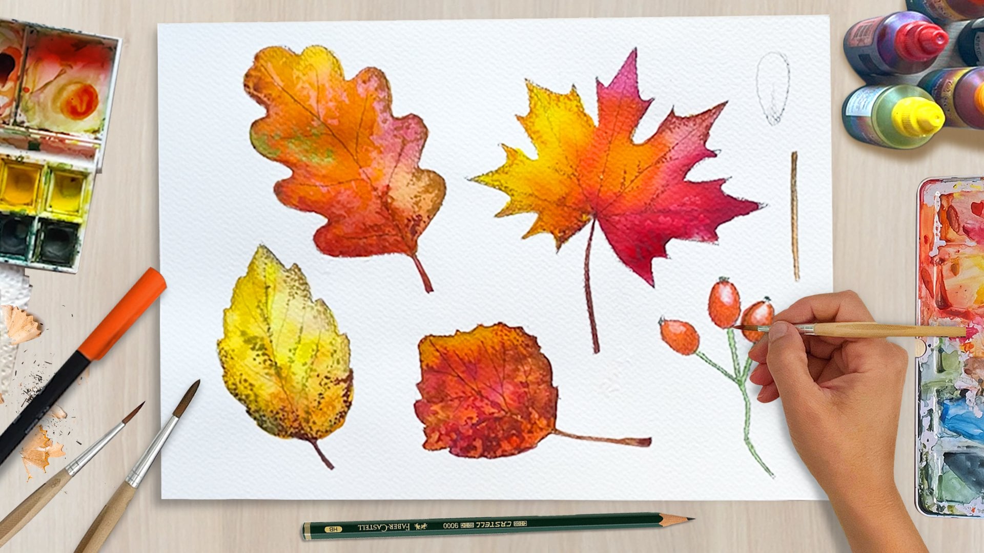
Transcripts
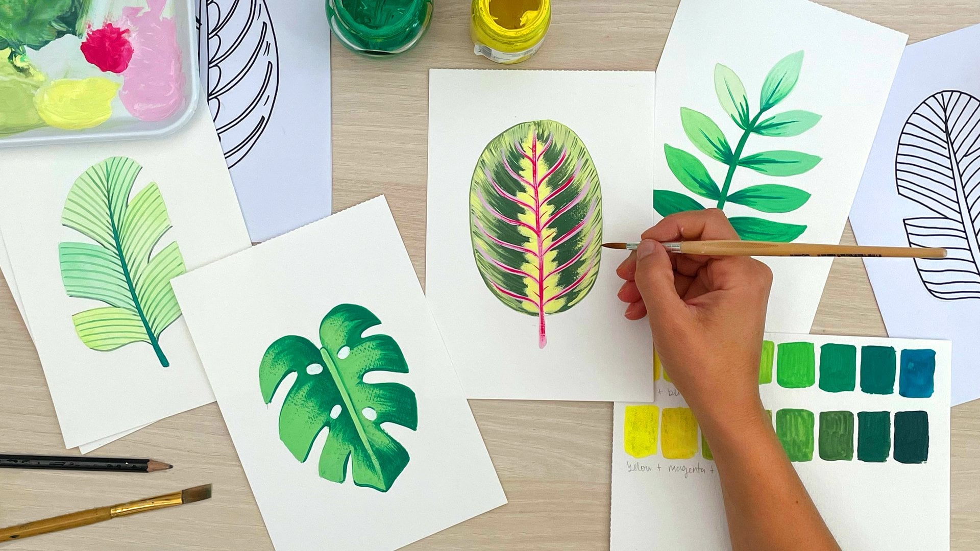
1. Welcome!: Brush markers are one
of the easiest ways to achieve a painterly look
without a lot of setup. With just pressure,
strokes, direction, and a bit of layering,
you can build a lot of depth and texture much faster
than you might expect. When you use them for
botanical paintings is especially satisfying. Or at least I find. In just a few layers, petals and leaves start to
feel full of light and volume, and the process itself
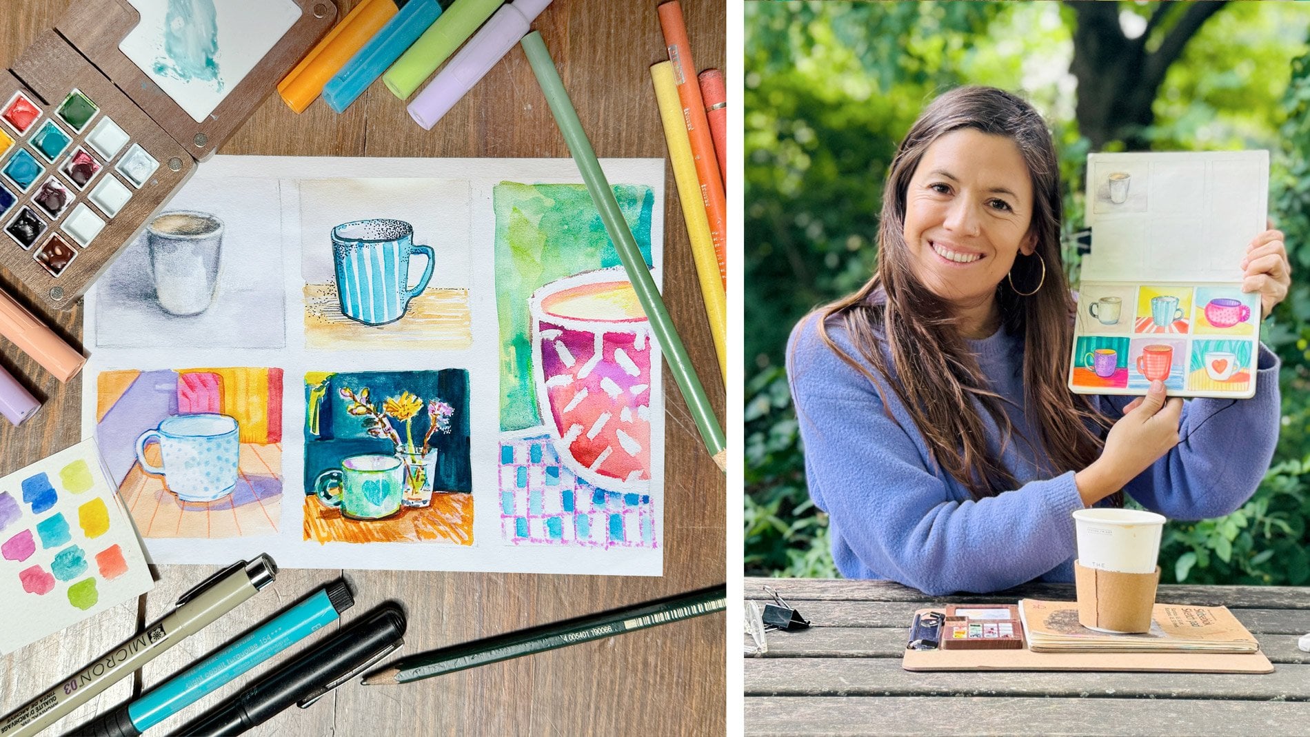
can be very relaxing. I am Silvia Spina, I'm an artist designer and
educator based in Barcelona. I worked for years as a
surface pattern designer, and botanicals have always been a big part of my
creative practice. I have painted them in murals,
worked with watercolors, and I have used my assets to
create repeating patterns, decorate designs,
and in general, create graphics for
different visual projects. In this class, we will paint
botanical flowers together, and I will teach you
how to achieve depth with just a few layers and
a limited color palette. We will start with
simple warm up exercises so that you feel
confident using pressure, stroke direction, and layering. And I will also show
you how I work with a limited color palette so that your illustrations feel
cohesive and intentional. Then we'll start painting. We'll begin with Natalia to put the brush marker
exercises into practice, pressure, stroke direction, and leaving light
spaces for volume. Then we'll move on to smaller
and more complex flowers, where I'll show you how to
draw and paint blooms from different angles and build
confidence through warm ups, small tests and gentle layering. Then you will see me apply
the same concepts in three painting demos
where you can watch the full process and paint
alongside me if you want. Although the paintings in
this class may look advanced, this class is beginner friendly, and I've designed it to
feel calm and practical. It's great for
artists and hobbyists who want to paint botanicals
with less pressure, designers creating
hand painted assays for digital products, patterns, and compositions and anyone craving a bit of painting
time away from screens. All you need to
take this class is a few brush markers
of different tones. Ideally, a couple of
light and dark tones, a pencil, an eraser, and any paper that you want. Hopefully, something
quite affordable so that you can practice as much as you want and willingness to
experiment and have fun. I have added a printable
coloring book with my hand drawn florals
that you can print at home and color
with brush markers for a little bit of extra
practice and inspiration. If you want to stay
in touch, make sure you follow me
here in Skillshare. I like to connect
with my followers to announce new giveaways, occasional freebies,
and tutorials. And if you like more creative
resources and tutorials, you can also find me through
the links in my profile, including a website,
YouTube channel, Instagram, newsletter, sign
up, and all those things. All right, get your materials
ready and see it in class.
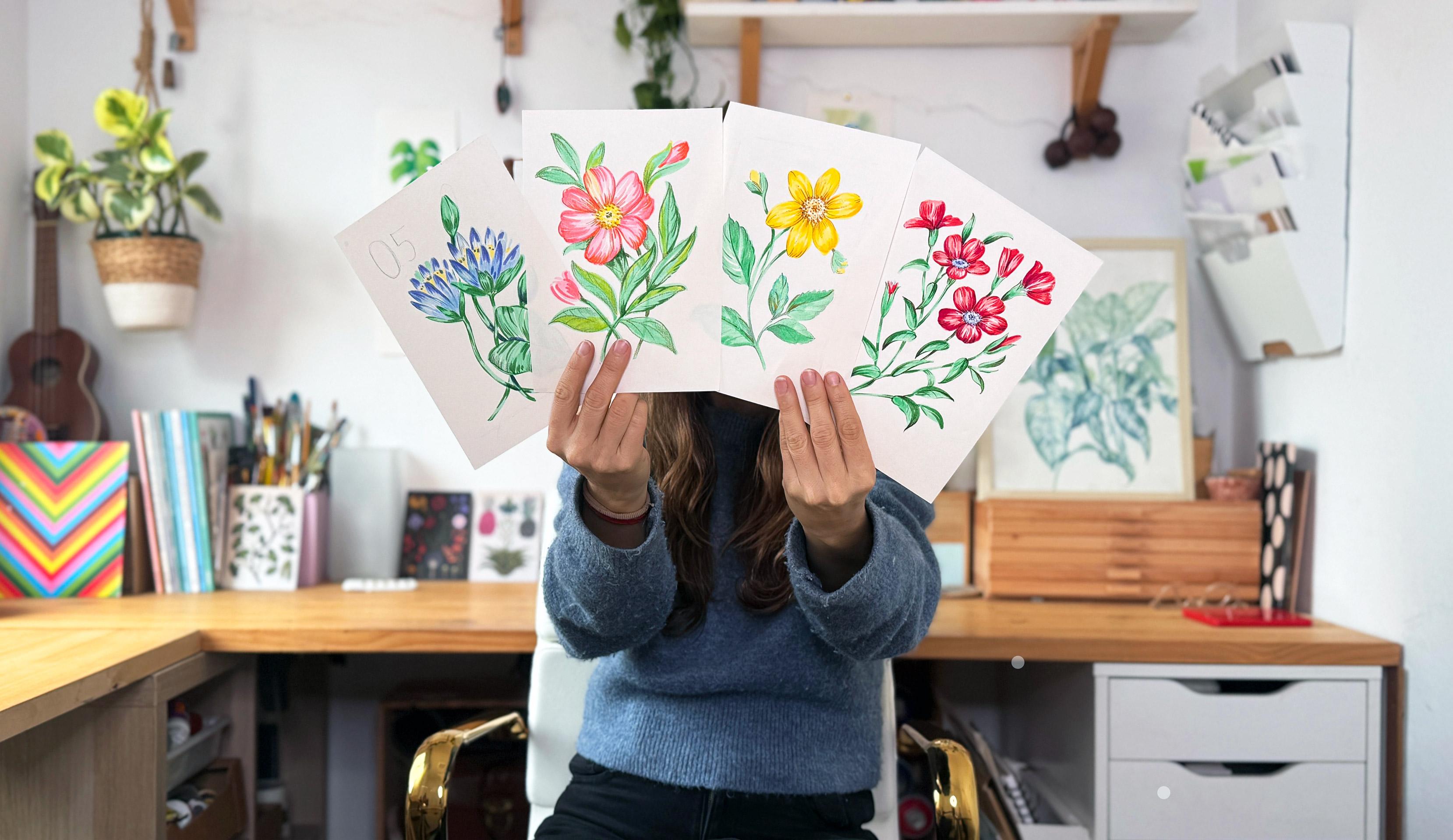
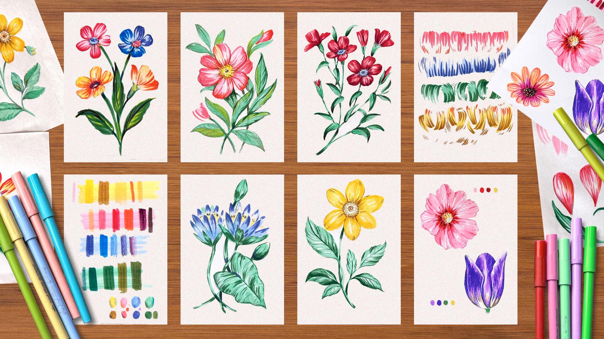
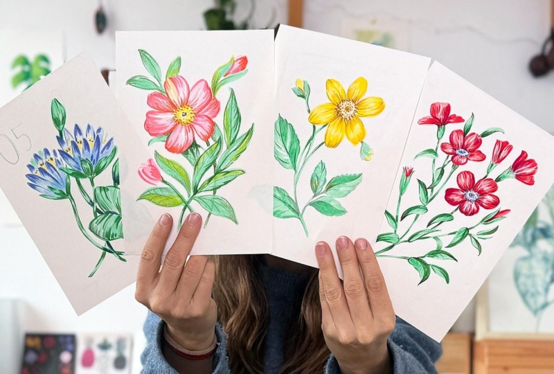
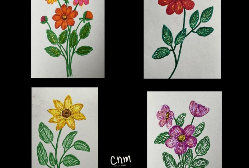
2. Your Project: You project for this class
is to create one, two, or as many botanical
illustrations as you want using brush markers. The goal of this project is not to create something perfect, but rather understand
the technique. And I want to invite
you to work from enjoyment and not just
focusing on the results. My goal is to help you feel more confident creating
volume and depth, using just a few colors, layering and using
expressive brush strokes. Throughout the
class, I'll show you my botanical references
directly on screen. I won't provide
downloadable references, as many of these
ones are corporated. But any flowers that inspire
you are more than welcome. For this class, I recommend
working on a sketchbook or sketchpad that you
don't mind using free. It is much better to use
more paper than less. Once you feel comfortable with the technique and have
practiced the exercises, you can always move on to a better paper for
your final pieces. Your final project, I would
love to see photos of your brush exercises along with one or more finished
floral illustrations. If you used a specific
color palette and you want to show me
how you designed it, you are welcome to upload
that page as well. Also, if you did any
pencil sketches to explore flower
shapes or positions, feel free to include those two. I really enjoy seeing all
the parts of the process. As a bonus for this class, I have included
three painting demos where I simply record the process of me painting different flowers without
explaining every step. These are meant for you
to observe how I apply the concepts from this class in a more intuitive, real time way. If there's a specific flower you would love to see
painted in the future, feel free to leave a comment. I would love to
record more demos and possibly add
them to the class. You will find a
downloadable workbook in the project and
resources section with a few coloring pages and
photographs I've taken myself. Overall, this class
is designed to feel calm, approachable,
and relaxing. The setup is
intentionally simple, so you can focus on building confidence and
enjoying the process. Once you finish your project, please upload it to
the project gallery of this class as I can't wait
to see what you create. In the next lesson,
I'm going to show you the tools that you will
need for this class.
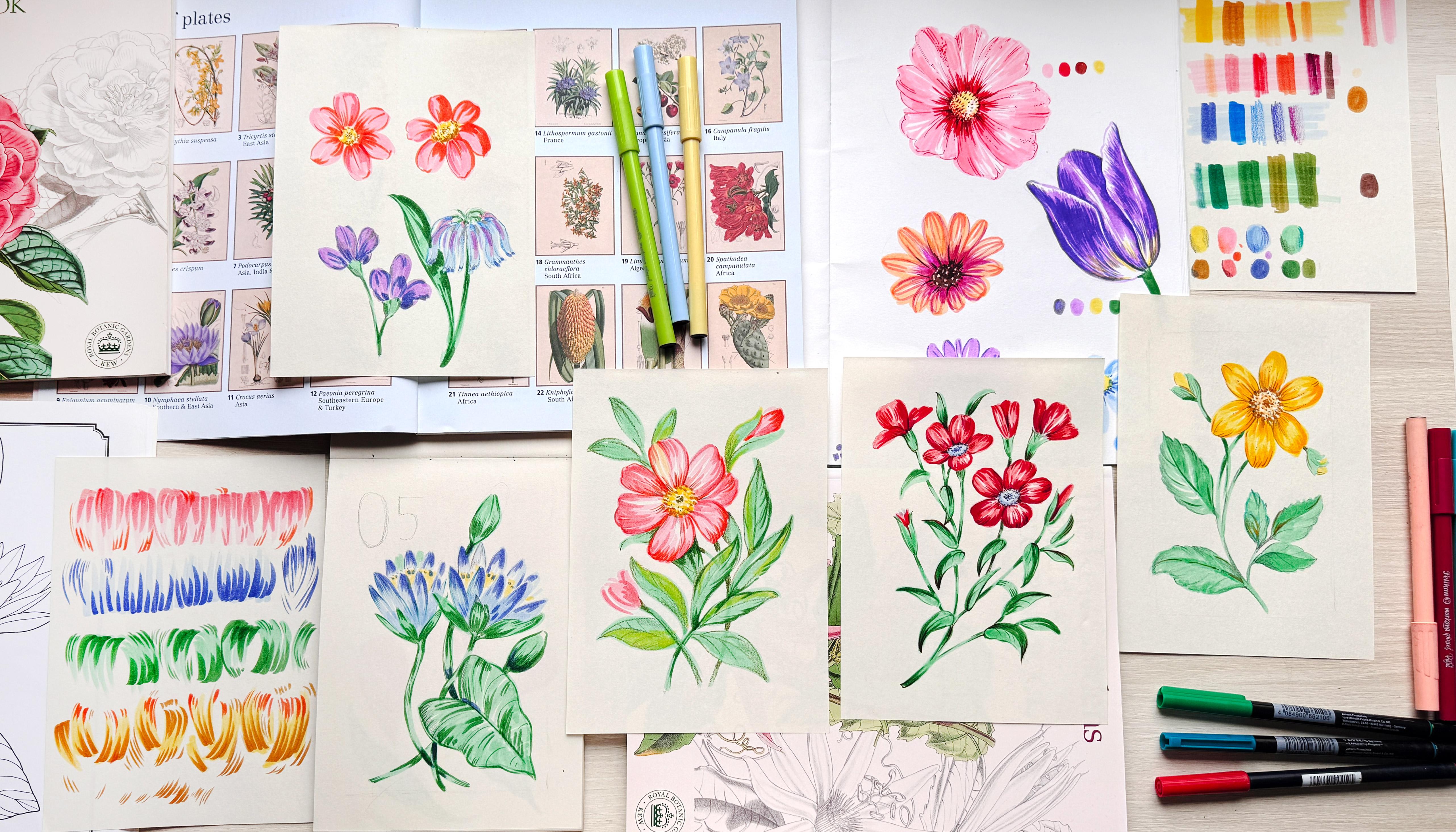
3. Tools & Materials : Now, let's talk
about the materials that you will need
for this class. Let's start with the type of
paper that you will need. I really want you to be able to use whatever you have at home. White printer paper
is absolutely fine. And if you have a sketchbook
you love, use that, too. I have used cold press
watercolor paper in the past, and it has worked well for me. But for this class,
I'm actually going to paint in this recycled
paper sketchbook. If you know me already,
you know how much I love using affordable tools, especially when learning
a new technique. So by using this sketchpad
of recycled paper, I won't mind using as many pages as I need
for color studies, color palettes, and
brush marker exercises. Even if I think many papers
can work with this technique, there is something I
want to share with you. While recording
one of the demos, I realized something important. Some papers work better with
brush markers than others. When I added this dark brown
line to this little flower, the ink started bleeding into the lighter
colors next to it, which was so annoying. That happened because
I already had applied two or three
layers underneath, so that area was a bit wet and the darker ink
blurred and spread. So here's a quick
test you can do before you commit to
painting a full piece. Different papers have
different fibers, and they absorb pigment
in different ways. Paint two color blocks,
one horizontal, and one vertical,
so you can create a little square in the middle
where the layers overlap. That center area will be more
opaque and a bit wetter. Then take a darker marker and draw a diagonal
line across it. You can do this over
three or four types of papers that you find at home. Here I'm using watercolor
paper, regular printing paper, recycled paper, and
this fourth one, which is part of a sketchbook I had where I painted my flower. The colors I'm using here
are very contrasting. You wouldn't normally
paint like this, but it's a great test to
see how your paper behaves. On this first paper, the dark
line seems pretty clean. This second one is called
press watercolor paper, and it also holds
the ink nicely. This third one is
regular printer paper, and surprisingly, the
color is mostly contained. And on this fourth sample
where the paper is wetter, the dark ink starts to bleed into the light
areas quite a lot. Don't overthink it. This
is just a quick test for you to choose the paper
that feels easier to control. Now let's talk about markers. I'm not going to
mention specific colors yet because we'll do
that in the next lesson. But in general, any
brush markers or lettering brush pens
can work really well. The main thing to look for
is a soft, flexible tip, one that lets you create
thicker marks when you apply more pressure and thin lines when you apply less pressure. Some markers have a harder tip, and even if you press, you
can't really get thick lines. You can achieve some variety, but for this class, we want markers that can
behave as a brush. So as long as your markers have a soft brush tip,
you're good to go. The brand doesn't matter. Having said that, there's a few brands that are
better than others. For example, these
are tumbo markers. I used them a lot
when I was working as a surface pattern
designer in London, and I still have
many colors left. They're not the cheapest,
but they're very durable. They also come with a dual tip, a thicker brush tip on one end, and a fine tip on the other. The brush tip is great for
covering larger areas, and the fine tip can
be used for details, even though I personally
don't use it that often. This one here is a faber castle. The tip looks thin, but it's very soft. So if I press, I can create thicker strokes or use a light touch
for fine lines. A lot of lettering brush
pens are like this, so if you already
have any at home, I think they will
work beautifully. And this one is a brand from
Colombia called Pelican. Even if they're really good, I have to say that
they are not that durable as a tumbo,
but I still love them. Once more, depending on
the amount of pressure I can achieve thick
or thin lines. You will also need a pencil
for your initial sketches. I recommend using a soft
pencil. Here's why. A harder pencil like
this H stays very light, so you end up pressing
harder to see it, and that can dent the paper. A softer pencil like HB or two B gives you darker
lines with less pressure, so it's easier to sketch
and easier to erase later. HB or to B is perfect. Anything softer than
that is fine, too, but if you go very soft
like four B and above, it can start staining the paper. So HB or two B is a
great sweet spot. You will also want
a clean eraser. Mine is a bit dirty because it's been lying in my
pencil case for ages, but it works really well. One is a Stetler. Some erasers
are honestly terrible. They smug, leave color behind, and barely erase at all. So a quick tip, test your
eraser before you start. A sharpener is handy, too. In the next lesson, we're
going to talk about color palettes and the type of tones you'll want
for this class, so you can choose your
colors with confidence.
4. Gathering Inspiration: In this lesson, I'm
going to show you my main two or three sources of inspiration when it comes to
painting botanical artworks. I'm going to start with the most accessible one, and it's nature. Nature is everywhere. You can step outside in
pretty much any season. And when you see a flower or any plant that captures
your attention, remember to take your phone
out and take a photograph. Over the years, I have
been building for myself a folder in my
phone camera gallery. I keep photographs of
flowers, leaves, pounds. Some of these photographs have been taken in botanical gardens. This is a day that
we went to visit a beautiful botanical
garden whilst traveling. I haven't updated that
folder in ages, though. So sometimes I just search
for the word flowers, and then my iPad
or phone gathers all the photographs and artworks
containing any flowers. Currently, I have
more than 1,300 floral photos in my gallery,
which is pretty funny. Probably there are some
paintings there as well. I'm in a rush, I usually just snap a photograph
and then go. But when I have a bit of time, this is usually
what I like to do. I start by taking a
more frontal photograph where I can clearly
see all the details, the center of the flower, the shape of the petals, and how everything
is structured. If I see another frontal flower, I like to photograph it too so that I have a bit
more of variety. Then I like to take
a few more photos of the same plant from
different angles. Especially interested
in seeing how the flower looks in
different positions, some facing forward,
others from the side, and also a few flower
buds, if there are any. Having that variety gives me much more information
to work with later. For example, I took
these rose photographs in London because I
found them so beautiful. I photographed the bud
the flower fully open, the flower from the side,
and also the leaves. I even took a few shots of the same rose from
different angles. That way, if I
ever want to paint or design something
with these roses, I already have
references showing how the plant looks from
multiple perspectives. This is basically what I do
when gathering inspiration. Just grab your phone, and whenever you see
a flower you like, take a few photos from
different directions, save them together in a
folder, and over time, you will build a really
beautiful library of references. And often they will also bring back some memories
of where you took them. Okay, I'm going to put my
iPad aside and move on to my second favorite source of inspiration, which are books. When preparing this class, I actually realized
how many books I have. I think whilst I was
living in London, I was working a lot in the surface pattern
design industry, and I got pretty addicted
to buying floral books. I once treated myself to
this beautiful set of postcards curated
and illustrated by Katie Scott and Kathy Willis, and I used to decorate my
studio with these postcards and sometimes use them
as inspiration when it came to representing
certain flowers. And then I have all
of these books. I collected quite a few of
them whilst living in London, and I love coming back
to them for inspiration. Most of these illustrations were made before photography
was really a thing. So artists and botanists were literally sitting
with the plants, observing them carefully, and
then painting them by hand. What I really find interesting is that these drawings weren't meant to be decorative in the way we think COVI
illustration today. They were a way of studying
and understanding plants. Even with that purpose, they still feel really
expressive and beautiful. When I use books like this, I'm not trying to
copy a plant exactly. I'm more interested in
looking at the shapes, the way things are
composed on the page, and how color is used. It's more about letting these
references inform my eye rather than feeling
like I want to reproduce what I see exactly. Actually, when I'm
looking for inspiration, I prefer focusing on the smaller plates or
thumbnail size illustrations. Seeing the artwork at a smaller scale helps me
step back and just take in the overall composition
and the main shapes without getting too caught
up in the tiny details. It also makes it
easier for me not to copy things exactly as
they're represented. Instead, I can absorb the structure and the
feeling of the illustration, the composition, and the colors, and then translate that into my own style in a much
more natural way. And of course, the Internet is also a great place to
look for inspiration, especially for plants
I don't have in my own photo library
or in my books. I often use sites like Pinterest or Pexels to quickly
find references, and I've put together a
small inspiration board that you can download and use as a starting point for
this class if you want.
5. Defining a Colour Palette: Okay, now let's talk
about the tones. To create shadings
on your flowers, it is very important to have a few tones of the same color. So some lighter ones
and some darker ones. A lot of these
packages come with very saturated and
strong colors, but it's key to have
a variety in between a very light shade and a darker
shade of the same color. So, for example, I'm going
to grab this mint color, this light green, and applying some pressure to the
tip, paint this area. So that would be
the light color, the light shade, and then I'm
going to grab this green, and this would be the color
that I would use to start giving volume and shadows
to my botanical elements. The color is actually
quite contrasting, so I'm going to
test another green, which is also dark, but might be a
little bit lighter. I think I prefer this one. So, for example, if you're
going to be drawing a leaf, you use the lighter
color for the base, and then use a darker tone to create some shadows
and volume on top. Now let's move on to talking
about the color palette. You don't need 1 million
colors for this glass. If you have two or
three colors for your flowers and one
for your leaves, then you'll be good to go. In my case, I want to have to hand a light yellow,
a light pink, and a light blue for my flowers, and I'm going to use this
mint color for my leaves. To select the darker tones, I'm going to use a new page
and show you a good exercise that you can do to start testing if you like the
color combinations. I'm going to start by
creating four rectangles using the four light colors that I want to use
for this class. As you can see, it's
very easy to cover large areas when you
apply pressure to the tip of this type
of brush markers. At home, you can
start by selecting four light colors and four darker shades
of the same color. So I'm going to start with
the yellow, testing this one. It is a little bit
more saturated, but it is not dark enough to
create shadings or volume. So I'm going to
go ahead and test this ochre superposing a line
on top of the rectangle. This color, despite
being quite dark, will work much better to
greet shadings and volume. I also have this peach tone, which also looks nice when I
layer it to the yellow one. I think any of these two colors could work very
well for shading, and I'm going to put
them right here and move on to testing the pink. I'm going to see
how the peach color overlays with this pink. I don't think it's
contrasting enough, and it changes the
tone of the pink. So I'm going to discard it. I have this other
darker pink here, which I think could
work really well. And I also grabbed this darker
red from my tumbo pack, but I feel that this
one is too dark, is a little bit cold, and it creates way
too much contrast. I also have this dark orange, which is a little bit warmer, not as cold as this red, and I think it works
really nicely with the rest of the tone.
So save it as well. Moving on to the blue, I have this dark, desaturated shade, which is really nice, or I have this more
saturated and brighter blue. It's also really nice,
but for my taste, today is a little bit saturated, and I'm leaning more
towards desaturated colors. So I'm going to use
the first blue. Okay, lastly, I'm going to move to the green and
see what I've got. This green one is nice, but I feel that it's once
more a bit too dark. So I'm going to test this other
one and see if I like it. It is also very dark, but I feel that it
has some warmth to it that could combine really nicely with the
rest of the tones. So I'm going to select
this second one without overthinking it. Okay, now, finally, here
on the bottom of my page, I'm going to create
four swatches using the lighter colors and put
the darker ones below. When it comes to
choosing colors, I really encourage you to
follow your intuition. There is no right or
wrong combinations here and no need
to overthink it. Take a moment to look at
your markers and pencils and notice which colors you
feel naturally drawn to. Which tones catch
your eye first. Which combinations feel pleasant
or exciting to try out. Trust that response, it is already part of
your visual language. Only thing I recommend is having at least one lighter tone and a darker tone for each
colors you choose. This will give you
enough range to a depth, layering and contrast without
needing many materials. And remember that
nothing is fixed. If halfway through the class, you realize a color
doesn't feel right, you can always swap
it for another one. This flexibility is
part of the process. By making these small
intuitive choices and allowing yourself
to change your mind, you're not only
learning the technique you're also slowly
developing your own style. In the next lesson,
we're going to start making some exercises so that you start
getting used to the technique of shading
and giving volume.
6. Warm-Up: Pressure, Speed & Layering: Before we start
painting flowers, we're going to do a
few quick exercises to get comfortable with
the brush markers. Think of these exercises
as a relaxing warmup. You'll explore pressure,
speed, and layering. We're going to start with
a few simple exercises to help you get familiar
with how brush markers work. First, let's look at
how to hold the brush. To create thicker marks, try holding the marker a bit further away from the tip and
applying gentle pressure. Usually apply
pressure by resting my hand on the table and
pressing slightly downward. This helps release
the tension from my fingers and elbow and
gives me much more control. Instead of drawing
one thick line from start to finish, try this. Apply pressure at
the beginning of the stroke and then lift the
pen as you move forward. This creates a natural
variation in thickness. I'm going to change
color now just to keep things playful and
repeat the same exercise. This time, starting
from the bottom and moving upward, again, apply pressure at
the beginning of the stroke and then lift
the pen as you move up. It is really important
that your hand stays supported on the
table whilst you do this. I'm not drawing with
my hand in the air because that would make it much harder to
control the brush. Rest your hand on the paper, apply pressure, and
then lift as you move. For the next row, we'll
start adding some curves. Try making curve strokes in one direction and then
switch directions. The principle stays the same. Pressure at the beginning,
lift the brush as you go. You can repeat this
exercise starting from the bottom and moving
upwards as well. You don't need many strokes. Even three or four
at a time is enough. All right. Now let's
move on to layering. I will introduce a second color and repeat the same
type of strokes. But this time, I will vary the direction and
thickness a little more. Some strokes can be
wider, other thinner. With this darker color, try not to completely
cover the first layer. Let the initial
color show through. This is how we start
creating shading and volume, especially when painting
petals and leaves. For a third color, you can
mix directions even more. So strokes from top to bottom, others from bottom to top and
keep them slightly lighter. For the last set, try applying less
pressure overall. Still start the stroke thicker and lift the pen bat gently. This exercise is
really about testing how much pressure and seeing how different
layers interact. You can already see how
much volume you can create by using just two colors. Hold on. Now let's try
something slightly different. This time, hold the
marker closer to the tip. Again, rest your hand on the
table to keep it relaxed. Instead of using pressure, focus more on speed. Quick light strokes to create thinner lines and
subtle texture. You can experiment with
different colors here or even introduce a third
color like this orange. The goal is simply to
explore how different grips, pressure, and speeds
affect your marks. Notice how different
it feels when you hold the pen
closer to the tip versus further back and how that changes the texture
and tone you create. Before we move on,
remember you can practice these exercises
as much as you want. There's no limit, and honestly, this is one of those
things that gets easier and more able
than more you repeat it. I personally really love
doing this kind of warm up. I try to stay present
whilst I'm doing it, feeling the texture
of the paper, listening to the sound
of the brush strokes, and noticing how the marker behaves when I change
the pressure or speed. It's a very simple practice, but it can be
surprisingly relaxing. And it's also a great
place to test colors. Even if two markers look
similar in the box, they can feel completely
different on paper. So these little swatches
teach you a lot very quickly. In the next lesson, we'll take everything we've practice
here and apply it directly to the petals
and leaves so you can start using these strokes
in a more botanical way.
7. Practice: Painting Petals & Leaves.mp4: Et's practice painting
some petals and leaves. We're going to
start by sketching a few things to use as guides. I'm going to draw an
oval inverted drop or this could be
already a petal. And for the third one,
we're only going to be using a line as a guide. For the leaves, let's
draw a long leaf. And then maybe three
lines that join below. And then we can draw
a stem on the bottom. Remember this is an exercise. It doesn't have to be perfect and there's no right or wrong. For the first petal, we're
going to basically repeat this exercise but stay
within this oval. So I'm going to start
by applying pressure to my marker and then lifting
the marker as I go down. It doesn't matter if you
surpass the pencil mark, and then go up. For the second one, I'm going to start by applying pressure
at the beginning. Try to vary the pressure and stay within the pencil marks. And then from the bottom, just draw some lines
going to the top. And then for this one, I'm only going to be taking
this as a reference. So I'm going to try to
emulate what I did here, but without pencil marks. Before doing the shading, I'm going to erase
this first mark. So this is to show
you that even if I have used a soft
pencil for this, I can still erase it once I have painted
with my brush markers. And now I'm going to
use the second color to refine the petal shape. I'm going to start from the top. I'm not going to cover
the layer below, but rather apply some
shadings on the top and on the bottom and
define the petal shape. I'm going to do the
same with this one. I'm going to start by
erasing the pencil mark and start using the contrasting
color to add some shadings. This color has
much more contrast and it might make
you more nervous. But this is just a
practice exercise, and it's good to start
testing how things look. Usually, when the
colors are darker, I tend to use them
a little bit less, and I'm a little bit more careful as well when
applying the second layer. You can also start playing
with different textures to soften the transitions from
one color to the other. I don't do this very
often, the dots thing, but it's nice to try. And now for this third one, I'm going to start
doing the same. Before moving on to the leaves, I just want to show you how
you can use the pencil to also start adding some shadings to your botanical elements. When using light
colors and my flowers, sometimes I use the pencil
to give some shadings. If you're curious later on, you can test these too. And if you do it
softly, the best thing is that if you don't like it, you can just erase it. Okay, let's move
on to the leaves. This leaf, we're going to use some thinner and longer
strokes that will go from the top of the
leaf to the bottom. And I'm going to
make them thinner at the top and the bottom and try to thicken the line towards the
middle of the leaf. You can see that with
these brush exercises, we're not only practicing
how to use the brush pen, but also how to start
achieving volume. You start thin by applying less pressure and
towards the middle, you start applying
more pressure. Let's move on to
the second leaf. In this case, we're
going to start on the side and move on to
the center using curves. Applying little pressure
at the beginning and thickening the brush as I move to the center and then repeat the same
exercise on the other side. Now, I always find one side harder than the other
one for some reason. I think it's because of
the position of my hand. You will see me rotating my
paper when I paint my plants. With these brush markers, you can start creating a bit of shading by giving second layers. You can see that when I
superpose these new strokes, I'm instantly
creating some volume by darkening some of
the areas of the leaf. Okay, let's move on
to practicing how to add volume using
a darker tone. We're going to do something
similar to the petals, but using the brush in
different directions, following what we have already
done on the first layer. So for this first leaf, I'm going to start moving
from the bottom, going up, applying very little
pressure at the beginning, and then trying to lift
my pen as I go up. I'll do one side of the leaf first and then move
to the other side. It's very important to not cover the first
layer completely. Try to vary the way you use your brush marker
with each leaf. Use more speed, less
pressure. Lift your pen. You can darken some leaves
more than other ones. For the second one, I'm going
to start with the center. I applied very little pressure into that central
vein and grabbing my brush marker nearer to the tip because I want
to have more control. So I am applying pressure on
my hand towards the table so that my fingers can handle the brush in a more
controlled way. To add some visual interest
and achieve even more volume, you can darken some areas of
the leaf more than others. And lastly, we're going to be using these lines as guides. I'm going to redraw this
second one to see it better and imagine that it was
a central vein of my leaf. I really like doing
these exercises without drawing the whole
thing with a pencil first because that will
give you confidence to really paint with your brush pen instead of always coloring
pre drawn shapes. Since these leaves
are quite long, I'm going to go
back to the shading from the top and the bottom
and not from the sides. And lastly, I'm going to
practice drawing this stem. With these longer lines, you will have to practice
using your wrist and your whole arm to be able
to draw them in one go. I'm going to erase
the pencil marks. I know that this is an exercise, so it is not necessary
to doing so. But sometimes I like to scan
these petals and leaves and manipulate them
digitally to create compositions either on
Procrit or using Photoshop. Take your time with these
exercises as they will really help you understand how to
use your brush markers. And once you're
feeling confident, meet me in the next lesson
where we're going to start sketching the
composition over first flower.
8. Dahlia: Sketching the Composition: For this first flower, I'm going to use one
of my beautiful books, and without overthinking it, I'm going to choose one of
these flowers to paint. In terms of simplicity
and composition, I feel that this could be a good choice because
it's only one flower. This one here is also
capturing my eye. I'm going to go ahead
with this reference. It's a big flower, and then it has a few leaves on
different positions. This rectangle has a bit of a different ratio to this page of mine, but
it doesn't matter. Going to start by
drawing a few lines, leaving a similar distance
on each of the sides. I can add a few on
these corners as well, and this will help me respect this border and create a
more balanced composition. Okay, now I'm going
to start creating some basic shapes to determine the size of
each of my elements, starting by drawing a circle
for the yellow flower. At the moment, I'm drawing super softly on my paper
to avoid leaving any marks because I'm only working on where my
elements will be. So there's a big flower up here. Then there's a stem
that comes as a curve. There's a second
stem because one of these stems goes
behind the flower, but I'm not going
to have much space here to put this flower. But because of the ratio
of the paper I'm using, I have less space in there. It's important to not get too obsessed with copying
the composition, but use it as a guide to
place the main elements. I can see that there
is a big leaf in here, so I'm going to place
it on my paper, and then there is this
other branch coming to the other side with a few smaller leaves that
come out of this main stem. And then there's
another stem here, so I'm going to do this much smaller and have fewer leaves. So as you can see, I'm
already changing a lot, the size of each element and adapting the whole
thing to my paper. This composition
is good as it is, but I wanted to try different things and ended up overcomplicating
it a little bit. You can keep it as
simple as you want, but since it's your composition, then you're allowed to test
things as much as you want. I'm going to place the
rest of the video at a higher speed so
that you can see the transition from one
composition to the other. I was basically trying to
fit in the flower bed, which I didn't even
paint in the end. But this is part of
the creative process, and that is why it's good to start by placing your elements with the pencil first before moving on to
the brush markers. Okay, now I'm going to show
you how I develop the flower. So I start by drawing a larger circle,
which I already have, and then I place
the flower center, which in this case, is in the middle of the outter circle. And then I draw some marks using these curvy lines that will help me place each
of the petals. Then I will use my brush
markers to complete them. I understand that
this requires a little bit more of
practice and confidence. So if you feel better, you
can draw the whole petal. In the next lesson, we're going to start
painting our flower.
9. Dahlia: Painting the Base Color Layer: I don't have a very detailed
drawing underneath, and I'm doing this on purpose. I like to keep the sketch
quite loose because it gives me more freedom to adjust shapes as I work with
the brush markers. I'm going to start with the
flower, and before painting, I'm introducing a few different yellow tones
into my palette. This gives me more variety between the center
and the petals. Petals will stay more
yellow and the center will lean a bit more
towards the ochre tone. Having this small color
range prepared in advanced can really help when making decisions as you
develop your paintings. I'll begin by
painting the petals. Just like we practice
in the exercise lesson, I'm starting from the
outer edge of the petal and then lifting my
pen as I move inwards. You can still see some
of my pencil lines here. So before continuing with
the rest of the flower, I'm gently going
to clean those up. I like to barely see
the sketch underneath. It gives me enough
structure to follow, but also leaves room for the brush markers
to do its thing. I'm keeping the reference
photo quite small on purpose. I don't want you to get to focus on copying the flor
exactly as it appears. Instead, I want you to
have it as a loose guide, mainly for overall
shape and color. As I paint, notice how I'm leaving small white spaces
between my strokes. This is really important. Those white areas create
light and volume, and once they're covered, it's almost impossible
to bring them back. So it's always
better to be a bit conservative in
this first layer. I'm also making the petals slightly more pointing
than the reference. This is one of those
moments where you can start making
the flour your own, adjusting shapes in a way
that feels natural to you. Now I'll move on to the
center of the flour. I'm tapping the paper with the marker rather than
using long strokes, which helps suggest
texture and volume. I'm switching to a pitch
tone so that there is a clear contrast between
the petals and the center. Again, I'm leaving plenty
of white space in here. In the second layer, I will decide how much
darker I want to go. But for now, I prefer
to keep things late. It's always easier to add a bit more depth later
than to remove it. That's it for the first
layer of the flour. Next, I'll move on to building the base color for the
leaves and the stem, keeping everything soft and
flexible at this stage. Since we've already done the brush marker exercises
earlier in this class, I hope you're starting
to feel more confident when it comes to painting the different parts
of this dahlia. Remember, this first layer
is just a foundation. It doesn't need to be perfect. Remember to rotate
your paper if you find creating these
curves difficult. As I said, I always
find painting one of the sides of the leaves easier than the other
for some reason. You'll notice that I'm
also not following the pencil drawing exactly
as I sketched it first. I'm really just using it
as a loose reference. This gives me the freedom to
adjust shapes as I go and respond to the brush marker instead of trying to
control it too much. If at any point you feel
like you're struggling, don't hesitate to pause
and move to another page. You can always create a few
extra exercises, for example, filling one page
just with leaves and another one with petals
in different shapes. This kind of repetition
is incredibly helpful and takes a lot of pressure off
the final drawing. Another option is to keep going and finish the flour
you're working on now, trusting that the second
layer will give you the chance of
refining the shapes, adding depth, and improving
what's already there. The base layer doesn't
need to be perfect. It's just a starting point. And if in the end, you don't love the result,
that's completely okay. What really matters is
that you've practiced. You've finished the piece, and you've spent time getting to know how these brush
markers behave. Every page you
complete helps you find confidence and
improve overall. Lastly, I'm going to move
on to painting the stem. Funny how I ended up changing the whole
composition to fit in a flower bud that I'm not going to be
painting in the end. But you know what? That's right. The best thing about
painting for practice or for fun is that we get
to choose these things. So choose whatever
feels right to you. In the next lesson, we're going
to develop the volume and contrast by adding a second
layer with darker colors.
10. Dahlia: Adding Volume and Depth: I just realized
that I didn't press record when doing the
second layer for my flower, which is very annoying. But I'm going to walk
you through what I did so that you can
catch up with me. I basically darkened a
little bit the center using the initial yellow because I had left too many white areas here. So I just darkened that area. Always making sure to leave
some white lines in between the petals because that light really gives a lot of volume. Then I developed the center
using the ocher tone. I analyzed a little
bit the reference, observing the
center, for example, that has a darker area
towards the middle, and then it has a ring of darker spots towards the
outer part of the circle. So I just started
tapping these areas, being careful with
how much pressure I apply onto my brush. Okay, I'm going to
grab another page to show you exactly what
I did with the petals. So I had the base in
this yellow color. And then I used this peach
color that I had tested in here because I realized that by shading just
with the ochre, the flour would have
gotten way too dark. So by superposing
another light color, I can achieve much
softer shadings. As I showed you when
doing the exercises, I started from the
top to the bottom and then did a few lines from
the bottom to the top. And lastly, I use the ochre color to draw
some very, very thin lines. If you want, you
can practice this petal before painting
your flower. This is one of the
reasons why I love this very affordable
sketching pad because I don't mind using various pages to practice when
learning a new technique. So now I'm going to go back
to the flower and finish applying this third layer
with the ochre color. See that I am only
using this color to add a few little
lines on the center, on the sides of the petal, and on the end of the
petal, very thin lines. And now, I'm going
to start developing the green parts of my plant. When looking at the reference, I see that there's only
a few darker areas and they tend to go towards
the center of the leaves. Some stems are
darker than others, and that really gives a lot
of volume to the plant. But in general, the leaves are very soft and they don't
have a lot of contrast. So with that in mind, I'm going to go ahead and try to interpret those
things my own way. I'm going to be developing this second layer
very, very softly. Very softly. Instead
of thick lines, I'm going to be using
very thin ones, grabbing the brush
marker nearer the tip, putting pressure my hand
on the table so that I can develop this type
of speed movement. So I'm not putting
pressure to the pen, but just freeing my fingers to do this type of hand gesture. I'm going to leave the
reference photo here in case you want to
look at it as well. So I'm going to darken that part of the leaf a little bit
more than the other one. You will see me developing the darker areas sometimes
from the center, but sometimes I will be drawing more from the
sides towards the center. And if you feel uncomfortable, just rotate your paper. Okay, that is enough
for this leaf. Going to darken the
area that goes behind the flower so that will allow me to create
some volume there, and then maybe decide which of these stems
is gonna go on top. I find developing the leaves a little bit harder
than the petals, and I don't know why,
but there's always a direction that feels easier. So going up feels a bit more difficult for me
than going down. Sometimes I do go up, but the gesture of going
down feels more natural. And that's why I rotate
my paper so much. In this case, for example, if I was developing the
shadows of the leaves, starting from the
central vein outwards, this rotation of the paper
would feel comfortable. But in this case, for example, that I want to be
developing the shadows, starting from the outer part, moving inwards, then this
position would be much more comfortable because I am shading from the top to
the bottom of the paper. I don't know if you're getting
what I'm trying to say, but that's kind of the logic of rotating my paper so much. And there are leaves that I will naturally make
darker than others. If you have a tumbo or one of these markers that have
two tips, towards the end, you can use the
thinner tip to add a few more details like lateral veins without
overdoing it. So just a few. And same with the flower, you can add just a few
final details if you want. Take your time developing your
flower and don't rush it. If you've finished
one floor already, this is a really nice moment to pause and upload it to
your class project. You don't need to wait until everything is
finished or perfect. Your project can grow over time, and you can update it anytime. You can always come
back later and update it with new flowers
as you create them. By sharing early, I can start giving you
feedback as you go, and you can also
look back and see how your confidence and
brush drugs evolve. Think of your project as a place to document
your process, your progress, and not
just your final results. So whenever you're
ready, upload what you've got onto the
project and after that, come back to the class so we
can keep on painting. Mm.
11. Practice: Sketching Flowers the Simple Way: The flower we're using
as a reference here is called num grandi pleum, which is a bit of a long
and difficult name. And since we're not aiming to copy it exactly as it appears, I'm going to refer them
simply as small flowers. We're going to be
looking at them in a very approachable
and simple way. We'll start by sketching them
using basic shapes and then we'll add a bit of color keeping everything
loose and flexible. Going to start by showing you the flower which is frontal. Let's start by
drawing two circles. If the flower was fully frontal, the center would be
in the exact center. This flower, though,
is not exactly frontal and its center
is somewhere here. So it's a little bit lower than the center of
the frontal flower. It has five petals. In this case, because the
flower is slightly angled, I can do these lines, but a little bit curvy. These lines would be the
center of our petals. If I mark the middle, this is where the
petal will start. And once you have
those marks in place, then drawing the petals
becomes really easy. And For the second flower, the outer circle can help a lot, especially with these petals
which are on each side. See how I'm respecting the
border of the circle and using it as a guide to draw
my angled petal, equally for the one
here on the bottom. Now let's draw a flower
which is even more angled. To make these exercises varied, I'm going to draw this
oval in a diagonal way. It might be easier if
you start by drawing the diagonal line and then
drawing the oval on top. Now, I'm not going to be placing the center
straight in the middle, but below the line. So it is going to be in the
center of this distance. It's going to be an
angled oval below below the line that is separating the larger
oval into two halves. And now I'm going to mark the
guides for the five petals. Marking the middle of
each of these spaces. And from there, I will use the outer circle to
complete the petals. Since this petal
is on the bottom, it's probably going to be a little bit
surpassing the center. Now let's go ahead
and draw one of these flowers which
are looking up. I'm going to start by
doing a line that is going to mark the direction
of this flower. The center would be here hidden, and then the petals are going
to go towards this circle. I'm not going to draw
the whole circle, but rather the portion that is marking where
the flower ends. This flower has a very
large receptacle, and then I'm going to
mark a few petals. And then from there,
it's going to be really easy to keep defining the
shape of this flower. And lastly, let's practice
drawing a few flower buds. The ones from these flowers
could be represented as cups. And then one which is completely closed and has the
leaves on top. O these are exercises that
you can create or not, but I like to teach them because they will
allow you to start getting used to representing flowers in different positions. And the best thing
is that if you clean a bit these drawings, you can keep practicing your brush marker skills and even choose colors for
your next painting. I was drawing quite hard on purpose so that you could
see the lines clearly, but I usually make
my drawings much softer so that I'm not
marking the paper. After creating the exercise, you can go ahead and color these flowers as
a way of putting your brush marker skills into practice and even use
different colors. It is with these
exercises that you will get better and
gain more confidence. You can try different
base colors for your flowers and then superpose other
colors that maybe you didn't choose in your
initial color palette. Maybe you find a really
cool color combination that makes you feel very
confident and happy, and you can apply that
for our next painting. My aim for this class is for you to play with different colors, different shapes, and learn how to represent different
types of flowers. We're not aiming for a realistic flower or to
copy a specific specimen, but rather take it
as inspiration. So use this lesson to experiment and play
as much as you want, test different colors, layer three or four at a time
if that's what you want. And if you discover that you like more a certain
color combination, bring it to the lesson where
we'll paint our next flower.
12. Small Flowers: Sketching the Composition: In this lesson, we're
going to focus on sketching the composition using the reference as guide rather than something to
reproduce perfectly. We'll look at how the
flowers sit on the stem, how they're spaced, and focus
on the flower directions. I'm hoping that after the practice we did
in the last session, you're starting to feel
a bit more confident approaching these
smother floral shapes. As we did when starting
our previous composition, I'm going to draw these
marks to make sure that I leave a border as a way of ensuring a balanced composition
from the beginning. Going to start by drawing a few very soft simple shapes of where each flower
is going to go. You can see that I'm
using ovals and circles, putting into practice what we
saw in the previous lesson. Now I'm going to draw a
few lines for the stems. I'm using the reference as inspiration for the direction
and length of the stems, but I'm trying not to get too obsessed with copying
them exactly. I can see that there is
a long flower bud here, which I really
like, and then I'm going to draw this branch. I'm not going to draw the
leaves because I will do them directly with
the brush markers. With that composition in mind, I can erase my marks
and start defining the flower directions
in a more defined way. So I'm going to start with
this one on the corner and keep thinking about
these flowers in terms of very simple shapes. It is very useful to know where they're
going to be placed, and then I don't care
erasing the initial shape to develop the flower
in a more defined way. I can draw a line for where the stem is going
to go and then draw a perpendicular horizontal line to define where the
center is going to go. From there, I can start marking where the
petals are going to go with these lines and follow what we did in the
exercise lesson. I'm going to move on
to this one here that has the receptacle quite long. I hope that I'm saying
that word right. I'm generally trying to keep the shapes very
simple at this stage. For this one, I'm also going to start by marking the stem, then draw the receptacle, and then mark the circle where the petals are
going to be placed. You can see that as I'm
developing my flowers, I'm also trying to
erase the guides that I'm no longer using to keep
the composition clean. Now I'm going to develop
this frontal flower, which is slightly angled. I'm going to start by marking where the stem is going to go, draw the oval for the center
of the flower and mark where the petals are going to go
with slightly curved lines. From there, I can
complete the flower. Okay, now that all my flowers are well placed and defined, I'm going to keep
cleaning and tidying this composition so that it looks a little bit more
defined and finished. Take your time developing your composition and
drawing your flowers. And when you're done, meet
me in the next lesson. We are going to start adding the first layer
of color to them.
13. Small Flowers: Colour Studies: Okay, so now I have
worked on my composition, but to be honest, looking at these red
flowers has made me a little insecure into
which colors to use. I wasn't really expecting
that because we have already created a
color palette earlier, but honestly, this is a very normal part of
the creative process. So instead of forcing it, I'm going to pause here and
do a quick extra color test. This is usually what
I do in my own work when I feel uncertain
before committing to color. And also, I thought
I only had one red, but looking at my marker box, it turns out I actually
have quite a few red tones. So I'm going to test a couple
of combinations and see which ones give me the richness and depth I want
before we move on. One of the things I love about using this very affordable
sketch pad is that I don't mind using another page to keep making
these color studies. Sometimes the best
thing we can do before starting a final
piece is just test. Doing these little color studies with affordable tools
like these markers, pencils and sketching pad, takes so much pressure off. It reminds you that
you're allowed to experiment and that
nothing is permanent yet. And the truth is that the more you practice with one tool, the more you understand it. In this case, how to
grab your brush pens, how much pressure
or speed to use and which colors you're
drawn to the most. This is also how you slowly
start defining your style. You notice which
color combinations you keep coming back to, what contrasts you like, and what feels more
natural to you. So even if it looks
like a simple warmup, this is actually a
really important part of getting better. After making this color study, I have decided that
I'm going to use the darker red for the
base of my flowers, and I'm going to keep
the center blue. Take your time
defining your colors, and once you're sure about
what you want to use, meet me in the next lesson
where we're going to start painting the base layer
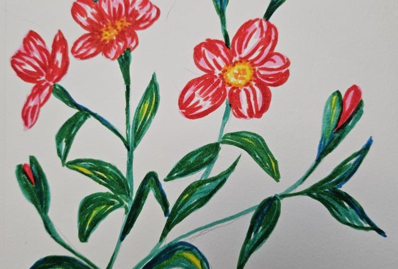
over small flowers.
14. Small Flowers: Painting the Base Layer: If you did a color study, I hope you're ready to
start the base layer. Doing one has definitely
helped me to feel much more confident and relaxed
about starting my plant. This layer is all about
placing light and structure. We're not trying to
finish anything yet. We're just creating
a soft foundation that we can work on later. So if you struggle, try to trust that when applying the
second and third layer, you'll be able to refine what
you apply in this lesson. I'll start with this
mid red and paint each little flower using the same motion we
practiced earlier. I begin at the outer
edge of the petal, apply a bit more pressure
at the start and then lift the pen as I
move towards the center. I'm keeping my strokes quite light and leaving small
white gaps in between. Those white spaces
are important. They automatically create the feeling of volume and light, and they give us room to
build the values later from light to dark without the flour turning
flat or overworked. We can always add more color, but once the whites are gone, it's very hard to
bring them back. As you work, try to keep
this base layer light. And if you're unsure, leave more white than you
think you need. We'll have plenty of
chances to deepen shadows and add richness
in the next layer. Once this base layer is done, we'll have a really
solid foundation, and the second layer
becomes so much easier because all the
structure is already there. At this point, I'm
going to go in with an eraser and
soften the pencil marks. I like keeping the sketch barely visible just
enough to guide me, but not so much that I feel like I have to
follow it perfectly. For me, removing some of those lines makes the
painting feel much more relaxed and it helps me stay in a more intuitive flow as I continue layering
with the markers. You will notice I didn't sketch all the leaves in detail,
and that's intentional. These leaves are short, curved, and a bit
scattered around the stem. So I prefer to keep that part loose and draw them directly
with the brush markers. It gives me more freedom
to adjust the direction, spacing, and movement as I go. Another thing I really like about having
an extra page like this one is that at anytime
I feel a little bit unsure, I can come back to it and practice before I commit
to the final piece. It takes the pressure
off because it reminds me that I can
always warm up again. In this case, I'm
using it to practice the brush gestures
for little leaves, painting one side first, then the other and
testing how it feels to pull the stroke
in different directions. I didn't sketch the leaves. What I did sketch are
the main stems because having that structure
helps me place everything. If you feel unsure,
what you can do is draw a few curvy lines and use them as guides to
paint your leaves. When painting with
brush markers, it really helps to think
about order what elements sit in the front and which
ones belong in the back. In this case, most of the leaves sit in
front of the stems, so I like to paint
the leaves first. Once the leaves are in place, I go back and paint the
parts of the stems that sit behind them using the
pencil sketch as a reference. The reason for this is that brush markers are transparent. If I were to paint the stems first and then paint
the leaves on top, the stems would show
through the leaves, and that usually doesn't
look very natural. By painting the leaves first, I can focus on getting
their shape right and then carefully at the stems
only where they're visible. It's a small shift in order, but it makes a big difference
in the final result. I was tempted to spit this
part of the video up, but I decided not to. This class isn't about rushing. It's about enjoying the process, slowing down, and staying
with what you're doing. I also think it's important
to show you the real timing. How long it takes me to
paint these flowers and the time I actually take
to draw each stroke. I genuinely like taking my time when painting
these type of artworks, and that's part of what
makes it so relaxing. The nice thing about
this technique is that even when
you work slowly, you can still create something
that looks finished quite quickly without much effort
and without getting messy. As we have already mentioned, brush markers are
naturally transparent. Because of that, once you have
finished your first layer, you can start painting over specific areas to
start building depth. This usually means
darkening the parts that sit behind other elements, like stems that disappear
behind leaves or other flowers or the center
of some leaves and petals. By layering the
same color again, you'll notice that volume starts to appear
almost immediately. This is a really
effective way to create depth before introducing
a more contrasting color. The gradual buildup
helps to keep the illustration
soft and cohesive while still giving it dimension. Lastly, I'm going to
paint the center of the flowers using this
light blue color. The original reference
look a bit different, but that's part of the beauty of painting our own flowers. We're free to make
our own choices. Since I've already
done a color study, I have made some of these
decisions in advance. This gives me the
confidence to trust them now and move forward
without overthinking. Once you're done painting
your first layer, meet me in the next lesson.
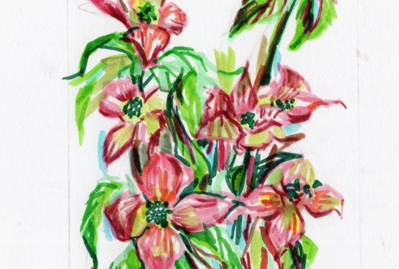
15. Small Flowers: Adding Volume and Depth: Oh. Now it's time to start
developing our second layer. Once again, if at any
point you feel unsure, I really recommend using your practice sheet to
test your colors first. You can also use it
to practice shading petals before moving
onto your main piece. Starting with a deeper red, I'm going to build volume
slowly and carefully. The key here is not to cover
the first layer completely. It's important to leave a few small white
or lighter areas, even if they're minimal,
because they bring light into the petals and
help them feel alive. For this layer, I'm
holding my brush marker closer to the tip and
applying less pressure. I'm also working with
more speed than pressure, pressing slightly
at the beginning of each stroke and then
lifting as I go. You'll notice that the petals
that sit behind others, in this case, the lateral
petals tend to be darker. By keeping the central
petal lighter, it naturally feels like
it's coming forward. I usually darken the
areas that are closer to the center of the flower and
slightly towards the edges. As I paint, I'm also following the natural curve of the
petals with my strokes. This helps me create volume, not just through color, but through movement
and direction. One thing I love about painting with brush markers is that somehow you're encouraged to start using a limited
color palette. You're working with a
small set of tones, and that limitation instantly makes your piece
feel more cohesive. It also creates a slightly
vintage look, in my opinion. And by spending some time
doing color studies, then the colors
naturally feel a little bit more curated and timeless. Now I'm going to
move on to adding a few darker touches
using this burgundy tone. Even though I want these flowers to feel more red than pink, I need to be careful here. Red is a very intense color. And if I layer too
much too quickly, the flowers will darken fast
and lose their interest. When using stronger colors, adding your second and
third layers slowly is key. See how I'm mostly
adding this third, darker color towards the inner and outer
edge of each petal. Okay, once you're
done with your petal, let's go ahead and move on
to our stems and leaves. Using a darker green, I'm going to focus on darkening only the areas that sit
behind other elements. For example, in this flower bud, just darkening the lower section instantly adds depth and volume. Because these stems are quite thin and the painting
is medium sized, I am switching to the smaller tip of my
brush marker here. I don't use it often. I love the looseness of
the thicker tip, but in this case, it
gives me more control. Again, notice how darkening, only the parts of the
stem that sit behind the leaves immediately
pushes the leaves forward. Now I'm going to develop the leaves using the
thick tip of my brush. When developing the leaves, I usually darken only
half of each leaf, starting from the central vein. I don't cover the whole surface, just the middle area. This simple choice
already creates a strong sense of
depth and structure. I'm not strictly following where the light source is and
working more intuitively. Darkening just one side
of the center of the leaf is often enough to make
it feel dimensional. With the finer tip, you can also add a bit of extra
texture like refining the central vein or draw the lateral veins to suggest
where the leaf is facing. Lastly, I'll test a
few blue tones to decide how I want to
darken the flower centers. I am following a similar
approach to the previous flower, darkening the center
and then adding a soft ring of dots around
it to suggest pollen. To finish, I'll use this
darker brown to add a few very fine details to the petals and
the flower centers, bringing everything
together gently. At. This class isn't
about rushing. It's about enjoying the process, slowing down, and staying
with what you're doing. I also think it's
important to show you the real timing
how long it takes me to paint these
flowers and how slowly I build each stroke. I genuinely like taking my time when painting
this type of artworks, and that's part of what
makes it so relaxing. The nice thing about
this technique is that even when
you work slowly, you can still create something
that looks finished quite quickly without much effort
and without getting messy. Brush markers are very
clean and direct, so you can get that
satisfying painting feeling, but with much less setup and
clean up than other mediums. When I finish a painting that has been done
from reference, I sometimes like to
place the two side by side and observe how similar
or different they've become. In this case, my plant has clearly been inspired
by this illustration, but I have made several
conscious choices along the way. For example, I changed
the floral center, and I also used a different technique to develop the piece. Some decisions
alone already give the final result a very
different look and feeling. As I mentioned in the
gathering inspiration lesson, this reference illustration
was created a long time ago because of that and because I've infused
my own style, color decisions, and
technique into this piece, I feel comfortable using it as inspiration without
concerns about copyright. In my own practice,
I'm careful not to copy illustrations from
contemporary artists. When working from references, I prefer either
older illustrations, photographs or multiple
sources combined together. Helps me learn from
what I see while still developing work
that feels personal, original, and true to
my own visual language. Take your time
finishing your plant. If you've finished
one floor already, this is a really nice moment to pause and upload it to
your class project. Your project can grow over time and you can
update it anytime. Think of your project as a place to document
your process, your progress, and not
just your final results. So whenever you're ready, upload what you've got onto
the project and after that, come back to the class so
we can keep on painting.
16. Introduction to the Painting Demos: Okay. Before we move on
into the painting demos, I want to share a quick note
about why I included them in this class and why they're a little bit different
from the other lessons. Up until now, we have
focused on understanding the tools and
getting comfortable with layering and color choices. That structure is very important because it gives
you confidence and clarity. But when it comes to painting,
especially botanicals, there's also a lot of value in simply watching the
painting process. So in the next lessons, I'm not going to be
explaining every step. You can think of these
demos as an invitation to observe and notice
how layers built, how I represent
lights and shadows. How I use the white of the
paper to create volume. In these painting demos, I have challenged myself to only use three or four colors. These markers are a
little bit transparent. So by layering them,
you can achieve new tones with the ones
that you already have. I'm going to speed up my videos so that they don't take as long, but just so you know, I
cannot paint that fast. You're welcome to
paint along with me, pause the video, rewind, or simply watch it
at a slower speed. There's no right way
of using these demos, and you can watch
them or not watch them at all and move on to
the final thoughts lesson. Okay, so with that in mind, let's move on to
the painting demos. I hope that you enjoy them.
17. Painting Demo: Cosmos Flower: [No Speech]
18. Painting Demo: African Lilac Daisy: [No Speech]
19. Painting Demo: Tulip: Co. No.
20. Final Thoughts: Thank you so much for
joining me in this class. I really hope that you
enjoyed slowing down, working with brush markers, and exploring how with just a few layers and a
limited color palette, you can create so much depth
and beautiful flowers. If after watching the class, you enjoyed it and learn
something new, please review it. It would mean a lot to me as reviews help me know
what I'm doing well, what I can do better
in the future, and also what my
students enjoy the most. You're looking for even more
resources to keep learning, be sure to check out
my YouTube channel. I like to post
shorter tutorials, art blogs, behind the scenes, and snippets to my creative
process that might inspire you on experimenting with more ideas and techniques. If you want to stay in touch, make sure you follow me here in Skillshare to stay
updated on new classes, giveaways a host and
stuff like that. And I love to keep in touch
with people through emails. I love sharing news behind the scenes of projects
I'm working on. You will hear about new classes, get access to discounts
on my digital products, hear about giveaways
and what comes next. If you want to check my
other personal projects, which include patterns, murals, paintings on
different techniques or just behind the scenes, I would love you to follow me on Instagram at ilspina dot art. It's been a real pleasure
painting with you. I can't wait to see your botanical
illustrations and what you build your confidence
using brush markers. Have a lovely day wherever you are and see you
in my next class.
 Silvia Ospina, Artist and Graphic Designer