Transcripts
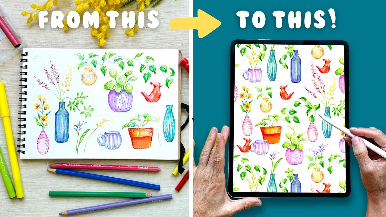
1. Welcome!: Have you ever wanted to achieve that stunning organic
watercolor look Improprit? The one that feels as expressive and textured as
traditional painting. Yep, I have been there, too. Hi, I'm Silvio Spina, I'm an artist and designer
based in Barcelona. Over the years, I have painted with traditional watercolors and digitized hundreds of
assets to create designs, patterns, postcards, wedding
invitations, and Waart. When I got my iPad, I became fascinated with replicating this
technique digitally. And after lots of
experimentation, designing custom brushes, and
creating unique textures, I have finally
perfected the process, and I am very excited to share everything that I
have discovered with you. This class will dive
into the art of creating vibrant digital
watercolor roses in procreate. I'm going to guide you step by step through the techniques that make your artwork
feel rich and textured, just like traditional
watercolor. I'll also share my
favorite brushes, including some that I have
designed myself so that you can experience the joy of painting with
watercolors digitally. As a bonus, I'm going to show you how to save your work into your image library and create a stunning
plural composition, perfect for creating
greeting cards, social media posts, wedding invitations,
or even wall art. This class is ideal for
artists, designers, and hobbyists looking to create watercolor assets for
art and design projects. Whilst basic knowledge of
Procrits interface is helpful. No prior painting or artistic
experience is needed. If you're new to Procreate, you can start by taking my
class, digital Illustration, a beginner's guide to
Mastering Procreate, where you will
learn all the tools and functions in depth. All you need to take this class
is an iPad with Procreate installed and willingness
to experiment and have fun. Before we dive in, make
sure to follow me here on Skillshare to stay
updated on new classes, giveaways I host and
stuff like that, and I'll be thrilled to have you join my online community. So get your iPad ready
and see you in class.
2. Your Class Project: First of all, let me just say how thrilled I am to have
you here in this class. Your project is divided
into two parts. Part one, you'll
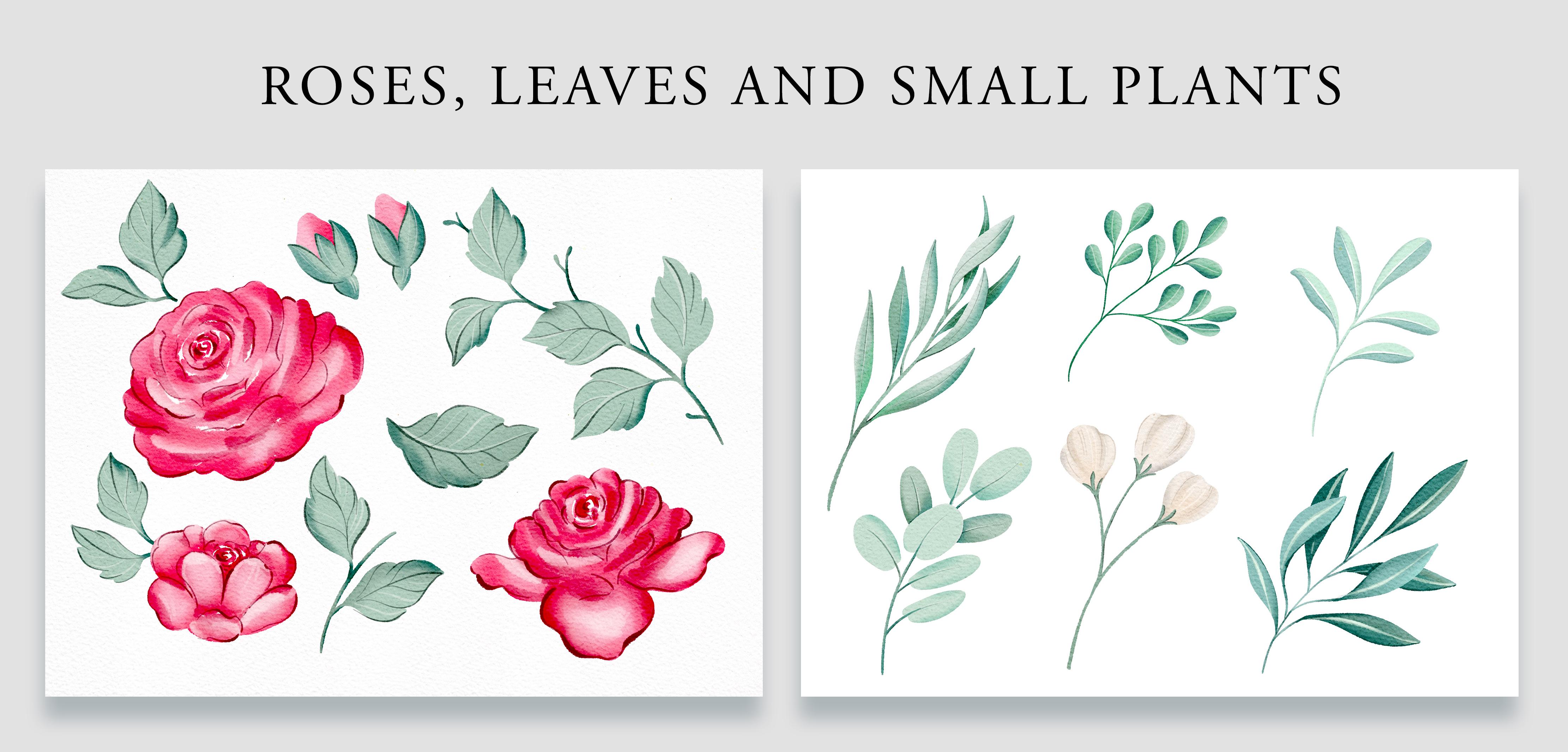
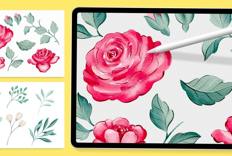
start by creating a beautiful set of
watercolor roses, leaves, and small plants
using procreates, and I will guide you in
every step of the process. At the beginning of each lesson, I will demonstrate
each technique in real life so that
you can see how pigments behave in
traditional watercolor and replicate that
feeling digitally. As you create your roses, you'll likely end up with several visual versions that you can activate by making your
layers visible or invisible. Some styles will be more loose and some others
will be more detailed. So if you're a for it, I would love to see them both. If you use the
glazing technique, don't forget to show me how your acids look in different
tones for different seasons. The second part of your
project is to create a final composition using
all of your botanical acids. This is where everything
is going to come together. I am excited to see how you combine your paintings
into a beautiful piece. To help you focus on perfecting
your composition skills, I'm going to provide five quotes for you to incorporate
into your designs. You can create one composition or several. The
more the merrier. Once you have finished
your project, upload it to the class
gallery as I can't wait to see your beautiful work and
hear about your process. To make the learning process
smoother and more enjoyable, I'm going to provide a few
resources for you to download. In the next lesson,
I'm going to walk you through each of them
to help you get started.
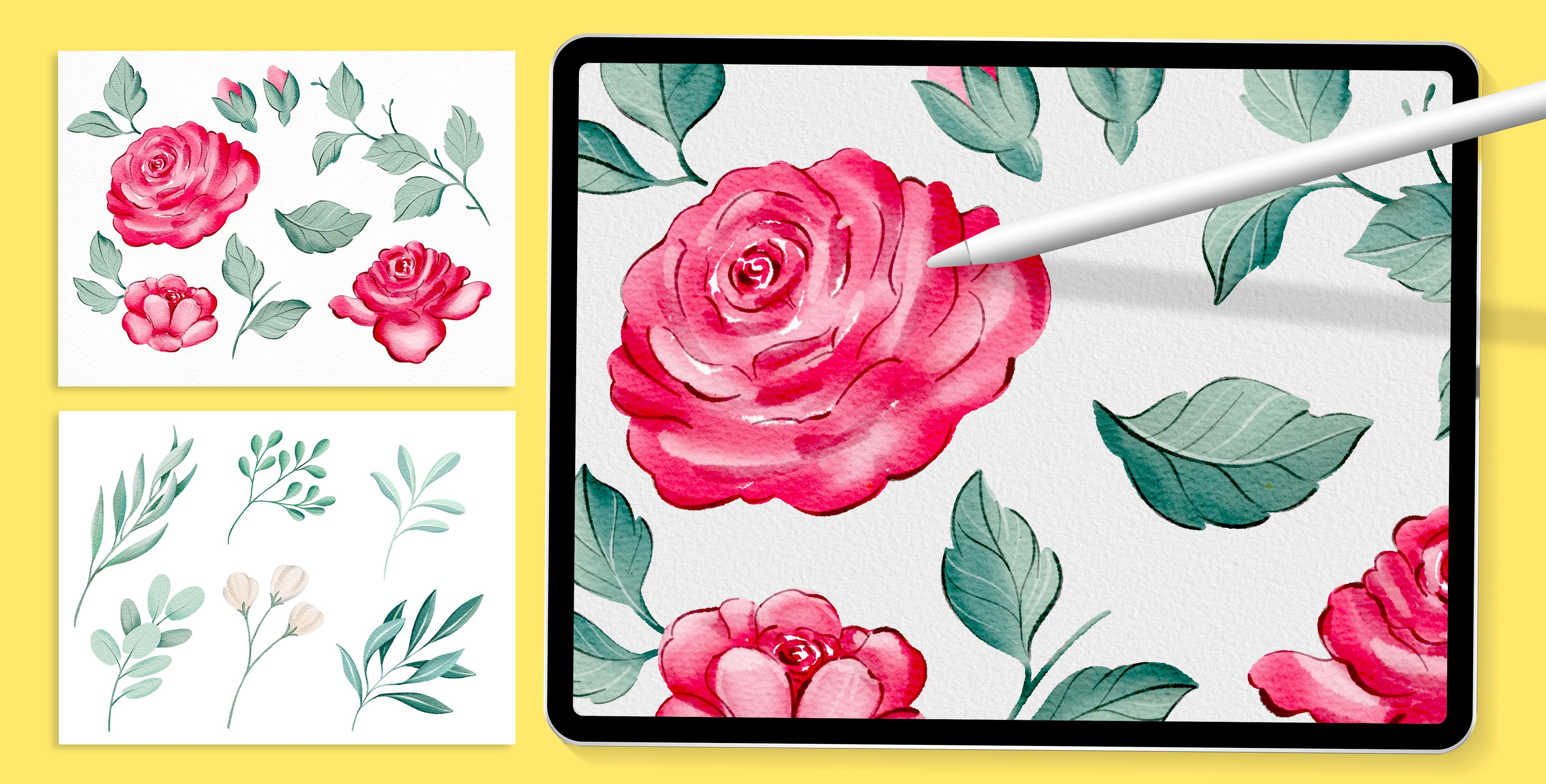
3. Getting Your Class Resources: For this class, I have provided a few resources
that you can download. I'm going to start by showing
you the propriate file. This is an A four file which
should work well on any iPad regarding their size or capacity and provide enough
layers for this project. If you want to have a
larger file, by all means, go ahead and make it larger
in the Canvas settings. This file contains two folders, one with a few watercolor
paper textures, and the other one with some
drawings for you to trace and make the learning process
easier and more enjoyable. I want to take a moment
to explain how I set up my watercolor
paper texture. This setup has worked
really well for me, not only for watercolor paper, but with any texture
like canvas, recycled paper, and other types. Let's open the cold press
paper group, which is on top. We have three layers. The first layer counting upwards is set up
to linear burn. If you zoom in and set
the opacity to 100%, you'll see the paper
texture clearly, and this is the layer
which I usually have at a lower opacity because
of how strong it looks. Second layer is set
up to color burn. This layer will make your colors look brighter and a
bit more saturated. And the third layer is
set up to soft light, which gives a bit more of light and contrast
to your paintings. A recommendation I have is that if you're running
short on layers, you can discard the
top two and just leave the one which is set up to
linear burn. Color palette. For this class, I have also provided a watercolor
palette with a few sort of neutral colors in case you'd like to use it. I like to use these colors
because later in class, I can superimpose brighter and more saturated colors
or change them fully to make these
plants look seasonal. But you can also choose your
own colors if you prefer. Now let's move on
to the brushes. Have included a brush set with the brushes that we will
use during this class. This is a reduced set of
a larger one that I will provide as a digital product
available for purchase. Now let's go through each of the ones that
you're going to get. I'm going to create a
layer on top of my group to test these brushes and
show you what they do. The first brush is the blotch shoid that I
use for various things. First of all, I
love this brush to paint silhouettes when
painting with watercolor, because the border isn't
completely defined, which gives me a
more natural look. But for a wet on wet effect, I make the brush larger, which results in a
more loose border. You're going to see all
these things later in class. The next one is the
wet on wet brush, perfect for blending colors
like real watercolors. I use this brush to paint larger areas when
developing my paintings. It's great for mimicking
the wet on wet technique. If I start with a light wash and then apply a more
saturated color, it gives this beautiful
effect on the blending on the paper as if the
paper was damp or wet. See that if I zoom in the paper, these borders are very
soft and undefined. This brush is also very
sensitive to pressure. I'm going to paint
this yellow area with a lot of pressure
so that's fully opaque. Then grab a darker color, and now with very
little pressure, I'm going to start creating this grading on top for you to see that without the need of
modifying the opacity bar, I can achieve
different levels of transparency depending on
how much pressure I apply. With a lot of pressure,
check out these borders. They are very defined, and
the color is fully opaque. And with less pressure, you will achieve a very
transparent layer of paint. Now let's move on
to the smudge tool. I absolutely love using
the blend brush to soften the paint that I
already have on my canvas. You can blend colors completely, blend them to the
white of the paper or adjust the size and opacity of the brush so that the
effect is a bit softer and the transitions of the
colors are not as strong. These two stamp brushes are
not going to be included in the class resources
because we're not going to end up needing
them in this class. In the next lesson, we're
going to start painting the base layer of our
roses and leaves.
4. Roses: Soft Wash Base Layer: In this lesson,
we're going to paint the silhouettes of our
roses with a light wash. This layer will be the base
of our watercolor painting, setting the foundations for
the layers that will follow. Let's open the layer panel and start by making the roses layer visible and lower its opacity so that we can just barely
see the silhouettes. Let's also set this layer to multiply so that the colors won't interfere with
the colors beneath. I like to lock this layer to prevent myself
from painting on it. Next, we'll create a
new layer and place it below the acids layer so that we can see the
silhouettes clearly. Let's open the brush panel and select the blotch
silhouette brush. To paint this light wash layer, we're going to use
a neutral pink. If you open the color palette, you will see this second swatch, which has a pink that is
not too light or too dark. Instead of copying
the rose exactly, we'll use it as a reference. Although I have provided these shapes for
you to trace them, I want you to learn and practice how to paint a watercolor rose. This technique can also
be used in real life. Usually, I start at the center
with a smother brush and I gradually expand outwards
until I reach the edges. I'm going to start painting these curvy shorter
lines from the center, leaving these empty spaces which appear in a white color
in between my strokes. I like leaving these
white areas empty, as they will help me shape the rose when I apply
new layers to it. Remember that this brush is
also sensitive to pressure, so you can vary the size of your strokes with the pressure that you apply to your pen, but also with the
size bar which is located on the left
side of the screen. You start with thinner and
shorter strokes in the center, and as you move outwards, you should start using
longer and wider strokes. Once we reach the outer edges, we'll define the siloed with a smaller brush to
define the borders, as we don't want them to
be too loose or messy. Remember, we don't need to
replicate the choid exactly. This is just a guide for how
to develop a rose shape. Instead of having to color
these white areas like this, we can use the color drop
to filling them quickly. Once I have filled one area, I like to tap on continue
filling and then tap on all the areas that I want to
fill with this solid color. Lastly, you can adjust these white areas and decide how much white
space to leave. A few small and very thin
areas will be just fine. Now let's move on to the second rose using
the same approach. Just to warn you,
this is a bit more of a complex rose because
of its position. This rose is looking upwards, so it has two frontal petals
which will be lighter, and the central area which is in the back is going to be darker. This is going to help
us build some volume. Going to start with small
and loose curvy strokes to start shaping the petals, keeping them fluid and natural. Remember to leave a few
white gaps in between your petals as this will help you a lot throughout
the painting process. See how even if I am working
on the stop area I'm making my brush strokes wider and longer as I reach
the outer petals. I'm going to now fill
these two central ones and then move on to
these bottom ones. Just to warn you,
this is the more complex rose of all three
because of its position. No need to worry as I'm going
to guide you step by step on how to develop this rose throughout the
painting process. Okay, now I'm going to move onto the silhouette using
a much smaller brush. Oh. And time to move on
to the third rows, which is going to be throughout the process much easier
than the second rows. It is good to start by checking the size of your brush
so that you can achieve smaller and thinner
curvy lines towards the center and make them larger and longer as
you move outwards. Remember also to leave
some white spaces in between your strokes as they
will help a lot later on. For these bottom petals, you can lower the size
of your brush and draw the cloud directly using the reference drawing
that I provided. And if you want to change
the shapes of these petals, please feel free to do so. I'm going to turn the
background layer to black, and you can notice some
transparency in these roses. This in real life is
very normal and you actually want to achieve some transparency
in your paintings. But in this case,
I want to be able to use these roses over
a dark background. Maybe I want to create a pattern or decorate a quote later on, and so I would rather
make them fully opaque. So a way to fix this
is to duplicate the rose layer several times until there is
no transparency left. This step basically
ensures that the roses can stand out even
on dark backgrounds, which is going to be
super useful when creating future patterns
or compositions. Once the roses are fully opaque, we can merge them by pinching our fingers together
over the layers. You don't have to
name your layers. I actually barely name mine, but since I'm creating
this class and I want to keep everything very
clear and organized, I'm going to make the
effort of naming them. I'm going to name this
layer base layer. I'm going to turn this
layer back to white, and I just realize that I'm
missing my flower buds. So I'm going to
activate the drawing again and basically
repeat the process. I'm going to do it on a
separate layer, though, because I've already
done the process of duplicating the previous one and I don't want to mess it up. Once I'm done, I'm going
to merge the layers together and make the
background color white again. Take your time painting
this first layer. In the next lesson,
we're going to create the light
wash for our leaves.
5. Leaves: Soft Wash Base Layer: My. In this lesson, we're going to do a similar
process for our leaves. The first thing
we're going to do is open the assets folder, unlock it, and activate
the leaves layer. As I did with the roses, I'm going to lower the opacity
so I can barely see it, collapse the assets
group, and lock it. I'm going to make my roses layer invisible and create
a layer on top, which I'm going to name
leaves first layer. From the color palette, we'll select the second swatch and maybe make it a
tiny bit lighter. This green tone is not
too light or too dark. So if you're choosing
your own colors at home, keep that in mind. It's better to keep the green neutral at this stage
of the painting. Making sure that we have the blotch silhouette
brush selected, and that we're happy
with its size, we're going to start
tracing these leaves. This time, we're not going
to paint any strokes, but rather draw the
silhouette and use the color drop to
fill these shapes. Notice how I represented
their shape. Some of them are facing down, some of them are more frontal, and others are angled. Having this variety within
your leaves will help you a lot when using them to
create future compositions, whether they're
patterns, posters, decorating quotes,
having this variety will make your
artworks more dynamic. It is really good to observe
nature to understand how to represent leaves and
flowers in several positions. You can do this on a simple walk outside or watching plants
that you have at home. Just take a moment
to observe how leaves look when they're
placed at different angles, how the central vein looks, and how are they connected, for example, to a central stem. And remember that at home, you don't really need to be too precise with these shapes. This exercise is just to
help you learn how to draw these leaves and roses
in a variety of angles. When painting this base layer, I like drawing the leaves first, filling them up
with a solid color, and leaving the stems for later. Let's activate the
roses layer so that we know where to draw
the flower bud leaves. We want to draw them as if they were hugging these flower buds. Once you're done
with the leaves, you can move on through
drawing the stems. I like to adjust the size of my brush to a smother
one when doing this. I also like to draw my stems curvy and not complete the
straight as once more, they make my compositions
more dynamic. I'm struggling a little bit
to create this longer line. If that is the case for you too, you can help yourself by opening the actions panel preferences and increase the pressure
and smoothing bars. This will help you
create smoother lines. Once you're done, it's important to deactivate these options again as they will affect all the brushes in your
library from now on. So go ahead and
when you're done, turn these bars off again. That is so much easier for me. I have added a few
shorter branches that you can choose
to keep or discard. Plants often have these
random bits of stem, and I feel that when I
add them to my plants, they tend to look more natural. Finally, it's key to verify that this base
layer is fully opaque. I'm going to duplicate
this layer various times, merge them, and turn the
background color to black. Now that they are fully opaque, I can turn the color
back to white. Some of these leaves should
go behind the roses, but the flower bud leaves
need to be placed on top. So we're going to tap
on the selection tool, choose free hand from
the bottom menu, and enclose these leaves. Making sure that we're
on the right layer, we're going to use
three fingers down, tap on cut and paste and
move this layer to the top. And that's all for the
base layer of our leaves. Take your time developing
yours, and when you're done, meet me in the next lesson, where we'll start developing our roses using the
wet on wet technique.
6. Roses Wet-on-Wet: Saturation & Depth: O. Now that our first layers are complete, we're going to move
on to adding shadows, volume and textures using
the wet on wet technique, which by the way, is very common in traditional
watercolor painting. If you have ever worked
with real watercolor, you will recognize this
technique where you paint with a watery
mix over wet paper. When doing so, the pigment
bleeds into the paper, creating the beautiful
unpredictable results that are characteristic
of the watercolor style. I'm going to start by adding a stronger color to the roses. So first, I will lock the base layer so I don't
accidentally paint on it, create a new layer, and set it to clipping mask. I'm going to keep
things tidy and name the roses second layer
to stay organized. You can, of course, use
any name that you want. Open the color panel and
select this third watch, which is a stronger and
beautiful saturated red. Although this color
is quite strong, it is still neutral in value, not too dark and not too light. And so it will be stunning to make some natural
paint effects. Let's open the brush
panel, and this time, we're going to work with the wet on wet
number four brush. Going to start with this rose, and we're going to
start on the center. The center of the rose is
usually more saturated and dark because there are more petals and shadows
contained on it. And then as the flower opens, there's more light
reflected on the petals, and so they look a
little bit lighter. This brush is also very
sensitive to pressure. We want to create soft shades, so it's better to use very little pressure and
use it at a larger scale. You are not using the
brushes that I provided, maybe you can try out the soft brush under the
airbrushing collection. I'm going to start in the center using a smaller
size of this brush, and with very little pressure, I'm drawing these curvy lines, once more leaving some empty
space in between my strokes. The idea is not to cover the
previous layer completely. And as I move towards the
outer part of the rose, my lines are going to
start getting longer. And look how quick it was to give some volume to our rose. In my opinion, it already
looks really beautiful. Let's move on to
our second rose. Since this one is a
bit more complex, due to the angle, it is better to have
the sketch visible. The two central petals are in front and should be lighter
than the darker background, center and petals
which are on the back. Having this sketch
visible will make it easier to manage the contrast
in between these areas. We'll start with
a smoother brush, loosely adding some
shadows on the center. Look how I'm taking in account the position of the rows
to draw my strokes. This time, they're not
completely circular, but they look like a
flat horizontal oval. When trying to darken
this back area, I realized that I left too much white space
in my back layer, and because the
top one is set up to clipping mask is
not showing through. So I'm going to select
the bottom layer, select the blotch Choid brush, select the light pink that
I use for the first layer, and fill this area
a little bit so that what I paint on
top shows through. See how now what I have
painted on top is visible. I'm going to go ahead, lock this layer and go back to the roses second layer to
keep developing my rose. We're going to keep these
two frontal petals lighter, and you will see that by keeping the back area darker
and the frontal petals, lighter, we will
achieve a lot of depth. The frontal petals can
have a little bit of shading at the bottom
for a more natural look. At this point, I'm
going to deactivate the sketch for a second
to see how it's looking. I think it looks nice, but I feel like these shades
look a bit too strong. So now it's time to show
you how the SmathTol works. I'm going to tap
on the finger icon and check that the blend
brush is selected. Applying very little pressure, I'm going to start
passing my pen over the shadows
to soften them up. I really love this tool
as it helps me gain a natural look when my shadows
or lights are too strong. It's good to work on it
gradually and not overdo it. See how with a little
bit of smudging, this rose is now looking
much more natural. Now moving on to the third rows, we'll activate the sketch, make it softer, and make sure that we're on
the right layer. Once more, starting with a
smaller brush will work from the center and
gradually increase the brush size as we
move towards the edges. I'm constantly varying
the pressure of my brush to achieve different sizes
and soften the transitions. When two petals meet, the area where they overlap will naturally be a bit darker, whilst the petals that are more exposed to light will
have lighter shades. So the contrast
between darker and lighter areas will start
giving the illusion of depth. It is good to start thinking about these things
whilst painting. And once more, observation is key to realize these things. When you observe a
real flower in detail, then painting from
memory becomes easier. The contrast in between darker and lighter areas will start giving the
illusion of depth. For the flower buds, we'll add a tiny bit of
shading here and there. Now that this layer is finished, we'll move on to the second
layer for our leaves. A
7. Roses: Adding Hard Shadows: These roses are already
looking beautiful and could be ready
to use as they are. They're loose but still
have plenty of volume. However, since I
want to show you different levels of
complexity, in this lesson, we'll take it a step further by adding harder shadows
and lights to our roses. In watercolor
painting, playing with soft and hard shadows is key to making your artwork feel
real and full of life. Soft shadows help everything
blend beautifully. On the other hand, hard shadows add contrast and definition, helping shapes and
edges stand out. We were working with
traditional watercolors, this would be similar to
the wet on dry technique. This means painting
with a wet medium over dry paper to create more
defined edges and lines. That said, towards the
end of the lesson, we'll smudge some areas
to soften the look almost as if the paper was still
slightly damp in a few spots. Before we start, let's take a look at this rose photograph. One characteristic
of roses is that their petals aren't always
super rounded when they fall. They often have a bit of a
straight line when they fold. So with this new layer
of lights and shadows, we're going to try to
create this effect. We'll start by
creating a new layer, place it above and
set it as clipping mask so that the shadows stay neatly within the row shapes. And let's rename it to
Rose's third layer. You can also name it
to Ross hard shadows. For the shading, we'll switch back to the blotch
silhouette brush, but we're going to use
it in a larger size. I'm going to open
the color panel and select the fourth red, which is a darker,
richer burgundy color. Let's begin by testing
the size of our brush. This time, I want the
brush to be larger. I like the borders because they are more defined than
the soft gradients, but they still have a
bleeding effect which I love. That said, I don't need the
shadows to be too dark. If I were using
real watercolors, my mix would be watery
enough to see what's below. Always, it is better to start in the center and slowly
work your way out. This brush is very
sensitive to pressure, so you can apply
more pressure in some areas whilst
creating straight lines. Sometimes my lines
will be curvy, and other times they're
going to be straighter. Try painting in a soft, loose way and also try
not to overthink it. You can draw your lines
as many times as you want undo them as many
times as you want. One thing I find very helpful is using my arm to paint
these lines, not my wrist. Instead of placing my wrist on the screen and applying a lot of pressure
with my fingers, I keep my wrist up and use quick arm movements
to create the curves. You can try this out and
see if it works for you. I want these shadows
to be more defined, but I'm going to
smudge them a bit in certain areas as if the
paper was still damp. I think this will help me in creating a more natural look. Let's move on to
the second rose. If you haven't finished
yours, don't worry, pause this video and meet me
back here when you're done. Remember that this rose is
a bit more challenging. This rose has two
petals in front, which should be lighter. While this could change
depending on the light source, I want to present the light
coming from the front. So the top part,
which is at the back, should be darker and
the petals in front, we're going to keep lighter. You can focus on adding these hard shadows
on the top part, and you can also draw
some thinner lines in between petals to
accentuate their division. If your shadows are too strong, remember that you can use the smudge tool to soften
a few of these lines. Before moving on
to the third rows, I want to add more
depth into this one, so I will layer in some
more of these hard shadows. This time, I am applying a bit more pressure
with my brush. So even if I'm using
exactly the same color, it looks a bit darker. I am also trying to
create thinner lines. I feel the top area
could be darker. Else I want the shadows
to be a bit stronger, I'm going to blend them a little leaving some hard
shadows here and there. Take your time and
once you're done, move on to the
third rows with me. You will see how this
one is much easier. I'll start in the center
and apply more pressure to my brush to enlarge it as I
move towards the borders. I want these bottom
petals to be lighter, so I'm going to cover them less. If you feel that your
shadows are too strong, remember that you can blend
them here and there too, make them a bit softer. In my case, I want the rose
to gain even more volume, and that's why I'm going to
create a second layer of these hard shadows
using the same red and applying a bit more of
pressure to my brush. Lastly, I'm going
to smash some of these areas so that they
are not that strong. Take your time in this part of the process and try to enjoy
it as much as you can. When you're done, meet me in
the next lesson where we're going to add some hard
lights to our roses.
8. Roses: Adding Hard Highlights: Now that we have
some hard shadows, we're going to create
some hard lights. First thing, I'm going
to create a layer on top and set it
to clipping mask. We're going to be
doing something very similar than in the
previous lesson, but using a lighter color. So I'm going to use the first
swatch of the color panel, which is the lightest of all and increase the opacity
of my brush to 100%. Always try to make the effort to not cover the previous
layer completely. A few soft lines here and
there will do the job. Once you're done, you can use demuch stool to soften a few parts
of your lines. The key is not to overwork it. Let's stop for a moment and make these new layers of hard
shadows and lights invisible. I love this version of the rose, but with these hard
shadows and lights, you can see that this rose has started to gain a lot of volume. Towards the end of the class, you can export
different versions of the same painting by activating and
deactivating these layers. That is the beauty of
working in layers. Let's move on to
the second rose. I will add some light areas
to these frontal petals and zooming out constantly to see how the rose is
looking overall. Sometimes I can use a reference
photo to do this process, but it's also fun
to work without one because then you can
just go with your intuition. See how this has brought a
lot of volume to this rows. Take your time finishing
the second rows and meet me back here
to start the third one. Once more, starting
the center with just a few short lines and then move to the edge
with longer ones. I imagine that
these bottom petals are receiving more
light on them. Therefore, they
should be lighter. Keep in mind that it's
better not to overdo it. You can paint a few light
areas, smash them a bit, and if you feel that there
is some volume missing, you can go ahead and add a
second layer of hard light. Once you're done, meet me in the next lesson
where we're going to finish these roses by adding
some dark ink lines to them.
9. Roses: Final Touches with Ink Pen: Mm. In real life watercolor, the technique of applying
black ink pen over a loose watercolor
wash is incredibly common and for a good reason,
is absolutely beautiful. I really love this
method because it brings everything
together beautifully. The black ink adds
definition and structure, yet it doesn't cover the soft loose elements of
the watercolor beneath. So it's a perfect way to create contrast and definition while still maintaining
the fluidity and freedom that makes
watercolor so special. Let's start by opening
the layer panel. At this point, we're starting to have quite a lot of layers. So to keep things organized, we're going to divide the leaves and roses
into different groups. So select the roses, group them, name the group, and do the
same with the leaves layers. Now the flower buds are a bit tricky because they're
in separate layers. So I think it's better for now if we can just group
them together. In this lesson, we're going
to focus on the roses. So let's go ahead and create a layer and put it on
top of this group. I'm going to name this
layer as ink and open the brush panel to select
the blush silhouette brush, which we're going to use
in a much smaller scale. This brush maintains a
natural flow to the line, and it is sensitive to pressure. So as you draw, I
encourage you to start varying the pressure to adjust
the width of your lines. I don't like using
pure black ink for this technique as it is often too dark and the coverage is too
opaque and desaturated. Instead, I prefer using
a rich, deep color, which is why I'm using the last swatch left
on the color palette. I love this dark burgundy color. You can start by testing
the size of the brush, which in my case
is way too large. If you feel like it,
before doing your lines, you can practice creating a few lines on a separate
layer in order to start understanding the amount
of pressure that you need to apply to your pen to
achieve different weights. Also, here's a
little reminder to turn off the pressure and
smoothing bars as we don't want to lose the kind of shaky and very natural look of the lines that we
are about to draw. One thing that you can
do before we start is to make the roses
drawing visible, as that might help you a bit. Making sure that I'm
in the right layer, I'm going to start once
more in the center. I actually prefer
to have my roses drawing invisible as it
distracts me a little bit. See how this time my lines are curving towards the center, varying the pressure and creating some lines
here and there. On some of the petals, you can create shapes
like this one. These lines are
highlighting some of the definition which
is already underneath. So you can also follow
the harder shadows and lights that you have done below to guide
your ink drawings. You can also have a first
attempt with these lines, and if you're not
sure you like them, you can try again on
a separate layer. Do this exercise as many times as you need until you
feel comfortable. You can define the border in some areas and leave
it empty in others. With just a few
well placed lines, a rose is looking even more beautiful than
it was already. You can go ahead
and stop this video if you need more time to
finish your first rose. Once more, I'm starting with the center where I'm going to apply more pressure to my
brush to make my lines darker. I want this central area
to be darker in general. This will make the two frontal
petals come to the front. Sometimes you don't have to
follow the exact borders. It is actually pretty
nice when the paint is not so defined and some
areas bleed into others. And I'm done with
the second rows. I always feel that
this third rows is super easy after
doing the second one. Once more, I'm going to
start in the center with shorter curvy lines zooming
out once in a while so I can gain some perspective and drawing some organic lines here and there as I
move to the bottom. You can define these
bottom petals a bit more, varying the pressure that
you apply to your brush. Once you're done
with your roses, met me in the next lesson, we're going to add the final
touches to our leaves. In the next lesson,
we're going to do a similar process,
but for our leaves.
10. Leaves: Final Touches with Ink Pen: In this lesson, we're
going to move on to our leaves and follow
a similar process. As we didn't give any hard
shadows to these leaves, we're going to apply this
ink pen on a light color and on a dark color to give
extra volume to our leaves. We're going to
start by collapsing the roses group and creating a layer at the top of the
leaves group called dark ink. Once more, instead
of using black, we're going to grab the very
dark grayish green color that I left in the
color palette. It is the last swatch and it has worked
really well for me. I'm going to adjust
the size of the brush so that it matches the size
of the lines of the roses. We're going to start
adding some darker lines and then move on to
adding the lighter areas. You can practice a
video lines by creating a layer on top and
drawing a few curves, varying the brush
pressure to achieve different sizes in
the same stroke. And whilst doing so, you
can also pay attention to the different levels
of transparencies that appear as a result of
the pressure that you apply. This exercise will help
you gain control and feel more comfortable when drawing the details
of your leaves. I usually start by
applying little pressure, and then I increase it as I
reach the end of the leaf. I feel this line is quite dark, so I'm going to lower
the brush opacity. I'm going to repeat
this process, and I think this is much nicer. After drawing the central vein, you can go ahead and draw some shadows towards the
outer part of the leaf. If you're struggling
to place these lines, you can go ahead and activate
the drawing template, as I think that
it might help you with the direction of the veins. I prefer not to have my layer active as I like to
draw things fresh, but they might give you a hand. Before moving on, we want to create a layer for
the light ink. This way, you can start experimenting with
drawing lines in the two tones and see the
effect that they each have. For the lighter lines,
we're going to select the first swatch I left
in the color palette. You can start by drawing
some curvy lines on the dark area of your leaf and then draw them again on the light area of your leaf and see
what you prefer. I like to mix them
up a little bit. I found that placing
the light ink drawing below the dark
one works better, but you can see which
order you prefer. The way I like to draw these
lines is by applying very, very little pressure
to my ink pen so that they are very thin
and a bit transparent. Feel free to experiment
and try different things. You might prefer how your leaves look with a lighter
or darker shade. I usually draw the veins
starting from the border with a little curve working towards
the center or vice versa. As you can see, I am following
the curve of the leaf, which gives it a lot of movement and makes
it more dynamic. But remember, it's
important not to overdo it. Now we're going to open the flower buds and
create a new layer, drawing a few lines
here and there. I'm now going to select
the lighter layer and add a few soft touches to enhance the volume and light of
these leaves here and there. If the lights are super soft, I feel it works very well. You can intentionally make
more light lines towards the side of the leaf and leave the dark lines
for the darker side. I prefer to place the light ink layer below
the dark ink because I feel that it works really
well when it comes to adding volume on the
central vein of the leaf. So I redraw the central line below slightly off
the darker line. We didn't add hard
shadows to these leaves, and I'm feeling that they could benefit from some darker areas. So going back to the
wet and wet brush and using a darker tone, I'm going to pass my brush on some areas of the stems
and of the leaves. By making some areas darker, I will gain a lot of volume. If your leaves are already dark, you might want to lighten
some areas instead. But if there's room
for darker areas, go ahead and add them. By doing this on
a separate layer, you can always check if
you like the effect, and if you don't
can just discard it without affecting the
previous layers of paint. If you're not completely
happy with your painting yet, trust me, it is through practice and repetition that
you will improve. And let me show you
what I mean with this. Whilst I was
designing this class, I experimented with a
lot of different roses. And in the process, I
painted a lot of them. Now I feel super
comfortable painting them, and I feel that these
new ones are not only better than my
previous versions, but the most important
thing is that I feel that I'm more comfortable
when painting them. So trust the process,
finish the class, and you can always practice more once you have finished and
learned the technique. In the next lesson,
I'm going to show you how to use the
glazing technique to enrich the colors of your roses and adapt them to sweet
different seasons.
11. Painting Small Plants: Practice Session: Mm Practice makes perfect. So in this lesson, we're going to use
the smaller plants to practice some of the concepts that we learned in
the previous lessons. I have already
shown you the step by step to achieve a
watercolor technique. So in this lesson,
I'm going to go much faster and play my video
at a higher speed. Don't worry, as I'm still going to talk you
through the steps that I take to finish my plants so that you
can follow along. If for whatever reason, you don't have enough layers to paint your smaller plants, you can go back to
the gallery and duplicate this file to complete
this part of the class. On this new file, you can
go ahead and get rid of the roses and leaves groups so that you make
more layers available. In my case, I don't have
any problems with layers, so I'm going to continue
working on the same file. I'm going to start by making my smaller plants
layer visible and lower its opacity so that
I can barely see it. I'm going to lock this layer and create a layer below
the acid group. The same way I did when
creating my leaves, I'm going to start by drawing the siloeds of some of
these leaves and then fill them up with a solid color
using the blotch siloid brush, which once more, I love. Using this neutral green, I'm going to start by drawing
a few of these leaves. Don't want all of these
leaves to have the same color because some leaves are in front and some leaves
are on the back. After drawing their silhouette, I'm going to fill them up with this solid color and create a layer below to draw the darker leaves which
once more are on the back. I'm going to lower the
opacity of my drawing as I feel that it's getting
a little bit on the way. So lower the opacity and
lock this layer once more. Using a darker shade of green, I'm going to complete the
leaves which are on the back. I'm going to make my
leaves fully opaque by duplicating their layers
several times and merging them. Lastly, on a separate layer, I'm going to draw the stem using the blusch brush on
a smaller scale. This stem also needs
to be fully opaque, so I'm going to turn
my background there to black and check that
everything is opaque. Now, before moving on
to the next plant, I'm going to finish this one. To keep things organized, I'm going to place these
layers within a group. Instead of creating
multiple layers on top, I'm going to go
ahead and activate the Alpha lock option by swiping two fingers to the
right on top of each layer. This means that whatever
I paint on top of these layers is going to be contained within
what's already there. This is an alternative to using layers in the
form of clipping mask. I'm going to start with a
light shade of green and start adding some light areas into
the leaves which are on top. Lowering the opacity
of the smatchtol, I'm going to soften these
areas a little bit. I'm going to move on to the
darker leaves and make them lighter so that they're not that different from the
layers which are on top. See how at this
stage of the plant, I'm using the wet on
wet technique to add some darker areas and lighter ones into each
part of the plant. I am constantly switching
in between layers, giving some darker areas
to the items which are below and maintaining the leaves which are on top lighter. And whenever I feel that my shadows or lights
are too strong, I use the smudge tool
to soften them up. Once I'm done with this
part of the painting, I'm going to merge my layers into one because I
don't mind losing them. Instead, I'm going
to grit a layer on top and going back to the
blotch silhouette brush, I'm going to start drawing some ink lines with a darker and lighter
tone here and there. I hope that your
understanding that this process is
always very similar. In this case, for example, I feel that these
lines are too strong, so I'm going to
lower the opacity of the blotch shoeit
brush so that these lines become a bit transparent and they don't
cover fully what's below. It's always key to maintain the transparency
of your assets and try not to cover completely
what's on the layers below. Lastly, I'm going to grab
a lighter color and add a few ink lines here and there to give extra
volume to my lips. Okay, I'm done with
this first plant, and I think it looks beautiful. So I'm going to
collapse its group and create a layer on top to
start my second plant. Once more, using
a neutral green, I'm going to draw the
leaves silhouettes. I'm not following exactly
the drawing which is below, but rather using
it as a reference. After filling my leaves
up with the solid color, I'm going to move
on to the stem. I'll duplicate my layer to make sure that my leaves
are fully opaque, and with the wet and wet brush, I'm going to start giving some light areas to all
of the leaves. This time, I'm going
to use the trick of adding light areas to
just half of the leaf. Once I'm done with
the light areas, I'm going to add some shadows. These lights and shadows
are a bit strong, so I'm going to use
the smudge tool to soft tend them a little bit. On a separate
layer, I'm going to draw some central veins
on a lighter color. I'm going to move on to giving some shadings
to the leaves. In this case, I'm using the
blotch silloid brush at a lower opacity to add some soft hard
shadows here and there. I'm going to move on to the
third plant and once more, use a very similar process. I'm using a different
dyer, and once more, I'm going to use the alpha oc option to add some shading
onto these leaves. Making sure first that
they are fully opaque. Even though I want to vary
the tone of my leaves, I'm keeping them quite
neutral and desaturated, because in the next lesson, I'm going to show you how to use the glazing technique to brighten up their colors or
even make them seasonal. You can get very creative with
these plants if you wish. Try to experiment as much as you want with different
colors and stuff. I am keeping my plants quite
neutral because as I said, I'm going to show you how to use the glazing technique to
brighten up their colors, but I want you to feel free to experiment with
this technique as much as you want to understand its potential and how you can
apply it to your own style. You can challenge
yourself to keep some plants lighter and
some plants darker. This fourth plant is meant
to be an eucalyptus plant, so I'm going to keep the
colors desaturated and soft. Once more, I'm going to use
two layers so that I can work the leaves which are on top separate to the
ones which are below. This way, I can add these
shadows to the ones which are below in a much easier way without the need of masks
or stuff like that. This new plant has these
small flowers that I wish to keep in a very
desaturated cream color. This watercolor technique always follows a very similar process. When you're drawing leaves
or smaller flowers, you always start by
drawing its silloloid, filling it up with
a solid color, making sure it's opaque, and
then take it from there. I am convinced that it is by practicing that you will get better at painting
with any technique. So I hope that by drawing the roses in
different positions, drawing the leaves
various times and putting all the concepts
you learned into practice with these
smaller plants, you have started to understand the potential that
this technique has. My smaller plants are
finally finished. I hope that this video
wasn't too fast for you. I did a few different things
here such as the Alpha log, but the logic remains the same. Currently, I have six layers. So once more to keep
things organized, I'm going to group
them together and name the group smaller plants. In the next lesson,
I'm going to show you how to use the
glazing technique to vary the colors of your plants and even
make them seasonal.
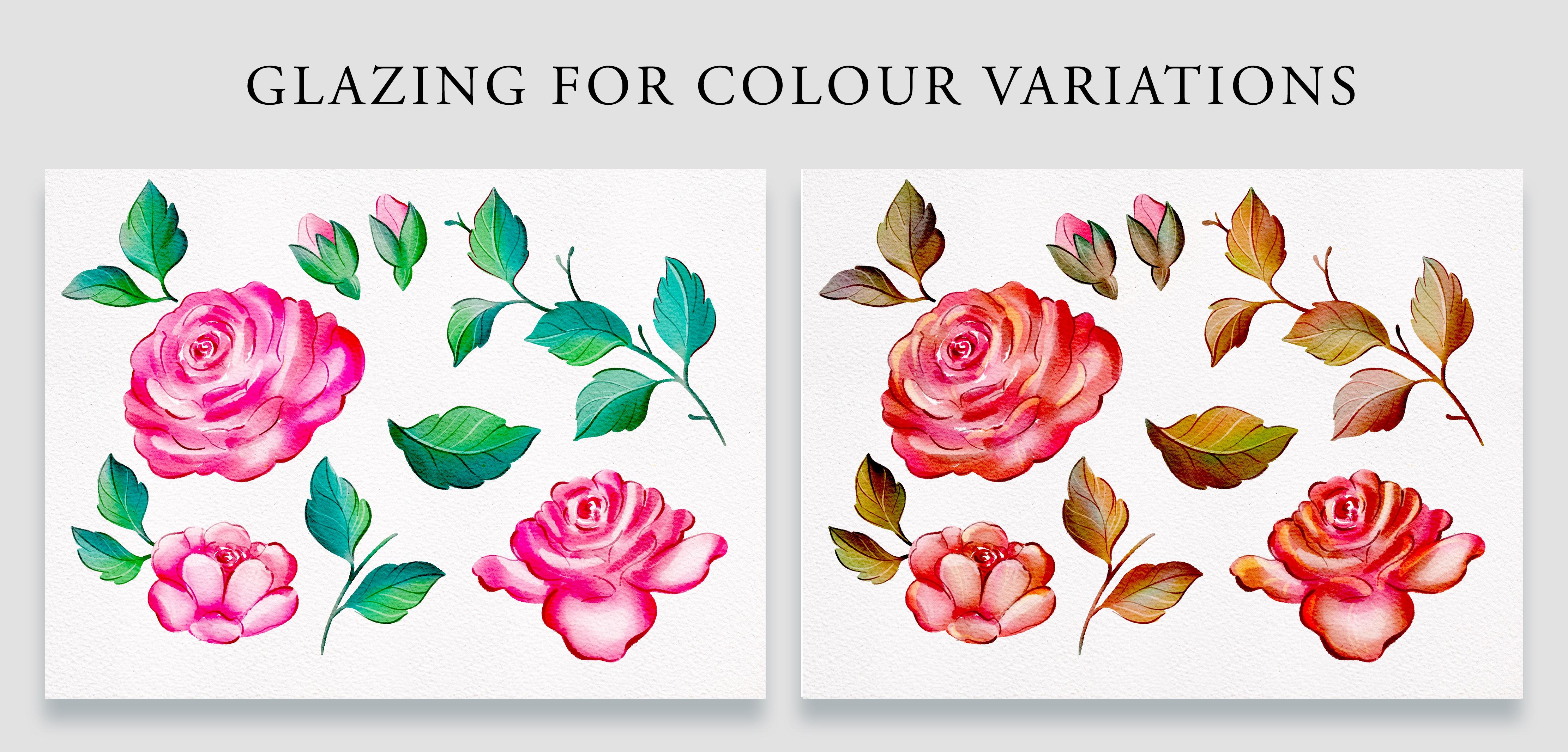
12. Glazing Technique: Color Variations: Mm. One of the best things about working digitally is how easy is to adjust the
colors of our paintings. I love using the adjustment
tools in procret, but with this
watercolor technique, I am aiming to mimic the
look of real watercolor. And that is why I'm excited to show you the
glazing technique. This method is commonly used in traditional
watercolor painting by layering transparent washes onto already existing colors. Before we dive in, I
recommend duplicating your roses layer or even
your complete file. Apply the glazing technique, we are going to need to
merge some of our layers. And you've already seen
that we can achieve different styles by making our layers visible
and invisible. So if you merge all
of those layers, you're going to
lose those styles. That's why I recommend that you duplicate your file first. If you want, once you have
duplicated your file, you can name one of the files, watercolor roses, layers, and the other file can be named something like color variations. Going to walk you through adding this effect to roses and leaves. And once you have
got the hang of it, you can go and apply that same technique into
your small plants. We're going to start by opening the duplicated file and merging the roses
and leaves groups, but keep them in
separate layers for now. First, let's focus
on the leaves, create a new layer, place it on top of the leaves and set
it as clipping mask. For this technique, we need the new layer
to be transparent, so we're going to
tap on the N letter and change the blending
mode to color burn. In this new layer, we'll use brighter colors
to enhance the leaves. I'll start with an
aquamarine tone and a bright light,
saturated lemon yellow. Using the wet and wet brush, I'm going to paint
gently over some areas of the leaves without applying too much
pressure to my pen. Notice how the colors
become much brighter. By painting directly on top, we can control exactly where
we want each color to go. We can also modify the colors
with the adjustment tools, which by the way,
are pretty good. But by doing so, we wouldn't have nearly this
level of control. You can try using
both a darker and a lighter tone to see how they affect different
parts of the leaf. You don't have to completely cover the previous
layers of paint. By applying very light pressure, you will create transparency, and the blending between
colors will feel more natural. You can test different
things, for example, I'm using lemon yellow
for the lighter areas of my leaves and aquamarine
blue for the darker tones. But of course, you can try as
many colors as you want and see how they affect the colors below when you
use them differently. This is why I always
prefer starting with more muted colors
when painting my acids. My leaves, for instance, have quite desaturated greens, and that is why superposing these brighter colors
is being quite easy. If the base colors
were too bright, balancing the glazing effect
would be a bit harder. Feel free to experiment with different brushes to
apply this effect. Test brighter tones and
darker tones, for example. In here, for instance, I'm using a bright yellow to highlight the central
vein of the leaves, and I think it
looks pretty cute. Once in a while, you
can try changing the blending mode of your layer or adjusting
the layer's opacity. You might stumble across
something you love. Some amazing effects can appear when experimenting
with this technique. To keep track of your progress, you can duplicate the layer
and compare the effects. I think I'm going to stick to the colour burn effect for now, but you can explore and find
out what works best for you. Now let's move on to the roses. I'm going to create another
clipping mask layer and use a magenta color
with a larger brush size. By applying very
little pressure, I'll add subtle magenta touches to the roses here and there. If you want to explore
different color options, try adding another layer. I feel these roses could have some color on
their lighter areas. So I'm going to create
a new layer on top, set it up to soft
light, and with a very, very light magenta,
I'm going to pass my brush over the light
areas to modify their tone. You don't always have to
stick with darker tones. Lighter colors can brighten
areas beautifully. Just create a separate layer, try different blending
modes and adjust opacity levels to
see what works best. Let's go back to the main
gallery and compare the before and after.
Pretty awesome, right? I'm going to duplicate my
fowl once more and show you how I adapt these roses
into the autumn season. So I'm going to start by
erasing the colors that I have already created
to start fresh. So I'm going to
create a new layer, set it to clipping mask, set it to color
burn and this time, and for an autumn
inspired palette. For my leaves, I'll try
a reddish tone at first, but if it feels too dark, I'll adjust it with a
lighter shade instead. The lighter color
adds a softer effect, but it's not as
vibrant as I'd like, so I'm going to switch
back to color burn. Which helps me maintain
that light yet saturated look perfect for the
autumn fill I'm going for. The beauty of this approach is the amount of control that
you have over your colors. Whilst adjustment layers can
achieve similar results. This method allows you to
have much more precision. Plus is more fun and you can experiment and see where
your creativity takes you. Towards the end, if
you feel like it, you can also apply a little bit more details using the ink pen here and there. In this case, I'm using
some lighter lines, and I have also applied some
darker ones here and there. Alright, let's compare
the three versions. The first one has neutral,
more muted tones, although I'll admit
that the roses are quite vibrant rather than
completely desaturated. The second version has
a cozy autumn inspired vibe with a warm
palette of earthy hues. In contrast, the third
version feels bright and lively with summary tones
like aquamari and magenta, which adds a playful
touch to my painting.
13. Fixating & Enhancing the Watercolor Texture: At the moment, we have
got a set of layers containing the
watercolor paper texture on top of our paintings, which makes it look
stunning and real and make the painting technique
much more satisfying. But when we deactivate
the paper text layers, our paintings go back
to looking a bit flat. If you have taken my
previous classes, you know how much I love to have NIMAch library with assets that I can reuse in
several projects. So in this lesson, I'm
going to show you how to apply the watercolor
paper texture to your assets and make the final twigs before you
export them into your library. I'm going to work with this
colorway as I love it, and the layers are
already merged. If you want to do this with
the original file though, just duplicate it
first as we're going to have to merge all
of our layers again. Let's get started and apply
the watercolor paper texture. The first thing
you have to do is to adjust how strong you want the watercolor
paper texture to be, and this is up to you. The linear burn layer
is the strongest, but the top two also
affect your image. So go ahead and play with the opacity bars until you
like how your assets look. We're going to
start by discarding the invisible layers
that we're not using. Then we're going to merge our leaves and
flowers separately. I will start with the two layers which compose the leaves, then move on to merging
the roses layers. And since the flower buds don't make a lot of sense
on their own, we're going to merge those
leaves into the roses layer. We're going to start by applying the watercolor
paper texture onto the leaves and move to
the roses later on. Start by duplicating
the layer of the leaves and the group which contains the watercolor
paper texture. Move one of the groups on top of the leaves layer and
merge them together. Now the leaves are
looking beautiful, but we have a problem. They are not isolated. The paper is now covering
the whole canvas, and to be able to use these
leaves in other compositions, we need to erase the background. Thankfully, we saved the
leaves layer separately below, so it's going to be super easy. Look at how different
they look with and without the
watercolor paper texture. Tap on the layer that doesn't contain the watercolor
paper texture. It should be below,
tap on select, and the leaves
should be selected. Now go back to the layer which contains the
watercolor paper texture, swipe three fingers down
and tap on cut and paste. Open the layer panel, and
now we can get rid of this layer which contains the
watercolor paper texture. And now our leaves are with
the watercolor paper texture, applied and isolated,
which is great. It means that we can use them over any background
that we want. Whether it's dark, saturated,
it doesn't matter. Before we proceed
with the roses, I want to show you something. If I activate the roses layer and choose a dark background, you'll notice these holes
appear in the roses. I left these spaces intentionally when
creating my roses to achieve more volume. But if I was to use these
roses over a dark background, then it wouldn't look nice. So to fix this, I'm going to turn the background
to dark to be able to visualize well where
these gaps are and create a layer that I'm going
to place below my roses. I could grab a brush and start
filling the empty spaces, but that might be a
bit time consuming. It's totally fine if you
want to do it this way, but I want to show you a second way to
approach this problem. Let's start by making sure that the roses layer is selected, tap on the third icon
on the top menu, which is the selection tools, tap on automatic from
the bottom central menu, and tap on the background. In this case, is black. Then tap the screen with your pen and move it to
the right to increase the selection threshold so that the selection bleeds a little
bit inside your roses. We are going to fill this
selection with white, and this will prevent having any white border
around our roses. Since we need to select the
roses and not the background, we're going to tap invert from this bottom menu to
invert the selection. Let's go back to the layer panel and create a layer
below our roses. Make sure that you have
the white color selected and use the color drop option
to fill each of the roses. This will fill all
the empty spaces. We can tap on the
selection tool to discard the selection
and problem solved. Now we can go ahead, merge these layers and apply the
watercolor paper texture. Let me remind you
how to do this. You start by duplicating the watercolor paper texture
and the roses layer. Merge one of the groups
with one of the layers. This has applied the
watercolor paper texture to all the canvas. So now we need to
isolate our roses. Tap on the layer below, tap on select, tap on invert, so the roses are selected. Go back to the layer which
contains the paper texture, swipe three fingers down
and tap on cut and paste. Now you can go ahead and
discard the paper texture, and now all of
your assets should appear with the paper
texture applied to them. In the next lesson,
I'm going to show you how to place each
of these elements onto its own layer so that we can start using
them individually.
14. Organizing Assets into Layers: Now I'm going to show you how to isolate all these assets into their own layer so
that we can export them separately as images with
a transparent background. I'm going to start by
making my background white again and show you how to enhance the color
of your assets a tiny bit more before separating
them into layers. I'm going to start by
duplicating my roses layer just in case I don't like what I do, I can always go back. So usually after I apply the watercolor paper
texture to my assets, I find that they look
a tiny bit opaque. So I like to go to the
adjustment panel, go to curves, and slightly move
this top blue node to the left to increase
the light areas. And this bottom one to
the right to increase the saturation and make the roses and leaves look
a bit more rich in depth. It doesn't change drastically, but I do feel that the colors
become more beautiful. Let's go ahead and do this
with the leaves layer. So I'm going to tap on the adjustment s panel,
tap on curves. I'm going to zoom in so that
we can see it clearly and start moving these nodes to modify the
lights and shadows. Below the Gama option, you have three channels, red, green, and blue, and you can modify
them separately. I'm going to tap on
the blue channel and start moving the nodes. See how the color changes. You can even create new nodes in the
middle of the line and move them independently to affect different
areas of your leaves. This allows you to modify the
colors of the light areas, mid tones, and dark areas
of your acids even more. Take some time playing
around with these channels and adjust the saturation
and contrast of your acids. If you want to experiment
with the channels option, I invite you to start
duplicating your roses and leaves layers so that you can
achieve different options. Then you can decide
which ones to keep. The change is not dramatic, but with the before
and after option, you can admire the changes. I'm going to get rid of the previous layers because
I don't need them anymore, and I'm also going to get
rid of this paper texture. I know that there
is another file in my gallery containing
all of the layers, so in this one, I don't
mind getting rid of them. Now we're going to place each of these elements onto
its own layer. Let's start with the roses. I'm going to tap on
the selection tool and tap on fregan
from the bottom mani. I'm going to start
enclosing the flower buds, Swipe three fingers down
and tap on cut and paste. If I open my layer panel, I can see that my flower buds now appear on a
separate layer on top. I'm going to make
it invisible and repeat this process for
the rest of the roses. Enclose it, three fingers down, cut and paste and make
the layer invisible to avoid confusion on what's been separated and
what's still missing. Now I'm going to move
on to separating my leaves and repeat
exactly the same process. Okay, now that all of our assets are separate on
different layers, we're going to export
them separately as images with a
transparent background.
15. Exporting Your Assets to Your Image Library: Let's export these
beautiful assets separately as PNG files with
a transparent background. This method has
worked best for me when exporting
images individually, and I start by placing all the assets in the
center of the canvas. If we export the images as
they are at the moment, the file size will
match the canvas size, which isn't ideal.
It's way too big. Instead, it is better to crop the canvas to fit each
acid before exporting it. I like to start with
the largest one, open the actions panel, tap on canvas, tap
crop and resize, and adjust the canvas
to match the acid. Once it's properly cropped, make the background
there are invisible. Go to Share and tap PNG to export it with a
transparent background. Tap on save image, and the image should appear
on your photo gallery. Now, moving on to the
second largest asset, I will crop the canvas again. Go to Share and tap PNG to export it with a
transparent background. But what if when making
another asset visible, you notice part of it has
been cropped simply undo the last few steps and adjust the canvas size to fit the new
asset before exporting it? Go ahead and export all of your assets into
your image library. If you have several images
which are of a similar size, you can crop the canvas. Shared layers export PNG files. This will export all of the visible layers
simultaneously. I have exported my images, and now I can check
my photo gallery to see that all my images
have been exported. If you have taken my
previous classes, you know how much I love to keep an organized library of images to use across different
visual projects. I have a folder called
Image Library where I have been saving all of
my images for a while, so I'll go ahead and add my roses and leaves
right away to it. I'll tap Select,
select them all. And add them to
my image library. Go ahead and export
your smaller plants, and if you're up for it, organize all of these images
into a dedicated folder, that will be your image
library from now on. In the next lesson,
we're going to create a final composition
with all of our acids.
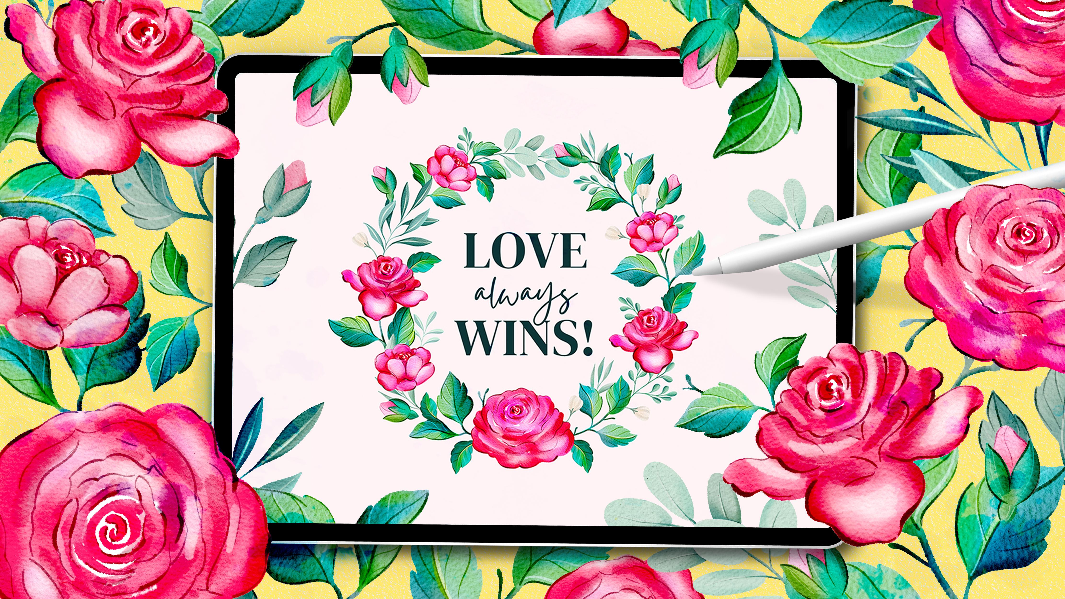
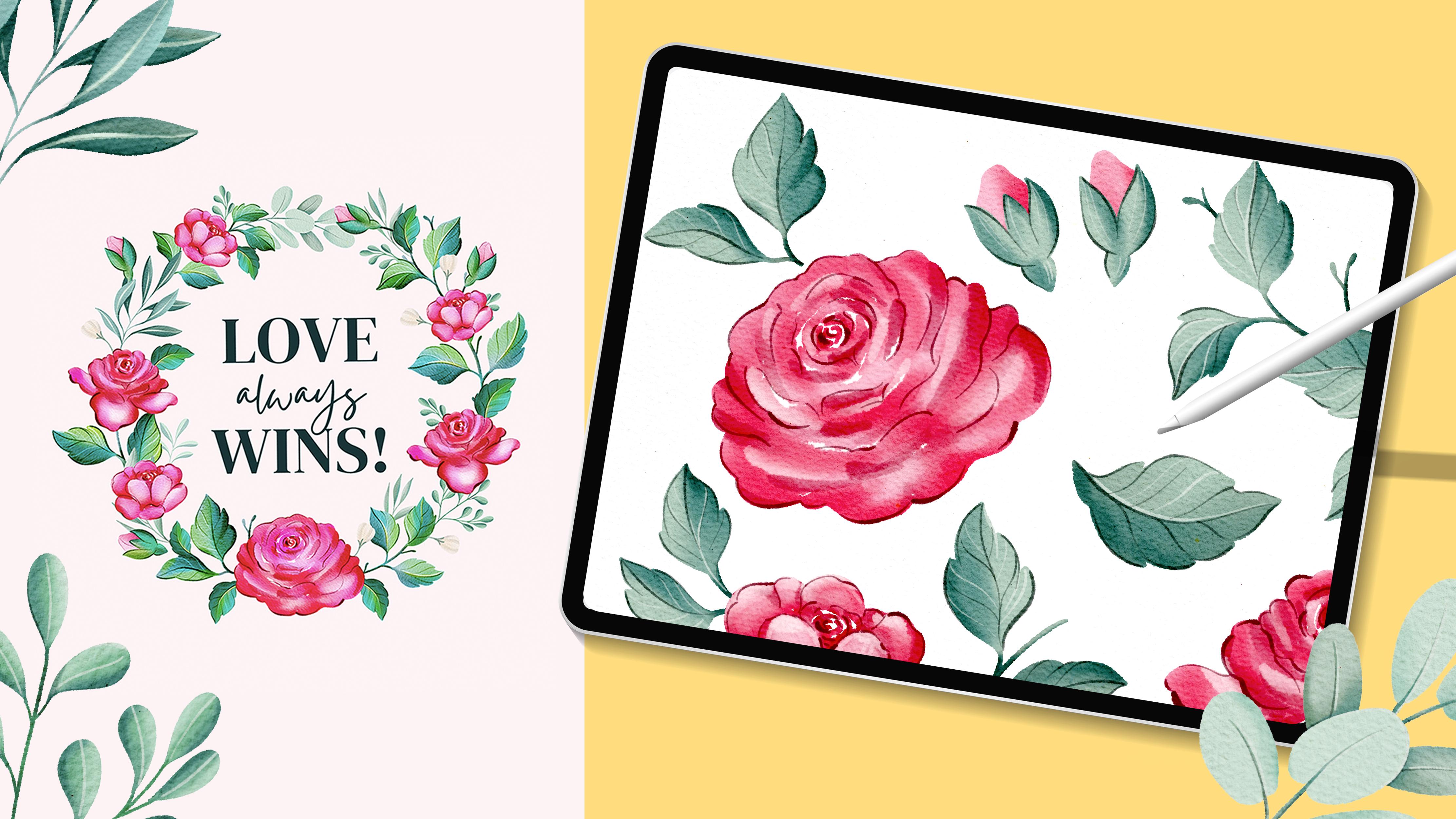
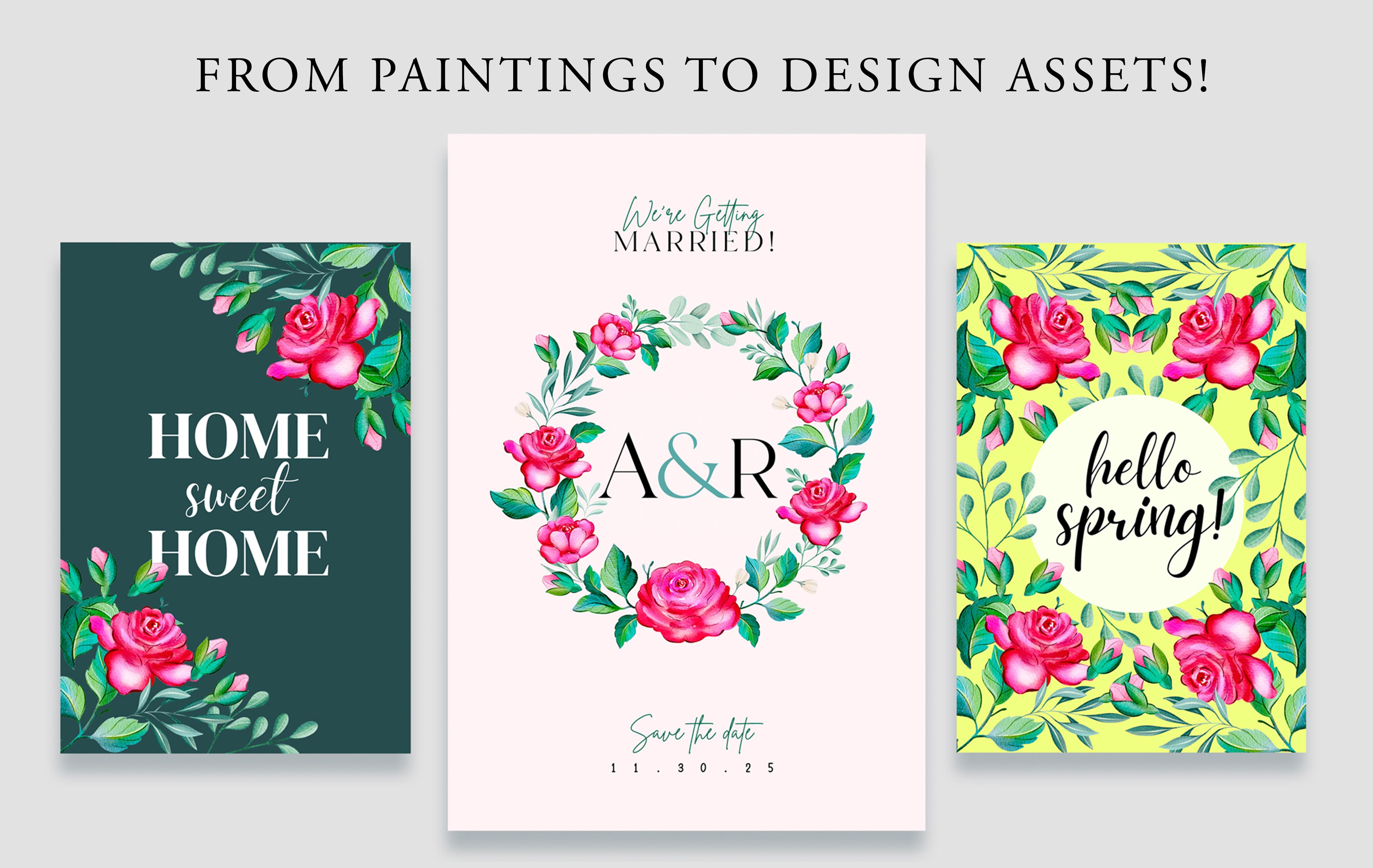
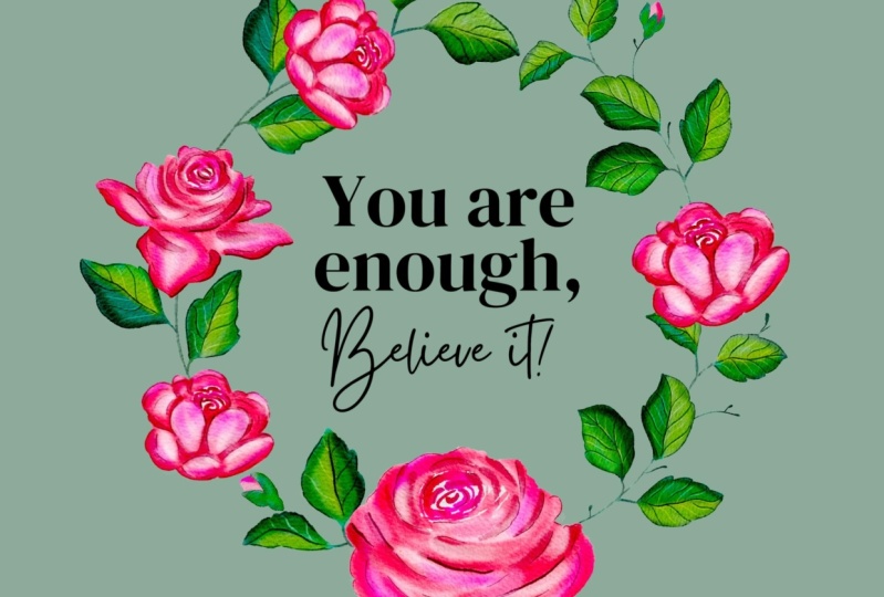
16. Creating Your Final Composition: Now that we have a beautiful
set of roses and leaves, I want to show you
how I use them to decorate a quote and create
a final composition. In many of my other classes, I have taught how to
do this in Canva, but this time, we're going to do it here straight in Procrit. In the class resources, you will find a
folder named quotes with these five quotes that have a transparent
background. Let's go back to
Procrit and open a file to create our
final composition. I'm going to select an A four
file for my composition, but, of course, feel free to choose another one
if you feel like it. Before we move on,
I want to address an issue I came across that
you might encounter as well. I'm going to split my
screen and display the photo gallery on the
left side of the screen. So you have to slide
your finger up, tap and hold the
icon of the gallery, and slide it to one
side of the screen. Have exported my roses and leaf, but due to having
my system updated, now a lot of my images appear as if they had a white background.
No need to worry. When importing these
images into Procrit, you will see that thankfully
they're still transparent. This is how I like
to import my images. Let's go ahead and add
some text to this canvas. If you don't want to
download the quotes and you rather add your text
straight here in Procrit, you'll have to
follow these steps. Tap on the wrench icon to
display the actions panel. Tap on add tap on add text. Write whatever you want to write in here, I'm going
to write hello. You can use the transforming
tool to make it larger. And if you want to
change the font, you have to tap on
top of the layer, tap on edit text from
the dropdown menu, and this menu down here in
the center will appear. When you tap on
the central icon, you will be able to display
this menu where you can modify the characteristics
of your text. Now, let's go over
how to import one of the quotes included in the
folder you downloaded. I'm going to slide my finger
up and open my folder, which in my case, is in Dropbox. Yours is likely in
the Downloads folder. The folder's name is quotes, and I have left five images with different
quotes which you can use. I'm going to use the first one, which is Love always wins. So I'm going to tap on the text and import it into Procreate. You can also import
your image in the actions panel by tapping on either Insert a file
or Insert a photo. I'm going to erase my rose and adjust the size of my text. For your composition, you
can do whatever you want. You can add flowers and
leaves on the top and bottom. But in my case, I want
this quote to appear surrounded by a crown of my
beautiful roses and leaves. And I think that for that, I do want to modify my canvas
ratio to squared shape. So I'm going to tap
on the actions panel, go to canvas, and go
to crop and resize. I'm going to make
the size a tiny bit wider and shorten
the vertical scale. Something to keep in mind is that whilst transforming
your canvas, you'll see how many layers
you have available. They recommend
ensuring that you have at least 20 or 25 layers
to complete this exercise. If you have less than that,
you can tap on settings up here and lower the resolution
of your canvas to 150. This resolution will still allow you to print your design, but it will give
you extra layers. If you still need more layers, perhaps you can make your
canvas a bit smaller until you see that the number
of layers which appear up here exceeds 25. To make my rounded floral crown, I'm going to start by drawing a perfect circle
to use as a guide, ensuring to have enough space on each side of the canvas to
place my flowers and leaves. I'm going to create a
new layer and select the fine tip brush from
the ink collection, which comes by
default in procret. I'm going to draw my
circle, leave my pen down, and with a finger
from my other hand, I'm going to tap my screen
to make my circle perfect. Now I can fill it
with a solid color, move it to the center of the canvas and place
it below my quote. I only want to use this
circle as a reference, so I'm going to
lower its opacity, and I'm also going to make
it a bit smaller to make more space for my flowers and leaves on each side
of the canvas. Let's lock this layer
and import our roses. I'm going to slide
my finger to display the photo gallery on the side of my canvas and make
my gallery smaller. If you're using a smaller iPad, you might prefer to import
all of your assets at once. Personally, I prefer
importing them as needed. So I'm going to start by importing the three
main flowers. I'm going to close the
gallery and start by making them smaller
because of their color, these flowers will serve as
the foundation of our design. That is why I prefer to import and position them first
within the circle. Can design this crown
however you like. You might create a
heavier composition at the bottom and use
smaller plants as you go up or go for a balanced composition where the crown has an even
weight throughout. I'm going to adjust
the size of my quote so that I have more space
for my flowers and leaves. I'm going to start by placing a few of these roses
around the circle, keeping the largest one
at the very bottom. I will probably adjust their positions as
the design develops. Next, I will begin importing my leaves and positioning
them around the circle. I need the rose layers
to stay on top of the layer panel so that
the stems go behind. Now that I have
placed a few leaves, I'll import one of the smaller plants and
show you something. This one, in particular, has a very straight shape, and I can't seem to position it harmoniously
within the circle. To fix this, I'm going
to use the rap too. I'm going to discard this
image and import it again. I'll tap rap from
the bottom menu and start moving the mesh
intersections to adjust the shape, making it rounder so that
it fits the design better. When you transform
images in Procreate, their quality can sometimes
decrease slightly. But since this image is already saved in
my photo gallery, I don't mind if it gets a little blurry because I can always
reimport it if I need to. Now, it's much easier to fit
this plant within my circle. I'm going to import my flower
buds and separate them into different layers so that I can use
them individually. Try experimenting with the
size of your elements, make some plants larger
and other smaller. This variation adds balance and visual interest
to your composition. I'm going to place a
smaller rose in here, as I feel that there's
a lot of bread in the bottom part
of my composition and not much on the top. Every now and then,
I like to create new elements from the
ones I already have. Let me show you what I mean. For instance, I will
import this larger branch, but let's say I only want these three leaves
here at the bottom. Easy, using the freehand
selection tool, I'll outline the part I want, cut and paste it
into its new layer, and erase these extra bits. Now I can use these three leaves separately, which is great. I do this a lot in my designs. Don't be afraid to
discard elements if they don't feel like a natural
fit within your composition. You don't always have to use all of the elements
that you have created. Now that the circle is complete, I'm going to make the
guide invisible and continue filling the space
with smaller plants. There's something else
I want to show you. I'm going to select
this little flower, place it onto its own layer, and use the rap transforming
tool to modify its shape. After transforming my flower, it's looking a bit blurry
and has lost some quality. To fix this without
reimporting it, you can head to the
adjustment panel, tap, sharpen, and slide your pen
to the right on the screen. This should bring
some sharpness back. If you want to change
the color of your quote, all you have to do is start by selecting the color that you
want to add to your text. In my case, this green. Select the layer from
the layer panel, activate the Alpha Lock option, tap on your layer, tap on fill layer from
the dropdown menu, and your active color should
be applied into your text. You can also change your
background color and test how your design would look
over a dark background. I'm going to select
this dark aquamarine and color my quote white. I also love how
this version looks. Take your time experimenting
with different colors. And if you're up for it, why not upload a few
color variations along with the rest
of your project? The best format for
sharing your images in the project and resources
gallery is JPEG. Simply tap on the range icon, select JPEG and save your
image to your photo library. Feel free to create as many
compositions as you like, as I would love to see them all. In the next lesson, we will upload our project to
the class gallery. I can't wait to see
what you create.
17. Time to Publish Your Project: There is no better way to learn that by
actually doing and I hope that you have
been able to create your project whilst following
along with this class. If so, now is the
time to upload it to this class Project
and resources gallery. Publish your project
following these steps. On this class Project
and resource stuff, you will find a button
that says Create Project, tap on it, and you will
enter this window. You can add a title to
your project in this box. It is important to add a cover image because
if you don't, your project will appear with a gray cover in the
gallery of this class, and we want to be drawn
into seeing your project. Tap on the button
that says image and start selecting them
from your computer. I would love if you could share your initial collections of
botanical illustrations. I want to see the way that
you interpret the flowers if you chose different
colors to the ones that I use or change the shapes. But even if they're
identical to mine, I would love to see them too. Below, you can add some text
and share some thoughts. You can tell me
about your process. It is really nice to read
my students thoughts, as it helps me to
know them better and have a more human
approach to them. Feel free to share
everything that you've done. You can make your
project private, and Leslie, once you're ready, you can hit that grid
button up there that says publish and your project will appear on the gallery
of this class. If you post your project
on social media, I would love if you
can tag me so I can share it with my
followers as well.
18. Brush Kits & Classes to Keep Growing: I really hope that you have been enjoying this class
and having fun experimenting with the resources that I have shared
with you so far. Before we wrap things up, I have got something
very special that I want to share with you, something that has made
a huge difference in my own digital
watercolor journey and how it feels to
paint on my iPad. Introducing my watercolor
Procrit brush kit. After months of experimenting,
testing and refining, I am beyond excited to finally share my watercolor procreate
brush kit with you. I've poured a lot of time and care into crafting these
brushes to help you achieve the organic
look and feel of real watercolor when painting
digitally in procreate. There are some brushes that
you have already tried. Already used a
lined detail brush, the blusch silhouette,
a blend brush, and a wet on wet brush, wet on wet number four to
create soft transitions. Each section of this brush
collection is designed to give you different effects for similar parts
of your painting, making it easy to
explore and experiment. What's included in the
kit paper textures. I've hand photographed seven different
watercolor papers from top brands to give your digital painting an
authentic organic feel. I want to take a moment
to explain how I set up my watercolor
paper texture. Usually select a light gray for the linear burn and
color burn layers, and a white for the
soft light layer. If I want to enhance
the paper texture, I tweak the curves in the adjustment spanel to
slightly increase the contrast. You can also experiment with toned papers to find
what works best for you, blend brushes for
the smudge tool. These brushes help you
soften color transitions, mimicking the natural blending
of pigments on wet paper. You will find a
variety of textures, a few soft blenders, which are great for smooth
watercolor effects, and a few dry brush blenders for stronger, more
textured effects. The soft blent brush we use
in this class is my go to, but I also love experimenting with the other for
different effects. Line detail brushes. These brushes are perfect for fine details, borders, inclines, tree branches, and
intricate elements, allowing you to bring delicate
touches to your artwork. I love using them when
painting landscapes or adding expressive strokes to
my botanical paintings as we did with our roses
and leaves in this class. Wet and wet brushes. I've designed these brushes for painting large washes
such as skies, soft backgrounds, tidy effects, and seamless color transitions. These brushes give you that beautiful diffused
watercolor look. If you love blending
and creating those atmospheric effects,
this section is for you. Textured brushes. I use these to add extra depth and texture
to elements like foliage, trees, trunks, and even grunge or distressed details
in my paintings. These brushes bring
an organic hand painted touch to digital work, splash and splatter stamps. These are so fun to use. Splatter brushes can add a natural lively
feel to backgrounds, flowers, or even
specific texture areas. I often apply them
with a mask to control their placement or select only the areas I
want to highlight. Bonus stamp set. This extra set of
four hand painted stamps for practicing landscapes
and composition skills. I created these based on traditional
watercolor landscapes and urban painting techniques. These stamps are part
of a larger collection, which you can find on my
digital products page. Get the full
watercolor brush kit. I have spent a lot of time
perfecting these brushes, and I know they'll make your procreate experience even more enjoyable and impactful. If you're ready to
take your digital watercolor work to
the next level, this kit has
everything you need. Check out the full brush kit and other fun watercolor resources on my digital products page. I will leave a link below in the description
of this class. Give them a try experiment, and I can't wait to
see what you create. If you share your
paintings on Instagram, you can tag me at
sylvispina dot art so I can not only see
what you're creating, but I can share it with
my followers as well. Now, let's talk
about what's next. I presume that if you
have taken this class, it's because you love
using pkrit and you're probably eager to keep practicing and
improving your skills. So I've put together
a few classes that will help you continue
expanding your skills. These classes will build on everything that you have
learned so far in this class. Okay, so you have started
your image library, and now your set of watercolor
roses and leaves is ready to be used into new
exciting design projects. And that's why I have
prepared two classes that will be the perfect
next steps to make this possible and
prove the point of why is such a game changer
to have an image library? Let's start with my class
from procrage to Canva, turn your illustrations
into digital designs. In this class, you'll expand
your library whilst creating a collection of botanical assets in a different visual style. Whilst doing so, I'll share my favorite procrage
shortcuts and a few workload tricks
to elevate your game. Now, if you loved designing
the crown with your roses, you're gonna love the
second part of this class. I'll introduce you to Canva, a powerful super beginner
friendly platform packed with design resources
like fun pairings, ready made templates,
and layout tools. I will show you how to upload your flowers into
Canvas gallery and decorate four pieces ready to be printed or
shared with the world. Lastly, I will introduce you to using mockups
to visualize your designs in real
world applications and bring your
creations to life. Okay, now you've mastered decorating design pieces
with your illustrations. But what if you could take
your skills further and turn your watercolor roses and leaves into endless professional
looking patterns. If this is something
that catches your eye, you're going to love that class. I'll show you my simple yet powerful method
for transforming your existing artwork into stunning repeating patterns
all within Procrit. This class is perfect for
artists, illustrators, and designers who want to expand their skills and create
ready made patterns. No matter where you are
in your creative process, I'm here to support you
in every step of the way. I can't wait to see how you continue to grow and develop
your watercolor skills. Feel free to reach
out if you have any questions or
need extra guidance. In the next lesson, I'll share some final thoughts and
say goodbye to you.
19. Final Thoughts: Thanks so much for
joining me in this class. I am truly grateful to everyone who has
made it to the end, and I hope that you have
enjoyed the journey as much as I have enjoyed
creating it for you. If after watching the class, you enjoyed it and learn
something new, please review it. It would mean a lot to me as reviews help me know
what I'm doing well, what I can do better
in the future, and also what my
students enjoy the most. If you're looking for even more resources to keep learning, be sure to check out
my YouTube channel. I like to post
shorter tutorials, art blogs, behind the scenes, and snippets to my creative
process that might inspire you on experimenting with more ideas and techniques. Make sure to follow me here on Skillshare to stay
updated on new classes, giveaways I host and
stuff like that. And I love to keep in touch
with people through emails. Although I only send
one every few months, I love sharing news behind the scenes of projects
I'm working on. You will hear about new classes, get access to discounts
on my digital products, hear about giveaways
and what comes next. If you want to check my
other personal projects, which include patterns, murals, paintings on
different techniques or just behind the scenes, I would love you to
follow me on Instagram at sylvispina dot t.
And that's all. Thank you once more
for being here. Enjoy your creativity and
see you in my next class.
 Silvia Ospina, Artist and Graphic Designer