Transcripts
1. Introduction: I am launching a new
series where we'll paint themed illustration sets
together Improprit. In this edition, I'm
going to show you a super easy and fun method to paint a Ponsetia flower
from the first sketch, all the way to a
polished illustration full of depth,
light, and texture. Now, in this series, we're not just painting illustrations. We're building you a
personal design library to grow over time. That means every
illustration that you create becomes something that you
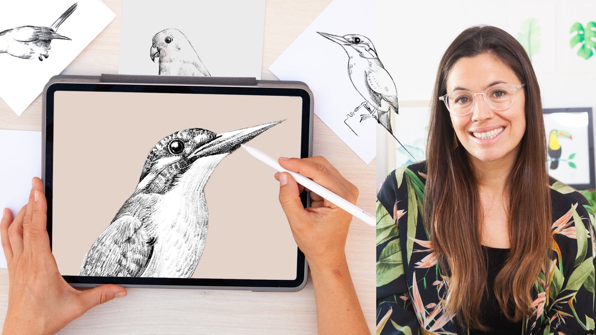
can reuse again and again. I am Sylvia Spina. I am a full time artist and designer living in
Barcelona, Spain. I adore traditional painting, but Procreate completely
changed the way I work. Having a full art studio on my iPad means that I can
create from anywhere, and I can use my favorite
techniques wherever I go. You don't need any
previous drawing or illustration experience
to take this class. The method is simple, intuitive and designed so that you can follow
along step by step. What you do need is a bit of procret experience using
layers, brushes, colors. If you feel that I'm moving
too fast in this class, I really recommend
taking my class, digital Illustration, a beginner's guide to
mastering Procrit first, then coming back to this one. It will make the process so much smoother and
more enjoyable. By the end of this
class, you'll have a fully painted ponstti
that feels hand painted, full of depth, and looks
beautifully polished. I am a big believer that with the right method and
a bit of guidance, anyone can create illustrations that look advanced
and professional, and this class will
show you exactly how. You would like to turn
your artwork into finished designs
or sins patterns, make sure to check
the learning path that I have left in the
description of this class. This class is part of
an ongoing series of seasonal illustrations
designed to help you grow your image
library over time. So make sure you follow your own Skillshare to
catch up the next one and join my newsletter
through the link in the description of this
class for extra resources, freebies, and behind
the scenes updates. You can also follow me on Instagram and YouTube
for extra content. All you need to
take this class is an iPad with Procreate in stout. So make yourself a T, find a cozy corner, and let's start painting
our illustrations.
2. Your Project: Your project for this
class is to create a fully finished
poinsetia illustration in procrete that feels soft, full of depth, and
beautifully hand painted. We'll start by sketching
a single petal using very cool procrete functions to make it super easy and fun. From there, we'll
add color and use smart compositional tools in procrete to build
the whole flower, the leaves, and the center. In the process,
you will learn how to use layers effectively, use blending modes to achieve
depth, towards the end, I will show you how to add texture and watercolor effects to elevate the final piece. If you're up for
it, I would love to see how you turn
your Ponsetia into a greeting card using Canva with the bonus lesson that I have decided to add to this class. I already went to the printers this morning and I
did three of them, one on each language, English, Catalan because I
live in Barcelona, and I have Catalan
family and Spanish. And let me tell you
they look so beautiful. So if you're up for it, I would absolutely love to see your greeting card as part
of your final project. Complete the final
part of the class, you will need to download
your class resources. To download them, just follow the link in the
description of this class. When you do so, you will also join my newsletter,
but don't worry, I will only send
occasional emails with creative
resources and updates. If after finishing this
class, you enjoy it, learn something new and want to support me as a teacher,
please leave a review. Reviews help my class
gain visibility. They also help me know what I'm doing well or
what can be improved, and it always makes my day to know what my students
think about my classes. And if you share your
work on social media, you can tag me at sylvispina
dot so I can see it, celebrate your progress, and even share it with my
followers as well. I can't wait to see your
beautiful Ponsetti flower.
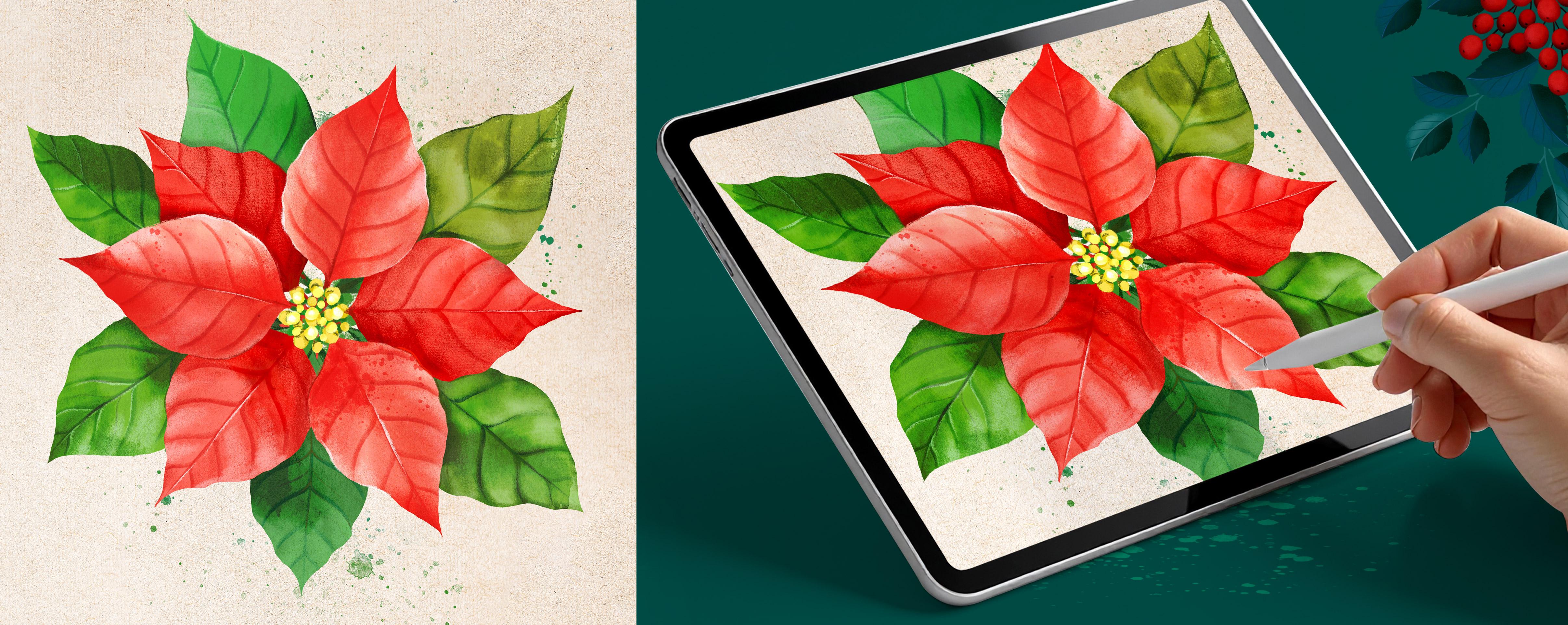
3. Sketching One Petal: Before we start, let's
analyze this beautiful plant. The ponzettia flowers
are formed by leaves and petals that start stacking
one on top of each other. The ones on the bottom
tend to be green, and as they grow, they tend to turn red, which is absolutely beautiful. They also have this center
here, and as you can see, the petals and
leaves are basically the same shape with
a few variations in color and propusion. With that in mind,
we're going to start by sketching one petal. Let's go ahead and
open a new document. Tap on the plus icon, and to create a custom document, tap on the black box that
has a plus sign inside, and you'll enter this window. Down here, I'm going
to tap on centimeters, and I actually have a ruler
here so I can more or less visualize the size of
document that I want to open. 20 to 25 centimeters
would work well. That way, I can print it as Wallart or create
greeting cards with it. Set the DPI to 300, and this is giving
me a maximum layer of 72, which is plenty. I'm going to tap
on the Blue check, and here's my document. There are two ways to
create this petal. You can draw it freehand if you want something more
organic or you can take advantage of
Procreate's symmetry tool to get a perfectly
balanced shape. To activate this option, you have to tap on
the actions panel. Go to Canvas, activate
the drawing guide, tap on Edit Drawing Guide, and down here under symmetry, you can move your guide with this blue node and place
it where you drew the line. Before we draw the petal, let's analyze its shape. If you want to open
your reference photo, tap on the action panel, and under Canvas
tap on reference. Now here, tap on image, import image, import the image
that you want to display. I'm going to set this here, and I'm going to zoom onto this petal to be able
to see it clearly. These petals are thinner at the top and more rounded
towards the bottom. So with that in mind,
I'm going to draw it. Going to get rid of
this layer because I don't like this petal
and create a new one. Now to activate
the symmetry tool, I have to tap on my layer and select drawing assist
from the drop down menu. I'm going to start
with the central vein. So I'm going to start
with half a circle at the bottom and draw
the top of the leaf. Lastly, I'm going to draw
these lateral veins. This is just a sketch, and it doesn't have
to be perfect, but I find it easier to start with a drawing like this because when it comes
to painting it, I can focus more on
choosing the colors and brushes rather than
getting the shape right. Once you finish your sketch, meet me in the next lesson. We will start adding color.
4. Painting Your Petal: Let's paint this petal
with some color. I'm going to close my reference as I don't need it anymore, and sometimes what
happens to me. I don't know if it
happens to you too, is that when I have a
reference photo on my screen, I feel like I want to
copy it and I might start making things a little
bit more complicated. I'm going to use this
drawing as reference, so I'm going to tap
on the end layer, set the blending
mode to multiply, lower the opacity to the
minimum, lock this layer. I'm going to create
a new layer and place it below, tap on it, and activate the
drawing assist option so that I can paint
it in less time. I'm going to grab
the shear water which is under the inks colleon because I actually really like this brush and start
drawing the silhouette. That's a little bit too large, so I'm going to make
the brush smaller. Select a nice red, which is not that
bright like this one. Maybe a little bit lighter, more like pink and draw
the silhouette of my petal and drag the active
color to the center, adjusting the threshold to make sure that it's
contained inside. You can see that I didn't
follow the reference exactly. So I'm going to polish
it a little bit, but it was much easier to redraw it rather than
painting it from zero. Now, if I turn my
background color to black, you can see that this
brush is beautiful, but it is a little
bit transparent, and I want to be able
to use my ponsetia over a light background and
over a dark background. So a way to fix this
is to duplicate your layer several
times and merge it, and there you go with fixed
the transparency issues. Now I'm going to
create a layer on top, activate the clipping
mask option so that anything I paint on
top remains inside the petal and activate the drawing assist so that everything I draw on one
side appears in the other. I'm going to change my
brush for the huntsman, which is under the
pencil collection, choose a darker red to
draw the lateral veins. I'm also going to rotate
my paper since I find it easier and start drawing
some lateral veins, trying to maintain
a similar shape and distance in between them. I'm going to deactivate
the drawing assist, make my brush smaller
and draw a central vein. And lastly, I'm going
to merge my layers. Once you finish your petal, meet me in the next lesson where we're going to
compose our flour.
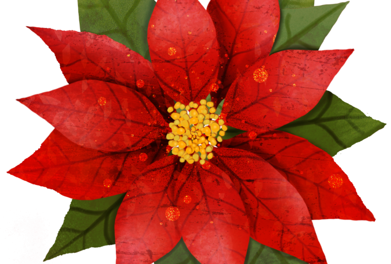
5. Composing Your Flower: I'm going to start
by getting rid of this sketch layer as I
don't need it anymore, and now we're going to turn this single petal
into a full flower. To help with the composition, I'm going to show you how
to display some guides that will show us exactly where
the center of our canvas is. Tap on the actions panel,
tap on drawing guide. Edit drawing guide
and under symmetry, tap on options and
tap on quadrant. This will show me
where the center is and divide my screen
into four parts, which will be very useful. I'm only going to be using
these lines as guides, and so I'm going to deactivate
the drawing assist option. Okay, to start our flower, we're going to duplicate our layer and make the
bottom one invisible. We're going to make our
leaf smoother by tapping the arrow icon and
adjusting the bounding box. Scale it down until it sits in the top
half of the canvas, leaving a bit of distance
from the center. We're going to draw a
little stem for our petal. I'm going to be using the
shear water brush once more, select the same color
of the petal and draw a little line that will serve as a stem to connect
the petals together. Okay, now we're going
to start the flower. So we're going to
duplicate this petal by swiping three fingers down
and tapping on duplicate. While the bounding
box is active, I'm using the green handle
to rotate the petal, placing it diagonally on the
bottom left of the canvas, keeping the stem
aligned to the middle. Now I'm going to repeat
the same process. So stripe three fingers
down, and this time, I'm just going to tap
on flip horizontal and send the petal to the
bottom right of the canvas. I'm going to merge
these three petals, duplicate my layer, tap on the arrow icon,
and rotate them. I'm going to adjust the center so that it's aligned with
the one on the bottom. And alla we have
a pancetta flour. At the moment, all
the petals look like they're sitting
on the same level. So now we're going to add some shadows to create
a bit of depth, making some petals appear on top and others fall
slightly underneath.
6. Adding Shadows to Achieve Depth: At the moment, all the petals look like they're sitting
on the same level. So now we're going to add some shadows to create
a bit of depth, making some petals appear on top and others fall
slightly underneath. I'm going to open
the brush library, select the pencils collection, and tap on the Huntsman pencil. Of course, you can use
any other brush you want. I'm going to select
a darker red. To work in nondestructive way, we're going to create a layer on top and activate the
clipping mask option. This way, if we don't
like the shadows or we want to discard them, we can make it easily without affecting the petals
that we already have. These shadows should
stay really soft, so it helps to lower the
opacity of your brush. Instead of holding the pen close to the tip
and pressing hard, which gives you a very opaque, defined line, try holding it a little bit further
back and tilting it. This gives you a
much softer touch, which is perfect for shading. You can adjust the opacity using the lateral slider or simply by changing the
pressure of your hand. As you shade the bottom petals, you can also start playing with slightly different
tones of red. I like to begin by shading
the very bottom of the petal, the part that sits
behind the top ones, because that's what
creates the most volume. And right where the top and
the bottom petals overlap, I darken the color a bit more
to deepen that separation. Notice how this soft
shadow instantly lifted the top petals and
pushed the bottom ones back, creating a lovely
sense of depth. I'm going to rotate my canvas to repeat the process on
this second petal. Sometimes I like to detach the color panel
from where it is, and you do this by
holding your pen on top of it and moving the panel
anywhere on the canvas. And that way, you can
leave it on display. Sometimes I do this
to be able to vary my color easier without having to be opening
the panel each time. You can also add
some shadows towards the edges of the
petal and always always add darker shadows where the petals overlap to
create even more depth. Right now, if you add
too many shadows, this layer can start to
cover the one underneath. To fix that, open
the layer panel, and on the layer
containing the shadows, tap on the little N and
change the blending mode. You can set it to multiply, darken, or any other
mode that you prefer. This makes your shadow
layer more transparent, so the colors underneath
still show through and your shadows blend nicely
with what's already behind. And lastly, repeat the same
process for the third petal. How easy and beautiful was that? It already looks
so full of volume, and I hope you're
enjoying the process. Now I'm going to create a new layer on top and
set it to clipping mask so that we can keep adding shadows to other
areas of the petals. I really enjoy this part,
and I invite you to take your time as you develop the
bottom layer of your flour. You can keep experimenting by
adding softer shades along the edges and following the natural direction
of the lateral veins. When you're done, meet me in
the next decent where we're going to start developing
the top layer of petals.
7. Adding Light: Developing the Top Petals: In this lesson, we're going to follow a similar process using highlights to develop
the top layer of petals. I'm going to start by
creating a new layer, tap on it, and select clipping mask from
the drop down menu. I'm going to use
a color picker to select this red and
make it much lighter. And start passing my brush very softly in some of these areas to create
even more contrast. See how I'm focusing first on the areas where the
petals overlap. By adding shadows
to the petals in the background and bringing
light to the ones on top, we can really increase
the sense of volume. You can also tap on the and try different blending modes to see which one gives you the
effect you like best. You can also start playing
with the opacity bar. Keep varying the tone
of that you use, leaving the lighter
tones toward the edges, and returning to the
more bright color towards the center
of the petals. I really enjoy this part of the process and hope
that you do, too. I zoom in and out
constantly as this helps me gain perspective on
how my flower is looking. You can keep experimenting, adding light areas to the top petals or increasing the shadow of the bottom ones. Once you're done
with your shadows, open the layer panel and start merging the layers that compose the bottom petals and the layers which
compose the top ones, leaving them on separate
layers for if you want to keep adding shadows
and lights later on. I love how the panzetia
is looking right now, but I feel that if the petals were slightly different
from each other, this flower would look a little bit more realistic and organic. I'm going to show
you how to achieve this with the eraser tool. Now, just in case I
don't like what I make, I'm going to go ahead and group the petals and
duplicate the group. This way, if I don't
like what I create, I can always go back to
the original petals. I'm going to tap on
the eraser tool and select the Penzance brush
under the gouache collection. These words are so
difficult to pronounce. Using the eraser, I'm
going to start modifying the silhouette of each petal so that it looks a
little bit more organic. It's almost like I'm carving new petals out of the
ones that I already have. It's important to do
this process slowly and zoom in and out constantly
to gain some perspective. To shape the bottom
ones is easier if you deactivate the top layer to
be able to see them properly. You can see that the
difference is not massive, but by giving some variety to the silhouette of
some of the petals, the pancettia starts looking
more organic and realistic. In the next lesson,
we're going to create a center for a flower.
8. Creating a Flower Center: As we did with the petals, we're going to analyze the
center of the Bonseta flour. You can see that's composed
by little yellow flowers that seen from afar look more
like yellow dots of texture, mixed with a light green
and a few red spots on top. With that in mind, I'm going to switch back to procret and create a new layer on top to develop the center of my flower. I'm going to go back to using the shear water brush which
is under the inks collection. And using a yellow tone, I'm going to start drawing
some circles on top. You can vary the size of your brush to create
some variety. I'm going to make these
dots fully opaque by duplicating the layer and
then merging them together. I'm going to open
the brush collection and go back to using
the Hansman pencil. Looking back at the reference, I remember seeing some
green dots as well. So I'm going to shift
the color a little and add a few green touches around the sides of
the yellow ones. Right now, these dots look like
they're floating, so I'm going to connect
them with the center by adding some darker
red lines underneath. You can see that
I'm keeping this a little bit abstract
and organic and trying to paint by memory instead of looking
at a reference. Adding these darker red
areas is helping me create the feeling of depth and anchurs
everything in place. I also want the center
to feel a bit denser, so I'm going to
duplicate the layer, scale it down slightly, and rotate it to
add more variation. Then I will adjust
the color by opening the adjustment panel and using curves to brighten
it just a touch. You can create new nodes
on this line by tapping on them and make sure that you're working
on the gamma option. You can see that by moving
these dots up and down, I'm able to make these dots
look a little bit lighter. With the Alpha lock active
on each of the layers, I'm going to keep
adding a little bit of shadows and lighter areas
on both of the layers, following a similar process as the one we did with the petals. I am darkening the areas where the top and bottom
layers are overlapping, and this is instantly helping
me create extra volume. Lastly, I'm going to
switch to the layer on top and select a
very light colour, almost white to add a few
highlights onto the top layer. I feel like I am missing a little bit of green
on this flower center. So on a layer below, I'm going to paint
some extra dots here and there using
a very dark green. This is going to darken the overall area below
the yellow dots, helping me achieve
a lot of depth. Once you're done with
the flower center, meet me in the next lesson
where we're going to start turning our
petals into leaves.
9. Turning Your Petals into Leaves: Oh. Before moving on to the leaves, I'm going to group
the layers that compose the pollen so that I can later decide what to
keep and what to discard. I'm also going to organize
my layers a little bit. Now I'm going to deactivate
them and make the bottom petal visible and
duplicate this layer. It's always a good idea to keep the original petal intact in case we want to
use them again. Before I scale down this layer, I'm going to make the petals visible so I can
judge the right size. You will want to place
this petal a little further from the front petals
and slightly to one side. Now we're going
to transform this petal so that it starts
looking like a leaf. Open the adjustment panel, tap on hue, saturation, and brightness and move the hues later until you
get a nice green tone. Once it looks like a leaf, I'm going to start
duplicating it and placing the copies around the flour
as I work on the composition. As I do this, I will keep adjusting the greens with a hue, saturation, and
brightness slider to create some variation. Before moving on, I'm
going to deactivate the petals layer and
paint a stem for my leaf, so that later is easier to
connect them onto the flower. Okay, I'm going to go back
to duplicating this leaf. You can also begin reshaping
each leaf by using the rap tool as you
duplicate them to access it, tap on the move tool and select
Rap from the bottom menu. Just like we did
with the petals, we're going to add shadows on a new layer set
to clipping mask. To keep a consistent style
across the whole ponzetia, I'm going to go back to
using the Huntsman pencil, which now is under the
recent collection and follow the same method to keep adding depth
to the ponzetia. Try varying the green
tones as you shade to bring more depth and
richness to the leaves. See that I'm varying
the color all the time and the way
I grab my brush. Sometimes I am giving shadows, especially in the areas where the leaves go
behind the petals. This way I achieve more volume, and sometimes I'm
using lighter tones to enhance some
areas of the leaves. Take your time
developing the shape. Take your time developing the shadows and lights
of your leaves. And once you're done,
merge your layers. We're going to follow
the same method we used for the petals, and this repetition
is very helpful. The more we repeat these steps, the more naturally
they'll come to you. And my hope is that you
start using these techniques in future illustrations without
even thinking about it. When you're finished shaping
and shading your leaves, use the eraser tool to gently refine the edges and
vary the shapes. Creating slight
irregularities can make a big difference
in how our leaves look. These subtle variations help your plants look more
organic and realistic, and they reinforce everything you've been practicing
throughout the class.
10. Adding Final Touches: You can see how we've followed
the same method to create the leaves in the back and the
multiple layers of petals. I'm going to keep my
center separating layers for now just in case I want to do
something more to it. Now, I'm going to add a few
more light and shadow areas across the leaves and petals to build even more volume
in my Ponsetia. Now we can start testing our ponzetia over both
a dark background and a light one to see if
there are any edges that need refining and
also to see how it looks. I think it looks stunning
over both backgrounds, but I'm going to set my
background back to white. This lesson is all about giving the final touches and
details to our illustration. It's quite a personal stage, so there isn't really a
right or wrong way to do it. But I do have a few
suggestions that might help. First of all, add
these final touches always on new layers. After testing some brushes, I really liked the
bandicoot brush, which is on the
pastel collection. I feel it has a similar style
to the pencil I was using, but it's a little bit larger
so I can cover wider areas. I'm going to keep
my camera recording and speed up the footage so that you can see
the decisions I make as I polish my panzeti. The final changes won't be huge, but I do like spending
a bit of extra time on these last touches to see how much they can elevate
the overall results. As I said, this is a
very personal stage, and there's no really a right
or wrong way to do things. But I do have a few
suggestions that might help. First of all, take your
time and enjoy the process. Keep zooming in and out. Zoom in to really refined
small details and zoom out often to check how everything is working
together as a whole. Add your details on extra layers so you can keep things
nondestructive. If you don't like something, you can simply hide the layer, erase it, or come
back to it later. Try to stay consistent with
the brushes you're using and adjust the brush size depending on the area
you're refining. Smaller for small details and lines and larger
for broader shapes. I invite you to do the same, slow down, enjoy this part. And once you're happy
with your flour, meet me in the next lesson, where I'll show you a few
tricks to add extra texture and watercolor effects to your
illustration. See you there.
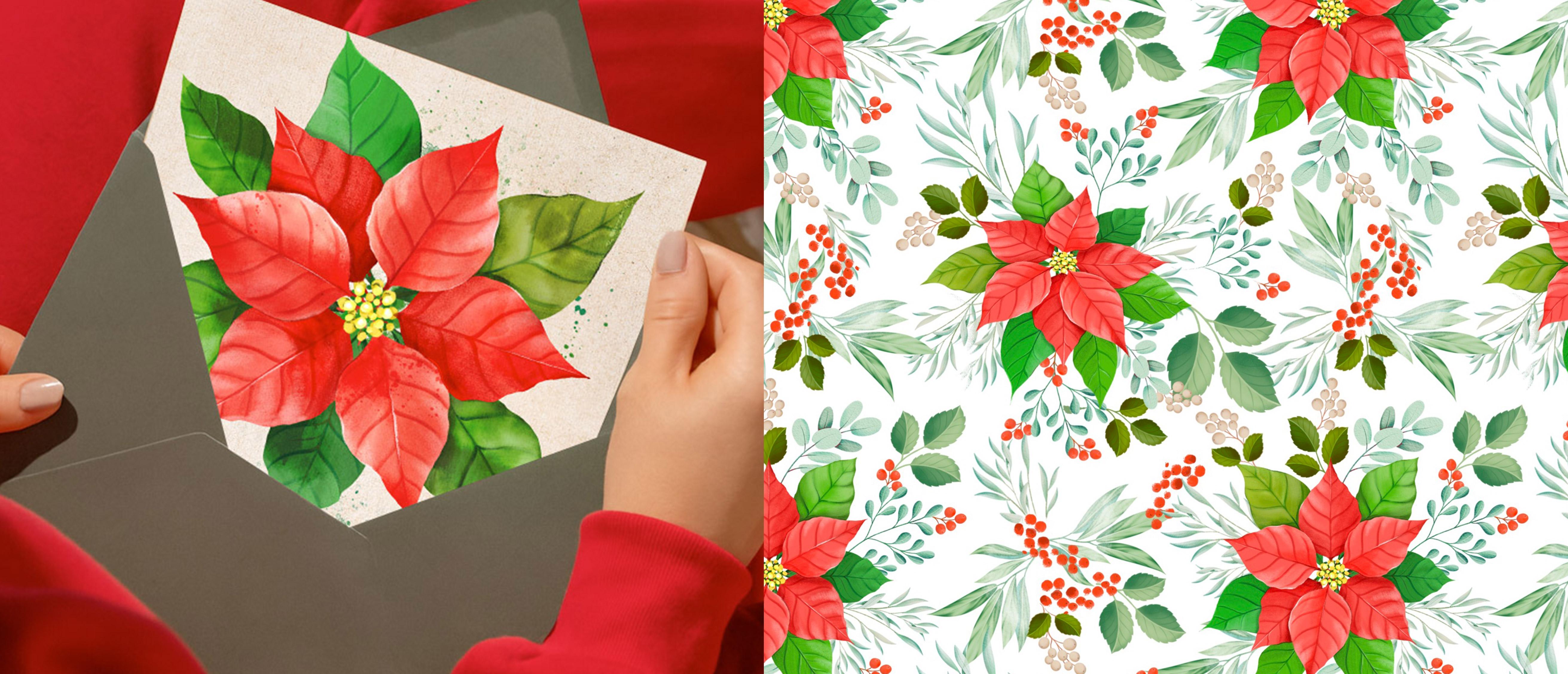
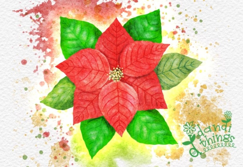
11. Adding Texture & Watercolour Effects: As a bonus for this class, I'm going to show you how to add watercolor texture and paper
texture to your ponsetia to make it even
more beautiful and help it stand alone as
a finished painting. Before we jump in, let's
export this illustration and save it into your photo gallery with a transparent background. So start by making the background
color layer invisible. Then tap on the wrench
icon, tap on share. And under share
image, tap on PNG. Then tap on Save Image and
go to your photo gallery, and your image should
be saved in there. I have a dedicated
folder where I save all my illustrations and
I call my Image library. If you already took
my previous classes, you probably have one by now. With my image
library album open, I'm going to tap
on the plus icon, select my image and place
it into this folder. It's a really simple way to
keep everything organized. I'm going to go
back to Procreate, make the background
color visible and open a folder containing
these two images, a paper texture and a texture
that I have done myself. I'm going to start by dragging
the paper onto my Canvas. You can also add new images
by tapping on the wrench, I can tap on ad and either inserting a file
or inserting a photo. W to enlarge, my paper and check that I haven't
lost so much of its quality. If I did, I can tap on
the adjustment tools, tap on sharpen and slide
my pen a little bit to the right to increase
that sharpness. I'm going to move this layer to the bottom that's already
looking really beautiful. Duplicate it and send
the copy to the top and set the blending
mode to color burn. Because I feel that
this could bring the opacity of my panzettia
back a little bit. I can also adjust the opacity. And now I'm going to open my
folder again and this time, I'm going to open the texture. This is really cool. It has a little bit
of a workaround, and I'm going to
show you the way I tend to use these textures. I tap on the blending mode and I start moving
my slide around, you can start getting
some really cool results, but they can look a
little bit messy and just way too experimental
for what I want to achieve. So the way to work around this, especially when it's a
full image you have, is I'm going to bring
this back to normal. I actually quite enjoy
this soft texture, but not this harsh one. I'm going to take my layer
to normal and select the free hand tool and
select this bottom area. I'm going to swipe
three fingers down, tap on duplicate,
and tap on vertical. So I'm going to just
replace that part. It's not important that it's
not perfect, doesn't matter. We're going to be moving
this texture around, but I just wanted
to get rid of that. Went to often the transition
and merge my two layers. Now I'm going to
duplicate this texture, make one invisible, and move the visible layer on
top of the leaves. I'm going to set these
two clipping mask. Start moving the blending mode. And now you can check
that is much better because the texture is only
being applied to the leaves, and I can separately see which
blending mode I like more. This looks much more
like watercoloring. It lightens up the leaves, but gives these type of,
like, beautiful gradients. And color burn makes them
a little bit darker. So you can start
choosing what you like. You can also slide the opacity
bar to soften the effect, and you can even use the saturation bars to change the color of the
texture, which is amazing. Okay. I think it makes the whole thing a
little bit more interesting. I'm going to duplicate
the layer again, send one of the
layers in front of the bottom layer of petals, tap on clipping mask and
repeat the same process. You can also make
this layer smaller. You can wrap it or distort it, or do anything you want with it. You can also erase some areas. So, for instance, I
quite like this petal, but this one, I feel like
it's maybe too textured, so I can softly erase
some areas if I want. Lastly, I'm going to
repeat this again. So yeah, you can
see that it kind of does add a little bit
more of interest. Lastly, I'm going to use
this splash brush which is part of my watercolor brush set that I designed that year. If you're interested, you can check this on the
digital products, or I will leave a link below. I'm going to gift
this one to you and put it in the folder along
with the paper textures. So they just add a few
points of interest. And then maybe erasing a few. I can fit the Alpalo option and paint some of these
with a red colour. You can apply the same method of creating layers
on top of each of the elements like petals and leaves and add some splashes
of this watercolor brush, change the blending mode
and see if you like it. Okay, I'm super happy
with how this is looking, so I'm going to show you how to export your illustration
into your image library. We're going to export
our illustration so that you can upload your beautiful project to the project and resources
gallery of this class. I'm genuinely excited
to see what you create and how you apply the
methods you learned here, whether you adapted
them to your own style or followed along step by step. Make sure all the layers you
want to include are visible. Then tap on the wrench icon, go to share, choose JPEG and save the
image to your gallery. If you open your photos app, you will see your artwork there ready to be uploaded
as your project. In the next lesson, I'm going
to say some final thoughts, share how you can keep expanding your procreate skills
and say goodbye to you.
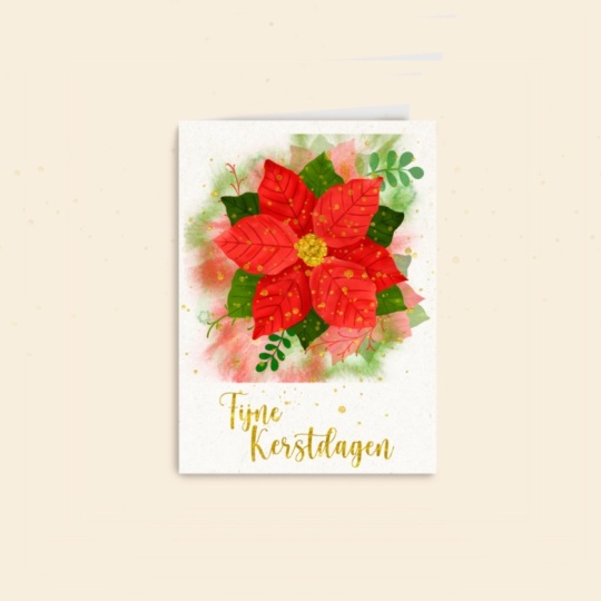
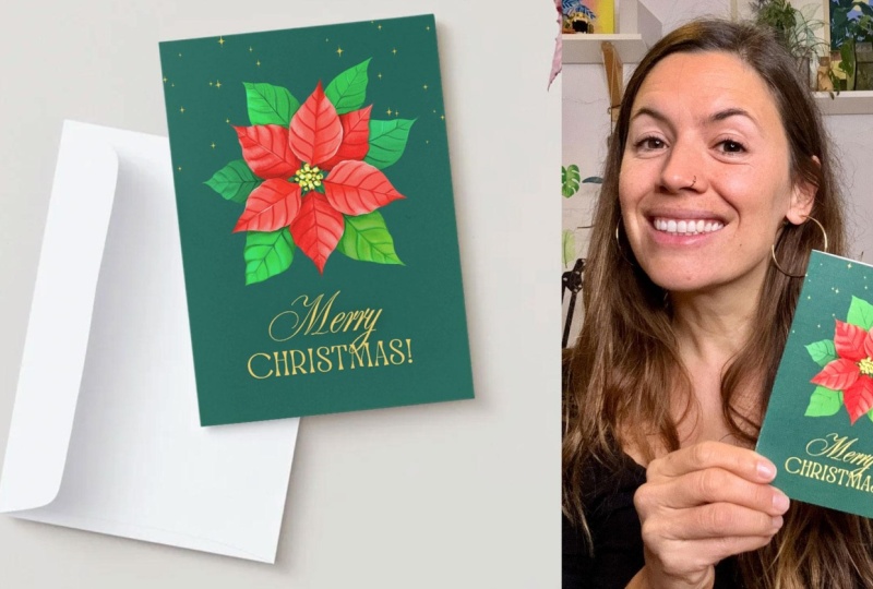
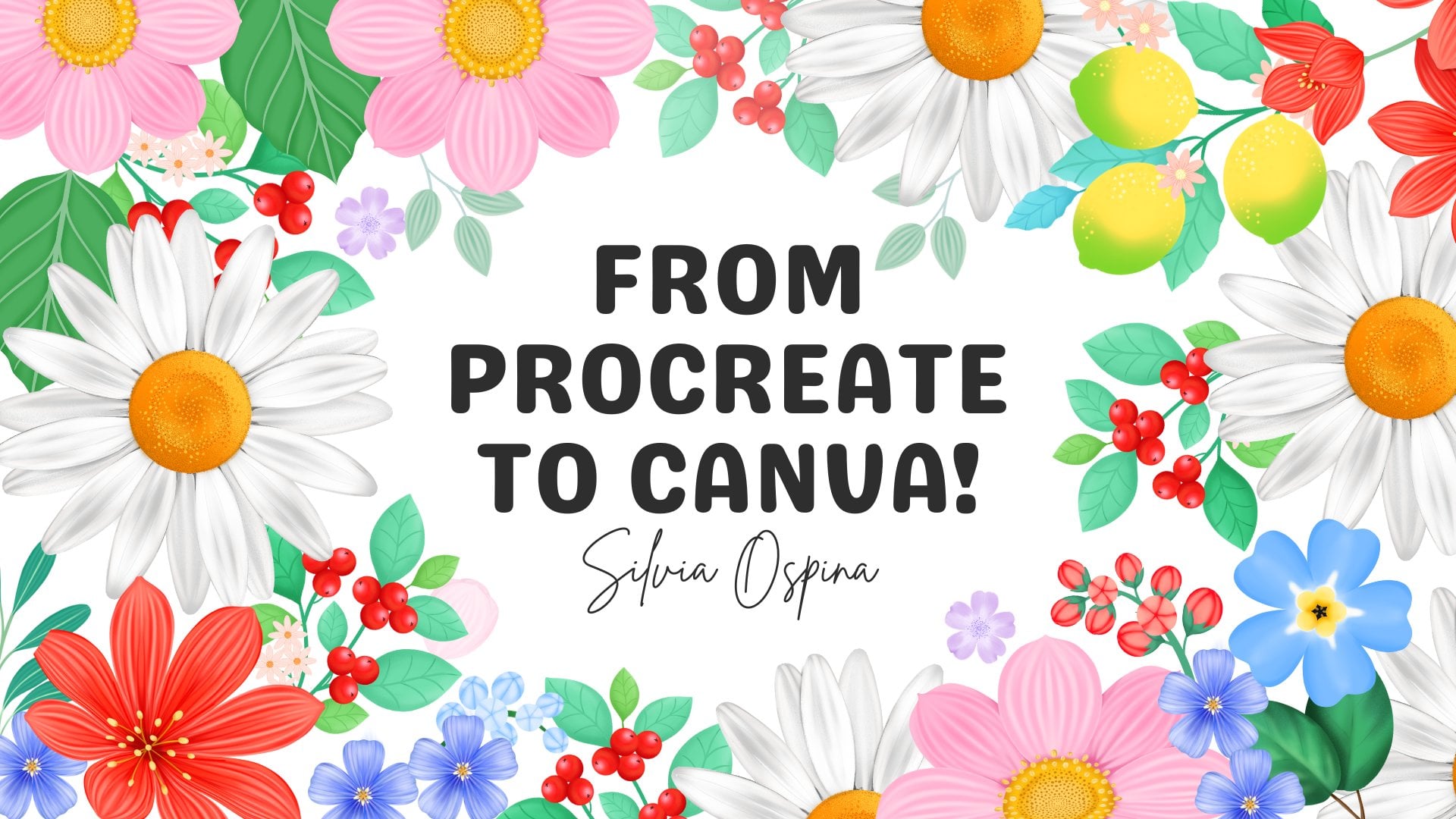
12. Let's Create a Greeting Card in Canva!: I have decided to
add this bonus, where I'm going to
teach you how to grab your Ponsetia from
your image library, upload it to Canva and create
a stunning greeting card. I already went to the printers this morning and I
did three of them, one on each language, English, Catalan because I
live in Barcelona, and I have Catalan
family and Spanish. And let me tell you
they look so beautiful. So if you're up for it, I would absolutely love to see your greeting card as part
of your final project. Just so you know,
I'm going to be using Canva in my computer. If you're on your iPad, the setup might
change a little bit. If you feel lost or think
that I'm going too fast, I highly recommend taking my
class from Procrit to Canva, where I explain Canva in
depth used from your iPad. Okay, let's get on with it. So this is my Canva
account to create a new design tapon create up
in here this purple button. On the search boox,
I'm going to type greeting card and select
greeting folded card portrait. Here you have the template, and you can also see the
mockup, which is amazing. I really love watching the design on a mockup
whilst I created. So now I'm going
to go to Uploads, tap on this upload
files button and select the artwork which I
have left on my desktop. I have the JPEG that
has the texture, the paper texture, and
the watercolor texture, but I'm going to upload
the Ponsetia which has a transparent background
and it is on a PNG format. It's uploading into
my image gallery, and to import it on my canvas, I just have to click
on it. There you go. Here is my Ponzetia and
I'm going to make it a little bit smaller and place
it in here on this half, which will be on the front
of my greeting card. Now I'm going to select a
dark background for my paper. And to do this, you have
to tap on your canvas, and this top menu will change. If you select this
colorful circle, you will have access to
this menu where you will be able to select a color
for your background. You have these ones that come by default, but
if you scroll up, you will find this circle where you will be able to select
any color that you want. I'm going to select
a dark green more, which has, like, a
blue hint to it. Okay, now I'm going
to add some text. To do this, you
will have to tap on this text icon on the left menu, and you will have
access to either writing your own things
or scrolling down. And here you have a lot
of templates that have really cool font combinations made by professional designers. Some of them are paid, and you will recognize them because they have this little
crown on the bottom, right side of the thumbnail, but there are lots of free
ones that you can test. Some of them already have
Christmas combinations like this Merry Christmas. But for now, I'm going to tap on this sparkle one that
has a cool effect, make it smaller and
leave it there, and see what else I can find. I quite like this bride
and groom combination, and I'm going to
make it smaller, change its color to this yellow one looks like a
golden yellow, which I like. And to edit the different words, you have to double
click on them. This is currently a group, but you can see by
double clicking on it, you can change it. And if you want to ungroup it, you have to select the group and tap on and group up here, and then you can modify
them separately and even move them a bit. I'm going to separate
this Christmas and move it down a bit,
and I like that. And then you can select both and either group them
or just move them together. Okay, now I'm going to work on the composition of my card. So I think I'm
going to right now, the ponceetia is in the middle, but I'm finding hard
to position the text. So I'm going to
move it up here and then put the text on the bottom, and I think this
looks really nice. One thing I really love
doing is clicking on the Map and seeing how my design would look
on a printed product. This easily helps me see
if it's well composed. My flower, for example, could go a little bit higher. So by seeing the
printed product, I can take those decisions in
a more mindful way or even test the design
with the followers before I go ahead and
print a final design. Okay, now I'm going to work
on the back of my card by duplicating my ponzettia
and making it smaller. I'm going to place
it here for now, and I'm going to test this sparkle word to
see if I like it. I'm going to put by Silvia
Ospina or something like that. And modify the bounding box to maybe from Sylvia's
pina would be better. I'm probably not
going to put this, but this is just
to test the font. Make it smaller, and I'm
going to place it down here. And it looks quite nice. I don't mind it, but I'm
going to keep playing with it until I like it because
I'm not that convinced. Once more, I can go ahead
and tap on the mockup, make it larger and see how the back of my
card is looking. This is honestly so helpful. I can see that it's not well aligned, it's not in the middle. So I'm going to move it a
little bit to the center. And this is so easy to spot
when you look at the mockup. When you're working
on a folded card, an easy way to make sure
your things are aligned to the middle is to tap on
elements, tap on rectangle. You can just click on the rectangle to add
it to your canvas, and then you can adjust the size of the rectangle to
fit the back of your card, select all the elements, tap on position up
here on this menu, and under arrange align elements
to the vertical center. And this way, you
will be able to align your elements on
the exact center of the back of your card
or on the front of your card if that's where you want the elements
to be aligned. Okay, lastly, I
feel that this card could do with some glitter
or something like that. So I'm going to tap
on elements and write stars to see what
do we have in here. It's probably all paid, but I'm going to tap on C and start scrolling down until I find some little stars that don't have
that crown on them. That means they're free, and I'm sure I can
find something. Sometimes you have to be
a bit patient patient. But here they are. I knew we had something. So I'm going to
tap on these ones. And on these ones too, which are a little bit
they're just one color, and I think I like them more, and I'm just going to play with them until I like something. Okay, this is really lovely. I'm going to go ahead and download this
design to print it. So to download your design,
you have to tap on share, tap on download, and
on your file type, you can select
whatever you want. JPEG is good for sharing online. And for printing, I usually select PNG or PDF for printing. For illustrations, I
always go for PNG. So download and here it is. This is my final card. I'm going to go to the
printers and print it. And this is it. How
beautiful and easy was that? I hope that you
enjoyed this tutorial. If you print your card, please share it with me. You can tag me at Silvia
dot on Instagram. One thing I wanted to
ask you if one thing I wanted to ask you is that if your card ends up looking
too similar to mine, please don't sell
it commercially, and if you share it
on social media, I would appreciate
if you tag me at silvia.org and make clear that it was something that you made as part of this class. This way, you will keep
helping me as a teacher and motivate me to keep
sharing more classes. In the next lesson,
I'm going to say some final thoughts with
you and say goodbye.
13. Final Thoughts: Thank you so much for
joining me in this class. I truly hope that
you enjoyed slowing down and maybe even discovering how comforting it
can be to build an illustration library you can return to again and again. If you're ready to keep going, I really encourage you to
explore the learning pathway. In from Procrit to Canva, I'll show you how to turn your artworks into
printable designs, mixing your illustrations
with text to create wall art, greeting cards, social
media graphics, printable calendars, Christmas gifts, and
stuff like that. You're interested in
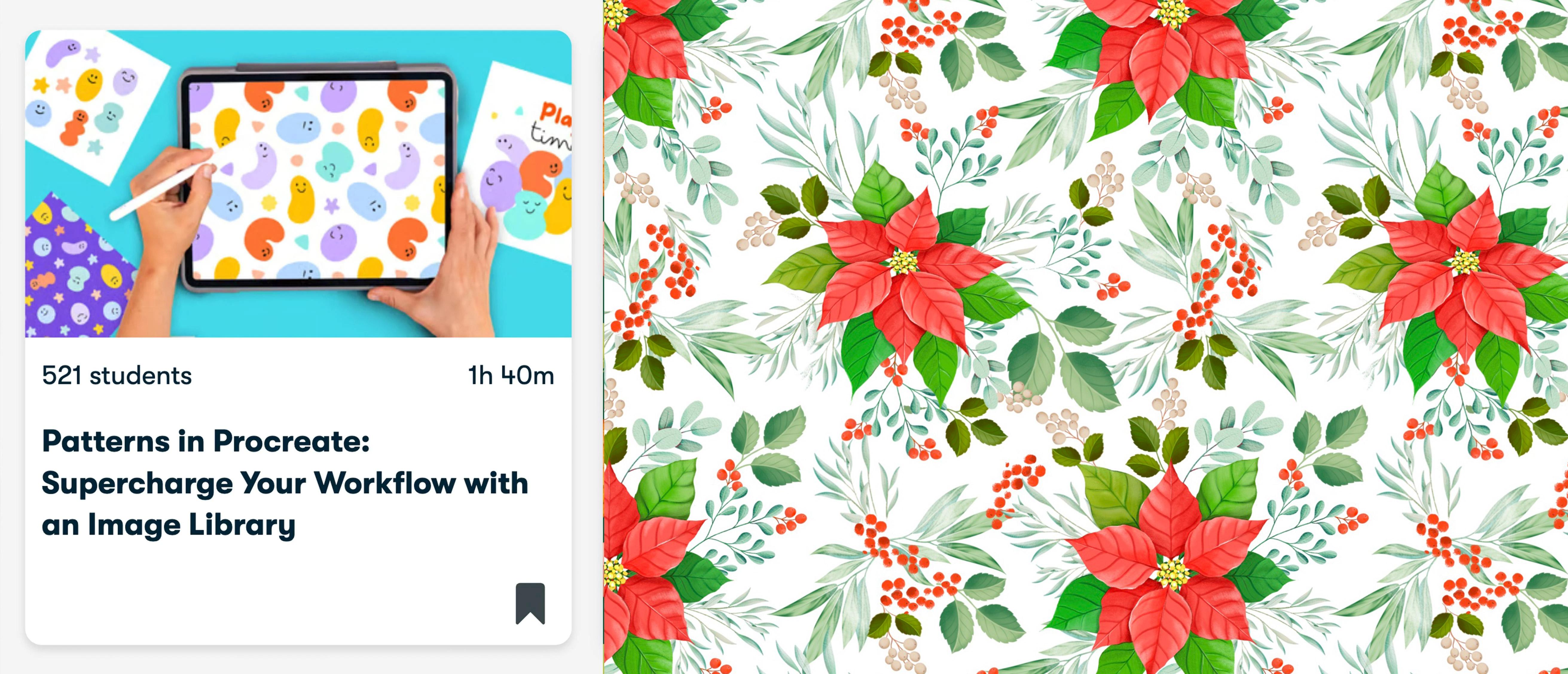
seamless patterns, I also recommend taking my
class patterns in Procreate, supercharge your workflow
with an image library. You will learn a simple
method for building repeats, the key fundamentals
for designing successful patterns and how to visualize your work on products. Join my newsletter
through the link in the description of this
class for ray resources, freebies, and behind
the scenes updates. For more casual tutorials
and art blocks, you can also find
me on YouTube at Silvispina dot art and on
Instagram using the same tag. If after finishing this
class, you enjoyed it, learn something new and want to support me as a teacher,
please leave a review. Reviews help my class
gain visibility. They also help me know what I'm doing well or
what can be improved, and it always makes
my day to know what my students think
about my classes. So please if you enjoy this
class, leave a review. It's been a pleasure
to paint with you. I can't wait to see
your Ponsetia flower and watch you grow
your image library. See you in my next class. Bye. H.
 Silvia Ospina, Artist and Graphic Designer