Transcripts
1. Introduction: [MUSIC] Has this ever
happened to you? You go on vacation,
and you think, "This is going to be such
a nice relaxing vacation. I'm going to take my sketchbook. I'm going to just sit
and admire the scenery and draw pretty
pictures all day long." You get there and
all of a sudden, you're running around in a
million directions at once, trying to see everything, trying to do everything, and you never even
opened your sketchbook. That's exactly how I felt on
my last trip to Amsterdam. I came up with a
really simple approach that uses a very
minimalist color palette and lots of white space. Just two or three swipes
of color and you're done. I'm using one pen for
the whole drawing. This time, I also took a
couple of markers with me, and I use those for
details and shadows, which just turns out to
be a whole lot faster than really fine
watercolor brushstrokes. I was really surprised at how lively and vibrant
these sketches were, even though they were dashed
off in under half an hour. I was also just so happy to have such a lightweight travel
sketching kit with me. I never even debated
whether or not to carry art supplies
around with me. I just always had them in my bag because they didn't
take up any space and that's how I was
able to squeeze in a few minutes of sketching whenever we had a little
bit of free time. The result is a sketchbook
that feels really bright and lively and never
overworked or labored over. It was always just
quick and fun. I'm Amy Stewart. I'm a
best-selling author, an artist, and an
urban sketcher. I've been all over the
world with my sketchbooks and they're just
full of memories from every trip I've
taken over the years. In this class, I'm
going to show you a really simplified
sketching style that actually has some
cool ideas behind it. We're going to start out by picking a color
scheme ahead of time based on the idea of
complimentary colors. I have an alternative
approach to this that I'm going to show you. I have even arranged
my watercolor palette so the color complements
are next to each other and I'll show you
how to do that too. Now, we're going to be drawing
in a really free, simple, easy style without getting
too hung up on details. We're actually going to
leave a lot of white space, which I think can let
your artwork breathe and give it just a light,
whimsical quality. These are quick and
playful sketches that anybody can do
with a little practice. If you're a beginner, I think this is a
great place to start, and if you've been
making art for a while, I think you'll like this as
a way to just loosen up, and do something quick and
simple in your own style. Let's get going. [MUSIC]
2. Your Project: [MUSIC] The project
for this class is to do a quick travel sketch based on either the reference
photos that I'm providing, or you can just work from
your own vacation photos. Of course, ideally
what you'll do, is you'll go out into
your neighborhood, wherever you happen
to be and try drawing from life using
these techniques. You don't have to live
around the corner from the Eiffel Tower to make
an interesting drawing. I hope you'll go out and just give it a try
wherever you are. Now before we get into each
one of these sketches, we're going to take a minute
to look at the scene, decide on a color scheme, and also decide
what not to paint. Part of keeping it
simple is just putting down a few quick strokes of color and leaving
lots of white space. When you do your sketch, I hope you're going to
follow the same process. First, pick your color scheme, decide where your
color is going to go and where it's
not going to go, and then get into the drawing, but there's one more thing
you're going to be able to do with this project
if you want to. For my last example
in this class, I'm going to put down
the color first without any preliminary sketches
or drawings to guide me. By putting the watercolor
down first and then figuring out how to make
a drawing on top of that, you're guaranteed
[LAUGHTER] that the finished sketch is
going to be a little wonky, a little off kilter in a way that I think is
actually really charming. I hope you'll give that a go. Be sure to post your projects in the
project section below, I really want to see
what you're working on. Of course, if you have any
questions or comments, post those two, I'm happy to pop in and
answer those. [MUSIC]
3. Supplies: [MUSIC] Supplies for this
class are really simple. I've posted a supply
list for you, but if you don't have
these exact materials, feel free to work with
whatever you've got. We're going to be doing
this with watercolor, and in the next lesson I'm
going to walk you through my watercolor palette
in more detail. We'll talk a little bit
more about the paint. But any basic watercolor
is satisfying. You don't have to
have my exact colors or my exact watercolor kit. Also you can do this
with other types of color like acrylic ink
or something like that. If you like it
better, feel free. Let's look at supplies. I'm going to show you not only the supplies
for this class, but the supplies as I use
them when I'm traveling. Everything for me fits
in this little bag, and I'm going to say more about the bag in a minute
because I love this thing. But first of all, let me just talk
about what's in it. In terms of a watercolor kit, this is the travel kit
that I'm using these days. I put this in my supply list. It's a company
called Art Toolkit. It's a tiny little kit that's the size of like a credit card. Basically it fits in your pocket and I filled it up myself
with tube watercolor paints. All my colors are
from Daniel Smith. But again, whatever you're working with is going
to be totally fine. But this is my watercolor kit. For brushes you really just are going to need one simple brush. The brushes that I'm
traveling with these days are both water brushes. They have water in the
barrel that you can use. I tend not to rely
on this so much. I carry a little water
bottle around with me, but I like this one
that's got a square tip. I've really been
using that a lot. Then just a regular
watercolor brush is just going to be a basic
round brush tip. But this is also super
flexible in terms of whatever brushes you have
will work for the class. You're going to need a
pencil and an eraser. We'll do some pencil sketching. For pens, what I'm
using this time is a Tombow Fudenosuke brush. It's got a hard nib and
it comes to a point. You can draw with a really fine line or you can lay it down on its side and get
more of a bold stroke. This comes in black
and it's waterproof. I think it's a great little pen, but any drawing pen is
fine like a pigment liner. Any pen with waterproof ink will be totally good for
this. That's all you need. Also something new that I'm doing that I'm
going to show you in this class is traveling
with just a few markers. What I'll be demonstrating, these are Faber Castell
Pitt brush pens. They're waterproof, good ink. Good quality like
India ink, light fast. It's good stuff. I've
got a couple of grays, a light gray and a dark gray. This is cold gray
3 and cold gray 6. But one or more gray brush pens might be fun to have for
this if you've got them. Then also, I took a bunch of colored markers with me and
I didn't use most of them. These are the two
I ended up using, so now these are the
only two I carry. This one is called
dark chroma yellow. The reason I got so
into this is that I was using it in windows, like light coming out of shop windows and
stuff like that, and basically the same with this light blue one
is that I would maybe put a little
and upper windows in buildings or just
here and there. Sometimes I would put
these on people's clothes. Just ways to add a little bit of extra sparkle or
vibrancy to painting. You might pick different colors. Take a few with
you next time you go out and see what you use. You might like having a
couple of different greens so that you can really quickly
scribble in some trees. You might like having a couple of skin tones because if
you're drawing a lot of people in crowd you can
very quickly brush in some arms and legs
and heads with those. Maybe you want like
a really bright pink that would be good for shop awnings or beach umbrellas or
something like that. Really just think creatively
about those and take the colors that you're
drawn to and see if they're useful to you. We're going to have those and let me talk about the
paper real quick. I'm going to be in the class. I'm going to be demonstrating with just a block of
watercolor paper. Be sure your paper
says that it's for watercolor especially
during the class. That's all you
really need to know. For our travel sketchbook I'll show you what I've
been liking lately. This is a Stillman
and Birn sketchbook. It's their zelda paper
which is very smooth. It's a little bit like hot
press watercolor paper. I got to tell you this one does not really take a
ton of watercolor. A few brush strokes is fine. But if you really
want to get into a lot of wet watercolor, then you need a
heavier paper that says that it's just
for watercolor. These clips are useful to me for holding the pages down and for clipping my palette onto my sketch book
as I'm drawing. That's what those are. Then I usually have a
bottle for some water, just like a little shampoo
travel bottle thing and some cloth to clean
my brush with. But I want to say
something about this bag because I just want you to get a sense of you can make this really
easy on yourself. You can have a very
lightweight travel kit that you'll never hesitate to take with you as you walk
out the door because it's not going to get
too heavy on a long day. Everything fits in here. I can stick my watercolor
palette in here, my brushes. There's room for my pencil. There's room for a few markers. Then when I'm drawing, there's a little pocket
in the front and my water bottle
just fits in there. That's nice like
everything is together. But the thing that I really
like about this is that there's this little
snap on strap and I can clip this on
to the front of my bag that I'm wearing
over my shoulder. That's the bag that I walk
around with all day long. I can just hang off
that bag and I can use an extra binder clip
to keep it firmly in place on my bag and then all my art supplies are just
within very easy reach. If I have to move on quickly, all I need to do is
just zip this up. [LAUGHTER] Should be a
little quicker than that. Just zip this up and
I can walk away. Everything is very
compact and together. This is my entire
everything that I'm walking out the door with
when I go travel sketching. I could even take a sketchbook
that's half this size if this was more than
I wanted to deal with. I encourage you to
think about something that's just easy
and convenient for you that will
encourage you to get out and sketch as
much as possible. I think that's everything
we need to talk about in terms of supplies. Let's get into looking at the watercolor in a little
more detail. [MUSIC]
4. Watercolor Overview: For each of these sketches, we're going to take
a minute ahead of time to choose a color palette. Now, for some of you, this might be a
real shift in terms of how you approach a sketch. You might be used to
making a drawing first and then coloring in
every part of that drawing from the
ground to the sky, to every building and tree
and window and awning, so that basically every inch of your paper is covered in
paint and you're trying to match the colors you
see in front of you and make everything
pretty realistic. What we're going to do today
is different from that. What we're going to do
is we're going to pick just two or three
colors that work well together from a
design perspective. These colors are going
to have some basis in what you see in the
scene in front of you. But the fact is
they don't have to. If you want to take a
beige colored building and make it bright
green, feel free. You want to make the
trees purple, go for it. The whole idea is for
these to be really lively, imaginative scenes that show a little of your personality. To choose this color scheme, we're going to start
out by looking for complimentary
colors, and to do that, we're going to use
a color wheel. Now, you probably already know the traditional color
wheel with yellow, red, and blue as
the primary colors. But have you ever
looked at a color printer cartridge and notice that those printers don't use ink in red,
yellow, and blue? Most printing material
like books and newspapers and magazines and
your color printer at home, they print with a different
color scheme called CMYK, which stands for cyan, that's basically turquoise, magenta, and yellow. The K refers to black, we don't
need that for this class. But the CMYK color wheel, it uses yellow, turquoise, and magenta as the
primary colors. Just like with the
traditional color wheel, the complimentary colors are the ones that are just opposite. These complimentary colors, they look beautiful together, and when you mix
them, you get some lovely desaturated,
neutral colors. Now you might have a lot of
questions right about now. You might be wondering
how it's possible to mix colors using a
different color wheel. Or you might be wondering how to mix earthy tones like yellow
ocher or burnt sienna with a pallet of such bright
saturated colors. Well, I can promise you
all that is possible. If you really want to spend more time studying color wheels, I have a whole
class on this idea of the CMYK color wheel. It answers all those questions. I'll put a link below if
you want to check it out, but you don't need
it for this class. All you need to know
for now is that we're going to be looking
for color schemes for our sketches that
are based roughly on the idea of complimentary
colors that are across from each
other on the color wheel. To make it easy for me to quickly choose a
complimentary color scheme, what I did is I went through my paints and I chose
colors that fit on this color wheel and
then I arrange them in my travel palette so that each color is across
from its complement. They're sitting right
next to each other, so I don't have to stop and
think about it too much. If you want to try
something like this with whatever colors
you like to use, I've included the color
wheel and a drawing of my own palette
for you to download, and feel free to experiment with that and just
make it your own. Now, one thing I want
to point out about this palette is that
there's 12 colors on my color wheel
and the palette I'm using comes with 14 spaces. I added two colors that
I just use constantly; Naples yellow and new gamboge. They just happen to be favorites of mine that I always want to have on hand and
you're definitely going to see me use
them in this class. You might have a few
different colors that you can't live without. Your palate should definitely be personal to you and
your own preferences, because that's what makes your art different from
anyone else's art. Now that we have some
colors lined up, let's do our first sketch.
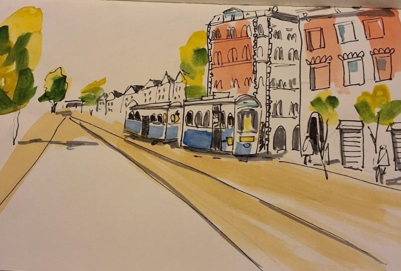
5. Train Color Choices: [MUSIC] Let's walk through
this first scene and think about what would be a
good color scheme here. I'm wanting to pull my
colors from real life. Obviously, the train is the whole reason [LAUGHTER]
for this sketch. It's got a darker blue, more like a true ultramarine
blue on the train. I'm sort, does the
train stay blue? The train could
be another color, but let's for the moment, let's think about that as blue. The other thing is these buildings that
are in the foreground, like I could see putting
some color there. I like this peachy coral color that both of these
buildings seem to have. Maybe I'll work with that. I'm going to put some
color in the trees. You're going to
see as we go that I really love [LAUGHTER] putting the trees in with some
color that I think works, but they're basically going to be the colors that
trees generally are. I'll put some of those trees in, other than that probably
not a ton of color, maybe something on
the ground just so the train doesn't look like
it's floating in the air. That's about the only other
thing I can think of. With that in mind, maybe it's an orangey,
peachy coral color. Maybe I keep the train
blue, maybe I don't. Let's take a look right now at the color wheel and see
what makes sense here. If I'm thinking in
orangey, peachy color, then I'm looking at
something in here, something between pink
and orange maybe. What's across from that? Well, what's across
from it is turquoise. May be a cobalt blue. You could use a lot
of colors here. This could be civilian blue, this could be fallow blue. Maybe it's in here. Which means that even though
the train in real life is closer to ultramarine,
I'm going to skip that. I'm going to push it over here, so I get this nice
complimentary color scheme. Then I'll work the trees in. The trees are going to
be pretty bright colors. They're going to stay
on the same side of the color wheel basically. Everything in my
painting is going to be on one side of
the color wheel. But there will be more
or less colors that are pretty true to the colors
that trees actually are. Having thought that through, now let's look at what we can do here with the colors
we've got on the palette. Maybe I take a little pyrrole, orange, maybe some
quinacridone pink. I might dip into new gamboge, which is really just a
mixture of yellow and orange. I'm really just playing around
here to see what I get, what's appealing to me. I just want it to be
somewhere in here. Oh, I love that. Like that to me is
such a gorgeous color. It's really bright
and clear and bold. It's not too different from the color that the
building actually is, but I think it just makes a
little more of a statement. I can maybe go a bit
more orange than that. Let's see what happens if I
push it a little more pink. If I get a little more, maybe quinacridone,
pink in here. That's also pretty great. I think a color that
somewhere in here for the building would
be pretty nice. Then for the train, I want a blue that's not all the way over
to ultramarine, not like a real true blue. Let's see if I take
this as cobalt, teal blue, light bright
turquoise color. Now, it could be something
in here for the train. I like that actually. That's cool. But let me
push it a little more blue. Let me get my cobalt. Again, like a fallow
blue or civilian blue, something like that
would also work. Oh, I love that. Like these two together
I think are so great. I'm definitely going to go
with something like that. I mentioned that I thought I probably needed a
little bit of color on the ground just so it doesn't look like the train
is flying through the air. Let me clean my brush
off a little bit here. But this enables yellow. One of the reasons
I like it is it's a neutral color that I feel like it shows up a lot in cities that could be at
the side of a building, that could be pavement, could be a lot of things. I keep it on my palette
all the time for that. I use it constantly. Then let's think about
the trees a little bit. I'm going to just
do very bright. These are bright, crazy
colors for the trees. But pretty much
just like a bright, unmixed yellow and a light, really awesome,
brilliant, bright green. Then I might take, this is fallow green. It's fallow green, yellow shade. Is what it's called. But I might mix that
in with some of this blue that I
already had on there. Maybe even a little turquoise
to get the darker color. Let me get something that's actually much more
dark than that. I could go there, I could bring a little
turquoise into it, but somehow I want the darkest possible color
that's in this tree. Now, as you can see, this is a super bright, super saturated color scheme that I think it fits my
personality more than anything. You might look at
this and go up, this is totally not me. But I hope that what you
can see is that I've limited my color choices here. I'm limiting the parts of the painting that I'm
even going to paint. I'm not going to paint
the whole thing. I'm going to have like a bright vibrant color
scheme that looks like this. Let's get into it and see
what we come up with.
6. Train pencil sketch: [MUSIC] I'm starting off with a pencil sketch to begin with because there's a little
bit of a perspective in this drawing [LAUGHTER]
and it might help you to see me
sketch it out first. Now, if you're not used to drawing in perspective
and you're not familiar with the idea
of a vanishing point, don't worry about it too much. I do teach a whole other
class on perspective, but I don t think you
really need it for this. What I'm showing you here
is that all of the lines in this drawing converge
to this one point. By starting out with
a pencil sketch, I can just very roughly map
out some of those lines. It just gives me
some guidance so that when I really
do start to draw, I can feel a lot more
free and relaxed about it because I know that I have all
these angles right. But if that seems
really unfamiliar to you and you're not
quite sure how that would work,
don't worry about it. You can just measure
with your pen or your pencil and just sketch
out some rough shapes here. Anytime I'm doing
a pencil sketch, I'm thinking about building containers for these
things to go in, so I'm not really
thinking about, I need to sketch this building and then that one,
and then that one. It's more just, I need to build a little container that
this object fits in. For instance, the train. Now, there's this
super cool train that pulled up while I
was sitting here drawing. I definitely wanted
to include it. Trains have the annoying
habit of moving on, [LAUGHTER] it's what trains do. But once I saw one go
by, I thought, well, there's probably going
to be another one in 15 minutes or so. Sure enough, there was. When this is happening
to you out in the world, remember that you can leave
some space for something and see if it comes
back, and often it will. We're going to do
this with people as well a little later, but for now, we've
got this train. Unfortunately, we're
working from a photo, so it's sitting still. All I'm doing right
now is I'm using those perspective
lines to help me place these objects
where they go. I've got the train in, I've got the tracks. I need some sense of there being tracks that the train is on. There's a little sidewalk. Then there's also these trees which you're going to
see when we add color why it's always so
important to me to block out where the trees go. I think, especially in
an urban environment, trees really help to break up the monotony of
buildings in streets. It's a very different color
that comes into your palette, which I think is really cool. Also they can help to show what's happening
with light and shadow. I always like to just mark out a little space where
they're going to go. If I'm starting off
with a pencil sketch, just establish that. I think these lines are pretty much where I need them to be. I'm going to think about, in this case, maybe even
adding another tree. These trees, by the way, these things, these
elements I'm putting in, they don't have to be
exactly how they are in the photo or in the
scene in front of you. You can add an extra tree. You can change the height
of something slightly. Feel free to just make it
work for your drawing. Then also stay open
to happy accidents. [LAUGHTER] If you make
something a little too tall, a little too short,
just work with it. Generally, for a super
quick sketch like this, I might not be
starting in pencil. I might just be ready to
break right out into pen, so I have to be ready to just
own up to those mistakes. But pencil is nice because
you can make changes. Here, for instance, I'm
feeling maybe I made the train a little too big
and it's taking up too much space in the drawing. The drawing doesn't have to
match the photo exactly, and in my case it doesn't. But I do want to
just be aware of, this train has two cars, and so where does one car
end and the other one begin? How wide is it? How long is it? The great thing about
pencil is you can make adjustments and everybody does. The reason you have
an eraser is so that you can keep
changing as you go. That's the whole reason
for working in pencil. Erasing something does not
mean you made a mistake, it just means that you're
making little adjustments and thinking through
some ideas about how you want the
whole thing to look. But there's our basic pencil
sketch, so let's move on.
7. Train Drawing: [MUSIC] If you've done that
pencil sketch along with me, then the drawing is probably
going to go pretty quickly. I'm using this Tombow
marker for this, again, any ink pen, fine line or whatever
you want to use is fine. Because I have all these
pencil lines down already, I can move right along with dropping in these
little buildings. Just looking and observing what these far away
buildings look like and very loosely how big
they are relative to the ones that are
closer to me that are going to appear
quite a bit larger. I'm also using
more of the tip of the marker so that
I get a finer line. Then you'll see as we get
closer to the viewer, the buildings that
were closer to, I'll use a little
bit more bold line, but I'm really just trying to get very loose shapes in there. It doesn't matter to me
exactly how many buildings. I'm definitely not
counting buildings. I'm just dropping them in to get the sense of the street
goes off into the distance. I am also not going to draw a black
line around the trees. I'm going to let these be more loose organic
shapes that aren't really contained
or defined by ink, and it'll just be watercolor, so I'm going to skip over those. Now as I'm dropping in some of the details on these
buildings that are closer, I'm definitely looking at the architecture and trying
to get a sense of life. Well, what is the
shape of this roof? Is there a little window up
there, are there gables? How does the whole thing work? Because you do want it to feel
like you're in Amsterdam. You want some of those
architectural shapes. But it should also be
something that's very quick, and you're not trying to get hugely obsessed over
just a ton of details. The other thing is I can pull elements of buildings
that I see around me. I don't have to copy these
two buildings exactly. I'm definitely not
doing that here. I'm sort of looking
at generally, what are the roof lines like? What are the windows like? What can I pull in
here to make it work? I've got the basic shape of the buildings just roughed out. I'm going to do the
same with the train. I've already drawn it in pencil, so I have a pretty good idea
of where it is in space. I just want to use quick
little lines to get a sense of the general shape
of these two train cars. There's something
underneath there. I guess they're
not called wheels on a train, but
whatever it's called, there's definitely
you can see that there's a little
equipment under there. I like those details. I'm just going to lay down these lines
that are giving me a general sense of
where everything is. You don't have to
copy your pencil drawing exactly if you
decide that you need to make some slight revisions to the thing as you
draw. That's good. The longer you're drawing, the more you're seeing and
the more confident you feel about your ability
to figure this scene out. By the time you're into ink, you've already
learned more about it than you knew when
you were in pencil. It's totally fine to disregard little elements of the pencil drawing if you're getting different ideas or different
information as you draw. Basically I'm getting
the tracks in. This is like a
bicycle lane as well. That's got a little separator, so I'll put that in. There's a little building
off in the distance. I broke my own rule and drew
a little outline around a tree off in the
distance because it's one that I hadn't
drawn with pencil, but I just noticed it back there and decided
I wanted it there. I'm going to make some marks
for the trunks of the trees, but again, not the
tree itself really. Anything else I can just
see that's maybe way off in the background there
that I want to get a sense of. I'll put it in. Then coming back
to the train now, I can start to get a
little bit more detail. Now it's time to start thinking about things like windows. When you're drawing
windows and doors, don't feel like you have to count and draw every single one. Just make something that fits with the drawing that
you're doing and gives the viewer a
sense that like, okay, I get it, this
is drawing and there's little windows
that start halfway up and that's how trains work. That's good. That's
all you really need. I'm just going through
here and starting to fill in some more
details and also some little dark
areas like the door itself might be dark just because it's open and
there's a shadow cast, or maybe it actually is a door. Anyway, putting those
little dark areas in makes it clear that this
is more in the foreground. There's some stuff up on
the roof of the train. I wanted to get there, so I drop that in. But, just go along and fill in, make sure that the
windows are getting bigger as you're getting
closer to the viewer. [LAUGHTER] That's
always helpful. There's also a door, of course, to board this train. I think maybe in this case, I'm going to go ahead and
put a little figure in, basically just a
little dot for a head and a little lumpy
shape for a body. Just get something in there because maybe
there's a conductor who's leaning out or maybe someone's about to get
on or about to get off. That's helpful. Then obviously someone
is driving this train, at least I hope they are. I could think about maybe putting someone up
there in front as well. Just any little details
that really say that this is a train
and maybe give the sense of it as a
little vintage train. Like there's some little
signs or little markings. Any public transit
anywhere in the world has its own distinct
logos and shapes. Getting those things in, darkening up some of these door and window spaces
will really give it just some weight and some presence and
draw the eye there. Underneath the train, there's a dark shadow, just like there are under cars. Again, I'm laying my pen
down on the side and just blocking in some
darker shapes here. It's always good to look for where are those shadow shapes. A lot of the time
they're in places where I think connects
with the ground, a contact shadow gets made. Now with the buildings. Obviously, I want to
put in some windows and some other little
architectural details. Just look for those
little elements and see what you can suggest, what you can drop in. Once again, in terms of windows, I'm not counting windows. I'm not trying to make
them look exactly like what's on each building. Just a general sense that these are buildings
that are closer to us and this is what
the windows are like. It's helpful if they line up, it's helpful if they're
in perspective, but we're going to
have a couple of other chances to
adjust these later. Don't worry too much if
anything seems a little off. There's already some things
that are a little bit off in this drawing, but overall, once it's all said and done
and there's color on it, it's just going to look
like something that was done very
quickly and freely. It'll have a little bit of
an improvisational feel. That's all you're looking
for. I'm just figuring out. Again, I'm going back to that
vanishing point over and over again just to
get some lines in, so I can just see where
these windows fall. One good trick is
to just draw a line and stack the windows
on top of that line. That does happen with
these buildings. I'm basically
making the letter m as pairs of arched windows. That's not exactly
what I see here, but I can see it up
and down the street. It makes this building look different from the
one that's next to it. It's also just a shape
that I can draw in a very quick and free and
unrestrained way on the page, which is what I'm looking for. Then of course you get
down to ground level, and you start to see
different elements. You start to see doorways
that might be really dark, either because they are
in shadow or just a tip, whatever it's a
dark colored door. I'm paying attention to
what I see at ground level, maybe an arched
entryway, for instance. It doesn't really matter whether they line up or don't
line up with the trees. Once we get color in, the trees are going
to read as trees. It doesn't matter exactly
what's happening in terms of windows and doors
and the tree trunks. I'm not too worried about that. Couple other windows
that are down there at ground level that
I will work in. Then I'm also just thinking about other little details
that I can drop in. One of them is that there
are people walking by. I can use any person
who's walking by, and I can measure their height against these doors
like where does their head fall relative
to these doors? Just drop in very loose figures. Just a little blobby
shape with a head. I was talking about
this conductor earlier, but I didn't actually
put the conductor in so they're same thing. It's just a torso and a little dot for a
head is good enough. It suggests that
there's somebody driving this train,
which is helpful. That's really good to
know. We've sketched out some very basic
details here. Normally at this point
I'll take a pause and assess how much more time
I have to work on this. Then maybe come back in and put a few more details in before
we get to watercolor. That's what we're
going to do now.
8. Train Details and Shadows: [MUSIC] I've got some time. I'm going to add in a little
bit more detail with pen, but we're also going to
get into marker here. This is always a moment where
I'm looking around going, do I really have more
time to devote to this? What are some of the cool
little architectural elements that I could work in as
long as I'm sitting here? For instance, there's this
brickwork around the windows. I really like that. Sometimes even just adding, looking up along the
roof line and saying, what exactly is
going on up there? Are there little windows? I love antennas and
chimneys, stuff like that. I'm always looking
for those things. Is there any little extra bit of trim or detail or styling
that I can work in? I'm going to see a
little chimney up there, I'm going to drop that in. I'm going to add the little, I wish I knew what these
were called in Amsterdam, the hook that they use to pull furniture up through
the windows. [LAUGHTER] I love those. I might as well add those in
as long as I can see them. Then I'm going to come
in with some markers. This is my darker gray marker. I want to start adding
some shadow elements. I'm looking for the deepest, darkest shadows because I've got two different gray markers
I can use for this. This one is almost black. It's ever so slightly
lighter than black. Also this is a brush marker, so it's easier to
get a big markdown. That's why I use that
instead of the pen. I'm realizing that in some of these windows, it
would be nice to just barely suggests that
there's people on the train. So I 'm just drawing in little torsos with little
dots on top to suggest heads. That's really about all that is. Now, I've got my lighter
gray marker and I'm looking for other areas where I want to drop in some shadow shapes. A lot of times, this
is within windows. Windows, I think we
tend to want to make windows blue like the
sky or blue like glass. But in fact, often they're
quite dark and they can give a little depth and
just anchor you, give a little bit
better sense that, oh yeah, this is a building. Sometimes I'll come in and
do some really dark windows. Definitely for these
buildings off in a distance, I hadn't done any
windows up until now because they're so far away. They are tiny little dots. I want to do them
in gray rather than black because the
farther away you go, the lighter things get. The lighter in value. By doing them in gray
rather than black, they just helps make
them seem further away. I'm just looking for
any opportunity like, what can I use this gray marker
for once I've got it out? Sometimes I see things,
I'm going back and forth. Usually, I'm holding two or
three pens in my hand at once. Like I've got my Tombow pen here and I'm doing
things like making the tree trunks longer and just establishing exactly
where the sidewalk is. Even just taking a
break for just a second and looking away
from your drawing, you look back at it and you
can see all these things that you need to fix or that
just don't quite read right that you didn't
notice the first time around because you were so totally absorbed in the drawing. I'm going to lay in a little
bit of a sense of a shadow, along these train tracks and sometimes the curve of the street will cast a
little bit of a shadow. It just gives it a little bit more of a
sense of depth as well. But at this point, I think we've done
a pretty good job of laying in a lot
of darker shapes, a lot of gray shapes. Maybe I come back in and
do a tiny bit more detail. There's these metal door type
things on this building, so I can put that in. I'm especially interested
in more detail right around the front of the
train and these buildings. One thing that these
buildings have is this brickwork
around the corners. That I think is a very
authentic detail, very Dutch. Even though all I'm
doing is making these tiny little
marks with my pen, I think it does add to the sense of the architecture
of the building. I'm going to go ahead
and put those in while I have an
opportunity to do it. It's also just a different
kind of shape and a different kind of line
can be a really good thing. It can just give a
lot of variety and just make the whole drawing seem a little bit more lively. That one really appeals to me. You might find
different things that look appealing to you as you go, and so this is where
it's really about your personality too. Few other little spots where
I could see that I can put some shadows in, and
that's really about it. What I'm going to do now
is come in with my eraser. I'm going to erase everything. I can even erase the shapes of the trees
because I know where they go. I mean, I'm sitting
right in front of it so the trees haven't
gone anywhere. By getting rid of
these pencil marks now really makes the
drawing look really fresh and clean and
ready for some color. I think that all
looks pretty good. I think we're ready to
move on to watercolor.
9. Train Watercolor: [MUSIC] Now we're ready to add some color and I'm going to
start with these markers. The idea with this yellow
marker mostly is that it can give a little
sense of light, maybe just a few little accents. I'm going to go ahead and do
the signage on the train. Then with a blue marker, a few of the windows, not all of them, I don't
want to overdo it. But I think it brings
a little bit of life into the drawing to add a
few spots of color that way. They are almost too small to do effectively in watercolor. Now with the trees, I'm starting out with a bright yellow. I'm using this square brush, which I really love
for putting in trees because they're not
squares, it's the opposite. They look stylized. This might not be your taste, which is totally fine, you definitely don't have
to do it this way. It's just something I
started doing by accident, and I really like
the way it looked, so I've kept it up. Once I've put that yellow down, I need to let it dry completely before I add anything else. I'm going to come in
with this orangey color, which is a mixture of my orange with a little bit of
Naples yellow to make it a more creamy,
almost pastel color. I'm just dropping in a couple swipes of
it on the building. That's it. Now I'm
coming in with spring green or just
any other bright green. Maybe you have a
phthalo green and dropping in a few more
brush strokes on the trees. Again, they're really
square strokes, they are very stylized. But the idea is that there's
light hitting the tree, so some of that yellow is going to represent where the
light's hitting it. Then this is more of a mid-range green that's most of
the body of the tree. Obviously, it's just a very
bright, cheerful color. I'm not trying to work in all the nuances of the
color on that tree. Now for the blue on this train, it's just one stroke. I'm really wanting
to be very quick and spontaneous with this color. I'm just dropping it
in and leaving it. This is a mixture of a
turquoise and phthalo blue. It's just something that I think looks good with that orange, so it's really just about
those two colors together. That's pretty much all I really feel I need
to say with color. Now, I'll do a little
bit of trim there in that same blue. I think it just needs it
so that the train has a little bit more
prominence, maybe. Now that the trees are dry, I'm going to come in and
add the darkest color. I've got a little bit of fallow green mixed with
phthalo turquoise, so it's just a very dark green, a dark greenish blue. I'm putting that down in the lowest corner parts
of the tree again to suggest darker areas
of the tree that are lower to the ground and
more away from the light. It's just a quick
couple of strokes just to get a darker color in there. It doesn't matter
exactly the shapes. Again, if you're not into
the square brush strokes, you definitely don't
have to do it that way. But I do like the way it
looks to layer one color next to another rather than
put them on top and mix them. I'm coming in and just adding a little bit of Naples yellow to the street because I feel it just needs to be
anchored a little bit, so that it doesn't
look like it's floating in space too much. I just want to drop in a
few quick brush strokes. It's a very neutral color, doesn't really compete
with anything else. I think it just
helps a little bit. I also realized I
left out one tree way off in the
distance [LAUGHTER] that I wanted to include. I'm real quick going back and dropping in just a
tiny little hint of the yellow and a
little bit of the green. I'm not so much waiting for each pass to dry as much because I want to wrap this up and also it's so small
off in a distance, I don t think it
really matters much. But there, that's good enough. I think it just draws the eye in a nice way down
there and just sets up a nice pattern
with the trees. At this point, it's
pretty much done. If I have a little more time, this is a moment when I might
come back in with markers, look at any place where I
just want to make a little more of a statement
with some shadows. I'm looking around at
some of these windows. Any place where I can just
liven things up a little bit. Looking at the people
and the trees, they could use a
shadow behind them. The train is obviously going to be casting a
little bit of a shadow. This tree over here
is casting a shadow. I'm not doing as much of
a shadow, by the way, as I see in the photo or
as I saw in the scene, because I don't want that
color to really dominate. But once I've got that done, it's looking pretty
well complete to me. I can come back in, I'm just going to tweak
some of these trees. Any other little
adjustments that you want to make at the
very last minute, now's the time to do it. The paint is pretty much dry. You've got an opportunity, come back in with the gray
maybe just a little bit, and darken up the
front of the train, the areas around the windows. I can maybe make
a little darker, add a few more little shadows
just to give it some drama. But these are all just
very small things. I'm really just looking
around and going, well, where else could I just
drop in a couple of more lines just to make it feel a little bit more finished even for a very quick
spontaneous sketch? You can always come back
with colored markers as well and drop in just a
tiny little bit of color. I've got these figures
that I just sketched in and I'm just going to add a little bit more
detail to them like, maybe one of them
is carrying a bag, maybe I can make
their pants dark, just something to make them
stand out a little bit more. I'll put some blue pants
on this one figure. I could also come back with that same yellow and just
do their heads. [LAUGHTER] It's not really the perfect color
for someone's head, it's not like it's a
skin tone or anything, but I think it just
makes them stand out and look a little bit more
complete in a certain way. I've got all that little
tiny touches of shadow. Again, this is all just
extras at the last minute, and I think that's
pretty much it. That's our first sketch. [MUSIC]
10. Cathedral color choices: [MUSIC] Are you guys
ready for the next one? In this scene, I
was standing here one afternoon and this woman happened to walk across the scene. It just
the right moment. I was already sketching. I saw her coming. Unfortunately, I had
my phone nearby, so I took a few quick
pictures that she was moving across the scene and this
is the one I like the best. I love it when that happens. Even though she was
moving too quick for me to catch her exactly, I could always glance
down at my photograph. Now, when I'm thinking about a color scheme for this one, this time, I want
the color scheme to be based on the
mood at the moment. This is the great thing
about sketching from life is sometimes you catch something that's
a mood that isn't exactly captured
on the photograph. In this case, even though the trees here are
still pretty green, it was already
starting to feel like fall just a little
bit in Amsterdam. This beautiful light
that's moving across the scene also felt like
that early autumn light. Immediately I thought, wouldn't
it be cool if these were fall trees and they had
some orange to them, so they were a fiery color. That seemed interesting to me. Then I thought, well
these buildings are all silhouetted against the sky. They're quite dark. It'd be an obvious
choice to go with a really dark magenta or
maroon or purple color, but I want it to really be
about these orange trees. I'm going to make
these into fall tree. Then what I do with
the rest of it? Once again, if we look
at this and I think, I want to be in here
like in yellow, orange, maybe just a tiny bit of green
still left in the trees. What's a good
complement to that? What's really going
to make it stand out? This time, it's
ultramarine or just a really more of like a true
blue somewhere in here, like maybe somewhere between
ultramarine and cobalt, but also really dark and not quite so
bright and saturated. I think it needs to be a
little more neutral to fit with that shadow. The sense of it being in shadow. Let's see if there's something
we can do with that. The first thing I'll do, let me just think about fall and tree colors
a little bit. Again, this is just
going to be like a few quick brushstrokes
that's really more about color scheme than anything else. What could that be? New gamboge is already, this is one of the reasons
I always keep it on my palette is that I just
feel like it does so much. Right away I think that looks like autumn
leaves on a tree. Let me work a little
bit of orange into it. Gorgeous. These are
really speaking to me, these colors, I love it. Then I think there's a
darker color I can get. I'm going to use what I know
about complementary colors. I'm going to mix
the color that's opposite this orange
on the color wheel, which I have placed
opposite in my palette. Let's get a little of this
blue out and see what happens. If I work just a tiny bit of it into the orange.
Look at that. I get such a beautiful brown
color that I think could also really be lovely
in these trees. That's very cool, but now I need the blue, that's going to be these
silhouetted buildings that are just silhouetted
against the sky. So maybe I'll take some
of the ultramarines. Maybe I'll take
some of the cobalt. I feel like it's
somewhere in there, but then I really want it
to be not this bright. That's a very bright, saturated color and I'm not interested in that
because it does need to feel like it's
against the light. You just can't see as
much color because the way it's silhouetted
against the sky. I'm going to work into that
orange a little there. Now I get a beautiful dark blue that's pushed towards
gray a little bit because I've mixed it
with its opposite. I've mixed it with a
little bit of orange. I think that's gorgeous. There's an idea for
some colors there. It also just so happens
if I want to get a sense of light moving
across that pavement, I think that new gamboge ships. That's got a little bit of blue still mixed
in it from my brush. I tried this with an
actual clean brush. A little bit of new gamboge on the pavement could
be lovely too. That's really all I need to
think about for this one, those are basically the
colors I'm going to use. Again, you could choose a
different color palette. I think in this
case for me anyway, because I decided to really
emphasize those trees. It's the trees
against the building that I'm interested in
playing off one another. But there's other ways
of going about it too. It doesn't have to be about the trees in this case.
Let me just show you. It's also possible that
you might be interested in really focusing
on these windows. Maybe that's really
interesting to you. There's some little
picnic umbrellas. Maybe you want to really pop
those out in a bright color. You could really make these lampposts a
focal point and make them a really bright color that stands out against the
buildings or whatever. So there's a lot of
different ways to do this, but this is the way
that I'm going to go. Let's give it a try.
11. Cathedral pencil sketch: [MUSIC] We're going
to start this one with a pencil sketch, just like we did last time. I'm really looking to just draw containers that these
shapes fit into. There's a building over here to the side that's
pretty good size. I want to make sure I get that in generally the right spot. Then there's all these buildings in the background as well. I'm just looking at where does the dark area,
this picture start? What's the overall height
of that area back there? I don't have to draw every
one of those roof lines. I don't have to get that church in the background in detail. Just a general sense of where it sits is plenty and
that's going to let me draw with some
confidence when I get going. But that's all I'm really
aiming for at this point. You don't really need
much more than that. I also want to be sure and get the trees in because I'm going to be very careful to
paint those separately. My little thing with trees, I just love having them stand out in a really dramatic
way in a cityscape. I'm putting those in to be sure that I just don't
get carried away and forget where they go and to make sure that I
handle them separately. Now the other thing is we've got this figure and I
really want to mark where's her head and
where do her feet lands? I have a general sense
of her overall size. Then I'm just going to try
to just sketch in the shape. She's got the skirt
on so it's like a triangle shape very
particular shape. Just putting in a few
lines and her legs are at an angle that follows
the angle of her skirt, which helps a little bit. She's doing something
funny with our hand. Like I think she's
talking on her phone or doing something with her phone that
doesn't read very well. So I'm not going
to bother having her arm up the way it
is in the picture. I just don't think it
will make a lot of sense. But I liked this bag and I like the way it's
swinging up behind her. I think it helps give
her a sense of motion. I want to put that in and
I'm really just looking to make sure that I've got
the shape generally right, so that when I draw it, I can do it in a way
that is very quick and doesn't feel like
it's too overworked. Now of course, when you're
out sketching in real life, people don't stand
still for you like this so you have a
couple of choices. One is, if you're
lucky you've got your phone nearby and you
can snap a few pictures. I took a few
different pictures as this woman was walking
across in front of me. Then you can glance down at the phone to get them
in the right place. Otherwise, you
just have a lot of people walking past and
you make a composite of all those people and end up with some recognizable
figure in front of you. But I thought she
was so great that I wanted to get her exactly. I'm just going to drop
in these paths just to have a sense of where they are. I think it also helps
position her a little bit, you get the sense of her
walking across the street. I want there to be some line
in the street to show that that's what this is and make
some little adjustments. That's why we're doing
this in pencil so we can erase, so feel free. Then the last thing I'm
going to do here is just add a couple of these
perspective lines to show the angle
of the windows. I'm just looking at the angle of the bottom of the windows. I really think that's just about all I need to
start the drawing.
12. Cathedral drawing: [MUSIC] Let's get
into this drawing. I'm using my Tombow pen again. Just like before, I can really just use the
very fine tip of it to get the finer details that I want and then lay
it down on the side when I want something more bold. I'm thinking this time first about some things I
see in the foreground, but I want to make
sure I don't get lost. I'm really fond of lamps, light poles in cityscapes, so anytime I see them, I make a point of drawing them and I like to see them repeat. Usually, they do. Usually, if there's one lamp post, there's going to
be three or four. Even if there's not, it's
pretty easy to add some. In this scene, I'm
relocating one of the large lamp posts so that they line up a
little bit better. That the large one is very
much in the foreground, but a little bit further over to the left than it
is in the picture. I'm just getting in
some basic details. There's a couple more that
are off in the background, so I will drop those
in as well back here. They might not even be super obvious by the time
the drawing's done, they could definitely get lost. But I still like to put
them in and I think they help to give me a sense
of where everything sits. I think there's one more
over here and I can't resist just adding another
one over on this side. It's really tiny, but I'm just going to drop it
in. I think that's good. Now I think I will start over on the left
on this building. Try to really move pretty
quickly with your brushstrokes, with your pen here. Really get something
that feels very lively, and that it was just
done all at once. I'm slowing it down a little
bit for you from how I might normally draw if I'm
outstanding on the street. This is a little
bit more measured. But I think when you're
just starting out, you tend to want to
take a second to just look and make sure
that you've got everything in exactly
the right place. That's totally fine. But
overtime work on doing some of these rapid brushstrokes that feel like they were
really just tossed off. I think that what you
get when you do that, is you get a little
bit more of a sense of your own personality. Your own hand comes through because you're not
being quite so careful. Anyway, I'm just going around, I'm doing a little bit of the features of the
architecture here. There's a darker shadow on the side of the building.
I'll drop that in. I love any a little ornament sticking up on the
top of the building, [LAUGHTER] so I'm just
adding something there, just a general
sense of something that I can see off
in a distance. Now there's a little
building or two. It's hard to see exactly
what's going on back there, so I definitely don't need
to add a ton of detail, but there's a little building
off in the distance there that's low down
next to the church, which is considerably
taller and really the thing that everybody's eye is
going to be drawn to. Now I'm going to
start to get that in. The thing when you're
doing something like a cathedral or a church or a complicated piece
of architecture is look for the squares. Generally, a building like
this is actually going to be a box with another
box sitting on top of it and a triangle
on top of that, [LAUGHTER] or
something like that. To the extent that
you can break it down into those types of shapes, it'll just make it
so much easier. There's the box sitting
on top of the box. I can see the spires have more of a column that
just goes straight up, and then they come up
at an angle after that. There's that little triangle
shape in the middle, and then the two spires, which I'll draw in
pretty quickly. Again, just obviously
it's a church, there's going to
be a cross on top. Any other little architectural embellishments that I can
see that I want to add, this is the time to do that. Then there's a couple of just traditional
Dutch canal houses that are so small
off in the distance. They are really hard to see, but they do have that
distinctive roofline that tells you that you are
[LAUGHTER] in Amsterdam, so I want to be sure
to include that. I'm glad I drew in
my trees there, so I leave some space for them, because it's very easy to
get carried away doing buildings and forget to
leave room for them. Then down here,
over to the right, there's a few little
my patio umbrellas, maybe a coffee cart or
something like that. In addition to lamppost, another thing that
I always like to draw is patio umbrellas, so I can't resist
putting them in. Then I might think about some people milling about
under those and other things, but I'll come back and worry
about that in a minute. Now that I've got everything very roughly in position here, I can come back in here and look at a few more
details on this building. I want to give a sense
that there's a lot of architectural trim going on, but I also don't
want to overwork it. Once again, I'm doing these
windows that are like, it dislikes the letter M or
it's just a few little lines. You don't have to get
super fancy here. Most of all, whatever
shapes you make, make it something that you
can do fairly quickly with your pen that you don't
feel like you have to really overwork too much. Obviously lots of little
details on these windows. You get the impression
that these are probably like stained
glass windows, even though you can't see
that from this far away, but that's probably
what we're looking at. The doorway is very dark. It's hard to see
from here really the difference
between the building itself and a dark doorway. But I want to go ahead and
put them in because we expect this ornate facade with a lot going on the
front of the cathedral. I'm just seeing
what little details there are here that I can
go ahead and include. That looks pretty good. Now these little canal houses, they're so small [LAUGHTER]
compared to this big church. In terms of doing windows, once again, don't get
into counting windows. I'm just going to do
some very small marks using the side of the pen. This is one of the things
this pen is great for, is you can get just
a dark thick mark just by laying it on its side. I think this reads
pretty accurately. You get a sense of scale for one thing because
these canal houses are like four or five
story store and here's this building next to them
that towers above them, so I think that's cool. I'm just making little rows. Once again, I'm definitely
not counting windows. [LAUGHTER] That's
not important here. Maybe there's a little
doorway down at the base. Just a little bit
more of a sense of a window here and there. That's all I need. It's looking pretty good. I think we've got
a lot in here and now I'm going to do this
figure in the front, and I want to encourage you just be really quick
and loose with this. You had time and the
pencil sketch to work out her proportions and the
general shape of this dress, don't get too fancy with it, don't get too detailed just let it be a silhouetted figure. It's obviously going to read as a figure running
across the street, which is exactly what you want. I think that looks
pretty good actually. Maybe get the strap on
her dress a little bit. Now, these legs, again, they follow the
angle of the dress, so that's what I'm looking at. I'm just barely giving her feet. [LAUGHTER] Just
something that's points in the general direction
that she's going. That's okay. That's really all we need. That's good enough. I'll go ahead and
darken in her head. She has her head
turned away from us, so she's got longer hair and
you see that coming down, and I wanted to just
emphasize that. Now that she's in place, I can do that curb that
she's stepping across, and I can do that curving
lines of the street, and just really just go, be pretty free and easy with it. It doesn't matter if you get those curves exactly
right or not, what matters is that they
just feel natural and fun, and like they were
done all at once. Now there's other
people in this scene. I definitely don't want
her to be all alone. This is a pretty level Street. What that means if you've
studied perspective, you know that generally, people's heads tend to line up, so if you're standing
up and you're looking at people head-on, their heads are all
going to line up no matter how close they
are, how far away. We have this figure
in the front and we can see where her head is. It gives us a pretty
good reference for where everybody
else's head should be. Now there is a little bit of a hill that she's walking up. To a certain extent
that starts to fall apart as we get to some
figures that are closer to us. Fortunately, I do have a photograph here
that I can rely on. Also you can sometimes
judge the height of people by looking at
doorways and saying, well, let me make sure
I've lined them up at the right height to be walking through some doorways here. Like over here, again, I'm looking at the height
of my main figure and I'm trying to as much as possible drop in some
other figures where the heads all line-up and
the bodies are just smaller, which suggests that
they're moving away. That's a rule by
the way, that only applies if you're standing up. If you're sitting down, then you're looking at
everybody at waist level and people's bodies tend to all line up
across their waist. If you want to
explore that more, I've got a class on perspective that will explain
all that to you. But anyway, that's just the
general rule that I'm using to get all those
figures in there. Then there's just a couple
more things I want to do here. I want to get some window
panes in this window, because this is another very
elaborate, pretty building, so I want to just suggest that by putting in the
window panes and a few other little details
maybe just to round this out. Everything is
looking pretty good. See there's few more
places where maybe I could add a little window, a few more little details, darken a few things up. But I think this is it. I'll just erase the pencil
and we'll move on to some shadows and a few
other details with markers.
13. Cathedral details and shadows: [MUSIC] I'm just going
to take a few minutes to add some more details
with markers. I'm starting with
my dark gray marker and I'm just going to block in this figure that's
in the foreground. She's silhouetted against
the sunlight there, so I'm not going to try to make her legs a different
color or anything like that. I just want her to be
this one dark figure that's running across the street and I think I'll use my black pen to do the bag. I don't know that anybody's
going to notice that one is dark gray and
the other is black. But for whatever reason, I thought it would
be cool to make the bag just a little
bit different. But otherwise this is
really just a matter of going around and trying to add the shadows to get some depth and to get
a little more drama. So maybe around the curb there, there's always a little
shadow that falls. Some of these windows and doors that are
often in distance, there are pretty dark, so I'll just ink those in, in a few places. The patio umbrella
is over there. We're casting a shadow, so I dropped that in. Also this doorway over here. Maybe whatever that is, a window or a door there
in the background. I could darken up
this roof line. I'm going to I'm
going to be putting paint back there too, which is going to
make it seem darker but somehow it feels like this will give it just a little
bit of added sense of depth. Then there's a shadow on
this building being cast by whatever architectural
element that is just a little bit raised up there running through the building that
casts a shadow. I want to look for
places like that, just opportunities to be able
to add little bit of depth. Often underneath
windows and doors. I'm going to use my lighter gray for some of these so
that everything is not exactly the same but again, more shadows being cast. Just one part of the
building on another, under the eaves is a great place to add a little extra bit of shading and throughout
the whole thing. If I run across anything like
right here on this roof, I just want to add
some lines to suggest, like roof tiles or
something like that. You can always go back, get into your pen, add some darker lines, add a few little
details here and there that you notice as you go. Maybe a little more shadow
under these umbrellas and one side of them would be in shadow and the
other sides white. I just swiped a
little bit of shadow across the dark side of those umbrellas and some
of the windows for sure. I could probably add a little bit to the
figures, can come in. I don't want to put
people in close. They're all different
colors. Like you're going to be in blue pants
and a red shirt. I don't want to do
that but I can just give them a little
bit of variety. With the blue marker, I can add a little
bit into the windows, I can get this gold
color and maybe do the lamppost [LAUGHTER]
or the lights. I don't know, some of those
detail might get lost when I come in with paint but
it's hard to resist. I'll just drop in
little bits of light that suggests that
maybe there's lights on inside these buildings. Just some little
extra bit of glow here and there can be fun to do. Little blue, I'm just
looking for opportunities, if there's another
lamppost there, any place I can find to just add a tiny little bit of extra
detail to make it pop, give it a little bit
of a sense of depth and start to suggest the effects of the light coming
across the scene. I think it'd be really good here because this is a
scene that's all about this strong late
afternoon light and these buildings coming into shadow like just before
the sun goes down. I really want that vibe in here. I'm just looking for
ways that I can do that by looking at what
would be the light side and what would be the
shady side and just dropping in a little
bit of a shadow there. And it also gives the building a little bit
more strength and presence, which I think it needs
but I think that's good, so let's go to watercolor.
14. Cathedral watercolor: Let's get into the watercolor. This is new gamboge, which is a really beautiful
color orangey yellow. It's like sunlight in a tube. I just love it. It's a good color for the fall foliage look that I
want to get on these trees, but of course, it's also great for light hitting the pavement. This is a good example of why
the pavement's pretty pink, but I'm not interested
in pink for this. I like the idea of this gold
color just moving across the picture and I want to do really swift strokes
that really, even though I'm taking it slow, so you can really just
see everything and have a minute to catch your
breath and think about it. But you want it to feel
really quick and dashed off and fun and lively.
I've got that down. I'm checking to make sure that the trees are dry because
it's just been a second. But now I'm going to drop in
some orange to just continue this sense that these trees have already started
to turn for the fall. I want to leave some of that yellow visible because that's what gives you the sense
of light hitting the tree. Even though we're
not doing anything remotely complicated
on these trees, it does help to be able to have a light side
and a dark side. That's what that does by
leaving that yellow area, you get the sense of
where the light side is. The dark side is obviously going to be the side
that the sun isn't shining on and just the
lower part of the tree. I think those look pretty cool. I actually think they look
like pretty interesting trees. But we can probably come in and give them a little bit
of a darker area as well. We need just a second
for that to dry before we are able
to add more to it. But meanwhile, I'm
just going to look at this deep blue that I think would be really
cool for the buildings. I've got some ultramarine and some fallow that I'm
mixing together. But they're pretty bright, so put a little bit
of green in maybe, I want it to be more
of a blue-green, Prussian blue would also be
a really good color here. I'm going to take just a
tiny bit of some orange and mix it in just to gray
it down and make it darker. You see this pushes it towards a real deep,
dark intense blue. It's actually similar
to Payne's gray. If you can imagine, if you have Payne's
gray on your palate, then this might look ever so slightly
more blue than that, but still it's a
pretty neutral dark blue that feels like the
shadow area of something. That's what I really
want to get across, is that it's like
a shadow color. I've got my brush
loaded up with this and here I go. Once again, I'm looking to
put down really quick strokes that feel very free and spontaneous even though
I'm giving it all a minute. You guys can think it through and work at your own
pace a little bit here. I want this whole
area back there to be really dark and to feel like it's all really
in these shadows, that are these deep blue shadows of a late afternoon like this. I'm just going to bring
this is a pretty big brush. It's not necessarily
the perfect brush for drawing this size, but I can lay it on its
side and get close enough. I want to leave some
white space as well. I don't need to go in
perfectly around that tree. I like the idea that
there's whitespace. There's a deep dark
shadow over here. I'm going to use that same blue. For one thing I want to let the blue repeat
itself somewhere. I like that the yellow
in the lamp post is repeated in the trees
and in the same way, I want the blue of
those buildings in the background to be
repeated somewhere else. Bringing it into the foreground
like that it's nice. I'm also going to put some on my figure walking
across the street because she's in shadow so
that shadow needs to relate. I put a little too
much paint down so one leg looks much
larger than the other, but I think I can lift
it up just a tiny bit. Just some clean
water on my brush. This is pretty good
watercolor paper. Generally if you work fast, you can put some water down and lift it up and I added
just a tiny bit more orange to this mixture to make an even
more neutral color for the shadow she's casting. A little bit more blue
on her and a little bit more gray in the
shadow of her figure. I think that looks pretty cool. Already you get a
sense of the light and the dark between the yellow in the street and what's coming across her figure and then her silhouetted
in the background. Now, I'm going to take some
orange and I'm just going to mix a lot of this blue into it. This is really like mixing
complimentary colors to use a very limited color
scheme to get this. Here's this dark brown. That's a little too dry. I don't want a ton of
water on my brush, but I need a little
bit more than that. I'm going to come in with just a little bit
more water and add the darkest area there. I'm going to get, I feel
like these trees could also really just use
a tiny bit of green, but a really olive green, like the last of the green
that's clean to the trees. I don't actually know why I'm so obsessed over the exact
color of these trees, but I just feel like they
need a little of that. I'm taking the same
blue that I'm already using and I'm mixing
it with a tiny bit of new gamboge to get a very
dull down olive green color. But I'm just going to work in, I feel like in the middle
of the tree maybe, there can be just a
little suggestion that it hasn't completely turned yet. I don't know. This
is totally optional. This is just me getting probably a little too
technical about the trees, but I like the transitional
element there. I've let everything dry and
now we're going to finish up with a few more. I'm just looking for
any place that I want to add any other
little details. Maybe a few little
shadows here and there. A little bit more detail
on the lamp post, any place where I can just
darken up a figure, maybe. Anything that feels like
it's missing now is definitely the time
to go and add it in. Any other shadows. We have our main figure, we have her shadow, but everybody else needs to
be casting a shadow too, or else it's just not
going to look right. The lamp post cast a shadow over here
underneath the trees. There should be a little bit of a sense of the cast shadow. This should also be really
dark under this tree, I'm just going to fill it in
with my gray marker just to suggest something that tells you that of course that's
in shadow as well. I think that all looks good. These blue and yellow colors
that I use on the markers, sometimes they're nice for what I'm doing right here where I'm just adding a little bit
more detail to the figures. I don't want to bring
a whole new color in for their clothes, but I can just give them a little hit every now and
then of that blue or yellow. They'll stand out
just a little bit, but they'll also, I guess, harmonize with the
rest of the scene. Let me see a few more
little shadow areas. These are all just
tiny little details. This is the thing you
only do if you find yourself with a little
bit of extra time. But little bit more shadow
on the church there. Any place where I
can come in and add either lighter
gray or darker gray? This roof up here, that would be a good place
to add maybe a darker color because it would be
silhouetted against the sky. That's a good option. Then just keep looking around
for any place now that the color is down you can always see where things
aren't quite right. It's like this should
be a little bit darker. Maybe I need a little bit more
detail to draw the I here. These are just those
last-minute fixes that really only makes sense once
you've put some color down. Sometimes I'm going back
to my lamp posts to see if I can get some
yellow to stick there, but I think I've pretty
well covered it up. This looks good. We've got one more that we're going
to do in this style.
15. Bridge Color Choices: For our last sketch, we're going to do it
a little differently. I think with everything
you've learned so far, I think you'll be able
to pull this off, and it'll be really fun. What we're going to do, is we're going to put the
watercolor down first, and draw on top of it with
no pencil sketch at all. The first thing I need to do
is think about colors here, and then we'll get into all
the rest of it just a minute. I like this big
building, I mean, maybe it's a maroon
magenta color, very mild and desaturated, but I like that. I'm interested in
working with that. If I'm going to
do this building, I feel like maybe I ought
to just have a band of color over here for
these buildings as well. Maybe something
that's a little less intense because they're
in the background, and I actually don't want
people focusing on them. I think the thing
that's interesting to look at here is this bridge. I think what I'll do is I'm going to drop some color
into this building, maybe a lighter
version over here. I can't resist doing trees, so there's definitely going
to be some trees in this one. But I think with the bridge, I'm not going to put
any color at all. I'm going to let it be a focal point by leaving it white, and I think it's going to draw people to it because it's
going to be drawn in, but no color on it at all, and you'll see the
color around it. Let me just see if this is
a maroon-magenta color, let me just see what
else makes sense. Once again, let's go back
to the color wheel here. Here's quinacridone magenta, this is what I'm thinking maybe something really
bright like this, but I don't want all the
buildings to match it perfectly. So if I do this with that
one building on the right, then maybe somewhere
in here in a lighter, and more dialed back way
or the other buildings. Then I'm looking right
across it for the trees, and this time with the trees, what I think I want
to do is maybe this is really bright and saturated. Then maybe the trees
are more dialed back, and they're more
of an olive color, which I think would be really
beautiful against this. You can see how there's
some olivine again, it's getting towards fall, and so there's some yellow
coming into these trees, they're a little faded, they're not bright
Technicolor trees. I'm just going to see
what I can come up with using those ideas. Let's just see how
this might work. For the big building on
the right like I said, I was in love with the idea of doing some magenta this time, and I'm just going to
go straight in unmixed. Wow, [LAUGHTER] I love this. I love that color, I love thinking about that
color on that building. That really appeals to me. Now for the other buildings, I don't want them to
be quite as intense because I don't want
to compete with this. What if I am just
thinking about this, I'm just thinking out
loud about new gamboge, maybe some quinacridone pink, something a little
more dialed back. Maybe some of this magenta
can come into this mix, but it's just a
slightly different, it could be that maybe a
little more quinacridone pink. Those two look the same,
something like that. It's like they're similar, they're related to one
another but they're not exactly the same, I don't know. I think there's a color in
here that appeals to me, so it's going to be a mixture, and I might even allow it to change a little bit
like I might even say, okay, that's super
bright, but it's okay. Maybe it's some of that, but maybe I just let
it blend just a bit. I mean, that's a possibility. I like the way these two
are talking to one another, but again, this is so much
about personal preference. Like really, you
might come up with a completely different
idea for how you want to approach this and
that's totally fine. Now for the trees, I'm going to take some yellow, and I'm going to mix it in with this orange because what I
want is like an olive color, something that's
really desaturated. I will take my
bright spring green, maybe some new gamboge. It's hard to even see what this is going
to be on the paper, so let me just put
it down there. Oh, I love that, I love these two together. That's a fantastic combination. They're still across from each
other on the color wheel, but I've really
desaturated this, I've really dialed it down. Let me see what else I can get if I want to go a little darker, so now I'll take
my fallow green. But again, darker, desaturated, what if I take this magenta that right across from it
on the color wheel. Wow, beautiful. Again, it's like an
interesting, moody, dark green that I
think just sit so well up against that magenta. But you can play
around with this. The fun thing about having these really bright colors is that you start mixing them, and you get some
really unexpected, wonderful neutral colors. Like now I've pushed it a little bit too much
towards brown, but let me just see what I get. This looks cool next to that. I'm liking the trees being somewhere in
there and that's I think what I'm going
to aim for with the trees standing up
against this building. Little bit more of a lighter tone on the other buildings that
are behind the bridge, and I think that's the only part of this that I'm
really going to draw. Again, it's going
to be super fun because we're going to
put the color down first, and then we just
have to figure out how to make the drawing
work on top of it, which is just so great, and you get some
interesting results when you do that.
Let's get going.
16. Bridge Watercolor First: [MUSIC] Remember,
we're starting with watercolor first here
before we do any drawing. I think I want to get going with those buildings
in the background as the first little bit
of color that I put down. I'm mixing together
some new gamboge with a little bit of
quinacridone pink and a little bit of orange. I just want that
coral peachy color. I'm not feeling like this
has to be any exact color. In fact, I think it
might be interesting if there's a little
bit of a range or a gradation in color
on those buildings. Now, we're not painting
the bridge here, the bridge is going to be white. This is a sweep of color that's basically going
to go above the bridge and define the shape
of the bridge. I'm really just
mixing up a range and getting something that
could have that variety in it, and that'll look good
with the magenta on the building on the right, but not match it exactly. I just want there to be a little difference
between those. Here I go, and I'm going to
try with my brush first. I'm just going to practice
this movement before I do it, and there it is. [LAUGHTER] It's always
a little nerve wracking to just put down a stroke
of watercolor like that when you're not really sure exactly where it's
supposed to go. It's perfectly fine to
make those movements, make those gestures, and just practice it
before you do it, make sure it feels like you've
got it in the right place. There's these buildings
off in the background. I'm not going to do this tree
that's in the upper left, so I'm pretending
it's not there. Of course, when you're
drawing from life, you can lean around and
look at what's behind it. But I think here, I can make some assumptions
and it'll be fine. I'm just putting
in the buildings. You can see that there is
a little variety there. I'm putting a few brush
strokes down below to suggest reflections
in the water. Now, I don't know exactly
where the water is going to be because I haven't
drawn the bridge yet and I fully expect to be a
little bit off with that. But the fact that this drawing is going to be a little off
kilter from the painting is exactly what I'm going for. That's totally fine. Now I've got my
quinacridone magenta, and I'm getting ready to do
this building on the right, and it's just going to be deep,
rich, beautiful, magenta. This is such a gorgeous
color. I love it. I'm just making a shape
for the building itself, not the awning or
anything below it, and also, there's a little
row of white windows just on the edge
of that building and I want that to stay white. I'm just doing the
building itself. That's really all I
need for that building. Again, maybe just put
a few little marks, this is optional of course. But putting a few
little marks down to suggest reflections
in the water, I think is a way of
making it seem like the bridge is not just
floating in space, but it just anchors
it a tiny bit without really overdoing it. I don't know if you've ever
gotten way too involved in trying to make reflections
in water look perfect. This is definitely not
the time for that. There are some trees in
between these buildings. For these trees, I want
this olive green color. I'm playing around
with new gamboge, spring green, little yellow, but mixing in some orange
and maybe even mixing in some of these magenta colors
to just knock it back, to really neutralize
it and desaturate it. They're still green trees, but it's just a very
different kind of green. I want this first one to
be light. I love this. I think this color just looks
fantastic with the magenta and it also looks really good
with those other buildings. I'm just putting down very
quick little brushstrokes. I want these brush
strokes to be pretty dry because I want this
thing to dry quickly. The whole point is we're
sketching quickly, we want to be able to move on. I'm just putting down fairly dry little quick brushstrokes there. I think that's about right. I want to get some of this
down in the water as well. Just suggesting the reflection of the trees also in the water. There's quite a lot of
green in the water, if you look at the photograph, because of all the trees, so just getting a little
bit of that in there I think would be nice. Now I've got to give
this a second to dry. My paper's drying
pretty quick today, but if yours is not, definitely give it a minute
or put a hairdryer on it. Make sure it's completely dry before you put the
next layer down so you can get that
sharp division between the different
brushstrokes, which I love for this style. It's not how I always
work with watercolor, but I think it just is a bright, lively, fun way to do it here. This is fallow green. I'm mixing in some orange tones. I'm trying to get this
darker olive color, mixing it into the magenta
to get it pretty neutral, and I think this is about right. This is a middle
tone. I like that. I think maybe my first color could have even been
a little lighter and this would have been
a better mid tone for it, but that's okay. They look good, they look pretty similar to
the scene in front of us, and they look good
with the other colors. Now I'm taking again
some fallow green, maybe mixing in a little
blue even, and some oranges to try to get a really deep
dark olive green type of color for the most shadowy
areas of this tree. You could bring in
a little orange, you could bring in
a little magenta, something that's the opposite of the greens and blues
on the color wheel. Again, you're looking
at compliments and just play around until
you think you have something that's really almost
towards a gray in a way. I think this is
going to be good. Again, make sure it's dry. You see you get these
nicely chiseled brushstrokes when you do that. It might not be your style, but I think it's fun to
just see these colors lay on top of one
another like that and not all run together. Having one layer be completely
dry let you do that. I think this looks pretty good. The only other thing
I'm going to do, and I'm thinking
about the river, I'm thinking about
the water down below. We're always so tempted with
water to just get blue. It's water, it must be blue. Well, I'm sure you can see there is no blue in
this river at all. But if I take a tiny bit of blue and I work it into the green and I work it into some
of these magenta colors, just the other colors that
I've been using on my palette, I think I can get a pretty cool, neutral grayish green color that really does represent what a canal looks like
in the middle of a city. Maybe a few of those
brushstrokes. Yeah, I like that. I think maybe just a
few of these will also just help very briefly
suggest to the viewer that we're looking at water without going whole
hog on water. I think this looks great
and let's move on.
17. Bridge Drawing: [MUSIC] Let's get the
basic drawing on. I'm using the same pen I've been using for
the other ones. This is that Tombow pen. I'm going to start
with the bridge, which I'm putting just
under the sweep of color. It could have been a little
bit further below or above. We're not trying to
match it up exactly. That just seems to be
where my pen went, so I just went with
it. Here's the bridge. Now there's a little wall over on one side and then
there's this big arch, that's very important, so
we want to get it right. Again, I'm practicing with my pen before I do it
and there it goes. Don't worry, it doesn't
have to be perfect. You've got a general idea of where it is and
where it's supposed to be and that's enough. Now there's the wall comes
down the other side, and then there's a
little boat over here. I definitely want to
include this boat. Boats are tricky to draw. They're like cars, if you give them just
a little bit wrong, they look very strange. I'm trying to get the
angles right just by using my pen and holding it up and just trying to guess at where these
lines ought to fall. But they are tricky and if
you want to go back to pencil and sketch it out
in pencil first and then draw over it,
that's perfectly fine. I actually do that a lot. It's a great way for artists to work and
don't hesitate to do that. I'm just going to
put the window in. Now, this boat has a
little tarp over it. I think it doesn't look great. I'm not really sure I could
depict that very well in this very loose
drawing that I'm doing. I'm not going to bother with it. I'm just going to put
the little windshield up in front and call that good. Now, I'll start in on the buildings in the
background next I think, and just rough in the shapes. I can't see everything
that's going on on this one building because the trees in front of it, but that's okay. If you're sketching from life, you can obviously lean over
and see around the tree. If you're working
from a photograph, you can look at other
nearby buildings as a reference and get a general
idea of how they work. Now, I'm choosing in this
case to have the roof line of these buildings come up above
where the watercolor is. I just felt like
doing it that way. None of this is
really a solid rule. The buildings could be taller or shorter, doesn't really matter. I'm looking over next
to this big building. We're actually looking
down a side street, there's some buildings that seem a lot smaller
because they're further away and there
are also at an angle. Then there's a building
that turns the corner here, so we see it going one way down that one street and then we see it turn and come
around the corner. Once again, I'm going to put this traditional
Dutch-style roof, this tall roof on it, and there's more buildings
over there behind the trees, but we don't have to be super concerned with that right now. I do want to get trunks on these trees so they're
not floating in the air. Don't have to be super
fancy with that, that's more than enough. Then this building over here, I'll suggest where the roof goes and then there's
these windows that protrude out from the building and they are painted white in the photograph. I like that. I like the idea of letting them come out
of the painted area, but not quite like
have it be just a little bit off and that's just a happy accident of what I painted and then how
I drew on top of it. Same thing with this
awning, really. The awning is half in and
half out of the painted area. This is the stuff I like. To me, this makes it feel
interesting and lively, and very spontaneous
like there was just a very free-flowing
process at work. Of course, I'm trying to be a little bit slow
and careful so that you guys can watch what I'm doing and
really think about it. But the idea is for this to really feel quick
and dashed off. I've noticed these lampposts
[LAUGHTER] I can't resist. We have lampposts
in every one of our drawings in this class, I think I could have called
this class how to draw lampposts or how to draw slightly cricket and
weird lampposts really. But I see this tall
one that's over here. I know again if
there's one lamppost, there's probably two or three. Sure enough, if you look
very closely at the bridge, you can see that there's one
at either end of the bridge. Honestly, even if
I didn't see him, I would put them in any way. It sort of makes
logical sense that if there's one lamppost, there's going to
be two or three. It also makes sense
that there would be one at either
end of a bridge. I'm happy to have those here. I'm not terribly worried
with getting them to the exact right size
or configuration. I'm just drawing these goofy little lampposts
and they're good enough. People look at them,
they know what they are, that's fine. We have the big
shapes figured out. Let me see if there's
anything else really major. Underneath the bridge here. See how there's this curve because you can see
part of the bridge. I'm just laying my pen
down to use that as a measurement and trying
to get that right. It's nice to have the
overall structures in place, but there's still a
lot more to do here. I definitely want the
bridge to be a focal point, even though I'm not
putting any color on it, I can still add some
features to it. There's these bricks and
I'm drawing the bricks. As you can see, I'm just doing this one continuous line where I go up and
down and up and down and by falling into a little bit of a rhythm
like this with your drawing, it lets you move
a little faster, but it also means that
your hand is doing something that feels
natural to it, there's a certain rhythm
to drawing like this. I'm always looking
for opportunities to work something like that in. There's more of
that stonework or brickwork also here
around the arch. I can do something
similar there. I can just draw it on
as one continuous line. The other thing I like about doing this as opposed to just doing a bunch of quick little
hatch marks is that to me, it looks a little more
like stone if you do it, but it still doesn't
take forever. Then let's see, there's more
of this brickwork over here. Already, I feel like
the bridge is starting to have a lot more prominence and your eyes are already
going to be drawn to it a little bit more
because of those bricks. I'm also going to just suggest the stone or the brick of the
bridge by doing what's basically like a
cartoonist's trick of drawing a few tiny little bricks or just dots or little lines that suggest
a bunch of bricks, even though I'm only
drawing a few of them. You can also see
what the bridge, like some of those
colors, I put in as reflections in the water
didn't end up in the water, they ended up on the bridge. I'm perfectly fine with that. What I'm doing now is I'm going
in and I'm just adding in some detail on the roof and starting to put
the windows in. Now with the windows, just as we've done with
the other buildings, don't feel like you
have to get caught up in counting Windows. You definitely don't
notice in this case, the lamppost is right
in the middle of the building and I'm
just going to skip one of the windows
[LAUGHTER] because I really want the
lamppost to stand out. I'm just not going to draw
one behind it because I don't want any
competition there. And when in doubt, I think make the windows
a little too small. For some reason, I think oftentimes it ends
up working out really well and gives the
building a little bit of a charm to it. Little tiny windows on that one. Of all the houses that are
in the background here, this one is the most dominant, the most obvious one. I'm just doing the
same thing here. I'm not counting windows. I do notice that they're
spaced a little differently. Anything that can give
you a little bit of variety there without too
much effort is always great. Now there's something different happening at street level here. I'm just going to
sketch in something. I can't even really tell
what's going on back there, but I know that there must be doors or storefront or
something different. These little tiny buildings, they're further off
in the distance, you can't really see
what's going on as much. Here again, I'm just
going to barely suggest windows with
just a few lines. That's really all I need to
do and then this building, it's turning the corner here. I like putting out the, I don't know what
those are called, it's like the little hook that
protrudes out from the top of Dutch houses that they can haul furniture in
and out of windows with. I'm sure there's a term for it. Somebody is going to
tell me what it is. But anyway, no one
will really notice, but I just drew those in, and a lot of my
drawings of Amsterdam, you always see a bicycle somewhere [LAUGHTER] I try to
put those in all the time. There are certain
little things about Dutch cities that
I love to include. This building has
little pattern of brickwork above every window
that I like including. But I think we've
got the basics, so it's time for us to
get into some details.
18. Bridge Details and Shadows: [MUSIC] How much more detail
and shading you add here is really up to you and might just depend on
how much time you have. Sometimes, when
you're traveling, you realize, "My friends
are supposed to meet me and they're not here yet, so I can sit and work on
this a while longer," and you can really get into it. Other times, it's
time to move on. I'd pretty much be happy with
this drawing just as it is. But I'm going to go around. I'm going to add some post to the railing
around the bridge. Now I don't want to get too
detailed with that railing because I want to put in
some bicycles [LAUGHTER]. It's Amsterdam, you have to have bicycles attached to the bridge. All I'm really doing is
a couple of circles and a few lines to suggest
like handlebars or a seat. But really, I think if you
see a couple of circles next to a railing and
you know it's Amsterdam, you know those are bicycles
and that's enough. There's also people
walking along the bridge. I can look at the
photograph and I can see where that railing hits
most people as they walk. It seems to be
about waist height, just depending on the
person, of course. Waist height or somewhere
in the middle of the torso. I'm just dropping in the most
simple figures possible, just a little lump for a torso and just a dot for a head and a couple of
lines for the legs. That's really it. I don't think it needs
a lot more than that. It just suggests that people
are moving and walking. And I think that's plenty. Now, I haven't gotten around to this building here
over on the right yet, so I really do need to get
some more in on this side, although I was so much
liking the way it looked just with that little
bit of drawing on it. But we can go ahead and
put in these windows. This really has the feeling
of windows that hang out along the front of the
building like big bay windows. There's windows on
the side over here that could really
look like anything. I'm not even terribly
wedded to making them look like the exact windows
I see in the picture. I just need something that
I can drop in quickly that looks different from anything else that's
in the picture. I think that's plenty. Now, there's like a cafe
or something underneath. I think this is maybe a hotel and there's a little
outdoor cafe. My trick for drawing people
sitting in a cafe is you've got a head with a
little torso [LAUGHTER]. You've got a line for the table, couple lines for chairs, and just some sort of
crisscross lines underneath that might be chair legs or
the people's legs or whatever. It's really not much. But I think if you
just glance at it, you get a sense of
like, "Oh yeah, there's people sitting
in a cafe over there." That is plenty. There's stripes on the awnings. I don't want to get
into color on these. I just want to draw something
to indicate that that's it, that's a striped awning, little bit of a
shadow underneath it. Give it a little bit of weight. I think that looks pretty good. I can also come around. The boat is attached with a couple of
lines to the bridge. That's helpful [LAUGHTER] so
the boat doesn't float away. Maybe I can add a tiny
bit more detail there. Make some of these
lines a little heavier, like where the bridge comes
into contact with the water. Anytime one thing comes into
contact with another thing, you might get a little
bit heavier line. What I'm doing over here is
just putting little tiny boxes inside these bigger boxes to
suggest windows with trim. Any little tiny bit of
architectural detail that will make one
type of window look different from
another type of window. Now coming in with markers. I'm using this
yellowish gold color to suggest lights from the cafe and maybe a few
lights in windows, we're not doing really enough
to suggest time of day. Is it daytime? Is on towards the evening? With a blue marker, I'll just hit a few windows. I like doing the little
window in the boat. It just draws a bit more
attention to the boat, I think. But I don't really
think this needs too much attention
paid to these windows. I actually think the less
you notice them, the better. I can use these markers also
on the people a little bit. If I want to color in
some legs or some bodies. Then I'm going to
take my dark gray and do the shadow area
under the bridge. This just gives the
bridge a sense of depth. It gives it a little bit of
a three-dimensional feeling, I think, and it
pretty much matches the values in the photograph. I like that. Let's see. I think I can also
put some dark gray underneath the awning. Because it's
underneath the awning, it's receding back
into the cafe. It's probably dark. I think that's nice. I think that adds just
a little bit of drama. I feel like somewhere up
around this roof line, maybe just a little
bit of a shadow under the roof structure there. A little bit more with
some of these people. It really doesn't need much. With the light gray marker, I could darken in a few more
windows if I feel like it. I can do these roofs which
are in fact colored gray, but no matter what color
they actually are, you could always use a
little gray on the roofs if you like to do that. Really, I think we're
pretty much done. I'm pretty satisfied
with how this looks. I think it's very fun
and spirited and lively and gives a sense of the
place and the moment without really fussing too
much about every little detail and trying to make every little
thing a different color, I think it's a
nice little scene. I don't really see a little
window here and there, but I really think that's it. I think we're done. I'm pretty happy with
how this one turned out, and I'm hope you're happy
with yours as well. [MUSIC]
19. Final Thoughts: [MUSIC] That's it. I hope you
had fun with these ideas. I want you to see
that this is like a really loose relaxed style that you might not
necessarily use all the time. But it's a great way to
do just a quick sketch that's lively and also really
reflects your own tastes. A few takeaways you might
want to think about, no matter what kind of
watercolor palette you're using, no matter what your
color choices are, make sure you know which of
the colors in your own palette are compliments of which other
colors in your own palette. Because if you can
understand that, then you can quickly come up with a color scheme
that really pops. When you're out walking around, even when you're not
sketching, ask yourself, how would I paint this
scene with just two colors? Because a lot of the time, by just slightly tweaking the
colors you see in real life, you can get an
interesting combination. Maybe it's green and
purple, pink and turquoise. But remember, these
don't have to be supersaturated
candy-colored sketches. When you mix
compliments together, you get some wonderful
neutrals too. Also, those colors can be
so much more impactful when you leave the rest
of the drawing uncolored because basically nothing
else is competing with them. Think about that. Another thing, just in terms
of sketching really quickly, I think one time saver that
can really make a difference is to not spend too much
time on a pencil drawing. Pencils are a very
useful drawing tool, I use them all the time. But when you start with pencil, think about just drawing
in a few big containers to hold the major shapes. Then as long as you've
got those in place, you're going to be
able to fill in the other details with ink. You're not going to need
a preliminary sketch of every little window and
door and lamppost in order to be able to do something
that looks really cool. Finally, think about
how much fun it is to put down some
watercolor first and then draw on top of that. When you do that, I know, things are going to
be a little off. It's going to look
a little wonky, but to me, that's what
makes it so interesting. I hope you'll play around
with that technique. I almost [NOISE] forgot
to mention these markers. If you want to play around with having a few markers
in your travel kit, the trick is to pick
out a few colors that just appeal
to you personally. Take those out sketching and
see how much you use them. You will find the
right colors for you and for your own eye
and for your own taste pretty quickly just
by paying attention to which ones you
reach for the most. [NOISE] That's it. Thank you so much for
joining me for this class. I teach a lot of other classes, so feel free to take
a look at those. You can also come
find me on Instagram, I send out a newsletter, I have a website, I'm really easy to find, and I would love to
stay in touch with you. Thank you so much [MUSIC]
 Amy Stewart, Writer & artist