Transcripts
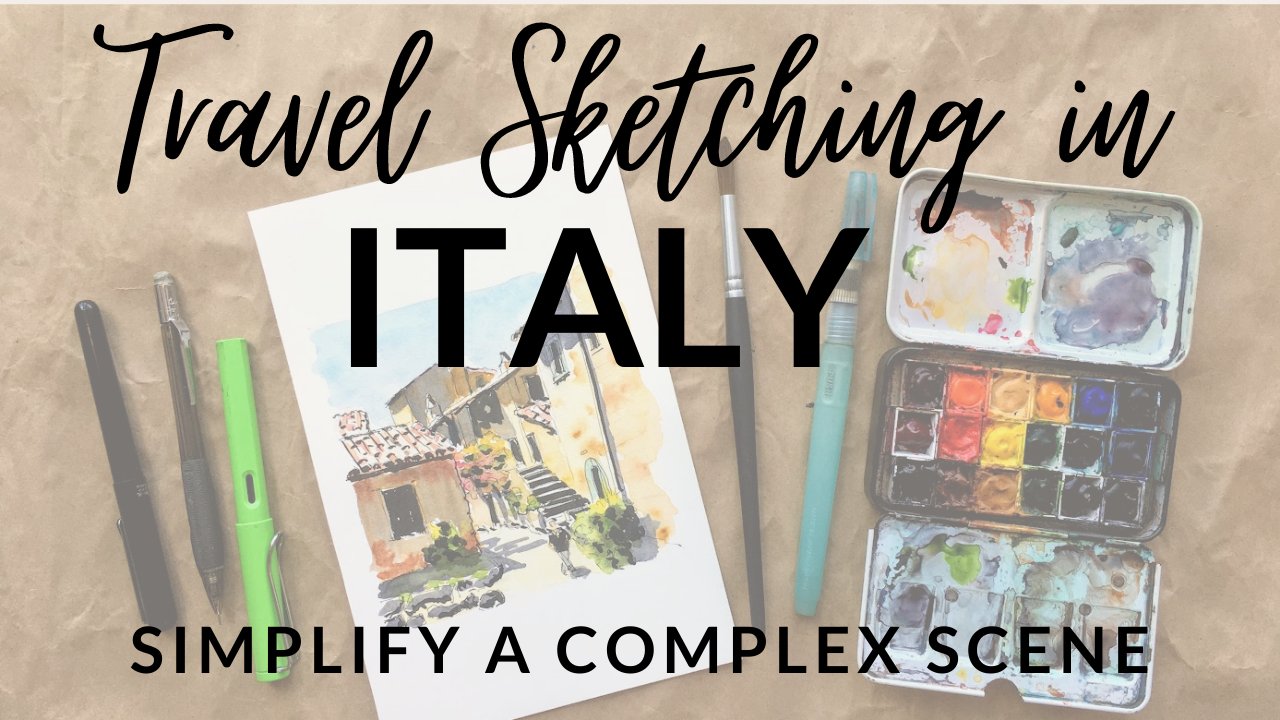
1. Lively Colorful Doors Intro: Hi, I'm Amy Stewart. I'm a writer and an artist. I love to travel and to sketch the places I visit. I also take a lot of pictures to paint when I get home and whether I'm in Italy or France or Mexico. One of my favorite subjects is old painted doors. They have so much character and they really tell the story of the place. But you know, there's a few challenges that a particular to drawing and painting doors, including getting the proportions right, conveying a sense of depth, figuring out how to depict faded paint and crumbling stone without overworking everything and how to include just enough of the elements that surround the door without taking away from your main focus. So in this class, I'm gonna show you how I approach my paintings of doors will go step by step, starting in pencil, then moving on to ink and watercolor, and I even at a few highlights with white acrylic paint pens at the end. I'll give you a few of my own photographs of doors for you to work from, but I hope you'll go through your photographs from your own travels and paying a door that you fell in love with last time you were out exploring the world
2. Supplies: Let's talk about my favorite subject, which is art supplies. I encourage you to use whatever you have for this class. But let me show you what I'm gonna be using. You're gonna need pencils. This is Ah, hrn HB. Drawing pencil is fine. I also like this mechanical pencil. This is the pin. Tell side quick. So the buttons on the side here and it's full of HB leads. But anyway, you need some kind of pencil and an eraser. I used needle gum erasers because it's very easy to pick up that pencil without damaging the paper or the ink that you've put down for paper. You just need any kind of watercolor paper. It's very important that it's a watercolor because it's gonna paper has to be able to hold a lot of water. I'm gonna use a seven by tin sheet for what I'm doing, but it can be any size, and you can use cold press or hot press. If you don't have watercolor paper. Be sure it at least says mixed media. That's ableto handle wet media like paint. So that's for the paper. Oh, and also for my initial drawing, you're going to see me use a T Square ruler. It's not totally necessary that you have one of these. Any kind of straight edge will dio. But I love these, and I particularly like that. They're clear because you can see the drawing underneath them, so that's very useful. We're going to use some fine pens for the first pass aligns that we make, and this is Ah, micron drawing pin. This one's in 02 like 02 or 03 These are affordable, their disposable. They're waterproof. That's what really matters. This is another brand of the same type of thing, so a drawing pin like this is fine as long as it's waterproof. I'm also going to use this platinum carbon ink pen. I love these pens. It's a nice, fine line. This is called the Platinum Carbon desk Pen, I think, is what they call it, and these ink cartridges are waterproof. I'm gonna show you what they look like. It's important to get the platinum carbon ink, um, cartridges that go with it. It's specific to this pin and these air waterproof, and that's wonderful. So that's for our fine lines. To make thicker lines in ink, again got choices. So if you have some of these just disposable drawing pins, as long as they say waterproof, this one's up on a 0.8. So that's good for a thick line. That'll do fine. Another thing you could use. I've got my Lammy safari pin here, which I love this pin, and this is a fountain pin that also comes with cartridges. But the cartridges they make for the ink isn't waterproof. So I get this converter and this is just Ah, it's a plunger. You twisted and the plunger goes down and you twisted again. The plunger comes up, so I use this platinum carbon ink. And it's the exact same Inc as What's in here. Same thing. It's just in bottle form. And so all I do is dip this down in the bottle and twist the plunger down to push any residual ink out and twisted again to pull it up. And it will pull the ink up and fill this little cartridge and then obviously wipe off the net because it gets super covered in ink every time you do that, Which is why I always have ink on my hands in these classes, but anyway, Lammy safari pin That would be great. Another pen that I love for these thicker lines is the sailor feud a pin F u D E e, and it's got this bent nip, which is gonna be hard for you to see now, but I'll give you, Ah, better shot of it when I'm drawing with it. But the nice thing about this Ben Nib is that depending on what side you're drawing with, you can get a fine line or really thick line, and this one same deal it comes the cartridges, but they're not waterproof, so there's a converter that's specific to the sailor pens, and it works exactly the same way. I use the same ink, and I just dip it down the bottle and twist and the plunger goes up or down, and when it comes back up, it fills up with ink, and I'm good to go, so those are terrific. If you've got something like that, as long as the ink is waterproof, that'll be great. But my favorite thing to do when I'm home when I'm not traveling is to use a dip pen. I'm sure there's artists to travel with Depends, but that's too much. Too much mess in too much trouble for me. But this is a very inexpensive depend with a little bit nib. This is just a cheap, um, set that I bought at the art supply store. Comes with a lot of different news. You just pull them off and put him on and just a little, very inexpensive bottle of waterproof India ink that dips in here and you draw so you'll see me use all of the's. So that's lots of options. You're also going to see me do a final pass with a brush pin, so this one is, ah, marker. But it's a soft brush. It says SB. So it's a soft brush tip. Also, what a proof, really fund use. My favorite, though, is the pen tell pocket brush pin. It's got a wonderful brush tip. It uses cartridges, and it's really easy to snap a cartridge on when it starts to run out of ink. And here is what those look like, and then you'll also see me use these white acrylic paint pins. It's kind of fun with watercolor to be able to add a few little highlights that you couldn't quite manage when you were painting. So these are Posca acrylic paint pins. There's lots of different brands now of acrylic paint pins, but I've got a finer one and a thicker one. One is white and when his cream color, but I use them both and then finally, last but not least, you're gonna need watercolor. I'll give you my list of colors that I use, and I'll be talking about those colors as we go. But this is just a little travel set, and I use my travel set even when I'm home. Drawing in my own studio are painting in my own studio because I want to just be very familiar with where the colors are, um, and how quickly I can get to them. Because that way, when I'm out sketching in the world, I'm not using something unfamiliar and it just feels like everything's off. So I always use this travel kit, even when I'm even when I'm at home. So I've got that and for brushes, really anything will dio. Occasionally I'll use a flat brush like this. Usually it's around brush. This is a 10. That's pretty typical for me. and I have this water brush pan, which I don't find it all that helpful to have the water in the reservoir. But what is helpful is this little fine point. And so I'll use this sometimes when I want some detail, those air, the brushes I use. Okay, those are all the supplies and all put list in the notes, but use whatever you've got and let's get going.
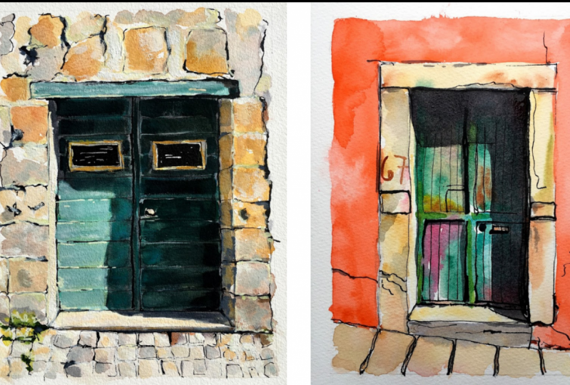
3. Choose a Good Door: first, let's talk about how to take good photos and select good subjects. I think the most important consideration is light. What makes these doors come to life is that you have strong light and strong shadows and light and shadow is what gives a drawing or painting depth and makes it come off the page. Without it, everything looks flat and kind of more cartoony. So when I'm traveling sometimes all spots, um, great doors. But it's an overcast day or the sun's just on the wrong side of the street. And if I can, I just come back later and get those pictures. I also take much whiter and more pulled back pictures. Then what? I'm actually gonna end up using that way. I can decide later how much I want to crop the image. I actually love this whole picture, for example, and I might come back into different versions of it and crop it in different ways every time. But I also just like being able to include some context to give the door character a little bit of the sidewalk or the street helps to anchor it door numbers or other little signs around the door. Maybe there's electrical wiring doorbell just enough so you see it's context. You might include a window that's next to it, or a little bit of the roof line. The door is still the focal point, but these little supporting characters give it life. And also, if you stand back, you can generally get a straighter image. When you're standing right in front of a geometrical object, like a door, the sides tend to bow in your photo, the angles air distorted because of your lens. So I always try to go across the street because the distance helps with that problem. And also don't worry if there's random things sticking into the image that you don't want. This photo has really awkward shadows along the top and bottom. They don't do anything for the composition. There's, Ah, horizontal shadow right across the center of the image that's cast by electrical lines that you can't see. I generally don't include shadows unless the thing casting the shadow is also in the picture. Otherwise, I think it's just too hard to tell what it iss. This photo also has a sign above the door that doesn't look like much and so it looks sort of awkward. I leave all that out. Also, that little post in front. I'm not going to include that, But you can even have a car parked in front of the door. That's okay. The great thing about doors is that they're pretty symmetrical, and if you can see part of it, you can probably fake the rest. Now, I'm also always looking for color. When I get these very colorful doors home, I use the auto enhanced features in my photo editing APS to boost the color. Even Mawr and most photo APS have these. I use camera plus on my phone, but Google photos and a regular iPhone camera app. They all have these filters that will really boost the color. In the contrast, you know the risk with water colors, that things can look washed out and faded. And I want to push the color in the contrast in my pictures as much as possible, so I'll be able to push it in my painting. A good trick is to take your photo and converted to black and white. Is there still a lot of drama in the picture? Do you see riel contrast between the lightest areas and the darkest areas because you want that in your painting, too. So try taking a photo of your finish painting and convert that also to black and white at the end of the process. How does it look? Do you see the same kind of dramatic contrast? All right, those are just some tips, but now let's start drawing.
4. Pencil sketch: Okay, so the first thing I'm gonna do is make Cem just guidelines on my paper of where I want the painting itself to be. This is seven by 10 paper. So I'm gonna make the painting six by eight. And fortunately, with a ruler that's pretty easy on this long side. I just need to cut off an inch on either side. So instead of 10 inches, it's eight. And on the shorter side, I just need to cut off half an inch on either side. So instead of, um, seven inches its six. And then I used the T Square to make these lines in pencil because I'm sort of notorious for making lines that are very straight. So A T Square is really valuable to me, and I like to use a clear one, because I can see that drawing or the painting underneath. And sometimes I do go back later and add elements that I might need a ruler for, So it's handy to really be able to see what you're working on. So I get these lines in. I will come back later and erase these. So I want him to be really light. Um because I'm gonna mostly not be ableto see him by the time that paintings done. Once I've got that together and I'm sort of just double checking it here, making sure I'm happy with how it all looks. Then I am going to start on the drawing itself. I'm switching here to a mechanical pencil. I just like it better. It feels better. My hand And also, it's very, very light and actually a little easier to a race than the other pencil I was working with . So I've got that and I'm gonna draw this freehand. I'm not gonna measure and get too hung up on the exact geometry of the whole thing. So I'm starting out just eyeballing it and getting in the big, important shape. So obviously the walkway or the street, because I think the door needs some context, so I wouldn't want toe leave that out. And I'm trying to just decide where the door is inside my, uh, drawing without doing too much measuring. I'm looking at the shape of the door, but I'm also looking at the space around the door. So the negative space. So how much room is there on the sides versus the top. And usually if I eyeball it like this, I can actually get pretty close. I think this is also just great practice for when you're out sketching in the world and you don't have a lot of measuring tools with you. I mean, using my pencil to just make a little tiny mark where the paint changes color. That will be something I want to see later. And it's also kind of a good landmark toe, um, line the other shapes up with I'm not going to get into every little detail, though. So you're not gonna see me, um, worry too much about, like, every little brick above the door. So I'm coming back now with my t squared just to make the lines straight that I've drawn. So I've eyeballed where they go. But now I'm using my ruler to make them very, very straight. And my reason for doing this? I don't do this much well, Occasionally I do. But for the most part, I don't do it when I'm out in the world travel sketching Once in a while, I will. But the reason I do it when I can and when I have the luxury of a ruler is that if those lines are really straight than when I come in with ink, I can be kind of free and loose, and it can look more hand drawn. But structurally, I know that the shapes air right underneath, and I like that mixture I like knowing that it's fairly accurate, but I can also be really loose. And it's very obvious that this is something drawn by hand. So I'm just using the the T Square to get in the trim around the door, and I'm also gonna wanna measure where the two doors meet in the middle. So I'm using the metric side to just sort of get a measurement of how wide it is. It looks like it's eight centimeters, so four centimeters. I use the metric side because it's super easy to do that math. You're not dealing in quarter inches and eight inches and all that. So I know I need that line in. I'm sort of looking at the paint on the wall and where those lines are compared to that line in the middle of the door. And so I'm changing my mind a little bit here and deciding that I needed to move those. Maybe I didn't have him right to begin with, and that's totally fine. That is the whole point of the eraser. If you're using a pencil and you're not using an eraser, you're doing it wrong like the whole point of the pencil is that you can erase. So don't hesitate. It doesn't mean you made a mistake. It means that your reevaluating and making new decisions as you go and once again I'm just making that line real straight so that everything that goes on top of it can be really loosen hand drawn, but it's ready to go.
5. First Pass with Ink: The next thing I'm going to do is just a little light ink, just enough so I can get rid of my pencil marks. And I can use this micron pigment liner find tip or this carbon platinum ink pen I'll use by use both. I'll show him to both, but this is the one that has the cartridge that just pops in it. So, um, it's what A proof Inc Both of them are waterproof ink. Both of them are very fine tips, and I'll start off using the the Micron. So this is very light. I'm using the 02 I would use a 02 or 03 for this, and the idea is to just barely get these lines in so I can erase. I am trying to be true to the drawing. So if the lines need to be a little uneven because something is bumpy or textured, then I want to do that. If the lines are really straight, because it's something maybe human made that has a hard edge, then I want to do that because these lines are in fact going to show now one advantage to using Riel Inc like this platinum carbon ink pen is that the ink doesn't tend to skip Posse's much on textured paper. I am letting the line itself skip so you can use broken lines. You don't have to have solid lines everywhere again. Really? Look at what you're drawing and look at where you actually see sort of darker shapes. And if you don't see it, you don't have toe. Put it there. So I'm being sort of thoughtful about where these lines are going and how prominent they really need to be. Because all I need Dio Like I said, it's just get enough in so I can erase. So I'm just going around doing the trim around the doors here. The thing about an ink pen. I'll just tell you from experience. You might be tempted to use a ruler with this, but when you have really ink flowing out of a pen, it'll actually, um, the ruler will sort of draw it up and you'll end up with a lot of smeared ink underneath your ruler. So this is something that you want toe do without a ruler, but again, that's the whole point of having a very straight line underneath. you've got something to follow that you know is right. And you can be a little more free with it and, um, make it really look handmade and hand drawn. So I'll just get these last little bits in. You'll notice that I didn't do a lot of detail on the drawer on the door itself. Yet all those lines, sometimes I can't decide right away how I'm gonna handle it and you'll see me come back later. Once I make that decision, I'm not gonna draw in the place where the paint color changes. I'm gonna leave that in pencil because there is no actual line. It's just a change in color right there. So it's important that I know where it is, but I don't really want a hard incline because you don't see that in the picture. So I'm going around and I'm mostly erasing the line I put around the edge for where went the painting to end. I can still see it. You might not be able to see it in this video, but I can still see it. It's just very light, you know, once we put water color down, that pencil line becomes permanent, so I really don't want it to be super obvious where that IHS. But otherwise I'm going around and erasing. You could sort of block up the pencil if for any reason that seems easier, or you can just wipe and get the pencil off of their Some artists leave their pencil marks in. I think that the drawing looks cleaner and lighter and really beautiful when the pencil goes away. But again, this is just the beginning and will add more ink from here.
6. Ink Drawing: a few options for ink. You can use one of these drawing pins. This is the eight, so it's thicker. This is my Lammy safari ink pen. And again, I've used the converter here. So this has platinum carbon ink that I've added to it. And you've already seen that in the supplies the sailor feud, a pin which I showed you and the supplies. It's got that bent nib, and it also has a converter in it with the platinum carbon ink. This is a really cool one. I'm gonna demonstrate all of these, but I just want you to have options and be able to use whatever you've got around. As long as the ink is waterproof, there's a lot of different things that can work here. What I really love is a dip in. So here's a dip in with waterproof India ink, So I'm gonna demonstrate all of these. But basically the idea here is to add thicker lines where you actually see thicker lines. So really be looking at your image and looking for places where you can add little bits of darkness. It's the variety in the line weight that really makes a drawing interesting. So I'm starting out just using one of thes pigment liners. These are cheap disposable. They're really good pens, and you can get some variety in your line weight using these. So that is an option, for sure. The Lammy safari pin I really love it's really think so. It does flow a little bit better on the paper, and you can vary your pressure and get some difference in line. So a lot of times all use this and you can see how I'm getting it a little uneven. And I'm working in little bits of of darker line here and there, but really being thoughtful about where I put it. So I do get all of that variety. Now. I'll try next. The sailor feud a pin and just show you what that looks like. And this one so great, because depending on what Ed you use, I know it's hard to see on this video. But if you if you lay down on the fine edge, then you get a really fine line. But then you can also. Now I'm using the thicker edge and getting a really thick line. So the cool thing with this pen is that it's so versatile. You can use it for both fine lines and for really heavy lines. And I love using it on this paper that has so much texture because the ink really responds to that texture and you get this kind of wonderfully uneven sort of look, so that's a lot of fun. And I use that pen a lot, and probably if I could only take one pin. I would take that one because it's so versatile with the fine lines and the thicker lines. But a depend is so much fun. I don't travel with ease because Inc has the potential to be such a mess. But here again, I'm using one of those bent Nibs that has. I can turn it on its side and get that really fine edge. Or I can get a much thicker, darker line. So all I'm doing here is I'm looking for the the sides of things where the shadow hits it. That's definitely a darker line. Where is where the light hits it is? A is a much lighter line, and I'm really just trying to respond to the image itself and put darker, shadowy shapes where I see them, but letting the line to be really thin, where they're Maurin the light. So this brickwork up top. I didn't do any of this with pencil at first because it kind of doesn't matter. I mean, you don't need to exactly copy what's happening. You've got these really uneven, you know, places where the walls are cracked and the plasters come off and and it's kind of a mess. And so what I'm doing is I'm really paying attention to the shadow shapes and trying to get those in. I don't necessarily need to outline every little bit of it, and I also don't have to make something that looks exactly like the photograph. I mean, it's a lot of kind of, uh, cracks and texture and uneven material, and at some point I really just need to sort of focus on my drawing and make something that fits there. There's this little box up there. I love it when I can add little utility boxes, electrical wires that are coming in anything like that. And if there is a cash shadow, I'm always sure to make it darker on that side. Now, um, for the brick itself something that I'm thinking about here as I'm doing this again, I'm not trying to copy exactly what I see. I'm just trying to pay attention to the general shapes of this. And you know, if you really look at brickwork and stonework, you know when you're out travelling, you'll see that there's a lot of variety. They're not necessarily really even or symmetrical. This one is crumbling, so there's a lot of kind of a little corners where there's a real dark shadow cast. There's just a lot of variety between dark and light and a lot of variety in the sizes of these pieces of stone. One thing I really want to emphasize that is particular to drawing Stone is when I'm doing something like this, I draw the entire stone. So I'm not looking at this as a pattern of lines that I'm trying to reproduce. They aren't lines their stones, and when I'm drawing him, I'm really thinking about the fact that a person cut this stone and a person laid these bricks, and so I want to draw them as whole bricks. So I go all the way around them every time and I think that makes them look more like real pieces of stone and less like some random, um, grid work. OK, so I think you get the idea of how this works. I'm gonna speed up this next section. You probably don't need toe. Sit here and watch me do every single one of these all speed it up, but you'll get the general idea. Okay, This is moving at double time. Now, um, again, I'm really looking at the shapes I see in the photograph, but also being mindful of at this point, I've already done part of the drawing, and I kind of have to respond to the drawing is I've already done it. When you're doing something like this, that's ah, riel specific detail. Don't get too caught up. And maybe counting the numbers of rows of bricks or the exact numbers of stones, it's more important to give a general sense of it. And I'll also say that if this was an entire wall of brick, I probably wouldn't draw the whole thing. I would draw a little bits of brick that kind of suggest that that textures everywhere, but I wouldn't necessarily put it all in. The reason I'm happy to do that this time is that it's kind of a small section, and I think it's also an important part of this drawing. So I'm happy toe. I'm happy to include a mall. Now I'm getting back down into this sort of crumbly texture and back at regular speed. Now, I just want to show you I'm looking at these different cracks in the way that pain is coming away, and I'm not trying to outline the entire shape. That's a different color. I'm really just looking at. Where are their little cast shadows in among all this peeling paint and all this texture? And I'm just trying to respond to what I see without necessarily being too worried about copying it exactly. And I'm also trying really hard not to do too much of this. If anything, you want toe kind of show some restraint and do as little as you can to give this impression. You know, this is really a case where less is more. And of course, you can always come back and drawn more of this later and you're about to see that I will, you know, kind of come back in and do some extra touch ups later on. So don't get caught up in trying to catch every little imperfection in the building. Because, remember, we haven't gotten to paint yet, and there's a lot more that you can do with pain as well. Okay, so something that I'm thinking about now are all those lines in the door. And I wasn't sure if I wanted to include him at first, and I've decided to. So this happens to me all the time. I won't bother with all the detail inside the door. I'll decide. Oh, I'm gonna think about this and come back to it later. And then I come back to and I think, Yeah, I think I do want include that and I sort of have toe, take a step back and figure out how to do it. So the first thing I'm doing is I'm just getting there's like a little piece of trim that Aiken see around the edge of the door, and I just want to get that in, and it's perfectly fine to turn your paper like I'm doing. If it's more comfortable for your hand, you know, just do what works for you you don't have toe. You don't have to be able to make every line from every angle. There's it's it's more important to just do something that fits well with your hand. There's a little bit of a shadow under here, so I'm gonna go ahead and emphasize that this sort of this bar a lot of this I'm gonna be able to do more of with color. So I'm mindful of the fact that the drawing itself doesn't have to say everything because the pain conduce some of that as well. There's also sort of a cash shadow, a little bit of a gap. You often see this down the center of a door, so I'm gonna dark in that up and and more strongly emphasized that there's kind of that bar that that line that goes across it. I love hardware on doors. So if there's a little lock or a latch, I always put that stuff in just strengthening up some of these lines. And again, I'm just using the finer edge of the same pen, and it's one of the reasons I love this depend. I love the kind of wobbliness and flowy unevenness of the ink. So now I'm thinking about those boards, which I didn't do before, so I did count them, and I think there's six of them, and I'm just eyeballing it at this point, but I'm actually going to show you a couple different ways to do it. So the first way is, um, here I am. I just eyeballed it and because my lines are straight and this is another reason why I used the T Square to get the drawing itself right, because I know that the lines around it are all all square. It's easier for me to do a little free hand in here, and you can see how light I'm making these. And then I'm making these broken lines, and that's really important, because all you're really seeing is the shadow in between those boards. So that's one way to do it is to just just go free hand. And that's what I did there. And they turned out pretty even because I have those other lines to guide me. But if that makes you nervous, there's nothing at all wrong with going back to pencil to get add in some details later. So here I am with my pencil again. In this case, I'm not going. Teoh, erase this pencil. It's very light and it literally the lines are going down exactly where the ink is going down. So I'm not worried about needing to erase it. It's definitely not gonna show anyway. Um, there's no reason not to do the top in the bottom At the same time, some time with doors like thes the top in the bottom are different. And so it may look at first like its exact The pattern is exactly the same, but they might have used a different different pieces of wood or for whatever reason, they look a little different on these old doors. But I'm gonna go ahead. I'll do all of these in pencil, and then I can go and ink right on top of, um and again, turning the thing on the side like this just makes it a little more comfortable for me a little more comfortable for my hand to do it. I'm once again I'm just using the the little fine edge of this nib. This is this is one of these wonderful bent drawing Nibs that gives me a lot of flexibility , but I'm just using the fine edge. I'm less concerned with these broken, uneven lines. Once I get into the area of the drawing where the shadows gonna be, I'm mindful of wanting to include all the details that are in the shadow. You can't really see, um, everything that's in that shadow area from the photograph. But I know that in real life shadows air very transparent, and you very often can see a lot of that detail. So I'm drawing the entire door, even though I can't see it all in the photograph because of the shadow. All right, there it ISS with its lines in place. I'm just looking at a few other places where now that I have those boards, I can put in some little bits of shadowy detail again, I'm thinking of them as individual boards, and each one has little sort of gaps and places where the where the light, um, or the shadows just sort of fall darkened some of these up in a few places because they are quite bold lines. There's quite a lot of that kind of shadowy shape, So this is the sort of thing. You know, I will sort of go back and forth and go over it and just look at how the drawings looking to me. And where do I want things to be? Bolder, obviously, wherever you spend the most time and wherever you do. The most kind of detailed work is the focal point in this case. Do you to see where the focal point is, right? I mean, it's the door. That's the whole point of the of the thing. But I'm really thinking about how doe I draw people's eyes kind of right into this door. And I love this kind of smudgy, thick and thin feeling with the ink, and I just think it really reflects that way. The light moves across it, you notice. By the way, I don't really go back and get ink very much like a little bit of ink last for a long time . It's one of the amazing things about thes. Depends is that they really do hold, ah, lot of ink and and you really can work for quite a while, sort of forgetting that there's a pot of ink there that you have to go back to all right, making that very dark. I love all that variety, and you can see how uneven those lines are and very much feel like something hand drawn.
7. Brush Pen: I'm gonna add a little more detail with brush pens. This is always kind of the finishing touch for me. You can use a marker style. This is a soft brush again. Waterproof. Very important. You can use this kind of pen, these air great. And, um, they give you that kind of brushy feeling. They're very affordable again. Disposable. And I used these for a long time. Um, and they give you that sense of a brush, which is just like what the pen tell pocket brush pen does as well. Now this is one again that comes with cartridges. Thes air. This is waterproof ink and it's cartridge. That's particular to the pen. Tell pocket brush pen. This is, you know, really my favorite pin in the world. It gives you. You can kind of get in and do these little wonderful kind of squishy, inky, blobby shapes. I could have done this with the depend, too, but there's something about the brush that gives you just a different texture and less of a sense of line and more of a sense of flow. So this is always my last step, and what I'm doing is I'm looking for where the shadows are. I'm not actually fully inking every shadow with the brush pin because I'm gonna use paint for that. So there's color still to come, and I'm mindful of that. But what I like about bringing in the brush pin is I feel like it gives weight. I feel like, you know, you sort of want this sense of, like, the heaviness of the stone. You want a sense that these things were coming into contact with one another. So I am filling in just some little gaps, and I'm looking at the photograph and doing that where I can see it. But the other nice thing about the brush pin is you actually can get incredibly fine lines with it to that have, Ah, wonderful sense of flow. That's, I think, a little different than what you can get with any other pen. So I hope you're seeing as I'm working on these bricks that they're kind of coming to life , and they're getting a little bit more of a sense of, um, more of a three d cents. So I'm gonna use the, um, brush pin everywhere where I see cash shadows, But again, I'm not gonna Inc in the entire shadow, because we're going to do that with pain. But just by adding more weight to the lines around the edge of the shadow, I think gives it more of a sense of depth and you know it works is a drawing all by itself , even if we weren't adding in a lot of if, we weren't adding in color, which we will, and the fine tip gives you a way to add in some really nice, feathery lines. The reason I get down there along the walkway is that any time one thing comes into contact with another, there's sort of this little contact shadow. And so the walkway, the street coming into contact with the door, um, or they're building is a place where you get these little shadows of just where they come into contact with each other. I'm doing the wood now and for the wood grain. I'm using the very tip of this pen, very fine lines, and sometimes I'm letting the thicker lines come in, which I hope is in keeping with what this cracked old piece of wood looks like. And there's there's more to come with pain. I know that. So I'm also not wanting to overdo it. But just give it enough with the ink that you get a sense that this is would and that it's a different texture than some of this other stuff. There's always little sort of hairline cracks again, where the plaster has peeled away. So if there's a way that I can kind of enhance some of that, I'll go ahead and do it. I always have to be careful not to overdo it. The one time I most at risk of over doing things is once I get this brush in my hand, because I love it so much that I just want to put it everywhere. And I really have to try to restrain myself and remember that I've still got paint to come and that that's where the real farming This is fun. But that's where the real fun is. There's just another dark, shadowy place, and I'm looking at that shadow, and I'm seeing how the shadow sort of falls down into those lines, Um, between the boards. And so I'm really just trying toe emphasize some of that again. Just, you know, bringing this toe life as much as I can. This is where I really should should put this pin down. But I'm just looking real careful at where I see the shadows where the darkest parts are looking at the values of the whole thing. You know, it's sort of helpful in fact, toe, look at this in black and white and really see Where's the Dark? Where's the light? How can I be sure, really punching up the darks and really, really leaving the lights alone? Because I can. I can convey that in other ways. So I'm just looking for places where I can put in a little finishing touches and that's it . I think we're ready for paid.
8. Watercolor: Okay, I've sped this up to double time because I'm kind of a slow painter, and I think you're going to get the idea on. The other thing is that watercolor sometimes requires a little bit of drying time. So this way you don't have to sit through all of that. So I've mixed up Meridian and Cobalt teal to do this wall. I work with a limited palette. This is my travel palate, and I keep that same travel palette when I'm at home. And so what that means is, I e don't have colors that are an exact perfect match every time, and that's fine with me. So this is kind of the right color. It isn't perfect, but, um, I'm putting it on in a way that's really loose and blotchy. I'm dabbing it up in places. The reason I'm sort of dropping in little bits of darker pigment here and there. But watching it in other places and leaving some white patches and other places is because that's what the paint really looks like. It's this old building. It's been out in the sun. That's what it looks like. So this is just that really just a richer mix of the exact same color for the darker bit below it. And I'm leaving a little bit of room for these, um, places where there's cracks that I'm gonna come get into. Later and again, I'm doing the same thing you saw me do before, where I'm dropping in hits of more intense color and just letting it move around on the page, because I want this kind of organic feeling of paint that's mourn away and been out in the sun for a long time. So that's our wall. I just checked to make sure that it's dry enough that I can get those two right up next to each other. And again, I had my pencil line to be able to see the difference there. But you can see why didn't want an incline there. This looks much more natural, like actually how paint on this wall would look. This is Naples yellow Naples. Yellow is my favorite color for sun drenched buildings, just about anywhere. Um, it's a good kind of base color, and here I've got a pretty rich mixture of it. I'm I'm aware of where that line is, where the paint color changes. This is another thing where I can mix it up a little song dropping in some yellow Oakar just in a few places while the papers still wet so that you get some variety in how that paint looks on the wall. The, um these little around the edge here. I just want the same color because it is that same paint color here I'm taking transparent earth and a lizard in and I'm mixing those together this red color that this wall this is a very characteristic color in Mexico and it's this kind of dark red that you see everywhere , and it too has a lot of variety in it. You know, a wall of its painted red is going to fade quite a lot because red really does fade in the sun. So I'm just I'm working it in here. I'm letting it be pretty uneven. The mixture is dinner in some places and thicker and others so that I get that kind of variety and I'm gonna pick up a little orange. I like Teoh really make it different. I wanted to feel different everywhere it goes down, so it seems lighter over here the light is just hitting it that this is sort of the lightest, brightest part of this. And you can see I didn't really wait long enough. Um, there's a little bit of color bleeding in over there. There's a little bit bleeding in right here. This is because I didn't let it dry all the way. You know, this is what happens when you're out in the field sketching. So I paint at home pretty much the way I paint when I'm out on the street, which is I'm moving fast. I'm not too worried about these kind of mistakes. Like, I could have repainted this for this class, but I wanted you to see, like, these little things are you can fix him. I just went in with a dry brush and I picked up a little bit of pain, and I know that I can come back to that later and fix it, so I just lifted it off with the dry brush. All right, I'm gonna clean out the other side of this palette so I can keep working. The tricky thing about something that is being hit by sunlight is making it, you know, light enough and bright enough that you really get that sense of it being almost kind of blown out. So what I'm mixing up here is so impression blue and some ultra marine together, and I'm just gonna put it down and see how I like it. And do you see how I'm painting each board individually? This is kind of like what I said in the drawing section about the stones and about drawing each stone individually. I think it makes it look a little more realistic. And, um, it allows lots of little those little white areas. Some painters call those sparkles little places where the white of the paper shows through . You can also see that these little beads of pigment form just wherever my brush stroke ins , and I'm fine with that. I let those be in different places. I want this to look like faded, peeling paint. It's a little darker over here. I know that part's gonna be in shadow, so I'm not as concerned with trying to get this very particular kind of variety in it. That's gonna show that it's fading out in the sun. Um, once again on the lower part, I'm just doing each board individually and, um, at the bottom. It's kind of like it's dirty. The paint has peeled a little. So while it's still wet, I'm just trying some things out. I'm trying yellow Oakar, a little bit of transparent Earth, maybe even dipping into my graze a little, which is a color called Shadow Violet that you'll hear a lot more about in just a minute. Because I want that sense that this there's kind of just this part where the paint has peeled away a little bit is a little dirty down there by the street. I think that just makes it look a lot more realistic. I'm dipping into my shadow, Violet, some which I I just sort of keep this big mess of graze on the other side of my palette there, um, again, just just to kind of show the the variety is thes colors Come in. This is just that little edge, just like that little piece of trim that the that the door is set into, and I'm just using the very tip of my brush. I'm coming in with a little bit darker, richer mixture that does have some of that shadow violet in it. But otherwise it's the ultra Marine and the pressure in blue, and I'm just dropping it in. But then I'm coming back with just a wet brush that doesn't have any pain on it. And I'm sort of blending because I really don't want to see lines there. You don't see lines in the photograph, but you do just see these changes in color from where it's jar curto, where it's more faded out. And that's what you know. That's why this door has such character, right? Like that's what's so cool about it. So again, I'm getting more and more into my shadow Violet here, and I'm mixing it in a different area of the, um, pallet, where I just always keep these kind of neutrals. So that area is in shadow, so it's just much, much darker. And there's a little bit of shadow that you can see where the door comes together in the middle there and also below that bar in the center. So I'm just trying to kind of notice that there's always a little bit of, ah kind of a feeling of shadow down along the bottom as well So these are just little details. Now, let me get back into this. This is gonna be, um, get some Naples yellow appear again. I want this sense of the sun hitting it. So I'm taking this Naples yellow, and this is kind of like a base layer and I'm hitting. I'm treating each brick individually again and leaving it pretty splotchy. So there's areas that are totally white. There's areas that are just hit with a little of that Naples yellow. And that's just kind of the base. That's just kind of what's going to go underneath. And all these places where the paint has peeled away. That's what I'm gonna dio. I'm switching down to a finer tipped brush. This is just that water brush. It's It's not that it's such a great brush. It's just that it's a really fine tip, and I find that useful. So again, with the transparent Earth and Naples yellow and maybe a little yellow Oakar, there's a lot of colors going in there, and I want that I want a lot of a radio want that real mixture, so that's run thinking about with that Now I'm I didn't draw the stones in front of this. I'm doing him free hand now, and I'm using a little trick of perspective, which is the stones in the very center. The line is straight, and then they fan out at a diagonal on either side, and it just gives a sense of depth. But I didn't measure it. I didn't draw it. It's something that I'm just kind of doing freehand. And the main reason is there's not like a sharp lying around each stone. So I didn't want if if you want to, you could come in with pencil and sort of very lightly draw this. But I just wanted that sense of the that. The grout is white and the stones are kind of this. I mean, in a way, it's a real multi colored sort of pattern with the stones along the sidewalk here, these air really old. They're really dirty there, Dusty. There's a lot going on, so I might drop some gray into some of them. I might drop a little bit of the transparent Earth or even a little Eliza Rin just to give him some variety and t give that sense that they're stone and I wanna work on them all at the same time while they're wet, because that wet into wet movement is very convincing on stonework. So now I've got some yellow Oakar and I'm just going in, and I'm really looking at this place, all these places where the paint has peeled away and you're just sort of seeing the wall underneath and trying to just go back and forth. There's already a layer of Naples yellow over there. I'm dropping in a little bit of grades, just a tiny bit of maybe that shadow Violet, Um, and kind of a brown mixture that's just a mixture of some blue and gray and a little bit of that transparent red to make kind of a brown. And in various places, I'm dropping in a little more blue, which pushes it towards gray like this is really just kind of going back and forth and playing with the colors that are already in use elsewhere in the painting. I mean, I'm not introducing any new colors at this point. I'm taking a little ultra Marine and mixing it in with my reds to give me kind of a brownish color on some of these stones, the stones are all really different, Like there is a fair amount of variety in him. I mean, in the picture, you can see, you know, they all look sort of the same. They're all sort of blown out by the sun. But really, there's a lot of variety. And, um, I'm again mindful of the fact that the door is the focal point, not the stonework. So I don't want I don't want him to be. So I popping that you quit looking at the door so you can see him and to come back and kind of blend and dab up some of this color while it's still wet. I'm just at, like I might just add a little water and dab it back up again so that there's a variety, but not so much that it's like this whole crazy pattern. The competes too much with the door. So the brown on the wood is just a mixture of the reds I already have and a little bit of the blues I already have. I'm very much using what I've already got and not did. I don't have a brown on my palette. I just mix it with some reds and some blues. I think this site needs to be a little darker as it dries. Watercolor gets lighter, and so I'm always looking for opportunities toe maybe punch it up a little bit. So I put some down. I saw that was too dark. I dabbed it up just a little bit. But a certain amount of this is just kind of going back and forth and watching as it dries and seeing where you can add something. I'm gonna drop in a little bit of yellow Oakar for that gold padlock, which is a very cool little detail. I'd love things like that, and I'm heading in a tiny bit of Naples yellow here and there on the door, because there are these places where there's kind of a golden sunlight color that's hitting the most faded parts of the paint, just tiny little accents again, I don't want to overdo it with that. Now I'm taking shadow Violet. I'm mixing it with some pressure in blue to make a dark, dark gray and a little bit of Daniel Smith neutral 10 which is just basically like a black . And now it's time to really get in and think about this shadow. It's super important to get that nice angle where it's sort of coming into the door. I'm really watching how the shadow is cast and trying to get all these little bits and pieces in. And I want to work pretty quick here. I mean, this video is sped up, but I actually am at this point working pretty quick because I don't want that line that I just made to be visible, So I'm gonna get back to my big brush. Now the shadow is darkest right around the inside of the door, and it gets lighter as it moves sort of away from the corner. So my mixture is gonna be more watery as it gets away from the corners of the door. But it was thicker when I first put it down, get that angle exactly right. That little sharp angle just says so much. It really gives such a good feeling of depth. So I always pay attention to that and really slow down. Make sure I'm doing it right. I'm bringing in some more neutral tent and shadow violet up in these corners while it's wet . and it'll blend and it won't look like an obvious line. So just kind of blending this. And you can see why it was important to put the put those details down underneath because there is a little transparency in shadows, and it's cool that you can see the lines and the color that's underneath it. But mostly this is this is really this is how I do all shadow. So its shadow violet, maybe a little bit of neutral tent if I needed to be extra dark, and then some of the color that the thing actually is now I'm taking that same shadow mixture, and I'm looking for places where I really want to enhance all those cash shadows. And this means going back to a smaller size brush for sure, because some of these air little tiny, sharp details, and I want him to be sharp, you know, on a very sunny day like the shadows are very sharp and distinct. I'm taking my shadow mixture, and I'm blending it back with this reddish yellow mixture because the shadows as they hit this brick actually get quite warm. It's not that cool blue shadow that I was using on the door. So it's good, Teoh, you know, just look at it and really observe how the colors of the shadows can change. So this is a lot of going back and forth. Sometimes something looks too dark and too bold and all dab it back up again. Those were just kind of the ways that I work. I'm making sure everything's dry before I'm going in with all of this because I don't want these shadows toe feather out at all and along the bottom there again, there's a little tiny what they would call a contact shadow where the building meets the street. So I want I want that to be visible. So this green, if I mix it with the shadow Violet, this is four groups that's a little too dark. This is for the electrical, the wires coming out of this and the shadows they cast, which I think is really interesting, and I never draw these ahead of time. I always wait till the end to see if there's something I really want to include. And then, you know, I'm always kind of a little bit on the fence about Is it obvious what this is. Sometimes if you can't see very clearly what is casting the shadow, I'll leave it out like I'm not going to include a shadow that's being cast by an object that's obviously not in the picture, because those can. Those can be sort of confusing, but in this case, this is wiring that's coming off of that little utility box, and I'm gonna come back in and kind of mess with that and ink later.
9. Finishing Touches: I'm also speeding this up to double time because I spent kind of a lot of time with ease pain pins, adding a few little highlights. This thinner one is white and the thicker one is cream. And what I use Thes four is just to add a little touch here and there of, um, white, where you can really see it in the in the image or in this subject. But that is hard to do with watercolor. So if you really look carefully at this door, you concede e how, in addition to the dark shadows between the boards, there's these white highlights where the sun hits the boards in a particular way, and I just think it looks cool and really brings it toe life. Some of these are actually going to be kind of hard for you to see on camera, but But there, there, I'm going back into my shadow color a little. Now that this is completely dry, this is just sort of, ah, one last one last going over of little tiny details. I'm adding Mawr shadow in as well to the door and Teoh some of these boards because that cash shadow I already did it with ink, but there's places where I think bringing in that actual shadow color will really bring it to life. So I'm being very uneven with it, just sort of putting it here and there where I actually see it in my picture. But I think it gives it more depth again with the highlights using this white paint pen to really show where the sun hits it and I'm gonna take that out. But sometimes in a shadow there will be one little thing that still stands out in this kind of bright. So it's sort of cool to draw it and leave a little hint of it, showing through a lot of times air on the edges of these doors. It actually fades toe white because the stone is crumbled and there's there's just light hitting it. So sometimes I'll look at an edge and ask myself, Is that EJ really black? Do I see black right there, or is it actually white? And if it Dwight, I might add it up in the wood for sure. There's areas where the light hits it, and these bricks, it's the same thing, like sometimes the border between these bricks is not black. It's it is white because it's all crumbly and bleached out by the sun. So I'm just going in and kind of looking for opportunities. Toe ad back in some little white highlights that otherwise can get lost when you're painting with water color. And it's sort of cool to just mess around with this. And really, really think about what you can do to make it pop. As much as working with a black pin can make things pop in the dark's adding back in some whites, some really light colors can also make things pop. And it's true along the walkway there, too, that there's areas where there's not a black line between the street and the building. It's actually bleached out and white right there. So okay, here we go.
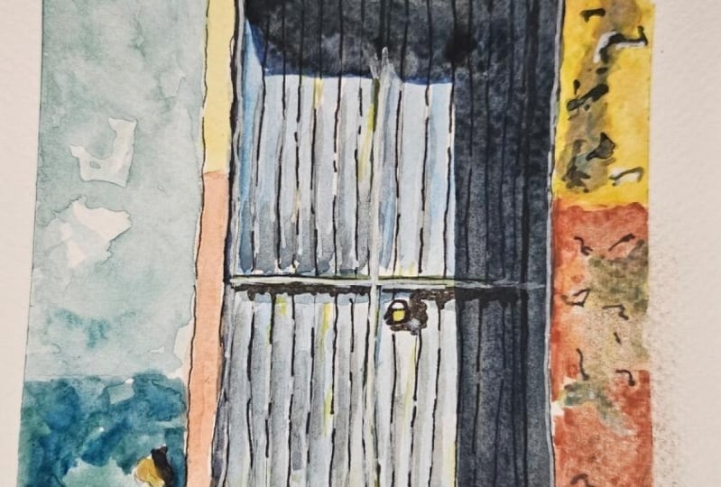
10. Bonus: Green Door: this is a greatly sped a bonus round that'll just let me show you a few other tricks. This well has stone on it. And I'm starting again with Naples yellow and dropping in some of that yellow Oakar and just letting it move around kind of organically, like you saw me do before. And you can see I'm also blotting it up in a few places to let a little more white show through. And the idea is to just suggest the stone. But again, the stone isn't the focal point. This happens to have kind of a soft pink threshold. So I dropped a little bit of that in and the wall I'm using a very light just cobalt, this cobalt teal and sometimes letting a little bit of extra green mix in. But this is pretty light. So it's the cobalt teal, sometimes with just a drop of meridian and um, maybe letting it be a little more intense in a few places. But now it's time to think about the door. So this is Hansa, Yellow and Meridian that I'm mixing together, and I really want to use a lot, a lot of yellow because I want this sense of sunlight hitting it. So I'm going with the haunts of yellow first and then mixing a little bit more that meridian in it. I'm also occasionally dipping in just a little bit to my sap green. Um, again, I want a lot of variety here, so you can see how I'm keeping it wet and letting the color move and also focusing on one board at a time with this kind of really interesting sort of metal grillwork that's got glass behind it. I'm going a little darker, but it's the same mixture of colors, and I've drawn it, so I can just easily go in and and paint right over it. You know, I let that dry and then I'm dropping in shadow Violet to kind of suggest this glass. But being very loose and blotting it up in place is making it darker in places. I wanted to have a lot of variety in it, but it's really just straight shadow. Violet, I'm not I'm not really doing much to it. I'm gonna, um, get thes. You can see how I'm sort of drawing in the stone again. I'm doing it by hand and I like that. It shows the perspective sometimes even when I don't see stone quite like this or when the stone is not running in that same direction. All still draw it in like that because I think it draws you in. And I'm using a mixture of shadow violet, a little transparent red Earth and just trying to get variety in those shadows. Same appear with this shadow. It's the shadow violet, and this time I'm letting some green come into it. And also a little bit of that Daniel Smith neutral tent where I want it to be Super, super dark. And there's other places where that shadows hits. So I'm going around and thinking about where I can add that in. And the shadow also falls on this metal, this kind of grillwork over the glass. Now that my wall is dry, I'm dropping in where the stone is, and it's just a mixture of yellow Oakar and transparent earth and Naples yellow and, um, just going in and dropping in those shadows where you see him between the boards a little bit and as it dries, you know, as it drives, the colors can kind of lighten up. So I'm fine with going back to. In fact, I'm gonna let it dry completely. And once it's dry, have decided that my green is in green enough, so I'm going over it with a richer mixture. But I'm still letting that lighter yellow show through like I want. I want bits of that yellow to show through, but I still think it looks like the light is, um, hitting it. But it's just a big, bold color, and I think with watercolor, it's important to really push how vibrant it ISS. Once it's dry, I can also just touch up a few areas with my paint pin, and there you go.
11. Bonus: Red Door: I'm adding in this red door as a bonus because I wanted to show you how I dealt with that complicated pattern on the door, but also just to point out that you're free to leave things out. There's a dark shadow along the bottom in the top of this photo. Neither one of them really makes sense. There's that sign above the door, but it's blank. So I thought it would be hard to even just be able to see what that is. Um, and there's a post in front, and I didn't want to include that either. So you're free to pick and choose, and you'll see me do that here. This is another very sped up bonus round, but I wanted to show you how I handle the kind of complicated pattern on this door. After I done most of my inking, I decided I think I will do this pattern. So I went in and I basically just made myself a grid, um, using my ruler and you can see that I just eyeballed that grid. I didn't take a lot of careful measurements. It was just to give me a little bit of guideline and then I just looked at the pattern. I just observed what I was seeing and drew. But you can see that I'm drawing very casually. It's pretty informal. I get it pretty close. I'm not worried about being to precious with it. I could have obviously spent hours measuring all that out, getting it exactly right. I take a thicker pin and I go in and I hit the sides of it where their shadows this door actually has a couple of layers of, like, beveled carving on it. And I'm not gonna worry about getting all of that. I'm just trying to communicate a little bit of the sense of depth that these air, these kind of cut out areas. Um he will see me just adding in a few more little details that I didn't get with the initial line work. And then, um, coming in. This is my brush pin again, coming in with my pen, tell pocket brush pin and really adding some dark ink on some of these shadows and I will go in. I'm trying to not make them all look exactly the same. That's the other thing. I want everything to look a little different, so the darkest shadows air underneath the top part of it. So I think those in. And then there is a bit more I can do with color this time. By the way, I'm using a flat brush. I love flat brushes. I don't use them much with watercolor. I just kind of forget about him because I don't travel with one. And like I said, when I'm at home, I tend pain with the same tools that I use when I'm traveling, so that they're always really familiar to me. This, by the way, is a mixture of pyre. Allred Empire All orange, and I'm starting with a pretty light layer and letting some white bits show through and then coming in on top of it with more of a brilliant red. I obviously want this to be a really vibrant, colorful painting. I don't There's no time to wimp out. So cleaning up a few little edges there, but you'll see in a minute how I sort of handle, um, handle that door some more, so I'm going to get the wall in and, um, really trying to cover a lot of ground trying to make the wall. Be very, um, uneven because the paint would have faded. And it just it just looks different, Um, dropping in a little bit of extra pigment here and there to try to get some of that variety And this stone I'm using, like yellow Oakar with a little bit of gray. It's There's a lot of color on this stone. The Stones kind of like it's sort of dirty. It's maybe got some mildew on it. If there's a lot of aging happening on this stone and a lot of variety, so it's It's that Naples Yellow and the Yellow Oakar Here again, I'm kind of just playing it by ear with these stones. I'm doing the same thing where I let them move out at an angle so that you get that sense of perspective. There's not a lot of stonework at the bottom of this one, so there's not as much to Dio now. Once it's dry and I did have toe you can't see it, but I did wait for it to dry. I come back in with Shadow Violet, and this is pretty much just a straight shadow violent, and I'm getting that shadow and their looks good, that little angle with the door. And so here I'm coming in with a small brush and working on those shadows with paint in addition to the ink letting letting a little layer of paint sort of tell some of the story a little bit of coming in now. But it's dry. I'm coming in with ink and adding some of those electrical wires. I usually say that stuff until later. Here's the shadow on the electrical wires and then, um, I've let it dry and here come the paint pins and I slowed this part down a little bit cause it be kind of impossible to see otherwise. But there are these little white reflections on the opposite side of where the shadows are . So I go again. I don't want everything to look exactly the same, but I do see these little bits of white. I'm just gonna go in and find a few other places where I can make that pop, Um, and where maybe I want toe. Um, so this is the electrical wire. It's abraded. So I'm adding in some white there and a few other places where I think the transition between two things is white rather than the darker in color, and that's it.
12. Final Thoughts: Okay, that's it. I hope you'll pay your own doors now and post your paintings in the projects. There's also a discussion area where I'm happy to answer your questions. Now I have a bunch of different art and writing classes here on skill share. So take a look. Let me know if there's anything you find particularly challenging in your creative process , because you might see me address it in a future class, enjoy your art and stay in touch.
 Amy Stewart, Writer & artist