Transcripts
1. Introduction: Hey, everybody, I'm Amy Stewart. I'm a writer and an artist. If I could be anywhere right now, I'd be in Italy with my sketchbook. The light is breath taking the architectures gorgeous. And really, everywhere you look is another painting. But you know, it can be tricky toe capture all of that in one small sketch. So in this class, we're going to tackle one of those beautiful village scenes with a jumble of buildings all crammed together and lots of details like stonework and tile roofs and flowerpots draped over the stairs. Lots of gorgeous light and shadow. It's exactly the kind of scene you want to be able to capture with your sketchbook and remember, But to do that and get it done quickly takes a few special techniques. So in this class we're going to focus first on getting the major shapes in place by measuring how they fit into the frame and how they fit next to one another. Then we're gonna use wet into wet watercolor techniques to capture the feeling of stone and tile without actually drawing every single stone in every single tile, and we'll do the same thing with foliage and flowers rather than pain. You know, individual leaves and petals. We're gonna use this loose, wet, into wet technique to quickly capture the idea of greenery and flowers. And then we're going to switch it up and use wet over dry techniques to add in shadows and a few bright colors and other details. The whole idea is to get the major shapes right block in the light and dark areas, and then really simplify everything else. In order to do a scene like this, you can do it. You just gotta have a little bit of a plan. So this is gonna be our plan. Let's start painting.
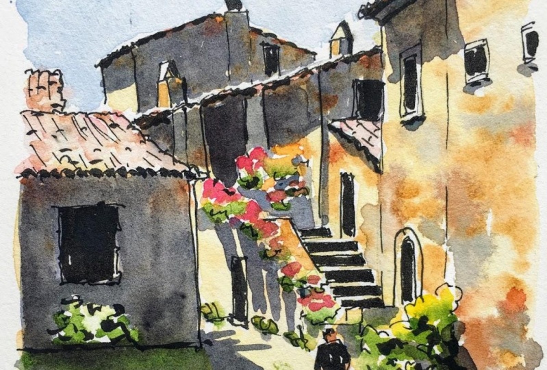
2. Project & Supplies: I'm gonna give you my photograph toe work from If you'd like to paint this scene along with me and posted in the project area, but feel free toe work from your own photos as well, or go ahead in your neighborhood to sketch. Okay, so that's the project. And in terms of supplies, let's take a look at what you're going to need. You're gonna need some watercolor paper. Um, it could be a sketchbook with with watercolor paper in it, or I'm just working off of, ah, of a watercolor block. It could be cold press or hot press. I like hot press because I like the way the ink flows across it, but either one is fine. The most important thing is that your paper needs to say that it's for water color, and this is gonna be especially important with the wet into wet techniques that we're gonna use. You're gonna need some water color. So I'm gonna be working off of, ah, travel palette like this one, and I'll give you a list in the supply list with all the colors that I'm using. Um, I'll be starting in pencil. So this is ah, mechanical pencil with H R h B led really light late because you're gonna erase all the pencil, and I use one of these need herbal rubber erasers. Teoh Race doesn't damage the paper. And then, um, I'm gonna be using kind of Ah, medium, uh, pen. This is a fountain pen. This is a Lammy safari with waterproof ink. But any kind of drawing pen or drawing marker is fine. Just be sure it says that it's waterproof or permanent sometimes is a permanent, Um, and just kind of a medium. Medium thickness is fine. I'm also gonna be using that my pin tell pocket brush pen. So this has a brush tip on it, and it's got waterproof ink. You could also use a brush tip marker with black ink. But again, make sure it says that it's waterproof or permanent because we're going to be putting watercolor on top of it. And then, of course, you're gonna need a brush. I'll be using just a regular watercolor brush like this. This one is a 10. So, like a 10 or an eight, I guess, would be fine. But for some fine detail, I'm gonna be using one of thes water brush pins. It's got a really find tip, and it's good for getting in there and getting some really sharp edges. So any kind of small brush with a with A that can give you a good sharp edge would be good for this class. That's all we need in terms of supplies, so let's get going.
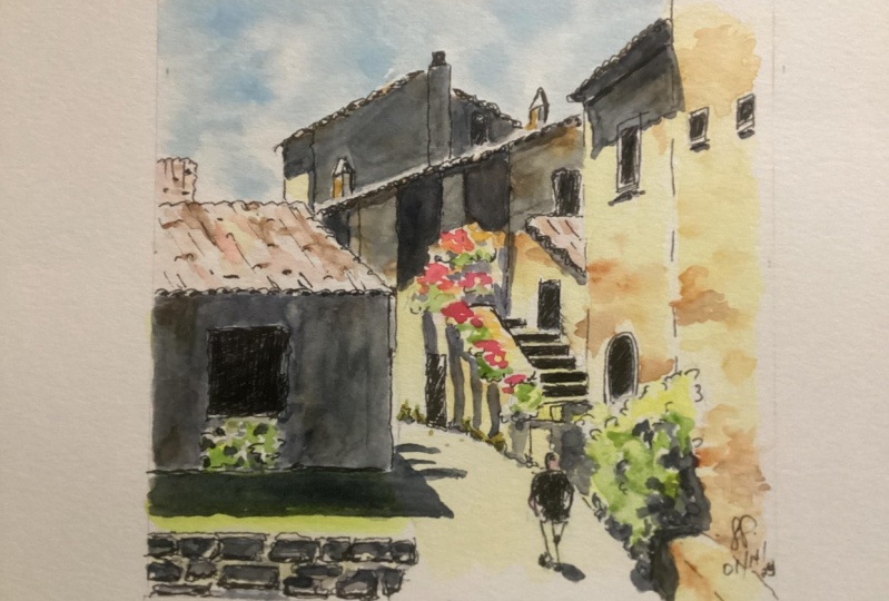
3. Pencil: I've started out by making a five by five inch square, and I'm just marking roughly where the center points are, because when I start to do this drawing, I'm gonna be referring a lot to the horizontal and the vertical centers. What I do is I start out by looking around the edges of the scene to see where the different buildings, the different elements of the scene, come into the my frame. And if you're doing this out in the field and you're sitting there looking at this scene, you can do the same thing you consort of. Use your a pen or a little viewfinder to just establish what part of this scene you're going to draw. And if you begin by going around the edges and just marking where the various elements come in around the edges, it'll it'll help you figure out how every object relates to every other object and how to just get it all in place. So I started over here on the right, looking at the buildings and the pathway, and there's another building that comes in over on this side, and I'm just measuring how far into the scene does it come where on the left hand side does it enter the frame and just tryingto loosely sketch that in? And I'm really taking my time with this pencil drawing because there are a lot of complicated shapes here in the whole point is to just really, you know, carefully measure these angles and really try to figure out how all these things relate to one another. There's a little tiny roof behind that bigger roof. I easily could have left that out, but I'm I'm leaving it in for the moment anyway. Um, I'm sort of fiddling with this roof line because it is really important. A lot of other things need to line up with it, so I'll keep coming back and adjusting that a little bit. And you know, this is really important that you it's the reason you have an eraser is so you can continue toe make a little adjustment as you go. So definitely do that. Now I'm looking at this other roof line, the one that's got this big white highlight on it, which I really like, And so that's a strong visual element. I'm just looking at Where does it start and what does it connect? Teoh. So you can see that by having ah, couple of objects around the edge of the picture. Having those right means that now I can start to fill in what's in the middle, and I can have some certainty that those air those air accurate. So, um, I'm just going to bring in there's a little window there and then just another little piece of a roof. And I like that because it's got that bright highlight. So I definitely want to include that, and I'm just looking at Where does that little roof line up to? What's across from it? Now there's a couple of pillars or columns, and a lot of this is in shadow. So it's not something that I'm gonna have to pay ah, lot of attention to. I'm just sort of marking where I see those little pillars and like where they line up with that building on the left that's in the foreground. It'll just again it's gonna help me to establish all the other shapes and figure out where they all go. So, um, looking at the path down here, I wanna be sure that I'd get the curvature of the path, right? And I can see right away this is that's not it. So I'm just gonna be kind of referring to my picture and measuring that angle because the sweep of that path, it's kind of it's what takes us into the picture. It's sort of what invites us in. So you want to make sure you got that right, and that's something that I can I can No, it's right if I know that these other buildings air in place than I know, like Okay, where does that path meet up with that building? I'm just going to start looking at other little details I can fill in, and it's always a question of like, All right, what do I know? What a my pretty sure is in the right place. And based on that, what can I start to add? So like looking at that roof line on the left, what's right across from that, Will, this little doorway happens to just line up with that roof line, So those are the kinds of little clues that I can use to start to just get things in the right place. Um, these two buildings over here. Have, uh our this was one big building over on the right has a couple of little windows and doors in it. I'm not gonna fuss over this door. It's an archway. I'm just gonna put something in there. I'm gonna roughly put in where that shrub is, because that's gonna help me line up some other elements. So if, like once that doorways there, then I know how big the shrub is because the shrub covers up roughly half the doorway. So in every case, I'm just looking at All right, What can I put in now? What am I pretty certain of? So I can start tow line some of these things up. Um, now, obviously, the stairs are the crucial thing to really get right here. If those stairs air, right, and and it really looks like a path up into this building, then everything else is gonna fall into place. So I'm I'm working my way around those stairs. I'm not going to start with those I'm going to see. All right. Well, what else can I kind of mess with here? Like, there's all these plants and I definitely want to get the plants because that's part of their, like, Italian villa experiences all these beautiful flower boxes kind of spilling over. So I know I've got these plants and then I know that alongside the stairs there's this railing are not a railing, but a little wall and that the bottom of that wall lines up with the with the little marks on the arch door. The door has a little piece of trim around and Scott, a couple marks on. And so I used that to kind of line that up. And then there's another little half wall at the bottom of the stairs and some more little plants. So I'm just kind of like all right, the plants air sort of safe to do That's hard to get wrong. Nobody's really gonna notice if you have the wrong flowerpot in the wrong in the wrong place. And there's also more plants up here, and I'm just roughly outlining those in pencil. So I'm just checking to see if the shapes right Is this whole thing reading accurately? Um, looking at the, um, that little wall along the stairs, it looked like maybe maybe it's a little too far over. I'm gonna keep adjusting this angle and kind of double checking this. I'll try drawing these stairs in now and just see how they look. Um, they come down it a nice angle, but then the building that's on the right there sort of juts out in front a little bit. So the last, the bottom couple of stairs, that the right hand side of them are cut off by that building. And I want to make sure I established that as well, cause it just helps the whole thing to read, right? So that's looking pretty good. So I'm sort of going over it and getting the angle on those right now. There's one more building in the background, and I haven't gotten around to doing this one yet. Um, but now that everything else is in the right place and I feel pretty good about, um, how all the shapes air fitting together, it makes sense to go ahead and put this in. And I'm looking at, like, where does the peak of that roof line up? What else in the drawing lines up with the peak of that roof? And then where does the roof come down on the other side. What is that line up with? And so in that way, I'm able to get this little building in the background pretty accurate. And I'm gonna put in the chimney. I love chimneys. I think they're anything that's on a roof, whether it's like a chimney or an antenna or a satellite dish or anything like that. Ah, water tank. I love those kinds of things, and I always put those in. The other cool thing about thes chimneys is that they have a strong light source hitting him, so it helps to support this idea of the light coming into the scene. And I want all the help with that I can get. So I'm just sort of double checking where everything lines up because there's gonna be some pretty strong shadows, and I'm not exactly marking where those shadows go. But I'm just looking at where the light and shadows hit this building and making sure that I've given myself a little guidance about that. There's a little door back over here. There's not much to it, but it's easy for me to put that in now because everything else is in place and I can see about where that fits in. Um, a few little other details with these plants. And now that those are all in place, I'm going to think about this person. And I'm not going to try to draw this particular person. I'm just gonna draw like a recognizable human figure. So it's basically just, like ahead. And, um, torso just sort of Ah. But ah, belong like a rectangle for the torso and the legs and just barely kind of suggesting those arms. So I'm not gonna over think this. I wanted to be as the same amount of detail or not detailed with the rest of the drawing has in. It s so I'm just looking to get something in that's loose and that and that fits the scene . And again, this is a perfect time to like a race. It start over if you need to. Like I just did. I very often will mess around with figures and do two or three attempts before I get it. Just how I like it. So that's totally fine to do. Um, there's some little plants along the walkway there, so I'm just gonna suggest those, um and then just looking at kind of what's in the foreground here. It's like there's this grass and then there's those stones and get this window in and we're ready to go.
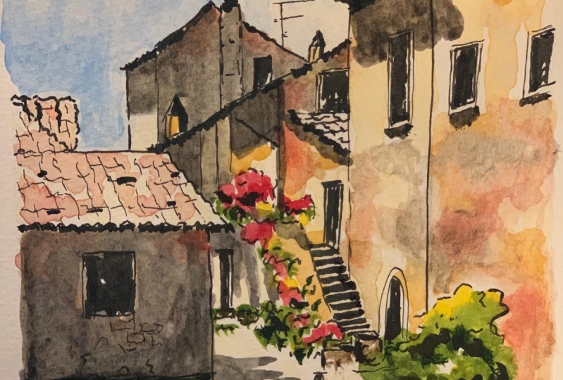
4. Pen: if you've taken any my other classes, you know that. Usually I like to start with that fine line pen and just quickly go over my pencil drawing so I can erase the pencil. And then I would come in with more of a medium pen like this one, which is a Lammy Safari fountain pen. But in this case, we spent more time on the pencil drawing because there's a lot here to get right and we're going to spend more time in the water color phase, building up some layers. So just to, ah, save time and to focus on what's important, I'm going straight into kind of a medium tip in Teoh really go over what I did in pencil and get in some details, so I'm trying to make my lines expressive. Um, I'm mindful of the fact that this is stone, and there's a lot of places where I'll be able to indicate stone with the plants. I'm just kind of making a few marks to establish the you know, the boundaries, like the outside of where these plant shapes are. I don't need toe, obviously draw every leaf or really even get into every little shadowy area and every little light area. I just want to roughly establish where that goes, and same with things like this door. I'm not going to get fancy with the trim or anything. I'm just gonna kind of quickly establish where that is for these roof lines. I do want to be mindful of the fact that these are tile roofs and I want my line work to show that. So I am just looking closely at what I can actually see of these tile roofs and just trying to draw something that sort of suggests that, like here along the edge, you're you're facing the edge of the tile. So you see these little loops where they were, they come up and I'm not going to try to draw every tile. But I do want to suggest with some lines, I just want to suggest the direction that those tiles flow. And I'm just using really kind of Skippy lines, and they're not perfect, like I got a couple wrong here, but it's totally fine. It's It's not gonna be super obvious once the whole thing's done. And, um, there's a lot of detail in the shadows here that I'm not even going to really try to capture Gonna put this window in and again, I'm trying to give these lines some suggestion that this is essentially carved out of stone . And then there's thes stones along the bottom. And I like thes here because I like having kind of a bigger, darker shape in the foreground. It kind of anchors you in the, um, in the foreground of the painting. You know, where I as the viewer and the artist I'm actually standing. So I'm sketching those in mostly because I want to indicate which are the darker areas where the shadows are in the lighter areas where the light is hitting those rocks on top. So I'm trying to kind of draw those shapes in and just establish where those go and I'm gonna continue toe working my way around just looking at, you know, all the different lines that are kind of, um, showing like the path. And I've got these little plants along here. Um, just just filling all of this in. And as I get up off in the distance a little bit, I'm still mindful of the fact that there's tech texture. So I am suggesting this tile roof just a little bit, but much less because it's further away and so you just can't see as much of it. But I definitely don't want those lines to be straight. You know, part of what gives this some character and really shows that you were there and that you were observing it very closely is that you can see the the little irregularities in the stonework. You know, that's such a part of this story. And we are not gonna be drawing or painting every single stone s 01 of the ways that you can suggest the stonework is just the kind of irregularities in your line. And this roof line is really important to me because I love this little white highlight. You know, that bright reflection that's hitting that roof, and it's small and subtle, but I want to be sure I can get it. So, um, I'm just kind of filling in some of these details in this building. It's again. It's kind of hard to see what's going on there because there's dark shadows. But there are a couple of pillars, and I'm just looking at like, where do those pillars come down relative to what's around it? To try to get those right so that when I do come in with some light and shadow, those will be in the right place and the light and shadows. What really tells the story here. So I just want to be sure that I've kind of given it the right framework for that. So Okay, that was that little that little bit of roof you can see. Get that little door in. Um, as always, I'm staying away from the stairs. I'm gonna do those last, you know, this is Ah, it's kind of like warming up. You'll see me do this with the paint to where I'll start with sort of the easier stuff in a working my way around to the more complicated things. Once I feel I'm ready. So for these plants, I'm just drawing the undersides of them. Just the shadowy parts, because that's something that's gonna be super easy for me to do with paint. And I don't need a lot of line work there. They're just gonna be these kind of colorful blobs. He's like pink blobs. Okay, now, here I come in with the stairs and what I'm doing. I really want to preserve those white highlights on the stairs. So what I'm trying to dio is to draw the dark part and to leave a little bit of white for that. Um, for where? Those white highlights air hitting and that's it's gonna be tricky. But I'm hoping that I can help hoping I can pull this off. Um, so just looking around for any other little details I want to fill in. Um, maybe just emphasizing where some of these plants go a little bit more. And, um, for the figure, I want to keep the super loose. Um, you know, I drew it a couple of times. I mean, I drew it in pencil a couple of times, but I only get one shot of it in pen, so just going to give him some little arms and just a little bit of sense that he's walking . I'm just looking at you know, that one leg is in front of the other and I want to try to get that right. But also, I really don't want to overwork this. It's not gonna be obvious at all. like what he's wearing. Exactly. I'm not trying toe really reproduce any particular close. I'm just trying to make a recognizable figure walking through this scene, and now we're ready for brush pin.
5. Brush Pen: I have erased everything except a little bit of pencil work around the flowers. I decided to leave those in just so I could see kind of where I'd place those. And now I'm coming in with this brush pen and I'm filling in the darkest of the shadows. Not all the shadows, because we're going to some of the shadows in pain. But I just want some heavier line. Give a little more weight to it. And also, I realized I forgot to put this plant in. But I did want to put the shrub in because I like the way the light hits Some of it. It'll be tricky. Teoh. Keep that in and to not accidentally paint over it. But we'll see if I can manage that. But I just want, you know, I'm using the brush pen to do that very darkest areas, kind of the underneath where the shadows air deepest and just going around and saying anywhere where I can add some of that in. I always do this under roof lines, but especially with a tiled roof like this, there's kind of a lot of cast shadow, um, underneath those tiles and I'm filling in the windows. You know, the funny thing about windows and doors is they can be a lot of different colors on. You think that Windows air gonna be light like that? They're gonna just be reflecting maybe blue from the sky, but often windows on buildings or quite dark, especially on a sunny day. And I find that if I fill them in with ink, it really just makes him pop and kind of kind of brings him to life a little bit. So I'm gonna fill those in and just continue to get this underneath of this roof line and the darker sides of the chimneys as well. I conduce. Oh, this window will fill that one in. And underneath that little roof line, there's quite bold shadows under these, and but we're going to do that with watercolor. But this is just toe really anchor it and to really make the darks pop and and the values to really get the darks as dark as possible and the lights as light as possible. So this is kind of the that's that little bit of roof overhang. And these windows I'm not only filling in the windows but also giving him a little bit of a shadow Underneath this window. It's actually a little bit of a color. You can kind of see that it's sort of light, light blue. But I'm gonna go ahead and make it. It'll be more unified if they all look the same. So I'm gonna go ahead and make that dark. I'm coming in and just suggesting some of the darkest parts of this shrub There's a little bit of brush up in there and then, um, kind of along the ground. And then for my figure, I'm just gonna kind of really darkened in that shirt. And the reason I'm doing this with the brush pin and not with paint is so that I can be a little bit more refined with it. And I'm also going to sort of suggests, um, hair. I'm not gonna bother with that hat, You know, if you sort of squint at this picture, the hats not super obvious. So I'm just It's too small a detail for me to want a fuss over. Get that other door in, and I'm just suggesting a little bit more in terms of darker shadows around some of these plants, and, um, kind of double checking some line work. You can always make a few extra lines at this point if you need Teoh. Um, it's totally fine toe. Just go back in and add a few things and maybe, just you know, I don't I really don't want to draw every single shingle, but I do want to suggest this tile roof. So maybe just a few little details in there and then finally for these stairs. So, you know, I left those little white spaces in, and now that I drew them carefully, I can come back in and do those with ink, and they really pop, and we're gonna let this drop dry and get right into painting.
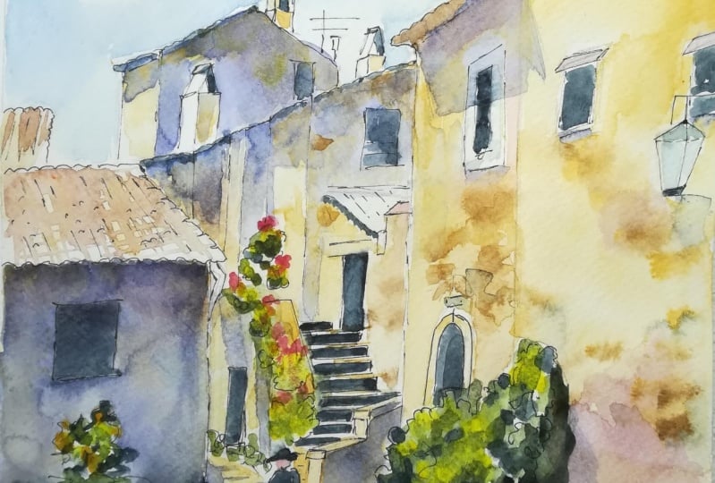
6. First Watercolor Layer: okay, We're gonna be painting in layers and sometimes we're gonna use wet in wet technique and sometimes a wet, over dry technique. So we're gonna do the sky. This is wet and wet. We started with a water color glaze. I just put down Clearwater and now I'm dropping in some cobalt blue and letting it move around. The water is mostly in charge of where this goes. So that's something you got to do pretty quickly because that layer of Clearwater you put down will dry up pretty fast. But it gives you some control. And also, you know, if you wanted to just suggest clouds, I don't really get into a lot of detail with clouds, but you can sort of mop up a little bit of that, um, paint and get just a suggestion of ah, of a sky with some clouds. And it's a nice thing to Dio. And now we're going to take Naples yellow, which is a beautiful sunlit color. And of course I'm not far from Naples and Italy here is that it's really the perfect color to use. And I'm going to start on the left and the reason we're starting over here is that this is actually gonna be covered up by a shadow later. So this is a good place to experiment with this technique. Because if it goes wrong, uh, you're not gonna notice it so much once once we come in and put a shadow over it. So what I'm doing is taking some yellow Oakar. You could also use raw sienna. That's a little transparent. Red burnt sienna would be good there as well. Basically earthy colors that lean a little bit towards deep yellows and oranges like what you see in Italy, and I'm dropping it into the wet paint and letting it move around. I'm also picking up a little shadow Violet Tous, maybe get some grays in there as well, because any kind of old stone work for old brickwork is gonna have some some gray just from the weathering in the aging. So dropping some of that end letting it move around, Um, with the water on the paper, uh, kind of, however, wants to, and I am using a smaller brush for this, So I'm using my amusing my brush been because these were really fine details. I'm gonna bring a little bit more Naples yellow down here over the It's actually a little yard. There's a little bit of grass there, even though you can't quite see that. And, um so that's That's the first wall and we have to let that dry before we can do too much more, but I'll come in just a bit in the roof. I also want toe suggest a little bit of color in this roof. You know, one thing about this photograph is it makes it look like the roof is totally blown out, is completely white. But that's, you know, that's kind of the camera doing that. That's really how the lenses is reacting Teoh to these bright reflections. In reality, if you were standing there, you would see more of the pink and orange tones in the tile roofs. I'm just dropping a little bit more of that in OK, moving right along. I'm gonna dio this building in the back, and I'm really trying to preserve that little white highlight, so I'm looking closely at it and being sure that I stay off of it. I can always go back and add paint there. Can't take it away so I'm leaving a little white stripe. I know it's kind of hard to see on camera, but this is important cause I love that little white highlight along that roof, and I want to be sure and keep it. I'm doing the same thing here where I'm dropping in while the, um, paper still wet. Just dropping in some yellow Oakar some I'll do a little transparent earth as well. Now you want to be sure this doesn't end up looking like chicken pox and needs to have some variety to it. But also not just look like these random speckles. So, you know, I'll keep going back and forth. I'm gonna mush some of these together. Um, and you know this effect, it's hard to predict exactly how it's gonna look. It kind of has a mind of its own because you're dropping pigment in tow onto wet paper like that. So that was also gonna be in shadow. So again, good one to practice on. I always sort of work my way up to the more complicated or the more important parts of a drawing. So once again, this I'm just doing Naples yellow all over everything except for the plants and except for that little piece of a roof we can see and I'm doing the same approach. I'm coming in with some some transparent earth and little bits of yellow ochre. And I'm just looking for like, if you really look closely, where does it seem darkest? Where does the stone seem a little darker than in other places? And it tends to be like up under the roof line. Or, you know, maybe along these pillars a little bit. Most of this will also be in shadow, as you can tell, just by looking at the photographs. So it's it's not hugely important. A lot of these details are going to get lost in the shadows as details really do get lost in the shadows. So this is again about kind of just practicing a bit and seeing what that effect is like. But now, now we will get into a bit more detail. So this wall is underneath all those plants, and, um, only part of it isn't shadow, but some of it isn't son, since it is a little bit further away, I don't want it over work. It, uh, I'm gonna also just while I'm here, I'm gonna go ahead and fill in the little, uh, lane, the little walkway. And I just painted right over my figure. So I put Naples yellow right over him as well. Yeah, it'll help to kind of unify the whole thing. So Okay, that is handled. And now we get into what I really consider the foreground. And this is the part of this scene where if you were sitting there looking at it, you would be thinking, Ah, I really have to draw all these stones. I mean, the whole point of this is the stonework, but here is where we can really have fun with this approach. You've had some time to practice it by now, as you've worked your way around. And so here we g o. So I'm dropping in. This is more yellow, Oakar, and I'm putting quite a bit more in this time. And I'm actually thinking a little bit mawr in terms of of stonework, like I'm looking at the stones and the direction they move, and you can sort of get a sense of of, um, they're not individual stones. There's but they're sort of group together. if that makes sense. So I'm trying to kind of squint and see them as groups of color rather than as individual as individual rocks. I've just added in a little Daniel Smith neutral tent, which is will darken it, and we'll push it a little bit more towards brown. If you had something like burnt sienna or another brown on your palate, you could work some of that in a swell. And by getting in some of this neutral tent or the shadow violet once again, I'm just dropping in these bits of gray to suggest the way that Stone Ages and Weathers and this is really starting to look beautiful. I'm very aware that I want to keep some areas of it light, like you don't want to get carried away and do this everywhere. So I'm trying to kind of be judicious about how much of this I dio and where I put it down . Put a little bit of Naples yellow on top of that roof while I'm thinking about it and drop in. A little tiny bit of you could use a lieser and you could use quinacrine own rose, just some sort of almost a burgundy color, and I'm going to take a little bit of orange. This is just viral orange, and I just mixed it with some just basically a mixture of these other colors that I've been using. And I'm just coming in under the roof line because even though you can't see it in the photo, uh, these air orangey pinky tiles and so you'll see it even in the shadows. And I'm kind of loving that orange. So I'm gonna drop a little bit of that into the stonework as well, which I think it's just looking so beautiful. And it looks like stone, even though you don't see individual stones in place. And that's really my goal. Here is toe, um, convey the sense of it pretty quickly, but not get caught up in so many details that it's just visually. It's just a mess, you know you want it toe. You want there to be areas of simplicity within, um, you're drawing, so I'm going in and I'm doing the stone with a little bit of Daniel Smith neutral tent mixed into some of that transparent red earth. And now we're gonna let this drive
7. Second watercolor layer: It's really important that this first layer be totally dry before we, uh, come in and keep working on it, because now we're gonna have to start defining some smaller shapes and some sharper edges. And in order to do that, we've got to make absolutely sure that, um, but everything else is dry so that it won't, uh, we won't have too much color bleeding into anything else. So now that it's dry making a few little fixes in the foreground things that I didn't, uh, that I didn't get done earlier. But, um, the main thing at this point is that we're going to get into all this foliage and sharpen up a few other little details, but then get the shadows in, and that is tremendously important. So in terms of foliage, I'm gonna go around. I've got this shrub that I want toe try to preserve, um, on the left There, I'm gonna add in a little bit of yellow just basically. Wherever I see the lightest green, I'm adding in a little bit of yellow because I don't want it to be too dark green. The shrub over on the right is mostly in sunlight and I'm kind of exaggerating the the effect of yellow hitting that, but I think it would look cool. So then I'm gonna go into sap green and just drop in that tiniest bit. So the only part that's wet is the shrub. The rest of the paper is dry, and that's what keeps it from running everywhere. And I'm deliberately letting it run into that yellow that I just put down. That's something that I wanted to have happen. I can also go ahead and put in this little lawn and it's brighter yellow in the foreground . And I know these are gonna run together again. I intend for that to happen. I'm gonna pick a little bit of it up so that it's good in light. I'm just using a dry brush to pick some of it up because it is gonna be in bright sunlight , and that will be more obvious when the shadow goes down. So, um, I have these other places where I've put some yellow in, So now I'm coming in. It's still wet, so I know that these air gonna blend together a little bit. So this is a little bit of a wet on wet technique again. I'm dropping in some of the sap green, and I'm letting it run into that yellow and basically create like a light sunlit green. But I'm letting it do it on the paper rather than mixing it in my palette. And I'm just looking for opportunities. Where I put that yellow down, I'm gonna drop in a little bit more green. This is just all these plants that are in these planners, and I'm not looking too closely at like what these plants are, particularly how many of them there are. Um, I'm gonna try to be almost treat them just as one shape along the walkway there that looks like the grass is all dried and dead. But I'm adding a little bit of green there, just toe just to continue sort of the story, you know, to continue the the sense of greenery throughout the picture. So I just dropped a tiny little bit of yellow car into it. So it does look different from the other plants, but not too much. Now I'm just gonna take quinacrine own rose as a pink, and it's mixing a little bit with some Naples yellow on my palette, and that's fine. It'll just make it a little bit more pastel e, and I'm basically going to use this for all the plants. I'm not going to try to get into there being like 300 different colors of flowers on this porch. I wanted to be more unified, and I think that visually, it helps to take what's a very complicated scene and simplify it a little if I keep the colors the same. So for the most part, I'm just going in here and I'm looking at the picture, and I'm looking at where those flowers actually are. There is there's one big kind of yellow something, something up at the top. That's that's got kind of an orangy yellow in it, and I'm I'm giving into the temptation toe drop a little bit of that in as I go. I'm just realizing that that little the bit of stone there along the stairs I had never painted that, so I wanted to just drop a little bit into that. I'm double triple checking that everything is dry, so I'm putting my hand on it to make sure the paper doesn't feel cool to the touch. If it feels cool to the touch, it's not truly dry. And these shadows that I'm gonna put in I really want to see sharp edges with shadows. So I'm mixing up Daniel Smith, shadow Violet, and I'm adding the tiniest bit of car bezel violet into it. I want these shadows to be a little bit more blue or purple than what you see in the picture. One of the things about digital cameras is they actually do a pretty poor job of representing purples, which means that your shadows often look a little browner. Maybe in this case, I think they look a little browner than they would in real life. But if you didn't want to exaggerate this purple color in the shadow like I'm doing here, then, um, just using shadow Violet and working a little of the wall color into it like some yellow Oakar, you would get a really nice brown shadow with that. So I'm first coming down and you can see how you know, I was saying you could just experiment with that wall cause it's gonna get covered up. You can see how you drop the shadow in on top of it and everything that you did just kind of disappears behind it. I'm getting a little bit of shadow color into this plant and some of it into the lawn there . And I'm bringing in some Daniel Smith neutral 10 and darkening this up because if you look at the picture, you can see that this is really the darkest area of this whole scene. So I really want a, um exaggerate how dark this is. And of course I know to watercolor. So it's going to get lighter as it as it dries. I'm gonna add some of the shadow color into the stonework as well. This is all about unifying the picture and which is part of what we wanted you to simplify it. So by working the same shadow color in everywhere, I'm sort of simplifying it. No, I want a hard line right here because it's the shadow, the building, And I'm doing this shadow that goes into the path. And I really want this to be a good, sharp shadow, which is why I'm using the small brush and kind of going carefully over here and really looking at the picture and looking at all the different ways that shadow moves across that path. I mean, I think already you know this this really it kind of draws you in, and it really gives you a sense of the time of day and also just the light in Italy, which is so beautiful. So I'm gonna do the same thing up here. I can see where that shadow is cast under the, um, overhang of the roof and then the sides of the chimneys. I don't know. You might remember earlier I said, I like these chimneys because there's one side of them that's enlighten the other sides and shadow. So now I've got to really think about that. And also remember that white highlight along this roof that I'm trying to preserve. So I'm going carefully with my shadow color here and being very mindful of wanting to preserve that white highlight right there. All right, so I feel all this in, and like immediately, it has a sense of dimension. And also this shadows a little lighter because it's further in the background, so it doesn't need to be quite as dark. And you can see how some of the color that I put down earlier. You can still see it through the shadow. I mean, that's it's the nice thing about a really nice, transparent color like this. Okay, now, this pretty much this whole building is in shadow their leaves, this part of it. So I'm coming right down to where the flowers are. And this is why I'm glad. I've I'm giving things enough time to dry, so the flowers are pretty dry there, and I can bring this shadow into it. And there's this angle that this comes down and I want to be sure that I get a sense of that angle. So there's sort of ah, hard shadow where these two buildings meet up Just mixing a little bit extra up because I pretty much used on my shadow color up. So yeah, there's kind of like a hard shadow right there. But then the rest of it is in light. And then underneath that little roof overhang and in the background right here, this is all in shadow. But that little roof is in light and again. Now you think you can start to see how it really brings it to life when you get these shapes right, and you get the light coming across him just right. It really starts to pop. So, um, I'm working my way down, mixing up a little more as I go, and it's fine if you're mixture changes a little bit. You know, if you, um if you have a little more or less blue or purple in it, that's OK. Let's see. So these plants are also casting shadows on this wall, and I kind of love that. So I'm gonna go in, and, um, just try to as much possible to just mimic what I see right there and get these long shadows coming down this wall a little bit underneath the plants that are along the walkway there and even some. So within these plants and just kind of this is a little bit of wall, that's kind of right behind that guy. So I'm a little bit of that, But being I'm being sure to kind of work this into the plants, this guy has a wonderful little shadow. In fact, the whole reason for including the guy in the scene was to include that little shadow. I really wanted to get that in there. Be sure that people shadows connect to their feet. That's a little trick I'm not. I'm not going over work this at all or overthink it. But I just want to make sure I have that connection between the back foot in the in the shadow just right. Okay, so a few other little places I'm just sharpening up some of these details and adding in there's like shadow behind a lot of these plants. It's like the plants themselves air in the light. But then there's some shadow color underneath. Um, so I'm just, you know, I don't overwork it, but I do have some little spaces to fill in there, so I'm trying to make that as accurate as possible, few more little bits and pieces. And then there's one other big shadow that I haven't done yet that I will get Teoh just a second. This is more about just checking all the little details, kind of giving it a few minutes to dry. I'm gonna, um now that the shadows air dry. I'm just adding a little bit of yellow ochre to those chimneys. I think that they were to light to begin with and it's something you start to see. Once everything dries, you can really start to see what's maybe to light where you want to add a little bit of color. And here's that one last shadow that I needed to add in. And I love the angle of it. This is one of those where again, this is why it's so important to make sure that your paper is completely dry. The other layers totally dry before you go in is that I love this angle. It's a really sharp, uh, it's a really sharp angle, and it's like it really shows the roof line. So I want to be sure that I get that in just right. Yeah, okay, the color is a little different, but as it dries, it'll, um it'll come out just right and then underneath the windows as well. I'm just gonna bring in a little bit of that shadow color. I'm just looking for anywhere else where I can put some of that down. Um, there's still some kind of white space around these plants, and I could just leave this, but, um, I'm just kind of gonna go in and just see what I can do. Like over here, I can add a little bit more Naples yellow to these rocks. They ended up being a little too light. So I'll drop a little bit more of that in in the, um underneath the roof here and in between these columns, it's actually darker, So I'm mixing up some neutral tent with a little bit of kind of a brown color. So with the, um, transparent red Earth and just really emphasizing some of these shadows being careful, not toe hit the flowers. But also I'm really wanting to get some pretty sharp edges in there. They're so that it's kind of sends it back, I think, and just gives a sense more of even a better sense of what's in light and what's in shadow . So I'm just gonna clean up those edges the best I can. I mean, this is watercolor, so don't get hung up in making absolutely perfect edges. It's OK if things are a little loose and wobbly and I'm coming in with the Naples yellow and just filling in some really obvious white spots that I felt were just maybe popping out a little too much this is all about making the whole thing feel very unified. And I'm going to do the same thing with the stairs I had left him white originally, and now that everything's drying and coming together, I want the tiniest bit of yellow on those stairs. So you get this sense of this golden sunlight hitting it. And at this point, I'm really just kind of messing around and looking for any little details that I might want to, um, clean up just a bit. Um, I'm I'm I'm getting the tiniest bit of a shadow color on my figure on the pants, and it's basically just dirty water, like I'm not even. There's not even really any color there, and I'm taking some transparent red for face and arms and that's it. Like that is all the detail I'm gonna do on that figure. I definitely don't want to overwork that so a little bit more, um, transparent earth. I'm going to just get back up into these rooftops a little bit now that they're dry. I think that they are still a little too light, and I think that they, like I said, the camera tends to blow these reflections out and make him seem like they're totally white , but I know they're not. I know that they're like a pinkish reddish orange ist color of some kind, and I can work some of that end. So I'm just kind of making some little shapes that aren't exactly the individual shingles, but do suggest that this isn't one solid thing. And then I'm just using plain water to blend it together a little bit, picking it back up with my paper towel. I mean, just going back and forth and trying to get sort of a believable sense of Of what? Those roof, um, color should look like there's a shadow also behind this plant, like the plant itself, is casting a shadow on this little kind of, uh, step or kerb along the building. So I'm gonna get that in, and that's it. We're done
8. Final Thoughts: Okay, that's it. I hope you enjoy this little excursion to Italy. I would love it if you would share your painting in the project section and also feel free to post a question or comment in the discussion area and I'll definitely pop in and answer those. And if you're planning your next trip right now, keep practicing with pictures like this or with scenes from your neighborhood. Because the more you practice, the more comfortable you'll be diving into a scene like this one and simplifying all those details and really capturing the moment when you're out and about with your sketchbook. Um, let's say I teach a lot of other classes on both art and writing, so please check those out and stay in touch. You can find me on Instagram. I have a website. I send out a newsletter. I'm easy to find all over social media, and I would love to hear from you. Chow
 Amy Stewart, Writer & artist