Transcripts
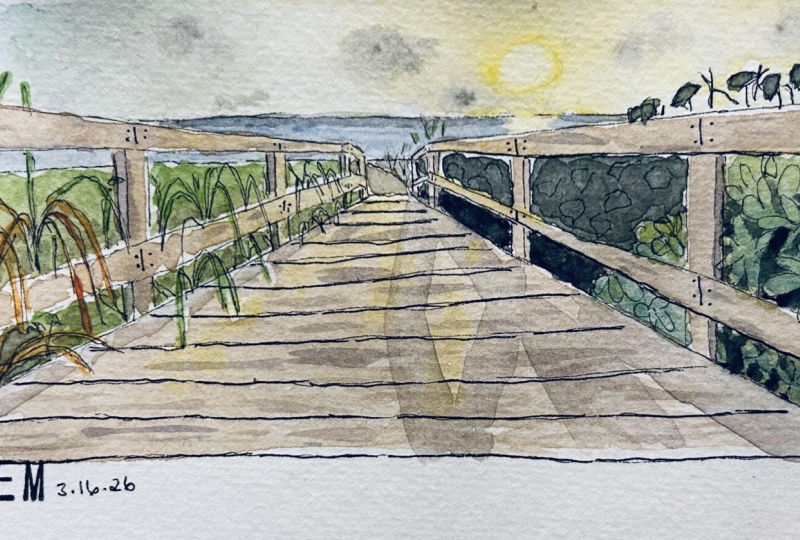
1. Introduction: Hi, I'm Amy Stewart. I'm a writer and an artist. I've written six books about horticulture in the natural world, and over the years I fill my sketchbooks with images from garden and nature, including garden scenes, sometimes from my own garden, Um, and sometimes from somebody else's garden. Also botanical gardens that I visit when I'm out on book tour and just, you know, flowers and plants that I spot when I'm on vacation like he's in Mexico or this one in Italy. Um, and a couple of years ago, I filled an entire sketchbook with the plants blooming in Washington Park, which is near my house in Portland, Oregon. So when it comes to creating ah, Garden or Nature Journal, there's so much that you can explore with pain and EQ. In this class, we're going to focus on creating a complete garden scene just like this one, with a variety of plants and even a little structure peeking out from behind the foliage. And in order to do that, we're going to tackle one of the most challenging aspects of sketching in the natural world , which is quickly mixing a variety of greens. So just look at the difference between these paintings and how much the greens helped to tell their story. Ah, look at this. Joshua tree in San Diego compared Teoh this agave, a plant in Mexico and this incredible begonia in a friend's garden. The greens are also different, but so important. And they really help Teoh tell the story. I've taken a lot of our classes over the years and I think that sometimes painters can get a little too technical when it comes to greens. So in this class I'm gonna simplify and de mystify greens so that we can get on with our painting. Okay, let's go.
2. Supplies: Okay, let's talk about supplies. It's a watercolor class. You're going to need some water color. This is, Ah, travel palette that I use, whether I'm traveling or whether I'm just at home painting and I'll have supply list with links, so I'll show you all the colors I use. But any kind of water color palette is fine. Whatever you've got and for a brush, this is a 12 round brush. I use this a lot, but for a few fine little details, I'm going to use this this water brush. I'm really just using it because it has such a nice find point. There is water inside the barrel, which could be kind of cool when you're out and about. But I find that it's hard to control the water with this, so I don't actually use the water very much. But I do like that fine tip. You're also going to need some watercolor paper, so hopefully you have a sketchbook with watercolor paper. That's of course, ideal for going out and sketching in the garden in nature, but at the very least, you'll need some kind of watercolor paper for this class. Be sure it says watercolor on it. This is a Windsor Newton block. Um, this is a hot press block from Blick. It doesn't matter whether you get hot pressure. Cold press either is fine, but just make sure it says watercolor paper. You're also gonna need a pencil and an eraser. I use a drawing pencil. That's Ah H R H B, which means it's a real hard lead that makes a very soft lines that are easy to a race. And I use one of these need herbal gum erasers because they don't damage the paper at all. So that's good. And then for pins you can use disposable waterproof pens would be perfectly fine. This is, Ah, micron. Sometimes these air called pigment liners, but they're just They're basically just fine tip markers and their waterproof, and that's what's really important. And I use a thin one. This is a two ah, thicker one. This is an eight that would be helpful toe have. And if you want to try the brush pin that I demonstrate, this is a, um, it's ah, it's a Faber Castell Pitt artist pin. It says SB. It has a soft brush tip, so this is also waterproof, Um, but you'll also see me using fountain pins. So this is a platinum carbon desk pin with waterproof cartridges, so I love this. It's so easy to just pop these cartridges in so again, platinum. Carbon is the brand, and they make the waterproof platinum carbon ink cartridges that go in there. I also have a brush pin. This is a pin tell pocket brush pin, so it's similar to this SB marker. But it's just it's got really link in it, and it also just refills with cartridges so very easy, and you can just get the cartridges with it. So that's a pin tell pocket brush, pin these air wonderful. And then I'm also going to be using my Lammy Safari fountain pen, which I love. Now this pin, the ink that comes with it in the cartridges is not waterproof. So for this one, I have a converter, so I buy this platinum carbon ink. It's the exact same ink that goes in this platinum carbon desk pin on Lee. Here it is in a bottle, and it's really easy to fill These. Basically, I would just open up the bottle of ink and dropped the pen down in it, and this little red at the end of the converted here is like a plunger. So you twirl it down and then twirl it back up and it draws Inc up just like a syringe and then wipe it off real good and put the pin back together and you're ready to go. It's very easy to use anyway. That's all we need to get started, and I'll post a list of all of that. But basically, just use what you've got. The most important thing is that your paper says that it's for watercolor and you have waterproof pens.
3. Demystifying Greens: I made this really mess of a bunch of different colors by just mixing all the different greens I could possibly think of and letting them all run together. And I think this is how greens can get in. Our mind is very muddled up. I want to really simplify and Dean mystify greens. If you've ever taken a watercolor class, um, and really thought about how to mix greens, you might have seen some pretty complicated color charts. There's so many different options. There's a lot of greens right out of the tube that are really interesting. There's a lot of different mixtures. Here's a color chart that I did just using what happened to be on my palette. And as you can see, it's kind of a lot. It would be really hard Teoh in any way memorize this and really put it to use out in the garden are out in the landscape. So what I want to do is I want to simplify all this and strip it down and make it really easy for you. Um, I hear a lot of watercolor artists saying, Oh, I never used green out of the tube. I always mixed my greens Well, guess what? The greens that come out of the tube are just mixtures, their mixtures that are already made for you that are perfectly proportioned. And best of all, you can control the water a lot more easily because you're not dipping in and trying to mix three different colors and get the right amount of pain. But also think about whether you have the right amount of water. So just to give you an example, these air a couple of my favorite greens sap green, which I use all the time, is a mixture of quinacrine own burnt orange and azo yellow and fellow green blue shade. That's what's in the tube, and what you get out of that is that beautiful sap green and then cascade green, which is really wonderful if you happen to live in the Pacific Northwest like I do, or anywhere where you have a lot of Conifers and you get this sort of bluish green in your foliage. Cascade Green is nothing but a mixture of raw sienna and fellow blue, and you can even see that because it's got this wonderful way that it fades out and you can see touches of the raw sienna there, but you can also see this bright fellow blue because these two pigments sort of I don't like each other. They push away from each other a little bit just because they way they're different size and different weights. And so you get this wonderful effect where they kind of settle out and separate from one another. So there's absolutely nothing wrong with a really fantastic green right out of a tube. Don't feel like you're not a good painter if you're not mixing him. So here is my simplified, demystified way of thinking about greens. You are gonna need a few different greens in order for there to be some separation between , say, the trees in the bushes and the perennials and the and the lawn. And you also have to be able to show the difference between when something is being hit with bright sunlight or whether it's in shade. And I think that if you have five basic greens on your palate, you can do this, and obviously you can change these up. You can mix them in with some oranges or some brown's. Maybe in the autumn or just depending on the light. Or maybe a plant is, um, I just knew the end of its life cycle, no matter what time of year it is, and it's gone a little yellow or it's going a little rest colored. But what you need is you need a bright yellow green. You need what I call a fake green, which is sort of like a Kelly green. It's that green that you think doesn't exist in nature, except it actually does. If you really look, it's sort of almost like a pop art sort of artificial green. I actually think it's really helpful to have that in a garden palette. It sounds counterintuitive, but you'll see me use it. You need what I would just call a regular green like. This is just the green of the of the trees. This is sort of the basic green that everything is, and and and we work from there for that I'm using sap green. You also need some way to mix a blue green for Conifers and for any any foliage off in the distance, or for just maybe, cultivars of a perennial that has more of a bluish foliage and I'll show you what I do to mix that. And then finally, you need a dark, dark green, and that's just for shadows. Or for again, I'm thinking about Conifers because I live in Portland, Oregon. But any plant that just has really dark, deep colors, so that's what you need. And, um, let's talk about some different ways that you can get there.
4. Find Your Greens: Okay, So real talk about my palate. Um, this is what I actually take out with me out into the world. I have two of these, but this is the slightly larger one, and it's a mess, and I paint if I'm painting in the studio. I still use this because I want to be really comfortable with it. And when I go out to paint in the world, I don't want it to feel wildly different from what I'm doing at home. So this is what it really looks like. And you're going to see that. You know, my colors get mixed in with one another. It's a little bit of a mess. And I deliberately didn't clean this up because this is probably gonna be what it's like for you when you go out to pain. So this is Hansa Yellow right here. This is my bright yellow that I would use to mix a bright yellow green. And as you can see, I've already gotten some green into it. It always has green in it. This is never as clean as I wish it would be. And I'm not even really gonna clean it up for you. I'm trying to wipe away a little bit of it, so we get a slightly more yellow version. But rather than just take this out of the tube and drop it into a nice clean palette and show to you that way, I just want you to see what it's like to really use this in an act more of an active working way, because that's what it's gonna be like for you when you're out and about. So all right, I picked a little bit of the green up out of there, but basically, here's my hansa yellow. I'm gonna put it on the palate. It's already looking kind of green because I'm always mixing with green and I just don't keep it very clean. But let me just get some of that out. That's a pretty thick mixture. I want to get a little more water in it, so it'll move around on the page a little bit. In addition to Hansa Yellow, I think iso yellow is really beautiful. In effect. I'm thinking about getting that next time I run out of yellow, but let me just put some of this down. You can see because there was some green mixed in it. It already has this kind of nice richness to it. So this right here is pretty close to the yellowish green you need. But let's push it. Let's push a little more towards green, and I'm just going to get some sap green in there just a little bit. I just barely touched it. And now let's just see what that looks like. It's still pretty earthy. It's a pretty, earthy, um, mixture of the two. I'll bring in a little more. Let's see how that looks. It's moving a little bit greener. Let's move in some more. It's still very much what I would call a yellowish green. See that I know it's gonna change as it dries a little bit, but this will just give you a sense. Like, to me, that whole range is what I think of what I'm thinking of yellowish green foliage. So this could be just very early spring. Or it could be a plant that just has naturally yellow foliage to it, like I'm looking out my window right now, and there's a bamboo with yellow foliage in it, and, um, it's kind of that so that's sort of the range. And so that's I'm mixing SAB green with a yellow and again I used Hansa yellow here. But I think iso yellow is another really cool one. That would be great to use. And but you can see that that's it's a pretty earthy, natural kind of yellow. It looks like it comes from nature. But I also like to do this kind of bright, fakey green what I call a fakey green because you really do see that as well. And so for that I'm getting some Meridian. There's probably a lot of different ways to come at this. And in fact, um, I'm gonna I'm gonna show you another page that I just showed you a minute ago. I'm gonna show you again real quick. The, um, version of this, if I were to buy it out of a tube, would be this hooker's green. See, this is what I would call kind of a bright fakey green. It looks like a paint color or a fabric color more than it does a color in nature. It looks like a color out of a crayon box. So Hooker's green would be a good a good one if you just wanted to buy it out of a tube. But I'm gonna try. I like to have this veridian on my palette. I think it's great for again more artificial things, like painted buildings or signs or even awnings on a patio, that kind of thing. So I like having a green like that, but let's make some yellow in it. This is the same yellow, and do you see how you get a green? But it is this kind of bright Kelly green. It just looks like a more manufactured green to me. And in this case, that's just what I want because you really will see this in the garden. So let's just see what it looks like here. Look at that. That is such a different. It's also a light green, but it's so different from the, um, yellow green that we started with. So I'm just going to keep going. I want to just get a good rich mixture. I'm trying. I'm trying to keep my yellow clean, but you can totally see how this happens, how the yellow just get so um kind of polluted. So this doesn't have to be super light in color. But the idea is that you get more of a, um, you get a green that, um, the kind of just pops right out at you and that in that really surprising, almost candy colored way, Like if you can think of a candy colored green, that's what I'm after. So I'm doing a little bit richer mixture here just to get some of that in so you can see what a richer mixture. But I think of this is being kind of a lighter green. It can go darker, this granulated a lot, so it really sort of separates out. But you can see how it could be darker, but that it's it's a very difference. It's still light, but it's a very different version of light. So I like I like to have something like that, Um, and like I say, go with hookers. Green. If you really want this right out of the tube, I mix it, and I do a lot of going back and forth now for a regular green like your most normal go to everyday green sap green, is it? I don't see how you can possibly beat sap green. There it is, man. That's pretty much every green year ever gonna need. I mean, this is the basic green, and everything else is a variation off of that. So let me get this pretty wet and put it down pretty light. I mean, you can see the difference between those two right? Like this is more of, ah, a natural looking green. And it's because it has those orange tones already mixed in it already in the tube that quinacrine own burnt orange, Um really gives it this very sort of natural feeling to it. And you do get a lot of variation in sap green like there's a lot. There's a lot of richness and a lot of variety to this. I'm trying to get down and really get the darkest, the darkest version of what you can get out of sap Green. I mean, I think that's pretty great, that's all. That's a lot of variety there, and it's really different from that. And it's different from that. And even the lightest versions. Do you see how you already have some kind of obvious differences? Okay, I want you to be able to see my palate is I'm working here, so I'm just gonna have to set this down right here. So it'll stay on camera a little bit, but let's work on a blue green. So again, A lot of different ways to do a blue green And I love Cascade Green Let me show it to you again so you can see it. Cascade Green is beautiful and I do have it in the two by just don't keep it on my palette a lot. But, um, if you're gonna be out in nature a lot, I would just get Cascade Green and use that It's gorgeous. But this is my regular kind of urban sketching palette. And I'm gonna show you what I would do here. I would get again sap green. But now I'm gonna make some blew into it, and I'm gonna go with oppression. Blue Pressure blues. A really good one, Teoh, have on your palette. Look at that. This kind of deep, rich color. It's wonderful for water. It's wonderful for things like reflections in glass. Um, I don't use it as a sky color, but I totally use it as a water color, and it's just it's just such a wonderful rich. It's such a wonderful rich blue and I want to push this. I want this to be really blew like we're not messing around here. We need blue, You know, you've got blue foliage in the garden, and so really, it's all about the blue with just a little bit of green in it. Teoh remind us. You know, that this is this is foliage, so that's what that looks like. Let's get it really good and dark. Um, you can see what's so what's happening with all this mixing is every time I mix. I'm also changing up the water ratio so I might get a nice, pretty dry mixture in here. But then I've got a wash, my brush off and go back and get more paint. And you can see how it's hard to maintain the right amount of water, Um, and the right amount of pain when you're mixing like this. And that's why it's so nice to just have an account all in one color that's right out of the tube. So I've got different ratios of Prussian blue and sap green in here, and you can see some changes happening there, but that's a pretty good blue. So pressure in blue with just enough sad green in it to make it more of a green. I'm gonna give it a little bit lighter. I didn't quite go light enough up there. And I want you to see because you can imagine trees way off in the distance or even a plant like kind of a modern perennial that has a beautiful bluish green foliage. You can see how you could totally use that and that really works. And so the last thing is what I would call a dark green. And this is really for shadow sides of trees, stuff like that. So I'm gonna go back to my straight sap green mixture and what I'm going to dio you can certainly mix in a blue like an ultra Marine or oppression can get you kind of dark and even like a burnt sienna or ah, transparent Earth would dark in this up. And in fact, I'm gonna, um why don't I just show you that I wasn't planning on doing this? But this is transparent Earth Red Burnt C and his, um, would would do the same thing I mean, it would be a little bit different, but you know, So here's just an example of a dark green where I've taken my same sap and I've mixed in this transparent earth and I can get a pretty nice, dark, dark mixture moving towards bronze. But for the shadow sides of trees, I'm going to show you my favorite go to thing. That idea, which is? I take my sap green and I dip into Daniel Smith neutral tent. So this is kind of like a black, But the idea with it is that it's for mixing with other colors, and it makes them dark without much changing the color temperature. So without making them too warm or too cool and you can get the most incredible dark, dark green with this Look at this. I think this is beautiful and amazing. And for for shadows and just for very that kind of very dark. I love that for very dark green. I'm gonna come up here with some regular green and just try to dio I'm trying to do kind of a lighter version of it just to show you what, What? It does work with me a little bit here. Yeah, There you go. You can sort of see what the neutral tent does to the sap green when it mixes together. So if you work with the colors that you have, I mean, don't feel like you have to go and buy a whole new watercolor palette just to mixed greens . Try to keep it very simple. So the first step here is just mix yourself up some greens and make sure that you're comfortable with a range of greens that are very obviously different from one another, because that's what's really going to make your nature sketching and your garden sketching really come alive.
5. Pencil Sketch: If there's any kind of structure in your garden, it's always great to include it because it gives you gives the I a break from you know, all the greenery around it, but also it gives you something to build off of. And if you get the structure in the right place than the plants can become supporting characters that, um, play off of that. So I'm making a little square so that I leave. I like to leave some white space around the edges of my garden journal. So I'm making a little square for that reason, and I'm noticing that this structure, um, is a little comes a little more than halfway over. So the first thing I want to do let me just sort of figure out, roughly awry. Ad the where the ground is here and then halfway through is about where that windowpane is . So I need to come over from there. You need to leave some room for sky. I'm seeing scum in a just draw kind of the what I call an envelope. This is sort of a container for where the sky goes because that told me about how how high up the sky is. I think it's actually a little higher than that. So now I'm going to get this structure in the roof starts a little more than halfway over. There's a tree in front of it, but I'm gonna worry about that later. Let me see if I bring this over like this, and then my little house, Mrs. Like maybe a little guesthouse is not my garden, by the way, because you are all planning to come visit. I do not have a guesthouse like this, but, um, yeah, that looks about right. And so again, I'm just sort of looking for the big shapes, like just asking myself like All right, where's there's a window that's here. It's had a little bit of an angle cause it's, um, it's on this side. And then there's another window that's here and again. It's all right. If this is a little off, I mean, I can sort of adjust. I can I can make a lot of adjustments here. There's, ah, I have a lot of flexibility. I left myself some room so that if I decide how I think this is actually a little I want this to be a little longer. I won't include a bit more. I have room to do all that for sure. Um, this big tree, this sort of comes. I like that. It's such a big, dominant shape. It takes up a lot of space right there. It's gonna fill up this whole corner. I'm just sort of leaving a little spot for that. And then this shrub comes up to about the bottom of the window. So this is where I start lining things up. I've decided where these windows are. I've decided where the roof is now. Everything else is gonna have to orient itself around that. So I'm going to say, OK, well, here's Here's the shrub and I like the shrub. I want to include the shrub because its's connecting me to where the grass is, and there's a little kind of patio type thing right here. So the grass kind of goes like that and in the grass comes out here. Everything else I can kind of do in pen, like I've established where the big shapes are. And now I can be a little bit more free in pen
6. Preliminary Drawing: I'm gonna use a fine pin. This is the platinum carbon desk pin again. But just anything that's that's That's fine, because what we're doing right now is we're just trying to get enough drawn in that we can erase and then we'll get into more detail after that. So I'm just trying to draw and I don't even have to have really complete lines. It's okay if I have sort of broken lines here, like See, I'm not even fully drawing this yet because I know there's a lot of little details here. I'm super interested in getting some of those details, right. This is really just to kind of give myself the loosest possible impression of where things are so that I can come in and do more detail later. So this shrub and I'm gonna just sort of see, I'm not even really connecting all the lines in this shrub. I'm just being some uneven little lines. I'm definitely gonna remember that That's a shrub. There's no possibility that I'll forget what that is and then appear this tree has thes big old leaves. And so I'm gonna go ahead and kind of as I'm just making This is really just an outline for Anita. Go buy because it's telling me where this tree falls relative to the house. There is a I don't have to really nail every single branch. But I'm just gonna kind of suggest I do see where there are some branches coming up here, and I'm just gonna make a few lines to suggest that. But again, I'm not getting totally in tow this whole tree right now, I'm just doing enough so that I can array. So it's like, All right, what else did I do in pencil? That's important to get right now. I did this grass, but I don't want to do the grass as just a straight line because the grass is not a straight line. The grass. It's hard to see in a photo, but if you were there in person looking at it, you would definitely see the kind of little jagged edge of the grass, these little blades of grass sticking up again. It's very it's a small thing, but it's really cool when even with this first pass, you can just sort of lay in some of those details. Um, here. I don't want to draw in this hole side of the house cause that palm trees are that banana trees gonna come over and I don't want to forget about that. There's another little tiny roof back here, and I'm going to just ignore that. I'm not gonna put it in. Um and I did want to kind of remember how much of this area is sky. So just I could I could almost just wait here. But I'm gonna just do these little spiky shapes of this kind of this little palm tree here . I'm gonna put in some more spiky shapes here. That's it. That's all I'm gonna dio. I'm not gonna worry about getting these palm trees those trunks. I'll do that in a minute. I just see some more spiky shapes back here, and some of them curve like gravity is sort of pulling him down. And that's enough for me Toe erase what I've got. Because everything else I don't need the pencil lines for anything that's left. So I'm gonna leave just a little bit of my outline. That's telling me where the edge of my drawing is because that'll remind me to stop painting because I do like to leave that little bit of white space, so just kind of just picking that up. Um, And then I usually start erasing in the first area that I drew because Inc takes just a second to dry on the paper. Not that long, but I don't want to start a racing on thing I drew most recently because it might still just be a tiny bit wet. I'll get some smeared ink. So I'm starting over here because I know I did the house first. There's a whole bunch of extra lines over here. I can get rid of that, that I can get rid of all these lines I drew for the grass and then this. So, yeah. I mean, I have a pretty good sense of where the major shapes are. And now I can really have fun with all the details. So I'm just gonna be looking very closely and, like, really sort of enjoying the act of observing. This is obviously a roof with shingles, So the lines here are actually pretty uneven. I don't want to draw every single shingle. I want to suggest that there shingles, so I'm letting you know I'm letting some lines come in like this, but I'm not gonna go to crazy. I could do some of this with color, but I don't want This is not the point of this painting, so I don't want I don't want to get to pulled into that. So I think this house, it's like I see these lines. I see the kind of batons here, but I need to actually bring this out a little bit more. So I'm gonna do that now. It's not gonna be terribly important. I mean, I'm gonna be able to see where the window part of this ends, and the rest of it's just gonna be in shadow. So this windows a little bit of an angle, So I wanted to draw that, But I'm gonna get in here. I'm going to speed up this little section two double time. All I'm doing here is just, you know, lightly drawing in these windowpanes. I don't want to get too hung up on things like architectural details on this building, because, really that while it's a nice, strong shape that anchors it, the point of this sketch is the garden. So the idea is not to get so hung up on the architecture. So I'm just sort of suggesting all that there's a chair in front here, but it's white, and I'm not gonna worry about it. I'm just gonna completely ignore it. I'm much more interested in the foliage than I am in the little chair sitting there. So, um, okay for the shrubs, what happens is there's, like, areas of bright green. And then there's thes areas of shadow, and this is how you see this and, you know, a lot of trees and shrubs. You'll see these irregularly shaped, shadowy areas, and I'm really wanting to kind of notice those. But I will go ahead and draw in just a few leaves. I don't have to do it everywhere, And I'm really trying to catch, like, what did these leaves look like? Because obviously, leave shapes are all different. So my trunks, I did sort of already draw these in. And, um, there's actually there's some, uh, you guys, I'm gonna forget the name of this. What is it? Stag? Isa Staghorn fern. That's up in here. This'll picture I took in Florida and I confess, I don't know my tropical Floridian plants very well. So I'm sure that someone who's in Florida is gonna tell me exactly what all of this is. But these are big, big leaves, and I'm totally gonna, um, just look at these shapes and really try to observe and get in just the size of these leaves. That's such a going to be such a great thing when we go into add color, I also want to notice where I see a lot of sky and a minute draw pretty obvious looking shape for where I want to leave a patch of sky. I'm gonna put in maybe a few more patches of sky than you actually see here. In fact, because I do want a sense of that that there's a lot of sky coming in through the trees and I still see drunks coming up this way. I'm just going to make some lines. I'm gonna do so much of this in paint that I don't want. I don't need to do too much line work right now because there's so much more coming. So I'm just gonna leave that I've got this hedge here, and then there's I am gonna put in these little just look like impatience to me? Maybe so. This is almost just like I'm making some notes with my with my pen to come back cause I'm gonna come back and do Maurin color later. Um, big, spiky shapes, dark red foliage. Love it. That kind of thing is so great. I'm gonna really exaggerated. I'm making it a little bit bigger than it even is. And then there's a yellow one behind it, which I also love. That's maybe it a little bit more of an angle. And I'm trying to make these angles realistic. Like I'm trying to really look at, you know, how does it bend? It sort of comes up high and then bends. Okay, that's good. Um, and then over here, there's, um these are really enormous leaves and feel Frieda really show the size of these cause Thistle thistle again. Once we get into some color, that'll be so useful. There's another little shrub here, right here. I almost wish I could leave it out, but I think that would be too tricky because the star of the show over here is again. This we really want to pick up this red foliage like it's on either side and there's a reason for that. It's wonderfully symmetrical. The garden designer knew what he or she was doing for sure, And we really want to show off the symmetry of these two plantings and those colors playing off each other. OK, another shrub that's gonna basically we're just gonna follow this all the way to the end does kind of take a little turn. So there's an area here that's in shadow, and I'm gonna just make some scribbling marks to kind of remind myself that that's in shadow. And then the underneath part is darker where it meets just where it meets the ground. And there's also darker area where it meets up with this other shrub. But again, I'm just kind of looking. I'm just really observing closely and seeing places where there's darker areas. And I'm just gonna work off a year now and just see, like, where are things relative to these other things? Okay, I really want it. I need deal with these banana trees, don't I? Okay, so I'm gonna I'm not gonna do the trunk first. I'm just going to focus on the leaves and then the trunk is well there to support the leave . So we're gonna will add it as a, uh, supporting character in a minute. So I'm being just very quick with ease and trying to really observe their shape, but also not getting hugely caught up in every little detail, because color is going to do so much of that work here. I'm just treating these is almost like this abstract collection of lines like just following. Where do I see these shapes? Here we go. There's some that are down here in the these deep, dark shadows They're hard to see, but they're probably going to be kind of useful to us. So But those in I'm just suggesting some trunks here that does not have to be the most important thing. I like this shrub that has these yellow flowers. I'm actually gonna work in some of that yellow, even though it's deep in the shadows. I want it. I want it in there cause it's nice. It's a little bit of a change. And over here I mean, there's just a lot of foliage here. There is some variety in it, but I'm just sort of making some marks to suggest foliage there and then these poem trees. I like him. They kind of go off the top of the page. And normally you might think, Well, if it's, you know, you you want to be able to see the whole tree. But I kind of like that. It's going way up in the sky and we don't see the whole thing. So I'm just making a little palm tree trunk. I can't even see all those markings on this tree. But I know that Palm trees were kind of like that. So I'm sort of just using what I know and I'm trying to follow. There's always this kind of pattern of how the Franz fall. And so I'm trying. Teoh be mindful of that. This one comes down like this and you see how they're like they're coming this way. At first, I really haven't look at this cause it can be a little counterintuitive, Like at what point do they kind of stand up more? Same here again. So much more is gonna happen with color that I don't want to get too hung up. I'm probably not gonna do all three. I'm probably just gonna do these two because I don't really feel like I have left quite enough room in my drawing. That's okay. Here. We can't even really see the shapes. We just know that it's kind of spiky over there. Here also, there's this wonderful little bit of sunlight coming in, and I'm actually going to draw that space so I don't Otherwise I will totally forget about it. Um, I see more of these big banana leaves over here, so I'm tryingto kind of get those in. But again, it's really color. That's gonna differentiate all of this. All right, that's pretty much our first pass of the drawing.
7. Inking the Shadows: Now what I like to do is to come in with a little bit darker, line in in a few places and to really give weight. So everything's not sort of feeling like it's the same weight. So this is my Lammy safari pen, which Aziz you can see is a darker, heavier line. Everything you know, everything that's outdoors and has a light source on it has a dark side to it and a light side to it. So what I'm doing is I'm considering where the lights coming from and I'm just looking to see, like, where are the, you know, where are the dark sides of everything? Because of where the light's hitting and it's It's not always, um, it's not always so easy to see. You know, it's easier on a really bright day to be able to see those differences, But, um, yeah, it's not always the easiest thing in the world, and again, I'm not gonna go. I'm not gonna go everywhere here because I am going to come back in in a minute with an even darker pin and really in gin. Cem shadows. So what I'm looking for now are not so much the big, heavy shadows, but just the places where I see like the undersides of things like here The son I know the sun is is, you know, obviously is shining down from above. So obviously something that's running parallel to the ground, the underneath side and then I can see that it's coming from over on the left. So, like the left sides of things are the shadow sides. So some of this, even if I I can't quite see it so well in the photograph, if I was there in person, it would be a little bit more obvious. But I can kind of get some of that in just by looking, cause I can see from the shadows being cast where the white sources. So I'm just gonna do a little bit of this. I'm not going to go crazy with this because I've got another pen that I'm in it that's going to really pop out the shadow sides, and that's coming in just a second. Okay, so I added in just a little bit, and already you can see there's a little bit more richness to it. There's a little bit more of a sense of like through, uh, three d you know, it just it just pops out just a little tiny, bit more. I think I'm gonna come in and kind of there may be all right, That's pretty good. And this is my pin tell pocket brush pin that I love so much. And so here you know, the thing about greens is that it's sometimes hard to get as dark as we really want. Teoh with greens in shadow. And I love to just really, really emphasize thes shadows because I think it just brings up the light so much so I really want to play up these darker areas within the green foliage, which I already kind of marked out with my pen. But I'm gonna come back in and just really go for it. I'm not filling them in completely because I do want some green color to come in between these bits of black, and that's what's going to make it seem like these shadows or green and not totally black. So I'm just I know there's a lot of dark behind these banana leaf, so I wanna really I'm looking at Where are their shadows and I'm adding a bunch of this in , um, underneath. There's sort of an underside to some of these leaves that I can see. Let me do that. Let me get over to the house before I get all over there. Let me let me do the rest of this. Um, these windows a cool way to do what? There's so many ways to handle windows into handle glass. But a cool way to do it is to treat them as black. And as you can see here, there are some reflections in these windows and all play around with that a little bit. But they're the windows air, actually. Pretty dark. I'm sure you can see that. So just dropping in this black is surprisingly realistic, like surprisingly lifelike. Okay, um, let me get back to these super dark shapes I want I want to come up in here with it because I see opportunities for really good shadow shapes. I'm you know, I'm doing this with respect to what I've already drawn, but I'm also, in some ways just drawing freshly on top as well. Like you can follow the line work that you've already done. But you can also come in and and add to it and do something that's maybe a little bit different than what you had originally laid out. This is all about your act of observing and your experience of observing what you're saying . There's deep, deep shadows that that these banana leaves air emerging from, and that's what makes him so, so cool looking and so bright. So I'm really playing up how dark this is back here, cause it really is quite quite deep dark colors. Um, I am gonna come in over here, the side of this tree, the side of this one. These these are often the distance, so they're not, and they're much more in sunlight. And so it's not this same super super dark that I'm seeing over here. So I'm not putting the black up in those palm trees because it's up in the sky. It's brighter. It does have shadows, but not shadows that air dark like this. Still just sort of dabbing these in but leaving lots of room for green. I mean, you don't want to take away the opportunities to do green, because really, that's what this is all about. Um, a little bit around some of these leaves. That's looking pretty cool to me. I am gonna come up just with the just with the tip of of this because I like the kind of stroke you can get. I'm really not trying to make it blacker. I'm just trying to take advantage of this brushy tip in a few places, and I can get this more beautiful kind of organic line. That's really great. Any kind of brush, Soft brush tip marker pen like this is super cool for leaves and things where you want these really kind of feathery lines don't get too carried away. I tend to get too carried away with something like this. Okay, this is looking really cool, and it's ready for some water color.
8. Painting the Big Shapes: Okay, let's do this. It can be pretty overwhelming to look a complicated scene like this and wonder where you should start. So it's a good idea to just always have a place where you start and where I start of any kind of outdoor. Seen as I do the sky first. And one reason for that is I want a very clean color for the sky. So I do it when my pal it's nice and clean, but also I can just let that area dry and move on to something else. It's totally far away from it. So I'm using cobalt teal for the sky. It's in Florida, it's Caribbean. I think that's fun to Dio, but very often I use cobalt blue, which is right here next to it. But for this one, why not? Um, I don't know why I picked up this flat brush. It's not usually the one I used for something like this, but I'll go ahead and use it for these larger areas and show you show you how I do that. I'm going to just lay this in, Uh, see already. I think this is too big to bigger brush this makes more sense. I'm not worried about exactly how the sky color and the greens of these trees meet with one another. Because I know that I can put some darker greens on top of a blue and it'll look just fine . So I'm not worried about it. I'm just going Teoh, um, kind of stay out of the palm tree area because I do want it to be light and bright. So I'm laying in a little bit of blue here and there, but not too much. And I remember that there was this kind of area right here where the sky shows through. And I wanted to show that to and that's all I'm gonna dio There's plenty of places here where the you lightened that up. The white of the paper is still showing through, and that's awesome. And I don't want to overdo it. I'm just gonna you know, that is a sky that you just going to glance at that and go, Yeah, that's the sky, and that's all that's gonna happen. And that's what I want to have happen. So I need to stay away from this area because it's wet, so I'm gonna do the grass next. I like to do any kind of big areas and get those done. The only exception to that is if I'm doing, like pavement somewhere, maybe in an urban scene, I leave it to the end because it tends to be a gray. And I love to mix that gray out of everything else I've used in that painting so far. So I wait till the end cause I've got a lot of colors on my palette. But what I'm gonna do here is a big wet wash of Hansa yellow, and I'm just going to drop the tiniest bit of sap green into it. In a few places, if you look closely at this lawn, you'll see that there's more or you know that there's bits of green here and there. Also, this is not this lawn is not quite the iridescent bright, bright yellow that I'm about to put down here. But again, you know, I'm just trying to suggest the general idea. This is going to give an impression of sunlight hitting a lawn, and I'm much more interested in just conveying that feeling than I am in total total accuracy. OK, so quick while this is wet, I'm just dropping in some green, but I'm not putting it everywhere. I'm letting it move, and I can decide on the paper how much I want to blend. But I want to keep it really, really like there's so much green in this scene. This may look too yellow to you right now, but trust me, we're gonna have so much agreeing that this is gonna The contrast of this is gonna be like such a kind of a relief on the I. And I love that. There's little bits of white here and there that I left. So that's it. That's that's how I'm handling the grass. The next thing I'm gonna do is I am gonna go ahead and get in the roof of this house so that it's done and drying, and then I can I can really move around a lot and focus on all these greens. So there's, you know, there's a 1,000,000 different ways to mix a gray. I've got some blue over here, so I could take a bit of red or orange and work it into it and get I mean, that already is a pretty good brownish grey. Just you know, you just start with the blue and put the opposite color in, and it's pretty good. Um, shadow Violet is kind of my shortcut for any graze I need, but I could also do. I could take some yellow Oakar naked mix in a little ultra marine, and I'm just, you know, by by taking something from kind of every corner of the color wheel. So I get some blue. I get some yellow when I get a tiny bit of red or orange. Then I'm getting this nice, neutral color. I think looking at this that it leans a little more blue than brown. So I'm gonna pick up the tiniest bit more ultra Marine. I like it. I want a lot of variety in this because it's weathered, the shingles, air weathered. So I'm gonna just I'm gonna go really quick here, but leaving some white areas, and I'm gonna put it back in here to just a little bit so I can kind of show through. And gosh, I think I'm gonna just call that good. That's about all I'm gonna do for that
9. Adding the Greens: we're going to start thinking about all these greens. So with a lot of these, I'm gonna do the same thing I did with the law on which is I'm in a star with a yellow and then I'm going to drop the green in because there is a lot of light hitting in some places . So let me just show you kind of what that looks like. Let me do this shrub. I'm coming in with my yellow. It's a pretty wet mixture and then I come in with my sap green and I'm gonna start down towards the bottom because it's darker towards the bottom. The angle of your paper is going to make a difference in mine, is there? Let me clip it a little bit better settle a little flatter wasn't lay in real flat, but you can see how already like it's greener down here. But there's that bit of yellowish kind of up near the top. So that's what I'm going for. I've got some just pure sap green on here, so I'm gonna I think I'll go ahead. I'll just lay a little bit in here. I'm kind of taking a risk because I don't want it running into the law on. So, like, am I really done with the lawn? Yeah, I think so. Okay, Good. And then these little in patients or whatever they are, I do. It would be cool to kind of give a sense that there's white flowers, but it's so hard because it just looks like the white of the paper. I might decide to make those pink, so I'm gonna do very little there in terms of greenery, because I like the idea of some little pop of flowers. And so I might just fake it and turn those into into pink flowers in a minute, um, sticking with the greens. I'm gonna go ahead and do the rest of these shrubs because it's kind of the same concept over here. I'm going to do this one. I'm treating it as all one thing that's low head right here. Drop in that yellow and then get my sap green. And again, I'm starting at the bottom, the lawns already dry, Which is why I can do something that's right next to the lawn. If the lawn wasn't dry, I'd be staying away from this particular section coming in with my brush because a lot of green went all the way through these shrubs. But I do want that sense of light, so I want to pick it up. So I'm coming in with a dry brush. I'm even just gonna blot it up a little bit with a paper towel just to get some of that lighter color back. That's cool. And it does look like it does look like lights hitting there. There's one more shrub, and it's behind this very distinctive read fully and so I don't want to do too much because that red is the star of the show here. I'm gonna really be exaggerating that red and making that very prominent. So I'm gonna just be pretty limited with this green in the background so that I've got plenty of room left to really go crazy with that red. So I was really careful with that. Okay, so there's that, um, yellow. So I'm Look, I'm treating this all as one yellow shape. It moves up this way. It's this one kind of big slope that's all in the light. So that's one thing, and then I'm gonna come in this is very dark green. This is also one big shape. I don't want this running into my shrub just below it, but it's just dry enough that I think it's OK. I do want to let some of his green run into the yellow, still little wet. I can allow that to happen. And then this is where I really need my dark, dark green. You know, I have some ink that I already put down, but I'm coming in with my Daniel. This is Daniel Smith neutral tent. I'm gonna mix it with the sap green. This just needs to be so, so dark. I've got a pretty dry mixture there, but I'm just letting that be kind of the darkest part of this because it's really deep in shadow. A lot of these greens that kind of similar to the eye, and they definitely look similar in this photograph. But I need ways to distinguish them. So for the banana leaves, um, in a kind of draw on my fakey green, I'm going to get my meridian out. There's some meridian. This is just going to distinguish it. It's just going to make it look a little different and then get a little yellow in there. It's still a green, but that little bit of blue And it will just make in make these stand out. And I'm not so concerned with, I mean I am concerned about does this match what I'm seeing? But mostly what I'm trying to dio is I'm trying Teoh, um, convey the experience of being in this garden. Right? And there is a lot of variety here, and I just need ways to show that. And so bite having this green be different from that, and they are different. Um, it gives me kind of a quick, easy way toe Highlight that. And here I'm not even too worried about exactly what I'm looking at here. I know that these are this is just kind of a big mess of foliage, and it's a lot more of those banana leaves, so I'm just gonna let that continue on. And there's quite a bit of white showing through still, and I like that. But I am gonna come in maybe with some shadows as well. Um, the I'm gonna say the palm trees for last. I'm gonna do this other tree, which is again with these yellow. So now the sky is dry. Yes, skies dry. So now I can get in here And once again, that's maybe a bit too. But to dry and mixture once again, I'm coming in first with the yellow because that is meant to convey this idea that the sun is hitting it. Then was my sap green letting some sap green? It's really in a lot of bright light, so I'm not gonna not gonna overdo it. I'm just looking at the tree and I'm looking at Where is it just super, super bright. And where should I put him? Or green. And at some point, you're not just responding to the tree that you're looking at, but you're also responding to the drawing that you've already done. Like you've already got a certain amount done here in a certain amount down on the page. So you gotta started. Just deal with that and think, Well, what's gonna look what's going to serve my drawing best with this reference that I have now , I'm gonna come in and put in some darker greens, but I gotta let that dry. I also need to do some some I'm aware that I need to do some tree trunks down here too. But I'm also gonna wait on that. So this is just pure sap green. I'm just coming in and kind of just filling in. It's darker down here. We're out of the sun again, leaving plenty of white. Okay, so that's good. Now, here's I think you know, there's lots of different approaches to doing palm trees. Mine is that I see a lot of yellow and even orange in palm frond. So I'm gonna start with yellow Oakar here. If you didn't have yellow ochre, another thing might be new gambo sh would actually be That's actually kind of cool, Um, or even just your bright yellow mixed with a little orange or a little red. But the point is, I want a different yellow than what I've already put down. And I do want that sense. You know, if you've really looked at palm frond, you know that like they kind of they're always sort of drying up and falling off. They're always in this that kind of life cycle. So I'm putting that in, and then I'll introduce some green into it. Just do that sap green. I want a very fine point I'm using. This brush is a 12. That's kind of a big brush to use, but I'm all about simplicity. I'm all about just having one brush. I'm really looking. Looking at where do I actually see green? Because there's a lot of other colors happening here that aren't maybe necessarily green. It's quite dark. I might come in and and, um, add some even darker colors here. But, um, I'm going pretty light at first because I can always come back and do more. But I can't take away the trunk of this poem tree. I'm gonna just see what it's like. I don't even know if there's gonna work. I'm gonna take some Naples yellow and drop that in because it's kind of a gentler yellow color, I think a little darker green on that side. And then over here we've got just this kind of bunch of foliage that again I think I can just do some Hansa yellow and a little bit of sap green. It's all this that's over right here. I'm just gonna just kind of blow that out like that. Um, the last green thing really is this these other kinds of Franz over here, and they really are way too thin and spiky for me to do with that brush. So I'm getting out my water brush here, which I can use to do some finer details. And I'm not going to get too fancy with this. I'm just going to get some sap green on here. They are a lot lighter in places, but I'm just going to go. I think we're usedto things that were kind of they're off in the distance there, silhouetted against the sky. I think it's fine for this to be just kind of a straight up green. And as my breast dries out anyway, I will get some variation not gonna overdo it. Just you just get a sense of this kind of spiky shape that's different from some of the other shapes. It's darker, more clustered together, right around the edge of the roof and less towards the sky. Okay, that's cool.
10. Final Details and Shadows: I'm mindful of the fact that I still have to do these tree trunks while I have this brush in my hand. I am going to do these wonderful, these wonderful things. So let's see the yellow one. I'm totally doing this with new gambo shows. You don't have New gambo is just take your yellow and drop a little orange into it. I wanted to look different from all the other yellow, so let me just fill this in. But then there's a little bit of red in it as well, and I'm mindful that so I'm gonna But I'm going to represent that. I said red. I think it's a little bit more orange than red. So I'm dropping in a little bit of orange while it's wet. And just letting that orange move around a little bit. That looks pretty cool. All right, that really stands out. And then this dark, dark red is so great. And I am just going to do this with a lizard Crimson. Um, if a lizard crimson is not a color you have, then I actually as I'm looking at it, I think I'm gonna do a lizard, crimson and a little bit of this transparent earth to just brown it down a little bit. So you're just looking to mix, um reds and browns together. Maybe adding in if you didn't have a lizard crimson. You might add a touch of blue to the mixture to send it ever so slightly towards wine or Burgundy. But that's what I'm going for is kind of a Burgundy color, so Oh, yeah, this is great. I love this. And I'm really I'm kind of making these bigger than they actually are, because I just think this hit of color is so perfect. And again, I wanna make a cluster of color near the base of it. Wow. I love that. Okay, let's do the same thing over here. I realize I need to put a little green around the base of this too. I forgot about that. But I can come back later and do that. Oh, this is so cool. Perfect. So, you this just really stands out. That's super fun. I'm glad I made him bigger. Actually, that really makes me happy. Um, there's another leaf behind that one that I did not do earlier. And I wish I done it in my fakey green. So I'm getting some ridean in a little bit of answer. I'm taking my life into my own hands cause I'm doing this and hoping that it doesn't run into that read that I've already put down. I think it's gonna be OK. I think I do it. All right. That looks supercool. Um, I am going to go ahead. I'm gonna get just some straight sap green and a little bit of neutral tent to darken it up . So this is like my dark green mixture just come in around the base of this because there was There is some There is Maura around it. I've kind of lost. I've lost kind of that big shrub. That's right behind it. But that's OK. This is good enough. We need a little bit more of that in there. Speaking of dark green mixture and neutral 10 I need that in this tree. And I got to do those tree trucks, and then we have to do some shadows last, and I'm waiting for everything to dry before I get to into these shadows. All right. Super dark. So again, I'm just kind of looking for Where do I see the really shadowy areas in this tree? And it's about. And sometimes they connect, you know? So it's about looking at Where are these shadowy areas and do they kind of connect to another one? It's almost like a chain of little islands. And so that's an important thing to look at because they form their own kind of shapes that are very irregular looking, but also just very recognizable. It's like this is what trees do. I'm gonna dark in this up just a little, a little more dark around here, adding, these darks, This is just all about adding drama. All right, um, the tree trunks are gonna help a lot because they're going Teoh, add some warmth. So I will go with my transparent earth. That way, too Brown. This is a pretty gray, these air pretty great tree trunks. So I'm putting a bunch of blue into it to make a grayish brown even more gray. That's good. I like Teoh. Um, sometimes I you know, I'll put in some yellow first and then come in over with the grace, So I'm gonna take some yellow Oakar. I'm gonna and again this is kind of exaggerating the effect of the sunlight. I'm gonna put that everywhere, exaggerating the effect that the sunlight has on tree trunks. But, um, I think it's there, and I think it really helps. So now I'm gonna take this gray and kind of come in on the side. So I'm okay with them, really blending as they are right now because I'm kind of doing the color of the trunk. But I'm also kind of just doing the shadow cat side of the drunk. And it is in pretty deep shadows. So this color to sort of works, I don't even really need to do much of a more color there that reads as tree trunk. Realizing these leaves look like they're not attached to the trunk. I'm just gonna I'm gonna come in with some yellow ogre and just sort of ADM or leaf color in there. Cool. I mean, this is already looking very fun and very, very kind of sweet this little this little cottage. But, um, now we add in the shadows I think you'll be surprised at how kind of great thes shadows are in terms of really making everything pop. I love my shadow, Violet for shadow colors. But I'm gonna make thes extra purple shadows because there's so much green. So having having purple against all that green, I think, well, just really bring it to life. And I'm all about just really pumping up the color. So that's a wonderful purple. It's very much like, you know, uh, great, right? Like great bubble gum or something. And that's what I want. And I mix it in with the shadow violet to gray it down just a little bit. I could just mix it into sort all these other colors I've been working with and get a nice gray. But let's just keep things simple. Um, let's see. I'm gonna I'm gonna start with the shadows on the house. I know this is all dry. There's kind of ah line right there and then there's ah sort of hoops. I don't want that line. This is all pretty dark. This is shadow. This is shadow. There's a bit of a shadow there, but there's also some. There's a place where some white comes in, and I was sort of arguing with myself about what to do about that, but I think that will be fine. There's always even if you don't quite see it. It's a good idea to put it in shadow under the roof line here, and I can see that cash shadow a little bit and shadow right here. This one's at an angle, but I see a little shadow there and then we ignored the chair. We're pretending like the chair isn't there because I didn't feel like doing the chair. But, um, we want a sense of some shadows coming across the building like that. I have a feeling if that share wasn't there, we would see a shadow coming down sort of at an angle there. So I'm gonna just take a chance and put that in. Um, I also want a little sense of the shadow color around the base of these shrubs coming across there. This plant is casting a little bit of a shadow around the base of these shrubs to I like, because there's always a little bit of a of a shadow happening there. I want to get in kind of behind here, dropping a little bit of that purple. It's so dark that it's hard to see, but I like to just add it in any way because I know it's there and just sort of the underside to some of these leaves. I think it's nice to bring in some of that purple looks really cool, I really like. And how this whole thing looks, um, on this side of the trunk again, just a little bit more even up in these leaves Just a bit because there is kind of a shadowy side to these leaves, so that's a cool place to put it. I'm looking at sort of the inner part of this banana tree. And don't get Teoh caught up in this. There is such a thing as too much Adam, but I see a little bit back here, so I'm gonna put it there. I was debating about this shadow across the lawn because I have this thing about. I don't like to put shadows in when I can't see what's casting the shadow, because I think sometimes it's hard to really make that believable. And you just end up with this weird, blotchy thing on your painting, and everybody's like, Well, it's cool painting, but what's that weird, blotchy thing? And I think I'm going to just follow that instinct and not put that inasmuch as I love it. I can see in the photo that it's a palm tree shadow because I'm in a very palm tree neighborhood here. It makes total sense to me visually, but within the context of this painting, I think it might not make so much sense. So I'm taking my shadowy gray color now. I'm just saying what I think about some of that in the windows. There's this temptation to one of paint windows blue, and it's not. It's not a bad thing sometimes, but in this case I want to get in like I see this yellow from the curtains, which is kind of Ah, but that's a lot to ask of the viewer to recognize that that's yellow from the curtains. But I just want, you know, I just want a little variety in this in these shadows, and I also I don't need him to be too terribly dark like, If you know, if you feel like you're just you're overwhelmed, the windows in there too terribly dark. You can always come in and play with them a little bit, so you know, I am dropping in some blue, basically, that's it. There's our garden sketch
11. Final Thoughts: Okay, that's it. I hope you'll take your pains and go out in your own garden and give this a try. Post your paintings in the project section. I'd love to see what you're working on, and if you do have any questions, just put them in the discussion area and I'll be sure to pop in to answer. I also have other art classes that come at the subject from different angles, including one called laid back lettering for anybody who wants to Adam or decorative lettering style to their sketchbooks. So check that out and come find me on Instagram. I'm posting new art there almost every day. Thanks so much, and I hope to hear from you.
 Amy Stewart, Writer & artist