Transcripts
1. Introduction: Hi everybody. I'm Amy Stewart. I'm a writer and artist and a travel sketcher. In this class, I want to look at an aspect of travel sketching or urban sketching that we tend to overlook. And that is interiors. When I'm talking about interiors, What I mean is any kind of indoor space, whether it's something you encounter in your everyday life or when you're out on vacation. So you know, that could be the room you're sitting in right now. It could be an apartment or a hotel you rent when you're travelling or I don't know, maybe it's a train station and museum, your favorite cafe around the corner. All of those are places that you can capture in your sketchbook. And they helped to bring back that sense of place and remind you of kind of all the little everyday moments when you are traveling or just in your life every day at home. But the trick is really understanding perspective. So I teach another class that focuses on one-point perspective with interiors. And that's when you're looking directly into a room and all the lines converge into one vanishing point. But in this class we're going to look at 2 perspective. And that's what you see. For instance, when you stand outdoors, when you stand on a corner and look at a building from an angle where you have two sets of lines leading off to two different vanishing points. But we're going to work on how 2 perspective works inside with a scene like this, where you're basically looking into the corner of a room instead of the corner of a building. So you can use these lines to help guide you when you're drawing furniture and all the other elements in a room. And we're even going to do a cafe filled with people. Now I know it looks complicated, but you'll be surprised at how quickly you can sketch a scene like this if you just know a few tricks by spinning a little extra time on the drawing, by really nailing the perspective, then you can relax and get creative and playful with ink and watercolor markers, colored pencil, whatever you want to use. So we're going to work from photos in this class. But the idea is that we're going to be able to create quick, simple sketches that you could absolutely do on location in a short amount of time. Now I have a lot of different techniques and examples to show you. So let's get started.
2. Project & Supplies: As a project for this class, you can work from my photos. I'll put them here for you to download. Feel free to also work from your own photos or work from life, whether it's inside your own house or at a cafe down the street, or any other interior space that you find interesting. And I hope you'll post those. I'd really like to see what you're working on and definitely let me know if you have any questions, comments, anything like that. Okay, so now let's look at supplies for this class. We're going to be working in sketchbook format. So this is the kinda sketchbook I would take with me when I'm traveling. It's a mole skin watercolors Sketchbook. It's real important that that paper, or that it say that the papers for watercolor. You could also use a little sketch book like this, which is spiral bound. It has watercolor paper in it. This is another one that I like to use. It's definitely student grade paper, but it is real, a 140 pound watercolor paper. So something like that is fine or just a traditional artists watercolor block like this. That as long as it says is for watercolor, it could be hot press or cold press. Hot press has a smoother texture which I kind of like, but it doesn't matter anyway. Just make sure your paper says that it's for watercolor. And then in terms of the paints for brushes, just basic watercolors, synthetic brushes are fine. Sometimes I'm going to use this flat brush. Other times I'll use a round brush and sometimes I use these these portable water brushes that where you can put water in the barrel. But mostly I just like the little fine tips on these. So I'm really mostly just using them for the tip and not so much for having water in the barrel. I'm going to be working out of a travel palette. I'll give you a list of colors, but basically any kind of basic set of watercolors is fine to get you started. So whatever you have will probably work, but there will be a complete list. On the supply list. You're going to need a pencil and eraser. And we really are going to be doing a lot of pencil work and in some erasing. So be sure you've got that. I like these nice bubble gum erasers cuz you can get into small areas and it doesn't mess up the surface of the paper too much. Now for ink, you could use just a regular drawing pin these or sometimes they're called pigment liners. These are 0.5. That's fine. That's a that's a normal kind of medium thickness and that would be perfectly good. They'll say on them that they're waterproof or permanent. So that means that we'll be able to paint on top of him. I'm going to be using my Lamy Safari pen, which I love. So there's real Incan here, but these are very easy to use and let me just explain real quick. The ink that comes with him is not waterproof, so you gotta buy the converter, which is just a little thing that cost a few dollars. You pop it in. And then when you twirl this red thing on the end, the planter goes down and then you twirl it the other way it comes back up. So all you have to do is dip it into a bottle of ink and then twirl the end and draw a fresh load of ink into the barrel. And I'm using platinum carbon ink, which is waterproof. So this is actually really easy to do. And I love the look of real ankle though it can smear a little bit. You're going to see me make that mistake, but it's okay. Anyway, so that's what I'll be using for Inc. I'm also going to use my pen tell pocket brush pen. This has brush tip on it which I love. It also comes with cartridges and these are waterproof, so the ones that come with them are fine. Just pop it in there. You're good to go. These are wonderful. I love working with them. If you don't have one of these and you want to try something similar. These are real inexpensive, these pit artists pins and may come in at SBI, which means soft brush. So it's the same idea. So you might give that a try. And then also I love these acrylic paint pens, and so it's great to have a white acrylic paint pin to do little touch apps on top of watercolor or just add highlights or accentuate things. So that's fun to have not totally necessary but cool, cool toy. And then finally, if you want colored pencils, markers, whatever you've got, we can work with all of that. Okay. I think that's everything. Let's get going.
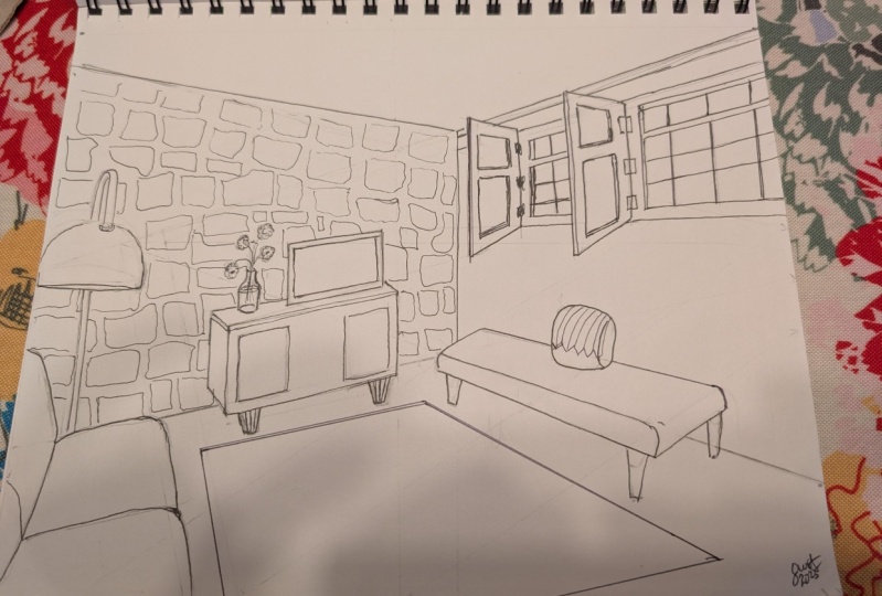
3. Two point perspective: Now that we've talked about how one-point perspective works with interiors, I wanted to talk about how 2 perspective works. So here's what 2 perspective it looks like when you're outside. You might be looking at the corner of a building. So all those perspective lines are, are branching off and they're going to meet off at, at a vanishing point that's often a distance. And might even be outside of the frame of your drawing or outside of your field of vision. But you have, it's called 2 perspective because you have two sets of diagonal lines that are converging off to their own separate vanishing points off in the distance. So that's what that looks like outdoors. When you're indoors, it's kind of the same deal only instead of looking at the corner of a building from outside, you're looking into the corner of a room. And this is a very common situation with interior. So we're going to do a few of these. You can see here that we still have a horizon line, which is that point where all the lines are straight and it's basically I level with the viewer or in this case the photographer. But you have these two sets of diagonal lines that are each headed to their own separate vanishing points. Both of those vanishing points are still going to sit on the horizon line, but they're just going to be in two different places. And all the other elements in the drawing, or at least a bunch of them, a bunch of other elements in the room are going to, are going to follow those same diagonal lines. So it's very helpful. Let me show you how this works with an image that we're going to draw. This is an apartment that I stayed in in Portugal. And I wanted, I'm going to do this one a little bit different. I'm going to show you first where the horizon line is now it's my eye level and I was standing up to take this and you can see that there's a little bit of an angle there. So it's not there. There's a little bit of an angle there. It's not there. It's right there in the middle. And pretty much the top of the TV is apparently just about an eye level. That seems to work. I'm just kinda double-checking, but I'm really eyeballing this, right? This isn't really, this isn't really a work of great engineering and great precision accuracy. This is me just sort of drawing that straight line where I see it. And that's pretty much right. Now. Here's what I'm going to show you. So to get the, to get the two vanishing points, the first thing I'm gonna do is I'm going to line up where the wall meets the floor, which is here. And I'm going to go up and look at where the wall meets the ceiling which is here now they're not, they're not quite perfect. And you might be thinking, Why are they perfect? I want, I want, I want this to work with just a ton of precision. And the reason it doesn't exactly is that this is an old building and things are a little bit out of kilter, and that's going to happen. You are going to see that you're going to think, what am I doing wrong? Why isn't this quite right? And the reason it's not quite right is just that we're dealing with the real world and we're dealing with buildings that walls might have shifted a little bit, the floor might be a little bit uneven. If you're working from a photograph, your photograph might be a little off kilter. But anyway, so I'm, I'm glad we're using this image because it points that out. But so here's our lines and there's our vanishing point. Now what about the other vanishing point? So let's go over here. And we can see pretty well where the windows are, this I mean, this wall over here where it meets the ceiling. I'm going to get that in. And so we can expect the where the floor meets the wall to be pretty much the same. But again, like this room is a little the room itself tilts. Things, get adjusted and added and moved a little bit in old, old buildings. I mean, this building is actually hundreds of years old, so we shouldn't be too surprised. But can you see how this works? And when that happens, where things are kind of not exactly precise. You can go ahead and make them precise and you're drawing, it'll kinda make your life easier. So we have two vanishing points here. And once you know that, you can sort of see how the rest of it works like, OK, if this is my vanishing point over here, well, I can see how that makes sense with this rug, because the rug is squared off with the room, right? The rug is not at some jaunty angle that has nothing to do with the lines and the rest of the room. You can see how the lines in the in the couch. Because again, because it is lined up with the walls, the lines of the couch kinda makes sense here. And so even the lines in the ceiling, there's sort of this paneling in the ceiling. Those lines all go to the vanishing point. Sorry, you can't see that very well. And he kinda handwriting. And same with the furniture over here. And then when we go this way, it's the same kind of deal like this side of the couch. It follows these lines. So that's why this is so useful. And once you get it, you'll have a really easy time using it. I'm going to show you real quick a couple others that we're gonna do just to give you a little preview of coming attractions. And just to get you thinking about it in my, what I encourage you to do is I'm going to give you these pictures, of course. And you can print these out. Printed mountain drawn. I'm just like I'm doing. And so here, if we look for where's our vanishing point? Well, guess what? It's way off the edge of the paper and way off the edge of your screen. I mean, it just, it just is we can't get anywhere close to it. So it goes way off into the distance. But knowing what we know about these angles, we can still kind of eyeball and get it about right? And we can still figure out roughly where our horizon line is. Because first of all, a person who took this picture standing up and this guy is standing up. And so we know it's about even with his head. And we know there's just a very gentle diagonal, very minor diagonal line on the bottom of these pictures in there probably are. Horizon line is right there. And then the second vanishing point is for this, for this wall. And if I go like that, and then I go and I line this side up. Just kind of paid attention, trying to be careful with where I am there. Then I get there. And this line is right on my horizon line. I know it's kinda hard to see because, because this is black and white, I'm using a black marker. But there's my horizon line so that vanishing points on the horizon line. And there's another vanishing point that's way off the edge here, but it is also, and everything in this room can go to these vanishing points. And so it's so useful that picture frames all line up, everything lines up with these two vanishing points. And once you get that, so what we're gonna be doing with these interiors is we're going to be looking for this line, which is the corner of the room. And then we're going to be looking for where the walls and ceilings meet and that's our whole job. And then believe it or not, I know you're thinking this is completely insane. There is no way the scene is way too complicated. There is no way I ever want to get involved with anything like this. But I'm going to show you a trick and then we're gonna do the trick. But once again here you can see how we've got this line, right? That makes sense. And then you can see also how there's a vanishing point that goes way, way off the page, way off in the distance. So we can't even really see that one. And then over here there's gonna be a vanishing point that also goes pretty much off the page like both of these, both of these are converging, but they're converging at a point that we can't even see. But this is going to become more comfortable for you pretty quickly. You're gonna be surprised by the time we get to this one that you can really do this. And the horizon line, I know where the horizon line is because the person taking the photograph that the viewer here is standing up. All these people are sitting. So the person standing up there head is a little higher, it's up here. But also these very helpful lines in the brick work. These give me something I can line a ruler up too so that I can see. I mean, I'm just kind of eyeballing this, but I can see that the horizon line right here. But anyway, another useful way that we're going to use perspective in this crazy, what seems like a crazy complicated scene. We're really going to simplify it. And I'm going to show you this really neat thing which is, if you look at the heads of all these people, they form this very shallow triangle. And we're going to be playing around with the idea of this triangle. So from his head to his head is a diagonal line from his head to his head. I mean, he's a little taller. It's roughly a diagonal line. And all these people who are in the foreground, like her and her, and this guy, and this guy and this guy, they all line up so it splits very shallow triangle, this pattern. All their heads fit within those lines. And that is what's going to allow us to do even a crazy complicated looking scene like this and make it really simple and something that's really fun to just knock out while you're sitting there drinking your coffee. Okay, so that's what we're doing. Let's get going on 2 perspective.
4. Portugal Apartment: build the room: So when we're looking into the corner of a room like this, the first thing I wanna do is get that corner placed right. Where did the two walls come together? So I'm just trying to figure out I'm eyeballing it at this point. I'm not yet going to use any Rulers. I'm just going to see how close I can get, just drawing it on my own. So I'm looking at the picture and I'm looking at where the walls come into the picture. So I'm looking around the edge of the frame and saying, okay, where do these come in? And I'm sort of noting those as I go and just holding up what I'm doing. You can't, you can't see this part, but I'm holding up my pencil to the image and checking that angle and then laying it back down and seeing if it, if it seems right. Of course, there's gonna be things in the way, sometimes like furniture and stuff. So you can't always quite tell, but you can usually get pretty close. And now I'm going to come back and see how close I got with my, with my ruler. Like I'm going to look for that vanishing point where these lines converge and just see if I see if I got there. And I want to go ahead and draw that in because it's going to be really useful to us for figuring out a lot of the other angles that are in this image. So I'm just sort of really establishing it. And the whole reason we're doing this in pencil is so that we can make these little corrections as we go. So, yeah, that's looking pretty good to me. Now, this does not have to be super, super precise. You're not being an architect or an engineer here, and you just wanna get it pretty close. So don't make yourself crazy with that. But anyway, where those two lines meet is the horizon line. So I'm going to just indicate that put a little dot there just so I can be sure. And then I'm going to start giving myself these perspective lines that I know will help me with what I have coming next. So I'm not these lines don't correspond exactly to anything that's happening in the image. I'm really just randomly putting in these angles that I know are going to be useful to me. And I'm continuing these lines down along the floor. And the reason I'm doing that is because the furniture in this room is very helpfully aligned with the wall. So these lines are going to work for the furniture. Again, if somebody decided to get real creative with their decorating and put the furniture at all kinds of crazy angles. Of course, this wouldn't work, but it does work because because of the furniture being aligned with the walls. So that's good. So I have that in place and now I can I'm going to go ahead and erase. I don't really need those perspective lines in this wall because there's, well, its 2 perspective. This wall has its own set of perspective lines, so I'm going to erase it just so it's not too confusing to me. But now I want to look for this other vanishing point. And this gets tricky on this wall because the vanishing point probably goes off the page entirely. I mean, I'm going to play around here and see where I find it. But, you know, it looks to me like it probably goes all the way off the paper. And when that happens and it will happen. When that happens, it's, it can be a little tricky From the perspective of your drawing because you end up eyeballing things a lot more. But it's looking to me like the vanishing point is pretty much kind of at the edge of where my sketchbook is. So so it goes, yeah, it's way out there. So it goes almost almost off the paper. And again, it's fine to just get close enough. Like close enough is perfectly good with this. Don't feel like you have to spend your whole life getting this to exactly line up. When I'm doing this kind of thing, when I'm just out and about sketching. I'm not nearly this careful with it. I'm showing you this because it's a class and you want to really learn the fundamentals of it. But you can really eyeball it, be much more casual and free with it and we're gonna do something like that as well. So I've given myself the same perspective lines on this side that I did on the other side because they're going to be useful when we're again with the furniture and also with the stonework on the wall. These kind of lines are actually going to be really helpful to us. So I'm giving myself those lines so that I have them. And also there's floorboards. I might want to just suggest those wooden floorboards as well. So I'm putting those lines and along the floor as well just so they'll give me a little bit a little bit of help with that too, if if I want to include them. So I've got all that. And there are some planks in the ceiling. Now this is the kind of detail that I would be super loose with. I might make a few little lines to suggest these wooden planks in the ceiling. But I'm not gonna go crazy with this level of detail. But I'm gonna go ahead and put them in just to show you like all of these things go to that same vanishing point. So you're, you know, it's the same idea. So that's why this is so useful. So now we have this box all put together. And I'm just going to clean up some little details, but this is really what we need in order to start furnishing this room. I'm just to kind of go around and check and see if there's any places where I'm feeling like things aren't quite coming together, right? This is, you know, kinda my well, not my last chance, but this is a chance to get this. All right. And now let's start putting in the furniture.
5. Portugal Apartment: furnish the room: Okay, so once you've built the room, you've done all the hard work and now you're just fitting everything into the room that you've already built. I'm gonna do these windows first. It's nice that the bottom of the window is basically lined up along the horizon line. You can see that they're real straight. And it's pretty easy to get the top angle right, because it's almost right along the ceiling. And now I'm going to show you we're going to, I'm just going to put in there's kind of a kind of a deep set window. There's a little bit of a recessed angle to it there. So I'm going to put that in and then get in these shutter doors now the shutter doors or the yeah, the window shutters. They don't follow any particular rules or perspective because they could be opened and closed at any wacky angle. So apart from the fact that vertically they're straight up and down, otherwise you're kinda just having to eyeball it, raise, go back and forth. That's why you have pencil and just get things in generally the position that you see them in. Over here. I'm going to I'm going to have all of these little window panes, but I definitely want to show. And so here's a cool trick. I drew an x and the center of that X is where the center of those window panes go. So it's a great way when you're looking at something from the side like that. You know that there's this thing in the middle, like that middle bar, but you're not quite sure where the middle falls because you're looking at it at an angle. So by drawing that x and then putting in this case that center bar in the middle of the x, you'll get the center part of it in the right place. This is also a great trick for, for outdoor too, when you're, when you're drawing buildings, it's something that I use a lot too. But I'm just kind of just very lightly drawing in these these window panes. There's doesn't have to be a lot to him, but it does give a real sense that these are windows. So that's cool. Alright. So once I've kinda got all of this and I just want to recheck some of my lines. Obviously the that upper window pane, you know, that line needs to needs to follow, right? It needs to kinda hold true. I mean, that's the thing about, about doing all of this in perspective is that what we're trying to do is we're trying to get everything to kind of line up. So take the time you need, you know, go back to your ruler or any kind of straight edge that you might have and just get some of those details in and get it right. I mean, that's the reason we're doing this in pencil first. So you absolutely should be a racing and rethinking and reworking as you go. I mean, that's kind of the, that's really the fun part of this whole thing. And now that I'm happy with the position at a Windows, I'm going to start to look at the furniture and I can see that there's a throw pillow that goes right under the window shutters there. And then the little capture this little day bed I'm looking at where does it where does it sit relative to the wall, like how far down the wall is the is the back of the couch where it sits up against it. And so I want to follow those perspective lines again because that's the, that's the cool part about this. So I'm just bringing up the ruler here to show you. How you can, how you can rely on that, and now where does it end relative to the window? So I know that that's where the couch end. So that window has become my reference point for where I can kind of line up these angles. And I'm just looking at the other side. There's, the shorter end also follows perspective lines. And those lines that I put down on the floor, those are super helpful. So you can see how by using the lines I've already laid down, I'm able to make this little rectangular box kinda, kinda shape and make it read pretty well and position it in the room where it goes and being able to position it next to the Windows, really helpful. There had to move the pillow down a little bit because it was kinda floating in space. But I do think I've got this and generally the right place, so I'm happy with where that is. Put some I'll put the little legs on it. It's just got a few little it's got a couple little legs there and there's a shadow underneath it that we'll worry about later. Want to get this rag in. And the rug also is very helpfully aligned with the room. It's not edit crazy angle, so I can use my perspective lines just perfectly here. And I'm looking at where does that rug sit relative to where the little blue couches. And once I get that in, it'll also help me kind of judge where everything else goes. And this is a stripe brag, so I'm just, I'm just sort of making those little lines. So all remember that I wanna do those stripes. And now I'm looking at, okay, the, from the corner of the rug to the legs on this little console thing that's up against the wall. So what about that? And I'm following the perspective lines that I put down on the wall, which is very helpful here. So that I can get that angle right and get the, there's a back to it as well, of course. So I can again, I am able to use all the, all the regular lines, all the lines going to be two vanishing points to get both sides of this since it is square against the wall. So and I don't need, again, I don't need to spend forever making this perfect. Like it's a little console with the TV sitting on top of it. So I want to get it pretty close, but it's more about just kind of, kind of getting the basic shapes in and having it read, write is something that's furnishing a room. So that's just the goal. And so just work on the check the angle of the legs because the legs will hit the ground at the same kind of perspective lines. So that just gives me a lot of different ways to look at it. And I am not sure I can go back to my ruler and my vanishing point to make sure I get those angles right. Do you see how that works? That's they're all pointing towards that. So let's call the vertical lines that straight up now lines are always just straight up and down, which is really nice. That makes things very easy. But sometimes it does help to get out a ruler for those as well. Because when everything else is at an angle, it can even be a little confusing figuring out where the vertical is, but this seems to line up pretty well. I'm just looking at. Where the end of the couch hits relative to that little console and relative to the rug. So see everything fits next to the, everything fits with the thing next to it. Now the seam of the couch merges off into that same vanishing point. And I know I keep saying this over and over again, but I just really want to emphasize like if the couch had been at a weird angle, this would not work. So the reason this works is that the couch is lined up square with everything else in the room. But you know, sometimes if you are working on a room where we're going to image like those were some of the furniture in the room is just at some slightly off angle. You can pretend it's not. If it's easier for you to follow these kind of I'm perspective lines. You can just in your drawing line the catch up a little bit better if it happened to be at an odd angle. But fortunately it's not. This room is pretty well squared off. And so I'm really able to use those lines, which is nice. Now, I love this big cool lamps. So this is something, it's easy to figure out where to put this because I can look at where it fits relative to the other objects in the room. And I'm just going to really simply draw in the stand that kind of holds it up. And so that gets that in place for me. I don't need to really fuss over that a lot. That's, you know, that's plenty of information for now. And by the way, it's, it's really great fun to kind of exaggerate things like this. Like if it's a little bit bigger in the, in my drawing then than it is in real life. Like you can kind of exaggerate and have fun with the things you really like. And you can add things like, I could add more pillows on this couch if I wanted to. I could put pictures on the wall. I can put a house plant in the corner like now that this is all set up, I think you can see how you can be a little imaginative and be kind of fun with it. So I'm just erasing some of the, some of the perspective lines, but I know I don't need anymore just so they won't confuse me as I keep going. And then one thing I want to do up here, I'm not going to get super detailed about all that stone work. I want to suggest that there's stone on that wall. But if I did all that stonework and just extreme detail, it would distract from the rest of it. You want everything to kind of be one of a piece. But I am going to just loosely draw in some stone because they also follow the perspective lines. So as long as I have these lines here, I might as well just suggests some of them and I can decide later how I'm going to handle this or exactly how detailed I want to be with it. But just by putting some in, I'm just reminding myself and making sure that I get the angle right and that I just kind of understand how this stone follows the same, the same perspective lines is everything else in the room, which is, which is really great. So now I can go around and I can just kind of erase any extraneous lines. Because remember, I'm just going to be paying over this with, with with watercolor. So, so after I get it all inked and drawn it, I'm going to erase all of this stuff completely, but for the moment I just want to erase enough of it so that when I start drawing in ink, I don't get too confused. I'm just check in a few of my lines here making sure I'm absolutely happy with it. Because the next thing that's going to happen is that I'm going to start, I'm going to come back in and do this all in ink. So this was kind of my last chance to really get out the ruler and double, triple check some of these things. And so I'm just re-looking, making sure that I'm satisfied with with how the windows work and just double checking a few angles. This is really extra, like normally I would not probably be so careful about all of this, but I just wanna give you guys an example that you can really see and follow and that makes total sense. But if yours is a little wonky, it's okay. I mean, you've gotten a lot of the fundamentals in place already so that it's reading more or less like a room and it does not have to be rendered with just the precision of an engineer. This looks great. We're ready to move on and start drawing with ink.
6. Portugal Apartment: ink: The ink part of this can really go pretty quick because we've invested a lot of time in the drawing so far and it's looking good. So remember if you're right-handed, at least you want to work from left to right so you don't smear the ink? I will smear the ink. I always do Do as I say, not as I do. Try to, try to stay over to the left and the opposite of course, if you're left-handed. But, but you want to be mindful of that. Now if you're using something that's more like a drawing, like a pigment liner, dry a lot faster than this loose flowy Inc. does. You're not going to have as big a problem with that, but don't worry about a few ink smears. You won't even notice it when she get the watercolor in. So what I'm trying to do is to just make, make interesting lines. I mean, this is definitely going to be very, very visible as part of the drawing. But also, I can, I can move pretty quickly here. I can be pretty confident that that what I've done in pencil is going to work and, and just kinda have fun getting everything just rendered in pen. So one thing to remember here is that if you do think something's off, this is really and truly your last chance to fix it. So you can at this point revisit some of the decisions you made about some of these angles on things. If you're like, I don't know what I was thinking. I really didn't look straight to me or that really doesn't look like it's in perspective to me, you know, this is your this is your last chance, but don't feel like you have to follow what the pencil drawing says. Because of course, you can get your drawing and you're free to change it at this point. So I'm not putting a huge amount of detail in right now either. I'm just trying to get the basic shapes in. I'm not really sure how I'm going to handle the stone works. I'm just I'm avoiding that for now while I think about it. And with the rug, I've already decided that I'm going to put those white stripes on the rug in at the very end with a white paint pen. So I'm not worrying about drawing that yet and trying to keep to my vow to move from left to right. So I'm going to work on now I'm kind of just trying to stay off of the wet ink and get these really just outlines. I mean, I'm basically just kind of outlining here and only leaving out those things that, like I said, like the stone work and the stripes on the rug where I think I might do something a little different. I'm saying with this throw pillow, you know, and there's a pattern there, some stripes on it. I'm not gonna do that in pen. That's something that I might do. I might do in pencil or with paint. Here again, this is where I have to be very careful not to smear what I just drew. But just getting in some amount of basic detail on these windows and just, just really, just really basic line work. So I'm drawing in, you can see the corner of that window and it's great with Windows if you can kind of get that little inset, that little interior part and really show that. I'm just kinda rethinking these shutters as I draw them, I'm re-looking at those angles. Again, knowing this is kind of my last shot at doing that. So anything I wanted to change about it now's the time for sure. As I'm drawing here, I have to confess to you that I kind of left out the this other shutter that's in here. I didn't really get it fully drawn. There's like the inside shutter on that first window. I kinda just skipped over and I'm just going to leave it like it's sort of hard to tell what it is anyway in this little drawing. So it's fine. You'll find things like this. Like you'll be going along and you'll be like, oh, I left out that second lamp or whatever. Don't worry about it. I can see that out there like the edge of the shutter on this side and I hadn't drawn it in pencil, but I'm just deciding that I'm gonna go ahead and put it in. I just like it because it's close to the viewer at something sort of dark and obvious in the foreground. And I like it whenever I can pull something really from the foreground in. So just finishing up these window panes and they really are just, you know, pretty straightforward. It's just a little grid. It's already reasonably accurate. So I'm just getting those lines in. I know also that I can come in with some paint later for these so they don't have to be super detailed. They just need to be kind of in the right place. I mean, this is really looking good, is really pretty much coming together. So I'm just gonna alike look for any little little last few things where maybe I feel like I'm missing something. You can see where I smudge the ink just a tiny bit because it's inevitable because I knew I would. But, um, but it's fine. It's really going to look okay. And checking out like things like the legs on the bottom of the sofa or anything else where I think I might like that little bit of detail. Of course, I can always come back later and add more with pen, but I think this is good. This is looking pretty good for now.
7. Portugal Apartment: brush pen: I made sure the ink was dry and then I erased all the pencil marks I didn't need. You notice I left some of some of the pencil on the stone wall over there. But otherwise I, I erased everything else. And now I'm coming in with a brush pen and I'm just looking for areas where I can add a little bit of a darker, thicker line weight. And so that tends to be the undersides of things or the shadow side. So beside that's away from the light. So like with this TV, You know, I can I can sort of dark and up the edge of that I can go around. I sort of like we're walls and ceilings, meat or walls and floors meet to make a little bit more of a pronounced transition there. So you don't always have to do that, but it's something I tend to do a lot. The edges of these shutters are pretty dark and I could do that with pain. But the having this extra bit of black, it just it adds some weight and some interests. It gives some variety to the line weight. I'm realizing also that I didn't really draw in any details on these shutters. And so I'm using just the very fine tip of this brush pen to do that. I could have just gone back to my regular pen as well, but since I have this one in my hand, I'm just kinda dropping in that little bit of extra detail. It will look different than the regular pen line because it's, because it's our brush tip, it's a more wobbly looking kind of line. Which again, I like, like, I want that difference. I know that there are a lot of artists who will use something more like a marker for this so that while it's still a brush tip, it's a firm tip and it doesn't have this kind of wobbly unevenness to it, but the wildly unevenness is kinda what I'm after. So so that's what I'm doing. So again, just I'm putting that kind of the dark side on that shutter. Rather than do that in pain, I'll just go ahead and do it in ink and then I can kinda go over it in paint. And there's, there's all kinds of shadow areas within the window, like the darker the darker parts that are that are just away from the light. So I'm gonna go ahead and really build that up. Not coloring it in perfectly. I don't need it to be totally opaque because I know I'm going to put some brown color to suggest the wood. So it's kinda nice if I leave some areas not Incan because that way the brown paint will fill that in and it will just give this kind of sense, this sort of illusion of this really dark wood. So this is that shutter that's in the foreground that I really like. So just big dark object there. And then, and then going around like the little legs of things and kind of the underside of this couch. I know I'm gonna do this one in a blue color, so I don't want it to be totally black, but it would actually look kinda cool if you wanted to do that. There's a little shadow behind the pillow. So I'm just suggesting that there is a danger. I gotta tell you with this brush pen. I love these brush pen so much that there's a danger of kind of doing too much. Once I get this in my hand, I don't want to let go of it again. So really, some of this is a little bit gratuitous, but it's just because I like it so much. I liked the look of it. So I tend to want to just go around and add as much as I can. But remember also that the point is to have some variety. So if you completely do everything in this brush bin and go over every single line you did in a finer pen, then you've sort of lost the variety in line work. Anyway. I should probably take my own advice on that a little bit more. But with the lamp, I'm just looking for ways that I can give the lamp a little more weight by looking for the darker shadow side of any details with that lamp. And this really is the last thing I'm gonna do before I start painting. So where else do I need something like I forgot about doing this little bit of detail on the inside of the shutter. So I'm just gonna go ahead and go in and grab that. And then once all this is done, what I need to do is just give this a second to dry before we get into paint. I can always come back and do more of this after I finished with the watercolor to, so this doesn't have to be the end, but this is just a few little details here and there. And then let's let this dry for a second. Start painting.
8. Portugal Apartment: watercolor: Okay, it's time to paint. So I want to start with the largest areas in the room, the most dominant colours. So I've got some yellow ochre that I'm going to where I'm going to begin with, the wood color for the floor is just a basic yellow ochre to start with. And then I'm going to mix in a little bit of transparent red oxide. You could also use something like a, I don't know, a burnt sienna here, you know, any kind of reddish brown that you've got an umber type color. I want it to be darker underneath the couch where there's a shadow. I feel like that's a very warm, rich brown shadow. So it seems to make sense to use that darker color. Now of course, this is still pretty wet, so the I know the color is going to run a little bit, but I also know that it's kind of a soft shadow anyway, so I think that's okay. But a little bit of that brown go in around the edges. And now I'm just going to drop in a little bit of my orange. I like the idea for a wood floor of there being a lot of shifts in the color. So as long as the paint is still wet and I can kind of play around with it. And I'll go ahead and do that. Now for the ceiling. It's a pretty warm, rich ceiling and I'm actually starting, I'm putting down quite a bit of this orange, spiral orange. And then I'm going to lay some brown or colors in on top of it with this transparent red oxide so that it's super warm and rich and red. Now as you can see, there's kind of a bluish reflection hitting the ceiling. I'm not going to bother with that. I will go ahead and pick up some of this some of this color with a dry brush just to suggest There's light coming in from these windows and hitting the ceiling. But I'm not gonna get crazy into doing like reflections of blue light in there or anything like that. I'll go in. This is just with the Transparent Red Oxide. I'm going to use this for the wood as well. But any Brown you have on your palette is fine. If you mix an orange and blue together, you'll get some really good Brown's as well. So now I've got shadow violet mixed with a little bit of yellow ochre. And i'm going for a grey here is, but I wanted to be a gray. That's a little bit of a yellowish gray. So what this is is it's a cement wall and so you could do it just completely gray because we all know a color submitted is right. But in this room, there's so much of this warm, rich light bouncing around that it has taken on a reddish yellow town. And so I'm just aware of that. I also want there's a little angle here where the light is coming in and hitting it. And so I want to be able to show that. And also you can see how the colors a little uneven and splotchy and that's very much on purpose. I mean, I think that cement has these kind of sort of natural blushes to it. And so just having. A lot of water on the paper and letting the color move around and do its thing is sort of, sort of great for something like this. So that looks good to me. I mean, again, it's close enough and this is why I like to do these big dominant colors early because I want, I know that those colors are gonna mix into everything else. I'm just dropping the tiniest bit of blue into some of these shadows. And just, just messing it up just a little bit to get more of that sense of concrete. Working some Naples Yellow into that same mixture. So this is very similar. The stones over here, you know, they might be kind of grayish stone in the right light, but in this room they're pretty yellowish. So a little Naples yellow, a little yellow ochre and some shadow violet. And I'm mixing those together and I'm letting my paint be kind of just generally the feeling of stone like these dabs of paint. I'm not even really paying attention to the pencil lines I put down and trying to follow that in any way, but just try to get something that has some texture to it and seems believable as stone. And I actually think that looks kinda cool just the way it is. I probably will come back with a little colored pencil and maybe work on those lines a little bit. But I think you sort of get the idea that it's stone without it seeming just no totally overworked and that was my goal. So now I'm going to use Prussian blue on this couch. Prussian blue is a wonderful dark blue that leans ever so slightly green. I'm mixing it with some shadow violet For the darker side. And also for this end, it's a little bit lighter, so I'll come back in with a slightly more watery mixture that I'm going to use on top. I'm going to dab it up. So I put it down and then I dab it back up again to get this sense of the light hitting it. So that's very intentional. And same thing over here. I can put a little on the side and if I want to, I can come back in. You know, I can pick things up while it's still wet. I love that about watercolor, that you get that opportunity to do that. This, I want to come in and dark and a little bit on the front. I could also have waited for that to dry and come back and do it once it dries, you see what color it's really going to be, right? Because it's going to be, things are gonna dry and they're going to be a little bit lighter. So now I've got more of my same pyrrole orange mixed with a little bit of that transparent red oxide. Because this orange couch isn't like a super bright orange. It's a little bit of a tone down orange. And I'm doing the darkest parts first and giving them a little bit of a chance to sink into the paper. I don't want to let them completely dry, but I definitely want him to be to stay more or less where they are. And then I worked in a little bit of yellow and came into do these lighter parts. And here again, I can put some down. I can lift it back up with a dry brush and try to get this sense of light hitting that couch. It's, you know, it's a leather couch, so it really reflects light. And by just playing around with this a little bit, it makes it just seem more three-dimensional. You know, you really, you really sort of have a sense of it, not just as this flat block of color in the room, but you get the sense of like rounded cushions. So I like that. I'm working a little more read into it. Because the light is just a little different on the back of the couch because there's all this blue light coming in from the window, so it's cooling it down. It looks almost a little more pink. So I just wanted to change it a tiny bit. This is very minor. I definitely don't have to be glint quite this careful. And then along the top it's really bright because there's light hitting it from the lamp. So I just came in with a little yellow there. And again, I can sort of play around with darker shadow areas within these cushions to give them that sense of roundness a little bit. But I think that looks pretty cool. It looks pretty, pretty believable. Now. Now that this is dry, you know, because this is always like a race to you get one thing down, you let it dry, you go work on something on another part of the pain. He well, that thing is drying so then you can come back across the room. So so now that I know that the things that I painted first or dry now I can come back in and I've got a pretty thick mixture here. And I'm really working on getting the darkest parts of the wood. And for this I'm, I'm once again using the same Transparent Red Oxide. A little touch of blew into it, we'll make it a bit browner. So if, if I wanted it to be less red and a little bit browner, then that's what I would do. Now with some yellow ochre. I'm going to do the insides of the doors but are being hit with a lot of light. So they're quite, quite light and quite bright. And I really want to emphasize that sense of light coming in. So I'll just use a much lighter color and pick up some of my brush and really try to get that sense of the light coming in through these three big windows. And I'm just going to keep working on the details around these around these windows. I haven't shown any color coming in through the windows. At this stage, you know, obviously they look really white. They look really blown out in the picture and that's, that's kinda fine. It's tempting to, it's always tempting to want to just drop a little blue into Windows because the sky is blue but you know, windows or are of course, doing a lot of different things depending on the light that's impacting them. So but I'm just going to leave that for now. For this little credenza on doing the same thing. I'm just coming in and getting the wood on the front of it and the legs a little bit lighter color on the top. So I'm using I used that yellow ochre again on the top of the credenza because of the way the light's hitting it. And then for the TV itself, I'm using Daniel Smith neutral tent with a tiny bit oppression blue mixed in because of the balloonist of the light that's hitting it. And I'm picking up a little bit there too, just to give that sense of like reflections bouncing off of it. But that's just a very small thing. I mean, you know, none of these are things we really need to fuss over a time. It's just about kind of establishing lights and darks and giving things a sense of depth or a sense of their form. So now with some shadow violet and a little bit of Prussian blue mixed in, I'm just dropping in a gray color for this rug. This rug is a good example of something where if you want to be imaginative and change something in a room, you absolutely can. So there's no reason why you have to stick to a gray reg if you have a vision for something else going on there, if you want to do really crazy stripes in a different color, something like that. Okay, so now here we go on the lamps. So this is going to be using shadow violet again. And I'm just looking at light versus not light. That's all I care about. So this lamp is actually reflecting everything that's in the room. And you could do a tiny version of the painting inside the lamp if you wanted to be super crazy. But all I'm doing is asking myself, where is it light and where is it not light? And I dropped in that shadow violet. But now I'm going to put in a little bit of that transparent red oxide because of course, so much as getting reflected in this lamp in terms of all the browns in the room. And I really like the way that looks just as it is. So if you, reflections are tricky, and if you get to a point with a reflection where you go, oh, that looks pretty cool than just stop. Don't press your luck. I think that looks pretty neat, so I'm just going to leave it. I'm coming in with my paint brush and just a real dry mixture and putting in some red stripes. This is something that I could also do with markers or colored pencil or whatever. So I didn't have to do it with pen, but just want to show you kind of all the different options there. So now again, things are drawing. We're sort of moving around waiting for one thing to dry before we do something else. So now I've got a tiny bit of cobalt blue and I'm just dabbing it in here and there on these windows so that it's not just untouched white paper. Just a little bit now, a tiny bit of Naples Yellow. And maybe in some of the window panes I drop in a little yellow. So you get a sense that there's something going on outside. You don't know what it is. These colors are gonna lighten as they dry. So it'll be even less of an effect than it seems, which I think is great. I think that's just what you need. So now I'm just going to look for any little places where I've missed a chance to add in some details. But actually, I think this is looking pretty good.
9. Portugal Apartment: mixed media: We're going to add some details here in mixed media. And this is of course totally optional. And if you're traveling, you might not have all this stuff with you. I usually do travel with a white paint pen because I can use it for all kinds of cool little highlights. And here I'm using it to put some stripes in this rag. Now, some of these details are going to be a little bit hard for you to see on camera because they're kind of subtle, but they look really cool in person. So play around with this stuff if you have some of these tools and if this is the sort of thing you really enjoy, it can be a great way to just highlight or accentuate or just add some variety or a little bit of different texture. So first thing I'm doing, I'm going around with my white paint pen and I'm looking for places. I mean, I did those stripes in the rug and I am looking for places where it's just a little lighter and brighter. And some cases I'll go right over on top of the ink lines I made because I want to sort of knocked back that black line a little bit on the lamp. There is obviously some reflections along the stand and also just some light coming out of the lamp itself. So I got my ivory paint pin and did that. So it's just a tiny bit yellowish because the light coming out of it would be just a little bit yellow. So I'm just looking for places where the light hits something, whether it's the site of the TV or certain areas in the shutters where it's some of the lines on the detailing inside the shutters. Actually it looks white because of the light hitting it. So i'm looking for opportunities like that in any place where I just want to sharpen up, align and have it be white and bright. That's a really cool use for paint pens as you can really clarify and edge and really make it pot. Because those are the kinds of things that you can sometimes lose when you're doing watercolour, it's really easy to sort of blow right over a nice sharp edge like that. Now I'm coming in with just a yellow colored pencil and putting some stripes on that pillow. Colored pencils are great for things like fabric. Here, even though this leather, it's not fabric, but I'm just sort of doing a little bit of extra texture on this couch with an orange colored pencil. You can, you know, you can drop in maybe a slightly different color than what you had on your palette, or just make for more interesting transitions between colors. I'm coming in for wood grain, I really like coming in and just getting some of these kind of textured pencil marks into, into wood grain. It just kinda let you know what you're looking at a little bit. So I'm just going around and seeing where I have an opportunity to do some of that. And using colored pencil also to like darken up the side of this couch is a cool way to do that. And I'll use a little bit for the shadow underneath. I mean, I have a nice dark brown shadow, but if I can add a little bit of blue in there, because, you know, shadows tend to be cool. They, they tend to lean towards a blue or purple. So just putting in a little bit of a darker shadow there. And now what I've decided to do with this stone work is to come and draw in the mortar between the stones. It is a darker color. So I'm just dropping that in with a brown pencil. And I want it to be pretty light. Again. I don't want to really dominate the whole drawing with this. I don't wanna go too crazy. I'm not really looking at the reference photo too much at this point because I have the pencil marks I put down. I have the pain. So the mortar lines really need to go around what I've already got here. And so I'm just sort of trying to do the right amount that really just suits the room. There's a little seam, this Wallis concrete or stone or something, and there's a little seam along it. So I just wanted to get that in and look for any other places where I can kind of sharpen up align or just want to add a little bit of a different color Senate and a little bit of a different direction. So I've got a, I've got a brown colored pencil and I'm just kind of making a few little extra marks. You get a lot of drama from having darker colors in the shadows, you know, lighter colors elsewhere. So this is an orange marker. You could also use markers. And probably I wouldn't normally use everything on every painting, but I just wanted to show you all the options. So this is a Tambo marker and orange. And I'm very much keeping it focused around the darker areas and just kinda go and write on top of where my black lines were and just make it pop a little bit. I mean, it's subtle, but it adds a little note of vibrancy to it that I really like. And so I think that makes it look cool. I'm going to come back in. I just see a few more opportunities with my white paint pen to just add a few more pops of highlights which really play off well against some of the places where I've gone in and added in some of those darks and now with a brown marker. So this is something I could have done with pain, right? I could have just done a really fine line of brown paint here, but doing it with a marker, you get a nice bold line. And of course you don't have to worry about it running into anything else or waiting for it to dry or any of that. So I'm just going around like I really like the way this dark marker looks around some of that window trim up there. So any place that I just want to sharpen something up, these markers are great for that. Maybe make this edge a little bit darker, a little more noticeable. Window shutters again, I can go around and just do a bit more on this little credenza. I mean, this is all in some ways, this is all just a bit of overkill, but it's just to give you a chance to see all the different options and things that you could be playing around with. I can make some there's a shadow underneath that credenza that I didn't get a chance to put in. So I just dropped that in with marker. I can use marker to make the shadow underneath the sofa even darker, like the darkest part of that shadow, even darker. And it looks really sharp and really good. So I think this whole thing is coming together pretty well. You notice I really didn't touch the lamp because I was pretty pleased with how that worked out. I can see a few more opportunities. I'm just going to kind of go along the wall here. I mean, I'm sorry, along the ceiling. And do some of those those planks, those boards in the ceiling. But very lightly. I mean, I I like that it's a wood ceiling and I want to make that obvious. So having these plankton there really helped to suggest that. And of course you noticed that where the light hits it, the seams in the planks are actually white. They're not a darker color. So I'm just using my paint pin a little bit to show that in a few places, but I don't have to I don't have to do too much. I don't have to get to two crazy detailed about all that. So any other little spots where I want to do anything I'm just looking in for may be a little bit more in the floorboards. I can come in and do a little bit more of that kinda, kinda colored pencil. Sort of finish that off. Look at adding some little knots in the wood. And let me just see if there's other places in this stone work where I want to add just a tiny little bit more detail. Just sharpen it up, makes some of them a little darker than others so that there's that nice since a variety between them. So really, I think this is like a pretty good, I mean, we've done, we've pretty much tried every art technique imaginable on these with the Stones. I'm taken the ivory paint pen and making some of the stones lighter because some are lighter, summer darker, that's just started how stones are. So just adding a little bit more variety in their, although really we've done more than enough. So these are like a ton of options. But I think it's really come together well.
10. Museum pencil: Alright, now that we've done a couple of these in UC, kinda how it works. I thought I was just thinking about like alright, so what are some places when you're traveling? What are the kinds of interiors that you might do a lot? And you know, one of them could be an art museum. And the cool thing about art museums is that they will let you sit inside and sketch. They might have some restrictions on what materials you can use. It might be limited just to pencil or maybe pencil and pen. Probably you can't bust out your paints. But I've been known to sketch inside a museum and then just go sit out on the museum steps and finish the painting right there. So for this museum scene, you can probably already see how this works, right? I mean, we're looking into the corner of the room and I'm just doing what I've done before here where I try to get the angles right just by measuring it in eyeballing it, and just thinking about what I know about how this works. And then I'll break out my ruler and double-check it and see if I can't identify that vanishing point, which does help to just have that marked. It'll, it'll, we'll use it a lot in this in this one. So I'm kind of, this is, this is, again, this is why we use pencil, right? I'm sort of rechecking, rethinking, remembering, eyeballing the angle and just trying to get it right. And then I'll break out my ruler and get it in place when I'm sitting in sketching in an environment like this for real, Again, I might not worry so much about getting this exactly technically perfect, but sort of useful to do. Now this is one of these angles where the vanishing point on the other side is so far off the page that I really, using this kinda little ruler that I would travel with, I almost really can't find it. So I'm just going to rely on my eye to get those, get those other angles right. I know that this is my my horizon line. The photographer is standing up taking this picture. So an easy cheat is that the horizon line is pretty much going to be level with that person's head, you see? But otherwise you can just sort of tell by looking for like where can I see a straight line? And wherever you see the straight line in this drawing, I know that's where the horizon line is. So I'm giving myself these perspective lines along that wall which I know are going to help me with all these pictures. But I'm also putting some down on the floor because they're going to help me with the furniture. So I get all that laid out and I'm pretty happy with it. But again, the vanishing point is so far off the paper on this other side that I'm just gonna kinda eyeball it. I know the angle of the top and bottom of the wall. And I know that the horizon line is straight, that's perfectly horizontal. And so I'm just kinda making a reasonable guess here and it's close enough, it's going to look totally fine. So that's all I really need to think about doing right there. And then once I've got all of this in, I can start thinking about, well, what else do I see in this room and what is, there's kind of some white. A wanes cutting or something along the bottom of the wall, you can see out sort of white area. And I went to preserve that. And then there's also a pretty deep kind of gold colored trim along the top of the wall there. And I want to mark out that area so I just remember where it is and I don't draw right into it. And I just kinda preserve that as well. I think that'll be a good thing to highlight and paint when I start painting. So I'm just gonna kinda make sure that I've got all that where I want it, so that I can then start thinking about furnishing this room. And I'm looking at that big picture. Where does that big picture fall on this wall and it seems to be about halfway down the wall is where the right-hand side of it is. And then I get to use my perspective lines that I've drawn to really get it into place everywhere. So these pictures actually come together really quite quickly because I've got these helpful lines and I can look at like, OK, this little picture on the left. How big, where does it sit relative to the big one that I just did? So I'm always looking for for how does one thing line up next to the other thing. And so there's a picture on the other side. It's a little bit higher than the one on the left side. So I'm using my perspective lines again, but also just thinking about where they all sit next to each other. And then there's these two other ones that kind of fit one on top of another and I can measure the top and bottom of that one against all the other ones I've put into place. So it's all about you get one thing right? And, and everything else can kind of flow along with it and it'll be it'll be pretty close. I can do the same thing over here and I can look at R8. Where did the pictures on this wall sit compared to the ones that are next to him on the other wall. And I want to make sure that I get everything positioned just right. And I've also got my perspective lines here to really help me, which is great. And I'm looking at like, okay, this, there's kind of a bigger picture in the middle. And where does the corner that one sit relative to the corners of the other two that it's next to. So that kind of thing. I just keep going and keep working my way around the room, work in all of these elements and together, you pretty much get how this works by now. And then I get over to the side here and I didn't really, I didn't leave myself exactly enough room. Maybe there should be a little bit more wall to the right of this picture, but it's fine. It doesn't matter. I wasn't measuring out a space on my paper that exactly match the proportions of this photograph anyway, because I wanted this to be as if we were working from life. And when you're working from life, you don't have the perfect measurements and the perfect edges of a photograph to really help you out. So the next thing that we do here is the furniture. And I'm measuring where the furniture sits relative to the pictures. I'm using the perspective lines to get the angles right. And in this case the, there's some, gosh, how do I say that? Some horizontal lines that are pretty much straight, straight horizontal lines on the top and bottom of that little that little cabinet or whatever it is. So it helps that those are basically straight and that the others are angled, but there are angled in accordance with the perspective lines we've got. So it's pretty easy to get that fit into place. And now there's this big, weird, very ornate table. And I'm looking at, alright, where's the top of that table relative to the Wayne scouting behind it? I'm putting in the angles of the top of the table as they aligned with these perspective lines. But I very helpfully put down, And other than that, we're really kinda looking straight on it. So it's got these very thick, ornate, kinda stubby legs. And I just need to basically tell myself where those are and this underneath part that's also got a lot of gold guilt on it. And also there's these three little statues sitting on this thing. And of course, I mean, I can barely see these statues. They just look like these little black shapes to me. So I'm not going to render them accurately, but I kinda like it, like it. I think it sort of gives you the sense that you're in a museum and theirs stuff in the middle of the room that you walk around and look at as well. So I'm just making these goofy little scribbling shapes for the moment. And I also want to get in this person. So I'm looking at where is the head? Will they head right there on the horizon line because I'm the viewer, the photographer. It's going to, this person's head is going to align with their head. And I mark down where their feet are on the ground. And then I basically just make this kind of lumpy shaped for the shoulders and a couple lines for the legs. I'm not trying to draw this exact person in the exact posture they're in, but just any representation of a person is plenty for now.
11. Museum Pen: Alright, now I'm gonna come in and just start inking this. And I wanna give you a little hint about drawing straight lines, because people get sort of intimidated and think they can't draw a straight line. But do you see how I put those little dots down to give me some guidance and then I just went from dot to dot to dot. It's kinda, it's kind of an easy little cheat. So if you're nervous about it, if you're worried you're gonna get it wrong. You could, you could try that. And those little dots can be whatever distance apart from one another they need to be. This also works with curving shapes. By the way, you can sort of put little dots on a curving shape. And sometimes it's easier to just connect those dots. But I'm working quickly and I want my lines to have a quick feeling to them. I want this to feel kind of dashed off. You know, it's meant to be a quick sketch done onsite. And it's okay if the lines kind of What's the word? If they sort of cross each other at the edges, I'm fine with that. I'm not trying to be super, super precise here. I'm just trying to get this thing drawn in pretty quickly and as long as it's accurate, I'm happy and all these little dots I'm doing by the way, I wouldn't normally do quite so many of these. I'm just demonstrating it to you in case you feel a little nervous about drawing so many lines, but you'll get more comfortable with that over time. Mostly the trick with straight lines is to go real fast. You actually get better Boulder quicker lines when you go real fast. And all those dots that I'm putting in, by the way, they're not going to so much show up once all is said and done. And even if they do, I think they give it a little character. I actually like that little bit of extra ink here and there. I think it's it shows that it's Inc. which which I think is cool. So I'm just again, I'm just really following the pattern that I set down for myself. I don't have to really add a lot of detail right now. For these little statues that are sitting on this table. This is really just gonna be like a, like I said, just a scribbly little set of lines. I think that their little figures on horseback. But I'm in no way trying to make it look like a real person on a real horse. And I know I'm going to come in and color these black anyway. It doesn't so much matter exactly with these pencil lines look like. Now I am kind of suggesting some of this shapes of this crazy desk which has all this kind of guilt carved embellishment on it. I'm not trying to copy it exactly. I am just marking the shadowy areas as I can see them kind of a darker areas in their knowing that I can come over with some gold or gold ish paint anyway. And and add a little more detail, make it feel just a little more realistic. So I'm just going to kind of keep going around the room here, trying to work from left to right so I don't smear the EEG. Well, I did a decent job of that. But there will probably be some there'll probably be a little smeared in before all is said and done. And I think it'll, I think it'll be fine. So once again, just getting these as long as they're in the right place and just remember, if if you if you're not happy with the placement of anything, this is your chance. You don't have to be so obedient to the pencil lines you've already drawn. If you think they're off than there, probably off and now's the time to changing before you make them a little bit more permanent in ink. I'm just getting these lines down. Everything is just about in place. Just looking for I gotta get this little, this other little piece of furniture in, get that done also just in a very basic way and there's not a lot of detail I need to put into that. Just making sure the angles are right and there is a little statue of some kind on top there, so I'll drop that in. And then for my person, one more thing I wanted to say about drawing these people as you're sitting and drawing in person, people will come and go. So the trick is to sort of figure out like what are their heads line up with generally and then just get this kind of generic figure in there.
12. Museum brush pen: Now I've let the ink dry and I've erased all the pencil. And i'm going to just come in and put in some more details with the same pen. But there's, there's just a few opportunities to add some more stuff here. There's a lot of trim. I've been that ceiling and just by putting in some lines, I can kinda suggest that there's some depth in something interesting going on up there. I think that'll that'll help a little bit once I get once I get ready to get into paint. And there's also these little I wish I knew what these were called, but anyway, there's, there's little bits of extra ornamentation along here and I'm just drawing them in right now. This kind of thing is a little bit extra. You probably don't Well, you definitely don't have to do it. But sometimes I like picking out some little pattern like this that I, that I can actually pull off quickly and drop in there. I think it just makes the room seem more specific, makes it seem more like this particular place. Now I'm going around because these are such big, heavy frames. I'm just gone around and drawn the insides of the frames. And I'm not doing a lot of detail with them. They're pretty ornate frames, but I'm going to be coming back with the brush pen and also with paint. So this is just about getting, just sort of establishing generally the size and weight of these things, which I think is important because it's kinda this grand museum. And you really want the sense of these like big important paintings, big important frames. So that's just what I'm trying to draw in as I go around the room here, get those get those established. These ones that I'm looking at from the side, I can see more of the frame on the left side than the right side. So thinking about that a little bit, making them a little bit heavier, little bit thicker on the on the left side than the right. But honestly, even if you don't bother with that, it's gonna be fine. I mean, just like this right here. Just doing this part already makes these look a little different, which is, which is kinda what you want. And I'm looking for any opportunities to add some little detail with ornate table legs, just anything I think I might want to get in there. Just kinda emphasizing these boxes, although actually I'll come back and do that with brush pen, so I don't need to do that much here. There's a little bit of trim there with a Wayne scouting, so I'm just adding some detail there. There's little, you know, I should know my architectural terms better. But these little rectangles is little bit of extra detailing along the wall. I'm just drawing those in. I could've also just left this to do in paint and not drawn it in at all. That's, you know, it's really up to you. Probably. Since it's just pure gold color, I think it would look I think it would be great to just leave that and do it later with paint. I think that would be plenty. But now I'm going to come in with this brush pen. And with the brush pen, I'm looking as I always do for the darkest side of an object, the side that's got a little bit of a cast shadow on it. And the lighting and here's a little bit tricky, but for sure all of these paintings are darker underneath. And then sometimes you can see that one side or another is darker. So I'm just kind of suggesting where I see these shadows and I'm not being fancy about it at all. I'm really just drawing in an extra heavy line to give it a little bit of depth. And when we go to paint over this, like already having that dark line there really helps because it means that the paint doesn't have to do quite so much heavy lifting because we've already, we've already done some of that with ink. And I'm going to look at this piece of furniture. Like what can I do here? What are the darkest areas on this other little desk? And then here's where I'm going to color in the little pedestals that these things are sitting on. And then I'm really just kinda take it my taken my brush pen and going boop, boop, boop and just making little squiggly lines to suggest these statues. Again, I don't know what they are. The viewer is not really going to know what they are. But we've all been to a museum where they have little bronze, whatever sitting on pedestals. So as long as you just suggests that, I mean, you're fine. You know, again, this is really something that's meant to look like that you just sort of dashed it off in the moment and that you were there. Now I am putting the shadows between these little architectural ornaments, but I don't know what they're called. So that hopefully it looks like there's shadows between them, but then those little the little pattern, the little details in any place else where I can add just a suggestion of darker Inc. in here. Again, being very careful trying not to smear. Now with these paintings, what I'm gonna do is I'm going to take, because there's so much black in the paintings. I'm using my brush pen for the moment. I'm just painting in. I forgot that there's these little gold corners on that one, but I'm just painting in the black areas and leaving the rest of it white. I'm not, in no way am I going to try to reproduce these paintings. So I'm not even trying to make them look like what they are. I mean, these are mostly paintings of people, you know, their paintings of these figures. So a certain kind of painter would get really, really into trying to reproduce this exactly even at this tiny size. But that is not at all what I'm about. So I'm just going to look carefully at each painting and really observe it just because I think this is fun to do. But only just drop in black ink where the black parts of the painting are. Now. And if I were in a room with very different types of paintings than those that didn't have so much black. I might not be going through this little exercise. I might be deciding that I do it all with watercolor. But you can see already how cool this looks. I mean, they actually look, it's funny because they sort of look like modern art on the wall, just like this. But it really draws the eye and it really gives a sense of importance to the paintings and, and just a real presence. So, you know, even if I wasn't a roomful of contemporary paintings or just something different that wasn't. So we're, the black color wasn't quite so dominant. I would be tempted to put as much of this dark color in as possible because I think it really puts the focus on the paintings in a way that's very cool and just really fitting to the room we're in. I think those look kinda great actually. So I'm just gonna go around and look for any other opportunities to sort of dark in something up. My little statues are looking pretty good here. And just let this dry and we'll get on with some watercolor.
13. Museum watercolor: I waited to make sure my ink was completely, completely dry. And I'm gonna paint this wall with a really small little brush pen because mostly I'm drawing with the paint. I'm using Alizarin crimson here. You could use permanent rose or just any other dark kind of wine colored burgundy colored red would be good. There is a kind of brighter red where the light hits it. I stuck mostly to these darker wine colors, but, you know, do your own thing here, whatever you wanna do. The important thing is I am being pretty careful as I go around the edges of these frames because I want to come back and add all that gold. That's really the point here. So I'm trying to really look, really pay attention to what I'm doing and not let any of this red color just sort of, you know, slop over into the frame area because I really want to preserve that the colors are darker underneath their frames and we have our ink to help suggest those shadows, but we can come back in and do a little bit more with paint too, just to kind of clarify that. But as you can see, I'm keeping my brush pretty dry. And the reason is that I don't want the pain to move around too much. I really needed to stay put because we've got a little we have a little kind of precision project we're doing here is I'm being pretty careful. I'm keeping it pretty trying to stay off the trim as well and looking for opportunities to drop in a little more paint kind of underneath over there. And then I'll just do the same thing over on this side, just, just going around pretty carefully. This is one of the reasons I like this little water brushes that it really is like you're drawing with it. I got a little too much paint on that gold frame and I wanted to pick a little bit of it up. You can do that if you act pretty quickly. And so I just reached him with my paper towel there to lift that up real fast. I'm trying to pay some attention to the darker areas versus the lighter areas, but mostly just giving a general sense of this kind of Riegel color. My color doesn't exactly match what's on the wall, but it is what I have in my palette. And you know, that's something I'll say with a travel palette. You're traveling with limited colors. And so you won't be able to match every color, wallpaper or every flower or things like that. But you can get something that gives just a sense of what the place was like. And I think this accomplishes that. I'm just gonna go around now while the paint's still a little bit wet, i'm going to go around, darken it up in a few places. And when I do that, of course I need to I need to blend it in with what's around it so it doesn't look like it doesn't look like I went back in repeated partner that I'm adding in a little bit of some brighter reds in a few places and just kinda, just kinda messing around with this and see and what I can do while while the paint is still slightly damp. Oops, I got into that I got into that frame a little bit, which is exactly what I'm trying not to do. Of course, as this dries, it'll all kinda little all kind of blend together a little bit more as well. So now I'm sticking to my larger areas just like I have with the other ones. I'm gonna take some Naples, yellow and a little bit of yellow ochre and I'm just going to get this floor. This is a wood floor, but I basically just need to suggest this kind of warmish light would color. I'm not gonna get into any detail at all with this floor. That point of the painting is definitely not the floor in this case. So just sort of dropped this color in maybe look for places where it's a little darker in places and I can drop in a little bit more color, but it's not something I need to spend a lot of time on. And there's kind of a fancy ceiling in this room, but I've decided to ignore it. And this again is just these are the kinds of choices you make when you're on site. And there's only so much you can do. So I'm just dropping in a little shadow violet, just to get rid of the white of the paper into suggests that there's something going on up there. But I mean, there's this arch and there's kind of some fancy embellishment on the wall. I'm not doing any of that. You could certainly do it if you had all the time in the world. But this is plenty for me. And now it's kind of a matter of I have to make sure one thing is dry before I move on to the next thing and I'm definitely going to stay away from those walls. I don't want to get started on the gold frames until I'm absolutely sure that's really, really dry. So what I'm doing is I'm just getting in and doing this wood furniture. And this is a mixture of transparent red oxide with a little bit of that Daniel Smith neutral tint here in there. And on this desk, it's kinda light on top. So I have put a darker color in front, but it's a little lighter on top because there's so much light hitting the top of the desk and it's probably all polished and kinda shiny. So I wanted that to be a little bit lighter. And now it's time to start thinking about this gold and yellow ochre is a good color to use for gold. And I'm also using my new gamble. Or you can use something like Quinn acronym gold. I mean, basically you want a yellow, the liens a bit towards orange and something like yellow ochre, even, even like a Rossi and it can be good for golds. And if it's getting to look to yellow, then I'll drop a little bit of yellow ochre in here in there just to darken it up some. And I might come back later and make it even darker. But for the, for right now, the point is just to get this color down and see what I think of it. Once again, the drawing is so small, you can't really see how ornate all of that guilt work is. Now here I am coming in and just drawing in the gold trim on this little bit of detail on the wall. This is the thing that I was saying I could have just done with painter would've looked fine. And it's because I'm using this little brush tip, water brush that I can get in and do that kind of stuff. So now I know my wall is dry and I can come in and start doing these frames there. Mostly, they're kinda dark really. It's darker, gold color. So that yellow ochre all by itself is pretty good. And there might even be some places where I want to bring in some darker brown colors as well to really, really push them a little bit. But you can see how simple this is, right? We're not doing any kind of fancy painting here. We're really just going around and kind of a straight line around these frames. Where I left a little bit of space, where I left a little bit of white area. And it does the job. I mean, it definitely suggests that you're in this room with all these big gold frames. So that is the point of this part. All right, so now those are in this desk in the front. There's so much going on on that desk I can't possibly hope to capture at all. I'm just dropping in this dark yellow ochre to once again suggests like yes, this is some sort of guilt. Gold plated wood or card. I don't know what it is, but anyway, that just gets the idea that now on the pictures I've taken just a tiny little smudge of cobalt blue. And I even mixed it with some of the other colors that just happened to be on my palate to gray it down a little bit. But the idea is that I just want to drop in a couple of colors. I'm not trying to represent everything that's in all of these pictures, but people are wearing blue for sure. So it makes sense to just drop in a little bit of blue and let's put some on the real person standing there and not just the paintings of people. Whenever I have figures in a real like this, I will always just drop in at a color on their clothing that kinda just as a color that I'm already using in the room. I don't really want to spend a lot of time going. This person should have an orange shirt and this one should have a red shirt. Like just make them seem natural and make them seem like they're part of the painting. So I'm coming back with a little Permanent rows that I'm just I'm mixing into this yellow a little bit. And I'm not even trying to do anything as sophisticated as suggest flesh color or anything like that. But more just getting a mix so that there's some blues and some sort of not quite red but yellowish reds. And just a little bit of contrast just enough to sort of show you like whatever. There's paintings on the wall. Painting is probably of people and that's kind of all you know. So now it mixing up the system, shadow violet mixed with some oranges, some of that yellow ochre. And I'm coming in and just darkening up certain parts of the frame. This is, this is almost unnecessary. I'm sort of doing a little bit extra just to show you you can do, but I don't know that we really need it that much. But if you look closely at these frames, you can see that some of them are half the frame is sort of light and bright and lit. And the other half is kinda dark and in shadow. So I'm suggesting just a tiny bit of that. But that's really all you need here. And this is done.
14. Museum Paint Pen: If I'm traveling, I probably don't have a lot of mixed media supplies with me, but I usually have a white paint pen. So this is this is another thing that's really pretty, pretty extra At this point, I'd be pretty happy with just what I have. But as long as I have the white paint pin out, I'm going to put some highlights on those little statues so they look like they're made of some kinda shiny metal. There's a little highlight on the desk and some kind of bright spots on the legs. And definitely the picture frames have lighter areas and darker areas. So it can be kinda fun to just go hit those lighter areas one more time and just emphasize where the light is falling. So I'm just going around and looking for little opportunities where I can touch something up or just brightened something up a little bit with a, with a paint pen. And it's great for those things where you think I'll like, I wish I hadn't quite painted over that or maybe there's, maybe there's a line that's a little cricket. You just want to straighten it a tiny bit and sometimes just adding a little bit of white is just enough to get it exactly where you wanted. But these are just little fun things to add at the very end. I mean, this kind of thing, this is the sort of thing that I would just be dashing off quickly to remember an afternoon at the museum and just sort of captures the moment, reminds me what the places like. And it's cool that with just these few simple ideas about perspective, you can get all these complicated shapes to be pretty much right. I didn't have to look exactly, did natural look like engineered, designed it or a, you know, an architect drew it. But you pretty much have the idea of the size and scale of this museum standing in those little architectural details at the top and just giving a sense that there's some kind of pattern going on here. There's like little tiny white stripes in the ceiling. You guys can probably barely see this. But, but it looks kinda cool. Just gives it a little bit of, bit of a sense that there's just a lot more embellishment and ornamentation there. So I'll go around and drop some of that in. But really I think this is looking pretty good. We're going to we're going to stop here.
15. Cafe Pencil: So we're gonna start with this exactly the same way we would any other room, which is I'm going to build the room itself. So I'm looking for where the corner is, just where that fits on the page. And I'm just eyeballing these angles. I'm I'm holding my pen up to the photo in this case. But if I was sitting in the cafe just BY holding my pan up up in the air up to the scene. And I'm just trying to judge generally, you know, where these where these walls fall and they look pretty right if all I'm doing is just eyeballing him. And so once you've done this for a while, it becomes, you know, less critical that you do this kind of this kind of real careful double-checking of the vanishing points. But I'm just doing it with my pen there a little bit just to get a, just to get a general sense, do I think this is about right? And I'm marking the horizon line. And remember it's pretty obvious from this picture that person that took the picture is standing up. So the horizon line is going to be at the eye level of a person standing and there's no one standing in the room, so we know, but we can imagine where a person's head would be if they're standing. And so that's about where the horizon line is. But we have a little help because the wall is brick and so you can find the straight line on all those lines are bricks and that's the horizon line is where it becomes level. So we know that. And I can make myself some little perspective lines again, just very loosely. I'm trying to set aside my ruler on this one and just sort of just sort of judge it using, using what I know. It's perfectly fine to always use a ruler. It's totally no big deal. But anyway, I'm just going to try doing it without I just made the, I just changed the dimensions of this a little bit so it'll fit the photograph better. But of course, in real life, there is no photograph. You can, you can you can let this goes as far out of the frame as you want because you get to decide where the frame is. So on the other side there's this upper window kind of thing. And again, I'm just using some little perspective lines to try to get the angle of that right. And then there's kind of a beam that comes down and just wall after that. So I'm making my x here so I can figure out where the center part of this lower window goes and where are the other two would fit on the other side of that. And then I'll just erase some of my little, my little perspective marks here. So they're not quite as obvious just to get them out of the way so they don't confuse me as I as I keep drawing. Okay, so now my room is in place and I know where the horizon line is, which means that I know where I level is. And just getting a few of these little beams in the ceiling, also using perspective lines there. And before I get into anything that's down below, I'm gonna go ahead and drop in the lights. I like these light fixtures that are hanging from the ceiling. I think they, they just sort of give the room the sense of height and it gives more of a vibe of what kind of place it is. And they also kinda vanish off into the distance. You know, they get smaller as they go back into the distance. And the ones in the foreground are larger. So it helps with that sense of depth, which is the whole reason we learned perspective is to get a sense of what's close to us or what's far away. Okay, so here's our horizon line. There's no one standing up, so there is no one's head at that level, everyone sitting down. And so where is, where are people's heads? So here's that kind of triangle shape in everybody's head. I know because I spent a little time looking at it, thinking about it, measuring it. Everybody's head sits on within this triangle somewhere. So now I'm just gonna go around the room and I'm going to, I'm going to look at the people sitting in the room and I'm going to line up their heads with the architectural features in the room, the beams, the windows, all that kinda thing. And all I'm drawing is a little oval for a head and a little kind of boxy shape for shoulders. I'm really just doing the heads and shoulders of all these people. I'm not fully drawing them in. Some of them are a little, a little taller. So I'm trying to have a little bit of variety and be a little bit aware of differences in height. But in this case I think it looks like that guy standing up, so I'm going to just adjust him a little bit so he's not that much taller than the person sitting across from. And then there's this guy off in the corner who is the farthest away and also his head is at the highest level. And I'm I'm lining these people up relative to the windows, but they're sitting under so I can more or less position than right now. Obviously, I don't have to get them all in the exact right place. It's doesn't matter. It's still feels like a cafe, but it kinda helps me to orient myself and I make sure I know what I'm working on if I more or less get them in the right position. And you can see that these little shapes I'm drawing very like little doodles really, that's all they are. Now some of these people are closer in the foreground and so there are larger. And so making a note of where their heads sit relative to the people I've already drawn is important, but it's also important that I make their heads bigger. Like they're more in the foreground. And so again, I'm just doing these very loose kinda shoulder shapes that don't even really relate precisely to the people. I'm just kind of, I really feels more like a doodle than anything else. What I'm doing is just a little head shape and then just something for Shoulders. There's two women sitting at a table here who are kinda facing each other. So I sort of want to suggest that, that they're in conversation with each other, but I'm just again, just suggesting it with these very loose figures. And then there's a couple more folks kind of right over in this corner whose their heads are a little bit bigger. So I want to make sure that I've got that exactly right. And this is already, this looks like a cafe full of people like, I know no one in this room has any legs or arms. But already it kinda looks like what it is. And so now I'm using my perspective lines again and I'm just drawing in some lines for the, for the tables. Now we know because we've been doing furniture so we know that the tables, they're aligned with the walls. So we can follow these perspective lines. And I'm just loosely putting this in for now. I'll go back and be a little more precise with it in pin in a minute. But I can see that these are rows of tables and I can see that the angles track the, the kind of lines that I get by, by following my ruler and following my perspective lines. And so now I'm just going to try and I don't have to be real specific about this, but I'm going to try to make the other lines in the table and put some table legs on them. And so I'm kind of using my, you can see I'm using my pencil to judge these angles, but they're also tracking the kind of the perspective lines from the other side of the room. So I could get real fancy with my ruler and my focal points. Or I could just sort of eyeball those angles and then just dropped down some table legs. I'm not drawing chairs, were not getting into people's feet. You know, that there's still, there's still sort of these disembodied figures at this point. But, but it starts to fill it in and you start to really see like, oh yeah, these are people in a cafe sitting in tables. So that's our pencil sketch.
16. Cafe Ink: Now I'm gonna go over this in pen and we'll see, we'll see if I can manage to follow my own rules here and work from left to right and not smear might eat too much. But, but this stage is really pretty straightforward, right? Because he won't. For one thing you've seen me do this before, really, I'm just I'm following the guidance I've already put down. If I if as I'm drawing this out, if I start to see anything that looks a little off or that I kinda, kinda regret. I think Oh, I don't think I was really looking at this closely enough the first time, but now I can really see it. Then this is the time to disregard what I didn't pencil and to make those changes. But otherwise, I'm putting in a tiny bit more detail like I'm turning these lines and to little beams. And I'll go in and just kind of maybe a little bit more carefully render these lamps. I obviously didn't have to do too much in pencil because I knew I was going to come back and pin and and go over them a little bit, but it's just about double-checking their size and placement just a bit as I as I go along. So I'll go ahead and finish building out the room first and then we'll deal with all the people, get the rest of these, get the rest of these lamps in and and do something with the Windows as well. So I'm on double-checking things as I go, but I'm also moving kind of quickly. I mean, this is the idea here is that this is a sketch that you can do in person. So you're sitting in the, in the cafe yourself having a cup of coffee and you're just sketching what you see around you. So it's not the kinda thing that you're going to labor over forever and ever. And it's going to be something you do in the amount of time it takes you to sit there and drink your coffee and eat your sandwich or whatever. So ok, the upper part of the room is built. And now I'm just gonna go around. I've, I've kind of done these little figures in, in pencil, and I've done the tables in pencil. Now, one thing about drawing people from lifelike, This is of course they're gonna get up and go. They're going to leave, they're gonna move around. They're gonna push their chairs around. Waiters are going to walk back and forth and the restaurant. So the important thing is that you've, you've kind of given yourself by doing it real quick and pencil first, you've, you've figured out the parameters of this thing. Like you understand how the whole thing works. And so of course, if someone gets up and leaves, you can still draw Am I mean you have an idea of where they were and how they relate to the table next to them or to the person they're sitting next to or the other architectural features around them. So you can respond to the changing environment and start adding people in and rearrange things a little bit or not. It's okay if somebody left you can you can just Inc. in as far as you got, you know, with with some of these figures. So I'm going around and I'm doing all the figures first. And this is, you know, I said at the beginning like am I going to follow my own instructions about working from left to right? And I'm sure you're watching this and thinking she is totally not doing that. So I am trying to be careful to stay off the ink. It helps that I went from top to bottom a little bit so it won't smear. But the other thing is I do want to get the people in position before I draw in their tables, because now I really need the tables to look right? So now I'm going to, I'm going to look a little more carefully at those tables and and try to make sure that I'm really dropping in table legs that look accurate. Now as I go around here, I'm not putting in any chairs. I think we've got enough. I'd like I think this is good enough to suggest What's going on in this room. And you're gonna see that I'm going to kinda just blow out the details down here in the lower part of the drawing and call it good. You could of course get into other things. You could get into those chairs, you could get into what's sitting on the tables because people have little coffee cups and plates and their laptops and there's stuff there. But I think at this size in a sketchbook, it would only add to the confusion like this. It looks pretty right. All of this, it looks fairly accurate and you have a general sense of where we are and what's going on here. And I want to simplify things so that I can actually get something done and then go get on with my day. So I'm going to, I'm going to keep this really simple, but you're gonna see in a minute how I think the I just fills in the rest of it and it it it kind of all makes sense for what it is. So I'll just keep double-checking my angles here and try to get these folks looking like they're sitting at these tables and look in as I get into the foreground and looking at what those table legs look like, they sort of come out from the table that a little bit of an angle. So I'm I'm suggesting that just a bit. And don't worry if you're a little bit off, you know, like there's there's kind of a gap on the right here where I didn't I didn't quite get some tables close enough together, but I'm not going to fuss over that. It's fine, it's done. I've moved on. So I'm just double-checking everything, making sure that I like, you know, where all these things fall and that everything kinda lines up the way I want it to line up. And now what I'm gonna do is come in with the brush pen and really look at shadows because there are some really interesting opportunities here. So I'll once again starting up at the top and do these lamps which are black. So I'm just dropping in the brush pen just for the black ink and looking at places where this is the same thing you are done with all the other rooms. Like where's kinda the shadow sides of things? Where are those sort of darker corners in the room where I can drop in a little bit of ink just to suggest, suggests that this is the dark corner with the windows. There's always a darker side where there's a little bit of a sense of shadow. So can I get some of that in? Also, by the way, there's pictures on these walls and I ignored the pictures to this is all about keeping it simple. So I left that out. I'm gonna go ahead and around the window here, just add a little bit of emphasis. And then do, I'm gonna go ahead and do these posts, are these beams or whatever they are in ink. So that that's just kinda done. Okay. So that's the room fairly well filled out. And now I'm just going to, in a very loose, very sketchy way, I'm going to take my ink pen and I'm going to just add the sense of the shadows underneath the tables. Like everything that's underneath the tables is actually pretty dark, including the people like their legs and their feet and underneath the chairs. So I still have not drawn in the rest of their bodies like I have not given them legs and I have not given them feet. I'm just sorta kinda blowing that out by making it all just dark underneath there. And look at your drawing as well as the scene and go through and try to do what makes sense for the drawing at this point more than the scene in front of you.
17. Cafe Watercolor: So already I think we have a really cool sketch and I would be happy to just leave it like this. You know, if I was done with my coffee and ready to move on, I could just go. But we're gonna take the same incredibly streamlined, simple approach to painting it that we took to drawing it. So I'm just mixing up some transparent red oxide with a little orange and a little red. And I'm doing this brick wall in the loosest possible way. I am using my little brush pen because this is a pretty small painting and I need to kinda work around these windows and stuff. So I'm using something that's pretty small, but I'm trying to keep it kinda wet so that I can get some variety in the color so that it has that feeling of faded brick. Now, as I start to draw this down, I'm not gonna get too close to my people. I'm going to leave a halo around them. And leaving, leaving your, your, your crowd of people with a kind of a white halo around them, sort of sets them apart and also just keeps you from getting too busy and detailed with the color. So don't feel like you have to get right down on top of them. You can just kind of, again, this is supposed to be super loosen sketchy. So be loosened sketchy about it. I'm drawing in these other, are dropping in these other little bits of color while I have a chance, while the paper is still wet, just so I get that kind of blotchy feeling of, you know, faded brick. But that does not have to be anything too fancy. Now the light coming through these windows, there's actually a bunch of different colors and a bunch of different things going on with the windows. And you can look through the window into more brick beyond. I am skipping all of that. I'm dropping in some blue. Now it's a little bit of a cliche to say that, well, there's gonna be blue sky or blue light coming in from a window. Of course, there's not necessarily. I could have just as easily used a yellow right there. But I happen to like the harmony of this blue and this orange red color. I mean, they're there, they make sort of a nice pairing. So I just decided those are going to be the dominant colors in this painting. I've dropped a little yellow ochre into the ceiling just to give the ceiling some sort of color. But that's really pretty much it like that's, that's all we really need for. Color in the room itself. Now, the trick I think people is to again keep it really simple. So I'm using the same kind of transparent earth. Read this transparent red oxide, and I'm just dropping a little on everybody's head. So it's kind of like, you know, in one way it's sort of like I'm assuming, like everyone has the exact same skin tone. And I always choose a pretty dark skin tone because watercolors lightened as they go. And you can go through and pick it up and change it a little bit with some of the people. And now I'm taking the same blue that I've already used and I'm pretty much just dropping it in on everybody shirt. Now you could skip a few people and give them white shirts. You could also mix some of this, which is kind of happening on the paper here, mixing some of the blue with some of the red oxide color and you'll get a nice gray. But basically now I have people and they're wearing clothes. It would be easy to spend a lot of time going through saying, I'm gonna give this person a green shirt and I'm gonna give this person a yellow shirt. But I really don't think it's necessary. And I think when you look at the picture overall, it's not that that's not what strikes you as what color everybody's wearing. I'm just putting a little bit of color on the floor. It's almost just a little bit of dirty water. It's like a tiny it's just a tiny warm color with a little bit of that of that brick colour on the walls. And really, that's pretty close. I could come back in and darken up a few of these shirts. I could I could mess around with details a little bit, but I think the last thing I'll do, I'm going to just do a little bit of touch up here, but then I'm actually going to let it dry and drop in just a few more details. But even here, even just leaving it like this, I think you totally understand what it is and what the point of the drawing is. But now that it's dry, I just want to see if I can drop in a few more details without making myself too crazy. So I'm coming back with my ink. And some of these folks were looking at the backs of their heads. So I'm just giving them kind of black blobs to suggest hair to make it kinda obvious that some people are facing is, but some people were looking at the back of their heads. I, I'm definitely not interested in getting into details like somebody's hairstyle or that they're wearing glasses or anything like that. I think we're just too this is too quick and simple a drawing for this, but I can make a few people shirts, black instead of the blue color. If I left a couple of white, then there'd be even more of a little bit of a sense of variety in that. But, and I think if you try to get too detailed with the people at this point, you lose just the spirit of the whole thing, which is what this is about is just very quickly capturing like this is the cafe where I had my breakfast every morning. And you just want a sense of that and maybe you want to write yourself some little notes or a little journal entry here. And, and that's really it. You've, you've captured a very complicated scene and you've done it very quickly. I know this is the type of seen that a lot of people don't even want to tackle. They just don't even have any idea where to start. But I think you can see how if you just really simplify this and just focus on what's important and get through it kind of quickly that you know, you really can't create something that's very cool and captures this whole, this whole complicated crowd of people all at once. So just touching up a tiny little bit with the table legs, but that's pretty much it. I think we're done with this one.
18. Review & Final Thoughts: As we wrap up, I just want to review a couple of things and show you a few more things in my sketchbook. First of all, going back to this image, I just want to remind you you can get in there with some texture and really have fun little scribbles with colored pencil. Do some really light fun washes with the watercolor. You can use a lot of different materials and different styles to get your idea across. Here's another example from actually that same apartment in Portugal. You might recognize that big shutters on the windows. But this is just a little vignette. You know, it's really just looking into a corner, but I'm still using all these same principles. I still have some perspective lines there and I'm using them to help guide me and to help place all these elements together. So even though I'm not doing a full room, the same kind of ideas really still apply. This is an apartment I stayed in, in France and, and, you know, you can recognize how I just put the room together. And once I've got that, I know where all these other elements fit. And even for the things that aren't Square against the wall like these these kinda curve chairs. I can I can line them up relative to other things in the room and get him pretty close. And that's what makes it really funded, capture something like this and just do it really quickly and have a little memory of that place you stayed. This is really one of my favorites. This is another just apartment that I rented one time. And we have the same, the same principles at work in terms of all the perspective lines and a lot of things in the room pretty much follow those lines, these pictures and the console over here. But some things don't. Like I've got this round table and I have to figure out how to play some chairs around it. Another roundtable right here, this chair in the foreground. So getting good at getting them major elements more or less, right? Gives me lots of room to play. And do you bring in a lot of different textures in here with pencil and marker. So there's kind of a lot going on with these pictures. I kept them really loose, but I did do some little scribbling things in him, which I just think it's fun to put those kinda marks in. So I love the ability to start with the basic framework of a room and then just really kinda go crazy with what design elements I want to, I want to really play around with. And I wanted to show you this last one because I talked about this a little bit in the class. You know, sometimes something in the room is actually off and you're better off making it conform to the rules of perspective. In this case, this mirror was hanging from the wall sort of at an angle because it was on some wires and it just hung. So it's at an odd angle. And at first I thought I should be faithful to that. But afterwards you can see how it just looks kinda wrong, right? Because this line goes this way and you want this line to go this way as well. So I wish I had just straightened this mirror out of my mind rather than have it just it just looks like something's not quite right and it's not so obvious that it's because of the way it hangs forward off the wall. But anyway, this is another example of just a little vignette where we're not even doing that full room. But by understanding the perspective here, you do get a sense of depth and you get a sense that you're in a room. And then you also have something pretty firm that you can start to line up these elements with, and that is what allows you to get everything else into place. Okay, I think that's everything. I hope you had fun and that this class got you excited about drawing interiors. Please post your questions or comments. I'll be sure to pop in and answer. And also, I do teach a lot of other classes, both about writing and about art. So have a look at those and please do stay in touch. You know, I have a website. I send out a newsletter. I'm on Instagram and other social media and I would love to hear from you. Thank you so much.
 Amy Stewart, Writer & artist