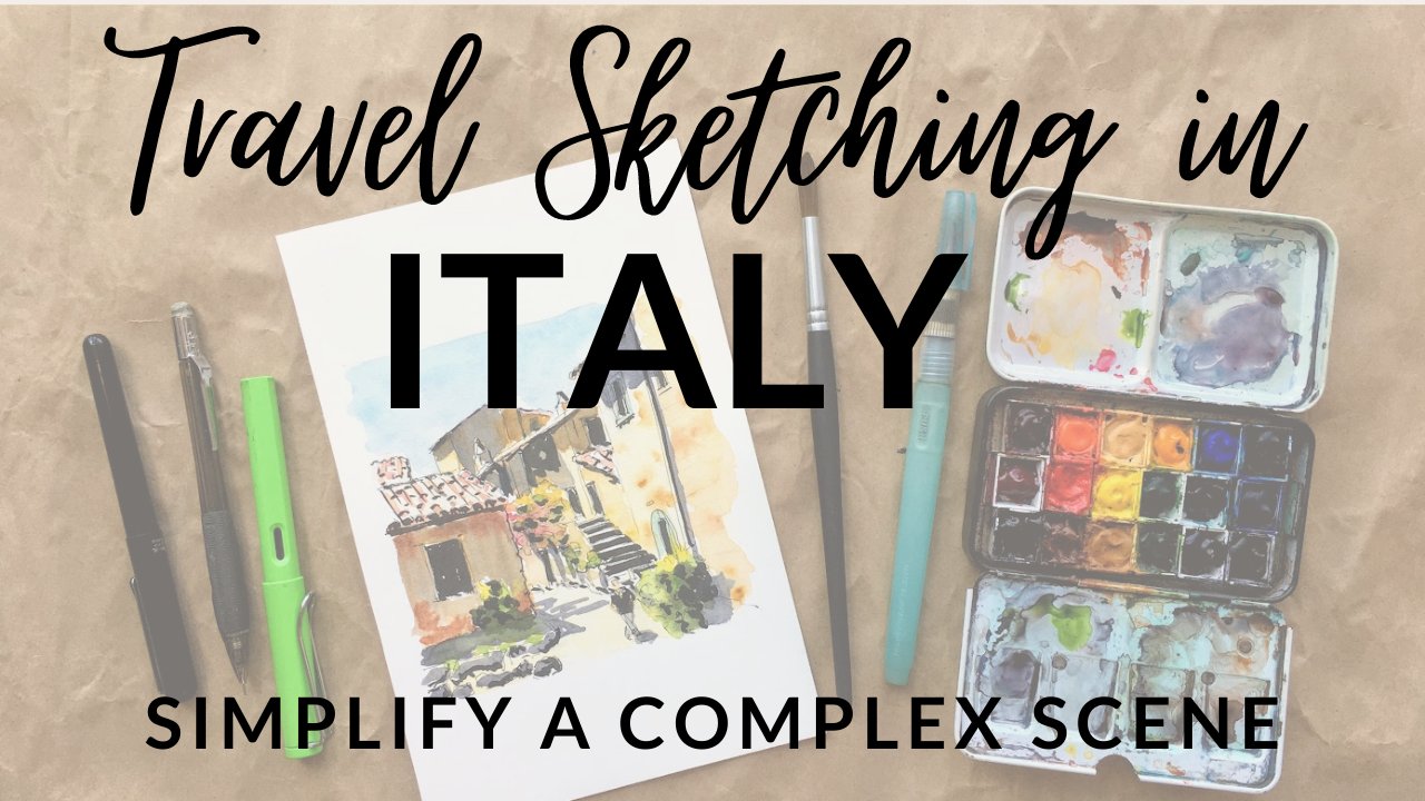
Transcripts
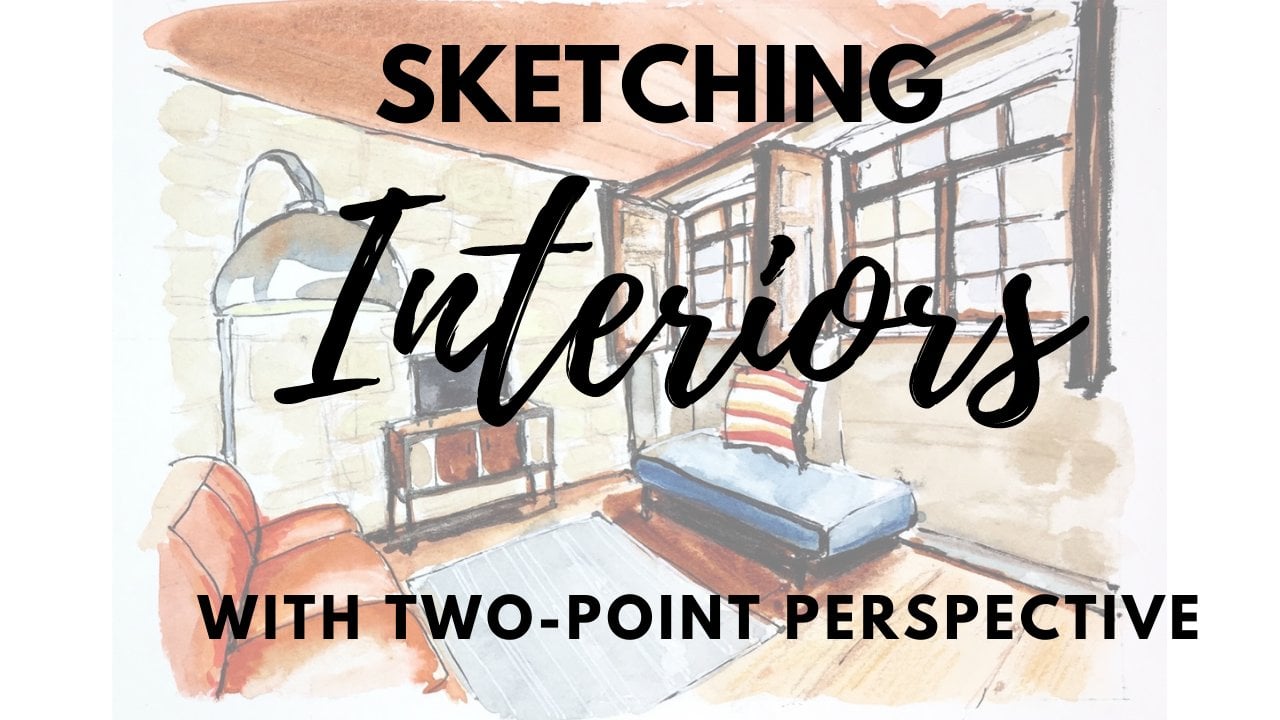
1. Introduction: Hi, I'm Amy Stewart. I'm a writer and an artist. I love to draw the world around me in a sketchbook. And I especially like to take a sketchbook with me when I travel places. But you know, I've noticed that one of the things we overlook when we're doing travel sketching or urban sketching is Interior's. Think about it when you travel or even when you're out and about in your own hometown, you're inside all kinds of interesting spaces. And it could be your house or the apartment or hotel that you stay in when you travel. Maybe it's an art museum or a cathedral or the cafe where you have your coffee every morning. All of those are places that you can capture in your sketchbook to just help to evoke a sense of place. And I remind you of all the little moments in your everyday life for your vacation. But the trick with interiors is that you really need to understand perspective. So in this class we're going to take that first step and work on simple one-point perspective. We're all the lines in a drawing converge to a single vanishing point. You might be used to doing this outdoors on the street. But we're going to work on applying those techniques indoors as well, because even the furniture in a room can follow this one-point perspective. So by spending a little extra time on the drawing and really nailing that, then you can relax and be really creative and playful with EEG, watercolor markers, colored pencil, whatever you'd like to use. Now we're going to be working from photos in this class. But the idea is that you're gonna be able to create quick simple sketches that you can absolutely do on location in your sketchbook in the moment. Alright, let's get started.
2. Project & Supplies: For our project, for this class, I'm gonna give you my photos to work from, but I hope you'll also just use interiors that are around you, whether it's just right inside your house or a coffee shop down the street or any place where you can go inside and sketch. It's really great to do this from life. And of course you can work from your own photos to. But what I do hope you'll do is to post your, post your art in the project section because I'd really like to see it and I'd also be happy to answer any questions. Okay, so having said that, let's look at supplies real quick. You're going to need some watercolor paper for this class when I'm out and about traveling and sketching, I like these mole skin watercolor, no bucks, this is what I travel with. But if I'm just around the house, I'm I'm home. I can take something a little bigger. I might just use a spiral bound watercolor notebook like this. There's a bigger size that I like, and this is kind of student grade paper, but it's good. It's a 140 pound real watercolor paper and that's what you need. Be sure it says watercolor on it. You could of course use a traditional artists watercolor block like this. I like hot press the textures and smoother and I like that, but cold press is fine as well. Basically, as long as your paper says watercolor on it, you're fine. In terms of painting. Any little synthetic brushes are good. Sometimes I use a flat brush like this, other times around brush, and sometimes you'll see me come in with one of these little water brushes that just have a real fine tip, which is helpful. I usually don't even bother putting water in the barrel. I mostly just like these for the tip. Well though sometimes it's nice to have that water. Any kind of basic watercolors set is going to work. I'm using my, my travel kit here and supply list. I'll give you a list of colors, but just a basic range of watercolors is, is fine. You don't have to get fancy with colors here. Of course, you're going to need a pencil and eraser. I like these needle gray racers because they don't mess with the texture of the paper too much and some waterproof ink. So you could use these pigment liners are drawing pins. These are, these will say on them that they're waterproof or they'll say permanent. This is a 0.5 thickness, which is just a normal kind of average size. So these are fine. Or I'm going to be using a lamb IE Safari fountain pen that I've put waterproof ink. And so I love these pens. I'll just explain to you in case you happen to have one and you're wondering how it works, you gotta buy a converter for it. So this is a special converter just for Lamy Safari pins. And you just pop that on there and you twist the little end of it here and it works like a plunger. So you can stick it into a bottle of ink and twist it down and then twist it back up and it'll draw the ink up. And so the ink I'm using here is platinum carbon ink. It's waterproof. That's important because we're going to be painting on top. So if you want to use really Inc. You can, but you definitely don't have to. It's totally fine. Usually you've got one as it's waterproof. I'm also going to be using my beloved pin tell pocket brush pen alive. This is a waterproof ink pen with a brush tip. And this also comes with cartridges that are already filled with waterproof ink. You just pop one in and go. So it's a wonderful pen, but there is a quick, easy and slightly. I mean, this is not very expensive, but even less expensive alternative would be the pit artists pin, which comes in a soft brush. So it says SB on the tip. These are also good. They're more like markers, but it gives you that brushy tip. So all this will be in the supply list. The last thing I want to mention is a painting. So many used. These white paint pinned some, and these are great because you can add bright hits of white. Maybe if you color over something with your watercolour, it's a nice way to get some white highlights back. And then if you want to, totally optional, if you happen to have some colored pencils or some colored markers, and you'd like to play around with those as well. Feel free. You can do that as well. I think that's everything we need to talk about for supplies. You can see a full list that I've uploaded if you want to check that out and let's get going.
3. One point perspective: Before we get started drawing, I wanted to just review the basics of one-point perspective and 2 perspective. And so we're going to start with this sort of classic image of railroad tracks and telephone poles going off into the distance. This is kinda what every art student begins with when they're learning how one-point perspective works. So one important thing is where the horizon line is and the horizon line is always unique to you as the viewer. If you're sitting up or standing down or turned to one side or the other, the horizon's gonna shift. It's not a, it's not a fixed thing in the world. It's your horizon line. So in this case, if we mark the, where the horizon line is, it's where it's, it's where the lines in the image are straight across become horizontal. And we're going to demonstrate this in a second. I'm just giving you this quick visual. And then the perspective lines, these railroad tracks and these telephone poles, as they go off into the distance they meet and they meet at the horizon line. But they form this kind of x marks the spot and that spot in the middle there. That's the vanishing point. And so all the lines in this image converge to that vanishing point. Ok, so that's kind of a basic image that maybe you've seen something like this before in our class about one-point perspective. So here's how this would work outside like in a cityscape. Like let's say it's this street scene. It's the same kind of thing. There's a horizon line which is specific to you. It's from it's at your eye level. And it's also that point where all the lines in the image become horizontal. And then you can see how these other angles of the buildings and the marking on the streets and the sidewalk, do you see how they all converge to this single point? And that's the vanishing point. Ok, so you've seen how that works outdoors. Now let's look at how it works indoors. It's really the exact same thing. So I have an image here that is about as close to the railroad tracks and telephone poles as you can get and have it be indoors. And so now I'm going to show you in a little more detail what I meant about that horizon line. So this picture is obviously been taken by someone who's standing up. It looks like kind of at eye level. And do you see how if we follow these lines, do you see these angles? You see how you can just keep going with your ruler like this. And so when I say the horizon line is where these perspective lines straight now, this is what I mean. So we've got this line that's here, and we've got this line that's here and the straight line is kinda right here. There's nothing exactly in this image that represents that line. But we can kind of extrapolate that, that's where it is. So OK. What I wanna do is I just want to show you how this works in practice. And actually let's start down here on the floor. Alright, so here's this angle and watch what happens. I'm just going to get out a Sharpie. And I'm just going to draw this. And then I'm gonna do the same thing on the other side. Just make sure my rulers pretty well lined up. There you go. That tells us where the vanishing point is because we took real lines that we can actually see in the drawing and we extrapolated them out all the way across. And this X marks the spot is where they meet in the middle. And so that horizontal line, even if you don't see any lines in the image that tell you that exactly because there just didn't happen to be anything right there. That's the horizon line. And so everything else that happens in this image feeds off this horizon line and feeds off these these angles. So I'm just going to use my ruler. And this is a great exercise to do. Print these images out and do this yourself. Because by physically drawing on one of these, you really get a better sense of how it works. And you're putting, you're putting your, your brain and your hand together and that's real helpful. You can see there's a bunch of these lines in the ceiling. And so that helps to, I love it when there's some kind of pattern in the ceiling or the floor that lets me see these angles. I'll do a few of them over here as well. And just so you get this sense, but I think you understand how this works. So whether you're outdoors looking at skyscrapers, or whether you're indoors looking down a hallway, you get the same effect. And so this is how one-point perspective works on an interior. Now, I'm going to show you an example here of an interior that we're going to do in a minute. And you can see how it works in a room like this. Now you can see all the way down to the very end of a hallway because, well, there's a wall here, right. But the lines are still doing the same thing. So even though I, well, I can't see all the corners of the room, but I can see some of them. So there's there's a there's a line here where the beams in the ceiling come in, but I'm looking for the line of the ceiling itself, which I can actually just sort of see in this picture. So I'm going to grab that. I'm gonna grab just because it's easier to see there's a line in the in the ceiling up there that's kinda like a seam and the wood on the ceiling so I can see that. So guess where my horizon line is. It's right here. And that kinda makes sense because the person taking this picture is probably standing app, right? So that seems like it's about at eye level. And if you look at some of these items on the wall over here, you can see how maybe that's where that straight line occurs. If you could see the brick work on this wall a little bit better, you could see that the seams in the brick or pretty much straight right there. So that's the horizon line. And when we're working on an interior like this, everything is going to flow to this vanishing point. Look how the furniture. Do you see I'm going to, let me just do this little table and show you the lines in this table flow according to that, the lines in the couch because the couch happens to be lined up with the wall. Thank you very much. That makes our job easier. That fits the Windows, of course, will line up assuming they're not some crazy angle of window. And even things like this seam and the couch over here and this top of the couch right here. Make sure you can see what I'm doing there. Okay? All of this goes to this vanishing point. So we're gonna do this, we're gonna do an example of this in just a minute, but let me just also show you one more thing. The rug as well. It's really helpful if there's like a rug on the floor or some kind of I don't know, tile pattern or something like that. It's really great when you can get that in there too, because it really gives that sense of depth. Now in this case, unsuspecting this reg is actually a little bit off kilter because it does, it's comes close to lining up with our vanishing point, but it's ever so slightly off, but let me just draw it in here. And you can see it's pretty close. I, you know, this is a room and objects can move around in a room so you can't always count on everything lining up with your perspective lines here, but enough of them will that you can start to fit things into place even over here. This table. While I'm sure that the people in this room were not being totally rigid about lining the table up with the wall. It's close enough that it pretty well lines up with that vanishing point as well. And even if it didn't, you could adjust this table slightly. You can just draw it a little differently and make it line up and then you'd be real certain about it. But the angles in the chair, same deal. Okay? So with a, with an image like this where we can still find the vanishing point even though it's not visible to us because there's a wall in the way, right? This is the important concept I want you to get. Here. We can actually see all the way to the vanishing point. I mean, the vanishing point is an intellectual exercise. It is not a dot that exists in real life. But nonetheless, you can see all the way to it here. You can't see all the way to it because it's being blocked by this wall, but we can still identify it. And so when you have an image like this where you're looking straight into a room. This is your approach. It's one-point perspective. And here we're going to do what I call building the box, which is we're going to look in this room and we're going to try to find the box. There it is. And you want to, you want to draw that. And you want to draw the, you want to find where the walls connect with the ceiling and the floor. And in some cases you can't see it because there's a couch in the way or there's other things. But you should be able to use what you know and understand about perspective in order to be able to get there, in order to be able to put all that in. So that's our mission. When we have a room like this where we can use one-point perspective and then find this wall, basically build this box. Right now that you understand that I just wanna give you a couple of other examples of one-point perspective and building the box. You should be able to see by now. It's like, okay, this is the box there it is. You know, you can see that. And once you can get that in position, sort of figure out where that is in the image. This is what we're going to build this whole drawing on. And so here are these really essential kind of perspective lines that are showing us where, showing us how this room comes together, where the floor meets the ceiling. They're all kinda right here. And so this is the first general shape that we want to be able to work out. And I'll give you one more example before we move on. This is the part that I stayed in, in New York one time and there's a lot going on here. It's cluttered, it's everything is off center, it's tilting that you still get the sense of like, oh, you know, the boxes kinda back here, right? Like that's the ceiling, that's the floor. A wall here. There's probably a wall over here that we can't quite see. But you still, even in this kinda weird cluttered room with nothing quite lining up, you still get this basic sense. Now there's a bookcase in the way so we can't quite see how this all works up here, but probably, you know, there's something going on like that, right. And so in any situation where you're looking straight into the room and you've got this one-point perspective, it's going to be about find this and find that. And once you've got it, then you'll be able to draw anything, I promise.
4. Pencil Sketch: Build the Room: As you can probably imagine within Interior, We're gonna spend more time in the drawing phase and really try to get these perspective issues just right. And we're going to start by doing what I call building the room. Meaning we gotta just get the walls and the floors and the ceilings and the right place. And so this is one where we can see the, we can, we can find the box in the room. In other words, we can see this one wall that's completely intact. And I'm just trying to eyeball where that wall IS. I'm working from a photo so I can just sort of see how it, how it sits in the image. And then I'm going to try to get the lines of the ceiling and the floor. I'm going to first try to draw a free hand and then I'm going to kinda come in here and check my work. And one thing I want to emphasize, well, two things about this picture. What is the Vegas, those beams along the ceiling confuse things a little bit because you cannot actually see where the wall meets the ceiling. And it can throw you off a little bit with this picture. But the thing is that if you just sort of impose the rules of perspective that you already know and understand, even if the room's a little wonky and it doesn't quite seem to work. Just go, I know how this is supposed to work and I'm gonna go ahead and make this line up with what I think it's really supposed to look like. You'll have an easier time with the drawing and it won't matter. You know, the thing is that with with any room, things can be a little bit irregular. Like we have these sealing beams that kind of obscure where the ceiling actually is. Things like that can be a little confusing. So what I'm doing is I'm trying to just sort of draw in where I see the ceiling and floor coming in. And then I'm double checking it with my ruler, but I'm not sweating it too much. C, I'm, and I'm just gonna kinda draw this and that gets me my vanishing point where those lines meet in the middle. Now the fact that this happens to fall pretty near the center of the drawing is a coincidence. It just has to do with where the viewer is standing. So the person who took this picture happened to be standing kind of in the middle of the room looking straight on. And the height of the camera happened to be at about the mid-level of that wall. That's all coincidence. If you'd been sitting down or standing up on a ladder, this horizon line that I'm drawing in now, that horizontal line, that's your eye line and that, that's the viewer's eye line in that could've been anywhere. Okay, so what I'm doing here is I'm drawing in general guidelines to help me with perspective. These don't have anything to do with anything I can see in the room. So I'm just putting these down without really looking at what's in the room, right? These are just straight lines that are getting Give me some guidance. Now that I have all this in place, I'm going to try to get that window in place. And the windows a little bit tricky because it's not quite Center. It's ever so slightly to the left. And so I'm measuring like here, I'm going to measure left to right and I can see how much of a pencil width it is. So it's sort of like theirs. One window width on the left and then the window, and then another window width on the right plus a bit more. So that's just helping me to kinda eyeball that window. You're going to see how important this window is for the rest of the drawing. It's like you get one thing right, and you can relate everything else to that. So that's kind of a big priority and just getting something established about where are things in this room? Who like now we know where the wall is, we know where the ceiling is and where the floor is, how all those things meet up. I can get rid of these guidelines in the middle now because they don't really exist. This is just a flat wall. So fine. I've got that. I've got my I've got my little window here. And as long as I'm kinda messing around with this on, I'll give it a little bit of a windowsill. I mean, none of this has to be perfect right now. It's just about getting the shapes in basically the right place. I'm gonna go ahead and put these pictures on the wall just again, generally where I where they fall relative to that window, how high or low are they compared to the window? And just trying to kind of get those in because I'll use those as sort of anchor points for everything else.
5. Pencil Sketch: Furnish the Room: Now that we've built the room, we're gonna furnished room. And everything I do is going to be working off of these perspective lines that I've put down for myself. And I'm gonna measure where everything is in this room relative to that window and those two pictures. So like there's a couple little shelves on the wall and I am measuring where those hit relative to the edge of that picture on the wall. That's how I'm getting it positioned. And when I get into doing this furniture, it's very convenient that people tend to line up furniture against the wall so that, so that they follow the same perspective lines. If somebody decided to be very clever with their interior design and put all the furniture in a wonky angle. None of this would work. But I know it works because I know these things are basically lined up alongside the walls. So I'm following the perspective lines. I've already put down. Those lines apply to everything. They apply to the furniture, they apply to the floorboards, the rug, the whole deal. And so as long as you continue to follow those guidelines you made for yourself, you'll get everything just about right. So I'm measuring like, how far out does this couch come relative to that picture on the wall? Does it block part of the wall in the background? Yes, it does. It's sort of like part of that and then part of the floor. And I'm just checking all these angles, just trying to get something in here and trusting that those lines I've put down are getting Give me a pretty good result. And of course there's a reason why we're doing this in pencil. You're supposed to erase the point of a pencil is that you can erase it. So definitely keep going back and forth and make little adjustments between, between what you see and what you draw. It's just this sort of constant back and forth with your, with your pencil in your eye. I like the little pillow. I'm going to put that in. I'm going to leave a bunch of stuff out just for simplicity's sake. And just so we can get through this kinda quickly, I mean, you can spend as long as you want on an interior. There's always so much stuff in a room. But you'll see that I'm going to, I'm going to leave some things out just to simplify it. Like I'm going to leave that rug off the couch as much as I like are the blanket that's sitting on the couch. And I'm going to leave that off as much as I like it. So with this table again, I can follow these same lines that I put down. And I'm just measuring where it sits relative to the couch and relative to that window. Like how does it line up against the right-hand edge of that window? Those are the kinds of things that will help me keep all this work in, right? And so just getting in the table legs and figuring out again, where do those fit relative to the couch. And I'm using the same guidelines, the same perspective lines to get the little supports underneath the table that kind of connect the table legs together. So the table legs themselves where they land on the floor, those follow those same perspective lines. Everything, again, assuming it's all kinda squared off in the room and the furniture is not at crazy angles. Everything will work that way. This rug fortunately, has also been put down on the floor. Pretty square. So so there again, I I've I'm able to draw it in very quickly and simply and it looks right as well. And once I've got that in the The chair over here is a little bit tricky. I'm gonna hum it to hold off on that. And I'll go ahead and get the window in these curtains. So I'm just kinda designating for myself like where is that? And then I can erase those guidelines because I don't need them inside the shape of the curtain. So I'll go ahead and get that in place. Getting in the kind of bigger, more obvious shapes first, it's always a good strategy. And there's a picture on the wall here too. So I'm going to kind of mess around with getting that picture in a measuring where it lines up with the other picture. And just making sure I'm satisfied with how all that looks. Now I'm going to tackle this chair over in the corner. I'm going to leave out the chair in the foreground just for simplicity's sake, but the chair in the corner, it's pretty straightforward. It's also more or less lined up against the wall so I can measure where it sits. Again, relative to that window. The window on the back wall there. That tells me where the corner the chair kind of sits, just adjusting where this curtain comes down a little. And so the angle of the back of that chair, you can see how that matches the perspective lines that I already put down. So again, everything's kinda lining up here and we can't really see it. But the where the back of the chair meets the seat of the chair also lines up with these perspective lines that we've done. And now I'm looking at like how far does the chair come out into the room relative to the rug? And again, that same all important window on the back wall that I know is in the right position. And I can just kind of, again, using these perspective lines as guidelines. I can kind of build this chair because I know that I know the angles and I can see where it sits in the room relative to things like the curtain and the pictures on the wall. I'm gonna go ahead and put some arms on that chair, get those in. And I'll go ahead and draw in the little throw pillow. It's a nice thing to have. And then I love this kinda like wagon wheel shape. I definitely want to, I want to get that in as well. It's it's actually kind of let me just sort of square that off. There's the base of the chair. I'm realizing here that the wagon wheel shape actually comes up and touches the bottom of the arm of the chair. So this is the kind of thing like this or why we do this in pencil is to be able to keep looking more closely and really, really see what you've got going on and just make sure you've got it right. So okay. There's the chair. Now. I think I will go ahead and do this little table next to it. Mostly. I'm just doing this to demonstrate one more thing that follows the same rules. It's not so important in this table, but, but it will give you a little sense of that. So just double checking all the angles of the chair and making sure I'm really satisfied with where all that is before I started another thing. And so this table, I'm like, Where does the table sort of line up with the chair? So I'll go ahead and get the horizontal edge of the table in. And then the sides. They follow these same perspective guidelines because this table is basically lined up against the wall. And very helpfully it's not at some weird angle. If it's at some weird angle, then all bets are off. And you're just gonna have to kinda hold up your pen or your pencil and tilt it from side to side and try to measure and just get it worked out. But as it is, I can follow those guidelines and get that in pretty easily. So that's really nice. I can fit in something like that if I, if it's something that I want to include and you know, you, you're really, you will make choices about what to include and what not to include in an interior because there's always a lot of stuff in a room. And so you do have to you do have to kinda make those decisions. So like leaving out that chair in the foreground, that's mostly just so we can kinda get through this quickly. But there are some other details in this room that I really like and I want to include like over in this corner, you can't really see very well, but there's like a little table back there in the corner and there's this plant. And I've decided that I'm definitely going to include all the plants. So, so I'm going to draw those in. There's a plant behind this chair. I like that the leaves are really different. That's helpful. Oh, I'm gonna get this lamp into. I like including lamps. They're pretty simple shape, they're really expressive. They really tell you what kinda room your end. So I'll get that lamp and then just a few big shapes for that plant. And then there's also a little plan on the table in the middle of the room here too. And again, different shaped leaves and slightly different colors. So that's cool to be able to have those three. And you know the viewers, I can kinda go from one to the other to the next.
6. Ink: At this point you have a choice. You might want to if, especially if you're painting and guage, just start painting, you might come in with ink, which is what I'm gonna do. But first let me show you real quick. If you do want to just start painting with either washer, watercolor, maybe you just don't like the idea of the ink. Go ahead and erase this drawing back a little bit. You can just kinda wipe it or scrub added or just dab it up with gum eraser like this just to make it a little bit more light. So the paint isn't competing quite so much with the pencil. You don't have to do that, but it's something that a lot of people do if they're gonna go straight to pain. I've decided that I'm going to draw this with ink now. And in that case, I'll just worry about erasing after I'm completely done. So I'm gonna go ahead and draw a border around it. And you're gonna see in a minute that I'm going to live to regret this. I started out by putting in the box because I wanted to just draw this in the same way that I drew the pencil drawing. Just to really show you, just to remind you of the approach that we want to establish that wall in the background and this window and really get these things exactly where we want them. However, I, in doing this, I overlooked one of my cardinal rules of drawing an ink, which is you really need to work from left to right, assuming you're right-handed, see how I smeared the ink right there. This is this is my fault. This is my own my own hubris is that I'm not working left to right. I'm, I run the risk of smearing that you can get. In fact, I did. I almost just started over here, but I thought, you know, I'm just going to leave this in because maybe you'll be more likely to remember and learn from my mistakes. If I actually show you the mistakes, phaco, I decided to just leave it. But also, It's also true that those kinda little things are just what's going to happen in your, in your sketch book as you work and you gotta kinda live with them and move on. And you'll see by the end that we don't even really notice it that much. But I did originally started by wanting to focus on this wall in the background and really get it establish. But I finally had to accept the fact that I was making myself crazy trying not to smear the EEG and that if I would simply work from left to right and a really straightforward way that I wouldn't have that problem and that's why I tell you guys to do. So anyway, here we go. Okay, now we're going to work from left to right. Like non crazy people, normal people do. And since I'm just going over my pencil marks, it's really, you know, there's there's kind of not a lot to say about it, except that remember when you're drawing an EEG over your pencil sketch, now's the time to make some changes if you want. Like I slightly reposition this table as I drew it and pushed it a little bit back. And I also want to say that I'm deliberately having these inclines be very loose and sketchy and expressive. You know, the thing about an interior is you're not going to make a perfectly accurate. Rendering of this entire room and everything that's in it. I mean, you're not an architect, right? So you might as well have it be expressive and create something that looks like you. I mean, I do think it's important to spend some time on that initial drawing and get something that is accurate in terms that perspective and their proportions and the positioning of everything. But once you've done that, go ahead and let yourself be kinda loose and free and let your line work. Have some character. Let it look like something that you drew. Not something that was drawn by a machine or drawn on a computer. So I'm just sort of going around and putting in pretty much all the details. I'm not gonna leave much to just do in paint. I'm basically going to go ahead and get like there's like the little sort of wagon wheel design on this chair. I'm gonna go ahead and put that in. Really getting go ahead and flush out pretty much everything I everything I see here. Go ahead and get the rug in. And again, being being mindful this time about trying to stay left to right so I don't smear anymore ink, but of course I will. I will. And there's a lot of little details that I can add in now that I didn't bother to do with a pencil because, because I didn't need him. I knew I could do this freehand later. I knew I didn't need to draw twice, basically, just getting the friends on the rug, stuff like that. This table, this is a good time with stuff like the table to kind of recheck the perspective lines. Make sure I'm happy with the position of it and how it sits in the room because I can change it. There's still time. One last time to make some changes from the pencil drawing. If I feel like I really need to. So I'm just sort of rethinking and double-checking where these legs go. And just making sure that I'm happy with how all that is. The plant. I can really only kind of barely see what's going on with this plant in the photograph. So it really doesn't matter. I'm just I just like that the leaves are a different shape than the other plants and the rooms. There's a nice little bit of a kind of contrast there. And I'll come in again with the couch. I'm just sort of double-checking all the decisions I made about where these things go. Making sure that I like the, the making sure that all the perspective lines are kind of in place and working. This is my one last opportunity to really do anything about that. So I do tweak them a little tiny bit as I go and just try to get something that I'm that I'm happy with. Go ahead and put this little pillow in. And at this point I'm over on the far right side of the of the drawing and getting in some of these last little details like with the plant. And obviously some of this I can really do with paint. So like these spiky leaf shapes, I could just totally leave these and Duhem with pain. I'm just getting a few lines in just to kind of remind me the height of it, the shape of it. And so I really need to do with that. We've got this little there's a little like a radio on on a shelf there and then there's another shelf here that I can't quite tell what's on it, but I think I'm going to just decide that it's yet another little plant. So, and this is also the time when I can put in some more details like, you know, putting in some little knobs on the radio. That's a cool thing to do right now. And just working on anything else that I may be left out, get that little picture in. Make sure I'm happy with the lines of the ceiling. And, you know, originally I wasn't going to put in any of these sealing beams. These are or Vegas. But I think what I'm gonna do in the name of simplicity, I'm just gonna put in a couple of them. I'm not going to put in all of them because it would kinda make you crazy and might be sort of hard to tell what they are, but you have the underside of the beam which is a light color. And then another line where the darker side of it meets the wall. So it's three lines that you need to put in every single time. And usually there's a little kind of a joint where they where they meet up with the wall. You can't see that with this higher one. But basically this is an example where I'm simplifying. I'm just making a choice to do a little less of something like I still wanna suggest it, but I don't have to include them all. Okay. And then just a couple more elements that I I did not get an earlier, I'm going to put this little pillow in, even though I'm having to draw it over some of the other elements in the drawing. That's fine to do. Just, just put it down. Same with the leaves here. They're going to overlap the lamp a little bit. It's totally fine. Just gonna get those in and move on.
7. Brush Pen: I'm going to come in now with my pocket brush pen and add some darker, heavier lines to suggest the shadow sides of things. The undersides, everything like these table eggs have a dark side and a light side just depending on where the light sources and the light source, we've got two different windows in the room. So there's a couple of different places the light can be coming from. But you can, you can get the idea. You can see what I'm getting at here. Like there's gonna be a dark shape underneath the couch, for instance, are underneath a chair. I'm gonna go in and I'm just gonna emphasize areas where one thing comes into contact with another thing. Even just sometimes even just by putting in a little dot to show where one thing touches another. These leaves are going to have a dark side and a light side to him. And so doing something to emphasize that what it's doing is it's just helping certain details to pop out. It's giving it's giving the furniture some weight so that it doesn't feel like it's floating in the air. And it's helping emphasize where the light sources like putting, dropping in those shadows underneath a window sill or around the edge of the window frame. We'll just kind of imply that I'm even doing a little bit of that around that picture frames up in the corners of the walls, for instance, there's always a little bit of shadowy stuff happening where the walls come together. Sometimes it's just a matter of dropping in some dots. Other times it's heavy bold lines. And this again is just a, it's really a matter of your personal style, what you like. But I really love playing around with this pocket brush pen. I think it gives a feeling of movement. You know, the lines are really sort of organic and brushy. They look like they were painted on rather than drawn on. And I just think there's something really wonderful about that. I can get in just the darker, some of the darker areas around this table. And also because I'm gonna be doing watercolor and water color can end up looking pretty light even when you think you're putting it down quite bold. And so by doing some of this just with this dark ink pen now, It's going to help me out when I start painting because it means that my dark, my darkest darks are just already going to be there. So any place I see a little opportunity to do that. I wanna do it. It goes without saying that you should once again work from left to right so that you don't smear the pain. There's already some, you know, there's paints mirrors here. I mean, Inc. smears here, not pain but Inc. there's already places where the Inca smeared, but it is kind of going to disappear when we paint. And so I actually think it's sort of good that that happened because I can remind you like, don't be real hard on yourself when you make little mistakes as you go, the overall effect is still going to be pretty great. I think you're going to be pretty blown away with what you can end up with if you just sort of keep at it and let it be what it's going to be. I'm realizing I wanted to put a little bit of a baseboard in here. It's perfectly fine, of course, to come back with with pen. And at any other little details, I know there's some dark shadowy kinda shapes with these Vegas or these beams across the ceiling. So I'm just going to emphasize that a little bit. That'll just help me out. When it comes time to paint, it'll be a little bit more obvious, like witches the bottom and which is the side of these beams that we'll just give it a little bit more of a three-dimensional shape. I'm also just gonna do a little bit more detail work around this curtain part. This has also just like where do you want people's eyes to go? And so if you just think about it that way, like what, you know, the viewer has to kind of make some choices about what to look at. And so what do you want the viewer to look at? Go ahead and, go ahead and emphasize that going back in and adding some that had little fringe around the around the reg, any other little details on this rug that I can think to do? Now's a good time to do it. Sometimes just adding a second line to darken it up a little bit, rather than using the brush pen, but just go over it, go over it a second time. Now I've also decided to go ahead and add this air conditioner, the window unit in. You know, it's a lot of character, right? You really get the sense that this is a place out in the desert. And if you go rent like a groovy little plays out in the desert, you know, there's going to be a window unit air conditioner in it. So I decided to go ahead and add that. It's just a few simple lines, it's easy to do. And I also wanted to mention there are things I'm not including like there's these cowboy hats hanging on the wall. And as much as I love those, just in the name of expediency. And also because I think in this little drawing is going to be hard to tell what they are. I decided to leave them out. But you might make completely different decisions about what to leave in and what to leave out. There's a real dark piece of wood or something around the window unit and I'm gonna go ahead and put that in. I think it looks kinda cool and I think it's sort of obvious what it is. If you were the one who stayed there business, we're a little vacation rental place and of course you would remember that it's the it's the AC. And and I guess that's all that really matters. So let me just see if there's any other little details. I'll add some little wavy lines to suggest that these are the curtains. And I'm gonna go ahead and put in some stripes on the rug. This is a Type a rug that so familiar to people like we've all lived in an apartment with this rag that I want to just sort of add in these little diamond shapes and just make it clear, a little bit more clear. What kinda rubbed this is, I can do more of that with color, but I think it would be nice to just, just integrate a little bit of that. So a little bit more detail on the rug, I think, would be kinda cool. And this is your chance to kinda go around and see if there's any last little, you know, little details that you want to include Before we get to paint.
8. Watercolor: Okay, so let's get into some paint and I'm gonna start with the wall. I went to do the kind of the bigger colors, the colors, a dig at the most area and the painting first. And so I've got some yellow ochre and I'm doing the darker areas around the corner of this wall where it's a little bit more in shadow. That window brings a lot of light in, so it's lighter as you get closer to the window and it's darker around the corners of the room. So I'm first dropping in this yellow ochre everywhere. And a pretty wet mixture. Just sort of let it move around and then just coming in with lighter. This is quinacridone. I'm sorry, this is new game BOJ, but quinacridone, gold would actually also be good, but just a lighter yellow and I'm doing it quickly enough that it'll blend with what I've already put down. They're not gonna totally run together, but they're definitely all still wet. Because it's meant to be that the it's meant to look like the wall is all painted one color and just that there's light and I'm using my dry brush to pick up a little bit of that paint to make it lighter. So that's a nice trick for adding something to just give this sense of a highlight or of light hitting something, just dry your brush off and pull that in there. Now I mixed in a little bit of Daniel Smith neutral tint, which just darkens that yellow ochre mixture to make it even darker in the corners. And this is something I can do because it is still wet, so it is still moving around and it's going to it's going to blend a little bit. And this other wall is also yellow, but it's brighter color because there's more light hitting it. So I'm using that new gumbo, blotting it up with a paper towel. Were the colors just run together a little too much. But it's okay if they run together a little bit that darker color in the corner over there, that's fine. So I'm just getting some of that in picking it up just a little bit again to show that the light coming in. And now this couch, I'm using a little Naples yellow here just to have a slightly different yellow on the couch. Again, I'm not bothering with the blanket that's on the couch. You could certainly do it. It'd be easy to do actually. Then it'd be fun to do with mixed media, to come in with markers or colored pencil and do that pattern. I just I just left it off for expediency sake. But you can get into as many of those kind of details as you want to. So I've done both the chair in the couch in the same color because they seem to be made out of the same material. And now i'm working together some transparent red along with the yellow and these brownish colours to just get some kind of would like color on this floor. And I'm not worried about just exactly matching what I see in the photograph. I think it's pretty obvious to the viewer that this is this is a wood floor and I also know that this is going to be a good place to come in with some little lines and colored pencil or something later if I want to, to give even more of a sense of texture, the tables also would, and I'm using these same colors, the same Transparent Red. Oxide and also the, the yellows. But I've already been using to suggest the wood on this table. I mean, I'm really trying to keep my color palette very minimal because I want the whole thing to feel unified. And it's great when you can do this with an interior because you know, you've got these colors bouncing around the room. And so every color is affecting every other color. So the more unified your color palette is, just the better. I'm just going around now and doing some of the like this little wagon wheel thing over here and also the arms on the chairs. Just any place where you see little wind details. As long as everything is dry near it, I can go ahead and do that. And now there's a lot of these turquoise colors as end including on the other wall. So I'm any use cobalt teal for this and it's not a color that I had on my palette, but turquoise type colors are hard to mix. So it's nice to just get him right out of the tube. So I just added a little that any kinda turquoise color would do. If you don't have one. You can get into mixing some blues and greens together and you'll get something kind of close, but, but it is nice. It's a nice pure color to just get right out of the tube. So I'm just going to get in and do a little bit of detail on the rug. Everything else around it is dry enough that I'm not worried about them running together and I'm not trying to exactly copy the pattern. I just wanna give the impression of of this type of rug on the floor. So I'm just dropping in some stripes very casually and I'll come back and add a few other colours to it. But there's just sort of gets the, gets the basics down. Alright, that looks, that looks pretty good. I'm gonna want to, well, let me just there should be another little white stripe there, but I left it out, so I tried to pick it up just a little bit, but that's the other thing I could come in with a white paint Pin later and add some more stripes if I wanted to. So it's sort of nice to have those options. So this table is more or less that same turquoise color. I mean, I'm sure the person who decorated this room was kind of trying to have some matching colors, but they maybe didn't match quite this much. But again, it's, it's nice to just use the same colors everywhere in to get that, to get that sense of a unified palette, sort of nice. So there's the table. I'm just doing a very light wash of that color over on this wall. It is a it is a much lighter version of it. So just dropping that in very casual. I also want to do, this is a new game, bows, and I'm just doing the bottom part of these beams, the part that is most in the light. And you can see what a difference in color there is between the part that faces down towards the floor and the other part. I'm gonna get a little bit of orange here and drop it into the pots that the plants are in. And then on the pictures, I'm obviously not going to try to copy the whole picture. I'm going to just pretend that they're all little landscapes. So I'm taking that same turquoise color and putting it up near the top as if it's a sky. And then these same sort of earthy reds, oranges underneath as if, as if it's the earth and like they're little pretend landscapes and that's all that's going to happen. That's all I'm gonna do right there. I think that's more than enough. Now I'm gonna come in with my dark my Transparent Red Oxide and duties other the darker side of these wood beams. The ceiling is we can't really see the ceiling because there are so many beams and I decided not to do them all. But you can assume that the sealing is not perfectly white. So I will come in in a minute and just add a little bit of shadow color on the ceiling itself so that it doesn't look quite so bright white. But for the moment, there's just transparent red oxide with some Daniel Smith neutral tint. And these little wood shelves on the wall. I'm gonna get those. Anything else I can find that needs a little bit of that color and this kind of wood treatment. And I've decided to make this a little pot with a plant in it that's sitting on the shelf. I can't quite see what it really is. So that's what I'm gonna do. I'll drop this turquoise in on these cushions as well. Now that everything around it to dry, I can go ahead and get in and do that. I'm going to now take some bright yellow. This is Hans yellow. And I'm putting it down on the plants. I'm going to put some green on top of it, but I want to come in first with this yellow for like the lightest parts of these plants. And obviously the plants are quite small. You can't see a lot of detail. I like that they're different shapes that really kinda helps. Let's see, I'm gonna take some sap green, mix it. And then while the yellow and these leaves is still wet, I'm dropping in this Sap Green and so they're kind of just blending on the paper. And I also got some, some bright fail Al Green. I want, I want the greens in the room to be, to have some variety to him to not look all exactly the same. So I'm dropping in the failure Green, which is a much brighter color of green just to have some difference. And now I'm taken Sap Green and mixing it with a little bit of Daniel Smith neutral tense. So it is a darker type of leaf. And just, just dropping these in I, I can't even see it in enough detail on that plan to even really know what it is. And then just sort of dark green spiky shapes over here in the corner is really all you need. And I mean, that's pretty much all it is. And again, the little plant on the wall is just sort of three little blobs. And that's all we're doing. I want to add some richer color on the chair where the light isn't hitting it. So kinda like the shadow side of it, just to give it more of a sense of it as a three-dimensional object. And there's a way I can do that on the couch as well. You know, parts of this couch or lighter and parts are a little darker. Coming in with some orange now that the rug is dried and just adding a few or in stripes, this is obviously something I could also do with marker or pen, but and on the pillows as well. But I'll go ahead and do it with paint just to show you what that's like. But we will add some details with mixed media too. Okay, so those are done. And now I've mixed a tiny little bit of shadow gray. Yeah, Daniel Smith, shadow violet in with some of this blue. And I'm just suggesting a little shadow color in that window. And on the curtains, you know, they're not completely white. There's folds to the fabric. And this is where I'm coming into the ceiling as well. And just again, just really kind of just suggesting a bit of just just to get rid of the white paper, just to make it not quite so bright, but really that's pretty much it. That's what we're gonna do for what color.
9. Mixed Media: Okay, so now you can, if you want to do once everything's dry, come in with some mixed media, whatever you have, and just add a few little details. So like I'm realizing I never really emphasize these picture frames enough. So I'm just going to use my, my pinto pocket brush pen and just come in with ink and do this. But that could have been paint. I couldn't use just any kind of marker or even colored pencil to do those. But let me just sharpen that app. And there's one more little thing that I realized I kind of missed. There's just a little shadow on part of a lamp shade. It's a really small thing. I definitely could have left that out. And I don't think you can even really going to be able to see it that much on camera. But it was kinda bothering me that that I didn't get it because there's a white highlight next to it. And I, I like being able to show those things. So maybe a little bit more shadow too. And the curtains here, I just want to sort of knocked back some of the white. So I'm just going to mess around with that just a bit. There's plenty of time for that to dry and meanwhile, there's lots more I can do. I there's something like an old radio or something on the shelf. So I'm going to use the black brush pen there as well, just to make a few little details on that. And now I've got a yellow colored pencil and I'm just adding some kinda scribbly lines to put a little texture and a little bit more of a darker color on the chair. This is very much just experimenting. I mean, you can really just kinda play around and see, see what you like. I started really drawing on this and doing this kind of scribbly line back and forth, which makes it look more like fabric. I mean, of course it's a it's a leather couch, but I kind of like the way that looks. I just like having those extra little bit of stripes. And so this is where you can really just add a little bit of yourself, put a little bit of yourself into it and add little patterns are little details, whatever appeals to you. So with a brown colored pencil, I am gonna try to suggest the brick on these walls. Now the thing with bricks and stones is you really don't want to draw every single one and have it pull the viewer's eye away from the rest of the rest of the painting. So I'm not putting them everywhere, but I am just putting some little lines, some little some horizontal lines with little short vertical lines that kind of alternate and are staggered to just barely suggest a brick pattern. And occasionally I'll draw a complete little brick, but it's all pretty random. I'm doing a more around the edge and less than the center just because if you really look, you can see that in the darker corners, you can get a little bit more of a shadow there in that, in that brick color. So this is something you don't wanna get too carried away with it. Again, I wouldn't I would not put it everywhere, but it's kinda fun to go in there and just make a few little lines. And because the wall is yellow, it makes sense to do this in a brown because that's how the mortar is in between the bricks as kinda get to show up. And then I'm doing a little bit of the same thing on this wall on the left because it is also brick. So if I did it in one place, I feel like I ought to do just a tiny bit of it in another and the other place just so it all kind of lines up and I'm remembering my perspective lines as I go down. Just to make, just to help support the idea of the perspective. They're sharpening up some shadows underneath these chairs with a, with a colored pencil and then also restating the lines of the floorboards. So I drew these initially with my perspective lines, but now I'm just kinda coming back and putting him back in and using a pencil to suggest the texture of the wood floors and maybe a few little knots in the wood, stuff like that. You could also do that with a marker. I this is another thing where I want it to be pretty light. I don't want the viewer really looking at it. I'm using colored pencil here to just add some stripes onto the rag. And this is definitely the kind of thing where this whole, that whole RUG could have been done in colored pencil or in, in marker and it wouldn't look kind of cool. You know, it's nice to have some contrast. Just kinda going around and looking for where do I want to make something pop just a little bit with a dark green marker and putting some, some shadow colors on the undersides of these leaves. I could've gotten really into maybe making some like variegated patterns and leaves. You know, you can really have a lot of fun with that kinda stuff. I'm adding a few more little spiky shapes over there in the corner. So I'm actually doing more, going a little further than what I did with with pain. Now I'm going to take a Brown marker and just sharpen up these beams a little bit. I mean, it's fine to leave him kind of loosen hand painted looking, but I do want them to look a little bit more alike would. So this is a good time to come in and just, just sharpen these up a bit. They don't have to be perfect. And this whole thing should look like it was made by a human being. So that's fine. But I'm just using some kind of wavy lines to suggest wood grain a little bit. Colored pencil would have been fine for this or even append, whether it's a brown pen or a black pen, I could have come in and done it with that as well. And just, I'm just kind of coloring it in a little bit, mostly just to sort of knocked back that marker color and make it not quite so obvious. And now I'm taking a light grey colored pencil. You could just use a regular pencil, just like a normal pencil and do this. And I'm remembering my perspective lines and I'm putting some lines in the ceiling as if it's some kind of ceiling tile or I don't even know what I just felt like it needed a little more color there. And I love being able to put those perspective lines in because, you know, everything is pointing towards the focal point, which is great. I have a turquoise colored pencil, so why not use it? So I'm just going around. I'm adding a little bit more color to that table and just looking for anywhere where I can just add any more little details on the on the wood or or just any place else where it seems like I might want to drop in just a little something extra. Now I've got my white paint pan and so I'm sharpening up the lighter underside of those would-be seems a little bit and coming in around the window and just looking for places where I want just a little hit of white. Maybe on this lamp shade over here, the little white highlight that goes with that gray shadow that I put in. And so it's kinda fun to go around also. And just not just look for places where you might want to add darks, but lights like here, I've just got a thick white paint pin. And I'm just getting more of a sense of the light coming from that window and hitting this chair. So I'm making some kind of scribbly lines would definitely looks scribbling like on purpose. Same with this table. It's definitely getting hit by the light. So there's a little bit extra that I could maybe do there just to kinda brighten it up. And around the picture. There's a little Matt around the picture, so I'm just sharpening that up, just cleaning it up a little tiny bit. And on the plants there might be some highlights where the light is hitting these leaves. You could also use a yellow or even a light green paint Penn for these. I'm just doing among white and I think it reads pretty accurately. I mean, I think the light that is coming into this window is pretty white, so I'm just I think that's fine. Little bit on these shelves up here. I'm going to come in on this air conditioning unit and just kinda sharpened up some of those details. Make it look a little bit more, a little bit more realistic. And then the fringe on the Rogue is actually white thread. It's not, I mean, I drew it with black ink, but it's not actually black. Friends, it's white. And so I'm going in and dropping some kind of white fringe on top of the black, I could have just left it off altogether knowing that I would do it in white paint pen. But I think that mixture of him actually looks kinda cool. So that's fine. Maybe a little more detail in the rug with the white paint pin on the throw pillows. Really, just, really just anywhere you kinda wanna mess around and add another little note at this point, none of this is necessary, right? This is all just kind of extra. And it's all just sort of for fun because I have these tools, but I think this is looking pretty good. So here it is.
10. Final Thoughts: Okay, that's it. I hope you had fun and this gave you a new way to approach interiors. Please post your projects. I'd love to see those. Of course, if you have any questions or comments, post those two, I'll be sure to pop in and answer and keep an eye out for my class on 2 perspective with interiors if you want to keep on exploring this subject. Also, I do teach a lot of other classes and writing and art, so have a look at those and just please do stay in touch. I have a website, I'm on Instagram and other social media. I send out a newsletter and I would love to hear from you. Thank you so much.
 Amy Stewart, Writer & artist