Transcripts
1. Introduction: Hi, I'm Amy Stewart. I'm a writer and an artist. I always take my sketchbook with me when I'm traveling or even just when I'm out and about my neighborhood. And usually what I'm drawing is street scenes, landscapes, people, architecture. But sometimes I stumbled across a still life. Now I'm not talking here about a classic still life setup in an artist's studio. What I'm talking about is just an interesting arrangement of objects in everyday life, like a vase and salt and pepper shakers on the table in a cafe. These little still lives are everywhere when you learn to start looking forum. And the great thing about a still life. And I think this is the reason that they're such popular subjects for artists is that a still life. Let you do a little bit of everything. Interesting line work, vivid colors, dynamic compositions and just you end up with, you can get really strong contrasts between shapes, colors, values, and you know, a still life can also tell a story about the place you visited, about your everyday life, about the changing of the seasons. So in this class we're going to draw a simple arrangement on a table in a restaurant, done with just one drawing pin and a little bit of watercolor, really simple supplies. But we're going to take an unusual approach to this one. We're going to draw the entire scene with just one line, never lifting our pen from the paper. What this does is it gives a really distinctive hand-drawn quality to the lines. Because you can never lift up your pen and put it down again with a lot of momentum or movement that makes it a great exercise for beginning artists. But, you know, it's also really helpful if you're a more experienced artist and you feel like you've been stuck in a RET. So this, combined with a really loose and splashy approach to watercolor, will definitely change things up for you. I'm also going to show you exactly how I do this in my travels, sketchbooks where I'm adding a little writing all around the artwork to record my memories of the place and what I was doing there. So there's just a really fun, quick, relaxed way to capture the moment and work on your art skills a little bit. All right, let's get going.
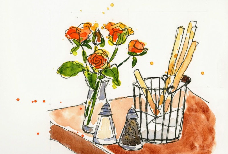
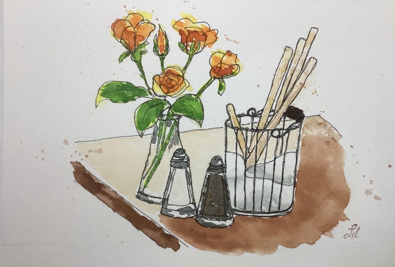
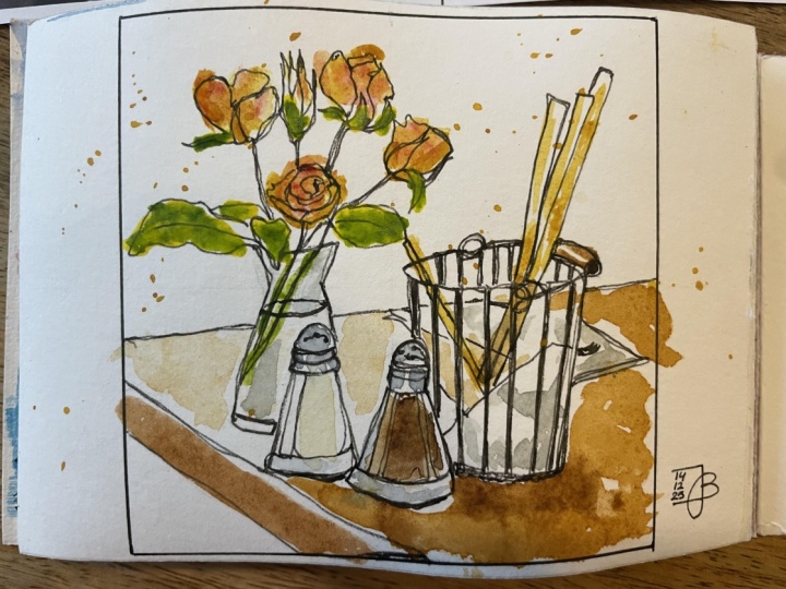
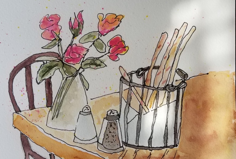
2. Project & Supplies: For the project for this class, I'll give you my photo to work from. But also feel free to find your own real life, still life. Anywhere all around you might be a little collection of objects on your nightstand at a restaurant, on a bookshelf, on your neighbor's front porch, any little collection of objects qualifies as a still life. But whatever you decide to draw, I hope you'll posted in the project area so I can see it. And of course, if you have any questions or comments, put those in as well and I will pop in to answer. Now, for supplies, there can be really simple in this class. This is all you're going to need. You're going to need some paper and please make sure that it says it's for watercolor. So it could be a watercolor block like this one. It could be watercolor sketchbook like this one, but make sure it says watercolor on it, cuz we're actually going to be putting quite a lot of water down. So like mixed media paper is going to buckle a little bit if you, if you use it. So good watercolor paper, a pencil, and an eraser. And I'm going to be using a ruler just a little bit. Not totally necessary. A basic watercolor sets. I'm going to use my trusty travel palette and I'll give you a list of some colors, but we don't even really need that many colors. I'm only going to use one brush and it's pretty big. This is a number 10 round brush. Honestly, probably whatever kind of watercolor brush you have would work just fine. And then just one drawing pen. I'm using an 08 waterproof pigment liner and there's a lot of different brands that make them. This one's at Micron, this one's a Copic, and this is the Faber Castell Pitt Artist Pen. Every art supply store sells these. They're very inexpensive. Make sure they're waterproof, but they almost all are, they'll say waterproof or permanent on them and get a good thick one. So I'm using an eight, something, something kind of bold, I think would be really good for this class. And that's it. That's all we need. So let's get going.
3. Pencil Sketch: If you're sitting in a cafe and drawing, you're not going to be able to print out a picture and draw a grid on it. You're going to be drawing from life. But the fact is a lot of artists have a grid in their minds. Even when they're drawing from life. They're figuring out what's in the center horizontally, what's in the center vertically, What's right in the middle. And they're doing that even if they don't talk about it. So we're going to start with something like this and we're going to do a pencil drawing. And I want you to notice as I do the pencil drawing, that because we have the luxury of a photograph. I'm really looking at like, where did these things come in? I'm going to start around the edge and I'm going to start with the table. And I'm going to look at like, where does this table start relative to this horizontal line? Where did the lower parts of the table starts? So like that, that, and that are going to be important to me. This, and this like where are these lines? And this, and by establishing where the table is, it's so much easier to place these objects on the table. So when you're drawing from life, that's one suggestion is start by getting the, the furnishings or the background or whatever it is. Get that in first and then place all the objects within it. Now something else is that if you are drawing from life, you might not necessarily start with a pencil drawing at all. You might go straight to pin. And if things end up a little wonky or there's something you wish you could erase, but you can't erase it because you started and pin. That is, the whole point is to just be fresh and spontaneous and loose and just, you know, just go with it. So that's okay. Alright, so I've made a grid that matches my, matches my photo. And that allows me to start drawing. So I know the table kinda starts here and goes to here, and then goes to here. Now another cool trick. If you're, if, if it makes you a little nervous to draw straight lines and other fun little trick is to just put a little trail of dots and, and just connect those dots. So that's one way to get a straight line. And I know that the other side of the table, it starts here and it goes to here. I can also be double-checking angles with my pencil. And again, if it was in real life, I'd be holding this pencil up to the table and trying to get that angle right. But we're working from a photograph, so I don't have that. And there's the lower part of the edge of the table right there. Okay, so now that the tables in place, I can start to fix things relative to where the table is. So again, here's the center and so like what's in the center? Well, the pepper shakers kind of in the center here. This vase is all the way over. This little basket of bread sticks is all the way over here. So knowing those relationships can really help. But I'm gonna go ahead and start with the vase. So fortunately, the narrowest part of the vase happens to be right on this center line. So that gives me something to go off. It's sort of flares out, comes down not all the way to the edge of the table, but sort of close. There it is. There's the sides of it, something like that. So that's the vase. I'm going to come back to the flowers in a minute. And as for the salt shaker, it is below the line of the table. So like here's the table and there's the salt shaker and it comes out to the edge of the table over here. So I'm just kind of, you know, looking at measuring, so okay. Below the table. It's something like that. In the bottom of it. I know comes like here's the bottom of the vase and there's the bottom of the salt shaker. The relationship between these two that's helping me to figure this out. Good. So now I can kinda get that on. And I can get this over here. Sort of make that angle a little trick when you're drawing an object like this that's maybe got a funny angle to it or some curves is you can put a line right down the center of it. And you could always use a t-square ruler, Certainly when you're working at home anyway, I'm sure you're not going to travel with one of these, but you could use that just to be sure. And then you can kind of compare one side to the other. So now I can sort of look and go, Okay. Does this side look like that side? So putting that line down the center, It's amazing how much that helps. Think I'm going to make this a little taller just sort of ahead of it. All right, that's about where that is. And then the pepper shaker is a little bit lower because it's closer to us. The fact that it's closer to us makes also means that it's ever so slightly larger than the salt shaker. We may not get this perfect. And that's okay. I mean, certainly this is why we're using a pencil is so we can erase, but also don't spend the rest of your life trying to make these objects exactly perfect. The whole idea behind this style of drawing is to be quick and free and spontaneous. And it's going to look like you were there and it's going to look in the moment. And it's going to look kind of deliberately imperfect like I am sort of forcing it, forcing you to be a little bit imperfect. We're good with the style that we're going to use. So these two objects are touching this salt and pepper shaker. I don't have them quite overlapping as much as they do in the photograph, but it's close enough and you'd be looking at sort of where's the bottom of this one? Where's the bottom of this one? Where's the top of that one wears the top of that one. Let's sort of my thought process is I'm putting these together. Now that I got the pepper shaker. Now I can put this basket in and the rim of the basket starts about here. Where does it end up? It ends up, ooh, you know what, I forgot to put in the corner of this table. I'm gonna go ahead and put that in right now. That's actually important and helpful. And I just in my haste to get going on this, I just left it out. So that's really useful to have that in there, okay? Because the reason that's useful is that this bread basket, it starts right here, almost exactly in the center. And it goes to right here, which is about where the corner of that table is. So that's one side of it and the other side of it is right at the corner of the table. And now let me see if I can just get this little curve That's about right. Close enough. Now I'm going to bring this side down. I'm checking that angle against the angle in the picture. And the bottom of it starts about here on the pepper shaker. And it's also curved. Remember that if you're drawing, you know, around item sitting on a table like this, the bottom is also rounded. It would be a mistake to make that flat. It's got a curve in it just like this has a curve in it. Okay. So those are in about the right place. And I don't really need to draw in the lines on here. I'll just very loosely put them in, but I can do that in pen. I don't really, it's not super important. I do really like this little handle. So I am going to take just a second and try to get this thing right. It's probably not going to be perfect, but something like, it's something like that. And then there's another little how does this work? Another little handle on that side. I like that. So I'm glad that I took a second to put that in. Other things that are going on here with this little basket is that there's a napkin in there. So I'm just putting a few quick lines to suggest the napkin and the bread sticks. I'm just drawing in. I'm kind of looking kinda look at it, the angle and also looking at like how tall. But I'm not worried about perfect straight lines or anything because I can do all that with pen. This is more about placement than anything else. Another cool thing about drawing the bread sticks in with pencil is that it's a really good reminder that they're actually in front of these other details in the basket. So I'm going to need to remember to do the bread stick lines on top and not, not have all these lines showing through like they are right here. The ones in the front show through, but the ones in the back, the bread sticks cover it up. Alright, so these are in more or less the right place. And as for this vase, I'm not actually going to draw the flowers right now. I'm going to draw little containers for the flowers to go in. Do you see what I mean by this? It's almost like they're little envelopes for the flowers. Because I can do all this in pen. Now, like I said before, if I word sketching this in real life, I might not have time, I might not have time to do this kind of a pencil drawing, in which case, I would be just going straight to pin. But as long as I have the time and it's good for us when we're practicing. I'm gonna do both same with the leaves. I'm just, I'm not really too concerned about getting these leaves exactly right. I see three kinda big leaves that I want to include. There's this one, there's this one, there's this one. Those are the ones that are most important. Oh, and there's a big flower right in front that I almost left out. That's a really important flour. So I want to be sure and get that in. And the stems. I'm not worrying about the background. I'm not gonna do anything with background. So now I'm just going to look real quick. Is there anything else that I want to make sure I get right in the pin drawing like there's a heavy glass bottom on these salt and pepper shakers. I want to make sure I notice that everything here is pretty much okay. I think I'm ready to go on and draw this in pen.
4. Ink Drawing: By giving myself the challenge of drawing this entirely with one line. I'm guaranteeing that the drawings going to look a certain way. It's going to have a very loose free hand style to it that's just inherent in this practice. If you force yourself to do everything with one continuous line, you're going to have a lot of kind of interesting, wonky lines as a result. And that's what I really enjoy about this approach, is that it really forces you to change your style and do something different. And that's why I think this is such a great thing to do if you're kind of in a rut. But it's also a really great thing to do if you're a beginner. Because it really gets you thinking about like, how did these lines work and how do they relate to each other? Now if you pick up your pen a few times, you're not gonna get in trouble. It doesn't mean that you did it wrong. Go ahead, do it. You need to do. But hi, Just just for once and just to, just to just for fun, try finding out what it's like to do this with just one line. It's almost a meditative process. Now I want to be careful not to draw on top of the bread sticks here because the bread sticks are on top of the basket. Like I said, that's an important, that's an important element here. There's a little bar along the bottom of the basket and I want to get that in. Now. I'm just going to go up each of these bars and back down, which I sort of have no choice about doing. If I'm gonna do this as one continuous line, I just have to go up and down. I will also tell you that at the end when we're done with this, I will go back in and add whatever little random lines I think might have gotten left out. So don't feel like you're not gonna have any chance to come back in and make adjustments here. This is really meant to be just a very fun relax technique and not anything that has to be that you have to adhere to super rigidly. It's meant to just be an enjoyable different ways to draw, to kind of loosen you up. Give you maybe a new way of thinking about drawing. Now I'm gonna go ahead and do this bread stack now. So it's let me get the napkin into as long as I'm down here like this is part of what happens is when you're really looking at where are these lines? You tend to follow these little roots to get these things done. So now I've got that bread stick in. Again, it's because the bread stick has to be in front of this back part of the basket that I'm really thinking about this. So there's that little loop. But now I'm going to go back down. I'm going to get the bars that are in the back here. There's another one. And I'm going to follow this back over. You end up with kinda some heavy lines if you go back and forth a bunch, which is fine. Okay, so now I'm going to do these other bread sticks and I'm going to be a little bit more careful about the shapes that I'm making. More careful than I was. And the pencil drawing. The reason I'm going back up and over it is because I have to get over to the next one. So this is one of those situations where you can just pick up your pen if you think, Wow, this is crazy. I'm kind of stuck. I'm in a weird place here. Just try and think about, think carefully about the bread sticks being in front of that back part of the basket. I think this looks pretty good. Okay, so now I gotta get back over to my vase. Oh my goodness. I'm gonna come down here. Like a mouse in a maze, figuring out how to get out, how to get out of where I got it. All right. Now, no, I'm into my vase. That's pretty good. You got that done. I get a little sense of a line right there. I do have to do the rest of the table. And there's more of the table over on that other side that I haven't done yet. But now here's where I made a little bit of a mistake. I wish that I'd put this leaf in on top of the vase. So the base is looking like it's in front of that leaf, which it isn't. But I'm not going to worry about it. And this is about sketching for middle life and being spontaneous. And those are the kinds of things that happen when you're being spontaneous. All right, now that I'm doing these flowers for real, I'm really paying attention to all these like there's all these little leaves around the rows. So I'm really looking at those. And I'm looking at the shapes of these petals. Where are they come around? Which ones overlap? Which other ones? The odd little shapes that they make. I mean, I want them to look kinda, kinda weird. And to fit with this we're drawing, we're okay. I'm going to draw around the edge of this rose and I'm really looking at it. I'm looking at the shape of these petals. And then I'm going to start coming inside and seeing where I can see the inside of some of these petals. And I'm just working my way around towards the center. It would be very easy to just draw a super quick little spiral and call it done. And I'm trying to really watch what I see here. Alright, well, I've gotten to the center, but guess what? Now I gotta get back out again. And I can take a little shortcut back out. I hope you understand what I mean by getting back out again, I'm trying to do one continuous line. So I have to leave the center that Rose and I can leave it by, by any means necessary. I'm going to go ahead and get the stems that are in the water. As long as I'm here. The vase is clear so we can show those stems. And then I'm gonna come around this leaf. And I'm going to come up here to this flower. And again, I love these little, really looking at him very carefully, these little leaves that peel out around the edge of the rows. And I'm looking at it, these petals and like really what's the, what shape am I seeing these petals making? There's another one that comes out of this side here. And then I'm going to come back down the stem. And around here, and I'm gonna go back up this stem. More of those little leaves. Think there's one around the side here. There's kind of a big one right there. I know my hands in the way a little bit right here. Just bear with me and I'll get out of this area. You'll be able to see, I'm just doing the outline around the top edge of this. Not really worrying, not really standing back to Luke and worrying too much if I've got things a bit in the wrong place. I mean, honestly, what's the what's the point right now? Okay. That stem is done. And then there's just the little bud. So I'll go up here and it's got a lot of little green leaves around it. Very pretty like that. And you can't really see much of the petals. So I'm just gonna kinda make a little close it off right there. One thing I do want to remind you at this stage is one of the reasons I'm using a really simple drawing pen like this, and not a fountain pen or nothing with liquid ink in it is, but I don't have to worry about smudging the ink. It would be very hard to do this kind of continuous line exercise and have to work from left to right. So my hand never sits down on wet ink. See, I've gotta get the background of this table in. I don't want to draw right through my bread sticks, so I'm going to come just have to get the rest of that table. And so it's like how do I get the chance? There's really is like some kind of silly little game, but it's fun. Okay? And now I gotta get the other side of that table in. And there it is. There's the whole thing done in basically one line. Now we're going to let this dry for just a second and then we'll erase it and see if there's any other little lines we want to add or things we want to change about it before we paint.
5. Ink Drawing Review: Okay. Like I said, you don't really need a lot of drying time with these kinda drawing pins, but it doesn't hurt to give it justice second to make sure you don't smudge anything. So that's what I've done. And now I'm going to erase back my pencil lines. One thing if you are doing a pencil sketch, of course, is to do your pencil sketch really, really light. Mine is darker because I really wanted to show up on camera so you guys can see it. But normally I would do a pencil. If I'm going to do a pencil sketch, It's going to be super light so that I don't have to work so hard to erase it. But as soon as I do get that pencil erased, I'm really, you know, I'm actually really pleased with how cool this drawing legs. It definitely looks a little wonky. That's totally the point of one continuous line drawing, but I think it's kind of a wonderful. So a few things that I can see right off the bat that I want to add that I didn't catch or just didn't think to do is a little line down these leaves. Just to kinda show that their leaves inside the pepper shaker. I'm going to just do a tunnel little dots. The, obviously the color is going to tell people which one is the salt and which one is the pepper. So this isn't totally necessary. Just sort of like that little bit of extra detail. And it does kind of break up the sense of this being all one line to have a bunch of little dots like that. You might also see if you want to just darken up the underneath of some of these things where one thing or something touches the table. I might add a few little holes in the top of this shaker. This is a really oddly shaped little salt shaker, but that's okay. I'm going to color this in a little bit of color in the end of that, color, that one into. You could, if you really wanted to go to town here, you could decide that you really want to color all of these in. Make them a lot. Now that I'm doing it, I can't resist. So I am gonna go ahead and do it. I'm just going to color these and make them thicker black lines than they were. This is not totally necessary, but here we are. Go ahead and do it. I think it actually does add some nice variety to it. So any other little details like that that you want to fix up? Great. Do that now. But I think we're ready to get going on some paint.
6. Watercolor First Pass: I'm going to be very loose and splashy with my paint colors. And I encourage you to do the same thing. But in order to do that, we do have to be a little bit strategic because you got to leave time for one thing to dry before you move onto the next thing. So I'm going to start with the roses. And this is, this is new gamboge. You might also have just another warm orangey yellow. Maybe you've got quinacridone, gold, something like that. And I'm going to start by splashing in this yellow. Now the one thing that I do wanna do is I want to be careful not to get into my green leaves. That's important. I want to leave the green leaves so I can come back and paint them. But I want to put a lot of water down and you notice I'm coloring right over the lines are sometimes I'm not coloring right up to the two inside the lines. So that's deliberate. I want this to look like it's kinda just splashed on. And then I'm just going to take my orange and I'm going to drop it in and just let it move around. So this is going to give it some variety and some sense of light and dark. You can also see that little specks of paint are kinda flying around and that's great. I love that. That is totally the look I'm going for. Very loose, very abstract. Don't fill the flowers all the way in, but also don't stop them from don't stop the paint from flowing out over the edge of what you've drawn like, let a little of both things happen. I think that looks really cool. I'm going to just leave it like that knowing that I can always come back in and add more or change it up if I want to. Okay. So while that's drying, I don't wanna do anything on the leaves right now because I want to let that dry while that's happening. I want to get into these bread sticks over here. So for the bread sticks, I'm going to use Naples yellow. If you have Buff Titanium, that might be useful, you can mix in a little yellow ocher or raw sienna or transparent red oxide to get more of the toasty warmer tones. But let's start with this. So this is Naples yellow. I'm going to let it just kind of flow down here along this bread stick. I want it to be kind of blotchy. I know that I'm going to be dropping in some darker colors to suggest that it's a baked good with that unmistakable golden toasty color. So I'm going to get some transparent red oxide or transparent red earth and drop that in. Again, something like something like a raw sienna could be good here. Or just a brown. Any any kind of brown tone you have. And I'm just letting it I'm just sort of gently coaxing it up the sides of these things and not putting it everywhere, but very deliberately not putting it everywhere. Maybe a little yellow ochre. That's a nice warm golden color that also can suggest sort of a thing that's been toasted a little bit. That looks pretty good. If you think you've gone too far, you can always pick a little up with a dry brush. I don't want to overwork it. I want it to look like this was just splashed down, so I would not actually want to get too far into picking up color and putting it back down again. But you can you can make little adjustments like that. And again, there's white areas here where I just didn't quite get it all. And I want that I want that look like I just kind of splash this color on which I did. Okay. Those two things need to dry before I can do other things. So I'm going to go ahead and get the table in. So for the table, I've got my transparent red oxide again, like a burnt sienna, burnt umber, some kinda dark brown would be fine here. Maybe mix a little bit of a reddish color into it. Now I'm mixing in some Daniel Smith neutral tent, which will push it towards a darker brown and just kinda going back and forth with that. So I want this side of the table to be the darkest part because it's kind of in shadow. And you notice there's like a little strip of light along the rim. And then also, it's much lighter up here in the foreground and much darker over here in the background. I'm not going to leave that lighter area completely, completely white because I don't think it would read quite right. I don't think it would just be quite clear what's going on. But let's just see. So I'm going to work in some yellow ocher just to change it up a little bit, make it lighter. And then I'm just going to come in. I'm going to stay away from the edge here. I'm just going to come in with some plain water for the part of this that's more in shade and then see what happens as I just start to drop this in. So this paper is pretty wet and that's why it moves the way it does, but it's nice because it gives it some texture. Like it gives it a little bit of the sense of wood. Maybe again, I want to stay away from that edge so they don't run into one another. But also so you get a little sense of that highlight. I'm not worried about completely coloring this in. Remember this is a napkin, so that part needs to stay right? So I'll come around now. I want it to be, I want it to be much lighter in the foreground, but I do want a little bit of color. I don't want it to be completely white because I just don't think it would make sense. It goes through the glass that goes in-between these salt shakers and it goes through the bars of the little basket, but not down into the napkin area. So this is one of those things where you sort of have to like, be really looking at like what is, how does this thing work again? But if you accidentally paint over some unit me to paint over again, this is supposed to be very loose and spontaneous and fun. So just keep going. Have fun with it. Don't those kind of mistakes or things that you'd never notice when you go back and look at your sketchbook later, you're just amazed at how awesome the whole sketch book is and you don't even see that stuff, so don't worry about it. Okay? So I've got a sense of this table in. And while it's still a little wet, I think I am going to add a little bit of a sense of a darker color. Over on this side. I just think it needed a little bit more in the paper was still wet, so I had the opportunity to do it. I think that looks pretty great actually. So different areas of this are drawing. But I think that now we can go ahead and get into these leaves.
7. Watercolor Second Pass: To do these leaves, what I wanna do is I'm going to start out with some very bright yellow. This is hansa yellow. You might have a azo yellow or a lemon yellow something. And again, I'm really dabbing this on in a very loose, kinda carefree way. I'm not worried about covering every single thing. I'm not worried about coloring within the lines too much. I want there to be some sense of this color not quite aligning with the, with the pen drawing. And now I'm going to take some sap green and I'm going to drop it in and let it move around. You've gotta do this kinda quickly. If you didn't quite get it in quick enough, they won't blend. But you can still just paint some green on top of the yellow. It's fine. And you'll get some really interesting effects. Now this has wandered right into my nice orange flower because it wasn't totally dry. And neither was this. I lifted that up with paper towel and I might come back in and add some more orange. These are the kinds of things. Whenever I fill in these classes, I always do them two or three times and I decide later which take I want to use. But I like leaving some of these mistakes in so you can just see how to deal with them because mistakes happen and it's totally fine. So I lifted a little bit of that up so that the green running into the orange, you don't see that as much and I can come in and drop some more orange on there if I really want to. It's not the end of the world. Here's another leaf. And then there's these stems that run down into the vase. So again, I'm kinda starting with the yellow and dropping in while it's still wet. Dropping in sap green and letting it move and follow the yellow on its own, letting it do what it wants to do. I forgot to put any color on this little stem, so I'll just drop that in. All right Now, all that has to dry. So while that's drying, what else can we do? Well, we can do the pepper that's not touching anything that's wet. So that's helpful. So I've got this transparent red. I need a dark brown. I could just go in with my neutral tint, which is like a black. You might have a really, really dark brown that's pretty close to black. You might have a gray on your palette, like a Payne's gray or something like that. You could start with that and work some orangey are some reddish tones in. This is Daniel Smith's shadow violet, which I use and a lot of things you could mix a little bit of that gray in, but we're looking for a gray that leans towards brown. That's really what this is. And I'm just making a, I'm really making like a puddle of paint on here. I want, as always, I went there to be this kind of Blache quality to the paint. I might drop in a little bit of another color like what would happen? I wonder if I drop in a little bit of yellow ochre because there are these within that pepper shaker, there are these kind of yellower bits. So let me drop that in and see how that goes. All right, what else can I do while some of these other things are drawing? Well, one thing is there's a grayish color that I like to use for the silver on the salt and pepper shaker. And also just used to suggest some little reflections in glass. So I'm going to start here. This is again about mixing a gray and like maybe you have a really good grade on your palette, like a Payne's gray or some other gray. I've got shadow violet here. I'm going to mix a little ultramarine in it to push it just a little towards blue. If you do like a mixture of ultramarine with brown like burnt sienna, or even like this transparent red oxide. You get all kinds of interesting graze like that's a little bit more towards brown, but the more blue eye drop into it, the more it goes to gray. I'm just messing around with this just to show you like there's so many ways to make a gray. If you're already just have a ground your palate, you want to use. Great. But I want to push it a little towards blue. So it has that kind of look of silver. And of course silvers reflective. So it can be, It's not just one thing, but I'm not getting real academic about this silver obviously, I'm just going to drop a little on there. I want a light mixture of it to come down the side here. To suggest that this glass base, this is such a big brush to be using. And the reason I'm using this big brushes for one thing it stops me from being too precise. But for another thing it's the kind of thing where you might just be traveling with the one brush and you gotta do everything with that brush. So I like to sort of simulate that, that activity for you. Okay, Also with the vase, I want this suggestion of glass. So I'm dropping in a little bit of a bluish gray, but I'm staying away from those leaves because that could get me into some trouble. I'm going to have to come back and do a little bit more of that in a minute when those leaves are dry. Now with the napkin, There's also this sense of shadow on this napkin. And if I dropped in just a little color here, a little bit of shadow, it makes it a little more obvious what this is, that it's a napkin. If it was just a whitespace with those lines on it, it just wouldn't be as obvious. So get that in there. I can also do the top of the pepper. And again, I'm really just dropping those in. And I'm going to go ahead and try putting in little bit of this gray color along the bottom of the pepper. And I'm going to go up the side just a bit knowing that all that's going to blend together because it's all really wet. Okay, so I've done little reflections here and there that I think are really helping. Another little, little detail. This one isn't totally necessary, but I do like this little wooden handle and I went to some trouble to put it in. So now that the bread sticks are dry, just coming in with a dark brown and putting it on that wooden handle. That's all you can see of it. So that's just one tiny little detail. Now, with these flowers, I had that little accident where the green ran into the orange. So let me dip back into my orange because I do like this really intense, deep orange color. So I'm just splashing some of it back in. And I'm really looking at where is that orange? A bit darker because it is darker and places in lighter and other places, which is in part why I why I use the yellow in combination with it. But also now I do have this option of coming back in and splashing a little more yellow, a little more orange and on top of that yellow. So that's nice, that looks good. And the only other thing that I really want to do is I want to get a little color into the salt, because salt is not just the color of white paper. It's reflecting off the table and it's a very mild kind of like a yellow ocher, but really light. I could almost just dip into my to my dirty water really, which is kinda that color. And just get a little of this. So I'm just going to dab it on, really just dropping it on there. To just kinda suggest that. And I'm going to let all of that dry. So this is, I mean, this is really feeling very complete to me. Like I'm I'm pretty happy with how this looks and I went kinda slowly and explained everything, but I hope you can see how you could just really go crazy with this and do it in a very fast, loose, spontaneous way. I'm going to just drop in a little bit of this bright yellow. I think some of it got lost and it's so much fun. And I love the way the color doesn't quite lay right on the petals. That is, that is a 100 percent on purpose. I'm going to get a little bit. This is really just fussing at this point, which is maybe the opposite of what the ideas behind it, thing like this. But I'm going to drop in a little bit more of this yellow because I think it's so much fun. I don't want to put it everywhere. And you could even do a few little paint splatters if you want to. So I've got just a little bit a new gamboge on the end of my brush. And I'm gonna pick up a little bit of orange to, and I'm just going to hold it here and hit it very lightly just a couple of times, just see what I think of it. That's kinda fun. I don't know if you're a fan of paint's bladders on your watercolors or not. You could also do a contrasting color like a blue or purple if you wanted to really go crazy. I think that's more than enough, but it's sort of, it sort of fits with the light hearted feeling of this. So, okay, we're going to let this dry and come back and look at it one more time.
8. Finishing Touches: This has had a chance to dry and I really loved the way it turned out. I like the way that these splashes of color kinda lay on top of one another. I love the way when you're just let a lot of water dry on the paper, you get this like, you can really see the outline of where I put this color down for the salt. I mean, I think it really has a lot of charm and it's definitely different from how I usually draw. And that's kind of the point. So of course you could go in at this point, change anything, mix things up, whatever you feel like doing. But I don't really see the need to mess with it too much. I wouldn't want to, I wouldn't want to do too much. But this is exactly the kind of drawing if it was on my sketchbook that I would then write all over and I think it's fun to do that. So I'm going to show you what I would do if I were gonna do that. I don't remember where I took this picture. So I'm going to I'm actually going to make up the name of a restaurant. And I'm just going to write it out in block letters in pencil. I'm going to put cafe or veto. Or veto is a beautiful town in Italy that I have visited and I loved. So that's just so that I'm sure I left myself enough room and I can already see that I made it a little bit uneven. And this is the one thing whenever I'm writing it is the one thing. If I can make my writing be a little bit street, then it'll help. So now that I've written that out in pencil, I can see that I really needed a line right there, but I can, I can make change the shape of these letters when I come in and do it in pen. So I'm going to come in and pen now. And I'm not gonna do any fancy lettering, but what I am going to do is just make the letters a little bit stylized by making him tall and skinny and having the crossbars be at really odd places. So like for the a, I'm gonna have the crossbar be really low. And for the f's and the ease, I'm going to have the crossbar be really high. There's one of these things where I'm just using my own handwriting. I'm really not doing a lettering style per se. I'm just mixing it up a tiny bit. For this are I'm going to have the top of the r. Let me just think. Be really low. Just changing like where the height of those typographical features go. Can just, can just change it up a little bit. Crossbar the E is also going to be really high like the F. I think this needs to be a little bit further over. That's why I drew it in pencil first. This is also going to be really skinny. So that's all. I'm really not like I said, this is not really a fancy lettering style. Another thing I could do if I felt like it is that I can make the left-hand side of each letter B it a little thicker and darker. And that also just makes it look a little stylized without actually learning a lettering style. It's just a way to make it look like something. So I'm just coming in and darkening up the left-hand side or else just the downward side of each letter. That's all. It's not anything really special. And then, you know, what I would do at this point is I would just kind of write all over it and just sort of make notes about my memory. So like let's say that this is the side of my sketchbook right here. I sped this section up because I definitely cannot write a made-up travel sketchbook entry and talk at the same time. All I really did is that I got out my real travel sketchbook from last time I was in Italy and I looked up, you know, a very similar little diary entry that I made when we ate out in a restaurant. And so I'm just writing about the, what the local pasta is called and what some of the local specialties are. And these are great things to have when you get home because you will totally forget, like I had forgotten about this delicious little white bean and tomato sauce and Sage dish that they served us. And so that's what's so fun about this. There's nothing fancy here. There's no great lettering. It's not a great work of literature, but it's absolutely wonderful to have when you've been off traveling. So give it a try and just experiment and have fun with it.
9. Final Thoughts: All right, you did it. I hope you had a lot of fun with this class and you'll take these ideas and just to go out and try them out in the world around you. If you're not in the habit of doing these kinda single line drawings like we did with the table arrangement in the cafe. I hope you'll play around with that technique from time to time. You know, sometimes when I'm just really stuck on a drawing and I'm frustrated and I just don't know how to make it interesting. I'll try drawing it with a single line. And I always end up with something that looks cool and is just really different from what I usually do. And remember too, that adding layers of very bright splashy watercolor that doesn't quite align with your drawing. It's a great look and it's something I always have fun playing around with. So post your art in the project area so I can see what you did. And of course, if you have any questions, feel free to post those as well. I will pop in and answer. And if you want to share your work on social media, tag me on Instagram or something like that. I would love to see it there as well. And please do stay in touch. You know, I teach a lot of other classes. I'm easy to find online. I have website. I sent out a really fun newsletter. I would love to just hear from you. Thank you so much.
 Amy Stewart, Writer & artist