Transcripts
1. Introduction : Hi guys, Welcome back to eclipse. During our today's tutorial, I hope teach you how to play and lovely travel illustration. And you're going to travel to Japan. Also created for you lots of freebies such as color palettes catches along this custom brushes. And I also teach my own pictures that I created today during our class. So I hope you are ready. Do you can grab your pencil, iPad, or just regular watercolor paper and pains. And let's go. A freelance illustrator. Welcome back to my class and let's paint altogether called Travel illustration in watercolor style. And today we'll traveled to Japan. At the end of my class, you will learn more about Procreate, especially how to use layers, clipping, mask, selection tool, and how to add color variations to your picture. And most importantly, you will learn more about composition and how to arrange objects on a canvas in a beautiful way. You can use the illustrations you create for Poisson and Instagram added to your portfolio or sell it on Etsy road and so on. Or just share it with someone whom you really like. I am sure they will be so happy to get an illustration set is created by you. Today. I want to show you that watercolor. It's so simple and it's a real fun. And in Andrew, my class, you can see it today. I will teach you how to create texture paper. How do you Sam brush? How to paint a picture for alms as gauge? You can draw your own sketch or use mine. How to use my default Procreate brushes. Who? Watercolor painting. How to apply my new watercolor technique. What r is in you and says you need to know if you want to create watercolor illustration, how to use selection tool. I will explain what is clipping mask and we're going to use it a lot of times. I will also show you different techniques of adding shades and highlights. I will show you my whole process from start to finish. And as a bonus, I will share with you my texture paper, custom brushes, color palette, sketches that I created. I will also add my pictures that I drew. Feel free to use them for your own art projects. This class is great for intermediate level. Also can define for beginners if you watched my previous classes and can be useful for experienced artists. Probably here, you can find an inspiration in new ways, how to paint travel illustrations. Your class projects will be next. Choose your favorite country. Pay in some travel illustration using the TBS and brushes that I gave you today. I will use Procreate for this class and his iPad and Apple Pencil. So if you have it closer, Maza, drawing pets or just regular watercolor paper and pains. Please join our class and good luck.
2. Getting ready : Well guys, our first step we will be let's create our texture paper. And for xhat, we need to go to our Procreate enough to tap class. And that theme, just dress the theme and tap. If you need to press inches and grab Nian pair 11 inches at 300 DPI resolution. So in the US you might see some maximum layers have to be, might have is 56. And after to create. Our next step is I will go creative union layers. And guys, it's very important to remember that all my freebies you might get in projects in sources section. And it's very important you need to open set in a browser, maybe through the Chrome, maybe Safari. Because if you open your Skillshare through the Skillshare app, you might not see as a freebies. All of Zamzee in the right corner. And there's a headline resources and all those MZ download it in the downloads folder. And I have to press action potentials, say breast ad and tab, insert the file. And after say it, you need to go to the Downloads folder and choose texture paper. Okay, so I've downloaded our texture paper now that needs to replicate it two times in order to add some watercolor look. And after law, change the mode to Linear Burn first and in as a paper read the moves it to Color Burn. And our next step is list of the kids at one time Linear Burn and merge it together. Now let's duplicate Color Burn and also merge that together. After is it louder sound, pass it in our linear burn mode. Select two layers and press Group. Our next step, let's just rename that. I can't grade. So I guess now you need to remember that we need to pay and underneath of our extra paper layers. And also speaking about, as a brush said, I created for your brush set, which is called travel. Wherever we have irregular watercolor brush, Let's increase the size helixes. And I have also bought dots. Pretty lovely one. The other thing is going to cover stem simple. This brush is also pretty cool. And tinderbox, since brushes native procreate brush and dry E and goals to same. I like the textures that they had and thoroughly brushes, Greg brush for blending. So I hope you're ready. Now let's move to next part where I will explain what you're going to paint. Well now what our texture papers are ready and it guys, I wanted to show you those sketches that I created. First one is sacra, because we're going to pay in today. Travel picture of these, a loss of interest in color variations and loss of interests in combinations. And our final destination will be Japan. So that's why I append sacra because we're going to edit two different pictures to our actual paint into actual picture. And after I pains is Mellon Tim's school GMO wanting. And we also will need to theme for as a composition, save his glasses. And also I painted different places that are very popular in Japan, sand beneath camera and we had Polaroid pictures. And inside of those pictures we will place our beautiful compositions.
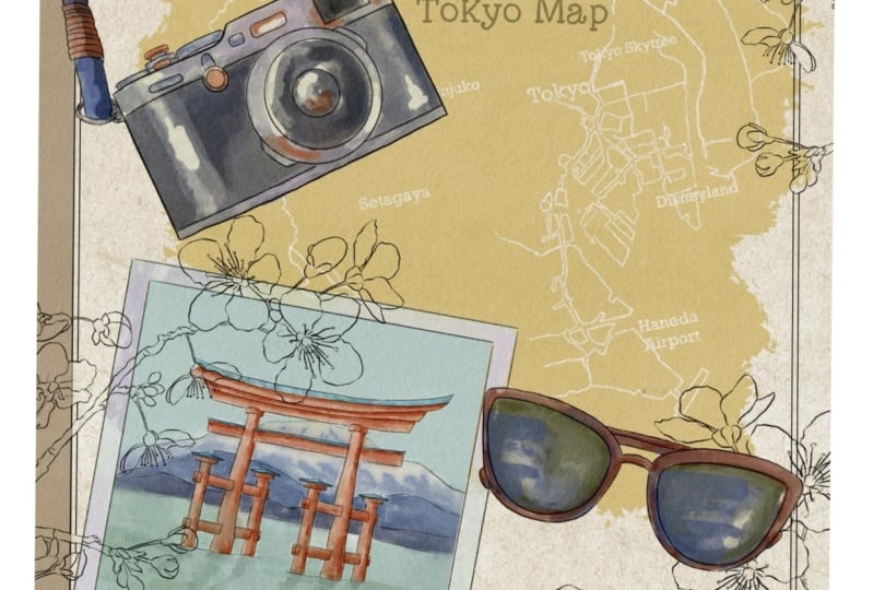
3. Painting map: And first of all, I'm going to create one more layer. What we VDD and I created for yourself, big truck. Well, let me show it to you. Okay. Is everyone okay? And I already found for you some pictures. This is I went to Google Maps and this is part of Japan's is is Tokyo. I'm going to pay and talk to your first took it out background. And our next step is we're going up fields and areas. It is underneath of our map with some particular color. Like say is let me think and I want to have this beige color. I think it would be great, like sand. So our next step is we'll place it on a top of our map and lead a lobar SAP positive x's. And our next step, we will grab eraser, use tinderbox as an eraser. So now our aim is to show, thanks to say raisins is part, we will show the main lines and is a composition in Andrew will be very beautiful. So first of all, just stick to this red lines is one. And we need to emphasize that actually we can emphasize it like from zed to start erasing main parts, it might not visit. Perfect, it's fine. As long as you like your peak. So first of all, we need to show this red line is a razor. So it will take us some time. The tie, either chess, speedups, whole process. But you can take as long as you need. N12 are just stop my lesson and take your time. Grab free hand and up to sad. Raised three fingers down and press cut. Okay, the arrays is region now we need to raise a part of is of water. So we need to go grab razor, selection tool and arrays is reversed part. Because when you're very thick line, you might grab eraser and do it by yourself. It's all up to you. God. So same if you have some water sources either gone, crappy razor. I will just start to raise in this part. You can try to use Justice orange maps. Just track so minute. Now and again, I'll spit up our painting in order to be faster. And after said When you've done with your clients, I will show you on right now here. So that's our map and it looks just amazing. But who doesn't resist lines? We will go and thus her turn to our map and we will make thicker lines. Thin lines should be a very, very thin, barely seen. And now we need to show legs is a gray lines. Hold around. Well, I think we've done is our map IN final detail. You see we have our map here and we need to show Tokyo on a map. So I'm just gonna grab our eraser. What we did before and we need to tap like this is Tokyo. So we need to show main cities all around like main regions now diseases in parts of a CT, picky and setting over Tokyo. So later we'll add some name here. So I do like the way how it looks, That's our map and digital get our playground. So for now we're going to need our maps, so we will turn it off.
4. Painting camera, glasses and paper: Instead of his camera, watercolor camera either create one layer underneath of our camera. I've oversaw basicity. Often just grabbed pool, regular watercolor brush, and grabs his great color. Controls the size of super harsh. Main point is we need to create a composition. Wearing colorful one. You can overlap the Somoza colors. It's fine because later we'll just blend this part. And speaking about his camera, I actually have reference picture. So we need to go to Actions, press Canvas and tap reference. Whereas it, we have these fine. I will place it here for now. Look at the purple color that we have some great color inside and cross this part. Just tiny beat and up two sides, grabs his dark color. Dark one. Direct glucose. So the, I tried to make our camera fairy B2B very colorful. And this way the French shifts from this part. Blue color here. Okay, cool. Now I need to get rid of transparency so I will duplicate the layer. Lovers are positive, 30 percent merge together, dedicated one more time, go to lower layer, tap Adjustments, Hue Saturation, Brightness, and tap Layer enough to turn brightness to maximum. Duplicate that a few times and up to merge that together and merge together with the camera. After said, we're going to grab Terrell airbrush and press Select. That means that now we can pay in jazz and our selected area. And I want to blend some sharpest lines. The lions who seek into span to now a selected area. It's very convenient because sometimes he just the 12 blend enough to erase some sins. It goes beyond alliance. To tie. Useful trick. Now you can get even more color variations to this peak turns. This way. We'll create one more layer and tap clipping mask. And after grab stamps bought occur stem symbol, we have this bright color and just tap it like that. And after that, think about a way where you want to place it. And after that, lawyers are positive. If you want. And if you lived his blend some sharpest lines. And same you can do from this side or maybe incited. Also. The other things that you might do is you cannot grab selection tool, press freehand, and select the areas that you want to make darker. Like for example, CS1 press Add. And let's think and maybe inside this part shows a half add. Okay, There's Vaughan Professor set after press Adjustments, Hue Saturation and Brightness and tap layer. And now turn your brightness a little bit lower and increase the situation. And you see it's very bright now. Also you can add some shapes. Same here. At one situation and brightness. And turn your brightness a little bit lower down. If you like, if you think, Okay, this is too sharp, just blend it for that I appreciate satisfied is what we have. So I decided to keep it that way. Turn off, turn off. Next theme. We have glasses, but definitely needs them for regular watercolor brush. So inside it will be pretty gray, not everywhere. So we don't need our reference picture because we didn't have its implicit glasses. Have to set slightly bluish color. Same here and we might add some reflections to this part. Little bit of Sam. And opposite side, probably to give you something like Brown. I think it would be good. I can now should get rid of transparency. Publication layer, lovers up to 20 or 30 percent, merge it together, replicate one more time. Go to lower layer, press Adjustments layer, and turn your brightness to maximum. And my suggestion, I actually want to have to make it a little bit brighter. So tap adjustments and press cars and tap layer. So you see I made some brighter and more saturated after they're deposited into four needs to press Select. Template said. Okay, after that, if you want, you can also add some stem brushes, press clipping mask, select this bull would call stem simple. Grasp of probe is this dark purple color. Feel like I can place it like sad. Lover sandbox it in this way. If you want to of course, or just make it like says. Okay, this is way more better. If you'd like you can duplicate it. And tags and Asit themes and as a part here, or by magnetic, merge all of it together. After that go grab selection tool. We need to show some shade and press F3 hat. And we need to select this part because this part of glasses is behind the glasses and after this part as well. And to add here, okay, Let's start here. She's attrition brightness layer. Make it a little bit tighter. You feel like you can even change the color and lifo bit. Like set. Same you can, if you like, you can add shades here as well. At maybe you can tap here a little bit of dark shade and should be fine. Lover, SAP Potidaea in prison situation. But I'm glasses heredity. Also. We can turn it off without our sketching layers disappears hours kitchen layer. If you'd like, you can Lower South Pacific a little bit. I want to keep everything with sketches. So now let's move to this part, or this one is pretty simple why we need this paper? Because here actually we will type my trip to Japan. So I will create one more layer underneath. Perhaps the slides by each color thing. So grapple regular watercolor brush. You can overlap with this brush here because this is paper. It would be even better. And I will create one more layer. And I will grab this dark blue color. And color. Was it like blending tool? Duplicate, 40 percent, merge together, duplicate. For loops 14, 40% merge together and merged together. Okay, pretty quick. So next step is, I'm going to go and add some stamp brushes, press clipping mask. Yeah. For what about different theme? Wk, It's add, go to lower layer adjustments, hue, saturation and brightness and turn you to maximum. Set means it to be removed. The transparency. Now, layout clipping mask layer is on, is activated. And if you're going to grapple with the colors term simple, grabs this beige color, pretty bright one over SAP, ICT and erase. Erase. This part is he's way. If you'd like, you can just remove some sharp lines. And if you write, you can have over subpar city even more. I want to keep it like that. All ready. Finally, again, one more thing I wanted to pay in this Polaroid pictures. I will create one more layer underneath lower SAP acetate little bead. And I will have this bright blue color. I would remember it as a brush. This is a regular watercolor brush. Increase the size. Also, some of them can be a little bit lighter, darker. So as these colors will be pretty and bright. Having to remove the transparency, public aid, 40 percent marched, cancer. Eraser is in the razor. You're going to use Terrell a, a brush. You can use dry ink brush is also fine. Any brush which is comfortable for you, duplicate one more time. Go to lower layer after tap hue saturation, brightness layer. Why we're doing it once again via removing transparent. After that, press Select tool and blend some sharp lines. Okay, I am, I'm satisfied. One more layer clipping mask. Same for what to close temps, simple. Dark blue. Increase the size. And you're gonna keep it like this. March together. Okay. Keep it like that.
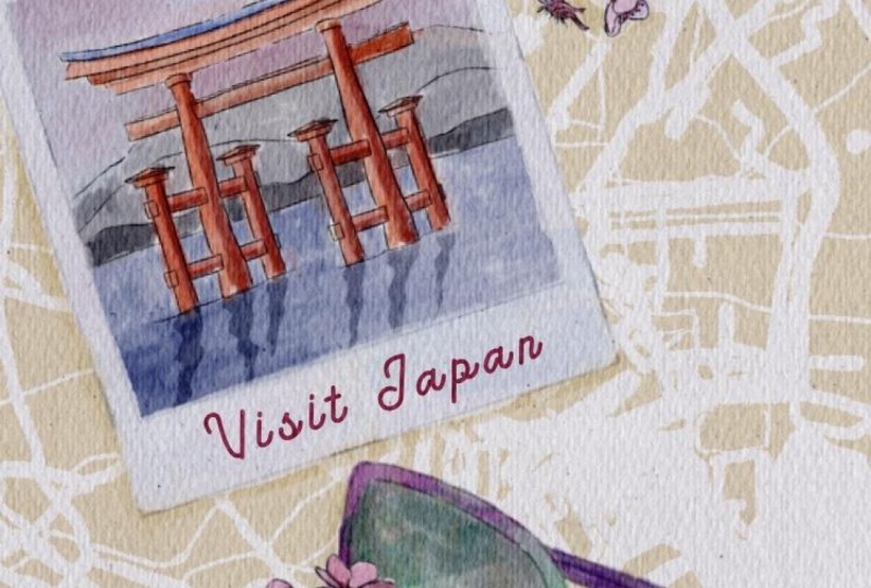
5. Painting famous Japanese places: So after that we have says forge amount and I will create one more layer. And I have some pictures actually suppress Canvass reference. And here we have huge amount to very beautiful and guys who sees this via pain saccharide because later I will create this beautiful color composition. So I created 1 million under nice lover south, I said to you, at least obeyed. And archaea now we have blue color here. They've got to grapple with the color regular. I can speak about as a top, of course we won't leave it white. So I will go to this. Let me think this light purple color, nearly white, but it has a little bit of purple shades. And I paint on top is purple color. And that does add picking up the canes, add numbers out by Sita tail. 30 percent merge together, planned and tonal. Blend very sharp lions and keep it set to white again. Now intranet want to add some shades, but before that we need to lower South Dakota lower layer price adjustment is Trisha brightness and make it not transparent. Why we are doing it? Because actually, if our picture is transparent, that becomes add a new shades. So that will be barely seen after that grep freehand and I want to show some shades even more. She Saturation and Brightness, tap layer, lovers, uprightness, increased duration. Okay, same. I will draw this blue color selection tool Here at hue saturation brightness and make it lie TOR, exit against itself which amount and looks are equal. We also have this tempo, sometimes kind of a key. So here when it feels arrest is blue calorie out, blue background both guy pool water and this red gates. I will start with orange color. I will create one more layer on Denise lovers that Bassett a little bit. When a top actually have blue color. So from that side we'll have lighter part and from the right side we will have shadow side. From this side I paint orange color, wheel around. And on the contrary right side with the red color. Great. Again, now let's just blends. He's part and off to say to people move to saccharides and most important part 10 is the most important bards. Enough does it start how a composition and a tick merge it together? And now we can start adding some shapes, selection tool. And the one Pfizer's any institution and brightness. Make it a little bit more. And same I can do here without water. We have some reflection and I see it looks better. Sky and to rest and it had some sheets. Now it's time to turn off our feature for awhile. Let's return to our last picture. That's our sacra and yet created layer that is underneath our skin graft. And guys, it won't paint any background in this picture because pause. The most important thing here is actual flower. And I will go and grab or regular watercolor brush. I will grab this light pink color. And let's start beat and petals one-by-one. And I'll see you don't need to feel all petals with just one color, just to most important leaves. And after they've moved to nasa color and grab a lighter color, maybe even purplish. We will go and graph given brighter pink color up of our lab. If you went the onset lines, just creeping arrays are all planter and glands. This part is going to make a darker, reddish color. Oh, Let's duplicate our layer one more time. Lovers up I said to 30 percent merge together. Duplicate it one more time costs we need to get rid of transparency adjustments, hue, saturation, brightness and tip layer. Turn on Brian does into maximum. Three times merge together and merge together. Now you can tap, Select the blending tool and blend very, very sharp lines. And you remember because he selected out area, we want to go beyond science. It's very convenient. And so now I need to show some shades and I'm going to use some my stem brushes. So I will create one more layer on the top tab, clipping mask. Grab poetical of stems, simple, grabs this dark purple color. And I can lower saw by city. After March set together. You still need some sheets, tab Freehand. And so mostly I to sit on our branches. Add hazard, same percent adjustments, hue saturation and brightness and tap layer. And now I will use our situation, make it a bit darker like this. So I think I'll sacrifice pretty lovely right now. If you want. You can also select some tiny areas. And in this way, you will add some highlights as 12 percent adjustments, hue saturation and brightness into player. And you see you can make some parts little bit brighter. I think I liked the way how it looks.
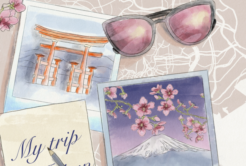
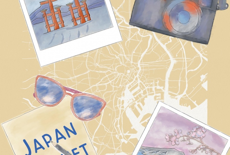
6. Final step: Composition : Guys, we can merge it together. Can just say m is our Fuji mounting merged together. Same as our lead term, merge to cancer. So now we can start building our composition. And guys, I will turn off our sacra and I will use sacral loss of time, sexually cycled replicates it a few times that I will turn on our map, say S1. And now let's start building our compositional. It seemed where we wanted to place all our objects. You might duplicate all your layers. In case if you want to change it later, you need to have some backup plan. And you need to have all your beamed in step decayed it one more time. Because I want to tell you that if you lower the size of your painting. So it's a quality of a patient in venues Zoom, it will be wars. What I wanted to do, I will place our background on Denise. Okay, now, when you turn on your painting, you, it's fine. It's not transparent anymore. But if you place your background on the top, you might see is that it's hurry very transparent right now. So now you can think way you want to place the sled her. Because here you're going to pick on a ride, something like my trip to Japan. Now let's think where we want to play, so rest. All right. And I wanted to have some pictures. You remember how we're going to pay and then use your WK? Is it a few times? Because we have two pictures. First one, I will make it smaller. Of course. I want to put it summary here. And it should be on Denise of our letters yes. Over here. And same I want to place second picture. Just move it here. Okay, we already created a beautiful composition, but this is months at end, of course, hacking maxlength. Let's build our painting. Okay, to turn on our picture here. And if I need to place it inside over here, all of our painting, so that means it's at rest. We will just simply cut. And now they need to cut the edges who go to the selection tool, freehand. And we need to select this area. And three fingers down and talk, cut. Those same here. Selection Tool, three fingers down. Cut. And you want to make this parts of frame lighter. You go to the curves, tap layer. You can make it lighter like six, and you can make it more pride. Now let's go and grab this foods amount in CS1. And as you might see, I didn't paint any background here. Since this way, I need to fill that area later and have to just erase the rest. Perfect. So our next step is we can just add some tiny bead of Apollo coloring Internet top. So this parts we'll put pin. So now let's just duplicate it one more time. Lower set by city to 40 percent merchant to get duplicate this one more time, go to lower layer off the adjustment hue saturation, brightness and target practice to maximum. So first of all, our main, THE reason why we're twins it. So we need to get three cough transparence merchandise and place it underneath our chmod. And now blending tool. And let's just blend towards a sharp lines and make our sky very, very beautiful. Same. We're going to go to our frame, go to curves. Make it a little bit brighter and more vibrant, guys, we need to pay in tiny soccer on a top of our paintings he remember on a picture we had tiny sacra side. We'll have our o fluoro. I will of course make it smaller. Let me think I want to place it on top of everything. We can duplicate it a few times. Let's return to the previous layer. Now I spit up our painting process a little bit because it can take us app does this group selection tool, select off lever three fingers down and tap. Got a cave, beautiful. I like all saccharide here. I want to keep it that way. Let's just merge it together and merge together as a whole picture axis. Okay, we already pay into Tokyo teachers now and think about other objects that we have. So we have sunglasses and we have camera. Now we need to think where we want to place it. Like for example, somebody here because we still have our map. Okay, I've decided to have our camera. This one probably summary here. Also speaking about glasses, I still I still wanted to put some somewhere in other place. Now, guys, a minute to write my trip to Japan and also add some shades from the objects and said we'll add. So first of all, took place on it, create a layer on the top. I'll grab this light blue color. And also after that, press add, add text. I have to think about the style you can use, the fonts that you have that you like most and just use it. Okay, and I'm going to use cell phones that I have is called silent t. If I'm not mistaken with my right business Palin, and either probably lovers and positivity, so good. And the size and I will write something like my trip to Japan. And after that, if you want to change something, you see here, because my pencil is over, is should be on a top of our writing. We need to tap, Select, and have to copy and paste. Now our layer on a separate layer. And I will grab eraser and just simply raise a parts that I need to be, I need to erase this. So now my trip to Japan looks more natural. Also guys, shades you remember about it. So it will create one more layer underneath of everything. Dark shade, darker, beige color. To add some. Use regular watercolor brush and just add some shades from our objects exist. Also need to return to our letter, create one more layer on top and pains a shadow from the glasses here as well. Tcp decided to put shade from right side, left side, right side, from the right side. And when we add shadow, it means that how objects are not floating in the sky or something like that. That's why it's very important to add some shades and need to be on a layer on the top. And when you add the shadow from our pencil, if you want to play the sacra, you can also add some one branch of sacra on top of everything. Let me find it here. If you want. Of course, it's all up to you. So you have this option, it looks pretty lovely or you can put a sacra here underneath. For example, x is. But I think it's too much of the objects from this side. So probably my aim will be to place it Sandra from this part. Guess they've done this our paint and I hope you enjoyed today's tutorial, how to prove how to create beautiful travel paint in Java composition, and how to arrange different objects in one painting, and how to get some creative ideas. I'll look forward to see what you are going to create. This is an end of our class, but now you know a lot about composition. And now you are ready to pay into your own travel illustration. Just choose the countries that you like, and I will be happy to see your paintings if you wanted to, you can leave them. It's Skillshare in the project section where you can see the tech me in Instagram. Both ways are fine. There's a visual OK, and let's see it in your video. Bye bye.
 Inga Yoon, Digital illustrator and teacher