Transcripts
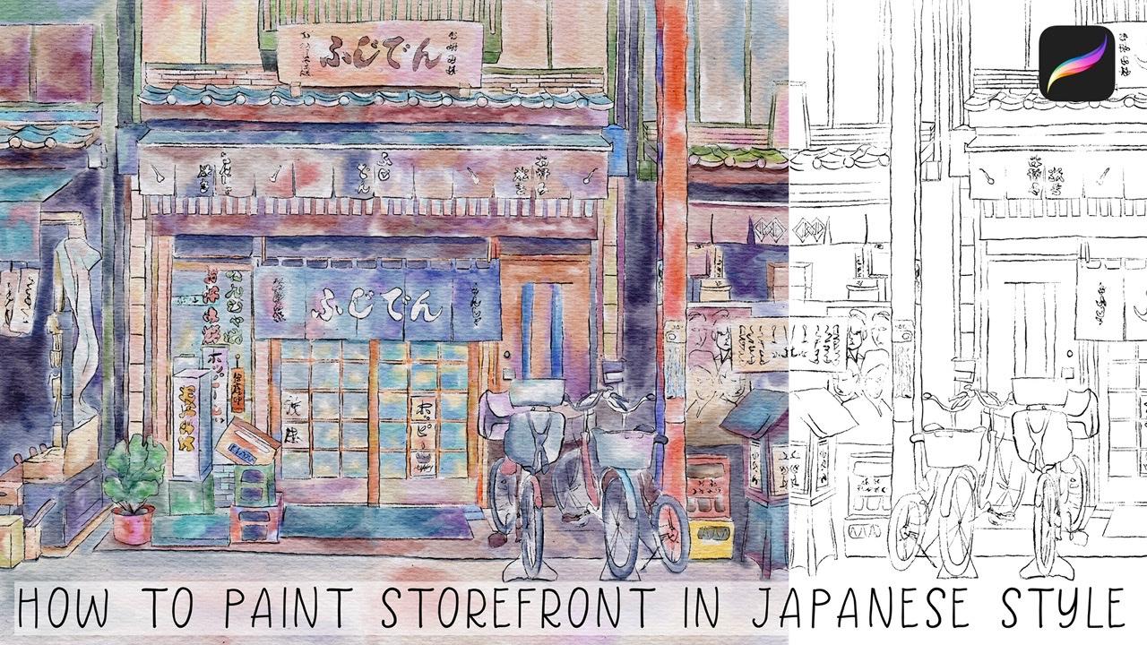
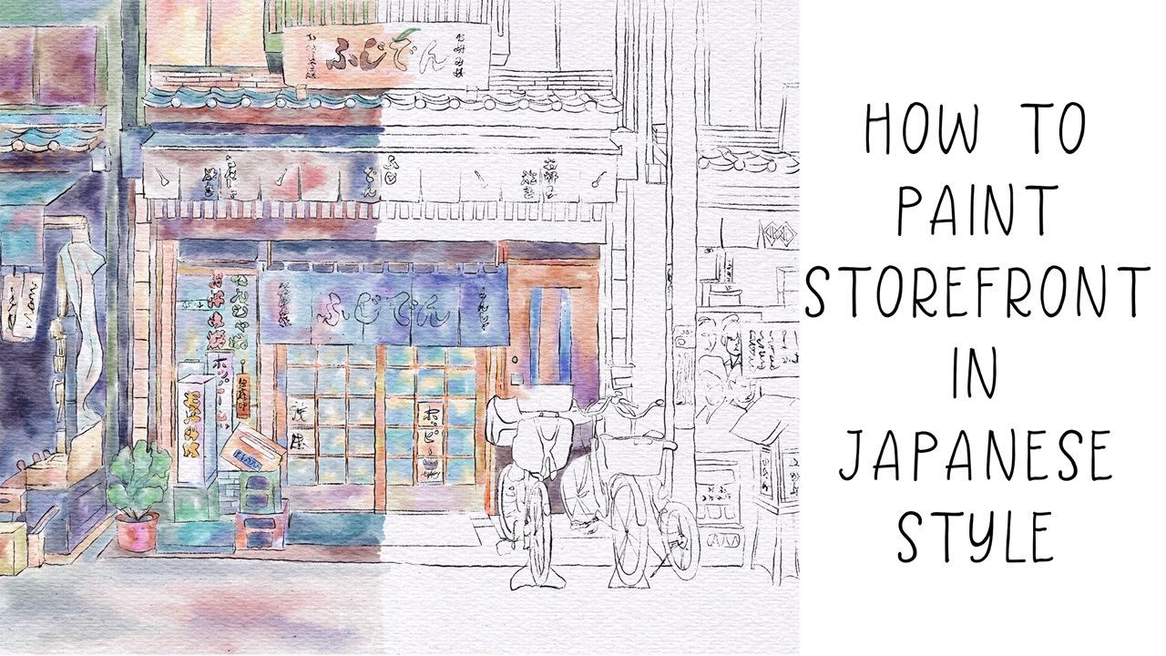
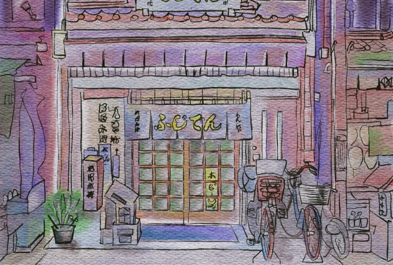
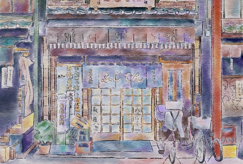
1. Introduction : I'm so glad to see all of you here during my today's class has its own next topic. And as it promised to you, our today's class field theory about pictures in Japanese style. Hi guys, I'm even go freelance illustrator. Welcome back to my class and let's paint altogether amazing watercolor illustration in Japanese style. We will pay in Japanese storefront. You can choose my reference picture or go to the website and special.com peak and pain storefronts that you like printed later and put it in a frame. Today, I want to show you that watercolour. It's simple and colorful and that's a real fun. Today we'll teach you how to create a texture paper, how to sketch properly. You can draw your own sketch or use mine. How to use my newly created procreate brushes for watercolor painting. How to paint illustration in Japanese style. How to ban the Japanese storefront in watercolor style. I will also show you two techniques of adding shades. I will show you my whole process from start to finish. And as a bonus, I will share with you my textured paper, reference pictures sketch alone with my pictures that I drew. Feel free to use them for your own art project. This class is fine for beginners and intermediate level, especially if you've watched my previous classes. Even some experienced artists can find here some useful tips how to paint watercolor illustrations in Japanese style and of course, inspiration. Your class project will be next. Pay into your own storefront using the tips that I gave you today, I will use procreate for this class with iPad and Apple pencil. So if you have it or some other drawing pets or just regular paper with Spain's. Please join our class and good luck.
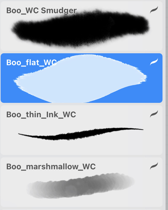
2. Textured paper and sketch: Well, I think I can start and let's create altogether our canvas and fuzzy edge. We need to create a special size. And since we have been Nian and 11 inches is 300 dpi and ask, does it create? Now how to create texture paper and immediately replicate our creating new layers of init to press add users to file. And when we press at 1s is button, my paper will bid on a law that automatically from my downloads. So let's do that. And extra paper and now let's replicate it two times. And our first chick textured paper, let's move to Linear Burn mode. And for the second one, it will be coloured bird. And after said, I wanted to replicate it two times Linear Burn and two times Color Burn. And I want to replicate it or merge together layers and the march to get the layer, layers recently Nurnberg, enough to want to duplicate it one more time. Leaner burn enough to merge together and merge to guess a color burden molds. And my next step is, I will love or SAP passage of Linear Burn, maybe two thirty five, thirty three percent every scholar but burn, it can be till 78. So it's grew up said after zed rename to having your options. And because I uploaded an erosion of procreate and actually you don't need to use our keywords. You can just use Apple pencil for x_hat, and I'm going to show you one magic trick. So what do you need to do is just to write textured and write something like text chart. Yep. And up to say it here, and paper. Great. So that's our texture paper and we created a new one, and now we are ready for paying team. It's pretty lovely. I can increase the positive here. And what do we do first? We need to, I already feeds it to screen, but as you see, v have some parts that are not in a picture. So I just want to assume our picture slightly. Okay, is it will be fine. I liked the feeling that I like how it looks now and that's what we're going to paint today. You will lowers their city as well. And I need to create a new layer here. And for this painting, I will go and grip income brush in him can set all of appropriate. So let's go ahead and let's start tracing. And they speaking about reference pictures. I wanted to tell you that this picture I found on a website on splash where you can grab pictures and use them for your personal and commercial purposes. So a place you can use this reference pictures that I'm using right now, I will add to it such as a script is a description of our class along with my sketch. So once again, you can try it by yourself or you can just use this kitchen I already created. It's all up to you guys. Use your imagination. Just trust yourself, your fear. And so what you want to draw and grabs the picture as your reference picture, trace x_hat. And after that we'll move to painting part. Okay? Yeah, I think it see it and now you can turn off us our reference picture. Books.
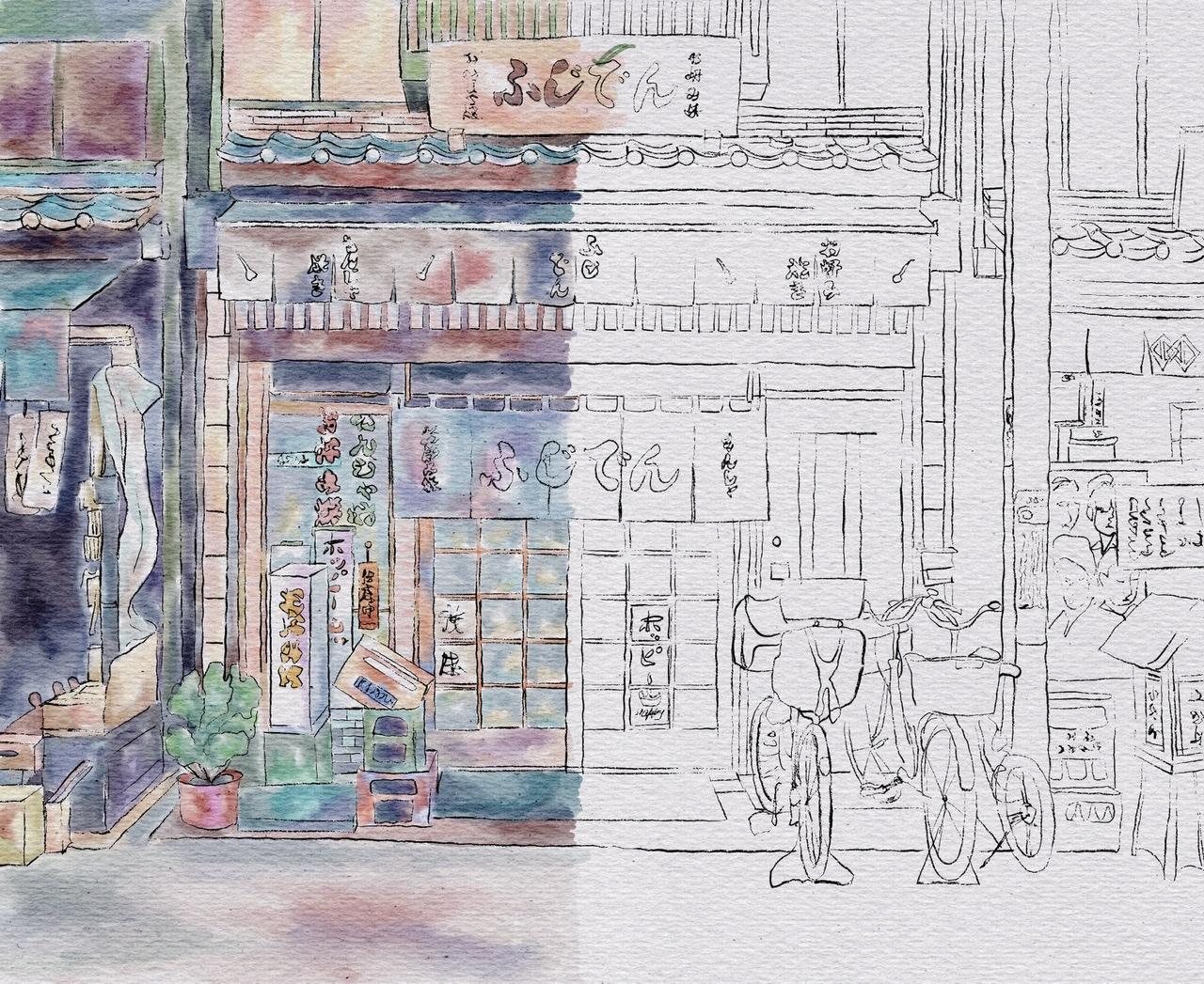
3. Painting storefront Pt. 1: Let's start and I will go and grab my blue marshmallow watercolour brush. And once again, we need to begin anew length just below texture paper. And I'm going to use our reference picture as our color palette. So let's start infrastructural. I want to start this is part of a building. Guys. Be careful, try not to go beyond the edges. And I want to play around with colors. Makes him like brighter. A key perfect. Now what else I can do? This colored area have same color here on the top. And I'm sorry, if you overlap with Somoza color, we always have to control this size. We then need to like bland everything entirely, just sharp edges ends. It will be in the house. If a Main Street and nice you see it's very bright and saturated and also want to add some yellow color here. Okay, so colorful. You can play viz a viz other shades. Said means that I have some blank spaces where I will later, late at some other shades. Speaking about Japanese painting, Japanese treats. It takes time to finish sketch, to add colors, to mix colors. So probed our class today will be predicted along who fled. Watercolor. Brushes are also very cool as an eraser. And don't forget about Chait. So our today's tutorial slightly different comparing to my previous tutorial about Japanese pain teens about Japanese street painting ship and his style. Because this time I actually want to be more creative and different shades. So once again, pick your favorite color, think about color pellet. And after said, go ahead and add some of your personality into your painting. Like cease for me, I like cool. And now this just same muses part. And I went to purple. So my next step, he took crap, very bright brown color. And as you might see, some bright brown color here. Premises side K, very loudly. Now let's move and grabs his book. Heller. Care also needs a brown color, light brown and finish our door. Now says SDK is also pretend to care until weeks colors. I think this would be very, very loudly. Great. Now let's move to this part. And as those stars tell us about name, okay, is this color is dark blue, is not black. Even kind of propeller. Be careful. Okay, now, let's finish this part. A key Crete. Now next scene, we're gonna go and pains his part. Now to add shapes to civil as boxes. Okay. So what about this sign? It's French. Now we have those boxes here and something here. So I think we need to move to losses first. I can create. Now what about either box, it's green and threat. So you see it's pretty simple. Nows is parked, flora plot and many green color. And oversee the guys venue paint. Some plants. Don't use just one shade for planned. Just tried to mix it with some Ozzie shades, grep darker or lighter shade. That's very important. Because in a nature like when we look at the tree, it's not just like tree made for one-color, Definitely not. I like to play around and add differentiates to our pot. And after blend or whatever are Sabra poet as grabs this color. Here in color. And again, perfect. Now it has this part. And I think ground is kind. Now blending tool. Perfect, he blends at. And now let's move to this part and here you have brown color. Now next theme, and we have also ones who again, blue color. Well cool. So my next step, these outta here. Yep. Now steel the half, so scholars here in behind. So I'll do this part and let's add some shades to our ground. So the has the last final thesis, as this one is here.
4. Painting storefront Pt. 2: Wireless keep paint you. You're almost finished. Half of the PM team is here in this bank is complete and lending it. And then now you have green color undersand. Perfect. Our next step B. So you have loss of shades here and says set property. I wanted to add some green shade here. Okay, this part. So just practice hero. Yeah. Nice image. First half of our PQ chart. Turned off. First sketch. Has this look very, very pretty. I like it to have second Bart and fuzzy. Yes, I will turn on us kitsch layer. And I will move us kids to this part. Yes, I'll write here. So now we are ready to pay in second half of our painting once again via On the same layers underneath our texture paper. And this is layer Webby pain before. And let's get paid. And I think we need to finish this part first to second one enough to go to the top. And after finish our bicycles and optimal to this part. So let's do that. Some explained into, okay, great. So next, let's move to this part. And it's something between purple and yellow color. And this part is also orange. Yellow. And I want to add purple color. I think this combination can give very, very cool. He went into it. Blending tool. I like it. And I think guys, I wanted to create a new layer cuisine pred cars that I can make some strong legacies and after icons. And so in this way, I just need to create a new layer in order to protect our paint in ends up previous painting, I will just lock it, this one up. Does it feel combined layers together it unto our evolves. And as you see, it's very, very lovely. Painting. Key blinding tool. So simple to blend together and reach those watercolor Luke. Okay. I can't, I can't. So next theme is brown color. It's here. Okay. So now let's move 2is part like books. Now. Now what we need is You have shaped here to, here, here, here by tens ischemia, it's pretty light. Green color. Next case, cream color, say S1. Tree tonight.
5. Painting storefront Pt. 3: Now let's briefly, very fast. Spain's is part of how painting. Perfect. So I did, I said one, here we have brown color everywhere, Brahman and proud. So that's crapped, light brown and dark brown colors. And this is why part here we have Dr. mine. So this is why it's silver but we can add some shade. Mostly like to limit like white color. Okay, cool. So now that's finished resists bars and after bicycles since the last one is here, and after we can add shades, who's my new brash? And that will visit nt. Cool. So here we have red color. Do you do? I've got glands at slightly sign I can't severity important to blended and create different shade variations like I did here you see it's not entirely like solid gray color. I added different shades and it helped me to create beautiful composition. I think we finished painting now, bicycles. And I'm satisfied. And now let's move to the last part, final one. And let's pick week. In nature. Ok, cool. So non brown colored. Tried to combine dark shades and light shades to see you back we have lot dark shade, light shade, dark, dark shade, very dark light, very light. So tried to keeps a balance. So we can shade here, here and unzip clustered. Okay, like to play around is also shades. And I think this one looks cool. Amazingly cool. Okay, finally guys, you can turn off our reference layer. Let's check out picture pretty carefully. The ACL already found. Here my stroke that I made not an, a purpose mistakenly. Okay, great. Now let's merge together two layers away to it's locked. Unlock. Now let's merge together layers and we can lead. The middle part. Here is blended and blended and great guys, this is our watercolor illustration. You can leave it like that or you can keep adding shades also on poetries at I'm gonna teach you, is you can just go and replicate how pained and now it's pretty saturated. You can just blow over that pasta T c. Now it's small, saturated. I like how it looks. Pretty nice, but I want to keep it that way. Also what you can do it just go to hue saturation, brightness, go to layer. Increase situation. Maybe 5%. Pre-biotic indoor. You can just go and grab both thin in quarter color and erase the name because this one is in his written in white Covey's white-collar. And guys, you can keep it like that. Or you can go and grab my brush, which is called Beaufort watercolor, creating new layer because I want to control that passivity. And let's start it in shades. So let's start that in shades and to show you two techniques, and this technique is either just use my booklet watercolour brush. And second technique is I will grab a selection tool and I will add shades thanks to selection tool. So let's, let me show you this two options. You're gonna controls are positive, the brush, and the size as well. Thank you. Hello. Okay. Do it. And guys, speaking about shades, I told us that we have to options. And the second one is Festival. You need to decide whether we need to keep it that way. Well that mantle on machine or they want to, lovers have positive. Once again, let's decide whether we want to keep it that way or we want to add some. We're gonna lighten our shadows. So now this is the light in our shadow, not multiplied. This is related to, this is we turn it, you make it like very saturated. I want to keep it like visits, shades. And now I want to mark it together. So now I want to show some trig magic trick, how to add shades. So once again, if you go grep freehand and perhaps areas that you want to, you want to add shades. After the professor. Maybe four for one to 3%. And after hue saturation brightness and press layer, lovers of brightness increase saturation. And that might help us to, gives us shades. Now as you might see, our planned is a she'd say, I want to achieve here. I will go to grip free hand. Select the area where I want to achieve and after breast ad. And I want to show that the area is a shade at. Back. After that, her 3%, She's attrition brightness layer increase situatedness and decrease brightness. You see, now we have our shade xs. I wanted shade here. So I'm gonna go and grab selection tool, free hand. And I want to say to this column here, and I'm going to cheat here. And the shadow in this area. After the professor. 2% hue saturation, brightness, layer. Lover, parietal, this increase situation, I want to keep it at situated. Okay, cool. Yeah, I like it. Guys. We've done with our watercolor illustration in Japanese style. And guys, I want to show you what we are going to pay in next week. So as you see, we also go into pay and picture in Japanese style. But this time, as you might see, I made my sketch is a pencils. So it might help us to reach different look, different feeling after we finished our painting. And as you might see, is this picture is more in traditional style. Well, now you know how to build ministries in Japanese style in would occur. And I hope you enjoyed this tutorial and let's see you next week.
 Inga Yoon, Digital illustrator and teacher