Transcripts
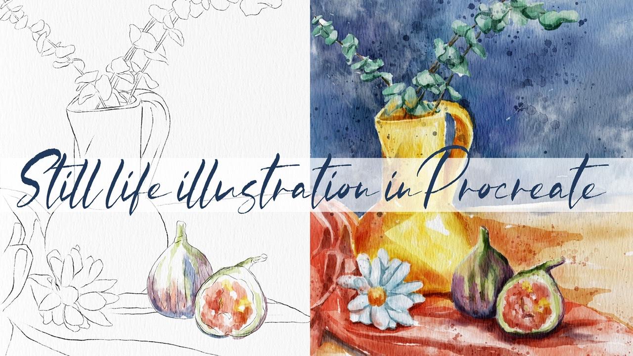
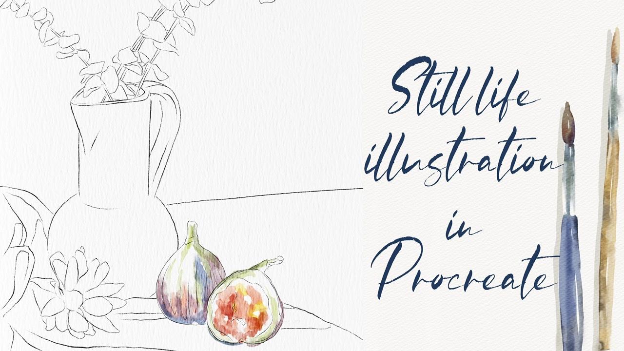
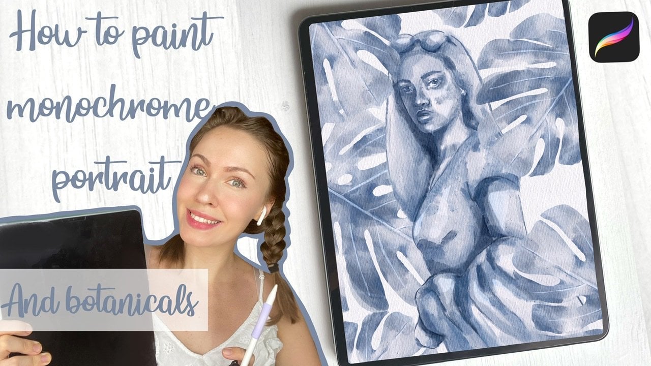
1. Introduction: Hi guys. Hello everyone. Welcome back to my class. You're in my today's class. I will teach you how to frame steel Life illustration in a water coast in Procreate, I hope Google likes it. I prepared for you lots of watercolor brushes and my watercolor paper watercolor palette, and my own pictures that I drew. I hope you go likes. And if you're already crap, yeah, I bet. Apple Pencil filled. Let's fan together. Hi guys. I'm a freelance illustrator. Welcome back to my class and let's dive into Still Life, illustration and paint altogether. Beautiful composition with ways, fruits and botanicals in watercolor style. At the end of my class, you will learn more about Procreate and composition, especially how to use layers, clipping mask, Alpha Lock, Selection tool, and how to texture, volume and color variation to your picture. And most importantly, you will learn how to paint watercolor illustration in a simple way and your painting technique. You can use the illustration you create for posting on Instagram, editor portfolio or sell it on Etsy camera, and so on. Or just share it with someone calm you really like. I am sure they will be so happy to get an illustration that is created by you. Today. I want to show you said watercolor is so simple and it's a real fun. And in the end of my class, you can see it today. I will teach you how to create texture paper. How do you sketch his voyages composition? How to create traditional watercolor illustrations in Procreate. How to draw different kinds of glands, how to paint a picture RES, and without reference picture. How to use my default Procreate brushes for watercolor painting. How to apply my new watercolor technique would as in you and says you need to know if you want to create watercolor illustration, how to use Alpha Lock and clip and USC, how to add texture to your artwork. I will also show you how to add shades and highlights. I will show you my whole process from start to finish. And as a bonus, I will share with you my texture paper, custom watercolor brushes, color palette, sketches that I created. I will also add files of my pictures that I drew. Feel free to use it for your own art projects. Because this class is great for intermediate level, also can be useful for beginners. If you watched my previous classes and experienced artist, probably here, you can find an inspiration. Your ways how to pay in Still Life illustration. Your class projects will be next. Painter composition with ways, fruits and botanicals. Using the TFs and brushes that I gave you today. I will use Procreate for this class, we use iPad and Apple Pencil. So if you have it for some other drawing paths for just regular watercolor paper and pains, please join our class and good luck.
2. Creating Paper : I think we're ready to start IS, and first of all, you're going to create extra paper and download all our freebies, half froms a website. So and now I'm going to tell you how to. First of all, if not all of them procreate. And after sad, in order to create a new canvas, we need to tap and tap plastic cap. I've decided I need to switch from pixels into inches. And the right nine pairs, 11 inches. And guys, keep in mind, we need to have 300 DPI resolution. And maximum layers that we might have is 56. After zed tab create our canvas. Now we need the expert textured paper. And guys, Today we're going to paint in watercolor style. So behalf of watercolor paper, once again, if I now go to layers duplicated a few times and a base. Now when I explain you how to export and where to find our freebies. So we need to open my class in browser, an open set in a Skillshare app, because in z sway, my freebies might not be visible. And after said, in projects in sources section in the right corner, and this headline resources, you might find all my freebies. So when you download them all, so freebies fill within downloads folder. You might go to Files, app in downloads folder, surveys. After set, we need to go and tap action button, tap, Add and tap, insert the file. And after in downloads folder you go there and insert our watercolor paper into the property. Neck thin, either a takes a paper and now I will press fit to screen. And now you see it's perfect for the size of our canvas. Says our texture paper by two, we need to get that authentic watercolor texture. For xhat, we need to change the blend mode. I'll duplicate the layers two times, moved to Linear Burn and counterpart. Next, I will duplicate Linear Burn layer two times. And after merge together, hired replicate Color Burn and merged set to Katherine have to set love herself by city TO 67% in linear burn mode and Color Burn. I don't do anything services layer. After that, I select two layers and I will press crew. Next, rename. Now guys, keep in mind, we need to pay it and the nice paper layers group, don't draw all at top. Dawn, draw here. Because if you Joe said, you will not get this authentic watercolor look. I'll show you an example. And for example, when I draw, you see I didn't have this watercolor look. Because you don't see is at watercolor paper is blend and intersect color. So bad. If you move our layer on the nice, you see simultaneously risks hearted have in our watercolor texture. So guys, please bear tension and paint on this, uh, paper layer group. And I think now it's time to show your color palettes at p-hat. So it's called steel laugh. Still live. Color palettes is one. And today we're going to create a composition by ourselves. So I gives you some options, dependent or HON, reach element you would like to add to your composition. You might use some particular feathers. And I think now it's time to show you is that approach says that we have for today's class. Once again, remember, we need to paint and in nice sketches and underneath our paper. So let me show you. So we're going to use for Oriental tribe rush for it in details. Upper branch, our main brush it likes it. One is one of my favorite, precious, more perfect tellers. Small surprise that can help you to mix colors. Nature Valley, Hospital gonna use it a lot of times for watercolor background, add some splashes and shows a watercolor texture. Most crap us to add a try effect and add more texture to our paint, him letters. Also, we're going to use this brush in and of our painting with watercolors stem symbol would occur. Stem also will help us to add some texture and tone native Procreate brushes or six per pencil and terror layer brush, 6-bit pencil we're going to use for creating our sketch and parallel rash with an I use as a blender. Okay, I think we are ready to start. Let's go.
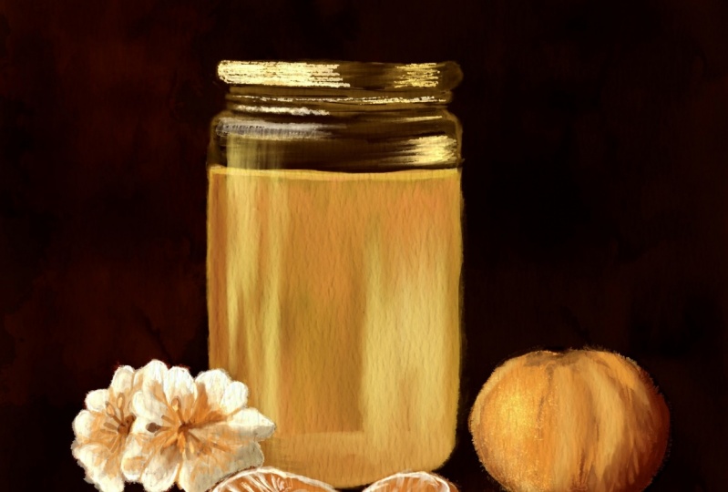
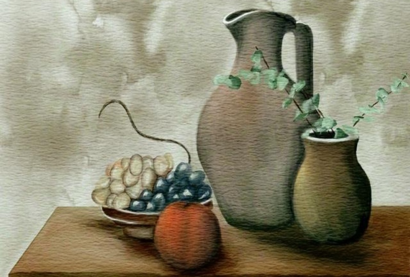
3. Creating Sketch: So now I will show you our base reference picture. And after we're going to add some kind of fruits and plants to our illustration. So how to import your reference picture into the procreate when you tap action button, tap Canvas, and tap reference. After the tab image has input image. But before Zed guys tried to save our reference picture to camera, roll it down. This is how reference picture. We need to use it. And we need to keep it because we need to seize it. Details how to add some shades and highlights. Once again, it's very important to remember that as a light source will go froms or right side, you see promises part has means that the left side will be the shadow. Now later, I'll show you how the shows it thanks to our watercolor brush set. So next step, once again, turn off our sketch base. So this is here. I tried to ease our painting process, so I prepared for us his kitchen already sketching layers. But once again, if you want to do it by yourself, feel free to dose it either leaves reference picture in a description of our class. Next step, v, here we have some options and then I'll turn it off for a while. So we have two fruits. So one is Pamela, or probably orange, you name it, and the second one is 500k. Pie likes us fruits Hong going to probably stick was fixed because I lexical combinations that they have and see me, I'm mixing purple and lime green together. And here we have eucalyptus. You might also use this plant and place it in our base. And there is another option. We have this plan, so now its toes at, so I'm going to use a sketch based and after arrival, use out planned and now try to put it inside. So once again, it's important to feel the area in this part. So once again, I will turn it off for a while. How moved to our sketch after set, either grab the selection tool, press freehand. And now I want to select our eucalyptus, like say is and I will press Copy and Paste. Now let's turn off our sketch layer. Turn on our base. And let's move our eucalyptus Felipe horizontal inlets to a little bit. So now I want to erase sub parts that are overlapping reads our ways. So we want C to know ways because it's hidden by its edges. So as it's why I erase some parts, saying these ways here in this area. I will return to this catch pays crab eraser. And now I will erase some parts of ways because it's hidden because of how eucalyptus plant likes his OK. Perfect. My likes. Harry, you see we have one flower in this area. Now let's, now our next aim. Let's just go and merge together sketch base and eucalyptus. Turn it off. Let's return to our plans and our fruits and decide which route you want to add to your illustration. I like fix, as I mentioned earlier. So I will select it and press copy and paste. Turn off our sketch layer, turn on our sketch base, and let's decide where you want to place it and offers these are best place who would fit right next to surveys? Summary here. Now let's return to the sketch base and erase overlapping heads. Because our figs are in front. So they're in a center of our attention. So they will cover a part of our ways and cloth. Okay, It'll, they had locks. Once again, speaking about composition, Let's just merge it together. Returning to our sketches, we're going to use a sketch base. And guys, once again, why I places in this area. Because here we seize the rule of thirds. What does it mean? For example, when people look at the picture and they've done actually low chloride in the center. It's more pleasant for us to see at objects when they're a little bit to the left, move to the left, or to the right, or to the upper part or the lower part. So once again, you see our ways. He's not in the center. It's moved a little bit to the left side. So when you look at a picture, first of all, we'll look at our ways. After that hour I catch us. I was fakes and after the move tools is this flower and said helps us to feel that says picture is harmonic. Once again, when you create composition, when you paint something, then play some objects right in the center, tried to move it a little bit, the edges, just tiny bit. But still, you thought create more harmonic atmosphere. Okay, we've done with the sketch and now let's move though paint and part.
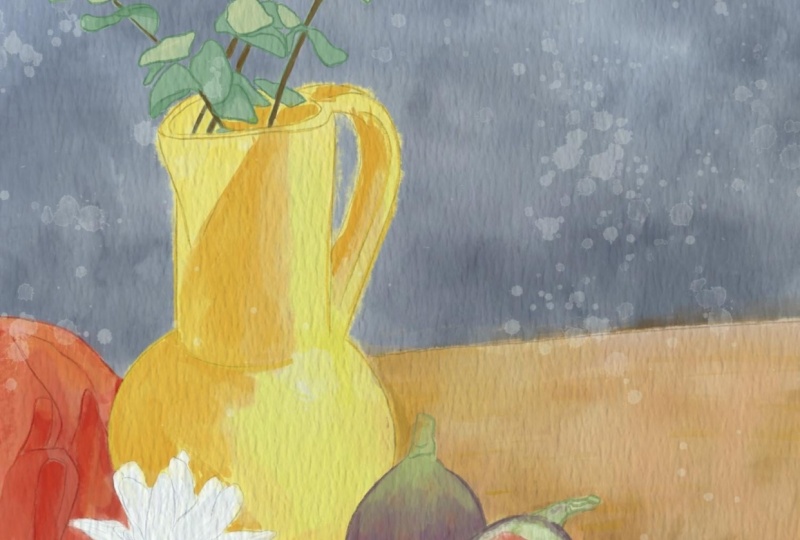
4. Adding Colors: So we are ready to start coloring. And as a first step, self-driven Adobe's failure, add colors to our picture. And the next step field, if you're going to add some shades and color variations. So what I'm going to draw either lovers, the sketch layer to 50 percent. After that, I little locket zed me and said, I will not mistaken paint on say Slayer because later we're going to turn it off. And after said, I created one more layer underneath and we'll paint on SAT layer, keeps it in minds. Very important. Next step you're going to grab four of our brush. I've favorite brush, Henry gonna go and grabs his slide, orange color. And I want to start adding colors to our ways. It's fine if you have some overlap in sleigh to reveal just for a moment. I like said, now we're going to grab this pride, pride, red color. And I'll start adding some shades. And I go feels a killer V's. This car. Jose, you might look at some parts and sees at some curious UPI pride. So you might leave it like this and don't add any color. Planter reaches going to add brighter shades. Now grabs his pride, wide color, near divide, like a pink color. Likes that. K1 to fall as keep adding Honors. Member grabs is pretty orange color. As you might see, I'm paying everything on just one layer. For now. I don't need to create a new layer. Now I want to change a little bit of color variation to now I want to add more yellowish color. K. And Mike said, Now let's go and grab dark hello color. Here. I'll create one more layer on Denise. Fine, you might overlap with our sketching layer because later I will just for more transparency. Now, let's create one more layer on top of everything. And you're going to pay in plants and fruits. And I will go and now I've got my purple color. And now lime color. Now to pride to lime color. Now, go and grab yellow car. Now slides the bluish shade. Not everywhere. Okay, and now I'm going to grab the eucalyptus. I'm shades, kitchen lines, mudstone you to add some lines. Create one more layer, grab brown color. And I need to add size. I need to add the branches. Okay, Perfect. We've done this gathering part now we need to promote transparency. So how to choose which I've got WK to Layer and go to our layer. Tap hue, saturation and brightness and most uprightness TO maximum. Now replicated three times. Merge to guess it's a white layer. You see now this is feasible. This white layer is his ways wide layer and you see we remove the transparency. Eucalyptus is not affected by dark color from the background. After Mirza together, the same is his art. To very bright. So I'll morale moves up positive one layer till 30 percent. And that'll merge that together with time and go to lower layer. Tap the adjustments, hue, saturation and brightness and increase upright. This tilde maximum replicated three times. Marriage together, merge together. And those same is a bad crowd. I love herself isotope one layer till 37% after merge together because I wanted to have this situated car and go to logger layer adjustment, hue saturation and brightness. And we'll practice TO maxima, replicates it two times, had merged together. Now I'm ready to remove, to remove the caps. I use terror lab brash as planter. So how can I remove as gaps without affecting the isolators? That's pretty simple and I'm going to show you how to set it. So you're going to go to our first layer and tap Alpha Lock. So now is it means that if I do some changes, resist layer, get one code. The answer lines. Can you see some parts? That is completely fine. It didn't affect oscillators. Okay, And like how it looks, keep it like this. Now you can turn off alpha lock. And the same ways, our base, I'll press alpha log. Lending to move. You don't need to blend everything entirely. You mad cap the leaf timing gaps. If silk nature. Turn off. Alpha lock and key. Wonderful. Now the time is coloring part. Let's move to next part and highlights.
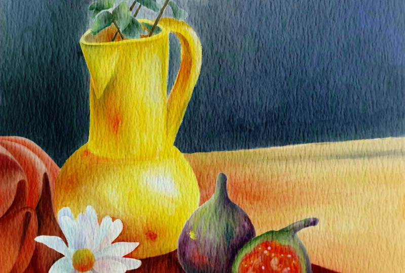
5. Adding Shades and Highlights: So let's get started and now we're ready to add shades and highlights as it's a little bit in the outside. So probably there will be some noises. So sorry for that. Okay, so as a next step, what we'll do, I need to know how physics look like open unsplash.com website. And here receive different kinds of figs so we can zoom it a little bit and now we can see how they look better. You see this is a combination of purple, red and lime green color. So let's start adding some colors and change. Once again, we need to create one more layer. On the top of our fixed layers is one. And we need to press clipping mask. So after said, we need to speech brush to border color background, this one. And I want to add shapes first. And after that, either start adding more kind of variations. Same as lime color. Again, lovely family. Now we're going to just saying VCs parts because we are still on a layer where we have our eucalyptus, floral and fix. So I will go to pretend dark shade may be a little bit darker. You can control that by city it can be more saturated, less saturated. I decided to make it slightly darker. Same, I will return to Phoenix and I'm going to go and add some color variations here. Now flora, let's go to bluish color. Be careful we say inside with this part. Now pretty orange color. Like here. If you like, you can duplicate it and in this way, your color variations will be more saturated. I decided to move to 30 percent after Mirza together. It looks pretty fine for me. And now I want to use blending tool and blend sharp edges. Because I wanted to look more natural. March together with our original layer. Now let's do the same with our ways and some kind of growth are vocally paired like we did before. And now I will grabs is pretty bright, yellowish color is something between yellow and orange. Vice away. We need to keep our reference picture with inherit for some reasons. So let's turn it on. And now we see where we should add some shades. Maybe can go and grapes like orange color. So I'm going to add some kind of red color here. So this is some kind of reflection. Looks wonderful. And it's very important to add some kind of reflection from one color to another. So you see we have the clothes, snacks to our ways, and we will have a reflection of red color on our yellow color. On a contrary, we will have tiny bit of yellow color on the red color as well. So don't forget about that. And let's start adding some color variations to our clothes. And don't forget about shades. So of course, in areas where two objects next to each other, we'll have some kind of shades. You might add some color variations to the background as well. Replicated. Move TO 50 percent or something like that. And Mirza together. The same is a background. Clip it. And now try to think about the color variations. Maybe you want to make some parts darker and lighter, like you see on our reference pictures, solid black color. But in a real nature, we don't have that pure black shades. So we need to add some color variations. Okay, now let's return to the center. I want to add more details. I'll create one more layer on the top and I want to clip it. I would grab Gu of a rash. So this part is it has lime color, swatch. We're going to try to do probability. You can go to slightly darker shade. Hey, you can decide by yourself, don't want to have more dark shades or less. Now a little bit of reddish color. Just a tiny bit later, a little blended. That vehicle have some reflection from the clothes, like I told you. Now increases size and we'll add more bright red color to the inside of our 50k. Parts will be pretty yellowish. Now let's go and grab purple color. And this side should be darker because it's part of fingers next to announce iffy and we have NZ shadow is cast in to this part. You see like here. This part is allied by the glucose is to fix are next to each other. This partial, the darker, same part, same here, here. So same situation we have on our picture from this side, some kind of garish color. This a little bit. They'll make a tech entire liberal, entirely purple here. Okay, Got it. Now let's grab blending tool, flowers. The size doesn't make it said beak, because we need to blend the pars buttons the same time. Doesn't blend too much. Because we need to show and to have the strokes. Since this paint is this type of painting, I will tend to keep the Z lines. And I want to show that it might look nature. If you like. Leave some strokes. Of course, then turn your pin to the entire rainbow. Cool. Now let's go to this part of the eucalyptus. And you also need to remember where we have shade. So as the light side, right side, so the left side will be slightly in the shade. So in this case, what I'm gonna do is I'll create one more layer on top. I would love to multiply and I'll clip it. So now I won't go beyond the lions of our eucalyptus. But another hand, thanks to the multiply blend, the layer mode, some sheets will be darker so I can show the shades easier. And once again, in areas where if your objects are next to each other, we have shapes. That's why some leafs and you'll become completely in shadow. As completely fine if you don't want to pay in so many details. Once again, dependent on which style you might have. Sometimes I have like some mode to paint all those details, but sometimes I just want to show the basic shapes and for me that's fine enough. Okay, perfect. Now let's go to slightly greenish shade. And I wanted to show the shape defenses area. So once again, a menu pane something, try to stick to around three colors, three differentiates. So here we have like dark bluish color. We have this pretty bright green color and they have just bush cut. So I have three shades and that's enough for us. Again, after the chest Smarter Together is our original layer. Now we're going to save this way. Clipping mask multiply S1 to emphasize a main parts, main shades. And after just blend this area, you'll get a reddish. Next is after that just plans with edges k. Now it looks wonderful and you show the shades. Summary here. Maybe this part is not that dark. So you can just erase it. Gives blending tool reddish color. Now let's just same as close. Once again, I don't want to too much time on details, so I'll just show it prettier and trough two-way. Because once again, our focus should be not on a cloth, but I'm actually on a ways with florals and fix. So once again, decide which style is more suitable for you. Whether you want to show all those details or you want to skip it and focus more on like smaller parts of your composition is all, all optional. Show. Just no pressure. Tried to decide which styles use. Your mall was a shade from the clothes on a table. Let's keep it in this file. Now that's our next step. I wanted to anything that is a background, probably want to add a little bit of shades here. So grep, yellowish color when some parts. And I wanted to show some shade from our ways here. Now as MOOC next. And in our next part we're going to add final details. And that will be the end of our composition.
6. Adding Final Details: Now we're ready to turn off our sketch layer. And that looks wonderful. You might see it here. My suggestion, I went a little bit of shade around the ways on the background. So I'll press clipping mask mode to multiply. Bhopal same brush. I just want to add a bit of a shift here. Because once again, I wanted to create volume. And maybe we don't see an actual shade on the picture here, but rather the opinions, some kind of like artwork. Of course, you need to think about the dimension that you will have more or less shades. Say, you might say, is algae's rates change as Waymo better? Now let us return to fix flower and eucalyptus. Here we're going to create a new layer. I want clip at this time. So, and I'm going to use for perfect colors, small, for ADD and tiny details. Once again, let's think what color we need. I just wanted a little bit of colors here. And I want to plant one colors in another. Might be more propulsion. Let's say I wanted to show a little bit of shades here. Slightly darker one. And now I want to believe it's this purple color into set close. Like I told you that we have reflections. Like we have our colors. One leads to another one. So it's like what we are going to do now, same as this reddish color. It will call it a little bit on our flower because it has bright shades. Just tiny bit, but we still have it a little bit of yellowish color. Okay, perfect. And we might add tiny bit of our background color. You might add it here. There's precious, precious sensitive. So be careful because we can't have a solid HHS. Yes, some colors, it would lead to one another. Now I want to add slightly off here we shade to this bar. My suggestion graphical or COPD color. You might show a tiny bit of shades here. Just a little bit. Because our objects, they shouldn't be just floating in air. You need to show that, say, a stain on common ground. So like what we did here. Still Life illustration, It's very important to show the contrast. The swine are the main features of such kind of paint and said It looks amazing if you know how to use this contrast, how to show it to, to ask people. And now we'll try to add just contrast to our illustration. Examples is part of code. Once again, I, like I told you, I won't spend too much time on paint and all those details. Add some tiny shades to this part. Some close here. A little bit of shades in this area. Darker shade. Remember look at this part. And let's create one more layer and shows a highlight. Let's increase our capacity. We can show us why lines some gaps. Usually if you use like traditional watercolor, you might use this. Wide highlights like this highlights things to goulash pains. But now that we have an option, and we can show is a light color here. And now it may be easier. And if you think it's too bright as lovers out passivity, make it less. Right? Okay, great, I like it. So we have all those tiny details which we created and it looks way more better. Exam. If you want, you might lower South Park City. Okay, Great. I will merge together or three parts, this one. So next step is I wanted to add some shades and highlights two ways as well. I still disposable brush. And don't forget to multiply. Not forget about contrast. To show it as well. Show a little bit of shade here. Just tiny bit. Now grab a reddish color, bright color. And the show a little bit of edge here. K. Now the last details to add, some parts, some details to feed and everything. And so it would be so multiply. Show some shades. Now let's go and grab brown color. And if it's too sharp, you might just blends that are too dark. To show the lines over there. Now I want to show some shades here. Flourish color, Multiply, Blend tool. Okay, now let's turn to finish this tiny VPLS. I like this multiply blending layer modes because it doesn't matter which crash your chosen. Correctly, chose a color that we need. Most of the times, of course. And we still need to show some kind of highlights. Here. Not just our calls a time of course. Can light purple color. Here we have light purple, tiny bit of purple shade here in Korea. So paint and fixes phantoms are best seen because you can practice your skills. And you would think, what do you like most? What style you like? Maybe I want to add more shades to this. This is not enough. Healing said. Almost done. Guys. Now you don't need our reference picture. We can go to Canvas tab reference, and now we can call this piece finished. I hope you enjoyed our today's watercolor tutorial and now you know how to fence to live illustration these crows in the watercolor style. And this is the end of our class. And now you know how to bend steel lot for illustration and watercolor style. That is, I would do very thankful and that would be great if you could share your own art, excuse me. So I'll wait for them in projects and sources section. And if you have any questions, suggestions, recommendations, you might leave them in discussion section and lists each other in a new video.
 Inga Yoon, Digital illustrator and teacher