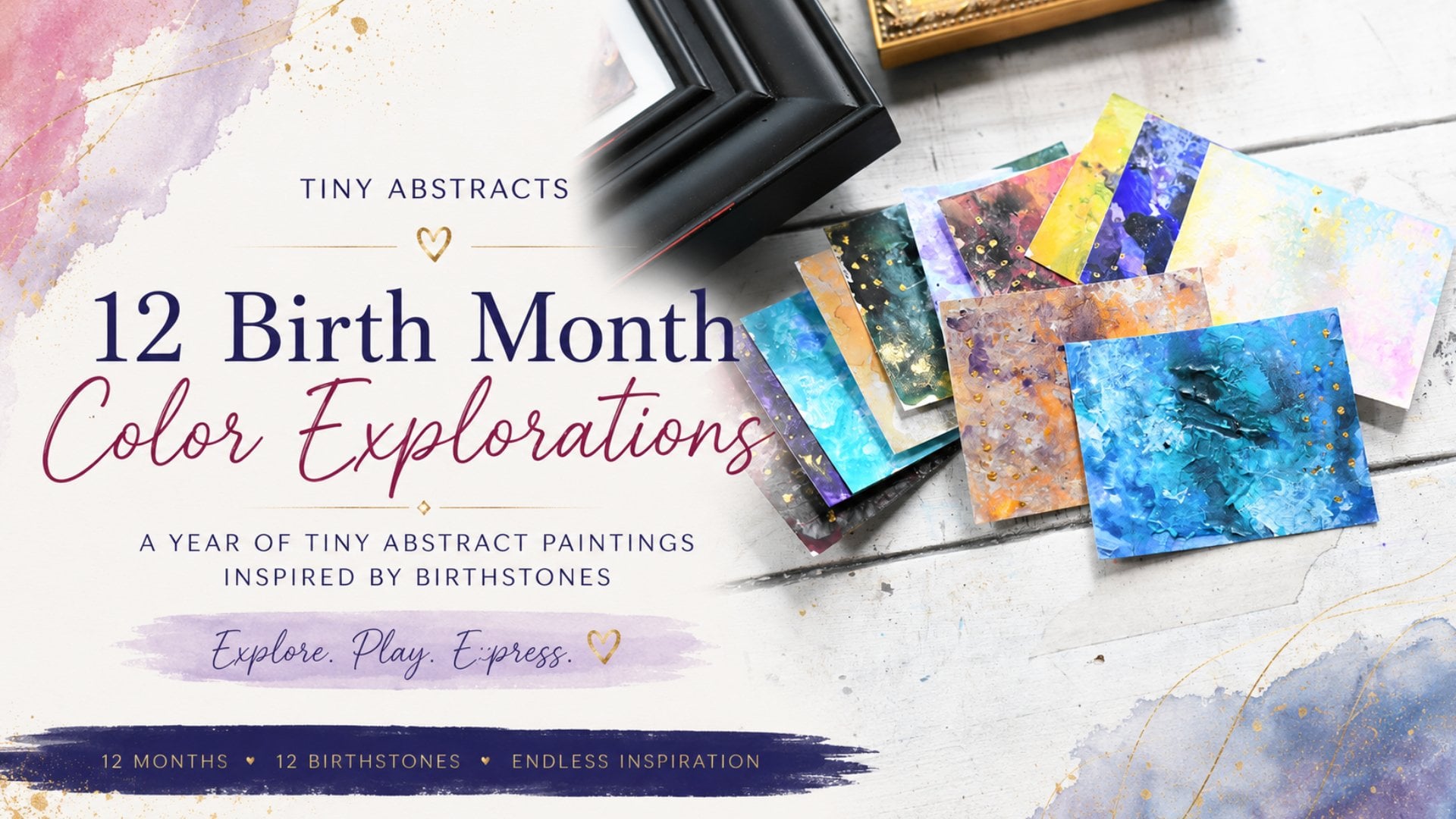
Transcripts
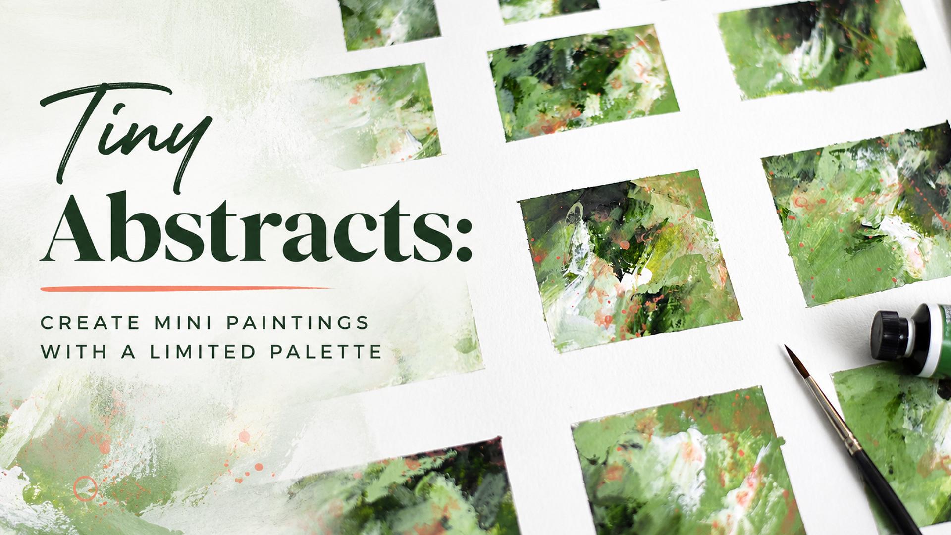
1. WELCOME: One, this is Jay Johnson, and I'm here to welcome you to tiny abstracts create
Mini paintings with a limited palette. In this class, you
will watch me and learn how to use a variety of your tools
that you have on hand. One paint color, two
neutrals of your choice, and one accent color. You will learn how to
take those and create some beautiful tiny
abstract paintings using my very simple
process and techniques. This will give you an experiment with that one color.
Try to pick a color. You can pick the color I used or pick a color that you've
never worked with before and two neutrals to learn the color,
learn how it works, learn if it appeals
to you or not, learn how it might look in a finished piece just from blending this with
some neutrals. And it will give
you the opportunity to play with accent
colors as well. I say, use one in this class, but you can always use multiple accent colors
if you would like. But I hope that you will step into class with
me and have fun with this process of creating tiny abstracts because
they are a delight. They're a delight to do. They're simple, they're fast. It makes for a fun,
short studio session. It's a great way to loosen up and learn how your
colors behave. And I encourage
you to join us and experiment and let us see
what you come up with. I look forward to
seeing you in class.
2. CLASS PROJECT: Talk about your class project. Your class project is to use whatever materials you have
to play with some color. You will start with one color. Just pick one. It doesn't
have to be this one. Just pick one and some
white and some black. And following along
with what I did in the class with taping
off the paper and using your one color
and your two neutrals, create whatever you can with
whatever tools you have. Brushes, palette knives,
sponges, whatever. Whatever suits your fancy. And then pick an accent color. Doesn't have to
be what I picked, which was cad red light. It could be a
different accent color like I did on these
other paintings I did in another studio session where I used a golden ochre. Wever feels good to you at the time and just experiment
with that one color, a couple of neutrals
and an accent color. Your class project
is to do a sheet, taped off anyway you want. For class, I did this
one before class, I did this one where I taped off smaller portions,
tinier squares. And create a sheet that
you can then use later in other art projects
or turn these into finished art pieces for your
customers and your clients. So, or do nothing with them if you don't want
to, you don't have to. That's the whole point
of these. They're fun. And I'd like to see
what kind of fun and what kind of pieces
that you come up with based on your
one color choice and your neutrals and
your one accent color and the way you type yours off. I'd like to see what
you come up with. But keep that palette limited. This is all about working with that limited palette and experimenting with
that one main color to kind of learn how
that color works with your neutrals and blending and learn how it
works with an accent. Feel free to use
different accent colors. If you want to use
different ones on each one, feel free to use
different materials. I've used acrylic in this class, but you could use watercolor. You could use pastels, you could use markers. You could use No Color, too. You could use Guash. There's a variety of
things out there. Use what you have, but
one color, two neutrals, taped off and one accent and see what you come
up with and be sure to upload your class project to the class page so that we can
see what you come up with. And maybe it will
spur creative ideas in all of us to see
everybody's work. Thanks again, and now hope
you guys have a great day.
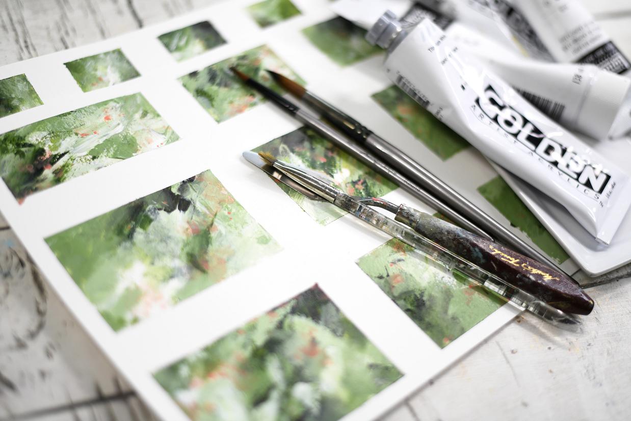
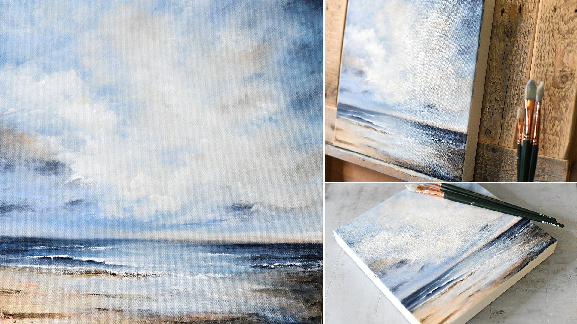
3. PREPARE THE PAPER: Okay, our first step is
to prepare the paper. I'm just using this
cheap watercolor paper I picked up at Michael's. It's not very expensive. It's great for these fun
little experimental projects. So I have a cutting board here. This is one of a
set of three that came from Walmart for
super inexpensive price. I like these because when
I tape the paper to these, if I do get a little more fluid
paint and want to tip it, I can easily pick it up. So I like using these. And I've got my trusty
painter's tape. I'm just going to
tape this sheet off. And I don't know
if that piece of tape is quite long enough. I'm going to try to get it
on there, fairly straight. Top and bottom, and I can
see through here so I can see about where my
border is there. Tape it down good. Turn it this way so I can
do this correctly. And try to get this one. I try to make sure it's
even when I tape it down. A little piece of
tape right there. I didn't get that quite
long enough. All right. Let's do the other side. Is This is how I do all
these little mini abstracts. I tape them off like this and I tape this off into a grid after I
make sure that's down good. Now, unless I'm preparing
something for a specific size, I don't worry about sizes
or I have it in my mind. I want to do squares. So I may tape this off where
I can get some squares here. Let's do one that way. Try to get some squares on top, and I may or may
not get squares. I may get some
rectangles out of it. Doesn't really
matter. I'll probably get some smaller down here. I'm trying to keep these
pretty good size here. And try to get those where
they're sort of squared. See that bottom one will
be a little skinnier. That's okay. These aren't
for any specific project. These are just for
me to play with. I try to get it straight. And that's not straight. Something's not straight. Try
not to spend too much time. I could leave these like this. I think I will. So I got a couple squares and some
rectangulars, different ones. And then before I get
started with paints, I like to just dampen
the paper with a little fine Mr.. That helps the paint
move a little better. Not too much water.
And there we go. The paper is now prepared.
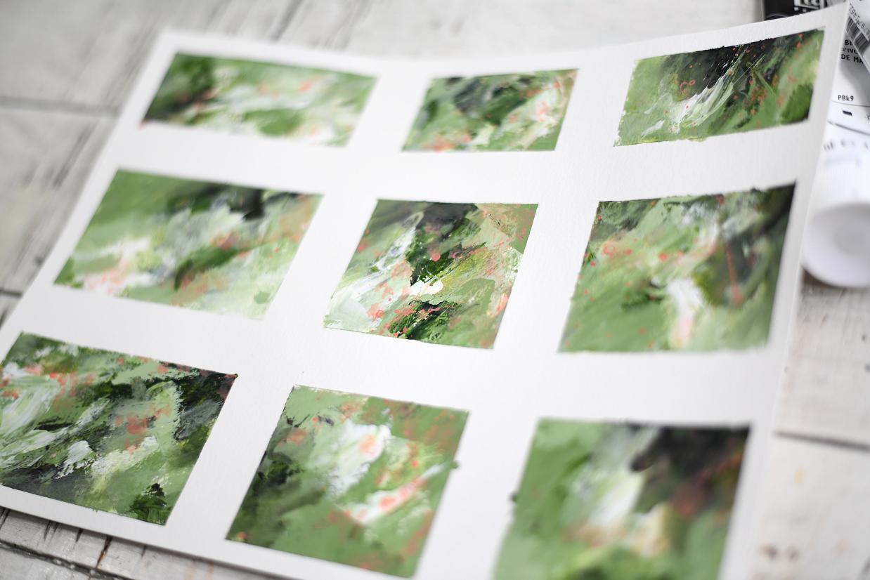
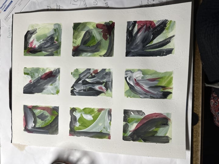
4. CREATE THE GRID PAINTING: You're preparing the paper, it's time to set up the palette. This is a very limited
palette for this class. I'm using one color, sap green, which is not a color I've
worked with very often, and it's time for me to experiment with a little
bit and play with it. I'm just going to put some
of that on the palette. See if I can get
that top back on there so it doesn't dry out. I'm going to use
white, titanium white. There's some of
that on the pallet. I probably use a lot of white, so put a good bit of white. That may be a little
too much. That's okay. So that's that and
I have ivory black. White and black are obviously
good neutrals to use. That's probably way
too much black. So there's my
palette, ready to go. I'm gonna set that
off to the side. Make sure this tape is down. It's kind of bubbled up a
little bit of the water. And then I have a
variety of brushes, a couple round brushes, a little angled stubby brush, palette knife,
some other brushes in case I decide to use them. I like to have a variety laid
out and a catalyst wedge. I like those. I like
to have a variety of tools laid out to work with. And the goal of these is not
to think. It's just to act. So, I like to
dampen my brush and dry it off on the rag
just a little bit to tap out the excess water. And I like to start
with the main color, which is the sap green. So I've just put a good bit of that on the brush. I'm
not going to think. I'm just going to start
swooshing and putting color wherever it lands on
these taped off portions. And if I get some on the tape, I like to try to get off of there and use
that on another one. And I don't try to
fill the whole thing. Alright, there's some sap green. I'm going to go right into the white and get a little
bit of white on this brush. Did not clean the brush, and I'm going to just get some white on here very quickly
wherever it lands. Not thinking. If
it mixes with it, that's fine. That's
the whole point. Experiment with the color, the mixes, see how things go. All right, that's enough white. Now I'm going to
go into the black. And because this is a big brush and black is kind
of overwhelming, I'm just going to
clean that brush off, and I'm going to go
to the actually, I'm going to go to the little
angled stubby brush I have, which used to be
dampened a little bit. Tap it off just so it's
got a little water. Get a little bit on there. Not too much. And I usually try to go with
this in the areas where it's darker already and
just do the same thing. Just scrub a little
bit in wherever. Not thinking. Just
experimenting here. Maybe less black on that one 'cause there's
less dark area. And there I was
thinking, wasn't I? And then this one's
got very little dark. Alright, there's some black. Now to make things a
little more interesting. I'm going to go
in with actually, no, I'm going to get
the palette knife. And I'm gonna mix a little bit of the white with the sap green. So I'm gonna pull some
sap green right there and get a little bit of
the white and mix those two together to get a little lighter shade and maybe a little more white
because I don't think it's quite light enough for me. I want it to be kind
of fresh looking. Ooh, that's a pretty green
that made by doing that, really fresh looking for spring. That's what I'm thinking of. Everything around
me is blooming. Everything has
just turned green. I'm gonna get some of that
on the palette knife. And these areas where
there's some paper showing, I'm just going to
start swooshing some of that into it just wherever. And I try not to
leave too much on the tape and scrape that off
and use some of that, too. Now, let's get some
there, there there. Just looking for the white
areas where it's really white on the paper. And if I end up making
an interesting mark, I try to save that And this
looks like quite a mess now. So I'm going to scrape
off that green on there. And I'm gonna add some more white to that to really
lighten that green shade up. Stir that around. Maybe
even some more white there. So I've got a nice
mix there of that. And since I have some
on the palette knife, I'm just going to dab some on each one just to get what's on
the palette knife off. Because I like the texture that a little
palette knife gives. So I've got it mostly clean. Now I'm going to take
my smaller brush, and that lighter
color I just mixed. I'm going to get some of that I'm gonna turn the
brush on the side, and I'm just going to
start working some of that color in different spots. If a brush gets too dry, have to wet it a little
bit more. There we go. So I'm not trying to
create anything specific. I'm just messing
with these shades of green that's created
by the mixing. I go right over wherever. If I get some black on
there, that's fine. And a little bit more. Alright, now, I'm going to take this same
small round brush, clean it off really
good in my water. Make sure it's kind of damp. And wherever there's hard edges, I'm going to gently
work some of that in. Now, this may have
dried a little bit, so I might need a
little more water. Just trying to tone down some of these hard edges and do a
little bit more blending. And if it's dry a
little bit too dry, you can always do
a little sprits of water which will
help things soften up. This is why I like
to work really, really fast on these. And move that paint around. I'm not blending
it like totally. I'm just moving
some of the edges where the hard edges are around. Let that water get in there, and that helps to do that. This one doesn't
have a lot of black, so I can pick up some black from one of the other one and
bring some more in there. I really like the shades this
has created at this point. I'm just very loosely
doing this moving from one to the other super, super fast. I got a little open
spot here where there's a little bit
of the base layer showing through in
these couple ones here. So one thing I like to do I
get a palette knife again and maybe get just a little
bit of these colors that are left and swoop some
color in there. And remember, I sprayed this. So the paper is kind of wet. At this point, which helps
to move some of that better, bring in some of
that lighter color in with the white and
the lighter green. This area right here is
where I was concerned with. It was showing a lot of
the paper through there. Ooh, that made a nice mark. If I see that something makes a nice mark, I often try to. That one did, too.
Leave it alone. And there. Now, one more touch up in any areas I see might need
to be blended a little bit, and maybe even bring in
more of the sap green. Let's just bring in a
little bit right there. Anywhere I see where
I might need that. Just where I just
want a little more of that sap green color as
it was from the tube. And if it blends with what's
on there, that's okay. And still keeping the brush sideways to bring
some of that in. I like that. And this looks like a terrible, terrible mess right now, I know. Alright. Wash off
that round brush, give a little bit of
dampness on it and move move some of these colors a little
bit to blend them. I mean, this is all just how your hand moves with your
brush and your tools. And if you're using watercolor, you could add more water. You could blend a
couple of colors together, the two colors. But I like acrylic for a lot of these 'cause it brings
in that texture. Like right here, there's
some good texture. I don't really want
to mess with that. Maybe a little bit down here
at the bottom edge of it, pull some of that down. I try not to get too
nitpicky at this point. This right here I'm
not really liking. So I'm thinking of blending that out a little more on
that particular one. I just go around and I find
spots that I don't really like or that need a lit
touch up at this stage. Try not to spend
too much time on it because we're gonna come back with some accent color and just see what we
can do with this mess. So that's three colors, sap green, black and white. And I don't want to
waste this paint. So what I like to do when I have I'm gonna
set this aside to dry. It's gonna have to dry before
we add the accent colors. So I'm gonna set it aside. And what I like to do
with the excess paint is really, really simple. I like to get as much of it as possible
off on some paper. With a palette knife or brush or a catalyst wedge or whatever. This is just a journal
that I do this then. These pages, these papers can become backgrounds
for many abstracts or they can become
collage papers. I don't like to waste paint. So I like to get
as much of it as possible off on some
paper as a background. And then these can be
added to and turned into page papers or even used as a background for
another painting or some color inspiration. So then I will set this
mess aside to dry, but those are papers
I can use later. And then I clean my pallet
immediately when I'm done, so it'll be ready
for my next step. So as soon as I'll
put a fan on this, and as soon as the cutting
board page is dry, we will come back and
add some accent color.
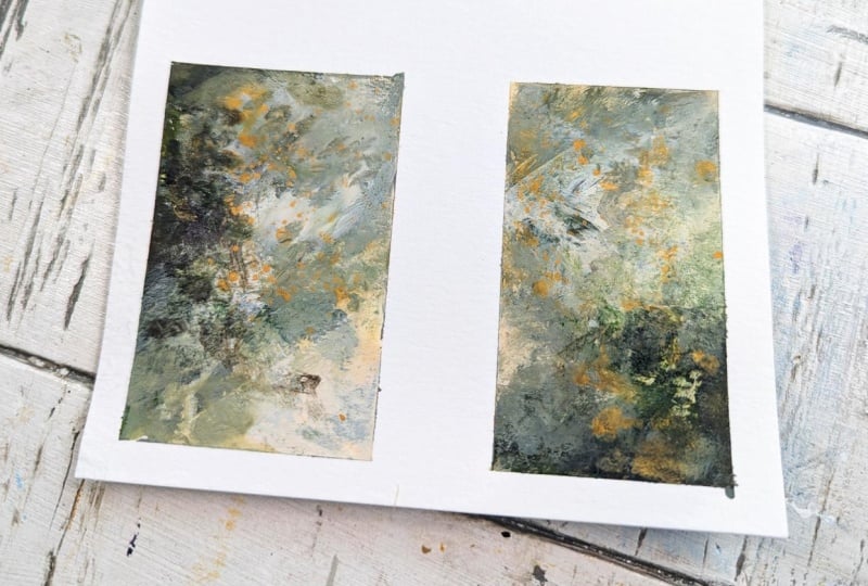
5. ADD YOUR ACCENT COLOR: Alright, this is dry now. So it is time to add
an accent color, which can be any color
of your choosing. You don't even have to add
an accent color if you like this shades of the green,
and are happy with that. But I like to add a
little fun accent. I don't know if I
want to go that way. I'm thinking I might
want to go this way or I like to turn the
board and kind of see where I might want to go. Maybe this way. I don't know, just
seemed kind of fun to do it a different direction. Now, I've got some
cadmium red light here. And of course, it's really,
really super, super bright. And there's some outside here. There's some coral roses, and I was looking
at those and how pretty they look
against the green. And this is a little a
little bright for that. And I thought, what if I tone it down with a little bit of gesso. So I'm just going hopefully
you can see this. I'm just going to put a
little bit on the plate. If I won't need much, that's probably too much
and a little bit of the white gesso
mixed in with that. Find my palette knife
here and just kind of stir that around and see
what I can come up with. Color wise. Oh, yeah, that's
definitely toning it down. I still feel I might want to
tone it down a little more. So add a little more just so. And I'm not really I'll
turn this this way. I'm not really worried
about it getting too fluid from the gesso
because I'm gonna add, oh, yeah, that's pretty. I'm going to add a lot
of water to this to be able to flick little
droplets on there. Oh, that's pretty. That does look like those roses outside. They're sort of a coral color. And I'm not going
to apply this with the palette knife because
it'll be too much. I just want little drops
of this as an accent. So I'm gonna take
this paper towel, clean that palette knife off, get another paper towel out because I'm probably
going to need it. Got a little wipe there
in case I need that. And I'm going to spray some water on that to
really make it fluid. Probably have to get
some more on there. It's still a little thick. Let's just put a lot on there. So, see, we've got really
nice coral shade there now. I'm gonna wash that goopy
paint off that brush. I'm gonna spray
it a little more. On there because I don't need it to be really, really
thick at all. I'm gonna test this one. I see, it's really
thin on the brush now, and I'm just going to tap and flick it wherever
it wants to go. And, of course, it's
way too much paint. Get this really liquidy
part and do it again. I don't want it too much. So I'm going to take
some of this back off. Alright, let me move
this out of the way. And let me decide where I might want to
soften some of that. So to soften it, you just get your brush damp and
just gently tap those little dots To break them up a little bit and get some of that
color integrated. A little bit of
speckles is okay, but I don't want
it to be too much. This one's got a really
big amount right there, so I'm going to spread that out. You got to do this kind of
fast before things dry. Oh, I like that little I
don't know if you see that made some little rings.
That's kind of fun. And if you have a spot
where you don't want it, just take that little wipe or your paper towel and dab it and tone it
down a little bit. Let's get this one. It gives it that little
bit of interest, kind of a garden feel all with accent color on this simple
one color plus neutrals. Now, I got a litt
too much on here. I feel right here on that one. So I'm gonna brush
some of that off. Soften some of that.
I'm not worried about the areas where it's
speckled on the tape. And you can always,
add some water in there to kind of move
it around that way. And then catch it with the paper towel or
the wipe to soften. But you got to get it
before it really dries. Let's see if I can scoot that
up where you can see it. I'm just adding some water to these 'cause they're
getting kind of dry. And dab with that wipe
or it's too much. Of course, there's a bunch on the tape
that's distracting me. Now let's turn it the other way and take a
look different ways. See, it's just some
small accents in there. So now that has to dry. And once that's dry, then we can pull the tape
and see what we've got.
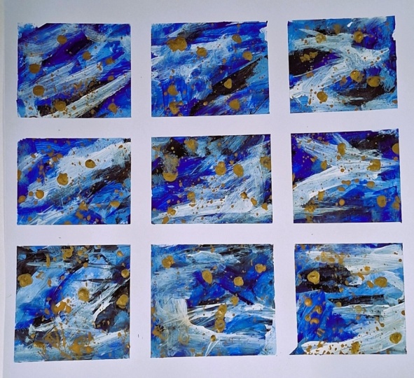
6. SAVE LEFTOVER PAINT: I have another sheet here
that I did before I did this. I'm going to set
that aside to dry. This was done with
the same colors here, the black white
and the sap green. And then in this one, I used
a couple other neutrals. And I thought, since I have
some of this coral left, I'm going to do the
same thing with this. And I'm standing up to do this one and just
flicking that wherever. Trying to get some
somewhere on each. Oops. I might have got a
little too much there. Now, on this one, I'm gonna do something
a little different. Many use the sprayer,
which is an alternative. If you don't want to drop
water on with the brush, you can use your spray bottle to move some of your
accent color around. Like that. And I only
have too much right there on that one. Well,
I think it's too much. Not sure. This is really fun. I missed one right
here. There we go. But the fine Mr. Spray bottle
is the way to go with this. Now, this I had already
taken off the cutting board, but I've got it pretty
wet now I've sprayed it. And since it's not
attached to the desk, I can kind of tilt it. Like sew and move some
of that color around, which is another fun thing
to do with the accent color. Now, this is all acrylic. But you could use
watercolor if you wanted. I didn't have this
particular shade of the coral I was
after in any paint, and I knew I could get it with the
acrylics really quickly. So that's why I just went
ahead with the acrylics, but you can use whatever paint
you have watercolor guh. You could add a lot of
different things to this. I'm going to let this one
dry and the other one dry, and then we are going to
come back and peel the tape. But first, while
those are drying, we're going to take
my Trustee journal where I put the excess paint from the green, black and white. And since I have the coral left, we're gonna just get a little
wild with what's left. Don't ever leave
paint on the palette. Go ahead and do something with it on a blank sheet
because like I said, these can be a base
for something else. They can be a color inspiration
for another one you do. They can be collage papers. They can be a lot of things. So don't waste it.
Bind a blank piece of paper and just put it on there. So we've totally changed
the look of those. If you want to, you can even
do something like this. Put the pages over, get your extra paint,
start another sheet. This is what these art
journals are good for. Doing something with
the extra paints and having something
you can use. And you can use because I'm using the backsides
of these papers, which I've squished
together now, and peel them apart like sew. And you can decide, I've
got some of the paper off. This is a thin journal, but that can be a collage
piece right there. But you could use the front or the back side or whatever.
Just don't waste it. Always save it. Now that piece is loose. Let's just put it over here. Don't be afraid to use
your fingers, either. Let's see, that's a collage
piece that we just used. So always do something
with the extra paint on another piece of
paper that could then become part of something
else later on. That way, you're
not wasting paint. That's just my tip of the day. And always clean your
palette when you're done. Second tip of the day. Alright, we're waiting
on drying time now. As soon as those dry,
we're pulling the tape.
7. REVEAL THE PAINTINGS: Alright. I think we're
ready to pull the tape now. This is the most exciting part. So I'm going to start
with the middle pieces. As some people save the tape and use them
in other projects, too, but I'm not a fan of that. Nothing wrong with it.
It's just I'm tired of seeing the blue
after I've done this. I like blue, not
this kind of blue. Oh, I can tell they're
already looking pretty. Oops, I got to get these side
pieces first. Look at that. These are gonna be the
sweetest little abstracts. And just with one color, and, of course, the
neutrals and the accent. But you don't have
to do an accent, like I said. Let's see here. What's what? Oh, this
one at the other end, I used that extra little piece. Oh, these are so cool. See how pretty things get
when you pull the tape? I am just loving these, and I'm not even a fan of green, but et's take a look. Let me move this out of the way. Oh, look how pretty. Look how cool these are. Oh, I can so see these
framed up on greeting cards, offered as original art pieces. I like to turn them
different ways to see what looks best. I really like this
one right here with a little bit of
texture in the middle. But then there's this one here
that it accidentally made that fun mark when I put that
on there real quick like. But, you know, this is a little quick project you could do in your studio with one
color and a couple of neutrals and an accent color. And truthfully, the only reason I thought of the accent
color is I looked outside. I saw the roses that
were blooming on my daughter's rose bush
and they're coral colored. And I thought, Oh,
aren't those pretty? I thought, Hmm, wonder how
coral would look on the green. And that's how creativity works. You see something, it spurs an idea in your brain
and you just go with it. So these are some fun
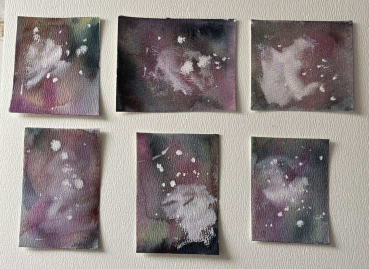
garden toned abstracts. But, you know, these are great. Let's look at the other sheet. Oh, and by the
way, that leftover coral that was on that
palette, real liquidy, I grabbed another sheet
of watercolor paper, took a paper towel, got it on the paper towel
to clean the palette, stamped it all on this sheet. So here's a good
base sheet to start another sheet of abstracts
or something else. Always always use the paint that's left on the
palette on something. So this is the one I did before. I started the class
with the same colors, but with some
additional neutrals, the titan buff and raw umber and some
Pain's gray in these. But these right here are the
same as these right here. Same color choices,
but they have a little bit more of
the black in them. So see how different
they can look just by altering the amount
of one of the colors. Anyway, let's I just want to peel these so you can
see how fun these are, too, I know they're
gonna be great. Now, these are a lot smaller. They're little bitty
little bitty squares. This peeling the tape part, I mean, seriously, I've been doing these every
day here lately, just to break out of some non creative moments
I've been having. So I've been doing
these every day, and I have created all different colors
and kinds of sheets, and I have no idea what I'm gonna do with
them at this point, but, you know, the idea
will hit at some point. Alright, I've got that side. Let's get this side. Sometimes it will pull the paper, the
painter's tape will. And I think a lot
depends on the paper, how hard you're pulling,
how fast you're going. I tend to be a little
bit impatient. So I like to go kind of quickly. Alright. Let's get this one. If I can I can get that one. Somewhere. I'll get it somehow. Oh, it frustrates me when
it There we sort of got it. There. Now, see, I kind
of tore the paper there. I got in a little bit of
a hurry. And here, too. That's okay. And I won't use
all of these for something, but I sure do save them. I have a little box. Sometimes
I'll cut them apart. Right now I'm leaving
them on sheets because I have some ideas for
maybe mounting some of them as series as groups. And so I'm saving them on sheets rather than cutting them apart. So I have everything
all kept together. There we go. Alright. Like you said,
these two rows were done with the same colors here but with a little
bit more black. And see, they look a
little bit more dramatic. And then these had some
additional neutrals, titan buff, raw umber,
and pains gray. So I encourage you to play with whatever other
neutrals you have. Even the neutral there's many gray shades out
there in paints. So and there's other, you know, beige color shades as well. Now, I could I'm going
to stop here with these because I like them and I don't know what
direction I want to go, but I wanted to add that
you can always continue on. There's no rules with these. This is to just
experiment with color. Show that you don't need a
whole lot of colors to make something nice and
exciting and interesting. You just need a little bit of materials and a
little bit of time. And it just totally frees up the creative mind when
you do things like this. Because you're not trying to
create any specific thing. You're just messing
around with color. But yet you end up creating
something very cool, very interesting, very unique. If you really like the way
some of these come out, you can always take your
color combination that you used on something like
this and translate it to, say, a larger canvas or
a larger sheet of paper. These are experiments to
see what you might like, what you might enjoy, to maybe even show other people who
might want a larger piece. And if they say, Oh, I really like something like this with this little
bit of dark here. You can recreate that with these same colors on a larger
surface if you want to. There's a lot of uses for
what can be done with these. There's a lot more you can
do with them if you want to. You can accent them with gold, use stamps and stencils,
all kinds of stuff. But this class was
just about using the one color with the two
neutrals and the accent color. So that's what I've covered, and I hope that you have enjoyed watching
these and seeing how these turn out and even seeing how the
different shapes look. And that one right
there I really like. Anyway, these are dry, so now I can move on
to my next project.
8. THANK YOU: I want to thank you so much
for taking this class, and I hope that you have really enjoyed watching
what you can create with one color and a
couple of neutrals and a tiny bit of accent
of your choosing. I encourage you to
do this kind of project just to loosen
up when you get stuck, if you want to try out a new
color and see how it works. This is a great
way to do that and actually see that it
can create something unique and interesting
and different and all different
sizes of it, too. And I also want to mention the using your leftover paint on your palette tip
that I gave you to have some extra paper handy and use that paint up
on that extra paper because now these
papers can become the basis for the start
of your next project. And I also wanted to show
you another example of using these same colors with a couple of the other neutrals
that I mentioned earlier, and a different accent color. So you can see the difference
in how things turn out just by a couple different
neutrals and a couple different
accent colors. So I hope you have
enjoyed the process, and you will join me for
more of the classes in my tiny abstract series because I have a whole
lot coming your way. Because I love these, I love to experiment with
different materials and come up with different unique
ideas in a small format. Small format art has always
been my favorite why? Because people always have
room for a small piece of art. So I like small format art. And I hope you do, too. I hope you've enjoyed
this class and that you will join
me in the future, for my other tiny abstract
classes. Thank you again.
 Jai Johnson, Painting My Favorite Subjects