Transcripts
1. Welcome: Hi, I'm Jay Johnson and
welcome to Where Sky Mets Sea. In this class we'll be painting an expressive coastal
scene in acrylics, complete with bold clouds, calm waters, and
soft sandy textures. We're keeping it simple
using just eight colors and some fun unexpected tools like sponges and rags to
create beautiful effects. Whether you're new
to painting or just looking to loosen up and
try something fresh, this class is all about
relaxing into the process. I paint places
where the soul can breathe and I'd love for
you to experience that too. So grab your brushes, gather a few supplies
from around the house, and let's get started.
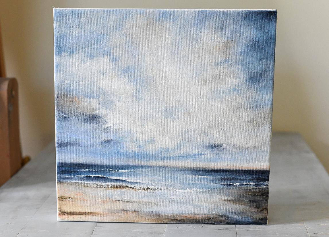
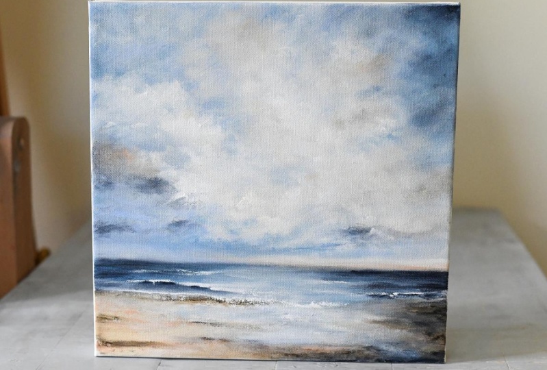
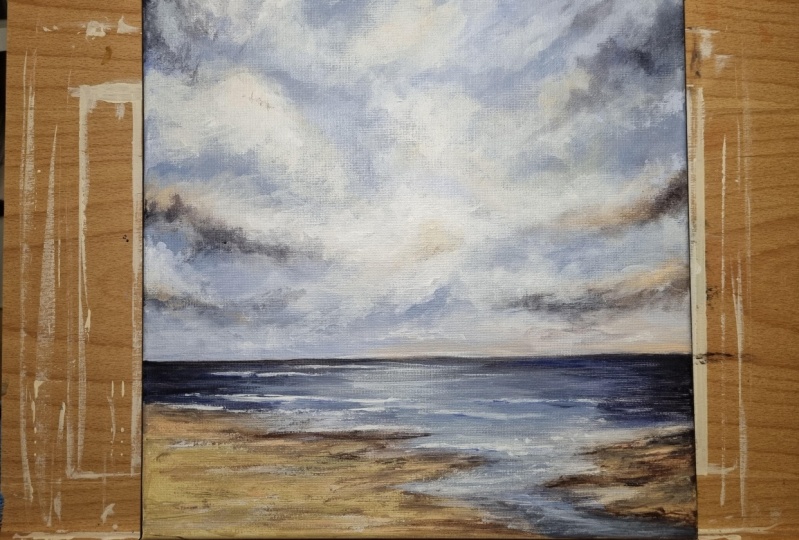
2. Class Project: For your class project, you'll be painting your own
expressive coastal scene on a 12 by 12 inch canvas or any
surface you have on hand. We'll focus on building up the sky with the
dynamic cloud shapes, blaring in the calm water, and grounding the scene with
the soft sandy textures. I'd love to see what you create. When you're finished,
please be sure to upload a photo of your painting to the project section
here on Skillshare. Whether you follow along closely or you put
your own spin on it, I can't wait to see
your unique version of where Sky meets Sea.
3. Supplies: Okay, let's talk about
supplies that we're gonna use to do a
painting on this canvas. This is a 12 by 12
gallery wrapped canvas. This is what I use
the thick canvas, but you can always use the
thinner one if you'd like, or even a flat canvas panel.
Now, this is a square. I love doing square
seascape paintings. So this is the size I've chosen. So, something like that
to do your painting on. Well, let's talk about
a few other things. Um, this is just a
plastic palet tray, and this is pallet paper here that I have taped at the
corners on this tray. I also have a palette, pallet box off to the side, the Masterson stay
wet palette box. I don't use the sponge in there anymore it kept getting moldy. But what I will do this
tray fits perfectly inside the box with the
palette paper on it. And if I wet the paints down with a fine Mr. Spray bottle, before I put them in
the box overnight, I can use them the next day. But this I just like 'cause it's easy to pick
up and move around. And obviously, I used to
paint on the palette first. And that's when I discovered
this palette paper. Yes, it's a little
bit more costly, but to have this, but I got tired of trying
to keep that clean. So the palette paper goes just taped on there
at the corners, and it'll stay in place. So before we get
into the paints, let's talk about some other
things I'm gonna be using. I do have my brushes here. These are just a few of them, but my favorites to use
are the filberts here. And I have a palette knife, too, for mixing colors. Actually, I have a shorter
one here I like better. So palette knife. I use these Filbert brushes. Now, these are the
long handle ones. They're the silver brand. They're very expensive,
but you don't have to have the long handle
ones or this brand. But these are, I want
to mention this. These are natural bristles. These are not the
synthetic bristles that you'll find like
this that are really, really soft and slick. These are the rougher bristles 'cause I do a lot of scrubbing. And they also don't gunk up with paint as much
as the synthetic ones do. So these are the type
of brushes I use, and I like the filberts
because they have the rounded tip,
which is very useful. They have a little edge
there on the rounded tip, which is useful for side work. And they also have
the flatness to them. So if you wanted to
brush down flat, they're really good for
putting in lines and scrubbing and
blending out clouds. So I use those type of
brushes, the filbers. And then another thing
I use is these sponges. These are the Scotch
kitchen sponges. And I have tons of these. And you'll see me
demonstrate these in the mark making video
where I show you the different kinds
of marks you can make with these sponges, and that's kind of fun. I use both sides, and I usually use the sponge in this hole size because I do larger paintings more than I do the smaller
ones these days. And I need that larger piece. But because this is
a smaller 12 by 12, I'm actually going to
cut a couple of these, so I have some smaller pieces. And you just take them
with the scissors, cut them to the size you want. You want a little skinnier one because sometimes it's hard to get in a small spot with them. Let's see. I cut this one. And this just gives you some different angles and shapes and sizes to use because when you're using them
in a small space, you may not want to hold
the great big sponge. So there's a few
pieces of that when I cut that I can use
along with the brushes. And another thing I
use to paint with, as well as cleanup
with are these rags. They are a microfiber rag. They come in all
different colors in here. This was a 30 pack.
They're smooth on one side and fluffy
on the other side. And let me show you the brand. Auto drive microfiber
multipurpose towels. And you can just throw
them in the washer. You can rinse them off
in the water and throw them in the washer.
They last forever. They come in this huge
bag of 30 towels. I've had this for years, and I'm still not
through the bag. I'm just now getting
to the yellow ones. So as far as tools, that is the tools
I'll be using Now, let's talk about the colors I'll be using for this painting. And normally I mix
most of my colors up. I have my favorite colors
like for instance, I have this one here, it's a purple shade, and I'll be doing some
other color mixing shorter classes to
show how to mix different colors that I use
in a lot of my paintings. But once I've mixed
a color, excuse me. And I find that I like it, then I want to use it more. So I get these mason jars
and jelly jars like this. And I will mix up a bunch of
my favorite colors I like. I write on top what
colors I use to mix it. So when I run out,
I start to run out. I know what to use to
mix that shade again. I keep them over here on a little uh a rotating
spice rack, actually. I just stack the jars on there. But I also will go
straight from the tube. And for this to make it easier, I'm going straight from the tube with colors that you can buy. All of these may not be
in your local stores, but you can always go online
to someplace like Blick. We're gonna use Pains
gray. By Golden. And the brand really
doesn't matter, but there are a couple colors I use that are only available
from certain brand. This powder blue is by
Windsor and Newton. Now, it only comes. It's
wonderful for skies. Wonderful, wonderful, wonderful. And it mixes with other
colors very nicely. So my local Michael's
store does have this. But should you not
be able to find this you can go on the website, and it'll tell you on the description what pigments are used to make this paint. And basically, this
powder blue is made with ultramarine
and titanium white. Now, the ratio mixture, I'm not sure of because I haven't mixed it
completely myself yet. I have played with those
two to try to get to this, and I have gotten to it, but I can tell you it's a lot
more white than it is blue. But it's a very pretty color. And if you just don't want
to fool with mixing it, if you get this, Windsor
and Newton powder blue, and it only comes
in the small size, which if you're doing a
lot of skies like I do, small size isn't
going to cut it. That's why I'll
be mixing my own. So that is a favorite,
along with Pain's gray. Then I have this azurite, I guess that's how you
pronounce it from golden. And it is sort of a more
I wouldn't say turquoise, but it's a it's a really deep almost
like a blue gene blue. I guess is how I describe that. And I use this mixed with some other things
and into my paintings a lot, it kind of gives it a
different blue hue than, say, the bright
ultramarine wood. And I really like the
hue that it gives. A new color I've
started playing with in my paintings is
Titan green pale, and I'll be using that mixed with a couple of these other
colors in this painting. I won't be using it straight. It's too green, but
I will be mixing it for this painting
on the palette. And then if I get some
mixtures I like with it, I may jar those up
in my little jars. But the thing is, you don't need a whole lot of that in the painting
we're going to do today, so I don't plan on
mixing up a whole lot. Then I have raw umber, which you can get that in
any brand, tight and buff. This is golden. I've only
bought it in golden. I'm not sure if you can
get it in other brands, but it's sort of a beige color. Here's another one that you can only get from
Windsor and Newton. It's called pale Rose Blush. This may be something you
have to order online. It's a pinkish hue, and you can see, it's sort of a flesh tone. Because the sand
and a little bit in the clouds in the sky tends to have a little bit of
pinkish color in there. I didn't want to use
a really strong pink, and I picked this
up and tried it, and I really like using this. There you can go on the website and see the pigments used to mix together to make it. I haven't tried mixing this. This is another one that I only use a very little bit
of in my paintings. So this is not something
I need a whole lot of, like I would the powder blue. So I just buy this direct from Blick
Windsor Newton brand. And then, of course,
titanium white. I use quite a bit of that. And you can get
that in any brand. So these are the one, two, three, four,
five, six, seven, eight colors that I'll
be using to create this painting and a couple mixed colors
from these colors. It will be a very calm
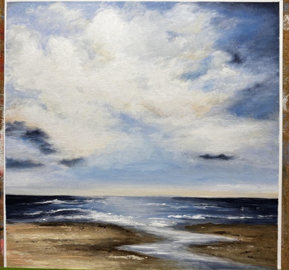
neutral seascape. Now, as far as drawing
out the design, I don't draw out my designs. Sometimes I will look at
a picture to get an idea, which I did already of having the horizon line
here, some water. Coming across the horizon
line here with sand here, but then the water kind
of scooping around and, you know, seeping
up onto the sand. That's the plan for
the horizon here. So I'll look at a picture and get a general
idea of layout, then I'll go from
there on the colors. Same with the sky. I like a lot of
clouds in my sky. It makes it interesting to me, and I'm planning on
doing a sweep here from this side with some clouds coming out of that
up this direction. And thinking of the colors that are in the sand might
be in these clouds up here, the colors that are
in these clouds here might reflect
on the water here, maybe a little sky might
reflect down here. So that's kind of the
direction I'm going, but I like different
cloud formations. I don't usually do, like, one or two little bitty clouds. I tend to prefer more
the more clouds, the better, even
the stormy look. I really like the
stormy look with the light coming out of
the clouds kind of thing. But I tend to like a couple of different type cloud formations where they're coming
out of one side, pretty strongly and then
sort of drifting on up here. I also like to do a
sweep like this with clouds with them getting smaller and here and having
the light coming out. And then sometimes I might
just have a cloud on one side with it very
clear on the other side. That's just kind of what
I like for my clouds. That's how they all
tend to come out. But my skies have a
lot of clouds in them. The more clouds, the better, the more interest it adds to me. And so that's the
plan layout for this one that I'm thinking of with a little
bit of the sand, water coming from the horizon
down around this way, Horizon being you don't want
it right in the middle. I'll cut your painting in half. So down here, a
little bit lower. And then with this all
being the sky with the clouds and some color, we'll get into that
when we do the colors, but some color from down here, up here and color
from over here, down here and color
from the sky up here, down here to kind of
tie it all together. I I don't want to
use just one set of colors here in a total
different set of colors here. I like to whatever colors are here are also going to
be in those clouds. And whatever colors
are in the sky are also going to be
somewhere in the water. That's underneath the sky. So that's just the
way I like to work. So that's what we'll be doing. And I think I've covered
all the supplies. Obviously, a bucket of water. Oh, one more. I forgot about the most
important one Gesso. Now, I do not prime the
canvas with the gesso. Necessarily. I don't prime it, let it dry, prime it
again, let it dry. I don't do that. I
will apply gesso to the canvas with the
sponge first and then immediately
start applying color, which will then blend
with the gesso. But I like to have a little
bit of this on my palette, which is very liquidy, so I don't put a
whole lot there, because when I actually
start doing clouds, I'll start with this before
I go in with colors. So gesso is another
thing we need. And I believe that's
it as far as supplies. So hang tight, and we will
see you in class. Uh,
4. Mark Making: Alright. Before we begin the
mark making part of this, I want to just show you
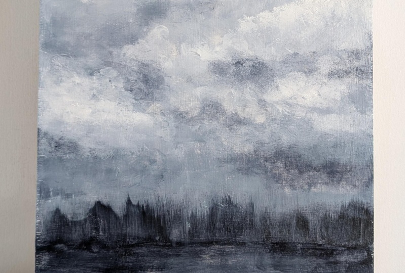
a couple paintings. This one here, and
this one here. Now, this painting here. Was completed solely
with my Filbert brushes. These are long handled
Filbert brushes, and that's what I use for
a lot of my skies and seascapes and pretty much
everything. I just love them. But they're very expensive. And so I thought, Well, what
other materials could I use? And these filberts, when
painting with those, I go very, very slow. And if you've watched
in my previous classes, you know that I'm very long winded and I kind
of ramble a lot. So I thought, What
can I do differently? Especially because
those are expensive. And so I used the tools I'm getting ready to show you to
do this painting, which, to me, looks about just
as good as this painting. The clouds may be
a little bit more refined as they are here, but it's still a great painting. And I did finish this off with some Filbert brush
work in the end, but you absolutely don't have to have it with what I'm
getting ready to show you. So let me put these
down out of the way. So all you're going to need
is for this mark making video is we're going
to learn how to make marks with a
kitchen sponge, the kind with yellow on one side and the green
rough on the other side. As you can tell, I've
already used this some. Now, this is damp because
I used it earlier, and I've rinsed it
and squeezed it. And then a microfiber rag. This is damp, and it's messy. This is
what they look like. They're real fuzzy on one side and smooth on the other side. And I get these in bags, great big bag of them
at the hardware store. Like Lowe's or Home Depot
or something like that. This one I've already messed
up, and it's kind of damp. It doesn't have to be damp to show you what I'm
going to show you. And there's one other thing you need other than a
bucket of water to rinse these things out is
a fine Mr. Spray bottle. And that. And we're going
to use two colors of paint. We're going to use pains
gray and titanium white, just for this example to
show some mark making. So I'm going to take
my sponge here. And in the beginning, we're just going to
get a little bit on the corner, like so. And we're just going
to see what kind of mark that can make. Just go down. And because
it's a little damp, it'll spread out pretty easily. So that makes a
nice line that way. Now, what happens if
we get the paints gray all along the edge of the
sponge there, like so. In that case, if you want
to do a horizontal line, which is great for landscapes, to make a horizon line and
you can pull down like so. Now, this is not normal paper. This is canvas paper. It's got a canvas texture,
but it's really a paper. Normally, I'm working
on Canvas, with Canvas, you'll get a little bit
more texture when you drag, showing, but it can
add to your painting. Those are two marks there
that can be done with that. Now let's switch to the other side and
get a little bit on the just a little bit on that
corner on the rough side. And let's just see what happens with that when we make
a mark with that. Now, look how scratchy that is. See, it's quite a
bit more scratchy, but that texture
can come in handy. Here's another thing
you can do by getting a fine line along
the edge of paint. So I'm just dipping it
in the paint's gray, trying to make sure that
whole edge is covered, and then I pad it off a little
bit, so it's not so thick. Let's just see what
else we can do here. Let's see if we could do a well, that sort of looks like a bush, a tree trunk, which is scratchy surface of that side works really well for glasses. So if you're doing
a horizon line, you want to put some
grass, of course, the marks would be, you
know, shorter than that. Let's get a little
bit more on there. Let's see if we can do a thicker almost
like a tree trunk. Now, I don't do very many trees because I'm doing seascapes. But you can see the
start of a tree there. And then if you got a
little bit on the corners, you could make some branches
come off that tree, come out a little wider
as you come down. Let's do this corner. It's starting to form
like a little pine tree. Let's get a little
more on there. And you're going to get your
hands dirty doing this. You can wear gloves.
It's almost kind of like finger painting
but with a little tool. So there's a little tree, little pine tree,
little bushes here. Few little marks there. If if your paint gets too dry, you can take your spray ball, do a couple little squirts, and Look at that cool texture you can get just
by getting some of that paint off of there. There's a lot of different marks you can do just with a sponge. Well, I got a little bit
left here on this corner. The softer side is
great for blending. So that's just a couple
of example marks. Let's see if we can
accomplish a wave. I'm going to get the softer
side, the edge right there. Just a little bit along
the edge and pad it out. Now, obviously,
you're not going to paint a wave with a dark color, but I'm just doing this, for example, to show
you what you can do. And a wave would normally
go something like this, sweeping that may
be a little thick. But you can always blend it in. Et's put a little spray on
there and wet that down a little bit more and pull
some of that color. Now, when it comes up to
trimming up the top of a wave and putting the
white foam on top, I would probably use a brush for that just 'cause it's
such fine detail. And you can use any brush. You don't have to use a Filbert. Filbert's just my favorite kind. And see how easily that
blends out with the sponge. Now let's do this side, let me show you how to
do a gradient using the sponge and use
the pains gray first. Just get a little bit on there. You can get a little bit more on there and come down
a little further. You see that speckled
pattern right there. You can just gently press and see you can get some fun
texture out of this side too. If you press with
the other side, you can get the
fine little dots. So just by gently typing. These are fine little
lines and dots, and you can dot
with the corners. Dotting is good for
putting flowers on stems. If you make a line
and you want to put some flowers on it,
you can do that. But we've got this side
coated pretty good. So I'm going to
Just do some here. And we're gonna spray a
little water on there. Keep that spray bottle
handy 'cause it's really great to help with the
blending out of the paint. I go up. And I'm pressing pretty hard now. And as you get up,
it gets lighter. This is a good way to give your painting a
wash to start with. And I usually do use a little bit more paint than I'm putting on here for this. See now you can see that
by sweeping that across, you can see kind of a makeshift
horizon there. All right. Now I'm going to add
some white to this. So I'm going to swap
to the other side where it's fairly clean and
get some white on there. I'm going to bring that
white right in here. And we're going to wet that with the spray bottle just to help
it flow a little better. And go up a little further. But back and forth,
if you want to. Now it looks like we almost have a horizon line with trees, which is kind of interesting. Now, I've got my
sponge kind of dirty. So I'm gonna dump that
in this water over here and trying to squeeze out
some of this excess paint. I have a lot of
these sponges here. So if I need to swap to another one for other
colors, I could. But for right now, I'm
just using this one. And I do like to clean them off in the water
pretty quickly after I use them because they can be harder to clean
if you let the paint dry. So now we're going
to go to the Rag. And I'm just drying my hands
on there a little bit. What I do with the rag is I poke my finger in a spot where
I want to get paint, and I hold the rag
out of the way. And I'm just gonna dip this
in the white and pat it down. And I'm going to try to make
a little clouds cover here. And it's hard to make a cloud shape when you're
doing it with your finger, but you get better
the more you do it. Well, it's actually easy, but it can look too contrived and not as
loose as a brush wood. The try to blend cloud
cover out a little bit. And then try to make it
not look so harsh here. And notice I'm
turning in circles. And I just kind of angle
the rag a little bit as I need to just to get a little base cloud
cover down there. Now, let's get a little
more white on there. I'm not looking at a
picture or anything. I'm just trying to make
a little cloud here. And the paint will pull up on the one end by
my fingernail in there, so I'll kind of lay back from that if I
don't want it as dark or punch a little closer in on that to make some
of that paint off. I just like to blend it around. Let's put a little
bit over here. And if the cloud looks
too harsh, too bumpy, not, you know, too forced, you can come back
to it with the rag and loosen it up a little. Put a few other little
marks in here using that little part by the
fingernail that I mentioned. So we got a little cloud
cover going on there. If you want to add a little dark to the underside of your cloud, you just get another part of the rag that doesn't
have the white on it. Pick a little spot,
barely touch it in there, get a little tiny bit, and let's get under
this cloud here. I'm not pushing real hard. I'm just gently blending this. Remember, this rag
is a little damp. I just gets a little
shadow in there. And if you want to put a
little shadow at your corners, which I like to do a lot, and you can back back into a cloud by cutting
into it using this. Cutting down around, like so to cut into it and
always blend out. I do a lot of blending
in my sky and my seascapes because I
like the softness of it. Let's cut around this
one a little bit. Once again, the darkest part of the paint is where my
fingernail is in there. So if I don't want I don't want that thick
paint going on there yet. I'll back down and use this part of the rag
instead of that part. And then when I'm
ready for it, I'll touch the fingernail area to it, which will help bring some of that paint color back in there. It's just kind of you
have to play with it and kind of get an idea. Now, I feel like it needs
a little more white. So I'm gonna try to
find my spot here on the rag where the white
was on this rag and just get a little bit of white
and kind of pounce it out and decide what
I want to do here. Let's just go bigger right here. And then up here, And I'm gently
pushing it and barely touching to try to lend this in so it's not
a real harsh transition. Put a few little fingernail
spots, as I call them. And if I don't like them, I just blend them
right back out. But I'll spend a lot
of time on the clouds. But this right here is a lot faster than doing
it with a brush, and this is what I would do
to get my base layer down. And if I want to lighten up
the ground just a little bit, I can come in there with a little white as a
glaze over top here. If it's not transitioning
well enough, spray bottle time to wet
that down just a tad. Get it on the
finger. And then it almost looks like a winter
snow scene going on now. And if your rag is damp and you get a little
bit too much on there, you can go back over it to kind of bring some of that
initial color back out. Let's see what that looks like. Yeah, it kind of looks I've
got a little mark right here. I don't know where
that came from. Let me get my I don't even know where my
dark color was on this rag, so I'm just gonna
dip another spot in there and get up
under this horizon. In fact, how about some of
that texture from the sponge? Might look interesting. Let's do the softer side, get a little bit on the edge there just a little and kind of put it under the horizon,
dotting it in there. Then I can pull
gently pull down, give it a little
bit more interest. I think I need a little
bit more darkness along this line here. I can get a little
trees in there. I don't normally do these
kind of landscapes. I normally do seascapes, which is what I'm gonna do
on campus, but right here, I'm just showing
some mark making, so Look at how cool that
is when you bring it down. Not that this would be
a part of the painting, but it is an
interesting wash. See, I can wash it different ways. On Canvas, you can get it off the canvas better than you
can when it's on paper. I'm just washing all
the way across now to see how that's
going to come out. Just get a little
color on there. I'm gonna wash this sponge out a little bit,
squeeze it out. Make sure it's squeezed
out really good. Get that water out of there so it won't be
dripping all over. What if we wanted to put some little texture
like we had here, which that came from
the sponge side. But what if we wanted
it not so straight. Can we accomplish that by kind of rolling the sponge
up in the finger, dipping it in the white. Sorry, my pallet is
making a terrible noise. Just like that, getting
a little bit on there. You know, I just gonna
kind of curl it. And just gently curl it. You just have to play with the marks and see what you like. And now I'm just pressing it. But look at that cool texture. Now, that cool texture can be useful in the water after
it comes off the wave. But here, I've got a hard edge, so I'm going to try to curl that sponge a little so
that edge is not so hard. Let's see if I can then take the rag after
you've done that, find a clean spot on your rag and just gently scrub that in where
it's too hard of edge. Kind of work that
color in, like so. Then you go a little
bit of texture, like in the water here. I mean, this is just a quick, rough example for
mark making only. This is not the way I
would do it in a painting. I mean, I might make the mark, but I won't leave it
looking like that because I don't think that looks
very good. For a wave. With a wave, I would probably
grab one of my fielders. I got a real small one here and just get a little bit of white a little bit
of white on there. And start getting in some highlight on the
top of that wave. Then as it comes
down, I do like this. I get a little more
white on there and kind of bring
that down a little. So it's not so harsh on the top. And then using the rag
to help blend it out. See how nice it
looks when the rag blends those colors together. Just gives it a
really smooth blend. I mean, and that's kind
of a dome shaped wave. That's not a very good wave. Well, let's see if I can There's brush marks, and I could sit there and
blend with this brush or I can quickly get after it with the rag and smooth
that out very nicely. There are times you
want it to be smoother and then there's times
you'll want texture. A good part for some texture here would be the green side of the sponge here
on top of this wave. So let me dip that some of that in the white because
that's going to leave a little bit more rough
texture and usually the wave is splattering on the top, spraying that water off the
top and even some down here. And I'm just touching this. I'm not scrubbing it. I'm just touching it
and rolling the sponge, turning my hand different ways. Get a little bit more on there. But it's very interesting
what you can accomplish. And then if you want to
drag some water out here, there's usually going to be
a shadow under the wave. Now, that's a little
rough blending, so I'm going to swap to
the other side where it's softer and gently
smooth that out. There we go. And then up here, I got a little bit carried
away with the spray. But let's say I
wanted to put some of this texture down here again
because I kind of lost it. So I'm just gonna pat
that in the weight. See that texture. And I'm
going to kind of roll it. Because if you do
the straight edge, you're going to have a
straight edge there. So I'm just gonna roll
it and gently press it to get a little See that straight edge is appearing because I'm not really rolling. Just a little water
texture in there. Now, that's a little rough
looking right there. So we'll go back with the rag and gently blend out some of that where
it's a little rough. We don't want that
strong hard edge there. You'll have to just play
with your finger in the rag and on the sponges to see
what you can come up with. And then if I need to darken under the wave a
little bit more, I can always take the small
brush and I can get in here and really darken
under there a little bit, and then wet the brush
and wash it off and take it like this and kind of softly blend that in
those little dots in. Starting to look more wave like. But it's a lot of back and forth with these
different tools. But just in that
little bit of time, I've created some
interesting marks just by using this
sponge and the rag. I mentioned flowers.
Let me see here. If I can get a little edge on here with the
darker on this corner. The pain's gray. So let's say you wanted to do some stems. And the harder you press, the stronger your line will be. Give a little brown
to sit on there. So let's say that's
a little bush. And you want to put a couple
little flowers on there. You can dip the
harder the green side into your flower colors. I usually just do a corner on this because I don't
want to smoosh it down and have a whole
lot and I just.in different spots sort like
I did with the wave. But when you're doing flowers, you would have other colors. And I just kind of it's very impressionistic, the
look you can get. You can even dip that whole
edge in there like this and do a whole flower stem
in there if you wanted to. Like, so there's
a whole bunch of little white flowers
popping off of that. And you can also do
some scratch marks with that same white into the darker area to
make it look like foliage. You just have to play with it. I mean, these colors aren't
the right ones for foliage. Then if you mess something up, fuse your rag, wipe it out, and blend it out a little. That's just a really
quick example of some different kind of
marks that you can do. So I just wanted to
show you that in this video to show you
how to do some of the mark making with these
tools because I'll be using these very exclusive
kitchen sponges and microfiber rags that
come in a bag from the hardware store to actually work the beginning of
the canvas painting. When it comes to the end, I will be using the
Filbert brushes, and I will be doing
a seascape scene and not a pine tree or winter
tree scene or whatever. And see, I'm looking at this now where this white it's a
little bit harsh right there. And you could take a wet brush if you'd done this a
little sooner than I did and kind of work that
in a little bit better. So it's not so harsh. Work it up there
near the tree line. It's just interesting looking. You get a lot of cool,
impressionistic, abstract, even type looks just with these simple little tools
of the sponge and the reg. And I mean, there's so many marks
you could do with these. I mean, you can coat, and I
will do this with the canvas. This whole thing will
be covered with paint to actually wipe it across. And, of course, a bigger canvas, you would have to do a lot more of that or use a bigger sponge. But these are just the
regular kitchen sponges, and I'll be doing the 12 by 12, so this will be fine. And we'll work with these things and the Filbert brushes and a little bit of paint
and a spray bottle. And we'll see if we can
come up with a seascape. Um I guess that's it for this
quick mark making video, so stay tuned for the next one, we'll actually start showing
the colors I'll be using and getting into actually laying it on the canvas and get
going with a good seascape.
5. Set Up The Palette: Okay, we are ready to fix up our palette
for this painting. I already got my palette
paper on my plastic tray, and I'm going to start
putting some colors on here. We're gonna start
with Pains Gray. Now, how much color you put on the palette is
a guessing game? I if you put too little, you keep having to come
back and add more. If you put too much,
then you'll have extra that may be good paint, but you don't have
anywhere to put it, which is why I like
the jelly jars because I can put the
extra paint in a jar, especially when I mix colors. So we've got I've put
some paints gray. Let's put some azurite, which is a darker blue. I think that's how
you pronounce that. It's the azurite hue. I don't know if there's a plain azurite or if it's always a hue. Now some powder blue. Now, powder blue will
use quite a bit of. And you'll learn this as you go, which ones you use more of. I'm gonna put quite a bit
of powder blue on there, 'cause I'm gonna be
mixing some of these. Now, let's go with
this titan green pail, which I'm not gonna use
this if I can get it open. I'm not gonna use
this one by itself. I can't get it open.
Good Lord. There we go. I'm not gonna use it by itself. I'm gonna be mixing
some of these. I'm gonna mix some of
this with raw umber, and I'm gonna mix some
of it with powder blue, and I'm gonna mix some of that powder blue mix
with the azurite. So I'm actually gonna put
three little piles here, very small because we
won't use a lot of this. But that'll give me the ability
to mix them right here. All right. Let's
get some raw umber. And don't need a whole
lot of this, either. Let's get some of
the pale rose blush. And I like to put my lighter
colors further away than the darker ones
just so they don't get mixed up by mistake,
if I don't want them to. Then the titan buff, we'll use quite a bit of
this and the titanium white, so I'll put a little bigger pile of that titanium white. Let's see. Put that right there. We use quite a bit
of that, so I'll put some extra of that on there. And then a little
bit of the gesso. Not too much. Now, this is
quite a bit more fluid, and this is a new bottle, so I'm gonna try to be careful. Just put a little
bit right there. For right now, I can
always add more of that. Now I'm going to mix
up a couple colors. We've got a paper towel here to wipe off my palette knife. I'm gonna mix the titan green
pale with the raw umber first to get sort of
a brownish green. And I'm just going to take a little bit of the
raw umber and mix with this and then add more as necessary 'cause I don't
want it to be really green. There are green toms though, in the sand and in the water. At least the water I observe, it's got lots of
greens and blues. It's still pretty green. So I wipe that off so I
don't contaminate this and get another big
bunch of that raw umber. There we go. It's getting to be a little more
brownish green now. Sort of a grayish
brownish green. Real technical terms there. But I will see a lot of
shades of green, especially, like in where the water
crosses over the sand. M I still think I need that
maybe a little darker. I don't want to use
all my raw umber. I'm just gonna put a
little here beside it. Now, that's a pretty
good bit of it there. Now, let's see. That's getting to be more of
the shade that I'm thinking. Where you have wet
sand under the water, it will be darker than
where you have dry sand. I try to scoop most of
it together in a pile. I still think it could be
a little darker than that. It's two tan. So we're gonna add even
a little more of this. So the lesson there on that color is a lot of raw umber and a
little bit of the green. Now we're getting more
into what I was thinking. And I probably won't
use all of this. So I could start
a jar if I wanted to for this particular color
and mix up some more of it, so the next time I
don't have to mix it. That's why I do my
jars to save myself time. That's pretty good. Now, I want to take the
titan green pale and the powder blue and mix in here. So I'm gonna grab some. I don't know how much powder blue. I always start with a little bit and then just add a little
more of whichever color. I can tell right now that's
gonna still be too green. I'm trying to get to a
more of a bluish green. I can tell I'm gonna need
some more powder blue there, so I'm just gonna go ahead
and add it into that pile. I'm gonna add quite
a bit of it 'cause I can tell I'm gonna
need quite a bit more. Just kind of tones
down that green to give it that bluish cast
but not straight blue. Try to get mixed up pretty good. That's a pretty
shade right there. You know, I got a little brown
in there if that's okay. Alright, now we're gonna
take some of that. And we're gonna mix
it with azurite, some of that same kind of
mix, but I'm gonna mix. You know what? I'm
gonna leave that. I may need that by itself. I'm just gonna take some of this that I just mixed and
put it off to the side. Right there, and I'm gonna grab a little bit
of this azuate. That may be too much. We're
getting ready to find out. Oh, no. That's a
pretty shade of blue. I think it needs to be
a little bit darker. So let me grab a
little bit more of it. That Azure hue has a turquoise, well, blue jean color, I guess, more than a turquoise. Yeah, that's a pretty
shade right there. I try to squish as much off
as I can pile it together. Scoot it up next
to the main pile. Wipe that pallet knife off. And let's see. Now to keep everything a little bit damp so
this doesn't dry out. I'm gonna use my
fine Mr. Sprayer and just squirt each one with a
squirt of it. Even the gesso. 'Cause these are all
heavy body paints. There we go. There's our
pretty little palette for kind of a neutral calm. Seascape with some great clouds in the sky is what I plan. So we're going to try this out. We got some good
shades here going on. And then we've got this
extra little bit of green, which I may or may not use, or I may end up
mixing it in with one of these others
as we go along. So we're ready to
start the painting. So I will get my water bucket, those sponges that I showed
in the supply video, I'm going to wet
those sponges and squeeze them out so that
they're damp but not dripping. And I'm going to get a rag and a couple of rags
and my spray bottle, which will be needed. I will also bring
the palette knife just in case I want to apply a little bit of just a tiny little bit
somewhere or make a line. This is good for
those kind of marks. But I just my paintings
paint themselves. That's why I'm not
using a drawing. I have an idea of how
I want the clouds to go and kind of way I want
the sand and the water. And I just let it
work itself out. And to me, it feels
more organic and free. When I'm doing that, if I draw
it out, I tend to want to, you know, paint exactly around everything
and get real exact. And then it feels too forced. So that's why I don't
like to draw it out, and I just like them
to form themselves. And most of the time
it does pretty good, and I just keep working it until I get it to where I like it. This is the palette
we're going to use. I'm going to go get those
other things and get set up at the easel and we're
ready to start painting.
6. Painting The Base Layer: Have all of my little
supplies here. Wet sponges, pieces of wet
sponges. They're damp. They're not wet. Here's a rag. Excuse me. And the rag is dry, but this is what
we use the spray, Mr. For to wet parts
of it when we need it. And to keep the paints
a little bit more wet. So I'm going to try
to keep my head out of the video.
Bear with me here. I did not mark a horizon line, and I probably need
some tape to do that, and I don't have any handy. So we're just going
to eyeball it. I want the horizon where the sky meets the sea to be
somewhere in here. So with this sponge here, I'm just going to take
a little bit of the paint gray along that
edge of that sponge. And I'm just gonna try
to eyeball and keep a straight line pretty close. Okay. So this is where
the sea will start. Sky will be above this. Let's go ahead and
wipe off some of this where I can put
a cloud up in here. And up here in this corner. I always like to try to get as much paint off
the sponge as I can. I just know that I want some shadows in the sky
in some darker areas. I do like to take a
little bit of the gesso, dip in that, and go
ahead and apply that. And I'll just let it blend
with what I just put on there. Just It helps the paint move when there's the
wet gesso on there. And where it meets the
sea, it will be lighter. So keep that in mind. Down here by this horizon
line, it will be lighter. I'm still dipping in the
gesso and blending right to these darker areas I just
laid down to go ahead and get some shadowing going on. Look at that paint's gray when you blend it
with the gesso. It makes some very nice shading. I really love this color. And I'll even go
get some of that on the edge of that sponge
and just go right over top of this horizon
line to smooth that out. Now, I want to get some of the azurite and the powder blue
going on in the sky, too. The azurite is a little darker, so I'm just going to put
a little bit of that on the corner and kind
of work some of that. In the areas where
there might be some shadowing that gets that luscious blue jean
blue color in there. And I'm not thinking
this through. I'm just kind of going around
where I think it should go, putting quite a bit
on these corners. And if I need to lighten up, add some more gesso. So, we got a little
sky working there. Let's get a little bit of
this powder blue in here. And I'm using the same
area of the sponge, these are all going to
blend together anyway. But I like all these
colors in the sky. Kind of worked in there. I'm not pushing very hard. I go ahead and cover
this up because I'm going to integrate
some clouds in here. But the sponge makes
it really easy to lay down some color real
quick for the background. And with acrylic, the more
paint you have on the canvas, the better it will
blend as you go along. So I'm still working with
the powder blue in here. Blending it with
those other colors. I don't paint the sides. I leave my sides white unless somebody requests
it, then I might, but most of the time
they don't gonna work, um, some of this with
the green blue mixture, the green and the azute. I'm going to mix work some
of that into these areas here to integrate
that at some point, you could start
dabbing or moving your sponge in different ways, turning it different ways. I like all these shades
of blue in here. And it'll feel pretty wet. When it feels too wet, stop. And then at that
point, let's switch to laying down a base
color down here. Now, the pain's gray is
here at the horizon. So this may be a
dark area of water. Maybe this might be a
dark area of water. And then it'll lighten
up as it comes through here is what I'm thinking. And then it'll be a
little darker color down here where the water
washes on the sand. And the water will
kind of come down from here and cut into the sand, maybe even have a
little sand over here. So let me go ahead and get this color that's on the sponge now in here where I might
want the water to be. Maybe have. And I just kind of go back
and forth here where I think I might want some
water coming onto the sand. And then I probably
want this dark color down here in this corner. There we go. See
how that's looking like a nice water there? Now, let's get a little
sand color in there. For the sand areas. I don't want to use
too big of a sponge. In fact, I'm gonna dip
this in my water bucket and scrub it on the grate
that's in my water bucket, which I can show you my water
bucket and squeeze it out. And if any pieces of sponge
come off, just pull them off. Kind of rinse it and
squeeze it out real good. So it's still damp. It's not soaking wet. But this is the water bucket. And it is a I think it's
Bob Ross water bucket, but inside this bucket is a grate that you could scrub your brushes
on or your sponges, and that just sits
down in there. And it makes it makes everything get cleaner,
a little bit better. And I use that for my
brushes and my sponges. And let's get a
little sand in here. Let's use one of these sponge
pieces that's not real big. And for the sand, where
it touches water, it will be a little darker. Over here, in this
area is right here, it'll be a little darker, but over here,
it'll get lighter. So I'm going to start with just a little bit of this brown green mix because where water
touches the sponge, it will where water touches
the sand, it will be darker. So I'm just gonna
lightly on the edge, kind of get in there. Like so. And maybe down here, it'll be a little
darker and then up here extending out this way, where the water is going
to come over the sand. Then this shade over here, I'm thinking will be
a little darker sand. Maybe you dab some down there. And you can stretch those lines out a little and
give it a little shading. See? Just very gently. There we go. Then over here, it'll be a little darker. Maybe you can come into
the water right there. You don't want to
look too forced, which is why I like
doing it this way and just letting it go
where it wants to go. And then usually the corners, I make it a little
bit darker there. You can pull down on it. This can be the undertone here. But see, it's extra dark there. Now let's get some of the tighten buff on there,
and I got too much. So if you get too
much, just pad it out in a clean area
on your palette. If you don't want
it to be too much, you can also wipe it off on a paper towel if you get a
little too much on there. So I'm thinking the lighter
areas would be in here. I get a little bit
more on there. And then over here, this
is going to be darker, but I'm going to
go ahead and put the lighter area down first. And then I'm going to go back to that darker shade that
I did with the green, pack that out a little and add some more of that dark in here. Just very gently. Don't press too hard on that and try to keep
it on the edge. So it looks like where the
water is hitting the sand, it's going to be damp. So there's gonna be some
shading there where it's damp. You can even just make
some little marks like this by pushing. Of course, you'll probably if you're like me, you'll
lose some of this. But it gives it some
texture in there. And I'll refine this later, but I wanted to get
that base color in there and then work on
this water some more. So I'm going to rinse this
little piece of sponge out and rub it on that
grate to scrub it out real good and then squeeze it to get
as much water as I can. Set that one aside. Now, let's get some
of these colors that we have up here
into this down here. But I also think, I need to work this color in. This color in the panes gray and maybe even the
azurite a little bit in there. Try to get them all in
there into the water, which since there's
not much water, I'm going to use a small sponge here to lay that color in. The colors. I'm
thinking darker here, and the clouds are going to have some brightness
coming down. I'm thinking this area will be the lighter blues here and then darker here and darker here. Let's start with the
dark, believe it or not. Usually you go from light
to dark and I'm just getting a little
paints gray on there, where you find this horizon area where it comes
down in the water, and then see, I don't
have much on there, but because the sponge is wet, it allows that to blend in. And if you use the edge
and you do it sideways, you can get the illusion
of some waves in there. Just very gently. Now let's grab
some of the azute, which is the next color. I'm gonna put it right on top of that and work a little
bit of this color in. It's got that nice
blue gene blue shade. Go right over top of that darker area and
blend it together. And down here, too, this is going to be
a little darker. Down here. Maybe a little dark right
there where it hits that sand. Now let's go to this blue, which is the powder blue, the Titan, green,
and the azurite. And let's work this blue in. And we're going to do this right on up toward that horizon and
gently drag that through. You don't want to do a
solid blotch of color, so that's why I just
gently drag it. Keeping in mind, this is going
to be the lightest area. There we go. Alright, now let's go. This was the green with the powder
blue only without the azuret. I want to get some of that
really light blue in there. I got a little too
much on there. So at it off. Because this is where I believe the light will
come hit from the clouds, hit on this horizon, and work its way in through
here in the center, like a reflection almost. I get a little more
of that on there. Drag it out. Don't like
superblend it or anything. Maybe we can put it a little
bit down here as if it drifted from here. There we go. So we got a little reflective
area going on there. And I'm just gonna touch some
of this in the sky up here. So I'm thinking clouds here, clouds here with a
little more color. These would be the
brighter clouds with a bright area right here. So more colorful clouds here, but I would like a little
of this the pale rose. I'd like some of that in the sand and right here
along this horizon. So I'm just gonna flip
this sponge around and get a little of that
pale rose on a corner. And we'll start
with the horizon. If that tint is going
to be in the clouds, and I just gently work it up so it's not a harsh line and
work it over very gently. Now we got a little that
pale rose going on. And some of this pale rose I plan on having it
in the colorful. Well, it won't be colorful, but it'll be more color in
the clouds on this side. And I do want to bring this pale rose into the sand, as well. I'm actually going to
put some over here and probably go over
this with more dark. I think that needs to be darker. I'm gonna put some in here. Because this sand, it's
too plain right here. It needs to be shaded some. So by bringing some of this
color in from the sky, the pale rose color, it helps it get shaded. And you can just be very choppy
with how you put this in 'cause your sand is
going to have texture. In it. Anyway. This is not supposed to be an exact photographic
representation. It's supposed to be more of an impressionistic kind of look. I do want a little more
darker shading over here. So I'm going to get that
brown that I created with the titan green and the rolling. I'm gonna get some
of that back in here and just gently drag
it in this area here. Maybe even actually go
for a little touch of the raw umber itself
in this area. Get a little texture
going on in there. There we go. There. I might need some of that
raw umber over here too, where the water hits the sand. Helps give it that contrast where it'll stand
out a little more. I think I would like
a little bit of the darker blue right here. Maybe that paint's gray. That's the darkest I got. I just put a little
bit on there. And I'm just barely dragging it. I get some of that paints
gray on this other side, too, because I've lost some of my darkness I wanted
right here at this side. Gives that water a little
bit more dimension. Okay, is this sponge off. Scrub it in there and get that
excess paint off of there. Now that I've worked
on the bottom and created this base layer, it will be time to go
back and work on the sky. And I'm going to put
some cloud formations in first with the gesso. Now, you could do
this with a sponge. Let me check it. Yeah,
that's pretty dry now. So it'll go over top of that. You can do it with a sponge or you can do it with a
brush at this point. A sponge will get it in there. You know, relatively quickly. You can actually do both. So let me go. How
about this bunch? It's kind of got a curve on it. I don't know if
that'll be helpful or not to work some
clouds in there. Let me try. I'm just going to.it in the gesso a
little bit on that curve. I think, where do I want
some clouds in here? Coming down through here, I do want a dark area
here and you can just quickly scrub it and work it
out and blend it out fully, but not solid, just
in different areas to start indicating some
clouds with the gesso. I like the gesso here
because number one, it blends very nicely
and number two, if you have too much
paint on there. It can be pretty thick, but the gesso is so thin. Do a little one right here and you can turn in
circles and make some little cloud areas like this and then lend that
out and down a little, very gently indicate
indicating some clouds. So I was kind of thinking here, have these come together in the center and then brush some of it up this
way to blend it out. It is a lot faster blending with the sponge than it
is with the brushes, and I do a lot of dry brushing. And these don't really look like a plow shape at this point, but you get the just that I'm getting some
different shades in here. And then the brush will come
in to help intensify things. And I want some work. I kind of want this to
drift over and make a big cloud going out this way. So let's see if I can
make that happen. So this piece, I'm
thinking we'll drift up, and make a big cloud. I may actually turn some circles here and
blend this a little bit. And you know, you'll have
extra paint on the edge. You can push a little harder and try to work some of that in
and get some interest there. I'm thinking I want
to go up this way. This way it's too blue. I need some dimension
there with some shapes. I love a lot of
clouds in my skies. To me, they look kind
of boring if they don't have enough clouds.
Maybe come up here. Kind of pull back
every so often, and like, right here, I've got a really straight
line. I don't like that. So you get a little
bit more on the edge there and do a little bit here, maybe come down here and
then drift over this way. But I really like the way these kind of paint theirselves. Even come down over that pink just a little that blush color. I still feel this is too straight line there
and blend in some of this. It's too harsh. And this is just being done
with the gesso. To kind of lay out
where I want things, but not super heavy thick. I do know I want some dark under here and
some dark up here. Let's put a little
more cloud in here. Let's go. I got a
little more on there. I think I need some
shapes up here. And even at the top. We got a little bit
of clouds there, and I'd like to add some of
this gesso into the water, too, to pick up the fact that this is gonna
be reflecting. And I don't want too much, and I want to do it very gently. Keeping in mind, this
will probably be the brightest area of
reflection right here. I feel like I got
too much there. Let me see if I can
take the clean edge of the sponge and tone
that down a little bit, pull it out, blend it out. Okay, we're getting somewhere. Now, I've just laid some
basic cloud color in here. At this point, I want to I
don't want to lose that, so I want to give
this a chance to dry for a few minutes
and then come back and start dry brushing in some
color with the brushes. I do want to add
before I do that, I think I want to reinforce
these darks in here. I'm thinking right there, too. I like to tend to go in threes. So if I put a dark here, I want a dark over here
and a dark over here, and maybe even a little dark right down here
with the stand. And I can accomplish that
with the pain's gray. Let me take one of
these other sponges I've already rinsed out. And pain's gray
and the re right. Both will accomplish that. So I'm just gonna get
a little bit here. And I'm kind of going
in circles here. Dusting some of that in there, maybe put a few little
marks down here, maybe one over here. You can also always use your finger or the
rag to blend that in. I do want a little bit
here up under here. Then let's get some up here. I don't want too dark up here. I don't want to
look like a storm. I'm going to go to the azurite now up here and work
some of that color in. The more shades of color, the better, in my opinion. You can cut into the
clouds like I showed in the mark making video and you can shape them
a little bit more. Like that. It gets us a little
contrast there, maybe even dust some
of that up here. Okay, now I'm going to let
this dry before I come back in and start actually dry
brushing with the brushes. But that was all done with
a sponge right there. I'm thinking here I
need a little bit of reflection
reflective on the sand. I accomplish that with See, I keep thinking of things. And this is how I work, though. You look at a different area. But we got a nice
little reflection happening in the water, but we don't really
have enough of it here because if the light's hitting
here, it's gonna hit here. So I'm gonna take a
little bit of the gesso, just a tiny bit
on the sponge and just glaze it over that area. And right down in here,
maybe a little more. To indicate that the light is also hitting that
sand right there. I come a little
further with that. And this is just a
very light glaze. I'm not even sure
if you can see it, but just gives a little
reflection right there. Even tone that brown there down a little bit with
some of that isso. Because if it's
reflecting here from the sky and the clouds, it's
going to reflect there. I also think I need
a little bit right there above the pink. So I'll put some on that
sponge and go just over top. And I'm going to just
wipe that off on the ray 'cause I got a little
too much on there and gently blend that upward. So that pink wasn't
such a harsh line. Okay, now I'm going to.
Just for a little while. And then so that's base
layer with the gesso clouds. If you find any
little bumps on here, like pieces from the sponge, just wipe them off. But by letting that
dry a little bit, it'll be easier to
come back with brushes then and dry brush some
other layers on top of these to really
create the shading and the color variations that
we want in the painting. But this is a good start. So if I can squeeze
myself out of here, we're gonna let this dry.
7. Painting The Sky 1: Alright. We are ready to continue on. If I don't spill my water. Okay. Now, I have
several brushes here. These are the Filbert brushes, like I talked about earlier. Obviously, this one would
make a big cloud shape. And these two would
be more medium. This one would be
for fine detail. So I'm going to start
with the big one here. And I'm actually going to take some of the
titanium white, but I'm going to
dip just a touch of titanium buff in there to tone down that white and
just kind of stir that up on the palate a little bit. So it's not quite so bright. And this is a dry
brush at the moment. I have not wet
these, but I've got just a little bit
on the tip there. And I tend to hold
the brush like this and do like this
circular motion, gently scrubbing it in there, working in where I
might want some cloud. And then as I come down, I like to leave a little color showing through the clouds, but I will turn it on his side
and kind of brush it out, and then he can turn on
the side where there's more paint and add some more. But you hear it's real dry. Scrubbing. So we got a little cloud
working right there. I put a little bit
more on there. And maybe right in here come down here a little bit and connect to
that straight one I had done. And there's very
little paint on here, and I'm mostly just scrubbing
this. You can hear that. But it creates a
really nice blend, and it allows some of this
base color to show through. I'm going to bring a
little color in here. I'm going to do a
little bitty touch, just a tiny on the tip
of that of the pale rose blush and work some
of that in here. Just over top of the blue and maybe get a
little bit of the brown, which was the green with the raw umber and kind of work some of that
in there to darken it. I may have got a
little too much. Blend some of that out
down into this blue. And you can just really scrub it out if you got
too much on there. Now, I've lost my
pale rose blush. Let me pick up
just a little tiny bit 'cause this is
a small painting. So you don't need too much, but I want a little
color right there. And usually, when people use
the long handle brushes, they're way far
back. It forces you. If you're further back, if you find yourself getting really tense and you scoot further
back on your handle, if you have a long
handle, Philbert, it helps you to loosen up. But when I'm doing these
clouds, I'm kind of, like, up close as I'm doing these. Se see if I can dust some of that color
in there over that. Now, this looks too
straight to me right here, so I need to break
that up a little. So I'm gonna go
back to the white with the titan buff and kind of make a little few little marks there and even break some of
that over the color area. I blend it out a little bit, but the blue is still
showing through. Maybe even a little
bit more of that. Let's see. How do
I want to do this? How you turn it on the side? You just let the clouds
kind of form theirself. Anywhere where you have
a really harsh line, try to break it up a little. And I've got a couple colors on the tip of that brush now, and I'm not rinsing the brush. Um Let's work on this. I'm running out of my white, so I want to get a little
more titanium white, and a little bit more of that titan buff to tone
it down just a tad. So it's not super bright white. I try to save the
super bright white for any specific
highlights I want. Let's put a little
bit right here. I'm just barely touching this. I may have got that more of the creamy color from the
titan buff to work in there. If you want to do
a larger cloud, just turn it flat
and circular motion. Let's work some of that
color up into this one. But the more colors you have in the clouds,
the more interesting. And then if it's too choppy, take that edge and soften
it by scrubbing it out. Yeah. And then if you just turn it on the side
and make a mark, no telling what you'll get. I got a nice creamy color. I'm going to add a
little white into that, though to just straight
titanium white. So it's not quite so creamy. Just some little marks in there. And like I got a thick
paint mark right there that I just ended
up with by doing this. And I like that, so I'm
gonna try to leave it alone. But turning sideways on
the edge of the brush and then turning flat in
circular motions, and then using that
excess paint in another spot and then blending it out to give it that wispy. Look, I barely have
man paint on here. I get some up here. This corners too.
I don't know, too. I'm just dusting it
over top of the blue. It's too blue. I like the
blue shadowing underneath. I still think this may be too yellow from that titan buff, so I'm gonna pick up some
more titanium and come in here and make another cloud over top of that in some spots. I don't want to do too much try to do too much detail with the big brush because I want to save that for the smaller brush for
the really fine details. Now, I'm thinking about
bringing this pink again. You know, I have it over here, so I'm thinking over
here and over here. I just like it in
different areas. Let's try to get a little bit
of that shade up in here. And I've still got that other colors of the tight and buff and
white on the brush. So it's mixing with
those as I do this. 'cause I was thinking I wanted some more color on this side. With the whiter clouds
over here and coming down. And it's all about just
playing at this point. What looks good to you? What do you want to see where and let the clouds
form theirself. Just try not to
make sure they're a big blob or a
big straight line and brush them out if they get a little
strong on one side. So I've got a little
color in there. Come down with that a
little more. Let's try. Yeah, let's just
stick with that. In here. I don't have
enough paint on there, and you'll know when you don't have enough
paint on there, 'cause it won't do
anything. There we go. We come out this way? What's some of that shade? Let's get a little more
titan Buff in here. Just straight titan
buff right there. They can always lighten it down. Maybe even a little pink. See, I'm playing now. That pale rose blush does a nice job of giving
a orange look. Now, let's go back to the white and tighten
buff over top of that. Well, we got a nice little
dimension going on there now. Let's see. Thinking I want a little come down here with this and maybe go
over here a little bit. Let me get a little bit of that brown and kind of
I can lighten this up, so just sweep some of this color in in a few spots over here. Like I said, I'll lighten it up. Just trying to create
some good shading of colors in these clouds. I'm really scrubbing
hard to that out. Maybe a little pink in here or maybe in between.
How about in between? Right over the blue?
A little bit of that shading in there. Very little. I'm still working with
the biggest brush. Trying to get some color in
here where I might want it. And it's looking
a little choppy, but it will develop as I
layer more on top of it. Let's see. I think I need to mix up some more of the white with a tiny bit of the titan buff on the palette
directly with this brush. I've got quite a
bit on there 'cause I mixed it with the brush. So let me build build
some cloud in here. And this way come down into the center a
little bit, right there. Over the brown that I added. So the brown will
now be the shadow. Let me get some more of that to go in here over the
pink and the blue. Maybe get a little more pink
and come out in this area. It's not really a pink. It's a pale rose blush. It's more of an orange pink, but it's not as harsh as, say, an orange color would be, a particular orange color. Now go back over that with the lighter shade
blend it right in. Go back up here. I just kind of see areas where I might want to add something where it might
look a little choppy, or I just want to gently
dry brush over it. Getting a good looking
sky This is too choppy. And this looks pretty good, but this is too choppy here, and that is a darker blue.
That's the darker blue. So at this point, I think
I'm gonna go with the powder blue right on the
brush with the other. And I'm going to work
some of that in in different spots gently
and blend it out. You can go over here
with some of that color. I like to put the colors
in multiple spots. That blue may be
a little bright. I'm going to add
some of this one in. It's just whatever
your eyeball thinks is right from the
colors on your palette. And like I said,
you can cut back in to clouds and shape
them like I just did right there. And up there. It's getting some
good colors now. Okay. I'm gonna go ahead and spray some of these paints on palette just to make
sure they don't get dried out too bad. And I think I'm
gonna swap off of this brush and go to
one of these two. Maybe maybe this one, which is the It's not the
second. It's the third one. But I'm gonna rinse this off and dry it
really, really good. Then I'm gonna apply
some color with this. But if I need to sweeping
blend the color out, I'll use the damp brush. I'm gonna dry it really good 'cause you
don't want it dripping with water unless you want
water drips in there, which I've done before. And that's kind of fun, too, but that's not what I
want for this painting. So I'm just scrubbing
it on that grate. Really good to get all that
paint out of the bristles. And then I'll just use a rag. Now, I haven't used my
rag to make any shapes yet in this painting. And I'm thinking about
getting a little gesso on here and doing that with the rag over in these two sections
to create a more wispy look. So there's my damp brush. Let me get a little
bit of gesso on here. You can form your clouds with the rag just like you
can with the sponge. It just depends on what you
want to do, what feels right. So I've got just a tiny
bit of gesso on there. And I want to just gently put some shapes in here and even
wipe it out a little bit. The gesso is lighter in
consistency than the titanium. So it will dry more
transparent over these areas. And then get a little bit more
on there for the tiny bit. Put this side over
here and create some. I turn circles, hold
the rag out of the way. The rag just really gives
it a nice softness. I mean, it's very subtle. It may not even matter to you. I want to put a
little bit over in here. And some my beer. I got a little bit in
there. I'm gonna take another part of
the rag that's dry with no color and just
blend that in very softly. If you need to blend it
more, push a little harder. Okay. So don't forget your rag. I just haven't used it much
in this at this point. Let's see where I
want to go next with that next smaller
brush this size. This is a six. The big one I was
using is a ten. So I have a 108, a six, and a two in Filbert sizes. And I have bigger ones for
my bigger canvases, too. Alright, what do I
want to do here? This needs to be brightened up. I want a little shaping right in here and some
coming over here. And I think I think I may want a little bit right
there. Where's that rag? Let's do the rag again with a little bit of
gesso on there and work around this darker cloud here and actually
just drag that down. It's like finger painting. And I'm using my
fingernail here, too, to drag some of that. I get a little bit more
of the gesso on there and do a little bump there,
a little bump there. A couple here. And then just kind of softly circle those and blend
them out a little. It makes for a really nice
blend when you use this rag. Just real soft. Oh,
that's pretty. Okay. Now we'll go with
this smaller brush and see where I want to go.
8. Painting The Sky 2: And I'm going to I'm gonna use my palette
knife here and just mix up a tiny bit of the titan
buff with the white again. So it's not such
straight or white. And you can also since I got
a palette knife in my hand, if you want to make a mark or
two with the palette knife, you can drag some of
that in where you're thinking about
putting some clouds. So the palette knife
is also useful. I just wipe it off on the rag, and then I can take
that brush that I left damp and kind of spread
that out a little bit. Work that color in.
That's interesting. Then I'll rinse it off again, scrub it out, and
dry it with a ring. So I don't want it super
wet, but you can do that. If you want to you have some
paint on your pal and knife, just go ahead and
stick it on there. And then blend it out
with one of your brushes. Now, let's see here. I think I'd like a little more
blue showing right there. Let me get the really tiny one, the two and get this
blue right there, which was Azure right, powder blue, titan green. Just put a couple little
dots of that in there. And maybe over here and maybe
up in here to help define these clouds and then blend
it out. The best you can. And I'm just using the
dry brush to blend it. I'm fixing to go over this
with the other brush, but I wanted some more of the blue color cutting in there. Now, let me rinse that brush
and dry it really good. But the number two is
great for just putting in a tiny dot here and there. And a lot of times I
will have three brushes in my hand and a rag in my hand and a sponge
all at the same time. I'm trying not to do that here. So let's go with this white
and tighten buff mixture and maybe get some in here and come right over
that blue I just did. Let it poke through.
Don't wipe it away, but just come right over it. I can kind of see a
little hard line there. I don't know if you can see
it. But I don't like it. So I'm gonna try to make a
little cloud shape there. Come up through
here across here. And let's work on this area. That blue's a little bit
too pointy right there. So I'm going to go over that. Just let it blend with it
and write down over it. It's come all the way down here. I get some bright color in
here and here. Brighter. So there's the white
with the titan buff. And a little bit more
of that coming from this side to where they kind of meet and then blend that out over the pale
rose blush and over into this area, right
out over there. Oh, there's a little harsh edge right there I need
to get rid of. So let's go ahead and stir
around in here a little bit. And of course, that's not dark enough or not strong enough. You can take your brush and
just push it down and roll it to kind of get a shape and then do
like this to blend out. There's all kinds of ways
you can work your brush. I think that paint's
not thick enough there. Let me get a little
brighter weight. On there. Just kind of dab it. And then I want to
soften something, just go gently over it. And come right on
up over this blue. Now, see, I'm still letting
the blue show through, but this is like a dry
brush glazing technique. This This is bugging me here. I think I want to come down with this cloud and kind
of connect it to that. Over and there. I'm
just fine tuning now. I like that little sky
hole peeping through. I'm gonna get a little
this pale rose blush from this aside here
and bring it in. I really like this
pale rose blush as an orange color in
a sky painting. Mmm. Need a couple more
little clouds in here. Up here, up here. Breaking things up.
Adding some interest. That's looking pretty good. I'm trying to decide, I
think I might want some more of the powder blue
dusted in here. I'll get a little bit
of that on there. And you can do the blues in the same way you do the clouds to
look like a cloud. And that powder blue, I know it's a blue and
it's made with a blue. But it's got a lavender cast
to it, which is really nice. I'm thinking I want some blue
in here. This blue again. I'm gonna put that in
with a small brush. Help shape that
cloud a little bit. But the more interests you have. With the different
colors in there, I'm trying to say the
more colors you have, the more interest you'll have. Let me see. Let's get
some of this. Oh. I'm going right over that
blue I just put in there, but it's blending with the
colors that are on here. There. I don't come down here. I just tend to look at different parts and
see where I'm going. I think I want a little powder
blue somewhere in here. I like that lavender look. And it is kind of lighter. So let me get a little
white on there, too. Like right here above the rose. Maybe even need a little
more white right there. Trying to get that
light on the horizon. Really good. I think I need
some darker in here now. Where's that little brush? Let's try it with the azute. It may be a little too strong. I'm just putting a few
little dots in there. Let me get a little paints
gray in there, too. Just a couple little dots. Boost that contrast a little. Wash that out. It looks
terrible right now, I know. But this brush I
already had paint on. I'm just gonna go ahead and
work those colors with it. It may be a little too dark. But I go back over it. I just felt like it needed
some darkness coming from this corner up here. And that's too dry, so
I'm gonna wet that brush, wipe it off on a rag to
get most of the water out. I'm trying to get this color
to move a little as a glaze. I got it on there too choppy. So that's something
you don't want to do. So let's go back to this
blue and go over it. That's the beauty of acrylic. You can go over top of
one if you screw it up. We got a couple different
shades in there now. I'm going to get the pains
gray back up here in this corner and right in here. Turning the brush circular. Helps to create
some good shading. Doing it this way. Scrubbing. Now I've made this
look terrible, so we need to fix that. I'm gonna wash that brush. Like I said, with acrylic, you can easily go over
a section you screw up. I think I need some
more of the titanium white mixed with the
tiny bit of titan buff. Maybe a little more
than a tiny bit. Since the sides kind
of darker anyway. And that's a little
strong right there. I dropped right over what
I just did a little bit. There. This is a little strong, but it's mixing with it. It's creating some
interesting shades and now get a little bit more of just
titanium white on here. Just gently blend that out and put a few little
marks over in here. I don't usually talk when
I'm doing a painting. And it's kind of hard
to say, do this, and you'll get this
because it's all about how you're
moving your brush, whether you're using a rag, a sponge, or a brush. Um, it's just like I said, the skis paint themselves. Alright, let them
paint theirselves. I try to get lots of layers of cloud cover in there because
it's just more interesting. I think there needs to be
something right there. Go right to the tighten buff. Get that in there. Maybe
that'll straighten that up, give it a little more color. I do like a lot of color in
the clouds and like I said, if you want to loosen
up, hold your brush way back and make a few marks. And see, now I basically have
no control at this point, 'cause the brush is so far back. It's very difficult
to have control, but it helps you to loosen up. But the Philbert style brush is wonderful for clouds 'cause you can turn them
all different ways. You can get a round edge,
you can get a straight edge. I think I need some light O
this pinkaria right there. I don't know what
I think I need. I'm just sitting here
playing at this point, going around to different spots. And you get to where you
start mixing paint a little faster because you get
to where it's working. You see it coming together, and you're just not worried about it anymore because it doesn't matter where
you put a mark down. I put a mark here,
put a mark here. As long as you work it a little
bit, it's gonna be cool. I'm a little pink and a
little white right here. And if you get a hard
or a thick paint that you really like,
leave it in there. Like I did right
there. I like that. So I like to leave a few
spots like that in there. A few spots of color
here and there. I really love these colors
in the sky, though. I think I need a little more clouds down here in the white. Just a little bit around
this little dark area. I was just looking
too structured. Maybe a little
tighten buff here. There we go. I like little
holes poking through. Let me get a little
of the I got a little bit too much of the
powder blue on my palette. See, I really thought I was
gonna use a lot more of that. This is why I have the jars, so I can store some extras now I notice
I'm going sideways. I'm trying to make
it like there's some drifting going on with
that powder blue. A little bit thicker
application of it. Cutting across here. And you can let your marks get a little bit more
abstract in there and they'll add even more interest. So color adds interest,
marks add interest. Painting the way far back on a long handle brush
give you some interest. And now I'm going to
try to glaze over this just a tad with the powder
blue on the edge of the brush. So I'm going to just gently
sweep some of that over. And even bring some
into these clouds. And down here too over
this into this horizon, not horizon, but you
know what I mean? We get a little of this blue
and pull that in there too. Pushing it and allowing it
to go where it wants to go. I'm still not sure
about this area. I may get a little
white on there. Let's see if I can work that in. I don't know. I may need to add
a little more dark there like I did over here
with the small brush. Let's just go with the paint's gray rather than the azurite. Les put a dot put a dot there. Trying to document areas. Now, using the small brush,
I'm going to rinse that out, just pad it dry and go
right back over those, and that brush is slightly wet. So it helps it to
move a little bit, and it may be just
a very small thing that you can hardly
see the difference. Get a little more pains gray
on there in this section. That brush is still fairly wet. I'm actually going to
pull that over into the pale rose blush and
glaze that over top. But a lot of this is glazing, putting a little bit
over certain sections. And if you get the
brush a little wetter, you can actually move
that paint a little more. You can make fine
little lines with it, just a little bit
on the tip there. And you couldn't even
touch it to one of the other areas is still wet and drag it just very lightly. I mean, now I've got
this one too too dark, so I'm going to go over
that powder blue, I think, on that same small brush and kind of work that color
in there over top of that. So it's not quite as shocking. Maybe even over this one, too. That one's still pretty wet. I'd like to bring
this blue up in here a little bit and cut into these clouds
and then pull out, pull down with the blending. Pull across. I think there needs to be a little
bit of that in here, too. And a little the paint's gray. Why not? And then
let's wet the brush. And while it's still pretty wet, move that color around. Really fine, almost watercolor type when you leave
the brush really wet. Get a little more
of that. Now let's get a little powder blue. Get some of that color in there. Remember, the more colors you
got mixed in, the better. That's kind of cool. I'm gonna clean my olive brushes now. I'm going to reinforce this
pale rose right in here. And then with the titanium
white right over top of it. Reinforce that cause I
kind of lost some of it. Get some of that white on
the bottom of that sky. There we go, it looks
like a nice globe now. I still need a
little more white, I think, little strong. It looks like a nice little
glow happening there. Okay. So at this point, I rinse my brushes, dry them off on a
ray. Really good. Lay them down. This
point, I like to get up, stand back, look at the
sky from a distance. I think that's very
important to do that and decide where I need what if it needs
to be super soft, I use a rag to apply and blend. If it can be a
little rougher with some texture, I use the brush. Probably won't use the sponges
anymore at this point. And then I'll let
the sky rest for a little bit unless I see something I have
to fix right now, and I'll come back and then
work on this section now. And then after this section
is pretty well complete, I can go back and do anything to both sections to
tie it all together. So I'm going to let
this dry for a minute, take a minute break before I
come back to work on this. I am going to step
back and look at that. And I think that's
very important to do. Step back and look
at your painting.
9. Painting The Sea And Sand: In stepping back, I'm really happy with the
sky at this point. I don't see anything that jumped out at me I need to change. I'm also happy with
the watercolors. The sand, I'm not quite as happy with And so I'm going
to work on that. I do like this, these
marks. I do like those. But I think what I would like to do is add a few waves in here. And I know I showed
in the mark making video doing that with a sponge. Because this is such
a small painting, a sponge, I think would
be a little bit thick. So I'm going to do it
with a palette knife. And I'm going to do
it with titanium white just on the edge of the palette knife,
and I tap it out. And I'll just kind of
decide where I want to wave and gently touch it
there and drag a little bit. And I move it kind of like
this when I'm doing it. And then, of course,
if it's too harsh, take a brush and kind
of push it around. Like so. We'll come back and do some shadowing
later on the waves. But there's a good
wave right there. But you get a little bit on
the edge of the palt knife, but it's usually too much. So I'll tap that edge off onto the pallet before
I actually apply. Let's put one over this dark
area right here because that looks like there could
be a nice little wave going there and as
you come across, you might have to tilt
your knife a little bit. And then using that brush right away while it's still wet. You can smooth out some of it. Don't do all of it and
bring it over into the highlight area
when you're smoothing, you know, when you're
blending that very gently. There we go. It's a
nice little wave. And let's get a little
more on the palette knife. Tap it off. I don't want to make
these too strong. Because it is a very
small painting for me. I like to paint the bigger
the bigger paintings and turn your brush as you go. I mean, your brush,
your palette and I. And then use that other brush. Your smallest Filbert. If you don't have a Filbert, by the way, you can you
can use a flat brush. A little bit too
much right there. You can take your finger or
your rag, scrub that down. You got a couple little
good waves there. Now, as the waves are out here, they're going to be perhaps
a little bit choppier. Let me put a little one
right here. Like that. They might be a little choppier out there, a little stronger. But then as they as they
come toward the shore, they will soften up
as they hit the sand. I don't like to paint the really big huge surfer type waves. I like the gentle lapping waves that are just kind
of gliding up there, real nice and calm. Um, that's just that's what
I'm after with my paintings. I'm after a calm, peaceful feeling where I can
just go, and just relax. Now, in here, as it first
comes up onto the sand, there might be a pretty
good little wave there. So let's see if we
can get one in here. Drag that way, even put some down here,
but more straight. And you could tilt
your pal knife the other way, too, and drag. And I like to get the excess off in here where
the reflection might be and take that brush and sort of blend some of
this out a little bit, so it's not quite so strong. There I got some on the sand. So we'll just go ahead
and pull that out. If the brush is too dry, wet it a little bit
more and gently sweep it et it make the shapes. It just made a little
shape right there over the brown area with
that little wet brush. So let it make some of those
shapes as you work it in. That's a nice thing about
using the brush a little wet. You can get some nice little
reflective shapes in there. Okay, that looks pretty
good for the waves. And because there's
dark under there, I won't have to do very
much shadowing, if any. This line right here
is a little bit harsh. So I may take just a tiny bit of Azure on the tip of that brush and sort of glaze
that over that, if I can. I don't want to force it. And I can take a little white then. Just a tiny little bit and glaze it over that, soften that. Could actually use the gesso. 'Cause, remember, as it
gets closer to the horizon, it's gonna be a
little bit lighter. I do like a little darkness there to distinguish
between the two. I might need to come
down here with a little powder blue because
sitting back, I see that I have a little
raised up area right there. And my horizon might not
be perfectly straight. Oh, and I could take a tiny bit of Paine's gray on the tip of that brush and run
it along there. It's not even I hadn't
got enough on the brush. Just trying to
straighten that out, and then I went too
far, of course. So we'll let the brush, type it out just a little
and give that more of a watery look and use my finger. I'm nitpicking now.
I've got a spot right here that has got a
white spot there. So I'm gonna try to get
that paint gray over that. There we go. That's
a little better. Alright, let me see what I
need to do with the sand. Try to remember to wipe your palette of
palette knife off. That's why I have tons of
these rags sitting around. I can wipe the rag. I mean, wipe the pallet knife, wipe the brush,
wipe the painting. Let's see. I'm going to get a little of the titan buff
on the palette. Sand is gonna have more texture. In it. And you can pull down and you can actually
scrub with the palette knife. Where's that peach color peach? I'm not real good but the
memory on the colors. I like to put interesting marks, though, with a palette
knife into the sand. Now, this I don't
like what I just did. So using the rag with
my fingernail area, I'm just gonna sort of scrub
away at the bottom of that. There you go. Might like a little bit of that
color right there. Very tiny. You get a little
tip on the palette knife. Tap it off. I don't want
it to be very strong. Then just press it right
there, a little bit. Palette knife off. Take that rag or a brush and just kind of
sweep like that. I just broke that markup
real quick using that rag. Alright, I'm going a
little darkness in here. The highlight areas over here, so I want some darkness here. So with the palette knife, I'm gonna go with that
darker, that brown mix. And I'm going to see
just lay a little bit in here in a couple
of different spots. Then turn the
palette knife over. I just did with the rag. A second ago, I'm gonna
do over here, I think. Soon as I untangle the
sponge from the rag. Just gonna get a little
section of the rag with my fingernail area and just swoosh and then
swoosh some more. Technical terms here, swoosh. That rag does really
nice texture. Oh, look at that. I'm
kind of liking that. Maybe you can use that that's left on the rag down here
along this bottom edge. I think I need a little
dark on the bottom edge, so let's get the raw umber
with the palette knife. Put a few little dots there. Maybe it will right there. And once again, rag, fingernail, and just
kind of gently swoosh. I don't want to
wipe it all away. I'm kind of getting
underneath it, and then if I don't
like something, I'll go back over top of it
and move it around a little. The rag creates some
really good texture, especially on the canvas. We're trying to pull it
down a little there. I think right here, oops, where I just
touched that and it's wet where it's super dark, I want to put a wave
right over top of that area and pull it down some as if the water is
splashing onto the sand. I'm going to attempt it. So we're going to take
the palette knife, the titanium white, top
it off pretty good. I don't want it
to be too strong. I'm going to attempt right here. Start here and drag, lift it up and take a
look at where you're at, if you need to and
follow that dark line. And then here super dark, grab it and actually
press and pull downward. Maybe add a little
bit more right there and use the small brush to soften some of
that if necessary. And poke some of this up
as if it's splashing. Poke some of that
white up upward with the small brush and then
downward. Right there. Oh, I like that. I'm
not sure about this. This is a little
harsh right here. I'm gonna grinse that brush, tap it off, 'cause I got too much down
here in the brown area. And maybe drag along
the top of that, soften that a little, move some of that shading very lightly up in through here. Okay. I like that. Normally,
if I wasn't recording, I'd be standing up and going back and looking at this from
a distance lots of times. I think I do need
a little bit of darker blue right here kind
of pulling over this way. And I'm going to take
that blue mix we did with the green because as the
water gets over the sand, it will have a greenish
cast in there. And I'm just gently touching a few little
streaks in there. Dry brushing that. And then I'll blend some of that back
up into the water as well, and even over the
wave just a little. There. Alright, I'm gonna rinse a small brush. I'm gonna mins a palette knife, wipe it off with ag I'm gonna
see what else I need to do. I really like the way this
is looking. Right here. I think there needs to be a
little dark division here, contrast there. So I think what I'm gonna do paint's gray is such
a wonderful color. Just get a teeny, teeny, teeny little
dot right there. Drag right in here. And drag it jag it. And then I miss brush after applying that and keep
the brush kind wet. I patted it off just a little, but it's still kind of wet
and then using the side, I could use the rag too and just drag little bits of that around both into the water
part and not wet enough, wet it again into the water
part and into the sand part. Get a little more Paine's
gray and come down here, and that brush is pretty wet. The pains gray has
the bluish tone, and it really lays
nicely over sand. It's great for making shadows. My brush is still pretty wet, so I'm just applying it
directly into this area now. Very wet, which will leave
a nice little glaze. Pull it even up here. Paine's gray is wonderful for creating some
good shadowing. Move it around everywhere. Even over here into this blue. I need a little more
down here in the bottom. Darken that blue quite
a bit right there. My bottom edge needs a little
help. Too much white there. So we're just going to get more on that brush and come
along that bottom edge. And the brush is pretty wet. So like I said, this
is like a watercolor. Even come into this
area of the sand, if it gets to be too much, wet that brush, wash it, pit it off a little bit. But still leaving it kind
of on the wet side to move this because it is wet sand, so any marks you make that look wet are just going to blend in with that
just real nicely. There. That's a little better. You can go up here a little bit. And I'm using the
brush on his side. But Pain's gray
is just wonderful for wet shadowing, as I call it. And since it's a glaze, it won't dry as strong as
it might look right now. I think I need a little bit
more lightness in here to indicate more of the reflective
quality of the water. I'm going to put some
of this paint scrape right there under
that little pool of water and drag it around with this really
wet brush. There we go. But now I need some
more reflective quality on the sand and on the water. I don't want to go
with too big of a mark or brush
because I want this to be very subtle I may. Let's see. I'm just going
to do it with the brush. I'm going to take
the titanium white, put it on the side
of that brush. Keeping the brush sideways flat. I'm just gonna drag
it very gently. Let the bumps of the
canvas pick up on there. And this is a very small brush
because it's a number two, so it doesn't up a lot of paint. You can drag it over that area. Now I need some down here. I'm pretty much drybushing this. And not the whole thing. Just getting that
excess paint off the brush in some certain areas. Now I'm going to go over
the water right there with this dragging and drawing that reflective quality into it. Okay. Now, I need to step back from
it and look at it again. No real sure about whether
I like these marks or not. I might need I might
need a little spec from, say, a sponge or a
little dash from a rag. Let's see. Let me find one
of these small sponges. I'm gonna dip into the pink a little bit and pop some of that shade in there over that. I like that shade. Then
I'm going to dip into the burnt umber,
not burnt umber, raw umber on the same sponge
and just gently touch it in a few spots with the
sponge like that. And then rag to
sweep some of that. So it's not so strong. That shows a little
bit of differences in the sand there, and
I'm dropping my rag. Um, I might even
put some up here. Yep. I do need to shadow under the
waves, just a tiny bit. So back to my small brush. Paine's gray again.
Favorite color. And let me pick where I want it. Right there. Right there. And I'm gonna wet that brush. Really wet and go right back
over that to blend that out. Real watery. And then a little more pains gray
on the tip of that brush. Let's go over here on this side. And dampen that and get some good water on
there. There we go. Might even do a little
more wave right here. I know I showed you
how you can do that with sponge with a rough edge. I'm gonna try it. I may
screw something up. I'm just gonna get a little
bit on there, pat it out. So, see, there's very little. I'm gonna pop some on there. Press it. Maybe a little
too much. Maybe not. We got a little bit up here that try to smooth out
that a little bit. I mean, it's just very
a very delicate area, but that rough
edge of the sponge does create a nice,
like, splash. This little line over
here is too straight. So we're gonna smooth that out, some. Soften it there. Ooh. Let's see how
about right in here. Just trying to find
a place to wipe off some of the excess
paint and even apply a little bit more. The neat marks this makes, you can pull down
and create more of a couple of abstract marks there from that side of the sponge and then soften
it with the wet brush. That's fun. That's fine. I like this. This is
turning out better, and I thought I may not look
that great on the video. I'll try to get some better
pictures of it for you, but, I mean, I'm pretty
pretty happy with it. Um, I do think there needs to be a
little bit more dark in there because this is looking
too like too much water. So let me pull a
little of the orange. Or the rose blush in there
and give it a little color, and then let me get some of the raw umber into
this shadow area. And you can bring
that raw umber with a wet brush right
over the water, and then you can go back
with the white on the side of the brush to create
just a little highlight. And I'm nitpicking now. This is This is actually
pretty good the way it is. But I do think this needs to be brighter right
there than it is. And a little darker up under it. And maybe even a little
paint's gray in there, 'cause I love it. I love my paints gray. And doing the side work with a little tip of the brush
just touching it in there, just does so nicely. I stuck it in the wrong spot. Wet the brush, go back over it. Drag it out. I think I need. I've got a lot of powder blue on my palette that I
didn't realize. Then I'm gonna bring
some of that in here. 'cause when water
comes over the sand, there'll be quite a
few shades of color. I'll bring some of
it down here, too. And there's no reason why I can't bring some
of that powder blue into the sand a little bit. No reason at all.
I'm the artist. I can do what I want. But I
encourage you to do the same. That that might
look pretty good. I might have to do a little
touch up on the sky. But I'm gonna spray down this
paints a little bit more. I'm gonna have to put I
don't like wasting paint, so I like to have the jars. But if I don't have a jar
for a particular color yet, I have a jar for
the powder blue, but I don't have
a jars for these. That's too little of an amount. But one thing you can
do when you finish one canvas is go ahead and
have another canvas ready. And go ahead and apply
some of these colors as a base layer to start
your next painting on. Just like we did here
with the sponge, go ahead and apply them. It doesn't matter how you're going to paint or
what you're going to paint. You know you're doing
a sky and the sea. You know you're
going to have a sky. You know you're going
to have sea water, and you know you
might have sand. I've done them both
ways with water up to the bottom or sand
worked in there. So you know, you can use
those paints to go ahead and prepare another canvas before they dry up if you don't
want to waste them. But I do need to step back
from this for a minute. Let this dry a little bit, see if I want to add
any more marks in here. At this point, um, it would be more about adding
some interesting marks for me than actually painting. Just mainly mark making. If I see that something
needs something, I may put a mark there,
an interesting mark. But I have to step
back from it to see, and I encourage you guys to
do that as you're painting.
10. Finishing Touches: Okay. I have stood back
and looked at my painting, and I see only one spot
that is bothering me. And it's this spot right here. This, you have a wave. So it makes sense
that there'd be a little lift right there
in the darker color. But here, you don't have a wave. This is just where it's
washing up on the sand. And I'd like to fix this little area with just
a little mark of some kind. And I'm thinking I'm just
gonna tap my palette knife. If I can get some paint
on there that's not dry. I did just spread some,
put a little water. Just got a little
tighten buff on there. And I'm just going to run a little line of that
there and bring it down some and kind of create some
sandy texture right there. This is where you can have
a lot of fun creating some interesting
marks in texture. Now, that's a little
too strong right there. So I'm going to
take this wet brush and sort of blend that
in above that and add just a tad more white
reflection there across that. So now it's not lifted
up as if there's a wave. I bring a little more reflection
in here with the white. And now I think I need
a little blue in there. Let's go with the powder
blue and wash that off. And this is where you can
get really experimental. That really light green blue. This one right here. Let me put a little bit
of that on there. That shade and bring
that it's more neutral. And just kind of with
a really wet brush, I'm just working that in and bring a little bit
of that over here, too. You don't want to do too much. If you do too much,
you can take your rag. You just kind of sweep it out. It's just a little bit interest. I got a little bit of
a bump right there. So I'm gonna I mean, there could be a rock
or something there. I want to bring a little
bit more white over that. There. Just straighten
that up a little. I don't want it to
look too force, so I just tend to make quick
little marks here and there. To indicate interest. It's all about interest for me. I could sit here and play with it for a while, if I wanted to. But I don't want
to bore everybody. I even put a little line of white reflectiveness
down here. I think that's where the
most reflection will be. And I also think I might want to fix a little bit of brighter white in
these cloud areas. So I'm going to just go after the titanium white
with this tiny brush and put a few
little cloud areas, highlighted areas where
I might want them. This one is too structured. So I'm just gonna
take another brush and sort of brush
it out a little. You can put some down here. A few little drifting
pieces of clouds. Down there, take a dry brush
and brush it out a little. A little more white. I think I'd like this area
here to be highlighted a little bit more with
a brighter shade. Take the other
brush, brush it out. Even a little bit more
down through there. And let's do a little
sweep around in here. Why not? Yeah, I made a real
funky mark right there, so we're gonna blend that out. This is just touching up
little areas, I think. I want to stand
out a little more. This area right here. You can even put a
thick paint mark or two on there if you want to. Gonna work that white in there. This is bugging me right here. It's too harsh, a little
white right there. And maybe sweep that out and get a little
cloud shading in here, right over that dark area. And maybe even up in here and then take the larger brush and glaze it or dry brush it to glaze it in just to
soften that a little bit. Still too harsh right there. There. I kind of like that the way
that just technical term. Little white bits where paints
raised up a little bit. But blend it out and
don't leave it too hard. Maybe even some more white
glazed over up in here. I'm pretty happy with that. So at this point, I would stop and I would let
it finish drying. And then I sign my
paintings down here. But all my sky and
Sea paintings, I sign with a gold ink pen. It's very difficult, especially
on a small painting for me to sign my name with brush. So I sign with a gold ink pen, that's kind of a
little trademark I have with my paintings. And I will touch up these sides where they're really rough right
there on the edges. I will go over the sides
with white to trim up any areas where it has
creeped over the edges. And now, obviously, if somebody wanted one
with blue sides, I would paint them blue. You can do whatever you
want to do with the sides. I just like a nice clean white
look on the edges of mine because a lot of my paintings are being
hung in coastal homes, and they have lighter
colored walls. They don't usually
have the dark walls, and the white tends to go
nicely with the walls. So I just leave them white unless they request
something different. But that turned out
to be a really, really cute little 12 inch by 12 inch sky and sea
painting, I think. I hope you guys have enjoyed
this and we'll have fun. We've made marks
with sponges, rags, palad knife, brushes, even
our fingers a little bit. And that's what it's all about. It's all about just relaxing and feeling feeling what
you're painting. And I like that calm, soothing feeling, which is
why I chose these colors. And I like the clouds
dancing across the sky. Um, I just with the water gently lapping
on the shore, that, to me, creates just a nice
place to relax and breathe. And that's why I do these. So, I hope you guys
have enjoyed it. Thank you for watching my class.
11. Final Thoughts: Thank you so much for
painting with me. I hope this class gave
you a moment of peace, some new techniques and the inspiration to keep exploring
your own creativity. Remember, it's not
about perfection. It's about expression. Let the brush, the
sponge, the rag, whatever tools you use be a part of the story you're
telling on the canvas. If you enjoyed this class, I'd be very grateful if
you left a review or followed me here on Skillshare and don't forget to
share your project. I absolutely love
seeing your work.
 Jai Johnson, Painting My Favorite Subjects