Transcripts
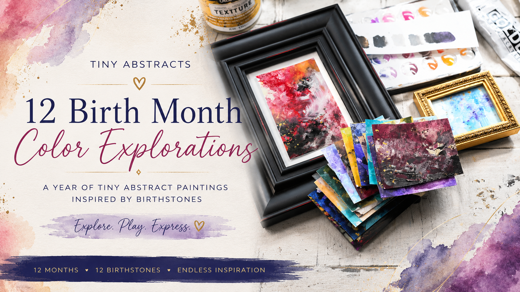
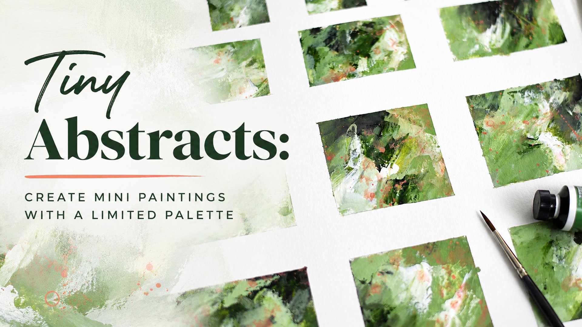
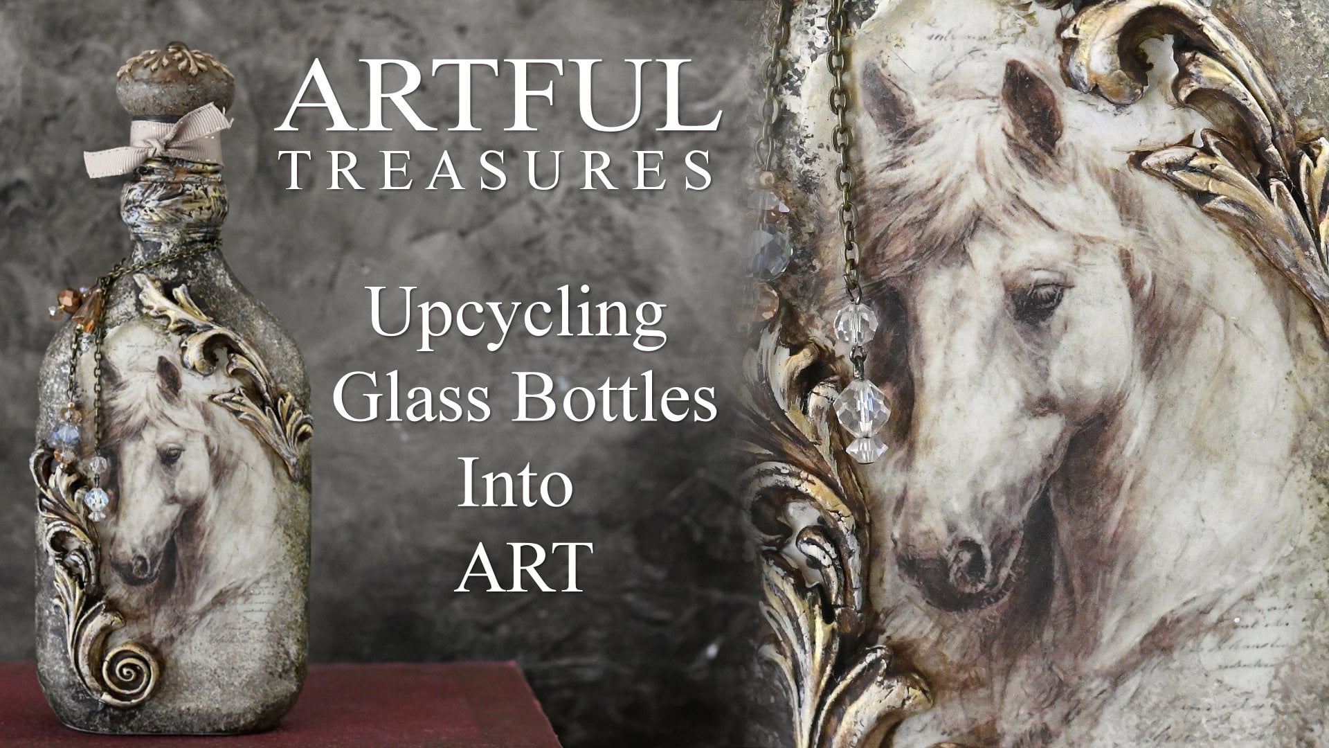
1. Welcome: Welcome to Tiny Abstract 12 birth month
Color Explorations. I want you to join me for a colorful mixed
media journey as we create tiny abstract
paintings inspired by the beautiful birth
stones of each month. In this class, we
explore the rich colors, moods, and personality
of all 12 birth months. We have January,
February, March, April May, June, July, August, September, October,
November and December. Rather than focusing on
realism or perfection, this class is about exploration, experimentation, and discovering
your own creative voice. We'll work on watercolor
paper and we'll create each month's paintings in
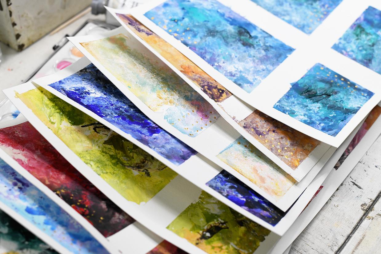
a grid format like this. So you will be able to complete several paintings
per each sheet. By the end of the class, you'll have a growing collection of many artworks inspired by the gemstone colors and
the moods of each month. This is a mixed media
friendly class. So use whatever supplies you love or combination of your favorite materials as
I've done in this class. I use acrylic and Watercolor for my two
mediums in this class. Throughout the class, we'll
focus on mood, atmosphere, color relationships,
texture, and intuitive painting rather
than creating exact copies. Every painting becomes
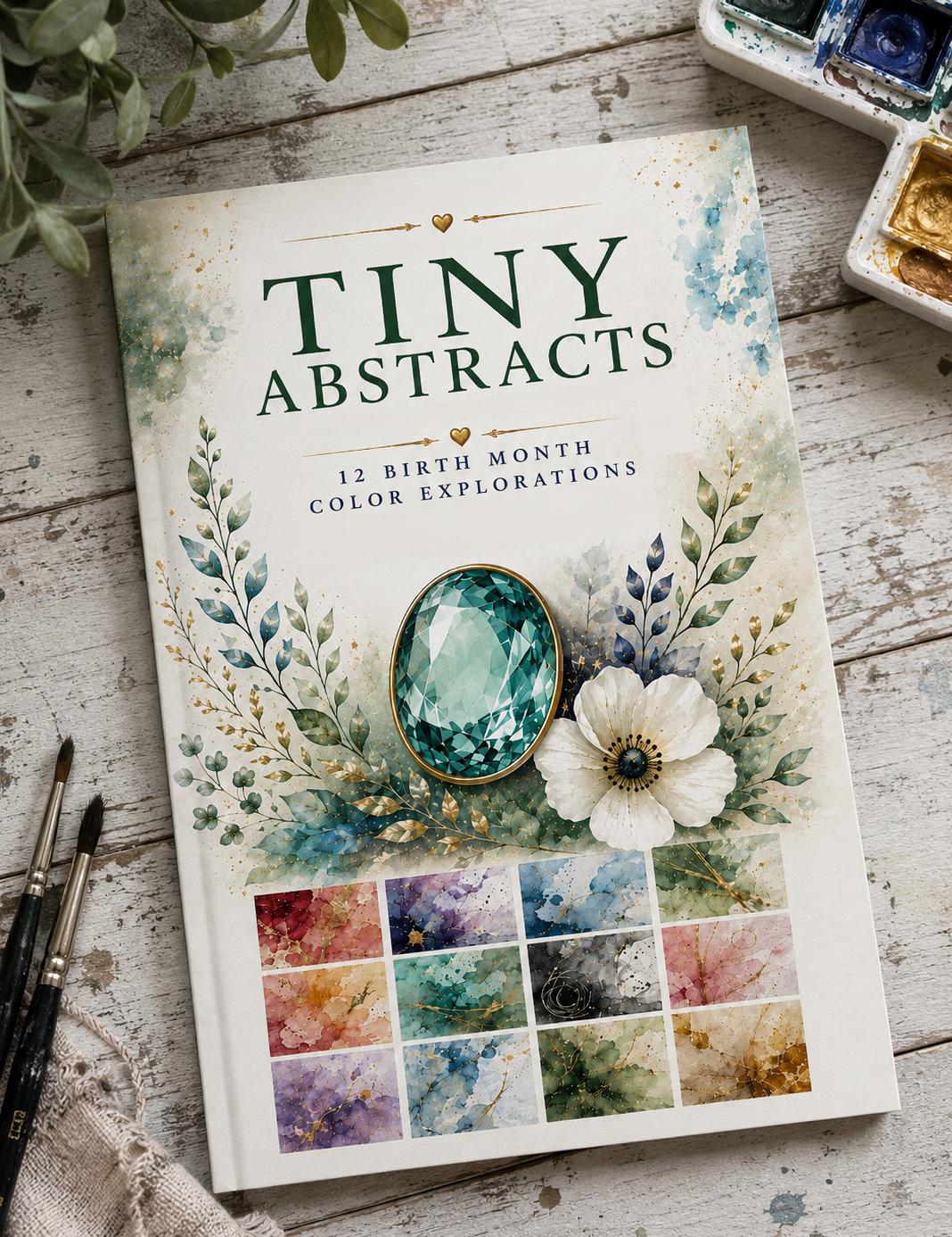
uniquely yours. Included in the class are 12
lessons, one for each month. And you'll also receive this free principal birth
month inspiration guide available in the class
resources section. The inspiration guide features four color combinations for each month to achieve different
looks for each month, along with other tips,
inspiration and ideas. Use the guide as a
jumping off point. Don't feel you have
to follow it exactly. Mix things up, follow
your intuition, and make the work your own. This class is suitable for beginners and experienced
artists alike, especially if you like
color, atmosphere, intuitive painting, and creating simply for the joy of creating. So let's loosen up
explore color and create tiny abstracts that
are meaningful, expressive, and uniquely yours. Let's experiment. Let's play, and let's have fun with
different colors for each month. I look forward to
seeing you in class.
2. Class Project: Let's talk about
your class project. For tiny abstracts 12 birth
month color explorations, I want you to print out
the guide so you'll have your colors you can refer
to and work off of. Of course, you can alter
anything you wish to alter. I want you to pick a
couple different mediums to work with as I
did here with these. I used Watercolor and acrylic. It as my mediums. And I want you to pick
some tools like I did in class that you can work with consistently through
the whole series. Now, I would love it if you
would do the whole series. I would love to
see a spread like this of where you did 12 months so we could see all the
beautiful color combinations and how everything comes out. But I know that's a lot of work, and I know a lot of people are gravitated to their own birth
month or their families. So if you just want to do one or a couple or a few,
that's fine too. Get your watercolor paper out, tape it off consistently through the ones you want to do as far as your sizing
with your tape. Use your mediums of your
choice and your tools of your choice and come
up with a fun abstract for your birth month
or a friend or a family's birth month and share it with us on the
class project page so we can see what you have created because everything you guys
do inspires everybody else. Thanks again, and I hope
you will enjoy the class.
3. Supplies: All right, let's talk about what supplies you
will need to create tiny abstracts and do the 12 month birth month
color explorations. First, you'll need the guide, which I provided for you in the resources section as a PDF. And this little guide, you can print it out or you can
look at it on your computer. It talks in here
about what kind of supplies you might need and a
little bit about the class. It talks about how to use the birth month color sheets
to inspire your paintings, and it gives some steps here which you can follow or
not. It's up to you. And then it goes into the month with the different burstones. Some of these months
have a couple of different burstones Like June has several different kind of stones that you
could potentially use every sheet has four
options of color combinations, and we have mood words and
texture and mood ideas, which are just little
inspirational words to help you along or maybe you'll connect with a word of something you're feeling
rather than a color that day. We talk about neutrals here, so you definitely
need the guide. Let me put that
aside for right now. You'll need some
watercolor paper, and I tape my watercolor
paper, too, a cutting board. Got a set of three of these at Walmart for a
really cheap price. And I love them
because when I tape the paper on the cutting board, I can pick it up and
tilt it to move when the paint's really wet.
You'll need some tape. Oh, I forgot. I'm going
to I like to tape off the size of an index
card for some of these, and I'll explain
that in a minute. Obviously, you'll
need some paints. I have acrylics here, a variety. I keep all my neutrals here on the desk that I like to
use so they'll be handy. I have watercolors, which
is what I'm going to be using for this class as my
main one to start with, and I may graduate into
adding some acrylics. These are a set from Michael's, it's called I forget
the actual name of it, but it's at Watercolor set. But they make really
pretty mate colors, and you can see this is what it looks like when you
see it in the store. And I made this color
chart so I could see each row what the colors look like. So I'll
be using those. I also have some of the
Neocolor II crayons, which I've started
to really enjoy. I have Inktense blocks. That's another material
that I like to use. They are very, very rich
and permanent and very fun. These are some of my favorites. Now, there's obviously
a lot of other choices. Like pastels and pastel
pencils and things like that. You'll need paper towels,
wipes, spray bottle. This is a fine Mr. Spray bottle and I also
have a mini one. I got a set of four
of these or six of these from somewhere
probably Blick. And I always have
some gesso on hand. I use the titanium white
acrylic is a neutral, but I like gesso as well.
It's a little thinner. Obviously, brushes,
palette knives, sponges, anything that even like
an old toothbrush, it can do splatters, catalyst wedge,
anything that you can move paint around with
or apply paint with, you could even use your
fingers, which I've done. You might want to
palette for your paint, pick this up. At
the Goodwill store. I really like this 'cause I can actually use my
palette knife on this. It's wide enough to mix colors. So if I'm using
acrylic, I like that. And I have a little journal
notebook here that I just put extra paint in
that I have on the palette, and just to either use
as collage papers later, test colors, see how
things are going to look, try different marks, try
blending and not blending. So it's always good to have
some paper laying around, whether it be in a journal or just some extra pieces of paper. Like, here is an extra
piece I had done, where I took the extra paint
that was on the palette, put it on here with
Palette Knife, and then added some
gold on it just to test it to see how I
was going to like it. And that can now be
a background for something else to
add more to this, or it can be collage
paper in the future. And, of course, rags to clean
up with if you need those. But that is pretty
much all the supplies. You might see me use some other supplies like a
bamboo skewer and an old fork. Anything, like I said, that you can move paint with or apply paint with is
a potential supply, even a little stick from
outside off one of my bushes. So that covers the supplies, and we are ready to get into starting the
January painting, which will be my first one.
4. Prepare Your Paper: Alright, it's time to get
started with January. So I'm going to get
out one of my sheets of the nine by 12
watercolor paper, which fits perfectly on
my little cutting board. And I'm gonna tape this off. And I'm also gonna use
an index card to mark off some a couple of spots
the size of an index card. And the reason why is because
I do frame mountain frame. I'm trying to get my
tape straight here. I do mount and frame my pieces on I'm sure
that's not straight, but I mount them on a plain piece of paper or a colored piece of paper
or some kind of backing. And then I put them in frames, and the index card
size is perfect to go on a four by six or five by seven or even an
eight by ten frame with a nice wide border. That's just a good size, and I like to do a
couple in that size. Let me see here. I try to keep these borders about the same all
the way around. I can see through the tape. So just trying to keep
it as I'm eyeballing it, but I'm trying to keep it as even as possible as far as the border size
around the edges. In case I want to
leave a border, I don't always leave a border, but sometimes I do
like to leave one. Alright. So I'm gonna stick the index card here right there. And I'm gonna do a piece
of tape to go here. But I'm not gonna go
over the index card. I'm gonna go beside. Just right up to it like that. And then I'm going to
do another piece across here underneath the
card not overtop of it. Just keeping it lined up
with that edge there. Now, I'm going to move the
card over here like this. I'm gonna do another
piece this way. Like that. And then I've got
one more space here. And if I put a card there, I'm going to have a
little strip right there. So I actually may leave that
one just a little bit wider. It would still go well in most
of the frames I mentioned, and I'm sorry if I
hit the camera there. Let me adjust this a little bit. So you can see a little better. So I'm gonna leave
that one. So these two are the index card size. This one's a little
bigger, and these two are just random
ones. That's okay. So that is what I do
to prepare the paper. Now, sometimes I will wet the
paper before I get started, but because I'm going to
be using some Watercolor, I'm going to have a lot of
water on this paper anyway. So I don't want to get
it like super duper wet, so I'm not going to wet
it before I get started. So the next video, we will start with January.
5. Paint January: Okay. Getting ready to
start January here. And on the page for January, I have four choices of color
combinations, suggestions. These are just suggestions. You don't have to use them, but I've used a couple of these already on some of these sheets, and they work really well. So you might want
to consider them. There's some color suggestions. There's some mood words. That just kind of
get you in the mood. If you want to add some
words to your art, you could write those on there. And then there's some
texture and mood ideas for if you're doing
a layered painting, different textures that you
might want to put in there, different things
you might want to do to create some
interesting texture. And then here's a
section about garnet and tips layering and softening
edges and things like that, which those are the same
tips for every month. But you might want to read over this first before
you get started. I'm familiar with it
since I made these, so I already know what
I'm going to do here. Now, on the watercolors, I swatched them out here. This color here is
closest to the garnet. It may not be quite as dark
red as it needs to be. We've got this dark brown here, which is probably close to
a raw umber of some sort, and we have the black,
which can deepen this color a little bit more
to get it closer to that. And that's what these
color suggestions here in number four suggests, the red, the umber, the titan buff, and the black. Now, there is no
titan Buff on here. I have my little acrylic
neutral chart here. This is titan Buff. This
one's kind of close, but it's more of a peach. You know, I could mix colors, but that just takes more time, and I really don't want
to fool with that. I like the colors to mix themselves while
I'm doing things. And mix visually. So it just helps me go a
little bit faster. And that's what I'm
trying to do here. I'm trying to create
some fast fun projects in my studio that will
end up being really nice later on that I can translate into something I could frame and gift as a gift
or sell or whatever. So these are my neutrals. They're up here in a box, and I don't know if you
can see that on camera, but I keep those handy. And these are the watercolors, and I like to mix acrylics
and fluid paint of some sort, whether it be
watercolors, ink tints, the Neocolor twos are
very nice to introduce some fluid work, any of those. So what I'm going to start with my favorite thing to do is
to take my darkest colors, not the optional black. I'm going to try
to do number four here, this color scheme. I could do this one.
It's got burnt sienna in it and titanium white. I could do that one, but I'm
really feeling this one. I don't know why. I just am. And it's got the word
luxurious for a mood word, and that just appealed to
me because I am going to be adding gold as an
accent at the very end. So I like to take my lightest
color and my darkest color. Before I get to the true color, the main color, and I like to
add those in with acrylic, then go more fluid with the
main color and then bring acrylic in if I need to to
deepen that if I need to, if that makes any sense. So what I'm going to do is get my palette knife out
and I'm going to go with the titan buff
first, which is right here, and very loosely, without
thinking a whole lot, I could use the wedge now I'm going to use
the palette knife. Everybody's got a palette
knife. It's pretty easy. So I'm going to just put some on the palette knife
a pretty good amount. Oops. That's too
much, but we'll see. And I'm just going to move the palette knife
around, even rub it. And I don't mind leaving a little texture on
there of some sort, like a little thick texture. That just adds interest. I'm just going to put some of the lighter color where
I might want it to go. And I'm kind of
scrubbing it with a palette knife and tapping to add a little more
texture in there. Let's get these
bottom ones here. Get a little bit more
on this palette knife. Just very loosely without
thinking and make a mess. Let me see if I can scrape
some of that extra. Don't even need to put
this on my palette. What I do need to do, though, is get a fresh paper towel and keep my keep everything
clean. You get them? I like the wipes because
they're already wet. And I like paper towels. Because they just they're
useful for everything. Alright, so that
is the titan buff. Now the darker color in that
color combo was raw umber, which is this acrylic. I'm going to get
some of this with the palette knife as well. I'm going to get that tightened buff cleaned
off of it in the water. Now I'm going to decide
where I want to put some dark on each one of these. Let's see. How about that? How about it over here?
A little bit there. Just don't. Just move. Let the palette knife, let your hand move,
let the paint move. Just don't overthink it. Just till it feels right to you. And if it mixes a little
bit, that's right. And maybe won't put
as much on that one. I try to pick it up off
the taped area if I can. Maybe even cap the
knife to create a little fun texture and
marks in there. All right. So we have the lightest color in that particular color combo and the darkest color
other than black, which was the optional color. Now I'm going to go in
here and get this red, which is this one right here. I don't know if you can see
you can kind of see that. It might be off camera just a little bit. Let me scoot over. So I'm going to get my big
round brush really wet. Just tap some of it off in the bucket water bucket and
get this red going here. And I'm just going
to start swooshing some of this red color around in the empty areas and maybe add a
little bit of water, drip some on there like that, get some more for this one. Notice I'm holding the
brush very far back. I'm kind of doing
it sideways very loosely around Once again, loose, free, fast, not thinking, I'm going right into the
acrylic, which is still wet. Maybe do some little
droplets in that one. And I know this doesn't
look like anything exciting at this
moment, and it may not. And just put some
water on there. Move some of that around
a little bit more. Try to break up
those hard lines. And another way I like to do
that is with a damp sponge. I like to just kind
of go in here with a damp sponge and
speckle up some of it. It's too damp. It's
not really moving it. So let's do this. Let's get the umber from
the Watercolor palette on the sponge and try to speckle some of that
in there in a few spots. Like that gives
it some movement. You could even pick up
some of the red in there. I love sponges. I use
them a lot in my work. They give some interest and excitement to
the pieces, I think. Let's see. Let's pick up
some more red for this one. And of course, the red
on top of the brown, it will look nice and dark. Just not really
thinking much at all. Now, I think I have a
lot of brown in there, and I think I need some
more red over that. I'm going to stick that
sponge in the water. Let's see what I can do with
this red with the same red. Let's see if I can
get some more of it. See if I can tap
it. There we go. Of course, it's going
everywhere when I do this. H and I don't have enough
water on there, probably. Just really really fast. Oops, I actually hit
the paper. That's okay. Let's do that here. Let's
hit the paper, some. Let me make it a little bit.
Oh, I kind of like that. Let's do that some more on
some of these other ones. Get a little more
water on there. That's kind of fun. Hmm. I got some good red going on
there now. Let's see here. I think I might want to
integrate a little more of the titan buff somehow over
top of the darker areas. So what would be the
best way to do that? We could do sponge or we could do the palette
knife again. So let's try. Let's see. Maybe we can do a fan brush. How about a little fan brush and get some
of that in there? We get that brush a little wet. And to do this, I'm actually
gonna have to get some on my palette here to be able to use this
fan brush properly. Fan brushes make good marks, and they also blend well. I dampen the brush, so let's get some
tighten buff on there. I'm going to hold
the brush way back, and I'm going to connect
it where I want to connect it just kind of help
it flow a little bit. Even I like doing my
brushes sideways. I got a little bit of red on
there now, but that's okay. Let's see. This is a
hard line right here. Let's break that up. And I'm just lightly
holding it so I can drag it a little bit. Create more interest that way. Well there's some hard land right there, so
let's pick that up. Let's go this way with it. I'm just lightly
touching it on there. Let's get some of
that down in here. Now let's go this one. And then let's see. This one, and this
one's got hardly any. So we really need to bring
something in there. Alright. So we got some more
tightened buff in there. And I'm gonna spray
on that palette to keep that paint a
little bit looser. So now let's go with
that big brush again. I get the red. Soak it really good. And once again, I'm
going to keep it loose bring some more of it in there in
some different spots. And then you got a lot
of water on that brush. Let's bring some in this one, 'cause the red is
the main color. I haven't used any black yet, which is the suggested accent. And I'm just going
really, really fast. Not really thinking. Get that red moving throughout
these pieces. Alright. Now, what about the
black? Do we want it? Greate some black. Maybe
us Where's my small brush? Here it is. No. I lost it. There it is. This is my
smaller round brush. Maybe let's do Oh,
you know what? Let's do the toothbrush. Another fun brush.
It's already wet. Just get it a little bit wetter and scrub
it in the black. Really good. And then it's
really hard for me to do this. I tend to pull from the bottom, and it goes way that way, so I'm toward me. Just flick some black in
there. Using my finger. Maybe even scrub some of
it in there. Why not? I think I need some more. Well, let's let me do
the smaller brush. Where is it? I lost
it. Here it is. Okay, let's get some
black on this brush, and let's tap some little
loose, watery speckles. I'm trying to tap more toward the dark areas. There we go. And maybe even brush some in there like this in a few
spots, brush it out. Oh, yeah. That's kind of cool. Okay. Now, what do I want to do? Keeping with the working fast. Do I want to do some water
spray or do I want to do some paper towel pickup
or anything, really? I could do a little bit of
water spray where I put that black on some of these and let that
black move a little bit. Maybe even get the red to
move a little bit more. Now I'm going to get
my January here. I think I got a little bit too much of the tighten
buff still showing. So taking that
small brush again, I'm going to go back
into the red to get a really liquity and do
some more red splatters. And maybe even tap
some in there, move some of it around on these. After I do the splatter,
tap it in there. See, I've got these big areas. And, you know, it's too much
too much of that big area. It needs to be more of an accent and have different
shades of the red, at least in my opinion. Maybe even put some right here. There we go. Let's get down
here to these bottom ones. It's not as much of an
issue on the bottom ones. So I'm splattering it
on and then tapping it into the wet acrylic paint, which helps blend it a little bit and even move
it around some. Maybe still have a little
too much brown showing. Maybe Let's put a little red in there over top of that black and just
kind of layer it in there. It's gonna have to dry anyway. That, you know, with
Watercolor being transparent, we'll get some layers of
that red over the brown. The red, the garnet
red is the main color. That's the thing to remember. And just when I feel the
brush gets too goopy, I just kind of brush it off. I mean, wash it off. Trying to get over that brown, let that brown show
through but not be so obnoxiously loud. And, you know, we'll
just have to wait and see how this dries up. But let's compare again. It's looking a lot
more like this now. Got a few little
highlights in there. Got the warmer tones
from the Titan buff, mixing with everything,
and the browns in there, the rich browns, a little bit
of black, but not too much. Really, really messy and fun. But I kind of have an idea. One more idea here if I can
find what I'm looking for. Ivory black acrylic. I want to try something with the palette knife here with it. And I want to try to do a
really thin line on there, 'cause Black makes
everything pop. Well, let's see. I'm going to try maybe just get a
little bit in there. Just a few little marks of it, a little bit of texture from it, a little bit more on there. Kind of pulling it and doing some lines and then moving
some of that around. Even just stamping
some of that on here. That palette knife
getting a mess now. This one had a lot of
water right there. But it just makes
everything pop. Maybe some little lines
here and then pull it out. Then I'll add some texture, tap it a little like se
another couple little lines, maybe a little
criss cross there. Pull down on this side, maybe tap some right there. No rhyme or reason to this. The goal is to get the colors. You can always scrape it back
off if you don't like it. Stamp some more on that one. Maybe move it around
a little, scrub it. Okay. That's enough
for the black. So we got a mix of acrylic
and a mix of watercolor on here that needs to dry. Before I add my gold
metallic accents to it. It really needs to dry. I can't do it while
it's this wet. So it's just gonna have to dry. So we're gonna put
the pan on this, maybe a little heat gun, give it a few minutes to dry. But there's what we're
looking at right now. And I know it looks
like a huge mess, but I'm telling
you, it will look really cool when we
get the tape off. Alright, dry time.
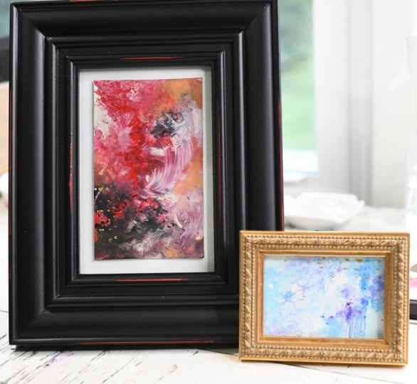
6. Finish January Art: Okay, let's take a look at this. It's pretty dry. These thicker areas are still
maybe a little bit squishy, so we're not going
to touch them. But before I pull the tape, I would like to put some of this metallic texture
paint that I love. This is by Deco art,
Americana decor texture. This one is bright gold. I also use their
metallic fluid paints. These are a little older, so they're a little thicker, but they're not as thick
as the texture. And they just came
out with these, and they're really
nice and thick, and it's a beautiful gold, and it really adds a bit
of richness to things. And I have here a vintage fork. Now you can apply your
accents accent color of your choice with
whatever tools you want. You can use a tiny brush, you can use stencils,
you can use sponges. You could use a stick. I've done this before with
a little stick and applied some I've even
used pine needles, dip it in and drag it
and apply some that way. But for this particular group of birth month images
I'm working on, I just want a
little bit of gold. I don't want to overdo
it because gold is a very strong color and I want it to add a
little bit of richness, but I don't want to overdo it. So what I'm going
to do is just dip this fork and
everybody has a fork. You got a fork, get a fork. It doesn't have to
be a vintage one. I'm just dipping it in the
texture to get some on there. And I'm going to pick a
few spots on each one to just add a couple dots and
I'm just touching it there. I'll dip it some
more and move it in a different area and just
touching it in different spots. And I don't know that I got that one right where I wanted
it, but it doesn't matter. There's just a little bit
right there on that one. Then this one, maybe
go up here and go this way and put
a few little areas. The nice thing about
the fork is you get several dots on
there at one time. If they go on there correctly. I got a little bit too much
on the edge further up. You don't need to
dip it in very far. Let's put one more there. Just add a little bit of gold. And this one, how about we go in this dark
area right here? I just keep dipping it until I feel it's
got enough on there, and I'll wipe the excess off. So that might be enough
like three or four rows of dots per one. And then on these smaller ones, I just pick maybe two areas. And I like to go different
directions on them so they don't all look the same. So I just have a little bit
of dot accent, not overdone. Now, another thing
you can do with the fork is once you have
enough of that on there, you could drag it
different directions and get different
marks that way. But I didn't really want to overdo it on these
that I'm working on today. So I'm just going
to wipe that back off into the tube the best I can stick that in my water and then we're
going to pull this tape, and I'm going to
be careful because the gold is still wet. But if you get a gold mark
where you don't want it, you can always take
your little tiny brush, get some water on it, and blend that mark out
while it's still wet, and it will leave a sparkle over your image in
a certain area. So if you wanted a
little bit more sparkle, you can get that stuff
wet and then drag it with a really wet brush
and it'll just leave almost like a glitter, but it's just a slight sparkle. I just wanted a
little bit on these. Now, let's compare.
Before we I think we're pretty good with the
garnet on all of these. But we'll compare again
here in a minute. Alright, I'm gonna pull. Let's see. Which
one did I do last? This one? This one. And try to pull slowly so
you don't rip your paper. But the reveal is the
most exciting part to me. Now, on the next months
that I'm going to do, I'm going to do
the dots the same way with the fork on
all the months for this particular group I'm doing because I want them all
to look like a series. So I want them all
to look similar. So I'm not going to show that necessarily in each video
for the subsequent months. It will already the dots will already be added
before the reveal. Just to save a little time because it's kind of repetitive, I'm doing the same thing for
the accents on each one. Alright, now I get
this piece off. If you pull too
hard and too fast, you could rip the paper. So I can tell right now
I'm already loving these. And I hadn't even got the
rest of the tape off yet. Let's see here.
Let's try this side. And some people save their
tape and use it in collage, but I don't done with the tape. Once I'm done with this,
I don't want to see it again. So I'm done with it. If you were using a
white tape, maybe. I just like this
blue painter's tape. It works very well on all
the things I've tried it on. So let's talk about some other ways you could add accents. Case I didn't say, I did
say the different tools, but you could use stencils
if you have stencils. You could also tape off
if it's really dry. You could tape off
areas and paint with the gold and some lines. You don't even have to use gold. You could use white. You
could use another color. You could use silver, pearl, any The metallics
just add to it. And I mean I'm trying to do these based on the burst
stones, which are jewelry. So I like the metallic because that's what you
usually see with jewelry. Alright, let's get this
last piece of tape off. So far, I have not
ripped the paper. Ya. And I'm pulling
very carefully. There we go. Okay, I'm really liking these. I am really liking these. Now, let's see what they
look like. There we go. Move my board out of the way. So here we go. Did we do
good with January or what? Is that not cool? Look at
those how pretty they are. Yes, yes. Now, I wanted to
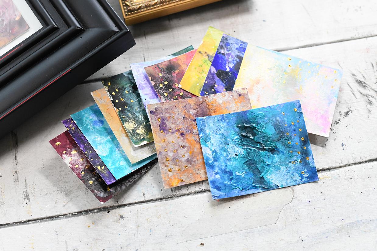
show you something else. Before I close out January, I've already done a couple
of January's sheets in a couple of different ways. This particular one was done based on number
one suggestion here, the deep classic garnet. And this is all acrylic on here. It's quite a bit richer and bolder with these color choices
that I used in acrylic. It's good. It's good. But I wanted to try
some different things. So that's all acrylic. And then I have this one here, which is pretty much all
watercolor with the gold added. I did add the water here. You can see how it's spread out with the gold and
made a sparkle area. This is all watercolor
and I taped these off different so I didn't
really have enough over there. And this one I taped
off really different. I had a lot of little
abstracts, tiny abstracts, which is great because I
frame a lot of tiny pieces. So anyway, this is
all Watercolor, and this is all acrylic
and you can see. Now, this was done based on number four of the
color suggestions. You see the difference, but they still all tie
in with the garnet. But you see the difference
on those four choices. If you use those different
color combinations, you'll come up with
a different look. From the same months, which is fun to try the
different choices. Acrylic, Watercolor, and
then this one we just did. For class is the acrylic
and Watercolor mix. And this is my favorite. I like using acrylics and
then the fluid paints of some sort along with them because they soak
in with the acrylics. They make the
acrylics soften some. They blend a little bit
nicer with the acrylics. I just the acrylics give
it a little boldness, the Watercolor gives
it a little softness. So it's the perfect
combination to me to use both. But all of them look
great, honestly. So there is January
and we are ready to start February in
the next video, and I hope you will watch
all of the months and do your experimentation
with this I suggest doing it the
same way for each month, not necessarily the
same choice here. But if you're going
to use, in this case, I used acrylic and then
Watercolor mixed with it, and then the gold with
the dots with the fork. If you do it the same
way for each month, you'll have a cohesive series featuring all 12 months
by the time you're done. And you can see
just by looking at these other examples how
different they look. Based on what media was used. You don't have to
do that if you're just experimenting and
wanting to have fun. But if you're going to
do the whole series, try doing it with the same
media throughout each month. And that way, all of
your months will have the same kind of look but
different color combinations. But I wanted to show
you these so you could see what you could do with
the different medias. Anyway, we are ready to
move on to February. Thank you for joining
me for January, and I hope you guys have
enjoyed this lesson, and I'll see you
with the February 1.
7. Paint February: Alright, I'm ready
to start February. Now, I've already
taped off my paper, just like I showed in the initial video
preparing the paper. I've done it the same way. These are all going to
be done the same way, so no surprise is there. Now, February has these
pretty amethyst colors, and I have the purple, the dioxyzine purple
and the acrylic. But I also and I probably
have the rose, too, but I also have the
rose color here and the purple here and the
watercolors here, these two. And since I'm doing
a combination of acrylic and watercolors, I thought I would try that
purple instead of this purple, but I'm going to keep it handy
in case I want to use it. I'm looking at this
soft lilac one. For some reason, these colors
are appealing to me today. Um, dreamy, intuitive, gentle. I'm just kind of
drawn to this one today rather than the
stronger ones over here. So I think I'm going
to try this one, and I do have titanium white, and it said, add a touch
of raw umber to soften. So I don't know how much
raw umber I want in there. Probably not a whole lot. So I'm thinking let's just put this one
aside for right now, and I can bring it
in if I want to. Instead of putting
two colors on here, the light and the dark neutral, I think I'll just go
with the white on here, and I could even bring
in a little titan buff, which might be interesting. And that's right here.
These are just suggestions. See, this one here
has the titan buff and the titanium white. So they're just suggestions. You can do what you want to do. I may leave that out in case I want to bring
some of that in, but let's just try
putting some titanium white on this paper, just to get started
and then bringing in maybe some of the raw umber, maybe the titan buff, maybe different
ones, maybe both. I'm just going to put
some of this white on here to get started
with the palette knife. And I know it's white.
It's hard to see. Like I said, no rhyme or reason. Just get it on there and get some texture going in there from this paint,
from this acrylic. Just be very loose about
it. Don't think about it. Just put it on there, wherever your heart desires. These are meant to be
done very quickly, which I don't have a lot of
time in the studio today. So these are perfect for when you don't
have a lot of time. Let's see. Alright, let's put
that in there. We'll keep this out
in case we need it. I could put a little bit of the raw umber in here with the pallet I'm
gonna get my paper towel. Should have your
paper towel ready. And let me just put a little
bit in some of these. Not too much. Just a little bit for some darkness in there. Don't want to overdo it with this color because
it is pretty dark. And we're going to go over
this with the watercolor, so this will be a light
and a dark neutral, however, There we go. So now we have the
light and the dark. If it doesn't work, well,
then it doesn't work. That's a whole part of
this experimentation. And I'm going to use my large round brush for the watercolor. And I think I'm going to
go in first with this purple and just kind of
drop some of that in there. Near where the brown is. I already got the
purple and the pink. And I'm going to use
my spray bottle. Let go ahead and
spray some on all of these just to get the
paper a little wetter. That'll help that paint
move a little bit more. And just letting the paint
go where it wants to see, it is kind of softening that now that I'm messing with it. Well, I got that
purple really wet now. And I've already got
it over into the pink. Since the purple is darker, I'm trying to put that near
where that the brown is. I'm ending up getting my brush really, really messy there. Get a little water on there. Yeah, I've already got it
onto the pink in my pallet. But that's okay since I
plan on using both of them. Alright, now, since
I sprayed that one, I'm gonna spray move move some of this paint
around a little bit. Just buy some little spritzes. This one right here I
can't really get to. This is why I like to
use the cutting board, though, if I want
to make it move. You know, that one
moved all the way down there. That's okay. We'll just roll it around. Let's see here. Let's
see what can happen. Just roll some onto
each one if needed. Can always move it
out of the way. That one's getting
really dark on the bottom 'cause I got
a lot of purple on it. Alright, let's get some
of the pink in there. Well, I got some purple
on the pink here. Gonna pull that off.
That's not the right pink. The pink I'm looking for. See, I used this purple and
I got some purple on here. But the pink I'm looking
for is more this one, which is right here. Yesterday, I used this
the crimson color. This is the one I want to use. So I'm gonna get that pink. Really wet brush and
just kind of Oops. Drop some of that in there. And I need to let me see if my little sprayer will
do any better than that bigger one. Not really. I mean, it's wetting
it a little bit, but Just get some
water in there. That'll help it move.
And, of course, I'm getting acrylic all in the water to it,
which isn't good, but you can take it back off by getting that brush clean
and drying it off. Now That one's looking
kind of pretty. I'm just dabbing
it. Wherever Wever feels right at the time. This one looking really cool. I'm not sure where I want to put the pink. Maybe right there. Cover up some of that brown. Maybe right here. Yeah, I got
a lot of pink on there now. Now, let's see if I can move
some of the pink around. Now, what do I want to do? How about some more purple? And I've got pink that's kind
of falling everywhere here, so I'm gonna try to soak
that up out of the palette. What about using my
trusty little sea sponge or piece of little sea sponge. These actually come
in a packet of, like, ten from Walmart. They're just little squares.
They're already cut, but they're great for
small pieces like this. So what if I just get that
wet and go back and dip it in that purple Watercolor
and just pounce some of that in there
throughout that design. Give some interest
to it. So pattern. Now, let's try this one a
little faster on that one. Now, this one, even
grab some of that pink. I make a real mess with a
palette when I'm doing this. But that's looking
pretty amthysty. Pink's a little strong, I think. And I really need a
paper towel to dry some of this up. Alright. So I'm gonna tape my little
paper towel 'cause I got a lot of wetness
on here in some spots, and I'm just gonna tap into some of these areas
where it's super wet. This one is really super wet. And pull some of that back off. Alright, so we've
got quite a bit of pink and not enough purple. So I really think I need
some more purple in here. And I may need to move
some of the color around. So how about if I just
get the palette knife and some of this wet areas here? It's really wet and maybe even do some little bit of
scraping through things. See what that does.
That's interesting. Make some little lines, and I try to do
whatever I do to one. I try to do to the others, just so they have
similar marks in them. I still need more
purple, though. I mean, you look at
this right here. You got pink and purple, but the purple is dominant. And the purple needs
to be a little darker. So here's what there is
a darker purple in here. Right there. I was
using this one. Maybe I should use
this one a little bit. Maybe with the smaller brush. And let's just drop some of
that purple in a few spots. Let's turn the brush
sideways, and, oh, yeah. That's really pretty. Maybe go over some
of this pink so it's not quite so bold. So this is the
darker purple here. Just tapping it
where I want it to go on the side with
the brush on the side. And I'll move it with a
spray bottle if I want to, but see how it's blending
with the titanium white. And you can even
do some blending, if you wish to soften
some areas up. Put a few drops on there to move some of that paint
around and soften it. Get some drops in there to
move that that dark purple. Oops. Maybe even just a
couple Oh, yeah. This is what I need to be doing with this. Those splatters. That's kind of
interesting. Let's just do that on every one of these to get some of that
dark purple in there, and then I can move it around. Alright, let's put
some drops of water in there to help move some of that around so it
doesn't look so speckly. And then even go
back and get some more of the dark purple. I'm trying to bring it somewhat over the pink areas to
tone down the pink. And I also need some
over this brown area, I think. There we go. I may be right in
here on this one. I haven't gotten enough
over the pink on this one. So let's bring some of that in. Oh, that's looking kind of cool. And a little more of the dark right there over
that brown area. Maybe a little water
move some of that. And let's get some
more on this one. A little water to
move some of it. More up here, where
the brown is. Brown just kind of brings in
a little bit of earthy tone. Kind of interesting.
Alright, let's try to do something with
these bottom ones here. And bring some water in. That one, the pink
isn't quite as strong. I really like the shades
on this one already. So I don't know that I want to mess with that one too much. And some right here on this one. And over here on this side, and put a little water on there. Move some of that around. See, I like it when it
kind of paints itself. This one's got a couple blobs
right here I don't like, so we're gonna fix that. We got a little
bit of bright pink in there, and I
really like that. This one's got a lot of
just pink everywhere. So I think I'm going
to tone down some of that with the purple. 'cause it's too speckly looking. And on this one,
let's get some more. Move some of this purple
around. I like that. I'm trying to decide where
I want to go back with some pink on some of these. Because I like the
pink bean in there, but not quite as much as it was. And I don't know if I can
use the if I can roll this a little bit to move some things without it
messing everything up. 'cause I kind of like some of the pattern I'm getting here. And I'm gonna get some
of this excess off here where it's a little strong. I don't want it going under. This is really
strong right here. So I'm gonna pull out
some of that extra water. And the paper towels
getting kind of gross. So now I think what I need at this point is just
a little bit of that pink. So the pink is this pink,
which is right there. And, of course, I've made a
mess out of everything here, so I'm gonna try to
clean up some of these palettes a little bit,
where I got it too much. I like to keep things
all cleaned up and organized the best
I can. Alright. So that particular
pink right here. And I want to drop some tiny amounts where
I want it to go. Just to give it that
little pop of color, kind of wind it through here, but not where it's all
over the whole design. And this will dry down
some as this dries. Here we've got a little spot right there where some might
look good right in here. That is not as strong. I want to drop some more
in there on that one. I'm trying to There we go. Get some in there where it's not so strong that I don't want
it to be too light, either. Kind of want it to
look like this one. And here we got this
pink area right here. Maybe put a few drops of water there to
let that spread out some spread that purple
out. There we go. And this one doesn't
have hardly any pink, so I'm going to put
some right here and kind of come over here in this wet area with some of it. Drop a few little splats
on both of these. Alright. Let's see what I
can do with this last one. Alright. Maybe right down
in the middle there. I'm not sure I like this
section right here. I think that needs a
little more of the purple right in here. It's just a little bit too
I don't know. Not right. And maybe just drop
some water there to move that and add a
little bit more purple. Move anything around that
I want to move around. And probably at this point. Oops, I need to leave it set and let it dry
before adding the gold. So after this completely dries, then I will add my
gold texture paint just like I did in
the January lesson, and then I will peel the tape. But right now, I'm thinking I've got a good
mix of purple and the pinks and you can see here when you look
at the birth stone, it does look very similar, but it'll dry up a little
different than this. And that's the fun
part just letting it dry and see how it turns out. So I'm going to let it
sit and let it dry. I'm going to put a fan on it. I normally would tilt this up on my bucket and have
the fan coming across. But there's a lot right here, and if I do that, that's going to run down to the other design. And I don't want that to happen. In fact, I may move some
of this just right now. Just a little bit. To
move some of that around. But I'm not going to be
able to tilt it without it rolling all over everything
else. So there we go. The amethyst is
now going to dry, and we will be back
to see the outcome.
8. Finish February Art: Alright, everything
is dry with these. And I've turned it
upside down now, which I encourage
you to do to look at your work in different ways. I like these three
pretty decently. This one here, I'm not real
thrilled with the brown, the amount of brown
or the way it looks, and this one here as well. And I also think it looks
a little Um, I don't know. Like the water didn't flow
as good, like, right here. And I don't know. There's just there's I think it
needs more work. And sometimes I think
this when I do them, and sometimes I
don't this one I do. So I'm pulling out the purple
in the acrylic this time, and I'm just gonna do a
little finger painting. I'm just gonna put a
little bit on my finger, dab off some on the paper
towel just a little. And gently rub some of that in over top of where that
brown is really showing. Now, this kind of
brings you back to childhood when you do
the finger painting. But if you want a really
soft, smooth blend, and also when you rub it
over some of the texture, it picks up some of the
texture, which is kind of fun. Now that toneed down that brown, but it still shows
through a little bit. It's just like a darker purple. And there's some
areas around here where I don't like
that much white. So we're just going
to also move some of that around like that. Now, the acrylic purple is quite a bit more vibrant
than the Watercolor purple. And I really I really like that. I'm going to take a little
bit of the titanium white. And put it on my palette there, just a little tiny bit. And I'm gonna use my
finger with that, too. I mean, you don't
need fancy tools. I'm just gonna put a little
bit of that on there and see, like, right here, I don't know. Some of the marks I don't like. I'm just gonna drag some
of this white around. And I'm just doing it
very lightly so it's picking up the texture. That's there underneath. And then if you get
a little too much, just wet that finger a little
bit and smooth it out. It makes for a really
nice soft blend. And then I'm going
to I may as well squirt some of this
purple on here, too. This is just, um, kind of
fixing up and adding more. Before I get now, see, that to me, looks
much better now. And I'm going to get this
corner a little bit better. That just looks much better. So here I'm going to fix
this area. We it's dark. When you drag it
over very lightly, it allows the shade underneath
it to show through. So it's still there.
It's just not as brown as it was before. And then I got this
one spot right here that's kind of speckled. And you can use your finger in a circular
motion to help blend that in. Okay, that looks
a little better. And now I'm thinking,
let's pick up some of the white and notice that I have purple on my finger, so we're getting a
little bit of lavender. So that's fine. And I'm going to gently work some of that
over here on this side. It and then pick up a little more
and just drag it. Drag it around a little. And let's get a little
white and purple. Obviously, you can use a
brush if you would like. But I'm just doing a little bit. This also keeps the amount down. Drag some of that
across and give it some interest.
Just very lightly. Talk about having your
own touch applied, and then I'm going to get a little water
there because it's a little bit a little
bit too strong. But it creates like a
little mist over there. That little streak of
light in the middle. Okay, now, see how
these two look compared to this one.
With the water drops. Sometimes the water just
behaves differently. I don't think I applied it
differently, but maybe I did. So I'm gonna get a
little more purple. Work some in here
over this area. And let's get a little
bit of white in there. I like that it that little
burst of light right there. Pick up some more
purple layer it. The more layers you do of different little
things like this, the more interesting your
pieces will end up in the end. I do like this right
here pretty well. And I think I could work a little more of this
purple in there. Maybe even leave some little
thick lines on that one. Okay, I like that one.
Now I'm going to turn it around. Turn it around. Now, let's look at these. Now I don't like the
browns on these, either. Now that I've gotten
rid of them on those. You know, sometimes
you try a color, and it's just like,
not appealing to you. So, do something else. Bring in more of a color
you've already used or um you know, even bring in a new
color if you wanted to. There's no set rules. I like that little
bit right there. That's kind of interesting. I'm gonna move it
around a little there. And let's get we need a
little shoose of white here. On this one, just like
we had on others. I like to repeat
what I'm doing on every one because that way
they all look similar. They all have the same similar
marks, similar colors. Try to get a little bit
of that dark purple right there and tone that down. N a little swooshe of white
in this one, maybe this way. I might have got a
little too much of it. But by using your I'll bring some purple in
by using your fingers, you're bringing in very
tiny amounts at a time. You're not overdoing it like
you could with the brush. Okay, I like that, but I
don't like this there. So that's another reason
I like to use my finger, especially with these
being small pieces. Um, just cover that
up a little bit. With them being small pieces, well, there's a good
swoosh of white. I don't want to mess with that. But with them being small
pieces and using your finger, you're just doing tiny
little amounts at one time. So you're not overworking it. And it just kind of inhibits
your ability to overwork it. Now, there's a little pink showing through on all of them. I bring some purple on that. Maybe around this edge
right there a little bit. Okay, I like that better. So I wasn't gonna include
doing the gold dots. Oops on the video because I
did that in the January 1, and it's kind of repetitive. But since I had to
fix these anyway, I am going to include it here. And I'm gonna open
my gold texture paste and find my little
trusty vintage fork. And I'm gonna decide where to strategically place some dots. So I'm just dipping the
tip of the fork in there. And Oops. Try to get enough on there. I'm putting it's like not
wanting to come off real good. There we go. Maybe on
this one, we'll do some. Oops, that's a little too
much on the dot because I had it flat instead of
straight up and down. I might have to
move that one dot around with a brush
a little bit. All right. Let's
put some up here. Mm. To place them in
different areas. All right, put some
right here, right there. Just a little bit to accent. To add a little bit of
wing, I guess, if you will. This one to put some
right there, right there. Maybe right there, right there. Alright, I don't want to
overdo it on the dots. So that's enough at that. But I got a couple of them
that are kind of thick. I'm going to take this little
brush, really little brush. Get it really wet
with water and come in here and move oops, move some of these that are kind of thick or where
I don't want them, move it around before it dries, and it'll leave a little
bit of a sparkle there. I just drag some sparkle
through there on that one. And you can kind of
scrub it if you want to. I'm trying to move
some of that up there. Moving around. If you wait till
it gets too dry, it won't move as good. So, you got to work
kind of fast with this. And you can always dab some
back off with a paper towel, if you want to, which
I've been known to do. These are getting kind of dry, so really can't mess
with those very much. Let's try this one. Okay, that one's right. A little bit wet. Just move some of
that sparkle around. You can use a wipe to pick
up some of that or move some of it. Ounce some of it. I just don't want it
overdone with the sparkle. Now, this one it brought up
an area of color right there, and it made a spot right
there I don't like. So I'm going to go
back with the purple. Just a tiny bit on my finger, put dab some in there. Over top of that, and this one. Well, this one I want to go. This one might require
two fingers to do. No and sort of blended in. And this one here
is pretty good. This one there got a little spot right there
I don't really like. Alright, I think I like
those a little bit better. I'm gonna put a little
bit right there and dab some of that
off. Got too much water. Now, these just need
to dry really quickly. I'm gonna try to use heat gun. All right. Sorry about that, but, you know, it is what it is. Okay, let's let's check. With February here and see if we're in line with
what this looks like. And I think we're
pretty darn close. And these are not
completely dry. But in order to not have
to do another video, I'm just going to go
ahead and carefully pull the tape and show it to you, and then I'll let it sit
here and finish drying. Su find where my top piece of tape is and pull it very carefully so you
don't rip the paper. And I think these are
gonna be super pretty now. So the lesson in this one is, if you don't like what
you did on layer one, let's add some more. Switch paint mediums. Try other mediums. You know, like I switched
to the purple and the acrylic instead
of the watercolor. And that worked really
well. In this case. And then, you know, bring in a different
color if you want to. If you don't like the
color that you used in there and it just is not
setting right with you, cover it up. You can keep going. You can add as many layers
to these as you want. Alright, let's get these
outside edges here, if I can. Here we go. Trying not
to tear the paper, trying to go slow enough. Alright. Let's see if I can get this corner
or this corner. I think I went under
my board here with this one. There we go. Now, I think they're looking
really, really pretty now. And make sure your
hands are clean. In case you want to
leave a white border, make sure they're pretty clean, not have any wet paint on them. Now, this one I did go
under the tape here. So these I would probably
not leave a white border. Unless I painted some
white paint over that. I would probably just cut these close and not have a white
border. It's up to you. Itpends on if you want to do
anything with them or not. Just turn it around and get
this last strip of tape. Here we go. Now, we
started with it this way. So show it this way. And, of course, has
to finish drying. But how did we do for February with these first colors
and option number one? I think we did really,
really, really good. I'm real happy with the way
this has turned out now that I've brought in some extra paint and toned some of it down and, of course, added the gold. The little bit of gold is
just that little extra I'm doing on all of these to kind
of tie the series together. So if you don't use
gold and you want to make it look like a series and you want to do every month, but, you know, you
could use silver. You could use pearl. You don't have to use Metallic at all. You could use just a
plain colour paint if you wanted to accent or have no accents if you were happy
with them the way they were. But I think this
turned out really, really good for February. So what do you think?
Do you like February? I hope so. And the next month we'll be getting to is March. So let's just take
a peek at March. Oh, look at that
pretty aqua marine. I don't know if
I'll be able to get that color or not
to achieve that, but I'm certainly
gonna try some way. That's gonna be a
challenge, though. But in the meantime,
let's enjoy February.
9. Paint March: Alright, I'm ready
to begin with March. And I've been sitting here
looking at this for a while. And I wanted to say part of
my delay and what takes me so long in creating art sometimes is my inability
to make a decision. And I was having
that with this one. I've got some nice
turquoise shades here with some deeper blue. There's lots of choices here. I finally just decided number three might be the one
I want to go with. We've got white and
we've got black, and then we've got a
turquoise blue shade and ultramarine blue. And I was looking at
my watercolors here, and this one here is as close to the turquoise
as I could get. Maybe with a little
black added in that, it might be a little darker. This one looks like the
ultramarine blue to me. So I thought I might
use these two colors. And maybe a little
black to deepen them, but I also have the black and the acrylic and the
white in the acrylic. So I thought it'd be kind
of simple to maybe just play with the turquoise and the blue with
the black and white. And let's just see what happens. It may turn out, it may not. That's all part of
experimentation. And just deciding, you
know, which way to go. And you can sit there and
try to decide all day long. And I have black acrylic
here and white acrylic, and I think I'm just
going to start by putting some white acrylic on here
with the palette knife. Just to give a good base to
start adding some color into. Once again, I'm
trying not to think just swooshing some of this on. It gives a little
bit of texture. No way of doing this. And I like the texture it gives it because I like
texture. It's my thing. So I like a little
texture in my pieces, which is why I love
acrylics because they're so easy to get some
texture in there. And I have, of course,
marked off my paper like I showed in the prepare
your paper lesson. And I'm preparing
each month the same way that I show with
the same layout. This is going to be
interesting to see how this comes out. And this time, you know, I've been putting down two
neutrals to start with, and normally I would put down black and white
at this point. But this time, I'm going
to hold off on the black because you can really
overdo it with the black, and I want to bring it in later. Instead, I want to go
to the two watercolors, the turquoise and the blue
and get some of that in here. And I'm just using my
largest round brush, and I'm going to go ahead and sprit a little water on there
so this paint can move. I'm going to start off with
the turquoise or aqua shade and just drop it in there where I think it
might be interesting. Of course, it's blending
with the acrylic. Which is what I wanted to do. I'm just kind of try to make
some kind of movement there with it and go ahead and
add some of that over here. And I'm cleaning the
brush and trying to get that acrylic
off of there so I don't put it in
the aqua watercolor. Let's start up here on this one. So that's why I keep
cleaning the brush. I don't want to get that
white in that watercolor. This does look
pretty aqua colored. I'm gonna spray some
additional water on here to help move some of
this around in a minute. Right now, I'm just swooshing it wherever it feels
right at the moment. Didn't look at the
mood words for this, but anything involving
ocean colors is very peaceful to me. Let's see what we've
got. Deep, elegant, tranquil, mysterious,
expansive and thoughtful. Tranquil. That's the word
I like on that list. I do have quite a bit
of watercolor here. Let's see if that fell
down in the middle. I'm going to try to get some
of that up with a brush. Dot some of that in there. Maybe even do a few
little splashes, of course, I'm making a
mess in my palette here. I just don't like
to waste any paint. It's too expensive. Alright. Since I've got the small brush, let me go to that deeper blue and see if I can bring some of that in here in a few places. Let's just do like this
and flick some on. Oops. That didn't work so well. Into there, and then I can move it around after
I get it on there. Alright, there's some in there. So let's move some
of this around. Just kind of push those two
colors around in there with the white gives it a nice flow when you've
got some water on there. Actually, I'm going to put a
little more water on there. Spray some of this.
Move it around. Alright, now let's
get some movement in here to sort of blend
these a little bit. This first one is a little bit light because I blended that in a little more. And, of course, my
paper is starting to buckle up a little bit. So I'm gonna move it around by tilting some of it on that one. And then I'll get some
more water on there. That's kind of pretty. Now let's move this one a little bit. Where I've got the
little speckles, I don't know that I want
that many speckles. Makes it look a little bit too busy when you have
too much of that. But I'm just tapping
the water on there, blending this right end with the acrylic that's underneath
the white acrylic. There we go. That one that drop made a beautiful blue
shade right there. Well, let's get some
of this moved around. Is some pretty,
pretty aqua and blue. I do like both tones in there. I think we might need
a little more of that blue in there. In a few spots, I'm
just gonna drop some in with a very wet brush and very wet application and just gently move
some of it around. This one needs some
more blue, for sure. Let's put some over here. I really hadn't got too
much there in that section. And move some of it over here. That's looking pretty.
This one needs more blue. Maybe down here in this area. And bring some of that
mixed color over. Add a little more water. More water to help it flow. I'm just dabbing
the water on there. Now it's flowing, see. This
one I lost a lot of my blue. It blended out. So I'm gonna
drop some more in there. Maybe even grab a little more of the turquoise in this
one to deepen that a little bit. In a few spots. There we go and see that blue is moving into it now. That's
looking kind of cool. Well, so let me pick
up the blue here. The integrate some of
that into this design. And I'm trying not to think too much about a design
at this point. It's just wherever the brush lands when I first
pop it on there, I just work out from there. Oops, too much water. And now this one needs some
more blue dabbed in here. And, of course, I can
move the blue by tilting, which on some of these, I might want to move it
around a little bit. But I don't want it to get too streaky like my last one did. I felt like it was just
too much movement. I want to go around the
edges and pick up some of this extra paint that's
cooled up right there. 'cause it's a little bit
too much water in there. And this helps trim
that down a little bit. It'll still move and fill back in wherever I picked it up from. Just watch that dip that
paper towel in there. And doing this also creates
some interesting pattern. So I try to if I dab it on one, I try to dab on some
of the others as well. So everything gets a
little bit of that same mark making material. There I did a little too much. I actually have a
little blue left here that's very
liquid on the palate. So I'm going to drop some of
that in here, let it flow. And now I'm going to
go back to the aqua. And drop some of that. In each one. Oh, I got
too much white on there. And I'm trying to
pick areas where it looks a little choppy
to drop that in. This one's got a lot
of white space up there, which is fine, but I think it could look
a little more interesting with some more of the
aqua added in there. So if one gets a little extra blue or a little extra aqua, all of them do. Just to keep some consistency among the ones on the sheet. I've got a lot of
streaks in there. Now, I haven't added any
black in at this point. And the black is
optional on this choice. So I could decide if I
would like to do that, and if I would
like to do it with acrylic or the watercolor. And I'm thinking
using my really, really tiny brush here and trying to add some in
with the watercolor black. Just in a few spots where
things are darkest. Okay. Just try it on this one. And then just add a
little water to it to blend it out where it
doesn't stay super black. I don't know if I like that.
I might not like that. I think it's taken away
from the prettiness of it. So let me dab that
black back off. And let me go back. With the aqua with the larger brush and dab some in and then
the blue, as well. Yeah, I didn't really like that and add a little water
to it to help it move. I'm thinking lighter and
fresher with this set, and where the black would
give it some elegance, I'm thinking the blending
it is not working. Maybe a few little speckles of it might work if it
would stay speckly. Which with as wet as this is, it's just going to
blend in at this point. I do want to move this one
here, some of that around. Move some of that color around. These look very
organic at this point. This one here it's not
really moving very much, so I'm gonna help it. There. I looked a little
too strong right there, but it looks very
organic and pretty. And it already does look
like the Aquamarine. This one here is a little area right there could use a
little help and movement. And Black would make
it pop, for sure. But do I want it to do
that? Is the question. And here we go back to what I
said about decision making. The goal here is to do something
really quickly and then just stop before you go too
far. And that's hard to know. I mean, if you have an
hour or so to sit in your studio and play with different combinations,
then that's great. I'm really I'm thinking, do I want to spend that
much time on these, or am I just experimenting with how these colors
are going to work? And do I need to add anything else other than
the gold at this point? Do I need to add anything
else to this particular one? Because I am thinking
lighter and fresher. Tranquil was my favorite word
on the mood words there, and that looks very
tranquil to me. Very much ocean like. So I can let these dry,
and then I can decide, maybe I do want to speckle a little black on with a
sponge here and there, just as an accent with my
favorite little sea sponge. But right now it's
too wet to do that, like with the black acrylic
or even the black watercolor, it's just going to blend
right in 'cause it's so wet. So I think I need to wait
and let this dry and then decide if I want to
add any black in or just leave it
and add some gold. Sometimes I know the
gold's going in, but sometimes with the colors, it's best just to leave it, especially when you get
something you like. And right now, I'm feeling that this looks very aquamarine and very tranquil, which is the word
I was drawn to. And I'm thinking just leave it at the moment
and let it dry. And then after it
dries, come back. And see if I want to add any black accents in or if I want to go
straight to the gold. That right there
was a little bit not loose enough for me, so I'm going to touch that up and check all
these other areas here where I might
want to spread some color out before I stop. Alright. I'm actually gonna force myself to stop
now and let this dry and then come back
and look at it and decide where to go after that. So part one is done of
aquamarneF the moment. We'll let that dry and we'll see what it looks
like in a few minutes.
10. Finish March Art: Alright, they're mostly dry. There's a couple of
wet spots right here, which I'm just not gonna touch. I'm gonna let those
finish drying. If I touch them with a
paper towel or something, it's gonna pull up the paint and make a spot
that I don't want. So I'm just gonna
leave those two little spots there alone. I am going to go ahead and add my gold with my trusty fork. I've decided no black on these. I love the way these
look right now. They're very tranquil, which was the word
I was looking at. Soothing, fresh, clean. I really like this look
on these particular ones. So now it's just a
matter of where to put a few little gold accent dots. I'm gonna dip my little fork
in the gold and pick a spot. And I'm not sure where, but it tends to show up pretty good if you
go in a darker area. And you got to get
enough on there. Oops. All right. That's pretty good. Let's
do this way on this one. I just like a little
bit of gold in there. Let's go this way on this one. And I'm kind of right
there by that wet spot. See if I can get one
or two more in there. And this is just a very delicate light application of the gold. Just to add a hint of gold. Alright, let's do this way. I've got way too
much gold on here. That's just a little
delicate application. I'll scrape what I've
got on there back off. Put that in my water. Let that gold soak off of there. So now I'm gonna
look one more time. Compared to my sheet here.
And I'm looking at this. I'm looking at the
actual burstone. And I really like that. Now, there is little bits
of black marks in there, but I don't feel I want to do that, so
I'm not gonna do it. I'm just not gonna
do it on these. That's just all there is to it because I'm the artist and
I can make those decisions. So let's pull this tape off and see see what these look
like without any tape. I have a feeling they
are gonna be so pretty. This is the perfect colors
for the March birth month. Perfect colors. Alright,
W one next? This one? Let's see. I end up wrapping
my tape around the edges. Then I have to find Alright. Now, I've got these end pieces
wrapped around the edges. Oh, I got that one wrapped
around quite a bit. Got to get ahold of it without
touching the paintings. You know, I thought this one
was gonna be super duper hard because of that aqua color. 'Cause you normally don't have
a paint that's just aqua. Or I don't. I always
have to mix it. This one came out to be
one of my easiest yet. But I stopped and didn't make it too complicated, which helped. It's really hard for me to
do that sometimes, too. Alright, let's see here. This is the orientation that
I did the Minds. I'll look at it that way. And I think that looks really, really nice with
that aqua color. They might be a little
brighter than that and not quite as tone
down, but that's okay. It's what I felt today. So
that's what I wanted to do. And, of course,
you can turn them whichever way you want when
you're doing something with them to see which
orientation you like it better. But for now, I feel we've done
pretty good job with this. So what? Let's just
review real quick. On this one, instead of using two acrylics
underneath the watercolors, I only used one, titanium white. Look at this nice texture it
did on some of these pieces, these textural marks
that right there, those little bitty lines, can you see The little
bitty lines right here, it really adds some
textural marks to it without being
over textured. And I love the flow
of the two colors together that I use
to demonstrate Aqua. So I'm really, really happy
with the way this turned out. This is a fresher,
a lighter look than the other two
I've already done, and it makes a nice
contrast to those. So I'm going to call
March complete. And go on to April. So let's take a look at
what's coming up with April. Oh, April's gonna be tough
because April is the diamond. So you got a bunch
of choices here. I'm gonna have to
decide which route I want to go with April. So we'll get on to April next.
11. Paint April 1: April is the diamond for its birth month
color, which is clear. But if you look at it closely, you can see it's got
white and it's got shades of gray in there, maybe even a little
touch of black. And then there's these
color suggestions here, which are interesting. I like the warm brilliance one. But I'm not too sure about
bringing the brown in. I just I mean, it may work fine. I just don't know that
I want to do that. And here's our neutrals, titanium white, titan
buff, which are here. Then you got the
brown, the raw umber. And I just don't
know about that. I'm leaning more towards the
gray and the yellow ochre. And in this little watercolor set that I keep knocking
the top off of, I can't pick up correctly. I have the ochre. These two right here kind of
look pretty close to that. Probably this one, 'cause this one's a little more orange. So probably this one. But there's also
this color here, which is a it kind of looks like a cross between umber
and a greenish gray. So it may be an olive, which is kind of interesting. Um and I thought in here, I see lots of olive. So I wondered about
using this one, which is right here on
the palate and this one, which is right here
on the palate, in combination with
some of the neutrals. And it's just trying to get to a diamond
is kind of difficult. It's going to require some
titanium white on top, I think, rather than
underneath. The colors. So I'm thinking about
altering what I'm doing with this particular
one a little bit and starting with the
water colors first on here and then bringing
in some titanium white, maybe a little titan buff, which is suggested here, and maybe some of
this light gray. Even though it
doesn't show that on these color charts,
it shows here. And I thought that might be interesting to have some
little touches of that. Maybe. I don't know. I've got them all laid out to figure out what I want to do. I think what I want to
do first is start with the yellow ochre
and that this gray, greenish gray, which
here is a sage green. And then the pain's gray is
suggested in several areas. This is more of a darker green
with some gray, I think. But I kind of like that tone. With the ochre, I'm thinking
it would look good. So why not try it? This is all about experimenting. So instead of starting with
the acrylic on this one, I'm going to start
with the colors, and I'm just going to add
some water on each piece in different areas in the center and maybe down a side
there a little bit, and maybe across the
top here a little bit, maybe across the bottom
here a little bit. And just start dropping
some color in here. So let me start with the
ochre color because to me, that's the one that's going
to be most powerful here. So I'm just gonna drop some
in there in each one of these and let it go where the water is that
I've put on the sheet. Just kind of let
it flow Of course, I have to find where
I've put the water. It's kind of hard to see. Alright. Now I'm going to grab some
of that olive green color, and I'm gonna drop
a little bit of that in each one in a few spots. Just a little bit. Just
to create some interest. Now, let's take the spray bottle and see about moving some
of this paint around. Kind of hard to spray
backwards toward myself. Like on that one. But I've kind of got enough on there now to move it
around a little bit. It's moved around.
Now, how about we go back and add some
more of the ochre? Because I kind of lost
a lot of it there. I just add some more
in where I feel like I've lost too much of it. And I can either
move it around with the brush or I can roll it. Let me roll it a little bit. That certainly does make
an interesting pattern. Of course, this needs to dry
a little bit, I believe. It's too wet, so I
will use the heat gun. I don't think that's
gonna get it, though. I think it needs to dry a
little longer than that, which means April may have
three parts in it, maybe. Let me just try this and
see if it does anything. Too much water. Now, that's not gonna work. It's too much water, so I can either take some water back off
or I can continue on, or I can continue to move
the water by doing this, or I can just let it
sit there and dry. Oops, and there went
some off the side. I do like to move the paint
around to get that flow. H And, of course, it's
still too much water. It really does need
to sit there and dry. So I will have a somewhat
of a stained look, but you notice my
greenish gray color has kind of disappeared. So let me get the smaller brush and pick back up
some of that and put it in a few spots because it really has
kind of disappeared. Mm Now, let me move that
around a little bit. Just kind of skoo it blend it in a little bit. Actually actually move it more around because
we're gonna be using acrylic so I can cover
some of that up. And I'm gonna pick up a
little bit more of the ochre to dab in there in
these really wet areas. You're probably thinking, how
in the world is she gonna get April look out of this? And, believe me,
I am sitting here wondering the same
thing at this point. I'm just going to see
if I can move any of this water a little bit
on each pay each section. To let it spread across
the page a little more. I probably need to be a little
bit more aggressive with this as far as turning it. So to help it spread
across that page. That's quite a bit
more color there. So now I do think this needs to dry before we continue
on with part two. The heat guns not gonna do it. The water is too much, so it's just gonna have to
have the fan on it and dry. So that is what I'm going to
do after I move it one more time and try to get some of that color dispersed
on these different ones. This one right here, this little section
is bugging me. I need to disperse
that out a little bit. You can use your brush
to disperse it out, too. This one. Try to push it around a little
bit, where you want it. Even go from one to the other. If you need to pick up some
from one and put it in one of the others. Okay. Now I'm going to let this
drip and put the fan on it. We come back and we'll go forward with April
and do part two.
12. Paint April 2: Well, that did not take
that long to dry it all. And, you know, with
each one of these, I'm working things
different ways. This may end up being
my favorite way. But now I'm going to put
some acrylic on here. And here's what I'm thinking. Let me pull out the
I'm looking at this. We've got the light
grays and the white. But then in this
one, I was looking at the titan buffs involved. And I thought, you know, it might be nice to have
the white make a statement, but have some accents of the titan buff and the light
gray in there as well. So what I thought
about doing is putting some texture marks on here with the light gray
and the titan buff, and then swooshing over top of that across the
design with the white. I don't know how that'll work,
but let's just try it out. I've got a little palette here. I'm going to put this is the neutral gray eight in
acrylic, it's pretty light. Put a little bit of
that on the palate, and this may end up just making a big mess and I may
start back all over. I'm gonna put some titan
buff on this palate too. So let me show you
these two colors. So that's a very light
gray on the titan buff. And I'm just going
to dip this in. I'm going to start
with the light gray and sort of pounce that little sea sponge in there
and pounce a lot of it off. And I'm gonna pick
where I want to put it. And I'm thinking, put some right in here and just kind of keep dipping and placing and just alter how you're turning it and where you're
putting it and just, you know, put a little
bit on each one. So that they all have some. And don't go too heavy
with the pouncing. That's what I'm thinking here. All right, there's the gray. Now let me pick up
doing the same thing, but with the titan buff
on that sponge and work it sort of right in there
with some of the gray, but also extend it out a little bit further than
where the gray was. And this may look
absolutely whoops. I got a little too
much on that one. It may look absolutely horrible. And it may look like the most fantastic thing
since sliced bread. Now, see, that's a
little strong there. Get some more extended out here. Okay, that's quite a
bit with the sponge. I'm gonna dunk that in the
water and leave that alone. Now I'm gonna get
the titanium white. And what I'm gonna do is just line the edge of the
palette knife with it. Pretty thickly, but not all the way across the pale
knife, about like that. And I'm just gonna get
where most of the gray is. And most of where I
did the speckling, and I'm going to
start there, and I'm just going to swoosh. And then I may come
across and swoosh another way and just lightly
dragging it like that. And see how it makes some texture from the
watercolor paper, right? There's a pretty good
bit of white there. So I'm gonna do another one. For this one, swoosh this way. And because the paper is
buckled a little bit. That's some good
texture in that one. It doesn't lay down flat, which is fine because
I want that texture. Now, let's see. See if I can
do this one from up here. I just drag it lightly. And I might need more
weight than this. On some of these. I've still got a little bit left on there, so let's do this one. I don't need as much
on the bottom ones. Hard to drag the
opposite direction. So this is given a
totally different look than the other ones. Now I'm pressing a little harder there to get some
in that corner. This one here I'm not
real thrilled with, so I'm going to add a little
bit more on that one. There we go. That's
a little better. I like to have that movement
all the way across. Like this. And I'm just putting some
of the extra on there. This one doesn't have as much as the others, but that's okay. Now, right now,
what I'm going to do is anywhere that
there's hard edges, really hard edges
that I don't like. Now, it's up to you whether
you like something or not. I'm going to try to blend
it out a little bit, and I could use a brush, but I'm just gonna try to do a little bit of it
with my fingers. Sort of soften some of it, where it's got a
really hard edge. And of course, if your finger gets too sticky
if you're using your fingers, then you can just dip
it in a little water. And you got to get
it before it dries. And I'm just picking spots where I feel the
edge looks too hard. Notice I'm dropping my finger in that water to loosen
some of that up. And it just takes a little touch to smooth some of it out. And even rub some of it over the watercolor paper
in a different spot. Let's get this one.
My finger's too wet. You get too much going,
it'll get too wet. This is why I like to
do it dry if I can. I don't really like that.
This is drying already. Trying to hit edges where I don't like
how the edge looks. That's kind of
interesting. But now, I'm thinking with that
gray that's left on here, I'm gonna get a small brush, get that gray fairly wet. Dip it in that water, get
quite a bit of water in there. I don't know if you can see that to get it very, very wet. You know, 'cause this is out of the tube acrylic,
it's a lot thicker. And I want it to
move a little bit. So now I'm going to take this. Let's take another brush here. Let's see if I can add a few speckles of this color in a few spots were to add some interest and
break it up a little bit. Okay, that's pretty good.
Now I'm going to do the same thing with a little bit of what's left
of the tighten buff only. That is starting to
dry really fast. So I'm just gonna add
some water with that. And I'm gonna do the same
thing with this one. Oops. Okay. That's kind of neat. I'm gonna clean this off. Now I'm wondering if I
don't need to bring some of that yellow ochre
and the green back in. I'm afraid let's see. Let's take a look at it. I mean, it's gonna be
hard to get April, you know, with these colors. And if I'm looking at the
burstone, it's gonna be tough. But I could bring If I could keep my lid on
this, it'd be great. I could, Brandon. I'd clean
that palette off real quick. I could bring some of
those watercolors back. Just to add a little pop, make that weight, stand
out a little more. So I'm gonna use
the small brush. I'm gonna try with the
ochre first and just kind of dip some in here
in a little area. And then I'm gonna
drop some water on it. I'm not brushing it. Just kind of adding some
of that color back in. All right. Now let's
pick a spot on this one. What we do right in here. I really like that little
bit of white right there and then drop some water. On that area. Now
let's go to this one. And let's do some right here and drop a little
water on it and pick up a little more on this
one and add some maybe on this corner and then add
some water to it like that. Okay. Let's go to these in this corner and maybe even come across through
the middle on that one, add some water, bring it
right over into the white. And then this one is wide
open on what I could do. Put a little water in there,
let some of that move. And how about right here? In this area a little water. Alright, that's the ochre. Now let's get that that green. Where do we want to put this? How about just right here
and bring in the water. And actually tap it right on
over the white a little bit. You're gonna pick up some white. But it gives it
that I don't know. It's kind of a
gemstone like look. Let's do this corner right here. And along there and
a little water. Because the acrylic
dries so fast, it's easy to go over
it pretty much. Always add water to soften. Now here, let's do some right here up along this
area and right there. Yeah, that dark
really makes it pop. And, you know, I said this is
like a dark grayish green. It almost kind of looks like the umber that the
guide suggested. Almost. And then this
one let's put some on this corner and some
water, bring it in. I think it makes a little
bit more dropped in there. Okay, on this one,
I'm gonna go right there and add some
water to move it. Help it spread around a little. Oop. I got a little
too much there. And this one, how about
right in here? Connect up. Right there, and some water. Notice I just drop those drops on there.
It starts moving. This one, I think I need
a little more ochre since I overdid some of this. I kind of move that around
a little bit this way. And I really overdid that one. My paper towel. Get some of these
edges here on these two soak some of that up. Okay, let's go back with
the darker in here. Let it spread around on its own without really
adding any more water, except for right here where it's kind of got a little blotchy there
and maybe right here. Yeah, add some water there. And then pick some of it up with that paper towel
I got a little too much. And I can move some of
this water on all of them, just like I did earlier. To give it that nice stained. Look, this one, I
lost some of my dark. I'm gonna go back in in
this corner and right here. And just to tad water there
to make some of that move. I think I got too
much water here, so I'm going to try to
pick some of it up. So it's not so thick. And here and here. Well, now I've got the colors and immersed in
they're pretty good. And I was originally looking at this one, the
warm brilliance. I don't know if it's
representative of April or not. I don't know if this
one's good enough. But, you know, I think
that with a lot of them, I'm gonna tap back off these
really super dark areas. M. You know, you just
never never know. I want to move. Some of
that with just a wet brush. Now, I could sit here and
fuss with this for hours. But I think I've got
enough core in this one. And look at it.
Sticking with these. I think it does kind
of look like that. Not so much look like this, except for the white
area, kind of does. But it doesn't have to be exact. Now I need to get
some gold in here to finish this one out. But, you know, I would like this to dry a little
bit better first. So, like I said,
April's probably gonna have three parts here
because I need to put the fan on this
and let this dry for a few minutes before I put the gold on there so I
don't disturb anything. So we'll be back in just a few minutes with
P three for April.
13. Finish April Art: Alright, everything is
totally dry on the April set, and I'm going to
add the gold dots with my little fork tool here,
get some paint on there. I'm gonna decide where
to put them on each one. We're not really showing
up real good on that one. Probably with the yellow
ochre being in here on these, that could have an effect
on how well it shows up. But they're just tiny
little accents anyway. Let's see, Let's put some
up here on this one. I just move it back and
forth a little bit because it gets up on here and it won't come off
of there unless I drag it. I don't want to change since I'm trying to keep my
series consistent, I don't want to change the
way I'm applying the gold. I want it to be very
similar on each one. Let's see. Let's do here. Here. And here on that one. And on this one, let's do down
here at this bottom part. Just kind of wiggle it to get
some of that off of there. That's just very, very faint. That looks pretty
good. I'm gonna get the gold off of that. And we are going to take
a look at April here. And, I mean, with a diamond like this to get those colors,
exactly like this. It would be a little difficult, but I do have all those
colors integrated. And I went with the
warm number two on this one, the
warm brilliance. I was thinking luminous. I was on the mood
words on that one. Luminous sounded good. And I think these would
be really pretty if they're framed up
in a gold frame. But let me go ahead
and untape these. Untape is that a word? How about remove the tape? Hey, we make up our
own words here. Uh oh. That one can't
be removed yet, 'cause I have to remove
these long ones first. Okay. Yeah, I missed that one. Somehow I messed that one up. I try not to mess
everything up there. There we go. Alright. But yeah, I think these
would be really pretty in a gold frame or even with
the gray that's in them, that lighter gray could be, um, Oh, I got hung
up on this piece. With the lighter gray, I think that they could even
be framed in silver for a very different look
if they're to be framed. Let's get this one. Well, that's not working,
so I'll start right here. Then get that one. And this one. I love my little cutting board for these projects
with this paper size. And it makes it very easy to move things around where I don't have to tape
it to the desk, especially since I do like to tilt and let the paint flow. Alright, just a couple
more pieces here. Let's start with this
one closest to me. I'm trying to pull slowly, but I'm kind of
excited to see these. Actually, now that
I'm seeing them, like everything else that
I do in this manner, when I pull the tape, they just end up
looking amazing to me. And these are looking
better than expected. And I really do think
they kind of go with the warm tones of that
number two option, which is what I was after. So I'm kind of pretty
happy with that. Alright, let me move
this out of the way. And without touching them,
I think they look great. So once again, here's
the number two option. These golden colors
paired with the white. And it said raw umber, but I use that brownish green, which is more of a olive green, but it does look a little
bit like umber when it mixed with things. And I think this
one did very well tang in with what I
was after with this. I think these would
be great for April. So, I'm happy with that. And next, well, let's see what
we've got coming up next. We have coming up May, and I get to play with
this emerald green. So this should be fun, fun, fun. And I'm already
seeing one I like. So we'll play with May next. But in the meantime,
there is April.
14. Paint May: Alright, we're ready
to start with May. And May, of course, is
the beautiful emerald. And I was looking at
the four options here, and I really like number four, because it involves
more golden color. Green wise, from the watercolor
palette I have here, these greens that
are in this palette are just not right unless
they would be mixed heavily. This color here looks a
lot like the raw sienna. So I'm thinking I'll bring in for watercolor, some of that. And then acrylic for the rest on this with
titanium white as a base, and I don't have viridian green. Actually don't have most of these greens that
are listed here, but I do have chromium
oxide green and this one called muted green by liquitex,
and this is golden. And so I did a little test
here on a sheet of paper. This muted green is
actually the darker one, and this is the chromium one. Chromium oxide green. I mix the two together here, and it gave me a
really nice dark green that looks comparable to this. But then I remembered, we're going to have white involved, so I better bring in
some white. So I did. I brought in some white, and I mixed it with the muted green, which created that
color right there. And then I mixed a little of the chromium green in with it, which created this a
little bit darker shade. And then I just dry
brush some white over top of that just
to see shade wise. So I think both these greens, plus the white, can make a
really nice color combination. So I'm going to
use both of them. And that's what I mean when I
say when I said earlier on, don't worry if you don't
have a specific color list, just use what you have, figure it out, get close. You can alter any of
these to what you want. But this one, it's called golden Lukes and
goes for luxurious. And that's what I think
of when I think of emerald and gold,
very luxurious here. And so I'm definitely
going to bring in the gold texture paste as I have on the other ones to make some interesting accent dots. But these are the three
main colors I'm going to work with. For emerald. I've already taped off the paper in the same manner
as the other ones, and I'm going to go ahead
using my palette knife and get some titanium white down on all of
these sections here. Let me move these up here. And like I said before just
put some of that neutral on your palette knife and just maneuver it where
you want it to go. Don't worry about making
a specific thing. Just let your palette knife go, let your hand flow the
direction it wants to go. This is just to get a little
something down on the page. Just a little something
to work with. I know you can't really see
this because it's white. But it will show up later. That's a really
good way to start, get some of it on there, wipe the excess off on one
of the other ones. So you don't waste the paint. Now I want to bring in that raw sienna color from
the watercolor palette, which is I can't get my
lid to stay on there. This one right here.
I'm just going to set this down so I
don't mess things up. I'm going to use my
big round brush again. I'm going to get it very wet. Get it in that raw sienna
watercolor and just start adding some of
that into the design. And then if you want
to add more water to help it move around, let it blend with the white
a little in certain spots. Just gives that nice pop of
golden color on this one. Of course, now I've got the
brush too wet on this one. And drop some water in there. Just do this on each one with the watercolor to get some
of that wet color in there. Just wherever. Don't worry
about where you're putting it. Just put it wherever. You can always add some more
water in there, and we'll turn it
here in a minute. We'll lift it up and let
some of that paint move. And, it sounds like this one. I'm gonna try to get some of that excess that I
dripped on the tray. Alright, now let's roll
some of this color around. Just let it move a little
bit different directions. Ooh. Try not to
roll off the paper, like I was about
to do right here. And you can always bring in some more water if you want to soften
something up a little. Pull some of it back off. Alright. That's
enough of the gold. And gold. Raw sienna color. I'm going to keep that
watercolor palette open in case I want to
bring that back in or maybe even bring one
of these other colors like the black. Might
be interesting. Now I got to work with
these two greens. And I'm going to go
with the darkest one first and just put
it down somewhere. And I'm thinking, do I want to use a palette
knife or do I want to use a brush I mean,
I could use both. I could use the palette
knife and then the brush to blend some of it. So I'm just gonna
put a little bit of that on the palette knife edge, and I'm gonna decide where
I want to swoosh it. Of course, there you
see it's blending with the white. That's okay. That's what we're gonna
brush out and blend it. That's kind of
interesting. Oh, try not to think too long. As. Now, remember, the emerald is gonna
be the main color. So we do want quite
a bit of it on here. Alright, now that looks like absolute trash
right now. I know. But how about if we get some of the oxide green and this one, I think I'm going to play with my little stubby angle brush, and I'm just going to put
some right on the brush, not very much, just a little. And I'm gonna pick
an area where I want to blend some of that shade with what's already
there and scrub it in with that dark
green and maybe, you know, even move to
some different areas and just keep going with
what's on the brush. Until you run out of
stuff on the brush. I'm starting to there.
It's a little wet. You just skip around and go whichever ones you
want to go to. Alright, now I'm gonna
rinse off that brush. And before I go into brushing
some more of this around, I'm going to put
some on the sponge. I'm just going to use
this little palette here of the same lighter green,
not very much of it. Just to add some
interesting marks. And this is a dry sponge. I'm just going to go
right in with it dry, Stamp around on
that lighter green, and then just pick a few spots to add some marks on each one. I may have to get
more paint on there. 'cause I'm running kind
of low. Maybe not. I might have enough here. So that gets some
more green in there. Throw that sponge in the water. And because I like to clean my towelet off really quickly, I'm gonna go ahead
and wet that and use a paper towel to wipe that off. I case I want to use
that for something else. Alright, so now I've
got a big mess. So I'm gonna take the
small round brush. Remember I mentioned
adding in some black. I'm gonna get the
black watercolor. Get the brush wet. Even though the color scheme
didn't call for black, I'd like to just add in
a little bit in some of the areas where I think there
needs to be some darkness, trying to get the brush really wet and get it in
this watercolor. And I may have to bring
back in some more white and just put
in it wherever. Now, using that same brush, I'm just going to start
dropping some water on here where I put the black and let it roll around a little bit,
move around some. Like that. And now I'm gonna bring in
some more white. And I'm gonna use the same
round brush so I just washed off the smaller one. I'm gonna put some
white on there, right from the tube like that. And I'm gonna hold the
brush on its side and just kind of scrub some in there. Keeping in mind that emerald
is the main color here. Actually, I'm going to
put some palette because I'm going to dirty
it in the tube. Emerald is the main color, but the white really
helps set it off. So I didn't even clean my brush. I'm just going right into it and decide where I
want some white here. I'm using the side of the brush. See how that's changing
that mixing white with it. And also going to leave some really nice thicker texture in a few spots where
I'm putting that. Just doing it really
quickly on its side. I've got some areas here where
it's kind of puddling up. So I'm going to take
my paper towel and sort of pounce some of those really wet
spots down a little bit. And then maybe brush some of what I got on the paper
towel back in there. Oh, that's pretty. And then this one's a little bit wet. Alright, now I still have this
paint left on the palette. We've got a little
mix here going on. I'm gonna add some of that
in with palette knife. I'm gonna try to get
a little mix of both. In there. Go right
up through that dark on some of these just to
apply it and not waste it. Now, this is really
kind of marble looking. And I don't particularly
care for that. So what am I going
to do with that? How about we take the big brush. Let's get some water in there. A. To loosen that up a bit. And now, of course,
it's mixing it. And it's making it very pale, almost white light green. But it's very watery now. I've got it on the big brush. I'm just going to do like this and get some good Oops. And if you touch the paper, you get a really good
mark when you hit too hard, splatter
marks in there. Okay. That's pretty good. Now, that smaller brush, I'm going to wash it off and where I got
some of these marks that I want to move them
around a little bit, I'm just going to dab
it with some water. Not all of them,
but some of them. That helps move it
around, soften it up. Like, here's a little bunch right there that's a
little bit too much. I'll just grab some
of that and move it with just a little water. And then maybe this one. Then this is marbly looking, which I'm not real
thrilled with that. I want to actually
brush that out some and then put some
water on it to soften it. Now I'm looking at each
one a little bit more individually than I did before. I move this a little
bit, blend it. Add a little water there. This water, as I add it will help soften some of these
colors and help them move, even though I'm
not really moving the paper around very much. Softens everything. Let's go to this one and soften
that up a little bit. I got a little bit of
marbly stuff there. I'm tone some of that down. Just keep dipping
in the water to get more on there
to get it to move. Let's look at this one. And then this one. And then this one I'm
kind of happy with. Maybe bring a little
bit there on the white, soften that edge, make
it a lighter green. I'm looking at each
one individually, and I just dropped
a bit of water there just to see where I
might want to move some stuff. How about some of that
right there, soften that. Here's some black right here. See if I can pull
some of that over. Let's see, this is a
little dark right here. There we go. Get some
of that to move. So we got a few shades of green thanks to the two
colors plus the white. I've got a black
droplet right here. I'm gonna try to work
that around a little. And then over here, I
have a green droplet. Just dabbing to move, move, move that paint. I don't really know I'm kind
of liking the patterns, so I don't really know if
I want to turn the paper, you know, turn the board
or not at this point. It's all just decision
making here, now, and this is where
you can get stuck if you spend too
much time on it. So I don't advise spending
a whole lot of time on it. That looks like a
pretty good mix of greens with a little bit of that raw sienna peeping through. By the time I add the gold dots from the
texture paste on here, that will tie in with
that raw sienna, but it'll have a sparkle to it. So at this point, I think it's time to put the fan on
this set and let it dry. Let me look at the M here. Here's your emerald. I think that's a pretty good mix of
colors to work with for May. So I'm gonna leave this to dry, I'm gonna put the fan on it so that it will be all good and dry before I add
the gold texture paste. And I take this opportunity
to clean up my palette here, in case I want to
use it again in case I'm not satisfied
when I come back. And just kind of
let everything dry. When you put a fan on it,
it doesn't take that long. I could use the heat gun to move some of it or
to dry some of it, but I prefer the fan. I think the heat gun
sometimes, I don't know. I mean, it's good if
you have a thin layer, but when you have
thicker acrylics, sometimes I'm not thrilled
with the heat gun. I'd rather just have
the fan and let it dry. So that's what we're going to do on this one, and
when we come back, we're going to add
the gold dots with the texture paste and my famous fork I've been
using to add the dots.
15. Finish May Art: Alright, everything
is nice and dry. And I am ready to apply
my metallic paint. Might be a little
spot right there that's still wet where
it's real thick. Yeah, that spot's a little wet, so I'm gonna try to
stay away from that. Now, as I've done in
the other lessons, I'm going to dip my little
vintage fork in there, I got way too much on there. And I'm going to put
some dots just in a few different
areas of each one. Let me scrape some of that
off 'cause I got way too much on there there. Alright, where do I want to put some dots here? How
about right here? Sometimes when you wiggle
it back and forth, it'll put some
extra marks there. Or thicker marks. Alright, I want to stay away
from that wet spot up there, so let's try some dots down
here on this bottom section. On that one. Alright, on this
one, let's try this way. Now, those on that one
got a little bit thick. I may have to put a
little water on those. This one was tried this way. And that's pretty.
And then this one. How about this way? Let me see if I need to or if I want to add any
more. I don't think I do. But I do. This one here, these couple little spots
are a little thick. I'm going to take this
little tiny brush and wet it and kind of spread some of
that around before it dries. It'll add a little sparkle in the area and kind of disperse that gold just a
little bit there. Okay. Everything else
looks really good. Let me see if I need to
take some of that off with a wipe or paper towel. I don't know if I can get
that extra water I got there off. All right. That's pretty good. Actually, I don't that spots still too big, so I want to try to
move some of that. There we go. That's better. Alright, so we're ready
to peel the tape, even though they're
not completely dry. I'm going to go ahead and peel the tape so we can see
what they look like. But just comparing
before I do that, they look very much like this. The shade of the darker shade
where I added the black is more toward this one than
this one, but it's close. I mean, you need some shading. Some of the color is like
this one, very closely. Okay, let's peel the tape. Now, I did these
cross sections last. I want to peel those first. This is my favorite part, if you haven't
gathered that already. I don't and I don't rush it 'cause I don't
want to rip the paper, but I also kind of
like the slow reveal. Then this one was the next one. Yeah, I can tell
already I like these. See, after they get dry
and you step away from it, it just kind of helps to change the look it dries and it looks different when
it's dry than when it's wet. Okay. Yeah, I'm already
loving the sins. I'm already loving
these for a May 1. See if I can get this
piece from the top. I kind of have to wrap
around my little board here. Alright. On the bottom. Oh, yeah, I'm liking
these. I'm liking these. These are perfect for May. I'm glad I decided to
use the two greens to give some different
shades on this one. Oh, yeah. Let's take a look without the board
there. There we go. Oh, pretty. There we go with May. Oh, yes. Look how they blend nicely
with that gemstone. Oh, yeah, very luxurious
looking. Very much so. And you can turn them
whichever way you want when displaying or framing
or putting them on a card, all kinds of things. So, May is officially done, and we're now ready
to move on to June. So let's take a peek at June. I get the page turned. Oh, now, June is one of
the months that has a few. We have Pearl. We have
Alexandrite and moonstone. I believe that's
all three. Yeah. Pearl, Alexandrit I'm saying
that right and moonstone. A very similar in colors. But moonstone, I
can tell you is one of my favorites as
far as a stone goes. But the color schemes, the Alexandrite is a
little bit bolder, but the color schemes for the pearl and the moonstone
are very similar. So I will probably go with something here
from the Moonstone page, or I may use some
from all three pages. I don't know yet. So when we come back for the next
lesson, we'll be doing June.
16. Paint June: Alright, we're ready
to start with June. I have picked moonstone,
which, of course, is a little bit more difficult because the whites that it has says pearl white, like an idscent Pearl white. I have titanium white. I do have some
iridescent medium. I thought I could mix
a little of that with it to see how that looks. As far as colors, I like the moonstone blue, the lavender gray,
and the white with a gold accent like in this moonlit glow,
option number one. And of course, these
colors are very specific. I have a few colors here. I have a pale violet, which looks like it might
go with that lavender gray. I have powder blue, which would go with the
moonstone blue, but I also have this blue
and the Watercolor here, which kind of looks like a light shade of blue that might work instead
of this powder blue. And then I have a
serlem blue, acrylic, which could be lightened up
to about that shade there. But that already
looks like that. So I thought I would just keep them all here and
keep them handy and maybe use this one
with the water with the titanium white and
the iridescent medium for the white I apply
with Palette Knife. So let me open this up. And get situated here and
move this out of the way. And this is going to be interesting because of the iridescent medium
I need to add to this. So I'm going to just put
some on this palette. Here. I don't know
how much I'll need. I want to do too much. And this is ictex basics,
iridescent medium. I have never used it. But just to mix it
with the acrylics. So I thought I'd try
mixing a little of that in and just see how that goes. Of course, I've
got my paper taped down the same way
as all the others. I don't really see much
iridescence in there. Maybe I don't have
enough in there, or maybe it shows up later. I put a little more in there. Why not? This is
all an experiment. Supposed to give it
kind of a pearl look. And I'm just gonna take
my palette knife and start applying some
of this on here. No rhyme or reason as
to how I'm doing it. Just whatever feels
right at the time. That's some nice
texture in that one. Go to add a little bit
more texture in that one. Let's do that in all of them. Just a little bit
of that tapping of the palette knife to
add some texture, maybe even add a little bit more of that medium here on these. Well, it's a medium
and titanium white, so I'm gonna put
this palette aside. And now I'm going to take
the light blue here. Let's see if I can get
this where you can see it. Hopefully, you can see that. And I'm going to go with my large round brush I've been using for a lot
of these because it gets nice and juicy
wet and get some of this light blue color and work some of that
in with that white. I get too much acrylic on there. I've got to wash that brush off. But just trying to keep it very very loose and maybe even add a little bit
of water on there. Alright, let's go
to the next one. Okay. Let's add a little Oops. Let's add a little
water on there. Maybe a little bit
more on that one. Maybe do some
flicks on them too. Then add a little bit of water. There we go. Now. We got a little bit there, and then spread that out a
bit with a little bit of water and go to
these smaller ones. Add a little bit of
water on that one. Didn't really do any flicks on these. Get some
of that in there. Add a little more water.
These looking very oceani at the moment with
these lovely colors, this blue and paired
with the white. And I don't know how
iridescent that'll be, but I added quite a
bit of that too there. And let's Look a few spots of that on there
and a little water. I think I need some
more here on this one. It's mixing with the
white that's there. Yeah, I got quite a
bit of water on these. Whoops. That's a pretty
good bit of the blue there. Tap tap on there a little
bit with that rag now. I have the lavender, the pale violet, and I'm not sure how I want
to apply that. But I'm thinking
my trusty sponge Since I've already got
this palette dirty here. With the white and
the iridescent. Let me see if I can get this violet open.
Oh, my goodness. Can't get the tube
open. There we go. Let me put a little bit. Oh,
that is a that is a violet, and that's way too much.
I've just squirted out. I'm gonna get a little of this powder blue as well
if I can get it open. It's a little somebody use
when I'm painting my skies, it's more of a bluish purple. Put both of those
on there. Why not? And then I have the serian blue. If I want to brighten
things up anywhere, I can always use that. I'm gonna take this little
my little trusty sea sponge, and I'm gonna start pouncing it, and I'm actually going
pounce in some of both colors and pounce
some of it off. And then Work some
of it in here. The sponge is still kind of
wet from the previous lesson, so no rhyme or reason as to
where I'm putting this on. Just to add something fun. I love the texture
that the sponge makes. I could sit there and
go over all of it, but don't really
want to do that. Just dab a little bit more
that's left on that sponge. Alright, that's kind
of interesting, but it's a little bit too
textured for me, too spongy. So now I want to
do something else. Um let's see. What do I want to do?
Do I want to bring? Let's just go with
the Oh no. Let's see. It you know, in the watercolors
here, let me show you. I was thinking of
that serlem blue, but this blue right
here at the top here is an awful lot
similar to that. So what if I take smaller brush and get that wet down real good and just start applying
some of this in here in a few areas and then add some water to
it to help things move. And even go over some
of those spongy edges. So they're not quite so strong. Oops, I got in the
wrong one there. This is how I end
up with acrylics, on my watercolors is I
double dip that brush. Alright, let's just
add some water on that to help that move. You know, opals have a
lot of color in them. A lot of different shades. Now, let's get some more
of that for the next one. Let's put some right here
in the center, go this way. Add some water. Help it move. Get some more of it
for maybe down here, add a little water
to help that move. That's kind of
interesting. You know, opals also have pink
sometimes in them. And I'm wondering I
need some pink in here. Of course, I don't
have any handy. I would have to go look for it. I started thinking
about all these things as I'm going, and of course, I don't have the right things
out. I move this around. I'm gonna bring some of this
up in here and over here. Alright. So they're all getting a little
taste of this blue. Worked in there. But it's watered down so
it'll lighten up. And one more. Let's
go right here. See how that water just moves when you add little drops to it. The Watercolor
just moves around. Well, that's kind of pretty. Let me roll some of this
color around a little bit. I don't want to
roll it too much, but I want to move some
of that paint around. I'm gonna end up
getting it all over my table if I roll it too much. And then I can go in with a little white and
pick up some of that extra really quickly,
working around it. I don't like that
little mark right here. So I'm gonna take that
brush and move that around. And this one here, too.
Move some of that. Very interesting. Let's see how we're
looking to the oak here. I almost think we
need a little bit more of that darker
blue in there. And of course, if
I had my purple, but I do have a purple
Watercolor, why not? Opal has a lot of colors. Here's a purple Watercolor. Let me dip in that with a pretty good
bed of water, and let's, um, hit some of this on there. In a few spots. Oh, that's pretty. Let
me get some water. That's kind of pretty.
Using that purple. I could drop a little
water where it's too strong and kind of move some of those spots there's too many dots from it. M. Tapping with the water on a wet painted area helps
that paint move a little bit. I do like bringing
in the purple. Yeah, I think that looks
really pretty with the purple. I'm trying to decide if
I want to do any more. You know, I might get a
little this iridescent white and really water it down. If it's even gonna be
iridescent, I don't know. I have not used that medium. Let's flick a little
white on here, too, if it'll go. Just to break up
some of these areas. Get a little bit more water with that paint being so thick. Alright. I'm gonna dot some of the white in this one right there and break
that up a little. Gonna see if I want to move any of these edges
where the sponge hit, where it's a little
bit too strong. Move some of that around. Just so it doesn't look
too overly textured. Of course, I love texture, but I just don't want
it to be too busy. This one looks pretty good. I've got a hair in there of
some sort from somebody. Must have been a brush
hair that came out. I needed to get that
out with something. I got a little stick here. Let me see if I can
get it. Of course, it's in there
really, really good. Which brings me
to another thing. If you wanted to add texture
into the thicker paint, you could always drag
something through it. I'll do that sometimes. Let's make this have some
drips right here on this one. Just by dragging this is a
little stick from outside. Just by dragging some of
these wet areas around. If I do it to one, I try to do it to
several of them. I mean, all of them. So they
all have similar marks. That's just a little
stick from outside. Anything can be used as a tool. Gosh, I think I
really like this. I think I need to let this dry now and then come back
and add the gold to it. And I've lost my rag. I was getting some of this, um, extra wet paint here on
the edges. There we go. And you can also stamp with
the paper towel in areas. Anything can be
used to make marks. There's the rag right
in front of me. And this particular spot right here is not
moving enough for me, so I'm gonna break that up. Okay, I'm gonna let this dry. Good. I'm gonna
put the fan on it. And when I come back,
we're gonna add the gold texture paste and see what we end
up with for Opal.
17. Finish June Art: Okay, we are dry. Everything is nice and dry, so we're ready to put my favorite little
gold dots on here. Let me see if I can get
this situated, right? So you see what I'm doing. There we go. Let me move
these out of the way, 'cause they're in my way. So, once again, still
using the gold texture paste with my little
favorite vintage fork. I dip that in there, and I'm gonna decide
where to put some dots. So I'm just going to pop some on each one so they'll
all be consistent. Just in a few different spots. That one's pretty. This keeps the little series I'm doing
consistent by doing this. And one more little spot. Although that one didn't
seem to go very well, that run right there
is a little bit thick. There. I'll scrape that off and put that in
my water bucket. So they all have some, and I think they all
look pretty good. So I don't need to Well, this one up here got a
little bit of a that one dot has a little bit of a long area where it
didn't really make a dot. So I'm just gonna put a
little water on there and try to move that one around a little may
have already dried. I may not be able to do that. Let me grab a paper towel. Yeah, the gold texture paste dries pretty quick unless
it's on very thick. Alright, so we are ready to pull this tape on the opal set, but let's look at it first. This is June or
the moonstone set. I'm sorry. This is June. I was going for the
moonstone look, and I think that ties in
really well with that, but we'll see after
I get the tape off. So these pieces
went on first Well, there we go. Kind
of stuck there. Been sitting a little
longer than I intended. Alright, let's get
the center one. Oh, so far, I'm liking
what I'm seeing. I got under the tape a
little bit right there. I tried I try not to use too much water,
so I don't do that. But sometimes it just happens. Moonstone. I don't
think I've ever. Before I started doing these, I don't think I've ever done anything based on a moonstone. I love moonstone.
They're so pretty. Alright, let me see if I can
get this corner piece off. It's wrapped around here
pretty good on this side. Here we go. Oh, look how
pretty these are. Yes. So far, I'm really excited
with how this series is going. And I really hope
you all will do all the lessons and do
one for each month, but because each month is a little different
with what I do. It's consistent but different. You may learn different things
in each month's lesson. Little tips and tricks. Alright, these are upside down from the
original orientation. So let me turn them around
and get rid of this board. So we can actually take a look. Oh, how pretty. Now let's look. Yep. See? And this was this was the one I was
looking at as far as colors. Oh, that worked
just beautifully. I am thrilled with that one. I just was afraid of this one, thought it was going
to be too hard. But I'm thrilled
with this. And look at this texture in here. Oh, and I love the addition of the
dark purple Watercolor. I think that really
helps set it off. And you can see
here where I used the stick to move some
of that wetness around. I made those cool little lines. Like I said, good
tips in each lesson. So watch them all I do
different things with each one. So we are ready now to
go on to July next. And let's just take a look
at July in the guide here. And of course, it's the ruby. And reds scare me, honestly. Red is a color I'm always
very anxious about. So this one is going to
be a challenge for me. Oh, I want to
mention the idscent. You know, I used the idscent
medium here with the white I don't really see that it
made it that descent at all. So maybe it would if I used
it with a different color. It's a little bit got a
little bit of a pearly shine, and you can't really
see this one, he could see it more
than the others. But it's not like super sparkly. And I just I saw the word
Iredscent mentioned under July, so that made me
think about that. But next up is July, so we'll be tackling the ruby. And that should be quite a
challenge for me anyway. So let's get started with July.
18. Paint July: Alright, I am ready
to start July. Now, the colors and
options here on the July sheet that appeal
to me is desert sunset. Number three, ruby red, raw sienna, warm
beige with gold. To me, it it's just
a timeless look, which that's one of the
mood words is timeless. Those colors just timeless together, and I just like them. Now, I don't have warm beige, but I have titan buff, which is like a warm beige. If you see from
my neutrals sheet here where I've tested out my neutrals, that's
pretty close. So I have that I
have crimson here, a tube of that in acrylics. And then I have that color in the watercolor palette which is pretty close to Raw Sienna, so that would be
this one right here. So I'm thinking to
use those colors to create the July set of
abstracts, which are ruby. And if I wanted to add a
little darkness to this red, I could use a charcoal gray
it mentions that here, and that's a pretty good choice. And in the watercolors, I have black as well. And I could potentially
add a little bit of that it's pretty close
to the charcoal gray. It's black, but if I did
it real watered down, it would probably
add a little bit of darkness to that crimson color. And if I want to lighten it, just mix with a little bit
of this would lighten it. But let's just see how it goes. And since I like to start
with the neutral color, I'm gonna go ahead and get
some of this on the on my palette knife and get
it on my sheet here, which is taped out just
like all my other sheets. So I'm gonna get a pretty
good bit on there. Try not to make a mess, but, you know, as
usual, it happens. I'm just letting it go
where it wants to go, not really thinking
about it that much. Just doing a little
few little swooshes. On each one, just to get
something down on the page. Alright, so there's that. Now, I'm thinking before
I bring in this red, which is going to
be pretty powerful, I want to go with the sienna, this one here and
get some of that down on here and get some
other color on this paper. So I'm going to use my
big round brush again and just get that sienna nice and wet and just kind of start working in some of
that into some of these. And I try not to get the acrylic in the watercolor,
but it happens. So I just go with it. I'm not trying to be pristine
with my paints here. That's a pretty rich color. That sienna in the watercolor. But it's just fun to
sit here and make a mess and see what'll
come out of it. And let's get some on here. I try to put it in the
areas where the white is. And then I also like to just
kind of flick some around. So let me try just to get a
few little spots on each one. And then I'll add with
a smaller round brush, get some water on there
and drop it on some of those spots to break it up and move some of
that color around. I don't need all the spots
to stay exactly as they are. Even work some of
the other areas. I got a little glare
on my page here today with the bright
light coming in. So, kind of hard for me
to see on some of these. I feel like I may be
working a little bit blind. Alright, that gives a
little interest there. Now, what do I want
to do with the red? How do I want to apply the red? Do I want to use
the palette knife? Do I want to use a brush
and work some of it in I'm not really sure
what I want to do. Got a few different
choices here. I think I'll use the
palette knife just to get some on the page and then use the brush
to move some of it. Now, July is ruby, so I want the red to be
pretty prominent with these colors just being infused with it kind of in
the background or around it. Let's just put a
little bit on there and decide where I
want to go with it. Oh, that's kind of bright. I'm just gonna get some on
each one of them to start. And then move some of it around. This one I don't feel. These
two with all of these, I don't feel has enough. So I'm going to bring
some more in on these. And it is fairly bright. Try to use up what's on the palette knife and get
some of that on there. Alright, now, you know, I mentioned that black. I might try to bring
a little bit of that in with this tiny brush. And this is the watercolor. I want to get a pretty
good bit on there. I don't want to
overdo it with this. I want to get it
nice and watery. But I'd like to bring a
tiny bit of darkness in here a couple of these. With a tiny brush, and I got some red on there, so I don't want to put that
in the black watercolor. And just mark some in here where I might want it to get no rhyme or reason or
anything else to this. No thinking at all here. Now that I've got some
of the black on there, I'm going to go back to
my smaller round brush and drop some water in there and move some
of that around. So it turns into more of
that charcoal gray color. I can always come back with
more black if I need to. But I don't want it to sit
there looking like it is. So I want to move some of it. And just dropping water on here and diving that brush around
helps some of it move. You got to do it before
it's really dry, though, so you got
to work quickly. But that's the whole
point of these. This shouldn't take
that long to do. 20, 30 minutes. I mean, obviously, you can take
as much time as you want. But they're meant to be short
little fun projects to do. And just these particular
ones are based on the birth month color theme because I like stuff like that. Alright, what have I got here? I think this one needs a little
bit more black in there. So I'm just gonna dave some in there and
some of that water that's already there
and move it around. Maybe even a little
bit more down here. Maybe on this one, a little bit more move some of this around. You know, the red colors
kind of scare me. I know I mentioned that before. And I always think, Oh, they're gonna look horrible when they're done, and they might. Now, where's that smaller brush? I'm gonna drop some
water on this area. That's a little
thick right there. And this one I'm gonna
move some of this around. And this one that's kind of an interesting
pinkish color there. Pinkish gray. When
that in there. See what happens. This one. This one's got a lot
sitting right there. And that's a pretty pretty
good bit of water on there. So I'm gonna try to roll
some of it just to move it different directions. Whoa. And I don't I'm trying
not to go off the page, but you never know
when I do this. Let me get my towel here and drive this
excess on this one. You can even dab it on there. Now, what would be let
me set this aside. What else would be
interesting here? In the watercolors, I actually
have this dark red right here that might be interesting to drop
some of that in there. So I want to try that. I'm gonna try it with the big brush. And it's this one right here. I'm just getting it
really, really watery. And whipping some
of it on there. I might have to use this to
guide it a little better. I like that color. It's
a really dark red. Contrast nicely with
this bright red here. Yeah, I think that's
a great addition that darker red
with the crimson. Of course, now it
looks all splotchy. And I don't want that,
so I'm going to go back to this brush, the smaller round brush and
start moving some of that. Just drop water on it and tap it a little bit,
and it'll start moving. Oh, yeah, that's a really, really pretty shade now. Make sure to get all
these little drops done while it's wet
because if it dries, you're kind of stuck with it unless you want
to cover it up. And this one. Yeah, that really adds some interest with that
brighter crimson red. All right here, it was
a little splotchy. This one moves some
of this around. I think that one needs
a little more black. Gonna move some of this
darker color here around. I probably have too much
water on the sheets now. So things are kind
of pooling up. That's the time
to take a look if it's still wet and either dab it off or move it
around a little bit. Hmm. I think I need a
little more black in these. And I don't know the best
way to get that on there. You know, I have not
used the sponge. And I do have ivory black
here in the acrylic. I could maybe dab some
of that on there, or I could move some water
around a little bit. Just to kind of get things
blowing over these. Whoops. You risk things
when you do this, but I don't have a pattern
yet that I'm like, Oh, I don't want to mess that up,
so I'm taking chances here. Let me get that towel again. Get up some of that excess on these Yeah, I wonder about adding
some black acrylic. I'm gonna move the
watercolor out of the way. This is ivory black. Could add some of this with
the sponge on a few of these. See what happens. Not a lot. But I really like the pattern that this
little sea sponge makes. This little chunk of sea sponge. So I'm just gonna pounce this around into my
little palate dish and decide where I want to hit. I've got a good bit
of black there, so maybe in there. And maybe this needs a little
bit of something there. And maybe over here on this one, and maybe over here on this one, over here on this one, and
over here on this one. I don't want to do
too much of that. So that's enough
with the sponge. Now, I wonder if I get some of this black and
really water it down. This ivory black. See, it's like the red
is just so so powerful. I want to tone some of that down by adding in
these different shades. Maybe even dab some of
that on there on that one. Dab some on that one. Oh, I don't know
about this July. I'm not sure yet.
I move some water. As long as there's
water on there to move, I'm gonna
try to move it. If I don't have a pattern that
I'm, like, thrilled with. S I'm looking at
these now going, Where's the gold gonna go? Let me look at July here. It almost needs to
be a little pinker. I think that red is kind
of more of a cherry red. I'm thinking about bringing in the titan buff again into this. Now, I don't know
if I should do it with a brush or a palette knife. You know, I could clean this out the black because
I think I mean, I could drip a little bit on
there and a few of these. So I don't waste it. And it was kind of a little
bit of water there. Now I can clean this off. Alright, that's pretty good. Now let's put some
of this on here. Don't know how much
I'm gonna need. Now, how can I get that in
there to make it interesting? I've got a little
fan brush here. I'm not sure if that's
the brush I want to use. I might because it's not too
heavy. So let me try it. Just get some on the fan brush, and I'm just going to
go start working it in blending with
some of this red And then add a little water if he gets too too mixed
up on that fan brush. And pick up some more. Get some more line
work in there. It's kind of interesting
on that one now. I'm starting to actually look
at them individually now, and I also have to remember
I'm gonna be adding gold to these gold accents. I'm dragging this fan
brush on the side. Rather than doing
it straight down, I'm even going to drag some of the color that's on there
around with the fan brush. And I'm going to put a
little more in there. And I might want to come
back in with some of that sienna in here somehow. I'm trying to work each
one of them just a little different. There we go. And oh and you can actually scrub with the fan brush to
maneuver things around. I feel like this
one doesn't have enough of the tighten buff. The way I want it
like these two do. So now I've added a
little more there. Let's try doing something
with these little ones. Um, where do I want
to go with this one? Sometimes you just got to guess. Okay. And I feel like I've
lost a lot of the raw sienna. That's why I'm thinking I should maybe come back in
with some of that. I don't want this tightened
buff to overwhelm everything. But I just think it
needs some in there. And this may or may not
be working for July. Good enough. Like I said, red is a color that I'm
just I just don't know. Sometimes it makes me nervous. I'm gonna squeeze
out this sponge, get a lot of that black
out of there best I can and dip it in this
tighten buff that's left and just kind of start going on here in some of
these areas with a sponge a little bit to help break up some of
those harsh lines that may be there
from the fan brush. And just tone down some
of that red a little bit more and add a little
bit more interest. Alright, that's out of that. I need to decide if I want to come back in with
some of that sienna. Remembering I'm going to come
in with the gold accents. However, it won't be a
lot of gold accents. So when you look at this. Still, that red is still
pretty bright in some spots. But, you know, it may dry. It's looking better now more
in correlation with this, except for the raw sienna. I do think I need to
bring that back in, just to keep with this
particular color scheme, and I don't know which brush I want to use
to bring some of it in. Um, I think I want to use the big brush to
bring some of it in. And I need a little
bit more water. I've back over here
so you can see. And let's just
drop some in here. I'm just dabbing it.
I'm not brushing, and I'm gonna drop some in here. And I'm gonna drop
some in right there. On that one? Three places. Okay? Since I started with
three places on that one, I'm gonna try to
do the same thing in three places
on the other one. So there's two places and let's
do down here. The places. Just trying to keep it
cohesive as a series. And if I put something
on one in three places, I want to put it on the
others in three places. Alright. This obviously
won't need as much. Uh There we go. And let's do here. And two more places. There. And the third one, I mean, the last one, let's
drop some there. And the opposite corner
and this corner. Maybe even over towards the
middle a little bit there. So it's in three places
on each one of them. Now, let's see. Number three, are we right in line
with the colors? I think we're pretty close. Pretty close. I've got a little a little drop right
there. I want to move. So look to see if
you want to move anything before you
let it sit to dry. This one, needs to be
brought in a little bit. And this one brought
in a little bit. It tends to roll when
the paper buckles. I think I'm pretty
close on these. And what I'm trying
to remember here, too, though, is
I've got the gold. So I'm going to add the gold, and where am I going to add it? Probably where the red is the strongest just to
make it really pop. But, you know, I've got
some black in there, too on some of these, so that may or may may or
may not show up real well. I'm gonna tone some of that one down and work some
of these edges of the sponge area in
with what I just added and add a little
bit more water on there. The sponge areas
kind of dry already, so I'm not sure how much
this is gonna help. And here, it's kind of
disappeared a little bit. I almost want to grab
a little bit more of that black watercolor
on a couple of these to create
a darker area. On some of these. I'm
just dabbing it on there. And these don't eat much. And now that I've added that, I can drop a little water
in there to move it. Not too much. I don't
want it to all roll off the the whole section. It's just like that little
pop of black in there. Some interesting pattern in that one. Alright. Now let's see. I still going with these colors. But look at here. You can see the black in there,
in the stone. Now, it may it may
dry up darker. It may dry up later. Usually, things dry
a little darker, but I'm gonna move
some of this color here and that there. I don't know. And then this
one rolled over there, so that may or may not
have been a good idea. I didn't really like that. That's why you got to be careful when you're moving stuff. I'm just gonna dab
that those two. Now, these I think these
actually need a little more red, but I'm gonna go
with that dark red. Crimson watercolor and bring some of that in there on them. Right in here. And then add a little bit of water to help
some of it move. That's kind of
moving on its own. Alright, at this point,
I've got it too wet. I think I just need
to leave it alone. But I do think we're
pretty close to a July look compared to this stone and these particular ones in
this particular option. And then when I add
the gold on there, that should be kind
of interesting. So, this may work out
good for a July abstract. I'm not sure I like that
puddle right there. So I can take my paper towel
and soak up some of that. And I'm sorry if
I hit the camera. So that's not so strong there. And the same here on this one, just pull some of that out
so it's not so strong. Maybe even dab some in there to bring back some
of that texture. See, you can just do
whatever suits your fancy. So that's kind of
what I'm doing there. And now taking away too
much there, in my opinion, so I'm gonna get back on here and get a little bit more of
that color in that corner. Maybe even pick up a
little black there. Okay, I'm gonna
leave it set to dry. And when I come back,
we're going to determine if it's any good or if it
needs to be scratched. And if it's good
enough to suit me, then I will add the gold. But
19. Finish July Art: Well, it looks like July is pretty dry almost all the way. And wanted to compare again. Yes, I do think we're on
point with these colors here. This number three option. Yes, that's fine. That's fine. Now I want to bring up January, which was the other red one
and show you the difference. See, January is the garnet
instead of the ruby, and garnet is a much deeper red. So this does fit for July. I think that'll
work really well. So now I'm going
to add some gold. I'm gonna use my favorite
texture paste here and my vintage fork to apply
some gold dots on here. And then we'll pull the tape
and see where we're at. So I'm gonna get a
little bit on the tip. And I'm gonna
decide where to put my dots and I like to put it in the reddest area or the
darkest area, or maybe both. So here I think I'm going
to start right there, and I kind of drug it
when I put it on there. A little bit. And I can move that one that I drug
a little bit messed up. Can actually add a
little water there and spread a little bit of that out so get some sparkle
involved on some of these. If I wait too long, it'll dry and I
can't get it out. There we go. That's better. Okay. Get a little more on here. And on this one,
let's go down here. Uh some dots there. And on this one, where
do I want to go? This is kind of busy right here. I'm thinking maybe right
up in here on this one. So let's go this way. I don't know how well
they'll show up. I kind of have to wig
on my fork to get the dots on there, and I kind of drug that one a little bit,
but that's okay. All right. That
looks pretty good. And then on this one,
I'm gonna go with this dark area down here. And well, I think I'll go
this way again on this one. And once again, I'm
doing it three times on every one of them with the dots. And then this one,
let's go this way. And I try not to, like, line them up exactly because I want them to look a little
bit more random. And then on this one, let's
see. What do I want to do? I don't really want any right there because
it's too much gold. So I'm thinking over here
maybe at the middle area, and then up a little. That one didn't
really make a mark. And then I'm trying to
get a mark on there with that particular one there. And then kind of
in between. Oops. There we go. Wipe that
off a little better. Now, do I need to fix
any of these dots? Well, I already fixed
these over here by adding a little bit of
water to that one, just to spread some of
that sparkle out on these Because one and this is a little
bit messed up here, so we'll just move
this one around. But if you wait too long, it'll dry too fast, and you won't be able to move
it with this texture pace. It dries very, very quickly. That's pretty good. I
got an odd one here. That's probably almost
dry, so that's not moving. And then up here,
it's dry. Alright. This will just have
to do. So let's pull the tape and see what we've got. I'm going to start
with the middle, even though it's not completely
dry yet. It's close. Let's start with
the middle pieces. Yeah, it's still wet under
some of that tape there. I had a lot of water
that I put on these. These two got a
little bit outside of the tape, this one, too. But if I I'm liking these. See, every time I pull the
tape, I just love them. Alright, let me get
this piece here. I've got that really taped well around there, so
I'm gonna turn it up. Well, it's on there pretty good. There we go. Alright. But every time I pull the tape,
I just love them. That is just the funnest part to me because they just to me, when the tape's on there,
they still look horrible. So when I pull the tape, it's like it cleans them all up. They don't look as
much of a mess. And they actually just work. This one's wrapped around
the back, pretty good. But they're still a little wet, so I'm trying to
be very careful. But I'm liking what
I'm seeing so far. I'm pulling slowly, so I
don't want to rip the page. Yeah, this got a little wet
right here on these, too, but that's okay 'cause
I can trim these up right to the edges, and
you'll never know it. One more to go. This is so exciting
to pull this tape. Oh, oh, I love these. Okay, I'm happy with July now. See, I get happy with it
when I pull the tape. That's just what's so
fun. You can just sit down and start putting colors together and
making some marks and adding some water
and adding some dots, and then pull the tape and
look at what you've done. It just looks good. So let me move the board
out of the way. And let's look. Ooh, I do think we've done a great job
with tying in with July. And with this particular number on the option color options. Yes, yes, yes. I think that's beautiful. Those are so much fun. And what a unique gift these make for somebody
that's got a birthday. A little piece of abstract art that is made with their
birth month colors, just for them, and
everyone is different. None of them are the
same. So everyone is a unique and original little
miniature work of art. It's just fun to me. And, of course,
anything that's done in miniature can also
be made larger, like on a larger canvas
or larger piece of paper. You know, if you
have one that you did it and it came out
really well and you want to replicate that same
thing with the same brushes and the same colors on a
canvas, you can easily do that. But these give you a
smaller way to experiment, and they also make
fantastic gifts and cards. And I mean, there's
nothing better than giving somebody an original work of art. That's what
I'd rather have. Every holiday, every
birthday, et cetera. Give me an original work of art, something that nobody else has, something that I can
treasure forever. That's just amazing. Anyway,
July has turned out great. So the next month
coming up is August. Let's take a peek.
Now, this is my month. August is Pi of dough. And this is gonna be fun, too, because I don't know that I have a green that
looks just like that. So there might have to be a little color mixing
involved in this one. And I can tell you
I'm already being drawn to the earthy pyro dough. That's just what my eye went to, and it's probably because
of that yellow ochre. I really like that color. And it's as the mood words say, for the earthy one, natural and organic, balanced, grounded. That's something I
really need right now, and I guess why
I'm being drawn to that these colors in
this particular one. So I think that's what we're
going to do for August. But July has worked
out fantastic. So calling this one done
and next up is August.
20. Paint August: Okay, I'm ready to start
August, which is Piro dough. And I have decided I like
number two on the options, the earthy Piro dough. And I do have titanium white. I have a yellow ochre right here on the
watercolor palette. I have some raw umber here, which is to ground
things a little bit. The problem is the green. So let's talk about the green. I have two greens. Here.
They both say olive green. And this goes to show you the difference in colors
with manufacturers. This is a very Windsor Newton's a very professional brand. This is their olive green. I absolutely love it. I probably
have to order some more. I've almost used
this whole big tube. And then this is from Hobby Lobby, Masters
Touch, Acrylic. Also olive green. But let me show you
the difference. I did a little tests here. Excuse my messy sheet. I was testing a bunch of things. This is this one,
the hobby lobby one. This olive green, these are put down with
a palette knife. When you put it down
thick, it looks like this. It almost looks
like a dark brown. But when you wash it out, spread it out some,
this is the color, but it's much darker than this. Then this was a mix I did here of this and the
titanium white over here, and I brought it over
here to compare it. So it this one here, the winds are in Newton
olive green with a palette knife spread out a little bit more with a brush and a little water. Same color. It's just the
applications different. But you can see how
dark it is here, and then mixed with
titanium white there. So this is a little
bit more subtle. This has a little more pop. This one from Hobby Lobby. And obviously, the one from Hobby Lobby is closer to the Pira dough here
than either of these two. This could be used to
add a little darkness in here in place of raw
umber, if I wanted to. So, when it comes to the
pyradugh, it's a hard green. It's a hard green to fine
straight out of the tube, but this is the
closest thing I have. Now, there may be
other manufacturers, other kinds of acrylics that have a green
that will match. It may not be
called olive green, but it might match and you don't have to
worry about mixing. But if you don't have
something like this, and you have this, you're probably going to have
to mix it a little bit, like I did on that
test sheet to get a lighter shade to make it look closer to this 'cause this is a it's an interesting green. It's a vibrant green. And not it's earthy, but yet, it's vibrant. So I'm not going to use
the dark one and mix it. What I will do unless I just use it to darken
a little of this. So I'm gonna keep it here. But this is the one I'm going
to use for the Piro dough. The yellow ochre from
the watercolor palette will be worked in in
the titanium white. And if I don't need
the raw umber here, I'll use the darker olive
green from the other brand. But let's get
started with putting some paint on my already
taped off board. And I'm just going to use
palette knife again to do this. I like the way that's
working for me, just to get something
down on the paper. I probably should have my
other glasses on to do this so I could see
a little better. Yeah, let me swap. There we go. Now I can
see a little better. Yeah, I have reading
glasses that work well for this
close up work. And try not to fuss
with it too much, just get something down. And I like to leave a
little bit of it to have some texture or even make some texture in there
with the palette knife. It's really fun just to
smoosh it. Is that a word? Smoosh smoosh it on. Just see what ends up where. I'm just going right
out of the tube with this like I've been
doing on the others. And let it fall where it may. I might want a
little more on there to have a little more
texture in that one. Alright. So now I have
something down on the page. I think now I want to get
into this yellow ochre. And I'm gonna use my big
brush and let's see here. Yeah, get that
brush good and wet. I'm gonna actually just
drop a little water on these ahead of time, now I haven't been doing that. This is just another technique
I like to play with. I might have done that in
some of the previous ones, but I just like to get a
little bit on the paper. Okay, now let me get
the ochre watercolor wet and see if I can find
where I put some of this. And work some of it in here. There we go. Get some
worked in this one. And I've been using a lot of that yellow ochre watercolor. I might be getting
kind of low on that from this palette that I got at Michael's for a
watercolor pallet. It's actually a pretty
good little palette. I had a little more
water in that one. Yeah, I think that one's
getting to the bottom. And if I want to keep using watercolors as my
second medium here, I might want to buy
some individual ones. But my goal this
year has been to use up things I
have in my studio, and I have a lot
of mediums here. I have these watercolors, I have pastels, No
Color two, et cetera. Alright, so that looks
kind of interesting. Now I'm going to put
some of the olive green, this bright one on here, and I'm trying to decide
how I want to apply it. Do I want to do it with brush? And I'm thinking, this
one, I might want to. So I'm going to move
the watercolors aside, and I'm gonna put some of this
in my little palette here. Pretty good bit of it. And
I'm still gonna go with Well, yeah, I'm gonna go with
this big round brush I've been using on this. But what I'm gonna do
is hold it like this and go sideways with
the application. And I'm gonna let it mix
with what's already on here in the different areas. I'm gonna try to leave that yellow ochre
color that I put on there. And I'm not cleaning
the brush now. I'm just going from
painting to painting here and just applying some of this real haphazardly and letting it mix
with what's on there. To get a nice mix of things
to get something on the page. I'm pretty much going over
that white really quickly. But I'll bring back some white. Little bit. Okay,
that's the main color. And I wash that
brush a little bit. This one here and one down here, I think these have
some thick areas, these two, and that one. I'm going to put a
little more in here, like a thick textured area work it through there
and pick up some more just to get a little thick textured area in there because I love texture. And these here need a little
bit more of some texture. Texture just helps
add the depth to it. I'm gonna leave this on this palate I may
need some more of it. Scrub that brush off. So now I am looking at the dark
olive green here to work some of this end
or the raw umber. And I think I'm just gonna
go with the raw umber, 'cause it will darken it. Good enough. And how am
I going to apply this? Do I want to use a brush or
do I want to use a palette? Let me use palette knife. Get my towel here, clean this off. Here's what I'm gonna do. I'm going to put a
little fine line of the raw umber along the edge. Very little bit. And I'm going to try to just
guide this a little bit. Just kind of make a mark just to get some of
the color in there. And I'm gonna have to keep
wiping this off on my towel as I do each one here 'cause I want it to be super dark
when I first apply it. See a very thin line, and I'm gonna start in
different spots and go different ways like that. That's kind of cool. Wipe
off that palette knife. I want to get a
thin line on here. See, I have not
changed up any of my tools during all of this. This one is start up here
and kind of swoosh down. Cool. I haven't changed
any of my tools. I'm using the exact same tools
I've used for every month, but I'm using them differently
in different manners. Then line here. And let's go. There, that one. It's almost looking like
chocolate mint, the colors. I'm gonna get another
thin line here. And let's go this direction. If you don't like something, feel free to wipe through
it and make another mark. That's just getting
some down there in a random spot. Kind of random. I'm kind of deciding
where to put it, so thin line, and then this one, I'm just going to
spoosh that way. Alright, now I have some
of the brown in there. I don't feel this one has enough now that I'm
looking at all the others. I think I got in a little
bit of that white there. So I'm going to come in here with a little bit more
there on that one. There we go. So now
what do I want to do? How about if I take
my small round brush. Hey, wait a minute. Got another idea. I'm
looking at the watercolors. This particular color here, here, looks kind of like that, but a tad lighter. And this is a dark
olive green right here. I'm thinking about taking that dark olive
green and dropping some of that in there and letting it move around
with the brush. So I'm going to get that really, really wet and just
maybe even flick it, maybe even do my little Um, a little thing I like to do
with flicking drops on here. Then I'll move them.
Okay, there we go. Let's get some for each one. There we go. Oh, that's cool. There we go. Get a
little more for these. Yeah, it's a real
dark olive green. Pick up a little
more for that one. That one. Okay. Now I've got those
interesting drops on there, and this is where I
like to take water. Same brush, but just water on it and just drop
some water in here and kind of move it around
some helps to lighten it up. Excuse me, create some flow. Not on all of them, but on some of
them, I'll do that. And just drop some
water on there and help it move around a little. And then I decide
after I've done that, do I want to move some
of it a little more? And where do I want it to go? This just helps add some
shading and some color, but it's a real watery look
because of the watercolor, and you can't even
flick some right off of the brush in there. Dab some in with some of the
other areas, if you want to. Did I even put some on there? Yeah, on this side, I did. It's just kind of meditative
to sit here and do this. Okay, that's kind of fun. This one here we need to ab some of that back
around and off. Helps blend some of
what's on there. Just picking different
spots where I'd like to see some of this
move around, too. H, it does look very
organic and earthy, which is kind of what I was after with these colors in
this particular choice. That's kind of cool. I think the yellow ochre is
more peachy looking, though. Well, maybe not. I just glancing at that. Wondering if I want to
bring in a different yellow or You know what? Here's what I'd like to do. Let's move this.
I have this left. So how about if I use my sponge, my little sea sponge, dab in some of that
green that's left, pounce it off on my dish. So it's not quite so strong. And then let's pounce some
little areas on these. Now, I got some of
that color in there. I really like the pattern that
this little sponge leaves. Okay, that's kind of cool. Now, if you don't like
any of the pattern there, you can take your brush
and brush some of that out or add a little water to it. But I have this green left, so here's what I
want to do I think I want to brighten
things up a little. So I'm gonna take some of the titanium white that
we had down initially, and I'm going to
put some of it in there and mix it with the brush. Et's mix this color up
and see what we get. It'll be a nice, a
really light green. It's that white has really
brighten that up now. I should have mixed this
with something else, but it's hard to get a
palette knife in this dish, so I'm using this brush. That's a lot lighter
green there. Maybe I could brush some of this off the side of the brush just kind of gently in
here in a few spots. I don't know if I'm
gonna like this or not. Well, I kind of I
kind of do like it. I'm trying not to push real hard 'cause I don't want to mess up any of the texture that's there that I
might happen to like. I got some of the
brown on there now. Mixed up some of that a little
weird. No rhyme or reason. Now I got too much brown
on there on that one. Just adds a little
bit more texture and interest in a few spots. Dab some with the brush, make some little marks. Just padding this brush around
in a few different spots. Alright. What do
I want to do now? Don't have much left on there. Let's get that sponge again. Squeeze all that green out
of it. Oh, it's a mess. And so is my hand,
but that's okay. I want to pounce it in here with a lighter color and speckle
some of that on there. Overtp. In a few spots. Now, I'm kind of losing my dark that I dripped
on with the watercolor. I've also kind of lost
some of my white. I just don't like
to waste paint, so it's kind of
use up what I got. So get this palette
wiped off a little bit. I like to clean
things as I go so that it's not dried on
there later too badly. There we go. Oh that green's
vibrant, people. Vibrant. Now, I'll be applying the
gold on here with the fork, like I've been doing in
all the other lessons. So let's do you know
what? Let's mix. After I just got
rid of all that. Let's mix a tiny bit
of the light green. And let me go ahead and pull
out this darker olive green. I think I need a little bit
more something in here. So I'm going to put
some of that on it. Same. So I got the dark one
and the light one there. And where's my
little angle brush. Here it is. I'm gonna mix this with my little angle brush here. Just mix those two
greens together, it's going to take
a minute because it's mixing with a brush. See, it's making a
nice darker green. We need some of that in there. But where is the question? And how much on each one? So, see, I've got a
nice darker green now. So once again, I'm going to
use the side of the brush, and I'm just going to
pick a few spots to kind of make a few
marks and scratch. Use the side of the brush, scratch some of that
color in there. And I'm trying to keep in mind the earthy kind of
random earthy look. I know I'm not making
any sense when I'm rambling when I'm doing this, but I'm I'm kind of
thinking at the same time. So we got a lot of greens
going on there now. And at this point, I'm thinking that maybe we might need a little white
magic coming in here. Clean that off. I have
a white water color, but it's not gonna show up good, so and I want to work with what I've been
working with with every set, so I don't want to pull
out anything else. So I definitely want to use the titanium white
acrylic. Damn. Hey, I got a toothbrush here. Now, how fun will that be? I did use that in
a couple of these, but it makes great
little white speckles. You just got to get the
white watered down enough. Of course, I could
have used gesso, which I also have
suit right here, but I'm gonna try this. I stir that up in that water. Cause I won't need much of it. Just really loosen
that tube paint up. I still kind of thick.
This is gonna make a mess. See, I have it on
the toothbrush. So I'm gonna do like this. And just get some
on that toothbrush it's real wet and
just drag my finger and Wherever it goes, it goes a little bit
too much on that one. And of course, I've
got it all over my desk now and
probably all over me. Okay. So the areas where it's too much right
here and right here. What do I do with
that toothbrush? Can I just tap that toothbrush that
I've just dipped in water a little bit. Since I do it on one, I'm
gonna do it on all of them, but not I'm actually
picking up from this one. Where I have a lot of
extra that fell on there. Grabbing it with the
toothbrush and tapping it. That's kind of fun.
That is kind of fun. Now, I have a little
bit of white left here. So I could take
the smaller brush, get some water on it, and using the tail end
of this other brush, Just tap a little bit more of that weight on there.
Oh, that's kind of fun. You talk about a fun abstract. This is a fun abstract here. Once again, cleaning
off that palette. For sticks on there. Alright. So grab some more
paper towels in case I need. Now, what do I want to do? My thinking is where am
I gonna put the gold, and is the green dark enough? And does it even match
what August here, though, should look like? Does it match my theme
I'm working on here? Well, the green
matches really good. Does it match this? Pretty well. It's got the darker
raw umber in there. The green is almost spot on. So that's good. But I'm kind of thinking I might like a little bit more straight
out of the tube of this, but I'm not sure how
I want to apply it, or I may not need to do that. I need to work some
gold dots in here. I'm just kind of
studying it right now. Mm, maybe not. You know, this is one of those moments
where you have to say, stop before you mess things
up, overwork things. You know, this is just one of those moments where you
got enough on there, let it dry, see what happens. Then add the gold
after it's dry. I mean, I could touch a little
water here on this one, mainly because there's
a couple spots that are bugging me on that one. And here, this
one's pretty good. You know, just touch
that water on there. Don't it. I let the water move it. 'cause it'll create
a color difference. If you let the water
move it as it goes, it'll create a just a slight
color difference and it'll create some interesting pattern and shading all on its own
if you just leave it alone. And, um, this right now kind of being that
I am August baby, this right now kind of looks
like my creative brain, which is kind of a mess. You know, always
all these new ideas coming in and here and
there and everywhere. And to me, it's speaking to me. May not speak to you, but that's why you have
the opportunity to do it the way you want with
the tools you want and the marks you want and
however messy you want. So I'm just gonna
quit playing with it. Now I'm gonna put the fan on it. I'm gonna let it dry. And when we come back,
we're gonna see how it dried and how it
looks and then apply, if all is well, apply the gold dots with my
Trustee ventageFk. Y'all should get that by now. If you've watched every lesson. Alright, August is set to dry.
21. Finish August Art: Alright, August is dry. And it's time to add
my favorite gold, this gold texture paste
with my vintage fork. Gonna add some little dots just like I do in
every one of these. And I'm gonna put them in
different places on each one. I wiggle the fork a
little because it helps to apply the marks
a little better. Well, let's see. Where do
I want to put them here? Maybe here. Uh oh. See if the fork moves, it kind of drags
it a little bit. They go up a little higher. So that one kind of
drug a little bit, but it's okay. It
doesn't look that bad. They don't have to be perfect. Now, where do I want
to do some here? Mm, maybe I I'm kind
of feeling this. I know it's the same
direction as the others, and I've tried to alter what I'm doing on each one so they'd
be in different places. Those are a little harder
to see on that one. I might just add another
little bit right there. So that one's going to
be a little different. These I'm gonna do here
and here and here. And then this one let's do
on this side, here and here. And here, I hear that tape popping up a little bit while
I'm doing that one. And this one let's
do here and here. And here. Okay, you
scrape this off. Put that down in my dirty water. And we can see how
close we are on August, which I think we're
pretty close, and this was the one
I was referring to for my colors this
time, Earthy Pyrido. So now I'm ready
to pull the tape, which is my favorite favorite
favorite favorite part. So let me get hold of
one of these edges here. And let's do this. Oh, got a little piece of
paint stuck on that one. Didn't want to come up. There's one. And usually when
I pull these two, I start to get an idea of whether I'm gonna
like these or not, and I'm already thinking. Yeah, I am. But then I'd say
that with everyone, don't I? Because I do. The fun thing about them is they're abstract. They're all different.
They're all spur of the moment based on how my hand wants to move at the time and what I want
to apply at the time. I have tried to keep
things consistent through each month of this class
and do a little series. That's just the way
I wanted to do it. So that's the way
it's being done. And it'll help me have a
nice grouping when I'm done. And if you guys do
the same thing, it will help you as
well to stick with the same type of
brushes and mark making tools on each group and the same type of
accent on each kind. It's not a necessity. But if you want a
cohesive series, it's a good way to be
assured that you'll get one. Alright, we're getting
somewhere now here. Yeah, I like these.
And they do kind of remind me of chocolate
mint that colors. And I am a huge
chocolate mint fan, so I definitely appeals to me. Oh, yeah. I am real happy with
these, as well. And the fun thing is, with the options I've given
you in the guide, you if you were
to do say August, but do all the color
options that are shown, Well, I can't seem
to get that one off, so we'll go this direction. There we go. Alright, let's
see what we've got here. Here we go. Ooh, pretty. And when I pull it off
that cutting board, you can really see
there we go, August. Does that not blend nicely? And that was with number
two, these colors here. But like I was
saying, if you wanted to do a grouping for, say, August, do one each week. You could do these
colors on week one, these colors on Week two, these colors on week three, and these on week four,
and have a whole grouping that would still all
be applicable to August birth month colors. And you would have they would look different because
of the color combinations. And the accents that you choose. And there's a lot of other
ideas down on these sheets under texture and mood ideas to give you maybe
some other ideas of some things you might want
to try with your paints and your materials to add in some
different interesting bits. So be sure to explore those. And use this guide throughout
the year to really develop and explore colors
and develop your skills. But for right now, I think we've done a great
job here with August. I'm really happy with this. So the next one
will be September. Let's take a look here. This is my kids sapphire. So I'm gonna have fun with this. And then, you know, we've got some good
blues in here, and I don't know which
one I'm gonna go with. I haven't decided yet on September because I just
now turned the page, but it'll be fun to explore
September for our next month.
22. Paint September: Okay, it's time to
start September. Now, for September, I'm
looking at option number one, the royal sapphire
with ultramarine blue. Docs in purple and
titanium white. And it says, add a touch of
Prussian blue for richness. Well, I don't have that, so I'm just going to use
black instead of that. It's very dark, so by the
time it mixes with these, it'll probably look about right. Um, I think this will look very bold and powerful and regal. Those are the words
I'm looking at there. Trying to get that in my mind while before I start painting. So, I already have paper done. I do have some acrylics here. I have the titanium
white, ultramarine blue. I have the dioxyzine purple, but I also have that same purple bright in here
in this Watercolor palette, these two purples,
actually, and the black. So I'm not sure if I'll
use the acrylic or these. And the black, I
probably will add with the Watercolor just to keep my little Watercolor mix going. So I'm going to start
with the neutral color, the white and get some of that down with
the palette knife. And just kind of start working
this September 1 here. Oops, I got way too
much off of there. And just spreading it on there wherever the palette
knife wants to go. Trying to get a little texture happening in there with
this titanium white. A little interest
with that texture. I love texture, so. Oops, I went under the
tape there a little bit. Oh, that one's kind of cool. I know you can't see that
very well 'cause it's white. But it's pretty cool. Alright, there's some
white down on there. So we'll close this
back up for right now. Put this up here. Oh the way. Now, ultramarine blue. Let's um I'm not sure. I'm gonna put some of
the purple in first. And I'm gonna go from
my water colors, I'm gonna go with
this darker purple just to drop some of that in there and see how this goes. And I'm mixing it
right with the white. Spread some of that
in there wherever. I'm a little more
dark on this one. Of course, I pick up
the white on the brush. So I have to keep
rinsing the brush. Let's get a lot of
purple on that one. And one more. Move that one a little later. Okay, there I've got
some purple on there. And I can since it's pretty wet, let's see if I can move some of that purple around
by tilting my board. Some of it will move.
Some of it won't. Oops. Oh, I need my handy paper
towel here to get to excess. For it goes. Too crazy. Alright. Now I want to get
some of this blue, the ultramarine blue. And I think I might go with the palette knife again
on this. I'm not sure. Maybe not. Maybe I'll just
stick with that big brush. But this is, um, the acrylic, so I can't really pull it
out of there with the brush. Let's just put some in my
little palette dish there. That's a pretty bright blue, which is why I'm gonna
use some of the black in there with it to tone it down. And I'm going to dab that brush. I'm still going to use
the same brush for this, but I'm going to go sideways
when I blend it in. Just get a good helping
of that on there and just start working it in and
blending it. Oh, that's pretty. And then I'm gonna
pick up a little more I like the way it
looks when it blends in. And if I get too much
white on the brush, since the white is still wet, I'm just going to
rinse it 'cause I really want this blue to stay powerful as
much as possible. Because it's supposed
to be mostly blue because it's sapphire. Alright, get that brush rinse stop and then dry it off
a little on my towel. Then let's roll it
in that paint again. And on this one,
let's go this way. Pick up a little more up here. Oh, that's pretty. Rinse it. Dry it off on the towel. I'll pick up some for this one. Blend it right in. Pick up a little more. Okay. Rinse it. Dry it. And then this
one let's go this way. I like using the
side of the brush 'cause it leaves
some drag to it. Oh, that's pretty nice and dark, rather than the
tip of the brush. I'm just rolling it in
the paint to coat it. Trying to leave a little
bit of the white showing. And there we go. So now I have some of the blue on every one of
them at this point. I'm just going to
set that aside. And now I'm going to go with
my smaller round brush. I think I'm gonna
pick up some of the black and bring
some of that in. And I'm just going to.it on there and then drop some water on it while it rinse the brush to kind
of move it around. And pick up some black
for the next one. Once again, I'm
putting that black on kind of sideways
with the brush. Then I just pick up some
water and drop it on there to help move it
and blend some of it in. So it almost, you know, it turns a little bit gray when it blends
with some of this. It's just kind of interesting. On this one, I'm gonna pick up a little more of that
black and put it right there cause that looks like
it could be a good dark area. The more water you add, the
more you can move it, see? If it gets too soupy, you can move some of
it somewhere else. That one's looking really good. Wonder if I can pick up some of this for over here on this one. Maybe even work some
right over into this one. I got a little too much there. So I'm gonna grab
that a paper towel soak some of that up
so it's not so strong. Now that I see the
dark black there, I think I need a little
more on this one, so I want to dot some more in here and do a tad bit of
water to move some of that. All right. Let me go
to the third one. Decide where I want the black. This looks like a good spot
and work it down in here. This is really blocked
in with the blue, so I want to work some of
that black in through there. So it's not so blocky. I like pattern and
drop some water on here in a few spots
and move it around. Because the paper
is kind of warped, it will kind of roll
where it wants to go. It'll flatten back out later. Move some of that. And then pick up some of
that excess there. Let that one sit a minute. Mm, time to go to these three
with some of this black. Got a lot of black
still on there, so I'm gonna go straight over to this one, too at the same time. Then I'll drop some water
on there on both of them. What do I like I really
like the way this one's looking and pick up some
more black for this one. See, this is really
blocky with the blue. So I'm gonna work some of that black in there on this one. And drop that water
on there to make it move, spread it out. Okay, that's looking
kind of interesting. I'm thinking it's time
for some more purple. And I'm wondering about using some of the acrylic
purple this time. Instead of the Watercolor? Well, no, let's do the Watercolor
because I got an idea. Um, I'm gonna get the
dark purple again. And this time, I'm
gonna just Oh, yeah. Splatter some on there. On all of them.
Whatever you do on one. Do on all of them.
You don't have to. But since I'm trying to
make a little series here, I thought that would be fun to kind of keep it consistent. Now I'm going to
get some water on that same small round
brush and drop it in some of these
areas where I did the splatters to
actually help some of that move around a little. This one, the spliders are very, very small on this one. A little bigger on this one. Just drop some water on it
to help it spread around. A little bit. You don't want
to lose all your spiders. This one here, I think I need some more splider now I've
put too much water on there. So I'm gonna move
some of that water, and I'm gonna get some
more of the purple and do a little bit more
on that one, too. All three of these, really.
How about all of them? Okay. Now, I'm thinking I want to darken this blue just a little bit to make it just
a little richer. And I'm going to find
my black acrylic. I want to put some of that
on here on this palate. So we got black and
blue mixed together. And of course, I'm going
to have to stir it up. I have a little plastic
palette knife here. Maybe that'll do okay
in this little dish. I just really want
to darken that blue. And I may have got
too much black on there, maybe too dark. That's very rich. But it kind of looks like
that Prussian blue that it said I got quite a bit on here, so I'm just going to swoop and press that palette knife on there and get some of these
darker marks with this one. Maybe even add a
little texture there. I could do this with a sponge like I've done on
some of the others. And I might go back and get
some of it on a sponge. So now I've got quite a bit
of dark in there with this. And now I think I need
more blue this blue. Um and I may do that with the
other palette knife. And just put some on
the edge like that and just pick a spot to go from
to apply it and move it. And it's hard to
do that sometimes. Well, it went right there, so that's where it's
getting applied. Maybe even right there. Alright, let me put some
more on that palette knife. I'm not cleaning the
knife right now. Well, maybe I should clean it. I sort of made a mess of that. Or maybe not. Let's just drag it around and put some more on. I've got a lot of thick
paint on here now. So this might take a
minute or so to dry. Oh, that's looking
really rich, though. And I'm dragging it kind of lightly just
to get it on there. I don't want to upset
what I've already done. But it's real wet and watery, so there I just put some more on that one and this one, this one. This one. Why not just
put it on all of them. Now, I've probably got
enough paint on there. And what I don't have on these three on the
bottom is enough white. But there is white
underneath there. I'm going to see if
I can blend some of this harsh lines
out a little bit. Not even really blending. I'm just adding a little
water there and kind of moving it a little. This one, this line right
here. I don't like that. It's a little too thick. And this right here. Okay,
let's put some here. And all these bottom ones, what's missing is
enough white on them. So here's what I'm gonna
do my trusty sponge. Now, I've got my little
palette dirty with the blue. But I've got another
one over here. I. And I might be able to well, I don't
want to apply it there. I'm gonna apply it on this
other palette off to my left, which you can't see and dab that sponge in that white like that, and then just start. Oh, yeah. That's cool. Dab it some more. I really like the pattern
the sponge makes. I just I just adds such
interest to me that pattern. Alright, now these bottom
ones need a lot more whites. I'm gonna put some
fresh white on there and get some going in
there on all of them. And, of course, the white
has now mixed with the blue pretty good
from the sponge. I'm not sure I like this dark
white streak right there, so I'm just gonna
work over that. There we go. And maybe even put
a little more down here and some right there,
and some right there. I still got some left
on this palette, so I don't like to waste paint, you know, this from
the other ones. That's kind of interesting.
I got some good dark areas there where I can go with
my little gold accents. And I have this pretty
blue right here. So what happens if we add the white and
the blue together? What happens if we add
a lot of water right there on that and use that small brush to
coat the brush with the very liquid mixture of that lighter blue and
do something like this. Get some more on there. To integrate some
of that fun color. Does that really add
some nice shading? I think that's pretty good. I could do that with
some of this, too. Um, or how about the toothbrush
on some of this one? Let's just try it. Get
the toothbrush wet. I mean, wet this
really good with my spray bottle to
moisten this up. Get a lot of water in there. Alright, this may
make a big mess, but I'm getting that toothbrush
mixed in there like that. Oops. Yeah, just nothing like making a big mess. That's
part of the fun. And now I got some good
drops coming in here, where I made a really big mess. But I can get those off. First, I got to get off my desk. Just go on that
tape and dry that. And I'm gonna see if there's any really strong areas
where things have puddled that I can pat
with this paper towel. This area. These two down
here have quite a bit of pubbling And right
there, some ooh. I think I need to add a
little bit more right there. Cause I messed it up
when I used the towel. I got it too far
onto the painting. I think I did it again. I'm just gonna put a little water on there
and spread that out. Okay. At this point,
it's time, I think, to let this dry
and then come back with the gold accents and see
how that's going to look. Before I do that,
let's compare first. Oh, I do think that looks very close to the
September colors there. And these in number one, we've got the purple in there. Yeah, these might be very interesting for
September abstracts. Let's put the fan on it, let it dry and see what
we have after it dries.
23. Finish September Art: Well, we're not quite dry yet. There's a few little
spots on here that, um, aren't quite dry. And I don't know
if I can just pick up some of that water. Yeah. Now, some of the thicker
areas are still a little wet. But I'm gonna go ahead and
put the gold on anyway. Because I'm on a roll now. So I'm gonna take my
favorite vintage fork and dip it in my
gold texture paste. And I'm gonna start
putting some dots on these in a few
spots on each one. Let's see. There we go. Kind of roll that fork
to get those dots to show up where I want them to. It just goes on there kind of thick when you
dip it in there. Let's do. Oh oh, I kind of drug that one, so those marks are a little
bit bigger on this one. That's okay. Alright, let's
do. Let's do this one. Rolling it helps
the texture paint come off the fork
a little better. But they all have that
little bit of gold. Now, if you wanted a
lot more gold on them, you could always use a stencil and stamp something
with some gold on them. That would be pretty.
There's all kinds of things. And after these are done and all dried and you cut them apart, you know, you may want to
do certain things like add something to each
one differently. That's up to you. The goal here is to just get a
cohesive group done for each month and then be able to display those as is or
work into something else. They're just fun little
abstracts to do, and the monthly colors
kind of get you in the groove for working with
a certain color combination. So let's look at September here. I think it looks really close. So I'm going to start
taking this tape off, and I'm gonna be
really careful because these are still wet. And I don't want
to mess them up. But I love pulling the tape. As you know already, if you watch the other lessons, pulling the tape is
the most exciting part because then you
can really see how well they look because it's really hard to tell when you've got this
painter's tape on here. Now, if you use a different, like, a plain colour tape, it might be a little more
obvious how good they look, but it's hard too
with this blue tape. You just kind of have to trust the process and trust that
when you pull the tape, you're gonna have
something worthwhile. Alright, let's get
these end pieces off. I've got them wrapped around my little cutting board here. And kind of hard to get off of there and
still hold this flat. Okay. Yeah, see, it's still wet. That's why I have a paper
towel handy all the time. Alright, let's get
this side off. That one's really got a
wet spot right there. That top one. Alright. Let's get this
side, this bottom. Now it's starting to
look really nice now. You can really see each one individually spaced apart
from all the blue tape. There we go. Now, I went under oops. See, some of that's
still wet right there. So these will be trimmed up to the edge of the design and then
mounted on something else. A plain white piece of watercolor paper is
what my intention is. Obviously, if you wanted to leave a white
border around them, you might want to be
a little bit more careful with how much
wetness you get to the edge of the tape because sometimes
it will seep under. Alright. That's so pretty. These are so pretty, but
let's look how they compare. Oh, I think they look really
nice with September colors. And they really did good
this royal sapphire. Oh, that's pretty. Yep.
Yep. Alright, that takes care of September. So let's see what's coming
up next is October. Now, October, we have
a couple of choices. Opal, Turmaline, which is
like a watermelon color. And I'll have to
decide which one I want to do for
my October sheet. I'm leaning towards
the opal because I've already been thinking about those colors this morning, more so than the tourmaline. But if you wanted something
a little brighter, the armoline would be fun. But I think I'm going to go
with the Opal for October. But in the meantime,
here we have September, and I'm going to put this
aside where it can sit very carefully and finish drying completely because we do have
some little thick areas in here where I applied
that blue fairly thick. So I'm going to set
it aside and let it dry thoroughly before
I touch it again.
24. Paint October 1: Okay, we are ready
to do October. Now, October, as I said
in the previous video, when I introduced
this has two colors, 2 stones that could be used. But Opal is the
one I'm drawn to. Turmaline is a little
bit more rich, a little bit more bolder colors. I really like the
colors in Opal. They have everything,
blue, pink, green, purple. It's wonderful. And I actually have a set of paints here I
wanted to show you. These are Windsor
and Newton acrylics. There's a pale violet, a pale rose blush, a powder blue, and a pale olive. All of these are great to
make an opal combination. However, I'm also looking
at my watercolors here in my little palette I've been
using we have lots of pinks, these lovely blues, green, and the yellows in the
watercolor as well. And, of course, we have our
color suggestions here. If you want to go
a little richer, you could go with
something like number two. I really like the idscent or I like the coastal
shimmer, too. That's kind of pretty because
I love coastal stuff. Well, I like them all, but Idscent it speaks to me
more of what Opal is. Light, magical,
dreamy, which are some of the mood
words that go with this particular
color choice combo. And we've got a seafoam green
Lilac gray, a pearl white. I don't have a pearl,
so be titanium white. And of course, I have the gold. But if there is no
sea foam green here, however, this pale olive
might fit the bill, especially if a little blue. See that? If a little blue and purple are
mixed in with that. So I'm thinking we
have purples here. This one is really pretty. This one kind of
goes more the opal in my mind, or this one. And then we have these pinks. This is a really soft pink here. And then, of course,
the yellows. So I'm and we've got
lilac gray here, which is a light
purple mix with gray. I'm not leaning toward that. I'm leaning for
this particular one more of this bright color here. And this light pink here
or maybe this pink here, and the green and
obviously the white. And the blue, 'cause
there is blue in there. I'm kind of thinking
this blue right here. So I'm thinking a
mix of a lot of different things for
this particular month. So I'm going to start by
putting some white down. And like I said, I
don't have pearl, and I used an iridescent additive in one of the other lessons for
the other months, but it didn't really make
it sparkly enough for me, but I have another
idea on how to sparkle this one up because
Opal needs some sparkle. So starting with my palette
knife and the titanium white, we're going to get some
color down on here. I mean, some paint down
here just to create some good texture and
something to work with. And I'm leaving some of that
texture on kind of thick, 'cause you know, as I've said, in every one of these
almost, I like texture. Texture is my thing. So if I can get some texture
in there, I'm gonna do. But I have really
learned through this process that I am
enjoying the act of putting a neutral down with acrylic and then going on top of that with some watercolor and let it flow
in there with it, and then bringing in some
more acrylic, too, of course. There we go. I like that. I'm gonna add a little
more to this one. And this corner up here, I try to use all
the paint on there. Get it on the palette I
mean, get it on paper. Alright, so now I'm ready to
play with these watercolors. So I've got a lot
of choices here. And I don't want to set
this down on the paper. And I do have the green in this, which I want to reserve, so no green from here. But I am thinking this
purple, maybe this pink. Not sure which yellow. Maybe that yellow. Purple pink, yellow. So that would be purple pink, which has a spot on
it, and this yellow. And maybe a little
bit of this blue. So this one, this one, this one, and this one. I'm thinking of just
dropping colors on here because opal is
a big mix of colors. Now, I don't want to mix them because they will turn ugly. So what I am going to do just to help things move a
little bit better on these is I'm going to spray each one of these down
a little so they have some extra water
already on the paper. And I'm going to start
with that purple. Let's just start with that. And I'm going to bring some
of that into each one. And I'm just going to
stick with that one color for the moment and even blend
it with some of that white. But I clean off the brush so I don't get
white all over it. And I can add some
more water to this to spray this to help this move. So we're just going with
the purple on every one of these for right now, put a little bit more there. And, of course, the purple will turn pink as it blends
with the white. Alright, there's some purple. I think I need a little
more on that one. I think I kind of
skimped on it there. And maybe this one, too. Now I'm gonna go to the
pink, and, of course, I've got some other color
that dropped in my pink, so I'm gonna try to get that
cleaned off there first. So it doesn't look muddy. Alright. So let's get some let's get a little
bit of the pink in there. And, you know, pink kind
of goes with purple, so we'll put it kind of
close to the purple. So there's some pink going in. And some more for this
one. A little more. And then on this one, And just putting it wherever. No plan here. Alright, there's
some pink on each one. Do we dare try the yellow? Why not? Let's go ahead and
get that bright yellow. It may be a little too bright, but if I have it
super watered down, it may not be too bad. And, of course, the paper
has some water on it, too. It is pretty bright,
that yellow. And let's get we're
gonna go here. There. So I got a little
yellow on each one. Now, how about some
of that light blue? And because the blue is
closer to the purple, I'm going to maybe stick near the purple when
I apply some of the blue. This is really fun to just
sit here and do this. Very meditative, calming. We got a lot of blue
that's spilled over here. I'll see if I can pick
some of that up so I don't waste it all. Drop a little bit of that
in here in a few spots. Oops. Some of that purple
blended with that. Oops. I'm starting to hit
some of the other wells. Okay, so I have all
of those colors in. No green yet. None of
the pale olive green. But what I want to
do now is I want to move some of these
colors around. So I'm probably I could do
it with the spray bottle, but I'm afraid I
would lose control. So I think what I'm going to
do is take my smaller brush, smaller round brush and just start working some of
this color around dabbing extra water on there and moving the color around where it's not. See? And of course, this
yellow is a bit strong. So I can turn that a little
bit and move some of that. And I've got my trusty
paper towel here, so if I get too much in a spot, uh, I can pick it up, which kind of happens
sometimes when you get a lot of
water drops on there. But I like the smaller brush for adding some little
drops of water in there because you don't have so much water that you
saturate everything so badly. But you got to work quick 'cause this water color
dries quick, see? This is almost getting dry here. And I'm just going
where I want to move some of that color
around a little bit more. I really like this mix, the blue and the
purple made there. But this yellow is
exceptionally bright, so we want to move some
of that on into the white and over here
with the pink. These colors are so pretty. It's just it's like a
rainbow of pastels, which is kind of what Okal is. I'm trying to work very quickly to move that color
before it dries. Now let's see. And I've got lots of little
pools of color here, so I'm going to just go along the edge and
get some of that off. Is going to end up
under the tape. This is very, very wet paint. And you can dab with
the paper towel too to take some of it back. Some of that that's
still really wet on there will still
continue to move. I really like those colors, but now it's time
to bring in some of this pale olive green. And I don't know how I
want to bring that in. I'm thinking with perhaps this
little stubby angle brush I have and kind of dry
brush some of it in there. Let's just try it on one. And you just have to pick
where you want it to go. And you can tap some of
it off if you want to, I have very little on there, and I'm just going to work
some of it in somewhere. Now, that may be a
little bit dark, which is why I had very
little on the brush, so I can actually work on
blending some of that in there. With that white. But that gets some of the green in there. And I'm not sure I'm
thrilled with the green. Just go to rinse that off
and put a little bit more on this one to do this one. And I'm just putting
it wherever. Yeah, I'm not sure
I'm thrilled with it. It's okay. I think it's a little it's clashing
on this first one, it's clashing a little
bit with the yellow. So I think we might need to
do something about that. And I'm kind of just
scrubbing it and they're mixing it with some of that water color that's
already there. Just to get some I think
the yellow's too bright, by the way, now that I'm
looking at it, some more, so I think the
yellows gonna have to be toned down a bit.
Just my teammate. Okay. Which I knew that
when I used that, um, that yellow
that might happen. I want to put a little
more water on that one. Break some of those marks up. So I'm washing this and
scrubbing it off on my towel, just picking up a little bit for each one to get some of
the green worked in there. Yeah, the yellows
too bright. Alright. So, in that case, because
the yellows too bright, I'm going to do
something I've been doing all along with
my Trustee sponge. I'm going to put some titanium white here in this palette. And I'm going to get my
trusty little sea sponge, pad it in there and pounce it around quite a bit to
coat it really good. And where that yellow
is super bright, I'm going to just pounce up and down right there with it and move to each one and do the same thing to tone
down some of that yellow. I don't mind some of it peeping through and maybe even work
in some other areas there. And pouncing kind
of lightly 'cause I don't want to cover
up all the yellow. I just need to tone
it down a bit. That one's a little wet. And I work it over the whole thing to get some white
going in there. But we've got some pretty
mix of colors there. I really think it
would be pretty. Let's sit here. You get
this palette cleaned off. Okay, let's go
back to our sheep. You know, it suggested this turquois blue in
the coastal shimmer one. I do have a turquoise blue in this watercolor palette
that's really pretty, and I'm kind of
thinking it might be fun to bring some of
that in here now. I thought originally
I would need that. And that would be
this blue right here. I'm not I used this
one in each piece, but I'm thinking it needs a
little bit more blue pop. So when I get the little
brush, get it super wet. Put it in that turquoise, getting it really, really wet. I'm gonna do my little
trick that I've been doing. Take another brush here and start tapping some
of that color in there. And get some more water. Help things pop a little bit. I just keep going on each one
until I feel it has enough. Now, as you've seen me do, if you watch the previous
lesson several times, I take that same small brush, get it loaded with water, and just drop some water in here to move some
of those speckles and help some of that
color spread out a little. And you'll kind of
judge, you know, how much water when
you do this enough, you'll kind of judge
how much you want. On your brush, you may
shake some of it off. You got to do this
while it's still wet. Don't take a break or anything. Because if it dries,
it won't move. But just dropping a little
bit of water on there in some spots helps it helps it move and spread
out so where it's not so speckly and where the colors blend
a little bit more. Let's get this one. And
you can kind of even guide it with your brush
when you add that water, kind of guide it where
you want it to go. It's just so fun to sit here and do this and watch
this paint move. I like using the acrylic
because it gives me some structure and some
texture and pretty colors. And then I like using the
watercolor because it helps helps things move
a little bit better. That purple's a little strong
right there at that edge. I'm just going along
wherever I see that there might need to be a little help This
one right here, I feel like needs to
break up a little. Move it. Maybe even here. Those are looking very opale Now that I've done
that with the blue, what about some of the
pink bringing some of that I That's a pretty
bright pink I used. And I do have a
lighter pink here. I'm just gonna dip it in
some of this lighter pink and using that same method. I don't know. That may be
the same color pink I use. Drop a little bit
of that in there. I'm not gonna put
more yellow in. That yellow is strong enough. You got to watch it with yellow. Yellow is a very strong color. It's a happy color, but you
can overdo it with yellow. But Opal has these colors
just kind of swirled, all mixed with each other. And that's what's kind
of cool about it. Like right here you can see. They've all kind of
mixed with each other, and I'm going to guide some of that up here, this direction. And over some of it,
where's that paper towel? I don't know what I did with it. But there's a little bit more water right
here than I would like. So I'm gonna go right along the edge and soak
some of that up, maybe even pad it
just a little on these where it's really,
really super strong. It'll move back when
I take it away. I'll roll back because the paper is sort of warped.
Oh, those are pretty. I'm starting to like them now. Let's compare. Oh, those
look very interesting. Now, that there is a little
peachy orange in here, which I happen to have this
particular pale rose blush, but like the green, I think
it may not be bright enough, and I don't know that
I'd want to add. It's pretty pastel. I don't know that I'd want to add a whole lot of
that if I use it. Maybe just take a little bit on my finger like that and just kind of dot some
of it Oh, it's pretty. I need my paper towel, but if you use your finger, you can get a lot more
delicate with it. Just pat some of that in
there in a few spots. See how that added
that little peachy orange right there?
That's really pretty. You don't want to overdo it when you're doing a
color mix like this. But just a little bit in there, kind of deepens things. Maybe you can get some up here. This is real wet, so it's
not really picking up there. Let's go to the next one. Let's get some in this area. But by just tapping with
your finger and you can kind of move it around, too, it gives it a little
deeper deeper look to each one of these
with that color. Don't really know that
I like it right there. I kind of got muddy, so I'll pat some of that off. But I do like it. I do like this color. It's
called pale rose blush. And I'm gonna work some
of it into each one of them, little specks of it. And by using your finger, you kind of keep better control. To just dab a little
bit in there, 'cause it doesn't need much
does not need much of this. But it helps deepen that
yellow a little bit. You can do. It's like finger painting like
when you're a kid. This was too wet up
here a while ago, but I'm gonna try again
to bring some of that in. Just tapping there. And then brings the
over here, too. Okay, I think I like that even better now that
I've added that. When you have
something like an opal that has a lot of colors, you can sit here and play. All day with
something like this. Yeah, I think we're a lot
closer. A lot closer. I do think they could all use a little bit
more of that blue. Just 'cause of what I'm
seeing in the stone here, um, so what I may try to do
I don't want to overdo it. I'm just gonna grab
that small brush again with a little bit of the blue and just type some in. Especially this one. This one
doesn't have enough blue. This one doesn't either. And the nice thing
about opal is you don't have to follow
any certain pattern. You can just put it
wherever you want. Now that I've added some in, I'm gonna drop some water on
there to help move it some. Not too much. And I'm just tapping that
water on there and then moving that brush
where I want that to go. That one doesn't
need much water. And then a little right there.
Alright, let's compare. Let's look at what we got. I think that's even closer. Yeah, I like that. And I do have a special
little something I'm gonna do on these particular ones to add a little bit of sparkle, but this has to dry
first completely. And being that it's mostly
watercolor on these, I do believe it'll
dry pretty quickly. And then I'm gonna come back
and add something a little different to this one that I
have not done on the others, but I do like to show
you different things you can do using the same
medium you've been using. So I'm gonna put the
fan on this and let this one dry and then come back, and we're gonna add something a little special to this one.
25. Paint October 2: They're not totally dry, but that's okay because
October is going to be a three part video because of this step
I'm going to do now. And then this step will have
to totally dry before I add the dots. But here's
what I'm gonna do. I'm going to take that
gold texture paste and I'm going to put
some in this palette, and I'm going to
water it down a lot. And obviously, texture
paste is extra thick. See, I'm going to
take a little bit on the palette knife there.
Put it in the dish. And this texture paste
dries really quick. Now, let's see let's just
see how thick that is. See? That's pretty thick. I'm gonna spray quite a bit
of water on here. And I don't know if you
can see what's happening, but those little gold particles are spreading out in that water. Trying to get my spray bottle to work and take that palette knife again and stir that gold
texture paste around like this. I probably had too
much on there, too. I probably didn't
need that much. I'm trying to break it up and get it soaked
in that water good. Stir it up real good to
make it a very liquid gold. And it's still got
a few little chunks in there. I'm working on it. See how liquidy that is now? Compared to how it
was a while ago. I'm gonna take the big
brush, get it really, really wet, dip it in there, and stir that brush
around like this. And I'm just going to swoosh
it across each one like so, not covering the whole thing, just getting sued
down on each one. Oh. Now I take my spray
bottle and spray each one where I
put those swooshes, which will help the
metallic shimmer spread out across
the whole design. This one here, I
have a little bit of a couple pieces that
are kind of thick. And then I can pick up some
more if I want to add some more in there like this. It's just like gold soup is what it's kind of
like at this point. Now, I know it's probably
hard for you to see, but there is a gold
shimmer that will dry here across all of this. So I'm gonna take my trusty
paper towel and where it's at the edges, soak that up. Soak up that extra. And wherever it lands when it's drying is where it's going
to be the strongest. Like here, it's in the middle. But they all have
a gold shimmer. And of course, you can
move it at this point. Move each one to roll
that gold shimmer around on each one of
them all directions. Like so. Dry the excess off of the edges. I can tell you some of
this is getting under the tape because this
is really, really wet. But now they all have
this gold shimmer built in to the design, and that's just from
the texture paste, which is meant to go on
thick, but as you can see, when you water it down
and it spreads out, it gets in these areas. Let me hold this up, see if
you can see this first one, you can see it's getting in
the areas of the texture and settling in
those little areas, highlighting the texture. And then in here, it's settling on
these bottom ones in the middle a little bit, which I could take a paper
towel and just put the tip of it in there and soak up some of that excess liquid on these. And then you can see the
gold a little better. You'll see it when it dries. When the water dries. You'll
see it a little better. But that is a good way
if you want to give some shimmer to your
pieces is you can loosen up that gold
metallic texture paste with water and let
it spread over the whole design so that it will just infuse the little gold
sparkles everywhere. Now, after this part dries, we will still come back
to finish this out using the dots with the texture paste that I apply with
my vintage fork. And we'll put the dots in strategic places
and pull the tape, but now it has to totally dry before I can do that because
this is very, very wet now. But that's the only way to get that gold shimmer on there
and through the whole piece. But this is going
to be a really, really fun, pretty one. And like I said,
you can do this to everyone if you want to. If you want some kind of
metallic shimmer, obviously, if you have a liquid a liquid, a more liquid gold paint that you can loosen
up with some water. You could do the same
thing. It's just And I have one here that's
just the metallic paint. It's a bright gold, and it's a little looser than
the texture paint is, but it is a little
different shade. So I wanted to stick
with the same shade I've been using through
this entire series. So that's why I
loosened up this. But you can see
you can loosen up a highly textured paint
to allow it to move. And with the metallics, it does a really nice job of giving them a
nice little shimmer. Um, so we're gonna let
this totally dry now, and then we're gonna
come back, and we're gonna finish out October.
26. Finish October Art: Alright, October's with
the gold are pretty dry. Can you see the gold shimmer in there? How pretty that is? Now we're gonna add the gold dots with my
trusty vintage fork. So let's see where I
want to add some dots. And I'm thinking the
spots I want to add them are kind of away from
where most of the gold is, so it won't blend in
together too much. Let's see here. I kind of like this area right
here on this one. There is a little gold
there from the water. But that's okay. Let's go up here on this one. That's pretty, pretty, pretty. Yes. Okay, now, this one
I've got a lot of gold on, so kind of hard to know
which way to go on this one. Maybe I'll kind of go like this and tie it in with some of
that gold on that one. And this one oh, goodness. Decisions. This one I'll go this way. There. So now they all have the gold dots just
like all the other months, tying my series together. And this is what I would like you guys to
do when you do these. When you do each month, make some kind of mark
that you can use on every one that you do with a certain tool to
keep them consistent. Of course, you don't have to do all the months if
you don't want to, but it really helps to explore color to work on each month. All right. Now, let's
take a look at October, and I think we're
pretty close there, but we're going to see when
we pull this tape off. So I'm going to very carefully. And some of this tape may
stick a little bit more 'cause I did use a
heat gun on there trying to get it dry so
I could continue on. And I don't normally use a heat gun 'cause
it will kind of dry certain things a little stronger than
I would like them to. I like them to kind of
do it on their own. They tend to blend and spread out a little
better that way. Oh, these are gonna
be pretty. Yep, yep. I'm liking them.
Let's get this one. And I'm not a big pastel fan, but when it comes to opals, I am all over that, because I love opals. Trying to get this
off the bottom here. They are one of my
favorite stones, not even my bird stone. But I and, you know, this wouldn't think I
wouldn't think this would be the colors for October, but for an October stone, I would think, you know,
fall kind of thing. So this is kind of interesting. This one is a little
bit different because of the
iridescence challenge. But as you can see, we
handled that just fine. All it takes is a
little bit of what if? What if I add water to texture
paste and what happens? Will it loosen up enough to make a shimmer
over the whole piece. Yes, it will. And I found that out accidentally
by blending some of the little dots out with a little bit of water when
they were too strong, and I saw how that shimmer
just moved across the page. So Ooh, I'm liking these. Alright. Let's get the
board out of the way. Aren't those pretty? Those are so pretty.
Alright, let's compare. Are we pretty close
to Opal or what? I think we are. Each one of
them is different and unique. And I didn't specifically go. I kind of went towards this
number one suggestion. But I brought in, as you saw, several other colors in there because I was
looking at this, and I could see all
the colors in there. And I wanted all those
colors in my piece, and I think they turned
out very good for this little grouping of
tiny abstracts for October. So I'm very happy with this, especially that gold shimmer. Let me hold that
up so you can see that and see how it shows
off the texture there. Lovely. Lovely. So the next month
will be Um, November. Now in November, we get more into the fall colors, the topaz. So this will be fun
because there's some different color
suggestions in November I would not
normally think of. But, um, I really do think this will be a fun one to do with some fall colors. So November is next. Stay tuned.
27. Paint November: Alright, I'm ready to
get started on November. And this is one of
the only months that I'm not particularly drawn
to any certain combination. I'm looking at this, and seeing these lovely golden colors with a little darker hues
of the orangish color, brownish color in there. And I'm looking at these and I see peach blush, and
I'm like, peach. To me, that's like
a pale orange, it might be okay in
this combination. The citrusy one, I'm thinking,
Okay, here's the deal. My husband's birthday's
in November, and I'm thinking, Nah,
that wouldn't go with him. I really like the
amethyst on this one. This one is more fall colors, burnt sienna, olive
green, topaz yellow. And when they say topaz yellow, there is no specific color that I would think goes
exactly with that. Um, but I'm looking at
these with the amethyst. I like the thought of adding the dark purple or even the medium purple
and add gold or bronze, soft top n not really
going toward that, but the warm beige that
this one has is, you know, I could see the
yellow colors I have things I have blended with
titan buff as a base. So that's what I'm going to
use for my neutral base. For colors, I started digging through my
yellows and things, and I found this yellow orange azo and
quinacridone nickel azelGld. I did a little
finger tests here. I just got some on my
finger and put some here. So the yellow, this is the
yellow right here by itself. Well, that's
obviously too bright. This is the quinacridone
nickel azelGld here. And that's, you know,
super dark, which is nice. But when you mix too much
of that with the yellow, it gets too orangy. But when you mix
just a little bit of it with the yellow,
it gets closer. So I'm thinking this
mixed with a tiny bit of this to tone it down
just a little bit, and then bring it in
straight as accent, if I want to a darker accent. And then with the
watercolors here, I'm thinking this one, this purple, which
is right here, brought into the design. And now, if I did want to go with a warm peach,
there's one there. And this kind of goes along with the topaz color really well. This particular one here. So some of those might
be able to be worked in. But I think what I want
to do is try these two together on top of this first and just see
where that leads. And since I have trouble
mixing in that little palette, I'm just gonna well, actually, yeah, let me go
ahead and mix this up first. I'm gonna put some of this on here, stretch some of it out. That's probably way too much. And I'm going to
put a little bit of this on here down here. Not too much of that. And I'm going to do a little
mixture here in the middle. Use this palette knife here. I'm just going to take part of this to do a little mixture
with and part of this. And so it won't be too too much of that
quinacridone in there. And I still feel it's gonna have to be toned
down even more than that, but maybe need a
little more of this. This is, you know, I
just didn't want to mix too much and have
it become too orange. Now let's compare. And, of course, what
would be ideal is to do a slight glaze of
this rather than a mixture. That's pretty orange. Let's pick up some
more of that yellow. And that may be
what I need to do. Still, that's really,
really orange. So maybe a glaze of that color. Now, I don't want to waste
this that I've done here. But here's what I'm thinking. I'm just gonna use what's
on my palette knife, get it all off of here 'cause I don't like to waste anything. And this will be a good base for some other abstract
work in the future. 'Cause I don't like
to waste paint, so I'm not gonna like, just pitch that or anything. And I do this all the time with these smaller sheets when I do something
like this, a test, and just kind of move
it around on there, and that could be a base for something else in the future. But that's not gonna work
for what I want today. That's just too it's too orange. Now we're gonna try
something else, though. We're gonna try a glaze of the quinacrodon over the yellow once I get some of it down, and I think I will blend the yellow in with
the titan buff, which might tone it down some. We're fixing to find out. Get another paper towel. Alright. Get that palette
knife cleared off. Really good. So let's go on there with some tighten
buff with a palette knife. Just like I've been
doing with the white. And just put it wherever
it wants to go. Based on whatever movement your arm and your hand feels
like doing at the moment. Very, very quickly,
not thinking. Just trying to get all the
paint off the palette knife. Okay. So there's
some tight and buff. Now, how about how about we take a little bit
of this yellow on a brush. Actually, let's use this
little angle brush. This is good for scrubbing
and kind of blending, and it's already damp. We're just gonna get a
little bit of yellow on there. Not too much. I'm gonna turn it on the side, and I'm just going to start working some of it in
with tighten buff. Okay. Okay. I'll clean that off got
it too much on there. Wipe it off on the towel. Let's get something
for the next one, decide where to go,
and just go with it. Alright. Now, there's
not much left on there, so I don't need to clean it off, but I do want a little
stronger one on there. Now let's go to the next one. Don't think about it.
Just work it work it in. That's a really
strong yellow, see? And yellows can be overwhelming. Just kind of maneuver it based on how you feel at
the moment. Don't think. Just keep going. Let it blend with some of
that tighten buff. Alright. That's some
pretty strong yellow. And it's actually quite a
bit stronger than that, so it needs to be toned down. Now, this is where I was
talking about the glaze. Let's do a little
glaze here of this. So what I'm going to do put some in my little palette here. Try to get the lid back on so it'll open back up
correctly and not dry out. I have very little on here. I'm going to use
my spray bottle. And put a good bit
of water on there. And now I'm gonna use
that palette knife, which still has a little
tighten buff on it. That's right. I'm
just gonna stir that around to break it up. Kind of like I did in the
October lesson with the gold. Just really loosen this
up, be a good wash. I don't want it to
be super strong. I'm gonna spray a little
more water on there. And using the big brush, I'm gonna get a lot
of water on the brush and just kind of dip
it in there real gentle and just start working
some of that in there. Wherever right over
top of what's there. And this still may be
too orangey yellow. Like I said, yellows
are more difficult. H All right. I'm going to put this
aside for the moment. Bring the We're a
little closer to that. It still looks a little strong. So I'm going to
use a spray bottle and move some of this
pretty strongly, just to help tone it down. Help it blend with the titan
buff that's underneath it, which is quite a bit softer. Now, one way to make this lighting up is
to add a darker color. And I don't know if I'm gonna need any
more of that or not. So I'm gonna let that
sit for right now. But I'm going to get that
big brush and get it in this purple, the amethyst color, and get it super wet and just start dropping some
of it on there, turning the brush around
in different spots. And then once I've dropped it, I'm going to drop a little water on there to help move it. And if I get too much
water going off the side, like I have here,
just always always have a paper towel
handy to pick that up. But look at that nice blend that's done now and
how it's softened that yellow up because the
purple is much darker, so it's going to make the
yellow appear lighter, but I have a lot of water
on this paper right now. A lot of water. I want to try to pick some
up off the edges. It will fill back in. This one here is really
going off the edge. So these I'm kind of
working on a little more individually at the moment
because of the purple. Now, I did that one all at once, but I wanted to test
it before I go on to the others to see
how this might flow. So now I'm going to
grab some purple, really watered down
and just apply it. In there. Wash the brush, get it really, really,
really watered down, grab some more
purple for the next one and work it
in to the design. Not that there's any
specific design. I'm going to get a
little more purple on there because that's
a little strong. And then go to this one. And then this one
And then this one. I'm going to get
some of the excess off I spilled some out here. I'm gonna pick it up with
a brush and get it out of this palette and dot
some more of it in there. On a few of these. And then this one here. See, that yellow is still
really strong there. I think this one may need a
little dab of strong purple in there to work in
like these have. Move some of that around. Alright, now, see
how dark that is and see how cool it looks
next to that yellow, but I'm fixing to lighten it up. I'm taking the
smaller brush to add some little water in
here to move it around. Super, super wet right
now on this paper. I'm trying to pick up some
of that water that's already there and move it to some of these other
spots to help it blend. This one turned out super
light at the moment. I'm gonna move some
water through here. And the more I put
on that yellow, the more it will lighten it. Trying to move some of this off the edges and onto
some of these. That was kind of interesting. It's still really,
really bright, so I'm not sure if this
is the right choice. I'm gonna dry up a lot of
this excess on the edges. And it's okay if you go
over the actual painting. I'll roll back into
place whatever's left there because the
paper is warping. I'm just not sure about
that strong strong yellow. So we could bring a little
tighten buff in there. Or what else was
I gonna use here? Refer back to the sheet. It says soft top. Mm. Charcoal gray is an
interesting choice to bring in. It may be a little dark, though. I'm thinking maybe bring some of the titan buff
back in but with a sponge. To try to tone some
of this yellow down, a little bit of yellow
showing is okay. I don't think I'm gonna
use this one anymore. So we're just gonna go ahead
and clean that palette. Before it stains it too bad
because that color will. So yeah, tighten buff with a sponge and tone
down that yellow. And the sponge will help
some of the yellow still show through. So
here's the sponge. Let's get some tighten buff
in this little palette. We're just going
to start pouncing. Sponges solve a
myriad of issues. So I'm going to pounce
most of it off on the little pallet so
it's not too strong. And I'm going to start moving
it in there very fast. Don't push down real hard. See how that lighten
that up quite a bit. Okay. And I'm gonna dip it right back in there without
cleaning this sponge. And let's go to this one. Thinking I want to
tone down the yellow, so I'm moving toward
the areas where the yellow is strongest. Might need a little
more on there on this one. A little more. You see, lets that
yellow peep through. But it's not like super duper strong once you
get this on there. It's getting kind
of interesting now. I'm liking it better. I'm gonna try to stay off that dark purple
line on this one because I kind of like
that worked in that one. I don't want to take
all yellow away. I just want to tone it down. I don't want to take it away. I just want to layer. I just
pounce on a few other spots. Alright, that's the sponge. So the purple has lost
some of its darkness. So I want to bring
some purple back in. Using my little favorite method. Get rid of that town China town. Let's look at how
we're looking here. We're closer to
that topaz shade. I'm gonna bring some of
that purple back in. There is a darker purple here, right here, right underneath it. I may work with that one. I'm gonna pick up some of
this loose paint that's in the palette before
it gets on my brush. There. Alright. So let's see. Clean that angle brush off good. Now, let me get my small brush, this one, the small round brush, and I'm gonna put it
on that darker purple. Got a good bit of water there. And now I'm gonna take this
and I'm going to tap it. If it'll come off there, I
don't have enough water. Type a few spots where I want some of that
darker purple to fall. And it helps, go back
to that first one. It helps when you add the
darkness in to lighten up what's there if
it will stay dark. I'll put some up in that corner. This is starting to look
kind of interesting now. I kind of lost my
dark purple line here I was trying to hold onto. But that's the fun part
about something like this. You can't control it totally. That's why I like
doing these I mean, you can control an abstract. I prefer not to, and
I prefer to allow them to have happy
accidents, paint themselves. Oh, that's kind of looking very interesting.
Very interesting. Now, I want to break
up some of these, but I don't know that I want that much water in there
to break up that much. So I have this little
tiny brush here. I'm gonna try dipping that in the water and getting
it kind of soaked and just gently that
may not be enough. Well, there it goes. Gently tapping some of that
in there to allow some of this to move a little bit and not be so structured
from the splatter. And there's little
splatter bits in here that need softening. So just dipping the tiny brush
in water and putting it on those spots and then you
can guide it by tapping. Don't drag, 'cause you'll move all the paint
underneath it. Just tap 'cause this is very thick paint at the
moment and very wet. I'm gonna dip some
in there, too, or drop some on there to allow some of that
to spread out. Okay, that one's
looking really good. We're gonna go to this one now. Just tap on some
of these speckles, to soften them up so they
don't look so speckly. Especially when they're in
the center of a light area. You want that color to spread out and move and
blend a little bit. Kind of gives it like
a marbled appearance. Then here we've got one there. Got a few little
speckles there. So here. See if we can connect these two somehow guide it just by
tapping, tapping it on there. To help some of this spread out. If you need more water, just
re dip it, dip it back in. And that's starting to
look like a tree there, and I don't particularly
want a tree, so I'm gonna move some of
that there, let it flow. Kind of pick it up, type it. It still kind of
looks like a tree. I may have to put
the paper towel on there. Or I may leave it. I don't know. I think
it's a little strong. Let's see what happens.
Just soak some of this up. These paper towels, by
the way, are va brand. And they're excellent at soaking up a large
amount of liquid. Alright. Well, let's get down
here on these bottom ones. Just tapping some of that
water on those speckles areas. And let it move kind of where it wants to go unless
you want to guide it. Then just tap, tap, tap. I'll pick up some of that
wet paint underneath. I'll lighten it, blend
it just by tapping, but don't do like
this. Don't scrub. Or you won't get
the same results. Here we got one right
there in the middle of that light area.
Got one right here. But by guiding it
over this yellow, it's toning down that yellow, and it's also making
that yellow look less strong because the
purple is so strong. Like, I don't like these
little random spots, so I like to tap on them to help those blend
out a little. I still don't like that right
there. And I don't know. I can get it to move
if I turn the paper, but I'm afraid I'll mess up everything else I've done,
which I kind of like. So I'm just pushing
down to let that water flow in a little
different place. It may flow right
back when I let up. Now that I've got
to move a little, maybe I can guide some of
it at a different location. And it may dry up really pretty. Now I've picked up some of
the titan buff by accident, so go ahead and
get that in there. So, how's it looking now? Okay, the gold color does look much more like
this, much more. And we've got this
amhyst in here, as the Twilight glow states. I don't have any
soft top in there. I have the tightened buff instead because I wanted to keep it a little bit
on the lighter side. If I did want to
add some darkness, I could go with a charcoal gray. And I have a muted gray here. And this tube, which is very, very dark, kind of like
a almost a purple. But I don't know if that'd
be too much or not. I still want the focus
to be the topiz. Ah. No, see, this is what happens when you
drop your stuff but that could be a happy accident
if you could make a circle, by the way. Everything is an opportunity. You could call it a mistake, but it could also
be an opportunity. Um, I want to keep in line with the topaz feel so I don't want to get too
much darkness in there. The goal was just toning down some of that
topaz a little bit. And these yellows,
they're difficult, man. You don't get the
right shade of yellow. It's not going to work out, but by using the Nickel
Azo gold in there, you toned it down to
this darker shade. But the yellow
itself, I don't know. Maybe we need a little
white in there. There's a pearl white
listed in this one. That might be kind of
interesting. I don't know. Don't really know if that's what I want to do.
And look at this. This went right
back where it was. Right there. I'm about
to tap that all off, 'cause that's really bugging me. Let me get this
brush out of here. And move the lighter purple around there. Move
this one, too. So I could bring some white in. To tone down that
golden color even more. I mean, I don't know if that
would be a mistake or not. You know, decisions, decisions. Just tapping some of
that excess liquid away. So what do I do? Do I want
to bring some white in. Oh, gosh. Could do a little toothbrush white with the watercolor white. I do have a Watercolor white. I don't know how that would
look. Well, we can try. We get that toothbrush. And in the Watercolor white, I don't think it's gonna do
much good, but You might. This is a children's
toothbrush, by the way. Yeah, it might. It's soft enough, where it might tone that
down a little bit. Some of that yellow. Whoa. That might have
been a little too much on that one. I don't know. Don't want to overdo it. I could use my little brush and
move some of that white. Well, it's kind of cool looking. Maybe pick some up
and put it over here where this yellow is
really, really strong. 'Cause yellow that glow of
that yellow will show through. And I don't know once that white dries if it's gonna make a
lot of difference or not. And I like to keep holding it up to my guide here just to see. And I think they're
pretty close. I almost need to bring some of that quinacridone
back in there. How about doing that with a tiny brush or S, I don't know. There's just a little bit, and maybe Kind of work it in there like this
on a side and blend it. Well, it's kind of interesting. Adds a little bit
of darkness there. A little bit of shading,
very tiny brush, very tiny amount,
though, on the brush. Maybe some in here. And by just letting it kind of go on its own where
it wants to go, and then you can always add
some water to soften it. Hmm. That's kind of interesting.
Let's put some in here. But the tiny brush
allows you just to get a little
tiny bit in there. So it's not so overwhelming. That may be a little strong. Type some of that out with some extra water. I don't know. This one could use a
little bit right there. I got too much on the brush. Just try to guide it along that edge where it's already got some of
the tightened buff. Just a little bit on each one. If you do one on one, if
you add something on one, add it on the others. I almost think I need
some raw umber in here. That's kind of what
I'm thinking now. Just add a tiny bit
in these little ones. Add a little water to help
it move a little bit. Yeah, I'm almost
thinking raw umber would be good to be
brought in here. 'Cause I can kind of see that raw umber in that
topaz stone in the image. Alright, that's enough of that. That colors really,
really, really strong. But it's more of a gold, and golds are very strong. You get some of this
excess off here, away from the edges.
Alright, let's look. Really struggling with this. I'm thinking some raw umber needs to come in there,
just looking at that, and I can't believe that I didn't come up with
that in these colors. I don't know what I
was thinking on this. I mean, I don't know what
I was looking at that day. Probably looking at some color suggestions and thought, Oh, those will look
good together, but, um, we've got Here we go. We've got a raw umber
in the Watercolor. I'm almost thinking to
bring some of that in. Why not? Get that good and wet. So I can drop some
in there somewhere. I'm not sure where.
Could just tap some in. Each one will have a little bit. I should have done it
where the yellow was. But I can still do
that, pick up some more where that
brightest yellow was. No, November may end
up being a total bust. I don't know. I'm gonna
use that same brush and move some of that
around. Why not? Let's just get it super wet, and then we'll roll this color around and we'll see
what we end up with. Sometimes that's
what you got to do. You just got to let it fall
where it's gonna fall and let it dry. See what happens. It's kind of
interesting, though. Every one of them is
kind of interesting. That yellow is still bugging me. It's still a little strong. And this spot right here is
driving me crazy 'cause it keeps gathering too much liquid. I'm almost wondering
about bringing some white and anytime you got something that you
feel isn't working, go toward white. Nothing else. You can start all over. This
right here I don't like. There. That really
didn't do a whole lot. Probably because I used too much water to spread
out what was there. And I have a lot
on there already. I don't know. It may end
up being my favorite. It does look like these colors. And that tape color appears
to be in there now. Even though I didn't intend
on it being in there. This is one of those
indecision moments. I'm thinking about
bringing some white in with the sponge. Get that sponge out
out of that water. And find my wait. There it is. Put some on that palette. This is probably gonna
solve everything right here. At least I hope it will. So I'm gonna dab that
sponge in that way, get most of it off, and I'm gonna decide
where I want it to go. I'm gonna try to keep
it in a few spots on each one and then go
back after it with a brush to do a little
bit of blending. Yeah, that corner right
there was real strong. This is real strong right here. It's also really,
really wet on this one. Alright. That's
that's enough white. That's enough paint completely. This is one of those
things where I'm like, never should have
started this one today. Should have waited
till tomorrow, 'cause I was already working on several of these
and getting tired. And that makes a difference. And I still have to add my
gold dots on here, too, to keep it consistent
with the series. But let's take the
small round brush and just gently move
some of that white, hard edges from
the sponge around. Swipe it off. Keep
a little water on there so you can
move some of it. I just don't like it to have real hard edges everywhere
that sponge touched. So I like to blend a
little bit of it out, but by tapping,
not by scrubbing. Just taking down that knocking
down those hard edges. Maybe even add a little
water on that one. These aren't so bad because
they're a lot smaller. But just tapping down on
some of those hard edges. I don't know. This may
end up looking okay. I don't know if I like that white right
there in the center, so I'm gonna move
some of that around. Move some that way, disperse some of that color, pick up some of this brown, too, that's on there. This one here is still
too strong right here, so I'm gonna kind
of guide some of that weight over that
way to tone that down. There we go. That's better. And got a lot of tighten
buff right there. I'll see if I can get that
back in there somehow. And on this one.
And on this one. Hmm. What do we think? Maybe? Maybe not. Maybe I should just let it dry and walk away and come
back and add the dots. And I've lost my paper towel, probably used it all on that aggravating
area on that one. And I'm sure that I've
gotten some under the tape on these with as
much water as I've used. Yellows are difficult, uh, you know, yellows and reds. And the thing is, those
are two of my favorites. In colors. But, man, it's difficult
to get them to look the way your brain
wants them to look. Alright, we're gonna
put the fan on this. We're gonna let this dry, and we're gonna
come back and add some gold and see if I've gotten anything
that I'm pleased with.
28. Finish November Art: Well, November is almost dry. We have a little spot right here that's
still a little damp. And I may get my trusty
paper towel there and sort of soak some of that up a little or move some of that
around right there. Okay. So after it's dry and
comparing to this, with the addition of the white, both the watercolor
and the acrylic white, I think it did tone
it down quite a bit. And this purple and the
browns blended in enough to kind of go with this
soft top color here, kind of, which if you
mix two opposite colors, you know, they will
make a grayish shade. But I'm actually kind of thinking it goes
pretty good with this. We're going to add the gold. With my trusty vintage fork
and my gold texture paste. And we're gonna see
how it looks overall. I'm going to put some
right here, right there. And right there. Although I didn't get
as much on there as I wanted on that particular
one. No, I did. It's kind of hard to
see the gold on these because of the topaz color. Which is kind of gold. In fact, I probably
would have been better off just using gold. This one has definitely been
S, it's hard to see that. It's definitely been one of the more challenging ones
for me out of this bunch. And now, when I pull the tape, I may say, Oh, I love it. And I may say I might revisit November to
play with colors again to learn how to get that perfect topaz
color blend because, you know, I'm trying to
use what I have here. So that was the colors I have, and I'm thinking that, you know, maybe I have another
color that I could do a blend with
that would get closer But that's the whole point
of all of this is to get some exercise in colors and blending and
mixing and seeing what works well together and what doesn't
work well together. Okay. Now, this one is busy right here where I was
going to put it over here. I'm not so sure you'll
see much of it, but I'm going to go
ahead and put it. Uh oh, it's hard to know. I'm just going to
put it right here. Don't want to overthink.
It's a little busy. You can't see that much of it. But you could see some
of the gold in there. Like I said, this will
probably be a month that I revisit with some other colors to play with to get closer
to the look I'm after. And I may do one of these
other combos, but see, I've got topaz
yellow here 'cause I know I wanted it
to look like topaz, but then when I started
looking at my yellows, I don't really have a yellow
that looks like that. My yellows are too light
or too bright or too dull. Um just it's going
to have to be mixed. So that's probably going
to be a challenge for me is to come up with
the right mixture to get as close
to that as I can. But anyway, let's pull
the tape on these and see if I have
anything worth keeping. And I know I went under the tape on a lot of these because
they were super wet, and they're still
wet under the tape. But I'm ready to take a look. So because they're
wet under the tape, they're going to be extremely
messy around the edges on the this is one of those I did a lot to to
make it work overworking, which, you know,
I say, don't do. But sometimes you
just fall into that. Oh, this one's got some of
the paper coming up. Uh oh. Yeah, this one was definitely not my best effort
on the months. But now that I'm getting
the tape away from him, I'm actually liking what
I'm seeing color wise. Now that I'm getting
the tape away, it's just that Um,
it frustrated me. You know, one of the
one of the buzz words, under mooved words
here is mysterious. Well, I feel this one was kind of on the mysterious
'cause it was a mystery to me how to accomplish with these colors what
I wanted to accomplish. And I'm peeling up a
lot of the paper here. This is also a new roll of tape. I don't know if that has
anything to do with that. But I'm gonna trim
them up anyway. I'm not gonna leave a
white border on these. I'm gonna mount these on paper. So they'll have a white border, but not by me leaving
a white border. See, I got a lot of mess
here in between these on this one on
every one of them, but, you know, I'm
kind of liking the designs now that I'm
seeing them with the white. Kind of liking what I'm seeing. I wouldn't say it's
my favorite month out of all the months
that I've done. That paper's still really
wet as is my board. Okay, let's get
it off the board, which does make a
difference in how it looks. Yeah, I made big mess there. But let's just look. You know, it's actually
ended up pretty close. Took me a lot to get there. These are really close here. Took me a lot to get
there with November. The look I had in my
mind that I wanted, and I'm still not sure
this is exactly it. And I'm still thinking
I need to step out of my comfort zone and maybe try some mixes of
some of these other colors, which is why I gave four options on each
month because, you know, one may work one
month or one time, and then you may decide
to just step out of that comfort zone and push the boundaries with one
of the other choices. So I tried to do that with the four choices for myself
as well as for you guys. But anyway, I I'm
okay with November. I wouldn't say it's my favorite, and I did make a
big mess on these. They're gonna have to
be trimmed up very carefully to be used in
some finished pieces. But I do like the overall
design of each one of them. And I do think I got pretty
close to the color of topaz. And it's just a difficult color. It doesn't come straight out of the tube looking like that. So topaz is gonna be a little
bit more of a challenge. Anyway, let's see
what's coming up next. I believe that will
be our last month, which is turquoise which is just one of my
absolute favorite colors. And, you know, I have
painted a lot of ocean scenes and sky scenes. And so I am all into the
turquoise shades and the blues. And this is more in my
comfort zone, the turquoise. So we will go on to December
and see if we can finish out the 12 birth month
color expirations with bang with turquoise, and then we'll take
a look at all of the finished sheets and see what the favorites are and what came out good and
what needs other work. But I will see you on the
next lesson for December.
29. Paint December: Okay, we're ready for December. And before we get
started, I apologize. I did some stuff
wrong on this sheet, and it put the wrong color words where they were supposed to be. So, you know, I'm not perfect. Uh, this right here is
a lo green winter tell. I don't I think I
had that on there, and I forgot to take it
off that's supposed to be tight and buff as a
neutral support color. Anyway, we're just
going to go with it and work with what we got here. And I'm looking at
this winter teal here at number two option, which has the turquoise, which I don't have,
believe it or not. And the To green, which I do
have here, and the purple. I have the purple here. I have two purples. And I also have this particular green is
kind of like the To green. So there's a few
Watercolor choices there, of course, titanium white. But I do have a couple of I have this turquoise,
which I really like. I don't have the To turquoise. This is cobalt turquoise light, and it's a really
pretty turquoise. And I also have this azurite, which is a darker blue. I've used it in several
paintings that I've done. And if you blend a little bit of that with a
little bit of that, it gives it some really
nice turquoise shades. It's kind of got a
turquoise tint to it. And so I pulled out these
and the To green here. I don't know how much
of that I'll input in there because I don't
know how much of it I need, but I do like the idea of the turquoise and
the purple and the white and probably won't do a whole lot of purple,
but integrate sum. But here's the stone
we're trying to get to. And I'm going to start
with the titanium white, and my palette knife
and put some of this down and just get
something on the page. Not thinking about it, just going wherever
it wants to go. Just to get something on there. Probably need a little more. I need a little
more on that one. I like to get that
texture going in there. Which you should know if you've watched all the
months at this point. I know not everybody's
gonna do that, some people are just
gonna skip ahead, but I encourage you to watch each one I do different
things in each one, even though I'm using
the same tools. There's little tips
and tricks you might pick up on from the
different months. So I encourage you
to watch them all, even if you don't do them
all for your project. Alright, there's
some white down. Mom I'm getting a little
sunshine coming in here now. Sorry if that's putting a glare. I don't think it's
gonna last long. Um I'm gonna go ahead and drop a little purple in
before I do the turquoise, so I'm gonna tape
my watercolor here. I'm gonna use this one, the darker one right
there. This one. Just to get some of that shade
in there in a few spots. On every one of them. And I'll move some of that
color around in a minute. With the other brush,
add some water to it, or maybe with this brush. I just wanted to
integrate some of it. Oh, that one got a little
bit too lavender looking. Strop a little darker in that. And there. You know, and
something I haven't done in a few lessons is use my little spray
bottle to see if I could loosen up some
of that with it. It doesn't produce
as good a spray as the bigger bottle does. And I don't want
to get it too wet. So I'm going to take my smaller brush now and just kind of move some of this color
around on some of these. Especially where
there's a harsh edge. I don't like the harsh edge. Like gray here,
there's a harsh edge. I try to see if I can
break that up a little or work it somehow with
the white that's on there. I may pull some of
this back off with a paper towel maybe. It's quite a bit of purple
or I could cover it up, but it is kind of
wet, so in spots. So I'm going to see if I can pull some of that extra water out where it's really extra. And these are those
Viva paper towels. They're excellent for soaking
up stuff really quickly. Like that. I just
don't want it to be too wet when I go to
add the turquoise. So let's see here. Just
tap a little bit more. I just think the purple and the turquoise look
really good together, so I really wanted
to use this one. Now, this is my
favorite turquoise, but I want to get
a little bit of the darker shade down of this azuate and I don't
want to overdo it. So I'm not gonna
use that big brush, but I am gonna use my
little angle brush here that I've had handy. I don't use it on every one, but I'm just going to
tap some on there. And like I've done,
on the others, turn it sideways and sort of
work that color in there. And as you can see, when
it blends with the white, it makes a nice turquoise. It's a really pretty blue. I'm just going straight
from the tube here to work some of that in. Then I'll wash some
of that off of that one for that and
go to the next one. I don't know if that may
be too big of a Yeah, that's kind of a
chunk right there, and we wipe that off on a towel. See how when it blends, it blends with the white. It makes a really
nice turquoise shade, but it's a darker shade. So don't think about
this when you do this. Just take a little brush
like this on its side, scrub it wherever you
feel you want to put it. You might have a lot of it, you might have a little of
it. Just work it in there. Go to the next one.
The smaller ones, I don't need quite
as much on there. I'm just doing it
wherever with the brush. No set thinking about it
isn't going to have a lot. And get that excess off, too. No sense in wasting paint. Alright. That's
kind of different. That beautiful dark blue. Trying to get my brush
scrubbed off there. I got to This is my little
scrubby angle brush, so it gets stuff stuck
in there pretty good. Now, no. Let's check this turquoise. Now, I was checking
my watercolors to see if I had any Watercolor
that was pretty close, but I don't feel that I do. This is one of my favorite
turquoise colors, though, so I'm excited to finally be able to use
this in something, and I'm going to go with
it on the palette knife. Just a little thin line like that. And get it
worked in there. I need another paper towel to be able to wipe this
palette knife off on a little bit
between each one. So a little thin line. And I can go back and
pick up some more. I'm just getting a little
bit on each one right now. I got a little too
much on that one. I hear you. That paper has kind of
warped a little bit. Please, I'm just gonna come
right over it like that. So there is that
brighter turquoise. Now things a little
bit more interesting. That's got a distinctive
green shade. And this is very green. With this, I'm going to drop a little bit of
this in there too. Using the pallet knife again. But this time, I'm just
going to get a little bit of this green color here and just put a little
spot on each one. This is something I
hadn't tried yet. Just a little accent spot. I don't know if it'll
work out or not, but it gets a little bit
of that color in there. And of course, this is a super bright turquoise that turquoise. So now I'm thinking I need to deepen things a
little bit with that color. So I could go with the azurite, which is the darker
shade of blue. I'm trying to look here. You see, it needs to go
quite a bit darker, I think. But this is a very thick paint. So what I'm going to
do is put some in the palette cause none of the blues in my watercolor
palette are this dark. And I really like
this particular blue. I put some in the palette, and that's probably
way too much. And I'm going to add quite
a bit of water in there. About four sprays. And then Palette Knife has a little green on
it, but that's okay. I'm just going to
stir that around a little bit to break
that break that paint up, make this quite a
bit more liquid. Stir it up a little. This a real pretty dark blue. So now I'm going to
take the big brush and just start
dropping some on here in some areas around where I did the lighter
turquoise and that green. If it picks up some of them,
I'm not worried about it. I just want to get some on here. So more of that color, 'cause
it makes a beautiful blend. Very quickly. Work very quickly 'cause it's things are drying. Alright, we got quite a
bit darker on there now. And I'm going to take some
water on the smaller brush, and I'm going to start dropping that in and moving some of this around on all of this, dabbing, just like I've
done on so many of the lessons because it breaks
up those edges to do that. And I'm probably going
to have to come back in with some white Okay. Maybe, maybe not. Got a little glare on that one. I can't really see
what I'm doing. When you drop that water
in and you tap it, it just starts
changing the dynamic and changing how things are blending together and
flowing together. And frankly, I just like to
sit here and do it and then see how it ends
up. It's just fun. Get some of that green I got quite a bit
of water on here. Kind of losing some of
my purple on this one. And it may look
terrible when I'm done. And of course, it's still
not as dark as this. So here's what I'm thinking now. We have this little
mixture here. What if we've dropped
some black in there from the Watercolor? We haven't tried that, have we? We haven't tried
mixing Watercolor and acrylic in the pallete. I don't know if I can
get that accomplished. Trying to tap it on the edges so to go down in there and
I could stir it around. It really makes a
dark charcoal gray. Which is a great
neutral color here. Even though I don't have it
listed. See how dark that is? I'm thinking we need to do
some of my favorite thing. Let me get that
extra off of there. I do some spiders with that to work some
darker color in here. I'm trying to find
my brush that I use. All right, let's get some of this with a small round brush. I'm not worried about
fixing any of it right now. Just getting some on there. That's a pretty, pretty color. So that's a watercolor
and acrylic mix. I try to get a good bit
on each one of them. Alright. I need my other glass
so I can see. There we go. So now using that same
small round brush. I'm gonna come in
here with more water. And just drop some in there
to break some of that up, help it move around on these. Once again, dabbing. Trying to hit a lot of the
little random speckles. And then, of course,
this large area right here is too big. Now, this will look really
good once the gold is added. I can tell you right
now these colors with the gold dots at the end that I've used
on every month so far. I will look really, really good. I'm trying to see
color ice here. That's getting closer now
with that dark being added. I think you might need a
little more of that in there. I was gonna add some
white with my sponge, but this is awful wet. So I don't know
about doing that, but I think I will add a
little bit more of this. Especially in those areas
where there's quite a bit of water because it'll
spread easily on its own, since I put the drops on there. All right. Let's see
what that looks like. It's hard for me to
see with the glare. I might want to roll some of it. See if I can make
some of it move. Ooh, that might be too much. Afraid it got too
much water on there. I'll just tap some of these spots where
it's a little wild. Definitely getting
a little turquoise, marbled turquoise look. Alright. I'm gonna get
the extra water off with this towel on these. I've gotten a little crazy with the water the more
I go with these. But I really like the looks
that the water creates. This one, I don't like that
little part right there. And I don't know if there's
anything I can do with that, maybe get a little more of this dark and work
some of it in there. And. Just checking all of them. I just took water
away from there, and here I am bringing it back. But that's part of
the fun. I see, when you dab in
there, it pulls back. Some of that water and some of that color underneath
it shows back up. You just have to play
and experiment with them to see what fits. And I'm gonna move some
of that water around. And then, of course, this bottom these others are moving, too. That's okay. I'm gonna pick
up some of the excess. I think it'll be really
cool looking when it dries. I do think maybe I could use a little more white in there. I don't know. That's
pretty cool looking. Go for the winter teal
look here, number two. So that's what these colors. It does need more white. So we can handle that. We can get rid of
this blue here. Get some white on
there. It's not like I don't have
ten more of these. I always feel I have
to clean this one off. But it's it's it's
what I have handy. Alright, let's get
some white on there. And let's do a little sponge. This is probably
gonna end up being a big mess because
they're still pretty wet. I'm gonna pounce that sponge
in that titanium white, that sea sponge, pounce
a lot of it off. And I'm gonna decide where
I want to go in with some white. And I'll fix it. If I decide that
I don't like it. I think this needs to
be broke up down here. This is a little bit busy. I mean, I'll fix where I've put the white to break
it up a little bit. I'm making a big mess here
with the with the white. Nice big mess. I'm gonna
take my little brush. Got a few spots
right here where I'm gonna don't really want
to add much water. I just want to move some of it. This one doesn't have
a lot of weight. I'm gonna see if I can pick up some more work some in there. There. That's kind
of cool on that one. Break some of this
up. Some of that. I'm starting to look at them a little bit more individually now and see what
needs to be wear. I'm actually, other
than that one there actually getting kind
of happy with how these look. And they're not as dark as this because the green
gives it more of that. I don't know, it kind of
reminds me of a pine tree green for the winter. So it doesn't look
exactly like the stone, but it's definitely
turquoise and definitely got the shades. And at this point, I'm thinking, maybe just
let this sit here and dry. I don't know if any of
that water will move. Let it sit here and dry
and then see what we have. I know the turquoise is a
little brighter than the stone. But this is my interpretation
based on the colors I have. So I think what we
need to do now or what I'm going to do now is just
let this sit here and dry. I'm gonna put the fan on it. I'm not gonna put any
more water on it. And let it sit here and dry
and then come back and review it and add more if I want to or add the gold at that point.
30. Finish December Art: Alright, December is mostly dry. I think we've done
pretty good on these colors from the winter teal option
number two on December. Um, I'm ready to apply the gold with my
gold texture paste and my trusty vintage fork. There's one spot there
that's still kind of wet, so I'm gonna try to stay
away from that spot. And some of these
thick areas where I applied the little palette
knife with the green, those are still kind of wet. So I'm going to try to
avoid those the best I can. Those are a little thicker
where I applied that. I really do like that. By the way, the plying
the accent color would just a little bit
on the palette knife. I feel that added some interesting texture
on these to do that. And I hadn't tried that in any of the other
monthly lessons, so there was a there's another
new thing there to try. So I'm going to dip in my gold texture paste and
get a little bit on my fork, and I'm going to start applying it where I want it the most. I'm thinking maybe
stay away from the spot where I applied that because it'd be
too much in one area. So I'm thinking of maybe
going in a different area. A little bit there. Then on
this one, maybe down here. With a few dots. I like the fork can apply
multiple dots at one time. There I did a little
scratch mark. I moved it. And that
happens sometimes. But I can work some of that out with as soon as I find my
smaller brush right here. Actually, this little
bitty brush would be good. Just get the brush wet before it dries and work some of that out. I'll just add a little sparkle as it spreads out,
which is kind of fun. That makes those not
quite as strong of marks look a little
bit more random. Alright. Let's do this. I have to wiggle the fork back and forth to get it to come off. And let's do this one and down. Here. And then this one, let's do it over here. And notice I'm doing three little groupings
of dots on each one, which I've done through
the entire series. And this is to keep things
consistent with my series. Um you don't have to do
that if you don't want to, but if you want to
do all 12 months and create a consistent series, that is one way to generate consistency through your series. And since I will be
framing some of these and putting them in my local booth, I do want a consistency
across the series. Alright, I'm gonna
pull this tape, and we're gonna
see what we have. And I'm gonna pull
December's sheet over here so I can look. And I'm sure some of the color went under some of the tape. 'Cause I had quite a
bit of water on here. But I am liking how
it's turned out. I think it does look very, very nice for a
December abstract with the turquoise shades, and it kind of has
a winter feel, which winter teal
was the option I went for on the options. And that white bringing
that white back in added that little bit of that wintery feel
even more, I think. So that was a good
choice on these. And I'm liking what
I'm seeing so far. Alright. Now let me
find the bottom of this where I can pull
this off 'cause I have to wrap it around
my little board. And then get it
unstuff from myself. This board, by the way, is and 11 by 14. And this paper is nine by 12. So it's kind of a perfect fit. I got this board as part I know I've said this already,
but I'm saying it again. I got it as part of a set
of three from Walmart. They're like, bamboo
cutting boards, and it was like $9 and
something for the set. And I have two smaller
ones than this, but they're great for just
taping a sheet of paper on. I like it 'cause I can
move it around if I have a lot of paint and water on
there and help it spread. Because if I tape
it to the desk, and then I want to move
it, can't move it. Although this is a board, on top of my regular desk, my board used to be pretty, and it's gotten paint
all over it now. But, you know, I painted
this board and glazed it, and I can redo it
again in the future. Oh, I'm really happy with
the way this is looking. So I'm gonna turn this around. Get rid of the board. And
let's see how we have compared for the
December winter teal. Oh, I think it's
pretty darn close. Pretty close. I think that's a great great one for December. I'm really happy with this, and I'm especially
happy with adding that little bit of the green
with the palette knife to create that little burst of color and texture
in these pieces. I think that really
added something to this. And now I'm thinking
that might be a new favorite technique. So that is the end of all 12 months in
the tiny abstracts, 12 birth month color
expirations class. And I can't wait to see what you guys come up with in the ones you submit
for your projects.
31. Thank You & Final Thoughts: I want to thank you so much for joining me for this class. Tiny abstracts, 12th birth
month color explorations. Look at all the
beautiful months here that were created on one single sheet of
watercolor paper, multiple tiny abstract
paintings that now can become little masterpieces
once they're cut out, and these make great gifts. You can mount them on
the front of cards. You can mount them on. One thing I do a lot is get a piece of small
watercolor paper, trim it down, just plain white, trim it down to the size I need to fit in a frame like this, this is a four by six and
cut one out and mount it right in the center
with the white paper being the border
around the image. This is a thrift store frame. This is a great way to reuse frames with some
new and interesting art. Another thing you can do to
mount them if you don't want to use watercolor paper
is you can get mat board. I have a whole bunch
of Mtbard pieces cut. These are eight by ten,
and you can mount a piece in the center of one of these and they'll go on a
standard eight by ten frame. And for the minis, these
little mini frames, like this one from
Hobby Lobby make great frames for the mini
works of art like that. So I hope you have fun with this class playing with the different
colors that are listed, color combinations
listed in the guide. I hope you have fun
experimenting with different mediums
and different tools to create the months
you want to create. I encourage you to create
all the months, of course. But even if you don't want
to create all of the months, at least watch them because there's different tips
with each month that I feel are helpful for your
overall series and creations. So thanks again for joining me. I can't wait to see what you've created and have a great
time experimenting.
 Jai Johnson, Painting My Favorite Subjects