Transcripts
1. Introduction: Hi, I'm Elizabeth and welcome
to this artist inspired Series class where we're looking at the work of Mark Rothko. I'm a professional artist
and art educator and I've been teaching here
on Skillshare since 2021, creating classes that
explore different art making approaches that I'm using
in my own art practice, things I'm getting excited
about in the visual art world, and in the artist
inspired series classes, I am sharing about
the life and art of various artists from the
past and present to get you inspired and give you some
new ways to think about art making that can positively influence the
work that you create. In this class, we're looking
at the work of Marco. Mark Rocco is one of the pioneers of the color
field painting practice, which is a subcategory within the art movement
abstract expressionism. Mark Rocco was looking at
the relationship of color to emotion and the viewers experience when we look at art. He's creating these giant
color fill paintings that are these soft edge rectangles that are set in a
vertical format. The idea was that you would
stand very close to them and you would become absorbed into the color and
that you would have a very emotional experience, whether that be
tragedy, ecstasy, happiness, something
profound would happen when viewers stood
in front of his pieces. I can say that that is true. I have stood in front of
Rothko pieces and marveled at the emotion that comes over you when you're standing in front
of these pieces. Now, for our class project, we are not going to be working
as large as Mark Rothko, although you are welcome to
go very large if you would I'm leaning more into
the relationship of colors to each other and how
colors can convey emotion. We can do a mini Rothko of sorts and play with a couple of different ways to approach the class project through
different art media that can help us start to understand what Rothko is getting at and the aim
of his art making. Let's on over to our
next lesson and we'll talk some more about
our class project. I'll see you there.
2. Class Project: Name. For our class project, we are going to be looking at color and color relationships and the emotive
qualities of color. Now, you can do this project with any art materials
that you wish. I'm going to show you a couple of different approaches that I'm currently exploring
as I try to wrap my head around the
expressive quality of color and how
colors relate to one another as I look
to Mark Rothko work and his goals in creating these
large colored film paintings. Going to be leaning into some really juicy watercolor
and I'm going to be playing around with dissolving
soft pastel and turning soft
pastel into a paint. You could also do something very similar with colored pencil. You could absolutely do this
digitally if you wanted to. When we head over
to the next lesson, I'm going to share the different approaches
that I'm playing with and give you some ideas of ways that you can
approach this yourself. But as with all of my
artist series classes, please feel free to lean into whatever art supplies and materials are getting
you inspired. Let's send it over to our next lesson and we'll
talk some more about the materials you might want to use for class. I'll
see you there.
3. Materials: One. For our Mark Rothko
inspired art project, there is a wide range of art supplies that you
could lean into. You can really, truly go with any art materials that
speak to you and make you feel comfortable exploring color relationships and the
emotive qualities of color. I'm going to do a couple
of different versions of the class project in
a range of materials. The first one I'm
going to do is I'm going to dissolve soft pastels. You use your chalk
pastels and then you can do it on black paper or you can do it on white paper. Drawing paper,
mixed media paper, watercolor paper, whatever kind of paper you have on
hand should be fine. Going to be dissolving
this with baby oil. I've got some baby oil, I've got a small cup to put it in. Then in the demonstration video, I first was trying to do
it with cotton swabs. That works great. It just
takes a little bit longer, and I wanted to just do it faster and be more in the moment and be less
tedious about it. In the demonstration video,
you'll see me switch from cotton swabs to an
acrylic paint brush. Is just a nice brush
that will give me nice smoothness to
apply the baby oil to my soft pastel drawing.
It washes out gray. The baby oil is pretty
gentle on the bristles, so you don't have to worry
about it damaging your brush. To clean up that, you just wash your brush as you would
normally with water. You could use a
little soap if you wanted to just to
break up the oil. But I found that in working
with dissolving soft pastel, that water worked just fine
for cleaning up my brush. A cloth is always a nice
thing to have whenever we're using any of
wet art supply. That is one take on
class project materials that you might want
to have on hand. Another option is to do
the dissolve technique, but to do with oil pastels. When you're dissolving
oil pastels, you swap out the soft
pastel for oil pastels, and then for your
dissolving solution, you swap out the baby oil for mineral spirits
or paint thinner. The mineral spirits can
break down the plastic. I'm actually going to
get just a little dish the kitchen or an old cup
that I can put it into. Then again, I would
use my acrylic brush. This is meant for painting,
so I'm not going to worry about the mineral
spirits on my brush. I'm just going to make sure I wash it really well
when I'm done. Then the cloth on hand is nice because sometimes the solution, either the baby oil or
the mineral spirits, because you're picking
up the pigment and breaking down the binder, that's the dissolving
that's happening. You're going to want
to dry your brush off between colors if you find
that they're mixing too much. That is a second way to go
about the class project. Third way is to do it
with liquid watercolor. If you're going to do
liquid watercolor and you could do any other type
of watercolor you want, I want the really
juicy bold color. Because I have
liquid watercolor, I'm going to lean
into this type of watercolor over my
tubes and my pants. But I'm going to have some watercolor or
mixed media paper. I'm going to have my
liquid watercolor, a palette to put
it into a cloth, and then I'm going to stick
with my flat acrylic brush because I want to lean into rectangles and
fields of color. And then I've got a cup to put water in for washing my
brush between painting. Those are the three ways that I'm going to approach
our class project, but you could absolutely
do this digitally. You could also dissolve
colored pencils if that's something that you know how to do and
want to explore. If you want to explore
that and you're new to it, definitely check out my Shan Scully inspired class where I show you how to do color pencil dissolving
using rubbing alcohol. Choose whatever you want to go for your materials,
and let's get those out, and then I will meet you in
the next lesson where we will learn some more about
the art of Mark Rothko. I'll see you there. Oh
4. About Mark Rothko: Named Mark Rothko is one of the pioneers
of the color filled painting part of
abstract expressionism. Abstract expressionism is
a very large field of art, very broad category in
the realm of art styles, where artists were
really starting to lean into abstract subject matter and the expressive
qualities of it. All subject matter went away. The subject was no longer
what it was a picture of and now the art materials themselves and what we do with them
became the subject matter. Artists like Jackson
Pollock that were doing drip paintings and exploring how we apply the paint that way. We had other artists
that were working in very thick layers of oil paint and other
kinds of paint where you really have a very thick
viscosity to play with. Then we had artists
that were doing the color field paintings like Mark Rothko and
Helen Frankenthaler, who were doing much more thinned down applications and
really playing around with how you can manipulate the paint and in particular color to have these big fields of color and then what are the
relationships to each other? Then how does that piece of
art relate to the viewer? What is the experience of someone seeing
that piece of art? That was really what Mark Rothko was inspired by and looking at. Creating these giant fields
of color that caused the viewer to have a really profound emotional experience
and reaction to it. He really intended for you to
stand as close as possible, which museums will
not let you do, but he really wanted
his viewers to be totally encompassed
in the painting. He did them very large and the idea was
that you would just be overwhelmed by it and then have a really
amazing reaction to it. He was very moved by the
different spiritual qualities of art and what that could
bring to someone's life. And he had a lot of different fun art aspects
where he was playing with spirituality and
art and emotion and connectedness in various
projects that he worked on, as well as these
large scale paintings that he is known for today. Let's en ever to
our next lesson, and I'll begin sharing
with you how I am exploring the
inspiration that I'm drawing from Mark Rothko and his color field paintings.
I'll see you there.
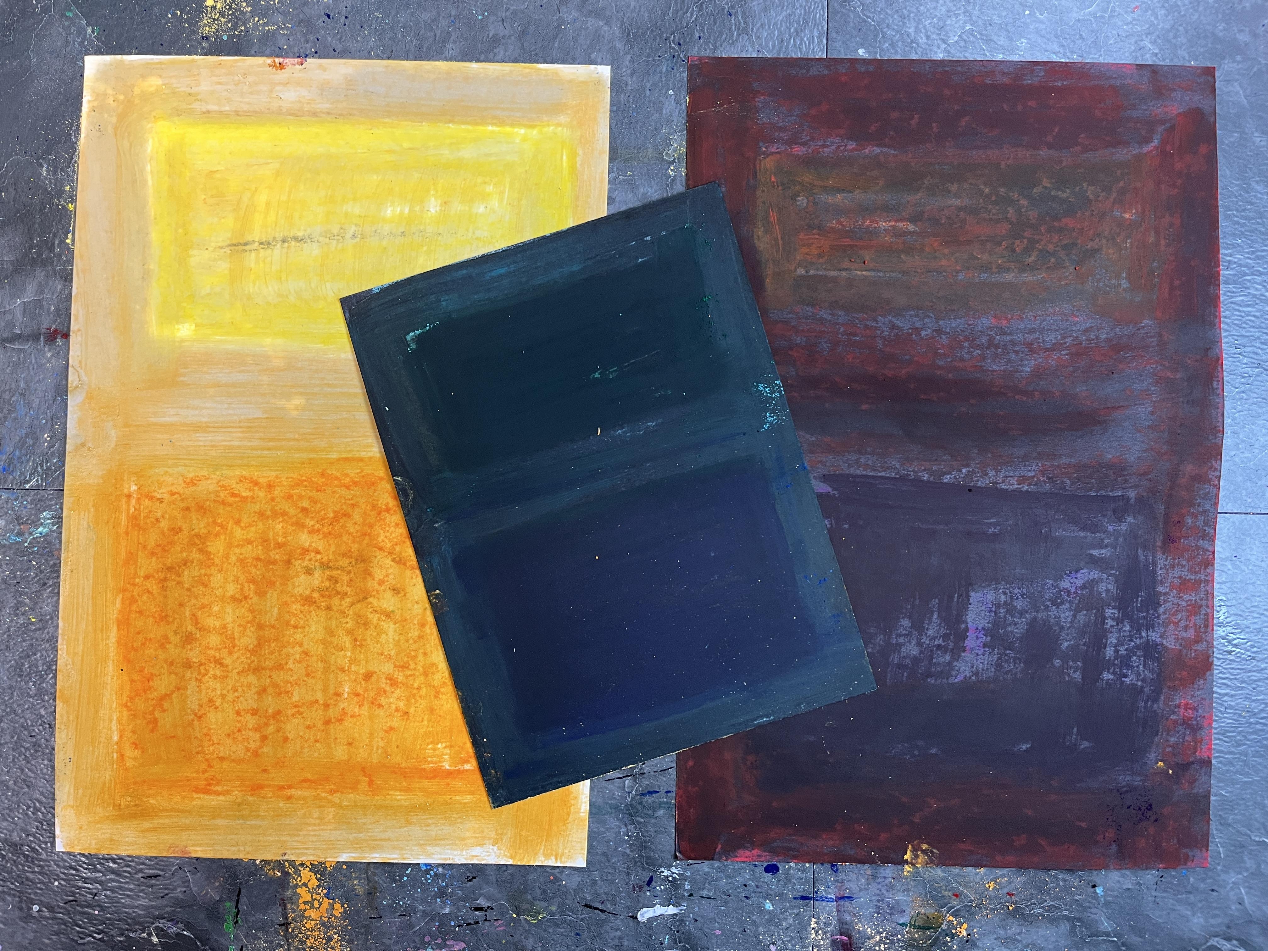
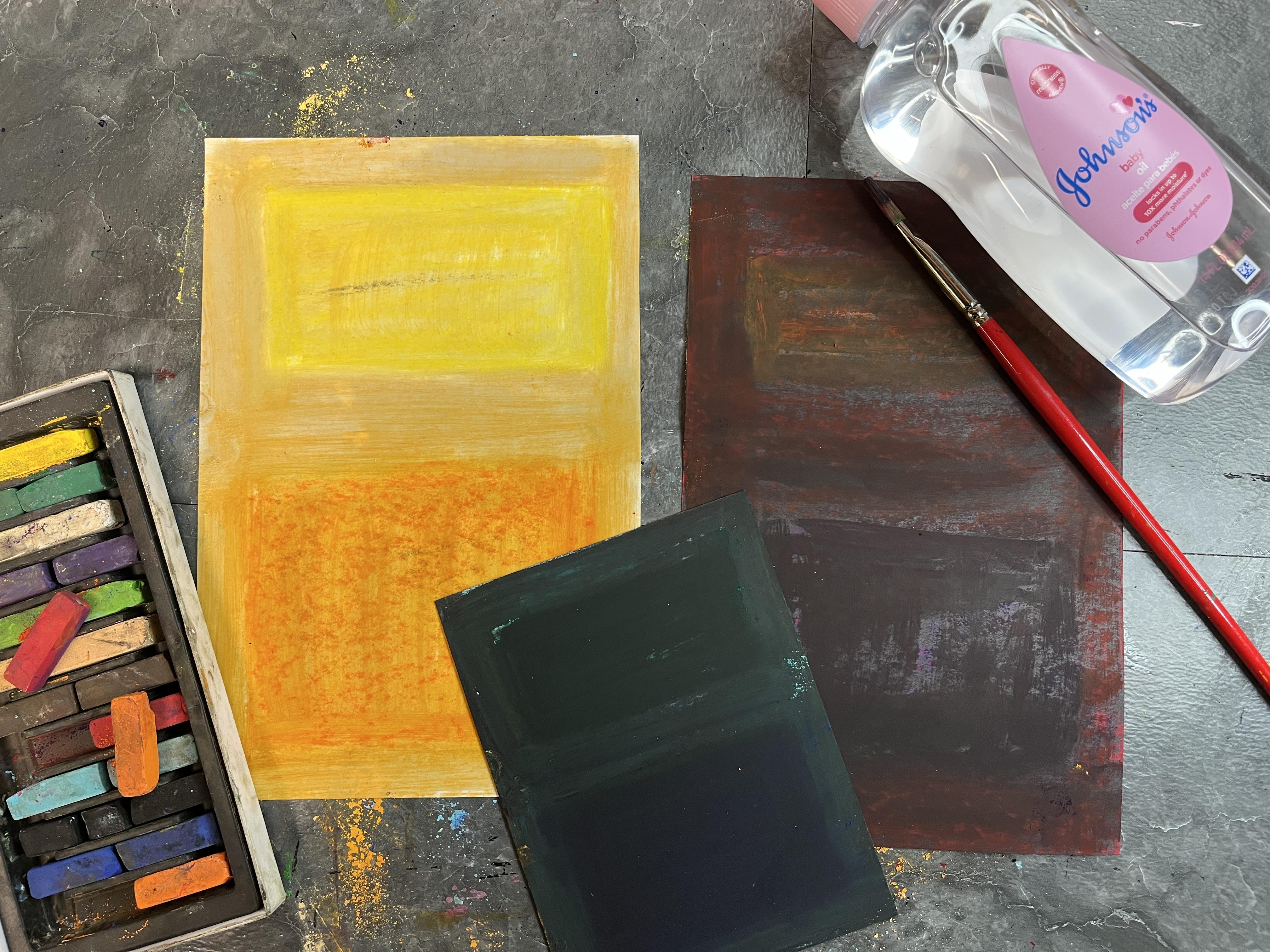
5. Soft Pastel with Solvent: For this Mark Rothko
inspired piece, I'm going to be using
soft pastel on paper, and then I'm going to be
dissolving it with baby oil. So the baby oil is going to kind of act as
a binder, sort of. So this is kind of like turning a dry medium into a wet medium. So the first step is to apply your soft
pastel to your paper. You really can use any kind
of paper that you want to. It is going to get a little
bit moist with the baby oil. So you want to make sure that
the paper that you choose has enough thickness to it that it can withstand
getting a little bit wet. But the baby oil
does evaporate and dry really quickly
because it's an oil. So that's kind of a really
great part of this. So for the soft
pastel application, you can experiment with colors. You can layer it up.
You can lean into the rectangles that Mark Rothko is known for. That's
what I'm doing here. I'm kind of starting
with some base colors and kind of blocking out in a similar composition
to what a lot of his color field paintings were with the overall
background color, and then the smaller rectangle
and the larger rectangle. Could have done a full
background color and then mixed color on top of it because I'm
using soft pastel, and it mix and muddies quickly. I kind of wanted to keep everything blocked
separately and then start building up layers of new color and mixing
new color as I went. You will have a lot of dust
working with soft pastel, so you can just kind of tap it off to the side, like I did. It'd be really helpful
to have a damp cloth on hand so that you can kind of
wipe up your area as you go. I started using the tip, but I will say it was too small. I needed something
a little bigger, so I swapped to one of my
older acrylic paint brushes. Baby oil is a very gentle oil. It's not going to
damage your brushes. You do want to make
sure that you wash it when you're done
doing this process, but it's not going to damage
your brushes in any way. It's just, like I
said, turning a chalk, a dust into a liquid. So very similar to
before two paints, where they would grind
up the colour pigment, and then they would add the
binder to make the paint. This kind of actually is pretty fabulous in that
it hearkens back to the origins of painting with different
colour pigments. The other great thing
about the baby oil is that it brightens and boldens
up those colors, 'cause soft pastels can
be very rich in hue, but they can also be a
little muted sometimes. So the baby oil is giving
it kind of a brightness by adding that binder to the
pigment, which is pretty great. It will kind of blend out, but I really liked
the soft quality of Mark Rothko's rectangles, so I didn't mind that my
colors kind of bled out. Especially, you can see it on that orange square
on the bottom. Wanted to test doing this on
white paper and black paper. The interesting thing
about the black paper, because the baby oil is turning the soft pastel chalk
pigment into a liquid, it's also spreading it out. This example here, I only did
straight layers of color. I didn't straight,
everything is blocked. I didn't build up anything else. And it does look like I'm
wiping away all the pigment. But when you kind of see
it without the sheen, it creates this really dark richness that I
loved in the end. I kind of felt like at
first, I was like, Oh, did I just make a giant
mistake and kind of learn something that I don't
like about this process? But then I wanted to kind
of see what happened if I leaned into some other
colors and I built up some thicker layers of the pastel chalk and then see
how the baby oil reacted. So you could also do
a test sheet, right? You could have, like, a small
scrap of your black paper or whatever color paper you want to have for
your background. Then you could put
on the chalk pastel of all the different colors, and then you could apply
the baby oil to see how it was going to react with
the background paper color. I'm the artist in
person that likes to dive in and problem
solve as I work, so I just went for it. But you could absolutely do test sheets and color swatches
and all that good stuff. That would be really
fun because that would help you see more the possibility
of the colors and the impact that the baby
oil can have on it. So just like the other one, even though I'm using
brighter colors, it's still muting them down. And the cool thing is that when you add baby
oil to soft pastel, it is creating a
transparent liquid color. So because I've got
black underneath it, it's not necessarily
that the orange isn't still there and all of
its bright orangeness or the red or the violet. But what it's doing is
it's something that was an opaque chalk is becoming
a transparent paint. And so now we can see
the black through. So it's almost like
we've made it glazing. I do wish that I had
played with this a little bit further and
done this whole step and then gone back in and done some more chalk on top and
then activated that, too. And I think that's something
that I'm going to keep doing as I continue to
explore this process as an art technique and
as I look to the work of Rothko because he was really
building up layers of color. And you'll see when you get to the liquid watercolor
demonstration, an example, that I talk
a lot about glazing. That is what's happening
with the soft pastel here. We are creating glazes of color, and we can see the paper through
it, which is pretty fun. And then as it
dries, you can see, like, now the color is
kind of coming back. Once we get that sheen of the
oil to evaporate and dry, can see the color better. And then we have this
really beautiful mix of the bright on the white, where the white is shining
through the liquid, soft pastel, and then we have the dark coming through
the other colors. So this was incredibly fun. I hope you check
out this process. But now let's head on
to the next lesson, and I will show you how
to dissolve oil pastel, where we're going to
break down the binder instead of adding a binder.
6. Dissolving Oil Pastel: Now I'm going to
do oil pastel and I'm going to dissolve it
with mineral spirits. So what the mineral spirits do, they break down the oil, the binder that is holding
the pigment together. So you can start with
an oil pastel drawing, and then you paint over it
with the mineral spirits very similarly to what I
showed you with soft pastel. But now it's going to
really kind of create this creamy painted
appearance to it. So that's going to be a
really fun way to kind of get some of the vibes of Mark Rathko into a drawing by turning a
drawing into a painting. Because I know I'm going to
be dissolving my oil pastel, I can play around
with colors that are going to blend together
because we're going to turn this drawing
into a painting. It's still going to probably
have a little bit of the transparent quality
that the soft pastel one did when I started adding the baby oil to add a binder
to the pastel powder. But this is a fun, a little
bit of reverse of that, but it gives it
similar appearance, but it is still very
different just because we're working with an oil
based drying material. The more you layer
up your oil pastel, the more rich your oil pastel
painting is going to be. And that's something
that's really fun to play with because it's the same thing as when you're doing
an oil pastel drawing. You really want to build up the oil on the
surface to get it. So if I just just
so you can see, I've got my mineral
spirits in a jar. I've got my acrylic paint brush. The more you have down, the more effect
you're going to get. If I do it just a
thin application, I'm going to have a more
transparent appearance. To my painting. I want to push this one to be a little bit more than that. So I'm going to play around with layering up some other colors. I don't have to worry about the fact that this part is wet because the mineral spirits
evaporate pretty quickly. And I can also kind of draw
back into it a little bit. It doesn't really work as well, so you kind of want
to let that one dry. So I might have
to circle back to that part, and that's okay. So I'm going to quick get
some oil pastel down in here, play around with layering
up my oil pastel colors. The other thing by
going lighter with the oil pastel and having less of a thickness
to the layering, I can keep some of my marks. So that kind of adds more
of a drawing element to which could be really nice for your Mark Rothko
inspired piece. The other thing, because
it dries so fast, you can work back into it. It doesn't have to be
I did the oil pastel. I did the mineral spirits. I don't like it, but I'm done. I could be I'm not
happy with it yet. I'm going to add
more oil pastel and more mineral spirits and kind of play with the back
and forth there. Okay. I've got some
basic oil pastel down. Now I'm going to add the mineral spirits and start
to break down the binder. Now you'll notice it's turning my brush green from
where I painted before. You might have to do a little bit of cleanup
between your layers, but that's where you can
also kind of just you know, you can put it back in
the mineral spirits to clean off the pigment
and then wipe it off. To. So the mineral spirits
are working twofold. They are dissolving the
binder of the oil pastel. They are also a way to clean off the oil pastel pigment that your brush is
going to pick up. One thing that I
could have done to make my life a little bit easier would have been to start with the
lighter areas first, but I want to play with that blending that's going to happen, so I'm not going
to worry about it. Another thing I probably
also might have wanted to do would be
put down a scrap cloth, but I can just wash
my table afterward. I do want to make sure that
I wash the table. A cleaner. Normally, I just
wipe it with water. But because I am using
mineral spirits, I mean, they'll evaporate, too, but it's just nice to get those
off your work surface. If you're at all concerned about the mineral
spirits and ventilation, you could absolutely do this somewhere in your
home or you can open a window or do it outside if the weather
is nice where you are. We are in Michigan Spring, so yesterday was
gorgeous and 64. Today is 38. Doing this outside was not an cool thing is we still get
a little bit of the grit. It'll depend on the oil
pastel brand you used. I had less oil pastle here. This is where my thinner was,
and then I dissolved it, and then I went back over it
and dissolved it some more. That's a little bit
different treatment than some of these areas
where I really pushed. But it's almost like seeing the brush strokes through
too, which I really like. I really like that aspect a lot. There's going to
be a little bit of bleeding that's going to
happen through your paper. That's another reason why
it's a nice idea to have newspaper or something else
you can easily dispose of. Just something to keep in mind. You could also work with gloves. I just wash my hands with soap and water really
good when I'm done. It's evaporating pretty quickly. I'm going to keep
working back into this. I find that when I go back in, it's picking up the pigment. It is also still pretty wet. That can be a cool effect, a little bit of a
scratch through. But if you don't like that, I like it here, but I
don't like it there. I can go back in with my mineral spirits and I
can smooth that back out. There's a little bit of
experimentation and flex that's going to happen
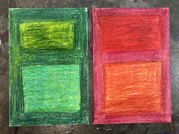
here. Here is a green one. I'm going to play
around some more. We got another sheet of paper, and I'm going to do
a little bit more. I want to do one more demo, and then we can move on to
the liquid water color. This one I want to lean
more into the earthy tones. I'm not going to play with
having two color rectangle. Are similar and
then I can layer up more colors on top of them
to get it be different. The other thing with
oil pastel in general, if you want to do a
really light color, layering up that way, you're
going to want to start with your lightest color and
then layer on top of it. You can layer the
light over the dark. The wax makes it trickier. It's a lot like the way that colored pencil behaves
in that regard. I'm ready to go in with
my mineral spirits. You don't need a lot of
it, goes quite a ways. And just when it starts to feel like it doesn't have as much. It's not dissolving
as much, then you can always dip your brush
back in and get some. I love how that one turned out. So I'm going to use the
mineral spirits to clean my brush and then
kind of wipe it off, make sure there's no
pigment, and then I can wash it at the same. So here are my two oil pastel dissolved mark
Rothko inspired pieces. The different colors will
also kind of show more. So, the green that I use that
dark green was pretty dark, so I see a little bit more of the graininess of
the oil pastel, whereas red blood a little
bit more kind of softened. So you can kind of play
around with that, too. And again, just like with
this soft pastel one, if you wanted to do a little color swatch and
kind of test out your oil pastels and kind of see how it works with
your mineral spirits, that's probably a
really good idea if you're a little
apprehensive about this. But I think that if you try this step for your
class project, this option that you're really going to find that you enjoy it, and that it's a technique that you're really going to
love using in the future. So let's send it over to our last class demonstration
where I will show you how to use liquid watercolor to explore Mark Rothko inspired
paintings. I'll see you there.
7. Liquid Watercolor: Alright, I'm all set up to do
my liquid watercolor play. So I'm going to go
into this wet on try because I want to have
a little bit more control. I might then after I
have some color down, go wet on wet between more painted color
and the wet paper. We're just going to kind of see since this is an exploration. But I want to thin my
color a little bit. And I also kind of want to play with making some other colors. So I'm going to kind of
mix sort of a violet. I might actually get
a bigger paintbrush. Because I want to be
able to go kind of fast. I'm going to approach the color application just like I did my other ones and kind of build the frame of the color first
and then go from there. I also kind of want to play
with the idea of glazing. So actually, I am going
to get a bigger brush. The more I thought about playing with color with
liquid watercolor, the more I kind
of wanted to lean into the transparency of it and kind of play with what I could do
with a glazing effect. So actually, I'm going to paint the whole paper
relatively one color. I mean, Mark Rothko was
working with oil paint. We can tell that there's some blending that
happened on the paper. If your paper starts to accrue like that, you can
get some tape. I could have taped it down to another board or I could have
taped it down on my table. But I really love how his paintings go all the way
to the edge of the canvas. So I didn't want
to do that here. You find yourself
in the same spot that I am and it's coming up. We can just put some tape down little balls of
tape in the corners, and that'll just help keep
it flat, some more to it. This is more blue than I was
kind of going for initially, but I think it's
going to be right because I'm going to do the
glazing effect on this. So the cool thing
about watercolor is that it's transparent. We can build up some thin layers of color
and kind of lean into that transparent quality
and play with that to get some of the
color effects that Mark Rothko is getting
with his pieces. So we can let it dry,
we can make it dry. We can also do a little bit of blotting too and kind of
speed up the process. I'm not worried about it blending because ultimately
I want that to happen. So I'm going to kind of use a smoothing blotting technique to kind of pull up some color, but to also take some
of the moisture out, and then I can kind of
keep going from there. So now I'm going to really
lean into the violet, and I'm going to kind of paint in the rectangles like he did. For true glazing, I am going to have to wait
for some of this to dry. I don't mind doing
that. I can also get on my heat gun and I
can let it dry. But what I do want to achieve by adding it while it's all
still a little bit wet, is the fuzzyness because
there's a lot of soft edges that Rothko is known for in his
color field paintings. And I also like a soft edge. So I can see I've got some
of that happening that feathering around the edges,
which is pretty great. I'm going to have
fresh strokes just by the nature of how I'm
applying this paint and the fact that this brand of liquid watercolor is a little
gummier than other kinds. So it just ends up
being a little bit thicker and kind of a
little bit more of a gel. But I can kind of lean into
that a little bit, too, and play with my paint to water ratio and lean
into those darker edges. I'm also going to play
with darkening up the background a little bit,
kind of what happens there. Now, for your project,
you don't have to lean into the rectangles,
ands of color. You can kind of
take your project somewhere else if you want to. And play with how the color goes on the
paper in other ways, I kind of like the rectangles. There's something about
them that I really enjoy. I do want to gradually work up to a more opaque color field, even though I'm kind
of playing with this idea of glazing colored in. Like I said, for glazing,
we have to let it dry. So I think I'm going
to actually get my heat gun out in a little bit and see what that adds to
it, kind of play there. Now, the fun thing about
using watercolor is that we can play with adding
more color from the pigment. We can also play with pulling color up and
layering through it. Things are getting a little
out of hand, but that's okay. I'm going to wash my brush,
and then I'm going to go around my whole
frame with just water, pull some of that color out. Soften it a little bit. Make it a little bit more
unified, I think. I think I need to dry it. So I'm going to
get my heat done, and I'm going to put some
heat on this to dry it, and then I'm going to kind
of reassess where I'm at. Alright, it's mostly dry. So now I'm going to
keep going back in with more color and
water kind of play with building it
up some more until I get to a point where I'm happy and I want to call it done. The other thing, because
I dried everything, now I can do the glazing. It might activate it a
little bit in spots, but I can kind of go
over everything with thin layers of
color kind of play with the muting effect that
that's going to have and then the optical
blending of color versus the actual blending of color.
So that's what glazing is. You're putting a thin
layer over the top of an area that's already dry. And then when you do that, you're building up
transparent layers on top of each other so the eye blends them when we
look at it versus actually mixing that color
that they're then creating. It's kind of like looking
through different color gels and you stack up those gels, and you're going to get
that kind of seam effect. I remember going to the library with my kiddos when
they were little, and they would have kind of an activity table set out with a bunch of patterns
of color gels, and then the kids could
kind of play with how they overlapped them to
make new colors, like what colors blended
together optically. That's what glazing
does. We're optically blending colors instead of
literally blending the color. And that, to me, made all
the difference in the world. So now I feel like I can kind of keep going back in now that I've kind of
softened everything, and then now I can kind
of build up some more. And then it'll just
be a back and forth play until I decide I'm done. Now, because I have
wet blue on there, the pink that I'm laying down, that magenta is blending
with that wet blue. So now my wet magenta is literally blending to make a
new color with the wet blue, but underneath there is still the dry color that I created and then did
the wet glaze over. So I can kind of play
with hard and soft edges and crisp color
and softer color. So that glazing effect, if you
were doing this digitally, say you're doing
it in Procreate, you could play with layers
and transparency and kind of build up the effect of glazing
that way with your colors, meaning into layer transparency by modifying that percentage. And then I could
keep drying this and then kind of working back
in with Mark as layers, and it doesn't have to
be a one time thing. It could keep going back
and forth between it. Maybe that's what I'll do next. Alright, I think I wanted
to one more blazed coat. And I think I want to
do it with a violet, fully contaminate my magenta, and then put a bunch
of water in there to make a great big
puddle of some nice, transparent color, and then I'm gonna just
kind of go over everything. So I stuck to a pretty
analogous color scheme. Analogous colors are colors that are next to each other
on the color wheel. So as you go around the wheel, those colors are sitting
right next to each other, and you know that
when you blend them together and you
use them together, you're going to get a
really nice effect. Like they just go well together. I often lean into
analogous color schemes. That is kind of my
color happy place. If I'm doing something where I know I'm going to be mixing, then I like to lean more into
colors that are unified. Because I bolded that, and now I feel like I need to bold that, maybe I just need a little
bit more purple tint to the blue that's up here. Because I have a little bit
of violet in my background. And then I kind of just
need to unify that a bit. I'm gonna dry it,
and then I'm going to see if it needs
anything else. I think I want to do one
more thin glaze layer, and then I'm going
to call it good. And I think I want
to do magenta. So because that magenta
is contaminated, I'm going to make a fresh one. And then no matter what happens, I'm going to call it good
because I could just kind of keep messing
with this all day. And although that would be fun, I think in the end, I
would just get frustrated. A layer of magenta for
one final glazing. Think actually, the last last thing that I
think I want to do is take my cloth
and pull back. Some of that, I
have to be careful. My paper has gotten wet and dry a lot of times, so it's fragile. I don't want to tear it. I can kind of pull up a little bit. I kind of lost the definition
between those two. Ten this recti on
that rectangle. I'm not trying to
get a crisp edge. I just want to mute a little bit of the
background color. I love that. That's great. That's exactly what
I was kind of hoping we'd get to or I thought we'd
get to in this exploration. So now that I have done
three explorations using dissolved soft pastel, dissolved oil pastel,
and liquid watercolor, we can head on over to the last lesson to
wrap up the class. I'll see you there. Oh
8. Final Thoughts: Thank you so much for joining me in this class and looking at color as we looked at
the work of Mark Rothko. I hope you're seeing
color in a new way and considering different
ways that you can use color in your own artwork and I hope that you've had a lot of fun creating your class project. I would love it if
you went over to the Projects and Resources
section of class and you uploaded a photo and wrote a little bit about your class project to share with others. It's a great way to
summarize the experience, reflect back on what you made, and share that with others. I hope you also takes
some time to check out other work that gets posted
to the student gallery. If you continue to
explore color and relationships and anything
else related to this class, I hope that you will add
that to your class project because you can edit your
project and add more anytime. I would also really appreciate it if you took the time
to leave a review, sharing your thoughts about
the class with others, both myself for feedback for
creating future classes, as well as giving others who
might be considering taking the class a little
inside student view of what taking the class was I would love to stay connected. If we aren't already, please be sure to click
the follow button below so you get notified about future classes
that are coming out. We can also connect
off the platform on Instagram and on YouTube. There under Elizabeth Welfare. I'm so thankful you
took the class. I can't wait to see
what you've created, and I will see you
in another class real soon till next time.
 Elisabeth Wellfare, Artist, Art Educator