Transcripts
1. Introduction: Hi. My name's Elizabeth
and welcome to my Artist Inspired series
class about Amadeo Modigliani. I am a professional
artist and art educator, as well as a published author
illustrator and I've been teaching classes here on
Skillshare since 2021. I have a bunch of classes
that explore a wide range of art making approaches and I
have my artist series class. In classes like this,
we get inspired by the life and art of an artist
from the past or present, and then we explore art making inspired by what
we've learned about so this provides us
a unique opportunity to look at their journey,
their development, different aspects of
their art making, and use that and put it
through our own aesthetic and into our own art lens to help us continue to grow as artists. In this class, we're looking at the amazing art background
of Amadeo Modigliani. Modigliani is best known for his elongated
neck portraits. He was also a sculptor
for a period of years and we can see elements of
the way that he treated the figure in his very
stylized approach as he emerged different elements of art and art history that
he really found inspiring. Modigliani had a
very short life, but in that span of time, he created many works of art that we can draw inspiration
from in a variety of ways. We can look at his use of color, we can look at his
stylized nature of depicting the male
and female form. We can look at his two
dimensional paintings or his three
dimensional sculptures. In this class, we are
going to be exploring all of those aspects
of Modigliani's we find ones that we want to play with in our own
art making approach. Let's head it over
and talk some more about our class project.
I'll see you there.
2. Class Project: For the class project, we
are going to be looking at ways that we can
stylize portraiture. We are going to be
looking at the way that Modigliani played with
really beautiful lines, elongated forms,
and the way that he was leaning into
inspiration of primitivism, as well as some of the more classical
approaches to art making. Modigliani was all about taking things down to a very simple approach to both the
sketches that he would make, his study of values, the lights and the
dark, so the shading of the sketches and then ultimately the paintings that
he would create. For our class project, I'm going to demonstrate
how I am using acrylic paint and sketching
out a very simplified form. Then we're going to talk about
the way that we can easily manipulate acrylic paint
to get some very subtle, beautiful gradations
a Modigliani. Let's head over to our
next lesson to talk about what materials you're
going to want to have on hand for class.
I'll see you there.
3. Materials: For our Amadeo Medigliani
inspired artwork, we are going to be leaning
into acrylic paint. So I have my acrylic paint. I've got a variety of brushes. I'm going to be working
relatively small. So I grabbed a couple of
flat ones and a round one. I've got other brushes on
hand that I can grab too, but things smaller because we're going to want to play
with building up our portraits inspired by Modigliani's portraiture,
his painted portraiture. So then because we're
working with acrylic, we're going to want to
have a jar or a glass of water for when we
clean our brushes and a cloth to dry them. Then you can work with any
color background you want to. When I taught this
class in person, we worked on construction
paper because I really wanted to start with that
neutral gray background. I have a bunch of this on hand. I cut it in half and
we were pretty small. You could absolutely work
larger if you want to. You can also work
on white paper, black paper, any other
color paper that you want. If you're going to go
for a paper painting, make sure that you choose
a mixed media paper or even a watercolor paper just
so you have a little bit more thickness so it can
take the acrylic paint. The construction paper does
fine with the acrylic paint. We're not going to build
up crazy heavy textures, so it'll be totally. Going to want to sketch out
your portrait in advance. So you're going to
want a pencil and eraser so that you can lightly plan out your portrait artwork
before you begin painting. Let's gather up
our art supplies, and then we'll head on over
to our next lesson to learn about the life and art of Amadeo Medigliani.
I'll see you there.
4. About Amedeo Modigliani: Amadio Madigliani is a very
interesting character. He had a fairly tragic life. We think of the tortured artist, and he pretty much fits
that to a t. He began his life at an early stage where his family was in
financial ruin. They had a lot of struggles
when he was growing up. Then on top of that, he had
a lot of health issues, both in his early years
and later on as well. But like many artists who suffer extended
periods of illness or issues with their
health, they lean into art and Motigliani
did that as well. He began learning art
from a very young age from his mother and he
continued to learn it during one of the periods of time where he was ill and unable to attend school
for long stretches of time and was
learning from home. He dreamed of
traveling to Italy. He really wanted to go and see the works of the
master artist in person. When he became well
enough as a young man, he ventured off and
began exploring and gobbling up inspiration
all across Europe, especially in Italy and really taking all of these aspects of the artists
that were works that he could go visit in museums and
the artists that he would be able to meet and connect
with on the streets of Paris, taking all of that in as he began to flourish
in his own art making. He has some similarities
to Picasso. Picasso was very
interested in primitivism, the art of primitive
cultures that Picasso, like Modigliani were exposed to through museums, having
collections that including artists could
go see and then take those inspirations back to the studio and explore
that in their own way, much like we're doing in
the artist series classes. He was leaning into some
of the same elements of the primitive masks
were coming to Europe and being put on display
from different cultures. It's really interesting
because we can see a parallel between the
way he simplified, especially the face for
many of his paintings and how that was then translated
both in his paintings, as well as in his sculptures. Modigliani was very
interested in stylizing. He did not want to
replicate the people that sat for him and he did
do direct observation. He had a model sitting and then he would paint him or her, but he would do it
in his own way. He would elongate the neck for an elegance and simplify
the face and it would have very subtle shifts of curved lines that would define different
aspects of his figures. He did some really
fantastic work. Plays on intentionally
trying to portray the character of the person through the painting, which is interesting because the eyes are often ones that
he didn't paint in. He left those as a solid
color or textured oval. There are ways that he
depersonalized the portraits, but he was also putting the essence of the
person into them. It's this really fun
play of those things. He continued to
have a tragic life. He really wanted to be
a successful artist. He had this idea had to be theatrical and be over the top in order
to be creative. He felt like he needed
this very dramatized life to generate the inspiration
for his art and ultimately self sabotaged himself in a lot of ways through
substance abuse and different lifestyle choices that caused him to have a
short life in the end. He was very passionate about art making and
very passionate about painting and truly was
trying to have a way of generating a lot of
inspiration and a lot of creative energy that
he could then pour out in his paintings
and his sculptures, unfortunately, it backfired and tragically caused him
to not survive for long life. But the
work that he left behind is incredibly inspiring. I love his use of colors and we can see some expressive
brushstrokes, even though his palettes
are fairly limited, we can see a lot of intention behind how
he treated the figures and how he stylized them and the figure in
relation to the background, we can have a lot
of fun finding ways that we can take all of this and interpret it into our own portrayal of the
figure and stylizing it. More information about
Madam Modigliani and his life and many
pictures of his art, both paintings and sculptures. There's a Google
Science presentation on the projects and resources
section of class that is a great resource
to help you really start to see all of the
amazing ways that he was exploring art and there's a lot of information
in there about where he was drawing
influence from for his creativity and a
lot about his life too. Definitely check that
out before you dive into sketching your
stylized portraits. But when you're ready,
meet me in the next lesson and I will walk you
through how I am doing some simplified
stylized portrait sketching to set myself up for
portrait painting success. Him the next lesson real soon.
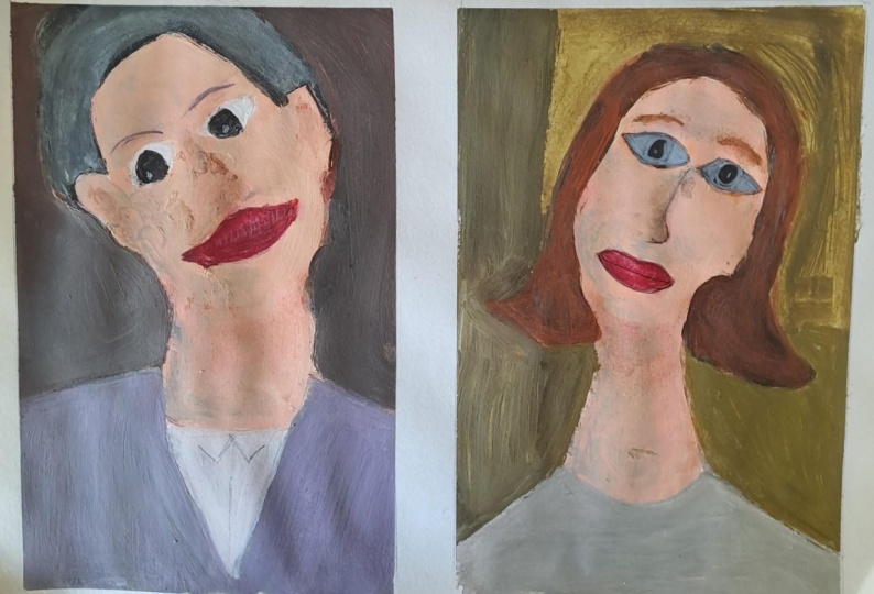
5. Sketching Stylized Portraits: The first step to creating our Modigliani stylized portrait is to sketch out
our portrait image. You are welcome to use references of Modigliani's
work as a guideline. You can also look at a reference of any portrait that you like as
you approach this. I am doing my painting
on construction paper, so I've got the piece
of construction paper cut to the
size that I want. This is a nine by
six, big enough so that I didn't have to
do teeny tiny features. So now I'm going to lightly
sketch out my portrait. I'm leaning into more
simplified shapes, a Modigliani and a
very elongated neck because that is
one of the aspects of portraiture that he
really leaned into. His very elegant
elongated necks. So I started with a basic perve for the jaw line and
then this long neck. And then I'm keeping the facial features
relatively simple. What I'm going to end
up doing when I get to the next lesson where
I'm painting this, I am going to paint
in big blocks of color and then kind of layer
in a little bit of shading. There's not a ton of
shading that's happening in Modigliani's work to create depth and dimension in
three dimensional form. In the faces themselves, it's relatively flat with some subtle values
here and there. So I just need the basic shapes to get my portrait
onto my paper. With an elongated neck, you want to make
sure that you give it the rest of the body and then just kind of have
it go off the page. I'm not really worrying about necessarily
correct proportions because we know we're distorting them and stylizing them I love the way
that Modigliani is kind of playing with
different ways that he addresses hair and
hats with his figures. So I'm kind of leaning into some very simple basic lines to create the shapes
that I want to. I want to make sure that this
is really easy to paint. I don't want that to
be a stumbling block for approaching his style. But I also want to do it
with my own aesthetic. So this is a little bit
of me and a little bit of Modigliani as far as how I
laid out my stylized portrait. Just kind of refining some things and kind
of figuring it out. But this is really all that
you need for your portrait. As you kind of start to stylize and sketch out your portrait, you'll start to figure
out what shapes do you need to have your portrait
make sense on the paper. And really, like I said, you can really lean into
his artwork as a reference, but I really encourage you to not just replicate
his portraits, really kind of put your own
spin on it a little bit, really trying to play
around with how you can personalize and stylize
your own portrait here. Also, think about
the background. You could leave it flat or you could put some other
basic shapes in there. I just did a couple
lines so that I could do a little
bit more play with different color and value to pop her
off the background. Have some fun sketching
out your portrait, and then when you're all done, meet me in
the next lesson, and I'll start showing you
how I'm approaching painting my stylized Modigliani
portrait. See you soon.
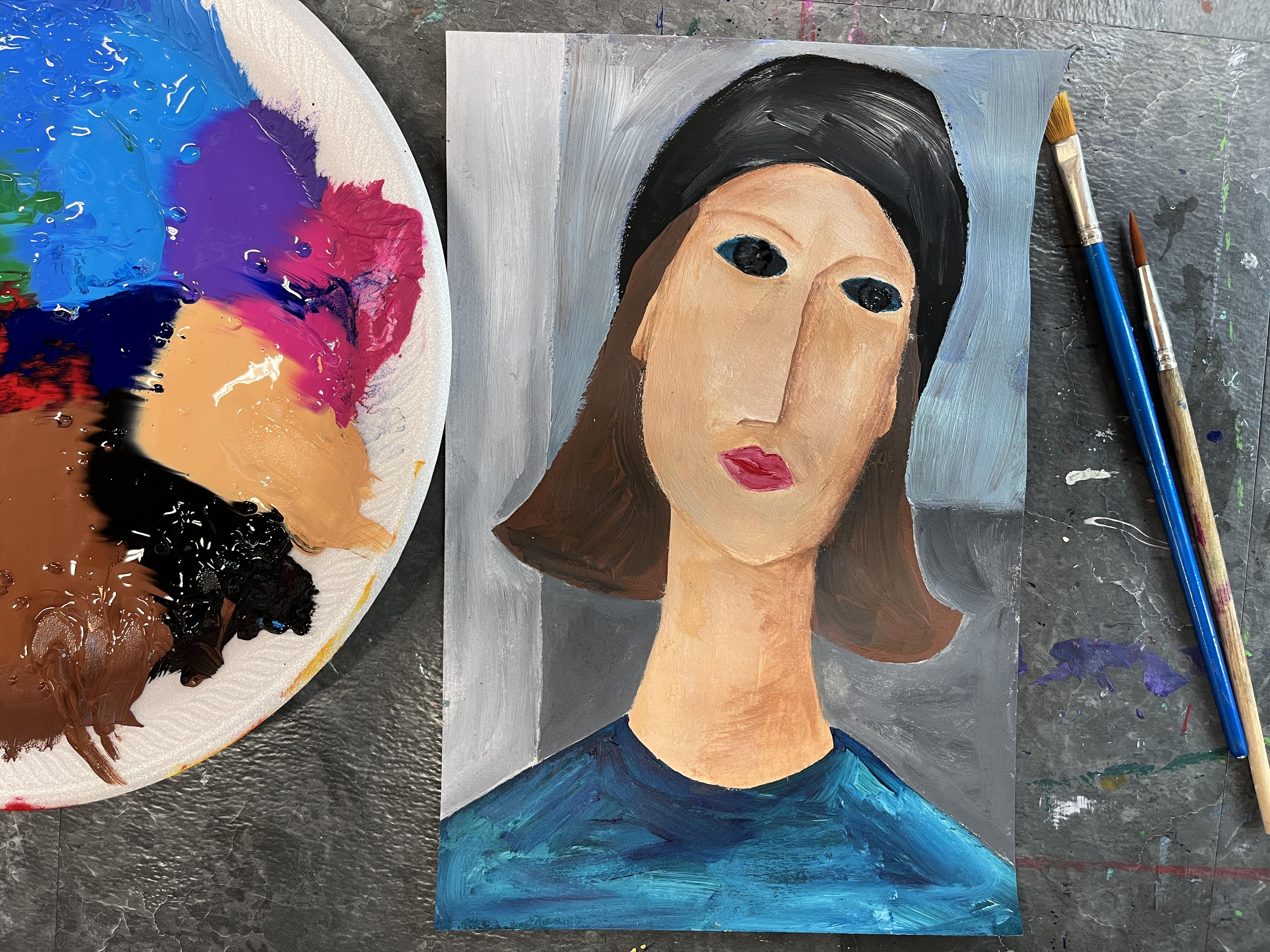
6. Painting Portraits Part 1: Gigliani painting, think about what color schemes
you want to play with. Do you want to lean into
more realistic colors? Do you want to do more
non realistic fantasy? Do you want to do a
limited color palette? He was leaning into fairly
traditional color palettes. So a lot of the color schemes that you'll see in his
paintings are ones that involve a lot of blues
and a lot of natural colors, browns and tans,
beiges, a lot of grays. You can kind of play with
any way you want to. For the skin, I'm kind
of doing a mix of a basic color and then playing around with different lights
and darks of that. I'm sort of kind of blending
and shading as I go. I really want it to be subtle. I don't want to have a fully realized three
dimensional painted portrait. I want to have it
continue the stylization. You'll also notice that I'm painting over some
aspects of my drawing. So I know that the lips and
the eyes are going to be different colors from the color that I've chosen for the skin. But as far as, like, the nose goes and that stuff, I'm just kind of
painting over my sketch marks, and that's okay. It's okay to let those go, and then we can kind of bring
them back in as we paint. And then I'm kind of
sort of leaning into a basic understanding
about which parts of the face are
lighter than others. I do want a little
bit of dimension, kind of like Modigliani
was working with. I also want a little
bit of flatness, too. So you could do this
in a couple of ways. You could paint
everything flat and do kind of a base flat coat of color and then layer on top of that some more nuance
for your lights and darks, or you could do like
I am and kind of gradually put the values in a little bit of subtlety
here and there as you go. I'm trying to make sure
that I stay inside my lines so that it's a little easier to kind
of navigate that later, but I have a solid
sketch to work with, and I'm working in sections. So I'm going to do
all of the skin tone, and then I'm going
to kind of move on to the next color
and the next color. If you're going to
do it in layers, just kind of do one section
that's all the same color, and then while that dries, you can move on to another area. So here is where
I'm talking about blending it on the paper
while it's still wet. So I kind of put
down a base color. I didn't worry about it
being all the same value because I knew I was
going to do some shading. Then I mix up a little bit
darker version of that color, and I start to kind of put in where there's some darks to kind of create the
roundness to the face. So the basic sense of this
is our heads are ovals, and we know that
it's going to be a little bit darker
on the sides, and then it's going
to lighten as it comes toward the front. So at this point, I'm
really treating it like a very smooth oval that
has roundness to it. That's kind of the
basics of the shading. And then I'm going to jump
down to the neck and I'm going to kind of put in some of
my base color for that. And kind of work back and
forth between the two. The neck is a cylinder. So the lighter portion is
going to be at the center, the darker parts are
going to be at the sides, and then you can kind of
blend those two together. You could do a lot with, like, glazing, more
of an approach. You could do a base coat, and then you could
play a lot with your color transparency using water to thin your paint to
do your shading that way. That's also a really
great approach. I wanted to kind
of just go for it. Plus, I just really
love blending my paint while it's wet on the
paper or the canvas. And this part's a
great example of that. I'm putting in a lot of light, and then I'm going
back and forth between my wet darker color and my wet lighter color and kind of blending back and forth between
the two of those. If you find that
one or the other is taking over more dominance, you can always wash
your brush off or just wipe it off so it
doesn't get wet and then just kind of
pull off some of the extra light color and then continue to
blend on the paper. It's really just kind of a
back and forth play between the two values or as many more values as you're
working with at one time. Again, I want a really
subtle value scale here. I really want subtle value. So I'm really not going extreme. I've got a light and
I've got a dark, and I'm working
between those two. And then I'm just
going to keep going. I'm going to add in the ears. I'm not getting
terribly intricate. I'm keeping it pretty simple. I just want to allude to dimension in this
aspect of my painting. The next step is
to start painting in the specific facial features. So I like to start each
of these with kind of a base color similar to
how we handle the skin, and then I can
kind of go in with more value and color
to define the forms. So base color for the lips, and then I'm going to
gradually start putting in sections and little bits where I'm going to define the upper lip from
the lower lip. And really kind of loosely allude to details of
the mouth for the hat. This one, again,
I'm going to go in with just a nice base color. I wanted to have
some nice contrast. So I chose black for the hat, and I'm just
painting flat black. And then, while that's
still a bit wet, I'm going to go in and add in some highlights with white so that I get a little
bit of dimension. I want to allude to three dimensional form
without getting too particular about
detailed shading and intricate for the hair, I'm going
to do the same thing. I'm going to start with just a nice flat
color, even coverage, and then kind of
decide if I want to add any depth or dimension
or texture to it. Modigliani portraits
have a mix of it. So sometimes there's
texture in the hair that can be created by using
visible breast strokes, value changes, color changes. And sometimes they're
just kept very simple and minimalist as far as how much attention
he gives them. As I'm doing a lighter
color for the hair, I can really lean
into my darks to kind of push the hair that's
falling on the back of the head further back and
push the face forward by just doing some very
basic value scales. So I'm just kind of dropping in some dark along the edges of
the face and the sides of the neck and then kind
of fading that out as I blend that into the brown
that I've already got down. This works because my
paint is still wet. But then you'll also see
me kind of mute that a little bit by going back
over the black with brown. So you can play with
the order that you put your colors to create
your different values. And you can decide
how far you want to take this as far as how much
shading you want to add. But I really enjoy
just the subtle bit of value to kind of help place things in space and kind of define the
head from the hair. This also works
really great because the darkness of the hair is in contrast to the bright
lightness of the face. It's pushing the face forward
and pushing the hair back. Creating emphasis on the face. Next step was to paint
her shirt or her dress. I wanted to continue with
the idea of contrast between the brightness of her face and the darkness
of what's surrounding her. I also wanted to play with color schemes that were
common in Modigliani's work. Plus, I just also
really like blue. So again, I'm starting
with a base color. I'm starting with a darker color of the value that I want. And then I'm going to add a little bit of
dark just to kind of help define and allude to the three dimensional
form that is her body. You could really play with anything you want at this
point in your portrait. You could add, you know, pattern, you could
add design details. You could really
get as detailed and specific as you want to and
as stylized as you like. I wanted to play with value and basic color and just very
soft illusion of depth. I also really like texture when I'm working
with acrylic paint. So this was a part
where I could kind of play around going back and
forth between light and dark, kind of refining the shape of her shoulders
and the neckline. And then I can also, you know, have some more expressive brushstrokes with the lightness, and then I can kind
of go in with my dark to kind of blend it a
little bit more and kind of clean it up so that it still feels unified
within my portrait, but it is also reading as a
different type of material. Next step is painting
in the eyes. You can do this a couple
of different ways. Modigliani also did this a
couple of different ways. So in some of his portraits, he kept them as fairly
flat colored basic shapes. In other ones, he actually defined the iris and the pupil. So I decided to lean into just the flat almond
shape for mine. I also decided to go in
with blue and kind of have that mirror the
color of her shirt. But as I went into
this, I realized that that was just
was much too bright. I could have left it
like this. There are ones where Modigliani
had brighter, lighter colors for
the eye shape. But for me personally, I just felt like
I wanted them to feel more recessed
into the head. So I went over the top of this light bright blue
with a darker blue.
7. Portrait Painting Part 2: Next, I'm going to
paint the background. I really like the
way that Modigliani played with value and
kind of value contrast, but in some very subtle ways. So I'm still leaning into
a limited color palette. I'm kind of drawing on blues
and then neutral grays and kind of figuring
out what color is going to best fit my
background as I go. So I'm initially starting
with the light blue, and then I decided
to make it darker, and I'm kind of
really intuitively figuring out my colors as
I work through this piece, because when the
piece was painted against the neutral lightness
of the construction paper, it had one appearance, but I really wanted to paint
the background as well so that I was following through on a
fully painted surface. So now I'm kind of
playing with the idea of color and color relationships
and color values to figure out what type of background
is going to work best to highlight the
figure that I've created and not compete with it. Which is why I'm kind of
lightening and darkening and kind of playing with a
lot while the paint is wet. So I went in with a light blue, and then I went in
with a more true blue, and now I'm kind of pulling back the value of that blue by layering in white and doing a
lot of mixing on the paper. What this is giving
me is some very, like, kind of playful brush
strokes and value shifts. I like paint for paint's sake, and that's something
that I think we see a lot of in Modigliani's work. So kind of leaning into the fact of what happens
when you paint wet paint onto wet paint and how do those two layers
of paint interact? Like, the more you
paint into it, the more they're going to
mix and kind of flatten out. But if you leave it
there and kind of let it sit in its unfinished state, then you get some really
lovely brush strokes and marks and textures. That's kind of what I'm going
for here as I figure out what colors and values do I need to have
in my background. I also broke my background
up in a couple of different basic geometric lines to create different shapes, some interesting ways to kind of break up the space behind my figure because I
didn't necessarily want to have one flat
wall behind her. Now I'm leaning into
more of the neutrals, but it's all part of
the experimentation and kind of leaning
into the process and seeing what happens as I play and explore with
color mixing and color relationships and being very much in the moment for
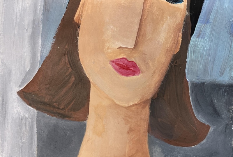
painting the background. So the final step, I really wanted to bring
back the definition of the nose because
I had painted over that when I painted
the rest of the face, and that was fairly intentional. It's just kind of easier to get the basic skin tone and
values and shapes in there, and then keep it pretty
subtle when you go in to define facial
features that aren't, you know, eyes and mouth. For this one, a great way
to do it with acrylic is to kind of especially if
it's a hard edge like this, like her nose is
kind of painted on the side angle because
we're simplifying it down. So I just did the shape of
the nose for how I wanted it, and then I kind of
dragged the paint over. And this is a chance
for me to kind of pull in some highlights and
put in some shadows, add a little bit more
peachiness and kind of warm up, you know, warm it
up, freshen it up, and just kind of on top of
that initial layer of paint, add a little bit more in there. There's a lot that kind of the back and forth that
happens with acrylic paint. You can also kind of get your base color in and
then you can clean your brush off and you
can kind of drag that color over and do more
of a glazing effect. But really, what I want
here is I want to have kind of a crisp edge and
have the nose create a shadow for the right
side of my image. And then just kind of
start to play with just kind of a little
bit more dusting of darks to define the dimension of the face a little bit more. It's very easy to get
carried away with this step. So just go subtle, start with small
bits of paint and kind of play with putting in your darks and kind
of fading those in. And then you can see here
I'm putting in the lights. So I'm really kind
of popping the nose forward by brightening
that up and then just kind of going
back and forth and just kind of getting everything to blend out a little bit more. Modigliani, we saw
the breaststroke. Like, we see the paint. We see
where values kind of meet. So it's totally okay to have that be part of
your painting process, too, which is great. It gives us a chance to
play and explore without trying to get a very smooth
gradation of values. We can have things
be a little bit more patchy and kind
of play around a bit. If you kind of block them in, then with a dry brush, you can kind of go
back and forth between them and get those darks
and lights to merge together in the middle without just moving around a bunch
of paint on the surface. So don't be intimidated by
this step of the portrait. Like, this can be a
really fun process, but I know that it can be
a little intimidating if you're newer to acrylic or
newer to doing portraits. But remember, we're
going for stylized. So have fun with this. Like, lean into the paint and
the value and the color and the brush strokes and just play and no matter what happens, it's going to be an
amazing art experience that's going to help you grow. And that's the goal. So the same thing that I did for the
skin on my portrait, I'm going to go in and
I'm going to kind of pop some more darks for my lips. So I have that base color. I have some of the
brush strokes, and then I'm going to go
with a very small brush, and I'm going to kind of
create the lines that are going to be where I'm
going to have the darkness. And then I'm going to kind of
fade out those dark values and kind of blend them
into the base color. And it's going to give the illusion of a more
three dimensional mouth. This is a step you
wouldn't have to do. I totally could have stopped
at how I had it before. But as I brought more values and more definition to
the face as a whole, I kind of wanted to
play with bringing the lips out more and
having those kind of be a more intense part of
the colors for the painting. So I started with my
darks and map those in. Now I'm going in with my lights, and it's just that
back and forth of value until you get the
effect that you want. And then I'm doing the same
thing. I'm kind of, like, now I'm refining the nose just a little bit more
with a smaller brush. And there isn't a lot of
linework in Modigliani's pieces. Like, there is and
there isn't this is where I'm kind of
What do I need to add for my own painting so that I really love
it all the more. So I kind of wanted
a little more definition for the neck, a little more
definition for where the ears coming off the head, a little bit more
definition for the line of the nose and kind of
playing into just, like, some dusting
of paint lines. So really subtle linework that just kind of helped
define what's going on. Then we're adding a little
bit of shadow also around the upper left side where the
hat is on top of the head. And then just kind
of using a clean, relatively dry brush to kind of fade those out
pretty quickly. So just more subtle
variation and a little bit more intense
quality to my shading. And then I'm doing
the same thing by just kind of defining the brow. I'm not putting in eyebrows. I'm not getting intricate with hair in any
way, shape, or form. I'm just This is very much like the masks that
Modigliani sculpted. I just want to
have some linework and some shadow that defines where the browbone is above the eyeball and that kind of and
then helping it to, like, sink back between the highest point
of the brow bone and where the eyeball starts. So it's just a little bit of further facial definition that I felt like it needed just to really finish off this portrait. And I love how this turned out. Like, I'm so incredibly excited
by my stylized portraits, and I'm very excited to make
some more and kind of create other characters that might live in a land of
Modigliani painted people. So I hope you are also excited
to paint your portrait. Let's send it over
to our last lesson, and we'll wrap up the
class. See you there.
8. Final Thoughts: Thank you so much
for joining me in this artist inspired
series class about Amadeo Modigliani and his amazing paintings
and sculptures. I had so much fun creating
my stylized portrait, and I have a feeling
that the play of color and the
subtle values and the stylized nature that I
pulled from Modigliani's work to inform my own is going
to be something that I carry with me in my art
journey for a long time. I love to find new ways to approach
different subject matter. This class was a really
great opportunity to look at the way that
Modigliani created his own way to portray figures and represent
different characters through his paintings
and sculptures. I can't wait to see
what you created. You can pop on over to the Projects and
Resources section of class to the student gallery, and you can upload
photos of your project. It'd be great to see
some different photos in process along the way. I love seeing the journey
that an artwork takes as an artist navigates the waters of creativity and inspiration. Can upload as many
pictures as you like and add different
texts to help create some context to the project and the artwork
that you're creating. You can also go back and
edit your project anytime. If you circle back
to this or you find this popping up in other
art that you are creating, you can absolutely add those
to your project to expand what you're sharing
about the inspiration that you're getting
from Modigliani's. You had a chance to do that? I would love it if you'd pop
over and leave a review. Reviews are a great way to share both your thoughts
about the class with me to help me improve what I'm creating for you
in future classes, as well as to share
your thoughts from the student
perspective with others. Reviews are something that
I look to these days to really figure out how am I going to decide how
I spend my time? Don't have unlimited
time, unfortunately. We often have to find
ways to filter things down to help us figure out how
we want to spend our time. When it comes to classes online, I like to see what the
students are saying in other classes and
use that to help and inform me about the
class to see if it's something that I should take on at that stage of
my artistic journey. This has been fantastic.
I've loved connecting with you in the artist
inspired series classes. There are many
more coming up and there are many
previous ones you can explore if you're
new to following me and this approach
to art making, getting inspired by
artists past and present. Thank you so much for
connecting here on Skillshare. You can hit the Follow
button below if you want to get notified
about future classes and feel free to also
connect with me out on Instagram and YouTube where
I share my art journey, art adventures I'm going on, what's going on in the studio, what I'm up to in
the world of art. There's some fun
stuff coming up, especially as I get ready
for summer art mode. Again for taking this
class and I hope we're seeing another one real
soon till next time.
 Elisabeth Wellfare, Artist, Art Educator