Transcripts
1. Introduction: Hi, I'm Elizabeth and welcome to my Artist Inspired series
class where we look at the abstract acrylic
paintings of Alma Thomas. I am an artist and art educator, both here on Skillshare and
in person in the real world, and I love creating classes that share my passion
for art making, what I'm exploring as an artist, and in the artist
inspired series, the artists that are getting me excited and that
I'm looking to for inspiration as I continue
to push myself and grow and try new different approaches to art making as part of
my artists journey. This class, we look
at Alma Thomas. Alma is an amazing artist who actually came to professional art making
later in her career. She started as a junior
high art teacher and as an art teacher myself, I love finding artists that were also
educators because it's just a really special
bond that you feel with someone who not only is a creative
person like you, but also shares that
creativity with students. Alma's artworks really
took off when she retired from teaching and could devote full time
to her art making. I love the way that she
plays with dash marks, hatch marks, and bold colors to explore things that
were inspiring her. Although her artworks
are very abstract, they are representing
very real tangible things like the flowers that she would
see around Washington DC, where she lived
and taught or the moonlanding that she
experienced with Apollo 11. She's a whole
series of paintings where she explored
different aspects of that. I can only imagine that if
you were someone who lived through that momentous period of history, if you were an artist, you couldn't help but
create art based on how you were moved by seeing that experience
happen in your life. I know that I've had
those experiences too, both exploring the brighter side and exciting side of life, as well as some of the
sadder points in life too. As a creative person, art is
often a way that we express ourselves and process our
feelings and get things out. Alma was doing that in such
a joyful, fantastic way. Even though she was living
through some turbulent times, her period of history
is definitely not a smooth one and I can't really
say that any period is, but she found such
a beautiful way to express the joys in life. She felt like there was
enough darkness in the world. She wanted to use her
art as a way to put some brightness and
lightness and joy out there. That is exactly how I feel when I look at one of
her paintings when she started figuring out who she was as a
professional painter. I think we can have a lot
of fun exploring that too. I have gotten so excited by this class that I
actually changed course. I made some initial
paintings and I filmed that process for a class project and I'm
sharing those too. I really wanted to do a deeper dive as I got more
and more and more inspired. Was really starting to
weave Alma Thomas' ideas and process into
my own art making. There's a couple
quick super speed through videos where I was
just dipping my toes in to getting inspired by Alma's
work and then there's a longer video where I share where I really
take a deep dive. That's the one that will
take us from sketching to color exploration
to our final artwork. I love the fact that I felt so connected to her work that just a surface exploration
wasn't enough. The needed to be a deep dive. I'm really excited
that I can share both my surface
toe dip as well as my deep dive exploration into Alma's work and artistic
process with you. I hope you'll join
me in class as we explore the life and art
of Alma Thomas and get inspired to make our own
abstract old color paintings. Head on over to the next lesson, and we'll talk a
little bit more about our class project.
I'll see you there.
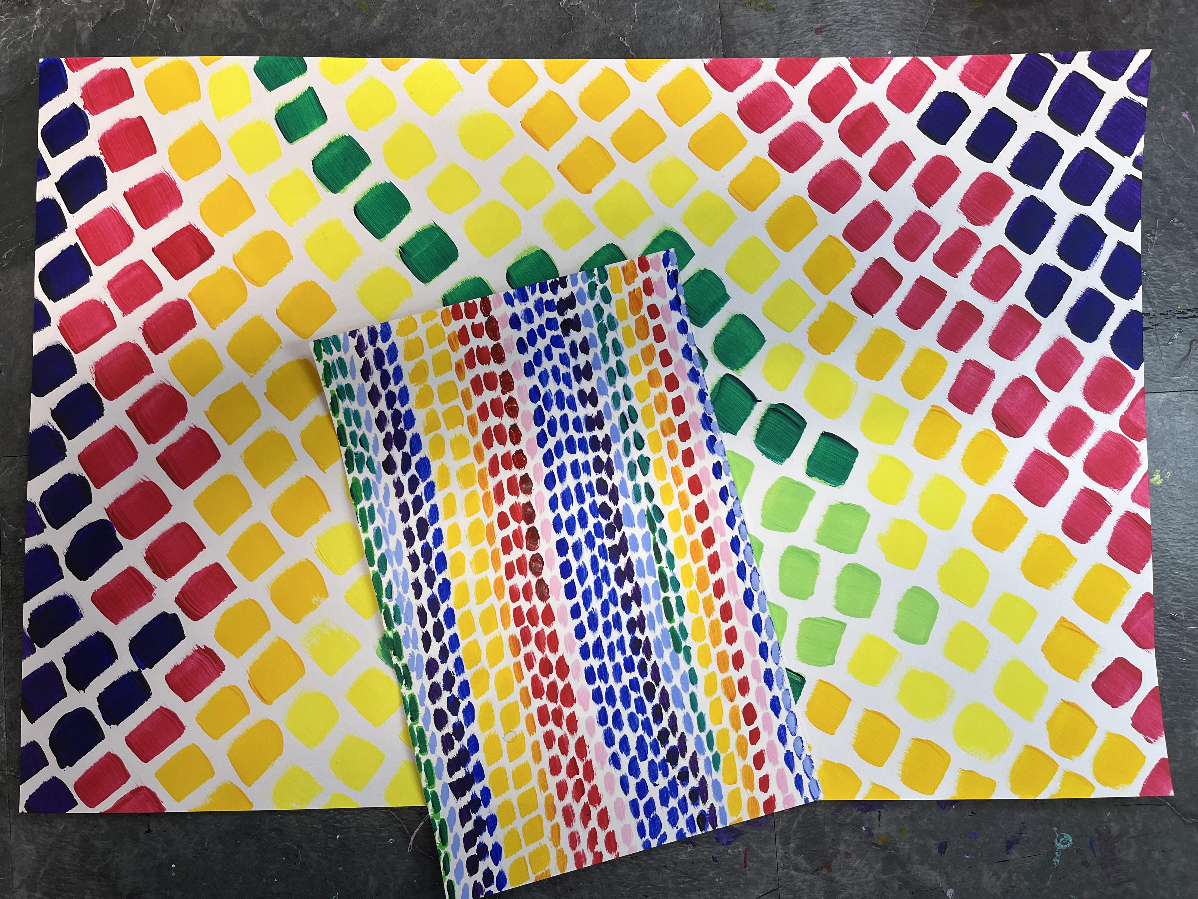
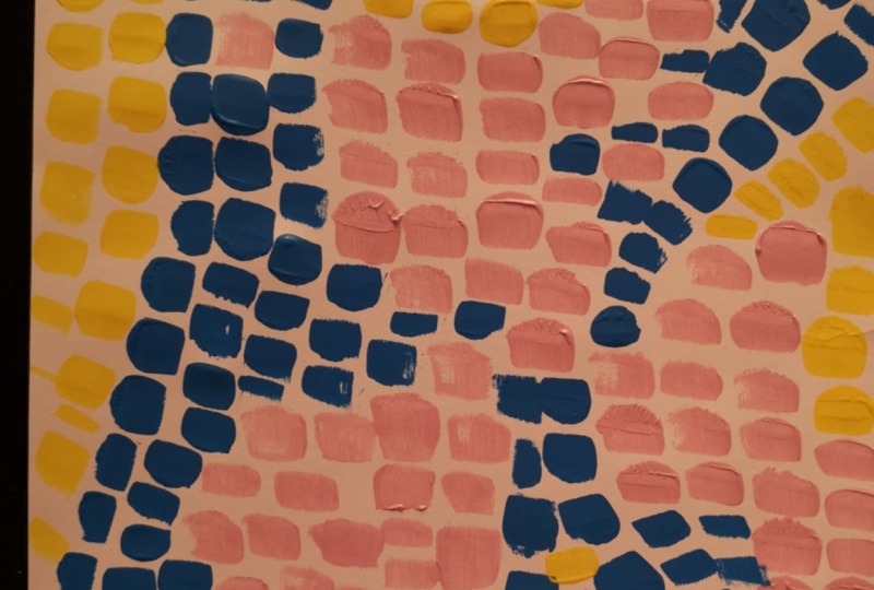
2. Class Project: For our class project,
we are going to be exploring the ways
that Alma worked with basic shapes and color
and the dashed lines in bold acrylic paint to create her large
scale paintings. We're going to work
a bit smaller. I've got one where I just were
in the toe dipping phase, I was working on a nine by six, and then I have one where
I worked on 12 by 18. Big for what I've been
making these days. Then for my bigger project where I really walk you through all of the steps that I have evolved in my
continued exploration, that's going to be on
a larger scale also. If you're working larger
for your class project, you might want to lean
into a larger brush size, and if you're working
smaller, you want to lean into a
smaller brush size. But you can get inspired by Alma any which
way you want to. You can get inspired
by her colors. You can get inspired by
the marks she was making, by the basic shapes and the way that she was using
those to represent very special significant things in her life and that she
observed around her. In the lesson where
we learned about Alma's life and artwork, really be open to the different ways that
you might get inspired in the way that her work
speaks to you and how you want to explore
that in your class project. But the basic materials are very straightforward
for this class. Let's hand it over to the
next lesson to talk more about what supplies
you're going to want to have on hand. See you there.
3. Materials: For Alma Thomas
inspired artwork, I'm going to lean
into acrylic paint. For your base painting, you could do it on any
surface you want to. I'm going to do it on
some mixed media paper. So I've got small paper
and I've got bigger paper. I'm probably going to
play with both sizes and kind of see the
difference between them. She was working very large, so you could absolutely lean into a large scale
painting if you wanted to. If you shrink down
your brush size, you can get a similar effect
with a smaller brush. Going to have a couple
of different brush sizes of my acrylic brushes, and then I've got acrylic paint. A lot of times when we see
work inspired by Alma, it leans into the
rainbow aspect because she has some very
colorful pieces of art. But she also has
some that lean into some very specific
limited color palettes. When we get over
to the next lesson and we start looking at her art, really look for pieces and color palettes that
she's using that really speak to you because
you could choose any number of colors that you want to work with
for this project. I'm going to start with
some base colors and then probably mix
up some other ones along the way because
this is a really fun opportunity to
play with color mix. Working with acrylic, we're
going to want to have a jar of paint and a cloth on hand for washing our brush and drying it off between
color switches, and we're going to want to
have a palette, as well. I have palettes like this, ones that are the disposable ones. Ones where you use
it, and then you just rip off the sheet and
you've got a fresh one. You can also use plastic
palettes if you like, or a lot of times if
I'm teaching a class, I'll use styrofoam ones. We are also going to look
into sketching some ideas. Alma's work was
representing a lot of different aspects
that she was really interested although
they're relatively simple, as far as the shape she's using, there's a lot going on there
that you can lean into also. Definitely check that out in the next lesson where we talk about what was inspiring her to make art in her later years after she retired from being
a junior high art teacher. You can just go for it and start to build it
up intuitively, which I share in
two demonstrations that I do working larger
and working smaller, it's also nice to sketch out some compositions and
play around with that, too. So we're going to take a look at that in one of the lessons. So for that, you're
going to want to have a pencil and then just
some smaller paper, sketchbooks, scrap
paper, copy paper, whatever paper you
have lying around, just to sketch out a couple
of different thumbnails, just as you think about how you want to lean into her work. You could go along
the lines of color, you could go along the lines
of mark making, composition, use of shapes, simplified forms, but these are all the
supplies that we're going to need for our class project. So gather those up and let's head on over to the
next lesson to learn more about the life and art of Alma Thomas. I'll see you son.
4. About Alma Thomas: A Alma Thomas started her career as a kindergarten
teacher as someone who was constantly wanting
to return back to education to
continue to grow. She was definitely a
lifelong learner and really had more and more ideas about what she wanted
to do with her life. She always loved art
all the way through. But after being a
kindergarten teacher, she decided to return
back to school to get her degree in teaching, and she became a junior
high art teacher, and that is what she did
for the bulk of her career. It was till after she retired
about 30 years later. That she began to work
professionally as an artist. She was painting all along
as art teachers tend to do. We are artists and art teachers, but you don't have
a ton of time to explore your own art making
when you're teaching. She really came into her own
when she had all the time in the world to explore art and how she wanted to represent the things that
were important to her. She really felt that
it was important to put brightness and
light into the world. Even though she
was living through some very turbulent times
in the United States, she was born in the
south near Atlanta, Georgia and her family
moved to Washington, DC as part of the migration north as an African American
woman and family. Her family was
uprooted because of the turbulence that was happening in the South and
in the country at the time. She was definitely living through moments in history
that were challenging. She did explore some of
that in her artwork. She was attending protests. She was advocating for
other Black artists. She was really voice and a force to support others who needed
help being raised up. But when it came time to make art professionally
and she really had the time to explore art making and what
she wanted to express, she leaned into
bright bold colors. She leaned into basic shapes, but she was very much documenting the
experiences around her. Many of her pieces are named after flowers because
she was looking at the different flowers
that she saw in bloom around Washington
DC, where she lived. She was also living through the time of the
moonlanding and has a collection of paintings that explore that through
basic shapes, bold colors, graphic marks, those dash lines colorful, beautiful dash lines and almost all of her
pieces are giant. They are really, really
big paintings and that meticulous mark making
is just so fantastic. I can't help but feel joyful
when I look at her work. I love that she brings
such joy to her work. I can only imagine that she
was a joy as an art teacher and really brought out all those amazing qualities
in her students. Is very important
because in 1972, she was the very first
African American woman to receive a solo show. This was a huge moment to be recognized as a
professional artist worthy of such an honor to have
all of your work out there and to celebrate everything that you've created in your life. But then also to have it in such a prestigious
location as well. It's really amazing. Now that we have talked
a little bit about a class project and we know what materials we're
going to be using, we dove into a little bit about Alma Thomas's life and we looked at a lot of her
different paintings. Let's on it over
to our next lesson and I will walk you through the beginning stages
of sketching out your compositions.
I'll see you there.
5. Sketching Composition: So I'm going to sketch out
a couple of compositions inspired by the work
of Alma Thomas, and I'm going to kind of lean
into her play of geometry, and I'm going to do a
little color planning also. So the first step
I want to do is I want to create some thumbnails. A couple of the pieces I've
created inspired by her work, I've really played with a more intuitive
approach because that is more genuinely
my take on art, but there is a lot of value to planning out your
ideas ahead of time. And I really want to show
you how you can do that. Because that would
have been more in line with what she was
doing because we know that she drew out
her compositions on the canvas prior
to painting them. I'm going to lean into
some geometry and want to kind of go with some
shapes that I really like, and I tend to really enjoy
circles, much like Alma did. But my spin on circles is
a little bit different. I like to play with
size variation, and I like to play with balance with both symmetry
and asymmetry. So I'm going to kind of explore something like this
maybe as an idea. Then I also like to play with rectangles and squares
and I love overlap. I'm going to play with an idea that I explored a long time ago. I'm going to come
back to that idea, lay down a couple
of different ideas between squares and rectangles. I also want to play with where
she fills the whole space. But I think I want to do it with an oval instead of a circle, play with what happens
if I have a big oval, and then maybe even just
the overlap of a tiny one, keeping it super simple. And then let's see. What are some other ideas? I like all of her the line work, but I also like how she has some triangles and how those lines would
only go that way. Then maybe this one, the marks would go this way. So we can play with the shapes, we can play with the
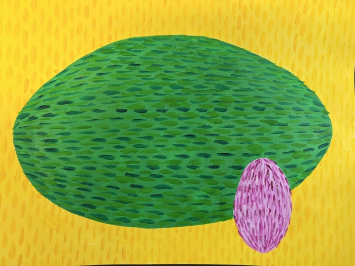
direction of the lines. The marks for this one, I think I want to play with
kind of a curved idea. So there's a roundness, and this is kind of starting to remind me of a watermelon. Maybe if I painted this one, I would play with green. Maybe this one, the marks
go another direction, kind of that same idea here, but I'm playing with a different
sort of playoff of that. And then maybe see if these are kind of
horizontal, those are vertical. Maybe the background would
be more vertical dashes. So that's the other
thing you want to figure out is what direction do you want your marks to go in? She was generally
working vertically, but we're leaning into our own aesthetic
inspired by her work. We can absolutely turn this on its head and
make it really wild. These ones, I think I would
maybe keep them true to her vertical marks
and then just let the colors play
within the circles. And then the background
would also be vertical. The other thing we
could do is play with not having
everything full of marks. Maybe our canvases aren't
so packed with lines. Maybe we're playing
with a negative space in a different way. She has a negative
space in her pieces. She was also playing with
color relationships. So I think she wanted
all of the color there, and then the marks and then
the color relationships to each other add this kind of vibration, which is really cool. Her pieces were huge. So even the ones that
are more single hue or only two colors are still very dynamic because
of the brushstrokes. This I really love.
I think I'm good. I think I've got four
really solid ideas that I might want to
explore in the future. So I'm going to heading over to the next lesson where
we're going to start to talk about color and how we take our sketching
ideas for composition, and then we start to think
about our color relationships. I'll see you there
in the next lesson.
6. Planning Color Scheme: Now I want to explore
these ideas in color, but I really want to play
with a couple options. Let's say we lean
into the watermelon. I'm going to sketch it
again. Here's where you could start on a
different sheet of paper, and then I'm going to put my
marks in with my graphite. Because what we want to
do with a thumbnail, that's what these
are tiny drawings, planning out composition
and design ideas. We don't want to spend
a lot of time on them, so I don't want to make
the marks in color. I just want to get my
ideas out so I can make some decisions so I can go into my other one because this reminds me of a watermelon. I'm just going to lean into it and I'm just going
to pop down some green to see what that looks like because
that's something that I feel like I need to do. Then I want to play with color
mixing in my actual piece, maybe I warm this up a bit add a little bit of
a limey green onto it, and then I can even
remind myself. That the marks are going
to go to contrition. You would be really
funny in playing, what if I did some solid shapes, which is what I want to do
up here with the rectangles. Then on top of that
were my dash marks. That would be a really,
really fun way to push what Alma was doing further into my own aesthetic.
I love that. Add a little heart.
Say, I love that idea. Now, the inside
of the watermelon is pink and red, pinkish red. Why don't we grab? Why don't
we really play into that? We'll make this one pink. I'll just kind of
remember that we're going to have that
on all of this. And then let's see. What should the background be? I think I want to do
yellow, like a really, really bright yellow,
something that's going to easily stand out
against everything. So it's gonna become a
really bold painting. And I might decide that
that's true yellow, and I'll show you
how you can play with I'll play with that. That's pretty crazy.
What if we did? Let's do another play
on this thumb now. I'm going to have my green watermelon and I'm going to have my pink watermelon and I'm
going to recreate it this way. I'm going to recreate
this part of it. It doesn't have to be great. It needs to be enough so that
I can get the idea down. I know I'm going to have
these dark green lines. But I'm going to do dash marks. So it bed into Alma, and then
I'm going to took my pink. That's going to be a pretty
warm pink, more dash marks. And then if this is too much
feels a little too much, I'm going to take
maybe I was like, I want something
bright but not dark. We'll start with this one, but I do want to add my dash marks. Because the yellow is not
going to give me enough. What if we do a soft yellow in the background?
I like that better. I'm not sure that
is the right color, though. So what can I do? I can. I chop my picture in half and I
can play with half of it. So what if I do more
of a yellow orange? I like that better. That ties in the pink a little bit better. What if I'm still not sure? I shot my canvas and
paper in half again. I think I want to lean
more into the orange. So what if I grab This is
a pretty orange orange. What if I try to pop
that even orange? Now, this orange is mixing
with everything underneath it. So to get what I want,
I think I need a little bit Orange or
orange. I like that. See now, so the pink
is down here, right? So what we can do
is we can cover up what we're not interested
in and be like, Okay, great. Okay. And then we can
keep messing with it. So this is a really fast way
to start to play with color. So we have our composition plan that we did in the
previous lesson. We've chosen one that
we're exploring further. We figured out some
color relationships here and we're starting
to explore here. Does that mean
that it's going to be solid lines of yellow? No, not necessarily, but that
might be my dominant color. So actually, let's
play with that. Maybe what I want to
do is have a mix. Maybe I want to
have some sections that are that yellow
or that orange rather. So that are lighter, then maybe we even
want another one. Maybe some of this pale
yellow is in there. Then maybe we go back out. Then we go back to
the dark again. That's it. That's the one. And it took all of
this very fast, but it took all of
this to get me there. So cool. I'm so excited. I'm going to leave my
pencils out so that I can have access to them
for color matching. I'm definitely gonna
play with this for one of my Alma Thomas
inspired pieces, but I think I also really want to explore some of
these other ones. Now let's go to the next lesson, and I will start to
build this up bigger on my actual paper and do it in acrylic paint.
See you there.
7. Demonstration 1 Part 1: I am incredibly excited
to work on this painting. I've got my sketch and I've
got the colors that I was playing with in colored pencil while I was mapping out my plan. I'm going to sketch out my design on here
minus the hatch marks. I'm just going to
do my basic shapes and then I'm going to start
playing with the colors. I think I want to do hatched colors on top of solid colors, but I might see what it feels like once
it's bigger because oftentimes when you go from a smaller sketch to
the larger piece, it changes the
perception of it and you just have to reassess the plan. I'm also working with
fairly light colors. I'm going to sketch
out my ovals. And then I'm going
to lighten them. There might be a
period of time where you can't really see
my sketch very well. The erasing part is to lighten, I'm just dusting it over so
that my lines are fairly visible because I want to make sure that those pencil
marks don't show through. Acrylic paint is opaque, but some colors and some brands are less
opaque than others. What I'm going to do
is I'm going to mix up a nice light yellow for the background and I'm
going to paint that first. I'm going to start with
my white because I know I want to go pretty light. Anything that is a darker color is going to gobble
up your light. You always want to start with your lighter color and then mix your darker paint into it. Let's say you when I
get into my green, if I want to aim towards
a lighter green, I would either start with
my white or my yellow, and then I would slowly
add my green into it. Because it's easier to darken a color than it is
to lighten a color. Now, the other thing I want to consider here is I'm
going pretty big. I don't want to have to mix my color again and
do color matching. That's a great exercise. It's one that I absolutely recommend you do
sometime just for fun. Try to mix up a nice big
blab of d. One thing I can do since I'm mixing
up a lot and it's really kind of coating my brush, I can get out my palette knife, and I'm going to
actually go do that. Palette knives are great
for a lot of reasons. Their main reason,
which I tend to only really do when I'm
doing oil painting, is that you can mix
up your colors really easily without the paint getting stuck you can
just brush it off. When you're doing
it on the brush, a lot of times you end up
wasting a lot of paint just because you get stuck
in the bristles and at some point, you've
got to wash your brush. It's also not terribly good for your brush to get totally
covered in paint. I often tend to skip this
step when I'm going for it. No, I want to kind of see I like I know this
is different than what I was originally thinking, but I think I'm
going to go for it, and I'm going to
see what happens. The great thing is, I can always paint over with another
color if I want to. Acrylic paint is one where we don't need to
add water to it. We just have to load our
brush up with more paint. And I'm going to go kind
of careful on those edges. I could add a little
bit of water if I felt like my paints viscosity was thicker than I wanted to, viscosity being a fancy
word for thickness. I'm noticing that
some parts of it are a little more
mixed in than others. It's also going to dry
a little different. So the color that you
have on your palette, is going to alter slightly when it goes on your
paper and starts to dry. You can always mix a little
outside what you want. We're also thinking about the
fact that we're going from colored pencils for
our color mapping, color scheme experimentation
stage to acrylic. We can recreate and mix many colors and we can
get pretty darn close. But sometimes it's going to be a little bit different
depending on what you have. I think what I might do is do the orange marks
on top of it. That might be where
that comes in. The cool thing is because I'm doing the dash marks on color, I'm going to get a really
cool color optical effect. The eye is going to
blend those colors together and communicate
that to the brain, and then it's going
to read differently. If this was something that
you were nervous about doing, you could absolutely do
some color swatches. I'll actually show you. Fined. I've got another
piece of paper. I could do a piece
of paper and I could just do some
larger sections, some squares or rectangles or
whatever you wanted to do. Of the color, and then
we can let that dry, and then I'll show you after
this dries in a second. It dries pretty fast, how I can do my dash marks
on top of there. So that's another
good thing to do. If you just need a little
bit more reassurance that your color choices
are going to work out. Depends on how technical
you want to be about it. I'm a very intuitive artist. Kind of like I love the
happy accidents and I love kind of seeing what's going
on with what I'm making. The surprises are
something that I brace. But that's not everybody, and I definitely
understand that. And sometimes it's
just not your mood. Like, you just might not be in the mood that day for surprises. You just want to know
it's going to work. So any tips or tricks I can
share to help you overcome any nervousness or concerns about things working out,
I'm happy to do that. Background is very yellow. I'm going to wash my brush. It's really important
because acrylic paint is a plastic based
paint that we wash our brushes after
we're done using. You also never want to have your brushes sit in the water. The water gets in there
and really starts to mess with the bristles and the
integrity of the brush. Because I have all that paint on there because I was really
going to town mixing. I really want to make sure that I'm washing and
wiping off my brush. Sometimes we use the water with acrylic to do more
of a glaze process. Maybe that's something
that would be really fun to explore in
a future class. We're looking at art techniques. Let's set this up to aside for just a quick second and I'll
show you the color watching. It's pretty subtle. Let's
see what that looks like. I'm load up my smaller brush. I'm not sure what size
dash marks I want to do yet, but I have
a couple options. But this is a small
section. So I want to do. That's really dark. I'm
not sure I like that. What if we take some white? This is like an expansion
of the color lesson, right? You could absolutely
do this at any point. Alright. What if I have a lighter
color than what I was doing? What if I reverse it? I'm going to go darker, but I don't think I'm
gonna go that dark. Let's mix up some green. And I really love this one, where I had the light green with the dark green
for the dash marks. Probably the dark
green is going to just be what comes straight out of
the tube that works great. So now I need a light green. If I mix white with green, I'm going to get
a mintier green. If I mix yellow with green, I'm going to get a warmer
kind of limey green. I kind of want something
in the middle. So I think what I'm going
to do is mix my lime green, and then I'm going
to do it down. Yellow was our lighter color. We're going to want
to grab some yellow. It's pretty big
section we're mixing. So we're going to go
for the hue we want, and then we're going to go
for the value that we want. Mixing color is
definitely something I love to do. Let's
grab some white. Now, normally, I would
grab some white off to the side and I'd
slowly mix it in. You could also play around
with not mixing it all in. You could have it be a
little bit more streaky. I think I might have gone
too far with the white. The thing is once you
start to lighten a color, it's hard to get it back because the
white's just in there. So we're just going
to try darkening it. Yeah, that'll work. This section's pretty big. I'm going to go with
my biggest brush. My paint's also a little
bit gummy because it's been sitting uncovered
for a little while. So in this case, I am going
to add a little bit of water just to help thin out some of the tackiness
that's happening. So if I keep my brush pretty
well covered in paint, I can get a nice crisp budge. Anywhere your paint
looks thinner, you can always paint
over it again. Acrylic paint gets
sticky as it dries. Might want to wait for it to dry and then do another coat. If at any point your water gets really dirty or you just feel like you need
some fresh water, dump and rinse out the water. If you are concerned about it the plastic paint
going down your drain, if you dump it into a plastic bucket or plastic container, as the paint sits, the paint particles are
heavier than water, so they're going to
settle to the bottom, and then you can pour off your pretty much
just dirtish water, and then you'll
have the paint at the bottom that you
can scoop out or throw out and put
it in a garbage so that it doesn't
go down your drain. I have a lot of paint on
this. But it stok for that. Is to have some scrap paper. I got books and turn them
into collage papers. So I just put my
leftover paint on there. So I'm just going to
scrape it off first. Then I don't have so much
paint going down the drain. All that great paint can go
to make decorative paper. So we're going to take some
white. We don't need a lot. And we're going to mix up
kind of a pale magenta, and then we'll use the pure
magenta for the dash marks. I'm going to go back
to my smaller brush. Helps to rotate your paper, depending on what type of angle or curve
you're trying to do. Now, the other thing you can do besides washing your brush off go back to your paper and
just add some more marks. You will still have
to wash it, but now more of the
paint is on here.
8. Demonstration 1 Part 2: So my yellow is dry, my green is mostly dry
and my pink is not. Let's start working
back into the yellow. I'm gonna rotate it, and I know I want my lines to go down, and I know I want to
keep them pretty narrow. I have a tiny little spot
with my paint mixed, but just like watercolor with a little bit of a damp
brush and some scrubbing, I can wash that paint off there. I want to maintain
the brush shape. Now, here's where
you can decide. Ho you going to do
full of brush strokes. Are you going to go sideways
and do more dashed ones? You might want to have
a teeny bit of water, so it's a little thinner so that you can do some
smoother brush strokes. You can start anywhere
and work your way over, or you can start on the edge and work your way left to
right, right to left. Working right to left
doesn't make sense because I'm right handed,
but this is also wet. So I don't really want
to work left to right. I'm just going to start
in the middle here. And then I'm going to
just eyeball it down, and then anywhere it
goes off the page, it goes off the page. My green is wet, so I have to make sure that I
elevate my hand. Also going to stagger my marks. So instead of going
boom, boom, boom, boom across, if
there's one here, there's going to be
one here and one here. I found that when I
was doing it before, they ended up doing
that on their own. It was very hard to
maintain a consistency. Maybe I just was going too fast. Hard to say, but
I'm going to aim for an evenness between them and then let them stagger as far as how they
line up horizontally. I think it's also going to
give it some nice variation. Chances are you're going
to find that your marks are going to get off at some
point, and that's okay. We have to remember that
Alma was doing this a lot. I mean, this was her
technique that she was working with pretty
exclusively in her work. So we have to give
ourselves a little grace. We can also see they're getting thicker kind of hard
for you to see. It's just because my brush is getting too loaded
up with paint. So throughout the process, you need to wipe it off
and you need to kind of clean your brush
sometimes and start fresh. The more paint you have on
there, the thicker it gets, but we have to keep
loading up our brush so that we have enough
paint to make the mark. When you work from the
edge, if you've got a shape dividing up your background, there's a really good chance. Like, I think this is
already going at an angle. You might kind of
find yourself things might get a little weird when my lines all of a
sudden line up. So it might have been better
to go from the edge over. That's maybe something to just think about if you're a little bit more concerned
with being meticulous. My brush oakes are
getting too thick. So I'm gonna wipe off
some of the build up, maybe a little bit of
water. I'm loving that. My pink is still wet. But I'm going to start
working my way the other way, being really, really careful
not to put my arm down. Backgrounds done. Green
looks like it's dry. The yellow is still a little wet because I just finished it. And I'm really liking the
size of those dash marks. I'm going to carefully
work around my yellow. And I like what I did
here, what I had. I'm going to start
in the middle, and then I'm going to
kind of have them bow. So I'm going to have a
straight one and then they'll bow up and then
they're going to bow down. So there's gonna be a little bit of spacing happening there. I'm going to go with
my solid green. It is easier, I
feel to go up and down than left and right
and have it go straight. So I'm going to turn my paper. I'm going to stagger my marks
again because I really like how that effect was there,
and it was just easier. Kind of gave me a guiding point as far as where the
next one could go. I'm going to do one whole side. And then I'm gonna
flip my paper, I think, so I can keep
working out to the right. I do feel like they
were too spaced out. I'm gonna make a warm
green, but that in between. I want it to be much lighter than my base
screen and my dash green. So we're just going to
really ramp up the lime. Quality. And now I'm going
to go in lime in between. I still want to see
the base color. I just need to break it up. I'm not even going
to follow my lines. I'm just going to
fill in the gaps. I said, it's just
to break it up. It just feels too flat. It feels too just incomplete. That's exactly what
it was missing. It's very subtle.
I'm not even sure if you can see it on camera. It's making all the difference, just to warm it up and to
break up the flatness. If you put your dashes
closer together, you may not have
the same problem. I think that's it. I think
I got all the spots. Last part. The pink part. I'm going to just use
my regular magenta. I'm going to use a smaller brush for that because
it's a smaller area. This one, they're going
to go up and down. I'm going to do the center and then the outer edges and
then curving it down. If you decide to do the curve, it helps to do it in sections
and then kind of fill in. So that would have been something that would
have been good to test before I started
on my but it okay. I liked putting the warm in. I think I want to do the
same thing I did here. So I'm going to mix up a light. It's not really adding
a value change. It's just adding texture. I think what I might
do is make some very, very pale version of this and see if popping
in a little bit of that. It needed the lighter.
I've lost the lines, but I don't really mind so
much on this part of it. They're spaced out here and
they're more or less there. That's exactly what it
needed. So lightness. It's easy to take
this step too far. So cut yourself off. This is fantastic. I'm thrilled. This is even better than what I dreamed of when I was
working on this sketch. Let's review. We
have the sketch, we have the color exploration. Now we have what became of
it in the final artwork. I couldn't be happier with this. I learned a lot along the
way that I can then use when I circle back and work
on some of these other ones, which I absolutely want to do. I'm going to do
because I'm having so much fun exploring
the styles of Alma Thomas and her
play with color and pattern and dashes
and all the good things. Here's my full one.
You can also check my toe dipping ones where I just played with rainbow
colors and mark making. The whole thing is just marks. I didn't draw any basic
shapes for those ones. But I will say that I
needed personally to explore those before I could get to this point. Don't have to. Now that I've figured out how to walk you through this process, you can glean into the rainbow, just dash marks filling the
space if you want to or whatever color combination you want to and just play
with dash marks, or you can go this route and do a little bit deeper dive or
somewhere in the middle. Feel free to check
all those other ones. Otherwise, you can pop on over to the last lesson
to wrap up the class.
9. Demonstration 2: Ten. For this one, I really wanted to go large and play with something similar to the size of Brushstoke
that Alma might have been using in her
large scale pieces. And I had this idea of
just really starting with something bright
and light in the middle. I really love the way that she builds up lines with dash marks. That was the foundation of it, and I just kind of was going to decide how it grew
out from that. So I started with
a really light, pale yellow green, and I'm trying to get it
to kind of bow out. I wanted to kind of
have this roundness. I love the way that
Alma often use circles. Some of her basic shapes. And I wanted to
kind of lean into the curb of the circle without
literally doing a circle. And I really felt
like it made sense to me to work on a
mirrored symmetry. So starting with that
central line and then building out
on each side of it, and then as I went, kind of
deciding how even to make it, and at which point do
I change the color. So now I'm going in
with my bright yellow, and I'm kind of
creating a line that outlines around that and
creates a yellow section. I did find that because
I was doing bent lines, I had to be a little bit more mindful of
lining things up. And I also kind of had
to let go of wanting to make it like perfectly
evened out and grid, like I was leaning into line, not necessarily grid, but
it's hard when you're doing works like this to kind of not get in your
own head about it. Because I was painting this kind of quickly and I really kind of wanted to let there
be a lightness to it and just a looseness. I was really kind of
struggling with how to not focus so much on the fact that it wasn't
getting terribly evened out from one line to the next and where
the marks were going. It was really fun
though to play with a variety of colors
and decide what color is going to come next and what colors I stumbled upon
as I started mixing together. Rarely wash my brush
between color shifting, and I love doing that
as a way to kind of discover new colors that I
hadn't really had on my radar. So the light orange
came from having the yellow on there and kind of leaning into a little bit. I think I had some
orange on my palette. I was using leftover paint from some other painting
projects that I had. So that's the other fun thing was that I wasn't
starting with pure paint. I have the pure hues
on my palette, also. But then I also have some
ones that were kind of mixed up as part of
some other exploration. Did decide, much like
in the smaller piece that I needed to break
up my colors more. The light green
felt too dominant once I started adding in the
yellow and the pale orange. I picked up some
darker green and started going over
and adding that in. I find it interesting
that in both pieces, green is what I ended up popping darker in and all the other colors just kind
of felt like they worked. If you find yourself
as you're getting into this kind of being a little dissatisfied or wishing you had made some
other color choices, you can absolutely always, whether it's dry or not, go back in and paint over. Because we're using
acrylic paint, it's incredibly forgiving. It's an opaque paint. It's
meant to cover itself up. I loved going in
with more worms, and I wanted some more
intenseness there. So I'm kind of deciding
how much red do I put in? And then because I'm
doing this mirror symmetry sort of kind of, I've gotten a little bit away
from I'm popping the red in on both sides of the central image that
I've begun creating. This is a point where
you can kind of decide, how is this going to go? Like, how are you going to keep manipulating the lines of dash marks that you're creating? Maybe you're not even
doing lines of dash marks. Maybe you're exploring
a different sort of repetitive brush stroke or
shape that you're painting. We can lean into any aspect of Alma Thomas' work
that inspires us. I love her play of color. I love the line work that happens with the
dashes of paint. I love the play of just the fact that
they're not perfect, the fact that you can
really see her hand and every single mark
on her canvases. And I was really trying to relax into that
as best I could. I love having a full
range of contrast. So because I started
with such a light color in the center and kind of kept things fairly light and bright, I knew I wanted to try to push the darkness
on the outer edges. I also love the look of
red and purple together. It's just a really aesthetically pleasing color
combination for me. So I really made sure that I got that color combination in there once I kind of saw where
the piece was going. I am working very large. This is a 12 by 18 inch piece of paper. And having a lot of fun with big brushstrokes on big paper, it would be really fun to
do an even bigger one, to get to get a canvas
out and work even larger because I really enjoy the repetitive nature of it, the play of choosing colors, building up the lines
and the dash marks and just the satisfactory feeling of filling in the entire space. So here's how it turned
out. I love it so so much, and I hope you have as
much fun with yours. You'll see in the
next demonstration how I played with
smaller brush strokes on a smaller piece of paper and kind of some similarities
that exist there, as well as some differences
as I played with two different ways of
exploring Alma Thomas' work.
10. Demonstration 3: For this piece, I
really wanted to play with a much smaller scale, and I really wanted to lean into the vertical mark making that we find in a lot
of Alma's artworks. I also really wanted
to play with kind of building up the
composition as I went along. I do love working
very intuitively, so this leans well into my
own personal art aesthetic, but I'm also doing
it a Alma Thomas. So I'm starting by loading up my brush with some
really bright yellow and starting to create the
marks going down the page. And I will say, she was working very large for the
majority of her artworks, and Must have just
had immense control. Like, I wonder if she often, you would have stepped back to kind of see how the
compositions were coming together since she was working on such large canvases. So after I built up two
different segments of yellow, also playing with
creating different width. So although my marks are aiming for a more
uniform application, that kind of varied
a little bit as I was kind of leaning
into this process. I wanted to have more and less of the stripes of those
marks to really kind of lean into some variation in line with as we could identify like segments
of color, basically. So I've got a thicker
band of yellow, created with two
stripes going down, created with two
stripes going down, and then I've got a
single strip of yellow. And then I was
layering in my orange, and now I'm going
in with my red. So I'm really kind of
building it up very methodically working my way
through one color at a time. So once I move on
to the Nx color, I just kind of made
a conscious decision that I wasn't going
to go backwards. I was just going to keep moving through the color
spectrum so that I could see how it went and
kind of what colors I ended up with in the end by just building it up
as I went along. So I treat one
segment of the paper, and then I go to the next one,
and I kind of keep jumping back and forth as I
keep switching colors. And you'll notice that
I'm really just kind of leaning into whatever makes the most sense as I'm
deciding how many rows or columns of a color to have before I move on
to the next color. I also wanted to lean into
some more value variation. So I went right from
my red to my pink. And just kind of wanted
to play around with some lighter colors because
I really enjoyed using the lighter green in the
larger piece that I created and how that kind of just gave a nice contrast to
some of the darker, pure hues that I
had in my piece. But then adding
to that contrast, I wanted to have kind of
that light pink sticking out between those really bold
blue and red sections, which was something
that I definitely, leaned into from Alma also. She has these moments of just lightness within these
bold fields of color marks that I just really
found pleasing and interesting and just
aesthetically something that I wanted to kind
of explore myself. So that was a really
big part of why I wanted to have that
light pink in there. So, like, almost
it's pretty pale. So even on the camera, you can see, like, you
know, is it there? Is it white? Like, there's especially as the page starts
to fill up with more marks, it becomes even more
of a contrast between the lightness of that
pink and the darkness of the bold colors that are
filling in around it. So I just kept going and kind of how do you need to keep
reloading my brush, too, because I found that
my acrylic brushes were a looser bristle
than I would like. So I would say, if you're
going to lean into this, maybe pick a firmer
bristle brush. I think it would be
easier to get the marks. I would also love to
explore this digitally, doing these kind of pieces inspired by Alma and Procreate. And I've seen other art
teachers who get inspired by Alma and do projects with their students using
cut paper, too. That would be really fun
way to do it would be to cut all these timy bits
of paper and then to collage them and
kind of lean into the mosaic aspect of Alma's marks that way
in a collage piece. But here I really wanted
to kind of lean into the fact that she
was painting and I wanted to paint like Alma and just kind of
have that experience. I did find that as I went along, my getting the really straight vertical
lines was a challenge. It was really quite hard. And I'm working much
smaller than she did. So maybe it's harder or
smaller. I'm not sure. But I did find that I ended up some wobbly wobbliness
to my lines, but then I just kind of
leaned into that, too, and made that part
of the composition as the composition grew. Once I ran out of room for
my smaller section of color, I started building out on both sides of my larger section. So now it's just a
matter of sticking with a color and putting
in columns of color marks until I get to a point where I feel
like either color that color is done
or it's time to move on to another color to
finish out the piece. And I really am working fairly, fairly color scheme wise. I was working very rainbow in the first big
piece that I did. Here I'm leaning away
from it a little bit and just kind
of jumping around the color spectrum
and kind of going for a more limited
color palette while still playing into a lot
of the standard colors. Looking back on this, though, it's interesting that a lot of this is made up
of primary colors, which was also something
that we can see Alma doing a lot in her pieces. She has many pieces that don't
stick to primary colors, but this one it was
fun that it was primarily primary colors with the addition of a couple tints. So I have the lighter blue
that I'm putting in now. I have the light pink
that I put in before, which is a tint of red
and just kind of really leaning into that and then having those be
the dominant thing. So I would say, as
you're planning out your Alma inspired artwork, I would you could either kind
of let it evolve and let it kind of get created as you go and work
more intuitively, or if you feel like you
need more of a game plan, maybe pick a color scheme, pick some color scheme
that kind of inspires you and kind of start
with a limited palette. And then as you get
into the mark making, you can kind of
decide what else it needs as you start to see
it growing on the page. I did find that I had
a couple ones that I needed to go in and
tweak the colors of. It just needed a little
bit more variation. So I did find that the
great thing about acrylic, I can go back over it, and the opacity of it will just totally cover up
whatever's underneath it. So I did have some points
where I wanted to have a little bit more variation
and pop some more color in. So I did paint over a couple
of sections that either needed a different value or that needed a
different color hue. But that was definitely
an editing choice that I made after the fact, just to kind of crispen
up the piece and kind of get it to a
more finalized de. But I had so much
fun creating this, and there's so much
work that Alma made, especially after she retired
from being an art teacher, that she just explored this
huge this huge world of color and marks and her
inspiration and influences from nature and
her interest in space. And just all these
fantastic ideas that she was exploring through
these abstract pieces. It's really fun to lean
into her process of the mark making and
get inspired by the things that were inspiring her and then put her
own twist on it. So this was just such
a joy to work on. It was so incredibly fun. And I'm excited to do
more and explore even more of what she was doing
during her time as an artist. So let's s over to the last lesson to wrap up the
class. I'll see you there.
11. Final Thoughts: Ten Thank you so much for joining me
in this class as we looked at the life and art of Alma Thomas and used her work as a jumping off point to
get inspired ourselves. I hope you had so much
fun learning more about her work and what inspired her and her
artistic process, sketching out some basic shapes as we built up our compositions, exploring what color choices
we might want to work with, and then taking all of that
over to your final artwork to really thoughtfully evoke the feeling of whatever
you chose to explore in whatever color scheme
you chose with the marks that I found so
inspiring in Alma Thomas'. I hope that you are interested in sharing your
work in the student gallery. It's so fun to see how
everyone interprets projects, especially when we're looking at artists to get inspired
and we're layering on our own personal aesthetic and then how those
two weave together is such a unique experience for each artist that
takes these classes. I love sharing how I work
through this with you, but I so enjoy seeing what you create as a result of the ways that you're
getting inspired. The artists that
we're looking at and the artist inspired
serious classes. I hope you'll also stick around the gallery and check
out the artworks of your fellow students and give each other some feedback, encouragement and comments
that can help all of us grow as creatives and art
history passionate people. If you've had a chance to share your student project in
the student gallery, I hope that you'll take some
time to leave a review, sharing your feedback
about the class. What did you like?
What got you inspired? How did it impact
your art practice? Reviews are a fantastic way for students to get an inside look as they're deciding
what classes to take time is our most
valuable commodity. By providing reviews
that give folks a chance to see what class
experience another student had is invaluable as we decide what classes to explore on our creative journey
here on Skillshare. I would love to stay connected. Be sure to click Follow so you get notified as feature classes and any discussions that I post if we aren't already
connected on Skillshare. I also share tons about my art making practice
on my Instagram. I share a little bit about
classes I'm teaching in person and online
and what I'm up to, different art adventures I
go on over on Instagram. If you'd like to follow
me over there as well, that's a day to day, week to week update
about what's coming up, what I'm excited about,
what's getting me inspired, and what I'm up to
in the art studio. Also have YouTube
channel where I share tons of different
art techniques, some that are related to classes on Skillshare,
some that are not. But I also try to take you on art adventures, share
what I'm up to there. But there's a ton of videos on there that I think
you're really going to enjoy and will get you
further inspired to do even more art making as you continue on
your creative journey. Thank you again for
taking this class. I really appreciate your
time and your exploration of these artists and I
can't wait to see you in another class real
soon. Till next time.
 Elisabeth Wellfare, Artist, Art Educator