Transcripts
1. Introduction: Hi, I'm Elizabeth and welcome to another Artist
inspired series class. I've been teaching on
Skillshare since 2021, sharing my art background,
my art experience, what I love doing, and what's getting me creative and excited. In the artist inspired
series classes, I teach you about
the life and art of an artist from past
or present and ways that we can get inspired
by different elements that they were or are exploring
in their own art making. I am a professionally
trained artist and art educator as well as a published author
illustrator and I am very excited to share
with you in this class, the work of Matthew Wong. Matthew is a Chinese
Canadian artist. Matthew's landscapes explore
amazing elements of color. They have some wonderful play of mark making and texture a
lot like Vincent Van goes. But the way Matthew does it is in such a unique,
beautiful way. We are going to be exploring
imaginative landscapes, drawing on memories of our
own for our class project. Let's head it over to
our next lesson to talk more about what we're going
to be doing in class. I'll see you there.
2. Class Project: As with all of the artists
inspired series classes, you can really lean into any materials that you want
to for your class project. For this class project,
I'm going to be demonstrating what I'm
doing with acrylic paint to lean into a little bit of the work that Matthew was doing by leaning into landscapes, drawing on his marks and the inspiration that he found in Vincent Vango's painting. Then also playing
with my own ideas of imagined landscapes
and memory landscapes. The really neat thing
about Matthew is that he wasn't using
any reference images. His time during his short life was divided between Toronto, Canada, and Hong Kong primarily. Those are the two
cities that he was bouncing from the time he
was born until his passing. There's some really phenomenal inspiration that's coming from his memories of place and his relationship to place in the paintings
that he created. We're going to lean into that
two for our class project. Lesson over to the
next lesson and I'll talk about the
materials that I'm going to have on hand for class and
give you some suggestions and ideas for ones that
you might want to consider as well.
I'll see you there.
3. Materials: The materials for our
Matthew Wong inspired painting project are going
to be acrylic paints. You could also lean into
other art supplies, too, but Matthew was a painter. So I wanted my art project
that I did for this class inspired by his work to be
of a similar paint medium. He used oil, squash, and watercolor, as well as
some ink for his drawings. But I think I can get the same
effect with acrylic paint. So I've got my acrylic
paints. I've got a palette. This is a disposable
one, but you could use any kind of
paint palette that you have or a ceramic dish
or a styrofoam plate, anything that you
can put your paint on to mix your colors. I've got some mixed media
paper, I've got a jar of water. I've got some acrylic brushes,
and then a paint cloth. Matthew worked intuitively,
so he would just start painting and let the painting kind of
evolve from there. The sketch out in advance
if you want to kind of plan out your imaginary landscape
before you go into it. So I've got a pencil
for sketching. Go to work kind of small I want to lean into what
Matthew was doing, but I want it to go
a little bit quick, almost like a study of his work and his application of paint and the inspiration that he can give us and the inspirations
that he was drawing from. But then I might down the road make some bigger
ones. I'm not sure. But you could paint on
any surface you want to if you have canvases
or wooden board. You can even paint on
scrubs of cardboard, old Mpboard, whatever
you have around. So go ahead and get
out your art supplies, and I'll meet you in the
next lesson. See you soon.
4. About Matthew Wong: Matthew Wong is
an amazing artist who didn't start creating
until much later in life. Earlier on, he had these ideas about wanting to be
successful and wanting to find fame and he
started pursuing different studies
that he thought would lead to careers that would
lead to those lifestyles. Matthew had a lot of challenges. He suffered from depression. He was autistic, and
he had Aspergers. He lot of different things that challenged him as
far as being able to succeed during in the
traditional school setting, as well as socially. Matthew often found
different situations to be very overwhelming and school was not a happy place for him, but he was very motivated to do well and find
success in life. After trying several
different jobs that didn't quite fit him, he settled on painting
as a last resort. Self taught. All of
the experience and knowledge that he
is putting into these beautiful paintings
comes from his own self study. He devoured artists that he found inspiring
both historically, such as Vincent Van Gogh, as well as artists that he
connected with on Instagram. That is how he built a lot of his art relationships by
connecting on Instagram and social media with
other artists that he was inspired by and then
actually going to meet some. Painting is what made
Matthew come alive. He really truly felt like
he was painting to survive and he really painted as
if it was for survival. He was producing so many
works of art so quickly that in the short
period of time in his short life that he
was an active artist, he produced so many pieces, but he also found great success. But with that come
some challenges too, especially for someone
who is a little bit less comfortable
in social settings. Matthew was sharing his work on Instagram,
connecting with other and became immediately
recognizable and famous as an artist
during his life. He had several large
shows and unfortunately, Matthew took his own
life at the age of 35. He was really drawn to the
work of Vincent Van Gogh as one of many that
he really absorbed the understanding of
color and the play of those relationships and
the sense of place that you can create in a painting and the ways that you can apply the paint to lean into
different qualities of paint, especially the mark
making approach. Though he was
looking very heavily to the work of Vincent Van Gogh, he really truly made
his works his own. He never worked from a
reference image and he was really leaning into
mostly landscapes. He does have some
abstract pieces as well and a lot of
that was really reflecting on himself
in the way that he painted figures within the
pieces if there are some. But a lot of it is memory, duality of his life between initially being born
in Toronto and going back and forth between Hong Kong and Toronto through the majority of his life and the sense of place and one's position
within that place. Often, there's a
figure that feels very overwhelmed by the nature
that surrounds it. Matthew's pieces
are quite large, for the most part,
especially the ones that are on Canvas, are
very large pieces. We can really get a
feeling for Matthew and his personality and what he was expressing on the canvas in the paint and
the color that he. So let's sit over to our next lesson and I'll start showing you
how I'm exploring imagined place and landscape
and color and mark making in my own paintings inspired
by what I'm taking away from the amazing body of
work that Matthew created. I'll see you in the next lesson.
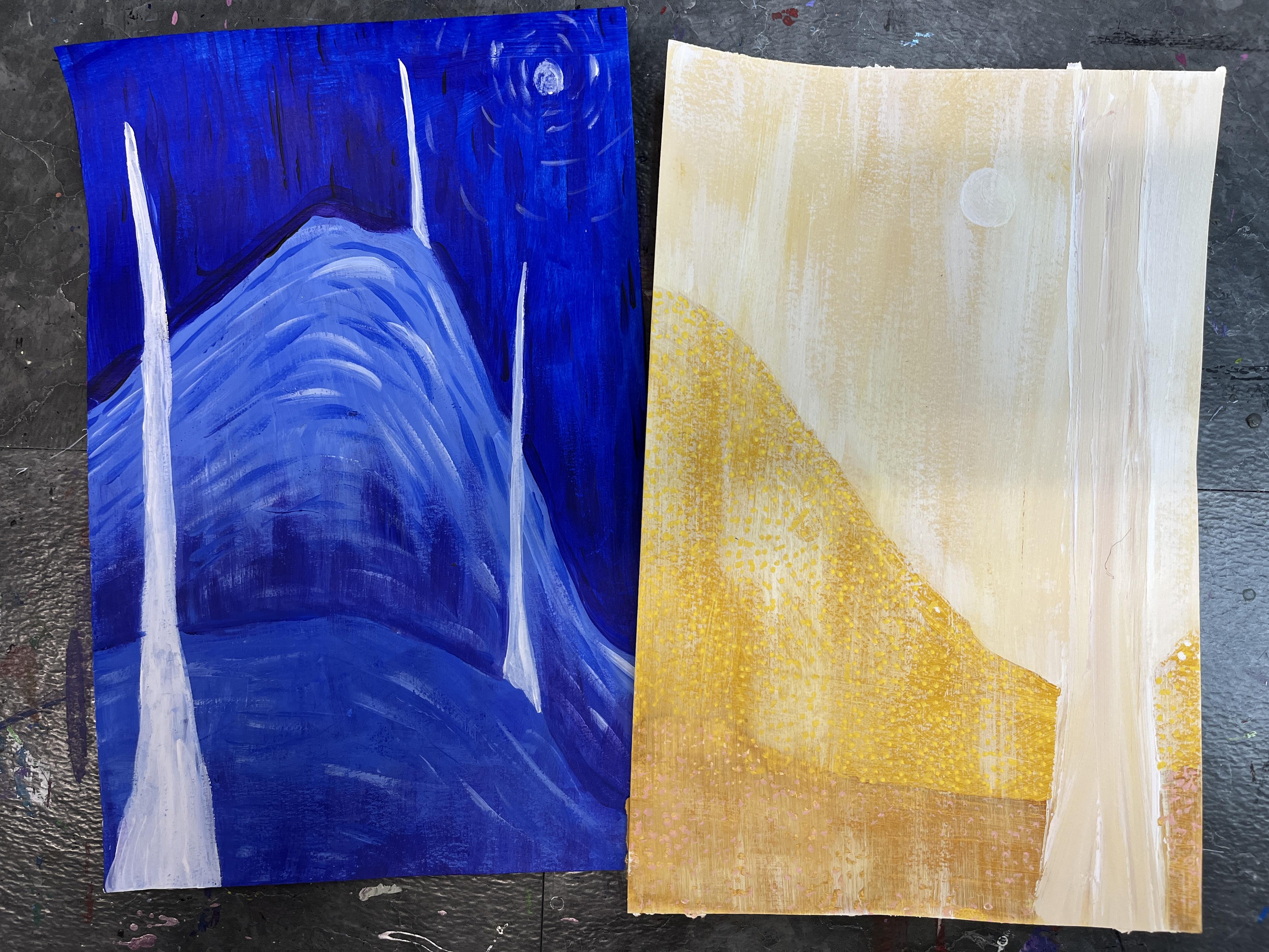
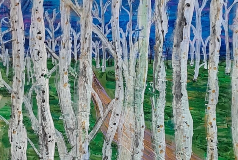
5. Imagination Landscapes: So I want to play with the intuitive process
that he was doing. I want to play with
layering at App two, and I'm actually going to
get a scrap of paper to put underneath because I want to paint all
the way to the edge. I like to use construction paper as my scrap paper because then it becomes paper that I can use for
collage later on. A lot of Matthew's paintings have very similar color schemes, and a lot of his paintings share color schemes with
other artists. But Matthew was always
putting his own spin on it. So even though he was looking to all these other artists to learn and grow because
he's a self taught artist. So his education was
curated completely by himself through the information and the imagery
that he absorbed. And Matthew really was a sponge. He had a talent for just taking in information and
remembering it, was really able to not lose
any of the information, as well as to
analyze and critique and interpret it and then
reimagine it in his own art. Which is really phenomenal
cause a lot of times, we don't always know
where influences come from or
inspiration comes from. When we're doing
things, Matthew was able to not only take in
vast amounts of information, but also to recall it
and then to be able to draw on that recall in
his own work in his life. So because I'm doing acrylic instead of oil or watercolor, I'm going to do this in layers. So I'm going to start
with a base coat. And I like brushstrokes. And we want to get inspired
by Matthew's work, but we also want to lean into our own sensibilities and
our own aesthetic of what, you know, makes us excited. Because brushstrokes were a part of what he was doing and
a lot of his paintings, I'm going to do it my way. I'm going to play with
the smaller ones, and I'm going to play
with the great texture in the mix of colorful marks, but I also want to play with the paint really effective paint because that's what I
love about painting. And I have a pretty
limited color palette which Matthew also had. I'm leaning into
colors that I like, and then I might pull in some
other ones, too, as I go. When you're working
with acrylic, if you're new to
this paint medium, it is a plastic based paint. It is primarily opaque. You can have thinner
paint quality. I'm using liquitax and in
Amsterdam all acrylics. It's usually a
pretty thick paint. This one's a little
thinner, but I could always lay on more layers. So if you want more opacity and your paint quality
is on the thinner side. If you're using craft paint
or student grade paint, those kinds of paints are great. But if you want that
really solid color, you might need to paint it, let it dry, and then
do some more layers. That's just the nature of
acrylic and how it goes. The other important
thing is because acrylic paint is a
plastic base paint, this can do a lot of damage
to our paintbrushes. And I a lot of times like to have multiple
paintbrushes going, but it's really important
that we wash our brushes when we're not using them and that we don't let them
sit in our water. If the water gets
into the barrel, it can start to actually
damage your bristles. So we need the water
to clean our brushes, but the water can also
be damaging, too. So I'm done with my basecat. I'm going to wash my brush, and then I'm going
to dry it off. Because the other thing with acrylic is you really want to be working with a dry
paintbrushes. Really important. If you have water on your brush, it's going to thin
your paint even more. That can be super cool effect. When you do that with acrylic, it's called glazing, and you could absolutely
play with that, but I want to go
for the rich color and marks that
Matthew is known for. So I'm going to
make sure I dry off my brushes between things. I'm also going to play
a lot with value. And mix up a couple
different values of blue. So to lighten my blue,
I'm going to have white. And then it's just
about a balance of different amounts of the color you're using and then white to lighten it or the
color you're using, and then the other colors
you're using to darken it. And I love to darken without using black because that takes
it to a different place. There's a great time and space
to use black in painting. These days, I'm kind of
leaning away from it as ways to more naturally
realistically, just a little bit more
intentionally darken my. If you're making
a lighter color, you want to start with
your lighter color, and then you want to grab the color you're
going to mix into it. The darker colors can gobble
up the lighter colors, and then you end up mixing
more than you need. You do want to mix
enough of a color. You want to make sure
that you're getting the value of color that
you're interested in. So I'm going to play around with different balances of white to blue to get some gradients
or some different values, and can always grab more
white if it's too dark. But it's a lot easier to darken a color than it
is to lighten it. You've already started
mixing it, that is. Take a lot of blue, try to have a more
subtle lightning. And then I'm just going
to start playing. Kind of had this idea that
maybe I want to do a mountain. Then I also have an idea
that I want to do a ravine. I think I'm going to go
with the mountain first. So the blue kind of becomes our underpainting. You
don't have to paint at all. I could have left it white, but I just wasn't sure
where I was going. So this was a way to get
the white out of the way. I can always bring the
white back either with white acrylic paint it on or
I can get out my paint pens. That's another great
way to get those marks. And maybe that's something
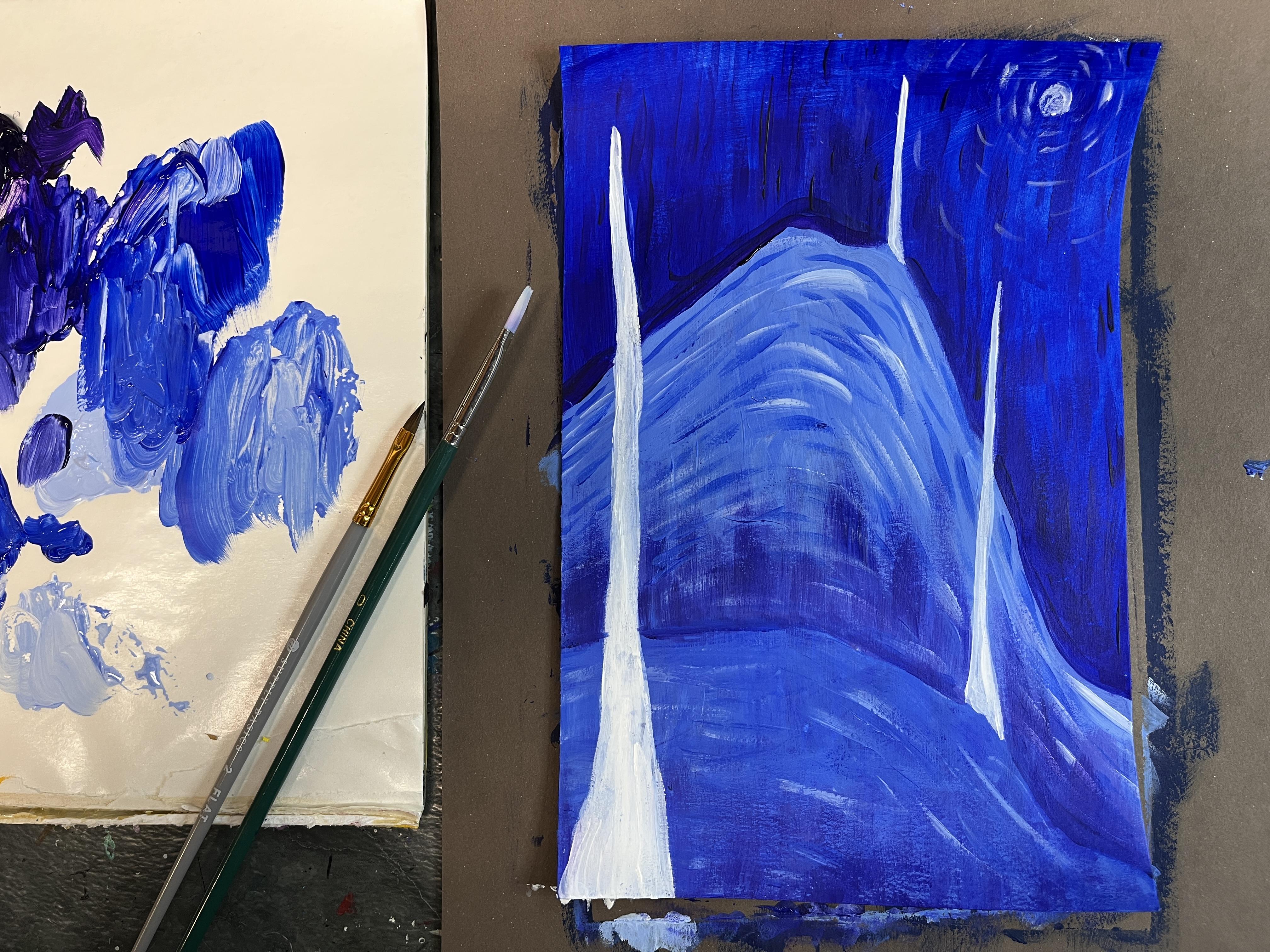
we'll lean into, too. My paint is a little bit thick, so I'm going to get a
teeny bit of water, and I'm going to mix that in so that it goes on
a little creamier. 'Cause I kind of want
the crisp edges. And when I'm using a
flat brush like this, sometimes you get the texture. I don't want it
transparent, though. So it's kind of a fine
balance of the two. When it goes on like this and you've got kind of
that wispiness, that's dry brush technique.
Totally great technique. It's wonderful. Not necessarily
what I want for this. Also like to do a lot
of mixing on my paper. You'll see me playing with that. It's not the same value because
I didn't mix up enough, so I'm going to play
with the back and forth and adjust my color.
That's pretty close. The other great
thing about acrylic is that it dries quickly, and when you paint over it, the paint you're painting
over it is okay. If you make any mistakes,
you can just let it dry and then you can paint back in
over the top of it to correct. I'm just getting down
some base colors, mapping out the start of
my imagined landscape. Matthew also worked
a lot from memory. He was never looking
at reference images. The references were in his mind. Oftentimes, the imagery
that he would create could be a combination of
the imagined worlds to help him work through and manage the things in life
that were overwhelming or sadnesses in his life were to escape to
his imagination. He spent a lot of time
in his imagination. But he also just like he
did with gobbling up art, he was gobbling
up memories, too. So he could use those memories merged
with his imagination to kind of have this really
rich reference library almost that he could
brr into his artwork. So acrylic paint dries a different value than
it is when it's wet. You can paint on
a certain value, and it's not going
to dry the same. So as your painting dries, while you're working, you might notice your value
shifting a little bit. You can paint faster. Or you can know that and you'll kind of
learn to adjust for it. Also, it gets a little
tacky as it dries, which can be frustrating. Sometimes. If your paint
starts to get sticky or tacky, that's a good time
to let it dry and then paint back into it
again after it's dry. Cause it'll just kind of
keep pulling the paint up, which isn't necessarily something you want
to have happen. Like that's what's
happening right now. I've got a mix of paint colors that are sneaking
in on my brush, but it's also picking it up. So I'm going to let
that section try. And then I think I'm going to start to go in with
some more details. I kind of want to play
with imaginary landscape, as well as some geometric
abstraction elements. Not quite sure why. This is that intuitive piece
when you start on artwork, and then you kind
of let the artwork guide how it turns out. But I also kind of
want to play with the idea that he was
doing, you know, different things that
were symbolic to him, and I want to play with scale. So maybe there's, you know, some balance but imbalance that happens with
these white lines. As they get further
away, they get smaller. So something you
could consider for your own imagined landscape would be leaning
into your memories, your memories of place. And that could be like the
idea of kind of, like, a general place, like the
idea of the beach versus, like, a specific beach, or it could be something that's
very personal to you, a space or a place that
holds a lot of memory. That would be a really
fun way to approach this. And I think if I
were doing that, I have a lot of memories tied to Lake Michigan
growing up in Michigan in the
Midwest and sailing on that lake with my family,
especially with my dad. We grew up sailing, and I have a lot of memories
being by that water, a lot of happiness tied
to those memories. So that would be a fun
thing to kind of think about portraying water and the idea of being on the water. That feels like a
good balance. Now I want to start to play
with brushstrokes. So I'm going to get
a very small brush, and this is where you could
lean into paint pens, too. And maybe I'll do that as well. Like you always kind of
start with one idea in mind, and then you've got
your art materials. And then if you're a mixed media artist
like me or you dabble in combining art media
that as you get into it, you kind of, like,
long to reach for these other art supplies that feel like they're going to be a really
important part of that. Go bring purple into this. So I want to mix up some
blue violet before I get too far along and
introduce that also. So maybe that can be the
start of my line work. Help creates even more division. It's going to be
pretty subtle because my background is that dark blue, but that is going to change
as I add more marks. And then maybe that
gets lightened. So I have that same
repetition of space division, and it's still in the violet, but I lighten the violet to match the color lightning
that's happening. So I'm going to play with
some dry brush going up from that I feel like I want even more of that
painterly texture. I didn't perfectly blend
all that color together, so I have the fun of unmixed
color coming through. So then these lines Brushstrokes are following
adding to that vertical sense. I don't necessarily want to
do it on that one, though, because I want there
to be sky and ground. But what I can do, I can
darken this a little bit and I can have some of
this come up from down here. The other thing about acrylic, if you're painting a small area, you want to use a small brush. If you're painting a big area, you generally want
to use a big brush. I get out all the brushes and
then I forget to grab them, which is something
to think about. Almost training
yourself to adjust your brush size for the area that you're
painting on your piece. I think I guess I do want to have this going up from there. It'll create a nice unity, as well as kind of add to the vertical quality
of what I'm doing. And then it becomes
less flat, too. If anything gets
a little muddled, I can always rispen things back up I'm
probably going to do. This feels like a
nighttime scene. So I think I've
just decided that I want to kind of
incorporate the moon. And then you can decide how complex you want to make it too. I mean, it's really up to you how much detail and how much
you want to get into this. I'm going to do kind
of a pale blue, and I'm going to add
a very small moon. I don't want it to
stand out too much. Add a little bit of
smudge of blue in there. And then some linework
going around. It is kind of hard to
paint super small. So that is where
having a paint pen. Or even colored pencils
might be a nice way to go. I don't want this to lean too much into van Gogh
because for me, the influence is Matthew's work, and Matthew was inspired in a lot of ways by van Gogh work, but that's not where
my inspiration is. So because I've done some other stuff
inspired by van Gogh and I teach that sometimes
to my Kito students, I need to be a
little bit careful. Now, if you're painting on
another sheet of paper, it will stick like that. You could let it dry or you
could just gently pull it up. You can always turn your paper around to get at things easier. I could reach over the
land to get at this guy, or I could just turn my paper
and paint it upside down. I'm going to go
ahead and lean into some blue violet
and kind of start adding some linework
into the background. I want to keep it kind of loose. I don't want to get too
obsessive with this. I just want it to
be a little bit of texture so I can continue to break up
what I've got going on. So this is just a
hatching technique. You usually see it
more often with pencil or pen ink artworks. If it was a
consistent size mark, that would lean more
into impressionism, which is what came before van
Gogh was inspiring Matthew. To play with texture, and
I love to play with marks. So I'm going to kind of
lean into longer lines, and I'm even going
to let them go up over my moon that'll make
it a little bit hazy. And then you can always play with turning your
brush sideways and getting a thinner
mark or turning it the flat way and
getting a thicker mark. There's all sorts of ways to
do the mark making aspect. You can vary depending on how
you manipulate your brush. You don't always have that
same ability when you're using paint pens unless
you've got a chisel tip. Alright so the ans very much
up. Really liking that. I think I kind of
want to get that same effect going all the way down. Maybe it's gonna stay in
the analogous family. I don't know if
I'm actually going to use that pink that I got out. So now I want to lean into
a darker blue, I think, and kind of add in some linework and texture to the mountain. And then what I might
do is do this again, that dry brushing vertical
quality that I did, I might go back in later after the blue is dried and add
that over the top of it. The other thing that helps
when you're doing these marks, if you're leaning into
that aspect is to play with different colors and
different values of color. You can have just the one color. That's totally great.
But if it feels a little flat or you want a little bit more
dimension in depth, varying the value or the
colors will give you that. And I can show you
that in a sec. I don't want to get too wild. But I do feel like it
needs a little bit more. So I'll mix a lighter blue. Then I can start to put in. Maybe I don't put them
everywhere, or maybe I do. I don't know. But now there's
a little bit more going on. Yeah. I love that. I'm still not sure if I'm going
to go back over that. I'm going to decide as I go. I've got vertical and
I've got the movement. I like it being different by not having the lines or if
I want to add them in. I can always paint back over
it if I don't like it, too. I'm not stuck. Maybe we add
just a couple to kind of see. Yeah, they're really subtle
'cause they're so close in value to the color that I'm going to go
ahead and do them. At least a little bit.
Get a little bit of white by the barrel in my brush so I can squash it a little bit, and I can get some
of that lightness to come through. Awesome. I love. Now, I want to crispen up the
vertical ones that I did. So I'm brightening up
those. They really pop. Then the other thing
you can do is you can play with value to create emphasis and to kind of highlight certain
aspects of your painting. Anything that's lighter is going to draw the
eye's attention, and you can use your darks to intensify how your
lights appear. I'm going to add a little
bit more highlight up here. I got a little lost a teeny bit of brightness to some of those, and maybe they come out and kind of disappear
as they go away. The other thing you can do, so that's one thing I didn't
want to happen there. I can use a wet cloth, a damp cloth or I can
use a damp brush. As long as what's
underneath it is dry, I can add some water, and then I can dab it
and I can erase. As long as your paint
hasn't dried yet, you can do that. It's
going to be risky. I want to clean this
one up a little bit. So I'm going to take the white,
I just painted the white. So it's not the
best time to do it, but I'm going to paint the negative space to
crispen up that part of it. So I can kind of paint the edge and then kind of get
that to blend out, blend into what's happening
in the background. And I think that'll
work really great. I'm really enjoying Miss. I just, you know, you
never know when you start something, how much
you're gonna love it, and I had no idea
where this was going, and this is bringing
me lots of happiness. I do kind of want to
do the dry brush back in at least here. I
feel like it needs it. So I'm going to get
my larger brush and gonna make up some
lighter blue violet, just do, like, a little
bit. Just a little bit. I'm going to be a little
bit done here, too, just to kind of re
emphasize that texture. I'm just going to do a little bit of cleanup
here and there, and then I think this is done. This has been so fun to create. So now that my painting is done, I'm going to go ahead
and let it dry. Because I'm painting
on paper, it is curling a little bit. A trick for that is to
let it dry and then put some heavy books on top of
it and that the gravity and the weight of the
books will help flatten your painting back out. I really enjoyed this process. I hope you have as
much fun as I did playing around the ideas
of Matthew's color and Matthew's art approach
and the inspirations that he was drawing from and the inspiration that
you can draw from him, play of the imagination and
the idea of landscape and personalizing it
if you want to or just seeing what comes out of your own
creative imagination. So I'm going to clean
up my workspace, and I'll meet you over
in the final video to wrap up the class.
See you there.
6. Final Thoughts: Thank you so much for
exploring the work of Matthew Wong with me
and getting inspired by the ways that we can
consider Matthew's depiction of landscape and place and
our relationship to it, as well as color relationships and the feelings
that we can put into our pieces and the role of paint on the surface and the
marks that we can play with. I hope you are feeling
really inspired to explore all of these things in a variety of ways in
your own art making. After you've had a chance to
create your class project, please pop on over
to the projects and resources section of class and upload your project to
the student gallery. I love seeing all of
the work that gets posted there and the different
ways that we each approach
 Elisabeth Wellfare, Artist, Art Educator