Transcripts
1. Hello, Welcome Back!: Hi there. Welcome back to another
Skillshare class. If you're joining me
for the first time, let me quickly introduce myself. My name is I'm an artist and an art educator based in
Bahrain, originally from India. I'm someone who loves
painting landscapes and teaching that to my students
online and offline. Over the past few years, I've taught thousands of
students and help them rediscover the creative side
and fall in love with art. You can find me on Instagram and other social media
platforms under the handle. This simply aesthetic,
but I'm constantly sharing all the updates
about my daily life, paintings that I'm
working on and any updates about
upcoming workshops. In this class, we're going to be doing something different. And that is diving into the wonderful world of
watercolors together. I feel like watercolors is a medium that is
loved by thousands of others for not only its vibrant
and translucent nature, but also because the whole
process of painting with watercolors can be so
therapeutic and distressing. Keeping this point in
mind, in this class, we're going to be painting five gorgeous
landscapes together for the next five days using some very simple
watercolor techniques. Designed this class in a
way that you can join them, even if you're an
absolute beginner and have no prior knowledge
about watercolors. If you are an
intermediate artists, feel free to join him
for some relaxing that a pure tech painting
sessions will start off by knowing the right track
art supplies that you need to pick when it comes to
painting with watercolors. Then dive into some simple and basic
watercolor techniques. These watercolor techniques
and not only essential, unhelpful for the class
projects in this class, but you can also use
them when you're painting on your own as well. And using our knowledge of the watercolor techniques
for the next five days, we will be painting these five beautiful
landscapes together. Each landscape painting is
unique from one another, having different color palettes. Only vague about less
than 30 min to paint. In this class, the main
focus is to stop obsessing over our final outcome to
get a perfect painting, but rather enjoy the
process because that's the journey towards the end that is going to help you de-stress. And the entire process. Each day when you sit down
and paint is going to help you relax and it's
going to be so therapeutic, I can promise you that. So if you have about 30 min on your hand for
the next five days, join me in this class and let's paint together. See you inside.
2. Materials You Will Need: Alright, let us know
a little bit about the art supplies that we need
to have for today's class. Alright, so we're going to
talk about all the papers, paints and brushes, and
everything that you need to gather up
before we get started. The first thing that
I want to talk to you guys about is the paper. Now, I am going to be using these papers from
the brand bow hung. Sorry if I'm saying it wrong. I got these from an
online store in India. So you can use any paper that you have with you.
It doesn't matter. The thing that you're
going to be looking for is for it to be
100% cotton paper. Of 300 GSM people, 100% cotton paper
works out really well for watercolors because it
holds up a lot of water. It stays wet for a
longer period of time. And that is a very, very beneficial point when it comes to painting
with watercolors. So this one is cold pressed. As you can see, it has this really nice
texture on the paper. And your paintings will
turn out really nice and this will keep the paper wet
for a longer period of time. You're gonna be looking
for those types of papers. But if you have any
paper with you, you can use that because
I'm not trying to force you into anything in this class. So that's
the main goal. The size of today's
class projects, these, the class projects in
this class are going to be almost half of this. So I think this one is 13 cm like this and
18 cm like this. So 13 in the width
and 18 in the length. So that's the size
that I'm going for. But feel free to choose any size that you'd
like to work on. And I will be taping my paper on this wooden clipboard because it's nice to move
around In clip it on, tape it on any any
sort of clipboard or glass board or anything that you have
which you can move around. It works perfectly fine. The next thing that
I want to talk to you guys about is the brushes. These are literally the
gems of my collection. I love these brushes
so much because it comes to a really
fine and just show you. You can see if I were
to put water in this, it's going to come to
a really nice dip. Even with a larger size brush, you can get beautiful
brushstrokes and beautiful thin brushstrokes. So this works out really well. So these are the only four
brushes that I will be using. That is size 1,284.2. So these are the
only brushes that I will be using in the class. So you can keep flat
brushes with you to make the blending
process easier. I don't mind blending
with a round brush, so I just go with it. But again, keep a flat brush
with you if you'd like. The next thing that I want
to talk about, other colors. Now, these other tubes of
paint that I have there, a mix of shimming curve and
Daniel Smith's White Nights. So there's just a mix of
all these little brands that I invested
on over the time. And then I ended up
curating my own set. I just got this. How would I put it up? Palate? Yeah, it's a 48 color palette. If I'm not wrong, because
it's curated this set for myself with a lot more yellows and pinks and purples and blues. And all the colors that
are generally tend to use. I have them placed here. So this is easy for me to carry around with me when
I'm going to a cafe to paint or just a lot
more easier than carrying all the
shades with you. I've done this. I will be talking
about all the colors that we use in the
class projects, and detail before we begin. So don't worry, you will not be confused about the
shapes that I'm using. But I just wanted
to show you guys my little palette as well. So yeah, this is the palette. So now we've discussed
paper paints and brushes. The other things that you
need are two jars of water. One is going to be for you
to rinse your brush in, and the other one is going to
be a fresh supply of water. Very simple, very
easy, basic stuff. I am keeping this ceramic
plate as a mixing palette. I prefer ceramic over plastic because it doesn't
make those little droplets. It's a lot more easier to
just mix the paint on this. Next, you need some
kitchen towel, tissues, rag wherever
you have with you, at which you will just
dry off your brush. So anything works really. And the last thing
that you will need is obviously to tape
down your paper. This is a 1 " masking tape. And don't ask me for
the brand because it's just a really local brand. I don't know what brand this is. Yeah, that's pretty much it for all the supplies that we need. Very basic. If
you've painted with watercolors before you
already know the drill. So let us learn some
watercolor techniques.
3. Essential Watercolour Techniques: Alright, let us learn a few watercolor techniques that will help us understand how to get a hold of the medium
better before we go ahead and start painting our
class projects. So the first main two techniques
that I want to talk to you guys about is
still wet on wet and the wet on dry technique. As we know, when wet on wet
is put into play, what is it? Just like the name suggests, you wet the surface first, so that is your workings. That is wet and on that
you add your paint. So you're adding paint on
a wet surface that's wet. Your paint on a wet surface
that is your paper. When wet on dry
is put into play, it's almost like saying wet
paint on a dry surface. You're not prepping the
surface with water. So both of these techniques
have their own benefits. And wet on wet, the paper is still wet for
a longer period of times. If you're working in
the background with a lot of you want to add in some clouds
and just blend the skies and colors
into one another. We prefer to go with
wet on wet because the paper is wet for a
longer period of time, which gives you enough time
to just move the colors around and blend at the clouds. So it's better to
work with wet on wet. And wet on dry is mostly done
for our transparent layers. And the layers you
want to add over a background surface or the background
layer that we have. So let us learn what
wet on dry is first. Alright, so I'm
just going to wet my brush and I'm going
to pick up some paint. Let's say I pick up
your brilliant blue. This is the color
that I'm using. It's a nice blue color, like a cool blue shade, I think. Alright, so you can
see, I've just taken that and added it on my palette. You can also squeeze
out a little bit of the color and put it on the
palate and make the mix. Since I'm using it from my color palette directly and putting it on my
mixing palette just to get a nice even mix up
the color with my brush. If I were to apply it on
the surface directly, it will be wet on dry. So see how when I apply it, the paint just stays there. It's not moving unless
I want it to move. So I have more control over what control over
the way the paint moves. Now to lighten this up, I will just load up a little
bit of water on my brush, apply it and I can
bring it down slowly. So using this technique, you can create a nice
gradient wash as well. So we're just water, you're
bringing down your paint. And as we came down, I didn't do anything
with the paint. I didn't mix up any paint on my brush or
anything like that. I just loaded water to lighten the color up and bring it down. So you're just going to move in this left and right
motion and create a nice even blend in
between the sheets so that it appeals nicely,
nicely spread. It's nice graded wash from the darker color at the top and the lighter color at
the bottom, right. Very simple. Now
the same technique can be done in wet
on wet as well. But over here I want
to show you how to do it wet on wet and how to mix
two different colors here. So you're gonna be
doing the same thing. The same color combination that we are using
here will do that. But for wet on wet
first we will take a brush with some water and just apply it evenly
on the surface. Like this. Two colors will
do the same thing here. With wet on wet technique. See how it is. I have applied a nice even layer of
this water on my paper. Make sure that
it's even Alright, sometimes we added
a lot of water. And when you do that,
you kind of lose control over the way the paint
is supposed to move. So make sure you don't
have a lot of water on your paper because your
paint is already wet. Alright, now have a look
at this. I apply it. Can you see how
the paint is just moving with the paper, right? You can see how it
doesn't stay when those sharp edges like it did for the previous one
for the wet on dry. I'm going to just move it out. And if you can feel like a lot of the
blue is coming down, then you just clean your
brush with just water, you're going to bring it down. See, over here. This technique actually
gives us a lot of working time, which means that Your paper will be wet for
a longer period of time. And you can really do the
blending process better and just take your time with it. You don't have to rush to get all the colors in the
same backgrounds, such as if you're
painting clouds, you might need a new mix. And this way, you know, it ensures that the
paper stays wet for a longer period of time as compared
to the wet on dry. And then you have enough time to just move the colors around and get the perfect blend
that you want in the sky. So these are the main two
techniques that we talk about. Wet on dry and wet on wet. The next thing that I
want to show you here, how you can blend two
complimentary colors together using either
of the techniques. Alright, so we're going
to do wet on wet. But if you were to like wet
on dry and wet on dry board, then you will be using the
same step here as well. So what do I mean by
complimentary colors? I mean, if I were to mix blue color, Let's
just try it out. If I were to mix blue, has as here, I'm mixing
blue with yellow. If I were to take
some yellow color, Let's say cadmium yellow
and mix it together. I get this green shade. Right? Now. Whenever we are painting skies, we obviously paint a lot
of yellows and blues, let's say orange
and purple as well. But we don't see a
green in the sky, but if you were to
mix it directly, we can see we get a green shade. So to avoid this mix, mix between the two
complimentary colors, we are going to use
a technique here. So let's use the wet-on-wet technique
and see how it's done. I'm going to go ahead and read this entire
surface like this. Evenly spread it out. Evenly spread it out like this. And then I'm going to go ahead and load up
a little bit of the blue color applied at the top and bring it
down this way, halfway. Stop here. I'm going to stop here. When a clean my
brush completely, load up some fresh paint, switch to the yellow, apply the yellow at the bottom, move it upwards
halfway and stop here. Okay, now I've left a little
bit of whitespace, right? You can see I've left a
little bit of the whitespace. And that's because
I'm going to be using this to our benefit, to sort of blend the blue
and the yellow together. So I'm going to clean
my brush completely, dry off the extra water and just move the yellow up slowly. Bring the blue down slowly with just my clean brush.
I'm going to do that. There is no paint, there is no extra
water in my brush. Just a slightly damp
brush is all that I have. And I'm going to bring
it down like this. You can see how they have
some blended into one another without really creating
that muddy mix. I'm just going to
move it slowly up and down in these little strokes. Can you see how the blue
and the yellow have nicely blended with a little bit of that whitespace
in the middle. And it's not money, it's not as green
as this, right? So that's the way in which
you can blend two colors together without really
having a muddy mix. So it can be any color
that you're using, right? It can be anything. Get you use any
complementary colors. You will mix them
in the same way. Now let's try and
mix two colors. Let's say we're mixing yellow and orange and red together. I want to show you
how you can do it in the wet on dry
method as well. Alright, so over here I start off with a yellow
color at the bottom. Then I will switch
to my orange color. Now, since these
colors will never, you can never go wrong
with these colors, right? And why is that? Because they're all warm shades. Mixing them will not
create any muddy mixes. So see even with the wet on dry, you can achieve a very similar
look into your painting. And see you can blend as
many colors as you want. This is like a variegated wash, but you have different
variations of colors, such as the yellow,
the orange, red. So it's all blended
with one another. And you can see how it has gradually transitioned
into each other, right? We have the yellow at the base. It's transitioning
to the orange, that is transitioning
to the red. You can do this with as
many colors as you want. And if you ever feel like
you're getting this line, like a separate line
that divides the color. We can just clean your brush
and just using a damp brush, you can go over that a couple of times so that they
blend into one another. So can you see how we have a nice variegated wash
between the three shades. That is our yellow,
orange, and red. And this was done using
the wet on dry method. Alright, now the next thing that I want to show you is how you can control the flow of
your paint on a wet surface. If you were to create
clouds, alright? If you were to create different
shades, not even clouds, blurred out objects
in your painting, how you can do that. So the first one that
I want to show you on how you how different
consistencies of the paint sort of control the way in
which the paint moves. Now, let's have a look at this. All right. So we're just going to apply an
even layer of paint. You're going to go with
the wet-on-wet technique. You can do the same thing
with wet on dry as well. Try it out and see
what you like. Everyone has different
preferences, so it's not good to confine
people in certain techniques. You can always use a
different technique than I do to achieve a similar result. Alright, so we're gonna
go ahead with blue. The first consistency that I'm going to make is very watery. Okay, So I have a good
amount of water in my brush. They might paint mix. And when I apply this here, can you see how it's spreading? Obviously because this is
the wet-on-wet technique, it's going to spread. And you will notice
that is spreading more, the more water I have in my mix, the more it's going to spread. Like this. But if I just go with a thick
consistency of paint, so if I'm going with a very little amount of
water or more paint, just a tiny hint of water. And see when I apply this, the spread, the
blooming effect in your paint is a lot
more controlled, right? Can you see wherever I apply it, it's going to almost
stay there and slightly blend into
the background. Obviously, it is going to
blend into the background because we're using the
wet on wet technique, but it will still preserve the shape that
you are going with. Can you see how it is blended, but it's still preserving
the shape that I want. Right? So this happens
when you're using an more controlled
consistency of the paint is slightly thicker
consistency of the paint. So whenever you're
painting clouds, you want to add the stroke in a much
controlled manner so that it just doesn't spread into the sky color completely the sky layer
that you applied completely. So let's see how that's done. Okay? So I'm going to go ahead and just wet my entire
surface using the water. So make sure that you're not loading any other
colors into your sky. Alright, So let's just, I'm going to apply an even
layer of paint like this. Going evenly spreading
it makes sure it's even that is
very important. Let's say I want to create
the same grid gradation. So I have the yellow
color at the base. Alright, that transitions to
the orange color like this, and that transitions
towards the red, right? So that's the grid gradation
that I'm going for. Right? You can already notice
a slight difference in the way the colors look. Right. Here. We have more water. So the way it
appears is slightly different as compared to the previous one where
we use wet on dry, the one above that. All right. So here I have the red. I'm laying that down. And then I'm just going to add in a little bit of yellow at the base as well and just
blend them into one another. Alright, now over here I want you to have a closer
look at this. Now what I'm going to do is switch to a
smaller size brush. This is a size four brush. I'm going to mix a little
bit of the neutral tint, which is a gray color to the red to get slightly browner mix. So you can see here
I have this shade. You can also notice
how this one's a really thick
consistency of the paint. It's not too thin, it's
not too watery. Right? Now if I were to
create the clouds, I will just stop it and make
this into the red area. Like this. I'm just
roughly tap it in, see how I'm doing it, and see how it still stays there while slightly
blending into the sky. And that's how you
create the clouds. So see how I've added that
darker color at the top. As they come towards
the orange one, I can use a little bit of red ocher mix and then add
the colors at the clouds. In the way I'm adding the clouds is more in this linear format. I'm just brushing
it up like that. Just adding the clouds. You can just move it with the darker color as well to add, add in a little bit of
variation in the colors. This is pretty much
it how we'll be adding the clouds
and how you can make them control than
how you should avoid them completely blending
into the background layer, you'd have to use a slightly thicker consistency
of the paint. So let's see, over Europe,
I was supposed to make these mountains that
are in the background. Then I'll go with a
darker shade of brown. Again, very controlled,
thick consistency. Alright. Then I
will just add it in here and see how it blends
with the background. But it's still retains the shape in which I
am laying it down. See how this goes. So whenever you want to
achieve looks like these in the background where everything
is sort of blurred out. You will use this method and use a thicker
consistency of the paint. That is pretty much
it for this block. Alright, so here's our final
wash cheek Technique sheet. Whatever you would
like to call it. I would request you guys to
try it out once to really just get a hang of
it before we go ahead and start painting
our class projects. As you can see, we'll be
using a combination of these types of washes
into our paintings. Obviously, I'll be explaining
all the techniques and the ways in which we
approach that painting. But it's pretty much
going to be using this knowledge that
we have just done. So here was our basic wash sheet and now I will see you in
the first-class project.
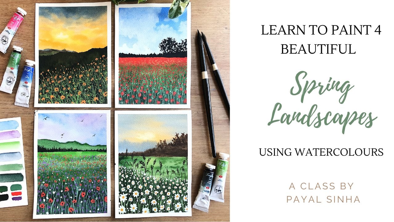
4. Day 1 : purple Evening: Alright, let us get started
with our first class project, which is of this
gorgeous purple evening. The colors that I'm
using are cadmium red, blue lake, quinacridone, violet rose, golden deep sap
green, and Payne's Gray. And also keep a little
bit of white gouache or white watercolors with you
for the stars and the moon. And if you don't have
the exact same Sheets, use anything that's closer to the colors that
we'll be using. It doesn't have to be exact. Alright, so I've taped down
my paper on all four sides. I have my palette, I have my mixing palette and
the gallows and follow me. This is a thumbnail painting of something that we're
gonna do today and try out. Along with your
watercolor paints. Please keep a tube
of white gouache or white watercolor is
with you because we need that to add in
our stars and moon. But yeah, this is
pretty much it. It's a very, very simple
painting over here. We're going to explore the ways in which the colors
will blend into one another. So I think it's very, very nice. And it's a very fairly
simple paintings to eat. Anyway, let's get started. The first thing that
we are going to do is create our basics sketch. Now there's not a lot to sketch here because
everything is just this, just sky and then you have the moon and the other elements. So the only thing that
you'll have to do is make this ground space. Okay, So roughly just
going to sketch it out. I think somewhere around here. I'll do it. I did go ahead a couple
of times on the line. So roughly this is going to
be the division of my line. This is going to be
the ground where I have this happening. And then I have the
remaining bit for the sky and obviously
the power lines. Yeah, along with
your white goulash, do keep a pen with
you and a scale because we'll need that for
drawing the power lines. It's very easy to
draw with a pen, so keep that with you and
let's just get started. So the first thing that
you are going to do is wet your surface, correct? So you're gonna go
ahead and load up your bigger brush with a lot of water and just evenly spread it across the
top part of your sky. Part of your intake. Not this guy. Sometimes when I am
painting while talking, I end up saying things. Not in the exact way I would say it if I'm doing a voice-over, but I wanted to give
it a try when I'm just talking as we paint, because at that moment I can really explain
things a lot better. So this is the surface
that I've painted, not painted applied water to where using the
wet-on-wet technique. The first color that
I'm going to use as cadmium red light writing to clean my brush
because I think I have a little bit of
Payne's gray in there. But yeah, that's
loaded up again, this is the color that we have. As you can see, it's a very
nice Depot, orange color. I wouldn't call this red. Red because it's not very red. It's almost like a
vermillion shade. So you're going
to use that color and apply it at the base. You're just going
to go ahead and just apply it somewhere around here and start moving
upwards like this. All right, You're going to
start moving it upwards like this. We've got the sky. You could also add in a
little bit of orange to make this section a little bit more brighter at the bottom, I think it's too dark,
but you can add in a little the base and then
move it up like that. Alright, now right here, I want to add in
the pink fellow. So I'm gonna go ahead with a quinacridone,
violet rose color. So this is a pink color. You can use any pink color
that you have tissue. This is the color
that I'm using. I'm gonna go ahead and apply a lighter layer off
this over here. Nicely just blended
into one another. And then just leave it. I'm just placing the
colors right now. At the top. I am using the sheet
called Blue Lake. It's a very nice, deep blue. These are all from White Nights. This is the sheet
that I am using. Wanna go ahead and just apply
it all over at the top. As you can see, we are
not matched the color, well, this is still a
very different color. We have a night sky
in our painting, but this one's a lot
more brighter, correct? Darken it up. We're going to use Payne's gray. Now I'm going to add Payne's
gray to the blue mix. Make a deeper blue color. It almost looks like
an indigo shade. You can't really see
it here, but it's. Almost like an indigo color
and when to apply it, you could use indigo
directly as well. I just wanted to play around with the colors and just mix and match and move it around
and see what works. Alright, so now that we have
all our colors in place, it's time for us to go ahead and just blend everything
into one another. What do I mean by that? Is start moving these
colors into one another. So you can load up a
little bit of red. Correct. And you can just start
making these streaks like this so that it moves
in with the pink. Like this. I didn't some darker
colors at the bottom. Load up a little bit of
the quinacridone, violet. Apply it here, move it, play around with the colors, mix and match blended around. Just enjoy the process of adding these colors
in your painting. So as you can see,
I really like doing these tricky things because that makes these colors roughly blend into one another because of the
wet-on-wet technique. And it looks really nice, almost looks like clouds without having to do the
work for the clouds. See like this is just going
to roughly add that in. Make these strokes like this randomly placed it
whenever you feel like it. And that's pretty much it. We are not doing a lot
of blending for our sky. We're leaving it very simple. And we will let
this entire layer completely dry in the one another because the
surface is wet, the wet on wet
technique is gonna do its magic and let all the colors blend
into one another one. And everything will be
looking really nice and evenly spread when it all dries. So we're going to let
this whole section dry and then we'll
move on to the ground. But alright, so over
here this is still wet, but this bottom layer has dried. So we're going to
let this air dry for now and move on to this bit. I'm gonna go ahead and Z, but not re-wet, but wet
this entire surface. Once using water, you
can use a clean water. I'm just using the same
muddy water because we are using going to create just
muddy structures here. It doesn't really nice
and clean anyway. So we're gonna go
ahead and start off with a sap green color. This is the color nice
and light, correct? So it's just going
to apply that here. As you can see, it's very light. Almost not the color that
we need in our painting. To this. You can
apply a little bit of the burnt umber color
to darken this bit, a little bit more. So over here, I just like
to work around and a lot of sections play around with
darker versions of the color. Really just bring in a
darker tonal value here. I'm just using a little
bit of that indigo shade, my burnt umber color. So all of these are
the colors that I'm using to add in
the darker colors. So I'm just going
to go ahead and randomly add some
strokes like this. Even over here where the
remaining trees are. I will add it here as well. Just so that this
section appears darker. And it shouldn't look like
it's completely light as compared to what we see
at the top, correct? It shouldn't be that light. You're amusing. Some more darker colors. Mixed it with the
brown and the green. These, you can just add
it like this randomly. Just add it here as well. I'm just making these
strokes like that using some strokes here to say maybe these are grass shapes that we can't
really see clearly. I'm just playing around with different radiations
in this section. Really like the way this looks. I'm not going to overwork
on this area so much. Once this dries, it'll look a
lot more evenly spread out. Good. Alright, so I really like this. There's a little bit of
green so that, you know, it's grass, but you have
the darker colors as well. Now I'm going to switch
to a smaller size brush. You can switch to a size two
brush or a size one brush. Whatever you have with you. And I'm going to load it up with a little bit of Payne's gray, a darker version of
the Payne's gray. And I'm going to start adding
some strokes like this that will depict the plants
at the horizon line. Right? So I'm just making this up. Dots of different sizes. And once all of them
are laid out together, they will really look like
plants at the horizon line. And you'll have to do
this wireless layer is wet so that the
sort of blends into that section and
you will not have those harsh lines and that area. So I'm just gonna go ahead and dab in some more like this. I'm just complete this
entire nail with it. So make sure that you're varying the height of these shapes. Because that really makes that area pop up a
little bit more, shows the different
radiations that you have and everything
just looks a lot better. If you walk around in
different sections. You can send escaping dots, loading my brush
with some paints, just tapping different
dots around that section. And this is pretty much it. Once you complete this, this is your main part of
the painting that's done. We're going to let this dry and then we'll go ahead
and add the other details. While the sale was drying, I wanted to add in some
more finer details. And what I mean by that
is some final finer dots so that it looks a
lot more natural. So I'm just going to
play around with that. Some smaller dots around the main structure
that I've added. Like this. Very fine details,
very light handedly. Just going to touch the
tip so that I have to find these details are sexy. What we need, you don't
need a lot of details, just fine structures
in that area. Yeah. And that's pretty much it. I really liked the way
this looks right now. We are going to let this dry and then add
the other details. Alright, now that the
entire section has dried, it's time for us to
add in our stars. I'm gonna do that by just
loading my brush with a little bit of white gouache. And I'm going to go
ahead and load up another brush with
nice mix of it. You can also use white
watercolor directly, but make sure that you are
using a sick consistency of it so that it stays
nice and opaque. So this is the color, this is the consistency
that I'm using. The shape is titanium white. And I'm gonna go ahead and tap, actually apply this here
so that I don't get stars all over the
place and just dab it against another
brush to create the stars. So I'm just going to add
in some more water to get a thinner consistency so
that I get some big stars. The thicker consistency is the final your
stars are gonna be. So I really like
the way this looks. Not going to overdo
this because this is a step that a lot of us tend to overdo because it's so much fun to tap in the stars. So I'm just going to
stop right here and let this section completely dry. Alright, now that this
has completely dried, it's time for us to add
in the power lines. You can do this freehand. Freehand as you can just
place them wherever you want. Or you can sketch it out with a pencil first
and then apply it. I'm just gonna go ahead
and do it freehand. So I have one here and
another one at the top of it. Somewhere around here. And another one. Another one would be below this. I'm going to vary the distance. So this looks like this
ones. For the most. This one's slightly
in front of you, so the distance is like that. The next three that I apply, I'm going to make it stick up. Alright, so I'll have one, he'll just move it
slightly upwards and draw another line so that
It's nice and thick. These power lines are
really closer to you. So they appear thicker. One here. We'll go. Scales are around and make
that thick, myosin thick. And just another one
somewhere around here. One more with a little bit up or down and just
make it thick. Again. Here is the power lines. If you think you want to just
go ahead and fill it in, just using Ben, go ahead
and do that as well. This is what it's going
to look like finally. And now it's time
for us to add them. Using my smallest size brush. I'm using a size two brush and the white quash
that we already used, I'm going to go ahead and
make them nice crescent moon that I'm going for similar around in
the middle over here. So just using my
smallest size brush, I'm going to make
a more likeness. Nicer control in this area if you want a nice
crescent moon, because it's very easy
to mess up the shape. If you think you
messed up the shape, then you can always make
a full moon in that area. Alright, so I'm just
going to stop right here because I like the
shape of the morning. It looks good. So I'm just going to let this dry completely and that
is your final painting. Alright, this is eight. You're going to
build the tape off and see your final result. I really liked the
colors in this one. There are a lot more vibrant as compared to thumbnail payday. And now we reveal our
crispy clean edges. This is my final
favorite step actually. All right, This is
your final painting. Let's have a closer look at it. All right, I'm going
to bring it up here. You'd go nice and focus. It was very simple painting, focusing more on the
blending of this guy. We've got beautiful stars, power lines, crown, plants. A very simple composition, but a painting that
will really help you de-stress because it's
a simple composition. So yeah, this was it
for this class project. I shall see you in the next one.
5. Day 2 Part 1 : Sunset by the Lake: Alright, let us begin our
second class project, which is off this beautiful
sunset by the lake. The colors that I'm using are
blue, violet, cadmium, red, golden deep
quinacridone, violet, rose, burnt umber,
and Payne's gray. If you don't have
the exact shades, feel free to use the colors
that are available with you and just enjoy the
process of painting. Alright, so I've taped on
my paper on all four sides, and I have my mixing
palette here, and I have the colors inside of me and
everything ready to go. Here's a thumbnail of the painting that
we are going to do. As you can see, we're
achieving a lot of the details in the background using the wet-on-wet technique. And why is that? It's because we want a blurred out effect in the background. And the main focus of
our entire painting are these wildflower elements
that are in the foreground. So that's all done wet on dry, but everything that
we are achieving in the background is wet on wet. So it's a really,
really nice and fun painting where you're
learning a lot about how to control your paints. Alright, so let us get started. Alright, so the first
thing that we are going to do is create our basic sketch. Now over here, the sketch is very simple because
all we have to do is take our scale and
divide our paper like this, somewhere in two-third
and one-third. Alright, so that's the
distance that we are taking, just roughly very lightly
draw a horizon line. Now as you can see, we have two sets of
mountains here, right? Or foliage or a piece of land. Basically. This entire section is
like that, roughly done. So I'm not really
going to sketch out each and every element because it's all very
free flowing in nature. So we're just going to
let the colors be there and let the wet on
wet magic do its job. We have a son here which we will learn how to create by
using a very simple method. And obviously we have
all our elements here. These are all going to
be done as we progress. I'm not laying out
a lot of sketch. The only thing that
you will have to know is where this line is, so that you know which part is the sky and which
part is the ground. And we can quickly just get
started with our painting. I'm going to take your
bigger sized brush and you can keep all your brushes with you actually so
that it's easier. I am using these for brushes. I'll be using them
throughout the class. These are the four
brushes I use. I'm using the bigger one. We can use a flat brush as well. You can use whatever
brush you have. You can use a biggest size brush to wet the entire surface. You're going to evenly
load up your brush with water and just wet
this entire surface. Make sure that you are
not using a lot of water. Because sometimes
when you do that, if you apply paint on it because
there is a lot of water, it will just go all
over the place. So over here we're trying to
learn control on our beans. Even though what watercolors are very free flowing medium, if you know how to control them, things can be very easy and not be as steady as they seem. I've applied an even layer to make sure that
you have in evenly, you can go over this a couple
of times so that you're just getting rid of
the extra paint, not paint to water that you
might see on your paper. So now that I have this ready, I'm going to start painting
for the base color. I have cadmium red, so I'm just going to mix
a little bit of cadmium red here on my palette. Alright, and I'm going to add a little bit of water in it. So we're going to start
very slow and light. So I'm going to apply the
cadmium red here like this. Alright, do this
cadmium red roughly, I'm going to apply a little
bit off my orange color. I'm going to apply
a little bit of orange color here
somewhere in the middle. And just let it go like this. Right here, I'm
going to clean it. Let me just also swatch
the colors as we go. So here I have the cadmium
red shade that I've used. I've used a little
bit the orange. We'll also use a little
bit of pink later on. But right now these are the
colors that we're using. Next, I'm going to
mix a little bit of my blue violet color
with Payne's gray. Alright, so when I do that, I create a grayer mix. Instead of having
violet color as is, I have this grayish shade. Using this color, I will
apply it at the top like this and just bring it down
as you bring it down here. Be very careful
because when they sort of merge into one another, they can be a little
bit muddy and Blache. So just using a clean brush. I'm gonna go ahead and just move the colors into one
another roughly. Alright, so now that
we have this section, then we can just work
on this as well. Now, whatever is the
part of the sky, you're going to see a
reflection of that on the lake. So starting off with the
red color here somewhere, you're going to
roughly placed it in. Then you have the
orange color again, roughly placing everything
in here like that. I'm not focusing a lot
on the final outcome. I just have this and I'm not trying to copy the exact things. Remember that. Never get yourself to really think about copying
the exact things that you see because then you forget to enjoy the process and you focus more on getting
your final results. I'm just roughly
placing all the colors in like this as you can
see, I've done that. And I like how this looks. We don't have to work a
lot on the details here. Just roughly placing
everything is good enough. Now we're going to switch back
to our sky to add in some of these rough cloudy effects that you see right
there all blurred out. So we don't have
to work a lot on getting really good details. So to my cadmium red, I'm going to mix a little
bit of a violet color, of pink color, rose
color, whatever you have. I am mixing Quinn violet rose. And this is the
shade that I get. It's a lot more warmer. And I'm gonna go ahead and
just apply it like this roughly using the
wet on wet method. I'm just roughly
going to add it here. Make this rough, rough
placements of these scholars. And let the watercolor do its magic by adding the
fellows in the sky. We can add it somewhere around here and then using
a clean brush, you can also just sort of
blend it out into the mix. This really rough. I'm not looking at
the final outcome. Now to make the sun you
will take a softer tissue. This is a very soft tissue. I'm going to turn it
like this and get to a point where you can see an
almost like a circle top. You see how it is
circular, spherical. And then you're going
to take this tissue and just dab it like this. That is going to lift the
paint off from the paper. You have a sun right there. Very simple way of
making it, correct. It was not so
complicated at all. It was such an easy way, easy method of doing it. I'm just brushing over
some of the pink. I'm adding the pink
gifts as well here. This way, roughly
just placing it in. Now we're gonna
go back to these, these clouds, the darker ones. For that I'm going to use
the same mix of my papa and my Payne's gray this
time a little bit more Payne's gray so
that they appear darker. This is the shade
that we're going for. Maybe a little bit more
purple because it's too gray. So that's the color. Using a little bit
of water in my mix, not a lot of water, just
a little bit of water. I'm gonna go ahead and
start tapping these clouds like that. Like this. Just roughly rough strokes. Can you see how it is coming
from the right side and stopping somewhere in
the middle like this. Rough, rough strokes like this. And we're doing all of it
while the paper is still wet. Once this dries out, it will dry out to be lighter. So don't worry if it
looks a little bit weird or not something that you
are into at the moment. They're also going to repeat the same type of strokes down. It doesn't matter
if it's exact or not because we'll have
a lot of elements here. So it does get covered
up a little bit. It doesn't matter if it's
exactly the same or not. You're just roughly
placing all the colors, similar colors at
the bottom as well. Now, using a clean brush, I'm just gonna go ahead and move these colors
around a little bit, just so that they look a
little bit more natural. And to do that, you can
use your clean brush directly and just move
colors around like this. See how easy that was
to create, right? Because all of it is
done on wet and wet. It's very easy and simple to just move around and
create these brushstrokes. Alright, so I really
liked the way this looks. I'm going to switch
to my smaller brush. This is a size four
brush and we're gonna go ahead and add all the
cloud or no clouds, the details for the
foliate section here. So for that I'm going to mix my Payne's gray with a
little bit of sepia. There we get darker colors. Alright, so this is the
shade that I'm using. It's a dark sepia color. I'm gonna go ahead and
just apply it like this. Since the paper is still wet, it's going to do the job for you for
creating the strokes. All you have to
do is guide it in what direction you
would like it to go. I'm going over this line, the horizon line that we made carefully than just
adding it in that area. And can you see how the colors are just
seeping into one another? And it's doing all the job for
you by just moving around. Now, it is bleeding
on the side as well. But we will fix that. We will take care
of it, don't worry. And we will create
that separation between the land that's above the water and the one that isn't to create a lighter shade in it. We are going to go ahead
with our burnt umber color. So I'm just going to
load up a little bit of burnt umber and just add it at the top here
where the sun is. The sun rays are going to
create a little bit of lighter colors in this foliage. So just trying to put that in as well so that when it dries, it looks like there are
different colors in that area. Now using a mix of burnt
umber and Payne's gray, just a lighter
version of the color. You're going to go
ahead and repeat, repeat this at the bottom
as well like this. Fleet. Make a smaller section of it because as it bleeds through, it will create the same effect. So just a smaller section of what you see above
the horizon line. And as it bleeds through, it will create the
effect like this. Alright, now, to get that separation between
the land and the water, they're going to
take your brush, you're going to dry
it nicely carefully. And just brush over
this line like this. And wipe your brush again. And brush over this
line like this. Wipe your brush again to get rid of any water
that might be there. And just brush over like this. So it's almost like you're
lifting the paint from the surface to create the
separation between the two. Now, if you look very carefully, you can see what section is above the water and what isn't. Very nice. It's very clear. At the same time, our section is drying,
somewhat drying. You're going to let
the whole section dry. Lift up the paint from the sides if you think it's
seeping in a lot. And to make it a little
bit more natural, I'm just gonna go
ahead and add in some more clouds because I
felt like there was a lot of speaking in from here. I'm just going to
add in some clouds, some smaller strokes like this. And since the paper
is still wet, it will just blend
into one another. Just rough strokes like that. Here as well on the water to make sure you're doing this while the paper is still wet because you don't
want it to dry. Otherwise you're not gonna get the similar effect
in your paintings. You have to have to see
if your paper is dry. If it isn't, then
you are going to let the whole section dry and then
you will repeat this step. But now we'll do it on a, just a dry surface. Then it will create a very blotchy effect
into your painting. Right now I'm happy with
the way this looks. I'm going to add
up these blurred out foliage at the bottom, these plant elements
at the bottom. For that, I'm going to mix
my Payne's gray and set beer together to create a dark mix of color which is
very close to black. It's a very dark color, very close to black. And using a thicker
consistency of it, as you can see, it's
not very watery, right? It's nice and thick. Using a thick then
system, the office. You're going to go ahead
and just really like this. And you will be doing this because you're using
a thick consistency because it will not
spread out so much. If it's very light consistency, there are chances that it will flow just like what
we've done here. Since we use the
light consistency, it was flowing
everywhere, correct. But now we want to just use a thicker consistency
that so that we have more control over these
brush strokes that we have. Can you see how they are
blurring out a little bit. But there are a lot
more controlled, a lot more in position. Since it was a little bit dry here the people
who are dried, you can see how it's
not blurring out. So you have to make sure that your section is still slightly wet while
you're doing this. I'm going to add
in some more plant elements, the flower heads, just some stuff at the bottom and just let this whole thing dry completely because we're almost reached the
end of our painting. I'm going to let this
whole section dry. And then we'll move
on to our final step, which is adding all the
foliage that is in-focus.
6. Day 2 Part 2 : Sunset by the Lake: Alright, so as you can see, our surface is
completely dry, right? So now it's time for us
to layer this section. So it's almost like this
entire background was done in a single layer using
the wet-on-wet technique. So now we have to
go ahead and just add in some extra strokes of all these little wild
plants around the lake. Alright, so we've
got some beautiful strokes to work with. The color that I'm
using is a deep, deep shade of Payne's
gray and severe. So really a very,
very dark color. It has to be slightly darker
than the one before so that it appears darker, right? In very simple terms, that's how it's
supposed to appear. Alright, so I'm
gonna go ahead and start off with this section. You can also sketch this out if you're not
very confident. So you can have a
picture of this to sketch out all the elements, the way in which
they are moving. I like to do a very free
flowing depending on where I like to place them in
my mind and how I go. But feel free to do
whatever feels good to you. I'm gonna go ahead and just
make a nice curve like this. Again, you have to be cyclic controlled with the way in
which you move your brush. Now I'm going to release
some strokes towards the left and some strokes
towards the right. So you're going to use the
smallest size brush for this so that you have
more control over it. So any brush style comes to
a very fine tip is good. You can, I'm releasing
another section of this wild plants
just like that. So that's a nice and big head. I'm releasing some more. So I'm just going to be
repeating the same step. It's a nice strong line
upwards and then you have some strokes towards
the left and right. To make the leaves, you will start at
one point over here, go up and just bend your brush
like this and release it. This is one way in which
you can make the leaves. I'll show you another
one where you just press on one of the
light anywhere on the line and then just release it so it can
be in different directions. You don't have to follow
a single direction. You can just make some
more of these little, I don't know, What do
you like grass elements. I think that's what
you would call them. Maybe you can make a
leaf standing just like that. Like that. So just adding a lot
of elements here, playing around and
seeing what works. And adding different
brush strokes. So you're not going to limit
yourself to something. You don't have to copy
this exact thing, you don't have to
copy what I'm doing. Just flow with what
your mind tells zero. Because the whole point
of this is to enjoy the process rather than getting stuck up on the final results are being kid to make a mistake. So once you let go of that fear, you're going to really
enjoy painting. So I'm just gonna go ahead and make another one like this. This one's gonna be
a nice and tall one. I'm going to bring it all
the way up till the sun. Then I'm going to make
these brushstrokes just relieving it
left and right, trying to keep the
shape of fit in mind. So it's gonna be wider at
the base, wider at the base, and then as you go
up it's going to get narrower and narrower. Lilly's another one,
just to make it look. Even add in different
strokes around with it. So this took them very
similar to if you've made a palm tree and
made those leaves. They're very similar to that. Just in a different format. Just a different sort
of plant element. So you can only see a lot
of things in nature that are very similar
to another plant, probably like the
way in which you make it in on a painting. Brush strokes are gonna be seen, but it'll be a completely
different plant elements. So a lot of fun stuff
happening with these plants. So I'm just going to release
some leaves from here, bring it down so you can see I'm playing around with
the shape of the leaf. I'm not really making it
straight up and down, or just focusing on a final
outcome for the leaves. Make it, make it sway around
and dancer onto the wind. Maybe have another
lunge element here. Nice wildflower right here. And I'm going to release these, make a leaf like that. Then I might want to
add something to it. Maybe let's see. I want to add something coming
from the outside. Alright, that's coming from
the outside of the painting. And then it has the, the
wildflower head like this. And then if maybe has a
leaf coming down like this. And then you can make these
smaller sized grass shapes. Just add in different
variations, so make them in
different directions. And that's pretty much it
for our painting actually. You're going to let
this whole section dry. I really like the
way this looks. I'm not trying to I'm stopping myself a lot from
adding bullets. Because if I do that
in not make sense because this is a section
that's in focus, right? You have to stop yourself
from adding birds. And if you wanted to add boards, you'll have to add them in
the wet-on-wet technique itself so that that section
is sort of blurred out. But yeah, this is pretty much it for this simple painting. You're going to
let this dry brush by the time let this dry. And then we'll move on to painting the paper and
seeing a final result. Alright, now that might be
poor, is completely dried. I can be lifted off. So you're gonna carefully
peel away from the paper keeping in mind that you
don't pay your painting. So just be a little bit
careful around this point. Repeating this process
carefully away from the paper. Make sure you don't have
paint on it and don't touch your painting
directly using your fingers if you have wet paint because then it's not salvageable
since it's watercolors. But yeah, this is
pretty much it. This is your final painting. I love how this looks. Let's get a closer look at it. Look at it. I love how this looks, how we were able to achieve very simply lake background by just moving around and P going on with the
wet on wet technique. And probably learned a
little bit of control over our brush and paint. We've got this
beautiful outcome. I hope you enjoyed
painting this one. I will see you in the
next class project.
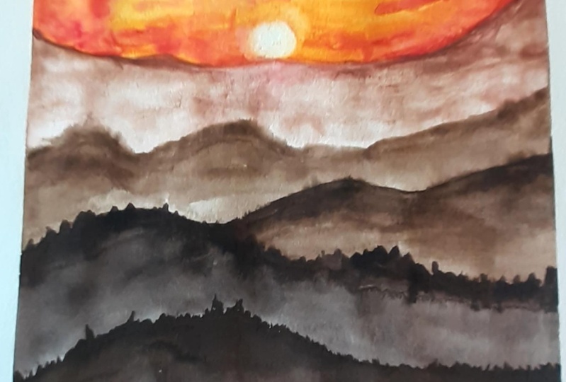
7. Day 3 Part 1 : Break of Dawn: Alright, welcome
to Project Three, which is often the
break of dawn. The colors that I'm using are blue, lake, cadmium, yellow, golden, deep, burnt
umber, and Payne's gray. These are the names of the
shapes that I'm using. But again, if you don't
have the exact shades, feel free to work around with
the colors that you'd like. And let's get started. Alright, so I've taped down
my paper on all four sides. I have my palette, my color palette with me, along with my mixing palette. And then I have my
sample painting here. So this is a thumbnail painting of what we're going to do today. It's very simple and simple in terms of the
background colors. And all the three elements that I've added is
very free flowing. So I'm going to teach you how
you're going to be making that without really focusing so much on the final outcome. Because a lot of times we
try to hold onto a brush, onto the brush to really make
this clear, clean strokes. But the art lies in the
randomness of these elements. We're going to learn
that today that's the main focus of this painting. So let us get started. Alright, so by now we know that our first step is always to
create our basic sketch. Now over here, my basic sketch
is going to be like this. So I have some elements, plant elements that will
be coming out from here. All of these sides, I have the sun
somewhere around here, and I have a huge working
space for the sky. And obviously many
more plant elements coming left and right. Alright, so you can sketch these plant elements just to understand the
placements of them. But make sure that they are very lightly place because we don't, we don't want a lot of details because it can be
very free flowing, right as we go. So it's just going
to roughly create a basic sketch as you
can see how light it is. I haven't really pressed onto my brush and applied
a lot of pressure. It's just very light. Just understood what the
painting composition is going to be like. And I'm just going to directly move into the painting bit. So what you're going to do is using your bigger sized brush, you are going to apply an even
layer of paint everywhere. So I'm going to load my
brush with some water, clean water, and apply an
even coat of it all over. You can use a flat brush here, but I'm just going
to go ahead with my round brush and just
roughly spread it all over, making sure that the water
that I apply has to be nice. And even again, you can go beyond this section
as well if you'd like. I'm just going to make
sure that I'm covering the entire surface
using my brush. And then I'm going
to move it across in one direction so that it is nicely and evenly spread
rather than it being all over. So I'm just going to spread it. Clearly. There's an even amount of water. Alright, so now it's time
for us to start painting. The colors that you've seen our thumbnail
paintings are orange, yellow, and let's get
it, get right into it. For the yellow bit,
I'm going to be mixing my cadmium
yellow medium color. This is the shade. I'm
going to swatch it. You can use any yellow
that you have with you. Really just don't worry about
using the exact shades. Focus more on enjoying
this process. Yellow color. I'm going to apply it where
the sun is roughly like this. Let the wet on wet do its magic of spreading around the paint is going to move
around, dance around. And you just have to slightly guided into the direction
that you would like it to go. Now, I'm going to load up my brush with some orange color. Alright, so this is the
orange sheet that I have. Alright, and I'm going to
load up a lot of it so that the color is nice
and vibrant and intense. And we're going to apply
from the sides like this and just cover all the
area around the yellow that I just idea is to have the yellow
where the sun made lies. Then you can have
orange around it. So I've covered the half
of my paper with orange. I'm going to switch back to this lifting techniques
or using a soft tissue, you're going to just roll
it up so that you'd get a little rounded spherical
shape at the top. And then using that, I'm
just going to lift off the paint like this
from my paper. Alright, so now we
have a son if you think it's not nice and round. And just using your blue color is not blue color,
sorry, yellow color. You're going to just
apply it around. The sun just to make
the circle more even, makes this nice, nice
and round, right? Just smoothing it out. Okay? Now that we have our orange in, it's time for us to
move on to our blue. For my blue color, I'm going to create a mix of blue lake that is
from my palate. It's a beautiful
white knight mix. Along with some Payne's gray. You can use a little bit of indigo color if
you'd like directly. Or you could use
your Prussian blue with your Payne's gray. To get the color,
which is very simple, you just wanted to have a
depot tonal value of it. So I'm going to start applying
the scholar at the top. Like this. Right? The people were
slightly drying so you'll have to work quicker
in case your paper is drying. I'm going to bring
it up to here. And right here where the
orange and the yellow, orange and the blue are meeting, you have to be careful
using a clean brush. We're just going to blend
them into one another. Just using water, nothing else. If you just put the pigment
right into one another, they will create a muddy shade, which we are trying to
avoid using a clean brush. If you go over, it's a lot more better. I would say the color
is not as intense as if you were to just move the blue and the orange directly. Alright, so I really liked
the way this is going. Now that we have all
our colors in place, it's time for us to add more intense values
of it around it. So starting off with my yellow, I'm going to go
ahead and load up more yellow pigment
in my mix like this. You just apply it where the sun is around that
roughly like this. Just blended into
the orange as well. Just moving the colors
around like this. And now I'm going to
switch to my orange color. Make a nice intense
mix up the color by using more paint and a
little bit of water. And then you're going
to apply it like this, just using the wet-on-wet method for the
streaks in the sky. Just going to add it
like this roughly. Just placing it playing
around with this color. Like this. If you're feeling like
you want to add a little more of intensity into it. You can mix a little bit
of red to your orange. And this will be the
color that you get. So it's almost like
a red orange color. And then again in some
more strokes on the sides. Just to add a little bit
of intensity into it. Roughly just placing it in. You can also go upwards into the blue slightly, not so much, just a little bit like that. And now we're coming
to the blue part. So just using my
clean brush first, I'm just going to blend
this together with the previous layer so that
it doesn't look so awkward. In that section. It looks nicely blended
into one another like this. Alright, and now I'm going to switch to my blue color
this time adding a little more Payne's gray into it so that the intensity
of the color darken. Then you can make in some more strokes at
the top like this. Just darken the sky at
the top and then just bring in some strokes
downwards like this. I'm very light with it. The light, lighter
your brush stroke is. And what I mean by
that is to be leather. You tap on it. The pressure that you
apply very light z. So you get thinner
stroke and you have more control over your brush. If you feel like, oh no, I made a mistake and I
need to fix something, then you can just use
your clean damp brush to move the paint around. You can always just use
your clean brush to fix it. Anything that is going
wrong or you don't like. Sometimes we load up a lot of it of intense colors
on our brush and that doesn't look that
good when we laid down or it just blends in
a lot, leads in a lot. And we're like, oh no,
we don't like this. This is not where I
wanted the color to be. Then you can always
just senior brush and just use the clean brush
to move the colors around. So I'm just using a clean brush
here now to just move the blue slowly into
the orange colors so that they look
nice and blended. And they don't look like
they're just not together. All right, In section I
could add a little bit of orange and yellow right here. To intensify this, a little bit more of the
color upwards into the blue. Okay, That's pretty much it. I guess I really liked
the way this looks. So I'm not gonna
do anything else to this because
that'll be almost like overworking on the entire section and
that might ruin it. I'm going to let
this section dry. And then I'm pretty sure
it's gonna turn out nice. And even because
there's what does, it's going to blend
into one another, bleed into one another, and create a perfect
blend in the sky. We're going to let this dry and then we'll move
on to the next step.
8. Day 3 Part 2 : Break of Dawn: Alright, so now this
entire section is dried. As you can see, I love
the blend between the darker blue
shade with yellow, orange and all the colors, warmer colors at the bottom. And I really like how they've blended into one
another without having all the muddy shades that you would usually end up making. So now it's time for us to
move on to this section. Now, as you can see in
our thumbnail painting, we have an intensified
version of the darker color, which is a mix of
Payne's gray and our sepia shade around
and where the sun is. Almost at this region, we have a lighter color, alright, which is our burnt
umber color directly. So now I'm going
to create a mix of both the shades that
I can show it to you. I have septicemia and I have my Payne's gray
blending into one another. Let me just give you a quick
movement of the brush. Shade of yellow. Here
is the darker color. And let's just go ahead
with the first question. Let's just apply it. So I'm just going to apply
it like this. First. Cover the remaining
bits with the shade. Like this. Alright,
so it's almost, almost since this movement. Right now where this section is, I'm going to go ahead
and say my brush, load my brush with some
burnt umber color. Right? And just applied like this. It's still very dark. But when you really look
closer to the section, it will appear slightly lighter than the
colors that is around it makes it so I'm just going to
move it around and make sure that it's nicely
blended into one another. Once you're done with this, It's time for us to switch
to our smallest size brush. I'm gonna be using my size four brush because it becomes
too really nice. Fine tip exactly like how
I would want it to be. And we're gonna go
ahead and start painting all the other
foliage details that we see. Starting off from
the right side. Make sure that
you're not putting your palm directly
on the wet surface. And we're going to
start painting. The plant elements that I have
here are really like this. See I released a stroke, maybe make one branch, and then I have just dots
randomly placed around it. Can you see how I'm
actually not thinking the whole process
through or trying to make it look like a leaf. I'm just making random dots and just sort of tapping and
releasing my brush so that there's an unevenness in the brush movement that will
give you the randomness that you actually need in your structures of plants
and foliage elements. So you can see how I'm
doing this over here. I've switched to my burnt umber because it's closer to the sun, that I need some
lighter elements to be lighter shades to
be along that area. So I'm just going
to this infancy her randomly placed it is not focusing on our
structure directly. Is it going to look
like a leaf eventually? All i, for, all I'm focusing on is that it should
look like a branch. And elements around the
branch can be uneven. Like this. I'm just going to get in some more
structures here. Some more structures here to make this appear a
little bit fuller. You can also make
bigger strokes when you want a lot more
opacity in the region. And the others that you
make will be really free-flowing and smaller so
that you can see through it. And you're just blocking
in a little bit of light, little bit of the background. Alright, so I'm just going
to make some more strokes. This is, this is the only
time consuming part of this entire project where
you are having fun. But really this is a lot more enjoyable
because you are making these potatoes batons and your brush movements are
pretty much interpretative, but the strokes that you get
can be different, right? And I'm just I'm not
really focusing on my final outcome because that's not something that
I wanted to think about. I want to just think about
enjoying this process, enjoying this step of adding a lot of these foliage
details in my painting. So I'm just going to randomly
place the whole thing. You can look at this
thumbnail that is right here to make the movement. The only reason I made
these companies are because sometimes people
find it easier to always look at what our final outcome is or what
we are actually painting, and what the approach is and
what the painting is about. So that's why I
have this in front of you so that you
can constantly look at it and see how I
am also painting from it. How am I approaching
that painting? And this way you also
learn a little bit about how my brain functions. So think is very
cool by the way, can also just read this out so that it doesn't
look like the layer is just lying on top of
this foliage section. So I'm just going to blend
it into wire mother. Then moving back through
all the details here. Just adding a bunch of
different brushstrokes, bunch of different elements. Just completing the whole thing. So you can see
there's a lot more that we are supposed to do. So don't worry, Take your time. This whole process can be
a little bit meditative. You might get into a
head-space where you're not thinking because your
brain is sort of used to. It knows what it's
supposed to do, what is the function
that it needs to do? And it will give
you the signals of trying to make those kinds of
brushstrokes on your brush. Your hand will move in that way. And slowly your brain
tries to descend into a lot more
meditative space. It's almost like a meditation. We're just repeating the process again and again and
again and again. And because of that
repetitive motion, your mind feels a lot more calm. It does take a little bit of
time probably to get there. Because if you're
just starting out, then you might feel stressed about the process because you're trying to make it
look like something. And that is why I
said earlier that don't focus on the
final outcome. Don't focus on trying to make a painting
look exactly like its reference picture or the
painting that I've made? Or it doesn't need
to look like that. No one is going to question
you if you made it exactly in the same
manner or not. As long as you're
enjoying the process and just painting and
learning, That's all good. It doesn't matter if you are doing the exact thing or not. So we're done with
this section here. Let's complete the ones here, and then we'll move
on to the left. It's more side. Alright? So usually when I'm making
these type of brush movements, I tend to go in a very
meditative space of my own. I'm not talking a lot and
I'm not seeing a lot. I'm just repeating the process. Over here. I'm making a lot of
work because sort of brush movements make
more blocked in space. As you can see, it's a lot
more blocking spaces, right? So there are a lot more
closer to one another so that you have a lot more
of that negative space. Whenever you want to block
in more of the space, you will make the
strokes very close. If you want it to have a lot
more space between them, then you will make them close but leaving a
little bit of gap. Right? See how they are different.
And that's okay. It's okay to make the final outcome our new
trade for the second time. It might not be in the exact same manner and
that's completely okay. It shouldn't actually
look exactly like something that you've done before because each time you are in a
different headspace. All right, so I'm just
gonna go ahead and make some more strokes
around the top. Might get real quiet
in the in-between. Just know that I am just enjoying the process along
with me, you can tell. So I'm just going to
queue in some more music that's coming to your brain. And we're just going to complete this whole section together. Alright, so I've
completed this section as time for us to
move on to this one. Again, making some morphine, more mix of paint of
my darker fallow. And over here I have a branch or a trunk
coming in like this. And then that separates
into the final, final ones. Make sure that
you're not pressing onto the ones that you've
made on the left side. Because you might
load up some paint on your farm or your
fingers and it could. You could tap it
on your painting, so just be a little bit
careful around that area. Other than that, it's all good. So start tapping
some more details. Many free flowing, as you
can see, randomly pleased, different sizes, different
shapes, different ways. The final outcome will look. And that's the beauty
behind this class project. That it doesn't have a particular outcome and doesn't have a very exact outcome. You are three
elements could look different when you
would make it. Mine might look different as compared to yours
and that's okay. That is the whole process
of this painting. You're going to just
complete this whole tree. And once you do that would
be the end of your project. So just go ahead and
enjoy this last bit. Okay? Alright, so I'm pretty much
done with this section. I'm going to, Let's step back and actually look at
it and see maybe if a brown just left empty or there's certain
things that I would like to change or add or
neglect or whatever. So right now I feel like I could use a little bit of
foliage on this section. So I'm just gonna go ahead
and tap that in as well, just to make it appear
a little bit fuller, they feed, it looks empty. So I'm just going to do
that roughly placing it in. If you are happy
with your structure, then just let it dry. And then we'll feel
the tape off together. Alright, so I think I'm done. I like how this looks. So I'm going to let this dry and then we'll be in
the tape off together. Alright, so my painting
is completely dried up. So I'm gonna go ahead
and just be lifted off. Pulling away from the paper, making sure that I don't
end up doing anything. And this is ready. You
can see how the crispy edges I've been revealed. And this is our final painting. Let's have a look at it. Let me just focus
on this button. 1 s. Yep, Here we go. This is our final painting. I love the brush strokes of the foliage that's
around our section, the sun, the sky, everything is so pretty very
repetitive, very simple. But I'm pretty sure it was
so much fun to paint, right? Alright, so this is it
for this class project. And I will see you
in the next one.
9. Day 4 Part 1 : Under the Stars: Alright, let us begin our
fourth class project, which is of this beautiful
sky titled under the stars. The colors that I'm using
are cobalt turquoise, Prussian green, blue,
indigo, Payne's gray. And I have a DBA white gouache
with me for the stars. Now, don't worry if you
don't have the exact sheets, you can work around with
the colors that you have and just enjoy the process. Alright, so I've taped down
my paper on all four sides. I have my color palette with me, and I have a mixing palette and everything just
ready to roll with. So here's the
template sample piece of what we are going
to paint today. As you can see, it's
actually a very, very beautiful starry night. Not the van Gogh's Starry Night is just a very galaxy
themed painting. And we'll just actually letting the colors flow into
one another and enjoy the process of getting these different shades
of blue in our sky. I can do this with any color
that you'd like as well. You don't have to stick to blue. Pick any shade that you sort of are attracted to and
we can work with it. Alright, so that's
quickly get started. Alright, so the first thing
that we are going to do is get everything
covered in water, right? So you can use a
larger size brush, flat brush or a round brush. Something, something that's
really big so that you can cover a good amount of
surface area using that brush. And I'm just going to apply water all over the
surface like this. Make sure that you are
evenly applying the water, which means there are no
puddles of water on your paper, is just nicely evenly spread
across the entire surface. Just sort of vetting the
working space of yours. And as you know by now, this is your wet
on wet technique, which means you prep
the surface first with water and then you will have
your watercolors on it. And this will really help
the watercolors to just flow around and dance
around on your paper. So here I have all
the water laid out evenly on the surface and I'm going to switch
to a smaller size brush. So this is a size eight brush. So this one works well for
this surface area that I have. And we're going to
start painting. For me. I'm starting off with
the lighter color first. Over here, I'm actually
using cobalt turquoise. Let me just show you what
the color looks like. It's a very, very light blue. We can use a light
blue shade as well. I'm going with the shade
called cobalt turquoise. And I'm just going to apply
the shade in the middle. So what happens really
here is that as you apply, you will start off with the
lighter colors first and then move around with the
darker shades around this area. And then just really
blend and move and mix everything
into one another. So this is going to take some time to really
play around with. So you generally just apply the lighter colors in
the middle around it. I'm going to apply
a darker shade. Now my darker shade is going to be the Russian green color. Let me just show you
what it looks like. It's a very, very nice,
deep turquoise color. You can use turquoise
color as well. So this is pushing green. So I'm just going to apply this around the science like this. The second time that
I'm going to be making the same painting might not
turn out exactly like that. Because obviously there
will be things that you will add and you cannot control the way in which your watercolors
are going to move. That is the beauty
behind this, right? You really cannot control the colors or nowhere they're going to go and
how they're going to mix. And you can just hope
for the best and just enjoy the process. So your final outcome might
not look exactly like mine. And that doesn't mean
that it's wrong. It means that you
worked hard for it. You worked, but in
your thoughts and your work into it and you're
getting the results of it. So I think it's just so beautiful when you
work and learn from somebody online or offline
and then just apply that in your own work and get a
completely different outcome. Moving on, I'm using
a deeper blue shapes. I'm just playing around with colors and just moving around with colors and exploring
how to move these shapes. It's really not a lot of
thought behind this brain here. I'm just looking at how the colors are blending
into one another. And all I have to do is
sort of just guide it. All I have to do is
just move the paint, just tell it where to go, what the surfaces
that is supposed to occupy and it's going to do the remaining
bits on its own. So as you can see, now we have all the lighter
bits put in, right? What I mean by that is
you have, although, although turquoise and all
the protein green color and then we have the blue. So now we're going to
add in the darker bits. For this, I will be
taking my indigo color. So this indigo shade is a very, very nice deep color. If you don't have these shades. And you can use shapes
that are closer to add indigo color is almost like a mix between Prussian
blue and black. So you can try it in
equal amounts and see if you're able to get a color that is
similar to that. And really just don't think
about the final outcome. Alright? That's, that's one thing
I want you to keep in mind for this class
project is to not, I mean, all class projects
actually not just this. All of them that don't worry so much about the final
outcome because that's a lot of times it
just takes away from the process of
enjoying the journey. And you're so strong upon
getting the buffer extra, getting the perfect
colors that you forget that art is all about
enjoying, right? So just let that fear
of failure goal. I know it's a very hard
sort of thing to apply. I can totally agree
with you on that. But let's figure out,
let's try, right? We can always try and see
forever to let it go. So as you can see how I worked around this entire
stack structure with the lighter color than I
had darker color around it, and then the deeper
blue and then I have the darkest indigo
color around it. So that's how you're
playing with it. Because we need to be sort of preserving the lighter
shades in the middle. That's very important. Now that we have all
these colors laid out, we're going to go back and
just mix in a better way. Just let everything
blend together again. You can also lift this
up and just move this around a little bit or
keep it slightly elevated. Whatever is more feels
good to you really. If that feels good, go with it. You can elevate it. You can move it around
and just see how you feel while you are painting
and moving the colors. And then just go with it. So I'm just trying
to preserve in this little lighter shade
here for our galaxy tall. And then have all the
darker bits around it. So it's very uneven,
very scattered. There is no particular
order that I'm following. I'm just, I'm just
adding in the colors and moving it around and just seeing what it
might look like. It might look different when
it's dried and that's okay. You're just, like I said, exploring and having
fun in this spirit. This is a very simple
class project. It's just all about enjoying the process of letting the
colors blend into one another. And you really don't have to think about the
final outcome here. I really like how
this is turning out. Maybe I would, maybe I'd
want to add a little bit of this deeper blue
shade that we use. This one. I could add a little
bit of that sum in some place, certain places, just to add a
different variation of the color. Just move it. You can add in some
blue and green as well. Let me add a little bit of
cobalt, turquoise again. Just to lighten some bits. Alright. I like the way this
has turned out. I'm not going to add in any darker colors because we have to also show the trees
in our painting. So I'm just going to let
this entire section dry. And then we shall move
on to the next step. That will be for adding our
pine trees and the stars. Alright? Alright, so this is what our final dried-up
painting looks like. It's completely dry right now. And see how it's very
different from this, but also has the
same color palette. I really like the way this is swirling and just blending
into one another. Just love how it's done out. So now to add in the stars, we're going to switch
to a white gouache. If you don't have white gouache, you can use white
watercolors and just use a very thick consistency
of it, like really thick. And it would be a lot more
beneficial if they using white watercolors directly from the tube rather than the bands. If you have a white tube, that will be a good substitute
for your white gouache. But if you have white gouache, well then good because
it's very nice and opaque. So we're going to start
tapping in the stars, right? So for the stars, what I want to do
is sort of thicker, smallest size brush, make a consistency of
paint that's like this. If you're using watercolors, you want to get to
this consistency, this nice thick consistency. And then you're going
to take another brush, any other brush actually. And then just start
tapping stars like this. You're going to just tap
against the other brush. And just stars will
just splatter around. Alright? So the lose, you're the loser. Your consistency is if
it's nice and loose, maybe has a little
bit more water, the bigger the
stars will appear. Remember that a case
if you want big stars, you want to start
loading up a lot more to paint on the brush. See how I have
bigger stars here. If I want a smaller ones, I would just tap in with a thicker consistency that will give me really find stars. So now I want a few big ones. So I'm just going to
sort of loosen up the consistency of
my white quash. Then just tap it
and see how I've got bigger stars right now. You can always just
play around with this. And that's very easy to go
overboard in this section. So be a little careful
because all of us have a tendency to just add
way too many stars. Just stop somewhere where
it looks like this. It's nice and full, but it's
not too much as well, right? And then you can use the same round brush to
add in some bigger stars. If you didn't get
that many big stars, then you can manually
add them as well. Just draw them. Really big one here. Alright, so really like
how this is turning out. Final outcome looks nice. So we're going to
let the stars dry. And then we'll be adding
in all our pine trees.
10. Day 4 Part 2 : Under the Stars: Alright, so now we're
going to go ahead and add an Ola pine trees. So what you can do is take a pencil and mark
all the trees first. If you're not very confident with where you'd
like them to be. So I'm just adding
trees like this. Instead of adding it just flat, I'm giving it a little
bit of it so that you get a different sense of
direction here rather than it just being flat. Like this, I'm just going
to add different sizes. The ones here will
be slightly shorter. And then as you come here, I'm gonna be adding some
more vigor, bigger trees. Make this one can be a
little bit more slanted. So you can sketch out
these lines just to give you a little reference, right? You can do that or you can just straight away go and
add these pine trees. The color that I'm
going to be using for my pine trees is Payne's gray because it's a nice,
dark, deeper color. This is the sheet
that I'm using. It's a nice deep, Alright? So we're gonna be using Payne's gray for the entire process. If you don't have Payne's gray, you can use a mix
of black and just add a little bit of your
Freudian blue in it. So make sure that it doesn't
become indigo color. And to avoid that, you will just have to add in more black paint into your mix. Alright, and we're
going to start painting our pine trees. We're going to start
off first with the center trunk like this, bringing it up to the height
that we want it to be. And then we're going
to be releasing these tinier strokes left
and right, like this. And as you come down, you will be sort of increasing the span of your
branches that you fan out. Alright? And if you really pay attention to
the way I'm making it, there is not any particular
idea that I'm following. I'm just keeping in mind the
shape of the pine trees, which is as it comes down, it has this nice doll
triangular shape, right? I'm just keeping that in mind. And the way in which
I'm just releasing these branches are very random. And the beauty behind
your pine tree to look very natural is the
randomness that it has. So don't worry about
the way of pine trees look because this is
supposed to be fun, right? Enjoy the process of adding these random branches on
the left and right side. You might notice that I go really quiet in
the middle and that is because I am so engrossed in the process of
painting these pine trees. Then I've forgotten
that I should be also explaining things as we go. But really just the process of painting these pine trees
are very therapeutic. I love painting
trees in general I find is so nice
and so therapeutic because you get so lost in doing these
repetitive brushstrokes. And some people might
find it stressful. I'm not going to lie. We
all are different, right? If there's something
that I enjoy my buck be the same thing that
you enjoy as well. But I feel like I've
done this so many times. But my brain is wired to know when I sit down to make these repetitive
strokes left and right. It's sort of like
I'm not thinking, I'm just doing it and I
brain sends the signals to my hands to know what
the brush stroke is. That I think that happens
a lot when you are used to a particular
brush stroke. A couple of times,
you've done this a lot, so you sort of have
more control over it, but see how it's very
randomly placed, right? I'm not focusing so
much on the structure. So I'm just going to release in some of these branches as well, which does not have
any thing just to add a little variation to our pine trees rather than just being all pine
trees fully, right? So I'm going to start adding
in some variations here. This one could be a
small pine tree as well. So see how I go left. 1 s. Let me just see for
getting a good focus. Yeah. You are, You guys
are able to see it. So I'm just going left to right, and then left and then right. There's just many randomly
placed brushstrokes. Alright, so I'm just
going to release in some more of those little
branches as I was saying, just to add in some variations. So this could be a little
process where it takes a lot of time to complete because the background
was a simpler form, simpler way of doing something. There's a lot more
easier to achieve. But over here it might take
some time, but don't rush it. Don't rush the process to
just finish something. We just take time
to enjoy this bit. So I'm just going
to go quiet now because we're just
repeating the steps. If you notice, this is
more slanted and as you, as I'm coming
towards the middle, these trees look slightly
more straight up. And that's how I'm gonna
be adding the sort of like this curved look at the
bottom to add them. The variation in the land where the trees are around me and
not just in front of me. More shorter tree branches. So I'm just going
to go quiet now and enjoy this process
to the fullest. So we have almost reached
towards the end of our section. So just a few more trees to make until we're
done with this. So just hang in there and
add in some more trees. Alright, so we're almost
going to finish this bit. Just have to add one
bought off the tree here. Like that. We're not going
to see the whole tree. It's just the top
section of the tree. We're pretty much done with
the way our tree looks. I really like the
way this turned out. So we're going to let this dry completely and we're
gonna pull the tape off. So this is it for
this class project. So just hanging there, let it dry and then
let's get back to it. Alright, so I feel the tape of off-camera because I
thought I was filming it, but it wasn't filming anyway. Here is a final outcome. He can see. Let's
have a closer look. Actually, you can see how
beautiful the stars love, the tree and the
blends and the sky. I mean, it was such a
therapeutic process. I mean, I totally enjoyed it. I hope you guys felt
the same way where we weren't stressing out about the final outcome and just
enjoying the journey. I hope you had fun. This is the class project for today and I shall see
you in the next one.
11. Day 5 Part 1 : Hilly Sunsets: All right, Welcome to your
last and final class project, which is off this
beautiful sunset. The colors that I'll
be using as cadmium, yellow, golden deep,
which is an orange shade. Cadmium, red, burnt
umber, and Payne's gray. So very basic, simple shapes that you probably
have in your palette. So let's get started. Alright, so I've taped
down my paper on all four sides on this board. And I have my color palette, my mixing palette and everything ready brushes and
everything ready. And use thumbnail of what we're going to be
painting today. Cds of these gorgeous
mountains and a sunset and a silhouette of some trees and
branches at the top. I think this is a very, very pretty project
to learn where you're just using similar
shades to achieve the scotch gradation
in the mountains. I think it's really,
really fun project to do. So let's quickly get started. The first thing that you're
going to do for this one is actually create
a basic sketch. You will need a pencil with you. Now if you really notice the thumbnail painting that
we have in front of us, we have almost this
much part like one part of the paper of the surface that we're
working on as the sky. And then remaining bit is almost like the
series of mountains. So somewhat more than
half of the paper is going to be covered in
these series of mountains. And we have about seven or six C's of my series
of mountains. So let's just go ahead
and sketch them. You don't have to sketch them
in exactly the same order. Obviously, you can
play around with it. So just don't feel like you have to do
it in the same way. So if my half of the paper would be somewhere around here, it's going to extend it a little bit upwards and I'm going to have some mountains like this. This is the first one, right? Leaving a little bit of gap. I'm going to draw the
second one, k like this. I have a second one
over here, right here. Actually want to
make a third one, which is not all the way, It's just half this,
halfway like this. Okay. Then here I have
another one like this. All the way like this. Just ends somewhere halfway like this here is
but not halfway, but just does not
reach the extreme end. Then here we have
another one like this, scrolling and
enjoying the series of mountains that we have. We have another one here to see how I'm just sort
of playing around with the shapes in
different shapes to this like different directions
and just playing with it. And that's exactly what
you're meant to do. Just play with the
different sizes, right? So here I have 1234567 lines. And in this one we had six
because I meant to do one, but maybe I missed it while I was painting it,
but that's alright. Right at the top
somewhere around here is going to be my son. I'm not going to mark that because obviously it's
not necessarily to market. We're going to be
lifting the paint off, so we will be achieving that
look based on how we lifted. But yeah, this is pretty much what our basic
sketch looks like. So let's just get into
the painting bit. We're going to start
off with a wet on wet technique for the sky. So I'm going to load
up my brush with water and just apply it
like this at the top. Right, you can be slightly careful around the mountain bit. That's alright. Just don't go beyond that. Try to not go beyond that. But even if you do
it somewhat okay. So I'm just going to go
ahead and add in water, just evenly spread it out, make sure that it's
evenly spread. And here's what it's
going to look like. Alright, now I'm going
to switch to a dash, like a size eight brush. And we're going to start
painting this bit. I'm going to use orange
color actually at the base. Alright, so I'm
going to be using the shade called golden deep. It's nice, deep orange color. I'm going to apply that
at the bottom here. Carefully at the bottom, I'm going to apply it like this. Alright, and this transitions
to a yellow shade. So the yellow color that I
have is does cadmium yellow? Hello. This is the sheet
that I'm using, cadmium yellow, and that is the color that I'm
using at the top. This using my brush, I'm just going to blend
them into one another. Right? So I have this nice, gorgeous warm shade
in the sky, right? You can see how
gorgeous that looks. You can add in some
more variations of the orange at the bottom. Just to sort of
dark and let bit. We're just playing now. Just spreading the colors and different orders and
seeing what they look like spread out. You can also clean your brush. If you feel like
you're loading up too much orange upwards
into the yellow. Yeah, this is pretty much like how the sky
is going to look. At this point. You can add in some more
yellow if you'd like, and just play around
with the intensity of the color that you add. Now, I'm going to actually take a nice little
facial tissue. I'm saying facial tissue because it's a lot softer, right? There are a lot more softer. So I'm going to take
this facial tissue and bring it into this
bowl shape at the top. Can you see this round
shape at the top? Now using this, I will
be just lifting off the paint from the
paper. Like this. I'm just lifting it
off using that method. You can also use a little bit
of water and food like on the wall surface just to reward that Asia if
you think it's stained. So you can just use that to
sort of wrap the paint off. And then again go back, switch back to a drier side
and lift off the paint. But yeah, it's pretty
much like this. Now. It is uneven, right? It's not very circular. You switch to a smaller
size brush. Right? Is a smaller size
brush and just make a circle around it so
that it looks even. Can you see how it has that shape now than it did before and we just
lifted the paint off. So now it has that propose
so close and sheep. Right? Now what I'm going to do is actually using the
same size four brush. I'm going to be adding in some darker colors into the sky. So the shade that I'm
adding is actually red. I'm using my cadmium red
color from this palette. You can use a darker orange
color as well if you'd like. I'm just going to add in at the bottom just for a
different variation. And also make this look like certain darker
clouds in the sky. You're gonna be doing this
while the paper is still wet. So that using the wet-on-wet technique is sort of
just blends into, into the background
that you have to see. I'm just adding these
little strokes like this. Different variations
of the color. Can add it up towards
the yellow as well. And when you move
towards the yellow, you can actually take
the orange color and add a little bit of red in it so that it's not to read for the yellow
part of the sky. In some strokes like this. Right? I really liked the
way this looks right now. So I'm going to let this dry. And then we shall move
on to the next step, which is adding our
series of mountains. I'm just going to let
this dry for now. Alright, now that this
section is dried, it's time for us to paint
the first set of mountain. Okay? So I'm going to be using a smaller
size brush itself. So I'm using my size four brush. And the color that I'm using
is actually burnt umber. And I'm going to
add a little bit of my cadmium red color to it
just to almost make it warmer. You can also use burnt sienna here if you'd like directly. But I'm mixing burnt umber
with a little bit of red to get a warmer
shade like this. And you're going to start
applying this color. So I'm going to apply
the shade mostly towards the ends
like this. Alright? So I'm adding this mostly
towards the ends like this. And as I come closer
towards the sun, I'm going to take a little bit
of the red color directly. Just add it here. Just at this base. I'm going to add it
right where the sun is, then blended with the previous
color to add in warmth into that area to show the
glowing light through that. Alright, now that I have
all the colors in place, I'm going to just take what good amount of
water actually endanger? Just going to apply this all the way towards the end where
the next mountain starts. So be careful that you
don't go beyond that point. You're just going to use water to blend everything
right into one another. The method that
we're going here, if you notice very well, is not wet on wet, right? It is wet on dry. And that is the way in which
we are going to be moving. For the next set of mountains. You're going to use
the wet on dry method. Instead of the wet on wet. I've just added the colors here. I'm just going to make this red bit a little
bit more prominent. I'm just going to wet the
surface again so that you can really see that that
is a lighter color here. Let's compare to the other bits. Alright, so I've added this in, I'm going to let
this section dry. And then we will move
on to the next step, which is the next
set of mountains. You can also make the
top bit sort of really prominent by adding a
little bit more pigment at the top so that
it's nice and sharp. And the bottom bit is a
little bit more blended. So you can add a little
bit more pigment at the top so that
when it dries, it dries out in that way and you can add
some more water at the base so that the base section is a little
bit more blended outwards. But yeah, this is pretty much it for the first set of mountains. So let's just let, that is just let this dry and we'll move
on to the next one. Alright, so this
is completely dry. Now, we're gonna move on to the next one again
using the same brush, the color that I'm
using is going to be burnt umber as 0s. You can add in a
little bit of sepia and add to give it a darker
color just a little bit. But this is the sheet
that I'm using. You can add in a little bit of stuff here too that
if you'd like, so that it gets
slightly deepened down. Alright, so this is the
color that I'm using. I'm going to go ahead and start applying this
at the top like this. Alright. Apply it carefully around the
edges of the previous one. Like I said, we're using
the wet on dry method. I'm just going to disrupt me at the bottom before we
go ahead and just use water for the
blending process. Alright, so now you're
just going to draw up some water and just
move the colors around. Alright, so you're just going to carefully go about the edges. Remember to not go way beyond the next set of
mountains that you have. Keep that in mind. And then just go
ahead and use water to just move the colors around. Alright, so see how the
water makes it lighter. And add the top. You can just add in some
more pigment so that the top part is a lot more
darker and prominent. And as you reach the bottom
part, it's a lot more. Just blend it out and it's
creating that misty effect. So I'm just adding
some more pigment at the top so that it's darker. Like I said earlier, that
I would do this step. Yeah. This is pretty much
what it looks like. You're going to
let this dry now. And then we will do
the next mountain. Alright, so this one is dry. We're going to go
onto the next one. So you remember there
was another set of mountain that was
here that got covered. So you're just going to draw
it out again and bring it in again using a mix of
sepia and burnt umber. I'm going to just use a slightly darker variation
of the previous shade. Just slightly darker. It's not too dark,
just, just a needle. And you're just going
to add this here. And then you're
just going to use water to lighten this bit. And then use some
more pigment at the top to make the edges appear more
prominent in darker. And see how my edges
are very uneven. That's where the beauty
of these shapes like as you don't want the
surface to be really flat, you want it to have a
little bit of variation so that it looks nice and uneven because the mountains
are uneven, right? They're not playing surfaces. Alright, so I really
like the way this looks. So now we're going
to let this dry and then we'll move
on to the next one.
12. Day 5 Part 2 : Hilly Sunsets: Alright, so this one
is dried as well. Let's move on to the next one. In this one we will
be using more of the sepia color and little
bit of the burnt umber. Obviously, if you're
going for a very, very lighter version of this, you can also add in
a little bit of the Payne's gray to the shade. Just a tiny bit of it. Alright, let's, let's begin. So in this one you will be adding these uneven
shapes like this. The top instead of just
going over in a flatter, flatter, irregularly,
irregular manner, you're going to be going into these vertical ships like this. So this will show
that this one has a few trees and this area. We're just adding
variations like that. All right, so we're just going to bring this down a little bit. And then obviously
using the water, we will rewrite the surface and bring the remaining colors. The end of the next
set of mountain. We really have just a
dark or dark part of it. And then we just bring
out the colors to reach towards the bottom
and it gets lighter. And that's how we're
able to add that uneven, misty effect into our
series of mountains. I feel like over here
the color is not really reactivating and moving around. Just brush over a couple of times and that
should do the job. Or you can just add in some
more pigment if you'd like. So right now I'm just going
to go back and just to darken the tip or the edges and embed. Going to darken it
a little bit and just move the colors around. The beauty of this
entire section lies in the rapid, repetitive
process, obviously. And how you're going darker and also having the patience to let the layer dry before you
move on to the next one. It's really just working
in little bits and pieces. In this piece. This one is all about that. We're going to let this dry and then we'll move
on to the next one. Alright, now that we're
moving onto the next one, that is go ahead and just
use our setback color. Can it's nice. Darker format. I wouldn't say the darkest, but yeah, slightly darker. Then you're going to go
ahead and apply it in a little bit of burnt
umber to this that it's not too dark, right? So you're going to
start applying this at the edges again in a similar manner like this. Even brushstrokes just bring it down a little bit as well. Some color down. Switching back to
the color down. All right, Now that we have
it in just using water, we're going to deactivate the remaining segments
and bring it down. Just water. Moving the
water and bringing it down. This way. You can just fix your brush movements
to match the top so that it's nice and even you remember that it has to
look connected so you can load up a little
bit more pigment and go over the surface again and just make everything
blend into one another. And you're gonna
do that by using either paint or water. Rights. So here is this layer. Again. You're going
to let this one dry before we move
on to the next one. Alright, so we're almost reaching towards the end of
our series of mountains. So we've just got
two more to do. Now. In this one I'm going
to be making a mix of sepia along with a little
bit of Payne's gray. Alright, so by now you're
getting a hang of it. How we are darkening
the colors, right? We started off with burnt
umber and read at the top. And then as we
slightly move down, we are adding in
the dark colors. That's pretty much how we work. You're going to dark in
each bit as you move towards the end of
your mountains. So again, repeat the process, repeat the same step. So this is where the
therapeutic part of this is, you know, like I
mentioned earlier, is just about
repeating the steps. I'm going to do This really like process where
you're thinking so much about the outcome
and thinking so much about making
it look perfect. It all goes away. It should go away.
Because you don't want to create an exact copy. Like if it's noticed from the command painting,
this looks different. And that's okay. Yours can
look different from mine. And there is no right
and wrong in that. So this, again, would have
some light in this bit using water even in the
lighter color here. And add in some more pigment. Because it shouldn't
mean that light as well. Alright, this is how it is. Now we're going to let this dry. And then we'll paint
our last mountain. All right, so now
in the last one, we're going to use
a nice dark mix of PR and Payne's gray together. So really nice dark mix because you're not going to
add in a lot of water here. So nice dark color. And you're just going
to go ahead and make the same type of brush strokes that you did in
the previous one. Venue and similar brushstroke. I'm just going to
use a little bit of water and bringing down, again, I'm not adding a
lot of water and a lot of variation of the
lighter colors here. If you want this one to be
almost very solid and dark, pretty obviously a
lighter consistency would add in a little bit of variation in the color,
and that's good. If you think you added
too much solid colors, you can always lift the sheet a little
bit around as well, moving around so that there are some lighter parts
that you can see. Alright, so this one is
pretty much done here. We're done with the mountains, almost reached the
end of our painting. We just have a little bit
off the foliage to do at the top and they will be
completely done with it. So we're going to let this
dry or you know what, let's just leave it here too dry and we'll move on to
the next bit at the top. I'm going to use a nice
dark mix of just Scipio. Then we will just
paint that bit. Alright, so I'm going
to start off by just making a few branches if
you just put this aside. So you can either
sketch this out first or if you want
to do it freehand, you can do it free hand as well. I am just going to go freehand. Because, why not? Then I'm just going to add these little strokes
that are my leaves. I'll want you to just
pay attention to how I'm moving my brush here. From outside. I'm coming inside. And they're very randomly
placed like this. Very randomly placed together. So from outside I'm
coming inside like this. Obviously you can make this
in whatever way feels more comfortable and sort of
naturally occurring to you. Whatever brush stroke is more, more sort of like
coming into your head. You know, a lot of people
that some people are comfortable with
a particular kind of brushstrokes and that's okay. There's nothing right
or wrong in that. Alright, so just, just let your mind take you on this
journey of adding the leaves. There's no right and wrong here. Some more different shapes, different sizes, just adding
some variation into it. You can see how it's different
from our sample painting, but that's how it's
supposed to be. It's not supposed to
look the exact same. In these little branches
coming out from the job. The sky of gifts, this
view that you are standing probably under a tree, right? And you're looking at this
beautiful, gorgeous sunset. And just seeing
how the colors are hitting and how the mountains, they are the same element, but because of how the
light is hitting on them, they appear darker
or lighter, right? So we're just enjoying the view together and
tainting the view together. Letting the colors
sort of helium mind. This one's a very
warm painting, right? There are no cool colors. It's all a mixes of
browns and oranges, reds. It's a very, very
warm sort of thing. There are a lot of
people who are attracted to particular sets of colors. What I mean by that there
are a lot of people that, there are a lot
of people who are attracted to cool colors. There are a lot of people who
love different oranges and reds in that color is something that attracts
them the most. So this one is a very
warm color palette. So I'm pretty much done
adding the branches. We're not going to go all
the way towards the end. We're just going to stop
somewhere around here. I'm just going to add
in some more strokes, smaller strokes wherever I feel. Like it's necessary to do it. I'm just going to do it. Landed. Right. That's pretty much it. We are going to let this
entire section dry now. And then we will
feel the tape off together and see
our final outcome. Alright, so painting
has dried completely, so we are going to feel the tape off carefully away
from the paper. Make sure that you
don't have any. You're not tearing
the paper with you. So a little bit careful
around this time. I look at these beautiful edges that we're getting in this one. And this is it. This is our final painting. You can see how the
border is really just enhance the
painting, right? Makes it pop up really well. Let's have a closer
look at our piece. So here's the final outcome
and bring it in focus. Alright, here we go. You can see the sun. I love how the lifting technique creates this nice,
vibrant, vibrant, bright sun looks
really nice site and especially around
with the darker orange and red colors
in the background, it just shines a lot more. I really like the way this
turned out with a series of mountains and it was so
much fun to paint along. And obviously the
branches and leaves, if you know me, you
know that I love, I love painting cheese the most. But yeah, this was our
class project for today. And this is it. I hope you
enjoyed painting with me.
13. See You in the Next Class!: This is a two guys. We've reached the
end of the class. I hope you enjoyed
painting along with me on this therapeutic
watercolor painting journey. If you did, please leave a
review down for me because I love listening to all the
things that you have to say. And it also motivates
me to work harder and bring out better classes
for you in the future. If you've painted along with me, then don't forget to
upload your class projects under the projects and
resources section of the class. I would love to see
your paintings as well. If you have any
questions you can reach out to me on Skillshare or on my Instagram profile
at the simply aesthetic. And feel free to reach out
because I will always be there to help you
guys. That is it. I am going to take leave now and I shall see you in
the next class. Bye bye.
 Payal Sinha, TheSimplyAesthetic- Artist & Educator