Transcripts
1. Welcome to the Class: Hi there. Welcome to my
seventh Skillshare class. My name is Payal [phonetic], I'm a self-taught artist, an art educator, and an entrepreneur
based in Bahrain. You can find me on Instagram
at thesimplyaesthetic. Over the past two years, I've taught students
online and offline to explore their hidden talent
and fall in love with art. I feel art is a very crucial part of
our life and indulging ourself in a little bit of creativity can be
such a stress buster. Since the pandemic began, I have been driven towards
painting landscapes. Every time that I would
scroll through Pinterest or Unsplash and look at these
beautiful landscape images, or go on a stroll
outside and click pictures of things
that I saw around me. I was filled with
enthusiasm to paint them. It was almost like I was trying to live a life
through these images. But it was not always that easy because I didn't
know where to start, how to analyze an image, what techniques to apply, but over the years since
I practiced a lot, I understood how an image can be easily broken down
into different parts. When you practice each of these parts you get a
better understanding. In this class, I want to share my love for painting
landscapes with you. The medium of choice for this class is going
to be watercolors and we are going to be painting a beautiful lake landscape. The format of this
class is going to be slightly different
from the ones that you've done before
because I want to focus more on the
steps that you need to know to understand a
composition of a painting and then use all our knowledge
to make a class project. I want to focus on the lake
part of the class because I feel that lakes, even though they are a difficult
subject to paint, it's always so much
fun to paint when you understand the right type of techniques that
you need to apply. I love browsing through the lake images and every
time I see a sunset or sunrise by the lake I cannot stop myself
from painting it. In this class, I'm
going to share exactly each and every
step that you need to know and by the
end of the class, you will be able to paint
your own lake landscape. I have designed this class in a way that even if
you are a beginner, you can join in and explore
the beauty of watercolors. We'll start off by knowing about the right type of
supplies that we need. Instead of telling you just
the art supplies that I use, I will tell you the exact things that I look for when I'm picking them out. After that, we'll focus on learning the
watercolor techniques. I'm sure a lot of you
are familiar with these watercolor techniques
but in this lesson, I will be telling
you exactly how to pick them out when you're looking at your
reference picture. It's going to be very helpful to understand how to break down
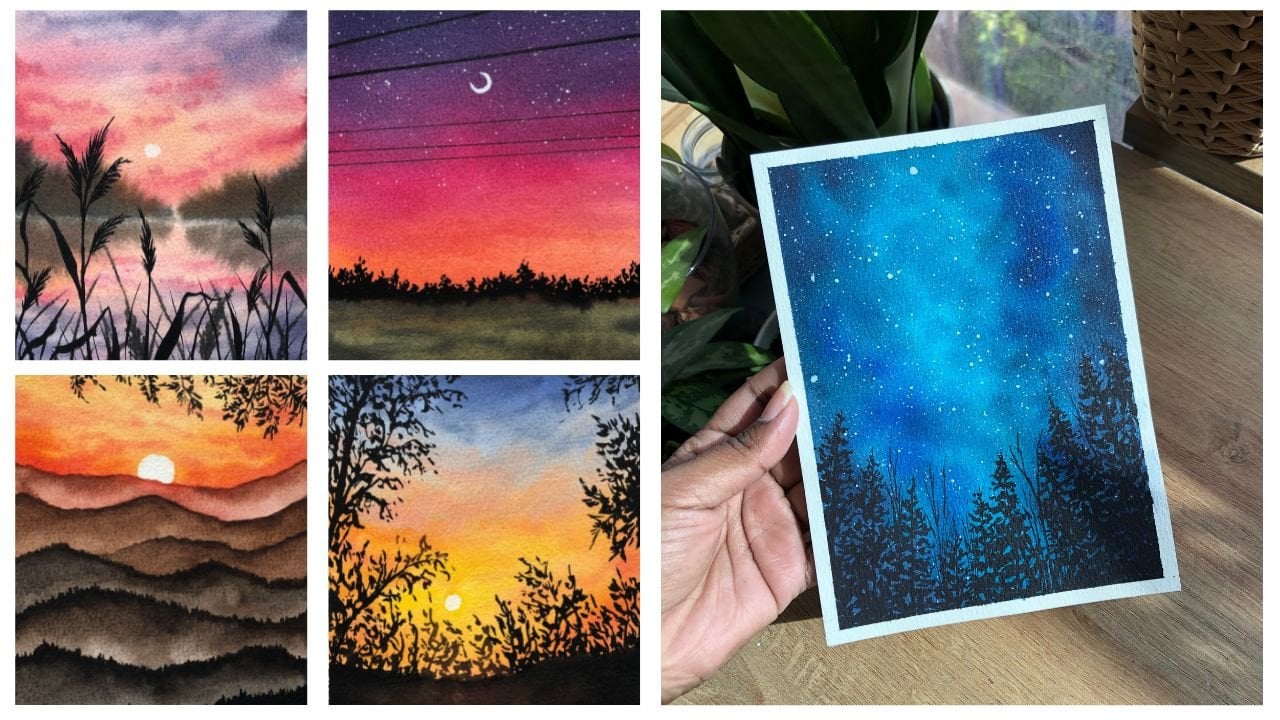
your reference pictures. In the next lesson, we'll be talking about skies. We will be painting six different types
of skies together. I will also be uploading a few other reference pictures in the resources
part of this class. You can download it from there and then give
them a try too. Each of these reference
pictures are selected in a way that you're applying
the same techniques, the same composition,
the same style so that you understand the
lakes a little bit better. If you're someone
who wants to explore the beauty of nature
by painting them then join me in this
class and let's go on a wonderful journey
with watercolors together.
2. Art Materials You Need: [MUSIC]. I'm so excited that you decided to be
a part of this class. Now let us talk about the different materials
that you need. Remember, you don't have to use the same brands as the
ones that I'm using. You can opt for any different brands that
you generally use or like. In this lesson the main focus is going to be on talking about the little things that I
look for when I select my papers and
paints and brushes. Now, I will also talk about the art supplies such
as the water jars, the mixing palettes, and all those little
things that would come in handy when you're painting
with watercolors. So, let's dive in. Alright. Let us talk about our
art supplies that we need. The three things that are very
important that you need to know about when it comes to painting with watercolors
is your paper, paints, and brushes. These three things are very important and it's
very important to know exactly what we look for when we want to select the right
type of art supplies. The first thing that
I'm going to talk about is the paper. When I'm painting
with watercolors, I look for a few
things in my paper. I'm using my Canson Heritage
Watercolor paper here, but I'll tell you how to select
the right type of paper. The first thing that
you'll need to look for is the paper to be 300 GSM. That is because 300
GSM paper is heavier, it won't pucker, and at the same time it'll
help you when you're adding a lot of
water on the paper. It's very important
for a paper to not pucker when we're doing
our wet on wet technique. The next thing is the paper should be a
100 percent cotton. Your 100 percent cotton
paper stays evenly wet for a longer period
of time and it dries really nice and even, and that's very important. The next thing is
cold press paper. That's a personal preference, you can go for a rough
green paper as well. I like to have medium texture on my paper and that is why I go for cold press paper
for watercolors. I'm going to be just splitting this A4 size paper into half, and I'll be making it A5, and I'll be just using that
size for my class projects. The next thing, our paint. You can use pan paints, you can use Stu paint, that's totally on you. I'm going to be using paints
on the brand White Knights. I've created this custom palette on the right side,
which is soft bands. I've just taken these tubes, put them in bands. This band is very
handy for me to travel with and that is why
I went ahead and did that. But you can go ahead
and choose any paints. Just make sure that you
slowly start investing in good quality paints like
the White knight ones, which I think are
not very expensive, and they are very good. You can slowly
start investing in good quality paints that
will completely change your watercolor game because
you'll enjoy the process of painting with watercolors if you have good
supplies with you. The next thing that I want to
talk about are the brushes. I'm going to be using these brushes from
the brand Silver. I absolutely love these brushes for painting with watercolors. I'm also keeping a flat brush, which is a two inch flat
brush to apply water evenly on the surface when
we're painting landscapes. My preference towards this brush is a lot because it comes
to really fine tip, which I will show you
later in the class, where I talk about
the brushes and brush control and
things like that. These brushes are my favorite and you need to pick
brushes that will come to a fine tip after you have applied
paint because that's very important and it really helps
in getting thinner strokes with a big brush
so that you don't have to keep changing
your brushes. The next thing I want to
talk about is the water. I always keep two jars
of water with me. One to use it for rinsing my pigments and the other
one is going to be giving my brush the final rinse and
the load up clean water to mix different colors so that my colors don't get
muddy in the process. You can keep two jars of water or keep one
jar of water and keep changing it frequently so that your colors
don't get muddy. We're done with four types of art supplies
[LAUGHTER] for now. The next thing that I'm
using is a mixing palette. I basically use ceramic plate, which is a nice flat plate for mixing my colors
because it does not form these bubbles
as you can see on my plastic palette
or a metal palette. It forms these bubbles, and on a ceramic mixing
palette it doesn't do that. You can use any ceramic plate and use that as a
mixing palette, especially when you're at home, so it does not matter. The next thing that
you need with you is to keep a tissue or a cloth so that you can wipe your brush to get rid
of any extra water, to get rid of any extra paint that really helps like that, to have a shorter rag with you. The next thing you need are your basic stuff that
is your pencil, eraser, scale, things like that that you would need for sketching
out your elements. You're not doing a
lot of sketching, but just a few little
basic sketching. Next we need a masking tape. I'm using this one
inch masking tape. This one works perfectly fine for the cold press paper
and I really like it. It's the one that you
will find in all stores. Next you need a board with
you to stick your paper on. You can do that on
your table as well, but I like to have a board so that I can move it around in case I want my paints to spread or if you
have a lot of water, I can just get rid
of it by moving it around and spread it
evenly on the paper. I like having something
that's movable. We are done with
the art suppliers. Let us know a little bit about our class project
in the next lesson.
3. Your Project: [MUSIC] Now that we have
our supplies figured out, I want to take a minute and
talk about our class project. We are going to be painting one class project in this class, which is of this
beautiful lake landscape. We're going to be painting
that from a reference picture. The idea about this class is to understand the composition
of our reference picture, how to analyze, where to apply
different techniques. How to pick out a
color palette from the reference pictures
and all that jazz. I will walk you through
each and every step. After this, I will break
down the techniques for you. How to paint different skies, how to paint
foreground elements, how to know about
the reflections. Using a combination of
all of those little bits, we'll paint our final class
project, which is this one. I'm also going to be
uploading a bunch of other projects in
the resources part which you can download
and give it a try. They will also have
the same type of concept and the same
types of steps involved. I actually want to open this little door
for you where you can paint these little
lake landscapes that are not too
difficult to paint. It's also beginner friendly, but also if you are
an intermediate you can add more details, too. It will also help you build
up your watercolor practice, build up your watercolor game, and that is going to be the
main idea for this class. Let us dive right into the watercolor techniques
in the next lesson.
4. Understanding Watercolour Techniques in Detail: Let us talk about the different
watercolor techniques. I'm sure a lot of you
are familiar with the term wet-on-wet
and wet-on-dry. These two techniques are one of the most important
techniques and almost as the base when it comes to painting
with watercolors. But there's so much more to these techniques
than just knowing them as two different
and separate techniques. Like when you look at
a reference picture, how do you identify where to use the
wet-on-wet technique? Where to use the
wet-on-dry technique. In this lesson, I'm
going to talk to you guys about the
wet-on-wet technique and the wet-on-dry the technique in
a little bit of detail which will show you the application
for these techniques. Another thing that I want
to focus on in this lesson is learning how to
control your water. It is very important that
you know how much water is too much water when it
comes to painting with watercolors. Let's dive in. Let us talk about two of the main watercolor techniques that I'm sure a lot
of you have heard of, like I mentioned before. We have the wet-on-dry and
the wet-on-wet technique. The first technique that I'm
going to talk to you guys about is the wet-on-dry method. Now as the name suggests, there is something
that will have a wet consistency and something that will have
that dry consistency. The first word is wet and
that resembles your paint. Since we're using watercolors, we add water to it and that
is why the paint is wet. The second word dry
is for your paper. You're not priming your paper
with any amount of water. That is why it's dry. When it's dry and when you
apply paint on a dry paper, that method is called
the wet-on-dry method. Now, why is the
wet-on-dry method useful, where is it useful, how
do you use it where? I'll tell you all the details. wet-on-dry method is useful when you want to add
details to your paintings. Now let's say the details are in the foreground or
there are crisp edges, details are crisp and clear and you want to show
that in your painting. That's when you use
the wet-on-dry method. As you see whenever I'm applying
any stroke on my paper, on a dry paper, in fact, the edges
are crisp and clear. The paint is not blending
into the background, it's not moving around, it's only in the areas where
I am applying paint to. When you follow a method where you want your paints
to be more controlled, you don't want them
moving around, you don't want them
to just spread out of control and that's when you
use your wet-on-dry method. It's the best method to use in adding details
to the foreground. You're making mountains or
leaves or adding any details, that's when you use
the wet-on-dry method. As you can see, wherever
I move my brush, the paint just stays there
in whatever shape I apply, it stays in that shape and that is the wet-on-dry
method for you. Now, let us talk about
the next method. By now you have the hang of it. Wet is your paint, and the next wet
that is mentioned in the technique is for your paper. Here we are going to prime our paper with water
and make it wet. That is why the wet paint goes
on a wet paper and that is why it's called the
wet-on-wet technique. Using my size eight brush, I'm just going to go ahead apply a layer of water on my paper. As you can see, I've evenly spreading it in the left
and right direction. Now when you see, I've loaded my brush
and I'm applying these little strokes on the paper so the
paint is spreading. Your watercolor is going to
flow where the water is. Since you've applied
water on your paper, your paint is going to
spread with the water. That is why it's called
the wet-on-wet technique. Now, the wet-on-wet technique is very useful when you're
painting backgrounds, you want luminous background, you want it to be chloe, you want it to be soft. You want it to be spread out and a little bit blurry
in the background, that's when you use the
wet-on-wet technique. Now of course, there's a lot of different ways in which you can apply wet-on-wet
techniques in your paintings, like for painting the sky. When you're painting
elements that are way in the background and you can still see them but
not so clearly, that's when you apply
the wet-on-wet method. You can also use the same
thing for making a sky. You can use a
wet-on-dry technique. But you see the
clear difference. In here when I applied the
paint, it's spread out. It's more lighter in color. But when I apply it on a dry
paper and move it around, the color just stays there. That is the only main
difference here. We have the liberty to
move the paint around. We have the liberty to
blend our colors together. We have time to just move our colors around
whereas in wet-on-wet, wet-on-dry, it dries faster so you don't
have enough time. On wet-on-wet since
your paper is wet, you have the time to
move your colors around. That is your wet-on-wet method. There are a lot of
ways in which you can apply this that we will discuss in this class
in the future lesson. This gives you a basic idea
of both these techniques. Now, let us talk about my favorite topic that I'd like to talk
about in watercolors, that is your water control. It is fairly important
that you know how much water is too much water when it comes to painting
with watercolors. A lot of times in the past I've made this mistake of not knowing when my water content
on the paper is too much or the water content
in my pigments is too much. That is why I would end up with really like my subject
would just blow it out. It wouldn't retain the shape that I always wanted to go for. That was the problem that
I was facing in the past. Once I discovered the
magic of water control, the whole watercolor game
just changes for you. I'm just going to make one
little rectangle with a clear, clear, clear layer of water. It's evenly spread out in
this left and right motion. You want to make sure that
you always go left and right and don't lift your
brush off in the middle. When you do that, you make sure that you have
an even layer of water. You must have seen when I
loaded my brush with water, I added it in through
the pigment mix. There is a lot of
water on my mix. It's not thick, it's
nice and light. When that happens, when your
pigments have more water, your paper already has water. When that happens, your
paints are not controlled, they will just spread around. Now this technique can be used
to its benefit. No doubt. You can use these techniques
to have subjects in the background that are more
blurry, more spread out. But if you're going to go for something that's
more controlled, this will not work. I just wanted to show you
a quick comparison between the same subject
and the difference between that would be the amount of water
that I'm adding. In the first one I've added
more water to my mix, to my paint mix. The next thing that I'm
going to do is again, apply a rectangle
of clear water. I move in this left
and right motion and make sure that I
have evenly spread my water across the little shape that I'm making or on
the paper basically. Make sure that you have
evenly spread the water. The best way to do it is
just go left and right in the same direction and lift off any excess water
that's on your paper. Now, I clean my
brush completely and I'm going to take
my indigo color. You can use any
color right here, you can use any color. I'm taking my indigo
color and as you can see, it's a lot thicker. There's more paint than
water on my brush. It's nice and thick, and you'll see a
complete difference when I apply it on my paper. I'm just going to
slightly wet my paint, add a bit of water to make it slightly thinner because
it was too thick. After making it
slightly thinner, I'm going to go ahead and
make the same mountain as I did in the previous section. Here, you see a huge difference. My paint is retaining the
shape that I want it to have. Sure it is blending
with the background, but it is still
retaining the shape a lot more as compared
to the previous one. That is exactly the
difference that happens when you add less water
in your paint mix. The magical thing
will come when I put in the branches, I promise. When I'm lifting off
my paint and I make the same branches as I did
in the previous one here, the brushstrokes are
more controlled, they are more informed. I'll show you exactly
what I mean by that. It does blend because
the paper is wet, it does mix, spread around
slightly, get lighter, but it retains the shape a lot more as compared
to the previous one. Let's say you have a subject that's not way too
in the background, but it's still not in the
focus of the observer. That's when you use this
controlled wet-on-wet technique, where you are adding the
paint on the wet paper, but it's more controlled as
compared to the previous one. You can use a combination of both these techniques
to your benefit. I'm not saying the
first one is wrong. It's not wrong. You can use it in subjects that are more
in the background, they are more blurry, they are not visible. When you have subjects that somewhere in the middle
ground let's say, you use this more
controlled technique. This gives you a clearer idea
of where your subjects lie. The more it's in the foreground, it's more controlled and
if it's in the background, it's more loose and flowy
and it goes with the water. The next fun little technique
that I want to talk to you guys about is the
dry brush technique. Now you can use
this technique to add details in the water. Like I said, it's a
dry brush technique. It's wet-on-dry. This technique is wet-on-dry. I'm just lifting off my paint, that bring out any extra
water content and paint. When I brush it across my paper, it leaves the subtle texture on the paper because of
the texture of the paper. When I rub my brush across it, the more parts of the texture on the paper
takes out the shape and the more depression
but in the paper does not take the paint
and that is why you get this rough texture. You can use this
texture to apply layers in your water and give your water some
depth of the lakes, some depth without having
to add a lot of details. It just simply adds a little
uneven texture to your water and to the ground you can use this texture anywhere
that you want actually. But this is a fun
little technique that I wanted to include in as well that you can
use in your artworks. We're pretty much done with
the basics of watercolor. I hope you enjoyed learning
these little techniques. You can use these
techniques in a lot of different ways and a lot
of different places. As you can see in the
wet-on-wet technique though, first puddle that we did, it dried out to be
like a stormy cloud. It looks like a stormy cloud. That's the best part about
wet-on-wet technique. It's so much fun. Once you learn how to
control your water, it's just magic how well you can do with the
wet-on-wet technique. These are the four techniques. You have the wet-on-dry, you have the wet-on-wet. You have the water control, that's very important to note, so do give it a practice. Don't skip this lesson. Give it a try. Try and look at reference pictures and see
where you can apply them. But that's pretty much
it with our techniques. In the next lesson, I'm going to show you how you
can use your wet-on-wet and wet-on-dry technique to paint
six different types of sky. Let's go.
5. Paint 6 Types of Skies: Awesome. Now that you've learned a
basic watercolor techniques, it's time for us to learn
one of the major application for the wet on wet
technique, that is skies. Skies in their own are
a very vast subject. But in this lesson
I've tried to brush over six different
types of skies. These skies are very similar to the ones that I use
in my paintings as well and they're very easy to
follow too. Let's dive in. I have divided my paper
in six different blocks, these are six squares that
I will be painting in. You can do this in
individual papers, small polarized size papers, whatever you want to go for. I've just divided my A4 paper into six different blocks and I'm going to show you the six different types of
skies in each one of them. The first one that
I want to show you is a nice graded wash. This goes for a very clear sky where there are no clouds, it's just clean sky. For that I'm just
going to first go ahead and make a mix of water and an
ultramarine blue color. Over here we're doing
the wet on dry method. But eventually this turns out
to be a wet on wet method because I lay the
layer of water and then I dip my brush
in clean water. I'm just going to move the paint downwards in this
left and right motion. Each time I come
down you will see the intensity of the
color goes down. Now I'll clean my
brush and using just clean water I'm going to move the pigment
downwards again, keeping my left and
right motion in back. Don't go all over the place. It has to be left
and right motion to get that perfect
gradient effect. That is the effect
that you're going for from the lightest
color at the bottom or the lightest tonal value of
the color at the bottom and then slowly transitioning to
the darker parts of the sky. This one like I said goes for the really clear sky where you just want to show the color in the sky.
There are no clouds. We're not adding any
drama into the sky. It's nice, cute,
plain little sky. The next one that I
want to show you is very similar to
the previous one. Just in this one we'll be
adding a little bit of spice to our sky. Using my size eight
brush I'm just going to apply a
clean layer of water. As you can see, I've just
gone all over the place but eventually I go in this left
and right motion to make sure that it's nice and even and make sure that the
water is evenly spread. Even if you go all
over the place eventually just make sure that your paper is evenly wet. Now I'm going to load my
brush with some blue. Here you will see
the difference in the wet on wet on dry method. The first one was wet on dry and we brought the colors
down using water. Here I've already
primed the surface. I'm just going in this
left and right motion. As you can see it was
so much easier to just move my paint around
in the sky with embedding minimal effort I was able to just create
that grid in effect. You can choose whatever
is more easy for you, the wet on dry or
the wet on wet. I personally prefer to do
wet on wet most of the times because it's easier and it does not take a lot of time. If you think that when
you're bringing the color down and if you think
that it's still dark, then you just clean your brush
and load your brush with just clean water to move the
pigments once that's done, you'll get a clear graded wash. That is exactly what we want. Now to add a bit of drama to the sky I'm just
going to go ahead and load my brush with some more
paint this time than water. I'm just going to create these little strokes coming
from the left and right side. Now this sky is mostly
done where you have a single color in
the sky and you just have darker version
of clouds in the sky. This just ****** up your
clouds a little bit. Let's say that it's nice blue sky but
you see a little bit of darkness in the sky with the blue itself not
adding any more colors. Just for the blue you add a bit of spice in drama into your sky. This is going to be the second
type of sky that I paint. This was all done in the
wet on wet technique. Since every time you want
to add clouds in the sky, you want to make sure
that they're using the wet on wet technique because your paper stays wet
for a longer period of time. At the same time it gives
you time to add the clouds work on your mixes and you don't have to rush the whole process. Now let us move on
to the third one, which is adding
clouds to the sky. This in fact is one of my favorite methods
in which I add clouds because it's so easy and it gives a very nice
finish to the clouds. It's beautiful. I have
thought this type of clouds before in my previous classes but I
just wanted to show you exactly how it is
done in this class. I'm just going to
go ahead and create like a borsch off the blue color which is
the ultramarine blue. Using the wet on wet technique I have easily just applied a layer of this blue all over
the square section. Now the trickier to get your soft look at the clouds
is to use a tissue paper. Make sure that you're
using a tissue paper which is quite thin. This is your normal
facial tissue paper, not the kitchen towels. These ones are a lot softer. You can roll it up
into this bowl shape and just stop on the section. Since your paper is wet
it will go ahead and lift off the paint
from the paper. You'd get these beautiful
clouds which was so easy to create and
it's just so soft. There are no harsh edges, nothing of that sort. It's just nice pure, simple clouds with just lifting off your
paints from the paper. Now this is again
to be done when your paper is still wet and
the paint is still wet. You have to be a
little bit quick with that before your paper dries. That is if you'll have
these beautiful clouds. Now there's another way
in which I add clouds. I'm just going to show
you this one is more of a wet on dry
approach to the clouds. In this section
you're just going to load your brush with blue paint. I'm going to go around in
this zigzag motion and leaving these little spaces where you want
your clouds to be. Wherever I want my clouds
to be I'm just going to go ahead and leave
that area empty. Then I'm going to
clean my brush. I'll just clean, get
rid of all the blue on my brush and then give my brush a final rinse
in the other tab, load it up with
some clean water, dab off the excess water. But make sure that
you have a bit of water and it's clean. Then I'm just going to reactivate
the paint which was in this section and just soften
out the edges a little bit. Now when you do that you get this soft
look for the clouds. If you think that your blue
is again overpowering, you can lift it up
with your tissue paper that does not matter. But here you're just softening the edges by adding a
bit of water to it. This is another way in which you add clouds and details to
your clouds in the sky. Again my favorite is the
lifting of technique. It's so much easier to do. I think it's just for a fact that I like working
with wet on wet whereas I like working with wet on dry for the background
layers and things like that. But go ahead and try
this out as well. This might be your favorite, you'd like working with this, that's personal preferences. Let's just go ahead,
give it a try and see if you'd like it. You can add darker colors around the clouds just to make
it not look so flat and lift off the extra
paints if you feel like the blue is overpowering
and you're not able to see the
whites in the clouds. To lift off your paint from
the paper all you need to do is make sure your brush is dry and then lift off the paint, wipe it on the tissue again
and go ahead and do that. You're just like soaking
in the wet paint and just drying it off
on your tissue paper. When you move and lift
your ink with your brush, you add more character
and drama to your sky. As you can see the clouds
in the fourth technique, which is the one
that we just did, is a lot more softer as
compared to the third one, which was done by lifting off the paint using the tissues. We can use the third one
for more structured clouds, and the fourth one for
a more softer look. Now, the forth sky
that I'm going to talk to you guys about is more about mixing
different colors in the sky. Most of the times in sunsets
we use colors like yellow, but we also use blue. When we use these
two colors together, a lot of the times a lot of my students end up mixing green, and that is not one of the favorable colors
to have in the sky. In this section, I'm going to teach you
how to avoid getting green in your sky and how to
get that beautiful sky look. Again, we're using the
wet-on-wet technique. Go ahead, apply a layer of
water evenly spread it out, and then load your
brush with some yellow. Go in this left and right
motion and apply the yellow. Make sure that you're
always starting off with the lighter tonal
values of your color, and then you slowly
add up your colors once you have all
your paints in place. I went ahead added the yellow, then I've added orange above it. From the top, I'm going to mix and bring down a
little bit of indigo. So when I brought
the indigo here, I want to stop right there. I don't want to bring
it further down, otherwise, it'll
make a muddy color. Here you're going to
clean your brush, give it a final rinse, dab off the excess paint, and then just slowly try bringing your color
down and fitting it in all those white spaces
that you've had left with the yellow, orange. Wherever you have
the white space, you're just filling
in indigo color. When you do that, you see
you're not mixing the colors, you're just placing the colors. That is exactly what
you want to do. Now once I have the idea of where my
colors are going to go, I can go ahead and
increase the vibrancy, which means add more
contrasting colors and add more pigments in the mix and make it nice and vibrant. Go ahead, add the
yellow at the bottom, then clean your brush. Take your orange shade
and add the orange color. In this left and
right motion add in mixture of yellow
and orange together. In that little section where
we put the orange before, go ahead and use the
left and right stroke and add it in there as well. Now, once you're happy with where the orange
has been laid out, you can completely clean your brush and take
your indigo shade, bring it down, stop right there. Clean your brush, lightens
off all the indigo off, and then give it a final rinse in your other jar of water, dab off any excess paint
that you might have. Then move it it down, slowly decreasing the
consistency of your paint. Slowly decrease it
and fit it in on the little white spaces that
you've had left. This is it. This is how you add different
colors in your sky, and this is how you try to avoid the blend of muddy
colors in the sky. You have to be a
little bit careful, that's the only thing. This is it. When you
move your colors around, this is what the sky
is going to look. Instead of laying it all flat, I went in this diagonal
motion for my indigo as well, so that it does not look like the indigo is just
straight up flat in that left and right
motion and my yellow and orange is just nicely dancing. I just moved it around. Eventually, they'll
all spread out and dry even because of the
wet-on-wet technique. But you get the hang of it. We're going to move ahead to the final type of sky that I
want to show you guys today. This one is very similar
to the first one. No, not the first one,
the one before this. It's very similar to that. The only difference here
is that we're going to add clouds in the sky and
give it more definition. Do the same process. Repeat the same step as
you did in previous one. First, we wet our entire area, prep the canvas or
prep the paper. Go ahead, add yellow, then add orange, and then
bring the indigo down. Now here I'm creating a mix of ultramarine blue and
the indigo shade together, just to get a nice
Prussian blue color. Then clean your brush, dab off the excess. Just using a light
wash and Lauder brush, move the colors downwards
very lightly without mixing any greens and sky
carefully, and you're done. Now that your colors
are in place, you can go ahead and add your vibrant tones
of the same color. Again, more pigment this time, darker yellow, more vibrant orange move it
in the left and right motion. Be careful wherever the
blue is already there, you don't want to
make any green. Then go ahead and
take your blue, bring it from the top. Stop midway, clean your brush. This time, again, I'm moving diagonally just to give
it that character. Like I said, diagonal character that we've done with
the yellow and orange and that is why I wanted to go ahead and do that with
the blue as well. Here you can see, I'm done
with how the sky looks. Here, we're going to add clouds. For the clouds, I
am going to use a brown color for wherever
my warmer colors are. The yellow and with oranges, I'm going to be using
brown color for that. For the one above that will
add more muted grayish color. I'm just going to go ahead load my brush with some burnt sienna. Using this burnt sienna color, I'm going to make sure that the consistency of
my paint is thick. Remember, water controlled. It should be thick so that it
does not spread like crazy. Your cloud should
retain its shade. They should look like clouds rather than spreading
all over the place, and that is why the thickness
of the paint matters. Make sure that it's not very loose and does not
have a lot of water. Then here, I'm just tapping in from left
and right motion. Don't worry you are not really doing anything extraordinary, you're just tapping
in the paint from left and right and releasing, lifting off your brush and
you'll get these clouds. Now the water is going to
do most of its job here, it's going to spread the paint
and give it a nice blend. All you have to do and focus on is putting and
tapping in your paint. Now for the gray color, I'm just mixing yellow with the indigo color with
a tiny bit of brown. I have my indigo, I mean, the blue color that I had
indigo and ultramarine blue. I'm mixing that with
a bit of brown and yellow and I get this
muted gray color. That's the color
I want to use for the clouds that are
in the blue section. Using this gray color, I'm going to go ahead
and add the clouds again in that left
and right motion, zigzag motion, and
just move it around. Slightly blend some of the clouds with the
brown ones as well. When you do this, again, make sure that the consistency is a lot thicker as compared to your paint consistency
for the background layer. When you do this, the water
is going to do its job. It's going to blend the
colors out for you, it will spread in the sky and you'll have these
beautiful clouds. I think this is one of
the most easiest way in which you can work and
create your cloud effects. Again, this is one
of my favorite ways in which I do what I do. I do and apply this method and almost all my
watercolor paintings, and this is how I do it. That's worked out
perfectly fine for me. It's all about how you
control the water. Like I said, and it's very
similar to the second step. In the second step,
all we did was work with one single color
and in the sixth one, we worked with a lot
of different colors. That is the only difference. The ways in which you add
the clouds remains the same from left and right
and you're just releasing when you
reach the middle, and that is how it is done and that is how
you add the clouds. As you can see in
the bottom left, my cloud has not
turned out well. Let me tell you why that happen. That happen because wherever I apply the clouds
in the left corner, the paper there was dry, it was slightly dry. Because of that it
almost became a wet on dry method
and because of that, it just had these harsh
edges which we didn't want. I'm just trying to
fix that by slightly wetting the edges and blending
it in with the yellow, so that it doesn't look
as awkward as it did before by just standing
there like it means nothing. That is it. We're done with the six different
types of skies. As you can see, we practiced
almost six important ones. The gradient sky, there we added some darker
colors with a single color, we lifted off some
paints to create clouds, we did the wet on dry method. We created two different
blends in the sky, one without clouds
and one with clouds, and all six of them
are very beautiful. You can use any of these that
you want in your paintings. Let us understand our
foreground elements in the next lesson.
6. Foreground Element: Branches & Leaves: Awesome. Now that we've
covered our skies, it's time for us to paint the things that we see
in the foreground. For this lesson I've decided the foreground element to
be the trees and branches. I often get questions as to how I make my trees
and my leaves, and the branches
look so realistic. In this lesson, I want to share my little secret with you. Let's begin. The first
thing that I want to show you are some of the examples of my
foreground elements. Here are some of
the paintings that I've done in the past. You can see I end up
making these trees and branches and leaves of different kinds and I
just try and experiment. I sometimes make
these wildflowers, so they're mostly
just re-creation of what I see in the
reference picture. Whatever the structure of the foreground element is
in my reference pictures. These are just some
of the examples. The category of my
foreground element just goes on and on. You can find more about
it on my Instagram. But in these paintings, one thing that remains common or important is the brush control. It is very important
to know your brushes. It's important to
know the capabilities of your brushes and what
they're capable of. I use the silver
black velvet brushes in size eight, four and two. I'm just going to
show you some of the brush control
techniques that I like to follow before I go
ahead and make any paintings, and this will help you understand your
brushes a lot better. It's important to
know your brushes. It's important to, like I
said, know their capabilities. You want to select a brush that comes to a really fine tip. That's one of the
most important things to look for in a brush. If it does not come
to a fine tip, you won't be able to get thin strokes with a
normal size brush, like a size four brush. You wouldn't be able
to get a thin stroke. That's completely okay. It's not wrong. It's okay. But the only difference
would come that you'll have to switch
between your brushes. I'm going to show you two
different round brushes. The black one is going to
come to a really fine tip, and the brown one is not
that pointed at the tip. It's a lot more round at the
end just as you can see, while the black one comes
to a really fine tip. I'm just going to show
you how both these work when you're trying to work with brush control, again. If you're not able
to get a fine tip, you can switch your brush, you can change
your brush and use a size zero brush instead. The idea here is to just practice how to
control your brush. One thing to keep in mind
is how you hold your brush. Hold your brush right
at the [inaudible] that'll give you a good grip on the brush and make
sure that you are resting your arm on
the paper as well. As you can see, when I apply
more pressure on the brush, I get really thick
lines and as I decrease the pressure
on my brush, I get a medium stroke and
as I decrease it further, I get a really light stroke. I absolutely love trying out different brushes and seeing
what they're capable of. Now, the first one that we
tried with a size four brush, and now we're going to try
a same size four brush, but this time it's
not a fine tip. As you can see, the more pressure I apply
I get a thick line, as I decrease the pressure, I'm still getting a
line that is thick. Of course, it's thinner than the maximum pressure that
I apply on the brush, but it's not as thin as the
one that we did with before. This is what happens
when you select a brush. Now, the black one
comes to a fine tip, and that helped us to
get really thin strokes. Generally, I just use the same size four brush to
get my thicker branches, thinner branches,
leaves and all that, so that I don't have to keep
switching between the brush. But if you have a brush that does not give you thin
lines don't worry, you can just use a
size zero brush. Pick up a size zero brush
and you're good to go. Go ahead, try out
different brushes, see which brush in
your set will give you the perfect stroke where you get thicker lines
and thinner lines. Let us try one more brush. This black velvet
brush I've taken, load it up with
some sepia color on the brush and this is the
maximum pressure that I apply. If I apply maximum
pressure on my brush, I get a really thick line. Now as you can see, since my paint was more dry, I was getting this
dry brush technique, but add a bit of water
to make it nice and loose so that you
get good lines. That's the thickest line and
as I decrease the pressure, as I keep decreasing
the pressure, the lines get a lot thinner. I'm able to get these
really thin strokes with a size eight brush itself. Go ahead, work on the pressure that you apply on your
brush because it'll really help you to get good
leaves and branches. Once you figure out how to work with different pressures, you'll be able to
transition from a thicker pressure to
a thinner pressure. Now let us learn our branches and the trees and the elements that
we're here to learn. Now, when I start
painting a branch, I start from either
of the sides. You can start from any side. It's starts off to be thick
and then it becomes thinner, and then you have
these mini-branches coming out from it and
they're all thinner. Again, pay attention that when a branch
is going upwards, then the sub branches
will go upwards. If a branch is going downwards, sub-branches will go downwards. They will of course
be at an angle, but they will still face the direction in which
they're supposed to go. Over here, I start off with
a thick stroke and then I slowly decrease the pressure that I'm applying on my brush. When that happens, I create this transition between
the thick stroke to the thin stroke, and it looks like a branch that gets thinner and has these smaller
branches coming out, so it's really important. Again, like I said,
the branches will only move in the same direction
as the main branch goes, it will not go in
the opposite side or it's more preferable to have it in the same
direction in my opinion, and I like working it like that. As you can see, they
will be at an angle, but they're all going
facing downwards, so work on the pressure
that you're applying. You start off with
the thick pressure or more pressure and then you slightly decrease the pressure. Here, I'm going to show you one, which is going upwards. I start with thick pressure, then slowly decrease
the pressure and get these little branches
out in different sides. As you can see, they're
all going to be a lot thinner as compared to the main branch from
which they are coming out. You can test this out
a couple of times. Now, the next thing
that I want to talk about is adding leaves. There are a lot of
different types of leaves that you can
add on your branch. I've quickly just gone
ahead and made a branch, and the first type of
leaf I'm going to show you is this dot
that I like to do. It's like stippling leaves. Just creating a cluster of dots of different
sizes together, and they will together form
the illusion of leaves. You are not applying
so much pressure, I'm just making dots
of different sizes. Some of them I'm
applying are just let's say slightly
touching my paper with, and some of them
I'm just applying a little bit of
pressure. That is it. You're just going to go ahead and do that and you get this beautiful clustered
leaves together. Let us try another one. I'm quickly going to just make a main branch and a
few sub-branches, and in this type of leaf, I'm actually making these lines. Instead of making dots, I'm making these lines, and I'm trying to make
them in a way that, let's say, it's one stem and
it has leaves around it. That's the basic idea. As you can see, the
branches that I made first, I'm just going to
add in these lines instead of dots as the leaves. This becomes another
type of leaf that you can add on your branches. I think this one is so pretty. I recently discovered
how to make this. I've been going insane over these types of
leaves because they're so much easier and they're
just making lines. It looks so nice, it adds so much
detailed to your tree or your branch with
very minimal efforts, which is just great. Now, let us try another one. Quickly just sketch
a branch out, you can make it in any
direction, and over here, what I'm trying to show you is the size of the
dots that you make. If you want to show a
closer view of the leaves, your dots are going
to be bigger. If the tree is a lot
more at the distance, you'll have to slightly decrease the size of the dots that you make so you make
them even smaller. I'm using my size 4 brush, you can use a size 0 brush as well if you don't get thin
lines with a size 4 brush. Remember, it is important to
focus more on the type of dots that you're getting with a brush rather than
the size of the brush. It's not important to have a size 0 brush itself
or something like that. It's important to have a brush that will give you
the dots that you need. Now, let me show
you another example where the leaves are a lot
more closer to the observer. Here, I'm making
even bigger dots. It's almost like
spreading the dots. This one shows a
more fuller tree, especially in the
silhouette form. It shows a more fuller tree, more denser and denser tree, and you're just going
to go ahead and fill in these dots like that. Then drag your brush and then make some dots around them, and this gives us an illusion
that we are very close to the tree and the tree is
nice and green and full. Now, you can go ahead and add
an extra branches and make these branches in
between them so that it does not look so
detached from the tree, just to give it a nice
overall complete look. Now, the next type of tree that I want to talk
to you guys about is a more like tree that you use or show during the winter season or when there are not a lot
of leaves on your tree. You have these extremely
twig-like branches, they are not very thick, they're not very big. They're very
twig-like structure. When you make these light
sub-branches of that, you're just adding a couple
of dots around the tree to give it the look or the illusion of leaves,
so just a couple. You're not going to
add it everywhere, you're just going to add a
few of it on the branches. Now, this you can
see is a shrub. It's not a tree
exactly, it's a shrub. It's just a structure, it's not yet bloomed. It's not green,
it's not intense. Just a few little dots, then I'll give you the illusion. I'm sure you are able to learn
a lot of different types of strokes that you
can play around with. The next one that I want
to show you is a leaf. It's very similar to
the one in the middle, where we added lines,
those lines strokes. But here, we're
going to be using my brush with not a
very sharp point. I want to use a brush with not a very sharp
point because it will give me the strokes
with very rounded edges. As you can see, whatever
stokes I'm getting, they are more round at the edge. They are not sharp and pointed. If you want to go
for a tree that has leaves that are very circular, you can use a brush that will
help you achieve that look. There's no perfect brush here, every brush can be used in their own
beautiful unique way. Here, I use the round brush
to get more rounded leaves, and that's pretty much it. These are the ways
in which I create my different tree elements
of the foreground. You can obviously go ahead play around a little bit
more with your brushes, try out different leaves, try out different structures, practice the branches,
practice the brush control. It's not like this
step is not crucial. This step is crucial
because it really helps you understand
your brushes. Once you understand your art
supplies, your materials, I feel like you know exactly
what to do with them and how to do a
painting with them. We are done with it. I hope you enjoyed this lesson, and let us go ahead and paint the reflections on water
in the next lesson.
7. Reflection on Moving Body of Water: [MUSIC] We've covered skies, we've covered elements
of the foreground, and for this class, we need to know how
to paint reflections. We're painting a lake landscape after all for our class project. In this lesson, I want
to talk to you guys about two different
types of reflections. First one is reflection
on a moving body of water and the second one is reflection on a
still body of water. Both of these reflections
have two different types of techniques and steps involved. In this lesson, I'm
going to brush over each and every steps
that you need to know. After the end of this lesson, you will be easily able to identify these two
different types of reflections in your
different structures. Let's go. The first type of reflection
that we are going to paint is reflection on a
moving body of water, which means, let's say, you have a lake or a river in which the water has
some movements, which means it has some ripples and that is exactly what we are going to learn how to paint
today with very easy steps. The first thing that
you need to do is divide your paper
into two halves. The one at the top
is going to be the sky portion and the one below that is going to be whatever is reflected
on the water, so basically, your
water section. Using my flat brush, I'm just going to apply a clear layer of water
on the entire area. It does not matter that it is the area above the horizon line or below the horizon line, you're just going
to apply water on the entire surface of
your painting area. Make sure that you have
evenly applied the water. Make sure you don't
have any puddles of water in different places, you want it to be evenly spread. Now using my cadmium
yellow color, I'm going to go ahead and apply the yellow color in
this left and right motion. It's very similar to the fifth type of
sky that we painted. That's exactly what
we're going to do. Now after the yellow, you're going to go ahead and add the orange from the left
and the right side. I'm using the shade
called golden peak. At the top, I have a mix of
indigo and ultramarine blue. You can use your Persian
blue color as well. Whatever you have with you, just use that and blend it. When you bring it down make
sure that you're making the total value of the blue very light so that it does
not form any green. We've learned all of the steps, we're just applying that step into an actual painting now. Again, now that I have
my colors in place, I can go ahead and add the vibrant tones
of the same color. First I have the yellow, then I have the orange. I'll bring in the orange from
the left and right side. I want the center
portion to be more yellow and the
sides to be orange, and that's the idea and the
look that I'm going for. Then I have the blue at the top blending
in with the orange without creating any
green in the sky. Make sure that's the only thing that you have to
be careful about. Other than that, just go ahead and play around
with your colors. It's not a problem. Now, once you are done
with the sky you have to make the reflection of the
sky on your water area. Now in case you're living
in a very warm place, if the temperatures are high your paper is going to
dry, but don't worry. You can just evenly
apply water at the water area or the
bottom media as well. Then whatever steps
you did for the sky, you're just going to repeat
it just in the inverted form. You have the yellow, then
you have the orange, then you have the blue. Whatever you did in the sky, you're just going to make
that to reflect on the water. Whatever the sky color is, the water looks
exactly like that. It reflects the colors of the sky and that's
exactly what we're doing. We add blue. Now blue is going to be
the bottom, [inaudible]. It's going to be inverted.
You get my idea. The yellow will be
touching the yellow and orange will be touching the
orange part in the sky. It's just going to be inverted. You are going to
paint the sky in the same way that you did. You're going to paint the water actually in the same way that you painted the sky and try
and get the colors in place. It's okay if it does not
look perfect. It's fine. We just want the
colors of the sky to be seen on the water, mainly. That's where the
focus is going to be. Now in this type of reflection, I am just going to focus on my background layer and a
blurred out middle layer. My middle layer is going
to be blurred out, it's not going to
be really sharp. Now I'm just going to
add the middle layer. The background layer
was for the water and the sky and the middle layer is going to be for
the mountains and the ripples that
I see in the sky. I'm just mixing my burnt
umber color over here. Using a thicker consistency
of the burnt umber, I'm just tapping in this shape
of a mountain or a bush, let's just say, whatever
you want to call it. You're just making the shape of these trees or mountains, whatever you want
to call it again. You're making that
shape and you're applying a layer of burnt umber. Now once you're done with that, you're just going to
take your sepia color and apply it again. Now, we're using the two
colors together because I want to show a glow in this, whatever is at the
horizon line, let's say, a cluster of trees or a forest, whatever you want to see. They are very close
to one another. I want to create that
glow which shows the lighter parts of
the trees as well, which is the burnt umber, and the darker parts which
are shown by the sepia color. Now again, whatever is above the horizon line gets reflected below
the horizon line. Again, using a thick consistency of the burnt umber color, you're going to go ahead and just make the same strokes as you did above the horizon line
to create the reflection. That is the only thing. Now, can you see
it's an inversion of the same structure
that I made? Again, you're going
to go ahead and take your sepia color and add in your sepia color just to create the darker parts
of the reflection. Again, your pigment
needs to be controlled. Your water control
that we learned in the beginning of this class
plays a very important role. If you add too much
water on your paint mix, it's going to spread all
over and it's not going to be controlled and you're not
going to get the same shape. But if you use a
thick consistency, you use a more
controlled version, then you'll easily get the structure that I'm
making right here. Now I want to create
the separation between the horizon
line and the water. For that I'm drying my
brush and lifting off the paint while it's still
wet to create this line. When I do that, it just
nicely creates a separation. Now, the next thing that
I'm doing is just making these horizontal strokes on
the paint that I already had. My brush is clean. I'm just moving the
paint that's already on the paper and I'm going
to create this ripple, which shows that it is
a moving body of water. That is why it's
uneven. It's moving. To make the ripples
in the water, I've just mixed the
blue and the browns together and I've got
this muted color. I'm making these lines
in this curved form, and I'm applying
more pressure here. Again, the brush control plays an important role when you know how much pressure to apply. Since this area is
closer to the observer, the ripples that the observer
sees are going to be a lot more bigger as compared to the one as we move
towards the horizon line. Now as I move closer
to the horizon line, I'm slowing going to
decrease the pressure. I'm going to decrease the pressure on my brush
and get thinner lines. Here I'm using my brown shade, which was the burnt umber mixed with a little
bit of sepia color. Using that color, I'm
creating the ripples. As you can see, they
are a lot thinner, they are a lot smaller as
compared to the ones that I made on the blue area which
was closer to the observer. Now, we'll be using the same concept in
our class project. This actually forms a really
fun exercise for you to do before you go ahead and make
or paint your class project. Just go ahead, add a bit of darker drawings on your ripples, make more ripples around
the main ones that you laid out first so that you add in more structure to these ripples. Again, control over the
paint mix is important, make sure that it does
not have a lot of water. Otherwise, it's just
going to spread all over and you won't get the desired ripples that
you're actually looking for. Remember, control
over your paint mix is very important and crucial when it comes
to painting ripples. The sizing of the ripples plays a very important
role as well. It's going to be bigger
when it's closer, it's going to be smaller
when it's far away from the observer and it's going to be more
controlled and light. That's pretty much
it for the ripples. This is one of the easiest
ways in which we are going to be adding ripples
in our class project. It's not difficult, it's a very simpler method
in which we do that. Here, we were trying to show
or achieve a moving body of water or a body
which has ripples and try to make the
reflection based on that. In the next lesson, I'm going to show
you how to make a reflection on a
still body of water.
8. Reflection on Still Body of Water: [MUSIC] Let us paint our reflection on a
still body of water. Whenever there is no movement
in the water bodies, the reflection is very crisp. It is a little
blurred out but it's still very nice and crisp. So there is no movement
in the reflection, so what is above the water, above the ground is going to be reflected as is on the water. Let us start painting that. I'm just going to go ahead do
the wet on wet techniques, so I'm wetting my entire paper. Just like the one or just like
the steps that we did for painting the sky and the
water in the previous one we're going to do that
before the ripples. First I've added the yellow, and then I'm going to add the orange around it and
then move to the blue, so the colors are going
to remain the same, so yellow, orange, and then at the
top we're going to have the mix of indigo and ultramarine blue or you can just take Prussian blue as well. Then using that,
that's going to be the blue part of my sky. I'm going to apply that from
the top, bring it down. Be careful when you're blending
the orange and the blue together because
we don't want to create the muddy
colors in the sky, so carefully just blending
these two colors. Now that the colors
are in place, we are going to go ahead and make our paints
more vibrant. This can be done in two ways,
is what I'm trying to say. Sometimes people like going with the darker tone of the color
in the beginning itself. For me I like going with the lighter colors
first and then adding in the darker ones once
I have things in place, because that gives me more idea about what colors
are going to look, how they're going
to look together or how I should work
on the blending, and it just makes
it a little bit easier for me to
understand and that is it. I like doing it in two
steps and you can choose to put the vibrant paint
in first go itself, that's totally a
personal preference. Now, once I'm done with the sky, I have blended the
orange and the blue together to get a nice
blend in the sky, I'm going to repeat the same
step at the bottom now. Since we did blue before, if you don't clean your brush
very well like I did here, if you don't clean it well, you might get a tiny
hint of blue and the paint will turn slightly
green because it has blue. Just make sure that
you're cleaning your brush completely
before you are going to go ahead and work between
yellows and blues. I'm going to repeat
the same step as I did for the sky
to make the water. I'm just going to try
and make my blends look the same so that it does not look weird and
it does not look like the sky does not match
the water reflection. Just try and match these
two things together. Use the methods in which you blend the same way as
you did for the sky. Try and get the same strokes in, that's what I'm trying to say. Try to make your water look
the same as the sky looks. [MUSIC] To get more crisp
and clear shadows, what I will be doing
for this section, or this type of
reflection is break down though composition
in background, middle ground, and foreground. We're not going to do
the foreground part because the foreground
part is going to be about adding the details of the leaves and branches
and things like that, but over here I just want
to show you how we do the middle ground part to get crisp and clear reflections
on the steel body or photo. As you can see here, I haven't added any
sort because there is no movement in the
water and it is reflecting the sky as is. Now, we're going to wait
for our paper to completely dry before we go ahead and
move on to the next step. Now that my paper
is completely dry, I'm going to go ahead and
create my middle ground part, which is adding the details of this little hill
with trees on it, let's say, and I'm
just going to go ahead and just add in these little
lines and make the details. As you can see here, you'll notice because
it's a wet on dry method, the details are the
crisp, they are clear. You can see exactly
what I'm making at the horizon line as compared to the previous
one that we did, where our middle ground
was more blurred out, out of focus, and over here it's
more in focus. I'm just going to
go ahead and meet this little hill
from the left side, and on the right side I'm
going to make a branch and add in a few little
details of the leaves, so just a branch and then
adding these little strokes, because I want to show you how the still life reflection looks. Basically what I
did here is make an element of the
foreground as well, and I just want to show you how everything looks when you put them together and
try and get them to reflect on a
still body of photo. Go ahead and add these little details
at the horizon line. [MUSIC] Once I'm done adding the
details at the horizon line, it's time for us to
paint the reflection. For this, I'm going
to use my flat brush. Make sure that you're using
a bigger brush over here because it will easily apply
water on a larger area. Over here I'm just going to
carefully make one swipe, and Right at the bottom
I'll make another swipe. Make sure that you're not
going zigzag, hear and there. Because we're painting
with watercolors it will reactivate
and move around. We just need to try and
apply water in one swoop, and that is it. That's the only
thing we need to do. Because the reflection is
going to be on the water, it will be blurred
out but not so much. You should be able to
see the structure. As you can see here when
I'm making the lines, the consistency of
my paint is thick, and because of this, the paint is not
moving around so much. You can still see the
reflection very, very clearly. I'm just going to try and get the deflection to be exactly similar to the ones that is above the ground
or above the horizon line. Now, since we applied
only one swipe of water, there are chances that
water might dry fast, but you don't have
to worry about it. Go with little sections. If it dries you
can make one swoop or apply a layer of
water over it again. In the either way
you have to work and you can go ahead
and do the same thing. Now as you can see, I've tried
to fit the reflection to look exactly like the one
above the horizon line, leaving the little
white space that forms the separation between
where the horizon line is, it just forms a separation. Now, if you notice, I went ahead and added a bit
of water on the left side because I felt like it was dry and if I went ahead
and added the stroke, it would be very
crisp and clear, and I don't want it to
be very crisp and clear. I want the reflection
to have the shape, but I want it to be
slightly brought up, just a little bit. You can add a fairly
thin layer of water, very little water, and you'll be able to
achieve this type of stroke. As you can see, I
went ahead and finish those little hills
and those trees, the far off trees, and next I'm going
to show you how you add the details of
the branch as well. Once we're done with this, we're going to go ahead and add the details of the branch. Now over here, we
need to slightly keep in mind as to how
you made the branch. I went for a simple one which
I generally end up doing, so it wasn't that
difficult for me to make. But in case there are
chances that you might forget what your branches looked like and
how you made them, it'll be easier if you
just draw them out once, both up and down
so that you don't miss out on the structure
of your branch. Again, if you notice here, the consistency of my paint is thick because of which
whatever shape I'm making, it's able to retain the shape. It's able to be in
that same stroke, but it's just slightly
blurring out. As you can see, this one
is a more controlled way of doing the reflection
on a still body of water. Whenever you have
water body that still you're not seeing a
lot of ripples in the water, you can opt for this method of making the
reflections on the water, which I think is really cool. Both of these are really just
beautiful in their own way. The first one is more loose and it's more
flowy and it's just, there no care in
the world with it. The other one is
well controlled, crisp, and you can
see all the details. Each of these have like a beauty of their
own and you can opt for either of the reflections depending on the reference
picture that you see. [MUSIC] Both my paintings
are now dry and you can clearly see the
difference between the two. The left one is more flowy. It has strippers and
it's more soothing, it's more like blurred
out and out of focus picture and image and we have been able to
really capture that. The second one is more in focus, you can see the elements above and below
the horizon line. The reflection is very crisp, we can exactly see
the deflection of the elements at
the horizon line, the tree and the mountains and all that and
it's very clear. You can use either of these depending on what you see
in your reference picture. Both are just beautiful
in their own sweet way. Now, we've learned everything
that we need to know, so let us gather and pick
up all of these pieces. Let's pick them up
together and apply them for painting a
beautiful class project in the next lesson. [MUSIC]
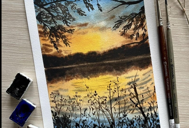
9. Project Part 1: Analysing Ref Picture & Colour Palette: [MUSIC] Awesome. We've covered everything that we need to know about
painting lakes. Now let us quickly dive
into our class project. I'm going to read down
the class project in three different parts. This one or this
lesson is going to be about understanding the
composition of our painting, deciding the color palette and sketching our elements out. The next lesson or the
second part is going to be about, painting
the background. We'll be painting the sky, we'll be painting the water, adding reflections
and all that stuff. The lesson after that,
that is the third part is going to be about painting
the foreground elements. Without wasting any more
time, let's get started. The first thing that
I like to do whenever I'm starting a new
painting is to tape down my paper on my clipboard on all four sides using
my masking tape. I've taken all my other
supplies as well as like the ones we discussed
in the materials lessons. I've laid everything out so
that it's all close to me and I do not have to run
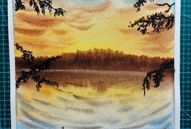
around finding things. The picture that we're
taking inspiration from is this beautiful sunset. You have the beautiful
yellow sun right there. Then you have the
orange bits and it slowly transitions
into the blue. Then you have the clouds
in the sky as well. The exact reflection is on the water with these
beautiful ripples coming from the right side and getting smaller in
the left and also lighter where the sun
set is happening. Then you have these foreground
elements exactly like the ones we discussed in the
trees and elements lesson. Everything that
we're going to do in this painting it's already
discussed earlier. Now, we're just going to
put all the pieces of our puzzle together and practice this final
lake landscape. What I'm going to do is, first make a basic
sketch of my picture. The first thing that
you need to do is have all your subjects in place. As you can see,
there's a horizon line that separates my
sky from the water. That is exactly what
I'm going to do. I'm going to use my scale and I'm going to draw
a horizon line. Now, you can make this at
an exact half of the paper. You can make this
by giving your sky a slightly bit more space
as compared to the water, but it's still almost a half. Just somewhere around
that you can use your scale and just draw
a very, very light line. It does not need to be dark. You can barely see that
line that I just draw. That is because when you're
painting with watercolors, if your lines to dark, you won't be able to erase them, first thing and second just shows and we
don't want it to show. Try being as light as possible. Now we're going to
sketch out our elements. I see these series of bush
or trees at the horizon. I'm just sketching this irregular mountain
shape actually and I'm making the exact reflection on the area below the horizon line. The way I drew the subject on the dot is going to be reflected the same
way on the water. Now that is the only thing that has the reflection
bit on our water, everything else that you see is not reflecting on the water and we don't need to show that. Again, you don't have to
worry a lot about it. I'm just making this
grounds based on the left and moving towards the
right, decreasing the size. Then I'm just going
to make in some lines that will show me
where my branch go, my foreground elements go. You don't have to sketch
out each and everything. This is just for your
personal knowledge, just to understand that whatever elements go in the
foreground, where they go. Once you're done
with the sketch, that's pretty much it. You can choose to skip this step of adding these elements in the
foreground as well. It's not a problem. Some people like to draw
their branches out, so you can do that. You can draw your branches
out if that's easier for you, but it is not a very
compulsory step. You can go ahead and just make a light sketch of everything
that you see in the picture. Once we're done with
that, we're good to go and move on to the next step. The next step is
going to be about deciding the colors that you need to pick for
the class project. Here's quick practice
piece that I did before filming the
final class project just to understand the
colors and have it all in place and see if it's actually turning out
the way that I want. As you can see,
for the most bit, I was able to grasp and get the exact colors that I see
in the reference picture, try and get the elements and they look the exact
way that I see. Now it doesn't
always have to look exactly the same as
your reference picture. You can always play around. You can always have fun. But I like to just stick around, at least for the
foreground elements stick around with what I see. Now, let us talk
about the colors. I think it's very important
to have your colors picked out before you go ahead
and start painting. Now what do you see
in the picture? You see that the sun
part or the bright part of the picture has yellow in it. I'm going to go for
cadmium yellow. I'm quickly going to show you a swatch of the
cadmium yellow color. As you can see, this is
the yellow that I'm using. Now if you don't
have cadmium yellow, you can use any yellow
that's a little bit warmer. You need a yellow that's not too cool like the lemon yellow. You need a yellow
that's a bit warmer. The next shade that I see
the sky is the orange and I'm using golden deep
by White Nights here. Now again, you can go for your cadmium orange
shade as well. But I've just gone
with my golden deep, which I think is a
beautiful orange color that I absolutely love and adore and I use
it in all my paintings. Now I want to talk
about the clouds. For the clouds, I'm going
to use a burnt umber color. Now, most of the times you
use burnt umber color to make the darker parts in the
foreground or make ground. You'd always assume that that's
the color that you pick, but I like using burnt umber
in the clouds as well. Now, the next thing that I want to talk about is the blue. For the blue, I'm going to
mix my ultramarine blue and my indigo shade to get
this nice Prussian blue color. You can use your Prussian
blue color directly as well. Just tone it down slightly when you're
using it in the sky, but you can use your
Prussian blue as well, or you can just mix
ultramarine blue and indigo to get this
beautiful blue shade that I'm going to use today. We have figured out the yellow, the orange, the clouds. Then we figured out the
blue part of the sky. Now you also see these clouds that are more neutral in color, and I achieve that
by just mixing the brown and the blue together. I can just mix the brown
and the blue or the orange and the blue and the
yellow together. Just like mixing these
colors together on the opposite side of
the color wheels that I get like a muted
version of the color. That is the color that
I'll use for the clouds. I love using this
muted gray color in my clouds and it goes really well with the burnt umber color, especially when I'm
making sunset painting. That is the color that I will be using for this class as well. Now, once we are done with deciding the
colors in the sky, the next thing that
I want to talk about is the color for the
foreground element. Now, a lot of times
people directly go for using black
in the painting because you see the
silhouette is black or dark in color and a lot of time the easier option
is to use black. But I personally like using a darker version of the colors
that I see in my painting. If it's a sunset
picture, it's more warm. It makes more sense
if you're using a dark brown color that makes the silhouette
part of your painting. That way the black just doesn't stand out and doesn't
look awkward. Now we've figured out all the colors that
we need for the sky. We've got the yellow, orange, brown, the blue, the muted color, and the brown sepia color. Now we will be using this color itself to paint
our class project. Most of the sunset
paintings have a similar type of
color combination, especially the warm ones. It has a very similar
type of color palette. But this is the one
that we will be using in our class
project today. We're done with the first
part of our class project. In the next lesson, we are going to be
painting the sky, the water, and the
ripples in the water.
10. Project Part 2: Painting the Background: Let us start painting
our background. I will be using my size
2 inch flat brush, my size 2, 4, 8, and 12 round brushes
for the class project. Now, the first step
is going to be wetting our paper and prepping our paper for the
wet-on-wet technique. I'm going to take my
size 2 inch brush, dip it in water, and carefully just layer the entire
paper with water. Make sure that you are evenly
spreading it all around and you're not having any
puddles of water on your paper. If your paper is evenly wet, your results are going
to be a lot better, your wet-on-wet technique is
going to be better so it's very important that
you apply a clean, clear layer of water. It works best when you have a bigger size flat
brush because it will cover a bigger area
with just a few strokes. The key here is to go
in the same direction. You can go vertically
or horizontally, that's up to you but make
sure that you are going in the same direction to
evenly spread your paper. Now using my size 8 brush, I'm going to start
the painting process. The first color that I want
to paint in is yellow. Right in the middle, I have
my vibrant yellow color. Using my cadmium yellow shade, I'm going to mix
it on my palette, and I'm making sure that my paint is nice and
loose in consistency. I don't want it to be
thick because this is the background layer
and it should be flowy. I'm loading it up
with my size 8 brush and applying it right in the middle where the sun is
very intense or setting. Now, what are the other
colors that you see? You see orange. In the reference
picture, we saw orange. Using my golden deep shade, I will be mixing it on
my palette and then applying it from the sides. I want to apply it from
the sides because I want the middle portion to be yellow and I want
it to be vibrant. I go from left to right and stop midway
where the yellow is, so that it's all in place and then slowly just move upwards. Then I clean my brush, dab off the excess, and then just slowly move
upwards, not all the way. Just stop right at the
half of the paper. Now the next thing
that we want to put on the paper is the blue color. I'm just going to load in
some ultramarine blue, mix it with a bit of indigo and I'll get this nice
blue color that I need, and I'm going to start moving
it from top to bottom. When I stop midway where I think I am good to
blend with the orange, I will just leave
that white space, clean my brush, and then
blend it downwards. When you're using
clean water to blend, you don't form the
green in the sky, like we discussed so
that is why we are being very extra careful right at the blending of the
orange and the blue. Now that I have the
basic colors laid out, it's time for us to add
in more intense colors. We're going to follow the
same process but just intensify the color a bit more starting off with the
yellow in the middle, then we'll have the
orange in this side, and then we'll move
on to the blue. I'm really happy with how the
sky has blended right here. Now this next step is going to be adding the
clouds that we see. Like we discussed early, we'll be using two colors for the clouds that is burnt umber, and the next one is that [inaudible] brown
color that we're using. First, I'm mixing my
burnt umber color. As you can see, the consistency of the burnt umber
is a lot thicker, and this way the paint is more controlled just like
we discussed earlier. Now we're just putting in all the puzzles to paint
our class project. Now I'm going from this
left and right motion and making a few little
strokes like this, make sure that you're
leaving your center portion where the sun is a
little bit empty because you will have to change the color of the clouds if
you bring it in the sun. But other than
that, you can just use your burnt umber color. You're just making these
little strokes diagonally, some of them are thicker, some of them are thinner. Then once you're done
with this color, we'll move on to
our mutant shade. That is by mixing burnt umber
and a blue color together. Now I've felt like the sun was getting a
little bit lighter. I just put in a little more yellow so that it stays
nice and vibrant. Now, mixing my blue color and my burnt umber
color together, I'll be getting this
nice muted color that I need for the clouds, which are more towards
the blue side of my sky. Again, using the same process of tapping in the
clouds diagonally, I will be making these clouds at the top and I will slightly
blend them with the brown as well so
that it doesn't just look awkward standing in two different colors and
they're more blended together. Yeah, go ahead and
add in the clouds. Now you know exactly what you need to do because you've
covered this before, you can leave the clouds
however you like. If you look at the
reference picture again, it's very important we're
painting what we see. Look at the reference picture and see how the clouds look. You can change things
here and there, I have changed the structure of my clouds because I
generally end up making my clouds look like this and it's more appealing
to me this way, so you can go ahead
and just make it this way or make it how you
see in the reference picture. Now that I'm happy
with my sky part, I'm going to go ahead and make that bush near the horizon line. Load your brush with
some burnt umber color and then apply it at
the horizon line. Make sure that your paper
is still wet at this time. If you think your
paper has dried, then you can just
wait for the paper to completely dry and then re-wet the surface and then add in
your bushes near the horizon. It's very important
that your paper should remain wet
for this process. First, I've laid down the burnt amber color and I'm just making
the irregular shape that I've seen in the
reference picture. Then once I lay that, I will be adding the
Sepia color to form the darker parts of the
objects near my horizon line. Just like how we learned in the reflection
part of the class, the process that we followed is going to be
exactly like that, the reflection on the
moving body of photos. That's the same type
of steps that we are applying for
our class project. Go ahead and make in this little bush
near the horizon line. Now, once you're
happy with that, we are going to move
to our water bit. By this time, most
probably the water area that we wet before
would have dried. But that's okay, you
can go ahead and re-wet the surface again
using your flat brush. Be a little careful
around your horizon line. It's okay if your paints blend in, that's completely fine. Don't worry about that, but just go ahead and wet your
entire surface with water. Now what we're going
to do is just to replicate what we see above the horizon line at the area below the
horizon line as well. Using my size 8 brush, I'm going to go
ahead and replicate whatever I see above
at the bottom. We'll start off with the yellow, and then following
the same steps as we did for our sky part, so we'll have yellow, then we'll have
orange in the sides. We'll have the blue as is. Now, over here since
we'll be making ripples, we don't really need to show
the exact cloud structure. It's okay if you
just get the colors that we see in the sky
on the water as well. Now, once I'm happy with how the colors of my water look, we are going to go
ahead and replicate the subject of the horizon line. Using your burnt umber
and size 8 brush, try and get that same
irregular shape as you see in the area that's
above your horizon line. Now, let this just be as is, we'll add the darker tones once we add the
ripples in the water. Now, using my size 4 brush, I'm going to use the
lifting technique and lift off the paint to create that separation from the area above the water to the area
that's below the water. All you have to do is
wipe off your brush, make sure that it does not have a lot of water in it and then just drag in the area that
you want to lift off. Then that will just
soak in the water and you'll eventually end
up with that line, which will have less
paint or no paint or it will probably just show
the white of the paper. Now, we're going to start
off with the ripples. For that I'm just mixing
my indigo shade with a little bit of brown and I'm going to go ahead and
add in this ripple. Now, these ripples
are very similar to the ones we
practiced earlier. You're putting in the puzzle
for the ripples as well. I'm starting off with
the ripples that are a lot bigger at the bottom. As I move closer to
the horizon line, I'm going to make them a
lot thinner and smaller. The area that's closer
to the observer, you want to make sure
that you're tapping in your brush a little bit more. Then to the area that's
away from the observer, make sure that you have a really light-handed
pressure applied. You're just going to go ahead
and add in these ripples. Now, you will start
off with your ripples being really far apart
from one another, and as you move closer
to the observer, you'll make them a lot
more closer to one another because
they're more compact. Just go ahead and create the ripples like
we've done before. Now, once you're happy with the few little ripples
that you've added, you are going to go
ahead and add in some intensity to
the same ripples and add in some other ripples
around them as well. The big ones will also have some small ripples around them. I'm just going to go ahead and repeat the
process of adding in the ripples until I'm happy
with how the ripples look. The process is very similar to the ones that we
learned earlier. Just go ahead and
add in your ripples. Now, once I'm happy with
how everything looks, I'm going to go ahead and add the darker part
for my reflection. Using my size eight brush
and our Sepia color, we are going to go
ahead and add in the darker colors
for the reflection. Just go ahead and make the
same type of reflection that you see above the horizon
line at the bottom as well. Then using our brush, we will be making those little
smudges at the edges so that they show the
irregular shape and the ripples in the
reflection part as well. To make the reflection part a little bit more interesting, I went ahead and
added a little bit of the burnt umber color
at the tip as well. Wherever I'm making those lines, I'm using the burnt umber color and mixing these two together, just like how we
mix the two colors together above the
horizon lines. It really helps to add
in the lighter colors. Since the sun is right there, you'll see a lot
of light parts of the subject as well as
compared to the dark parts. I think adding in the burnt umber color
just changes everything. Now, using a mix of the burnt umber color and a
little bit of Sepia color, we're going to add in the ripples which are
lighter in color. It's really, really tiny
ones, thin ripples, but the more warm in
color as compared to the indigo and the brown or the mutant mix that
we created earlier. Let's just go ahead and add
the ripples using this color. Sometimes it can be really, really easy to go overboard and that's
when you should look at the reference picture so that you understand where to stop. I think I've added
enough ripples and I'm just going to
stop right here. Now that we're done with
that background layer, we're going to wait for this
to completely dry before we go ahead and paint
a foreground element. In the next lesson, we will be painting our branches
and the leaves.
11. Project Part 3: Painting the Foreground: Now that our paper is completely dry and I'm so happy with the way
our background looks, it's time for us to add
foreground elements. Adding these foreground
elements is going to make our painting really stand
out and look beautiful. The color that I'll be using is Sepia for the
foreground elements, and we'll be using the same
type of tree elements such as the branches and
the leaves like we learned in the foreground
element lesson. You need to have two
brushes with you. You need to keep a size
4 brush or a size 2. This is what I'm using majorly because I want a bigger
size brush to make the bigger branches and smallest size brush to make
the details in the leaves. Let's just start right
in with our elements. The first one that
I'm going to do is the left side corner branch. I've loaded and taken my size 4 brush loaded
up with some Sepia. Then I'm going to start by
making the branch first. Like we did before you remember, we painted the branch first
and then added the leaves. That is one of the most
easiest way to make any branch and leaf combination because it gives you
the basic structure. I'm just going to make a bunch of branches coming out
from the left side. Now, you don't have to exactly
replicate the same thing. You're just going to
get inspired from it, understand how it looks, and then as you paint along, you can make a few changes. Now that I have my
branches set out, I'm going to make the leaves. You remember the leaves that we learned where we
were making lines, that is the style that
I'm using for this one, so this gives me this illusion of long leaves on the branches. Just go ahead, make
a bunch of lines. You can use a smaller size
brush here if you want. In case you feel that
your bigger brush is not giving you
those final lines, go ahead and use the size
0 or the size one brush, wherever your brush
is basically. Here I'm just going
for a size 4 brush, which gives me a
really fine tip, so I'm able to are lot of different details
with the same brush. Now that you set the main
branches out in case you want to make a few little branches coming out from the
left and right side, which are going to be
your sub-branches, you can go ahead and
do that as well, and then complete your
entire section out. I have placed the
practice painting right next to me so that you get an
idea of what I'm going for. I wanted to keep the main
reference picture as well, but I could not because it
was too big for my screen. But I've put the
practice painting so that you just get an idea. Go ahead, follow me along or just go ahead and
do your own thing, add in these branches
from the left corner. In the right corner
side of the painting, you see that we just have a branch which is empty which does not
have any leaf on it, so we'll sketch that out and we can draw
that out with a brush. Then at the bottom, the area below that has the same type of leaves that
we made on the left corner, so it's the same process like we've done before in our
tree element lesson. Just following the steps and trying to recreate what you see. Now, a lot of times
people find it easier making these elements in a way that this sketch out the main branches first and then just go over it
and paint over it. But that's completely
a personal choice. It's a personal preference. If you think you're confident enough to just go ahead and wing the whole situation and make everything look
pretty in the end, then you can go for it. If you think you're
a bit confused and you're a little
bit scared because you've worked so hard on your background and
you wouldn't want to ruin all that hard work because you couldn't make the
foreground look nice, so you can go ahead
and sketch it and then trace the branches out
and work accordingly. Again, personal choice. I personally just
like winging it. I'm like, I'll just try and
recreate things that I see, so I didn't stress
out so much on that. But if you want
to sketch it out, you can go ahead and do that and complete this
little section. I'm just going to keep
quiet so that you actually enjoy the
process of making this. If you're painting
along with me, it would be really fun because it will just give
you the time to follow me along and I haven't
sped up the process or anything so that
you get your time, take your time and just follow along and enjoy the
painting process. Once we're done with the
top part of our painting, it's time for us to add the
crowns and the details for. For that I'm going to
use a combination of the color Sepia and burnt umber. Again, I'm going to be
using the same two brushes, size 4 and size 2. Now, right here, what I want to do is first load my brush with the Sepia color and
make the ground shape. Load your brush with some
Sepia and go ahead and make this irregular ground shape by just dragging your brush
and adding in the paint. There's no perfection,
there's no right or wrong. You can go ahead and make
it however you like. It doesn't have to be
exactly the way I'm doing. I'm just going for a curve
and I'm just slightly making the uneven ground
look. That will be it. Once that is done,
we'll go ahead and add the details that's above it. Let us start with these slight tweak-like
shrubs in the background, and for that I'm going
to use my size 2 brush. I'm going to make a mix of the burnt umber color
with a tiny bit of Sepia. I want the color for this one to be slightly lighter
as compared to the ones at the bottom because I feel like the sun is
falling directly on it. That is why it gets that little warm colors in the sky as compared to
the ones at the bottom. You're just going to start loading your brush
with some paint. We're going to make very
thin strokes now again, wing the whole situation or
sketched out if you want. I'm just going to go
ahead and try and just replicate what I see. I can make a few changes
that's totally on me, and the process here again, is very similar to the
ones that we did earlier. I have taught you
all these elements in the lessons before, and we're just, like I said, putting the puzzles together to complete our final painting. Go ahead and make this our little twig-like shrub, that's what I like to call it, and complete the
entire structure, and then we'll go ahead and add the bigger shrubs at the bottom once we're
done with this. I know it looks a little bit awkward right now because the bottom
looks really empty. But don't worry, once we add
those shrubs at the bottom, it gets covered up
and it all looks like a piece together. It'll not look as awkward standing out like
it does right now. Just go ahead and
add in those leaves. The way in which you make this is very similar to what you see, or you just try and observe
your reference picture. You're observing your reference picture and just
trying to pick out the things that you are
capable of putting in. It's very important to look for things that you are sure that
you are going to do, or are able to do. When you pick out
things like that, it gives you more
confidence to paint it out. A lot of times, if you go for extremely difficult
reference pictures, and if you're not
able to complete it in the way that
you want to do it, then it disappoints you and
you end up not doing it. Always start off with things you think are simple and
you're able to do, and this way you end up boosting your confidence to go ahead and paint more reference
pictures and then eventually you'll
fall in love with painting landscapes
like I've done, and every time now that I
look at landscape pictures I feel so happy and I cannot
stop myself from painting. There are still a
lot of subjects that I find very difficult to paint, or I would need a
lot of practice for, but that's how it is. Art is something that you are always learning and exploring. Go ahead and make
these shrubs for now, and then we'll move
on to the next step. Once we're done with this, we're going to go ahead and add the details in the bottom
part of my ground. For that, I'm going to use
my same size two brush, and I'm going to load my brush with some
sepia right here, not a mix of sepia and
[inaudible] But just sepia. Then I'm going to make these little strokes
or little lines, and then I am going
to just drag it along and make the strokes
a little bit bigger. It's very similar to the strokes that you made
on the top left corner. But here you're just applying more pressure on your brush. Like I said, hold your brush well to get a good
grip over your brush. When you get a good
grip over your brushes, strokes will be more clear. You'll be able to control the pressure that you
apply on your brush. That plays a very important role in a way that your
strokes turn out well. Just go ahead and
add the details to your shrubs at the bottom. It's very similar to, like I said, the top-left. Just here the leaves are
bigger and thicker and fuller. It's very similar. We
have learned this before. It's all about how you
apply the pressure on your leaves and the look
that you're going for. Just go ahead and add
it at the bottom. I am not going to talk
anymore so that you enjoy the process of adding
the foreground elements. Yes, it does take a lot of time, but it's definitely worth it. We've added all the elements. Now I'm just going to put my reference picture
right next to it and make a comparison about the things that I
would like to change, or add or if I've missed
out on something. As you can see, I
wouldn't say painting is a complete replication of
the reference picture. But it's highly inspired
from our reference pictures. We tried to get
the colors right. We tried to get the foreground
elements the way we want, and now is the time to make any final changes that you want. Every time you like have a
side-by-side comparison, that's when you realize in case you want
to add something, or if you've made a mistake
that you'd like to rectify now is your time before you go ahead
and peel the tape off. I think I would like to change a few little
things about my branches, make them longer, fuller, add in a few extra leaves. I'll just go ahead and make
any of those corrections. Once you are happy with how
the whole composition looks, that is the end
of your painting. I am really happy with the way everything looks, and I will slowly
peel the tape off. Oh, my God. Getting
these clear crisp edges, this is the moment
that I live for. I love it when I peel
the tape off and not even a single drop of paint has seeped through and
your edges are really crisp. It's just the most beautiful
feeling in the world. Now we are going to sign our painting to make
it uniquely ours. Just put in your sign, and don't forget to always sign your paintings because
it's really important. This is our final painting. I absolutely love the
way this has turned out. I love the water reflections, it looks so realistic. The clouds and the
foreground elements, everything is just my favorite. Here's a quick side-by-side
comparison between my practice painting and the
class project that I did. I love how each of
these are different in their own way in terms of
color and foreground elements, but they're just both
beautiful in their own way.
12. Final Thoughts. See you in the Next Class!: This is it, you guys. We've reached the
end of the class. I'm so happy with the way
our class project looks. It almost looks like
a picture, isn't it? I've tried to break down
this class project and also this class in
different bits so that it's not only easier for you to paint this class project or know the steps involved in
painting this class project, but also you can use the same
concept or idea to paint from your own reference
pictures that have lakes involved and
reflections involved in them. I have uploaded a
few more pictures or reference pictures in the resources part of the class so that you can
go ahead and download them. You can give them a try as well. All of the images that
are uploaded there, will have the same concept
that we have learned today. It'll be a good practice for you to get your hands-on
how you paint them. If you paint those or if you
paint this class project, please do upload it under the project section
of this class. I love browsing through that section and seeing
what you guys create. It makes me so happy each
time I go through it. If you get a little extra time, do leave a little review down for me because it
makes me really happy. It motivates me to
make more classes, and it really pushes
me to go out there. One last thing, if you're sharing these class
projects on Instagram, do tag me @thesimplyaesthetic, and I would love to see
them on Instagram as well, and I would love to share them
with my followers as well. That's pretty much it. I am really, really happy that you decided to stick
around till the end. I shall see you in the
next class. Bye-bye.
 Payal Sinha, TheSimplyAesthetic- Artist & Educator