Transcripts
1. Welcome to the Class!: Hello everyone. Welcome to
the first class of 2022. My name is Bio. I'm an artist, art educator, and an entrepreneur based in Bahrain, originally from India. I go by the name, the simplest
[inaudible] on Instagram, where I share my love
for painting every day. You can find more about me in my About Me section on
Skillshare as well. I hope you guys had
an amazing new years, and wishing you guys
that you're filled with positivity and hoping you achieve all the dreams and goals that you've set
for yourself this year. Since it's still winter, which means we can put on our
large hoodies and sweaters, sip on some hot coffee, get comfy and paint. This January I'm bringing
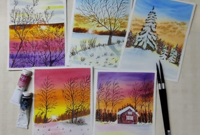
you a class where you can paint these five beautiful
winter landscapes with me. We are going to be focusing on the medium watercolors
for this class, and I've designed
this class in a way that you can paint
one class project each day and slowly build your habit of painting with
watercolors every day. I will be uploading all the five class projects
together so that you can start this five-day
painting journey according to your
time availability. I will be walking you
through the art supplies that you need for painting
with watercolors. We'll talk about the
right paper, paints, brushes, and every other thing that we'll need for this class. We'll then brush up on some of the watercolor techniques
that we need to know for painting
our class projects. Then using a combination of
these watercolor techniques, we'll paint five
beautiful landscapes. Painting snow can be
a little challenging, and that is why I have chosen these five beautiful yet
simple landscapes where we can also learn how to add the lights and
shadows to your snow. Each of these class projects are super unique in their
own beautiful way. If you are someone who loves to explore different seasons, then join me on this
magical journey where we explore the
season of winter together. Gather all your supplies, get cozied up and let's begin.
2. Materials you'll need: [MUSIC] Let us talk about the
art supplies that we need. For the paper, I'm
using this 300 GSM, 100 percent cotton
paper by Arches. I absolutely love using and
suggest using a 300 GSM, 100 percent cotton
paper because it can hold on a really
large amount of water. It makes a painting turn
out really beautiful and it works for most of our techniques that we'll
need for the class. I've taken my seven by 10-inch
paper and cut it into two, and this is going to be my preferred size for
each class project. You can take any size that you like to paint the
class project on. For the brushes, I'm
going to be using my silver black
velvet CTs brushes. I'm going to use the size 2, 4, 8, and 12. I absolutely love these brushes when it comes to painting
with watercolors, because it can come up
to a really fine tip and it also holds a
large amount of water. But you can use any size of brushes that you have
available with you. If you don't have a brush that comes to a really fine tip, you can use a size double zero or zero brushes to get really fine strokes
for our paintings. Next, we're going to
talk about the paints. I have made this
custom palette with a mix of my white nights
and [inaudible] paints. But you can use any brand of watercolors that are
available with you. I will talk about
the color palette of each painting right before
the class projects. You can go to each
class project to know the exact colors
that I will be using. Next, we need two jars of water. Using two jars of
water is really important when it comes to
painting with watercolors, as one is going to be for
your clean water supply, and the other is going to
be to rinse your brushes. Next, we need masking fluid, especially for the snowy
pine cones class project, you will need to
have masking fluid. If you don't have masking
fluid, don't worry, you can just use white gouache to go ahead and add the
snow to your pine cones. When you're going to
apply your masking fluid, makes sure that
you apply it using an old spoiled brush that
you don't need anymore, as masking fluid
ruins your brushes. Next, we need to choose a
rag to wipe our brushes when it has excess water
or just to clean them. Make sure that you have
a cloth rag with you. Next, do keep pencil, eraser, and scale with you as we'll be doing really light sketching. Next, you need to have a
tube of white gouache. This really helps in
adding some of the snow on the far-off mountains
and trees and also to add highlights
to our paintings. Do keep a sturdy board with you. I will be taping down my
paper on this board so that it lays down flat
and it does not buckle. Lastly, we need to have
masking tape with us. I'm going to be using
this masking tape to tape down my paper
flat on the board. That is it. These are all
the art supplies that you need to start with
our class project. Let us move on and learn the basic watercolor
techniques in the next lesson. [MUSIC]
3. Warm up Watercolour Techniques: Before we move on to learning and painting each of
our class projects, I thought I'll brush
you on some of the watercolor techniques
that you need to know. These techniques are going to help you in the future as well. The first technique that
we're going to talk about is the wet
on wet technique. The first word is for your wet brush and the second
word is for the paper. I'm going to load my
brush with some water and evenly apply it on my paper. Next, I'm going to
load my brush with some paint and I'm going to mix a thin layer of my paint so there's going to be a bit
of water to it as well. When I tap my brush
on the wet paper, as you can see it really
just spreads around. It blends and it tries to spread with the water that
is already on the paper. Next, I have taken paint directly from the pan without
adding a lot of water, and when I tap it on the paper, it spreads but not as much. You can control the way your paints blend
or the way they are supposed to spread by working on the quantity of
water that you add to it. The next technique that we need to know is the wet on dry. The wet is for the paint, so you have water and
hence it is a wet paint. When you apply this
paint on a dry surface, which is your paper, that is your wet and dry method. In the wet on dry method, the blending is a
lot more controlled, which means your paint will stay around the
edges like you'll have sharp edges without
blending into the background. So if you have no water, your paint will be more
controlled and you'll have proper shapes and edges. This is a more
controlled way of using this technique where you
don't want your paint to just go crazy but you want
them to be controlled. The next technique that
we're going to talk about is the wet
on wet blending. This is a technique
that we mostly use for our skies when we
want our blends to be released seamless
and all put together. That is when we use the
wet on wet blending, which means we're going to use the same wet on wet technique. But instead, we move in this left and right motion or you can say up and down
in this that I'm doing. You go in that one motion and you try and blend
two colors together. In wet on wet, the blending is a lot seamless
because your paint has more time to blend before getting settled on
or dried onto your paper. That is why when your paint is wet and your paper
is wet beforehand, it gives you a good
amount of time to work on your sky
and try and get it in a really well blended together without making
it look really sharp. So if it was a wet on dry, you'll have more sharp edges. But with wet on wet, the blending is more seamless. Like you can see, I've blended the orange
and the pink together seamlessly for it to look
like one-graded wash. [MUSIC] Now what I want to talk to you guys about
is the lifting technique. We use this lifting
technique to show the whites of the paper after we have applied
a layer of paint. This is a combination
of your wet on wet technique and using your dry surface to lift off
the paint from this paper. First, we're applying a
layer of water and adding a layer of paint over it evenly. You can have it
however you like. I'm just evenly spreading
the paint on the surface. While the paper is still wet, I'm going to take some tissues, all your brush that is completely dried off so you
should have no paint on it. The first thing that I want to show you is with the tissues. You're going to take
your dried tissue and start lifting off the paint. Now there are a few
factors that depend on high ability to show
the light of the paper. That depends on if your
color is staining or not. So if you use staining colors, it will stain your paper because when you try
to lift off the paint, you won't get a
complete white color. But if you are using
non-staining colors, you'll be able to show the
complete white of the paper. You can also use masking tape to have the
whites of the paper, but this method is really
natural in my opinion. I like using it for
the sun and clouds. The next thing that I want to talk to you about is very basic. It's just different
brushstrokes. When we make trees or little
branches, pine trees, any absolute element, we need to have a good
control over our brush. When we have a good
control over our brush, we're able to get
really smooth strokes without having to
stress over it. Take your brush, take a different sized
brushes and make some strokes and see
that when you apply more pressure on your brush what kind of strokes
you're able to get, if you apply like
medium pressure on your brush what type of
strokes you're able to get, and when you are
really light with it, what is the thinnest
stroke that you can get. This will give you an idea on how much pressure
you're supposed to apply and how much pressure you're supposed to
release to transition from a thick stroke
to a thin stroke, and this place is
really important role while painting trees and branches because we don't want to move from one
brush to another. It's really uncomfortable. We try our best to use one
single brush to try and complete one element or
maybe like two brushes. But once you have little
control over your brush, you're able to do it
with a lot of ease. First, especially making
different strokes, you need to have a
good control over your brush and also
grip over your brush. When you're making trees or
branches or leaves, whatever, you need to hold your
brush like you'd hold a pencils so you have a
good grip on your brush. At least this is what
really works for me. Then I try to hold it, almost at like 80
to 90 degrees to the paper so that I have a
lot more control over it. Then I've practiced
the pressure, putting pressure,
releasing pressure, things a lot of times. I get to see that, okay, I'm now supposed to
apply this amount of pressure to have big
strokes with this brush. I'm supposed to apply
a lot lesser pressure to get really thin strokes, and that will completely
change your game. It will completely
change the way you use your brushes and how
your painting turns out. So just do practice these brush strokes a couple of times. I'm not doing anything
extraordinary, I'm just trying to
make some trees, and branches, and
leaves, a pine tree. Whatever you'd like, just play
around with your brush so that you get a good
grip before we start painting on
class projects. [MUSIC] This is it you guys. These are all the techniques
that you need to know before we move on to
painting our class projects. You have the wet on wet, wet on dry, wet on wet blending. You learned lifting
technique and a few brush strokes
that you need to know. For our class projects, we will be using a combination of these different techniques. Let us move on to the
first class project.
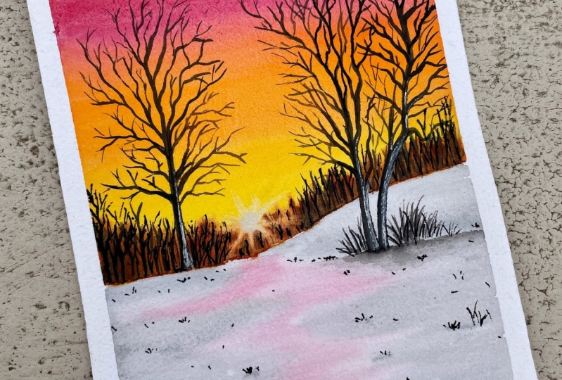
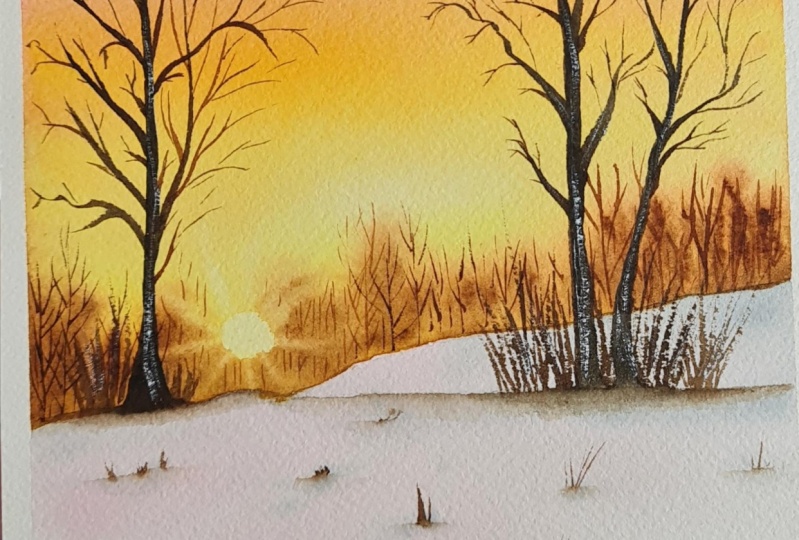
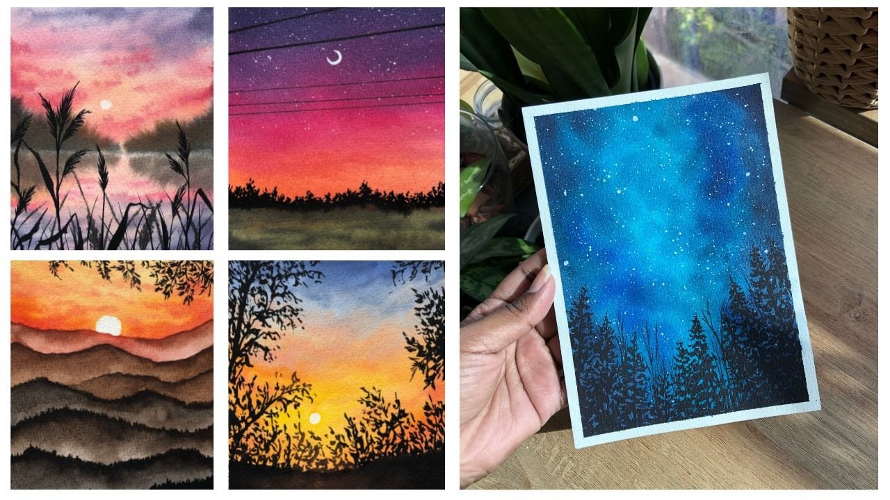
4. Project 1: Winter Branches: Let us start with our
first class project. This is a beautiful sunset
painting of some branches. I've named this
branches of winter. The colors that you
need for this class is, cadmium yellow,
golden deep, carmine, quinacridone violet,
burnt sienna, burnt umber, sepia, Payne's gray and indigo. I've taped on my paper
on all four sides, leaving a thicker border at the base for that polaroid look. This is the picture that we're
taking inspiration from, so this is our
reference picture. What I'm going to
do now is I'm going to sketch out the
horizon line and then some of the branches to get a clear idea of my painting. Using my scale, I'm going to divide my paper in two half, and just draw a line. This is going to
be my horizon line that will separate the
ground from the sky. Then I'm going to go ahead
and sketch the main branches. Now, you don't have to do it exactly like your
reference picture. You can just take
the idea from how the branches look in your reference picture and
then sketch something out. You don't have to sketch out your tinier branches
because that is something that you will do once you are done with
the background wash, and we are definitely
going to wing it. We're not going to follow
the exact branch structure. I'm just going to roughly sketch the branches and specially the main branches and
not the tiny ones. Once I'm happy with my sketch, I'm going to take my flat brush. You can use your larger
size round brusher as well and then just
coat it with water. You want to spread water evenly in the sky portion
of your painting. Now I'm going to use my
size 12 round brush and load my brush with
some cadmium yellow. But before I do that, I just want to show you the
swatch of my cadmium yellow. You can use any warm yellows
that you have with you. That is completely your choice.
You're free to do that. Then you're just
going to add a bit of water to make
it nice and flowy, and just spread it
near the horizon line. You're going to go in this
left and right motion, because this is how
your paints will seamlessly spread
and they look even. Now, you know why we wet
the paper first is for the wet-on-wet
technique and that makes the sky blend really easy. Now, this is my
golden deep color, just swatches my golden deep. I'm going to just load my brush and go in this left
and right motion. This is just a free stroke, I'm not really
thinking a lot and I'm just going with my brush here
and there, left and right. Now, this is my carmine shape. Now, you can use any pink
that you have with you. That's totally,
again your choice and the colors that are
available in your ballot. Then again load it and spread it on some little
portion in the sky. You're going to add four
colors to your sky. You have your yellow, orange, pink, and purple, let's
go into simple terms. You're just going
to spread and blend all these four colors
together to have a nice and seamless
blend in the sky. As you can see, I have just
taken a really light wash. I haven't done a really thick
wash, it's really light. While I'm happy
with what colors go where I'm just going
to take my tissue and make this circle shape, Roll it into this round shape, and lift off the
paint from the paper. Like I showed you in
the lifting technique, while the paper is still wet, you can lift the paint from
the paper and then leave the white space of your paper
and you can see through. That is a technique that
we'll use for the sun. Now I'm going to
go ahead and add some rich colors that is a lot more intensity
to my painting. I'm going to add
more pigments to my mix and then go ahead
and do the same process. Add the yellow, the orange, the pink, and the purple, and then blend all these
four colors together, so that they form a really
nice and seamless blend. I don't really put a
lot of pressure on myself when I'm
blending my colors. I let the water do its magic, and I'll just go ahead and do this left and right strokes. But when I want to show a
proper blend between them that shows the orange
is not completely separate from the
yellow or the pink, so I just go ahead and add these tinier left
and right strokes from different directions
and then stop midway, so that they look like
little clouds in the sky. Not exactly clouds, but just that blend
between these colors. You're just going to go
ahead and make these little left and right strokes to stop midway just to blend all
of these colors together. Don't really think so much. Enjoy the process, this is a really fun
wet on wet technique. Most of the times in
wet on wet techniques, your water does the magic. You just have to guide your paints to the direction
you want them to go. I've changed the
size of my brush. I took my size eight brush, and went ahead and
added a little bit of pink blobs as well. Again, left and right, stopping midway
making small strokes. Then I'm just going to slightly blend it
because I felt it looks really pink compared
to the rest of the sky. Just bring some orange down so that it doesn't look like
a plain wash basically. I just want some darker
contrast to my paintings in certain places and a lighter
wash in other places. Once I'm happy with
the blended my sky, I'm just going to go
ahead and correct my sun. That is I'm just going to lift
off a little bit of paint. We're going to move
on to the next step, which is we're going to
add our far off trees, the trees and the
bushes at the distance, near the horizon line. For that, I'm going
to load my brush with some burnt sienna. As you can see in the mix, there's not a lot of
water in the mixture. There's a lot of pigment
as compared to the water. Now, why that is important is because in wet
on wet technique, if you add paint with
more water content, it's going to spread
out even more. But if you decrease
the content of water in it and it's more thick
with a lot more pigment, it's going to spread,
but not as much. As you can see, it's
not spreading as much as if my paint was really
lose, it would spread a lot. Compared to that, it's
spreading a lot less, so do add very little
water to your mix and then go ahead and just touch
it near the horizon line. Like I said, the wet-on-wet technique is going to
do the magic for you, and your paint will seamlessly
blend into the sky, creating this nice effect that these trees
are really far off. You can't really see the
details of each of these trees, but rather you can
just see the shapes. Like there's this huge bush or there's a huge
forest near the sun. Make sure that
you're doing all of this while your
paper is still wet. We don't want our
people to dry in between our wet-on-wet
techniques that we're doing. I'm just going to show
you the swatches of my burnt umber and the burnt sienna because I
forgot to show it earlier, but so this is your burnt umber and your burnt sienna color. Now we'll be using our burnt umber color
to add more contrast to the area near the horizon or a forest
near the horizon. As you know the area which is
near or closer to the sun, it's going to have a lot
more sunlight passing through it as compared to the ones in the left
and the right side. For that again, I'm
doing the same method, loading my brush with
some burnt umber in a thicker consistency and I'm just going
to tap it near the horizon line and the wet-on-wet technique
is just going to do the magic for me. You'll just seamlessly
blend into the sky. Once I'm happy with that, I'm just going to lift off some more color from the
paper using my brush, just like in the lifting
technique that I showed you. Just going to dry your
brush completely and make these little strokes and then dry your brush again and
then make the stroke again. This is just to show
the rays of the sun. You can completely
skip this step if you don't want to do it or if
you're not confident enough. But this is how you can
easily show that glare or the sun rays shining
through something. Now using my size four brush, I'm going to go ahead and add
the trees that you can see, the details of
their the horizon. Now, the paper that I'm going to work on is completely dry. I've waited for this
layer to completely dry, and that's when I'm going to
go ahead and add the trees that you can see the
details of which are much closer to the observer. You have to make
sure that your paper is dry because you
don't want it to spread into the background
layer like we did before. This is your wet
on dry technique. I'm just going to
go ahead and make these little lines just to show trees and bushes
near the horizon, it doesn't have to be perfect. I'm completely making
random strokes, and dots, and lines like that. You're just going to tap
and extend your brush forward and try making
little branches as well. In some ways, you just tap little dots clustered together. There is no perfection. You can't really see each
detail of your tree. You're just going to see
some shapes that are not clearer to the
observer's eyes. Yeah, we're just going
to go ahead and do this, and I'm using the
burnt umber color for this process again because they are from the
left and right side. As they come closer
to the observer, I'm going to change
the color and I'm going to use the
burnt sienna color. Like I said, because
the sun rays pass through this
because of which the colors appear a lot vibrant and lighter as compared to
the left and the right side. Now when I come really
close to the sun area, I'm going to add a little bit of orange to the burnt sienna, and using that deep
brown-orange color, I'm going to go ahead and make three little bushes
near the horizon. As you can see, it's
like a glare of orange, burnt sienna, and burnt umber. Now let us go ahead and paint the ground using my flat brush. I'm going to apply an
even coat of water, and then for the ground, I'm going to use a
mix of my Payne's gray and my indigo color because I don't want
it to be really gray. I want it to have a
blue undertone to it, and that is why I'm adding a
little bit of indigo to it. Now make sure that you're not
using a lot of pigment here because we're going to be using a really light
wash of this gray. We don't want the
really deep gray color, and then I'm just going to make these random strokes again. It's from the left
and the right side. Make sure that you're leaving
this little empty space in the middle because that's where we'll be adding the reflection of
the sun on my snow. Make these left and right
strokes come from left, then come from right,
and stop in the middle. Make it look a little zigzaggy like as you can see I've done. They're not like
in the same size. What I'm trying to
say is make them look a little uneven and
indifferent size. Now I'm going to load
my brush with some yellow and the orange color. Now again, I'm using
a very light color. I'm not using very
intensified color. It's really light, less
pigmented, more water, and that's why you get a
really nice and light wash. We don't want the
reflection to be too harsh. Be a little careful
when you're blending the blue and this
yellow-orange mix, because if they mixed together, they're going to
make green and we don't want that
green muddy color. So be a little bit careful. That is why we start off with really light washes for
the snow specifically so that even if you
make any mistake here and then you can go ahead and fix it and blend it out. Now, once our gray was there, I'm just going to
load my brush with some more gray paint and go ahead and add some more
shadows to my snow. Now as you can see, I
messed up on the left side. Like I said, you can correct it when you're
using light washes. I'm just going to dry my
brush and just lift the paint off so that it doesn't look
really harsh and muddy. I'm quite happy with my snow and I'm going to just show you the color swatch of
the gray that I used. It's just a mixture of your
Payne's gray and indigo. If you don't have these
colors, don't worry, you can just use your
Prussian blue and a bit of black and blue to it just to get the dark
indigo Payne's gray color. You can always experiment with
your colors that you have. Now once my paper
is completely dry, I'm going to go ahead and mark the branches
that I sketched. Now if you don't or if
you can't see the sketch, you can go ahead and sketch
your branches again, and using your sepia color, you're going to go ahead
and make these branches. But do be a little bit careful
because we are going to play around with the
lights over here. As the branch comes closer
to the sun, like I said, light will pass more through that area so it will appear
a lot lighter in color. It's going to be
your brown branch, but when light is
passed through it, it'll appear more orange. That's exactly what
we're trying to depict. As I come closer to the sun, I added a little bit
of my burnt umber on the color on my brush and
then just made the branch. As I come even
closer to the sun, I'm going to use my
burnt sienna color and make these branches. You just have to
be careful around this little circular
area near your sun. Other than that, all
the other areas can be made with your sepia color. The strokes, again, I asked you guys to practice your brush movement
is because of this. I want you to have a good
control over your brush. You should be able to make thicker strokes and
thinner strokes with the same brush without having to change your brushes. That is why even
having good brush plays an important role, but I'm just trying
to get you guys to practice with one single
brush that you have. All you have to do is press your brush a lot
when you're making the thicker sections
of your branch and be really light-handed when you're coming to your thinner strokes, and they're very random. Don't stress out about
making your branches look perfect because
they're not perfect, there is no perfect branch. You can really play around with this branch thing that
we're going to do now. It's really fun, honestly. It's really fun and therapeutic. You're just going
to go ahead and make these little strokes. One more thing when
you are painting branches is that you should have a good
grip on your brush. When you're making
these branches, what really helps me is holding my brush like
90-degree to the paper as you can see or
perpendicular to the paper and then having
a good grip on it. You're holding like you're
going to hold a pencil. This gives you a
really nice grip. How you'd hold a pencil will exactly hold your
brush like that. Just leave that little space. Obviously, don't hold it
really close to the brush. Yeah, that really helps. Just keep that in mind
and make these branches. Now we are going to
go ahead and add those little leaf details that we saw in our reference picture. You can just extend
your branches out and make these look
clustered dots together. There's no perfection
in this involved. There's no protection
whatsoever. You're just going to
extend your branch out and mainly the little dots. You can look at the reference
picture by the way, I have attached it in the
resources part of my class. You can download each of these reference
pictures so that you can see it for yourself as well. Or you just wing it. If you're just having fun, then just go ahead and not
think so much and just do it. All of these branches
that I'm making, I'm just extending some
tinier branches out of them, I'm this making
these little dots and that is the whole thing. The only place that you'll have to be careful
is around the sun. Don't forget to
switch up between your burnt sienna and
your orange color. Very closer to the sun, you'll have to add orange
and then you can transition. This is basically
our transition. Here when I'm using my sepia
mixed with a little bit of burnt umber and I'm just
going to make these dots. As I come closer to the sun, I'm going to add burnt sienna
and orange and that is it. Go ahead, fill up
your branches with as many tiny leaves
that you'd like. Enjoy. I will be increasing
the speed of my video for the
next few minutes. At least until when I'm
making these branches because the process
is very repetitive. If you think I'm going fast, you can always
decrease the speed. You can change speed
of the video and then go slowly feeling
I'm going too fast. But, so this is a
repetitive process, so I'm just going to
increase the speed now. Now that I've filled up
all my branches out, I'm going to go ahead and
add some finer details. That is just a few
extra branches wherever I think it looks empty. That will be the end
of your painting. If you're happy with
how your branches look, you can just stop right here. I just wanted to add
a few little details here and there just to make my branches not look
completely out of proportion. That is it. Once you're happy
with your painting, you're just going
to wait for it to dry and then peel your tape off. I'm so happy that we got
clear, nice, clean edges. That is it. I think the painting
looks really beautiful. It was fairly really easy to paint since it was our
first class project. But I think it turned
out beautiful. Imagine standing under this tree and watching the
sunset, beautiful. Let us move on to the
next class project.
5. Project 2: The Forgotten Tree: Let us start with the project 2, which is this beautiful
forgotten tree. The colors that you
need for this class is cadmium yellow,
ultramarine blue, indigo, raw sienna, burnt sienna, burnt umber, sepia, and Payne's gray. I've taped on my paper on all four sides in
this polaroid style. This is the picture that we're
taking inspiration from. We have a beautiful
background and a beautiful foreground
with some little grass, shrubs, and a lonely tree. What I'm going to do now is, obviously, sketch
everything out. Using my scale I'm going
to divide my paper with the sky portion being a little bit more than
the ground portion. It's just in your mind, you're not going to
really measure anything. Just make the sky portion a little bit more than
the ground portion. Then for the foreground part, I'm just going to sketch
this slant uneven line. I'm going to just try to imitate what is in my inspiration or the
reference picture. There's a tree and
these little grass, shrubs or these little twigs, whatever you want to call it, that in the side. I'm just going to
sketch everything out. Now, why you need to sketch these little shrubs out as well is because
that is going to help us place the shadows
when we are making our foreground wash. We'll be painting the shadows before
we paint the little grass. That is why I just sketch
everything out roughly. Don't go into the
complete details, but let everything
be nice and rough. Once I'm happy with my sketch, which is pretty simple, it's just the horizon line
and the foreground details. Once I'm happy with that, we're going to start off
by painting our sky. For the sky, I've taken my
size 12 brush and I'm going to apply water evenly
on the sky portion. Just go left and right. If you have a flat brush, you can use that as well. Then just make a nice even coat of water in your sky portion. Be a little careful around the horizon line,
and that is it. I'm going to show you
the colors that we'll use for the sky. We are going to be using
our cadmium yellow. I'm just going to quickly
swatch it out for you. We have our cadmium yellow. You can use any warm yellow that you have in your palette. Next, I'm going to show
you the blue color that I'm using. I'm using a mix of ultramarine
blue and the indigo color together and creates this
beautiful Prussian blue color which is slightly
darker as well. But if you don't have indigo, then just take your
Prussian blue color and you'll just have
to work with it. But yeah, these
are the two colors that we need for
the sky majorly. For the clouds, I'm going to
use this raw sienna color. If you don't have a
raw sienna color, you can just mix yellow ocher
and add a little bit of your burnt sienna to it to get this color or something
closer to this color. Let us start by
painting the sky. Lighten lightly. We're going to do a
light wash first. Using my left and right strokes, I'm going to apply the yellow. It's not in a straight, even manner like we did earlier. I've left some little spaces in between to blend the blue and
the yellow color together. For the sky here we
have to be a little bit careful when we're blending
because as you know, when blue is mixed with
yellow, it creates green. That is why we have to
be a little careful. What I've done here is I've added the pigment at the top, then using my left
and right strokes I have just blended
it to the bottom. Then what I've done is cleaned my brush out completely and using water I'm just
trying to blend the yellow and the
blue together, trying my best not
to create the green. When you're blending
them together, remember to leave a
little white space where you'll be using water
to blend them together. As you can see I
only come halfway in the sky portion and
then clean my brush, loaded up with some water and then try and
blend everything. This way I'm not creating
any green in my sky, but at the same time, I'm blending the yellow
and the blue together. There's going to be
this white space, but we're going to fill
it up with some clouds. I've taken my raw
sienna color and I'm going to load it with
more pigment and less water, so that it doesn't really spread into my wet on wet paper. this is the wet on wet technique and that is why I've
added more pigments. As you can see, it spreads
into my wet surface, but not really like
crazy spreading. It's quite controlled. It knows that it's supposed
to blend into the sky, but at the same time, it knows it has to
retain its shape. For how you're
going to make them, I'm just going to tap my brush, like touch my brush to the surface and the
water is just going to hold on to my paint and make it stick
to the paper basically. I'm just going to make
some clustered clouds. You can look at the
reference picture just to understand the
placement of the clouds. I'm just going from right, and I'm making these
blobs and then making some smaller
blobs around it to have bigger clouds and smaller clouds just to
give it more variation. Remember, at this time, you are supposed to
have very little water on your brush because when you control the content
of water in your mix, that's how you're going to
get a nice cloud shape where the cloud is blending with
your sky but at the same time, it is a proper shape, it is not all over the place. Yeah, I'm quite happy
with how the sky looks right now so
I'm just going to leave it there and
not overwork it. Then I'm taking my
burnt sienna color and like we did in the
previous class project, I'm going to make
these far-off bushes. I'm just going to load my
brush with some raw sienna. Again, lesser water and more pigment so that they're
not blending like crazy. Then when you just tap near the horizon line the water is
just going to do its thing. It knows that it's supposed
to make everything blend and your paints will just flow with the water and it'll
just try to blend itself. Just stamp, move it, guide your paints and rest of it is just
your wet on wet magic. Yeah, just come from
the left and right. We are going to make one whole
layer of the burnt sienna. Then to add more contrast, to add bushes, I'm going to go ahead and add
the burnt umber later on. I've just given this
a little variation in the shapes and sizes. I didn't want them
to look all even because when we do
that it resembles the mountain and that is
why I want uneven shape. Next, I'm going to take
my tissue and make a really thin fold just to lift off some of the paint
from the bushes to the boundaries for our
passing through it. You can use your
brush here as well, I just wanted to try the tissue method to
lift off the paint. That is why I went
ahead with the tissue. You can easily do
this with your brush, like we did in our
previous class. Brush and just completely dry it and then
lift off the paint. It's pretty simple. You can always experiment
with what works best for you. You like the tissue method more or you like the
brush method more, that's completely your choice. Now, I'm going to show
you my sepia color. This is the swatch
of my sepia color. Using this color, I will
be adding more contrast to my far-off bushes or the
forest near the horizon. I'm just going to load my
brush with some sepia. Again, lesser water, more pigment, and then just tap, in the same shape that you did before but don't go all the way to the shape that
you made before. Basically, I just want to have that little warm
sienna shape or sienna color at the
background as well so your darker colors
are going to be more closer to the horizon line. As you can see, you can still see my
sepia sienna color at the back with my sepia color being more closer
to the observer. Yeah, that's pretty much it. You're going to go
ahead and just add some little shapes
in the front and let it blend with the water in the background
that is already there. You're doing all of this while
your paper is still wet. You want it to be wet so that it nicely blends with your sky. Then wait for the paper to completely dry before we
move on to the next steps. All of this is happening while
your paper is still wet. Next, we're going
to go ahead and paint that little area between the foreground and the area
below the horizon line. I'm just going to
take my brush and wet the whole surface and apply a clear layer of water to do the wet on wet
technique for the snow. Now, like we did in the previous class projects
while painting the snow, I'm using a mix of my indigo color and a little
bit of Payne's gray here. If you don't have that, you can use a
little bit of black to your Prussian
blue and make a mix similar to that and you can use it for the
shadows of your snow. Your snow is not going
to be completely white. It's going to reflect
the colors of your sky. When the sun shines on the snow, it will reflect the
beautiful warm yellow. That is exactly
what we want to do. Right below the sun area, I'm going to go ahead and apply a little bit of a
lighter tone of my yellow just to show that beautiful warm
reflection of the sun. Be careful when you're doing this because we don't
want it to be too yellow and we don't want to have problems while
blending it with the blue that is the
shadow of our snow. Just be a little bit careful
and you're using a very light wash off your blue color. Whenever you're
blending the yellow and the blue together, make sure that you have a lot of water on your brush so
that it's easier to just blend them together
without creating a dirty green mix or a dirty
muddy color in the middle. Add a lot more shadows slightly below the horizon line and just randomly add little
left and right strokes to show the unevenness
of your ground. Once the paper has
completely dried, we're going to go ahead and
paint the foreground part. So I'm using my Size 8
brush and just applying even layer of water
because for this we'll be using the
wet on wet technique. So just loaded up my brush with some water and just evenly applied it on the
foreground section. Using my Size 4 brush, I'm going to load up
some yellow to add the reflecting color from the sun that's
shining, in that area. Just add a little bit of yellow near the edge of the foreground, and then we're going to add the darker shadows for our snow. I have just randomly added
some yellow near the entrance, somewhat in the middle as well, just to show some
more reflections. Then I'm going to clean my brush completely to get
rid of any yellow. Then I'm going to load it
up with some light wash of the mix of Payne's
gray and indigo. I'm going to apply it in the
little white spaces that we had left so carefully, which is going to hope that these two colors don't create
any green in the middle. Then I'm going to load up some darker tones of
the same gray color. Then I want to show the
shadows of my tree. Now when the sun is falling on my tree and the little
shrubs around it, it's going to make my
shadow fall backwards. That is exactly what I'm doing. You can get a clear idea
from the reference picture. So you can go ahead and
look at that as well. But I'm just going to make this reflective other shadow falling backwards basically
in this line. I have made a really long line near the main tree
because it's long, and then tiny lines around the little shrubs
so that it shows that the shadow falls
right behind it. I'm adding a few little shadows, irregular shadows near the
little tiny shrubs that I, or the grass that I
sketched in the middle. You're just going to go
ahead and add shadows for all the shapes that you
sketched basically. You will have to
vary your colors. So you'll have some lighter
gray when you start off, then you add a little bit
more pigment to your mix. You start out really
light and then go ahead and build your
shadows even more. As you can see, I'm just making these little lines
to show the shadows. The longer shadows from the
little shrubs that we'll paint a head once this layer has dried and some more details. I'm just adding little tiny
shadows here and there. Like I said, you can look at
the reference picture from the resources section to understand the shadow
placements better. But I'm just going ahead
and adding them wherever I sketch those little grass. Once this layer has
completely dried, I'm going to go ahead
and use a mix of my sepia color and my
burnt umber color. Then I'm going to mix
these two colors together. Then I'm going to go
ahead and paint the tree. Just make sure that your layer, the foreground layer
has completely dried to avoid any blending
with the ground. Then you just going to follow the shape of the
tree that you made. Using my burnt sienna
catalog and I come closer to the sun
in that sun area. I'm going to carefully
just load my brush up with some burnt sienna
so that it shows the lighter brown
color near the sun, and I'm just going to make
these little branches. But when you come to the area that's a little further
away from the sun, you can go ahead and use your
dark brown color as well. Just follow the
sketch that you made. Look at the reference
picture if you want to see how the branches look when they are
placed together or where do you want
to place the branches. I just basically follow the
shape of my main tree that I sketch and then just add branches wherever I
feel like adding them. Yeah, that's pretty much it. I'm just going to sketch
my tree first with lesser branches just probably let say the main branches first. Then once I'm done with that, I go ahead and add
the tinier details to my branches. As you can see here, our tree doesn't look really
in sync with the ground. Or just look that looks
like it's just there. To bring it in sync, what I'm going to do
is load my brush with some water and wet the paint on the trunk and slightly blend
it out with the ground so that it looks like
it's right there. It is attached to it rather than it just looking
off in the middle. You can always blend out your
little shapes that you make with water just to blend
it out with the ground. They look like a
part of the ground. Once we're happy with how our main structure
of the tree looks, we're going to go ahead
and add tiny branches. For that, I'm using
my burnt umber color. I'm just going to
go ahead and make tiny branches protruding
out from the main branch. For this, I'm using
my Size 2 brush. You can use any brush that
you have which comes to a really fine tip and which will basically give you
really thin strokes. Again, hold your brush 90
degree to the paper so that you have a good control
over your brush strokes, and then be really
gentle and light with it because you're making really
small and tiny strokes. Make sure that
you're not pressing your brush a lot on the paper. Just light handedly go ahead and make these little branches. One trick to keep in mind
while making these branches is to not make these
little branches come out in the
opposite direction. Now, if they're facing
towards the left side, try and make these tiny branches going in the same direction. So if they're going upwards, try to make them facing upwards. A little degrees, left
and right doesn't matter. Just we have to make
sure that it's not completely towards
the opposite side. A few of them can go if that
is a structure of a tree. But most of the times
these branches, they follow up
particular direction, or at least go with the branch. Most of them at
least know who they can be different
variations to your trees, but for this tree, let's say we are going
to go ahead and make these little branches really
symmetrical and nice, and the ones that go
in the same direction. Just going to go ahead and fill the entire tree with
tinier branches. Once you're happy with
how your tree looks, you're going to go ahead and
make these little grass or the shrubs shapes near
our tree as well. The area that is towards
the right right side is the area that's a lot farther
away from the observers. The grass is going to be
slightly smaller there. But the ones that are on
the left side of the tree, are going to be slightly larger. When we place them
aligned with our shadows, it makes a lot more sense. As you can see, when
the light falls on, this grass and the
shrubs in the ground, it creates a shadow effect. That is what we're doing. Also when you making the shape, make sure that you are
using a clean brush, and you are blending it with the ground like
we did for the tree. All you need to do is load your brush with
some clean water, activate that paint and just
blend it with the ground. You'll be able to see
that these shapes are not just random
shapes on the ground, but they are blended and
in sync with your ground. Once I'm done with adding this little grass near
the edge of my ground, I'm going to go ahead and add
them in the middle as well. All those darker snow
shadows that you see, that is where I will
be adding my grass, so that it looks like there is a shadow effect on the
ground because of them. Each time that I
make these shapes, I'm going to slightly
blend it with the ground. I'm also adding some tiny
blobs in the middle, just not really grass shape. They are just little dots for creating a little bit of
a texture on my ground. Everywhere you see those
darker shadow colors, you're going to slightly add these little grass shapes around it and blend
it with the ground. As you can see, it looks like really now in sync
with the shadows. It might have not made any sense why we were painting
the shadows first. But now that everything
is in place, it looks a lot better and it creates this
beautiful shadow effect. It all looks really
good together. Once I'm happy with how
everything in my painting looks, it's time to do the final step. That is to add a little
bit of the highlights. For that I'm going to use
my size two round brush, and I'm going to load it
up with some white wash. I'm going to add
those strokes on my shrubs and on my
trees. It's very random. I'm just making it on some of the shapes just to
add highlights. On the left side of my tree, I'm going to do the same. At the same time, I'm using my white wash to highlight
my sun rays as well. I'm just going to
go ahead and make a few lines in the same
direction of the sun rays that we lifted
from the wet paint. If you think that your white
looks really overpowering, you can always smudge
it out with your finger on the area that you
want to spread it in. As you can see, I've just made a few strokes and
then using my finger, I like to just smudge
it out so that the white doesn't look
too overpowering. I'm just going to apply it on the tree trunk to
add highlights, and we are done
with our painting. We are carefully going
to peel the tape off, and I'm just so happy we got beautiful clean edges
and the painting looks so beautiful
once it's completed. I know we started
off thinking that it might not look
good altogether because the shadows
might look off. But I think the shadows
look beautiful. Everything about the
forgotten tree looks amazing. I hope this tree flourishes beautifully
in the spring season. Let us move on to our
third class project.
6. Project 3: Warm Winter Sunset: Let us paint our
third class project, which is this beautiful
warm winter sunset. But colors in the sky
look magical with that sun rise coming in
through from the forest. The colors that we
need for this class is cadmium yellow, golden deep, Carmine, burnt
sienna, burnt umber, sepia and Payne's gray. I've taped down my paper
on all four sides, and this is the picture that is the one that we're taking
the inspiration from. We're going to start off
with the basic sketch. Using my pencil, I'm first going to draw
the ground section. Here I'm not making a
straight horizon line, but rather I'm going
to do it free hand. It's an uneven ground,
so there's one, an irregular shape in the
bottom one third of my paper, and then one
mountain like slope, that is the ground that's
behind the foreground section. Then I just thought that
it looked really odd, so I erased it and made it
a little bit more slanting, and then I'm going
to place my tree. I'm just going to make
a basic sketch of the two trees that I see, so I'm just going to
make one main trunk and then just have a few
branches patrolling out. You're just going to look at your reference picture and sketch the placement
of your tree. You don't have to go
in complete details, but rather you can just find out where each of these elements
fit in your painting. Now before we move on
to painting the sky, I just want to show you
the swatch of the colors. I'm using the cadmium yellow, which is a beautiful
warm yellow. The next color is the
swatch of an orange color. This is called golden deep from the white knight
set that I have. Next, I'm going to use
the carmine color. You can use any deep
bank like quinacridone, rose or any dark pink color
that you have with you. If you don't have
that, don't worry, you can use red as well. Let us move on and take a brush load it up with
some water and apply an even coat of water on our sky portion to do the
wet on wet technique. Now, using my Size 8 brush, I'm going to load it up
with some cadmium yellow, and I'm going to apply
it randomly using the left and right stroke in the first bottom half of my sky. You're going to transition from yellow to orange
to the pink color. You can do the yellow, orange, red if you don't have the pink, that's totally up to you. But here I'm adding the pink and the orange
together to get a nice, beautiful warm red color, or a pink with the
pink undertone, so that's the color
that I'm going for, so I've mixed it with orange. So we are transitioning
from yellow, orange and this mix
of pink and orange. Once I have the
lighter tones ready, I'm going to go ahead and
add deeper tones to my sky. Which means I'm going to
add more pigments to my mix and then just try and blend
these colors together. Like we learned in our
wet-on-wet blending, you're just going to transition from one color to the other, and since it's wet on wet, you have enough time to
walk with your blending. You can move from top to bottom and then come from
bottom to top as well. This way you'll be moving
the colors both way. If you think your pink
looks more over powering, then you can go from bottom
to top and blend it that way so that the yellow moves
more forward on the top. But if you think your
yellow is more and pink is less then you
can come from the top to bottom to just
give it a nice blend. I'm really happy with
how the transition has happened from the yellow
to orange and to the pink. While the paper is still wet, I'm going to load it up with
some burnt sienna color, and I'm going to make those
trees like we've always done. Make sure that you have
a thicker consistency of your paint here which
means more pigment, less water, like very little just to make it nice and
fluid, that's all we need. You're going to make
this upwards draw, so you're just going
to slightly push your brush upward and the
water will do the magic for you in blending it and
mixed it up around just to show some bushes and
then just vary the sizes. Don't make all of them
look in the same size, you want to vary the sizes which will make it look more 3D and give it more contrast so just to vary the
different sizes, and now the next thing
that we're going to do is lift our paint. We need to do that while
the paper is still wet. Using my tissue, I'm just
going to roll it into a circle and lift the
paint off from the paper. Next, I want to show you how to add the darker
tones to your forest. Now we have one color laid out, which is my burnt sienna. I'm going to go ahead
and add the burnt umber. I'm using a really deep
tone of the burnt amber, and we're going to apply it to the left and the
right extreme sides of my painting to show
the density of my forest. Over here, the stroke I'm using is not similar to the
one I did before. Here I'm trying to
make these trunks and try to add a few
little branches to it. As you come closer to the sun, you will be using a mix of burnt sienna and the burnt umber to get a little lighter tone. Then again, when you transition to the
extreme right side, you can use your
burnt amber itself. You're making these little
longer strokes and you're trying to get a few
branches out of it. Now don't worry
more on giving it the proper shape because this is going to blend
with your water, so it's not going to
be that clear anyway. You can just make
a few long strokes and make a few branches and then let it blend and do
its thing on its own. Now, the next thing
that we're going to do is take a tissue make a little vertical shape like a thin vertical shape and
start lifting off the paint, slide it on the paper, and this will lift off the
paint in the sun's rays. It'll be like the rays coming
in through the forest. You're just going
to fold it together to get this vertical shape and then just lift
off the brush. You have to be careful when
you do this because you want to do all of this when
your paint is still wet, so you have to be a
little bit quick. Now, once that your paper
is completely dried off you're going to
use your Size 4 brush to make a few little branches and trees that are moved closer to the observer and that he
can see the exact shape of. You're going to make a
straight line and then you're going to make a few little
branches protruding out of it. It's very simple, you make a one vertical line and then making a few
little branches of trees. You don't need to make it
look like an exact tree, so just make these lines and make a few little
branches coming out. Do remember that
you want to vary the sizes of these trees
that you're making, try and make them
in different height so that they don't
look very odd, and of one similar size. You want to make them look like they're all different
from one another. Just make a continuous
plain of these trees. If you are getting confused on exactly how you want
to make these trees, then you can just look at the little flow of the
buoyancy that we had before, and this way you can
see how tall I can make them and how I
want to vary the sizes. When you come closer to the sun, you're going to use your bond amber color
to make these trees. Remember, don't overdo
on the rays of the sun. Try and make these tree strokes or the trees in
between the rays. They should be behind
the rays that are coming through not on top of it. Just be a little careful
around that time. We just need to be a little bit careful around the sun rays. Other than that, again, it's fairly to put
it the field is going to go all the way from the left side
to the right side. Now that we are out from
that little area of the sun, we can again switch to our sepia color and make
these little trees. Now that that tree
is completely done, we are going to
paint the ground. For that I'm going
to use a mix of my Payne's gray and a
little bit of pink. I wanted to have
that pink and tone. The other color I'm going to use for the snow, or
for the highlights, and my snow is going
to be a lighter tone of the pink and orange mix
that we used for the sky. What I'm going to do
is using my brush, I'm going to completely wet
the surface with water. Now that I have covered the entire ground
area with water, I'm going to go ahead and apply the highlights of my snow. Right under the sun, I'm going to use that
little pink shade that I swashed earlier, and then apply it under the sun area to show
the highlights. When the sun is going
to shine on my snow, it's going to reflect
the colors in the sky, and the other portion
is going to be the more shadow part of my snow. Once I am done with just applying a little bit of
highlights to the snow, I'm going to go ahead
and add the shadows. I'm going to apply
it from the left and I'm going to apply
it from the right. Then just with my
wet damp brush, I'm just going to try
and blend them together. It's okay to leave
a little bit of uneven white spaces in between. The other ground
that we sketched right behind the foreground, that is going to be off
my Payne's gray color. I'm going to apply a
slightly darker tone just below the tree, and then try and slowly blend
it out to make it lighter. Then I'm just going to
apply a darker tone of the Payne's gray
and the pink mix, just to show the difference
in the two grounds and add a little bit
of darker tones to add more shadows on my ground. While my paper is still wet, I'm going to mix a little more
gray to the mix of paint, and then using the wet on wet techniques since
my paper is still wet, I'm going to just tap in
some shadows randomly. These are going to be the
shadows of the grass that I'm going to put on my ground later on once the paper is
completely dry so you can just randomly put it wherever you would like to add
the grass honestly. You can get a little bit of the idea from the
reference picture where you want to put it but
it is all just to random. The next color that I've
swashed is the sepia color. Using the sepia color
and my size 2 brush, I'm going to go ahead
and make the tree. This is the time when
we make the tree once the ground is
completely dry. I'm going to make the
left most tree first. I start from the bottom, applying more
pressure on my brush, and I slowly move upwards, slightly releasing the
pressure from my brush. This way I get a thicker
stroke at the bottom, and a thinner one as we go up. Then after cleaning my brush, I'm just going to slightly
add a little bit of water, and blend to the
ground so that it doesn't look awkward and
just standing there. Next, I'm going to go ahead and make a few little branches. Now my tree and the
trees in the picture, they look very
different obviously. But here I'm just going
ahead with what comes to my mind slightly keeping the structure of the tree in the reference picture in mind. You can see the area that it is or how the branches look and you can just keep that
idea and go ahead and make your branches as
however you would like. Using my sepia color, I'm going to start
making these branches. The branches that I made
closer to the sun are made by the bond amber
colors since again, because the light falls
directly on these branches, so they're going to
appear a lot lighter as compared to the
other side of the tree. You're just going
to add branches, and then do it until you feel completely satisfied
with one of your trees. If you are not able to get the thin and thick
strokes with one brush, then you can switch on
to your other brush, which will help you
achieve thinner strokes. We just want our branches
to look natural. That comes with a
lot of practice, because you're able to work on your different hand pressures that you apply on your brush. Like I said, it does come
with a lot of practice, but, you are painting
to practice. Just keep painting trees. Whenever you get time
do try and Google blue. This will help you,
just to get a hang of it and make them look
all natural and pretty. Once you're satisfied
with your first tree, now your going to go ahead
and begin the second one. So if your pencil
sketches gotten lighter, you can go ahead and
sketch over as well. When you make the main
trunk, clean your brush, loaded up with some water
and slightly blend it with the ground so that it looks
all in sync with the ground. Now if you're not
really comfortable with going with the flow
with your branches. Don't worry, you can always use your pencil you can
sketch out each and every tiny branch that you'd like and then using your brush, you can paint over it that
is completely on you. What you feel the most
comfortable with. I have painted trees like so many times that
now I just go with the flow and I'm able
to add the strokes and the tiny branches on my trees wherever
I feel like it. I don't really put a lot
of pressure on myself. I just try and add
these strokes, but if you're not
really comfortable, you are still scared that you don't want to ruin
your painting and you want it to be nice
and perfect and natural. Then they can go
ahead and sketch it out and then paint over it. Once I'm done and
happy with my trees, I'm going to add a
few little details. So for the details
around my tree, I'm going to go ahead with
my Size 2 brush and make these little vertical strokes and strokes that look
like branches as well. Near the trees, all right. Using my size four brush, I'm going to load it up with some clean water and slightly
blend it to the ground, so that it looks all
in sync and natural. So we're going to add these
around your second tree. You can make them
look like grass. Some of them you
can make them look like tiny twigs and branches as well. Okay. Next you are going
to go ahead and add the little grass structures on your shadows that you added
while painting the snow. So these are really
tiny, fine strokes. Then I'm going to use my
other brush just slightly blend it with the ground so
that it looks really natural. So you're going to cover all the spaces that you
added the shadows to, so your just going to
add this tinny strokes. In certain places they're
just going to make these little dots to add a little bit of texture to your grounds so that it
doesn't look all plain. I'm going to add a few little
highlights to my painting. So I've loaded my Size 4 brush with some whitewash
and I wiped it on the side of my paper
just to get rid of any excess paint and water. All right. So that it's a
little bit dry and then I'm just going to rub
it over the trunk just to add details
of the snow or the frost on my trees and other few little highlights
on the grass as well. So you need to keep in
mind that your brush needs to be slightly
dry, all right? It shouldn't be really
loaded with paint. Otherwise it's going to be too wide and we
don't want that. We want to also add a little
bit of texture to the trunk. All right, so you can
wipe it on the side of your masking tape and
you'll be good to go. Now we're done
with the painting. We are going to carefully peel the tape off and you've gotten beautiful crisp edges and
that makes me really happy. Honestly this painting
turned out beautiful. It was so simple to paint. It was not complicated at all. We had beautiful simple elements and I love how warm it looks. Let us move on to our
fourth class project.
7. Project 4: Snowy Pines: Let us paint our
fourth class project, which is this
beautiful snowy pines. The colors that you
need for this project are cadmium yellow, golden deep, ultramarine blue,
indigo, raw sienna, burnt sienna, burnt umber, sepia and paint gray. I've taped down my people on all four sides and this is the picture that we are
taking inspiration from. As you can see, this
beautiful pine tree in the foreground with some
forest in the background. Using my pencil, I'm going to lightly sketch the ground first. It's an uneven ground
as you can see. I'm just going to
sketch that out and then we'll be sketching
the pine tree. I'm drawing one vertical line on the left side of my paper. Then I'm going to
start sketching the snow that has
fallen on my pine tree. We will be masking this area
to preserve the white of the paper and then once our
entire painting is done, we'll go ahead and add
the shadows to our snow. You're going to look at
your reference picture carefully and you're going to sketch out
the snow shape, the snow that has fallen
on your pine tree. It doesn't have to
exactly look the same. You can change a few little
things here and there, like the shape in which
they have fallen. But you have to
keep in mind that you need to make
it look conical. You're looking at this
reference picture to just get an idea for how your
tree is supposed to look. You can change the way the snow shapes are that
is completely your choice. You'll just look at the way the snow has fallen
to get an idea. The snow will be really small at the top because the
surface area is less. As you come down, it's going to be more snow. You're going to increase the space that you're
sketching out. At the same time, you'll
be increasing the span, so you'll be increasing
the width of your tree. The pine tree is a conical, so these are the things that you need to keep in mind
and that is why you look at a reference picture
so that you can get your sketch to be better. As you reach to the ground
section that we sketch, you can leave it slightly
below because we'll be adding the shadows
to it and the tree, I mean the leaves and stuff. It look perfect. You can
sketch the whole blob. I mean the snow blobs on your tree and you can
just leave it there. Next, I'm going to sketch
two more trees that are slightly closer to
the observer and that is why I am going
to sketch it and mask this since
it's a lot closer. This tree is on the right
side and it's slightly smaller because it's a bit
far away from the first tree. Right next to it
there's another tree, which is even a little further away from the second
tree that we sketched. So you're following
the same method, this one was really random. I just sketched out the shape of the tree just to make it
look smaller, that's it. Next I'm going to take
my masking fluid. I mean, take it in
with my old brush. Using my old brush
is really beneficial because masking really
spoils your brush, so you want to use a brush
that you don't really use. Using that brush,
I'm going to mask the entire sketch that
I've made for the snow. Carefully just go
ahead and cover all of the surface with
your masking fluid. Here are my masking fluid
has completely dried, so I cover the
entire surface with masking fluid and
waited for it to dry. Let us look at the colors
that we're using for our sky. We have this beautiful
warm yellow called cadmium yellow and it is the only yellow that I've been using
for my class project. Next we have this beautiful
orange that is golden deep. Next, I'm going to use a mix of ultramarine blue and indigo. If you don't have indigo, you can use a mix of ultramarine
blue and Prussian blue, or directly use Prussian blue, that's completely up to you. You just need a blue, like a deep dark blue. Next, for the clouds, I will be adding
the details with this beautiful raw sienna. If you don't have raw sienna, you can mix your yellow
ocher with a bit of burnt sienna and you'll get a shape slightly
closer to it. Let us start painting the sky. Using my size 12 brush, I'm going to completely
layer the top portion, which is the sky portion
of my painting with water. Make sure that you
apply an even layer of water and not too much water, just something that is even enough to make
your paper wet. Using my size 12 brush, I'm going to first
start off by adding a light tone of yellow just to get your colors in place
just to see what goes where. Then golden deep. Then I'm just going to
add it in this slide, slanting left to
right motion just to make it look a little
wavy and not just flat. What I mean by that is
not just straight left to right motion would
rather you give it a little bit of an angle. At the top I bring
down the blue from the top I bring it down
and I'm stopping midway. Remember, because the
orange and blue we'll mix together and create a muddy shade and
we don't want that. You can bring it down
a little bit and leave that white
space in between. Then clean your
brush with water and then slightly blended
out in the sky. When you do that, it will
blend out seamlessly. Now that I know you know
where the colors go, I'm going to add a
darker tone of my color. I'm going to again start with my cadmium yellow and
then add my orange. I'm going in the same
left to right motion, but I'm just giving it a
little bit of an angle. Now I'm stopping here
near that white space. Then I'm adding a little bit
of indigo and ultramarine. I'm mixing the two together and bringing
the blue from the top. I'm bringing it down
and then stopping midway so that we can blend the orange and
the blue together. I've clean my brush completely and it just has a
little bit of water and you can see I bring it down and then slowly
move my orange up. This way, you'll have
a seamless blend without creating a
dirty muddy color. Because when you
add water to it, you know the intensity of your
blue will slightly lower. You'll have a lighter tone of your blue and that
is why it won't look that muddy when you
mix the two together. You're just going to be
a little bit careful around this area while
you are blending. Go from the left and right. You can mix the lighter tones
of the colors together, but just not the darker ones. Next, I've gone
ahead with my orange nodded a little more
darker tones to have a variation in my sky
so that it just doesn't look really flat and
of the same color. Once I'm happy with how the
blend of the sky looks, I'm going to take
my size 4 brush and add a little bit of
water to my raw sienna. I want to take consistency, as you can see on my palette
and then slowly start tapping this on the space between the yellow
and the orange. This way you will see that your paint is blending
into the sky, but it's not going crazy. It still retains the
shape of the cloud. That is exactly what we want. We want to have that space, the shape of your cloud, but also that little blend into the sky in the background. Just go ahead and tap these
little clouds into the sky. You're just tapping
and trying to slowly guide your paints
where they have to be. Alright, so some places you have big toe taps
and some places just tiny ones to depict the small little
clouds in the sky. As you slowly move upwards, don't go all the
way to the blue. Just another little white space. You can tap in a
few more clouds. Once I'm happy with
how the clouds look, I'm going to go ahead and add the far-off forest
in my painting. For that, I'm using this beautiful
burnt sienna color and I'm loading my brush
with the burnt sienna. Again, we're using a deeper consistency or
a thicker consistency, and I'm going to
go ahead and make these little vertical strokes depicting some of the branches, so vertical stroke and a few little branches
here and there. Again vary the sizes, don't make them all look same. Just vary the height
of your tree, and then you are going
to make this all over that little ground space
that you have sketched out. They're going to be all over, so it's like a denser forest. It's going to make
these vertical lines fewer little branches protruding out from it. Once we're done with that, we're going to go ahead and add a little more depth to it. For that, I'm using
my burnt umber color. Again, load your brush
with some burnt umber, thicker consistency so that
it doesn't spread into your water or your wet
surface like crazy. You have to do this
entire process while your paper is still wet because you are doing all of this on a wet
on wet technique. So do keep that in mind. Now I'm just taking my
burnt umber and then making the same stroke
like I did earlier, which is making
these vertical lines and making a few little
branches protruding out of it, and you're just going to
cover that entire space. Make sure that this stroke is slightly smaller than the
one that you've done before, so that it adds a little more
depth into your painting. Now that my painting
is completely dried, I'm going to go ahead and add a few little details to
the branches at the top. For that I'm using my
burnt umber color, and just at the top, I'm making these tiny
branches so that you can see the
exact shape of it. In the front, we'll have some more pine trees
that we will sketch now. So that is why for
the background trees, I'm going to add a
few little details on the top part of them. Just a few little branches that you can see the details of. Now, let us go ahead and add our pine trees
in the background. For that, I'm using this
color sepia which is a deep dark brown and then I'm going to load my brush
with some sepia, and I'm going to be
making pine tree. So you will start
from the left side. You'll make one vertical line. You can start from the bottom, make a vertical line to the top, and then you're going to make these little left
and right strokes, which is you're just
pressing and slightly releasing the pressure
on your brush. As you can see, I'm just making left and right
strokes and some in the middle to depict
the pine trees. This is a very basic and simple
way of making pine trees. I'm not going ahead and adding a lot of detail
since they are in the background and we will be putting snow on them as well. You basically won't be able to see a lot of details to it. Do vary the sizes
of the pine trees, do not make all
of them together. Here you can see the
exact way how I'm sketching the pine or
painting the pine trees. It's just one vertical
line and then taps on left and right side and
slightly releasing it. Just remember, you have to vary the sizes of
your pine trees. Make some of them look taller, make some of them look smaller, that's totally up to you. Yeah, just play around and
paint your pine trees. After we're done with painting our pine trees
we're going to go ahead and add the
shadows in our snow. For the shadows, I'm
going to use a mix of my ultramarine blue
and indigo color, but I'll be using a
lighter tone of it, which means I'll have more
water in my painting, and that is why it
won't be really dark. We'll do transition
from the lightest and then we'll slowly
add the deeper tones or the darker tones to depict the more shadow
part of the ground. This is the swatch for it. In this swatch, I've
added more indigo, so that is why it
looks a little bit darker than the
color of our sky. Using my brush, I'm
going to load it with some clean water and I'm going
to apply it on my ground. My brush is not exactly very clean and that is why you
can see a hint of blue, but I was not complaining, that is going to be the
color of the ground as well. So that was luckily
not a problem. First, I'm going to
add a little bit of the yellow to depict the
highlighted part of my snow. Since the sun is not directly falling
on the snowy section, that is why we
don't have a lot of highlighted part but rather
more of the shadow part. But still I've added a little bit of the
colors of the sky, which is the yellow, and I'm just going
to leave it there. This is the only
section which I'm adding the highlight to. Next, I'm going to
start off by adding the deeper shadows to my snow, which is right under the tree. So because of the tree, we'll have a lot of
shadows on the snow. I'm just going to go ahead and
make the darker strokes or darker tones of my blue coming
right under the pine tree. Now you can just
imagine the shape of your pine tree and you can see
how the shadows will look. If you are a little
bit confused, you can look at the
reference picture as well to get a bit of an idea. But just remember that the way your tree
is going to fall, you'll just have
a lot of shadows, and then I'm just
going to go ahead and add a few little
shadows here and there. This will depict
the uneven ground that the snow has fallen on. It's not a flat surface, but rather it's uneven and that is why you have
some deeper shadows on the ground and somewhere it's a very light
tone of the shadow. I went ahead and
added a little more yellow to my highlighted
part of the snow, but it turned out to be
a little too yellow, so I clean my brush and slowly
lifted off the paint so that it does not as
vibrant as it was before. There's a nice tiny
hint of yellow. Next, I'm going to
go ahead and add some darker shadows
in the areas where I felt that the shadows
turned out to be a little bit lighter when I
first tapped on the paint. Right under the tree, I thought the shadows
were little light, so I went ahead added a tiny more pigment to my
mix and added the shadows. You can always work on different variations
with your shadow. Some places are going to
have lighter shadows, some places will
have darker shadows. Next, I'm going to take
my white quash and we're going to work on adding the
snow to our pine trees. You can do this carefully while the bottom part is
still drying or you can wait for your
painting to completely dry before you move on
to adding the snow. For the snow, I'm
going to load my brush with some white quash. This is my size 4 brush. You can use a smaller-sized
brush as well, and then you're going to go
ahead and start tapping it on the leaves and the structure of the pine tree that you've made. One thing that you
need to keep in mind is that you're not supposed to add the snow on
the entire pine tree. What I mean by that
is do not cover the entire tree or the entire leaf shape
that you have with snow, you should be able to
see a little bit of your pine tree shape or the pine tree leaves and
the structures as well. You have to preserve that little brown shape or
the sepia color basically, you need to preserve that. So carefully just
tap on the top, and that's how
you're going to add the snow on all your trees. Here you have a better view of the pine tree or the way I'm adding the
snow to the pine trees. I'm just tapping little
left and right strokes as you can see, and I'm leaving a
little bit of spaces in between so that they are
uneven and they look natural. Once I am done adding snow, I'm going to take
my size two brush and the color that
we'll be using for our main pine tree is this beautiful dark deep
brown color, the sepia color. We'll be using this color
for the tree. All right. For that I'm going to load
my brush with some sepia, my size two brush, and we'll be starting from the top of the tree and
then slowly come down. You remember the
vertical line we sketch, we're slightly going
to follow that. I'm going to start from
the top. All right. Then make this little
left and right stroke, which are really small. As I move downwards, I'm going to increase the size. You know where your leaves are. Because you've
already masked them. You're just going to make these little strokes that are the leaves that do not
have snow on them. I'm just dab applying pressure on my brush
and releasing it, applying pressure
and releasing it, and that's how you
get this stroke, and be very light handed. All right. Have a good
grip on your brush but don't be too scared or
don't be too [inaudible]. Just forget about everything. Your tree is going to look
perfect. Don't worry. All right. Just
relax and just make the pine tree just following this little stroke
that I'm doing. If you're not confident enough, you can just take
your rough paper and then try making the stroke on the paper before you do
it on the main painting. This will build up
your confidence a little bit. All right. As I move downwards, the size of the leaves
will increase. All right. So I'll have bigger
strokes that I'm making, you can see these ones are longer than the ones
I made on the top. As we move downwards, you're also going to increase
the volume of your tree, which means you'll have a lot more stems and the
leaves all clumped together. So you'll be making larger one, so it'll make your tree
look a lot fuller. You're just going to follow the exact same way
that I'm doing. As I move downwards you can
see the strokes a lot better. These are just vertical lines, the strokes that I'm making, and I'm just going to
make my pine tree look full of these
beautiful bind leaves. All right. One thing
to keep in mind that don't just make the
leaves at the bottom, make a few little on
the tops and do add a few little branches that
do not have any snow on them as well. As you come to the bottom, we're just going to
add the leaves in all directions so that
our tree looks full. The center little snow
space that we have, we're going to go all around it. This way our tree
looks really full. We're going to follow
the same step for the other two tiny trees that we have in the background as well. Here your strokes will be a
little more smaller than you did for the one in the
front, the first tree. They're going to
be even smaller, but I'm sure you're going to manage it. Now that we're done
sketching a pine tree, it's our final step
in the painting, which is to add the shadows. Using my eraser,
I'm going to get the masking fluid
off from the paper. You can see it has beautifully
saved that whitespace. It does look like snow
even without the shadows. But having shadows will make the snow look even
much more beautiful. Using eraser, just completely
get the masking fluid off. Here I have the masking fluid completely off from the paper. Now, I'm going to
go ahead and show you the color that we're using. We're using the
same shadow color that we've used for the ground. We're going to use the wet
on wet technique to add the shadows in our
pine tree as well. I'm going to wet the little
section with water first. I have added water. At the top I just took a
little bit of my gray color, which is the shadow color, mixed with blue, and
then added that and then slightly blended it with water and lifted off
the excess color. It was more of a
wet on dry method. But when we come to the
ones in the bottom, we'll be using the proper
wet on wet techniques. Since that space
was a lot smaller, it was okay to use the wet
on dry method where you add the paint and then dry your brush and lift
off the excess paint, leaving a little bit
of a whitespace. You're going to be doing
this section by section. You wet your little snow
section with water, then you apply the shadow in the bottom 1/2 of
your snow section, and then using a clean brush, you slowly blend
it into the water. Apply water, use
your brush loaded up with some paint applied at
the bottom part of your snow, and then if they're
not blending, you can use your
brush to blend them and make them spread all over, and slightly remove
the excess paint if you have at the
top part of the snow. This [inaudible] we
are going to follow the step for all of them, for all the three
trees that we have. This is your wet on wet way
to add shadows to your snow. Here you don't have to really worry about the highlights, that is because this is
the backside of my tree, so the light is not
directly falling on them. The major part of the snow is covered or it does not
have light falling on it, and that is why it appears all gray because light is
not falling on it. You don't have to worry so much about the lights and shadows for this tree. Using the same method, I have covered the entire of my three trees with
my gray color. I'm adding a few little
extra details here and there where I feel
there's an empty space or the masking fluid
had taken over and I can not really see the shape
of my leaves that clearly. You can add a few little details wherever you think you
want to add the leaves, and this is the end of
your 4th class project. Carefully build a deep
from all four sides and I'm so happy that
we've gotten clean edges. Absolutely delightful
thing about painting with watercolors is getting clean edges in the end. This is your painting up close. I think it looks so beautiful. Everything about this painting
is my absolute favorite. Let us move on to our 5th
and final class project.
8. Project 5: Cabin in the Woods: Let us paint the
fifth class project, which is this beautiful
cabin by the woods. The colors that you need for this project are cadmium yellow, golden deep, carmine, quinacridone, violet,
burnt sienna, burnt umber, sepia, Payne's gray, and indigo. I've taped down by paper
on all four sides and this is the picture that we're
taking inspiration from. The first step is going to be to get the elements in place. We'll have to draw
the horizon line, the cabin, and everything so
that we can start painting. Using my scale and pencil, I'm going to draw a horizon
line at 1/3 of my paper. This is going to be the ground, and at the top of that, we're going to draw the bond. I'm going to draw two
vertical lines first, a few centimeters apart, and roughly mark a center part between the two lines
that we made at the top. Then just start sketching the snow that has
fallen on the cabin. You can look at the reference
picture and you'll get a better idea of how you
want to sketch everything. It's a very simple sketch of your cabin, it's
not complicated. We're just trying
to make it look slightly 3D just
like in the picture. Then once you are done
with the basic structure, you can add the
windows in the middle. For that, you can use your scale pencil just
to have straight lines. Otherwise, you can draw
it freehand as well. That is completely up to you. You can add any more
finishing touches that you would like for it. I'm going to go ahead and sketch a few trees just to
understand the placement. I'm going to make the tall trees that you can see in
the reference picture, not the ones in the background. Now that I'm happy
with my sketch, I'm going to go ahead and
start painting the sky. Using my size 12 brush, I'm just going to apply
an even layer of water. One thing you need to be careful
about here is you're not going to paint on the
top of the cabin. You have to go carefully
around the area of the cabin. Make sure that you don't
have any water in it. Even if you do, it
isn't that much of a problem because your cabin is darker than the
color of your sky. But since we have to preserve a little bit of the white
spaces for the snow, I would suggest to try and
go around it carefully. Now I'm just going to show you the swatches of the
colors for the sky. The first color is
this beautiful, warm cadmium yellow Next
we have this orange, which is called golden deep
from the white knight set. Next, we have the carmine color. After that, we have the
quinacridone violet, which is this beautiful
violet color. You can use any colors that are similar to these from your color palette. Let us start painting the sky. I'm going to go and
load my brush with some cadmium yellow and start
applying it from the left side, stroking it towards
the right side. Carefully I'm going to
go around the cabin. This is the only place where you have to be a little bit careful. As I come towards
the right side, I'm going to use the left
and right strokes to blend it and then start adding
the golden deep color. Here you can see I'm applying a very light tone of
the colors first. I like to have them
placed in the sky before I go ahead and add
deeper and darker tones. But if you want, you
can go ahead with the darker tones in
the beginning as well. Then on top of the orange, I'm going to start and
blend the carmine color. Then in the remaining space, I'm going to fill up
the Payne's color. It's very simple.
You're just going to blend these four colors
together in the sky. Now that I have my colors
placed in the sky carefully, I'm going to go ahead and
add the darker tones. I'm starting off with
the darker tone of the cadmium yellow
from the left side. I'm going to spread it
out the right side. Then just below that, I'm going to apply
the orange and stroke it from the right
side to the left side. I'm going to bring,
and then the colors from the right to the left. Then above this, I'm going to use the carmine color to
blend it all in the sky. You just have to be
a little bit careful around the cabin part. Then other than that, you can just freely try and
blend the colors together. Right above the orange, I'm going to start blending
in the carmine color. Above that, we have the
quinacridone violet color. Instead of having these colors, put right one above the
other and blend it together. I like to bring in some of the
colors to the bottom color that there is so that they look like a nice seamless blend. I just want some
of the colors of the purple to be in
the carmine color, the carmine to be in
the orange color. That way the transition
is a lot more prettier. The sky looks prettier. But if you are a little bit confused on how that is done, you can have a graded
wash from the yellow, orange, pink, and
purple as well. I'm just going to go here and try and blend
the colors together. I'm just going to go
from left, stop midway. Come from right, stop midway. That is the only thing
that I'm doing and I'm trying to make the colors in the sky look a little less orange and yellow but a
lot more pink and purple. That is why I've brought the
carmine color at the bottom. Just using the left
and right strokes, you're going to
blend and see when you completely feel
satisfied with your sky. You need to work until then. But also be careful
that you don't want to overwork
on your painting. Wherever you feel that you are a little bit happy with
the way your sky looks, you can stop there. Now that I'm happy with
the colors in my sky, I'm going to go ahead and
swatch the burnt sienna color. We're going to be using this color to add the
background trees. You want to do this
while your paper is still wet. Remember that. That is the only time
when the paint will blend because we are going to use the wet on wet technique. We want our paper to be wet. I'm just going to load my
brush with some burnt sienna, a thicker consistency
of my burnt sienna. I'm making the strokes
similar to making pine trees. If you look carefully, I'm making one vertical
line and then tapping left and right and
the water is going to do its magic for
you by making it look like a blended pine tree or
a really far off pine tree. There's not really a
shape that I'm following. I'm just trying to
make these pine trees. Here, I'm just going to
show you the consistencies. It's really nice and thick and just draw a vertical
line. Just like this. You're going to load your
brush with some paint, draw a vertical line, and start dabbing
left and right, slowly and gradually
increasing the size. Remember, you want to vary the shapes of your pine trees and the heights of
your pine trees. Don't make all of them
in a similar size. Make them of different
heights and sizes. This way, there'll be a lot of variation in the trees that
you add in the background. For the pine trees
behind the cabin, when you can carefully
just bring out the top part of the pine
tree behind the cabin. You don't have to
do the whole tree. You can just carefully tap
the top part of pine tree. Next to add more contrast to
these far off pine trees, I'm going to go ahead and load my brush with some burnt umber. Here's the swatch of the burnt
amber and we're going to be following the same stroke
method for the pine trees. Load a thick consistency
of the burnt umber, and start with making a vertical line and then
tapping in the trees. Make sure that these
trees that you tab are not as tall as the ones
you've put before. Because you want
to be able to see this bright brown
color that we have in the background as the sun
just falls on it directly. That's why it's more
vibrant as compared to the ones that I'm painting
now and once this is all dry, we will be adding
the third layer for the f r off trees
in the background. Just go ahead using
your burnt umber. Add a few little pine trees in front of the ones that
you've added before. Now that our paper
has completely dried, I'm going to show you the swatch off the colors that
we're going to use. Now I'm going to use this
dark [inaudible] color. It's a beautiful dark brown
and using this color, this is going to be my third
layer for the pine trees. I'm going to make
a vertical line. These trees will be in-between the trees that you have
made in the background. You can see that, I've started making
the pine tree in between the trees that you
can see in the background. This way there some more
depth to your painting, and you're just going to
sketch out these pine trees. Now the way you make these
pine trees are very simple. We've done this before, but it's going to make a
vertical line and start tapping left and right
to portray the leaves. Then you're going to also
vary different sizes. Over here, I don't want to add a lot of pine trees
clustered together. I'm adding a lot more details, some shrubs and some little
plants around my cabin. Not all of them have
to be a pine tree. You're just going to vary these different shapes and
strokes that you're going to make by tapping
your brush to add a bit of foliage
around your cabin. Let us move on to
painting the cabin. For that, I'm going
to use a mix of the carmine color along
with burnt sienna, so you get this nice
deep maroon color. You can also use any red that is available
in your palette, and add a bit of burnt sienna to it to
get a deeper red color. I'm going to carefully apply it around the
front part of my cabin. We're just going to use this
color and apply it all over. This is your wet on dry method, so you don't need to
wet the surface or anything you can
just go ahead and start filling in the
space of the cabin. Now to fill in and add a little
bit of shadows, I'm going to go ahead and add more burnt sienna to the mix and start-up by applying it from the left side and right
under the roof of my cabin, and slightly try and blend it with the colors that
I've already applied. This you need to do while the paper is still slightly wet, and if it isn't you can load your brush with a
little bit of water and try and blend it with the red that you
have already applied. You'll be using the
same color to apply it on the side of
your cabin as well so the other wall is going
to be in the same deep, darker red color. Once you think that
your layer has dried, which it will dry
quickly because it's a wet on dry method, you're going to go ahead and add your insides or the gray
section of the little windows. It's going to be a dark
window and for that, I'm going to mix a bit of
my Payne's gray with water, so it's going to be a lighter
tone of the gray color. I'm just going to apply it in the two little white
windows that we had. While that dries, let us go ahead and paint the reflection of the
snow in the foreground, which is our ground section. For that, I'm going to wet the surface first
so that you can start your preparation for doing the wet on wet technique. As we know that
the snow is going to reflect the
colors in your sky, you're going to load your brush with a lighter tone of cadmium yellow and start applying
it from the left side. Right below it since
the majority part of the sky is this
pink-purple color, you're going to go ahead and apply the carmine
right at the top and the bottom or somewhere
in the middle of your yellow. Next, we are going to
mix a lighter tone of our Payne's gray
and indigo to get the shadows in our snow. Right in between
the spaces that we have from the yellow and
the pink that we mixed, we are going to go ahead
and apply our shadows. Also right under the
cabin and that area, you're going to have a little
bit of the darker snow. You're just going to carefully blend all of them together. Remember to be a little
bit careful with the blending of the yellow
and the snow color, that is our shadow snow
color because it will make a muddy color if
you add too much yellow. Just be a little
bit careful with the blending of that,
other than that, you can just go ahead using the left and right strokes and try and blend
the colors together. We don't really need to focus on the more
highlighted parts and the shadow parts
because we're not adding any deep
dark shadows here. We're just going to
add a lighter tone of the shadow and
start blending in. But just remember to
add a little bit of the darker shadows
right under the cabin, and other than that you can
just blend everything else. Once the paper has
completely dried, our dark snow part
has completely dried, we are going to go ahead and add a bit more details to our cabin. I'm starting off with
my bond amber color and outlining the left side because that's going to be the more darker
section of my cabin. I'm going to load it with
some water and slightly blend it into the colors
that are already there. When you do that, load it up with some water
and slightly blend it, you get a nice
seamless transition from the darker color
to the lighter one. We are just going to slightly outline the space so that you can give your cabin a
little bit more definition. Once you're done with that, we're going to apply a white
gouache which is going to be the snow on the top of the
cabin, which is the roof. Carefully mix a little bit of white gouache and
apply it on the top. You're just going to apply it, just start with the
roof you'll just cover the space
that we sketched. On the left side of your cabin, just mix a tiny bit off and create your white
gouache so that you get that slight gray color
which is going to act like the shadows on your snow. Other than that, that is it, you just make it and go ahead and finish adding
the snow on the roof. Once you're done with that, you're going to go
ahead and outline the window to give
it more details. You can look at the
window in the cabin of your reference picture
and see how you're doing it. Otherwise, you can just
see what I'm doing. I've just simplified the
whole thing because I didn't want to add a lot
of details to the cabin. I'm just going to outline
the shape and add a few little details
to the window. Next, to add more
details to the cabin, we're going to load
our brush with some white gouache
and slightly rub it on the side and on the masking tape so that you get rid of any excess paint, and just slowly rub it over the front and the
sides of your cabin. This is going to be
the highlights of the snow that has formed on the cabin or let's say the ice or the frost
that is on the cabin. Just to show that you are
going to go ahead and do the dry brush technique to slightly have a bit of the snow or the white thing on the cabin. Once you're happy with
how your cabin looks, you're going to go
ahead and paint the taller trees that
are around the cabin. You can look at the
reference picture to slightly place the trees. Or if you want to sketch
the trees out first, you can do that as well. First I'm going to go
ahead and make the trunk, and a few little branches. Just to understand
the placement. Next, after I'm done with that, I'm going to go ahead and
add the tinier branches. Adding two trees at an equal
distance from one another. I'm just going to
vary their sizes. I'm going to make one tall, and the next one shorter. There's another tall
tree that I'm adding, which is slightly in
front of my cabin, as you can see, it
was in front of it, and I'm going to go ahead
and make the trunk, add a few little branches. Again, you can look at
the reference picture to understand the placement that
will really help you out. Next, there's another tree, I'm just going to sketch
a few trees right next to one another of
different sizes, and height, and make a
few little branches. Once I'm done adding
all the trees, I'm going to load my brush
with some clean water, and slightly blend these
trees to the ground so that they don't look like they're awkwardly
standing there, but rather they are
blended with the ground. Now we're going to go ahead add the
tinier branches. For that I'm using
my bond amber color, and I'm using the bond amber
color in the left side, which is where you can
see the yellow part of the sky so that means the
light is still there. Because of which these branches appear to be more vibrant, and brighter in color. When I will be making the
branches on the right side, I'll go ahead, and use my setback
color altogether. You're just going to make
a few little branches. Over here you can see, these trees are not really broad like the other
trees that with meet, there are a lot more
narrow, and really tall. You want to make your
branches in that way. You can look at the
reference picture, look how the tree
looks in that picture, and slightly try and get the shape of your
tree from that. Other than that,
adding the branches is something that you can
bring it on your own. You don't need to look at the reference picture for that, for the exact details. But first to get the size, the shape, you can just have a look, and
see how it's done. Then you're going to add these branches on
all your trees. As it is a repetitive process, I'm going to increase
the videos slightly. But if you think you
want to paint along with me or I'm going too
fast in the next slide, then just decrease the speed. You have the option to do that, and that way I'll
be a lot slower, and you can paint along with me. The process is very
repetitive, like I said, we're just going to
make branches on all the trees that
you've sketched out. I'm so happy with the way
my trees have turned out. I'm just going to
make a little bit of correction by
adding more snow on my roof because I felt it had gotten a
little bit lighter. The next thing that
we're going to do with that bit of frost or the ice or the
snow on my trees. For that, I'm going
to load my brush with some whitewash, and then rub it on the sides
of my masking tape over the masking tape
is to get rid of any excess paint
that I might have. This way you get a really
nice dry brush technique. You can do that, and similar to the one we used while
applying it on the cabin, you're just going to use the
same method and slightly add a bit of snow on the
trunks of your trees. Once we are done adding the
snow in the vertical way, we're going to go ahead and
add a few little strokes in the horizontal way as well to add more details on your trees. If you think you've overdone it, then you can wait for it to dry, and use the brown to cover up any excess white space
that you might have. Don't worry about it. Go ahead and add a few little
details to your trees. Once you're done with
that, we're going to do the final part, which is to just add the
snow that has fallen down in this irregular
shape around the cabin. If you have not left that space, you can go ahead, and
add white wash over it. It's completely fine. Washes of big as you can see, I'm going more than the area of the space that I left behind. You can just go ahead
and add it over. If you think it's
got a light tone, maybe want to add a
few little layers, maybe one or two times, so that it's nice and white. Other than that,
you are good to go. You can go ahead and
correct anything that you want to
correct, and that is it. Once everything is dry, you're just going to
carefully peel the tape off. This is my favorite
painting from all of them. What have I said this
before? I don't remember. I think it has turned
out beautiful. I love the snow event, the cabin, and the
trees around it. Oh my God, I cannot even
imagine living here. Anyway. I'm so happy, you've completed the
fifth class project.
9. See you in the next class!: This is at you guys, am so happy that you've
reached the end of the class, thank you so much
for picking out your art supplies
and joining me on this five-day watercolor
landscape journey. I hope you learned something new about watercolors
from this class, or even if you're someone who paints regularly
with watercolors, I hope you enjoyed painting
these five projects. If you enjoyed
watching the class, do leave a little review
down for me because I always love reading what you guys
think about my class. If you've painted along with me, don't forget to upload
your class projects in the class projects
section of this class because I'll really want to
see what you guys paint. To share my class with
your family and friends, so that they can learn
something from this class too. You can follow me on Instagram, I go by the name, Decently Aesthetic to see
more of my paintings. Until then, I'll see you
in the next class, bye.
 Payal Sinha, TheSimplyAesthetic- Artist & Educator