Transcripts
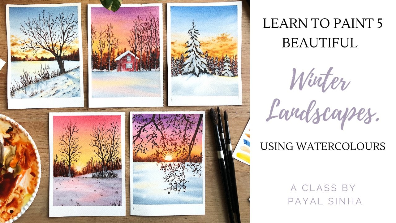
1. Welcome to my Class :)): There's a sunrise and sunset every single day, and they're absolutely free. Don't miss so many of them. Rightly said by Jo Walton, I am a sunset enthusiast as well. If I could, I would leave everything behind what sunsets every single day. But I also understand with everything that we have to do and we need to do. It's not always possible. But I have something really fun planned for you in this class. Yes, you've guessed it right? We are going to be painting sunsets. Hello everyone. My name is spirals and Hung. I'm an artist and instructor and Skillshare teacher based out of Boston, originally from India. And welcome to my second Skillshare class. In this Skillshare class, we are going to be painting three glowing and beautiful sunsets. The medium of choice for today's class is watercolors. Going on a beautiful journey to explore the world of watercolors in detail. If you're a beginner at this medium, don't worry, I'm going to be covering each and everything in detail so that you can start your watercolor journey right away. I will be talking about the right kind of art supplies that is not only going to bring you better results, but it will definitely make you fall in love with painting with watercolors. We will be discussing about our color palette in detail, along with some really useful information about watercolors, will also learn some really important watercolor techniques that will help you in your own paintings as well. You'll also learn how to apply these watercolor techniques to paint clouds and background details. I will also be explaining some really fun elements that we'll be using and are being tanks. And after gathering all of those information, will move on to painting three beautifully glowing sunsets. I would highly encourage you to paint along with me so that it's easier for you to understand the techniques that I'm using. And then you can use them in your independent paintings as well. But if that's not possible, don't worry, Take your time with the class and without delaying any further, let's get started.
2. Art Supplies: Let us talk about the supplies that we need for this class. You do not need to use the exact brands that I'm using, but you can use anything that is easily available with you. Let us talk about the paper first. I'm using the arches 100 percent cotton paper of 300 GSM for best results with watercolors, I would always suggest to have a 300 GSM, 100 percent cotton paper. A 100 percent cotton paper, especially the cold pressed ones, help you are able to remain wet for a longer period of time, especially when you are going to be working with wet on wet techniques. And that is exactly what we're doing. So that is why it is advisable to have a 100 percent cotton paper. As you can see, the paper has a beautiful texture. And because of that tooth of the paper, that is the texture, the water is on the paper for a longer period of time. And that is why we are able to work with the wet-on-wet technique a lot better. Let us talk about the paints. So I'm going to be using watercolors from two brands, that is white knight and shaming care. In the next lesson, I will be discussing about all the colors on my palette and also the substitute colors that you can use for your painting. The colors that I use for each painting will be mentioned before the class project as well. For the brushes, I'm using these from the silver black velvet CDs in the size 12, 8, 4. And to be using the size 12 and eight for the background washes and a size 42 for the finer details. And I'm painting. I love using these brushes, especially for my watercolor paintings because of how much water it can hold. And also it comes to a really nice and fine tip. So I really absolutely love these brushes. I also have taken might do inch flat brush. Now this is completely optional. You don't need to have it. I love keeping this brush with me because it ensures that I am able to apply water on a larger surface evenly. So if you don't have it that is completely okay. Make stuff taken up ballot. This is a ceramic mixing palette. It's basically a blade that I like using for my painting purposes. I really like ceramic mixing palette because the water is much easier to mix and it doesn't form droplets like in your plastic palette. So I like having ceramic mixing palette. Then I have two jars of water. As you can see, this is clean, so this is going to be my clean supplier photo. This one's duties of this jar I'll be using for rinsing out my brushes. So make sure you have two jars or glasses or water. Next. I've also kept a clade with me to dry off my brush is whenever I'm painting. I have a tape or masking tape. It is a pencil and a pro circles I'm going to be using the pros are good for making this the structure or the soccer for the sun. But that is completely optional. You can use a cab or a coin, whatever is easily available with you. Next, I've taken this tube of white quash. This is titanium white from the brand and brushstroke. If you don't have white quash, don't worry, you can use white poster colors, white acrylics, or even white watercolors directly from the tube. We just need something or peak for making the sun. Next, make sure that you have some tissues with us. Well, we're going to be using the tissue to lift off paint from the wet paper. I'll show you more on how you can do that in the techniques lesson. Next, we need a surface or a board on which we can tape down on paper. So I've taken this clipboard and this is how I'd be taping down my paper so that it's more and more Bill and I can move it around. So make sure that you have something that you can move around and lift as well. So these are all the supplies that we need it. And let's move on to the next lesson.
3. Colours on my Palette: Let us talk about the colors that we need for this class. I will be showing you the colors that I'm using, but also explaining the substitute colors that you can use if you don't have the exact sheet. I'm going to be using watercolors from two brands, and that is White Nights and Schenker. I'm going to be using the color sepia from White Nights and all the rest of the colors function thinker. So this is my transparent amble. Transparency and transparent orange, quinacridone gold, and the yellow, orange color. So these are all my warm colors. I'm also keeping a blue with me. This is the ultramarine blue. So these are the seven fellows that we need for the class. Let me show you the other colors that you can use if you don't have the sheets that I mentioned before. So you can take yellow, ocher, orange, burnt sienna, burnt umber, and set B. So these are the five colors that you can keep with you. This is from the brand Magellan mission. As he know what colors they come in three different forms. That is transparent watercolors, opaque watercolors, and semi-opaque watercolors. So the colors that I'm using are transparent colors, which means they appear to sit on top of the people and allow a lot of light to pass through them. Whereas if you look at an opaque color, it wouldn't let that happen and that is basically laying quash, right? So these are these warm colors that I'm using are all transparent colors. The pia and the ultramarine blue is a semi-transparent color. And all my other colors from Magellan Mission Gold are semi-transparent colors. So you can see if your color is transparent or opaque or semi-transparent by looking at the Duke or even looking for them on Google. I'm just gonna quickly swatch the colors and show them to you. So first I have this quinacridone gold. So you can see it's a very nice and bright yellow color. It's just beautiful. Yellow makes me happy. Next I have this yellow orange color, which is like the name suggests, a mid color between the yellow and the orange. Next I have this transparency sienna. So when I'm swatching these colors, you can see how the colors are more transparent and you can see the paper below, right below the paint, you can see the paper. So this is what happens when you're using a transparent color. They are all more vibrant and you can see the paper through them. So I've squashed my audience chart, transparent orange and the transparent on book allo. Next I'm swatching the set bear from white knight, so it's a nice dark brown color. And last, I have the ultramarine blue or ultramarine blue is a semi transparent color. It's not transparent, as you can see, it looks a lot different as compared to the other colors. It's a little bit opaque because it's semi-transparent. So these are the colors that I'm using for the class project. Now I'll just quickly show you the substitute colors. So instead of the Quin gold, you can use the yellow ocher color. And for the yellow, orange color, you'd be mixing the yellow ocher and orange to get a mid-tone. So I'll show you how you can make that as well too. Let us just quickly swatch the yellow ocher color. So as you can see, it is a little bit duller as compared to the Quin gold, but it is a nice or the yellow color that you can use for your class project and for the things that we're going to do today. Next, for the yellow, orange color, I have mixed the yellow ocher and the orange color in equal amounts. Now this isn't exactly the shape that I have watched before, but this is the best you can do with the colors that you have around yourself quickly showed you the colors that I'm using that is yellow ocher plus your orange color will give you a nice yellow orange color. Make sure that you're using equal amounts of both. Next, I have the bond sienna color. The orange color. The burnt umber cologne, suited the transparent colors you're just using the normal colors that come with your set. Lay the bond order and bond sienna burnt umber. And here is my sepia. And I've also taken the ultramarine deep from gentle mission for the blue that we need for one of our paintings. So I hope you are able to understand the colors that we're using, the all basic colors. We're not going to be using any other colors outside the things that I've switched. There'll be a different combination whenever we are painting, I will be mentioning about each specific colors before we start with the class projects, let us move on to the techniques.
4. Watercolour Techniques: Let us talk about the watercolor techniques that you need to know for this class. We are going to be talking about wet on wet, plain wash and graded wash first. For wet-in-wet, as the name suggests, you are going to be applying your wet brush that is with water and paint on a wet surface. That is the first word, reliance for your paint brush and the second for your paper. So for wet on wet, we are going to apply our section with water evenly. This technique is widely used by artists when we want to spread, are paid on a larger surface area evenly, especially for landscape paintings. This is a very useful technique that you can use for your projects or future paintings. So as you can see, I've layer this section with water evenly using my size 8 brush. And I'm going to show you what happens when you put your wet paint on a wet surface. So I've taken my brush and I'm loaded it up, put some ultramarine blue. I've added a little bit of water. And as you can see, as soon as I tap on my surface, the paint just automatically spreads. And that is because these are watercolors, right? They're going to follow you or follow something that has water. As you can see, I dab and the colors automatically spread. Now one factor that determines how much you're being spread is the ratio of the water and pigment on your brush. If you, if you have more pigment on your brush, the colors will spread, but not as much as compared to when you have more water and less pigment on your brush. So as you can see, you provided more pigment on my brush. The kalos do spread the ultimately does spread with the water, but not as much as compared to the previous steps that I made. So you can practice this a couple of times to understand the water ratio controlled on your brush. Let's talk about the next technique that is the plain wash. As the name suggests, we want to spread the paint on a particular section evenly, and it should be one single color. We do not want some places to have more pigment. Somebody some places to have less, right? So that is why the wet-on-wet technique is best suited for this method because your pain, so we'll just spread and users have to guide them a little bit. So I have layered this section with water evenly applied an even coat of water. And I'm loading my brush with some ultramarine blue. And I'm just going to cover this entire section with ultramarine blue. And this point I'm not worrying about the deduction will try brush moves. My main focus is to first get pigment in this section. So as you can see some places, it looks like there is more paint in some places it looks like there's less paint rates. Some places are darker than the other, but don't worry about that. First, we need to focus on getting the color evenly spread on the surface. And once we have done that, we wouldn't move up brush in one particular direction, which will ensure that our paint is evenly spread in this part of the section. So once I've layered with the dissection with ultramarine blue, I'm going to move in this left and right direction. I wanted to make sure that I move in this one particular direction in the left and right election and not in anything else. To ensure that the entire cell first and the band is evenly spread and it has no blurriness. So as you can see, once I moved down in the left-hand side section, the entire section looks nice and plane and once it dries is going to look just one plane wash. Let us talk about the next technique, that is the graded wash. In this technique, what we're basically doing is gradually decreasing the intensity of color. So they are going to be having darker tone of ultramarine blue at the top. And we'll have, when we come down will have a lighter tone. So for this method again, I'm using the wet-on-wet technique like I mentioned before, wet on wet technique is really good for blending processes, especially for landscapes. So I've just layered this section with water evenly. As you can see, I'm learning a lot of water, just a little amount that it's nice and wet the surface. And then I'm going to load my brush with some ultramarine blue and tilt my board a little bit so that because of the gravity, the paint will just flow down. So I'm going to move in this left and right direction, the to and fro motion. And I will be applying pigment. And as I come down, I'm not going to do anything else. I'm just going to move in this left and right motion. And as I move down, since the pigment will retain on the paper, and as I move downwards, it's going to decrease, right? The paint consistency or the paint amount on my brush will decrease. And that is why as we come down, the intensity of the color decreases. So as you can see, I have a nice and dark blue color at the top, but as I come down, it has decreased. It's just pale blue color. It's not that vibrant and dark as compared to the top. So you can repeat this a couple of times. Now I'm going on going ahead with a darker blue color. And as you can see as I come down, the intensity will slowly start decreasing. If it is not, what you can do at this point is just rinse your brush a little bit. Does your brush will ensure that you get rid of excess paint that is still there. And you can just drive a little bit and then continue the same motion, again coming downwards in the to and fro motion. So as you can see how there's a nice and beautiful gradually decrease from a darker tone of the ultramarine blue to the lighter tone. The next few techniques then there's the wet on wet blending, lifting and the wet on dry method. Suppose for the wet-on-wet technique, I'm going to show you how to blend two colors together. This is a combination of the graded wash that we learned, but in this case you're going to be blending two colors together. So I have wet the entire section with water that is applied and even coat of fortress of that myself as is nice and wet. And I'm going to go ahead and load my brush with some ultramarine blue. And I'm going to put it on the top. And using my graded wash technique, I'm going to come down. So I'm just going to use a storm for a motion to move downwards. But here I'm going to stop midway because I need to blend the yellow and the blue together. And I'm gonna show you how to blend these two tricky colors. So I have taken lemon yellow, and I'm going to start with a darker tone of yellow at the bottom then as I move in this door and fro motion and then go up, thought I'm going to be blending and decreasing the intensity. The lemon yellow. So as you can see, the Docker lemony yellow is at the bottom and the darker tone of the ultramarine blue is at the top. And leaving that little whitespace in the middle, especially when we are blending yellow and blue together, is important because we don't want to make a green color when you blend the yellow and the blue. So when we have doLogin densities of these colors or darker tones of these colors. The green that we make, it's more evident. And that is why when you're blending some things in the sky, for example, we want a little white band in between so that we have enough space for ourselves to blend it to decrease the intensity or decrease the total value of our beam so that the green that we make is not that evident. Now over here, if you are very close to you Look, I have created green, but it is not visible, it's not an emergent green, it doesn't look extremely green. So that is why that is okay. So you have to be little bit careful when you are blending too tricky colors to get them. Let us talk about the next technique that is the lifting technique. One thing that you have to know is that you can only live the watercolors from your people when daughter colors are still wet. So that is why I have heard myself this with some water. This is just an example to show you how am I, how it's going to lift when the paper is still wet? Right? So I'm going to quickly apply ultimately in blue all over the surface. One thing that you have to look for is if your color is staining or not. So the bean that you're using, you can look for that information on the tube or on Google. If your colors are staining, if you're being to staining, then your paper is going to stay, get stained. And if you lift your paint, you won't be able to reveal the white of the paper. Whereas if it's not staining, when you lift the paint, you'll have a nice white surface that is your paper, right? So once I have the layer of paint laid down on the surface, I'm going to completely dry my brush like completely dry and there shouldn't be any water on it. And when I swipe it against the surface, you can see how the paint is loaded on my brush and it just gets lifted and the white of the paper has revealed. So ultramarine blue is not staining. That is why I can see the white of my paper. So this is how you can lift paint using your brush. Make sure that each time that you're lifting paint, you're also wiping your brush completely because we do not want any bean to be on the brush when you're lifting it the second way. Next other method that you can lift is using your tissue. So when I take a tissue and just dab it against the surface, since my tissue is dry, the water is going to get absorbed in the surface. And that is how I will be able to reveal the white of my paper. So you can use two methods to lift bend, that is your tissues or your brush. Let us talk about the last technique and that is the wet on dry method. So just like the wet on wet here, my brush is wet with water and the big win and myself, this is dry. So as you can see here, what I've done, I have just loaded my brush with some pigment or paint. And I'm just directly applying it on this section. And the section does not have any water, so that is the dry surface. And over you as you can see, as soon as I applied the color, the paint just doesn't automatically spread around. It is a lot more dry, right? But if I were to apply another color in this section, after laying this first layer of color, it would become wet on wet, like because my first layer is still wet. So this is the first wet on dry method. The next way of doing the wet on dry method is when you are adding details to your paintings. So my first layer has completely dry. Now one, since it's dry, it's again wet on dry ice. As you can see, I've loaded my brush with some ultramarine blue and I'm just making some tree branches and adding some details. So this is again the wet on dry method. Since my paper is dry and my paint is wet. If you're still in beginner at this medium, don't vary. You can practice these techniques a couple of times. They are going to help you in your own paintings as well, and you will get a better hang of watercolors with these. So here are the six techniques that I've taught you that is done by Don wet, graded wash, plane wash, wet on wet blending, lifting and the wet-on-dry method. In the next lesson, I'm going to show you how we can use these techniques in our paintings.
5. Exercise: Application of Watercolour Techniques: Let us now learn how we can use the techniques that we learned in the previous lesson for making the clouds in the background details. This is going to be a fun little exercise before we move on to a class projects. So I've taken the color quinacridone, gold, transparent orange, transparent sienna, and transparent amber on my palette. And the technique that we're going to be using for creating the Cloud is a combination of the wet-on-wet techniques, that is the graded wash and also the tapping wet on wet technique that I taught you. So I'm going to quickly note my brush with some water and evenly spread it on the section that I have sketched. So this is a small little rectangle. So I'm going to apply water on the entire surface, make sure that I get the corners as well. So make sure that you have an even layer of photo on your paper. Next, taking their size 8 brush, I'm going to start off by laying the lightest tone off my quinacridone gold at the bottom. I will be gradually moving on plants to the transparent audit. So there's a going there's going to be a smooth transition from our yellow color to the orange color for the background. Now, I start off with the lightest tone of the color, which means I have more water than pigment in my mixing palette. Then I have to start off with the lightest tone of the color because it's a lot more easier and it gives me a better idea of how I want my colors to be and how I want to blend things. So I'm just going to apply this layer. This is similar to our graded wash. So I'm just going to go into left and right motion and try and blend the two colors together. Once I'm done with the lightest tone of the color, I'm going to go ahead and add the darker tones. So I've loaded my brush with some more pigment in the same mix that I created. And then I'm going to go in this left and right motion and I'm going to blend the quinacridone gold with the transparent orange. So you can just move left and right, move upwards or downwards and just blend the two colors together. You can also go from left to right or right to left, you know, midway and stop like I'm doing here. And this way you'll be able to just create these very light cloud effect. So this is not how the clouds actually look. This is just me blending the colors for a smooth transition from the yellow to the orange. Once I'm done laying the background colors, I'm going to go ahead and take the burnt sienna color first. So I'm going to start off with a darker color for my sky. So this is the bronchi and n columns. I'm going to be laying the first layer of my clouds are this color. As you can see here, I have lesser water ratio as compared to the previous mix on the right side, which means I have more pigment and less water. So remember how I showed you in the Technion class that if you tap that more pigment and less water, you will be able to retain the shape as well as the paint will slightly blend into the background. That is exactly what we want. I'm going to go ahead and tap from left and right. So now this is a very random tapping technique. There is no particular order in which I'm doing it. Just the, just the one thing that I need to keep in mind is that I am going from left to right and right to left. And I'm also varying the size of my tab. So I'm not just creating one single, single style of tabs. I'm going to make some smaller ones, some bigger ones. Another thing that I will do here now is that when I come to the yellow part of my sky, I want to apply the transparent orange clouds rather than the transport transparency and our clouds. All right, because near the sun, let's say the sun shines and the clouds are much more lighter in color. And that is why I've chosen the orange color for the clouds near the sun, right? So this is just an assumption since this guy is lighter at the bottom, I've gone ahead and taken the orange color. So whenever you are going to be tapping clouds, remember that you're not adding a lot of water to your mixture and pick up more pigment. This time, this way the colors won't completely spread into the background. Once we're done with the first layer of the clouds, I'm going to go ahead and add the darker colors to my clouds. This just makes it look much more realistic and adds a lot of shadows to my clouds as well. So our clouds and not just one color, right, they have a lot of shadows in them. So again, I've taken my transparent amber color. And right at the location where I have laid my clouds at the bottom, I'm going to just stamp my brush. And again, it will blend with the background because now the paper is wet. So that is why the wet-on-wet technique plays an important role here. So I'm able to blend the colors and it doesn't look odd. Now, if you think that your paper is drying really quickly, do not be in a hurry. What you can do is wait for your paper to completely dry and just wet the paper again and start tapping the shadows to your clouds. But do not take your wet brush and apply it on the partially dry paper. It's going to create a cauliflower effect and we do not want that. So we have to be patient or you can just work slightly faster or get an artist grade paper. Because artist grade paper stay wet for a longer period of time. So as you can see, this was a very simple way and method of creating the clouds. You're just going to tap and you're just going to vary from two colors. So for the orange background, the colors for the clouds that we picked was transparent sienna and transparent umbrella. While we come towards the yellow part of the sky, we have transparent orange and the transparency and, um, so as you can see here, we use two methods. That is the wet on wet, the tapping method for creating the clouds, and the graded wash for creating the background. Now you can practice this a couple of times to get used to how to paint clouds. This will just help you get a hang of how much water and how much pigment you need for painting the clouds. Let us now talk about how to add the background ETS. I'm going to quickly show you what I mean by that. As you can see in my paintings, I have a background and a foreground, right? So my background is all with the wet on wet technique. And I want to show you how you can get the wet on wet technique could write for creating these background washes are these blood effects. So you must have seen the pictures that are taken in which one part or the mean element is in focus and the others are blurred out. So for that, I'm going to show you how you can do that. So first, I have taken what Done and I'm going to apply it on my section that I've sketched. Now, this is where the wet on wet plays an important role. We need to get our wet-on-wet technique, right? So I've started with quinacridone gold at the bottom. After wetting myself is entirely and I'm going to use the graded wash method and move upward. And I will be gradually moving to the color transparent Sienna at the top. So I will be bringing transparency. And now at the tops of this is the wet on wet blending that we did. So this is bad technique exactly. You just have to follow the same method and keep blending the two colors together. Here, both the colors are warm so we're not going to be having any DR. of the colors in between. So you can do you don't have to worry about that. You can just go left and right and blend the yellow and the transparency and on together. So quickly just stop on a few clouds, it doesn't have to look perfect. Then I'm going to switch to my size four brush and I'm going to pick up some paint. Here. I'm using the colors set beer, and as you can see, I've just added a little bit of water and I'm just going to mix it carefully and I'm not adding a lot of pain, a lot of water, but there's a lot of pain, so it's nice and thick and I'm going to make a mountain. So I'm making a basic shape of a mountain. As you can see, the paper is still wet, right? But my paint is able to retain the shape like the shape that I've created. It's able to retain that. But at the same time, the pigments are blending with the water. And this creates a nice and beautiful blurred out effect, right? But we have to master or learn how much of paint or pigment we need, right? We do not need to add a lot of water. If you add a lot of water, the beans will just disperse into the wet surface and we do not want that. We want it to slightly disperse into the wet surface. So you can just practice this a little bit. Practice this with different consistencies actually. And when you do it on your own, you'll be able to understand, you know, how much paint or how much water is needed. Next, I'm going to show you how to create these branches right now. Um, I will be explaining the shape of the branches in the next lesson. So this is just a random branch. Here. What I'm trying to show you is how in the wet, on wet surface, like the mountains, you can create different shapes as well by adding more pigment so you're able to retain the shape, but at the same time, it is slightly blending with the water on the paper. So you can see that these are branches, right? But they have not completely blended with these water on my background or my background wash. It's there. You can see the shape but it has blurred out. So once it dries actually you'd be able to see it a lot better that how it has blurred out and tone a little bit lighter. So just see how I have more pigment than what DO on my palette. So, yeah, do this couple of times. This will definitely give you an idea about how everything looks. So you can see the paint, the paper has dried. You can see how the mountains and the branches look like they are in the background. So this was all wet on wet technique. And for all the details in our foreground or in a building that we'll do in the class project, we'll be using the wet on dry method. So when I lift my paint with the same set their color, and I'm just going to create some more branches. Once it dries, you can see the difference how it looks like the blurred branches out in the background. They are not in focus. And the branches that are with the wet on dry method are in-focus and that is where you're able to see it more clearly as compared to the branches in the background and the mountains in the background. So this is how we are going to be playing without beans to create beautiful blurred out effects. You're going to have some things and focus some things blurred out. And these are the two things that we needed to know. Next, we'll learn about the elements. And we'll be good to go for our class projects.
6. Elements : Branches, Leaves & Wildflowers: Let us talk about each of the elements that we need for our foreground. So we have these blurred out or the background trees. And then we have these branches and some of the leaves and these wild flowers and the leaves of the wild flowers as well. So I will be explaining each of these elements one by one. And I'll walk you through how you can make them lighter and then glowing and how you can do all of those things. So for the first one that I'm going to show you is the background tree. So this tree is very simple. It's just one straight line and then I have a few of the branches coming out from the sides, right. So I'm just going to show you what you have to do and how you're going to make the shape. So first in this tree we have one street branch or like the trunk, right? So this is what typically a put. Next, I'm going to take these little branches out from the sides. One thing to keep in mind when you are making these branches is that we want our branch to be in the same upward direction. I'll show you exactly what I'm talking about. Now. You see I'm going to make one straight trunk. So this is my main trunk, right? And so this is the main trunk or the main branch. Okay. And then we have the sub branches. So they're coming out connected to the main branch. So one main branch is going to have so many other smaller branches, right? So we want to make sure that we are going in the upward direction and we are not coming in the opposite direction that the main branch is from. Of course, you can make these branches at an angle. It doesn't have to be exactly straight, but we want to make sure that it's moving upwards. So if you have a branch that is at an angle, It's coming from left to right, so it's moving towards the right side. We want to make the sub-branches moving towards the right side as well. They can be at an angle again, but we want to make sure that they're facing in the same direction. So I've taken my size four brush and I'm just going to show you how you can paint these. So first, I want to make sure that I have a nice grip on my brush. I want my brush to be held tightly and I want to hold it at this 90 degree angle. And then I'm going to apply some pressure on my brush. And as I apply the pressure, the more pressure I apply that thicker the line is going to be. And I can decrease the pressure by slightly lifting off the brush when you're moving or making your stroke. So as you can see with the same brush, that is my size four brush, I am able to create beautiful thick and thin lines at the same time. And that is why it is important for us to have a brush that can come to a fine tip so that you don't have to keep changing your brushes for the different strokes. And a lot of your work is done with the same brush as well. So at the bottom, you can vary the thickness of your brand depending on how close or far the subject is for you or the DRI is for you. So as you can see how I'm showing you that when you're making the branches, you want to make sure that they are going in the same direction or at an angle but not completely opposite to the detection in which we are flowing. Next, I want to show you how you can vary the colors in your trees depending on where the sun is shining. So as you can see, I started with the sepia color and I want, I'm just imagining that the sun is right next to where I'm going to lay down the orange. And that is why because of the glare of the sun, the plant appears to be orange in color. So as you can see when I laid down the orange on top of the set bell or next to the setback since the paint was still wet, they seamlessly blended into each other. All I had to do was just give it an addiction to blend it a little bit better. And this is one of the simplest way in which you can then two colors together when they are wet. Now let us learn about how to make these branches and the leaves. So this process of making the branches and the leaves is very easy. It's not at all complicated as it looks. So the first thing that you're going to do, I've taken my size four brush and I'm going to load it up with some set them, right? And what I need to do is bring one straight line down. So this is because the branches are coming from the top now they can be coming from any direction depending on how you want to paint them. Right? But the process is fairly going to remains same, like it's going to be very similar, right? Especially for the outermost branches that you see on your trees, right? Not the main tree trunk and the main thicker branches. This is the tiny or smaller branches that have a lot of dynein, dynein branches on it. So I've taken one main stem or branch down and then I've added these tiny branches to the sides, wearing them on both sides. And next thing for the leaves that I'm going to do a step, right? The processes just tap different dots of different sizes and different shapes as well. Make sure when you're tapping that, you hold your brush exactly 90 degree to the paper. Gives you a nice grip on your brushes well, and your ability to tap faster and more Better dot. This is how I feel, whether you can do it, how is whatever is more better for you? So what I do generally is make the branches and then I'm going to make one straight branch. I've linked the sub-branches and then just fill it up with the leaves, right? So I just tap on some leaves on the side just to. So now, when you look at a tree like that, lineages give you an example. When you look at a tree played, it's from fall, you're not able to see the exact tiniest branch or the tiniest stem at which the leaves are on. But you are able to see the leaves because they are bigger. So this is exactly what we're doing. We're showing some of the stems are the branches that we can see, but the rest of it is just connected by little dots there just next to each others are just gives you a more full view when you're looking at it from a distance. So you can vary the sizes again. You can make them bigger. Dots can be bigger, this dense can be thicker depending on if they are closer to you. And you can also make it smaller like I'm doing here. So this, the smaller ones are more for the ones that a lot in the distance from the observer. So you can always vary with the size and the shapes. The only thing that you need to focus on is the direction in which you make your branch. So the process is very similar to the branch that we did above. And you have to move in the same direction that does it. And then just learn how to tap these little dots that imperfect, so that's the perfect. As you can see, I've used the same type or the style of making the branches for the second class project. And this one is at an angle, is coming from the right signs and they are spreading in the same way. But these are more at an angle. The first one that I showed you was coming from the top. So it was hanging from the top coming downwards. So the process is fairly going to remain the same. You can really with the different angle, different sides on which you want to make the branches. But yeah, the step is just similar. So you can see the two comparison between the two. How in this one, the first one that I showed you is from the top and the second one that I showed you is from the right side. Let us now learn how to make the wild flowers and the beautiful leaves. Don't be intimidated by seeing the spin things right away because I will be covering each and every step in the class project. And it'll be more clear than just focus on getting the shapes of our elements right here. Okay, so I'm going to take my size four brush and I'm going to load it up with some sepia and make those beautiful curved line. Now we want to show that these wild flowers are dancing with the winds, having fun. So it doesn't have to be exactly street, right? You want to give them a slight curve next to tap the flower head. So this will just stand for the head. I'm just going to make these little dots right next to each other like we did for the leaves. One thing to keep in mind here is that when leaves are going to be Connecticut, they look like a cone. So I'll do that strokes, dot-dot strokes to make the wild flowers. Now, just like the branches, I'm going to remove other stems from the side and make more conical wild flowers. So you want to make maybe three or four flowers on the scene stem. Then at the bottom you can move ahead and make the leaves. The process of making these leaves that actually so fun because it's just, it's, it's magical because of the strokes that you can make with one brush. So as you can see, the brushes exactly 90 degree to the paper and I have a nice firm grip. Now heal the play is of how much pressure you apply on your brush. So I start off with very little pressure and then I increase the pressure. And as I move towards the top of my leaf, I'm going to decrease the pressure and lifted off. So as you can see, I have one section that is completely thin and then it moves, tickle and then it comes out to be really thin. Now you can bend them, bend these leaves in different directions as you can see, thin, thick, and then when I lift it off, it's ten, right? So you can practice these leaves in different directions. It's really fun, extremely fun. One of my favorite things to do is make these leaves. You must have noticed that some leaves go one way and then bend in other, none other direction. So that is exactly what I've done is I've gone thin, take and then bend it in another direction and may take again and then lifted my brush. So you can practice the stroke with different shapes, different sizes, different directions. It's really fun. So let's quickly make one Wildflower for practice again. So I've made one curve, curving towards the left side, and then I'm going to just make stems and then tap these dots for making the Wildflower. So like I told you before, it's going to be a nice conical shape. So make sure that you are making it in a conical shape. Doesn't have to be exactly conical. But yeah, when you put them in one particular shape, you might see that they are in this conical shape. Next, I'm just tapping my burnt sienna color or the transparency and uncles on top to just show you that just like the tree trunk that we did. And we wanted to show how the sun shines and what it looks like when the sun is blowing at it. That is exactly why I did that. And next, I'm going to just add some leaves. And this is the basic and fun process of adding your white flowers. So we're done with all the four elements that we need, that as the tree, the branches, the leaves, and the wild flowers. So we're done with all of that. And now we're just going to quickly dive into the first-class project.
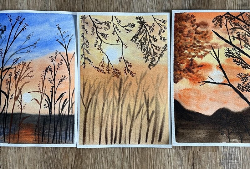
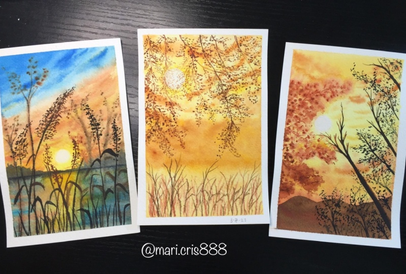
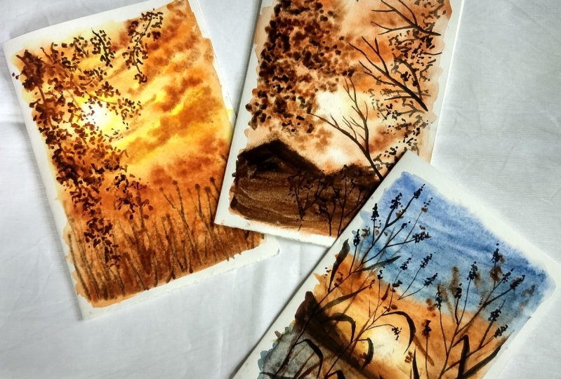
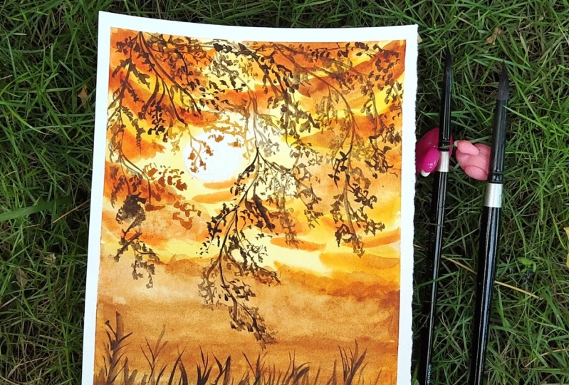
7. Glowing Sunset 1 : Painting the Background: Let us start with our first class project. So I've taken my paper and taped it down on this clipboard using my masking tape. I've taken all the supplies that we discussed in materials required part of the class. So I've taken my brushes, my paint, my ceramic palette, two jars of water, one for cleaning my brush and one for the clean supply of water. And I've also kept the clot with me to dry off my brushes. So the first painting that we're doing is off this beautiful glowing sunset, which has the trees, the clouds, and the sun in the background. So that's all going to be wet on wet. And the branches that are hanging from the top that all the wet on dry method. So I'll explain all of that. So as you can see around the sun, the branches that are around the sun, they're more orange as compared to the leaves and the branches that are always. So we'll learn how to paint exactly that. Do keep a tube of white gouache with you because we are going to be using the white quash to make the sun. So do have the white quash with you. So yeah. And also don't forget to have a tissue with you with which we will be lifting off the paint from their son. So using my process occurs first, I'm going to draw the circuit. So if you don't have a pro circle, you can use a coin or a cap, whatever is available with you. So we're just going to quickly make a circle so you can take a look at the reference picture. And then CUA I'm going to place the center of police did quite at the top half of my paper. And I'm going to just ease it slightly because we don't want it to be really dark. And on my palette, I've taken the yellow, orange color, the quinacridone, gold, the orange color, transparent orange transparency and transparent amber and set Piazza, I've taken these colors that we discussed in the materials part of the class. And also I have this little played in which I'll be boring out the white quash sun. Here's another swatch card of the colors that I'm using. You can obviously use the substitute for these colors. So you can just go for your normal cadmium orange. You're burnt sienna, burnt umber, and near sedia colors. And instead of the Quin gold, you can use Indian yellow, or you can use your yellow ocher as well. So I've taken my flat brush, loaded it up with some water and I'm going to evenly applied on my paper. So just make sure that you're covering all the areas and there's no bottle of water and it's all even. And using my size 8 brush, I'm going to start off by the lightest color that is the Quin gold. And I'm going to go around with this color, and I'm going to go around the sun. So when you look at the sky where the sun is, the sky is a lot more vibrant, especially during sunsets, right? So that is the idea. So I'm going to go ahead with the Quin, gold color and I'm going to apply it basically all around the sun and also on the other areas as well. So I'm just going to cover probably my top half or like three-fourths of my people in this color. And I've just quickly just applied that in an even wash. So remember the technique lessons that we did. So this is just a plain wash for now. So just go left and right using a left and right strokes, you're just going to color your people with the Quin gold. I've added a little bit more pigment to my mix that I was using earlier and I'm going to go ahead and create these clouds. So like we learned in the how to create the clouds part of this class, like I showed you, you load your brush with some paint and tap it on your wet paper. So this is basically like a wet-on-wet technique that we're doing. And you just dab it on the paper. You create these little strokes. You tap, sometimes you swipe some dimes and you get these little different shapes. So using that method, you're just going to create these clouds and then plus to add a little bit darker color to the Cloud. So I'm going to be building up my clouds and few different colors. So I'll start off with the yellow, the Quin gold, and I've moved to yellow, orange color. I'd be moving again to the orange color. So I'm just building up my clouds that way. So I've taken my yellow, orange color and I'm going to do this follow the same method, which is the wet-on-wet clouds methods. So just swiping, you can do it however you like the clouds don't exactly have to look the way that I am. You're just going to be moving from the left and right side, swiping, tapping and creating these clouds. Now, if you don't have the yellow orange color, you can just add a little bit of orange to your existing yellow color that you're using. So you get this color, which is in-between the main orange and the yellow color. So this is the yellow orange color. And I'm just stating the orange color and spreading it all the way to the bottom. And that is, that is it. You are going to be building up clouds. Like I mentioned, we are going to be building up the clouds. So once I'm done with this, I'm going to go ahead and take my transparent orange color. You can use your cadmium orange as well. And I've added water and I've loaded the paint and I'm going to go ahead and add the same color on my clouds that are already there on my paper. So I'm just going to go in that left and right Motion tab swipe, create these little strokes. And that is eventually going to look like clouds because you're using the wet on wet method for the cleft. For the ADA right below the sun, I'm going to have like a nice gradient wash from orange or the darker dawn of sienna color. And I'm going to bring it down to the bottom of my BIBO where the trees are. So as our reference picture, that's the idea of our painting. There's no particular way in which I'm creating the shapes. I'm just going to make like a wave or lake, mountain upward zigzag motion. And I'm just going to make a nice clean wash with my transparent orange color. So you can use your cadmium orange, like I mentioned, you can use the orange color that you have and just create this one nice plane watch. So while this is still there, I created this wash that might be stays wet for a longer period of time. And I'm quickly going to go ahead and lift off the paint around the sun so I have completely dried off my brush on the clot. So this way your brush is completely free of water and it has the freedom to pick up the paint. That is, that it's going to get in contact with. So that is why we are going to completely clean out our brush. It shouldn't have any water. And this way you'll be able to lift off your bean from the paper. Now, I'm going to go ahead and mix some burnt sienna color or my transparency and eye color. And I'm going to go ahead and put this right where I created that transparent orange wash. So I'm just going to make this random stroke just dab it on the paper since my paper is still wet, it will just nicely blend out and I don't have to worry about giving it a nice and even blend. And I'm just going to bring it all the way down to the bottom. Now one thing to keep in mind when you're working on this background is at all times the people should remain wet. If you think that your paper is drying out, you can always wait for the paper to completely dry. You can use a blow dryer and dry completely and then loaded and give it a nice wash with water before you go ahead and add wet paint. So just don't add water on your partially wet beans because it will not dry out properly and we'll create the cauliflower effect. So we don't want that. At the bottom. I've mixed a bit of sepia and just, you know, with the left and right motion I've added at the bottom. And now using the bonds sienna color, my transparent sienna color, I'm going to add my darker tones to the Cloud. So right where I laid out my orange color, right at the bottom of that cloud. I'm going to go ahead and add the sienna color. Now again, like I mentioned, my B but is still wet so I'm able to do it. If my people was dried out, I would not do the step. I would not add my wet paint on a partially dry paper. Rather, I will wait for my baby to completely dry and then I would re wet the paper carefully and then add the clouds and go, go ahead with the wash. So that is one thing that you have to completely keep in mind before you add any wet paint on your paper. So since this entire process that we're doing isn't wet on wet by using the wet-on-wet technique. So we have to make sure that your paper is completely wet. Since my father was still a wet noodle around albedo is still wet and the BBA had somewhat the continents myopain started moving into the Sun from the ER, from the bean that I lifted off. But don't worry if that happens to you, you can always fix this. This is just because you'll be able to still wet and the beans starts seeping in through those little water droplets. So you can just decode the shoe and just lift it off. When you lift it off with a tissue. That's when the water content is completely absorbed in your tissue and the beans will not keep falling in our seep in through the little top of your paper. So if you think that's happening to you, don't worry, you can just decode issue and abit of all use your brush to lift up the paint as well. That's completely your choice. Now, I'm using my secular color and I'm going to start making these trees. So the shapes of these trees are very basic like we learned in the elements section of the class. So at that time I showed you how to make these little branches. So you can just use that stroke. They are very random. You can just give them variations. Make some tall ones, mix them small ones, make these little random branches and you're just going to do it all over at the bottom. Now, like I mentioned, you have to make sure that your paper is still wet. And if it's not, wait for it to completely dry, then add a bit of water, and then go ahead and do this process. One would think that you have to keep in mind when you're doing this, is that do not add a lot of water to your paint. Okay? Especially when you're adding details on your beating, you want to make sure that your paint has moved pigment than water. So like we generally do for the rest of the background washes, we had nice and loose watercolors, but at this time you want to make sure that they were the colors a little bit thicker, inconsistency. They have more pigment than water, and this way they are bead will not completely spread because you know there's no water but rather pigment on your brush. So this way you'll be able to retain the shape of the object that you're putting in. But at the same time, since the paper is still wet, some of the paint will slightly spread out, so that's the best possible thing that you can do. So just keep that in mind. If you are not able to do this, you can always learn about a little bit of the water control. And yeah, so that is it about the part where you create the trees now of quickly loaded some white titanium guage on my little plate. And using my size four brush, I'm going to add a little bit of water like very, very teeny tiny bit of water. I'm going to make them nice and thick, creamy consistency of my band. And I'm going to go ahead and use the Spain to go around the circle that we sketched in the beginning. I'm just going to fill it with the white quash. So that's the whole part now is remember, when we lifted off the papal, lifted off the beam, we lifted it around the circle as well. It was not just the part of the circle, but around that as well, just to give it a nice glowing effect. So, yeah, that is it. Once you add the sun, your background part is completely done.
8. Glowing Sunset 1 : Adding Branches & Leaves: Let us move on and being the focus on part of the thing. So we're going to be painting these beautiful branches and leaves which are glowing through the Sun, right? So if you see closely you see a color change the branches and leaves that are away from the sun. There are a lot darker as compared to the branches and leaves that are just right above or very close to the sun. So because the sun is, you know, as the sunlight is falling directly on it and it's really vibrant and glowing through it. That is why you will see it as a more orange color as compared to the ones that are away from it. So we are going to be using a combination of your burnt umber. They are transparent, amber, transparent sienna, and orange. So I'm going to start off with the transparent on Buchla. And just like the branches and leaves that we learned in the elements part of the class, we're going to be making exactly that. So this is at an angle, so I'm just going to make one curve on one main branch downwards and I'm using my size two brush for this. Make sure that you have a good grip on your brush and you're holding your brush 90 degree to the paper, right? And then I'm going to have the sub branches coming from the main brand. So left and right I'm going to have the sub branches and simultaneously I will be adding the leaves as well. Now the process of making this very repetitive and quite long as well. So this is where most of your patients is taken. And the whole process is to just make little branches connected to each other and add the leaves. And the other focus of this part is going to be about blending the orange and the sienna color together for the glowing branches and leaves around the sun. So let us go ahead and make the ones that are actually away from the sun. And then we'll slowly move on to the center part, which will have more orange and the CMY color. As I come closer to the sun, I'm using a mixture of the orange and the sienna. I'm just using the same method of making designs, the little branches from the main branch. I'm going to be making the leaves as well. So the process is same with just having a little color shift and that is it just going to follow the process, makes sure that these areas that are around the sun, and that is why they're orange. They appear to be more lighter as compared to the ones that is away from the mean Sun. And that does it. This is the whole process. So have fun and enjoy this process if you want a better idea of how to lead the leaves and the branches, you can have a look at the reference picture yourself, and that will help you understand this a little bit better. If you think that your bond amber color is a little lighter as you're expecting, you can add a little bit of set pair to it as well and to become mechanized dark brown color. So as you can see here, as soon as I come closer to the sun, identically shift my colors to the more orange and the CNR gallows. And here you can also do one thing, like I said, when your paint is still wet, right? You can blend your darker browns to the lighter browns. And that is how you can create a smooth blend and a smooth transition for one stem as well. You can practice these strokes of whiskey a couple of times to get your hands on them. And London better. Visit, this whole process is very damp, so I'm just gonna keep quiet now I let you enjoy the process. So now that we've laid down the bottom of the branches and the leaves that are closer to the sun. We are going to build the right side of the cut-off section, as you can see. And this time you don't have to do any color shift. You can just use your one single color and you can make these branches. You can also weigh them instead of bringing them straight, vertically, downwards, you can give them an angle, make them sway and downs however you like. You can also deviate from the reference picture as well. That is completely up to you. And yeah, so this, again, the process is recitative. We are going to be adding the branches are going to be varying the size of your branches and the leaves. And just tap on the leaves, and that is it. So I will keep quiet again and I will let you enjoy the process of making the guardianship and beliefs. Once you have done and you're satisfied with how it looks, you can see if you need to add any more touch ups anymore and extra leaves or branches. You can see between the defense and the main thing that I did. They don't forget exactly similar. They're not exactly the same copy of the reference picture, but yes, I have taken inspiration from that. So the choice is always yours if you want it to look exactly the same or you want to change a few things that it's just up to you, right? So we're just going to quickly build the tape off. Be a little careful because we wouldn't want to pick in any extra fiber, paper fibers to row in our paintings. So be a little careful. We got really beautiful clean edges and I'm really happy about that. So here's a closer look of our bathing. I loved the growing branches and the leaves. And just the whole idea of the branches hanging from the top of the painting just looks so beautiful. And I'm really happy with this. So, yeah. Now let us move on to our second class project.
9. Glowing Sunset 2 : Painting the Background: Let us start painting with the second would last projects off quickly taped on my paper, on all four sides on my clipboard. I've taken all my supplies. That is the beans, brushes, mixing palette, all of that. And the colors that I'm going to use is quinacridone, gold, transparent orange, transparent sienna, transparent amber and set PEA. So we're going to be using all the same colors from the previous project. We're just not using the yellow, orange color. So here are the swatches. We're going to be using the Quin gold, transparent, orange transparency and are transparent amber and set there. You can always use substitute of the colors that you have. Like I explained in the color palette lesson, you're going to be using the similar tones of colors that we have. Next, we're going to be painting this beautiful glowing sunset. As you can see in the background. We have clouds, we have these little mountains or maybe a building with trees around it. And we have a glowing tree branches and some leaves in the background. And of course the Son. And in the foreground we have beautiful branches. A little bit of details and a few little tiny branches. So it's very simple, it's really beautiful. So as you can see, we have to be careful around the branches that are closer to the sun when we're painting the foreground. So I'm going to start off and make the sun first two somewhere around the center of my paper. I'm going to make the sun, depending on how the reference picture is, right? And then I'm going to erase the MOD so that it's not too dark on a painting. Then I'm using my two inch flat brush and I'm applying water evenly on my surface to start off with the wet-on-wet technique. So I wouldn't be starting with the colors quinacridone, gold. Right? So just like we did, the plain wash or the graded wash, they're going to be doing that using the left and right strokes. I'm going to be applying the quinacridone gold. Next I'm going to shift my colors and put the transparent orange. So the center part of my painting where the sun is, is going to have the quinacridone gold. And the top and the bottom is going to have the orange color. Now, like I mentioned before, I start off with the lightest tone of the color first. So now that I have an idea of how the colors are going to be laid down. I'm going to start adding the darker tones of the colors, which means more pigment and less water. Now of course, you're not going to completely miss own war dozens as watercolors. But we're just going to be adding more pigment than usual in a mixture. And you're just going to blend the orange and the yellow together nicely and seamlessly. Like we learned that the wet-on-wet blending part of the class. Once we're done with the blending, I'm going to start adding the Cloud. So for the Cloud, using the color transparent sienna and willing to load my brush with some paint. Now make sure if you look at the mixing palette of mind is more pigment in the mixture, then that is what DO. So that is exactly what you have to do. Do not add a lot of water, otherwise, it will just spread out more quickly. And for the Cloud we want them to have a nice shape, right? So just add a little bit of water and more pigment. And I'm just going to tap it on the paper and let the wet on wet technique do its magic. I'm not following any protocol or looking at the reference picture. I'm just going with what comes into my mind and I'm just playing around. Now the next thing that I'm going to do, and you should also see and know about this, is when I'm making the clouds near the sun, I'm going to go ahead and meet, make it in the transparent orange color. And that is because around the sun, the light is completely glowing through those clouds or it's falling directly on them. And that is why the colors are a lot lighter as compared to the other clouds which are on the top and the bottom part of my painting. So around the sun makes sure that you are going ahead with your transparent orange color. Now when we add the darker tones of the colors to our clouds. So for the top and bottom clouds, I will be adding my transparent umbo. So as you can see, my paper is still wet here. I have a lot of walking times and I'm going in different layers quickly. And for the orange clouds, I will be applying the transparent sienna color. So you're just going to Wadi with the colors that way for the darker clouds, you're going to have one sheet that is more darker then do previous layer. And so if it's orange is going to be transparent sienna. If it's transparent sienna, It's going to be transparent or burnt umber, whatever you're using. Next, I'm going to go ahead with my transparent amber. And I'm going to make this little kind of lake or an object in the background. So maybe it's those are some buildings and some trees. But I'm just going to go ahead and make like a mountain shape. I'm not really, I didn't really think this through as to what the shape was that I was making. I just went and made some wiggly lines and filled it completely to the bottom. So this is going to be my first layer that I apply. Now again, I will be adding the darker tones of it later on. One thing that really helps in working with wet and wet technique is when you're working in layers and you're working quickly. Now if you see, I made this of mountain, okay, for example, I have enough time to go ahead and fix and pain the things on the top and this is going to stay wet for some time, maybe five minutes. Now. I'm going to go ahead and lift up the paint using my dry brush technique and lifting technique. So I'm just going to lift the paint around the sun. You can use the tissue paper as well here, whatever works easier for you. So I'm just going ahead and lifting off the paint carefully as you can see, since these are non staining colors, I'm able to get surely nice and white of the paper is visible red, there is no standardized, just looks like it has been completely lifted and I can see the white of my paper. Now once this is done, I'm going to go ahead and read the branches and the leaves in the background. One thing to notice here is if you see carefully my paper is still wet, right? Which means I have time to work on my other layer. But in case your paper dries, don't worry, just let it completely dry or you can use a hairdryer to dry it as well, and then make a wash of water on it like you normally do when you start your painting carefully in one direction. And then you can go ahead and work on this part of the layer of the background. So that is completely okay In that also your beans will spread in the background. So I'm using a mixture of the transparent sienna and the transparent orange color. And I'm just tapping these dots, right? I'm just tapping dots randomly. And since the paper is still wet, it will nicely just spread on my paper. One other thing to keep in mind is that you're not adding a lot of water to your mixture here. Ok, We do not want our beans to just spread out in the background. We want them to retain its shape while slightly blending with the water. So I've added a lot of pigment or the mixture that I've made has a lot of beamed rather than water. And I'm just going to tap it randomly. You can take the reference from the reference picture to understand how you want to make the branches look. Or you can make it randomly as well. That is completely up to you. This just shows that these branches are coming from this side. And that is the perfect Look. I think we are able to get the shape of our branch is correct. Now, the first layer that I did wasn't mix show of transparent orange in transparency sienna. Next I'm going to add a darker tone of the color. And I'm using just the transparency and color. And I'm tapping it on the strokes are on the dots that I've already made. Right. And since that part of the paint is still wet, it's going to easily just blend in with it. So there's going to be a seamless blend. You don't have to make them blend. They will automatically blend because the paper is still wet. You just have to tap in the darker tones of the colors. Especially for the branches and the leaves and on the Sun, as you can see, they're all in layers. You can see orange, you can see the transparency and alkalotic and see a burnt sienna color. Then it develops to a bond amber color, right? So we'll also have to work in layers. Now my final layer is going to be of the bond amber color. So again, I've loaded my brush with some thick consistency of the bond amber color. Now makes sure that you do not want to make your being really thick, right? There should be water in it, of course. But you're going to be adding more pigment than me and do your mixture. So one thing that, I mean that is one thing that is a little bit important. Do not just load up your brush with direct the pain directly from the tube. You want to add a little bit of water to make it nice and flowy. If it is, if it has water content, that's when it blends with the background. So that thing is a little bit important. You can work with the consistencies and see how you're able to get it in higher-level to do so if you've worked on the exercises and the lessons that I showed you in the starting, you will be able to get that perfectly correct. So you're just going to tap your burnt umber or you're transparent amber color and it will automatically blend with the surroundings. Now for the final layer, I'm going to go ahead and add a few dots of Cepheids. Well, for the darkest part of my branches, which is exactly at the paper like at the edge of the paper. So at that area, I'm just going to add a little bit of sepia color as well. So as you can see, we are getting or shape or you're, you're getting the idea of the sun glowing through the branches, right? If you can see very carefully, you see the audience, you see the CNI, you see the amber, and it just looks really beautiful. I'm just going to go ahead and add a few little touch ups around my branches. If you notice, the sky part of the painting has dried up almost completely dry, but yes, it ties a lot less water than we started with. And I'm just going to make these dots around the branches just to give it a little bit more definite shapes of these branches and leaves in the tree looks follow. And it's okay if you're painting has dried up, the branch potion still has to be wet so bad the pain just seamlessly blend. One thing that I forgot to mention was while your mountain portion was still wet, you're going to go ahead and add a layer of set BR2 it as well. I forgot to mention that part, but yeah, you can just add a layer of sepia and you're good to go. So let us move on to adding the foreground.
10. Glowing Sunset 2 : Adding branches and leaves in Foreground: So let us now be in the foreground of the painting. Now my paper has completely dried and that is when I'll add the formed arm. But so as you can see, we have a few branches without the leaves and a few branches with leaves and the sub-branches as well. So we're not going to exactly copy the shape and everything. We'll just make the few main branches without the leaves that is around the sun. And we'll add our own details like we learned in the exercise class or the element part of the class, right? So I'm using my size four brush and I'm going to start by making my main branch that is around the Sun, okay, through which the sun glows and the light falls. So I'm going to start with the corner or slightly above the right corner. And I'm going to go ahead and make a branch. I'm going to make a straight line. And then I'm going to slowly decrease the pressure that I apply. So like I said, with your brush, you need to work on how you apply the pressure to the more pressure you apply that the choline and you decrease the pressure, you will have thinner lines. Now as I come near the sun, of course I will have to make it lighter, right? It's not going to be of the sepia color. So when instead, you're going to load your brush with a mixture of maybe your CNI and you're on Buchla and you're going to go ahead and just mix it with the set B that has already there. So you can see I start off with the set bear, then I clean my brush, right? And since the setback is still wet, the paint is still wet. I will just slightly move my brush over it. So I'll go over the sepia color a little bit. And then my burnt umber, burnt sienna mix will just nicely blend with it. So just making a few basic branches, this is not at all complicated. You just have to make a nice and thick branch and just blend the colors together since you're going around the sun. You can add a little bit more details by adding some tiny sub-branches as well. But do not add too many because as you can see in the reference picture, it doesn't have a lot of tiny branches on it. It's just one main the branch with maybe two or three sub branches. Next, I'm going to go ahead and make another branch, as we saw in the reference picture. This is another thick branch. So same using my size four brush, I'm going to make a line and then add a few little sub-branches. In this, we're not going to vary the colors since it is not close to the sun. So we can just use one single color that is your set their color and make the branch. Do add a few little tiny sub-branches as well with your thinnest strokes. And then I'm gonna go ahead and add another grant at the top right corner. Do add a little sub-branches, but don't go overboard to get an idea of how you want to make the branches and may you want to place them. You can download the reference picture from the resources part of my class and you'll be able to understand the painting a lot better when you look at the reference picture on your own. Next, I'm going to take my size two brush and we'll be adding these little tiny branches and the bushy leaves as well. So this one is very similar to the elements part of the class that I told you about making those branches and the leaves. So, and it's also very similar to the first project that we did. So in that one we were having these branches coming from the DOB and they were coming downwards. Here it has just entered addiction. So it starts from the bottom right, it moves upwards. And when you come to the right-hand side of the painting, you'll have it moving towards the left side. So you're just going to make one main stem and then add a few little branches and then tap on the leaves. So the process is very repetitive. So in this one, the leaves and the branches are not coming closer to the sun. So we're just going to use one single color for making this part. And you can just use your setback color and make these branches and leaves. You can vary them however you like. Write to look at reference pictures as well to understand it a little better. Make them go in different directions, make them have different sizes of leaves and everything. So this is a really fun process and enjoy it. So yeah, I'm gonna keep quiet now and you can have fun painting these branches and the leaves. Okay. No. Okay. Hello. The branches and the leaves is the end of these branches or leaves again, look and see what you like, but you want to add maybe more where you want to maybe give it as a bit of the details about the branches as well. And once you're completely satisfied with Gilbane thing, you're going to go ahead and gave up when you're building the tape, remember you're peeling away from the paper and you do not want to peel off any fibers or the people along with their tape because that would be just sad. So yeah, be a little careful. And once you're done with that, then when you carefully remove our tape, you'll have these beautiful white edges. And that just is so satisfying. I am so happy with how the painting turned out. You can see that the sun looks a little bit of yellow, but that is exactly what we needed. We did not want it to look completely white and I'm so happy with the way it turned out. Let us move on to a third project.
11. Glowing Sunset 3 : Painting the Background : Let us start with our third and final Skillshare project. So I've taped down my people on all four sides and I've taken all my art supplies. The colors that we're going to use for this class is quin gold, transparent audience transparency, and are transparent on both set beer and ultramarine blue. So ultramarine blue is the extra color that we're going to be using for this project. And the painting that we are going to be making is this beautiful river or lake sites, sunset, right? So we have the league, the mounting the sun, the beautiful sky. Everything in the background with some of the Wildflower was out of focus as well. And some of the wild flowers are in-focus, which means they are going to be the wet on dry method. So do keep Latisha with you as well so that we can lift up the paint around the sun area. Doing it with a tissue is going to be slightly easier. So you can use your tissue, but you can also use your brush if that is convenient for you. So I'm going to layer my paint with water since the entire process is the wet on wet technique. And I'm going to start with the quinacridone gold. Now I'm just assuming my horizon line, I'm not going to draw it, I'm just assuming it. And I'm going to start with the lightest tone of my quinacridone gold, and I'm just going to blend it in the sky. I'll make a straight line for my reference, right? I'm not going all the way with my quinacridone gold because I also want to be blending the orange from the sides. So the quinacridone gold is going to be in the area where the sun is shining. And around that area it's going to be vibrant and yellow. Whereas the other parts of the sky is going to be orange, which is around the sun. So that is why in the center F port the quinacridone gold, and around the quinacridone gold, I've put my transparent audit and I'm just going to blend it out in the rest of the sky part with water. And on the top I'm going to layer the ultramarine blue. Now this is very similar to our graded wash, but the only difference is that we are going at an angle, we are not going in a straight line. And like I said, you remember when I told you about blending yellows and blues, this is similar to that. We want to leave that white band in the middle so that we have space for blending the orange and the get there without creating a muddy color in between. And we want to seamlessly blend these two colors together so that they don't look awkward. So now once I'm done laying the lighter tone of my colors, I'm going to go ahead and increase the concentration of paint in my water, right in my mixin. I'm going to add more paint. And I'm going to go ahead and repeat the process of adding the colors. So from the sides I have my transparent orange and the morula have my quinacridone gold from the top, I'm going to bring down my ultramarine blue and try to blend everything together. You can use it left and right motion. It is nothing much to do here. You're just going to be making sure that you're not going in so-called with your brushes, you're just going in one left and right moment. As you can see, I'm only going left and right. I'm not making any circular motions at the little white border space that I have left. I'm going to bring these tiny strokes of blue down. And I will also be putting up or bringing up the tiny strokes of orange. So I'll make sure that they don't mix with each other, but they are kind of laid next to each other so that we get a nice blend in the sky without making the muddy color. So as you can see, I'm not mixing the blue and the orange together. I'm making tiny strokes. And I'm just praying for the mantissa has to know how to form. But yeah, you're just going to lift slightly with the orange and Lyft going to lift upwards and slightly with the blue are going to be coming down in that whitespace that we had. Next, I'm going to go ahead and add a darker tone of the same orange color. I'm not adding anything else. This is just more concentration of paint and I'm going to tap in some clouds. And they're very random. Instead of coming from left to right straight, they are coming from the left and right but at an angle. So if you can see the other same process but just tapping and forming these clouds with the wet-on-wet technique method. And we're just going to lay down the orange. And at the top I will be linked down the blue, right? And I'm also slightly bringing up, like I told you, I'll be bringing up the orange. So I'm just slightly blending in the orange with the blue in the white band. Yes, I'm going to lay down the blue. Now. Again, it's the same. Blue is just a darker tonal value, which means that it's more paint than water. That is why it assumes to be of a different color, right? So they are going to be adding darker tone of the blue and just try to blend the sky together. Make sure that you are very careful in this white band space that we have. And other than that, the process is just having fun creating the clouds. Once I am done laying the clouds and the structure of McCloud's, you're not going to make it look really perfect, but just fought off clouds. I'm going to go ahead and add some darker tones to my clouds. So using my transparent sienna, I'm going to go over the same orange strokes that I made before. And I'm just going to add some darker colors in the sky. And for the blue, you will not be doing anything different. You will be just adding more concentration of paint and lesser concentration of water so that we get a nice dark blue. And you will just randomly DHAP, but in the sky again. Once I am done blending this guy to get those, as you can see, the white band is now covered with the color orange and the blue. There is no particular. It doesn't look odd, it's nicely blended. And then I'm going to take my tissue and cleared this little circular blob, right? You're going to twist it in a way that you get a nice circle. And using the circuit, I'm just going to lift the paint from my brush. We wanted to be a circle so that we don't have to work hard in lifting off the beam. So if it's a circle, we can easily just tap on and that circular portion, we'll just lift off from the paper. So as you can see, these were non staining colors. So the fight off my beeper is just beautifully visible. Next I'm going to go ahead and add the first layer of the mountain. So the first color is this transparent on Buchla. And I'm just going to make an random mountain Cove. There's no particular direction in which I supposed to do this. You can do it however you like and how by how ever you want to make a mountain. So the first color that we're adding is the transparent yellow. And you will just make a line so that at the bottom you'll be adding the colors of your leg. So I'm going to start off with the orange color. So right below the sun, I'm going to start with the orange, and I'm just going to move left and right and lay down the orange color in the middle. Now you can see my people has slightly dried, but that is okay since we are just going to blend these colors and I will be blending the blues in the orange color, which is already wet. It will just work out fine. Can you see when the blue and the orange moist and mixed together it gets a little muddy green color. So that is why I wanted to avoid this color in the sky, in the water. It's fine because there's a lot of highlights is a lot of shadow play that it's happening. So having these colors in the water is not a problem at all. And since it's in the background with also having the deflection of your Mountains. Everything just works. So don't worry about that. Just makes the blues from the side and the orange in the center. Next, I'm going to load my brush with some sepia and I'll be adding the second layer off my mountain. So this is my darker color of the mountain. And I just, I did the two colors because I wanted it to have a nice glowing effect. So around the sun, where the sunlight falls in the mountains, it's going to have a nice glow and edge, right? It's not going to be off the one singular column. So that is why I want the sides to be a lot darker as compared to the center, right? As you can see even here, the sides look darker and the area right below the sun looks a lot lighter, right? So you can do that. And I will be blending it in such a way that I leave that top portion of my mountains to be nice and glowing. I'm going to go ahead and add the darker dawns of my orange and the blue again. And I'm just blending them together. Now the idea here is that the leg is not exactly going to look at reflect, looked like the reflection of the sky because it's the sunset, right? You're not going to be seeing all the colors on the lake. And also that the fact that your son is setting it's behind the mount, then you'll have a lot of shadows that are cast on your leg, right? So I'm just going to blend and move that colors to get them. The blue, I will bring it in between the orange and mix it so that the orange and the blue, they just don't look very odd next to each other. The idea is to just make them blend slightly in a zigzag motion, right? And then I'm just going to go ahead and add the shadows off my mountain middle. So you can use your set B alkalotic can also use your bond amber color for this. And I'm just going to make these lines right below. Just imagine it to be a reflection, like a proper reflection. So it's imperfect. You can do it however you like. You can make whatever shape you like. It doesn't have to look perfect because once it dries, it's not going to retain its shape is just going to show that the other reflection falls on it. Since the colors of my mountains had slightly garden lighter, I added another layer of the sepia color to just darken it a little bit so that it also looks different from the shadow. The shadow that disgust is not going to be of the same color as compared to your actual subject. So now I'm just gonna go and load my brush with some burnt sienna or transparent sienna. And I'm just going to make this left and right strokes in the water just to make some more shadows. I didn't want it to look exactly like the reflection of the sky. Rather, it, I wanted it to have more shadows and that is why I went ahead and added some of the sienna color as well. So you can do that or you can just leave it at the blue and the orange color that is completely up to you. It's however you want to do it. And once this is done, we are going to move to the photon part.
12. Glowing Sunset 3 : Adding wildflowers: Let us paint the foreground part. So in this section, what I'm going to do after one's maybe put as completely dry. I'm going to lay my painting with water. Not have to be very careful that I'm not, I don't want to go in different directions. I want to go from left to right. And street do not move in different directions. Otherwise of beans, we'll just move around and we don't want that to happen. We just want to slightly wet the paper for us to do a little wet on wet technique. So if you look closely to our reference picture rate that we saw, we saw that in the foreground, the wild flowers, some of them are in focus and some of them are not. So if you carefully see, we are going to be painting the ones that are not in focus but Destiel in the foreground. So I'm going to load my brush with some set bail. And we're going to make the wildflower element that we learnt, right? And you're just going to make it in different directions. Going to give it nice different elections. They're just going to tap on your paint and since the paper is wet, it will just nicely blend into your paper. Now, I've mentioned this so many times, but every time I paint a dialogue, I always think that I should mention it. You have to make sure that you're not adding a lot of water to your paint. And that is because we do not want the water to just spread it out in the paints to just spread. We wanted to retain its shape. At the same time, we wanted to slightly blend with the background. So do have a thick consistency of your watercolor. And you're just going to go ahead and make your wild flowers so you can look at the reference picture to get a better idea of where do you want to place your wild flowers? I'm going to be giving different directions to my elements so that didn't don't look really similar to one another. Give them some different shapes, different sizes, different directions so that it looks like you're white flowers are Dancing With the Wind, right? One thing to keep in mind is when they're coming closer to the sun, like we discussed, since it's a glowing sunset, that area around the sun, whenever the sun directly falls on it with, will appear to be slightly like as compared to the other elements, all the other seam elements on the parts that are away from the Sun. So you're going to load your brush with some sienna, burnt sienna or the transplant CLL that I'm using. And you're going to be following the same step and you're just going to make the wild flowers. If in-between you think that your paper is drying, okay, don't worry. Just wet your paper again once it's completely dry and you're good to go just like how we did in the beginning. Could you just repeat the same step? So if it's drying you elephants don't worry, you'll wait for it to completely dry and you can revert your paper again. So if you're just going to repeat this step until we have maybe four or five or six of the wild flowers in the bag down wound, forget to make the leaves as well. The leaves that are closer to the sun will be off the sienna color, right? And the ones that at all We will be of your sepia color. So do keep that in mind and make a few leaves. And then we'll wait for our people to completely dry before we move on to adding the wild flowers that are in-focus. Now that my baby has completely dried, I'm going to be making the wild flowers that are in-focus. So what I'm going to do is load my brush with some set bear color. And I'm using my size two brush for this. And I'm just going to go ahead and make the wild flowers that I like I normally would light. So we have learned how to make this element, these wild flowers. So just going to look at the reference picture and just recreate it. You can also give them your own direction. You can give them your own shapes if you're like. So in this way, this painting will be completely unique to you as well. So you can do it however you like or you can follow me along. And yeah, the process is fairly adaptive, so I'm just going to keep quiet and let you enjoy the process. Again, when you come to what is ADA, we're going to make it lighter with yours, burnt sienna color. And the rest of it is going to be with set gas or make sure that you keep that in mind. So since I'm closer to the sun now I've loaded my brush with the sienna color and I'm doing the same process, tapping, tapping, tapping, making those conical shapes of the flowers and the leaves. So the elements are the same and there's no change. Absolutely. And yeah, so you're just going to continue this process until you are satisfied with how you're building looks. Okay? Yeah. Once I am done adding all my wild flowers, I'm going to go ahead and make these graphs just to make the bottom look a little bit follow. It's very simple to make decisions. Going to load your brush with some set BI and you're going to apply pressure. And as you move up you're going to release your pressure. And this way you'll be able to create these little lines. It's not that difficult. And once you're done with that, this is it. This is the end of well-being thing. So I'm going to quickly peel off your tape carefully. And if you've gotten beautiful edges, I love it. And yeah, that is it. This painting is my favorite among all three of these. And I think we've done a great job by looking at the reference picture and the painting. I feel that we've done a great job and I just absolutely love how the colors have turned out the sun looks beautiful. And all the techniques that we've learned, we've used them totally in the spin things. So yeah, that is it.
13. Conclusion. See You! :)): And this is the TOO guys. I'm so happy and proud that you've washed until the end. I hope you enjoyed this class. I tried making this class filled with a lot of information and choose the class projects that will help you understand composition of a painting a lot better. We discussed some beautiful shapes that you can use for your sunset been things along with some really fun techniques. And these techniques are not only going to be useful for this class, projects are the things that we've learned in this class, but also a lot of your future paintings as well. I would love to see you use the elements that we learned in this class in your own projects. They're quite simple and a lot more fun and the makeup paintings look so beautiful. If you haven't given these class projects had tried don't Friday, you can take this class based on the time availability that you have. Take applying the techniques, the applications, and the element so that you not only learn these things for this class, but you learn them in such a way that you can use them independently in your brain things as well. And if you've given these paintings or try don't forget to share them by uploading them on Skillshare under this class. All posting them on Instagram and dragging me that my Instagram handle is at the simply aesthetic. Don't forget to leverage of view down as well. If you liked this class, it surely motivates me to do more and Lord better and work a lot harder. And I hope you enjoyed watching today's class. I'll see you in the next class. Bye.
 Payal Sinha, TheSimplyAesthetic- Artist & Educator