Transcripts
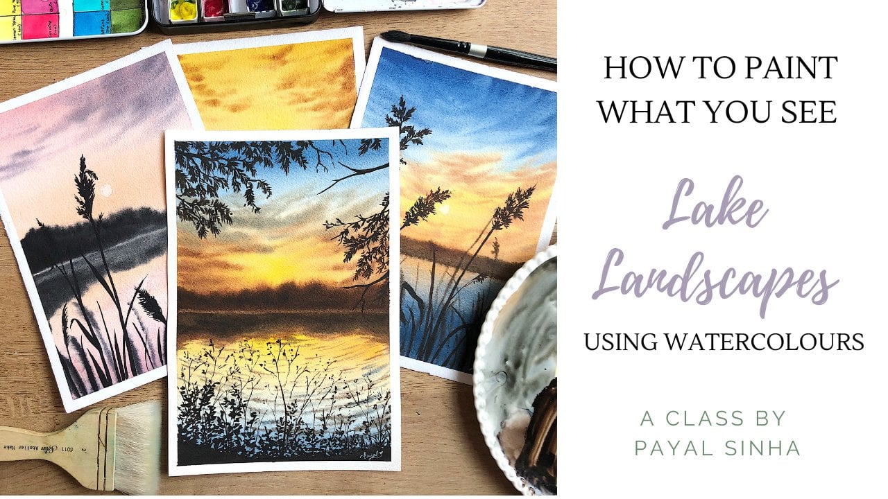
1. Welcome to my Class!: Spring is the season
that represents life, love, hope, and growth. It is the season that
marks the beginning of color with bright
colored flowers, green trees, and chirping birds. If you're someone who's fascinated by the
beauty of spring, then you are in the right
place. Hello everyone. My name is Payal. I'm an artist, an art educator, and entrepreneur
based in Bahrain. I go by the name, The Simply Aesthetic
on Instagram where I share my love for
art every single day. Coming from Bahrain, we do not get to experience
a lot of season in their extreme state except
for extreme summers. That is why I
resort to exploring different beautiful
landscapes and seasons by painting them. In this class, we
are going to do something of that sorts. We are going to explore the
beautiful season of spring together by painting these four beautiful
landscapes using watercolors. Watercolors are one of my
favorite mediums to work with. There is a magic in this medium that all
this brings me back. It's all about learning the right techniques
and learning how to control your water and your pigments and
once you master that, you can never look back. Don't worry if you don't have
any prior knowledge about this medium or are still
a beginner because I will be walking you
through each and every step. We'll start off by learning
about the right type of art supplies that you'll need when painting with watercolors. We'll then learn some of the
basic watercolor techniques that will help you understand
this medium better. Next, we'll move on to learning the elements of springs
such as the wildflowers, grass, and the different types of tree strokes
that you can make. Then using a combination of our different
watercolor techniques and the elements of spring, we'll learn how to paint these four beautiful
spring landscape. Everything in this class
will be explained in real-time so that you
can follow me along. Everything that we
learn in this class, such as the watercolor
techniques and the elements of spring will not only be useful
for the class projects, but you can use them in
your own paintings as well. Without wasting any more time, join me in this class and let us explore the season together.
2. Materials Used: [MUSIC] Let us talk about all the supplies that
we need for today's class. The first thing
that we're going to discuss are the papers. I'm using my arches, 300 GS-M, 100 percent
cotton cold press paper. You are free to use any brand of paper that is
available with you. Just make sure that it
is something that's a 100 percent cotton,
and 300 GS-M. Hundred percent cotton
papers are really, really, really good, and it works amazing with
wet-on-wet techniques, and your overall experience for painting with watercolors
just changes, and you actually
enjoy the process. Just make sure that you
have papers that are good. For the size of the
class projects, I'm just going to be cutting
this paper into half, and using them individually. You'll have two papers cut in half from this
one single sheet. The size of my paper
is going to be around 18 by 13 centimeters
in length and breadth, but you can choose any
size that you want. Next, let's talk about
the paints that we need. We are going to be using
the watercolor tube paints. I'm using the ones
by White Nights, by Netscape olive trunk. Don't worry about the colors because I will mention each of the colors that we need for our class projects
in the beginning. You can keep your colors
ready according to that. But majorly keep blues,
greens, yellows, oranges, browns, something
of that sort ready with you. But I'll mention
the exact shades in the beginning of
our class projects. Next, you need a tube of
white gouache as well. If you don't have white gouache, you can switch to your white watercolor that you'll directly
squeeze from the tube, and not add any water to it because we want it to
be nice, and opaque. Or you can use your white
poster colors as well. Basically, we need
something that is nice, and opaque because
that will help us to add the details in
our class project. All these stems
that you're seeing, the flowers that we're adding, we're going to mix
our watercolors with the white gouache, and this way, those leaves, and those stems, and the flowers
will stand on top, and we'll look nice, and opaque. So it's just basically
mixing gouache, and watercolors together
in our painting. Make sure that you do have a white gouache poster color or white tube of watercolor directly with you,
and that is it. Next we're going to
talk about the brushes. I am going to be
using round brushes, and one liner brush. I'm using different
sizes of round brushes. I have size 12, size 8 size 4, and size 2 from the silver
black velvet series, which are my absolute
favorite to work with. Next I have a liner brush, a size 1 liner brush by Pan art, and that is another of my
favorite brands to work with. These are the only
brushes that we're using, and I also have a nice flat brush from
brand silver as well, and you don't really need this. You can use a large size
brush to apply the water. I just like having a
bigger brush so that I can apply water on a
larger area quickly. Next, we have a mixing palette. I'm using the ceramic
mixing palette. It's basically a plate
that I like to mix with, and use for my watercolors, but you can use
any mixing palette that's available with you, don't worry about getting the
same supplies as I'm using. Next, we need two jars of water, as you can see, one is dirty. So, one is the jar in
which I clean my brushes, and the next jar is for a
clean supply of photos. So anytime I'm
mixing new colors, I'll be using water
from that jar. Next, you need a paper
towel or a cloth rag or anything with you in which
you can wipe your brushes, and get rid of any
extra water or pigment. So, just have something
to wipe your brushes on. Of course, you need a pencil, and a masking tape to tape down your paper from all four
sides so that it's nice, and sturdy, and not moving
around or buckling. Next, we need a wooden board or a clipboard or something that we're going to
tape our paper on. I just like using
this clipboard, and you can use absolutely
your table as well. You can use that. That's
completely on you. I just like having
something that's movable, so I can move it around, and I generally like using that clipboard for
painting with watercolors. These are all the art
supplies that you need for our class projects, and the next thing that I want to mention is this
little sketch book that I like to keep for recording all my
watercolor techniques, and elements that I use
for each of the class. You can practice this on
absolutely any paper. But I just thought
I'd like to mention it once, and that is it. Once you've gathered all
of these little supplies, we're going to
directly move on to learning the basic
watercolor techniques.
3. Brushing up on Watercolour Techniques: [MUSIC] Let us paint and learn a little bit about the different watercolor
techniques that we'll be using for our class projects. Here's a quick overview
of our class projects. We have four beautiful paintings and in each of these paintings, we're using different
combinations of watercolor techniques. In the first project,
we're using wet-on-dry method for blending the sky. In the second one, we're lifting the paint. In the third one, we're using
wet-on-wet for the sky. We're all playing around
with different techniques. I'm just going to teach you a little bit about
each one of them. We have wet-on-wet, wet-on-dry, wet-on-wet blending,
wet-on-dry blending, lifting techniques, and a little bit about
the brush control, which is really important. Let us learn what is wet-on-wet. The first word is the big thing, the consistency of your paint, so your paint is definitely wet. The second word is
for your paper. When you wet your
paper or basically prime your paper with water
before you start painting, you're making the surface wet, which means when you
apply the water, it will just nicely
blend into the water. It has something to flow
with since it's watercolors. Here I'm just going to mix my paint with a bit of water so that's wet and the
surface of my paper, which is also wet. When I apply the paper, you see the paint
just swishes around. It has a medium to
go and slow it. That is why it's
wet-on-wet technique. Wet-on-wet technique
is really fun, especially when you're blending skies or you want
your paint to flow freely and not be sitting on one side when you
apply the paint. That's when wet-on-wet is a really fun technique
to work with. The amount at which your paint flows with water depends
on the amount of water that you have on the paper and also the amount
of water that you have in your paint
and water mix. If your paint is thicker, the paint will stay there
and not spread so much. But if it's a loose paint, it will spread more. Next thing that I wanted
to show you is wet-on-dry. Wet again, is the consistency or is the word for my
paper basically, so it's wet and
dry as a surface. Here you can see the
paint just sits there. I'm going to move my paint
and give it direction, whereas in wet-on-wet, it just spreads around with water. Wet-on-dry is a more
controlled method. Next thing that
we're going to learn is the wet-on-wet blending, which is basically like blending two colors together for the sky. Over here, I'm priming
my paper with water, just preparing it
and at the top, I'm applying the blue color, which is ultramarine blue. I'm just spreading it and bringing it down in the
left and right motion. As you can see, it
just spreads more. At the bottom, I have
a carmine shade. You can use any shade basically
just to practice this. I'm moving it left and dry it and mixing
it with the blue. Over here, what
happens is you have enough time on your hands to do all your
blending processes. Whereas in wet-on-dry, your paints will dry faster, whereas in wet-on-wet, until the paper dries, you have the time to
move around, blend, mix and do all sorts
of blending process, mixing, process, lifting
process, whatever. You have some time
on your hands. Now, I'll just show you
the wet-on-dry method. When I do the wet-on-dry method, you will see my paint
is more controlled. If I want to blend my paint, I will have to apply water or move it around and
give it direction. See, if I apply it, it just sits there
and it's not moving. It's only in the area that
I've applied the water to. Again, the carmine shade, I'm bringing it from the
bottom moving upwards. It's just sitting there until
it mixes with the blue. Now when it mixes with the blue, it becomes like a
wet-on-we technique because there's
water on my paper. Wet-on-dry method is a more
controlled blending process, whereas the wet-on-wet
is more free. You have time on your
hand that's more free. You can choose any
method that you like blending your skies or
whatever you're painting, whatever subjects
you're painting. It's your choice as to
what works for you. In this class projects, we'll be exploring skies
in both the methods. We'll also learn about
on-dry blending for the sky and we'll also do
a wet-on-wet for the sky. You're free to choose
whatever you'd like. [MUSIC] Next thing that we're going to learn is
the lifting technique using brushes or tissues. You're free to use any method for lifting your paint
from your paper. The lifting technique only
works when your paper is wet. When your paper is wet and
when you use a dry surface, the water gets soaked in, and that's how you have
the white of the paper. I'm just applying a bit of the carmine color
on the wet surface. That's basically
wet-on-wet technique. I wanted it to be a
little bit darker, so I went ahead and added the ultramarine blue to it as well. I got this weird purple
color in the mix. You can use any color over here to practice
this technique. Once you have the
wet-on-wet surface ready, you will see that
I'm going to lift the paint from the paper
while the paper is still wet. I'm going to dry my
brush completely. Get rid of any
water that's on it. When I swipe it on the surface, it will soak in the water
that's on my paper. Each time I make a swipe, I'm going to dry my brush. I don't want the paint to
be in there from my swipe. I need to get rid of the water. The next way to lift the
paint is by using a tissue. When you just tap in the tissue, you will lift the paint. It's a beautiful technique
that actually you can use to create your soft
clouds in the sky. I think it's just
absolutely gorgeous and so easy all you have to do is tap with your tissues
and you'll have beautiful skies ready right in front of you with
a quick simple step. Next thing that we're going
to learn is brush control, which I think is very important. A lot of times, a lot of people tell
me that I'm not able to make branches like you or I am not able to make the brush strokes
that you're making. That is because you need to have a good control
over your brush. You need to know
your brushes well, you need to know
their capabilities and you need to hold your
brush in the right way. You hold your brush
like a pencil. How you would normally
hold a pencil. Over here, I'm using
my size 12 brush. Now of course, these
brushes are really good. They come to a really fine tip so I can make a thick stroke. With a size 12 brush, I can make a huge stroke
and at the same time, I can make really thin
lines with the same brush. This is a quick little exercise
that will help you know your brushes and do not skip this because it's
really really helpful. You just have to
know the pressure that you're applying
on your brush. Let's say it's a
size 6 brush and I tap in with maximum pressure, I get a very thick line. When I release the pressure, I get really thin lines. It's basically like
barely touching the paper and you get
thin lines like this. You can use this brush method or the brush stroke to
create different leaves, grass, shape and you
are more controlled, you get really thin lines. Remember to hold your
brushes like a pencil or a pen that you normally hold and work with
different pressures. You need to know the
amount of pressure, you need to know your brushes, so just move around, create
different brushstrokes, practice different
lines, practice different stamps or
your leaf stamps, try making different things. When you do that, you
understand your brushes, you understand your hands and the pressure that you
have in your hands. Once you have that sorted, you just need to know how to
get a particular shape done. That makes your process a
lot easier and it helps you a lot in your class projects or any painting that
you do generally. Just play around with different brushstrokes and
work with different brushes. I'm working with size 12, size 8, 4, 2, and the liner brush. I'm really familiar
with these brushes. I'm really comfortable with
these brushes and I mostly tend to use only these brushes for my watercolor paintings. I've worked with them a lot
so I know the pressure that I can apply and thin
strokes that I get. But when you are new
to your brushes, it takes some time
to understand them. Just play around, create
different brush strokes and see what works for
you. That is it. These are all your
watercolor techniques that you need to know before we move on and
paint our class projects. We're going to be
using a combination of these watercolor techniques
in our class projects. When you paint these
class projects, you'll be blown away with how
different things are done, how we use them in
an actual painting, how we interpret a landscape from a picture and
put them on a paper, and work our way through it. I think it's super fun. I'm really excited to go ahead and teach you how
to paint with them. I'm just showing you a quick
overview of how it's done, how you can do the
lifting techniques or the wet-on-wet technique
to create the skies, and the different
elements of our painting. Let us now move on and learn
the different elements of spring and then dive into
our class projects. [MUSIC]
4. Elements of Spring: For each of our class projects, we're using different
elements of spring. I'm just going to show
you my class projects. As you can see, we're using
different wild flowers, so we are going to
be painting daisies, spot bees, and just a few
different wildflowers. Then we'll have grass and
we also have a bit of trees and different ways of creating trees
in our background. We're just going to learn how to create each of these
things so that it's easier for you to
follow me along when we're painting the
class projects. The first thing
that we're going to learn are the wildflowers. Let us learn this
wildflower first. For this, I'm using my
size 1 liner brush. You can use your
round brush as well. To depict the flowers
that are really far away, you're just making a few
dots clustered together. You're just going to tap in
dots with your brush and make them together so
that they appear to be a bunch of flowers
and at a distance. That's how you create the look of these
flowers at a distance, but as you come closer, the size of these
dots will increase. For the ones that
are really close, I'm just going to move my brush around to create
these petaled shapes. You can see how
I'm moving around. I'm not giving it
a definite shape and I'm also not making
the dots in the middle. I'm just showing you how the basic shape of the
flower is going to look. You're just going to play
around with the shapes. You're just going to have fun. For the daisies again over here, the dots for the
ones that are really far away, they're just dots. But when they come
a little closer, you'll see a more definite
shape for the petals. You're just going to
make these petals form around and make them
join in the middle so,1, 2, 3, 4, then 5, 6, 7, 8, 9, 10. You can make a bunch
of 10-12 strokes or 7-8 strokes depending on the type and the size of
flower that you want. You're just going to make
these flowers look like that. Now you'll also have to give these flowers
different directions. Not all the flowers will
be facing towards you. You'll have flowers
facing different sides. You will have some facing
away from the observer, some of them facing directly, some of them turning
towards the left and right, so that way you give
a different shape. When you give a different shape, you just make it at one side
and stop in the middle. I'll just show you,
so 1, 2, 3, 4, 5, 6 and you see it's only halfway. Then at the bottom, I
release the stem down. So 1, 2, 3, 4, 5, 6 and then, release
the stem down. This way you create
the basic shape for the flowers and
then have the stems. Of course, the same stems are
going to be in green color, but we've just
gone with carmine, which was on my
palette and with them. For the far piece again, it's the same first
stroke that we did, so you're just making
one whole blob together and then releasing
stems because you're not really seeing a
lot of details for the flowers as they are still
far away from the observer. Next thing that I
want to show you are these little wildflowers that I have painted around
on the class project. I just want to show
you how that's done. I'm switching to my size 2
round brush for this one, and then I'm loading my
brush with some paint, so making one line that's
curvy in one direction. This is moving
towards the right. Then I'm releasing
these little strokes which eventually form
like a triangular shape, so 1, 2, 3, 4, 5,
6 and then 1, 2, 3, 4, 5, 6 on the other side. Then I'm releasing
some leaves and then also making two or three
from the same stem. You're making one line and then tapping in the flowers
from the other side. Strokes that you're making
are going to be coming from the same place from where they originated from one side
so they're together, and they're just going to be in this little conical shapes. If I were to put
them in a shape, they would be like a triangle or a [inaudible] fit right in. For these leaves,
what you have to do is start with one line, tap and apply pressure on
your brush and then release. Here, having a good control of your brush is very important. You see how I start with a thin line and then
change the direction, tap in and then
release the pressure. The sideway bent leaves are the ones that we're using
for our class projects, but you can practice these
leaves in different forms as well and that is it
for our wildflowers. It's pretty easy if you ask me. The next thing that
we're going to practice are the grass shapes. We will have a variation
of different grass and stems and all the green
stuff in our field. I'm just going to walk
you through one-by-one. Most of the times, you're using a simple step and in one
of the class projects, we're giving it a
little more detail. Let's start with a simple one. Let's start and
load our brush with some green paint because
the grass is green. I'm starting off and creating
these little strokes. Either you can go
from the bottom, so like from the ground and then release your grass outside, or come from the top and
make them touch the ground, and the size of the
grass will again depend on how it is located, like where it is located. Is it closer to the observer? Is it further away
from the observer? The closer ones are a lot
more thicker and longer. You can see how I'm giving in different directions and not
all facing one direction. They have different directions and they're all in
different sizes as well. The ones that are
closer are made by making a dot and pressing on your brush and then
releasing it a little bit. The ones that are still far away are a lot
thinner and smaller. Just play around with the shape. Give it different directions, don't forget and you'll
be done with it. That is pretty much it. For this class project, we are actually giving a little more detail to the
ones that closer to us. I'm just making a dot and changing the direction
and applying pressure, and then some of them, I'm ending it right at
the direction and giving them a little shape of a bud. These are going to
bloom in the future. That is one of the other
strokes of the stems and grass that we will be adding
in our class project, so just play around with these strokes and see
how they are done. They are very much easy. Learning them beforehand
will really help you when you're painting
these class projects. The next type of grass are the stems that I'm
making, actually. Just the same stroke, but here I'm just adding a
little bit of details to it. I have the grass shape laid in. In this class, I'm
just releasing some of these little leaves
and tiny details. It's pretty much like the wildfires that we
learned, the third one. But here it is in a
different direction. It's an a little bit
different directions and they're not even. I wouldn't say I would
fit them in a cone. They're all of different sizes and they're just
all over the place. This is just to add a little
bit more character to your leaves and lot more
details to your leaves. You can go ahead
and practice this a little bit so that it's easier when you're painting
these class projects. As you can see, it's one line and then adding these
little strokes, tiny strokes around it and it'll look like a leaf eventually. That is the basic idea
for a different cross. It was very simple. You just need to know the
control that you have over your brush and once
you figure that out, that is why the
technique was important. This will be a piece of cake to follow along because
it's not that difficult. Then you'll have these
other grass around it so it just all
comes together, and even if you mess up, it's all going to look beautiful eventually because you'll
have the flowers on the top. Everyone's not
going to be looking at each of the grass
shapes that you've made because the focus is majorly on your flowers and the background
and everything. Just all the elements
put together, they're all going
to fall in place. Go ahead and practice
this once again, having a good control
of your brush, knowing how much
pressure to apply, and also using a
brush that'll come to a fine tip is very important. Pick a brush that'll come
to a really fine tip, especially for the
grass shapes because it really helps and you
get thin strokes. The next thing that we're
going to learn are how to add these trees
near the horizon. Some of them are done
using the wet on dry method and some of them
using the wet on wet method. Let us learn how we
create each one of them. For the first one that we are
going to do is this wet on wet silhouette of a
tree that I've done. For this, we are going to
wet the surface first. Using your biggest size brush, you're just going to
prepare the header by applying a layer of water on it. My water is slightly
pink and that is why you see a slight hint of pink because I was not
using the clean jar of water and this is what happens when you do not use
two jars of water. But since it's just
a technique lessons or like an elementary lesson, so we don't need to
focus on that more. Over here I'm going to show you how the wet on wet
technique works like magic. You see here, because I had a lot more water on my paper, the paint just spread a lot more and I
couldn't control it. But as soon as I slightly decreased the amount
of water that I had, it got a lot more control. When you are painting wet on wet technique and you're adding different elements to it and you want the elements to
retain its shape, you have to add very little amount of
water to your brush, to your paint mixture as well. It shouldn't be very loose like you generally
paint you skies with, it should be really thick. When you do that, the paint
blends in the background, but at the same time
retains the shape. Over here up just added the paints next to one
another and they're just spreading in there
creating a look of a bush or a tree
clustered together. It was so easy to
create this effect. All we had to do was tap. All we had to do was use a thicker consistency of paint and just tap
them together. When you use a
thick consistency, you can also create
different shapes. Let's see, over here I am
creating a tree and adding branches and creating that look of the leaves coming
out from the branches. The paints are blending
in the background, but at the same time they
are retaining its shape. You look at it and
you know what it is. You know that it's a tree,
you know it's a bush. It's very easy to create these bushes and add
different thorns as well. The first one, if you think
it has gotten lighter when you use a even
thicker consistency, you can add different
tonal values and over here if you see
the branches at the top, they've blended and
gotten light in color. When I'm adding more
paint around the areas it has gotten darker and it
looks a lot more deep. I've just used my green shade, my hookers green
shade and that is it, and I was able to create
this beautiful effect with the wet-on-wet technique. The next tree that
we're making is with the wet on dry
technique and these are the trees that
we are generally making at the horizon line. These are really far
away from the observer, so you don't really
see a lot of details, but at the same time, you see that there's something, a bunch of trees
there at the horizon. You make the line and you're just making
these vertical lines clustered next to one another and you're making
them in different heights. When you do that, it gives a nice illusion
for these nice bunch of trees and it has different
heights and variations. They all look very
good together. Make sure that you are adding different
variations to your trees, not making them all
of the same height because in nature they're not going to be all
of the same height. You have to give them
different variations and different sizes so that it
looks really nice altogether. The next type of tree
that I want to show you is this very simple
tree full of leaves. Making the branches first, you're making a lining creating a bunch of branches
next to it and you're just tapping vertically or
perpendicular to the paper. When you do that, this creates a nice little bunch of leaves clustered together and it
makes it a tree looks fuller. You're just tapping
in these strokes of different sizes together, and when you do that, you get a nice full
tree and I think it's a very easy way to
create your trees. We're not working a lot on how it's done and not working on the perfection since
it's really far away and you're not really
seeing all the details. You just need to see a bunch of trees at the horizon,
that is all. You just create the stems
and add in the leaves. Here's a closer look. You're just creating the stems and then adding in
leaves next to it. One stem and then tap, tap, and you create
these leaves. They're very imperfect,
they're not even. You just need to create that
nice illusion of the leaves. For the leaves, the
stroke that we're making, are just these dots of different sizes
clustered together. Make some of them big, some of them small, play around and we've painted this type of trees in
my previous classes. I'm not sure if
you've seen that, but if you've seen them, you know how we paint the trees and it's a very
simple way to do. Here are all the
elements of spring. We have a wildflowers
our different grass and stems and the trees that we're using for the
class projects. Let us quickly start painting
our first-class project. See you there.
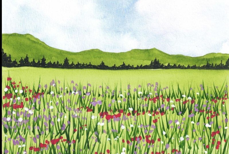
5. Project 1 Part 1 : Painting the Background: [MUSIC] Let us paint our first class project, which is this beautiful flower
bed with birds in the sky. The colors that I'm
using are cadmium red, ultramarine blue,
quinacridone violet, sap green and indigo. I've taped down my paper
carefully on all four sides, on my wooden writing
board or writing pad. The picture that we're
taking inspiration from is this beautiful flower meadow. As you can see, we have some mountains in the
background and some trees, and we have a beautiful
pink sky in the picture, but we're going to make
it slightly blue as well. The first thing that we're
going to move on and do is just to create
a basic sketch. It's very important to have
your elements in place. I'm just going to draw a horizon line right at
the two-third of my paper. Basically here what
we're doing is leaving the sky
space to be slightly smaller or lesser as compared
to the flower meadow space. Then I'm just going
ahead and sketching the mountain shape as I see. The first mountain shape
that I sketch was a little lower as compared
to what I wanted. I just went ahead and created another one behind it and I'll just erase the one that
I sketched out first. Right at the horizon line
we have these trees. I'm just roughly
making a sketch of it. You don't have to
make it look perfect, we're just trying to put in
the elements in place and that's pretty much about
it for our basic sketch. Now, we're going to go
ahead and paint the sky. I'm going to take my
ultramarine blue color and my quinacridone purple
color on my palate. These are the two colors that we will be using for our sky. Now, the quinacridone
violet color is slightly very dark. When you're making the
color for the sky, we're going to add
very little amount of pigment in our mix, so we need a really nice and
light version of the color. I'm just going to show you a quick swatch of the colors
that I'm talking about. See how the quinacridone
violet is really dark and I don't want it to
be that dark in the sky, so I'm just adding
a lot of water and pinning down
the consistency, and you get a very light
version of the color. Now, we're going to use
the wet-on-dry method here instead of using the wet-on-wet method that we
generally use for our sky. I'm just loading my brush up
with some ultramarine blue, and I'm just spreading it out on my paper in the sky region. Then right next to it I'm
mixing up some light version of the quinacridone purple
and I'm just applying it and adding water to mix
these two colors together. Basically eventually this
becomes a wet-on-wet method. But when you apply it for the first time since
the paper is dry, it's called the
wet-on-dry method. As you can see, I'm just
leaving some white space, then loading my
brush with a lot of water and then blending
the colors out so that there are some
lighter versions and some darker versions of
the colors in the sky. You don't have to
worry about making a sky look really perfect
here because we're just trying to blend the
purple and the blues together to have that
little mix in the sky. We're not making
any clouds as such, so you don't have
to worry about it. Now, I'm just going to go
ahead and make the mountains. For that I'm using
my sap green color. Then, I'm going to take my
indigo color on my palate. Now, when you mix your sap green color
with the indigo color, you'd get a really
deep green color. If you don't have
the indigo color, you can use Payne's
gray as well, or you can just use a mixture of your Prussian blue
and a bit of black, so you slightly get
that indigo color. But the idea here
is to just make a darker version of the green. You can use Payne's gray, you can use indigo or you can
just mix Prussian blue with black to get that indigo color. You can use that to
mix it with a sap green to get a darker
version of the color. Here I'm going to load my
brush with some sap green, so I'm adding a mix
of sap green and the tiniest bit of indigo, and you can see how I've gotten this really nice dark
deep green color. That is going to be the
color for my mountains. Here again, we're using
the wet-on-dry methods. I'm just going to go ahead and load my brush with
the paint and just go around the sketch that I made and fill in that area
with the green color. Now to blend it further and
reach the horizon line, I'm just going to load it
with some water and spread the paint out. That's
pretty much it. You are just filling
up your mountain space with the darker version
of the green color. Up to now we were using our Size 8 round brush for creating the sky
and even the mountains. You can use your Size 6 brush if you don't have
a Size 8 brush. The idea here is to have
a bigger size brush, so that we can go ahead
and add details to a larger area without having to dip our brush and paint
every single time. You can use any
size brush really. We're just going to
go ahead and fill the mountain shape with
the dark green color. We are not going
to focus a lot on the details for the
mountains because we eventually want it to just
dry out as one single color. I have tried to give it a little bit of
depth and details, but it's all going to dry
out as one single color, and honestly, I'm
not going to focus a lot on the details
for the mountains. Once that layer has
completely dried, we're going to go ahead and
switch to a Size 2 brush or really just a brush that can come to a
really fine tip. You can use any brush that
comes to a really fine tip. Then I'm just going to add more indigo color to the
mix with the sap green, because you can see the
color is really dark. That is why having an indigo color with you
is important because it adds and creates like a
really dark green color. Now using this dark green color, I'm going to go ahead
and just create a bunch of trees around
the horizon line. Now, you have to keep in mind that you're going
to vary the sizes. Over here I'm just dapping in the brush to create
different strokes, and then ending it up
at the horizon line. It's very similar to the
elements of the spring that I showed you in the
previous lesson. We're just going to go ahead
and do the same thing here, create a bunch of strokes
together that will depict these far off trees
near the horizon line. Make sure that you
are varying the size, which is very important, that adds a lot of
depth to your painting. If you make all of them look, for same height, it doesn't
really look that great. You want to make
sure that you are making them in different sizes. Make some of them taller, some of them smaller, and this way you get
a lot of details to your paintings. Yeah,
it's pretty much it. We're just going to go ahead and fill in the entire
horizon line with different strokes
and wait for it to dry before we move
on to the next step. [MUSIC] Now, once that the trees
near the horizon are done, we're going to go ahead and
paint our floral medal. For that, I'm going to go
ahead and start off with my sap green color as the individual color without
adding any indigo to it. I want the flower bed basically to transition
from a lighter green, which is right under
the horizon line, and it will transition to a really deep dark
green at the end. Each time I am adding
the next color, I'm going to add a bit of indigo so that I get
a darker green color. Then this is again, a wet-on-dry method, so each time I'm just moving it down and then blending in
the colors as you can see. You can go ahead and
do the same step with wet-on-wet as well, it doesn't really matter. Each time I'm adding
more indigo and I'm just bringing it
down as you can see. At the very bottom, I want it to be really dark, so I'm just adding a bit of
sap green and more indigo. You can see it's a really
nice very dark green color, and this is because there's
a lot of shadows in our reference picture as well, and also because it's
closer to the observer. You can see the
flower bed very well, so you have a lot of
shadows in that area. That is why this area is
really nice dark and green. It needs to be really
dark at the end and then as it goes towards
the horizon line, it's supposed to be light. That is exactly what I've done, and I'm just going to go ahead
and play a little bit with the different green
tones that I have. Just keep in mind that the area below the horizon
line is really light, so it's just sap green. If you don't have really light
version of the sap green, you can just add a bit of
yellow and you can make it even lighter in case you feel like your sap green
is not as light. But other than that, you can just directly go with the sap green as
well and just add your color in the
same transition and then just blend
everything together. You'll end up with
something that looks like a blend of these colors together with the darker
ones at the bottom. Don't forget to
just blend it right a little bit so that it doesn't look like
a seamless blend. We want some other shadows
in the areas as well. The only thing to
keep in mind here is that you want to wait for
it to completely dry. The next step that we
will focus on is taking our white quash and creating
the details of our stems. I'm going to show you all
of that in the next lesson, which is Part 2
of our Project 1. Join me in the next lesson.
6. Project 1 Part 2: Painting the Floral Meadow: All right. Now it is time for us to do the most time-consuming
part of the class project, which is adding the details to our floral meadow
or our flower bed. The first thing that
we're going to focus on is creating the stems, the grass, the leaves, or whatever you want to call it. I'm mixing my white gouache
with a bit of sap green and a tiny bit of indigo to
get this dark green color. I'm using gouache because it's
a more opaque watercolor. It is opaque
watercolor basically and stand out more
on your paper. I'm going to start off
with the area which is slightly below the horizon line, which is not right below
but slightly leaving that little gap and I'm just going to make this
little grass shape. Now keep in mind
that you need to use a brush that comes to
a really fine tip. You cannot use a size 2 brush and not have a really fine tip. If you think your brush is not going to a really fine tip, you can switch to a size 0
or size double zero brush. The idea is to make
really fine lines in this area and as you transition
closer to the observer, you will see more details. That is why you can use a
bigger size brush because you'd be making bigger stems
and leaves and all that. But when you're further
away from the observer, you want really tiny details. I'm just using my size 2
brush because it gives these beautiful lines
which are really tiny and I'm just going to make this grass shape
like I taught you in the Elements
of Spring lesson. I'm just making tiny grass
and I'm going to transition from this color as
we come closer. Obviously, since our
bottom is darker, this color is not
going to show up, so over there we'll be using a lighter version of the grass, but don't worry, I'm going
to take you step-by-step. We're just creating a
layer of this grass first and we're going
to work in sections. This is my first section. As you can see, I created
this first section. Now, right below that, I'll leave a little
bit of space and start off with my second
section, as you can see, with the same color but this
time I'm making the grass a tiny little bit more bigger than the one I put out before. Each time, each
section that I do, I will be increasing
the size of the grass. Now you have to be really patient with this step. I know it takes a
lot of time because it's time-consuming and it requires lot of detailing
and layering and all that, but it's so much fun to do, especially when you're
working in sections. If you think it's getting
too much for you, you can have little reward
breaks in the middle, so you can be like if you
finish half of this section, you get to take a
break for 10 minutes. Anytime obviously if
you are painting, if you're sitting down to paint, I always suggest that you take a bit of breaks in between. Otherwise, you get
really stressed out and it's not
fun because you're painting to be stress-free and you don't want
any added stress. I've just slightly increased the speed because I don't
want to take a lot of time. A few guys here, are
doing the same thing. The process, like I said,
is very repetitive. We are working in sections
and increasing the size of the stems each time we are doing the next section or the
section below that. If you want to slow
down the video, you can definitely do so and take it slow and then follow me along but the process
is very repetitive. Anytime that I'm
changing the color, I will definitely stop and mention the shade
that I'm using. Just follow me
along, be patient, take your own sweet
time and have fun. Now as I come to
this area which is slightly in the
middle green section, I'm going to add a bit
more white to the mix. As you can see, this is
the swatch up my color. It has more white and
small green and I'm just going to use
this color to create these long stems of grass shape. Now you can go from bottom
and then slide your brush upwards but you can also bring
it from top to the bottom. Whatever works, whatever makes
you feel more comfortable. I'm just going to create
more grass shape. Again, the process
is repetitive, you're working in sections, and you're just going to
add layers and layers of this stem so that there's a lot of depth
in your painting. This is the first class project, so don't be so stressed out. I've kept it as
simple as I could and made it really nice
and easy to follow along. I hope it is all making
sense to you guys. I don't want to
stress you out even more by talking a lot about it, so I'm just going to let
you enjoy the process. Just use this color and fill
out all the space that you have on your paper right now before we move on
to the next shade. Now, once this layer has dried, I'm going to go ahead and create a darker version of the
green because I feel there's a lot of light
and there's not a lot of darker colors in the
paper so that is why I've just taken my indigo
color and I'm adding a bit of gouache to it to make it nice and opaque
and a tiny bit of sap green to get this really
nice dark green color. Again, I'm just
going to go ahead and make the same grass
shape that I've been making all this time and don't
worry if you're filling out the little greens that you've already
laid out before. Picture that you're
not laying down the darker green on
all of them because then that completely defeats the purpose of you laying
the lighter color first. But you can just add them
somewhere in the middle, not everywhere so that it doesn't look all very
clustered together. You're just adding
the darker shadows to your painting and you can mostly focus this color in the area that's closer
to the observer. That's at the end of the paper. As you can see, I'm doing that right at the
end of the paper. I'm just going ahead and
adding the darker colors. Like I mentioned before, since it's closer
to the observer, you'll be able to see a lot
more detail and that is why you need a bit
more of the layering, especially in that area. I've just gone ahead and
added that in a couple of spaces to fill out
the darker colors. Once that dries, we'll
move on to the next shade. Now that I'm happy with
how everything looks, I'm going to go ahead
with the next shade, which is a lighter version of the green that we
laid down before. Here, I've added more white to the mix and as you can see, it's really nice,
it's really light. Now you don't have to lay
this color everywhere. Now, I want to mention
another thing. When you laid out
the first layer, you put it everywhere. When you laid out at
the second layer, you are filling in
the little spaces that you have missed from
the previous stroke. Now when you lay out the third layer which
is the lighter one, you make even lesser. You don't want to fill out the whole space with this color. I'm just going to
make some strokes in the middle and then
just leave it right there. As you can see, I'm just making some
of them in this color. I'm not making all of them in this color and that is
exactly what you need to do, not make all of them
in the same color. Just some of them,
just add some strokes in the middle in a
nicely dangling around, having highlights and lighter
versions of the color, which makes it all
look nice and pretty. That is the only thing
you need to keep in mind. The first layer,
it's everywhere. Second layer, filling
out the spaces. Third layer to just add
more details and highlights to the two layers that
you've laid out before. Once you're happy with
how everything looks, it's time for us to
add the flowers. Now that the paper
is completely dry, I'm going to make the
mix for the flowers. For that, I'm going to take my cadmium red
color, and to this, I will be adding my white
gouache to make it nice and opaque because we want our flowers to just
stand right there. I'm going to switch
to my size one brush. As you can see, I've just added my white gouache to it to
make it nice and opaque. Then using this color we'll
be adding the flowers. I've just mixed a nice amount of it and I'm just working
on the color that I want. Because I want it to be
a little more darker, I'm adding a tiny bit of gouache to a little bit of
red that I took out, and you can see it
has turned out to be a nice vermilion color to
be very honest with you. Using the shade, I'm going
to start making the flowers. Now for the flowers, we're just going to
use a stroke that I've taught you in the
elements lesson, which is just like a blob. We are not focusing on the
exact shape of our flowers. It's just a blob
in simple terms. You're just going
to create a bunch of blobs and then vary the sizes of the
blobs that you're laying out as simple as that. Let us not make things
more complicated. Also, make your blobs to
vary in different sizes. Make them in different shapes, make them in different sizes
and you're good to go. I'm going to make the shape, this random little shape, which by the way depicts
the poppy flowers. I'm just going to
make these blobs bigger as they are
closer to the observer, and as they move further away, they're going to get smaller. That is why I said we're
working in sections. Because the ones which have long contrast and all that
are towards to the observer, that is why you
see more details. They are bigger, and as they move further away in the fields, they are smaller
because they are further away from
us or the observer. You're going to vary the
sizes like I mentioned. Now as we move further
away, as you can see, the shape that I'm making
keeps getting smaller. Now, I'm literally making just dots right
next to each other, and I'm leaving a little bit
of space because we're only working on different
colors for our flowers, we just don't want all
of them to be red. We want to add some
purple in there as well. We're just going to
leave a bit of space for us to add different
colors in there. I like the area under
the horizon line. I'm literally just making dots. You're making them
because you can't really see the details of it
like I mentioned before. They're really further
away from the observer, so you're just going to make dots and leave it right there. Now, I'm going to
mix white gouache to my quinacridone purple to get
this pretty purple shade, which honestly looks
very beautiful. Using this color will be adding more flowers in-between
spaces that we have. Now, I want to add a little more white to the
mix because it wasn't really popping up on the paper because of the green
and wasn't really showing. I just added a bit
more of white to make it like a lilac color, and then I'm just adding more dots to create different
shapes of the flowers. Now you don't have to
worry about the shape like I mentioned before,
just create dots. You don't have to
work on a lot of details because this is
the first class project. I just want to give you a
basic idea of how things are and how we work
in different layers, and how we work in
different sections. Let's take it nice and
easy and not worry about the shape of the flowers and the details
in the mountains, and just let ourselves
loose and have fun. You're just going to fill in all the little spaces that you see between the red that
you've already laid out. Again, remember as we move further away
from the observer, the size of the
flowers decrease. That's the only
thing you need to keep in mind, and
other than that, you're just free to
create any shape of flowers that
you like honestly. You want to make them look
like a daisy, go for it. If you want to make them like the blobs that I've
created, go for it. But yeah, just enjoy the process and lay this
color down in your field. Now, once we are done
with the purple color, we're going to go ahead and add a bit of details
with our white color, and I just quickly shifted
to a size zero brush. You can use your
size one-liner brush as well as any brush which has really small point to make
really small details. I'm just adding a bit of white flowers in there as well because I felt like it wasn't
popping out that much. I'm just going to add
a bit of white to make it nice and pretty. Since this field,
like I mentioned, and like we saw in the
reference picture, is a mix of different
wildflowers. That is why you can have
different color variations, and here that is not
a problem at all. Let's go ahead and create a few more dots and blobs
with the white color. Here I'm happy with how all the
flowers in my field looks and the grass looks great
and the stems look great. We're just going to
go ahead and add a few little final
details to make our flowers pop out a bit so that they don't just look like things floating in the air. I'm just going to add this little black dot in
the middle to add a bit of definition and write
under these flowers using my dark
indigo green color. I'm just going to make
a line so that you can see that the flower has a stem and it's not just
a flower hanging in air. You're just going to add
this little tiny detail to all of your flowers, especially to the ones that are closer to the
observer and you can see the shapes a
lot more clearer. You're just going to do that and make sure that you're making that little stem because that's really important to just add
a little bit of the detail. I'm just going to go
ahead and do that to all the flowers that are bigger. That is pretty much it for this process of adding
details to the flowers. Now I felt like we
need to add a bit of details and make our sky look even better and add
some elements in there. I I got a little
bit of a smudge of the dark indigo color and I didn't want to
leave it right there. I'm just using my indigo
color right here. I've decided to add
in a few little birds flying in the air and
enjoying the spring season. I'm just making an r
shape and extending the wings out for the
details of the birds flying. You can just go
ahead and make an r if that's easier for you.
That's totally on you. We are just adding tiny birds, and that's pretty much it. We're just going to wait
for our painting to dry, and if you think your
painting is dry, just go ahead and
peel the tape off. Once the tape is off, everything looks so much better, and I just love how our first-class project
has turned out. This class project was a
good building foundation for our future class
projects because we've learned the basics
of adding the stems, the flowers, painting the skies. Using a combination of this along with
different techniques, we'll be painting
the future projects. Let us quickly move on to
our second class project.
7. Project 2 Part 1 : Painting the Background: [MUSIC] Let us paint our second class project, which is this
beautiful poppy field. The colors that we're using
are cadmium red, carmine, ultramarine blue, sap
green, green, and indigo. Don't forget, you need to keep our tube of white
gouache with you. I've taped down my paper
on all four sides, and this is the picture that we're taking inspiration from. Of course, we are going to alter a few things here
and there but I think it's just a beautiful
poppy field which we are going to try
and recreate today. The first step is to definitely create a basic sketch
of our picture, to have all the
elements in place. You can find the
reference pictures in the project section. Using my pencil, I'm going to divide my paper in almost 1/2. Now again, it does not matter, doesn't have to be the exact
half so somewhere roughly at the half of the paper
you're going to draw your horizon line. It has to be a
really light sketch, do not make it really dark. Just slightly create
a horizon line at the half of the paper. Now, as you can see in the
area above the horizon line, you have these beautiful
trees in the background. They're really far away, right above the horizon line. So you're just going to
roughly create that sketch and create a few little
branches for the trees that are in the area above the horizon line as
well and right under it we'll have our
beautiful poppy fields and our beautiful
sky at the top. This is just a really
rough basic sketch. Now I'm taking my ultramarine
blue color on my palette because that's the color we'll
be using for our painting. Now, for the sky, I am going to use the
wet-on-wet method. I've taken my brush
loaded up with some clean water and
then I'm applying it in the area where the sky is, which is the area above
the horizon line. Don't worry if you get into the sketch of the trees
that you've made, it's darker, so it's
going to get covered up anyway. That's not a problem. Now here's a quick swatch
of the ultramarine blue. If you don't have the
ultramarine blue, you can use any blue
for that matter. Just a nice blue
color for our sky. I'm just using the left and
right method and I'm just creating an even blend of
the blue color in my sky. Now the idea here is to have a darker tone of the
color at the top which means we'll be
adding more pigment to the mix for the top and then
as we transition downwards, we're going to make it lighter. So you're just using water to
blend the color downwards. Now, the fun part. Remember how I taught you the lifting technique in the watercolor
techniques lesson? You're just going to use that method and you're going
to lift off these clouds. Now this is one of
the simplest way of creating clouds or just like a rough sketch of the clouds you don't want to
give in a lot of details and we want to focus more on the flowers
rather than the sky. I'm just taking my
tissue tapping in the wet section and
since the paint is wet, it's going to get soaked
into my tissue and I'm just going to create this beautiful
cloud effect in my sky. Now, as you can see, the paper is not
completely white. That is because ultramarine
blue is a staining color, so it stains your paper. That is why when I'm
lifting off the paint, it's not completely white and that is exactly what I want. I don't want the clouds
look exactly white, but rather have
that blue into it. It creates a nice shadow
effect as well in the sky, which I think looks perfect. I'm not going to
overdo anything. I'm just going to
stop right here. As you can see, we've got this beautiful cloud effect in our sky and I
think looks perfect. Now we're quickly
going to move on and paint our field by the
time the sky dries. I've taken the color
green on my palette. This is a beautiful
shade of green from the white nights series and I think it's perfect green
so I have sap green, green, indigo, and cadmium
red on my palette. Now, unlike the previous class
project that we did, here, we're going to have
red right under the horizon line and then we'll be transitioning to the green. That is why I've taken
read on my palette. So I'm just quickly
going to show you a quick swatch of the colors. We have the cadmium red, we have the sap green
that I just swatched out and you have
the green color. This green color like we did in the previous class
project is basically just a mix of your
sap green and indigo. Or somewhat very closer to that shade and next to
the same green color, I've added a bit of indigo to
get the darker green color. If you don't have
the green shade, it's not a problem at all. You're just going to
work with your sap green and your indigo color. Here, I'm using the
wet on dry method. I'm nicely applying a layer
of my cadmium red at the top, cleaning my brush and slowly
moving the colors downwards. Now, here, keep in mind you want to go in that
left and right stroke. You don't want to create
different little uneven stroke. So just make sure
you're going in the left and right strokes. Then just to add the
effect for our stems, I'm just making these
vertical strokes and this way you just add a little bit
of details to your field. Of course your red
is not going to just stand in the layer. It's not just going to be red and then green right under it. You need to show that
it's blending in together and it is
standing on something, your flowers have a stem. They're not just in the air. Here, you're just transitioning. I'm just creating a
base of the color before I go ahead and
add any further details. I've transitioned
from sap green to the medium green and
then on the bottom, I'm creating a really
deep green shade. Like I said, at the bottom, since it's closer
to the observer, you'll be seeing more details. Over here, I'm just making this little wet on wet
grass shape as well. This creates a very
nice effect for the stems and all the puts in all our shadows that we need. Since it's wet on wet technique, it will just nicely
blend in together and create that effect which
I think looks perfect. Don't worry about making
it look perfect again. Just don't worry about the perfection
behind your shadows. You're just adding
in these shadows and they'll try out to be really nice and
just among themselves. I'm creating that
vertical stroke and then I'll be
adding red on the top. This way, there'll be a nice little blend between
the green and the red. I've put on the red at
the area right below the horizon line because let's say the poppy
field is really dense. In the reference picture, you can see it to the poppy
field is really dense. Because it's dense, you don't get to see a lot
of the green in that area. That is why it is
completely red. But as you transition or as you come closer to the observer, and as an observer if I'm
standing right there, I can see more green
and that is why that transition needs
to be in place. Now, once our layer
is completely dry, both our ground section
and also our sky, we're going to go ahead and add those little trees
in the background. I'm switching to my
size 2 brush over here. You're using size eight previously just a
nice medium brush. Now over here I'm just creating again the uneven
sections for the trees. Again, keep in mind that at the horizon they don't
have to look perfect. You are just going to make them vary between different sizes. You want to start off
with the trees looking more denser at the left and as you transition or
move towards the right side, you want them to get smaller. Again as you reach the middle and after you
transition to the extreme right, you want to again start increasing the size
of your trees. We're doing this because making the left and the
right more section of these trees at the horizon
gives us an illusion that these trees are still
closer to the observer, but the tinier or
the smaller ones that are in the
middle are still at a really further distance
and really far away and it gives that nice illusion of
the depth of your ground. Now, we are just going to
make the trees over here, my phone did not record the
aid that I added the tree, but we're just adding the
tree like I taught you in the elements section and that's
exactly what we're doing. Once we are done with that, we are just going to wait
for everything to dry. In the next lesson, we'll be adding all
the details for our stems and our flowers.
8. Project 2 Part 2: Painting the Floral Meadow: Let us paint the flowers and the
grass of our painting. For that, I'm taking
my white gouache, I'm adding green,
a little bit of indigo and then a bit
of sub green as well. I'm just going to play
around and get a deep, dark green mix of the color, so we're going to start off
with a darker green mix and the area under the red
that we've laid down. I've added a lighter
green version, but we're going to do it
overdo the whole thing again. I'm going to start off with the dark green mix
that I just made and start making the grass like we've done in the
previous class project, the process is just the same, you're just going to go from
the bottom and then you're going to release just like I taught you in the
elements section, so just [inaudible]
like we've done before. For the area that is
right under the red, I've created a lighter green
mix and I've added that. My phone ditched me while I
was regarding that section, but I was completely fine, we can work around that. I'm just taking the green
color for now and adding the details for the
darker shadows or like there for the shadows of my
grass and that is why we are going to work with
the green first and then move on to
the lighter shade. Here, as you can see, instead of going
from bottom to top, I'm going from top to
bottom and then also switching it up in between
and adding bottom to top. So it's just about what
stroke works for you more. You like putting it at the bottom and then
releasing or you're like putting it at the top
and releasing it downwards. I mostly like to work
with from bottom to top, so I create my stroke just like that and you're just
going to work in sections and fill out
the entire area with the deeper green shade here. You can also add this
deeper green shade for the area right under
the red as well so that you get in some
deep dark shadows right there and you don't have to
do it for all the areas, just a few little
here and there. Now, we're just going
to add the green again, the process is replicative, you're working in layers, so just make sure that you are working in layers because if you go all over the place at once, you don't really
know the type of strokes you're
supposed to be making. Like I told you, each time you
transition downwards, you're going to increase
the size of the grass that you make because
it's getting closer to the observer and it's getting bigger because
it's closer to the observer and you
make them bigger, so just make sure that
you're working in layers. Again, this is a time
consuming process, so take your own sweet time
and just work on the layers. Now, I'm just going to create
the same mix of the green, but I'm just adding
a little more indigo this time so that I get a little slightly
darker green mix for the grass because we
are transitioning to the darker shade and we want our darker shade to show up on the darker green
that we've laid out. But yeah, just make
sure that your green slightly darker by adding a bit more indigo,
so as you can see, the color does not completely match with the color
in the background but you can see the
strokes of the graphs that I'm making and that
is exactly what we want. I'm just going to
slightly increase the speed because
the processes again, replicative, you are free to slow down the video
and follow me alone. Now that we've laid out
our deep green color, you're going to add more vital the same mix and a
little bit of sap green, so you get a lighter version of the green wood
shall be using for the highlight sections of stems. I'm just going to take
this color and I'm going to go ahead and
create the grass, shape or the stroke
once again right in the bottom of the painting because that's where you'll
be seeing more details. I'm not covering up all the green that I've
laid out because again, that defeats the purpose
of laying down the green. You want to add these tropes somewhere next to the greens
that you've laid out, you can cover a few of
the greens of course, you don't have to completely separate the two
strokes you're leering, so make sure that you're not
covering all the greens. You're just going to
work in little sections, make sure that you're
not adding a lot of this lighter strokes
because again, you want it to be
visible on the paper, but you don't want
it to completely cover up the previous stroke. I've just laid that down in the front or the bottom
section of my painting, I haven't gone all the
way at the back and then right above the
layer that we added, we're going to add more
white to the same paint and add a few more
highlighted sections, which is going to be at the area right at the bottom of
our painting basically. I'm just creating that
stroke and I'm adding a few little dots just to
create the shape of the buds, just to create the
illusion of the buds and the flowers that
haven't bloomed yet, so I'm just going
to make the lines and then create little dots around it and make them
curve in a direction. Don't make them all straight, give them different directions, make them flow, make
them go with the air, that's the whole vibe of the painting and that's
exactly what we want to do, make them all happy and
fun and just add them, do not add them
everywhere of course, again, this is a third layer, so we want it to be in little lesser
spaces as compared to the dark green or the
medium green that we laid out while leering
for this tense. Now, I'm adding a little
more white to the paint, and this is going to be my
final layer for the grass, I'm just going to add a few little strokes here
and there just a few and a few for the buds just
a tiny hint of it. Do not overdo this otherwise
it's going to look really white and we
do not want that, we just want a few of them to be in the
details, that is all. You're just going to create the graph shape and make those buds, which is basically a dot and then you're
giving it a stem, that is all that you're doing. Now, while this layer dries, what I'm going to
do is make a mix of the poppy florescent
you're supposed to add. Generally, I will just
use the cadmium red, but I wanted to be like
a deeper version of the color and that is by I'm
using the carmine shade. Basically, just try
and mix a pink in a little amount and read in more amount and then, of course, your white gouache, and a mix
of all of these colors is going to give you your
perfect poppy color shade. Here the one that I'm
going for is red, more towards the red side, but you can also do orange and go for whatever
color you want which matches to the
color that you've laid down for the poppy. I've done red here,
so I'm going to go for a darker
version of the red. Now, in the area right
below the horizon line, you can see it's red. We want our flowers to be
really close and compact together so that it serves the purpose of laying
out the red right there. I've taken my size two round brush and I'm
just loading my brush with the paint and then tapping in these dots really
close to one another. As you can see,
they're really close. We just want to do that because we want to cover up the space of the red with compacted
flowers in the distance. I mean, that does not mean that you completely fill
the space with red, you need to leave
the little hints of the layer that is beneath. But again, yes, make
them really compact. As you come closer, you want to make these
flowers slightly separated so that you
can see the greens and the stems that you've
created and that is it. We're just going to
work in sections like we've done before. We're going to go part
by part and then tap in these little dots to
depict the flower heads. As you come closer
to the observer, you're going to be increasing
the size of the flowers. As you can see over here, I'm just making dots. They're dots of
different shapes, you can call them dots
of different sizes. I'll Make them most of them more around towards the right side, more around towards the
left side, wherever. We're just tapping in these dots that are going to be the flowers
at the distance. In this area that we've
reached up till now, we've had the flowers
in almost small dots, and we want to slowly transition from these small flowers to a slightly bigger and slightly bigger so that when
we come closer to the observer we have
enough bigger flowers. I'm just slowly going to increase the size of
the dots that I make. Now, make sure
that you're slowly increasing it and not completely making huge ones when you have really small
ones at the back. When you knew transition it, it gives that beautiful effect of the endless poppy field
that you're standing in. It's a smooth
transition basically, that is exactly what
I'm trying to say. It's a smooth transition between the sizes and the
shapes of the flowers. As you can see, I've started increasing the size of
the dots that I'm making, and really close
to the observer, I'm going to be making
this size of the flowers. I'm not making them really huge and it's not really small. Over here again, if you've noticed the shape
of a poppy flower, it does not have
a lot of petals, it has limited
petals and that is why we are just
making a small swirl. Just create these
little swirls and uneven shapes because
like I mentioned before, they are not close
to the observer yet, so he's not able to see the proper details
of your flowers. But still, he can see
these pretty flowers. You're just going
to go ahead and add them close to one
another because in this picture the field has
flowers really close to one another and it's just such
a beautiful little meadows. Just go ahead and
add the flowers and then we'll move on
to the next details. Once this layer has
completely dried, we're just going to
go ahead and add a few little details
to the flowers. I'm just going to
add more white to my red mix that I used earlier. Then I'm going to
load it on my size two brush and we're
just going to add a few flowers with the
lighter color of the red. This is just to depict the different colors
in the flowers and just give it a little
more definition than there already is. Because here we're
not going to add the black dot in the middle
and that is why we are just going to add some
highlights to the flowers and we have them have different colors. There is no particular order
in which I'm doing it, I'm just adding it wherever
I feel like adding them. This, you have to do
mostly for the flowers that are bigger in size as
compared to the smaller ones. You don't need to
really do it there. But mostly to the flowers
that are closer to you are the ones that
you need to do it in. Now we're just going to
give our flowers the stem. Our flowers are
not just going to be floating in our meadow. What you're going to do
is just make this V-shape right under your
poppy or just like a little dash under your poppy, and then make a stem
that's coming downwards. You can skip the
dash step as well, but I just sometimes
like to add it to give it this continuity
of the flower. But that is completely on you, we're here to have fun. Make the stems, especially for the ones that are
closer to the observer. Don't forget to do
that on them at all. But you can skip the ones in the background
because they already have the darker
tones for the stems. For the stem, we are
going to use a mix of my indigo and
the green color. Just like the one
that we used earlier, or you can even create a slightly darker version of
it that's completely on you. Have just used a mix
of the indigo and the green color and
I'm just going to add some stems to my flowers. Once our painting
is completely dry, we are just going to
peel the tape off. I think it has turned
out beautiful. We've gotten this
beautiful sky cloud effect with just lifting off
the paint with tissues. I love how the field looks. Altogether, I just loved the whole vibe of
this and I just want to go and stand in
between these flowers. I hope you enjoyed
this class project. Let us quickly move onto
our third class project.
9. Project 3 Part 1 : Painting the Background: [MUSIC] Let us paint our third class project, which is this
beautiful daisy field. The colors that I'm
using is cadmium yellow, golden deep, ultramarine blue, sap green, green, sepia, Payne's gray and a
tube of white gouache. I have take down my paper
on all four sides using my masking tape and this
is the picture that we're taking inspiration from or
trying to slightly retreat. As you can see here, we have the daisy flower beds
in the foreground and we have this
beautiful green landscape with some trees and
mountains in the background, which is really blurry
and not in focus. We are going to be painting a landscape in which the
foreground is more in focus as compared to the background and we'll give it a nice circle. The first thing that we're
going to do is create a basic sketch to get
our elements in place. Using my scale,
I'm going to draw a horizon line slightly above the half of my paper and this is going to separate my
sky from the ground. From the right side, I'm
going to make this trail of bushes that comes to a fine
point towards the left side. In the reference
picture, you have everything that slightly
comes and merges towards the left corner and that is exactly what
you need to follow. I'm just drawing the
trail of bushes, it's like a few stems and
trunks for the trees, and I'm just making the bed at which the daisies are
going to lie as well. It's a very basic sketch. Just remember
everything comes to the point in the left side. Now for the sky, we are going to use the
color cadmium yellow, golden deep, and
ultramarine blue. I have taken these
three colors out on my palette and using
my flat brush, I'm just going to wet the paper. We are going to
use the wet-on-wet technique and we're
just applying clear layer of water right here and using my
size eight brush, we're going to start off
by painting the sky. Now, we're going to be
using these three colors, and I'm going to show
you how you can create a nice muted color
for your sky as well. First thing that
we're going to do is start off with the yellow. I'm taking my cadmium yellow, adding a bit of water and I'm
applying it in the middle. If you look at the
reference picture, you will see the sun is
somewhat in the left side of the paper and slightly
in the middle as well. Left middle and around that
we have the orange color. I've taken the orange, I've mixed it with the
yellow that was already on my palette and added
it around the yellow. We're going to start off
with the lighter shades first and then apply the
more vibrant version. Now I'm going to mix
a muted color for the bluish-gray
color of the sky. I'm going to mix my yellow, orange together and
then add a bit more blue to the mix to get
this nice gray-blue. It's more like a muted
color that really goes well with the colors of the
sky that we're laying down. I'm just quickly showing you a swatch of the colors
that we're using. We have our yellow, our orange, and at the top you'll see the muted color that
we're going for. Now, I'm going to
make more of the mix. I've added blue. Adding a tiny bit of yellow to the mix and a tiny
bit of orange, and then adding more
blue to the mix. When you add more blue, it becomes slightly like
a brown-gray color. That is the color
that we're going for. It's also very close to
your Payne's gray shade, but not as dark. We don't want it
to be really dark. Whatever white spaces
I have right there, I'm going to add the gray
color in those little spaces. We have yellow
around the yellow, you'll have the orange because
of the light of the sun and then in the remaining area in the left and right sides, you will have the gray. As you can see, my gray
is really lighter. I haven't added a lot of it. I've made the color
added more water so that it has a lighter tone of
the version of the color. Now, again, I'm applying
the colors over one another so that we get a
more vibrant version of it, especially for the
yellows and the orange. I've just laid down the yellow and then applying the orange around the yellow to have that nice glowing
effect of the sun, and then I'll be adding the
muted gray color around it. Now, we want to lift off
the colors for the sun. You can either do that by just lifting the paper directly, by using a tissue or you
can dry off your brush slightly and then lift the color with your
brush and wipe it off. Here I'm using both the methods. I have lifted the color with the brush slightly
and then lifted more whites by just
using a tissue to when the paper is still
wet and you use a dry tissue, the water gets
soaked in and you're left with the white
of the paper. You can see how
beautiful this sky is turning out each time
we're moving our brush over. In the sides I've added the muted gray color and
once we are done with that, that will be our sky. While the paper is still wet, it's time for us to move on to creating the background;
mountains or trees. For that I'm again making
a nice muted gray color, only this time it's going to be slightly darker
than the colors of the sky that we've used but
it's somewhat the same color. It is slightly more
blue and darker. Using this color while
the paper is still wet, I'm going to go in
this upward motion and I'm making these lines. Since the paper is wet, it will nicely blend into the paper and create the
soft glowing effect, and that is exactly
what we want. We want it to be
nice and glowing and smooth so that
once it dries, it creates that blurry effect
and it's not in-focus. To create that step, you have to make
sure that you're working on the
wet-on-wet technique. Another thing to keep in mind is whenever you are
layering more details, so the first layer, like the sky, was more loose, it had more water content. But the second layer
is supposed to have more pigments so that it doesn't spread out and
create a cauliflower effect, but rather it retains its shape. Now the next color that I'm
using is this brown color, which is a sepia color. You can also use van **** brown, whatever browns you have, or like whatever deep
dark browns you have. Using this color, if you see I'm adding more pigment and
less water to the mix. You can see that my mix is more thicker this time because I want our paper to retain the shape and I'm still working
while the paper is wet. If you think your
paper has dried out or it has dried in parts, in sections, in bits, then you just wait for the
whole paper to dry and then carefully apply a
layer of water over again. Then repeat this process
because we want our paper to be wet to create that
soft blurry effect. Here, if you see,
since I'm adding more pigment and less water, my paint spreads, but
it is more in control. I have control over the way in which I'm
making the shape. Whatever shape I make, it's going to retain the
shape that I'm making, but at the same time it slightly blends with the
water in the paper. Once you're done creating
that bush shape, you're going to just stop
in the stems and the leaves together to create a thing that looks like a tree
or like a tree. I don't know why I
would say a thing that looks like a
tree. It is a tree. We're going to create the trees and the leaves and the branches, but in a more blurry way. I'm just stopping in, I'm not creating any stems and then tapping in the leaves, I'm just creating dots
next to one another. Eventually it'll just
give you the shape of a tree in the background
which is blurred out, you cannot see the details off. But when you look at it, when you look at the picture,
you know it's a tree. Just stop in these
strokes next to one another and fill them up slightly so that they
look like a tree. Keep in mind that you want to make sure
your paper is still wet to create that
blurry effect. If your paper is
not where you're not going to get this effect. Once you're done with that, we are going to move
to our ground part. You can either wait
for the paper to completely dry before you do it, but I just went with it. I'm not going to wait
for the paper to completely dry before I go ahead and paint the crown. Just be careful that
around the horizon line, you apply water carefully, otherwise your brown is going
to flow into the ground. Just be slightly careful around that area and
other than that, you're free to do and go
into whatever you want. Now I'm switching to
my size 12 brush. You can still use
your size 8 brush. I'm quickly going to show you
[OVERLAPPING] of the color. [inaudible] sap green color in the little triangular
region area that I have and this is going to be the lighter
version of the color. Then again, we'll go ahead
and add the deeper tones. This is my lighter color. First I have applied my sap green and next this is the
green color that I'm using. Again, if you don't
have this color, you can go ahead and
use any other green, hooker's green if you have, you can go ahead
with that as well, or you can just add a bit of indigo to your mix and
you'll get the same green. Now, I'm adding these
strokes on the left and right side of the paper and
putting it in the middle. Why I'm leaving that
center spaces because of the sunlight that's
falling in that area. We're going to have that region be more lighter as compared to the
other sections. Now we're going to slowly shift
towards the area to which is like a triangle
again, like a slope, and that area is going
to be really dark, because that's more closer to the observer,
that's the foreground. You'll have deeper, darker shadows in that area. Once I lay down the green, I'm going to go ahead and
create this little grass shape. Make sure that when
you're making the shape, you have more pigment
and less water. You can see it
retains the shape. You can see the shape of
the grass that I'm making. You don't have to
make it look perfect. Again, this is just our deep
tones in our foreground, and we are just blending
all of it together so that once this whole
layer has dried up, we can go ahead and add our details with our gouache and create the grass details. So just going to go ahead
and create these bushes of these grass one
next to each other. Remember that the ones in the leftmost section at
the top is going to be smaller as compared to the other brush shapes that are making that is
towards the right side. This is because this
whole landscape is coming from the left and spreading towards
the right side. It's like the point of view is diagonal and that is why the left section is more smaller as compared
to the right one. I'm just going to add in a few little deeper
darker tones for the grass in the background. Just stepping in a
few little strokes, that will be the darker parts of our ground and we're not going to overdo
anything anymore. We're just going to
leave it right here and wait for the whole layer to dry and once it's all done, we can go ahead and add the further details
to our painting. I'm just going to go ahead
and add a few little deeper, darker strokes in the
foreground area and that is it. In the next lesson
we'll discuss how to add more details
such as the stems, leaves, and the flowers
to our foreground.
10. Project 3 Part 2: Painting the Floral Meadow: Once the paper is
completely dry, we are going to go ahead and add all the details that we need
to add in our foreground. I'm going to create a
really dark version of the green color, which is basically me mixing the green shade with a bit of sap green and the
Payne's gray color. Mixing these three
colors together, you're going to get a deeper
tone of the green shade. Using the shade,
we'll start off by creating the darker
colors for the stems. We're going to start from
the leftmost section. I'm going to create
the same grass shape that I've taught you in the
elements of spring lesson. You're just going to be
making these strokes, trying to give them
different directions. Don't make all of them
in the same direction. We are just going to
work in sections. Over here one thing to keep in mind is that you are
going to increase the size of the
stroke that you're making of the grass or the
stems that you are making. They're going to increase as you come towards the right side. Like I mentioned in
the previous lesson, that in this landscape
you're standing diagonally, so things are coming
from the left side and getting bigger
towards the right side. That is why the right side
grass stroke that I'm making are bigger as
compared to the left one. That is the only thing that
you have to keep in mind. You're working in sections. You'll see me add bigger grass shapes in the right side and we started
off with really small ones. Once I'm done with
the first section, I'm going to leave
some space and start making the same stroke
from the left to the right side and slightly
increasing the size of the strokes that I make and finishing all the sections. As you'll come at the bottom, you'll be making
really long ones because that's
where you're seeing more details and
that is the area of that it's very close
to the observer. That's bigger and
everything else is smaller. The process is very repetitive. I will slightly
increase the speed because the process is repetitive and I don't want
to take a lot of time. You can slow down the
video if you think it's going too fast to follow me along but over here we're doing the same process
and that is working in sections and increasing the size as we change
the direction. Over here I'm doing it
around 3-4 sections for the grass and the
ones that are in the end, the fourth layer let's say, is the one that is really
long and really denser. You're going to make a
lot of grass together. They're going to be
a lot thicker as compared to the ones
you've laid out before. To create this type of stroke, you're just going to press
slightly harder on your brush. When you do that, you create
thicker strokes and that is why knowing your brushstrokes
is really important. The amount of pressure
that you're applying on your brush is really important to get these types of strokes. Now, I'm pretty happy with how the deeper colors
of my grass looks. We're going to move
on to the next step. That is to create these little wildflowers that
are coming from the top. For that I'm going to take my brown color and I'm
going to mix it on my palette and add a
bit of green because I don't want it
to be just brown. When you mix these two colors, you actually get a really nice olive green color but
this is of course, a really darker version
of the olive green color. Remember how I taught you about these wildflowers in the
elements of spring lesson? You're just going to
be creating that in different directions
and different sizes. I'll give you a closer
view of what I'm doing. I'm going to make
one long stem and then tap in these
dots left and right. The topmost stroke that I make is going to
be really small. As I transition, it's
going to grow bigger. It's like forming a triangle, so you don't have to stress
out a lot on this stroke. You're just going to work on it in bits and pieces and
you'll get the shape. Do not not worry about getting the shape right because
that's our second concern. Here you're to have fun. You're just going to
make these wildflowers. You make one stem, adding the strokes for the flowers and then
leave it right there. You can also add the
leaves like I taught you. You're just going
to make one stroke, extend it, and then press it downwards to
create that leaf. If you think that this wildflower is a
bit difficult for you, then you can totally skip it. You don't have to
add it as well. Go ahead and create
this little shape. I will just give you a closer view so
that you can get a clearer idea of
how it's being done. Once we're done with that, we're going to go ahead and add the details to the leaves. For that, I'm going to
take my white gouache. I've put it on my palette, and we're going to be
mixing white gouache with a bit of our
sap green color. If you have to mix
right on your palette, we're just going to add your
white gouache to it as well. We are going to be making, let's say around three
layers of the white gouache. For the first layer,
I've mixed green. I've added a bit of
yellow to give it that nice, warmer green tone. I'll just quickly show you
a swatch of that color. This is the color
that we're using. This is going to be
the first layer for the gouache strokes that I make. We have, let's say
four total layers. The first one was
the deeper tones. Here is the slightly medium one. Over here you're going to start making the same
strokes like you did with the darker shadow
one that you laid out. Over here, do not worry. You don't have to do
it for all of them. You're going to
make it lesser as compared to the one that
you laid out first. Remember how I told you in our second class project that each time that
you add a layer, you're slightly going to decrease the number of
strokes that you make. Let's say if you made
100 in the dark ones, you're just making 75 now. Then 50 only for
the lighter one. Then for the lightest
highlight stroke that you make with gouache, that's going to be,
let's say only 25. That's just my basic math. Using this color, we are
going to apply the strokes. You will see me apply
it very less in very less places just to put in different layers because
that's what we want, different layers,
and we don't want to cover the layer that we've
already laid out before. It does get over really
fast and each time you are layering the number of
strokes that you're making is lesser so it's fun that way. Over here, I'm quickly adding the bigger strokes for
the stems and the leaves. Make longer grass
fill in that area and you'll be done with your second layer
with the gouache. This color, I think
looks so pretty. It goes with our background
color as well and it's nice. It's a nice warm green so adding yellow to the mix really
helps in your gouache paints. We're done with
our second layer. What I'm going to do now is add a bit more white to the mix. Once you're done and happy
with how everything looks, again, you can add a bit
of white to the same mix. Here we're using
the size 2 brush. You can use any size brush
that comes to a nice fine tip. Here's a quick swatch of
the shade that I'm using. As you can see, it's
a lighter version of the same color that
we laid out first. I'm just going to
go ahead and repeat the process of adding
these strokes. This time, even lesser. We are at the 50 percent mark. I'd be adding even lesser stroke and you're just doing
it in some places, you're leaving some
places as it is. Each time you add the layers, you're going to
decrease the number of strokes that you're making. Also, it is very
important to add these lighter strokes in the area that is closer
to the observer. Because that color or the strokes that
you're making in the area that's closer
to the observer, he is going to be able
to see it a lot clearer because he's able to see more
details in your painting, or in the landscape, or when you are standing close
to let's say a flower bed. That is exactly what
we're painting. You're going to be able
to see more details to the area of the
flowers and the stems and the leaves that are
closer to you as compared to the area of the
region that's further away. Of course, you're going
to see more colors, but the ones closer to
you are going to have more details and that is exactly what we're
trying to depict. This is my third layer. I've added my third layer. This is a lot lighter
and there are a lot of more details to the area
that closer to the observer. Once we are done
adding this layer, I'm going to stop right here, and I'm going to add my
fourth and final layer. This is the 25 percent mark
that we discussed first. Just add a bit more white
to the mix and you're just going to make it
very little areas. Just especially in the area that's closer to the observer, you don't have to go all
the way at the back. This is just to add
bit more highlights to the flower bed or the grasses. Once you are done with that, you're going to leave it to dry and we'll move
on to the next step. Once my grass layer
is completely dry, we are going to go ahead and
switch to another brush. I'm using a size one liner brush because this brush does not come to a really fine tip
but it is really small, but I don't get that very sharp stroke and I want a type of brush
that does not come towards really sharp
stroke because I want to add a more rounded
edge for my flowers. I'm just using my
white brush and I'm going to start
tapping in the flowers. Remember, the left
section is going to have just dots and as you
transition to the right side, you will be seeing
more structure for the flowers because it's
closer to the observer. That is exactly what
I'm going to do here. I'm going to make dots, especially in the area
that's very far away. As you come closer, you are going to be
seeing more details. You don't have to make each
and every individual petal, but they're just going to make, let's say five or six
blobs together to form a shape of a flower like I taught you
in the element's lesson. You're just going to
repeat the process and have some dots, have some bigger
flowers of course. You'll not have all the
flowers looking the same way, so you need to vary the
different sizes as well. That is exactly what
you're going to do. Make some blobs, make
them look rounded, give some of them a
proper shape especially I'm talking about the area
that is still further away. When you come closer
to the observer, of course, you'll have
to show the petals, the individual petals, not in a proper way
or in a perfect way, but of course you'll have to
show the individual petals. Here, I'm going make
a bigger flowers. I'm just tapping in, let's say 5-7 petals together and
all of them come together. 1. 2, 3, 4, 5, 6, 7 or 8. I'm not really sure
how many I made, but a bunch of them. Maybe seven, maybe eight, maybe 10, depending on the size of the flower
that you are making. The idea is to just show
our individual petals. This is the area that's really much closer to the
observer and that is why he's able to see those
flowers in a lot clearer way. Go ahead and create
these bigger flowers at the bottom and then also
vary them in different sizes. Make some of them bigger, make some of them smaller to add a lot of different
variations to our flowers. Once you're done adding
these individual flowers, you can also fill
in the spaces in between with smaller flowers or even little dots which depict the flowers
that are yet to bloom. It just adds a nice
little radiations to our flowers and I
think it looks very cute. Just go ahead and do that by just making these blobs
that you made at the top. That is exactly what you're
doing just to fill in the space and make everything
look put together. Now that my daisy
base has dried, we're going to go ahead and
add a bit of details to it. If you look at the daisy
flower you will see that it has a little
yellow-orange center, so we need to make that. For that, I'm mixing
my golden-leaf color, which is a nice orange color
with my cadmium yellow. I'm adding a little
bit of white to the mix to make it
nice and opaque. You get a mix of the yellow-orange color and you mix it with
your white gouache, and that is exactly
what you need to use a quick swatch of the shade. You're going to be making this little dot in
between the flowers, especially for the ones
that are further away. But as you come closer and especially to the flowers that are closer to the observer, you're going to make
a nice round circle. You can make a
nice round circle. You can make a semicircle. That's totally on you. I'm going to go ahead and make just circles in the middle. That just adds to our flowers, and I think it
looks very pretty. It does look like a daisy now. Go ahead and add the
detail to your flowers. You can add them, to all the flowers, especially the ones
that you can see the petals and you can skip the ones that are just as blobs. But don't forget to make it on the ones that you
see the petals in. Once we're done with that, I'm again switching to
my size 2 round brush. I'm going to use my Payne's
gray and my green mixed together to add stems
to my daisy flowers. I forgot to make this step, but luckily I
remembered in the end., so I had to remove the tape and put it out again
to make the stems. You're just going to
go ahead and make this little line so that it doesn't look like
your flower is just floating in the air, but rather they have something
to put their heads on. Just go ahead and
add in the stems. When you're doing this,
you'll also notice that you've missed a few spot, just like here where
I forgot to add the center part for the
daisy in that little flower. You can add and change anything that you
think is missing, you can add or you
can try and rectify your mistakes. That is it. That is going to be the end
stair for your painting. Once you're done with that, you can just let your
layer completely dry and then you can just
nicely peel the tape off. I'm just going to
go ahead and add those stems and wait
for my beat to dry. Now, everything is
dried out really well, so we are going to quickly
peel the tape off. I absolutely love
this class project. It is my favorite. I love how we've
gotten to create that blurry background and the foreground is
so crisp and clear. I absolutely love it. Let us move on to our
fourth class project, and it's the last one. I'm really excited.
11. Project 4 Part 1 : Painting the Background: Let us paint our fourth and final
class project, which is this dramatic
sky and flowers. I absolutely love the
composition of this painting. The colors that we're using are cadmium yellow, golden deep, ultramarine blue, sap green, green, sepia, Payne's gray, and white gouache. If deep down my paper on all four sides using
my masking tape. This is the picture that we're
taking inspiration from. We have this beautiful dramatic
sky in the background. We have a few series
of mountains. In the foreground we have these beautiful flowers
which are so nice and green, but not too green. I love how the composition of this whole landscape picture is. The first thing that
we're going to do is create a basic sketch. Instead of creating
a horizon line, we're going to create a
mountain shape avail. You're just going to
create a mountain coming from the
left to the right, extending from the left to the right somewhere in
the half of your paper. Then at the back,
you're going to create a few more mountains, which is like a
series of mountains. The last one is going
to be really small. Then you're seeing
a little more area and the one that's
closer to you, you see the entire mountain. You're just creating a
small series of mountains. In the foreground, I'm just
creating these little stems, and does not really matter. You don't have to sketch it
out but this is just for me to get a basic idea of where
everything is going to be. But yeah, the sketches
are very simple. It's not at all complicated. Now we're just going to
move on and paint the sky. For the sky, I'm using
my cadmium yellow, golden deep, and
ultramarine blue. I've taken them all
out on my palette. Using my sized well brush, I'm going to apply water
in the sky region, which is the top of the paper. We're using the wet-on-wet technique here because
we weren't good blend in our sky and for
having good blends in the sky wet on wet technique is the best method to work with. Carefully layer
your water around the mountain shape that
you've sketched out. Then I'm going to show you the swatch of the colors
that we're using. We're using our cadmium yellow, which is this nice
bright yellow color. Then we have golden tip, which is a nice orange color. You can use any orange color
that you have with you. Then we have the blue color. For the sky, we'll be creating that nice mutant grayish color but it includes the blue color. I'm just swatching
it out for you. We're going to start off
with the yellow first. I've taken my size eight-round brush by
silver black velvet, which is my favorite brush
to work with watercolors. I'm going to load it up
with some yellow and tap in the yellow somewhere in the
middle of the sky region. Not exactly in the middle, slightly at the lower
and then the left side but you get the idea of where
you want the sun to be. Next, I'm adding the orange, that is the golden deep shade
into the same yellow so that I get a lighter
version of the orange. I'm going to fill out the little spaces that
I have left right here. Now there is no
perfect way to do it. Every time if I was supposed
to recreate the sky, it's going to look slightly different because I'm just going with the flow and letting my paint blend into one another. I've lead it, let's say half of my sky portion is with the
yellow and the orange. At the top, they're going
to have the dramatic sky. It's a dramatic sky, so we need to have
the muted color. I'm again making
a mix of my blue, orange, and yellow together
to get that nice gray color. I'm going to add it at the top. Now you have to be a
little bit careful when you come around the orange. Don't mix it directly in because then you'll
have a muddy color. You're just going to
go around that area. You're going to go around that shape that you've
left the whitespaces. Since it's wet on wet technique, these colors will
slightly blend into one another but if you
forcefully blend them, you will have a muddy color
which we do not want. Once we have the basic
colors laid out, it's time for us to
add some deeper, darker tones for fun to make
it more vibrant and nice. I'm going to lay down the
yellow just like I did earlier. Fill out those
little whitespaces here and then move
ahead and add orange. Once you are happy with how
the yellows in your sky look, you can move on to the
orange and then fill out that space of the orange region, just like you did earlier. I generally like to mix my orange with the
yellow so that I get something that is still a little bit yellow and not
too dark orange. I'm just tapping in the orange in the region that I did earlier to get a nice vibrant
mix of these colors. At the top again, I'm
just lightly tapping. You'll see I'm not blending
the three with the orange. I'm not forcefully
trying to mix them, but I'm just tapping into that. The wet-on-wet technique
does its own magic and makes the colors
blend on their own. Next, again, I'm going
to make a mix of the muted color which I
think looks beautiful, just mixing yellow, orange, and blue together gets you this color that goes
perfectly with your sky. Just tap in the color at the top again to get a darker
version of it. Tap in. Don't forcefully try to
blend the colors, otherwise, you will not get a
nice color in the sky. You wanted to just seamlessly blend into one
another effortlessly. Your blending has to be effortless and
that's what we want. We don't want to force
any blending here. It's just tap and let the
colors do their own magic. You can just play
around in this section, you are free to do it the
way you want to do it. You don't have to focus on the reference picture
also at this point, just go ahead and blend
and see the blend of the colors and see
what works for you. If you like it or not, if you want to not have some certain colors or
have certain blends, that's totally on you. Now to lift off the
space for the sun, again, we're just using
the lifting technique. Tapping in with the tissue, it will nicely
lift off the pain. You get that nice sunglow and
Wait for your paper to dry. Now my paper is completely dry. Once it's dry, the
sky portion has nice blended dry
we are going to go ahead and create a
series of mountains. I'm going to use the same
color that I used for the sky, for the mountain that
is really far away. I'm just going to take
my size 4 brush, tap in, load it up with some
gray that we use for the sky and then just create mountain fill
in the mountain. Wait for this layer
to dry before you go ahead and add
the second layer. Each layer that you're adding, you're waiting for the
previous layer to dry. This is all the
wet-on-dry method, so you are not having that soft glowy effect like we did for the previous
class project, here you want everything
to be dry before you go ahead and do anything else. Now I've just taken a little
bit of sepia on my palette, and I'm just mixing
the sepia shade with the grade that was
already on my palette, and this is going to be the second color for the
mountain that I make. Once that layer has
completely dried, you're going to go ahead and create another mountain
with this color. Fill in the entire
space using the wet on dry method and when you're using the wet on dry method, the paper dries quickly, your colors dry quickly
and if they're not drying quickly you can just use a hairdryer to dry
everything out. Now I'm going to
take my green shade. You can use your
hookers green or just green mixed with
a bit of pale gray, it's just a darker
version of the gray. I'm mixing it with
the brown shade here. You don't want it to be
really dark right away, they're just mixing
a little bit of brown and the green color, mostly more towards
the browner side. If you see I'm swatching it out, it looks more like an
olive green color. Using this color,
you're going to go ahead and fill our
third mountain. You have three small ones and the fourth one is the one
that's closer to the observer, so we'll have to
work on that with a nice dark green and
have transitions of the light that's falling on it but the others
can just be as is. Once that layer has dried up, they're going to fill the
entire front mountain. For that, I'm going to
take my green color, of course and you're
going to have a mix of the brown shade
with the green, so that you get a
really nice dark, deep color and that is exactly
the type of color we want. I have made two different
types of greens here. One green is your green
mixed with brown, and the other one
is your green color mixed with beams gray, which is this nice
deep green color. I'll show you where
you're going to use that. I'm using my size 8
brush loading it up with the green mixed
status with the brown one, and I'm just going to apply
it around the sketch. Then I'm making these tiny vertical strokes that are going to depict the cheese
on our mountains, it's a nice thick green
luscious mountain. Then when I come to the area
that's right under the sun, I'm going to add a
bit of orange to my mix so that I get a
slightly lighter green. Then coming to the other side, which is the left
side where light is not directly falling
on the mountain, we are going to have
the darker green. The basic idea is
to transition from dark green to the green
mixed with orange, and then back to your
dark green color. Then you're just
going to apply it in the entire portion
of your mountain. What you can do here
is just take water, lots and lots of water
and then apply it so that you're wetting the surface and then slightly
blending in the color, and that is exactly
what I'm doing. See I've added lots of water and then once I'm
done with the water, I will just add in the pigment. It's basically like doing
the wet on wet technique. Usually wet on wet
technique makes things very easy to
blend and mix and spread out as compared to wet on dry and in wet on dry
is more controlled, it's more limited
but with wet on wet, it's more out there, it's more flowy and you've covered in a lot of
space with wet on wet. What I'm doing here
is just covering the entire mountain with
the green mixed with brown. Once I'm done with that, we're not going to leave
our mountain as is, because we want to show that a mountain
has some texture, it has some sort
vibe going on there, it's not going to be flat. What we're going to do
here is we're going to add deeper darker tones and this will depict the forest shape, the trees, and things like that. So I've just taken
a little bit of my green mixed with the
orange and then I'm going to apply it again
right in the area that comes under the sun and
where the sunlight falls. Then you're just going to
create this nice diagnose shape so your mountain
is flowing downwards. You're going to
have that curved, it's not going to be flat, it's going to have a slope. To depict that slope, you need to go in
that diagonal angle. This way when you see when
you apply the darker tone, you will have mixed my
brown with the green, and there's a darker tone. When I go into that slant it's like there's a
sloped on my mountain. Then I'm making these
vertical strokes and when I lay that
down since it's wet on wet and then
it's more controlled because if you
notice my palette, there's not a lot of
water, there's less water. When there's less water, your paint is not going
to spread out more, it's going to retain the shape and that is exactly what we have learned to control the
wet-on-wet method, to control with how
your paint moves. When you add less water, your paints blend out
but retain the shape. So you're just going to make that little tiny strokes
vertical ones and this gives us an illusion of forest of a slope and all the cool things that you want to add
on your mountain. Eventually this
slightly gets covered especially the bottom portion
slightly gets covered because of our
foreground flowers and leaves and grass and all that but it's always good to add in the texture just in case. It shows through the
strokes that we make. I really like how the mountain slope has
turned out honestly, I was so happy when
I was painting this. It looks so good with how
minimum effort you've had to put into it to get that nice structure
to your mountain, it looks so good. It looks like you've
put in a lot of effort, but it's like your friend
put on a lot of effort, which I think is very good. So yeah, just go ahead and add these vertical strokes wherever you think you want to add them, and play around with
the different greens. One is the green mixed with brown and the
other one is mixed with orange and wait for
it to completely dry. Once the paper is
completely dry, you will see the different
textures that you've added, the different layers that
it looks like the slope is coming down and you have trees
and it looks all so nice. Yeah, in the next lesson
we're going to add in all the details
in our foreground. So keep your green
and paint gray ready.
12. Project 4 Part 2: Painting the Floral Meadow: Let us start painting the class and the stems and leaves
in our foreground. For that I'm going
to use a mix of my green shade with paint cream. The idea here is to
actually have a green that is darker than the green that we've used
for our mountain. If we do not use a green that's dark enough and
darker than the mountains, then it's not going to stand
out. Here we're layering. The first layer that
we're putting in are for the deep shadow
parts of our leaves, so the darker ones. The dark color is going
to be our first layer. For that, I've made a
mix and as you can see, it's a really nice dark, almost gray color, almost
Payne's gray color, but it has a mix of
the green as well. Usually a lot of
people would say, why are we not just using black? Why are we using a mix of
gray and green over here? If you just add black, it stands right there. It does not go. In simple terms I'll tell you, it does not go with the
vibe of the paper and the vibe of the painting
if I just put in black, but when you mix a
color that's dark enough with the colors that you're using
in your painting, it matches with the
vibe of the painting. In very simple terms it matches with the colors that
you're using in your actual painting
and does not look very odd and that is why you're using Payne's gray and a darker green to
create that deep, almost close to black shade. I started off by
making the strokes and then I realized
that I should make a slope as well on which my grass lies on
because as we layer, we'll add in the more details. I've just gone ahead
and made a slope, and on that I'm making
the grass shape. Again, the same shape
that we've been doing since class project 1. We're just making the same
shape. Go ahead and add it. Do to not worry about
the grass shape in the area that
is below the slope because you'd be wondering, why we're not adding that, it just looks very odd? But we will work in layers and then it
will stand out more. This is your first layer, you're going to
wait for it to dry. Now, this has
completely dried out. See how it's really dark, goes well with the
vibe of painting. It's green. You can see
the green in there. We're going to start off with the first layer
with the gouache. I've mixed white
quash and green, added a tiny bit of
Payne's gray to it, just a tiny bit, but mostly green and
your white gouache. Using this color, this is
going to be a second layer, so you're going to go ahead
and create the grass shape. Now here is where
the magic happens. Here is where you're
going to start working in different sections. In the first layer, you just made one slope and went ahead and added
the details for the grass, but here you're going
to work in section. The top most is going
to be your section 1, so you're going to
lay long grasses. Of course they are long, but they are thinner. They are less detailed as compared to the ones that
we'd be adding in the front. That is how we're going
to show the variations in the shape of our stems and the leaves in this
type of painting. The section is small. Everything is close
to the observer, but there is still
something that's closer and there
is still something that's a bit at a distance. The leaves that I'm making now, they're at a distance
and the ones that are at the bottom of the paper, they're going to
be still closer. Over here I'm making two
different types of strokes, one is going from bottom to top and the other is
coming from top to bottom. Now, the ones that
are coming from top to bottom are
the ones that are the stems and once you
make a couple of those, we'll put the flowers on them. Now, the second section that
I'm working on is again, making different
strokes of the grass. Top to bottom, bottom to top, just play around
and add this layer. Here, just imagine this is your 80 percent margin off the number of leaves and
stems that you're adding, so you're adding 80
percent of that, so you're just filling the
entire surface with the grass. Do give them
different directions because that adds a
lot of variations, it shows that your
leaves are flowing, growing and are happy in
each other's company. Go ahead and do that. Make a bunch of these
like 80% percent, fill up the entire space with your first quash layer and once you're happy
with your basic shape, you're going to wait
for it to completely dry before you move
on to the next layer. Again, remember to add these strokes in
different directions. Don't make all of them
in the same direction. Once this layer has
completely dried out, you can see it's dry it out. It's a bit darker than
the color that we lead in and that's what
happens with gouache, it dries a little bit darker. The next color that we're using is this lighter green shade. I've mixed my green, I haven't added any
Payne's gray this time, and also added a bit more white. Here you can see it stands
out a lot more than the previous layer or
the color that we made. Now over here, you are at, let's say 60 percent, you're adding 60
percent of the strokes. Do make sure that you're not covering all the previous
layers that we've added and you're making some
of them nice and vibrant, standing out, adding highlights and layering and
all of that stuff. Go ahead and make the grass
work in sections again, because that is
really important. When you work in
sections you get an idea and everything does not look crazy because when
I used to paint earlier, when I didn't have any idea on how it was
supposed to be done, I would make it all
over the place and it wouldn't look good
at the end of the day, so working in section
makes it really happy. For the area that
is at the bottom, which is again, like I said, closer to the observer, you will see more details. I'm adding leaves. For the leaves what I'm making
is the same grass shape, but I'm adding a few
more strokes around it so it looks like these
are leaves and stems. It gives in a
little more detail, and as it is closer
to the observer, he is able to see
all of those things. Add in a few little
extra details here and there and fill out
the entire space. To make the stroke
again, I'll show you, you make a line just
like the grass shape, and then you add
in a few strokes around it in
different directions. That shows the leaves
and the other stems that are coming around
from the same single stem. Once you're happy
with this layer and it has completely dried, you're going to go ahead
and make our final layer. For this, I'm mixing my green, adding yellow to it. I'm using my cadmium
yellow because I want the green to be
nice and vibrant. I'm adding white to it
so that it's lighter and stands on the layer that
we've already laid out. Here's a quick
swatch of the color. It's almost like a
lime green color. It's like a very
pretty green actually. Using this color,
we are going to go ahead and add a final stroke. Over here, you're slightly dropping down to
your 25 percent. Just a few strokes,
not that many. Just a few for
detailing purposes, especially at the
back, just a few. But at the bottom, you can add a bit more
because you only have two layers right
there and you want to add in a few little
details to it. This time when you're
adding the strokes, you can also create
those little leaf shape that we learned earlier. Make the graph shape and make
those strokes around it to depict the leaves and the
little details of the stems. That is again, the
repetitive process that we've already done. Make sure that you're
not going over the same thing that you've made. Let's say I've made one stem
in the previous layer going towards the left
side and I would make the other one
in the right side. This way, there's
more variations, there's more layering, and it looks denser, it looks fuller when you
give a different direction. If you make all of them
in the same direction, then you don't really
see what's going on, so you give them
different directions. See, in this one that
I just laid out, since it was facing
the left side, I made it in the right side. Similarly over here, if
it's facing the right side, I'm going to make it
facing the left side, so that's how it
generally works. You just add in
different layers to it and different
directions to it to make your field or ground
look fuller and denser. Now I'm really happy with how the foreground leaves and stems all of
that are looking, it's time for us to move ahead and add the
flowers on the top. For that, I'm making a mix of my orange deep color
mixed with white gouache, so I get this nice
opaque orange color that I need for my flowers. I've just taken my size 2 round brush here and I'm loading it up for
the size 2 round brush, adding a bit of
water to my gouache and I'm going to start
making the flowers. You see those stems at the top. Those stems are going to be the stems that you
lay your flowers on. All those little shapes that you see that are
protruding outside. You're going to fill all of
them with these tiny dots. These flowers are
still further away. They are smaller, but
you can still see them, and when you'll becoming
closer to the observer, you'll be making them bigger. Now, over here the shape of
the flower is very random. You are just making those. It's like making a daisy, but you're not making
a daisy because you have even lesser strokes
in your flowers. They're not as detailed as your daisy was in the
previous class project. But still you are going to show those little individual petals, but not as prominent, the much more compact and that way you're just
going to add some flowers. You can also go ahead and make
a poppy if you would like, that's completely on you. See the type of strokes that
you want for your flowers. That is, I'm going to give you the freedom in this
class project to do so. Add in the flowers
that you want, you think you want to
add daisies over here, feel free to do so, you do not have to do it
exactly like how I'm doing. You can just recreate what you've done in the
previous class project, the daisy flowers and you can put them on the
paper over here. The process is going
to remain the same. You'll be adding the
flowers in the same way, so the area that's
closer to the observer, the flower are
going to be bigger, whereas the area
that's further away, are going to be smaller
and they're going to be tiny of blobs, so feel free to express your own emotions
with the painting. Try to put in your
own details if you'd like and in that way, the painting becomes
uniquely yours. You can also do it
something different, or you can just follow me along, which is also going to be fun. I'm not going to
tell you that it's not fun to follow me along. I'm just adding these
orange flowers everywhere, adding a bit of details
to the flowers that are closer and the ones
that are further away, they're just dots and just
little blobs honestly. They're just very random. Just go ahead and
add your flowers. Once you're happy with all the
flowers that are laid out, we are going to go ahead and add some basic details
to our flowers. The first thing that
I'm doing is mixing my brown color with a bit of the gouache to make it nice
and opaque and I'm going to use this color to make
the stems of my flowers. Our flowers are going to be facing in different directions. You'd have some of
them facing left, some of them facing right, some of them facing towards you, and some of them facing on the completely
opposite direction. You'll see me making this
little a star shape, or like a little
petal star shape, and then make a stem out of it, so that depicts the stem
that's holding your flower. I'm not making that
on all of them. These are only done
on the ones that are facing on the
opposite direction. I'm just going to add a few
little details for the stems and make the stem so that your flowers have
something to rest on. It shouldn't look
like your flower is just floating in the air, especially for the
ones that are closer. We've sorted the thing
for the ones that are away from the
observer because you have those stems
that they rest on. But for the ones
that are closer, just wanted to add some
darker stems into the mix. Once you're happy with that, we're going to go ahead and add the center part of our flower, so it should look like our
flowers have some definition. To do that, I'm
just going to pick a bit of that orange color
that I have on my palette already and I'm adding a bit of brown to it that
was already on my brush and I'm mixing
those two colors to add dots in the
middle of my flowers, especially to the flowers that are more visibility to you. What I mean by that is the flowers that are
facing sideways, the flowers that are
facing towards you. Make sure that you see
which flowers those are, and the ones that
you want them to be and add that little
dot in the middle. Once you're done with that. it's time for us to do the last final thing
and that is to make those little buds
that are yet to bloom and the most highlighted
layer of our painting. For that, I've
added more white to the green mix that was
already on my palette and I'm going to create these
little dots and these dots are the buds that are yet to bloom and add in
a few more grass shapes, these are just five percent. You're just at the five
percent mark and it's just adding very little strokes
of the grass as well. These little dots are
the buds that are going to bloom out
in the future. This is your final detailing of the painting and I think it looks absolutely gorgeous and I'm so happy with the
way it has turned out. I'm also adding a very
light version of the green also for the buds that
are yet to bloom, but you can completely
skip this step. I'm just going ahead and filling the little spaces
that are empty. Trying to fill all of those things up so that
it looks nice and pretty, but you're free to
just skip this step. Once you're done with that, once you think that your
painting is done and you feel happy with the way
everything has turned out, you're going to
stop right there. Don't overdo it. Wait for it to completely dry
and then peel the tape off. Absolutely favorite part about painting is peeling
the tape off, getting those clear, crisp edges and seeing
your final painting. Once all those little things
are off from the tape, you get a more high
definition version of your painting and
it looks so beautiful. I absolutely love the sky
in this painting honestly, it looks so nice, so dramatic, so pretty
and the mountain on the back is absolutely gorgeous. That is it. We have finished
full class projects. I'm so excited to put all of them together and
share them with you.
13. See You in the Next Class!: [MUSIC] This is it too guys, we've reached the
end of the class. I'm so happy that
you've decided to join me and explore the
beautiful season of spring. We've learned how to add pretty flowers in
our landscapes, learned a good amount of
watercolor techniques and how you can combine them in
your landscape paintings. Everything that you've learned
in this class will not only be useful for the class projects
that we have painted, but also you can use them
in your own paintings. I hope you learned something
new from this class. If you've painted along with me, don't forget to upload
your class projects under the project section of the class and if you're
sharing them on Instagram, don't forget to tag me
@thesimplyaesthetic because I would love to see them and share them with my followers as well. If you haven't been
a long, don't worry, you can take your
own time and paint the class projects
whenever you're free and then upload them. But I would love to see them. Do leave a little review under this class because
it truly helps me to understand how I can do
better or if I've done a great job and it truly motivates me to
make more classes. If you have any
questions related to art or the class projects, feel free to reach out to
me on Skillshare or on Instagram and I would be more
than happy to assist you. That is it. I will see you
in the next class. Bye bye.
 Payal Sinha, TheSimplyAesthetic- Artist & Educator