Transcripts
1. Introduction: You want to learn how to draw professional animal
portrait trap. Join me in this
comprehensive class where we will work together to create a life-like drawing
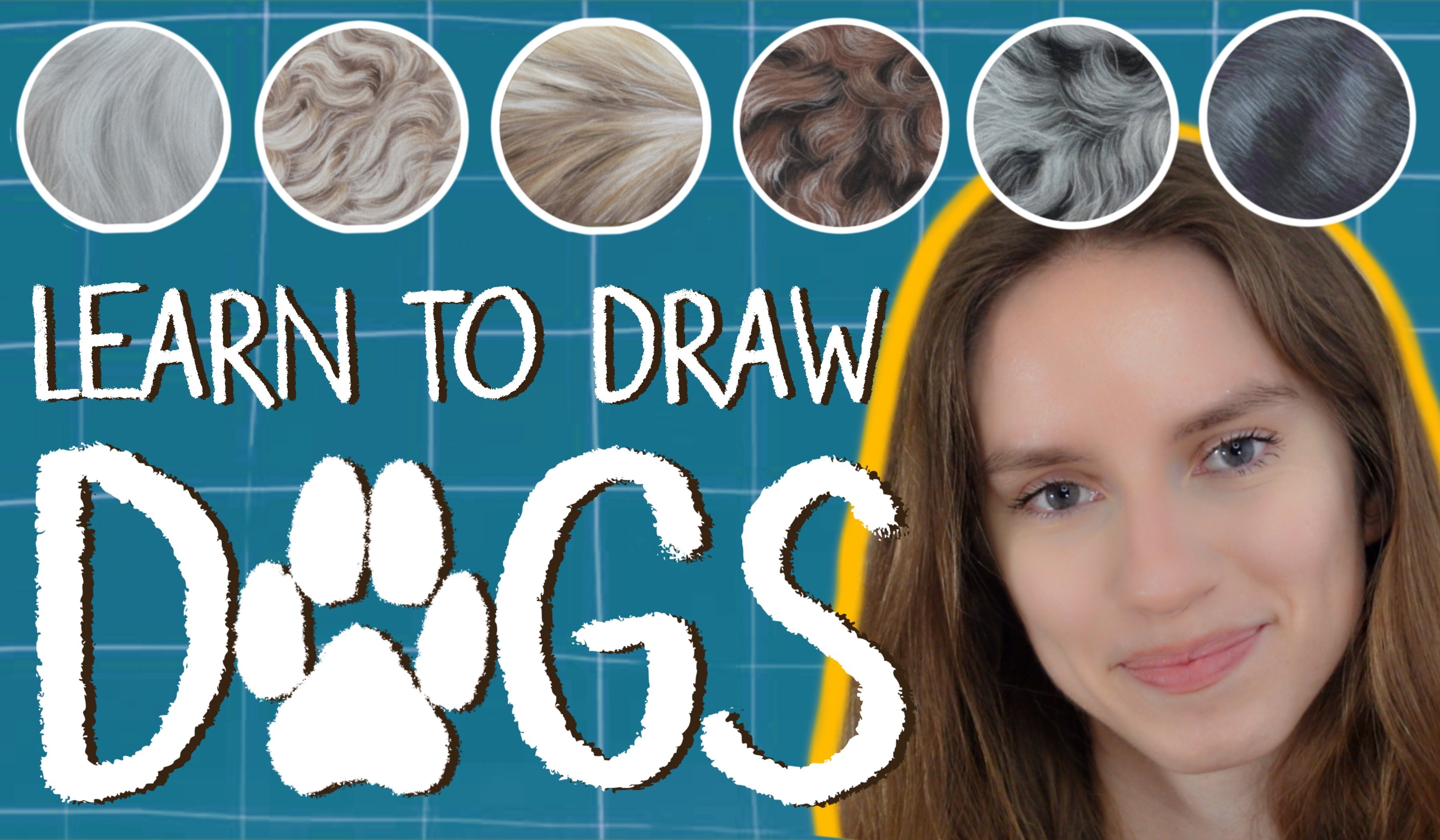
of a full legged friend. My name is Victoria Amoco
and I specialize in realistic pastel
portrait of animals. I have been working
professionally as an artist for a
number of years. And in this class, I would love to share with
you the entire process packed with tips
and tricks that I have picked up over
my drawing can read this class is for
advanced artists, but the drawing
process is divided into simple and guided steps. So even if you don't have a
lot of drawing experience, I am sure that you will pick up a ton of useful
tips in this class. So I welcome artists
at all levels. We will begin the class by
looking at the only tools you will need to create animal portrait try
and soft pastels. Then in the next
lesson we will look at using reference photos
and what to avoid. The quality of your
final portrait depends greatly on
your reference photo. I will help you choose images to essentially create
the best work. In the next lesson, we will sketch our drawing
more specifically, we are going to use
the tracing technique, which is a little trickier
with pastel paper. We will go over this together,
then we will find it. They begin working with
our soft pastels and create the most beautiful
smooth background. And we will discuss
how to choose the background color that
compliments your subject. Next, we will get started
with drawing our poppy. We will first draw the
eyes than the head, the nose and snout, the ears. And finally the
body will go over this process slowly and I will explain all the
steps in details, such as why I am selecting
sudden colors and y keep in mind when I
create the hash tricks, we will learn how to create basically as wolf
Software styles and how to use pastel pencils to create the fine
details on top, we will focus on volume, depth and
three-dimensionality to make our subject as
realistic as possible. Also, we will focus
on how to capture the personality of the
path and we are drawing. I am confident that by the end of this class
you will improve your drawing skills
significantly and you will have a more
professional approach. What we're trying to follow
me on Instagram where I post all of my Skillshare
updates and you will see a lot of my work there to also follow me here
on Skillshare to be notified whenever I
release a new class or I have a big announcement
to share with my students. I hope you find this class very informative and enjoyable. We'll be going over the
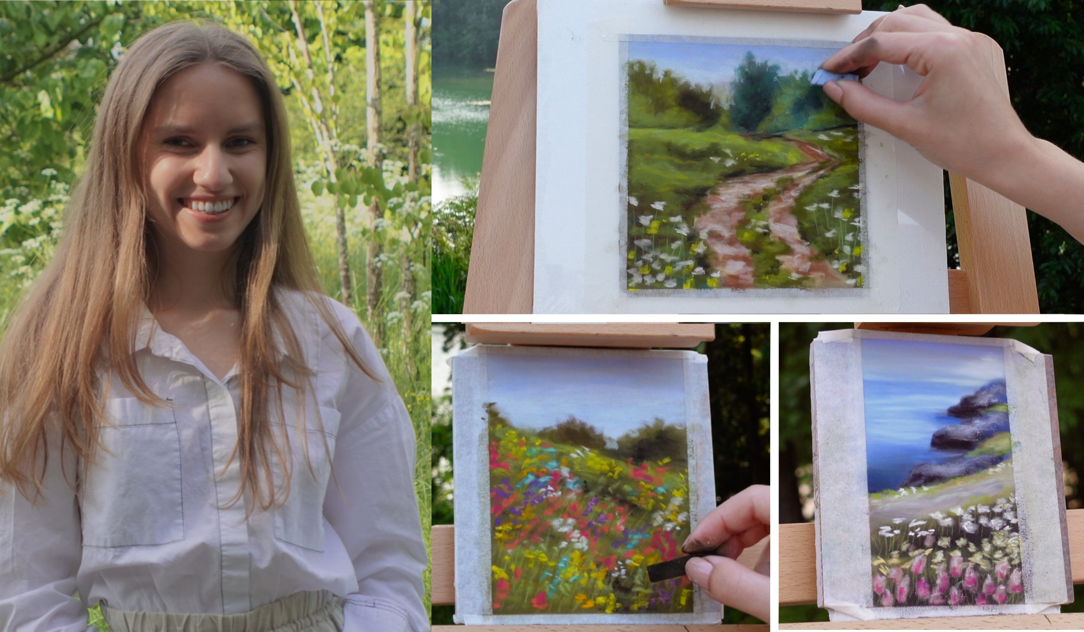
entire drawing process. So I hope you join in and create a small study with me as though we are
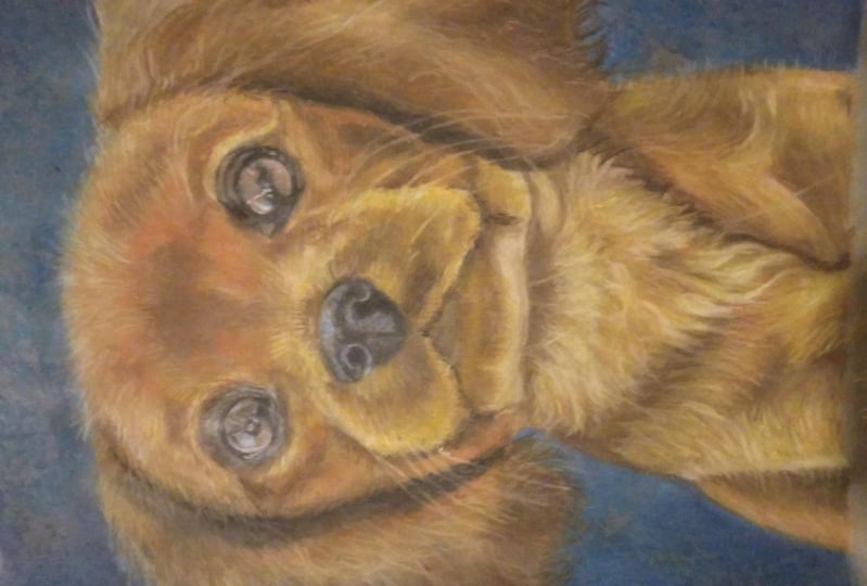
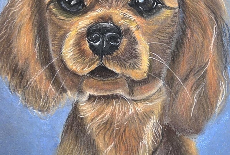
working on it together. You can even create a small study portrait just like these, to practice the pastel technique and get the hang of
animal drawings. I am truly delighted to
present this class to year and to create a
beautiful animal drawing. So let's grab our
pastels and get started. I will see you in
the first lesson.
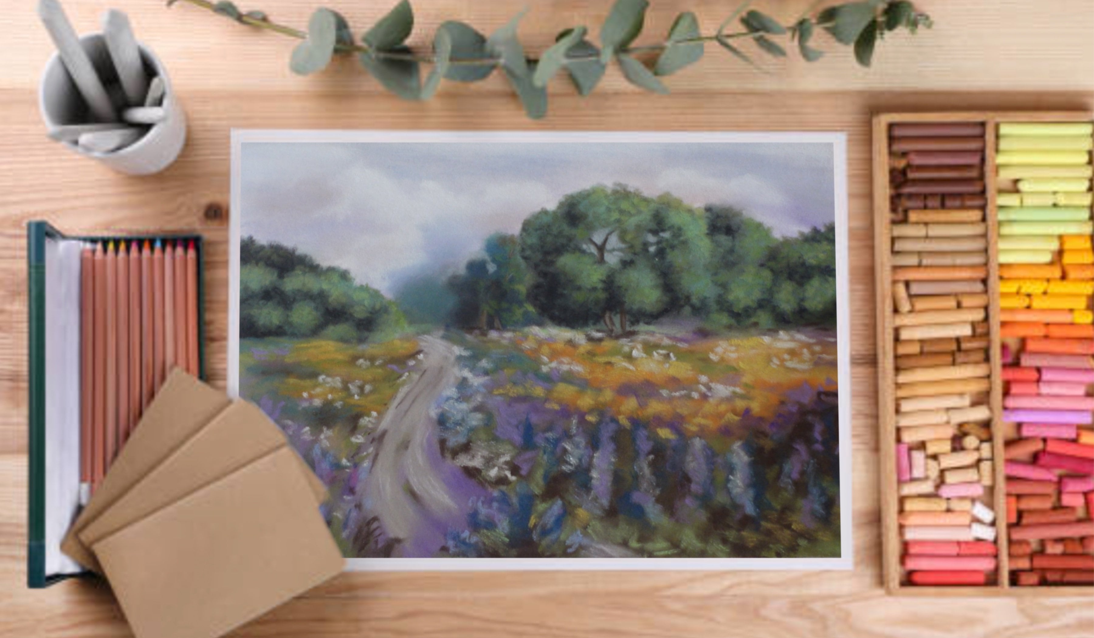
2. Materials: Hi everyone, welcome
to the class. I'm very excited
for you to be him. Before drawing, we'll
begin by looking at the tools and materials
we're going to be using. First, let's take a look at
the surface we're drawing on. I use clef on time
pastel mat in dark gray. You can get both the board
and the COD version of this. I always prefer the board, but both work perfectly. I choose the dark gray
color because it makes all the pastels of PM on natural as opposed
to white paper, which makes the colors a
bit too bright and vibrant. I also like this paper for pastels because
it's very grainy, almost like soft sand paper. This holds the pesto
very well and makes sure the drawing
lasts a lifetime. This isn't a kind I like, but you can use
any paper that has enough tooth to hold
the best style. The size I'm using
today is roughly ten by 14 " or 25 by five to 5 cm. I usually buy the LOD sheets
and cut out the size I like as the size range of
this paper is quite limited. I like to take this paper
to my drawing board to give it a clean
professional look at the end. Next we have the blending tool. I use this to blend the soft
pastels into the paper. This allows me to create
a very smooth layer. There are various
shapes and sizes, but this is the one I use. It's great for blending
both small and large areas. Next we have the soft pastels. I use these to create the background and the
base layer of the subject. These other sets I use, you do not need as many as this. I would recommend just having this site if you
are starting out. All of these are relatively inexpensive and work
perfectly for me. Finally, we have the pencils. This is the most important tool for creating pesto portraits. I use a combination
of three brands. The capo Thaler, current dash and the fabric Estelle
pit pastel pencils. These sets can get
very expensive. So if you're starting out, I would absolutely
recommend the stubby, low-carb or color pencils,
these older material. Next we will be moving
onto the drawing. Can't wait to begin to see that.
3. Creating the Sketch: Hi artists and welcome. So we are finally going to
get started with the drawing. There are so many
ways in which you can create your
preliminary sketch. So you can freehand it, you can trace it. You can use a projector. But this is a commission. And usually for commissions, I want to work
quickly and I want my sketch to be
very, very accurate. So today I will show you how I would do the tracing technique. So what you will need is a picture displayed
of your reference. They just can either
be printed or it can be on your computer screen. I am using mine on my
computer because I can zoom in to make it
the correct size, then you aren't going to
need your piece of paper. As I said, I'm working
on the class on time pesto mat in dark
gray and the size I am using for the
drawing is about 25 by 45 cm or ten by 14 " roughly. You will also need
some tracing paper. Mine is in a role so I can
cut out the size I need. I'm picking up my PayPal because this is the
size of the drawing. I am also going to take my
tracing role and I'm going to measure out the size of the paper and I will cut
out the role accordingly. So this is roughly how much
tracing paper I'm using. I'm going to overlay my
paper over it and I'm going to cut around the sides. Okay, So this is
the correct size. So we have our tracing paper and our drawing paper underneath so you can check that
it's the correct size. By the way, yours doesn't
need to be perfect. I cut around the outlines very quickly because we don't need the tracing paper
for anything else. We just need to draw this object and then
we can get rid of it. So don't worry if yours
is not perfect as long as it's big enough to fit in
our reference subject. Now, this paper is the
size of our drawing paper. I'm going to do it is I'll just put this against the screen. And I'm going to zoom in until the drawing is in line with the reference
papers about this image. You can even make it a bit
smaller because what I do is I tape around the edges of my drawings so that it
has a nice clean look. We're going to do
that in a minute. But as you can see here, there is some space left
for this over here as well. And I'm aligning it with the
very top of the drawing. I'm going to use a white pencil. This one is listed below
are both yellow pencil. And I use this one
because I find that it's most a dusty because essentially you will
see in a minute, we're going to press the
drawing into the PayPal. So we need the pastel to be very dusty so that it transfers
onto a gray paper shortly. But if you don't have
this exact one, honestly, any other white pencil would do as long as he can
faintly see the line. So I'm going to trace over it. Going to work my way
around my subject. I'm not pressing
too hard at all. I don't want to damage
my laptop screen. I'm just pressing very lightly. In a moment. We're
going to trace the other side of the storing. And then we're going to
press a little bit harder, but we're not going
to need to press this side against the
paper so much so, yes, just draw very gently. And what I'm doing is I'm not focusing too much on
the small details. I'm just mapping out where all the features
also a mocking, this is the side of the
head has this rough shape. I'm not copying every
single hash stroke. And that's because we can
find all these details later. For now, I'm just making
sure that I have the eyes captured in the right place and I'm trying to
capture the right shape. The eyes are very important. So when you do your
initial sketch of the IZ, have to make sure that they
are very, very accurate. If you don't get
the eyes correct, then it's actually quite hard to capture the resemblance of
the dog you're drawing. The eyes have so
much personality. So really, really make sure that you put a lot of effort into, into capturing those, especially
in the initial sketch. Say I'm just mapping out here. There's a dark brown
shadow over here. I'm just mapping out all
the changes of color. So there's a very high
height and lumpy off. And I'm going to
work my way down. Going to bring my
drawing in line. I find that this is my favorite
technique to do when I am drawing portraits that
are on the smaller side. Because imagine you're
working on an A1 size. It would be very, very difficult
to trace out like this. You would need a very big
display screen or maybe even a projectile would work best if you were
doing a very big drawing. Because if you want to
use this technique, you would have to do like
tiny bit by tiny bit. And then it's very hard to
make sure that everything aligns because you're limited
to the size of your screen. But when you are drawing
something small like this, it fits perfectly on the screen. So this is the technique
works great if you are drawing portraits
around this size. Also the nose is very important. So make sure you get this
very, very accurately. Spend a bit more
time on this than the list goes on and
get the nostrils. So why we are creating a sketch? Let me tell you a bit
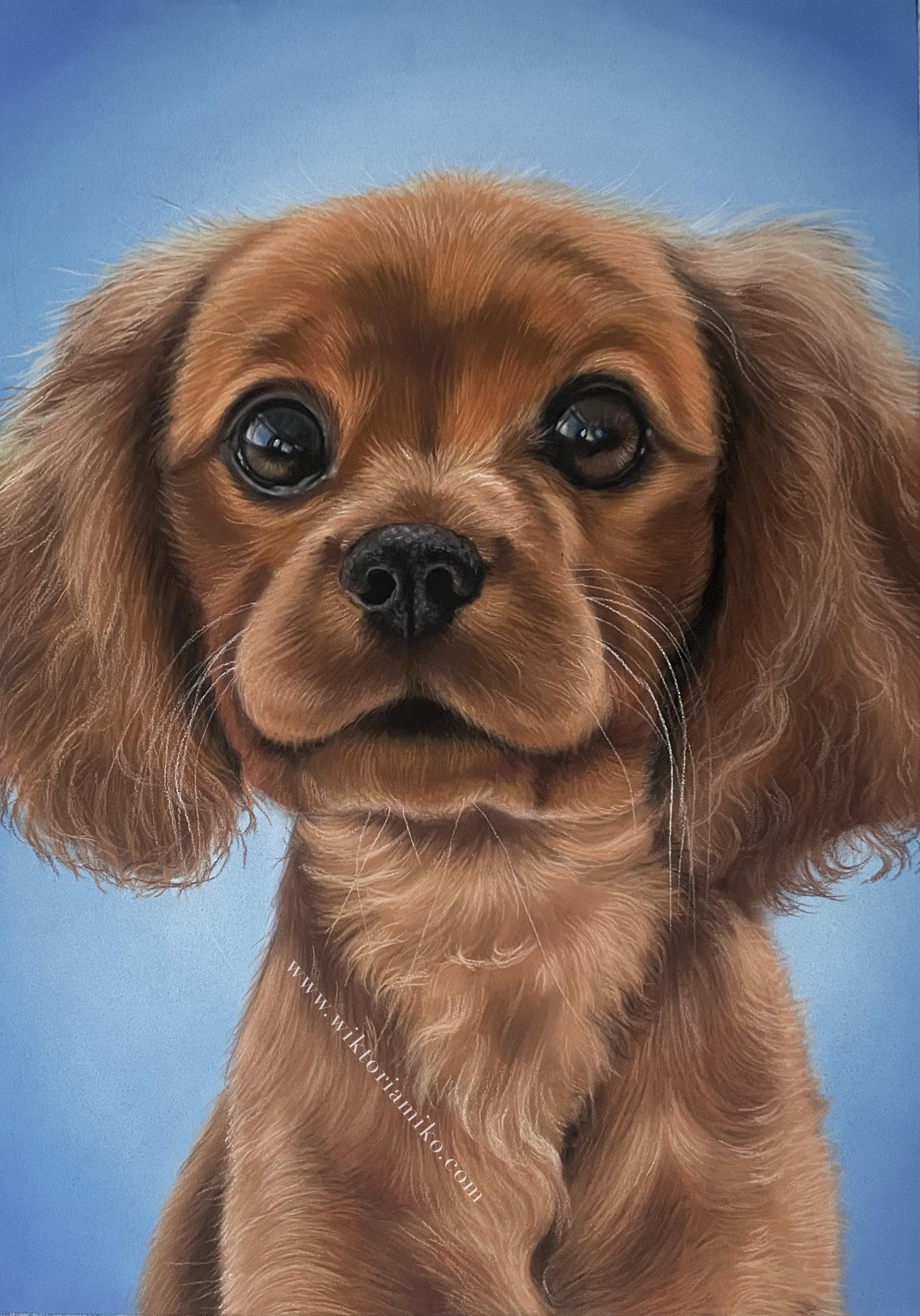
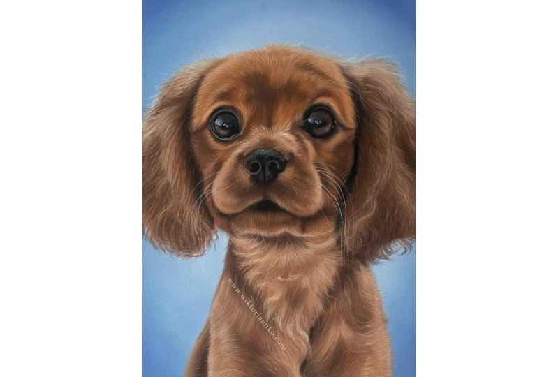
about this puppy. So this dog is called
Alfie and he is a puppy. He is a Cavalier King,
Charles spaniel. And he's very cute. He's actually in my family. Did is so adorable. I just knew I had to
do a portrait of him. So I'm very excited
and I hope you guys are excited to join this all because he's severed horrible. Now a useful thing to know is if you all going to
use this technique, then this works best in a room that's very dark because that's when the screen
will appear the lightest. And you can see all
of the details. For me. I'm doing it in the light
room because I'm showing you guys the technique. But usually I would
blow out my candle, turn off all my lights, and I would do it in the dark. So our tracing is complete. So next what we're going to do is we're going to turn
it on the other side. And now we are going to use our white pencil and we're
going to do the tracing again on this side and make sure you don't do this on the
paper that you're drawing on because all the lines
will show through. So just put this down
on the table somewhere and go over the outlines
and use a farmer hand. Because what we're going to do is once the site is complete, we are going to put it on paper and then we're going
to press down onto it. And what's going to
happen is it will imprint on the actual
drawing paper. Yes, pick up your pencil. On the clean side,
on the robust side, just start going
over the outlines. Okay, So this is how
our drawing looks. This is on the reverse side. So now I am going to
quickly set up my easel and tape my drawing paper
onto the backboard. And then we will transfer this during onto
the drawing paper. I use this blackboard to
tape my drawing onto it. So when I am working
on an easel, I need something very firm
to support the drawing. So I just have this
very cheap piece of I don't know how to
apply what I think. And now I am going to tape
my drawing paper onto this. And after that we will
transfer the sketch. So here is my piece of paper. This is the size of
working on again, this is about 25 by five
to 5 cm or ten by 14 ". You can do smaller or bigger, anything that you like. You can even do like a tiny, tiny drawing like I have over there. These
are very small. They're about postcard
size is just for practice. This is what I'm working on
as this is also a commission, so this is the size. So I am just using a regular
masking tape for this. I don't want
anything too strong. I just want something
that's going to secure this onto the backboard. Why I'm going to
do is I am going to rip off about the entire width of
the drawing paper. I'm going to take up about
half a centimeter at the top. Looks about right. I'm going to pull it up and
secure it against the back. And I'm going to do
the same thing for all the remaining three sides. So again, about this much, I'm going to do this side. Alright, so this
is pretty much it. I'm going to put it
back into my evil now. Okay, so our drawing
paper is not secured. So now we can finally move on to transferring
the drawing. So here is our sketch. So we're going to turn it around and make sure you
have the correct way round. Alpha here is tilting
towards this way slightly. This so I can tell that this is the right
side of the drawing. Then I'm going to press
it against the paper. I'm not going to press it
through hot right now. I'm just trying to map out. I would like what I would
like to press the drawing. And now what you are
going to do, and again, this works better
on a flat surface. But just for the demonstration, I'm doing it on an easel. So I'm holding it very, very funny with this hand. I do not want this
piece of paper, this piece of tracing
paper to move at all. So I'm holding it
very, very firmly. And y I'm going to do is
I'm going to drag down, I'm going to go over all
of the lines and really, really pressing into it. I'm pressing quite hard to make sure that everything transpose. Okay, so now if we
did this correctly and we go to remove
this piece of paper, then underneath you will see a very faint sketch
of your drawing. So now what I'm going to do is I'm going to
go back in with my pencil and I will
reinforce these lines. Well, I'm going to do
now is I am just going to take a look at my reference and I am going to fill in all of those little details that we
didn't capture the Ansari. I am trying to
complete the snout. So my advice would be that you don't rush through this phase. You really take your time with
the details and make sure that everything is where
it's supposed to be. You don't want to
draw the eyes wrong. You don't want to
draw the nose room, you don't want the mouth to look wonky because these
auto foundations, and if we don't get this right, then later on it can be
very hard to capture the personality and
character of our subject. So really make sure you get all the details down now and make sure you
do them properly. And by this, I mean,
I'm not putting down all of the
necessary details. It's just I want everything
to be in the right place, so I'm making sure that e.g. the eyes have the correct shape and that they are where
they're supposed to be. Okay. So I was sketching part of
the drawing is complete. I'm very happy with this. We have the eyes perfectly
mapped out, the nerves. We have all the details, all the shadows are
mapped out roughly. And now we are ready to work on our beautiful
blue background. Sir, I will see you
in the next lesson.
4. Painting the Background: Artists, welcome back. Now we are moving on to
drawing the background. I'm very excited about this because it's my favorite part. It feels like painting. Yeah, let's begin. So here we are going to
be practicing blending and we will also try to create
some kind of a gradient. So usually when I
create backgrounds, I like them to be
darker on the edges and lighter as they
come to the center. So I like to call this
a spotlight effect. I feel like it really
brings out the subject if there is a light
aura around them. This is what we are
going to be practicing. But before we actually start
painting the background, I just wanted to tell
you a little bit about how I choose the
background color and how I create this reference
picture with the background color
already behind it. So this is how the
reference image origin and they looked,
this is cropped. It was part of a bigger picture. So I am using an iPad and recently there was an
update to iOS succeed. And what you can do is
you can just hold down on the subject and copy. Then I go into my
Procreate app and I believe you can only have
this on an iPad or an iPhone. But what I do is I go on this
ranch and I click paste, and then our subject
is pasted very nicely. But if you don't
have the new update, what you can do is
you can just import the picture and you can
erase around the sides. This is just a
little bit faster. But if you didn't
have the update, then what you can do
is you just click on the rubber and then you can
erase around the edges. Then what I do is I create a new layer
underneath this one. Feel free to skip this step
if you don't have an iPad, but this is just what I'm
showing you in case you do and you want to create
your own background. I go into my color select tool. So I tried to find
the midterm color. This is the color that's not
too light, not too dark. So I wouldn't choose
from the shadows. I wouldn't choose
from the highlights. I would pick like a midterm
like from over here, maybe. This is where our
color shows up now. Then I'm going to click on this. And if you go down to harmony, then procreate
will show you what is the complimentary color. Say, Hey, you can make sure in your settings here because you can have different features. But I just go to complimentary. So this is the color that would look best with this color. So I tap on this and I take this color and make sure that I am on
the empty layer. And I drag it down. Here we have our background, but then Y also do is classic. I also do is I find a lighter
color because as I said, I'm going into soft
blend airbrushing. As I said, I like to
create a gradient, so I'd like to do
something like this. Make it, maybe take
it down a few shades. And this is pretty
much how I do it. So you can make this lighter or darker, whatever suits you, but this is how I choose
the best background. So this is how I would go
about creating background. And usually I would maybe make this darker or lighter or
experiment with other colors. So then we have a few
options like this. And I would send them to my client and they would
choose the favorite one, in which case they have
picked this light blue color. So this is what we're
working on today. But when you are doing
your background, feel free to choose any color
if you want to do pink, black, yellow, anything,
anything that you like. Okay, so finally we can
actually start our background. So the tools you will need for this is something to blend with. I am using the
soft pastel knife. My cover is a bit dicey, but I did use it for blue
pigments, so that's okay. Then you are going to need your soft pastels
for the background. So I chose a dark
and a light blue. You can choose any that you like. The steps
are all the same. It doesn't really
matter what color you are using as
long as you have one dark color and
one light color, you can make this
background green, in which case you
would have dark green and light green or you
can make it brown, dark brown, light brown, or maybe even want
to make it black, in which case you
would use black and some gray for the gradient. So these are the colors
I'm using and feel free to do a little sample. We can always cover these up, so just apply a little bit
just to see if you like it. Because sometimes it looks a bit different when you
put it on the paper. And when you actually
see on the stick, like to do a little bit of a swatch test to see if
I can even make it work. Okay, but I am happy with these. So I'm going to
take my dark color and I'm going to use
the flat side of it to work my way down and apply
a thin layer of this color. And I'm applying this
all over the background. Make sure you don't
apply too much of this color the way
pastel paper wax. Is that it has these teeth. So the pastel, the
way it works is that the dust sits in-between the
teeth of the pastel paper. But then when you apply
too much of a pastel, then it's hard to add another layer on top because
it's already filled. So when I am painting
with pastels, I tried to be very
mindful of this so that I can always
make changes later. So since we are
building the gradient, I'm trying to just draw a very thin layer so that we still have space to apply
the lighter best or later. Okay, so now that
we have our layer, I am going to take
my pastel knife and I'm going to blend it. I really, really like this tool because it creates
such a smooth blend. You can also use your fingers
if you don't have this, I would advise that if you can, then I would get
your hands on this because if you blend
with your fingers, It's never learned
to be a seamless even blend like this one. Sorry, this is definitely
a tool life having. Okay, So once this
is all blended, we are going to take our lighter
color and we're going to focus it towards the
center of the paper. So imagine that there was a long oval shape here in
the middle behind the dog. So this is the shape
we're going to draw. Again, I'm using
the flat side is just the most efficient
way to apply the pastel. When you are painting
the background, try not to create
any harsh lines. So if you draw the very tip and you apply lots of pressure, then when you come to blend it, these little marks,
they could show fruit. So this is why I advocate for
drawing of the flat side. Because you are least
likely to make hash marks. And also don't press
into the paper too hard. If you want to make
something lighter, then I would just use layers. And now again we are
applying a small amount. And then if we want to
increase the gradient, we are going to go back in. So again, I'm taking
my blending tool and I am going in
circular motions, making my way from the
outside towards the inside. Actually felt like lightening
the whole background. So I'm going to
take my new color and I'm going to go over the
entire background again. You don't have to do this. It's just I feel
like I don't have the color that I want for the background in my collection, so I'm going to mix them. I'm again, I'm going to
blend the entire thing. I would say that pastels are
very similar to painting. But the one thing that can be, I guess a disadvantage is that you can't really mix them on the palette
like you would with paints, so you have to mix
them on paper. So I applied the blue color
and I thought it would work, but I actually thought
it was too dark. And I don't have a color
that I felt like it's very accurate to the background that I created on my tablet. So I had to mix
them on the paper. But honestly, I don't
mind this so much. As long as he just
work gradually. As long as you
work gradually and apply your pastels in layers. This is why I said in
the beginning it was very important to just
do a very thin layer because if we had overloaded the pastel paper with
that fast dark blue color than it would be very
hard to do this now to apply more color on the top. So yes, be very mindful of that. Alright, so now we've had a
bit of a change of plans, but I did have to mix my colors to get
the shade I wanted. So now that we, our base color
is a little bit lighter, I'm going to go back in. I'm going to go back in with my light blue color and again, focusing on the
middle of the paper. Again, blend it together. Don't worry if you go into
the outline of our dog. Doesn't matter that much
because we can always overlay when we do
start drawing the dog. But try to stay
within the lines. And to emphasize
the gradient more, I'm going to use a white color. And this one, I'm going to focus even closer
towards the middle. I'm not going to go as far as
I did with the light blair. Alright, I'm very
happy with this now. I'm just going to
take my clean finger and I'm going to
perfect this blend. Little. For the final step, I'm going to use a
darker blue color, and I'm going to just add the tiniest amount of
pigment in the corners. Then again with
our pastel knife. I'm going to blend this. And I'm doing this to emphasize
the gradient of bit more. Okay, so this lesson
is almost done. The only thing I
would do is I would take my tracing paper. I would just go over these lines
because I didn't lose them when I was
doing the background. Okay, so our background is done. I did go way too much into
the silhouette of the dog. As you can see, I accidentally covered all of these areas, but that's okay because we can always lay on
the pastels over it. So when we draw the a, we will fill in this
area and that's located. In the next lesson, we are going to be
drawing alphas eyes. And I am very excited for this. That's always my favorite parts or I will see you then. Bye.
5. Drawing Eyes: Okay, welcome to
the next lesson. So now we are going to
be drawing the eyes. So I'm using a black pencil
and I am just going to start by drawing the
outline of the eye. And this time when I do, I'm going to add all the
details and make sure that I'm very, very precise. So I'm doing the eyeball fast. I'm the tree just
working my way around making sure I have
all the details. So I'm wearing to repeat
the same steps for this I, of, hey, let's just focus
on this iPhone now. So now the outline is done. I am going to start by filling
in all the darkest areas. So this is the
stellar black pencil. So I can see that there is
a lot of darkness here. In the eye. There is a bit of a
reflection over here. So I'm going to leave this out. And also at the top, there is a very dark patch. So yeah, Essentially
when I'm drawing this, I'm just trying to
make sure that I copy down all of the shapes and I know that
sounds intuitive. But during Israeli
just observing, you see why the colors are. He looked at where
the colors are and the copy their shapes. This is, this is
really how it works. Moves is why look for, I
look for shapes when I am, when I am copying down colors. So I can see that there is a
triangular shape over here. This is somewhat of an arch. Over here as well. At the bottom. There is some uneven
space over here. It goes up. And
then to the side. Now I am taking
my blending stump to walk this layer
into the PayPal. Remember, pastel paper, it has a lot of texture
and I really want to secure this color into the paper so that
it does not move. I'm just working my way
around the whole region. I just call it in. Then I
am using this gray pencil. And I'm going to fill in the
top part of the eyeball. Again, I'm observing the shape
so I can see that there is a round patch of gray
over here and it goes up. Really zoom into the, I am looking at the
reference on my iPad and I'm really zoomed very
close into the eye. And I can see everything and I'm the tree just coping on
the shapes as I see them. Then I'm going to bring it down a little
bit further here. And now I'm taking
another pencil. And I'm going to
add the highlight. Reflection in the eye. There is some gray area
above the eye over here. So try to use this. I'm just reinforcing
the black region for like it's faded in too much
with the remaining colors. Alright, so I know
it's hard to tell because right now
this doesn't really look like an I have
nothing to compare it to. Once we fill in all the details, it will begin to
come in together. But I think this looks
really good so far because I've just turned
on the lights to make it a little bit brighter. Anyway, let's continue. I see there is some faded Brown inside of
this highlight over here. So I'm just trying
to replicate this. Now. I'm going to fill in
the area underneath the eye and above. I'm going to blend it
in with a brown color. I'm only using pastel pencils for this as opposed to using the soft pastels because the
soft vessels are very big. So if we tried to add in some details with
something as big as this, then it would be really hard to have any kind of precision. And the eye is so small
that it just works best to use a pencil because you need to be very accurate with
how you draw it, because This is the eyes, the feature that distinguishes this dog from other covenants. Sorry. I would use a soft pastel for pretty much everything else. But for the eyes, I just need
to be very, very specific. Sir. I'm using just the pencils. Now. I am just extending towards the
areas outside of the eye. And I can see that there
is some brown over here. I'm choosing a very warm brown. This is molecule
been sienna color. There are some dots
here on the waterline. There are some reflections. Is quite important if due to add more
definition to the eye. So when you want, during the
reflections in the eyes, they are rarely pure white. Usually they reflect
some blues and purples. So even in the photo, even though there is
some white light, I'm going to change
that because I feel like that's kind of hard to
translate into a portrait. So I want the eyes to
stand out even more. So I'm taking a blue
color and I'm going to draw the reflection. I'm going to change
it completely. Now. I'm going to go in with
a little bit of white. I'm going to drag out
this highlight as well, two more, the center of the eye. I just wanted to make the eye as reflective as
possible because that really adds life
to our portrait. I'm going to do one more here. I'm just going to add a
little bit more blue into this reflection to really make
it look like it's the sky. Okay, So we will work
in the areas around the eye later when
we do the firm. I'm sorry. This is pretty much
it for the left eye. It took us a while because you just gradually
have to build up and they are. But this is what it looks like. I think this looks
amazing, even though it doesn't exactly
follow the reference. As long as you have the shape, the reflections are not
characteristic to the dogs are. As an artist, you are at
liberty to change this. And I just felt like
this would look a lot nicer if it had a really
big reflection because this is a puppy and I feel like I'm making the eyes stand out
more and look more innocent, really captures the
nature of a puppy. So I felt like this was
the right decision. So this is what our
left eye looks like. And now we're going to repeat the steps
for the right eye. Okay, so we start the second die by drawing the outline again. We're going to repeat
the same steps that we did for the first time. So again, what I'm looking
for here is all the shapes. So right now, if you look
really closely at the eye, you can see that there
is a light gray patch. And I guess it's a reflection. Then another one over here. And the rest seems to be
pretty much pitch black. Then we have the hair
separating the eye area. So now I'm going to fill in the will the areas that
are black on the eye. And I'm going to say it's
pretty much all of it. Again, I'm not doing a
thick layer because we are going to add some reflections
on top of this later. So we don't want
to fill in that. We don't want to fill in
the truth of the paper. Okay, and now to work this
into the pastel paper, we're using our blending tool. And also it works just as well. If you use the tip of
your pastel sponge knife, it would do the same thing, but this one just has
a bit more precision. These are so cheap by the way. You can probably find
them in any craft store. And you can actually also
make them yourself at home because it's literally
just compressed PayPal. People call it like a blending
stump or a paper stump. Yeah, it's, it's amazing forum blending the small areas
because it has a fine tip. And when it gets dirty, you can rub it on some sandpaper and the pigment
will all come off. Okay, and now I'm
going to fill in this section of the eye. And again, these
are just the very basic shapes and colors. We're going to do the same thing that we did with the left eye. And we're going to add a lot of detail
on top of this area. This is why I love about
pastels because he can really lay out infinitely. Okay, so we've roughly
captured the shape of the eye and all the shadows inside of it and the highlights. So now I'm going to do the same thing as I
did around the eye. I'm going to slowly
start booting up. This is just very basic. Of course we're not
adding any detail. We'll do this in
the later lessons, but now I'm just adding all
the shapes around the eye. Again, we are going
to add some brown. Okay, so now that
we have the basic shapes and colors mapped out, we're going to start
filling in the details. Sorry, with the black pencil. I'm going to make the
eyeball stand out some more. And when I am drawing, I am looking down at my
reference like every two 3 s. To make sure that
everything aligns. You have to be, if
you want to create a very realistic
drawing, one that radio, radio resembles the dog or anything else that
you're drawing rating. You have to constantly look at the reference and you have the tried to copy things down
as accurately as possible. Again, even though those
details aren't really, there are no reference. I am adding some
details to the iris. Okay, now, I really like how this eye has some reflection
in the water line. And even though we can't really see anything like
this in the reference, I'm still learning to add it just to make the eye
stand out some more. I'm going to do a
very simple line. This then. Some very bright highlight. The eyes are done. We are of course going to
fill in the area around them, but I just wanted to
show you how to do the eyeballs and make
them reflective. So e.g. if the eye is lacking
some highlight, then I just wanted to show
you a way that you can incorporate it without really taking away from
their resemblance. So anyway, in the next lesson, we are going to start
working on the file. And I will show you how to create basically
as with soft pastels. So I will see you
in the next lesson.
6. The Head: Welcome back to the class. In this lesson, we are
going to be doing the head. We'll do all of this area around the walk around the eyes. We'll get started working
with soft pastels and we will build some
beautiful texture. So let's get started. So the way I approached drawing, that is by first
drawing a base layer. For the base layer, I
use my soft pastels six. I have a ton. Obviously,
you don't need as many as I have these. I've just a quiet or EVA, so many years of drawing. But really I'm only going to
be using a handful of them. If you feel like you don't
have enough pastel colors, then you can always
mix them on the paper. When I draw my base layer, I always aim to have a little bit darker then what the finished product
is supposed to be. So here's my reference
image. So e.g. this area here, It's
like medium brown, but I would make it
a little bit darker. And then this area over here, I'll make it a little
bit darker too. So the reason why I like to
make the base layer darker is because when we apply our
pencils on top of it, then this is how we build depth, because the pencils
that we apply, they are going to
be lighter shades. So we are going to bring
back the values of the actual fat and ultimately the finished product will
be the accurate color. But we'll make the base layer darker so that it appears as though there
is for underneath. And yes, we will achieve dimension and depth within
the five we do it this way. So I'm going to start with
this area over here now. Okay, so I am going to stop
by swatching my colors, seeing if I like them. I'm thinking of using this as the highlight color.
It's not bad. Okay, so I'm going to get started now first I'm
going to be filling in this light patch towards
the right side of AI. And as you can see, this is
a little bit darker than the final column that
we're going to achieve. So essentially I'm just
following the shape, so I am trying to pick out
all of the highlight colors. I'm just observing
where they go. I'm also drawing in the
direction of the hair. So e.g. this hair is
going towards this way. So I'm trying to already
create this direction. So when I'm picking my
pastel sticks colors, I'm trying to pick ones
that are very warm, not cold because this dog
has a very warm coloring. So I don't want to pick browns that I don't want to pick browns that
are a little bit cool. I want to pick ones that are
very rich in the red tones. Don't worry too
much if the shapes, I'm not exactly accurate, we all going to be blending
this in the moment, so they will all kind
of blend together. So don't worry too much, just map out roughly
what all the colors are and try to capture
their shapes somewhat, but you really don't have to
be accurate in this step. So now you take your blending tool, whatever you're using, I'm using the soft pastel knife. And if you are using
a sponge like IM, make sure that yours is either clean or it has
brown pigment on it. The last thing you want
to do is go ahead and start blending with
a green sponge. And when I am blending, I kind of tried to blend
all the colors separately. I don't just go over the
entire thing at once because it's just going to mix all of them together into one turn. And we don't want to do that. We went to leave the highlights where they are and the
shadows way they are. We just want to than them into
the paper and we also want to create smooth
transitions between them so we don't want any
harsh changes of turn. So we went to overlap
the colors somewhat, but we don't want it to blend this whole
area into one color. Okay. And if you feel like you need to add, then go ahead. I definitely feel like I
need a bit more red in here. Sometimes actually works
better to be then move your finger because I feel
like with the sponge, it kind of mixes all
the colors into one. But with your finger you
can keep the turn in place and just press
it into the paper. Because your finger carries
so much less pigment. So yeah, it's, it's
better if you want to keep your colors separate
and I'm just yeah, not blended into one
blob of color menu. Now, I'm going to add
some quick highlights. So we have highlighted over
here and above the eye. Then there's a bit of
highlight them this way. I'm being very careful
not to go over the eye. I don't want to have
to work on that again. And pastels, they are so dusty. I, if I were to drag
my finger over, the whole thing would disappear. So I'm being very careful. Okay, So this is
rough the wall you should be getting
as the base layer. So we have all of the
shapes mapped out. You can see there
is a darker shadow here on the middle of the forehead that some
shadow rings above the eyes. This area is more orange and this area is a lighter
shade of orange to, I guess I had also done some basic highlight and
shadowing on the eyes. But now what we're going
to do is we're going to put our soft pastels
to the side for a moment and we're
going to start adding our details with our
soft pastel pencils. I'm going to make sure
to wipe my fingers. And I've been doing
this throughout the entire drawing session
because if I change colors, I don't want to
contaminate them. So I just whenever
I change the color, I make sure to quickly wipe my finger quickly wipe my fingers on the
tissue, and that's it. Also. I don't want to blow the last so with a clean tissue, I'm just going to wipe it down. Okay, so now we're going
to add the details. We'll have our colors and
our shadows are in place, but we just have to create the actual texture of the file. I'm going to be very
careful and they'll not to lean my hand
on the drawing. I'm going to just rest it on
the areas that are clean. I'm also not going to put
it in the background slur. Actually, before we do that, I'm just going to draw some dark shadows because
the is start over here, but the hair from the
head, it overlaps. That is slightly I'm going to just and the small amount
just around the head. No. So on this side, when I am applying
the hash strokes, I am trying to make them
the same length of the fab. Sir. I'm not just going
to do one long stroke because this puppy has very
short forever above the eyes. I'm just creating very
small short strokes. Also, another thing I'm
keeping in mind is I am trying to keep the lines at a slight distance
from each other. I'm just going to draw them one right next to each other
because that's going to end up covering
the entire basically on sir, I am creating. Lines with a little bit
of space in between them. And in the end, this
will also make it look like the drawing is
much higher quality. So yes, I'm keeping
these things in mind. So essentially I'm using
my base layer as a guide. I'm applying the lighter
pencil colors over the lighter base
layer regions and the darker colors over
the darker regions. And of course, the
color variations. Some highlights a lighter
and darker than others. Some of them will read,
some of them were yellow. Some of them are cool and warm, slurry detail the
things I'm looking for. But yeah, this is the essence
of Drawing Animal Farm. So I'm using this
color as a millstone and I'm going all over
the neutral areas, so the medium brown. I'm also using darker
brown pencils and adding darker hair
strokes to create depth. It's also important to
remember that we have to choose from warm browns, not cool browns, because this puppy has very
warm coloring, so he has a lot of
red undertones. So if we pick up brands that
are slightly blue tinted, which I'll known as
the coal trains, then they won't
look quite right. So yeah, I'm just
repeating the process. I'm applying darker browns in areas that I want
to be withdrawn. So the shadowy areas. And remember that the areas that are light a pay closer to us because they brought forward and the darker areas
are in a distance. So this is how we use color
to build dimensionality. Over here I'm just adding
black because there are some very dark
cars are on the eye. And now for the final touches, the very top of the
head is the lightest. So here I'm using a
very light pink at, it's almost a white color. And I'm adding hashtags
right on the very top line. And also I'm creating
some hair strokes over the background to
make it a pastor, Alpheus standing out against it. Okay, So this is how I
go about doing the fat. So to summarize for us, we created a base layer. We tried to simplify the
far into simple shapes. So we knew there was
dark brown over here, so we created a shape like this. And that we knew were
arched highlights over here and above the nose. So we have approached it this way and that's how
we created up ice layer. And then after that we
have created five strokes. The way we did this is we
kept in mind that they have to be the same length as the actual head to make
it look a bit fluffy. And also we kept in mind
the direction of the hair. In the next lesson we are going
to be completing the head and we will do the mouth
region. See you there.
7. Nose & Snout: Hi, welcome back. In this lesson we
are going to be drawing the mouth region. So we're going to
start with the nose. So what I'm going to
do is I'm going to draw an outline around the nerves just like
we did with the eyes. So fast. I'm just doing
the outside line. Now I'm going to
accentuate the nostrils. I'm making sure that I
have the right shape. The nose is also
like the eyes in that it's very
characteristic to the dog. So really put a lot of
effort into capturing the correct shape and size. You see there is a bit more
of a darker shadow here. And it lightens at the very top. So I'm doing this line just
to guide myself later. Has a really thick line
right down the middle. You can use soft pastels
instead of pencils, but I like to use pencils for the nose as well because again, just like the eyes, it's very small and there are a
lot of little corners. So I want to have precision. So I'm using a pencil. I'm outlining all of the areas. A very, very dark starting
with the most sure. I'm adding a thin layer of that here because it's still
quite a dark region. It's not as dark
as the nostrils, so we have to apply less black, but it's definitely
still dark nonetheless. Okay, so these are
roughly the highlights and shadows in place. We can see that
around this mixture here there is quite
a lot of highlight. And then at the top
over here as well, we're going to say, I only applied a very thin,
they're black. So than anything we put on
top of it will be lighter. I'm going to take
my blending stump and I'll go over
the light areas. And remember we want our
base layer to just be a hint darker than the
finished products. So right now this is
just the base layer. You don't have to be crazy
specific about how this looks. Just get all the
highlights and shadows in the face and make it darker
than the finished piece. Because remember when we add
our pastel pencils on top, they are going to lighten
the whole nerves. I'm just going to exaggerate the shadow a little bit more. There is some really dark
arch above the nostril here. And there's a thick black line running right down the middle. Over here. It's a
little bit darker and you want the nostrils
to be a fat black color. So yes, this stage, essentially what we're
doing again is we're just copying down very precisely all of the shapes
in the right colors. And that's, that's
pretty much it. So I've only used black sofa. Alfie does have a black nose, so it's a little bit
more simple because we don't have to worry
about the colors too much. It's a bit more straightforward. So now with my finger, I'm going to slightly
blend over everything to make the lines that
must seem this. Okay, so now the fun part is we're going to
add the highlights. So I am using a gray
pencil and this one has a slightly bit
more blue hint to it. And essentially slowly
the dog nurse takes die. It has I don't really
know how to describe it, but it has those little cracks. That's very difficult to draw. But the way that you
can represent this as by just drawing little dots
very close to each other. Then the AI will
fill in the rest. It'll make sense of this detail and it looks like it looks
like the texture of the nose. So I'm just making
very light dots. And I'm doing them over
the entire highlight area. And once we've
finished with this, we're going to add a lighter,
lighter gray pencil. I'm also going to overlap
into the black patches little bit to make the blend
again more seamless. Now I am using a slightly
darker gray pencil and I am applying these dots. Remember the remainder
of the nose. So a lighter, cool
gray pencil over the highlights and
a darker pencil over the over the
mole black areas. So you see how it's
slowly starting to resemble the texture of a nose. And when we add even
more highlights, you'll see how great
this technique is for creating the texture. Just reinforcing the sum of the black shapes because I've lost them when I was
adding the highlights. I'm going to use a
little bit of blur because that looks like there is a little bit of
a blue highlight in this corner of the nose. And here I'm going
to take a very light blue and I'll add the
very light highlights. There is also a tiny bit of
brown reflecting over here, so we're going to
add a hint of that. Alright, so this is pretty
much then those done. And now we're going
to do the snout. So again, we're starting
with the base layer. We are mapping out all
of the highlights. Putting them, I'm
roughly copying their shapes and
where they belong. Again, remember we want the base layer to be a
little bit darker than the finished products or use shades that are
slightly darker. Also something that's
important to keep in mind is now when we are
drawing the snout, we have to compare it to the areas that are
already existing. So we have to
compare like, okay, what color is this shadow over here compared
with this shadow? Because we want to make the
drawing look very cohesive. These other things you
have to do to it to create a convincing drawing. E.g. right now the shadow
here is very dark. It's about as dark as this
one here on the forehead. I'm trying to match them. Yeah, little by little. We add our colors and then
we build our texture, and we build a
beautiful drawing. Again, there is a very
dark shadow here, and this is about just as dark
as these two on the side, on the forehead so you
want to match them. Okay. So I'm wiping my fingers. And I'm very typical.
My blending stump will blend all of this
together and see how it looks. And then we can always add more soft pastels on top
to perfect our base layer. I'm going to start with
the lighter colors. Alright, this certainly
does not look amazing yet, so I'm going to add
some more colors. It's definitely not as warm
as well as the forehead, sir. You have to add
some reds in here. Okay, this looks a bit better, but we still have to add some more highlights
and shadows. I'm going to take this
slowly one by one. So first I'm doing
the dark shadow on the, underneath the nose. Hi. Alright, so I'm pretty
happy with this. Now I'm going to just wipe off. Okay, so I'm very hopeful
for the base layer. Now we are going to add the fire texture with
our pastel pencils. Sorry, Put yourself to
pastels to the side. And let's move on to that. So right now I'm just blending the nose into the
remainder of the snout. So I'm going around this
area because there is a pretty big black shadow
or patch underneath. And just like with the
rest of the drawing, I'm adding light pencils over
the light base areas and the mid brown over the
midface layers and the dark browns over the
darkest layer regions. And again, this varies some highlights a warmer
and darker than others. So these are the
things I look for. So I'm slowly building
up these details. This color is very good
for the lighter mid tones. Again, remember, this
is very important. We have to create
foster works all the same length as the dog's head. And they also have to go
in the same direction. Make sure you have your reference
photo displayed and you are looking at it like
literally every few seconds. You can't see if I have my
displayed on the left side of my easel and I am
constantly looking at it. I am not working from
imagination at all. So remember this is
a commission and the owners of the puppy know
his appearance very well. So we have to really make all the details like they are
on the reference picture. Now I am adding some
browns for some reason, browns are a little difficult to apply over the light areas. So this is why it's important to have a
darker base layer. Then you just have to lay a lighter pencils on top
which is easier to do. Okay, So as far as the snout, it's pretty much done. Now we are going to fill
in the surrounding areas. So again, Harry, I'm mapping
out the darkest regions. I am figuring out where the
darkest brown areas are. And I'm trying to
simplify this shape. And this time I'll just blend all the colors one-by-one
with my fingers. Blending them with your fingers is a little different
than blending of your pastels bunch because your fingers don't
carry so much pigment, so it doesn't spread around
the paper so easily. So when we use our finger, we are keeping the
colors more or less in one place and we're just
working it into the PayPal. But when you use a sponge, it's a little harder
to control as the pigment carries everywhere. So it's easier to blend the whole area
until assimilatory. And you can use both blending techniques
to your advantage. The sponge work brilliantly for the background to create
such a seamless blend. But when it comes to precision, it can be a little bit tricky to do that with your sponge. You can see here how
beautifully the pastels blend. They stay in the same place, but just look a lot smoother when they are blended
with your fingers. So I'm applying
some final shadows. I'm almost done with this part. Okay, So our base
layer is complete. I've also just done
an outline around the sides in between
the ears because I'm in between the
ears and the face because we are going to
draw some further over it. So I wanted to have this done. Okay, now pick up
your pastel pencils. We are going to add
details to the file. Okay, so now we are
going to be adding the details of our pencils. So I am using the yellow pencil in the areas
that I want to stand out. It's a lighter color. So when we apply it
on top, they are, the colors that are lighter
will come towards us and the colors that are darker will appear as though they
are further away. I'm still going through
the same process. I am applying the
mid tone browns over the mid tone base layers. And this area
underneath the mouth is a bit more on the orange side. So I am choosing my
pencils accordingly. I am using my blending
stump here to drag the black pastel
into the brown eye. I'm trying to make the
transition a bit more seamless. Again, working with
my mid-tone here. Now I'm applying
the highlight color on top of the midtone. Now there is some
pink highlight here, sir, I'm adding this term. Okay, So the mouth
region is now complete. And the next we are going to
be moving on to the ears. See in the next lesson.
8. The Ears: Hi artists. So now we're
moving onto the is. Again, the standard procedure is fast reader the base layer
without soft pastels. And then in the
second stage we apply the details with
our PESTEL pencils. So again, let's start
with this error. Behalf us were there and
to build the base layer. So I'm going to start
with the darkest areas. Again, we remember
that we want it to be darker than the
finished product, so don't be afraid
of the dark colors. We all go into light
and these regions soon. And then I'm going
to blend this in. There is some red color along the side of
this brown region. It's a very vibrant
orange or red. Again, I'm just going to
reinforce these dark shadows. This area right down the middle
is probably the lightest. We're trying to
keep that in mind. We want this to be
the lightest area and darker on the sides. I'm going to make it a
little bit more red. Okay. I'm pretty
happy with this. This is the darkest area. Then we have some darker brown
patches on the left side. And there is a bit of a head
running down the middle. It's very faint, but when
we add the pencils on top, it's really going to bring them out and make a big difference. Sir. Anyway, let's move
on to the right ear now. Okay. So same
process that's fast. Make this area dark. And I'm trying not to
go into because we have some really nice flat strokes
coming out of the head. So I'm trying to
not go into that. But honestly don't
worry about this. It's pretty easy to
bring them back soon. Anyway, just some radiating
black area over here. We're going to blend this now. There is some vague
highlight for you here. Yeah, The basically,
it's very important, but all you do is you break down what you
see into simple shapes. So right now I'm trying to do this shape over
here and it looks a bit like a triangle. So. I'm just choosing the
colors accordingly and breaking the whole
thing down into shapes. So you can see there is somewhat another looking
triangle at the bottom. That's all it is.
And you just have to do this one-by-one. When you think you've
done with this stage, compare it against
the reference photo, make sure you have
everything in place. I'm just going to add a bit
of a stronger highlight. And with a clean finger. This is a very basic base layer, but it gives us
all that we need. We just need to map out where the dark areas
out with a light areas are. And then when we go over
it in pencil is we're going to bring in all
the detail, okay, so soft pastels aside, and now we are going to be
using our pastel pencils. Clean your fingers
mine, very, very dirty. Okay, So why don't we start at the top and work our way down. There is a lot of
highlight here. Maybe I'm even going
to use pencil because this highlight has a little
bit of a pinkish here to MIT. And also there is a lot of hair now going up
into the background. We want it to look like the dog is before
the background, sir. That's trying not to have a very clear cut line
around the edges. We want to make it a
little bit more fuzzy. And now as we are edging
towards this dark shadow, towards the side of the head, we are going to have a very
gradual change of color. There is a highlight
here at the top. So before we go into
the very dark browns, we're going to use an
in-between pencils. So this is a light
brown, um, and yeah, I'm just adding some
details so that does not such a dramatic change because that doesn't
really look natural. So the heroin that is, it's a lot longer than it is
around the, around the head. So when you create your
own pencil strokes, make them much longer. To make the a is look
Haryana and more fluffy. The area at the bottom. As you can see, we have two
overlap into the background. And the hair from about
here towards the right, goes towards curves like this, down to the left side. And then the hair on this
side curves to the right. So we are trying
to replicate this. So now I'm just going over these strands to make them appear as though
they are like in batches, kind of clumps together. Now I'm just going
over the highlight because I want to emphasize it. Alright, This looks pretty good. Sorry. There are layers and
layers and layers of fat. This area here is stands out against these two
shadowy areas over here. And this area is much
lighter too here. We have some good overlap
over the background so that it looks as though
it comes out a bit. And now let's do it this
way towards the right. Okay, so again,
that's stopped from the top and work our way down. So I'm starting
with the highlight and very important to follow
the direction of the hair, follow the curves
and also the length. That's them. These are
the two important things. The lymph make the, make the lines as long as the actual hair and
follow the direction. So again, you can see that the hair from
this point onwards goes towards the
right and then from this side it goes
towards the left. Citizens, what I
mean by following the direction of the hair. These things that were very characteristic to the
puppies that were drawing. So it's very important
to focus on this. Okay, We're almost done.
I'm just making sure that my highlights are
exaggerated enough. Can see there is some
curly hair texture over here at the bottom. Again, very
characteristic to Alfie. Now I'm just reinforcing. That has all has all the
little hairs on the sides because I did cover them up while I was
doing the base layer. I'm never on this side too. Now, these two long pieces of hair coming out
from above the eye. Going to add this in. Then we're going to
do the whiskers. But that's once we've
completed the body part because it does go
over the body as well. Okay, so this
lesson is complete. So again, we started
with a base layer. We built up the shapes of all the highlights
and the shadows. We made sure that there are very smooth transitions
in between them. And we also made them a few shades darker than
the final product. Then we went in with
our pastel pencils and we added all of the details. And we kept in
mind the direction and the length of the pencil
strokes we're making. And we had also
emphasized all of the highlights and shadows. In the next and final lesson, we are going to be
doing alphas body.
9. The Body: Artists, welcome to the lesson. Last but not least, we are going to be
drawing the body. So again, like in
the other lessons, we are going to first start by building a base layer
of soft pastels. And after that, we will
build the fire texture using our pastel pencils. So grab your soft
pastels for now. I'm going to start
with the dark browns are going to begin
with this shadow here. You see this is why our
initial guys are so important because now
we don't have to focus so much on figuring out where these darker and lighter
areas are supposed to be, which is building
on the foundations that we've already
built for ourselves. Now I'm going to blend
them one-by-one, sir, I'm doing the
darkest colors files on a fast and then
blending them. And then after that we'll,
we'll go from there, we'll add the lighter colors
and then the lightest. And this helps because when
we bend it one by one, we make sure that all the colors don't blend into one turn. So we kind of keep them
separate this way. Now I'm adding the medium cars. So I'm following the
direction of the hair. There's a lot of little strands
of hair that stick out. So I'm slowly building
up this texture. I'm following the
direction they go in and I'm roughly following
the length as well. Going to lighten these
areas just some more. Alright, we're almost
there. I'm just going to reinforce the highlights
one more time. Random, actually going to
blend this out with my finger because you don't want it to blend too much with the
rest of the colors. I just kinda wanted
to sit on top. So my finger is
cleaned by the way, I'm not contaminating the
different colors together. So now I'm going to
wipe my fingers. I think this is
pretty much done. The basically it
looks really good. We have all of the highlights
and shadows in place. So yeah, that's put
our soft pastels aside and pick up our pencils. Okay, why don't we start
from this left side, then work our way
towards the right. So I'm going to start
by building texture. This is kind of our focus, so it's pretty difficult
to see what's going on. But we can make out that the hair seems to be going
up towards this way. And we're also kind
of edging out of the silhouette and
over the background a little bit to make
alphas standout. Then we take our darker color. And now I'm going to
take a little bit of black just to make
this shadow match.com. Then I'll try to integrate
the highlight and shadow some more so
that it isn't there. Harsh lines and it's more
of a smooth transition. Okay? Alright, so this
little section is done. Now let's move onto
this part of the arm. Again, I'm edging outside
of the silhouette. I'm just drawing a few
little hairs sticking out. So I'm trying to build up this little area
over here so fast I'm doing a bit of brown
and I'm pretty much dragging my pencil across
this entire section. And I'm following the curves of the actual hair on
the reference photo. Okay, so now we have
some brown strokes. I'm going to pick up a mid tone color and
I'm going to go over it in-between them to start
building this and this depth. So again, I'm following
the direction of the hair and I'm just building
up the texture. Now I'm going to start
adding the highlight colors. I'm using the CLI or heel
to build up this arm. And it seems like there is a highlight going
along this section. And then one highlight
going along here like this. But in-between is a
little bit darker. If you zoom in, you'll
start to see this. It's very light along with
the very edge of the arm. And then in the middle
It's a bit lighter. So I'm trying to add some, add some lighter color right to the middle to start creating the illusion that
this part is coming out. And we'll go into reinforce this with a lighter
color in a second. But now the CISM, we're gradually
going to get there. Again, make sure that you add some hairs are overlapping
the legs section, because the arm is
in front of the leg. And you can see in
the reference at those a little cute little
heads sticking out. So I'm using now a white pencil. And I'll just add lines, short lines to the very end of the arm side of
the All my main. Because he will observe in
the reference photo that this area is actually
very, very bright. So of course we have to
capture this as well. Then there's some strokes
connecting towards the middle. All right, and this
looks pretty good. I'm also going to add some more yellow to extend this
highlight a little bit. Now I'm going to start
working on this area. Here. It's quite a light region, so I'm going to use
a yellow color. I'm going to try
this orange for now because I don't want to leave the yellow just
for the highlights. I want to build some
base file first. So I'm following the
curvature of the hair. And again, it's very
important that we keep our lines the same length
as the hair strokes. If you draw very short
lines are very long lines. It's just not going
to capture the same, the same look of the firm. Alright, so now we're
going to pick up a white pencil and
we're just going to highlight these little
strands of hair. Now I'm just adding the
really dark shadows here. I don't think this
is even dark enough. Now I'm just making it
brown and in a moment I'm going to add some
black strands to it. All right, Actually,
why don't we move on to this section over here now and then we'll
finish off by doing this one. So I'm going to do
little strands here because the shadow kind of
eats into this section here. So I'm drawing some
quick strokes. It's important to walk
from dark to light here. So right now we're using brown. The brown hair is
usually the one that's underneath because that's a
bit darker in the shadow. And then we're
going to move on to the mid color and then
the lightest color. So we do this in order
because we want the lightest one to look like it's on the
top that gets the highlight. So yeah, essentially
I'm just adding the brown pencil wherever
I see it on the reference. So there is some darkness
he swung drawing some. Hi strokes going
in this direction. Then there is also some
darkness over here. So it seems like all of our
dark areas are in place now. So now let's pick up our mid
color and we're going to apply this color everywhere that we want to create a mid tone. So we observing the
reference pic Charles and which is creating hair strokes over
the brown strokes. I'm going into the brown a
little bit because as I said, we want to create
a gradual blend. We don't want to go from
brown to mid to light. We wanna go from, we want them to
overlap slightly so that it's more
seamless and natural. So there are no harsh
lines essentially. So yes, I'm still following
the directions of the hair and I'm
essentially just filling in the whole area using this color because it's the mid tone. And then we're going to apply
the light color over it. And it's going to
create this nice depth. I'm going to do in this little
bit with my finger because I feel like I made the brown
a little bit too dark. Still going to use
y in the moment, but we're gradually going
to build up the highlight. Follow all of the
little clumps of hair and roughly
placed them down. There is a long one here. Now I'm using a pinkish color because not all of the highlight
has a yellow tone to it, like this highlight over
here definitely appears a little bit more pinks
or three I'm using, I'm using a light
pink color here. Cz constantly have to compare
columns to each other. Like what color
highlight is this compared to the other
highlights over here, and then compared to the highlights on the
head and the ears. This is something
that you have to look at when you're
working with color. If you're working in black
and white, of course, this isn't the consideration
we have to think about is the darkness of
your pencil marks. But yeah, collage drawings are a little bit
harder in this regard because you have so
much more to compare. We don't want these
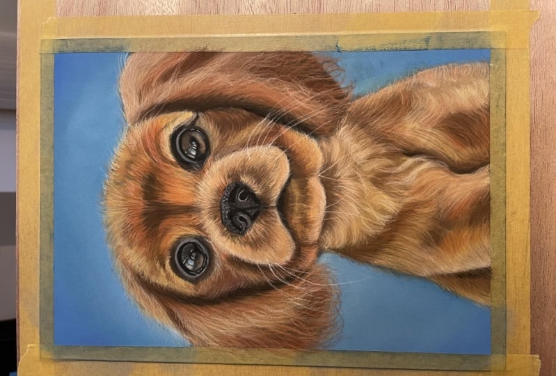
highlights to be if it's on the
reference picture, this height over here maybe is the same color as this
highlight over here. Then we obviously want
them to be the same. We don't want this
one to be much darker than this one because
it's inconsistent. So you constantly
have to be looking at these little things and
matching. Okay, this looks good. And finally, we will move on to the very last section
before we finish our drink. So this is very exciting. So again, let's start with
our dark brown color. So I'm first going to draw the dark brown strokes following the lungs and
direction of the hand. Now I'm picking
up the mid color. And we're going over
all of the mid tones. There is some light color here. And it, Okay, So I'll mid-tone
color looks good. Now, Let's just make
sure that we have some heads sticking out and also really trying to cover up this outline
because it's quite messy. Alright, now I'll yellow
pencil for the highlights. So again, pay attention
to where they are. There's a highlight that has a direction going towards the bottom left, the
bottom-right, sorry. Then on this side it
goes to the bottom left. So almost like a triangular
shape over here. If you look at it
like this, a spike, then there is some
lightness above here. Then here on the shoulder, I guess. Okay. And now the pink color because I want to emphasize
some of the highlights and make sure that you are ever left the background slightly. Just do a few little messy
strokes. Okay, so we're done. The only thing we have to do is draw the whiskers
and I left them to the end because they
overlap over everything. So yeah, now we
can do them, sir. Festival there are these free long ones coming
out of the chin. So I'm using a white pencil and make sure you have
a very sharp tip. And I'm literally just not
putting it flat like this, but I'm holding it, touching it with the very finest tip because I want it
to be a thin line. I'm just doing this. One to the free. There are two coming
out, like so. And now we have more
over here, say 123. Okay, and now on this side, and I'm also going to take
a very light white color because I don't want them to
all be the same thickness. So I'm going to take this one because this
is a very bright white. So this is the Qur'an
dash Chinese white. And if there's any current
dash pencil you buy, obviously these sets
are very expensive. So if you buy them individually, the one that I would
really recommend is the Chinese white
because it's so pigmented, unlike all the other white
pencils I've tested. So grateful doing
things like adding the reflections in the eyes
or drawing the whiskers. I feel like it would be very
hard to achieve a very, very apparent
bright white color. But with this one, this one, it's, it works great. Alright, So I guess the
drawing is complete. This is, this is the end. I really enjoyed working
on this with you. I think Alpheus,
such a cute boy. I guess in the next lesson
we will peel off the tape, which is very satisfying. And we're also going to
summarize the process. And we will also talk
about the class project. Sorry. Make sure you watch the final lesson and
I'll see you there. Bye.
10. Class Project & Thank You!: Hi artists. Congratulations, we made
it to the final lesson. Thank you so much
for taking my class. If you enjoyed it, I would
be very grateful if you left a positive review or
a comment or project, your interactions with
the class help it show up on Skillshare or
other students may find it if you have
any questions or would like me to clarify
anything in the class, then please ask below and I will be more than happy
to help you if you have a friend or
know somebody that's interested in pastels
or animal portraiture. And do you think
they would enjoy this class then, please, rather than CO of
them, make sure that when you do
upload your project, that you leave a link
to your social media or your website or others
can find more from here for the class project
I would love if he created a study of the
drawing and upload it. You can create portrait
like this just enough to practice the impasto skills and get the hang of
animal portraiture. Or if you were
interested in just a small section of the class, like the eyes, it would be beneficial to just do a
small study of those. I would love to see
your drawings and of course I will provide
detailed feedback. I have more pastel classes
here on Skillshare, such as drawing a dog with
darker color, hair texture. If you are interested in drawing other subjects and pastels
such as landscapes, I can recommend this
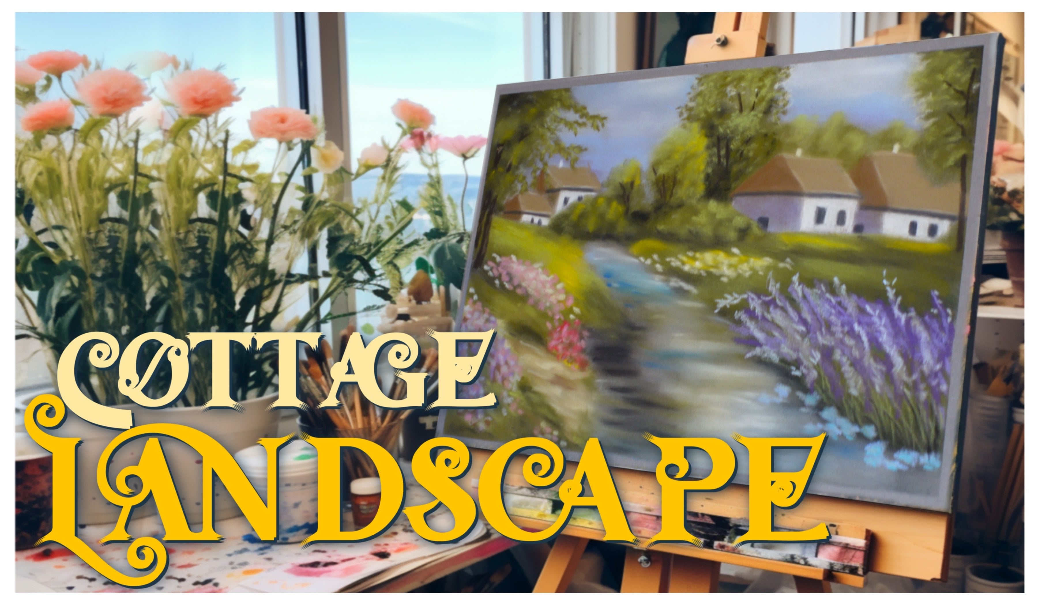
class to you in which we created a magical portrait of a house and a beautiful garden. Or in this class when we drew
a realistic harm if you are perhaps interested in creating drawings for your commissions. Don't forget to follow
my Instagram at Victor, I'm eco out to see
more of my work or updates about my
Skillshare classes. Perhaps if you were interested
in they commission. I am available for those for my website, Victoria
vehicle.com. Oh, sorry. Follow me here on Skillshare to be notified whenever I launch a new class or I have a big announcement to
share with my students. Anyway, that is all from me. Thank you so much for
watching my class. I really hope that you enjoyed it and found it very useful. I am really looking
forward to seeing you and answering any
questions you might have. Thank you so much again
and happy creating.
 Wiktoria, Professional portrait artist