Transcripts
1. Welcome!: Welcome. In this class I
would like to show you how to draw a colorful landscape
using soft pastels. You don't need to have
any prior experience in painting or drawing
to join this class. The process is broken
down into simple steps. So even if you're
just starting out, you can trust that
you will be able to follow and enjoy the process. My name is Wiktoria Miko, and I am a portrait artist specializing in pencils
and soft pastels. I've been a teacher here on
Skillshare for the past year, and I also deliver one-on-one
private art tutoring. In this class, I would
like to share with you a very relaxing
step-by-step process to creating this scenery. We will start by
preparing for the drawing and looking over the
necessary tools. After that, we will sketch
the landscape together, and paint the cloudy sky. Then we will move
on to the trees. Specifically, we will learn a simple technique of layering pastels to draw realistic
trees and bushes. Finally, we will move on to
the cheerful floral field. We will use a lot of color
and learn how to use our pastel stick to create
a variety of fun textures. I hope you'll find
this tutorial to be very relaxing and meditative. I am so excited to present
this class to you, so grab your pencils and I will see you
in the first lesson.
2. Materials & Preparation: [MUSIC] Before we begin drawing, let me quickly tell you about
the tools we will be using. I am going to be
drawing on an easel, you can do the same or draw on your table or whatever is
more comfortable for you. I will be using Clairefontaine Pastelmat to draw on today. The size is 18 by 24
centimeters or 7 by 9.5 inches. In my opinion, this is the
best paper for pastels. Next, we need to
have soft pastels. I am using this set of 36. It was really cheap and
not a special set at all, so no pressure to have
anything high-quality. As long as you
have a good amount of colors, that's all you need. Finally, this is optional, but I do recommend using pastel
pencils if you have them. They are more precise
than soft pastel sticks. When we want to add the
details, they are good to have. But it's fine to just use the
pastel sticks on their own. This is the brand I recommend, they are very soft and blend, and they are very well. You'll also need
something to blend with. I am using a soft blending tool, but if you don't have this, you can blend with your
fingers or even cut off a piece of a regular
[inaudible] sponge. Make yourself comfortable,
put your hair up and grab a tea and a snack. I have a doughnut which
tempted me so much, I finished it before the
drawing even started. Now if you have some
tape laying around, it's good to tape around
the edges of your paper. For me it's to keep it
in place on the easel, but also ensure the sides
are nice and clean. That is all. Now
that you're ready, I will see you in
the next lesson.
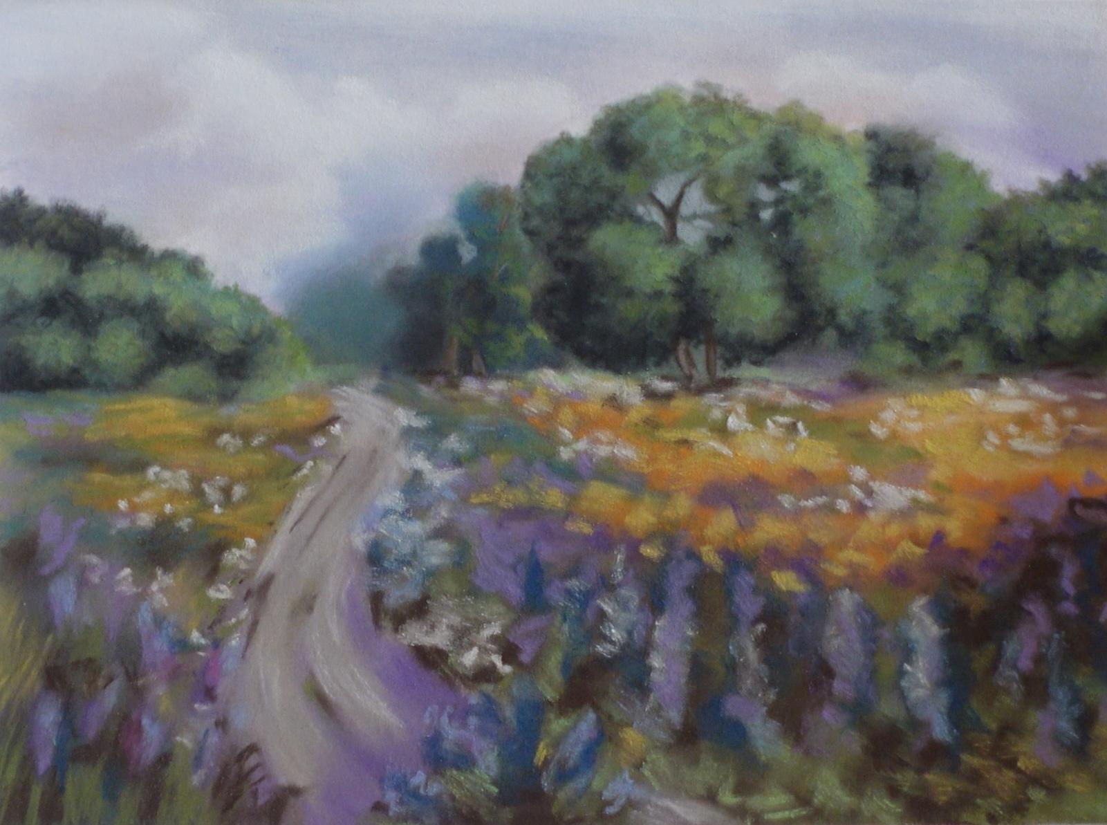
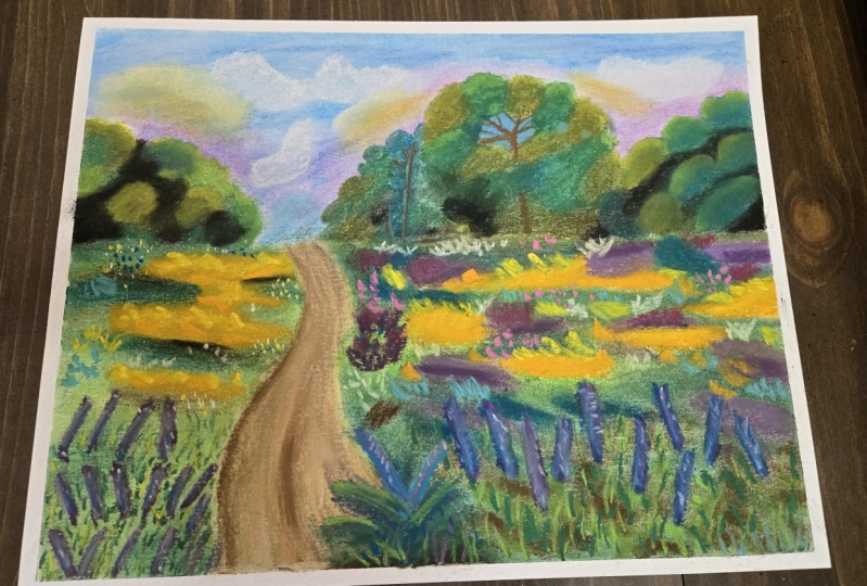
3. Paint the Sky: [MUSIC] Welcome back.
For the background I will be using this
collection of colors. First, we need a rough sketch. We begin by splitting the
page right down the middle. This is our horizon line where the sky separates
from the land. I am also going to outline roughly where I
want my path to be. I am creating a curved
path toward the left side. What's important to know is that the objects closer
to us are going to appear bigger and those
farther away will be smaller. With that in mind as the path gets closer to us it becomes wider and narrower further
away toward the horizon line. Now let's sketch the trees. I'm not going to add any
details to the sketch. For now, I'm just
mapping out where the trees are and
the rough shape too. We will add the details
once we add some color, so I am creating a
few tree outlines. Trees have a rough
circular shape, but they are not going
to be a perfect circle. They will have very rough edges. Definitely try to replicate
this in your own work. If you have even circles
it may not look realistic. I would also like to
have a little bush right in front of the path. Now we can find in the
starting some color. We are aiming for a
somewhat purple sky, the kind you sometimes get at
dawn right before sunrise. It's light, but the colors
are just waking up, so we have some purple
turns in the sky. [NOISE] Next, I am using
a blue pastel stick and almost covering the entire
remainder of the sky. I'm just going to leave a bit of room for a different
shade of blue. I am using more of
a gray-blue here. I am applying the skull so that the sky isn't just
one even turn. If you look outside you'll find that the sky has
different colors, especially during
sunrise or sunset. You'll find different
shades of blue, purple, sometimes even orange. The sky is really
just one solid color. Now we will take
a blending tool. If you don't have
a tool like mine you can blend with your fingers or cut off a section from
a regular clean sponge. Now we're going to blend
the whole sky together. We are blending
little by little. I am being careful not to mix all the colors
into one turn, so that's why I'm blending
small sections at a time. [NOISE] If you feel that your sky is already
at the desired color, you don't have to do this step, but I am adding quite
a bit of white. I am trying to lighten
up the sky a little. Again, I am not applying
this all over the sky, but just in certain areas. If I apply it over the
whole sky it would just be one color, and
we don't want that. I'm also adding a touch of blue to bring back some
brighter color. [NOISE] Now it's time
to create the cloud. I am essentially trying
scribbles, using white. Try to follow the shape and
size I am creating here. [NOISE] Now what's
important is that I will be blending this
using my finger. The fingers don't carry as
much pigment as the sponge so when you blend
with your fingers the pigment stays where it was, but it looks more faded
whereas the sponge carries so much powder that you
can really spread around. I am deliberately trying
to use my finger to soften the cloud but make
it stay where it is. I am adding the tiniest
hint of orange. I like the look of this
because it looks like the sky is on the verge
of brightening up. [MUSIC] Now I am
bringing back some white to give the
cloud some dimension. Finally, for the last step
let's pick up some darker blue and add it into this gap between the trees
to create depth. The darkness will
make it appear as though this part of the
sky is further away which is what we want because
you can see farther into the distance since there
are no trees in the way. Let's just blend this and
our background is complete. I will see you in
the next lesson where we will paint the trees.
4. Trees & Bushes: [MUSIC] Here are the
colors we will be using. I will also be using a
handful of pastel pencils, a variety of green
colors and light blue, white, brown, and black. So we will start by
blocking in the colors. I am using a green pastel to build this fluffy
texture of the brush. I'm also going to add
black pastel in-between these circular marks
to create dimension. I always keep a wet wipe handy because pastels can be
a little bit messy. I like to wipe my
fingers to avoid spreading the pastel
dust everywhere. Of course, we have
to blend our brush, so grab your blending tool and work those pastels
into the paper. Sometimes the layer
turns out too fancy. You can reapply those
same colors once more. Now here I am using
the pencil because I'm trying to build up
the texture of leaves. It's great to use the pencil here because you have more of a precise application
compared to a stick. Though if you aren't
using pencils today, you can just use the corner of a pastel stick and you'll
get a similar effect. So essentially I am drawing
a scribbly texture over the green areas and with a black pencil over
the black areas. Then with a lighter
green pencil, I will create some more
texture over the green areas, but only where I want
to create highlights. Remember, light will fall
on your objects differently depending on how exposed
to the light they are. The leaves on the very
top of the button will be lightest because they
are exposed most, but deeper into the bush, the leaves will be a
little bit darker. So this is the science of making drawings appear
three-dimensional. Now that we've done one bush, the rest should be
a little easier. Again, we will start by
blocking in the basic colors. I am using green and black, just like on the previous brush. I'm going to blend
this together of course and this
time for a change, we will introduce a
little bit of dark blue to make this tree
a slightly different here and again, we will blend. Now this is where our
blue pencil comes in. Alternatively, you can use the same blue pastel stick
as we used for the sky. What we will do is isolate
this tree from the background. We will reinforce the
edges a little bit because sometimes when we blend the
edges get a little bit lost. Also when you look up the trees, a lot of the sky will be
flushing for it because there are gaps between
the branches and leaves. I am going to create
a little patch in the tree to replicate this look and this will make our tree look a
little more realistic. Now again, repeating the
steps from the previous tree, let's create some more
precise leaf texture. I'm only going to apply this on areas of
the tree that are highlights to make this tree a little more three-dimensional. Now let's give our
tree some branches. Let's draw a short lines
in-between the leaves. Remember the branches are
going to be in the center of the tree behind
all of the leaves, so we can't draw the
branches over the leaves. Now the last step for
this tree is we will add some highlights to the
branches and the tree trunk. Now we are working
on the big tree, and again, we will start
with the same steps. A lot of this is a
repeated process so fast we block in our
basic colors and blend. I am using a lighter shade of green here to add
some highlights and again, we will
draw a little bit of the sky using a blue pencil. I'm just painting a
small rough patch and that will make
all the difference. Just like with the
previous tree using brown, we will draw the tree trunk. Remember it will be
behind all the leaves, so not all of the trunk and
branches will be visible. Once that's done, we will
draw the leaf texture. Using black, I am
drawing scribbles over the dark areas
and in a moment, using green, I will be adding the texture over
the green areas. Here, I am adding some
more blue highlights to show this guy coming through
in-between the leaves. Now, using a lighter
green pencil, we will add some final details
to draw the highlights. The very last step is to add highlights to the tree
trunk and we're moving on. So now we have the
last bush left. We already have
lots of experience, so this will be very
straightforward at this point. Again, we will begin
with the basic colors. This is what I call
the base layer. Once we start to
apply the details, I consider that the top there. So we are trying to create
this fluffy rough look by drawing round green shapes
and black in between them. Once that's blended,
we will reinforce the dark areas by drawing
black scribbles over them. This represents the
texture of the leaves. Now we have to draw
the texture over the green areas using
a green pencil. To finish off, we are
using a light green to draw the highlights and
once that's finished, we are done with the trees. I hope you've been enjoying
the class so far and next we will draw the
beautiful floral field.
5. Path & Floral Field: We are going to
start with the path. Here are the colors
we'll be using. The path is very simple, it's not the focal points, so we will just
make it very basic. I am starting with the
darker purple and I'm drawing strokes following
the curvature of the path. I'm using purple because I
want it to seem like the color of the sky is somewhat
bouncing off from the path. Now in between the purple areas, I will be using a
greenish-brown color. Again, it's very important to follow the
curvature of the path because we want to enhance the direction the
path is going in. Of course, we need to
blend these colors, so grab your tool and gently work the pigment into the paper. Now we will be refining
the path a little. I'm adding a touch of gray
to turn down the colors. Finally, as the last step, I will apply some more purple
to darken certain areas. Once that has blended,
we are done with the path and can move on
to the colorful field. Let's start with the left side. The process is going to
be similar to the trees. We're going to begin by
blocking all the basic colors. I begin by drawing
green grass strikes. They don't really resemble the
shape or texture of grass, but we will get there. Then now let's fill
the page with color. I also added a tiny bit of
blue to add some variety. We of course going to
blend this together and that will give us a
very thin base layer. Now we're going to
create the lavender. I am using the dark purple
pastel sticks and touring thick lines close together to give the appearance of
a patch of lavender. Now we will grab our
orange stick and draw patches of orange flowers
in the background. This is at a distance
from the viewer, so we wouldn't be able
to see too much detail. A general
representation of there being flowers in the
distance will do. Now we will continue filling
in those basic colors. I am adding more green here. The placements of colors are
pretty random I suppose. I like this look of a landscape
with a mix of colors. As long as we add the details
to the plants in front and leave the plants in the back
blurred then that's good. Now I am going in with a black pastel stick
and I will add some shadows here and there to add some depth to
the flower field. I like blending with my
finger because it leaves the color in place but blase. Whereas the sponge
moves all the pigment around and mixes it with
the surrounding colors. Both techniques are good, but
it's important to know when each technique works best to achieve the intended results. Now we proceed to
add some details to the front of our landscape. First, I am drawing grass. I'm placing my lines
and clumps squaring upwards to mimic the
natural flow of grass. Now I will proceed to draw
some lavender details. We don't have to make them
super detailed but just capture the general
highlights and shadows. We will add some blue on top of the purple lavender to make
it appear like highlights. I am adding some brown here to turn down the colors. It is, after all, not
sunny in this painting so the landscape wouldn't
be super bright. Now I am adding some texture
to the flowers in the back. I'm just gently
brushing my pastel against the paper to
leave some light marks. Now of the very edge of
a white pastel stick, I will create the appearance
of small flowers. I am just pressing a little
harder her and lifting off. I'm not dragging my stick
on the paper at all, but I'm just dabbing it. Now we move on to the right
side of the landscape. I will start off by drawing the shadows
underneath the trees. Essentially, I am drawing elongated horizontal
shapes using black and I am going to blend them out
with the tip of my sponge. Now we will begin
the same process as we did for the left
side of the landscape. The idea is to fill in
the basic colors first, and then we will refine the colors and add
some details on top. We start by placing
noun patches of orange. I am focusing this color on
the top half of the field, consistent with the left side. Once that is done and blended, we will go in between the
orange patches with purple. Of course, we have to blend. Now let's add green which will be the dominant color here. I am filling out most of the lower half here and
we'll blend this too. [MUSIC] Next, to tone down
the brightness, I will be adding
brown in-between the green areas and blend. [MUSIC] I felt that my layer
was a little too thin, so I repeated these steps and I added a layer of green blended, then another layer of brown
and blended that too. [MUSIC] Now a slight hint of blue to
introduce some more color. I would also like to reinforce the orange area a little more because the layer is quite thin, so I am going over the same
areas with my orange pastel. To add some dimension
to this area, I am going to add yellow
to lighten it up. That will make it
look like there are highlights on the
orange flowers. Since the layer was quite
thin on the purple areas, I went over them once more too using the same purple color. Now, I will proceed to
blend the whole landscape. I will be careful not to mix this whole area into one
messy patch of color, but blend one color at a time, first the browns then the blues, then the orange and
find the purple. I would like to add
some details to the front of the landscape so I will add flowers similar to the lavender on the left side, but I will use dark blue
like the delphinium flower. [MUSIC] We'll also create
some other texture on the orange field using
orange and yellow pastels. [MUSIC] Now let's add some white
to add more highlights. We will continue to
add more texture. I'm creating small strokes
using a variety of colors. I am essentially going
over the landscape with the same colors creating short strokes to
create some texture. [MUSIC] The top half is now more
or less complete so let's shift our focus to
the lower half again. I would like there to
be more flowers here, I definitely didn't draw enough. While I am using blue, I will draw some flowers on the little bush in
front of the path. Let's quickly add
some grass texture to the bush while we're at it. We need to add highlights
so using light blue, we will go over the flowers and brown at the core of
the brush to create shadow. Now some more blue to
reinforce the highlights. Now let's shift our attention back to the main
parts of the field. I will begin by applying dark brown as the base
and bending as I go. I really want for the
landscape to be very textured. [MUSIC] Now let's go back in-between the brown marks with
our green pastel. [MUSIC] Again, let's introduce
some more blue flowers and add highlights. That's pretty much it, just some final touches
if you need them. If you feel that you want a certain color to
stand out more, add some more texture to it until you are happy
with the drawing. [MUSIC] Thank you so much
for watching and I will see you in the conclusion where we will
summarize the process and to talk about
the class project.
6. Class Project and Thank You!: [MUSIC] Congratulations, we
made it to the final lesson. Thank you so much
for taking my class. If you enjoyed it,
I wouldn't be very grateful if you left
a positive review, a comment, or a project. Your interactions with
the class help it show up on Skillshare so other
students may find it. If you have any questions or would like me to
clarify anything, please ask below and I will be more than
happy to help you. Throughout this class,
we have explored different techniques and methods of landscape pastel painting. For the class
project, I would love to see a landscape drawing. I leave feedback
on all projects, so definitely upload
yours and I will give you some further
constructive guidance. I have more classes
here on Skillshare. If you'd like to get into
drawing with soft pastels, I have an introductory
class where we went over all the basics, just how to blend
and layer pastels. Also, if you are interested
in one-on-one out lessons or would like to receive
a custom portrait of your own pet or relative, send me an email to
wiktoriamiko@hotmail.com. Don't forget to
follow my Instagram @wiktoriamikoart or my website, wiktoriamiko.com,
where I actually recently started and our
blog. That is all from me. Thank you so much for taking my class and following along. I really do hope that you
learned something useful. I am really looking
forward to seeing your art and answering any
questions you may have. Thank you so much again and
happy creating. [MUSIC].
 Wiktoria, Professional portrait artist