Transcripts
1. Welcome!: I love making art with pastels, because they produce
brilliant colors and you can just
dive straight in without needing paint brushes,
solvents, or a palette. All you really need
to get started are some pastel 6 and
a sheet of paper. Hello. My name is
Victoria Mikoart, and I'm a portrait artist
specializing in pastel medium. I have created a whole
lot of animal art, drawings of people,
homes, and landscapes. Pastels are so versatile, you can use them to create
many subjects and genres. Since I've started
working with them, they have quickly become my
favorite medium to draw with. I enjoy pastel so much that
I want to share with you everything I know about them. In the first lesson,
we will learn what soft pastels are made of and to take a look at
the different qualities and how to use pastel safely. In the second lesson,
we will take a look at the different types of
pastels you can buy, which are soft pastels, hard pastels, pastel pencils, and we will also briefly
look at oil pastels to see how they differ
from soft pastels. In the third lesson,
we will consider what surfaces you might
choose for your pastel art. In the fourth lesson, I will
spill all of my secrets about the best
blending tools I use, which really go a long way
in elevating your drawing. In the fifth lesson, we will take a look at
the blending techniques, specifically how to lighten and darken sections
of your drawing, and learn the basics
of building depth or dimension in your art. Finally, we will put all of
our newly acquired skills to practice and create two
really beautiful drawings. You may follow along with
just one of them or both. Trust me, they are a lot simpler
to create than they look. We will use very
simple techniques and I will slowly guide you
through the whole process. Hopefully by the
end of this class, you will have a good
understanding of pastels and be able to show a
3D impressive artwork. I am truly delighted to present this class to you,
so let's begin. See you in the first lesson.
2. What Are Soft Pastels?: Hi and welcome to the lesson. We're going to start by talking about what soft pastels are. They are essentially pigments that have been mixed with
water to make a paste. Then a binder is added to them so that they stay intact
and hold onto the paper. They are formed into a
certain shape like a cylinder and then they are dried. Then once they are dried, you can use them
directly on the paper to apply pigment
and to draw them. You can get them in varying
degrees of hardness. I will tell you a bit more
about this in the next lesson. By an essence, you can
get a hard pastel stick. They are usually
quite long and thin. Then you have soft
pastel sticks, which are usually
shorter and wider, or they can also be cylinders and you can also have the
pastels in pencil form, which I have all over
there on my wall. Here I have one here. It's essentially
pastel in a pencil. This versality means
that you can use your pastels for all
subjects and genres. You can use the pencils to
draw very detailed pieces, and then the pastel sticks to create very beautiful
painterly effects. Now let's talk
about the quality. You can get a whole
range of these, usually pastels that
have more pigment and less binder are
more expensive, so they are known as
artist quality pastels. They produce more
intense colors, but they are also more
prone to breaking since they have less of the
filler holding them together. They also have high
permanence ratings, which means that they
won't fade over time. Then you have student
quality pastels which are much cheaper, but they usually contain
cheaper pigments and they'll also contain
more filler and binder. This means that the colors
won't be as intense, but they also won't
crumble as easily as artist quality pastels. Honestly don't feel pressured if you don't have
artist quality pastels, to be completely honest. I completed a whole
bunch of drawings using only the student pastels and they've worked
wonderfully for me. I would recommend these two. In fact, I don't know if I actually have any
artist quality pastels. I think all the ones
I've been using, they are just student quality because I go for
them so quickly. I just get them on
Amazon for $15, $20. They work perfectly for me. One thing to consider
is the safety when you're working
with pastels. They essentially deposit
fine dust into the air and you can easily inhale this. There are now non-toxic
pastels available but still you
probably don't want to inhale pastel dust anyway. Some artists they
wear face masks. But honestly if you were drawing something for a very long time, like when I draw my
animal portrait shot, it takes me hours and
hours, days even. It can get quite uncomfortable
and inconvenient. If you maybe have nice weather then it would be better
to work outside. If you are indoors, then make sure your room
is well ventilated. If there's no window,
put on the fan. But what I do is I just avoid
blowing the pastel dust. It's very tempting,
but don't do it. You get pastel dust that
gathers all the time when you're working with them,
especially soft pastels. But a little trick that
I found for myself is I have a little desk vacuum, so whenever I have too
much pastel build up, I use this and I scoop it up.
3. The Different Pastel Types: Now we will talk about
the types of pastels. There are four main types, we have the soft pastels, hard pastels, pencils,
and oil pastels. They are all essentially
pigment in a stick form, but what makes them different is how they are bound together. Let's begin by talking
about soft pastels. As we know, soft pastels are pigment held together
by a binder, and we also know that the more expensive
artist quality pastels have a higher ratio
of pigment to binder, and the more affordable
student quality pastels have less pigment
and more binder. Soft pastels have a very
fragile consistency and a powdery texture, which makes them
great for blending. If you pick them
up of your head, they immediately leave a lot of pigment
residue on your fingers and a lot of people
consider it messy to use. You can create all
sorts of strokes, for soft pastels you can
get very wide strokes if you use the side
of the stick or you can even use the very
edge for fine lines. But honestly it's quite hard
to get the precision with a soft pastel stick
because of their shape. What a lot of artists do, and this includes myself, is I use the soft pastels for doing things like base
layers, or backgrounds, things that don't really
require that much precision, and then I use pastel
pencils on top of them but you can also
use hard pastels on top of it to also
get that precision. Soft pastels come in
cylindrical sticks and they have a range of sizes. You have whole
sticks, half sticks, fixed sticks, and you can
also buy them individually. But I would recommend that if you are buying
your first pastels, it would be easier to buy a starter set with a
balanced color palette so you can build on
it over time and buy individuals sticks
if you wish to. There are also pan pastels, which I put in the same
category as soft pastels. I don't have any to show you, but they are, instead of
being shaped into sticks, they come in tiny little jars and essentially this
means that you have a lot less binder in them
because you don't have to shape them into
a stick so they have higher hire
ratio of pigment. The way you apply them is you have a type of sponge because you can't just apply
the pastel directly on the paper like with stick
pastel you need a tool. There are pros and cons of this. The advantage is that they are amazing to paint backgrounds, but they're not as opaque as
some of the other options, so it's a little harder
to cover up mistakes. Pros are that they are
a little cleaner to use because you
don't have to touch the pastel with your fingers, and they are also much superior at bending than
using your fingers. Next we have hard pastels. They are essentially made from the same ingredients
as with soft pastels, except for, and this is
important, the ratio. They have a lot more binder
and a lot less pigment, so they have lower color
intensity as you can see. This is soft pastel and
this is the hard pastel, so when I apply it, even though
I'm pressing quite hard, it comes out quite light. They usually come in
long square sticks, which are so much better
suited for creating the fine lines compared
to the soft pastels and you could also use the
broad side of the pastel for applying broad
strokes of color. Again, as I said earlier, the most common way to use hard pastels is to use
them in combination with soft pastels and
you can use soft pastels for creating backgrounds and generally fitting
in larger areas, and then use hard pastel sticks
to add the finer details. As far as blending goes, because they have so
much more binder, they are a little
bit hard to blend, as you can see, it's not
really moving around much. Next we have our pastel pencils, so they are just like
your regular pencils but encased within the wood is a thin stick of pastel
that has a consistency that's in-between hard
and soft pastels. Pastel pencils are
perfect if you're looking to create more controlled
detailed works with pastel. Because they have
that precision, so you can really create
all controlled shapes. Pastel pencils are versatile enough to be used on their own, but many artists use
them in combination with other pastel types,
especially soft pastels. Like I said, I use soft pastels
to build the base layer, and then I put the
soft pastel pencils on top to add the details. You can sharpen them
to a fine point to create very precise
details or you can use them, bluntly for soft, hazy
lines, many artists, and again, this includes
myself use them for the fundamental sketches
and that's very handy given that graphite pencils
don't work with pastels. I find them super
convenient because they're not messy
like soft pastels, you can easily create quick spontaneous drawings with little preparation or clean up, and still enjoy the pleasing
qualities of pastels. If you are looking
for a place to start, I enjoy using the stabilo
carbothello pastel pencils, and they are artists grade and they are also
quite well-priced and you can buy them in sets or you can buy
them individually. An important note
about soft pastels, hard pastels and
pastel pencils is that they are all bound with
the same kind of binder, which means that they are
compatible with one another, and you can use all of
them on the same drawing. As you can see, in terms of blending, you can definitely blend them quite easily and you
can lay on top of them. Next we have oil pastels, and I'm only mentioning them because a lot of people don't
really know the difference. But after this point, we won't talk about oil pastels anymore
because I don't really consider them in the same
category as the soft pastels, but they are essentially bound with oil and wax
so this gives them that unique texture
that is very similar to oil paints but this means that it cannot be mixed
with other pastel types. They have a quite different
textures of pastels, they are a lot more creamy and they feel damp
or somewhat sticky. Oil pastels are
like wax crayons, so it's much more
difficult to blend them but they don't make
your fingers dirty. This is a clean finger. It's quite difficult
to move this color around but as you can see, it's not really left that
much color on my finger. An advantage also is that they don't produce a lot of dust. If anything, they
leave like clumps of pigment but it's not
dusty like soft pastels. Another note is that
soft pastels can be used like an
opaque watercolor, so if you draw on the paper with them and then use a wet brush, then it creates a very
similar effect to watercolor. But if you put water
on the oil pastels, the wax resist it so you can't really use the oil
pastels as watercolors. But yes, this is all
we have to say about the oil pastels and from now on, we will just be referring
to soft pastels.
4. Best Surfaces for Pastels: There are so many
different pastel papers but the main thing
you have to consider is the tip of the paper. Because pastels are dry, they need something
to hold onto, they won't just attach
to any surface, they need the surface
to have tubes, so it can grip onto to it. My favorite paper to use is the Clairefontaine Pastelmat, and this is a bit more high-end. I will show you a
cheaper alternative, but if you can get
your hands on this, I would highly recommend it. The texture of this is
almost like sandpaper. It has rough grains that
are very close together, so you can imagine the
way the pastel holds onto it is by filling up the
areas in between the grains. You can get the surface and both the sheet
and the board form. The sheet is just like
your regular paper, it's thin and bendy, but the card has a three
millimeter thickness. It is a bit of a study
surface which is good if you're going to draw
a very large piece. But otherwise, that
card is great. They come in a variety
of shades and sizes, the size is your preference, it depends on what
you are working on. But in terms of the shade, I would like to recommend that the dark gray color
instead of using white. There are a few
reasons for this. The first is that
you can work with both dark and light
colors from the start. If you want to add white
in a certain area, you can do that
on a toned paper. Another reason is that
it's a lot easier to judge how dark or a light color
is on a toned paper. If you apply a gray pastel
on the white paper, then the grain might look
darker than it really is because of all the
white contrast around it. Then when you continue adding more colors
to the portrait, and around the gray patch, the gray might lose its
perceived darkness. By using a mid toned paper, you will be able to see
the color value more correctly without the illusion
of a white background. The second type of
pastel paper I would recommend is the Ingres
Daler and Rowney paper. This is significantly
cheaper and I have seen a lot of artists use
this and it works fine, especially if you
are a beginner. If you're just starting out
and are looking to practice, this is what I would recommend. This paper also comes in a
bunch of different shades, so it's fantastic for practice, and you can also see what shade of paper
works best for you. Once you have some
experience with pastels, I would recommend with the
Clairefontaine Pastelmat, I along with what seems
like the whole world of pastel artists swear by this so it's for good reason.
5. Possible Blending Tools: Now we will talk about
the blending tools. As we already know, pastels are very
dusty and they need a little bit of help to
be worked into paper. You can still see the
texture of the paper underneath and also
if we blow on this, a lot of the pasta would
fly off as it's not secured within the texture of the paper. We need to find a way to work the pastel into the
texture of the paper. There are endless tools you can use to
blend your pastels. One way that's very good and you have at the
disposal of your fingers. Make sure that you have
a wet wipe with you at all times to avoid
spreading around the pastel. You should also
use it in between blending to clean your fingers. You don't want to
blend a green region and then move on to read and end up mixing
these colors together. When you blend it
with your fingers, it doesn't move the
product around too much, and it mostly just
works into the paper. Another tool which you
probably already have in your home is a Q-tip
or a cotton bud. Your fingers are great at pushing the pastel
into the paper, but a Q-tip has more
of a rough surface so it's able to pick
up a lot of the pastel and move it around, which makes it a
great blending tool. One of my personal favorite ways to blend is by using
blending stumps. These are very cheap and you can find them
in any old store. It's essentially
compressed papers, so you can file these
down to remove the color. Honestly, I don't see
many people use them for pastel drawings, I believe they are made for blending charcoal and
graphite pencils, but they are wonderful
for blending pastels. They carry a lot of products, so they are great at
creating a smooth blend, and they also have
very good precision since they are also pointy. These usually come in
a few different sizes, so you can use these for both
large and very small areas. Now my absolute
favorite blending tool is the soft pastel knife. I have mentioned it earlier because it's great for
applying pan pastels. But even if you don't
use pan pastels, it is still worth
having these tools. I only have one sponge shape and allows me to do everything, so don't worry about buying
good different ones, this is more than enough. You can easily take
off the sponge cover if you are switching
between colors. It just blends the
pastels so beautifully. You can easily blend a massive
area with just one tool. You don't really need to go back and forth with this much, it creates a beautiful
blend with just one stroke.
6. Blending Techniques - How to Lighten & Darken Colours: Pastel colors are blended
together very easily, but one disadvantage is that your colors
are tricky to mix. If you are painting, then you can mix the
colors on the palette, but if you were just
working with pastel sticks then it's hard to mix them before applying them
onto the paper. This means that when you
do mix your pastels, you have to do it
directly on your surface. If you have a full
set of pastels, you might not have to
do this so much because pastel manufacturers
know of this issue, so they offer a huge
range of colors to compensate for this
difficulty with color mixing. But still, you will add
a lot of highlights and shadows to your drawings. Let's go through some
blending techniques. Let's do this
demonstration test. I will just do a quick circle. This is not an ideal circle, but it's a rough circle shape. If this circle is pink, we have a circle and
now let's imagine that the light is
coming from over here. Now let's think
about the different ways that we could change the color of the circle
to lighter or darker. There are a few ways that we can increase the
darkness of a color. If we draw a shadow here, the first way that
we can do it is by using a complimentary color, so a complimentary
color for this would be a greenish color. If we add the shadow, this is the shadow, because the light is
coming from this way, then the shadow would
fall over here. Now if we blend this, you can see that it's turning the pink into a darker shade. This is just a rough
demonstration, but I hope it shows you that you can do this with
complimentary colors. Let's blend this quickly. If we have another circle, we can also use a black pastel. Let's spend this together now. If we have one more circle. Now, the third way
that you can increase the darkness of this color is by using a darker
version of the color. Yes, these are the freeways. I'll also show it to you
with the green color because it's not so clear. We have a green circle here, and then we have a darker green. You see it's creating
this nice depth. These are just a few ways that you can make
the color darker. It really depends on the effect that you're trying to achieve, but I would try to
not use black so much because I feel it often
desaturates the color. If we draw another green circle and then we use a black pastel, then you'll be able to see how it doesn't look quite
as nice as this one above. Let me make this one a
bit darker to show you so it really is clear. You can see how the
one here on the top, it has a more rich and
vibrant change in color, whereas the black desaturates
the color below it. Now we know how to make
our colors darker. Now let's talk about how we
can make our color lighter. You can use, first of all, a
lighter version of the color. For example, we have
a lighter pink here and we're bearing in mind that the light is coming
from this direction, so the highlight would
be focusing over here. If we blend, then you see
it still has this rich and vibrant changing color. We can also lighten the
color by adding white. Let's try this here. I'll also show you
that much lighter pink because I feel like that
was quite hard to see. The two main ways
is that you can use either a lighter
version of the color or you can use white. But again, you might
be able to see that the white desaturates
the pink color, whereas this is still
quite a rich pink value. I would recommend that
you use either one based on what you were
trying to achieve, but I find that beginners, they often pick up the white and black more as opposed to darker versions of the colors or complimentary colors. But I feel like once
you stop picking up the complimentary colors and darker versions
of the color, once you stop thinking
about this a bit more, then this is how you elevate
your drawing skills. But then another way that
we can lighten this, for example, if we
are using green, we can also use yellow because yellow is in
the green families. If we use yellow on
this and we blend it, you can see it blends
quite seamlessly and it creates a nice highlight. This is how you can blend and create a
transition of color. Try this with other colors
to get a feel of pastels and get comfortable
with blending. Now that you know what
pastels are made of, what tools you will need, the basics of blending, I would recommend that you grab some scrap paper and pastels and play around with them to get a feel of
how pastels work. See what happens when
you press harder, when you try to lay and blend. See what strikes you
can achieve with them. Can you use the flat
side of a pastel to achieve a cloud texture or maybe the edge of a green
pastel to imitate grass? Try these without
any goal in mind and you'll actually learn
lots about pastels. This is it for me. In the next lesson, we're going to move on
to the demonstrations. We're going to put all of
our skills to practice and we're going to create
some really beautiful art. I will see you then.
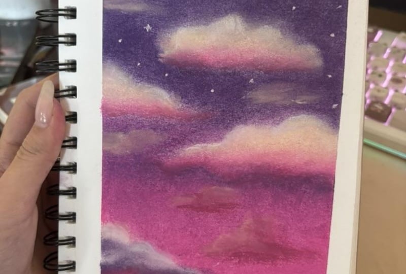
7. Let's Paint a Simple Sunset: Hi, artist, and welcome
to the demonstration. In this lesson, we are
going to be drawing a sky. We will try to imitate a
purplish pinkish sunset. We'll practice some blending, we will practice
building a gradient and drawing some cloud textures. I'm using this sketch book, but I cut my paper into half so that I can have
a smaller size because we don't care to have a very big grand
detailed drawing. I'm just making it small so that we can get
some practice done, and yes, get the
hang of pastels. Then the next thing you
will need are your pastels, you don't need
anything high-quality. Honestly, all of the work that I did starting out was done with cheap pastels that
were £10, or $, or less, and that's pretty much it. Those are the only
tools you will need. I would also recommend
having a wet wipe so that you can clean your
fingers in-between the blending so that we don't
contaminate our colors. Another bonus is
I would recommend that you have a blending tool, but if you don't have
it, then that's okay. We'll practice blending with both our finger under this tool, so you can do both. Another bonus tool
is a pastel pencil, and this I would only use it for sketching out
the initial drawing. But if you don't have this, you can just use the edge
of your soft pastel. Again, I'll show
you both options. I'm going to put a photo
of the finished piece so that you can have it as a reference photo
as we're creating. Essentially, I would start
by drawing the clouds, and this is really the only
thing we'll have to sketch because the sky is
just a gradient, there's nothing really
to sketch there. I'm just sketching this cloud, and I'm just creating a blob. It doesn't have to be
any specific shape, just something really
quick and simple. I'll do another one here, picking out from the side. If you don't have a pencil, feel free to use the
edge of the soft pastel. If I create this small
cloud over here. Both work as long as you're just not using
it very lightly. The first stage is done. We've done the sketch, and now we don't need our
pastel pencil anymore. You can see that the pigment has transmitted onto my fingers. I'm going to wipe it on my
tissue, on my wet wipe. Now we're going to start
by drawing the background. We will create a gradient. We'll try to go from purple
to pink as we go down. I'm using a pink pencil
to sketch the outlines because the background is
going to be purplish pinkish, so the outline lines are going to integrate
with the background. For example, if we
had to use a green, then it would be
very hard to cover up the outlines if we
had a purple background. Yes, so use a purplish
or pinkish color. I'm going to go
from the top down. I looked for a purple color. This one, it's almost like
a little bit gray tinted. You don't have to have
the exact same color. You can have one that's slightly more pink, slightly more blue, whatever suits you as
long as the color at the top is different from
the color at the bottom. Anyway, I'm going to sketch
over the entire background. We can use the side of our
pastel for quick application. As I'm doing this, I'm
not going into the clouds because remember
that pastel paper, we don't want to fill
up all the layers because if we draw a very
thick layer of the background, then it's going to
be very hard to draw light clouds over it. I'm going to leave
them out for now, and I'll just go around them
to create the background. When we draw a gradient, something that's important
is we don't want to go from a solid purple color
and then stop drawing about this point and then
go into drawing with pink. We don't want them
to be separate. We want them to overlap. I'm doing purple. Then even though this area is going to be a bit more pink, I'm still going to
go over it slightly with the purple, so here. I'm going to put
this to the side, and now I'm going to choose
a pink color for the bottom. I've got this pinkish color. I'm filling in the whole thing. Then I'm not going to stop here. I'm not going to stop right
underneath the purple, I'm going to overlap
so that in the middle there is a more seamless blend. We're going to go from purple
to pink at the bottom, and then in the middle we're going to have
a mix of them both. Because in nature,
especially on the sky, the colors they all blend so that you don't really
have any hash marks. This is important to make
the drawing look convincing. I'm doing quite a
thick layer of this. I'm trying to cover up
all of the white areas. I'll also add a bit
more purple here because I can still see quite a lot of the
white showing for. If you can just see a little
bit of the white showing for, don't worry because we're
going to blend it together I feel like I just have
too much white showing. Now we are going to try to
blend everything together. If we use our finger, start at the bottom. We can create
somewhat of a blend. But this is why I
say with your finger it's not ready that
great to blend because it doesn't really
build such a smooth coverage. For example, now if I wipe
my finger and I use my tool, then you'll see that the colors they just blend
so much smoother. It's also faster as well because if you were to do
this with your finger, then it would take you a while to get such a smooth blend. But with the soft
pastel blender, it takes a minute
and you're done. If you want, you can even
create this layer again. If you feel like the white of the paper is still
showing through then you can just create one
more layer, so plus pink. Go all the way to the top. Now if we blend again, then the color is
much more solid. We don't have any of
the white showing for. It's the thing with pastels, you have to work with layers. When I'm blending the sky, I'm trying to blend
in a straight line. Usually if I'm trying to
get a very smooth blend then I'll go into this motion, but with the sky, it looks like streaks. I am trying to have
this effect going on. Next, we are going to
now do the clouds. The clouds at sunset, they're never quite white. They usually have like a
more warm color to them. Usually, they have
a color of yellow, some pink showing further. I'm going to use the same pink that I had used for this section and I'm going to use some
very light yellow color. Yes, so fast. I'm going to create at the
bottom the shape of a cloud. I'm not covering
the entire cloud, just a section of it. Now I'm going to blend it. Excel with my finger. But there's sometimes
blending with your finger I'm blending with the sponge. It creates a different effect because the sponge
carries so much pigment that it will literally carry
the pigment elsewhere. If you were to use
this over the cloud, then you can smudge it so that it would integrate
with the background. But we don't want that. We want it to stay in place. When we use our finger, it just doesn't pick
up so much pigment. I feel like it just works a
little nicer for a cloud. Then anyway, with the yellow, now, I'm doing the
top of the cloud and with a clean
finger and blending. You can repeat the process. You might even want
to use the pencil to have some harsh lines. You can use the edge of
your pastels stick as well. I'm happy with this cloud and now we're going to repeat the same process for
this cloud here. Remember the bottom
fast with the pink, we blend, and then the other. You can use your pencil
to add some darkness. Now, because we are going
down towards the pink, the pink color doesn't stand out so much
from the purple sky. Instead I'm going to
take the purple color and I'm going to just draw
a line right at the bottom just so we can isolate the cloud from the background some more. Now, I'm going to blend
in with the rest. We can again use our pencil. I just want to bring out
the shape of the cloud some more at the top. We don't have long legs now, the last cloud and this one, I'm only going to use purple because it would just blend entirely with this
background so first, I'm using purple and blending. I didn't make it
quite a dark cloud. I'm now adding some white. I'm just using a bit more
of the red pencil color. Again, if you don't
have this pencil, just use a pastel in a
different color too. It just works the same. It's just about having a more
precise tip like this has. I would just like to add some more clouds faded
in the background. I'm going to take a new color, and this one is roughly the same color of the
pencil that I was using. Here it is compared
to the other two. It's an in-between
between these colors. It's not as blue as
this one, but you know, it's different than these two. I'm going to draw some
streaks and blend them in so that they look like
clouds in the distance. I'm going to add
some white to it. Now, another thing
that would add a nice touch is if
we draw some stars. I'm picking up a
white, soft pastel and I am just going
to draw dots. I'm not sure you're just
pressing it on the paper. If you have a white
pastel pencil then what you can even do is draw lines coming
out with some of them so that they look
even more like stars. You don't have to do this
to all of them just some. This is done now. Why don't we take off our tape and see how that
looks underneath? I always love this
part the most. It's very satisfying. This is our drawing. I think this is a really
nice study of a sunset. I would love if you replicate this drawing with me
and follow along. In the next lesson
we are going to draw more of a winter landscape. I will see you there.
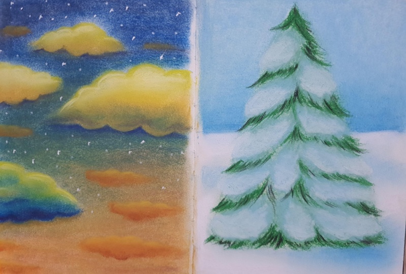
8. Snowy Winter Landscape: Welcome to the lesson. In this lesson, we
are going to be drawing a winter tree. We'll have a tree in the middle. We'll have some bluish
background and some snow. We'll have a lot of snow
sitting on the tree branches. Again, the tools are the same. You just need some paper. I recommend having a wet wipe so that you can
clean your fingers in-between using the pastels. You will also need your pastels. Of course, your soft pastels. As an optional tool, I do recommend having
the soft pastel sponge because it does create
such a smoother blend. As an additional tool, I would also suggest
having a pencil just so we can write
the initial sketch, but you don't need this. You can also create sketch with the edge of
your soft pastel. I just like to use this because it gives
me more precision. Anyway, with this, I'm going to sketch out a
triangular shape roughly where the tree would be. We're doing this because
we don't want to draw the background over the
entire tree region. Because as we have
learned previously, the pastel paper has two. Essentially, if you fill
up all of the areas, then you won't have enough
space to build layers. We don't want to
draw the background over the whole thing because then when we want to add the green and white over it, then it would be very difficult
to add to these layers. We're just going to draw
the background in the area where we actually need it. Then we will draw
the tree separately. We have the tree about here. We don't need to be specific about the shapes or the details. Just literally highlight
where you want it to be. As you can see, this
is looking advanced. I'm just drawing a
very basic triangle. Then here, we'll separate
the snow from the sky. It's roughly straight. It needs to be in line. Now, we don't need this anymore. Now, we're going to
do the background. I'm going to use a
light blue color. I'm using the flat end of it just because it gives
much faster coverage. I'm doing quite a generous layer of this blue all
over the top part. As you can see, you
have the reference of the finished image on the screen so you can use this as a
comparison and a guide. Now, why don't we use a
slightly more darker color? We'll just add some darkness right to the bottom
of the horizon just so that the sky can
get dark as it goes up by initially just doing
the slightest hint of it. I want there to just be
a very small gradient. Now, even with your finger
or your blending tool. You're just going to start
to work this into the paper. Also, if you want, you
can try doing this with a tissue or a sponge. If you got a bit of a sponge
or a Q-tip, try it all out. Do everything. See what works best for you. I like this nice because I feel like it's
the cleanest way to blend and the fastest. It also gives you a
very smooth finish. This is the background
we've done. Now, we will do the snow. I'm going to use
the same blue color that I used for the sky. I'm just going to
draw some lines in the snow so that it looks
like there's hills of snow. Also, we're going to have some shadow right
underneath the tree. Some blue snow shadow. With a darker one too. Now, I am going to
add some white. This is the thing. If we had worked
on turned paper, then we would have been able to add this white immediately because you could see lighter shades on a
darker colored paper. But since we're working
on a white paper, if we apply this one here, you can't really see anything. So this is why I was
[inaudible] for our area. But as you can see,
there are ways. You can always add
the white bits last, or you can even use the white of the paper
as your highlights. I'm just adding this in areas where I want it
to be very snowy. If you look at snow, then the shadows are
usually quite blue. Yes, I was using the blue
color to create shadows. I'm just blending
with my finger. You can use either your
finger or the sponge. Anything you have. It's just that when
you use your finger, it has a very different finish. The finger doesn't
carry as much pigment. So if I had used this
on a pastel sponge, then it really picks
up a lot of color. Then you need to be able to
carry around everywhere. But when you use your
finger to blend, you leave it in place. You can use that
to your advantage. In the moment, when
you do a tree, I'm definitely going to
use my finger a lot more because I don't want the tree to blend
with the background. I want my soft pastel
marks to stay in place. I'm just going to
reinforce the shadow. Now, we are going
to do the tree. We are going to pick up
our green pastel pencil. I'm actually not going
to press too hard because we don't want to fill up the whole layer with green, and then not be able to
create the snowflakes on top. I'm literally just creating a very thin layer of
this green color. I'm going downwards
in a curved way. I'm essentially just
drawing squiggles really. Nothing too complicated. It's just the branches get
longer as they go down. It's all going to be
covered by the snow anyway. I'm just creating the
messy texture of branches. We're going to just
lightly blend this into the paper just with my finger, just so we push the
pigment into the paper. Now we are going to
take our blue color and we're going to draw
the snowflakes on top. Don't worry if your tree
looks very bad right now because we will reinforce it and make the branches
look at much better. It's just as I said,
we don't want to take up the whole space. I'm creating shapes on this tree to resemble big layers of snow. Again, I'm using the blue color. In a moment we'll add
some white on top of it. Let me just do one more here. Now I'm going to
use the white color and I will just go over
that blue areas on the top. I'm using a black color and
I'm just going to reinforce the branches in-between the snow because the tree is
definitely quite dark. I'm creating the branches in the areas that the snow
isn't layered over them. Now I'm just going
to use my green and I'll go over the black area. I'm doing this just because I want the green
to be quite dark. I don't want it to be a
bright shade of green, I want it to be in-between
black and green. That's why I'm layering
these two colors together to hopefully give it
some depth and shade. We're almost done. I'm just going to add
more of this blue color. This is pretty
much done as well. I would just like to reinforce the shadow underneath
a little bit. Then with my finger, also I'm just going to
use my blending stump to get rid of the texture
of the pastel strokes. I want to blend the bright green with the black a little
bit more as well. I'm just going over
a little tiny bit. There we have it. Our two studies are complete. Now let's pull this off. I always really like
adding the tape because it gives it this
clean look on the edges. Of course, this is not an
essential step, it's just done. I like doing it. You have to have this
to have this clean look and also is because that whenever you're
working on an easel, you obviously need to secure your pastel surface
to something. That's why I use the tape. Our drawing is complete. Here it is, alongside
our previous study. What do you think of them? Tell me which one
you liked more. I would love to see a
project in the projects and resources tab below. I look forward to
giving you feedback. I hope you enjoyed this. In the final lesson, we will go over
our final thoughts and more details
about the project. So I will see you then.
9. Final Thoughts & Thank You: Hello, artists. We made it to the final lesson. Thank you so much
for taking my class. If you enjoyed it, I
would absolutely love if you left a positive review, or a comment, or a project. Your interactions
with the class help it show up on Skillshare, so other students may find it. If you have any questions or would like me to clarify
anything in the class, please ask below and I will
be very happy to help you. Make sure that when you
upload your project, leave a link to your social
media or your website, so others can find
more work from you. For the class project, I would love for you
to follow some of the simple illustrations
and upload them. I would love to see
your drawings and, of course, I will
provide feedback too. I have more pastel classes
here in Skillshare. For example, in this class, we drew a summary lemon branch using very simple techniques. We learned about base layers, choosing the right color,
and building detail. Alternatively, I have two
animal portraiture classes, one where we learn how to
create dark, curly fur texture, and in another one we drew
a brown cover layer puppy. Or perhaps if you are
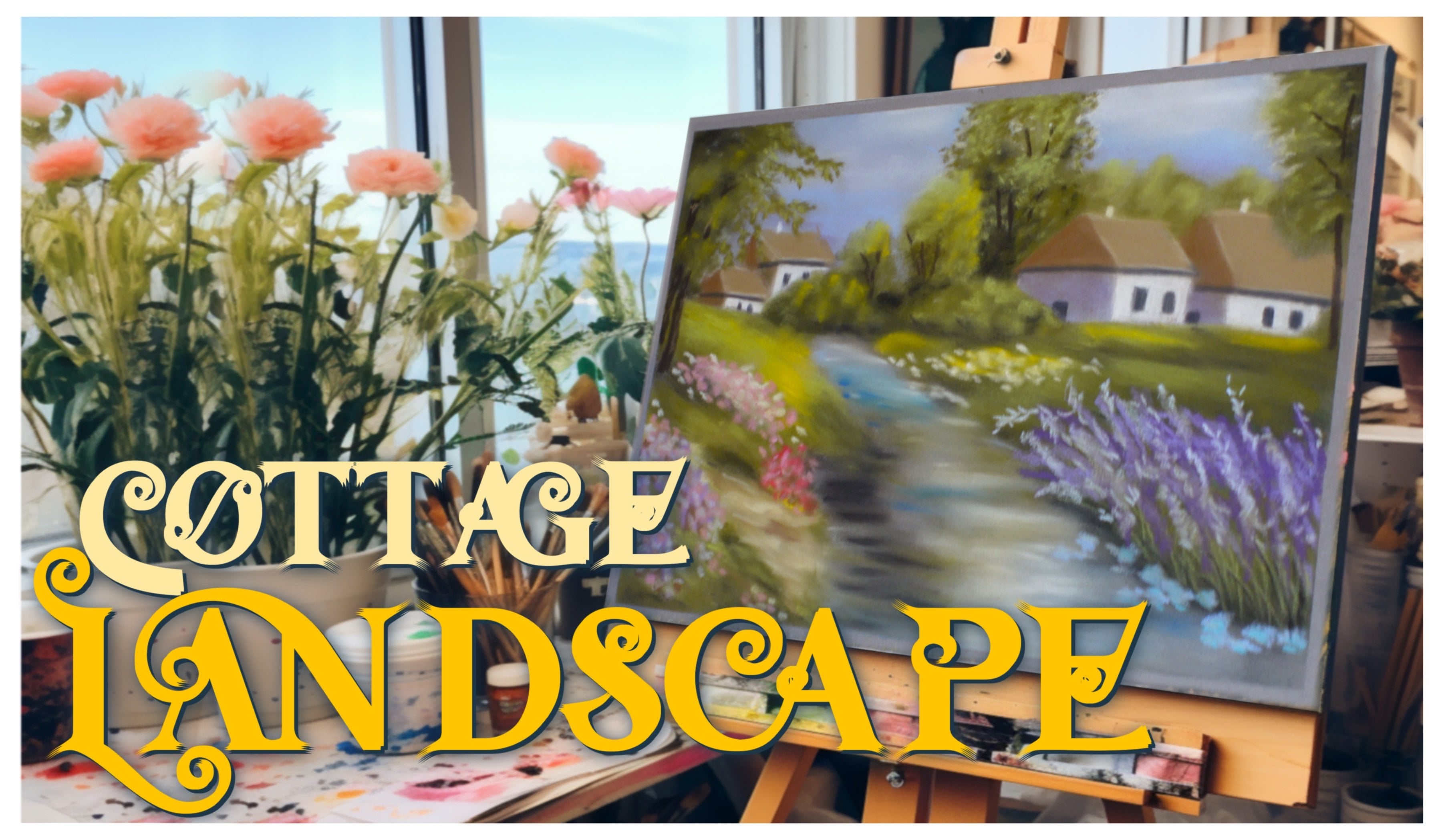
interested in landscapes, here we drew a magical
house and garden with beautiful floral bushes and a
stunning vine covered roof. Don't forget to follow my
Instagram wiktoriamikoart, or my website wiktoriamiko.com
to find my details and see more of my artwork. That is all from me. Again, thank you so much
for watching my class. I really do hope that you enjoyed it and found it helpful. I am looking forward
to seeing your art and answering any
questions you may have. Thank you again,
and happy creating.
 Wiktoria, Professional portrait artist