Transcripts
1. Welcome!: Welcome. In this class, I would love for you to join me in creating a beautiful green
landscape using soft pastels. Learn how to draw distant trees, realistic water, and
colorful flowers. Hi, my name is
Victoria Mico and I am a portrait artist specializing in pencils and soft pastels. And I also love painting more loose landscapes like the artwork we are
creating today. This class is made
for artists on the beginner and
intermediate level. I will guide you through how to complete every paint stroke. So even if you are
just starting out, the tutoria will
be easy to follow. If you are overwhelmed
by creating the sketch. The outlines have
been created for you, so you may download them
just on working with color. Once the outlines are complete, we will focus on
creating the sky. After that, we will
draw the trees. We will learn how to
use our pastel stick to create a convincing
leaf texture. In lesson four, we will
draw the charming cottages. We will learn a little bit
about the source of light here to make our cottages
appear three dimensional. In the fifth lesson, we
will draw the grass. We will use layers
of green colors to create a rich
and velvety land. After that, we will
draw the stream. We will learn how to create realistic water by adding colors such as
greens and browns. In the final lesson,
we will draw flowers. We will learn how to draw them using an
efficient technique. We won't focus on creating
each individual petal, but how to represent the
flowers in the realistic way. The materials you will need for today's lesson pastels
and pastel paper. A Bender is an additional
recommended tool though. If you don't have one,
you can bend with your fingers or even a
regular household sponge. I am so excited to present
this class to you, so grab your pencils and I will see you
in the first lesson.
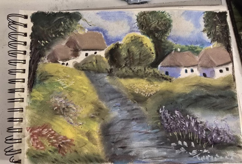
2. Create the Sketch: Hello, Artists, and welcome
to the first lesson. Here we will be
creating the outline. I know sometimes the outlines
can be overwhelming, so if you want to jump straight
into the drawing process, feel free to use the outlines provided in the projects
and resources tab. You may trace them
to your paper or print them out whatever
works best for you. If you'd rather create
the outlines with me, let's go ahead and get started. I am using a white
chalk for this. I am working on
gray paper today. If you are using white paper, you may use a light gray chalk. You don't want to use a color like black because
it will be hard to cover up and it may muddy
the colors we apply on top. I begin by creating
the horizon line. This is a slanted line across roughly the
middle of the page. I'm not going to fuss
over the details too much because those will be filled
in when we apply color. We just want the
rough shapes for now. I proceed to create a rough
shape of the cottages. When you draw the outlines, think about how they
will look in Fred, the roof will be
at a slight angle. I continue by creating the tree outlines choi all of the sky will be covered
with the trees. I am creating rough
circular shapes for these. Again, we aren't creating any details such as the
branches or the leaves. We just want the
general shapes for now. There are also
cottages on the left. So let's go ahead and create tho the two trees on either side of the painting will come
onto the foreground. Little they will be closer to the viewer,
so they will appear. There is also the
stream which will get bigger as it comes
closer to the viewer. With perspective, the
closer something is, the bigger it appears. So the stream will appear to narrow as it goes
towards the background. That's pretty much it. We are creating a rough
shape for the path, and on the left we are creating the basic
shapes of the flowers. So this is it for
the first part. I hope you're excited
to create the sky. In the next lesson, I
will see you there.
3. Paint the Sky: Welcome. In this lesson, we will be drawing
the sky on the left. You will find the color
palette I have used. I know everyone's pastel
collection is a little different so you don't have
to have the exact colors, but just try to get the
colors which are closest. The sky is pretty
straightforward. I like to select a
few different shades to make the sky darker. In some places, I'm using a purple color to make it
darker towards the bottom. This can make it seem like
it's approaching sunset. Just remember not
to cover the trees now with a light of blue. I will go over the sky region. It's important to overlap the purple so you
have a gradient. It wouldn't look natural if
it went from purple to blue. You want the colors to
blend into each other. Of course, when you're
switching colors, wipe your hands because you don't want to
transfer the colors. Now it's time to blend. You want to work those
pigments into the paper? I think it would be nice
if we created clouds. So with white pastels, let's go ahead and
fill in those gaps. The sky definitely
doesn't look ready. We have to go over the
layers a few more times. So I am currently going over
all three colors again. Now I am adding a
little pale orange just to make the sky
that one step more interesting and of
course we blend. Look at the difference
those extra layers make the colors all blend into
each other seamlessly. Because of all the
blending, the colors may sometimes disappear, which is what happened
to our purple. So if you wish, go ahead and reinforce that wonderful color. I also forgot to fit in
this part of the sky. I must have thought
it was a tree. As a final step, I am
going over the sky once more to make the clouds
a little bit more visible. They still look really streaky, but sometimes that's how the sky looks. So I am happy with it. Anyway, this is it. If you're
a perfectionist like me, go ahead and go
over some colors, make final changes, until you're happy with
the finished result. This is my finished sky. I hope you are happy with yours. And next we will be moving
on to drawing the trees.
4. Distant Trees: Welcome, Now we are
moving on to the trees. I really enjoy painting them. I feel with soft pastels, it's easy to achieve
the look of trees. Let's go ahead and get started. As usual, the color
palette is on the left. I am starting with
the distant trees above the two cottages
on the right side. There isn't an awful
lot of detail here. Hopefully it will
be straightforward. I am starting with a
somewhat dark green color. I am going to create
randomly shaped patches. Trust the process
here, it will look a little crazy
before it gets good. Next, using a
lighter green color, you want to fill in the gaps. This will create the look
of highlights and shadows. The trees are very distant, so you won't be able
to see any details. Therefore, if you
represent the trees, this will look quite natural when blending. Let' s be
careful not to blend the colors into each other and create
an even patch of color. You don't want to lose those highlights you've just created. If you want the contrast
to pop a little more, go ahead and go over
the colors once more, this time not blending as much. Now onto the middle trees, we are following roughly
the same process, Starting with dark green. We are creating the base. If you want to add extra depth, it's good to use
a touch of black. Once we blended the
black with the green, it will give us a deep
dark green color. Now repeating the steps
from the previous trees, we are using the lighter green
to add high lights on top. We are essentially
creating patches here. This will create the
rough texture of a tree. The only extra step here is that we have to add
some more details. Remember, objects
which are closer will appear bigger
and more detailed. So we have to create
rough leave textures to make the painting
appear more realistic. A great technique to achieve the leaf texture is to go over the patches of green and create
clusters of little marks. We can use the pastels to, to create different textures. When painting
something like a tree, we don't spend hours and
hours painting every leaf. Instead we represent it
using this technique of creating small rough patches represents the
leaves quite well. So right here I am using light green to create
the leaf texture. Just make clusters
of random spots and it will really appear like
the rough tree texture. I am also adding some darker patches to add texture to create some
more depth in tree. Feel free to blend
the patches a little if you feel that the
texture appears too strong. Here I am adding
some more details around the outline of the tree. You don't want it to appear like a solid shape of greenery. You want the edges to be rough, to accentuate the uneven
branches of a tree. Here I am repeating
the process and adding some more leaf texture again. If you feel your texture
turned out too rough, you can softly
sponge the leaves. Okay, a tree is not complete
without its core and branches with a
dark brown pencil or the edge of a pastel stick. Draw rough branches peeking
through the leaves. Notice that I didn't draw a continuous line because the core is in the
center of the tree, so some of the leaves
will be in front of it. Hey, I am feeling in the
remaining blue background color. I realized I missed a section, but that's okay because we
can always go back and forth. Okay, so we are
slowly moving towards the left side and drawing
some more distant trees. We want these to
have some depth. So I am starting with
a black pastel stick and concentrating that
at the base of the tree. Next I am grabbing a mid
green color and placing that over some of the black and towards the
middle of the tree. Finally, I am using the
lightest green color and focusing towards the top of the tree where most
of the sun would hit. Once you have placed down
all of your base colors, go ahead and blend
it altogether. Notice that when I am blending, I am being really
careful not to turn the whole bush
into a solid tone. I am blending of the
tip of my tool and blending in small
sections at a time. I felt that I didn't have enough of the mid
green color here, so I am adding that back in. Now, just like with
the previous tree, you want to create
some rough texture. So with the lightest
green color, I am creating small
rough patches. Also, there is another tree
here on the right side. So let's quickly
complete this one. We are using the same
steps as before, so we should have
a lot of practice. Now, we are starting with black. And first filling
in the center of the tree because the
tree is cropped. Because the tree is
cropped out of view, the center is towards
the right side. Focus your color in that region. Are applying green
over the black and extending that towards
the edges of the tree. Now with a lighter green, we are going to create
some highlights on top. Go ahead and grab
that blending tool to work those lovely colors
right into the paper. Now, of course,
our tree won't be complete without the
wonderful leaf texture, so I am using the lightest
color to create that. Finally moving onto the final
tree on the right side. Something a little
different about this tree is that it is a
little closer than the rest. Once we complete the
foreground in a later lesson, you will see that this
tree is actually quite close to the view
on that being said, I am being a little more
careful with my application of the soft pastels and I am trying to achieve this rough
texture from the start. Again, I only used
three colors for this, same as before, black, mid green, and a light green. After blending, I felt that I lost those light
colors quite a bit. So I'm trying to
bring those back. Now, let's go ahead
and add the tree. I am using dark brown for this. Again, like before,
you want to break up your line because
you won't be able to see the entirety of the core, just some of the leaves
will be blocking it. I have also added
some finer branches that overlap the background. Now using the mid green color, let's add some details
onto the branches. I am creating more specific leaf strokes along the branch. Now on top, I am adding a similar leaf texture just with a lighter green color
to add high lights. Now onto my favorite
part of drawing trees. Take a blue color and draw around the
outlines of the tree. Don't be too neat and go
into the tree at times. This will make the outline
appear more rough and realistic and the leaves will appear more clear
against the background. Feel free to smudge
if you feel that the tree looks just a
little bit too rough. Now, all that's
left is to go back and forth and refine
your details. I wanted to add a
couple more branches over here and that's
almost everything. Thank you for
following the lesson. I hope you enjoy
it and that you've learned something
about growing trees. I will see you in
the next lesson, where we will get to work on
these beautiful cottages.
5. Cosy Cottages: Welcome back. In this class, we will be drawing the cottages. As usual, you will find the
color palette on the left. We will begin by filling
in the basic colors. Starting with white,
we will toward the front wall of
the first cottage. Next, I am using brown to
complete the sidewalls. This doesn't need to
be perfect because we will be blending it
into the paper shortly. Now, I am also coloring in the front of the two
houses on the right. Next, using a little blue, we will color in the sidewalls. Once it's blended,
this will look like the side of the house is
slightly in the shade. And now of course we blend. Try to beat, you don't
want to muddy the colors, so try to blend in sections. Here I have decided to
go back in with some purple to make the sidewalls
appear even darker. Let's go ahead and blend the white sides
of the house too. Now using a base color,
let's fill in the roof. Here I am adding
the white wall to the little house, all
the way on the left. Now using a slightly
darker brown, we have to fill in the
sides of the roof. It's essential to
use a darker brown here because this side of
the house is in the shade. And if the wall is darker than, the side of the roof has
to be darker as well. Of course, give
everything you smudged to make the colors
appear nice and smooth. Now we have to add the
cute little chimney. So if you have a white pencil, it may be worth using it because it allows us
to be more precise. If not, you can
use the corner of a white pastel stick instead. Next we have the final details, like the doors and
windows of the cottages. Again, it's preferred
if you have a dark gray pastel pencil to use because it allows us to be just a little
bit more specific. But of course, if you are only
using pastel sticks today, that is absolutely fine. Just take this step slowly and try to be as precise as you can. As a final detail, it
adds quite a nice effect. A little line
underneath the roof. This makes the roof
look like it's casting a fin shadow
on the house. You don't have to
add this detail, it's not necessary, but I
personally happen to like it. Here we are, adding the last few details and that will be all. I hope you found the lesson straightforward and enjoy
drawing the cottages. Thank you for joining
and I will see you in the next lesson where
we will draw the grass.
6. Vibrant Grass: Hello and welcome to the lesson. Here we will be learning
how to draw the grass. As usual, the color
palette is on the left. Grass naturally has more of
a yellow, warm undertone. When you pick up your pastels, try to pick greens
that are more on the yellow side as opposed
to the blue and cool tones. I am going to be working with the same shades we have
used for the trees. You may also use the same ones to make your drawing consistent. Before we move on to the grass, let's quickly fill in
the distant bushes. The bushes will follow the
same steps as the trees. I am starting with
a mid green color and creating texture. Now I am filling in the
remainder of the bush by applying the highlights with
the lighter green color. Of course, we have to
blend, Just a reminder to take care when blending. Try not to smudge the whole
bush into one even tone, but blend in small
sections to keep this nice variation
of color in the bush. A slightly different
step now if you want to make your bushes a
little bit more warm, you can use yellow to
add extra highlights. Yellows and greens are
in the same family, so it works very well
if you want to use a little yellow to lighten
areas of the bush. Now the reverse. If you'd
like to darken your bushes, go ahead and add
a touch of black. Remember, a little goes a
long way with this color, so apply it very, very lightly. Now you want to go
over the bush again with the same colours
and create texture. I am using a light green here. I am adding colors and blending until I am happy with
the texture of the bush. Okay, finally we may
start on the grass. So the way I
approach painting is by dividing the grass
in two sections. It won't be an even green color, but there will be shadows and highlights on different
parts of the grass. Just like with everything
else we are drawing. If you look at the
finished piece here, you will notice that
there is almost a hill in front of the two
houses on the right, and there is a section of
grass below that tree. Then on the left, the
land is a little steep, so there is shadow closer to the water and below the tree. It's very tempting to just fill in the grass with
one solid color, but that will make the land
seem really true dimensional. Whereas you want to create
depth in your work. That being said, work on
each section of the grass at a time to make them
differentiate from each other. Here I have applied to
the midtone highlight and shadow to make this section
of the grass seem separate. Now to the left of that, I am
starting with some yellow, and don't worry, once we blend, these colors will
seem harmonious. As long as the grass is not
one solid color, we are fine. One thing about the
shadows is that the lower the grass is,
the darker it will be. Because less of
the sun gets into those areas as opposed to the top of the grass
which will be in the light. Use that as a guide when
you are deciding where to place your light and
dark shades of green. Now we are blending again, Don't blend it all in one go. Take your time and slowly make your way
across the section, and you will see the colors
blending together seamlessly. Here. I thought it would look
a little nicer if we add more shadows at the base of
the bushes and the grass. Now, I am lending this
with my finger because I don't want those shadows
to move around too much. I just want to work
them into the paper. Now, we are reinforcing
all the colors. I am adding some more yellow, but perhaps you
may want to add a bit more black or mid green. Take a look at your drawing
and try to decide what, if anything, could be improved. Now we are moving over
to the left side. The process is the same here. Draw each section of
the grass separately and pay attention to the
highlights and shadows. In this corner,
we have the tree, so it's going to cast a slight
shadow on the grass also. Let's take a second
to think about the source of light
in this scenery. If you look at the houses, you can see that
the light is coming from the top right side. Hence why the side of the house appear as they are facing
away from the light. That being said, you want
to be consistent throughout the painting reflect the
source of light in the grass. Since the left side of the
grass is at a slight slope, it is exposed to
the light source. This side of the grass
will appear lighter. As I am creating this slope, I am building a gradient. The darker shadowy areas blend seamlessly into the
lighter sunny areas. You don't want any sharp
change of value here. Smooth gradients are key. Now I am ending the
darker green to make the grass more
shadowy on the left side. Again, when blending, make
sure you blend in sections. I'm going over the dark
green values first. Now it's time to
refine the layer. In my case, I have to
add some more shadows. In fact, in a moment,
I will add some black to really add extra depth. Now we are approaching
the final layer here. We want to focus on creating texture so the grass
doesn't appear too smooth. I am basically going over the layers with the same colors, but I am creating
streaks of color. A similar process to what
we did with the trees, except the strokes are not
as defined as the leaves. Once that's done, we will blend. I am using my finger to blend. If we use the blender, the grass will appear smooth again because the blending sponge has so much texture that it carries over the
pigment really well. So it will give us a
smooth blend again, which is wonderful,
but this time we want to retain the texture. Now, for the final section, there will be quite a
bit of shadow here, because we will have a field
of flowers which will be blocking a lot of sunlight
from reaching the grass. That being said, I am
using color, green tones. I know the blue looks
really strong right now, but we will apply a lot
of green on top of this, which will leave us
with a beautiful, cool blue undertone. Is this is it for the grass? I think this was my
favorite section to draw. I really love layering the pastels and
blending using my hand. I hope you enjoyed this too. And I will see you in
the next son where we will draw the stream. I
will see you shortly.
7. Draw a Realistic Stream: Hello class and
welcome to the lesson. Here we will be
drawing the stream. I really enjoy painting water, so I hope it will
be fun for you to, again, the color palette
is on the left side. There is of course,
no pressure to have the exact colors work
with what you've got. So we are going to start by
drawing the under layer. The stream won't be
a clear blue color, that won't look as realistic. I am adding a thin layer of some really dark
gray underneath. First notice I am applying
the pastels in lines. It's much easier to replicate the texture of water this way, so apply a few thin
black streaks. Now of course, we
need some blue. So we are applying
this pretty much over most of the stream region. Just remember to draw the
stream using straight streaks. Once we blend, this
will look like water. So now we are applying the white throughout the
middle of the stream. It's important to
overlap your colors. Don't go straight from
brown to blue to white, but overlap them slightly. So once we blend, it looks
uniform and now we blend. Just remember to blend in straight lines to maintain
the streaky appearance. Unfortunately, the process
is not that simple, so we have to refine a
little more like me. Your water appears too dull. Go ahead and add more blue. Lay your colors on top until
you are happy with the look. If your water looks too blue, add more brown or white. If it's too bright,
you can darken it with black. It's
really up to you. Take a look at your drawing and try to decide what it means. Take a look at the drawing of my finished piece and
use it is a reference. I have decided here to
add some more green, The same mid green I was using
for the grass and trees. Sometimes water does
have this green tint, so I thought it looks
quite realistic to add it. I continue to refine
and add layers until I am satisfied with
the color of the stream. I also added a touch
of darker blue to make the water more
saturated in some areas. Be careful not to overdo this, because if we add too much, the water can look unnatural and now we blend. I'm using
my finger to blend here, to keep the colors in place. I don't want them to
remove and mix too much, which is likely what would
happen if we used the blender. Now I am adding some more final touches and
blending as I go. This is it for the lesson. I hope you had fun, and I will see you in
the final lesson, where we will add some beautiful flowers to our landscape.
8. Blooming Flowers: Students and welcome
to the class. Here we will be working
on the flowers. When it comes to flowers, unless they are close to us, we won't be able to
see much detail. We won't see the
individual petals or the shadows and highlights
of each individual flower. In fact, from afar, we will only be able to see
their basic shapes. That being said, you don't
have to draw many details. You can represent the flowers by creating strategic marks, just like the leaves
were, well represented, by drawing small
clusters of dots. Flowers are the same except
they will be bigger, considering that they are
closer to the viewer. That is what we are doing today. We are using different colors to create clusters of flowers. Here, you don't have to
follow the colors I am using. You might add any
colors that you like. I think some nice alternatives would be just white
or pink flowers, or perhaps more yellow flowers. If you want to create a warm, sunny feel when you
create your flowers, make sure that the ones that are closer to the foreground appear bigger than the distant flowers which are further
away from the viewer. For the pink flowers, remember that they are on a slight hill. Follow the direction
of the grass. If you created the flowers in
a straight horizontal line, it won't make sense and it will make the
ground appear flat. I am adding some more highlights to the flowers to
add more dimension. Feel free to add a white
or light pink color when you draw your clusters. It adds a natural look to draw some isolated flowers
around the cluster. So they're not all in one
tightly squished place, but grow slightly more randomly. I continue to repeat the process with purple flowers here. These are closer to the viewer, so they will be bigger
than the pink flowers we've just created
in the background. Since these flowers are closer, they will also be a
little more detailed. So go ahead and add some more dimension of the lighter colors. The process repeats itself
for the next set of flowers, so I won't talk you through it. Instead, enjoy the soothing
sounds of the pastels. Now we have a slightly
different cell flowers. I was inspired by
lavender flowers, so these are going to
be a little bit taller. Before we start to
draw the petals, we will have some visible stems. Here I am, using
the mid green color to create long, curved lines. They won't all be uniform, they'll slightly vary in
length and direction. So keep that in mind
when you are drawing. Now I am creating a base for
the actual lavender flower. I am using a pretty dark purple, and I am creating
upward spirals, which are wider at the bottom
and thinner at the top. Next, I am using a lighter shade of purple to add
some more detail. I am repeating the
same spiral motion. I am using a light blue. I am adding some
final highlights. Now we are adding some
more distant flowers. I am using yellow for the base and white for the high lights. If you have some pastel pencils, you can add more
details to the flowers. You can do this with the
corner of a pastel stick to. I am essentially creating a
more precise dotted marks. We are done with the flowers. I hope you had fun drawing them. We just have a few
more final touches to do and then the
drawing will be complete. The tree on the left goes
into the foreground. Now that we have
completed the foreground, we can draw the trees. I am using a dark
brown pastoral pencil, the same color that I used for the previous tree branches. I am creating a
solid dark brown. I have drawn two thick lines to make it seem that there
are two trees here. Remember, the tree core
won't be a straight block, it will have some curves and
it will be slightly thicker. On the bottom here I am adding some more
texture to the tree, will be lighter pastel. Again, I can't get
enough of the flowers, so I am adding a little more white petals to the background. The painting is
pretty much done. I thought a path going towards the stream would
look quite nice. So I am quickly
going to add that. First I am looking in the
area with some light brown, then I am adding some texture on top with different colors. I am using a beige and white to separate the path
from the grass. I am using black to
define the path. Sides be very conservative with the amount of
black you apply. It can look very overwhelming. Very quickly Go slowly because it's easier to add
black than to remove it. I am adding some green
over the black to add some texture and make it look more cohesive with
the rest of the land. Now, for the very final step, we have to add the
tree on the right, just like we have done
with the previous tree. And again, I am using the
same dark brown color. That will be all. Here are some very satisfying
tape peeling shots. I hope you enjoyed and that you were proud of the
artwork you've created. I will see you shortly in the very last and very
brief conclusion video.
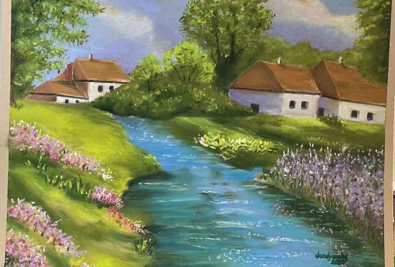
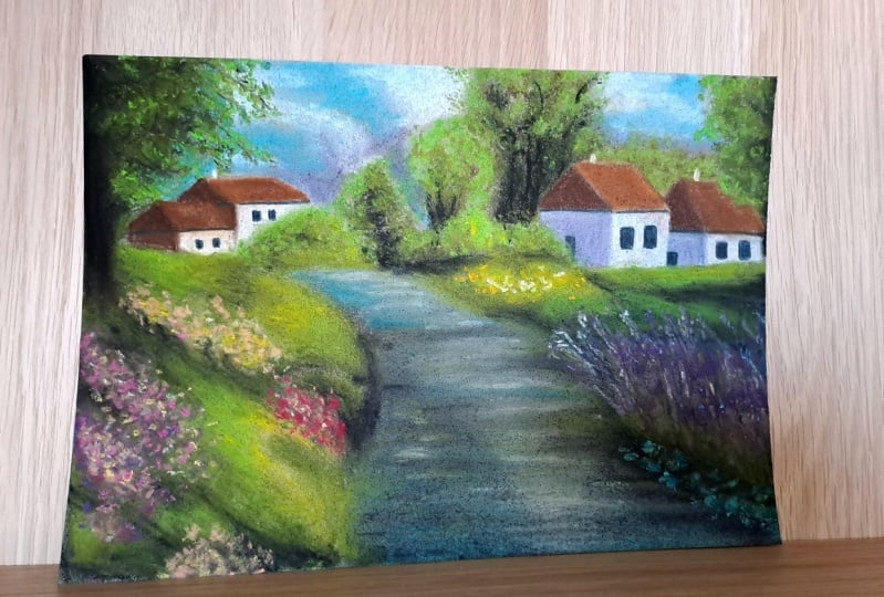
9. Class Project and Thank You! : Congratulations. We made
it to the final lesson. Thank you so much
for taking my class. If you enjoyed it, I
would be very grateful. If you left a positive review, a comment, or a project, your interactions
with the class help it show up on skill share, so other students may find it. Throughout the class,
we have explored different methods of
pastel landscape painting. First, we created a blue
sky and distant trees. After that, we painted
the cozy cottages. Here we focused on how to make them appear
three dimensional. After that, we
switched our focus to creating the green grass
and flowing stream. Finally, we created
vibrant flowers of many different
types and colors. If you have any questions
or would like me to clarify anything,
please ask below. And I will be more than happy to help you for the class project. I would love to see the
landscapes you've created. I leave feedback
on all projects, so definitely upload
yours and I will give you some further
constructive guidance if you are looking for
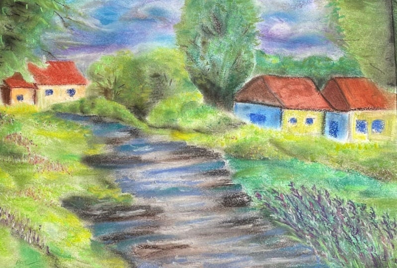
more pastel classes. I have a similar
landscape tutorial. I think it will be
great for you to try it now that you've
gained some experience. If you'd like to follow a
painting with even more detail, this scenic artwork is the
perfect tutorial to follow. We painted a breathtaking
cottage covered with vines and an
enchanted floral garden. To find these classes,
go to my profile or follow the links in the
about section of the class. Don't forget to follow my
Instagram, Victoria Mico Art, or my website, Victoria
Mico.com That is all from me. Thank you so much for taking my class and following along. I really do hope that you
learnt something useful. I am really looking
forward to seeing your art and answering any
questions you may have. Thank you so much. Again
and happy creating.
 Wiktoria, Professional portrait artist