Transcripts
1. Hello Artists!: Welcome. In this class, I
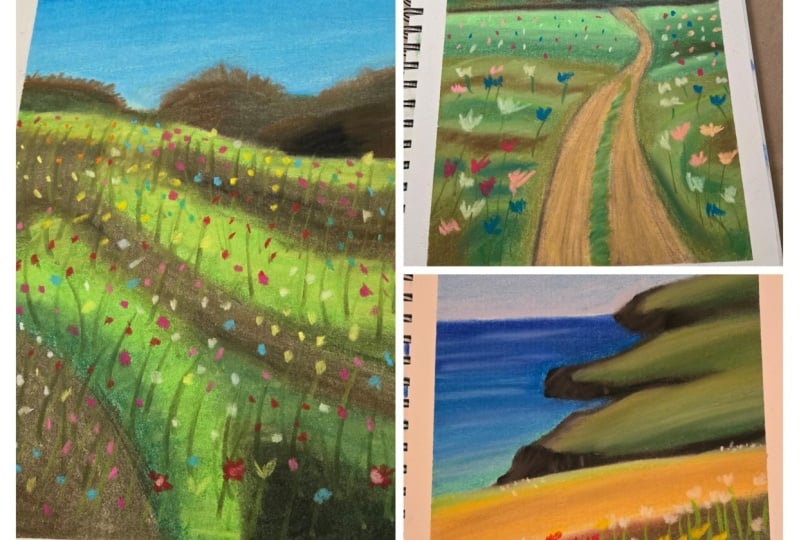
would love for you to join me in creating free, simple Landscapes
using soft pastels. Choose between a green,
delicate landscape, a colorful Floral Field, and a viewer overlooking
Coastal Cliffs. Hi, my name is
wiktoria Miko And I am a portrait artists specializing in pencils and soft pastels. And I also love painting and more loose landscapes like the artwork we'll
creating today. This class is made
for Artists on the beginner and
intermediate level. I will guide you for how to
complete every paint strokes. So even if you are
just starting out, the tutorial will
be easy-to-follow. We will begin each landscape
by creating the outlines. Then we'll move on to creating a soft blue gradient
for the sky. Next, we will create
distant details such as trees and Cliffs. We will focus on
highlights and shadows to make the background
appear realistic. Finally, we will move closer to the foreground and learn how
to create Floral fields. We will start by learning how
to create base layers and build up to creating the
Floral details on top. Each landscape is a
separate lessons, so feel free to do them in order or start with
whichever painting you like best the materials
you will need for today's lesson are soft
pastels and Pastel paper. A vendor isn't additional
recommended tool there. If you don't have one,
you can then move your fingers or even a
regular household sponge. I am so excited to present
this class to use. So grab your pencils and I
will see in the past lesson
2. Serene Green Woods : Artists and welcome to the
first pastel painting, the materials we
are using today. And that is the same
for all three drawings. The soft pastel blending knife, a wet wipe to clean
your fingers. Pastel paper, and
of course, pastels. If you would like to purchase
the same brands I am using, you will find the link to each product in the description. We begin by drawing the outline. I am using a white
pastel stick for this. Feel free to use
any neutral color that will be easy to cover up. I begin my outline by
creating the horizon line. This will separate the
sky from the ground. Next, I create a rough
sketch of the path. This is a very rough outline, so don't get too caught
up and making it happen. The only thing to
remember is that objects which are close off will appear Vega and objects that are farther away will
appear smaller. As the path gets closer
to the horizon line, you want it to narrow. It is going to pay
much more wider, closer to the view on. Next, you want to draw
the outline of the trees. Again, no need for
perfection here, we're going to draw most of the details when we
put down some color. Just create the outlines of the trees in different
shapes and sizes. Now we move on to
painting the sky. On the screen you will find samples of the colors you need. We start with a light
blue color and create a thin layer all
over the sky region. Next, take a slightly
darker blue and create a gradient by applying the colors towards
the top of the sky. This will make the sky look
lighter closer to the ground, which is very realistic. Here I am going back in
with the lighter blue and refining the lower
half of the sky. Just to make the layout
a little thicker. I love when this guy has
a little more color. So I am adding some pale
pink between the trees. Don't forget to wipe your
fingers between changing colors to avoid
transferring on Monday. And then next, take
your blending stump. And when the sky make sure that your blend it doesn't
have any other colors on it that would muddy this guy. Use a clean blender
or one that you have used to blend blue before. After you've
finished with ending the sky should look
something like this. The gradient shouldn't
be nice and even, and you shouldn't
see the color of the paper from
underneath the layer. Now, it's time to
move onto the trees. I am sampling some green colors and trying to find
that the best ones. We're going to cover
this annually. On the slide you will find all the colors I choose
to draw the trees with. There is of course no pressure
to have the exact ones. Just pick whatever
colors or crisis. I am walking on the
trees, on the left fast. I am filling in the whole layer with the meeting green color. This will be our
base and we will add our shadows and
highlights on top. I am not really happy with
the depth of the green. And I didn't have a
decent green shade, so I'm using brown instead. I am layering the green
colors on top of each other to create a sort
of messy texture. This will resemble trees. Moving on, we will make this
tree a little cooler shade. I am starting with
a little bit of black to make this tree
dark in the middle. He awesome greens
I will be using. I start with the
bluish green and create a layer over
the whole tree. Once we draw over the black, it will look like that
part is a little darker. I'm just going
back-and-forth and refining Here we will create
the base layer of the last section that I am using black to darken
the color is on top. Then I am using the
bluish green on top. Let's quickly blend
the colors together. I am still using my hands to blend to retain some texture. Again, we are layering some more green colors on
top to create dimension. Usually the lighter
tree branches are reflecting the
most sunlight, so they are farther away
from the core of the tree. In that case, I
work from dark to light until the tree
has enough definition. The final step, and this
is my favorite plot. I take the light blue color and I walk around the
outline of the trees. My goal here is to
make the outline a little more sharp
and irregular. I feel that this makes the
trees of pay more realistic. Let's move on to the field
part of the drawing. We should probably begin by separating the field
from the trees. I am using light
green at the top. Momentarily, I will
use medium green beneath it and dark
green at the bottom. This will help to
create a hillock which is lighter at the top
and darker at the bottom. I feel that I'm
struggling to get the separation between
the sky and the fields. So I will create a dark line along the bottom of the trees. Again, make sure that you
wipe your hands because it's really easy to be
messy with pastels. Now let's blend this line in a little so it's not so prominent. And once that's
done, we will turn our attention back to the field. We are continuing to
create the hills. Here I am using the dark green
to create the base layer. Again, I am adding
a little brown to enhance the shadow
and follow this up with your heel is well the top layer. I like to go over
each color again and create a little
texture with the pastels. I like this more than
just a smooth even layer. Now onto the rest of the field. For efficiency, I will cover the whole remainder with
the dark green color. Now, to add some depth, I am using some brown. I am placing this
quite randomly. I just want to have depth in different places to make
the grounds seen uneven I'm also adding a hint
of that bluish green. It's not necessary, but I just
liked the grounds to have a little more color. And now we blend. Let's also not forget about the little patch of grass
in the center of the path. Now we're going to
add some texture to the Grosse by going over
it with the same colors, just like we did before. And now we are going to follow the same procedure
on the left side, working our way from
dark to light colors. We are nearing the end. Now. We're going to
quickly create the puff. We begin by creating a base and they all very
light beige color. I actually think this
looks a little too yellow, so I am using some
reddish browns now to add some texture. This red looks very
bright at the moment, but once we blend it, it will fit perfect thing. The prices here is very
similar to the grass. Now that we have the base layer, we will go over the path
again using the same colors. I want to create a sort
of coco puffs texture. So I am creating thick, short strokes that represent
this texture quite well. The path is pretty much done. Now let's quickly create some grass strokes in
the middle of the path. You want to begin by
creating a base and dark green on the layer I already
have underneath this, I was testing out a technique which I
didn't end up liking. So I am covering up anyway. Now we are adding some
lighter pastel strokes on top to create
depth and dimension. Finally, I'm adding
a tiny bit of yellow to lighten up the
path and grass symbol. And once that's done, we'll move on to the flowers. We have finally arrived at the final stage of this drawing. Let's draw the flowers. We begin by drawing
the flower stems. I am using the edge
of my pastel stick to create multiple thin lines. I am mostly adding them to the
front of the field because the details aren't so visible
farther into the landscape. Such details will be too small for us to see from a distance. Now, feel free to use
any colors you like. I am using white to
draw the petals. I'm using the side
of a pastel stick to create a rough shape
which resembles flowers. Again, let's remember that
the flower is closer to us, will be more detailed and bigger than flowers
in the distance. I'm getting a little
distracted here and adding some more green
texture to the cross. I also think that the path would benefit from a little
more brightness. So I'm adding a little
more white texture. We're adding as many
flowers as we like, giving a little more details
to the flowers at the front. Just a few more
details left now, we are adding some shading
to the sides of the path. This is just to separate
it from the grass. If you'd like, you can add
a little more depth by emphasizing the shadows
with a little bit of black. Of course, we have to blend. Feel free to either use your finger to blend
or the blending tool. Now we are done. Feel free
to add any final touches. I had exaggerated the edges of the trees with the blue
sky color. Once more. Awesome final shots. I hope you enjoyed the
drawing with me and I look forward to seeing
you in the next lessons.
3. Vibrant Floral Field: Hello Artists, it's
wonderful to have here. Here we are working on a
beautiful floral landscape. We are using the
same materials as for the remaining two
paintings in this class. We have soft pastels, pastel paper, and a blend out. First, we begin by
creating the outline. It is just going to be two
lines to separate the sky, the trees, and the field. No further detail
is required him, we will create those
with the Soft Pastels. Next step is the sky. This is also pretty
straightforward. We begin by filling in the whole sky region
with a light blue color. Now to blend, we are using
the soft blending sponge. This is my absolute favorite
Pastel product by fonts. It blends so much by today, your fingers or any other
blending tool I've tried. If you find that your
blender is little data, you just remove some of the
leftover payment by rubbing it on a clean area like the
tape around your PayPal. This will stop the
previous color from transferring
to the drawing. Still transfer some of the
pigment to your drawing. That's okay. Just
create another layer. This time it will create
a little gradient by adding some darker blue just
towards the top of the sky. And it will also add some
more at the bottom to make the sky appear like it's getting
lighter as it goes down. When we blend, let's blend in a straight horizontal line to not never on the
colors too much. You want to keep this nice
clean gradient as opposed to mixing all three shades
into an even return. Time for the distant trees. Let's start with
some dark colors. As the underlayer. We will
be applying Green over this, but this will help
add some depth. Now, of course we apply some green over the
whole tree area. I am using a pretty dark color. Once we blend, you will see
those darker values appear. Now, before we add
details to the trees, Let's create a base
layer for the field. A base layer is just
all the basic values without any details. So let's use a green a little lighter than the one
we used for the trees. Then I am using a little
black below the green area, we essentially
creating small hills. Now in the middle of the
green and black shade or also add the
darker green color. This again will
create a grading. We go from black, dark
green to light green. Once we blend, this will
create an effect of that. As though the tallest
point of the hill, which is where the
sunlight would hit, is the most lightest and
towards the ground as dark as we will continue to create a suspect for
the rest of the field. Let's be able to run them
with the shadow placements. The hills won't be
even underlined up I'm also adding a touch with brown hair to add a
little more color. Blending. We are blending
each color separately. This will ensure
that we don't mix the whole field into
one green solid turn. Now, if you feel
the need to take some time to
reinforce the colors. Sometimes when we
blend some colors don't show as much
as we want them to. So I'm going over the darker
brown and the black regions. Now to add some texture, I'm going over the
green areas to starting with the darkest and working my way up
towards the lightest. And finishing off
with a touch of yellow to warm up the landscape. Now let's shift our attention
to adding some details. Let's start with the trees. I am adding some
more color to make the outlines a
little more uneven. Now we're repeating
the same trick we did with the fast landscape. And we are using the
light blue to go into the trees and make
the outlines even shop on. This is really one of
my favorite tricks. It helps a lot of achieving
the realistic tree texture. Now we're moving onto the final details
which artist flowers. This is the most exciting
part in my opinion. With the edge of our
Pastel sticks that's create long, thin upward lines. Notice they are not perfectly vertical but slanted
and slightly curved. Now I am adding a few more lines just in a darker shade of green. Now grab some colorful
Pastels to create violence. The main thing to remember
here is that flowers in the distance won't be as detailed as the
ones in the front. Also the flowers won't
be spread out equally. They will be more
concentrated in some areas and less than others. Let's go ahead and
repeat these steps. Will a variety of
different colors. You can follow the
same colors that I am selecting, or you
can trees growing. Also Feel free to go back and
forth between the colors. If you feel you need a little
more yellow in some areas, go ahead and keep adjusting and adding flowers until
you're happy with it. I am adjusting the tree a little to make it
slightly taller. Now to finish off here, I'm adding just a
touch of black, whether he'll shadows or do you make the land look
a little less flat? I feel the bumps
on the field have disappeared a little
because of the flowers. We can fix that by adding
the tiniest amount of black. So though we haven't,
our drawing is complete. Hey, awesome, satisfying. Tape removal shots. I hope you enjoyed
painting this with me and had a relaxing experience. I will see in the next
and final lesson, Bye
4. Ocean & Coastal Cliffs : Hello and welcome to the third and last
landscape painting. This one will have an urgent
and distant Coastal Cliffs. So I hope you'll find it
relaxing to create this image. Let's get started and
I hope you enjoy. We are using the same
materials as for the remaining two
paintings in this class. We have soft pastels, pastel paper, and a Glenda. We begin as usual by
creating the outlines. This will be very simplified. We will not be adding
any details here, just the general shape
of the field and Cliffs. Let's begin with the sky and see they are both very
similar in color, so we can paint them
simultaneously. We are starting with blue
at the top of the sky. In a moment will be adding
a lighter blue underneath. So make sure that you reserve your lightest blue
color for that. If you don't have
many blue shades, you can alternatively use white to lighten the
bottom of the sky. Next I am adding a little
bit of cream color because I like those orangey turn Easy here in the sky before sunset. Now for the Arusha and
I actually struggled a little bit here because I
made it as light as the sky, so I wasn't able to
separate the term. Sir. I'm fast-forwarding
until I do it correctly. Also here I reinforce the sky colors some more because the
nail wasn't thick enough. So if you can also see some of the paper flashing
free to Pastels, you'll walk may also benefit
from reinforcing the layer. Okay, so now the correct way to paint theory should I think the best approaches to make the ocean a darker
blue just like this. Then we can add the lighter
blue details over it. Let's make sure we blend
between each layer. I am blending in
horizontal lines. I find that that works
quite well for the Asian because it can take quite
streaky because of the waves. I also thought it
would be good to separate the see from
the sky but other. So I am creating
a sharp line and trying to make it as
straight as possible. Now with a white pencil, Let's add some further
reflections to the ocean. Go ahead and add some
clouds if you like. I am creating a very
basic Cloud using white. Okay, Now let's add some
depth to the see around the areas where the
Cliffs would be reflecting from the water. So let's add some
black fast and blend. Once we add some
dark blue over this, it will create beautiful depth. Now onto the Cliffs, I am using a solid black Pastel to create the darkest parts. With our blending
totally will blend upwards to cover the
remainder of the clips Now we are redefining the gaps between the
Cliffs with some there. I am using dark
blue because there will be more shade
between the Cliffs, so the word will appear.com. Now on top of the Cliffs
I am adding some blur. Honestly, I don't
know why I did that. I think I just liked the idea of having a cold blue
tint on the rocks. Now with a lighter gray, we're scribbling on
some highlights. I feel that I've lost the
intensity of the black, so I'm just quickly
reinforcing those. Now with a white pastel stick. Let's add some
further highlights to make the Cliffs a
little less flat. We are focusing our
highlights towards the top of the Cliffs because that's where the
sunlight will hit. So this is where the
lightest area will be. Of course, don't forget
to wipe your hands. We're moving onto Green next. So you don't want to mix
the existing pigment on your fingers with the green
color we are about to use. Now let's add some
grass to the painting. Let's begin by adding a little gross details
on the distant Cliffs. It's not necessary, but
I think it will look nice to have some more
color in the distance. Next, let's go ahead and
that's some gross to the field and separate it
from the ocean and Cliffs. Now with a hint
alveolar that's add some highlights to
the distant grass. Let's go ahead and
create the puff at the top of this field, I am using a light beige color and filling in the
whole far-off region. And now we blend. I realized
here that the green blend, the change the color of
the path and little. I am okay with it, but this
is a good reminder why you should always
wipe your blender when switching colors. Again with the yellow, we are adding highlights to the grass, just like we did with
the gross on the hill. I am adding a touch of
brown because why not? I think it looks quite nice. Now I am going to build up some texture by going
over the pop of light. This will add highlights in addition to making
it look less smooth, which is more realistic. Now let's finally you
fill in the field. I am going to begin by placing
down some a darker value. So the field has depth. When we apply the green on top, I am using some brown and also some black as the
dark undertones. You'll see that once we apply the Green turns the
field or light enough, but it will have a lot of that. So here we will apply the
green quite liberally. We want to cover up the
dark on the turns there, add a brand until you're
happy with the base layout Feel free to add more
green, more black, or brown, until you're happy with the saturation
of the field. I'm actually going
to add some more black to dark in the
field once more. That will be a lot of flowers
on top of this field, so it will be
brightened up already. Now let's begin the flowers. I am using the same green
color as we did for the grass. Let's start by drawing
the stems of the flowers. They won't be
spread out equally, but this will be a
little more random. Some of them will bend
towards the left, some to the right, and others
may be perfectly upright. Also, it's important that you don't draw the stems in rows. They are growing out of
different points of the ground. Moving on to the flowers, Feel free to pick
any colors you like. I will start with white. If you've done the
previous drawings, this shouldn't be
very familiar to you, but if not, no worries. Essentially we are
creating mocks that resemble flowers with
the pastel sticks. Remember you don't have to draw all the intricate details of the flowers for it
to look like one. You can create the kinds of marks that were
present a flower well, and it will be very clear to the viewer that these are
flowers that you are drawing. Another thing that is quite
important is perspective. Remember that when we look
at an object close up, it will appear to have
a lot more details and it will be bigger there. If the same object was
placed much further away, the details will
be hard as I see, and the size will decrease. Applied this principle when drawing flowers
once at the front, will it pay more detailed and bigger than the flowers
in the distance? Now let's go ahead and repeat the process with
the yellow flowers. You can choose pin kit
or Powerball blur, any color that you like. I happen to like yellow. So
I'm going ahead with that. Let's interval to
add some yellow into the white flower regions. So there is some
natural overlap. We are now adding some flowers
to the back of the field. Remember, this is where the flowers won't
pay small essence. They are farther away from us. Let's finish off
the field by adding the last set of
flowers for these, I am choosing a warm
color like orange. Remember these flowers
at the front will be a little bigger than the
white and yellow flowers. Since they are a little
further in the distance. I'm adding some light pink
here to introduce some light. Since these flowers
are closer to us, we will be able to
see some details. So I think having
a few highlights will look quite natural. Now of a darker pink, I will introduce some
deeper colors to add depth. I am focusing the darker pink at the bottom and the
lighter pink at the top. Since the light is
coming from above, the highlights will be higher up on the shadows, lower down. He awesome, wonderful
peeling shots. I hope you find as
satisfying as I do. I had so much FUN Drawing with you. Thank
you for watching. And I will see in the
next and final Click by
5. Class Project & Thank YOU!: Congratulations, we made
it to the final lesson. Thank you so much
for taking my class. If you enjoyed it,
I wouldn't be very grateful if you left
a positive review, a comment or a project, your interactions with
the class help it show up on Skillshare so other
students may find it. Throughout the class,
we have explored different methods of
Pastel landscape painting. We created a green,
delicate landscape, a colorful Floral Field, and a view overlooking
Coastal Cliffs. I hope you learnt
a lot about how to lay a pastels and how to use the pastel sticks to create different
effects and textures. If you have any questions or would like me to
clarify anything, please ask Butler and
I will be more than happy to help here for
the class project. I would love to see the
Landscapes you've created, whether it's all three,
you just one of them. I leave feedback
on old projects, so definitely upload
yours and I will give you some further
constructive guidance if you are looking for
more Pastel classes, I have a similar
landscape Tutorial. This is a slightly larger piece with a little more details, so I think it will be
great for you to try it. And now that you've
gained some experience, if you'd like to follow a
painting with even more detail, this scenic artwork is the
perfect Tutorial to follow. We painted a breathtaking
cottage covered with vines and then chanted
Floral gotten. To find these classes
go to my profile or follow the links About
section of the class. Don't forget to follow my
Instagram wiktoria Miko Art, all my website wiktoria, me call that column
what I actually recently started and I'll
blog that is all from me. Thank you so much for taking my class and following along. I really do hope that you
learned something useful. I am really looking
forward to seeing your Art and answering any
questions you may have. Thank you so much again
and happy creating
 Wiktoria, Professional portrait artist