Transcripts
1. Introduction : Hi, my name is Victoria Nicole, and I am a portraitists specializing in soft
pastels and pencils. I focus mainly on
animal portraiture. I have the joy of drawing
adorable dogs for my job. And in this class I would love to share with you
everything I know about the person if I am making this class for you because
when I was starting out, I always wish that there was a comprehensive class that told me everything I need to know about dog portraiture
in pastels. There are a ton of tutorials which show you how to
draw a specific breed or specific features like
the eyes mars is, and so on. But while these tutorials
are fantastic for showing you how to draw that
specific breed or feature. They don't necessarily
prepaid my Kotlin of yarn. And that is what I would love
to achieve with this class. I hope to show you everything, including all the different
flower colors and textures, how to paint dog features like
the eyes, nose, and ears. We will be working with soft
pastels and pencils and discuss when it is best to use them for different purposes. I really heard that once
you finish the class, you will feel very confident in creating animal
portraiture of urine. That you will be equipped
with all the tools and have complete knowledge of the materials and
techniques needed. I am incredibly excited
about this class, so I really hurt
that you do join in. I promised that you will learn something useful,
Andy, We'll have fun. So grab your pastels and I will see you in
the first lesson.
2. White Fur: My first step when I
draw animals in pastels is I draw a base layer
first with soft pastels. This is because
soft pastels have a very quick coverage and
they are very vibrant. If I was to do a basically
a pastel pencil, it would take me a
little longer to finish. And also the pencils
are not as vibrant. Additionally, the amount
of pastel that is in the pencil is much less
compared to the pastel stick. If you want during an entire
piece and pastel pencils, you're going to wear down
the pencil very quickly. And this is more costly
than using pastel sticks. You don't have to use
both soft pastels and pastel pencils. You can use panned
pastels or hard pastels, whatever works for you. I recommend soft pastels
because they are very vibrant and
provide quick coverage. And pastel pencils are great for applying the individual
hair textures on top. So for the base layer, we're not going to focus
on the details just yet. That's because we will be
blending everything anyway. So for now let's focus on the general colors
and shapes we see. By the way, when
we draw white far, let's keep in mind
that the white fat is never really white. There are a lot of
shades of blue, gray brown depending on where the picture of
the animal was taken. E.g. if the photo was taken
outside in the light, you may find a lot of blue reflections of the
sky within the far. That's because phi
is very reflective. So these interesting values of the surrounding area
will bounce of the firm. Makes sure that for the
shadows you use these colors instead of just using a grey
pastel or a black pastel, because you're missing
out on a lot of vibrant colors which will make the animal look more realistic. Also for the base layer that we're creating with
the soft pastels, Let's make a little darker
than the intended result. That's because if we make the base layer completely white, we won't be able to
add any highlights on top because the layer would already be the lightest
color possible. So if we make the base
layer a little bit darker, we can then use the white
pastel pencil to add highlights which will show up beautifully against
the bluish background. And those highlights will also help to lighten the base thing. When you are drawing the
base layer of soft pastels, make sure that you are already going in the right direction. Because a lot of
the initial strokes you make will show through. And you can imagine if you
go in the wrong direction, this weren't help to enhance
the form you're drawing. And it could start to
look a little messy. So we have to blend
in the layers because we are working with a
paper that has truth. Think of it as pushing
the pigment into the paper so you can fit
more pigment into it. Once you fill the truth, you won't be able
to layer as well. So they'll go too crazy with the amount of pastel you apply. Try to be intentional with
the colors you apply. Look at the reference image and observe what all the
colors and values are placed instead of during
a thick layer of white, then blues and grays
and so on, on top. That way you can still give the pastel pencil room to
sit on the top of the tooth. Once we have a base layer
that we're happy with, the next step is to move
on to pastel pencils. With this, we are
going to create the hash drugs to give the
appearance of fat extra. Again, all we have to do is observe observed the
direction of the hair, the length of the hair, and
the color of the hair is the hair in a clump or as
a single strand of hair? These are the things you
must pay attention to. An important thing
to do is to make the hair strokes
have a little bit of distance between them. You want to be able to see the beautiful base layer
beneath the hash drugs that gives the appearance
of depth and it also makes the hair on top
they pay very defined. A lot of these steps
are repeated for different flower
colors and textures. The main difference is
the colors that you use. It's a bit deceiving
because when you draw e.g. brown fat, you don't
just use browns, you use reds and yellows. And when you draw a black fill, you use blues and purples. So it's a little bit confusing. But other than the colors, the steps overlap a lot. So essentially you have pastels. It's just a layering process. You place down a layer
of pastels and blend, and then you paint
another layer on top. We get to the end result
that you're happy with. In the final layer, I like to add some details and
have some strands of overlap each other to make sure my piece doesn't
look very flat.
3. Blonde Curly Fur: For this, we will be following very similar steps as the
remaining hair textures. We will start by creating the base layer with
pastel sticks. And we won't be focusing
on the details but capturing the general
colors and shapes. And once that's complete, we will move on to drawing the individual hair details
with the pastel pencils. For the basically I am using a collection of
brown pastel sticks. Although the colors of the
animal is light beige, we are going to make the
base layer I lot.com. When we use the pastel pencils, we will use lighter, more accurate shades
and they will lighten the whole firm and
also stand out beautifully against
the base layer. For the base layer,
we want to capture the general values and
shapes of the shadow. This fun texture is a little
bit different from the previous white textual
we drew together. Because it's calling
the way that we create the base layer has to
be a little bit different. To make out more clearly
where the shadows are trying to squint and
look at the image. When we squint, we get rid
of all the details and we're left with just the shapes of
the highlights and shadows. I like to do this because
it shows me all the shadows are and I don't have to be
distracted by the details. You have to trust the process when painting in this technique because the base layer stage is not a pretty one,
at least for me. But I know that once I add the details of my
pastel pencils, it will all come together and
look wonderful in the end. The order at which you apply pastel colors is not critical. We are going to blend all
of them together anyway. Once we have the
first layer complete, we will see whether we are
missing any colors or whatever we want to lighten or
darken certain areas. I would like to draw
clumps of hair, so I am creating
these lighter shapes. In a moment, we will add
pencil highlights on top. It's important to blend between each layer of soft pastels. We are working on paper
with a tiff texture. So there is a limit to how
much pastel we can apply. Once we fill up the paper, it would be hard to apply
more pastels on top. But when we use a blending tool, we push the pigment into the paper and make
room for more layers. Once your base layer has reached a point
you're happy with. We will move on to using
the pastel pencils. Using them for the texture is great because they
are very precise. We can achieve the thinness of a hair stroke with a pencil. And we wouldn't be
able to achieve this with a soft pastel stick. They are very thick, so they would like
the precision. Now for the pastel pencils, we are using colors that are
more true to the animal. You will see that once
we start to apply those, they will lighten
the overall look of the firm despite having
a darker base layer. So usually the head that's highlighted is the
closest to us. They stick out of
the animal's body, the Merced and
reflect the sunlight. That means that
the hair closer to the skin is going
to be a hint.com. So what I like to do is I
like to make the clumps of hair lighter at the tip
and darker towards the body. When we are drawing an animal, fat is not as characteristic as other features such as
the eyes are the ears. So we do follow the reference
image very closely, but we can get away with it
if we make some changes. When we draw the facial
features later on, you will be able to
see that we have to stick very closely to the image. But with the file we have a
little more artistic liberty. So I have a dark brown pencil for the hair strands
in the shadows and a light flesh colored
pencil for the highlights. And I'm also using a
mid brown pencil to integrate the dark and
the light hair strands. For the last step, I like to add a little realism
into the fire and draw a single isolated strokes that stick out of
the hair comes. This makes the file look
a little less tidy, which appears more
realistic in my opinion.
4. Light Brown Straight Fur: So again, as with the
previous hair textures, we will start by building the base layer of
soft pastel sticks. And after that, we will add the hair details with
pastoral pencils. This color has a lot
of orange tint to it. It's a very warm brown color. So we will choose our
pastel sticks accordingly. I am including the color
samples on the screen, so try to color match them
as accurately as you can. If you only have a fever
style sticks, don't worry, you can mix your colors to get the closest colors possible. So in brown, fat extra, there are a lot
of hidden values. There are definitely
lots of yellow since this is a warm brown coat. It's never as simple as using
just brown on brown fat. Usually have other
interesting colors like reds and even blues. So look for these values when you are creating
your animal portraiture. When you just use browns, you miss out on a lot
of vibrant colors. The animal has a naphtha, which makes the animal
look more realistic. So we will apply the
pastels sticks in patches. We will be trying to create
the shadow beneath the fact. As you can see, the bottom half is much darker than the top, especially the bottom left side. So I'm going to focus a lot of dark brown soft
pastel over there. And on the top
half, I'm combining different shapes together to
get a warm, lighter brown. But remember, we want
the base layer to be darker than the
intended finished piece because we will be using lighter pastel pencils
to create the fat extra. Don't worry too much about
the details at the moment. This is all going to
be blended together. Just focus on capturing the general colors and
shapes of the shadows. Once your base layer has
reached this stage you desire, let's put our pastel sticks aside and pick up
our pastel pencils. Now, although this
Harris straight, there is still some color to it, I am using my wrist here to get a very soft curved stroke. The darkest hair will
be in the shade, so they will appear below
the lighter Asterix. So try to work in stages first, use the darker brown
pencil and work your way up to the
lightest pencil. You don't have to do this
systematically in stages. I didn't really work like that. When you're drawing a subject
matter this complicated, it's difficult to be organized. You may need to
go back and forth between the pencil colors. But keep this general
principle in mind. The lighter hair
strokes have to sit on top of the darker
hair strokes. Ulcer, as was the case with
the remaining five textures, we will try to keep
a little bit of distance between
our hair strokes. We don't want to cover this
beautiful basically how we've just created with
our pastel sticks. We want to place
our hair strokes strategically so that we can see the base layer beneath it. And we'll be adding dimension. Again, like all the
remaining far textures, last step is to add those
individual hash works to make the hair a little less
organized and well natural. So by night events will create a few historic
sticking out, not really following the same direction as the
remaining factor.
5. Dark Brown Curly Fur: Hopefully now that we've
done free fall textures, you will get the general
idea and feel a little more confident creating
different kinds of colors. A lot of these steps are transferable with any
pastel portrait trial, regardless of what
your painting, if the subject is big
enough for pastel sticks, I use those to
create a base layer. I do this because Postel
sticks are a lot cheaper than pencils and they can cover a large surface
area very quickly, so they are perfect
for the base. Then I use pastel pencils
to draw the details on top. Pencils have a lot
more precision, so they work better for this
purpose than pastel sticks. So let's use our pastel sticks
to create this base layer. I am blocking in
the general colors despite extra has a
lot of red to it, so I am using more
reddish brown colors. Also choose a darker brown
pastel or I back one and apply it to the areas of the firm that
are in the shadow. Also, the brown tone is
not the same everywhere. It gets lighter and
darker in certain places. This is what you
have to look for. In the base layers, I
choose more vivid colors. It may look a little
funny at first, but when you add more
muted colors on top, it balances everything out on the vivid colors show
up from underneath, which creates a beautiful
effect of depth. When we create the base layer, Let's try to draw our strokes over the direction of the thigh. This will create a texture
that mimics the natural flow of the remaining four colors. We make the base layer dark and then the intended
finished piece, because we will use
pencils in lighter colors and we want them to be able to show up against dark layer. When we blend our base layer, it's important to
achieve a smooth transition between the colors. In real life, you don't have
sharp patches of shadows, usually have something more of a gradient that goes
from light to dark. So I make sure that
you're basically it doesn't have any
sharp changes of car. Now that our base
layer is complete, let's pick up our
pastel pencils. Remember these are going to be lighter so that they
can stand out against the database layer
and create more of a balance that will resemble the true coloring of
the animals cart. The lighter strands of hair will also create a lot of depth and dimension because the
darker base layer will show through
from underneath. Also, as the head gets closer to the root,
it gets darker. That's because it goes
closer to the shadows, so less light is
reflecting from it. You can use a slightly
dark brown pencil to integrate the highlights. The shadows. Use
this brown pencil to almost connect the
lighter strokes to add a darker shadows. So when you're drawing the Hare, observed the direction
it's going in, observed also how
long the hair is. It's important to also not start and end your head
in the same places. You went to vary where the
head starts and finishes. When you are drawing, hey, you have to think
of it as comps and clusters and not
individual hair textures. You can see that
this curly hair is almost grouped into clusters. If you tried to draw
each individual hair, it would not look realistic. For the last step,
I like to include a few little flyaway
hairs to make it look more realistic and depth.
6. Grey Curly Fur: Gray coats are very fun
to draw because there are a lot of cool very values
hiding in the fat. We are first going to draw a
basically off soft pastels. I am going to be using black
for the deepest shadows. Grateful the midtones
and a bluish-gray for the highlight areas like
of the remaining vertex. Just, let's remember
to make the base layer darker than the intended
finished piece. Because once we add the
lighter pastel pencils on top, the code will become
much lighter. So when you are drawing
the base layer tried to already be following the
direction of the hair. This will create a texture that mimics the natural flow of, again, don't focus too
much on the details. This will all be blended anyway, so the individual has strokes
don't matter so much yet. You can squint your eyes and
look at the reference image. This will help to extract
where the shadows and highlights are and
simplify the base layer. Once your highlights
and shadows are in place and you are happy
with the base layer, it's time to move on
to pastel pencils. We will now be creating
more precise strokes. So again, think of this
dog hair as in clusters, the individual has
all grouped together. So we want to maintain
this appearance by following the
direction of the hair. I'd like to start by
drawing my hat the root, and go outwards towards
the tip of the head. Note that the lightest hair
strokes are closest to us. They stick out furthest from the body and pick up
more reflections. Whereas the darker hand strikes are more towards the shadows. It's good to keep
this in mind to make the hair look
three dimensional. So even though the
hair is grouped, It's not necessarily that neat. Not each hash mark is shaped the same as the hash
tricks around it, but they do follow roughly
in the same direction. As we know. There are a lot of blue tones hidden in
the gray texture. So I am using a blue pencil to draw the main
highlights, not white. If I had only used black, gray, and white, the animal would
likely appear quite aged. But because we use blue, we keep the hair looking
very vibrant and useful. Again, for the final
step we are going to draw some individual
has sticking out not following the same
direction as the rest to make the FAC or a PA
little more stick.
7. Black Short Fur: I love drawing short black fur. I find it to be the
most straightforward. The base layer is very simple. There are no extreme highlights and the fire is entirely black. So we will start by drawing a fin black layer
over the whole page. Once that is complete, we proceed to add
some highlights. I am using light blue for this because black far
is very reflective. So if you take a picture
on a bright day, you might find lots of blue reflections
on your black dog. I'm adding these light blue
highlights very generously. I love this color will
dissipate into the black, as you will see in the moment. Now we will move on to using pastel pencils to
create the texture. I will be using this blue pencil predominately throughout
the entire file area. Don't use white or
gray fur highlights because black bar
is very reflective, so it has a lot of
interesting values like blues and purples. Look at your reference
photo and see if you can find these
interesting colors. A cool tip you can try out is to enhance the saturation
on your reference image. It will really bring out
all of these colors. And of course, don't copy
the high saturation version because it will be very bright, but use it as a guide to figure out whether
there's blues and reds. A lot of beginners
tend to represent sure have I drawing
strikes that are the same length going
in the same direction and starting at the
same point in rows. But if you observe
your reference image or your dog's head in real life, you will notice that FAR doesn't
actually look like that. The hair grows and we'll
random directions. So make sure that
you vary the points at which the hair
starts and stops, and it isn't lined up in rows. The hair will go in different
angles and curves slightly. It seems like the short hair is the easiest type
because it doesn't have any complicated curves, but these shifts
in head direction are more visible on shorthands. So make sure you pay
extra attention to this. Don't just guess where
the head direction is by really observe, keep looking at
your reference the whole time every few seconds. Adding these elements can really make your work stand out against somebody who is
just starting out and doesn't really
know much about this. You really don't have to capture all the details to make your
drawing look realistic. If you step away
from the Outlook, you won't be able to view
all the details anyway. And your work can
still look super realistic without
all those details, as long as your shadows and
highlights are in place, you want cool, look
very convincing. When you have a file
like this one where the highlights are light and
the shadows are very dark. Make sure that when you have a gradient it's very gradual. You don't want to go from
very dark to very light, but have a seamless transition. Make sure the black radio
fades into the light blue. This is why we have
to make sure that our basically as a
blended seamlessly. Now we will reinforce
the black shadows by adding hash drugs
with a black pencil. I went to really bring out the dark values
to add dimension. I would also use a
hint of gray to create subtle hair strokes
over the black areas. Next, I will use a
lighter blue pencil to go over the lightest areas
to make them stand out. This contrast between the
light blue and black is what makes the phallic free
dimensional and realistic. There are also some
interesting purple values, so we will add these quickly
and there you have it. Our black vest
study is complete.
8. Upright Ear: For this tutorial, I will be drawing two different
kinds of is. The first will be my miniature
pinches big, upright, and the second is
more of a floppy, a belonging to a
Golden Retriever. We will start with the upright. And I love drawing these because you can see a
lot of the dog's skin, which is very fun to draw. So we will start by
drawing the outline. I always use a very light
pencil for the outline because I don't want to be
able to see the outline, wants the drawing is finished. I can use white since
I'm using a gray paper. But if you're using
a white paper, go ahead and use a light gray
pencil for the outlines. Just like with the texture, I will start by using pastel sticks to
create a base layer. The error is not
completely flat, it bends in certain areas, and it's the lights
and darks that creates the illusion of three
dimensionality in your drawing. Especially if the dogs, it looks shiny in
the reference photo, such as the curve at
the bottom of the air, whether it connects to the head. It's good to take a moment
before you start the drawing to observe whether lightest
and darkest values are. Then you can compare throughout the drawing process to make sure that no other values
go outside of that range. E.g. if we know that the lightest value is
the middle of the air, we know that we cannot make any other area
lighter than that. Look for those hidden values. Although this a belongs
to a black dog, you won't just find a
black hair strands. You will find a lot
of new infections. Let's have brown skin
on the turns and so on. It's good to look for
these hidden values and emphasize them. That's what makes your
drawings look very realistic. A good tip is to use a color drop tool to pick out
these interesting colors. It also helps to increase the saturation of
the reference image. It will bring out
these unique colors. Of course, don't draw from
the highest saturation image, but use it as a guide. When you are drawing any image, you have to pay close attention
to where the darkest and lightest turns out because this will give the
ears some shape. It took me a while to build
up the base layer here. I realized I needed to extend
my black areas a lot more. But that's okay because we
can always go back and forth. Pastels make it very easy
to cover up mistakes. Sometimes after you bend
your base layer together, it doesn't really look
how you expected. You may need to add
some extra colors to lighten or darken the layer. So keep refining your basically until it gets to a point
you're happy with. So once we have finished
to the base layer, Let's put our pastels sticks aside and use the
pastel pencils. We are going to be using those
mainly to add hair texture to the ear and to add
some additional detail. I like to use the
pastel sticks for the base layer and
the pastel pencils for the precise details which I kinda achieved with
a big pastel stick. So again, I will pay attention to these interesting colors. I am using a lot of blue
to create the highlights. If we used white or gray, we could easily age the dog. The hair appear like it's gray, not black with highlights. There are also a
lot of pink shades at the base of the ear, so don't miss out on those. Remember, when you're
drawing the hey, you must pay attention to the direction the
hair is going in. This helps to add shape
to your drain and help to make it look more
accurate and realistic. And another thing is that
this dog has short hair. So make sure that your
pencil strokes reflect that you should have very short
and quick hair strokes. If you draw long hair strokes than the hair will
appear longer, which weren't exactly resemble
that dog you're drawing. Also, it's important
that the hair doesn't start and stop
in the same place. You don't want to draw
the Heron and even Rome, but make it a little
bit more random. So keep repeating
some of these steps. I'm checking the reference to make sure you didn't
miss out on anything. When I am working on
something complicated, I like to focus on
a small section of the drawing at the
time and compare. E.g. I. Will focus
first on the very tip of the ear and make sure that
I have all my values down. Then an inch below the
tip of the air and so on. It's much easier to notice all these little
details when you take a section at a time. Something I keep
saying to artists trying out pastels is not to get discouraged and finish
your drawing even if it doesn't look
so good in art. And this applies particularly
to pesto drinks. There is often an early stage. I definitely have
this ugly stage of my work because I work in layers which may seem a
little bit messy at times. And only once I add
those final details and get to the end
of the drawing, it all starts to come
together and look convincing. So don't be put off
by the ugly stage. It's a lapel of the
pesto drawing process.
9. Floppy Ear: Now we will move on to drawing the Golden Retrievers floppy. And I usually find
this one a little easier because it's very
similar to drawing fur texture, which will already have so
much more practice with. So again, I will start
with the outline. I am using a white pencil. I don't want the outline to show for it at the end
of the drawing. If you're walking
on white paper, remember you can use
a light gray pencil. It doesn't need to be a thick, dark outline as long
as you can see it. That's all that matters. So when I'm doing the outline, I tried to follow the
angle of the lines. The A's are very
characteristics, so I tried to make them resemble the original reference
as closely as possible. We have to make a
very proportional. So once you sketch is complete, we will be creating
the base layer. There are a lot of
page turns in this, a dark brown shadows. So let's plug in all
of those colors. I usually start with the
most dominant column, in which case it's page and I fill out all of the areas
where this term comes up. Remember that a good trick to simplify the air is to squint. This will get rid of
all the details and leave you of the
general color values. Fill those in as best as he can, and then use your
blending sponge to bend them as seamlessly
as possible. Remember the values on
the firewall overlap. You weren't have a book of light brown next to dark brown, there will be more of a gradient from light to medium to dark. So make sure you blend very well and have this seamless gradient. When I blend, I tried to not
blend the whole air at once because that will cause
all of the colors to mix together into one even turn. So instead, I tried
to blend one color at a time that will still give
us a beautiful gradient, but they weren't mix all
of the colors together. So a lot of the time, once you blend, the colors will get a little bit mixed up. So feel free to add another layer of pesto
is what I needed. I definitely needed to
exaggerate my shadows some more and bringing
out more highlights too. Once you basically are reaches a stage that you're happy with, it's time to use pastel pencils and start working on
the third texture. I will start with the highlights for no particular reason. You don't necessarily have to walk in any particular order. Mine changes depending on
why I'm in the mood today. As long as you observe
what is light and dark hash for XR, that's
what's important. Also keep in mind
that the direction of the hair and the
length of the head here. This air is very fluffy, so it's a nice effect to have some hash marks overlap
the background. This helps to give
the full volume. So I'm going over the light
areas of the base layer with a light pencil and I am
steering clear of the dark, shadowy areas for now. I'm using a white pencil
here and I like how the beige from underneath mixes in with the white
pencil strokes. So it gives us a
very light beige, not a white color. Then I'm using more of a beach pencil to go
over the shadows. I like to do this
because it integrates die hash marks with
the darker areas. It stops them from
looking so disconnected. Now for some final details, I'm using more of a
deep brown to go over the shadows to enhance
the clubs within the aim, remember it's the light
and dark values that help to make your drawings
look 3D and realistic. There are also a few
subtle blue highlights, so I'm adding in those terms.
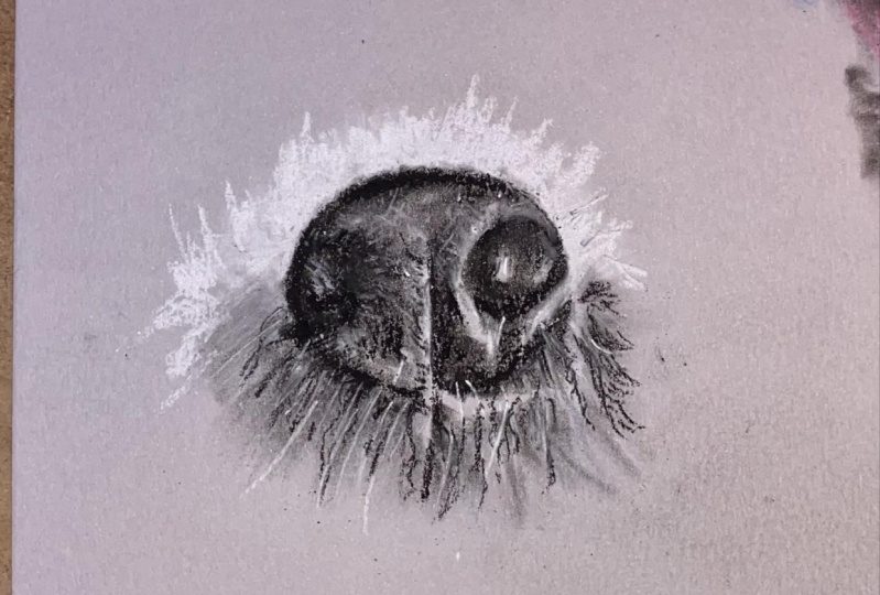
10. Pink Nose: For the nose, I will start by sketching out the proportions. I am using a white pencil
because I don't want the outline to show through
at the end of the drawing. I'm paying attention
to the proportions of the nostrils to
the rest of the nose. And I'm paying attention to why the line in the middle falls. I just observed the
angles of the outlines and compare the length of
all the lines to each other. Also, I would like to point out that for the
previous drawings, we used a combination
of pistols, sticks, and pastel pencils. I advocate for this whenever
the drawing is big enough, but when I am working on
something as small as a nurse, I find that the pastel
stick legs precision. So I will be using
pastel pencils for the nurses as
well as the eyes. I'm going to start by blocking
in all the main colors. There are quite brown and
shadows on the noses, so I will roughly fill those in. Next, I will block
in the nostrils and use a pink color as the general undertone
of the nose. I'm going to blend all of this together using a blending stump. Feel free to continue using your spongy blender as long as he can be precise
enough not to go outside of the
edges of the nose. Next, I will refine the base
layer, adjusting the values. The pink was
definitely too strong, but I didn't have a great color, so I had to mix my
pencils to arrive at this more accurate
grayish, pinkish here. Because we've been
blending so much the nostrils kind of blended
with the rest of the nose. So using a deep black we're
going to bring those back in. So continue refining
your base layer until all of the shadows and
highlights are in place. Then we will move on to adding
the texture and details. Try to stay away from
overusing black. This will desaturate
your shadows and make them look flat. I like to use dark browns for the shadows on a
pink nose instead. To replicate the newsletter, we can create small
circular motions. I'm essentially going
over the basic deal with similar colors to make it appear a little
bit more textured. We don't have to draw the
texture exactly as it is. We can just represent
the effect it creates. I am adding some gray, pink, and brown scribbles in
the correct places. Once we lay all of these, they will start to
appear like no leather. We also have to make sure that the nostrils are integrated
with the rest of them. Notice we don't want it to appear as though the
nostrils are detached. We want to communicate
to the viewer that they are tunnels
inside of the nose. So I am using a reddish brown
pencil and I am drawing small scribbles to the size of the nose to show that
the nostrils go inwards. Finally, I'm adding
white scribbles using this small circular
motion at the very top to create
the highlights. I am observing the
reference image constantly and checking to make sure I put all of my highlights in
the correct places. For the final details, I am adding some
stronger reflections to really bring
out this texture.
11. Black Nose: Okay, Now it's time
for the black nose. So again, of course we have to start by making the sketch. So I will do is as
accurately as I can measuring the angles
and lengths of the lines against themselves. I began drawing the nose by
filling in the nostrils. I don't want to lose them once I start to fill in the
rest of the nerves, I am using a deep black
for the nostrils. Then I like to fill in the remainder of the
nose using black, but I vary the intensity at
which I press the pencil. I know that the deepest black
values are in the nostrils. So I pressed the pencil hottest, bought the top of the nose
is a much lighter gray, so I only created a light layer. Next, I am going to block in the highlights and
add hints of brown. I like to blend in
between my layers. I am also going to
reinforce my black values. When you blend, sometimes
they fade away, so it's necessary to
go over your colors. So this noise is
very reflective. There is a lot of moisture
and is also black. So all of the colors around the double bounce
off the black nose. There are some purples, blues, reds, so many colors. Just like with the
previous nice texture, I am going to create
pencil strokes using a round emotion. I feel that random scribbles replicate the texture of
nice, never very well. There are a lot of blues
here in this node, so I will be using those
to create the highlights. I don't want to use white
or gray because that will take away a lot of the
vibrancy away from the nerves. And it also doesn't
look as realistic. We're almost done. I like to add some black in-between
the highlights to reinforce the texture over the nose because the
cracks are very dark. And for the final step I will
be using a white pencil and drink some intense highlights to add more dimension
to the nose.
12. Dark Eye: Now we will be learning
how to draw the eyes. This is particularly
important because the eyes are very
characteristic. We have to get them
very accurate to convey the identity
of the animal. If we don't draw them well, the portrait one resemble
the PET as much. If we make errors with a far,
we can get away with it. But unfortunately with the eyes, we have to be very careful. So let's take this stage of
the drawing very slowly. We start with the proportions. This is probably the
most important step. You want to make sure
that is drawn correctly. We don't want to start during
the shadows and details, if the foundation
is not accurate, spend a lot of time
on the sketch, measure your proportions
are correct. Constantly keep
comparing your drawings against the reference photo. Something I always
tell my students is to draw what they see, not what they think they see. We all have an idea of what
an eye looks like, e.g. we have biases that the iris
is going to be right in the center and there will be an even amount of whites on
either side of the iris. But really when you look
at reference photos, you find that it's a lot
different than you think. Don't draw from intuition,
draw what you see. Forget your drawing
an eye and pretend to drink something you've
never seen before. Once he outlines are done, we will start to block
in the basic colors. I am not using soft pastels here because they are not precise
enough for the small i, I am just using pastoral pencils because it's a lot smaller. So I start filling in
all of the black areas. A lot of this I is black, so it happens to
be a large area. I am going to leave
out the highlight in the middle of the people. I don't want to fill it in and then draw a white
reflection over it because it will
be hard to get the same intensity of white. I am creating a blue
reflection in the eye because that makes it look like the skies reflecting from it. And I think that
adds a nice effect. It makes the IOP more lifelike. The entire process,
I always tried to follow the reference
image exactly, but the reflections in
the IR an exception, the eye is already
very reflective, so I will copy it exactly. But if it was taken
in poor light and the I was just
one flat color, I still would have added some
bright reflections to it. Reflections are not
characteristic. They depend on where the
subject is in the environment. So they change all the time. They won't change how much
the animal resembles itself. That will just bring some
life to the subject. We will proceed to
blend it all together. I am using a blending stump. You can use anything as long
as it's precise enough. You could use the tip of your blending sponge
or even a Q-tip. But if you don't have
a blending stump, I highly recommend you buy one. They are very affordable and
they are great for blending. So the reason why I
blend is because I like to get rid of the grainy
texture of the paper. By blending, we create a nice even coverage and you
can't see the truth so much. I continue to refine. When you blend,
sometimes you can lose the intensity
of some values. I am going over
some of the areas. The most important thing is to continuously check
the reference image. You start by roughly
blocking in all the values, then you pay attention
to the details. We know that the white
of the eye is going to be more white in some areas, slightly gray and Alice. So we look for those changes in value and replicate
them in our drawing. Now we are going to draw a
portion of the hair around the eye just so we can observe how the head direction
changes around the eye. So if you take a moment to observe the head
around any dogs, I grows towards the end, around the inner corner of the hair changes
direction very quickly. It splits because below
the corner of the hair grows down and above
the coordinate goes up. So this transition of the
head direction is very swift. We are using a black pencil
to create the base layer. We are following the head
direction as we do this. We will blend this
and refine until we're happy with the
intensity of the layer. Next, I am using a brown pencil because there are some bits
of hair that are quite light. I am filling those in keeping in mind the head direction
as well as the length. We want our pencil strokes to be the same
length as the hair. If we make the pencil
strokes longer, we will create the effect
of lone pair and it will take away from the
resemblance of the dog. Finally, I am adding some
highlights and that's about it. There is also a hint
of brown in the eye, so I am going to add
that and we're done.
13. Light Eye: The process of
drawing in pastels is very similar
for all features. We start with the outline. We make this very precise
because the eyes have a lot of character to capture the
resemblance of the animal, it's essential to get
the eyes correctly. So really spend a lot of time making the outlines
proportional. Once that's done, we will
proceed to draw the base layer. We are using pastel
pencils for this, we will be blocking in
all of the basic colors. There are a lot of
yellows and reds, so we are fitting that in and blending between the layers. Let's ignore the
details for now. Remember the squint. This plays out all
the details and leaves us with the
general values. Try it now and see
if it works for you. There is a lot of
darkness underneath the eye that the light
source was probably above the dogs or the eyelid
cost a shadow on the eyeball resulting
in a black shadow. So fill this in and
blend it so that it's integrated with
the rest of the eye. We draw the highlight
using blue and white. I like using blue because it
makes the IOP very vibrant, like this guy is
reflecting from it. We continue to build
up the details. We essentially start by
filling in the hole. I will general colors and
refine and add details on top. So now let's add some texture to the iris using a lighter yellow. Let's add some lighter
scribbles to the eye. To finish off, let's draw
the fat around the eye. This should be
straightforward since we have so much practice with
the fat textures. Now, we begin by drawing
the base color underneath. I am using a beige color. Then following the direction
and length of the hair, we will complete
the hash strokes.
14. Conclusion: Congratulations, You made
it to the final lesson. Thank you so much
for taking my class. If you enjoyed it, I would
really appreciate if you left a positive review or a
comment or a project. Your interactions with the
class help it show up on Skillshare and allow other
students to discover it. If you have any questions or
would like further guidance, please ask Hillary and
I will be more than happy to help you for
all the class project. I would love to see
any exercises you completed such as one
of the bad textures or the features like the eyes
nice or I leave feedback on all uploaded projects
are definitely upload yours and I would love to give you
further guidance. I have more classes
here on Skillshare. If you'd like to find out more about the different pesto kinds, I have an introductory
class where we went over the differences
between soft pastels, hard pastels, pastel
pencils, and oil pastels. We also created some
quick pastel drawings which were very
enjoyable to make. So don't forget to
follow me here on Skillshare or Instagram,
Victoria Mikkel OTT, all my website,
Victoria Nikola com, where I actually recently
started an art blog. That is all from me. Thank you so much for taking my class and following along. I really hope that you learned something useful and
enjoyed the class. I am really looking
forward to seeing your projects and answering
any questions you may have. Thank you again and
happy creating.
 Wiktoria, Professional portrait artist