Transcripts
1. The Procreate Pastel Masterclass!: Hello and welcome to the
procreate pastel master class. Now here was the thing. You can get brushes
that look like pastel brushes inside procreate, and occasionally you'd
come across a file that looks like a
pastel paper texture. But the big problem
was the texture of your brush wouldn't match
the texture of the paper, and so the whole
thing fell apart. Until now, I have a lot of downloads for you on
this course, including five different kinds
of paper texture for you to draw on that cover. The most popular papers that
you use in bond day pastels. But more than that, for
each of those papers, I have multiple brushes
that are designed to work specifically
with those papers. The texture of your
brush you're using exactly matches up with the
paper you are drawing on. In addition to that, I've made
available for you hundreds of colors that are sampled
from real world pastel sets. You have authentic
looking pastel paper, Authentic looking
pastel brushes, which match the paper perfectly, plus the kind of
color you use in the real world to
create pastel drawings. This is what I'm calling a complete environment. Everything works together to create complete pastal effects. But in order to get
the most out of it, you need to know
what my thinking was when I created the various
different brushes. So I have tutorials for you showing you how
to use the brushes, which brushes to use, why they work the way they do, and how to get the
best out of them. Enroll on the course now
and in no time at all, you are going to be creating some beautiful pastal artwork. My name's Simon Foster and I
will see you on the course.
2. Welcome to your Complete Pastel Environment: Hello and welcome to Procreate
the Pastel Masterclass. Thank you very much for
investing in this course. It means I get to do
what I love doing, which is making video tutorials. But okay, let's get
down to business. But okay, let's get, but okay, let's get down to
business because there are a lot of resources
for you to download. If you're on Udomy, they are
attached to the next video. If you're on Skillshare, go to the Resources tab. If you're unsure how to do that, go to the end videos. Because there's a video
there where I download these files onto my old ipad and I can show you
how I do that. Also, if you are completely
new to procreate, there is also a video at the
end which just takes you through the very basics
of how to use procreate. Okay, so with that
out of the way, let me tell you what you're getting on this course and why. I think I've given you
something which I've not seen before and I'm going
to give it a fancy name. Let's call it a
complete environment. And let me show you
what I mean by this. Okay, So if you're
doing pastels, you need paper and there are a few different varieties and
lots of different colors. And you also need pastels
to go on that paper, and they come in a variety
of different colors. And so to get a
convincing pastel effect, well, you need three things. You need the paper, you need the pastels to look like
they belong on the paper. And also the right colors,
if we can call it that. Al right, for this course, I have scanned in five
different kinds of paper, which pastel artists
use all the time. And let's take one, let's try this one. Tans or me tienes, and I apologize because
I know at least one of those pronunciations
is completely wrong. But take a look at this. This paper texture is a very popular surface
to draw using pastels. And if I just pinch
outwards to zoom in, you see the paper texture I will quickly pinch in to zoom
to fit At the moment, it's kind of this
grayish midtone color. But on the course, I provide several different
color palettes. And if I come to my color
icon and tap on it, let's come down to palettes. Okay, You're getting all
of these colors here, which have all been carefully sampled from real world pastels. So they are the
kind of colors that you will find in a pastel set. But look, if I come down
to DC pastel paper colors, that's my default at the moment. You can tell by that little
tick mark I'm circling. I brought lots of
different kinds of pastel paper and I
scan the colors in, and I spent some time getting the right base colors for this. So these are a selection
of the kind of colors you expect to see when you
buy a pastel paper pad. And so if I come to
my layers panel, you see there where it says
background color tap on that. I can change the color of this pastel paper to
whatever color I want. These are the kind
of colors you will expect to see with
pastel colors. And oh, that's bright, but that was scanned in. And you can do the same with
any one of these papers. If I come back to
the gallery and I choose say, pastel paper, which if you never tried it, is like fine grade
sandpaper because it really helps the pastel
to stick on its surface. And if I can make that
any color I want. So, so far you've got
five different papers, 30 different sample
colors for each. Although if you want to choose your own
color, that's easy, just come to any one of the other color
pickers like the disc. And I can finally tune this
to wherever I want it to be, maybe around there
somewhere. Tap on. Done. Well, okay, so far we've got some
nice pastel papers that you can turn any color you want and we've got
some pastel colors that are taken from real
world pastors and well, yeah, that's not
particularly different to a whole lot of other things
you can do in procreate. But the next bit,
this is the bit where I started to feel a little
bit pleased with myself, because when you come to the
brushes with the course, you get four
different brush sets. Dc. Pastoral 01, DC. Pastoral 02, DC. Pastal extra, and DC. Pastel daubs. Okay, so let's go
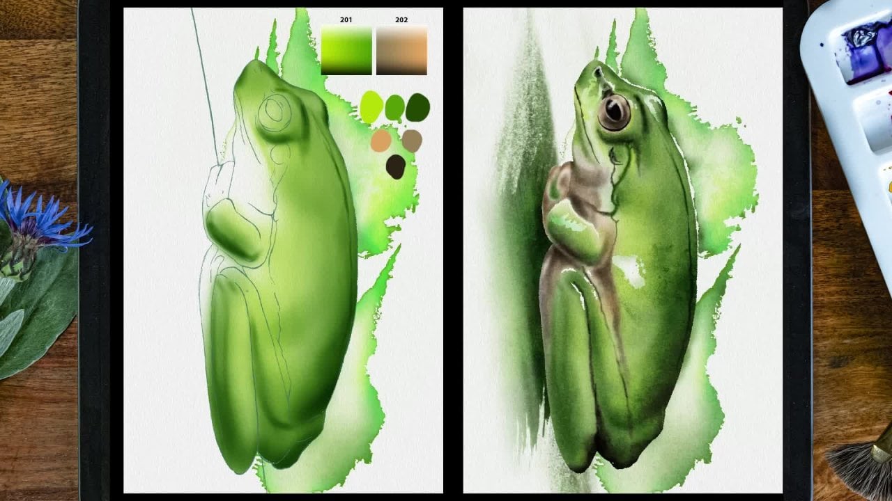
to DC Pastel 01. And the paper type we're using
at the moment is me tans. So look at this 123
me tans brushes, which are especially designed to work with this particular file. So that when you use
it, for example, if I come to, well, the round pastel and I'll make the opacity up 100% I'll
make it nice and big. When I draw on it, it reacts as if it's sitting directly on top of
the paper surface. And by that I mean the
texture of the brush is especially designed to match up with the texture
of the paper. I tell you what, I'll do a
couple of different tones in there just to get them to blend a little bit like this
and maybe something lighter, so it's really obvious. Now if I zoom in, this brush is designed to go in
particular with this paper. And I'll tell you what, look, if I make the paper invisible. That is the brush
without the paper. And you can see the texture of the pastel there when I add
the paper in the background. The two match up
with each other. And it's a series of
four different brushes. That's the standard round brush. This, which I'm using now, would be a side brush
like if you are holding. The pastel on its side. You've also got pastel scraped because when you
hold a pastel on its side, or in general, you're
pressing lighter, you get less of the pastel deposited on the high
bits of the paper. So you get this thin
scraping of color like this. I'm using the same pressure, but I'm getting much
less pastel put down. If I scrub hard,
you can see more of the pastel goes down that behaves as it would
in the real world. And also finally, look, if I come to pastel pencil, should I say tans pastel
pencil, and I draw with that. If I press lightly, I get
a slight past effect. Let's zoom in on this. If I press hard, you
get the effect of what happens when you take a
fairly sharp pastel pencil, which will dig into the
paper a little bit. So you get these
stronger brush strokes, put it on its side. Let's make this a little
bit lighter, shall we? If I tilt the pen
over onto its side, it's designed so that it
spreads out over a wider area. And this is what I'm talking about when I say
total environment. I have not seen this before. Where you get a set of
brushes which are designed to work with one particular
texture and with each other. Because all of these brushes
share one thing in common, and that is the
texture of the grain. That grain you're looking
at right now was taken directly from this paper surface that you see in the background. Of course, you have
different types as well. Look, this is pastel paper. I have pastel paper pastels. Let's take the round
one, the obvious one. Let's try a nice yellow. So you can see what's happening. You can see I get much
more of a gritty brush, which matches up with the
grittiness of the paper. And if I come down
to say scraped, same pressure but I'm getting the effect of the pastel scraped lightly along
the top of the brush. What about sprinkle
even lighter? So you use these 12345 brushes with this particular
paper, Sugar paper? Well, that's what we called
it when I was an art student. It may go by the name
of something else, but it's cheap paper which you just use for doing
loads and load of sketches, but you can still get some
very nice results with it. If you go to DC Pastel 02,
here we are at the bottom. Dc sugar paper, pencil, sugar paper, sugar
paper, scraped. So let's go to sugar paper. Let's just try fairly neutral, lighter color and zooming. That's the effect you get when you use pastels on sugar paper. Because I'm zoomed in close, hopefully you can see the rough marks that you
get with the sugar paper, but it provides an
interesting texture. And what's more, it looks natural for our purposes now, don't
forget with this. Also, you do have smudging. I can use the same brush to smudge that I
made marks with. Sure you can get some
smudging effects going on. Because pastels, you
do a lot of smudging. Now, what about Strathmore? This is a professional paper. It's got a really nice
texture, it's quite smooth. If I draw using this city
up on to 100% per size, fairly large, and
sure enough you can see I'm getting more of a
softer cloudier effect. This might be good
for doing some more softer gentler pastels. Finally we have low Vl. Is it almost feels a
little bit velvet. It's very soft and you can get some very soft smoky
effect with it. If I come to Velo Pastel here, let's choose fairly simple
brown and draw using this. Let's zoom in a
little bit with this. Come on, let's get a slightly
more interesting brown. And look at that soft
effect. Look at that. It's soft and it's smoky. If I tap and hold down
on my smudge tool, so I smudge with
my current brush, you can see how it still
looks like pastel, but it smudges very gently. And look, if I take
another color, let's choose a very light
color. Put that down there. Come back to my smudge tool, and if I lower the opacity, it takes more time to smudge. So that can vary the smudging effect
which you are going to need because you
smudge pastorals, as well as making
marks with them. So you've got this which is
very soft and smoky in DC. Pastal extra one. I've got a few
smudgy brushes here, look for law smudger there. And I can with a custom smudge
brush or use any of the regular brushes that I
use, but I have other ones. What smoky smudger,
what does that do? It's smudging but still you can get more drawn
out effects like this. Going back to the
original paper that is the point of the various
materials on this course, complete environment for paper. Any color, you want a series of colors based on
real world pastels. Plus also a set of brushes
that are specifically designed to work with
any one piece of paper. And just in case you
want a little bit more. Well, there is a little
bit more as well. If I come to my wrench icon, the ad tab is selected. So I will come to insert a file I want my icloud
Drive Procreate projects, my Pastel master class. If I come down to the bottom, any one of you
who's already done my procreate watercolor
master class, will know that I had something called Little Blobs of Joy. They are a series of swatches. Let's take a look
at the first 105. And if I make this
bigger, there we are. And I'll make the drawing
underneath invisible. All of these colors
are carefully sampled from real
world pastel sets. And so you can be working with the kind of color you would get in a real world
pastel exercise. Now you may notice
one thing with this. When I brought them in, they got brought in underneath
the paper layer. And because of that, you can see little variations in tone. You don't want that, you want just a simple block
color to sample from. So you put your finger
on where it says inserted image until it
pops out a tiny bit. Then you drag it on top of the paper layup and there
are your pure colors. I'll just quickly pinch
inward to zoom to fit. And you may notice this. If you come to the palettes, all of these DC pastors, let's take a look at say, DC pastors, peach and maroons. Well, look at that,
peaches and maroons. There's 30 colors
in the palette, but there's also
the same 30 colors in this on screen palette. And you can see I've labeled
it peaches and maroons, number one through to 30. And so if anyone
says to you, hey, I love the colors you did in that last pastel
drawing, what were they? You can turn around and say they were from the
little blobs of Joy palette number five as compiled by Simon Foster Peaches and Maroons Colors number 217.29 So it's a bit like pantone reference colors
but not quite as confusing. Also, you have little
blobs of joy 06. These are the same pastels, but this time the middle color is the color from
the previous file. But I've given different
shades dark to light. And they work in a
very similar way to the way people make pastels darker or lighter by adding white to
the base shade, quite often by adding
black to the base shade. So you have that
system in place. And finally, you have
little blobs of Joy 07. These are a different
set of pastels taken from a couple of
different manufacturers. And the difference with this is if I come to say the reds here, the middle tone, that's
your base color. But instead of getting
three lighter shades and three darker shades, you're getting a continuous tone going lighter and
darker from the middle. Third, the combination
of different kinds of paper and any color
paper you want, plus these specialized brushes, which are designed to work
with that particular paper, plus a whole load of
either procreate palettes or on screen PNG files
of real world pastors. Plus the lighter
and darker tones means you have you guessed it, a complete environment
to work with. That is exactly what we're going to be doing in the next video, where we're going to just do
a very simple illustration just to put the
principles in practice. We're also going to be updating
a very traditional way of helping you to draw
something for the digital age. That's all coming up
in the next video. I will see you there.
3. Sketch using the Digital Grid Method: All right, let's get
on and draw something. I'm in my pastel
paper folder and I think I want to use a
pastel paper that's got a very obvious
texture so that you get the clear idea that
we are drawing in pastel. For that, I think the one, the clearest texture
is going to be tan. So I will come, I will
swipe to the left and I will du, always do this. In fact, if you have a folder called Pastel Bases
with in procreate, duplicate the entire folder. Then go to the duplicate folder. Find the paper you want and then duplicate that like I've done. Tap on it to open
it up and you can see it's got pretty
clear texture there. Quick thumb and finger swipe
in to get our paper to fit. The next thing I'm going
to come to my wrench icon, and I want to insert a file, it's on my icloud drive. I will come to my Art Inspiration
folder, pastel bases. And I think a very
simple thing to start off with would be an orange. So I've got this one from the
unsplash photos stock site. I'll leave the name as it is. And I won't try and pronounce this because I'll get it wrong. And I don't want to
disrespect the author, but it's this one here, so tap on that. Has to think about it, and here we are, Actually, you know what, I want to make it just
a tiny bit bigger because I don't need
the space above. I want a little
shadow on the bottom. And I'll put it about there and I'll tap on any icon I like
just to commit to that. Okay, so that's coming in
on my drawer here, layer. And we are going to
need to draw this. But what I'll do
here is something I mentioned at the end
of the previous video. Where we're going to take a
very traditional drawing aid, but we are going to update
it for the digital age. So come again to
our wrench icon. Come to insert a file for me, it's on my icloud drive. Procreate Projects
passporle Masterclass. And it's this one? Yes. It's another file
for you to download. I'm sorry, DC grid 07. Now, if you know anything about the grid
method for drawing, you will know that you take
an existing drawing or a photograph and you draw
a grid over it like this. And then on the piece of paper
you're going to draw on, you draw the same grid, but bigger or smaller, or the same size or
whatever you need to do. And you use the
various points on the original grid
of whatever it is you're tracing over to act as reference points for
your actual drawing. If you don't know
that technique, you soon will because
we're going to do it here. But remember digital age, because the whole thing about the traditional grid method is it takes time
to draw the grid. And depending on
how good you are with a set square and a ruler, generally speaking, it's
just a set of squares. Then you have to
repeat the same set of squares in very faint
pencil for example, and use that as the base. But this is the digital
age and you can take any digital file you like and duplicate it as
many times as you want. So let's take advantage of that. This is a file I created in an illustration
program where, amongst other things,
they have color. So we make the grid lines
in different colors. Now that should really help you, because the classic
thing that goes wrong with the grid
method is you make a mistake as to which square you're supposed to
be making references from, so you make a little mark
that you think is right, but actually it's one square. Too high or too low to
the left or whatever. But with this, because you
have different color lines, you can make a mark, for example, where the red
line meets the blue line. But also because this
is digital and I can create this file once and use
it as many times as I want, I can take my time with this. You will notice there are
also some diagonal lines. There are also three
different concentric circles. So if I zoom down to
this point I'm circling. If I want to copy that, I've
got a strong green line. I have a fainter brownish line, but also just underneath and to the left of that red circle. So you've got different
geometric shapes, different angles and
different colors. This should really help you with making sure you're getting
the right reference point. And here's the other
thing as well. I can make this bigger
or smaller as I want, if you're new, you might want to make a
small grid like this. As you get more experience,
you might decide, well, I want to be bolder
and I'll want to make a bigger grid so I have
less points to worry about. Also, if you wanted, you could angle it like this because, well, you'll see
in just a second. So supposing I make the
grid about what about here? What I'm doing is
I'm trying to get some significant points to
lie in significant areas. Like for example, this one, the very center of
this grid where I have two diagonal
lines meeting. I've put that just about where the stalk
meets the orange. I've also got where the two
diagonal lines meets that strong blue line going down that is on the far side
of the shadow area. And in fact, I can
maybe even just drag down just a touch like this. So I have this little area I'm circling here just at the
very top of the orange. And again I've got a
diagonal line there which is helping me
reference that point. Okay, so my super
duper reusable grid with little circles and diagonal bits is lined
up how I want it. I'll just press any
icon to commit to that. Okay, so now don't I need
another grid to trace this off? Well, as it turns out,
not necessarily look. Let's take advantage of the ipad screenshot feature at the top left of your ipad
or the bottom right, If you've got it the
other way round, you'll find the
two volume buttons plus also, is it
the home button? And so what you do is you take the leftmost volume
button and the home key, and you press them both
at the same time and you get a screenshot
tap on the screen shot. There it is. And you can see
surrounding this there is a white box with
some thicker bits on the corners and the sides. So you take the thicker bits
and you drag them around. And in this case I'm going
to drag it so it's pretty much surrounding the border
of the picture like this. And once you do it will
usually re size like this. That's my reference image. And now I'm going to come to
the top left and press done. Gives me choices. Where do
I want to save this to? I want to save it to photos. All right, that's it. Now next thing, the
draw here layer where I imported my image, tap on it and come to clear. But I still have the grid. I'll come to my transform icon and I can move this across. I want to move it across
to the left to where I want it, say about here. I'm not going to
move it anymore. Because once I commit to this, the bits which are
on the outside are going to disappear for good. So I try to lose as little
of it as possible like that. Then I will come insert a photo, because I want to go
to my photo library and there you have it. My screen shot of the orange. And because I took a screenshot, the grid lines are applied and I can place this wherever
I wanted to go. Let's make it a
little bit bigger. I am going to make the grid, I am going to make this
a little bit smaller. So you can see that
with the grid method, you can make things
bigger or smaller. And if you do this, make sure that you are set to uniform. If you set it something like free form or distort or
warp and you drag a corner, you'll change the aspect
ratio of that image. You don't want to do
that, and in fact, look, I'm going to make it a little bit smaller like that. Okay, So that is the grid method updated for the digital age. It should be a lot more useful, but the only way we're going to know that for sure is when we start making a sketch
based off that screenshot. So let's do that next.
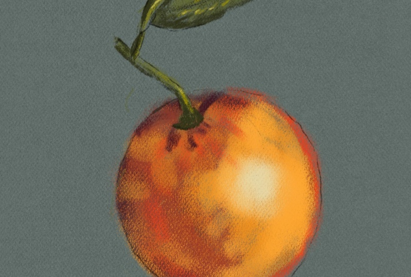
4. Sketching the Orange: Okay, so let's put this
theory into practice. I have my imported image, and the first thing I want
to do is to make sure I'm happy with the size of the
drawing I'm about to create. Because I may want to make
that grid bigger or smaller, which I can do because
this is digital magic. To do that, let's
put down a few of the outer markers of that orange just to see how
it's sitting on the paper. To do that, I'm using the
met tans pastel pencil. I'm choosing a very
muted dark brown. Now let's just try a
couple of pencil strokes. See what it looks
like on the paper. I'm finding that a bit hard. And now I designed
the pencil that way. Because when you're drawing
with pastel pencils, sometimes you make
hard strokes where you don't see that much of
the texture like that. But I think I want a fairly
light flicky sketch, because I want this
to look more like a modern pastel
drawing where you see plenty of loose
brush strokes and the texture showing
through underneath. So I'll take down my paste to around
about the halfway mark. Make the same brush stroke. And yeah, that's given me a much softer sketchier
effect, right? Let's zoom out again
and put in the markers and also run into a problem and what to do about it because, well, look, if I zoom in, let's take a look at this
very obvious reference point. I've got the blue
line going down, I've got the red
line going across, and I have two little
diagonal lines pointing down to that point. That's definitely an
accurate reference point. But in order to do this, I've got to zoom back out again. I can't see both grids
at the same time. I'm not happy. So
this is what I do. I'll come up to that
inserted image, I will swipe to the left, and I'll just delete the layer. Instead, I will come
to my wrench icon. You want to be sure the
canvas tab is selected? Then you come to
reference. Turn it on. Now I've already done this, but to import any image you just come to
import at the top. This takes you through
to your photos at where you see all the photos including that screenshot we did in the previous video tap on
that and there you go. And the advantage
of that is that I can resize this
as much as I want. I can move it out the way, but also I can zoom
in on that point. But I can also zoom in independently on my
main drawing area. If you're doing
the Squrid method, this is a better
way of doing it. So now I can see both
reference points. I come and I create
another layer. And I'll call this markers
because I'm not sure, I'm going to use this
as my sketching layer. I'll explain why
in a little bit. There's my point
put down a marker there and I know that's
in the right place. Let's come around a little
bit and take a look at, say, the bottom marker. If I go one square
long to about there, then I go down past
that blue line, it's about about here. What I'm looking at is that little triangle that's made underneath
the big blue line. And it's the triangle formed by those two diagonal lines and
the bottom of the orange. And it looks like a little
triangle like this. So I'm pretty certain that's the bottomost point
of my orange. Now, what about
the rightmost bit? Well, look, if I take a look, I can see in my reference, I've got that blue
line, it's past there, but it's before the green line. I can just about see the brown line on the
actual orange itself, although it tends to disappear. But I'm pretty certain it's
around here somewhere. Then comes up and
goes round like this. What about the top? It's about halfway in between the blue horizontal line and
the green horizontal line. It's to the left of
the red vertical line. In fact, yeah, I've got where a horizontal vertical and a
diagonal brown line met up, so pretty certain
it's right there. And you can see when
I'm doing this, I'm getting an idea of the outer limits of
where my orange is. And I know they're
accurate because I have this grid reference with
all these different colors, which is making it pretty
easy for me to reference what I'm looking at Now,
what about this stalk? The top of the stalk, I've got a blue line and a green
line and a horizontal line. Where it's about there, isn't it? What about the leaf? Well, the tip of the
leaf is where I've got two blue lines crossing,
which is that one there. And the tip of the leaf is extending up towards
that brown square. It's about there. Now, when you're doing this in your mind, you take each one of
these squares and you divide it up into
ten, for example. And you try and figure out how
far into the square it is. It could be halfway
into the square, it could be a third of
the way into the square. What I normally do
is, in my mind's, I divide that square up into
ten different segments. Like let's take this one here. You see where the
stem of the leaf joined the stalk of the orange. That to me looks to
be about halfway, maybe just slightly halfway from the blue line
towards the brown line. So I know it's going
to be about here. The underside, pretty
much where I've got that brown diagonal line meeting the arc of
one of the circles. So now instead of thinking
halfway along the square, I now have it's where a
diagonal meets an arc. So it just makes
life easier for me because I can think in
geometry terms diagonal arc, and I can also think in
different color terms, red, green, blue, brown. So let's take a look at my markers just to see how
this is fitting on my page, and I think that I'm happy with that size. Just
one more thing. Before I do, I just want
to make a couple of markers where the stalk
meets the actual orange. And what do you know?
Right in the middle way, you've got all these
lines converging. I definitely have
a marker there. Let's take this point
on the stalk now. Yeah, this is a case in point that is straight
up the red line, but it's in between blue line and the brown line,
which is there. And it's about what, seven tenths of the
way up that red line. So that's, can be about there. And then it goes across to
this square here with the red, the blue and the brown lines. That's about two tenths, three tenths, maybe
about a quarter. So that's going to
be about there. Okay. So I'm pretty
happy with the size of that if I wanted to make
it bigger or smaller. Well, I'll show you that now. I have my markers in place. I also have my grid in place. That was the inserted image. Come on, let's rename it so I can talk more
clearly to you. I have my grid layer,
my markers layer. I will come to my markers layer and just slide and let go. So that is chosen as well. Now if I come to
my transform tool, again, make sure
you are on uniform. Do not come to distort
or warp or freeform. You want uniform. I can pinch in a little bit just at the side of the screen, not the screen itself, to make things a bit
easier for me to see. And if I want to move this, I will choose point on the
outside and move it around, Not on the inside,
because I don't want to risk rotating this image. I can make it bigger
or smaller as I want, I can position it on the screen by dragging from the outside. But as I say, I don't want
to risk rotating this grid. I could rotate the grid
in the previous video. We know we're setting things up because once you
take the screen shot, you're left with the same
grid at the same angle. But once I've taken
my screen shot, no, you can't rotate
it anymore anyway, Supposing I reposition it
and I prefer it where it is, I can tap on any of the icons
at the top just to fix it. So now the next thing
to do is I can always come to my draw here layer
and put my sketch there. Okay, so now I've got
my markers in place. I want to do my sketch. I'm going to come to
my drawer here layer, which I haven't used yet. And I want to do this on a separate layer to
my markers layer. Because the markers layer was for working out
the anchor points. And how big I want this on my paper for the
actual sketch itself, I might include it in
the final drawing, and so I don't want these
really heavy marks here. I want something a bit lighter
and a bit more flicky. And so I'll come down
here and I know where I have the top part of
my orange on the side. And I can just draw like this. I could still be taking notice of the various
different grid points, but I want this to be
a little bit lighter, a little bit faster
brush strokes like this, and two fingers to
move this along. Because, well, if
you take a look at some very old fashioned
pastel drawings, you can't tell them from very finely detailed
oil paintings. But these days pastels tend
to be a little bit freer, a little bit looser, and you can see the
texture of the paper. And so that's the look I'm
going for because this isn't the pastels looking really
realistic master class. This is the pastels
master class. To get pastel like effects. Those curves were easy for me to do because I'm
right handed and I'm using the natural arc of my right hand to
do those curves. However, the curves
on the other side, they are very unnatural for
a right handed person to do. Look, I'll have to
give it a try and, uh, undo that stroke. And just two fingers
rotate around. And this is what you
do in real life. You'll be rotating your
paper around all the time, just so you're using the
natural curve of your hand. Now, how's this going? Again, I'm doing it nice and
light fast brush strokes, the viewer isn't going to see that reference
image at the end. And also, oranges do come in
different shapes and sizes, so I don't need to
be too precious about getting all the
exact grid bits lining up. I just need a
general round shape sitting nicely on my picture. And I think, yeah, that
works now for the stem. Again, people aren't going
to see the final image, so I don't need to
be really uptight about getting all my
anchor points in place. Instead, I want
expressive brush lines. Yes, I'd like it to
look like a stalk. I don't want it looking
strange or anything like that, but I also want those fairly light
flicky brush strokes that hopefully will keep this drawing looking quite fresh, like someone hasn't spent
hours and hours and hours agonizing over
every last detail. It's just something fairly light and you know what I
was about, say be confident. But the only way you can be confident is by practicing
and getting confident. That way, what I
would say is spend as much time as you want
looking at what you're drawing. You should be doing that anyway. Spend at least three or
four more times looking at the subject than you do actually making
your brush strokes. So look at it all you want, get an idea of where the various different reference points are. But when you make
your brush strokes, just try and get it a little
bit freer and easier. Happy brush strokes,
there are no mistakes. Only happy accidents apart from the unhappy ones. Sorry, Bob. And all due respect
to you. Great man. Okay, so let's see what that looks like without
the markers in place. Yeah, that's fine. And what about without
the grid in place? Yeah. I now have a
sketch and orange, which if I need it
to be accurate, it's accurate just
while I'm here. Even just looking
without the grid, I'm thinking there's one
or two things I want to do here a little bit there. And come to my race tool again, make it a little bit smaller because that is
looking a bit ugly. Come back to my brush tool. Okay, so let's carry
on in the next video.
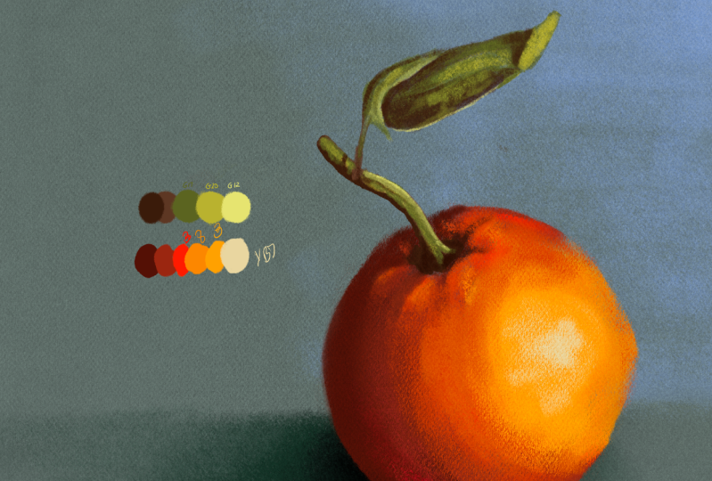
5. Select a Palette and Draw: Okay. Let's choose
some colors for this. Before I do though, let's
do a bit of housekeeping. Don't need that rid anymore,
so let's get rid of that. I don't need the markers
anymore. Get rid of that. And what I will do, I'll
come to my gallery. Okay. And the next thing
I will duplicate that. So I always have my original
image to work from. I will look at that, it call on my image.
I don't need that. So let's come to import
image again from photos. We're good to go because the next thing is I need
to choose some colors. For this, I will
create an empty layer. Otherwise the colors I import will import onto
my drawer here layer. And I can't be bothered to rename the layer I'm working on. So branch icon and insertifile
come to my icloud drive. My Procreate Projects
Pastel master class. Let's come down to our
little Blobs of Joy. Let's try Blobs of
Joy, 05 Pastels. That's probably a simple
one to start off with. And there are my various colors, and I will make this
as big as I like. Come to my layers panel and I'm going to create another layer. And I'm going to choose
the second brush, down my round tans brush. I just want to
experiment with some of these colors just to see
how they fit on the page. Let's make the orange
big, big as we like. But what I am going to do is play around with colors and
get approximate colors. But I'm not going to change the background so it is darker. I quite like the background,
the color it is. I think it will go quite
nicely with orange colors. And while you can draw on
dark paper with pastels, and people often do, I want this to be a
little bit lighter. And because I've changed
the background effectively, I'm going to be introducing
more light into the scene. So I don't necessarily need the really dark colors that I can see in my reference photo. I will want dark colors though, and I'll explain why
when we come to draw. And what colors do I want? So I want to choose
a pretty deep color. What about color number
29? Is that going to work? Let's try that. Let's
try color number 23, because as orange gets
darker, it becomes brown. Now, we were using color
number eight, which I like. I need a color in between. I want a fairly intense red. Because you tend to find
around the terminator that this bit where the
light hits the darker area, you tend to get quite
saturated colors. In this case, I think
it's a reddish color. I need something in
between, don't I? What about color number three? That's pretty bright.
Okay, Let's try that. 292338? Okay. I like color number
three and I like number eight, and I like the way they're
playing with each other. I don't like 29, so I'm not going to be a
slave to this palette. Instead, I'll take that
color number three. And I'll open up my panel. And I want a, it's still
in the terminator, so I'll still want
it fairly saturated. And see what that looks like. What's it color number three
that's sitting better. And then color number
eight that I prefer. But I do want a darker
version of what I had because we build
up dark on light. I think I'll use that
as my base color. So for this, let's
get organized. Let's an area of
color like this. Then. I chose that color. These don't have
numbers, remember, these are just solid colors I can sample from
when I'm drawing now. What was it next? It was
number three, wasn't it? That's three. I like what that's doing with a darker color
color number eight. I like what that is doing
with color number three. I need a highlight. As it's
getting towards highlight, it's getting more yellow. Can I get an in between color? It's pretty similar.
That's color number 19. Yeah, I'll go with color number 19 finally, for the highlight. Well, I've got these
very light yellows here. Let's come from yellows
and browns. Number six. Actually, that's a bit
too bright for my liking. Let's try number, well, let's try yellows and
brown color, number seven. Yeah, I like that.
So what have we got? I'll choose my
pastoral pencil color that was yellows and brown. Seven, y, seven, that's
a bit too thick. Let's make that thinner.
Color number 19 didn't, and that is from reds
and oranges are 19. Color number eight,
color number three, and the last two are made up. I'll know from that if I
want to refer back to it, that all of these colors are
going to be red and oranges. 19, and that's going to be
yellows and browns seven. Now I'll leave my palette there because I need to
come back to the greens, but I want to move on with you and I will also
choose my Rays tool on 100% and just get rid of
these colors underneath. Now finally, I have my colors. I can start drawing. Let's put this off a
little bit to one side. Give myself a little
bit of space to draw with. We will take. I've got, let's
call this palette. And I'm going to move this just off to the side like this. Come to my drawer here, layer. And finally we are ready
to start drawing for that, let's do some fast
brush strokes. Let's come to pastal side and you start off with
the darkest areas first. As before member I can
always erase these. I'm going to lay down
this fairly thickly. I'm keeping an eye what
it is I'm drawing. I can see darker areas
around the stem like this. Extend that out a little
bit, because remember, I'm going to be laying down lighter colors on top of this. Maybe that's about as
much as I want to do, and I'm going to
leave it fairly free. I'm going to try and work
fast here on my next rule, and this is really important. Please try and work at
ideally, a similar speed. Don't talk like I'm doing because it's really distracting. It's giving me a hard time. But don't try and get your
drawing to look like mine. Look, I've done
lots of tutorials because I'm always
trying to improve. And the worst thing I can do when I'm doing a fairly free, expressive illustration
like this, is to try and match up my fast flicky strokes with
what the tutor is doing. If you do that, you will
almost inevitably start doing some really careful considered strokes to try and get it in the same area and you'll lose some of the spontaneity,
I guarantee you. So your drawing should look different to mine.
Now, can you see this? When I'm putting down these
lighter areas over dark, the darker stuff is
staying in the valleys, the lighter stuff is staying on the
hilltops of the paper, so I'm getting a much more
natural effect like this. I'm just doing a few light
flicks like this now. What about, oh no, let's do a little bit
around the top here. There we go. Try and keep the brush
strokes in place. Maybe a little bit smaller. Just try and pick out a
little bit of detail. Just around here, around here. You vary the width of
the brush strokes. Now, I didn't mean to do that
last light brush stroke, but I'm going to leave it in there because when
you work fast, you're going to get
a little bit of randomness in there right now. What about this main orange? Yeah, it's sitting nicely
on top of the darker areas. I'm going to just go
really fast around this. Bring it up to here. I'm trying to make my brush
strokes follow the contour of that orange. Bring
it down there. If I want that to extend
a little bit further, then I'm going to come
to my meant pastel. Scraped because that leaves less pastel in the mountain
top areas, but overall. But you can see when I do that, I can press fairly
hard and I'm still getting a textured effect now. What about the slightly
lighter stuff? I'll come to my
meant pastal round. I want that again
to be pretty big. Yeah, that's just picking out some high lights like this,
which I do quite like. That was way too heavy. That brush stroke I just did
went a bit too fast there, take it back because it destroyed some of the
texture of what I was doing. And finally, I want
that highlight now. Should yeah, I'll use the
scraped again because I want these highlights to be
picked out fairly lightly. Like this. Actually, that's a bit too much, so I'm going to take
that back a little bit. Keep on two finger
tapping. Take that down. I will use my pastels round, maybe make it a
little bit smaller. I'm just drawing that
high light area again because I'm dark light, I'm getting a better high light. I went too far with that. Again, I'm going to two
finger tap to undo that. Isn't two finger tap, wonderful. Come on, let's come
over here a little bit. Now, I've quickly put
down these brush strokes, but I think I need to
do a little bit of taming with it because
I was going so fast. Now when I'm doing it,
I'm now over lighter, which I was saying I don't
particularly want to do. But I can always come
back in at any point and reapply those brush strokes. Now I do want some
deeper colors just around the outside of this
orange on the right hand side. But if I do that look, the brush is too big. So I'm keeping this
as simple as I can, not bothering with
clipping layers. Instead, I'll just
come to alpha lock. When I do that, it means
that on this layer, I can only draw on any bit of this layer which already
have pixels there. If it's transparent,
I can't do it. Now, I can easily see that easy. I can draw around and bring out the shadow areas of that
orange much more easily. But I'm not going over anything, I'm not going off onto
the blank bit of paper. So that's a fairly easy
thing to do in fact. Also various texture bits on the inside of this orange
which I can put stuff down on. I'm just trying to match some of these colors in with
each other a little bit. As soon as I don't need it, I'll turn off alpha lock. I'll make my breast size
smaller because we're big. Then go into the smaller areas. I'll start a sample colors
from the actual image. Now now that I've got my
basic colors in place, just try and work up a
little bit of detail just around here always. Do you break brush
strokes first or hang on Alfa lock because I
want a little bit of reflected light here but I
don't want it going too far. So I will do that. So I don't go over into that shadowy area as soon as I've done that
Alpha lock off. Now bear in mind as well, when people are doing
pastel drawings, they'll be using their finger or blending stump or
whatever to blend things. It's one of the staple things that you do when you're drawing. Well, in this case I do have some smudges down the bottom in the DC
pastel extra one, but I'm just going to use the same pastels to smudge
with as I used to paint with. So I'm in the smudging tab. Same brush as before. I might take down the opacity so the effect isn't
quite as strong. And let's do a little
bit of smudging around here just to
blend these colors in. Can you see that happening? Those colors are
starting to blend, and I'm starting to get a
softer terminator around here. And this is very, very similar to what you do when you take your finger and you
rub across pastorals. The difference being is you
do it in the real world, well, the paper texture is
always going to be there. You're not going to flatten out the actual paper
texture by doing this. You're just going to
spread the pastel over the hills and the valleys
of the paper itself. But bear in mind, this isn't the real world. This
is more digital. So you can start to
destroy the texture a little bit by doing this,
but that's not a problem. Come back to your paint brush. In this case, use the pastel. Scraped, Just use a
little bit of local color there and you can
just reintroduce the pastel texture like this, as well as getting
your smeared effect. So you can really
fine tune this. Let's make this a
little bit smaller. I need some slight deeper
oranges around here, I think come on a
little bit deeper. Just start to draw
out some of these. No, I'm using the scrape, that's not the right one to use. Let's use round,
make it fairly small because the scraped is just
putting down lighter areas. I need something a
little bit bolder, maybe a little bit bigger, just to get some of the deepness of the colors just as it goes into the shadow where
the stalk meets. And I'm looking at this
now thinking, okay, I'd like to do this bit,
I'd like to do that bit, but time is starting to march on and really should be starting to look at some other things. Let's let's choose a color
from here which is yeah, a slightly deeper
orange Alfa lock back on and I just want to boost up these darker
colors underneath. In fact, look, if
I'm doing that, it's more of a peachy color but just a little bit
deeper just around here. If I decide I've
gone too far with some of these free and
easy brush strokes, just come back to my eraser tool again and I'll choose
a round brush, full pasty, doesn't
have to be well, whatever size you want, take half a lock off, and maybe just kneat up one
or two areas around here. Because I'm using one of the
pastoral brushes to erase. It'll still leave one
or two bits around, like if I come
down to here rays, but I'm still getting one or two pasty
bits in those areas, so it's not that cold and it's still looking
like a pastoral effect. And I'm starting to
get a little bit too obsessive about this
at this point I stop. In fact, I'm going to raise once because I'm starting to
get a bit too hung up on. Let's make that bit right, let's make this bit right. And I want this to be free. I want this to be fast. I want this to look
like a quick sketch, not a quick sketch that I've suddenly decided to spend
a lot of time working on. So I'll stop here and I'll
finish up in the next video.
6. Finishing the Orange: Okay, let's try and get
this thing finished off. I called up my layer three, that's with my little
blobs of joy on. And I chose from the greens
and turquoise palette. And I suppose the main color
I've got is greens and turquoise is 17, 27, 28. And I also took greens
and turquoise is 17, which is that one
came to my colors. And I've got a darker, more neutral version of that color to act as my
base shadow for that. So let's make our little
blobs of joy panel invisible. If you have enough
memory to do that, Fine. If you don't delete
the entire layer because you still
have the codes there. Gt 17, Y, B seven, and so on and so forth. Let's zoom out a little bit. Let's choose our palette layer. Let's come to our transform. Let's move the whole
thing up there, so that we can zoom
in on that area. Let's move this across.
Look, it's up to you. We can do this on a
separate layer if you want, or we can do it on
the same layer. I'll do it on a separate layer because I want to make the point that layers are a good thing and there are advantages
to using them. You don't have to for this. Well, I need some of
the darker areas. In fact, I've got some very
dark areas around here. I'm noticing that I've
drawn on my sketch layer. I didn't particularly want to do that because I might want
the sketch to show through. That's a mistake people
will make all the time. So this is what I'm
going to do and I'm showing you this in case
you make the same mistake. And also the nice thing about
doing backups and versions, this is version two of my
drawing that I'm working on. But version one has the
layer with the sketch on, so I put my finger on that
layer until it lifts up. I drag it over to
where it says gallery. I'll wait for a while
it goes through, then I open up mutants
4.5 Drop it in there, it imports it, and there's my layer in place
and in the same position, which is nice. Thank
you very much. And look, let's do me your
favor and call this sketch. I think I would like
that to be sitting on top of the drawings
that I'm doing, which it is, but I'll
lock it that way. I won't make the
same mistake twice. That's the advantage of locking your layers because
I've done that though. If I make it invisible
for a second, you can see the leaf shape. But if I make it visible again, I'm doubling up the
effect of sitting one on top of the other,
that's a bit too strong. I come to my drawer here, layer, I select my arrays tool, I can just get rid of this. Be careful when
you come down here because you don't want to
erase any of that orange. Put it back on again
and you're good to go. Okay, so I did want
another layer. Didn't tight. Let's do that. Come on, let's rename it leaf. And Well, I want the darker
colors first, don't I? What brush am I using? I don't want to use
the pencil In't. Use the round brush for now. It's going to be smaller. Is that about the right
size? Yeah, that's fine. And I'll just put in some
of these darker areas here. I'm not drawing directly
on the sketch layer. And there's one or two
other darker areas here. Bear in mind this leaf is in
a pretty strong lit area, so there's going to be
some pretty dark shadows. I've made everything
lighter so it's not going to be quite as dark
as the original. Also bear in mind as
well in the reference, This is a photo. And even with image
manipulation these days, when people look at
something and they know it's a photo or they
assume it's a photo, they'll accept anything that leaf is curved around
at a weird angle. So yeah, we accept that, but we're not doing a photo. Here we are doing a
loose pastel sketch. And people will accept just
about anything in a photo, but they won't accept
the same thing if it's a pastel sketch. And I'm looking
at this bit here, where the leaf folds over, that's clear enough
because, oh, it's a photo. If I try and reproduce that
in a loose pastel sketch, people are likely to
get confused by it. They won't know exactly what
it is they're looking at. They might judge your
picture as being, well, not quite as good as it should be when you're doing
stuff like this. You do have to
simplify your shapes. Now, I should have
still put down a fairly strong area of dark around here so that
I can build on top of it. And I'll do that here. I think people will accept
the leaf folding over at this point I'm not
so sure about here. I might try and simplify that shape when you're
doing your pastorals, you need to simplify
your shapes. Like for example, this other leaf here which I'm circling. I didn't even bother
drawing that. I think that will just
be way too confusing. So, pick carefully what
it is you want to draw. Right? Let's put this down here. I'll make it a
little bit smaller because these are
fairly fine shapes. And I want to put
down a little bit of contours just around here, more on the lit side. I'll make this bigger because I've got the main
body of the leaf here, which is predominantly
color that I've got or the color that
I'm using at the moment. Don't be afraid to put down
large shadow areas and well, pretty sizable lighter areas. But you tend to find that the shaded areas tend
to be pretty big. And I need these to interact
with each other better, but the high light
areas maybe less. So they're a little bit more
focused and highlighted. Look at this leaf for example. There's quite large
shadow areas here, and there's a bit around here, which I should do more. But if you look at those
little highlights, they're fairly small
and fairly tight. That will depend on how
shiny the surface is. But in general, don't go too
heavy on the highlights. Don't spread them out quite as much as you would do
with the shadow areas. That's a general rule of
thumb. Not in all cases. But my main rule is don't
be shy with the shadows. I've had quite a few people
sending photos in or sending illustrations in for the
Solid Foundations course or the water color course. And it's been great
seeing things. But one advice I keep on giving is don't be
shy with the shadows. You see just a tiny
little bit of shadow, very shyly hanging
off the bottom of an object with a huge
mass of the local color. That's probably the
color I'm using now, not a lot else for this. I'm just trying to sketch on one or two of the highlights. It's a little line
just along here, a little bit around here. I'm now more scribbling
than laying down areas of color here. A little bit down there. And I'm working very fast. I'm not trying to get
this to look like a really accurate bit
of botanical art, I'm just going for the
general feeling and I'm trying to let the colors play with each other a little bit. Those shadow colors are playing
with the main color and these high light areas playing
with the other colors. For these lighter highlights, just one or two very light
bits, not much at all. Just to give a little bit of pop to what I'm doing like this. And also in general,
the main focus is going to be the
orange and the color. So you probably spend more time concentrating on that than
you would do on the leaf. So I'm going to make the
leaf a bit more skirchy, a little bit faster
because looking like what it's supposed to
look like is great. But when you're
doing loose stuff, the simple way the textures play with each other on
the page is also great. And just adding those
few darker streaks there has made that leaf a
little bit more interesting. What about some of the
semi lighter streaks? That I get an overall lining
on the top half of the leaf, a little bit more so
than the bottom area. Because another very common
thing that people do is it's all one color
with a few variations. But when you look at objects, you can get a
massive shadow area, a mass of local color, and a mass of lighter
colors as well. That's what forms
the overall object. It's not just one huge blob
of orange in this case, with a tiny little bit of red and a tiny little
bit of a highlight, you get areas of color. Now you can see here, it looks like I made a bit of a mistake. I put down a darker area. What do I do with that?
Do I keep it and say that was part of the overall
speed of what I was doing? I think in this case, look, if I wanted to get rid of it, choose me local colors
come to the orange layer. Classic mistake going on that it looks like that is actually on the
leaf layer. That's easy. Come to the leaf
layer, get rid of it, and I'll leave those
marks underneath just for a little
bit of variation. Okay, so the very
last thing I want to do with this is just add a little bit of
shadow underneath because at the moment
it's floating in midair, come down to my layer underneath my orange layer,
create a new layer. I'm just going to sample
that screen color. Put my finger on,
choose that color, come and choose a darker, fairly saturated
version of that. For my brush that's come
to our side pencil, I want it big, just
create an area here. The shadow might be
the light is coming in from above and to
the right slightly, so there'll be more of a
shadow on the opposite side. This, I'm going to lay it
on a little bit thicker, just around the base of the
orange and let it gradually fade out with lighter brush
strokes off to the side. Because you'll get
the deeper shadows directly under the object. A little bit more around here because it's coming from
the front and to the right, you're going to get
a little bit of shadow coming back again, a little bit deeper, just where the shadow
meets the orange. Final touches. Draw here. Let's come to half a lock. I'll choose a bit
of lighter orange. I'll choose my
round brush there. No, I will choose my scraped.
Don't want it that big. I turn a little bit
more reflected light and I wonder can a greeny, bluey background,
would that reflect at all on the underside
of the orange? So, alright, let's come on,
let's do something silly. Let's try greens and
turquoise is number three, which is more likely to work. But if I come to my orange, just add in one or
two little touches of that and let's make
this a bit bigger. Come on, if we're
gonna do it, let's do it. Let's not be timid. And abandoning just a little bit of that reflected light there. I'm not sure that's working because it looks
like I've scraped away part of the pastel,
leaving the paper underneath. So I'm going to double tap a few times to get rid of that. There we go. Call
my layers again. Now, I could just call up a
color from the color picker, but one of the
things about pastels is they are expensive. And what you've got
here 180 pastels that would cost hundreds and hundreds and
hundreds of pounds. So your choice of colors quite
often is pretty limited. So you have to improvise, which is why you see in
a lot of pastel drawings some colors that you wouldn't expect to see there.
But hey, they're fun. They work. So let's try, let's try blues and cyans
eight, it's a bright blue. I wouldn't expect to see
it there in real life, but this is a pastel
drawing and in fact, let's choose a round so it doesn't look like it's
scraped just on the top. And I'll make it fairly large, but I'm just going to go very lightly with this just to add just a little bit of complimentary color
into the shadow area. Even that was too much,
very lightly like this. I am probably breaking the
rules of physics here, but I'm simply doing it
because it might look nice. Because I know
there'll be a bit of a reflected light there
if I'm doing that. Let's try a little bit of just here that's
purples and neutrals. 29. I'm just putting
a little bit there just to mix
things up so that I get something which
looks a bit more interesting then
anatomically correct. Okay, so I've got
my drawing now. I don't need my
reference image anymore. I've used my meat
tant brushes on a me tans paper surface so that the brush strokes look like
they belong on that paper. But one optional tray you can do is you can take
your meat tans layer, put your finger on it so it
lifts up, come on, lift up. And then drag it all the way over the top of
all the drawings. But underneath the palettes, I'll do a two finger
tap to undo that. Look at the overall drawing. When I do, it was subtle, but if I do a three
finger tap to redo it, I'm reintroducing
the paper texture into those brush strokes, especially in those areas
which I smudged earlier. And I made sure to set
up all the paper layers so that you can vary the
strength of the effect. If you decide to do this swipe to the left, come to unlock. Then where it says,
oh, tap on it, you can see the capacity
of the layer is about 60% and that
means you can ride it, you can make it less, so it looks pretty awful or
you can increase the capacity up to 100% So you're getting a very strong pastor
effect there. How strong you want the
paper texture to go, That is entirely up to you, like for that I like what it's doing with the surface
of the orange, but I'm not so sure
about that leaf. And overall, it's looking a little bit too
strong for that. You can play with a blend mode now at the moment
it's set to overlay. Soft light gives a
software overall effect, hard light gives a
very hard effect. Those are the three ones I'd
recommend you play with. You do have other overlay
textures like this, which is really strong, that which is
practically obliterating the picture pin
light ain't working. So for this maybe I'll go
back to overlay as before, but I'll take it down a
little bit so it's not completely dominating that leaf. I'll settle with somewhere
around 70% And once I do that, come on, let's be careful, lock it again, because I only want that as
a paper texture. I don't want it interfering
with what's underneath. Now the very final thing, well, I've got an RN sitting
there to the right, but I've got a whole
load of empty space. I don't really want
that. So sort that out. Come to your wrench icon, come to canvas, come
to crop and resize. If I do that, you can see how many layers
I've got available. I've got, look, I
need it for my work. I've got an M Two ipad Pro here, so I'm going to get loads
of layers to play with. But I've tried to
strike a balance so that if you have an older ipad, you can still have layers
with the size of these files. And you can print this out to a fairly decent size if you
choose to print it out. But if you decide you want a smaller canvas to work
with in the first place, don't resize the image. Come to crop and
resize and do it this way to make a
smaller paper like this. Because all the brushes you've got here have been
specially designed and the textures
have been scaled to work with a
paper of this size. And if you make the paper
texture bigger or smaller, the size of the texture
inside the brushes isn't going to match up
with your resized canvas. The little blobs that
make up the paper test, you will either be
too big or too small. It's all been
carefully calibrated. Okay, so for a quick
sketch like this, it took a long time. That's because I had to
explain things as we go through so that you can get the best out of this set of brushes. If yours doesn't look
like mine, that is fine. It's not supposed to. It's a free and easy sketch. At this stage, all you
really want to do is to try and get it looking
like a pastel drawing. And just to show you these
images I'm showing you now, they were all done by me just
while I was experimenting around with the pastels to see how they were
working on the paper. And also to get enough
experience with them that I could give you good advice while
you're drawing. But you can see they
were all done by me. But they're all different in
some cases by quite a bit. For this, you don't
get marks for accuracy like you would in
this painting from the Solid Foundations
course, for example. You're just getting marks for something that has
a bit of energy. The colors play nicely. It looks nice. That's all you really wanted to
do with this approach. And I'll see you
in the next video.
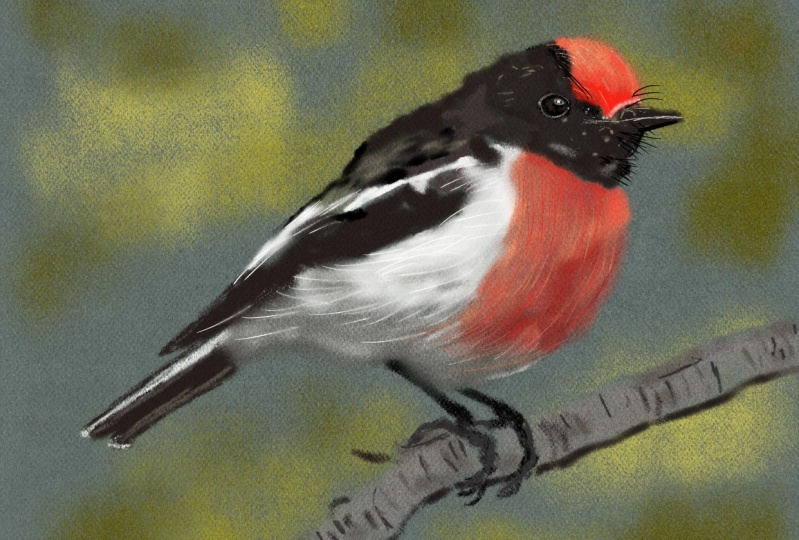
7. Crop and Block in our Robin: Hello and welcome to the second of the tutorials. A
couple of things to say. One, I have a terrible cold. I'm sorry about my
voice being so croaky. And the second thing,
I'm finding it almost impossible to talk and
draw at the same time, not with this freer, looser way of painting. So I'm going to
try something new. I've already recorded the video. I will add the
sound over the top. Okay, so this is a file
for you to work on. It's called Pastel paper, Robin. It is available for
you as a download. I've already done
the sketch for you. I use the same grid technique as I did with the
previous video. I also chose a series of colors
from little blobs of Joy, I think it was 07, the one with the
gradients in there. And I've numbered them, so you can see where they came from. Also, you can see at the top, I created my own
little gradient based off colors from the
ones with numbers on. Because I thought I might need
the transitions in colors going from that dark red to
that fairly light orange. I think the orange might be
a little bit too bright, but let's see how
we get on with it. Okay, So the first thing
I want us to do before we even start is to
resize everything. The reason being is
the paper that we're going to be using today
is the pastel paper. One which is like, well, very fine
sandpaper I suppose. But what I want is for the
effect to be very obvious, I want the dots to clearly show up from the
pastel paper brushes. But as we discussed in
the previous video, you can't just resize
the canvas because the brushes are designed to work with a certain
size of canvas. And if you resize it,
the dots of the paper aren't going to match up
with the dots of the brush. So instead of that, you
need to crop it down. I suppose it's the same
thing as taking a sheet of pastel paper and cutting a
smaller section out of it, and then drawing on that.
So this is how we do it. We choose the layer
we want to resize. And we come to the
transform tool, which I'm circling now, And we come to a corner and
just drag everything down, make it smaller,
make sure uniform is selected at the bottom so
we don't distort anything. Reduce the size, in this
case just under half as big. Come to the layer
with the colors on and reduce that down. And move it around to roughly
where I need it to be. And yet I can rotate
it if I want. It's just a series of
colors so it fits better. Then when I've done that, I come to the top left wrench icon. I come to canvas
crop and resize, I'm reducing the canvas size so it's a fairly close
crop because I want the robin big
in the picture so that you can see
clearly what I'm doing. But not so close that it
looks cramped and there we are and hopefully you
can see that grit effect in the background is looking a lot bigger and a
lot more obvious. That's what I want, but also
I want to double check. So I'm going to
come to my brushes. I'll choose one of the
pastel paper brushes. And I'm going to make
a few brush strokes in different colors just to be sure that
the gritty effect I want is quite obvious. Because I want you
to be able to see it as we're going
through the tutorial. So I'll do a few experimental
brush strokes now. Yeah, that seems to be
working okay for me. So next thing I will
clear that layer and oh, here's a good idea,
let's get a reference. So we can draw from
Come to a reference. And I have the photo I want in my photos app. Navigate to the. This will also be
available as a download. And I'll just position a
canvas and we should be good to go from our brushes. Come to DC Pastel 01, and we want DC
pastel paper pastel. And the next thing we need
to select some color. So use your finger,
put it on the canvas, to invoke the Eyedropper
tool, choose a color. And let's start doing a
few broad brush strokes. Now I'm painting
big here because I want to put down areas of color. The opacity of the brush is
on 100% But I'm not pressing too hard because
I want to try and keep the graininess
of the brush. I don't want to press so hard that I get a solid
mass of color. I don't want a little
bit of texture in there. Now, as before, I'm going to
be working dark to light. It just seems to work
better with pastels. And if you think about it, it kind of makes sense. Take a look at the orange that we did in the previous exercise. Well, the surface
of that is quite rough and it's a bit like
looking at hills and valleys. At dawn, the light
is going to catch the tops of the hills before
it goes down to the valleys. So the top bits are going to be better lit than the bottom bits. And so in the case
of the orange, you're going to find
the high light areas appearing more on the
raised bits of the orange. And so when you're working
on some pastel paper, which is usually textured, it just makes sense to mimic the real world by having a
darker layer underneath. And then the lighter layer brushed a bit of
lighter over the top. So you end up with
the darker colors in the valleys and
the lighter colors on the tops of the hills, on the top of the
texture of the paper. Oh, and one thing I
should say at this point. I hope I've managed to give
you something that gives you a pretty realistic
looking pastel effect. But one major
difference is, look, if I use pastels in the real world and then
I start blending them together using my finger or a cotton bud or whatever
you want to use. All the little granules of pastel are still
going to be there, so if I put down, say, a black and then a green
and then a yellow, I can blend them together and they'll still be
little bits of black, green, and yellow in there. And they're all going
to mix together no matter what I put on top. They'll always be
there. But this is not a real world,
this is digital. And it's a good idea to be aware of the differences
and to respect them. And in this case,
supposing I blend a red and a yellow together and I get kind of
an orange color, what I'm left with is a load of pixels that are orange in color. What I don't get a little
bit of a red pixel and a little bit of a yellow pixel sitting next to each other. No, once the orange is mixed
in any one particular area, there'll be no trace
of the original red or the yellow pixels. So you get permanent
color changes. And I think that's why it's important when
you're doing this, be aware of how hard you're pushing down with
your apple pencil. And if you want to keep
the pastel effect, often it's a good idea to
just not press down so hard that you completely obliterate whatever
is underneath. You want to keep the effect of those little layers of color. You can get very subtle
built up effects with this. But you can't get to blend
happy, let's put it that way. Okay, so for the
rest of this video, you're just going to see
me put down broad areas of color using the color
swatches to the right. So what I will do is I will speed up the film a little bit. I'll add some music in the background just to let you know that there is some sound
there. And then I'll fade out. And then I'll see you
in the next video where I want to double check my dark to light
values because that's what's defining the
form of the Robin. And maybe just start adding in a little bit of extra detail. So I'll shut up now and I'll
see you in the next video.
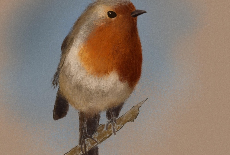
8. Using the Daub Brushes: Okay, so I've got
my basic colors in place and I've got
my basic dark to light. I want to add some more detail. And if I take a look at
that photo of the robin, there's a lot of very
fine feathers in there. I'd like to suggest
something like that. But at the same time, it looks
like a whole lot of work. So I want you to come
to the brush library and select DC Pastel Dubs, because sometimes you'll find people who are
working with pastels. We'll make a series of short brush strokes that
criss cross each other. Or a series of short brushstrokes
that follow each other round a contour of something
like the breast of a robin. And so what you've got with these daubs is a whole series of brush strokes which
you can use to very quickly build up a
textured surface. And let me show you what I mean. I'm going to come
to DC Pastel daubs thick and I'll
check the opacity. I want that on 100% As
for the brush size, well, I've got a couple
of markers here. I'm going to go with
about 13% Now let's make one or two brush strokes
choose color and okay, that's gone too much, I will knock that back and just basically make
lighter brush strokes. Okay, I've got an M
two ipad and so I do get that little brush preview that you're sometimes seeing. It is useful, but it only really shows up on the
most recent ipads. So if you don't see it,
don't worry about it. Okay, so what I'm doing now is using a number of different
colors to build up the form, to carry on building up
the form of the robin, but also I'm doing it
with some texture. And the beauty of this brush
is that I can build up quite a complicated
texture really quickly and easily because I'm putting down multiple brush
heads at once which are all going in
the same direction. Okay, I'll quickly access
my arrays tool just so I can clean up some of
those brush marks that went beyond the
border of the Robin. Okay, back to my paint brush. I'll make the head
slightly smaller and I'll do a little bit
of slightly finer work, which means the individual
daubs that make up the brush stroke
are a little bit smaller and you know what, Rather than having to go through four different categories
of pastel brushes, if I come up to the top
and I select recent, these are all the brushes
that I've used recently. And you'll often find,
like with this picture, you tend to cycle through the same brushes to create
the look you're going for. So don't forget
with the brushes. Once you've been
painting for a while, chances are you're gonna
find the brush you want there rather than
playing hunt the brush. Okay, so I'm back to my
pastel paper pastel brush. I selected it from
the recent tab, and looking at the picture, I decided that I need to make
the darker areas darker. And if you're doing the
technique, which we're doing now, which is lighter brush strokes
over darker brush strokes, sometimes you're going
to have to put down a darker based tone than maybe
you're comfortable with. And in that case, you need to keep telling yourself, look, I'm going to put
a lighter tone on top of the colors I'm
putting down now. So I guess I'm
repeating the advice I often say to people when
they are starting out. Don't be shy of
making things dark. This is digital. You
can completely draw over any brush stroke you
make with any color you want. And this style is supposed
to be quite a free and easy, expressive way of doing things. And you have the two
finger tap to undo things. And so I'm not saying be reckless for the
sake of being reckless. What I am saying is try and get into the frame of
mind where you're just, you're having a bit of fun and you're concentrating on
what you're putting down, but you're not worrying too much about what
you're putting down. Take a few risks, play
a few games with this. And if you push
something too far, for example, with this, if
I suddenly decided, oh, that's too dark, instead
of just erasing it, I'll think to myself, well, what color can I
put on top of that? That's gonna make it work? And that way you get to explore a new way of doing something that helps you with
your creativity. And then you add that new way of doing things to your skill set. You get better while
you're having fun, which seems a pretty good
way of doing things. Okay, so I've put
down my darker areas and I don't want there to be
too much variation in there because I want the variation
to come when I come back to my door brush and for this I'm using DC pastel daubs medium, which is a little bit thinner
than the previous Or brush. And I start to put down lighter
areas on top of the dark. And if you take a look at the photo of the robin
next to the illustration, that's very similar to what's
happening in the photo. Lighter areas over dark, especially with things
like fur with feathers. Pretty much any rough
surface really. Okay, I'm going to
speed this film up a little bit so that
you don't fall asleep. And the brush strokes
that I'm doing, I'm trying to take in the
direction of the feathers. If you notice, I'm going round, I'm going up and over
the Robin's head. If I was to try and make brush strokes any other direction, it wouldn't really work. Okay? I think that's most
of what I wanted to say. If I think of anything else, I will stop the music. But for now, I'll just let
the video carry on playing. And you can see how
I use that dubs brush to gradually
build up the form, but also to give an idea of
the feathers of the robin. And unless you hear from
me again in this video, I will speak to you
in the next one. I'm going to be using some
layer blend modes to work some more on the darkened light of this picture. So
I'll see you there.
9. Darken and Lighten with Blend Modes: Okay. So, as it stands, I've done quite a bit
of brushwork here, but I think the Robin is
still a bit too flat. It needs a little bit more
dark and light in it. So my question is, how can I get darker and lighter areas in there
without having to go over and destroy
all that brushwork that I did in the
previous video? And the answer to that is
going to be layer blend modes. So let's see how that works. I'll open up my layers panel. I'll create a new layer. Oh, before I do that
layer that I've just been drawing on with
all the finer brush work, I'm going to tap on it and I'm going to choose clipping mask. And what that means is I'll
only see brushstrokes on that layer wherever there are already brushstrokes on
the layer underneath. If the layer underneath
is transparent, I can't draw on my
upper clipped layer. That means I can go right up to the edges of my robin with any size brush and
not worry about brush strokes going beyond
the outside of the robin. Okay, so I'll come
back to my layer six. I will make that
eclipping mask as well. And then I'm going to come to the little n which I'm
circling now, and tap on it. And I get all the
layer blend modes I am going to choose multiply. And when you set a layer
blend mode to multiply, it's going to affect all
the layers underneath it by making them appear
different kinds of darker. And the darker the color
you put on this layer, the darker the colors will appear on all the
layers underneath. I'm also setting the
capacity of the layer to less than 100% In this case, around about 70% The reason is, once I do everything
I want to do with this layer and
make things darker, I may decide I want the
effect to be a little bit more subtle so I can
reduce the capacity. But if I wanted the effect
to be more extreme, if the capacity was on 100%
I'd have nowhere to go. So if I set it to about 70% and I decided I want a
stronger effect later on, I just increase the opacity
slider and I'm good to go. Okay, well, I'm sure that was all completely
understandable. Let's show you this inaction. I'm going to choose
a paint brush. I want a simple brush. The reason being is
I want to affect the look of the brush strokes
that are already there. Rather than creating new
textures on top of them, I just need things to be darker. So I will choose from DC
Pastal extra DC Pastal Soft. I'll choose a darker color. And I'll zoom in
a bit on this so you can see more
clearly what I'm doing. I'll set my pasty low
because I want to gradually build up
the brush strokes rather than all
in one big sweep. Set my brush size to
where I want it and look at the right hand
side of the robin. You know, some building up brush strokes to
make things darker. Also, one thing I hope you'll
notice as I'm working is that the underlying
brush strokes and the texture are still there. They're just getting darker. That's what the
multiply blend mode does if the layer
blend mode is set to normal as I built up the brush strokes and obliterate the brush
strokes underneath. But the beauty of layer
blend modes is you can still see all of
that texture underneath, but the whole area
is getting darker. And that is one of the big
advantages of digital art. Oh, and if you're
a photographer, what you're looking at now
is how you do dodge and burn in a program like photo
sharp or affinity photo. And like dodge and burn. Sometimes you don't
realize how much of a difference you've made until
you see before and after. So let's do that. Let's
come up to our layer, make it invisible for a second. That is, that is after just
look at the difference. Okay, so that's the darker side. What about the lighter?
Create a new layer. And this time we're going to set the layer blend mode to screen. If multiply makes things darker, screen makes things
lighter and like before, we're going to adjust
the capacity to around about 70% so I can make the effect more as well
as less intense later on. Okay, I'm going to choose one of mid oranges from the
breast of the Robin. And I can do that because the layer blend mode
is set to screen. So if I take a color that's the same as
the color underneath, but I add it on the layer
set to screen blend mode, that area will get lighter and you can see that
happening right now. Okay, I'll choose a
more neutral color so that I can work on the desaturated areas
of the robin without sticking an orange tint
into the highlights. Let's see what I can do. Hopefully, as I
work, you can see I'm making certain
areas lighter. But as I mentioned, I'm not destroying the underlying
detail of the feathers. Okay, as before, let's
do a before and after. This is before, this is after. I'm not sure about
the highlights, so I'm going to rock the opacity slider backwards
and forwards a few times so I can decide how intense I
want this layer to be. Yet another advantage
of doing digital art. You can vary the
intensity of any layer. All right, so let's zoom in a little bit because I want to start putting in some details, especially around the
eye and the beak. Okay, so let's take a quick
look at my layers panel. What layer do I need to be on? Let's remind myself, yeah, I want to be on layer four, the base layer, and I
can make changes here. What am I going to use? Dc pastel. Paper pastel. And I just want to put
in some details now. The multiplier layer
which made things darker and the screen layer which
made things lighter. I'll be sitting on
top of the layer I'm drawing on making things
darker or lighter. But actually that's
quite easy to work with. I just pick the color I want, start to make my brush strokes, and I'm adding in some
finer detail here. And there does come a
certain point where I want to get in the
important details. And in the case of this or any
animal, human or whatever, if there is an eye in there, the eye is the important detail. So if I'm going to concentrate on any one particular area, it's going to be
around the eye area. So let's put some
stuff in there. I've got a little bit of
prostrokes on the layer above, which I think I'll
have to erase. But for now I'm just blocking in a dark area to form
the basis of the eye. Once I've done that, I
need to find the layer that's got the extra prostrokes sitting on top of the eye. Just by making layers
visible or invisible. And when I find that layer, select it, I come to my arrays tool and I
just raise the price. Strokes that I don't want. And do a quick
visible invisible on the layers just to see
what's on what layer. When I've decided to do that, I'm just going to come back to the layer which I'm putting
the black of the eye on, and just build up a little bit. Let's zoom that out. Let's
take a look at that. Okay, yeah, now I
think I'm ready to add some more detail which we
will do in the next video.
10. Adding Detail: Okay, so we did our sketch. We've added in our
broad areas of color. We put in a nice bit of texture using the
daub pastel brushes. And we were able to further
enhance the dark and light of the picture using
the layer blend modes. This video, we're going to
take a look at the detail. Now I want to check out
what's happening with the sketch layer by making
it visible or invisible. Because I think in some places, especially in the areas
with less detail, it's helping hold the
picture in place. But for the areas
around the head, for example, I think the sketch layer could
do with being hidden. It's going to be a
bit of a distraction. But anyway, I will focus
in on what I'm doing. Whoops, I do that.
That was a mistake. Make my picture a
little bit bigger. Which layer? I R layer five. I want DC pastel, paper pastel. I think for this, but brush size pretty small because
we're working in fine areas of detail. Choose a color because I want
to work around the eyes. The size set, 3%, let's see what that looks like. At the moment, that might
be a little bit too orange. I need something
lighter. Do that. Chose a lighter orange. And then just start,
well, scribbling, drawing around this area
because I want to make the overall area brighter
as it appears in the photo. So choose another color. Play around the
size a little bit, just so I get the
look I'm looking for. Yeah, I think that's
working for me. Now, you'll notice with this,
I'm drawing over the eye. That is not a problem because the eye is on the
layer underneath. All I do is make my various
different pros strokes get the overall tone right. Then I can start erasing this
new area of light orange. But I can do it
creatively to try and bring out some of
the form of the Robin. And I'll show you what I mean by that in a couple of minutes. Okay, I'm just going to
carry on drawing and speed this up a little bit so that you don't
die of boredom. Now I'm going to get
to the arrays part. I choose a razor,
DC pastel paper, pencil size 4% I'm
just going to knock back some of those
brush strokes I made so that the
underlying eye is there. But now look what I'm doing. I'm making a little marks and raising that
line underneath, because if you
look at the photo, it's like a dotted line going around the underside
of the robin's eye. Rather than having
to do little dots by little dot by little dot. Making the line
then erasing bits out of it gives me a lot
more consistent line. Okay, back to painting
again. Choose a color. What brush shall I use? What am I using? Dc
pastel. Paper pastel. And I'm going to smudge this, I'm going to use DC gritty
smudger size, fairly small. And I just want to blend out
that area of orange just into the slightly grayer areas towards the back of
the bird's head. If this was the real world, this would be the point where
I'm either reaching for a cotton bird or
a blending stump. You wouldn't do it with your
fingers because your fingers would be too large
an object to do this fine detail painting. And let's sample a color. I'm going to need something
a little bit more grayish, so from around a bird's head. And I want to put a high light
into the eye of the bird. And this is the point
where any painting with an eye suddenly
springs into light. I'm using the layer above
my main colors layer. And look, I know in the photo
it's a smooth highlight. But this is supposed
to be a pastel drawing that's not giving
me what I want. So I will undo a few times and start again because I
want to get this right. I'll use DC pastel paper pencil because I would be pressing
down a bit harder at this stage because I'm working in fine detail and
one, a definite highlight. I'll choose a
slightly darker gray for that high light behind
the main highlight. Then sample a light gray. I'm still sampling
from the picture, not from the palette
at this stage. I want to get my colors
from the picture to get it looking consistent and put
in that main highlight, and all of a sudden that
bird's got a personality. Okay, I want to carry on
working on the eye and adding a few more highlights
on the eye itself, plus also around the outside of the eye because it
does still feel to me a little bit stuck onto the body rather
than part of the body. And I think adding a few of the extra highlights is
going to help it blending. Like just in the corner here? Yeah, I think that
highlight is starting to make the eye sit better
against the body. I think I need also a little bit around
the outside as well, because some of the highlights aren't quite highlighted enough. So I've just sampled a lighter yellow and I'm
applying that now. Yeah, that's starting to help bring the outside
of the eye forward a little bit so that the
eye itself gets pushed back into the head of the
robin, which is what I want. Also just a few extra
highlights around just to break up that slight C of a light orange around
the back of the eye. You'll notice when I'm
doing this as well, I'm not choosing for my
color ballet anymore. I'm choosing colors directly
from the Robin itself. At this stage, that's
what I should be doing. Okay, so now carry on. Sampling some colors and adding a little bit of fine
detail in the area. I don't want to concentrate on just the eye and ignore
everything else. Otherwise, I'm going to
end up with a picture with a huge amount of detail just in the eye area and
everything else. By comparison, it is just a loose sketch that
would look a little bit odd. What do you find?
People tend to do is to put detail in the areas
that interest them the most. That is usually the eyes, the nose, the mouth. And as they start to move away
from those central areas, you can almost hear what's
going on inside their head. It's something like, I
enjoy doing the eyes, I enjoyed doing the mouth. The nose was okay,
the ears are okay. But there does come a
point where you've done all the fun stuff and you're starting to get
just a little bit. I've done the fun
bit, let's finish off the picture and move
on to the next one. And so you do find the detail
starts to get a little bit less as you move away from
the main focal areas. And you are certainly
going to see it on this picture for two reasons. One, the aim of this picture and this project is to give
you something that looks like it's been drawn on traditional pastel paper,
using traditional pastels. And trying to get inside the mindset of someone
who's doing the drawing. And the other reason is I'm
the same as everybody else, I've done the interesting bits
and I'm going to start to get bored towards the
end. So there you go. Authentic looking pastels and authentic looking
thought process. But okay, now I'm
working on the big, because if I've done the eyes, then really I should
do the big to a similar level of detail
because it's in the same area. And I think what I'll
do at this point, I'll speed things
up a little bit. Because if you do speed it up, but not by too much, it can help you see the
process rather than looking at all the individual
brush strokes I'm making. So okay, let's speed up now. And at this point, I decide, okay, enough detail on the head. Don't do what I have
a habit of doing, of drilling down into as much detail as I can
get out of the picture. Because for this and most
modern pastoral styles, that's not what it's about. It's about color. It's about
seeing the brush strokes. And yeah, you can have detail, but I want to try and keep
it a little bit fresh, much more handmade than a photo. So now it's a case of just
adding in pencil details. I'm using a fine brush and I'm starting to zoom
out a little bit. I think I need to do that because the more
you're zoomed in, the more obsessive you're
going to get about the detail. And you'll notice that a
lot of the brush strokes I'm putting down are lighter
than what's underneath them. That's to add a little
bit of texture, a little bit of highlights. On the other hand, the
darker brush strokes, that's what I'm using to
define the form of the robin. Like around the back of
the wings for example, I think it needs a little
bit of dark in there so that the whole area doesn't
become a shapeless mass. But there'll also be room for
some highlights in there. So that's the two
things I'm doing here, making the form a little bit
stronger but also lighter bits to add a little
bit more texture and a bit more interest
to the picture. You will also notice,
most probably, as in going along,
that I've kept the detail in the upper areas. And the further I
go down the body, the more sketchy the
drawing becomes. And as I've already explained, that just naturally
tends to happen. So I realize I made a
statement inside my own head. As I'm working, I've decided I'm going to concentrate
on all the fun bits, all the character bits, all the bits that people are
going to look at anyway. And I'm not going to
spend too much time on the bits that are
further away from that. That is the feet, that is the branch looking
at this picture. People are naturally
going to look at the eyes and the
beak in the head, but there's also a huge area of orange because it's a robin, and that's what Robins have. And so, I'm going to spend
just a few minutes putting in some finer brush
strokes on the chest of the Robin so that people
have something to look at. I'm not making parallel
lines, not all the way down. In some places I'll
make little V strokes where the lines gradually
go in towards each other. Because I think that's a
good way of representing the feathers and the slightly roughened up nature
of the chest. And I'm using a mix of
dark and light strokes. But the main thing
about this is, if you remember a
couple of videos ago, I used the du brushes to
quickly create a brush texture. Now my job at this point is to add a little bit more
interest to that area, but to make sure the
new brush strokes I'm doing look like
they were done by the same artist who did those texture dub brush
strokes a short while ago. What I don't want is
a certain kind of texture in the background and then a completely different
kind of texture on top of it. I need to marry the
two textures together. Anyway, look, I think I'll call it a hold here and
in the next video, let's finish off this painting, Titi.
11. Finishing our Robin: All right, so I've
got to the stage where I want to just
finish this drawing off. I've got all the major
detail in there. And I think the first thing
I'll do is I think I'll add a very simple background instead of having
just the plain paper. Now you do see people
on the forum saying, well, I'm not very
good at background. So here's a very simple way. I'd say the main color of this picture is that
orange of the chest. So open up our layers
panel and I want to create a new layer just on
top of layer one, which is where the
sand paper is, because I want the background
to be behind the Robin. So I sample the orange. Then I come to the color panel and I have the disc selected. And you can see the orange
I've just selected. So now what I'm
going to do is come halfway around the outer circle to get the complimentary color. Now that color is
going to be way too saturated for my purposes, I would just want to
sample sky background. So I come to the inner circle and I drag the inner reticule to the left so that I come to the less saturated
versions of that blue. So from there, choose a brush. I think DC pastel, paper pastel will do the job. I want my press size
very large and I just lay down a few strokes of blue just to act as a sky in the background to
break up that sea of sand paper that I
have in the background. Then come back and I'm going
to choose a slightly darker, slightly more saturated color. And put that down towards
the top of the picture. Then come back and choose
a very washed out, very light version,
almost white. And put that underneath just to break up the field of blue so I have different
shades in there. I'm just tapping down various
different brush strokes because I still want to get the texture of the actual paper represented in those
brush strokes. Okay, so the next thing, open up my layers panel
again and I want to make my sketch layer
visible because I used one of my pastoral
pencils to sketch it. I'm wondering if
some of it can be used on the final image. And I'm looking at it thinking, yes, it can, especially
around the outside. But I want to
experiment with this. And by experimenting,
I mean I want to make certain parts of the
sketch layer invisible. But I also want the flexibility to make the layer visible again, if I decide that actually I do prefer the sketch in that place. Now to do that, I'm going
to use a layer mask. So I tap on my layer
and I choose mask. And the next thing is
to choose a brush. Now for this, I don't
want a textured brush. I want a simple brush that
can make things visible or invisible without
any texture in the way. So I will come down
to airbrushing. It comes with procreate, and I'll choose a medium brush. The next thing I need
the color black. So I come to my color panel, I'll choose from the Classic. I find it easier to choose
a dead black from there. For my brush, I am going to make sure the size is
a reasonable size. Take the capacity down so I can build up my brush strokes. Now you're seeing
what happens here. When I paint in black
on a layer mask, you make any pixels that
you brush over invisible. So what I'm doing is I'm
going round and making various parts of
the sketch layer invisible to see
what works were. Now I think on the branch, yep, the sketch layer is helping disguise the fact that that's
just a few blobs of brown. But now what I'm going to do is I'm going to choose white. And I'm going to go back round. Because the nice thing about layer masks is if
you paint in black, you make things invisible. If you paint in white, you make things visible again. A layer mask is just simply
a layer which sits on top of another layer and make things visible or invisible,
you paint in black. You make your layer invisible, you paint in white, you
make it visible again. And so now I can go around and check the various
different parts of my image and decide where
I want this sketch to be. But now I can play
some more games by coming to my
sketch layer itself. Not the layer mask
the sketch layer and choose alpha lock.
Now that's on. I can only draw on that layer where
there's already pixels. Now what I'm going to
do is select the color. And I'm going to draw on the sketch layer
so that instead of the lines being a charcoal
black, they're orange. And I can get a little
bit of a reflected light on the right side of the
robin that work there. Let's see if that works
in any other area. So I'm going to
select some colors. Yeah, I'm just around the claw
areas that's helping bring the claws out in a very
light and sketchy way. What else can I try? Let's
try a little bit of blue. And try a bit of blue just on
the left side or the robin on its back to get the idea of some light bouncing off
the back and the head. I can draw over this as many different times
as I want just to try and bring a little
bit of life and interest to the
outline of the Robin. Okay, so the final
thing I'm going to do is open up my
layers panel again. And I'm going to
drag the paper layer up above all the other artwork. Just so I can re establish a little bit more of the
grittiness of the paper. And I'll get rid
of my reference, I don't need that anymore. Zoom in and then open, take a look at layer one and take it underneath
that's before, take it on top, that's an after. And I think I prefer that it's re establishing some of
the texture of the paper. But I'm going to unlock it. I'm going to tap
where it says, oh, and I'm going to play around
with the apacity because I'm wondering how strong
I want this effect to be. The original 60% was a
little bit strong for me, so I'm taking it down by about 10% to around 50% And quick thumb and
finger swipe inwards to get the finished, Robin. Okay, so there's a whole
load of pastel papers, a whole load of pastel brushes, three pastel palettes, a
Quick Start tutorial video, plus how to download
all of those assets, plus a couple of projects to
show you how the paper and the pastels are intended to be used to get the best
results possible. Okay, so thanks for watching. I hope you'll take
the time to check out the various other
procreate classes I have. And in the meantime, I would
like to see a few Robins on the various different forums
so that you can show off just what you can do with a
procreate Pastel masterclass. Take care and happy drawing.
12. A Procreate Primer: Okay, now this video is just a very quick
primer for procreate. It's just in case
you've never used the software before and you
don't know where anything is. It's more just a quick
tour of the interface. If you need more of
an introduction, then I have procreate the fast guide or procreate
solid foundations. And both courses have
got very nice reviews. Thank you very much for that.
Anyway, let's get started. There is your procreate icon. I'm circling it now. And if I tap on it,
the first place you come to is the gallery. And you can see various bits of work I've been working on Now, yours will look different
to this because if this is the first time you won't have created anything yet. And so you'll just get the sample images that
come with procreate. Anyway, come to the top right. There's two icons there
I want to show you. One is import, if I tap on that, that's where you can load up
various files that you may have downloaded
from the Internet or from one of my courses. But I'm going to cancel
that because instead let's create a new file
for you to work on. To do that, come to the
plus sign and tap on it, and you have various different presets that you can load up. Let's just do this as
simply as possible. The very top one where
it says screen size, tap on that and you
get a new file. If you take your finger and thumb and you pinch it inward, you can resize it. You can rotate by moving your
finger and thumb around. And let's just move
that to there. Great. You've got a file, you
want to create something. And to do that, you
come to the top right, You've got 12345
different icons. Let's show you what they do. The first one is the brush icon. If I tap on that, you can see you have a whole load
of different brushes. What you're looking at right now are a series of pastel brushes, which I'm working on
for a new course. But what you will have are the brush sets that
come within procreate. If I come down to where it says sketching and
I tap on that, there's various different
brushes and you have a whole load of different brush sets which have brushes in. Okay, so let's choose one. Let's try Nico
roll, tap on that. Okay, so the next thing is
I need a color to do that. Come to the very
top right where you can see that yellow circle, that is my currently
selected color. If I tap on that,
I have access to various different
colors and I have various different ways
of choosing the colors. If you come to the
bottom, you can see I have palettes
highlighted in blue. Now, these are various different
squares that you can get. So if I tap on, say, this red, I can draw with that. If I want to choose
a different color, tap again in that
little red circle. And you'll notice
whatever color I choose, that little circle in the top right changes
to that color. That lets you know what your
currently selected color is. Tap away, and there you go. Now at the moment, I'm not
very pleased with that. It's not a work of art.
I want to get rid of it. So take two fingers and just
tap. That's two finger tap. Once I'll tap again and you can step backwards through the
brush strokes that you made. If I then realize actually
that was a masterpiece, I can three finger tap to redo, three finger, redo two
finger tap to undo. And if you hold down two fingers on your ipad just
for a short while, start to rapidly step
backwards through the undos. Hold three fingers down for just a short while and you'll rapidly go through any redo. All right, back to these colors. I have palette selected
at the bottom. If I go through these
where it says disc, tap on that and you
end up with a disc. And you can see
around the outside, all the colors of the rainbow. And I can move this
around, so you can see I'm selecting greens,
yellows, oranges, reds. And these are quite
intense reds, because that circle
in the middle, that controls how
intense the color is. And you can make it much
less intense and lighter, or much less intense and darker. You've got your
full fat red there. You have darker
versions down here. You have lighter
versions across here. But as you go across, you get less and less saturated colors. You can see that is a
very desaturated red. It looks like a brown. I can move it back
towards saturation, and I can move it here to
achieve more of a pink effect. That's the disc, the classic. This is my favorite when it
comes to selecting colors. You've got all the colors of the rainbow laid out
on a slider here. And you can see the full fat
color is in the top right. Darker versions of it are here. As you go down, as you
go towards the left, you get less and less
saturated colors, until eventually you end up
with gray, white, black. Any color is available to you. And if you want a little
bit more control, rather than dragging
this around, you've got your hue slider here. But underneath you have
your saturation slider. And you can see as
I move it around, that little circle in the big block of color
goes side to side as well. I also have my value or my brightness
slider at the bottom. If I move that, you can see my little circle in
the square goes up or down to get lighter
or darker versions of my base color just
underneath that. You have your history, which is all the colors I've
chosen recently. Then the harmonies. You have lots of
different modes here, split, complementary. I'm not going to get
into all of these. These are just a way of choosing things according
to color theory. You can move that
central reticule around like this
and you can control the darkness or
brightness of it with this little slider at the
bottom next to that value. Well, it's a computer, and any
color has a numeric value. Those three sliders I was
talking about, the hue slider, we look there's a value, 193 degrees, 73% saturated. Now it's 46% saturated
and 75% bright. And I can adjust it that way. Also, you have red, green, and blue sliders, and you can achieve lots
of colors that way. And finally, we get
back to palettes, and let's choose a color
again, that nice red. Let's come back to
our brush tool. There's my brush library
Nicarolas selected. Did you notice that it seems
a little bit small and it's not quite as intense as that color I chose
in the top right. Well, the reason for that is because of these two
sliders on the left. The top slider controls how
big or small your brush is. And you can see the brush slides getting bigger or smaller. That's what 39% 40%
And yeah, sure enough, you can see the brush is bigger, but it's not very intense. That is because
the bottom slider controls the opacity
of the brush, and at the moment,
it's set really low. If I take it up to 100%
I draw now, oh yeah, you can see that's a
much stronger color if I take the opacity, so it's way low. You can see that I can
gradually build up the brush effect more subtly. At this point, I should
say these two sliders learn to use them and learn
to vary the opacity a lot. Learn to vary the size a lot, because then you get
small brush strokes, you get bigger brush strokes, and you vary your work. And if you alter the opacity, you can build a much
more subtle effects. Let's choose another
color for this. Let's choose a nice,
not very subtle yellow. And crank up the opacity
and the brush size. There, there you go. Two really subtle brush strokes. Now, supposing I want
to get that red, I was just using, Well, that's okay if I
just press and hold my finger up in the top left where the little
color circle is. Just hold it for a couple
of seconds and you'll get the last color
you are using back. Okay, that's our brushes. But you can do one
of three things with every single brush
in the brush library. You can paint with it
like we've been doing. But if you come to
the icon next to it, which I'm circling, this
is your smudge function. And if I tap on smudge and
come down to painting again, there you can see
I have nico roll. But this time instead
of painting with it, let's come to that border. I'm zooming out by dragging outwards with
my thumb and finger. Let's come to that red
and yellow border. I made my brush size
a little bit smaller. And if I just rub
along that border, can you see what's happening? I'm smudging like this, and I can blend different
areas of color. If I come to a different brush, let's let's come to airbrushing and choose
one soft airbrush. I make my brush
size larger because the brush size doesn't stay the same no matter what
brush you select. I chose a different
brush. So now I have a different brush size. If I come to that same
area and I start smudging, can you see I'm getting
a much smoother blend. The soft airbrush is a very
soft, simple blending tool. All right, so that means we can create brush strokes
with the brush function. We can smear the brush
strokes around much function. But we can also erase brush strokes using
the eras function. Again, it is the same brush, but this time we're using it
as an erasor. Let's do this. Let's take the pastor
right the way. Let's make our brush
size any old size. And there you go. I have now erased the paint
strokes from that area. And this is a very
important point in traditional media use an
erasor on a piece of paper. You can always see a
bit of pencil left over and the paper has been flattened where
the brush stroke was. But this is not traditional
media, this is digital. If you rub something
out, it's gone. There is no trace of the
brush stroke to finger tap, to undo the arrays or anything else you've put on your canvas that
was 100% opaque. If I take this down to
a much lower pasity, say around 33, 34% I
start building up. You can see I'm gradually
raising in this area. If I make repeated
brush strokes, or I press pretty hard, I can vary the brush stroke. Here's another nice thing, if I come to textures, let's try Dove Lake, my brush size 6% My pasty
is about halfway. And then See that I'm raising, but I'm getting the
pattern that the brush makes as part of the
erasing process. So you've got lots of
different ways to paint. Lots of different
effects when you smudge, and lots of different
effects when you erase. All right, I'm going to pinch inwards to see
more of my canvas. Now the one icon we
haven't looked at is this one with like
two squares in there. I'll tap on that. This
is my layers panel. You can see I have
something called a background color
and layer one. All right, well, let's take
a look at background color. If I tap on that
little white rectangle that is the layer icon
for background color, well you can see I have my
colors open up again and I can choose whatever color I
want for the background. That's useful, let's
make it lighter. But for my layer one, if I tap on the little icon
which I'm circling now, I get a whole list of
options I can rename it, which is always a good idea
if you can remember to do it. And I can do various
things to it. Like for example, if I
made a mess and I just want to get rid of
everything, I can clear it. Two finger tap to undo that
and bring back what I've got. But what I'm about to show
you is something I've seen a lot of beginners not do, which is a real pity because
it's very, very useful. Come to the plus sign
at the top right, tap on it and I get a
new layer, layer two. If I come to my paint brush, let's try Oriental brush, and let's try any
color at random. Let's just try green
color so it stands out. And brush size is big enough and I can draw that's not
standing out very well. Let's try upping the opacity. Yeah, that's better. And yes, I know it looks like a
mess. But here's the thing. See that little tick
mark right where I'm circling that
is a toggle switch. And if I tap on it, the
layer becomes invisible. Tap on it again, it
becomes visible again. See the little
ensign next to that? If I tap on that.
Well, they have a whole load of things
called layer blend modes. We won't talk about those, but you can see I have
Apacity. It's a slider. And I can make this top
layer completely invisible, partially visible,
or fully visible, and everywhere in between. If you decided what
you did was nice, but it's in the wrong
place, well, look at this, Come to the top left and look at this icon with
the arrow tap on that. I get a box around everything on that layer
where there are pixels. Because at the
moment we're using our transform tool and
look if I tap anywhere. Normally it's an idea to go on the outside
and move around. Look at that, I can move this. What's more, you see
that little green circle on the top which I'm circling. Now if I tap and drag that, I can rotate this
around like this. You notice you get
an elastic line. If you want to move
it very subtly, drag the green line out. And you can move things
very slowly like this. If you want to move it fast, take the little
green elastic line around and look at that. All right, we've got
different modes here. At the moment, I'm in uniform, which means I can resize it as well as moving
and rotating. But if I come to
something like free fall, I can stretch it like this. If I come to distort, I can take just one of the
corners and move it out or in, like this, as well as the
corners around the side. You want to do a quick bit of simple perspective,
you can do that. If you come to warp, I get a grid drag
where the lines cross. I can warp this. If that's too much, I've got a reset button down the bottom. Let's just quickly walk this
around like that and say I tap on my layers icon
that's now committed. The changes I've made are
permanent unless I hit undo. Now let's come back to layer one and the next
thing we're going to take a look at is this looks
like a little S shape, it's the selection menu. Now remember we're not on the layer with a green scriggle. We're on the layer with those
big red and yellow marks. And you can see at
the bottom I have various different ways
of selecting areas. At the moment, I've got
rectangle selected. If I come here, drag out a box, you can see where I've dragged
a box, that area is clear, but I'm getting these little
moving lines which let me know that wherever there are moving lines, it's not selected. If I then come back
to my selection tool and let's just come back
to, let's try free form. I can move this whole area around wherever I want it to go. I can stretch it like this. And once I'm happy with that, I can just tap on, say, my selection icon again. And that gets committed. If I come to my
selection tool again, you've got other
things like free hand. And if I drag out
an area like this, if I come back round to where
that little white dot is, tap on that little white dot. I now have an area selected
which is a free hand shape. So that is the select tool, various different ways
to select things. Next to that I have
my adjustments. I don't want to
get into these too much because there's
a lot to cover. But suppose when we come to hue saturation
and brightness, I can take this entire air and change the hue and
swap it around. Can you see that when I do that, the red is getting more pinky and the yellow is
getting more orange because every color is being
shifted around the rainbow. I can also alter how
saturated it is, like completely gray
to pretty bright. I can also alter the
brightness as well. You can alter the entire layer, but come to the
top in the middle, where it says hue
saturation brightness. But if I come to
this little triangle which I'm circling now, instead of working on my layer, I'm now going to work
using my pencil. And you can see my
little brush icon has now turned blue and it's
got little sparkles there. And what that means is,
let's choose something. Let's try wild light. That sounds dramatic.
Check my size. The capacity is up full. I'm going to paint in a
certain area like this. You notice how I went
underneath that green area? That is because the
green paint stroke is on the layer above. So my little brush
stroke gets hidden. I've painted with
this, but I can move the hue around and
change this color, the saturation and the
brightness just in that area. If I take my capacity
down on my pressure, make my brush size larger. For example, paint
in a different area, you can see I can
gradually build up the effect like this. If that's not enough. Look,
if I tap on my erase tool, I can erase these brush strokes while I'm painting in this mode. If I come to my smutchtol, I can blend the effect I'm doing whilst I'm using hue
saturation and brightness. Tap again on the adjustments
icon to commit to that. But you can see I
have a whole load of different adjustments
and I cover all of those on the solid
foundations course. Okay, so now the one final icon is this little wrench icon, which is your actions icon. This is where you come if you want to add something
like inserted file. Okay, let's do
that. Let's come to palettes and I'll load
up blobs of joy 01. This is something I created for the water color course and it gets loaded into its own
layer called inserted image. Now at the moment,
I don't want it in the middle of layer
one, layer two. So if I just tap and hold, I can drag it up to the
top of my layer stack. When I do watch, that
green brush stroke suddenly gets placed behind
those little blobs of joy. Because what'sever at the top of the layer stack covers up
whatever is underneath it. Things like layer
two and layer one. Now supposing I like that layer, I can lock that layer so I can't draw on it or I can unlock it. Supposing I don't want
that layer at all, I can come to delete
and get rid of it. Supposing I want
to keep the layer, but I don't like that
green brush stroke. I can clear the layer,
various things you can do. Quickly, coming back
to our wrench icon, you can add various
different things. You can, you can copy canvas. You get various
different assists, which is beyond what I want
to do here at the moment, if I decide that my
little maroon and orange blob with cutout
is a masterpiece, I share it and I can
tap on procreate Jpeg. If you're going to
place it on the Internet and you can export it, I'll use airdrop tap on my Mac. It gets exported.
We're good to go. You can also export videos. That's probably the
videos you've seen on the forums, preferences. That's more than I
want to get into. And Help, Well, what we're doing right now
is the help file. That is a very basic walk
through for procreate. And it's just there to give you a quick head up so that you can follow along with this course
a little bit more easily. Go back to the course,
go and have some fun, and I will see you in
whatever video you land on.
13. Download Resources from Skillshare: Okay, let's show you
how you can import various different assets into
Procreate from Skillshare. The class I'm using to show you this is one of my classes, learn to draw with Procreate. But what I'll show you holds
true for any other class. Okay, so first thing,
let's scroll up. You see a number
of different tabs. Here you want to press
projects and resources. And here, if you come
down a little bit, you can see there's various
different resources I have. So let's download a
few files. Let's try. Well, for a Procreate sketch, at the top left, all I
need to do is tap on that. Gladys sketch, Procreate. And I can also see something
here which says, save. So I'll come to save, and I'm going to save
it under my files app. Now, this is an app which
comes with every iPad, and it pretty much does
what it says on the tin. It's just a way of organizing your files, so I'll tap on Save. Now, while I'm here, let's
download a few extra things. So I've got the procreate file. Let's try the file underneath, dolphin dot JPEG tap on that. And that downloads, which took a little
bit of time and again, come to save, make sure
I have file selected. And while I'm here,
let's calm down a little bit because
I want to find yeah, where I'm circling,
learn to draw palettes. These are procreate palettes and I've compressed them
all into a zip file. So if I tap on that, come to save, so I'll come
to save save in files again. And also the brush set. I wanted to show
you that, as well. So let's come to the brush set. And yeah, I want to save
that and save that in files. So I will swipe up
from the bottom of my screen and let's just
come to my files app, and sure enough, here are the various different
files that I downloaded. If I come to this rather
small little symbol at the top, just
where I'm circling, and I tap that is a useful little button
because it will give you some information about where on my iPad these various
different files are stored. Okay, so sometimes I
have people saying, Look, I've got a problem.
I have a ZIP file. I don't know how to unzip
it. It really is easy. Let's come to this
one in the top left DC line to draw brushes
zip just tap on it, and it automatically extract. What about the learned
to draw palettes? Tap on that. It extracts. And you can see I've
got the dolphin there, and I've got the Gladys
sketch Procreate file. Now what about DC A
three paper file? This is a procreate file
that's been compressed. Sometimes I have to do that. All you do with this, again, is just tap on it
and the file unzips. I already unzipped it earlier,
so now I have a copy. I'll come to the one which has two at the end of the file name. That's the second
one I downloaded. If I tap and hold on it, and come down to the bottom,
I'll press delete. So now, well, okay, let's come to DC A three
paper file, Procreate. I'll just tap on that.
It gets imported. And there it is.
If I just pinch in a little bit, that's my file. Okay, well, that was
straightforward. What about importing a
brush set, for example? Again, very easy. Just come up to my brush
icon, tap on that. And you can see I have
various different brush sets on the left of the actual
brushes themselves. Just where I'm
circling, there is a plus sign tab
on the plus sign. And then, well, at the moment, procreate things
you want to create a new brush. You don't. Instead, you come to where I'm circling and come to import. Come to, in this case, I'll come to Chrome. So DC learns draw brushes. They unzip to a folder,
tap on the folder, and I'll come to say,
DC drawing brush set, tap on that. It imports it. And right at the top,
you can see DC drawing. Now, I already have that from one of my previous
courses just here, so I'm going to come
up to that DC drawing. Tap on a little icon, and you get a number
of choices there. I will come to delete. Yes, I did want to delete that. As for the palettes,
again, very simple. Come up to the top right where
I'm circling, tap on that. Come to palette at the bottom, and you can see I have a number
of different files here. Anything which starts
with DC is my work. Supposing I come up to the plus sign at the
top right, tap on that. New from file, let's come
to where I'm circling. Again, it shows me the path. I want the crown folder. Let's draw palettes dot zip. So let's try DC drawing
color swatches, tap on that. And again, that gets imported at the top
of my palette list, ready for me to do whatever I want with it. And
I'm good to go. And that is how you can
download files from Skillshare onto your iPad so that you can do whatever
you want with them.
 Simon Foster