Transcripts
1. Hello and Welcome: Hello and welcome to
Procreate the fast guide. Now this is supposed
to be a fast guide. So let me quickly tell you what you're going to be doing on the course and why this
course is different. In the first part
of this course, you will be creating a
screen full of suites. I'll introduce you to many of
the tools inside Procreate. For the second project, I'm going to show
you how I created an image that you will see
throughout the course. And that is a child walking
their pet dinosaur. Now the second project
concentrates more on workflow because just learning what all the tools
do isn't enough. They need to know
about workflow, how to start and where
to go from there. But there's more. This is what makes this
course difference. After the to follow
along videos, I have a whole series of
reference videos which explain the various tools you
can find within procreate. And at the start of each
of these reference videos, I show various timestamps. So you know exactly
what point in the video you need to go to to get the information you want. I've also created a PDF
that you can download, which lists all the
reference videos. And at what point
in those videos, I talked about the various
features of Procreate. That way you get the
information you want quickly. This is going to be a
huge, a time-saver. And what's more at various points in the
first two projects, I told you where to go in
the reference videos to find out more about what we're doing at that particular moment. So you have it all. You get to practice the tools, you get to practice
the workflow, and you will know where to go in the reference videos to find out more about
what you're doing. Again, this is a
huge time-saver. Now, while on for me, well, I've been a designer, illustrator for
more than 30 years. I also spent a few years
being a teacher or my degree is all about
how people learn. You learn. You aren't
safe hands. Okay? Who that is, what procreate
the vasculature about. So it's tied to go
onto the next video. I will see you there.
2. Let's Have a Quick Mess Around!: Hello and welcome to
Procreate the fast guide. Thanks for taking the time
to invest in this course. This is supposed to
be the fast guides. So let's get started
straight away. I have my iPad and let's
open up procreate. The first thing you
see is the gallery. This is where you store
various different images, but let's create a new file. So we've got something we
can start painting with. Come to the very top left
and tap on the plus sign. You'll have a number of
different presets here. I will just go with a
standard screen size. There's my new file,
procreate file, which is opened consists of a layer you can draw on
and the background color. And we find those in the
icon I've just clicked, which is the Layers panel. And so now the next
thing is I want to make marks on
what I want you to do with the first session
is make a huge mess. So I will come to
my paint brushes. I have a whole load of
different brush sets here. And I'll come to one of the official ones
down at the bottom. Let's try painting. And I have a number of
different brushes here. Well, let's try Nikko rule. Let's try that one.
And in order to paint, I need a color as well. So I come to the
very top left and I call up my color panel,
and let's choose a color. I'll come to this rainbow
around the outside, allow choose a red color
and I can vary how dark or light it is or how saturated it is in this square. Let's try color there. And then all I do is
make a paintbrush. There's my first mark
within procreate. If I wanted to alter the
size of my brush stroke, I can come over to
these two sliders on the left-hand side. The top slider alters how
big or small my brush sizes. So if I make it
very big like this, I might get big brushstroke or I can make it a very
small brush stroke. Let's make this bigger again. Now at the moment, I'm getting a fairly solid but not
entirely solid brush stroke. So if I come down to
the bottom slider, this controls how
transparent the brush is. If I make it a pasty a 100%, I get a very thick brush stroke. If I drop the transparency down, I get a very thin brush strike, which gradually builds up. Now, I want to choose
a different color. Let's try more of a
yellowy color like this. I learned. Gradually build up
my color like this. There's my first
Brilliant bit of artwork, except it's not,
it's complete mess. And this is exactly
what I want you to do for your first session. There are a number of
advantages to make a complete mess like I'm
doing now. While is that? Well, you can experiment with different
brushes. Let's try. It's Hamas you what that looks like and choose a
different color. It's Dr. Blue. Yeah, I can see I get a
different kind of brush stroke. I may come to a different
price category. Let's try sketching and
try peppermint pencil. Let's try vert. And
let's try, well, let's try a very light color
and I can draw using this. What I'm doing is getting
a feel for the way my pencil interacts
with my iPad. I'm also realizing that different brushes are going
to give me different effect, even though I'm using
the same pencil like the PubMed pencil gives me a very
different effectors, say the artist crayon, Let's take a look at that and increase the size a little bit. I'm starting to figure
out the brush strokes. And I'm also starting
to figure out where various things
are on my interface. Generally speaking,
with Procreate, if you're making marks, you come to this area of
your screen, the top right. If you're doing things to the
marks you've already made, or doing housekeeping
things like importing files or
changing your Canvas site. You'll come to this
part of the screen. So direct action here,
caretaking stuff here. And don't forget our size
and opacity slider here. Now, supposing I don't
like what I just did. Underneath these two sliders, I have two little buttons. I have the undo and redo button. If I tap the undo button, you can see I'm undoing the
brush strokes that I made. And the button underneath that, I can redo the brushstrokes
that I've made. But one of the nice things about Procreate is that there are a whole load of finger gestures like show you just
a few of them. Now, if I wanted to
undo approach strike or rather than coming
over to my undo and redo, all I need do is make a
brushstroke life verse. And then if I don't like it, get two fingers and
two-finger tap to undo. Two-finger tap to undo
again and again and again. If I tap and hold
my thing is down, I do multiple readers like that. But if I get a three-finger tap, I started to redo the brushstrokes and I fight
three finger hold and tap. And that's what happens
when I three finger hold. If I want to zoom my canvas, I pinch inwards like this. Pinch outwards. If all to rotate my canvas. I can move it around by
rotating my fingers like this. If I want to move
my camera around, I can just two-finger
drag like this. And if I decide I want my
cameras to fit to the screen, I can just quickly
pinch in like that. Those are the basic gestures you really should know about to get yourself up and running in the shortest amount
of time possible, which is what this first
video is all about. Any brush within procreate. And you can see that
loads of them around. You can do three
things with any brush. You can paint with them
like I'm painting now. Or you can smear with them. What brush tool I
have chosen for that, Let's try smokey paint and you can smear the brushstrokes
around like this, or you can erase. And by coincidence I have smoky
points selected for that. And I can erase my brush
strokes like this. Every brush gives
you that ability. Now supposing, I have
my **** brush selected. Let's make capably
mark here like this. And suppose you want to use the same brush to
smear things around. That's not a problem. I just come to my
Smit icon and tap and hold and I get smudge
with current brush. If I open it up, sure enough, there's my damp brush. I can smear with
that brush instead. And can you see how the
way I'm smearing with this gives me a slightly
different smearing effect. The previous brush I used, because every price can be set up to have
different properties. So they work in different ways. If I want to erase
with the same brush, well, I can do the same thing. Whichever brushes actively
selected at the moment, like the smudge brush, if I just tap and
hold on my eraser, that brush it now gets selected to erase with
and if I open up, sure enough, there's
my damp brush. Now at some point in this video, we will be taking a brief
look at the brush engine. This is where all the different
parts of your brush I'll put together to make the final approach that
does such wonderful things. But that's coming up later in
the course. For now though. Okay, we've seen we have our brush library where
you can make marks with, you can smear those
marks around or you can erase those marks
or with any brush. But there's also
the layers panel. Every new file you create inside Procreate will have
at least one layer, layer one plus also
the background color. For the background
color. If I tap on that, I can change the color of
my background to whatever I want. Like this. But also I can
create new layers. And so if I come
to a plus sign and tap new layer called layer two, and then I can come to my brush. Let's choose a different brush. Let's try artistic hertz. Okay, Let's try hertz and
see what that looks like. I'll choose another color. I will make a brushstroke, fair, and another a lighter
brush stroke like this. And let's go for a completely
white color there. Now what's nice about this is those sets of brushstrokes
on a new layer. And so I can make the layer underneath
completely invisible. Visible. What's more? Do you remember how I said
the things on this side, I can paint, smear or
raise plus layers. Along the other side, you have the ability to select
and transform. So if I come to, for
example, my transform, I can take the brush
strokes which are only on that layer and I can move
them around like this. I can't resize them like this. I can distort them like this to do kind of
perspective effects. Or if I want to get
really technical, I can walk them so that I get
a little cage where I can warp the brushstrokes into all kinds of interesting shapes. And to commit to that,
I would come in, tap on my arrow icon again, come to my layers panel
and there's my layer two. With everything warped. We've seen most of the
icons in the top right. One we didn't take a
look at was colours. You have a number of
different ways to show and choose colors. At the moment it's on disk. You also have classic
Harmony Value Palettes. We will go through all of those. Let's come back to
the disk and you can choose a color from anywhere
around the outside. Those are all the
colors of the rainbow. And supposed to get I2, say an orange color. Well, on the inside you can choose Walt that showed
most intense version of it, but you can choose a darker
version of the orange, or you can choose a
less saturated version of the orange or both
at the same time. So you get kind
of a brown color, light color for a more
peachy flush time. Like this. We've already seen. You
can do various things, things inside that length. But you can also select parts of your
brush strokes like this. And then you can also do things
like you can adjust them. For example, the hue
saturation and brightness. Just inside the area. Can you see the colors shifting around and getting
darker and lighter? Because as I said, the icons on the top
left of your screen, they tend to make changes to a brush strokes
you've already made. Now, I can tap on any of these top icons to take me out of what
they're doing. And finally, on the end
you have your wrench icon, which gives you all the
housekeeping things like inserting files, resizing, sharing your work
with the outside world, and also setting things
like preferences. Like for example, you
may be left handed, in which case you can take
these little sliders on the left and put them onto the
other side of your screen. If you want, you can
have a light interface. Dark interface. I will just put those back to where
they were before. We will go over this
stuff in more detail. But for now this was
just a first tutorial, just a load appropriate and just to give you a
very general orientation. Now what I would like you to do before you go onto
the next video, if you haven't already done
this, do what I've just done, just create layers, just
choose anything at random. Could I suggest you
deliberately set out to make a mess rather than a
finished piece of artwork. Because when you're
making a mess like I'm making right now, you're just becoming
familiar with where to go with your pen on
your screen to access things like the brush tool
or the smear tool like this, all the arrays at all like this, or how to create a new layer, or how to choose a color. Or how to alter the hue and saturation and the brightness of
everything on that layer. Because if you're trying to draw something that
you recognize, you can end up frustrated
because you want to do something inside Procreate to make your drawing look better, but you don't know how
to do it just yet. Well, that's what the rest
of this course is about, showing you how to do things as quickly but also as
thoroughly as possible. So that by the end
of the course, you are confident
to be able to do the things that you want
to do with Procreate. But for now, just have
fun. Make a mess. Play around with
all the sliders. And don't care
about what you do. Just familiarize yourself with the general interface
and how it feels to slide your pen along
the surface of an iPad. Alright, Micah,
couple of masses, just get rid of the files afterwards because
they don't matter. And in the next video, we'll talk about the
gallery has organize it and also how to create new files plus a phrase called DPI, which seems to confuse a lot of people who shouldn't
really confuse. But I will explain
to you why you don't need to worry about it. That's coming up
in the next video.
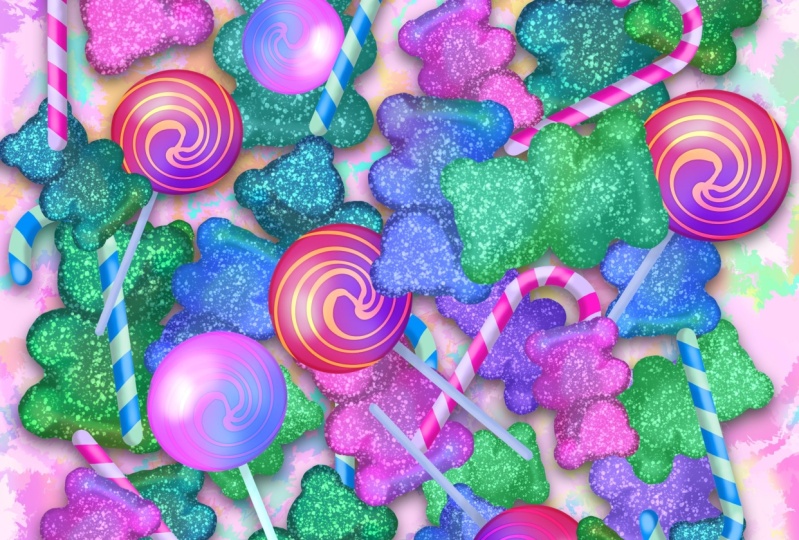
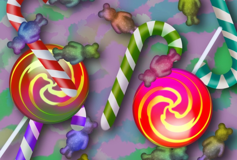
3. Project 1 - I Want Candy!: All, let's get started with our first projects versus
Procreate on my screen. I also notice we've got
drizzle for the next hour. You gotta level of again,
my country anyway. We knew new file. So for my new file, I will just go with a
standard screen size, same size as the iPad screen. And we get our two layers
plus a background color. The first thing I'll do is just reduce down the
background color because I find
that just a little bit bright to be working on. Some kind of a blue, but a very not bad
kind of a blue. Just to take some of
the glare away from the screen and come to done. Okay, so for this tutorial, we're going to be
making some sweets. They're pretty simple
shapes that colorful. And also I want to show you as many techniques as I can
cram into this video. So layer one is selected, I could do with a dark color for alerts to that disk for example. And I will come to here. Then I need a brush. I'm in my airbrushing
brush set and I will come down too
hard air brush. Let's just check my size. I could do with it being
a little bit smaller. So maybe around 8, 9%, something like that
and do a quick test line. Yeah, that's about
the size I want and I will double-tap to
lose that light. Okay, So now first of all, I want to draw a lollipop. And for this, I'm going
to take advantage of the quick draw in that. I'll draw my circle
from my lollipop. I'll hold my brush in
place until I get that ellipse created and I get
something called Edit Shape. I have a choice here between
a ellipse or circle. Now can you see that text which is appeared at the
bottom of the screen? You will see that from time to time in these workflow videos. And that takes, lets you know
the title of the video in the reference section
so that you can go to that video to
find out more about, in this case, quick draw. If you want. There will also be other
titles which might look like this, for example. And so what you have now
is the title of video plus the minutes and seconds into that video that I talked about. The thing that you're
seeing on screen that is gonna be a huge
time-saver for you. Alright, I will draw out
the circle for the head of the lollipop that
I want to do first. And when I do, rather than
taking my pen off the surface, my iPad, I'll just hold
it in place like this. And eventually I see that
ellipse created an Edit Shape. And if I come to Edit Shape, I get a choice between
an ellipse or a circle. I get that I can stretch
my circle like this. I can rotate it around, although there's not much
point where the circle and get this to the
size I want it to be. Okay, so I want to keep that
so I will tap on my brush. Then I'll come to my
layers panel and I will slide left and
duplicate my layer, the layer one underneath. I'll make invisible.
I want that there just in case I need it later. But anyway, I have my
top layer and come out. Let's start as you
mean to go on, name your layers
as you go along, you are going to affect
me for this because sometimes you can
end up with dozens, if not hundreds of layers. And Earth are all
called layer 12, three seventy, eight hundred
forty two or whatever. You are going to have
a nightmare trying to figure out what is on what lab. I will call this lollipop. Head. There we go. Okay, so the next thing
I want to do is to flirt the inside of that
circle with the same color. All the same color is up
here in the very top right. So I will drag that and
flood the area like this, that one's a bit too far. My threshold is 89%. If I slide my pan
over to the left, eventually I threshold gets
less and I can let go. All right, so that
area is colored, but that is looking a little bit dark for a kid's lollipop. So how come to my layers panel? And I'm going to tap, and I'm going to
come to alpha lock. That will make it
so that I can only paint on areas which
already have paint applied. Anything which is transparent
will stay transparent. So for this, let's come here. I'm in my airbrushing brush set, but I want a soft airbrush. So come to soft airbrush. Now my size and opacity, I want the opacity
right the way up. I want the slides
fairly large like this. And I need to choose
a nice bright color. All right, well, let's try
pretty bright red like this. I can just paint in
that area or like that because I have Alpha
Lock Selected on that layer so I can't draw
on the transparent pixels, but I would like a little bit more of a two
tone effect of this. So let's come here and let's
choose a color for this. I totally what we'll
do, let's come to the. Harmony disk. And instead of
choosing an analagous, analogous outcome to triadic, because I want a very bold, bright Canada effect here. Now let's come to tetrads, and that's the color
I've chosen a. Let's choose this
color down here, which is a quarter of the
way around the circle. And I want to color in
just part of the circle. So I'll start at the
bottom and work my way up. Now that is too strong, so I will double
tap to undo that. Instead, I will lower
the opacity so I can gradually build up the effect and we can get the
capacity as low as I want. I also want the brush to
be a lot bigger because I want a softer transition
from one color to the other. Let's start at the bottom and gradually worked
my way upwards. Can you see how I'm now getting a much more gradual
build-up of that effect. Okay, one thing I should
say at this point is that you're looking at the direct
recording of my screen. And so you do get
drifting color cast. I've done my best to correct it. But if I show you a
screen recording than the colors I see when I'm recording it look
more like this. So just bear in mind, there is a certain amount
of drift in the color. Back to the direct
recording of my screen. Maybe that's gone a bit far, so I will sample my red. But just by tapping and holding until I get the red color. And I'll just drag this down
a little bit down here. I know a little bit down here. Then what I'll do is I'll
come to my classic tab. Just push my little reticule. That's that little
circle there up to the very top because
I want a slightly lighter highlight inside there. I will make my brush
size smaller and gradually build up a little
highlight around here. How's that looking? Okay. Yeah, no more than that. All right. So now I'd like to get some stripes in there and get
them looking very swirly. So I will come back, It's my layers and I
will add a new layer. Now I want to put down
some paint brush strokes, but I wanted to only go as far as the edge of that
lollipop head. So I'll show you the
before and after for this, Let's come to our
paintbrush again. I will come back down
too hard air brush. In fact, now let's come to inking because I want something which has
a variable width. I found basketball can do the
job quite nicely with this. I don't want a plain
white for this. Let's find a color for this. Let's come to disk. Will choose a yellowish
color for this, I'm using very primary colors. This little circle
in the middle. Let's make this a
light color like this. And actually let's make this a little bit
of a cool yellow. Let's test out the
width of my brush. Yeah, that seems about right, but you'll notice that it goes
past the age of my circle. That's not a problem. I will top tab and
I will go thick, thinner and then
thick again there. And I'll do another one here. Start off pressing
hard and go thinner in the middle and
pressing hard again. And then what I'm gonna do
is come to my layer three and I'm going to
select Clipping Mask. And when I do, in fact, let's move this
over so you can get a clearer idea of
what's about to happen. Our press clipping mask. This is another way
of making parts of your layer invisible
because that layer, which is sitting above, you see that little arrow
pointing downwards. That lets me know that layer three is clipped to the
lollipop head layer. And so you can make
your brushstrokes, but they just don't
appear beyond the boundary of anything on
that lollipop head layer. Okay, so now I want to get a little bit creative with this. I will come to my adjustments and I will come down to liquefy, which is a wonderful tool. I have a number of
different options here. If you come to push
my brush size, I could move these
brushstrokes around. Or for this, I want to
come to twirl right, our chair, my brush size again, maybe that's about
the right size. And now all I'm gonna do is just come to this
add hover on that. And can you see how everything's
starting to spin around? I want all of those
lines to spin around, not just a little
bit in the middle. So two-finger tap to undo and make my brush
size quite a bit larger. Now let's try at all. Yeah, that's what I'm want. Mccann nice swirly
pattern on that lollipop. Now of course, because
I'm being greedy, I want to play around
with the effects. So let's see what
that looks like with different
layer blend modes. I'll try it under overlay. Looks interesting. What about soft light? That looks nice. Hard light. Wood reducing the past to create a slightly
different effect there. I think maybe about there, I quite like that, but
of course I'm greedy. I want even more of an effect. So I'm going to swipe left and I'm gonna
come to duplicate, to duplicate my layer, I will come down to the
layer below and I will reset it to normal. Like this. One I'm going to
do is come back to my adjustments and I'm going
to come to Gaussian blur. Now from a Gaussian blur, all I need do is just
either with my finger or my pan slide from left to right. I want to do. Can you see I'm getting
a slightly blurry effect just behind those swirls. That is the layer below
getting more and more blurred. Just blur it just by a
small amount, maybe 3%. And then to accept that, I'll come to my layers panel. But I want to increase
the opacity up so I can see that blur
effect a bit more strongly. It's still not quite
strong enough for me, so I'm going to swipe left and duplicate the layer so that I get a doubling up of that layer. And did you see how I got a
bit more of a glow there? I like that, but what
I would do is I will merge this layer down
to the layer below. I can do that with merge down. There we go. Now while I'm here to do,
I want to experiment with a layer blend modes to see if I can get
different effects. One, I put it to
light and do you see how I get a slightly
different effect there? Because the blend
mode you use will have a bigger effect on
what your layer looks like, like ad that's looking very
strong and I like that, so I'm going to keep it. Okay, So unlike
what I've got here, but I could do with a bit of
an outline around it maybe. So remember layer one, my initial layer
which I just drew an outline on now I can use it. I can make it
visible and I'll put my finger on the
layer and I will drag this up right to the top
so that it's at the top of the layer stack because the
layers which are higher up in the layer stack cover up whatever is underneath them. Now I'm nearly there with that. But if I zoom or ride
up close and personal, you can see just
in this area here, that's where I started my
brushstroke and ended it and you can see it a
little bit inconsistent. Well, first of all, I don't
need this to be clipped. Lollipop head layer, so I
will turn off clipping mask, which changes the look slightly, but then I will duplicate
this layer so that I get a doubling up of the opacity right there, that
gives me what I want. So I will merge that
down with a layer below. Come up. Let's rename
this lollipop outline. But let's pinch
inwards to zoom out. And I'm not, you
know, with this, but I don't know
about your country, but where I'm from, a lollipop needs a steak. So let's do a stick. Let's create a new
layer and come on, let's name as we go along, Let's call this layer. Stick. For this. Let's come back to airbrushing
brush set hard air brush. That's what I want. Now.
I want a lollipop stick. I want it to be with that
people at the right width. Yeah, I can go with that. Now just in case I want to keep that brush size for
future reference, I can come here and I can tap on the little
button on the slider. If I press the plus side, I get a little notch. That means I can change my
brush size to whatever I want. But if I decide I want that
size which I liked before, tap that and it comes,
okay, so for this, I need I need a basically
a whitish color downside. I'll make it nearly white. In fact, let's come
to classic because I get a bit more
control with this. These are all blue colors. I want, I want kind
of a bluish white. So I'll move this down
just a little bit. Come on. Just to get to the
tiny bit of blue in there. Then I will draw a line and I will just
hold my brush stroke. And I get, instead of a line, I get a rubber band which
is completely straight, so I don't have to
worry about my hand wobbling. When I create this. Also, if I put my finger here, I get one figure modify
and that made it snaps to 15 degree increments. That means I can get a
perfectly straight brush like that. That go on are good. Only problem with that is
that look at the bottom. It's fading off a little bit. What you can do something
with that now I need to move that so it's
underneath my lollipop. So I will come to
my Transform tab. The bottom of the lollipop
stick is a little bit faded. That's not a problem. I can also flip vertically, so the whole thing
swaps upside down. And now that solid
edge is at the bottom. Great, good times. Now I can move this. A lot of times people
try and move from the inside and that
ends up stretching. But it's just as easy to come to the outside and move
around like this. Now wondering what about
the center of that lollipop is if I came to snapping
and turn on snapping, that will give me
some guidelines. So now when I move around, I see that I'm getting
a little guidelines. If I move this there, you see that blue
line running down the middle of both those shapes. That lets me know the shapes
are aligned to the center. So that's matched up perfectly. Alright, so I liked by
that is so our tap, any of the other
icons to accept that, the only problem with that is the stick is lying on
top of the lollipop. I need it to be underneath, so I will drag that down. It's underneath and
there it snaps. I will turn on Alpha lock. How come to my colors again? Because I want a little
bit of shading just where the stick of the
lollipop meets the head. Make things a little
bit darker like this. I will come back to my brushes. I'll choose my soft
air brush again. Make it a little bit
smaller like this. Just toilet bit of
shading just there. Then I will come and
make things even darker. Make a better, deeper shading, just where the stick meets the actual head
of the lollipop. Ok, so now the next
thing is I want to group all of these
together so that, for example, I can move
a lollipop around as whole or resize it
or do whatever. It's a good idea to
organize your work. So I will swipe left or
right for all of these, what I swipe more
than one layer, you can see that highlighted
that's my main layer. These are also selected, but they're just a bit darker. And I've got this thing
here called group. If I tap on group, all of those layers on a
new group called new group, which I could do without. So let's tap, rename
and call it a lollipop. And because they
are all grouped, if I come to my Transform, I can move this
around as a whole, are moved to the side there because I want to do a couple of more suites that will be
coming up in the next video.
4. Make a Stick of Rock: Okay, So we've
made our lollipop. Let's try making
a stick of rock. That's what we call them here. When you see what I'm about to, maybe you'll recognize it. So let's come to our brushes. Hard air brush,
that's what I want. Let's create a new layer and take a look at our
precise because I want this to be pretty big. 100%. Yeah, that's the
brush size I want, but I want it to be a
lot lighter than that. So double-tap to undo that, let's create just a plain white. Let's make it
slightly off-white, shall we about there? Then? I want to make like the handle of an umbrella but upside down. So I came here. If I do that and that's not
looking quite how I want it. An arc is created edit shape. No, I'm not sure even though I can move the
control points around, I'm gonna get the
shape that I want. Kinda have to try a
different way of doing this. What about quadrilateral? Definitely not. Forget that. Let's come
and clear our layer. I need to do this differently. Alright, let's try
again and I'll try using the assisted
drawing for this. Let's create a circle
shape, terrible circle. Let's come to Edit Shape and
yet circle, I want that. All right, for this, well, That's a little
bit big for what I want, so I'll push in, so I'm getting a much tighter shape like that. And I will tap to
commit to that. Then I will come and
create a new layer. I will do a simple brushstroke
straight down like this, hold one thing and
modify it so I get a vertical line like that. Now because these are on
two different layers, this is good news for me so I can come to my transform tool. I can move it. Snapping is turned on from the previous video and
this is gonna work. Is this going to snap? There? That could work? Yeah, I'll go with
that paintbrush to select k. It's nearly there, but I've got a circle as
opposed to a lollipop shapes. So what I can do is I
can come to Layer seven. I will duplicate
this in case I mess the whole thing up and make the layer underneath invisible. I'm using my hard air brush
I could do with erasing, but with the same size airbrush. Well, I have my erasers here. And if I was trying
to raise with that, then that's not
really the effect. I want I want something
a bit cleaner than that. So double-tap to undo that. My brush, I'm using
the hard airbrush. Okay, so let's come here. And I can come to
airbrushing and come down too hard air brush for
this and choose that. Check my pasty check my size. Is it the same size
as my regular brush yesterday so I can start
to erase bits like this. Let's swipe outwards to get an idea of what
I'm looking at. And can I get a shape like this? It's looking to be
a bit difficult. I need to find another
way of doing this. So two-finger tap to undo a few times to get me
back to where I started. And let's try to find
a different way. So I'm on my layer and I will come to my selection tools
and I'm going to drag out a rectangle like this to about halfway
down circle like that. I can only affect what's
inside my selected area. So I will erase this bit. Then I can come to any
of my other brushes. I can tap my
selection tool again. I only problem
with this now is I want that rounded n Now Curl. I put that rounded end
using my paint brush. I'll choose another layer for
this case, I get it wrong. I smudged off to one side. Let's try that again. Add there. We can see it's nearly there but not quite, but
not a problem. If I come to my Transform tab, I can just move this
around or just dock it into place like this. I'm doing this by
eye a little bit, but that looks about right. Let's de-select. Yep, that seems okay. Now I have three
shapes which are making up my stick of rock. So I will merge down
and I will merge down, which merges everything
into one layer. I do not need this anymore, so I will tell you that I will duplicate that in case
I mess things up. You notice how as
I'm going along, I'm creating safety layers. And that's just one
of the things that our layer is useful for. Not being silly with this
onto I come on, stick. Okay, I'm gonna do a
quick timeout here because while I'm
recording these videos, I'm actually recording two
videos at the same time. I'm doing a direct
screen recording of whatever I see on my iPad. I also have a camera
position to overhead, which is recording
my hand movements. But I'm starting
to find my hands are getting in the
way a little bit. And also the direct screen
recording simply gives you a better color reproduction of what I'm seeing on my screen. So I'm going to swap over to my direct screen recording now. And unless I have to go back to the overhead
recording of my iPad, I'll represent where
I'm touching on screen with a little red circle. It'll show you I am, but without my hand getting in the way out k, Let's move on. Well, it's a bit boring so far. So let's create another layer, and I will create a clipping
mask on that layer. Come on, There we go. Now. I could do with some
spirals on that rock. I will come to my color and
I will choose red is right, popular color for rock. I'll make it a little
bit darker there. Now, can I get this? That's looking a little
bit thick for my purposes, I want to make it a little
bit thinner like this and make things bigger. So I have plenty of
screen real estate to draw with also my color
as well. Come on. That needs to be brighter. So now let's come add, just makes them
brushstrokes alive, but they're not like that. I want more of an angle, don't
tie. Bit more like that. Not fair. Just compare. I create some strokes like
this that is working. I will create another layer. This I will also clip
to the stick layer. For this, I want some
shading on this. So what I'm gonna do is set my layer blend mode to add one of the dark and blend
mode like multiply. And here's a little tip for you. If you are painting with layer blend modes
to your opacity and drop things down to
around about halfway. That way you can make
your brush strokes. And if you decide you want the whole effect to be stronger, you can slide up your opacity. Whereas if that's
just set to a 100%, the only thing you
can do is reduce the effect it to
around about halfway. It doesn't have to
be exactly 50%. And then you can make the effect stronger as well as weaker. Okay, so for this, let's come soft air brush
again, Let's choose that. Let's take a look at my pastel, all my past to each
beat, fairly consistent, but my size to be a little
bit smaller like this, and I need a color
to do this with. Let's sample that are
very light gray and maybe make it a little
bit darker and a little bit more
saturated like this. Let's put a bit of
color in there. Now, let's see what
we can do with this. Can you see when I
make my brush strokes, I'm getting a
darker effect here. But because I changed
the layer blend mode, it's not just
drawing over the top of the red and the
white without blue, it's making everything darker. So I'm getting darker reds, darker grays rather than than
just drawing over the top. That's the nature of it. Let's get unalike bit of color which is darker again,
and I want to just drink. You just run the
outliner like this. I think I fully
wondering with this, if I want to blur this a little bit so it's a bit
of a softer effect. Let's try that. Let's
come to adjustments. Let's come to Gaussian blur
and slide along with top. To just make the
whole thing a little bit softer overall, Anya, I prefer that unlike the effect to be a
little bit stronger. And the good news
is because we set our opacity to about
halfway weekend, make it stronger
and look at that. Just by sliding around, I can adjust how hard
I want this to be. Now I could do with a little
bit of highlights on this. So I will create another layer
and I will clip it there. And this time I want this set to one of the
lighter blend modes. Let's try something
like screenshot. We sample the original
color like this. And my airbrush lets make it just a little
bit less opaque. Lower pasty means I
can gradually build up the effect and the brush I
want to be a bit smaller. Let's zoom in on this area here. See that? What am I doing? I'm not following my own advice. Come here around about halfway opaque so I can vary the
strength of the effect. So it's more as well as
less from what I saw. There may be make my brush
size a little bit bigger. And let's create
just a little bit of a highlight just
in this area here. I'll make it a
little bit stronger just on a curve like this. Maybe my, my brush a
little bit smaller so it's tighter down the side wall. What caused that
wobble? I've no idea. That's come down a little bit. No, I don't like that. Let's make the brush bigger and gradually build up
the effect around here. And I'll do what I did before. I will Gaussian blur that
just a smooth things up. I don't need very tight
highlights about that. Let's mess around with the opacity that's
completely invisible. And I'm not looking
at this number here. Because if you start
trying to design or create things by
looking at numbers, you're not looking
at your canvas. Just look at what you're doing. I know I'm sliding around, but I'm not looking
at my slider. I'm just looking at the effect. That's too strong. Let's try about their
half a much worse. But I can also do things
like I can play around with the layer blend modes to see
if that makes a difference. Color dodge. That gives quite a nice
saturated highlights, which I do quite like. Maybe I'd like that
to be a bit stronger. So what I will do is I will
take my layer and I will duplicate it to double up the effect that is
way too strong. So I'll take that back down. So just the top layer of these two colored dodge layers and gradually build
up a little bit more. To get about there, maybe a little bit more. It's sweet. It's supposed to be vibrance. Alright, so now with that, I don't need my
layer seven anymore. That was just my backup layer. Delete that, but
the rest of them, Let's group these together. We will call this stick. All right. There is the next to
my suites and come on. Let's move it off to
one side just up here. That's at the way, because
the next thing I want to do is some gummy bears.
5. Make a Gummy Bear: Okay, Let's carry on. We have our lollipop, we have our stick of rock. Let's come and
create a gummy bear. Now to do this, I want
a symmetrical shape. I can use the symmetry
feature to help me for this. I come to my actions panel, which is also known
as the wrench icon, and I can use my drawing guide. Now at the moment it's a grid. I don't want that, I
want the symmetry, so I'll come to
Edit Drawing Guide. I have various different
options down here. I want the symmetry at the
end, and that's all I want. I don't want to
adjust it anymore than that and I
will come to done. Now let's check my
layer because I need to be able to see that it
says assisted for that layer. And if I tap, you can see
Drawing Assist turned on. Let's find a brush, hard
air brush that's fine. Color. I'm probably going to vary
the color eventually, but I'll choose a kind of a
mid green for this because we haven't gotten the
green and it's not bright and colorful enough. Now what about the brush size? About virtue you think? Okay, let's zoom
in a little bit. Create. The shape. Will be the head. Is that's a bit too
sticky out he isn't it? Let's do it about,
shall we indeed a body? You'll notice how
the symmetry is helping me to draw both
sides at the same time. Create some legs down here, make this fairly
nice and smooth. We also need some arms
as well. Don't wait. Let's do that. Does that look like gummy bear? Maybe make a little
bit round around here. I want the feet, but not quite
as well as defined as they were about there shall we go? That's make the arms a
little bit more sticky audi like that. Let's pinch up. Like a gummy bear
shape, doesn't it? And now I want to move that around and maybe
resize it because I think that is a little bit big compared to the
other two suites. But if I was to try
doing that now, look with transform on. Well, I can't do that, but I'm a bit worried about the assisted layer starting
to mess things up. So I'm going to turn
off drawing assist. And I don't want that line going down the middle of
my screen anymore. So it come back to
our wrench icon and turn off Drawing Guide. Now, I can make that smaller
by choosing my transform. Just simply coming
down like this. About that size. Do you think? I think about that size? Tap to choose that. And let's zoom in a little bit. Before because I am paranoid, I'll duplicate this, but
he'll do yourself a favor. Let's rename this
before I duplicate it. Duplicate. So now if I mess things up, I shouldn't have a problem. I'll do what I did before. And I'll create a new layer. And I will create a clipping mask so that I can drop to the edge
and not beyond. Now what I would
like with this as a little bit of frosting because they have a
lot of sugar on them. To do that, have a
little search around and if I come to spray
paint, which you have, that flicks, and my brush size
is about around about 10%, unless just scribble across. That didn't work because
I need a lighter color. Let's choose a
very bright color. Let's choose this completely white and let's make it
completely white like this. Allie, quick scribble across and I get that frosting effect. Maybe that's a little bit
much so double tap to undo and even quicker
scribble across there. All right, So now as
with the sticker rock, I could do with a little
bit of shading on this. So I'll come down to my belt layer and create
another layer as before, I will turn this into one of
the dark and blend modes. Multiply, opacity, set
to around about halfway. I need a softer brush for this. If I've now come on,
let's try medium nozzle, which looks like a little
bit of a grittier brush. I'm going to choose the
same green that I have. But because I've
set my blend mode to one of the
darker blend modes, if I paint with it, I
will get a darker effect. Now what about the size of it? Needs to be smaller, doesn't it? Take down the opacity,
so it doesn't build up quite as quickly. Let's try this now. That is giving me
a darker effect, but that brushes to smallest
until let's face it, Let's increase the size of it. You can see I started to build up the side of my
gummy bear like this. You'll note that because I'm painting underneath the left 15, I'm still seeing I'm still
seeing the sprinkles. But I'm getting a
slightly textured effect because I'm using a
more texture brush. Now let's not be shy
without shading. Let's do this. It a little bit around
the edges in general, we go, I have the general
level of shading that I want. Let's come back at, let's take a look
at the opacity. A little bit higher is given
me more the effect I want. And I think that's good for
general purpose sharing. Maybe I wanted something even deeper in there as
well at some point. That is my shading. What about highlights?
As before? I'll set this to one. The lighter blend mode screen
is always a good word. Start off with it gives them
fairly natural highlights. So it's about halfway. And watch. Because it set to a
lighter blend mode. Even though I'm using
the same color, because the blend mode
is set to lighter, it lightens things like this. Let's undo that because
that is a bit big for my liking and gradually build up some highlights
around the head area. The top of the chest, abdomen, little bit smaller, a little bit on the
side of the arms, one side a little bit more
than the other because I'm imagining the light is coming
in from this direction. Just a little bit,
maybe a little bit around the feet as well, a little bit down here. Now I'm looking at the
sprinkles on top and they look like they're
just sitting on top. They're not really interacting
with a shading underneath. So I will come to
my sprinkles layer. I'm going to change
the blend mode. Maybe. See what happens when I do all the different kinds
of effects I get. Now, overlay is
looking interesting. It looks like sprinkles
are really starting to interact with what's underneath. Hard light. That's an interesting
one, are vivid light. Let's try more. Some of the lighter blend modes. The screen I was using before. That's fairly
interesting. Color Dodge, I get more color
in the highlights. Add is a very strong effect. Can I reduce this down
a little bit like that? Maybe. I'm looking at
this and thinking, well, I like the
effect I've got, but not all over the place. Maybe it's some of
the shaded areas. I'd like to see less
of those sprinkles. So this is what I'm gonna do. I want to tap to create
a mask for this. This is a layer mask. What I have to be
careful to do is not to choose Layer 15
with the sprinkles on, but choose this layer which
has the masks on that. I'm going to come to my simple soft air brush
and I'm gonna choose a black color when I take
the opacity fairly low, the size fairly small. And just to remind
you, I'm painting on the layer mask of
the sprinkles layer. Now, when I start to paint, can you see this? Wherever I paint and gradually
fading out the sprinkles. That is because our layer mask makes your layer
visible or invisible. Depending upon whether you
paint in black or white. Black conceals. White reveals. If I show you that again, you can see what I'm drawing
in black, black and sales. So it's hiding the
sprinkles on layer 15. Raster layer is white. So you see the
sprinkles on layer 15. It's only when you start
to paint in black that you start to get this invisibility. Very nice thing about it
is supposing I decide, well, actually,
if you wanted to, areas of Gordon way too far, all I need to do is come to white. Let's
take a look at this. I can paint the
sprinkles back in. And if I come to black again, I can paint those
sprinkles out again. That's the beauty
of layer masks. It hides details
from your layer, but it doesn't delete
them, has got to be good. All right, so I've
got my gummy bear. Let's take a look here. I quite like that. Let's just check the
opacity of this. Let's make it just a little bit. That's way too
much in your face. Let's change it to about there. And as before, I'll
take my bear layer. I don't need that anymore. I'll delete it. Ballet is now selected
and our slide and group everything
and call this. But I want to do a bit
more of this, I think, because I can duplicate my entire group and I can move it off to one
side or like this. When I do that, I'm going
to open up my group because I wanted to take a
look at various parts of it. For example, the bad layer. Well that's a basic
green and I've used basic green on top
of that as well. But what about if I had a slightly different color shading without layer selected, I will come to Adjustments, Hue Saturation and Brightness.
And Alverno, the hue. I want. I do. Can you see how I get different
shading on that bear. That bad now has a
slightly different shade, the fact to the original pair, and you can see that because
they're next to each other. I can also have
saturation of it as well like this to get
a slightly more, less saturated or more
saturated effect. You can also alter the
brightness to really create a strong shadow or a
much milder shadow. I'll keep that around halfway, but I just wanted to let
you know that there are ways of altering the shading
using this technique. We can do the same thing
for the highlights. Let's see if we can get
something interesting with this. What's happening here,
because you're not seeing the basic green, you're seeing the basic green, but with the screen
layer applied to it. So if I look at that, I've actually got purple there. Look, if I come to normal, That's kind of a purple color. So let's set that back to, set it back to color dodge, because that tends to retain some of the color
of the highlights. And let's come back to our hue
saturation and brightness. I move this around and oh, I'm getting a very
intense effect here. I'll go with that. A lot of it I'm just
thinking as I go along because part
of workflow is solving problems as you go along or coming up with new ideas
and just try them out. Like with this, I've
got it set to multiply, which gives you a fairly
neutral dark tone. Color burn will take more
color in the shadows. So that's try that hue
saturation and brightness. Let's move that around again. Direct choose the right layer. No, I wasn't. I want Color Burn layer. Let's try Hue Saturation
and Brightness with this. Now the shadows
are being altered. I can change the
saturation, the brightness. Let's make it not quite as dark. But I can play it. Oh,
that's interesting. Getting a curious
mix of colors here. I can make it a little
bit more subtle or a little bit
more in your face. Quite light. We'll look at that. And in fact, I'm gonna come down
to my bear layer, our turn on Alpha Lock. I still have my basic
green selected, but I want to try a green
which looks close to that. We're not quite the same. And
welcome to my Harmony tab. And I'm going to select analog, which shows you colors
which are close to the color Y'all painting with like at the moment I'm
painting with this. Why don't I try
something like that? I'll tell you what else though. I will not be a bit more bright, a bit more in your face. Let's just see what
this looks like. I am going to choose
soft air brush, lower pasty, large
brush like this. Looking interesting. What layer on my own, I want the bear layer. Maybe that is a little
bit too bright. Let's do that. I've come on. Let's just make it a little
bit more of a yellow tone. I can affect the color. Just in certain areas like this. Normally. Sure, that's working. Let's try another color out. Tap undo to get rid of that. And let's try it
on orange color. And now I can get a
multi-colored gummy bear. Now, getting close to the stage where I want a few more these
sweet scattered around, but I'm not sure about the
highlight on that lollipop. I'd like that to be a little bit stronger so I calm down and I close up my layer and I make sure I get the right layer. I want a new layer sitting on
top of the lollipop layer. Let's move this
off to the side so we can see what we're doing. And I'll set that to one of
the lighter blend modes. Let's try screen. Start off with it down
to about halfway. I want soft air brush is fine and I want a simple white
highlight like this. Pasty low to build it up and my size, Let's try part there. And I just want to
build it more of a highlight just
in this area here, which so it sits
on top of the red, but also those yellow swirls. If you make it a little
bit more opaque. And the smallest size just to pull the proprietor highlights. That didn't work out.
So audio maximum. So what I would do
with that is come and choose another layer
and set that to screen. Let's make it a little bit more opaque than the previous one. That said 73% opacity. This one is set to 46 opacities. So let's see if we can
do anything with this. Yet sharper highlight
just there. Although that's a
little bit too sharp. So I would just come and
I will blur that out. Now this is one of the
reasons why I flip between my hand doing
the drawing and recording the actual
screen because with my hand that you can
actually see what I'm doing. So I will fade back
to about there. Okay, I will go with that
and one more layer as well. I don't want to set that
to set that to color burn. Take it down to about
halfway and choose, Look, I'll choose some of
that purple opacity, low size, nice and big. I just wanted to build a bit of darkness there and
look, I made a mistake. What I should've done, this clip that led
to the layer below. Let's do that. Yes. Now it's clipped to
the layer below. Just put a little bit of dark. Let's alter the opacity
of it because it's looking a little bit
light for my tastes. Yet, see that when I
increase the opacity, I'm starting to
get some nice dark or effects on the yellow swirls. Okay, these are my basic shapes. Now, what I want to
do there is just take these elements and
scatter a few of them around.
6. Putting our Candy Together: Okay, I think I'm
nearly ready to start making a bit of a
composition out of this. Now, before I do though, I will come to my gallery and I will share as a Procreate file. Let's send it off to my iMac. You get exactly what
I'm working on. Candy 01. I think the first
thing I'm going to do is I want to come to my lollipop layer
because I think that black outline is a bit too dark, so I will tap on the layer and I'm going
to reduce the opacity. So you're seeing parts of the lollipop through
it like that. I think I've got
the next thing is, I think I'd like some kind
of a background for this. And also, I wanted to show
you a couple of more things. I'm going to create a
light and I'm gonna drag this down to the bottom. I'm also going to change my background color to
something a little bit more, but we'll go. The next thing. I have my last slide now I
could do with a paintbrush. Let's come to, let's
try medium hard airbrush. Check my size. Maybe about that big. And also I need a color for it. That would be a good idea. Let's find, Look, I'm not
going to be subtle about this. Sweets are not subtle. So the next thing is
I'm just going to draw a series of lines like this. Doesn't have to be
brilliant artwork workers weren't going to be doing
something with these anyway. What I am going to do is come
to adjustments and come to liquefy because I
wanted to store these and make these a little bit more interesting
than the hour. So I will try coming
to twirl, right? My size, I want a
fairly big size I want, Let's get a bit of distortion
in the pressure. Now. You go, can you see that? I'm getting some wavy lines? This way is so much quicker. I'm trying to draw
this all by hand. You're getting some very nice marble effects, shall we say. Let's do that a little bit
more and a little bit more. Thinking. Ripples in ice cream,
stuff like that. But I want a bit more than that. So let's come to crystals.
What do I have here? Size, again, fairly
large pressure, maximum distortion or maximum. Let's see what this does. Yeah, I like what that's doing. It's a nice crystallite
effects in there. Can I just talk a
little bit more? Let's try twirling, right? See what happens with that. I really want these
to be Ripley. Going along the lines and
also across allies to really shake things up a little
bit like this, okay, that'll do for me and I may be a little bit more with
crystals because I think last twirl I did
some of the crystals out. Okay, So we've got
that. I'll come to my layers panel which
will accept that and I'm going to
alternate Alpha Lock. And I will tap on duplicates. And at the moment I'm just
throwing ideas around, see what will work
and what won't. Okay, at this point, I'm about to start doing
some work which will not pick up well on the
overhead camera. So from here on, I've used the screen
recording software to show you what I'm doing for this. If I come to my Transform panel, I will just flip
this horizontally. And at the moment, it's
looking rather intense. But if I take this one
and I change the mode, the layer blend modes
and maybe something like overlays looking at interesting
or let's try overlay. I'm going to choose
my soft air brush. I want that medium
opacity, large size. I did have this green. Well, I want different colors
of a similar brightness. Allah have my classic
panel selected. So all I need to do now is just come to the hue slider and just choose some different
colors and just see what they do on the layer. Let's come to the layer
at the bottom first, alpha lock is on so I can
put whatever colors I want. This is starting to
look quite nice. Let's choose another color. Let's choose something
a bit more purply pink. And try that. That's working. Let's try
maybe something a little bit. Orangey. Put that in there. Let's come to the top layer and
do something similar. Let's try orange on that layer. And can you see how
I'm starting to get a nice patchwork of lots
of different tones there. And the fact that
one layer is set to overlay mode means
you are getting some rather interesting
colors here. You can tell I'm really
working pretty fast. That's because, well, you're on the clock and this is
supposed to be a fast guide. Okay, I like that, but I'm wondering that
might be a little bit too much for the various Which
one I lay them out there. So I'm going to put a
layer over the top of that as kind of a master
layer which can control it. So I will come. And I can have any color I want, as long as there is a little
bit of color in there, I don't need a gray,
I don't need a white. I just need a bit of color
and any color will do. I will have my layer selected, so I will come to Fill layer that turns the entire layout one
particular color. And again, I'm going to
experiment with the opacity. Let's take this down to
somewhere around about there. And also the layer blend mode. And I'm starting to get some interesting colors
coming through like this. It's just simply a
case of playing around with them to get something
that I may like. All of a sudden that's
looking quite automated. I quite like that. You don't know what
you're gonna get because you've probably
used different colors. And that's the thing. It doesn't have to look
exactly how mine looks. We've used a lot of tools
which randomized things, especially with the Liquify
layer where we added all those little ripples in crystals into our brushstrokes. So don't expect it
to look like mine. If it does, it does. If it doesn't, I'm sure
it's just as good. All right. That's looking okay, but here's
a nice thing about this. Let me just take this bucket, say something fairly
high opacity. But now if I come to hue
saturation and brightness, if I move it around, you can see I can change
everything all in one go because
it's all operating underneath a master layer. If I change the
brightness, I can change it so it's completely
bleached out, all looking really quite deep. So you have that layer
of control just by having a little think
about different ways. You can use layer blend modes. They really are the digital
artists secret weapon. Let's do what we normally do. Let's group these
altogether and we will call this bk to Stanford background. Don't forget also, I still have my background color
and I can change that around just how much
flexibility would you like? Okay, So next thing
I want to make multiple copies of my
bear stick lollipop. Well, there's different
ways of doing it live, but let me show you
something if I come to say the bear and I can
duplicate this. But I don't want to have all these different
layers because I want multiple copies of the bear and the
lollipop and the stick. And at each single
one of them has got 123456 layers per bear. I will end up
running out of RAM. I've made my basic changes. Soy, don't eat that with
all the layers in there. So all I need do is tap
and come to flatten. Now I just got one
layer called bear, with all the layers that made up the bear all merged together. So I can make the barrier
underneath invisible. And I can repeat the
same thing with a stick. I can duplicate it. Add flattened that. I can make that invisible and comes the lollipop and duplicate that and flatten that
little lollipop invisible. So now I'll do a little
bit of organization. Let's come here and drag
that underneath Carmen. Did you see what happened there? I messed up when I drag
down a little bit. So now I created
a new group with a stick plus the individual
layer inside there. So all I'll do is
I'll undo select Layer, undo group items. Okay, They're all my layers. I'll come to this one and
drag this to the top there. And welcome to this one. And I'll drag this one
up to the top there. Now for some strange reason, the lollipop got
renamed into a stick, which don't really need. So I will rename this. Let's just call it pops, and I want to change
the color a little bit. In fact, I will come
to the other layers and I will turn on the
Alpha Lock for those. I'll try and keep the bear
as a master layer now, do I want it that size before
I start making changes? Yes, I'll keep it outside, but I will duplicate it. Then I'll come to
my transform on our move it and I
will rotate it. And I'll know I don't
want to resize it. That will happen sometimes
if you try moving from inside something about there's
not enough space in there, so it ends up resizing. But if you move
from the outside, you can move it to the top
on Transform to lose that. Then I can come down to my
original bear and duplicate it and move that to another
place there, for example. You see what I'm doing. I'm gradually building
up the bears in different positions that
do the same thing again, that's come to duplicate, and that's come to Transform
and move that down to here. So it's just peeping
out of the bottom. Whoops, I accidentally resized
it again because I was trying to drag from the
inside and I did it again, tap to undo that. I think what's happening is I'm aware that time is moving on. It is supposed to
be a fast guide, so maybe I'm rushing
a little bit. Let's put the bear their hand. I will come to the top
and I will merge down. I will merge down again. I have three pairs
all on one layer. And if I duplicate
that and transform, instead of doing
it one at a time, I now have six pairs. To play with, Let's try
and make sure they don't overlap each other too much. Maybe like that's
tough to do that. I'm going to do the
same thing with the lollipop and the stick. I will probably fade
out and fade back in again because it would just be you watching more of the same. You are on the
clock. Same as me. Okay. I'm fading back in again. I think I'm nearly there
with this, the originals, the ones which I
didn't rotate around, I'm going to make invisible. I don't want them
to be part of this because it's always
an idea if you do something like this
to keep the original which is standing
straight up and down. Because if you need to
do more construction, It's easy to do construction
on an object which goes horizontally and
vertically than it is to do with things like this,
which are at an angle. Let's make our invisible
because I've done that. Let's do a little
bit of organization. Let's take pops, the
original Delta V. Stick down to the
bottom as well. Now I've got a lot
of layers there. Do I really need them to
be in separate layers? Eventually I will
flatten them down, but I'll keep them
in a separate layers just for now and you'll
soon find out why. Just before I do that, Come on. We need more beds. We
need lots of them. These are supposed to be sweet. That's supposed to be loads. Let's put some about that. I will take this layer
and I will drag it to the top because at the moment all the bears are
sitting at the bottom. We need a little
bit of a shakeup of the various different layers
so they look like the old jumbled on top
of each other, rather than all the
bars at the bottom, all the sticks in the middle
and so on and so forth. And FAD, come on, I want more bears. All right, so we've got
lots of different objects in lots of different layers and they're all
looking a bit Samy. I wanted to do
something about that. So let's take just
that one there. Look, if I come, I can come to hue saturation
and brightness. And I can change the ear. You can see the pair that I can change it to
whatever I want. If I come to these two bears
and do the same thing, Hue Saturation and Brightness, smoking change with whom? What ever I want? I can go through
the whole thing, or I can try
something different. Let's come to this ballet. Merge it down, add another
layer on top of this. And I will turn that
into a clipping mask, and I will change the
blend mode to color. Now what happens is
whatever color I put down, let's take a yellow, let me just show you
and then explain it. Soft airbrush be
smaller this time, about halfway opaque
unless you just find out what which pairs of those bears. All right, so my clipping
layer of slides. We'll look at that. Let's make this a bit bigger. The bears are taking all
the color of my top layer, which has set a
color blend mode, but gets the saturation and the dark to light or
the light underneath. On the upshot of that is, you can color in these
bears really quickly and easily to whatever
color you want. Instead of having a bear
which is just green, I can have a bear which is a
mixture of green plus blue. Anything in-between. And it all just goes
so much more colorful. There you go, three
different shades of bear. And I can do this as
any layer that I want. What are the bears are
part of this layer. Now I think I've
got most of them, but you get the general
principle with that. Let's try this pops layer here. Let's just try converting this and change the color as a whole just so
it looks different. Let's try this thick and I can come to hue saturation
brightness with this. But you know what? I think I'll do the same thing. I will create a new layer. I will convert this to
clipping mask layer, and I will change my layer
blend mode down to color. I can color this in
to whatever I want. There you go. Whatever
color you like. And notice how you're
still getting the dark and light on the stripes on the rock is just the
color which is changing. If let's do the same with
another one of those sticks, let's try this stick. Same trick as before. Clipping mask on the
clipping mask to color. What color would you like that? How easy as that. Now you're gonna a little
bit overboard with this. Because what I wanted to
show you the technique, why did I come here and try fading that opacity
of that layer. So I get slight hints of different color
for that stick of rock, but not too much. Now the reason I
kept all of these in separate layers with
the Alpha Lock turned down was because I knew
I was going to be making some very free and
easy brushstrokes. And if, say, all
gummy bears were on one particular layer in
which speed things up, but I would spill
my brushstrokes over onto the various
different gummy bears. I don't necessarily want that, but we are nearly there. If I could stop breathing, all these various
different things. But instead, now that I've
put everything on that, well, I can come to this
top layer that's controlling all there
unless I have a quick play around with this because maybe that background
is looking a little bit bright
for my likings. I desaturate things. You know what I'll do
with this, I will stop. And I maybe I will just
change the blend mode to a just a simple normal
way this a little bit. And that one file hue,
saturation and brightness. I can just control what things look like
in the background. Maybe something like that. Now for the very fine nothing, let's just take a look and
see what I've got here. I want everything. I want all of our model layer, but I also want to keep the individual layer
so I can't very well turn around and start grouping
all my individual layers. So the final trick, I want to take my background and I will make it invisible. I want to take my
background color. I'm gonna make that invisible. So now I have a whole lot of transparency behind
of those sweets. Now what I'm gonna do, I'm gonna come to my
actions palette and see here we've got Cut
Copy, Copy Canvas, paste. I'm going to copy canvas that takes every single
layer that you can see. If I come down here, create a new layer, come
back, I've got paste. That new layer has
everything that you can see all pasted
onto one left. Good time. So background color
on BK on this one. Notice how it's sitting
underneath all visible objects. I'm gonna come to my Transform. I'm going to drag
it down like this, which at the moment
looks rather confusing. Notes are worried. I will come once again to good old-fashioned
hue saturation and brightness and turn
everything black like this. Then I'm gonna come again and I'm gonna
come to Gaussian Blur. And I'm going to slide until eventually everything
starts to get blurred. I don't want it too blurred.
I just want to give the idea of a shadow. From here. I might set this to one of the darker blend modes because you do find that the darken
blend modes tend to react a little bit
more nicely with the background and I can vary the opacity of that
as much as I want. I will take it down.
So it's more of a subtle shadow, but it's there. I can just play around
with how far away I wanted or how close I
wanted my original sweet. It's just helping to lift them all out from the background. And by now I think I've
shown you enough stuff, certainly enough warm project. So I hope the various
references which I put up with the names of
videos was useful to you. And so it's time to move
on to the next video.
7. Downloading Assets to the iPad: So I just finished
the tutorial when I noticed three little dots
at the top of my screen. This has come with the
latest iOS updates. And if you want to know how to import files, well, with iOS, there's been a
number of ways and some of them are a
little bit obscure. But Travis, those three little dots at the top of
your screen tap, you get three
options of a moment, you're in full screen. Tap on the middle icon that
split your screen in half. And it's asking me to
choose another app. In my case, I'm going to
choose the files app. I'm just circling it now. Just in case it's
not on your iPad, you can download it
from the app store. If I tap on that, I have files and at the moment I'm in a
folder called downloads, which is all my iCloud Drive. I will tap where it
says iCloud Drive. And I will tap again to
where it says files. Look at all these Locations. Icloud Drive on my iPad Dropbox. Well, if I've just
downloaded something, come to downloads, well, here's one lines deluxe
drawing brush set. Let's try downloading that. I will tap and it
automatically imports. So that's important,
that was called the lines to look,
drawing brush set. I'll come up to those three dots on the top of my Procreate side. And I'll choose
full-screen again. Now let's come to
our brush studio. And I bet you if I come up to the top line still
lugs drawing set, we are good to go.
8. Project 2 - Sketching our Ideas: Hello and welcome
to this tutorial. At several points
on this course, I use an image of a boy
walking his pet dinosaur as a backdrop to show you various
things like selections, adjustments, and what have you. And then I thought it would be a good idea to show
you that workflow, how you go from having
a blank canvas for something like the finished
article. So let's do that. Let's come to our little plus sign in the top
right-hand corner, and let's choose a file. I'll just go with A4. And I will turn it sideways
because I want to show you how to go about
sketching this. Now one thing I should say at this point is this
is supposed to be a fast guide and I'm already worried about how
long it's getting. So this won't be a complete walk-through where you see
every brushstroke I make. And rather than you watching
me paint everything, I will fade out and then
fade back in when I have something new to say about
the process as a whole. Okay, so first thing I want
to do an initial sketch, I will come to my Brush Library and take a look at
what I have here. I'm in my DC brushed basic set, and I'll make this available
so you can download. And so now you can download them and have a few
custom brushes. I'll start off with DC sketches, and I want to choose
a color for this. I'm going to choose fairly
deep red like this. It doesn't matter
what color it is. Let's just check my brush size. That seems about right, because one way I normally
start if I'm doing something human is to make a
gestural sketch. That is a sketch which defines the overall
flow of the figure. For this, I know I want a
human figure fairly young, and I want them to be
being pulled along by a lead attached to
something big and powerful. I think there's gonna be
a lot of lean back for this and for this
you work faster. I'm thinking of the overall flow of the body
could be locked. There's the actual
head to be up here. I know it's looking very rough, but that's the whole point. Is it gestural study? It's not big on the details. There's gonna be an arm somewhere around here
which is going to be pulled very, very
straight outwards. And I want them to be waving at the same time
with the other arm. So that would be
it might be here and I'm thinking of a foot is
going to come down to here. I want the foot to be
digging its heal in a little bit like this. And the other thought, I need
to be backwards upon itself so it's supporting the weight
of the body like this. I want the toads be pressed up against
the ground like this. And yes, I know it doesn't look very much like
a person right now. It's just that to get
the overall form, the overall movement
of the figure. And let's put a couple of
things and maybe a little notch there and I'm not
there for the hand. It can be pulled like this. And the lead is going
to be traveling in the same direction
because I want the arm to be pulled so tight
that the arm is gonna be straight and traveling in the same direction
as the board. Also, I'm thinking as well that shoulder is going
to be pulled down. So you might get something a
little bit more like this. It's making bold flowing lines
at this particular moment, but I'm starting to
get a little bit of a blob around the shoulders. We're currently see what it
is I'm supposed to be doing. So I will come to my eraser
and DC brush basics. And I'll come to DC sketch
or I'll use the same brush as I'm using to actually make a pose that's a
little bit small, just keep it nice
and fast and free flowing like this maybe. And come back to my pencil and there's gonna be a hand
waving as well for the head. Do I want it like that? I'm not sure. Look, while I'm here, let's
use some other tricks that you use because you're
painting digitally, which means you
can do things that traditional artists can't do. Let's come to our
selection tool. I have freehand selected. Second one alone. I'll draw a selection around
the head and then I'll come to my transform tool and I can rotate that
around a little bit. Maybe. He's leaning his head right
the way back like this. Maybe bring it up a little bit here and I can go with that. There's a question, Do I
want him to be looking up or don't want you to be looking
straight at the viewer. I want him to be looking
straight at the viewer. So maybe I should draw a
central line like that. Might be around here somewhere. I want it to be happy though. So a bit of a smile
going on there. Isn't it looking very rough, but I don't care. I'm just working fast
just to try and get some flowing movement in
there while I'm here as well. Here's the other nice
big thing that you can use if you come to your adjustments and
come down to liquefy, I have pushed selected. I don't want my brush size
to be big because I want to make some big movements with
this because I'm looking, it is tall, so
maybe that could be even more exaggerated alike. This also while I'm here, let me just push his foot up so it's level with the other foot because he's on level ground. Maybe the arm could be
going up a little bit. I think for the arm, just exaggerate this a
little bit more and maybe more of a sweeping line going from his neck all
the way down his body, down through that front
like to his heel. Okay. So I'm gonna come
back to my selection tool because I think this arm could do with being just
tilted a little bit more. He's gonna be pulling
along with Dinosaur. Dinosaurs are big
and the direction of that line is going down
towards the ground. I want it to be rotated around a little bit
more so it's more level or even slightly
upwards because he's walking along with
something big, maybe, something like that. Okay. I quite like that. I'm gonna make it a
little bit smaller, so I got a little bit
more room to work with because his hands
starting to disappear. Off the top of the screen. I'm in uniform mode as well. Maybe positioned about there. Now one thing I should
say at this point, I'm still keeping this
in the sketching stage. That is because I know what
I'm going to end up doing. I'll name my rough sketch and I won't care about the quality of the line or anything like that because that won't be fixed yet. I've done my gestural
drawing of the boy. Then I'll do my rough
sketch of the outlines, the clothes, they expressions,
and what have you. That will still be rough because that still lets me rotate things around or stretch things are squashed things with
the Liquify tool. And then I know he's going
to be walking a dinosaur. So I'll do the dinosaur on a separate file and then create a new file after this and combine the boy and
the dinosaur together. Just a rough sketches. And it's at that point
that I'll worry about the quality of the line and getting an
outline to this boy. Anyway, that's my gestural. I will fade this down. So I can just see it to act as a reference and I
will create a new layer. I'd use my same brush, DC SketchUp, but this time
I'll choose a different color. I'll choose normally,
well, I'm doing sketching. I prefer some kind of
blue that's probably from my old days when if you
sketch it in light blue, it wouldn't show up as part
of the printing process. That's why there's a certain
color called process bloop. Anyway, let's come back
to my sketching brush. What size do I want? My brush? That should be about right? Because I wanted to
draw a bit more detail. But if I haven't really
thin and mean like this, it just doesn't look nice. When you do an outline
with everything that thin, it may look precise, but you want a certain
thickness of line. Just keep your eye happy. Let's put it that way. All right, so double-tap
to get rid of that. And so now I'm gonna
start putting in various different
details with boy, I'm still working
rough with this or not trying to do finished
the lines at this point. I do like that. Bear in mind again
that this is not like traditional painting
because once you rub something out,
it's gone for good. You don't get that problem. You get with regular
drawing with a pencil, where if you keep on
robbing something out your, where are the paper with this, you're not going to
wear out your iPad no matter how much you
erase things from it. So let's just keep drawing with this and see what we
can come up with. On her shorts. A kid. So that'll come around like body a little bit
skinnier, I'm not sure. Whereas is going to be the top of your shoulders
around here, isn't it? We'll have them wearing
a t-shirt as well. Not go to a fancy dress
policy or anything like that. Now here's the thing
I'm doing more of a construction drawing at the moment with a
gestural drawing, I was very happy
stretching his arms out. Now this is getting a little
bit more finished and pay a little bit more attention
to how big is arms off, for example, unless you just
rub out a few things here, because I need to put lines down to search out
where the form is. Like you see, I've done
several lines around his back trying to figure
out where his backward B, I'm going digital with
this so I can rub out those searching lines once I
find the line that I like, like this, gonna need a little bit on the
end of his slaves, which sticks out a little bit. And also I'm thinking
maybe that other arm, maybe I want that to
be a little bit more raised up like this. Now let's just do a quick arc and that makes his elbow
roughly about there. So let's do that. In fact, is Forum has gone
way too long, husband it, so I will come back to liquefy my brush a
little bit smaller. Let's just play around with
the proportions like this. I want to make it smaller. I can always construct it on a more local areas
to build up forms. Maybe like this. This is another reason that I'm keeping this free and easy, but I haven't committed to the actual line which will make part of the final picture. And the reason is
mentioned as elsewhere. If I push something too far, you start to get stretched out pixels and that will not
look good on my final image. So I will two-finger tap a couple of times
to get rid of that. And also to a certain extent, look, maybe that head. I'm still not quite happy about the shape of it or maybe
the size of it as well. I will select it, I'll
come to my transform tool. I will choose free form for this so that I can stretch
this and squash it, as well as angling it and what
have you and position it. Honestly, this is so useful while I'm doing the sketching, I don't want my snapping
turned on because I don't want that selection snapping to
other bits of my drawing. So I will turn Snapping off. Right now there may
be wanted to rather traditional artists looking at this saying, it's cheating. Animal can make good art. If you have all these
tricks at your disposal, won't know that's not true. Good art happens with
what I'm drawing now, the space between the years. It's not the technology. If that was the case, then I like it. I like playing guitars and I wanted to quite
expensive ones. It doesn't mean that
I'm a brilliant plan. Simply having the technology
doesn't guarantee anything you have to
practice with what you know, figure out different
ways of doing things. It's not cheating skill
because you have practiced. Monday. I'm gonna be a rock star. Look, I think I've shown you the general principle of this. I'm just drawing out sketch, which is most instructional. I've done my gestural
that's in the background. I used that as the basis. Sticking with construction
or sketch on top of that, it's not quite as free form like the arms have got a bit shorter and a bit
more in proportion. And I'm adding thickness in detail in various
areas which I didn't do with the
gestural because with a gestural sketch,
you don't do that. You're concentrating on
the big forms and how they move and how they bend
in space with us. I'm putting down various
details and we'll do traditional cartoon hand
with only three fingers. And actually with that, that finishes me
more splayed out. What am I doing? I won't do that. I'll take all of our hands like this
and come to my Transform. I'll come to distort because I want those things
to be more splayed out. Rather than close together. I can do this and you can
see what I'm doing this. I can work out the
formal bit better. It's very quick and easy. When I do that and zoom in, those lines are going
to get thicker. And so that is another
example of why I'm not doing this as a finished
bit of it looks sketchy, but it's final artwork, if that makes sense. I don't want this
to end up looking like a pencil drawing with some thicker bits
and thinner bits which you wouldn't get
in the real world. I know I'm doing
digital, but for now, all I want to do
is concentrate on getting the overall
form, how I want it. Then when I come in and do
my final pencil sketch, it will still look pencil or like a fuzzy pen or whatever, but it'll have what I'm doing now in the background
so I can divide up the tasks. I've got gestural to get the overall shape construction
which aren't doing now to work out the actual
details of what I'm drawing. And then on top of that, I will draw my
finished line drawing. You can still look
fresh and natural, unlike the kind of
thing that you would see with a traditional drawing. But we've got all this
technology backing me up. Okay, I'm gonna fade
out and fade back in with a new file
for you to download. So you can carry on with the next stage of
working at this picture.
9. Blocking In Shapes: Okay, I played around with this. I went away and he came back. And I use more than one layer to draw various bits of detail plus final part to
detail or what have you and ended up with
something like this. Now I'm going to
do the same thing with the dinosaur as well. I will do that as
a separate sketch and then I'll combine
them together. But one thing I found
was you can't insert one procreate file into
another procreate file. So what I'm going to
need to do is come to my layers and I'm going to
turn off background color. So I have the blue lines against a transparent
background and then I come to my Actions Icon, all my wrench icon
come to share. And I'm going to export
this as a PNG file because a PNG file will squash
ever the Antoine lab. But if there's a transparent
background like we have now, you will keep that
transparent background, which is what I want. So AirDrop, send this off to my Mac and then I can re-import
that into a new file. What I'm done, and that's what
I've done with this image. This file is called
walking 5001. It's available for
you as download. Or what I did was important the boy into a new larger file. I think that's about
5 thousand pixels along the long edge. Then I did a separate
drawing of Fido, the dinosaur imported that. And you can see if they're both on separate backgrounds like this answer now the next
thing I want to do is start blocking in these
different layers. Now blocking in as a
technique where you put colors in behind
your line drawing, which you can paint
over the top of. And because the blocks
are on separate layers, you can use techniques
like clipping layers or alpha lock on
those layers and paint pretty freely in
various different places and not have to worry about
the paint spilling over into other areas
of your picture. All right, so let's do that. So let's come and I'll
create a layer and I'll call this blocks 01. For this, I don't
need a texture brush. My brush set, I have
something called hard block it in and it is mine. No nonsense brush. Because you can paint fern, you can paint thick, which is good for getting into crevasses. But if I zoom in, that
has got a hard edge on the actual brush itself has
no texture in it whatsoever. I don't need that at this stage. Eventually, yes, I
would like texture. But for this, no. Okay, So supposing I come to the dinosaurs head and I'm going to twist it
around like this. Because I want to paint along just the edge of the
dinosaurs head like this. Wherever I think I want a
different color, for example, that hole or the eye of the dinosaur paint up to
the edge but not into it. Because I want to
use another layer to color in those areas. I want discrete areas of color which don't interfere with each other so that when
I make my brush strokes, my morning natural
paint brushes, I don't have to worry about the skin texture spilling
over into the eye area. With digital art, that makes sense because if you're using, say, a paint brush for example, you probably know
that you can use various different
parts of the brush, the tip of the brush,
the side of the brush, and what have you to vary the amount of paint
you're putting down. Now with Apple pencil, you can do the same thing, but while you're looking at a hard plastic tip as
opposed to a changing, moving sort of bristles which
you can monitor an effect. It's not as easy to create the thick and
thin that you need alter angle of paint brush like
I'm angling now to get the effect you want a
little bit around here. Certainly do need
disability with digital art to be able to isolate
certain areas to make your free brush strokes
knowing full well that without lack of control you have with a regular paintbrush, you can't control what happens
with your brush when it meets the borders that
we're defining now, I'm just coming to the edge
of my block like this. And if you notice, I've
painted around the outline of this area and I've made
sure there are no gaps. There is important because
what I'm gonna do now is put either my pencil or my finger just where
I'm circling now. And you've already
seen me do this in the Maker mess video
and I just drag across, I'll flood the entire area. That is a time-saver. Okay, you can see I've got rather a lot of work to do here. Tracing around the outlines of areas can be a bit
time-consuming, but it is something that
can help you sometimes. And I'll explain that if
I come to our layers, I'll come to my Fido lie on
our tap on the thumbnail. And there's an option
here called reference. I will turn on reference. Now, other layers can refer to that layer and the
outlines that it has. If I come back to block 01, it's going to refer
to the fido lab. Now if I come to this bit here, okay, so now I'll do
what I did before. I will drag and I will I've dropped it in and it
flooded too much. But take a look at the top. I have something
called color drop threshold at the moment,
etcetera, about 49%. I haven't taken my pen off
the surface of my iPad yet. Instead I will start sliding it to the left and
not as I do with that. The color drop threshold
goes down, down, down, down, down like this,
until eventually it only covers the areas that
I wanted to color in. At that point I let go because
look, that's too much. That is just enough and you want it to be just enough
before you let go. And the reason being as look, I'll just show you a certain
area, say around here. You can see where the
flooding has started to bite into the borders
of my rough sketch. If I do it again, I
can't say this bit here. And I'll jiggle around the color drop threshold there unless it is like at
the moment It's what, It's just over 10%. It's not cutting into
the borders very much. I needed cutting more because that's too much that's
just enough analyte go. The reason being is eventually
these flooded areas, I want to paint
over the top off. And if I come to the next
one down and there's hardly anything flooded because my color drop
threshold is very low. While I still have some areas here which I've got to paint an enemy because it hasn't
cut in enough that will show up as an empty space
in my final painting. At which point you
have to say, well, what's the point
of the reference later in automatic flooding? So it's a balancing act. But I also have another
problem with this, not so much with a dinosaur, but let's come to
the boy for example, you can see there's a lot of heavy sketch lines
all over the place. So if I come to the fido and I turn off reference for that
and I come to the boy, I make that the reference
layer because you can only have one reference
layer at any one time. Alright, well,
let's double-check. Blocks is selected. I don't want to start
flooding the boy layer. That is a very common mistake, not selecting the right layer. Supposing I come down
to the shoe area here, well, that's flooded it, but I can play with my
color drop threshold. But the fact of the matter is I've got loads
of borders in here, which is making my job
really, really hard. So at this point, you start thinking, well, maybe try to flood in all these different
areas before I've done my actual line work
isn't such a good idea. So this is what I'll do. I'll come to my blocks layer. I'll just clear it for now. I'll keep it there in case
I need it, but I will. Now, while I'll turn
off my reference, I don't want really want
to use that anymore. I will lower the opacity so that I can still
see what I'm doing. But it's not going to interfere with what
I wanted to do next. Because what I want
to do next is come to the blocks layer and
create a layer on top of it. And I'm going to rename
this layer to linework. But this is the point where I stopped doing my
finish line work. Now I need a brush for this. This is sketchy or DC 3D sketch. I'll go with DC sketch for this. I just want a simple
black for this. I will double-tap at the
bottom of my color disk. Then I'll come in to the area now I needed slide how thick I
want my lines to be. That's not bad, that might
be a little bit thick. What I'm doing is I'm gonna play around with this size
and we're going to make soft strokes
increasingly pressure than decreasing the pressure because I want the
thick and thin. Thick and thin is character. And it gives a more human-like
quality to your drawings, which you're not gonna get with. For example, hot air brush. That is very uniform line, that can be rather boring. It can be nice for graphic style
illustrations where you want a slightly
computery feel to it, but I want this to look
more natural than that. So I will come back to DC
brush basics, DC sketches. Let's just try a little
bit of detail with us. Welcome. Sketch different bits. I'm zoomed in while I do
this because I want this to be fairly accurate
to what I'm doing. But there's a danger with this. That is, when you
draw zoomed in, things can look fine. Look, I'll do a thin line
here then I will make it much thicker as it goes down. And at that point I
may be thinking, well, that was probably
getting to be too thick. But when I zoom out
and take a look, all of a sudden that
looks a little bit better because when
you're zoomed in, you get a very different sense of what is thick
and what is thin. That when you're
zoomed out to the actual size the image will be. When you're testing out
your line thickness, zoom-out to actual size and
actually looks not too bad. One, Umayyad, I'm on slide 6%, I want to change that to 5%. So it's just one
thinner, maybe 4%. For file this size which is about 5 thousand
pixels along the top, I think that is likely to
be the size that I want. So I will clear this, fade out and fade back in. Once I've done this. I've done that and
I've zoomed out. I think I'd prefer that line
width. That works for me. I'm gonna come to my slice
slide on the left and I'm going to tap that button and I got a little plus sign. And if I tap on that plus sign, I get a little notch. That means that I can change my brush size to various
different places. But if I tap either notches, I go straight back to 4%. This is gonna be very
useful because you saw that even if I adjust
my brush size by 2%, it changes the look
of my line drawing. Now supposing I do half of this on one day and half of
this on another day. And in the meantime, I
changed the brush width. Well, may not be able
to remember that, but now with procreate 5.2, you can correct
little notches on your size and your
opacity slider. So I know my favorite sizes and the opacity
that's very useful, but I want to be even
more safer than this. I'm going to create a
new layer and I'm going to call this brushes. And now what's the
name of this brush? Dc sketcher? I put it on 4%, so I write d, C SketchUp, full percent. This is a utility layer and
I can make it invisible and it won't appear
in my final artwork, but it is there in
case I come back to this in two years
time, for example, with a fresh install
of procreate, that notch isn't there anymore. I can just call us up and say, Well, I like the look
of that line work. How did I get it? I got it by using
DC sketcher 4%, providing I can read
my own handwriting. So it's a utility layer
and they are very useful and I recommend you get into the
habit of using them. Okay, so now what I need to do is to do all the
line work for this. You can see what my
sketch looks like with all those rather busy lines
which can look quite nice. And if I'm blocking in
just by tracing around the outlines and then
flooding in, that's fine. But if I want to use
a reference layer, then that is going to
give me an easier time. This whole idea of using
something as a reference layer. It can work and it
can work very well with hard edged line work. But the more painterly
you will outlines get, the more involved it becomes, and the more you may have
to go in and touch up the flooded areas in your blocked layer to
get the result you want. Okay, so you've seen the
general principles and watching me work is really
just going to waste your time. I'll fade out now
I'll come back in a new video once I've
blocked in this artwork.
10. Start to Paint: All right, This file is
available for you as a download. It's called Walking
fido blocked 01. And as I was drawing
in the outlines I made wanted to change us
mainly around the face. You can see the eyes. I worked those up a little bit. But let's take a look at what
I did with a blocking in. Let's make this a
bit smaller so I can see most of the drawing. I created a group
called flat and these other areas
blocks I created, and if I make them invisible
and visible for a second, you can seek lock one was just a general outline
around everything. But then on top of that
block two is the reds, and you'll notice that
they are separated out. For example, the red for the spines on the back
of the dinosaur are separate from the
rest of the eyes or the tongue or the
underbelly of a dinosaur. And same with block three, the yellows know to yellow areas touch each other like the
t-shirt and the hair. They're separate, the eyes and the teeth, they're separate. And the reason you
do that is precisely because now I can paint
using those blocks. And that if I'm
painting using say, the block to the red blocks and I'm painting the spines
of the dinosaur. I can be a little bit free and easy with my brush strokes. Normally they're not
going to interfere with the main body
of the dinosaur, but also those holes on the tail or the underside,
the red scales. Also what I've done look, I've got my brushes there, but I've also created another utility layer
called swatches. Or what I did was I played
around with my colors. Personally, I prefer to
use the classic and I choose a series of
colors for, for example, I've got red, orange,
lighter shade, lighter shade, and
a lighter shade. And rather than having
to keep my palette open all the time to choose
some various colors, all keep on selecting colors. From here, I have
a reference here. The various colors I'm
planning on using fall, the dinosaur on the boy. Instead of having to have
this panel open all the time, I maybe have my brush
panel open and at anytime I can just press and hold on
any one of those swatches, grab the color and
start painting with it. It's like an on-screen palette. And of course it is
a utility layer. So afterwards, I make it
invisible for my final export. Okay, so now it's a case of just filling in the
different areas. I've got a choice here. I could always just
simply turn on alpha lock and then
choose a brush. Let's try. I don't know, texture buildup and I can
choose the color now, I would like the dinosaur to
be this kind of color up. Start painting handle on this. I'm going to use my
lighter colors to choose my lighter areas on already. You can see with that brush, I think that's quite nice. That texture buildup brush, It's given me a rather textured
finish to this dinosaur. And if we wanted
to choose darker, a bit smaller, and I can start coloring in
the areas like this. This is the quick, simple, and dirty way of doing it. But I will talk a few
times to undo this. Because the disadvantage of
doing something like that is supposing some point I want to select the spines, for example, I can swipe lock to layer if
I come to my selection tool, if I zoom in just on
a few of those spines and I come to my selection tool, there is an option
here called automatic, and that works I suppose, in a similar way to
where you drag and drop colors into Philip
certain areas. And with that, if I
just tap on that area, it selects all of that
red area because it's looking at the later and
it's all a nice simple read. I won't do that, but
just supposing of care, I've got my red layer
with alpha lock on an icon when I start painting
various bits like this. And then I come in
and think, okay, I want to select
that entire area, so do what I did before
come to automatic guns. It's found a border
on that layer because instead of
being a simple red, it's now a mixture
of simple red plus these various areas
which I've painted in. And the more I paint in, the more those areas are
going to be filled up. So if I wanted to keep
that flexibility of being able to just select
certain areas to isolate them. Don't do this. Don't really need Alpha Lock. Instead, let's
come to our block. One layer on what I do
is I create a new layer. I come to clipping mask. What that means is I
won't be able to paint on this new layer why there aren't any pixels on the
block one layer, I'll show you what
I mean by that. Touch your build-up is selected. Let's find our brush like this. And I can come and
paint like this. And then painting
quite free and easy. Then if I turn off
clipping mask, That's the area I painted. But if I turn clipping
mask back on, those areas are hidden. So that clipping mask stops
me from painting over the borders of the
block one layer, think of it as being the parent
layer until they attend. And it's telling layer turn where it can and
where it can't paint. That's what I would
recommend doing with this. Unfamiliar. Simply a case of
choosing a layer, selecting your color, adjusting your size
and your opacity, and gradually building
up the layers like this. Like for this. I'll choose my base
color layer like this quickly scrub over. In everything. Then I might come here, although my opacity and start
to build up the top part of my layer like this and choose the areas where I think
the light is gonna hit. I want you doing this. Try be generous with it. Quite often you see
something which is looking really quite a big flat area of one or two
tiny little highlights and wanted to tiny
little shaded areas, not slosh that paint
down at this stage. Gradually build up. I'll make my brush a bit
more paint but a bit smaller because I want to
get smaller shaded areas. Maybe that's a bit too small. Worked like this. I can always choose colors from the actual painting itself just to add a bit of transition
in these areas here. You start to work that way. Like I said, this
is a fast course. I'm not going to
paint this before your very eyes or
anything like that. But here's some of
the tricks are used. When I was painting
this last time. I can create a new layer. Maybe change the blend
mode to something like site overlay for example. And I'll choose brown
watch or I use for this, I'll use, I'll use
my DC 3D sketch. I made the size quite a bit bigger than a
steward test, strike that. Yeah, I quite like that. I'll make this
darker and supposing I start doing frustrates like this to do
some stripes down the side, the dinosaur alive. Then if I come back to my
LED turn and not start to exaggerate some of the
highlights and low lights. I'll try swapping a brush because sometimes when you're
doing stuff like this, just experiment with brushes. Especially when you're not
familiar with the brushes. Just do an
experimental painting. Size a bit bigger and make
my pasty apart there. And I'll start to increase the highlights in certain
areas around here. Now, do you notice
when I'm doing this, Let's zoom in because the
layer above is set to overlay mode interacting with
the layers underneath it. Even though I'm painting
on the layer underneath, you can see the layer above
where those little stripes, they're also getting darker and lighter as I apply
dark and light. The main coloring and land. Starting a cobol, let's
get a little bit of yellowish orange and just paint that in just a mix up
the hues a little bit. And can you see that? Look, if I change layer 11, if I change the layer
blend mode back to normal, it just sits on top and
it's looking rather dull. If you change it to
overlay or soft light. Hard Light, vivid light,
that's looking interesting. You can paint your
dark and light areas, but anything you put on
top because it's set to another layer blend
mode is taking on the dark and light of
things underneath it. And of course, I have that layer selected
beginning where my stripes, if I come to hue
saturation and brightness, I can play around
with the hue of it. I can have green stripes, I can have more ready stripes
supposing a long green, but I say that's too saturated. I can make it less saturated, so it blends in a
little bit like this. I can also alter how
light or dark they are. And I can play around with
the settings all I want. But that's the way you do it. That lab. What am I doing that
should be clipped to the block one lamp and that's how you work
the picture up. You start off with block one. All the areas which are this light green paint in those areas and experiment
with the brushes, and generally speaking,
work large to small. Also don't forget
that stripe layer. You can vary the effects like this so it's
completely invisible. Or dial in or out as you want. Things you could never, ever do with
traditional artwork. But it really does invite you to experiment with
the layer opacity, with the layer blend mode with a different process
to see what kind of effect you can come up with.
11. Walking Fido - A Review: Alright, so I spent some
time working with up. I played around with colors. Let's show you what I've
done, my flats layer. If I open it up,
you can see I did quite a bit of extra layers. And you can see with
a block one layer, the one we were working on, I've used to put basic
lights and darks in that. Also, I experimented around
with different textures, layer 15 in there. And I changed that to color
burn because I wanted that to darken
things a little bit. But also when it was
darkening things, I wanted that to be
a certain amount of intensity of
color because this is more of a cartoony
illustration than realistic. On top of that, I put another layer in
overlay blend mode. And you can see it's adding some extra highlights to create a more 3D form
to the dinosaur. And block two, well,
that was the spines. If I make that
invisible, you can see where the lines are
gone over a little bit, but it doesn't
matter because block two is blocking them out. And you can see the
various different things I did with this, same with block three
and block four. On top of that, I have my actual line work that
sits on top of everything. And you can see
without the line work, it's suddenly becomes
very hard edged and a little bit not too nice. I'd refer with a line work home. I put alpha lock on for this. The reason being is
if you look at it, some parts of it are kind
of a dark green color and some parts of it are a brown color, especially
around the time. So if I come to the
boy, similarly, if I just circle in the
area around his cheek, that's a fairly light brown. If I come to the other
side, it's a darker brown. And around the
t-shirt and shorts, It's kind of a
grayish bluish black. And that's because with Alpha Lock turned
on, Let's show you. I'll quickly get my brush. Dc charcoal, turn the opacity up with my line work
layer selected. I can color that line
whatever I want. I chose to cover the lines
so that it had some of the local color inside the t-shirt or the
color of the arm, the green of the dinosaur. On top of that, I
had highlights. If you take a look at
the dinosaurs I that is set to screen layer blend mode, which is one of the
lighter layer blend modes. And I put in some highlights
just on top of the eye, just to give a
little bit of life. At the bottom and
Anthony flats layer, I just put a ground layer, background sky, my
background color. I can change that around to whatever color I want to give
a slightly different feel. In fact, maybe, maybe I
prefer something like that. That is the basic process, or should I say that
is one basic process? There are some people who post artwork online saying I only used one layer and if they
want to do that, that is fine. But my job with
this workflow with a dinosaur and the boy
was to make you aware of the various tools within
procreate and how you can use them to create
artwork effectively. You do your initial sketch, you can trace over
the top of it. You block things in and you can color in areas nice and freely. You use various layer blend
modes and you can really affect the look of your picture in all kinds of nice ways. And you experiment around with the various
different brushes. The size, the
transparency on putting things in various
different layers allows you all kinds
of flexibility. If I come to the flats
layer and I take a look at the dinosaur and I come to my overlay at the moment
it's set to maximum. I can also fade it down
so it looks more subtle. I can always try
going for Hard Light, which gives a more extreme look. Vivid light which has
changing things again. Now it's up to you to
experiment with it. You have the base files I've supplied you in case
you want to go and practice with sketching
or building up the paint. And I'm pretty sure that for all the amazing things that digital art can
do at the moment, we're still just scratching the surface of what people like you are capable of doing with an iPad and
an Apple pencil. Learn the tools,
learn the techniques, and just see what you
can come up with. I'll see you in the next video.
12. The Gallery and File Formats: Okay, let's open up procreate. When you open up procreate, the first thing you
see is the gallery. This is all the various
different bits of work that are either created or
imported into procreate. And every one of those
bits of work gets their own little thumbnail so
you can see what they are. And if I want to load
up a piece of work, I just tap on, say Sanita e 01 and it gets loaded to
come back to the gallery, go right to the top left where it says gallery
and surprise, surprise. I'm back now for any
one piece of artwork, if I come to the thumbnail
and I slide to the left, I have a choice I can share, I can duplicate or I can delete. If I share, I can
choose my image format. If I want to post this online, I might choose a JPEG. It exports and it gives me a destination where
I can send it to. I will send it to my
iMac via AirDrop, come to Dan and export
successful wabe. Sometimes when you're working, you might want to save
different versions of a file. If you like the work you've
done and you want to do more, but you're not feeling very
confident, not a problem. Slide to the left, come to duplicate and
you get a duplicate. If you do that, it is
important to tap on the name. And I'm going to rename
this to sunny day 0 to two. That way I know that
sunny days one is the original and sunny days III is the one which I will work up. And you can see, let's
find an example of this. And the angular from the
solid foundations course, you can see where
I've done this. I've taken the various
different stages of mine development
and I group them altogether with a whole
load of different names so that the one on the end and
or the angular finished. I know that's the one I got
sent out into the world. And to get out of that group, I'll just tap on the top-left. Because that under the FMLA is something called
a layer stack, which is a group
by any other name. To create a group, we'll look, I've got all these
3D objects that came with a five-point
to release. And that's taking up rather a
lot of space in my gallery. I will come to, for example, a soda can tap and hold
on my finger and drag it over to the surfboard
until I get that blue Look, I'm when I let go, I get
something called a stack. If I tap on the stack, you can see I've grouped
those two files together. If we want to
either another one, Let's add the skateboard. If I get over with my finger and eventually the stock opened and I can drag that
to where I want. This might be a glitch
within Procreate, but I've noticed that with
a five-point to release, everything is looking great out. But if I come to where it
says stack top and rename it, Let's call this
three and hit Enter. Once I do that, I get a thumbnail of what's
inside the stack. The moment is the soda cans. If I take the skateboard and
drag it over with my finger. So that skateboard is
the image in the top left when it come out by
tapping on where it says 3D, the skateboard becomes
the top image. You can see what's there. Now there are rather
a lot of them. So if I come to where I'm
circling now it says select, I get a little circle next to the name of the various
different things. So I'll come to the sunglasses, rollerskates, ceramic
parts, electric guitar 3D. Let's come to the 3D above. And I have an option there
to stack them together. They all get placed together,
and that's my stack. I'll tap the little
eggs in the top-right to come out of the select
multiple items mode, I can take that stack and
drag it to another place. If I come to the top middle one, the kicker is 0 for backgrounds
and slide for left. Well, the final
option is delete. I don't want to do that,
so I will just tap away. If I want to import a file, I can come to the top right
and tap Import. My case. The last thing that happened
was inside my iCloud Drive and I can choose
any of these files to import into procreate. There are other ways
of doing it as well, but we'll go on to that. That's my gallery in a nutshell, do yourself a favor as well for your files to share them and download them somewhere
else so that you don't risk losing any
artwork with any updates. The next thing is, in order to draw and paint
something appropriate, I need a new file
to paint it on. To do that, come to the
plus sign in the top right, you get a series of
presets that you can just tap on by supposing I
want to create a new canvas. That's simple enough. I come to this little icon which I'm circling. Tap on that. And I get this untitled canvas and you get a number
of fields to fill in. Every piece of artwork you'd do can be measured in pixels. Those are the little
blocks of color that make up any
computer-generated image. The image you're looking at
right now is just a series of different blocks of colors laid out in
a grid arrangement. And they can all change
whenever you may have paint stroke,
everything is pixels. And so here I have a width
of 2700 px or pixels. And a height of 1800 pixels. The maximum layers is something that you
want to take a look at because this is
letting me know that if I create a file this size, I'm gonna get a maximum
amount of layers of a 106. That is good news. But if I was to
come to the width, I'll make a really huge file. Let's try 8 thousand pixels
by 8 thousand pixels. Now the maximum amount of layers I can draw
with goes down to four layers that will vary depending upon your
model and year of iPad, the new modern iPads, we'll let you have more layers because they have more ramp. The older iPads, I'm
not sure it could even do an 8 thousand by 8
thousand pixel image. The smaller the amount
of pixels you have. Like say if I chose for
80 by four AT well, that gives me loads of layers, but I'm not going to have a very good painting experience with such a small file size. This simply not enough pixels along the width and
the height to give me some good-looking
brushstrokes are so I need a balance of a
decent amount of pixels. Let's try say, 3
thousand by 2 thousand. That will give me enough pixels to do some decent brush strokes, but it also gives me plenty
of layers to work with. So maybe outside,
That's what I want. Now, DPI, I need to tell
you about this because the sheer amount of
silly information I see from people saying, Well, when you create a new file inside Procreate,
blah, blah, blah, set your DPI to 450 pixels
or set it to 300 DPI. Dpi stands for dots per inch. That's how many
individual pixels make up every inch of your artwork. If you're going to send out
your artwork to a printer, then this starts to
become important, but otherwise, it does
not matter a bit. Did you notice maximum
layers is set to 85, my DPI is set to three hundred, three hundred DPI is generally considered
to be the amount of dots you need on a piece of paper so that when you
are looking at it, normal reading
distance, you can't see the individual dots that
make up that image. This is not a technical number. This is just a number
that was agreed on over the years by people looking at images that came
out of printers. And if there's 300 of
those little dots or pixels inside every inch
that you're looking at, you can't tell
where the dots are. It is not a technical
limitation. You can feed your print
or whatever you want. But if you're looking
at an image on screen, the dots per inch does not
matter one single bit. This image, which is
3 thousand pixels by 2 thousand pixels at
300 dots per inch, gives me 85 layers. Well, okay, let's set the DPI to 3 thousand
dots per inch. Now have an image which
is 3 thousand pixels by 2 thousand pixels and 85
layers, nothing has changed. The only thing you need to worry about if you're
creating something for the screen is your width
and your height in pixels. That's it. Dpi does not matter. It only starts to matter
if you come to inches. Now, I've got an image
which is 3 thousand inches wide by 2
thousand inches tall, that is way too large. So our backspace to 300 dots per inch card
is still way too big. So I will come to my width and I'll make an
image that is say, ten inches wide by
six inches tall. Now, dots per inch
starts to matter because now I have a width of ten
inches at 300 dots per age, which means 3 thousand
pixels because ten times 300 history
thousand and my height, well that's six inches
by 300 dots per inch, so that's 1800 pixels and
maximum layers of 95. If I change my DPI to 250, which is what a lot of
magazines are printed out at. I'm talking about
good magazines. I now get a maximum
layers of a 139. If I set my dots per inch
to 450 dots per inch, I get 40 as my maximum
amount of layers. And sometimes digital
illustrators, when they are printing to
get sent off to a publisher, they might print out at 450 dots per inch
because that means even less chance of people
being able to see the dots that make up the image when
it is printed out on paper. Let me say that again. If you're dealing with
inches dot per inch matter, if they were pixels, it doesn't matter a bit. Okay, so what did we say? 3 thousand pixels by
2 thousand pixels. And forget about the DPI
because it's in pixels and the maximum layers
of 85, that does mean. Now what about color profile? Again, this depends on what
you're going to see it on a computer screen or whether you're going to see it as print. If you can see it as
a computer screen, then you don't choose CMYK, you choose RGB, and you
choose what display? Display P3, that is what this
iPad normally displays out. And it can display a very
wide range of colors. Not all computer screens or tablet screens can
display as many colors. If I paint something which
has a huge range of colors, and then it gets seen
on another screen. That other screen may not be able to display all the colors. I can see the images going
to look a bit different. If I'm worried about that, then instead of Display P3, which gives me all the
colors of my iPad, I might use another
one called sRGB, not sRGB can't display as
many colors, but it is safe. And it computer screen or tablet I can think
of is capable of displaying an sRGB
color profile. Now if you're going out to
print for a printer can display even less colors
than a computer screen. And so if you are
designing for prints, It's an idea to choose CMYK because RGB stands for
red, green, and blue. Those are the colors that
make up a computer screen. Supposed to CMYK,
which stands for cyan, magenta in yellow and black. Because any printer
I can think of has at least those colors of
ink inside the printer. And if you're going
to print out, I suggest that you CMYK
generic CMYK profile should do the job just fine. Unless, for example,
the print house you go to asks for swap 2013, S3, blah-blah-blah, image case, give them what they want. But for this, I'll go for generic profile
time-lapse settings that if you want to
export out to a video, you choose the video
resolution you want. If you want it to
look really fancy, you might set it to their
cameras properties. That just depends upon the
background color you want. So welcome to create. There's my file where
my background color, the color I specified. But I can change that
to whatever I want. There's my layer one, which every new file
starts off with. I'm in CMYK. And you will find
the colors look rather more muted than
if I was doing it in RGB profile because
these are the rather more knocked back colors that are printer is capable of producing. And so all I need to know
is come to my brush menu. Choose any brush I want. Start to paint on my layer. I will start talking about
layers in the next video.
13. Layers - Group, Merge & Utility: Okay, Let's talk about layers. I'm in my gallery and I have
a file called Fox 0 won't, I will tap it to load it. This is available as a download. This image is made up of a
number of different layers. If I come up to where
I'm circling now, that is the Layers icon. And if I tap it, I
get my layers panel. And from this, you can
see that this image is made up of a number
of different layers. Most of the work that is done in my layer called main colors. And to show you
that, I will come to the little checkmark just where I'm circling and I'll tap it. This is a toggle
switch and it makes things invisible of visible. But the background as well is comprised of different layers. Like I have some
vegetation around the foxes feet plus some more vegetation
around the foxes feet in the layer above that
layers are one of the big advantages that digital art has over
traditional art, because you can have
as many layers as your iPads memory will
allow you to have. Okay, so let's make a
layer to start off with. I will come up to the plus
sign just where I'm circling now and tap it and I get
a layer called layer 17. If I come to my brush, Let's come to pay with Daisy. And just making a huge mark, which is a little bit more intense than perhaps
I would have liked. So I'll open up my
layers panel again and I can swipe to the left and I have a choice of
things I can do with it. I was going to delete
it, but instead, look, I'll show you if I lock
the layer like this, you can see a little padlock. Now if I try and draw
on this layer again, and let's choose a
different color. Now, can't do it. I get locked layer selection. Would you like to
open the layers? No. Cancel that. Swipe left again
and choose Unlock. If I decide I really like
that for some reason, then I can always come and
I can duplicate my layer, which gives an exact copy. And if I can buy select icon, I can move that around
to where I want. And then I decide
I don't like that. So I put my finger
on the layer and slide to the left
and I choose Delete. As for my original layer, what can I do something
with this will look, there's a little n just
where I'm circling. And if I tap on that and I can do a couple of
different things, I can alter the opacity at the moment it
is set at a 100%. If I slide down, you can see the layer
becomes more and more invisible until eventually it's completely invisible
that I can set my past due to wherever
I want it to be. I'll tell you about
backup to maximum because the other thing I can do with this is change
the layer blend mode. And you do that by coming
down to where it says Normal new slide and drag up and down if your
pen or your finger. And you get lots of
different ways of showing this layer compared to
what's underneath it. And you can combine that with the opacity to make the overall
effect much more subtle, invisible, subtle, getting stronger until
it's quite in your face. We will talk about layer
blend mode in a later video. Well, actually I quite like that effect, but for now, look, I don't need it, so I will slide to the left and tap on, delete. Every procreate file to create starts out
with two layers, at least wanted to draw on. Plus also at the bottom
you have background color. And if I tap on that
little beige swatch, I can change the
background color. Welcome to done, because
this is an important point. Every new layer starts out
completely transparent. It has no pixels, no brushstrokes, nothing on it. It's only when you start to make brushstrokes that the
layer becomes useful. While I'm here,
let's show you this. I'll create a new layer. I will put my finger, tap and hold to choose a
color for my background. Let's choose another
brush and the brush will do DC smoky
paints here a one, and I will my brushstroke. And if I open up my
layers panel again, you can see my brush stroke
is sitting on top of the fox. If I hold my pen or my
finger on the layer, do you see it suddenly jump up? That means it's active and
now you can see I can drag it down underneath where
the fox is. Let go. And all of a sudden
that paint stroke is behind the folks. That happens because
all these layers are stacked on top
of each other. It's known as the layer stack. The layers above will
hide what is below. That will affect the way
you draw your image. I will slide to the
left and delete that. You'll also notice with
some of these layers, instead of having a letter
to the right of the name, you have a little arrow
pointing to the right. That is because these are layers that have
been grouped together. And if I tap on that little
downward facing arrow, drag upwards, you can see my background is made up of a
number of different layers. And if I make my background
grouping visible, every layer inside my background
group becomes invisible. And that is very useful
for organizing things. Also has a nice thing if I
make this visible as a whole, the background
group is selected. If I come to my transform icon, I can move everything inside the background as
a single units. I will two-finger
tap to undo that. But if I want to move just one of the
layers within there, if I come to layer nine
and do the same thing. Now just that layer
moves around. Finger tap to undo that. Now I have done a deliberate
bad practice here. I didn't rename my layers. I'm looking at layer 99, which is also a duplicate, and I'm not sure what these layers are
supposed to be doing. I can try attacking
them on and off to make things
visible or invisible. But for this particular layer, if I'd rename that
to long grass, it makes my life easier because
I don't have to play the, let's tap a layer and try and figure out what it's
supposed to be doing game. In order to name this lamp, I'm going to tap just
where I'm circling, which is the Layer icon. Once I tap on the Layer icon, I get a number of
different options, right? The top, I have
something called Rename. I tap on that, allow for
this long grass and answer. And now I know what that is. If I want to group
layers together, like I have two layers here, Layer Layer 13, which I should have renamed
our tap on layer eight. And then I will slide to
the right on layer 13. And you can see it gets
a slight highlight. And as soon as I do
that at the top, I get something called group. When I tap on it, I get a
group called New Group. And as with layers, I can chop just where I'm circling now and I get
a number of options. I will rename this
to a grass, France. And now I know what's
in that group. Now as it is 13 and everything on there could happily be
sitting on one layer. So I want to combine them. Well, the most straightforward
way of doing it is Lear 13 is sitting on
top of layer eight. So if I just tap again where I'm circling on the Layer icon, I have the option second from
the bottom to merge down. And if I tap on that, both layers get merged. That means I get more
layers to play with further down the line,
which is a good thing. I will two-finger
tap to undo that. Because my other option is they're inside a
group and if I tap, I can merge down and everything
gets merged into one, at which point I don't really
need those inside a group. There's no point. There's only one layer. And so ethnic group,
I can come select that layer and drag
it out of my group, come to my group, and then swipe to the left and
delete that group. This is most of the basics. If I tap on the thumbnail, you can see I have a list of
things I can do with them. We will talk about that
in the next video. But just for now,
I want to finish this lecture by showing
you the utility layers. They are inside a group. And if I come to
the bottom of the two and make it visible, I have a layer which
I've named swatches. These are colors which I have
sampled from another image. And I put down a
little series dots. These are the colors I've
used for my painting. Now instead of having to
come to my palettes panel, I can just rest my finger on any one of the colors and I get
the color dropper tool. I'm once I let go, that color is selected and
I can paint in that color. And the other thing I've done, if I zoom out a little bit, is created a layer
called brushes. And with this, any brushes
that I found myself using, I created a layer, I renamed it to brushes, and I wrote down the
name of the brush, which brush set
there in where to find them and how
big the brush worse, and in some cases, how transparent the brush was. That means when I
come to this work a year down the line
and I can't remember which brushes are
used because you can never remember which
brushes you used. I have all the information
right there with the file. So I can drop straight in a year later and carry on with
the painting if I want to, because I know which
brushes I've used. Now I call these utility layers. And for the final
artwork, obviously, you make things invisible, but utility layers
are really useful. Not everyone uses them. I suggest you try it and
make your life a lot easier.
14. Layers - Hide, Combine & Reference: Carrying on from where we
were in the previous video, I did say that there are
a number of thumbnails which gives you a little preview
of what is on your left, like in the case of
the main colors layer. Well, that's the main
Fox layer, layer eight, if you remember, was
the foreground grass, but also the thumbnails. If you tap on them, give you a number of options. And I've shown you
a couple of days, but let's go through them now. Well, the first one is what I should've done in
the first place. So I don't get confused. Rename. And I'll call this fox grasp because it's right
in front of the fox. And the next thing, if I
come down to my fox layer, my main colors layer. If I tap, I have
something called Select. And if I tap on that, it means that everything on
this layer that has some kind of
paint or pixels, which are the
little squares that make up your picture gets selected and any completely transparent pixels
don't get selected. Now from this, you can do a
number of different things. But one very useful
thing for this, if I come down to where
it says copy and paste, if I tap that, you go
into the selection tool, we will talk about that
in a future video. But for now, if I come
back to my layers panel, you can see I have
a brand new layer called From Selection. It's duplicated
everything on that layer. Now I don't really need that, so I will slide to
the left and delete. Okay, The next thing,
copy will copy, copies, whatever is on that
layer that gets copied onto your iPad Clipboard, which means you could paste the contents into another app. Fill layer of care. We'll look, let's
create a new layer. So I will come to above BK
sketch and create a new layer. If I tap on it and
it says full layer, look at the color I
have in the top right. If I come to Fill layer, the entire layer gets filled
with my current color, which hasn't already added
too much to the picture. So I can tap again and
come down to Clear. And that clears everything
from your layer. Now underneath it, I have three different ways to
mask out parts of my life. What I will do is with my brush, smoky painting 01 is
selected and I won't make a big splurge brushstroke
light of this, then I will come to alpha lock. Watch what happens
to the thumbnail when I do that alpha lock, I get a little
checkerboard pattern that lets me know that this
layer has been alpha lock. What that means is any pixels
on this layer which are completely transparent are now locked and I can't draw on them. And if I come and I choose a nice bright yellow
color and I'll draw across those brush
strokes that are made. Can you see that? I can only draw where
there are already pixels and the transparent areas are completely unaffected. And so I will touch on do that. An alternative Alpha Lock. And I'll create another
layer on top of this with this one. And instead I'm going to
come to clipping mask. Watch what happens
to my thumbnail. When I do, I get a
little arrow pointing downwards that lets
me know that layer 17 is clipped to their 16. And I'll do the
same thing again. I will paint in
bright yellow and I get the same kind of effect. This is slightly different. If I come to this layer and
turn off clipping mask, you see that that yellow
brushstroke I made on layer 17, I made the entire brushstroke. But when I turn
on clipping mask, the other brushstroke only shows up where the layer below that it's clipped to their 16
already has brushstrokes. Now this has its advantages over the previous
method we used, which is on this layer,
which is alpha lock. One of them is, if I come
to my selection tool, I can move this
around and you can see the brush stroke on
top moves independently. Also, if I create a new layer and turn
Clipping Mask on with that, unless just choose
another different color. You can start clipping
layers on top of, in this case it later 16. And if I make the
layer 16 are visible, the other is above also
appear to be invisible, even though the little
checkmarks are set to arm. Now you can see in this, I already did this with this illustration for
the main colors, you can see I have
two layers above. One is called dark light. And if I make that
invisible for a second, can you see how it's affecting the darker and lighter
areas of my fox? Fur color cast. That's making the Fox for a
slightly more greenish color. For my dark and light layer, I set the opacity
to about halfway. I can make it more intense
like this or less intense. So I can vary the look of
my picture on the fly. And because it's not permanently affecting the main Fox layer, I can add or take away from
the dark and light layer. But look, I'll show you
this if I set my color to, let's use a very dark color. And you can see the
outline of the box there. If I come to adjust the corner, the rear ends of the folks, you can see I can
paint on the falx, but because this layer is
clipped to the Foxe's layer, I can paint on the falx are not worried about painting
over the background. Two-finger tap to undo that. If I unclip. Can see how now when I paint, I have to worry about not
painting on the background, but if I set it back to
clipping the top one, then I can paint or write it to the edges of that fox with some very free brushstrokes and not have to worry
about the background. That is a huge
advantage our top few times with my two
fingers to undo that. And also I will come to these layers and I will delete them because I don't
need them anymore. If I come to my main
colors of my fox layer, I'm gonna come to
mask when I tap it, you can see I get
two things here. I get my original
main colors layer, but I guess something
called a layer mask. This confuses some people. What I'll do is I
will choose a dead black for my brush and
what approach am I using? Smoky paint, anything will do. I need to make sure that I'm
painting on my layer mask, not my main colors
layer, my Layer Mask. And now I'm going to make a
brush stroke around the foxes is it looks like I've
erased the foxes areas. But if I take a look
again at the layer mask, can you see on the thumbnail
I have a little black mark. That is the area I painted
on because the layer mask, it's an extra layer which sits on top of my
main colors layer, and its job is to
make my fox visible or invisible depending
upon what color it is. Where the layer mask
is, paint in black, the fox becomes invisible
and where it's white, the falx stays visible. Here's the interesting thing. If I come here and
I change my color, white, now I'm going to paint
on my layer mask in white. The fox gets revealed again. Because a layer mask
does not delete colors, it just hides the fox
wherever it's painted black. And a nice thing about
it is if I just change my color and paint in
black, it's invisible. If I pay it white,
it becomes visible. And I can do this again
and again and again. And so I have a huge
amount of control over the visibility of my folks. If I was to use an
eraser on the FOX, those pixels are gone for good. Two-finger tap to undo that. But my layer mask selected, it's all just temporary. Here's another nice thing. If I change this to unmade
gray color and I come now. The Fox layer is roughly halfway visible because I
painted an inmate gray. It midway visible. Let's take yourself to white and paint it all back in again, layer masks are very useful, very powerful, but
they can be confusing and the classic mistake
that everybody makes, and you will make it as well as you come to your
main colors layer. Choose a white color and you go, Well that point you
might think, well, it revealed the
paper underneath. So I've made the fox invisible, but I'm painting in white
and I'll tell you a lot, I'll paint in black instead. What's going on? That
is the classic mistake. Everybody makes two-finger
tap to undo those. So of the three alpha lock here, this is the
straightforward way of doing things and
it saves layers, creating a new layer with
a clipping mask like this. And you can see my
clipping mask is active, that lets you stuck up more
than one layer on top of, in this case my fox layer. And no matter how
many layers you have, each one on top as long as it has that little
arrow pointing down towards my fox layer will only show up where the
fox is showing up. So I can build up, I can build up my dark
and light layer. It can build up my
color cast layer. I have independent control
over dark and light of my fox, and then the color cast of
my fox in the layer above. Just take a look very quickly. Invert swaps all
the colors around. I do not need that, So I'll, I'll invert it back. Reference. That has to do with how you
float layers unethical. I'll do a separate
insert for this. Okay, this is a different file. What I wanted to do is fill in the various different areas of this pitch with flat color. So then I can use things like Alpha Lock clipping layers to gradually build up the layers. But here's my problem. I have my final line work
and I have my layer 11. That is what I want to
do all my flooding. And I can do that
by coming up to my little color
icon and dragging down until I came
to a certain area. But my problem is I
flooded the entire area. I do not need that, so
two-finger tap to undo that. Now I have the rather
boring task of having to go around all the
outlines like fish to create a border because the Flood tool keeps flooding until
it finds a border. If I do that and then
flood that area, I can float, but that's
gonna take ages. Do not need that. Instead, I want to come to my
final line work. I'm going to tap and I'm
going to choose a reference. That means that my layer 11 or refer the line work on
the line art layer. And now when I flood that area, even though all
the artwork is on the final line work layer, because I set it to reference. My layer 11 refers to the final line work
layer and it says, okay, you want me to float
somewhere, not a problem. What do I use as a reference? Oem, the line work left. And so it floods those things. And even with the
linework layer invisible, you can see where I floated
right up to the borders. Need I say what a
huge time-saver, this is the fox grass.
What do you saw? How we can combine
layers to make it group. But notice the fox
grass layer isn't in a group and either as BK
sketch underneath it. But if I come to combine down, the fox grass gets combined with the layer underneath
it into a new group, which I enclose,
visible, invisible. The same thing I can
do with any group. I'm going to come to the false
graphs and drag it out of that layer and the BK sketch and drag it out of the
new group layer, comes my new group and delete
it and my background group. If I had been up, you can
see I have a number of different layers that if
I wanted to merge them, well, I can come
through and top merged down a few different types
until it all together. All I can pinch those layers in my case,
because I'm right-handed. First finger on land nine, thumb or layer four
and just paint them in until eventually they merge, which they didn't do that time because this is an awkward one. Yeah, that pendulum layers
in and they all get merged. I don't particularly want that, so I will two-finger
tap to undo that. In the case of this,
I'd probably find it easier to come to
where I'm circling. And I can just flatten everything into one layer
and it takes it out of the group because
you don't really need one layer inside the
group and do it that way, which I find a little bit
quicker. That is layers. Let's move on.
15. Brush Basics - Size & Opacity: Procreate five gave us the
val Curry brush engine, which was an improvement over
the existing brush engine, which was already good. And let's start off by coming
to our paintbrush icon. And there are the various
different brushes which are divided
up into brush sets, which is what I'm tapping on. Now, let's come to our
sketching brush set. And I have various
different brushes within here that I
can make marks with. So let's come down to say
artists crayon, brush stroke. That is way too big. So two-finger tap to undo that. And let's make our
brush size is much smaller. There we go. There's our brush stroke. And you vary the
size like you just saw by using the size slider. And you can bear
with the opacity, with the opacity slider. Let's take that down to 38%. So I get a subtle brush stroke, which I can build up. Or I can take it
right the way up to a 100% and get a very
bold brushstrokes. Now if you've come from
traditional media than a pencil always keeps the
same size no matter what, and it only ever has one color. But with digital art, brushes are a lot more flexible. And so there are a
few different ways of thinking that it's good to
try and get your head around, for example, with sketching. If I come to a six B pencil,
That's my brushstroke. Unlike a pencil,
you can have that whatever color you want. You can set your brush
up so that if you press the light you get
a faint brush stroke. And if you press harder, you get a thicker, more
opaque brushstroke. But you can also
alter the opacity of this brush independently. So now, no matter
how hard I press, I don't get the same
heavy brushstroke because my opacity lower. Let's show you a couple
of things on that score. If I come to artists crayon
and our choose another color. Yellow might be a
little bit hard to see. Let's try a cyan blue. There we are, because digital
brushes are different. Sometimes it can be
a bit hard to keep track of how big they
are or how I pick there. And that can mess you
up a bit in the middle of a project because if say, I spent a long time
drawing with my brush, 2%, and then I changed the process eyes to
a much larger size. And then I come back to this
area in the top left where I was drawing and I can't remember
what size my brush was. I might make it 3% and I get thicker brush
stroke width 5.2. There is a nice little
feature where if he just tap on that little button
inside your slider, you get a plus sign, size 8%. Press the plus sign and
I get a little notch. And if I were to take this
down to pose it to percent, I can put another notch there. If I was a larger
Marseilles, I can do that. I can have up to four
different notches inside my size slider. Now if I want to go
back to that 2%, I tap on my notch, an unbaked 2%, as I can tap on any of the notches to get the brush size is called back. This is getting a
little bit overpowered. So I will come to
my layers panel, tap and clear so we
can start again. Let's come back to that 2%. Choose different color. There's my brush stroke. I can do the same thing
with the opacity. I can set a little notches
on my opacity slider. If I decide I create a notch and then they come
back to this notch on, I decided I don't like it. Just press the minus sign
to get rid of the notch. While we are on the subject of thinking of digital brushes
in a different way, your brush can make marks. Your brush by using
artist's crayon. Your brush could also
erase brush stroke. So if I come to artists crayon
again, I'll come to me. That's way too big, isn't it? Let's take that down. And let's keep the
opacity fairly low. Because look, I can
raise my brushstrokes, but it's not like a
conventional razor where you always get
a mark left behind. You can completely raise
your brush stroke. And also it doesn't damage
the surface of your iPad. If you've ever tried to erase a heavy pencil brush
stroke several times, eventually you'll end up poking your eraser through the paper. Not with this. Once something's gone,
it's gone for good and you can erase as many
times as you want. And when you realize
that the eraser is not just there for
rubbing out mistakes, look, if I come to say bonobo chalk, instead of just erasing, I'm creating a new texture by partially erasing the
brushstroke I've made. So start to think of the
eraser as being every bit as important as your regular brush for making interesting strokes. You can paint, you can erase, you can also smudge unless choose suddenly
different from this. Let's try painting. Let's try, let's try it damp brush. And Will Smith with a damp brush and I'm getting some very interesting effect. This might be more interesting. If I choose a different color. I'll put that down there and then come back to
my smooth tool. And I can smear the colors. Against each other. I can take part
of the background and Smith that into the brush. Different brushes. Will Smith in different ways depending upon how they
are set up like this. I'm starting to get some
streets and looking a little bit like hair or
rippled surface. So think of this
smear tool as having all the creative potential of your regular paintbrush
and your eraser. All three tools are very important when it comes to
making interesting marks. Let's clear this layer and
create a few more strokes. Let's try bonobo chalk. It looks like. Let's try painting. Come to oriental brush
in a different kinda. See what that looks like. Alright, right
now, you can see I have load of different
brushes here. Sometimes it can be hard trying to figure out which process that lovely brush you are using two minutes ago actually is. Don't worry. There's
loads of presets, but if you come to the top, a recent addition is recent. This shows you the
previous eight brushes, but there are certain
brushes which are used all the time. One of them is peppermint
and so I made it a favorite. And you can tell that by the little star
in the top-right. Now supposing with turpentine, I really love that and
I wanted to make that a favorite swipe left
and come to pin. Answer now any
brushes which don't have that little star
in the top-right, they will rotate every
time I choose a new brush, the bottom one will
drop off the list. And your most recent brush, welcome to the top of the list. But then supposing,
actually, you know what, I hate turpentine,
I will unpin it. Now it will rotate
along with arrest. Law can be useful
because as you can see, there are a lot of
different brushes here. Now, anything which has its
own little special icon, like a little blue
pencil as its icon, or that little blue pen top, or a little paintbrush
or an artist easel. Those are all the presets
that come with Procreate. Anything which has that
little squiggle for an icon. These are presets
that I have defined. All there are a lot of brushes out there that you can buy
and download and import. Many of them are very good. But at this point, Can I give you just a
little bit of advice? It's tempting to think that it's the brushes
that make the drawings. If ever, you are on
a social media site and you see a good painting, you will find loads of people
saying, that looks great. What brushes did you use? Because there's so many, it's easy to get
confused with them. You can go out and buy a hundreds and hundreds
of different brushes. And what happens then
is that you spend hours and hours trying out various different
brushes are not really getting anywhere because
it's the hours you spent practicing your art that's
going to make the difference. There is no such thing
as a magic brush that will automatically make
your work brilliance. That said it can be a good thing to create your own
brush sets because once you know how to edit existing brushes or
create new brushes, then you can come up with
your own individual look. So to do that, let's
come up to the top. And if you get
something like that, just dragged down a little bit more and you get a plus sign, pressing it and you
get a new brush set. I will call this temp. I can take that and I can drag it just to where my
other brushes are. Supposing I like
DC dirty sketcher and I maybe I want to
play around and edit it. And what have you,
what you do is you swipe to the left and
you get a choice. You can share the brush with the outside world
by exporting it. You can delete it or
you can duplicate it, and you get the same name, but with the one on the end. Then if I rest my finger
on that to lift it up, I can drag that into my temp. There's my new brush which I can edit or I decided I hate it, I can delete it. And it's the same with
the Brush Libraries. If it's a library that
you have created or imported and you tap
on the name temp, you get the choice
of renaming it, deleting it, share or duplicate. If it is a built-in brush set
like a one, slow it down. The only thing you
can do is duplicate. But if I come back to temp, I can build up a whole
library of brushes. Then if I share that, I can take the entire brush step out and I have this
saved as a backup. Or that's the kind of thing that I can put
on the market to sell. But what about the brush itself? What about editing it? Well, to do that, you tap on the brush and you open
up the brush studio, which has a whole load
of different sliders. But in the next video, I will open up the brush
engine and I'll give you an overview of what those
various different sliders do. I'll point out some of
the more useful sliders when it comes to creating and
editing your own brushes. That's coming up
in the next video.
16. How a Brush is Made, Stabilization & Taper: Okay, Now this is the video
I wasn't looking forward to because we're going to talk
about the process studio. And this is supposed
to be a fast guide, but explaining every
aspect of the studio in full detail could end up taking longer than the entire
rest of the course. What I'll do is something
I don't really like doing, which is a bit of a mad dash
through all the settings. But more than that, I just wanted to explain
a few things and the general concepts
behind brushes. That way you have an
understanding and if you need to come back to
refer to this video, at least you've got some of the general principles in place. My temp directory,
which is what I created in the previous video. That's got a few brushes which I duplicated and I put in there. So let's take a look
at some of them. Let's take a look at syrup warm. This is my basic brushstroke. But if I come to sir at one
and I tap on the brush again, I come into the brush studio. We have a whole load of tabs and well over a
100 sliders here. Let's explain the
general principle of how Procreate makes
a brushstroke. And to do that, I will come
to the very first slider in the very top tab and I
will alter the spacing. I will spread everything
away out like this, a DC that you get
lots of little dots. That is the brush shape. And I'll show you that. That's what we're
splitting down. It's a square PNG file where the white bits show up and
the black bits are invisible. And you can edit that to
be whatever you want. Let's import something. You can import a photo, you can import a
file which might be a square PNG with some black and white bit
to be your brush head. Or you can come to
the source library because procreate has a large library of brush shapes for you to
create all manner of brushes. So let's come to the
most simple one. Let's come to that
simple white circle hard and choose that. And then come to the top
right and press Done. You see that it's just
a series of dots. And if I come back
to my Stroke Path and reduce the spacing, the moment we still have a
series of dots and the spacing controls how many dots get put down when you
make a brush stroke. And the smallest spacing value, the closer the dots
get together until eventually they form
a continuous stroke. That is the basic principle of how you draw a brushstroke. It's just simply a series of shapes all put down together. You can do things with the
shapes like for example, they are a bit spaced out there. I can jitter the brush
strokes so that, Well, whenever you see jitter
inside the brush studio, it means make random. And so that is a
jittered brushstroke with all the individual shapes, split it down with
slightly random spacing. The falloff just
controls how far you get along with stroke before your
ink or your paint runs out. That's the basic principle
outcome to counsel for that. And let's take a look
at DC gritty airbrush one because that is similar
to what we had before. Look, the shape is a
simple soft shape, so I get a soft edge. But if the shape is
what's coming off the tip of my pencil
or my paintbrush. Then the next thing is,
what is it going onto? Is it going onto canvas? Is it going onto paper? Is it going onto cement wall that is defined by the grain? And can you see I have a kind of a bitty grain structure there. And sure enough, if I
make a brush stroke, you can see I have a slightly
grainy texture there. Incidentally, audio brush
settings are on the left, you're drawing part
is on the right. And if I tap where
it says drawing pad, I can clear my drawing pad. And I can do things like I can choose a nice red brushstroke, or I can choose blue
brushstroke just so I can see what the brushstrokes look like when they're in color. Now, back to the grain, what surface on my drawing onto, I will come to Edit. And as before, I can import either a photo
or a file I've made myself all come to procreate
source library unless try, let's try the oil pastel because that is going to give
me a grainy field. And if I filter down there, It's looking a bit
repetitive at the moment. I'm not sure I like that, but I can do things like I can alter the scale of
the brush like this. And now I'm starting to get
more interesting effects. The bigger the scale, the bigger the texture, which needs to be a
repeating texture ideally appears to be. And also I can
come back to Edit. And if I just two-finger
tap the texture, I can invert it so the
black becomes white, the white becomes black. And if I tap on Done, I get a slightly
different effects. That is the basic principle
of the brush studio. You have a shape add command. Let's change that again,
just for the fun of it. Let's try 0 to come to. My shape changes
again too early. Well, it looks a bit like an
acrylic paint, shall we say. So the grain, the shape combined together
and the Stroke Path decides how far apart the individual splits
that making your brush. That is the basic principle. Alright, now let's
go through some more of the properties I have. Come back to my syrup brush
because it gives a nice Well, fairly smooth line, but if my hand gets a
little bit jittery, it kind of that's a
bit wobbly, isn't. So let's come tap on my one brush and the next
thing down as stabilisation, this is all about trying
to smooth out your stroke. Like if you have a shaky hand or you want long smooth
flowing brush strokes, visa the slides is to see. So I will do my smooth brush stroke and
I'll do it jittery bit and a large thick bit of
a thin bit and budgetary. That happens quite a bit when you're testing out
your brushstrokes, you lose half of
the brush stroke, especially if it's long. But we can use this. I don't want to take
everything down to 0 here. Then the streamline is the only slider we
have before 5.2. If I move back, can you see how the brush is
smoothing itself out? If I move the pressure around, can you see how the
thicker bits of the stroke I guess he more
evened out the pressure, evens out the width of the
stroke and the amounts. It's the stroke itself,
how jittery it says. And it's a case of playing those off against each other
to get a feel you want. That pretty much defines
all of the sliders here. It's about the feeling you
get when you're drawing. So you do have to experiment
with them a little bit. Stabilization. This is a very simple one. You just move it like
this and you can see the rather jittery brush turning
into a very smooth line. Basically, stabilization
just takes a moving average of
various parts of your stroke and draws
that on the canvas. The higher this slider, the more the wobbles
get averaged out. Now, motion filtering as a more advanced version
of stabilization, you're getting a very
similar effect here. In fact, you're getting an
even more extreme effect here. This tends to work a bit
better with the slide runs a Nephi expression slider when you're somewhere
around the middle. Because what their
expression slider does is try to add
a little bit of the character of the stroke
back in to the stroke itself. So you do get the smoothing. The expression tries to
just keep one or two of the little carrot for
kings of your stroke. And it really is a case
of experimenting with the sliders to try and find
the setting that you like. Let's take those back down
to 0 and come to taper. Tapers probably the least
used out of all the sliders. All it does if I come to
this little graphic at the top and I move little
blue dot on the right around. Can you see just the very end of the stroke gets
tapered off more, the more I move this slider around the one on the left that controls the start of a
stroke and it's highly done anything can I get any current? Yeah, there's a very
slight difference in thickness of the stars
of the stroke as well. More so the end, now they're linked tip should link both the sliders together. So when one moves,
the other one moves. But there was a little
bit of movement there that that seems
a little bit glitchy. Maybe that's part of a
five-point to update. Now the size controls how severe the transition is going
to be from thick to thin. The opacity that's
supposed to control the amount of transparency at the ends of
your brush stroke. We're not seeing much here. You're supposed to use
the pressure feedback to get more responsive. Start and under stroke. When you use your
Apple pencil, the tip, when it's very low, it makes your Stroke
Taper as if you're using a brush with
a very fine tip. If you crank it up, you get the opposite effect of a brush with a very thick tip. The tip animation controls
the above effect, either Azure drawing
via facts or after you've made your brushstrokes
and the Touch Taper, that's for when
you're having to draw using your finger
because your finger does not have pressure sensitivity
or tilt awareness. So if I draw with
my finger and I can move things around with
this, I generally speaking, trying to avoid these sliders because you will find within the brush engine what
approach can look like, like the opacity or how
rough the stroke looks can be affected by different
sliders in different tabs. But as you get to
know, procreate pretty soon you get a feel for what tab on what sliders are
affecting your cross stroke.
17. Brush Shape & Grain: Okay, Let's come
to DC smoky paint 01 because I want to talk
about the shape now, we've already seen how you can import various different
brushes inside here. Now the shape behavior that
controls the brush shape for every time you stamp down your brush at the moment
it's fairly scattered. If I take my scattered down. In fact, look what I'll do is I'll come to my
Stroke Path and I'll increase the spacing
a little bit so you can see the
individual dots, which will give you a
better idea of what's going on. Back to our shape. If I scatter, the
individual brush heads aren't stamping in
same direction. Look if it's off,
all the brushes stamp in the same direction, well, they would look, let's take rotation down to 0. Now, all my brush heights are split it down in
the same direction. If I scatter them, it randomizes the rotation of
each stamp every time it gets split down and it's not affected by the
direction of the stroke. That is a job for rotation. With rotation, each brush eight gets splitted out in the direction of
the brushstroke. If I clear for a second and
I draw a big arc like that, you can see the individual
spots are following it. If I take rotation to 0, everything's going in
the same direction. So Scatter random rotation, rotation, following the
direction of the strike more. The counter is set to one, which means every time the brush shape
gets split it down, it gets split it down once, but I can increase the count. So 123456789 AM account
jitter randomizes that. So you get more random
amount of splatters. That is useful when you
combine it with scatter because at the moment
nothing has scattered, everything's following
the same direction. You just get a
thicker looking shape or when you start to scatter, the individual brushstrokes are starting to scatter the light. Fat randomized, just randomizes the rotation of your shape
when you strike begins. So that means each
stroke is going to be different when it's
set to randomize. Now we're about to go
down the rabbit hole. We as a morph, detects the radius of the Apple Pencil tilt as it
travels through the stroke. That's what the manual says. Basically, your Apple pencil
can tilt and procreate, can read the angle that
your pencil tilts up relative to the screen of your iPad and an
override rotation. Let's try and give you
an example of this. I'm going to clear
the drawing pad. And underneath all
these sliders, I have this little
gizmo like a circle that control the rotation
of your brush stroke. But also it can make your Perestroika periods
we allot thin and I'll, let's try various
different things here. The scatter. And you see how the
process starting to go in line with just slightly
angling will look. I can change the angle. Using this. I can get a kind of a
calligraphy pen looked at the cross stroke,
clear again. But now I'm gonna draw, and then I'm going
to tilt my pencil around at different angles. As I do that control the
direction of my brush stroke. Like I'm holding my brush very flat and drawing
an arc like that. And you can see the
direction changes. That's because of the azimuth. If I turn it off,
the brush strokes go in the same direction, which can be very nice
if you're creating things like a calligraphy brush where you go to a sum of its
thin somewhere It's fat. Maybe I let it hang on. That you go straight out
of an old manuscript, flip x and y, just flips your brush
head shape around to create some interesting effects. But you can see I just move
some of those sliders around and I'm getting all manner
of interesting effects. Now what we've been using is
the brush around this graph. That's perfectly
round brush head, that's a little bit more narrow. The pressure roundness that will squash my shape depending upon how much pressure I apply. Not much pressure at
all, much more pressure. If I come to my
pressure roundness. Can you see where
it's set to max? Low pressure. High pressure on the
basic oval shape gets fatter than more pressure. I apply. Same with
tilt roundness. Drawing straight on. I bring my pencil over at an angle and it affects
the brush stroke. It gets more round
shape filtering. Basically what you've got with your shape is a
little bit map file, which is made up of pixels. And let's make this a bit bigger so you can see the brush
stroke a little bit better. Hopefully, with no filtering, you might get a slightly
crisper effect. Classic filtering was
before procreate five. But with procreate five, we got improved filtering. Unless you really want a
crunchy effect like that, just leave it on classic
filtering or improved filtering. And then we come to the
grain and I'll come to, come to painting or
something like that. Let's choose damp brush. I think that will
be a good example. I will come to green
now with the grain. Once you've loaded
your grain source, which we spoke about before, you get two different kinds. You get moving and
you get texturize. With texturizing,
that's the simple one. You make your paint
stroke and it looks like you're drawing
on top of a texture, in this case Canada
blobby brick wall effect. And as we've already
seen, you can adjust the scale of it. If you make some
textures too small, it looks like they
started to repeat, which is not particularly nice. And you can alter
the depth of it. If it gets very low effectively, you've just flatten the surface of whatever you're painting on. But as you raise it up, you start at a little bit
more depth to the surface. The blend mode,
that is something I want to save for a future video. Because blend modes
are very important, but that is a whole
different ballgame. Things like the brightness. I can adjust how
bright the texture is, also how contrasty it is, how much difference
there is between the dark and the lights. No Filtering, classic
filtering and improved filtering that is the
same as the shape. But there is another
option here for moving. And the movement slider at
the moment is set to rolling. Think of this as applying
your paint with a roller, which has the texture that you're looking at on
the left of the screen, I want to set a rolling. You get a very different effect compared to when it's a stamp. But now instead of the texture being just lying
flat on the canvas, It's either getting
dragged around like your paint roller
is fixed in one place, or the paint roller is
rolling much better. It stamping down
two IVs effects. But in-between the two
different extremes, you get all manner of
interesting brush shapes. If you'd like acrylics,
look at that. The scale we've already done. The Zoom well, that moves
in and out of light, makes things bigger or smaller. The rotation that controls the rotation of the
texture, pretty obviously. The depth. How much difference there is between the lowest
part of the highest parts. But you can also set things like the depth and minimum and the depth jitters to vary it as you make
your brush stroke. Basically what this does. The higher it goes, the more you're moving between the texture and the underlying
color of your stroke. And if this randomizes it, you only get that when the
grain is set to moving. Now the offset jitter, this affects where
your texture is placed down every time you make
a new brush stroke. So look if I come to
make your brush stroke, it randomizes
whereabouts your texture is placed at the start
which PRO stroke, so you get a more
organic effect. Everything else
we've spoken about when things were
set to texturize, apart from this
one at the bottom, 3D grain behavior, the 3D tools are outside
the scope of this course. This is supposed to be a fast
guide and I'm already not happy about how much time
this video was taken. You bought a fast guide. Let's try and move on.
18. Brush Render, Wet Mix etc...: Okay, come on, let's move
on to the rendering. This controls whether
your brushstrokes get placed down so
they looked like watercolors or
diluted all paints or stronger or paints or
acrylics or whatever. And you have four different
glazes, light uniformed, this is quite some lots
of photoshops, glazing, then a slightly heavier
and heavier clays is looking a little
bit ugly here. So I'll come to Council for that because I don't want it
to keep those changes. Let's try turpentine. It's up on that,
come to rendering. Likewise, uniform intense
heavy uniform blending gives kind of a wet mix effect. Whereas intense blending that tends to squash and mix
the colors together. Things like the
flow that controls how much color and texture flows from your brush
onto the canvas. White edges, if you've
ever used them. Watercolors, you may have
noticed that the edges of your brush stroke will be soft if you're painting on a
white canvas, for example. Well, what edges to
simulate some of that, but also sometimes with
a watercolor again, sometimes the age of
your brush stroke, especially if you're painting
on a dry watercolor paper, it will tend to be a little
bit darker and that's what burnt edges
able to simulate. I'm not getting a particularly
good example here. The burnt edges and
the blend mode, we will talk about
blend modes later are these blend modes
normally affects the color values of the
brushstroke luminance blending will affect how light or dark
various values are instead, what makes that tries to
emulate the effect of a paintbrush with either
water or turpentine on there. The dilution controls
how diluted the mixes that you are placing on the
canvas That's very diluted. Not much dilution. There's not much
water on your brush. The charge is how much paint
you've put onto your brush before you put it onto the
canvas. That's a lot of paint. That's not much paint at all, but the dilution is also low. And so it's by writing
these two values next to each other that you
build up different effects. They affect each other a lot. And you can see with the charge, the more charge I put on the mole paint gets spotted down at the
beginning of the stroke. Let's make a long
brushstroke like this. See how as I move
the charge around, the full amount of paint travels along with brush for further. Now, dilution is also going
to affect that as well. Take a look at that attack. That's how much paint
actually sticks to a canvas. If you set it high,
you're gonna get some thick bold brushstrokes. Set it low. You're gonna get some rather
delicate brush strokes. The pull that affects
how much your brush pulls the paint around when you're putting it
down on the canvas. And that includes paint
which has already put down. If I set the pool high
like this and come to Dan, make a brush stroke and then I'll make
another brushstroke. And every new brushstroke
is capable of pulling the brush
strokes underneath it. The grade, that's
the chunk in us, and the contrast of the texture, the blur when your brush stroke
gets put onto the canvas, we'll paint can spread and blur. That's what this is controlling. The blurred jitter that's
going to randomize it. And the wetness
jitter more about controls the randomness of how much water mixes
in with the paint at any point during the brush
stroke, color dynamics. Now I do like this one. I will come to Council. I will come to temp
and welcome to 30 SketchUp and make your
brush stroke color dynamics. You remember how that is just a series of little
spots of my shape. Well, if I choose, say, a red color. Now I'm going to
increase the hue slider. You see that the higher
the hue jitter slider, the more each individual shape that I've split it
down there is in here. Same thing with saturation,
lightness and darkness. Secondary color, well, there are two colors that as
your primary color, There's your secondary color that can be very
useful that various, every shape within
a brushstroke, as opposed to the
stroke color jitter. I'll need to put down a color
of the white because white, it doesn't really have
any hue to randomize. Let's choose our blue. There's our brushstrokes. If I increase the hue, then each brushstroke is
going to be different. Same thing with the saturation, lightness and darkness
and secondary color. Some really random stuff.
The color pressure. I'll take the hue up to maximum. And now our press very lightly
and I'll press very hard. And when I press harder, it changes the color. And this is pretty consistent. If I press softly, I'm always getting this kind of bluey purple effect
for our press harder. I'm also going to
get blue effect. Come on, the same thing's
going to happen for the saturation brightness
and secondary color. The color tilt. Same thing. My brush is held at
right angles to my iPad. If I tilted over to the side, the more of that
random color I get. That can be really lovely for creating some nice
rainbow effects. Let's set all that
back to what it was. Because dynamics, the first two, how the speed, I'm
drawing very slow. And I draw very fast and I draw very slow and
I draw really fast. What this does is affect how
thick or thin stroke is, depending on how fast I was going at that particular point. Same with the opacity. Now the faster the brushstroke, less opaque brush appears to be. You play with those sliders. Bear in mind there
are other things which affect the size
and the opacity. And you'll see those very soon. Or the jitter. This is random and it's
not affected by the speed. This just throws in just a randomization into
your approach stroke. With both of them set to non, you'd lose that
slight randomization. But as you increase them, it's just throwing
a general bit of randomization into the
width of the brush stroke, the opacity of
your brush stroke. Now the Apple pencil, I have this setup so
that if I press lightly, I get a thin stroke and
if I press heavily, I get a much thicker brush
stroke that is controlled by the pressure sliders,
the hardware press. The more the brush is
affected by this slide own. Hopefully you can see
that in action there. Same with the opacity. If I press very lightly
and press very hard, that is affected by
how hard I press. The flow is similar to
a pasty, but instead, it also is how much paint on your brush puts down
depending upon the pressure. Press soft, press,
hard, press soft. The bleed is just how much
your brush bleed around the edges into your
virtual canvas, depending on how hard you press. Let's try and set those to 0. Because underneath you have this thing called
the tilt because your Apple pencil knows how
hard it's being pressed, but it also knows what angle it is relative to the canvas. And this little gizmo here, I'm just moving that
little blue dot around to adjust the angle. This affects what angle my
pencil has to pay before the sliders underneath become active and start
doing their thing. I'm going to take
everything down to 0 and I want to make
your brush stroke. And we're gonna tilt by pencil right over
and nothing happens. But if I come to
the opacity, well, I can tell you from now as
I drew my brush stroke, I started off with it pointing straight
down at the canvas. And then as I made
my brush stroke, I let my brush
over more and more and you get this
effect gradation. On the other hand, if
he moves the slider up, you get a software effect when you're shading with your
brush it on an angle. And I will give you a very
good example of this. There's one brush I do like
the pattern in pencil. I will clear my layer and
I'm going to shade now, but then I'm going to
press a bit harder. I get harder brush stroke
and a wider brush stroke. Now I want to tilt my pen over and when he get
past a certain point, you see that it's behaving
how Pencil behaves. You turn it on its side and you expose more of the graphite to the surface of your
paper as you can cover a wider area,
which is what I've done, but also It's riding along
the top of your paper rather than digging
in so you get more of the grain of
the paper revealed. And I think that is doing rather nice job of
mimicking that. The bleed just controls
how much of the brush leaves around the edges
when it's tilted. And the size, well, that just makes
your brush stroke bigger as you tilt over size, compression stops the texture
which is inside the brush growing as you tilt the pan over with it all and I get
that effect with it off, the texture itself gets larger. So properties stamp preview just shows how the brush looks
inside your library. That's the one highlighted. I turn on stamp preview. I just get a single stamp of the brush, which I don't need. I want to see the stroke, the oriented screen that only
gets applied when the brush has a kind of an up and
downfield to his stroke, if you turn it off, that up and down field is consistent for the file
that you're drawing on, as opposed to how much you
rotate your iPad around. Now, I'm gonna go back
to my sketching pencil because at the moment I like
what my pencil is doing, but it's been setup, so it behaves like you would
expect a pencil to behave. It's fairly narrow and you
can't cover bigger areas, but I like that brush texture. When I told you over, I'd like to be able
to do more with it. But the problem
with that is that my maximum size is
already reached. I'm already on a 100%. The maximum size is
controlled by Bosch behavior. Maximum size, whoever
created this brush, set the maximum size so that it will behave
like a pencil. I don't want that. I
want more from this just because it looks like a pencil doesn't mean I can't
do more with it. I've set it to 56% now. Now you can see I get a much bigger area which can
be covered by this pencil. And I'm getting lots of
interesting effects. And hopefully the
rest of these sliders are all self-explanatory. Minimum size, how
small it can go, maximum capacity of 90%. If I change that, then that
is the maximum capacity. That approach can be minimum. Same thing. Materials. This is the 3D which we're not covering
on this course. And finally About this brush, this is made by Procreate. It's one of the
original brushes. But if I come to
one of the brushes, I duplicated an altered. Let's come back to my temp. Let's try DC smoky paint 0. You can see I renamed
it at the top. If I tap at the top, I can rename it to
whatever I want. I will just come and get rid of that one made by drippy cat. I can sign here. Do not use your
normal signature. You don't want that
going out into the world or the
last time I reset this brush was sometime last June or July
in the afternoon. But if I decide I don't like
the changes I've made to it, I can just come to reset brush. Are you sure you want to do it? Yes, I do. So now that brush
has gone back to the state. It was in last June or July. But supposing I do
something like I increase the jitter and
I think, no, that's it. That's what I want. I can come back to
about this brush and create a new reset point. And yes, I do. And other reset point, I can't go back beyond
my last reset point. So if I do some more
stuff like this, reset brush, yes, I do. It goes back to what
I had 30 seconds ago. Now the final thing is look, I've got my smoky
paint like this. Let's make valid bit smaller. I've got my Sarah one, which has got that
kind of a line. We'll look if I take Sir want
and drag it up so it's just sitting either underneath or
on top of the smoky paint. And I'm going to
drag to the right. So the smoky paint
is also selected. And when you do that, you get something
called combined. If he come to combine, the two brushes go together. When I draw with that, Let's make it a
little bit smaller. I get the two brushes
working together. And if I open it up, I have my one stroke on
my secondary stroke, and every single one of them
has its own set of sliders. Or you can alter things
relative to each other. So there's jitter,
I can take that down so I get them all
consistent stroke. They're even more funny. I can change how these
combine with each other based upon the blend mode which we will be talking about. So really you've got, even without importing your own brush shapes or your
own brush grains, you've pretty much got
an infinite amount of different brushes
that you can create. Now, I am sorry, that took so long. I know you are asking
for a fast course, but I know what's going to
happen if I don't go through every single slider
and explains what it does, somebody will complain. And given that the
brush engine inside Procreate is really quite phenomenal and let us such a
central part of Procreate, then rarely I did have to explain how things
work properly. Anyway, let's get back
to the fast guide and show you the things that really matter about
this program. Let's move on.
19. Choosing Color in Procreate: It is lovely having so many brushes to play
with inside Procreate, but you also need color to
actually paint or draw with. Everything to do with color is right up in the top
right-hand corner you can see my little yellow disk that is my current color and if I
paint with it that you are, but there are various ways to pick colors inside Procreate. So if I come up and I tap
on that little yellow disk, I can see lots of
different colors here. I have a number of different
ways to choose the colors. And you can see those
different ways laid out at the bottom of this
panel. I have the desk. I also have a classic Harmony, the value on pallets. Let's go through those now and we'll start off with a desk, because this is the first
thing you see when you open up with color palettes
for the very first time, just to show you a couple
of things in general. Just under that big doughnut
with a circle inside, we have our history. This shows me the
colors I have recently used where my current color
on the left-hand side, if I come and
choose a new color, make your brush stroke
with it and come back. That very desaturated cyan gets added onto the
end of my history. If you want to
clear your history, just press on clear
ortho I'm not sure why it ever
wants to do that. And underneath that, you
get your current palette, which in my cases, oil Hughes reduced more about that later. But coming back to the desk, you have all the colors of the rainbow around the
outside of your desk. These are your base colors
are not light reds or desaturated orange
purchased the hues in their most intense form. And so the way it works
is if I want blue, I can come around
my blues like this using that little disk
which is rolling around the outside of my doughnut
shape with all the colors on that little disk
is called a reticule. And you can see
whichever color you are choosing if I circle it now, on the left are those two
little swatches at the top. But you'll notice
it doesn't appear to change very much because the inner reticule or this
disk which I'm circling now, is set to very desaturated. But if I come to it,
I can move it around. And now can you see I'm getting various
different kinds of blue. I'm getting an intense blue. If I drag down, I get a
darker version of that blue. If I drag to the left, I get a less saturated
version of that blue. If I drag down to
the bottom left, I get both dark and desaturated. That's the way it works. I can also double-tap of eight points around
that in a desk. If I double tap at the top, I get a light blue. If I tap about 45 degrees round, my inner reticule snaps
to the most intense blue. That's the color I have
on the outside donuts. And in fact, let's give you
some words to describe this. If I come to my wrench icon and I come to help,
which is on the end. And I'll come to
advanced settings. And I'll come down until
I get at the bottom under accessibility, color
description notifications. This is new to Procreate
5.2 alto on that. Then I'll come back to the top-left and come
back appropriate. And now when I tap, can you see I get dark
cyan blue just at the top. I'll do that again because
it pops up fairly quickly. Cyan blue. Cyan blue again. Light gray is cyan blue. Let's save that and double
tap in the top left, and it snaps to white, mid gray. Sometimes when you tap
you don't quite get it. Let's try that again. Black, black block again. Dark cyan blue, that black. That's the thing. Sometimes
when you double-tap, you don't always get exactly what you're
expecting to get. It doesn't quite snap
where you want it to go, but you can get a bit more
sensitivity to that in a disc. And the way you do that
is by setting your car, like supposing I want some
variations of orange. And then if I put my finger and thumb inside that inner circle, which contains all
the variations of that orange and
pinch outwards, my reticule becomes bigger
and I get a little bit more. Finally, control in the
course on choosing. As I'm choosing, Can you
see I'm getting orange. Dark brown, dark grayish
brown, grayish orange. This can be useful for people
who are colorblind and that it gives a
written description of the color you're looking for. But again, with this, I can double-tap and
get a little bit more accurate.
When I double-tap. Anyway, I will pinch back in to get back to
my original disk with a doughnut
around the outside to choose my various hues. That is the basic desk
next to it is the classic. And if you're used to image
editing and art programs, this might look
familiar for you. It gives you access to all the colors, but
in a different way. Instead of that doughnut around the outside
with all the huge, you get the hue slider
along the bottom. Yellow's going through two
oranges, through two reds. And the red that
earned is the same as the red on that end. So instead of wrapping around, It's all illustrate line. So for this supposing, I want to choose
a reddish color. In the top right-hand corner, that is my basic red tone. And pretty similarly
to the desk. You go down, you get
your darker colors, you go left, you get
less saturated colors. You can mix it to around, to whatever
combination you want. Here's a word of advice for you. If you're doing very
stylized paintings with a lot of very
bright color for insure. Come around to this
right-hand side, would choose all the
saturated colors you want. But let's take this painting
I did, for example, over robin, the red
breast is pretty intense. You won't see those kind
of colors in real life. I just wanted to make a brightly colored
Christmas he image, but I can pick up a
color from there. And I do that by just holding my finger on the surface of
my iPad and I get a desk. As I move the disk around, I'll get too harsh
of a doughnut. The top half is showing me the color I will get
if I lift my finger right now on the bottom of
showing me my existing color. If I come to save this area
here that pretty intense. If I let go, look at where the reticule is on
my classic palette, weren't people are starting out. I might think I need a bright
orange for that red breast. And I'll come around here
somewhere and you'll get some very garish
looking colors. In real life, the colors
are much more desaturated. And even with this
rather bright painting, I'll do it again. You can see when I choose
various different colors, I'm not getting the most
intense colors that I can get. It's more subtle than that. And also that red breast is easily the brightest
part of the image. You can get away with
doing stuff like that. But also it's a
good idea to make this surrounding
colors that are less saturated like for example, if I come down to the tail feathers ensemble
of calcium there, look how desaturated that is. You can tell exactly how
these saturated it is because you have your hue
slider along the top, but also you have your saturation
slider just underneath. You have your brightness
slider underneath flat. And that shows you very
clearly how that square, which I'm getting my
colors from, is laid out. The basic q is in the top right, and how saturated it is, and how bright it is, is affected by the Saturation
Brightness Slider. This is the one I
prefer to use because I'm used to it from
other programs as well. And also it helps me with things like shadows and highlights. Now there are two schools
of thought with this, supposing this is my
basic color and I want a lighter color to add
lighter areas to my picture. Well, if I'm doing that, then I can drag upwards
to make it brighter, color, blue, friendly,
more cartoony. I might be tempted
to make things a little bit more saturated because the more light
that falls on something, the brighter it tends to be. Have you noticed how
on a bright sunny day, all the colors even terms
adult gray day because it seemed not back because there is less light hitting them. But when you get to very
bright highlights then yes, you start to head more towards
the more desaturated parts of this square asked for getting darker if this is
my local color. While two schools of thought are always less light forming
and shadow areas. So you tend to go diagonally downwards to the left because
there's less shadow there. If he being a little bit more
creative with your color, then you can also go down and make the colors
more intense. That will give quite a vibrant
field to the pictures. All right, let's move
on to a harmony. This is choosing colors with a little bit
of color theory. Now the way this goes is around the outside or your
basic intense hues. And the slider at the
bottom controls how light or dark those hues are. And the more you go
into the middle, the less saturated the
colors become until eventually you get a
degree in the middle. But you can see with this, I have my main big reticule
which I can drag around. And there's another little
one directly opposite. If you don't use
traditional painting, you'll know that if you want to make your color less intense, you mix in a little bit of its complimentary
color in there. If you have some orange and you want to make it less saturated, more real-world, muddy orange. If you mix in a
little bit of blue. What you can see this here, it's all laid out digitally. You can simulate what you
do digitally just by moving your orange reticule or your orange color in
towards the center until you get more,
not back oranges. And if you want a
little bit of the complimentary in the painting, to make the orange
look more intense, you might choose that color, the cyan blue instead. And actually I've
kind of done this in this painting because if I come to split
complimentary, as supposing I choose the smaller the oranges from
the chest of the robin. Well, the split complementary, instead of having my
main orange color plus a blue directly opposite, I have two complementaries, and they are the warmer
and cooler versions of my colors like in
the case of this, my orange is selected. That blue reticule
at the bottom. Well that's giving me
a warmer version of the complimentary color
and the more cyan color. Well, that's the cooler complimentary of
the orange color. And sure enough, look, if I
come to my background with those trees and I sample
a color from there. Did you see that? I'm talking about this top
radical which I'm tapping now. That is a desaturated
version of cyan. And just two seconds go, that color was about there. I had the orange of
my Robbins breast and the coolest
split complimentary. It was this color. For the trees. It was less saturated
and slightly darker. That's what I wanted. Cooler complementaries in
the background because I wanted to get the
idea of it being cold. But with the split
complementary that is useful for giving you some
warmer or cooler shadows. Whereas this mode can
help you with things like highlights or putting
tints on top of colors. Like for example, supposing
I wanted a flesh tone, maybe I wanted to
put some cooler and darker shades within
that flesh tone. Like I might want to have a little bit of red for
the cheeks or a little bit of green just to cool down certain areas of the
face that can work. And also if you're working
with highlights as well. Supposing that big circle
is one of my highlights, I might need warmer
or cooler highlights depending upon what kind of light is shining on my object. But so these two smallest
supporting reticule, they can give you some ideas
about what colors to use. This is color theory. In practice, it may
not work out that way. Just use the color theory to try and help you on your way, rather than letting it dictate to you what
you've got to do. Let's come down now to triadic. If you make a composition,
these colors, wherever you move around, all have equal dominance
with each other. And you will end up with a very strong and vibrant portrait, which might end up
being a bit too much. Supposing this is my color, this red color as my main color, I can use the green
and the blue, but what I would do with that is dragging towards the middle
so it's less saturated. And also consider making it a little bit darker so that you don't end up with
colors fighting with each other unless
you want a really, really bright vibrant painting. To triadic, it's the same thing, but instead of three colors, you get four colors spaced equally around
the color wheel. This will make for some very, very strong colors
in your painting, which can be a bit empowering. So just be careful with that. Okay, so answer value, solid, these sliders you've
already seen, here's your basic hue. Let's go for a blue color. And I can control how
saturated the blues. So either very vibrant, completely gray and not back, or somewhere in between
and how light or dark. The values underneath
that you have RGB. Well, that is because
your iPad shows you every color on your screen with millions and millions of pixels, that every single one of
those pixels has a red, green, and blue channel. And that will be between
a value of 0255, 255 multiplied by 255, multiplied by 255 gives you
about 60.8 million colors. And it's estimated that
the human eye can pick up about 10 million
different colors. Colors be a combination of hue, saturation and brightness. For this, you have
your red channel, the green channel, and you
have your blue channel. And it is by mixing different
amounts of these colors, that gives you all the colors
that you're going to need. Liked with this, I'm getting
kind of a brackish red. If I move up, I'm
getting a magenta color. And if I wanted to choose
a more bluey color, I look at my sliders and the reason they're
changing color. They're letting you
know, for example, that if I move my
red slider down to this point where
I'm circling now, then I will end up with
a very bluey purple. So I'll do that.
I'll move it down and end up with epilepsy,
kind of a purple. That's why these three sliders are always changing the color. They're letting you know
what will happen when you move the little dots on your
slider to a certain point. So if I want a more cyan color while I can see it about there. So I move my slider to
there and there's my SIADH. The closer these sliders
are to each other, the more of a gray color
you're going to get. And the more they move
towards the right, the light of a color
you're gonna get. You can also tap.
And two values. If I saw a color was
an RGB value of 67, two hundred one hundred seventy. I can tie it to 6870. I can get the exact color by
entering in those colors, the same with hexadecimal. This is used in web design. It is a six character
code in hexadecimal, which is log base ten,
gives you 12345678910. Hexadecimal gives you, what
if 34567891011121314 in 1516, you can't use numbers like
11 impacts the decimals. So you use codes like a, B, C, D, E, and so on and so forth. If you know the hexadecimal
code of something, you can enter that
hexadecimal code in there and get the exact
color that you want. Finally, we come to palettes. I've set up various
palettes here. If we want to create
a new palette, I can just count to my plus
sign and I have a choice. I can create new palette,
knew from karma, knew from File, New from photos. And so if for example I've
come to New from file, you can see how
various images here, and supposing I have a
picture here of sunny day 01. And I know that's a
picture of a young child. Tap on that and they get all the colors from
the image I selected. Calcium too keen on that because I don't get to choose
which colors I use. So I'll come to
the three dots in the top right of that part
and I will choose Delete. Yes, I wanted to delete. Instead. I will just create a new
palette and it's emptied. And supposing I want to
create a palette based off this image than
all I really need to do is come, and ideally, I'll choose the lighter
color thought I want first, I just hold my finger and
move around until I find a light color like this that go that is my
currently slightly color. And if I tap just
in the top-left, dark-colored gets placed there, then I can come and
choose a darker color. Say this one. It's up there. Dark color
again, dark in color. Darker color again. And gradually felt
my palette this way. Now, I, it doesn't have to be all in a line like for example, if I wanted to get some
of that and rather mouseY gray of the feathers, I can come to the
area below what start filling that in like this, people group their colors
in various different ways. That one I don't
particularly like, so I will press and hold on it and delete that
swatch because I want something darker and
I can tell what's dark. When I look at the top half of my little color sample
up about there, I think at the
very darkest part, supposing those trees
in the background, I might want those over here. On the other side of the palate. It is completely up to you, doesn't have to be all in order if you grew them
in different ways, that can help you to
understand what's going on. I will come to where
it says Untitled. I'll tap on it and it
gets to rename this. Let's call this
Robby, the robin. 01. I usually named things 01 because I spent so
many years working in design studios that I know the client is likely to
come back with changes. And so you get Robbie the robin, 010203 and so on and so forth. That way you keep track
of all the changes that your client is asking
you to do for this. I can tap if I can move it around and you can see I have
a little tick next to it. Are that sick means that
that is a pallet which shows up at the bottom
of all my other panels. But if I come to say
oil has reduced tap on my three little dots on
the right-hand side, I can set that as
default concerned. Now when I come through, you see the oil he's
reduced as default, but with 5.2 as well as having
compact, you get cards. Now let's come
back up to Robbie, the robin 0 walkers. That's what we were working on. Cards. Now you get larger versions of my palette and it's given the various swatches,
generic names. But if I tap on the
top-left one yellow orange, I can call this breast. Breast lightest. And then instead
of having orange, orange, dark brown, dark red, I can call the author
wanted breast, darker pressed mid tone pressed shadow, rest, deepest shadow. Or if I spent a lot of times sampling different colors from traditional artists
use that I could have pallets with names
like lemon yellow. But let's see how the radian and all those
lovely artistic names, which cannot help maybe a little bit happier and giggly
whenever I hear them. Okay, that is a
various different ways to choose colors for your work, plus also some color theory and general advice thrown
in. Well, let's move on.
20. Selecting Areas of Your Picture: This file is called
Walking fido blocked 01. It is available as
a download because I want to talk to you
about selections. If I open it up, I have two layers. I have an outline layer. This is the outline
of my drawing. And I've also got a blocks
layer that is where I blocked in the various areas so that when it came to paint, I can get some nice
sharp borders. Alright, so let's
take a look at this. The selection tools are
where I'm circling now. And if I tap, I get a number
of different ways to select parts of my layer, not my image. And let's say that
from the start, because the selections only work on the layer you
have currently active. And it is a very common
mistake to be on, say, the outline layer and
then trying to select an area and wondering why you're not getting the
results you want. It's probably because
you're on the wrong layer. For this. I want to come to blocks. I will come to my
selection tools. And I have four different
ways of slicing an area. Let's start with the
currently active one automatically will all
I need to do with this, just tap in various
different areas and they magically get selected. So what's happening there? Well, to clear my
selection and start again, I can come down to a
clear which I'm circling now and tap and
everything gets cleared. Let's make the outline layer invisible so we can only see
the layer we're working on. With selection on my mode
is set to add a leaf. I'll come back to that
area again and I tap anywhere inside that area
that I want to select. So I'm typing just
where I'm circling, Procreate ghosts searching
from that point outwards, and it keeps on selecting pixels until it
comes to a border. Now in the case of this, the borders are the red
underbelly plus the yellow lead, and then it stops. And that area I've
selected is not paint is just a shaded area that lets me know that area
has been selected. Because I'm in add mode. I can't come to various
different parts of my image and select them. But if I come to a
more complicated shape like Robbie here, and you can see I'm on the layer which has
his red breast. That is a bit more of
a challenge looked. I will come to my selections. Automatic is selected
and I have add well, if I tap, well, if I tap, not much is happening because I have a
complicated area of air with lots of
different colors. If I zoom in, all
their managed to do is select a very
small area like this. So what I will do
instead is I will come down lid and start again. But this time I'll tap and
hold and drag to the right. And as I do, the
selection threshold, can you see that allow the
top is getting bigger. The more I drag, the
happier Procreate gets about selecting outwards, and the more it's prepared
to include as part of its selection,
I'm in add mode, so I'll do that again
in this area and I can gradually build up my area. That's going a bit too far. So I'll drag that back. Maybe a bit of hair,
maybe a bit here. No, I got a little bit of the feathers just at the top
which I don't really want. So I'll counter move, try and remove the area
which I've already got, which isn't working
too well for me. So now what I do is rather
than sitting down and crying, I'll just change
my selection mode. I will come to freehand. One, I do the bits
of Robby that are selected are clear on the
bits which aren't selected. While you get these
funny moving lines that lets you know that those
areas are not selected. Well, I want to add
to my selection. So I'll come back to
add because there are certain bits of his yellow feathers
which aren't slighted. So all I need to do is just drag out a freehand shape like this. And you see that little dot
where I started drawing. If I tap on that dot, I've closed my selection area on those bits of the breast
are now selected. I can also come two areas around here and do
the same thing. If I wanted to remove parts, then I can always tap
on Remove outcome to say this area here. Remove that bit from
my selected area or this bit from
my selected area, and gradually build up
my selection this way. Now at the moment I have
pretty hard border. So what I will do is come
to further and I can feather how soft or hard
I want the border to be. Like, if I haven't,
I'll say 3% or 4%, I'll end up with a
softer, fuzzy border. So that can be quite important. Anyway, let's come back
to our previous image. Walking, fight out, blocked, the blocks layer
is still selected. I'll leave on outline
because quite often you'll need various
different layers visible when you're
doing you're selecting. Let's come back to
selection again. We can try free-hand again. I'll come around and close. If I come down to
where it says invert, that swaps things around. So what was selected is now
not selected and vice versa. I will clear That's
copy and paste. All right, Well, let's
select an area now. Let's just select
this area here. Welcome to copy and paste. I get a new layer
from selection. You can see that, but
I don't need that. So swipe to the
left and delete it. Alright, we'll look, I'm
going to come back to automatic and I will
select these areas here. Remember, I haven't
altered the color. That's just letting me know
the areas that are selected. But if I come to Color, Fill will look at
my current color is brown and now that area is
being filled with brown. But here's the thing. If I come up here, move my color swatch around, I can change that color
to a different color. And now what I'll do is
I'll press Save paintbrush. Once I do that,
that color has been added permanently
to the Dinosaur. Okay, So coming back again, phil is toggle switch. I need to toggle that off
before I get everything else. We've talked about automatic, we've talked about freehand, and we've looked at the
various options below. Rectangle is straightforward. You just drag out an
area like this ellipse. You can just drag out an
ellipse like this, add to it, or you can remove bits
from its build-up. Fairly complicated shapes, especially if you come
to your rectangle, I'm still, I still
have removed selected. I can take out bits of
my selection to build up some quite complicated
selections pretty quickly. Now, why would you
want to select areas? Well, that's come to clear. Let's come to automatic
income to our dinosaur. Again, what you can
do it to select certain parts of
your picture so you can do various
adjustments on it. Like for example, I can
come to hue saturation, brightness, and adjust the
color of that particular area. In the case of a simple
block in color fats. Well, okay, I suppose, but imagine Robbie the robin, you could adjust that
red breast to be various different colors by
shifting the hues around. But the other reason which is equally if not more important, is that once you have
an area selected, you can come to your
transform tool AMP form various different transforms
to that particular area. And that is what we'll
be talking about next.
21. Transform your Work: Okay, we're sticking
with a picture from the previous video
because now I want to talk about how you transform various different
parts of your image. Because selections,
which we spoke about, plus transforms naturally
tend to go together. I will turn off
blocks and I will concentrate on my outline. And first thing you
do is to consider whether you want
to swipe left and duplicate your layer and make your previously
invisible to act as a safety backup in case the various
transforms you do, don't turn out
quite how you want, for example, and welcome to
my selections as before, I will come to a
freehand and I will zoom in on the boy's
arm, for example. And I will just drag
around to drag out a selection like
this and select. Then I come to my Transform menu box
and you end up with a little box that surrounds the area that you have selected. If you have nothing selected, you can to your transform
tool that everything on that layer will get a
square surrounding it. This is all the active pixels
on that particular layer. Everything around the
outside of that box, there's just empty pixels. But you can see that box goes
right up to the borders of everything you can see on this layer that is known
as the bounding box. And if I come to our
first transform, which is free form,
we'll take a look. You get these little
blue dots just in the corners and on the
sides of your image. If I come to the one
in the top right, for example, and
I drag it around. I can make things
bigger or smaller, or I can squash things
in, flatten them out. That's because I'm
in free fall node. I can also come to
the dots on the side. I just moved the
sides like this. If I was in uniform load, I can only make things
bigger or smaller or drag things around by tapping on the inside or the outside and simply moving your
pen or your finger. There are also two other dots. At the very top you
have a green dot. And if I take that
and I move that, I can move my image around. If I move it close, I get
some quite big movements. If I drag further away, I can get much more subtle
and smaller movements. The one on the bottom for the rotation this
rotate the box itself. So if you have rotated
to where you are now, but you need that box to be
a little bit more square. You can do that and then
carry on rotating like that. Let's just tap on the transform again to
commit to what I've done. And then all two-finger
tap a few times to take me back to wherever it was before with my duplicated
outline layer. Alright, so let's zoom in
again and we'll come to us or elections first and come to the boy's arm
like we did before. Then transform. From that, hopefully you can see I can rotate the boy's
arm around and dragged into a new
position like that, for example, that was
done using uniform. So nothing changed. I could also do it free form
as well to make his arm a bit longer or
shorter if I wanted. I can also come to distort. Now what distort
does is let you take any of the points and just drag that around
the county, see, instead of having a rectangle, now we're ending up with What is it more
of a rhombus shape. And so now I can get the
hand looking bigger. The further up the arm I
go, everything gets bigger. If you need to do some
perspective effects, then while this can
be useful for you, that is a bit extreme, so I will take that
down to there. But they also have
a mode called warp. And when you have warp, this is like the advanced thing. Look, if I move a corner around instead of
straight lines, get more bendy shape like this. And so things are getting curved rather than going
from straight lines. I can also come to
the lines in between. I'm dragging this point here. I can also come to
where those lines intersect inside
that little cage. I've got liked I can drag these points around to
get any shape I want. If I come to Advanced Mesh, there you can see the
various control points that I'm dragging around. But I get little blue dots which show you where I've
dragged those points to. And you can see the little
dotted line which connects my control point to the part of the grid
that it's connected to. All right, so I do that. I think great, I love it. Then I decide actually,
you know what, I hate it. So I come and I
delete that layer, and then I duplicate
my backup layer, which is why you have a backup
layer in the first place. Let's come back to our selection tool and
select part of our image. In this case, we'll choose
the boy's head and tap. Come back to our Transform. Let's just change this to
say free form, shall we? So I get my box. I have a couple of
things I can do. I can flip it horizontally, I can flip it vertically. I can rotate 45
degrees like this. Fit Canvas. Let us do that. The picture suddenly,
it's rarely, rarely big. The selection expands
outwards until it finds the border of your
canvas, and then it stops. I do not need that, so I'll tap on reset by linear. Maybe you saw that if
I can fit to Canvas, when you make things
bigger or smaller, it can affect the
look of your line. If you're making things
very big like this, you can get maybe
some unwanted effects with the various pixels
will interpolation, which at the moment is set by linear that slides
what procreate does with your expanded
pixel selection or your shrunken pixel selection, you probably won't
see an effect here because this tends
to take place once you've committed to things nearest neighbor is
just not very nice. By linear. Generally speaking, if you're making things smaller
gate for that, okay, for by cubic, if you're making things bigger. But generally speaking,
when you're doing your transforms and you're doing this amount of extreme changes where things suddenly
get massive, no matter what Procreate DOJ, you're going to end up with some rather undesirable effects. And so you need to
judge how much you can expand or shrink things by. Also in general,
I should say that doing these kind
of effects is at, it's most useful when you
are sketching ideas out and you're worrying
about the form or the shape like in
the case of this. If I came to reset, I might decide that, well, actually all the boys had
to be tilted a little bit further back like this
or maybe that's too far, I can tilt it so it's more
like this and position it. It is this ability to be able
to move things around on the fly to experiment with how far away his head
is from his body. That's where the
transform tools, I think, are the absolute most useful. And if you watch those
YouTube drawings where people have time-lapse, you'll see them people using the transform tool all the time. At the sketching stage, the further you move towards
the finished painting, the more you might
run into problems when you are doing transforms. Well, the last thing I didn't
speak about was snapping. If I come to here, I
have two settings. I have magnetics and snapping. If I can turn Magnetics and turn that on and I move around, can you see I've got
this little blue line. I want to move the
selection around. It snaps to that
line so I can move the boy's head
horizontally like this, or I can move it vertically
from my old originally was. That can be useful. The further you get back towards
the source point, the mall, that line tends
to have a mind of its own. Compare that with snapping. Snapping does it
goes looking for borders around the
area where you are. And if can I find
the border here? Course not. It's not gonna do it is
it will come to research, turn Snapping off, and that's tries to
choosing something else. Let's try coming to
the dinosaurs body. I'll use freehand for this. My selection. Now let's come to
Transform and come to nothing now is going to work. Yeah. Did you see that? I'm getting a little guideline that's letting me know
at the moment that my selection is
halfway up my Canvas. As I move along, eventually, it snaps to the
edge of the Canvas. Can you see that
little yellow line? If I move it the
other direction? It snaps to the
top or the bottom. Quite often you'll find that
with snapping turned on, your selection will snap to
other parts of your layers. Welcome to reset for that. And if you want to
get out, all you need to do is just tap again on the transform icon. You can carry on with your work.
22. Adjustments: Okay, Let's talk about
adjustments which are found here. But because we were
talking about how to transform the various
parts of your image, I wanted to start
off by showing you the single most useful
adjustment that you have. If I can't, I'll make my
blocks layer invisible and I will duplicate to act as a
backup my outline layer. And now I'm gonna come
to my adjustments. And at the bottom you have
this thing called Liquify. If I come to that,
I have a number of different ways I can
affect my image. But at the moment I have
pushed selected and I can adjust the size of
my brush like this. And now look when I come
to say the dinosaurs, but for example, I can alter it. If I come to the
dinosaur's tail, I can alter that. I can alter this drawing in ways that I never could with
traditional media, everything suddenly become more elastic and think about it. If you're trying to transform
and rotate and resize your sketch when you're
planning where you got to put things on what the
form is going to look like. Being able to do this
is massively useful. A couple of things about this. The main tip I can
give you as start big and use the biggest brush
that you can get away with. And as you go along, make your progressively
smaller as you go along. The reason I say that
is because look, if I make my brush very, very small life S, and I want to adjust
the overall shape of that dinosaur
with a small brush. I have to do lots of little
movements like this. And it's very hard
to get smooth lines. You always tend to
get a little bit of a bumpy shapes which are
very difficult to iron out. So maybe with that
on my undo a few times and you can see if I
just make things bigger, purchased the overall
shape like I'm doing now, to get more of the shape I want. And the other thing
as well is look if I zoom right in close, small and I'll
stretch along way, there will come a certain point. When you stretch the pixels
so much that will look, most of that line is
kind of a smoky outline, but where I've stretched it, things are getting rather
smooth and indistinct. So the Liquify tool will alter the quality of
your brush stroke. That is why I say this is very, very useful when you're
doing a sketch and you don't really care about
what the line looks like. And just being able to do
this is just so useful. It does have a couple of
other different features. Like you can do
things like you can twirl right onto that. You can twirl left. If you pinch. Let's
make our brush a little bit bigger and come to
the eye of the dinosaur. If I paint, everything
suddenly gets In. Guess what expand does
the complete opposite? Crystals just
crystallizes your lines, get a nice shimmery effect. With this look, you've got things like
distortion and momentum. If I come to distortion and I crank it right the way
up and i fact that line, you've got a lot of distortion very quickly if I take it down, so it's very low, you get a much more subtle
buildup of the effect. If I come back to push
current momentum up, I'm going to make a quick flicking stroke on
the end of the tail. With momentum set to maximum, I may just a short stroke, but that tells suddenly flew up farther than the
actual stroke I made. So just be aware of that. For edge. It has the habit of pinching
the lines together. Do you see how those
spines along the back of a dinosaur suddenly got
pulled in together. But I don't like that. So I will come to
reconstruct cost, take my mountain down. It will take the
various distortions you made and bring them back
to their original states. You can selectively decide
which bits of your picture you want to take back
to where they were before you started
altering things, or you can simply come to reset and everything goes back to
how it was when you started. You also have a dial for vest as to how much you
want to take things back to where you started if
he come to adjust and you can set how far back to its original position
you want it to go. Is the liquefied tool. How useful is that? Come out? Just tap either buck on the adjustments are just
tap on any other icons. Carry on with what you're doing. Okay, this is walking fido 0 to, I worked up the image. So now I have the
main painted layer, the linework layer, the
ground and the sky. Let's come to the painted
layer and just show you a quick overview of
what adjustments do. I'll pick out certain bits to show you certain principles. But often these
are just a case of just experimenting and
seeing what happens. So for example, the top one, which is a very big one, hue saturation and brightness. I get three sliders
down at the bottom. With this. If I move the hue, I can
shift the colors around everything on that
layer like this. I can also alter the saturation of it and also the
brightness of it. I want to think, oh
yeah, brilliant. I can just tap on the icon
and I'm ready to work. Or I can two-finger tap to undo because I
don't like what I did. This time I'll come to hue,
saturation and brightness. I have choice. Hey, look if I move things
around a little bit to there, and then I decide, well
actually the certain parts of my image which I would like
to be different again. So now when I come to the top, I have a choice of two things. I've been doing
this with a layer, but if I've come to my pencil, my paintbrush icon
becomes active. But it's got a couple of
little sparkles next to it, which means that I'm
in a special mode, dc chocolate slighted, okay, that I'm sure that will be nice. But what I'll do
is our mood might hue slider around and you
can see nothing's happening. But if I paint and
just a particular area or like that part
of the dinosaur, only that part of the area
which I've painted is being affected by my hue, saturation. And brightness sliders. Useful to start, and here's
a nice thing as well. If I come to my
eraser tool that also gets the little sparkles
on, what do I have here? Alright, well, let's
try Artists Crayon, crank it up to a 100%. How big is it about
that big zoom in? I can erase the effect. Wherever I want. I have this ability to select just part of the layer
and change just that bit. Now what about if
I can just smear? Yes, the same thing again. What am I familiar with? Alright, let's try evolve. And if I try that,
you can see I can streak painted
area or like this. But now if I come
back to my layer, I can alter my layer. And this time everything
gets altered, including the brushstroke
that I just created. This way of doing things, they changed the layout
a little bit within 5.2, but this ability to be
able to alternate between the layer and the pencil is just phenomenal to accept that, just come to the
adjustments icon, tap it again on those
changes are now committed to two-finger tap to progressively undo that because
I do not need it. Looking like that. Take me back to
what I originally had now what is selected, that's made sure the
painted layer is selected. And take a look at a few
more of these things. Okay, Color Balance
curves in gradient map, they are a little bit advanced. Color balance gives you shadows, mid tones, and highlights
from my layer. Let's choose highlights instead. And I get three
sliders at the bottom. And I can alter the look of the colors just in
the highlighted areas. Can you see that only the light a bit of a layer is
being affected by this. If I come to shadows and
then move those around, only the darker areas
are being affected. If I come to the mid
tones, that guess what? The mid-tones get effected. And of course, you
can do that on the attire layer or the pencil. You will find color balance as an advanced tool and a lot of image editing programs like
Photoshop or Affinity Photo. And it's useful for things
when say you have a wall, the light shining on an object. You may want to warm up the highlights or you may
have some cold shadows, in which case you
might want to add some blue into the shadow areas. Going back to my original layer, I'm going to duplicate
this layer because I'm sick and tired
of doing stuff. Curves is a bit of a tricky one. By default, it will be set gamma and it can make things
lighter or darker. If you put a point towards
the left and you drag down, you make the darker
areas darker. If you put a point
towards the top end, you affect the
lighter areas which can make lighter or darker. This is really quite
advanced stuff. I won't go into too
much detail with it. But also, as well as the
dark to light slider. You have a red slider
and you can alter that. For example, I can
take all the reds and take especially
the lighter areas, a drop-down and value. If you put a point in the middle and take things back to
how they were before, just for the red channel. I can also get some
rather weird effects. You don't put a whole lot
of points on my curve. Tap to accept that and get rid of duplicate my layer again. Gradient map while you get
a series of options here. And what's happening
with this is that the darker colors are
all being turned into this blue and all the
lighter colors are being turned into this
pinkish brick red. And that gradient you see
in-between is being applied to all of the darkest colors going through to the mid covers, go into through to
the light colors. And I can tap to
enter a new square. For all the mid tones,
which are about the middle, I can change them to
whatever color I want. And I can slide it around to alter the color balance of that. And I can choose what color I want in the dark
areas themselves. So that can be useful for
doing some broad changes. Slide to adjust. I can run my finger from, from the right of my
screen to the left. I can decide how strong
the overall effect is, just by running my finger or my pen anywhere on my
screen from right to left. Top of my list or select
and get rid of that and duplicate my original layer
and come back Gaussian Blur, very popular one all you
do with this is just run your finger or your pen from left to right anywhere
on the screen. And things get more blurry. Motion and perspective
do very similar things. Noise, slide from left to right, and you start getting some noise on your picture and you can adjust the kind of
noise that you have. And just play with the sliders to get a feel
of what you're getting. And plus the slider at the top to adjust
the overall effect. Sharpen, it tends to create more contrast
premier individual colors. A bit of a subtle effect. Look if I zoom in
on this area here. Can you see what worse, soft, blobby colors suddenly
gets sharper. The more I move
from left to right. And I don't particularly
like that effect. Basically it creates
greater contrast around the edges
of your picture. Things like blooming glitch. Wow, bloom slide alone will talk to adjust on what
you find is it takes the lighter areas
are the highlights and splurge is them
outwards until you get this kind of soft
focus effect just in the highlight areas and human adjust to the various
different parameters. How much or how
little aVF ICU wants. Things like glitch. It just creates that
kind of effect, half tone that will
give you the kind of effect you see in these
like newspaper, magazines. And you can adjust the
size of it like that. Chromatic aberration. That aims to replicate
the kind of effect you see on a camera lens. On a not particularly
good camera lens where the light refracts
in different ways. It just affects the
edges of your picture. Last one at the bottom clone, while you get a
source point there, you can drive that source
point to wherever you want. And then when you start
painting on the outside, you make a clone of wherever your painting and place
it somewhere else. Like if I put it to the
eye, I can put the I there. I can put the I I know
I can put the I there. Okay. Those are adjustments. Liquefy. I love liquefy, hue, saturation and brightness. I use all the time,
Gaussian blur. I use all the time, the rest of them as and
when I need them. Okay. Let's move on.
23. Text: Rather than including texts as part of the actions gallery, I thought I'd do a
separate video instead. So if you want to add
text to your documents, come to your actions
panel and you want ad, you see it, text, tap on it, and you get a little text box with
text written on it. And so let's enter
something walking fido. But of course we can do
a bit more than that. Just at the side of
the screen you have a little aa sign where
I'm circling now. And if I tap on that, I get the various things
that you can do with text. Before I do though, you'll
notice the text comes inside a box which has two little
blue circles on either side. If you drag those circles, if I drag in enough, eventually the text
dots rapping round. And so resizing that box
is the way to go if you want text to fit in any
one particular area. Now at the moment, I
can't do a lot with this because I just have
a blinking cursor. If I want to do
things like change the font and various other
things that you can do. Well, I can come inside that
box and where it says fido, I'm going to double-tap and that selects the text
which says fido. And I get a little floating menu there where I have
various functions. You must know stuff like this. Clear the tax cut, the
tax to copy, paste. Let's come to select. All that's left is all my texts. So now I can change all of
it Just before I do though, just right on the end, just so you know it's there. You've got vertical text, which is a toggle switch
and I don't want to it. I have all the usual
things that you will find inside a word processor. I can justify left, justify center, justify right? Justify both sides which
never that keen on. Let's come back to
justify center. Now supposing I want to select just one little
bit of that text. You'll see just other
start and the end of the selected text I have what looks like two blue lollipops. And if I move those around, you can see I can
select certain parts of my text like this, but come on, supposing I
wanted to change the fonts. I just tapped on
semi bold and I get the various attributes
that you can change up the bottom
half of the screen. At the moment I have
enough 01 as a font. You may have this, you may not. But for the style you
can see I have regular, regular italic light, light. All of these various
different styles which live within the font. I don't like this particular
font I must admit, so let's try a different one. Let's come to our fonts here. Chalk Duster, that
was something I imported for another project. I don't think you'll have
that if you want to report. Well, I'm circling import now. Let's try. Let's try Bodoni.
Yeah, quite like that. Now what about the size? You can see I can
alter the size here. And eventually it gets too
big for my bounding box. So I will pull that
outwards like that. Okay, so kerning that
space is your text out. You tend to use that to separate out the spacing on
blocks of text, tracking some blocks
of text at the moment, but you tend to use tracking
more for the spaces between individual letters like
say the W and the a. Letting. That refers to how far apart
things are spaced like this. The baseline will look
if I drag it out, so everything's on one line
and I'll select just fido, baseline shifts, slighted texts up or down from wherever
it would normally lie and a pasty go on. Guess what capacity does
it alters the opacity. And of course I can
come up and choose whatever color I want for this, let's try a nice light yellow. And because that
is the only part of the text that is selected, that's the only bit
that changes color. A few other things as well. Underline, you can underline
outline tones of texts into outline text and
vertical text. Is there. Let's just drag that
down again by just dragging anywhere in the
middle with my finger. If I count a TT,
that just turns, everything is capital letters
and I can toggle that off. Those are the basics of text. If I tap anywhere else, that texture is there. If I come to my layers panel, you can see the layer
walking Fido has a different thumbnail to the
rest of the layers that a, that you can see that
lets me know that this is still a text layer. And the good thing about
it is that if I tap there, I get a couple of
extra options here. Edit text and rasterized
will edit text. But if I tap on that, I
come straight back and I can the select various bits of texts and carry
on editing it. But the picture in
the background. In fact, everything
we've done up to now has been raster based
or bitmap based. Vat is a clump of pixels which hopefully look pretty
text is vector-based, which is a series of
mathematical points in space which are joined by
lines and curves. And that is a good thing because I can come back in and edit the text at anytime
by news is look, if I come to say
liquefy, for example, because I want that
text to be a bit wavy and I've got
pushed selected. My brush is big and
here's a nice thing, but did you see that? Hopefully you did. The layer thumbnail
changed from the a into a little
preview of the text. Will you find out that is because the text was rasterized, that means Procreate
turned it from a bunch of vector
text into a clump of pixels which are in the shape of walking fido, but
slightly wonky. And so I can do artistic
effects with this, but because it's been converted
into a bunch of pixels, I can't edit the text anymore. Like for example, look, it says walking Fido, and Fido is now a lowercase f. I can't do
anything about that. What I can do is tap to undo and undo and I do and I do until I get back to my
raster based layer, at which point I
can edit my text. Come here. That says fido does
so double-tap inside, they're slighted so I can choose whatever I want for that color was about,
there wasn't it? Now, what we've done, edit text. If we want to turn us into
a whole load of pixels, we can just come to rasterize
the leg as rasterized. But here's a quick tip for you. If you are going to be distorting
text and what have you. This is what I would do two-finger tap to
undo the rasterize. And I'll come back in
and edit the text. Give it plenty of
space to breathe with. And come to my ARMA, I want to make the size bigger. In fact, maximum size 545. Well, let's try 650. I can type in the value I want then with a text much larger, then outcome to rasterize. So it's a bunch of
pixels become to liquefy and just pull it around just
a couple of different ways. Like this. One, I've done that on the text which
is nice and big, come to our transform icon and shrink it down to
the size you want. Which might be about that because you want to
have crisp, sharp text, but things like Liquify
tool can start to smear the pixels around a little bit if you
don't want that. So make it big and then
shrink it down afterwards. And you have a better
chance of keeping the text nice and
crisp and sharp. That is text in a nutshell.
24. Actions: Okay, let's take a look at our wrench icon or
the actions panel. And you can see it's divided up into quite a few
different things. This is a fast course to
talk about the basics, but I'll just try and go through some of the more important ones. The first subtype we've
got is the abs up top. So if I come to insert a file, I have my layer modes file. I can introduce that and it comes in under transform mode. So I can stretch a, make things bigger or smaller and do whatever I want with it. And it comes in as a
new layer called it. So to image within certain file, if I swipe to the left, you've got insert
a private file. And if I can bring
up the same file, well, it looks like it's
done the same thing. The difference is
you get private written underneath the
name of the layer. And what that means is
that when you export out a video which shows someone how you build up
your piece of artwork. This layer won't be seen on. So sometimes people will insert a photo and trace across
the top of that and say, oh, look at that, see
how good my drawing is. And everyone else starts
saying, cheat personally, I don't have a problem
if people want to trace, if it means they're learning
something while they do it, then more power to them. Then insert a photo
that will just choose a file from your photos
library or take a photo. You take a photo with your
iPad and that gets imported. Adding text is big
enough of a topic that I'll discuss that
in its own video. So we'll move on from there. Okay, now, my current
layer is painted, cut, copy and paste. You must know about those. Look, if I copy, that covers my entire layer, then if I go to Paste, I end up with a new layer. I'm in transform mode. And if I come to
my layers panel, that's how you can copy and paste that worked on
that particular layer. But if I come to copy canvas
and then come to paste, everything that was
visible all got copied onto one layer. This one, insert the damage. That can be useful if you
want to make a copy of the entire picture asked
for the Canvas itself, you can do various things. You can flip it horizontally, which lets you look at your
picture with fresh eyes. It's like holding a
mirror up to a drawing, looking at it from a different
perspective gives you some new ideas of the vertical
curve misinformation. Domain insurance layers, the maximum layers
of color profile. Unfortunately, you can't
change these settings. You're just looking
at the settings, crop and resize that lets you crop your picture so
it's going to end up being smaller or you can
stick some extra space around the outside
like this and you get a running country at the top is the harm needle is
you're going to have available if you had to
change it to that new size. If you come to Settings, you can enter the size
of the canvas here. So I might change
it to 5,500 pixels. And if I put a lock on, everything will get
resized proportionally. So if I take that 3655
and change that to 3800, then my height will get
correspondingly bigger. Okay, next up,
animation assist law. I'm gonna need an animation for. This is an animation which I did on the solid
foundations course, are not carrying
animation on this course. But basically what it does is turn all your
layers, all groups, into a series of
frames of animation so that you can animate
inside Procreate. Page assist is something I'm not going to be covering
on this course either. But basically what that does, but basically what
it means is that each one of your layers is
viewed as a separate page. Look, I've got my background, sky and my ground. I painted in my line work. Page assist just lets you toggle through like these
are pages of a magazine. And if you create a new layer that will work like a new page, or you can add a
new page down here. And you can swap your
pages around like this. The reference that is useful. If you tap on reference,
you've got a choice. You can either just have your
Canvas there to refer to. But better than that, you can call up an image
from your photo library, like say this face. You have that to refer to when you're making
your drawings. And of course you can zoom
in and zoom out like this. All right, So share that's when you want
to take your workout. It's the big wide world. If you are posting on
social media site, you might want to share
your image as a JPEG. And in my case, I'll send the software AirDrop to my iMac, and that's now on my iMac. If I want a
transparent background or JPEG won't give me that. So what I can do is I can take my background color on my
back sky and turn them off. Now, if I was to export
that out as a PNG, wherever I get that
dark background with a grid lines that
will be transparent, that's going to be
useful for you. Procreate well, really only procreate grades,
Procreate files. Psd is Photoshop format. Any sufficiently advanced
image editor will read that. You can work on that in
Photoshop or whatever. Pdf will save it
out as a PDF file. When you do you have a choice
of good, better, or best. I recommend you send
everything out as best. Tiff is an advanced file format, which is rather large in size, but it gives you a rather a
lot of colors to play with. Away, look, video,
time-lapse recording. If it's turned on,
you can export the time-lapse video of your
work and you have a choice, full length or thirty-seconds, tap on either one of those
and you get an MP4 movie. If you've been on any
of the forums and you see somebody gradually
building up that picture. This is how they do it. What you're looking at now
is just a quick example of the picture we have at
the moment preferences. We've already done some
of these light interface or dark interface, right-hand interface, the slide has moved to
the right-hand side. Brush cursor, find a brush. Dc charcoal. You can see when I draw, I get a little line, I get a little outline. When I paint, you can see I get a little outline
of my brush. If I turn that off, I don't get a little outline. Gesture controls. This gives me a whole
load of different ways I can customize,
Procreate for gestures. And one thing you'll
find is that you see that little rounded square. That little rounded square is where I'm circling right now. And that can be made to do
different things depending on how you have things set up
with an adjusted controls. Like at the moment,
that little square plus my Apple Pencil
will always smudge. So that's come to paint a layer. I will tap and hold. And sure enough it's
smudges with my pen. If I let go, then
I start to paint. So that can be very useful. The only thing about
to controls is look, I have load of different
things that I can do if I turn on Apple pencil while the little squares
held will also raise. If I turn that on, I get a
little exclamation mark, smudge, which means
it's turned off. You can only get that
little square things do any one thing
at any one time. Although having said that, Look, that was the
Apple pencil command. What about little square
thing plus touch? If I turn that on or I've done something with
the eyedropper. But if I come to done now, if I put my finger over that little square
and I use my finger, yes, I can smudge, but if I
use my pencil, I can erase. So it's just a case of setting
it up to how you want it. There is something here as
well called the quick menu. At the moment, it sets
it three fingers swiped. So if I swipe down
with three fingers, I can invoke the
quick menu, will. Alright, that's swipe
down with three fingers. And I get a quick menu, and I get a series of commands
like a little island. That is your default
quick menu one, where you get all these commands like I can flip horizontally, swipe down three fingers again, and can flip horizontally
again, swipe down again. I tap on quick menu. I've set up another
menu called my menu to. And if I wanted to
set up another menu, Let's tap on the plus
sign quick menu 03. And you can see there's
things like no action. Well, if I tap and hold that, get a whole lot of actions
like opening the Layers panel. Now, if I tap on that, it opens the layers panel. If we come to help, you have various settings, including things like
advanced settings where you can come here and come down. I turned on color
description notifications, single touch gestures companion. Then if I come back
in my Procreate, now I get this permanent
floating window, work in two things to work and move things around
with a move active. With the Zoom active. I can zoom and rotate. I can fit the canvas. And that is always there. That may be useful
for some people who don't have all the fingers
on the drawing hand. For me out as soon
just turn it off. Okay, so that is the
wrench icon with most of the features
already talked about. What we haven't spoken
about is the Drawing Guide. Let's talk about that next.
25. Drawing Guides: Alright, k, So the
drawing guides come to our wrench icon on under the Canvas setting you get something called
Drawing Guide. It can be on or off. I have layer five selected. There is nothing on this
layer so I can draw on that. I'll turn on my
drawing guide and by default, I get a grid. And if I come to my layers, I have to turn on
Drawing Assist. You can see just underneath
it says Assisted. What that means is
if for example, I'll take an ink brush, make it pretty bold, and make it large enough so that you can see it and
make it a nice, friendly, reddish orange color. And now when I draw, That's not me drawing a
beautiful straight line. That's the Drawing
Assist helping me by constraining my lines to
either horizontal or vertical. And if I try and draw
a diagonal line, condo, It just stays in place. So let us talk a few times
to undo that and come back because the drawing
guide by default is a grid. But if I come to
Edit Drawing Guide, I get some options at
the moment it's 2D grid. I can change the
grid size like this. I can change how thick it
appears to be on my screen. I can alter the opacity of it. The top, a little slider
which advice slide around. I can change the color
of the grid below. Alright, That's a 2D grid. What about isometric? Isometric is popular in
things like game design. Yeah, it's still popular. And I once spent
quite a few years of my life making
isometric designs. And what this does is the
verticals stay vertical, but things like the horizontals, they go off at angles like this. You can quickly build
up what looks like a pseudo 3D cube like this and maybe put a
little door in pair. Now if we want to
shade in that door, I can turn off drawing assist and everything goes back
to free scribbling. Turn on drawing assist and I
can't get that free. Things. It's snapping the way I
don't want them to snap. That's clear that layer and come back to Edit Drawing Guide. Now that you have perspective, you have to tap so much
create a vanishing points. So I'll create a
vanishing point here. Let's make our lives a little bit bolder so you can
see what I'm doing. You're gonna point radiating out and supposing lots of
points off in the distance. Because as things go
into the distance, things get smaller
and you can draw out Live which radiate
outward from that point. For a single-point perspective. In fact, come on, let's
get rid of some of this stuff so you
can see a little bit more clearly what I'm doing. And for that, I can draw
horizontal lines like this. There you go. That's my railway track
going off into the distance. And I can draw
vertical lines versus the telegraph poles by
the side of the track. But if I draw a diagonal lines, they all radiate towards
that point in the distance. I also have as well as
one-point perspective. I can drag that around. I can also have
two-point perspective. So now remember that drawing
we were talking about. Well, there you go. Building drawn. In two-point perspective. You can have up to three points, but then this starts
turning into a lesson about how to do a
perspective drawing, which maybe I'll do 1. But for now, Let's
clear my layer. Come again to edit Drawing
Guide Symmetry with options, I can have it vertical,
horizontal, quadrant, radial. So whenever such a radial, Let's choose a fairly
sweeping line for this. If I draw in one of
those quadrant areas, you can see the same thing gets repeated wherever you are. And if you're making
Mandelbrot designs, we'll look at that. There is another thing as well that's going to
help you to draw, and that is the quick
draw a function. Let's talk about that
in the next video.
26. Using Quick Draw: Okay, I'm carrying straight
on from where I was in my previous video and
I will clear my layer, but also I will turn
off drawing assist. And those eight lines radiating out or a
little bit annoying. So I will turn off
my drawing guide. I have an empty
layer selected and I will draw a line like this. So far so good. I two-finger tap to undo. I will draw a curve like this. So far, so good.
I'll try and draw a circle and we all know
how easy those are. I'll do that. Not brilliant, but now I will draw a circle and instead of taking my pen
off the surface of my iPad, I'll just leave it there.
Watch what happens. I get something called ellipse created when you draw a stroke, but you leave your pen or pencil on the surface
of your iPad, the assisted drawing kicks in, and I haven't ellipse created. And you can see that line
snap to a very nice, very convincing ellipse rather than the oval thing I drew. But more than that, I
can edit the shape. So if I come to Edit shape, I've got a choice of anything this has
knowledge and I can drag around just the
brushstroke itself. To drag it around. I can go
inside and drag it around. I can go to the outside
and drag it around. And I have little blue
control points which I can move and squash
the Ellipse tool, however, I wanted bike and drive those little blue control
points around like that. Or I have the option of coming
to a circle. With this. I can drag that around and
it's a perfect circle. And apparently that's what you
have to draw if you wanted to go and work in Leonardo
da Vinci's workshop. So go to Italy with
a copy of Procreate. You'll get in. That is
enormously useful if I just tap my brush icon,
that gets accepted. But there are other
things as well. Like Look if I do this and hold polyline created and I
can edit that shape. You can see it put down
more than 1 there. But I can drag these
points around like this. Now what about a
curve or an arc? If I do an arc like this? Well, it says ellipse created, but it's only part
of an ellipse. And so I get little
control point here which there's no brushstroke, their blood account alter
my curved like that. How can I do another one? Let's try something like this. Polyline created edit shape. And now got a
choice of polyline, line which goes it like
that, or an ellipse. And depending upon
what shape you draw, procreate will throw
out whatever options it recognizes in that line.
Now here's something. If I just draw a straight
line like this and just hold, I get line created
and it acts like an elastic band and I can move that around to
wherever I want. And it's perfectly straight. If you say there's no point
in learning Procreate because I can't even
draw a straight line. We'll tough. Now you've run out of excuses. If I put down a finger in
addition to my pen line, that line snaps to 15
degree increments, 0 degrees 153045607590
degrees coming out the shape. Yeah, I suppose I can There's my little blue control
points to move it to wherever I want and hold down my finger and it locks
in place until I let go. That is Quick Draw of heavier. Worried
about your drawing. Just hold your pencil on
your iPad at the end of your brush stroke and you will
get all of these options.
27. Layer Blend Modes: This file is called
Blend Mode 01. If I open it up, you have two layers of paint
layer and a layer on top, which is just a series of
colored dots along the top plus a black complete mid gray and white
dot in the middle. And the gradient
going from complete black to complete
white out the bottom. This file is available
as a download. You don't really
need to download it because all I wanted
to do is talk about the layer blend modes and show you the general
concept behind them. And to change the
layer blend mode, you open up your Layers
panel and why you see N on my dots layer. I'm
going to tap on it. And you see all of these
different layer blend mode, at which point you
panic and female, What am I supposed to do? But what our layer
blend mode does is affect how the layer
you're currently on, our faithful look of
your picture as a whole. Or to put it another way, what it looks like compared to all the layers which are
visible underneath it. Now at the mode
is set to normal, error-free layer is
set to normal when you first bring it in
or you've created, but then you change
the layer blend mode. I will make this a
little bit smaller. Like this. You can see more of the actual image at the
moment this is set to normal. But if I tap where it says normal and start
dragging up and down, look at that, that layer changes depending on which
layer blend mode I'm choosing. There's loads of them. Now here's the good news. Yes, there are lots of
different blend modes and how enough to learn all
of those will actually, these blend modes can be
divided up into groups. And everything within the group does a very similar thing. For example, everything
above where it says normal visa or
do something similar. And I will show
you darker color, Linear Burn color,
burn, darken, multiply. They take my dots
layer and alter it so that it darkens
everything underneath it, but in different ways. If I take it back to normal, for example, take a look
at that big white dots. If I take that to multiply, it becomes completely invisible, unseen, why it doesn't show up. But now take a look
at the mid gray dots. That may gray is making
the bidder the paint palette that it's sitting
on top of, darker. When you get down to black,
it makes everything black. Now take a look at
that gradients. It starts off white and
goes down to black. If I take that back
to multiply again, you don't really see
that gradient anymore, but instead what you see is the paint palette
underneath it gradually getting darker as the color values of that
gradient gets darker. This is very useful
because now I can darken everything underneath
my light in different ways. Now that's just plain gray. Now what about those dots
of color at the top? But that's what I like
in normal blend mode. If I take it to
Multiply blend mode, they're making things
underneath them dark, but that also
affecting the color. Once you get that
concept into your head, well now imagine I have an
image which I want to shade. And so I put a layer on top. I can click that layer
to my layer underneath, and I change the layer
blend to multiply. Well now I can give my object lots of different
shadows with lots of different colors by choosing what's in makeGray or color, but not alter the
object permanently. And here's the nice thing. Dark and it's also making things darker but
in a different way. Color Burn, look at that. It's making things darker, but the colors become more
intense, linear burn. That's quite an attractive
effect as well. Darker color, that just
decides which color in either lay is the darkest and whichever one is
darker. It shows that. So all five of those things do different things
in different ways. Of those five, multiply is very good for doing
naturalistic kind of paintings. Color Burn, heard
also linear burn. If you're doing a more stylized
painting where you want some nice vibrant colors
in the darker areas. We'll look at that. You can use that. Similarly. If we go downwards, we have lightened screen color, dodge add lighter color. Well, there's some layer
blend modes that are doing the opposite to the
dark and blend modes. These are the lightened
blend modes are thes. Screen is very nice
because it gives some natural highlighted areas. But everything does
things in different ways. Lightness, a little bit of
more subtle color dodge, that's getting some
very vibrant colors. Ad is a really strong effect. It's right in your face. Lighter color. It looks at the two layers and whichever
one has the lighter color, that's what gets shown. And then underneath that you
have overlay soft light, hard light, vivid Light, Linear Light Pin
Light, Hard Mix. Well they make
whatever is underneath them, darker and lighter. Take overlay for example, look at the gradients
along the bottom where my layer is lighter. The whole picture gets lighter, where it is darker, the picture overall gets darker. Take a look at that
mid gray dots. That's it under normal mode, that is a dead mid gray. If I change that to overlay,
it becomes invisible. So if you paint with a mid
gray, you won't see anything. But if you start to paint
with a slightly lighter gray, you'll get a little bit
of a lightning over the pixels of the layer
you're painting on top of. If you use a slightly
darker color, you're going to darken the area. And overlay is a
medium strong fact, Soft Light is a much
more subtle effect. Hard light is a stronger effect, or vivid light throws in quite
a bit of color in there. And these are known as the
contrast layer plant modes because they make things
more dark and more light. So now we must be at least halfway through all
these layer blend modes. But all you need to know
is that things have got darker or lighter or
darker and lighter. Before going further, of course, you can adjust the opacity. To lessen the effect, look at the ridiculous amount of power this has
started to give me. Okay, let's come down to
a few layers that you'll hardly ever have a useful
difference and exclusion, basically every layer blend mode is doing math on the layer. It's taking all the brightness
values of the top layer and converting them to a
floating point value between 01. It does the same on
everything that's below. It takes every single pixel and converted to a value between 01. Then all these Lapland motor
doing is performing maths, like in the case of it's taking those two values and it's simply adding the
two values together. And so the values get lighter. And that's why you get values like multiply the values
being multiplied together. That's where some of
these names come from. Anyway, difference
in exclusion you hardly ever use subtract is a very strong
effect because it's subtracting the two values, divide it, dividing
the two values. So you get kind of
opposite effects. You don't really need
to worry about them. But the bottom ones
of these are useful. These are called the
component layers. And if you're a man, but if we come to our palette, I will come to value. We have three components
to any color. You have the hue, which
is your basic color, the saturation, and
the brightness. If we come back. Here, you have three
components on. So let's choose
luminosity, for example. What luminosity is doing
is taking components from the top layer plus components
from the bottom layer. Now in the case of
this, it's taking the brightness components of a top layer and it's applying
that to the layer below. Now what about color? Color is taking a hue
and the saturation of the top layer
and combining it with a brightness of
the bottom layer, look at my gray dots
are my gray gradient. They're completely desaturating
everything below them. But the hue, the red, yellow, green dots from the
top layer are turning everything under them into
various shades of red, green, yellow, blue had cetera. And what you're
ending up with is the color component
from the top layer plus the dark to light and Saturation values of
the layer underneath. And that's what these
component layers do. Saturation, how saturated
the top layer pixels are, and combining that with the shoe on the brightness
of the layers underneath. So in the case of those
little colored dots, you're not ending up with those
different colors anymore. All you're ending up
with is how saturated those colors are and those
are the component layers. And what a surprise we've run
out of layer blend modes. Yeah, there are lots of them, but once you realize
they darken things, they lightened things, they
make things more contrasty. I ignore difference
than the exclusion, or it takes the different
parts of any color, the hue or the saturation, or the luminosity
of the top layer, and combines it with the remaining components of
the labyrinth and Nathan, and that is it. That's all you really need to know about layer blend modes. And I know this is a fast guide, but rarely layer
blend modes are so good for digital painting and understanding how they work, which by now hopefully you do, is one thing that separates
the skilled artist from the, Oh, I'm not really
sure what I'm doing. Artist kale, let's move on.
28. Thanks for Watching!: If you are watching this, that means you have
got to the end of the course, so well done. I hope the mix of reference
videos plus workflow videos, which were timestamped with the relevant times all of the reference video
was useful for you. Don't forget, you do
have the PDF which was downloadable from the first
of the reference videos. So you can print
that off all located on your iPad and no straightaway where to access the
information you might need about a
particular subject. Now, if you did
enjoy this course, the good news is I have a much larger course called
Procreate solid foundations. What you're looking at now are
various sequences from it, it goes into much more detail. And you also get plenty of workflow activities to
practice what you've learned. If you haven't yet check the course out and
sign up for it, because I have so much
more to teach you. In the meantime, I
wish you many hours of creating great art
within procreate. And if you do forget things, you know where to come
to remind yourself about the information
that's on procreate. The first guide, I'll
speak to you soon.
 Simon Foster