Transcripts
1. Hello and Welcome!: Hello and welcome to Procreate portraits for
people who can't paint. Beautiful love to create
beautiful portraits. But you've never had
a drawing lesson in your life and you
think you can't draw, but okay, here's my proposition. Can use scribble. Your count. Good, I have a treat here waiting for you using
the power appropriate, I will show you how to
create some great portraits. On this course, you
will use photographs of regular people to create
a pencil drawing, a pastoral of chalk drawing, a point holistic painting, and the classic pop-up painting. You will also create a high
key photographic effect. The studios chart a
small fortune for and you will also create a
beautiful soft photo affect. My aim is for you to take photos of people
who are special to you on that transform them into works of art
they will love. You, can be proud
of along the way, you will have plenty
of practice with some of the more powerful
tools within Procreate, layer masks, layer blend
modes, and adjustments. If you can scribble with an Apple pencil on an
iPad, you've got this, but at the same time, the end result is determined by the choices you
make along the way. So there was plenty of
room for you to create a beautiful artwork, your white. Now if you're already good at drawing and painting, right? Here's some prolog itself. Welcome techniques for you. If you can't, don't worry, sometimes it's not about the countless hours you
spend practicing the skill. It's about know-how
joined the course today, allow show you how I will
see you on the course.
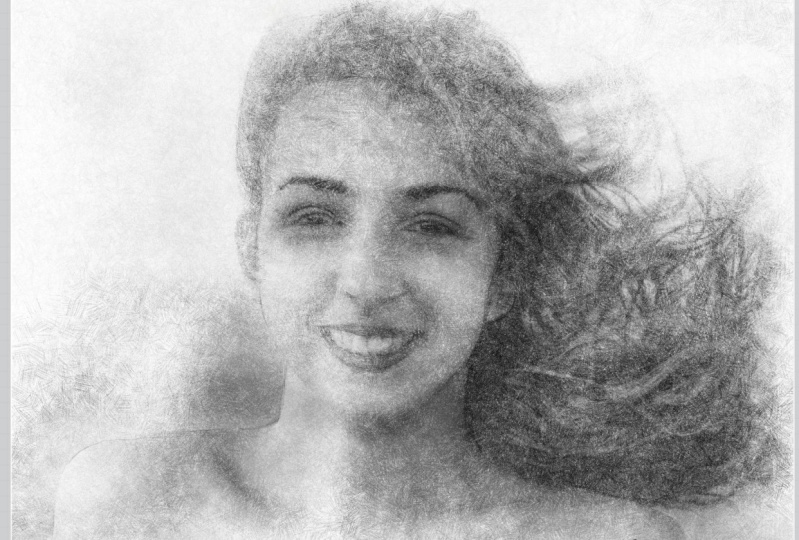
2. The Pencil Effect - Setting up: Out k. Let's get started straightaway. This file is called pencil 01. It's available as download
if you want to follow along. And if I skip ahead
to the end result, this is what you're going to be seeing by the end of the video. A simple pencil sketch effect. Okay, so let's get started. The very first thing I'm
going to do before I do anything else is I'm going to
crop this picture slightly. I want to concentrate
just on the head, top of the shoulders. To do that, I'll come to a top left and I will come
to my wrench icon, tap on it, and then I'll choose the second icon along
in the actions. And I'm going to crop
and resize for this. I don't want all this detail
around the bottom and I don't particularly need
all that hair on the end. The exact size on cropping
this too doesn't matter. I'm just doing it so I can
focus more on the face. Once I've done that,
I come to Darn, it works everything
out and there we go. Okay. The next thing
I'll move that off to the side and I'll open
up my layers panel. And you can see I get
something called layer one and I get something
called background color. For the layer one, I'm going
to rename this to base. If you are doing these
kind of special effects and you're working with
a JPEG you've imported, it is always a good idea to take your layer
one, duplicate it. That will be the one
or start to work on. For this one underneath a base, I will slide to the right
and I will lock it. I will also make it
invisible by tapping just on this little
square to the right. This is your safety layer
because sometimes you will want to call up the base layer again to make a duplicate of it, like I've just done. I'd say you want the
original image there as insurance so that if you
completely mess up everything, you always have your
base layer there. All right, so this top layer, I'll rename this to
grayscale because well, we're doing a pencil effect, and so I need this
to be monotone. To do this, I'll choose the
most straightforward method, and that is to come
up to my Effects tab. And I'll come to hue
saturation and brightness. For the saturation, I
will take that down to 0 and I have a gray scale image. And I can single finger tap
on my screen, press apply. The effect is applied. Now I could do more
things with it, but instead I want to come
out of this adjustments. So I'll just tap on my
adjustments icon again. There we go, grayscale. The next thing I'm gonna
do is create a new layer. And I'll rename this to artwork because
this is going to be where I'm going to
create the actual image. You'll notice I
have white selected and I'm going to use
one of my fingers and just drag from there into the main area and I
flooded the area with white. I'm going to tap on the
icon for the artwork layer, and I'm going to create a mask. I get something
called Layer Mask. Now the video straight after this project goes into detail about what layer masks are and why they're such
a wonderful thing. But I don't want to
get into that now. I want you to create the effect. Now, all you need to know about
layer masks are they make parts of the lever attached
to it visible or invisible, depending on whether you
paint black or white. So let's do that. And when it came to my brushes, I'll choose the
sketching brush set and I can choose any
of the pencils I want. I've got DO and selected. Okay, let's try that. And I'm going to choose black. I'm going to be painting
in black on my layer mask, not my artwork layer. Make sure the Layer Mask layer is selected because you tap on the name and you can see
highlighted in dark blue. In fact, just before
we do this look, I'm going to zoom
in a little bit on the face area that I'll make my artwork layer visible again, so everything's white, but now my layer mask is
selected, not my artwork. Layer mask on my pencil
selected my pencil. Let's take a look
at the size of it. I've got it set to what, 30%, 31 percent, and I'm
on a 100% opacity. And now I'm just
going to scribble. Watch what happens. I started scribbled,
can guess what that is yet. Hopefully you can. If you're looking at
that, can you see that is one of the eyes. If I go across to the
other side, the other eye. By the way, for a
lot of this I will speed up as a one I need to because I can only scribbled so fast and you're gonna end up getting
pretty bored. Now, is the mouth to add
here, somebody yes, it is. I thought off the top row teeth. And I can scribble
all like this. You can see the mouth. What's happening is I'm scribbling in black
on my layer mask. Wherever I scribble in
black, that white layer, which is called artwork, becomes invisible and
reveals what is underneath. But because I'm
scribbling with a pencil like this and also if I tilt my pencil over so
it's lying at an angle, I get what you get in real life because the
brush is set up this way. You get more of kind
of paper texture, smoother effect like this. So you can either get scripty
lines like this or tilt your pencil Y0 over with
what are we using the brush. You get the effect that
you get in real life, which is when you told
your pencil over, you can still
control the pressure in there at hard or soft, but because it's as an angle, you get broader brush strokes. It's a very common
technique when you want to create shaded areas. New, gradually refill
whatever is underneath. I'll fade out for now and I'll get back to you in just a bit.
3. Refine your Pencil Effect: Okay, This picture
is nearly working, but not quite the
various different shades of grays and blacks
that I'm revealing. All the kinds of
grays and blacks that you will get in a
pencil drawing. And the reason for
that is that, well, this is supposed to be a
sketchy drawing with a pencil. Well, for one
thing, the graphite in your pencil isn't black. Anyone who's tried
to do deep shading or black areas with a pencil. And this ended up scribbling their way through the
paper can tell you that you can only get to a certain shade of gray
with a graphite pencil. You can't get black.
That's what we've got in various places
on this picture. Also, for the highlighted
areas, areas around say, the teeth or the left
side of the face will, when you're doing a pencil drawing on a white
sheet of paper, you just leave the
piece of paper white. And the other reason, as well
as this is supposed to be a sketchy drawing with a tightly controlled
pencil drawing, you'll take the time to
vary the pressure of your pencil to build up
various shades of gray. Well, this is not like that. This is a sketchy drawing too. There's too many shades
of gray in-between. This is what we're going to do. We will come to our
grayscale image and we will duplicate it. I will make the artwork
layer invisible so we can see the
layer we've got. Just to show you what I'm doing. I want a more compressed
range of tones. If I want the darkest
areas to be not so dark and I want the lighter
areas to be lighter. So I will come to the top left and I will come
to Gradient Map, My currently selected gradients. Let's tap on that
and I can edit this. Now what we had before was
a range of tones going from pure black to
pure white bull, the thing is I can edit this gradient so I can get
more of the effect I want. If I come just where
I'm circling to that little square in the
bottom which is black. I can adjust the tone of this. I don't want this to be black. I want it to be a
deeper shade of gray somewhere around maybe there, that's about 20% up
from black on already, I'm getting it better effect. But also if I come to the white box and
the right-hand side, I can slide this in. When I do that, you can see all the areas which
used to be like right? And now a white color like this. I think that is gonna give me more the effect that
I'm looking for. It's a more compressed
range of tones with whiter areas plus also
a reasonable dark gray, maybe still a little
bit darker, light fast. What I'm trying to get
is the darkest areas are the darkest areas I can
make by using a pencil. And if I tap on Done, well,
that's one way of doing it. And if I turn on
my artwork layer again with my layer
mask applied, immediately, I'm getting
a better effect. That's much more the kind of effect you would expect
to see with a pencil. If I make this layer invisible
again and turn on my original too dark, much better. But what I will do is
I'll two-finger tap a few times to get
to this point here. Because look, I showed you the gradient map in
action and what it does. But the best way to
judge this is with a layer mask on the layer
on top already applied. So you could judge
things as they appear much more in
the final image. Come to adjustments again,
contra gradient map, and it automatically applies
the last gradient map, which was the one I did
a couple of minutes ago. But now, now with a
sketch mocks in place, I can start to slide
things around the judge, things a little bit better. Like two, I want
the gradient map to come in from bit, from that. Yes, I do. Compressing the amount
of turns I can get, But I have a reasonable
darkest tone there. Now what about this one here? That's too dark overall, that is giving me some
areas of blank paper. Take a look just on the
side of the nose and also on the left
side of the cheek. I can also just tap anywhere on that gradient at the bottom. If I do, I get a new box which takes
on the current color. And I can move that around to really find chair
and the effect, maybe something like this. Okay, I will go with that. I will tap on done and come to our layers panel again,
that's all committed. Let's take a look at what we had before and what we have now. Way too dark,
looking much better. Now, how dark overall
do you want this? Well, here's tip for you. You have a number of
different pencils. I'm using the HB pencil, which is actually quite hard. And that's going to give
me a couple of things. It's going to give me a
reasonably fine point. So I'd want my brush size
set to fairly small, but also it will give me a
fairly high key picture. And that means overall it's going to be quite light in turn. If I was to use something
like a six B pencil, well that's softer,
which means it puts down more graphite on the
surface of your paper. And so for our purposes, that's going to mean
a couple of things. Thicker pencil strokes because the tip gets blunt quicker, but also it means slightly
darker tones overall. So if you want the effect
of a hard light pencil, you make the image
underneath pretty light and use fine brushstrokes. If you're going to use
Hamas softer pencil, like a six B pencil,
the darker areas. We're probably be a bit darker overall and the brushstrokes
will be thicker. But I'm gonna come
back to my HB pencil. Let's make sure I have
the right layer selected. I want that layer mask selected. Black is selected. Now I can carry on scribbling
to make the effect I want. Now there are a couple
of things with this. You may decide you've
gone too far in certain areas and you want to get back the sketchy effect, like say, this cheek area. Look if I scribbling on a
little bit more like this. Well, there's no
pencil effect there. So at this point you
might think, well, great, Let's reach
for the eraser. Use the same pencil
and carrying go. No, you don't want to do that. If you want to get rid
of some brushstrokes, still use a paintbrush, but come up to white
because white reveals, black conceals and they can add back in the sketching life. There's, Let's just do that. Also bear in mind. It's a very common
technique when you're doing a pencil
drawing like this. Especially when
you're working in areas like the cheek
or the forehead where you have a large area of
similar tones to smudge. You can do that in Procreate. I have my HB pencil selected. If I just tap and hold on my smudge icon for a little bit, it says smudge
with current brush and there you go, HB pencil. I'll need that to
be maximum size. And if I come justice area
and I stopped to smudge, you can see I can start
to smear those areas. You're still getting
a slight impression of the lines underneath, but the tones are starting
to smear into one area. Well, you'll do that
with a pencil drawing. So why not do it here? Okay, I'm going to
choose black again, double-check because I'm
completely paranoid. I'm drawing on my layer mask where I want to find a detail. I'll use the point on my
pencil like this and get some fairly fine
lines that will be around areas like
the eyes, the mouth. I'm just doing underneath
the top lip at the moment. Because people
naturally concentrate in the eyes and the mouth, maybe the nose, but it's
the eyes and the mouth, the eyes of the most important
part of any picture. If it's a portrait,
it's the eyes. If it's a landscape, it's the eyes of
the person standing somewhere in the middle
distance looking at you. It is human nature. We always look at
the eyes first. That's where an illustrator
will spend the most time on the most trouble getting all the details right because
if the eyes look wrong, the whole portrait is wrong. There. What do you
use? Fine brushstrokes in the eye area like
I've used there. When it comes to areas
like say the cheeks. Well, you turn to turn your
pencil over a little bit. So use the side of it to get
more of a tunnel effect. And you can do that using the various sketching
brushes within procreate. They're designed to turnover. And also you'll tend to find, unless you're doing a very tight controlled photorealistic
pencil drawing, we will spend a lot of time
getting the eyes right with little tight controlled
brushstrokes and the mouth, and the nose and maybe the ears. But as we go towards the
outside of the picture, we start getting bored. So the brushstrokes will
tend to get a little bit broader and a little bit more freer in areas like
say the hair for example. Anyway, I think the
best thing to do would be for me to fade
out and fade back in once I've got to a certain stage where I can start to tell you some more things to
make this just a little bit more like
a pencil drawing.
4. Finishing your Pencil Effect: Okay, I've got to a
certain stage with this. You can see what I've scribbled in various
different details. It's coming together. There were just a few things I want to do with this though. I'm trying to think the
way someone who would think if they're doing
a pencil drawing, when you're doing
a pencil drawing, is to decide what to put
in and what to leave out. For example, let's
take a look at this area here because
it's quite wild. If I make my top
layer invisible, There's my original photo. There is a feeling when
you are copying from a photograph that if it's in the photograph,
it must be right. And therefore I must do
it in my pencil drawings, all my paintings or whatever. But the thing is, when someone
sees a photo like this, they say, Okay,
yes, it's a photo. Whatever I see in
that I will accept providing it's not being
obviously photoshopped. But when it comes
to something that looks like, for example, a pencil drawing, typically
an artist will make decisions about what they put
in and what they leave out. That big strand of flyaway hair just to
the top of the head. I don't see the point
in putting that in. My layer mask is selected. And I think for this HB pencil
is a small fine pencil. I want to use something
a bit bigger. Let's try bonobo chalk that can give me some
nice large areas. And so what I want to do
is use that short to paint white onto the
white layer on top. It revealing the
white layer on top and concealing
what's underneath. Make it a little bit smaller. And I'm just gonna
go through some of these areas here because the certain point
where you don't want to draw
absolutely everything. And when you do draw everything
with these sketchy lines, you can start to look a
little bit unnatural. Similarly with certain
areas like say, the strand of hair, I'm just
circling the top of it now. Well, when you're drawing
that you wouldn't draw these diagonal brush
strokes in the way they are. What you tend to do is I
make this a bit smaller. Those areas are going to be a little bit just plain white. So I'm putting in a few random brushstroke areas just to give a more of a hand-drawn
feel to it like this, I will come back to that
and walk in at some more, I think looking maybe
a little bit strong. So maybe I'll undo a few
times by double tapping or tap and hold just
to reduce that effect. But that could do with just
a little bit of touching up. Similarly with an area like this just where
the shoulder is, typically on the edge
of the shoulder where its light where you can see it's light there with a
dark background? Yes. Someone would do
something like that. Similarly, the side of the
neck where I'm circling, you've got the light of
the neck and you won't be able to pull it away
from the background. And so you'd put a bit of dark scribble there just
to make the next handout. But what about this area here of the shoulder which gets darker? Typically, you wouldn't do that. You get to something like this. You just have the dark area there against the
lighter background, as the rule of thumb is for your subject against
the background. If the bit of the subject is darker compared to
the background, you wouldn't have
those scribbly lines. Similarly, look at the
bottom of the picture. I'm getting a lot of very nice, fine detail of the dress. But when someone's drawings,
they're not gonna do that. If someone's doing a sketch, they're not going to suddenly
start putting a load of tight detail just in
those bottom areas. So vapid there. That
should really go. You can suggest it. But also it's a very strong horizontal lines which
are not to kill her. In fact, maybe I'll just pull this bit away just
from the side. Because typically with a sketch, you tend not to draw
right to the edges. I'm just going to get rid of
these various details here. You're not going to get
the fine detail there. Suddenly maybe just
the very edge of here. Let's make that a
little bit finer. Like this. These are just little
refinements that you're going to do to try and sell
the effect for being, well, it looks like
a pencil drawing, but free and yet very accurate because it's
based upon a photo. Similarly, I'm going to
add an extra layer and I'll call this details. I'm going to come back
to my HB pencil again. I want the darkest gray
that I've got an a. So if I come and just
sample this area here, that if the darkest great
I have, this is optional. You don't have to do this. But if he can say
areas around the hair, What's the size of
my brush, maybe I'll make it a little bit
bigger for this. So it's a bit more
obvious what I'm doing. I will start a scribble
in certain areas. Because when you're defining areas like this,
when you're drawing, you're not going to
have just a series of diagonal lines all going
off in one direction. You're going to have
a life which follow, saved by the hair
goes as I'm doing these light loose scribbles
just around the outline, around maybe this
bit here as well, using the side of my pencil as well as the point like this. Just to give a slight
hand-drawn fill in the various areas
of the picture, especially when we've got these. A strong diagonals going
through that massive hair. It's very simple. All you do is you
just trace around the natural outlines
that you can see. Similarly with the contours of the face that's come to here. You'll always start a sketch, or most people will
start a sketch. Nope, I go straight into
the shading book doing a few construction lines
like I'm doing here, can make a fairly light and you can decide
where they are. Typically, you might
turn around, say, the area of the nose, the eyes, and the eyebrows. Yes, you will have them there
because people tend to draw eyebrows in various
different ways. But you've got some little
pencil marks going like this. Just follow the outline
of where you're going if that might be a
little bit too ragged. Because clearly this person's spend a bit of time
looking good and it shows. But still a little bit of detail around here,
around the eyes. Definitely people will
draw the outline of the eyes like I'm doing now. I've run the pupils and it's putting in just the kind of
pencil lines that you would expect to see on
a pencil drawing just to try and settle the
shot a little bit more. Let's move them across to
hit definitely on here. Remember these gonna
be fairly tight areas and I'm just drawing over the top of the Layer Mask and the layers underneath because then I always
have the option. If I don't like it, it
just getting rid of it, maybe put a little
suggestion of eyelashes that you get these
various different lines which just might expect to see. Make them free. Don't make these cautious, don't do a fairly
careful lion all around the outline of the
subject like that. You want to make it flunky. You want to make it fast, because this is
supposed to look like a pretty loose pencil sketch. A little bit more just
around the shoulder, an upfront if just a few random squiggles just here and there. Just to give the idea that I was working fast when I
did this masterpiece, brilliant technique, but I did already fast around the mouth. Yes, do not outline the bits of the teeth life
as this is a big no-no. And you see a lot of people
making that mistake, teeth, you'll be seen as a mask. So I will tap a few
times to undo that. Let me just run the
line of the lips around the bottom of the lips. Don't do this topic. That makes them lips look
like they're stuck on. Fe, find that too strong, you can always come to
your details layer, tap on the N and you
can alter the opacity. You can take it right down to 0 and graduated dial in the amount of those loose pencil sketches
that you want like that. If you're feeling really brave, you can always add
another layer and you can start to put in the
construction lines. That's looking a little bit odd. But construction line going down for the middle of the face. Maybe you want to do the
construction line going across where the eyes
and the nose are, most of the mouth because people mark-off different proportions
of the face like this. Again, with that, you have the option of fading
to nothing grouchy, failing them in for very
faint construction lines. Or in this case, I'm just gonna get rid of them altogether. When you've done all that,
come back to your layer mask, do one final pass with it. I am going to stick with my Bonobo chalk because I
want large areas for this, like my past TDL low, set to white and I
just want to start revealing too In areas, again, make sure layer mask
is selected, that's good. Maybe make this a
little bit more paint so you can see what I'm doing. I will come to the cheek on the left-hand side and are
gradually paint in white, fade out certain areas just to give the
impression that there is plain paper there. And I gave up shading
at that point is maybe around
side of the nose, just in few areas. Again, to give more of a pencil based effect like say just
the side of the neck. I'm going to clear up some
of the detail around there. Maybe just a bit on the
side of the shoulder and look in your own time if
you've been following along, maybe we can take
another look at some of these strands of hair. Just be careful when
you're doing this because sometimes you can start to change the form of whatever it is you're
doing the cleanup work. Like for example, say
with his cheek here, if I was to take my opacity
up to a 100, I think. Great, Let's get rid of
some of these areas here. Let's make this bigger, maybe a little bit less opaque, so built but a little
bit more naturally. But just say this area here. If we get rid of a
large area there, you can flatten the cheek. That's not going to look good. So two-finger tap to undo that. All right, Just one final thing. I just an extra
layer of complexity. Look this layer seven where I
did the construction lines. Going to get rid of that. I'm going to come to Add, Insert a file and have
various different papers here which can put on top to give the suggestion
of a paper texture. What about cartilage
is 0 too rough gray? I will make that available as a download so you
can follow along, tap on that imported. Let's make everything
a little bit smaller. I'm going to come to
the little green dot at the top and move everything
around like this. I'm also going to make
this bigger so it covers the entire area. Then I'm gonna come
to my layers panel. You can see I've got a
fine paper texture there. It's not so good at the moment because it's just a pure gray. But if we come to layer
blend modes and we choose one of the contrast
layer blend modes. Like that, for example. Now if I zoom right in, can you see just little bits of texture that's quite
hard to see actually, let's go to about there. And we'll change the layer
blend mode to a different one. Let's try hard light,
or hard light. Linear light. Linear light is giving me
the most obvious effect. With that layer turned off. Things get digital
smooth with a layer turned on you getting
a paper texture. In addition, Though,
I noticed with this, I've got a bit of a smart there which I didn't
know I had before. Shower leave it there. Just so it looks like a
little bit of a mistake? No, I don't really have to. Look. I'll show you
how you can fix this, change this back to normal blend mode so you get the typical gray with
that little smudge there. And then I'm gonna come to my adjustments and I'm
gonna come to a close. I want to source
area about that. Let's choose a simple
software brush for this. And that little circle showed me where I'm going to
pick up areas from. Let's try it a little bit
just underneath there. So whatever is in that circle
is going to get stamped on when I paint over
that dark smudge. In fact, I'll take it down
a little bit more to here. I'll make my brush size
a little bit smaller. I'll make my brush
opacity on a 100%. And I can gradually just pick up the pixels from where the little circle is
on standard downward. I'm painting in that way. I can paint over
that little glitch. I didn't realize
that it was going to happen to be honest, but I'm glad I did
because it lets me show you what you
can do to fix it. Now wherever we Linear
Light about that. Before, after, if you don't want the
effect to be that strong, just tab where it tells you what the layer blend mode
is, where I'm circling. Take it down to 0 and dial in the amount if
you want like this. That is the first projects. Once you get your head around the various concepts
that we've used. And the main one
is the layer mask. This is self working. All you have to do is
scribble or maybe a little bit of tracing at the
end if you want to. But as I say, the
layer masks are probably the thing that's
going to confuse you. And so the next video
is just a video devoted purely to layer
masks and how they work. Because in future
projects we are going to be using layer
masks quite a bit. Okay, that's it for
the first project. I hope you enjoyed it and I will see you in the next video.
5. What are Layer Masks?: Oh, okay, let's explain layer
masks and what they do. This file is called layer masks. You can download and
follow along Burt's. It's just a very simple file which consists of two layers, which I'm using
for demonstration. You can do what I'm doing
here on any file you want. And you can see it
consists of two layers. I have a layer at the
top called top layer, and written on it is top layer. If I make it
invisible underneath, I have a bottom layer
with bottom layer written on it and they
look very different. And what I want to do is
make the top layer visible, so it hides the bottom layer. But I wanted to
be able to reveal parts of the bottom
layer to do that. Well, there's a number
of different ways, but the way we're
looking at is if you tap on the icon
which says Tableau, and right here you have mask. Click on that one. I do. I guess an extra layer
which is attached to the top layer
called layer mask. And if you look at
the Layer icon, you can see it's just
a blank white will. Alright, let's come
to our colors and I'm gonna choose a
black of my brush. What have I got from the airbrushing brush set
I'm using medium airbrushed. My brush size, well, it's fairly large and my
opacity is on a 100%. I will come back and I'll
double-check and make sure my Layer Mask is
the selected layer. You can tell that because
it's the deeper blue. And now I'm going to paint on the layer mask layer
in black at a 100%. Oh, look at this. The bottom layer is
getting revealed. Let's take a look at that
in the layers panel. You can see on my
layer mask layer a little thumbnail and you can see where I've painted in black, but you're not seeing
that on the actual image. That is because a layer mask
is a special kind of layer. You don't see it, you don't
see that black and white. What you see is what it does, and what it does is make
the layer it's attached to, visible or invisible depending upon what's painted onto it. If your paint black onto it, the top layer becomes invisible and you can see
the bottom layer. If I come and I paint in white. Now, I can make the top
layer visible again, just where I paint. And if I come to
my layers panel, you can see for thumbnail again, I have a white surround with a little black splotch and
where that black splotch is, anything which is
underneath it as concealed. There's a very common
saying with this. When it comes to layer masks, white reveals, black conceals, which means for the top layer, wherever the layer
mask is painted white, you'll see the top layer. And wherever it's painted black, the top layer is concealed, but it's not a raised
and that is one of the main advantages
of a layer mask. If I'm painting white, I
can reveal a top layer. If I paint in black, icon, conceal the top layer. If you can't remember, white reveals, black conceals. Just think black hole. If you paint in black, you create a hole
in the top layer. But here's the thing. Look, I'm painting with a medium brush
that's quite boring. Let's come to say spray paints, and let's choose, let
us choose flicks. Make sure it's set pasty a 100%. Let's make it nice and
big, unabated and black. And you can see I get a nice splatter effect there because the facts
of the matter is you can use any brush you want to create some
very complex effects. If I paint in white again, I can reveal the top layer. Alright, I'm back to where
I started to layer mask for the top layer is all white
so everything is seen. I'll create a little hole
in the middle like this. I'm using my medium
aperture again, but there is more to this. Look. If I choose a mid gray
paint on the left-hand side, can you see that the bottom layer is now
being partially revealed? And if I come to my thumbnail, you can see I've got my black hole in the
middle of my layer mask, but just to the left, I have a mid gray because the full story with a
layer mask is rarely, it's kind of a variation
of an alpha mask. Or when you have
alphabet bitmaps, it means black is
completely invisible, white is completely visible, but grays are partially visible. You can have anywhere from 0, which is black up to 255, which is white, and all
the numbers in-between. If I make this so it's
a very deep gray. You'll see most of
the later ones. And if I make it a
very lightest gray, you'll see most of
the layers on top. How dark or light you
paint with effects, how invisible or visible. The layer mask makes things. Let's come to a
layer mask again. And I'm going to tap on. When it's all white, you can see everything. If I tap again and
it come to invert, it turns it so
it's all black and so the entire top layer
is now invisible. I'll do that again. I'll come to invert. Now what I'll do is I'll
choose a block again. Medium airbrush is delighted, but this time I am going to
make my opacity much lower. I'm going to take it down
to what, about what, 2425%. And now I'm going to
paint on the layer mask, on the top layer,
I want to do that. Can you see gradually starting to reveal
the bottom layer? That's all one
paint brush stroke, which I can gradually build up. Gradually reveal
what is underneath. If I look a bit more on this, be on the left. I can gradually reveal
what is underneath. And if I sought to white, I can go around. Julie, conceal wherever I want. If I count again,
and I invert that, the white becomes black, the black becomes white. And now for the top layer, you're seeing the
opposite of what you had a couple of seconds ago. I will do that again.
I will invert. Now the thing about
layer masks is they create an extra layer. If you're worried
about running out of memory because you've
got too many layers. Yeah, that can be an issue. You have to be aware of that. And there are also other things like clipping layers
and Alpha Lock, which lets you draw on just part of a layout
like we're doing now. But with a layer mask, the upside is it
probably gives you the most amount of
control over what you choose to reveal or conceal on the layer that the
Layer Mask is attached to, in this case, the top layer. Now here's a couple
of gotchas and I can almost guarantee
you at some point, you will do this. You will do something like this. You'll choose black and
you start painting. And you think, oh, hang on,
it's simply click the green. Alright, let's
turn that to black again and up the opacity. And let's start painting. And you think, Oh, I must
have done something wrong. I'll paint in white. If all of a sudden you paint in white and you think
what is going on. That is because I'm painting on the top layer instead
of the layer mask. And you can see that because the top layer is
highlighted in blue, our layer mask is
that faded blue. You need to paint on
the layer mask layer. When you do that, then you get the effect
you're looking for. Let's tap a few times to
undo that mess. Okay. Let's move on.
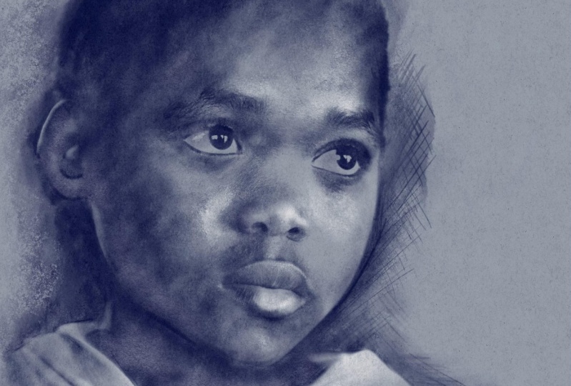
6. Pastel and Chalk, Part 1: Hello and welcome
to this tutorial. We'll be doing something fairly similar to what we did
with a pencil sketch. For this tutorial,
we're going to end up with something like this, charcoal and chalk effect. Now this is a little
bit more complicated, but you'll end up with
a method that you can do more with
by the end of it, this file is available
as a download. It's called Child 0 to download it and follow
along if you want to. Okay, so the first thing is I open the image and
I get my layer one. I'm going to do what
I normally do and I'm going to rename
this alcohol base. That is my safety layer in
case I mess everything up, which of course I never do. But also I'm going to be
duplicating this layer a few times to set up
the effect I want, okay, so the first thing I'm
going to do is duplicate it. And I'll rename this to shadows. Because if I cut back again
to the final results, typically the way this
technique works is you use various different
colors of paper. And what you're aiming to
do in the real-world is to use something like charcoal
to show the darker areas. You let the midtone of the paper represents some of
the mid tones of the skin. And then you add
in a little bit of chalk just to show the
highlights of the picture. So let's do that. For the first thing
that shadows, I'm gonna come to my adjustments and I'm going to come to curves. Now what the curves adjustment
layer does is control the overall darkness or
brightness of your picture. I'll show you, Look, I can make everything darker overall. I can make everything
brighter overall. The left side of
the curve controls all the darker tones
to the picture on the right side of the curve at this bit controls all the
lighter parts of the picture. If I put a dot in the middle, well, that's called a node. And if I move that up and down, you can see if I push it up, the pitcher gets
lighter overall, but the darker parts of
the picture stay dark. Similarly, if I do
this and pull it down, the picture gets darker overall, but the very lightest
areas stay fairly bright. If I make another node and drag that into
kind of a nice shape. Because what I want is a fairly contrasting
picture where the darker areas are
definitely dark. For this one, I don't really
want to eat lighter layers, but you'll see what I mean when I do a little
bit more with this. I'm gonna pull these
two inner nodes close together and that way I get
a very contrasty picture. Now what I'm looking at is
the area I'm circling here. I want the shadow areas
to be definitely dark. But what you can see again, just where I'm circling, There's a terminator that
there's a cutoff point between the darker areas
on the lighter areas. And those are the kind of
areas I'm interested in. Because when I do my
actual pencil sketch, I want these areas to be the bits where the
charcoal goes. So let's try maybe
about like this. I've got a little
bit of a transition between the darkest areas
and the lightest areas. Yeah, I'll go with
that with that kind of s-shaped where there's quite
a lot of lighter areas. So I will come up
to my adjustments and tap again to commit to that. Now I'm not going to be using
this to directly draw on. I'm going to be using this layer as the basis for a layer mask. So I'll create a new
layer and I'll call this my charcoal layer. And also I'm going to tap and I'm going to
add a mask to it. So now have a charcoal layer
with a layer mask on top. I will come down to
my shadows layer. Then I'll come to my
wrench icon on the left. And for this, I want this icon which I'm circling
now, the Add icon. And I'm going to come to copy. My entire layer is copied. Then this is the clever bit. You come to the Layer Mask
on your charcoal layer, make sure that is selected. Not the charcoal layer which is now highlighted in deep blue. I want that deep blue to be on the layer mask that come
back tomorrow GE icon. And now I'm going
to come to paste. From there. I'm just going to come
up just where I'm circling now to my
transform icon, tap again to commit to that. Take a look. That image is now pasted
into my Layer Mask. Now, if you remember
from the pencil videos, the layer mask makes whatever is underneath it visible
or invisible. Let's show you this. I will make my shadows layer invisible and I will make
my base layer invisible, so nothing is showing. Furthermore, while I'm look, I'm going to choose a
color for my paper. Now I need kind of a
grayish red will do me. I want a fairly
warm color to this, but very desaturated about, say, about that, that should do
for some of the mid tones, but I can also this later. The next thing, well, I need a brush for this. I'm in the charcoal brush set, but I'm going to use the carbon
sticks I find that gives a nice crunchy
texture for my color. Well, in order to get my color, I can't be on the layer mask. I have to come to
my charcoal lab, then I can select a color. Otherwise, if a
model layer mask, the only color I'm
gonna get is kind of a gray color to my charcoal. For my color. I'm going to choose a fairly
deep red because look, I'm told me about charcoal. The fact of the matter
is with this technique, you don't have to use charcoal. There is a certain color called, I think it's called
capita mortem. Is the color you
can get for parcel, which is a nice, warm, deep red. And you can see her look
outcome to my values. And you can read off
the colors that red, 103, green, turn blue, 19. Look unlikely to change
that color at some point, but just in case you
want to follow along exactly my brush,
my carbon stick. Well, let's set that
to pretty big as all I wanted to do is
come to my main area. Who? Ammo chocolate lab. And if I scribbled like this, you can gradually see the
boy's face appearing, but the problem
is it's inverted. Now the reason for
that, if I come back to my layer mask and I'll
zoom in a little bit. If you remember
with a Layer Mask, white reveals, black conceals. So you can see where our
scribbled Oh, my charcoal layer, but my layer mask is just a straight copy
of my shadows layer. And so the black areas
aren't visible on the white areas of
visible. So it's inverted. I don't need that, but that
is very easy to solve. I will tap undo a couple of times just to paint
in my brush strokes. I will come to my Layer Mask. I will tap on the icon and
I will come to invert. Now it's the other way around. That's the smart. But now, come back to your
layers and make sure the charcoal layer
is selected again. And if I scrub all that lovely child's face
chest pairs out of nowhere. And because I'm using
the carbon Stick, which has a nice,
crunchy texture. I've got the makings of
a nice charcoal effect. There's a little bit down here. I'll just strengthen
certain areas by going over them again, that's the left side
of the boy's face. So it looks like I'm
putting down more charcoal in those areas or this
particular pastel color. If I make my brush a
little bit smaller, maybe a little bit
under the chin, I'm putting down my various different shades of this color, but I'm putting down
a little bit more in some areas and a little
bit less in others. Because when you do
a charcoal drawing, you don't just keep the
same pressure all the time. You'll press harder in
certain areas unless hard another so that's just
the inside of the lips, maybe the underside of the mouth a little bit around this
side of the nose just to bring out some of
the deeper shadow areas they're a little bit
around the eyes, of course we're gonna need
that and also the eyebrows. And maybe adding just one
or two little details. Now when I was
experimenting with this, I did find that the carbon Stick is really nice for putting down large areas of a nice kind
of a chocolate type texture. But I find, for some
of the fine areas, I found willow charcoal,
the one above it. Now what's a little
bit better for me and I've got the opacity set of fall and the size of the way down
to 1%. I'm gonna zoom in. Maybe just strengthen
just one or two areas, maybe just around the
side of the face are for this I find if I put
my pen on the side, I get a fairly large, broad stroke like that. I'm gonna bring my pen pretty much at a right
angle to my iPad. Just do one or two
little sketch lines. We did this with
the pencil drawing. And it just helps
sell the effect that there's a little bit of
scribbling pencil in there. Maybe just strengthen around
the eyes because remember, people concentrate on
the eyes more than they concentrate on anything
else when they're drawing. Can you get a little bit
around the side of the nose? Just wanted to, uh,
bits around there. Maybe just a little bit, just roughly where the chin is. Working very fast with this. A little bit sketchy. Just wear the shirt is. And I'm making these
lines much more loosened, sketchy because I'm moving further away from
the focal area, that's the eyes
and people drawing naturally tend to
put down looser, more sketchy lines
the further they go away from the bits they've
concentrated the most on. And that is always going to be the eyes, the nose,
and the mouth. Also, while I'm here, I will come to my Erase tool
by willow charcoal is still selected unless make
it the same size, 1%. And I can just start to
scribbled back some of these areas here maybe to them fairly free and easy
like this just to get an effect going on there. In fact, rather than
a raising light that I will undo a few times, Holt are my two fingers
to step backwards. And allergies acquired
a bit of that by using the side of my pencil like this. Maybe a little bit
around here just to get some rounds on human
brush strokes in there. And then I'll come back to my main pencil or maybe
start a little bit of some very loose
crosshatching like this. I'm working very fast. You might want to take
more time with this, maybe pencil on the
side a little bit more. Just a very effective, a little bit like this. Also, if you want to smear or
smudge stuff for this year, I would stick with
a carbon Stick, make it reasonably
large like this. I'll take the opacity down so I can gradually build
up the effect. Because when people are
doing drawings like this, they will stick their finger and then little textured areas
and try and smooth out areas. Maybe try this around
the forehead area, see how that's starting
to get smeared out. And if I'm gonna do this, I'll do it Just while I get transitional areas
from light to dark, maybe around the side of
the cheek there as well. Maybe just a little
bit of reflected light that I put on the side of a chain on the left just to give the impression that
someone has gone in, in either with a finger or taught stick or had
a little adventure, rubbing things out
by using some bread. She can use Brad just a
smooth out these areas. It's up to you whether
you decide to do that, maybe you want to
keep the texture there because at
the end of the day, this is a digital drawing or so maybe you want to sell
the effect of this being on a very
textured piece of paper rather than a really
smooth glass computer screen. Okay, so I'll call
this done for now. And in the next video, we're going to add
the highlights. I will see you there.
7. Pastel and Chalk, Adding the Chalk: Okay, welcome back. Now just before I add
the lighter bits, which is what I said
I was going to do. There are one or two
things about this which I'm not quite happy about. One of them is those
eyes are way too light. You don't get pure
white eyes and it looks a little bit odd to me. This is what I'm gonna do. I'm gonna come back
to my layers and I'm going to come to my Layer Mask. Now the problem is if
I zoom in on the eyes, the layer mask is covering up the textured area underneath. I don't want that.
I need at least some of it to be
partially visible. So black and white reveals. So let's choose some
white chump my brush. I want to stick with
willow charcoal for this because I'm finding it works better for
painting fine details. But what I will do is I've lowered the opacity to
gradually build this up. Now, if I come to this
life, for example, I start to slowly build up. Yeah, that's working
better for me. It is quite surprising how dark the underside
of the eyelids do get on what we call the whites of the eye,
which are white. Let's do a little
bit around here. Let's take a look at the
other eye and try and match this up in terms of shading
yet that bit around here, definitely, if I could do it, being made darker just
seemed a little bit. And yeah, I prefer
that although I think I've gone a bit too far
on one of those EIS. Swap around. Take that back a
little bit like this. Swap back to white again. All right, let's come back
to our charcoal layer. Chocolate selected, That's good. That's what I want
for the darker areas. Long 1% because I think there's one or
two bits around here. Those eyes needle
a little bit more, defining the darker areas, pupils and what have you. Now, here's the other thing, and it is a small thing, but It's worth pointing out. When someone does a
charcoal drawing, it tends to be big strokes. And whilst you can put in
detail and build up form, one thing that you tend not to get is especially
around this eye. There's a little
crease under the eye, which that is not the kind of detail I would expect
you to be able to do with the charcoal drawing
is simply to find a detail and the charcoal
doesn't work like that. So I will come back
to the layer mask. Come back white is selected, which means I'm going to reveal
the charcoal underneath. And I'm just going to go
over very fine detail there. Just to remove it
because I want to sell the idea that this is
a charcoal drawing, stuff like that, you
simply wouldn't see. Similarly with the lips, there's one or two little crease on the lips that you're seeing, which I think could do with
being obscured a little bit. I still want the
form of the lips, but being able to see all
the tiny individual details, you wouldn't see that. Alright, let's come back to our layers and use
our base layer again. That's why it's useful
to have the base layer. So in case I wanted to
make another duplicate, I can touch and hold
until it floats, drag it to the top. And let's do what we did before. Let's make it visible. Let's do what we did before. Let's come to curves. Typically, when you
do a drawing like this on a medium lit subject, what you'll do is
have a fair amount of charcoal or the deeper tone to bring out the form
and the shadows. But then you just get some
smaller highlighted areas just to bring out
the lightest areas. For this, I'm going
to use curves again, but this time I only want a very small area of fairly
sharply defined light. This is gonna be where my
highlights are gonna go. And that's the kind of detail
I want no more than that. I think actually that's
make it about that. Also, you'll notice
just the natural pause. This person's skin beginning to be quite a crispy texture. Offer another drawing. I might want to blur this layer before I
do the Gaussian blur. So I don't get all these
little crispy bits, but actually I think
that's going to work quite nicely because the chalk will have a
texture when it gets put down on our
virtual paper anyway. So I think this crispy texture is actually going to help me. That's what I want, very
sharply defined, lighter areas. Now, how a tap on my
adjustments icon again, cmos a little bit. As before. I need new layer and I
will call this church. And it needs a mask, doesn't it? Now, I'll come down
to my base layer. I copy the layer. Then I came up to my
Layer Mask on my layer. And you know, it's
selected because it's that deeper of the two blues. And I come to paste, we go into transform mode so I can move this around if I want, but I'll just tap on my transform
iconic answer, lose it. And there's my layer mask. Now this base layer
that I just created, plus also the shadows layer. I don't really need them. I could delete them, but for now, I
will just take it. Drag it to the bottom. And just for the sake of
making things neat and tidy, I will slide across our
group those together. And they'll just sit there in case I wanted to
get rid of them. Now, let's come to a layer
with a charcoal layer. I wanted to reveal
the darker areas, so I have to invert that
mask for the top layer, the lighter areas are already selected and that's
what I want to reveal. That means I don't have to
invert this layer mask. Layer mask is selected, Let's just choose, this
is completely white. I'm going to go instead
for just a slightly off-white towards
pink or brush tool, I have selected willow charcoal. Yeah, I'll go with that
because I'm getting a little bit more control
with it than I do with the carbon stick brush. And also, well, this is
supposed to be chalk, which is different to the
previous brush I use. So maybe it will give me a
slightly different texture. Capacity up to a 100. Actually, no, I'll bring
up the size a little bit, but I'll drop down the
opacity because I want to gradually build this up. And oh, before I start, I think I probably
gave some bile advice. I don't want the
layer mask selected. I want the chalk layer selected. Choose our light coloring. Again. It's starting to look quite nice. Tell
you what I'll do. I'll put down a fairly
enthusiastic covering like this, maybe greatly
unoccupied afterwards. But you can see already it's starting to give
rather a nice effect. I'm getting just touches of highlight rather than
too strong an area. So everything looks a
little bit washed out. But he always specially on that for her dad's looking nice. It's a combination
of a texture of the brush plus also the
texture off the layer mask. Let's come down here a year. This is looking quite nice. That's looking to sharp on
the side of those clothing's. So what I will do In my eraser, It's the same brush still. I'm going to fade
a bit of a close. Just weren't working
now because I wouldn't expect to see a hard edge
while I'm here as well. There are certain areas as well, like the bottom of the lips where I want to leave
a little bit of a gap in places between the shaded area and
the highlight area. Because one of the
main points of a technique like
this is the tone of the paper act as kind of a mid to lightest tone for
whatever it is you're drawing. A little bit of the paper left bear is no bad thing, right? All my eraser still selected. I want to gradually tone
down certain areas. I want the points of highlights
rather than huge areas. Unlike, say, I wanted to leave some areas of the paper there. All right, let's take a look at this before and
after this layer. That's before. All of a sudden looking
a little bit flat, with those little touches
of highlights added, everything suddenly
seems to jump into life. That is the basic
technique where you use two layers instead of one to bring out the
details in your drawing. But there's still more
I can do with this. I'm going to zoom this
out a little bit. And I'm gonna come
tomorrow and check on. And I want to insert a file now. Where is that file there? Sugar Paper, bright. I don't know what you
call it in your country, but when I was at our
college that are rough, supposedly cheaply made paper which gives a very nice texture, which takes child call
on George very nicely. We call it sugar paper. That's what I've called
it here. I'll import it. It's come in a little bit small at the top, on the bottom. So I will just come to
the blue node at the top, right, and drag that out. The blue node, other
possum laughter, drag that out, that's fine. And our tap on my
transform icon to accept that this is a very light
image with dark of it. That's the surface of the
paper which I scanned and doctored and
touched up this. Now here's the interesting
bit. At the moment. It's not that
useful because it's completely covering
everything up. But come on, let's
name this to paper. Then I'll tap on my little n. Well, I want a lighter
bits to be invisible, just a darker bits to
show up most of that or mean one of the
dark and blend modes. So let's come to say multiply. I'll zoom in just a little bit. The kind of effect we've got. And you can see little bits of the sugar paper there,
which is important, especially for
drawing like this, because it is supposed to be based on some textured paper. Maybe I can make that a
little bit stronger though. So at the moment it's
set to multiply. Let's go through if
I just drag down, darken no normal to use. Color burn is quite nice. Linear burn, that is giving me a nice effect
that's very strong. If that is too strong for you, you can just come to
the opacity slider at the top, drag it down to 0. And there is our image
without the paper, which all of a sudden is
talking a little bit digital. It around. But if I gradually
slide this up, I can dial in the exact amount
of this layer that I want. And for this, I'm
recording this. So there's gonna be
a certain amount of conversion when I
edit the video. But also, I want you to see
very clearly what I'm doing. I want to crank this
up to maximum 100%. You might want something a little more subtle
that depends upon you. There's our basic image. I'm seeing one or two
beats which I want to touch up more than that. I did say this is a bit more complicated than
the pencil drawing, but it leads to more
flexibility at the end, while I'm showing you
the complicated bits will not show you
the flexible bit. If I come to my layers, this image is made up of
four separate images. The top paper layer, the chart
layer for the highlights, the charcoal layer
for the shadows, and the background
color will look. If I come to the
background color, I can change this to whatever
I want like there, see. If I have something like that. Instead of the
slightly warm red, I've now got a cooler blue. The whole picture gets changed. Not only that, if
I come and select my charcoal lab and I come to hue, saturation
and brightness. We can change the color
to what whenever I want. And I can change the
saturation to whatever I want. And I can change the
brightness to whatever I want. That looks okay on screen. But if I was to print this out, I think that would look
a little bit too dark. So our regular brightness again, maybe lower the saturation and there's a whole new effect. And that's the flexibility
I was talking about. You can adjust the background
to where you want. You can adjust the shading
to where you want. You could do something
similar with a chore layer, but I think that kind
of works better just as a simple white color just
to pick out highlights. And what's small Look, I'll tap on Done after
this charcoal lab. Just before I go, I wanted
to show you something. I will duplicate this layer and I will make the bottom
two layers invisible. The eye just there as backup in case I completely
messed this up. And I will come to my
Layer Mask because I'm thinking I could do
that just a little bit more of the paper
showing through so that the tone of the paper adds to the tone of the
picture overall. Now it could start scraping away the layer mask some more. But if I come to my adjustments once more and I'll
come to curves. Well, the layer mask
is just a dark to light layer which controls how visible the underlying image is. Let's try this. I'm
going to add a node in the middle and I'm going
to drive a node down. And as I do look at more and more of the underlying
paper is made visible. The explanation for that is
a little bit complicated. All you need to remember is that the black is concealing in
the white is revealing. By altering the ratio
or the dots of light, I can alter how visible all those dark blue texture marks
others will or not. I can control the
amount of shading. I've got to a really
fine degree like this. This is a huge amount of control and a huge
amount of flexibility. Let's compare what
we have there. What we had before was before, maybe looking a little
bit dark for my taste. This is it after
with a little bit more of that paper
showing through. Okay, That is the charcoal
and chalk effect. In all its glory. I'll leave you to experiment with the colors that you like. I think it is time to move on to the next video and I
will see you there.
8. Create a Simple High Key Photo Effect: Hello and welcome
to this lecture. If there is a certain
photographic effect which you see all
over the place. And it is this, it's very high key, which means there's a
lot of light areas. And for this particular style, a lot of the detail in the
highlight areas is bleached out and the whole effect
is very saturated, but also it's quite
soft in certain areas. If you get this done in
a professional studio, they will charge you a
lot of money for it, but it's actually quite easy to achieve if you have
the right tools, which you do in Procreate. And also if you know how, let's show you how these
are some friends of mine. We were on holiday together. This was a very nice photo
and I'll take a guess. You have similar photos to this. Okay, let's get started. Let's do the usual thing. Let's rename it to base. And I will duplicate my base then to get that really
high key effect. Well, there's a number of
different ways to do it, but I think the
most flexible way, all the way with the most
control is to come to curves. I'm all my gamma channel, the top blue one. And now all I do is I add a node somewhere in the
middle and I just crank it all the way up and
straight away you can see things are
getting much lighter. Okay, so I'm going to slide that node the right to figure
out the best place for it. This is going to vary
from photo to photo. So if you're
following along with one of your own
photos and I kind of hope you are because I would like to see some original work. I wanted to plenty of
washed-out areas like this. I could also maybe do
it just a little bit of contrast that just
in the dark area. So I'm going to add another node just towards the
bottom of the slope. And I'm going to drag
it down so I get quite a contrasty looking
picture, maybe around there. Okay, So I like that. So I will tap, say all my layers panel
just to commit to that. Because what I'm
gonna do now is, well, rename it again. Light, just so when
I refer to layers, you know which layer
I'm talking about. Then I'm going to swipe to the left and I'm going
to duplicate it again. And I'll call this one software. Because what I'm gonna do with this is I'm gonna change this to warn of a contrast
blend modes. I have overlay, soft light, hard light, vivid light, and you can see
that all giving me different kinds of
the same effect for light to getting lighter, the darks are getting
darker and it's all interacting with the
light layer underneath. That's the way layer
blend modes work. I think out of all of these, the first one, overlay
works quite nice. Soft light is alright. Hard light is giving me
quite an extreme effect. I'll go with overlay, which is getting me much
closer to the effect I want, but it's looking a
little bit grainy I could do with this being
softened a little bit. Not a problem with the
softened layer selected. I'm gonna come to my
Adjustments layer again, and I'm going to come
to Gaussian blur. Now called up the effect. I need to adjust the amount. That's very easy. Just take a finger, put it anywhere on the screen, probably towards the left pleasure finger and
then just drag. And as I do, can
you see at the top, you can see I'm adjusting
the amount of Gaussian blur. If I just add too much, it becomes so blurred,
it's meaningless. I want to slide back to the
left with my finger and gradually dial in by
sliding to the right. The amount to
Gaussian Blur I want, what I want is to
get rid of some of that grittiness just
in the skin tones. And also it's giving you
a nice soft focus effect to the people in the picture. I've gone for about four signs. That will do for me how much you use depends
upon the picture. So I'll tap once
more this time on my adjustments icon
just to commit to that. And let's take a look at
that before and after. It is without the
softened layer. That is with a softened layer. That is the effect
I've seen people pay a lot of money for in
photographic studios. But there is one more step
I would like to add to this because it's something that just happens when you
do this process. The skin tones are
looking rather yellow. I'm not sure I like that. Well, okay, not a problem. Let's fix that. And on the way, let's show you another use
for our layer blend mode. Come to our layers panel and
add an extra empty layer. Now I'll come to my
colors and I want to choose a generic skin tone. Doesn't matter whether
it's light or dark. Make it about halfway saturated, that's completely saturated, That's completely unsaturated. About halfway saturated. And you can see I'm choosing
kind of an orangey color. This will work for
most skin tones. And all I'm gonna do is come to the little color
circle at the top, drag down and I'm going to
flood the entire layer, come back to my layers panel, and tap on the little n
which I'm circling now. This time, I want to
drag all the way down until I come to color. What this is doing is taking the color of the layer
for the top layer, and it's applying just the color to everything beneath it, not how dark or light
it is, just a color. And you can see it's giving me some more natural skin tones. But the entire picture has
now got the same color. I don't want that. So I will tap and I'll choose mask to
create a layer mask. The layer mask is selected
because it's in deep blue. I'm going to tap on
that little white area or the Layer icon, and I'm going to come to invert. Now everything's invisible. We've done layer masks before. But now what I'm gonna do is I'm going to
choose a paintbrush. I'm in the airbrushing brush set which comes with Procreate. And I went to choose
medium airbrush. There it is. My opacity is set to
maximum my process size. I'll make it a fairly big, just big enough so
I can quickly cover the skin areas and I want to reveal the layer that
my mask is attached to. So white reveals,
let us choose white. Now let's come to this
lady on the left. And I'm just going
to paint just in the skin tone areas
and look at that. The skin tone changes. That is too strong on effects. So I will come to my layer for our play around
with the opacity. Take it right the way down to 0, gradually dial in the amount
of color change that I want because I don't want it
all to be one single color. Fat just looks unnatural in general when you're playing
around with the facts, it's always a good idea to take the layer
with the effect, take the opacity all
the way down to 0 and gradually just dial
in the effect you want. I'm gonna go with
around about there, maybe a little bit more. I've got 44% use what
works best for you. And now I got that. I can just come around and all the skin areas
I can just paint n. This is quite a subtle effect. And before I do anything else, let's make sure we're painting
on the layer mask or not layer for now from here,
let's just come in. I just take some of those yellow areas and you can see but hopefully you
can see me doing it. I'm just doing the girls right on now, just a side of her face. And a dear old dad, I'm doing him now. Now I've got a much more
natural skin tone from the, well, that's a column. I made sure that the layer four is now selected because now I can come in to say hue
saturation and brightness. I can change the hue to
wherever I want look, that's much more
of a purply red. That's much more green,
which I don't like, but I'm just showing you
this so that you can see that you do have
options with this. I'll take it back to
pretty much where it was. It's working there and tap with my finger on
my screen and come to apply the effect. If I come and I swipe right to choose everything I
used to make up this effect, put it inside a group,
close the group. And now if I make
the layer invisible, That's what we started out with. That's what we've
ended up with and it practically works itself out. Okay, that is it. Let us
see you in the next video.
9. Make a Soft, Grainy Photo Effect: In this video, we're going to
go for a soft focus effect, which is another one of these self working effects
that really is very, very easy to do. So let's make a start layer one. Well, Yes, Guess
what I'm gonna do, I'm gonna rename this to base. And so I know narrated
directly adjust that. It may form part of the picture, but also I don't touch that. I've always got my original
image to work on, right? Let's build this up. Just to show you the
effect we're going to be working towards in
a few minutes time, you're going to see this. Okay, let's get started. Duplicate the layer and we'll
do what we've done before. We're going to change
the layer blend mode. This time let's try overlay. Soft light. Hard light. I will go with overlay for now. I might change that later
depending on what this looks like after I've come to my adjustments and I
came to cause your blur. And I will just put my
finger on the iPad and drag from left to right to adjust
the amount of blur I have. And I'm gonna go with something that's fairly high because I want that soft focus effect, which I've certainly got. Let's take a look at
this with soft light, which is too small and
effect Hard Light, vivid, no, definitely not
linear light note pen, light. Look at are these I think
it's a toss up between overlay and hard light. Overlay. Hard light. There's very little
in it. Will look. I'll go with hard light
because I've used Overlay before and I just want to make it point that
sometimes when you see a tutorial like this
where someone says, oh, stick it into hard light mode, for example, it's
tempting to think, well, it's got to be
hard light because that person who did the
tutorial on YouTube, which I saw used hard light. So it's always got
to be hard light? No, that is not the case. It will depend upon the
picture you're using for this. I'm going to use hard light because I feel that's
what works for this particular picture and
I'll rename it to soften. Okay, so it's given us
a nice soft effect, but if I turn it off,
things look harder. But if I turn it on again, the colors have shifted
around a little bit. You may not want that. That's easy enough.
Look, if I come to my adjustments and come to hue
saturation and brightness, if I take the saturation down, you're not getting any
colors from the top layer. You're just getting dark
and light information so you get the original
colors that you wanted. That's all very well, but I wanted to do a
little bit more with this. I'm gonna take the saturation
down a little bit to there. I'll tap a finger on my
screen and press Apply. But while I'm here, I want to turn off my adjustments
and turn them on again. This time I'm gonna come
to, let's try curves. Now you've seen
with curves before that you can adjust
the dark to light. And in fact, there's quite a
popular effect at the moment where just the darker areas
get a little bit washed out. I don't want to do that, so I'll tap and then tap
reset at the bottom. What I want to do is play
around with the color balance. So supposing I come to read, if I put a node in the middle of my curves and
drag it down or up. Can you see that? If I push it up, I'm pushing
up the reds overall. So we get much more
of a reddish picture. If I drag it down, I'm
taking away from the rats, which means there's
more green and blue, which makes a cyan
or a teal color. What I can do is if I put my note up a
little bit like this, then add an extra node
towards the bottom. I can put cooler
shadows like this. I can raise. They're at in the
highlight areas, which I don't really want to do because I think
that's too much. So I'm just gonna
make the top of my curve pretty
neutral like this. But like you're saying,
Skinner just a little bit of cool into the shadows like that. And I can do all
that because I'm playing around with
a red channel. Don't forget, I also have green channels and
blue channels. Now, just for the
sake of showing you, I can slide the top
note around like this. And I'm adding a little
bit of cool just overall, I can also add a
little bit of blue, well, more purple color
if I want light fat, I don't really want that. That's just there to show
you the possibilities of playing around
with the curves on the different channels. I will up that note I
added and deleted to get back to where I was because that is
the effect I want. I will come back to
my layers panel and turn off and on again. And I'm getting a
much softer portrait. Okay, so what I'm gonna do now
is come to my wrench icon. And you can see
because I'm circling, I'm in the ad panel. I'm going to come down to Copy Canvas that copies
everything that you can see, not just one particular layer. It copies all the
different layers and puts them into one. If I wanted to lay a width, all those layers I just come
down to paste afterwards. It works at all out. I get to my transform
tool, I don't want that, so I will turn off
my transform tool, come to my layers and they're at the top is something
called inserted image, which if I make it invisible, nothing appears to happen. That's because this top image is a composite of everything
that is underneath it. Alternate on again,
what I want to do is come down to Noise and
I'll do what I did before. I'll put my finger on my iPad screen and slide
from left to right. And I can increase the amount
of noise in the picture. Now at the moment,
That's clouds, I'm getting a slight part of the fact I'm gonna
come to blows. Zoom in a little bit and
that's really quite gritty. I can increase the
size of it as well. I kind of prefer it a little
bit bigger like that. Turbulence. Well,
that's supposed to increase the turbulence. I want that down a
little bit because I'm finding it's too strong
when it's like that. Because what I'm going for
with this is the kind of grainy photographic
field you sometimes get, especially with
pictures which are taken in fairly low light. And this is the old fashion photographic film which
can look very nice. So I'm including it here. The noises set a
bit high for there. So I'm going to slide
my finger back to the left to get that
kind of effect. I think I will come back. It's my Layers panel and
look before and after. And one of the reasons
I made it fairly strong is because I can always
come to my opacity slider, slide it down to 0, and gradually dial in the
amount of noise that I want. Maybe about there. Okay, I've got my
inserted image. I've taker for quite a
strong grainy effect. Maybe as a general
rule of thumb, we can say when you're
going for an effect like this and you're adding
something like noise, or you're increasing
the contrast of your picture or whatever. Sometimes it's not
a bad idea to make the effect a little bit stronger than you would
normally do because, you know, you have
the opacity slider and you can adjust it. It's not a 100%, it's lower. You get something more
or less like that. Now the very final thing, the opacity is about
where I want it, but the layer itself
is set to normal. I'm gonna try one of the
lightened layer blend modes. That's lightened screen. That's working nicely. Let's do it before
and afterwards. This before, after screen being one of
the lighter Blend Modes, take everything underneath
it and makes it lighter. I guess what That's why they call it one of the
lightened blend mode. And while we're experimenting, let's just look at some of the other lightened blend modes. Color, Dodge gets
more saturated feel. Ad is going to create
a very strong effect because that's what
does light color. But subtle. So all of
these I think I prefer, or color dodge gives us
slightly saturated effect, but I prefer screen in general, if you're going for
more natural effects, then screen is good
way to lighten them. Multiply is a good
way to darken them. But I want this to be lighter because this
is a light photo. Now that I've changed
the layer blend mode, Let's play with the
opacity some more because I think now
that I've done that, maybe I could do with it being
even lighter or like this. Let's take a look at that. Let's slide to the right
and group or to top. And so if I make the
group invisible, That's what we started out with. That's what we ended up with. And it's a case of changing
the blend mode of the bottom one and blurring it to
make everything softer. I also played around
with the color balance by using curves that I covered everything onto a
new layer called inserted image and added
some noise to that. And again, I played around
with the layer blend mode. It is by playing around
with things like layer blend modes
that you can come up with all kinds of
interesting effects. In fact, between you and the majority of the
special effects that you see with photography
these days are all based around the
layer blend modes. And you can see we
used a couple of them here to create this effect. Okay, let's move on.
10. Pointillism, Part 1 - Create a Brush: Okay, For this video, we're going to create a
point holistic effect. Now just in case you don't
know what pointillism is. This is what will end up with
by the end of the tutorial. And traditionally this was, I think the start of
post-impressionism with Sierra and
people like that. It's where you have different color points next to each other. And when you stand a
certain distance away, your eye naturally fuses
those colors together to create a color which is a composite of all
the little dots. I'm probably the reason
why we have color TVs and color monitors these days
because they do the same thing, different amounts of red, green, and blue dots. Let's get started For this. I want to do a little bit extra. I wanted us to create a
brush which we're going to use to create our
point holistic effect. And if I come to my brushes, if I come to one of
my own directories, DC blobs, the one I want is this one called DC
pointillism Alpha. And if I just scribble, you can see those little dots. That's the brush
begins to be using on a layer mask to reveal
whatever is underneath. So I would double tap
to get rid of that. And let's create one. I'll create one from scratch so you can see the
whole process. So in my brush library, I'll create it in
the same directory. I will just tap on my plus
sign to create a new brush. Now the most important thing
for this is the shape. So if I come to my Shape tab
and I'm gonna come to edit, I want to import a shape
which I did earlier. So import a file. Now, bouts, is it there? I'll make this available to you. It's called dabbled 01. It's a simple PNG file. If I tap on it there. Okay, That works for me. So I will tap on done
and that gets imported. That is my basic shape. But let's go through some of the other types to
set up the shape. But I want the moment for
the stroke path for spacing. It's set pretty
closely together. I want that to be
spaced further apart. So I will come to my spacing and drive this up to about say, Javier with around 40%
or 41%, that's fine. And you can see when I
move my spacing around, all those little shapes
which go to make it my brush stroke placed
farther and farther apart. So about there. Now I did say 40%,
that's on 41%. You may be following along and you want to get
the exact numbers. That's not a problem. Just tap where it
says 41% and you get a numeric entry and tapping
40. And there you go. Okay, for this stabilization, I don't want any
stabilization taper, not interested in the shape. Well, that's where we
imported stuff in. It's looking very regular, so I do want us to
scatter around a bit. And you can see when I
up my scatter slider, you can see the brush
head is turning around. So each individual stamp
is now going to be put down at a slightly
different rotation or angle. That's what I want
for the grain. Will I don't want a
green that I just want the dots for the rendering. I'm gonna go with
intense blending because I don't want any
painterly effects here. I just wanted stamped down, just a simple brush
stroke for my wet mix. I don't really
want much of this. I want to take my charge
down to disabled my poll. I'll take that down a
little bit and said, No, this is all fine
color dynamics. Well, if I was using this
as a point holistic brush to actually paint with rather
than use on a layer mask, I might want to play around with things like the hue
and the jitter. In fact, we looked very quickly. I'll show you this. I'll clear the drawing pad and
I'll paint using say, a red color like that. I also things like the hue. Can you see each
individual brush head stamped down becomes
a different color? That would be useful if
I'm actually painting, using this as a
point holistic brush rather than a layer mask brush. But I'm not, this is just to reveal things on a layer mask. Dynamics. Do I want this brush
to vary its size or its opacity by how
fast I move my brush. Now I don't same thing
for this jitter, but with the Apple Pencil. Yeah, this one I do
want to take a look at because the top
but the pressure, this controls what happens with how hard I press with my pen. And I want to be sure that the
opacity is set to maximum. So now if I draw very lightly, I get a fairly phone stroke. If I press harder, I
get a stronger stroke. That's what I want because I'd like to be able to
vary the opacity of the dots based on how hard
or soft I press properties. Well, I do want to change
a couple of things here. For smudge. I can use brushes like
this if I want to make streaky smudges and
that can be good for hair. So maybe I can double up
the usefulness of this. I don't want this to be
a very strong smudges. And let's just take to
around about say what, 2526%, the brush behavior, yes, I will change the
maximum size because I want to alter the size of this
brush head by quite a bit. Because sometimes I want
to make large dots. Sometimes I will want
to make small dots. So I want to increase
the maximum size of it right the way up. Some very large amount. Minimum size can
stay where it is. Maximum capacity set to max. This all looks fine. Materials. I'm not using this as a material
brush About this brush. If you want to put your own
photo there from photos. And where am I There? Me. I can give this brush in
nearby tapping at the top. And that's called
this new Alpha 01. So I know which brush I've just created where it says sign here. I would not advise putting
your signature right, that if you go to send
this brush out to the world because then everyone
can see your signature. But what I will do is I'll
create a new reset point. What this is doing is saving
all the settings I've made. And so if I come
back in and make future settings and then
decide I don't like them. I can just tap on reset brush. I think we are done for that. And there it is, nu
alpha right at the top. That is the brush we're going to use to create this effect.
11. Pointillism, Part 2 - Create the Dots: Okay, welcome back. Let's set about creating
this point holistic effect. I'll make this a little bit
smaller so you can see what I'm doing just by pinching
into zoom out a little bit. Now, one thing I should
say at this point, I will show you the technique, but don't expect you all to look exactly like mine
because there were so many random things that
are gonna be going on in here that if I was to do the same
tutorial two or three times, I'd probably end up with
a different result. And I think this is the kind of technique that reward
experimentation. That's one reason why this
tutorials come up a little bit later so that you see in
similar techniques and action. And so maybe you're
a little bit more confident to try
experimenting yourself. Alright, let's show
you the basics. I'll do what I normally do. I'm gonna name it to base. And then I'm going to
duplicate my layer, make my base layer invisible. For my base layer, I'm going to do what
we've done before. I'm going to add a mask. So now there's a layer
mask attached to this. I'm going to invert it. That's double-check
my new dotty Alpha 01 is chosen, white is selected. I wanted a 100% opaque because I definitely want to see
the person underneath. Now what about my brush size? That's gonna be
way too big, 41%. Let's take it down to about, let's try to around about
what we aren't 11%. Let's zoom in a little
bit and start to scramble and see what we reveal. Sure enough, if I
keep on scribbling, can you see an I? It's just coming
into view there. This is quite a
small brush size. Wondering, well, I'll definitely
see plenty of detail. Same time with pointillism quite often the dots
are fairly big. So maybe I'll
double-talk to undo that and should increase DOP
disperse small amount. Maybe. Let's try 13%. And that is giving me more
of an effect that I want. Now maybe I'll try adjusting the brush size a
little bit more. Actually, I was
traveling a bit more. It does pay to experiment
at this point, I'm on 15%. I think. Yeah, that's about the right
amount of dots that I want. So what I'll do is I'll come back to my brush slider again. Tap on the little plus sign, and that creates that
little blue notch just on my slider of what that means is I've made my brush
size bigger or smaller. But if I just tap on that notch, the brush slider
snaps to 50% again, that will stop me from creating lots of different size brushes are so different sized points because once someone's
doing pointillism, they tend to use the same brush. Just dot it down lots
and lots of times. I'm gradually revealing
the picture underneath. But what I will do is
my background color. I'll change that to
something a little bit more midterm because at
the moment is just way too bright and it's confusing
what's underneath it. Now, do I want well, I can either make a similar
flesh tone to what's there. The background actually
serves to add to the overall skin tones like we did with the charcoal
and short tutorial. So maybe I'll go with that
for now and just scribbled. Just incidentally, I think
a lot of the times they impressionist used white
canvas to build up on top off. So I'm already getting a little
bit off script with this. But if I zoom out and just
make plenty of quiz scribbles, you can see how the page is just gradually reveals itself. And the denser the
pixels are together. The more of the effect
you see like this. That's not bad. But I want to do a little
bit more with this, don't I? Always? Because the thing is, if you remember me saying
pointillism often uses a series of complimentary
colors to create a third color. Now all I'm doing at the moment is just revealing whatever is underneath and also this quite a bit of sharp detail there. So I'd like to sell the
effect a little bit more. I'm gonna come to my base
layer and I'm going to come to Gaussian Blur and I'm going to agitate a little
bit of blur to this. Because if you're putting a
whole lot of points down, you're not gonna get a lot
of detail within the points. This will make it what
I've used 3% there. It's not much, but it's
enough to take away from that all that fine detail
which was in the background. All right, now this
is what I'm gonna do. I'm gonna take my base
layer and I'm going to duplicate it for my layer mask. On this layer, I'm
going to clear it. I don't know, let's
say my base layer. And I'm going to play
games with a color, well with the hue, dark to light, I want to keep, but I'm gonna move the hue over a little bit to
somebody quite extreme, that's definitely
a purple there. Tap up and come back
to my layers, add. Maybe I should rename
this to color shift 01. Gonna take that color
shift at 01 layer, and I'm going to
duplicate it again. And I will name this too. Color shift 0 to I want, I'm gonna do with this is come back to hue saturation
and brightness. And I'm gonna shift it
the other way or like this by a fair amount. For both of these, I'm going
to invert the layer mask. Let's start off with
color shift 01, makes sure the layer
mask is selected. My same dotty Alpha brushes
selected with white. And now I'm gonna come back and we're going to scribble some or you see where I'm scribbling, I'm getting a slight color shift in the areas where
I'm scribbling, like bears are very fast. I'm working very, very fast. Quite like the greens
in this area down here. Putting down that much
warmer pink, red color. Now, I want to come to my
color shift SiO2 layer, come to my Layer Mask, Make sure it's the
right layer selected. And we can about some of these. Hopefully what you can see, I'm using a bit of
pepper and salt here. Because that's what the
impressionists would do. I might use complimentary
colors to create a third one. And if you think it's looking
a little bit strange, actually, I've been quite
cautious with this. And if I wanted a little bit
more of the original color, come back to my layer
mask and just add in. The original color of my
friend is yes, he's a friend. Better looking than me as well. But he's also a really
nice guy as well. Some people, some people. Let's come back. Let's try a color
shift, CO2 because that's giving me the
most marked effect. Once I've done this, I just made a classic mistake, which I keep on
telling you not to do. I chose the color layer rather
than the layer mask layer. So let's start to undo
what I was doing. Double tapping. Take you back to a bit. Now let's come to our layer mask for my
color shift to layer. A little bit of random in that, once I've done this, depends how adventurous
I want to get. Come back to the color shift 0 to layer this time,
are ready, ready. Do want it, honest? I'll come back and
I'll alter the hue, saturation and lightness again. Because once I've got the
overall effect in place, I can play around to get
the effect I want look, I can go well that that's
way too much water. I need these three
different layers to play nicely with each other. When I say play nicely
with each other, I can still have a
pretty vibrant effect. Because that's what you get
with pointillism. Awesome. Not going for a subtle here. Let's try the other color
shift layer which I used, change the hue saturation. And prior to that, I quite
like what that's doing. What about saturation,
brightness and darkness? I can play around with that. If I rarely want to get
adventurous with this, look, you can see if I
disable the layer masks. I shifted everything
around as a whole. But maybe save this
particular layout works quite nicely
for the shirt, or may be in the shadow
areas of the face, but not so much in the
highlights, especially this one. What I can do with
this is make sure the color shift 0 to
layer is selected. And I will change my brush, our counter, my
airbrushing outcome, too soft air brush, change the size, maybe lower the opacity
so I can build it. Now. Let's put that
on full Come on. Let's be experimental and then come to hue
saturation and brightness. But instead of adjusting
the layer as a whole, I can tap on the little
triangle just at the top, and I can choose pencil. Now, I'm going to be
putting down colors with my soft air brush in this
lighter area of the skin hair. And once I've done that, I can
play around with the shoe. All I want, the brightness,
the saturation, everything. I get something which
creates what ever effect. I want maybe around that. And I can extend this
into certain areas. Once I decided yeah, I'll go with that for
that particular area, I can come to apply. But once I do apply, I can now carry on painting. So I'd come to the other side, the shadow area of his face and I can adjust each
other for that to wherever I want and maybe
something around there is looking
quite interesting. You can see how somebody got
these kind of blue colors, which I'm quite enjoying that. And if I decide that live out, where else is it going to go? Maybe around his shoulders and tap again and I can tap on Apply and I can repeat it again. I can come down to
where his color is on the right-hand side
and I can play around with it to get what ever I want. Almost side-to-side.
I like that. I can come back to, for example, polis panel that commits
everything there. Now the background color. Let's take another look at this. While I'm doing is I really, I'm making this
up as I go along. Not the technique, but
the color decisions I'm making gradually build
up things this way. And it's a combination of that
scribbling loss on these. It layers, different layer masks of building up the
effect as a whole. All the decisions you make are gonna be slightly
different every time. There is no reason at all
why you can't add as many of these layers as your memory
will allow on the iPad. Just to show you what I mean, If I come to my gallery and I
load up some more examples, same subject matter with
a slightly smaller brush. And you can see all the
various things I've got here. If I come again to this one, a slightly larger size brush. This time I think I'll use maybe more than two extra layer masks. You have to accept that it's gonna be a
little bit random, like the one I've just done
by comparison to the others, is actually a little
bit more restraint, especially if you can
pair that with that. For example, when I said
to you at the beginning, don't try copying
exactly what I do. That's what I meant because I
did the same tutorial three times and they came up with three wildly different results. It can be just something as
simple and straightforward. Straight reveal of the
photo using a layer mask. But then you'd start
shifting around the colors to create
the final effect. That is the end
of this tutorial. Thanks for watching.
12. Pop Art!: All right, Let's
make some pop art. I hope you know the kind
of thing I'm talking about Andy Warhol in the 1990's. Well, we are going to be ending up with something like this. Let's make a start. Guess what we're gonna do now. Yes, you're right. We're going to
rename this to base, just like we've always done. That is our safety laugh. And I will duplicate and make
the lower layer invisible. Okay, so what I need is a very stark contrasty
black and white image, which I can add color to. Straightforward enough, I
will come to Gradient Map, which we've used before. And it just so happens, I have the right gradient
that I want a simple black to white or thing is we want
a little bit more than this. So what I'm gonna do
is I'm going to tap on that dark to light
gradient about there. And I'll tap on that new
node which I've created, and that is going to
be straight up black. I'm gonna create another
one on the other side. And I'm going to tap on that and I'm gonna make that white. And now it is a case of just
moving these close together. See that I'm getting a very
stark contrast the image. But the thing is that
is way too dark. I need more detail in this. So it's a case of moving these nodes around
until I get the look. I won't no, I don't
want it to delete that. I think I pressed
on it for too long. Well, straight away, that
is looking very nice. Let's just have a
play around with it. What I'm looking at are the eyes because as
I keep on saying the eyes are the
most important part of any photo portrait. The eyes, It's always the eyes. Let's see if I can refine
it a little bit further. There. That's looking very interesting. The eyes, maybe the
nose and the mouth. That's what I like. You can see it's very contrasty. That's fine. So I will tap on
my adjustments icon again. And there it is,
That is committed. The only thing about it is, I'm not so keen on the hair. There's a lot of nice detail in the hair
which I've missed out look. There's quite a few highlights. And so what I'll do is I
will duplicate my base layer again on our drag this one
up to the top and our Pete, I will come to gradient map. But this time I'm gonna play
around until I start to get some highlights
appearing in the hair care. And you see that
it's also creating a nice softer effect as
well around the eyes. But if we're going for
the whole pop art thing, this has got to be very crisp. So what I'll do is I'll make some definite decisions
About what I want. If I want a very
contrasty picture, either black or white, these two middle nodes, which I'm sliding around now, they've got to be
very close together, something like
that, for example. And I will tap on my adjustments
again to commit to that. Now I have the layer
underneath, the layer on top. So I just wanted to reveal
parts of the layer on top. And by now you should be able to guess
what I'm going to do. I'm going to create a mask. I could do this either way. I could either conceal
the bits I don't want or reveal a bit I do
want on the top layer, I think I will first
of all invert this. And then I'll reveal
the bits on top because the most important part of the picture is the eyes. And so our availability
underneath relative to the most
important bit of the picture. For this, my layer
mask is selected. What paintbrush do I have? I will come down to my
airbrushing brush set and I think hard air brush that will do me just find
just down at the bottom. The last thing I need to select white and I'm
double-checking, I've got the right
layer, the opacity, a 100%, my price size, let's make it a
fairly large size. And then I can just come in and just reveal the
bits I want all my precise bigger because this doesn't have to be very
careful operation. There we go a little
bit around here. I'm getting a much more
interesting spiky effect around the outside as well, which I do like, I'll make my
brush a little bit smaller. Zoom in a little bit
because there's one or two find areas, I think just around where
the hair meets the forehead. Yeah, you can see there's
a lot of nice detail in here which I would
like to include. And I will swap to
black again because there's one page just
above the eyebrow which I think I went a
bit too far on. Okay. Is there anything else
I wanted to do here? I'm going to paint
in white again to reveal a little bit
more of the top layer. Because this, this little
bit here I want a nice, pretty clean line, just also
just down the bottom there. Like some definite edges here. Nice, simple shapes. And I'll get rid of those
slightly gray areas. I'm not going to worry
about them too much, but I want a nice
simple finish to this. While I'm here as well. There's a little bit of
detail under the nose, which I don't
particularly like that. And I think that's pretty
much my basic image. So I can work with that. Just while I'm here, is that anymore I
can do with this. I'm just wondering about the details around the
nose and the mouth. So I'll do one small duplicate, drag up to the top and repeat
the same process again, but this time I'm going to concentrate just around
the nose and the mouth area to see if there's any
more detail around here. Which could do with
the revealing. Because you have
those little marks around the side of the cheek and maybe around the
side of the nose. There may be stuff like that
is worth taking a look at. So this time I will just tap on my Layers icon and repeat
what I did before. I will add a mask. I will invert the mask. A layer mask is selected, my brush is selected,
everything is selected. So let's just see if we can
add a little bit more detail. Just in these areas here. Just around the nose. Because I want a very minimalistic
look to this, but I don't want it to
be too minimalistic. Now what about around the mouth? Yeah, that's working
on getting more of a sense of where the lips are and whatever maybe
around the teeth. Is it worth taking
a look at this? I think it is, yeah. Not too much. You don't want to concentrate
on the teeth too much. Sometimes you see people
drawing in the lines in between the teeth and
it never really works. Think of things like teeth
as being a solid mass. I like it in some areas, I'm not sure I like it
around the math after all. So let's just try
painting in black. And I prefer that slightly
more minimal look where I'm just suggesting
the areas around the mouth. Always be wary of putting in too much detail in
a place like that. Now what about that knows
a little bit by hand. I know most of this itself
working, but occasionally, you just want to go
in and just have a little play and see if
we can improve things. Well, I quite like that. So what I will do is I
will slide across and choose everything that
makes this image. I will group them and I will
duplicate the entire group. And then I'll tap on the icon just where
I'm circling now, allow comes up flattened. Now I have a new layer, which is everything inside that group which
has been flattened. All right, that's
all straightforward. Now, let's start
coloring this in. To do that, we will use
a layer blend mode. We will come to multiply. Now I know it doesn't
look any different, but with the darkened
layer blend modes of which multiplies probably
the commonly most used one. It affects the layers below anything which is white becomes invisible on this layer and anything which is black
is completely visible. That suits us because if I
come to my background color, I can choose any color I
want. Well, let's pop out. So it's not gonna be
very subtle, is it? So let's choose some
fairly contrasty, fairly light colors. Let's choose a pink
color like that. Then we'll look, I'll keep my new group because it
might come in useful. You might want to delete it depending on how your
memory is going. But now all I do is I create
a new layer and I can add that underneath it
set to normal mode. And now what I do is I come at hard air brush will
do the job for me. It just fine because
in pop out you see these large areas of
hard definite color. And let's choose something
not very subtle for this, let's choose, Let's
choose a kind of a tail and we come to a hat. Let's make this bigger. There is your first bit
of silkscreen printing. And you'll notice where
the pop art quite often, the border of the color
cuts over the line work. So I know it's going
over like this. That's okay. It's Pop art. And actually, let's come and
I'll hold on the eraser. So it picks up the same brush as always using to paint with. And let's just get rid of
some of these bits because I think it's working in some places, not
so much in others. In fact, I quite
like the way we are getting part of the effect
in some areas of the hair, but the pink background
in other areas. I mean, that's
working quite nicely. Let's just refine this
a little bit like that. Then for reasons which
will become apparent soon, I'll create a new
layer for this. Again, let's not be
subtle about it. Let's just choose a yellow. Fill in or out it. Come on, let's just
make this big and fast. Let's create a yellow around. Let's give a bit of spelled, just a mess things
up a little bit. We will create another layer unless you choose a
straight white for this, make my brush a bit smaller and we can paint the teeth area. I don't want that
spilling over too much. I'd like that to be quite tight. So come to my Erase tool, make it a bit smaller
and a bit finer. Get rid of it where
I don't want it. Come back to my brush tool. Just tie this up a
little bit. Let's deal. Whites of the eyes show weight. Eraser just to get rid
of the loose bits. That is one of my images I
love just while I'm here, I can do other things as well. I can throw in a little
bit of list and Stein, if I came to Halftone on
this one particular layer. In fact, let's do that. Let's throw in a
little bit halftone on that area for color. Screen prints. That's getting a little too
enthusiastic for my tastes. Or newspaper. Look, this is for
experimentation. I will go with the most
straightforward one like this. You use whatever you want. Now I've done that. I'm gonna come back to my eraser because I don't like the way it's bubbling out for want of a better
phrase around here. You have hard areas for this or at least
the originals did. I just want to come down
to my blue layer again. I will sample that blue
directly from the canvas. I'm just going for a
certain look with this, a certain look that
I want to take forward a little bit down here. All right, That will
do for my first image. I will come to my wrench
icon and I'm going to share, and I'm going to save
this out as well. I didn't get for
a JPEG exporting. I don't know, come
to save to files, put it into my portraits
can't draw folder. And let's name this
to one a save. Now, the reason we put things on different
layers is look, if I come to my
background layer and I will choose a different
color for this. If I come to my blue layer, hue saturation and
brightness and just move it around to another
color like that. That's how quick it is. Come to my yellow layer, hue saturation and brightness. And move that around to
where I want that to be. Who play around with the
saturation parameter, the darkness of brightness. I can do that. Share that as a JPEG exporting,
save to files. It'll go to the same place
we call this pop out one b. Now, I want four
of these, don't I? So I will just do
the other two now. Background color. We are
not going for subtle here. For this one, I'll try taking out those white bits
just to mix things up. For the layer turn,
which has those dots on, I'm going to come to Alpha Lock. And I think for this, I'll choose a pink color. My brush is selected. And I'll just draw over
the top for it like this. So I don't have that
dotty effect there. Just to mix things up. I faded out and fade
it back in again because I figured you have
the principle by now. You take your basic image, you move things around. This is the final one I've done. So let's put them altogether. I want to come to my gallery and I'm gonna create a new file. You can see just to the left, I have a half pop out 01 twice. Because when you're working
with stuff like this, you import your picture. Then the first thing you
do is you duplicate it. So you always have
your original file there just waiting
for you to call up again on the file
size while they are 3 thousand by 3 thousand pixels. Now, I'm hoping you've got enough memory on your
iPad to do this. Because now what I need to
do is come to six thousand. Six thousand is
this going to work? That gives me a
maximum of ten layers. That's okay for
the iPad I've got, but I can't make any assumptions about the kind of
iPad you've got. So look, I can take this
to 4 thousand pixels. And 4 thousand pixels. Whoops. That gives me maximum
layers of 29. Just in case you're worrying
about the DPI is set to 308, won't make a blind bit
of difference here and explain exactly
why on other courses. But let's not go into this
now outcome to create. Now 4 thousand by 4 thousand. Let's import the
photos to do that I could do with a
little bit of guidance. So I will turn on
the drawing guide, etc, grid, which is what I want. I'm going to edit
my drawing guide. I'm going to make my grid
size nice and large. The reason being
is I want to know where the center
of my canvas is. It doesn't really
matter what size you do this because I'm going to
turn on Snapping afterwards. But as long as it's clear where the central lines
are like with this size, I'd never be able to tell when it's nice and
big like this. Yes, it's obvious. So I will come to done. Then. I will come to my wrench
icon and I will come to, and I will insert a file. Now, I save them here. There we are. Pop art, one eye. Let's make sure if yours isn't
made sure that snapping is on by tapping on it and
turning on snapping here. Now what I do is I can move it up until eventually you'll see little snapping lines appear
just in the top right. Can you see that? Then I will come to the bottom right node and
I'll push upwards until I get just to the halfway
mark and it snaps in there. Good. And come to insert a file again. Pop out. Move that up. Snapping. Look, if I zoom
in and I move around, can you see just
wanted to move in, it docks with those
two little kind of yellowy orange lines. Whoops, move too far. Let's move it back again. All right, this time, come to the bottom left node
and push upwards until it snaps into place
to insert a file. Third one, let's break
this down until it snaps. And the top right
node pull down. The final one. Move it down until it snaps. Top-left, pull it down, tap away and, and,
and verifiable thing. So I can see the
full effect come to our wrench icon, come to Canvas. Turn off the drawing
guide so it's no longer showing up there. You have it apart. Each one is slightly different. That's what happened
in the original R. Be interested to see what
you could do with this, because this is pop art, but we have a whole load
of effects that we can apply to each one
of these things. So why not a bit of Neo Pop art? Is that even possible? But what I would
also like to see is your own original picture. Let's see what that
looks like with this, and let's see what
color combinations and different filters
you can do with this to come up with
something which is truly unique. That's pop-up. I hope you enjoyed
this one for watching.
13. Thanks for Watching!: Okay, This is the final
video of the course, and you'll still
hear, well done. One thing I've learned during these videos over
the years is that there are a lot of people who would like to be able
to do something, but there's a lot fewer
people who actually see it through and
get things done. And if you're
listening to verse, that means you're
one of the finishes. Well done for that. Now if you'd like
to know more about the various tools and
techniques we've covered here. Then I've got you covered. I have procreate
the first guide, which is four hours
worth of videos all about the various
features of Procreate. Or if you really want
to master procreate, I have the procreate
solid foundations series of videos
that comes in at around 17 hours worth of
in-depth tuition plus exercises. So you can master all aspects of Procreate to a
professional level. So maybe I'll see you on one of those courses in the meantime. Thank you for watching. I hope you learned
a lot and I hope you get to make some
great portraits. Take care and I'll
speak to you soon.
 Simon Foster