Transcripts
1. The Procreate Watercolor Masterclass: Hello and welcome to the Procreate
watercolor masterclass. Watercolor can be a
challenging way of painting. You need the right
technique and to understand the nature
of watercolor now, as well as being a digital designer illustrator
for decades. I've also used real life
watercolors for decades, so I can explain how they work. Plus, I've developed multiple
new digital techniques, especially for this course. I will take you right from the
initial brushstrokes using dozens of watercolor brushes I've created for this course, you will practice using various
sketches, color swatches, and files that I
supplied that I take you through a series of
follow along orioles, which gives you increasingly advanced techniques
and resources. Some of these techniques and resources you won't
have seen before. That's because I've used my more than 45 years experience to create brand new directions, using the tools
procreate gives us, as well as having over
four hours worth of follow along and have
a go yourself tuition. I am giving you 35 new
watercolor brushes plus 70 toothbrush heads,
22 watercolor splatter, 56 watercolor splotches,
14 watercolors cancels, 12 watercolor textures, 18 white plus 18 great
paper textures, 20 pieces of line art
to practice with. 52 color swatches based off of real-world paint around 256. New ways of working with color. You are getting
serious value for money with the Procreate
watercolor masterclass. If you can scribble with an
Apple pencil on an iPad, you've got this. Enroll today. I'll see you on the course.
2. Hello and Welcome: Hello and welcome to the Procreate
watercolor masterclass. Thank you for investing
in this course. It means I get to make a living
doing what I love doing. Okay, So what you're
looking at right now are different segments from
various bits of the course. But let's make this introduction practical because as
well as all the tuition, I have loads of resources
for you to download. So let's quickly see how to do that and then move on
to the next video. I have got a load of files for you and you need to get
them inside Procreate. So this is another
course I have on Procreate all about
creating rock art. But what I've done is
temporarily attached to one of the brush
sets I want you to have for this watercolor course. You can see down
where I'm circling. I have DC watercolor wash brush that I am going to tap on that. I get a download file down the bottom and I
tap on download, download, and I
get another thing saying open in, tap on that. I am going to save
to files tab there. It asks for a location. I want my iCloud Drive because
if you've got an iPad, you have an iCloud Drive. And I'm going to save it
to my Downloads Folder. Tap on Save. That's all nice. So now get out of Chrome. I sometimes find so far it gives me one or two problems
with downloading. So I use Chrome and now
if I open up Procreate, you can see I don't have any brushes apart from
the default brushes. That is not a problem. I need to come to my file's app. I can see it down the bottom, but if you can't see the icon, just come to the
top of your screen, drag down and go to Search. And I will answer files. There's my file's icon. Tap on that. Well, I saved it on
my iCloud and night. So tap on the iCloud, Drive there and tap where
was it download? Yep. That DC watercolor
wash brush set. Zip, dot zip. Oh, okay. All I need to do is tap on that and it
automatically unzips. Now, if I come
back to Procreate, open up my brushes. I have the sketching
brush that selected. It's at the top. All I need to do is come to the plus sign where I'm
circling, tap on it. Then I come to import the top
right where I'm circling. Then where is it stored? On the iCloud Drive in
the downloads folder. And you can see it there. Dc watercolor wash, brush set, tap on that. It imports. Add a look at this. I have a whole new category with all my brushes ready to go. Now the Apple operating system is doing update pretty soon. Maybe things will change then and be a little bit
more straightforward. But in the meantime,
this is how you get the files onto your system. Sometimes they'll just
be a regular file. It won't be zipped up so
you don't have to unzip it. That will make
life a bit easier, but now you know how to do
that. Well, let's move on. Okay, Good luck with that. There's a whole load of
resources waiting for you because as well as
providing good situation, I wanted to give you plenty
of new toys to play with. Alright, let's move on to the next video where
I want us to start practicing with all
those new brushes which are available as
part of this course. Okay, Now, just in case you've never used Procreate before, I've included a 20-minute
Procreate primer as the very last
lecture on this course. So if you've never
used Procreate before, skip to the end, take a look at the prime, always just explains
the interface. And then when you're
ready, we'll make a start with the
watercolor course. I'll see you there.
3. Get to Know your Brushes: Hello and welcome to this video. And I want this to be as simple
and as brief as possible. And all I wanted this lesson is just for you to start playing around with the various brushes we're going to be
using on this course. So as well as the brushes, there is a file I
want you to download, and that is simple
watercolor file. There's also a couple
of files for you called watercolor simple sketches 12. We'll take a look at those. So once you've
downloaded the brushes, the simple sketches, and
those simple watercolor file, the first thing I want you to do is to come to the
Procreate gallery, come to this simple
watercolor file, swipe to the left
and duplicate it. Now I always want to keep
an original and work on duplicate simple
watercolor file here. Let's take a look at this. I have a number of
different layers. I have Hughes at the top. These are just a series of the kind of watercolor
hues that you do get when you buy watercolors in that thing
called the real-world. Just so you have some colors to sample and play around with. And you may notice that
for a lot of these colors, you're getting a lighter
tone and mid-tone and a deeper tone all
laid out left to right. You have a paper lab, much more on that later
on in the course. And you have insert files here, draw here second Andrew here, first one that's come
to draw here first, my fuzzy line brushes selected. Let's just choose a color. I get my finger. And if I like the look of say that orange right in
the top left corner, just place my finger on, I got my little
sampler, little circle. The bottom bit of the
circle is my current color. The top bit is what I'm going to choose once I let
go with my finger. So supposing I liked that
deeper orange, I let go. That is now the currently
selected color. And there you go. I can scribble with it. And this is all I really want
you to do with this lesson. Just get used to the marks
that these new brushes make. I have quite a few
brushes for you. Experiment around with them
just to get a feel for them. I chose fuzzy line brush. If I come to DC simple round, deep and use that a very
different looking brush. And if I draw again, I can
get colors on top of that, I can build up different
layers to get deeper colors. If I want to get rid
of a brushstroke, two-finger tap to undo
and undo, undo, undo. Okay, So we are experimenting with various different
brush strokes, DC splotchy brush stroke. Let's try a different color. Let's try green color and
play around with that. And all of the brushes in these three different
prices that are older help us create
watercolor type effects. You don't have to
become familiar with all of these as you
go through the course, I will introduce various brushes as we go through the exercises. But if I can make one
recommendation at this early stage, I provided plenty of brushes to give a variety of
different effects. That doesn't mean you need to
know how all of them work. You are a lot better off
Mastering just a few brushes, then you are plowing your way through
hundreds of brushes, thinking there's going to be a magic brush that's going to magically give you the
magic effect that you want. There are people out there
selling thousands of brushes. The biggest brush set
you've ever seen. Well, if you get
something like that, you will spend all your time trying to figure out what
a particular brush does. I once you've done
that a month later, trying to figure
out which brush it was you are using
in the first place. So become familiar and become comfortable
with just a few. Now let's take the one
we've got at the moment, DC, what adds textured? There's two ways
to control that. One is the size at the top. Let's make it about what, 90%, or make your brush stroke, Let's make it a bit bigger, about 40 per cent, and
make your brush stroke. The other way to control
it is the opacity. Now you can see with this, this is set to a low opacity. If I crank that write-up and make it the
same brush stroke, can you see I'm getting
a much stronger effect? Given this is a
watercolor masterclass, that opacity slider, absolutely crucial
because watercolors work by having some pigment. You have some blue or some red. I'm mixing that in with various different
amounts of water to create either a
light washes where there's not much
pigment on your paper, or heavier brushstrokes
where there's more blue or red on
your paintbrush. And you can control that here
using the opacity slider. Okay, Let's come down
to draw here first. Let's clear it. Now while you're experimenting, you might want a sketch
so that you can try out the brushes against
the drawing or an outline. So if you want to do that, this is what I suggest you do. Come to the layer which
says insert files here, then come to the top left where you get that
little wrench icon. That is your Actions menu. And there's various
sub menus here. You want add, then
come to insert a file. Now do you remember I had
some simple sketches for you. So let's come to the bottom of the directory where
I store mine and I have to hear watercolor
simple sketches, 010 to 101. This is a simple PNG file, which means I get a
transparent background. I have a series of
sketches for you. All you need do now
is find one you like. Now supposing I like save that little mushroom
house just down the bottom and then finger and
thumb on a pinch outwards. And I can resize it and position it where I want it to be. I will take it to about there, tap any of my menus on the right-hand side
and that gets fixed. And I can use that just to base my sketches from now supposing I don't want those little bits of the sketches just to the
side and at the top, that's not a problem. Come to our erase brush. That is not a problem because we have our Paintbrush, menu, smudge or menu and arrays menu and any
Procreate brush can be used to
either paint with, smudge with or erase with. So for this, the two brushes I find best if I wanted to do harder raising are in the DC
watercolor line brush set. You have DC line blocking in it. And DC hard triangle ink pen, I want DC line blocker enter. My opacity is set
to 100 per cent. My size is wherever I want
it to be, I can make it big. And all I need do is
just erase the bits just around the
outside, like this. So I just have my
mushrooms sketch. The next thing, come
to our layers panel. I do not want to draw on this layer because if
I have to erase things, I'll erase the line
work and whatever. I don't want that.
So one thing I can do is put my finger on the slide to the left where
it says Lock, put lock. You get a little padlock. And that means I can't
draw on that layer. Now, I'll come down
to draw here first, let's choose a brush. Let's try DC hard wash buildup
from the wash brush set. And let's try, let's try a fairly light ish,
red brush opacity. And that's kinda
the whole point. I want to experiment with these brush size,
maybe about 11. And let's just come
through to here. And if I press light, I get a light effect. If I press harder, I get a darker effect
like this and I can maybe make the top of this a
bit deeper like that. Now supposing I want to try a different color, darker red. I can do that and I can
build things up this way and I'm getting quite
a hard edge there. Why don't I two-finger
tap to undo that and maybe try
another brush. Let's try hard. Washington ragged edge, which is basically the same brush. But I have a more ragged edge and I can build up
an effect like that. And then if I decide, oh dear, I've gone over the edges, I
can come to my Erase tool. What do they have DC
line blocker in it? Yeah, I can use that to arrays from around the edge so
I can constrain where I want the paint go like this. And I'm working very fast here. Then if I decide I want
that to be more blended in, I can come to my smudge icon
and I've got all my brushes, all of which can smudge
in different ways. Now the one I quite like is
DC smoky and smudgy deep. That is from the
watercolor wash brush set. And what size of maybe what size 8% opacity around about halfway. And I can start a smudge these different
areas in like this. I can smudge the
deeper color words. I can smudge the lighter tones in what's like this and build
up an effect like that. Let's come back
to my Erase tool, which is still has the
same thing selected. And I can maybe make
some white holes here. Or what I'm doing is I'm experimenting and
seeing what works, what doesn't work so well, and what each brush does. Not concentrating on trying
to do a good picture. I'm just playing
with the brushes. Like for example,
what DC Glaser. Let's try that one from
the wash brush set, and I'll choose a different
color, this green color. Brush size fairly large, my opacity pretty low. And I'm going to make
repeated brushstrokes just in one part of the screen and you can see things are starting to take on a green hue. If I now come to, let's try a fairly deep ish
blue on my brush the same. Now. Things are taking on a blue hue, but I can still see some
dark to light details. So now I know DC Glaser can change the color of
the things underneath, but it doesn't have
as much an effect of the dark and light. Let's tap undo a few times
to get rid of that because that's not really
an effect I want. That were tapping sound. That's my fingers tapping
against the surface of my iPad. Let's resize that
just a little bit. Now let's try another brush. Why don't I try DC
simple washed deep. I'll come to my reds again
if I make brushstrokes. And now you can see
that's very strong. And I realized maybe I don't
want it as strong as that. So two-finger tap a few
times to get rid of that and lower the opacity
and maybe up the brush size. Now I can make repeated
brush strokes. And that is a point that
is DC simple wash deep. They're smokey and smudgy deep. That's fuzzy brush deep. Wherever you see the name deep on the end of a brush name, that means that fat
brush can give you a darker tones than the
color you have selected. Let's try fuzzy brush deep, drop the opacity down,
make it fairly large. I will choose a pretty light yellow mate once
your brushstrokes, and if I might repeat
a brush strokes, that yellow I'm getting
is a little bit darker than the color
I have selected. And I'm going to stop now
because all I wanted with this was just for you to have
the ability to call a file, bring in a sketch if you want, and just play around with the
three different brush set. Play around with
the size of them, play around with the
opacity and just to get a feel of the kind
of things they do. And while you've seen, I've got a few sketches for
you just to experiment with. But as you go
through the course, I am going to be giving
you walkthroughs. I'll also be giving you
exercises, but bear in mind, you have a whole
series of sketches so that once you've
finished a walk-through, and if there is
an exercise based off that walk-through
which you've also done. You still have a whole
load of sketches that you can call up at anytime and
practice what you've learned. So this toad stool and all the
other sketches you've got, keep on referring back
to them that way. You've got plenty
of different ways to practice what
you're about to learn. In the next video, we'll start off with a very simple walk through using very traditional
watercolor techniques. And if I say the
name Beatrix Potter, that will give you a
clue as to the kind of thing you're going
to be doing next. I will see you in
the next video.
4. The Simple Technique, Part 1: Hello and welcome to
this first tutorial. And I'm going to
try and keep things simple just to get us started. Now has anybody read the Peter Rabbit stories
by Beatrix Potter? Well, I did this line drawing to hopefully look a bit like
something she would do. We're going to color it in. And the reason I'm doing
this particular style is in the past 100 years, the way we do watercolors
has changed dramatically. And nowadays you get a load
of really modern techniques. We will be looking at
those later in the course. But for now, because this
is the first tutorial, I wanted to take
us back to a time when watercolor
techniques was simpler. So this file is
called prom night. It is available for
you as a download. Let's get started. Well, the
very first thing to do is to come to our layers panel where I'm circling, tap on it. And these are the layers
we have to work with. The top three layers are locked because I don't want us
to paint on those layers. I want us to paint on the
layer called paint here. Before we do though, you'll
probably find when you open this file that the layer called
paper layer is invisible. And what I want you to do is
to come to just where I'm circling and tap there to
make the layer visible. Did you see that straight away? I'm getting something
that looks more like hopefully a fairly
old paper effect. Because, well, with watercolors, you need three things. You need a brush, and these are the brushes
I've got for you. You need a color. Well, I provided
those little blobs. If you want to select the color, just place your finger
on one of the colors and you can drag
around if you want. Then when you let go,
whatever is under that little crosshair in the middle is going to be the color you're
going to pick up. You've got your brushes,
you've got your color. And because this is watercolor, you need to control
how much color you got on your brush
versus how much water. That is simple enough. And I'll show you
this if I come to DC, simple hard wash and where I'm circling on the
side of the screen. This is your opacity slider and you can see it's on a 100%. If I make a brush stroke, you can see I get a
very thick stroke. That's because there's a
load of color on my brush, two-finger tap to undo. If I take this down to
something really low, Let's try around 25 per
cent and do the same thing. I get much less painful it down. So this slider, the
opacity slider, that is the digital
equivalent of how much paint you've got on your brush versus
how much water. That will vary from
brush to brush, two-finger tap to undo that. So okay, so you have your brush, the color, and how
much water there is. A third element is what
you're painting on. And that is going
to be crucial for achieving realistic
watercolor effects. I've got my paper
layer there that should help us to paint
something more realistic. Anyway, let's get started. I want to come to my
paint here layer. Now what brushing my using. Okay, I'll go with
DC simple hard wash that is inside the
watercolor wash section. Now how big I want this to be big around about 60 per
cent, nearly maximum size. For my opacity. I want
this down, nice and low. I've got 27% anywhere in the
twenties percent should do. And as for the color, well, I want that very light yellow. So I hold my finger over there until they choose
the yellow, let go. And using these settings, I'm going to put down a
very light wash of yellow, just where the firm
of this squirrel is. Hopefully, you realized
it's a squirrel. Eventually I want this to be oranges and some deeper browns. But for now, I just want to put down a base layer on
which to build on top of. So I've done that
and you'll notice probably that I've gone
over the edges in places. That suits me fine. I'll come back and erase
I just afterwards. So the next thing, Let's try
some of this orange on one, a lot of this orange on here. But I'm just gonna put it
down just in certain areas. And here's the first
tip for you when you're working like this and you
put it down areas of color, get your brush as big as
you can get away with. It's very easy to start concentrating too soon and
all the tiny little details. And that's not going to
work out very well for you. Get the big areas in. First. You'll notice I'm
only putting it in certain areas and leaving
it off other areas. That is the typical way that
you work with watercolors. I can always come
back in later and add more pigment colors deeper, but for now, I just want
to get a range of colors. Alright, so now I'm gonna make my brush a
little bit smaller. I've come to about 4445% and I'm going to
increase the opacity as well because I
want to put down some stronger areas like this. Let's get wanted to
paint strokes as well. Because, okay, I'm not going for an exact reproduction of
Beatrix Potter style, but I'd like it to look Beatrix. To ask a little bit. Again though I'm
making this nice and big little bit darker around the ears, areas of color. But I'm still working
in terms of areas. Little bit of shadow
underneath a jacket, a little bit underneath. Definitely. Try and think about where
the light is going to be, a weather light isn't
gonna be able to get to in which case those areas
are going to be darker. Yes, I am going over the line. Look at that. That's terrible. Well, that's okay. Because I'm going to come in and I raise these afterwards. Because while, as I explained
elsewhere in the series, Working with a little
plastic pen is very different to working
with a flexible paintbrush. And also this paint dries. Immediately. You can't do wet
on wet techniques, not with procreate, maybe
with some other software, but you can smear
the paint around it anytime when
traditional watercolor paint water dried long ago. So you have to adapt
your technique a little bit to take
that into account. Okay, I've put down those areas now what about a
little bit deeper red? I'll make this lower opacity because this is going to
be quite strong I think. But can you see that?
I'm starting to get just wanted to read touches
in one or two areas. And I want that because
doing a sea of orange, you can do that, but I'd
rather a little bit of variety in the actual color. Instead of one color and
making it darker or lighter, that you can do fairly easily like this. While we're here. Let's try a little bit of
that deeper brown as well. Because like I say, I want to mix things
up a little bit. But this is more shadow areas, so I'm only putting it where I think there's
gonna be kind of shadows. And also I'm going to use
a little bit of this blue because if you're doing
something in the style of, I noticed with Beatrix Potter, she does have a little bit
of blue in the shadows. So that's what I want to
do. That was too much. I'm talking working
at the same time. So it can be a bit difficult to concentrate on two
things at once. Multitasking doesn't
come easy to me. Now, just while I'm here, I've chosen my
original orange again, but I'm going to come
to a different brush. I've been using
simple hard wash, but now what I wanna do
is come up a little bit. I've got this brush, DC
smoky and smudgy deep. Now the thing about deep
is when you use it. Well, let me show you
covered right at the top. I'll make my brush nice and small so I can
make a local area. And I'll come here and I'll make wanted to paint brush
strokes like this. Can you see how I'm getting
progressively darker? But if I keep on going, I'm ending up with
a color that is darker than the
color I've sampled. So some of the
brushes will do that. If you see a brush with
a name deep on the end, it'll behave like
this two-finger tap. There's few times
to get rid of that. The reason I've done
that is because sometimes you'll want
these deeper colors, but you'll want to keep some of the original hue,
like top of the head. I want that to be deeper. Top of the ears, definitely
tip of the nose. The way these brushes
behaviors that you do get deeper colors, but it also become quite
saturated as well. So try not to make
it too saturated because one of the things
about watercolors is, well, especially with the
more traditional techniques. Sometimes it can look a
little bit washed out. Well, is washed out
the right word, shall we say more subtle than oils or acrylics for
example, or inks. Alright, so I've made
some brush strokes here, but I noted as Beatrix Potter, you do see evidence of
some brush strokes. So what I've done is
I've created a brush here called DCB is brushed 01. It's the same color as
I've been using before. I've got it on full pasty. I'll take it down to
around about what I did put a notch right there. Notches in your
opacity and your size. Or useful because sometimes
you will be playing around with the size and
the opacity of the brush. But sometimes you want
to be able to say, I want my brush to be, say what, sixty-six percent
opaque, and I want it to be twenty-six percent large. Well, that's pretty
simple enough. Supposing I wanted a very, very subtle, almost
non-existent wash. So I put my opacity on
twenty-two percent. I tap on that little
slider and I come to the plus mark and I
can create a little, not just there, so I can
come between the notches. I quickly get the brush
settings that I want. If I decide I don't
like that tap on again and this time
I get a minus sign. The minus sign and
the notch goes away. You can have up to four
notches for each brush. And so that should help
smooth your workflow along where you can find exactly the kind of
price setting you want. Anyway. So I want my
pasty on what was it? 66 per cent. I've
got a notch there. I want my brush
size fairly small. Let's try one or two brush
strokes just to test out. Yeah, that's the size I want because I want a
little bit of evidence. Just have some brushstrokes. Just in some of these
shadow areas around here. Maybe put a little bit
of an area here because you do see evidence of brushstroke in Beatrix
Potter's work. That's very charming as well. Just put a little bit
of line work in here, suggests that while
I'm here as well, I'm going to come to this
blue because I noticed that when she does some
shadow areas with for she does use this kind of blue color and it's helping just break up that C of orange effect that I've
got at the moment. Okay, that's come and take a
look at some of the areas. Let's come back to
our amber for this, I want my larger brush stroke, which is twenty-six percent because I want to do one or
two areas just in the tail, which is naturally larger. And people do vary their
brushstrokes simply by pressing harder on the Pro so
you get the amount of brush there is all
the people larger. Again, a little bit of this deeper blue just
didn't want it to areas. Now I did say that the
paint dries but at anytime you can smudge it
and that can give you some wet on wet effects. So let's do that. Let's come to our smudge
tool which I'm circling now. Tap on it. And for this, I want to come to my DC watercolor wash
section. Just here. I've got DC smoky
and smudgy deep. So I choose that. I want my
size to be fairly large. What nine per cent, which
is large for this picture. For my opacity, if I crank
it right the way up, I'm gonna get some very
strong smudging effects, which I don't particularly want. So I'm going to take this
away down to around around about twenty-five
thirty percent mark. Let's see how that gets on. And that's a bit too large to get down to
4%. Let's try that. And I'm not getting a
strong enough effect that Let's take this up
to around 50 per cent, and let's come to the table and see what we could do that yet. You can see with that,
I'm starting to be able to move the paint around. I can soften some of
these brushy edges. I can blend brush
strokes into each other, which is useful. So if I want my wet on wet
techniques combined with dry brush techniques,
this is the way I do it. Let's make this
very small because I like some of the line
work around the eye, but not all of it. Let's get rid of some
of it just around the rear of the eye
and maybe a bit of the brushstroke
just under the ear, maybe a little bit
under the chin. And so I can blend
things this way. Also. Well. A whole lot of hair, hair. If I come to my
smudge tool again, and this time I'll
come to DC watercolor extra and I have other top DC hair smudge large
and DC smudge single. Dc has much larger
selected, so that's good. My size is on what's on maximum. And I've set my opacity
nice and low because again, that will control how much
smudging I do with this. I said it very high. I'll get a very strong smudge effect and things will get dragged
all over the place. But with a settler and let's
come down to this leg and just do a few brush strokes. And can you see this? I'm starting to get the
paint smeared around, but because there's
very little dots, I'm quickly building
up a further effect. And that's the kind
of fact you do see in the example is
Beatrix Potter's work, which I was looking at when I was doing my
research for this. So Dr. backwards or forwards, if you drag from a blanket
area to a painted area, you will get a lighter effect. If you drag the
opposite way around. You'll get a deeper effect. That's me pressing very hard. It is up to you to
experiment with how hard you press and
also how far you press. Because if I press reasonably softly but do a long
brush stroke like that, okay, that is not working. Two-finger tap to undo that. I'm going for fairly
short strokes. Hopefully you can
see the brush head moving on the surface
of what I'm doing. Let's come around to
this forehead area. Just do one or two areas
around here just to break up. If that a little bit on
the hands while I'm here, maybe down the
bottom of the foot.
5. The Simple Technique, Part 2: Okay, So supposing I
decide at this point, right, this is as much as I
want to do with the firm. Well, looking at
Beatrix Potter style, she does keep these outlines which you can see
of the squirrel, but also she keeps within
those outlines pretty closely. It shows a very neat painter. And as you can see, well, maybe I should go and stand in the naughty corner because look, I've gone over a little bit. That is not a problem. Come to our arrays tool and what do I want
to use for this? I'm in my DC watercolor
line brush set. I'm going to use DC
fuzzy line brush. Now for this, I want the opacity set all the way onto maximum. I don't want this
set fairly fine. I'll maybe go out 14% and
see what happens with this. Because now I'm gonna come
and I'm going to start erasing the orange bits from
where I don't want them. That is maybe a
little bit big to fit into those smaller
nooks and crannies. Let's take that down to what? Six per cent. Yeah, that's giving
me much more control. And I come in and I arrays the color areas
that I don't want. Like this has come
down to the outline. You need to be zoomed
in fairly close. So don't forget
pinch in, pinch out. And also at the same time
to earn your picture around so you can naturally use whichever position is most comfortable for your
hand because there are certain angles which are
hand finds very easy to do. I'm right handed. So I'm finding these kinds
of angles easy to do and use the brush set to fairly small
for these final area. So I've got more
control over it. But there will come a certain point where
you're thinking, Oh, for goodness sake, it's taking ages to get rid of his broad area of color
which I need to erase. So what I'll do is I'll make my brush size a
tiny bit smaller, 5%, and our top, our grade a plus sign. Now let's try 2425%. That's giving me much
more coverage so I can erase things faster when I'm not concentrating on the edge. So make another notch. There are around 24%. Let's come back to five per
cent by tapping on my notch, which is making life easier. The other thing as well
is that when you're doing this, I'll be honest with you, it's not particularly creative, but it is a nice, relaxing thing to do. But life has coloring in books, but the complete opposite
in that you're erasing stuff so you can start to
get relaxed and let's do it. I guess I've done this. I've done this, but
this is all very nice. I'm all nice and relaxed. Don't go all the way up to
here and this is great. And I made a little
bit of a mistake. I need to get rid of that because I've got a whole load of fairly subtle transitions
and linework in that. And so the only thing I
can do as two-finger tap to undo and I've lost all
the work I've done before. So my next tip for you
is scribbling now, then take your pen off the paper and do a
little bit more. Like go, pan down, do a little bit more, Go pen down a little bit
more, and let go. Now if I make the same
mistake, two-finger tab, I've only lost a tiny
bit of that work. I'm just trying to
save you a bit of time and a bit of frustration
down the line. Oh, hang on. Bowtie. It's not for that is a bow tie. So lose that. Now. All I'm gonna be doing
now is more of the same. So I'll either speed this up, I'll just fade out and
fade back in again later. Okay, I'm back. If you are following along, I hope you remember to do just this little bit
in the middle of the screen now in-between the air and the
back of the tail. Now in general, I'm
okay with this, but I'd like the
color to be a little bit deeper in one or two places. But my problem now, some of those areas
are going to be on the edges of the squirrel. If I come in and start
painting deeper colors now, I wouldn't have to go through that whole erasing
process again. All know, look, if I
come to my layers and I tap on the little icon
where it says paint here. I can come to alpha lock. I'm with alpha lock. It choose a brush, Let's choose smoky and smudgy tape like
we were using before. An orange with alpha lock, I can only paint where there's already pixels on the
layer which is locked. So I've taken my
brush size a bit bigger and my opacity
after I'd halfway. So hopefully you'll see
this buildup quickly. Just around the bottom
of the tail area. Can you see how I'm
getting some deeper, richer red colors,
which is what I want. But I was right up to the edge, also with a jacket and right up to the edge of the jacket. But because I got
Alpha Lock turned on, I'm not going over the
edge because I can only paint whether already
pixels with paint on them. So let's just make this
a little bit deeper, a little bit richer in
one or two areas alike. This just the top of their head as well
around the collar. Just draw the cursor
or a little bit down here underneath the hand. And you know what? I know I'm gonna be
doing this all the way through these tutorials. I keep on thinking
or just do that bit? I'll just do that bit. That's just me
getting carried away. I'll stop this video now. I'll let you catch up if
you're working alone. And in the next video, we'll do some more
with this painting. So I'll see you there.
6. The Simple Technique, Part 3: Hello and welcome back and look before I
do anything else. I'm sorry, it's
really annoying me. I'm gonna come down here. I've
got that huge blob there, which I do not want. So let's come to
our smudge tool, smoky and smudgy deepest
selected, nice and small. And let's just get rid of that awful blob just down there. Spread around a little bit. Oh good. Now I can relax. So in the previous video, you saw me laying down various different colors to
gradually create this effect. And then you sold
me a raising around the edges using the eraser tool. And so now I want to carry on, I'm putting other colors and
I'll start with a jacket. I'd like it to be blue, a bit like Peter rabbits jacket. But my problem is if I try
and do the same thing again, and I go over the borders
and I start erasing. Well, take this area here where the back of the
jacket is against the tail. If I put down colors there
and then try and look, I'll show you, that's fine. The blue of the
jacket. Let's find our paintbrush That's come for. Symbol hard wash. I think. Great. And I start putting
down colors like this. You can see I'm starting to paint into the
origin of the tail. And if I come in arrays, I'm gonna erase all the
work I've already done. This is no good to anybody. So two-finger tap,
two-finger tap to undo that. Instead, look, it's very easy. You can to your Layers
panel and you come to the plus sign and you
create a new layer. That sounds very easy to say. But I've seen a lot of people learn to use Procreate
who get very surprised and very
happy when they realize you can actually
paint on different layers. Think of a layer just as being a transparent sheet
which you put over or under other layers. And you can paint on
that and it will not affect anything on
the paint here layer. Let's give this a name. Let's get in some good
working practices. Let's call this jacket. So now let's zoom out a little bit so I can
see all of the jacket. I have my DC simple hard
wash brush selected. And I'll start off
with the opacity below are my size
high and as before, I'll just put down
a general area. I've color. Imagine this as being the initial light wash that you often do with watercolor paints. Just to establish that
this is a blue area, it will have a light bits, it will have dark bits, but it's still all blue. How much of the paper you leave. Well, that's going to depend on the style you're going for. And I noticed with
Beatrix Potter, you do get your lighter
and darker areas, but she doesn't really
go to town with it. It's a traditional style, and so you don't get too bright, bright, or too dark, darks depending on
what she's doing. And in this case,
I'm particularly talking about the blue jacket. So as before, when you're
laying down your areas, the biggest brush
as is sensible. And put down yet areas
and think about whether lighters and whether
light can't get to like the light's
coming from above. And so the light is not
gonna be able to get to the bottom side of the arm. Also. The arm is putting a
shadow on the jacket as well, so that bit's going
to be darker as well. And also on the
other arm as well, that's gonna be a
little bit darker, a little bit down here as well. Now you may be wondering why I'm getting that slight
textured effect, those little lighter
areas, for example, where I'm circling now
we'll look that is because if I come to my DC
simple hogwash, I come to my grain. You can see I've got a
mottled effect there. And those little lighter areas, that's what you're seeing there. I quite like it because
it helped me to sell the idea that this is
an old, old painting. Little bit just around that,
a bit around the back and on the bottom of
the jacket as well. Please bear in mind with
this that I can also erase bits of paint to get
back the lighter areas. Okay, So brush size smaller. And I want my opacity up a little bit more
because I want to put down some definite
deeper areas like this. Underneath the sleeve. I'm very much so, although I think I've gone
a bit too far with that. So I'm going to come to
what's my smudge tool? Smoking as much
deep, that's fine. And I'll make this bigger. Because I think I went a bit too far and I want to just try and draw that back a
little bit like that. And maybe a little bit on this corner of whatever that thing at the back
of the jacket is. I have no idea. Let's just put in a
few deeper areas just where I want them in slightly
more localized areas. Now you can see when
I'm painting on this, I'm getting rid of some
of those lighter areas. I don't mind that
fairly deep around here because the
tail is gonna be hiding the back of
the jacket from the light bulb and you're trying to put
in a warranty with the creases that you would
expect to see in a jacket. Because again, looking
at Beatrix Potter, that is what she did. I'm going to make my brush
size a little bit bigger, a pasty lower again. And I'm going to go over the whole thing just to try and take some of those
too bright or highlights. Because at the moment, I think it's looking
a little bit bitty. I just want to try and do the whole thing in a little
bit to that and as well, I want to come to my
smudge tool again. I'm going to get rid
of some of these. Texture bits, I think they're
a little bit too textured. I like they're there, but they're starting to leap out at a little
bit about me. And so it's looking
more like, Hey, look at this interesting
texture rather than looking like
some old paper, which is what I
would like it to be. So let's do that. Okay,
time is marching on. So I'll do what I did before. I will come to my Erase tool. I still have my fuzzy
line very isolated. And let's get rid
of the blue where I don't want it and I can
do that now because look, if I come back to that
problem area I had before, because I am on a
different layer. I can erase all I want on
the jacket layer and it has absolutely no effect
on the layer underneath. That is how I can get
these nice sharp edges. Whoops, I went a bit too far. So two-finger tap to undo that. And also, I would say to you, That's what I need to do to get these hard edges
because I mentioned it before and I'm going
to say it again because I already recorded the video
where I do say it again. You're holding a stylus. You're not holding
your paintbrush. You're holding your stylus. It does not have nice
soft bristles on the tip. Has been one or
two people who've experimented with
bristles on the tip. But I think that technology
is a long way away. Good few years. And so why do you can simulate
what happens with brushes? You can't get the
physical effect of a brush with soft hairs
on a piece of paper. You can't see the bristles
bending as you apply more pressure when you're using a hard plastic pen like this. If you want to put
down large areas, that's in that you can do
with a real-world paintbrush, but it's not something you can do with a hard tip pants or you have to have a little bit of a think about the
way you're working. So doing it this way, you're applying paint and
who cares about the outline, and then going back in
and erasing the bits, you don't want what you can do that because
this is digital. It's not where if you
try and erase something, you're always gonna get a
little bit leftover on you. Let's face it. I mean, try erasing some pencil. For example. You will see the mark on
the piece of the paper. And the paper will
always have little in dense where he was
scribbling earlier. But this isn't traditional
media, this is digital. And so when you erase
something, it is gone. And so the way I'm
doing this now, instantly becomes
sensible, practical. Okay, I think I've done that. Oh, hang on. Let's do a
little bit at the end, cuddle like that to be
kind of a yellow color. Okay, So here's the thing. At the moment, I
have two layers. One called paint hair, Michigan meet visible and invisible on
water-cooled jacket. Now I could go creating loads
and loads of layers here. One for the doorbell, one for that wall behind, one for the flower want for the buttons, one
for the bow tie. But using this very
simple technique, if I can get away with it, I will try not to do that. For example, I'm on my
jacket layer at the moment. What brush do I have selected? Simple hard wash. Let's try B's brushes here. Zoom right in on that Bowtie
and let's find color for it. What my brush set fairly fine. Let's try it down
on that, not fair. The 8%, let's just try it out. And yeah, maybe
that's going to work. Let's try making that a
little bit less opaque. And one lay down a
fairly light wash. There are one, the idea of a pinkish bow tie and I'll
just call it the entire area in like this part for
maybe one or two areas. In fact, maybe I can
erase one or two areas. The paper do its job, then come back and I can
paint more brushstrokes and they can gradually build
up the form of the bow tie. I'm going for simple here. And build things up this way. And as long as I'm careful and I don't go over the border, which I can do with
this because it's a fairly hard edge brush and I'm using it fairly
small. I can do that. And if need be, I can
always come back to what's my smudgy brush,
smoking smudgy deep. Let's make sure it's
nice and small. I want phi control over this and I can just
smear the paint around. Let's make it even smaller, 2%. And I can smear
the paint around. So as long as I'm careful, I can get away with putting this on the same
layer as the jacket, and that suits me fine. Now, what else can I do here? Well, let's come to that light yellow that's come to
this button down here. What am I using? Let's try symbol
hard washing again. Nice and small. Pasty, fairly high. Can I just put down a little bit of yellow effect
there while I'm here, let's choose some
of that orange. And do that. Just to get a little
bit of just a study. Interesting painter fact there. Oh my goodness. I just noticed something. Come down to our
paint hair layer. My eraser selected
make it fairly large because I realize
there's been various parts. The tail, which I didn't erase. Well naughty me, but
we've done that. So while we're here, I'm on the third layer. I will choose that yield again. Let's come to this. Let's make this a bit bigger and just scribble down just a
little bit of a light wash, but you can still see the
paint strokes like this. Let's come and choose some of that orange just to put down something a little
bit deeper there. Some of that yellow just
to get a little bit of yellow on that side
are a little bit of orange and kinda get away
with a little bit of brown and they're just
want a deeper areas? Maybe? Yes. Okay. Excuse my Erase tool. Get rid of some of that off that button and I
will choose that red. Let's take a look at one. It's got to be a red
button, hasn't it? All one thing I do
want to do as well. Another thing that I forgot, I'm on the paint hair layer. My eraser selected a
whites of the eyes. I need them to be whiter. Do not want them being
dark apart from, Let's just choose the colors
directly from the canvas. This little bit
just to the side. I want that to
look brown because our young hopeful
has brown eyes, because scribbles
have brown eyes. And it's also my
favorite color for eyes. Alright, let's try it a
little bit more of that blue. Let's make a pasty fairly low
and the burst size fairly large because I
just want to put in one or two areas
just around here. That's maybe a little bit
too deep erase tool and just get that back a little
bit and knock it back. What I'm doing at the moment
is I'm looking fairly freely because it's a natural thing
to do and everybody does it. Certain areas like the
faces and stuff like that. That's where most of
the detail tends to be. As you start going
towards the outer part, towards the bits that people
tend to look at less. Those also happens
to be the bits where the artists simply
isn't as interested or they don't want to overdo the painting with a
whole lot of merciless, remorseless detail, which ends up overpowering
the main subject. So you choose your battles, you choose the bits where
you want the paint to go. Fairly concentrated
with a lot of detail. That means a lot of
small brush strokes. And you also choose areas
like I'm doing now, where you just want
broad brushstrokes just to indicates something is there without
necessarily doing well. And anatomically
correct doorbell that looks photo-realistic. There's just no point. It is a bit of a focal points, so I put a little bit of detail, but the wall in the background, I'm just putting a tiny
bit of color there. Now. What else do I need it? Oh, I know what they are. Am I on? I'm on the For layer. I think I can get
away with this. I'm going to compare
our put down a wash of yellow just on the stalk of that plant and I'm
going to come to green. What am I using? Simple hard wash.
Okay, that's fine. But let's make it smaller and
their pasty a bit bigger. Because I want to put in
just a little bit of green. Why you're doing
plants, you think, oh, great plants,
plants are green. Let's put letter grade on
their, we'll actually, if you develop photos, when you're working
with grass areas, you will know you've got to concentrate on the
yellow bits as much as the green bits because
plants are mixture for the most part of your
screens, but also yellows. So that's why I put some there below this in a little bit. Because I think that's too
hard to transition there. Once I've done that, my
Erase tool because I was careful not to go into
any of the three areas. I can do this and just
erase the bits that I want. Once I've done that, the only
thing I have left to do, really I think, is
gonna be that flower, which is gonna be
very simple to do. Let's come to the jacket. I've got plenty of space
to do stuff there. Now, what color should
I do with this? I'll start off with a very
light wash of yellow. Let's make that bigger
because I'm dealing with areas just like this. Shading down the side and
leave a little blank area. Just around the top,
just where I would expect there to be
some light onto it. And what are the
colors should we do? Let's try to draw a little bit of the same readily
use for the bowtie opacity down very low and just put it in it one
or two areas like this, just to vary the hue. So I've got a mixture of yellows and fairly
delicate pink, but I will use my Smudge
tool because I can, I'm not keen on that
texture that I'm getting. It's nice in certain areas. It's too much in others. But I can use my
Smudge tool just to get rid of it where I
don't want it like this. Just so I create a pretty
simple effect on that flower. And of course, that's finish this off the same way
you've done everything else. Just get rid of a
brushstrokes at where I don't want them. Quick finger and thumb pinch in. See the picture as a whole. And yet straight away, I'm looking at this
thinking, well, I could do this better
than I could do that bit and maybe put a shadow underneath just so that our scribble isn't
floating in space. And do I want to make the jacket darker in certain
areas but no, I won't. Instead, what I will do is I will make the pilot invisible. Just before I go
to the next video, can I show you something? Because I did say, you've got three things to worry about. The kind of brush you're using, the colors you're using, but also the surface
you are painting on. Let me make the paper layer
invisible for a second. I mean, you see the difference. Let's zoom in just
on this area here. If I turn on the
paper layer again, all of a sudden I'm getting a much more convincing
effect, more on that. In the next tutorial, where we will start to
harness the power and the possibilities
that digital programs like Procreate can give you. I will see you in
the next video.
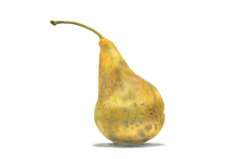
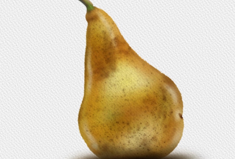
8. Paint a Pear! Choose a Palette: Okay, We're getting
ready to paint. To do that, we need two things. We need the paint brushes and
also we need some colors. If you want to be lazy, the reference images open. And so if you just
hold your finger on any part of the
reference image, you can pick up that color
and start to paint with it. Two-finger tap to undo that. Instead though, I want
us to use a palette. Before we do though, come on, that's come to layer three
and rename it to color. And then I'm going to
select the top layer because I'm going to
import a palette. And I want it to be imported right at the top of
the layer stack. And that is why I selected
the sketch layer because at the moment it's at the
top of the layer stack. So wrench icon come to
Add and insert a file. I have a folder called palate, and this is the one I want, watercolor main swatch, a 01. This is available as a download. If I just tap in
my layers panel, you can see it comes
in right at the top. I'll just move my
reference layer over a little bit so we
can take a look. These are the red, green, and blue values of the various different water
colors I've used over the years from different
manufacturers. And if you like the idea
of basing your colors of real-world water color
values than this is for you. But there are a couple
of things to mention. One is there are two
versions of Prussian blue and there's also two
versions of Payne's gray. That is because I went
onto the manufacturers websites for the watercolors
that I like to use. And the first Prussian
blue that I got, I thought, You gotta
be kidding me. So I found another version of Prussian blue plus also another
version of Payne's gray. Look, these are just names
we use whatever you see fit. Okay. The second thing, if you look, they are
graded dark to light. If you go towards the left
on each of these swatches, you get darker values. If you go to the right, you get lighter values. But I think the main
thing to say here is that these are the digital
equivalents of pigment. Pigment works differently
to digital colors. And if you are used to
traditional watercolors, you might be used to, for example, mixing up a lemon yellow with a bit
of parallel Scarlett. And then maybe adding
some viridian to break the tone and get maybe a
flesh tone, for example, if you do that in
the real-world, it doesn't follow
that you're gonna get the exact same results
in the digital realm. Okay, so with that
out of the way, let's pick some colors. I'm going to come
to my layers panel. I'm going to create a new layer. I'll call this swatches. Because while I
like this palette, Let's give me a good
starting point. It's completely
covering my screen. I want something a bit smaller. So from the DC watercolor lines, I'll choose aligned blogger in it because it's a
very simple thing. Let's take a look at this pair. Two fingers pushed out to zoom in and take a look at
some of these colors. I'm seeing some warm oranges, but also some cooler yellow. So it depends where you are. If you look on this
side of the pear, I'm seeing some
things fairly warm. On the other side of the pear, maybe something a
little bit cooler. So what I'll do is
I'll tap and hold on my lemon yellow and I'll use that as one of my base colors. And you can see me
drawing it in down here. I'm gonna make this
squarish like this. I could also do with a little bit of a lighter
version of yellow. I'm gonna go with down
the bottom, Winsor lemon. I'm going to choose
something from there. I have a light version
of that in notice how I'm drawing it right next to
the first color I selected. I also need a deeper
color as well. And for that, I think
I'll try new gamboge. I need a deeper version
of it about there. And I'm gonna put that
next to my midtone. There. I could do something
a bit deeper as well, but not quite as
rich as new gamboge. So let's try, let's
try some yellow ocher. See what I get with that. Put that down at the bottom. But also I want to cool this down with a little bit of green. Now which one? Let's try. Let's try some sap green. But I need something
fairly light because I see the coolness in more of a lighter tones rather
than the deeper tones. So I'll go with
that and I'll put that underneath like this. I don't want to
make sure I've got no little bits of the
background showing through. And also if I look at the
bottom and the stem as well, I'm going to need
something fairly deep. I will go with Payne's gray to and I'll go for a
fairly deep version of that. And I'll put that about here. Hopefully, that'll
give me all the colors I want for the pair. Okay, Next thing, let's make the inserted image with
a palette invisible. My swatches panel,
I will swipe to the left and I will
duplicate this. Then I will come to
my transform tool. Uniform transform is fine and I'm going to drag
the whole thing. And here's a tip for you. If you just want
to drag something, don't drag on the inside. Drag from the outside. That way you don't
accidentally resize things. That is all on a new layer. I'm going to come to my adjustments and I'm going
to come to Gaussian Blur. I put my finger on the
left-hand side of my screen and I start dragging
to the right. And when I do that,
you can see I start to blur the entire layer. The reason I'm doing that is because for the most
part I wanted to get my colors off those
123456 different colors. But there may be times where
I want an in-between color, somewhere in-between that
mid yellow and the DP Ella, for example, if I Gaussian blur, I get those in-between tones. That is the reason why instead of putting down little
blobs of color, I put down squares of color with no background
showing through. That way, I get a
consistent blur in between two colors rather than bits of background
getting in the way. So I like that. I'll come to my layers
panel and I will tap, Merge Down, that will take this layer and merge it
with the layer underneath. So there I have my swatches.
9. Paint a Pear! Choose a Paper Texture: Okay, I've just exported
that file and it is 01 blocked in case you
want to download and follow along from the
same place I am now, I could do with getting
my swatches out of the way so I can paint
on my pay directly. So I use the transform
tool just to move them. Okay, Next thing, we
need some brushes. So I have three brush
that's available for you. Watercolor line, watercolor
wash, and watercolor extra. The brush set I want to use
now is DC watercolor wash. There's a couple of
things I need to tell you about these. Let's start off with
DC simple wash. And I will choose that kind of amber color to
create a new layer. So I have an empty
layer to paint with. And the first thing to say is all the brushes
I'm giving you an, any brush that calls
itself a watercolor brush lacks something
very important. Water. What do I mean by
that? Well, look, you can see now I'm
painting in the real-world. I'm making watercolor
brush strokes, but there's water there and that is spreading the paint around. And if I add more paint, if they store water on my paper, the paint will spread out. That doesn't happen
with Procreate. I have DC line brush, dark edge selected.
As an example. I'll make a brush stroke
and you get something which looks like a
watercolor brush stroke. I'm keeping my pen on
the surface of my iPad. If I come back, you
can see I can spread the paint and the edge of
the paint out like this. But once I let go, I imagine
that paint drying instantly, there's no more water. So if I make another
brushstroke, you can see it sits
on top of rather than spreading into the
first brush stroke. If you want to do watercolor and he wants to do various
different effects, you are going to have to make friends with the smudge tool, which is next to the Paint tool. And if I just choose say DC
simple wash as a smudge tool, you can see I can start
to smudge things into each other to get them
slightly more natural effects. And that's clear what we've got. So bear that in mind. The second thing to say is, the worst color nearly
always is done by applying your lightest colors first and then your darker
colors afterwards. That is different as
something like say, oil paints wherever you're applying the paint
at all thickly, he tends to work
safer mid tones to light or from dark to light. So what does that mean for us? Well, look, if I come
to my wash brush set, I've got DC simple
wash selected, I will make it fairly large, but I'll make it about say, 47 per cent opaque. And let's choose that
nice amber color. And I'll make my brush
strokes like this. And if I make repeated brush
strokes, it gets darker. That's the key.
Set. Your opacity low and gradually
build up like this. But here's an important thing. If I choose, say, a white, I can paint over
that area and I can paint the white back in
with this particular brush. I can paint dark to light. You can't do that
with watercolors. So let's undo that a few times. Instead, if I come
to my paint brushes, you will see a lot of these paint brushes have
the word deep on the end. Like with this one, I'm using DC symbol Washington above it, DC simple wash, deep. It is the same brush
as DC simple wash, but it does one important
thing differently. I still have white selected. And I'm making my brush strokes. And you can see it's not
getting any lighter. This is designed to behave more like a
watercolor brush does. On the other hand, if I select that original Amber and I make brushstrokes in the same place because it has the
name deep on it. It'll get deeper. You can
see how it's getting deeper than the original hamper. I'm getting a much deeper color. So the way I recommend
you work with this is if you have two
brushes like TC, simple wash and DC watch deep. Start off with a simple
brush, the wash brush. And that will give you
anything from a very, very faint light color going down to whatever color you've
got selected at the time. And if you want to
make it deeper, swap over to the deeper
version of the brush. And you can start adding stronger shadows
and what have you. And just incidentally you
can see my brush head. Whenever I make
your brush stroke, if you want that, come to your wrench icon, come to preferences and see
where it says brush cursor. Look, if I turn that off, I'll make a few brushstrokes. I can't see my brush head. That is no good to
me because I have a very fine pencil
nib putting down a very large wash that is
not a nice way to work. So wrench icon preferences,
brush, cursor on. Okay, enough talk. Let's get started with this. I will, I'll just slide to the left and
delete this layer. I don't need it. I will come down
to my color layer, which if you remember, is clipped to the pear layer. I will choose a brush. I
will choose DC simple wash, and I'll start to put
down brush turns. My simple wash brush is
selected. Double-check. I'm on the right layer,
the color layer. And I'll start off
just by putting down a wash of my
lightest color. Opacity is around about
halfway on my brush size. 1920 per cent, that
should be fine. Just scribble in my basic
shape straight away, I will swap over to
my deeper yellow because I want it in some
of these highlighted areas. There's a bit
underneath as well. In fact, I'm going to be
building color on top of this, so I'll just make a general
overall wash with this. When you're putting in
broad shading like this, use the biggest brush
you can get away with. You don't want a really
small brush like this or the higher pasty and start
scribbling away like this. Not if you're laying
down areas of color to your finger
tap to undo that, took your pasty down. And the size I began. And I'm going to gradually
build up the depth of this. Let's come to a slightly
more amber color. I think I went a little bit of this darker color just
in certain areas. Here's another tip for you. When you are working
out the overall form, come to your reference image and pinch inwards
to zoom right out. And now I can see all the detail which can be a bit distracting. I'm finding it easier
to look at the dark to light values and
some of the colors. So I straight away,
I can see I have a dark band around the
middle of the pair. Definitely some at the bottom, but there's still
a little bit of a lighter area just at the
bottom, just a tiny bit. There's also a slightly
extended dark area on the cone of the pair.
Let's call it fat. Do I want to put just a
touch more green in them, maybe priced arguing darker. I'll give it a try
just on the one side. And now I think I'm starting
to go darker again, so add some more deeper color, but do it at the sides. And also as you start
to do the smaller areas because the sides are slightly smaller than the overall pair. Dan start making your brush
a little bit smaller. So you can do the flight areas, but still keep it as big as you think
you can get away with. Maybe a little bit bigger
for this central area. Again, I'm making brushstrokes
look brushstroke. Instead, I'm going to two-finger
tap a couple of times just to go back a little bit, maybe up my opacity a
little bit to around 36%. And now instead of
making brushstrokes, I'm going to tap, tap, tap, tap, tap, tap. And when I do that
straight away, I'm getting a more mottled
effect because you're seeing the brush head tap down once rather than tapping
down many times. When I make a brush stroke, I like that it's
giving me some of that slightly gritty
area of the pair. Come down a little bit more. Now, I'm a little
bit worried here that I'm going a little
bit too far with this. I'm making it a bit too dark, but I'll show you
what to do with that. If I just do a little
bit more tapping, maybe just a little
bit more green, I lower the opacity
just a little bit. Just didn't want to two
areas just to break up this yellowy brownie surface. And I think I'm getting
close to where I want to be. Like a site. It's gone a bit too dark in one or two places there.
Did you see that? If I just two-finger
tap a few times to undo just on the left-hand side of the pear in the shadow areas, I was tapping down
a lighter color on top of a darker color. And so the whole thing, if I hold three
fingers down to redo, everything suddenly got lighter. I don't necessarily want that, so I'll two-finger tap a few more times
to take that away. And instead, at this point, this is where I will
come to DC simple wash, deep, and now with
the same color, if I start to tap, Let's make this a bit bigger. Then I'm starting to
get the deeper tones. Like I say, I'm worried
that I've gone a bit too far in one or two areas. The upper side of that pair
is looking a bit too deep, doesn't have quite
enough highlights. So what I will do is I'll
come to my Erase tool. Symbol washer
selected, that's fine. I will take the opacity
down, the precise up. It's a case of judging how
opaque and how big you want the brush to
be for whatever particular job
you're trying to do. I'll just pinch out
a little bit so I can see some of those
highlights a bit more clearly. So with the erase tool, what's going to happen
is I'm going to erase, which means that the white underneath is going
to show through. So let's give this a try. Yeah, I think I've got
fairly lucky with this. That seems to be
about the right size for that central
area of the past. Certainly Bring it around
a little bit like this. I'm doing this a
little bit tappy, a little bit Draghi, make it a little bit smaller. And there's this top area
of the pair as well, which has some
highlights in there. There's also looks like
reflected light just underneath. Let's make this a
bit bigger. Do that. And also, if I zoom
in on that per area, I can see one or two bits of reflected light here and here, either from that white surface or the surrounding light areas. So let's put some
of that in there. There's just a little bit here, tiny bit here, maybe
still a little bit. If I make this a
little bit smaller, there's also a little streak just on the other
side of the pair, on the left-hand side. And maybe that's
coming up the side of the body like this. I'm starting to get the
overall shape of the pair. I quite like what's
happening with that, but what I am going to do
is come to my smudge brush, DC simple washes selected again. So you can see I'm using the same brush to do
various different things. My brush size. Okay, I'll try it about
there, see what happens. Because what I want to do is
just come to certain areas. I just push those lighter
areas around a little bit. Now, can you see me doing this? I'm not erasing. I'm
pushing the areas now. Can I get it to work? Yeah. Hopefully you can see this. As I put my brush down, I'm starting to push
just the bottom of that slight highlight
down a little bit. And in fact, now
that I'm zoomed in, maybe I want just a little bit lighter in one or two areas. And on the other side. Now that I've done this, I'm getting the overall
shape of the pear, but I do need some
smaller, darker areas. So come back to my paint brush. For this, I'm using simple washed deep so I know
I'm going to get darker. Let's try My that slightly
deeper brown color. A little bit at the top.
That's too big, isn't it? And maybe make it a
little bit more opaque. And I need a little bit just to the top of the pair That's quite dark, the very edge of it. Maybe just a touch down the
other side, not too much. But I'm not seeing down here. And that's made my
brush very small, slight indent to just there. I don't want too many
details on this layer. I just want to get
some little landmarks. Just want a few details
in one or two areas. Just to make it stand
out from the background, give it a bit of a 3D form. Now this bit at the bottom that definitely
needs working up. I'm noticing, I'm getting
quite a deep in the picture. It looks black. And so this is what I
don't want you to do. Great. It looks black, gets a black. I'll start drawing that in
like this repeated strokes. Because nothing kills
your picture quite as nicely as black instead. Well, it's quite a common
trick to mix colors together. For example, a deep brown like burnt umber with a deep
blue like ultra marine. And you mix those
two colors together to get a version
of black but black which has variations of color within it, blues and browns. So I'll do that with this, which is brown and bear in mind, I still have simple
washed deep selected, start off with a really large, just make repeated
brushstrokes at the bottom. Then at a certain
point, I'll hop over to my Payne's Gray and I will
start putting that in. And can you see when I do that, I'm getting the same darker
fact that I had before. But I am getting 12
little variations in color rather than
just that simple black, which was to be honest,
looking pretty impressive. So I will go with that. And yes, I know I haven't done the actual store
to the power of I. So come on, let's
quickly do that using same techniques because
it is pretty dark, especially on the end. Just before cool Holt, I'm looking at what I've
done at the bottom. And I think I've gone too far right where I'm circling here. Now I could use the smudge tool, try and move that
dark area down. The problem with the smudge
tool is that sometimes it takes away some of the texture that you've
been putting down. So instead, I'm going to
come to my Adjustments menu. Second from bottom, the
wonderful Liquify tool I have pushed selected. I have no distortion, no momentum at all. Pressure on Macs, that's fine. I just need to play
with the size. Let's try that size. And what this is going to do is just drag the paint
around like this. You can see why
my brush head is. And obviously I don't want that. I was just demonstrating it. Two-finger tap to undo that. But what I'm gonna do is I'm
going to pull just part of this down a little bit so
that it's further down, but I keep some of the texture. But while I'm here, we'll look a little bit at the side
which I'm circling. That came out too far. I can push that into
the side like this, maybe just this little bit here. And if I make this
very small in deed, I can start pulling around these highlights just
at the top of the pair, just to give them
a bit more wiggle. Guy the highlights to
where I want them. How useful is that? Select any other icon. Okay, I think I've got
my basic shape there, so I'm going to take a break. Before I do though,
I want to show you the number one easy trick to make your work look like
a watercolor painting. One thing before you
do the very next step, just in case you are
zoomed in like this. I want you to finger and
thumb drag inwards a little bit so you can see the top
on the bottom of your image. Then come to our wrench icon. The Add tab is selected
and insert a file. As part of this lesson, I have a couple of folders
for you to download, to unzip, to put on
your iCloud Drive. One is called paper grade, the other is called papal white. Tap on paper white. These are a series of
watercolor paper textures. I will choose watercolor A4. Tap on that to select it. It gets imported finger
and thumb pinch outwards. So the paper covers the entire image and
then come to our layers panel again that will commit to it and I get something
called inserted image. Let's be good. Let's rename this to paper. And at the moment, we've
got a bit of a problem. It's completely covering
my entire work. So this is what you do. You tap on the little n
which I'm circling now. That's N for normal because every new layer starts
out in normal blend mode. If you look up words, you get various different blend
modes called darker color, Linear Burn caliber, right finger where it says
normal and drag down. And can you see that? If I choose something
like multiply, you can see everything
underneath the paper layer. All the white bits of the
paper layer are being made invisible and all the
slightly darker gray a bit, That's the texture you
can see are showing up just a little against
whatever is underneath. That's what the dark
and blend modes do. So you get this paper texture. If I close that
and I'll zoom in, if I make the paper layer
invisible for a second. That's our pair with some nice subtle textures
but no paper texture. But with the paper layer set to multiply,
turned on again. And the very last
thing, I promise, I did say that this is the number one easy thing to do to make your picture
look more realistic. But actually, there
is a similar trick, which is much less
commonly known. There can take this whole global watercolor effect
to the next level, or maybe I'll reveal that
in the next project. But for now, I think
we've done enough. Let's take a break. I will see you in
the next lesson.
10. Paint a Pear! Adding Detail: Okay, So we're back. Let's carry on with our pair. I want to put some of
these details in there. You can see I have
some darker bits. I want this to be a
fairly watercolor effect rather than too realistic. So if I do get a little
bit of brush marks, That's no bad thing in my book, I will come to my layers panel. I will come down
to my color layer, and I'll add another
layer on top. I will click that. So that now layer seven is also clipped to
the parent layer. Okay, so next thing I
want to choose a brush, and I think for this, I'll
try DC for the brush deep. Let's choose a fairly
dark color with that, set the opacity fairly high. Now what about my size? I'll try it fairly high first just to get a feel
for how big it is. And if I do that, can you see I press hard to
get bigger blobs. If I press Softer, I get a softer blobs. I think that size
could actually do maybe a bit bigger for some
of these overall effect. But it still gives me one or
two slightly smaller areas that should do for me. But look if I do a brush
stroke for the bottom, I'm not sure how
obvious that is, so I will clear this layer. I'll choose this brownish color. There. You can see getting dark it
if I come down to the bottom, it's actually getting
lighter because I'm putting a lighter tone
on top of a darker tone. I don't want that. So this is what I do. I come back to my layers panel. Do you remember
with a paper layer, we set it to multiply our
layer blend mode will, I'll do the exact same
thing with this layer. Watch what happens to
those blobs when I do. Because layer seven is
now set to multiply, it still puts down curly. You can still see the brown, but it's making
everything underneath this layer darker
versions of brown. And let me just
show you this look, if I come and I make a white color and I want to
come to these darker areas. I'm going to start scrubbing that you can see my brush there. That's my brush out splashing down and now you can see it, but it's having no effect. But if I come and I choose
a darker gray brush, that I definitely get everything underneath
looking darker. That's how multiply it works. If I set this back to normal, there you can see
the brush strokes. If I set that back to multiply, the white marks
become invisible. Everything else get
the areas different shades and hues have darker. I will tap and clear this layer. And now I'll try
drawing in some of the blotchy marks,
the color I want. I choose my darker brown. I'll try using a
slightly lighter color, but it will still appear to
be darker in certain areas. But what I'm finding is it's giving you a certain
richness of tone. What I want it to be a
little bit richer in tone. It's giving you more
of a golden brown even early though with this, Let's see what green does. I'm not so sure about that. Let's try two-finger tap in a couple of times and
adjust the opacity. And just in one or two areas
just around the middle. You probably can't even
see me putting that down. I quite like the overall effect, but it's gone down a little
bit heavy for my tastes. So I know I want to
take some of this back. The good thing about it is
this is on a separate layer, look invisible, visible again. What it can do with this, it's come to my Erase tool. I'll use the same rush, DC fuzzy brush deep. I'll crank up the opacity so
it's pretty high brush size. I'll try maybe
around 50 per cent. And now I can do this just to erase some of those
marks I already made. Because while I like
it in certain areas, it's starting to look a little
bit intrusive it others. I think that will do for me now. I'll come back to my paintbrush or the brush deepest
still selected. I'll make it just a little bit smaller and I'll take
the opacity right the way up because
there are one or two really very deep marks here, which I'd like to put it in
just on this side of my pair. Now, if I decide that
effect is too strong, what I can do is tab again alone the M and I can take the opacity
right the way down. In fact, I recommend
you do this a lot. If you have a layer sitting
on top of another one and you want the colors to start
interacting with each other. But maybe the effect on the top layer is a bit
too strong to take the opacity down to 0 and
dial in the effect you want. When you do this, the temptation is to
look at the slider, a little bit of this
jiggling about now. Do not look at the slider. Take it down to 0. So now I have my pasty set to 0. Gradually bring
up the opacity to dial in as much of
this layer as I want. I think in the case of this, looking at the reference and comparing it with my picture. I think for me around, Hang on. I'll look. I'm around 80, 81%, it's not a 100%. I find that a bit too strong. I'm taking that
down a little bit. And the reason you take it
down to 0 and then dial it in is that if you take it from a 100 and gradually dial it down, you tend to get slightly
stronger effects than you originally wanted. So for me, around the
7980 per cent mark, I quite like that. Now what about all those
little dimples on the skin? Okay, let's create
another layer. And we will click that
to the parent layer. For this, we're going to come to DC watercolor, extra palette. And I want DC staples for this. I wanted dark. So definitely maybe
a brown color. And let's take this
up a little bit. I'll take it up to
that second market. If you tap close to one
of these little notches, your brush size or snap to it. So in the case of this, I've got thirty-five percent
tapped down to this. I get 11%. If I tap up here, I get 69 per cent. I don't particularly
want that notch. So I'm going to come to
that little minus sign where I'm circling and
tap to get rid of it. If you want a very
small brush size, I can derive my little
slide it down to about there and then tap on the little plus sign and I
get a notch there. This is handy so that
you can remember. Certain brush size is
like in the case of this, I want my brush out to be
thirty-five percent big. And then when I drag across
the surface of my pair, I get ducts, which I quite like, but I'll two-finger tap to undo that because now
I've shown you it. I think I get some bigger dots, more on one side of my pair, and I think I get smaller dots on the other side of the pear. So I come to my size slider, come down to this notch here, which is it's set to 11%. And I'll just tap in some
more dots around here. Now we have the same
problem as before. If you look at the very bottom, those brands are working
nicely for the mid tones, but they're too light,
the shadow areas. So I asked before, change the layer blend
mode to multiply. And you're getting something
a little bit more, like I want a few more just around the top bit of the pair. Then I think I'll come
to my Erase tool. Let's choose, let us
choose DC simple wash, a posterior set, fairly low
brush size, fairly high. And I just want to get rid of these dots in the areas
where I don't want them. Because it's a nice
textured effect. But it's a little bit
random, which is nice. But I'm a control freak. I like it a little
bit of control over the randomness of it. The other thing about it is these are a series
of round dots, but the pair itself is round. And as you go around
the sides of the pair, those dots wouldn't
appear to be that round therapy to be a
little bit more squashed. So this is what I'm gonna do, come to my adjustments
again and come down second from bottom
to my liquify tool. I'll make it fairly big. Store such push. And you can see I can start
to push these dots around. So what I'm doing is
pushing just from the outside inwards
a little bit. And if I make it bigger, I'm going to push from
the inside outwards a little bit just to provide you a little bit of distortion and spreading out as the
pair faces us directly. But then because I'm pushing outwards from
the center at, in, from the outsides, the bits
around the edge will start to bunch up a little bit more than the bits
in the middle. And I think that's all
I want to do for that. The reason that works, if I unclip this
layer for a second, you can see I have plenty of dots splattered
around the outside. And even though you
can't see those dots, the clipping layer is attached,
they are still there. So with the Liquify tool, if I start to push inwards, the dots which are invisible, other side start to become
invisible as you go in. Okay, I'm gnarly
there with this, but I'd like to do a
couple of other things. I want to come to
my layer, right? Well, what are we doing? Dots? I'm going to
duplicate this layer. Everything gets
darker. And in fact, what I'm going to do again, I'm gonna duplicate again, so it gets really, really dark. I want to take that
middle dots layer and I'm going to merge it down, which means it gets merged with the dots layer underneath. Let's zoom in for what
I'm going to do next. Come to our adjustments. And I want to choose
Gaussian blur. To make this work. I take my finger and I slide
it from the left side of the screen to the right side of the screen as I
do, can you see that? I'm starting to blur the edge of the dots
layer underneath, but I'm not doing anything
to the dots layer on top. So what I'm getting is a slight blurred halo
around the dots. The layer underneath is blurry. That layer on top is
still hard edged. And so I get this
kind of effect. Let's make that layer
underneath which I just blurred invisible for a second
and visible again. And you can see it's a
subtle effect, but it is. Helping to blend those areas. In fact, you know what, I'm going to push
this a bit further. I'm going to duplicate
again, merge down. And I'm going to repeat that because I never really
got what I wanted, but not quite so. Gaussian Blur again, like this. What about 5% here? Let's make that
invisible for a circuit. Yeah, that's starting
to merge those dots in, but overall, things
are too dark. So I'll make this one
invisible for a second. I will come to the
top dots layer. And I'll set that to about, say, around about the 50% mark. Let's turn on the dots layer underneath and play with that. And again around about 50
per cent mark with that, come back to the one on top. Now that I've adjusted both
and maybe adjust that. So it's just a little bit more opaque to get
more of the effect. So now I have my subtle dots, but I also have a little bit of a halo around them that is helping that slightly
dotty texture sit a little bit
better on that pair. Okay, couple more things to do before I call this finished, I'm going to create
one more layer. I'm gonna take this layer
and I'm going to drag it underneath my pear layer. And I'm going to call it shadow. Because in the
reference picture, you can see there's
a shadow there. I want to do that. So the parent looks like
it's sitting on something, but here's a nice thing. A couple of videos ago, I spoke about how this
whole clipping mask thing is a bit like using masking fluid on a real-world
watercolor painting, but this is digital. And so as well as painting inside that by using
clipping masks, if I put a layer
underneath the pear layer, I can paint on the
outside of that area. Let me show you
that. I will come to DC watercolor wash,
simple wash deep. Now, if you remember, I use the beeper brown and the blue. For the underside of the pair. I'll use the same colors
underneath for the same reason. Black is really good at
killing things stone dead. Let's make that a bit bigger. So if you can make a deep blue shaded area by
mixing colors together, you can get variations of
that brown on that blue, just in this one
particular area. And so it just
makes your shadows are a little bit
more interesting. Now, am I seeing a tiny bit
of green in there as well? I think I answered, I'll make a few green brush
strokes like this, come back to maybe blue and just fade that
away at the sides. And here's a nice
thing because we're in the digital world
and make my shadow. But compared to the reference, it's a little bit too tall, needs to be squashed down a bit, not a problem come to
our Transform tool. And because that is the
only thing on the layer, I can easily adjust it. I will come to free form so I can squash and squeeze
rather than justice, bigger or smaller, I'll push in a little bit from the bottom, pushed down a bit from the top. And straight away
you can see I'm flattening that
whole shadow area. If I want to move
it around finger or pan on the outside of
that box to drag it to where I want it to go and
maybe I want it to go about say they're my layers panel
just to commit to that. I'm very nearly there, but I'm going to come
to the color layer because for this to work, I think I need a
similar levels of darkness from the bottom of
the pair with the shadow. Shouldn't be a problem because I have my color layer selected. I have my simple wash
the brush selected, and all I need do is just make, well the brush a bit smaller. I think I just just a
little bit more of a brown and that rather dusky blue just to keep the
shadows consistent. And in fact, I think now
I need to come down to that shadow area and
make that just a touch darker because I don't
really want to see a border between the shadow of the pair and the
shadow of the surface. And I think I've got that now. One very final thing I
do want to do as well. When I do the outline, I wanted to use a
slightly rough outline to give a slight
watercolor effect. Now in a real life
watercolor painting, you will see very,
very crisp edges. But the minute you
take a digital photo, you'd never get a
completely sharp edge with a digital photograph. It just doesn't happen. I won't go into why right now. So I would like to soften
that edge just a little bit, which is very easy to
come to our pear layer. Because the nice thing about clipping masks is
you can alter them. If I zoom right up
close and personal, all I want to do with this is can once more to
our adjustments, gaussian blur and slide just
by a tiny amount, one or 2%. If I blew it by too much, then all I get is a fuzzy edge to my
power, which I don't want. So I'll take this down to try to percent see how we get on
with that because it's a bit difficult to tell
when you're zoomed in. Pinch to zoom. Now that I view it, when a zoomed out to where
it should be, that slight softness
to the edges, just helping the edge city in better with that
paper texture on top. So for this, let's come and
turn off our reference. Let's turn off our swatches. And there we have our basic pear using a variety of
different techniques. I think right at the start
of this project, I did say, don't try and match exactly what I'm doing on-screen yourself. Do your own version
because watercolor, you can use watercolor
for very precise work. But this course is more about the random chaotic nature of watercolor or why it can
be such a nice thing. As an example of that, I did this project
a couple of times because I wanted to practice
what I wanted to say to you. This is the same project
using the same techniques. And I got that. The same project using
the same technique. And I got that. And you can
see that all difference. So like I say, concentrate
on the techniques and doing your own version
on that score. What happens so often it, you do a project like this, you think, great,
I've learnt a lot. What do I do next? Well, I have another photo from the same website
and guess what? It's of another pair. And this is what I came up with using the exact same techniques. Here's a file for
you to download if you want called pair 02. You have the sketch, you have the pear shape
that you can draw on. You also have the
color of 01 layer, which you can use
as a clipping mask. You also have the
paper at the top, and you also have the
swatches and give it a try. Just use the same
techniques that you saw in this project and see
what you can come up with. Okay, let's wrap
this project up. Please stick around for
the next projects because there is so much
more to show you.
11. The Kingfisher and Blobs of Joy!: Okay, let's move on
to our next project. If I come to import, I have a couple of new
files for you to download. One is king fisher 01, which has a PNG file. And the nice thing
about PNG files is that you can have transparent
backgrounds with them. So for this, if I come
to my background color, you can see I just have the line work with
no white background. While I'm here. I will
rename this to sketch. And I will tap on the little. And I will reduce
the opacity down so it doesn't get in the way too much when
I start to work. Now if I cut a few seconds off the very end
of this project, this is what we're
going to be ending up with it a bit different
to the previous project, that pair, and I was aiming for a more watercolor
field, two-fifths. And with this there is a
design or illustration or an art principle and that
is blending opposites. What I was aiming for here is something that watercolor
does really well. These wide areas of colors which softly blend
from one into the other. Big washes or colors are
contained within hard edges. And so you get those
two opposites, wide and soft and
textured and hard edges defining the areas. Also with this picture, I've incorporated something you see a lot within watercolors. That is where you
have areas with no paint on just the paper, whichever it's done right. Can say a lot about the
form of what you're doing. But without the
painting getting too heavy and too
covered in pigments. Alright, so that's what
we're going to end up with all that together. Okay, So the reference
image for this is this. This is from the Pexels
stock photo website. And it's a beautiful
little king fisher, very skillfully captured
by a certain Andrew McKee, and this is also
available as a download. Alright, let's start
setting up this picture because we'll be using some techniques from
the previous video, but we'll be adding
quite a few new ones. Okay, so first thing, I want some watercolor
paper for this. So I will come to my wrench icon and I
will insert a file. Let's find my paper
white folder. And for this, just to choose different paper from last time, Let's try cold press
F9 with indents. There we go. I'll pinch that outward
so it's covering the entire surface
of my painting. Then if I come to
my layers panel, I need to change the
blend mode to, well, I'll go with multiply also with quite a lot of
these paper textures. I made them quite strong
because I was working on the theory that if it is a little bit strong
for your needs, you can always just take down the opacity to where
you want it to be. I'll take it to
around about halfway and I can come back and
adjust that at any time. Okay, So next up, I want some colors. In the previous video had a selection of my
favorite watercolor hues. But with this, we're gonna
do something different. And I don't think you've seen anything quite
like this before. I'm going to come to
my wrench icon is selected and insert a
file for my resources. I want to come to palettes, and I have four files available
for you as a download. Let's load up the first one, blobs of joy 01. Here we are. Little blobs of joy 01. And yes, I'm already regretting
giving it that name, but let's press on. Why do you have here
are 64 squares. And if I zoom right in
to take a look at 3637, for each of these squares, I have a color on the left, gradually fading through
to a color on the right, and that's the middle band. But if you go up in square, you get progressively lighter
versions of that gradation. And if you go down, you get progressively darker
tones out for many of these, I've played around with hue. So if you take a look
at 36, for example, as things get darker, you get a slight brownish tint. The reason I did this is because a lot of
times people ask, what color do I use or they're not sure about
color combinations. With this, the idea
is you come in and choose one of the
squares that you like. And so for this, I want to try and
use some colors to serve as a palette
for my king fisher. No, I could do what I did
before and open up Canvas, Reference, uncle up
an image that way. Or I could always come
and add and insert a file called Pexels Andrew,
Mickey, pinch outward. So I get a closer look at
the kind of colors I want. And if I drag that underneath, like this, come to
the asserted image, drag it across like this, come through a layer below, come to our Transform tool again and drag that
across like this, maybe make it a bit smaller
so I can see more of it. I could do it that way as well. Or if you have a second monitor, call up this image there. So you got as much screened
as possible to play with, without things like what
you're looking at. Now. Getting in the way. I think for the remainder of
this course, I will do that. So I'm looking at the picture on my computer and I'm
working from here, and I'm trying to
think, what color do I want from my little
blobs of joy 01. And taking a look, if I come here, look, taking a look at that 061. I think that is giving
me a good range of hues for the blue parts
of the king fisher. So I make sure that
image is selected. Come to my selection tool, I want rectangle
and I'm going to drag out a rectangle Lego. So just blob number 61 is
selected and I will come to copy and paste
my Layers panel. There's my wonderful
created swatch. Now I was taking a
look at this earlier, and there wasn't any
colors here that I really wanted for
the warmer colors. So what I can do is I
can swipe to the left, delete this, and I will come back and I will insert a file. Because I have four files
called blobs of joy, 01234. Let's take a look at number two. And I have a yet more
blobs here to play with for files with 64
blocks in each file, that's 256 different
blobs to play with. And I came up with these
blobs by going through many, many paintings and looking and thinking that color
combination looks nice. And so I sample directly
from the paintings. But also if I was looking at
a painting thinking, well, those orangey reds
go nicely with those fairly dusky
blue we graze at soil, sample, the orangey grace, but I'd also sample WE grace because I thought
they worked well together. So my tip for you is, if you find a color
that you like, take a look at the
neighboring colors because they might have been
sampled from the same image, which I thought it worked well. So in the case of say, seventy seven, seventy
eight, seventy nine, there's a good chance those
colors are going to work quite well together because
they did in the painting, but they were sampled from. Now for this, I did
some searching around. And I think the color I like for the orangey bits is
block number 123. You can see it's not really bright and loud
and in your face, like a 125126, it's much more
knocked back and natural. So as before, come to
our selection tool, rectangle tool
selected, drag out, select it, copy and paste. There's our new swatch. Now, is there anything
else here that I quite like because I think
from the background, maybe I'll put a background in. Maybe I won't I'm not sure yet, but just in case I do, Let's look, look around here. And I think a 110, those colors are
sufficiently subtle, but with enough variation within that one blob that I
think can be useful. So select tool again, choose it. I missed a bit of the very edge, but I'm in add mode
which I'm circling now. So I can just add to that
selection like this. Come on, let's do that. I can make it a
bit more obvious. Okay, I have the
right layer selected. I nearly had a gotcha there. I want from the layer
with all the blobs, not just without previous
blob I selected, come back to my select
all and copy and paste. So now I have my three
blobs and just come in here and also taking a
look at the picture again, there's also the
branch which has some very neutral colors. I think for that,
what about 096? That gives me some extremely
desaturated colors, but that's what I
want for the branch. There's also a good
range of light and dark, so I'll use that makes sure this time I come to
the Inserted Image. Select, copy and paste. So now I have my four
different blobs. I will swipe my original ones to the left because I
don't need it anymore. But now I have these
four little swatches. I'll take the one I've
already got selected. I'll come to Move and I'll
just move it down to here. I will come to the
one above and I will move that one instantly. Those little guidelines,
those blue lines you can see I've got those because
I have snapping turned on. Can you see just
where I'm circling now and where I'm circling now. So that helped guide
things in cancer. The next one, my Reddy brown, drag that down to there. And the next one, for all my blues, I will
drag that one down to there. Then I come to my layers panel. I'll take the top one.
I will merge that down. I will merge down again, and I will merge down again. Next thing I do is
I zoom right in and I take a good look
at those blobs. And I'm just looking
at the colors now, I'm thinking, do
they work together? Are there any of those
blobs which clash with any of the others
bearing in mind, I've got a brightly colored king fisher with a much more
neutral background. And I think, yeah, those
colors do work together. And if they work
together in blog format, the chances are when I
start painting with them, they're going to work together
on the actual painting. It can be a problem with a
painting that sometimes you choose a color which just doesn't fit with the
rest of the colors, and it just looks wrong. But if my four little blobs of joy look like they're
working together, there is a reasonable chance they're going to work together when I do the painting or
to put it another way, if there was one of
these blobs that really didn't go
with the others, I would consider
replacing that for another one because if it's
not going to work here, there's a good chance
it's not going to work on the actual painting. And here's the other nice
thing about this method. Every single one of these little blobs
of joy is numbered. So this layer will rename too. Swatches. And I can make that
invisible that anytime. And if you come back to a
painting and you think, Oh, I like the colors
I did with that. Where did I get the colors from? Well, you chose blob
number 6100231096. So you know, immediately where you've got
those colors from. I'm supposing someone asks
you what colors did you use? You can say, I use the little
blobs of joy, 6100231096. So now you have a common
language that you can refer to, to somebody else, a
bit like pants own, but Pantone only gives
you solid colors. This gives you a
blend of two colors plus the lighter and
darker variations. I hope you liked this idea. I found it to be very useful. Now, the next thing I want to do is just choose some colors, which I think are going to
work well on my painting. Because if I was
doing something like an expressive oil painting
or what have you, I might be tempted
just to choose various different colors
as and when I need them. But for this, I would like
to select colors from the swatches so things can be just a little bit
more predictable. So for this, I'll
create a new layer. I can always merge it
down later for my brush, I will come to my
watercolor lines. I will choose my line
blocker in air because it's a no-nonsense
brush with a hard edge. For the king fisher,
I'm looking at it. The light tones tend to
be more the greeny end, blah, but I want
something pretty light there, so
I'll choose that. I'll make a square like
I did the previous time. Then as things get darker, I think they get more towards
the red end of those blues. So I'm going to
choose colors in it, a line going back
into the right. So I'll choose
another color here. Again, make a series of squares so I can blur them afterwards. Another one around, say, here, make a square, add another
deeper one way down here. All that is going to be deep. That will be for my blues, for the brownie, orangey bits. Again, the lighter areas look a little bit more
yellow in tone to me. So maybe choose
from the top left where the yellow tones are. Draw that here. Try and make sure
there's no white in-between the swatches because I want to blow these
into each other. As we get darker, I think it is getting a little
bit of red in hue that I think it's one of
the big advantages, sorry, one of the other advantages
of the little blobs with joy, as it gets lighter
and darker tones, I can move from one
q to the other. We're out here somewhere. And finally, I want
something really quite deep. Maybe down there,
arches, it gets deeper. Maybe it's just a little
bit not quite as red, so I'll choose a color
or around about that. Or I want to do more
colors underneath. So I will come to
my transform tool. I will choose free form, and I'll just choose the bottom node and drag upwards so that
things get squashed. That doesn't matter. I can happily do that. I'll come back to my
paintbrush, the branches next. Let's take a look. I think there was a
pretty neutral and color. Let's try it. Pretty bluish, kind
of a light gray. I'll put that there as it
goes through the mid tones, I think it goes a
little bit more towards the brown, like this. I'll choose another
deeper brown around here. But as it goes towards
the very deep tones, I think it's going back
more towards the blue area. So I'll come down to
around about here. Because my move tool, move
this up a little bit. And finally, for the stuff in
the background on a fairly neutral and fairly light green, remember this is
background color. I do not want the
background colors shouting. I want them to be
in the background rather than too bright, too saturated, and can be
forward a bit too much. I will choose a
slightly warmer yellow because I'm seeing wanted to warmer areas in that background. Maybe come down, choose
kind of a brownie color. But also I'm looking
at I'm seeing some fairly cooler
areas in there as well. So I'll come to about there. And now I take a look at my little grid of colors and
I think what they look like, they belong to each other. And I think, yeah, they
do move this across. Then I will come
to the layer and I will duplicate the layer and we're going to blur these
colors like we did before. So move this across like this. And here's a little tip for you. If you want the colors, fade
it out to the background. So if it's a white background, you get lighter tones,
you can sample from. You can do that like we
did in the previous video. But just to show you
something different, I'm going to turn on Alpha Lock. Then I'm going to come to my
Adjustments gaussian blur. And you see that because the
alpha lock is turned on, the edges of those
swatches don't fade away because there are no pixels beyond the borders
on this layer. Now I've got this to about 13%, maybe take it to about 14%, and I'm getting some really
quite soft transitions there. That suits me fine. I will take that layer, turn off alpha lock,
merge it down. And I want to make the whole thing just
a little bit smaller. There. A merge that down. And those are the
colors I'm going to be using for the next stage, which is where we start
blocking in the king fisher. And I will see you
in the next video.
12. Blocking In our Kingfisher: Hello and welcome back. Just before I come to
the blocking in stage, I just want to do a
couple of things. I want to come to
my inserted image, which is the paper. And I'm going to rename it
to cold pressed in dance. That was the name of the file I imported in that way I know what kind of paper I used for this in case I
come back and say, Oh, I do like that paper.
It's right there now. I will also find now swipe to the left and
I'll choose a lock. I'll do the same thing
for my swatches. I will lock those that way. I can't accidentally
draw on those layers. But what I do want
to do is come down, I want to make a new
layer and let's rest my finger on it until it
lifts up a little bit. Drag it down underneath
because I want to start blocking in
this king fisher. But in the previous video, I used one layer alcohol, the layer block, I think. But for this project,
this is more advanced. I want to use multiple
blocking in layers. The reason being
is I'm putting in big areas of color inside
some sharply defined areas. If I try to do that with all the masking
layer on one layer, I could do all the
blues, for example. But then when I came
to the oranges, because the areas are
so close to each other, the oranges are going to go leaping over into the blue area. I don't want that. So I need multiple
blocking layers. So for this one, I'll start
off during the blues. So I'll call this block blues. Let's get started. I'll do the darker of
the two blue areas. So I'll come to my brushes, my DC line blocker, I could use that one, but let's take a look
at what it looks like. I'll choose the color I want to use for the deeper blue areas. Let's take a look at that. I'm going to compare that with
DC hard triangle ink pen, make it a similar size
and compare that. Actually make that thin. I think. I think I'm going
to use that instead. Because look, if I zoom
in on this area here, take a look at this area here that was for
my blocking in pen. You can see it's rounded. I don't necessarily want that. I want a bit more character
than a round blobby edge. If you take a look at where
I'm circling now, well, that was for my triangle pen and you can see it's not quite as rounded as got just a little
bit more character to it. That makes sense because I set up these parents
or their line, block it in a performance, a useful function you can block
in areas quickly with it. But you can also do that
with a hard triangle pan, but with maybe just a little
bit more character in there. In the previous video, I used the rough edge brush. But for this, because I've
got these big wide areas, I want a hard, crisp edge to
really hold them in place so I can get that
blend of opposites. I can always come back
to my block layers at anytime and edit the border
with any of my pants. So let's come here and clevis, make sure I have chosen
my hard triangle ink pen. I want it pretty small
because I want to do a little bit of fine line work. I'll come to this area here and I'll just start
blocking in my area. Maybe make this a
little bit bigger. What I'm around three per
cent, Let's try that. As I'm doing it. I'm not doing a huge smooth sweep like that. I want a bit of
character to this edge. So I'm pressing a bit
harder, bit softer, and I'm taking my time
when I go around just trying to put in a little
bit of imperfections. Kind of imperfections you might see when you're drawing with a brush which kind
of meanders along. I'm noticing for my picture, I've got one or
two little bits of feathers just sticking
out like this. I can round here. Just try suggesting some detail. Just in one or two areas. And around here, I'm getting
a little bit of detail from, well, one area
turns into another. It looks like a few
finer feathers. I'm not going to
worry about this too much at the moment
because I want to get my broad shapes and
align this around here. I also want this area
here not to be flooded. But now I have my
enclosed shape. Let's do what we did before. I will drag down. Okay, that's too much there. So I drag to the left until I just get the area
flooded but no more. So I've got 81.2%. You will have a different number if everything is flooded, no matter where you set
your color drop threshold. Then go back in and look for any tiny little gaps
in what you've done. Bear in mind when I do that. If I come to my eraser tool
and just press and hold, I get erase with current brush. What happened there was
because I held down for just a little bit
the same pen I'm using to draw with a selected. So now I can erase with the
same pen a pasty on 100% yes. Size. Because this is an
important thing. If you've learned to draw
using traditional media, especially something
like pencil, you make a mistake, you
have to rub it out. You still leave a mark
there and you start destroying the
surface of the paper. Or with this supposing, I want to just erase a
little bit around here. When I erase, it's
completely gone and no damage done at all. I can come back to my pen tool and just re-add it
this line to get a few bits of finely detail. If I don't like that, come
to my Erase tool again, get rid of those
areas like that. And you can do this as
many times as you want. So it is sometimes a little bit difficult to just keep
on realizing this, that at any point you can adjust and get
whatever you want. And there's no sacrifice
in terms of the paper. So try and get into this habit, which is very useful at
times of scrub, scrub off. So scrub on here, don't like it. Scrub off. You will
find when you do that, if you do find
slightly blobby areas, you can really hack
into those areas. Say like this little bit here, I can just trim off and get a
sharper edges I want there. Okay, I'm going to carry
on putting in areas. Whoops, I accidentally
put a bit down there. While I'm doing this, I'm gonna be looking
at the bird to just to find out whether
darker areas are. But supposing, for example, I've done my various
different blue areas. And so now I create a new layer. And I'll call this
block light blues. For this one, I'm going to use the latest version
that I've got. Eventually our turn all of these blocking layers white so I can paint on top of them. But I find it useful what
I'm doing this just to use a broadly similar kind of color to the color that finally
going to go down there. Because it lets me know
that if say I'm drawing on the lighter blue area using a lighter blue pen,
like I'm doing now. Well, it helps me to
be less confused. Supposing I was using a
bright pink for this, I wouldn't be quite sure if I'm drawing on
the right layer. So it gives me a little
visual clue for this. But there is one
thing I did say, I want to create some
space with this. So if I come back to
the block blues area, and I choose that
same blue as before, not from the paper itself,
from the swatches. So they're not affected
by the paper texture. So I don't get a
slightly darker version. And if I draw it right up
to this area here, well, you can see partly
it's disappearing underneath the layer on top. But also I want to leave a little bit more space
here. So I'll undo that. I'll come back to my
light blues layer and I'll start to erase area so I leave bits
of my paper clear. Maybe I want a
little bit of there, but this bit is light anyway. It's gonna be in the sunlight. So I want to see how much on my paper I
can leave uncovered. I want enough there
to show the form. And in certain places I want overlap between one
area and another. So at this point it's a little
bit of a balancing act, which bits overlap,
which bits don't. How many layers I want? That's all going to be down
to the decisions you make. So what I'm gonna do is carrying on blogging
in certain areas, create a new blocking
layer if I need it. And you kinda see me do all this before and you know the
general principles. So what I'll do is I
will fade out and fade back in once I've blocked
in certain areas, then if needs be, I'll explain a little bit more
about what I've done. So I'll fade out and
now I'm back. Okay. Now let me explain a little
bit about what I did. I ended up with four
different layers. And one thing I found was
I was doing it as I had to rearrange the order that these blocks went in
because like I say, in certain areas,
I want there to be a clear space between the
individual areas of colors, but in other areas, I wanted them to overlap. Now if you take a look at
the picture of the bird, if you take a look from
the back to the front, there is a certain order that the various different
objects go in. For example, with this branch the king fisher is sitting on, well that goes behind
everything else in the picture apart
from the background. Then next up you have the
orange of the breast of the bird that is sitting
behind a wing of the bird. So I had to arrange my
layers with that in mind. So block branch is sitting at the bottom
of my layer stack, then you have blocked breast. On top of that, you have blocked back. But now take a look. Just say on this area
here for the block wing, if I make it invisible
for a second, take a look at, say, these areas here
which I'm circling. Now I'll turn on the
block wing again. There's a bit of
overlap going on there. If I make it visible again, you can see I've put a
little bit of orange just behind those blue areas. That is because I want to
play around a little bit with the borders of these
different blocked areas. Because what I have now is
hopefully a good start, but I want to refine
those borders of the picture starts
to take shape. So I'll export this file
and send it to you. So if you want to follow
along, you can do so. Okay, I'll see you
in the next lesson.
13. Starting to paint our Kingfisher: Okay, I think we're getting
close to the point where we can actually do some
painting, will obey. But before we do, there's a little bit of
housekeeping I do want to do my block branch
layer is selected. I'm going to slide right to
left to each of these blocks. And I'm going to group them. I'm going to call
the group Kelly, Kelly the king fisher. And the reason I do that is
at some point down the line, I want to flatten this group and I'll explain why when
I do the next thing. Well, I need four more layers. One there to act as
a clipped layer, one here to act as a clipped layer one
there and one there. The next thing, well, I'll come back down to the block branch and
I will come to hue, saturation and brightness
from the adjustments. And I'll crank the brightness,
arrive the way up. So now I have a white layer, which is what I'm going
to need if I'm going to paint on those Clip
Layers and above. And we'll do the same
for everything else. And we'll look, here's an optional extra when
you're painting, especially when you have
multiple layers like we've got, I can almost guarantee it. Some point, you're going
to end up painting on the block layer rather than
the clipped layer on top. We can lock all the blocks layers to stop us
from doing that. Alright, Finally, I
think we're ready. Okay, So the first
layer I want to do is going to be
those lovely blue. So I will come to layer 12, which is on top of the block. When I know I keep on nagging you about
naming your layers, but it can start
to take you out of the painting zone and into that, let's organize everything zone, which can be a bit distracting. So it's up to you to
find a balance, okay? Now, I think for this, so at least you can see
what I'm doing. I did say I wouldn't
refer to the reference, but I want you to see what it is I'm looking at while
I'm building up colors, instead of me looking at it on my computer screen and
you're having to imagine, so let's make this a
little bit bigger. Let's choose a brush. I think for this, I'll
come to my wash brushes. Let's come down to I'll
come for simple wash. I'll start off by putting down a very light wash of
my lightest blue. So nice and big. A pasty set pretty low. We go just so I've got an idea of where it is I'm
supposed to be painting. The next thing, Let's try
a slightly darker color. I'll make my brush size
a little bit smaller, but still pretty big. And let's put in
some more details. What I want to get here is a good correlation
between dark and light. Maybe I could have made
my brush even a little bit bigger in some areas, a little bit smaller
and others just for more localized
touches like this. And let's choose our
next darkest tone. Make the brush. Well, let's see what
15 per cent is like. Yeah, I think that's giving me quite a nice finished there. I want the general darker areas as per the reference
to be dark and I want the lighter areas
to be fairly light. But I'm not trying to go
for lots of detail here. I just want an overall
impression of what I'm doing. Finally, let's come
to our darkest tone and put some of that in there. When you're doing this
against a white background, which is what I am doing. It can sometimes feel
like I've gone too far. But come up. We can always knock this
back later. Let's Be bold. Make do with that for now. And in fact, look
while I'm here, let's try and find, I'm just experimenting here
what smokey and smudgy, deep. Let's try that lower pasty, nice and big and I'm going
to tap all that was nice. You see how just that one tap gave me a
whole load of texture, but I think it's
spread or way too far. So what I would do
is I will come to a lighter version of
my blues and I'll make my brush size a bit
smaller and just tap down in one or two areas. This is one of the deeper ones, so it will make whatever
is underneath it deeper. I just want to get
a little bit of an idea of a watercolor
texture there. Now, already I'm
starting to think more. I'd like to do a little bit
more with this, but instead, I'm going to come to, let's try block back
because that's also blue, but a lighter version. And I just want to balance out the colors in the
various different blocks before I start working too much on any one particular area. So for this, let's
come back to RDC. Simple wash, lightest
color is selected. Let's just that I was about to do the gotcha that
I was just talking about. Locked layer selection. The current selection
contains locked items will look if I came to
cancel and I come here, I did exactly what I said, Oh, your bow to do this. And the reason I know that
is because I do it myself. I don't want the
block back layer, I want layer 11, don't I? So locking your
layers. Good idea. And thanks to me messing up, you have a good example of that. Alright, let's just put in
some of the areas here. I hope you realize that
when I'm doing this, I'm making fairly big,
broad brushstrokes. I'm not trying to go to the edge of my blocked in area
and then stopping. The reason is they'll come
a certain point where I want to edit the
actual block layers. And to do that, I need a bit of color spilling
towards the outside. Let's come down to
the bottom here. There's quite a
deep, but just down here on the underside
of the wing, I'll put a little bit
deeper just here, but I want to keep this layer, for the most part. Pretty light. Tiny bit at the top, you a little bit around here. At the bottom, come to
a slightly deeper blue. I'll put some of that in there, but not too much. And getting a bit
happy with where I'm splitting stuff
down at the moment. I want this area to be
light for the most part. So maybe like that
tiny little deeper bit just at the top there and
maybe just a little bit there. No more than that. Now, what about
the orange areas? Let's not go to the block layer. Let's go to the layer above it. Let's start putting
down some stuff here. Same brushes before,
nice and big. Low opacity. Just to put down some
general areas like this. Let's get a little bit more of a vibrant origin
there somewhere. You can see how
quickly the stuff goes down once you get started. I know it's a lot of preparation with all the blocking
in and stuff like that. But if you get some
effective preparation, it rarely does speed
up your process. Later on down the line. I'm starting quite like
what's happening here. A little bit darker just
down the bottom there. It seems to be mainly darker in the front of the breast
and also at the sides. So let's put in a little
bit more of an intense, darker, orange brown. I'm not sure what we call it. In fact, while I'm here as well, Let's come to smoky and smudgy. Now that we're
starting to get to the deeper areas and just
tap down a little bit. Just to give the idea of
some watercolor texture, make my brush smaller. Come on, let's zoom in
a little bit because I am going into the detail areas and tap down just at this
beautiful little bit, just on the side. A little bit more down
the front on the breast. I think I've gone about as
dark as I should do for that, but let's choose that
very dark bit and just a tiny bit just on the very
front of the breast. Still getting happy with it. You can hear my pencil tap
on the front of my iPad. That's going a little bit
dark and dead for me, I will choose a slightly
more vibrant brown there. Third one along, because
I know it's gonna go darker because we're using
one of the deep brushes. But it's also just a
little bit more colorful, a little bit more saturated. Now. Maybe just a tiny
bit pretty small, just in this area. Maybe just a tiny bit just
to the bottom of here. I want a good gradation
between light and dark. I'm starting to get there
now with this I think, Alright, go up, Let's
do the branch. Choose. My light is great
to start off with. Let's come back to that. Stay with smoky and smudgy deep, but I'll make it bigger and put in just a little
bit of stuff here. Don't wanna make this too
big on the main branch because it is round that branch. So I do need to
get the appearance of lighter at the top,
darker at the bottom. But for the branch, It's just something for the
king fisher to sit on. I just need it to
basically be there. Let's come to the darker bit. Zoom in a little bit nice and small and just tap, tap, tap. Just in certain areas, that's giving me
a fairly texture. Maybe I'll take
that Brown bit too. I just have maybe just a
touch of color in there. You can see what I'm typing, I'm tapping just basically on the border of the actual branch. You can see that by the
brush head splashing down off to one side a
little bit like this. Just a little bit more here. A little bit at the bottom. Okay, I think I'll call
it a hole for here. And in the next video, we're going to start adding
in some finer detail to this, add editing what
we've already got. So I will see you there.
14. Textures and Glazing: All right, We're back. Let's put in a little
bit more detail. I'm going to start off with a wing because that is a layer that contains the eye of
the bird in any picture. If there's an I in there, and that's the focus of the picture. I noticed with this as well, that now I've put in some
of the other colors, especially those deeper browns. Maybe I could go a
little bit deeper with the colors for the king fisher because against
a white background, I thought, well
that's pretty dark. Now I put in other stuff. I'm thinking maybe I can
go a little bit further. But still at the same time, I'm going for overall
dark to light rather than a huge
amount of detail. Okay, So my brush, I'm going to stick with
DC smoky and smudgy deep, but I will come in or zoom in a little bit more because
I am painting detail. I'll make my pasty up
a little bit more. I'll make my brush size.
Well, let's try 4%. See what happens with that. Because I know it's around
the back of the head. Yeah. That's kinda working for me. Be a little bit bold
with these tones. Without being darker,
it's helping making the light a bit appeared to
be a little bit lighter, which is what I wanted, but also this eye as well. I want to do
something with this. Let's darken the whole
area because I'm looking at the detail. I can see that I want
to create some of that, some of that nice shadowy areas. What I will do though,
is this very dark, rather dull brown as well, because I don't
want get all blue. I'm going to end up with
a super-rich blue there. I want something a
little bit data for the eye area in general. I know that doesn't
sound particularly nice, but I just wanted to take the tone of this
array the way down, but not all shades of blue. I want different kinds
of hues in there. That's starting to
look quite nice. But I think the sketch is
helping this at the moment. Look away, turn off the sketch. You can see I need a
little bit more definition in that area. Now I could add an extra layer, but I'm not gonna do that. Instead, Let's come
down to DC soft light. And you've seen there are certain brushes which have
deep on the end of the name, which means they work in
something called multiply mode. When this one does the
opposite, it lightens things. Now let's choose a color
that we've been using. Let's try. Walked almost by that
very light gray. Actually, it's not
gonna be too much. I want to try a
slightly darker gray because I want to make
the area lighter, but that's slightly
darker version I chose has gotten just a
little bit more color in it. Or maybe I can get some
of that color in there. Now let's do a test brushstroke with the settings I've got. That is way too big,
way too powerful. Let's take this
right the way down to one per cent can do it. But it's also, the
opacity is way too much. Let's take the opacity down. I've got about 18, 19% there. Let's take a look at this garage and I'm going to build
up this lighter area. The sketches helping me
to see what I'm doing. But I might try and get rid
of that sketch fairly soon. I kinda get rid of it,
the sketch layer now, Yeah, I've got enough of an outline to carry
on working on there. I think when you're working
in fine detail like this, it is an idea every
once in a while just to zoom out like I'm doing now. I can see what it looks like. Zoomed in. I'm thinking, oh, it's looking quite definite
when I zoom out, much less. So I need to be a little
bit bolder with this, so maybe make my brush size. Let's go risky. Let's go to
2% instead of one per cent. And make this whole bit a little bit of a
lighter like this. I'm also noticing
there's a little kind of a lighter area just
off to the side. That's as much as I
wanted to do with that. I think maybe just a
tiny bit around here. That's a little bit
more definition there. And also, as I'd maybe
just a little bit just around that highlight
in the eye. Let's zoom out a
little bit with that. I quite like that, but I'm being a bit obsessive, so come on, let's make it a
little bit bigger and bolder. So I can definitely see the eye because the eye is the
most important part. Taking my time to do this. I'm not going to do
every little bit in this amount of detail
because remember I'm talking about an overall field
rather than tight detail, so I don't want to do
too much more there. The only reason I'm doing
it now is because well, it is the area which is why
people look at the most. So Mr. obsessive, heroic, right now, I need to
extend that a little bit. But so packed fuzzy brush deep because if you notice
that darker area does go back a little bit, am I using a
different yes, I am. Obviously smoky and smudgy deep, but let's do that. Let's bring that
back a little bit. They're still using
that brown color, just a mix up. Some of the tones
are a little bit. Now come on, Let's zoom
out a little bit and actually see what we're doing
rather than just going, oh, that bit at the back
of our head is dark. Let's paint it without
looking at the reference. Which is a very
common thing to do. Let's take that back there. While we're here,
let's take a look at a bit on the underside there. Now notice that is lighter, so let's come back. To DC soft light. And this time, let's
choose one of the blues. In fact, let's choose
a mid-tone blue, which is a similar term
to what we got there. And let's see what the
brush actually does. Brush size a little
bit bigger this time, I think, at this speed. Now, can you see
that when I do it, each successive
brushstroke makes the whole area just a little bit lighter, which I can live with. I'm working quite boldly here. Look if I make the opacity a little bit more on
the brush size, a bit more than if
I just tap down. You can see the hue is
starting to change slightly. That is part of the
nature of this. But if I just tap
down, just say in the breast area with
the greater of pasta, you can see I'm starting to get a textured effect using
this brush stroke. But I'm getting a
little bit tired of this particular hue
because it starts to look a little bit different
to what I have there. So instead, I'll use the
lightest blue I have. And that's quite nice, But again, a bit bigger. Just to provide a little
bit more detail there. I know. It looks
quite splotchy there. Let's put a little bit just on that bit just
underneath the chin. And because I'm being a
bit obsessive as well, Let's choose say them. Third dark is blue and come back down to smoky and smudgy deep. And just add a little
bit more darkness and definition into this
area around here again. Remember, I'm looking for
kind of a watercolor effect, but transitions
from dark to light. The outlines of my block layers. To do a lot of the talking. For this stuff. Just
interesting textures. So let's make this boulder
little bit of proud here. And I think I'm just
about here with this, I will come to the
slightly lighter blue, the second lightest blue. And just add just a little bit just around this
bit of the wing. Because I'm tapping down, I'm getting that slightly
textured effect, which is what I want. Now, here's the thing. Because I use my liner brush. I have a slightly different
hue on the top of the head and just add a little bit on the
side of the chin. Now the side of the chin, I quite like the top of my head. Not so much. I think maybe it's just
a bit to turquoise. So I'm going to choose
a third blue along, which is more of a blurry blue rather
than a turquoise blue. And I'ma come down to DC Glaser. What this does look. I'll give you a very
obvious example. Let's use a obscenely
bright color. Crank the opacity all the way up and draw. Can you see that? It's taken that red
and it's splat it down all over any areas it
can get its hands on. It's changing the
hue completely, but you can still see
the dark and light. That is the glazes job
to put down a new color, but to preserve your
dark to light details. Now that's a very
extreme example. But supposing I was to take this and take the opacity
way down to what, 15 per cent and just posing
for the sake of argument, I wanted a little
bit, say purple out, you know, let's make
this a little bit. More peaks at around 30%. So you can see what I'm doing. And I supposing I come to
this bit at the side of the chin and go 12345678910. Can you see that with each
successive brushstroke, I'm putting down a
little bit and a little bit more of that red. So I'm starting to get a rather subtle variations in color by using the glaze brush. Okay. No, I did that ten times. So two-finger tap 12345678910, back to where I started. In fact, no. There. But what I'm gonna do look,
I'll tell you what I'll do. I'll come to some
of the local color which hasn't been affected. That's slightly turquoise. He finished, and I'll
do what I did again. So let's zoom right in. I hope you can see this. This is going to
be quite subtle. What I can do is just paint slightly to turquoise if
finished out again like that. Or maybe I can do it around
the side of the chin. The only thing about
this is if you use say of a dark blue on
top of a light blue, you're going to end up with
something slightly darker. So it just be aware of that. That's that main area done. Do I want to do anymore in
any of the other areas? Because to be honest,
this was the main bit that I was worried
about, the blue areas. But what about the breast area? Do I want to do anything with that brush to have I
don't want the Glazer. Let's try smoky and
some much deeper. Again, I want it
fairly small just to get these areas to
match up with, say, the blue areas are what I'm
finding with this is that the third brown
along is giving me slightly richer results
than the 4th Brown along. Just while I'm here, I will choose the lightest
version and come on. Let's come down to. Soft light. And again, because
I want to put in just one or two smaller
areas just to break up. Yes, I do. I quite like that. I'm getting a
little bit texture, which I would expect to see. But it's a watercolor texture, which is what I want. Just while we're here,
this very small area here. Yes, I do want to do
something with that. So smoky and smudgy deep. Let's just choose all
local color because now we've got some color down.
Yeah, you can do that. Choose local color,
brush size, small, and I just want to get
to a little bit more of that dark area just
underneath which you can see on my reference photo. Alright. The branch I'm not
that bothered about because it kind of incidental
to what we're doing here. Although no look I totally well, because if you take a
look at this branch, you can see certain
areas where you've got a definite kind of
purplish cast of that. So I wonder, I'm using the same brushes
I was using before. What was I using before?
Smoky and smudgy deep, a little bit bigger.
Here's a good idea. Let's actually come to the layer which has
all the color on. Just a little bit
more definition, just in this certain areas
where I can see it tiny bit on the side of the branch
there underneath. But before I get too
obsessive with this, because this is not really a main subject of the painting. Let's try something. You see Glaser, pretty
small, quite intense. I keep the dark and light, but I can change the hue of that branch just
in certain areas. Which is very nice. And while I'm here, let's come to DC soft light
and again, nice and small. A pasty still fairly
high and just add in some of those
highlights like this. But like I say, I don't do too much detail on this branch because it's not really the focus of the picture, but just to show you
the actual technique. And since I'm being obsessive, which I should not be
doing because it is supposed to be a loose
watercolor painting. I just want to show you
different ways of working. You go. Tiny little
buds done super-quick. I did say couple of videos ago that one of the main
things you can do to get a watercolor
effect is to put in watercolor paper like this. Now, I want to take
this one step further. To do that, I will zoom out
a little bit so I can see my entire page and I don't really need my
reference anymore, so I will come to my Canvas
and turn off my reference. What I wanna do is make
sure I'm either on my sketch layer or all my
cold press in dense layer. And I'm going to
come to Actions. Add, Insert a file I have supplied for you or
folder called Paper gray. Inside paper grade, there is a texture that I
really want you to make friends with that
is modal texture, 01. Tap on it. It comes in like this. I'll use my two fingers to
turn it around. I'll make it bigger so it covers the entire picture.
There you go. Brilliant. Well, not so
much because it's all gray, but it's layer blend mode time. This is mid gray with lighter and darker blobs for
want of a better phrase. And if you've got
something which is mid gray with darker
and lighter bits, then you don't use a
dark and blend modes. And you don't use the
lightened blend mode, although you can get
some quite nice effects. Instead, you come to the
contrast layer blend modes. More specifically for this, you come to either overlay or if you want a softer
effect, soft light. The other Contrast Blend Modes give some rather interesting, but not necessarily
what I want affects. Know for this, you either want overlay for a fairly
strong effect and I will zoom in on this so you can see more
clearly what I'm doing. Or you come to soft light for a slightly more not back effect. Now let's take a look at this. This is what we had before. This is what we've got with a mottled texture file applied. Now the reason I
recommend you do this is because often you'll find
with watercolor paper, especially when you're doing med to slightly deeper tones. What can happen is the pigment which is suspended in the water, can naturally tend to
pool in certain places. Because unless you're using
something called hot press, watercolor paper, which
has a smooth surface. One of the whole points
about watercolor paper, as you have a textured surface, it's got high bit,
a little craters. The pigment tends to pull
inside the little craters. And so you can get this
kind of an effect. And just while I'm here, you saw I imported the file
and I made it a certain size. If I had a watercolor
texture paper there with a much
broader texture, I might be tempted to come to my transform tool and make
the whole thing bigger. Can you see everything
getting bigger or smaller? Depending upon the size of
the texture underneath. Now I don't
particularly want that. I was happy with
the size as it was. So I'll undo that. I think as it was important, this is the right scale
for the size of the paper. But we can refine this even
more because I did say, you tend to get this
pooling effect in the mid to darker areas. So I don't want it in
the lighter bits and I don't want it in a
completely dark bits because when you apply the paint
so thickly that you get a very dark area than the pigment is
going to be everywhere. It's not going to rest inside the little valleys of the paper. So what I do is I come
to my inserted image, I tap on the icon and
I come to this mask. While I do that, I get
something called a layer mask and it starts out white. And with a layer mask, white reveals, black conceals. Have black selected. I will come to you, Let's come to a simple
wash or maybe a pasty very high and I'll make the
brush size a certain size. Now, let's take a
look just in the area where I'm circling
now and I will paint. You see that it
completely disappears because I've painted
black in that area. And you can see
on my layer mask, you can see my
little black mark, well, kind of a mid
gray mark there. And so just in that area, I've hidden that
mottled texture. But look, if I come to white, welcome to the same area again, I can paint it back in again. That is the beauty of a layer mask and it's
pretty unique in that. All it does is make bits of your layer invisible or visible. And you can paint in black and white as many times as you want. You can paint but with
a low transparency to gradually fade out
certain areas. Because what you're
doing is painting in gray effectively. I'm just going to get rid of this model texture just in the lighter areas and also maybe in some of the
very dark areas. But in the mid to
mid dark areas, I want this texture
because it really gives the feeling of the paint
pulling in certain areas, not done that in
one or two areas. Let's take a look at this. If I turn the layer mask off, you can see I get
the model takes jet everywhere with it back on. I already get them modal texture in the areas where I want. That kinda has the
effect of making the effect a little
bit less relentless. But the nice thing is,
let's take a look at this. What we've got without all of a sudden looking
a little bit smoother. And if I take off the
original watercolor paper, that is not looking like
a watercolor painting, but put a white paper texture
on plus mottled area. All of a sudden it's
looking much more like a watercolor painting. I think it's time to
take a break here. We'll carry on in the next
lesson. I'll see you there.
15. Using a Line Brush: Okay. We are back and
we're getting there, but Kelly is missing
something, namely a beak. So what I'm gonna
do is come down to my Kali layer and I want
a new layer for this. I'll just stick a new
layer on top like this. It's not connected
to any other layer because I just want to
draw this in freehand. I will call it my sketch layer. I can make it even
less visible as well. So I can just see
what I'm doing. Come on, Let's come back to our Canvas called
the reference image. There's my image, and let's just zoom in on the beak so
I can see what we're doing. Now for this. Well, I want to carry on with
the idea of the watercolor. And I'm turning this around because I'm thinking about
the direction my hand moves. I'm right-handed and I'm going to have to draw
some straight lines. I will find it a lot
easier to do it like this. Where my hand and arm, we're just moving naturally as opposed to something
like this where I'm having to pull things down
and it's going to be a little bit difficult for me. I can always turn around
this as well to get an idea of what I'm
doing for this though, I'm going to use a
different brush, one you haven't seen before. If I can do DC watercolor line, I have three brushes here. Line brush, Dark Age, chaos, H hard, and paint
your water drops. Now let's take a
look at the top one. I'm going to sample the color directly from the
eye of the king fisher because once you've got enough colors on your Canvas, which you have made by layering colors on top of each
other. Absolutely. Yeah, that's get the
color from the canvas. Now let's just make a couple of brush strokes with this
to show you what it does. Brush size around 3435%. I'll take the opacity, right? It's 100% and see about you getting a ward calorie
type brush stroke with a dark edge. Now I might have
mentioned this before, just in case I haven't, you put your
watercolor down and it naturally tends to spread. But when it gets to
the edge of the water and the dry canvas while
it can't spread anymore. So the pigment Russ there, but the water behind it is
still pushing outwards. And so sometimes you can get more and more pigment building up on the edge of
your brush stroke. And so you get
these darker edges. And that's what two-finger
tap to undo that I've given you a couple of them
to play around with. This one gives a more
chaotic effects like this. This one DC paint,
your water drops, vary the pressure and
you get this kind of cloudy stippling
effect like this. That's quite small. Family that a little bit bigger. You're getting all
kinds of interesting watercolor type of effect. I haven't taken my pen off
the surface of my iPad yet. And I can build up the border like this while I let go though and put my
pen down again, then I get a new area. And I can't do what I do
in the real-world work and just add to the border of
my original brushstroke. Because remember,
for most programs, digital watercolor
dries instantly. So let's two-finger tap a
couple of times to undo that, have a play around
with those brushes. They should be useful
for this one though, I just want DC line brush
dark edge as my brush stroke. And look just while I'm here, you may find that dark to
light ratio is what you want. But sometimes you
might want a slightly darker bit in the middle. Sometimes you might
want it lighter. So this is what you do. You come to your brush
and you tap on it and you go inside
the brush studio and Joyce off a practice brushstroke so you
can see exactly what it is you're doing when you adjust the parameters
for this one, there are two brushes combined. Once make the brush
stroke on one which provides a little
bit more texture. You can see I'm
in the Grain tab. Scroll down by dragging
up with your pan until you get to this one,
Brightness and Contrast. Now what's going to
happen here will depend upon your blend mode. The mode is set to light. And so with this, if I take
the brightness slider, if I move it up, you can see a change in
the brush stroke. And the closer to white
I'm getting there, the more pigment is
going to be put down. So if I bring that
up or like this, or maybe you can play
around with the contrast. Didn't do much in that case. I'll also come to this one, the top brush, come to the
grain, to the brightness. And yet without one
you can see because the blend mode is set to basically the
opposite blend mode. When I take down the brightness, I'm getting more
white in that area. So now when it comes to done, let's draw another brushstroke. Compare it with
what I had before. And here you can
see that's given me darker center to my brush, but I'm still getting the
darker bits around the outside. So in case you're playing
with these brushes, but you think I
want more pigment in the middle of the brush. That's what you do.
Tap on the brush, go to the brush and in
June and play around with the grain and the brightness
slider for both of them. But I want it to be
where it originally was. So I come to about
this brush and all I do is come
down to reset brush. I show you. Yes, I do. Reset. Now. I've got my
original brush stroke. I will clear this layer because what I want to do is just take a look at that bill. I've got my brush set to what? Thirty-five percent, a
hundred percent opacity, press light start off with
and then gradually press deeper as I go towards the bill to make
my brush stroke larger. Now I want more
than that, don't I? So I'm gonna do this. Yes, I know I'm getting overlapping
brushstrokes like that, which I don't particularly want. But what I can do is
come to my smudge tools. And this one here
smoky and smudgy deep. The reason I call it that is because it gives us
smoky brush stroke, but also I like it for smudging. Give it a name which lets me
know which brushes I like. I'll take the opacity
down a little bit. I'll make it nice and small and I can just
blend in the color. If I was to get a little
bit tappy with it, I can keep some of the texture that's being put down and make it even smaller. Just to blend this a little bit, I still want to keep some
of that hard edge though, because I liked the idea of
it being a watercolor effect. And I laid down
successive brushstrokes. The theory being, if it
looks like watercolor, can't be a bad thing. Now here's a good idea. Let's give them a
bit to his beak. Let's see. Yes, I did go straight
through that fish. Not a problem though. Maybe repeat a brush
strokes because if I look at the actual bill, there is a little
bit of a highlight there with a quality
definite darker bits, so great, keep that there. And while I'm here as well, that bottom bit with the top belt packet is
being darker as well. You know what, while I'm
here, I'm going to choose it a little bit of that
darker brown color. And I'm going to
extend this down a little bit here as well. Because I notice that
there is a bit of darker brown just where
I'm circling now. So it helps blend in the whole thing a little
bit more while I'm here. Can I get away with it a bit
just to blend the bill in? It's looking a little bit thicker than it
should be though. So let's come to
our sketch layer. Kim all, let's crank
up the sketch layer so I can see very
clearly where it is. I go to my eraser. For this, I will come to, let's try fuzzy line brush. Pretty small, completely opaque. And let's just try and trim
away some of that top Bill. I'm making it fairly fast
while I'm making fast strokes, no two ways about it. But because I'm
angled a painting, a natural movement of my
wrist is helped me with that, but also just erase it
from around the fish. That's how easy it is. It is just as easy to erase your pro strokes completely
as it is to make them. So don't be shy of
the erase tool. Sometimes just think
of it as being just another paint tool
that you can use if at all. I'm here, come on, come on
arrays, arrays, arrays. Let's come to our washes. Let's come to simple wash.
Take the pasty way down low. Psi is pretty low. I can just build up some
of the brightness on that top part of the beak because it is fairly bright
since I'm being obsessive. Dc brushed dark as it chosen. Let's make it nice and small. I want just a little bit, just erase tool again and
get rid of that bit there. Because if I come
down to layer ten, I did put down a block
in area for the fish. Let's do that. Let's take
a look at what we can see. It's a very similar
color to the bill, and I will use my dark edge for this or maybe make
it a little bit bigger. County council, let's come to the actual layer itself
rather than the block layer. Let's put that in
there a little bit around here, a little
bit around here. You know what as well. I'm going to choose a
little bit of blue there because I can see a bit
of blue just in there. And I quite like what this brush is doing
with the little hard edges. It's jesting scales
which I quite like. I'll choose a black again
because I just want to add in a little
bit attorneys make it small because I just
want to put in that either come back to the
blue I had earlier, make my brush bigger
and a little bit less opaque because I can just see
just a little bit of text, you just around here, which
you can gradually build up. Our main thing is, I want
it to look watercolor. But what tends to happen
is what I've done here. Because people look at the
eyes are the main subject a lot in naturally tend
to put more detail there, but as you go out
towards the side, you tend to put in a
little bit less detail. Now let's take a look at this, zoomed out a little bit more, but without the sketch layer and we're starting to
get there, I think. But do you remember me telling you about how the
paint spreads out and that's where you get
a slightly darker bit around the edges of
your paint stroke. I want to take a look
at that because that's where you can really
bring this to life. And let's make a new
video just for that. So I'll see you there.
16. Refining our Edges: Okay, at the end of
the previous video, I said we'll be
talking about how to darken the edges of
your watercolor shapes. Before we do that though, I want to refine the edges of my block layers because darkening the edges of
your watercolor shapes works a lot better with the technique I'm
about to show you once you've put in the final
detail on your block layers. So let's get started. Now afford or anything, I'm going to have
to come back in and unlock them and come here. Come here. You can tell they're unlocked
because they lose that little padlock
next to the name. Alright, let's start
off with Bloch Wing. And for this, the tools I
want to use on my brush tool, and I will go back to my hard
triangle ink pen for that. I will also come back to my heart triangle
ink pen for this, and I'll try and make them
to make my life easier. Similar sizes, I
want them both on 100% opaque brush size. Let's try 4% for that. And my eraser set
to the same size because when you're adding
ink and then erasing it, it makes life easier if both a pen and eraser or the same size, I have my block wing
layer selected. And if I come in and I'll
make it big brush stroke. Remember, all the colors you can see are on the layer above. And the only show
up where there is paint on the blocking layer. That's how it works. So the good thing about this is you can use this
to your advantage. Okay, so two-finger
tap to undo that. Because a few videos ago I
put down my journal areas, but at some point I was
planning on refining them. Well, I'm gonna do that now. Because as well as
being able to erase, you can also just use white for this because the blocked
and layer is white. If I paint outwards, look, there's a whole load of paint splattered around the
outside of the layer, sitting on top of
the block layer. If I look, if I come and
I unclip this layer, so it's just sitting on top. Look at that. One of the reasons
I was fairly free with my brush strokes
is that I wanted that outside area so that when I do clip it and
they come in and edited, I got plenty of paint on
the outside to come to my block layer and paint in
or out as much as I want. Now that we've got a clear idea of where the paint is going, I can get really quite
creative with this. One I'm looking for here. Balance between big,
broad areas of color. But also because this
is a king fisher, It's got some nice
little details in there. I can rarely start
to play games. And so we're getting an
intricate border combined with these broad sweeps of color
and blending the opposites. Which like I said before, is one of the keys to getting some really nice
looking artwork. Bear in mind. I'm swapping in-between the
eraser and the paint tool. The reason being is sometimes
it's difficult to get a Paint Tool to behave
exactly how you want it like supposing
I do this night side. Oh dear, that's just too much. Remember it's digital. So I can always come in and
I can always shave that down to an incredibly
sharp point if I want. Same works the other way, like an array certain areas. And if I decide that's too much, come back to my paint
tool and paint it back in and paint it back
out as much as I want. Okay, that is the
general principle on already just in
this particular area, you can start to see, hopefully if I'm doing
my job properly, that this balance between
the big broad colors and some really quite
intricate edges is starting to give
me a nice effect. Anyway, I will
carry on with this. I will probably just speed up what I'm doing because I've just got to do more of the same
as for the music will look, I just bought myself
a new guitar. I'm dying to do
something with it. So I'll throw in a
quick instrumental on the guitar while I'm
working. Okay, here we go. Okay, Just to quickly
pause at this point, I have been using the same
brush all the way through. And I think I've
made Paul Kelly a little bit scruffy than
they deserve to be. But the point I want
to make is it doesn't have to be just the triangle
ink pen. It can be any one. Let's try DC rough edge, which we used in the
previous project. And I'll also choose this one and make sure my block
branch layer is selected. And you can use it
to get slightly different kinds of edges. I think we got to a
certain point now. Now let's take a look at this
without the sketch layer. I got quite happy with this because I wanted to
show you the point. You can play around the
edges as much as you want. And you can see, I attack the branch quite
freely because, well, it's a textured surface and
I think he deserves it, but also around the edges of the bird, that
one I've done that. I can always come back and
look to my blog branch layer. Let's choose simple wash deep. Let's call up our
swatches again. And let's choose
that mid dark brown. And the paint layer is
selected, not the branch layer. And I can come in and I can just take a look at some of
those new edges I've created. With this one brush. For example, I can come
back in and just play around with this
new edges just to get the kind of effect I want. Also Come on, let's take a look at the breast
of the king fisher. Now that I've done those different bits and
refine the edges, I can come back in and
darken the edges that way. No, wait a second. I will undo that a few times. And in the next video, I'll show you a very
common technique that people describe to create burned edges on
these big color areas. And then I'll show you a way
which is non-destructive, very flexible, and very
editable. Once you've done it. I'll show you that
in the next video.
17. Darkening our Edges: Okay, so what about this
darkening of the edge technique? I'll show you the one
which I've seen on a lot of YouTube tutorials. I come and I choose. Well, let's try it
the blue area again. And what you do, you come to your selection tool and
you want free hand. And then you trace around
towards the edges of, say, this wing area here. Oh, there's also a
little bit around here. And there's also a
little bit around here. I want also this bit down there, but you try and trace close
to the area and you close it. So I have the middle bits
of the blue area selected. I don't want that,
I want to invert, so the outer bit is
going to be selected, but also I want to feather. So instead of a very hard edge, I get a soft edge
like this and you can kind of see what's happening
there and you do that. So now that means
the outer bits of the blue areas are selected and there's a
fuzzy edge on there. Then I come to my adjustments and it came to hue
saturation brightness. I take my brightness down. Can you see that? If I take
it right the way down, you can see the outer
bits are getting darker. And also you can play
around with the saturation and maybe the hue if you want. And you come away and you select any other tool that
is your darker areas. I have a problem with that. In that effectively, I
think you're working blind. You're gonna get the same amount of blurring all around the area. You're not entirely sure which
bits are being seen to and also that blue is spread
across multiple zones. You've got the back of the wing, the front of the wing that
head to try and draw out all of those and do it
in one go is tricky. But my main problem with this is that once
you've done it, it's permanent or
you can do is start pressing undo to undo
what you've already done. So let me propose
another way to you. It's a little bit more involved, but you will get so
much more flexibility. Before I do though, please
let me undo this a few times. Come on. I'm back to that and I'm
just going to clear. So I'm back to where I started. Alright. Back to where we started from. Let me show you the
way I would do it. I will come down. Suppose I wanted to do
the same area again, I will come to layer 12.
I will add a new layer. It's not clipped to the layers
underneath for my color, I will choose, well, let's choose that
kind of French blue. What I will do, well, I want things to be darker, so I want to set this to
a dark and blend mode. Let's try multiply. Then. I'm gonna come down to my block
weighing the thing that's controlling everything that
is seen, the block layer. Then I'm going to come to my
selection tool as before, but instead of
choosing freehand, I'm going to choose automatic. This is a fluid-filled
you tap somewhere and it selects everything
you can get his hands-on until it
meets a border. Remind my block in layer
for the blues is selected. I'm going to tap anywhere
outside that area. And that blue area is the
bit which I've selected. If I zoom in, I can come and select
in other areas like here, for example. Now how much time you
want to spend doing this is up to you. I'll take the time to do it because I want to
impress you with how good this effect b plus o. We got these bits at the top. I haven't, we haven't
done all of them, but frankly, I'm losing
the will to live. Well, let's come down
just to this bit here. Now this is all taking
me a lot of time. Whoops, I went too far. So two-finger tap
to undo, undo that. But some reason you
have to tap twice to two-finger tap and then it
gets rid of something else. I think that's a
bit of a glitch, but just work with it anyway. That's everything I
wanted to do apart from, come on, let's be
obsessive. These bits here. That took quite a bit of time and I might
wanna do that again. So what I'll do is I will
come to save and load, tap on that selections,
click on Plus. That selection is now saved. So this is what I'm gonna do. I'm gonna come to that later 16. And I'm going to fill layer that fills all of layers 16 apart
from the block wing areas. So, so far you may be
thinking, well, okay, so what now, this is the point where you come in and you
turn on the clipping mask. Oh, it's disappeared. But wait. Now come to Adjustments. Gaussian blur and slide
your thing across. Can you see what's
happening when I do that? The more I blur, the
more I'm getting, the darker areas around the
outside of my selection. Let's take it to about
there so you can see what I've got about 17%. Turn it off, turn it on again, and I've got the darker
areas. But there's more. Look. I can control
exactly how much I want by going from
naught to 100%. I can also come to hue
saturation and brightness. I can maybe take the
brightness down a little bit to make it deeper. I can change the hue
of it a bit if I want a bit of a color shift as I go down towards
the deeper areas, do I want a little
bit more purply, a little bit more greenie. Actually, I quite liked a
little touch of green in there, but I could also control
the saturation of it, which I don't really want to do. So supposing I go to about there that is not
fixed in stone, that can be turned off or on. Anytime. But look, there's more
because you're not going to get the paint getting
darker evenly, which is what's just
happened there. So you come to your adjustments
and you'll liquefy tool. You want push selected. You do not want any distortion, you do not want any momentum. The size I'll make a
little bit smaller. But the nice thing is, let's take a look at just
the top of the head. I can take this and
I can make it bigger or smaller as I see
fit if app for that, I'd like to make just the top of my head a little bit
deeper and I can start to mold the darker areas
as it where I want them. Let's make this a little
bit smaller because I want a little bit deeper
area around there. What about the top of the wing? I can do that wherever I want. Well, I guess that's
all I can control. Where abouts I have this effect. I could even use a layer
mask on this layer and just take out the areas where I
don't want the color to be, but I quite like what
it's doing on their head. And I like the fact
that even getting darker and lighter areas, I'll come on, let's
go wild with this. Let's make that area darker, make it a little bit bigger. I can control around the base of the wings as I'll do that. Now let's take a look at it. All of a sudden I'm
getting a much stronger, more vibrant effect, but
it's all controllable. Do I want it the
strongest that robotic, very, very subtle and not
back. I got the choice. It's non-destructive. You can come back
in a year's time and adjust this all you want. And if you don't like it, you can get rid of it and
start again because you haven't permanently altered
the paint layer underneath. You like that. Okay, We'll try this. Repeat it. Getting new layer, set the blend mode to Multiply. What am I thinking of? Look, let's come to this layout. I chose multiply. Let's try some of the
different darker blend modes. That's dark and collarbones giving you a slightly
more saturated color, Linear Burn darker color. What about the
Contrast Blend Modes? I'm getting different effects depending upon the
mode I've got. So I've got a huge
amount of flexibility. Anyway. I did
create a new layer. I set it to Multiply blend mode. I will come down to
my blog wing layer. If I do, I really
need to do that. No, I don't. Because if I
come to my selection tool, I come to save and load. I have selection one. Remember, I saved it, tap on it. There's my selection. Layer 17 is already selected. So as before, I can fill this, Let's choose a slightly
different color. Let's try something a bit
darker and fill that layer. Then turn on clipping mask
for this because I've been a bit too happy making my layer
nice and dark and intense. And what have you are not sure how well this
is going to work. Tell you what we'll
do. Let's turn off our top layer for a bit, come back to our layer 17 and do the same thing
again. Gaussian blur. This time. I'm just gonna do it by
a very small amount. Can you see how it's
getting just the edges? Take a look at those
little white dots on the wing or on the
top of the head, I'm getting just a
much more tightly controlled Gaussian blur there. And I can decide
how much I want it. I'll take it to a five per cent. How about that? Let's
zoom in on that. Make it invisible,
visible again, you can see that
I can always come back to hue saturation
and brightness. Or I can slide the
lead for the left and I can duplicate it so I
get a much deeper effect. If I decide, yes, I prefer that tap on that
layer I just created, merge it down to
the layer below. And there's my deep dark lines right on the edges of my paint. Let's turn it off. Turn it on again. You can see the
effect as before. I can come to liquefy, wet my brush size a
bit smaller and I can control the edge
of that as well. Generally speaking, with this, when I'm doing the fine edge, I'll try and push things
out of the way so I get a deep dark edge
in certain areas and they don't get the
effect in other areas. And by the way, I think
I'm going to have a problem sending you this
far because it's going to be, have so many layers
that it's gotta be simply too big, right? A little bit at the top here, just try and lose at night I
quite like that bit there. Alright, let's turn on
our other layer on top. And so you can blend those layers as much as
you want, maybe with this, I want to take it
down a little bit, so it's a bit more subtle. Now that I have that
layer on top with a finer, darker areas. Just to say it again because I'm feeling pleased with myself. You can come in and you can
adjust this at any time. You can come back in and
redo it if you want, because the underlying
painting is not affected. If I come back in a year's time, I decided, well, you know
what, that's way too strong. I can lower the effect
as much as I want on both layers.
That is the effect. I'm gonna do the same thing
for the other layers, but you've already
seen the effects. So what I will do
is I will just do the effect and then come
back in once I've done it. So I'll fade out and
fade back in again. Now that I've done
the other layers, I'll go in and just disable all of those
darkening layers. But I'll cut out a little bit of recording so you can see a straight before and after. Okay, let's try and finish
this off in the next video, I will see you there.
18. Add a Splat!: Okay, let's try and get this thing finished
off, shall we? I will make the swatches
layer invisible. I don't really need that. Now the next thing I want
to do just to finish this off is what I like
the overall effect. But I'm finding
some of these edges where say the orange
joins the brown, just a little bit too intense. I'd like to blow those in. Now I can do that
using the smudge tool. But the problem I find now is
I got so many layers there. And so I'll be doing
it for example by coming to say the block breast, come to my smudge
tool and coming to say this area here and
smudging the area. Can you see the area
smudging like that? I want to try and
smudge one area into another that didn't
really work there. What about the block wing
because that's sitting on top. And if I do that,
then you can see how it can start to
blend the areas in. But I'm starting to reveal areas underneath
which I'm not happy about to two-finger tap to undo that while
I'm here as well, I just realized something. If I come to my blog breast
and come to my Erase tool, I need to get rid of that
little out-groups way too much. Although actually I
quite like that effect. Get rid of just a little bit
around here because I want the white dot on the wing to be there or not affected
by anything else. But you can see the
problem with that. I've got so many
layers and even with the layers named i1
and to be playing, hunt the right layer
to do the right job, I don't want to have to do that. So at this point, as
with any painting, I have to make a decision. I have to turn around
and say, well, look, I think most of the
work is done now. So now I come back
to my gallery. I'm going to slide to
the left and duplicate. I'm going to choose
the duplicated layer. And the whole reason that I put everything in a
group called Kelly, everything you can see
that apart from the papers and the sketch is that now
I can tap on the group. I can flatten it. I've decided to commit to this. Now that I've done that, we'll look at, I'll duplicate. It goes, I mess
things up completely, hide one of the layers,
choose the top layer. Then I can come to, well, I'm going to use my
smoky and smudgy deep. I'm going to come into
certain areas like say this area just where the
oranges me to the brown. I'll make my opacity down low. I make my brush
size fairly small. But I want to start blending
these areas and come on, Let's take the opacity up
so I get proper Blender. You'll notice that I
didn't do much work here. I didn't do much pen work here. That's because I knew I wanted these areas blended
in a little bit. I'm finding I'm getting the
best results when I'm pushing one area into another like this, just to soften up, let's
make it a little bit bigger. I prefer the look of
that what I had before. Let's come to this bit here
and just soften that edge up. Looking very severe. Any other ideas? Yes, down here,
this h down here, I prefer that to be
a little bit softer, not everywhere, just
in certain areas. And I don't want to overdo
it because there are some some nice smudgy areas
which I've painted in, which when you smudge, you
run the risk of losing, you go to do that. Drag one area into another area. Let's just take a look
at that area now. And if I make it
invisible for a second, That's what we had before. Looking rather hard edged. That's what we've
got now with it just blended in a little bit. Bare in mind as well. It doesn't have to be
one area to another. It could be just simply
against the background, like I'm doing now. Just to break up all
these hard edges because you won't have a lot of hard edges in every single
part of your painting that they could really do a
little bit of work there. I'm starting to drag some
lighter areas and darker. Not sure I want to do that. Let's zoom out. If you're going close and make sure you go out again. See what you've done. I think a little bit
around here as well. That could do with
being a little bit drag down just to soften
up certain areas. So now I'm getting a
blend of my softer areas. My harder areas, soft
borders, heart borders. So I'm getting a little bit more of mixing things
up a little bit. Just about here. Which you would get in a
regular watercolor painting. Yeah, I don't like
this hard edge here. That's a little bit too much. I'm finding with this
particular case, I'm getting a little
bit more successful results when I drag the lighter brown areas
into the darker areas. If I try and drag
it the other way, it's getting a
little bit of that, but it's okay but it's done
to get a little bit dead. Don't like what I did there. So just quick two-finger tap a few times just to
get rid of that, we'll do a little
bit just where it's looking a bit jarring
like this bit here, I think that's looking a little bit not too nice
and I made it bigger. I'm just plotting
the paint around. For that, I'm looking
now thinking all yeah, I want to do that bit,
one of the, that bit, but it comes a certain point. We have to call a painting finished for the sake of your sanity as much
as anything else. I know when I press the
Stop Record button, I'll go back and think, Oh, I should have done that bit and I should have done that bit, but know that that's
be disciplined. Also just sometimes you
might get a little bit of a smudge of pink spilling
out from the picture like that on that score. Know, I've done that. And if we compare
what I had before, those softer edges, yeah,
that definitely helping. But I will duplicate one small because with all work
I've been doing and look, I've got some very
rich deep colors which you get with the
original king fisher. But one thing is always a good idea at the
end of a project is to take a look
at the dark and light and just have a
quick tweak around. Now for that, I
recommend using curves. This is all your
values, dark to light. Imagine along the bottom, on the left-hand side are all
your darkest pixel tones, and on the right-hand
side are all your white pixel tones. And in the middle are all
your mid brightness pixels. So look, it's a straight
line at the moment, but I can tap and I
can put a note there. If I move it around like this. I can affect the
brightness of this. I want more. If I want the bottom, I can adjust just
the darker bits in. If I was to move in on the top, that was to move
it in like this. I can affect the lighter bits
and you can see straight away I'm getting actually
some interesting effects. But that's not really
what it wants. I just want to know for
lightening of this. So it looks just a little
bit more watercolor it just by that much. Let's compare that with
what we had before that was darker or lighter. And yes, I prefer that
now that I've done that. Oh, yes, I'm being
obsessive. Come on. Let's blow that bit just there because that was
looking a bit too sharp. One thing you can do as
well if you want to create a little effect is
choose a new layer. Come to our paint brushes. Let's come to DC
watercolor extra. And there's one here
called DC splat, insert, alternate
shapes. Tap on that. You want a nice big
brush size like that and just tap down anywhere, you get a splatter brush stroke. I can come to my transform
tool and I can use the little green
dot at the top to move this around and rotate it to wherever I want it to be. Maybe I can put it just there to give the idea that
I got a little bit free and easy with my paint. I just found a nice little
spotty watercolor effects. For that. Look is just one splat. All I'll do is go to my
heart triangle pattern. I'll make it nice and big. Just rub out the bits where
I don't want it like that. But if you notice the
name of that brush, DC splat, insert, alternate
shapes will look. Let's show you this.
Let's create a new layer. And I'll choose a
reddish color like this. Then if I come, I tap on the brush and I
go into my brush studio. You can see my little brush head is where I'm circling now. That is the shape of my brush. And there it is.
But if I come to Edit and I'll come to import, and I'm going to import a fire because I have some
files for you. There are a whole load of different watercolor
splatters and splotches and things like
that, which I created. And they are all in the
watercolor marks, jpeg. What I want is
watercolor splatter. I have no idea which one
of those I was using. But look, let's choose
another one at random. Let's try splat three. It's a different color splat. And then I come to
dumb down again. Now, when you layer selected, tap down again and I
get a different splat, we can tie that into
place as before. Put that wherever we want, maybe just a little bit. Just erase tool again just to get rid of the
bits I don't want. So I can get the idea of there
being a splat down there. Whenever you see a brush from my brush set which says on
the end alternate shapes. That's what it means. You tap on the brush and you go
to the Shape tab, that's taper, That's grain. This is shape. Then you go to Edit, Import and import a file. And in the case of this,
in my splat folder, I have a whole load of different splits and
splotches for you. So you can adapt that brush at any point to choose one of
these alternate brush shapes. Okay? But if I want to get back
to the original brush, because I'm sending
you this library. Just come to reset
brush and I get my original splatter
shape, click on Done. Now the reason I've done this
is because I wanted you to have lots of different splatters and splashes and what have you, because watercolor is random and if you have the same
splat all the time, it's going to what people
are going to notice. So I want you to have lots
of different versions. But you saw there
that was what say 2530 different shapes in
there. What am I gonna do? I'm gonna give you 25
different brushes, all of which do the same thing. But the only difference is
the shape of the brush. Now look, I'm not gonna
do that because, well, saying I've got hundreds of different brushes when in
actual fact I have less, is a little bit dishonest, but also this way with just a little bit of a
dive into the RStudio, you can choose whatever
shape you want. And you don't have dozens
and dozens of brushes, all of which do basically
the same thing, taking up a whole load of
space in this brush set, because let's face it. Nobody ever looks down the bottom end to see
what brushes are there. They naturally tend to go
to the brushes at the top. So alternate shapes, just
a little bit of work and a little bit of knowledge about what the brush shape is there. You got access to lots
of different ones. Okay. I'm not sure I want that
layer to be honest, but I needed to show you the
principle while I'm here. Come back to my blog branch
because I'm still not happy with this
particular area here. I know I'm being
obsessive. Okay. So I'm being obsessive, but I'd rather, you
know, the process. Incidentally with this one. Let's try and find an area, maybe down here, just
down the bottom end. If I press fairly hard and
push, this particular bus, can smudge and get some nice watercolor type shapes there. One final thing with all the work I've
done that I inserted image with a soft light and
a little paint bubbles. I could do that
being a little bit stronger now at the
moment it's soft light. If I change it to overlay, that gives me a stronger
effect and it's giving me more the idea of the paint
pulling into certain areas. So soft light. I need something stronger overlay and yeah, I prefer that. Okay. So that was a long project, but there were a lot of things I wanted to show you,
a lot of techniques, some of which I'm pretty
sure you've not seen before, but they can really help sell the effect that
what you're looking at is a watercolor painting
of Kelly picking Fisher. Okay, thanks very much. I will see you in
the next project.
19. Simple Backgrounds: Yes, I know. I said we'd wound up their
king fisher project, but just after I'd finished it, I thought actually this is a good candidate to show
you something else. And so please stick with
this just for a little longer because we'll take
a look at this picture. I took a screenshot from
one of the pictures on my Pinterest board
or what I wanted to point out to you was around
the outside of the painting, you get this very loose wash, which serves as a background, which has some nice loose
watercolor effects. And here's another example. And it's the background
that interests me because sometimes on
the Procreate forums, you'll hear people say, I
find backgrounds difficult. The other thing as well as take a look at the edges
of that background. Trying to do that would be very difficult to do and
very time-consuming. And so early on when I was
working out this course, I thought there's gotta
be a way to do this. And so this video is about
the answer I've come up with. This file is called
king fisher backdrop. It pretty similar to
what we had before, but I made a couple of changes. You can see Kelly
has their own layer. I still have the mottled effect
along with a layer mask, but I changed the paper
to watercolor A4. You can find that inside
the white papers folder. And the reason I chose
it is because it has a slightly larger texture. And I want to be sure
that you can see the effect on whatever
screen you're looking at. So to make this work, first of all, I
create a new layer. I want this layer to be
underneath the king fisher layer. The next thing I'm going
to come to my brushes, and when it come
to DC watercolor extra and it's the one
right down at the bottom. Dc stands will insert
alternate shapes. Tap on that. And I'm going to
choose a loud color, which really makes its
presence known and is not going to be confused with any other color in the picture. So I've gone for a magenta
color and it's pretty bright. So now what you do is, I want
to make my brush size big. Let's try making it about 4445 per cent and do
a test brushstroke. And that's about
the size I want. Maybe I'll make it a little
bit bigger, say 65%. And yeah, I'll go with that. Then. I'm going to come and
create another layer. I accidentally created two. Not a problem because
I'm gonna be using them. Come to Layer seven, come to our stencil. And D, Remember when I said
insert alternate shapes, there will be some brush head in a directory that you can use. So let's come to shape and Edit, Import, import a file. And inside the watercolor
marks JPEG folder, we have watercolor stencils. And as we've done before, there was a series of
stencils here which are designed for this purpose
and this purpose only. I'll try say stands all six, which is kind of a
triangle shape and come to Dan and Dan again. And I'm on my new layer. I want a nice big brush
size and just tap down. And then I'm gonna come
to my transform tool. I'm going to rotate this around. Now I can either do
this by coming to the little green dot at the
top and moving things around. Or I can just use two
fingers and move this around and resize it to
whatever I want. Maybe I want it maybe
around here somewhere. And if I decide I like
that, okay, That's fine. Commit to that and
merge it down. Come to layer eight, come to my brush
and repeat again. Edit, import in both file. Let's try stencil
08. Come to Dan. And again in the top left and Larry to select it
and just tap something down there and move that to
where I want that to go maybe to about say right about there. Know about what I'm doing is I'm looking at the general
positioning of this, but also I'm looking how it interacts with the
other stencils. I have all my picture
like with that, it's crushed down quite close to that first stencil I
slapped down with this. I'm getting a little
bit more space just in the area
around the branch. So I quite like that. And so I merge that down and create a new layer.
Let's try one more. Let's try Edit,
Import, import file. Let's try, let's try stencil 13. That looks quite an
interesting edge and that is the point. Doing something like this, try to draw in a
shape like this will be rarely, rarely hard. But this way I can very quickly generate a really
interesting age which I can use as a clipping mask to
get some interesting shapes. Say about it. But
I do like that, so I'm going to duplicate it. And the new layer, I'm
going to move over here. Because I'm moving it over. I'm getting some of it
appearing on one side and some of it appearing
on the other side. But I have got a slight
gotcha here in that. Take a look at this bit and
this bit which I'm circling, they are the same shape. That is a giveaway. So this is what you can do. Come to our erase tool and
come down to watercolor, extra DC stance or
ultimate shapes, choose that and maybe make
this a little bit smaller. And I can, that's way too small. I make it bigger 18%. And I can cut into these shapes. Like this. And in fact, what I
will do is I will merge down and merge
down so I can get to the entire shape and
I can start to cut in various parts to get this
overall kind of a random shape. Now if you're following along, there's no way you're gonna get something that
looks like this. But this is something I've
mentioned to you before. This is a course about
watercolor painting. A lot of it is random. Do not expect your work to
look like mine all the time. You're gonna get
your own version of this. While I'm here though. That's a little bit just around the shape
of the woodpecker. Just so the
background doesn't go completely over the woodpecker. Because while you can see, I've got pink bits
inside the woodpecker. That's because those are just transparent pixels
on the woodpecker layer. While I'm here with
the erase tool though, I'm going to come back
to watercolor line. Let's try hard triangle ink pen. Because one thing
I do want to do here is I want to get rid of this texture inside
the actual woodpecker. I'm fine with it
around the edges. But I don't want it cutting
into the word packet itself. I'll quickly speed up with this. And that's most of it down as a little bit just around here. And I think for the beak, I've been looking into my
rough edge and just take out bits just to suggest a water texture and some
of these finer areas. It can be fairly loose
because often when people are doing these kind of masks, they'll often leave a
little bit of white just around the outline of the main subject so
that things don't get a little bit
heavy and oppressive. One thing I'm finding is that this rough brush that I
created is working quite nicely with this
resupplied stanza which I've just stamped down. It's putting down a
similar kind of a texture. Now I can always
come back in and edit this mask at any point, but I will call
that done for now. I may come back and
tweak the edges, but the rest is
actually pretty easy. So all I need do with this. Let's come on, let's
call this background. We'll add a new
layer and we will clip that layer to
the background. And the last thing
to do with it, now that I know
exactly where it is, I could really afford to
lose that very bright color. Oh, hello. Just before I do though, I'm going to come to
my paintbrush tool, come to my line, triangle Harding pain because
there's a little bit just here to having is
way too hard anyway. Come to hue saturation
and brightness, and just crank the
premise right the way up. So we have what we've seen plenty of times over the course. Then come to our layer seven. Let's open up our palette. And those colors
along the bottom, those mixture of very
kind of knocked back greens plus slightly darker
and slightly lighter. That's the stuff
I'm interested in. Come to our brushes,
watercolor wash, our tissues, DC
simple wash for this. And I will select a color. And pasty downsize up. Actually rather than
using that one, Let's try chaos washed deep
because that puts down well, or rather chaotic wash. Tapping down very, very lightly
and I'll do the tap, tap. So I get blotches of color, which you can get anyway
with the cows wash brush. Let's try a different
color here. Let's try a slightly
more greeny color. And you can see very, very quickly, I can put down the kind of
washes that I've seen. In fact, you know what, I'm going to come down to
my little blobs with joy. And I want something
a bit more yellow color and I'll swap
my brush over. Let's try slope buildup. Large size. When you're
doing stuff like this, for the most part you want a large brushes because
it's a big background area. So if you're trying to
make it interesting, different areas within it. While I'm here, come on,
let's lower the opacity a little bit and build
things a bit more gently. And I'm just throwing in different colors
because like I say, I want different
areas of interest. But also at the same time, I've got to bear in mind, this is a background
for the king fisher. Now we can play around
with the textures, but if the background starts
to fight with the king fisher for your attention when you're looking
at the picture there, maybe that's not
such a good thing. You want to get a
good balance here. Ideally, it's going to
be the king fisher with an interesting background I'd won helps the other
one to look good. That's the ideal. Let's come down to DC. Softer lighting, music, kind
of a nice yellowy color. Let's take the opacity down
or what this up gradually. Let's try just in certain areas. Oh, that starts to look quite nice. While I'm here as well. I will take a little bit from the king fisher because that Help create one
too nice effects. And before I start getting
too happy with this, Let's do a couple of things. One of them, you already know, we've seen this trick before. I will create a new layer. I will set it to multiply because we're going to darken the edges which
we've seen before, then come down to our
background layer. And let's just choose a
color from the background. I'll choose that brownie color. I quite like that. Then I come to selections. Automatic is selected and we tap anywhere outside
the actual area. But I won't go too
overboard with this because we've seen
the technique before. But let's keep the
momentum going. Come to layer eight and we
want to fill the layer, set it to clipping mask. I'll just duplicate this
to create another layer in case I wanted to do
different kinds of this effect. Two on the top layer, invisible
come to the bottom one. Let's come to Gaussian Blur. Drag your finger from
the right or left. Add that. Oh, yes. That is
working quite nicely. Just getting a
little burnt edges around the outside of the area. I will go with that. But I will come to my
liquify tool and just pushed around certain
areas because I think close to the king fisher, it's starting to create too
strong an effect for me. You might like it. And quite often you'll find that
things like this, that people work at a
slight angle and so you'll get more of a darker
edge on one side, then you get on the bottom. Sorry, another way of saying
that is you might get a little bit more darker
edges towards the bottom, or maybe some noise
around the top, you'll tend to get
more of a darker edge where there are
darker colors anyway, because there's more pigment being slapped down of that area. So maybe in the
slightly darker areas, pushed in a little bit. Also just a varying
effect a little bit. I don't want it to
look into uniform because otherwise
that kinda takes away from the random
nature of wolf killers. Alright, let's do one more. Let's take the one at the top, turn it back on so we can
see what we're doing. Now for this one, Gaussian blur, but I'll make this one bigger. About what, 2930, 31%. Now, what does that look like? With it turned on
and turned off. So turned off, turned on. I quite like the
overall effect of it. Maybe I should push it
around a little bit. Before I do though, let's try Hue Saturation
and Brightness. Move the hue around
a little bit. Yeah, when I move it, in this case towards 64%, I'm getting a greenish tint, which I do quite like. So let's take a look
at that before and after again, before and after. If you want that effect, that can work nicely for you. I could come back in again
and do the blurring, the Liquify thing like this. Nice and big and
maybe just yeah, with a larger blur on
funding that's working well, what I want to provide
a little bit of bias just towards
the bottom edge, just so we can pretend that it's watercolor papers,
it's an angle. And if I do that, there
may be at the top edge, maybe pull it away a little
bit in one or two areas. So I will come back. What I will do, I'll
select the background, pull us the layers above it, and I will put them in their
own group called background. Before all of a sudden
looking a little bit better. Now with an instant and very, very easy to create background and look
while I'm here as well, I'm going to come
to my main layer and maybe just fade it out a little bit because I
just want to be sure that there's something
interesting to look at, but I don't want it dominating
the picture too much. Now I could do this by
going back in with, say, my lightened brush and just
fading it in certain areas. Instead, I'll drop this
down to what, 71%. When you do something like that, you're failing against
a white background. So you can lose some of the
saturation of the colors. So you can come back
to adjustments, hue saturation and brightness. You can add the
saturation like this. You do tend to find
though there is a correlation between how
light something isn't, how saturated it is. Another way of putting it is, if you darken a color, it tends to get more saturated. And with this, sometimes
when you saturate, it can appear to be a
little bit deeper in tone. So this can be a balancing act. Alright, so there's a simple, easy to use background with some really interesting
borders to it, all done using the
stencil brush.
20. Build Up the Background, Part 1: Okay, that is the basics. And it's what I would call a low-risk thing to do
with your painting. And of course, if there's a
low-risk strategy like this, there's also a higher
risk strategy. And let me show you that now. And what I mean by
that is I'm going to now throw a whole load of brushes out that background to really build up the texture. And the risk is that gives a certain point
where it was just so busy that it completely
overtakes the painting. And you can barely see Kelly
the king fisher anymore. But I want to show
you different options or let's do this. Come back to our layers panel. I will take pasty up again and all of a sudden that is looking way too saturated. So I'm gonna take the saturation down again to about there. Let's create a new layer. I want to change this to add. Then I'll go into my brushes. And one of the brushes
I've got is DC salt that. And then I want to choose
basically a simple white color. Add layers selected. Let's clip it. Pasty on high Pro size to taste
and a little bit big. Let's make it a bit smaller, 4%. Let's try just behind
the king fisher. And I can put in little
salt marks like this. This is a very common
technique when people want to do snow or things like that and make that
a little bit bigger, 5%. And I can put in various
different salt marks like that. Now I used ad for this because image you get to see the
effect straight away. Because add is a very, very strong, lightened layer. The only problem
with that is that sometimes it will
change the colors, like I'm getting it,
very slightly yellow cast to some of
those little drops. So instead, I'll
change that to screen, which you can see is
much more subtle. But if I want to
make that stronger, I can simply duplicate the layer so I double
up the effect. Things get lighter,
but you don't get that slight color drift
that I was getting before. So I'll take that top
layer and merge it down. Let's call this
assault on that score. I have another brush
here which are designed to be used as a smudge tool. Come down to the
watercolor extra. I've got to in fact DC salts manager and DC
isopropyl horse merger. Let's come to salts merger. This is unpredictable. Sometimes it works,
sometimes it doesn't. And I find it works
best when you have a border between all
light and dark area. So what I'm gonna do
is I'll come back to my many colored layers. I'm just where I'm circling. That's what I'm going to
place the head of my brush. Make it nice and big. And I'm going to drag
from that lighter area into the darker area. See what happens. Did you see that? Let's try that in another area that's tried
down towards the branch. And as I do, it starts to drag
out a slight salt texture. Now I did design this to be
used as a smudging tool. But while we're here, let's come back to
our brush tool and DC splotch insert alternate
shapes. Let's try that. But for this, I'm
going to create another new layer that
automatically gets clipped. I'm going to use a very strong blend mode
like Color Burn. See what happens with that. I will choose a local color
in the area I want to affect. My brush is nice and large. You can see it's a
very texture brush. What happens when I tapped down? Oh, that is strong. In fact, that's a bit too big. A bit too strong for my tastes. Let's do that and tap
down one or two areas. It's looking a bit
too dark for me. Instead, I will come
and I will choose a fairly vibrant brick red looking for she has
breast and come and do that. Yeah. When I do that, I'm getting my darker areas, but I'm also getting a little
flecks of red in there, which I quite like
just while we're here, let's I chose Color Burn, but there are other
ones like this. Multiply gives a fairly neutral dark and effect
which can look quite nice. Darker, color burn. Linear burn is giving a
slightly more intense effect, but looking a bit more natural. And I think for that,
I would go with linear burn experiment
with layer blend modes. It should yield up all kinds of interesting surprises for this. I like it, so I will merge down. Zoom out again. That's come out. Let's choose. I have soft light and chosen, I'll stick with the
same brick red. And I'll just come to certain
areas and tapping down, creating lighter areas but with a slight reddish
halo around there. If I change that to a much lighter color and size a little bit small or
quite a bit smaller. Twenty-six percent. Maybe
draw one or two lines through that and I can start to build
up areas like branches. I don't like those two already. So forget that. Instead, let's come
to fuzzy brush deep. Let's choose a local color. Like this. I mean, we put in
one or two areas and gradually build up things. Maybe I can do slightly out-of-focus branch
shapes in the background. This, and again, this is risky because the
more I do this, the more I start to overpower the central,
central, main subject. But I want to show
you these things and if I'm gonna do that, then let's come back
to our salt layer. Let's choose a white color and maybe I can put
in that's too strong. Lower the opacity, maybe make the brush size a
bit bigger and I can put in a slightly lighter
areas here as well. It's case a working up colors in all kinds of hopefully
interesting ways which don't complete dominate. The main subject,
Kelly the king fisher. On that score will look, we can play games with the border of the king fisher because this is something you do see happening in the real-world. Let's come to Kelly. Let's duplicate Kelly. Let's make the lower layer invisible because I want
to experiment with this. Let's come to our smudge tool, smoky and smudging deep. And then I'm going to
come to certain areas like say the head area, a pasty us at that
a little bit lower. That might affect natural
smudging and Anita, play games. Let's try six per
cent with this. What I'm gonna do is I'm
going to start smudging parts of Kelley into the
background like this. And the reason I'm doing this is because sometimes
when you're painting you might have a hard edge and the paint's don't
start to bleed. But the more you start
getting a little bit creative with these
various different effects, The more you may find one area which is masked
with paint starts to skip over into some
of the wet areas. Basically, you don't get
it right all the time. You get a happy
accident like that, for example, maybe a
little bit down here. Working zoomed in so you
can see what I'm doing. If I zoom out a little bit, can you see that I'm starting to get main subject interacting with the environment in the way that real
watercolor paper would do. While I'm here. I will choose that color
that I just put down. I will come to my background. I will create a new layer and come to extra conduct a
splat alternate shapes. And I'll just tap down
something that is way too big. So undo that, make it
smaller about there. And I can just come to
my transform tool and just dock it into the area. I want just to provide a little bit more interest
in that particular area. And already I think
you're starting to see one of the dangers
of doing this. I have a little bit
of salt in one area. I have a very dark area
towards the right. I have a little splatter
of paint towards the left. The danger is that this starts
to get a little bit too, little bit of interest here, a little bit of interests there. And it can start to not
work together as a whole, rather a series of little
interesting areas. But I want to show you these techniques because
whatever else you can say, well, take a look at this. You've got the whole lot of
really interesting effects. That's going back
to my smudge tool because let's make sure
I find the right layer. That's gonna be the
top Kelly layer. And let's blur some of this stuff in because
that's really starting to look
quite artificial. In fact, I can start to blur it completely absolute wanted to places I don't
mind. I'll do that.
21. Build Up the Background, Part 2: What you want more, okay,
I'll give you more. What about the actual
background shape layer? Because one thing that does
happen is that you can get drips coming down, especially if the watercolor
paper is at an angle. Eventually bits of
watercolor will start to build up and start
to dribble down. We can do that because
we've been making big splatter brush strokes
all over the place. And so there's plenty of color information outside the border of the
background layer, but we come to the background. I will choose a
simple white because that's what the background is. I will come to line, I will come down
to DC rough edge. Now, let's see how
big my brushes at 7%. I'll come down to this area I'm circling here just where you can see a big buildup of color. And I will draw a
line down like this. I think that's too big,
so I'll undo that. How big was that? Five. So let's try 4%
and drag a line down. And I'm going to drag and hold. And when I do that,
eventually you get a line created which can pull
around like this. I can even come to Edit Shape
and I get two nodes and I can move this light around
to wherever I want. So maybe I have a little bit of a drippy
shapes coming down there. Let's try a couple of others. Let's try making it
big at the top by pressing hard and
coming down like that. That's too much. Let's
try somewhere else. Let's try. Press fairly hard and press
lighter as you go down. Line created edit shape. And I can move the two
nodes around to get exactly the effect I'm
looking for like that. Because it was too thick. I thought like that. But if I pull it up, I can
stretch out this effect. And again, the rough
age is working quite nicely with the stencil
that I stamped down. Let's come back and
maybe put another one just hit Edit Shape. I can put down drips
as much as I want, wherever I want,
just while I'm here. One, if you can pick
out a little bit more white on that branch, but a bit uncertain as to
whether it's going to work. So I can always come
here and I can always add a mask to this one. You add a mask, black automatically get
selected in your colors. Come to my paintbrush. If I just chosen and
a little bit bigger. And I can, oh, look at that. I can paint that
slight border which you do sometimes get like save this bit here that work nicely. Just along the top of the beak. Often you'll find
with watercolors, people will leave a
little white edge just on the border
of whether working, where they paint close
to the border of say, the branch and the background. But they don't quite
go all the way because they want to keep the clarity of the
different shapes and what have you now I think maybe
I've gone a bit too far there, so I just kept an
eye choose white. I can paint this back out again, and I can fine-tune this. All I want. I think straightaway, one
thing I would like to do with this is just get rid
of that salt layer. I just don't like
it. Whether you feel this effect is too strong. Whether you feel there's
too much going on there. That's up to you
because the fact of the matter is you can
just keep on going. Come to later server
and try Harry stroke. Choose a deeper color, make it fairly low opacity
and make the size larger. And I can put down little
heavy brushstrokes. The opacity for different
strength of effect. Let's come to washers. Swash deep, set fairly low
opacity and medium-size. And I can just come
into these areas and start drawing in there. Let's choose a more vibrant
color that will give me still dark but slight reddish
tinge in there. Boy, I really am carrying
the town where this, sometimes you need to, you need to take a few
risks because watercolor, as I've said several times,
watercolor is random. Especially when you're
doing something like this. Let's make things darker
or lighter as you see fit. And you've always got the undo button so
you can come back in if you don't like what you're doing in
a particular area. And just take things forward, not things bag or do you want
to get these random series, but apparently random
series of shapes, while I'm here as well, come to our background, smudge nice big brush there. And if I come to the
back of the king, fisher will gradually fade. It's almost like. The paint runs out a strength
in certain areas and it doesn't get to the
borders of where you work. So you can fade it like this. I find it with this. It works best if you've
tried Smith into the paint, we try smearing outwards
and you're getting a lot of mucky stuff
revealed in the background. You can fade those
very hard borders, maybe just one or
two areas like this. And let us not forget things like if we come back to
our main color layer, we can come to glaze brush. And suppose they all want a
little bit above that green. In that brown area, a pastel set to about halfway. Let's make this pretty large. And I can start to paint
some of the green. See just underneath
that branches suddenly got a lot less intense because sometimes it can happen
that if I colored kind of clash with each other a little bit while I'm here. Let's try some that blue. I'm putting it just
didn't want to see areas where the paint bled into the background like
that brown here that that paint might've spilled
out a little bit further. Why we originally were. And so you can paint the effect of the paint
gradually dissipating. One final thing with this, if you're gonna do this, go and have your fun, take risks, hopefully get a little bit
of excitement in there, and then take a break. Then come to it afterwards.
And see what you think. Because sometimes when you're
doing stuff like this, you're working so fast, you're on a roll, it feels good. There's so much chaos
going on in here. But sometimes it can
be very difficult to judge whether what
you're doing is either working nicely or it's just a complete incoherent mess, like right now I'm looking at this thinking that's
a little bit strong. Lower the opacity of this
layer just a little bit. Just so it's not
fighting so much with the king fisher for attention. But then when I go away, have a cup of tea and
then come back in, that might either say, yes, you've gone too far, use the one you did before, or I may come back
with other ideas. Like I might think, well, I like that darker area
on the right-hand side. Let's build that
up a little bit. Or I may decide I
want to lighten the area or change the color
using the glaze brush. Or I may decide I want to come to hue saturation brightness and play around with
the hue a little bit to get a completely
different look. Oh dear me know,
interesting possibilities. What about lowering
the saturation? Maybe do that, or I can just tap once on my screen
and come to reset. And instead, I might want
to come to my pencil. Choose o wonder, Let's
try feathery edge. It's like the rough edge but a little bit softer in general, a pastel full process,
fairly large. And let's try drawing in
a couple of bits too big. A couple of thin
areas like this. And maybe change the hue just in that particular area or just the brightest in that
particular area. And see what happens with that. In that case, I'm thinking, oh dear me know, I'm not
particularly keen on that. So I can tab again
and come to reset. But this time I'll just choose
DC splotchy brush stroke. Let's try that. Pasty on full size. Right now I have no
idea around 23%. And let's put it in
one or two effects. Let's make this larger, fast random brushstrokes there
and change the brightness. So I'm getting
something that looks like it fits in the
world I'm doing. Make the brush size large
and make the opacity lower. And see what I can do with this and paint in
different areas alike. This, if I'm a bit uncertain
about what I've done, I can always come back in and change it to where
I want it to be. Lower, the saturation, change the brightness
so it's more subtle or make it brighter light vis. Learn the tools and techniques that I've
shown you in here, try and learn them well. So if you're doing
something like this, you tend to get the most interesting and
most vibrant results when you're thinking
instinctively, you think, what if I do that? What if I do this? And once
you learn the techniques, you don't have to
think about all now, what was that technique I saw in minute 11 of that lecture
about the backgrounds. Once you know the techniques, you can work in a much more
intuitive and fast way, which is something which doesn't always happen to be fair. When you're doing
digital painting. Sometimes it feels a bit methodical with
these techniques. Learn them and who knows what you're going to
come up with. Okay. I'm going to stop now. And hopefully I've given
you a whole heap of ideas for things that you
can do with your background. Oh, here's another one. Come on, let's go
to our layer mask. I'm no idea if this
is going to work. Let's just try it. Watercolor, extra isopropyl
or smudge and pasty, way up and size, nice and large and a painted
black on the layer mask. So I've rubbed out that background layer
in certain areas. So I've got that kind of effect. I'm not sure I like that. Let's try it another way. Tap to undo that. Instead, I will come
to all, come on. Let's create another layer and choose a color from the area. Maybe like that. And let's try something a
bit more greenish light that size on full
opacity is on full. I can draw on a whole different
texture just like that. Let's change the blend mode
to one of the other ones. Let's try. Hard. Light is going to be one or
two interesting effects. Vivid light is changing the
colors in interesting ways. Linear Light that can work
in or what about multiply, darken, color burn, linear burn? Yeah, they're all giving me
interesting things and I can vary the opacity as well. Before and after. Maybe, maybe not, I don't know, but I have the luxury
of turning it on and off Because layers gave
you more flexibility. Okay, I can still think of other things to
deal with this. By now, you've
probably figured out, I don't really want to stop. I'm enjoying myself. I'm thinking, what if I do this? What if I do that? I'll have just done three
or four things here, which are simply wasn't
planning on doing. And I was planning
this video because I managed to get into
the creative zone, these different
techniques because I know them I've learnt
and then letting me get into that bit
of my head which is creative and
wants to have fun. I want you to experiment, or what if I do this? Or what if I do that? I'm having fun, which
is what I want for you. Okay. I promise I will stop now. And I'm sorry if this video
got a little bit random, but if it inspires you to
try out these techniques and get into the same mindset
that I'm in right now. Then I'm not sorry at all. I'm very pleased about it. And I encourage you to
have fun with this. I'll see you in the next video.
22. Your Turn! Paint a Frog: Alright, you lovely people. It is your turn again. The image on the left is by
David, close on Unsplash. So all credit to David
for a very lovely photo. And the image on the right is the watercolor painting
I did from it. And that is what I want
you to have a go at. This is probably the most
advanced task I'm giving you to do on this course because we've just done
Kelly the king fisher. And so I really want you to practice the things you've
learned from there. With this picture, I've provided you with a base file
called frogs 01. It has the sketch, it has
the swatches are used, plus also the watercolor paper
plus the mottled texture. So you don't have to worry
about anything like that? No. What I want you to do is use some of the techniques I've
used for Kelly on the frog. And you can see on the right, this is my version of it. Please don't judge your work on how much it looks
like my painting. If you're going to be critical
of your work, ideally, I'd like you to think
whether it looks good, be whether it looks like a watercolor painting and see and this is more for
me than it is for you. Did you manage to learn
any of the techniques you've learned from
Kelly the king fisher, or the previous projects. Okay, you have a go, have some fun and
let's get started.
23. A Procreate Interface Primer: Okay, now this video is just a very quick
primer for procreates. It's just in case
you've never used the software before and you
don't know what anything is. It's more just a quick
tour of the interface. If you need more of an
introduction than I have, procreate the first
guide or Procreate solid foundations
on both courses have gotten very nice reviews. Thank you very much for that. Anyway, let's get started. There is your procreate icon. I'm circling it now. And if I tap on it, the
first place you come to is the gallery and you can see various bits of work
I've been working on. Now yours will look
different to this, because if this is
the first time, you won't have
created anything yet. And so you will just
get the sample images that come with Procreate anyway, come to the top right, there's two icons that
I want to show you. One is impulse. If I tap on that, That's where you can load up various files that you may have downloaded from the internet
or from one of my courses. But I'm going to cancel
that because instead, let's create a new file
for you to work on, to do that, come to the
plus sign, tap on it. And you have various different presets that you can load up. Let's just do this as
simply as possible. The very top one where it says
screen size, tap on that. And you get a new file. If you take your finger and thumb and you pinch it inward, you can resize it. You can rotate by moving your
finger and thumb around. And let's just move
that to there. Great. You've got a file. You want to create something. And to do that, you
come to the top right. You've got 12345
different icons. Let's show you what they do. The first one is the brush icon. If I tap on that, you can see you have a whole load
of different brushes. What you're looking at right now are a series of pastel brushes, which I'm working on
for a new course. But what you will
have on the brush sets that come within procreate. If I come down to where it says sketching and I tap on that, there's various different
pressures and you have a whole load of
different brush sets which have brushes in. Okay, so let's choose one. Let's try Nicole
roll, tap on that. Okay, So the next thing is, I need a color to do that. Come to the very
top right where you can see that yellow circle, that is my currently
selected color. If I tap on that, I have access to various
different colors. I'll have various different
ways of choosing the colors. If he come to the bottom, you can see I have pallets
highlighted in blue. Now these are various different
squares that you can get. So if I tap on, say, this red, I can draw with that. If I want to choose
a different color, tap again in that
little red circle, and you'll notice
whatever color I choose, that little circle in the top right changes to that color. That lets you know what you're currently selected
color is to tap away, and there you go. Now at the moment, I'm not
very pleased with that. It's not a work of art. I wanted to get rid of it. So take two fingers
and just tap. That's two-finger
tap once, tap again, and you can step backwards through the brush
strokes that you made. If I then realized actually
that was a masterpiece, I can three finger tap to redo, three-finger, redo,
two-finger tap to undo. And if you hold down two fingers on your iPad just
for a short while, you'll start to rapidly step backwards
through the undoes, hold three fingers down
for just a short while, and you're rapidly go
through any reduce, alright, back to these colors. So I have pilot
selective at the bottom. If I go through these
where it says disk, tap on that and you
end up with a desk. And you can see around the outside all the colors
of the rainbow. And I can move this around
so you can see I'm selecting greens, yellows, oranges, reds. And these are quite intense
reds because that circle in the middle that controls
how intense the color is. And you can make it much less intense and a lighter or much
less intense and darker. So you've got your
full fat red there. You have darker
versions down here. You have a lighter
versions across here. But as you go across, you get less and less saturated colors. You can see that is a very,
very desaturated red. It looks like a brown. I can move it back
towards saturation, and I can move it here to
achieve more of a pink effect. So that's the desk, the classic. This is my favorite when it
comes to selecting colors. You've got all the
colors of the rainbow laid out on a slider here. And you can see the full fat
color isn't the top right. Darker versions of it are here as you go down and as
you go towards the left, you get less and less
saturated colors until eventually you end up
with gray, white, black. And the color is
available to you. And if you want a little
bit more controlled, rather than dragging
this around, you've got your hue slider here, but underneath you have
your saturation slider. And you can see as
I move it around, that little circle in the big block of color
goes side to side as well. I also have my value or my brightness slider
at the bottom. If I move that, you can see my little circle
in the square goes up or down to get lighter or darker
versions of my base color. Just underneath that
you have your history, which has all the colors
I've chosen recently. Then harmonies, you have lots
of different modes here. Split complimentary. I'm not gonna get
into all of these. These are just a way of choosing things according
to color theory. And he can move that central
reticule around like this. And you can control the
darkness or brightness of it with this little slider at the
bottom next to that value. Well, it's a computer and any
color has a numeric value. Those three sliders
I was talking about the hue slider
will love there's a value 193 degrees,
73% saturated. Now it's 46% saturated
and 75% bright, and I can adjust it that way. Also. You have red, green, and blue sliders, and you can achieve lots
of colors that way. And finally, we get
back to palettes, and let's choose a color
again, that nice red. Let's come back to
our brush tool. That's my brush library
and Nicaragua selected. Did you notice that this seems a little bit small and it's not quite as intense as that color I chose
in the top right. Well, the reason
for that is because of these two sliders
on the left, the top slider
controls how big or small your brushes
and you can see the brush size is getting
bigger or smaller. That's what 39%, 40%. And yeah, sure enough, you
can see the brush is bigger, but it's not very intense. That is because
the bottom slider controls the opacity
of the brush. And at the moment
it's set really low. If I take it up to
100%, I drawn out, oh yeah, you can see that's a much stronger color
if I take the opacity. So it's way below. You can see I can
gradually build up the brush effect more subtly. And at this point I should
say these two sliders learn to use them and learn
to vary their pasty a lot. Learn to vary the
size a lot because then you get small brushstrokes, you get bigger brush strokes
and you vary your work. And if you alter the opacity, you can build a much
more subtle effects. Let's choose another
color for this. Let's choose a nice, not very subtle yellow and crank up the opacity on
the brush size there. Too, rarely subtle brushstrokes. Now supposing, I
want to get that red I was just using
well, that's okay. If I just press
and hold my finger up in the top left where
the little color circle is. Just hold it for a couple
of seconds and you'll get the last color
you are using back. Okay, That's our brushes. But you can do one of three things with every single brush in
the brush library. You can paint with it
like we've been doing. But if you come to
the icon next to it, which I'm circling, this
is your smudge function. And if I tap on so much and
come down to painting again, you can see I have Nico
role, but this time, instead of painting with it, let's come to that border. I'm zooming out by dragging outwards with
my thumb and finger. Let's come to that red
and yellow border. Amend my brush size a
little bit smaller. And if I just rub
along that border, can you see what's happening? I'm smudging like this. And I can blend different
areas of color. And if I come to a
different brush, Let's come to what's come to
airbrushing. Soft airbrush. Make my brush size larger
because the brush size doesn't stay the same
no matter what brush you select, I chose
a different price. So now I have a
different both sides. And if I come to that same
area and I start smudging, can you see I'm getting
a much smoother blend because the soft air brush is a very soft,
simple blending tool. Alright, so that means we can create brushstrokes with
the brush function. We can smear the brush strokes around
with this much function, but we can also erase brush strokes using
the erase function. Again, it is the same brush, but this time we're
using it as an eraser. So let's do this. Let's take their pasta
right the way up. Let's make our brush size. Any old size. And there you go. I have now erased the paint
strokes from that area. And this is a very important
point in traditional media. You use an eraser on
a piece of paper. You can all see a bit of pencil leftover and the paper has been flattened where
the brushstroke was. But this is not
traditional media. This is digital. If you rub
something out, it's gone. There is no trace of the
brushstroke two-finger tap to undo the arrays or anything else you've put on your cameras that
was 100% opaque. If I take this down to
a much lower pasty, say around 33, 34%, and I start building up. You can see I'm
gradually erasing in this area for make repeated brushstrokes
or I press pretty hard, I can vary the brush stroke. And here's another nice thing. If I come to textures, Let's try dove Lake. My brush size, six per cent. Now pasty is about
halfway and then. See that I'm erasing, but I'm getting the
pattern that the brush makes as part of the
Raising process. So you've got lots
of different ways to paint lots of different
effects when you smudge and lots of different
effects when you arrays are, I'm going to pinch inwards
to see more of my Canvas. And either one icon
we haven't looked at, is this warm with like
two squares in there? I'll tap on that. This is my Layers panel and
you can see I have something called a background
color and layer one. Alright, well, let's take a
look at background color. If I tap on that little
white rectangle, that is the Layer icon
for background color. You can see I have
my colors open up again and I can choose
whatever color I want. For the background. That's useful. Let's
make it lighter. But for my layer one, if I tap on the little icon
which I'm circling now, I get a whole list of options. I can rename it, which is always a good idea if you can
remember to do it. And I can do various
things to it, like e.g. if I made a mess and I
just want to get rid of everything, I can clear it. Two-finger tap to undo that, can bring back what I've got. But what I'm about to
show us something, I've seen a lot of
beginners not do, which is a real pity because
it's very, very useful. Come to the plus sign
at the top right, tap on it and I get a
new layer, layer two. If I come to my paintbrush, let's try oriental brush, and let's try any
color at random. Let's just try green
color so it stands out. Brush size is big
enough and I can draw, That's not starting
up very well. Let's try upping the opacity. Yeah, that's better. Yes, I know it
looks like a mess, but here's the thing. See that little tick mark
right where I'm circling. That is a toggle switch. And if I tap on it, the
layer becomes invisible. Tap on it again, it
becomes visible again. See the little n
sign next to that. If I tap on that, we'll have a whole load of things called layer blend mode. We won't talk about those, but you can see I have
a pasty, it's a slider. I can make this top layer
completely invisible, partially visible, or fully visible, and
everywhere in-between. If you decided what
you did was nice, but it's in the wrong place. We'll look at this, come to the top left and look at
this icon with the arrow. Tap on that, I get a box around everything on that
layer where there are pixels. Because at the
moment we're using our transform tool and look, if I tap anywhere. Normally it's an idea to go on the outside
and move around. Look at that. I can
move this. What's more? You see that little green circle on the top which
I'm circling now. If I tap and drag that, I can rotate this
around like this, you know, to get
an elastic line. So if you want to
move it very subtly, drag the green line
out and you can move things very
slowly like this. If you want to move it fast, take the little
green elastic line around and look at that. Alright, we've got different
modes here at the moment. I mean uniform,
which means I can re-size it as well as
moving and rotating. But if I come to
something like free-fall, I can stretch it like this. If I come to distort, I can take just one of the
corners and move it out. Or n like this, as well as the corners
around the side. You want to do a quick bit
of symbol perspective. You can do that. If you come to
warp, I get a grid. Drag where the lines cross. I can warp this. And if that's too much, I've got a reset button down the bottom. Let's just quickly walk
around like that and say I tap on my Layers icon.
That's now committed. The changes I've made a
permanent unless I hit undo. Now let's come
back to layer one. And the next thing we're
going to take a look at is this looks like an S shape. It's the selection menu. Now remember we're not on the layer with the
green squiggle around the layer with those
big red and yellow marks. And you can see at
the bottom I have various different ways of
selecting areas at the moment, I've got rectangle selected. So if I come here,
drag out a box, you can see where
I've dragged a box. That area is clear, but I'm getting
these little moving lines which let me know that wherever there are moving
lines, it's not selected. If I then come back to my selection tool and let's
just come back to it. Let's try free form. I can move this whole area around wherever I want it to go. I can stretch it like this. Once I'm happy with
that, I can just tap on, say, my selection icon again
and that gets committed. If I come to my
selection tool again, you've got things like freehand. And if I drag out
an area like this, if I come back round to where
that little white dot is, tap on that little white dot. I now have an area selected, which is a free hand shapes. So that is the select tool, various different ways
to select things. Next to that, I have
my adjustments. I don't want to
get into these too much because there's
a lot to cover. But supposing we come to hue
saturation and brightness, I can take this entire layer and change the hue and
swap it around. Can you see that? When I do that,
the red's getting more pinky and the
yellows getting more orangey because
every color has been shifted around the rainbow. I can also alter how
saturated it is like completely gray
to pretty bright. I can also alter the
brightness as well. You can alter the entire layer, but come to the top in
the middle where it says hue, saturation brightness. But if I come to
this little triangle which I'm circling now, instead of working on my layer, I'm now going to work
using my pencil. And you can see my
little brush icon is now turn blue and it's got
little sparkles there. What that means is,
let's choose something. Let's try wildlife. That sounds dramatic. Chatbot size. The opacity is up full. I'm going to paint in a
certain area like this. You notice how I went
underneath that green area. That is because the
green paint stroke is on the layer above my little
brush stroke gets hidden. I've painted with
this, but I can move the hue around and
change this color, saturation and the brightness
just in that area. And if I take my opacity down on my brush and make my
brush size larger, e.g. painting a different area, you can see I can
gradually build up the effect like this. And if that's not
enough to look, if I tap on my Erase tool, I can erase these brush strokes while I'm painting in this mode. And if I come to my smudge tool, I can blend the effect I'm doing whilst I'm using hue,
saturation and brightness. So tap again on the
adjustments icon. To commit to that. You can see I have a whole
load of different adjustments and I cover all of those on
the solid foundations clause. Okay, So now the one final icon is this little wrench icon, which is your actions icon. This is where you come if you want to add something
like insert a file, okay, let's do that. Let's go to palettes and I'll
load up blobs of joy 01. This is something
that I created for the watercolor course and it gets loaded into its own
layer called inserted image. Now at the moment,
I don't want it in the middle of layer
one and layer two. So if I just tap and hold, I can drag it up to the
top of my layer stack. I want, I do watch that
green brush stroke suddenly gets placed behind
those little blobs of joy. Because whatever at the
top of the layer stack covers up whatever
is underneath it, things like layer
two and layer one. Now supposing I
liked that layer, I can lock that layer so I can't draw on it or I can unlock it. I'm supposing I don't
want that layer at all. I can come to Delete
and get rid of it. Supposing I want
to keep the layer, but I don't like for that
to green brush stroke. I can clear the layer. Various things you
can do quickly. Coming back to our wrench icon, you can add various different
things you can cut, you can copy canvas. You get various
different assists, which is beyond what I want
to do here at the moment. If I decide that my
little maroon and orange blob with cutout is
a masterpiece icon. Share it. I can tap on Procreate JPEG if you're
going to place it on the internet and
you can export it, I'll use AirDrop,
top of my iMac. It gets exported. And
we're good to go. You can also export videos. That's probably the videos
you've seen on the forums. Preferences. That's more than I wanted
to get into and help. Well, what we're doing
right now is the help file. So that is a very basic
walkthrough for Procreate. And it's just there to give you a quick heads up so that you can follow along with this course
a little bit more easily. Go back to the course,
go and have some fun. And I will see you in
whatever video you land on.
 Simon Foster