Transcripts
1. Learn to Draw with Procreate: Hello, and welcome to Learn
to draw with Procreate. Now, let me tell you
who this course is for, what we're going to be covering, and what you can
expect to learn. You're going to
learn how to draw. You're going to use a mix
of traditional techniques, but also you will be
learning never before seen digital techniques to
help you on your art journey. You will need an iPad,
an Apple pencil, and a copy of that
wonderful programme Procreate because we're going to learn how to draw
in the digital age. Start by drawing Gladys
the great white shark. Plus a simple Apple just to ease you into the principles
of digital drawing. But from there, I have
plenty of projects for you. You'll be sketching out the proportions of
the human figure, and you'll be drawing the
human figure in dynamic poses. You'll be creating
street scenes using one, two, and three
point perspective. You'll learn how to prepare
digital photos so that your life is made easier when
you come to draw from them. You'll have projects
where you'll learn to make shapes look three dimensional by using something
called volumemetrics. We'll go hand in hand while
you learn about shading digitally by creating a
semi photo real still life, we will create an accurate
sketch of some fruit using a never before seen technique
called Kim's sketch. You'll be drawing
shapes, spheres, dolphins, and in our final
and extensive projects, we will create a beautiful
drawing of a puppy using the various digital
drawing methods we have learned on this course. You'll be able to post this plus any other images
you've created on the course on the online gallery right here at Skill Share, you can expect to learn the foundations of drawing
traditional and digital. You will be learning
an effective workflow. By the end, you will gain confidence to tackle
your own art projects. And if you want to upload them
right here on Skill Share, you can do that, too.
I'd love to see. My name's Simon. I've been a designer for nearly 40 years. But with this course, I've taken those decades of knowledge, and I've condensed them
into one extensive course. And I'll show you existing techniques to learn how to draw, plus new techniques you will not have seen
anywhere else before. Okay, so in the next video, we're going to be
setting up our iPad and Procreate to work
the way we want it to, and then we are going
to start scribbling. Okay, I will see you there.
2. Set up our iPad...: Okay, so just before
we start diving into Procreate and getting
a feel for the program, I just want to take a quick look at a few different
things that we can do to make our learning experience
a little bit easier. I will swipe up
words to go out of Procreate and come into
settings on my iPad. Okay, so the first thing
I'm going to do is come to where it
says Apple Pencil. It looks like it's copied my
settings from my old iPad, but I'll go through them now. For actions, where
it says, double tap. Make sure that is set off. The reason is when
you are drawing, you will end up doing double taps all the time
without intending to, and it can get really,
really annoying. But this is a new one because I've got the
new Apple pencil. Squeeze Show tool palette. Given I've only just
got this Apple pencil, I'm going to hold off doing anything with that
for the moment. I may come back to
that later, though. Okay, now, the next thing
you definitely want to come to display and brightness. And again, it looks
like it's copied my settings from
the previous iPad. The brightens slider,
this is an important one. You want this set
somewhere above 50%. But I suggest not making it
completely bright like that. So maybe somewhere
around 60, 70%, but just in case
you're wondering, there is no one perfect
setting for that slider. Because, we'll think about it, this controls how
bright your screen is. But if you're drawing
in the real world, how like the environment you
draw in varies a lot and how much light falls
on a piece of paper when you draw,
that varies a lot. So there is no one true setting
for that, fairly bright. And again, you might
want to adjust that like if you're drawing
in a very light room, you might want to make
the slider a little bit brighter if you're
drawing in a darker room. Somewhere a little bit darker, it really doesn't matter. But definitely turn off true
tone, make sure that's off. And also night shift, you definitely make
sure that is off, because that's going
to shift the colors of your screen around depending
upon the time of day. You do not want that. You want accurate colors as
much as possible. Okay, so that's
my iPad settings. Now, what about
within procreate? I'll come back into
Procreate now. Oh, no. Actually, I'll just give you a couple more seconds to take a sneaky peek at the various
apps I have on my iPad. We've done that good.
Back into Procreate. So the first thing is, in
the top left hand corner, you can see something that
says Gallery plus one, two, three, four little icons. You want the icon I'm circling right now,
the wrench icon. That brings up your
actions palette. And what you want is to come to the icon
I'm circling now. Preferences. Depending on
which hand you draw in, I am right handed, so I have
a right handed interface. If I was to check that, the
little slides on the left, go to the right hand side. That would work if
you're left handed. I'm right handed, so I
will take that back. But the thing I want to come to is this one I'm
circling right now, gesture controls because you have a number of
different options here. Now, by default, I believe, if I come to copy and paste, three finger swipe will bring up the copy and paste menu if
I come and show you this. Now, this is why
I prefer to make a glove which only has the
little finger covered. That leaves my other three
fingers free to come to the surface of the
screen and swipe down. And when I do, that brings
up the copy and paste menu. That's the default, but
I'm not so keen on that. Instead, come back
to my wrench icon, come down to my
gesture controls. Instead, I prefer the quick menu so that when I do use
the three finger swipe, it will bring up this thing
called the quick menu. But notice when I
turn that option on, I get a little exclamation
mark by copy and paste. That's because that
three finger swipe down can only do one thing. So if it's invoking
the quick menu, you can't invoke copy and paste. But now, if I come done, I'll do the same
as I did before. I'll do a three finger
swipe down on my screen. And I'm getting my quick menu, but it's down in the
bottom right hand corner. That is because it's appearing in the last place where I drew. So what I need to do is
get my Apple pencil. I'll just make a
stroke anywhere. I'll make it somewhere around
the middle of the screen, two finger tap to undo that. Then if I do a
three finger swipe down again, that's what I want. Now instead of the
copy and paste, I've got this quick menu, and I can do things like
I can flip vertical. Three finger swipe again,
flip vertically again, three finger swipe again,
flip horizontally. And if you're a traditional
artist who's ever looked at your work in a mirror to see any errors that
might have cropped up, right now, you may
be thinking, Oh, that is useful because
you will do it a lot. So three finger swipe
again, flip horizontally. And let's do it again,
three finger swipe down. I could clear my entire layer. Two finger up to undo that
or three finger swipe again. I could add a new layer.
Let me just show you this. Within Procreate, there
are lots of layers. You can see I have
a background color, then one, two, three
layers on top. Three finger swipe
down, add a new layer. You can see a new layer gets
added, called layer four. And if I three finger swipe
again and come to merge down, what that will do is
take that new layer and merge it with the
layer underneath. When you are working,
this is a lot of good news because
when I'm working, every time I have to come up
to, say, the layers menu, and then tap a new
command or create a new layer and then come
and tap on that little icon, it takes my mind away
from where I want to be, which is on the canvas, just drawing away, having fun, instead of having to navigate my way around various
different menus. So that I consider to
be useful, indeed. Okay, let's come back to wrench icon or the
actions panel. And again, down to
gesture controls. And this time, I'm going to come up to where it says erase. You can see here a
couple of options. So a finger will always erase. No, I do not want that. The Apple pencil
will always erase. I definitely don't want that. But what about these bottom two? Little square plus touch or little square plus Apple pencil? Well, let me show you this. Let's take a look at the
bottom one and turn it on. Little square plus Apple pencil, come to Don that little square refers to where
I'm circling right now. That's the little square.
It's like a modifier square. And if I do my
three finger swipe down and create a new layer, and I'll draw I'll choose
a different color, so it's very obvious
what I'm doing. Let's try fairly bright blue, and I make a brushstroke. There you go. Yep, you
can definitely see that. Well, I could come to the top right to this
icon, which I'm circling, and that is the arrays icon, tap on that and I can get rid
of parts of that blue area. And if I make my
brush size smaller, I can erase little
bits here and there. But supposing I'm painting a
little bit more and again, I don't want to start having
clicking different icons. If I just rest either a finger or a thumb in that
little square area, you can see I can automatically
erase until I let go, and then I start to paint again. And then if I rest my finger or my thumb on that
little square again, I can erase, let
go, I'm painting, press down, I'm erasing, so that can speed
things up a lot. Okay, we're nearly there with this three fingers wipe down
to bring up my options, and I want to clear that
layer, 'cause it's a mess. The last thing I want
to mention is this one, if you have it. Brush cursor. That became a feature on more recent iPads when I come and I hover just
above my screen. Can you see that? You can see my brush head and where I'm
about to start painting. If I turn that off I'm
doing what I did before. I'm hovering in the same area, but you can't see it.
Turn it back on again. Brush cursor. And there it is. Okay, before we go on
to the next video, I just want to give
you a quick bit of advice if you are completely
new to procreate. At the very end of this course, there is a sectire called
the reference section, and I have a couple
of videos there. One is a very basic
primer for Procreate, where I go over the
bare essentials of how to use the app. As it is, when we go
through this course, I will be explaining
features with Inprocreate as we come to use them for the
very first time. So you'll kind of pick
things up as you go along, but if you're feeling
very nervous, go to the reference
section at the end, take a look at the primer. Now the other video there is all about how to download files from this website onto your iPad and then into Procreate
so that you can use them. And the reason I mentioned this now because the
next video contains rather a lot of downloads
for you so that you can follow along with the various
projects on this course. And the reason I put
them at the end of the course is because
I'd like us to get on. I'd like us to learn how to
draw in the digital age. And there'll be many students coming to this course
who already know the basics of how to use Procreate or how
to download files. So only if you
think you need it, pop to the reference section at the end and take a look
at those two videos. Okay, let's move on.
3. Your First Brush Strokes: Okay, if you just pop to the reference part of this
course right at the end and learn how to download the
various different resources plus the Procreate
primer, welcome back. So let's get started.
I'm going to come to my A four paper,
my spares folder. Let's choose any one
of these papers. Let's try DC A
four paper medium. One finger swipe to the left, duplicate it, and load up the spare, and
we're ready to go. First thing, do I want that
particular paper color, 'cause it is quite bright. What I'm going to do is come to where I'm circling
at the top right. That's my layers
icon. If I tap on it. Well, you can see I'm
about to draw on a layer. But I'm finding that paper color a little bit bright for
recording purposes. So I'm going to
come to the layer that says background color, and I'm going to
tap just where I'm circling in that
icon on the left. And let's choose a
different paper color. Let's try well, that's more relaxing or kind
of a bluey color? Yeah, I'll go with a
kind of a bluey color. And you can see, when I choose
something a bit darker, the texture of the paper is starting to become
more prominent. Okay, so I need a brush. Alright, well, let's
try DC pencil medium, tap on my colors.
I want to come to. My drawing colors, let's just choose a deep red, for example. Start to draw. Well,
start to draw. Start to scribble. At this stage, I don't
want you to draw anything. What I want you to do
is what I'm doing. And scribble. Like this. Because basically what you're
doing is creating a mess, but you're just getting
used to the feel of your Apple pencil against your iPad and just getting a
feel for what that is like. And also, in this video, I want to talk about
five differences between traditional
art and digital art, and let's quickly go
over a few basics. This is a complete masterpiece, but maybe I don't
like all of it. To undo a stroke, you hook tap with two
fingers on your screen. Doing that a few times,
and you can see me stepping backwards
through my brush strokes. If I decide, You know what? I don't want to destroy
my creative genius. I want those brush strokes back. The fingers tap to redo. Really nice and quick. If I put down my two
fingers and hold, you step back really quickly. If I put my three fingers
on screen and hold, I redo really quickly. Now, do you remember a
video maybe two videos ago, I went into my preferences
right here in the wrench icon. And for the gesture controls, I went to quick menu, and I
chose three finger swipe. Now if I three finger swipe, I get a number of
different options and I can clear my layer. That gets rid of everything. Try and get into the habit of doing the three
finger swipe down. There are a whole load of
useful things to do there. And that is good because of
the way your brain works. So at this point, I'm going
to recommend a book to you. If you come from a
traditional background, there's a good chance
you're going to say, Oh, yeah, definitely, that book when I
give you the title, which is drawing on the
right side of the brain, and it's by Betty Edwards. This book has been
around for decades. I seem to remember it coming
out when I was a teenager, so quite a long time ago. It was a bit of a revolution. And it was making the point that basically, inside
your brain here, let's do a quick model of our
brain as seen from above, and you get the left side
and you get the right side. And the book made
the point that a lot of very clever
heterologists have discovered that the
left side of the brain handles different tasks to
the right side of the brain. Now, when you're
drawing, you want to be in the right
side of the brain because the right side of the
brain controls creativity, intuition, shape and
face recognition, looking at angles and shapes, all of these things
are very important when you're learning
how to draw. Whereas the left side of the brain deals with
things like math, language, logic,
and, for example, navigating your way
through menus to get to that particular
gesture control and learning where the Done
button is, it's methodical. And the book drawing on the
right side of the brain, again, I recommend it, but it was originally written from the days
when you could just pick up a pencil and a piece of paper and go you're drawing. Digital art is not like that. If I am drawing, I want to be in this side of
the brain here, the right side of
the brain because I want to be measuring angles.
I want to be creative. I want to be a bit playful. But due to the way any
interface works, for example, if I want to color the left
side of the brain blue, I've got to access the
left part of my brain. I need to know where
to find the colors, know how to navigate
to the menu to find a particular shade
of blue like this, and then come in and start shading in the left
side of the brain. And I think this is one of the most fundamental differences between traditional and digital. With digital, you
have to learn to skip in between the left and the
right side of the brain. Now, I think I read somewhere that in the left
side of the brain, it takes a bit of
a time to go to the right side of the brain
so you can be creative. But the brain naturally wants to go towards the left
side of the brain. So this is possibly the most fundamental difference between digital art
and traditional. You have to develop
the ability to quickly skip in between the left and the right
side of the brain. You want to be in the
right side of the brain because that's where all the
duty creative stuff lies, but at the same time, you've got to remember how to
create a new layer, for example, or what the last
brush you were using was. All these different
brush sets, it's in. And the more time you spend searching around for
that brush, for example, the more you're getting into the left side of the brain and the more you're getting out of the right side of the brain. Over the decades, I've sat down many friends who come from a traditional art background in front of a digital art program. And almost without exception, the way it goes is
they start drawing, and you can see their curiosity is starting to be engaged. They're starting to think,
Well, it's a pencil, but I can use any color I want. I can use, say that color there, that brighter red, just
in that bit area there. And oh, if I create
a new layer as well, and I put some white
on top of that, I can put it in a bit of
shading around there, for example, but if I don't
want it there, I can. Move it around like this. Oh, this is interesting, and I can make it
bigger or smaller. That is a whole lot
of possibilities. And I can come and I can make
it invisible or visible, and they can even alter the
opacity of it like this. And at this point, when
you're showing them this, you can see their eyes light up. They're starting to
see the possibilities. But then you say,
Okay, you have a go. And then they start
to say, Well, how do I do this,
how do I do that? And what button did he press to move that
whiter area around? I can't remember. Ask him, Oh, wait, was this?
Was it? Okay. Okay, this is great.
This is lovely. And oh. I can also distort it, as well. This is really
something special. And Han, whereabouts were there
different layers? I can't remember. And that is usually the point where their eyes start
to go dim again and they start to get a little
bit turned off the whole idea because in
order to remember how to alter that light area or how to access the layers
panel and what to do there or how to
create another color or how to find that
one brush they liked, it's all left brain activity. And it's human nature that once we get into the right
side of the brain, we don't want to get
dragged into the left side. The way forward is repetition of the digital tasks so that you just know where
the layers panel is, or you just know because
you've done it a few times how to get a particular color or
how to get the right brush. It is a learning process, but if you do find yourself
frustrated because you can't remember where things
are, you're not alone. I feel it every time I
pick up a new R package, a music making package. And that is why little
things like three finger swipe down to clear
my layer helps me. I'm spending less time having to come to this layers panel, which is taking me out
of my drawing zone. Just three finger swipe. I'm looking at what I'm doing. Come to clear layer,
and I'm good to go. Okay, just very quickly. And let's try DC charcoal soft. Here's a couple of left
brain things for you. Look, I'm making a mark here. And if I put my pen on the side, I'll set it up so that
you get a broader, slightly more textured,
softer stroke. If I hold my pen straight
down towards the iPad, I get a sharper stroke. Like this. You can alter
the size of your brush. Come to the left
side of the screen, and this little slide here, you can see my brush head is
getting bigger or smaller. If I make it really
big like this, you get a massive brush stroke. If I make it very small I get
a very fine brush stroke, again, depending upon the
angle that I have it at. Now, here's a
little tip for you. Sometimes when you're drawing, it is frustrating to try and remember what size
you had your brush, say, it was 7% a while ago. Then I move it somewhere else, and then I think I want
that same thickness of line as I had last time, and I can't remember.
So this is what you do. You take your slider, drag it down with your
pen or your finger, take it down to 7%. And then you see in that
box which opened up top right little plus sign.
You need to press that. What I found is, if I try moving my pen over
so I can select it, that box disappears,
which is a bit annoying. So tap with my pen, and I'm holding my
pen in my right hand. So then my left
hand, I reach over, tap on that plus sign, and I
create a little notch there. And if I want a much finer
line like 2%, same thing. Keep my pen hovered where
that little slider is. Press the plus sign. And you are allowed up to four different notches
on that slider. So now, if I tap close to that original 7%
notch, it snaps to it. That makes my life a lot easier. It is the same for the
slider underneath. This is the opacity slider. Look, I'm going to
press quite hard there. If I take my slider down to what's that
notch? What is it? 43%. And I make the
same brush stroke, you can see I can still
press hard and soft, but if I press about the same
pressure as I did before, I get a less opaque
brush stroke, and you can see a bit more of the texture of
the brush there. If I take it right
the way down to what? 16%. I can build up my texture
very gradually like this. Okay, let's take that
back to what was it 43%? Here's the nice thing. I can have my brush,
any color I want. Okay, now, before I go on, I just want to
mention the first of the five fundamental changes
that you get in digital art. I'm drawing on a tablet
which is hard and smooth. I'm drawing with a pen,
which is hard and smooth. This is not like how I learned to draw when I was a little kid, and I bet you're the same. You started off with a piece
of paper and a pencil. One thing I never
realized until I started doing digital art
of paper is rough. It has to be so that when
you draw with a pencil, the little bit of graphite gets scraped off onto
the piece of paper, and that's how you
make a pencil stroke. And because you have
that friction in between the pencil and
the piece of paper, it kind of steadies your hand. It's like walking with a pair of sports shoes on a
grassy running field. You get a good friction. And you learn to control
your brush strokes by using that friction. But then you come
to an iPad with a hard pencil and
you don't get that. It starts to feel like you're wearing some hard
shoes on an ice rink. And when you make
your brush strokes, you can't control them as
easily as you could do before. You start to skid over
the surface of your iPad. The various different paper
protectors, that can help. That's the reason
I use them because the slight texture that you get with the paper screens
for your iPad, they're ever so
slightly rough, see, they bring back some
of that friction. I strongly recommend
you use them. Okay, now, the second
fundamental change, I'm using the iPad 13 here. Apple, why didn't you
make a bigger screen? Because if you come from a
traditional art background, you might be used to a big
piece of paper or canvas, where you can make your various
different brush strokes by drawing from the shoulder. But no, the i bead is small, and it limits the
kind of arm movements you can use to create
lines and shapes. So you need to adapt and
sometimes be prepared to do things you were told not to do when you learn
traditionally. Okay, third point,
this brush stroke bears no relation
to my Apple pencil. If I make my brow small and I draw a little
line here in blue, that's fine because I'm getting a narrow brushestroke from
the narrow tip of my pencil. But what happens when I make
my brush stroke very large? Still have a very
narrow tipped pencil, but I'm making a very
large brush stroke. And that can throw
people out because with, say, a traditional paintbrush, you make your paint brush
stroke, and at all times, you can see where your brush is touching your paper
or your canvas. So you're getting
immediate feedback. You don't get that
with a digital pen. And so, because of the way the pixels get put
down onto your screen, it does mean you have to learn one or two extra techniques that you couldn't do with
traditional art. Okay, time is moving on
the final two points, and they are very
important ones. If I come to my eraser
and I will come to DC drawing and I'll choose the same one DC charcoal soft, I'll make my press
slize pretty large. Watch this big deep
red and bright blue, if I erase, those pixels that I erased
are completely gone. It is not like pencil
drawing, for example, where you use an eraser and you're usually left with a bit of a
slight pencil stain. You can't quite get it off. You start to destroy the
surface of the paper, not nice. But with digital,
it is different. And also, by altering the
opacity subtly I get rid of whatever it is
I'm trying to erase. This one single fact alone has a fundamental impact
on the way you draw. With digital, nothing
is permanent. And the fifth and final point I want to make in this video, well, you've already
seen me do it, you can create new layers, and you can draw with as many layers as
your iPad can handle. This also means a fundamental
change in the way you draw, and it means you can
draw in ways that you can never draw with
traditional media. And also layers can be necessary because of the
way you make brushstrokes. You need to learn
how to deal with things in a slightly
different way. I will talk more about that
in the next couple of videos. So let's wrap this up for now. But as for you, look, come on,
three fingers swiped down, clear the layer and come down
to our layer underneath, three fingers swiped
down. Clear the layer. Look, just spend some time drawing with different brushes, get used to the whole idea
of making brush strokes. Do not try and draw anything. Even something simple, just make random brush strokes because if you start to try
and draw something, that will be the point where
you turn around saying, Oh, I want to do this or
I want to do that, because that's the point
when you'll start to wonder how you might
access another layer, for example, or where
the eraser was or even what undo Worth
tothinger tap. For now, just use
different sizes, different opacitors, different
brushes, different colors. Just familiarize yourself
with the interface, and in the next video,
let's draw something. So I will see you there.
4. New iPad Day!: Hello, Al. Welcome
to this video. Now, I'm sorry about
the sound quality. It's not as good
as I would like, but I'm recording
direct using my iPhone. Okay, so today, I've
got a special day. I've got my new iPad day. And this is the iPad Pro
with the four processor. Now, I will be honest with you. This is complete
overkill for Procreate. You do not need this. Look, I've got hit my now
suddenly obsolete iPad two, even this is overkill for
what you need for Procreate. But the reason I got
this is because of this. This is the new Apple
Pencil P three, and it has something called
barrel roll technology. Now what I understand
that to mean is if you're using Procreate and
you twist your barrel around, the nib or the cursor will
follow your rotation. This has the possibility of
being a new game changer. Now, the first game changer, that was in about 1993 1994. I got my first Wacom tablet, and that was where
you could draw on a tablet and look at
your computer screen, and that changed everything. You didn't have to
use a mouse anymore. Now, the next revolution, well, that's what you're
looking at right now, which is a graphics tablet where you can draw directly
onto the screen. Gadgets like this started
becoming affordable, maybe 15 years ago. And that brings us back today
with the new Apple pencil. And if the spiral
roll technology works the way I hope
it's going to work, this could be the next
big game changer. There's only one problem. In order to use this, you need one of these. This, my old iPad to
doesn't work with that. So in order to use this, I need to get that. But anyway, look, I put
on my old man glasses. Let's open these up and
take a look at them. Okay, so while I'm unpacking, let's talk about iPads. If you are looking for a new
one, which one do you get? Well, the first thing is, if you don't have an Apple
pencil, you need one. So allow for that amount of
money as well as the iPad. As for the iPad, any
new iPad you can buy in the shops easily has enough
power to run procreate, along with any of the
previous generation iPads that you may buy
refurbished or second hand. So there are two main
things to consider. One is the screen size and the other is
the amount of RAM. The bigger the screen size, the better time
you'll have drawing. The more am it has, the
greater the amount of layers you have to draw
on in any one drawing. And as this course goes on, hopefully you'll realize
what a good thing that is. Okay, I've got to this stage now and here's a tip for you. If you have brought a new iPad, when you get to this stage, don't take off the
dust protector just yet because one thing
you're going to want to do is to put on a screen
protector or some kind of drawing surface that's going
to make your life easier. I'll explain that and how
to do it in the next video.
5. Adding a Screen Protector: Okay, so in this video, I want to change the screen
protector on my new iPad. Now, there is one already on there. I couldn't
wait around. But the fact of
the matter is, it uses what I used paper like. This is kind of the
industry standard for screen protectors, which feel like paper. It's a nicer experience. I talk more about this in
another one of my videos. But the only problem with it is the new iPad has its
camera on the long edge. Whereas my two iPad, it has the camera on the side, and there's a little notch cut out in the screen protector
to cater for that. So, well, I clover it over the camera with a bit
of screen protector, so I need to do something
about that now. Also, I wanted to show you just what it's like to change
your screen protector. Now, just while I'm
here, I did say paper is kind of the industry standard for screen protectors
that feel like paper. They haven't released
a new version of this with a notch
on long edge yet. So instead, I'm going to be using just something
I picked up online, paper film screen protector. Not tried before. I'm
sure it'll do a good job. Now, another one which is
on this iPad at the moment is the Astropad
rock paper pencil. Now, the difference
is, it's actually got magnetic stripes on
the top and the bottom. So rather than sticking it down, you see that a little
magnetic stripe, that sticks the surface of your iPad and holds the
screen in place like that. This is quite useful
because you can take it off and put it back on
really, really easily. And also, I do have to say
the actual texture of it, if I can get white pencil out the texture is really
quite rough and it gives a good feeling of paper. With it, you do have
to change the nib of your Apple pencil if I just showed you
that as a close up. And I swapped over
to using metal tips a while ago because, well, they don't wear out the
way plastic nibs do, especially when you use them on a rough surface like this screen protector
I have on here, also with paper like, as well. And you do see
people complaining about this on the forums. Well, look, just swap
over to a metal tip. They're very, very cheap. They last a long time.
The drawing experience is pretty much identical
to using a plastic nib. So yeah, definitely,
swap over with them. But anyway, with this one, I do like it with a
little magnetic strips. My only reservation is that
when you're drawing because the magnetic strip is on the underside of the
surface of the protector, just right next to it, if I get my pants sig Gill. If you've been up close
and personal to it, you find there's a
slight lip there where the screen protector isn't quite touching the surface
of the iPad. Now, that I learnt to live with, let's put it that way because
it's not affecting any of the actual icons that
you need to press in order to use something
like Procreate. But just be aware of
that when it happens. But anyway, for this, what I need to do is change the screen protector
on my new iPad. And to do that, well, let's have the pencil. You're gonna need
to take it out of any hold as you
might have it here. Yeah. Go. Also. Well, let's see where am I. I'm just editing one of the
videos from the records. Let's get out of that, and I will come and turn
off all right iPad. Hold on at the side
and at the top, and slides power off. You don't want this on when you're changing your
screen protector. Anyway, let's move on. Alright. Now, you may
notice these things here. These are the kind of
dusters that attract dust. Alright, so that should attract some of the dust which
might be in the atmosphere. I've also vacuumed
my entire room because I'm worried about Dust. Also, this shirt. Look, it's quite a nice day here in
England. Would you believe it? But also, this shirt,
whenever I take it off, I get a static
electricity charge, which means it's
attracting dust. Me paranoid about dust? Yes, because every speck of dust which lends up on the iPad, when I'm doing this, I'm gonna
be looking at for a long, long time. Do not want that. Anyway, let's get my
trusty old glasses. I'm using This one I
just talked about, paper film screen protector. Now, it does come with several tools, which
is very useful. But what I'm going
to do is I'm just going to kind of make this up on spot because sometimes when you're putting on a
second screen protector, you've lost these various
different things like this, and so you just have
to kind of make it up. If you've got all the little
bits of tape which they give you with any of these screen
protectors, that's fine. But for now, I'll do that. I will also just get
this low tag tape. Alright? Let's get ready to
make it all up on the spot. Okay, so here's my iPad with the old screen
protector on there. I'll get out the new one. But this just here. Now, let's make sure that the actual notch is in the right place because
that's the top of my iPad. I've got a little thing here. Step peel off this mask
before application. That's at the bottom, so I will turn this around like this. And please peel off,
blah, blah, blah. Alright, so there's
a notch on my iPad. There's a notch on
my piece of paper. This is supposed to be
going on like this. And it's actually quite big. I hope this doesn't cause
problems while I'm trying to put this inside its actual case. But we'll see what happens. Okay, so for the first
thing, deep breath. I've got to peel off the
old screen protector. Try and find a corner
to do this with. There we go and try not to breathe too much on
the surface of the iPad. Right. Put that off to one side. And I'm taking a look
for signs of any dust. I put the screen protector on
the minute I got the iPad, I peeled off the
protective cover, put the thing straight on. They've given me various
different things like, I've got a little cloth here which I can use to
wipe off any dust. That's good. More than that. See what one of these things is? This is something you
buy in a camera shop, and it's there to remove
dust off lenses of cameras. So this would be the
first thing I would use. Just to remove bits of dust. And yet, looking
down at an angle, I can see various bits. The good thing about
this is it's not touching the surface of my iPad, which you don't want to do
unless you can't help it. If it's more stubborn,
use one of these things. Also, these people have very kindly given me an
alcohol prep pad. That's for things like
sticky fingerprints and stuff like that. Okay. Okay, so the next
thing, I need to put this on top of my iPad, and it needs to line up
as much as possible. Oh, pretty much perfectly. We'll see whether
it does or not. Okay. So now, well, I want to have a little
bit ahead of myself, I will get strips
of this In fact, yeah, I could move that if I wanted because
I'm going to have to. Do this. Put this
on the underside, let it roll down there. Now, the people who have made the screen protector
are advising me to do it along
with a long edge like this. I don't
want to do that. Sorry, the short edge. I
don't want to do it that way because 'cause
it's a short edge, I can put less of
these strips in there if I put them
on the long edge. Then I can fit more of
these strips in there. Ultimately, this joint, which is made out of sticky tape is going to be a little
bit more stable. Okay, so I've got five strips of sticky tape
there. I'll just realign this. They're asking me for this
to make sure that step two, the sticker that
says, step two is facing upwards and
towards me, that's fine. That seems to be in
about the right place. Let's just hold this
in place like this. And put my little bits
of stick tape there. This is, it's probably covered
up my camera. That's okay. I can always clean
it up afterwards. That is pretty much
how I want it. Now, what most people or most companies tell you to do is to fold this back like this, but then pull off
the entire back bit of it and suddenly flip it over. I don't want to do that. Stead
walnut look clean because, yes, I am ew and for
this, I think I do need. This my little dust free cloth. Oh, I'm holding my breath. I'm trying not to breathe
on the surface of the iPad. Okay. So now what I'm going
to do is I'm going to peel back this bit of
the screen potato. I don't want to touch the
actual surface of it, yet, but rather than
peeling it from one go, I'm going to take this
and I'm going to fold it over like this. Alright. Now, this is a trick
we used to do back in the old days when people
had airbrushs and we used to have huge
sheets of frisk it film to shoe the airbrush. You take a ruler, you make
sure it's not a sharp edge. This has got a metal edge, but it's a very blunt metal edge. Then you take it and you
move it along like this. Can you see as I do the paper, the bit of plastic at the back is starting to move with it. And if I do it this
way, I end up getting a smoother effect with all
that chance of big animals. Then if I was to do it, just
taking the entire sheet of protective film
and just flipping it over and hoping it works. Alright, so we can take
off these things now. Then you get
something like this, a little scraper
and they're very kindly supplied one with
the actual package. And when you look, you can
see little air bubbles. So what you need to do is
just push them to the side of the screen where they
will get pushed away. I don't see any in the middle of my screen, thank goodness. I've got a couple here
which could do gradually getting scraped out like
this fuel on edge here. You do this before you peel off the final bit of protective
film because well, you don't want to
damage the actual paper surface screen protector. Not if you can't help it. All right. I've done that. I can't see any more bubbles
inside there. Which is good. That is because I
used this ruler, which puts the entire thing down gradually in
a controlled way, but also in even surface. Now the last thing is, take the second bit of protective
film off and there we go. One screen protector
looking very nice. Thank you very much. Just
put that bag inside, it's actual case,
and I am good to go.
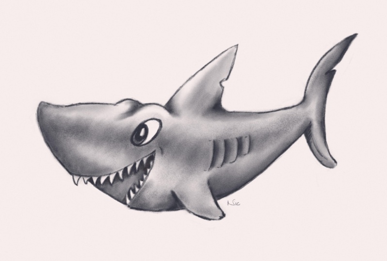
6. First Project - Gladys the Great White: Alright, just to get us into
a certain way of working, let's do a simple drawing. I'll make it up on the spot and hopefully show you a few
principles upon the way. So load up Procreate. I'm in my gallery section. Let's come to A four paper
learned draw spares folder. Let's just choose an
A four medium paper. So A four paper medium, swipe to the left, duplicate. Always work on the
duplicate for my brush. Well, I'll use DC pencil
medium. For the color. Well, I've opened
up my color panel, and at the moment, I've
got my palettes open. If you look at the bottom,
I have different choices, this classic. Harmony
value palettes. And I have my DC drawing
colors selected. At the moment, I'm looking
at this in compact view. You can see that at the
top, highlighted in blue. But if I come over to cards, whichever one is my selected
palette, it becomes bigger. And you can see with
this I've given names to these various
different colors. Because I went away and
I scribbled pencils and charcoals and various other ways of making marks on
pieces of paper, I sampled the colors, and these are the
colors I came up with. So you've got a reasonable idea of what kind of real world colors you're going
to be getting. So for this, let's try. Let's try softest pencil
and come back to compact, so I can see more palettes. Ask for my paper color. I I come to my layers panel, you can see I've
got the right layer selected where it
says, draw here. For my background
color, I think, rather than that warm yellow, I fancy doing a shark. On my solid foundations course, we did Anna the Angler. So let's carry this
on, give her a friend. Let's try Gladys the
great white shark. And so for that, what kind
of paper colour do I want? I don't want that warm colour. I want something a
bit note too great, a bit too dark. Let's try that. Perhaps color one, two, three, four from the left on the
top row of DC paper colors. Alright, so here's
the first tip. When you load up
a file like this, it naturally goes right to
the borders of your screen. But when I'm drawing, sometimes, especially when I'm making
something up on the spot. I often find I run out of paper. Now I can resize my drawing. But what I will do I will
take my finger and thumb, and I will just pinch
inward a little bit, just so you can see the paper. See the edges, and now I'm
going to do the opposite. I'm going to pinch out until I reach the sides of the screen, and then I'm going to pinch
out a little bit more so that my piece of paper is extending just beyond the
edges of my screen. So if I end up drawing something too big, which I often do, I know I've always
got a little bit of a safety margin around the
outside of what I'm doing. Okay, let's make a pentil mark, see how thick this pencil is. That is way too thick. So two finger tap to do that. Let's try the next size
down. What size is this? This is size 4%. You
won't have these notches. I think I mentioned
in a previous video. That might be a little
bit big, but no, look, I'll go with that
because I want to start by making some light,
broad brush strokes. There is something about
when you're sketching making really tiny little
brush dokes and tiny lines like that
doesn't really work. I want fast, fairly broad strokes so that I
can see the line. So I'll make my brush size. What size was that? 2% big?
Actually, you know what? I will go with that.
You will not have these notches on the slider
or the opacite slider. Remember, to create a notch, we discussed this in
the previous video, tap and hold on
the little slider. Then in my case, you keep your pencil
hovering over there while you press
that little plus sign, and then you get a
little notch that says, A past the 75%. That
could work for me. I'm going to take this down
to 2% size, and opacity. What opacity is this? This is 30%. Let's try that. Yeah. I prefer that. I'm getting some light strokes just to make my initial sketch. Alright, so three
fingers on the screen, slide down, and I want
to clear that layer. And so now I start
making up my shapes. Now, what shape does
a shark look like? Well, I'm working fast hit, you've got a slightly
snouty nose like that. And this is going to be
a cartoon shark, okay? Let's make it nice.
Let's make it friendly. And so I've got a tail
which comes up like this. The top of a shark, I
remember is fairly flat, but I want a bit of a
bend to it like this. It's got the fin. I
mean, let's face it, everybody knows a shark's
got a fin like this. And I've got the
tail fin. I believe the top bit of the fin in a shark is a bit
longer like this, and the bottom is a
bit shorter like that, and I've got is that
the dorsal fin? I think that's the
dorsal fin at the side, and it's gonna be quite rounded
like that, as I remember. And if it's a shark, it needs a big mouth with
plenty of teeth. Let's make it a happy shark. Come one as Anna
the Angler'sFriend. That seems a big smart.
Let's make it bigger. Come on. It's a cartoon shark. Let's exaggerate. There you go. You may notice when
I'm doing this, that mouth is quite scribbly, but I'm doing my best to
do fast brushstrokes, because there is
something about a line that you draw fast that just has more character than if
I was to draw that shape, look, if I make this layer
invisible for a second, and I'll create a new
layer drawer on top. And if I try and
draw the same thing, and I draw very slowly and very carefully like this and why
do what everybody does. Do scribbled lime because
we're not confident in making these long brush strokes and I'm being careful and
I'm scrubbing like this, and I'm coming around like that and scrubbing down
and blah, blah, blah. You compare that with that. And those brush strokes,
because they're faster and a bit more confident,
they just look nicer. So what I'll do, I'll call that layer three,
which I just created. I will tap on the
little icon where I'm circling and then
I'll come to clear, and I should be able to
use that layer later on. Come back to our
draw here layer, just where I'm doing
the initial sketch. I need an eye, don't I? Well, if the mouth is that, I need the eye around
here somewhere. Nice, big oval, and
it's a cartoon eye, so it's not like a
real shark's eye, which is very soulss. There's the eyeball. Let's make it happy. Now, if you look at that fin, all of a sudden that looks
a bit too far forward. So I have a choice.
I can come to my eraser. What is it set to? Well, that's set it
to the medium pencil, which is the same as I'm
drawing with because, remember, you can use any brush, any pencil to draw with, to erase with, to smudge with. And I just want to get rid
of things I don't like, so I'll put the
opacity right the way up and fairly large. And I can just get rid of that. And when it's gone, it's gone, not like a traditional eraser. And then I can draw
in the new shape, or if I press two things to
undo what I've just done, I will come to this icon
which I'm circling. This is the selection icon. And at the bottom, I have
various different choices here. I'm going to come to freehand. And when I've got that, I'm going to come with my pencil and draw a shape around
that fin like this, bring it back around and tap on that little gray dot to
complete my selection. And that means anything on
the layer I'm drawing on, which is inside that
little area is selected. Now I can come to this
icon, which I'm circling. That's my transform icon. And so now you can see I
have a box surrounding it. And if I put my finger anywhere either outside of that
box or inside the box, I can move that fin around
to maybe some light there, a little bit further
back on the body. Also, if I come to that
little green circle at the top, I can rotate it. So it's pointing a
bit more backwards. And at the moment
I'm using freeform, you can see that at the bottom. If I then come to distort, I can take one of these corners, and I can pull just
that corner to give it even more of a dynamic shape. Maybe about there. And
then the next question, people think is, how
do I get out of that? Well, with any graphics program, as with many different programs, you don't get out of this tool. You simply move on to the
tool you want to use, and that's what commits
that and let you move on. So I want to carry on drawing, so I come to my brush icon. That new selection and moving things around
is now committed, and I can carry on drawing. Okay, I quite like this. But I like to play around with that shape
a little bit more. So what I'm going to
do is introduce you to another tool which changes
the way you work completely. So this time, I'm going to come to this icon which I'm circling. This is the adjustments panel, and I'm going to come almost to the bottom where
it says liquefy. Tap on that. There's various
different things you can do, and I'm just tapping
on various things to highlight them in blue. But I want the one right
on the left called push. My pressure is on Max, my distortion is on zero. My momentum, that's
on zero, as well. But one I'm interested
in is the size slider. Because if I come and
I hover, there you go. You can see I have a
rather large circle. I wanted it even
bigger with this because when you're
doing stuff like this, you get the big shapes, how you want them
first, and then you start to work on finer detail. That is the exact same things
that you do in traditional, and you do it in digital, big shapes first, then smaller. You can see that is
absolutely massive. But what's happening is my pen is right in the
middle of the circle. I'm just hovering just
above the eye of Gladys. And then if I place my
pencil on my screen and drag downwards,
can you see that? Those brushstrokes
are getting dragged, and if I let go, you
get my pen again. And if I come to
the bit on the end, my pencil is right on the snout. If I drag that up, you can see I can adjust the
shape all I want, and I want more of an
exaggerated curve there. Remember, this is
a cartoon fish. I can exaggerate
as much as I want. I maybe want that tail
a little bit longer. So I'm just pulling around
various different shapes here, maybe a bit more of a
bend to the underside. Maybe a little bit less
around this area here. Yeah, let's make the snout
bigger, more of an angle. I'm looking for character
full shapes at this point. And I think I've got
more or less the big shapes that I want now. So now I'm going to
make my breast size smaller and start to refine
this a little bit so that I can just tweak
the very end and get a little bit more of a
bump. On the snout. The eyes maybe make those
a little bit larger. I'm going to make this
fin even more rounded, you saw me do that using the Select tool plus
then the transform. But you can do this using
the liquefied tool, and it's more interactive
and I like what it's doing. And only a shape that I want. Although I wanted to make that fin on the side
a little bit bigger, but it's starting to distort
the underside of the shark. So I'll two finger tap to undo that a couple of times.
Oops, I went too far. I adjust the tail. So
three finger tap to redo that step just for
the tail and carry on. And yet, I prefer that shape. So if I want to get
out of this tool, as before I move on
to the next tool, and that is my breast
tool, carry on working.
7. Gladys the Great White, part 2: Okay, so now I've
got my big shapes. I'm going to keep my
pencil the same size, but I want to start
refining this a little bit. I want a bit of a bend there. Now that I've done that,
hopefully you can see that eye has got more like an eyebrow there,
that's what I want. And if I've got that
there, there's going to be the same shape on the
other side of the shark, so I'll just pencil
that in like that. Now for the fin, I want a
little bit more shape there. I'm starting to draw in slightly harder because I want to start
nailing these shapes down. Let's round off that
eye a bit more, and I want a back
edge to this fin. As I remember, a shark's fin has got a bit of a notch in it, so let's put the notch in there, make it look a little
bit more shaky. And while I'm doing
this, I'm still pressing fairly hard
with my pencils, but instead, I can come
to my pasty slider. At the moment it's on 30%. Well, why not take it up to 50%? Carry on drawing like that and get some more definite strokes. Take this back around. Again, I'm being
careful not to draw little scrubby strokes like this because I'm
trying to be precise. So your finger tap
to and do that. And now I've got my
overall proportions, pretty much how I want them. I'm going to pinch
outward around the tail area so that
I can still make some fairly large
expressive brushstrokes, but again, they're more precise
because I've zoomed in. And when I zoom out again, those curves will
appear to be smaller, but I'm drawing at
a zoom level that suits the kind of curves
I can make with my wrist. We will be talking a lot
more about this when we start going into
the drawing gym where you start to
practice brush strokes and what hand movements make what kind of decent
brush strokes. But not yet. Let's just
do big picture stuff. Again, fairly quick
brush strokes there. Let's draw with a back bit do they have a notch
on the rear fin? I don't know, but I'll
put one in anyway, just simply to break up
this line which I'm doing so it looks interesting
rather than just a straight curve like that. I want to put a bit of
character in there, two finger tap to undo that. Alright, so let's come
to this bottom bit. Curve round, come like this and bring this
round like this. You will notice that
I've got a mix here of slightly more finished lines plus those initial sketch lines. Well, right now,
I've got a choice. I can leave them in there
because they're lighter, and also they add a certain
amount of character. If you look at lots of
different drawings, often you'll see
these sketch lines in and they look nice. You can see where the artist
has thought about something. I've done a stroke and thought, you know, what, I
don't like it there. I want to put it there instead. And when you do that,
you can start to read a sketch a bit
like you read a book, especially when you've done
a few sketches yourself. You know the kind of
things that you do, and hopefully you can hear my thought process
while I'm doing this, and I'm thinking, Well, do I leave the sketch lines
in or do I get my eraser and do I make it fairly small
and make it fairly opaque? I'll rub out the bit of the
line just where the tail was, where I joined the
tail to the body, and maybe a little
bit on the side here. For now, I will leave those floating sketch lines
around the back of the fin. I'm not sure I like them
around the bottom so much, so I might get rid of some of
them, but not all of them. I want to keep some of
the sketch lines there. While I'm here as well, I've decided I don't like
that little hump there. So what I'm going to
do is I will come back to my liquefy tool,
make it smaller. I'm going to raise this
whole bit up here. And I kind of prefer
that, I think. Can always come
back to it later. Come back to my raised
tool to move on, and I want to get rid of one
or two lines around here. I'm starting to get some
rather confusing lines around the eye because
I was a bit uncertain, so I made a lot of brushstrokes. But I'll keep one or
two this bit here. I'm thinking, if
I do a happy eye by arrasing that
bottom bit there, so you might take
a look at that. Yeah, that eye
looks much happier because it's like I've
pulled up the bottom eyelid, and at this point,
you say, Yeah, but sharks don't have eyelid. For the underside of the shark, I'm going to get my two fingers
and I'm going to rotate the whole thing around like this because like everybody else, I have one curve
that's easy to do. And that's where I move
my pencil using my wrist. I keep my fingers pretty still, but I just move my wrist
in one stroke like that, and I get an even curve. Drawing from the wrist,
we will talk about that. I'd like the underside to be
one smooth stroke like that, but actually, can I
get away with that? I think I can because
I want to have lips or a bit of a swelling bit around
the side of the mouth. In fact, I'd like it to be
a bit bigger than that. I've got no idea what this
is going to turn out like. And so there is a
certain amount of thinking out loud as I go along. But that's a good thing
because I want you to hear the thoughts that are
going on inside my head, what the process is. Now for that, I do like that curve that's
nice and smooth. I don't like some of
these curves around it because they're starting to distract from that
central curve. And also, that
curve is not going to be appearing behind the fin. So let's take this fin and
draw that in like this. Doesn't need to be
completely straight. I don't really want it to
be particularly straight. I want it to curve
around a bit at the end. Maybe curve up a
little bit like this. But, yeah, that's a fairly
character ful curve. I prefer that. And what
about the snout end? Let's come here and can I make? Yeah, I quite like that line. So I can use the
natural curve when I draw from my wrist
to come around. It doesn't quite join up. I
don't care. This is a sketch. Lines don't always
have to join up, and I'd rather it
be a carrot ful, smooth line than do
something where I start and then suddenly I slow down because I want to join
up and it doesn't work. To finger tap to do that. While I'm here, as
well, I'm getting a little bit slightly
confusing lines here. I think I might
erase some of these. I don't want it going
all the way back there. Drawing, using my wrist. Let's come here. Using my wrist, should I give a little
cheeky bit there? Yeah, I'll keep
that there for now, but one thing I
have forgotten to do I don't pretend to
be a marine expert, but sharks have
teeth and big ones. And if this is a cartoon shark, it's gonna need some big teeth. Now, whenever you do teeth, it can be a little bit awkward trying to get
the spacing right. And what I don't want to do, especially now that I've got
these nice curves is draw a whole load of teeth and
then start rubbing out a whole load of teeth and
rubbing out because eventually, I will cut into these nice
curves, which I've done. Let's make that one
a bit better to find because some of my
sketch lines I like. They're nice and free and easy, and some of my sketch lines are just confusing the
shape that I want. So I think the trick here is to decide which are these sketch
lines do you want to keep and which of them you
want to lose like this line here could
do with losing that. But I'll stop doing that now
because I want to move on. I will come to my
layers panel again. Do you remember I drew
that layer three? I'm going to come to
this one and show you another huge advantage of digital art because now I'm going to choose
my brush again. I want to start
drawing my teeth. So what like that that seemed about right for a shark
tooth. Another one there. And you can see I'm drawing and I'm trying to do little fast
brush strokes like this, and I'm not worried about going over the line of the
mouth. Like this. And some more air. Now, as they come around,
they're going to get a little bit narrower,
aren't they? I think, like this. Should have put in
a few extra ones. Yeah, 'cause let's face it, one thing Sharp's got
plenty of. His teeth. And now I'm going to choos my erase tool and
I'm going to get rid of those lines which are on
the outside of the mouth. And, look, I can do
this all I want, but if I try and erase
part of that mouth, I can't because the shape of the mouth is on another layer. I can only draw and erase and smear things on one
layer at a time. And so if I've got layer three selected, the draw here layer, which is where I did
my initial sketch, is completely unaffected. That in itself is
hugely useful and represents a major change when you're doing
digital artwork. And that has proven to
be very useful for me. But let me tell you a really,
really common gotcha. I want to come back in
and I want to just put a little bit more detail around
the outside of the shark. And so I choose my
pencil and I go, great, let's draw a little bit more
around here, like that. And I'm drawing on
the layer which just has the teeth rather
than the initial sketch. Look, it happens to everyone. Often it's no big deal. Sometimes it is a big deal. You draw on the wrong
layer because you forget to come back to
your layers panel and come down to draw here. So what I will do is I will two finger tap to get rid of those, then come back to draw here
and then draw my shapes like. This. So I've got the round bit of the
mouth because I'd like it to be slightly
three dimensional. Get and try and do some
nice, fast brush strokes. I know what I haven't done. I haven't done the gills.
Sharks have got gills. And as I remember this, three or four of them, they're
fairly regular. So, look, I'm going to show
you a little trick here. I'm going to create a
new layer by coming to my plus sign in
the layers panel. And this is just going
to be a guide layer. Now, whereas do you get
the gills on a shark? They're about here somewhere. I'm not drawing the gills. I'm drawing a shape where
I think the gills will be. About there, do you think, from the start of the gill
to the end of the gill, then I will come back to the layer where I
have my sketch. Zoom in as much as I like. In fact, I'm going to come
right the way around to again use the natural
curvature of my hand. I'm going to do one here, one hit, one ie, and one hip. Now, because I did that
little sketch box, I know where to start my brush strokes from and
where to finish them because, look, if I come here and make that layer invisible,
there are my lines. If I didn't have them, I'll
just draw off at the side. You can start to become
a bit uncertain about where to start your
brush strokes and especially where to finish them. So if you take a look at those
four marks I've just made, they're not quite as coordinated at the start and
at the finish as the brush strokes
I was able to make because I had this guide. Now, I don't need
that layer anymore. Let's make life simple. Swipe to the left
and where it says, delete, delete that layer. And now already, I've
got the problem. I want to erase that spare set of gills that I
did off the shark, but I'm not sure
which layer I did it on because you always
draw on the wrong layer. It's simple enough to figure it out where the little tip marks are just on the right side of all the names. Turn
them off and on. And yet, I can see
what's drawn on which layer by just turning the layer invisible and visible. So those spare gills are
on the draw here layer. Come to my erased tool
and get rid of those. While I'm here, as well, I need little bits here because as I
remember with girlls, they're kind of that shape. What happens is you build up a library in your mind of
what shapes there are, like the shape of gills
on the side of a shark, like the fact they have a
little notch in their fin. And I think, yeah, it is
on the tail fin, as well. I just a round off for this because I've
got my basic sketch. There, I think I'll crop this. I could make this bigger by
coming to my transform tool, choose uniform so I can size things and I can make
it as big as I want. But you can see the
problem with that is I size things on this layer, but I didn't size the teeth. So that's no good to anybody. Come down to where
it says reset, and let's just use my paintbrush tool to move on
from that particular layer. Instead, what I'll
do is I will come to my little wrench icon
in the top left. And I'm going to come
to crop and resize. Oh, now, that's really
difficult to see. There are some grid lines there, but because the paper is
white, you can't see them. So what I will do is I will come to Don without
making any changes, and I will come to
my background color, and I will choose something with a slightly
deeper tone there. Pinch inwards with
your fingers to zoom so you see
more of the canvas. And repeat. Come
to my wrench icon, canvas, crop and resize
there. Now you can see it. I'm going to take this bottom left corner and I'm going to
drag it upwards like this. And you notice what
I do at the top, can you see how many
lays I have available? Because I want this sharp to
be bigger in the picture, so I can make the
sharp bigger or I can make my drawing smaller. So if I come to
there and let go, that told me I have 313 layers available for me to carry
on drawing on with. That works for me. So
I'll come to Dunn. The canvas is cropped, and here's another
little tip for you. If your drawings like
this, for example, and you want to make it so
it fits nicely in the frame, just come and pinch inward
very quickly and let go. Didn't work that time there. I will come back to
my background color. I'll make it a
light color again. What was that? One, two, three? Was that the fourth along? Yeah, the fourth along
DC paper colors. And while I'm here, I will come to my
Ranch icon again and come to share share image,
procreate, exporting. I'll rename this, but
I'll come to AirDrop. My Mac is available as
a device to download to that sent on my computer. I will zip that up.
I will make that available for you
as a download for the next lesson in case
you want this image to follow along with when we do the next bit of this project, and I will see you there.
8. Gladys the Great White, part 3: Okay, let's carry
on with Gladys. And for this session, I might refine the
sketch a little bit, but mainly what I want to concentrate is adding
some shading to it, because this is digital, and there's various different
ways to add sketching, but it can't help if you modify your thinking from what you
know about traditional art. But the first thing
I'm going to do is my Gladys sketch is inside my
A four paper spares folder, so I'm going to rest my
finger on it so it pops up. I'm going to drag it up to
the top left hand corner. I'm going to plop it
down, say, there. And the reason I
do that is so that my A four spares folder doesn't start getting
clogged up with actual work. I'm going to come to
my Gladys sketch. I'm going to swipe left, and I'm going to duplicate. That way, I have
my original file and I can work on my duplicate. And if I completely
mess this up, I have the original just
waiting for me to pick up on. This is a really good
idea because if you're not scared of messing up your painting or your
drawing or whatever, because you know
you have a backup, it can give you the confidence
to try out New things. Okay, so I'm going to
take a look at this. The first thing is, those teeth, yeah, I'm okay with those
teeth. I quite like those. So I am going to merge them down so they lie on the same layer. Before I do, though, make sure my original
layer is selected. And when I come to my eraser, and I'm just going to
get rid of some of these guidelines just around
the open part of the mouth. The reason being is, if I turn on my layer three
with the teeth on, there's a lot of
detail with the teeth. You can see it's very busy.
There's a lot of lines. And what I don't want are the sketched lines to
interfere with that. So I'm just going to
erase the sketched lines. I can't go into the teeth area because they are on
a separate layer. You can hear me
making brush strokes, and you can probably
see my curse up. I'm tidying up the
line of the mouth, but I'm not affecting
the teeth at all. This is great news. Whoops. Went a bit
far with that. I got to remember I
won't affect the teeth, but I will affect the mouth when I start erasing around here. Alright, that'll do for me. So now what I can do, I
could come to layer three, which has the teeth on there, tap on that little dark
square or the layer icon. And there's something
here called Merge Down. When you tap on Merge Down, the layer you have selected and you know that because
it's in blue, is going to merge with
the layer underneath. So merge down. Everything
now is on one layer. Okay, quickly, pinch in and let go to zoom
my picture to fit. Do I want to make any changes to this before I
start shading in? Well, look, you may know that
artist's trick of where you look at your work in a mirror so that everything
gets flipped around, and it makes you look at your
picture with fresh eyes. Well, you can do that.
Inside Procreate. Really easily come to the
little wrench icon at the top. Make sure canvas is
selected, and at the bottom, you've got flip horizontal.
And flip vertical. I don't want to
flip it vertically, I just want to take a look at this when it's flipped around. And yet, straightaway,
one thing I don't like is this little
baggy bit under the eye. That's interfering with
the line of the mouth, and it's not quite
following the eye as well. So I'm going to get rid of that. Instead, I'm going to make
it a little bit more. Following the line
of the eye down, I'm going to spin the
whole thing round so I can use the natural curve that I get with my wrist. And
I think that works better. I'm going to erase a little bit more of that detail
around there. That is a bit distracting. Maybe a little bit around here. I'm also going to erase a little bit around
here to make sure that fin stands
out separate from the body without the
construction lines getting in the way. Now, the fin on top is looking a little bit more like a
fish's fin than a shark's fin, because a shark's
fin is triangular. It's not angled the
way I've got it. It looks more like the fin
on the side of the shark. So let's just quickly come
in to my liquefy tool, see if I can do
something with that. General rule, don't make big changes using
a small liquefy. Like this because you
get just wonky lines. It just doesn't work.
So I will come to where I'm circling
and press reset, instead, make the brush as
big as you can get away with. I'm going to pull that
along a little bit. Also, I maybe want to introduce a little bit more
of a bump there because the shape is kind of neither one
thing or another. I'd like it to
definitely be a bump and a curve like that
or a straight line. What I don't want is
something in between because then people aren't really sure what
they're looking at. I will pull this
over a little bit. Now, take a look at this. The liquefied tool is great, but if you really start to
pull a little long way, you start to get
that, the pixels that you're pushing around
start to get smeared. So the liquefy tool is great. You can make the
kind of alterations that you never could
with traditional media. But if you push it too
far, it's gonna break. So do your finger
tap to do that. I like some of the changes I've done, and just
while I'm here, I'm looking at the line
that I've just tweaked around with that bit where
my brush is of the tail, and I think that needs to be pulled up a little bit so that the top line forms a little invisible
line which carries on the curve that I've
created on the back. The curve I'm talking
about is this line here. Let's do that again.
This line here. When you're doing
sketches like this, make sure your lines line up, if that makes any sense. Make sure, for example,
that that line on the back matches up with
this bit of the tail. So you get a continuation of the flowing lines
around the body. The front of this fin
is just not right. It looks like an angelfish fin
rather than a shark's fin. So bring that round like this and a bit more
around like that. Oh, dear. I just cut into the top of the
eye. Not a problem. Use my arrase tool to
completely erase it. That's straightforward
enough. The back of a fin, I want that coming down a little bit out a bit further like this and in with a little bit
of a rough bit around here. And you can see, if I move my
brush a little bit smaller. Sorry, my eraser are
a little bit smaller. I can alter the line
as much as I want, and I can affect the quality
of the line all I want. Let's zoom that out. I'll not leave any trace of
what I had before. Okay, now I'm looking at
this, and I keep on thinking, yeah, I'll alter that bit, and yeah, I'll alter that bit. But no, let's move on
to the next stage, which is going to be shading.
Before I do, though. Well, there's no
particular direction that Gladys has to be facing, but I'll do a flip horizontal, and so the next bit shading. For this, I will
create a new layer. Alright, my new layers there. In fact, what I will do is
I will come here and I will rename this to shading. I'm going to give
you a bit of advice that you're going to ignore,
but I'll give it to you. Anyway, name your layers as you go along because
these little boxes, which I'm circling, those are little thumbnails of
what's on that layer. And often you can see what's
on there, but in this case, I can't because I'm using gray, and I'm not sure what
is on which layer. So naming your layers helps you to choose the right layer
when you are drawing. Alright, now, so, supposing
I want to color in Gladys, let's start off on the fin. Actually, no, let's
try the body here, and I'll do what we all
used to do at school. My pencil is selected. It's about 50% opaque. And I come here and I
start shading like this. I realize I run out of space, so I start shading here
and I come down to here, and I'm shading the whole
thing in like this. And after a while, my hand
gets tied and I get at bored, so my lines get further apart, and I've got these gills. So I'm going to have to
turn around and shade like this because I don't
want to shade over the gills, and it's all looking a bit
heavy and that's my shading, because I'm using a pencil, which has a sharp tip. Now, one thing I can do
is angle my Apple pencil. I designed these pencils so they work like
pencils in real life. Look, if I use my point, I get a fairly fine point. Now, I'm just going to
turn my pencil over to the side and do
the same thing again. And you can see I get
a much broader stroke so I can build things up by
angling my pencil like this, and you also may notice that
it's not quite as dark. Again, that's the way the
pencil's being designed. You draw with a point, you get a narrow
stroke, and as I started to angle my pencil over, so it's lying much flatter
to the surface of the iPad, you get a broader,
softer stroke. That's the way a pencil works. Three fingers wiped down. Clear the layer. Double check. I'm on the shading layer. But I'm going to make
my life easier by taking my brush size and
making it much, much bigger. Now, can you see that brush
head floating around? That's because I'm using a newer eyepad with
a newer pencil, and you get this floating cursor before you start making
your brush stroke. If you're using an older ipad with an older pencil,
you may not get this. But it's useful for me
'cause then you get a clear idea of how
big my brush size is. I'm also going to take
my opacity down to what, say, What do I have here? 30%. Now let's take a look. I want to turn my
pencil on its side. Can you see that? Technically speaking, I'm
still using my pencil, but I've made the point
of the brush much bigger. And by doing that, I can create these broad washes of color. And because I've made
the opacity lower, rather than having to press very lightly and
hoping for the best, and maybe in some places
I press a bit too hard, so it becomes uneven, I
can gradually build up The brush strokes to get really, really smooth shading,
very quickly, and it looks very professional
in double quick time. But you can see the
problem with this. Look, if I hover, my brush
head is really, really wide. Now, if I make it
back to being small again because it's a fine point, let's come say this bit here, and I wanted to
shade, say, the fin. Because my brush size is small, I have fine control over the point and where I'm
actually placing my shading. Now, because my
opacity is on 30%, it's actually much easier. To build up a smooth
area like this, and I can go back over
areas and gradually build up the opacity to get
some smooth shading effect. Compare that with the
opacity set to 100%, where to do something similar, I've got to press really, really lightly Liam and then I'm
getting a strong effect. And so I'm pressing
incredibly lightly, and it's still giving
me a dark effect. Well, that's the way I designed the pencil so that
if it's on 100%, you get some very strong
bold lines like that. But I designed it so that it works at different opacities. We do the sketch at 50% opaque, and if I press hard, you
get a strong wide stroke. If I press soft, you get
a softer narrower stroke. But if I take it way
down to 30%, again, I can gradually build up those different tones like
you used to do at school. And yeah, your hand's
going to get tired from all the scribbling and
you're going to get bored. But you can offset that by
making your brush size bigger. So Whoopie great. Camamotea all round
with extra honey. But hang on. Before we do that, the sharper eyed you may have noticed the
slighter problem. I've got this huge area beyond
Gladys, the great white, where I can put down
my broad areas, but I can't control
it the way I can when I have a fine
brush point like this. Instead, I've got all the
shading above the shark, and so this is the point
where I mention, again, one of the fundamental
differences between digital art and traditional
art and what to do about it. The fundamental difference is I can put down broad
areas of color, but I can't control what happens when it goes
close to the border. But you will remember
me telling you, if you use your Erase tool, if you put it on a pasity of 100% and you erase
the brush stroke, once it's gone, brush
stroke pigger it's gone. And so the way you
work is like this. You put down your
broad brush strokes. Then you erase them
back to nothing. Absolutely, no brush
strokes there whatsoever. I've done it just
on that one area, and you can see, I get
my smooth brush strokes. I can put down broad
pencil strokes, but I can also control where those broad pencil strokes
stop by using the eraser. Now, this is something
with traditional art, when people learn how to draw, sometimes the teacher
will tell them, well, eraser is not just for
getting rid of mistakes. It can also be used
as a creative tool, and then they show
you pretty much exactly what I'm
showing you now. The difference being
is, this is digital. And so I can erase, put down strokes, erase, put down strokes as
many times as I want, and the service I'm drawing on won't fall apart
like paper does. And that is probably the
single biggest thing I want you to take
from this lesson. A razor is no longer just there for
getting rid of mistakes. It is a creative tool, while we're here, let's take
a look at a smudge tool. What's the set to? Let's set
it to the same thing again. DC pants on medium. I'll make it fairly large. I'll do it about halfway opaque so I get slightly
less of the effect. And I'm going to use
it on the shaded area. Can you see what
happens when I do? Things are starting
to smudge out, but you're still getting some
of the grain showing up in that area just behind the gills around the tail
area, which I've smudged. The reason for that is
because of this top layer. This is why I supplied you
with different paper files. If I make this top
layer invisible, watch what happens
to the texture. Can you see where
it suddenly goes completely smooth where
I use my smudge tool? That's what this
top layer is doing. It's adding down extra texture, and the good thing about it
is if I swipe to the left, you can see I've got unlocked, I will turn the
lock off on here. And I'm going to come
to that little O, which stands for
overlay, by the way. But you can see my
opacity is set to 30%. I can make the paper texture
appear to be stronger, that's way too
strong for my needs. Or I can make it appear
to be more subtle. Like that is about half
of what I had before. And I think for this
particular drawing, that's going to work better. So I will swope to the
left again and set that to lock because I never want
to draw on that layer. I only need it there
to add a little bit of extra paper texture to the
drawing that I'm doing.
9. Gladys the Great White, part 4: Alright, that is all theory. Let's actually shade
this shark in. I will tap on the little icon to the
left of the word shading, and I will come to clear. Okay, so let's come back. DC pencil, medium, I want
the set nice and large. I want the opacity down low, where I might What
was that again? 30%. I'll do that. In fact, let's just
set this to maximum. And I'm drawing with a
side of my pencil so I get an even broader p stroke and I'm just shading
in certain areas. I would rather build this up. In two or three
different passes, just keeping my brush
strokes light, like this. And who cares if I'm
going over the edges? Because you're drawing when
you're younger, come on. You remember the
times you got praised because you drew right
up to the edges, but you didn't go
over the edges. And that's how you
learn to draw. But now we're learning
how to draw digitally. So stuff that. Go over the edges as much
as you want. You know what? I forgot to do something which
I meant to tell you about. I'll make my breast
size smaller. I'm going to make it really, really pale on the right side, I'm going to keep on
going over the left side. So eventually I get
something darker and darker. And I'm going to
increase the opacity up now to, what, 50%. Make my brow size a
little bit smaller. And I'm going to concentrate
on this left side and make it darker and
darker and darker. Take the opacity, take
it right up to 100%, make the bro size a bit smaller. So that I get the
maximum darkness that I'm going to get while
I'm doing this painting. Now, that is looking
very light at one end, but then suddenly going
very dark at the other end. That could have done being
a little bit smoother. Maybe if I come to
my smudge tool, make it a little bit smaller. I can no a bit bigger, actually. I can start to
smudge this so that I even out the dark to light transitions. And
yes, I can do that. But that is a reminder that this bit on the end
on the left hand side, that is the darkest tone I
can get using Where am like? My drawing colors. I think I was using the softest pencil. It's a dark gray, but it's not black. Look, let
me show you this. If I come to, say, the classic, that's
the gray we've got. That is completely dead
black. See the difference? And the reason I
mentioned this is because sometimes when people are drawing and I used to do it, you see it happen all
the time in schools. You're drawing and you
want a deeper tone, and you want something that
you think looks black. So you start scrubbing and scrubbing and scrubbing
away with your pencil, trying to get that black tone. You destroy the
surface of your paper. You get this dense, deep gray area that you've
just tried to make black, but it just won't go because the deepest
gray you're going to get is the deep gray here where I'm wiggling
my brush in front of. Now, I think later
on in the course, if you're working
from photographs, I'm going to show you a way
to make that, what is it? Mid to deep gray, the
darkest tone in your image, and that can help
you when you're trying to figure out your tones. For now, though, two finger
tap. Get rid of that black. And as I remember, the color before I selected black is the color I'm
using for this drawing. So all I need to do is
come to that circle in the top right and just press and hold just for a second
or so on that circle, and it recalls the last
color I was using, which in this case, is the color I'm using
for this drawing. Anyway, time is moving on. I think I might speed up
what I'm doing here so that hopefully you don't fall asleep. I'm using my pencil. I'm still using it
at a large size, and I'm still building
up using, what, 30% opacity to gradually
build up my tones. I want something a bit deeper. I'm going to make my
brush size smaller and I'm going to have
more localized black, sorry, more localized
gray in these fin areas. A little bit deeper for
the eye at the back. Maybe just a little bit
just around the edge here, just to put a bit of shading just on the
top, also on the back. I want to try and leave most
of the top of the shark almost untouched by
the shading because I want to get a little bit
of light and dark in here. But I think for now, I've got my first
pass sorted out. So now I come to my erased tool. I'll make it what size, 4%, and I'm still using my
medium pencil as an eraser. Then move around so that I can use the natural flow of my wrist to make
curved strokes because this is a series of curves
and just gradually take away the brush strokes I made
so that I can get all of these lovely soft transitions
and all these shading, but with a sudden cut off at the edge of Gladys
the Great White.
10. Gladys the Great White, part 5: One of the reasons I use the same brush for raising
that I do for drawing, in this case, a medium pencil is because the brush head look
at Zoom writing for this. If I make a brush stroke
like this, you can see, I've got a certain rough
quality to the edge of that brush stroke
look if I come to a slightly darker
area. Try it this bit. See how it looks rough, two
finger tap one, do that. And the reason for
that is I'm putting a negative edge when
I'm erasing stuff, and I want that naked verge,
is that the right phrase? I'm putting a border where
the lines of my sketch are. And I want that border to be a similar quality as the
actual lines of the sketch. Look, if I come and
I choose inking, say mercury, which is gonna
be a very hard edged eraser. Let's make that much smaller. See how that edge that
I've got there isn't matching up with the edge of the sketch because
it's too hard, so two finger tap do
that and come back to DC drawing, DC pencil medium. Now I want to make the edge. Yeah, it blends in much better with the
edge of the sketch. That said, look, bit smaller for these edges hit where I've got little
notches on the fins, but at the same time, drawing like that with that
really small brush. It's good for fine detail. Really boring for
the larger edges. So for the larger detail,
make the brush head. A little bit larger and
come from the outside in. Yeah, if I tried
to go too close, you can see already,
I make a mistake. That brush head is too big. Let's try it about 7%. And again, start from
the outside and come in. And, yeah, that's making
things a lot quicker for me because creative arrasing can give you some
very nice effects. But when you're
doing this, yeah, it can be a bit of a chore, but the payoff is
really soft shading, the kind of shading
that you've seen other people do and think,
but how did they do that? The control they must have over their
brushing, the patients. You can do really quickly. Now, there are a few things here that I do want to change. I want the whites of
the eyes to be erased, so you can definitely see that. And in fact, I'm probably going to put
sparkle in there so I will erase the whole of the
inner area like this. And so now what I'm going to do is add a little bit more shady and also add some deeper
shading in certain areas. So I'm going to
create a new layer. I'll probably end up merging this down so I won't rename it, but I'm going to do more
of the same this time. Cut my pencil, and I'm going
to come to the underside, put some deeper stuff there. And you can see I'm going
straight over that fin, and you're thinking, Oh,
no, what have I done, but look, come to my erase tool. I can erase that extra
bit of shading I did, but because this
is on a new layer, I'm not affecting the
shading underneath. So I keep the gray of the fin, but I just erase just
the bits I don't want. Let's carry on here
and repeat with this. Alright, now, what
else? Well, I think that needs to be
definitely darker. So, select my pencil. Let's make this a bit smaller. Let's just crank up the opacity
because this is going to be shade in, like this. Come on. Let's use our zoom
for what it's good at. So I can do all this detail. And I'm doing a pretty solid, darkest possible
tone in this area. Zoom art a little bit. Okay, that is looking
really dense, dense, black. No, no sharks eyes
look very dead, but this is a cartoon shark. We want a little bit
of life in there. So, come to my rays tool again, take the paste down. What brochure size shall
I have I'll hover over. That might be good for
the highlight on the eye. So I'm going to put a little
circle of light just there. And that gives a
little highlight. In fact, no let's do that
because generally speaking, when you're doing your
highlights on your eyes, you want them to be just on the border between the
dark and the light area. That works quite nicely. But also, I'm going to take
my opacity down to what? 22%. I'm going to choose
a larger brush, and I'm going to
gradually slowly build up a little bit of reflected light just around
the bottom of the eye. Again, your eraser is every bit a creative tool
and the actual brush. If you remember to use it for the things
it's good at, yes, it's good for erasing,
but also it's good for lightning certain areas,
which is what I want. While I'm here, as well,
let's make paste of my brush. 50%, I'm going to
choose some fine lines, and I'm just going to
strengthen some of these lines around the eye because they're looking a
bit indistinct right now. Do that. Yeah, that's starting to work a
little bit better. Now what about a
bag under the eye? I'm gonna make my brush
a little bit bigger. Add a little bit
of shading there. But I don't want it to
be the same thickness. I wanted to get
thinner at the end, so come to my arrays tool and just shave off the
bits I don't want. Again, the gray
underneath is not affected because it's
on a separate layer. On layers. Wonderful. Similarly bit of fine detail around
the mouth like this. You get darker. Provide
a little bit more depth. In the corners, and that's
starting to match up with the shading on the
underside of the shark, as well. So do that. Now, I'm tempted to go straight to
other areas and carry on. But if you're doing
this kind of work, it's best to do one
particular area, then erase the bit
you don't want. Then go and look
at the picture as a whole and do a little
bit of examining, is the shading matching up? Well know this bit here
where the mouth is, that could do with
being a similar tone, but a bit of a broader area. If you look at
underneath the shark, it's quite a broad, dark area compared to what's on
the inside of the mouse. Now let's build this up
a little bit like this. So the areas match up. Before I do too much with that, I'm going to add another layer, and I'm going to come
to the inside of the mouth because that
definitely needs to be darker. That's going to be one
of the very dark areas, but not completely dark. Maybe I've gone too far
with that in places. And also, look at this.
I'm being a bit timid. Can you see a slight halo
around the inside of the mouth? That's 'cause I colored
up to the edges. Oh, I've got a color
up to the edges, but not go beyond.
Well, no, remember. We've got our technique where you go right up to the edges, not care that much about it. C you erase, too? Just erase what you're doing. I'm doing a series
of strokes here. I'm not spending ages
scribbling away and doing lots of work and not taking
my pencil off my iPad, because what can
happen if you do that is that you can make
a mistake and go too far, and then you have to do your
two finger tap to erase, and all that time
you spent shading in one long go is wasted. Now, for this, I think I need more of a gradual
transition there. I am going to come up to the underside of
the mouth like this. But I do what I did before. Take my rose toll, set it
very low and pretty large, and I'm going to gradually
knock back this effect. I want it very dark, just in
the top corner of the mouth, but I don't need it
very dark everywhere. Okay, now, with this,
I've got a bit of a problem in that I need to erase this from
where the teeth are, but the shadings dark. I can't see where the teeth are. So what I do, I come to my layers panel, and
just temporarily, I will tap on that
little N. And when I do, you see all the different
layer blenmrge but also you get this a
paste slider at the top. And if I lower it a little bit, now I can clearly see the teeth and the
bits I need to erase. So eras needs to be finer, needs to be completely
100% and start coming in. Okay, I've done that.
Then when I've done that, come back to my layer and crank up the opacity to what it was before and
everything's arrased. Let's take a look at this.
I'm nearly there with this. But something that's not
quite sitting with me, maybe I need to do a little bit slightly
more highlighted work or a little bit
more shading work. Take my brush. What
layer am I on? Look, I'm pretty happy
with that mouth. I'm happy with the
underside of the shading. So I'm going to merge
this top layer down. And you know what?
Let's come and merge that layer down to
my main shading layer. So now I still have two layers, my drawing layer and
my shading layer. I just want to do a little
bit more work here, but as before, create a new
layout, work on that layer. An go close to the edges. You can go over the edges. Like this. Get rid of the
***** you don't want. But let's make it a bit bigger and lower the opacity so
I can on the underside, rather than getting
some sharp shadows, let's make it a little bit
more graduated like that, just on the back fin, as well. That's looking a bit too hard. That side fin I could do shaving just a little
bit like this. I'm going to come to
my main shading layer because I want the thin bit of the fin to be a lighter
color like that. Same with The big
fin on the back. Zoologists the world over. I'm sorry for my ignorance. Come back, add a little bit of finer detail around the
side of the fin there, on the underside, as well. A little bit just on the main
fin and behind the eyebrow. For that, I'm going to
use my smudge tool, make it fairly small and just blend things in a little
bit more smoothly there. You have to be careful when you use the smudge tool because you will still get some texture
from the top paper layer. But if you go too heavy with it, it can still look a
little bit too smooth. Ideally, it's nice
to keep as much of the texture as possible.
And we're very nearly here. I just want to try
something out first. Let's merge that down. You'll notice I
create a new layer put some brush strokes down, erase some brush strokes. Then when I'm quite happy
with what I've done, I merge down to commit. Sometimes when people draw, they have dozens and
dozens of layers. I've got no idea what's on what layer because there's so many of them and they
haven't named the layers. And so they never know
where anything is, which can be a bit of a
pain on the back side. Small, I just want a
little bit of highlight just over the eyes,
front and back. And also, one thing I
want to do where it says, draw here, most sketch layer. I want to get rid of that
sketch line behind so I get a nice clear looking highlight on the eye. Okay, I'm
very nearly there. Well, I want to keep
on carrying on, but I think I've got
my main points over, and so there will
come a certain point where I have to
call this finished. Let's try one more
layer. Use my brush. And I'm going to try just doing a shading layer which goes
down the side of the shark, so I'm going to
start off fairly big about halfway a,
and I'm scribbling. If I exaggerate it,
I'm doing this kind of scribble. I actually no. What I'm doing is this
kind of scribble. Let's make it smaller. Like that down the side of the shark. Make it the opacity a
little bit lower, 30%. I want to get an idea of
the shape of the shark. But I want a layer
coming down the middle. You have to provide a
little bit more interest on the side of the
shark. Like this. But I want a fairly
sharp terminator, a sharp line at the top, which gradually fades down as it goes down the
side of the shark. So what I'll do is I'll come
to my raised tool again. Set pass down 100. It's set fairly small, and I'm gonna's
make it bit bigger, and I'm going to eraise just this little bit which
I've done. Like this. Take the line there.
Definitely want to get rid of it around the eye area and also from the top I have the
bags under the eyes, the laughter bits, carrying it down like this,
towards the back. So I'm getting a sharper line at the top than I've
got at the bottom. Let's cut this back a
little bit more like this. And, yeah, I quite like that. It's looking a little
bit more sharky like the texture of a
shark's skin. Let's make it. Come on. Let's make
it a little bit more of a wobbly line like that. Okay, I'm very nearly there. I just want to knock back just a little
bit around the eyes. And yeah, I'm doing it again. I'm still looking
at this thinking, I wouldn't mind doing this and I wouldn't mind doing that. In fact, one thing I am going to do is come just to
the top of the gills, just on one side, add a little bit of
highlight just on them. There we go. I'm going to
come to my pencil, as well, and I'm going to make it a little bit darker just
around the base of the gill, which goes into the shading
on the base of the body, but also it goes over
the top of the side fin. And if I decide that's too much, come back to my
Erase tool again, cut it back where
I don't want it, but still leave the fin with a little bit of
a shadow above it. Okay, the very last thing,
let's merge back down. I'll leave the shady
on a separate layer. But what I will do
is I'll come to my Erase tool and get rid
of my reference there. A drawing is never finished. It's only ever abandoned. And then you come back to it in later years and think,
Oh, actually, look, let's come to my smudge
tool and just try and smudge that bit of shading just underneath
the shark there and maybe smudge a little bit
just on the other side of the mouth and all the little
things you're looking at, but comes a certain point
you've got to give up. You've got to walk away,
maybe come back to it in a month's time,
take a look at it, or in a year's time
and think, well, have I improved, which if you stick with it, you
will have improved. And oh, come on.
What am I doing? I keep on obsessively going back and just adding a few
more little highlights here and there and adding a
little bit more texture to the back of the body by making little smooth curve
brush strokes. That's working. I'm starting
to get the effect of light playing from the surface of the water onto the top
side of the shark, just in certain areas. And I had no idea
I was going to be doing this even 2 minutes ago, but I just wanted to
experiment around. And that's the point, experiment with brush strokes. Find out what you can do.
I'm making little X shapes. Down the side of the shark,
and I like the effect. So I wanted you to see it. Okay, I'm going to stop now for the main reason that this
video has gone on long enough, and it's only 3:00
in the afternoon, and I'm getting really hungry. I need some food. So I
will call this finish now. I can't help myself. I want a little bit more
on the top of the note. Stop. That was the sound of my pencil smacking
down on the desk. I'm stopping now. I will
see you in the next video.
11. Draw an Apple, part 1: Okay, I want us to
do one more exercise before we start learning the various different
drawing exercises. Before I do, though,
I want you to say hello to my
new little friend. And that is I got myself
a mouse and I set it up so that you can
see the cursor moving around the
screen like this. And so now there shouldn't
be any mistake about where I am when you're following
along with the tutorials. So, for example, if I come up to A four paper
lunch draw space, and for this exercise, I want to use a paper
with a bit of texture. So I will come to A four Mtons and I will swipe to the left. And tap on duplicate, take this out of my
folder so that I only have blank pieces of paper in that folder,
drop it down. Then tap on it, and
we're good to go. Okay, so for this, my brushes, I want to come up to DC drawing, and I'm going to come to, I've got MtonsPastel
sketcher at the bottom. For the paper color, let's come to our Layers
panel, tap on that. Come to our background
color, tap there. And for this, I don't
want golden age. I want my colors which
I've supplied with the course DC paper colors. Let's come down to here. And for this, let's come up to the first one. Tap on that. Honey, Yeah, I kind of
prefer that color because I want to use some
reds for my pencil. So if I come to my
colors for this, look, if I come up to cards
and click on that, I want here we are. DC drawing colors. And for this, I think I'll try sanguine three. I could do with a
little bit of color. Let's come back and
change to compact so I can see more of my
colors all in one go. And let's try a few
exploratory brush strokes. So let's take a look at this. That's the kind
of effect I want, and I'll do a two finger
pinch outwards to zoom in. That you can see, hopefully, what I've got there is
a mixture of my pencil, which has a texture
built into it, and I've also got
my paper overlay, which is also supplying
a grain there. So the combination of the texture of the pencil plus
the texture of the paper, that is what's hopefully selling the effect of me drawing
on me tans paper. Look, if I make this top
layer invisible for a second, that's the file
without the paper. This is the file with the paper, and you can see how the
two things together, the pencil and the paper
are selling the effect. Alright, so I want to come
back to my drawer here layer. I will tap just in the icon, and I'll come to clip. And then to fing a quick
pinch inwards to size to fit. Yeah, there's my piece of paper. Okay, so the reason we're doing another sketch here is for me to mention a few more things about digital art and
drawing in general, before we get down to, let's call the drawing gym. That is where you
start to learn about drawing straight
lines or circles and what hand movements and arm movements are good for
what kinds of brush strokes. Because this is you now,
this is the future. One model of learning
is you start with all the gym exercises and all the rather dry stuff
right from the beginning. And as you go along, you
learn more about drawing and your knowledge gets
broader and wider and wider, but you started off by
doing lots of exercises. I'll just to finger
up a couple of times. Another way of doing
it, and this is the way we're is we're starting off with simply doing
some drawing and talking about digital
drawing in particular. And so we get a slightly
wider introduction we come in and we
focus on our skills, and from there, we
start to broaden our field and gain a
greater understanding. So this bit and these bits, those are the drawing gym where we practice
our brush strokes. And as you go on, you start
to apply those skills to various different
subjects and build up your broader understanding of
drawing. That is the plan. Anyway, let's carry on just in case you're still awake
after all of that. Three fingers swipe
down, clear the layer. Okay, now, how big
do I want my brush stroke to be? Let's what's that? 19% and full opacity. That's a bit broad for me. I've got a good idea, Let's find the thing that
we're going to be drawing. This time, it's not
from Imagination. Come up to our wrench icon. And I want you to come
down to where it says, reference and turn that on. You get a little window. If you come to image and
then come to Import Image, this will take you straight
through to the Photos app, and I've supplied an image for you to download and
follow along with. It is this apple. Make sure
that is in the Photos app, and I can resize this window
Bang around like this. And this is what I
want us to draw today. To move the entire window, come up to that little bar in the top and drag that
where I want it to be, make sure I am on the
right layer, draw here. That's fine. Okay, so the
first thing I want to do is get that general
outline of the apple, which is basically a circle. But for my initial
brush strokes, that is too broad a stroke. So I will two finger
tap to do that. I will come down to what? What's that? 3% size. Let's try that brush stroke. Yeah, that could do the job. So all I want to do is make a broad outline of that apple. What I will do with
this is I will make it a little narrower, I move it over here, so I've got a bit more
space to work. If you have a computer, as well as an iPad that you
can sit in front of, put this image on your
computer screen so you've got more space to work
with on your iPad. Alright, so let's do outline. Just some nice foley free
brush strokes like this. Bring it round. That's
too narrow, isn't it? Let's make that bigger. Again, too narrow. Let's make it broader
like this, bring it down. And that's not looking a
huge amount like that Apple. But remember, we are
in the digital world, so come up to our
adjustments and then come down to liquefy.
There's my brush. It's fairly big brush
size. I want it bigger. With a liquefied tool, make
sure it's set to push, pressure on MX, distortion
nothing, momentum on nothing. And I want the size
to be a bit bigger. Let's try what 60%? Let's try that. Yeah, that
looks about right for me. Two fingers to drag up
my screen a little bit, and I want that circle
idea to look more like the apple in my picture. And again, for stuff like this where you're
doing broad shapes, you need a big brush size
with a liquefied tool. That's looking more like it. My size a little bit smaller. There's one or two little kinks just on the top of
the apple here. I'm not going to be too
obsessive about this because, well, no one's gonna
see the real apple. They're just going to
see my drawing of it, and apples vary in shape. And so if the shape I'm
drawing isn't exactly as the shape I've got in my
photo, who's gonna know? So what I'm saying is, don't get too obsessive about this. What I want to do for this
is a nice, quick sketch. So I'm going to come
to my eraser tool for my eraser, what have I got? I will look. No,
I will come down to the same brushes I'm
using to make marks with, but I want the opacity
all the way up. I want my size fairly small. Oh, h. Let's try that again. Let's come up to our erased
tool. Yeah, that's better. Because I knew
that I didn't have any notches on my eraser, but I do on my actual pencil. But for some reason, I
clicked on the eraser, but it didn't get selected. Never mind, let's just erase
this one little bit here. Let's come back two. My pentil and still the same brush size. I need the stem of the apple. What I can do is I can come over to where the
stem is in my photo, and if I just pinch outwards, I can zoom in on that detail. Now, I know the mistake I could very easily
make with this. I'm going to say the stem
is on the top of an apple. And so therefore, when I start to draw the start of the stem, let's draw it at the top
of the apple like this. And that is an example
of something I will be referring to constantly
throughout the course, the curse of assumptionts. I'll talk more
about it later on. But basically, when we draw, we always assume things
about the object we're drawing rather than actually looking to see what
is actually there. Like when I was a
kid, I learned that the stem of the apple
is on top of the apple, so I draw the stem of
the apple on top of the apple without bothering
to check where it really is. So let's undo that
a couple of times. And also, I seem to have managed to get to Bigger brush size. Let's come down to the
second bottom notch, 3%. The start of that stem is lower down because I'm looking at
it slightly from the top. Let's try it about,
say about there, if I come and two
finger tap outwards to zoom in on that area, and let's deliberately
do a bit of assumptions. The stem of an apple sticks
out of the top of an apple, so I'm going to come
like this. Well, no. And what I did
there was thought, the stem has to stick out
of the top of the apple, so there's going to be more of the stem above the
apple than there is actually inside the outline of the apple. That is not true. If you look closely, and I'll use my mouse, you see that distance to
that distance there. That to me, looks almost exactly
the same as the distance from there to there,
the top of the apple. So the length of the
stem of the apple meets the back edge of
the apple about halfway. So rather than just
looking and assuming, I have to measure things, this is a corsic of drawing, and it doesn't matter if
it's traditional or digital. So to fing a tap to undo what
I just did, and instead, the apple comes out from
the top of the apple about Imagine it's the hour hand
of a clock on a wall. It's coming out at about, what, just past 1:00. So I draw a mark just about
1:00 on the other side. Again, I've gone a
little bit too far. If I use this bit
as my halfway mark, then the top of the
stem is gonna be about there somewhere.
Come to my rubber. My razor, sorry. I just get rid of one or
two bits that I don't need. And I have the basic
outline of my apple.
12. Draw an Apple, part 2: Okay, next thing, I've
exported this file. It is available for
you to download if you want to follow along
with the same sketch. But what I am going to do is
come to my reference window. I'm going to zoom out a little
bit because I want to see a little bit of the shadow of the apple as well
as the apple itself. And for my main apple, again, I'm going to pinch
inwards to zoom out. Alright, so let's come back up. Double check my pen,
MtontPastl sketcher, and my color is
the same sanguine. Three. Alright. Let's come over. I want my brush
size to be bigger. Let's try I try 45%, and I want it to be
about halfway opaque, because what I want to do now is start to build up
some of the shading. Let's come round like this. And you'll notice
I'm happily going over the border of my apple. Remember, I can always
knock this back later on. Let's make my brush size. Let's just make it maximum size. I want to do the
shadow while I'm here, and there's a fair amount of shading on the right
side of the apple. I want to get all that
in. There's very, very little on the far side. In fact, the outline of
the apple has more to do with the darker tone of the canvas that
apple is sitting on, so I will do a little bit
of shading just around here just to let me
know the form is there, and straight from the off,
make it a little bit deeper around here, let
it fade out here. I'll make my breast size
a little bit smaller because I want to do
some more localized, deeper areas of color. Just where the bottom of
the apple meets the canvas, and we get a shadow
there because one thing I've noticed a lot from students
on my foundation course, but also my other
courses is that people can be very shy
about doing deeper shadows. You often get quite a
broad area at the bottom. Of an object that is
sitting on a surface, but the object doesn't quite look like it's
sitting on something because people are worried
about the shadow being too deep and also in
general, I've noticed. People are very shy about
putting shadows in. They might do it just
a little bit around the very edge like
this, but no more. Well, I don't want that. To
finger tap to undo that. The only way you can see
the shape of an object, apart from any horizontal
lines or vertical lines which distorts to go around an object is mainly
the shadow areas, and a little bit the highlights. They can really help sell an object a little
bit around the top. And also, I'm going to pinch
in a little bit, sorry, pinch out to zoom in, and I'm going to
put a little bit of deeper area around here. I'm doing areas of color here. Not sketching like this, you can do that, and I may
do it at some point here. But for now, I'm going
for areas of color, so two finger tap, do I do that? My brow size a little bit
smaller and starts putting, Oh, look, we've got a shadow
area here, haven't we? Going over the top of the apple. It's going round in a curve, which is helping
to give the idea of the outside of the apple. Maybe a little bit
deeper around here. And also, I've got one or two
bits coming out of the top. They look more like different
markings of the apple, but they're helping to solve the form, so I'll
get some of those. But at this point, I've
got my broad strokes in. I'm starting to go into some
of the more detailed areas. But before we do that, I want to refine
this a little bit. Remember, put down your
broad strokes and then control them with your eraser. My pacity on maximum,
my brush size. Well, let's try it around
12%, see what that is doing. Yeah, if I come to the
left side of the apple, that's kind of the
effect I want. Now, you notice because it is the same brush but
used as an eraser, I am getting a
slightly textured edge to the apple, which
I quite like. But for now, let's
take it down to 6% so I get a slightly
better defined edge. It's still got a bit
of texture in there, but I'm able to control
that hard edge because I want a mix of hard
edge and soft areas, two different things,
getting the contrast there. And that idea of
blending opposites, that's going to give you
some pleasing effects. And around this
side, as well, look, for this, I want that
darker area on the left. Let's get my mouse.
This area here. I want that darker area
on the left because that's what we've
got in the picture. Look, let me show you this. I put down just
enough brushstroke to give the idea of there
being a background. But I come back to my brush
brush pasty set halfway. I'll take my brush
size up to maximum. One thing I didn't do was say, Well, there's a darker
background there. I can see the background going to the edge
of the picture. So therefore, I will do
the whole thing like this. Well, I can see it
in the photograph, so I'll do it in the
drawing. You don't need it. If I two finger tap,
I just want that shading where it's helping to define the shape
of the apple. I don't need more. Otherwise, it becomes just a little
bit too oppressive. Anyway, let's come back to a
razor and came around here because what I want here on the right side of the apple is the
opposite effect. I want the darker
shade of the apple against what is now the lighter
part of the background. So I'm getting the
form of the apple defined in two separate ways. Dark against the
light background and light against the
slightly darker background. Now for this, I'm going to
be a little bit careful. Maybe make my brush size bigger, maybe knock it down to
a round about halfway. Try and blend this area here. So I get a softer
area around here. Yeah, and I prefer that. While I am here, if you take
a look down the bottom, it's not completely
dark around the bottom. You're getting a
slightly lighter area. So brush size down to what? I'm down to 14%. This may work. Let's find out. My opacity is around halfway, and let's put in a few strokes just on the underside
of my apple. Hopefully you can hear
the sound on my pencil, I'm working fairly fast because
I want some fairly fast, fairly confident strokes here. I know there is a very
hard division here, where you get the
deepest part of the shadow against the
underside of the apple, but to be honest,
I'd rather this gets blended in a little bit
more smoothly than that. I'm using a textured paper. I'm using a texture brush, and it's capable of getting some very soft and very
subtle transitions. And so I'm just trying to suggest the form
of the apple with some gentle light and shade with one or two slightly harder
areas just to mix things up. Don't want to go
overboard with it. Let's come back to our brush. Make it a little bit smaller. It's on 50% opacity and just
put back a little bit of the brush strokes
there just so I get a gradual lightning of the color rather than
a sharp band of light, which I had just a short while ago while I'm down
here, as well. These are the deeper
shadows of the picture. Let's my brush size a
little bit smaller. And let's just get some
deeper areas around here, and I'm going to extend
it up a little bit, even though it's not
there in the picture. Sorry, the photograph, so
the picture as a whole can look a little bit more dynamic in terms of dark and light. What am I doing here? Let's
take a look at this stem. Definite shadow on one side. More of a mid tone
for the main stem, again, I'm making brushstrokes
all in the same direction. And there are some
highlights there. Now we'll come to
that, but there is a darker area at the top, so let's put that there. Don't want to do too much
more for the stem than that. Alright, let's see
what we've got. I'm getting there. I'm going to come back
to my eraser now, and I'm getting to the stage
now where I'm looking at my sketch as a whole and looking at the
photo and thinking, maybe I need this here
or I need that there. And what's not agreeing
with me is where the stem meets the apple. So pressure selected,
let's take it. So it's fairly small and 100% opaque and bring
it down like this. And I've got a little
bit coming out here. But I think what's going
to make this is to come back to my eraser
set very high and very small because I want this hard transition where
the stem meets the apple. You can see it on the picture. Now I've done that,
let's make it a little bit bigger, my brush, and blend that in to this large area of shading
I've got to the right. By making my brush a
little bit bigger, and just softening
that broad raised area just on either side to
the left and right, just here and here, so things blend in
a little bit more. While I'm here, let's try doing some little curvy
strokes just around the outside of the apple to
suggest the roundness of it. Now you don't really see
that in the actual photo. But again, people aren't going
to see the actual photo. They're going to see the sketch. Now, there is one
more thing which I do want to do with this
because at the moment, I'm using this sanguine red against a fairly
light background. And the nice thing
is, the background is a similar color to the
local color of the apple. It's got that lightish green, but on the apple, I have this. I have the highlight, and a little bit of highlight
can really help. Your drawings jump
into three D. So what I'm going to do is I'm going
to come to my layers panel, and I'm going to come
to my little plus sign, and I'm going to
add an extra layer. I will come to my colors. I remember we were using
sanguine three, weren't we? Well, look, if I come
over to the side, I've got this one here,
sanguine tint three. I would choose that. It's
almost white, but not quite. The brush, Mutants, I will take the opacity
down to about halfway. I will make the
brush size bigger. Come on. Matt size
I'm using 19%. And then I'm going to come to where I can see the
highlight in the drawing, and I'm going to add some white. I'm going to tap, tap, tap as well as scribbling to get a slightly
mottled highlight. Look, if I come up
to my layers panel, and if I make this
layer invisible by clicking on that little
tick mark, that's before. That's after just that
one tiny bit of light, and all of a sudden, I'm getting a much more three D effect. Well, look, while we're here, let's carry on with this because there's some little highlights
on the stem of the apple. Let's come here and
try that. For that, though, I'm going to need
a lot smaller brush. That's come down to where am I? 2% halfway opaque. I'm just sticking
a few little bits. I'm just scribbling rather than a smooth brush stroke
like that. I'll do that. I'm making little stabby
brush strokes all way down to suggest
the texture of it. Mouth a little bit.
That is a little bit over the top because I wanted to make the point
that you can do this. So come to ras tool, nice and small 100% and just knock back some
of those highlights. And because I've done
it on a separate layer, I can erase those highlights
where I don't want them, and I'm not affecting
that red underneath. On layers are wonderful thing. While I'm here, let's
come back to my brush. And I wonder, just to really help things
along a little bit, if I put a little bit
of this white just on the border of where the
stem of the apple touches, the darker area or
the shaded area, tiny little bit on
the other side. Think of this as adding
spices to the stew. You put too much, it starts to look a
little bit overdone. And what about maybe
the tiny little bit just on the rim of
the apple like this. Now, let's zoom out a little
bit to see what I've got. I'm looking at it
now and thinking, Oh, I could do this,
and I could do that. Oh sorry, there's one
thing I do want to do if I come up to the top
and I just click and hold in that little
color circle, just for a short while, it will give me my last selected colour. A paste about halfway. My breast size a
little bit larger. Well, should I try, okay, 20%, because there's just
a little bit more dark around the top of the apple and just around
the side of the apple. I gradually fades out. And I just want to suggest that. But at this point, I don't
want to do too much more, a little bit deeper
around the shadows. But again, I'm going for
a soft shadow there, a soft line between the apple and the
canvas it's sitting on. If I look at the
picture, that shadow is kind of looks a
little bit like an iron. Look, you got this kind
of a shape like this. Not sure I want that. Might
be a little bit distracting. I'll make my breast size
a bit bigger and suggest it but not quite a shop
because otherwise, I think it would be a
slightly distracting shape from the apple itself. And you know what? I've just made the
classic mistake that I keep on telling other
people not to do. Look, I had all my
reds on one layer. Then I said, Hey,
here's a great idea. Let's add another layer and put all our highlights
on that layer. That way we can work
on the shadow areas and the highlight
areas separately. But then I forgot
to come back to my layers panel and
choose draw here. Instead, I put some red marks on the layer with
the highlights. That doesn't really matter to me now because this is
a simple sketch. Another time it might matter. Now, any other final
things I want to do? Yeah, I'm going to create another layer,
come to my plus sign. And calm down this area here, and I'm going to do a slightly darker area just on the outside, and then I'm going to come
back to my eras tall again. And it's set fairly small, and I'm just going to reapply. Erase tool just to this one area because that background which I was talking about earlier, well, it was helping to
show the form of the apple, but at the same time, it was starting to look a
little bit monotonous. So what I want to do is
just put a little bit of slightly deeper color very close to the area of the apple. You can see I've got rid of
nearly all of the bits of that shading which went into the apple. Not
quite all of them. I want to leave just a little
bit of roughness there because one of the
nice things about a sketch is quick brush strokes. One or two mistakes left in. In fact, sometimes
when you see a sketch, the mistakes or the lines that the original artist abandoned, they can be the most fun lines. There's a certain
energy to them. But with digital, you can
erase absolutely everything. And so the next question is, should you erase all the
things you think are mistakes? All I would say is, yes, you can erase any rough lines, but it's up to you whether
you think you should. Anyway, let's take
a look before and after with this.
That was before. That's after. Let's look
at it a little bit zoomed out because things look different when
they're zoomed out. Before, after, I prefer that. That shaded areas a
little bit more dynamic. And also, there's one or
two bits on the apple, which I forgot to erase. But now that I look at them, I quite like them, so
I will leave them. Okay, that is our second sketch. Very simple apple, just
showing you some principles. And yes, right now, I'm
looking at it thinking, Oh, I wish I could do this, I wish I could do that,
but I will stop. Okay, this is the end
of the introduction where hopefully
you do a couple of sketches just to
get your feet wet. And I've spoken about
some of the differences between traditional
art and digital art. But next up, I want us to go to the drawing gym where I will break down the
various different finger, hand, and arm movements you will use to make your brushstrokes.
I'll see you there.
13. New Section! The Fundamental Techniques of Drawing: Okay. Hello, A, welcome
to this new section. In this section, I want to
talk about how we actually use our bodies to draw with if you like the nuts and
bolts of drawing. Because digital art has changed just about
everything with art, but our bodies haven't changed. They stayed the
same. And there are still some ways to draw which
are easier than others. Okay, now, even if you've not had any formal art training, you will have had some training using one of these
When you were younger, well, not digital pencil. I mean, a real pencil.
Because think about it. When you were young, you have to learn how to
control the pencil. What did you get a whole load of praise for drawing? Yeah. Neat handwriting. So if you've had any
training whatsoever, it will have been holding
using, say, the tri grid, where you use two fingers in your thumb and you draw
and you draw very, very neat strokes like this, and you get praise
for drawing neat. But it's all very tight.
And yet, did you do this? Yeah, you did that as
well? Yes, you did. But later on, if you do
get any art training, you start to learn
to use your pen or your pencil or your paint
brush in different ways. Now, let's come just
for a second to this. This is my 22 inch
drawing tablet, and very nice it is, too. And the good thing
about it is I can make a very broad sweeping
brush strokes using my shoulder because
my shoulder is the only ball joint in the entire chain that
I use to draw with. Think about it. Be joint, nice big sweeping strokes, my elbow, it's a hinged joint. My forearm, well, it can kind
of twist around like this, but we tend not to use
that very much in drawing because all you're doing
is that with a pencil. Then you've got your wrist, which is a hinged joint
plus your fingers, which are a whole different
series of hinge joints. So your shoulder,
that's what you use to make your large
expressive brush strokes, and I can do that here. Incidentally, alright?
This is Rebel. Program I'm using
here is called Rebel. I think it's on Volition
seven at the moment. And if I'm drawing on
the mac or the PC, which I do quite often, then Rebel is my pain
program of choice. And look, I'll just
show you an example. I've got watercolor bra selected if I make
a big stroke like this and I mean, look at that. I've got paint dribbling
down my virtual canvas. That is mad, alright? And also, look, I can
get I blow it too, and I can blow this
paint around like this. Really smooth it around and
also look if I come down, I've got also some little
granulation pressures so that I can draw little speckles and watch them interact with
water at the same time. That is a load of
fun, but that's not really what we're
talking about today. Look, the main difference is, if I look at this screen
size here, nice and big. This is my iPad. This is the currently
largest ipad we've got 13 " and take a look
at the screen size. It is quite a bit smaller. So those big brush strokes
I can do with my elbow, it's not so easy to do when you're using
your iPad because, look, supposing I was to have it like this and I was going to
draw from the shoulder, it's just simply not quite as big as the
canvas behind me. Quite often, when you
go to art college, you have these big pieces
of paper and you'll draw at a distance to get your big expressive
brush strokes. With the iPad, what that your
maximum size at the moment. Hopefully, Apple will please make a bigger version
at some point, which would be
really nice. Yeah. Anyway, with it, I'll just three fingers swipe
down just to clear my lamb. Now with this, I'm a little bit more limited
in what I can do. There are certain
things I can do like if I lift my elbow up and I draw a little bit
more from my shoulder, I can kind of do that. What I don't want
to do is to get really crunched up like
this and see my wrist. That's resting
against the surface of the ipad and my desk. When I do that, I
can only really draw from my fingers
and my wrist. Well, that's all
very well, but if you want to do things
like a straight line, for example, you're
gonna have more luck. It's just rest it
against the side of my desk by drawing
using your whole arm. For example, here. You can draw one, two, three different straight lines just by moving my entire arm. And when I start
my breast stroke, I'm not too close
to my own ribs, that will affect the
start of my bras stroke. If I draw the other
way down like this, draw my line, but eventually I start hitting my own
roots with my elbow. These are just things
you have to be aware of. You have to be aware of
it with traditional art. But with digital, because you're working on a slightly
smaller screen, and chances are you're
sitting down like this, rather than standing up and
making big brushstrokes, you've got to be aware of
your own body and where your iPad is sitting
in relation to you. For me, well, I prefer to do it just resting on
one knee like this. I also prefer to get a
little bit further away, especially for my first
strokes where I'm sketching out fairly large
lines. Find it easier. When I start getting
into more fine detail, then I might be a
little bit encloser. I might put it down on
the desk so that I can do all this fine ferwork that I learned when I was
learning how to draw neatly. Well, no, actually, I was always being told off for
having terrible handwriting. Oh, well, Okay, look, I'll wrap this video up for now. In the next video,
you're going to be looking over my
shoulder directly onto my iPad and what my hand is doing because it's
time you went to the art gym where you
start building up your different technique
of how to make things like straight lines, circles, curves,
things like that, and this is where
you start to build up your artistic muscles. Okay? I'll see you
in the next video.
14. Drawing Straight Lines: Okay, welcome to the Art Gym. I did say at the end of the previous video that
in this video, you're going to be
looking over my shoulder. So well, here we are
looking over my shoulder. The file I'm using is any one of the paper files or just a
file you create on the spot. The pencil I'm using
is DC Pencil Extra. Fine. I'm set to 4% size, and my opacity is on 50%. It can be any brush you want. The whole point is just to
practice making strokes. Now, the first thing to say is, I'm going to show
you these exercises a bit like an
instructor at a gym, but it is up to you
to do the exercises. For example, I'm about to show you how to draw a straight line. And so what I need you to do afterwards is to practice
drawing a straight line. And basically, I
want you to fill pages and pages and pages and pages with hopefully
straight lines, hopefully straighter than that. Because calling this
an art gym, well, it is actually a lot like a
gym. You need to practice. You need to build up
your art muscles, and you're going to have a
better time of it if I show you some good technique
right from the start. Okay, so the very first thing, how do you hold your pencil? I'll be honest with you, it
varies from person to person. Now the standard way that you are taught
when you are young and you're learning how
to write is the trigrip. That is one finger, one finger, one thumb, they all come together and they make Fy control very, very easy. That is for writing. For drawing, it's
slightly different. The way I prefer to hold my pencil is a little bit
more relaxed like this. I see some people on YouTube videos holding
their pencil like this, which if they're
doing fine control, Okay, that's what
works for them. But when it comes to
making things like straight lines or
curves or circles, then the tri grip yeah, it's a good starting point, but there are other things
that come into play. So let's start off
with straight line. Before I do, for all
of these exercises, which I do want you to repeat again and again and
again, breathe. You're going to have a lot
easier time with this when your breathing is nice and
relaxed and controlled. In fact, some people find that drawing can be
a little bit like meditation because
they naturally find themselves getting
into a calm state, and the way you do
that is by breathing. Alright, so let's
show you before. This is before.
Let's draw a line. Probably the reason
we do something like that is because
we're so used to doing fine motor controls
because we do writing. That's how we learn
to control our pen. But it doesn't really work for drawing things
like a straight line. So three f to pull
down, clear my layer. One thing I do want
you to do before we start, come to preferences. I want you to come
to the wrench icon, preferences, gesture controls. And this bit here, enable
painting with finger. If it's turned on, turn it off
because a lot of the time, you're going to be
resting your finger or the side of your hand on
the iPad when you're drawing. It just helps to stabilize things when you're
making brush strokes. And so for that
reason, I don't want my finger making any brush
strokes I don't want. I only want my pen to do that. Okay, so the first thing,
the straight line. I find as a right handed person, the easiest way for me to draw a straight line is like this. And already, I've got a little bit of a kink
in the end of my line. I'll tell you why that happens
and what to do about it. Quick pinch inward and
two finger tap to one do. I don't draw a tightly
controlled little line like I showed you before. I try and do it all in one go. I keep my fingers and
my wrist fairly stiff. I'm not tensing them up
or anything like that. I'm just keeping them still. Any movements I do, I'm gonna do from my shoulder
and maybe my elbow, like this. It is so much easier. Okay, so when I made the
previous brush stroke, I drew my line and I
stopped at the end, but I kept my pencil on the surface of my iPad.
Let me undo that. I'm going to exaggerate
this a little bit and show you
just from the side, I do this thing where I swoop in onto the surface of my iPad and make
my brush stroke, and then I lift up at the end. Seen from the side,
it would be swoop in, make your brush stroke
come off at the end. Bit like an aeroplane,
come into land, make your runway, and
then take off again. Now, what can happen and you can see this when
I came into land, my pencil is set up so that
when there's less pressure, you get a more
transparent stroke. That makes sense because
that's what a pencil is like. But for this, if I just
want a straight line, I have to do a fairly
steep line and a fairly steep takeoff but try and make it
smooth at the same time. So in and out like that. You can see I try and do
it in one smooth stroke. Now, there is one
thing about this. Any paint program is
going to give you the ability to automatically
do a straight line. I procreate, it works like this. You make your brush
stroke and you hold at the end. You see that? After just a couple of
seconds, you get this, you get a line, which
is perfectly straight, and it's a bit like
an elastic band. You position it to where
you want it to go, you let go, and it's there. And if you want to
adjust it some more, you can even come to the top
where it now says editing. I've got a line, and I have a blue point on the end and a blue point
on the other end, and I can move this around to wherever I want to go,
supposing I want it there. Come back to my pencil
tool that is now set. And I'm ready to move on to
the next line. This is great. This can save you a lot of time, especially if you're doing
construction lines that you don't really want to appear
in the final drawing. But my problem with
that is, look, if I take this and I do another line right next
to that first one I did, you can see my perfectly
straight line shows up the fact that original line
I did wasn't quite straight. But the thing is, though, up until a couple of seconds ago, that line was straight enough. It wasn't perfect,
but for my purposes, it did look straight
and it looked human. It looked straight in the way that a human would
draw a straight line. You start mixing that up with the perfection of a straight
line like this one, and you can end up
getting a bit of a mismatch between
the perfection of a computer drawn
straight line and the slight imperfection
of a human line. And sometimes those two things don't sit very well together, which can leave
you with a choice. You either do everything
the human way. It's not perfect, but it's
good enough. It looks human. It looks hand drawn, which
means a whole lot of practice, and you're going
to spend a lot of time drawing straight
lines like this. Can you see how I've
put my elbow out to the side so it doesn't
knock against my body? And also, I'm drawing
in the center of the screen because if
I come to the edge, this bit, the heel of my hand gets knocked against the side of my iPad cover, this thing. So be aware of that.
Okay, the next thing, I want you to put a point in
the middle of your screen. And now I want you to draw out if you like hands
on a clock face, and I'm going to
start off drawing like this. That's fine. Draw like this. That's okay. And you see what I
did there at the top? I left my pencil on a little bit too long,
so I'll undo that. I'll try doing that
again, and I drifted off. I took off on the
end of that stroke. Got a slightly straighter line. What I find with this
is that there are certain angles like that
is not a good line. The angle I'm drawing at now, for me, a right handed person, it's not working well
because for one thing, my elbow is starting to knock against the
side of my body. Also drawing and
trying to push up like this is not quite as easy. No, what I find as a right
handed person is that drawing lines like
this around the 1:00, 2:00 mark, if this was
the hands of a clock, those are the easiest straight
lines for me to draw, so it follows that either I
can move my iPad around or two fingers just drag around and I can play
to my strengths. That is the easiest
angle for me to draw, and I can always rotate
the canvas around to do that from any angle I want. I'm going into my comfort zones. Now, eventually, it would be
nice to develop the skill so I can draw lines like that you saw there
at the beginning. I got a slight kink at the
beginning of my stroke. Because, again, I
had a slight nudge against the side of my body. These are the kind of
physical details that you don't realize until someone
points them out to you, and then when they
do, you think, Oh, yeah, of course. Why not? Okay, so that is straight lines, and I'm going to give
you a little exercise. I'm going to come to
my DC draw extra, and there's a brush here
called DC random dots. I'm going to choose
that. I'm also going to choose a
slightly brighter color. That's some kind of
a russet pink color. It can be anything as long
as it's fairly mid time. My brush size is what? 10%, and my opacity
is on maximum. I'm going to come to my screen, and I'm just going to do a
whole load of dots like this. Then I'm going to come back. DC drawing, DC
pencil extra fine. That's the brush I want. I'll
chooe a darker color again, and now my challenge
is to join the dots. Now, the reason these
are multi colored is so that I can
say to you, Well, I've got kind of a
dark pink dot here, and I'm going to try
and connect that to that's a very
deep red dot there. And the trick this is, if I look at what
my brush is doing, I'll end up going off course, and I'll end up having
to correct it like that. Now, you will notice I've
chosen what I find to be a fairly easy angle
somewhere around 1:00, 2:00. So I start on my pink dot, and rather than
looking at my pencil, I'm looking at my destination and I make my stroke like that. That's strange enough, I guess. Okay, so let's find another one. I've got a brown dot here
and a brown dot here. Okay, that's close
enough. I went over by a little bit.
That's not a problem. I can come to my eraser tool and get rid of it like
it never existed. Remember, it's digital. Once you erase,
it's gone for good. And so what I want you to do as an exercise, draw
straight lines. Try drawing parallel lines. They can be useful
for sketching. Try and make your brush
strokes fairly quick, as well. But also, I want you to start learning to
join the dots because a core skill in any of your construction
drawings will be to find a point which is say there, and I want to connect
it to a point here. So there. Now, look, I know that it's all very
well saying be confident, but you can't get confident
until you know you can do it and you can't really do
it until you get confident. So it's a bit of a
catch 22 situation. But take it gradually. Try doing a few
quick brushstrokes and you get a bit
more confident. Then try gaining a bit quicker. Once you master that, you'll get more confident with that. So basically, fake
it till you make it. And then the final
thing with this Look, I'm going to zoom
in a little bit. I can draw my line like this. And then I'm going
to draw another line from here down to this one. And then I'm going
to move around, and I'm going to draw another
line from here to here. So as well as drawing
straight lines, as well as drawing
parallel lines like this, as well as moving around to find the angle that suits you that
you can make straight line, I also want you to
make triangles. Do plenty of them. This
will become more relevant as we go further down the line into actual
construction drawing.
15. Drawing Curves: Okay, so the next bit, how to draw a curve. Now, it's quite simple. You see this bit of my hand, the heel of my palm, that is
going to be my pivot point. So I rest that on the
surface of my iPad, and there's my curve. If I push my pen out
a little bit further, I can get similar radiuses
just by extending. And if I keep on extending
my pencil outwards, well, I can get not similar radiuses, a wider radius, but
still the same curve. Eventually, when I get
to a certain point, the angle of my pentel is going to be so narrow
I'm starting to get a shaded effect that you do get with some brushes when you put your pen at
an angle to your screen. Alright, so but that can work quite well because supposing
I'm doing some shading, if I push my pencil
out a little bit, I do all my things completely
extended like this. I want a little bit
of bend in them. And when I come to do shading, because my pencil
is at an angle, I can vary my shading by
varying the pressure. This will work the same for all the pencils that
you get on this course. But I can build up a graduated
bit of shading like this. Because my pencil
isn't like this, very close to my fingers,
well, with that, I'm going to get a finer point, but also I'm going to get
the natural arc of my wrist, which makes the shading
a little bit difficult. So if you push your pencil
out like I did here, then you can get some
more subtle shading. Now, as for the curve. Well, here's a little
exercise for you if I come to my draw extra, come to my random
dots, that's selected. Put a few dots down,
then come back. To select pencil Extra,
final, whichever one. I want you to find a start
point and an endpoint, say, that one might be my
start point and say, this one might be by endpoints. And I'm going to go from
this point to this point, but I'm going to try and pass
through this point here. So it's a case of
positioning myself. I know that if I come to this point and then I come to this point, that's
not going to work. So maybe move my iPad
around or better yet. Move my paper around. Now let's take a
look. Start, finish. That's close enough,
move it around a little bit more, start, finish. And because I know
that my pivot point is going to be in
a certain place, I can move around the
paper to match the arc, and I think that should
give me a reasonable curve. Let's just try that again. So there to there, but close to that point,
move my pivot a little bit. Yeah. Aim for that point, but don't insist on going
right the way through it. Then when you're
doing this exercise, you're going to have a
bit of a better time. On that score, sometimes you will need a curve that
is not just that. It might need to be
a tight curve on the end because you might
be following a line round. Not a problem. You
can just zoom in. Carrying on your
curve like this. A lot of people will tell you, you should always try
and do it in one go, but we're living
in the real world. And you may find that by the
time you've practiced so you can do a perfect curve
every single time, you're so bored
with the whole idea that you're bored with
drawing in general. Let me put it to you
that it's also equally valid to just try and take a few little runs up at
it and then just get it so you get a fairly
smooth transition. From one of your curves to the next one that
you're going to draw. You can see I'm
zooming in each time and I'm making my
curves smaller. I'm not following anything in particular, but my point is, if you use the Zoom
function of your iPad, then you don't have
to figure out how to draw curve at a lot
of different sizes. One size will do. There you go. Let's just zoom
out a little bit. And that is a pretty smooth
curve, but you saw yourself. It's essentially
the same technique. It's the same curve. It's just this movement, but I did it by zooming
in and moving round. That's going to be
a key skill, which, let's face it, you can't
do it in the real world because you can't zoom
in on a piece of paper. All right, one more
thing with this, if I just clear the layer. Okay, look, in the real
world, curves are nice, but one thing
traditional artists have are things called French curves. And there are a series of curves which you put on your
piece of paper and you trace around the outline
and isn't that very nice. Curves that look a
little bit like this. I got this plus about six
others for about ten, a mark a yen, a buck
or a pound online. And look. Let's see in a
little bit. Come round. Let's come round this way. Let's zoom in a little bit
and come round this way. Let's zoom in a little bit
and come round. Right. You tell me where it is written that us as digital artists are not allowed to use these
real world French curves. It's not damaging the
surface of my screen, and for the reasons
we already mentioned, you can zoom in and rotate
as much as you want. So this little French curve, which is useful in
the real world, and why shouldn't we use it in the digital world is
much more useful in the digital world
because we can zoom in and rotate around and
come to a common point. Like that. Imagine
trying to draw that in the real world.
I mean, come on. There's going to be plenty of people who are going to tell you as a digital artist
that you're cheating because you're using a
digital package and that anyone can draw if they
use a digital art package. So, A, boo hoo, my
feelings are hurt. And, B, why not take
advantage of every bit of technology you have available,
traditional or digital? It's all about producing good
art at the end of the day.
16. Errr... so what exactly is an ellipse?: Hello. Just before
we get started talking about circles and ellipses and what
the difference are, I thought I'd give you a quick, no expense spare demonstration just to help you
along with this. This is a kitchen plate, and if you can see, there's
a little bit of dirt there. That's not dirt, okay? That's part of the design,
it's supposed to be there. Alright. So this
is a kitchen plate with some bits of blue
sticky tape stuck on it. Now, the bits of
blue sticky tape, you can see form across shape, and in the middle, that is the middle of the kitchen plate. All right? That's
the bit way to stick your cumpass and draw around to make the circle because that's what a circle is. It's a center point with
a bit around the outside, and every part of the outside is the same distance
towards the center point. And if I hold this so that this should be facing directly
towards the screen, now I'm just going to pause this video, take a screenshot, and then just going to
draw around the outside, and you can see I've got
pretty much a perfect circle. Okay, so so far
all well and good. Now, what happens when I
start to tilt the plate so the bottom of it comes further towards you and the top
end goes further away. Now I'll take a screenshot. You can see that that blue
bit of tape side to side, that hasn't changed
in size at all. It's still the same distance. The bit of the tape that's
running top to bottom, that distance as
you, the viewer, look at it, has
gotten a bit shorter. And if I draw the shape
of the plate now, you can see it's not
quite a full circle. It's squashed down a bit, and that is what an ellipse is. It's squashed down. Okay, so now I'll make it
even more obvious. I will tilt this a bit further
towards you like this. And now you can
definitely see it. The width of the plate, side to side, still hasn't changed, but the distance top to
bottom appears to be much narrower and so we
get a more narrow ellipse. Again, an ellipse is
just a squashed circle. That is the secret
to an ellipse. Now, I could take
the ellipse and put it on his side like this. This time, the top to bottom, that stays the same, no matter where I put it,
like this, like this. And this time, this line
here starts to get shorter. It also might start to appear
to be at a slight angle, depending upon where I put it. That is to do with the
rules of perspective. We will be talking
about that later on. But by now, hopefully, that should be enough
for you for when we need to talk about
ellipses and circles, which is coming up
in just a second.
17. Circles and Ellipses: Okay, so you've
seen the video of me holding up that
weight with the bits of tape on to show you the idea of horizontal and vertical axes. Let's put this into practice. When you are drawing
your circle, well, you can try drawing
in midair like this, but it's not going to
work too well because you need some kind of idea of contact with the
surface of your iPad. So what I prefer to do is to use this little
bit of my little finger. That's going to be
resting against the surface of my ipad. I put on my glove just
to make doubly sure that I'm not going to pick
up any stray brush strokes. Then what I do, I start
practicing my movement. If you take a look at my pen, it's facing directly towards the ipad and I do a few
practice movements first. And then when I've got
the idea of a circle fixed, I draw the circle. Now, here's something
you may not know. Apparently, if you
wanted to get to work in Leonardo DaVinc's workshop and become one of his
painting assistants, the price of entry
was you had to be able to draw a
perfect circle. And it may sound simple, but in actual fact,
it's really difficult. I mean, that's not bad,
but it's not perfect. Incidentally, practice
doing circles, practice doing lots and
lots of different circles. And what I suggest you do is zoom in and out
because you will find there'll be
a certain radius that you're going to find
the most comfortable. For me, this is about
the right radius or the right diameter, given that I'm
working on an iPad and an iPad screen is
a little bit smaller. If I was working on a
large piece of paper, I might make my movements from my shoulder
and practice those. But we're working with the
screen area that we're given. And so what I will do
is I will find out my optimum circle
making diameter. And I'll zoom in and out
to try and accommodate that like I did with the
curves in the previous video. Now, I do want you
to practice these. I want you to
practice the lines, I want you to
practice the curves. I want you to practice circles, ellipses, simple shapes, which
we will be talking about. I want you to practice
these a lot because they are the simple shapes that you will use to build up
more complicated shapes. In fact, they are the
shapes that you'll be using to build up practically
any shape you want. This is where you
start practicing. In fact, you might want
to make it part of your warm up routine every time you sit
down with your iPad. And if you get one
of those days where you're not really sure
what it is you want to do, then practice drawing your
lines and your curves and your ellipses
and your circles and your symbols shapes. You can never
practice them enough. On that score, you remember, I did say the price
of entry into Leonardo's studio was to draw a circle because
they're so difficult. Well, in fact, do you remember the French curves from the
previous video? What's this? Templates like these have been around since long
before I started out. All right? Simply a way of tracing out a perfect
circle quickly and easily. And artist, designers,
illustrators have been using these kind
of templates for, well, basically
hundreds of years. Like French curves,
they are drawing aids. You're allowed to use them. That said, with
Improcreate and with any digital art program,
you're going to get some help. Do you remember a short while
ago I did show you that if I draw a line and I
just hold at the end, I get this little
elastic band which I can move around and
then let go like this. And then if I want
to edit it more, I tap at the top and I can
see my two points like this. This is assisted drawing, and it's a big thing with Inprocreate that you can
use to your advantage. But it's not just lines. Look, if I draw a
shape like this, I get something
called a polyline, and if I want to
edit the polyline, I can edit like this. Sometimes when you do this, though, you'll find there'll
be more than one point. In your angles. Alright,
let's get rid of that. If I draw a curve like
this and hold on, I get an arc, and I can edit this as well. So you can get very smooth
results very quickly. My only problem with this is supposing I want to
continue that arc, so if I commit to it, and I've got to get
to this one here, it can be very difficult to line your pencil up to
draw a new arc. Now, maybe I got
lucky that time. I'll edit it, and what you have to do is you
have to come in really quite close and
really play around with those blue points
and also the angle of the arc as well to try and get the arc you're doing now to flow nicely into the previous arc. It can be done. It just
takes a bit of practice. What you want to avoid is
something like this where the arc goes around
like this and then it suddenly goes off in a
different direction. Now, that is very obvious. The problem comes when you
have something is like that. That line of that arc
very nearly continues on from the line of that
arc, but not quite. And if I just commit to it, you can see in this area
here, something's off. You're getting uncertainty fail, and I do talk a lot about that on just about
all my courses. It's where the viewer
looks at something and decides it's
not quite right, but they're not quite sure exactly what it is
that's not right. Like in the case of this,
it's ever so slightly off. It should be curving around
a little bit more like that. And if it was curving
off like this, it would be a definite
change in direction. People like to be certain about what it is
they are looking at. And if you got
something like this, it's a certainty that I meant the angle to
change like that. And if I've got something which just continues
on like this, then people won't notice the difference until
they're still certain. But when you get
something like this, it's not quite
continuing smoothly on, but it's not quite
making a definite break. So it is an uncertainty fail. You do not want those
in your drawings, unless you're
deliberately looking to make people feel
uncomfortable, but that is your business. Supposing I do my thing
where I trace around like this and I draw my circle
but I just hold at the end, I get a choice of either an ellipse or
a circle like this. Now with this, I can
move it around by dragging from the
outside or the inside. If I place my pencil
on the circumference, I can make it bigger or smaller. I can also rotate it round with these little
control points. Now with a circle, doesn't really matter, but
with an ellipse, I can pull out one side or another of an ellipse decorate my horizontal
axes and my vertical axes, and I can make this ellipse as deep or as shallow as I want, and then commit to that. I've shown you the
assisted drawing. Now, what about the
traditional way to draw an ellipse? I've
shown you a circle. For an ellipse, it's
very similar. Clear lip. But with an ellipse, really, you want to draw the axis
of the ellipse first. So in the case of this,
look, if I draw, say, a line like this, and I'll
use assisted drawing. I can move it around if I want that to be purely vertical, put my finger on the
surface of my ipad and it constrains the angle to
15 degree increments. There. That is a vertical
line, horizontal line, I can draw that, move it around, put my finger on
to constrain it, and I have my axes. Now the trick with
this is to get say a mark here and I need a similar mark of
a similar distance below. Now I can eyeball it
like I'm doing now because part and parcel of this is being able to
judge distances. I can do the old artist's trick. I can measure with my pencil, which is not ideal. Because there's something about around Apple pencil that doesn't lend itself
well to doing this. Or I can come and use something
like my ruler because it's plastic and measure the distance there and
move it down like that. And yeah, I got lucky with that. Got a similar distance.
Now, supposing for the horizontal axes, whoops, choose my proper color. Okay, so that's my axes there. I can move Oops, so let's reapply it. And it's about that
distance here, isn't it? I'll stop playing up. This is because I'm putting my
thumb on the screen. And when I do that, come
on, it's not doing it now. When I do that, it should there, it samples whatever color
is underneath my finger. And you can see my original
color is that deep blue, that's in the bottom half of the reticule because that's
its name and the top half, that's going around looking to find any color which the center of the
circle is underneath. And once I let go, that
will be my new color. If I tap and hold in the top, right, I select my
previous color. So now I have the four
axes of my ellipse. Now there are different
schools of thoughts with this. One school of thought which
you will hear often is, well, as with the circle, you train your hand to go in the shape of the ellipse
by going through a few times. And then when you feel ready, you come and you drop
it in like that. Oh, that's awful. Undo that. And Do it again. Again,
that's not brilliant. One reason is I'm doing this off axis and the
wrong size for me. Do you remember me saying
that with a circle, there is a certain size which is going to feel
comfortable for you? Well, it's the same
with the ellipse, but it's not just the
size of the ellipse, it's the angle
you're drawing at. At the moment, this is being
held directly to my body, and I have a completely
horizontal line. But do you remember me telling you when we were doing
lines that there are certain lines that
I find to be more comfortable to draw depending
on the angle they are. In the case of me, it's
somewhere between 1:00 and 3:00. So I'm doing myself more
of a favor by angling this axis to the angle
that I feel most comfortable with when I'm
drawing a straight line. I've also made it a little
bit smaller because in fact, I make it a little bit smaller
still, because, again, I want this to be
at the angle that I find most comfortable because I want this to be at the size I find comfortable
drawing circles, but modify that movement
for the ellipse. And the other thing
as well is, look, I'm slouching like this. When I slouch, it's almost impossible to keep my elbow
out from the side of my body, which is what I
need to be doing. So, come on, y man. Come on. Sit up straight,
like I was taught to. Okay, I'll call that close enough because the other
school of thought, which is the one I learned, you draw your rough shape in, and then you go in,
and if you remember, we were drawing curves. And so what I can do is I can use the natural curve in my hand to comb around and draw
first of all, that bit. Then draw this one. And yet, I can see I'm going to have a bit
of a problem with this because I went a little
bit too bulgy outwards. So let's undo that and start just a little
bit before my marker. And that's going
to be pretty much a straight line coming around like this. Same with this one. It's going to start off at
right angles to that axis, but it's quickly going to
start coming round like this. The final one curve
round like this. What I found is
that second method where you draw
your rough circle, and it's a little
bit off on this one. And then you draw in
your curves afterwards. I find, in general, I have a
much easier time with that. I haven't quite got
it right on this one, but then again, not a problem. Come to my adjustments,
come to liquefy. I want my brush
slicet dig for this. And I can just take the
whole thing in and just squeeze it down a
little bit like that. And that's how I do ellipses. Just very quickly,
while I'm here, let's do this and
pinch to zoom in. Make my brush a little
bit more opaque. Quite often, you might have
to draw, say, an I. I mean, everybody draws Is, and you'll
need concentric circles. That's with one circle with the same center
point as another one. Well, this is the way
you do it. You can leave the power of
your assisted drawing. So there's your vertical line, here's your horizontal line, and there, if you're
drawing ellipse in, you need them to be at
an angle, not a problem. You can come and you can rotate to any angle you
want with your axes. That's two finger
tap to reset that. Now, here's the trick. You come and you do your circle, it can be be as
rough as you like. But then what you do is
you come to where it says ellipse and
you choose circle. Those four points are now your little friends because you can make this any size you want, you can rotate it around and you can see those little
blue dots moving around. And when you think you've
got it in more or less in the right place,
you can move it. So those four little
blue points line up with the axes made by a horizontal and vertical
lines. So great good times. And then I draw another circle. It can be any size, any shape. It doesn't really matter.
Sorry, I say any shape. A size as long as it's
vaguely circle shaped. And again, with this
one, you can move it around so those little blue dots line up again with the axes. And from there, you can make that circle any size you like. And there's your
concentric circle, incidentally while I'm here. Egg shapes. All right.
Well, an egg is round on one end and more
pointy on another end. So instead of that being
the endpoint of my axes, I'm going to draw another curve about here and bring it round. There, divide it up into two separate
operations and start off. So I'm going at right
angles to this line, so the line will be about there. And bring it up and round. As I mentioned in a previous
video, the assisted drawing, which I used to make
this blunt bit of the egg will give
you perfect curves and perfect circle.
That's great. The only problem can come when you've got your
perfect circles and your perfect curves in the same drawing as the ones you've drawn by
hand, let's face it. If you're doing sketching, a hand drawn look can look nice. But again, you looking at that, you can tell which bit of this top curve was drawn
using assisted drawing, that bit, it's perfect. And this bit, which is
okay, it's good enough. But you can probably
tell the difference. And if you can tell the
difference while you're drawing, then a stranger
coming to look at your drawing will also be
able to tell the difference. So just be aware of that. Okay, let's move on.
18. The Grid Method, part 1: Okay, we've done a few
exercises to get our hands and our arm and our fingers into a slightly different
way of working. But now let's find a way to get the stuff that you see either in the real world or in a photo into your iPad in the form
of you doing a drawing. And we're going to start
off with a very simple, very tried and trusted method. It's used all the
time introduci. We're going to do
it with digital art and add some improvements
along the way. Well, at least I hope so. Okay, so I'm going to
come to my A four paper, learn to draw spares. Let's try DCA four course paper. I'll try that one.
It's as good as any. But look, if you have a more recent iPad,
then by all means, use the A three paper, which is larger, you get
better screen resolution. But for this, I will duplicate. I will open up my
piece of paper. The brushes I'm using doesn't
really matter for now, because what I want to do is import the image that
I want us to draw. So I'll activate my mouse. I'll come up to my wrench icon. You can do this with your
finger or your pencil. It's all the same,
but you won't get this little circle
which hopefully makes things clear
as to where I am. I want the ad section, and I want to come
to insert a file. Now, the image I want is in my learn to draw
folder on my iCloud. And what I suggest you do is
when you download the images for this lesson or any of the other images
you're going to get, create a folder on your iCloud. I've called mine
reference images. There will be more
added to this, and I want Dolphin. It imports, and I
get my dolphin. I also automatically get
put into transform mode. And you can tell that just
by that little blue arrow, which I'm wiggling
around close to, which means I can position
the dolphin wherever I want. And I'm doing this
by using my finger. I want the dolphin to be a
bit larger in the picture. I would like a nice big
space to work with. So I'm just tapping and dragging just in the top right
hand corner like this. Maybe move the image by
coming to the inside where you can see
this little line which is moving around. Bring it up here a
bit, make it a little bit bigger by dragging
from the bottom left. Come here. Yeah, that
should be about big enough. And to get out of this, just tap on any other icon,
I'll come to mine. That's what I want to draw. Now, one thing you
may notice with this, because my drawer
here layer was empty, the image gets dropped
straight in there. If there was anything on
that layer beforehand, then Procreate would
create a new layer. And I'll prove that to you by coming to our wrench icon again. I'm going to add another file. Come down to insert file. But this time, I'm going
to come to learn to draw. Again, I suggest
you create a folder on your iCloud drive
called Guides, and I'm going to
come to DC grid 01. Click on that and
it gets imported. I get a grid. If any of you have done
traditional drawing before, you may see where this is going. I'm back in transform mode. If you come down to the bottom where the controls for this are, you can see I'm set to uniform. That means I can
position that grid, and I can make it
bigger or smaller, but I can't stretch or squeeze it, and
that's what I want. So I come here, I
can make it bigger. I can use two fingers
to drag downwards, and I want to drag
this out so that it covers the whole
dolphin area. So I will two finger drag again, make this a bit bigger. Come on. Okay, that will do it
for the bottom side, and I need two finger drag
by coming to the outside of that grid and dragging
using two fingers like this. I can zoom in, I can
zoom out like this, but I'm dragging using two fingers on the
outside of that grid. If I was to do it on
the inside of the grid, I start to move the grid around. I start to rotate it like this, which is not really what I want. So two finger tap to do that. I can come to
anywhere outside of the dolphin and drag
down like this. And that looks like I've got the dolphin completely
covered in that grid, so I will come up to my pencil
just to commit to that. Now, the theory goes that if you come into this
grid and look, let's find a brush, let's try. Well, I could try pencil course because the paper is coarse. No, I'll use pencil medium. And for the pencil color, well, let's try deep blue. Actually, no, let's let's
try another red because I've got blue in the
background and the blue and my pencil may not show up. So the theory goes if I come
to the fin, for example, let's make my brush size quite a bit smaller and
look at this area here. I can see where the fin crosses
that point of the grid. That looks to be between
eight tenths and nine tenths of the way up that grid. And so what I'm going to do is end up with a
series of points that, in this case, are eight
tenths to nine tenths above of that line. And if I come to this
point, that's about what? Just under halfway
up the grid line. So I have a series of
reference points which I can measure to do an accurate
drawing of a dolphin. There's only one thing
wrong with this. I've still got the dolphin in the background, but
here's the trick, something that you can
do with digital art that you can't really do
with traditional art. Two finger tap to get
rid of one circle, to finger tap to get rid
of the other circle, but now I'm going
to position this so that I can see the
dolphin on the screen, and then I'm going to take
a screenshot of this. I come to the on off button plus one of
the volume buttons. In my case, they are
in the top left, and I press both
at the same time, and I get a screenshot. That's everything on the screen. I don't need all of it. I can come to this point here
and bring it down. I can come to the bottom point. What I'm doing is
creating a picture of my dolphin with the
grid in the background. Come up to Dan. When I do that, you
get the option to save to photos. Click on that. And the next thing I do I
just zoom out a little bit, so I can see my entire file, I come to my draw here layer. Where the dolphin is, tap on the layer icon and
come to clear. While I'm here, let's come
to that grid layer and I'm going to rename it because renaming is
a good thing to do. I'll come and we'll
call it grid. I'm also going to come to that little ensign and
I'm going to take down the opacity so I can barely see the grid so it
doesn't get in the way. For the next bit, make
sure I come back to my draw here layer and I'm going to come back up
to my wrench icon. But this time, I'm
going to come down to where it says Canvas. Come to reference
and turn that on. I get this little reference
window, and at the moment, it's just showing what I've
already got on my screen. But if I come to image, and then I come to import image, I get taken to the Photos app. And what's this right here? Just while my cursor's
wiggling around. Tab on that. There is my dolphin. And because it's a
screenshot of what we had just a couple
of minutes ago, I have the reference
that I need. I've got the grid
from the picture just a few minutes ago, as well. So now if I just two
finger drag to here, so now it's a pretty
simple matter. Come to my pencil. Pencil
medium, that's fine. I'll use that deeper blue, double check, make sure I'm
on the draw here layer. Come back to my pencil, double check my size. I want a thin line there. That's fine. And that's on
50% opaque. That's fine. On my reference image, my dolphin is one, two, three, four squares
high, by what? Two, three, four, five, six, seven, eight,
squares across. Let's just check we have
the same on our drawing. One, two, three,
four, B, one, two, three, four, five, six, seven, eight. Yeah, we're ready.
19. The Grid Method, part 2: Okay, let's get on
and draw dolphin. I'm on my drawer
here. Layer my brush. I'm using the DC PentlEtraFin. The color is DC drawing colors, this deep blue just in
the bottom left corner. My brush size is, what is it? I'm on 4% big, and I'm on 50% opaque. So let's start off in
the bottom left corner. Come to my reference
image and pinch outwards. On my reference image
to zoom in and I've got a square down here as well. And straightaway,
I can see I've got a little bit of a
line just here, just forming part of the tail. The bottom of the tail, if I get my mouse, this is the bit I'm looking at. The underside of that
tail looks to be about three tenths down
from the square. So there. I also have another point here, which is about halfway down this square we're working
in and about one tenth in. So that's about halfway down
and about one tenth in. I also have where the
tail joins the body, which looks to be
about 1-2 tenths down and just
crossing that line, so about there, and I can see
a line that curves there. Now this is all very
nice and very safe, but sooner or later,
we're going to have to draw this in, aren't we? So I can see a curvy line. Well, I know I can do that by
using the curve in my hand. So that is going to
come about like this. And I also have a top bit which where my mouse
cursor is right now. That's what about two or
three tenths across and down. So armed with that, I can move this round the tail does
bulge out a little bit, then comes down like this. There's also a slight
underside to the tail as well. Now that I've got my basic tail in shape, I'm going
to eyeball it. I'm doing this in relation to the shape that I've
already got there. Just working out the proportion
of how much further down that bit and that bit are just by looking at the
shape I've already got. To finger tap do
that and do that. I've got the body coming
down about there, and I have a shape
coming like this. I don't like what's happening
with that mark I made here. It's too dark. So if I tap and
hold on my eraser, I'll get the same
brush that I'm using to erase with that I'm
using to draw with. The opacite is on full. I want that, and the size
is about the same size, I will just get rid of that
line there and draw it in. Now, what I did here, oh, it's okay, and I
can come and visit it. But if you take a look, at the body of this dolphin, it's got the kind of
shape that you'd expect a dolphin to have these
lovely swoopy lines. And what I'm worried
about is that if I do this one square by one
square by one square, I'm going to end
up with a series of curves or straight lines that don't quite match up with
the next square along. I'll try and give you
an example of that. Look. I've got this shape here, which looks quite nice, and then I've got a
straight line here, and then I've got another
straight line here, and I've got a bit here
which starts to go round. And I've got one, two, three, four different curves
that I've just drawn. They don't quite match
up with each other. Also, I made a very
classic mistake with this top fin area. Look, supposing I have my
reference grid set quite small, but the grid I'm sketching
onto set very large like this. It can sometimes be
quite difficult to draw what you see when what you're seeing is a different size
to what you're drawing. You're likely to have
a better result if you make the two squares
roughly the same size. Anyway, I did a rather
a lot of things there, which I don't want, so to finger tap a few times to get back to
where we started from, and let's put in some
of these bits here, Let's start off where we were. Maybe move this off to one side because I'm going
to be going up, aren't I? Squares roughly similar size, and so I've got a
little bit just here, and I can see I'm
going to get a bit of a curve going around to
the end of the tail. I have a little bit
of triangle here. If I draw this in and rather than me saying it's two tenths down and
it's three tenths in, I'm hoping you can
take a look at what it is I'm doing and
kind of judge for yourself how far
up or how far in the various different
markers I've got move it along a little bit, looking at this bit here
along a little bit more. I've got a little bit
right about here, almost touching the bit where
those two red lines cross. And look, I need to zoom in a little bit
for this, I think. I zoom in here.
Let's take a look. I've got this bit here which
looks across about there. I've got this bit here, which looks to be just
over halfway across and about two,
three tenths down. I draw a little curve like this. And I've got this bit here where there's no one
particular reference point, but the whole thing
kind of curves down. Let's just choose
this point here. And is that about there? All right, just quickly
while I'm here, as well. Let's take a look at this bit of dolphin and make them
roughly similar scale. And I've got just
under halfway there. Tram more or less horizontally, and the fin just starts
to curve up there. Okay, look, I've got enough
reference points here. I'm going to move this
round. So that I can make hopefully a decent curve
using the curve of my hand. I've told you before
I am right handed, and I want to try and do this as much as possible in one go. So remember, just
breathe, nice and relax, bring it down, look
at where you're heading towards rather
than where your pencil is. Nearly got it, didn't I? But there's a hump just
here, which I didn't do. Not a problem. This is digital. I'm going to well, some people call it cheating. I call it just using the tools that you are blessed
with. Come to liquefy. My breast size a
little bit bigger, and I want this whole
thing to hump upward a little bit more like this, maybe a little bit
further down like that. And that is giving me much
more of the shape by what? Alright, C, let's take a
look at this bit here. That fin. It's funny
when I look at it, let's try and make sure that the grid is more
or less aligned. That's another advantage
if you're using a grid, can you see this bit here where I've got the
line of the grid of the reference pretty
much matching up with the line of my actual drawing and take a look at the bottom. I've got some very similar. I hope you can see
that the red line of the reference with the red
line of my actual drawing. That way, I know I'm
getting the same or a very similar angle in both the reference
and the drawing. Let's take a look at that fin. I'll make it a
little bit smaller, get it to match up like this. Strictly speaking, I don't
really need to do it this way, but I just want to show you
a certain way of working. So I think I've got all my various different
points in there. So now I need a slopy line
coming down like this. And I think that curve
I did at the top, this bit here, that's a
bit too shallow a curve. I think that tip of the
fin is a bit sharper, so move that around like this. Yeah, I think I can
live with that. Okay, let's carry on going. Now the next thing I
want to take a look at are these flippers, and I'm looking at my squares
in the reference image. I've got this bit here, which is that bit there. So if I go down diagonally one, this bit where I'm
wiggling my mouse around, is the same as this bit here. So now I know where
I need to put my new reference
points for my fin. So they're going to
be about just under halfway for that bit of the
fin and on the other side, it looks about three
tenths of the way along, and the body is just about
there where I'm drawing. So I feel another
curve coming on. I can use the curve of
my wrist and just draw, just breathe, nice and relaxed and bring
it down like that. Now, if I was feeling
confident I might undo that and try and draw a little
bit faster, like this. Okay, I think that pretty much worked because the faster you draw when you are using the
natural curve of your wrist, for example, the smoother the
line you're going to get. It's a little bit there, but I would rather miss that a little bit
and have a faster, smoother line than get it exactly there and have a
rather timid, shaky line. Alright, let's carry on. Take a look at this
bit. The flippers. This bit of the flipper is, come on, I need to see
the grid, don't I? That's about three tenths
about that far down. And this bit here is ever so slightly lower than this
point here, ever so slightly. And it's about two
tenths of the weight in, so there for the tip of that, and I think that's given
me enough information. That said, don't forget the
top bit of the flipper. It actually joins
this line here. So now I've got a line
here, comes down, trip out there, and
I want another curve which join down about like that. Alright. We're doing okay. Look, I might speed up
this video because I'm not sure there's too many things I do need to say at this point. I think I've said most of
the things I need to say. So I will speed up. If I can think of anything
else I do want to say, I'll slow down and
start talking again. Okay, I think I've
got my dolphin. Final thing to say
with this technique. Sorry, I've just seen
a little bit here, which I want to take a look at. There we go. That's better. The final
thing to say about this is that that comes
to a certain point where you start to see the
forms rather than just checking off your
various different landmarks on the grid. When you do that, the
temptation is to start drawing in the forms without checking where they
are on the grid. And I found that I did that, especially when I was doing this bit here, the underside there. Because I was
checking my new lines against my existing lines
rather than the grid, I found that I got a little bit off in one or two places.
Just be aware of that. Anyway, this is the grid method. This is tried and tested. This has been done for
probably centuries. But this is digital. And so in the next video, we're going to be doing
a very similar exercise. And in that exercise, I'm going to show
you different ways that you can lever the power of digital art to approach this in quite a few
different and new ways. Okay, so hopefully I've whetted
your appetite for that. I will see you in
the next video.
20. The Grid Method, part 3: In the previous video, we covered the grid method. It's been around for
years and years. It's tried, it's tested. It works. But this
is digital art. So in this video, I want to show you a few ways
in which you can take the basic idea and
move it forward in ways that would be difficult to do with traditional media, but not with digital media. Okay, so let's come
to A four paper, learn to draw spares. Let's try the A four
handmade paper, just for the sake of trying some paper we haven't
tried before. I will duplicate that
and I will open it up. I need an image to put in there, so come up to our wrench. The icon ad is selected and
I want to insert a file. In the previous video,
we did a dolphin. Now we're going to
get adventurous and we're going to do dolphins. And actually, these are
going to be quite a bit more difficult because they're
not quite sideways. Drawing something
that is completely sideways is a bit
easier than this, which is at a slight angle. So what I'll do is two
fingers push outwards to zoom in to fill my
picture like this. And then come to any other
tool just to commit to that, pinch inward a little bit so I can see the outer
limit of where I am. Now, in the previous video, I came to the wrench icon, ad in certifile I came to my guides folder and
called up DC Grid 01, and I pulled out the edges. So I could cover the
dolphins with the grid. I took a screenshot, and away we went. But one of the
reasons we use a grid is because if you have a
set square and a ruler, grids are easy to set up. If I have a photograph
lying on my desk, I can put some tracing paper over it and draw out my grid. And then on a larger
piece of tracing paper or very lightly in pencil on the actual paper
I'm working with, I can draw a grid
the same size or larger by upping the
scale of the grid, but it takes time to do. And unless you're drawing
a regular square grid, it's very difficult to reproduce the original grid you used
over your Reverence photo. Also, if you were to do things like put the
grid at an angle, that is hard to
reproduce when you have to draw the grid
again to do your drawing. So really, it has to be
a regular square grid, but this is digital. The old rules no longer apply. I will come to my
Layers panel and choose our inserted image,
and I will clear it. I'm going to come and
insert the same file again, DC grid 01. But this time, I can
put two fingers on the inside of my grid and play
with it as much as I want. Like, for example, I might
want the main horizontal lines to follow the direction that
lower dolphin is jumping in. So now if I come down to here, I have two lines crossing over where the eye
of the dolphin is, and the eyes are critical
on any creature, so that's no bad thing. And I can do more than
that. At the moment, I have the eye of the
dolphin about there, but I'm just jiggling
it around so that now, as before, I have lines crossing
the eye of the dolphin, but the top of the fin
of the top dolphin is just where that top
horizontal line and that vertical line meet. So now, rather than
drawing a simple grid, I can match the grid
to the subject. That will be hard to
do with traditional. You could do it, I suppose, more of a hassle than you need. But with this, all I need
to do is a quick pinch in and let go to maximize
my screen space, come to the top left where
I press my on off button, plus one of my volume buttons, take screenshot, call it up. I don't even have to crop it. I've just come to
where it says, Done, save the photos, and it's
there, just waiting for me. But I can do more because, look, I will click on the icon
where it says Insert Image. I will click again, I will
pinch inwards to Zoom out, so I get an idea of where my
new guide is going to be. But now I will come
to insert a file. In my guides, I use DC grid 01, but now I'll come to DC grid 02. And now I've got
a different grid. As before, I will move it around to where
I want it to go. Then I'll come to
my Layers panel. And the inserted image, I'll come to where it
says, N and click there. I can alter the opacity of this. So now I've got a
multi colored grid. Now, that is not just
there to look pretty. Do you remember me telling you, one of the major problems that you find with a grid method is quite often you forget which square
you're supposed to be in. And so you end up tracing
things in a square that's one too far to the left
or one too far above. But with this, suppose I come to say the head of that dolphin, I don't have that
problem anymore. I'll grab a pencil like
handmade soft charcoal, make it very small, make it completely opaque. Yeah, that seems about right. I will always make sure I've got a new layer that I'm drawing on. But if I have the screenshot in my little window just
off to the left, instead of wondering
which bits I'm marking off here and here, I know it's the pink square. So immediately, I have a
good handle on where I am. With traditional methods, this wouldn't really be
viable because it would be impractical to
stick down bits of squared colored paper in a grid over my
original photograph. Then have to go to a
different size grid for my final artwork. But with digital, there is the simple fact that once
you've created a file, provided you don't override it, you can use the same file
again and again and again. Once you realize that
the grid you use to draw your shapes can be as
complicated as you want. And the other point
is, any layer can have variable opacity. If it was the real world, I'd only have full opacity. But because I can
alter the opacity, all of a sudden, you've got a whole load of
new possibilities. Okay, I'm going to come
back to my squares layer. I will take it back up to 100%, and I'm going to clear it. Let's call up another one, wrench icon, add insert a file. This is taking all the ideas in the previous grid up
to the next level. Come to the layers panel. That will fixed in stone,
lower the opacity. Now, I'm never going to
be confused as to which square I'm on because
they all have a code. If I come to the
same area as before, I've got that pin
square is now C seven, and underneath it, I
have D seven, D six, and not only do I
have the edge of the grid to market
white points like this, if I just come to
my drawing layer, I have my grid where I
can measure points off. I transfer the image, but also we'll take a look at the blow
hole at the dolphin. It's just underneath
the curve of the C in square C seven. So that's very easy to
get a reference for. What about the eye
of the dolphin? Well, that is just
underneath that D shape, and I can't quite see that clearly enough,
but not a problem. Come down to my grid
layer and alter the opacity so that I
can see the e appearing. Just pass that vertical bit
of that D. It's really easy to see the position of the eye because I have this
extra information. So you're never going to
get lost with this grid. Remember, I can turn it
around to whatever I want, and also I can use
the numbers and the letters not only to
find the right square, but also I can use them
as reference points. Okay, let's take the
opacity back up to 100%, clear the image, and find
another one from our files. This one is DC grid 04, except it's not
really a grid, is it? It's just a whole
series of wavy lines. Doesn't matter, because I can see where the
lines intersect, where they sweep,
where they curve. And where is it written that
in order to use this method, you need a regular grid made up of straight lines. Nowhere. Dolphins are nice, swoopy shape, and I can move this around
to wherever I want. Like, for example,
I'm looking at the fin of that dolphin
right about here. And I can take one of those
lines and match it up there, open up my layers panel and make this just
slightly less visible. Again, you have all these
different reference points. And like we've been doing, take a screenshot by
pressing the buttons on the top left of my
iPad, C two, done. Save to photos, then
the wrench icon. Canvas reference. Image, import, image. You automatically go to the Photos library.
There's that image. Let's move it to somewhere out
of the way and enlarge it. Make the dolphin
layer invisible. Come to layer four, where
we're supposed to be drawing and make this
even less visible. I'll come to layer
four and clear it so I have a clean
layer to draw with. And now, where was
I with that fin? That was this bit of my drawing. I can see the tip of
the fin is right there, so I can do that. The line of the fin follows almost exactly
down to where that red line swoops down to meet a blue line
going the other way. I realize this needs to
go around like this hit, which is this line here. That's my fin with a
slight little notch on it, so I can draw that. And join it up like this. I'm not going to do the
whole dolphin again. I'm just showing you what
the different things are that you can do with, it's called a grid,
but this is digital. We're really playing
around with what the definition of
what a grid is. Okay, so I'm going to edit out the next bit of
this recording and take this file
back to where it's just got a couple of
dolphins showing there. And we're back to where we
started just as a quick aside. For those of you who have
done my pastel master class may recognize this method because I touched upon
it in that class. You had a grid called DC
seven, I think it was. And again, you could turn this around to wherever you wanted. And if you look closely,
you've got a series of different colored lines for
the squares of the grid, plus some smaller brown
lines in between, plus some circles, plus some diagonal lines so that
if you have it like this, for example, and again, you want to come to the fin, you'll know that when
you're doing your drawing, you'd be looking for a
square that was made out of a red line on the left and
a blue line at the bottom, and two brown lines there because the different
colors can help you and if you find that
grid a little bit difficult to see in one or
two places, not a problem. You just come to
your grid layer, swipe to the left,
and choose duplicate. That'll make the lines
stronger because this grid wasn't created
at full opacity. So then you click the
icon, merge down, and that will combine the
two semi transparent layers into a more opaque layer. Let's clear that. And I'll show you one
more. With this one, I wanted to make
the point that it doesn't even have to be lines. Let's try DC grid 05 you've
got a whole load of letters, plus symbols just
laid out in a grid, and you can use these. For example, if I
take it like this, come up to this region here. When you're tracing your grid, you have a T there,
and halfway down, that T is your reference point. As for the back edge
of the fin, great. It just happens to line up with this flower like symbol
just around here. So use that as a reference. You've got a series of
reference points which would be impossible to do
with traditional art. But because we're
using digital art, you can create a file once. You can use duplicates of it
as many times as you want. So for the grid, for
want of a better phrase, can be as complicated
as you like. And if it means you've got a clear idea of what it
is you're looking at, then that's no bad.
Also, who knows? Maybe tracing out your
drawing might be just a little less tedious
when you do it this way. Incidentally, I made
this file green, which is a bit difficult
to see, not a problem. If you come to this icon, this is your adjustments panel, and at the top, you have
hue saturation brightness. Let's make sure I
got the right layer selected because this will
only work on the active layer. Come to the layer with
all those symbols, come back to hue, saturation brightness, and you get three
sliders at the bottom. If I come to the brightness
slider and just crank it up, I can make this as bright
as I like or slide it to the left and make
them as dark as I like. I can change the color
to any color I want. I can change whether
it's a dull color or a very intense color by
using the saturation slider. So maybe make that
a bit brighter. And to get out of that, go somewhere like
my layers panel, make this layer a slightly lower opacity so I can see the
dolphins underneath. Take my screenshots,
and I'm ready to go. In the previous video,
I went through this. I drew the dolphin. There's no point in me doing this again because you'll just watch me draw something you've already seen
me draw before. The whole point of this video was to say that with digital, you can use an old method, but you can extend
the idea in lots of different ways to
make things clearer, to make your grid line up
better with drawing underneath. And once you've
created a grid file, you can use it again and again. It can be anything
you like. It can be as complicated as you'd like. And so hopefully you can see just some of the advantages
of going digital. Now, there is a bit
of homework for you. I want you to load this image. I want you to put all the
downloadable grid into a folder on your iPad
or Cloud or Dropbox, wherever you want it to be. And I want you to try a
couple of these grids and line them up in a way that you think works with the image. It doesn't have to be all
horizontal and vertical. You've seen it can be any angle, and I want you to trace off these dolphins using
one of these grids. There is one very last thing I do want to point out to you. I'm going to clear this layer. Take my opacity up again. I used DC Grid 01. I'm going to move it
around to maybe there? Would that be about the
right place to do it? Look, I'm not going to spend a setting this up because I
want to make a point here. This is a drawing aid, and it helps you
to trace off from an existing drawing or a photograph and
it's self working. You just mark off
the same bits of the grid on your drawing
that you see in the photo. But if you want to steadily improve your drawing, try this. When you feel ready,
two fingers and pinch outwards to
make the grid bigger. That gives you fewer lines, which means fewer
reference points, I'll make it bigger
and bigger and bigger until eventually
you're left with just a few reference
points where you have to fill in the gaps in
between using observation. Now, this may sound like
a very obvious idea, but when we start drawing something without using
guiide like this, you will see that
the ability to put down reference points that
you think are accurate on your drawing and
then filling in the bits in between is one of
the core skills of drawing. And so you may think with this that somehow it's cheating. It's not really drawing. But when you make your
grid bigger and bigger, you are naturally training yourself to draw
without any grids or any guides because
you will improve your ability to judge
distances and angles. And when it comes to
drawing, accurately, what you see in the real world, I can't think of a more
fundamental skill. Okay. I'll see you
in the next video.
21. Real World Measuring: Okay. In this video, I want to show you a
technique that's been used for hundreds of years, but it's still useful
for digital art. And that is where you use your pencil to
measure things with, but also I'm going to
show you something else, which can work just
a little bit better. Okay, so here's the technique. I have my image sitting right in front of me on
my computer screen, or you can imagine that this image is somewhere
off in the distance, and I'm drawing from real life. The principle is the same.
I take my pencil and I hold it up against something
I want to measure. Now, in the case of this,
I'm going to do this left handed so that you can
actually see what I'm doing. Now, supposing I
wanted to measure from the tip of the nose to
just behind the ear. Well, in the case of
the computer screen, I could actually
place my pencil on the computer screen and
measure the distance here. And you can see I move my thumb along to measure the
distance like this. But also, I can also measure angles like this
because if I do that, I can see the angles. Well, look, imagine that this was the hour hand of a clock. I am just past 3:00, so it's angling down slightly, and I've got this
measurement here, and then I put it onto my iPad and I make
the measurement. I can do the same thing if something goes off
in the distance, I can move my thumb down and measure things
in the distance. If you do that, there
are various rules, and I'll use my right arm for this because
I'm right handed. You always put your arm at
the same distance like this, and you always try and keep your eye in the same distance for when you're
measuring things. What you don't do is
bring your pencil in a little bit for some things and outwards for
some other things. Also, something
people tend to do, especially when
they're working from real life because they see
things up in the distance. They tend to angle their pen forward like that
or backwards like that, but mainly forwards like this, and you end up getting
a false reading. So the pen has always got to be either straight up straight sideways or straight
at an angle, but the pen doesn't angle
forwards or backwards. The other thing,
as well, is that sometimes when people
start drawing, they start leaning
in a little bit. So even though your
arm is straight, your whole body is
leaning in or out. That can affect things when
you're drawing things, which is off at a distance. But in the case of this, well, I can just lay my pencil
against the screen, and I'm always going
to get the right angle because my pencil is laying
right against there, and I can angle things around. And the trick is, well, you can take your pencil
and put it on your screen like this or you're getting information like I
know now the distance from the tip of the nose to the back of the
ear is about that. But also, if I look at where
the e is, I can see the I, if I measure that
distance there, is just over halfway
towards the nose. So that can be useful as well. It's measuring things as a
fraction of that distance. That is an extremely
useful skill. Okay, so that's the pencil, but to actually do this drawing, I was using something else
called a proportional divider, and this is what
I'm talking about. It's like a set of compasses, which forms, well, an
X shape, I suppose. The difference is, you
can see the pivot point is somewhere along towards
this end of the divider. And this is also adjustable so you can alter the
scale because look, you can see if, for example, I was to take what
they say measurement, from tip of the nose
to behind the ear. And also looking at
that, I'm getting some information about
what the angle is. I can tell it's not
straight on like this. I can tell it's at
a slight angle. But because of the way the
pivot point is placed, I'm getting a
smaller angle here, and that's what I was
using to create the fox. And so now I know
this point here, which is that point there, if I angle it up
slightly as well, that would be where the
tip of the nose is. And because the pivot point of where it is, it
doesn't change. So if I take another angle, say this larger angle from
this point here down to say, let's take it right the way down to the underside
of the body. Because it's a pair of
proportional dividers, that ratio is going
to stay the same. So if I measure off down there, I get information as to what
that distance is as well. And so this proportional
divider is very useful not only for
measuring distances, and I can see I can also
measure angles as well. I can also consistently
increase the scale or decrease the scale based
on where that pivot point is. And so, look, if
I show you this, I'm going to fade in
and fade out with this because it's a
bit fiddly to do. But if I take my pivot point, and I place it somewhere much more central, say about here. Now because my pivot point
is much more central, the scale is now
much more similar. The difference
between that angle there and that angle
there is much less. But if I was to take it and put the pivot point right
up one end like this. Now you can see, because there's
such a difference there, supposing I wanted to take
measurements from the fox here and do a really small version of the fox on my iPad, I
could do that, as well. So these are very useful. The only thing I would say is, this is a plastic version. You can get versions with
metal tips on the end. Please, please, please
do not get one of those. You don't want metal
tips anywhere near the surface of your
beautiful iPad screen that you paid so much money for. Now, the other thing
about this is, well, this is a very traditional
way of drawing. This, although not so many
people know about it, this is also a very
traditional tool. These have been
used for centuries. Okay, I will see you
in the next video.
22. Measuring Shapes, part 1: Okay, so in the previous video, we spoke about using your pencil or that
fancy little gizmo, the proportional divider to
measure distances and angles. And in the video before that, we were talking about making
up little random shapes to practice your lines and
your curves and your circles. Well, in this, we're kind of putting the two
things together. So I want you to come
to the ranch icon. Add a selected and I
want to insert a file. This is included
with the lesson. I put everything into a folder on the Cloud
cord resources, and one of the subfolders
is drawing guides. What I'm going to do is
come down to a file called Tracer Shapes 01 load that straightaway you
take a good look at this, and you can panic if you
want to before you do, though, I just want to show you what I want to do with this. Okay, the first thing is,
I'm going to come down to the bottom right
corner and I'm going to take this and shrink
it in a little bit. Whenever you import something, you automatically get the
transform tool selected. And at the bottom,
you can see I have something set to uniform. That means that no matter
how I resize this, it's always going to stay
the same proportions. And then I'm going
to take my finger and my thumb and
I'm going to pinch inwards because I want to make my file very
small like this. Then I'm going to come
to that same corner, the same bottom right
corner, instead, I'm going to make
this much bigger, and now I'm going to
come to the top left and make it bigger again. I want to drag in the middle. And what I want is
just to take one of these rather bewildering
looking squiggles at random. In this case, I'll just
take the top left one, make it a little bit
bigger like this because I want it to be just under
half the screen size. It looks like I've got
that. So to commit to that, I'm just going to come
to my paintbrush. I'm going to quickly finger and thumb pinch inwards to resize. Then I'm going to finger
and thumb just at Zoom out a little bit
by pinching inwards. And the only thing I want is the shape here and I'm
going to redraw it. I don't want all
these extra shapes or bits of shapes
around the outside, so this is what I'm going to do. I'm going to come to my
selection tool again. It's set to freehand. Yeah, okay, free hand can do it. What I'm going to
do is I'm going to draw a big shape around all the bits that I
don't want, like this. And then that little light colored dot just where
I started drawing, I will tap on that
and everything I drew around is selected, which means the shape I want, the shape on the left,
is not selected. Then come to my layers panel. Come to my drawer here layer, click on the icon, and I'm
going to come to clear. And that means that
everything was selected. I've just
got rid of it. Everything that
was not selected, which is that funny kind
of D shape, that is saved. Because that wasn't
selected, I've still got it. Okay, so what I want to do
is recreate that shape. And I suppose I better give a reason for doing this
because otherwise, you might be sitting
there thinking, you want me to do what? Look, there is a
reason for this. Once you get past the
stage of tracing things and you want to actually
draw things that you see, the next stage is to
construct your drawing. You may remember me saying
in the previous video, In order to construct things, you need to be able
to do two things. One is measure distances, two is measuring angles. Well, that is what
we're going to do here. So my goal here today is to recreate the shape I've got
just to the right of it, and I'm going to be doing
that by measuring distances. Okay, so let's see what
kind of pencil we're using. I've got DC pentel extra fine. I'm going to make it not very opaque so what I've got
set on opacity of 25%, and my width is set to
4%. Let's try that. Yeah. Okay, I can
live with that. It doesn't have to be
the same line width, but I would like
the ability to make fainter lines as well
as much stronger lines. So about 25% opaque, that should do the job for me. To finger tap once, twice, three times to get me back
to where I want to be. Okay, so if you're going
to construct something, the golden rule is you start
with the big shapes first, and then you work down
into the finer detail. And here's another piece
of advice for you. If you have a choice of bigger
shapes or bigger lines, start with the horizontal
and vertical ones first, because they're
pretty easy to judge. If you look at a horizontal line or a vertical line, and
look, I'll show you, if I do this, that line
is fairly straight, but you can see straightaway, that is not entirely vertical. So two finger tap to one, do
that. Let's try it again. Let's try and make it. No,
not quite. Let's try again. It's not entirely straight, but that's nearly vertical, but the top of that line and
the bottom of that line, well, the bottom of that line is just a little bit to the left. You are very good at knowing that line is nearly
vertical in places, but it's not as vertical as, say, this line here. The line that I want
to start off with. So two finger tap a few times. So, take your time
with this one. What I want is the line
which goes here, this line. And you know what?
It's too thin. I want to make this bit thicker. I want to make this 12%. What's that like?
Yeah, I prefer that. Okay, I think you really do need to see the actual
iPad itself plus my hand because you need to see my pencil and what
I'm going to do with it. Okay, so I've got
my vertical line, that this line here over here. I need to measure
how tall it is. Well, that's
straightforward enough. I need to measure that
line there and mark it off there and that line there,
and mark it off there. Pretty easy because I have
the top of my actual screen, I can take my pencil
and just bring it down until I meet the top
of that vertical line, make a mental note of where it is and mark it off like this. Bring my pencil down, make sure it's still parallel with the top of the
bottom of my screen, and I've got a mark about there. Now, I'm looking
at the screen from this angle instead of straight on because I want you
to see what I'm doing. So that might be just
a little bit off. In fact, I'm pretty
certain those should be up a little bit. So I know. I'll take this my
selection tool, drag around tap to choose, and then I'm going to come
to my transform tool. I'm going to move
the whole thing up ever slightly until I think I've got it in about the right
position and then just, well, I can either tap my
brush tool or I can just tap here again just
to commit to that. Okay, so this is all about measuring distances
and measuring angles. So the next line I want to do
is this one here, going up. Now, I'm hoping that every single person watching
this will know what that is. It's a watch with the big
hand and the little hand. And so what I want
you to imagine is that one of my kids came in in the middle of the night and took away the big hand so that I've
only got the little hand. So I can only tell the
time using my little hand. Now, looking at this angle
here, well, what time is it? Well, if that was the
little hand of a clock, then the time would be
something about well, it's past 2:00, but
it's not quite 3:00. So what? Maybe
something around 2:30. And so what I do is I come to my iPad and I draw a line at
hopefully the same angle, and I'm thinking it's about
between 2:00 and 3:00, about 2:30, and I think that might be
about the right angle. And so now, once
I've got the angle, I need to know how
far along it is. Well, look, if I'm
doing this exercise like this, it's pretty easy. All I need to do is
just come here and measure the angle by holding
the end of my pencil, putting my thumb where the end of the line on
my red drawing goes, and coming here, and just
notching it off like that. That is okay for this exercise, but what if I'm looking at
things off in the distance? Well, I can use my pencil, as we said in the previous
video to measure distances, or I can do the other thing, and this is the biggie. I measured this distance here, which is that distance there. And if I get just one
measurement like that, correct. Then if you like, that
becomes my anchor. I can look at that
distance and say, With confidence, Yep, it's
good. I know it's right. And so once I know
that I can use that to measure off other distances. Let me show you what I mean. If I come and I take
that measurement there, then I come and I move around
and I put my pencil there. Now, there's the start. And if I look at
this point here, it looks like this
vertical line is about seven tenths as
long as this line here. And so, supposing I
couldn't see that. Supposing that
wasn't on my iPad, supposing that was
off somewhere in the distance or on
my computer screen, I can measure the distance of the vertical
line and then say, Well, I've got a line which is about seven tenths of the way along, and I
can measure like that. Or I can come to this
distance here and say, Well, it was about seven
tenths along to about there. And I get a pretty
similar distance to the one I made a
couple of minutes ago. So that so that's
what I'm doing. I'm using my pencil to
measure off distances. At the moment, it is very easy, but I want an easy exercise
for you to start off with. But whether you've got your image right next to you
like this or whether it's on a computer screen or whether
it's a real object off in the distance or whether it's a photograph
sitting next to you, the principle is the
same. Use your pencil. Take a measurement. And
once you're confident with your first measurement
that's this one here, I know the angle is pretty good. I know the distance
is pretty good. I then know that if
I come and I measure this distance here and
then compare the new line, and I say about seven
tenths as long, I can make my mark and
do things that way. Okay, so I'm going
to carry this on in the next video,
but in that video, I'm going to introduce
you to a couple of little guides to help
you with this process.
23. Measuring Shapes, part 2: Okay, let's carry on from where we were in the previous video. The first thing I
want to do is move that blue shape which I'm
drawing more towards the left. The reason being is I
feel like I'm running out of space on the
right side of my screen. That's going to affect
the way I'm drawing. It also gives me a chance
to show you how to move things using
the select tool, but with snapping turned on.
And you'll see what I mean. Look, I'll come to
my selection tool. Free hand is still
selected. That's good. So I'm going to just
draw around my shape. Finish it off by tapping on that little light colored
dot where I started drawing, and then I come to I transform. Now, at the moment, I
could try moving it, but I'd like to
try and keep this moving so it's moving
just horizontally and not vertically so that I've still got the top
on the bottom of my long vertical in the right place relative
to the red shape. But you can see,
it's just wheeling around like this.
I don't want that. So two finger tap to
undo that movement. Instead, and when it
come to snapping, I'll turn on snapping. I'll also turn on magnetics. That's the key when I
turn on magnetics and I move this along,
can you see that? I'm getting that
little blue line. Oh, there, did you see? If I move it down a little bit, it dropped by 15 degrees, and I can move that whole
shape down by 15 degrees. If I move it back
so it's horizontal, that means as long as that
blue line remains horizontal, I can move my shape
exactly horizontally. That's what I wanted. Okay,
so I'm happy with that, I will come back to
my painting brush so I can carry on drawing. Okay, so now I need
to carry on drawing. And already looking at it now, I think that little line I
drew between 2:00 and 3:00, that's a little bit more
towards 2:00 than it is 3:00. This line here. Maybe
that line should have been just a little
bit less of an angle, maybe even just about there. Choose my razor. Make
it a little bit bigger. Come on. And just get
rid of that line there. Now, please bear in mind
this is a key skill, being able to measure angles. And as an ideal, you want
to be able to do it just by judging it without any
help from any guides. And when you can
measure distances and when you can measure angles, you can reproduce
anything you see. But in the meantime,
just to help us along. Okay, my drawhair layer has
got things selected on. So if I drop in another
file to help me out, it's not going to drop
straight on this layer. Procreate will
create a new layer to deal with what
I'm about to do. So the drawhair
layer is selected, but if I come two, arrange icon, add, and
I'll insert another file. This time, well, I've got a couple to show you. First
of all, I'll show you one. Rule it at zero, one, and
look at that in that suite. Now, I can resize that
to whatever size I want, but I'm not going to
bother doing that. Instead, look, you can see
it says inserted image. I am going to click on that name or tap on the
name if I'm using my pen. Come to rename, I'm
going to call this. Ruler and return. I'm also going to take my ruler, and I'm going to drag it
above my paper layer. The reason being is, this is not going to appear
on my final image. It's just there to help me. And I want to be able
to see it clearly. So what I don't want is it to be underneath a fine
paper layer where, look, you can see it's being affected by the paper texture. Don't need it, so drag
it back up on top. The next thing is, I'm
going to swipe to the left, and I'm going to duplicate it. And the next thing
I'm going to do is come back to my
original ruler layer. I'm going to make it invisible. This is a backup because one
thing you find with things like the ruler is
you're going to be moving it around
all the time. And sometimes you just want
to get your regular ruler, which is laid out,
nice and horizontal. You haven't resized it,
you haven't changed it. But for now, I have the
top ruler layer selected. So what I'm going to
do is I'm going to come to I transform. Now you see this
little green dot at the top, that is my rotation. If I it up like this
and I move it around, I still have snapping
turned on so I can move it around in 15 degree increments, and now it's
completely vertical. But now I'm going to get silly. I'm going to turn
off my snapping. And now I'm going
to move my ruler just by clicking on the outside, and I can move it so let's
just check a couple of things. Well, at the moment,
you can see, I can measure that original
red vertical line, and I've got nine units there. Well, if I move it
over here, what have I got here? Oh, look at that. You can see. I went a little
bit too long with that. But rather than
moving that top bit, I'm going to move so that
this little bit here is measuring off
nine units against my top notch and
my bottom notch, make sure I have the
right layer selected. That was where I
should have been. Now, you notice when I do that, if I come back to
my ruler layer, I've lost a top bit of it.
Didn't really want that. Nevertheless, I can move this around and I can measure off. Well, how many units was
this bit, and you can see, it looks like it was
just ever so slightly less than seven units long. So now what I'm doing
is I'm actually measuring things.
Move this across. Oh, because I angled it round, I can check my angle, as well. Look, I've got pretty much exactly where the white
triangle of the seven is. And if I can compare
it here, yeah, I got that point
pretty much exact, and the angle isn't bad either. So, you know, quite
pleased with that. Remember, with this, you can measure
absolutely perfectly. Because I angled this round. I've got the right angle. I also have the
right measurement. Do yourself a favor.
Don't go for perfection. Go for good enough. And for
me, that is good enough. So here's another
thing you can do. That rule I just used,
I angled it round, and so now it's a
bit compromised in what it can actually
do, so I will. Swipe to the left and
I will delete it. I will call up my
original rule layer. I will swipe to the left, I will duplicate it, and I
will hide that rule layer. You keep it there, but
you keep it invisible. So it's just there to make a duplicate of it
again and again and again as many times as you need because look,
if I come back, I just used it as a
straight measuring tool, but if I come here and I will
turn on my magnetics again, and I will move this
around so it's vertical, turn off my magnetics. Because, look, I just used it as a straight
measuring device, but the fact of the
matter is, look, I can resize it to
whatever I want. And so this has 16
equal measurements. If I was to put it there and then just reduce the size
a little bit, well, now, if I zoom in on that, I have that vertical line divided
up into 16 equal parts. And so just the
border 8-9 there, that would be the halfway
mark, wouldn't it? And again, if I choose to angle that round, bring
it round like this, I can now measure that angle, and you can see it is about if the vertical
was 16 units long, then that angled edge is
now about 11.5 units. It doesn't have to
be centimeters. It doesn't have to be inches. It can be just units. And just supposing for
the sake of argument, let's just get rid of that, call up my original, duplicate it again, make
the original invisible. Supposing for the
sake of argument, I wanted to know how many units along that line was compared to my vertical edge?
Couldn't you undo that? Make sure I am on the right
layer, come to my transform. And supposing I wanted
to know that this was, and the angle looks about right. Supposing I wanted to know what the proportion of that inside edge to the
vertical edge was. Well, right now, that inside
edge is ten units long. It's not 10 centimeters, it's not 10 millimeters,
it's not 10 ". It's just ten units. Allr? So take that. Move it along, move it around. So it's more or less vertical. If I push that little
green blob further out, then I can change the angle to a much finer degree like that. Now I know because I changed the angle but not the
overall size of that ruler. If the inside of that
triangle was ten units long, then the vertical is now
looks like 13.5 units, so you can measure
relative sizes that way.
24. Measuring Shapes, part 3: All right, I'm going
to delete that. All right, so then I'm
going to come back to my wrench icon, add Insert a file. And this time, I'm going
to come to clock 01, and I'm going to do the
same thing with this. Let's make it a
little bit smaller. Move to about there, and then that is looking pretty
light and pretty hard to see. So before I do anything else, I am going to come to my adjustments, hue
saturation brightness. Come down to my brightness
slider and make this darker. Because do you
remember me saying, Well, it's like the
hands of a clock? Well, these are the
hands of the clock. You've got all the hours
from 1:00 around 3:00, 6:00, round to 12:00 again. Those are the blue arrows, but the little magenta arrows, those are half past the hour. And so for this, swipe
to the left, duplicate, make the original one invisible, come to my transform. What
was I measuring here? I put the start of
it of the start of the line whose angle I wanted to measure. And what did I say? That little angled line which I just drew out a few minutes ago, I said it was between 2:00
and 3:00, about 2:30. And sure enough,
if you look there, line was pretty much exact. Alright. So you know what? I've spent so much
time doing this. Let's bring this down here. Let's actually use it
for something practical. I've brought this down
so that the center of my clock is just hovering over the bottom of the red line. And what I want to measure
is the angle from there to the bottom part of that triangle in the
middle of my red shape. And that is bang on 2:00. So what I'll do is
I'll make sure I come back to my drawer here
later because let's face it. If I don't keep on nagging myself to do that,
I'm going to forget. And so the angle
that I want is 2:00. For that, come on, I I used another one of
these clock things, I may as well just trace. So that about 2:00
is about like this. I know that somewhere along that line is the bottom
of that triangle. Again, the reason why
I keep this one here, come on, let's rename it. The reason I keep
that there along with my ruler, both invisible, is because if I decide I want to use my clock again because I'm so pleased with it and I
can't to my transform tool, and I move it across, you can see the left bit
of it is missing. If you take your image
and you put it like this, and then you commit to it
by pressing another tool, and then you come back and you decide you want to use it again, all the bits are on the
outside of the screen, get cropped away, so
that limited usefulness. So for that, choose that layer, swipe to the left and delete. But the good thing is, I have my clock layer and
my ruler layer just quietly sitting there, minding their own business until I want to use them again. Okay, enough with the theory. Let's go on and try
and draw this again. So, you know what,
come? Let's be careful. Come to draw here. The
top of that triangle is directly underneath
the apex of my shape. So tofing a tap, tofing a tap, drop a
vertical line down. The measurement for it? Oh
it's such a small measurement, I'm just going to guess
it because I've got so much information here
already. Oh, that is one thing. To quickly measure this, to double check that
I'm doing it right, I come here and take
a line like this, just hold it until quick
draw comes into place, hold my finger there to
constrain it to the horizontal. And you can see the tip of my triangle is just a little
bit higher than this point. Okay, if I tap to and do that. And if I was to
draw a line going across like this in the
opposite direction, get my quick line, hold my
finger on to constrain. That is where the top
of my triangle is. I know that because I
cheated a little bit, and I use the quick draw, straw horizontal lines, but
I should be eyeballing this. And all you have to do with
that when you want to eyeball it is just give it
constant concentration. Now, what about I
think this point here, that's the point I can see
where the curve starts to change from the bottom part of the curve to the
right side of the curve. Where is that point? Well, for this, I am
going to cheat again, but what I would do with that would be to hold
my pencil against my screen horizontally
against this point here. And I can tell that
that point is just a tiny little bit lower than
the bottom of my vertical. Now, whereabouts is
it horizontally? Alright. Come to my ruler, turn it on, duplicate it, make the bottom one
invisible, come to. Transform till I
can measure it off, and that is about see where the number nine is
and the little triangle. It's just a little bit
to the left of that. So if I move this along, Cthu my drawer here late. It's
about there, isn't it? Delete that layer, and that's for about that
initial point there. Or I could have taken this point it and measured
the angle that way. That to me looks like
it's about just go 5:00, and so I would
measure that point like that by trying to
get the right angle. All right now, what
about this point here? This, to me, looks like being the furthest point outwards. I'm going to measure my vertical
off my red sketch again, and I'm using my Apple pencil
leaning against my screen, and by measuring that, I
can see the overall width is a little bit wider
than the shape is tall. Now I think with this, come on, I've done enough measuring now. Let's start doing
the actual curves. I think for this bit, I want to see that bit and that bit. So that is going to
be using curve of my wrist about like that. It's quite a subtle curve, but then it changes its angle. And when we move the
whole thing upside down, and deep breath exhale
slowly while you do it. Pass through there and bring
it round to about there. And this distance here, that's coming down
at about 8:00. And I've got the top of the triangle coming
down like this. And if I just hold
quick draw for a bit, you can see if I was
to extend that line, it's going to just past
that bottom point I drew, so it would be about
there, wouldn't it? And, come on, let's
move it round to the angle I'm happy drawing
my straight lines at. I already know that
I'm going to get my horizontal line this point
where this angle meets. Take that, so it's pretty
much horizontal like this. That's why I need
a line connecting this point to this point. Move around to my happy angle
for drawing straight lines. And that's my basic shape, which took a lot longer
to explain than it actually takes to do because I had to explain the
principles to you. Look, I'm just going
to rub out a couple of things so it's
more clear to you. Alright, that's my basic shape. And looking at it, I can
see it's not quite perfect. And already, I can
tell you what it was. It was this blob here is maybe a little
bit too far along. And because I use that to measure various
other measurements, then the fact that
that is ever so slightly off has a
knock on effect. Everything I build on top of that is going to
be slightly off. So when you're making
your initial measure, take your time to
get them correct because you will be using
them to build up your shape. You start with your big
measurements first, because if the big
measurement is 5% off, then the smaller
shapes are smaller. They might be 3% off
or 2% or 1% off. But if you start off by
measuring small shapes, and they're 5% off, and then you start doing
your bigger shapes, then that effect is
going to be multiplied. So the bigger shapes are
going to be 10%, 15%, 20%. But I was able to
show you how you can take a basic shape and build it up using a mixture of measuring distances and angles. For distances, you've got
your ruler as a guide. For measuring angles, you've
got your clock as a guide, all tucked away, nice and invisible for when
you need them.
25. Triangles, part 1: This file is called
King of the triangles. It is available for
you as a download. And if I can move it
to my layers panel, you can see it's very simple. It's one layer with two
boxes, one on the left, one on the right, and
the one on the left has a whole load of
different triangles there. Okay, so this project is
part practice, part lesson. And I'll try and second
guess a couple of thoughts that you might have
at this moment in time. One is, oh, dear, that
looks really difficult. How am I going to do that? Well, I'm going to
go through it with you at least part of the way, and we're going
to break it down. And the other thought
you may be having is why on earth am I doing this? Just in case you let
me try and assure you the previous videos in this section have been
leading up to this point. And if by the end
of this project, you get a little light
bulb moment where you go, Aha, I get it. And you can keep that light bulb on and learn from
this in a good way, then even if I was to stop
the course at this point, I would have earned my
money. I won't do that. I've got plenty of other
things to show you, but let's crack on with this. What I want you to do is to use the exercises we've been
learning in previous videos, and I want you to
recreate this series of triangles in the box on the left to this
box on the right. Now, if I use my two fingers
pinch outwards to zoom in, you can see I've got
different colored lines. So the first set of lines I want you to recreate
are the red lines. Then I want you to recreate the green lines, then
the purple lines. Then finally, those
orange lines. Okay, so quick pinch
in to Zoom to fit, and I will do the
first bit with you. I will just pinch in
just a little bit so that the left side of the screen isn't obscured by
my two apacteansize sliders. As for my pen, I will choose DC drawing, DC pencil medium.
Yeah, I can use that. For my color, I'm going to
come to DC drawing colors, and there's this little
blue on the bottom row. That is what I refer
to as process blue. And there is actually a
color called process blue, and it was a special color
because it didn't show up on certain kinds of photo
mechanical transfers. So I've kind of got into
the habit of using it. So my pencil, DC pencil medium. How thick is my line? Yeah, that's fine.
You don't have to reproduce all the red and
green and purple colours. Just a straight
process blue is fine. My opacity is on about what? 50%. My size is on about 2%, two finger tap to undo,
let's get started. Okay, so the first thing to do is to put in the red lines. And you'll notice there
are three of them, and they are making what I will refer to as the
dominant triangle. Basically, it's the
biggest triangle I can see in this picture. You'll also notice
that these three lines go right to the edge of that little blue frame
this is useful because the empty blue
frame on the right has got exact same proportions. And if you are drawing
from a photo that is, say, 5 " long by 7 " tall, if you have a piece
of paper that is also in the same ratio five by seven, then you can use the
sides of the paper as very useful reference
points when you're judging half hour along to put your various
different lines. Okay, so the first point
I want to do is this one down in the bottom right because it's so close to
that bottom right corner, this is going to be
very easy to put in. So I'll come down
to the bottom right of my corner and put in
a point about there. That is one end of two
different red lines. And one of those lines
is going up from there at about what time
o'clock do you think? Well, I've got two. One
looks to be about 10:30. This is the line I'm talking
about here, this one. That seems to be about
10:30, and the other one, this one, seems to be
going up about what 11:00? And so by using the
clock face method to measure the angles,
I could do it that way. Or given that both lines join the outside of
that box on the left, maybe judging it that
way would be easier. So let's take this
line first here. This point here that
looks to be about, I'm not going to
give it a number. I'm just going to judge it. It's going to be about there. What I'm doing is I'm running
my eyes from this point. I'm trying to imagine
where that point is on the box on the right, two fingertip to undo those, and I think
I've got that there. While I'm there, there's another
line just underneath it. Really small distance there,
which is about there. Now, what about
this line going up? How far along is that? And I can see it's over halfway. It's about six tenths
of the way along, so maybe about there, once I've got that, let
it zoom in a little bit because Look, I'm
going to cheat. I'm going to use
assisted drawing. I'm going to draw a line, hold it until it becomes the
stretcher rubber band, drag it down to here and let go. Then I'm going to
come up to the dot I made at the top and take
that and drag that. Again, I'm going to use
assisted drawing because I can. And that leaves me
with one more line from the red triangle areas. And I think for
that, measuring it as an angle could be a
better plan because, look, I can see it's not
completely horizontal. It's just off horizontal. It's about there. Okay, so now I've got all the lines that make
up that large triangle. So now it's your turn, I'm going to say press pause, and when I do, I want you to
do a bit of this yourself. I want you to put in
all the green lines, and I want you to put
in those green lines by using the lessons we've
done in previous video. If you want, you can come up
to our little wrench icon. You can come to add. You can come to insert a file. Let's find ICloudDrive,
resources, drawing guides. Now in the past, we had
ruler 01 and Clock 01. Let's try the ruler
01, bring that in. And I can use that, for example, to measure this long
green line I've got here. Now, at the moment, it's
very clicky like this. That is because I have
snapping turned on, I will turn magnetics
and snapping off. Now this should free
rotate if I want it to. But as it is, I
don't need it to. All I need this to do is
to get to a certain size. It doesn't really matter what
size it is and bring it up to the side of my
square just here. And as it is, I've got
it set up pretty much exactly the same size as the vertical edge
of my blue box. And so now all I
need to is just move it around until eventually, I can see that the start of that green line just on the left hand side
is just under 3.5, 16 that's a little
bit much to take in. Let's make this bigger
so that I'm set to uniform and move it
around until eventually, I end up with the box being pretty much ten units
right there, isn't it? Maybe it should be just a tiny
little bit bigger Come on. Don't be shy. There we
are. Move that around. Then if I just come to
the top and just press on selection to commit and then come back to
my transform tool, I now have a unit that I've
resized so that you can fit ten of those units into the
long side of the triangles. And that green line coming
down is about two tenths of the way up from the bottom of the long side of the vertical
edge of my blue box. If I come to snapping and I turn on magnetics
and snapping again, I can move the
whole thing around so that it's now 90 degrees, and let's turn off snapping. That's got a little bit awkward. And if I come and take a
look and line this up, I can now see that same green
line that I was measuring is either just over 5.5 units based upon the
ruler I just set up, or if I want to make it
a little bit smaller so that it's the same
size as the long edge. Now I can take a look and
I can see that green line is 6.5 units out of ten
along the top edge. In case that sounds confusing, look if I just commit to this. Lo, I've got one,
two, three, four, five, six, and then this
bit here, 6.5 units. I will get rid of that. I
just wanted to show you it, and of course, the other
one is inserted file. That is the clock because I
was measuring angles as well. So now I can measure the
angle of that green line. If it was a little
hand of a clock, the angle would be about 1:15. And if I wanted to measure one of those green lines coming
down and I leave that there, you can see that red
line which I drew. Just past 3:00. And say this green line
here which I want to draw. That is just past 3:30. So measurements as a proportion or if we're talking
about angles, we're talking about what time
and the clockface are they? And I will come up and I will slide to the
left and delete that. Okay, that was a reminder. You can do either of
those two methods or you can just eyeball it. Personally, I would prefer you
to eyeball it because that would be a good direction
to go in if you want to improve. But
it's your choice. Do the green lines,
press, pause now. Okay, I hope you go on well
with that, now it's my turn. The reason I did
the red triangles first is because they
are the biggest, most obvious
triangles to put in. The green ones, well, they're the next most obvious, and so I will always, always put it in the largest, most obvious stuff first. And in the case of this, well, it's that green line I was measuring when I was
talking to you about it. The one that starts
on the left edge of the box about there. I'm ye balling it, and it
ends up on the top edge. And because I already have
that red line there and I'm reasonably confident I've
got it in the right place, it's pretty easy to
measure that in relation to how far that dot I just
drew is along the top edge, but also how close it
is to that red line. Now I've got that draw a
straight line and put it there. I think something's
ever so slightly off. The reason I say
that is because I am checking this triangle here
with this triangle here. And if you look at
the two of them, they're ever so
slightly different, this one feels like it's leaning ever so slightly
over to the right. And so that tells me that
either that green line or that red line are not quite
where I need them to be. So I'm going to two finger
tap to undo those circles. I can a undo for the green line. I think you need to come
over just a little bit further over just
about that much. But it's that red line. That's the one I'm
less happy with, so I come to my eraser. Let's use the same thing, DC pant or medium, make sure that we are
on a pasty of 100%, make it a little bit
larger 'cause I would like to get this erased
before you all fall asleep. And get rid of that line there. I think that should
be about here, maybe. Drag that down. My hand knocked against
the side of the iPad, so I got that massive
kinking reason I'm being so pinickety at this stage is because these are my
fundamental lines. And the various other
triangles and lines I'm doing will be
built on top of these. So if I get these wrong, everything else is
going to be wrong. With a drawing, after a while, you get into kind of
a groove and you get lost in the moments or
you get lost in shading. You might get lost in the
final detail, and it's great. But in these earlier stages, you need to have a
cold analytical mind, and you need to spend a lot more looking at the drawing
and in your mind's eye, imagining where these
various different lines and triangles and angles
and proportions are and using those to make your first tentative strokes and be prepared to look close and hard and decide if you've
made a mistake. I did make a mistake. I
want to correct it now, and so I can end up
with just four lines inside my box on the right, where I can say, Yeah, I'm
pretty confident those are pretty close to how they
appear to be on the left. Gives me the confidence
to build things up. All right, so, where
were we? Green lines? That's the first green
line that I wanted to do. The next green line is
going to be this one, which comes down to
about here. All right. Well, let's plot that.
On the left side, I think it's about
maybe about there. That's one of the points now, the other point of that green
line just goes straight back to where those
two red lines meet. There's a whole lot of
lines going back to there. That's my next green
line. Now what about this green line here? Well, that joins the bottom about there. Let's put that in. Having that box surrounding my image, this is really useful. It really helps me try and nail down where I think the
measurements are and take that line back to about exactly that point where the two red lines
meet on the left. If I compare it this
bit with this bit, what I'm doing is I'm
looking at the distance from there to there and comparing it with the distance from
that red line to there. And you can see the
red line is just a little bit further towards the bottom than it
is towards the top. Now what about on mine, it's close, but it's not quite. That tells me that
green line which I drew in could do with being a little bit further in
towards the corner. So two finger taps to start undoing there to get
back to this point here. In fact, now, tap once more, so that little dot at the bottom disappears because
that's not quite right. Let's put it a little
bit further in, drag up as before. And yeah, that bit
there, that bit there. And yeah, that works better. That portion and
that proportion, they agree with each
other quite a bit more to finger tap to do that. So that's that green line, where's the other green
line. It's this one. And I think at this point,
I should give you a bit of an apology because
that green one is not that easy to get. It would have been easy
to get if I had drawn in that purple line and
maybe that purple line first because it would
be easier to measure off that green line with those
two purple lines in place. Well, look, I'll
tell you what, I will leave that
mistake in because it does illustrate the point
that most two purple lines, this one and this one, they represent bigger shapes than the green line
in the middle, and I should be working bigger
shapes to smaller shapes. And so now, if you
did that green line, once more, I'm very sorry. My bad. It's time for you to do the purple lines and then do
that green line afterwards.
26. Triangles, part 2: Alright, let's see how we're
going to get on with these. Okay, purple lines. Well,
the first one I'm going to do because it looks pretty
easy is going to be this one. So I come to the
side of my screen, find a point, and I measured
off about there, I think. Take that line, hold my pencil on the end so
I get assisted drawing, and it's going to go
to that point there. Let me double check that. The way to check it is, does this shape look like this shape. And, no, this shape on the right is obviously slightly compressed compared to the
shape on the left. So I'm going to undo
that a couple of times instead I'm going
to make my line a little bit further down, going back to my
point. And there. Now that shape and that shape look more
similar to each other. They're still not quite exact, but I'm going for
close enough here. Okay, the next line I'm
going to do is going to be this line here, two fingertip to undo that. Again, I'm going to
eyeball that going up the side of my
rectangle on the right. Okay, so the next thing I
want to do is this one here. Two fingertaps would do that. Quick pinch in to zoom to fit
and do straight line here. But I think there's a
bit of a danger doing that because when you
are measuring distances, maybe from a screenshot or a photograph and
then onto your iPad, and then onto a piece
of paper, well, you can't zoom in to your piece of paper
where you can with a virtual piece of paper on your iPad or your
computer or whatever. And I didn't realize
this until I started doing digital art
for quite a few years. When you were doing
it, the traditional way photograph, real life, onto a piece of paper
or canvas or whatever, your brain locks him
to a certain scale. And if say you were
measuring with a brush, you would know
that the height of the model you're drawing is a certain distance
on your paintbrush when you're measuring off
using your paintbrush, but it's all in the same scale. But with this, you're constantly going in and
out like I just did, you start to lose
that sense of scale, and you end up having to
recalibrate that sense of scale every time you zoom
in and then you zoom out. And you're making life so much harder for that
bit of your brain that measures distances. Just try and bear that
in mind and try and keep it the same
scale throughout now, very quickly, I'm just
going to come to my eraser. I just want to erraise
this bit because I'm finding that circle
a bit of a distraction. Now, what about that
line I just put in? I think that is
looking about right. Yeah, I can live with
that. I'm comparing this kind of is it
a quadrilateral? No, it's not quadrilateral. Quadrilaterals have
got the same size? Oh, dear. I can't remember. Never mind. A shape on the left with
a shape on the right, and they look to be
pretty similar to me. Okay, the next thing I want
is to put in oh, I know, that green line I was busy
apologizing for a short while ago because now I've got
this line and this line, it should be much easier to
judge the distance here. So that's going to be
about two thirds of the way along about there,
draw a line back there. The edge of my hand keeps on
slipping against the side of my ipad because I'm drawing
close to the right hand side. And incidentally,
this is one reason I'm using the assisted
drawing to make perfectly straight
lines because if I was trying to talk about measuring
various different things, it's going to be a
lot easier for you to follow along when you
got very straight lines rather than natural
imperfections that I would have in my lines if I wasn't
using assisted drawing. So look, we're
getting there now. We've got that green
line in at last, and I'm going to quick scan in this area here with
this area here. And it looks like the general proportions are
good enough for me. And now I've put that in, I've
got this purple line here, which is basically that
point and that point. And again, if I'm checking that triangle against
that triangle, they look pretty similar. So I'm getting quite confident that my basic
framework is good enough. Good enough for
what's coming up. Okay, so I've got some more
purple lines to draw in. I have this line here,
which if I take a look, got two points there
and there and that line looks pretty much
absolutely horizontal. So all I need to do
is figure out where the point is about then
draw a line straight out, wait until it turns
into the elastic band, Hold my finger of my other hand on my screen at the same time, and it snaps. So it's dead
horizontal like this, and I'm comparing a
couple of triangles here. I'm going to come up to the top where it says line,
click on that. When I do that, I get
two little blue points. And I think with
these two points, if I just drag within
the middle of the line, I can raise or lower it, and I think this
needs lowering by just a touch about there. The reason I say that
is because I was taking a look this little area here
and this little area here. And now that I've lowered that
line by just a little bit, those triangles
look very similar. I mean, triangles
are good things to compare because
they're so simple. They are the simplest
shape you can make. And because you're dealing
with such a simple shape, it becomes easy to measure
things like angles, proportions in relation to another triangle and
so on and so forth. And so I've got another
line, this line here. Well, the end of
that line is there, and that looks to be not quite two thirds of the way in between these two points here. So find that about there. Draw a line outwards,
wait for my elastic band, and I can see heading
up at a slight angle. Now, what am I looking at? I'm looking at the triangle made by those two
green lines and now this purple line
because that's probably the biggest measurement I
have on the left hand side. If I do that about there, those triangles are
looking pretty similar, maybe a tiny bit smaller there. Good. Because now I'm also comparing that triangle
and that triangle, and those are pretty similar. Okay, I'm making
good progress here. What about this line here? Well, that line is starting
off at this point and coming down to meet the red
line somewhere around here, so draw the line, wait for the elastic band. And I can see that line is making a small
triangle just here, which you can see on the right, and you've got a
bigger triangle here, which you can also
see on the right. So it's getting the ratio of that small triangle to
that big triangle correct, which seems to be about there. And from here, I can see I've got another purple line there, which also looks
completely horizontal, so I can just draw a line
wait for the elastic band, tap another finger on my other hand to get
a horizontal line. Come up. Oh, come on. Where did you go?
Let's do that again. Elastic band, finger
to hold in place, tap on the line at the top, and I can move it anywhere
inside the middle of the line. Like this. I just
dock that in place. There's that purple line, and I think that is
all my purple lines. There's only one thing left
to do now the yellow lines. So move that around. Dock that in place there. And I've got one coming
up from the bottom, starts off at that point there,
goes to that point there. So that's to about.
There would you say? And then I've got one more
yellow line which connects that point to that point there. So now I have all my lines
in place I think I do. And it's taken a lot longer
to say it than it normally takes to do it because I'm explaining what I'm
doing as I go along. And in case you're
thinking, Well, that was an intense exercise,
why did I just do it? In the next video, I will
explain to you exactly why.
27. Triangles, part 3: Okay, let's do the big reveal. I have two files attached to this lecture for
you to download. One is this file. It's Procreate file. It's everything we've
done up until now, so that we're starting from
exactly the same point. The other file is
a file called Hi. And if I come to my wrench icon, a insert a file. And here we are. Hi there. Oh, look at that. I don't
need to resize this. It's the same size
as my original file. So I'm going to come
to my layers panel, and I'm going to take
my inserted image, I'm going to drag it by clicking and holding
holding my finger, drag it underneath Layer one, let go and look at that. If I had said to you, There's a kingfisher
on the left. I want you to draw a sketch of that kingfisher on the right, you might well turn
around and say, Sorry, no, can't do it. But there. Take a look at all
those guidelines. Nearly all of the
major landmarks of the kingfisher
are all laid out. The position of the beak,
the back of the head, how big the body is, how
far the body goes down, the wings, drawing that
should be really easy, given how many reference
points you've got. And this really is the
ultimate expression, if you like, of the grid method. But it takes it so much further. The only difference is
instead of you being giving a set of lines to draw out
which form a set of triangles, imagine you are looking
at that photograph and your job is to try and look
for the angles in the image. It can work for real
life, but on this course, we have to work with images, so I'll just refer
to it as the image. Let's just create a new layer. First of all, you decide where it is on the
piece of paper. Now, I've got a line
going down about here and a line there that gives
me the tip of the beak. I've also got a little bit
down here at the bottom. And if I measure
those proportions there to there or
there to there, I get an idea of where the
body joins the branch. Three things wipe down
to clear my layer. Once you've got those,
you have an angle going down here at
about 45 degrees, so about 4:30. That
gives you the body. If I take another
angle down here, which is just off horizontal, stretching out from
the same point, that gives you the
top of the head. If I was to extend
this line down here and take a line about down here, that gives you a
good idea of where a lot of the body is and
certainly the back of the head. That was the red triangle. I've got most of the
kingfisher in there inside that one large shape. And so from there, it would simply be a
case of building up your smaller triangles off the top of that
large, red triangle. And if you've got that
basic triangle right, then you've got a
much higher chance of everything that
follows along from it also being right
because you can build up using the techniques
that we use. The only difference
is instead of just drawing a set of
abstract triangles, you're imagining those triangles laid over the top
of that kingfisher. I'll take my layer three,
I'll drag it to the top. Let's turn it on.
Okay, I'm going to three fingers swipe downwards
just to clear that layer. I will take my kingfish up. I will come to that little, and I will take down the
opaste down like this. I will come to my layer
with all the lines on, and I will take the
opacite of that way down so I can just
see those blue lines in the background to
help me as a guide. And my layer three
Watch is for this. Let's try DC pounds
on medium is fine. I'll chose a different
color though. Let's try a deep
red color for this. What about my brush size? Yeah, that can do the job. Cpacity again, is about 50%. The bra size is set to 2%, and I've already worked
out all my proportions. So it's just a case of seeing
what triangles reference, which point this point
here is this point here. That's where the e is. So the eye is a
little bit like this. A little bit of that frown line, but you see aren't a lot of
birds. Now, come on the beak. What about that? Come on, like an angle there so
I can get just a little bit more a screen real estate. I have the top of the head there almost horizontal line because of the angle I'm looking
at it goes out there. That comes down to
that purple line, and I have just an arc almost
an arc that doesn't exist, going to that point there. The bit where the upper
and the lower beak meter, that's that green line, it seems to come to
about as far down as there because I have my
various different triangles. It's very easy to
judge that distance. That's about here is it? Draw another and we come
very close. Look at that. It goes over to
slightly over and comes round and
underneath a little bit. It's not a completely sharp
point. What am I doing? I'm working against the
natural curve in my hand. This is the way I
like to do my curves. Have a slightly over and come
round to a point like that, and there's a bit underneath, which comes underneath
what was my purple line. It stops just before I
meet that green line here. It's about there. I also have a little
curve down here. The reason I'm tracing off
these points is so you can see which bits of the original
picture I'm looking at. I wouldn't need to do
that in real life. And that's about here,
and that comes round. And this is practically join the dots because
I've already done all the hard measuring work when I was
doing the triangles, let's take the back of the head. That seems to come around
to this point here, just slightly above like that. And then we get kind of
a straight line down here with a little bit of
a feather ruffle there, which is very appealing. Sometimes, when you're
looking at it upside down from different points and different
angles or whatever, that can help because
instead of me saying, It is a back and what do I know about backs? Backs
can be straight. And then assumptionit is
distracting me a little bit. When you look at something from an angle you're not
used to looking at, you get less of that. You're more likely
to draw what's there rather than what
you think you see. And so that comes all
the way down like this, and it joins up there because it does straighten out a little bit towards the bottom. I've got a little bit of a wing which sticks
out like this. But because I've done all of
my hard graph beforehand, that's a pretty easy thing
to put in there because I can see that in relation to the triangles
that surround it. Kind of joins the
body around there. I've got my branch,
my big branch. That's what this horizontal
line there was all about. For the branch,
it doesn't really matter what it looks
like, what the angle is, as long as it looks like something the
Kingfisher can sit on. In actual fact, I'm kind
of tempted to make that a little bit narrower because
it's quite a thick branch. I don't know why, but I always like to
think of Kingfisher as being perched on
some tiny little twig. Anyway, let's move on. I have. The breast. Now, what's a good angle
for me to draw that breast? About like that. That follows the natural curve
because I'm right handed, but let's do it a little bit
more carefully than that. I've got it comes
down to about there. I'm looking at this
point. And then it comes down to where
it intersects there. So a bit like that. A little bit of a
ruffle on the feathers, just to give a little
bit of character. And then I've got
this point here, which kind of makes a
triangle about there. So I just carry this
down like that. Looking at this
little triangle here, you can see the white pit comes down to about
that point there, so I can trace that
pit pretty easily. But that also looks like if
I follow this line down, that's where the curve
of the wing happens. A little triangle
round like this, it comes past my red line. That's about that point
there, so draw this in. And the wing comes
down as far as that, or at least that part of the wing, that
third of the wing, because the lines I put in, they show exactly where the wing gets divided up
into its different parts. Got a bit coming down round. Here, I can see the
wing terminates different areas just in those two little
triangles about here. I've got another section of
the wing stops around there. I have another bit at
the top bit of the wing. Can you see this bit
just where it lies in relation to those triangles that comes down to about here. Oh, if I look at that, this
secondary bit of the wing, I've got a curve
going up like that. It may be a bit hard to see
in the video, looking at it, I've got a curve going
up, and that marks where this bit of the
wing kind of terminates. It comes around like
that. This joins up here. I've got a little bit more wing, which comes down to
this shape here. Just over halfway along that
bottom line, so about there. And that tip of the wing is
just a little triangle shape. Underside, just about there. Move it around. I'm nerdy there. I just want to be
complete with this. I have this little
white shape here. And if I look at that in relation to the triangles
that surround it. Well, that's pretty
straightforward. I've got a mark about here. I can see a little
bit of it here for a tiny little triangle there if I use my various
different shapes. And the top of that little
white area just grazes the top of the orange
bit of that triangle. Comes down to about there. I got a bit that curves just underneath here where
some of the orange on the side of the head meets the blue underneath like this. And just on the
underside of the eye, I've got this little area
here where the orange gradually fades into the blue on the top of the
head like this. Now there are various other
landmarks there, but look, if I just get rid of those
two construction layers. I just drew that. Whatever
else I want to do with this, I can say, Yeah,
that is accurate. That is what I
looked at because, well, in the case of the
exercise we've been doing, I made sure that those blue triangles I drew
in the background were the same or very close on the right as they
were on the left. The only difference is, if
I was drawing that without, there was series
triangles on the left. I'd been measuring
the distances. We already covered this. I'm sorry. There's one thing that's really
starting to annoy me. I don't like the
shape of that bill. Sorry, that beak. Not
a bill. It's a beak. I could go on and draw
various other bits from this, but hopefully I've made
the point that I wanted to make over the previous
few videos clear enough. Measure your distances. Measure your angles,
do your big shapes first like your big red triangle to form the body
of the Kingfisher. Take your time and look at what you're drawing with
an analytical mind. You're not saying, Oh, there's a Kingfisher's head. Oh, there's a Kingfisher's beak. Oh, there's a Kingfisher's body. You're saying there
is a line which goes down like this
at that angle. And there is a line
from the same point that goes down at more
or less that angle. There's also a line which
goes up at that angle, but the distance between that angle is not as big as the distance
between that angle. It looks somewhere
around half as big. I know I'll get my Apple pencil and lay it on the surface of my iPad to check
those angles from the vertical and also
to check distances. Or I can use my
proportional divider to measure out angles and
distances from real life on my computer screen and translate that to my
iPad because it's got plastic points and not metal points on the ends
of the proportional divider. Like Simon warned me about
a couple of videos ago. Work big, down to small, get your basic shape so that you are confident
that they are right. By the time you get
round to actually sketching in the
bits in between, it really is practically
like joining the dots. Now I'm making it
sound a bit easy. The ongoing thing that
you're going to be doing, as well as practicing
your straight lines and your circles
and your ellipses, is also you'll be practicing measuring distances
and measuring angles. This is not some magical skill. You learned to tell the time, looking at the angles
of the big hand and the little hand and figuring
out what time it was, Well, you're doing
the same thing here. You're measuring the
angles by saying, Oh, that's about 3:30 because you
know what 3:30 looks like. As for measuring distances,
you do it all the time. Whenever you reach out and grab something, you've
measured a distance. If you're out driving
and you have to pass between two cars,
you're measuring distance. So there is no great
artistic secret. It is just practice. If you practice, I'm not promising you you will be
a world famous artist, but I am promising
you that if you just practice and be prepared to make mistakes and
move on from them, you will get better
as an artist. Drawing is not a magical talent. Drawing is a simple skill
that anyone can learn. Okay, let's move on
to the next video.
28. Recreate a Shape: Hello, and welcome
to this lesson. In this lesson, I'm going to give you a simple exercise that you can do to practice
measuring your distances, your angles, the various things
we've been talking about, and this is pretty simple. For my paper, I'm using
the A four course paper. No particular reason. I just fancy a little bit
of rough paper. For my pencil, I'm
using DC pencil course. It is set to, 2%
big, 50% opaque. And for my color, I am
using DC drawing colors, second row down, one
in from the right, kind of a deep red color. Yep, that'll do for me if I press a little bit light. Yeah. Okay. That works. Okay, so, the first thing,
I'm just going to draw a simple random shape. I'll try and practice
drawing my circles, my boxes, my curves, my straight lines,
but it will just be a simple random
shape. So here we go. Okay, that will
do for my circle. Now, let's try a curve
coming down like this. Should I try a straight line? Let's try a straight line.
And what should we do here? Let's try another
straight line going up, maybe a 45 degree angle, two lines going up up
to 45 degree angle, one line going down again at
kind of a 45 degree angle. And let's try taking a little
bite out of my circle. So what about there? Yeah, just slice a bit out. So my shape, if I just trace
over it a little bit harder, is this kind of a shape?
Yeah, that'll do. So the next thing I'm going to do is come up to
my layers panel. I'm going to add a new
layer and let's lever a little bit of digital
functionality so we can make life
fun for ourselves. And also, I just
want us to practice a technique which
has been used by traditional artists since well, basically, since half decent
mirrors were invented. If you come to our wrench icon, come down to where
it says Canvas, and you have two things here, flip horizontal
and flip vertical. I will flip horizontal. And my shape has
now been flipped. And when you flip your drawing, either horizontally
or vertically. It helps you look at your
picture with fresh eyes, especially if you've been
working for a while, which I haven't if you have
been working for a while, you get so accustomed to
what is your drawing that basically you can't
see your mistakes because you've been
staring at them too long. But if you take the time to flip your image horizontally
and vertically, in fact, come on,
let's go for gold. Let's go for flip
vertical as well. There's my shape I can pinch in and out to
change the size of it. For now, I will just
keep it the same size. I will make sure my
new layer is selected, and I'm going to change
the colour that I'm using. Instead of using that deep red, let's change to Well, can I see that process blue
clearly if I draw with it? Yeah, that should be okay. So two fingertap to undo that. And so now the
challenge is for me to recreate the shape I
drew after I flipped it. Okay, so the reason
I initially drew that shape on the
right hand side is because I'm right handed, and I knew I was going to flip the canvas over. So
now it's on the left. If I'd done it so
that that shape ended up on the right
hand side, well, 'cause I'm right handed, my hand would obscure the thing
that I'm trying to draw. As it is now, I'm right handed. I can see it clearly
while I draw. One thing I will do, though, I want to give a
little bit of space between my new shape and the
one we're looking at now. But because I do that, then I'm going to find my
hand is going to end up resting on the right
hand side of my iPad. That's going to
affect my drawing, so I want to push it up
a little bit like this, so I've got a little
bit of space on my ipad to do my brush trucks. Okay, so enough talk. I've got a different
color. Let's try this out. Okay, that circles not perfect, but I will press on because I will be coming back
to this later. Alright, what else do I have? I have a straight line sticking vertically out
of the top of my circle, so that's about there, isn't it? And that's going straight up. I'll just draw a line like this. It's gone up too far, but I'm just constructing
shapes at the moment. I'll extend it a little bit. It stops at about
that point there. Then we've got a line going
down at about 45 degrees. What I'm doing is I'm
looking at this angle here. The end of that blocky
rectangle shape. If I extend that line down, it doesn't quite go to
the center of the circle. It's a little bit above. That's useful information, the kind of thing
I want to know. So reverse that it's
about what there, and it's about that
thick, isn't it? I'm just guessing here. Well, I'm not guessing,
but it's easier for me to say it's
about that thick rather than trying to talk about the ratio of the thickness and blah, blah,
blah, blah, blah. When you come to
do the exercise, it is a lot simpler
just to recognize the shape and then draw it rather than trying
to describe it. In fact, I used to teach
English as a foreign language. And one game we
would play was we draw a shape like this
and we'd try and get one of the students to
draw the shape while the other students tried to describe it. It was interesting. Now, what about the
slice on the circle? I'm talking about this bit here. Again, I'm gonna measure
it if I go straight up. You can see that slice starts
about halfway down there. Now, you can see that circle I drew wasn't that accurate,
but I will come back to it, so I'm going to have to
address that at some point, but that slice is going down at about 5:00 in the afternoon. And the next thing to draw, I've got a curve
which starts off here and ends up about here. But that is not a
nice curve for me to draw because it's
working against the angle of my wrist
because I'm right handed. So for this, I don't care. As long as I can see the
original curve on my screen, I'm going to twist the
whole thing round like this and do my curve,
try and do it in one go. When you're doing
your curve like this, I'm trying to position
the heel of my palm, the pivot point about halfway in between this point
and this point. And I might do a little
practice run first. Yeah. With that, I realized
I needed to move the heel on my palm down a
little bit and draw, like, again, down a little bit further and
maybe further away. And yeah, that's working better. So I have two shapes looking a little bit like
a knight in a chess game, but I drew these on two different layers using
two separate colors. And so Hooray for
digital technology, if I come to my Transform tool, You can see where I didn't
quite erase some of my blue lines when I was
figuring out my dimension. So I'll just come
to my erased tool. What is my erased tool? Open pointee, and just rub
out those marks there. Let's come back to my
transform tool much better. And now what I can do, if I come to either to the
outside or the inside, I can just move the
entire thing across, superimpose it over
what I did beforehand. And in fact, what I
will do is I'll come to snapping, turn off snapping. So I don't have those
little distracting lines, and I move it across, and I try and figure out how close I got. Well, it's not bad. But
why I'm trying to do now is take a look at this
and see where I went wrong. So, I need to find a place where it looks
more or less Okay. And I think that is going to be that little vertical
line sticking out the middle of the circle
if I line things up there. Well, the top, the
head of the horse, which is what I'm
going to call it now, you can see I drew it
a little bit too high and not quite steep
enough of an angle. So that could do with
being coming down a bit steeper and a
little bit lower. The back of the horse, the man of the horse, that's actually pretty good. I'm
quite pleased with that. And also the top
half of the circle, if you like the
chest of the horse, down to where I drew
that 5:00 line. That's not too bad either, so I'm quite pleased with this. But look, I said about 5:00 for that angle,
didn't I? Going down? It's steeper than that. So then what I do is, I'm
going to move it back. And try and remember all those things that
I said I done wrong. The head of the
horse is start off a little bit lower and it's
slightly steeper there. And it's to about What's
it to about there? Like that. This boot was okay, but it needed to be a
little bit steeper, didn't it? Like that. And I'll tap and
hold on my eraser, called the same brush the amusing to draw
with, and I'll draw it. That's Brush head is a
bit too big, isn't it? I'll try and rub out some of the things that I know
were wrong and repeat, do the same thing
again, move it over. And that is looking
pretty close. I'm going to call that close
enough for my purposes. I'm not going for perfect, I'm going for better, but
more than that, initially, I'm going for measuring angles, distances using a simple
shape that I made. Then I flip it around just to
mix things up a little bit. Then I try and
recreate the shape, move it over, check
for any mistakes. And okay, how many times do I want to repeat
this process? Because this is the second time I've moved my night chess piece, let's call it that to
check my progress. So to start off with Let's allow one check and
correct like I did, then a second check. And if there's anything
else that you think you really do need to take
a look at to correct, that's your double check, and you make your adjustments there. Allow yourself a check,
and then a double check. Anything beyond that? Well,
just create a new shape. Now, the nice thing is
because I have layers, this is possible
and it's very easy. Maybe you could do this
with tracing paper. That would end up being
a little bit expensive. This just feels easier. I can also use two
different colors, so I can easily check my new
shape against the old one. You're not going to get
confused because they are different colors.
And then move it back. Once you get
confident with this, you can always try doing
two shapes. Come here. Choose my original color
and simple as you like, we can even start to give the idea of a three
D shape like that. If you really want
to get adventurous, we will be coming on
to stuff like this. And then try and recreate both of those shapes
all in one go. Don't do it one shape at a time, because then you're
having to start to think about things like
the distance in between this shape
and this shape and where this shape lies in
relation to our chess piece. Knowing where one object lies in relation
to another object, that can be a very important
skill to learn because then you're starting
to have to think about things like
negative space. That is the space which
isn't the object. It's the space in
between the object, like this bit is negative space. This bit is negative space. This bit is negative space. But for now, okay, that is the recreate
a shape exercise. Lots of advantages to
doing it digitally, and it's a good warm
up exercise for you. Okay, let's move on
to the next video.
29. Kims Sketch: In this lesson, I'm going to show you a technique
you probably haven't seen before because I've not seen it anywhere else. I think this might be a brand new technique just
for this course, and I'm going to give it a name. I'm going to call it Kim sketch. Okay, let's get started. Let's choose a paper from my
lunch draw spares folder. A four sugar paper, that will do. It's
as good as any. Just touch and swipe
to the left and duplicate. And load it up. I don't want that
particular color, so I'll come to my layers panel, come to background color, choose a color for my paper. Let's try a simple
grade that suits me. And comes to done. My drawer here layer
is empty of pixels, so whatever I load is going to come straight
into that layer. So wrench icon, a insert a file. For this, I want the
file called four fruits. I import it, and that
size should do for me. But what I will do is
come to my layers panel, come to where the little is, and I'm going to reduce
the opacity way down so I can just see the outline of
the various different fruits. Then I'm going to make
sure I have a new layer. By clicking on this plus sign. For my brush, what
brush am I using? Well, okay, I can
use this DC fakecha. My color is set to
DC drawing colors. I'm coming to this very last one on my palette to
kind of a deep brown. For my drawing size,
what have I got? My size is set to 2%, fairly thin, and I've
got maximum opacity. Let's just give a quick
check for the brush. Yep, that's about
the width I want. Now what I'm going to do? I'm
going to come round and I'm going to start to make some
little notches on marks. Just in certain
places like where this fruit in the
background touches that lemon in the foreground. How about one here, where the two bits of fruit are just touching each
other in the drawing. I want to have one
down here where the underside of that
mango meets that lime. Maybe have something
just appear. What I'm doing is I'm just
drawing a series of markers. Now, how many you have?
Well, that is up to you. These are just
placeholder markers, so I know where
I'm going to place my brush strokes now more
on that in a little bit. And maybe one just there. Okay, so here's the technique. Have you heard of a
game called Kim's Game? Maybe you have,
maybe you haven't. But the way it's played is
like I'm showing you now. You put a series of however many objects on a
tray, and you've got, say, 30 seconds to look at it, and then you cover over the tray with a piece of cloth
like I've done now. And then you'd
have to write down as many things from the tray as you can
remember. It's a memory. I thought, Well, let's take that principle and apply
it to drawing because what you're doing is
you are committing various details into
your short term memory so that when you look
at your piece of paper, you've got, for example, how big the lemon is compared
to the lime next to it, or what kind of a curve you've got with that mango
in the background, because it's impossible to
look at the thing you're drawing and the drawing
itself at the same time. And you will also spend a
long time, for example. Looking at the curve
of that lemon, like, Well, I'm just tracing
over it at the moment. And if this was the real world, instead of drawing that
curve over the lemon, I'd be committing the shape of that curve to memory
before I draw it. To finger tap to undo that. So this is the essence
of Kim's sketch. Let's take the curve
of that lemon, for example. Take
a good look at it. I try and commit
its shape to memory because I have to look at it carefully because otherwise,
I'll do what we all do. I will look at it and
say, it is a curve. A curve is round, so I'll just draw a
round shape like that without looking more carefully at the kind of curve
that I've got there. It's a flatter curve, and
I can see at one end, it's got a natural
curve like this. But at the other
end, it suddenly goes round and you get
more of a sharper corner. And those are the
kind of details I need to look at
when I'm drawing. So to finger tap to
undo that twice. Undo those two strokes,
and this is what I do. I come to my layers panel. Layer three, that's what
I'm going to draw on, but I take a good look
at that curve which I was just talking about
committed to memory, then I come to this little tip mark on
the draw here layer, which has the fruit on, and I make the whole
thing invisible. And now what I'm going
to do is try and remember what that curve was like. It was
something like this. And as I remember, curves round
like this and goes round, and then I come back and
I check what I've done. And actually,
that's not too bad. I went a little bit flat. I think I got a bit too timid. But also, I was aiming for this little
reference point here, and there's also a
reference point there, which I wasn't
really looking at. So two finger tap to undo that. Keep on tapping until
you've got back to this point here,
and I can try again. So I've got my little corner, but not as sharp as I made it, and I come round like
this and I come to that. Let's take a look at that. That's looking closer, but I do notice that at one side of the lem I needed
a little bit more of a curve to show me
the end of the lemb. So commit a few more details to my memory, then
turn off the image. And I believe there was a
curve coming around like this, which sweeps round like that, and I've got more of a dip here. I will press and hold on my eraser to call
up the same brush. I'll pass to you on 100%. Let's just erase one
little bit which I had around here. Check again. And that's interesting because I thought just in this area here, I thought I'd been
quite subtle with that. I knew I had to dip in a little bit more
than I already had, but I thought, No,
don't do it too far. In my mind's eye I say, Oh, no, this whole curve curves in a little bit more
than I did before. And once I start telling
myself stuff like that, within half a second of me not seeing that lemon
in the background, I know I will have
gone from, Oh, there is a slight dip in the curve to there is
a dip in the curve, and I will do what
everybody does, and I'll exaggerate it
because all I remember after 1 second is
lemon, curve, dip. We can't help it. It is
natural for us to do that. It is natural for us
to look at something, assign a pattern to it, and then slot it in our memory. And if we have a vague visual description, that's good enough. Actually, looking at something requires constant concentration. In fact, I would argue it requires a very similar level of concentration that you
need when you're driving through a busy city that you've never driven
through before. In both cases, you
constantly have to be alert. In both cases, you are constantly judging
distances and gaps. And in both cases, if you
do it for a long time, eventually, your brain
will become tired. You, let's carry on. Let's undo a few times. See
what else I've got. Look, I've got the
underside of this lemon. I don't mind turning it around. This is just two
fingers moving around. And so now I want to memorize the curve of the
underside of that lemon. I can see it start off
around here somewhere, and I can see it ends
around there somewhere. And those two little
guidelines that I've drawn, they show me the direction at
the curve starts and ends, but it's up to me to try and
fill the curve in between. I think I may have gone
too far with that. Let's bring this one round
like this. See how I did. And again, I was a
little bit too timid. This is what happens. When we draw something,
the temptation is to be cautious
rather than too much if I two finger tap a few times to get to this point. Now that I try a second pass, I knew there was a curve there, but I played it safe because I was a bit uncertain about it. And in the time it's taken me
to talk to you about this, I've pretty much forgotten
where that curve was. So, come on. Kim sketch,
turn on the layer. Take a look at that curve, try and commit it to memory. Then bring it round.
How did I do with that? I did better. Did you notice, though, how I
started at this end, and I was quite confident, but by the time I
got to this end, I started to chicken out. I don't mind that because while this is a good
exercise for you to do, it's helping you do what you do when you're
looking at something. The only difference is
when you're looking at something and reproducing
it on a piece of paper, on your iPad, on your
computer, whatever. The only difference is, instead of that photo of fruit being off to one side or on your other computer
screen or wherever, it's there right
in front of you, so it makes it easier
for you to make estimates about what that
curve is actually like. How much does it curve? How
much does it bulge outwards? I'm drawing over shapes
that are fresh in my memory like say this
curve hit if I can, and I draw around like this
Did pretty well with that? The only difference is,
I'm drawing directly over the top of something rather
than being off to one side. But the skill in this case, of observing the curve well, that's the exact same skill
you're going to use when you come to observing a photo
or something in real life, which is off to one side, which is how we normally draw. Now, the reason I drew
these little markers in like this one is because I've got to
give myself a chance. If I had a blank piece of paper, I would have no idea where these fruits are in relation to the side to the picture or a rough idea of how high
they are in the picture, how low they are in the picture, how big the scale is,
and so on and so forth. Because if I did a good
job and got it so that all of these outlines I'm
doing are pretty much exact, but they were just
off to the side, because I hadn't put some
initial reference points in, I won't be able to tell whether I'd done a good job or not. And that is why I put just
those little reference points just so I'm in the right area to draw these various
different things. Anyway, that's the principle. And the only other
thing I would say is forgive yourself,
Look, take this up That's not quite right. If I
take a look at the top one, it's still not
quite right there, but it is close enough. If you had been
there when one of the great old masters was doing their painting
and you were able to take a photograph from the exact same place where
they were looking and you were able to superimpose the painting and the photo
on top of each other, you would see inaccuracies. It's practically impossible, no matter how good you are to do an exact line going around like this unless you're tracing
directly over that line. And if you look at sketches
of all these old masters, sometimes you'll see an arm
going in one direction, and you'll see some extra
construction lines around it, which lets you know that
that incredible painter from hundreds of years ago made one or two sketch lines and realized they got things wrong and then tried again and then put the line that they were happy with to complete
their painting. Try and forgive
yourself with this. Anyway, I will carry
on and see how I do. The the the the the Okay, in the case of this, rather than me just two finger
tapping to undo this, I'll try and use this
decorate my stroke because I can see in this
bit here, I went too far. Should be more there. And in the other part of this curve,
I didn't go far enough. Look, the edge of the fruit
is there instead of there. So I'll try and use that to
help me get my curve right, which actually proves
to be pretty easy, but what I will do now is I will get rid of
those brush strokes. Remember, it's digital
with the arrase tool. Once it's gone,
it's gone for good. You may find it difficult
to see on the video, but if you're following along,
hopefully, you can see. It's not just a standard curve. It looks a little bit more
like the pointy end of an egg. Mm. Nearly close enough. The point is, like, if you were to see
the outline like this and you were to take a look at the picture
of the fruit on, say, a computer screen in
front of you and you were to flick your eye from the
photo to this drawing, you'd probably say, Yep, those curves look fine to me. It's only because
we can directly compare one image on top of the other that
we start to think, Mm, Okay, maybe not. It all pours down to how inaccurate you're prepared
to have your drawing. If you're looking at these
curves and you're thinking, something's not quite right,
then you should change it. But if you're not doing
that, then it's good enough. Oh, no, at the top
of that mango, that is a big curve. So take a good look at it, commit where it is to memory, and Not too bad. Let's erase this bit. And also, I think got
a bit timid here. Let's move this round a
little bit more like this. Come to my eraser. And once
more, oh, you know what? That's close enough. Mustn't forget that bit
of the lemon down there. Now, What I do want
to do is I can see, there's a bit of a ridge there. That lemon is not
entirely smooth. You get these little
ripples. Like this. So I want to put
those in there now. I've just taken what I remember a lemon looks like and
just added in there. And, yeah, because I did that, then I've got it
a little bit off. But rather than erase those lines which are
very clearly wrong, I'll use those as
reference lines to try and get something
looking a bit better. But in the case of this, I think it went much more
like this, didn't it? Take a look? Yeah,
that's looking better, but there's a little bit
more there. Lose that. Lose that. And, yeah. And yeah, that's close enough. Let's take a look
at this as a whole. Yeah, that's close enough. Just while I'm here, I'm not quite happy
about this shape here. There's also one or
two ripple lines here. Let me take a look. Yeah, I went a bit
too far with that. There's a little bit of a ripple there, which
I wanted to put in. And I can see I get
more of a curve there. Okay, that is Kim's sketch. I find it works best on objects with definitely
defined edges. Like, for example, if I was doing a tree with
lots of leaves, I'm not sure how well
this would work, but this I have sharply defined outlines for
each of those fruits. This really helps me to
look at those curves, try and commit them to memory. Try not to make assumptions like I did with the top
of the lemon, like, Oh, it's a curve therefore, it looks like that
because that is a curve. It forces me to look at the subtle changes in the contours of the
shape I'm looking at, commit them to memory,
draw them out, and then check what
I've done straightaway. As you get more advanced, then you might be tempted
to have less guidelines, like if I create a new layer, the advanced version
would be if I just put, say, a line there, a line there, a line there, a line there, just to show the outer extents and maybe help myself a little bit with just a line
there and a line there, and then just start off with
that as a starting point. Okay, that is Kim's sketch. You're aiming for getting
those lines close enough, they don't have to be perfect. Michael Angelo wouldn't get
this perfect every time. Neither would Rembrandt and Salvador Dali would
paint a fish.
30. New Section! Volumetrics: So far on this course, we've got some experience of drawing things by
mainly measuring. Measuring distances,
measuring proportions, measuring angles, in the case of things like the grid method. Well, yeah, you're measuring so far along the squares of a grid, and we've done the
whole anglers at 3:30. Things like that. We've also done a little bit about tracing. And I made the point at
the time about tracing that I really don't have an
opinion for or against it. It can be very useful, and in places we don't
really want to admit, there's a lot of very
famous paintings in some very
important galleries, along with a lot of evidence
to suggest taste as well. But the limitation of
everything we've done so far is what happens when you want to either adapt
what you're seeing. So, for example, an arm
is at a different angle or someone's head is moved
around to the side more, or you just plain want to make something up either
out of your head or based on a series
of reference photos and combine them together to
come up with something new. In order to do that,
well, obviously, you can't just trace and you
can't measure distances. What you have to do is make up a shape that appears to
exist in three dimensions, even though it only exists on a piece of paper,
real or digital, because in the real world, you've got three
dimensions width, height, depth, but on a piece of paper,
you've only got two. So you have to develop the ability to be
able to visualize things in three dimensions and put them onto a two
dimensional piece of paper. If you can master that, then you have moved up
to the next level. Okay, so for this, I am
using A for sugar paper. It doesn't matter
which one you use. I'm using DC drawing colors, the color in the bottom left, that deep blue for the pencil, I'm using DC fast sketchu. I could have used
any one really. The size is set to 2%, and I'm on I'll put
it on a pasty of 50%. Let's take a look at
this. Yeah, that's okay. Okay, well, look, on my
desk, I've got a mug. You can't see the mug, but I'm going to try and draw it in such a way that you feel it's got a certain amount
of depth to it. Ideally, you can reach into
the picture and grab the mug. It's a fairly simple mug. It's fairly round, and
I am going to move my entire piece of paper around because I find drawing your llips is easier
at certain angles. It's a regular sided mug. There's no strange shapes to it, so I'm going to draw
a cross line for the ellipse, like this. This is the widest point
of the top of the mug, and I'm going to
draw a line down. This represents the
middle of the mug. Now, I know from doing ellipses that there's gonna
be a widest point, and it's going to be
the same distance on one side as it
is on the other. So I'm going to just lay my pencil against my
iPad and put the end of my pencil here and I'm going to lay the pencil along
that long axis. I'm going to mark off this bit here with my thumb.
So I'll just do that. Now, measuring, then move
my pencil along a bit. So now I can see
this point here, this distance is about the
same as that distance. I also know that that ellipse
at the top of my mug, well, when you've
got an ellipse, you've got a shorter
axis like that. So I can draw my ellipse in. And yes, I'm going to zoom in. Trace around like
this, go around, use the natural curve of
my wrist to help me draw. A reasonable ellipse. It's not going to get me
into Leonardo's workshop, but it's close enough for the things I want
to demonstrate. Now, a mug has side, and in the case of
this, the sides kind of go in a
little bit like that. So I'll draw a couple
of straight lines, hopefully going down at
very similar angles. And at the bottom, there's
also going to be ellipse. And let's just
check that distance there is about the same
as that distance there. That's fine. Because I'm
looking at it from above, I'm looking down into
the mug a little bit. This bottom ellipse is going
to be a little bit wider. The short axes are going
to be a little bit more like a circle than the top of
lips, so I'll draw that in. Actually, no, I don't like that. I was working against the
natural curve of my wrist. That did not work.
So come round. At this point here, it's
effectively a straight line, but it's only
afterwards it starts to curve around like this. And let's get that to join. So it curves around
nice and smoothly. Alright, so so far, I've got
a kind of a beaker affair. But this mug also has a handle, and it's coming down
extremely badly. It's a bit like
that. So what I'll do is I'll try and
construct the mug. I know that the bit
where the handle joins the side of the
mug is about here. Now, you can see, I'm
drawing a little bit of an ellipse because wherever
the handle joins the mug, that's going to be kind of
a mini bit of an ellipse. So there's going to be
one down here as well. But also, look at the sides of the mug.
They're sloping inward. So if I take that point
there and that point there, I'll try and extend this line
down to act as a guideline. That's where the start and
the end of a handle are. If the handle of the mug was sticking straight
out from the top, it's going to come
out like this. And those two lines, which I'm using to
construct with would pass either side of the center point here because it's coming
out at a right angle, and I know that when things
come out at a right angle, those two lines
I've just sketched in to represent the
actual side of the mug, the ones I'm doing
now, they will point towards this center
line of the mug. The same with the bottom ones, but because of the
laws of perspective, it's going to be such a
slightly steeper angle. Don't worry, we will
be talking about perspective in later lessons. But you can see, I'm
constructing this mug, effectively using a
series of simple shapes. Now, there's going to be an actual thickness to
this handle like this, and there's gonna be another
little guideline there. So let's trace this round. It's kind of a curvy shape like this. Let's turn it round. Yeah, the curve
kind of goes round, curves back on
itself and joins up. The handle is like that, but I've got this line here, which is also going
to go down and round. But if you see these lines
here, which I'm sketching in, you're going to get a cut off
point out of this handle, which is going to be a pretty
much the same angle or a very similar angle to those lines which touch
the actual mug itself. Now, of course, I've another bit of the handle just around there. Things are starting
to get a little bit confusing because there's a lot of construction lines there. So what I will do is I
will come to my eraser, just press and hold, so I'm using the same
brush as an eraser. Make sure my apastesn't 100%, my size, it's four or 5%, and I can just get
rid of some of these lines to make things
a little bit more clear. This is something you can't do very easily with
traditional art. You can, but with
traditional art, the recommendation is you do very fine construction lines. No, that makes sense. It can
make life easier for you. But with digital, there's no reason at all
why you can't just partially erase by rubbing
lightly or completely erase. It's up to you. And
so I'm going to do a fairly comprehensive
erase there and just neaten up one or two of these lines because I want to show you the
general principle. Now, you need a little bit of a strengthening area here because if you look
at a clay mug, you always get a lip
coming down or you often get a lip coming down
just to strengthen the joint. So I'll add that. I will
arrase certain details there. Also, I noticed with my mug, it's not a really
hard square join just at the top of the mug. It's ever so slightly rounded. Like that. So once
I've done that. I will raise and
erase that line. So now I have a
slightly rounded, slightly more realistic
top part to that mug. I'm going to errase just
one half of my curve here because I want that line to go around a little
bit more smoothly. That's looking a bit better. And it's the same with
the bottom area as well. It's ever so slightly rounded like that. Can
you see what I'm doing? I'm king interesting areas, putting in broad shapes
using guidelines, and luckily, I have an idea
of how to draw on our lips. And because I've studied
things like perspective, you get a certain idea of
what things look like. And I'm doing okay with
this, but looking at it, there's actually a bit of
tea in my mug, as well. Not coffee, tea.
Thank you very much. And so that's going
to be inside my mug. This mug has no
thickness, does it? Look, the lip of the mug can
be about there, isn't it? I'm going to turn this round. I'm only going to draw the
lip of the mug on the bottom half because I need an
idea. Of the thickness. But when you look at a
mug in the real world, you don't really see
the far lip of the mug. I'm talking about this bit here. Not unless it's painted. You
wouldn't tend to do that. You tend to draw the closest lip of the mug there because then, well, I'm looking at my tee. Well, that's another ellipse, but it's further
down into the mug. So it's going to start
off about there, and it's curving around
in a similar way, but the outer limits
of that ellipse, if I follow this down, well, that's going to be
there and about there, that's going to be the widest point of this
particular ellipse. So you're using that as a guide. Keeping an eye as well on
the top of lips to guide me. I'm going to draw in my tea. And again, I can do a little
bit of cleanup just in certain areas here
and here and here. And actually, the sides of that mug aren't quite straight. They are a little bit curved. So straighter at the top. And so now, look, I'm going
to crank up my apaste to 100% because I feel like I can do with some
strong lines here. It curves around this mug. So it starts off at
less of an angle, but goes down to a
slightly more of an angle. That'll be more clear when
I do it on this side. So it starts off a straight
down, but as it goes down, it curves round more like that, so you get a gentler curve. And again, I can rub out
my old construction lines. I think I accidentally
did a three finger swipe, and I flipped it horizontally, that is actually no bad thing, because now that I've
flipped it again, I'm looking at one
or two inaccuracies, which I'm not too happy about. For example, this
side of the top of the mug is not quite
how I want it. And look, rather than spending a lot of
time refining this, I just wanted to show you the general principle
of how I would take a real world object
and construct it using a mixture of basic
shapes like ellipses, curves, straight
lines, measuring. And one thing I
haven't told you is, Look, I'm sorry, I lied to you. I don't have a mug
sitting on my desk. I made this mug up out of thin. And the reason I can do
that is because I know some principles of how
to draw volumetrically, how to suggest volume
on a two D plane. And it's all to do with knowing your basic shapes and building
up using basic shapes, adapting them like I did
with this mug handle, then refining those shapes like I did with this mug handle. For example, supposing
I want to make the top of the
handle more rounded, I can simply put an extra curve in rub up the old
area like this. And then I have a
more rounded handle. And once you're familiar
with these techniques, then you are becoming
familiar with the whole idea
volumetric drawing, drawing a shape on a two D piece of paper so that it looks
three dimensional. Okay, let's move on
to the next video.
31. Volumetrics, part 2: Okay, so in the previous video, we discussed the whole concept
of volumetric drawing. Or, in other words, thinking
about the three D space, the thing you're drawing
occupies and trying to reproduce that three D space on your two D piece of paper. To do that, it really,
really does help. In fact, I would say it's
essential that you gain a knowledge of how to draw at least a basic three
D shapes because, as you've seen, you
can always build upon basic three D shapes to
create more complicated ones. Okay, so for this,
my pencil colour, I'm going to use
second row down, second one along, that kind
of reddish brown color. For my brush, I'm going
to use DC pencil medium, set two. What's that? Size 2% opacity, 50%,
that works for me. The paper itself is the
DC paper medium grain. For my background color, I think I'll have something
a little bit darker. So at the moment,
I've got bottom row, fourth one along, no, I want this a bit darker. Let's try middle row,
fifth one along. That's the sixth one
along, but green. Let's go I could go with either. And there's a couple of
reasons I'm doing all of this. For all your color
theorists out there, that is very cool blue. The middle row,
sixth one all along, that's a very cool green. Cool colors proceed,
warmer colors advance. And so if I use this cool blue, fifth one along, and I'm
using a warm pencil color, because that is a
warmer red than the background in
very simple terms, my pencil lines are going to naturally appear
to come forward. If you look off into
the distance and it's not a sunset or a sunrise, the further into the
distance you go, the more muted the colors
become and eventually fade away to kind of
a very hazy blue, not dissimilar to the background
color we're using here. And the other more general
reason that I'm changing the background color
and the pencil colors is because on this course, I want you to get
out of the idea of you need a white bit of
paper with a dark pencil making strokes on
it because it's kind of a limited way of looking at what you're drawing on also, when you come to
shading, which we will be going onto
later on in the course, if I have that darker pencil stroke against a background
that isn't white, and I can always come along
and choose a lighter color. And I can use that to mark in highlights
with my pictures. You already saw
this when we drew the apple further
back in the course, and the advantage of that is
that it gives me license to add shading and highlights to a background instead
of just shading. Anyway, three fingers
swipe down, clear my lap. Choose that red I was
using. And let's go. Okay, so the first
shape I want us to draw, well, very basically, we've got a cube, which is basically a square and turn that into
a three D shape. Well, that's pretty simple. And you just take three lines, extend the backwards,
and there's a cube. And if I'm really
feeling adventurous, I could always quickly turn
my pencil on its side, so I'm getting the shaded bit
of this particular brush, and I can start to
shade in the side, I'll do the front,
and I'll repeat that and gradually lower the pressure the further
to the right I get. And so I can build up an idea
of shading on the front. And for the top, let's
imagine the light is kind of coming in here. Down and off to the right. Oh, and while we're here, I just did a cylinder, didn't I? Okay, so for a cylinder,
draw our lips, take a couple of
lines which go in the same direction as the
center line of this ellipse, the horizontal axis
and the vertical axis. Well, that's what we've
done there. And then we take this axis here and just take two parallel lines going back like this to
a certain point. And then I want to
draw another line which is parallel to this line, just to give me my marker points for the rear of this cylinder. Let's turn this around so that I can draw it a little bit easier. I'll put in a little
marker just to show where that point
is right there, and just draw around like this. And I've got a cylinder. In actual fact with this one, it looks a bit strange
because I don't think those two lines going backwards
are entirely parallel. This line here flares
outward slightly, so the perspective is playing games with my
eyes a little bit. If things go off
into the distance, they're supposed to get smaller. And we will cover that in great detail when we do our
chapter on perspective. But for now, I'm not
so keen on that. Now, for that, I've got
a couple of choices. I could always come
to adjustments, come down to liquify. Okay, I've been
playing around with this tool on my distortion. I'll set that down to nothing
size that is way too big. Citrate a little bit
bigger than this. In general, when you
use a liquefy tool, get it as big as you think you can get away with and
then work smaller. That's about as big
as I would like, and I can always just pull the side outwards a
little bit like that. The problem with that is that the end of my cylinder
starts to flare outwards. Although having
said that, imagine you were going for
something like a vase. You could do a vase
like this quite nicely. By using the liquefied
tool, you know, cheating, except it's not
cheating because it's just another way of recreating what you
see in the real world. In fact, yeah, I'm so
pleased with that. I'm going to leave
that there. One vase. Because also that does help
to illustrate the point. I drew a basic shape. I drew a cylinder, and then
I tweaked that basic shape around until I end up with
a recognizable object. A vase falling over
onto its side. Having said that, I'm not happy with that bit
right at the end. It's got a bit of a bulge on it, which is not the same
as the other side, so I'll try and
push that around, so it's looking
more symmetrical. Now, if you remember,
I was complaining about my work a couple
of minutes ago. I was saying that the
perspective was off. Well, let's try doing
something similar. I'll do another
cylinder, but this time, I'll do an axis for it and mark off my wire
points about there. I'm not even bothering to measure with my
pans all this time. I just want to keep
the flow going. So there's my wide axis
and my narrow axis. Yes, I know a lot of
people want to do it all in one go like this, but I'm fine with this
doing four arcs easier. And as long as you get
something that looks like an ellipse and it looks
like an acceptable ellipse, whichever way you
want to do, you can try doing it in one go, or you can try the way I do it. If you're doing the
four arc method, I tend to prefer to do a couple of
starter marks like this. Just to remind myself that
when I'm drawing at, say, this point here, at some point, the ellipse will be pretty much a straight line like that. Otherwise, the danger is you
end up getting an ellipse, which looks like this kind of pinched uneven corners,
which you don't want. So start off going round.
I come round to here. And actually, looking at this, I think that is a
little bit too narrow. So very quickly, quick cheat
for you, create a new layer. I've got that and
that, haven't I? I've made that very obvious. Let's make that a little
bit finer, shall we? I've got a point here
and I've got a point it. But because that's on
a different layer, come to my transform
tool and move it down. And what do you know? There's
my exact measurement. And then three
fingers swipe down. Oh, no, look at this. We've got something that says merge down. If I tap on that, then it means that layer I just created
merges down to the layer below. Alright. One more
digital art tip, Br it inside a larger tutorial. Now, come on. By now, you know how my hand likes to work and how I like
to draw curves. So, turn the whole thing around just like we do
with traditional drawing, or a lot of people do with traditional drawing,
draw it around like this. At this point, let me say.
Let me double check this. I think I'll do it all with
a three finger swipe down. New layer. Check this distance. Come up to my transform
tool again, move it across. And yeah, I have got an
equal distance there. So I will three finger
swipe down and merge down. So I've got one layer. And then in the interest of giving you another digital tip, let's take this
line I've got here. If you like the center axis
of the undra I'm looking to create I do my brush stroke, just held my brush
without taking it off the surface of my iPad
until I get the quick draw, and there's the long axis
of what I'm trying to draw. And now I'm going to come up to my selectol and I'm going to
choose the free hand option. I come and I draw around. Let's only select my cylinder, and then I come back to where that little pale dot
is and tap there. And then if I come down
to see this thing, copy and paste, I
tapped on that. If I then come up
to my layers panel, you can see I have
my original layer, but I also have a new layer
called from selection. And if I come over to
my transform tool, I can move this along. Oh, look, everything that I selected got coppied and
pasted onto a new layer. Now, at the moment, I
have snapping turned on, which is making my life a
little bit harder than I want. So I'll come up
and I'll turn off magnetics and I'll
turn off snapping. And now when I move this around, I can move this to
wherever I want it to be. So if I move it to
there, I'm going to get a perfectly even ellipse with no ellipse getting smaller as it goes off
into the distance. But I have my
transform tool active. I've got it set to
uniform at the moment, which means that I can make this bigger or smaller
move it around, but I can't distort
it in any way. I will make it
smaller, like this. And I will move it, I'll dock in a position here, as if, imagine this was the beaker I was
looking at from above. But the thing about that is, if you remember a
few videos ago, when you saw me holding a plate up to the camera and then holding
it further down, the further down a
round object is, the more it appears
to be a circle and less than an ellipse,
not a problem. Instead of using uniform, here, I can always
come to free form, which means I can make
this thing bigger or smaller so I can make
the ellipse a little bit broader like this to get that effect of more you look
down on top of an ellipse, the more it looks like a circle. And from there. Oh,
go on it's digital. I'm allowed to. It's digital. Draw a line, wait a
couple of seconds. I get my elastic band,
do it into shape. Same thing on the other
side, draw my line, wait for me to get
the rubber band or the assisted drawing, and there is a cylinder
in a sharper perspective. And since we're doing
this, look, come on, let's come back to
my free hand to. Let's take this ellipse again. Come to copy and paste,
then come up to transform. Oh, no, what's happening there? I should have an entire
ellipse shouldn't. Instead, I was working
on this layer, wasn't I? So when I came to select, I only selected
this bit and this bit instead of selecting the original lips,
which is what I wanted. Classic mistake. Everyone
does it because we never remember which layer we're working on. Just
be aware of that. So what I will do is I
will take this top layer, which I don't really need,
but I will merge that down. I will come to this other
layer, merge that down. So now everything
is on one layer. Where were we? Draw. The shape, copy and paste
come to transform. I will come back to uniform, and I will make the
whole thing just a little bit smaller like this. Once I do that,
this time, come on, let's merge it down either by tapping on this little square just in my layers
panel and coming down to merge down or three finger swipe and choose
merged out from there. Because now if
there was a beaker, I now have the lip of
the beaker because I blatantly cheated and I copied my existing
shape and scaled it.
32. Volumetrics, part 3: Okay, so we've done our
cube. We've done cylinders. What about a circle? All right, let's do a circle.
Round, around around. Okay, that'll do for a circle. If you want to represent
a circle as having some kind of three dimensionality,
which often you do. Well, the first thing
I'd do while I'm sketching is to put in what
I think is the top point and the bottom point and the leftmost point and the rightmost point,
just to act as a guide. And now what I need to
do is put lips in there. So I will do a basic
ellipse like this, hold my pen down, and
I've created an ellipse. I will come to this top bit
where it says, Edit ellipse. I get my four corner points. I get my four control points. I can move this
exactly to where I want it to go like this. Dot things into place.
And I'm gonna repeat the same thing, Heit. This side. Hold, edit my ellipse, put the two control points on the end, and that should do. Now, at the moment, I have one of those diagrams
of an atom which you see in textbooks from
the 1950s and 1960s. But if I come to my eraser, I will tap and hold on it, so I'm choosing the same brush to erase with as
I'm drawing with. I pass down 100%. Size is 4%. It all depends on which half
of those ellipses I erase. Like, for example,
if I take this one and I erase just
half the ellipse there, and I'll also erase the top half of that
lips going across. Now I've got a ball that looks like it's
been thrown toward you, but it's going to
pass by you to the left and slightly
below my eye level, because that ball looks
a little bit like it's heading off
in this direction. Alright, so I'll two finger tap quite a few
times to undo this, and I'll take me back to where I had my two
full ellipsis. Now I'm going to come
back to my race tool and do kind of the opposite. I'm raising different
parts of my ellipses. So now that looks like a ball
that's being thrown toward you and it's going to pass by over your right
hand shoulder. It looks like it's traveling up. So the take from
this is if you have a circle and you want it to
look like a three D sphere, then two things are
going to help you. One is going to be
these shapes going round to help define the
three D form of that sphere. And these are known as contours. With a map, you have a
contour map where you have various lines showing how
high a little bit of land is. Same with this. The contours help to define what
the three D shape is. The other thing that's
going to help you're shading like we did
with this cube. Okay. Pinch to zoom in, and I'm going to take
my drawhd layer. I'm going to slide to the left, and I'm going to
duplicate this layer. I'm going to come to my transform layer and
I'm going to rotate this. I'm going to move it.
I'm going to rotate it. So everything's at a
slightly different angle. Let's move it down
here so things aren't clashing
with anything else. At I'm going to
work on this layer. In fact, let's move things
along a little bit, so things are a little bit
more central on my screen. Now, do you notice a
couple of things here? The first thing is this
square here, well, the light appeared to be
coming from the top and to the right because I've swapped
it so it's upside down, it now looks like the light is coming from the bottom
and to the left. So you can see shading
plays an important part. But the other thing I wanted
to do with these is that you've seen me draw
a few simple shapes. And you've also seen me copy
my existing shapes and use them to help me construct things like the lip
of that beaker, for example. Using
contour lines. And that's the thing you'll
often find contour lines. Let's take well, no,
let's take the other fs. The one sitting on
our current layer. Again, with this,
if I was to draw a curve like this,
maybe another one hit. Those curves are helping to
define the form of that vase. I can also do ones going
up the side of the vase. Now one thing I'm finding
is that center line which helped me to
construct that vase. This line which I'm
currently rubbing out, whenever you've got
a cylindrical shape, this center line is really
going to help you figure out how far off to each
side the side should be. But right now, it's starting to distract from the
shape of the vase. So I'm going to get
rid of it pretty much. I'm going to make a little
mark just about here, a little mark just about here. And another line here
because what I was imagining was imagine
from this point here, the center line of my vase, I was imagining a line coming
straight down like this. And at each of those
points that I marked off, I was imagining a
very similar line. As you got a little bit
further towards the bottom, that little line connecting the edge of my vase
to the centul vase, the angle's going to be
a little bit steeper because we're looking
from the top down. But once I've got my
various points there, I can start to imagine
what the curve of the vase is going
to be like there. That line is helping to define
what the vase looks like. Now, a know what
I'm going to come. To my adjustments,
come back to liquefy. I'm going to nudge this bit
of my vase outwards just a little bit in the minutes that have passed since
I was drawing that, I'm coming back to it with
slightly fresher eyes and looking at it rather than
talking while I'm drawing, which is never the
easiest thing to do. And I realized it was
ever slightly off so I just want to do
something with that. And I'll do it the
old fashioned way. I do want all lip to this vas, so I'll imagine a point
here and a point, here and a point,
here and a point. Here, you'll notice
that the point on the sides are just a little bit further in
than the points on the top and on the bottom.
Now I've got that. Draw a lip. And I decided to get dangerous for that one and not move around, but now I've chickened out and I've moved
everything around, so I can use the natural
curve of my hand. Still not ideal, but
look, let's go with it. I'm also going to
rub out this bit. If you are coming from a
traditional background, you're probably going that is
not the way I would do it. I would do very faint
construction lines and then go back over them with slightly stronger brushstrokes, because, yes, that's a
valid way of working, but from my point of view,
I can always come up. To my layers panel, create
a completely new layer, come to the layer I'm
working on at the moment, come to that little N.
And drop the opacite down to wherever I want it
like that, for example. And now we've got
our faded layer. I can always come back to
that layer I just created. And I can draw in more
solid lines for a more finished drawing
as strong as I want. Also, just while we're here, I'm getting a bit
ahead of myself here, but I'll make my breast
just a little bit bigger. I am now on 4%. I'm pushing my brush way over to the side because when
you lean it to the side, you get a broader, slightly less intense
brush stroke, and I can come over
this bit here and create a bit of shading here. And, oh, dear, that looks
like I've gone too far, even if it is a
nice soft finish. So, come to my eraser because this is all
on a separate layer, I can erase in fact No, let's make this smaller. Let's make this 2% now. Erase out a couple of times so I get a slightly harder edge. I could always use a completely
hard edge brush as well. No. So I can get as
crisp an edge as I want, but I want to keep just
a slight roughness to that edge just to keep the character of the drawing similar to what's underneath. And I've got my shading. The other thing, which
helps to denote form. But let's come back
to our Layers panel. Come on, let's merge this
down and let's merge. So I've got everything
on one layer. Notice when I do that, those
slightly faded drawings on the left stay slightly faded. They don't suddenly get
stronger because I've just merged down to a layer with a different level
of transparency. So while we're here, we've got our basic shapes, come
to my brush tool, and Look, I need
to take a look at my price stroke and make
it fine back down to 2%. Draw my shape here.
Now, that was roughly halfway along
this line here. So I'll do another one roughly
halfway along long edge, and create a little notch there. Let's come back
to my erase tool, and we can always erase
as much as we want. You can see how when
I'm doing this, I'm really taking advantage of the fact that digital
art gives me the ability to completely erase areas of my sketch in ways that you just can't do
with traditional drawing. And also, in this tutorial, you've seen me just fade
the transparency in various different layers so
that my construction strokes, which were pretty strong, can be as faded as you'd like. You can even make them
completely invisible. Ever so slightly visible or
back up to full opacity. So the fact that you
can erase things completely and you can
affect the opacity of the various different
layers that you're working with means that it's time for artists in general to
have a little rethink about how you do your
construction drawings. Now, any artist who has learned
traditionally will easily recognize that or that or that. Or even that little
light source indicator. There isn't a single line here that any traditional
artist won't recognize. But the fact that we have
mastery over opacity, either in terms of fading our layers or completely erasing our brushstrokes means that constructional drawing
or volumetric drawing, this is part of the
digital art revolution. Okay, before I sign off on this because this has gone
off quite a little bit, let's just show you a
couple of extra things. Supposing I wanted
a cylinder running through the middle
of this sphere here. Well, if that cylinder
was at this point here, all I would do was mark off the different
points of my ellipse, which is what it would
be come round like this. And if I wanted to
have a little bit of shading just to give people a clear idea of the fact that that is supposed to be a hole
going through the middle. Well, you know, this one by now. Quick bit of shading in there. Repeat that to build
it up to build it up a little bit more
and a little bit more. Let's have a little bit down
here as well, shall we? Come to my eraser, let's set it nice and small
completely opaque. Uh And unless I've got that there, I might decide, well, those two construction
lines are a little bit distracting on
the layer underneath, so I can come to the
layer underneath and get rid of them whilst keeping the shading on the top layer cause
it's a different layer. I don't touch that at all. There is no reason why I
can't take that basic sphere, start off drawing
constructionally, and then add extra shading
on different layers, go back and erase my
construction lines completely. There is no reason why I can't take basic sketch, follow
construction lines, and then add and take
away as I please, so I end up with a
completely finished drawing. Alright, and come
up to my layer, it and take the top
lap and merge down. Okay, so this is an introduction
to the whole idea of constructing shapes and making more advanced shapes
out of simple shapes. But what about when we start
getting into something like a kidney bean like this where you kind of
have a rounded shape. And let's come around here. I'm doing with a
slightly thicker pencil. That's right. I don't mind. It's like that, but
imagine I want to do some contour line which kind
of go around the side of it like this and up
over the top to try and help define what the form looks like
in a three D space. This is all well and good, and you'll find this as a very standard exercise.
This is nothing new. But my only problem
with something like this is when
you're learning, you're never quite sure what those cantor lines
are going to look like because you simply
don't have the experience of knowing that wherever it's
the kidney bean shape, you're going to get a line curving around as it
goes to the middle, then coming around back out
to the outside, like this. And so on the next video, I'll give you an exercise
to do where you might have to go out and buy some
children's modeling clay. That's coming up
in the next video, and I will see you there.
33. Get Squishy!: Okay, so for this exercise, I want you to go to a toy
shop or a craft shop, and I want you to
get a lump of this. I don't know what you
call it in your country, in my country, we
call it play Doug. It's that soft mushy
stuff that you can mold around like I'm doing now, but it's the kind of stuff
that you buy for kids. The grown up stuff, which
smells slightly of spirits, I would avoid that
because it does leave a bit of a
residue on your hands, and you don't want any of that stuff getting on your iPad. Anyway, I get my soft
moldable mushy stuff, and I mold it into a shape. And I'm using things like an old coaster for a mug to
do slightly straight edges. But then what I did, I'm
using a screwdriver. You can use maybe a
craft tool or whatever, but I'm cutting
slices along the top, along the side, and also along the cross section
of the shape I've made. And I'm not going in too deeply. I just want to put some contours
on a real world object, and this is a very
easy way to do it. And from there, I can
either draw it from life, which is what I would
like you to do. Or you can take photos of
it, which is what I will do. And in the next video,
I will take one of those photos and then we'll recreate the shape
we've just made.
34. Draw a Blob!: Okay, so in the previous video, we were making little
blobby shapes, and we were taking
photographs of them so that we can draw
them in Procreate. Now, I did a few, and I've saved them for you
as a download. But for the first
one, this is Blob 01. I put this into a file so that you can see
the reference image, and I can draw on another layer. And the reason I'm
doing that is because sometimes I want you to
see where I'm looking. You can't see where I'm
looking because you're not looking at me and you
don't see where I'm looking. But what it does mean is that if I say to you, for example, I'm looking at this top
curve right about here, I can just draw on the image and you can
see where I'm looking. So to your finger
tap to undo that. This file is also
available for you. It is called Blob
01 Masterpiece, but this does mean
that I've got not too much screen space to
draw on because well, I want you to see
where I'm looking, but that does mean that I need the entire image on
one side of my canvas. I think for this, I might use a lighter color
than I'm using. DC drawing colors,
second row down, third one in. Can you see that? Yeah. And the pencil I'm
using is DC pencil course, just because I fancy
a bit of texture. If you are having to
go at this yourself, one thing I would suggest you do is come to the wrench icon, come to where it says Canvas, come down to reference
and turn it on. You get a little window. At the moment, it's showing you just what I'm
drawing on the screen. But you can come to
image. Import image. That will take you
to the Photos app. And so I suggest you store the various images I
have for download in the Photos app so that you can just call it
up and just have this little reference image just wherever you want
it to be on screen. I will close this. Okay, so
we made our little blob. We did our little grooves
in to try and help us see where the contours
of this shape are. So the next thing is to draw it. Okay, so the first
way I'll do it, I'll just look at the
image and just draw it and try and describe what I'm
thinking while I'm drawing. Okay, so for the first thing, I'll look at the overall shape. I've got this rather large rounded bit on the
left hand side, and I've got a slightly what a horn shaped section
on the right, which is slightly smaller. So the first thing
I'm going to do is try and draw in the
biggest shapes. Always work from the biggest
shapes, then go smaller. First shape I'm looking at is this kind of shape like this. I've got a bit of an ellipse
at this end on the left, but it's not really
a perfect ellipse. Actually, it's
probably a bit more squash than I originally drew. Let's come to my eraser, choose the same eraser
that I'm using. To draw with, and use
that to erase with. So I've got that
shape on one end. I have another ellipse
on the other side, which, again, is fairly narrow, and I've got that little
kink just in the top, which gives it that
slightly horn shape. That's the bit that people
probably will notice first. So that's my general shape. I will three finger drag
down and clear my layer. With that in mind, I've got this large rounded
shape just here, which goes into kind of an
ellipse round about here. Bring it up. It's not
completely round like this. It is kind of curved round, but I do have a bit sticking down like this and
then coming in. And already, I'm starting to see maybe I've made a little bit
of a mistake because look, I'm about to draw the horn
end this bit around here, but I notice that the bottom of it is quite a bit higher
than this bit here. I undo that a few times. And so I'm worried that I'm going to be
drawing a bit too low. So looking at it, maybe that's the distance
I was looking at. So let's try drawing in that ellipse on the
other side like this. I've got the edge of my hand hanging off the edge of my iPad, and so I'm getting some
rather scrappy lines there. It's quite difficult to
control what I'm doing. And also, I think
with that ellipse, it's a bit too big and
it's a bit too upright. So what I can do is come
up to my selection tool, I'm set to free hand. So what I can do is I can drag around this ellipse like this, tap on that little pale dot, which is not that easy to see against that gray background,
complete the circle. Once I have done that,
then I can come too. My transform tool. At the
moment it's set to uniform, let's start off with uniform. I can rotate this around
a little bit more and maybe make it a little
bit smaller like this, drop it down just a little by
dragging around the inside. That's looking a bit more
like what I was seeing. To get out of that selection, just come to the paintbrush tool or any other tool
to commit to that. But I do have this bit which
curves around like this, and I can see I
went too far here, so draw that around like this. And yeah, that bump at the bottom was a bit too
exaggerated, wasn't it? So make it a little bit
smaller. That is very common. I had my curve there,
but then I said, Oh, wait a minute,
there's a bump. And so, by the time I got
round to drawing that, my mind it condensed that
down to curve with bump. And we do that all the time. Instead of seeing what we're
looking at, we look at it. We make a few decisions about it like curve with a bump in. And then we draw a
curve with a bump in, and we tend to
exaggerate things. Looking at it more carefully, I've got the start
of a curve hit, but then it's not really a bump. It just goes kind of
straight up a little bit, and a little kink inward and
then carries on going round. So I made that a bit
too exaggerate it, so it's up then rather
than being a bump there, it's less of an angle with a little bit of
a kink on the end, and that's looking a bit more
like what I was looking at. Also this ellipse on this side. I looked at it and I
thought, ah, ellipse. So I drew an ellipse, but it's a little bit uneven
and also it's not as wide as I initially
drew it. This is one thing. When you draw, you kind of
get into certain bad habits. You start to recognize certain things that you do
that you need to work on. Like, in this case, one of my habits is, I see an ellipse, and so I draw an ellipse,
like I've done here, but I have a tendency to make my ellipses a little
bit too wide. That ellipse should be
a little bit narrower, so it needs to be a bit
more like that, maybe. Get my arrays tool
and get rid of it. Also, there's not really
a hard edge there, but because I'm doing
a line drawing, I have to have a hard
edge there for now. So I carry on with this, and I've got a feeling
I'm going to be using the liquefied tool
before too long. Anyway, let's take a look at these little grooves
that I made in the surface of my little blob to try and help me
describe its form. So I've got one starting off about here at the top of that
rather indistinct ellipse, and it curves around staying
close to the top on my blob. I can see the blob goes inwards, so I
was about to do this. Okay, I'm exaggerating,
but that's another example of me
looking at something, but then describing it
in my mind and then drawing my description rather than what I'm
actually looking at. In actual fact, it doesn't
really go in at all. It just kind of goes
straight across until it hits the top of
that end ellipse. And then it comes down in
a rounded shape like this. And I can see just a little bit of the other groove on the end. So that kind of comes
down like this. It's rather inistinct,
but it comes down to about just
before the bottom, then it comes round like this. And then it's going
to join about it. Well, it's going to go to
about this point here. Then it goes up in a fairly straight line and
comes round like this. And I can see the end of
it goes kind of like this, and I've got a fairly
obvious groove here, it kind of curves
around a little bit, and then by the end,
I kind of lose it, but I realize that I've got too much of a rounded
shape right here, if I look at the actual shape, I've got a straight line there, pretty much. It's
not an ellipse. I thought there's an
ellipse at the end, so I drew an ellipse, and that's another example. Of how we draw what
we think we see. We make up our mind
about something, and we draw what
it is we've got in our mind rather than what
we're actually looking at. Now, what about these bits, these cross sections, which are helping us to define the form? Well, I've got one here, which comes down, that's
the most ellipse shape one. If that's a word, Ellipse.
The rest of them. When I look at it. Well,
that's because I didn't do a particularly good job
of making my grooves. And so what I've got here
is I've got a bit here, which comes down like this, and then kind of wiggles off to the side like that,
but not that much. I did it again. I
said, This bit here. There's a bit of a wiggle there, and by the time I
came to drew it, I drew a wiggle, but it
was too big a wiggle. And you try saying too big a wiggle with a mouthful of plums. Right, so slight kink there, then just straight
down like this. I've got one more groove there, coming down pretty much
straight. Round, a little bit. And I can see this bit here, that distance is much smaller
than that distance there, so I can see I've made a
bit of a mistake there. I think this angle here
is a bit too steep, should be a little
bit shallower, then it starts to come up
a little bit like that. And also the underside, I made that slightly off. That needs to come
more like this andro. This. Okay, so now I'm doing a quick check
of what I've done. I'm looking from
one to the other. Because I was the
one who drew it, sometimes it can be rather difficult for me to see
the mistakes I've made. You looking at this
might be thinking, Oh, come on, it's so obvious. So what I'll do is I will come up tomorrow and tricon again. Canvas is selected,
and I will flip everything horizontally so
that when I look at it now, the various mistakes
I've made have become a lot more obvious to me. Yeah, I've got a
better idea now. So I will come too. My adjustments come to
liquify. I'm set to push. There's no distortion,
no momentum, my size needs to be bigger. When you're doing liquefy,
work as big as you can. Then work smaller. So
I think about there. And definitely this top bit, the bottom bit needs to
come down a little bit, but the top bit
needs to come down by quite a bit and keep
that kinking there. And that bit definitely is more of a straight line
than I originally drew. Maybe make this bit here
a little bit fatter. And now that I check it, I think this bit at the end, I've been a bit too
timid with that. That needs to be
bigger, doesn't it? So I will come to. So I've come to liquefy, I will come to my
selection again, I've got free hand selected, and I will draw around this bit here because that
does need changing. It's too small. I will
come to my transform tool. For this, well, I've got various different
ways of transforming. At the moment I've got uniform, that makes everything
bigger or smaller. If I come to freeform, I can stretch things
independently like this. And don't forget
for all of these, I can rotate at any point. Let's undo that and
turn off magnetics and snapping so that I get
a smoother rotation. It's not snapping anymore.
Then I have distort. That is where I can distort any corner like this
or I've got warp. That gives me a little cage, and you can see I've
got nine squares there. Imagine wherever those
lines Cross each other. That's a little anchor point. And if I come to say, this
one here, I can move that. And can you see how
the cage warps, and whatever I've got
selected warps with it? That is what warp means. And that can be very useful. I think for this, though, I'll
come up, transform again. I'll try distort for this. I want the whole
thing to be over at a little bit
more of an angle. I want actually come
to uniform first. It should be bigger. Really do you think
it should be bigger? If I come back to distort, I think it should be a little bit more squashed
over like this. Once I've done that, come
back to my paintbrush tool, and then I'll just go over these lines again like
this. And you know what? This bit here is
starting to annoy me. It's too strong. Too definite a shape, which I'm not already seeing in the actual image.
A few more things. Let's come back to
my Like fry tool, make it a little bit
smaller because it is more rounded at the bottom
end like this. Okay, I think I'm
nearly there with this. What I will do is I will
come up to my wrench icon, canvas and flip horizontal again to get another fresh look at what it is I'm drawing. I think I'm nearly there. I'm just gonna do one more
quick adjustments, liquefy. I think that top edge needs
to drop down by a little bit. And I think maybe
that bottom bit just needs a little bit
more tweaking like this. Alright, I want to
test what I've done, and this is going to be pretty embarrassing if I've got
it completely wrong. But if I'm doing it this
way, one thing I can do. Because my sketch is drawn on a different layer on
my reference image, if I come back to
my transform tool, you can see there's
little bits where I've traced over the photograph, which
are picking up there. So what I'll do is
I'll come back to my eras tool and just
get rid of those bits, which you may not have
seen, but they were showing up just on
the end of that blob. I will come back to my transform
tool again. That works. Now for this, you
must make sure that snapping and magnetics are turned on because now I can use, Look, I'll come to uniform. And if I put my
pen on my curse or anything on the
outside or the inside, but not on the actual border
so I don't resize things, I can drag this across, let's
do it from the outside. That little blue snapping line means that I'm going
straight across. It's not going up or down, and oh, I'm dreading this. Have I completely messed it up. And, oh, actually, I've
done that pretty closely. I'm still looking at there
are certain areas just on the underside which could
do with being worked up. But that is actually
pretty close. So that's one thing you can do. If you're drawing on
one layer and you have your reference image
actually on your canvas, you can slide across and check what you've done to
finger tap to undo that. So that's my basic sketch. And I can tell you from now, it's not easy to do this. You saw what I did. I
put in some shapes. I made one or two mistakes. I looked, and I thought, Ah, in the photograph, I can see, say, the bottom of it, there's
a kink in the curve. And by the time I
came to draw it, instead of remembering
exactly what I see, my mind, I've got curve with akinkin and
that's what I draw. And our brains are very good at looking at
things very quickly and describing them inside our mind, curve with a kinking. Or an ellipse rather than an ellipse with a
very flattened edge. We just think ellipse. And so this business
of constantly looking so that we can see accurately what it
is we are looking at, that is a prime skill that you need to develop as
an illustrator. Okay, so you saw
the process there. I looked, I described, I drew it, I refined it. I used the liquefied tool, and I selected various areas, and I transformed them. This is an incredibly
common way of working with any
digital software. But I think I'll have
one more go at this, and I'll just give
you if you're like, a little bit of a
security blanket, it'll be drawing
on some techniques that you've already described. I will go on to apply
them in the next video.
35. Draw a Blob! Again! Bounding Boxes: Okay, in the previous video, I just kind of
winged it, didn't I? I looked at the shape,
I drew a few curves. I refined the curves. And in the end, I got something which was close
enough for my needs. But I must admit,
even though I've been drawing for
quite a long time, there is always that thing. Do you know that
phrase, The th of a blank piece of paper?
You want to do a drawing. You've got a piece of paper in front of you and you get into a bit of a sweat about where
to make your first mark. Okay, so look, I'll give you a quick technique
here, which may help. For this, again, I'm going to draw on top of my photograph. So I draw straight down. I hold my pen on my iPad
until I get quick draw. If I put another finger there, I can constrain the angle
so it goes straight down. Come up to where it
says line at the top, tap on it. I've got editing. If I then come to my
line and I just drag it, you can see where I'm dragging because I'm using my mouse, but that's not
working too smoothly. I'll use my pen instead. Now I can move this around, so I've got a vertical
line which I can put anywhere I
want on my canvas. Great, that's what
I want. So tap my iPad to commit to that. I'll do the same thing on the
other side, straight down. Put another finger
on to constrain it. Come to where it says line, and I would do that just on
the far right of my blob. Tap again. I'll do the
same thing horizontally. One finger to constrain,
tap on the top, and I can move this
down so it touches the topmost part of my blob. One finger to constrain, come to the line, edit
the line, and do that. And you know what?
I'm looking at this. I'm looking at this line
on the right hand side. Is that completely vertical? Let's try it again. That's
interesting. I do that. I think what I did was
I drew straight down, and then I held my finger
down to constrain, and then I let go with my finger just before
I let go with my pen. So let go with my finger,
let go with my pen. Oops. I didn't work. So there's a bit of a
gotcha, which I just did, which you might do, so I will leave
that in the video. Draw straight down,
finger on my ipad, take my pen off first,
then take my finger off. Now I've got a completely
vertical line. So let's try that again,
draw straight down. Hold my finger to constrain, remove my pen, then
remove my finger. Then I've got a
completely vertical line, which is not that
opaque, but it'll do. Okay, so what I've done now, I've put a box around the
outermost parts of my blob. It's the smallest box
that's made out of vertical and horizontal lines
that my blob will fit into. That is what's known
as a bounding box. And even just having
a bounding box, all of a sudden I'm getting
loads of information, which would be
difficult for me to see if a bounding box wasn't. I want a little
bit more to this. For example, I'm looking at the topmost part of that
blob is about here. That's about halfway
along the bounding box. And if I look at the edge here, where we just made a mark, I can see the leftmost part is six tenths of the way
down that vertical line. My youngest son just went off on a camping weekend and they
had to learn to read a map. And one thing you
get on a map is a load of grid lines
like we've got here, which are divided
up into squares. And each of those squares
can be divided up into ten. That's standard map
reading practice, so you get a more
precise location, and that is exactly what
we want to do here. And I'm going to call these vertical edges,
the shorter edges. I'm going to say they
are my unit of one. But I could do a square there. So what I'll do is I'll draw
a line going up like this, assisted drawing again,
but one finger tap, and that constrains
that to 45 degrees. And so now I can
move this around, and so eventually I get Can you see in the bottom left
hand corner there? I now have a line going up at 45 degrees from the bottom
left. Tap to do that. And now I want one more vertical line
going straight down, tap and hold, let go with my
pen, let go with my finger, tap on the little line
thing at the top, and move that over where the 45 degree line touches the top line,
and there's my square. Now, in my mind, or if I describe it to you, if I say, such and such a point is two tenths of the way along. You know exactly what
I'm talking about, because we have a square, which gives us our unit of one, which can be divided up into ten separate parts,
just like a map. Now, what I'm going to do is I'm going to come to
Westairs draw here. I'm going to swipe to the left, and I'm going to duplicate. Then I'm going to come
to my transform tool. Snapping has turned on. I'm going to move the
whole thing over. That's interesting. There's a bit too much
snapping going on there. There's one or two
confusing lines. But if I move it
along like this, Procreate's getting a bit confused about what
I want it to do. So make sure you've got no
diagonal lines like that, and now look at the lines
of the bounding box. Do they look like they are the same height as
the reference photo? Yes, they are, I think, so. There's my bounding
box with my square, which makes my unit of one,
which I can divide up. Now, life is going to be
so much easier for me. For example, I can
see the very top of that curve is about one tenth
in on that bounding box. That little kink
I had just there, that looks to be 1-2 tenths
of the way down from the top. And now I've got that
parallel line at the top. I can see that the
very topmost part of my end ellipse dips
down quite a bit. And all of a sudden, I've
got a very steep line, which goes pretty much straight
downwards for a while, then gradually curves round. Three tenths of the way up, I've got the bottom
of my ellipse there. Looking at this little bit, where those two grooves cross
at the end, where are they? They look just over
one tenth of the way in about three to four
tenths of the way down. So that would be
about my center point for those little grooves, which are not that distinct. I've got a line coming
across like this. If I'm starting to speak, and I'm sounding a little
bit more disjointed. It's because I'm using two different parts of
my brain to do this job. I'm using the speaking
part of my brain because I want you to
know what I'm thinking. But also, I'm using
the visual part of my brain to look
at what I'm doing. And it's not that easy to do the two things
at the same time. But okay, I've got my
curve here at top. It comes round like this. Now, I've got a pretty nice long sweepy curve along the top, which goes down to
about this point here, and that looks like it's
just over halfway 5-6. And that just curves around like this and then flattens
out a little bit. Now that pusky
ellipse at the end, which isn't really ellipse
because it's so soft. Well, I can see because I've got a vertical line and
a horizontal line, that helps me
measure the angle of the bottom left of that
ellipse much more easily. That is past 45 degrees. That's somewhere 4-5 o'clock. So that angle's going
to go down there, and it's pretty straight,
comes around like this. And now I've got
this border here. In fact, I'll zoom in
a little bit here. Those two lines here and
here are really helping me because instead
of thinking of that border between
the blobby bit and the paper it's sitting on, instead of thinking
of that border as belonging to the blob, I'm thinking of that border
as belonging to that piece of paper underneath
and because they have the horizontal and
the vertical lines, all of a sudden, I'm just
looking at this and seeing basically a triangle with
another triangle on top of it. This one, I think maybe it was drawing on the
right side of the brain, which first introduced this, and it's incredibly powerful. Don't concentrate on
drawing the shape. Concentrate on drawing
the negative space, the bit of your drawing or your photo or what you're looking at, which
doesn't belong. In this case, the blobby shape. The bit I'm looking at is
this bit here, this triangle. And because I've got that
horizontal and vertical line, that triangle suddenly becomes very clear and very obvious. So it's this bit,
the negative space. That's what I'm
judging my angles on. So peasy, I've got
a bit of a triangle which starts like that, but then it cuts like
this, I'm drawing, again, this negative space, and I'm looking here at
this negative space. I think I've gone a
bit too far because I've got a bit too
pleased with myself. So let's make that a
bit more rounded there. We can always arrase
this bit here. This bounding box is
helping me so much. And combined with
the fact that I've got this square within
my bounding box, which gives me my unit of one that I can
divide up into ten, all of a sudden my life is
getting so much easier. Alright? So just come
to my pen again, move this around,
draw this bit here, and that's looking
more accurate. Now there's a bit of my
ellipse which is coming round, but again, it's not an ellipse. When it comes to the real world, round shapes often aren't round, and ellipses aren't
often elliptical. There you go. There's my
big word for tonight. So for this, this is much
more of a straight line. And then I've got the start of that groove which
comes round like this. Now, what else can I see? What about this bit here? Well, it crosses
my diagonal line over halfway along my unit one, so about there drag that down. That's where This groove is, which goes up at a
fairly steep angle, and it's not really
ellips is it? It's just kind of a
straight line which comes down and then
joins up underneath. I've got this groove here, which all of a sudden is
just so easy to judge because I've got my Bminy box with my square.
And look at that. This top groove
joins the groove I'm drawing right where
that 45 degree line is, so that's going to make
my life easier, as well. For the line going down, again, I'm looking at This space, and I
want to try and recreate that shape as I see it, which comes in a little bit
like this and down like that. I've already got this line here because it
crosses at 45 degrees. At this point. Bring that round. And this point is going to curve round down to about here. Now it's about two tenths of the way in and
about halfway down. So two tenths of the way
in about halfway down. That's the area that
I'm heading for. Take it like this. Then it comes pretty much straight
down like this. Looking at this bit here, again, I'm judging where
that is in relation to this little triangle
here that I can see. So I can visualize that
triangle on the other side. So that is about there. That comes up to about there. That joins up to about there. I found another little
triangle at the top here. That's about four
tenths of the way along and one tenth
of the way down, four tenths of the way along and about one tenth
of the way down. Yeah, about there. At an angle. It's slightly elliptical, but comes down at not
vertically down, but 6:30, shall we say, if we're using angles like this and draw
this around here. Last little bits coming down pretty much straight line
down to that groove, then straight line across there. Now, here's the moment of truth. If that doesn't
match up, I'm gonna feel like such a fool, right? Okay, I've got one, two little bits which I didn't
fully erase on this layer. That doesn't matter. Come on. Snapping has turned on.
Let's take this back across. That is a pretty close fit. I made one or two mistakes. The biggest one that I
can see this bit here. That needs to go down further, and the bottom needed to
come down a bit also. But I think that
is close enough. And if I get rid of my
original boundary box on my photographic reference, the whole point of
doing these blob shapes is to get used to representing
a three D shape on a two D piece of paper
so that you can still figure out what it looks
like in three D space. And that's why these
contours help. If you can draw a shape and you can draw some accurate
contours on it, it will suddenly
spring into life. It will suddenly look
three dimensional. That's what you want.
But the problem with that is that when
you first start doing it, you don't really
know what kind of contours to draw on
a three D shape. That's why we made those
little squishy models and do grooves on them because those would be the contours
that we're looking for. And this is not
an easy exercise, because if someone
you know looked at the photograph of that
little blobby thing, it's a photograph, they
know what it looks like. But because you're
doing a drawing, if they can't see the
original picture, you've got to try and convince
them what that form looked like in three dimensions using a two dimensional
piece of paper. And that's why
contours can help. Look, you've got ten
to practice with. You can make them
up on your own. But the whole point
of this is just to get you into the swing
of drawing contours. Once you're comfortable
drawing contours, things suddenly become
three dimensional. Okay, that's it. I will
see you in the next video.
36. Scribble on your Photos!: In this video and
the next tutorial, I want to talk to
you about scribbling all over photographs. But before I do the
very first thing, I'm going to come
to my layers panel, come to my background color, and I'll choose anything
from my DC paper colors, which is a little bit darker so that we're not getting
too much screen glare. Come back to done.
And you know what? Fine paper, the actual
texture background, I don't need that. So make it invisible. The next thing I'm going to
do is come to my wrench icon, actions, come to add and
I'm going to insert a file. And for this, I
will come down too. Here we are. Ju Bing, this is a photo I got
from either Pexels or possibly Pixabay because I tend to go there because
I've uploaded photos there. But what I did do
was rename the file to the name of the original
photographer because, well, let's show a
bit of respect for their work. So, tap on that. Importe it, and I will make this bigger so it's
fully my screen. I will also come back
to my layers panel. I'll tap on that little N, and I'm going to reduce
the opacity down, not by a huge
amount, but just so that I can see my
brush strokes clearly. So about 70% should do it. I also need a new layer
to scribble on top of. Okay, as for my brush. I'm using DC pencil extra fine. My size is 2%. I'm on opacity of 75%. What kind of a line
is that going to give me? Yeah, that seems fine. I want it fairly thin
and fairly solid. As for my color, let's see. I've got my DC drawing colors. I think I'm choosing
second row down, ninth one along from the left or second row
in from the right. Yeah, that color, let's
double check that. Okay, we are good to go. Okay, so for a while now, probably since magazines
became popular, you'll find art teachers encouraging students
to get photographs of things like these flowers and scribble all over
the top of them. I mean, I don't mean like that. To finger tap to undo that. I'm talking about where you draw on top of them
to try and get things straight in
your own mind about the form before
you start drawing. And let's give you
a very simple one. Let's zoom in on this
bit here, this stem. Well, if you take
a look at this, I can essentially
see two ellipses, and I'll prove it to you. Look, if I draw very
roughly and I hold, I get my assisted drawing. I'm going to come to the top
where it says, edit ellipse. This, I will try and match
up the axes and I'll make this a little bit thinner like this. And
there's one ellipse. But now if I take a look, look, I've got another axis here. If I draw another ellipse, edit the ellipse, put that
there, put that there. The just a little
bit of tweaking and then come to my eraser, What eraser am I using
DC pentel course. Okay, that's fine. Do a little
bit of erasing like this. And if I make my
flower lay invisible, there is the basic form of that flower without
the petals underneath. Okay, so I used assisted
drawing for this. I don't really need to. I
just wanted to make a point that a lot of things can be broken down into simple shapes. And once you can
get those simple shapes fixed in your head, then when you come
to draw the picture, you've got a greater
understanding of the form you are
trying to recreate. So I will come to my little
icon of layer three, then I'll come to clear and get rid of everything
on this layer, come back to my pencil. And basically, you're fairly scribbly. See just like this. He doesn't have to
be really exact. It's just for you to try
and work things out. So I've got a form here. Also, if I'm looking at this, I can see a slight dip inside
the top part of that shape. Now, if you ever get to
the point where you're worried that your
lines are so scribbly, don't forget you've
always got your friend. Adjustments, liquify. You can always guide things into place a little bit if
you are worried that your scribbles are getting too of what's underneath to
understand what's going on, and you also can
use your eraser. I think for this, I'll use the same brush that I'm
using to draw with, make it bigger, and just
get rid of one or two bits. And this is just helping
me to see what I'm doing. Similarly with
this, I've also got various tan draws
coming down underneath. Now the temptation here
is to start thinking of a whole load of bits
coming down like this, which yeah, you can do, but I'll just two finger tap
a few times to undo that. I want to try and look at
this as a shape as a whole, and what I've got here is
another It's not an ellipse. It's more like a cone
with a top cut off. It's come down like this. Down like this, with
the top rounded off, shall we say, like that. On the bottom, is
kind of a cone shape. And once you do
that, you can start cutting out various bits where those little
tendrils coming down don't go so far as the rest. And also, I can just
add an extra bit here. I've got a little bit
coming down here. Plus, also, I've got a bit
which curves underneath, and I want to include
that because that's a characterful shape, just
to try and make it clear. I can get rid of some of
the bits that I don't want, things that didn't quite work. And underneath, I've got the
stem coming down like this. And if I make my photo
invisible again, I'm getting an idea of
the form of it just by drawing simple shapes on
top of it. Tracing is good. What about the thing next to it? I've got a cone here, haven't I? Look, I've got a cone which is slightly rounded on one side, but it does come
round like this, and I've got a bit of kind
of a sphere at the bottom, and again, a couple of bits
coming down like this. And by doing this, and by forcing myself to
use simple shapes, this should help
me when I come to do my final drawing to A, realize the form and also B, I might want to make this
drawing a little bit simpler, just so I can concentrate on
the main elements that make up my flower or my
stem or whatever. And again, it's
helping get my mind. Straight. This
technique is not about drawing something that looks
very realistic or pleasing, because let's face it, they're not realistic and they're
not that pleasing. This is about getting your mind into a position
where it can go on to draw something
which looks pleasing or realistic or whatever
you want to do. This is the warm up exercise
before the main event. Alright, just as a quick aside, here's one problem which
people have all the time. Supposing I wanted to draw the stem of this
large flower here, and supposing I was just
drawing off to the side, and I draw something like this, and then I try and
draw something here, and it's very, very hard
to get the lines parallel. Alright, Tofing a tap, I'm going to come back
to my layers panel. I'm going to create a new layer, and then I'm going to
pick it up and drag it underneath the
layer I'm drawing on. Now for this, I need
my pencil extra fine, and I'm going to
change the width. What at the moment? I'm on 2%. What about if I
take it up to 22%? How big is this? That's pretty close to the width of
the stem of that flower. If I just press just
a little bit harder, yeah, that's pretty much exact. For this, really, I should be using a brush with
a smoother edge, but I'll get by
with this for now. To finger tap to do that.
Come to our colors. I want to choose a
different color. Let's try this light blue color. And instead of drawing
directly on top of this, I'm going to set
myself a challenge. I'm going to draw
something like this, which gets thinner and thicker. Now, supposing I had a
stem which was like that, and I wanted to
try and match it. Well, come back to
our original color, come back to a sized
2%, I believe it was. We're just trying to
eyeball it where I can draw a shape like this
and come down like this. And then I try and
draw another shape which starts off thinner. I'm looking at this bit here. Then gets thinner, then
goes thicker like this, and, oh, that's a
real nightmare. But just imagine I use my thicker pencil to make the brush strokes on
the layer underneath. Now if I come up to the layer that I'm doing my
main drawing on, I can zoom in and just trace around the
outside like this. And then this is normally
where things go badly wrong. You come to the
other side and just trace this bit of like this. Then I can come to the layer underneath, and
make it invisible, and I get my lights behaving
much more how I want them to because I did all the hard
work on the layer below. Look, let's just show you
exactly what I mean by this. Come back to our
original colour, come to the larger size, and I just draw like this. Come back to my drawing layer, come back to my drawing colour, reset my breast size. And instead of trying to
judge off to one side, because I used my
thicker pencil and I just varied the
pressure slightly if I wanted to make things
thicker and thinner. All I have to do is just draw along the
edge of that blue line. And I have a much easier time trying to get those
two lines which mark either side of either a stem or any
kind of wiggling line, and life gets easier. I will come to my eraser, come to my main drawing line, get rid of this bit here, come back to my brush because look at the moment,
we can trace things, and wherever I drag
my pen around, my brush stroke is short, I follow, but you may
know this already. If you come to the brush
itself and tap on the brush, you come to the brush studio, and you get various different
tabs on the left hand side. But the second one
down is stabilization. Now, look, if I make a
squiggly line like this, Come to streamline,
it evens things out. If I come to stabilization,
it evens things out. If I come to motion filtering,
it evens things out. I am not going to give you a full breakdown on what
these different sliders do. I do that on the solid
foundations course. All I want you to take
from this is that, look, if I come say motion filter, and I'll take it up, say 60%. I'm having problems
getting it, so just tap on there and type in 60, tap away. It's 60. Come to done. Now when I draw my line. I'm getting everything
smoothed out. I'm trying to do some
jittery little strokes. Can you see the tip
of my breaststroke? It's wiggling up and down, but the strokes that follow it, it's a bit like having a dog on a fairly long lead where
I'm wiggling my arm about, but the dog is walking along in a straight line because that's the principle
going on here. So, look, if I come here,
I draw on I came round, I'm getting my
line smoothed out. Now, the problem with this is sometimes you can dig too
deep and you'll get some I've actually weren't
expecting to see like I did just in
that area here. Because your line is
getting smoothed out, occasionally, it
does things that you're not quite expecting. And also, let's
say something hit, which whenever people
talk about streamlining, it almost never gets said,
but it needs to be said. You are going to draw your lines at a different speed to me. You might be the kind
of person where you draw very slowly like this, in which case, the stabilization isn't going to make much of a difference because
you're drawing so slowly. In which case, you might need to turn the stabilization
slider up. You might need more stabilization
to your brush strokes. On the other hand, you might be a very confident person who just comes straight
round like this. In which case, because
I'm going faster, the stabilization has
more of a chance to work. So in areas like this,
it overtbilized. So I didn't quite get the
curve I'm looking for. And so the takeaway
from this is that because everyone draws
at a different speed, it then follows that everyone
has to try and figure out the right amount of, say, motion filtering or stabilization here
or streamline here. It's a case of
experimenting with these and figuring out
what works best for you. Now, what I've got 57%, I'll stick with that, maybe
that's what works for me. When I come round like this, and that's giving me
something fairly accurate. Now, it may happen that
once I do this for a while, I start getting
pretty confident, so I start going faster, at which point I need to go back in and tweak my own settings. So if you want to do this, experiment with your slider depending upon your
particular drawing style, how confident you're feeling, and also how big are the
curves you're doing? Like at the moment, I'm using the entire
screen to do this. Supposing I was doing something
much smaller like this, that is going to have an effect. Yeah, you can see, now
I'm drawing smaller. I'm finding it much more
difficult to control those brushstrokes with my particular
stabilization settings. There's no one size fits all. Let's try it about the same
scar that I had before and same speed that I feel comfortable
for as an illustrator. Oh, and one more thing as well, when you're doing this, breathe. You're always gonna get a more stable line when you're feeling relaxed because
when you're feeling relaxed, you're
feeling confident. And a confident line always looks better than a nervous one.
37. More Scribbles on your Photos - Negative Space: The last thing I want
to talk about in this particular
tutorial bottom layer, I'll slide to the left
and I will delete it. Come to my right layer and just get rid of
this little bit here. Everything in the tutorial
that I've done up until now has been concentrating on recreating the forms that I see. I can make things a lot simpler. Look, let's take a look
at this thing here. I'll do some of it. I can draw in the main axis like that. I've got a slight change
in the axis down here. And so by doing that, I
can just take a look at that axis and see
the slight changes, which I may not be able
to see when I'm looking at the photo because I have
all these distractions, these leaves, these petals. Oh, what a nice shade of
pink. It's all distracting. But I can try and take a look at these forms. I've
got this form here. Or I can look at something
called the negative space. That's where you
don't look at the actual form of the
thing you want to draw, you look at all the
space around it. And this is a hugely
powerful tool, and I think the
first place I saw it was in that book which I recommended at the
start of the course, drawing on the right
side of the brain. So I'll give full credit
to the original author. I've got my main leaf here and I've got a
leaf on the side. Instead of trying to
look at the shapes, how they relate to
each other like this, I look at the negative space. I look at where the background is against that shape
and that shape. And I want to look at it.
I see I've got a triangle. I've got a little triangle here. I've got another
little triangle here. And another one. Wow, two there. I have another triangle. Here I have another triangle
here and another triangle. Here. Oh, add another one. Here. Let's turn off our flower
layer for a second. Now just looking
at that, that is spectacularly uninspiring if you want to furnish a piece of work. But drawing those triangles and making a mental note of the
shape of those triangles. Especially say this
triangle here. That is pretty close to
an equilateral triangle. And when it comes to
draw, yes, I may draw, say this leaf coming around like this and something
else up here. But the natural tendency for me is does this look like the right shape for
that particular leaf, and does this look like the right shape for
that particular leaf? If I'm thinking to myself, Yeah, the one leaf looks good, the other leaf
looks good as well. That's all well and
good, but look, I will come and I will select
just this top bit here. Then I will transform it. Right. Those two leaves, let's suppose I've spent time
drawing them so that they look like they look in the photo, and
I'm thinking, great. But one thing I haven't done is check where those leaves are
in relation to each other. But if I have done my preparatory stuff where
I've done my negative space, all I would have to do is check that triangle, the
shape of that triangle. And if I was to do
that, I would then realize that top
leaf which I draw so beautifully is actually off in relation to
the leaf underneath. And look, here's
a really good tip for you when you're
doing your drawing. Sure, ultimately, you're going to be drawing the
form of something, but look at the negative
space that surrounds. Check, you've got your distances and your shapes, correct. Very often you'll find Ooh, you're a little bit off, but if you can correct
it earlier on, you're going to create a
much more solid foundation of spaces that work well
in relation to each other, and you can go forward
with your drawing or painting with much
more confidence. I'll give you one more example. Supposing I'm drawing that
flower bud just underneath. Supposing I'm confident I've got all my shapes drawn nicely
for the leaf on the top, and I'm happy with this leaf relative to this leaf because I used negative space to look
at this distance here. And I realized that the
negative space in my drawing looks the same or very similar to the negative
space in the photo. So yeah, I'm confident
I've got that right. Now, what about that
flower underneath? Well, the first thing I can
start doing is concentrating on the shape of the flower like this and drawing
it or whatever. But one of the first things
you can do when you're marking out that flower
bud underneath is say, Well, look, I've
already got part of my picture which I'm
confident about just above. So the first mark I'm going
to make is right here, it's relative to that bit there, and that bit there is
what I'm confident about. Then I can take it further, supposing I've got my stem, which has already been
drawn in place like this. Well, I know I've got
this negative area here. I don't have to draw it. I just have to be aware of it and what it's rough shape is. And I can use that
negative space on my photo as a base for my new sketch or drawing or construction of
that flower bud underneath. Okay, for this video, we've covered
scribbling on top of your photographs to get
an idea of the form. We've also covered
using a thicker line like this to use as a base
for tracing over the top of if you want to get two
lines that have to match up to each other like the stem of
a flower or coil of rope, and we've also spoken about negative space and
how powerful it is. So in the next video, I'm
going to use the same image, but we're going to do a
chicken wire drawing. That's coming up
in the next video.
38. Wrap Chicken Wire Around a Flower..?: Okay, so in the previous video, we used this image, and we scribbled
all over it to make visual notes inside our heads to prepare us for
doing a final drawing. Here's something
else you can do. And for this, let's come
to say I may flower, and I'm going to take a look at one or two of these leaves. So I'm looking at
this leaf here, if you like the biggest
leaf that we can see, and it's facing pretty
much towards us. What I want to do
is try and imagine the contours of this
particular leaf. I'm just going to draw
around like this, trace around the outline
just as far as it goes. But now I'm going to imagine
that I have some wire, a very fine wire that's not
going to hurt a flower, and that I get to
wrap the wire around that flower so that it hugs the form of that
particular petal. And then instead of imagining I'm drawing the leaf itself, I'm imagining I'm
drawing that wire. So in the case of this, I've
got same pencil as before, extra fine pencil,
so it's 2% big, and I'll put it on 75% opacity. So Imagine something like this. Imagine something like
this coming down. This is the wire which
has cross sections. I've got a bit here
and a bit here. I'm trying to follow what I imagine the plane of the flower. Like if I was to draw
something like this, that doesn't really
make sense to me. That is cutting across the form of the flour rather
than trying to follow it. Similarly, if I was to
do something like this, I think that is too exaggerated. I'm suggesting that that petal is curved, but
that's too much. That's too strong, I
think. I think it's much more like this. It's a fairly gentle
curve to this petal. Okay, that's one. Now, what about the
flower at the side? Alright, well, that's just
draw the outline like this, and there's a bit
coming around here and coming down just around
the out part of the flower. Now what about this
one? Well, I can see a line coming like this. But also, it's starting to curve away from us a little bit. So I've got a line which
is kind of like this. Which is a bit closer to that side than it
is to that side. And so what I'm
trying to do there is suggest that the leaf is curving away from us
along this edge here. And I'm just going
to get my razor because I've got a
little bit here, which is just annoying me. It's tiny bit distracting. Come back to my pam, and I think for this one, I kind of got shape. I think it's a little
bit like this. But as it goes further down, it evens out a little bit until eventually it kind
of straightens out, and towards the bottom, it's even starting
bend the other way. Oh, I've got the
bit at the back. Why are you doing
this? Don't try and get things to
match up like this. Otherwise, it just
becomes confusing. Make your down lines go so that they don't match up with the
lines underneath completely. Let's just heat that
up a little bit. Now, what about this leaf
at the bottom? This one? Well, we can see from
the photograph that that is facing much
more towards us. So when we do our wireframe, we've got to take
that into account, which I may start off by doing the central
bit of that paddle. There's just a little bit on
the outside of it like this. Let's just draw the
outline in very quickly. I'm using more
straight lines to do this rather than a
curve because well, that's another way of doing it. But I can see I've got lines
which come down like this. These are following if you
like the ribs of the leaf. You can see lots of little
ripples going through it. And actually, they're
proving to be quite useful because I can
get a guide that actually, it comes down more like this, a bit of a bend at the top,
then it straightens up. Now, I think the
important bit is going to be the lines that go
across like this. Now, rather than
slavishly trying to follow that line around,
it's not going to do it. Let's just cut it off there. What about a bit
here? I can see. That's cutting across.
That's cutting across, and that's cutting across. There's going to be
another bit here where I've got a line at a
bit of a steeper angle, which cuts across
and cuts across. Another one down here. Which, again, is going to go up. I'm trying to get it
so these wires are lying across the
petal at what you might call a right angle or a natural angle rather than
lying diagonally across them. Just do a little bit of
cleanup in one or two areas. Now, the test for this,
or the big test is, if I make my drawing
underneath invisible, will you still get
an idea of the form of those three petals just by
looking at the wire frame? And yeah, I think you do. So I'll turn that on again. I'll just come to this leaf on the side because
what I've done is I've drawn around the outside
then are filled in things. Another way of doing this,
which is equally as valid is you just look and try and
find a particular plane, like, for example, I think
there's a plane about here. Everything looks like it's
lying in the same plane. There's no changes there, but it comes to a certain point where the petal curves around. And so the plane next to it, I think curves around
a little bit more like this. And so I draw that. I can see a bit at the top, which looks more like a
triangle than a square, and that's equally valid. It all lies on the same plane. I think there's a
bit at the top, where everything inside that box is lying in the same direction. I can see a bit down here. Where things look like they're lying in
the same direction. Nothing that fits inside
that box is curving away or towards or is
the strange angle. I can see another bit here
and another bit here. And so rather than doing it
in that more methodical way, which I did for the first
three petals, for this, I'm just doing
things bit by bit, like there's a bit
there which looks like everything lies
in the same plane. Next to it, I've got
another bit here, and I think there's a lot here, which is pretty flat. And so all I'm doing here
is drawing what I think is a flat bit until the petal
curves away or curves towards. And when that happens,
I draw another bit. And if you're finding
it really hard, well, you may turn
around and say, Well, look, I reckon
there's a bit there, and I reckon there's
a bit there. The only problem with that is that even if
you're confident, those areas I just drew, even if you're confident
that everything inside that particular area
is just all flat, when you come to try and join
up those different areas, then it becomes confusing, like, do I draw like this? Do I have another bit here? And when you come to turn
off, your photo to check. Well, most of that leaf on the left hand side we've just been drawing, yet,
it looks okay. But this bit here and this bit here just look really
quite confusing. They're actually
making it hard to guess what the form is rather
than making it clearer, so just be aware of that. So this is the one
technique that I wanted to show you separate
to the other ones. It is straightforward, and the
whole purpose of it is the same as all the other exercises we did in the previous video. It's to help you fix the shape of the thing you're
drawing inside your head, and so that should make
for a better drawing when you finally come to do your drawing of whatever
it is you're drawing. Okay, let's move on.
39. Construct a Drawing of a Toy, part 1: Okay, let's take a look at a real world object that
we haven't made ourselves. I have five different photos of the same object for you to
download and take a look at. Let's take a look at one. Come to wrench icon. Then come down to reference. This is the first of the
photos Toy Dolphin 01, and you version two,
three, four and five. It's a little toy dolphin I
found lying around at home, and I thought it would make
a good choice to demonstrate this principle of constructing
little three D shapes. I will just move it over
to one side a little bit, maybe make it a little bit bigger so I can see
it quite clearly. Now, the reason I
chose the dolphin. Well, we've already done
a real live dolphin. Let's do a toy one. But also,
when you're practicing, getting something
small that you can put on the desktop is a
very good idea for the simple reason
that you can turn it around and you can see it
from different angles. And well, somebody just
looking at this photo might have a hard time
trying to figure out its three dimensional form. You can take guesses at but
being able to pick it up and turn it around in your hands and see it from lots
of different angles, that's how you're going to
get the three D shape of it. Now, it's not really practical for me to go around handing out a free model of a dolphin with
every copy of the course. And so, instead, I've
taken a photo of it from various different angles so that you can get an idea
of what it looks like. Now, for this exercise, I'm going to do say two out
of the five photographs. Feel free to follow along. When we've done this, I
would like you to have a go at the other three photos. For the simple reason that one of the best ways
you're going to learn and especially learn different new principles is repetition. Practice, practice, practice. And if you can bring yourself to practice the same
thing again and again, again, you cannot
help but get better. It is probably the
fastest way to improve. And so, I'll do this one, then I'll repeat the exercise
doing the next version. And then, as I say, if you can bring yourself
to do the final three, you're going to improve
with this technique. Okay, let's get started. I'm using DCA four paper medium. For my brush, I'm going
to use DC pencil course, just because I fancy
a little bit of texture for my color that's
come to our palettes, DC drawing colors, bottom
row, first one along. I'm using that deep blue. And my settings, well, my brush size is set to 2%. My pasty, I will
set that to 50%. Just let me try this
out a little bit. Yeah, I've got soft,
I've got heart. Yeah, that gives me what I want. So see if I can tap to do that. Alright, let's make a start. I think the obvious place
to start is the head. You've got this kind of
round sphere like shape. So let's just move
around a few times and gradually draw
in that shape. The ellipse has ever so slightly
pulled out a little bit, and it's a little bit flattened
just at the nose end, but I'll go with a
circle for that, and let's just draw
a round contour, just to get an idea of the
roundness of that head. And then I'm looking
at the nose. That looks a little bit like an ellipse that's
been stretched out. Basically, it's kind of
an elongated ellips Like this I'm seeing quite a bit of those kind of
shapes on the dolphin. So I'll come to my eraser, I'll long hold on there so that I'm using
the same pencil to erase as I am to draw with and come back to my
pencil and start again. So that stubby nose. Again, that's that kind of
elongated ellipse shape. It's kind of like this. I'm just putting in some
guide contours just for now, and I might well get
rid of those later, and I'm starting to get an idea of the shape of the
dolphin by doing this. What else? Well, I have a similar shape to that bill
with the fin of the dolphin. Again, that's like an
elongated logion shape. And I'm kind of judging by eye whereabouts,
that would go. It might be a little bit
difficult to draw that in before I've drawn in the body as a whole. So, what
am I looking at? While I'm looking at
the curves of the body, let's zoom out
just a little bit. You see how the top of the head, there's a little
seam there where the two bits of fabric
start together. Let's just put that in.
That might help me. That's probably about
there somewhere, and I think the
top of the head is a bit further round
because of it. And you notice when
I'm doing this, rather than just sticking
to the original ellipse, I do realize that
the head is a little bit flatter than the
bottom of an ellipse. And so at this point, you're asking a question which everyone should ask themselves when they're doing a
technique like this. How much do I stick to my circles and my
tubes and my squares? Because they're safe. I know how to draw
them, and how much do I move on from them to draw
more the shapes that I see? Well, that is up to you. And for this exercise, look, I'll try and
do a bit of both. I will start off
with simple shapes, and then I'll try
and advance them, because bear in mind, it's
not like traditional drawing. I can arrase and
alter things with much greater flexibility than I can with traditional drawing. Let's just zoom out a little bit so I can get a
sense of the form. Think I could do with some kind of definite point
in space to act as an anchor, and the obvious thing
for that is the eye. And so I'm looking at the
eye in relation to things like the corner of the
beak, the top of the head. And I think it's looking
pretty low down. One of the things
that makes dolphins cute is the fact they have
these big domed heads, and I think the eye is probably
around here somewhere. And once I've got
that anchor in, then, make sure that my
reference image is horizontal and vertical and
not at an angle like this. Otherwise, that will
really mess me up. So match up that dark bit just at the bottom of
that reference window. See that little strip of black? Well, that's the background
against the photo. So as long as I can see
that little black strip and it's not at a
curious angle like that, I know that my angles are
good to measure with. And so in the case of this, I'm putting my pencil
against my screen, and I'm angling it
upwards until I get the center of the eye until the tip of that fin on
top of the dolphin, and I'm getting something
around about 11:00. Well, between half ten and 11, so center of the eye going
upward to about there, and I think the fin is
somewhere along that line. Now I'm going to measure, let's try this distance hip. I'm putting my
pencil against that and I'm measuring the
distance of that line. Then I'm going to measure from the center of the eye
along my 11:00 line, and I get that distance plus about another
third on top of that. So I make the top of that fin
about there on that line. Now I'm going to commit, okay? I've done my measuring
and I'm going to draw in that little lozenge
shape again there, and I'm going to
make it a little bit three D to get a sense of the form of that fin. I'm going to use a similar technique for
that fin at the side. Look, I'll just draw a
line and then just hold. If I put my other finger or my thumb on there,
I can constrain. So now I have a horizontal
line shooting from the center of the eye towards what hopefully the
end of the fin. And if I take my pencil
and I hold it so that it's parallel with the
bottom of my picture frame, then draw it up until I get
to the center of my eye, I noticed that the
end of my side fin is pretty much level with
the center of my eye, maybe just a tiny bit above. Now, how far away is
it from that line? Well, now that I've got my
top fin and that distance, I'm going to put the side of
my pencil there and measure that distance from the center of the eye to the
tip of that top fin. Then I'm going to
move my pencil down to see how far along
the end of that fin is. And it looks like it is about one and a quarter of
that unit I just measured. So I'm getting the end
of the fin about there. It's a bean shape which is
similar to the top fin, but maybe a little bit narrower. And also, if you
compare the angles, they're at a very similar angle. That is giving me enough
information to just Look, let's stop messing around. Let's draw it in. So I've
got a bit of a bean shape, which is a bit more tapered
at one end like this. And I think that's
where the fin lies. Let's carry on while I'm here, I'm just double checking the angle I've got from
the tip of my fin. To the tip of my top fin. And I'm comparing that angle with what I can
see in the photo. And yeah, I think those angles
are looking pretty good. So, yes, I quite like that. Now the next obvious
bit is the tail. Where is the tail in relation
to the rest of my drawing? Well, I'm looking
at this point here, and again, I'm using my
pencil to measure the angle. From that point,
I've just circled to the bit of the fin,
this bit here. It's kind of a Y
shape, isn't it? So the dip in the Y shape. And that angle looks to
me to be about nearly, say, maybe between half 12 and one. I'm gonna
come up like this. Wait until I get
my elastic band. And look, I've got
12:00, 1:00, 2:00, 3:00. I'm looking at my elastic band, but I'm also looking at
the photo reference. And I think it's about there. Looks to me around
about half 12. Now, how far away is it? I'm going to see if I can
find a long measurement. What about the tip of that
fin to the tip of the mouth. And I'm measuring, again, using my pencil that distance, and I'm taking it up
to that 12:30 line, and ooh, maybe you
found the same thing. That distance from the tip of
the side fin to the tip of the mouth is the same distance
up to that little Y shape. Okay, so from there,
I'm going to start off by just drawing in a circle. Just a place where I am. I'm aiming to get the thickness, the overall thickness of
that tail at the start. From there, take a deep breath, and let's take a curve down like this to where I
think it joins the body. And I think that's about
there on the one side. What about the other side?
Bring that down in a curve. I'm watching what I'm doing. At this point, the
angle is changing, so I'm looking at the new angle. It seems to come down
at about 5:30 to that, and at this point, the curve of the side fin is going
to connect with that. But I'm just going to
take this curve round because if you look, I can definitely see a curve
which continues round like this and joins up with the beak. There's no sudden
changes in that curve. So I think I'm getting
something like that, and I'm getting pretty close to what I hope is
the right shape. What about the two
tips of the tail fin? Well, again, doing
a bit of measuring, I get the overall angle of it to be a little bit like this. Kind of a a right angle to that line I put
up about there. And now I'm just going to
try and guesstimate this. I can see a small circle here and a slightly
smaller circle here. But I noticed that one side just curves around nice and
smoothly like this. The other side of that
humps up a little bit. It's more of a
straight line, turns round and then goes back towards that join in the Y shape there. The other fin seems a
little bit straight on the underside and a little bit curvy on the top
side, like this. From here on in, I think
I've nearly got the shape. Draw a line here connecting one shape to another like this. The front of the fin kind
of curves around like this. I've got enough anchor points. I'm confident that I've got
things in the right place. Once I got there, it
becomes a lot easier and a lot quicker just to try and
join the dots in between. Alright, now, there's still a little bit more I
need to do with this, because I've got the
outside of the body. What about some contours to try and suggest
that roundness? I've definitely got
something here. I've also got a line about here. Sorry, let me backtrack
a little bit. What I'm doing here
is I'm looking, and I'm imagining
that at this point, I'm cutting at a right angle to the direction it's going in, so that's going to be
about about there. At that particular angle, that round tail fin, that's about where I would cut. That is what I use for
the axes of my ellipse. I'm just imagining that
line. I'll get rid of it. Just while I'm here, I'm
going to just get rid of one or two lines because
when you draw with pencil, I do think you get a
little bit more control with a pencil than you do
with a digital pencil. Maybe because we've probably
spent a lot more hours working with a real world pencil than we have with a digital one, or maybe the technology
is not quite there yet. Either way, I tend
to about more when I'm drawing digitally than
when I do traditionally. And if that happens
to you as well, that's okay. That's fine. You're allowed. Right now, I want another ellipse
around about here. Again, imagining what would
happen if f is to just make a straight across cut
on the tail at that point. But what about things like where the dolphin's fin joins
the body at the side? Again, I think I'm
going to get a bit of a contour like this. There's also going
to be a little bit of a contour around here. You can see I'm just
drawing circles here, circles that help
define the form. And there's one or two places where I think the
circles that I initially drew are starting to
interfere with the form, like there, because
I notice with that what you can
see on the photo. That's much more of
a rounded shape now. This bit here, I think,
comes round like this, and there you go. That's more like
the contour that I saw when I was moving the
dolphin around in my hands, and I think I can also do a contour around here
to try and help sell that. Maybe get rid of this point here because that little curve, which I continued was
helping me check if I had the curvature of the
belly of the dolphin right. Now it's kind of
getting in the weight. Same with that initial oval that I drew when I was getting
the head shape in place. And I want to do a couple
more contours here. I think there is a contour
at the top like this, dipping down a little
bit then going back up here and just turning
just at the end. Now, let's try while going down. I say the middle of the body. It's not going to be down the
middle at this point here, for example, because
we have a round shape, and due to the angle
of the dolphin, it's facing towards us slightly. I think this side bit is going to be a little
bit more towards the back than is directly down the middle of that tail
as we're looking at it. I noticed a bit of a swelling of the dolphin
around this part here. And let's try and get
that so it passes through the eyes like this. As you get towards the
head, the body does swell, it gets a little bit bigger. Let's undo some of those
confusing lines there. I just want to put in just a little bit around here 'cause I'm getting a sense
of that rounded head leading into the mouth. I'm also getting
just a little bit of the centosm coming down here. And if I just do
a little bit more erasing those big
straight lines there, it makes it very obvious
that I constructed this, which is no bad thing.
That was the exercise. And people looking
at this might think, Oh, now, they know
what they're doing. They constructed this. So it must be accurate, right? They can look dynamic.
They can look fun. But I think you have to
make the choice as to whether those are
helping describe the form and sell the picture and make it something that people
want to look at, as opposed to just
distracting marked in space. But I think I managed to get
a fairly good job with this. Sorry, I can't help myself. I'm just going to color this
wall a little bit in like this because I don't care if it's a dreamy young girl by Botticelli or it's
a toy dolphin. If there is an eye
in the picture, that is the bit people
are going to look at. I will make my size small and put just a
little highlight there. And there's my
constructed dolphin. I'll stop for now, but
in the next lesson, I'm just going to
pretty much repeat the process drawing
another one of the photos to really get an understanding of what
the dolphin looks like. I've drawn it once,
and by drawing it, I'm really starting to understand
the three D form of it. And hopefully, by putting in
those extra contour lines, I've helped you also get a good idea of what the
three D form is like. So hopefully version two is
going to be just a little bit quicker and a little
bit more self assured, because that is the
way repetition works. Yes, I know I said that at
the beginning of this lesson, I'm sorry if I'm
repeating myself. I'll see you in the next video.
40. Construct a Drawing of a Toy, part 2: Okay, let's do exactly what
we did before, but this time, I'll use the second photograph
out of the five because practicing the same technique on the same subject over and over can be a very
good thing to do. And let's get started. Make sure my pencil is selected the same settings
as I used last time. Okay, so first of all, I want that body
that kind of Well, there's a lot of elongated
ellipses in here. Let's draw the axis of the
ellipse in the first place. I think it is about there. That's about the overall
angle of the body. And you know what,
while I'm here, figuring out that tail was a
little bit difficult for me, so I'll put in the
angle of the tail. It's not 12:00. It looks about it's half
11 or something like that, so I think it's going to
be taking a middle line. It's about there, I think. I'm placing that
line there, as well, is starting to help
me get an idea of how big I want to make this
picture on my page. So let's do a couple of things. I think the cross axis, the smaller of the two axes for that ellipse is
kind of about that. So, come on let's draw this in. There. Actually, I
think it's a bit fatter towards the bottom
than it is the top. So let's make it a little bit fatter up toward the bottom. Maybe up there. But I do think
you can make reality match the shape you're
drawing or you can adapt the shape you're
drawing to match the reality. And in the case of this, yeah, there is an ellipse there,
but I want to refine this. I want to get this part of the body looking how
I think it should look before I go on to things
like the tail and the fins. And you know what,
for this? Come on. We are allowed to do this.
Come to our liquefied tool. What size is that? I think that's about the
right size as well. I'm using push, actually, make it a little bit bigger. Always with the liquefied tool, get it as big as you
can get away with. And I think this bit
definitely needs to come up. So I'm getting more of
a baby shape there. And having done
that, I think that looks about right to me. So I'm going to come
back to my pencil. Let's draw that elongated
ellipse for the mouth. So it's kind of like this. It's still lying along the
same axis as the body. And now I've got those
points in place. I think now is a good time
to put the I in there. Remember, in the
previous drawing, I used the I as my reference point and got all my angles fanning
out from that point. So let's try the eye about, say about maybe there. The bit I'm measuring now
is from the center of the eye going straight up
to somewhere around here. I'm showing you what I'm looking at when I
look at the photo, and I'm seeing an angle
of about like that from the center of
the eye to that bit, the middle of the V of the tail. Make sure this is set
to the right angle. So I'm going to say that
bit which I've just drawn, that bit there, which
I've just circled. That is the V of my tail. If I do that, then I've
got the two bits of the tail going backwards and
forwards at a certain angle. And relative to that dip, if I draw a line which is just a little bit lower,
maybe about there. I think that is the
wider point of the tail. And from there, I'm
going to put in a circle for the front
bit of the tail. And if you remember, there's a slightly smaller
circle in the rear. From there, well, I've
got this point here, and I've got those two circles, so I should be able to draw the curves that make up
the rear end of the tail. So I think a curve
about here going round. It's a fairly sharp
little dip going down towards the middle
of that Y shape. And then I was
about to say curve, but actually it's a
curve at the bottom, and then I've got kind of
a straight line going up, which then curves around, and the top rear bit of that tail is actually a
tiny bit off horizontal. There. Now, that is interesting because I'm looking
at that tail, and the suctionits
is kicking in again. If I had stopped
to observe that, I probably would have gone hit a curvy bit of the tail
which then points downward, so I'd be likely to
draw a curve like that, and then it down like that. And I don't think
that is accurate. What I did in my mind was I
described the line I'm seeing as a curve which goes up and then goes down because the end of
the tail goes down, but I don't think it's the case. I think what I've drawn
is more accurate. Alright, well, there's
an actual crease just right there on the tail. It's difficult to see
when you're zoomed in, which is worth mentioning. When you zoom things in,
you see them differently to how you see them if
you're more zoomed out. So if I zoom back out
again, as I zoom out, can you see there's definitely a crease there in the tail? I'm going to draw
that as an ellipse. Bit like that, isn't it? And
now that I've done that, I can draw at an angle of about 45 degrees joining
the rear end of the tail. What about the front
bit of the tail? Well, it's going up
at an angle that looks about 30 degrees. They're only going fairly sharp
anchor me down like this. What I'm also
getting on the tail, the halfway point where
the two halves of the body are what
stitched together, glued together, I don't
know what they did, but there's the seam. If I put the seam in there, that's providing me with some fairly accurate
reference points. Some clues for the viewer as
to what they're looking at. Okay, so I've got the tail. I think it's in the right
angle because I measured using this line here and
also this slide here. I think that was
pretty accurate. So I'm quite confident that I've got things
in the right place. So now I'm feeling confident, and now I've done it before, I'm going to put the curve
coming down like this. So it joins the body, and also there's another
curve on the far side, which is not just
straight down like that. It actually bulges
out a little bit before it continues
its journey down. So I'm going to put
it about here and gradually it flares outwards
as it joins the fin. Now, I could do with a couple of extra construction
lines there just to sell the idea that that tail
section is round like this. I put a bit of a kink in this one because if I
look at the picture, I'm seeing where the body
is starting to bulge. And I'm not sure people are going to believe
that. You know what? W I do a few times, and I'm just going
to do straight up ellips like that
or half ellipse. Notice with these, the axes of that ellipse are at a
right angle to the body. The axes of this ellipse are at a right
angle to the body, this ellipse, it's like
I'm taking the tail, and at those points, if it's a cylinder, I'm
cutting straight through. I'm not cutting at an
angle on that cylinder. That helps give the idea
of that tail being round. Now, what about the
fins at the end? I should really do
the same thing with them because they are round, and I think I need to show them as that because
at the moment, they're starting to
look really quite flat. So another ipse there again, it's going to be
at right angles. And I think I can get away with one going across like this. And it does dip
down, doesn't it? So I'm going to dip down
there and back up and round. I think you could do
with one more as well. At a slight angle where that meeting point
of the Y shape is, I'm going to do another
ellipse like this. At all times, I'm
thinking to myself, How can I give this the
impression of having volume? It's a round shape. Let's
draw that round shape. And I am getting there. And if I take a look
at this line again, that line kind of runs
through the top fin. The top fin is a little
bit further back. Even just having that line in conjunction with where
this line joins the body. That's given me enough, I think, to draw that other
elongated lips like this to give me the fin. And while I'm here as well, let's draw it a little
bit sideways to give the impression
of depth there. There's also the seam, as well. That's really going to help sell the idea of this
having a three D form. Okay, well, that's the top fin, and the top fin is a
fairly distinct shape that sits on top of the body.
We've already learned this. That bottom fin kind of pulls the body out before
it makes its shape. So I've still got that
kind of elongated sphere like we discussed in the previous video where we drew the first
version of this. But it does have a fairly smooth line there connecting it to
the body like that. No, I think that definitely
needs a couple of contour lines to try and describe the shape
let's do one here. Let's do. One maybe about here. And I think really still that
body's looking rather flat. I want a contour line
going on the body. It's not going to be
a straight ellipse. I'm having to look at this bit that I'm zooming
right in on and try and imagine what a
contour line would look like at that point. And I think it turns like this. It bulges out by quite a bit, and it comes down like this. Then I'll carry on this line going around just to
give a little bit of direction to that fin like that. Now, how
does that look? It's nearly there, but I'm
getting a little bit of construction lines around there, kind of
getting in the way. But also, I think I need
to smooth out the mouth a little bit to really get the idea of where
these lines are going. So let's smooth that
out there. And let's take this and smooth
that out there. And come on. I've got that seam that is helping sell this shot. Now, it does kind of
go almost so it's touching the far
side of the dolphin, but I'm not going to do that. Because look, you see that in
a photo where that seam is, and you'll accept it
because it's in a photo. If I draw what I
see there, well, because it's in a drawing like this while I'm
attempting to show form, I'm not sure people are
going to believe it. They're expecting
to see something just a little bit more rounded, so I'll give them
something which still describes the form
of the dolphin like this. But I'm going to
tailor it a little bit for the expectations
of the viewer. It's a bit like if you had a photo of a happy young couple, and they asked you to draw that, and you said, Yes,
of course, I will. What you're not going to draw is that random stranger grinning at the camera in the background. And you're not
going to draw that lamppost which appears to be sticking out the top of her head because it's in the background. It's not just about
knowing what to leave out, it's also about how to present
what is already there. People are still
getting a very good idea of what the
dolphin looks like, especially if I draw
this bit around here, just this little lips. But I'm not putting
any surprises because that particular curve
where it went very close to the rear
edge of the dolphin, that surprised me.
But I accept it. You accept it 'cause we
see it in the photo. People see the same
thing in a diagram. They're much less
likely to accept it. I want one more line going around the head of
the dolphin like this. It's not a complete ellipse. It's a little bit flattened as we get towards the
bottom like this. That's the impression I get. Now, am I going
to get ambitious? Yes, I am going
to get ambitious. Let's try also during. One more line which
goes through the body, I'm going to put it through
the center of the eye. Go to bring it around. Come on, let's look at the body while
I'm actually doing it. That would be a good
idea. I do that. I need that to bulge
out a little bit more, and then suddenly cut in
as we go up the tail. Again, I'm putting
this center line slightly towards the rear as I go up the dolphin because a dolphin is
facing toward us, which means that center line would appear to be
slightly further away in the same way that
this seam appears to be much further towards us, and that's going to come just around the rate of that fin. Right, now, do a
little bit of cleanup, let's make my brow size. It's a little bit
bigger. Paste on full and do a little
bit of tidy up. I'm not going to tidy up
absolutely everything because as before, I want to get the idea that
this has been worked on, it's a construction or drawing, so people can take it as that. There are certain things I
do want to get rid of like that line going around there
is just distracting it. And soon as I take it away, it's not pulling away from
what the shape actually is. Same with some of these lines down here. They're confusing. I'm thinking, well,
which line is describing the shape
and which one isn't? Same with this one here that could do
with being got rid of. I'm finding that line here. I'm going to mostly rub it out. I want it just a
little bit there because supposing
I'm showing this to another artist who knows this technique of
cross referencing, effectively, what I'm
saying to them is, Look, I've done my measurements. That line is correct, and you can see the proof.
I measured it. It's also reassuring for someone who's not
an artist, as well, gives them the idea
that someone like you has taking the time
to measure these things. Same with these
little bits here, the rear end of these ellipses. They're useful to help
construct things. But again, they're
starting to detract from the shape now that I've drawn all the
condols in there. And I think, Look, that's as far as I want to go
with this one, no, come on. Let's give them
an eye. That plus my eraser, nice and small. And let's put the highlight in. It looks like it's just
above center about there. And as soon as I do
that, as soon as I give it an eye, it looks
more appealing. Because people like
eyes, in fact, that eye is not
entirely a circle. It's a little bit of ellips
going back a little bit. Alright, let's take a reference
window, close that up. And there you go. Constructing,
measuring things, putting down one or
two reference points, in the case of this, putting down the I and
measuring angles from that I and then measuring
distances against each other, then putting our curves in, then putting the cross sections in to give the idea that this
is something that has depth. This has form. Okay.
Oh, you know what? What am I thinking?
Reference again. One more thing I do want to do. I'm still not quite
happy about that mouth, having to do with being just
a little bit better defined. So yeah, do that. And now, get rid of my reference
window. Okay, that's me. I've done two. I
hope you fold along to get a good idea of
how to go about this. Put down your broad
angles first. That was this line,
the overall line that that dolphin is sitting in. Then you saw me put in
another angle to try and get the angle of the tail as I saw it in the photo. And from there. As soon as possible,
I put the eye in because I thought that
would make a good point on the body to start
measuring angles and distances from put
a few contours in, completed the outline,
put my basic shapes in, and refined them, put
a few more contours in there to really give the idea of this
being a three D form. And you end up with
something that looks like it is
a three D shape. It lives in three D space. So, that was the first two
I hope you followed along because now you've got three
more photos to play with. I will let you get
on with those. When you're ready, we can
move on to the next video.
41. A Quick Study of the Human Figure, part 1: Okay, the very first
thing I'm going to do with this video before you start getting eyes strained
by looking at this white background
is just come to the background layer and just turn down the color and notch, so it's easy to see
what we're doing. Now, in this section
we've been talking about using simple shapes to build
up more complicated shapes. And so now I'm going to
take a deep breath and say, we're going to use
the same principle to draw the human body. One thing I want to stress
at this point, though, is that this is a
general introduction to illustrate how you can use simple shapes to build
up more complex forms, but this is not how to
draw the human body. That is a complete
course all by itself. This is more of a very
basic introduction. So what I'll do is I'll show
you the kind of shapes I will use when doing
the human body and we'll do those standard
static woman and man facing straightforward to
get the general proportions. Then I'll do a figure in action. And later on in the
section on perspective, I'll do another action figure, but this time using
perspective so that you can see this principle plus
perspective in action. One thing I should
say right now is that if you ask ten
different artists, what are the proportions
of the human body, you're going to get
11 different answers. You're going to hear
things like the length of the head is one eighth the
entire length of the body, or the width of the body is twice the width of
the head in the case of a woman and 2.5 heads
wide in the case of a man. All these measurements, they can be useful
to get you started. But everyone's different. Some people have
quite short legs in comparison to the
size of their body. Children have
proportionately much bigger heads compared to adults. Some people have narrow hips, some people have wide hips.
The same for shoulders. And when people are learning,
sometimes they learn the ideal proportions
for the ideal body. Well, what about the rest of us who don't have ideal bodies? So, look, what I'm
going to do here, I'm going to give you
a female and a male. Try and put out one
or two differences, but I'm going to
try and give you some simple shapes
which you can draw. What will happen is
the more you draw, the more you naturally
get a of whether say the head you're
drawing looks right or is too big or it's
too small for the body, the same for the length
of the legs or the arms. And so let's get on. First of all, I'll start
with the female body, my brush, DC pencil extra fine, my color, DC drawing colors. And we'll use this
second one down, the seventh one along. Let's take a look at that at 2% size and 75% opacity.
Let's take a look at this. Yeah, that's giving me a fine enough point to do
the things I want to do. So let's draw a line
going straight down. That'll be the
center of the body, and I've got my elastic band, hold down another finger or thumb or whatever to
straighten that up. Let go. There's
my vertical line. I will draw a marker at the
top, for the top of the head. I will draw a marker at the bottom for the
bottom of the legs. And about halfway up, I'm going to put
in horizontal line to represent where the legs join the hips. That's
your first measurement. The average person's legs are about half the
height of the body. That is a bit of a shame
because let's face it, people are more interested
in drawing the torso and the head than they are in drawing the legs,
but well, tough. The legs come halfway
up the human body. They can be smaller,
they can be longer. In the 1950s, when they used to do illustrations of females, they would increase the
length of the legs by really quite an extreme
amount sometimes because that was the ideal
of beauty at that time. But we're not doing
ideals of beauty. We're doing something
we can work with. Okay, the next thing, the head. Well, the head itself,
not including the neck is roughly about one eighth
the size of the body. That can vary depending upon
the size of the person. So if I make a
mark about halfway up and make another measurement
about halfway up again, that will be about the
height of the head. And from here, I'm going to draw a circle just about here. I will let the auto drawer do its job here just for
this one particular bit. Remember, I can move it
around like this so that I can match up those
dots with the axes. From here, because
it is a female head, you tend to have
slightly softer jaws, so I'm going to do kind of
lip shape just like this. I'm going to make my life
a little bit easier. I'm going to come to my
eraser, make it a bit smaller. I'm just going to get rid of
this little bit underneath, so it's less of a distraction. In case you're wondering
where the eyes are, this is where the eyes lie. In some cases, that's
where the eyebrows are. I've measured this
plenty of times, and it does tend
to be a little bit above the center line of the pupils, let's
put it that way. Then you get the nose, which, again, is about halfway again. And then you get the
line of the mouth, which if you take this
measurement I've just done and you divide it into three, the line of the mouth tends to be about a third of the way up. So you'd have the nose there,
the lips, and the eyes. I'm not going to do the face
in a huge amount of detail, but I will do the es. The es tend to start around
about that center line, and they come down to roughly level with
the base of the nose. Well, think of it as being
the start of the jaw, but we can't see the
jaw from this angle. Okay, the next thing,
let's do the neck. It's not really tiny like this, like a lot of people
like to draw. It is gonna vary, but I'm
going to do it about there. Now, I'm gonna be drawing
kind of an Android shape. I don't know if you
remember the film a robot, but something not
dissimilar to that. And use simple
shapes that once you learn how to do them
from different angles, then you can start building your humans in any
angle you want. Okay, the next
thing, the rib cage. Well, remember I was
doing my halves. I want to do another half again. That is roughly about the
base of the rib cage, what I'm going to do is give
you a shape to work with. I'm going to round off
the neck like this. I'm going to draw a
shape from that point. It's a bit like an ellipse, which goes down roughly as far as that line I just
drew that line here. But then it's going to curve
back on itself like this. This is the rough
shape of the rib cage. Now, this is one of the shapes I want you to get
used to drawing. If you were to do
that from the side, look, let's just
create a new layer. With the shape,
supposing I was to draw that at more of an angle. So you'd have the front
part of the rib like this. You have the bottom
part of the rib coming round and another part of
the rib coming up like this. Can you see how I'm drawing this looking slightly up and at an angle so as if the person is looking
over our left shoulder. And the top of the rib cage is at a slight angle like this. And from there, you'd put
the neck on top of there. But you do get this slight
downward angle there. Look, if this was from the side, you get this kind of a
shape where it joins the spine and there's my spine, and you get a slight
angle at the top. That is the one shape I want
you to be able to draw well. Okay, so luckily,
the navel, yeah, belly button, is pretty much
in a very similar area. Now, the belly
button or the navel, that is a very useful
point because that is a point in space that you can start to measure
your angles from. Remember how we like
to measure angles? Okay, so underneath that, the next thing I want you to
take a look at are the hips. They are a complicated shape. Imagine you got kind of
a cylinder like this, and it curves inwards by
a fair amount like this. But then Imagine this
is the rear of it, it comes down and dips up again, and that would be
where your spine is. As for the front of it,
that definitely dips down by quite a bit and
comes up like this. And this bit's a little bit
more rounded and comes down. But you're going to get
a bit at the bottom, a fairly narrow bit
that kind of curves round and back on
itself like this. So let's get our razor because that's already looking
really complicated. And what you'd get
would be the legs would attach here and pretty
much out of sight here. And just to make it even more interesting, the
whole thing's hollow, and you get your
cocky down here, but you don't need to worry
about all that stuff, because when you're
drawing this, you're not gonna see the hollow bits. So what I'm going to imagine
is a line about hip, which comes down and
another line here, which comes down, and
curves back up again. And I'm going to get
another bit here. So from the front, it's
like a very wide Y shape. But what I do want to do
is put where the legs, join the hips and also where
the arms join the rib cage. For those, use a
couple of circles. The good thing about circle is they're pretty easy to draw, and they serve as
an anchor point where you're saying the
legs join at this point, and they pivot around
from this point. Now, in real life, you're
going to a little bit like this where you get the head of the bone joining the hips
and a bit sticking out, where the bones of the leg
extend downwards from, but that's a little bit more
complicated than I want. So I'm just gonna
leave those there. As for the arms, you want the ball of the shoulder
plus the arms in one place. I'm going to draw
them about hit. Now, people might be saying, Wow, that's looking
a little bit low. But people have a tendency, especially when they're
going for, like, heroic figures or
things like that, to draw them way
up here somewhere, almost around people's ears. The fact of the matter
is your shoulders, like you do it yourself, go to the top of your
arms, shrug upwards. And you can get them pretty
close to touching your ears. In fact, put your head to
one side and the other. And you can probably
I'm doing it now. Maybe you can hear my
voice on the microphone, you can touch the bottom part of your ear against the
top of your shoulders. So there's a lot of
flexibility there. I want this to be lax pose rather than shoulders
hunched up, so I'm going to draw
those about there. As for the length of the arms. Well, let's do the legs first. I want a nice simple shape which curves outwards
and then comes down a little bit of a bulge here and maybe a little
bit of a bulge here. Same for the other side, little bit of a bulge going in another little bit of a bulge
here. No more than that. I don't want to start
getting into how the muscles affect
the form of the body. Think of it as being like
almost a fancy skeleton. Which you can move around
to get the shapes. Similarly, with a kneecap, it's about here, and guess what? Top of the kneecap, about halfway down the lower
part of the body. And in some places, they get a little bit
more complicated. They say the knee
is actually two ellipses on top of each other. But that's when you're
starting to draw anatomy rather than
just posing a figure. So I'm not going to do that. Instead, just carry on
down a little bit more. A bit of a bulge
there, tapering in, a bit of another bulge here, slightly less of a bulge on the outside of the leg and
a little bit higher up, going down to where
the ankles are. I'll do a cut off point
here for the feet. Well, they're gonna
be about like this. They're going to spread out more to one side than the other. If you imagine the big toe is there going to the
smaller areas, this is just very
quick and rough. It's not anatomical. It's not trying to
count the toes, and in fact, a lot of the time, if I just double
tap a few times, just to give a slight
sense of perspective so that it doesn't
look too flat. People tend to draw it a little the feet are a
little bit further down. Imagine if you're
looking at these, imagine you're at
the same eye level as the person we're drawing. When you come to the feet,
you'd look down at the feet. So let's draw them a little bit more as if they
were seen from above. Okay. Next thing. Well, the female figure
tends to curve in a little bit more than the
male figure at this point, so just do two curves
for that. Then the arms. Imagine a point about halfway down the thighs. You
can do it yourself. Stand up, put your hands
down by your side, and the tips of your fingers will come to rest about halfway
down the thighs. That is the total
length of the arm. Now, what about your elbows? Try pushing your
elbows into your side. You'll find the elbows nestle just beneath ribcage.
With this information. I can just draw a couple of
simple lines about so far, and they're going to
come down to about oh, imagine a very slight arc, which you would get
if you're swinging your arms around
because the arms are going to swing up and down. I'll show the back
of the elbow just as a little ball just like
it did with the knees. Then the forearms
come down like this. For the hands well, the bottom of the hand is gonna
be about there, level with halfway down. Half of the shape is
going to be the fingers. And so the palm of the hand
is going to be about here. For the thumb, let's do a simple circle like
this coming down. For the fingers, I'm just going
to draw these as a whole. I'm not going to do
all five things. There's simply not enough space to do that here, and of course, I've got to do the other side, so bring that down a little
circle where the elbow is. Have a slight bulge
going down to a little bit thinner as
we get to the wrist. And again, draw
the general shape of the hand, the fingers. I'll draw as one unit like this. Nother lips here for
the ball of the thumb, and the thumb comes
down like this. You can always do
a little bit here just to show the shoulders, and that would be the
basic female form.
42. A Quick Study of the Human Figure, part 2: Okay, that was the female form. Let's do the male form. It's basically more of the same, but the proportions
are different. Let's draw a line going straight the way down to
act as our centre line, hold for a second until
auto drawing comes in and hold down another finger to constrain it straight down. Okay, now, men tend to be a
little bit taller than women. So let's do that here. But let's not go
overboard with it. Let's make this guy a little bit taller but not too
much. Draw a circle. Everything else we'll do
with regular drawing, but just for the head, let's
do this bit like this. The head is still about
an eighth of the height. The only difference
tends to be that men tend to have
square as chins. So rather than doing
that little ellipse, I want to do something
more square like this. Is the same thing. So from the same
place, just about from halfway on that circle or
around about eye level, and let's put in some general
markers for the eyes. And about halfway
down for the nose and between a third and halfway down for the
line of the mouth. Let's do the neck. The
necks tend to be a little bit thicker on men.
So let's do that. And let's round it off for the start of the
top of the rib cage. As with women, the legs
tend to start halfway. Oh, actually, that's
a good point. Let's put the bottom marker at the top market and
the halfway house. About there. And from
here, the rib cage, it's the same shape as we had
before. Kind of an ellipse. It tends to be a
little bit broader. Men tend to have
bigger of cages. And while we're
talking about slightly broader, let's do the shoulders. They also tend to have
slightly bigger shoulders, so I'll do slightly larger
circle for the shoulders. But again, I'm not doing
these out here somewhere. For that kind of
superhero we're looking. Let's do a human figure, but in a relaxed pose rather than posing in
front of the mirror. As for the hips.
Well, they tend to be proportionally a bit
narrower than women's hips. So I'll draw that like this. I'll do a little bit that
comes down like this, and let's connect that
up there. Oh, come on. Let's do some love handles. We're going for realism,
rather than heroic here. Oh, fine, alright. If you don't want me to do that,
L, let's just do that. Let's do your generic male as you see in every book on how
to draw the human figure. Do not forget the
navel, as well. Very good landmark when
you're drawing things. And for the legs. Again,
it's very similar. Draw the legs like
we did before. Just come straight
down. These can even be just a simple
cylinder, if you want. For now, I'm giving
just a little bit more. I'm doing a slight curve the
way the muscles might curve, but this is just a simple shape, and the simpler it is, the
more you can pose whoops. Let's do where the
bones of the leg join the hips because
that's going to be the pivot point and
draw this coming down. A couple of circles
where the knees are, slight bulge inwards, and then coming down,
less of a bulge here, but coming down lower. Higher bulge here,
coming inwards, less of a bulge, but coming
down a little bit lower. Coming down to the top
where the feet are. And again, with this
I'll door these as if we're looking at them
slightly from above, you notice that the inside
tends to be pretty flat, whereas the outer part of the foot tends to bulge
outward slightly. And let's just put a
little line here just to represent the end of the toes. And that leaves me with
the arms as before. About halfway down the thighs, that's going to be where the tip of the
fingers are going to be and the elbows, they're going to be well, try doing the funky chicken, get your elbows and smack
them down to your sides. And you can feel
like I'm doing now, which is why I
sound a bit funny, your elbows come down to just a tiny bit
below your ribcage. That should be enough to get
an idea of what I'm doing. So the elbow is going
to be about here and about here. Let's draw these. Oh, here's something
that you can do as well. Take the bottom of your hand, where it joins the
wrist, put it against your chin and put it
up against your face. And you'll find the
tip of your fingers goes a little bit above
where your eyebrows are. That gives you an indication as to how big the overall size
of the hand should be. But let's do a bit of a slab
for the palm of the hand. Bring that down here. I'm doing the fingers all in
one. The thumb. If you're just putting your
hands just down by your side, your thumbs face forward. So I'll do that there.
Let's do the other side. I'm doing these fairly thick. You can even do these just
almost as shoulder, elbow, wrist, things, and you
can just join them up with stick lines if you're just trying
to get a pose right. It means you can concentrate on getting the pose right and then flash out those
little stick areas once you're happy
with your pose. But let's just finish this off. A simple slab for
where the hands, where the palm is,
bring this down. Your fingers have
got three segments, your thumb, and
there's your figure. If you want, you can either draw fairly skinny
shoulders like that, or you can flush them out
a little bit like this. That's gonna vary from
person to person. But those are the basic
proportions of the human body. I must admit I've
done things a little bit differently to you
see a lot of people do. I've made the female
a bit taller. But what you've got here
are a series of shapes that can be useful for
drawing the human body. And that's what we'll
do in the next video, we'll draw a simple human body in an action pose.
I'll see you there.
43. A Quick Study of the Human Figure, part 3: Okay, let's do an action pose, using the same
shapes that we were using in the previous video. For this, I'm using
DC handmade paper. I think for the background, let's make it a bit darker. Let's try. Second row
down, ninth one along. Or what about the
seventh one along? No, ninth one along. For my brush, I'm using the one down the bottom
DC fast sketcher, my color, DC drawing colors, bottom right for one
along that deep blue. And the brush size is 2%, and my opacity, 75%. What does that look like? Yep, that'll do. Okay, so
when you're using shapes, ideally, you want to be
able to draw things fast. It's good for
sketching out ideas. And the faster and the more confident you are
with your shapes, it tends to happen the more dynamic the shape
that you end up drawing, because if you're being very
careful kind of puts you in a be careful mindset when you're thinking about how you
want to pose your figure. So I'll try and do
this fairly fast. I suggest you start off with either the rib cage or the head. In this case, I'm going to
start off with the rib cage. I've been practicing,
if you remember, drawing my rib cage from
various different angles. So I can do this pretty quickly. I have to get slightly
lower at the top. That's my rib coach. Doesn't
need to be a work of art. I just need to get the idea. Down fairly quickly. Now, what I want is someone leaning back, stretching
up to the sky. So for this one, if
they're stretching towards the sky, they're
going to be looking up. So I'll draw my head, it's going to be
viewed from the side. When you view it from the side, the human head's basically
kind of an egg shape, and you get a bit coming
down at the front, a little bit just at the bottom. That will be the jaw line, and the ear would
kind of about here. And from the top, you get kind of a circle like this going forward into
this kind of a shape. It's slightly flat at the front, but it does go in
slightly a bit like that. Then you get the nose there. If instead, you kind of draw it where the head just comes
straight down like this, and then like that, but if you're looking
at it from above, you'd end up with eyes set
right on the side of the head. It would just look unnatural.
You don't want that. So back to our eraser, and I'll get rid of the top. I'll leave the one from the side there to act as a quick reference for you
while I draw the head in, I'm going to get the back of the spine would
be about this, but I am going to get a neck. So let's draw that
in about there. Let's just draw a quick guides for where the level
of the eyes would be, maybe at the bottom of the
nose and also the ear there. That's more than I need already, just to do a quick sketch. The next thing,
well, the spine is going to continue down
here and it's going to join the pelvis
somewhere around here. And once I've done that, well, do bits like the navel, if you want to gaze
at that and the back. Now, from here, it's
actually quite easy. If you just put a
reference point here and a reference
point about here, you could just draw your arms in like this with maybe
an ellipse at the top. And straightaway, I'm getting an idea of the form
I want this to take. And I want the hand to
come forward a little bit. So maybe one thing you can
do is do a lips like that. And once you do that, imagine
this is the back of a hand, and this bit here is
the front of a hand, same with here, and
maybe I just want to indicate maybe
the thumb like that. Same at the bottom. Put in your two dots where the
legs join for hips. And from here, it just
comes straight down. I kind of guesstimating
a knee there maybe. And for the bottom bit, you can do a straight line like that or sometimes stylistically, bend it back ever so slightly because the shin
does tend to do that. It kind of bends
back a little bit. From there, there's
your main foot. I'm kind of standing
on tiptoes there. Now, what about the other leg? It's gonna be mother knee. It's gonna be lying somewhere
along that arc there because legs swing out to the
sides, as well as forwards. So come down until I meet there. That's my knee. Down, slight angle. It tends to be the curve more towards the top
then straightens out, down to an ankle
there and from there, draw my main foot plus my toes slightly bend as
they're against the ground. That's really how easy it
is to do the stick figure. It's looking a bit
strange because I've got stick arms and legs on top
of a more developed body, but I just wanted to show you that just how quick it can be. Okay, well, if that's my elbow, I'm going to get a
circle at the elbow there and a circle
at the elbow there. I'm also going to get a
bit of a circle there, which is going to be
hidden by the body, and I'm going to get
another circle about here. From there, join the dots, you can maybe have a
bit coming down like this as it joins
the body, bit here, slight bulge as it
joins the body here, and come either side
of this stick bit, and I've got my hand for want
of a better phrase there. You may notice I'm making
things fairly thin. I think when you're doing
a sketch like this, doing very thick shapes, unless you have a reason
to do so can start to get the lines falling into each other and getting
a little bit confusing. So come round like
this and like this. I want to get the idea of the arm looking more towards us. Now, from a stylistic
point of view, this is not good posing. I'm going to end up with
an indistinct form. However, I am going to
leave it in place because one very important thing
when you're drawing and especially drawing
the human figure is trying to avoid assumptionts. You see people doing
this all the time. Take a minute. Look
at your own arm. I'm doing the same thing.
And I've got my hand, which I'm flapping
around on the top, and I've got my
elbow at the bottom. And I've got a fixed distance between my elbow and my hand. Short of some really
nasty accident, my hand is never going to get closer to my elbow,
and I know it. And with your hand, you know it. So the tendency is when
we're drawing something, when we come to the elbow, we can't quite get
over the fact that we know arm is long. So even if it's facing
directly towards us, we'll kind of do this. We'll kind of do a long forearm because we know a
forearm is long. And then maybe we stick a
hand on the end like this. We're drawing what we know
rather than what we see, and this is one of the critical problems that
you face all the time. You draw what you know
about the object, I, a forearm is long rather than what you're
actually seeing. And in the case of this, I want this form to come
much more towards me. Well, think about it, if you were to look
straight down all you'd see would be pretty much a circle with almost
no foreshortening. So I'm going to put the
start on my hand right here. At a slight ankle, and I'll put a main part of my hand as a
simple ellipse like this, and I'll put my arm, sorry, my thumb, I'll put my thumb just out at the side
as a kind of a stick. And try and get the
impression that the whole area is coming
straight towards me. If that is still too confusing, which let's face it, it is. One thing I might want to do is drop my hand down like this. So it's bent at the wrist. So I've got my forearm, which
is coming out like this, and I've got my hand, I can do whatever shape I want. I can do an ellipse. I can do that kind of a box which is wider at one
end than the other. I can put a marker for where the fingers are
and just do that. Let's get a razor and make it a lot smaller and just get
rid of one or two bits, just so I can clean
things up a little bit. And to really make it obvious, I put my thumb at the side and put a little
line down the middle. Another one halfway there,
another one halfway there. I'm trying to give
the idea of fingers. But again, it's just
a quick sketch. Now, the only thing
left to do now is where the dots for my legs, extend those so they are circles and draw these bits here again, back slightly down
to the ankle area. A little bit of a bulge to suggest a little bit
of the buttocks, which you can just about see the calf coming down and here. A little bit of the carve,
a little bit of the shin, bending in slightly, and just
flesh out these forms here. For the inside of the foot, you're gonna get a
bit more of an arch for the outside of the foot. You get more of a straight
shape. Let's put that. Like that. Now imagine if I wasn't talking and I
was just drawing instead. That is how quickly you can
get these shapes in place. In fact, one thing I am going to do is come to my selection tool. I've got free hand
selected because I'm still not happy with this. I'm going to come to
my transform tool. I'm going to move it up to there and maybe make it
just a little bit smaller. I think I made it a
little bit too big and to about there. P you to a little bit of
cleanup with my eraser. I prefer the angle of that. Remember, as you foreshorten, things are going to get smaller. Okay, that is an example of doing a quick sketch
of the body in motion. And if I want to knead it up, I can always come to my erasor, make it a little bit bigger, and just get rid of
some of these lines because they're a
bit distracting. But I'm just gonna leave
them there for now. Because I'm going
to come back to this exact same drawing. In the section on perspective, once we've got an idea of some of the principles
of perspective, in the meantime, let's
move on to the next video.
44. A Quick Word About Smooth, Flowing Brush Strokes: Okay, on my Procreate
solid foundations course, I have a whole section
dedicated to this. The brush studio where you
have all these different tabs, and this is where you
create your various brushes or customize existing brushes, I'm not going to go
into all of this now because that's for the
solid foundations course. This course is more
about learning to draw rather than all the
technical aspects of Procreate. But there are just
a couple of things I do want to talk about. One is the new features of the Apple Pencil P because right at the beginning
of this course, you saw me open my shiny
nube iPad Pro M four, which basically I had to get because I need to look at
the new Apple Pencil P, which only works with
the latest iPads. C. Thank you, Apple. So I will talk about
the barrel roll, but there is one thing that I do want to talk to you about. And that is that amongst all these different tabs where
you control your pencils, there's something here called stabilization
or streamline. I'm not going to go
through all of these, but I just want to introduce
you to a concept because it does have a major effect
on how you learn to draw. If you're drawing
in the digital age, what I'm about to show
you can either be very useful or complete
pain on the backside, and you need to know
how to deal with it. So these are the pencils I'm
giving you for the course. I'm using DC pencil medium. It's set to a pacity of
100. It's set fairly fine. What's it set to what 4% thick? My color is just a deep blue. So now, what I'm going to
do is I'm just going to scribble on the top
half of my screen. Then I'm going to
come to my library, click on the same pencil. I'm in my brush studio, and I want the second
tab down stabilization. I'm going to come to streamline. I'm going to take the amount up. There's some failure.
Let's say about 60%. I've come to Dame, and
now I'm going to make the exact same kind of
brushstroke, this scribble. Did you see that
when I was drawing? Look, I tell you what I'll
do. To finger tap to undo, and I'll exaggerate this. I will take my amount
up to maximum. And now the same scribbly line
again. Maybe you saw that. What these various sliders do is control how smooth
the line I'm doing is. And at the moment, B fall
stabilization is set to two let's crank up, do
the same thing. Oh. Did you see that? The finger swipe
down, clear my lap. What these various
different slides are doing is trying to help your drawing by smoothing out
your brush stroke. Now, at the moment,
stabilization is set to maximum. And if I draw a curve,
it almost feels like, Well, that's what is happening. As I do my various lines, you can see towards the
end of my brush stroke, it's sliding and floating
around a little bit, and it's helping me to
produce smooth brush strokes. To finger tap to undo that. For now, I just want to
stick with streamline. Crank it right the
way up. And again, I'll draw a brush stroke. It's taking away
the natural shake of my hand when I
draw a brushstroke. So suppose you have a point here and a point here
and a point here. And I want to draw a
curve which starts off here and there. You may have seen me do
this before, of course. So I draw like this, but
I'm a bit uncertain, so I get a little bit of a
wobble. No keen on that. Come back, take the
amount up to max. I'll do the same thing. Start
off bit uncertain about it. That is a smoother line. You will find the
quicker you draw the more the smoothing
effect becomes apparent. It is a guide. It is
here to help you. And so at this point, you may
be thinking, Well, great. Sometimes my hand wobbles a
little bit when I do curse. Let's just leave it
on all the time. Well, no, look, I'll
do a few times, and I'll write something
just using handwriting. Here. I want to now
do the same thing. I will write something, but this time with the
streamlining turned off. Now, you may have noticed
I wrote fairly quickly, but then when you're drawing, often you want to make
quick brushstrokes. And so while this smoothing
effect can be very nice, if you want to draw
smooth curves, if you want to draw
something small and angular like
I'm drawing now, with any of these streamline
things turned on, it becomes much more difficult, and I'm starting to
get rounded corners. And depending on how fast I go, now I'm just getting a
series of squiggles, which lack the sharp angles
of this brush stroke. And that was interesting. Look, I'll try doing that again. Make it a bit more central. I'm going to draw an
ellipse around the outside. But let's make my
cursor a bit bigger. Hopefully, you can see this, and I'll even make it
a different color. I'm going to try and draw
a very rough ellipse around the outside of
this jagged shape, but I don't want to actually touch any of that jagged shape. Oops, that was way too big. Let's make that smaller. Try it again. Seriously,
I'm not making this up. I'm trying to avoid touching the sides of that jacket shape, but because my brush
stroke is being smoothed, it's tightening up that ellipse. It's smoothing it out,
but bringing it in. And so what I'm saying to you is you have these sliders here. I'm not going to go into the Is no to what each of them do, but know they are there,
and if you up the slider, you're going to get a
smooth brush stroke. That is sometimes a good thing, but sometimes you just want full control
over your pantil, especially when you're doing sharp angled strokes or you're doing some fine work where
you're working fairly quickly.
45. DPI and all that Nonsense, part 1: Okay. In this video, I want to talk about DPI or PPI, which stands for
dots per inch or points per inch or
pixels per inch. And the reason I want
to talk about it is because on the various
different forms that I go on, where people are talking about design matters or
illustration matters, one topic which has the most false information
is about dots per inch. And these are a couple of direct quotes that
I've seen in the past, and these kind of quotes
come up all the time. And whoever gave this bit of advice was very well meaning, but just plain wrong. So in this video, I want to talk to you about dots per inch. I also want to talk to
you about magic numbers, numbers like 300 dots per
inch or 72 pixels per inch. And why they are good examples of either outdated information or they're good examples of a little bit of knowledge
can be a dangerous thing. Okay, so I'm in Photoshop, and this file is
called Jellyfish 01. It's a picture I took
a few years ago, and I ran it through some
creative filters because I'm wacky and artistic
and sometimes sarcastic. But you can see, it's a
picture of a jellyfish. It's a good image to explain a few things because
you can see, there's a lot of fine
detail in there as well, there is a jellyfish in the
background at the side, which is slightly out of focus
and is a lot of soft area. That will become
significant later on. But for now, let's take a look
at the size of this file, so we will come to
image image size. Here we go. That is the size of my image and on the long
side, which is the width, you can see it 4,560 pixels
by 3,648 pixels up the side. Resolution 240, forget about
that. It does not matter. I will explain that. Along the long
edge, 4,560 pixels. Now I've got my magnifying
class selected, and I'm going to count
to a bit just at the top and I'm going
to start zooming in. And you can see the
more I zoom in, the more I'm picking
up and all that lovely fine detail that
I've got in the picture, and I can zoom right in
and right in and right in. And eventually, I get to what any digital
picture is made up of thousands and thousands of tiny little colored
squares called pixels, all laid out in a grid, and that's what
makes your picture. It doesn't matter if it's a photo like this or
digital painting. It's all the same,
just a series of different colored squares
all laid out together. And because there are
thousands of them along the long edge plus
thousands going down, you get a picture
with a lot of detail. But I took this picture and I resized it to a number
of different dimensions. This is the same image, but I made the overall
image smaller, so it's only 1,000 pixels along the long edge instead
of 4.5 thousand. So from 4.5 thousand
pixels to 1,000 pixels. And if you saw any difference there
whatsoever, well, well done. Let's zoom in on the same area as before I zoom
in and I zoom in. You can see as I
start to zoom in, I'm starting to see the
individual pixels sooner, that makes sense because there are less pixels to this image, and so you're not going to get the same amount of
fine detail in there. Let's make that
fit on my monitor. The next one along,
instead of 1,000 pixels along the language, we have 640. Maybe you saw that. If I go from the previous one, to this one, maybe you can see now with this image scale
to fit my screen, you can just start to see the individual blocks
that make up the image. The smaller the file
size and pixels, the more you're going to see
a slightly blocky image. Now, what about 320 pixels
along the long edge? Now you're really
beginning to see the individual pixels
that make up this image. Now, what about 160 pixels
along the long edge? Look at that. It
is really blocky. I don't even need to zoom
in to show you that. Look, there's hardly
any detail there. Compare that with
our original image. Low to detail.
Hardly any detail. And you especially notice it in the areas
with fine detail. Look, let me show you something. If I come to the one which is 320 pixels along the long edge. Don't take a look at
the main jellyfish. Take a look at this jellyfish in the background and
take a look at those soft areas and compare that with the image that
has the highest resolution. You do see a slight difference when I click to the
High Resolution one. But if I come back
to the image with 320 pixels along the long
edge, you think about that. This image has less
than a tenth of the pixels along the long edge that the high
resolution one has, and that is really obvious in all the areas of fine detail. But when you come to areas
which have graduated colors, so soft blurry colors going
from one to the other, the difference is not
nearly so obvious. If I go to the next one
along with 640 pixels, look at this area again, if I compare that to the
highest resolution one, Did you actually notice
the difference when they change to the highest
resolution image? It doesn't matter
nearly so much in the soft gradated areas as it does when you have all
these areas of fine detail. Now, what that means for
you if you're drawing is, if you're doing very soft areas like this jellyfish
in the background, then the amount of
pixels in your image doesn't matter as much as if you're doing areas with a lot of fine detail
like a lot of pen workk. In that case, yeah, you do need a lot of pixels to
make up your image. Okay, so far, all well and good. But when we're talking about
pixels or dots, quite often, we can be talking about
three different things, and I think this is where
some of the confusion arises. For instance, I've
been talking about the various different images
of jellyfish I've got here, and it's the same file, but with different amounts of
pixels making up the file. The more pixels,
the more detail. But look, let's take the one, which is 1,000 pixels
along the top edge. And let's just check it
as well, come to image. Image size and 800
pixels up the side. But I'm recording
my computer screen. It's a different resolution. It's known as a four
K resolution monitor, which means the total amount of pixels along the top edge is 3,840 pixels and
2,160 down the side. But my computer monitor, along with every
computer monitor since shortly after computer
monitors were born, can handle images with different amounts
of pixels in them, and you've just
seen this happen. Can come to my highest
resolution image and it displays just fine. I can also come to my
lowest resolution image. It also displays fine
because the software is zooming in and out on
this image like this. And my computer monitor is
absolutely fine with this. Any computer screen
or tablet screen or phone screen can very happily zoom in and out on any image. Your computer won't fall over, it won't pack its
bags and leave. I can display things just fine. So when we're talking about the amount of pixels
in any image, it's different to the amount
of pixels there are on your computer screen or your iPad screen or
your whatever screen. The amount of
pixels that make up your monitor or your iPad, they don't change, and the
amount of pixels there are in this image
also don't change. No matter how much
I zoom in or out, the only thing that's
changing is the zoom level, and your computer can
handle this just fine. However, just before we move on to the big myth of
300 dots per inch. Let's talk about
another magic number. Let's talk about the
72 DPI or PPI myth. Because sometimes
when people give the advice that
consists of, oh, well, if you're drawing
something which is going to be on
a computer screen, it has to be 72 dots per inch. I'm sorry. No, it doesn't. Look, let me tell
you a story, okay? Once upon a very
long time ago, 1984, a company with a very
fruity name brought to market something called
a McIntosh 128k. It came with a
mouse of standard, and you could draw with it, which was a pretty
big deal back then. And I remember because
I remember them coming to my college and everyone
was amazed by it. And it had a screen, and its screen was built
into the computer. Now, that screen
was 9 " diagonally, and it was capable
of displaying 512 pixels along by 342 pixels down. Now the computers
were designed to work with Apple's image
writer printers. They had a print resolution
of 144 dots per inch. On every inch of paper, you could cram in 144 dots, and that is 72 times two. The theory was that it
made what you see on the screen the same as what
you would see printed out. So a standard protocol of 72 pixels per inch
was established. That was in 1984, 40 years ago. All right now, what you're
looking at now is an image of the dear old original
MAC on the left, along with some more modern
devices that use screens, and I'm going to superimpose
over the top of this, the amount of pixels
per inch on all of those screen monitors
are, there you go. Okay, so if we're going to
be more precise about this, a modern Mac retina display varies slightly from
model to model, but they're somewhere in
220-227 pixels per inch. Now, the Microsoft surface, that varies from about
148 to 267 pixels per inch off screen. If you remember, I just refer to my monitor as being
a four K screen. 3,840 pixels along by 2,160
pixels up or down the side. But that is a large
24 inch monitor. I also have a laptop, which is the same
four K resolution, but that monitor size is 17 ". So the actual amount of pixels per inch on a computer
monitor will depend on how many inches along
by how many inches down those pixels are going
to be stretched into. And that's the whole point. It's obvious that
Apple, Microsoft, all the monitor makers
and everyone else has moved on from a
40-year-old standard, 72 pixels per inch. The amount of pixels there
are in any square inch of a screen clearly varies
from screen to screen. The whole idea of
using some kind of weird protocol of
72 pixels per inch, these days is just nonsense. We've moved on. So where
does that leave you? Well, actually, in a
pretty good place. Because, well, look,
you're looking at an image editing
package at the moment. In this case, it's Photoshop. You've just seen a whole
lot of different files. You're looking at this
most likely that's not 24 " diagonally across, and yet there's not a
problem with any of it. Computers will take whatever
image or digital painting you've got and displayed without
any problems whatsoever. Now, what about when you
take something to print? That's where dots per
inch start to matter, but it's not what
people so often say. If I come over, you can
see I've got a file here, which is the same proportions as an A four piece of paper, the standard thing that
we all print out too. In fact, there is a
preset within Photoshop. I I come to file new
and I come to A four, and it says, right here, 210 millimeters by
297 millimeters at 300 pixels per inch.
That does matter. Let me make it more
simple for you. Let's come and change from
millimeters to inches. Now we're about to create a file that at some point
down the road, we would like to print out
on an A four piece of paper. So the way you do it is you put in the width and the
height in inches, all millimeters of
your piece of paper, and then you specify how many pixels you want each
inch to deal with. In this case, it's 300
pixels or dots per inch. Pixels per inch, dots per inch, it means exactly the same thing. And so that's what I
did. I printed it out. I create my file, and
there's my piece of paper. And I did that just before
I started recording, and I took each of those
jellyfish images I had. I copied them and I paste them on this file so that
when I printed out, I can see all my
different file sizes. The one I haven't put on
there is the largest one, Jellyfish 01, the
really big file. So what I will do is
I will control Oman plus A to select
everything in the file. Then I'll press Control
Oman plus C to copy it. I will come back to my file, and then I'm going to
press Control or Command plus V. Wow. Because I have so many
pixels in this image, Photoshop has very kindly pasted that image so that
every one pixel of my jellyfish file matches up to one pixel in my A
four sized file. And as you can see, I've got far more pixels there
than I actually need, but I want that file
to be the same size, so I will press Control
Command plus T to transform, which means I can
change the size. So I'll come and I'll put
it about here and do that. If I press Enter, what
Photoshop or a lot of other image programs will do has decided there were too many
pixels in my original file, so it's thrown a
load of pixels away. But it's left me with a
file that will still print out nice and sharp at
300 dots per inch. If I come and press Control
or Command plus one so that one pixel on my monitor equals one pixel on that
file I'm looking at. And you can see my high
resolution image is fine. The next highest
resolution image. This was the one
with 1,000 pixels. That also looks nice
and crisp. The 641. Yeah, that looks okay, but by
the time I get down to 320, things are starting to look
not blocky, but fuzzy, and by the time I get
to the smallest file, you can see I'm getting
a very fuzzy image. L zoom in on this. Yeah. That is fuzzy in a way that the original file was
blocky, what's going on there? Well, I'll show you. I will select this very
low resolution file. I will copy it. I will come over to my A four sized file and I will paste it in place,
Wow, look at that. That image I just pasted in, which is only 160 pixels
wide has been mapped one pixel of the image size to one pixel on my A
four sized file. You can see it's too
small, in order for me to view it at a more
comfortable size, I can press Control or
Command plus two to transform and make
this bigger like this. And once I do that, you
can see it's a bit jaggy. Once I press Enter, Photoshop or any other image editing
program realizes that I don't have enough pixels
to fill up the new size, so it'll add new pixels to try and help me
out. So I press Enter. And because it's
adding new pixels to try and help me
out with the slides, I get that slightly
soft and fuzzy image, and that is why if you go to a printer, they
will say to you, Well, I want a file, which is going
to be, in this case, what, two or 3 " along the top edge, but 300 dots per inch, so that for every inch that it appears on your final
printed piece of paper, the preference is for 300 dots for every inch that it's printed out so that when you look at it, you can't spot the
individual pixels or you don't get that slightly
soft, fuzzy image, and that is why you hear this magic number called
300 dots per inch. But here's the big secret. Your printer doesn't care what DPI your image is
supposed to be. This idea of 300 DPI is
a little bit of a myth. There is a bit of a myth
that a printer has to get the exact amount of pixels to print an image at
300 dots per inch. If you were going to do a
four by six inch print, the file size would
have to be 1,200 pixels by 1,800 pixels or
the whole thing won't work. This is not true. Your printer doesn't care what DPI or dots per inch your
image is supposed to be. Just take the image and print it out in a whole variety
of different sizes. The printer just
works it all out. As for 300 DPI or dots per inch, that's what some quite
experienced people agreed would be the
resolution you want to print out so that you can't see
the dots that make up the picture at a normal
reading distance. That number also varies. It depends on
things like whether the paper is shiny or matte. Like for a fine art
print, the paper is mat, and so there little dots of ink that get shot out
of your printer, get absorbed into the
slightly soft paper and spread into each other. But if you're working with
very shiny photographic paper, Well, the ink just tends
to sit on top of that. So in that case,
300 dots per inch, yes, I would go with that. Having said that, in the past, I've worked with a few
large publishing houses, and they print their
magazines out at 240 or 250 dots per inch. Absolutely, no one
ever complained. And it also depends on how far away the file
image would be. And, look, a lot
of it depends on how far the image
is away from you. Here is a billboard poster. Really, really didn't need
300 dots per inch because no one looks up close and
personal at a billboard poster. They're designed to
be seen as you're passing by in your car
from a long distance. So just superimposed
over the top and giving you now and you might want to make a
screenshot of this. These are the recommended
dots per inch. If you are printing
something out, depending on how far
where you're looking at it from 300 dots per inch, yes, if you're looking at something at a reading distance. But isn't it quite
remarkable how fast the amount of dots per inch drops the further away you get? So what you can take
from this is that 300 DPI dots per inch, also sometimes referred to as
300 PPI or points per inch, it is not a technical
requirement. It will not break any printer
if that printer gets fed an image that prints out
at less than 300 dpi. The worst that will happen
if something gets sent to screen is that you'll get a slightly blocky
image like that. Or in the case of prints, it'll either be blocky or if
the person resize the image, it will look blurry like
the bottom two images are.
46. DPI and all that Nonsense, part 2: Okay, so hopefully this clears up a few of the myths about DPI. But what does that mean for
you? Well, let's take a look. If I load up Procreate, which is the painting
software for the iPad, for example, here's a very
common thing that people do. They want a new file,
so they come up to the top left corner they
click on the plus side, create a new file,
and they think, well, what size I know?
I'll do screen size. That's fine. 2,752
by 2064 pixels, which is most definitely
more than 72 dots per inch. Click on that. So that file has the same amount of pixels as
I have on my iPad screen. I will just come to the
background color because that's looking a little bit
intense for my liking. Do you see paper colors? Now let's take something
a little bit more muted. For my drawing color, let's come down to
our palettes again. And for this, I will
use DC drawing colors, I'll use a deep blue
because it'll stand out. Now for my brush, let's use some of the stock brushes rather than the ones
from the course. Let's come to say let's
come down to airbrushing, and let's come to
medium brushes fine. I'll make my brush completely
opaque, my brush size, I'll make a little bit smaller, and I'll draw a brush
stroke like this. This is all fine. So let's try let's come to the
inking brush set. Well, let's try mercury. Again, let's create
that's way too big. Let's reduce my brush size, so it's nice and tight
and there we go. And so far, this is fine. I can do my various different
drawings or whatever. Choose any color I want. Let's chose a different brush. Let's try technical pen. How big is that? Let's
make it nice and small. And you can see this is great. And if I want, I can
even come in and I can even smudge certain areas. Let's make this brush
a little bit smaller. And so far, I'm
having a great time. But then I decide I want
a little bit more detail. So I put my finger and
thumb on the iPad, pinch outwards to zoom in. And as I do, oh, dear. I'm getting jagged edges. That is because I don't have enough pixels along
the width and up the height to
effectively zoom in. When it's screen size like
this, this is not a problem. The only problem
happens when I come in and I want to
add more detail, and pretty soon, I start to see the individual pixels
that make up this file. Now you'll notice with some of these look if I zoom right in. You can see I have my
deep red brush stroke, and just around the outside, I have these kind of
halfway house pixels, which aren't quite the
red of the brush stroke, but they're not quite that
cream color of the background. They're halfway in
between. That is because the makers of
procreate and the makers of any image editing software
program know that a set of bright red pixels next to a cream background is going to look really blocky and jaggy. And so they try and
help things along. By putting down a series of
intermediate color pixels. The problem where you
get these jagged steps is known as aliasing. And so these halfway
house pixels in between the brush stroke and
the background are known as anti aliasing. They're designed to make your
brush stroke look smoother. Now, zoomed in,
it's very obvious, but when you start to zoom out, in fact, if I zoom out
to this point, it works. If I zoom in a little
bit again, yeah, you can start to see
the anti aliasing the more I zoom in,
but it does help. Compare that with that
soft brush stroke I made. If let's try that again, I will come to my
recent brushes. What was I using? The
medium brush there. And I'll put in the brush
stroke with a softer outline. If you have soft areas
like we've got now, even when I'm zoomed in, because there are a lot of soft
transitions there, you can get away with a lot
fewer pixels on your image. Now, the problem
comes when you've got all these fine detailed areas like these brush strokes here, that's when you have to consider basically making
your file bigger. The one thing you
can do is if you've done a file and you really
want it to be bigger. Well, you can kind of help yourself by, in the
case of procreate, coming to the span icon, coming to the canvas and
come to crop and resize. And if you come to settings
and also resample canvas, you can come to, say,
the width measurement and what is it 2752? Let's try increasing
that to 4,000. Resample canvases on, so
it'll make everything bigger. You can see the height as adjusted to the same
ratio as the width. Click on Done, and the
canvas can get resized. If I zoom in on this area here, you can see Procreate's done a reasonable job of smoothing
out the jagged edges. But if I compare that
with what we had before, you can see because
those brush strokes have been smooth when
the file was resized, they're not quite as crisp as
the original brush strokes. That is an emergency measure.
Let's put it that way. In which case, you are
better off when you are creating a new file. Try and avoid things
like screen size. It may look like
a lot of pixels, but well, actually not too many. But look, we were
talking about A four. There's a setting
forward. A four, SRGB. Let's take a look
at that. I'll use my two things to twist
it round like this. Let's make the background. Again, a little
bit less intense. Let's take it to
about, say, here. And if I use the
same brushstroke, let's choose some of the
colors I was using before. Now, because this file size
is bigger, if you zoom in, you can zoom in a long
way before you start to see those little smoothing
anti aliasing pixels. The more pixels you've got, the more detail you're
going to get in your files. So make things bigger.
Now, the brushes infrogriate or the brushes
for any other art program. The brushes have a lot of
flexibility, but if you like, there's a Goldilock zone where the file size is neither
too big nor too small. We've seen what happens when
the file size is too small. Now, what happens if I come over and I'm going to come
to this little button, which I'm wiggling my mouse
in front of at the moment. Click on that to
create a new file, and I'm going to
create a huge file. Now, I can see how
many layers I've got. At the moment, I've
got 444 layers. That is a stupid amount. That little DPI that
you're looking at, 72 DPI, hopefully by now, you realize unless we're talking about inches on something
that's going to be printed out, that DPI means
absolutely nothing. In fact, I wish
that unless you are specifying inches as a
unit of measurement, millimeters or
centimeters, or inches. Yes, fine. Put in the DPI. But if you're just
dealing with pixels, I wish that DPI field
would just get grade out because it doesn't
matter one tiny bit. Your file size of 2048 by 2048 is going to
be the same size, no matter what this
field says it is. I wish it would just go away, it would avoid a
lot of confusion. But end of my runt, how big a file size
can I make this? Let's try 101, two, three, 10,000 by 10100000,
am I gonna get it? Oh, blame me. 10,000
by 10,000 pixels, that's gonna give me 14 layers. That is a stupidly large file, but come on let's
make it even bigger. Let's try 121, two, three. 12,000 pixels by
10,000 pixels, create. That is one big file. Let's
try Oh. Can you see that? That is one really
fine scratchy line. And if I finger and thumb
drag out woods to zoom in. You can see I've got a ridiculous
amount of detail there. That's all well and good, but what about if I make my
brush size maximum size? I can see a line there. It's fairly fine, but all of these brushes are designed to work with different patterns, different brush heads,
different textures, and they're designed to work
within a certain range. That is the range they
are happy working with. Like, I was using airbrushing, medium brush, how
big I can make this. That's not too bad.
Actually, that's quite nice. But depending on how
powerful your iPad is, you are asking it to cover a massive area like I'm coloring in now very quickly as quick as I can
make my brush strokes. Now, because of my
work, I need the top of the range iPad for
testing purposes. And so it can handle
this, but an older iPad asking it to do this much work would probably
make it fall over. There's also other brushes which use textures to make
good brush strokes. There comes a certain point
where your file size is so big that those textures don't work quite the
way they should. They can end up looking
a little bit crude. And so, like I say, there was a goldilocked zone the brushes themselves are going
to be the happiest. Now, in the case of the course
I'm doing at the moment, learning to draw in
the digital age, I've given a whole load
of different papers. This particular set are
designed so they can be printed out at A three
size at 300 dots per inch. And if I come to my mi tans pastel skirt shirt, use a
different color for this, you can see, I get a decent
looking paper texture. If I compare that with the
one I was using before, that massive file I
was using before, can you see now all of a sudden we're getting
some very small, not very distinct textures that I've got to zoom writing
to see what I'm doing. Compare that with
what I had before. Yeah, the pencil that I'm
using is designed to work on a file size which is a little bit smaller.
It's still a good size. It's still 83, 300
dots per inch, but you can see the texture
so much more clearly. Okay, here's a couple of
things for you as well. If for example, you
wanted to print out a business card that
would say 3 " by 2 ". Well, okay. Let's come too. Canvas, and that's
set this to inches. The width, I want 3 ", the height I want 2 ", the DPI well, because I'm
specifying inches this time, yes, it does make a difference. Well, I can try 300 dots
per inch. Click on Create. And now, in theory, if I create my business
card with this, I should be able to get
a good crisp resolution at 3 " by 2 " because
it's 300 dots per inch. That said, I've
done illustrations for various different
books, and one time, I did a series of
illustrations which combined plenty of soft areas like you can see with
my medium brush. And that was fine.
But then I did outlines around some
of the illustrations. That was at 300 dots per inch. The client came back to
me and said, Well, look, we can see the little jagged
edges on those sharp lines. So I said, Alright,
not a problem. Luckily, I'd used
different layers. And so I resized the entire image so that
instead of 300 dots per inch, it was now 600 dots per inch. And I went back in and I deleted the layer which had all
the hard outlines on, and I redid them at
600 dots per inch. The client came back to
me again and said we can still see the jaggy edges. So in the end, I went to a different kind of
illustrated program, and I used something called vector art to create
the outlines that way, and that guarantees
crisper edges. That is a subject
for another time. But what I want you
to take from this is if you are
designing something for print and it does have
things like fine detail, there is no reason at
all why you can't. Come to your gallery,
create a new file. And that was what inches 3
" long by two pixels tall. And instead of 300
dots per inch, because remember, it's not a magic number and it's
not a technical number. It's just an expert
opinion number. And instead of 300
dots per inch, you can try 450 dots per
inch to get crispo lines. Or you can try 600 dots per
inch to get crispa lines. As we've said, it won't matter for some of
the softer detail, but for some of the crisper
detail, why not do that? The printer will happily
print out a file that is 3 " by 2 " at
600 dots per inch. Now, one more thing. I know this has been a long one, but I just want to
mention one more area where you see the
phrase dots per inch, and I'll mention it now just
in case you come across it. In fact, you probably have without realizing it.
So let's show you. I'm going to call
Affinity Designer, which is a vector based
illustration drawing package, and very good as it is. To. I'm going to come
to new document, and I've got a number of
different choices here, and I'll come to landscape. And oh look at that. A four. Come to Okay, creates the
new document there we are. And the next thing
I'm going to do is come to my artistic text, and I'm going to type
in Hi there and return. Alright, take a look at the top. It says that text
is 125.4 points. Alright. Select a lot. And I'll make this. How
many times have you used a word processing package
where the type you're working in is 12 points. There you go. That's how
big an area regular font is at 12 points on an
A four piece of paper. That might look familiar to you because you'll have
used the word processor, and you've probably said, Oh, that says 12 points. And if I make it
bigger, 24 points. Does any of this look
familiar to you? That is because in the old days of lead
type or movable type, you had to have a way of
measuring how big the fonts were so that you could say to the people you
work with, Well, I want the title in 36 points, and I want the main writing
to be in, say, 12 points. And then you could
specify the font. Everyone knows what
everyone is talking about. And when it comes to the
old fashioned movable type, which we still use
the convention nowadays in word processors, guess how many typography
points there are to an inch. Yes, 72 points to an inch. The only reason I mention this now is not to give you
a nervous breakdown. It's because when you
do see PT or points in a word processing or a design document or
Photoshop or whatever, when you see the points,
that's what it's referring to the old fashioned way of
measuring how big a font was, and that is 72 points per inch. So that's the point at which
72 points becomes relevant. And I almost wish I
hadn't mentioned that because it can be
really quite confusing. Okay, hopefully, I've given you enough to be getting
on with for that. Let's just call up
another one at random. This is from the
watercolor course. If you want to check the
file size within Procreate, come to crop and resize,
come to settings. And yeah, you can see
that is 5,000 pixels on long edge and 3.5
thousand pixels down. And if I click on
Counsel for that, you can see that gives me
plenty of sharp, crisp edges. But it also gives me plenty of soft graduated tones like you can see here with this hard crisp edges
on the edge of it. Okay, that is DPI. It was a bit of a long read. I'm sorry about that, but
I had to do two things. I had to dispel the
myths to do with DPI and give you a solid
foundation on what DPI actually is and when it matters and in what
way. And let's move on.
47. Helper / Utility Layers: Okay, so a while ago
I did this drawing. It's a stone statue of, I think, a fertility goddess. And I thought it was
really very impressive. So I did the drawing.
That was a while ago, and I want to come back
in and carry on with it. At which point, there's a
risk that I am completely lost because I might not
remember what brush I used, I might not remember
what color I used, what brush size, I used. And the chance of me finding
the exact same color again is about 16.8 million to one because that's roughly
how many colors you've got to play with in your typical
modern computer setup. And believe me, the more time
you spend with digital art, the more you're
going to encounter this problem because
this is not like your art studio at home where maybe you have 30 pastel colors, and you can pick out the
right one very easily, and you get to know
what the colors are. And let's say those
pastel colors all come in one size only a stick. You see where I'm
going with this? In the real world, your
supplies are limited, and you're going to be
using them again and again and again and
getting to know them. But with any digital
art package, you have literally hundreds, no, thousands of different
brushes to choose from and up to 16.8
million colours. So what do we do about that? Well, the first thing
I would say is, yes, you do have access to thousands of
brushes, if you want. And you can waste lots and lots of hours going
through all the brushes, looking for that magic
brush that's going to make your artwork brilliant by magic. Or you can concentrate on just a few brushes and
really get to know them, but that's a general
piece of advice. The whole point of this
tutorial is, look, come up to the wrench icon, and I want you to insert a file. There is a file attached
to this lecture. I've put mine in my
drawing guides folder, and it's called helper
Layer 01. Add that. I will move it you can move anywhere from the
outside or on the inside. I'm going to put it just here, fairly bright colors as well. So hopefully this will show
up on most backgrounds. Then come down to, in my case, the bottom right corner and
drag this out. Like this. And then if I come
to my layers panel, you can see inserted image. Well, that's my helper file. And this is my new helper
layer or utility layer. And it's not very exciting, but it is going to
be so useful for you the more time you spend inside
any digital art program. The first thing I'm going to do is I'm going to click and hold, so it lifts up slightly, and I'm going to drag it
above my paper layer. If I zoom in and I turn
my paper layer off, you can see that is
the paper texture. Turn it back on again there. You want your helper layer
or utility layer right on top of all the other layers and definitely above
the paper layer. I'll explain why in
just a little bit. Okay, so you fill it in. The first thing
library and brush. Well, if I count, too,
my brush library. I'm in DC drawing, and if I come down to
DC MtonPastal sketcher, that is the brush I was using. But look, I'll show you.
I'm still on the layer. I can use, in this case, I'll use, say, a blue
color so it stands out. As it stands, that is not
very good for writing with. If I make it much smaller and
I'll increase the opacity, Okay, that should do.
So what was I using? D C. That's a little
bit too thin. I'm having a bit of
a problem with this. Let's try making it
a little bit bigger. D, C, I know which brush it is, so I'm gonna find a brush which is going to
work easier for me. DC pencil extra fine. Let's give that a try
size of 3%, paste on 100. Oh, that's much easier. So D C, drawing, slash me tans pastel sketcher. Okay, next thing, brush sizes. Well, what size did I use? Means. Well, I've got
my little notches here. I've got one, two, three, four. They are at 1%, 3%, 6%, 19%, one, three, six, and 19%. Now, I know they're
those size because I set those notches
quite a while ago, and I haven't
changed them since. Okay, so brochure pasits. Well, that's the
slide have been low. Let's go back to our
metons pastel Skircher. And I've only got
one opacity there. That's at 50%. Okay, so 50%. Incidentally, in
case you forgotten, let's just remind you,
Mutants pastel sketcher, supposing I wanted to set
a little notch at 25%. I tap to open up the little paste box,
which you can see now. And if I slide across and try and get to
that little plus sign, everything disappears,
which is annoying. So tap on there,
keep your pencil hovering over that little
rectangular notch, and then press the plus sign. To create a notch there.
Now, whenever I slide about, I will snap to those notches. Anyway, that is for my brush. Pastes, there may
be more than one apaste there depending on what you used when you made
your drawing for my erasers. Well, you may use a
different eraser to take away your brush strokes than the actual brush itself. In my case, I know
use the same brush. So again, it's me tans
pastel, so Me taints. Pastel. Skircha.
Okay, for smudges. Well, that's this icon
here with a little finger? Well, I didn't use any
smudges for this because I thought I would get some
rather too smooth effects. I want to keep the
texture of the paper, so come back to my
brush and none. Paper textures. Well, you can already see
here, Matins fine. Me. Meat tants fine. I know this is a bit
difficult to see, but trust me, it's there. Texture mode and opaste Well, the reason I do that is
because my meat ant's fine. If I swipe to the left
and come to unlock, I've got the texture blend mode set to overlay and
the opaste on 60. So overlay 60%. Now, what was that color
I used for the main work? Well, I've got blue
at the moment, that's kind of a reddish brown. Do you see my problem?
Unless I make a note of it, I may never find
that color again. Now, as it happens, if I come down to my palettes, I'm pretty sure I used one of these watches for my DC
drawing colors palette. Now, what was it?
Was it this one? Well, let's come to
the darkest area and try that. No,
that wasn't it. That's too dark. What
about second row down on the right hand side? What about that? Yeah, I think
that was the color I used. And so now I make
a note of that. That was DC drawing colors. For the swatch, well, I could
write down second down. Let's come up with a code ten M. That stands for tenth color
along on the middle row. So if you were choosing, say, this color which
I'm hovering over, that might be for T for top
or two B for two bottom, or in the case of these
swatches, I've given them names. So really, what I would rather do is rather than having to go searching for names like
Capet Mortem or sanguine one, I would rather just
come to my swatches, get a brush that doesn't
have too much texture, get the actual swatch itself, and do just make a solid
block of color like this. Now, you've seen
me do all this for one brush and the
different sizes, pastores, so on and so forth. But what about if you're
using more than one brush? Well, in that case,
I suggest you'd learn to write small if you have to duplicate the layer and have
two helper layers. For the most part,
though, I think, look, this other color that I
used, now what was that? You see my problem? I can't
quite remember what it is. And this is why it's important
to do this before you say, Okay, I've done my
picture, time to sign off. In the case of
this, what was it? That color, second row
down, fourth along? Was it that? I can't really tell until I use my metons
and use the same brush. And yeah, I think
it was that color, as I vaguely remember. But because I've got
that texture there, that's going to be
very difficult to pick that color up again by placing my finger and holding until I get this little color picker. So it makes sense to find a pencil like DC
pencil extra fine. Make sure I'm on the same layer. And put down a solid
area of color like this. That way, when I come
to pick my colors, I'm not picking various
different colors around the central color. I've got one solid area which I can just pick up
from very easily. Now, what I hope is you're going to draw a little
bit more neatly than me, and you're going to
put your swatches all in one place like this or plus to create a new
layer, rename as two. Swatches. And for this,
let's repeat that. It's making my brush size a bit bigger so it goes a bit quicker. And another one there. And now, when I'm drawing
my inserted image, which, come on, let's be
sensible. Let's rename this two. Hope is zero, one. And now I
can just make it invisible. And now when I'm
drawing, ifever I want to call up the colors
I'm using on the file, just place my finger on those
watches in the top right, call up my colors
really, really quickly, which means I don't
have to keep on opening up my
palettes and looking around for the exact
right color because in the case of DC drawing colors, there's a lot of colors
which are similar to those two colors I'm using at the moment, and I
might get it wrong. But in the case of this,
place your finger on. It doesn't matter
what layer you're on, and you've got your
colors ready to hand, and when you're
finished, turn it off. Now, I did say, put your helper layers at the
top, and this is why. There's my lovely
clean pristine colors. If I take my swatch
layer and I drag it so it's underneath
my paper layer, I'm going to zoom right up. Close and personal on
that deep red swatch. And yeah, you can see it. I know you can because I'm looking at the screen recording. I've got all these
different varieties in colour because
the paper texture, if I turn it off, and back on again is creating darker and lighter variations
of my basic color. And if I put my finger on there to try and choose a color, can you see the top half of my color picker is changing
color ever so slightly. Maybe you can see
that maybe you can't. Look, very obvious,
it's changing color. But inside, I've got lots of different variations
of my base color because of the paper texture. So let's drag that back above I paper layer again and there. Now I have my flat swatch.
And I'm good to go. And when I come to this drawing in another two years' time
and decide, Goodness me, maybe I'll actually finish it or try and make it just
a little bit better, I have all the information
I need to hand. Get into the habit
of helper layers. You will thank yourself that you did two years down the line.
48. Preparing a Photo for Drawing, part 1: There is a lot to be said
to drawing from life, but let's face it,
a lot of the time, we're going to be drawing
using photos as a reference. And on this course, we have
to use photos as a reference. But there are things
you can do to a photo that can help you. So let's take a look at a
couple of those things now. I'm in my A four paper folder. I'll just use any old file. Let's try DCA four paper fine, swipe to the left and duplicate and open up my duplicate file. The next thing, okay,
I need a photo. For this, I know I'm going
to import a portrait. So I will turn my canvas round
so it's in portrait mode. Then I will come
to my wrench icon, click on it, come to
add and insert a file. Here we are, portrait,
zero, one, choose that. And then click anywhere,
commit to that. Okay, the very first
thing I want to do is I don't want the fine paper
texture to get in the way, so I'm going to turn that off by coming to a little tick icon. Turn that off. The
next thing I'm going to do is crop this because I don't want those blank bits of paper at the top
and at the bottom. And also, when I
come to draw this, if my file has the same
ratio as the photo, that can help me a lot when
it comes to measuring things. On the other hand,
if I had, say, a square canvas and
I was trying to reproduce something from
a very wide landscape, that will give me problems
trying to measure things. To crop to size, come up to our wrench
icon again and this time come to canvas.
Crop and resize. I will just pinch
outwards just to make things a little
bit easier to see. And it's a bit hard to see just at the top
and at the bottom. But if you do this, hopefully you'll be able to see there's thicker bits just in the corners and in the
middle of the sides. I'm going to use my finger on the middle bit and drag down, and there now you
can probably see it and drag this
down to about that, come to the bottom and drag drop up there,
and then just come to. Done, cross the canvas.
There's my picture. Okay, I'll just put that to
one side for a little bit. And come to my layers. Okay, so now the very
next thing you do is you come to your layer
with the Photo one. You slide to the left and
you come to duplicate. You can make the original
layer underneath invisible, but you always want it there because we're going
to be altering photo. And if we completely mess it up, we have a spare at all times. Okay, so I want to
prepare this for drawing. I know I want to do kind
of a pencil drawing, so that means various
different shades off. Well, it's not quite gray. There's little bits of
desaturated color in there. But just for now, let's
say, a grayscale image is going to help
us. Well, right. Here's the easiest way. Come
up to our adjustments panel, and you have a whole
load of stuff here. And if I just want to
desaturate my photo, I can come to hue
saturation brightness. Three sliders at the bottom. Come to the saturation
slider, drag it to the left. I can tap anywhere off the canvas like where you
can see my mouse right now. And come to apply. Then just come to any other
icon just to commit to that. So there we have a
desaturated layer. That's the most
straightforward way, but we can help
ourselves a lot more. Let me show you a problem. I am going to come,
create a new layer, and for my brush,
what shall I use? DC pencil medium
from the DC drawing? Yeah, that's as good as any. As for my color, well, if we come to our palette, beginning of the course, I
gave you a few palettes, and the one we want at the
moment is DC drawing colors. It's my default palette so
that if I come to cards, you can see the various
different colors with the names. And for this, I'm
using a medium pencil. So supposing I wanted
to choose soft pencil. So I click on that to select it. That's my color. And then
finger and thumb zoom right in. Let's zoom in on a darker area. I now have my soft pencil color, and it's the darkest
tone I've got, and I'll just scribble just
on one particular area. Let's make that a little bit bigger so we can
see that more clearly. Right. Now, that is the
problem I was talking about. That is the darkest color
my pencil can give me. But if you take a look
at the photo underneath, there's a lot darker
tones going on there. And I remember when
I was a teenager and now I see it when I
go to my son's school, the art department has
some very nice drawings, but often you'll see this where the person doing the
drawing, for example, wanted to do those
shadows around the eyes or in the darker
parts of the hair, but the pencil doesn't
go dark enough. And so you find this
effect where they start scrubbing as hard as they
can in the shadow areas, and it kills the
grain of the paper, and it doesn't quite
work, and that might happen to you if
you're drawing in real life. So here's something you can do. I will come to my layer, which I converted
to black and white. I will swipe to the
left. I will delete it. Be it didn't work,
we have our backup, like we spoke about, swipe to the left and
duplicate that layer. Make the layer
underneath invisible. Now, instead of coming to our adjustment and going to hue saturation and brightness, there's something here
called gradient map. Click on that. You get a choice of different
gradients here. And what it does is it takes in the case of
this one or mocha. It takes the darkest tones
and makes them black. It takes the darker tones, slightly lighter and turns
them into a deep purple. It takes the mid tones and turns them into kind
of a bluey color, and it takes some of the lighter tones and makes them pink. And that can give us
some interesting effect, but we can lever
this technology. So come to plus sign. That will give us a
completely new gradient map. Now, so far, this looks like what happened when we
desaturated our image. But I'm going to come to this little square on the right hand side on the gradient. I'm going to tap on it.
Oh, look what pops up. Drawing colors. Well, I don't want this to be
the drawing colors. I want this to be
my paper colors. Now, supposing, for example, I want the paper color
to be that kind of creamy color in the top
right. So I tap on that. There's my creamy color. Now I'm going to come to that black square
on the left side, tap on that, and this is where it starts to
get interesting. My drawing colors, what
color did I choose? I think I chose the second
from the left on the top row. And that's a good point
if you're doing this. Make a mental note of which
of those grays you used, I will tap on it. And now my new darkest color is the same color
as my pencil color. And if you take a
look at that, yes, the whole thing looks lighter, but you're still getting
a broad range of tones. So this can really help us, but we can do more than this
because look, if I come, can you see there I'm hovering my pencil
just on that slider, supposing I put another
point just there, tap on it, and I can
choose the same color. And it's starting
to get dark there. But now I will come to
the top end, tap there. That's a little bit too dark. So now I come to
my paper colours, choose the same paper
colours before. And so now what I've
got, at this end, I've got a slider where I can control how
much of my picture is dark, and on the other hand, I have this other square
at the other end. I can slide that about
and I can control how much bare paper there's going to be in my
reference image. Something like that could be quite nice. How
much dark is that? Plus all the bits in between. Now, here's my first tip. I'm moving my square around
and you can see it moving. When you're doing
this, don't look at the square, look at the image. So something about maybe that. In fact, I like what the
light is doing, but the dark, bear in mind, if
I commit to this, all the darkest areas, I'm going to have to
draw in, aren't I? And I don't want to have
to spend a lot of time scrubbing with my
pencil for what is, at the end of the day, a
lot of rather dead detail, just a dead, deep gray. So if I just tap and hold on that little square
curative then let go, I have the option to
just delete that. And I think I prefer that
because immediately I'm getting more detail in the darker end. But this is the nice thing. With these control
points in between, I get to control how
much blank areas or blank pieces of paper I've got and how much
detail to put in. Now, when I'm doing this, I'm
looking at the eyes mainly and also the mouth
and how much detail I have in the eye area. And I'm thinking, Well, that can look quite nice, but that looks more like
a stylized fod than it does drawing with a little bit of detail in the
highlighted area. So I'm going to drag this slider off to the
right until I just get a little bit of detail around the eye area and also the mouth area. And
I quite like that. So I'm going to come to done. And if you see here,
that's a gradient I made. I can come and I can
call my keyboard. And I can call that soft pencil. So now if I call up the
gradient maps again, I know I've got a gradient map in there called soft pencil, and I know which
color that refers to because DC twine
colors, soft pencil. So that's one way when
we're searching for tones and trying to figure
out our darkest tones, this can really, really help us. But there is more we can do. Okay, here's a new file. It is the same file as
before DC fine paper. Well, let's come back
to our wrench icon, come to add come
to insert a file. And this time, I'm going
to choose Kangaroo. Click on any icon like the Layers panel
that commits to it. And let's do what we did before. Let's come to Canvas. Come to crop and resize. Let's zoom in a little bit. So now I can drag my little top draggy
bit around to there, pinch in to zoom out, and zoom down to the bottom, do the same thing
down the bottom, there and click on done. There's our kangaroo.
Come to the Layers panel. It says, draw here
and swipe to the left and duplicate and make our
original layer invisible, that's our backup layer. Now we're going to repeat this, but instead of doing a light bit of paper with
some darker drawing on there, we're going to do more of
a midtone piece of paper, where we can do darker stuff, but we can also
do lighter stuff. And let's show you
what I mean by that. Let's come to our
adjustments again, and come to gradient map. I'm going to create
a new gradient map. And the first thing
I'm going to do is click in the middle
of my gradient. Then I'm going to tap on it. They are DC paper colors. I'm going to choose more
of a midtone paper. Now, if I come down, not there, not
let's try that one. Or maybe that one or that one. No, that one, definitely. Three rows down,
one, two, three, four, five, swatches along. That's going to be the
color of my paper, and I'm also going to create another one with
exactly the same color. And then I'm going to
come to my darker end, remember this is going to be
the color of the pencil or charcoal or whatever
virtual mark making we're going to be using. We don't want DC
paper colors we want. DC drawing colors. I'm going to go for one
of these sanguine colors, one of these reddish colors. I could use that, that's
looking quite interesting. What about something
a little bit darker? Yeah, one, two, three down, and one, two, three,
four, five along. That does have a
name, but we'll just remember now three
down, five along. And if I want to, I
can create another one here and choose the same color. Now, what about the other end? Well, at the moment, it's white, but what I'm thinking
is I'm going to be using a deep red
for my shadow areas. I'm also going to
be using more of a chalky color for
the lighter areas. Now, what do I have here? Well, you can see if I
choose different colors, you get some
interesting effects, but all I need is a
light maybe not white, but a slight off white color. Now let's try three rows down the swatch on the
end. That'll do me. And so now what I do is decide how much of my picture I
want my red marks to be. And that's going to
be a case of moving this watch around Anything in between this swatch
and the swatch on the far right is going to be the deepest
tone we can manage. Anything in between
this swatch here and this swatch here is going to be where I'm going to be
using gradual shading. And I can fine tune
that to where I want. And it's starting
to get a little bit awkward to move
these things around. I'll try using my
finger. Will that help? Yeah, that does help. And I'm
going to move this around. Remember, look at the picture, not a little swatch
moving around, and maybe move that
to maybe about there. And now I come to the
other baby colored swatch, and I can move that around to decide how much
highlight I want there. Now, as a rule of thumb, when you are doing this
two tone technique, generally speaking, I
would advise you to have a lot more shaded areas than you do these
little highlights. I want just little
touches of highlights. If you make it too much, Oh
that looks more like a photo, and there's too many
lighter areas there. Maybe something on the
edge where I'm just getting a few flex
of highlights just on the surface of the leg and on the chest and maybe just a
little bit around the eyes. That will do for me, so
I will call that done. And in fact, before I do, it can do what I did before. Now, if I had thought ahead or I knew which colors I wanted, then I could write
down the colors here. I could write down the name
of the sanguine color. I could write down the
color of the paper, and I could write
down the name of the swatch I use
for the highlights. But for this, I'm
just going to call this sanguine to
chalk. Come to down. I now have soft pencil
and sanguined chalk. And if I wanted to see
what that would look like, if I was draw with soft pencil, I can choose that swatch, but no, I want this to
be sanguined chalk. I will come up. I will
choose anything else like my brush icon,
and I am good to go.
49. Preparing a Photo for Drawing, part 2: Okay, I've come back to this portrait because
I want to show the other big thing I see when I see a load of
drawings all laid out, and especially if people
are doing things like hair. People try and draw the
individual strands. That is not a good way to do it. What you need to do
is imagine the hair as being like, thick
billowing clouds. Get the overall form there and then work in the
detail afterwards. That can be hard because when you're up close and personal, it's very hard to see the billowing clouds for
all those strands of heap. So this is what you do. Come back to our Layers panel, and I'm going to swipe to
the left and duplicate. Then are going to come
again to our adjustments, and we are going to come
down to Gaussian blur. And I've heard that called
Gaussian, Gesian Gaussian. I really don't care.
Pronounce it anyway you want, but the important thing is. At the moment, it's set to zero. But what you do is you put your finger just where
I've got my mouse cursor. Now I'll use my finger
for this because the mouse cursor doesn't
do this very well, and I will, Whoa, you see that? You see that little thin
blue line at the top, and I'm getting gauzianblur and you're getting
the percentage there, I need to set to
something very low. But look, supposing I
do gauzian blur of 5%. Because the picture is blurred, all that fine detail has now
gone. In fact, no, come on. Let's put our money
where our mouth. Let's make this, say, 8%. Now, instead of seeing all
those fine strands of hair, I'm just seeing areas of
light and dark on the hair, especially, but
also on the face. I will come to my layers
panel. To accept that. And if I compare that with
the layer I had underneath, a whole load of really,
really fine detail. Turn the blurred
layer back on again. And now, when I come
to draw the hair, if I was to use this
layer as a reference, I'm much more likely to put in those graduated
dark light areas. Then afterwards, I can revert to this particular
layer where I can start to put in bits
of fine detail. If I was tackling this drawing, I would not try and do
every strand of hair. It's really labor
intensive and often the end result can look
a little bit overworked, just while we're here, actually. I wonder if this
is going to work. I've not tried it, but
one thing you can do, you can play around with
a layer blend mode. And if I take this and I
change it to say overlay. Oh, look at that.
You've got this lovely, nice, soft focus portrait. Maybe you could use
that as a basis for your work rather than the
original very crisp layer. But what we're doing here
is something you do with image editing programs
like Photoshop, Affinity Photo, all
the time you play with a different layer blend modes to see what kind of effect
you're going to get. We did have overlay.
There's soft light. There's hard light, and you can control how much or a little
of the effect right here. So that can help you
with your drawing, but if you want to take
a nice soft focus photo, there's a technique you can use. I'll leave it like
that just for now, because, yes, that could
be a nice reference. But one thing I will do,
I'll come to layer four now. I'm not sure why what
layer four is there, but if I turn it on
and turn it off, there's nothing on this layer. So what I'm going to do is
I'll come I'll make a note, DC pencil medium, and the color I'm going
to use is already active. So now what I'm going to
do is I'm going to come to the top corner and I'm going to scribble to make as much as possible a solid
swatch like that. I am also going to
make a mental note of what brush I'm using
DC pencil medium, so I write DC pencil, medium, and how big have I got it. I've got it set to
percent 2% thickness, 2% thick, and I've got
it set to a paste 100%. Past 100%. Now, why am I doing
that? Well, look, I do life drawing classes, and unless you choose to
bring your own materials, everybody uses a two B pencil. Everybody uses the same eraser, and everybody uses an A
three sheet of paper. Of course, if you want to
use something different, you're very welcome to do so. But we've just kind of got
into the rhythm of doing that. And so I can look through all my drawings and know they've all been done with
a two B pencil on a certain kind of paper, which is a three in size. Well, procreate
is not like that. If I come to my brush library, that's just one set of brushes, and there's took five, six, seven, eight, nine,
ten brushes to choose from. Lots of different colors. In fact, look, I used
soft pencil, didn't I? So I can come down here
and I can come too. D C. Drawing colors, and I used soft pencil. Soft pencil. And for my paper, I
used, what was it? One, two, three, four, five, six, and there is the problem. These don't order themselves in the same way they
do when you use the compact view and also not in the same way as when you're
calling up your colors. So in that case, what we do is we make every layer invisible, hold my finger on the surface
of my iPad until I get, it's called a reticule, my little color
finder and let go, and the background color becomes the latest watch on my color, and I can come up to here
and scribble in that swatch. So now if ever I need to find those colors again,
I can just come up. There's my pencil color.
There's my paper color. I want the pencil
color, don't I? And the whole point of
making these notes is because we don't
have a two B pencil and the same piece of A paper. We have an entire large art
shop inside Procreates. And when you come back to this drawing in two years' time, you're never going to
remember what brush you used, what colors you used, how thick the brush was,
what a paste it was on. You won't remember any of that. So you make a layer and
I'll rename it too. Reference. And now,
whenever I see that, I know that when I
make it visible, I will have all the
information I'm going to need to recreate the style
of drawing that I used. It's called a utility layer, and they are very useful, and people often don't do them
because they want to draw. This is boring stuff. Do the boring stuff
at the beginning. So you can get into the flow and the rhythm of the
drawing afterwards, but you will know that if
you want to create this, you'll have all the
information you need. Okay, let's move on
to the next video.
50. New Section! What is Perspective?: Okay, so welcome to
this new section. And in this section, we are going to talk about perspective, and it's a very
important thing to learn because it is what lets
you take a flat piece of paper or computer
screen and draw things in such a way that
they appear to have depth. They appear to go into the
canvas or the computer screen. It can be a little bit
confusing to start off with, but once you learn a few important principles
and techniques, it actually becomes very easy. Okay, so you're looking at an example of
perspective right now. This is a corridor from a French hospital
where I was staying earlier on in the year after I'd had a rather nasty
skiing accident, which nearly killed
me, but I had a team of French
doctors to fix me and a team of French nurses who really cheered me up and
made me feel very welcome. To them, I would
just like to say a very humble mercy Bien. Okay, so back to this corridor. Let's use this to
point out one of the major principles
of perspective. And yes, it will sound like
I'm stating the obvious, but things appear to get smaller as they go off
into the distance. I mean, take a look at those
seats on the left hand side. The seats which are closer towards us appear to be bigger, and the further off they
lie in the distance, the smaller they appear to get. Now, because you and I
are sensible people, we know that those seats
are all the same size. It's just that they
appear to get smaller, the further they
get away from you. That is the overall guiding
principle of perspective. But of course, there is
more to it than that. I stood in this corridor
and looked straight down. I didn't look up, I
didn't look down. I didn't look to either side. I just looked straight down
the corridor, took a photo, and I've got
something here called one point perspective or
single point perspective. Then I stood on a chair and took another photo in spite of
the fact that I was injured, but that's because I'm
stupid. I took this photo. Notice the difference
between this where I was standing and this where
I stood on a chair, my eye level was higher, and so that affects
my point of view. Then I lay down on the ground and took this
photo quickly before some poor harassed
nurse rushed up and tried to rescue me because
they thought I'd fallen over. You can tell that I'm
lying on the ground, and maybe already you can
explain to me exactly why. But I'll do that
in just a second. Then I stood up
again and I moved to the side of the corridor
and I took this photo. In every single one of these, my point of view was
different, high, low. To the side. Now because you
and I are sensible people, we know the corridor
didn't change. Everything still appears to get smaller as it goes off
into the distance, but all the photos
are different, and that is because I changed, my point of view changed. Normal stood on a chair. Lying on the ground
off to the side. That is the other important guiding principle
of perspective. One, things get smaller as you go off into the
distance, and two, what kind of perspective
you have depends entirely upon your
point of view. I want you to imagine there is a single beam of light which is shooting out from in between your eyes and
going straightforward. And that beam of light is a little dot that shoots
off to the horizon, and wherever you
look, that beam of light with a little
dot changes with you, and that is your point of view. Alright now let's take a
look at this a bit deeper. I did say there's a good
chance you could probably tell me why you can tell things
go off into the distance. Things get smaller,
you are right. But if I make some lines that
I drew more visible, there. I took the top corner
of the corridor plus the bottom corners of
the corridor and I just traced a line
going straight back. Sure enough, you're
looking at what a whole load of
artists from quite a few hundred years ago
discovered that if you take a series of parallel lines either in a corridor
or on a street, you trace them
backwards, eventually, they come to a single point. That is known as your
vanishing point. And yes, I did say
your vanishing point because that is going to
depend on your point of view. And here's something
else they discovered. If you're looking
straight ahead, not up, not down, that vanishing point will always lie on something called
the horizon line. That is your eye level. And that horizon
line is if you are in the middle of a desert where there was nothing
for miles around, that horizon line would be
where you'd see the horizon, if you were looking straight
ahead, not or down. And the vanishing point always
lies on the horizon line. Now, if I take a look my
high corridor, you can see, I've still got the lines, and they still go to
a vanishing point, and I still have
my horizon line. But if you compare that
with what we had before, you notice the horizon line
is always at eye level. But with this,
because I'm standing on a chair, I'm higher up, I see more of the upper bits
than I do of the lower bits. And so if you wanted to draw something with a
hole out of sky, you might lower horizon so you've got more space
to paint your sky in. Compare that with the
corridor when it's low. Now everything goes to a point, but because I'm really
close to the ground, I just see more of the ground
and my horizon line there. Is higher because I'm lower, and that is something
that can confuse people. But basically, if you're high up and you're
looking straight ahead, you'll see more of the sky. If your eyes are very
low to the ground, like say you're a cat and
you're looking straight ahead, you're going to see more
of the ground, like that. And if you are off to
the side like this, yes, everything still goes
off to a point and the horizon line is still
on that vanishing point. But because I'm at the
side of the corridor, my point of view or my
perspective has changed, and so I see this kind of thing. Everything goes to a point, and when you are looking
straight ahead, that will always be
on the horizon line, but the horizon itself can
be higher in your picture or lower in your picture depending
on your point of view. Let's go back to Corridor
one. I'll tell you what. I've got a pixel layer selected, I'm going to choose my paintbrush and
I'm going to imagine that somebody put
a cardboard box in that corridor and
they put it down, so it's lying parallel to every other line in that
corridor because let's face it, just about all the lines are all going in
the same direction. Supposing I come here and I
will draw the shape of a box. It's looking very
rough, doesn't matter. Let's just crikly color. This isn't that is the bit
of the box that's facing me. But now I want to
make it look like a box is going back
toward the horizon. So I will choose a
lighter version from my pen and I'll make it
a little bit smaller. I know that any
line that I have, which is lying parallel
to the walls is going to go back towards that vanishing point
on the horizon. So I can take the line, I can trace it off like this. I'm doing single point
perspective at the moment. The lines going side to
side on my corridor, they're not going to
change, but the lines going back, they are. They're going to obey the laws of single point perspective. Now, let's make my brush a little bit darker because what
about the side of the box? Well, I'm not going to
see very much of it, but imagine again, I need to draw a line which is
going to come down. Like this and that
bottom of that line, because it's lying
parallel to the corridor, the bottom line of
my box is going to point straight back
to the vanishing point, which I've tried to do there. And so what you end up with is a box that you
have drawn in perspective. I've lent that over a
little bit too much, so I'm going to come
to my errastol. Make it nice and small. And in fact, come on, let's
zoom in a little bit on this. And erased tool again. Make it nice and small, and let's try and crisp this up, and let's try drawing that line a little bit
more vertically like this, make it a bit crisper here. And there's my very crude, very simple box that I've
drawn in perspective, and it's obeying the laws of single point perspective
because all the lines which are parallel to the sides
of the corridor are all going back to the same
vanishing points, and that is the trick. With perspective, but of course, there's a lot more
to it than that. But don't worry, we are going
to explain all of that. Okay, so here's a
question for you. How did we discover the
laws of perspective? Well, to understand that,
you need to go right back quite a few hundred years to one of the sieges of Constantinople. And what happened during
that awful time was that a whole lot of refugees escaped and they
were glassmakers. And many of these
glassmakers ended up in Venice and they set up shop
and they rebuilt their lives. Only problem is, if you've
ever been to Venice, it's a whole load of wooden
houses sitting on canals. Now, glassmaking involves
using extremely hot fires. That's not good for Venice. And so the people who ran Venice decided that all of
these glassmakers had to go off on a separate
colony all on their own so they weren't going to
burn Venice to the ground. This meant you had
a whole load of different glassmakers all being forced together, and
guess what happened. Well, it's a pretty old story. The sons and daughters
fell in love. They got married. Families
grew close together. Family started sharing
trade secrets and so there was a
revolution in optics. One of those things that
happened was magnifying glasses or lenses became
much, much better. So you could use these
lenses to project light from real world
scenes onto a wall, pretty much like the photo
that you can see here. And so if you put a
piece of paper and you traced off the various lines
that made up that scene, you're going to end up
with something like that. So bright spark said, Well, hang on. We now know All these parallel lines go off to a point off
in the distance. Well, why not draw a point
in the distance and let the lines radiate from there and reverse engineer
the whole thing. Now you've got single
point perspective where you draw a point
off in the distance on your horizon line, let the lines radiate outwards, draw shapes based
on those lines, and you've got perspective. This was an absolute revolution. Here is the first known use
of single point perspective. Now in its mathematical
form, linear perspective, which is what we're looking at is believed to have been devised around about 14:15 by the
architect Filippo Brunelleschi. My apologies to any Italians because I've
pronounced that wrong. But this painting was done by Leon Battista Alberti in
14 35 noly 600 years ago. But you can see these
lines here and I'm sorry if I'm not drawing
them very straight, but if you take the
various lines here, they gradually go back.
To a vanishing point. And if you notice
that vanishing point, if you draw the horizon line, which is at your eye level, take a look at the eyes of the characters
in the background. Most of the eyes
are lying either on the horizon line or
they're a little bit above because they're taller or
they're below because in the case of this character,
he's kneeling down. His eye level is
going to be lower. And here's another
character for you off in the distance if I make my
brush a little bit smaller. You've got a baby
here, a small child. Their eye is below the horizon line because,
well, they're smaller. But if you take a look at
what is that his mum there? Her eye and the
person she's with, even though they're
further away, their eyes are lying
on the horizon line, and that obeys the
laws of perspective. Now, they didn't
always get it right. Look, here's another one,
the Battle of San Romano, done by ucelllo who is a
massive fan of perspective. And you can see he's kind of nearly got it
right, but not quite. Because although these things are obeying the laws
of perspective, for the most part, well, let's come down a little bit to the bottom part of the picture. Take a look at this person
here, they're falling over, they're lying dead
on the battlefield, and they appear to
be a little bit smaller than some of the people they should
be the same size as. If you look at that,
if you look at, say, this person here, they're pretty much lying about the same distance away from
you as this person here, but this person here
appears to be much smaller. So ucla didn't quite
get it right there. But also, if you notice these various different
broken lances, which look very
evocative and dramatic. Well, you can see they're
probably all going to go to a certain point,
the vanishing point, which is going to
be around about the eye level of these people here because that's
the people that ucla wanted you to
focus on the most. But in the chaos of a
battlefield, I put it to you, those broken lances
aren't going to line up parallel all in the neat row
facing the same direction, which happens to be parallel
to your point of view. There's also little things as
well like this helmet here. Appears massive next to
our poor little guy there. Maybe that was a
hobbit. I don't know. But I doubt it cause
let's face it, Ten hadn't written
the hobbit yet. But everyone is
going mad for this. All the important people
wanted perspective, and so every artist was
learning perspective. This is supposedly done by Dura but Look, if someone
tells me bro, I'll accept it because that toy looks rather modern to me, but everyone was studying
the laws of perspective. Now, if you didn't have your
nice sheet of ground glass, which is projecting
real world objects onto a wall which you could just trace off, you could
always do this. Look, you've got a frame
with either a sheet of glass or some pieces of string stretched out
in a grid pattern. And if you take a look
at what artist is doing, look at that. A grid. Now, we've done the grid method, so they're doing the same thing. He's using the grid
method to trace off what he can see
behind this grid, and there he's probably
studying foreshortening, which is all about
how things get smaller as they go off
further into the distance. Now, the other thing to notice here is, look at this thing. The reason that is
there is so that that artist can
keep their eye in exactly the same position when they're doing their drawing because you remember
me saying that it all depends upon
your point of view. This method he's doing, and I'm assuming it's a he
because no hair. And my apologies if
I've got that wrong. For this technique to
work, you would need to keep your eye in exactly
the same position. So your point of view
is always the same. If you moved off to one side, your point of view would
be slightly different. If you moved up or down, again, your point of view
would be different and this whole technique
wouldn't work, so you need to keep your
eye in the same place. Now, luckily, if you're just
doing a straight trace off, you'll be using a lens which
stays in the same place. You're working directly
from a photograph. The point of view is fixed by the camera lens when
you took the photo. Again, you don't
have that problem. But if you're drawing
from real life, you need to keep your eye in the same place to do a
really effective job. This was one point perspective, and this is probably one of the finest examples of
single point perspective. It's the School of
Athens by Rafael. Can you imagine if you've
never seen perspective before, you've never realized
that a flat plane like a canvas or a wall with a load of plaster on it
could actually have depth. Imagine looking at
something like that. No wonder all the rich people
were going mad for this. It's also the School
of Athens because, well, it was the
renaissance, the rebirth, where people were attempting
to go back and rediscover all the old secrets
and all the old glores of places like Greece or Rome. And the more you could
show on your walls, the more status you
had because you could hark back to this
wonderful vanished time. And to be fair, they
were looking to the past with kind of
Roman tinted spectacles. But hey, if you were
an artist and you knew the lots of perspective,
you were making money. Okay, so I'm going to wrap
up this video for now. I wanted to give you
a quick introduction to perspective what it is. The two main principles, things get smaller the
further away you get, and also perspective
is always going to depend on your
particular point of view, not the person
standing next to you, your particular point of view. But at the same time, I think we need to point out
a couple of things. Single point perspective will
work up to a certain point, but there's more than
single point perspective, and there is an example of it, and it is right here. Also, just to leave this, this is considered to be one of the greatest examples of single
point perspective around, but you may notice that most of those wonderful
perspective lines going off into the distance are all in this very central bit and also maybe just a little bit down here with these tiles, but you may notice
with this that Rafael has rather cleverly
put a whole load of people standing or sitting or kneeling in front of quite a few of the
perspective lines, especially around the edges. That was quite clever of him, and I will explain that
in a video coming up. But for now, this is
perspective, let's move on.
51. ... from the point of view of Captain Secondary & Zoe the Wonder Cat: Okay, so in order to understand things from a slightly
different point of view, I've created a quick
diagram with Inpro Create. So in this diagram, we have Captain secondary who
can get away with wearing all secondary colors
and his underpants on the outside of his tight
because he is just so manly, and next to him, we
have Zoe the Wondercat. They both want to draw this
scene in front of them, consisting of a path, a very square looking shed with a door and a window,
and a rubbish bin, because apparently
urban dreariness is the hot ticket in the
art world this year. Okay, so let's show
you a couple of things and introduce
a few new terms, which you will hear
people using when they're talking about
perspective. First off. Do you remember me talking
about a line that shoots out from between your eyes in whatever direction
you are looking in? Well, there you go.
There's the line. And that is where Captain
secondary is looking right now. But bear in mind, we have
forward facing eyes. We can't see all around us. Our eyes are designed
to focus on one point. Anything around that point? Well, we can kind of
see but not focus on. But there comes a certain point where you get your
peripheral vision, the corners of your eyes, and beyond that, you
can't see anything. Like, you can't see directly
sideways, for example. And that area where
you can see things, that is what's known as
your cone of vision, and that's what I'm
showing right now. So, okay, Captain Secondary is looking straight down
that garden path. You can see various things
that's all very well, but he needs
something to draw on. So you have something that
is known as a picture plane. Imagine you're standing in
front of a sheet of glass and you're going to
draw on that glass. Everything that you see. Imagine that little
circle that has appeared is what he would
see with his cone of vision. And so, do you
remember a video or two ago I spoke about how when they figured
out perspective, they figured out you
could take a point off in the distance and draw lines that radiated out
from those points, and those would be your guys to draw your perspective lines. Well, okay, here we are. Here are the perspective points that Captain
Secondary has drawn, and if he decided to splash out and use a lot of
that perspective plane, and what he might draw would
look something like this. That perspective point that
he drew was at his eye level. He drew his horizon line. He has his vanishing point, and all the lines in that scene, which are parallel to the
direction he's looking in, they are the lines that
go off into the distance. And so that's why the path, which you can see that goes
off into the distance. The squares that
make up that path appear to get smaller as they
go off into the distance, and the horizontal lines get close together on the drawing. Okay, so that is
captain secondary. What about Zoe, the Wondercat? Well, from Zoe's point of view, her drawing would look
a little bit like this. Breaking that down,
Zoe's eye level is about that high
off the ground, which means Zoe's horizon line is much lower in the picture. Zoe's perspective lines would radiate outwards from
the vanishing point. But Zoe's drawing again, would follow the
vanishing point. Couple of things to notice. Because Zoe's eyes are much
further to the ground, the horizon line would appear
to be close to the ground. And so that hut off to
the left hand side, would suddenly appear to be a really tall, impressive
looking structure. And as for the lines
of the hut that go off into the distance towards
the vanishing points, they still end up at
The vanishing points. But take that roof, for example. The line that goes towards
the vanishing point is going to angle upwards a
lot steeper than it would for Captain
secondary because Zoe's point of view is
lower towards the ground. Also, one thing to notice, Zoe is looking in the
exact same direction as Captain secondary. But as well as being lower down, Zoe is off to the
right hand side, which means she is right in front of that litter
bin, and she's lower. So she can't see the
top of the litter bin, and also it's right in front of her so she can't see the side. If you compare that
with Captain secondary, this is what Captain
secondary sees. He sees the top of the he also sees the side, so
that's what he draws. But Zoe can't see that, so Zoe draws this instead, what she sees from her
perspective or her point of view, and it's different from
captain secondary. And if you're an
English speaker, you'll know we use the phrase from their perspective or
from their point of view. We use that in everyday English. And now you know why. Everyone looks from
their own point of view or from their
own perspective. And you may notice that while
Captain secondary draws a garden path going straight ahead with lines coming
out to either side, Zoe is to the right of the path. So when she draws it, she draws those two lines
that make up the path going towards the
vanishing point off to the left of
her point of view. If I was to take Zoe and put a zoe on top of Captain
secondary's head, then she would have a
different point of view. She'd be looking
down on an object much more than
Captain secondary. But for now, Zoe is there, and so that's what
Zoe would draw. Things get smaller and that vanishing point is unique to whoever is looking
at something.
52. Building up our Perspective Drawing: Okay, enough theory,
enough history. Let's actually do some
perspective drawing. We're going to start off with
single point perspective. And the first thing,
let's create our file. And my first bit of advice is do not even think about trying to do a perspective drawing
using a small file size. For example, screen
size 2,752 by 2064. No, forget it. I want
something large now. What do I have here?
Let's try Look, let's take a look at paper. 11 " by eight by 5 ". Let's take a look at this. I will pinch in
just a little bit. I will change the
background color because that's a bit too
light and it's a bit glaring, so let's find one of
our paper colors. Something a bit more
muted. That's fine. For my pencil, I'm going to use the technical pen from
the Inking library. That's the one that
comes with procreate. The reason I'm using
this is because, look, it's a characterless pen. I just want this
for construction, and I don't want any
characterful lines making things unclear because we will be doing a lot of construction. Okay, so let's try this. It's on 100% opacity. What about the size? Let's try it around, what, 10%? Let's take a look at that. Yeah, I will go with that size because I'm recording this. And then I've got to edit the video. It's
got to get to you. But if I was doing
this for myself, I might use a thinner pen size. And the reason for that as
well as the reason for using a large file size is that when you're constructing
a perspective drawing, you can end up using a lot
of construction lines. And so if you've
got a thick pen, all those construction lines will start to interfere
with each other. And if you're using a
very small file size, you simply won't have enough pixels there to put
all the detail in. So two finger tap to do that. If I was setting up
a file to work with, in fact, come on,
let's do this now. Let's come to Gallery, let's swipe to the left and
delete that file. I will come to my plus sign, and I'll come to new Canvas. I'm working with pixels, and the width and the
height at the moment are 1024 by 1024, that gives me a maximum
layers of 1,000. Come on, that's ridiculous. Let's try 7,000 by 5,000. Which gives me a
maximum layers of 49. That is with my fancy
Schmansi latest generation iPad with 16 gigabytes of RAM, which I need for my work. Your iPad may well
have less RAM. When you're doing
this perspective draw make your file size big. Just try and make sure that you have a maximum layers of, say, four or five, because all
you're going to do is construct this using
just a few layers. And then what you can do is
create a new file and import your sketch into the new file at whatever size you
want and resize it. Or duplicate the file,
and on the duplicate, which are your
version two, you can crop and resize that down
to the size you want. I will go with 7,000
by 5,000 pixels, 49 layers, and that's
easily more than enough. I will come to create. Do what we did before. Come
to our background color. Let's choose a
fairly light gray, and I brush now needs to
be a little bit darker. We're good to go. Okay, so now let's come to our
wrench icon again. Canvas is selected. I want to come down to reference
and turn it on. I'm going to come to image. That picture you saw
in the previous video. I put it into photos. There it is. Let's draw what
Captain Secondary is seeing. Okay, so you can see from here, and hopefully you saw
from the previous image, he's staring off
into the distance. He has a path. He has
a hut on the left, and a wastepaper
bin on the right. Now, what did we say? If you're looking straight ahead,
you're not looking up, you're not looking
down, the horizon is going to be at
your eye level. Alright, let's pinch in to make this a
little bit smaller. And the first thing you'll
do is draw the horizon. This sets where your eye
level is going to be. And for this, let's make it
about halfway up the page. So draw a line across, hold until I get
assisted drawing, press another finger,
or in this case, I'm putting my thumb
on the screen, which constrains to
a horizontal line. That is my horizon line. Imagine the only things you can see are the path stretching
off into the horizon, the hut, and the trash bin. And so now what
we're going to do is imagine that we're
kept in secondary, and we're going to
draw our picture on that sheet of
glass in front of us. So zoom are a little bit. Well, I've got my horizon line. The next thing to do is to
put in my vanishing point. For this, I'm going to put the vanishing point pretty much in the center of my
screen, so about there. And all the objects in this little universe I've created will obey
the laws of physics, and they will appear to get smaller the further
the way they are. Let's start off by
drawing that path. Well, that's
straightforward enough. I come to my vanishing point, and I'm going to draw
out a line like this, wait until a sister
drawing clicks in. I'm going to put it here, then I'm going to come back
to my vanishing point. I'm going to draw
another line here. Now imagine Captain secondary is standing in the
middle of the path, so that other line
is going to be about the same angle as the first one. There's my path stretching
away into the distance. But you can notice
that path is made up of a series of squares all
laid out on the ground. Alright. Now to draw those, I'm going to draw
a line like this, wait for a city
drawing to kick in, and I'm going to hold
another finger on there to constrain it so it goes
horizontally like that. Now, because those
square path tiles are on the ground and they're
going into the distance, you're not going to get the
same distance going into the picture because
now we're talking about going into the
picture as they are, if they're going side
to side on the picture, you're going to get something
called foreshortening. And so the next line
might be about there. And the next line might be about there and the next
one about there. And you notice as
I'm drawing them, those lines are getting closer together because the
tars themselves are getting smaller and
smaller and smaller until eventually they
become infinitely small. Now, I think that one. No,
that seems to be about right. These lines are getting closer together the further
into the picture you go. And so the next question
is, well, how do I know? At what point to
put those lines? Like the next line I draw, is it going to be there? Is it going to be there? Is it going to there. Well, there is a way
to work that out, and I'll show you
that when we talk about two point perspective. But at the moment, we're
talking about one point. So for now, let's
just guess at it. Okay, look, I could
keep on going, but hopefully by now, you
get the idea that that path, which is a series of
square tiles gets smaller as it goes off into
the distance. Okay, great. The next thing, what about
that hut? Well, okay. The first thing I'll do is draw a line which is going to
represent the bottom of the hut. I would just wait
until I get assisted drawing and let's draw
a line say there. Now, take a look at that hut. The first thing I'm
going to draw is going to be the wall which
is closest to us, and then I'm going to draw that wall with the door
and the window on, and I'm gradually going to
build up the shape like that. Now, what do I know
about that hut? Well, I know that the line that I've just drawn
represents the ground, and the ground is
below my eye level. So that line I just drew comes down from
the horizon line. But I need to draw the end wall, and the rule is, with
one point perspective, if something goes
vertically and it's lying in the same plane as that sheet of glass
which I'm drawing on, it's going to be a vertical and the line going
left to right. Well, if that's lying on the same plane as the
plane I'm drawing on, it's also going to go side to side so there,
and it's there. And what about the rear wall? That's going to go
vertically upward us, as well. Now, what
about the roof? Now, we know that the roof is taller than us, and
if that's the case, then if you draw a line, it's going to go higher
than the horizon line. It's going to go up from the vanishing point somewhere above the horizon, and
let's call it there. But then you get the corner of the roof where you
get the end wall, so you're going to
get another line going side to side there. Okay, so what about the
far side of the hut? Well, there's the end wall
let's call it about there, and that's also going
to be a vertical line. And you can see,
as I'm doing it, I'm starting to build up various different
construction lines. And I think, actually this one bit of a mistake with that.
That's at a slight angle. Let's redo that now. Okay, so the next thing is one side of that hut has
a door and a window. Which one do I draw first? And the answer is, whichever
one is closer to you. This is another very important rule when
you're doing perspective. And so I'll show you, Look, I've got another
vertical line here, which represents the
side of the door, and then it's going to go back. Now, that doorway presumably
is higher than our head, so there's going to be
another line coming up from the horizon and heading
upwards, maybe to about there. Then I've got the other side of the door coming
straight down like this. Hold my finger down
to constrain to a vertical line
and if you notice, I did the nearest side of the door before I did
the further slide. The reason you do that is because this can be complicated, errors can start to creep in. And so if you do
the bigger stuff first and then make it smaller, those errors are
going to matter a lot less than if you make an error
on something very small, and then you project that thing forwards to you so
things get bigger. Well, that small
mistake is going to become bigger as
you come closer. So always do the things
closest to you first, and then if you have any
lines like we've just done, which get projected backwards, big lines first, project
backwards, then do the smaller. Let's just zoom in a
little bit on this because that brown doorway is inset,
what do I do with that? We'll take a look at it. That inset is on the same plane as that sheet of
glass I'm drawing on. So for my base of the doorway, I do this, do a line, and also another line here because that doorway
is taller than me, I'm going to see the underside of the top of the door frame. But now, let's draw
a line going down, which is going to represent
how deep that door frame is. And if you notice, I've got a point here and a point here, which represents
the two bits where the door meets the door frame. So for those for both of them, I take a point
outwards like this. And I project it past
that point there, and now I have perspective for the roof, and I'll
do the same thing. I'll project a line downwards. And project that line down so that it crosses that
point there and carries on. And while we're here, let's
take a look at that window. Now I can see from the picture, the top of that
window frame lies lower on the building than
the roof of the doorway. So maybe about that, is
that the roof of it? And then take that, check that line backwards to
the vanishing point. And what about the bottom
of the window sill that looks like it's below
eye level, yes, it is. So then another
line is could come down below the horizon line. That's a little bit too far
away from my vanishing point. Let's try and get
that a little bit more accurate. Out there. And from there, vertical line
straight downwards because vertical lines will stay vertical in one
point perspective, Andrew another line here. That's going to be my window. Let's zoom in a little bit more, add another vertical line
for the window frame on one side and another vertical
line on the other side. And I'll move that line
in just a little bit. It's going to be a
tiny bit thinner than the other side
of the window sill. But then take a line, project it forwards from the
vanishing point to where the top of the window
frame is going to be and another line from
the vanishing point. There. Now, I can do this because I've got
assisted drawing, so I have this elastic band. That is just one more example of why digital drawing is great. But now I've got a window
frame in the middle. The horizontal bar of that looks to be about halfway down, so that's going to be
about What about there? Take those two
points, project them backwards to the
vanishing point. And then we've got
that vertical. Now, where would that be? Well, look, here's a
little trick for you. I'm going to draw a
diagonal line that goes from one corner to the other of the
inside of that window. And where that line crosses the center point of
that halfway alarm bar, that's going to be where
that vertical frame lies. When you're doing
perspective drawings, you're always measuring
one thing against another. And it's actually quite a
dry process of measuring. Let's make that a vertical line. I will come to the top
where it says edit line, and I will move it
around to about that, draw another line
going straight down. And that's my window. And now, can you see what I
mean when I say, use a big file? Do thin lines? Because already you can see, I've done these various
different construction lines, and that building is
looking very complicated. We will simplify that
in just a second, but just before I do, well, we got that rubbish
bin, haven't we? Well, that is to the right
of Captain secondary. So let's draw a line coming
down like this. About there. Now, I notice with
this that trash can is closer towards
us than the hat. Its base is still
at ground level, but because it's closer towards us and it's
below eye level, the bottom of that trash can in our picture is going to
be lower in the picture. So let's make it about there, Constrain it by
holding on my finger. And if that is the
lower corner of it, there'll be a line
coming up like this. Constrain that. It's
quite a narrow trash can, so another line coming
straight upwards like this. And then the side of the trash can going
off into the distance, let's call it about there. Do a lineup like this, and let's say, this is a top of the trash can, constrain it. And so now I've got two lines
to take toward the horizon. I've got this corner
which goes all the way back to the vanishing point. And I've got this corner. Which is going to go
all the way back. And then I've got a point
here where two points meet, constrain with one finger, and there is my trash can. The first third is the
top of the trash can, so maybe about there. Constrain that. A line will go back again to the
vanishing point there. Then I've got a couple
of little boxes there. So for the first one,
let's just draw it in. And I'm just guesstimating this so it is quite rough because
I'm realizing time is starting to move on. Now I need to draw the
one on the other side. So again, I'm going
to guesstimate this. A lot of the time you do end
up kind of estimating stuff. You make your key measurements with lines going back
to the vanishing point. But there comes a certain
point you can get so overwhelmed that you judge it. And it looks good,
it looks good. Now, the only thing
I need to know is those lines going backwards.
Well, that's easy to do. I can take this top line
here and just extend it and this bottom line here and extend it until they
hit the corner. And then if I take a couple
of lines back from there, there's one back to
my vanishing points. And there's the other one. Back to my vanishing points. That way, I can get
the right perspective. Okay, so look, I've done my various different
construction lines here. Oh, my goodness, wasn't
that a labor of, I was about to say love, but that's not the word
I want to use. Constructing perspective can
be quite dry and it requires a lot of concentration and measuring one thing
against another. Measure your new things against the things that you
have already drawn, and you are confident are right. The next thing you
would do come to our layers panel and
create a new layer. For the layer we drew
on, tap on that N, you get the apaste slider
and you take the apaste back so that you can just
see what you're doing. Come to layer two. Now you can either use a more
character full pen if you want to draw
on top of that or stick with a pen
you've already got, but I would recommend
choosing a different color. Let's try just a dark
a darkish brown. What's that look like? Yes, I can clearly see that. And from there, you start drawing in the
various lines that you did, and you ignore the construction
lines you don't need. Like this. Okay, I'm just going
to slow down at this point because I
want to make a point. Let's just come
to this bit here. I could have just
drawn to there, let go, and then drawn to
there, and then let go. If you do that, you always run the risk that
you're going to get a slight mismatch
in those lines. I'll make it a little
bit more obvious. Supposing I was to do that. You can see the nearest
part of that window sill is clearly thicker
than the far side, even taking into account
the perspective. So for something like that,
go across, match it up. Then come to your eraser. I'll use the same
pan to erase with, and then just come in and get rid of the bits that
you don't need. Okay, we are there. I think I will come and
turn off my reference. Then turn up a
construction layer, and that is the view that Captain secondary
is going to draw. Everything that goes side to side is going to stay the same. Everything that goes
off into the distance is all going to travel to
the same vanishing point. And that is the technique
of one point perspective. In the next video, I'm going
to draw the same scene, but from Zoe the Wonder
cat's point of view. Just to show you how it's
different, but also, I'm going to use
something called assisted drawing, which
is there to help you. But also, I want to
point out some of the difficulties
you are going to find with one point perspective. That's coming up. I'll see
you in the next video.
53. Using Draw Assist: Okay, so previously, we drew our beautiful desert scene from the point of view of
Captain secondary. Now we're going to
do the same thing, but from the point of view
of Zoe, the Wondercat. So I will come to my construction
file, the large file. I'm going to swipe to the left. I'm going to duplicate, and I'm going to work
on the duplicate, and I'm going to clear both layers. Come
back to Layer one. What's it on at a
pacity of 100%. My color, let's come back to the color I was
using previously. That color, I think, is that
right? And the same pen. But let's come to our
wrench icon again. Call it reference,
image, input image. And this time, we're doing
it from the point of view. Of Zoe, the wonder
cat. And there she is. Now, the two things to notice, which are going to be different
from the previous drawing is that Zoe's eyes are a
lot closer to the ground, and also she's standing to the right of Captain secondary, which means she has
a different point of view or a different perspective. If someone's eyes are
close to the ground, it means you're
going to see less of the ground and more of the sky. So in the case of
this, a horizon line is going to be a lot lower
in the picture, like this. That is the far horizon as
far as Zoe is concerned, and you draw it at eye level. You're going to end
up with more sky and less ground because
we are imagining we are drawing this from
Zoe's point of view where she is looking
straight ahead. And that's the thing about
single point perspective, when you're looking
straight ahead, your vanishing point is going to be pretty much in the middle of your picture because that's the middle of your
point of view. You can move that point of view off to either side a little bit, but if you move it too far, things start to look strange. More on that later.
Now, let's take a look. The first thing we did
last time was the path. Well, in the case of Zoe, she is to the right of the path. So as far as she's concerned, the path is going
to be to the left. So if I zoom in a little bit, the first construction line is going to be off to the left, and second, the far
side of the path is going to be much more over here. Because Zoe is lower down, she's going to see even less of the square tiles that
make up that path. If Zoe was a bird instead and was flying
directly over the top, those square path tiles
would look square, but Zoe is not a bird. Zoe is a cat. Zoe's eye
level is really low down. So these various lines that make up the
squares of the path are going to be a lot closer together than they were
for Captain secondary. Oh, I must admit, at this point, I'm dying to tell you
what you do to make the distances between
those path tiles correct. But I'll save that until we talk about two
point perspective. Okay, I'm not gonna keep drawing those backwards
because by this point, we're thinking about the
will to live, I'm sure. And actually, I think I might
not have left enough space because what is right in
front of Zoe the trash can. That is right in
front of the Zoe, so that is going to occupy
an equal amount of space on either side of my perspective. So it's going to be like that, is it? Maybe about there. Imagine that is the
base of the trash can. The trash can is
taller than Zoe, so the vertical lines of
that trash can are going to go up past the horizon
line like this. The top is going to
remain horizontal because that bit of it is lying
parallel to where Zoe is. Now, what about the upper third? Again, that is above Zoe's
eye level like this. Let's just quickly zoom in and draw the little hole
which is there. So that's what Zoe would see. Now, what about the hut? The near wall of the hut is further back than
the trash canter. That's going to appear
higher in the horizon. Maybe somewhere around here, but let's make a
horizontal line. That will still be
horizontal because it is lying on the same plane
that Zoe is drawing on. Let's make the vertical
line about there, but that's going to be
towering above Zoe. So we're going to have to
make that very, very tall, and then we're going to get
the line going backwards to the vanishing point and the other line going back
towards the vanishing point. That is the side of the hut with a door
and the window on. Let's draw the rear
part of it like this and there'll be the roof, which is going to go
off side to side. The door frame, let's make that about there
going backwards. Going down, like this. Add another line for the
far side of the doorway, which I construct after I've done the near
side of the doorway. Another horizontal line
going across like this, and then coming
down, meeting there. And another line going across
where the two lines meet, that will be corner
of the doorway, take a line from my
vanishing point, take it up, project it past a little
corner of the doorway. That will be where the
roof of the door is, and same down the bottom. I'll do the window and
then I'll block in in brown to give you
the finished sketch. Okay, so now I've
done my drawing. If I turn off my layer where I did all my
construction work on, that is what Zoe
sees when she looks out on the same landscape
as Captain secondary, but from her point of
view or her perspective. And if I turn on my construction layer again
and I come and zoom right in, you can see sometimes
I want to go back to the same vanishing
point for all of these lines that are going
off into the distance, but I didn't quite get
it right all the time, but also there is an
easier way of doing this. I will create a new
layer, and this time, I'm going to come to
my wrench icon again, canvas and come to this
thing, drawing guide. If I turn it on, by default, I get this two degrid. Now we've seen in
the past two Dgrids can be useful for
all kinds of things, but we want perspective. So we come to Edit Drawing Guide to change the kind of
drawing guide we have. And look here, two degrade,
isometric perspective. Now, it may ask you to tap anywhere on the screen to
set your vanishing points. As it is, I've got a
vanishing point already here. So what I'm going to
do is I'm going to come and put the
tip of my pen on that little blue
circle to drag it down to the vanishing
point I had before. And you can see, I
get a horizon line, but I also get all these
lines radiating outwards. Now, at the moment, I
have it set quite dark. If you take a look at that
little rainbow bar at the top, just underneath where
it says drawing guides. There's a little dot there,
and if I drag it around, you can change the color
of that drawing guide. Let's set it to about there. If you can't see it very well, you can change the
thickness of it here, so it's either very
thin or rather obvious. I will make it rather obvious because I am
recording my screen. I want to be sure
you're going to see it. I can also change
the opacity there. I will keep that on maximum. I will come to Dan.
The next thing I'll do is I will turn off that layer which had
all my construction on there because that's
just confusing things. For my layer two, that's the
one with the final drawing, I will take the opacity
of that write down. I'll just use that as a base because now if I
come to layer three, that's my new layer,
the layer I want to draw on with my new
construction alliance. If I come to the
little square icon, I will turn on drawing assist. Once I do, you can see I get a little message there
saying, Assisted. Choose my pen, technical
pen, same size, same color I used
to construct things before now, watch this. If I draw a vertical line, that's not me with
a very steady hand. Procreate knows if I'm drawing using one
point perspective, my vertical and horizontal lines are going to be just that
vertical and horizontal. So it gives me a straight line. I'm wiggling my pen around, but I'm getting a bang
on straight line. Now, what Now what about this
hut off in the distance? You do the lines
closest to you first. But now I want to draw that line going off
into the distance. If I do that, seen that? Look, I'll do a few more lines. Whenever Procreate sees a line that looks like it's going
off into the distance, it will make that line
completely straight. So this is really going
to make my life quicker. But the thing is,
I wanted to make sure that you understood
the principles of one point perspective before
we started using this to assist us because now you understand the
principles, I hope. That's true. Horizontal
line really easily. Oh, this is nice. Now you
understand the principles. It's easy to apply those principles with a
greater understanding. I'm starting to repeat myself. And look how quick this is. Now, stuff like this, that
is a horizontal line there. It's going to get a
bit confused because the line I'm trying to
draw is so close to horizontal it doesn't really know whether it's supposed to draw a perspective line
or a horizontal line. So just be aware of
that. That can happen. And there was one thing hit
that I wanted to show you. Let's draw this
little letterbox, because at the moment,
that is just flat. That's going to have a bit
of depth in, isn't it? You're going to see a little
bit of thickness there, so just take a point going
back and a point going back, which is helt by the
perspective drawing assist. And because it knows we're in one point perspective,
horizontal line stay, horizontal, the vertical line state vertical. Now,
there is one more thing. I just wanted to show you Supposing that hut didn't
have a square window, supposing it had a round window, which fits just around where
that square window is. Well, you can use construction
to help draw that. For this, I'm going
to have to turn off assisted drawing
because what I want to do is draw a little X shape in the middle of that square, and I can't do that
at the moment because the drawing assist doesn't
realize I want to do that. So I will come to my layers, come to where it
says assisted and turn off drawing assist. Now, I just use a
quick draw function to get my little elastic band and
connect that corner there. And that corner there. So
I've got the diagonals. Now I can come and turn
drawing cyst back on because there's lines going directly up and directly down. And those are going to be
the axes of my ellipse. I will create a new layer. Doesn't have drawing cyst, I will come here and I will take the opacity down like this, come back to that new layer. Now, this is going to be easy. You use those guidelines
I just created to create the outline of your ellips and I'm doing a terrible job of
it at the moment. But this is what the circle
would look like from a one point perspective,
point of view. Let's make this even
more invisible. But there is an easier
way to do this. If I come back to my layer,
I'll create a new layer. Draw just a rough
ellipse like this. Edit my ellipse. I can
move it into place. I can drag the axes
down like this. But you'll notice
with this, it's not being affected
by the perspective. Well, show you a little trick. Let's make the layer behind it invisible and I will
turn on transform. I will come to distort, and now I can take
this and this. And I can take those corner
points and match them up to the corner points of my
constructed perspective ellipse. And that's how you
can do an ellipse that obeys the laws
of perspective. Now, listen to what I just said. I obeys the laws of perspective. That does not necessarily
mean it's going to look good. Let me show you this. I
will clear that layer. I will clear the layer
underneath as well. I will use this layer
to create a circle. Imagine there's a round
circle right where Zoe is. Well, okay, that's
not a problem. Let's turn on drawing
cyst for that. And I will do a line here
and a line here and a line. Here. Actually, no, what I will do is I
will take those lines, and I'll extend them off
to the site like this. So a line here, a line here, and a line here, I'm
guesstimating here. And what I'll do is I'll
do something about here. Does that look more
or less in front of us with equal sides?
Okay, that's fine. I will also do one A there, you do find the more
extreme the angles, the harder it is to
judge stuff like this. So I've got that. I will lower the opacity
down a little bit. I will turn off drawing
cyst for there. I'll turn off drawing
cyst for here, and I will turn off the
drawing guide here. So the only thing you can
see for our purposes, is that square there,
and that square there. One is right in front of us. One is way off to the side, and the one on the side has a more extreme perspective
than the other one. Let's do what we
were doing before. Let's come to a layer four. Let's change the color so it's a nice bright ish red color. Choose a different layer. Yeah. That's what I want. Nice, big red hole drawer and
ellipse like we did before. Coming to Edi'elips and
I'll take the corners. Yeah, just about there, and we'll do what we did before. Come to transform,
distort, all I need do. Is take the corner
dots of the ellipse, match them up to
that background box, and in that way, I can
construct an ellipse which obeys the laws of perspective
and looks pretty good. Very accurate. Let's do the same thing we're
having so much fun. New layer. Let's draw
our ellipse like. This can be as
rough as you like, because we are going to be using edit ellipse and we're
going to match it up so that those dots side to side are lying on
the right plane. They're definitely side to side. They're not going up
or down like this. Let's repeat what
we've just done. Take these points match them up like this exactly like
we did previously. And let's take a look at that. Now, here's a question for you. Which one looks good, and which one looks odd? And now, you're not going to get a price for guessing which one. This one here, that looks great. That obeys the laws of one point perspective,
and it looks fine. It looks realistic.
It looks convincing. It looks like it's sitting in perspective because of that
little trick we did where we did an assisted drawer
and ellips and then matched it up to that construction
box in the background. Compare it with this one, that also obeys the laws of
one point perspective. You saw me draw the ellipse, and you saw me guided into place using the same construction
box that we had before. Why does that look odd when
the other one looks natural? That has to do with how
we look at the world, and the way we look
at the world is different to the way a
camera sees the world, for example. T,
let's show you this. Do you remember this
original diagram? Well, in this, I did show you Captain secondary's
cone of vision. Do you remember that?
We only actually focus on small areas of the
landscape at any one time. We need to be able to judge
distances very acutely, so we have binocular vision, which means we focus on a
particular point in space. And you can only focus on a very small area at any one time. If Captain secondary is drawing on glass panel in front of him, there's only a small bit
that's going to be in focus, and at the moment, he's
staring off into the distance. But if Captain Secondary wants, for example, to look
at the rubbish bin, well, that's in his
peripheral vision. So what he's actually looking at is going to shift
down to about, say, here, so that he
can focus on the bin. And then if he wants to look at the top corner of the hut, for example, his kind of vision, well, the bits he's looking
at is going to be doing this. Where we are constantly
shifting our eyes around, scanning to see
where things are. Our eyes never rest in any
one place at any one time, but you can see, I've got all this picture
plane to draw on. Now let's take a look
at what we just drew. Which bit of the picture
are you focusing on? That's right. The
vanishing point because the vanishing point is always in the direction you
are looking at. And then if you wanted
to go and take a look at the circle underneath or
that hole in the ground, your point of view or your
vanishing point would shift from where we've
drawn it down to there, that would be a
new point of view. And if you wanted to look at the back part of the
hole in the ground, your point of view
might shift to there. If you wanted to look
at the front part, your point of view
might shift to there. But with a drawing, you
only get one point of view. You can't change that. You get your vanishing
point and you've got to stick to it for
the entire drawing. And that means drawing
things which are outside the cone of vision of
wherever you're looking at. Now, in the case of
this ellipse here, if your point of view is
shifted down to about that, yet it still looks natural. But the further outside
that cone of vision you go, the more things
don't look natural. Like, for example, that problem hole in the ground we've got
off to the right hand side, you would never see
that in real life. It would be outside what your eyes can see when you're
looking at this point. Instead, if you wanted to look at that hole in the ground, you would suddenly
come here, and that might be your
new perspective. In fact, let's do
that. Let's come, too. Drawing guide, edit
drawing guide, let's come to perspective. And let's put that down to where your new point
of view would be. Come to Dunn. And all of a
sudden, it doesn't make sense, because that grid I
used to help me draw up that ellipse is no
longer the right grid. It's skewed off to the side. So this picture is obeying the laws of one
point perspective, but it looks off because one thing that
a picture or a photo can't do is change
its point of view depending upon where
you are looking. Just very quickly, do you
remember this picture? Rafael Athens. And I said, Good old Rafael was smart. He didn't have those
perspective lines going right to the sides of
this very white painting. He kept those lines
going backwards into the middle part
of the painting. And also, there is a
whole load of people in there who are well, they're
the point of the painting. All these famous people
from the time are in there. But they're standing
right in front of all those rather
awkward perspective lines, you're looking at people
rather than lines leading you in and out of the picture at sometimes rather
extreme angles.
54. Two Point Perspective, part 1: Okay, now, hopefully you remember this from
a few videos ago. The French hospital Corridor. And I drew this cardboard box as a way of showing you how
one point perspective works. Now, that is all just
fine as long as I live in a world where I'm looking
straight down corridors, and everything in that
corridor is a square or cube, has straight edges and lies
parallel to the walls. But what happens when somebody
comes by and knocks that cardboard box off to one side so that it's at an angle
to the corridor. It's not lying parallel. Well, for that, you need something called two
point perspective. And if you're used to the idea
of one point perspective, two point perspective is
really not that difficult. It's just more of the same. Twice as much more to be exact. First of all, I will zoom in so we've got a
little bit more space. We can see what we're doing. And for this, I'm going
to need my horizon line. I'll make that visible again. If you remember, I put
in the main lines of the corridor and where
those four red lines met on the horizon line, that was my vanishing point. With two point perspective, your vanishing point is not straight ahead of you
where you are looking because the things
you're going to be drawing in two point perspective are lying parallel to the
direction you are looking in. That's a bit of a mouthful, but if I show you this, I'll turn off my main lines. I will come to the
layer with the box. I'll drop the opacity of it. I will make it
invisible very soon. But I'm going to pretend that the box was
knocked in such a way that one of the front
edges pretty much stayed where it
was and everything else pivoted around it. Choose my paintbrush. I will choose a color from these
little blobs at the side, which I created, which are
the colors of my original, and I'm going to just draw in that front edge for the
sake of this demonstration, that was the one bit of
the box that didn't move. But now that box has
been knocked around, so I can't use these perspective
lines anymore because my box doesn't lie at the same angle as the
walls of the corridor. Instead, I need a couple
of extra vanishing points now they will be on
the same horizon line, but they're going to
be off to the side. Like, for example,
supposing I put one. He, let's move this across. I've got as much screen
space as possible. Supposing I put one about here on the right hand side,
can you see that? What I'll do is
I'll create a line. It's going to be a
rather thick line, but going from the
edge of my box all the way back to
that vanishing point. And then if I come to the bottom of my cardboard
box at that point, I would draw a line
going up like this, which goes upwards until it
meets that vanishing point. Then for this, well, I'll need another
vertical line, won't I? Because I need the
back edge of that box. That's going to be not
the same with here as the original box because things get smaller as they
go up into the distance, and so that distance
will be slightly less. Let's make a line
about, say, there. And this bit here,
that's the bit of my box that was facing towards
me. Now it's at an angle. And then because this box
is now at an angle to me, I'm going to need
another vanishing point on the other side, two
point perspective. So I will come and I will choose a darker color of the box. And let's create
a vanishing point as far as possible as I can get away with on
the left hand side, and then I repeat the process. I take the top part of that
box and extend the line going back towards that
vanishing point, then I come to the bottom of the box and do the same thing. Extend a line which
is going back towards the vanishing
point on the left. And then I need the
rear edge of the box, and this is two
point perspective. So the verticals are still
going to stay vertical, and that is the
rear end of my box, and I will make my original box invisible and just
color in this new side. And from there, I will choose the color of
the top of my box. And I wonder if you can
tell what to do next. I need to draw the
top of the box. I've already got two other lines that form of the box that's this edge here and
this edge here, which doesn't show up too
clearly against that floor. But we need two more edges to complete the top
face of the box. And because this box has
a lot of parallel lines, there's no funny angles there, the two lines are
going to go back to the same vanishing points I used for everything else
when I made this box, and I'm hoping that you'll be able to guess where those go. One of those lines is
going to come back towards my vanishing
point on the left, and the other one,
which I can't see at the moment, let's
just move across. There it is. The other
line is going to come back to that vanishing
point on the right. So there and now I didn't need to do any
of those dotted lines. I just wanted to show
you the direction of those construction
lines heading in. And if I color that in, and let's just neaten
this up a bit, I'll quickly use my arrays tool. There you have it, there's
my box at an angle, but that is not a
problem because now we know about two
point perspective. Now, this particular
box, it's not perfect. Because if there is one thing that trips everybody
up when they are doing perspective is that those two vanishing points
are too close together. And so you end up with a shape that looks
like you've taken a photograph of it using a very wide angle
lens with a camera. The angles are a
little bit too steep. It can look a little
bit distorted. I think one of the
reasons for that, especially when
people are learning, is that they have to put their horizon line
and then their two vanishing points on
the same piece of paper that they are
drawing their object. And so you can get classrooms
full of drawings done by students with very
extreme angles to the buildings or whatever
it is they're drawing. That simple reason,
they have to put the vanishing points
on the same piece of paper they're drawing on, and so the vanishing
points are too close together. Well,
that's not a problem. In the next lesson, we are
going to go into Procreate because you can set up multiple point
perspective drawings, but your vanishing points
don't have to be on the same piece of paper or
file that you're drawing on. They can be way off to the side, but we'll take a look at
that in the next lesson.
55. Two Point Perspective, part 2: Okay, this is something you
should be familiar with. This is when we were drawing
in one point perspective, and you can see the
various different construction lines just there. But now supposing we want to do something in two
point perspective. If you remember, we had a drawing guide,
edit drawing guide, and we came to perspective, and I could so up close
and personal create my vanishing point
just about that. And let's make the guide look a little bit
more visible by dragging that little rainbow slider at the top to
something we can clearly see. Let's make the thickness a bit thicker so
that when I do take this out to video and it arrives on your screen, you can
see what we're doing. Okay, we did all
this, didn't we? And if we want to do
something on this new layer, which I just created before
the start of the recording, select the layer tap
on the thumb now, come to draw on your cyst. And now, what have we got
the same pan? That's good. We can draw whatever lines
we want. They will snap. To either the perspective lines or vertical or horizontal. So far so good. But what about if we want to
do two point perspective? Well, let's make Layer two
invisible for a second and come back to our range icon. Edit Drawing Guide. I can move this perspective
point to wherever I want, maybe do it around there. And if I just tap I create a new perspective point and
I can drag that around. And if you notice, I can drag it up and down so that
I can have Well, if you do something like that, it would be like you're tilting your head to one side
so the horizon goes. At an angle. Imagine you're flying in an airplane
and you bank. Now, it's not very
visible at the moment, so come to a rainbow
bar at the top, and let's make the guidelines.
Okay, that white color. It's an idea to make your
different guides different colors because this can
get pretty complicated. Come to down, actually,
you know what? I'm making it more complicated
than it needs to be. Let's take this
and drag it down. I said, as far as
possible, it's level, and I'll drag it
off to one side a little bit like
this. Come to done. Now, Okay, look at
the same layer. Supposing I wanted to
draw a simple box. Well, if I'm looking down on it, I can draw a vertical
line like this. I can take a line
back and a line back, and you can see
everything is snapping to either vertical or one
of these two lines, it doesn't have to go directly
on that white guideline. It can be anywhere in
between. It will always snap. I think sometimes
when people do this, they think it's got to line up exactly on the grid
lines that I'm seeing. It doesn't have to. And then just drag something like that. I can draw horizontal
lines as well, but usually you
wouldn't do that. It tends to be either
vertical lines or these lines going
off into the distance. And so from here, I
come up to top left, drag a line back, come to the top right, and
there's my cube. If I just erase one or two bits, that's how
straightforward it is. Now, that me looking down on top of the box now supposing. In the world of teaching
people perspective, there's always flying
boxes up in the air. Don't ask me why, but I can
do the same thing again, just drag some lines backwards, always draw the shapes closest to you first, then go backwards. It makes life so much
more accurate and easy. Drag your vertical lines. Neaten that up
just a little bit. Oh, let's not forget to do the underside because
this is perspective. If something is
above you, you're gonna see the
underside, aren't you? So there's our box. No, I want to
create a new layer. And I'll make this
invisible for a second. Imagine I was looking
directly on top of a box. So I've got a straight
line like this, straight line like this, straight line like this, and
a straight line like this. That's me looking directly
down on top of the box. Well, that's easy
enough because I've already really kind
of drawn that twice. One where I'm looking down onto a box and one where I'm
looking up at a box, but there's square
boxes. It's fine. The lines go straight
back. But just supposing for this box, I have corner taken
out of one bit. And imagine let's come on
let's go wild with this. Imagine I've got a
chunk taken out, roughly circular, like this. So I've got that shape. All of a sudden life becomes
more difficult. The trick here is to plot
things out. So what I'll do? I'll call my original shapes. I will take this off to one
side, maybe put it here, and we'll have to imagine that we've got two views going
on at the same time here, and I'll choose a
different color. Let's choose this light blue
construction color Now, what I'll do is, I'll just do this by means of demonstration. Supposing that bit I cut out of the bottom was
this closest edge. Well, what I would
do is I would look at my overhead view
and decide, well, it's cut out about that much of my leading edge
and the long edge, it looks like it's
cut about that much. So now what I do is I just take a line straight down and
a line straight down. And then I'm going
to have to turn off assisted drawing
because remember, it restricts my lines. And these lines that
I'm going to draw in now like this one here, that's not lying
on the same plane as those various different
perspective lines. So just for this bit, I do
that, come to my eraser. Get rid of these bits. I'm doing this as I go along. Normally, what I would do
is draw the entire shape, then create a new layer
and trace over the top, like you saw me do a
couple of videos ago. And there's my new
shape. I'm going to keep pressing do quite a few times because I
want to get back to that original box like that. Now, what about semicircle? That's going to be more
difficult, isn't it? And so what I will
do is, I'll draw it on this side of my box here. And again, it's the same thing. This point and this point here, I figure out how far into
that long they are cutting. So turn on drawing
a sister gown. I reckon it's about
there and about there. Draw two lines straight down because I've got a
cylinder cut out of this. It's not just at the top. And then, well, that cylinder
looks like it's cutting in about halfway into my box. Maybe just
a little bit over. So about this point here
that goes back now, actually you know it's gonna be a little bit more than that. Let's make it about there. That's as far back as
my cylinder cuts in, but what is the furthest
point? Well, that's okay. That's going to be halfway
in between this point and this point because with
a circle or a cylinder, the central point is always
going to be halfway, so that's gonna be about there. And so from there, I
take that point back and where those two blue
lines cross just here, that is the furthest back
point of my cylinder. But what about the bottom bit? Again, that's fairly easy. I take this line down until it meets the bottom
of my cylinder, then drag that line
back like this. And if I take another
line down here, where those two points cross. I'm not going to see
that, but it will act as a guideline when I come
to draw in my shape. Now, I will come to red here. I will turn off drawing a cyst because now I think
it's going to get in the way. But what I'm going
to do now is draw a curve like this going
around to that point there. Hold, and I've got arc created. I'm going to edit that arc. Now, this is going to end up being a little bit of guesswork, I reckon it's about like that. But the guidelines
that I've put in are really helping with this
if I come around to here, edit the arc, and it's going
to be something like that. Let's do the same at the bottom. Now, I know that you can be as messy as you
like because you can use the Edit arc function to create the arc using the guide
I have set up here. Now, I did do something here, which really I
shouldn't have done. I should have done all
this construction, especially those blue lines on a separate layer because then
I could just take them out. As it is, I'm going to have
to do quite a bit of erasing. I'll do that now
just so you can see the clear shape once I've erased the things
that need erasing. Okay, only there. Oh,
that was really messy. I really, really should have put my construction
lines on another layer. I mean, it's digital
art. That's one of the main advantages you have being able to use
multiple layers. If I just turn off the
drawing guide for a second, that is an example of how
you would go about well, in the case of this cutting out a cylinder from a block
or a short while ago, taking a piece out of a block. You take a series of points
that you know to be correct, and that's usually going
to be the closest edges. And then you take the lines back towards the
vanishing points. You start with what you
know, and then you plot out by taking lines backwards
to create new shapes.
56. Constructing things in Two Point Perspective: Imagine you're on a
fairly tall building and that block at the
bottom is a building, and it's on a street and it's
on the corner of a street. Well, that's easy. There's your street, and if
it's on a corner of a street, there you go, Oh, hang on. I did the wrong
way around there. I went from far away to close up, and it
didn't quite work. So take a line back there
and take a line back there. Turn drawing your cyst off. Zoom in maybe a little
curve like this. Oh, that's very rough, but I
can do another curve here. And yes, use hit
the arc at the top. I get my two little
control points. And it is so much easier
with assisted drawing. Okay, so this is all very nice. Imagine somebody built a new building just
a short way back. Well, that's not a problem.
Turn on drawing cyst again. And they drew it to be the same height as the
building we've got. So take a guideline back. Draw that there.
Draw that there. Extend our lines backwards,
always backwards. It's built to the same depth. How do we do that?
Not a problem. Come to the back end of my
first building until it meets. That is how deep our building is going to be and take
the line backwards. There's our new
building. What happens if someone decides to build a building in between the two, and it's not parallel to
the first two buildings? What if it's at a slight angle? So they do the first corner, which is closer to
the street there, and, of course, it's
going to be taller. But like you say, it's not at the same angle.
It's a slight angle. If that is the
case, we can't use that vanishing point off
to the left because it only works for any
object which is lying in the same plane as
my first two buildings. If that's the case, what
we would have to do is come and edit
our drawing guide, and move this, in this case,
I'm moving it off screen. This is a huge
advantage of digital. You don't have to have
your vanishing points actually on the file
you're working on. And so for this one, I can move this one and a little
bit to compensate for that. Those are our new
vanishing points and make sure,
drawing sisters on. So now my new line
is going to go back like this, go up again. It's going to come
back like this. And let's imagine this
is a very thin building. It's going to come
back like this. So we've got a wonky building. Turn of drawing assist. Make the drawing
guide visible because it's already getting
very complicated, and let's do a little bit of raising to try and
save your sanity. Okay, there we go. There is a street corner with two buildings lying
on the same plane, one really awkward building
at a slight angle, which is taller than the rest, so you don't see the
top of the building. And the point of this is that two point perspective,
yes, it works. And in an ideal world, because buildings tend to be built next to each other
on the same plane, down the street, you can use the same two vanishing points to construct all
those buildings. But occasionally, something
will be there that isn't lying at the same angle as the buildings or the street. If that happens, you
need to work out the two new vanishing points for those shapes that
awkwardly refuse to lie in a neat grid pattern. Now, just before
I go, let's come back to this drawing here. I did say there was a way
for you to figure out the distance between these tiles as they go off
into the distance. Well, you do that using
two point perspective. And to do that, I will
come to this later and I will make it so it's
much more faded. Got the basic shapes, but
let's set up our perspective, drawing guide, edit drawing
guide, perspective. That was my original
founding point. Let's put that right there. Make it thicker, make it darker so we can see
what we're doing. Turn on drawing your cyst so this perspective
lines will work. And I draw. Let's make this a little bit thicker I
can't really see it. Let's draw our pathway going off into the
distance like this. I'll do is I'll come in, and
I'll put in my first marker. And personally, I think I
left too much space there. Let's say that is
my first square. And now I want to
make all the squares going off into the distance
so they are correct. Well, the first thing I'll
do, I will make a layer. I'll drag it underneath. This is going to be my
construction layer. I won't make the same mistake
I made a few minutes ago, by trying to draw everything
on the same layer. Come back to my brush,
I'm going to change my color to that
rather muted blue. Drawing assist is not turned on for this, so I'm
going to come here. I'm going to come to
the bottom corner. I'm going to draw a line
going straight diagonal. And can you see what I'm doing? I'm making sure that
that line goes through the bottom right corner of my paving tile and the top left corner, it's
going diagonally. And so then what I do is I
come back to my drawing guide, and I want a new perspective
point off screen. Let's make it way off like this until imagine that
blue construction line going back until it
hits the horizon. That is where I want
my vanishing point. I'm having to guestimate
this a little bit, and this is a good
example of why sometimes it's an idea
to draw very large so that I have enough space to take my blue construction line all the way back to the horizon rather than ha to guess it, which is what I'm
doing at the moment. I will make my line lighter so I can see more
clearly what I'm doing. And if I come to it done, yeah, that looks
to be about right. So now what I do if I
take this point here and turn on drawing
assist and take that line back so it goes back
toward that second point. Where it hits the side of
my path, that is correct. Point at which I draw
horizontal line like this. Because, if you think about it, imagine this is my garden path looking directly from above.
It's a bird's eye view. Well, these lines, these are
the lines that were going off towards the horizon when we did our one
point perspective. But you've seen me do this. I drew a diagonal line here, which goes off until
it meets the horizon. Now in a bird's eye
view where we're looking down from so far above, there is effectively
no perspective. Every single one of
those diagonal lines is going to go off in the same direction
like we're seeing now. So the edges of the track, two parallel lines going
off into the distance, things appear to get smaller as they go off
into the distance, and so they come to a point. But it's the same with
those diagonal lines. As they go off
into the distance, they're going to
appear to get smaller. They're going to appear to
get close together until eventually they appear
to go to a single point. And that's exactly
what we're doing here. We're just taking the
various different lines. And instead of those
lines going parallel, they obey the laws
of perspective, and they go back to
a point like this, there will come a certain point where things start to
get a little bit hazy, little shapes start to
merge into each other. And if I just quickly
go over that in red, I will make the drawing
guide invisible, I'll turn off all
that construction, plus what we had
in the background. And that path going
off into the distance because I've used those
parallel construction lines, which because we're
drawing in perspective, go off to a point, that would be how you do
the correct spacing. You construct. And that is two point perspective
in a nutshell, just in case your brain
is completely fried, there's also something else called three point perspective. See you in the next video.
57. Three Point Perspective: Okay, so in the
previous lessons, we have spoken about
one point perspective, which is what we have here, where you're looking straight
down a street, for example, and everything that you can
see is either parallel to the direction you're
looking at or as a right angle to the
direction you're looking at. And then we spoke about
two point perspective. Where instead of looking
straight down a street, you're looking at an
angle to the buildings. And so we got
something like this. Now, what about three
point perspective? Well, with one
point perspective, you were looking
straight ahead on a parallel street and two
point perspective, well, that's what you get when you turn your head
from side to side, and you might end up looking
at something like this. The point perspective, well, that's when you're looking
up or down, as well. And that is why I
kept on saying, imagining you're
looking straight ahead because once you
start to look up or down, then chances are you're
going to need a third point. Which really is not that hard. It's just more of the same. So let's take a look at that. Let's imagine that we're
standing on a street corner, we're looking diagonally
at the buildings. But also, I've gone up to, like, the sixth floor of
a block of flats, and I'm looking down at the
roofs of the buildings. Let's come to our
wrench icon again. Come to our drawing guide again, come to Edit Drawing Guide. And so for this, I've
already got two points here, so I'll take that point
in the middle and I'll dry it across like this, and then I'm going to
need a third point. And so I'm going to tap below
to get that third point. And the reason I tap below is because each of these
vanishing points, we've got three of them here, they represent one of the possible ways
you could be looking like if I started to look more towards
this point of view, for example, that would mean I'm turning my head
more to the right. And the same with this one. If I was to turn my
head to the left, I'd be looking
more towards here. But for this one, if
I was looking down, I'd be looking more towards
this fanishing point here. Now, I'm going to zoom
in a little bit so you can see the lines
because I have to tell you that those turquoise lines do I have for that third
perspective point? Those are fanning
out way too much. The general rule of thumb is, if you've got your third
point of perspective, and it's dealing with
the up and down, it needs to be as far
away as possible to stop everything from looking too exaggerated and also
one more thing. If you're doing the kind
of three point perspective where you're looking
down on something, instead of having our
horizon line low down, you have your horizon line much higher up in the
picture like this. Now, can I get any more? Yeah, I can zoom out
a little bit more, and I'm going to drag down my vertical perspective
as low as I can. Can I get any more further down? No, Procreate's not letting
me zoom out anymore, so I will come to Dunn and
there are my grid lines. I'll pinch in just
a little tiny bit. And now, we've got layer one
for our construction layer, our brush, technical pen. That's the one we've been using. And I've got that blue color. I'm not sure how well
that's going to show up against the color
of the lines I've got. So let's change that to let's change it to
that brownish color. So now let's do what everybody does and forgets to
activate my layer, so I draw like this and think, why aren't my lines
being constrained? To finger tap and two
finger tap to undo that. Come to our layers, and, yes, let's turn on
drawing assist. So now let's do that again. There's a corner of my street. There's another
corner of my street. C turn off drawing your cyst, and let's draw a very
rough curve like this. Be as rough as you
like, because we're going to edit arc and we're going to turn that into a smoother street
corner like this, drag the points
wherever you want. And when you're doing this, try and get it so that the start of the curve is going in the same direction as the
two lines on either side. If I make it like this, you can see the start and
end of the curve are going in very different directions to my straight lines. So try and get it so it all matches up. In fact,
I can zoom in. Let's do it nice and precise. And About there, one thing you'll find
when you're doing this, you are going to have
to move the curve from side to side, as well as up and
down to try and get those two ends to match up
smoothly, like about there. And you can see the
center of my curve is not equal distance between
the start and the end. That's just the way
it's going to work out. Come back to my pen, and
there's my smooth line. Now, what about my buildings? Well, let's say the
nearest building start off about here. And I just did it
again, didn't I? I forgot to turn
drawing assist back on. So let's do it about there, and there we have the
drawing assist. That's nice. I'll take it up to
about this point here, and then I'll take
a construction line going back on either side. Because remember, we
always go big to small, and the top of that building is going to be a little
bit bigger than the bottom of the building as
we see it in this drawing. Let's do a line going down
to about street level, another line going down to
about street level there, and then take our lines back
and where they intersect. That is the basic
block of our building. If I zoom in a little bit here. When you're doing
construction lines, don't be afraid to go a little bit further than
you think you need, because if I look
at this point here, I didn't go quite far enough. So if I try and do it now, okay, I got lucky here, but one thing you'll
find is when you're trying to match up
lines like I just did, you're going to be
ever so slightly off. You don't want to
do that. So top of the building, top
of the building. There's our first building. In fact, at the bottom, come
on. Let's do a doorway. Let's do a doorway. About here. Line goes back. Line goes back. Let's make a doorway
a little bit inset. There, the only reference point I have for that is
the bottom bit, so I have to take a line. There, you may have noticed
when I'm doing this that sometimes I will take a line backwards towards
the vanishing point, and sometimes I
will take a line, like I just did here, from a certain point away from
the vanishing point. That is because I'm
constructing this drawing based on things I already
know are in place. And in the case of this, that was the market I know
is in the right place. And so that's why in this case, I draw away from the
vanishing point. Now, come on, while we're here, let's do I'm not an architect. What do you call
this particular bit This little bit that
sometimes sticks out to stop people from getting wet while they're waiting in
front of a door? Well, whatever it is, it's very, very easy because every single
line I drew just then was either estimated or it was based off point in space that
I've already constructed. Alright, so let's draw a
couple of other things. I want to imagine the next
building back is a bit lower, and it's also inset
a little bit. So about there. Take
a line up there. And because it's a bit lower, you are going to end up seeing a little bit more of the roof. That wasn't quite
right. Come on. Let's make it a little
bit more precise. And let's make a building
on the other side, sticking out a little bit more,
but even lower than that. So sticks out a little bit. Take a line up like this. I did say it's
going to be lower, so let's make it like that. Take a line backwards, take a line backwards, and go from the existing
point, take that backwards. Now imagine this is a
street kiosk, for example. So we're going to have
a window like this, there'll be a shelf
there, so put on shelf. So whoever owns this
can sell things. C put out things
like newspapers, already, I'm starting to
think with this my pen, which I'm using to construct these various different
lines is a little bit thick, because the more
things I put in there, because now I'm getting down
to some finer detail here, if your lines are too thick, they can start to
interfere with each other. Let's take this back a little bit until it meets the
edge of the building. In fact, 'cause it's a kiosk, I'm going to make it
fairly narrow like this. And so you can see
what I'm doing here. It's basically what we've
already been doing, but the only
difference is I have three vanishing points
instead of one or two.
58. The Human Figure in Perspective: Okay, do you remember
quite a few videos ago, when we were in the
section on construction, we used some simple shapes
to construct a human form. Well, we're going to
do the same thing now, but we've done a little
bit about perspective. So I'm going to draw
a human figure here, but I'm going to put
it a little bit into perspective because it just adds an extra flavor
to my drawing. If you look in comics, when people draw the
figure in action, they'll use perspective
all the time. Just makes things look a
little bit more interesting. I'm not going to go
overboard with this. It is going to be subtle, but hopefully just enough
to make things interesting whilst not leaping
out at you that's Hey, well, this entire comic was filmed using an extreme
wide angle lens. Alright, let's get started. I'll make my figure a little bit larger so maybe you can put in a little bit more detail and maybe make it a little
bit more mangay. The only thing I'm going
to do there is the head is going to be bigger than it would do as if it
were real life. So I'd like to make a start.
I will do what I did before. I will start off using the
rib cage or the chest area. It's a good place to start off. So my brush just
to double check, is going to be DC fast sketcher. That is set to 2%
size, 75% opacity, and the color I'm using to draw with is DC drawing colors, bottom row first color
along that deep blue. Alright, so the first
thing I'm going to do is the ribcage. I want to do a slightly
Spidermanish forward jump. So when I'm doing
that, my rib cage is going to be angled
over a slightly forward. There's the sternum. There's the other side of the rib cage coming
around, like this. If you remember, you've got
the notch at the bottom, and you're going to get a
bit of a circle here where the neck joins the whole
chest area or the rob cage. Now for the head itself, I said, I wanted to make
this a little bit bigger than it would
be in real life. So I'm going to do the back
of the skull coming around, like this, coming around again. Going into the chin area, let's do a little
bit of a neck here. If I'm going to do
that, let's anchor the orientation of the head
by putting an ear in place. I'm also going to put in a
center line to the face. It's not much, but it just helps give the idea of the head
is not completely sideways. It's facing a little
bit towards us. And while I'm here, let's put in roughly where the
eyebrows would be, roughly where the nose
would be and roughly where the mouth would be, assuming the mouth is closed. From here, the next
thing to do would be I've got my spine
going down the back. I'm imagining where
that line is, and I want it curved. I want the whole figure
to be curved forward. The only bit, the human body that is capable of
bending is the spine. Okay, you can bend
at the elbows. You can bend at the
kneath the wrists, but the only line
in the human body, should we say, is
going to be the spine. That's going to come down
like this, which is going to join the pelvis. Let's do the pelvis, put the pelvis in place.
Gonna come down like this. I'm going to do an ellipse here for one side of the pelvis, and I'm going to have to imagine the llips on the other
side is going to be a little bit like this. No, I've done that. I can always connect
these up like this. Maybe the nave there. Let's try putting in the
center of the body, as well, just to provide a
little bit more reference. Now, what about the arms? I want this to be a hunched figure. I want the shoulders to be
up up towards the ears, not by a silly amount, but if I put one
shoulder about there, another shoulder about there, this should give
the appearance of hunt shoulders but
not too exaggerated. Now, once I've done that, let's put in the arms. Now I want an arm going upwards. What I'm trying to imagine
is where the elbow would be. It's going to be,
it's a point around there if I do a quick dot there, but that's going to come upwards round in
kind of an ellipse, if I was to imagine the
arm down at my side, in which case, the elbow is nuzzling just around
the bottom of my ribs. Then if I raise my arm up I'm
trying to imagine this arc, as to where the
elbow would end up, and I think it's
going be about here. Let's try and draw
it around that, see how I get on with that. A little bit of a bulge
for the shoulders there. For the forearm, let's
cut in a little bit, not too much and draw
it around about here. I'm going to put in a
couple of contour lines. Remember, we discussed contour lines way back when we were talking about
constructing just to give the impression of
that arm being round. Now that I've done
that, I think I can join the arms of
the body a little bit, a little bit of
definition for the lats. Also, there's going to be a line coming down here of the chest muscles
which are going to join just around that little notch in the rib cage where
the two sides join, but that will be a bit
stretched out because the muscles going to be
stretching because the arms up. Now, are you going
to draw breasts? Well, they'll be around here, and the tissue tends to
join close to the sternum. And if anything, I
would rather suggest a breast rather than
doing what I see where people do these
ridiculously large breasts. I'm sorry. I just can't do that. So I'm just going to suggest the line of the
breasts about there. I might just rb one
or two bits just so the underside of the breast shows a little bit more there. Maybe bring this
round like this, raise a little bit
here just to make it clear that we've got a
new line about there. From there, I've got another
arm coming down here. I'm imagining, again,
a point about here, just where the elbow on
the far side would touch, and it's going to
be swinging forward to about I want to
make it about there. Now, I did say gonna do
a bit of perspective. So for this, I'm going to make the arm a
little bit thinner. I want to make things just
a little bit smaller. As if it's filmed using
a wide angle lens, but nothing too
extreme, hopefully, and put a wrist about there. Now, before I go on
to do the hands, let's do the legs, as well. Look, I need to find my
anchor points, don't I? So I think there's gonna
be an anchor point about here on the far side, there's going to be an anchor
point maybe about there. I'm having to imagine I've
got X ray eyes so that I can see through to the
far side of the hips. From here, you don't
just draw directly from here because don't forget
the legs join the body, but there's a whole
load of bum, as well. So this whole thing needs to come down by
quite a bit below. So the whole thing needs to
come down a fair amount below that pivot point and then
start curving up towards here. At this point, I'm kind of guestimating where the
knees are going to be. For the knees, I tend
to think of them as being a little bit
like a signet ring. Look, you've got the
face of the ring there and it's bulging
forward over it slightly, a little bit more
towards the top. But then around the back, you've got the bit of the
ring which joins, well, which you put
your finger through. That is kind of how I
imagine they need to be. So for this, I do the kneecap. That's always going to be either forward or the top
side of the leg, and that's the point
it bends from. When you're bending
your leg, you don't try and bend it from the back. You try and bend it from
the forwards, back. Otherwise, you end up with
legs that bend unnaturally. Let's do the other leg and that's going to be a
little bit in perspective. Coming down like this. Slight bend to the top, a
little bit around the thigh. Again, that leg
might end up being a little bit smaller
than the leg in front. A little bit smaller is fine. I don't want it
larger, definitely. But look, while
we're here, let's do the calf of the leg
in front like this. And the front bit,
the shin, again, have it bend a
little bit slightly, just beneath the knee
and then straighten out. From here, we're going
to come down to well, there's an ankle
bone on either side, but I can only see one, and
that leaves us with a heel. I'll have the feet
pointing forward, I think, for this coming around. And for this, it's
a bit unclear as to which direction the feet
are actually facing in. So I'm going to put a
little bit of a line there, which is slightly bigger
towards the big toe end, just to suggest that this bit here is where the big toe is, and I'm just going to
put another guideline here just to denote where
the side of the foot is. Doesn't need more
than that, because now you know what the
orientation of that foot is. Let's carry on with
this bit here again. I'm going to have it a
little bit smaller maybe. Another bone there just to
show me where the ankles are. I'll have this foot pointing
downwards, I think. And also, because with this, we'll be seeing the
insle of the foot, I want to make that a little
bit more bent like that. Outside of the foot straight, inside of the foot, more bent. And again, put a couple
little guidelines just to let me know where the side of the foot is and where
the top of the foot is. Okay, finally, the hands. Well, for this, let's do a little bit more construction with this than
we've done before. So let's start off with
a hand in the distance. I want this to be a little
bit smaller than the hand in the foreground in keeping with this whole
perspective idea. I'm going to put a slight
curve on top of the box. The box is slightly
narrower at the wrist. It flares outwards, and
then it curves slightly. That's where my fingers
are going to go. And for this, the fingers
are going to be pretty much the same distance as
that distance there. Well, certainly the middle finger, which is
the longest finger. I want to do a bit of a cartoon style hand
gesture where you get the two middle fingers
are kind of stuck there, and then you get the unix
finger on one side and the little finger sticking
out at the end, like this. And they're looking a
little bit formless there. I'm going to put in
there's going to be Three joints. I'll do the
middle two just as one, three joints, so that's going
to be two divisions there. As for the thumb,
I'm going to put a ball to suggest the
base of the thumb, and the thumb is going
to have two segments. Now, that's the hand and
oh just very quickly. Let's draw a couple of segments there, so it's all in keeping. That's bending back a little bit, just the two
middle fingers, so I'm going to get
my adjustments, my liquefied tool, make
it a little bit smaller. I'm just going to
take those forward a little bit because frankly,
they're starting to annoy me. Make it a little bit smaller. That's a bit too big
for what I need, and maybe take this one down
just a little tiny bit. Okay, I'm getting a
bit too fussy there. Look, what I'll do is I'll
come onto the top bit. This hand's going to be bigger, and I want the fingers in a
slightly more dynamic pose. So the first thing is that kind of square
shape that I did, I need to be able to draw that, but at an angle, I need
to see the side of it. So I want to draw kind
of a shape like this. Come down there. From there, well, look, let's
do the thumb first. I need a big ball for the
base of the thumb there. If you take a look
at your own thumb, look at the base of your thumb. That ball of thumb comes halfway along or
halfway into your hand. And from here, let's draw
a bit of a shape here. With the thumb, you go to
bend it back just a little bit like that. And what
about the fingers? Well, basically, I've
got four divisions, which you can just
about see here. That will help me show
the base of the fingers. Now, when you're
doing the fingers, take your hand right now. Hold the fingers straight, then bend your fingers forward. Can you see how the back of your hand or the backs
of your knuckles, that's the point you bend from. You don't bend from the
front of your knuckles. That would look strange.
So use that to make your form decision when
you're bending your fingers. They're going to be
quite stubby like that, and I think I need to rub out a little bit there.
That was too much. For my next finger along, my ring finger, I want it to be a little
bit further forward. And you know I'm drawing
the back part first, if you like the backside
of the fingers. Those are the bits that
are going to bend, and I'll draw a
little circle here and then fill in
the bits like that. Now for my next finger, I want this to be
more up in the air. But again, I'm drawing
from the back of my finger from there, do my little curves and then
join the bits like that. For the very last bit, I'm
going to have a finger pointing more or
less straight up. The middle finger is obscuring
what that finger is doing. So I'm going to have to kind of guesstimate it a little bit. I'm just again using my
Xray eyes to see through. Okay, so now I've done that look like
zooming a little bit. I'm just going to
neaten this up ever so slightly because some
construction lines look nice, but if they start to get in the way of what
you're trying to do, then they become a problem. I just want to get rid
of just enough there so you get an idea of
where I'm going with this. Maybe make a slightly
round bit at the base and maybe curve this
line around here, smooth them out a little bit. Let's zoom out a little bit. Are there any more
confusing lines? Maybe one or two,
maybe this spine. It was necessary at the time, but now I feel it's starting to get in the way of the flow or the dynamics of the body
because I want this to be a dynamic form. Certainly
that chin, as well. Let's get rid of that.
And once I get rid of it, you get much better idea of what's happening
with that neck, I think I want to get rid of
various bits around here, just to strengthen the idea
that there is a leg there. I'm not erasing them completely. I want just a hint
of them there, but definitely get rid of
some of these little points, I was showing where the elbows would be in
relation to the body. And I could keep on
going with that. But the main point of this is, I wanted to come back
and draw a human body, but do you notice, look, if I take this hand here, by selecting it, come
to my transform. I'm going to move that hand
over to the other hand. You see the difference in size. One hand is much bigger
than the other hand, but I did that on
purpose because I wanted to give a
suggestion of perspective. And when you see it in context and off in the
distance a little bit, then you start to realize that I'm getting that
body in perspective. It's not screaming in
your face perspective, but it does help create a dynamic looking and
hopefully exciting figure. It adds to the movement.
Okay, let's move on.
59. An Introduction to Shading, part 1: Okay, it is time we
spoke about light and shadow because we've done
things like contour drawings. But what's really going to bring your drawings to life
and make them feel like they're popping
off the page is effective use of
light and shadow. So I did a few photographs. I've loaded them into
Affinity Photo two. It could have been Photoshop. This time round, it was
affinity photo two. And these photographs are off. A square rubber,
which I cut in two, cut an angle off one of them, plus a white egg and a
black rubber squash bowl. And they are all on a
white, heavy paper sheet. What I've done is taking
the same photograph but with different lighting
conditions because that will let me start telling you about various different terms we use when we discuss light and dark. So the first thing is
we talk about values. The light values, well, that's the whites and
the very light grays, and the dark values, those are the black and
the deep shadows, and then you have
your mid values, you'll also hear people refer
to the same thing as tones, light tones, dark
tones, mid tones. It's nothing to do with color, how red something is or
how green something is. It's all to do with
a light and dark. Values. If I just take my color tab and take
it down here a second. If you take a look at this area above, we
have the histogram. This shows you all of the
dark and light values. At one end, you have all the black tones and
how many there are, as you start going
towards the right, you start getting
towards the mid tones, and you can see I have a
whole load of tones here which are just a little
bit lighter than mid gray. As you carry on, you get a
falling off of the amount of lighter tones until
eventually you get right to this end,
which would be white. But you can see in this
particular picture, there's no completely
white tones. Which might be a surprise
to you because well, I did say white rubber, white egg, white piece of paper that they're
all sitting on. But that is the first point. Just because we look at
something and say a white egg, it doesn't mean you're
going to be using a lot of white when
you come to draw it. In actual fact, let's
take a look at this. I have my color
slides down here, I will change this to grayscale. You can just see the
color changing as I slide this gray slider around 0-100. But here's the thing. I have my color
picker selected and I have it set so that whenever I click anywhere on my screen, it will take an
average reading of the pixel I'm sitting
on top of plus all the pixels around it and work out an average reading
for the brightness of it. If I take it to this egg, for example, I click on it, I take a look at my
gray scale reading. That is a value of 74% bright. If I come to the
lightest point here, the brightest bits
are 90% bright. But what happens when I come
over to the shadow area? Let's take these mid shadows. That is 28% bright
on a white egg. If I come to the
deeper shadow bits, that's 24%, so that is the
next thing. It's a white egg. Trust me on that, but its
values, dark to light, that's very much going to depend on what kind of light
is falling on it, which direction the
light is coming from, and how much of that
light there is. Now, in the case
of this, there was one light source and
one light source only. That was the sunlight
coming in through my window and you can see that I have very soft shadow areas on the egg and the shadows
in the background. That is because especially
if you have, say, an overcast day, but it's still bright and you're
close to your windows, those windows act as a massive soft light box
where you got lots of light streaming in and
creating these soft shadows in the background and
the soft shadows in the shaded area of the egg. Just while we're here, look, we have that squash wall there. Do you call it softball
in the states? I'm not sure. What about
the color values here? If I go to the darkest point? Well, that's a value of 4%. That is pretty dark. What about the lightest point? Lightest value is 20%. Just before we go on
to the next picture, the reason the egg is
white and the reason the squash ball is black is
because the squash ball, due to the nature
of its material, absorbs a lot of light, which is why it has
a very dark value. If you like its local value, that's the value
that we all think it is when we think
of a squash ball. That value is very dark, whereas the egg on
the other hand, most of the light bouncing onto that egg bounces
straight back outwards. It's got a very high
diffusion value. It diffuses light
straight back out at us. Lighter something
is, the more it bounces light back out at us. Let's go on to the
next picture values to sunlight and
area light close. What I did was I took
a photographic light. It's an area light
which is 6 " by 4 ". That's 15 centimeters
by 10 centimeters. I held it reasonably
close to the objects. You can probably tell
where I was holding it. I was holding it
in my right hand and slightly above the
different objects. The reason you can tell that
is because of the shadows. Look at the shadow of
the egg, for example. Well, if there's
shadow, you'll find the light on the opposite
side of the shadow. The light comes down,
hits the object, light travels in straight lines, and so it can't get past the object because it's busy
bouncing off the object. And so in the case
of this area light, it can't get behind the
egg on the left hand side, and so that's where
you get your shadow. Okay, let's give you
a few terms here. We've already discussed
the local value. The egg has a lot
of light values. The squash bowl has a
lot of dark values. Now, what do we call the
border where the light can light the object
and the bit of the object that our
light can't reach? Where does light start
becoming Shadow. Well, that line is
called the line of termination or
the terminator. Let's go back to the
previous picture. Yeah, with a single
source of sunlight, take a look at
these two erasers. Take a look at the
smaller of the two. In the case of this, the
angle bit of that eraser, it's receiving plenty of light, but the bit on the other side, that's not receiving
the sunlight, but it is getting light
bounced off the paper, plus also the walls in my room. They will be bouncing
light around. But because eraser has got
some pretty sharp edges, you get a sharp terminator. Compare that again with the egg, you get a gradual terminator. Just where I'm hovering
now incidentally. This bit, the terminator, the light can be said to be bouncing off it at
a glancing angle. The light is just
scraping past it. And do you notice with this where we have the terminator
or the glancing angle, that is where I can see most of the detail of the texture of the egg because an egg does have a slightly rough texture. You don't see it in
these fully lit areas, and you're not going to see
it in the shadow areas, but at the terminator, the light is just
grazing the top, and so the light is
going to pick out all the little ridges and
ignore all the little valleys. And that is why on
the terminator, you'll tend to find
the most texture. You compare that with
the squash ball. That is just so dark that even with the regular
sunlight going onto it, you don't see much
texture there. And also, if you take
a look at the egg, there's a bit there
which is almost burnt out, very, very light. That has a value of 89 compared
to the areas around it, a value of 77%. That little highlight area is called just that
the highlight. Compare that with
the squash ball, which is not diffuse at all
and also has a rough surface, you get a very dull highlight. Like surrounding area is 12, the highlighted area is 19. If that was a black
snooker ball, for example, you get a much
stronger highlight because a snooker
ball is smooth. But the rougher the surface, the less of a highlight
you're going to get. Okay, onto a couple
of other terms, you get more than
one kind of shadow. If we take a look
at our first egg, the shadow on that egg is
caused by the egg itself. It's just that the egg is so far turned round that the
sunlight can't reach it, and that shadow, which is
created by the object, is known as the form shadow. But you can see
just underneath it, the object itself is creating a shadow
on the white paper. It's blocking the light
from getting to the paper, and that is known
as the cast shadow. If we come to our
second photo again, you can see form shadow just
at the back of the egg. You can see form shadow just
on the sides of the erasers. That's what's letting us know
what the shape looks like. But also, my squash ball is creating some cast
shadow on the egg. You will get two different
kinds of shadow, while we're on the
subject of shadows, you get more than one
value in a shadow. Let's take a look at the shadow
of this egg, for example. I come very close and I
take a value reading, this shadow area, the
darkest part of the shadow, seems to be around 18 and we got anything
darker than that 17 15 even right around
the back of the egg. If I compare that value of 15 and I come down
to say this area here, it's still in shadow, but that is a value of 30, 30%, twice as much
light in that area. So what's going on? Well,
the light is coming down. It's bouncing off the paper, back on to the egg, and you can see some
reflected light there. And from there, it's reflecting
back onto the paper. Light bounces around, and the lighter the object
the light strikes, the more it's going to bounce. And so in this part
of the shadow, which is around
the value of 33%, I've got some light bouncing from the light
I'm holding up to the right onto the paper onto the egg, back
onto the paper. I also have a little
bit of ambient light. Just bouncing off the
walls in my room. And when you're drawing,
you have to take into account the ways in
which light is bouncing. Okay, one more term for
you before we move on. This bit here at the
back, you can see how as the shadow
gets further away, it gets softer before it
disappears altogether. This particular bit is
called the penumbra. Conversely, you're going
to get the darker shadows in areas like here, which is a value of
12 ridiculously dark. That area, if you like, is
the place where light goes to die because whatever light is
in that area has come down, it's bounced off the egg, it's bounced off the floor, it's bounced up to the egg,
it's bound to the floor. There's a little bit coming
off the black squash bul, but that is creating its
own shadow in that area. Every time light bounces, it loses some of its power and so it can't
illuminate areas, and so you will find in the
little creases and crevices, like this little creasy crevicy bit just
underneath the egg. The light gets trapped
in these small areas, and these darkest areas, they're known as
occlusion shadows. Now, if anyone's done three D, quite a few years ago, all of a sudden everyone was talking about ambient occlusion. The way light dies in
all the creases and crevices and it
makes things look very realistic in three D. Well, it's the same when
we're drawing. The more light bounces
around in the deep crevices, the more you're
going to lose it. Okay, let's move on.
60. An Introduction to Shading, part 2: Okay, I've got seven
of these pictures all with different
lighting conditions. They are available for
you as a download, and they all have different
lighting conditions. They're all there to make
various different points. But one thing I do have to say, I tried to get these so they had a similar range of
values, dark to light. So you had very dark areas
and very light areas. And also the camera itself, I didn't set it to
the same setting for every single picture
because for one thing, I wanted to show you the
maximum range of values so you can see the highlight
areas and the shadow areas. Also, I wanted to make the point that when you are
drawing from a photo, a photo does not see
value the way you do. Now, I've already mentioned
that a camera can lead to inaccuracies when it's taking photographs with perspective, but it's the same with value. And for the same reason. When you look at this photo, your eyes are going
to be looking maybe at the egg overall, then you'll focus highlight maybe then you'll take a
look at the terminator here and you'll look at
the cast shadow plus the form shadow in this area here because you've
learned about it. You'll be looking
at the reflected light in the shadow of the egg. You'll be looking at the
highlight on the squash ball, which is lighter
because I'm holding the light closer. But
that's the point. Your eye is going from
one area to another. A camera doesn't do that. The camera took all of
this in 128th of a second, I think it was, and so it
has to make compromises. When you look around,
when you look at the shadow area
of the squash pool, the iris in your eye will
get bigger to let in more light so that you can read all the detail in those areas. Conversely, when you look at
the light bit of the egg, the iris in your eye will
get a little bit smaller, so it lets in less
light so that your eye doesn't get overloaded
with all that light. Your eye is always adjusting to the amount of light it's looking at at any one particular moment, and for that reason, you can pick out so much more detail in the shadow areas and the highlight areas
than a camera can. A camera has to do
it all in one take. Your eye doesn't
just to give you an example of that.
This is light room. Now, a camera is capable of giving us photographs that
we can composite together, which means we end
up with a photo that acts more like
the human eye does. I very simple terms, this
photo here is very, very dark. But you can see
plenty of detail in the highlight areas on those white buildings and on the sloped and circular roofs. On the other hand, here's
the same photo with a whole load of light coming
into the camera lens. You can see now
all the detail on those roofs is blown
out. It's just white. There's no detail
there, but we're getting detail in
the shadow areas, which we just couldn't see
in the previous photo. You can take this photo and this photo and
maybe another photo with in between
values and you can put them together to create
something like this. This is known as a high
dynamic range photo where you stack photos together with
different exposures to draw out as much
detail as you can. And so with this, if I look at this little swimming pool, well, if I was actually there,
my eye would adjust to take in that amount of light and so I could
see the detail. Then if I looked at
the top of this roof, for example, my eye would adjust again so I can take in
that amount of detail. If I come up to the shadows in the corners just
above this roof, my eye would adapt to let in the right amount of light so
I could take in that detail. So this photo is behaving much more like the human
eye than a regular photo. Now there's been quite a bit of criticism of this technique
from, shall we say, more traditional photographers,
because it takes away the art of light and shadow
to create an evocative photo. Let's move on. The one thing I wanted to say with
this was, Okay, we've got all this bounced light going into the shadow areas, and you can see there's
quite a bit there. Let's take a look at the local
color in a well lit area. That is 85% bright. But if you look at
this area here, well, that still looks
really, really bright, from looking at that, I
would expect that to be somewhere pretty
close to 85% bright. Let's find out. Nope,
it's 57% bright. It's quite a bit darker. And that's the point. The top of the egg? Well,
that's direct light. The bottom of the egg,
that's reflected light. Reflected light is never going to be as strong
as direct light. And one very common
mistake that people make is making the reflected light in the shadow areas too strong. It's never going to be as
strong as direct light. What about the light in the
terminator? What's that? That's 43%. So look, just go quickly through it. The high light area marks
100%, that's a bit blown out. For the direct light
area, that's 82%. For the terminator,
you're looking at 58% for the start of
the shadow areas, 43%, going back into the
reflected light, that's 56%, or what
about the shadow areas? Where's the dark
bit? Just hiding. Underneath the egg,
that is 27% bright. What about the light
bouncing back from the egg into the shadow
areas? That's 33%. What about coming out
towards the penumbra, that's 21%. 20%, 23%. As you go further out, 29 cent, 39%, and then we
get to the paper. Compare that with
our squash bowl, which has a rougher texture. 54%. 61%. Great. As I go away towards
the weld area, 33%. Go towards the terminator, 18%, go towards the shadow area, 9%, go towards these
deep shadow areas. Eight. Oh, a little bit of reflected light here. 26 there. Ooh. 8%. So if we're
coming to draw these, you have to bear
in mind that I've got 54% in the highlight areas of the black squash ball and in the terminator where
you're starting to get the shadow, I've got 47. So the highlight of that
black squash ball is very similar in value to the start of the shadow area of the egg. Now, I would never have guessed that just by looking because I look at the black ball and I see the highlight, and
I think, Oh, wow. That's a highlight.
It must be bright. I compare that with the start of the shadow area on the egg, and I think, well,
that's a shadow area. It must be dark. I'm
making assumptions. Assumptionits,
nearly got me again. Come on, let's move on.
This is still sunlight, but with the aerial light
at a very low angle. Take a look at the
values of the egg, 100% highlight,
the lit area, 84%. Take a look at the
terminator area, 41%, take a look at the
darkest bit of the egg. 15. The light's coming from pretty much
the same direction, and that light is pretty close. When you get the light source close to the object
you're drawing, you'll tend to find you get a great difference between the lit areas and shadow areas. Also, you can see the
shadows are getting longer because the light
is placed low down. The lower the light source,
along with the shadows. This one, the sunlight,
there was some there, but the area light was set to practically right in front of the camera, it was just above. So that would be a
difficult thing to draw because
everything looks flat. The lights coming in straight
towards the objects, compare that with the
previous those will be much easier to draw
because the light is coming in at an angle which
helps define the form of the objects because
we're getting much more definite form shadows. That's that one. Let's
take a look at this one. That is just the aerial light from the front. There's
no sunlight there. A little bit of sunlight
helps soften things overall. But this is just stark. Imagine drawing that and
then trying to draw that. That's going to be much more difficult to draw
because there's no form shadows helping
to define the form. There's also very small
amounts of cast shadow because the light is coming from practically where
we are looking. So when you're doing your
drawings or you're setting up something to do a drawing from
it, think about the light. If the light's coming
in at an angle, usually to the top
right or the top left, looks the most natural,
that's going to give you the most to work with in
terms of light and dark. Finally, this one here. This is where I closed
the curtains and I took my area light and I moved it
so it was quite far away. Now, the area light, well, it's six by 4 " or 15
centimeters by 10 centimeters. Because it's an area light, it gives softer shadows. But if you compare
this picture with, say, this one, take a
look at that shadow. That's fairly soft because my
area light is quite close, and so the middle of
my area light, yeah, that's shining directly
at those objects, but also the sides of my
light can reach just a little bit around the edges of my objects like the
edge of my egg. Not all the light. If
you take a look at this area here in
the deep shadow, there's no light coming
from my area light there. If you take a look at
this area, of the ground. Well, all of the area
light is hitting that. If you take a look on the
outer bit of the shadow, most of the area light is
catching that directly, so quite a bit of light. As you go towards the middle, only part of my aerial light is touching that particular bit of the paper and
part of it isn't. You've got a value of 59, just the start of the shadow 46. In the middle, it is 35 where some of the area light is catching the paper
and some of it isn't. As you go towards
almost complete shadow where only a little bit of the area light can
catch it, that's 27. And when you go right
into the shadow, we've got a value of 20. That's where the
area light close. So you get soft shadows
with the area light far. You're getting some
harder shadows closer to the objects and
the shadows are longer, but as they go away, they gradually get softer
towards the penumbra. All right. That was quite a lot of
information to take in. I wanted you to have a
thorough understanding of the concepts as well as the various terms we use when we're talking
about light and Doc. Now that we've done that,
come on, we need to draw. So let's do that
in the next video.
61. Shade Basic Shapes, part 1: Okay, if you are still with us and you haven't
fallen asleep after that long explanation of the different terms we use when we're talking
about light and shade, let's draw the egg and
the ball and the eraser. I am going to come
to my wrench icon. Then canvas is selected, and I'm going to choose
reference turn it on, and I've imported a file
from my photos library. This particular one is value 03, sunlight and area
like behind because I think this gives me plenty of different
things to talk about. Now, I know the canvas looks suspiciously like an empty
white area, but it's not. This file is called
shadingbsiczer one dot procreate. It's available as a download. And if I come to
my Layers panel, you can see there's actually some different layers
with white shapes. These are the shapes of the egg, the ball, and the erasers. Look, if I come to
my background color and I make it a different color, there can you see now. I have the different things
on different layers, and that will make our life easier because in this tutorial, I only want to
concentrate upon shading. So the size and shape and position of the various
different objects, I've already done that for you. And I'll start off with that dark squash ball and
we'll take it from there. So back to my background color. Let's make that as
white as everything else in this file.
Ball is selected. Also, if you zoom in
very closely on this, you can see I have the
shape of the ball, but also the background is a checkerboard pattern of medium and slightly
darker squares. That means that that
layer is alpha locked, and that means I
can only draw on that layer where there
are already pixels. And the only pixels there
are in the shape of a ball, which is white at the moment. But let me show you what
that means in practice. I have DC pencil medium
selected, that's fine. For my color, I'm going to
go pretty dark with this. I'm going to go top row
and eighth one along. That is a pretty dark charcoal. I'm doing that because the
ball itself is very dark. And if I come over
to my settings, I'm on 100% opacity
at the moment, and one by brush size, I'm going to want it
bigger than this, because what I want
to do is scribble in that area to get
everything looking dark, and then I'll work
lighter afterwards. Okay, so I'm just
about to start. But one thing I would say is, if you are going to
follow along with me, don't follow along just
yet because I'm about to do something wrong deliberately so I can illustrate a point. Alright, so, like we said, we've got our ball right there, and if I just scribble,
there's my ball. And what's even nicer is. You see my erasers layer? If I take that
layer and just hold my finger on until it just
skips up slightly like that, I can drag and rearrange the layer
order, and when I let go, my erasers are now in
front of the ball, which is how they
appear in the picture. All of these layers that you
can see in the layers panel, well, that's called
a layer stack. And the higher up a layer
is in the layer stack, the more it appears to
come towards you or in front of the things below
when you're actually drawing. Now, let's zoom in here. And so so far, come
back to my ball, which has Alpha lock selected. Let me just turn that off
a second, and Oh, dear. You see with Alpha
lock not selected, I can draw wherever I want. So two fingers to undo that. If I turn Alpha lock
on again, though, I'll try doing the
same thing, and you can see in my brush trying to make marks, but it can't. That's what Alpha lock
does. So far, great. Okay, so the next
thing I'm going to do, let's just make this
a little bit bigger. So that you can clearly
see what I'm doing. And I think that's actually tilted around a little
bit. Yes, it is. Let's get it at the same
angle as my reference image. The next thing I'm going to do is I'm going through a arrase. I've said this several
times in the course, you can erase as easily
as you can make marks. So I'll come to my arrays tool. I will choose the same
pencil DC pencil medium. Now, for this, I
want my press size. No more than halfway
up. That's 22%. The reason being is, can you see that pattern gets
bigger or smaller? As I change the size. And if it's too big,
it's gonna give me rather relevant texture
to the one I want. Although, I can
experiment with it. The next thing is my opacity
is definitely not on 100%. That's way too
strong, way too fast. So I'm going to take the opacity way down. I'm going to
take it down to what? 22%. And then, well, the first thing is, I've
got that highlight so. If I just start brushing very lightly over a pretty
wide area like this, that's starting to work. And you can hear my
pencil in the background. That'll be the screen
protecton making those noises. I'm going to drop my
opacity down even more down to what 7%. Let's try that because
I'm getting a bit of a sharp terminator here where
the light becomes dark, I want that to be
even more subtle. I'm just working on
the outside edges of that highlight I'm
starting to build up there because I notice it's
a very gradual transition. I will stop there. I will take my pasity up to
where is it there, 22%. Let's try that again. I'm pressing very
lightly just on the outer edge of my squash ball because
there's some light reflecting off the egg
just on the side of it. Can you see that? So
let's include that. There's also a little bit of
light just at the bottom. Which looks like it's reflecting off the paper underneath. And now I've done that. Let's
work on that highlight. So about there, it's a
smaller, sharper highlight. Let's take the opacity up
to 50%, see how that goes. And, yeah, that's
starting to work. Now, I could keep
going with this, but before I start getting
too pleased with myself. Let's come back
to my ball layer, and you can see now the
entire layer is dark. This is all very
well, but what would happen if I decided to
change my background color? Because this is just
a very stark white. And this is the first time on this course we've used
plain white paper. I've always tried to use
colored. It's more interesting. But look, if I come to my
layers panel and come to my background color and try and alter the color
to something. Well, let's come to our
palettes and DC paper colours. If I choose an off white
color, that's not too bad. If I chose a slight
creamy color, you're starting to get creamy highlights on that
ball instead of plain white. That could be fine for you. Because if the lightest color on your piece of paper
is that cream color, then that's pretty
much what you'll get. But what if I wanted to
change the background color, but I still wanted that local dead white colour
on that ball area. Or at least you
wanted the option of either this new tinted highlight or the original dead
white highlight. In which case, what I'll do
is I will come to my gallery. I will get rid of that file. And I will duplicate
my original file, shading basic 01,
and start again. And if you are going to
follow along, now's the time. And if I open up
my layers panel, that ball was set to Alpha lock. It's a useful way of working. You've seen what it
does, but well, look, I also wanted to show you
another way of working, which is very common
in Procreate. I just has one or
two advantages. So I will come to my ball layer, I will turn off Alpha lock. My ball layer is selected. So if I create a new layer, it's going to be just
above my ball layer. If I then tap on
this layer and come to clipping mask,
Did you see that? I now have a little arrow
that's pointing downwards, and the icon for the layer is just a little bit
inset to the right. That means that layer is
attached to my ball layer. And if I come back
to my pencil again, it's the same pencil, I can still make my marks like this. But those marks will only appear where there are pixels
on the layer underneath. Look, if I take this and
I turn off clipping mask, so it's just a regular layer, all I've got is a
big blobby area. If I turn on
clipping mask again, I have this nice tight outline. Similarly, if I come down to my ball layer and I'll choose a simple white and I draw just a little bit
off to the side. Take a look at my ball layer. You can just see
I've drawn a load of white pixels just shooting
off the side of the ball. That means these
pixels on the top, which are shooting
out in black can appear because there's
pixels underneath them. But if I hit the undo button
again, they disappear. So the clipping layer,
you only get pixels appearing on the layer
above where there are pixels on the layer below. Let's turn on a reference. Come to image, import image. For my photos, Library, there's same thing as
before. Same thing here. Come to my layers panel. Take my erasor layer,
stick it above. Oh, just with erasers
because I dragged it on top. It's now clipped to
this ball layer. I don't want that tone
clipping off of that. And do what we did before. Let's come to our eraser, same eraser as before, and rinse and repeat. Press lightly as before. Let's take the
opacity up so I get some sharper texture there rather than building
it up gradually, which means I would
get a smoother effect. I want something a little
bit textured there. I think I've gone a
bit too far with this. That is not a
problem. Let's choose our brush again on
this time. Hang on. Drawing colors eighth one along on the top.
Let's use that. Let's take our
opacity weight down. Brush size 12%.
That'll do the job. Let's make it a bit
bigger. What's that? 22%. And just gradually knock back some of these highlights I was getting a little bit
happy with this. Sorry, I said happy, excited. Come on, I'm allowed
to be happy. Knock that back there, a
little bit at the bottom, a little bit at the side. And one final thing come
back to my raise tool, I want the br size pretty small. In fact, no, a bit
bigger than that. Let's try 12% just
at the bottom, I noticed there's a bit of a local highlight there that I want and carry on with this. Make everything darker overall, like I said, I was
getting a bit excited. And I will call
that done for now, although I may come back to it. Now, if I go to my background color and I
change it to something else, you can see that
highlight doesn't change because I erased various parts of
my layer five to create those highlights
on top of that ball. And so what you're seeing
there is the white color of the ball layer underneath.
Well, that's all very nice. You've got your highlights
there, but what if you wanted your highlights to be
the color of the background. So it looks like the paper is showing through in those areas.
Well, that's easy enough. Come to our background layer. DC paper, colors, let's try, say, top row, ninth one along. No, let's make it a
bit more obvious. Middle row, last
one, tenth along. Come to D. And then
for the ball layer, well, yes, I'm going to
turn on Alpha lock again. Come to my colors,
same color as before. And now, paste right up. I normally do this
with a solid brush, but I don't want to get
things too complicated. I can now scribble
over that layer, and now the ball is the same
color as the background. So you now have the
choice of that or that, and ultimately, it's more
flexible than Alpha lock. I'll just turn my
background back to the same white as these
various shapes I've got. I think that's enough. But now, I will stop and I'll
come back to you in the next video where
we will carry on.
62. Shade Basic Shapes, part 2: Okay. The next thing, let's take a look at these two razors in front of the ball. Angel, let's zoom
out a little bit, because we're now about to
start doing the white objects. And I'm trying to
do that against a completely dead
white background. So what I'll do is I'm going to zoom in a little
bit so that I can see the background right up
against my reference window. So you see the light gray
of the background against the complete dead white
of my background color. And so now I'm going to come
to my background color. I'm going to see, I can drag it around
to any color I want, but I'm going to take
it back to white and gradually take it down until I get some kind of
gray there that is close to the colors of the
background in the photo. If I take it so
that the top right is almost invisible in
my reference window. Well, that's the color of
the paper in the top right, but if I take it down
and so the bottom left part of my picture
becomes almost invisible, you can see there's two
different shades there, so I'm going to take
something in between. I've got kind of a grayish color rather than a dead white. That's probably going
to help me with my erasers. In fact,
you know what? For my erasers, I'm going
to be cheeky with this. I'm going to take my
reference window. I'm going to drag it over. And I'm going to zoom right in just where those
lightest areas are. My erasers are selected, I will temporarily turn on
Alpha lock. Oh, come on. Let's be really
cheeky with this. I will come to what I think
is the lightest point on my erasers and grab
the color there. And I will paint the
erasers in that tone. Is that really so bright? Let's take a look at
one or two other areas. Yeah, there's a bit in the top right hand corner
of that eraser. Did they get that or did
they get the background? It's hard to tell. Yeah, which is just a tiny bit lighter than what I put down. But I keep on calling
those the white erasers. In actual fact, they're not. They're kind of a grayish color. But then my problem is, when I take a look at my
reference image, I can see that the
top of that eraser is actually slightly lighter
than my paper background. And so do you see the
problem going on here? As I'm working
through the picture, I'm having to make compromises. Now, these compromises,
you wouldn't really notice them if you were just drawing this using a piece of paper, but because we're
using digital, well, the advantage is we can
compare colors and values, which is what we do directly against each other with
incredible accuracy. But the disadvantage
is we can compare colors and values against each other with
incredible accuracy. Whole point is, that paper that all those objects
are sitting on, the color value is varying slightly as you go
down the screen. Look, I'll show you. Those
are my bright colors. I I set my color there. I've got the color now stored. If I come down to
this point here, the top half of that semicircle is the color I'm
currently hovering over. The bottom part is
the color I've got. I just got the color
from the top right, and when I compare it with
the color on the bottom left, you can see it's a couple
of shades darker. Oh, dear. And so by measuring things
as accurately as I'm doing, on the one hand, it's great. It makes my life easier, but unless I'm going for a complete photo real
representation of this, which is frankly too
much like hard work, the other alternative is, I have to make a
few compromises, so the picture looks right. And in the case of
this, I'm going to come back and choose
the same color. I lay before, and I'll make
things darker as I go on. Okay, that was a
bit long winded, but let's turn off
the alful lock. I will create a new layer to fit on top and
buy a razor layer, set it to clipping mask,
like I did before. Now, what color were we using? Were we using this
very dark color because I wanted to get the
dark of that squash ball. But now I've got a bit of a
problem because that color is very dark to be laying down some light to
medium gray tones. The answer for this is going
to be very low opacity. So take the opacity right
the way down to what, 10%. Try that. By size, I've set that to 22. And for these top areas, I'm just going to put down
a very light frosting, which you can barely see
just on the top areas. Now, you're probably thinking, Well, I can't see anything. Let's try making this layer
invisible for a second. Let's make sure
you can see it and make this top layer invisible. Hopefully, you can see that
things just got a tiny, little bit darker,
just a tiny bit. And then I'm going to create
a new layer on top of that. I will set that
to clipping mask. So this new layer I've created is also attached to
my eraser's layer. Now, let's do a bit on the side. And this bit on the
side is just a tiny bit darker than the paper that's
just to the right of it. Alright, now, let's
do this eraser, I'm doing pretty smooth strokes. You can see where my brush
cursor is bouncing around. And yes, it's going over the border or the edge
where the side of that eraser turns into
the top, for example. That's right. I don't mind that. Just putting down these areas, not worrying about the edges. I'm just putting down the tone. And you can see it's
darker in the bottom bit, definitely, than
it is in the top. While I'm here, just a
little bit of dark just at the bottom. The
other eraser there. I think I can see just
a tiny bit of dark just where the side of the eraser
turns into the top there. But of course, you're
looking at this, and you're thinking, Yeah,
but what about the edge? Okay, come to our eraser. Certainly a paste to 100%. Let's make it nice and small. And Start making
marks like this. And remember, whatever
we can brush on, we can take away just as easily. I'm going to have to guesstimate this a
little bit, aren't I? I've got a line just here,
which is running parallel. So what I'll do is you can see my cursor making
empty brush strokes. I'm just following the line of this digal bit of the eraser. And once I'm confident that my hand is at the right angle, then I start making
the brush strokes going down like this. Going parallel to the first
strokes I made until I get where I think the
edge of that eraser is. Now, what about the bottom bit? Again, I will repeat. I'm making dummy brush strokes here. And once I'm confident my
hand is at the right angle, I will take my entire hand back make my arrays marks until
they get to the corner. Now I think the top bit needs
to go down a bit further. Same thing for the top. I pass it on 100%, M one or two dummy marks, then bring this down
like this until I touch. A corner of that eraser. And again, come down like this. Okay, I can do it this way or for the sake of showing
you another way of doing it. Come to my selections
and see how I'm tapping out a series
of points here. I'm not dragging, not like this. I'm letting go and tapping, letting go and tapping down, and then come back to complete what I've done. I
will clear that. Instead, now that you
know what I'm doing, there's this area
here wasn't there. And the reason I do
that first line, even though it's not going to do anything is just to give myself a little set of marching ants to act as a reference guide. Two finger tap to do
that and drag this up so this new line
which I'm moving now should be pretty much parallel to the marching ants on
the other side because that's what's happening on the side of the
picture anyway there. Because only that
area is selected, I can come to my layer seven
and I can come to clear, and only that part of the layer, which was inside the selection is going to get cleared.
Everything else is fine. But you can see the
problem with that. That edge is very crisp and
we're very well defined, whereas that top edge, for example, which
is more what I want, because I still want to get
that feel of pencil on paper, I'm gonna have to
come back in with my eraser and just
tease that edge. So it's not quite as
severe as it was. And you know what? Quite often, I see tutorials
where people say, Use the selection tool, then you can get
nice crisp edges. Actually, I'm not so
sure about that because the edge that you get when
you do a selection is very, very sharp. Maybe
you don't want that. Okay, last thing
with this primve on, I noticed that I've been a bit
timid with this edge here, it's at a slight wonky angle. Yeah, those sides are a
little bit more parallel now. Same with the top and the side. I was a bit too
timid, but come on. Let's get this looking a little bit more like
it should look. Okay, we're happy with that.
Look, I'm happy enough. I can always come back
later at some point, but what I will do
is I will come to this layer and I'm
going to merge down. Then I'm going to
create a new layer. And turn that into
a clipping mask because I want to
repeat the process, but what I don't want to have is load and load of
different layers. Now, this file is smaller than the other files
I've given you, and that is so people
who don't have such powerful iPad
as the one I'm using aren't going to run out of memory because we're using
quite a few layers for this. So the file size is small, but sometimes people will use dozens and dozens of layers, they don't name them and they can't figure out what
those layers are for. So, create a new layer, and when I get to a certain
point where I think, that's what I want,
I'll go with that, then I'll merge it
down with a layer underneath and carry on. So pencil paste low, press size fairly large, which is giving me
this mottled texture, which is what I want. So now, just come
to this area here, clipping mask is set on, so. I'm not going to go over
the edge on the left side. I am going to go over the edge on the right side, but
I don't mind that. Definitely a bit
darker at the bottom. But looking at this side I'm
doing now it's not quite as dark as the right cheek
of that smaller rubber. So before I get
too carried away, I will put a little bit just towards the top to add a
little bit more definition. Then into my erasol it's
set to 100% and then come in and get rid of all the
stuff that I don't need. When I was hit,
listen to that sound. I'm just doing this
all in one go. When I get to the critical bits, you can it I'm doing
individual brush strokes. That's because if I mess up, I've only got one
brush stroke to undo. Whereas if I do all this, and then I realize, Oh, I've got it wrong. One undo does all the work that I've done. I
may not want that. So nice and careful with this, we are allowed to turn
our picture around. I just come hit and just
get rid of stuff hit. Of. I wonder if there's anyone out
there thinking, Well, no, you can't do that. It's too easy. It's cheat. Oh, come on, please.
This is digital. You take advantage of every opportunity you've
got with this. Now, look at that.
That definitely needs more of an angle on it. Alright, that'll
do for that one. What about the small of the two? Well, let's just scribble hit. Incidentally, look, let
me quickly show you. If you're looking at
this and thinking, don't like the grain of the pencil, well,
you have the choice. You can always use
DC Pencil Extra fine to do the tutorial. That will give you
a finer grain, or you can make the size
of the pencil smaller. And if I scribble like this, because the pencils
size is smaller, you do get a slightly
finer grain. But if you want to
do this exercise or any of the other photographs
and you want to finer grain, DC PentilEtra fine
will do the job. Anyway, where was I? I'm having to judge this because
one thing I haven't got yet is the shadows on
the piece of paper. To really mix and match these values so they look
good next to each other. I do really need that. And so this is why quite
often with drawing, it's a case of
doing one section, then doing another section, then going back to
your original section, revisiting and seeing what
you can do with that. Okay, pretty much there. Now, I notice with this, I've
got a slight curve on this. Here we are. Do that. And I think that edge just around the bottom
should be a bit darker on the right cheek of
that smaller eraser. That's not a problem. Come back to our pencil. I'll make it a little bit smaller and just darken this up. I am going to met
this layer down, but I can also draw on it. I don't have to just erase Let's make the opacity. Come on. Let's set that to 50%. Let's try and keep
you awake for this. Yeah, and just that little bit make the brush
size a bit bigger. Just that little bit
of extra dark that is helping to sell the
form of that a bit better. Layer panel, merge down. New layer, clipping
mask, and paste down. Brush size up because the
last bit is This bit, let's do it. All over. This bit is darker
than the blow bit. It's a bit darker at the top. But I notice there is a
slightly lighter area just on the edge.
So let's try that. Come a razor, nice,
small, set full. Again, this is slightly curved around, isn't it like that? And there's a ****. And let's take this edge here. And, let's do this
bit here as well, there's a little bit
of dark down there. That is a pencil mark, which came off my knife when
I was doing the cutting. I'm not gonna worry about
that. I'm going to leave it. My breast size pretty small, and I want just a little bit of a slightly lighter
area. Just here. Undo that a few times 'cause I haven't quite
got what I wanted, and then a paste set very low because I think it's too
dark in one or two places. I'll take some of that back, try and get an in between tone. Now, looking at this now, I've done nearly as much
as I want to do with this, but I want the tops to be
just a little bit darker, so set my paste really low
and just go over this again. There was a point
where I thought, Okay, those tops are
about the right value. But now I put down the
sides of my erasors. As I said before, you
have to go back in, you have to do various
different adjustments. I have just a tiny bit
darker just against the side of that
dark ball. Too dark. And while I'm here
again, I think, again, I think the side of that eraser Cdc being just
a little bit darker again. I know it's local
color is white, but on the shading there. You take the lightest, whitest thing you can possibly
think of and you stick it inside a
room where there's no light, and it's black. So it's all about the lighting. Local color, yes,
but also lighting. Okay, look, I'm
going to stop here because I'm looking
at it and thinking, Yeah, I want to do this,
I want to do that. But time is moving on. This is about showing you principles, not you listening
to me agonizing over the value of one shape
relative to the next one. So let's move on
to the next video.
63. Shade Basic Shapes, part 3: Okay, so the neck shape the egg. I save this one to last because this is probably going
to be quite a challenge. I was talking with some of my friends at the live
drawing class the other day, and we were sharing stories
about the things that you have to draw when you're
learning how to draw. And one of the things
that came up was a shoe. Another thing that came up was
a crumpled soft drink can. And when you're painting and you're learning
how to do values, an egg is part of your
journey, trust me. So let's make a start with it. One thing I would say, though, is in these videos, I'm concentrating on
the individual objects. If I was doing this for
my own benefit, by now, I would have put
another layer on and added the
shadows because they form a very important part of placing your
objects in space. And also, you kind of need them there to compare
your color values, so you can go back and modify, like we were talking about
in the previous video. But look, let's get started. Let's come to layer
seven and merge it down, like we said we
were going to do. And so you'll notice
that the ball has one clipping layer above it. The erasers has one
clipping layer above it. I always want to
keep that clipping layer above the ball layer
or the erasers layer. I don't want to merge it down so they're all on one layer. Otherwise, I'm going to
lose some flexibility. So come to the egg.
Creation new layer and come to clipping mask. Now, the thing about this layer is I've got a little
highlight there. I think I'm going
to cheat with this. I'm going to come to
my background layer. And for now, oh, this
is a tricky one, because my background color is slightly lighter than the
background at this point. So at some point, I'm going
to have to fudge this. Maybe when I come and
do my shadows sofa now, I'm gonna come to my egg layer. I'm gonna turn on alpha
lock temporarily. And I'm going to cover the whole thing in almost the same white
as my background, which makes it a little
bit difficult to see. Not a problem. Come to palettes, choose DC drawing colors
and eighth one along. Right now, for this,
drawing size can be big. In fact, I want it to be
big because I have a lot of very soft shapes in my egg. And trying to do that
with a very small pencil is going to be a bit of
pain in the backside. But I also want a very low pasty I'm going
to take this down to what, 9% and come to the outside. Of my egg and just very slowly and gradually build
up the outline like this. This is gonna end
up being darker. But I just need to see
where the actual egg is. That'll be nice. Definitely got a
darker bit here, but I'm pussyfooting
around a little bit. You see where the terminator is, the bit where the direct light fades away into the shadow area. That's a bit I want, and it's kind of an
elliptical shape. So for this, I have to make slightly elliptical
brushstrokes. You can see why I'm
doing it, and gradually, you can see I'm building up the form of the
egg like this. And I can definitely
see that terminator, that area where the
light becomes shadow is deeper color than towards
the bottom of the egg. That is more to do
with reflected light. And just quickly, I think I showed you this in
the previous video, but if I put my finger on and set the color to the
top of that egg. Well, when you look at
the bottom of the egg, you can see all this
reflected light from the paper it's sitting on, and you may be thinking,
well, what great. That's the same value as
the lip part of the egg. I mean, look, there's a lot
of reflected light there. Well, okay, we have
the local color here of the lip part of the egg. Let's go down to
the reflected part. Remember, the bottom part of that circle is the
color we've already got. The top part of that circle is the color that we would
get if we were to let go, I E, that's the bit of the egg we're looking
at right now. And look at the
difference in value. There's a huge difference there. That can really trip people up. But we've got digital technology,
so we can measure it. I want the bottom part
definitely to be in shadow. And when we draw the
shadows underneath, you can see they're
quite a bit darker, so that will appear to make this bit lighter
by comparison, but let's keep on going. Let's keep on
building up our tone. We need this bit to be darker. Well, look, your pasta is
on practically nothing. Let's take it on 5%. Temptation can be after a
while to think, Well, come on. Let's up the apaste and
get this done quicker. But especially with a
soft object like an egg, the more color you put down
for any one brushstroke, the harder that brushstroke
is going to appear to be. Look, sometimes it's nice
to see the brush strokes. But for this, I want to try and get as smooth g as possible. Now, I think with this,
I've gone as far as I can go with this particular
level of pasity. So I'm going to take this,
I'm going to take this up to 20% now, but I'm making light
brush strokes. And I'm having to
concentrate some of these brushstrokes in some
of these darker areas. You can see the
bit at the front. Well, that's the bit, which is in shadow from
my squash bowl. And actually, it's pretty dark. And there's
a bit at the back. One that's built at this
terminator, a little bit more. Built this bit here. Alright, I'm just
going to fade back in. I've had to do some undoing
because look what happened. Somehow I managed to pick up this medium gray color.
That's not what I want. I need the same dark because I'm trying to make
this like a drawing where you use one tone and you vary the pressure of your pencil
or in the case of this, you vary the pressure
and the opacity. Otherwise, you're
kind of painting. So opacity. Let's take
this back to 10%. And again, make light strokes I'm getting to the
stage now where I need a little bit more
on my terminator, just to get that transition
from light to dark, but I'm starting to
need some darker stuff on the actual edges. So for this, I'm going to
take my paste to 20% now and make some darker strokes to really start to
bring out the form. Just a little bit more
on this terminator. And I think I'm getting here, but it's very hard to judge this without the
shadow underneath. But I think there's a
darker bit down here. And then if I come to my eraser, set it to about 50%, I want it set fairly
small in size, so I've got 4% there because
there's a little bit of reflected light just on
the underside of my egg. Just a slightly lighter
area just here. Okay, last thing I'm going to do make my bras size a bit bigger, crack my paste up to 100%
because I want to put in. Actually, no, that's 100%, yes, but smaller brush
size 4% because I want to put in that highlight, make my brush size
a little bit bigger and press not quite as hard. And just tap for that slightly mottled
highlight that I've got here. Very subtle, but it's there. And also, I noticed there's one or two slightly
little bits there. That's too strong. I'm going to put the
subtle bits here, and let's take the
opacity down to 22%. And there's just a
little bit of light bouncing around just toward
the rate of the egg. So paste 50% because that's
not quite strong enough. So just about there.
I've got to be careful with that because
I can see it in the photo, so I think great,
put it in there. But someone coming to the
drawing won't see that, and they may be thinking, Well, is that
supposed to be there? Is that just
something where they didn't get the
shading quite right? But look, I've got my
basic shapes there. I'm nearly there with this, so the final thing to do
is to put on the shadows.
64. Shade Basic Shapes, part 4: Alright, so let's put
some shadows on there. It definitely needs
those shadows because I probably
need to go back and do some tweaks to balance up the values of those
various different objects. But at the moment, they're
just floating in space. They need the shadows to ground them to give a
sense of where they are. So, come back to
my layers panel, I will come down to
my lowest layer, add a layer, then
I'm going to drag this layer underneath
all the other layers. Come on, let's rename
it. Shadows and return, let's get started. As my brush. It's the right brush.
I'm going to put this on a lower pasity 20%, and let's start off with the. Well, look, I know the angle of my wrist and how it works, so I'm going to toss the
whole thing round like this and start making circular
strokes like this. Keep it nice and light. And I can see one of
the darkest areas is. Come on, let's make this big. There's a definitely
a darker area down the bottom here,
all around here. And you can see, as I start
to do that egg immediately. It's a happier egg. It's
sitting on something. Karen going And I'm aiming
for a fairly smooth, consistent valley underneath
because then afterwards, I will go in and
start erasing areas. Now, also the panumbraRmember, the penumbra, that's this bit. That, you can see, is
a softer edge shadow than the other bits. So I want to try and keep
that soft edge there. That is about as far as I
want to go with that shadow, come to my eraser, again, make it very low and big because in the central
area close to the egg, I've put a little bit of
reflected light there. I want to include that. And I've done that,
come back to my pencil, and I want to just beef up the shadows just in
one or two areas. Especially when you're
doing big areas like this, lots of light scribbling
and trying to keep just nice smooth
strokes of your hand. Now, what about the other bits? I want to keep this at
an angle because this is the angle I find most
comfortable for doing this. Alright, well, I've
got that ball. That's coming on doing this. Art layers wonderful things
you can draw behind objects, which you can never do
with traditional drawing. Now, a shadow is a shadow. I know that's an
obvious thing to say, but I need to try and get this
broadly the same value as the other shadow for
the simple reason that it's absence of light
on a white piece of paper, so where there's no light
there, you're going to get the standard shadow which
is going to be similar in value with variations from reflected light like
at the bottom of the egg, and also the penumbra, is going to be a similar
level of softness. It's a case of bouncing up
the shadow with the egg, and I think that's a very
similar set of values. Because that squash ball is so dark and it's
absorbing light, it's not bouncing back into that shadow areas
the way the egg is. So you're not going to get as much reflected light in there. Oh, there's a very deep
bit of shadow here. This is a very common thing. When people are doing shadows, they get a bit timid
and they don't do the shadows quite
strong enough. Quite often you'll find
when you're doing shadows, sometimes it's hard to see where the object ends
and the shadow begins. Alright, I'll go with that. Now, let's do these erasers. There's more of a straight
line going on here, and there's a very
sharp bit here, which I will probably erase when I come to refine
this a little bit. In general, I think the shadows on these erasers are a bit more interesting than either the
egg or the squash ball. They're definitely darker
than the eraser themselves, but maybe because the
different angles, you're getting some
rather interesting effects going on here. Come on, that's
definitely darker. That needs to be darker. Now, this is a very
good case in point. You see how deep the shadow is underneath that
shorter eraser. But at the moment,
what I've got, it looks like it's
floating in mid air. That's got to be darker. So for that, my brush size
doesn't need to be smaller. And I really do need to build
up the shade in that area. See, now, it's starting
to work a bit better. A little bit here as well. My brush size back to
its original size. Back to being smaller because
I need a pretty sharp angle here and fairly dark just underneath the base of that eraser there a
little bit darker there. Then when I come to my eraser, crack up the opacity,
make it nice and small, and I'm going to
try and get just in this one area a fairly
well defined shadow like we've got in the photo. Make my brush a
little bit larger. I'm not going hard with this. I don't want to overdo it. That's as much as I want to do. Come back to my pencil tool
and just extend that line. Let's make it a
little bit bigger. We were on opacity of 30, brush size of 12, and just extend that
a little bit there. Now, I could keep on going
with this because I keep on seeing little bits of
reflected light in there, but I want to wrap this tutorial
up because I've now got a good opportunity to talk about what I've been
saying for a while. Now that I put the
shadows in there, I can start to judge the
values of my objects. Let's stay with
these erasers for now because now the
shadows are there, I'm going to come back
to my erasor layer that's clipped to the erasers, brush is selected, and I'm going to take the
opacity up to 50%. Brush size 12%,
because I realize there's more bits so with
this bottom of this eraser, can you see how I'm getting
a little glowing edge just on the base of that eraser? If you look, those edges
almost blend into each other. So make my brush size smaller, but I want to go over this line here just so it
almost disappears, then come back to my
shadows and build up that so it's slightly darker. Then come back to
my eraser layer and I'm flipping in
between two layers, just trying to balance those
values against each other. B size bigger because I need that darker area to
extend upwards a little bit. That's a good example of
what I was talking about. Having to go back and revisit. Oh, now take a look
at this bit here. I'm still on the eraser layer, but this is way too light, isn't it to be darker. And like I said, it's not until You put in the values next to an
object that you can start to judge the values
of what you've already got. Come back to my shadows that needs to be
darker down there. Make this a bit bigger, and did my shadow come back to my eraser and
deepen the side of this? I could keep on going with this. There's certainly
plenty of areas now that I've got all the valleys working
next to each other. I don't want to go back and
start fiddling around with. Like, for example,
look, this bit here, I can see just a tiny
bit on my shadows layer. Now, I'm wondering whether
this is just a bit of sharpening that's
been done by the camera because what I can see is a slight lighter rim just
around the side of that ball, which I'm not sure you
would get in real life. Sometimes when a digital camera sharpens an object to
make it stand out, it'll put a light in a dark
border on the actual object, and I think that's what's
happened here, actually. I think that works
better visually in a drawing when I don't have
that slightly lighter area. So, in the case of
this, I'm saying, I don't care what the camera
says, I'm doing it this way. Let's take a look at egg. Wow. Now, take a look at
that reflected light. That is way too light. So I paste right down, size nice and large, and garage build up?
Reflected light. It looks like my terminator needs to be a little
bit darker, as well. And I think the very bottom of that egg needs to be a
tiny bit darker just so it's starting to sit against that shadow rather than
floating above the shadow, if that makes any sense. Yes, you want shadows definitely
to place your objects. But you want your objects and the shadows to be
part of each other. What you don't want, which I'm getting a little bit on
the bottom of this egg, is the feeling that that object is somehow floating
above the shadow. But also, bear in mind,
this is a drawing. People know it's a drawing. And so you are allowed
a certain amount of artistic license with this like with this shadow. Come on. Let's make this a
little bit deeper, a little bit deeper
in this area here, which I can see in the picture. Okay, there comes
a certain point where you have to say enough. Close my reference. Pinch outwards. And yes, I'm looking at
this thinking, Oh, I want to do this bit,
I want to do that bit. But the whole point
of this is not for you to listen to me
obsessing over my drawings. The whole point was to
show you how you can go about shading in a different
series of objects. And I'll just repeat things I've already said
on this course. Your arrased tool is every bit as valuable a
tool as your brush tool. Layers are your friends, and in the case
of this tutorial, you've seen how we can Alpha lock layers so that you can only draw where there's already
pixels on that layer. Or you can add these
clipping mask layers, which are more flexible, but they're more layers, so
they take up more memory. And whenever a layers
clipped to a layer below, you can only draw
where there are already pixels on
the layer below. But also from a
drawing point of view, you saw me draw
these basic shapes. Then as they added more
shapes around them, I went back to my
original shapes and tweaked the values because
it's only when you see the values next to each
other that you start to get an idea of how accurate what
you've drawn actually is. Okay, so you've got
this file you've got shading basic 01 Procreate. What it suggests you
do is you import it and you make a
duplicate and you work on the duplicate because you also have seven different
variations of an egg, a squash ball, and a
couple of erasers. And so you can practice your different lighting setups using the same file because
all the objects there are in the same position. And I suggest you do
practice with these. The reason I chose them
is because they are a broad selection of simple objects to start off
with. You've seen me do this. You're really going to start
to get the benefit when you start doing it yourself and
try with different brushes. Try with DC pencil
extra fine in case you want less of a pencil texture
on your work. Alright. Enough talking, I will speak
to you in the next lesson.
65. Shade Basic Shapes, part 5: Okay, let's add a
tiny bit more to this project because I realized I was getting a
little bit precious with this. I was saying, Oh, no, we've got to use the
same pencil throughout. So we can emulate what would
happen in the real world. And so I chose the
pencil I thought would best match that squash ball, that slightly rough texture. And yeah, I could use
the same pencil to draw the erasers and the
egg and the shadows. Then I had a word with myself, and I thought, Oh, come on,
stop being so precious. People use different pencils when they're doing a
drawing all the time. And so I went back in Annie's
DC pencil extra fine, and I readd everything apart
from that black squash ball. And I came up with this. And simply by changing my pencil and just doing
what I'd done before, I was able to get a texture to the erasers and the
egg and the shadows, which were closer to what
I was seeing in the photo. Now, there were also a couple
of other things as well, and I think it would be a good
idea to mention those now. I made the background
a little bit darker. I forgot to go back and edit that when I was finishing
off my drawing. And here's a couple of
other tricks, as well. Looking at this, I think maybe the shadows are a
little bit dark. So that is not a problem. I come to my layers panel. My shadows layer is selected, I'm going to come
to that little N on the right where I'm circling, I'm going to tap on
it, and I'm going to adjust the opacity
of the shadow layer. Look, if I take it
right the way down, that's what it looked like before we put shadows in there. And again, with this, when you're altering the opacity or when you're using a slider, don't look at the slider, look at the effect
it's creating. And in the case of this,
I think it's not by much, but I want it just lowering
just a tiny little bit. Maybe about there.
Now, what have I got? 95%. So just a tiny bit, but it's helping glue the shadows into the
picture as a whole. So it's just lowered by 5%, but I feel that works better. Also, I noticed when I did
this, if you compare, say, the erasers against
the squash ball, those edges are a
little bit harsh. This is a problem that you
don't get in the real world, but you do get it within
digital art too harsh borders. And the reason that's happened is because I have my
eraser layer there, and the edges of those
white blocks that make up my erasers layer are just
a little bit too harsh. So I'll turn on the shading on the clipping
layer above that. Okay, watch this. I'm going
to come to my brushes. I'm going to come
down to airbrushing. These are some of
the factory presets. I'll use soft brush. I will make sure it's on 100%. I'll also make sure
it is very small. 2%. Then I'm going
to zoom right in on, say, the top bit of that eraser. And you can see it's
looking a little bit too harsh against
the squash bowl. So come up to where
it says adjustments. Then come down to Gaussian blur. Then you see where I'm circling, tiny little triangle,
tap on that, and I have a choice here
of layer or pencil. At the moment,
it's set to layer, which means that any changes I do will be applied
to the entire layer. Look, let me just show you this. I put my finger on the top left, and I slide until eventually, and I discover a bug
within procreates. I've seen people mention this on the various different forums. If I have Gaussian
blur set layer, sometimes you can't drag a little slider
along at the top. In that case, look, we need
to use a pencil anyway, so I will come back and
tap on pencil there. You see at the top,
I get a slider. That is currently set to 60%, which is way too
much for our needs. But I can put my finger
on that blue slider. And slide it left to right. That increases or decreases
the gaussian blur. I wanted to decrease this
right the way down to. Well, let's take a look at 4%. You can see my brush there. I'm going to make
this even smaller. 1% if I zoom right up
close and personal. Can you see how that
edge is getting blurred? But the problem is somehow
it set itself to 4%, I need this to go down further. That's 2%, and even within 2%, if I slide around, I get
a little bit of a change. I want this down to 1%, and I want to gradually fade this edge next
to that squash ball. Now, at the moment,
it's very obvious, but if I zoom right the way out, it's almost not noticeable. It's only when you start to zoom in and you compare the top edge of that erason on the right with the one on the left that you
start to see. Well, yes. There is a slight difference, and what I want to do
is put a little blur on those borders because
you'll find if you're doing, say, a digital
photograph, for example, you'll take a photograph
of something and you say, y, that's a hard edge. It's only when you zoom
up close like we are now that you start to realize there's a lot of
in between pixels between, say, a light border
and a dark border. And that's what I'm doing here, pulling just a few
pixels along the border, which blend one
edge into another. As I say, when you zoom out, it won't appear to make
much of a difference. Well, you won't notice it, and that's kind of
the whole point. It has to be a subtle effect. But it will help to
soften the border just slightly between one
object and another, as you would see in a
digital photograph, and it will stop
those erasers from appearing to be rather
harsh and standing out a little bit unnaturally from the background and
from that squash ball. So I will tap on, say, my Layers panel to
commit to that. Let's just come
back in and I will just two finger tap to do that. That was before this is after. It's giving me just that
little bit of extra polish. On the drawing. Now, I've
done that with erasers. Now, what about the egg? Yeah, if you take a
look at the border of the egg against some of
the darker bit of the shadow, it's looking a bit unnatural. So I will come to
my layers panel. I will come to my egg layer. Oh. I will tap on it, and I will turn off Alpha lock because if Alpha lock is on, this is not going to work
and do what I did before. Come to my adjustments, come down to Gaussian blur, Gaussian blur is on at 0%. Out there now. Now, if I drag with my finger, you can see the
effect as a whole. And what that's doing is taking the white areas and
blurring them out. And so you're seeing
a little bit more of the scribbles I put
on the layer above, which is the actual
shading layer. And for the sake of showing you another way of doing it,
I'm going to be lazy. I'm going to just slide this
entire thing down to 2%? Yeah, let's try 2% and come to my layers panel,
just to commit to that. Let's two finger
tap to undo that. And then three
finger tap to redo. And the only way I'm
really gonna tell with that is if I two finger pinch inwards to re slice my canvas
and two finger tap to undo, three finger tap to redo. Yeah, that is helping
my egg to settle into my picture and kind of relax a bit into those shadows
in the background. Okay, one very,
very final thing. My grain layer at the top, look, I'll zoom in again. If I turn that off,
you can see how it's contributing to
the picture as a whole. I've still got the grain
of the paper there. But if I slide to
the left and unlock, the blend mode from this layer
is still set to overlay, but I had it higher. I had something like 31% or 27%, and you can see the grain
is a little bit too strong, at least for my tastes. Let's zoom that out
a little bit more. And so, again, as
you're working through, and especially when you're
giving a final polish, like we're doing now, just give another quick
tweak around with this. Take it all the way down
to zero if you want, and then just gradually
fade it in until you get the amount of grain
you want for this picture. So again, I'm looking at the
picture, not the slider. I will let go whatever I got. 15%. Turn it. Off and on again. Yeah, it is subtle, but it's really helping
sell the picture. Alright, slide to the left and lock that again because I don't want to risk
drawing on that layer. And, okay, that really is it
for this particular project. I did go back because I wasn't happy with the
drawing I'd done, but it also gave me a chance to make one or two extra points, especially when it
comes to adding that final layer of
polish to your work. Now, let's move on.
66. Return of the Blob! Part 1: Okay, now, do you remember this? This project was for when
we were talking about construction
drawings and how you can use contours to show the
shape that you're doing. Well, now I want us
to shade this in. I can tell you from now, this is not going to be the
easiest of projects. In fact, it's actually quite difficult because
let's assume that whoever is going to look at this will not see the
original photograph. The only thing they're going
to see is your drawing. If that was a drawing of a banana or a face
or a house, Well, people know what
bananas look like and faces look like and
houses look like, but they've got no idea what this little blobby
shape that you've just drawn actually
looks like in real life. So if you get the shading wrong, it's just going to
look confusing. So it's not the
easiest of exercises. And for that reason, it
makes very good practice. Let's get started. There
is a file to download. It's called Blob 01
Masterpiece two. It's what you're
looking at right now, so we're going to start
from the same point. Okay, so the first
thing I want to do is get rid of that
reference photo, so I will do that
by coming up two. A wrench icon, canvas, and then come to
crop and resize. When you do this, you
will find there is a box which surrounds the
outside of your canvas, and I want you to
come to the left side just where my mouse is hovering. There is a little marker. If I zoom in a little bit, maybe you can see
it, maybe you can't. It's not that easy to see, but just about halfway down. And if you drag it across, you can see it's turned blue. I want to drag across so that I completely get rid of a photo. Once I've done that,
I come to done. That is what I want
us to color in. Now, just quickly, while I'm here, I'm going
to come back. To my wrench icon to
canvas crop and resize, and I'll come up to
where it says settings. My file size is 1,689 pixels by 1416 pixels. That
is not very big. Eventually, I would
like this to be bigger. But I'll start off with
it smaller for now because it is quite a common
practice with digital art. To start with a
fairly small canvas, you can see there's not
that many pixels there. And then as you start adding
more and more detail, you can make the
file size bigger, but there's a way of doing that, and I will show you
what that way is. So come to Dunn I know
it said cropping canvas, but it's still the same size. The next thing, I want
my reference image. So come to my wrench icon. Canvas, reference, turn that on. At the moment, I'm
seeing just my canvas. If I come to image, I took my original
photograph and I put it into my photos app. And so you can see now what
it is we're looking at. Let's try and put this
off to one size here. If you have a spare
computer screen, put that on your computer
screen and give yourself a little bit more screen
space on your iPad. But look, I will move
this over to here. I'll make it a bit smaller so I can see both things
at the same time. And for this, I'll use the same color that I used
when I originally drew this. That's DC drawing
colors, second row down, and it's the third
one in from the left, that kind of light
brick red color. My pencil, I'm using
DC pencil course. I'm starting off with
it on around about 50%. Now, one thing I could do is create a new
layer and then do my shading on that
new layer and then make this layer that you're
looking at right now, this line layer invisible. But one thing I have been
saying on this course is that with the arrase tool, you can completely
erase any brushstroke. And also if your eraser is
set fairly low opacity, you can gradually fade
away brush strokes. So I'm going to do my shading on the same layer that
I did my drawing, and I'm gradually going to knock away various different
construction lines. And so, in fact, if I swipe to the left with that
layer underneath, I'm going to delete it
because they don't need it. My reference image, what's
on my reference image? There's nothing there. That was the original
photo, wasn't it? So I can get rid of that. So
now I've just got one layer. I know sometimes on the various different
social media groups, people will say, Well,
I did this painting, and I only used one layer,
like it's a good thing. In general, I don't really
see the point of doing that. Layers are a huge advantage to you as digital artists use them. But just for this, I want to
make the point that I can erase any lines I want and then build up on
top of my sketch. Just for this, all on
one layer. Here it goes. First thing, my
arrased tool is set to the same brush as my drawing
tool DC pencil course. At the moment, I'll crank it
right the way up to 100%, so it completely erases, my
brush size is what, 10%. I can just start to get rid of some of these lines
around the outside, which I don't really need. Well, I don't need them at all because they were construction
lines. Now I'm shading. I'll get rid of the bounding
box around the outside. And that little diagonal
line down there. And now there's construction
lines which were helping me, but are now a bit of a
distraction, they're going. And would you look
at that? It looks like I missed a little bit. Right here. By the way, did you notice that with
my reference image, I can pinch in and out. I can change the
angle just by using two fingers or finger and
thumb, dragging things around. So I'll do that for about Okay, so first thing I want to do
is put in the broad shading. As with construction, start off with the larger areas first, then refine downward
into smaller detail. Okay, so for this,
there still seems to be a bit of an unwritten rule
that when you're drawing, you throw using a series of brush strokes or scribbles
like this to gradually build up your shaded
areas because that's what you do with a
pencil. Forget about that. Don't need to do
that. Let's make our brush size much
bigger. Say, 23%. I will take down my paste. What's that on? 22%?
Is that big enough? No, I'll make this
brush size bigger. Take it up to say 48, 49%, and I'll gradually start to
put in the shaded areas. I'm starting off with this ellipse on the end
because that to me, looks like being the
darker bit like this. And there's also a
bit on the underside, which extends about halfway
up the side of my blob, which peters out just as I get toward the
right hand side. And you notice I'm not
that bothered about going over the borders
because I have the eras tool. Same where there's a
little bit on the top, which is a little
bit darker there. This is my first pass, alright? A little bit darker
there against the light of the paper
in the background, and I will make this darker
on successive passes. But there was one
thing here, as well. I jumped straight
in and went, great. Let's do the blob. But it's not the darkest
part of my picture. The darkest part of my picture are the shadows
underneath the blob. You can see, look, I'll
make my breast size quite a bit smaller, 11, 10%. There's a darker bit just here. It goes underneath. And there's also a bit of a
shadow on this side as well. And I'll make my size a little
bit smaller because here, the pencil I'm using or
the color I'm using, doesn't go quite as dark as the shadows in
the actual photograph. And you see this all the time when people are
learning to draw. They want to draw a
dark shaded area, but that pencil they've
got in their hand. Well, we always tend to
think it goes to black, it doesn't goes to kind
of a medium to dark gray. And so they start
scrubbing away, trying to get the
darkest bits of their drawing as
dark as possible, but the pencil they're
using just can't do it. And so you've got to
adjust a little bit your whole idea of what
are the darker bits of your picture to take
account of that fact. A little bit up here. I
extends down a little bit. And now what I'll do is I'll
come to my erased tool. Pasty set to 100%. I want this fairly fine. And I can just start chipping away at this bit at the top. Once I've erased it
and you can't see it, it's gone for good.
So I do this. And you can see I'll get
this nice combination of soft shaded areas, but with a sharp terminator, a sharp cut off point. That is a huge
advantage of digital. Now, I notice with this just where I am now, that right side, there's not enough of a tonal difference between the shadow and the
actual blob itself. In the photo, it's more marked. So what I'm gonna do now
is I'm going to take my pasity of my eraser
right the way down to, what, say, 20%, my
breast size, say 6%, and I'm going to come
just where the border is between the blob
and the shadow, and just make that
little area a little bit lighter so I get a bit
more of an edge there. But already, I'm starting to
run into a bit of a problem here because my
file size is small, and I can't really get
edges that are that sharp. So this is what I'm gonna do. And when I come to
my wrench icon, I'm going to come to crop and
resize, come to settings. I'm going to lock this
little field here. See that little chain so that whatever I do on the left side, the right side will get
increased proportionally. But I do want to turn
on resample canvas. So that means that when
I make this file bigger, which is what I'm going to do, so I've got more
pixels to play with, my drawing is going to be
made bigger at the same time. So I've got 1689. Let's turn that
into, say, 2,500, and you can see on
the right hand side, that number got bigger
proportionally, as well, that
should work for me, then come to done.
67. Return of the Blob! Part 2: Now when I come to well, let's crack up the
opacity up high, make the breast size
nice and small. Now when I come to say the top, I can get a much
finer cut off point. And in fact, when I
notice when I do this, I've got some little grooves and indents where those cantors
on my blobby shape were made. Okay, let's shade this in a
little bit more, shall we? Come back to my pencil, sent me a pasty up to 50% again. Let's take the pro size to what. Let's try 8%. What's
that gonna do? Quick test with that?
Yeah, that should be okay, because I can see I need to make the underside a
little bit darker, although there's a
tiny little bit of reflected light just
in one or two areas. Now, let's make it a
little bit bigger. Let's make it 22%. I'm going to just
gradually scribble in certain areas because
I can see there's one or two little thumb
marks and finger marks, which I haven't looked at so far because they
will finer detail. I was doing my broad past first. But I'll start thinking
about them now. Definite thumb mark around here. I don't want to go
overboard with the shading, because the colors kind
of a mid brick red, shall we call it. I simply can't get my brush
strokes as dark as the photo, so I have to bear that in mind
when I'm doing my drawing. Trying to add in detail
without it getting too, shall we say isolated. Sometimes when
people are drawing, they put a little
bit of shading here, a little bit of shading there, and the drawing can
end up looking like a series of different
shady areas, but it's a load of separate areas rather
than the drawing as a whole. So when you're drawing one area, quickly flick your
eye around and see, say this bit at the top.
I'm having to judge it. Is that bit I'm shading at the
top, this bit around here. How far does it cut in? And is that bit at the top, as dark as say the
bit on the end? And in this case, I
think, yes, it is. So I can afford to
make the bit on the end a little bit darker. I say the bit on the
end. That's the bit. The right hand
side. There's also a little bit coming
down here as well, and a little bit more shadow. But again, come to
my raised tool, I paste on 100. The brush size is
set really low, and let's cut into this area here because that's
only a small shadow. I can see there. I don't want
to go overboard with it. You make brush size
a little bit bigger. 3%. No more than that. Try and get that fairly
tight shadow area, because you can see
it's it's dark. It's the underside, and
then all of a sudden it goes to a much lighter tone. It's not a gradual shadow. It's a fairly sharp
dividing line there. And also, there is a little bit of reflected light which is helping the underside stand
out a little bit more. So I'll draw that in, which would help to find the
form a little bit more. Yeah, that's starting to work. While I'm here, as well, I do have these gouges, don't I? They really should be put in. I'm not going to do all these little wrinkles in the lines. You have to decide which bits to put in and which
bits to leave out. Like say, I've got a
bit here where there's a little bit of that modeling material which has
been raised up. When I made my little gouge.
I don't want that there. So now that I've got some
overall shading in place, let's put in some of
these darker gouges. Again, this is
going to be some of the darkest color that
I can get away with. My brush, I need to set
in pretty small, don't I? What size is that? 2%. Okay, around 50% opacity, but I'll press hard. So I've got a bit here which
comes down quite sharply. And because I've
resized my canvas, I can do sharper lines. I can't do them really
deep shadows because, again, my red pen
doesn't go that deep. That's a bit too much, I think, this little area here. I don't want to get too close in because I'm still working on overall tone here with
one or two darker areas. But if you spend all your time zoomed right at close
and personal like this, you'll get an uneven tone on
your actual picture because basically what will happen is you look at this
bit and you say, right, darkest bits,
lightest bits. And so you'll press as
hard as you can for the darkest bit and leave the lightest bits
completely erased. Then you come to another
area. Say down here. And you'll go, Darkest bits, lightest bits, you
repeat the process. But if we zoom out,
you may notice that the area I was just
zoomed down on was a little bit lighter overall
than the previous area. So you've got to look at
the picture as a whole. You can't spend
all your time just focusing on just the
tiny little areas. Otherwise, you get a
picture that looks like it's made up of lots
of tiny little shapes, but it lacks cohesion. You've got to make up your
mind on something like this, which bits of detail
you want to include, which bits you want
to throw away. Crop my past it down
because I can see one or two lighter bits just on the end on either side
of those grooves, and I think those
need to be put in. So now it's just a case
of swapping between my brush and varying the size. If you can get away with
a larger brush size, use a larger brush size. And using fine when you have to. This little bit down here. This groove needs
strengthening up a little bit. And then knowing when to erase. What I'm going for here is, I'm not going for
microscopic accuracy. I just want to go for
the overall form of this plus one or two
slightly carped foot bits like these little finger and thumb marks just
on the side of it, I'd call those
fairly characterful. But what I was talking
about earlier about them being, it's
nice doing them, but you don't want them to
exist in isolation because I realized the edge of my blob, let's make them by
brush size bigger. That means it's a little bit of shading in there because it was starting to look a
little bit indistinct. And there is a bit
of shading there. It's not the lightest part. You will also notice
that I'm leaving certain areas without
any brush strokes. That's because I'm
using this light gray of the paper to do
my shading for me. Like, especially the
left side of my blob, that is a good candidate
for just leaving blank, but I'll just put
in and strength and then just this
top gouge or groove, just to give a little
bit definition just in that area and a tiny little bit of shading
just on the bottom. But in actual fact, I can come
to my eraser and I can get rid of some of these lines because they're helping
to define the form, but they're a little bit
too strong because tonally the left side of
that blob is very similar to the color of the
paper in certain areas. So I want just strong
enough of a line so that you know where the blob
ends and the paper begins. Anything more might
come across as being a little bit too harsh. Come to my pencil
again, make it small. I need that gouge line there. A little bit bigger and a
little bit darker around here and a little bit
darker around here as well. And then come to my
eraser because most definitely there's lighter
areas there above and below, and also just on this bit here, that's coming down like this. A little bit to try and accentuate the lighter
and darker areas just where those
finger marks are. Now, how am I doing with this? I'm nearly there. I
just want to come, choose my pantal again,
make it fairly large, and I just want to make this
right side a bit deeper, just scribbling lightly
over the top of it. You notice in
several areas here, I've put down my basic tone. Then I've put down
my darker tones. Then I've erased a little bit, and then I've gone back in, like I'm doing now and adding
some darker tone again, and I've gone a
bit too far there. Come to my eraser,
knock that bad, come up up to 100%. The knocked down percent a little bit of the
opacity to about 40%, and I'm on 7% here because my shadow here is looking
a little bit indistinct. Remember, you can
see exactly what I'm looking at this area here, but the end user won't be able to see
something like that. And so this shadow here, just on the end, let's
take a look at that. Let's come back to
my pencil tool, 50% opacity, press size, make it pretty big again
and just gradually add a little bit more
shadow in this area. I'm not sure how much I want, because, in fact, no, I'm going to undo that a little bit, make it much bigger,
make the pasity much lower and add a little
bit of shading here. Not too much, though, because I want to get the idea of
there being a shadow there. I maybe come from
multiple light sources, which we get two different
flavors of shadow there. You get a deep shadow and
much more of a mid shadow. Same with underneath here. But for my purposes,
I just want this to look like a shadow so that
people can look and say, it's a shadow, and it
helps sell the whole idea, maybe make the midsection here just a little bit
darker in certain areas, tiny little bit building
upon the end, not too much, a little bit more
on the far side, tiny little bit underneath. And I could keep on
going with this, but there comes a certain
point where I need to say, Have I done enough
to convince you, the person who's looking at it, of what this general
shape is like? And I think I've got
close enough with this. Remember, this is an exercise. I don't want this to be a
completely finished drawing which I've spent hours
and hours and hours over. Just before I do sign
off on this, though, I'm going to come
to my adjustments. Come to liquefy, yeah, good old liquefy again. And I think that's about
the right size for me, but I'm going to come over to this ellipse on the right side, I'm going to drag
the whole thing in. Like this. No, it needs to be slightly bigger. About there. Because, yes, you can use the liquefied tool for
altering lines and sketches, but you can also use it for
shaded areas like this. The same rules apply. Make it as big as you can get away with, and there will come
a certain point where you can push things so far that you start to smear the pixels rather
than moving them. And you can see by doing
this just by pushing those little finger and
thumb marks in a little bit, I'm starting to get a slightly
better realized form. Okay. I'll stop there. Just a
couple of things to note. Do you remember when
we started this video? I had a sketch with a whole load of sketch
lines in there. You can barely see any
of them now, in fact, let's take away a little
bit just on this side here. Because it's digital, you
can completely erase and add and then gradually knock back the things
you've just added, and that is a huge
advantage of digital art. I'm sorry. That little
kink at the bottom is not quite how I wanted
it. It's a bit sharper. And another thing to
note, as well is that quite often digital artists will start with a smaller print, and they use it to
put in broad strokes, broad shadings, and then
they will make it bigger. The golden rule with this is you do your
soft shaded areas. You do those first, and you
can indicate where some of the sharper areas like the different grooves
on this blob are. But you wait until
you've made the picture bigger and they're maybe
bigger and they're maybe bigger again
before you start adding in the fine
detail because you need the extra pixels of the
larger file size to put in the finer detail
because you can't do though define detail when you haven't got enough
pixels to work with. And also, Procreate, along with just about any other
image editing program, has a lot easier time of making soft areas bigger than it does a lot of
hard linear detail. The finer the line you've drawn, the worse it's going to look
when you increase the size. So save the finer detail
and your final lines until after you've increased
the size of your image. Okay, I will stop there. I will see you in
the next video.
68. Your Turn! Draw a Puppy: I have no idea what you're
looking at right now. The reason being is I've
got a complete project, which will most likely take in elements of various things
we've learned on this course, but I just wanted to
do a complete project start to finish so you
can see the workflow. And presumably it
turned out okay, because if it had turned
out to be rubbish, then I'll start again, and you wouldn't be looking at what you're looking
at right now. I've decided I want to do
a puppy because this isn't a specialized course
on how to draw animals or how to draw people
or landscapes. This is a general introduction, but a lot of people
want to draw animals. A lot of people want to
draw things like fur. And also on various
different forms, sometimes I see people
drawing with very hard edges. And so the brief I've set
myself is to draw this puppy, but in a soft style. And now I've cut away
from the finished image. At least we're looking
at the same thing. I'm in my A three paper folder. I'm not planning on using many layers to create
this image because it's a particular
drawing method I want to show you that doesn't
require a lot of layers. And for this, I'm going to use
DC A three handmade paper, the one in the top left. I'm going to slide to the left, and I'm going to duplicate
my piece of paper. I'm going to open it. Now, the very first
thing I want you to do is to come over
to our wrench icon. Come down to Canvas, and
I want you to come to Crop and Resize and click on that because that
shows me at the top, it just went away very quickly. I'll do that again. Come
to our wrench icon. Come to Crop and Resize. There will be a
number in the middle of the top of the screen,
take a look at it. It says, 103 layers available. And I want you to do that
because I don't know what kind of iPad you're
going to be using for this. And if that number was something like two or three different
layers available to you, I suggest you use the A four version of
this file instead. But if you got something like eight or ten layers available, you should be absolutely fine. So now I know that I'm
going to come to cancel. The next thing I want to
do is come to my pencils. I'm using various pencils
from my DC drawing folder, and given I'm likely
to be spending quite a bit of time with this
and I want a soft finish, I just want to experiment
with different pencils on this particular piece of paper to see what kind of
effect I'm getting. So while I want
the soft drawing. What about charcoal soft? Let's take a look at that.
I'm set to a paste 43. Let's make it fairly large. That's a size of 27%, and just have a quick scribble. I just want to see what this
looks like. On the page. I will also come to my eraser
and choose the same brush, DC charcoal soft
because I want to see what it looks
like when it erases, and I'm going to try
different sizes and different opacities just to
get an idea of how it looks. Like if I make it very
hard and very small, I'm going to get a hard edge. If I make it larger and I
make the opacity much lower, I am going to get a
much softer effect, which I can build up and end up with a softer edge like
this because well, look, I'm going to
give you a law. It is my universal law of how to create
something interesting, and it is very simple. Blend opposites.
For this drawing, I want dark and light. I want soft edges, and I want Hard edges. It is thick and thin. That is how you can create some interest in
what you create, and it's not just illustration. In music, you get soft
passages and loud passages. You get low notes,
you get high notes. In a film, you vary the pace. You have slow bits where the characters talk
about their motivations. Then you get the
action sequence where the characters act out their motivations and
fight each other. In a piece of writing, you
may get short sentences, long sentences, action
sentences, thoughtful sentences. It is by blending
opposites together. That, to my mind, is the secret of
good creativity. And the difference between a straight up painting like this, which is from the solid
foundation course, which is just a straight
copy of something with no thought given
to any decisions and a great work of art, like, say, the mona Lisa or
GnkeORothko or a pollock. The difference is the
decisions that the artist or the writer or the music
composer decided to make. Good creativity is all about
what decisions you make. Anyway, let's come back to this. That is my charcoal
soft. It's not bad. Let's take a look at
DC pencil medium, just for something different
and paste about halfway. Let's make it fairly
large because I want to see how these
various pencils put down broader areas of color because what I'm planning on
doing is putting down broad, soft areas of color and then cutting into them
and refining them, using the eraser,
then reapplying, using the brush, and building
up a picture that way. Let's make this a
little bit less opaque, see how it gradually builds
up. You should be doing this. If you have a pencil and
you're starting to draw something fairly
large, take your time. Experiment with different
pencils and see if they give you the kind of
effect that you're looking for. Now, that I do quite like. It's quite mottled,
and you know what? I think I prefer that
over the charcoal soft, which is a bit
surprising because I thought I wanted a
nice soft picture. Maybe I should have
named them differently. But yeah, that is giving me
the kind of effect I want. I will long press on my eraser to make it whatever tool I've
been drawing with. If you take a look,
Yep, DC pencil medium. Let's see how this erasers. Yeah, I quite like that. Let's make it a
little bit crisper. Yeah. I like that. That is giving me a hard edge, but not too hard. Come on, a puppy is cute. I don't want a whole
load of hard edges. Now, I could carry on, but I hope you get the
general principle. Go through the brushes,
decide what you want to use, and I've decided I'm going
to use DC pants on medium. What I am going to do is
come to the layers panel, and I'll come to handmade paper. I'm going to swipe to
the left to unlock it. And then I'm going to
come to that little Oh. Click on it because I
have this set to overlay, and it's on 30%. What happens if I play
around with the opacity? If I take it down, I get a cleaner effect if
I up the opacity, that's zooming a
little bit more on this so we can see
this very clearly. Come back. Well, I quite
like the more textured look, but I notice because we're
using the overlay blend mode, it's starting to affect
the color of that blue. So what about if I
put it into something like soft light tends to
be a bit more gentle. That's looking nice. Now,
what if I turn this off? That's without the
paper texture. That is with the paper texture, but this time set to soft light, and I've really crunched
it up quite high. I quite like the look of that. I can always reduce it later on if I decide it's too strong. But I think that's working
with my chosen pencil, the DC medium pencil. So the next thing
I do, obviously. Well, not obviously because I've been caught
out in the past. Slide to the left and lock that again so I
cannot draw on that. The amount of times I've made changes to my paper
overlay on the top, and then I've started
drawing and thinking, Well, I can't see the marks on
my iPad. What's wrong? And then I realize I'm
drawing on my paper layer. So always, always, always, if you are adjusting
your paper layer, lock it afterwards. That's the first
thing you do before you move on and
draw anything else. Anyway, I quite like that. And so I will come to my draw
here layer, click on it, and I can come to clear or I can three finger swipe down
to call it my quick menu, which we have discussed
in the previous video and come to clear layer. And now just to double check. I'm using my DC pencil medium. I have it set to
different notches. I have it set to 22%, 12%, 4%, and 2%. I may alter those as I
carry on with the drawing. As for my capacities,
I've got them set to 75%, 50%, 30%, 20%. So now when I'm drawing,
I can come to, say, the middle notch on the opacity, the top notch on the size. And as for the color, I'm
using DC drawing colors. I'm using bottom row, first one on the left,
that deep blue color. Okay, this was the
preparatory lesson. So in the next lesson,
we'll call a picture and start doing our initial
sketch. I'll see you there.
69. Position the Sketch on the Page: This picture I did a while ago, and it's an example
of the kind of drawing style we're going to
be doing for this project. Basically what
happened if I zoom in. I was just sitting in front
of my iPad and I was bored. And so I put down just an
area of this brick red color. And then using the
same pencil type, I started errasing bits of it, then adding bits to it, adding bits around the outside, raising bits around the outside. Varying the opacity and size
of my pencil and my eraser. And I started off
just doing the eye, and then I gradually built up the details around
the side of the eye. I decided I wanted
it to be some kind of mythical bird, so
I added the beak, the feathers on the side, those kind of hairs on the top, and I thought, well, let's have the bird actually
interacting with something. So I had some kind of a thief who had stolen
something, added a background, and I just gradually built up things by putting down clouds of dark color and then
starting to sculpt them by erasing bits,
adding extra bits. That is the kind of technique I want to do with the puppies. So let's call up a file that we were working
on the A three file. Now, because I've been
drawing for, well, quite a few years, just
something I like to do. Just draw a cloud of color
just absent mindedly doodle and let the ideas come from the shapes I'm seeing in
the chaos I'm drawing. It works best when
you're relaxed. It works best when
you're listening to some fairly relaxing music with not too many
words in there. And sometimes late at night
when I'm feeling quite tired because then the random ideas
start to flow more freely. But this is a course on
learning how to draw, so I'm not expecting you
to do the same thing. So what we're gonna
do is on one layer, we are going to put down what I hope is a fairly
accurate sketch, which is quite linear. If you like, we're doing
the outlines of the puppy, and then we'll draw on
another layer using that pretty accurate
sketch as a reference. Speaking of puppy is, come on. Let's take a look at
the little critter. Come to actions, Canvas. Reference. Now,
yeah, there we are. This is what is available
for you as a download. And straightaway, I'm thinking, Well, how much of that
puppy do I want to do? Because this is going to
be quite a long project. And the purpose of it is for, well, you to draw
something nice. Hopefully, you've got
nothing against puppies, but also to show a technique, and there will come a
certain point where by the time you're drawing the
third or the fourth leg, there's not much more to
say about the technique. So I'm going to select the
part of the puppy that I want, and I'm thinking head and
shoulders, something like this. And now I come to
my first problem. I want this to be portrait, but at the moment, my
picture is landscape. Now, I could just
turn my entire canvas around so it's
portrait like this. But I want you to see as much as possible of the canvas
while I'm working. And especially when I
come to do my sketch, I want to be able to
draw fairly large. So what I'm going to do, which
will also quite help me is I'm going to turn my canvas
to the side like this. I'm going to take my image
of the puppy and turn it so it's on its side and make it so it's bigger
in the picture. Let's resize what I'm doing. And as I'm doing it, I'm looking at the
left hand edge of my reference
window. Can you see? I can move it around and
at the moment, look, the picture is at an
angle, and you can tell that by looking at
the left hand edge. So what I'm doing
is I'm trying to get the picture fairly
large on the screen, but also the edge of my reference picture parallel with the edge of my
reference window. So I have that little sliver
of black just on the side. And what I'm going to
do is draw my sketch on the side because I want to see all of the
picture I'm doing. In fact, let's make it
a little bit bigger. While I am drawing
out my big sketch, I want to go into the details, then I can turn my
paper around when I've got the overall
proportions of the head. But for now, I need to see
the puppet's head as a whole. And so I will draw sideways. That is no bad thing, because in previous videos I've spoken
about if you look at your picture from an
angle which is not what you're expecting or
not how you usually see it. And so you stop thinking about what you're actually drawing and you start to
think of what you're drawing as a series of shapes. And that can help you get
more accurate drawings. Okay, so if you don't
have a spare computer or you don't have a
smartphone, do this. Call it your reference
image and make do by moving your window around when you draw on different
parts of your screen. However, I do have a
computer in front of me. I also have a phone, as well. So if I was to call up
this picture on the phone, I'm probably going to get the same physical size to draw from, or if I call the
picture on my computer, I can get the same size, I can get larger,
I can get smaller. And so for you, call it up on your
computer or call it up on your phone or if you have
to do what I've got here, which is the reference image
and move your window around. I want the license
to be able to just draw big shapes all in one go. So what I'm going to do is
come to my Actions icon, I'm going to turn
off my reference window so that just for now, I can use every part of my
screen to build up my sketch. Okay, so let's start
doing the sketch. And bear in mind, I'm
looking at my reference, in my case, on my
computer screen. So my pencil medium is selected. I want this. How big
is my pencil size? That is way too big.
Let's make this what? 4% size and take a look. That will do, but what I am going to do is
come to my colors, and I'm going to choose any other color than the blue I'm going
to be drawing with. So in the case of
this, I'm going to choose second row down, one, two, three, four, fifth, one along that
kind of red color. And for this, I'm just going
to be making rough strokes. And the first thing I'm
going to do is sketch in the overall size of the head, which looking at my
reference image, it's kind of a wide oval shape, so I'm going to do
it round like this. And then as with any animal, I'm going to mark in
where the eyes are. And the eyes are
probably somewhere around about about there. And once I've done
that, I'll start marking the center
position for the nose, which I think is
about halfway down. And, oh my goodness, I nearly started thinking, Well, with a human, those are the kind of proportions
you're gonna get. Roughly halfway
down for the eyes, roughly halfway down
again for the nose, but I'm not drawing
a human, am I? I'm drawing an animal.
I'm drawing a little dog. Look carefully at
your proportions. Take measurements
if you have to. Use your pencil if you want to. In the previous video, I have referred to
proportional dividers. You can use those if
you want. You can use regular dividers
if you want to. Just start measuring
your shapes. In fact, I'm gonna
need some kind of a center line coming down
the middle, aren't I? And you can see so far
this is very, very rough. What I want to end up with is a much more precise
and detailed drawing. And once I know that is right, it's going to give me confidence to draw my softer shapes. As for the line of the mouth, that is probably
about here somewhere. And what else can
I see? I think I'm getting there for the
basic proportions, but it is different. I've kind of got these ears
at the side, haven't I? So let's try and mark those
ears in very roughly like this and have I got the
right size on my page. I think I have I've also
got the top of the head, which is kind of maybe
like this coming round. I've also got a touch of a
collar down here somewhere. And the sides of the
animal come down. There's a little bit
of difference between dark fur and light
fur coming down here. Now, have I got the
right size there? I think I do have the
overall proportions. That's as much of the
puppy as I want to draw. So the next thing is, let's draw in. Well, let's draw the eyes. So one about here,
one about here. And there's also
the nose, as well. Let's do the nose. While I'm here, as well,
let's start drawing some of these divisions for
where the fur is. That's kind of about here. There's also a bit coming
down here as well. Maybe a bit coming down here. And I think those are the major, major landmarks when just positioning where I want
my subject on my canvas. I mean, I can always
move it around. I can resize it, but I want to try and get
it right from now. And so the next thing
I'm going to do is go away and
make a cup of tea, and I will see you in
about ten or 15 minutes. Okay, I'm back.
Now, the reason I did that is because in
these early stages, I want to make sure
my eyes are fresh. Because if I get my
measurements off at this point, I'm gonna have to
live with those mistakes for a long time. And yes, I can move
things around. This is digital art after all. But I'd rather get the
overall measurements right in the first place so that I don't have to further down the line. Alright, so the first
thing I'm gonna do is I'm going to call
up my reference again. There's my little cute
little puppy. I'm sorry. I'm trying not to start talking little baby voices with a
you would you little puppy? I will stop. Okay, so the first thing I'm
going to do is zoom out. So I have them lying kind
of next to each other, and then I'm going to
come up here and I'm going to flip
horizontal and back, and I'm going to flip
vertical and back. Now, flip vertical. While the puppy is
kind of symmetrical, so that won't make
as much difference. But when I come to
flip horizontal, I'm already starting to
see one or two mistakes. In fact, it's starting to look like a different
breed of dog or a different age of dog.
So I'll flip that back. I can also Turn a puppy round like this and turn my picture
around like this. And yeah, the nose, I think that needs
to be higher up. I think one of the eyes
is over slightly off. I'll take a look at this. Move this round. Again,
I'll do what I did before. I will close this window so I can work on the
picture as a whole. And yeah, looking at this, things are a little bit off. Okay, I'm on the same layer
that I'm drawing with, and I'm going to come to my selection tool
in free hand mode, you can see that just
down the bottom. And first thing is
that nose is way off. That's way too high, so I'm going to draw
around it like this, complete by tapping on
that little gray circle. Then I'm going to come
to my transform tool. I've got uniform at the moment. I will come to free
forms because that way I can stretch things
like this a little bit, as well as make things bigger. And if I come to the inside or the outside, I can
move this around. I've got magnetics or
snapping turned on. I'll turn those off so I can
move this around freely, and I want to dock
that in about there. It needs to be wider, as well. So about there. Yeah, I prefer that. Coming
back to my free hand tool, the eyes seem
slightly off as well. Let's come to this one and
come to my transform tool. That needs docking to about
there. The other one as well. That's looking a bit off so
come to my selection tool, grab that bit and dock that
to about a little bit lower. I think about there. Oh, that collar, as
well. That's way off. That bit there most
definitely needs moving up into place to about
maybe about there. And the top of the head,
yeah, that's way off. It's too low. So I'm just
gonna come to my erased, I'm just going to raise
this, bit that's way off. The top line is a bit closer, and for the sake of showing you another
way of doing this, I'll come to my adjustments, come to liquefy, push is
selected. How big is this? That's way too
small. So come down to my size slider
and make it big. I know I keep on
saying it, but when it comes to the liquify tool, which is incredibly useful, by the way, especially
for something like this, make it as big as
you can, in fact, even a bit bigger
because I want to push so I get that
more like peaked, slightly domed forehead,
a bit more like that. And that already is
starting to look more like the puppy
in the picture. My pull things in a little bit towards the bottom, as well. The bottom of the
chin, I'm okay with, I think that's looking more
like I wanted to look. I think this needs to come down. I'm noticing more of the ears maybe stick out a
little bit more, and then they kind of taper
inwards towards the bottom. I think that's very characteristic
shape of a dog's ear. So come to my eraser and
just erase one or two lines. I'm just refining the
very basic forms. For the mouth, well, I've got a central bit there, which kind of comes down
about as far as here. I've got a little patch of
fur just underneath the nose. What about the actual nose
itself that's coming down? A little bit more
flattened there. Let's put in the nostrils there, and oh, hang on. Nostril is way off the w. So let's put some
rough nostrils there. Let's try and put
it in a little bit of these kind of eyebrows. Now, I'm putting
in some guidelines because I'm dealing
with fur here. And yes, I want some
fairly hard areas so I know what I'm looking at. But also, I want some
little general guidelines to show the direction
of the fur. I will go into this
in more detail when I do a more detailed
sketch of this, but I'm just putting in
broad areas where I can see either bits of fur or divisions between
dark and light fur, anything which is going to
give it a little bit of form. And now I've done that, I think this bit around the outside, this original ellipse did just started to get in the way a
little bit, so that can go. And looking at that, let's get rid of some
of these cross lines. I'm not making it
up as I go along. I'm modifying things
and things that were useful when I was
drawing in the overall shape, and I started to get in
the way a little bit. Now that I'm starting
to put in more detail. Swan. Let's make our line thinner. I think
there's a little bit. Okay, so look, we're
going to have to maybe put in a little
bit more detail, so I'll come back to my brush. First it's fairly small, and I want to put in
things like eyelids and bits of shapes of fur around the outside
of the eyes as well. So, look, what I'll do
is I'll call a holt now, and then the next video, I'll turn the entire picture
on its side, zoom in, and then concentrate on
the details of the face, things like the
eyes and the nose. So I'll do that in
the next video, and I will see you there.
70. Refine the Sketch: Alright, let's go in with
quite a bit more detail. First thing I'll
do is I will call my reference image so that we can at least see where
I'm heading with this. So reference image. And, yeah, if I pull
this out a little bit, I'm going to zoom right in on the puppy's facial features
so I can do more detail. And for that, yeah, let's
turn my entire image around. I'm just going to
zoom right in so I can see plenty of what it is I need to see in order to
do a fine detailed drawing, which I'm going to splurge bits of dark blue ink all
over the top of. Okay, so for this,
looking at this now, I could do with a
bit of refinement. Let me just check that I. I'm going to make this
window a bit bigger. Zoom in as close as I can. On those eyes because
looking at it now, just check a top. Yeah, I'm pretty
certain that left eye, which has given me problems
a while ago, it's too high. The eyes are the
most important part of any picture if
there's eyes in there. So that whole eye needs
moving down a little bit. And I'll probably end up drawing over the top of it, but for now, I just want to see whether
I can get I think looking a little bit more like
the puppy's eye before I start drawing
over the top of that. I just want to get the positions right. That's looking
a bit better. It's ever so slightly down compared to the
one on the right. And I'm just putting
my pencil parallel to the top and bottom of my
picture. Yes, it definitely is. Now that I've zoomed
in, I realize that. Okay, so while we're
here, let's come in here. I'm going to make my pencil how thick is it?
Now I'm zoomed in. I'm going to take it down
to 2% thick, how's that? That's much fineer
and I'm seeing some fine lines
here which I need to do you know what I need
to do some erasing, as well. I know where the lines. I'm going to mostly erase
the lines I've already done. I want it so I can
just see enough of my old markings before I do a more detailed
version of this eye. The old markings are there just to remind me where the
overall position is, but this definitely needs more work because you
get the eyes wrong, the entire picture
is going to fail, no matter how good
everything else is. So come to my pants again, and I'm seeing kind of
an eye going around like Well, there's
the eyelid there. And you've got the
overall pupil, because there's
definitely a pupil there. That's coming in a
little bit like this. I've got the lower
eyelid in place here and a little bit
of a lower eyelid, which looks slightly furry, so I'll mark that with
a slightly furry line. I do have one or two little bits of fur coming in there as well, and it looks like
little shape here. The moment, I'm
thinking in terms of shapes, that's too low. That needs to go
up a little bit. And that I think is much
more, I'm happy with that. Now, I've done that because
the eyes are so important. Let's do something similar with the eye on the other side, arrays are nice and big. And I'm mostly erase
what I've done, so I can just see
vaguely what I've got. I'll get rid of that Santa
line completely, come back. I think the top of the
eye where the eyelid is, that was looking okay. And the actual eye
itself, I'm sorry, I find it quite difficult to watch and talk
at the same time. So if I end up saying
things which don't make much sense or there's a
large pauses in my drawing, it's 'cause I'm trying to draw various shapes
which I know there, let's do that pupil there. Interesting. It's
not around pupil. There's a lot more detail in there than there is with
a regular human eye. So I'm trying to
put that light bit around the side there. And this is all going to come in very useful when I
come to actually draw or put down my areas of color because
these are my anchors. These are my boundaries which are going to be
so useful for me. And I'll admit it, this is taking up a
lot of concentration. But when I come to put down
my various different bits of deep blue and then erraising and then want to be in a
lighter state of mind. I want to be a
little bit playful. When I'm putting down
shapes and erasing them and using thick and
thin and soft and hard, I want to be in a slightly
more playful mood. I don't want to have to
worry about positioning. I'm doing this now, well,
this is the hard work. Get this right, and I've got the confidence to really have some fun when I'm
doing the drawing. Now, what about the nose. Et's make this a little
bit smaller so I can see the nose in relation to the eye. And again, I'm going
to come to my arrays, I'm going to do array so I've just got some
very light shapes. Let's get rid of this
big cross line here. I don't need that anymore. Now in previous videos, I have said, Well, even the construction lines. They can look good on
the final drawing. They can let people know what you were thinking
when you were drawing. But in the case of
this, this construction is not going to be seen
in the final drawing. It's just a framework to
base the final drawing on. So be as savage as
you like with this. Right, let's come
and take a look. I think the nostrils are
a little bit low down. I do it being just a touch higher up now that
I'm looking at this, and they're more like this, and you're getting
that a bit of a curve coming around here,
round like this. So let's try a razor, make it fairly small
and get rid of. Old nostril. And
this one as well, is looking, Look come
on let's draw this in. I think that's going to
be much more like this. You only get this slight
sharp shape at the bottom, our dog's nose like that. That's going to come up here, curves in slightly
goes up and round. At the top, I'm going to put a dark border there
coming around like this. I'm just starting to show indications of the
direction of the fur. I will come back
to that later on. Let's come down here and just
choose our razor and just start lighting up these
initial brush strokes that I made here 'cause they are starting to get in the way. Come back to my pencil, and I need to draw that. We'll look. I do have a
bit coming down here. I only mess that
up. Come down here. And I've got a line here, which is the line of
the nose that you get in dogs and cats that
curves up around here. And that gradually fades away. The mouth is not very
distinct, is it? It's basically it's a dark
area with bits underneath, and I think that
light that I did here is looking a bit intrusive. So let's take that right back. Instead, come on. Let's try and mark kind of a general area. I think I can see part of the mouth just coming down here, so I'll mark a bit of fur there, and there's another bit
around here coming down. And now I've got my
landmarks in place. I'm going to get
rid of some more of these lines and start to
refine things a little bit more because I
can see the chin is coming down about there. What I'm doing is I'm taking a look at the sketch close up, but I'm looking now at the bits which are
distracting me the most. And this line at the top is
distracting me the most. There's a definite bit here where you got these
lovely transitions from either the dark to light or the tant to light and the lovely directions of the fur as well. I just want to quickly
indicate those. So it's kind of sweeping
that way a little bit. And then it's curving back
ground in itself around here, and then splaying outwards here, a little bit curving
upwards there. What I'm doing here is I'm
giving some indication of the direction of the fur because when I come to
actually draw this, these shapes are going
to be very useful. There's still a bit
around their nose, which I could do
with doing as well. Because when I'm actually
drawing the fur, I like to concentrate on
the character of the fur, the thick and thin of it, how light it is or how dark it is compared to
everything around it. And if I don't have to worry about direction
at the same time, then I am doing myself a favor. Let's zoom out a little bit, and I'm starting
to see if you like the outside of the eyebrows
coming down like this. Let's get rid of
some of this stuff. Don't need that anymore. I'm quite happy
where the ears are. They're not bad, but oh, there is a little bit the side of the face coming
down here and it seems to join where the mouth is
like the cheeks of the dog. I've als got border of
fur coming around here. And I've still got
bits of this chin coming down around here. Do one or two
guidelines around here. One idea that maybe
I should have done, this may get confusing later on is to choose a
different color when I show the direction of the fur lines. In
fact, you know what? I do want to make life a bit
easier for myself later on, so I am going to do just that. For the boundaries between
the dark and light, yeah, I want to keep
those in place. When I'm just showing
the general direction of the fur, say around the nose, I am going to come
and I'm going to choose let's choose
that mid blue color. I no, come on. Let's choose a green. Let's chooe any green. Okay. What I'm
going to do is just show the general direction
that the fur is going Okay. I'm looking at the picture. That's coming down between
3:00 and 4:00 down to about definitely a
steeper angle as we go down. And this is going
to help me when I come to do things like
the eyebrows, come on. Let's get rid of these
bits around here. I will put these in as
my fur direction lines. A little bit around here. There's also little
bits around here. Oops. Also, if I move
this to the other side, yeah, I've got some more
directional fur lines here. These are especially
going to be useful, I think, areas around
the mouth, for example, because what I'm
going to have to do there is do a darker area, then do lighter bits
of fur on the top, and it will all depend
upon the direction of the fur as to how successful
that's going to be. So why don't I just put in some guidelines right now
to help me on my way. Now, I'm going to come back
to my red color again. Let's come to Classic, which if you have a larger ipad, you're going to get
your color history. So I can see my two colors just where it says history and I'm swapping
between the two. I'll come back to
my original color. I will put in the transition between the dark and light here. Look, you've got a bit curving down just on the
side of the cheek. Leave you like these are
my hard transitions. These are my tonal transitions. And then if I come and
choose my green again, then I can start to put in
more some directional lines. There's a bit of a change in
angle on the cheek there, but let's put these in. Should we put two of those little whiskers in there,
as well? We can do that. There's one or two
around here as well. Okay, we started getting
rid of these bits. This is really in the way, isn't it? Get rid of that. Come and choose one or two
direction lines just for the side of the
face can see them in my reference. There we go. And one or two bits
down here as well. Okay, by now, I'm pretty sure you've got a clear idea
of what it is I'm doing. Oh. I think this is
a red marker here. That's the top of the
eye proud coming around. Also, maybe the side here. I'm just refining that a little bit just down the
bottom, as well. Look, let's zoom
out a little bit, start getting rid of some of these lines here which are starting to get a
little bit in the way now. I will carry on with
this. I will carry on refining this so that
what I end up with is hopefully a pretty
accurate sketch with various different parts in
red to show the hard borders, in fur or the eyes or the nose with some green direction lines which show the
direction of the fur. I'll carry on with that, and I will see you in the next video.
71. Prepare the Photo: Just before we get started on
the actual drawing itself, let's put into practice a
couple of techniques I outlined for you in a previous video
about how to prepare a photo. For this, I'm using
a four sheet of paper so we can accommodate
people who have older iPads. The actual handmade paper or the paper, I don't need that. So I'm going to slide
to the left and unlock this because you need to unlock it before you can delete it. Okay, so let's come over. Try wrench icon, come to ad. We're going to insert
a file. Where is it? Here we are, Pexels, poodle the name off. Now, I know that I didn't
use the entire puppy. I'm just using the
head, so I'll make this a bit bigger like this, so I got most of the detail
I'm using in the drawing. Maybe bring it up a
little bit and come to, for example, my layer panel,
just to commit to that. And maybe I'll slide
to the left and duplicate that layer and make
the layer below invisible, just so I have a backup in
case I don't like what I do. But the first thing is, I'm going to come over
to my adjustments. And then, do you remember
we did gradient map? Well, if I call this
up, straight away, I'm getting a rather
interesting idea of the kind of color
values I'm going to get when I use the blue pencil. Okay, so at the moment, I have various different
presets going on here. And one thing I noticed
was the sang winter chalk. I was trying this out just
before I started recording, and I noticed that when
you come in and edit a preset or you create a new preset based off an
old one, it overwrites. So instead of having a deep red to a chalky
white, I now have this. These are the colors
at the bottom, which I'm using or I'm
going to use to draw with that deep blue that you can find in the color
pencils palette. I also have another one here, which I can slide around
to affect the colors. I don't need a whole lot
of deep blue like that. That's really killing all the
detail in the shadow areas. So I'm going to make this
a bit lighter, like this. As for this, this
is my paper color. If I come to where my paper
colors are, where are you? DC paper colors. It's actually one, two, three, four, fifth. I This one as I'm looking at it, the second row down and one, two, three, fourth one along, and that is placed
pretty high up. What I'm trying to
do here is, well, that's way too light and getting blown out detail
in the highlights. If I put it about there, I'm getting a good idea of detail in the lighter
areas of the fb, but maybe you can
see this on screen. On the very far side, I have a completely white
swatch and how you can do that by coming to any one of these little
buttons underneath, supposing I come to this
one and just crank it all the way up to a simple white because later on in the drawing, I think I might use
a chalky white or a white pencil just to add
one or two little highlights. But I like the look of that. I'm getting good
tonal variation. I'm getting plenty
of paper color, but I'm also getting just one or two little highlights going on. The main thing is, I think I've got something here
which I can work with when I come to laying down various different tones
when I'm drawing. So I will come to done for that. Let's zoom out. Come to any of my other icons
to commit to that. And now I will take this
and I will export it. I will come to my wrench icon. I come to my share
icon, share image. Well, I'm just going to
share this as a JPEG. I'm going to use AirDrop. I'm going to send it to my Mac. That goes through.
Thank you very much. That's my first reference, but then what I'll do is I will come to my
drawer here there. I will duplicate this, but given I'm only
exporting these to us as reference files,
I don't need to. So duplicate. And now let's
zoom in a little bit. And once more, I'm
going to come to my adjustments now I'm going to come down
to Gause and blur. And I'm going to put my finger right at the top of the screen and slide and slide
sideways and, Wow. I'm getting this way blown
out gaussian blur here. I'm going to take this down to something like
no more than 5%. And the reason I'm doing this is because when I'm drawing, I don't want to
get bogged down in all the detail of the fur when I'm laying
down tonal areas. So if I come to, say, my layer panel, that will
commit that top layer. But if I make this
top layer invisible, so you can see
what's underneath, that's the image I just
duplicated and then blurred. And you can see all
this crisp detail. But now I've got this. That means there's a lot
less distracting fur, which could be useful
for me when I come to put down my various
different tonal areas. So once more, come
to our ranch icon. Come to share and
save this as a JPEG. It's going to have
the same name, but that won't be
a problem because when I come to export it, say if I airdrop, in
the case of a MAC, all I get it's the
same file name, but with a two on the end. I will rename those to
Puppy Prep one and two, and I'll make those available as download so that you've got the same reference images as me for you to follow along with. So next lesson, let's go wild. Let's actually do some
drawing. I'll see you there.
72. Lay Down the First Areas of Blue: Okay. In this video, I want us to start putting down an initial layer of dark blue just to show the darker areas. Now, if you don't have
a computer screen or a phone to look at
reference pictures, well, okay, come to
our wrench icon. You come down to the Canvas,
then come to a reference. And for this, I'll
come to image. I will import image, and I want Puppy Prep 02 blurd. Now I've got three
files for you waiting. Puppy 01, that's the procreate file we're
going to be drawing on. And Puppy Prep 01, that was where we converted
it using the gradient map to various shades of deep blue through to the creamy
paper color we're using. But I've just called
up Puppy Prep 02 blud because for this, I don't need a whole
load of crisp detail. What I need is to put down the darker areas and not be distracted by
a whole load of fur. So for this, I'm going to be concentrating on the
eyes and nose area. If this is the way you
prefer to work, then great. What I will do is
I will refer to my computer screen for the simple reason that I
can turn off my reference, and I can show you more
of what it is I'm doing. Okay, so I'm going to
come into the eye area. Don't start drawing yet if you're planning
on following along. Because I want to
show you something. I only have two layers here
because this is a large file. It's designed to
be printed out at a three at 300 dots per inch. And so there's only two layers. The top layer, the handmade paper layer and
the outline layer. Well, that is that
sketch we did. And so what we're
going to do is come up to plus sign on
the Layers panel. And create a new layer, rest your finger on it until
it jumps up a little bit, then drag it down to
beneath the outline layer. The reason being is when
you come to draw on this, you should still be able
to see the outlines. And the outline
layer will act as a useful guide until you've
got enough detail on the layer underneath
that you can just hide the outline layer and only
work on the sketch layer. To that end, as well, I will come to my layer three, click on the icon, and
I will come to rename. I will call this
Draw 01 and return. And yes, I know I'm
getting naggy, but please, please try and rename your
layers as much as you can. It will make your
life so much easier. Now, I've called it
draw 01 out of habit. I always name most things 01. That is from my time spent in professional studios where you need to name a number
just about everything. But now let's come
take a look at this. I have DC pencil medium
selected as my pencil. I past it to around, say, 50%. My brush size is fairly large, and I just want to
put down a dark area of blue behind that
right eye as we see it. And if I do this, see, I'm just putting down
these gentle areas. And my problem is, once I get past a certain point, I simply can't see the red and green lines on
my outline layer. So what I have to do is
slide to the left for it, come to unlock, slide to the left again and
come to duplicate. See how things got
suddenly much stronger? Now, supposing I
can do that again, supposing I come to duplicate. That layer has been
duplicated twice, and now I'm getting
a very clear idea of where my guidelines are. So I'll tap on the top one on this little icon and
come to merge down. And I will do the same again, tap and come to merge down. That means all
those three layers are merged into one layer. And the reason I ask you to hold off if you're following
along is because I don't know how many
layers your iPad can handle with a
large file like this. So now if you are
following along, Okay, let's just delete this. Come to your outline layer, duplicate it twice, and
merge those layers into one, so you've got what
I've got here. But next thing, and
this is very important. Slide to the left
and lock your layer. At no point do you want to be drawing on your
outline layer, unless you fancy a
really difficult, frustrating time
doing this project. Okay, so as before, come to our plus layer. Now you can follow along, drag it underneath, tap on it, rename it, and call it. Draw 01. Hand return. Okay, that is selected. Let's zoom out a little bit. DC pencil medium is selected. I'm going to set it
large to around 50-60%. The opacity is on 50. Let's take that down to 30% to gradually build up
some darker areas. My eraser, that is the same
thing, DC pencil medium. Not going to be using that yet, so come back to our pencil. And we're going to
start to put down different areas of blue. I'll start around the eyes. They seem to be pretty deep in color there or deep
in tone, should I say? And I'm looking at my guidelines and trying to
gradually build up the color. I don't want to go too dark,
look if I zoom in on this, okay, that is way too
dark, way too fast. I might end up with
tone that deep, but I'm building up different
tonal variations here, and I really don't need anything nearly as deep as that for now. Let's see what happens later on. So two finger tapped
one, do that. I can see around the eye area, though, things do get
quite a bit darker. I also wants the cheekbone, and this whole thing is
coming up like this. Oh, no, I'm going over the border of the year
into empty space. That does not matter, right? This is going to be the
draw on wipe off technique. So I really don't
care about that. I'm trying to provide
a little bit of thermal variation here
as I put things down, but most of it will come when
I start to use my eraser. And also, come on, I need to cut into the areas where
I have lighter fur, especially in the bits
where I have lighter fur laid over darker fur. There's a lot of fur here, and the way you draw
fur is 90% of the time. You put down the darkest bits, the bits which lie
underneath the fur, that's usually the case. And then you draw the
lighter fur on top. Pretty soon we're
going to be working in quite a bit of detail, but it always makes sense to try and put down
your general values, your dark and light
areas because when we do work in those bits
of much greater detail, we'll probably end
up being zoomed in. And if you do the thing where you work on a smaller bit of detail on a small section of the screen and get it looking
how you think looks right, and then you go to
another section of your screen and get to how
you think it should look, you'll end up with
a whole load of bits which tonally look great. Until you put them
next to each other, then you realize that maybe you made that bit too dark and the other bit too light and you've given yourself
a whole lot of headaches. So at the very least, yes, we will be working in
quite a bit of detail, and we will be spending
time being zoomed in. That is why it's important
from now to try and get the tonal areas pretty close to how they're
going to be later on. Now with this, you
can see around the outside of the nose. There's a fair amount of
light fur over darker areas, especially around this mouth. So let's put in the
darker bits there. The nose itself, there is a
darker bit that I can see. Look, I'm talking about things you're not looking at on
screen at the moment. Let's come to our reference
layer there. See that? The actual nose itself, you can see it has kind
of a dark band above. That's maybe a
pasty bit brighter, so I get stronger
strokes above like this. But actually, there's
a fair amount of midi ish gray there. Definitely that bit there
needs to be darker, just around maybe
the outlines of various different bits and also just around the
side of the nose maybe. But already I'm starting
to get a little bit bogged down some of
the finer detail. I don't want to do that.
That's just quickly put down areas where I think I'm
going to need some dark. I said I'm going to be doing a fair amount of detail here. That will mainly
be at the bits of the picture where people
spend most time looking at. That is going to be
the eyes and the nose. As I go more towards the
outside of the picture, there's probably going
to be a lot less detail. In fact, I'm pretty certain there'll be a lot less detail. So I'll put in the broad
tonal areas for now. But you'll find people do
that when they draw a lot. I'll concentrate
on the bits they find interesting or they
know other people will find interesting and not
put a whole lot of distracting detail in the
less interesting areas, the less important areas. Just let these darker areas
cut in a little bit more. I think when we're
younger, we spend so much time coloring in things. And what do you get praise
for when you do that? Oh, look, you call it in right up to the edges
of the picture, and that's what you
get praise for. And so that's what you do. But I need you to cut over those areas
because we will be cutting these areas back
because this is not traditional drawing
that you learned when you were at school or at home. This is digital, and it
requires a different mindset, especially for this technique where you apply
your brush strokes, and then you rub them away. I am very nary there
with this quickly, I'll come to my razor. I'll set it to very low. That is, what, 22%. Make it. Let's try 12%. Now let's make it bigger.
Let's make it what's that 22%. I'm just going to
lighten up certain areas around let's call it the eyebrows because I'm gonna be concentrating
upon them next. So let's make sure that they
are how I need them to be. Okay, you know what?
That's enough. That's my general
shading put in place. So in the next video, I want to start working
on one of the eyes, and I'll do that in detail
because let's face it, that's the thing
you want to see. Then after that, you can
have a go at the other eye. I will see you in
the next video.
73. Add Some Detail to the Soft Areas: I still have my blurred
reference image. I'll move it to the side,
open up a little bit, and I'm going to concentrate
just on this eye area here and I'm going to zoom in on the same area of my file. Double check. Draw 01.
That's the right layer. And let's start putting
in some detail. The first thing I want to do is start taking away
some of that dark. So I've got my eraser selected. I've got it set to 22%, and let's see how
I go with that. For my size, I'll try 12%. Let's just try a couple
of exploratory strokes. That might be Look, I'll start with that,
but I think I'll go lower in a little bit. First thing to do, I I said at the end of the
previous video that I was going to do great detail, then you have a go, but I think we'll make it a little
bit easier on you. I'm not going to go into
huge amounts of detail here. I'm just going to refine what I already
have for this eye, so that I've still got the blurriness that I have
in my blood reference layer, but I'm just starting to
tighten things up a little bit. I'm getting the same
problem I had last time. I rest my hand at the
side of the screen, and it starts sending my paste
values all over the place, which I can't say
I'm too keen on. Anyway, let's carry
on. I'm just putting in Differences in
tone gradually. Like there's a
lighter bit just on the underside of the
puppy's eye there, and a lighter boot comes
down just on the eyebrow. Let's refer to it like that. I'm going to make my
breast size down to, what, 4% because one of the major
areas is this upper eyelid. I had two smaller brush size. I still need it larger, so I'm going back to 12%, and I'm making repeated
light brushstrokes just to get that area in place. It looks like it gets
bigger on one side. And the other. And there's
also a large part here. Looks like the iris
of the eye coming up and going around
a little bit, plus a little bit just here. I'm resisting the
temptation at the moment to just go for the really
detailed version of this. So I'm pretty clear
in my own mind that I'm doing the right areas, but let's keep it
blurry for now. I do not want to
start getting bogged down in detail straightaway. I definitely can see on the
outside of the eyebrow, that's definitely a lighter area there. So let's put that in. It's a pretty large
area of pretty light. Just above the eyebrow, let's make eyebrow size
down to 12% again. Just put in some of these areas, which I think come down
a little bit further on the outside of the eyebrow. But what I will do now is I
will come back to my pencil. I will make it a smaller size. That's 12%. I will
make it 50% opaque. I'll come back in because
there are certain areas here which are darker and no
it needs to be smaller. Let's make it 4%. And I want to make
some of these areas definitely darker because I
think around the eye area, this is where you've got the darkest tones above and below. Let's zoom out, so I don't get too bogged down
in the details. That pupil is most
definitely dark. You know, at some point, I think I'm going to have
to start playing some music so that
you know that I'm still here because I'm
finding at the moment, it's more important
for me to put down these areas and just look at what I'm doing
and concentrate. And it's very difficult to do
that while you're talking. It's almost impossible sometimes because you're accessing
different sites over your brain. I will make my breast size a bit bigger because
I think I need some darker areas of fur here for me to cut
into later on. Also some bits around here. Make these bits darker. I'm going to do a variety
of different things, okay? I might do fades from
one scene to another. I might let some music cut
in or I might speed up what I'm doing because you need to know that the
sound is still working, but at the same time, I need to concentrate
on what I'm doing. So if I am just a little bit less eloquent than I usually am, I'm not saying that's much, but usually I'm
better than what I'm like right now, that
would be no bad thing. Alright, what I'll do
is I will just come to my outline and I'll turn
that outline layer off, so I'm getting an idea
of how I'm doing. And yeah, now that
I've done that, I can start to see more clearly the values
that I'm trying to do. For example, I'll make
my eraser smaller, maybe make it past your 50% to work in a
little bit more boldly. I'll put my pencil at the side, which tends to give a broader softer area for
this particular brush, but I'm just going to
put in certain areas, which I think do
need building up. You know what, I'm ignoring
that highlight in the eye. That definitely needs doing because that's the
brightest local point, that little reflected highlight. That definitely
needs to go in there because if I don't
have that in there, and I'm finding it
very difficult to compare the various different
values that I've got, I've got my darkest points
in my lowest values. But without that very light
highlight to show me the way, it's very difficult to judge the various different
shades when I don't have the lightest
possible shade there. Now there is a bit here,
which is also light, but I think that's
going to be first, so I'm going to hold
off that for now. To my paste down a little bit and just draw a little
bit of the corn via there and come back
to my pencil, 50% opaque. It's reasonably large
because I realize I need to take down some of the
values just underneath. And this is what I'm doing.
I'm just playing with the values while I have
this nice and soft. The corner of the eyelid, that could do with being
just a little bit darker. I'm starting to see
just little bits of fur coming out at
the side like this, and these are the kind of things that will be done
in more detail, but for now, I'm just getting a feel of the different values. And also, you notice when
I'm doing it as well, I'll be zooming in,
I'll be zooming out. That helps me take a look
at the picture as a whole, plus also the detail when I
need to because you're always comparing your values in a drawing with another
part of the drawing. And I think for
this, I've come as far as I want to
because no, I haven't. No, I need to do a little
bit more with this. Come on. Being very timid
with that highlight. I've got to remind myself what I'm telling
you all the time. Nothing's fixed in stone. I can raise as easily
as I can add marks, and I can do it as
often as I want. So, come on, let's be a
little bit bold with this. Remember, bolder brushstrokes
always look better. Well, not always, but if the observation is as
good in both cases, the bolder the brush stroke, the more confident
of the brush stroke, yeah, that will
always look better. Alright, I'm going
to say press pause, and then what I want you to
do is come over to this eye. And start putting in the
color values for that. Make your initial values. But as soon as you
can, start to compare the values that
you're doing with the values of the eye
on the other side. So have a go at this eye, and then after the pause, I'll come back in and
I'll have a go myself. Okay, press pause now. And we're back. The
first thing I'm going to do is I'm going
to come to my brush and I'm going to extend some of
these darker areas down a little bit because I realize
when I come to do my fur, they've got some dark areas with some pretty
light fur there. So let's get that in place. I also need a
little bit of dark. Just around the actual eye itself between the upper lid
of the eye and the eyebrow. Plus also underneath this lid that needs to be a
bit darker here. You probably have
something different. I'm just talking
out loud here about the stuff that I need
to make to my picture. But let's come to our eraser. I'll set it low and
gradually build things up. What am I on 12% size
and opacity of 22%. Let's put in the obvious areas. Let's put in that
eyelid at the top. Seems to be bigger
towards the center than it is on the outside. I've got this iris, this very light looking
iris there. Let's do that. Maybe make the top of this
eye a little bit bigger because that sketch I did
seems a little bit narrower. Maybe I was a little
bit conservative there. I will come back to
my pencil because the pupils definitely
darker on me. My size is smaller,
12%, opacity of 50%. And I'll start to
put in this pupil. That needs to be darker. Come a little bit down here. Come back to my
eraser. It's set low. I want it set fairly
big because I've got the underside of the eye as well that
needs building up. I'm just trying to build these values relative to each other. These will change when I see
the final detailed picture, but I don't want to do that yet. I know me. I know what I'm like. I'll just put a little bit
of fur just in one place, just to see what it looks
like, and before you know it, I'm doing the fur and I'm not thinking about my tonal values. So I'm going to have to ask you to do something which
I'm not that good at, and that's be patient
and trust the process. What trusting the process
means is you get to a certain point
and you think it's not looking how I
want it to look, I want it to look different. And so this is the
point where you start putting in bits of detail just to see what they look like. And ultimately, it does not
do you any good whatsoever. I'm trying to think about what the finished drawing
is going to look Rather than build it up one tiny detailed section at a time, which is very gratifying to do, but I want the picture
to be coherent overall. And my brush size a
little bit smaller. That's 4%. Is that
gonna be too small? Because, look, I want to
do this highlight here. And the reason I've done
this is, well, look, I want to compare that highlight with a
highlight from the other. These two highlights, yeah, they can be different
because highlights will be different depending upon
the eye and the lighting, but tonally, I need them to
be as bright as each other. Me put a little bit of light
just here. I'm comparing. Let's take this and make it narrower and make them bigger so I can see both of
them at the same time. Now I've got my general
landmarks in place. The only way I'm
going to be able to tell this properly is if I turn off my outlying layer and then start to compare them. And when I do that, the
first thing I notice, the thing that
stands out for me, is that the iris on our right is lighter than
the iris on our left. So maybe up the
opacity to 50% size, let's try what, 12%. Let's try that. It's
just a little bit, just down in the bottom corner. Need to make it a
little bit brighter. For all I know, I'm
going to have to come back in and make those lower. In fact, looking at this now, yes, I do have to do that. I'm going to come
back to my pencil, opacity on 30% set
fairly large, 22%. And I'm just going to scribble over both irises they've both
suddenly got too bright. I got a little bit
too happy there. Now, while I am here,
oh, look at that. It's a cute little nose. So let's come here. Outline back on,
'cause I need to see what the outline
of the nose is. And I think the first thing
with this is I'll add the darker areas because
I can see a bit. Look, this bit just
above the nostrils. That's dark. That's
what's giving it this slightly shiny effect. So passing on 50%. My brush size set to, say, 12%. Let's see how I
get on with that. It's not very big.
This darker area. But the reflections,
that's what's giving the idea of
it being shiny. And we'll work on that when
we welcome the fining detail. Now that I've done that,
come on these nostrils. They are definitely dark. And there's a little
bit underneath as well, which is hanging down. Maybe it curves
around a little bit, on the outside of the nose, just around the
top here as well, a little bit around the bottom. Now, let's come to our razor because there are certain bits here which are
actually pretty light. So pasty 50% of my brush size. Let's start off with 12 and see if I need to go fine with this. Yeah, definitely a lighter
area here. It's almost white. A bit around here coming down. That splurged out a bit too far, but I can come back
in and change that. A paste lower, breast size smaller because I need some
lighter areas around here. I've got my pencil it angle, which will spread my breast
stroke a little bit more, a little bit underneath as well. A little bit around here, just on the top side of this
nostril. Coming down again. Brush size bigger again because the whole
of this underside of this nose is actually quite
light. So let's do that. Hopefully, I haven't
made it too bright, I can always come back
in and glaze over it with a light lower pasty
scribble of pencil. And there's a central area here, which is overall a bit lighter. A little extra white
bit just there. And I can see just a tiny bit
more just at the top here. But right, let's
take a look at this. Let's close our reference
window and turn off my outline. You can see things
start to take shape. I think I've got enough
detail in there that for those bits I've just done,
the eyes and the nose, I don't really need my outline anymore, and as
much as possible, I want to get away from the
outline because when it's on, it's harder to judge values. And at the moment,
that's exactly what I'm doing. I'm judging values. That said, I've got an important decision
to make, I think, because look in the photo, the one eye is slightly
higher than the other. But do you remember
me telling you? There are things in a photograph which
people will forgive. They'll forgive just
about anything in a photo because they
can see it's a photo. But when it comes to a drawing and they
know it's a drawing, they're a lot less inclined to forgive they won't
turn around and say, Well, one eye is slightly
higher than the other. I don't mind because
it's a photo. They're more likely to
turn around and say, Well, one eye is slightly
higher than the other, and I think it's
a little bit off. So at this point, yeah,
I think I will do this. I'm going to come
to my adjustments and I'm going to come down
to my liquefied tool. Now, how big is that Brush? That is way too large.
I'll make it smaller. I've got push selected. Make it a little bit bigger. Again, the golden rule, make the brush as
big as you can get away with it and I'm
going to make this one eye just a
little bit higher. I'm going to make this other eye a little bit lower, as well. And you notice I'm altering the position so that they're much more equal with each other. But what I am going to do,
and I know that you can see the outside of my brush
because it's wiggling around. I'm going to go to just
below that left eye and pull it down a
little bit and then come above and pull
it up a little bit. I'm pulling it from the outside, so it's just a
little bit bigger. Same with the other one,
because the whole thing about young creatures
is they have big eyes. Big eyes are more appealing. Not by much. I don't want
to make this too obvious. I don't want to make this
into a carcataw of a puppy, but just a little bit bigger, and the eye level much
more evenly spaced. Now, I could do this once all the fine detail is in there. But you tend to find that
the liquefied tool works. Well, it'll work on
any set of pixels. But the finer the detail or the harder the edges that
you are moving around, the more chance there is
that they're going to start to smear and become
a little bit soft. Now, I don't want to do that. When I come to do my fur, if it's hard edged, I
want it to stay hard. So if I'm altering the features now, when everything's soft, I'm not going to encounter
that problem later on where I'm smearing
sharper pixels around. Oh, and incidentally, you ask any successful portrait painter, whether it's pets,
whether it's people, a certain amount of
changing reality, just a little bit
like I've done here, when I make these eyes
just a little bit bigger. That is perfectly acceptable, especially when you're
doing portraits. If you want to get paid, you
try and present the person you're doing the picture
of in a flattering light. And if that means making the
eyes a little bit bigger or the spot on the side of their
face a little bit smaller, then with the painting, it's a very common and accepted
way of doing things. Less so with a photograph,
but with a painting, yes. Okay, enough talk. I will speak
to you in the next video.
74. Detailing the Eye: Okay, this file is
called Puppy 02. I have made it
available for you as download so that we're working
from the same position, because by now, what you've got will look very
different to what I have, and I don't want you to be
discouraged because of that. And while we're here, the
first thing I'm going to do is I have unlocked my outline layer because you remember I did that really great idea where
I made the eyes, different levels, and slightly bigger, so they're
more appealing. Well, that's all well
and good, but now my sketch layer doesn't quite match up to the actual
eyes themselves. That shouldn't
really be a problem, but let's just make
you aware of it. And so let's come back
to our liquefied tool. You can see there's
the size of it, and I'm just going to drag. That may make it a bit smaller. I want to drag this eye so it's matching up with
the changes I made. This is just so that
when we're referring to the eye layer a little bit
further down the line, for example, that mismatch is not going to lead
to some confusion. Now, I already did it
to a certain extent on this eye here, but I thought to
myself, Oh, hang on. Maybe I should show the people who are doing the
tutorial the same thing. Now, that has distorted
in a not very nice way. I've got to be aware
of that. But I think that is pretty
much how I want it, so just be aware of that. Okay, so for now, slide to the left and lock it because we're looking
at outline layer. So we don't draw on it.
I'll make it invisible. I'll come to my draw one
layer. The eye will come to. By reference. And
for this, well, if you remember, I
had a blurred image. I don't want that anymore. I'm going to start doing
the finally detail on what we see is
the right eye so. Import, and it's
this one, isn't it? But a sharper crispier detail. Let's make this bigger. Let's move it over a
little bit so I can get a little bit more
central in the screen. And I think I have enough
soft areas to act as landmarks for me to not need
the outline layer there. Now, at this point,
you might be thinking, Oh, I'm a bit nervous. To be honest, so
am I because we've already even spent a
long time doing this. I don't want to mess
it all up for you. So you've got a choice here. If you have enough layers
available on your iPad, simple enough,
slide to the left, duplicate and make the
bottom layer invisible. I will change this, of
course, to draw 02. To be honest, I don't
even need to do that, because I'll always know that the topmost layer is the layer
I'm currently working on. And once I get to
a stage where I'm confident that the top
layer is how I want it, just delete the bottom layer. If you do not have enough memory on your iPad to be
able to do this, come to the gallery, and
it's called Puppy 02. You'd slide to the left
and duplicate the file, call it Puppy two A or whatever you want to call it
and work on the duplicate. Okay, so my drawer here
are two layers selected. Let's get right up close
and personal with this. And from here, it's
more of the same. I will be using some of
the larger size brushes, but to get the finer detail, I'm gonna be using
finer brushes. Alright, now let's
see what we've got. I'll come to my eraser first. The eraser was set to 22%, it size to 2%. Can I get away with 4%? Let's see, because I realize there's rather a large
area at the side. Yeah, I can get away with it. There's rather a large area
at the side like this, which it's taking a look at. I'm just gonna get the
form a bit better defined. It's much more angular
than I had it, but then I'm going to
come to my brush, paste, 50%, brush size, 4%. Can
I get away with that? Because I realize I do need
to refine it a little bit, for a slightly harder
area coming down. And you can see
what I'm doing now. I'm starting to add areas and I'm going start
to chisel away areas. Like, for example, if I
come back to my eraser, there's a very fine line here, side of the dog iris, which I couldn't see when
everything was blurred. Now I can see.
Let's do it there. And while we're here, there's a fine line going
all the way around. Maybe make this 2% and
up the opacity to 50%. I'll til the picture
around so that I can use a natural curve on my hand because this
goes round like this. And I notice this here, there's a much lighter bit. I'll change it to 4% size and
take the opacity back down. And even putting that
fine detail in there, all of a sudden, this is
starting to spring to life. Let's come back to my
pencil opacity on 50%. Let's take it down to 2% wide because I can see
the highlight there. It's divided up into
different areas. And I'm going to
make it this bigger and lower opacity because the top of that highlight is a little bit darker
than the bottom bit. Now for this, it all depends on how painstaking
you want to be. I am going to be
painstaking around the eyes because they're the bit that people
look at the most, and they're the bit that
people that are gonna say, Oh, look at all that
wonderful crispy detail. That person's a genius. Well, no one said it to me
yet, but here's hoping. It's a case of just simply
refining the shapes I've already got there to get something that looks
a little bit realistic. I need that lighter edge needs a little bit more work
behind it as it comes round. There's also the white of the eye if somehow
I missed that bit, probably cause it was
hidden by the fur, so I didn't quite notice it, but that's definitely
a lighter area there. Is size even smaller because I want to have
just a little bit more this rather interesting
iris of the dog. And I will come
back to my pencil. I will make my brush size
bigger, opacity lower, and I'm just going to
go over the bottom bit of that iris because
it's a bit too bright. It's nice by itself,
but I don't want it competing with the
other elements in the eye, but my eraser. What else can I find? Slightly lighter in some areas. There's a little line coming
down and across there. Let's try it out. I can
always get rid of it. I don't want it
looking too fussy. It's definitely a much
brighter bit here. Come back, small size, higher a pasty to my pen because it's getting a bit too
bright in one or two areas. Come back to my eraser, paste it up a little bit, so I can work a
little bit faster, 'cause what I'm finding is I'm starting after a few minutes to settle into what I'm doing, which means I can work faster. And if I wasn't talking, I would probably
work faster still. It's just taking a
look at one or two of these little details
here and there, and there's a bit I
definitely need to get in. Got the top of the
eye, but there's also the bottom rim of the eye
coming down like this, which is thicker than
I first thought. I definitely needs
putting in there, and it kind of comes
up a little bit here. Come back to my part,
that needs to be fine, 'cause there's a darker
area under here. I get a little bit
bigger I come I want to put down areas of color rather than scribble in areas of color. I need some darker areas here. Probably the darkest
areas I'm going to do take back this
eyelid a little bit, so it's all one tone because I think now I'm
going to come back. I'm going to make my
brush 12% big and 50%. I'm going to do very lightly
this area here even that. Let's take that down to 22%
because it was too bright. And I've got an area here
of the eyelid. Coming down. A bit closer. On one side, a little bit further away on
another coming down here. But as it goes closer
towards the nose, it gets a little
bit darker overall, so it come back to my blue
opacity, low size 22. When you're doing
something like this, you're giving your pencils
a really good workout. You're really
learning what sizes and what opacities are going
to serve your needs best. So I keep on saying
size 4%, apasT 22%. And after a while, you just instinctively know what is the right pencil size and opacity for the effect
you want to do. That is when you
know your pencils, and that is a very
important thing. A little bit liter
in one or two areas, a little bit darker
in one or two areas. I'm getting to the
point now where I could happily lose myself
in all this detail. But I am aware that
you're watching me work. You may be following along, and you're probably
ending up with something rather
different to this. So what I'll do is
let's zoom out and compare the more detailed side with the less detailed side. And yet, yeah, you can
see the difference. Also, I'm starting
to realize that one or two lines need
to be a bit thicker, and I can start to add in
little bits of that fur detail. I could keep on going
with this because I keep on noticing things where
I think, Okay, change that, change this, and you
can really get lost and spend many a happy hour basically getting
lost in your drawing. Put in just little bits of fur. So I will come to my pencil. I'm looking at that eyelid. Brush size, that's
very fine fur. I'm going to set that
right the way down to 2%. I paste it on 50%, and I'm going to
start to just make one or two little
brush strokes cutting into that eyelid area. Can you hear the sound
that my brush is making? Some very short brush
strokes like this. A little bit down
the bottom, as well. And now that I'm
starting to do that, I realize I do need to
make underside of the eye a bit more uniform
dart because there's gonna be some lighter fur
coming over the top of that. Then I'm going to come to
my razor, same brush size. Shall I try it on 50% and
just do some light strokes? Should I try that? Okay, yeah,
that's starting to work. And you can start to see some brush work going in there I must doing some of
this flyaway fur. That will be important to really sell the idea and
bring this down, hit. Being this round, a few
lighter bits down here. Same with the bottom in fact, I can make this bigger, and I can see look, I'm going to increase my
brow size a little bit, very lightly trace in. There's a slightly
lighter rim of fur just around the
base of the eye there, and making my breast size is a bit bigger and a
bit less opaque. And just extend this
down a little bit. Come back to 4% and 50%. I can remember what
the numbers are now. That means I'm
learning how to use this brush and put in that slightly
lighter rim there then come back to
my paint brush. Set very small, 2%, 50% opacity, arms going to start to cut
into this area a little bit. Remember, paint on, erase
off easy way to work. Then come back to my eraser and add in one or
two lighter areas. Very fine fur around here. I'm not going to use
2% for all of the fur, but just this fine fur
around the eye, I will do. And I think I need to just
bolster up one or two of these little
highlight areas here a little bit on that
bit of the eye there. See your mouse a little bit, and that is looking
really quite realistic. Drop my paste a little bit. There's one or two
little bits here, which do a bit of building
up and a little bit of knocking back and a little
bit further down here. When you're zoomed in
very close like this, it's great having all
this surgical control and putting all these
finer details in. I tend to do areas a
little bit too small, because well, they look great
when they're zoomed up, so when you start to zoom out, you realize actually
that area that I was doing is actually pretty small, and it needs
to be bigger. When you're sketching, do
it from different angles. Well, you're doing
your tonal work. Look at it from different sizes. That's not something you'll
hear traditional artists say because you only
get one zoom level, but this you get much
more than one zoom level, and you've got to take
that into account. Alright, I've got to a
certain point with this, and already I'm still
looking at this thinking, I want to change that
and want to change that. But that's 'cause I'm
getting lost in the drawing, which is a really nice place to be and something we all want to. But time is moving on, and you know what's coming
up next, don't you? There it is just
waiting for you. Have a go at the unfinished eye, and I will see you
in the next video.
75. Your Turn - Detail the Other Eye: Okay, how did you get
on with the other eye? Good, I hope, but just in
case, let's do it now. Alright, so that's the
eye we're talking about. I wonder if I can
move things around a little bit so that I can see the one eye while I'm working
on the other one. Yeah, I think I can, at least in the drawing so I can bounce things out a little bit better. Okay, let's do pretty
much exactly what we did for the first eye. Alright, so a razor
set to 12% size, and, you know, let's try 22%. I know I could put
in other notches, but I'm just trying
to get a feel of the way this particular pan works at a series of
different sizes and opacors. Let's swap the pencil and
firm up that pupil because there is a slightly
harder edge to it than the one
I've already got. Let's make it slightly
larger, 50% opaque. It's interesting. I've not
really noticed this before, but with a dog's eye, it's not just a
straight round shape like we have as humans. It's much more an interesting
series of shapes. Let's make this a
little bit bigger, definitely darker in the
corner and underneath. There's also the slight
lip underneath the eyelid, which needs deepening
up a little bit. There's a bit of a
broken line there. I come back to my
razor, nice and fine. Small tip size, paste 22%, and let's build up
things like that. Lower eyelid is definitely lighter in the picture
than I've got it. It's a little bit just
at the side here, which is really quite light. Let's make this a
little bit bigger. Let's firm up the edge
of the iris, as well. I'm going to make my brush
lower paste and fairly large, and I'm just going to lightly brush over the top of that eye because there's
a fairly large area there, which is just it's not dark. It's not completely dark, but
it's not completely light. It's kind of a mid gray. Then come back to my pencil and add in a slightly
darker area here. Also the upper eyelid, as well, that needs
firming up, as well. In fact, come to our
razor, very small size. That top eyelid needs to bring you out a little
bit more, doesn't it? Care not to make it too thin. I used to be a little bit
thicker than it is now. And that's form up this
bottom area, as well. I've kind of been avoiding it, but let's do this pupil. Opacity up to 50%. And let's take a look
at the highlights, possibly on the single most important bit
of any portrait. Small brush size.
But to my brush, slightly larger, lower opacity. I need to extend the bit just
below the eye a little bit. Also, the bit at the top is slightly lighter
in certain areas. And I think I can see just
hiding behind all that fur, there is the white
of the eye there. While I'm here, I'm comparing that eye with the eye
on the other side. Come on let's zoom
out a little bit? 'Cause looking at it, that
eye on the right hand side is a little bit larger
than the left hand side. That's gnaw that's natural. But again, for the reasons I've already mentioned,
this is drawing, and I don't want there to be too big of a mismatch.
Going on there. So what I will do
is one more time, come to my liquefy
tool and I'm going to draw down the
bottom bit of the eye. Things are still very
soft at the moment, so I can have a lot
easier time doing this. And I prefer that. That's said. I think that Iris
could have been pushed down a little bit,
pushed in a little bit. So it's slightly more
square. You know what? I'm sure there's
someone watching this thinking, Oh, come
on, you can't do that. That's cheating. Well, no, it isn't another tool. The same way, a
screwdriver is a tool. And now that I've
done that, yeah, there's a better balance between the two eyes at this point. But there's very definite things here which I do need to take a look at because if you take a look just at the
corner of the eye, there's a bit here,
which is way too low. That needs to be
higher about there. And if I do that, I
come to my pencil, make that slightly larger. I lose some of that area there. There's also some
bits coming down, some lighter bits coming
down from the side here, which we need to take a look at, slightly lighter
area around here. Come to our pencil again. That top eyelid needs just a little bit of
working up my eraser again. Look, I could keep
on going at this, but let's do what we did before, let's put in some finer detail. So come to my brush, the smallest brush size. I paste on about 50%. I want to move it
around to here, 'cause I'm just
gonna find that a little bit easier on my wrist, and I want to start putting just one or two little
direction lines just cut into this lighter
area a little bit. What a little bit down
the bottom as well. Let's make this a
little bit larger. It's getting a little
bit too fine detail, which I will lose the
minute I zoom out. Let's come from a
razor and just add in a little bit of
directional fur like this. Oh, I don't come back. This top bit definitely needs roughing up of
that area beneath the eyes and firm up certain areas and take
down other areas. I'm not getting there with this. I just need to add
in just a little bit of slightly lighter
areas just underneath. It needs to be fairly subtle, but I'm going to increase
my opacity up so I can see more clearly the
lines I'm doing this way, I can create lines just by
sketching fairly lightly, but if my opacity is way low, I've got to press a
lot harder and I want my brush strokes to be
fairly light and flicky. And, yeah, now that
I've done that, I'm able to get just a
little bit more expression or a little bit more
fur into these areas. I went a bit too strong there. That's really not a
problem. Let's come back to my brush and just knock it back. Let's just increase
one or two areas around here just to provide
a little bit of interest, so it's not one
tone or the other. A little bit of
variation in the tone, make my brush much
bigger and lower opacity because I have
a larger area here, and I really do need
to raise up that. I put it a little bit. It's too low. So now that you know the technique,
I'm doing that right now. And then once I've
done that, come back in, add the bits of fur. Now that you know
what I'm doing, I can do that a lot
faster into my razor. Nice and small, 50%, and just adding one or two
bits of flyaway fur here. Not too much. I'll do
that in a later lesson, but come on let's
compare this again. I think by now, I've got the
eyes to more or less match each other in terms of detail
and the variety of tone. So I'll call those done now, and then I'll carry
on working with the area around the eyes
in the next lesson.
76. Draw the Eye Surround: Okay, in between the previous
video and this video, my head cold is really
starting to set in. So if my voice
sounds a bit rough, then I am sorry,
but let's move on. We've done the detailing
around the eyes. I may come back to that once
I've added some more detail, but for now, I want
to do a bit of a repeat of the
previous two videos. I am going to come back
till the puppy's eye area. I'm going to make my reference
window a bit bigger. And I want to concentrate
on the fur around the eye. And one of the reasons I did a fairly symmetrical
portrait for this tutorial is so
that I can do one side, and then you can have
a go at the other one once we've worked
through this together. Okay, so let's make a start. I'll make this a
little bit smaller. Let's just call it the eyes a little bit here just so I
can see the eyes on screen, what I've been working on over the previous two videos.
That's what we had before. This is what we've got. Now, I'm pretty happy with what
we've got at the moment. And so I'm going to come
to the layer underneath, which was an earlier version. I'll swipe to the left
and I will delete it. And at this point, I think
it's quite common to feel, while I'm happy with
what I've got so far, I don't want to mess it up. And so people start to
get a little bit timid. But I think when you're
doing something like fur, those confident strokes
I was talking about, they're really gonna
start to matter. You're going to have
to learn to trust the flick of your wrist to
create some decent fur. So we'll do what we did before. We will swipe to the
left and we will duplicate what we have so that you have the
confidence of knowing that your backup file is
sitting just underneath. Okay, let's get started. I'll be staying on
the same layer. Let's make this side
bigger in the picture. And the way we're
going to work is we're going to erase parts of the blue area and draw
in parts of the blue area. So we're going to
be flicking between our razor and I paint brush. And the way I want
to do this is to do broader strokes first and then come back in and do
some fiiner strokes. The broader strokes will be mainly to create the
overall fur effect. The smaller strokes are going
to be a little bit more standout for these little bits of hair that you can
see standing out. Let's zoom in on this
bit, for example. You can see a mix
of background fur, which is kind of a texture plus one or two lighter bits
which are just standing out. The background fur, I will do at 4% size and whatever opacity I think is right for
wherever I'm drawing. And then for the standout hairs, which are going to be
mainly the eraser, we'll take the width down
to 2% and up the opacity. But for now, I just
want general first. So I'm using a size
4%, opacity of 22%. Okay, so let's zoom out a little bit so I can
see what I'm looking at. And for this, do you
remember when we were doing our sketch or our outline? Well, this is going to
help us now because I drew in some
directions of the fur. When I did my outline,
that's going to help us. Just make sure you're still on the correct layer
to draw on draw 02, the duplicate layer we just did. My eraser is selected. I'm on 4% size, and I'm on opacity of 22%. Let's start drawing
in a few things now. So I've got my general border of my fur just coming down here. Already, on that
fairly light area, I think I need to up my
opacity a little bit. Yes, that's giving me
some better strokes. When I do my brush strokes, I'm concentrating on this
little bit just here. Seems good places
only to start off. But what I'm not going
to do is just a series of parallel strokes like this. That's not really going to
give me the effect I want. So let's undo that a few times. Instead, I'm doing
it fairly lightly, and I'm going to cross my
brush strokes a little bit. Let's give you an example
down here, for example. It's going to be
like that instead of like that because this
is a fairly shaggy fur. You see more shaggy
in other places, but vary the brush stroke
around a little bit. And thank goodness, I did
these little guideline areas. The red as I remember is where I get the light for
going into the darker first. Let's put some heavier
stuff around here. What I am going to do as well, is come to my pencil with
pretty much the same setting, size 4%, and a paste Let's try a paste 30% because I want
to cut in to these areas. It's not just a case if I just make my outlier layer
invisible for a second. It's not just a case of
getting my eraser and just keep on scribbling away until I get
the effect I want. It's going to be a blend
of the eraser strokes, plus also the blue strokes. Crossing over each other until I gradually get the
transition that I want. That is not opaque enough. I need the opacity
on 50% for this. It's a case of judging the particular area that
you're doing at any one time. I'll put in one or
two darker strokes as well here because I
think I can see them. And I'm gradually building
up a patchwork of fur like this darker bit just to the side here, which
I need to work on. And I'll turn on my
outline again to see if I have any helpful
guidelines, and I think I do. Yeah, I need to cut into
this bit a little bit more. And hopefully you can hear
how fast I'm working. This screen protector
proved to be a fairly good buy because, well, you can hear my
brush jokes and you can tell the rough speed
that I'm doing. Now, that sound will
occasionally fade out. That is because in one or two places I speed
up what I'm doing because, well, I don't want
you falling asleep. And in one or two places, if you're not learning
anything new, effectively, you'll just be watching me draw.
I don't want that. Ideally, I want to
strike a balance between you seeing how
the drawing progresses, but also you actually
learning something on me, telling you something
useful while I'm drawing. Got to be a little
bit careful here. I'm going to come back to my eraser because
I can see there's one or two bits here where
the fur changes direction. Like I've got some white bits here coming up that seem to be going into
the general ear area. Let's don't forget to cross
over what we're doing. And another bit coming up here plus the fur
changing direction. This is quite a difficult
one to do, to be honest. You've got lots of different
changes in direction, which you need to try
and get in place. And I'm flicking
my eye in between my reference with all the fur on and the actual
drawing that I'm doing. Now, another person might be a little bit more
methodical about this, but what I'm trying
to do is flick my eye between the different
areas that I can see, to try and get an
overall feeling or an overall balance
to what I'm doing. Like, for example, just around this eyebrow area or the
outside of the eyebrow, I can see various
bits going on here. I may be making my brush strokes a little bit too
firm here at the moment. Maybe I should
lighten up on them because it's going to make
my brush size smaller. That's when I'm going to get those little standout
lighter bits of swap over to our pen because I think I
need some dark bits here and also definitely that little lighter area that I did just around the
outside of the eye. That needs a little
bit of breaking up now that we're going into
some of the finer detail. Let me just take a look
at what I've got so far. I'm getting the start
of something I want. What I'm going to do, though, is take my brush size so it's
bigger, lower the opacity, and just start to go over one or two areas and do areas of tone on top of the
fur that I've already done. It can work quite nicely. I'll set my size to about
22% and just coming down to the lower
right of the eye. I need to tone down
some of these areas, I think, and maybe create
some slightly darker areas. The point I'm making
here, as well, is that once you made your brush strokes,
you can tame them. You can tone them down, which is no bad thing because I can always draw fur
on top of them. Let's do the same
with the eraser, make it slightly bigger,
make it less opaque, because there's still one
or two areas here that I think could do with being
made lighter overall, which I can work the fur into. This should stop me from
getting a whole load of tiny little curved lines all over the place
that approximates fur, because fur is more than that. You get your lighter
and your darker areas. Look, I'll just show
you in just one area. Take this bit here,
which I will undo. Supposing I want that to be overall a little bit brighter, I can just lightly scribble
just in the middle area. And if I undo what I just
did, and then I redo it, when you're building it up, you don't always see it,
but it is there. And this idea of bringing out certain areas and lowering
certain other ones, that's going to help you get
much more subtle effects. The last thing I
want to mention just before I start, well, who knows? Maybe playing some music until I can think of
something else to say. The last thing I want to say is, I'm looking at my picture, and I'm reproducing roughly
what I see. On my drawing. But I'm not obsessively looking at every single
hair and thinking, Right, I've got to do that bit there, and I've got to get
that tiny little bit of hair in this other place
and blah, blah, blah. Remember, the person who looks
at this drawing at the end is almost certainly not going to see the photo from
which it came from. And so I want to
get something that looks like the fur
on this young dog. But look, if that dog shook its head and looked
at the camera again, a lot of this fur would be in
a slightly different place. You get the overall fur effect, like you get these bits
which I'm just doing now, these areas of a lightened dog. The actual fur itself, well, all the individual
strands would have moved because the
dog shook its head. And so what I'm saying
to you is don't obsessively try and get every hair right in the belief that if I get every
single hair right, it'll look absolutely realistic. Well, yeah, it might do, but
why do that to yourself? Save yourself a little bit
of time and effort and get the overall effect of going
in the right directions, but not every single
different strand of fur. Okay, from here on in,
I'm finding it almost impossible to draw and
talk at the same time. So I think I'll probably shut up until I can think of
something relevant to say. Instead, I'm just going to work. I'm alternating between
my pencil and my eraser. I'm still putting in
slightly larger areas where I think I need them by using slightly
larger brush strokes. But from here on in, it's going to be a case
of varying the width of my brush and erasor and the opacity of my
brush and my erasor. That's basically it. That's hopefully gonna give me the effect I'm looking for. Okay, so from here on
in, I will shut up. Hello, yes, it's me again. I just wanted to quickly mention that now that I've
zoomed out a little bit, it's helping me because
when I zoomed in, right at close and personal, I was looking at all
the fine details. I wasn't looking at how the
details fit with each other, like, for example, this little bit down here, this
little bit of fur. I was just looking
at that ridge. I wasn't looking at how that fur relates to bits around it. Now that I have, I'm getting a clear idea of what I can do. And again, I advise you
don't be shy with this. You can always tone down or completely draw over
something you've just done. No stroke here is permanent. So again, I advise
you to be bold. Okay, so now I've got to a certain point with
this where I've laid down the general patterns and the general form of the fur. Hopefully, I've got an idea of the direction the
fur is going in. Now what I'm going to
do is take my arrays of size from 4% down to 2%. My opacity is on 50%. And what I'm gonna do now
is put in one or two of these little sharp
highlights of fur in area, say, around the eyebrow. I've got a little
sharp bit there. Another bit here, another
bit coming up around here. And what I'm hoping for is
just to get the idea of little flyaway bits of
fur of which there are plenty because this
is one shaggy dog. So I just want to
get a little bit of interest into this picture. I've got my fairly thick fur. Let's put it that way. Now
I'm doing my thin fur. I'm blending things
thick and thin. I've already mentioned
that once before, but that is a really, really good way to add
interesting variety and a bit of harmony into your picture blending
opposites, thick and thin. I'm taking a little bit of
time as to where I place these things because these are the bits that are
going to stand out, these little flyaway bits, and people are going
to look at these more. All the fur we've been
doing up to this point has been background pattern fur where people look at
the pattern and go, Oh, that is complicated. It's these little standout bits of fur that I'm doing right now. That's going to be what's
going to draw people's eye. I am bearing the
pressure a little bit, not all sharp white bits. And now that I've done that, I'm starting to feel
like the pattern fur the stuff that I have been doing with the slightly thicker lines, I could do with taming
down in one or two places. So I come back to
my blue 50% opaque. I will make it how big. 22%, that's fine. There's just one or two
places where I feel there's just a little bit too
much fur in there. And it's starting to
become a sea of fur rather than having any
real form to it or shape. So I just want to take it down
in just one or two areas. Let's make my brush size
at smaller size 12%, and it just kind tame me
down one or two areas, as well as coming to my eraser, making my brush size
again a bit larger. 22% knocked down
the opacity to 22%, and there's just one
or two little bits. Down by this cheek bone area where the fur needs
an overall lighting. And I think at this point, I want to say it's
time to move on. That means, well, you
know what that means. That means it's time for you to have it go
at the other eye. Come on. Let go, Simon. Let go. Sorry, I keep on
seeing bits. I'm in the zone. You know, that zone. The one where you just keep
on finding things. You're completely absorbed, and forgetting the out
the outside world. You're just having a bit of
fun with what you're doing. That's no bad
thing, but come on. I've done one side. It's time for you to
do the other one. Now, the next video is going to be pretty much a repeat
of what I've done here, probably with less
talking, as well. So if you're feeling
brave and you want to have a go at the left eye, as we see it, great.
Give it a go. You don't need to
watch the next lesson. In the lesson after
that, though, we are going to be
taking a look at how to deal with that mass of
fur in the central area, and we're going to
be tackling that using something
called layer masks, which you've not seen
on this course before, but they are very powerful. That's coming up after
the next lesson. So in the meantime,
I will sign off. Have a go at the
left eye yourself, which is what I will be doing in the video coming up.
I'll see you there.
77. Your Turn to Draw the Eye Surround: Okay, I'm going to
do a little bit of talking just at the start of this video just so you know that your sound is
actually working. But this is a video where, look, we've done the right eye
of the puppy as we see it. Now we're going to
do the left eye using the exact same techniques. I've said just
about everything I wanted to say in
the previous video. This is just going to
be more of the same. Start off with your
outline turned on to get the overall direction
marks of the fur. Use. In my case, I'm using size 4% plus opacity. Well, I can try 50%, but fairly light brush strokes. Same with my paint brush
when I'm applying paint, size of 4% opacity. Well, that's going to
vary a little bit. Put down your
general pattern fur to establish overall
direction and what have you. Then, and especially
with your eraser, you're going to take that
down to 2% width to put in the little bits of
hair that you can see sticking out.
In various places. Do not try and draw every single strand of
fur that you see. Just aim for
something that looks like a fairly
convincing fur effect. Try not to get a sea of
different lines and call it fur. Try and get some idea of dark
and light within the fur, which means it's
perfectly allowable at any point to increase
the size of your brush, maybe knock down the
opacity and just gently put in lighter and darker
areas within your fur. Oh, and one final
thing, as well, you will be working fairly
close up like this, but keep taking time to zoom
back out again and comparing what you're doing
with a one eye area with the area that
you've already done, and there may be times
when it would be an idea to work a little
bit more like this. But for now, whoops, I resized my window, but I accidentally missed. I ended up drawing in
razor mark with my finger, so two finger tap to undo that. Let's try not doing that again. There's my fur.
Let's make a start. D Okay, I think I've got
something here which is looking quite similar
to the previous side. Oh, yes, I keep
on looking at it, thinking, Yeah,
actually, you know what? I want to change this bit. I want to change that bit. I suppose, at this point, this is something which you
often hear people say. Part of it is just simply
knowing when to stop. And I want to stop
now because I really, really want to move
on to the next video because you may have
noticed with this, I have made a point of
avoiding that hair, which cuts into the eyes, because if you've
been feeling a little bit nervous about doing
all this fur and whatever, you're going to be very
nervous about trying to draw a line all over your
existing artwork. So let's not do that.
Instead, in the next video, I'm going to do the sides of the nose around the eye area. Using something
called layer masks. It will also explain
why I've got these rather large areas of dark just in the center
section, just above the eyes. You may have been
wondering, well, why is that area so dark
when there's fur there? All will be revealed in the next video,
which is coming up.
78. Say Hello to layer Masks: Okay, so in the previous video, I was talking about this
thing called a layer mask. Let's show you a action. I do have to advise
you, not warn you, but advise you that some people find layer masks a little bit difficult to get
their head around. They are worth it, though. So what I've done is
just create a new image. This is just a standard
screen size image. I've got my brush,
DC Pantel medium. And you know what? Let's
choose a green color. Make my brush nice and
large 100% opaque, and I'm going to scribble
a layer of green. Then I'm going to
create a new layer. And I'm going to create a
layer of red on top of that. And so what we've been doing
with the previous video, but with a little
bit more finesse, I hope it come to our razor, and bear in mind we
are on the red layer. I'm going to rub out
bits of the red layer like this to reveal the
green layer underneath. And if I'm on 100%, I'll do a very definite erase, and if I'm on a lower paste, I can gradually build
up the effect where I gradually arrase the layer on top to reveal the layer below. So far, so good. But going back to our puppy.
Well, there's my layer. There's my draw to layer. And so what we have
been doing is gradually erasing bits of the blue
to get lighter areas. But now, if I call up
the reference photo, I've got these bits of fur, which are starting
to extend into all these areas of fine
detail that I've done, and I really do need to
do those because that's part of the character of this
particular breed of dog. But I'm nervous. What
if I get it wrong? Well, I can two finger
tap to undo stuff, and I can keep doing the two finger tap dance
to step backwards. But that's going to
end up with me doing a whole load of tap
dancing backwards, then starting again, then
tap dancing backwards again. And then once I take this
file into the gallery and reopen it or I
reopen procreate, all those undo steps
will have gone. So maybe I'm stuck with some
work that I didn't like, which has ruined all
that fine detail. It's not a good solution. Let's go back to that file I did just a couple
of minutes ago. There you go, rhapsody
in green and red. Let's come to our layer
palette. Layer two is selected. Come on, let's rename this. Red and green. Let's go to the red
layer, the top layer. And now what I'm going to do is I'm going to
come to the icon, tap on it to reveal our
various different options. This is the one that we
haven't touched before. We've done Alpha Lock and
we've done clipping mask, but in between, you've got mask. Watch what happens on the
Layers panel when I click mask. I get something
called a layer mask. It is white. But you don't see white because this is a
special kind of layer. You may also notice
up in the top right, the color I'm using has
suddenly changed to black. Now, make sure my layer
mask is selected. It is the one on top
of the red layer, and it's the lightest blue. I will come to my paintbrush. I haven't come to my eraser, I have come to my paintbrush. And let's choose a size. Let's take, say, 12%. Opaste is on 100% and
Oh, look at that. I'm erasing parts
of the red layer, and I can see the green
layer underneath. Let's come back to our layers
panel. Well, look at that. That brush stroke that I
made was done in black, and you can still see black
in the top right hand corner. But the brush stroke I made
appears on my layer mask. Let's do a little bit
more down the bottom. Come back to my layers panel. You can see just in
this little bit here, just like all of these little square things
just on the right hand side, they are little thumbnails of what you've painted on
that particular layer. You can see the sploge of
green on the green layer, the sploge of red
on the red layer, and you can see
the general shape. It matches what you can
see on your painting area, but the layer mask has white apart from one
or two black bits, and where the black bits are, I have made the red
layer invisible. That is because the
layer mask is attached to the red layer and
only the red layer. It won't affect the green
or any other layer. This layer mask will only
affect the red layer. They're twinned to each other. And where one goes,
the other follows. Now, so far, you may
be thinking, Okay, this is just another way
to erase part of a layer, but this is where it
gets interesting. You know, I've been
painting in black. Well, I'll come to my colors, and instead of
painting in black, I will now paint in white. I will now come
back to this area. You can see my brush
hovering around, and I'll make a brushstroke. The red has come back. Wherever I paint in white
on that layer mask, I can suddenly see
my red paint again. Come back to my layers
panel. This is the rule. When it comes to painting
on your layer mask, white reveals black conceals. And what that means is, wherever there is white on
the layer mask, the layer it is masking, which is a red layer, will be fully visible. But if I paint a dense black
anywhere on the layer mask, wherever that black is, the
red layer becomes invisible. So when it comes to
painting, like I said, white reveals black conceals. Sometimes you might get
the two of them mixed up. You might think, Well, does white or black conceal,
I can't remember. So the way I remember
it is black hole. You know what a black
hole is in space. So wherever you paint black, you create a hole in the layer
the mask is attached to. I'm going to rename this layer
mask layer to Mr. Maski. So now I'll just
say it again with some cutesy names rather
than technical names. Look, do you notice when
the red layer is selected, I get my red color. And I can change that
to whatever I want, green, blue, gray,
whatever I want. But as soon as I
select Mr. Maski, it changes to white. It remembers that I
was painting in white. If I change it to black, I can now erase. And then if I go back to red, I get the original
color that I had. But if I come back to Mr. Maski, it turns to black,
and I can erase. If I then come to white, I can undo my arrays and
show the red underneath. Now, at the moment, I am
working with 100% opacity. Just supposing, well,
I could do it one of two ways I could either
change to a gray, like a mid gray or I can lower my opacity on
my brush stroke, so opacity of 50%. I'm painting on Mr.
Maski and Look at this. In fact, I'll make
this a bit bigger and gradually build up
the brushstroke. And if I change to white again, I can paint with less
than 100% capacity. I'm using a light brush stroke, and I can gradually reveal
my red layer bit by bit, also gradually because
I'm painting in white. The white is revealing
the red layer. If I change to black, and I paint ever so gradually on my red layer, black conceals. So black is concealing
the red layer, bit by bit by bit. You can use any paint brush
you want on my mask layer. If I try to choose
say deep red color, take a look in my
little colour reticule. You can't paint in colour on your layer mask.
You can paint in tone. You can paint a mid gray. But if you try and
choose a bright red, which is halfway bright, you'll end up with a mid gray. Look, technically, all that's happening with Mr.
Maski is that, yeah, you're painting
in black and white and eventually gray. But with a normal layer,
look, you have color values. If you have a value of zero,
it's completely black. If you have a value of, say, 100%, it's completely white. With a layer mask, it doesn't
show black and white. All it shows is different
levels of transparency. So if you have a value of zero, that means completely
transparent. If you have a value of 100%, it means the layer
the layer mask is attached to is 100% visible. If you had a value of 50%, it would mean that
whatever layer the layer mask is affecting
would be 50% opaque. That is the trick
to layer masks, and look, now will be a good
time to stop this video. In the next video, we will apply this principle to the
artwork we're doing.
79. Create our Layer Mask: Alright. Without further ado, let's apply a layer mask
to our drawing layer. Just before I do, though, let's compare what we had with
what we've got now. Am I happy with what I've got? Do I want to move on? Yes, I do. So you can keep this bottom layer if you wanted if you have
plenty of memory, but if you're worried
about memory. And the amount of layers
you have available, just slide to the
left and delete. Because whenever you
add a layer mask, that counts as an extra
layer in your file. And if you have a lot of layers with a lot
of layer masks, you're going to double the
size of your procreate file. But let's come to our layer. Let's click on it, and
we'll choose mask. You can see what
happened as before. Well, the last color
I had was red. Look, if I come
to my draw layer, it clicks into that red I was using in the
previous video. If I come back to
my layout mask, it clicks back into gray.
So I'm going to come here. I'm going to choose black
because at the moment, my entire layer with all
the blue on, is visible. I want to selectively
make things invisible. So this time, remember, we're not using our razor. We're using our paint brush
to paint in either black to hide the bits of blue on this layer or white
to reveal them again. My paint brush is well, let's turn it to 4%. I have 50% opacity. What's
that gonna give me? I'll start off with this eye. I'm starting, well, you can see, I'm just jiggling the head
of my brush around here. And what I'm going to do is paint in, you know what already? I think I need
something smaller, let's crank up the
opacity to 75%. And that's giving me
more of what I want. It is quite thick, but come on. Let's do what we said we
were going to do before. We're gonna be bold with this
coloring these areas here. Well, I wonder, did I put
any guides? Yes, I did. So make sure the layer mask is selected. Be
careful with this. A very common mistake is to accidentally draw on
your drawing layer, and wondering why you're getting all kinds of weird effects. Always make sure you've got
your layer mask selected. I'm going to twist
my entire picture around because I want to
use a natural curve in my hand to draw some of these lines in like
this. And you know what? Come on. I want to crank
up my past to 100%. I want to be a little
bit bold with this. What I want to do is get some of these hairs which are just
on either side of the eyes. Let's bring this round, see what kind of effect I'm getting. And yet, I'm starting to get it. And can you hear how
quickly I'm putting down my brush strokes?
Quick brush strokes. That's what I want.
And gradually build up the lighter areas. I'm starting. Can you see
where my pressure is? I'm starting fairly far
back into that white area, which is in between
the two eyes, if you like the forehead area,
there's a reason for this. But I'll carry around with
this because I'll be honest, I've been looking
forward to doing this. So I'm having a bit of fun. Got some nice,
flicky brushstrokes. Let's just turn off
our online layer, and, yeah, that's
really helped me. And now, I think this
one bit I did here, that's just a little
bit too intrusive. That needs to go to a
finer point. Well, fine. To a fine point there,
make it nice and light. Then I will come and
I will choose white because what I've been doing up until now is painting in black, which means I'm concealing
the blue underneath. Now I'll come back to white. And when I start doing
brush strokes, remember, black conceals white reveals. I'm now painting in white, so I'm revealing the
layer underneath. It looks like I'm erasing the white marks I've
made, but I'm not. What I'm doing is revealing
the blue underneath. If I come back and I
choose black again, I start to hide the
blue bits underneath, but it looks like I'm painting
the lighter brush strokes. How nice is this? Now, you are probably
wondering why I was cutting in so much into these white areas in between the two eyes,
the white forehead. Let me show you why. Let's come back to our draw two layer. So now we're going to be
drawing on our original layer. I don't need that
blue. What do I need? I need for my DC drawing colors? Bottom row first one along, that is the blue
we've been using. My paintbrush is selected, I'm going to make
it nice and large. I'm going to take the opacity right the way down.
That's on 30%. Now, let's make it 20%. In fact, no, I'm going to
make it nice and high, and I'm going to
scribble and then undo. Take a look see we
brush is hovering, I'm gonna make my
breast strokes there. You see that? I'm revealing the brush strokes that I
made on my layer mask. They're just sitting
there, and if want to do something
with them, great. But do you remember
me telling you that for fur,
generally speaking, the way you do it is you
have a darker background, and then you put lighter
bits of fur on top. That's the way fur works. Let me just undo that
before I forget. Take a look at this
area of the photograph. Well, that's what
you've got. You've got these slightly darker areas
with lighter fur on top. Well, we can emulate that. Let's drop down our
pasty down to 30%, and I'm going to gradually
put in a darker area here, and what I'm getting is the darkness of the
fur layer underneath, but with my lighter
strands of fur, which I'm drawing
on the layer mask. That means, effectively, I can draw the fur
wherever I want, but I can also control how
dark the background is. Look, in the case of this,
I can come to my eraser, make it large, and make
it very low opacity, and I can control how dark fur is underneath those
lighter strands of fur that I've drawn
on the layer mask. Look, if I tithing and
taped and do that, all of a sudden I'm
getting a darker area. So with a layer
mask, okay, yeah, they can be a little bit
confusing to work with, and they can be a little
bit intimidating. But once you get used to them, you can paint over
all those fine bits of detail as much as you'd like, because, well, in this case,
we're painting in black. Turn your brush around
painting white, and you can erase
everything you've done. All that detail you had in
the eye is just waiting for you if you decide to either hide or show things
with your layer mask, and you can affect
how light or dark the fur is underneath all
your lighter strands of fur. This gives you an incredible
amount of control, even just in this
little bit here. Imagine I was doing
traditional media, and I decided I wanted a darker color just
behind all the fur. Imagine coming in on our draw two layer and having to draw in all the darker bits in between all the bits of fur.
That will be a nightmare. But we have layer masks, so we don't need to do that. Okay, I'm going to draw a
little bit more on this, but I've got a fair
amount of work to do, so I might speed up. Generally speaking, what
I would do with this is now you've seen the
overall technique. First of all, I will count
to my draw two layer. I will set my opacity very low, make my brush very large. I'm going to put it in
a general light gray, sorry, light blue
in these areas now. And now you realize why I'm doing this B I've
got my layer mask. I can just draw over the
top of this anytime I want. There's certain areas where I don't think I'm
going to need it. I just various bits
around the nose. They're all practically
all white, anyway. But even if I decide that actually I do need one
or two blue areas, I can always come back
and paint them in whether there is fur on top of them
on the layer mask or not. And now do you realize why I put this rather large
darker area blue in this particular area here. That's because on the photo, I can see there's darker
areas underneath the fur. I knew I was going to see that. And so I put the darker
bit of fur just in this one particular area because I knew I was going to be
using the layer mask, and that darker area should
hopefully just spring to life when I start working at
it by using my layer mask. I'll tell you what I'll do. I'll stop this video now
and in the next video, now the explanations
out of the way, I will come in and start doing the layer mask and see
what we come up with.
80. Continue with our Layer Masks: Okay, just before we start, I have saved this file
off as Puppy 02d. It is a very large file, but if you want to download
it so that you're starting off from the same point as
me, feel free to do so. And just please make sure
that when you start drawing, it will most likely
come up like this. With your outline there. Yeah,
that's going to be useful. I'll leave that on for now. But please, please,
please make sure you are on your layer mask layer. The color you've got there and the top right may look like
it's completely black. Yes, it is. Okay, we got lucky. Double check to start off with so you've got completely
black selected. The brush, DC pants on medium. I'm going to crack my
opacity way up high, I'm going to take my brush size. I'll start off by
doing the final edges. It's a little bit of the reverse way that
I was working before, but I'm reasonably
confident you want to try cutting in to the
areas around the eye. So I'll do the same. And again, you might get some
music for this, which may fade out when I think I have something that
you might want to hear. In fact, no, you know
what? I'm going to start off with size 4%. Paste is on 100. I'm using my standard
pencil brush. And look, let's
just make a start. Okay, now I've got to a
certain point where I think I've got most of
my guidelines in place. And if you remember way back
when we were doing this, I was saying, Look,
those guidelines are going to come
in useful for you. Well, this is the
point where they did. So let's take a
look at this with the outline layer turned on, and, yeah, that's
starting to work. I am noticing that
those guideline layers, maybe they're just not
quite curved enough. If you take a look just here, you can see there's definite
kink in the fur there. So, wow I'm here,
that's come too. Adjustments liquefy Oh, that
needs to be a lot bigger. Let's make it.
Okay? At that big, and let's see what
we can do with this. Oh, look at this. We can twist this fur
around all we want. And, in fact, when
you're learning to draw, this is actually
very useful because especially when people are
doing construction drawings, they tend to
straighten things out, like if someone's
leaning at an angle and the heads off to one side,
when people draw it, they tend to straighten
angles out and also with the curves here,
there is a tendency. To straighten things
out. I'm also going to maybe exaggerate this
just a little bit because I like
that sweep of fur. It's attractive. And so if I exaggerate it
just a little bit, then hopefully I'm kind of pointing out that
it's attractive. Okay, I will click anywhere either on my
regular brush icon, I could also do my layer
icon just to commit to that. Also, I'm going to double check. I'm on the layer mask because, yes, I am completely
paranoid about it. Come back to my
brush and carry on. I think I need to do a little
bit more sweeps around here because I've got things going in slightly
different directions here, which they're crossing
over, which isn't too bad, but I do want to get the idea
of a sweep of fur there. The moment, what I've got
some very nice curves sitting on top of a darker area. I need the whole thing to
be a bit more integrated. Now, I can do some more fur
coming around like this. I am also going to put
in some filer bits, so I'm gonna come
and choose size of 2% and put some
thinner bits in there. That's gonna help sell the
effect of it being well, a little bit more chaotic. Otherwise, it would
be a bit too smooth. What I am going to do is come down to my
actual drawing layer, and this time, I am going
to come to my eraser. I'll make it fairly large, 22%. Let's make it a bit
larger. I'm on 53%, but my opacity is low, because what I want to do, can you see all my brushes
hovering around? If I look at that
bit and compare it with the actual photo, I don't have those
dark gray areas behind. They're much lighter. But the good thing is, because
I'm on the right layer, I can just gradually fade that fur into pretty
much wherever I want. How cool is this? No. And let's not forget
that in other areas, that fur is definitely darker, so I can localize. Is that the right
word? I don't know. I can take out the bits
underneath the fur, just in local areas. Let's make the pasty a
little bit brighter. That's on 50%. And just do this. If I go too far, I'll get my pen and just
gradually put in that blue. In fact, look, I suppose, I'll go, Yeah, that's brilliant. Oh, no, I've gone too far. Come to my brush tool. Let's set our pasty nice and low and make it fairly large. What? 53%. And I
can come back and draw in that blue or take
it away as much as I want. I can then come back
to my layer mask and draw in and take away
as much as I want. This is a ridiculous
amount of flexibility. Okay, so here's a
question for you. Why didn't I just use layer masks to create
the entire image? Well, for one reason, they can be a little bit
confusing to work with. So I wanted to ease
us in fairly gently. But look, for the
general purpose fur that we were doing over
the previous few videos, the whole idea of painting
on and rubbing off, that works just
fine, and you can get a lot of decent fur effects. But in the case of this, where I have some very
complicated shapes and some very complicated fur going over an existing area
of high detail like the eye, this is one place where
layer masks really do the job better than any
other thing I can think of. Also, Fur is so often a case of a darker background with lighter strands of fur
done over the top. And you've already seen with this that I can come in and edit how dark the underlying areas
are to my heart's content. So those are two areas where
I really do think this was the right time to
talk about layer masks. Said, look, I'm starting to fall victim to something I
said that I didn't want to do. And that's do a whole load of lines which gradually
make up a fur pattern. I don't want to do
that. I still want to be working in areas like, for example, good case in point, this area in the forehead, just in between the eyebrows, that is a fairly blank area, and it's going to take
forever to gradually build up all these lines up bits
of f one line at a time. That's going to take too long.
So, in the case of this, I'm going to make my
brush size larger, lower pasity down, and I just want this as
an area of color. Can always cut in at any
point and change this. But looking at this
now, like I say, it's going to be a
mixture of areas on my picture with some strands of hair there to
represent the fur. I'm not going to do every
single strand of fur. It's just going
to take too long. And also, you can end up with a picture that just
looks overworked. Where you get to see
every individual strand that makes up the hair. That much detail can start to be distracting
after a while. You start to lose the
idea of the form of, in this case, the puppy. I did once to a soft
portrait of a dog, but I've got these areas
of really crisp detail, which I don't mind, but I want it to be more
than just that. I want there to be softer
areas as well as harder areas. And you notice again, I'm still working fast
because I can come back and edit this at any point. But let's try and marry these shapes together
because at the moment, it's still early days yet, but I'm starting to feel
a little bit like I've got the puppy's eyes on the
outside of the eyebrows, and then I've got the
bit in between the eyes, and it's looking a little bit like two separate
parts of a picture. That's because it's early days, but I do want to work right now On marrying these
areas together. And now I'm going to do that
by working on my layer mask, but also coming to my actual
drawing layer as well. Come to my eraser,
set the opacity low. The brush size is pretty high, and just tackle the various different tonal
areas from both sides, using the different
effects we've learned on both of the layers. Oh, also last thing on this, as with the fur lad, don't forget at some point to come down and choose
a smaller brush size, so you can vary the
width of the fur, just to get that
little bit of chaos you get on these
lovely little dogs, little bit of thick and
thin, little bit of variety. Oh, that's one thing I
should mention as well. I'm working on my layer
mask, white is selected. So I'm revealing the colors underneath these
whiter bits of fur. But look, if I do a
light brush stroke, just see where I'm jigging
my brush around there. Look, if I press very lightly, I can gradually fade just the tip of that brush and maybe just one or two
bits around here to gradually blend
those areas in to the background areas as well
as completely erasing stuff. So you can get an enormous
amount of subtlety that way. And I noticed some of
these fineer strands, they gradually clamp together, so you don't get a series
of just rats tails. Gradually, they clamp together
to form solid masses. And that's what I'm
working on just on this side at the moment. And also, let's
just try and make this blend in a little
bit with this eyebrow, which was done using
the previous method. Like I say, I want these
two techniques just to sit ideally seamlessly
together so that the person
looking at it doesn't realize there's been
two techniques used. All they see is just
a seamless hole. Okay, we're nearly
getting there. I just need to try and match
up things on both sides, which I've nearly got. And also, like I said,
what I wanted to do was try and get the
layer mask bit of detail and the layer underneath
bit of detail to sit together so you can't tell where one starts and the
other one ends. And I think I'm
getting there now. And I must admit, I'm
having fun with this. I'm enjoying myself. Isn't
that what we should be doing? I mean, yeah, sometimes
it's stressful. You're drawing and
you feel nervous. Other times, you find your
rhythm, you find your flow. And this thing just seems
to appear before your eyes. And sometimes you have a bit of a hard time thinking,
Well, I'm doing this. It's almost like the drawing just seems to fall
out of your pencil. Anyway, listen. I think what
I'll do is I'll stop now. And, look, I may
come back to this. In fact, I probably will do,
because the more I do it, the more keep on seeing
bits where I think, Oh, no, I want to change this bit and I want to change
that bit like now. I've just noticed there's
this bit above the eyebrow, which really does need transitioning a bit more
smoothly than it already is now. And now that I do
that, I realize that, Oh, no, there's a bit
on the other side. You see how I'm
drawing in areas of colour and show you a way
to work a bit faster. And then when I've
done that, take my brush size down and throw in some fineer bits on top of the softer broader
areas of color. And that way, I get a nice
blend between the two. I'll be honest with
you, that's going to work a lot better
for the drawing as a whole than if I do a whole
load of really fine detail. And, sometimes people do that, you can kind of admire the sheer amount of work
that's gone into it. The effect can look
very harsh sometimes. Hence me saying that
if you remember, I was saying, well, no, I
want to do a soft drawing. Okay. Oh, come on. I'm sorry. I don't want to stop. I'm
enjoying myself too much. I don't want to lose that flow. I don't want to lose that
place in my head where I am at the moment,
I'm just relaxed. I'm not thinking
about anything else. If I wasn't talking to you, I'd probably have the radio on or a playlist with some
just nice, relaxing music. Really enjoy the
whole experience. But no, come on. Discipline. I'll come on
and do the nose next. It will be more of
the same technique, but time is marching on. Okay. I'll see you
in the next video.
81. Sometimes, you Just Have too Much Detail: Okay, this is not a
puppy. Yes, I know that. But I wanted to
make a point here, because I've been banging on
about how I don't want to put loads and loads of
detail into my picture, even though you've
seen for yourself, you can put in as much
detail as you want. And so I called up this picture. This is one of my friends, and maybe you agree. He's a little bit
of a silver fox. And so I took a photo of him. I tried to get some fairly soft light in there, some nice, moody darker areas, but a
reasonably soft portrait. Now, do you remember
me telling you quite a few videos
ago, these days, you can get some software which will take a photo and make it look more like something you might see with
your own eyes, where it can even
out the detail in the shadows as well
as the highlights, and so you get a much more u and spread of detail
across the picture. So I thought I'd do the
same with this photo. I've taken a fairly soft photo with a little bit
of detail in, say, the hair, maybe around
the cheeks, the nose, the eyes, not in shadow areas. I ran it through some
software with one aim in mind to get as much detail out
of that photo as I could, detail in the highlight areas, detailing the shadow areas, and to get a rather exaggerated
version of what we might draw if we could draw photo realistically I
came up with this. That is all the detail I could possibly squeeze
out of this picture. And that is ghastly. No wrinkle was spared, no skin paw was left untouched. No strand of hair
that wasn't obsessed over in the quest for as
much detail as we could get. Look, let me save your eyes. That was the original photo. I'll compare it just once more. Lo away if you don't
want to see this. That is with every bit of
detail remorselessly laid bare. And let's hide it again. I'm just trying to
make a point here. I think with digital, there
are plenty of possibilities over traditional media
to do a lot of detail, but the next question
is, should you? Oh, and just in case
you ever meet this guy, I'm not going to
give you his name, but in case you ever meet him, Please don't mention that I did what I just did
to a photo of him. Okay, let's get back
to our drawing.
82. They Have Wet Noses, Don't They?: Okay, I think it's time we
took a look at the nose and also the mouth because the two are going to be
very closely linked. Before I do, though, there is something I don't
like about this picture. There is something off. And I think I've got an idea, but when you're in
this situation, the best thing you can do
is come to our wrench icon. Canvas is selected, and
I will flip horizontal. That means I look at this
through a fresh set of eyes. And yeah, straightaway, I can see one or two
things I do not like. The top of the head
seems slightly wonky, and also the eye sockets. Or, the eyebrows, they're
not quite matching up. And I'm not sure about the
position of that nose. I am going to come to my
adjustments and come to liquefy. Let's take a look
at my brush size. I want it to be
bigger for the top, because the top of the head seems slanted off to one side. I don't like that.
Oh, hang on a second. Before I do this, let's make sure I've got the right layer. Yeah, I need to kind of draw 02 layer rather than the
layer mask above it. So come back to a
fight and then move. Yeah, when I do that, now
I can move the blue bits. Make my breast size even bigger because this does
require quite a shift. So it's more central,
and straightaway, that's making me happier. I need to make my breast
size a bit smaller, and I'm just looking at these
bits around the outside, the eyebrows, or
whatever better phrase. I think I'm going to take the one which is
currently on the left and just pull it outwards
just a little bit. So it's slightly less arched a little bit more
rounded at the side. Maybe do something similar
to the other side as well. I just want to match them up so they look similar to each other. Maybe to about there. And
I'm kind of preferring that I haven't worked
on the nose yet, and I've got a feeling that the look of it is
going to change. When I start doing what I did in the previous video and adding the hair using the layer
mask, hang on a second. I'm going to make my brush
size a little bit smaller. I'm looking at the underside, which I haven't worked up yet, but it seems the jaw is a lot bigger on one side
than it is on the other. So maybe if I just pull this around a little bit and
try and match things up, maybe, I'm going to do it. I'm going to push
the whole nose ever so slightly off to one side. I'm also going to make
my brush smaller. I'm going to just push
it in a little bit. Remember, we're talking
about a puppy here, a young animal,
and baby animals, big eyes, small nose and mouth. I can always make it maybe a
little bit bigger or smaller when I'm coming in and
actually painting on it rather than moving
elements around. But I just want a solid
base to draw on top of. Like I say, at the moment,
I'm not quite happy with it. I know that I am deviating
from the photograph. But like I said before,
people are like that. They will forgive just about
anything in a photograph. They won't forgive
the exact same thing or the exact same
positioning in a drawing. And yet, I keep
on seeing things. Let's move this side
bit up a little bit, maybe move the other
one down a little bit, just to match things
up as much as I can. Basically, I'm going for
a more symmetrical shape. Now, okay, there is no such thing as perfect
symmetry in nature. But again, I am talking
about a drawing that people can believe or drawing that people think is realistic. Things around not by too much. Oh, hang on, that went too far. I'm starting to play
around with the shape of the eyes there, which
I don't want to do. So, okay, I'm going to call
that enough nudging around. Let's come back to
our wrench icon, and I will flip
horizontal again, so I'm in the same
orientation as the photo. And yeah, overall, I think
I'm a bit happy with that. There is one thing
though that is really starting to bug me. My draw zero layer
two is selected. My brush is selected. I'll set it to 4% and
pretty high opacity. I'm going to come in
this tiny little bit of hair that little
squiggle on the end. I keep on looking at it. And if I keep on looking at it, that means it's distracting. It needs to form part
of a greater whole. Okay, so let's take a look at this nose and the mouth area. I think this is going to
be a little bit trickier than the previous
lesson because well, you can see, I've got quite a few dark areas under the fur, especially just under the nose. I've got the nose itself,
which is still fairly soft. I haven't firmed up the
different textures on the nose. Got the fur going off in
all different directions. I've got in some places
like under the nose, I have some fairly
dark background. In other places, I have some
fairly light background. So I think it's
going to be a case of gradually working this up. And one of the first things
I'm going to do is I'm going to come to
my outline layer and just take a look at where
I perceive the mouth to be. And I'm looking at the
darker areas under the fur. You can see right
under the nose, I definitely have a
darker area there, but then for the lower jaw, things suddenly get lighter. I'll start off with that. So I'm gonna need my eraser. What layer am I on? I'm on my actual drawing layer
rather than my layer mask. Yes, I keep on checking it
because, yes, I have to. My brush opacity is set to 50%. My brush size is set
pretty large, what, 65%. And I'm gonna need it
about that size to gradually get rid of
this darker area here. Not all of it, because
I notice that there is a very slightly darker area
just underneath the mouth. This is going to be tricky. Look, I tell you
what I'm gonna do. I'm going to take this
right back and start again. Size 22% so it's narrower, and I'm coming in close
now to the underside. Well, the top of the lower jaw. While I'm here as well, I think I've got
it how I want it. So while I'm here, I'm just going to knock back some of these blue areas just around the
side of the mouth because what I'm doing is
I'm looking at underneath the fur and trying to decide
what those toes look like. Like, if you take a look
just above the nose, you can hardly make
out any kind of fur. And that means that you've
got the white fur against a very light or almost
white background. A little bit you can see in
between the strands of fur. Maybe my brush sise
just a little bit small because in some places the fur goes in waves
rather than straight lines. Actually, no, I have
an idea. Forget that. I'll just do a general
lightening of the area. I'm not going to worry
about the direction of the individuals trans of fur
because I think later on, the Liquify tool is going
to be my friend yet again. Okay, I am going to turn
off my outline layer. And I think now I've got
enough to be working in. I can just see when I zoom out, I've got a little bit of a
lower jaw going on there, which I didn't have before. Okay, come to my layer mask. My color immediately
switches to black, which means I'm going to
be hiding bits of blue. That conceals, it's
going to be my eraser, in this case, even though I've got my paint brush selected. How about that for
messing with your head? And what I'm gonna do I
set my brush size to 4%. The opacity is set
fairly high as well. Now, at this point,
you might expect me to go very close to where I think the nose is and make careful brush strokes like this. No, I'm not
going to do that. I'm going to crack
the opacity all the way up so I can
get brush strokes, even though I'm not
putting much pressure on and I'm doing some fairly
light strokes like this. And you can see,
I'm very cheerfully cutting in to the
actual nose air itself. Call my outline again because I did various guidelines there. Let's take advantage of them. But as I say, I'm very happily
cutting into the nose, and you'll see why in
just a short while. F now, let's just get some of these direction
lines in there to get a sense of how the
fur is curving around. And don't forget to cross
your lines a little bit. You don't want a whole load of parallel curves or
parallel lines here. This fur is quite chaotic. And I think as soon
as I got an idea of the direction of
these little strands of fur from the green lines, I will turn off
my outline layer, and that makes life
so much easier. Okay, I'm zooming in again. Now I'm going to go from 4% to 2% white because I want to put in some
of these finer hairs. Again, I'm cheerfully
cutting into the nose. And for these narrower hairs, I'm going to put a little bit more slightly more chaotic lines if you take a look
around the mouth area, you've got lots of
little curved bits of fur like I'm doing now, and I think they need to be
there to add a sense of chaos just into these areas which I'm doing now, especially
around the mouth. The line of the mouth, while the bottom jaw
meets the top jaw, people are going to
look there a lot, so pay attention to those areas. But like I say, a
little bit of chaos. Now that I've done
that, I'm going to come and I'm going to change my color from black to white. So now I'm going to reveal
the layer underneath. Effectively, I'm going to be erasing the brush
strokes I've just done. I want my brush to be larger. I want it to be let's try 12%, and I want it to
be lower opacity. Let's try 50%. And now I come to the bits
of fur around the nose, and I'm going to gradually
erase them and start nibbling away just at
the edges of the nose. And by doing it this way, I don't end up with a
whole load of hair around the nose where all the brush
strokes start off very carefully because I'm trying to match those bits of fur
with the side of the nose. I could just make nice
fast brush strokes, which is what they should be. It also, if I do it properly, let's the end of
the brush strokes. I'm just doing it now. Fade in against the side of the nose rather than being a
very abrupt start and end. And that will help bland these brush strokes against
the edge of the nose. I've got a little bit
here where the fur is more gentle and appears to
meet the nose more gradually. But let's do this. My problem right now, though, is that I'm gradually
blending these bits of fur against a nose
which is still soft. I haven't firmed
up the nose yet. So maybe that's
something I should do in the next video before I
carry on with the nose. So, yeah, I'll do
that. I'll stop now. I'll see you in the next video.
83. Drawing the Mouth and Nose: Okay, so let's zoom
in on this noise because in this video,
we want to finish it. Now, one of the reasons I'm
working on this so close up is so that you can see
very clearly what I'm doing. Under different circumstances,
I might be more tempted to look at the
eyes at the same time. What I do need to do
is come away from my layer mask layer
and come to my draw two layer because
trust me on this, if you get used to
using layer masks, I don't care how
much you use them, there will be times when
you forget to do this. Make sure you're on
the right layer, either your drawing layer
or your mask layer. Okay, so for this, well, I can either start with my brush or I can start with my eraser. I will start with my brush, I think, and I'm going
to set it to small, I'm going to have the
opacity set at least on 50%. Because there's an area
just underneath the nose. And in fact, actually,
you know what? I think I've got this
the wrong way around. I shouldn't be making things
darker at the moment. I should come to my eraser, halfway opaque, set to. Let's try 12%. I need to make the bottom bit
of that nose a bit lighter. Definitely a bit
coming down here. And, yeah, that's definitely
improving things. While I'm here,
let's put in one or two of these areas around here. Look, I am going to
zoom in for this because there's an area just around the
outside of the nose, and I'll make my breast
size smaller for this. Just around the actual
nostrils themselves, there seems to be kind
of a much lighter area that is fairly well
defined, fairly hard edged, which comes around the side
of the nose and swap back to my pen because dogs have this characteristic
on their nose where it's almost
like at this point, just on the side
of the nostrils, it's divided up into two
halves. Definite gap there. Same for the other side. And while we're here, let's add a little bit more definition.
Run on the bottom side. I notice for this, the side of the nose seems to go pretty much vertically
upwards and then just curve around
slightly at the end. And I think I need
to come back to my eraser and just extend
the lighter area slightly, not by too much because
one thing I realize is when I did this in
its blurred state, there's actually bits of
fur sticking down there. And if you take a look at
the underlying brightness or lack thereof, actually, I need
to come to my pen. Pasty set a bit lower. Brush slides a bit larger, and I need to darken brush
slides a bit larger again. I need to darken
some of these areas because these are going to have bits of fur
on top of them. That's the lighter areas, which I didn't see
when I was putting in my general shading because
the fur had been blurred out. There is one bit, though.
Look, I come to my razor, brush size 50%
transparent and on 12%, there was a little
bit of the nose here, which is definitely brighter. Just tap in a few places. Then I'm going to take my
brush size down to what, 4% opacity way up to 100 and I'm going to stop.
Can you hear that? Little taps. I'm
doing little taps just to get that
slightly dotty texture that you get on a dog's nose. And it's almost
impossible to tell what that looks like until I
zoom out a little bit. Now that I have, yeah, that looks okay, but I did need to zoom out
to check that out. And there's one or
two little bits just on the underside
of the nose, one or two little details. Take my opacity
down to 50% again, and maybe just add a
little bit more mottling just on the side of the nose. You can see one or two
slight contour lines just around the nostrils. Maybe make them just
a tiny bit modifined. I'm flicking my eye in between the bit of the photo that I'm drawing and the actual
drawing itself. And my eyes are flicking
pretty fast here. Just want to get things in more or less the right position
and the right brightness. The nose is one of those areas, well, you look at the eyes,
then you look at the nose. So people will be looking at this to give them
something to look at. Brush line is a bit bigger, and I just think I need to slightly firm
up that transition between the dark top bit and the slightly lighter bottom bit. Come back to my pencil, Brush slize 12%, past 50%. Drop that down a little bit, just one or two bits underneath, which I think you make it
just a tiny bit darker. And Okay, let's take
a look at this. Yeah, that nose is
looking better. It's going to look better
again when I start putting bits of just
along the top of it. And now I have my nose better
defined. I can't help it. I'm going to come back
to my liquefied tool, make it small because I noticed the bottom of the nose is
coming down a bit too low. That needs to be a little bit
more raised up like this. Little bit more heart shaped, a bit more like that
while I'm here as well, I want to make my brush
size bigger because I need to pull down this
corner of the mouth, I think, because at the moment, it's a bit too high. Maybe pull this out
ever so slightly. Okay, come back to my layers
panel, choose my layer mask. And now the nose is a
bit better defined. I'm in a better position
to start going forward. Let's zoom in a little bit
so I can see what I'm doing. I need black because I need to erase bits of the
layer underneath, and brush size on 50%
set to 4% brightness. Up the opacity that's not
strong enough for stroke. I need some fairly well
defined strokes here. So let's try opacity 75%. And yeah, that's
starting to work better, but this is one of these
areas where people will spend a fair amount
of time looking at so pretty soon, I'm going to knock the
brush size down to 2% to get some of
these fine hairs. And when I sort my
color over to white, I make my brush size
a little bit bigger because some of the ends of these bits of fur
I've just done, I just want to fade them in a little bit like this
bit here is too strong. And just doing that has helped, so I will choose black again, set 4% and just start to try and marry this nose to
its surroundings. It's still standing out
a little bit too proud. And it's going to
be a mix, I think, of the brush size being
4% wide and 2% wide. I'm tending to use the
4% width brush for my more general brush strokes and the general
direction of the fur, and I'm using my 2% wide or my finer brush for the
slightly more chaotic areas. Whoops too bright.
Take that back. Well, lots of little X shapes around the bottom of the mouth. I can see rather a lot of
quite chaotic fur around here, which is going to be very
characteristic of the dog. So that's what we do. One or two slightly I hope
that's not bits of food I'm drawing on these tiny bits of fur
just around the bottom. If so, I'll go easy on them because puppies are
really cute and adorable. They're even more
cute and adorable without a whole load of
food around the mouth. Back to 4% because I
think I need to get some idea of some of the
direction of these bits of fur. I need it to look like a mass of fur rather than
a whole load of individual strands that make up something that looks
vaguely like fur. God to think about the
picture as a whole. If you remember, too much
detail can be a very bad thing. Okay, now I'm way too close
to see what I'm really doing, so I'll let zoom
out a little bit. Yeah, it's starting
to get there. I think at this
point, I'm going to make my brush size a
little bit larger, let's say, 50% large. Sorry, 22% large, lower
the opacity a little bit. And I'm just going to
go around the outside. You can see how my
brush currently is, because at the moment, I'm seeing quite a lot of ends
of the various lines I've drawn for the fur around the nose, just
suddenly stopping. They need to fade into a mass. So I'm just disguising the
ends of the bits of fur. And let's take a look at the lower part of the mouth.
That's also important. I haven't really worked on
the lower part of the mouth. I think one thing I should do at this point is come
to my drawer layout. Blue is selected. That's good. I want my pasty set pretty low. That's opacity 30%,
my brush size. I'm going to make it a little
bit larger around 52%. I'm just going to
play a little bit with these darker areas. Underneath the fur layer. And can you see this? Look,
I make it very obvious. Okay, I'm going to erase
that, but just before I do, look at how dark I can quickly get the fur
underneath. Press on, do. If you take the time to work up these underlying
darker layers, you are going to get a
layer of flexibility, which you never would have had before with more
traditional media. And again, I'm just
flipping in between. The photo on what I'm actually doing and seeing how
I can build this up. Right now, with that bottom
lip, I'm not happy with that. Let's make my breast
size smaller up the opacite cause
underneath all that fur, I can see there's a very
definite line there. Dogs lips are
black, aren't they? It'll be just the
lip of the puppy, which is going to need some fur put on top of it,
but we'll do that. And make the brush a
little bit bigger, and a little bit softer, a bit more transparent, just to darken this area here and fade it
in a little bit. Okay, let's come back
to our layer mask. As before, we want
to be a raising. And by now, we know the drill. A paste up fairly high, we'll start off with 4%,
then we'll go to 2%. I won't get my outline. There's a definite outline. Let's make my brow
size a bit bigger where the chin is.
Let's put that in. Luckily, I have this big
red line underneath from my preparatory drawing to
show me where the chin is, which saves me a whole
lot of guesswork when I'm trying to worry about
where the fur is going. I just made a mistake
here? I think I have. Look, for my layer mask, I want this to be the
individual strands of fur sitting on top of various shades of blue underneath, like
you just saw me do. But what I've just
done is put down an area of white
by erasing things. And so for this, I
want to keep what I do on the layer and what I do
on the layer mask separate. I want to start tapping on D, but then I'm going to hold my
fingers to step backwards. Can you see what's happening? Right. By holding
two fingers down, you step backwards very quickly through the various undoes. Once you get to a certain point, though, I've gone a bit too far, I three finger tap
to redo there. And at this point, I
can see just down here, that was the first
wrong stroke I make. So now if I two finger
tap undo again, there. That's the point I should be at. So now, come back to my actual drawer
layer rather than my layer mask.
Come to my eraser. Opacity is set around
about halfway up, and breast size
set fairly large. Now I come in and do this. Do you remember me saying
several times with layer masks, keep on checking your using either the right layer
or the right layer mask, depending upon the
task you wanted to do? Well, there's a
good example of it. I just got caught out. I should listen
to my own advice, but I think I managed
to catch that. Now I can turn off
the outline again. And now I want to do the first, so I come back to my layer mask. I need my breast selected, and I need to erase. That means painting with black. Where were we size 4% and start putting in
various brush strokes here. Nice, short brush strokes. They are directional.
They seem to be sweeping out towards
either side of the mouth, slightly curved, but there's
a lot of chaos in here. I don't have a lot of
detail under the chin. Well, I'll do short
stubby strokes just for where the bottom of the chin is where it meets
the neck in the picture. Just to firm that
up just a little bit. Nice, quick strokes. But then I'll come to 2% for the fine brush
strokes, and I need. Well, you can see,
you've got fur hanging down over
the top of the lip, one or two bits of fur
starting off just around here. So let's put those in. A little bit of chaos. Controlled chaos. There you
go. That's a nice phrase. And while I'm doing
this, while I'm concentrating on my
individual brush strokes, I'm trying to take notice of the overall direction
of the brush. Like just in this
bottom bit here, I can see a lot of
hairs which kind of curve round back in
towards the mouth, so let's put some of those in. And presumably, yet
also on the other side, they kind of curve back in. And now that I think about it, that is quite characteristic
of a dog like this. I'm also trying to
concentrate on how much the mouth is covered
by all these hairs. And some breeds, like an
old English sheep dog, you cannot see the actual mouth unless the dog has
its fur trimmed. In other breeds of dog, you can very clearly see the mouth. So it's a case of judging
for this particular puppy, how much you can see the mouth. And I think that's one
of the characteristics of various different
breeds of dogs. So it'll be an idea if I take my time and try and get
this looking right, I'm not going to go to be
able to tell that until I start to zoom out and see
the picture as a whole. And yet, I think I'm getting
fairly close with this. One thing I am going
to do, though, is once again, come to liquefy. How big is my brush
that is way too big. Let's make it smaller. Yeah, I want 34%. And what I'm going
to do because I have my layer mask collected
is just come in and just make one or two little sweeps with the fur because
trying to get your hand to do a whole load of lines going in more or
less the same direction, but with slight variations
is really, really hard work. Especially when
you're working fast, which is what I was doing, make my brush size a bit bigger. Always make the brush as
big as you can get away with when you're using
the liquefied brush. But can you see what
I'm doing here? I'm able to get clumps of fur to move in
similar directions. And by so doing, I can start to put it in a slight S shape. For example, just
in this area here, and that is the kind of S
shape I'm seeing in the photo. I want to be careful with this. I don't want to go too close to the actual nose and pull the whole
thing over like that. That's two finger
tap to undo that. And I'm not going to make
it too strong an effect. I just want the
effect of the bits of fur interacting with each other. So where some bits of fur go, others follow, and I can get
waves of fur if you like. I tapped on my layer
just to commit to that. And if I two finger tap, I will get the entire
effect removed. So let's do that. To finger tap. The fur all of a
sudden looking a little bit more straight
than I would like. Three finger tap to redo. And yet, I'm getting more
the effect I want there. I might come back
to the mouth now, but I realize we do need to move on to do
various other things. So I will call the mouth. No, I won't yourself. I'm sorry. Lay a mask. Brush, set very low. There's just one or two lighter
bits of ctic fur I just want to do just underneath
because what I had done, is starting to look a little
bit like it's been tacked on rather than forming
a seamless hole. Okay, I'm going to exercise
a bit of discipline, which I'm not very good at. And I'll stop now and we'll
carry on in the next video.
84. Construct a Frame to Check our Drawing: Alright, it's been
a couple of days since I last worked on this. I had various family things
to do over the weekend. And coming back to it, there are a few things that
I want to change. And I think the most
important thing for me is the mouth is almost giving
this too much expression. I want the expression
to come from the eyes, and the mouth looks
just a little bit too downturned for my liking. So make sure I am
on the right layer, my draw two layer. That's fine. Come to my pencil, zoom in
and zoom in on my reference. Well, actually, I'm not
sure I need my pencil. No, I tell you what I will do. Brush size two, 12%,
opacity on 50%. I'm going to make
this mouth just a little bit more round. I can see a kink in
the lips, which, yes, I can see in the photo, but I'm not sure it's
helping the picture. So I'm going to make
that more uneven. But now I think the
real work comes when I tap on my eraser. I'll make the brush
size, what, 12%. My opacity is on 50%. And I need to tone down
some of that darker area. It's giving too much
of a downward turn to the mouth, which
I don't like. And so, actually now that I'm jiggling my
brush tip around, I need this to be a little
bit bigger, I think. Let's try maybe that big. You can see the brush head
moving around like this because I'm using one of the
more recent Apple pencils, which means you can hover just above and see what you're doing. And this is useful for us
because you can see where I am. So I'm just going to
come very lightly. Take away some of that
slight downward curve to the mouth that I can see. I'm going to do it
little by little. And given I just open this file, if I just to finger tap to undo and just keep my
fingers pressed down, I'll go back to the point
where I last opened this file. So that's an easy way for me to see how much
I've done already. So tofing a tap hold yeah, that's what I had and three finger tap and hold
to redo everything. And yeah, I think that
is working better. I prefer that. Stool could do being a little bit
less distinct. I will then come to my layer
mask, white is selected? No, I want black because
I want to create some more fur which means raising that blue
in the background. So just a little bit more
just to work things up. So brush, pacity
set pretty high. I'm on 75%. My brush size is
either going to be 4% or 2%. I'll start with 2% and see
how I get on with that, but don't forget to
cross your hairs, so you get a little bit
more of that slight chaos. And yeah, that is
starting to help disguise the line of the
mouth a little bit more. Maybe I needed to do
that in the first place. Don't forget it does
come round like this. And one thing I am going to
do is I'm going to come back to white and make my brush
size a little bit bigger, 4% because I want to reveal just that little bit of
the nose coming down. It is distinctive shape, and I think I managed to
obscure it just a little bit. Now I will come back to
my layer underneath. I'll choose my eraser again. I make my size a bit
smaller size 22%, 50% opaque because I'm seeing one or two little diagonal
lines in the fur. Look, if I make it very obvious, oh, that's way too obvious. Look, can you see
where my brush is? It's sweeping in a little arc. I'm just putting down
just a little bit of a lighter area in one or two places because the fur is clumping
in that direction. All right, let's zoom
out a little bit. Let's see what I've got.
Oh, I could keep on going. But what I am a bit worried
about is the overall form of the puppy or at least how
it appears in my drawing, because I've done a lot
of fur, which is great. That's what we should be doing. But the form of a
puppy's head or any other animal is
not defined by fur. It is defined by the
underlying bone structure and the muscle structure. At the moment, I've
got an early all fur. And I'm worried
that it's starting to distort the
form a little bit, and I'm worried that little
inaccuracies have crept in, especially around the nose area. And so what I want to
do is create a cage, like we saw in a previous video, just to check where
I am with this and just to get a better
understanding of the form. Now, to do that, I will
come to my layers panel. My outline layer, well, if you've got enough
memory, fine, keep it. But one thing I am
going to have to do is just for a short while, create two more layers. I'll get rid of them afterwards. But I'm just thinking about the amount of memory you've got. If this is a problem for you, then one thing I suggest you
can do is slide to the left. I'll unlock your
outline layer and then slide to the left again
and delete the layer. That will free up
some memory for you. Well, let's lock that again. One thing I was
going to do, anyway, is crop this because
I think there's just a little bit too much
space above the puppy's head. That could do with coming
down just a little bit. So to do that, it's
pretty simple. Just come to our wrench icon. You want to come down to canvas, make sure that is selected, and then come to
crop and resize. 103 layers available. So
now you can see, well, look, there's a box
surrounding the puppy. All I'm going to do
is come with my pen. Just to the top bit,
there's a little rectangle, which has turned blue, and
I'm going to drag this down. And can you see as
I'm dragging down, you can see I'm
getting more layers available because the
calmas is getting smaller. That frees up more memory. So I'm going to take it
down to about there. It doesn't have to be exact. I'm just freeing up a
little bit more memory for me and come to done. Oh, yeah, that's
cropped. Move that to one side, move
that to the other. Now, if you still have
problems with memory and you can't get two more
layers in your layers panel, one, two, then you can always
try resizing your picture. Let's slide to the left, delete that, slide to the
left and delete that. Instead, let's come back to our actions panel
Canvas, crop and resize. And for this, for the
resize, come to settings. You want to make
sure for you start that resample
Canvas is selected. Okay, supposing I want to change that number
on the right, 4,695, if I change that to say 3,000, I suddenly get well, it just said, 275
layers available. That is a huge amount.
Then if I come to done, it resizes the canvas and
was still good to go. That is just an example. I will two finger tap, so I get back to
my original size. That's just how to resize or crop a canvas, just so you know. But anyway, look, it doesn't matter where
I put this layer, I'll put one layer
above layer five. Doesn't matter what I call
it, it's going to go soon. I will choose a
different color, though. I will choose just a
color that stands out, my pencil, I want
it pretty narrow, and I want the opacity on 100. That's fine. I will zoom in. And the center of the nose that goes in between
the lips of the dog, I'm going to draw a
line there, draw it up, wait until I get my rubber band, and put my finger on the canvas to snap that
so that it's vertical. With that there in place
before I do anything else, I will come to my transform
and just move it so it's right in the middle of the dog's face because it's
facing directly towards us. Now, from here, I will
start putting in landmarks. I'll put in just the
sides of the eyes there. But what I will do
is, look, I'll make my brush a little bit smaller. I don't need broad
lines for this. And I'm going to
start putting in little well,
rectangles, polygons. And what I'm trying to
do is trying to figure out the form of the muzzle. So that will be the mouth, the nose, bits around the nose. I just want to imagine I'm
wrapping chicken wire. No, that's a pretty
horrible thing to say. I'm just imagining that
this dog's face is made of a series of planes,
like a three D mesh. As we said in the
video when I did this, this helps you get an idea of
the form of the dog's face. But let's not forget
these bits around here as well. This
can be a triangle. Well, I don't mind that,
but I just want to build up a pattern of if this
was a three D form, what that three D
form would look like? A little bit here just
coming in slightly. Alright, let's make I
draw a layer invisible. Just looking at what I've
done and nothing else. Does that look a bit like a three D model of
the dog's muzzle, as we can see in the
photograph, this bit here. And I think, yeah,
it does pretty much. So let's turn on
what we had before. Then I'm going to
come to layer five, and I'm going to
slide to the left, and I'm going to duplicate it, and then come up.
To my transform. And just down here, there's
a little thing that says flip horizontal,
tap on that. And from here, if I turn on snapping so that I can always
keep in the same plane, I'm going to move this off
to the side like this. A. Just sit on top of
what we had before. And now I can come
to the upper layer five and tap on the icon
and come to merge down. Now I have everything
in one layer. And now the moment of truth. Oh, please, please, please.
Let's take a look at this. This has given me an idea
of where I am with a dog, and I can see that
it's close enough. I mean, in real life, a dog might look like that. I'm just a little bit
worried about the way I did the fur on either
side of the muzzle, it's slightly uneven, and it's giving me an
uncertainty fail. I mean, I'm the one
who's drawing it, but it's giving me
an uncertainty fail. I'm not entirely sure that it
is how it's supposed to be. And that is not a
good place to be. Remember, if this was a
photo, you might say fine. If it's a drawing, people
will be much more judgment. So this is what I do. I'll
come to my layer five, and I'll drop the
apaste down so I've got a clear idea
of what I'm doing. Then come down to
my draw 02 layer. And guess where we're going now? Yes, we're going to our
adjustments, liquefy. I'll make my brush nice
and big about there. No, maybe a little bit smaller. And I think this little bit of fur just here going
out just a little bit. Maybe this little
bit of fur could do with being pulled
down just down here. That corner of the mouth could do with being pushed
up just a little bit. Now for the eye, I think the
eye is very, very close. Can you see my little brush? I'll do this just to see
if I can get away with it, because if I look
on the one side, I have my two
little red markers. And I hope you can see them. They're exactly in place. On the other one, if I just nudge whole eye just
in just a tiny bit. Oh, not enjoying this. I'm feeling a
little bit nervous. I think I've got away with
that. Now I just push out this side of the cheek
just a little bit more. Just so that the one side matches up more closely
with the other one. And this is mainly the muzzle and just a little
bit of the eye. And because I did that
little three D cage, this is really helping me
make my final adjustments. And from here, look, I will come to my layers
panel that will commit to it. Turn off my layer five.
Let's take a look at this. And, yes, I feel
happier with that. Let's come to our layer five, slide to the left, delete it. And now that I have done that, I think in the next lesson, we really should start to work
on the surrounding areas. We've worked on the eyes, we've worked on the nose, we've
worked on the mouth. We've worked on
all the bits that people are going to
look at the most. But come on, let's
get this finished. So I'll see you in
the next video.
85. The Outer Bits: So just to remind you of
something I was saying before, you put all your detail in
the bits of the picture where people are going to
spend the most time looking. We've
already done that. That's the eyes, the
nose, and the mouth, plus also the bits
around the outside, the eyebrows, the lovely
little bits of fur. But now Come on, let's
work around the outside. I think for this, it's going to be a fairly
straightforward matter, alternating between my draw
layer and my layer mask, putting my general fur on the draw layer and the finer
fur on the layer mask. For this, because we're not dealing with
the central area, I want it to be a
little bit looser, a little bit faster,
flickier strokes. I may put a little bit
of finer detail in the outlying areas for which
I will use the layer mask, but for the most part, I think it's going to be the blue pan sat plus the eraser on
the drawer, the 02 layer. To start off with, come on, let's take a look at
the bib. Of our dog. And now looking at it, well, I think the first
thing is the eraser set fairly low paste, but fairly large because I
think some of these bits under the chin definitely
need taking down, making lighter because there's
not a lot of dark detail. Under the chin. And also, these are just general darker areas that I put down, right, in the earlier
part of the project. So now these definitely
need revising. Let's a little bit to see more
clearly what we're doing. And at the same time,
let's come to a pencil, again, set pretty large. Let's take this to,
what, 12% and brush paste on 50% and start to just create
a little bit of fum. No, I want the brush to
be larger than this. 22%. And you can hear and see
how fast I'm working. I'm not speeding
up anything here. I want these brushstrokes
to be fast and loose. I might put a little
bit of detail in here just to keep
the eye entertained because one thing
that will happen is that once you spend a lot of
time looking at the eyes, the nose, and the mouth,
the next thing you do is your eyes flick to the outline of whatever
it is you're looking at. Here's a really good
idea. Let's undo that because it looks
absolutely awful. Hey, carry on with
what we're doing. Brush set large and
very low opacity. I just want to add a
little bit more dark into this area because I want
to add some fur there. I'm going a little bit
of detail in there, and the only way I'm
going to get that is by rasing over a
darker background. I can't erase over a
lighter background because that will mean
there's nothing to erase. Alright, back to my eraser. Paste set to halfway. Brush size set to 12%. Let's see how this goes. If it doesn't work, I can just
make it bigger or smaller, alter the opacity
and stuff like that. I'm seeing overall
directions of the fur, so I'll put in some
fairly big guidelines there just to base
my sketches on. And I'm finally with this, I'm confident now to the point
that this outline layer. I'm not really using
it, so I lock, slide to the left again. I'll delete it. Make sure I
come to the draw 02 layer, not the layer mask, which
I very nearly messed up. I'm not concentrating on
any one area in particular. I'm just Looking at the photo
and just contracting on, which every bit happens
to catch my eye, and I'm trying to go for
the big forms like there's a little clump of
fur just right here, which is very subtle,
but it is there. So I want to make sure I've got the overall clumps in place
then maybe think about. Working on some of
the finer areas. When I do do the finer areas, maybe I will start to
use my layer mask more. At the top of this lesson, I
gave you some, if you like, some guiding principles of what I'm going to do
with the layer mask, where I'm going to put the fur. Those were kind of guiding principles because look,
for example, here, that darker bit just behind
the fur I'm doing right now, it's a bit too dark. I'm not seeing that
on the drawing. So what I'll do is make my
brush size as big as you like. Take the pasty right the
way down to what, 22%. And just lighten up the
whole area like this, maybe up my pasty a little
bit more so I can get just a little bit more
of the form here. There's very little detail
in the areas I'm doing now, so that given it's a white bib, that can be white, can't it? I'm not going to do that collar. It's not adding anything for me, so I'm going to make an artistic decision to just take it out. Press size is a bit smaller, paste up and work on a little bit more of the
details around here. I'm just going to quickly
go around the outline. I will make my
brush paste higher. What am I on? 79%,
but I'm only on 4%. I might alternate
between 4% and 12%. In fact, I'll start
off with 12% because one thing I'm not keen on is
just the overall outline. I just splurge down some blue just to get an
idea of the terminality. I want to put the dark bits
where the dark bit should go. Now that I'm coming to
look at the outline, I'm not happy with
how splurgy it is. I want this to be
a soft portrait, not an instinct portrait. As I mentioned to you earlier, when people come to
something like this, once they looked at
your inside areas, they'll start to focus
more on the outer areas. They'll do a little trace around the outline of whatever
it is they're looking at. That's just human
nature, especially with animals,
especially with people. So if they're gonna
be doing that, we'll give their eyes just one or two things to catch your attention just
so they can say, Oh, look, this person even did a really good job around
the outside of the puppy. Boy, they're really
dedicated artists. I must bite that work. Okay, now there's a
tiny little bit of blue just around the top
and not very much at all. So let's get rid
of some of that. Nice and soft, remember. And also, there's one
or two bits here. One thing I am gonna
get busy with or be concerned with or be aware of is that, well, you
can see it right now. I've got a lot of fine
detail around the eyes and the nose and the mouth and a
lot of very blurry detail. Immediately outside. Yes, I want this blowy detail, but I don't want it to be
a sharp division between all the crisp detail in the middle and all the soft
detail on the outside. So what I am going to have
to do not now, but later on, is come back in and add some finer fur details just in these soft areas
that I'm doing right now. Otherwise, it's going to
be a little bit jarring. Look, let's just give an for
example while we're here. Let's take my brush down. What was I using before, 4% and add in just one
or two finer bits. Bear in mind this area
here or this area here, because at the moment, I've got those fairly well defined areas, but also just on the outside. We've got these bits
which are a lot blurrier. And again, you're
getting this mismatch, which I was talking about. Now, when I'm applying my
fineer fur bits or the hairs, I'm making them follow
the softer blurrier bits. Like, for example, can you see my brush had just
wiggling around there? There's a softer bit here, and there's also a
softer bit here. So I'm going to add
to the softer bits. Rather than going
off on my own and doing a bit just
off to the side. The reason for that is that,
yeah, I have my softer bits, but if I add just a few crispier bits
just to those areas, I'm making the fur
work as a whole rather than Oh, here's a soft area. There's a harder area there, which has got nothing
to do with it. To finger tap to undo that. If instead, I come
to this area and just add to it like that, the whole thing starts to work together rather than
two separate areas, one blurry and one hard. I'm just looking at
what I've got here. By now, hopefully you can hear
my hand is pretty relaxed. That's how I can get these fast, reasonably confident
strokes like this. And yeah, you can see
that I'm managing to get these soft
elements to work. And it's not taking
me too much time because I'm not doing
every strand of fur. What would be the point?
It would take too long. The whole thing might
end up looking rather overworked and a bit too
uncompromising in detail. Now, do you if you remember that portrait I
did on my friend? Sorry, that awful portrait
I did on my friend. That's what I'm talking about. Brush size larger
12%, apasti on 50%. There's just a little bit
above the eyebrows here. A paste, somehow snuck up
there. Let's take those. Brush stekes back. I passed it on 50% and just
nice and light. And, yeah, that's
working for me, especially in these
background areas. You can see there's
bit of detail there, but I'm just going to
put them in lightly. In fact, that kind of works as well because if you
look at the photograph, the photographer was using a
fairly narrow aperture lens. That means a lot of
light gets in there, but you have something called
a narrow depth of field. That means that the eyes
and the nose are in focus, which is what they should be. But where the ears are, it's ever so slightly
out of focus, which suits my needs
because that's what I want. But I should take
that into account. There would be no point,
and it wouldn't look right if I tried to invent a whole lot of really hard detail here. Ah, now, just look at
the side of the face. I need to put in one or
two brush drugs here, which agree with the general
direction of the fur. I just put some slightly
looser ones down here. Hardly anything down here. There's really not a
lot of detail that. I'll make my brush
slides a bit larger because I have one or two
little lighter patches here. I'm doing a lot of
erasing at the moment. Let's come back to my pan, make my brush size, what 22%, make my paste on 50%. But again, light brush
strokes in one or two areas, maybe around the outline because I've done
a lot of cutting away with my eraser of
these darker areas. But maybe I need to
add just a little bit in one or two areas just
to tie things together. And if I'm doing
this, let's make our brush size down
to back to 4%, again 50% and just to add it just a few little details around the outside like I
was talking about, just so that when people do their little trip
around the outline, they've got bits
they can look at. Okay, now, I concentrated on that one here. Compare
it with the other one. There's not a huge amount
of detail in there, but I think it is
the right amount. I may come back and work
on that in a little bit. But yes, now that I'm looking, I'm seeing one or two bits, so I think, Oh, yes, let's do that. Let's do that. Oh, now those
bits down there, I just did. I'm not sure they're working. I could carry on working
them up because I've got these little random
strands of fur in there, which aren't relating to
anything else in the picture. They're just a random strand of fur just for the sake of it. Let's eingertap few times
to get rid of that. Instead, while I'm here,
back to my eraser, about 4% big, back
to 50% opacity, and instead, let's
just pull out some of the fur just from the puppy
area, just from the chin. Take some of these around there, and I think that's
working a bit better. Anyway, I'm starting to get
a little bit lost in my own, but I'm enjoying myself. Imagine that.
Illustrator has fun. That's because I feel like I've done most of the hard work, and I can see doing
those looser bits. It's a lot faster. Let's
do the other side. As much as possible,
I'll try and see both sides of my
picture while I do this, so I don't want to get
too zoomed in because I want to be sure that the left
ear matches the right ear.
86. Finish the Outer Bits: Come to our pen. Yeah, I'll make do with 4% now, 50% of pasty just to add in what are your little detail
rides around the outside. Maybe that was a bit too hard. Maybe I'll come back to that. Let's make this 12%. Come on. Do I want to get into the finally details just
yet. That is one thing. I did do some darker areas
just around the eyes, and whilst I want this to be fairly soft
around the outside. I still want to
have darker areas, areas which are as dark. That will help the inner
bits of the face and the outer bits of the face
sit together a bit nicely. Now, while you're watching this, you might be thinking,
Come on, do that bit. Do the bit I'm looking at,
which I think you need to do. Well, no, 'cause I can't guess what you might
be looking at right now, thinking, When you gonna do it? You do it. I really hope you're
having a go with this, either watching
this and then have a go afterwards or
following along. Following along might be a better idea because this
is a pretty major project. In fact, this is the biggest
project on this course. And in terms of the amount
of lessons I've done for it, this might be the
biggest project I've ever done on
any of my courses. I just put in a few
highlights here and there, a little bit more
chaos because this is looking a little
bit just a tiny bit neater on this side.
That was too strong. Let's do that. Back to my blue size 4%. I want a little bit
more chaos or just around on the outside of the is. Actually, I quite like those
flicky bits I've just done. Oh, not too much, though. Maybe that's overdoing
it slightly. But what I will do is, before I go back and raise
some of those, I'll put on one or two bits
just on the other side, because now it's a case of bouncing these up
against each other. And again, I'm trying
to put these in places where there's already
a bit of detail so they can complement
those bits of detail rather than just around a
bit sticking out like that. Okay, back to my eraser. I just want to tidy
up a little bit more just around the
outside here because, again, I'm not keen on that, just a little bit more detail. One or two places take
this back up to 12%. You'll notice from the outside, I'm tending to flip
between 12% and 4%. The detail in the inet bit, I was swapping between 4%
and 2% size of my brush. I'm just gonna do one
or two more bits, just to join the inner bits, the higher detailed bits with the outer bits just so well, to try and get away
from that effect, I was talking about
where you're getting almost like two separate
areas of the dog. I'm seeing a bit here
and a bit there. And by now, look, I could take all day with this. Come on. Let's take a little
bit of a look at some of the bits underneath
with the body because really we do need
to get this finished. We're at that stage
now. Come on. How much more are
we going to do? I am gonna get rid of some of these bits of
fur just at the bottom. I want to take the whole
thing in a little bit. What I don't want is to get those little bits
of fur at the bottom. I want them fading away, but I don't want them touching the bottom of the canvas
because I think that would be, it gets a bit too crowded. Hopefully, just gracefully
fade out these bits, rather than just that
splurge bit I've got here, let's just knock it
back a little bit. If I take it back
a little bit more boldly, around the side as well. So I've got rid of all
those smudgy bits, which I don't like. And then when I've
done that, then come in and start teasing the little bits just
around the edge. I'm noticing some really
frizzy little bits of fur. I'm going to stick in
one or two little lines there just to try and copy that. Let's take down to 4% to add in a little bit of crispy detail just in
one or two areas just so that people can look
at the borders and recognize the similar kind of detail that they've got
in the central area. And I think maybe that's it. If they see the same
kind of detail just in one or two places,
just around the border, it looks like the
same artist doing the same picture at roughly
the same time using the same techniques because I was a little bit
worried that I was ending up with something that looked like two separate
pictures, almost. But again, I'm trying to match
these finer details with existing softer forms so that things work
together as a whole. That's what I'm doing
here, trying to make sure the picture
works as a whole, because we've been
very focused on different bits of detail
in different areas. Come to my pen. It's on 50% capacity, 4% big. Let's add in just a little
bit slightly darker detail in these areas because there is detail in the central area. So give people just
enough so they recognize this as one image rather
than two separate images. The detail a bit in the middle and the blurry detail
around the outside. So now I'm trying brush size
of 22%, brush pasty 30%. Light brush strokes around
here just to try and get a little bit detail here. Dark on one or two areas so that I've got areas of dark and light rather than contrast the darker bits in the
middle or the eyes and nose, which kind of goes to
a nondescript kind of mid gray in the outer areas. Okay, what I will do is I
will come to my layer mask because I want to draw a
little bit more in black, just in one or two areas just to mix things
up a little bit, because I'm still not entirely
happy with that chest. As it is, I'm trying to cover a lot of area in a
short space of time. So brush size on 22. Let's knock this down
to 12%, 50% opaque. Painting in black to
hide certain areas. And yeah, that's giving me
more the impression of one of the lighter bits of fur
underneath my main layout, there's a little bit of
fur almost going sideways, just here, which I
think we should put in. But there's too strong
an area of mid gray, just in the area where I am. That needs breaking
up a little bit, brush size down to 4%, opacity on 75% because I want to have a little bit
more sharply defined just in these areas because my
main concern at the moment is that the chest is just a
little bit too amorphous. There's not enough sharper
detail in there to yes, I'll say it again to make it sit with what we've already got. And these brush strokes I'm
doing, they're almost random. They're not. They've
got direction. They do need direction. But I want the person
looking at this thinking, Well, in the chest area, the artist was doing a
lot of very just loose, fast, flicky strokes to
create a general texture. Brush a little bit
bigger because I need one or two areas around here rather than
individual strands, which we have spoken
about before. And it's a case of working
pretty fast with this, and then, at what point
does it start to work? Well, you'll know
when you see it. And I think this bit where
I'm using the layer mask, it's helping me to
see it finally. That can do with the
bottom being just a little bit shaggier because
at the moment, what I'm seeing is a rather defined kind
of bit at the bottom, which is blurring out, and it could do with being
broken up a little bit more, so it looks like fur
that is gradually fading away rather than a blurred area which
is fading away. Okay. I'm making the whole
thing smaller because, look, I've been working pretty close up and personal with this, and it can be a
little bit difficult, especially when you're working
on the individual strands to get an idea of what
it's looking like. So once I take it out like that, that's going to give me
some new ideas of what to do with this because
I think I do need just have areas rather than a massive fur which is not
that cohesive at the moment. So brush size set,
I'll set it higher. I'll set this to what
47% somewhere 40-50. My brush passed on 50%, and I'm just going to
lighten up one or two areas. And yeah, that is helping me. There's less detail in there. But I'm getting more
sense of areas of fur, which are clumping together rather than what I had before, which was a little bit
of a nest of rats tails. Pinch outward to Zoom to size. I think I'm very nearly
there with this. There is just one more thing
I want to do with this just for the sake of showing
you something different. I'll do that in the
next and final lesson.
87. The Final Touches, and Thanks for Watching!: Okay, we are so
very nearly there, which I'm sure you're
broken hearted to hear. Look, if you take a
look at the picture, there's just one or two
slightly lighter areas. They're just pure white areas. I'm just thinking, let's make this into more of
a two tone affair, and it gives me a
chance to show you one more technique before
the end of the course. Choose another
layer. Same brush, but this time, I'm just going
to choose a flat white. My brush size is set to 22. Let's take that down
to 12% for now. The opacity is on pretty high. Let's take that 72%.
Alright, I'll do that. And I'm just gonna repeat one or two lines
which just follow the general line of the fur
just in one or two areas. I can always arrase
these at any point. I'm putting in just a little
touches of highlights. Nothing strong,
definitely nothing strong. Just a little bit. I can see just at the
side of the muzzle, maybe one or two bits at
the top, around the side. I'm doing this, and
it's so subtle. Maybe you can't even see this after the whole
thing's been converted. What I will do is, I've
come to my layers panel. I've come to my
background color, make sure I can see
what I'm doing. And I will come to the little
circle just at the top, and I'll just pull
down the color of my background ever so slightly. That's by a tiny amount there. You're still getting all
the dark and light values, but it means I can
just see those tiny little bits of fur, which I'm doing at the moment, and I want them to
be very subtle. Make my brush size
smaller now down to 4% and just add a little bit of finer detail to those broader bits so that it looks like a
lot of fine detail, but in actual fact,
it's the appearance of finer detail with a lot
fewer brush strokes. Maybe tiny little flicks just on either side
of the eyebrows. Well, I am here, as well. I am going to come back to
my trawze or two layer. My eraser is selected. I pasty set to about 50%. I'll try 4% because
I'm just gonna come to the eyes and just add a
little bit more hair. Just around the top eyelids. Because I've got a
massive fur here. I just want to
make sure the eyes have a little bit of interest there because people
will be looking at the eyes more than
anything else, so give them a bit of detail to look at when they're
there and maybe just make these highlights of the eyes just a
little bit lighter, a little bit stronger. And Come here. Turn off our reference image. Yeah, I admit it. I'm looking at this, thinking, I want to change this, I
want to change that. In fact, I'll come to Layer
four where the white fur is. My arrays are set full
opacity and set to a tiny small amount and
just knock away, no, 4% and just knock away some of these areas
just to get the impression, I've got some very fine
light strands there. And yes, I'm looking at it thinking there are still
things I want to do. I just can't help myself. But I think now is the time
that we call a halt to this. This has been easily the
biggest project of the course, and so I think it makes
sense that I make it the last project
of this course. I really hope you enjoyed it. I have to admit it has been just about one of the most
challenging courses I've done. There's a whole load
of techniques in here, and I guarantee,
like I told you, either in the advert or the
beginning of this course, I can promise you some of these techniques you will
have never seen before. I've developed them
over the years. I've also developed one
or two specifically for this course because
the brief I set myself was drawing
in the digital age. There are so many possibilities, so many things you can do, but there are also difficulties, and you have to understand
what digital media is. How best to use
it, but also with digital with just a
little bit of thought, there are so many
ways to help you learn the age old skill
of learning how to draw. Oh, and on that score, as well, there's just a couple of files
attached to this lecture. It is the same puppy done
by the same photographer, but in different poses. So if you think I've just finished this course.
What do I do next? Well, there are a couple
of pictures just waiting for you and you can do this
entire tutorial again, but using the different photos. Just follow along with
the different photos, and you can come
up with something that is uniquely yours. And that's what I
would like for you. Keep using the techniques,
keep practicing. You will only get
better if you practice. If you practice, you
will only get better. And I hope that one day you're looking at an original
drawing you did, and you think, that
looks great. I did that. And if you get that, I
am very happy for you. Okay, there are a couple of reference videos
just after this, but this is now the
end of the course. Thank you very much for
investing the time. And I have plenty of
other courses for you, including procreate courses if you want to follow along
with me some more. I hope you do. I will look forward to
speaking to you then, and in the meantime, happy drawing and thanks for watching.
88. Bonus Video - A Procreate Primer: Okay, now, this video is just a very quick
primer for Procreate. It's just in case
you've never used the software before and you
don't know where anything is. It's more just a quick
tour of the interface. If you need more of
an introduction, than I have Procreate
the Fast Guide or Procreate solid foundations. And both courses have
got very nice reviews. Thank you very much for that.
Anyway, let's get started. There is your Procreate icon. I'm circling it
now. And if I tap on the first place you
come to is the gallery, and you can see various bits of work I've been working on. Now, yours will look
different to this. Because if this is
the first time, you won't have
created anything yet, and so you'll just
get the sample images that come with Procreate. Anyway, come to the top right. There's two icons there I want to show you. One is Import. If I tap on that, that's
where you can load up various files that you
may have downloaded from the Internet or
from one of my courses. But I'm going to cancel
that because instead, let's create a new file
for you to work on. To do that, come to the
plus sign and tap on it, and you have various different presets that you can load up. Let's just do this as
simply as possible. The very top one where
it says screen size. Tap on that. And
you get a new file. If you take your finger and thumb and you pinch it inward, you can resize it. You can rotate by moving your
finger and thumb around. And let's just move
that to there. Great, you've got a file. You want to create something. And to do that, you
come to the top right. You've got one, two, three,
four, five different icons. Let's show you what they do. The first one is the brush icon. If I tap on that, you can see you have a whole load
of different brushes. What you're looking at right now are a series of pastel brushes, which I'm working on
for a new course. But what you will have are the brush sets that
come within Procreate. If I come down to where it says sketching and
I tap on that, there's various
different brushes, and you have a whole load
of different brush sets, which have brushes in
Okay, so let's choose one. Let's try Nico
roll, tap on that. Okay, so the next thing
is, I need a color. To do that, come to
the very top right where you can see
that yellow circle. That is my currently
selected color. If I tap on that, I have access to various
different colors, and I have various different
ways of choosing the colors. If you come to the
bottom, you can see I have palettes
highlighted in blue. Now, these are various different
squares that you can get. So if I tap on, say, this red, I can draw with that. If I want to choose
a different color, tap again in that
little red circle. And you'll notice
whatever color I choose, that little circle in the top right changes
to that color. That lets you know what your
currently selected color is. Tap away, and there you go. Now, at the moment, I'm not
very pleased with that. It's not a work of art.
I want to get rid of it. So take two fingers and tap. That's two finger tap
once, and tap again, and you can step backwards through the brush
strokes that you made. If I then realize actually
that was a masterpiece, I can three finger tap to redo. Three finger redo, two
finger tap to undo. And if you hold down two
fingers on your iPad, just for a short
while, you'll start to rapidly step backwards
through the undos. Hold three fingers down
for just a short while, and you'll rapidly go
through any redos. Alright, back to these colors. So I have palettes
selected at the bottom. If I go through these, where it says disc, tap on that, and you end up with a disc, and you can see around the outside all the
colors of the rainbow. And I can move this
around so you can see I'm selecting greens,
yellows, oranges, reds. And these are quite intense reds because that circle
in the middle, that controls how
intense the color is, and you can make it much less intense and lighter or much
less intense and darker. So you've got your
full fat red there. You have darker
versions down here. You have light
versions across here. But as you go across, you get less and less saturated colors. You can see that is a very, very desaturated red.
It looks like a brown. I can move it back towards
saturation and I can move it here to achieve
more of a pink effect. So that's the disc. The classic, this is my favorite when it
comes to selecting colors. You've got all the colors of the rainbow laid out
on a slider here, and you can see the full fat
color is in the top right. Darker versions of it
are here as you go down, and as you go towards the left, you get less and less
saturated colors until eventually you
end up with gray. White, black. Any color is available to you. And if you want a
little bit more control rather than dragging
this around, you've got your hue slider here. But underneath, you have
your saturation slider, and you can see, as I move it around
that little circle in the big block of color
goes side to side as well. I also have my value or my brightness
slider at the bottom. If I move that, you can see my little circle
in the square goes up or down to get lighter or darker versions
of my base color. Just underneath that,
you have your history, which is all the colors
I've chosen recently. Then the harmonies. You have lots of
different modes here, split complementary. I'm not going to get
into all of these. These are just a way of choosing things according
to color theory. And you can move that central
reticule around like this, and you can control
the darkness or brightness of it with this
little slider at the bottom. Next to that value. Well, it's a computer, and any
color has a numeric value. Those three sliders I was
talking about the hue slider? Well, look, there's a value.
193 degrees, 73% saturated. Now it's 46% saturated
and 75% bright. And I can digest it that way. Also, you have red. Green and blue sliders. And you can achieve lots
of colours that way. And finally, we get
back to palettes, and let's choose a color again. That nice red. Let's come
back to our brush tool. There's my brush library.
Nicarole selected. Did you notice that it
seems a little bit small, and it's not quite as intense as that color I
chose in the top right? Well, the reason for that is because of these two
sliders on the left. The top slider controls how
big or small your brush is, and you can see the brush slides getting
bigger or smaller. That's what? 39%, 40%. And yeah, sure enough, you
can see the brush is bigger. But it's not very intense. That is because
the bottom slider controls the opacity of the
pression at the moment. It's set really low. If I take
it up to 100%, I draw out. Oh, yeah, you can see that's
a much stronger color. If I take the opacity, so it's way low. You can see that I can
gradually build up the brush effect more subtly. And at this point, I should say, these two sliders learn to use them and learn to vary
the opacity a lot. Learn to vary the size a lot because then you get
small brush strokes, you get bigger brush strokes,
and you vary your work. And if you alter the opacity, you can build up much
more subtle effects. Let's choose another
color for this. Let's choose a nice
not very subtle yellow and crank up the opacity
and the brush size there. There you go. Two really
subtle brushstrokes. Now, supposing I want to get that red I was just
using, well, that's okay. If I just press and hold my finger up in the top left where the little
color circle is, hold it for a couple
of seconds and you'll get the last color
you were using back. Okay, that's our brushes, but you can do one
of three things with every single brush
in the brush library. You can paint with it
like we've been doing. But if you come to
the icon next to it, which I'm circling, this
is your smudge function. And if I tap on smudge
and come down to painting again,
there, you can see, I have Nico role, but this time, instead of painting with it,
let's come to that border. I'm zooming out by dragging outwards with
my thumb and finger. Let's come to that red
and yellow border. I made my brush size
a little bit smaller. And if I just rub
along that border, can you see what's
happening? I'm smudging. Like this. And I can blend
different areas of color. And if I come to a different
brush, let's come to. Well, let's come to air brushing and choose, soft airbrush. I make my brush size larger because the brush size
doesn't stay the same, no matter what brush you select. I chose a different brush, so now I have a
different brush size. And if I come to that same
area and I start smudging, can you see I'm getting
a much smoother blend because the soft air brush is a very soft,
simple blending tool. Alright, so that means we can create brush strokes
with the brush function. We can smear the brush strokes around with the smudge function, but we can also erase brush strokes using
the erase function. Again, it is the same brush, but this time we're
using it as an eraser. So let's do this. Let's take
the apas right the way. Let's make our brush size. But any old size, and there you go. I have now erased the paint
strokes from that area, and this is a very
important point. In traditional media, using
eraser on a piece of paper, you can always see a bit of pencil leftover and the paper has been flattened where
the brush stroke was. But this is not traditional
media. This is digital. If you wrap something
out, it's gone. There is no trace of the brush stroke to
finger tap to undo. The arrays or anything else
you've put on your canvas. That was 100% opaque. If I take this down to
a much lower pasity say around 30, 34%, and I start building
up, you can see I'm gradually erasing in this area. If I make repeated brush
strokes or I press pretty hard, I can vary the brush stroke. And here's another nice thing. If I come to textures, let's try dove lake.
My brush size, 6%. My paste is about halfway, and then, now you see that? I'm raising, but I'm getting the pattern that
the brush makes. As part of the erasing process. So you've got lots of
different ways to paint, lots of different
effects when you smudge and lots of different
effects when you erase. Alright, I'm going to pinch inwards to see
more of my canvas. Now, the one icon we
haven't looked at is this one with two
squares in there. I'll tap on that. This
is my layers panel. And you can see I
have something called a background color
and layer one. Alright. Well, let's take a
look at background color. If I tap on that little
white rectangle, that is the layer icon
for background color. Well, you can see, I have
my colors open up again, and I can choose
whatever color I want. For the background.
That's useful. Let's make it lighter. But for my layer one, if I tap on the little icon
which I'm circling now, I get a whole list of options. I can rename it, which is always a good idea if you can
remember to do it. And I can do various
things to it. Like, for example, if
I made a mess and I just want to get rid of
everything, I can clear it. Two finger tap to undo that
and bring back what I've got. But what I'm about to show
you is something I've seen a lot of beginners not do, which is a real pity because
it's very, very useful. Come to the plus
sign at the top, right, tap on it, and I get a new layer layer too. If I come to my paint brush, let's try oriental brush, and let's try any
color at random. Let's just try green
color so it stands out. A brush size is big
enough a I can draw. That's not standing
out very well. Let's try upping the opacity. Yeah, that's better. And yes, I know it looks like a merge, but
here's the thing. See that little tick mark
right where I'm circling. That is a toggle switch,
and if I tap on it, the layer becomes invisible. Tap on it again, it
becomes visible again. See the little
ensign next to that. If I tap on that, well, I have a whole load of things
called layer blend mode. We won't talk about those, but you can see I have opacity. It's a slider, and I can make this top layer
completely invisible, partially visible or fully visible and everywhere
in between. If you decide what
you did was nice, but it's in the wrong
place, well, look at this. Come to the top left and look at this
icon with the arrow. Tap on that, I get a box around everything on that layer where
there are pixels. Because at the moment, we're
using our transform tool. And look, if I tap anywhere, normally, it's an idea to go on the outside
and move around. Look at that. I can move this. What's more, you see that
little green circle on the top, which I'm circling now. If I tap and drag that, I
can rotate this around. Like this. You notice
you get an elastic line. So if you want to
move it very subtly, drag the green line
out and you can move things very
slowly like this. If you want to
move it fast, take the little green elastic line
around and look at that. Alright, we've got
different modes here. At the moment, I'm in uniform, which means I can resize it as well as moving
and rotating. But if I come to
something like freeform, I can stretch it like this. If I come to distort, I can take just one
of the corners and move it out in like this, as well as the corners
around the side. You want to do a quick bit of simple perspective,
you can do that. If you come to
warp, I get a grid. And if I drag where
the lines cross, I can warp this. And if that's too much, I've got a reset button down the bottom. Let's just quickly warp
this around like that, and say, I tap on
my layers icon. That's now committed.
The changes I've made are permanent
unless I hit Undo. Now let's come
back to layer one. And the next thing we're
going to take a look at is this looks like
a little S shape. It's the selection menu. Now remember, we're not on the layer with a green scriggle. We're on the layer with those
big red and yellow marks. And you can see at the bottom, I have various different
ways of selecting areas. At the moment, I've got
rectangle selected. So if I come here,
drag out a box, you can see where
I've dragged a box. That area is clear, but I'm getting these little
moving lines, which let me know
that wherever there are moving lines,
it's not selected. If I then come back
to my selection tool, and let's just come back
to let's try freeform. I can move this whole area around or wherever
I want it to go. I can stretch it like this. And once I'm happy with
that, I can just tap on, say, my selection icon again, and that gets committed. If I come to my
selection tool again, you've got things
like free hand. And if I drag out
an area like this, if I come back round to where that little white dot is tap
on that little white dot, I now have an area selected. Which is a free hand shape. So that is the select tool, various different ways
to select things. Next to that, I have
my adjustments. I don't want to
get into these too much because there's
a lot to cover, but supposing we come to hue
saturation and brightness, I can take this entire layer and change the hue and
swap it around. Can you see that when I do that, the red are getting more pinky and the yellows
getting more orange because every color is being
shifted around the rainbow. I can also alter how saturated it is, like,
completely gray. To pretty bright. I can also alter the
brightness, as well. You can alter the entire layer, but come to the top in
the middle where it says, hue saturation brightness. But if I come to this little triangle which I'm circling now, instead of working on my layer, I'm now going to work
using my pencil. And you can see my little brush
icon has now turned blue, and it's got little
sparkles there. And what that means is,
let's choose something. Let's try wild light. That sounds dramatic.
Check my size. The opacity is up full. I'm going to paint in a
certain area like this. You notice how I went
underneath that green area? That is because the
green paint stroke is on the layer above. So my little brush
stroke gets hidden. I've painted with
this, but I can move the hue around and
change this color, the saturation, and the
brightness just in that area. And if I take my opacity
down on my pressure, make my brush size
larger, for example, paint in a different
area, you can see I can gradually build up
the effect like this. And if that's not enough, look, if I tap on my erase tool, I can erase these brush strokes while I'm painting in this mode. And if I come to my smudch tool, I can blend the effect I'm doing whilst I'm using hue,
saturation, and brightness. So tap again on the adjustments
icon to commit to that, but you can see I
have a whole load of different adjustments, and I cover all of those on
the solid foundations close. Okay, so now the one final icon is this little wrench icon, which is your actions icon. This is where you come if you want to add something
like insert a file. Okay, let's do that.
Let's come to palettes, and I'll load up
blobs of joy 01. This is something I created
for the watercolor course, and it gets loaded
into its own layer called inserted image. Now, at the moment,
I don't want it in the middle of layer
one or layer two, so if I just tap and hold, I can drag it up to the
top of my layer stack. And when I do, watch
that green brush stroke, it suddenly gets placed behind
those little blobs of joy because whatever at the top of the layer stack covers up
whatever is underneath it, things like layer
two and layer one. Now, supposing I
like that layer, I can lock that layer so I can't draw on it,
or I can unlock it. And supposing I don't
want that layer at all, I can come to delete
and get rid of it. Supposing I want
to keep the layer, but I don't like that
green brush stroke, I can clear the layer. Various things you can do. Quickly coming back
to our wrench icon. You can add various
different things. You can cut, you
can copy, canvas. You get various
different assists, which is beyond what I want
to do here at the moment. If I decide that my
little maroon and orange blob with cutout
is a masterpiece, I can share it. And I can tap on Procreate JPEG, if you're going to place
it on the Internet, and you can export it. I'll use AirDrop,
tap on my IMAP. It gets exported. And
we're good to go. You can also export videos. That's probably the videos
you've seen on the forums. Preferences, that's more than I want to get into and help. Well, what we're doing
right now is the help file. So that is a very basic
walk through for Procreate, and it's just there to give you a quick head up so that you can follow along with this course
a little bit more easily. Go back to the course,
go and have some fun, and I will see you in
whatever video you land on.
89. Download Resources from Skillshare: Okay, let's show you
how you can import various different assets into
Procreate from Skillshare. The class I'm using to show you this is one of my classes, learn to draw with Procreate. But what I'll show you holds
true for any other class. Okay, so first thing,
let's scroll up. You see a number
of different tabs. Here you want to press
projects and resources. And here, if you come
down a little bit, you can see there's various
different resources I have. So let's download a
few files. Let's try. Well, for a Procreate sketch, at the top left, all I
need to do is tap on that. Gladys sketch, Procreate. And I can also see something
here which says, save. So I'll come to save, and I'm going to save
it under my files app. Now, this is an app which
comes with every iPad, and it pretty much does
what it says on the tin. It's just a way of organizing your files, so I'll tap on Save. Now, while I'm here, let's
download a few extra things. So I've got the procreate file. Let's try the file underneath, dolphin dot JPEG tap on that. And that downloads, which took a little
bit of time and again, come to save, make sure
I have file selected. And while I'm here,
let's calm down a little bit because
I want to find yeah, where I'm circling,
learn to draw palettes. These are procreate palettes and I've compressed them
all into a zip file. So if I tap on that, come to save, so I'll come
to save save in files again. And also the brush set. I wanted to show
you that, as well. So let's come to the brush set. And yeah, I want to save
that and save that in files. So I will swipe up
from the bottom of my screen and let's just
come to my files app, and sure enough, here are the various different
files that I downloaded. If I come to this rather
small little symbol at the top, just
where I'm circling, and I tap that is a useful little button
because it will give you some information about where on my iPad these various
different files are stored. Okay, so sometimes I
have people saying, Look, I've got a problem.
I have a ZIP file. I don't know how to unzip
it. It really is easy. Let's come to this
one in the top left DC line to draw brushes
zip just tap on it, and it automatically extract. What about the learned
to draw palettes? Tap on that. It extracts. And you can see I've
got the dolphin there, and I've got the Gladys
sketch Procreate file. Now what about DC A
three paper file? This is a procreate file
that's been compressed. Sometimes I have to do that. All you do with this, again, is just tap on it
and the file unzips. I already unzipped it earlier,
so now I have a copy. I'll come to the one which has two at the end of the file name. That's the second
one I downloaded. If I tap and hold on it, and come down to the bottom,
I'll press delete. So now, well, okay, let's come to DC A three
paper file, Procreate. I'll just tap on that.
It gets imported. And there it is.
If I just pinch in a little bit, that's my file. Okay, well, that was
straightforward. What about importing a
brush set, for example? Again, very easy. Just come up to my brush
icon, tap on that. And you can see I have
various different brush sets on the left of the actual
brushes themselves. Just where I'm
circling, there is a plus sign tab
on the plus sign. And then, well, at the moment, procreate things
you want to create a new brush. You don't. Instead, you come to where I'm circling and come to import. Come to, in this case, I'll come to Chrome. So DC learns draw brushes. They unzip to a folder,
tap on the folder, and I'll come to say,
DC drawing brush set, tap on that. It imports it. And right at the top,
you can see DC drawing. Now, I already have that from one of my previous
courses just here, so I'm going to come
up to that DC drawing. Tap on a little icon, and you get a number
of choices there. I will come to delete. Yes, I did want to delete that. As for the palettes,
again, very simple. Come up to the top right where
I'm circling, tap on that. Come to palette at the bottom, and you can see I have a number
of different files here. Anything which starts
with DC is my work. Supposing I come up to the plus sign at the
top right, tap on that. New from file, let's come
to where I'm circling. Again, it shows me the path. I want the crown folder. Let's draw palettes dot zip. So let's try DC drawing
color swatches, tap on that. And again, that gets imported at the top
of my palette list, ready for me to do whatever I want with it. And
I'm good to go. And that is how you can
download files from Skillshare onto your iPad so that you can do whatever
you want with them.
 Simon Foster