Transcripts
1. Hello and Welcome: Hello and welcome to Procreate solid
foundations, part one. In this class, you
will be creating your first piece
of Procreate art. I'll take you through
a complete workflow as we create the angler, you'll learn how to set
up your first project, the initial sketching and
the best approach for it. How to ink and block in
your work, then your pain, your work and take your
art to a finished state, a complete workflow,
start to finish. But I've also supplied you with some sketches which you can work out using the
same workflow. But this time, you made
the choices about color. If you make the
choices about style, about the quality of your line. So you can practice the
workflow you've learned, but also come up with some
artwork that is unique to you. But there is so much more
to this class than that. Your second project
will be to create a realistic painting
of some peppers. And applying the color theory of Procreate has built
into its color panels. You will also learn about the right way to
create a new file. What thoughts, but HR and I will also dispel some of
the myths about that. You'll learn what
color profiles are. You'll learn how
the calorie works. You'll learn what layers are on the things you
can do with them. But also, I have
what I believe is the most comprehensive tutorial about the val Curry brush engine which was introduced
into Procreate file. I'll show you every
panel and every slider. And by the end of that, you will be able to create your own brushes
with confidence. Now this class is aimed
at people who are new to Procreate and don't
know how to start. And the solid foundations
class is aimed to answer one very simple
question have that is, how do I know what I've learned
enough to be able to say, I know procreate joined
the class today, dive into the first project and learn from someone who spent over 35 years as a digital
designer, illustrator. I'll see you on the course.
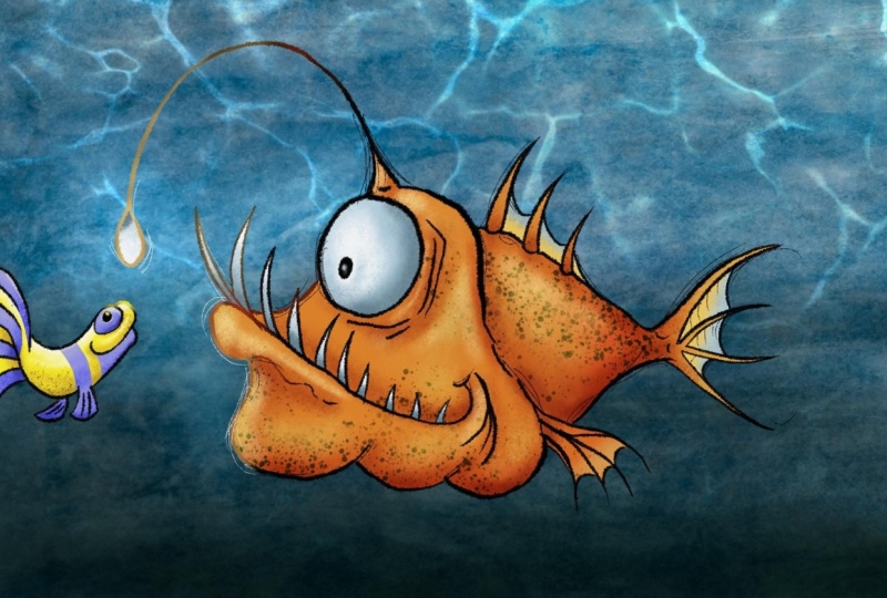
2. Annie the Angler - First Sketches: Okay, So here's an idea. Before I start diving into all the various features
procreate has to offer, let's just open it up
and create something. So let's come to
our procreate icon, which I'm circling now. Tap on it and we're
ready because right now you want to start
creating some artwork. So we'll go into
greater depth and we'll worry about all the
in-depth stuff lighter. Okay, so first thing, you need to create a canvas so you can paint
something on it. So come to the very top right, and I'm circling that
little plus sign, tap on it and you get a
whole list of options. I will go with a four by six photo and I will tap on that. That's my file ready to work on. Okay, Now just to give
you a quick heads up, this project is a
few videos along. By the end of it,
I'll have done this. And on the way there will have just touched upon a
lot of the techniques which we're going to go into in much greater depth as we
go through the course. I will come to almost the
very top right again, I'm circling it now. That is something called
your layers panel. Tap on that and you can see
what we have to work with. We have something called
background color and we have something else
called layer one. We are going to draw on that In just one thing I should
say before we start, absolutely, everything you
see in this session will be covered in much greater
depth throughout the course. And you have an option. You can follow along and
draw while I'm drawing. Or you can just sit
back and take a look at a fairly basic workflow
because workflow is every bit as
important as the tools. I will explain briefly
as I go along. And sometimes when I'm
talking about something, I might say something like, Oh, we're doing layer
blend mode now, there's a few videos about layer blend modes in the
section on getting creative. And that way you
know that if you don't get what I'm
saying in this session, you know where to go to look at the videos to help
you some malt. Anyway, let's carry on. Everything that you draw
has to be on a layer. I have one layer here
called layer one, but now I need something
to draw width. So I come to this icon here, which is my Brush Library
and I will tap on it. I have a whole load
of different brushes. Now by default, you won't see all of these sections
I have at the top, but you will have a brush
that called sketching, which I've certainly
now, and if I tap on it, these are the various
sketching brushes I have inside procreate, and I'm just going to
choose procreate pencil. Now I could do with
a color for it. So I will come to the very top right where I'm circling and I will tap and I get a number of different
ways of choosing colors. I have Disc, classic, Harmony, what have you? I will just stay with
disk for this tutorial because it's the first
one that appears. And I could do with
kind of a light blue or like this for example. You can select any
color by tapping or dragging with your
finger or your pencil. And that outer circle
is all the colors of the rainbow where you
choose your basic color. And the inner circle gives you a lighter or darker or more
or less saturated version of that basic color. And what I wanted to do
is do a quick sketch. I'm going to check
my brush size. And I do that by coming
over to the left. And I have a little slider here, which adjusts the
brush size a 100%. I'm sure it's gonna
be fine for me. I want to make sure that
it's on a 100% opacity. So I can see it very clearly. Now, I will just scribble
to test the brushstroke. Yeah, that works okay for me. If I tap on my layers panel, I again, if I zoom in, can you see that little
box which I'm circling now is a little preview of
whatever is on my layer one. Alright, so I'll tap anywhere on my canvas to close
my layers panel. And I want to get rid of
that squiggle so I can either come down to
where I'm certainly, that's my little Undo icon. And if I tap on that, it goes just under that I
have a redo icon. And if I tap, my brush
stroke comes back. And this is the way
you do want to do it. You take two fingers and you tap them on your screen
at the same time. So two-finger tap to undo. If I want to redo, I do
a three finger tap on my brush stroke comes
back two finger tap to undo three-finger
tap for redo. Learn that from now because you will use that a lot anyway. Two-finger tap on the, okay, so now I want
to do a sketch. I've decided I'm going
to do an angler fish. And if you don't know
what one of those is, you soon will do. Now what I'm gonna do is
a sketch work and just work out ideas and
shapes and proportions. And then I'll draw a more
finished line work over the top of that once I've
decided where everything goes. Okay, So to start off with, I'm going to draw a
little triangle shaped life at not already
show I like that shape, so I will tap to
undo and I'll just do a series of
shapes until I find something I like that I
like more but not quite. Let's try a more,
something like that. I'll see what I
can do with that. Now the trick is to
work fairly quickly. I just want to create
some basic shapes to get some basic proportions. Because I think with an
angler fish, they have. Big miles light that I want
mine to be a cartoony one. So I'll give a
little smile there. And they have little spiky
friends at the back. Maybe a little spiky things. As I'm going through, I'm
just refining my sketch. Now at the moment
I'm starting to get some straight lines I could
do with rubbing those out. So I have my brush tool
selected at the moment, but there is another
one where I'm circling. This is my eraser tool. And if I tap on that and
I'll tap on it again to see what kind of
brush I'm going to be using as an eraser. Because any brush that
you can paint with, you can also erase with. And I think for this
I will try coming to my airbrushing section. What do I have selected
in their heart airbrush? That should be okay. Let's just check my
size. On the left. That should be about big enough. And now I can rub out by various sketch lines so things don't get too messy. Maybe around here. I'll come back to my
brush icon again. I'll carry on putting in
some basic shapes in there. We need a fin down here. And you can see I'm
working quickly and I'm just trying
to refine my form. I think if it's an angler fish, it should have a bit
of a bigger chin like that and maybe something here just to define the
corner of the mouth. That top lip that
could do with being a little bit more rounded and irregular back to my eraser and just carry on
sketching like this. Now the good thing
about it is it's not like a pencil and
a piece of paper. You can erase as
much as you want and it's not going to
affect the paper at all. Oh, I know what they're
missing that he wants him teeth don't lay
circle on big TV. It's an angler fish. I think they're fairly
irregular, quite spiny. If you're going to
draw something like an angler fish and it is
worth going and googling, angle efficient, getting a few ideas of what
they look like. So I'm okay with that. Okay, I'm starting to get
basic shape with this, but the whole fish
is a little bit to the right and
a little bit up. I needed to go down
because I need to do that little thing
that sticks out of their head and there's
no space for that. If this was a piece of paper
and that was a pencil, tough, I should have
thought about that before. But if I come to the icon, I'm certainly now this is my transform icon
and I tap on it. I got a little box
surrounding my fish. And if I put my pen
or my finger on the inside or the outside
of the box and drag around. I can move this to
wherever I want to go. So I want it to be
down here somewhere. And also maybe that's
a little bit big. So I'll come to the
bottom-right corner. You see where that
little daughters, and I'm going to drag that, which means I can make my
fish bigger or smaller. I'll come to about there,
make it about there. And then I will just tap on my brush icon again to set that. Now got a bit more
space so I can maybe play around with the
shapes a little bit more. This stage, like I say, I'm working fast because
this is all about ideas. It's not the finished product. I'm not going so fast that
I don't care about it. But I find that if I sketch
the free of the ideas are, I can always make
this title later. I realize I haven't
done the eye. The eyes are very important. In fact, the eyes of
the most important part of anything which
has a character. Rather than sketching there, I'm gonna make my life
a little bit easier. I'm gonna come back to
my layers panel and I'm gonna come to that plus sign
where I'm circling now. That will create a new
layer called layer two. Then our tap anywhere outside of the layers panel to come
back and I'll do the eye. Now. They have big googly
eyes like that, don't they? What I want? No social I'll
double-tap to undo that. I'll try again. Is that what I
want? It's not bad, but I'll double-tap on
this time at all circle, but I'll hold my pen on
the surface of the iPad. You see that at the top
it says ellipse created. And if I take my
pen off my iPad, I now get something
called Edit shape. This is the quick draw function. And if I tap on that, I get four little
control handles. And I can move the shape
of that ellipse around. And if I tap in the
middle and drag, I can move the whole thing. This is quick draw and yes, there is a video for it. Where do I want that? That's quite interesting. Very think I don't want
it to be a round shape, do I want it to be
slightly elliptical? I think a fairly
round shape for now. And let's make it a little
bit more vertical like that. And then I'll tap
away to set that. And then on top of
that I'm going to do just a little
pupil like that. I'll do a couple of
lines on the other side. I'm not keen on those. Let's double-tap to redo those. So let's. Just sketch in quickly the idea. Now the nice thing about it is that I is on a separate layer. If I come back to my transform
tool like we did before, I can move that around to
wherever I want to get a fit. Now getting little
lines like that, you see that blue line there. That's a bit distracting. That's because
snapping is turned on. It's on my little dialogue
panel at the bottom, so I will tap on snapping
to turn that off. Now what I move around, I can move it around
to wherever I want. I could always
resize it as well. But I'm happy with
the size it is. So I'll have it
about maybe about there and then tap on
my Pencil tool again. Okay. I'm happy with an I there. I decide yes, I want
to commit to that. And so I want the I
on the same layer as the main sketch
that is easy to do. I'm in my layers panel and our tap on the Layer
icon of layer two, I want to do, I get a
whole load of options. And one of the options down
here it says merge down, tap on that layer too, merged into layer one. So now I have one layer
with all my sketch on. Okay, I'm going to carry on the process in the next video. Just before I do, you've seen
how useful is that you can rub things out and not damage to the surface
of your paper. And you've seen how you can have things on separate layers, which can be very useful
for positioning things. If you've seen a little
feature called Quick Draw. But there's one more
feature I want to show you, which is really useful for when you're working
out shapes come to the icon I'm circling now the adjustments
icon, tap on it. Second from the bottom
you have a feature called liquify tap on that. I get a whole lot of
controls at the bottom. I want to double-check. You've got the same as me. I have various features here. I want the first one
called push by pressure, is on Macs, my
distortion is on 0%. Uh, my momentum is
unknown as well. My size. If I move that around, I want to adjust the
size of my brush. I'll try around thirty
seven, thirty eight, thirty nine percent are now just where the
fishing rod is. I wanted to tap on the line
and I'm going to drag it. You'll see that it's pushing
and pulling the line or out. You cannot do this with a
pencil and a piece of paper. This is so useful. And you can see what I'm doing is I'm changing the form of my fish in ways that I never could with
traditional media. And it can really
play around with the shapes to get something,
hopefully character fall. Now the trick to this,
I'll let you know from now is to start off bigger, make it big movements that
make your brush smaller. Undo the finer movements. Now, one thing it's not
that easy to draw and talk and explain things
at the same time because I think you're using different parts of your brain. But let's just do a quick
better sketching like this. Give them more of a
thick Labaree chain. Maybe bring that
in a little bit, that down a bit there. And I can really
start to play with a form to get the
shape that I like. One thing I should say is
that if you move too far, maybe you can see that
the pixel start to smear when you try and drag
things around too much. But at the moment
that doesn't matter because this is just a sketch. We'll do the finished
line work on a new layer. So I'll undo that because
I was just demonstrating. But if you do get
a little bit of smearing, it doesn't matter. What I'm finding
with this is that by using the Liquify tool, I can really start to develop
some character for this. I'll make my brush a
bit bigger because I don't want the ij
be completely round. I want it to be a bit like
an ellipse, but not quite. That is a general
principle of that. I will tap on my brush
icon to commit to that. And then if this is
a typical workflow, I will create a new file and
do another version of this, and then another new file and
do another version of this. And I will keep on going until either I find a
shape that I say, Yeah, that's the one I want. Or if I come to
the very top left, you can see the word gallery. If I tap on that, that shows me all the different
artwork that I've got. And if I create a
whole series of angler fish sketches next
to each other one-by-one, I can look at the
little thumbnail and I can decide which of
those shapes are like. Most of that will be the
file I will work on. So I will do that and I will
see you in the next video.
3. Importing Files into Procreate: So I just finished
the tutorial when I noticed three little dots
at the top of my screen. This has come with the
latest iOS updates. And if you want to know how to import files, well, with iOS, there's been a
number of ways and some of them are a
little bit obscure. But Travis, those three little dots at the top of
your screen tap, you get three
options of a moment, you're in full screen. Tap on the middle icon that
split your screen in half. And it's asking me to
choose another app. In my case, I'm going to
choose the files app. I'm just circling it now. Just in case it's
not on your iPad, you can download it
from the app store. If I tap on that, I have files and at the moment I'm in a
folder called downloads, which is all my iCloud Drive. I will tap where it
says iCloud Drive. And I will tap again to
where it says files. Look at all these Locations. Icloud Drive on my iPad Dropbox. Well, if I've just
downloaded something, come to downloads, well, here's one lines deluxe
drawing brush set. Let's try downloading that. I will tap and it
automatically imports. So that's important,
that was called the lines to look,
drawing brush set. I'll come up to those three dots on the top of my Procreate side. And I'll choose
full-screen again. Now let's come to
our brush studio. And I bet you if I come up to the top line still
lugs drawing set, we are good to go.
4. Inking In Anna: I'm in the gallery
part of Procreate. And you can see I did
three different versions of the same thing because I have those
three small thumbnails lying next to each other. It's very easy to compare them because I'm looking
from a distance. I can judge the big shapes
next to each other. And off the three, I think I prefer the middle one. Now they're all called
untitled artwork. So the middle one is the winner, so it's going to get a name. So I will tap where it says Untitled Artwork and
I'll give this a name. The angular 01, get into
the habit of naming your files or one habit I adopted pretty early on
when I was working in various studios is to put 01
at the end of everything. This is 01 because this is
the first version of my file. Clients may want you
to change a file. You may decide you
want to change a file, but you need to keep
previous versions to refer back to the angular 01. There may be an a, the
angle is 020304, and so on. Anyway, I will press
return and what I will do, I will put my finger
on that and I will swipe to the left. I don't have a choice here of sharing, duplicating
or deleting. I will tap on Share
image format. I won't Procreate exporting. I will export that via
AirDrop to my merch. By the way, using
a mouse or using the PC for decades
I've been using both. I really don't care
which one I use. That's gone through.
I'll tap on Done. I will make that file available
to you as a download so that you can carry on
using the same file as me. So there's my file. If you want to zoom in on a particular area
of your picture, yet your two fingers over the
area you want to zoom in on and you pinch
outwards like this. If I come to the little
light on the end of the fishing pole or whatever
you want to call it. You can see I use the liquify tool and that
area did smear a little bit, but that's okay because this
is not my final line work. If I want to zoom out, I get my two fingers
and I pinch inwards. If I wanted to rotate two fingers and just
rotate my things around two fingers just to
drag from side-to-side. Now I want to do some
line work with this. So I'll come back to my
layers panel and look, I'm not gonna
promise I'm gonna do this all the way
through this tutorial, but I'll try and get you
into a good habit from now, tap on the layer
and choose Rename. And I will call this sketch, because it's a sketch, get into the habit of renaming your layers as you
go along if you can. Otherwise you can end
up with Layer 89, layer 1991, and you don't
know what's on each layer. That can be a real pain
in the bum anyway, so I need a new layer.
I'll create a new one. And I will call this ink 01 because I may have more
than one inking layer. I don't know yet for
that I need a brush, so I'll tap again
on my brush icon. Just underneath the
sketching brushes that I have an inking brush set. Which one do I want for this? Welcome to say for
technical pen, and I want a black
color for this. So I will come to my color
panel in the very top right. And to get that, I've
got my outer ring, which has all the
colors of the rainbow. At the moment, I have
blue selected and I can tap and drag on
that to select a color. But it's the inner circle with all those various different
shades of that particular blue that I'm interested
in because there's a smaller circle which
I'm circling now, I want to drag that
right the way down to the bottom because I
want a simple black. Then come to my brush tool, the technical pen is selected. Let's take a look at
the width of this. Let's make that about halfway. Big opacity on full. Definitely. Let's try that. It's okay, but I want a line with a bit
more character to it, so I will two-finger
tap to loot that. Let us come to
choose another one. What about syrup? Okay, let's give that a try. Again. I'm not keen on that. It's not what I'm looking for. I want something with a
bit of a rough align. And so at this point it is good idea to start
auditioning pens. Now I've got two here, Ink Bleed and dry ink. Let's try dry ink. So what that looks like, that is a bit rougher,
a bit more texture. Maybe that could do the job. What about the other one?
Ink Bleed? Let's try that. Let's make it thicker by dragging up versus
Iceland earned. Now. Yeah, I do like that. That's what I want. That's maybe a little
bit thick for my needs. Let's make that a
tiny bit thinner. What am I on now? 15%. Let's take a look at that. When I press a light with my Apple Pencil,
I get a thin line. If I press harder, I
get a thicker line. That is what I want. I'll tap to undo that. And what I'll do is I'll
come back to my layers panel are coming to my
sketch layer and you can see just where I'm circling. There is a little n.
If I tap on the end. In fact, shows me two things. The various layer blend mode, which we will talk
about also the opacity. I'm going to take the
opacity slider and I'm going to slide it way down until I can
just see the sketch, or then I'll tap back
on white ink 01 layer. And in that way I just
get the faint outline so it doesn't distract me when
I'm doing my ink lines. Okay, so let's take
a look at this. I am going to put two fingers
close together and then drag outwards to zoom in
on the main face area. Then I think I have about
the right width selected. Now, I want to start inking in the various different areas. We'll try and work
fairly fast with this. Because a first-line tends to have its own
energy as opposed to a very careful line
which tends to be a little bit less
sketchy like this. I don't like that.
I'll tap to undo. I will also vary the
pressure because you really do want to get a
difference in line with, especially with an
illustration like this figure on the bottom
of the lip going thinner, like this as it peters out. Now what I'm zoomed in like this that might look a bit too thick. Let's check that little bit just after our medic
couple of brush strokes, just for the outline, the broader aligned
with the fish. Now if I zoom out, I'm looking at that
and maybe that was just a little
bit too thick and it's best I decide that now rather than what I've
finished the whole drawing. So I'll come back to my slider and I'll make
my brush size what? 12% there. Now let's try that's
pressing hard, that's processing not as hard. That works better. It's
not quite as thick, but it is giving me some
good thick and thin lines. So I'll come back
to my layers panel. I will tap on the
ink one thumbnail. And I have a command here
which says Clear topic flip, the whole thing disappears. So let's come and zoom back in again and take a look
at what we can do. Maybe I'll start by doing
a whole mouth like this. Drag it up, drag around. Bring it down to here. I'll break the line.
I'm one of two places and fairly the thick and thin. Try make some fairly
light fluffy lines and try not to control
things too much. You can see I've got a stray bit of just where I'm circling now. So I will come to my eraser
tool, get rid of that, tap back on my pen
tool and carry on quite often
through the course. If I'm doing some
drawing like this, it can be nice to
watch because I've watched people draw myself, but you're on the clock. I don't want us to
make a huge part of the time of this course,
you watching me draw. So quite often our
speed up the video. If it looks like I'm drawing
really fast, don't worry. You don't have to
draw that fast. That's just me speeding
up things like no music in the
background there. That is just that let you know
the sound hasn't suddenly, it disappeared and you don't have a problem with the sound on your iPad or computer or
whatever you're watching. It's also just me being
a frustrated musician. Okay, that is my basic outline. Get my eraser because I think he made a little bit
of a line there. And now what I'm gonna do
is create two new layers. This layer I'm gonna call
inc 0 to this layer, I'm gonna tap rename
and we're going to call this brushes. The reason I do this is
because what parts did I use? I've got my inking
brush sets and I'm using ink bleed moment, it is on 12%. So all my brushes
layer, I write inking. What was it again? Ink Bleed ink, bullied. And I'm also going
to write down 12%. The reason being is I now
want to change the size of my brush to do some
final scribbly lines. But you saw just a short
while ago that even altering the brush size by a
few percentage points can affect the look
of your picture. I dropped it down by wall, 3% or something like that to
get the line that I wanted. And so I want some kind of a
record of what brush I use, which brush set it within
and how big the brush worse, because now it was on 12%. I want to take this down. It's slides to what?
Let's try say 4%. Make a couple of scribbly
lines and tipping it up and two-finger tap to undo that because I wanted
to even thinner. Let's try 2% Okay, I will go with that 2% on our right down
on my ink layer, 2% because now I know what
brush sizes are used. And also that 2% is written
in two per cent thickness. So I know what it's
supposed to look like. Now all I do is I want
to make that layer invisible because
I don't want it to be part of my final art work. So all I do is come to the little tick mark just where I'm circling
now of that layer, tap on it and that
makes the layer invisible or visible
or invisible. Now, I want to make sure I
have the right layer selected. Be warned, you will often
draw on the wrong layer. It's just the nature of any art program which
supports layers, which is all of them. So come to link to a. Now what I wanted to do, if I make this a bit bigger
by dragging outwards, just before I do anything, I will make my sketch
layer invisible. So it's not getting in
the way underneath and I can see what the artwork
is supposed to look like. My ink to layer is selected. And now I want to do
some scribbly lines because we've got a
certain amount of energy. I was uncertain about this
and how it would look. And so I put it on another layer and if I
decided I don't like it, I can always get
rid of that layer. I'll make it invisible.
What have you, but what the energy there. And I remember when I
was at art college, if you go through our
college or designing college or when you're at school and
people teach you things. And possibly the single most
important thing I learned, no, there's two most
important things I learned. And they are both just
three little words. And the first of those was, make your line work
thick and thin as it is. I already have thick and
thin on my main ink layer. But this extra layer where I'm just putting in a little
bit of energy lines. This is also thick and thin. It just makes things
more interesting. I want to have done this. I think I will show you
an example of this where the line width is all
the same thickness. But for now, I'm just putting
in little scribbly lines. Ema think it looks a
little bit scruffy. But what I'm trying to do is get a little
bit of scruffy us, a little bit of something
that doesn't look like it has been done on
a digital paint program. I'm making sure that my
hand at the moment is making flaky light movements. Even some motion,
a mistake because the line work is supposed
to be fast and sketchy. I went, people are doing
fast and sketch it. You will get some
random lines like that. It just adds to the
character of the piece. Look, I'll make this layer
invisible for a second. This is what I had before. This is what I have with
that extra ink layer. There may come a certain
point where you think, well, I don't want to push it
anymore because it might end up being too
much, not a problem. Come to your layers panel
and add another layer. And we can call this ink the 03, and you can draw on that. And if it's too much, swipe to the left and there's my big red panic
button called died. So I delete that. Anyway. I think it's time
to take a break with this. If you're following along, you can work on this
as much as you want. I might do another version of this inking layer and see
which one I prefer more. But that will be
for the next video. So I will see you there.
5. 5.3 Updates to Procreate: Okay. I'm recording in my
kitchen because I need more light because I need you to see the actual screen
with my hand in front of it. Hello. As a result, I'm sorry
about the sound quality. Now the main feature
inside procreate 5.3 is the hovering
Pencil features. Only the most recent iPads
support this feature, which is a bit of
a disappointment, especially because
I had to go out and buy an M2 iPad to show
you these features. Nevertheless, here's
my procreate gallery and the little nice
things first look, if I come and I hover
over a portrait, you can see it gradually
get drawn out. This is like the recorded video, but with the preview. So that is nice. If you come to a folder, you didn't get an idea
of what's inside there. If you come to say a 3D
object and hover over, you get little turntable
animation like this. And if you come down to say, you get a preview of the
animation which is in the file. Anyway, Let's come back, Let's come to this one here. I'll zoom in a little
bit like this. And then now you've
got your Apple pencil. If you hover over,
nothing happens. That is because you need
to come to preferences. Inside the preferences panel. There you come down to
brush cursor, turn it on. Now. You can see when I hover over, I get a preview of
my brush cursor. Now let's take a look at this. The brush I'm using
is from puzzles set I'm drawing called
the town's postal. The reason I'm using this is because it is a big brush size. And if I hover over like this, you can see that now
here's something. If I pinch in and out, you get a preview of
your price sized. This is rarely useful. Also. Take a look here. If I use my finger
and drag up and down, you can alter the opacity. I must admit, personally, I prefer just to do
the size just because, well, my thumbs better anyway, this, I find a
little bit awkward. But anyway, let's show
you some more previews. If you come to advance
the cursor settings. At the moment, you can
say show while hovering, show our painting or show both. Personally, I prefer show while hovering because
when I'm painting, I can already see the brush
strokes that are being made. Now you also get two cards, you get high contrast. Let's make the brush
size bigger shell away. You get to see a high contrast brush cursor wherever you are on the screen. That is okay, but I much
prefer to have active color. That way if I can choose
a candidate like this, I can judge the color wherever I'm going to
make your painting. So for that, you could come in and do that double tap to undo. You can also come to brush their approach
outline style per brush. And then if you come
to the brush thing, and if you come down to Apple
Pencil and scroll down, the hover, contrast active
color of a film long shape. Or you've got all those
on a per brush basis, which is offering
nice, that's cool. Counsel for that. There's
also the fact look, if I double-check,
I'm on one to layer. If I come and make a huge area like that and I
think actually no, I don't want if I go
to my Erase tool, add hover, and make it
bigger, and let's change. Let's try again the
mutants pencil. I can hover over and I can see where I'm about to erase it. This is really useful. That's up the opacity and you get a clear preview of what it is you're going to be erasing. That is really useful,
rarely really useful. Similarly with smudge, if I
tap and hold there, we go. Preview. Yes, I do. That's great. Now there is one thing supposing among this layer and
I make it invisible. I can depress your cursor. It doesn't appear. On a layer that's invisible. You have to have a layer
visible to actually see that. Okay, let's show you a
couple of other things. I want to do some flooding
with this picture. Now my ink layer is
set to reference. And I wanted to do some
flooding on layer three. So if I hover over
my color desk, double-tap, I get color drop. From there. I can do all my
color drops as much. So once one outside
I've done enough, I've come to tick to commit
to that, all very easy. Now the color drop tool itself
has changed a little bit. Look, if I come and I drag
to say this part here, I get this thing,
continue filling. And as before, I can keep on
filling as much as I want. And then what I want
to come out of it, I just come here to color
drop the color drop caps, committed to what I'm doing. Now these updates are
quite nice, but for now, it only really works on the
really high-end new iPads, which I'm sure in time more
people will end up buying. But for now, it's a bit of a pity because some
of these features, especially the brush preview, I'm finding it really useful.
6. Blocking In Anna: Okay, we are ready to start. Again. I'm in the gallery
and you can see I did another version
of Anna, the angular, and that is the angular 0 to, I will tap on that
to load it up. And I did that because
I find it easier to work when I'm not talking
at the same time. And also maybe I can
teach by example because the initial sketch I'm
building on top of that. And then with my ink 01, my ink 02 layers, I'm going to be
adding colors and building on top of that. So from that it follows that it's important to get
the foundations right because it's difficult to build anything you want to see on top of shaky foundations,
of these foundations. So you want solid foundations, which is the name of the course. Incidentally, I did
do another layer at the top of my layers
panel and I called it, oh dear me know. That is because I wanted to illustrate a point
that I was making in the previous video about thick and thin
being so important. Now that top layer, that ODE me know layer that
is where I took a very simple brush
and made it a constant thickness
all the way through. So instead of getting this, we end up with this. I traced it off the same sketch, but that is a single
constant line thickness. And hopefully you agree that
given a choice to frame that and that the version we're
looking at now is better. It's thick and thin. And those three words were the most useful piece of
advice I hadn't college. And from there I
went on to develop the closest thing I've ever got an illustration philosophy. And that is to blend
opposites. Thick and thin. That's a huge one, but
there are other things. Blend dark and light, blend hot and cool colors, blend saturated with
the saturated colors. And blending opposite is one
of the principles secrets to creating artwork that
looks dynamic or fresh, interesting because that
is better than that. Now I did say in the
previous video there were two pieces of advice which
are just three little words. And the first one
is thick and thin. The second bit of advice, the other three little words is possibly the single most
important piece of advice I can give to anyone
who is creating some artwork or creating
some design work, or creating some music, or creating a film. Anyone who is creating anything, the single most
important three words you are going to hear are going to be given at the end of this
particular tutorial. Hopefully, that's made you
curious enough to go to the end of this tutorial
to find out what they are. In the meantime, the next
thing I want to do is something called
blocking in colors. There is an efficient way to do this and it's searching
for this course. There are a series
of lectures all about the efficient way
to block in colors. But for the meantime, we'll
do it the simple white. I am going to come to
my sketch layer and I'm going to create another
layer underneath it. And I am going to
call this block 01. You can call it
whatever you want, but just something so
that I know that when I look at that layer and
see the name block 01, I'll know it's to do
with blocking in colors. I can make my sketch
layer invisible, and I want to choose a brush which gives me a
fairly solid color. Now, what about studio pen? Would that do the job?
Let's take a look. Yeah, that works for me. If I zoom in on it, it gives me a solid color. It's also got a
fairly sharp edge, both of which I want. So I'll undo that. I need to choose a color, so I'm gonna come
to my outer ring. I want to choose orange. I now Anna is an angler fish, but let's give a kind
of an orange color. Now at the moment, I've
chosen my orange color there, but I've still got black. You can see which
colleague to draw with. When you look at this
little rectangle in the top right that shows
you your current color. But you can see it's
still too dark because although I've selected
the orange hue, I've got a completely dark
shade of it, which is black. So I need to come to
that little circle in the bottom and drag it up until I get fairly
bright orange color there. It's not completely saturated because when you move that little circle
around in the middle, you get desaturated colors, saturated colors, and dark
colors, and light colors. I'm gonna choose something which is fairly saturated
but not quite. Double-check, make sure my
blocking in layer is selected. And then I'm gonna come
here and we're going to trace around the inside now, can you see just on the on the
side of where I'm drawing, I'm getting that orange
color like this. What I want to do is
trace around the outline. This can take a bit of time
and it can be a bit boring, but it does save your time
further down the road. As it is. You can go in and just stop painting and not worry
about your edges. Now you can see
if I say writing, I've gone over into the teeth in just this area
which I'm circling, that is not a problem. I will come to my eraser tool. I'll tap again to call
it my eraser tools. And what do I have? Hard airbrush. That's what I want
because it's got a hard edge or soft agent
might give me a slightly In Moshi edge to
draw or erase with. But I made my brush size a
bit smaller and I come here, I get rid of the
color in those areas, tap back on my
brush and carry on. Actually, I think I'll do
two separate layers of blocking in colors
where I'll have the eyes and the teeth
on another layer, and, oops, I accidentally
put down a blob of color. Doesn't really
matter because if I know there's going to
be a layer on top, then I don't have to spend all my time Tracy
around all the teeth like this because
I'm going to put another layer on top which
will hide what's underneath. So I can just come
here and just shade around these areas as
quickly as I like. What I will do to show you
the general principle. Normally out trace
right the way around the outline and do whatever
bouts do just once. But look, if I come
around like this and just close up this area or made by top two layers invisible because now you can see I just have a closed area of orange. You can see I've got
my little orange color swatch in the top right. If I just put my finger or
my panel and drag down, I get this little
circle and it floods the area and you have something called color drop threshold. If I leave my pen on my iPad and drag it
from left to right, you can see if I drag too far, I flood my whole area, but if I drive back, I get just the area
inside filled in. Now let's zoom in. A little fringe there. No, I don't, That's good. I can come to this bit
here in just a quickly. Just draw in the area. Let's come back to my layers and I'll turn on my
top two ink layers. And you can see I've
managed a fairly quickly trace around the outline and
then color that area it. Now here's a little
trick for you. At the moment, I'm
tracing in and I'm tracing up to the
outline of the fish. But if I tap and hold with my
finger on my blog 01 layer, you see how it pops
out a little bit. When it does that, I
can keep my finger on there and drag up. So now by blocking
layer is sitting above, might ink one and into layers, which means it's
hiding those layers. That's the way layers work. The layers on top
hide whatever below. All the layers on top interact
with whatever is below. That is something that
happens in layer blend modes. There is a tutorial for those. But the reason I did
that is if I come and I pinch outwards and my
two things I can zoom in, I can come down to
the bottom and rather than guessing what's underneath, when I'm drawing, I
can now draw directly on top of my key line
around the outside. And I might make my
brush just a little bit smaller because I'm going to flood in and as long as I have a solid line, that
doesn't matter. But now because I'm
drawing on top, I can see exactly where and cutting over my key
light like this. Just to show you that again, normally I would just trace all the way around the outside, but I'll show you the
general principle again. Come up to our color swatch in the top right and
drag into our area. And generally speaking, when
you're doing a threshold, you want to drag it as far
over as possible as you want until it floods out and then drag it back
just a little bit. With that, if for now, all I need do is just carry
on and draw around the edges. Like if you came to
a fairly small area, like say this area is supposing
that was really tight. There's no reason at all
why can't just happily go over then come to your eraser tool and just
trim off what you've done. You don't have to do a
thing that some people do. And making your brush really, really tiny so he can fit into all the little
cracks and corners. Because with the erase tool, especially with something
like heart airbrush, to erase those pixels, they are gone for good. Anyway, let's carry
on with this. Maybe now will be a good
time for me to speed up. Just when I've done everything. Or I can fade out and fade
back in once I've gone around the outside and colored everything in for this
particular layer. In fact, yet, I
think I'll do that. Okay, I'm back. It's all been colored in. If I come to my blocks 01
layer and I tap and hold with my finger and drag it down
underneath the ink layer, all of a sudden
being layers on top. And I can see clearly
what I've done just instantly while
you're doing this, you might want to just make those invisible and come around. Just check for anything
you might've missed. Like maybe there's a
little bit there which I missed. Oh, yeah. You can see a little bit
there, a little bit there. This can be a little bit boring and feel
not very creative, but it does make life a little bit easier further
down the line. So ink, ink to visible again. Now I'm going to create
another block and I'm going to call this block 02. It is sitting on
top of block one, so it will cover up
whatever is on block one. For this, I just want
another blocking in layer just for things like, well the fins, the eyes, the teeth, the light. So I will choose
another color for this. Let's start off with a lighter, more yellowy version of
orange and outcome in, until what I did before. You can see I'm drawing
on the outside. That's not a good way
to color in, is it? Because these more things
for me to flood come up, Let's at least be consistent and logical and a little bit boring at this stage,
which this is. But it will make
life easier later on around like this and
drag that color over, flood that particular area. Alright, so let's try
and find something else. This is more of the same. The only difference being
is it's on an upper layer. I'm covering everything
in same color. That will change later
on because we're going to use something called
a clipping layer. But I'll explain that
when we get to it. The meantime, I will
cover these areas in. Maybe I should fade out
and fade back in again. Once I've done this.
7. Time To Paint!: In this video, we're gonna start coloring in our character. We've blocked in Anna, but now it's time
to start adding things like shading and texture. By the way, the angle is 03, that is available for
you as a download. And you can see I have my two blocking in
layers and I'm going to use those as the
base color in with, because what I'm going to
show you is something you can't do at all using
traditional media, but it's so flexible when
it comes to digital. I'm gonna create a new layer sitting directly on
top of block 01. I'm going to tap on
it and I'm going to select this thing
called clipping mask. And when I do, you'll
see a little arrow pointing down towards block 01. That lets me know
that layer eight is clipped to block 01. What
does that mean? Well, love. Let's start coloring in
shall we are counting my brush library and
there was one down here. Willow charcoal inside
the charcoal brush sets water start off by putting
down some darker colors. So I will press on hold with my finger in any orange area. And I get this little gizmo. There's a little crosshair
in the middle of it, plus two halves of a circle. The bottom half is
my current color. The top half is the color I will select once I let
go with my finger. Like if I drag around, if I come to this bit here, that yellow if I was to let go, now, I choose that yellow. If I come down to here, I choose that black. If I come to here, I will choose the orange, that is what I want. So I let go and orange
is my new color, then I want to choose a deeper, a more orangey version of
what I've already got. So let's drag that
down to about here. I want to keep it
fairly saturated still because this is
a cartoon drawing. You can get away with
more saturated colors than you can with real life. Let's try that. My willow
charcoal brush is selected. I'm gonna make sure
that my opacity is right up to a maximum
on my brush size. I wanted to be a bit larger because I want to
create some big shading first and then make some smaller, deeper
shading afterwards. And here's the thing I want
to place my brush here. Can you see my brush
there on the screen? But nothing's happening. It's only when I come
into the colored area, they use EMR being
made. Let's undo that. The reason being, if I open
up my layers, panel layer, the layer I'm drawing
on is clipped to the layer called blocks
01 might orange layer. What that means is
you'll only see the brush strokes I
make on layer eight, where they're also colors
put down the block 01 layer. So it's like a little
mask which hides all the paint strokes except for where I decided to paint. This is very nice because
it means I can draw, for example, at the
bottom and I can make nice free brush
strokes like this. I don't have to worry about the edge of the shape
I'm drawing on. So I will draw in
areas like this. By the way, you do a very common question on the Procreate forums
where people say, How do I color in or I'm not
very good at coloring in? Think about where the light
direction is coming from. Now, unless analysts
swimming upside down, the light is going
to be coming up from above where the sun is. And it's going to be less light underneath where the
bottom of the seers. And yes, I know Anna
is a deep-sea fish, so there won't be
much lighter around, but I'm using a bit
of artistic license. I, my $0.02 of advice to you is make your initial
shapes certainly big. If it looks like
it's looking right now in the chin area
where you've got a very obvious area
of orange with one or two slightly darker bits around the edges that
have not gone far enough, start off making shapes bigger. Like I'm doing now. Say you get a good
spread of tones, dark to light, and hopefully they blend
in with each other. Now we're going to make my
brush size a bit smaller because I want to paint onto
the chin area like this. And also look a bit
more here where I'm getting the little roles. I will choose some deeper
color soon, add to those. But for now, look at this because my teeth are
on the layer above, I can safely make a nice big brush stroke like this and the teeth
aren't affected. This makes my life
so much easier. If I decide I've gone a
bit too far with this and maybe I want to bring back
some of the original color. Let's just quickly
do around here. I can just tap anywhere there is an original
bit of color. Pick up some of
my original color just by pressing with my finger. So I got my little color
sampler tool and come back and draw those areas
back out like this. I think I would go with that for the initial target areas. If order to call back
that deeper orange, I can always just
tap and hold in the top right where I've got my little orange color circle. If I tap on hold just
for a few seconds, it calls up the previous color add selected and I
can draw with that, or I can tap to open up my
color panel and you can see my history and just where
I'm circling now you can see the previous two
colors I was working with. A darker color,
slightly smaller brush. Let's just add a
little bit more. You can see through this, I've been fairly generous
with my tones because. Like I say, I don't
want it where I have a little small dark area with a huge sea of my
base orange color. But what I am going to do
is I'm now going to make things a bit redder
and a bit darker. Because I want to do some
of the really deeper areas. I'll keep my breast size smallish because I want
these to be tighter, more defined areas like this. Just come around the outline of the fish and just do some
of the deeper crevices. So I can get more of a 3D sense. My drawing. Maybe a little bit just
around where the teeth are. A little bit just down
in the corner here. Just a deeper crevices, the deeper shaded areas, those are the areas
I want this just to make the whole thing just a little bit more
three-dimensional. Those are my darker colors. What about lighter colors? Because I could do some
highlights on here. So I will come
back to my colors. I will choose my original orange because I went
darker and redder. I'll go the other
direction. I'll make it more yellow, lighter. It's still fairly
orange but lighter. Now I can play safe with this. I can always create another layer and I
can do the same thing. I can choose
clipping mask again. And because you can
see layer nine has that little arrow pointing down towards my block 01 layer. It's also clipped to that layer, which means I can
do the same thing. I can make my price. Biggest start off with, I'll
put down a large area like this and it won't go
beyond the edges. All my blocked in orange color. Now let's make this a
little bit smaller and put onto highlighted areas here. There's gonna be
a bit of a light, I would imagine from that
little light on the front. Now, maybe I've gone
a bit too far with my shading just on
the body of the fish. So I can also raise with that now at the moment I
what kind of erased or have hard air brush I could do with erasing
with the same brush, that same willow charcoal
brush, not a problem. I will come to my eraser tool and
instead of tapping on it, I will tap and hold. I get a message at the top which says erase with current brush. And Sean, if, if I select willow charcoal is now selected, that is a handy little tip. What are my settings? Yeah, that's about
the right size, but maybe instead of making
it a full on a 100%, so I get all or nothing. If I drop it down a
little bit to around about just under halfway
and I start to erase. Now, if I make repeated
brushstrokes are gradually get rid of some
of that lighter area. But what I will do is I will come back to my
paintbrush again because I think I need some
much lighter color there to act as a highlight. I made sure my brush
is fairly small. Is this going to work?
Let's take a look. Yeah. I prefer that it's small, it's more localized, but I'm getting just a little
bit of highlights. And you can hear my pen
tapping because I'm dabbing brush strokes just to get a bit more of an
interesting texture. I want some around here. Definitely. Maybe around here,
maybe around the front, maybe just a little
bits around here, just about a bit of interest. And the highlights
help create the form. Just a little bit
around here as well. Here I'll make it
really, really small. Just for a tiny thin
highlight just along the lip. I'm going to come to my
eraser because I'm not happy with those bits there. Instead, how come back? They should be
smaller and tighter. I think just to add a
little bit of interest, and maybe just
around here as well. Alright, well that's the
dark and light for my fish. Now what about the eyes and
the teeth? Not a problem. Come to block two, which
is my eyes or my teeth. And our repeat,
create a new layer. Clipping mask. I think for these bits, maybe I'll make them a little
bit more bluish in turn. Blue eyes, blue
light bluish teeth because I have orange
around about here. And the complimentary or the opposite color
to orange is blue. But I want to make it a fairly
light blue and a fairly desaturated blue because working with
complimentary colors, where you have the
opposite colors on the canvas that
can work nicely. It can give a lot more impact
because they're opposites, like thick and thin,
dark and the light. Complimentary colors,
they're opposites, but just saying, throwing opposites together
and it will work. That is not the case. It's not the fact
if you throwing in opposites onto your canvas, it's how you do it. That's the key. The trick when you're
working with colors is if you don't want
them to clash horribly, you make the secondary color all the not so important color, much less saturated look. That's very saturated.
If I move across, this is very desaturated. Because as you traveled from
here to around about here, you get less saturated colors. I want a pretty light
and not saturated color. I'll try around about there. It looks almost
gray but it's not. And if I come to my area, Let's make this bigger. Is that the kind of blue I
want working with the orange? Yeah, I quite like that. I'll also call it the
teeth, the same color. The little dangling bit. I'll make that the same color. I think for the fins, I've kind of made them blue. I'm going to make
them a mixture. I've blues and orange. So I'll pick up some
orange there and just put those in just
for a slightly more. I'll choose a
transparent effect. So I'll put a little bit
more blue just around the outsides of the fence and maybe a little bit more orange around the inner
part of the fence, presumably where that
little membrane of the fin gets a little bit thicker as it gets
close to the body. I don't know. That's tap and hold. Call
it my original color. And I wanted deeper
version of it, not too deep because I'm
working with light colors. And when you have a
basic light color, make it today it might
just be too strong. Andrea, let's do a little
bit of shading around here. The shading is going to be
around the bottom to the right of my eyeball because
the light's coming from above and ulcer from
a light on the fish. Let's make the base of the teeth a little
bit darker as well. Just so they sit a bit
better than I'll come back, I'll make a lighter
version. Look. I'm gonna make it
pretty much white color in this area here. Gradually getting lighter. Top of the teeth, definitely make it a little bit smaller. This light needs quite a bit
of light on it. Come on. Let's make this get a straight white and blend that in as well. Yeah, that's what I was after. Starting to look a
little bit more 3D. Now, let's do the T
for top of the teeth. Life is maybe take this
a little bit down. A little bit more light
on my light on the end. Also, let's make my brush
up is smaller and do a little bit of a light just
on the underside of the eye. So it looks like the eye is a little bit depressed
into the eyeball. Choose my original blue, while my original
dark blue and I want a darker version again, my brush is fairly small
because I wanted to do just around the outside of the eye just to get it to sit a bit better with the
surrounding area. Maybe if I dropped my
opacity down a little bit, I can get a more smoother
gradation there. And then I'll bring up the
opacity again because I want the base of the
teeth three that darker blue as well because they're disappearing
into the mouth. And so where they're
disappearing, you'd expect things to
be a little bit darker. Maybe just the tip
of my lightest. Well, what about just a few bits just to add a bit
of pepper and salt, just on the end of the fins. Just to provide a bit of
texture, a bit of interest. And okay, That will do for
my basic shading I think, but I'm going to add
a little bit more. I'm gonna come back
down to block one. Now, what's the
top layer of that? That's land nine, isn't it? And I'm going to add
another layer on top of that and repeat, I'm going to do clipping mask. Now. Block one has three
clipping layers above it. I don't know. Let me come to my brush. Now, where was it? I was using willow charcoal. Oh, good point before
I forget anything. Come up dry process
layer, turn it on. That was willow charcoal. Try and remember that because I need some
kind of a panda. Let's try a scheduler. Just try the Procreate pencil. Can I draw with that? And the first set was
charcoals and it was willow. Charcoal, Bulimia. When you come back to this
a year down the line, you're rarely going to
appreciate the fact that you took the time to
create a process layer. That's what's known
as the utility layer. It doesn't add to the
final piece of artwork, but it's very, very useful. There are other kinds
of utility layers. We will talk about that
later on in the course. But let's come back to layer 11. Now the one I want
for this is in the spray paints brush that and the one-on-one
is this one. Flakes. Make sure the layer is
selected and for the color. Because slightly more
saturated version of that and about mid tone. And what's my price size? Let's make it about
looking at about 10%. It's on full opacity. And now I want to spray
in certain areas. Now it doesn't look too
nice at the moment, but I'm going to
come to my layer. I want to tap where it says An because I can alter
the opacity of this, but also I can change something called the
layer blend mode. And that affects
what this layer will look like compared to
everything below it. For example, I make it. Linear Burn, all of a
sudden it's got darker. What about color burn? That's making it
darker but more of an intense red color
or darken or multiply. Now out of those, I think Color Burn is suddenly given me a really
interesting texture. But the nice thing
about it is it's not just lying on top of whatever is underneath
it because you can see where there's a highlight
on the back of the fish. Those little blobs are less intense and why the
fish is darker, those dots get darker. That is because the
layer blend mode is playing with everything
which is underneath it. There are lots of them. If I go through Color, Dodge, and analytical,
overlay, soft light, hard light, you will learn what all of the layer blend modes
do and how they are grouped. And that is the key to getting them to work
nicely for you. Now if you think that
effect is too strong, you can always come
to the layer opacity and lower the opacity like this from 0 and gradually
dial in the amount you want. Now this is quite cartoony, so I can get away with having a fairly intense
effect like that. I don't like it in
all of the areas. I like it on the back
or not too short around the eye area or
the very bottom of it. So I can always come
to my eraser for this, rather than choosing
willow charcoal outright. Airbrushing our
choose this one here, the soft airbrush to erase with, make it fairly
small and I'll make it pretty low opacity so
I can gradually fade, weigh those brushstrokes where I don't want them like this. You can see how they're
fading away quite nicely. I don't want them
in certain areas, but not in others
like it didn't want it just in this
section I did there. I don't want it
around on the fins. And this gives me a
much more control. I quite like it on the
bit under the chin but the lip area or
not so sure about. So I get to choose
where I put this. Even more interestingly,
I can come up to my adjustments
where I'm circling now. I have something here called hue, saturation and brightness. If I tap on that, I get two choices, layer or pencil
outcome to layer. When I do that, I get three
sliders at the bottom. If I cancel my hue slider, there is a little dot in the middle which is kind
of blue at the moment. But if I move them side to side, you can see the hue is changing. As I do this. I can also alter the brightness to get it where I
want the saturation. Yeah, I can do that with
the one in the middle. And so it can really
go to town and applying what I want with this. A quiet like that green, but maybe that's a bit too
saturated for my liking. I'll drop that down
a bit like that. What's our decided? I like that. I can just tap on my brush
again and that commits to it. I welcome back to
my eraser because I realized once I did that, there was a little bit on
the lip that I didn't want. I think that's as far as I want to go with a fish for now, I may come back to it later, but in the next video, come on, let's give it a background and, or the Angular is just
floating in mid-air. Let's put a C in
the background and we'll do that in the next video.
8. Add the Sea and Finish: Okay, This is Anna, the angle is 0 for I've made it available as a download
so we can work together. In the previous video, I said I wanted to do a
background for this. I think a bit of organization would not be a bad
idea right now. So I'm gonna come
to my layers panel. And you can see I have all
these different layers which are making up my fish. I could do with those
being grouped together before I start adding
yet more layers. So I'll come down
to my base layer, my sketch layer,
even though it's invisible, I can select it. And then I'm gonna put my
finger on the layer above it. And I'm going to swipe from
the left to the right. I get that less
liked it as well. You can see my principal
areas in dark blue, but any other selected layers
give that same light blue. And I'm going to do the same
thing for all the layers. I'm going to go up like this and swipe left to right for everything that
makes up the fish. And as soon as I have
more than one layer selected at the top right
of my layers panel, I have my group icon. I'll tap on group. Everything
gets put into a new group. And if I come to that little
downward pointing arrow, tap on it, I can
close that group. I can also rename it to okay, So now that's all
that I can make the entire group
invisible if I want. If I come to my transform tool, I can move everything
around as part of a group. I don't want it
to be down there, so I will two-finger tap to
place it back where she was. Okay, so we need a background. I want to create a new layer, and I'm going to drag this layer underneath because I want
things to be in the background. I'll make it a bit smaller then rather than
painting in a whole C, there's no reason
I can't just come in and add my own file. So I'm going to count that
little wrench icon in the top left which I am
circling and I'll tap on it. And I have a whole series
of actions that I can do. Within procreate. We will go through this, but I want at and I
want to insert a file. The far I want. It is also available
for you as a download. It is bath tile 01. There. This is just a photo of
a tile in my bathroom. And you see the little
blue dots in the corner. I can drag this out so it covers my entire image like this. And if I tap on any of my
tools, I commit to it. Straightaway. I have a textured blue
background which I quite liked, but I wanted to do
more with this. You see how that inserted
fire went on top of layer 13? Well, let's rename it to see. I want to put a layer on
top of this and make it a bit smaller because I want
to make bottom area darker. To do that, let's
come to my brushes. I want to come to airbrushing, and I'm going to choose
my soft air brush again. I'm going to make it very big because I wanted
to cover a large area. I want to keep the
transparency low because I want to build up
my price strokes, but I want to choose. Well, I'll tell
you what I'll do. I will come hair out, select a basic
color from that C, But then I'll do a darker
version of it like this. It looks almost black, but it's still in the
blue bit of the spectrum. And then I'm gonna
make brushstrokes from side to side like this. Just on the bottom half and
do more brushstrokes in the bottom half of the bottom
half appears to be darker. Care, Let's zoom out with sorry, let's zoom in with this. And you can see the
bottom half is darker, but the brushstrokes
I've made a covering up the texture of
my bathroom tile, sorry, I mean, the sea. But what I can do is
what I did before. I can change the layer
blend mode and I will change that to, let's try multiply because there were a number
of different ways to make this layer dark at when you compare it to
what's underneath. And just by experimenting
Color Burn, I don't like dark
and is a bit dull. Multiply that works nicely. It's given me darker, but somehow it feels a
little bit more natural. A while I'm here, I'll
do what I did before. Again. Outcome to hue, saturation and brightness in my
Adjustments layer, I will choose the entire layer. I'll just play around
with the hue just to see if I can get a more
pleasing effect with it. The purple doesn't work,
that's not natural, but the green just nudge
it a bit towards green. I quite like that. It's providing a little
bit of variation. Saturation. Maybe let's try and make it
a little bit darker. Again. That's too dark. I'm losing
the bottom of what I've got. Maybe about there. It's fairly subtle, but I think I'd prefer it to
what I had before. So I will tap on my layers
panel again to commit to that because I want to add
another layer. For this one. Procreate has a huge library
of different brushes, textures, abstract, and I'm
looking for, there it is. Inside the elements brush sets. There's something called water. And I am going to choose a
straight-up white for this. I think opacity is very high. My brush is set
pretty high as well. Or may think smaller. And I'm going to
draw across the top of my canvas like this. That's a bit too small for my
liking. I want that to be. Quite a bit bigger. So I'm
choosing size what, 34? Let's try that. That's
about the size I want. And you see that I'm
getting a water of act. I want to underneath
I'm not sure. Let's try change our
layer blend mode of this and see what we get. It needs to be lighter,
so there's no point in making it darker because
it gets invisible. There's the lightened
screen is quite nice. Color dodge add. What about the contrast layer blend mode? And you will learn about the
lightened blend mode and the darken blend modes and
the contrast blend modes, which is where we
are now overlays. Interesting, Let's make
this a bit bigger. Shall we come on? See
what we're doing. Overlay, soft light, Hard Light, vivid light, linear
light, pen light. Okay. I think out of all
of these refer overlay, because it's staying light
where I want it to be light, it fading more where I need
it to be a bit darker. At the bottom of the screen, ion is taking on some of the
color of the sea behind it. And I liked that it feels
like it's blending in more with the texture
of the bathroom tile. So yeah, I'll keep that. I will also add another layer. And for this, I'll
choose all item blend mode in the first place. That's a very strong one. I will choose a color. From here. I will come back to my
airbrushing, my soft air brush. I'm gonna set my
opacity of very, very low press size about there. Because what I want to do is put a glow just where
the light is now, is this going to work? Look at this. I'm using the add
layer blend mode, which is a very strong, very powerful blend mode. I made my brush even bigger, but I have the opacity
way low so I can gradually build up
the effect here. I'm also going to put some on the front part of the fish
just to lighten things up. In fact, maybe a
little bit of a halo, certainly around the front part. Now let's take a look
at that before and after by turning off the layer, make it invisible. Before. That's after. I do like that, maybe it's a little
bit too intense. So our tap on the little a sign and take the opacity down
a little bit like that, so it's not glaring
and interface. Similarly, I wonder if I
made that bit lighter. I wonder if I should
make the rear end of anaerobic darker. I'm just experimenting here. I wasn't planning on doing this but experimental
and that's the key. So there's my block, one layer. I'll come to the top,
add another layer, turn it into a clipping mask
on only affecting the fish. I'll make it, Let's
try Color Burn because that gives them
quite intense colors. I can just choose one of
the oranges from ADA, but my brush, I'll make a little bit less transparents
but still very large. Just do that. In this area. Make the rear and
the bottom side of the fish bit darker just to increase the overall
feeling of it being 3D. Now I may have gone a
bit too far with that. Let me play with
the opacity of it. Without it, without
that it would, I do like that now what
about the color blend mode? Without make a difference? Linear burn, darken, multiply. Multiply seems to be preserving
a bit more of the detail, but I liked the intensity of a color burn is getting more
deeper red shaded areas. So I will stay with that. Just for I started
to erupt things out, I will make things even darker and just play around
the bottom area, like PBIS, just a
little bit around here. Maybe still a little bit just
in the corner of the mouth. Then I'll come to
my eraser tool. I will tap and hold so I use
the same eraser as before. Yeah, soft air brush and make
it a little bit more opaque as it's just a little
area down here where I think it's gone
a bit too dark. So I'm just taking some of that dark layer away like this. I think that is working
better overall. Okay, Now this was supposed
to be a tutorial where I show you various different things and I think we're
nearly there now. We've seen various
different techniques, all of which you will
learn and you will master because there's a ton of videos for everything you've seen here. Just before I do though, when it comes to my ink layer, I'm going to tap and
I'm going to turn on Alpha Lock. I want I do. Look what happens
to my little icon, just where I'm circling now, our turn on Alpha Lock, I get a little gray
checkerboard effect there. Alpha lock means that I can only draw on this layer where
there are already pixels. If it's transparent pixels, I can't draw on them. And the nice thing
about that is, okay, what have I got? Soft air brush. And I want to choose
a light color by pressing on
here, for example. Now when I paint, I can
turn this black pixels. Any color I want. Because I can only draw
whether it already pixels, which means bit of a fish which is closer or
closest to that light, I can change the color of them. Now you'll notice with this, there are certain lines
which aren't being affected. That is because they are on
the second inking layer. Not a problem. I can turn
on Alpha lock for that. I'll come on, Let's
just go for gold. Let's just choose a
wide shallow way. I make those wider around and just get a bleached out of fat on
that particular layer. Let's come back to 01 or
choose a more orangey color. That's a bit too bright, I think so I'll choose
a darker color and I can paint that area back in. I can have the lighter, brighter orange colors
just where I want them. I think that's working quite
nicely with a fishing rod, but not quite as far as that, maybe about there without
deeper red color, then I'll have to adjust on
the Ford bits like this, maybe a little bit around here, and ink 0 to do the
same thing with that. You can play around with
a key light as well. You have to keep it fairly
dark still, I think, but it adds just a little bit of variety to what you've got. Okay, That is the
first project that is to introduce you to a workflow. And on the way we've touched
on various different tools. Every one of those
tools has a full video explaining everything
you need to know about the layer blend modes, about Alpha Lock and clipping masks and the difference
between the two. Plus you've seen
things like grouping. Why it's good idea
to do a sketch, how you can adjust the sketch using things like
the Liquify tool. It's all going to be
explained, don't you worry. Okay, the very final
thing before I sign off, I did tell you three
important little words and that was thick and thin. But there were the other
three words which are the single most
important three words. Any creative person
needs to abide by. Those three words are not. Pay me now, you worry about that after the creative process, know those three words are, I hope you're listening
very carefully. Get things done. Right now you may
be thinking what is valid, What's the big deal? But the ability to get
things done is what separates the successful
people from the dreamers. Getting Things Done won't
guarantee you success. There's a whole load
of other things there. There are literally millions of creative projects out there. Some of them are finished,
but most of them, well, your inspiration
turned into hard work. And you have to
learn the ability to work hard and get things done. And you can make a start
with that on this course. I have so much good information on this course to show you, stick with it as much as you can and see just how
much you can learn. And let's make a
start with that now. I will see you in
the next video.
9. Your Turn to Create! New Sketches: Okay, so we've done the
first project and well done. I hope you've learned a
lot of things from it. But here's the thing. I do courses like this myself because I like
learning new things. And maybe you're like me. I get to the end of a
section where I've done say, a piece of artwork or whatever. And I think great, but
I want to move on. I want to learn new things. But then they come back
to something like this. And I realized that, well, I forgotten quite a bit of it. So this is strictly
optional for you, but this is what I
would like you to do. I've uploaded three
different files. You have foxy locks, 01, and you have dynode endings. You have two sketches. Now the point of this
is you may be thinking, well, I've learned
the techniques, I'd like to practice them, but I don't know
what to draw and B, and this may apply to you. You may be thinking, Well, I'm not very happy about my drawing skills.
Are drawing skills. That's just a simple
case of practice. But what I've done is I've done the first part of this
tutorial for you. I provided you with three
files for sketches in total. And what I would
like you to do is to take these initial
sketches and develop them in the way that we
developed and the angular where the two
points are raised earlier, you don't know what
to draw or maybe you're not too happy with
your drawing skills. That E14 you also that in a fairly similar
style to Anna the angular because I drew
all of the things. You can concentrate on
doing the ink work, blocking in painting
through the interior. And you can practice all
the techniques which we've discussed in this
first set of videos. Also, it gives you something fairly fresh and
original to post, where you can post
here, you can post on, there are loads of
Procreate forums posts on there because you will be making the decisions about what
colors you choose to use, what brushes you choose to use, what affects you choose to use. So by the end of this, you will have a picture
that you can say, yep, I did that. This may feel quite
scary at first because it's one thing to follow along with somebody telling
you what to do. It is another thing to
start doing it yourself. So what I suggest you do is
go back to the inking video, because with this, we've already done the initial sketches. Inking vermin is the next
step in this process. And from there you
can move on to blocking things in adding color, adding light and shade, playing with different
kinds of colors using layers it,
but if even ten, say the fox and you still
feel nervous, fine, just ink in a hedgehog or the toad stool,
or the butterfly, the dog or the man, or the dinosaur, or
just the background. You've got plenty of inking
here to practice with on that when you
feel more confident and more ready to move on, go for it starts small and
Azure confidence increases. You won't need to refer to the videos because you
will know what to do. Once you've done
that, you will have learned a solid workflow. And from there, you
will be able to move on to the more in-depth topics covered in the solid
foundation series of videos. So come on, load at
one of the files, go back to the
video about inking and let all move
forward together. Okay, That is the end of the first steps
series of videos. And I will see you soon.
10. Go on, Make a Mess!: Hello and welcome to
this first session. What I want you
to take away from this lesson is to get
used to making marks, smoking, or raising,
using different colors. And we'll take a quick look
at something called layers. We'll take a look at
the very basics of using Procreate so that
you can at least do some technically very
basic illustrations straight after this lesson. I will be taking everything
you see being done in this lesson and I'll go into much more detail
in future lessons. So if on light on
the details here, please bear in mind that this is a get up and running lesson. Alright, so I'll pick
up and I'll put on my fancy cotton glove
which I made earlier. No expense spared. And here's my pencil. Procreate. So let's open it up
and we'll get started. At the moment, I'm
in the gallery. This is why you see all the
various different things that you've done
inside procreate, but I need a file
I can work with. So welcome to the
very top right. And here I've got a plus
sign. I'll tap on it. And I have a list of presets of various files and
various different sizes and formats that I can use. I will go with a standard A4. Okay, now I am recording this using a direct screen recording. I'm also recording it by
pointing a camera at my iPad so that you can see my various
different hand gestures and there's my hand Hello. Recording directly can be
a little bit difficult. 1.5, this dark background. So one of the first things
I'm going to do is come up to my little spanner icon and come over to where
it says preferences. And I'm able to change
my interface to a light interface that just makes my life a
little bit easier. And it also makes
your life a bit easier when you're busy
customizing brushes, but we will be covering
that much later on. Alright, so tap anywhere
to get rid of that menu. The next thing I'm going
to do is bring two fingers and drag my canvas around so
that I can see more of it. I can also pinch in to zoom out and pinch outwards to get
it close to my image. There's also a command
where if you quickly just pinch in like this, the canvas sizes itself
to fit the screen. Although you saw me have
a few go's at that. That's one thing about Procreate or many other iPad programs, you have a whole load of
gestures to control your screen. And I'll just pinch
in a little bit. There you go. There's a gesture. Great when they
work, but they don't always work quite the
way you want them. You will probably
see more examples of me using gestures
throughout this course, which may be won't work
properly or first-time. And the reason I'm leaving those in there so
that, you know, if it happens to you, it happens to other
people as well. Okay, enough talk. Let's actually make some marks. I will come to my paint
icon and you can see I have a whole load of
different brushes. So let's just try. Well, let's try sketching
peppermint, That's fine. Let's choose a color for this. You have a whole load
of different ways of choosing colors. We will be looking at that, but let's just come to our disk. Let's choose a blue
color like this by dragging around the outer
circle to get my basic hue. And then I can alter
the lightness or darkness or how intensities
with this inner circle. There we go. There's our very
first brush stroke. If I wanted to come
and change the color, I can choose a different color. I can choose a different brush. Let's come to
painting, Shall we? Let's choose something like what spectra, what that will do? And let's choose
another color for this. And there you go there regarding a completely different
kind of brush. Let's use another one.
Let's try tomorrow or tomorrow or whatever that, however that is pronounced
in your country. You have different
brush strokes there. Now here's something. You have two sliders at the side and you can alter the
size with a top slider. So if I make my size small, tiny little line, if I
make my size bigger, I get a much bigger brushstroke. And if I make it really
big, Maximum Size, I'll choose different
color for this, I get a ridiculously
large brushstroke. If I change the transparency by moving my bottom
slider like this, I can put down a
very light wash. Let's choose a strong
color like red, allowed color, but my
transparency is set low. I come down to the bottom. That's make my precise
a little bit smaller. You can see almost
nothing is happening. Let's make this a little
bit less transparent. And you can see I put
down a light wash. If I move the transparency
slider all the way up, I get a completely
opaque brush like this. If you've ever
painted with wars, colors all laid down
and oil glaze right now maybe you're
sitting up and pay attention on that score. Over the years, I've given
many friends who are good artists their first
taste of digital painting. I've seen the process they go through and I noticed
a few things. One is that they are excited
by the possibilities, but frustrated by their
lack of knowledge. Or the knowledge is what
this course is about. But there are a couple of particular things I
want to talk about now. So we make some marks. If you want to undo a mark, you have the undo button under the opacity slider,
which you can tap. Once you do that, you get
another button there, which is the 3D button. So undo, redo. You can undo several times, I think Procreate has it up to 250 undoes
and also reduces. But personally, I think
these buttons here are bit of a waste
of time because all you need to do is you
get your two fingers are new tab and you tap,
and you tap again. If you want to redo
a brushstroke, used three fingers and you tap, tap and tap again. If you have your two fingers
and you hold them down, you can see a step
backwards really quickly. Same thing with
the three fingers. You can step forward
really quickly. Now, I suddenly
decided that, okay, I've got my strong bluey
purple color there. But I like this very washed out purple just appear in the
top right-hand corner. But that color was made
by a combination of a semitransparent brush
against a light background. I didn't choose that color, but I can select it
directly from the Canvas by just getting a finger or just
holding down on the canvas. Do you see that circle? It's divided into two halves. The bottom half of the circle is showing you your
currently selected color. And you can see that in the
top right of the interface, but the top half of the semicircle that is showing
you the color you're going to select once you let go of
the surface of your iPad. So if I come down to say this bit here with this
light green and I let go. That is my new color. Let's do that again
because I did like that light purple color. So I'll come out and
find the car I want. So let's do that again because I think that's
the color I wanted. You notice how it's
changing all the time. That is something to be
aware of when you're choosing colors
from your Canvas. But I like that color, so I'll let go and
that's my new color. Now one thing I'm going to do
is come to my layers panel. You can see I have a layer, they're called layer one. That is what I'm doing
all my drawing on. I also have something underneath
called background color. And all that does is
if you tap on it, you can see a whole load
of different colors here. And I'll come back to the disk because that's
what we've been using, so you're probably
comfortable with it. But if he moves around, you can change the background
to whatever you want. If he can paint in
a certain color, you can define your background in the same color
or different color. Anything you want. For now, I'll take
that back to an almost white like this. We can carry on. I'll tap on my
layers panel again, and I'm going to create a
new layer by coming to my little plus sign or write
in the top-right corner. There's a layer
called layer two. But I don't want my layer
one to be showing up. So I will have those little checkmark
and it becomes invisible. Because there's just
a couple of things I want to show you as well. If I come to my sketching, my peppermint brush is active, I will choose a color for this. Let's choose a fairly dark blue against
that light Canvas. I will hold my pen directly
upright like this. I will make some brush
strokes and you can see I get a certain width if
I scribble and as I do, I'm gonna tell my pen more and more and more over there
comes a certain point there. Did you see that? Instead of getting
that kind of a stroke, I get that kind of a stroke. That's because this
pen has been set up. Inside my RStudio to react to my pencil using
the tilt slider. I will be showing
you all this stuff, but that's coming up later. Similarly, let's find approach which will give me
some thick and thin. Let's try inking. Let's try, okay, well
syrup that selected, how big is my brush? Right? Okay, this will do, I
will change my color. I will press light. Then I'll suddenly
press a lot harder. Do you see how the press gets
thick and thin depending on how hard I press my pencil. So from this, you know, you can use your pencil in different ways to
alter the size, sometimes the opacity, and you can tilt the pan
for different effects. That all depends on
how the brush has been setup inside the brush library. But we will go into that. Just a few more
things to show you. I will make another brushstroke
here in a different color and another color here.
Pick up this color. I've got some not terribly
subtle colors here. But if I come to this tool here, my smudge tool, and I'll
select a brush for this. Let's come down to painting. And let's try, let's
try damp brush. I will ultimate
size a little bit. Then I'll come to this border between that turquoise
and the red color. And can you see that? When I make
brushstrokes over it, I started to be able to blend
the two colors together. That is your smudge tool. You have lots of different
ways of doing that. Let's try. Let's try airbrushing,
soft brush. Let's give that a try. Let's come to this border here. You can see it blends, but in a much smoother away. There's less texture in there. That's because
every single person in your library can be
used as a paint brush, as a smudge tool, and they'll smudge and lots of different ways or an eraser. If I come down to
my airbrushing, that soft brush,
that was the brush I was using for this area here. My pasty on full, I make my size
fairly small and I can erase my brush like this. If I make my pasty much lower, I can gradually arrays
piece by piece like this. If I come to texture, Let's try, I don't
know, rectangle. My brush is not that big, but if I'm arrays there you can see I can erase in
different ways. And can you see with this brush, if I press very lightly, only get a very slight
amount of erasing. If I press hard, I get a very strong
amount of erasing. You can write the pressure
of your brush and use all manner of different brushes to erase and all manner
of different ways. Okay, so the purpose
of this video was just to get you used to using the interface and the very simple way to make you aware that there are
three tools appear. Painting, smudging, erasing. You can alter the
color of things here. You have layers here,
whereas you can have more than one
layer to draw with. You can adjust the
background color. You can change the size
of your brushes here. You can change the
opacity of your brushes. You can use your pen and lots of different ways for lots
of different effects. I hope that is
enough for you to be intrigued and to want to go away and do this
session yourself. Make a mess, just make
random brushstrokes. It really will help
you to figure out what kind of things you
can do inside Procreate. Yet he used to go into certain
areas of your interface. And also for the
very simple reason, you've got a hundreds
of different brushes. I haven't used all of them. Every once in awhile. I will do a make a mask brush session just to see what the possibilities are. Okay, the final thing to
say for this session is, for traditional
artists come into digital art for the first time. The final stumbling block, and possibly the most
important one is if, for example, I come to
some watercolor brushes, I think great watercolors. So I make a few marks and it doesn't look
like watercolors, not the way I want
it to, not enough. I think this is the thing which is the biggest turn off or some people coming from a
traditional background. It doesn't look or work like
they were expecting it to. The fact of the matter is you can take these brushes or make something that looks much
more like how you'd expect, say, a watercolor to look, but you have to
embrace new practices. Things like locking your
layers or layer masks are using color burns or darken the edges of
your paint stroke. It's up to you to
decide how much you want to draw and paint
in a traditional way. But there is a whole world of new techniques waiting for you. And the more you embrace
the new technology for what it is and what it isn't, the more effective you'll
be with procreate and many other painting or
image editing programs. You can't just take
your knowledge of traditional art techniques and apply it with no
modifications to digital art. You have to adapt what you know, unlearn a few old things and learn some new
tools and workflows. Is it worth it? Oh, yes. I said is. I'll see you in the next video.
11. The Gallery: Okay, So in this video, I wanted to talk to
you about the gallery. That's the screen you get when you first open up, Procreate, or you come to the top left, you get all your
pictures laid out. So I wanted to show you a couple of things that are
gonna be useful here. But before I do, I'm gonna come out
of Procreate again. And instead, I'm going
to count my preferences because one question which
is sometimes the asters, how bright showed your screen B, you come to your settings
and the slider you want is this one, the
brightness slider. I have mindset to around
about 70% because I'm recording the screen and it helps with the
recording process. But ultimately, and you're probably not want
to go into here this the manual brightness
is a judgment call because how well it should a piece of paper p when
you're drawing on it, for example, while it yes, but how well lit? It's a bit of a piece
of string question. The general advice is try
setting your brightness to around between 80, 90%. If you're in bright
sunlight and your roaring, you're properly needs
set it brighter. If you're in dim light,
you'd start edema. Be aware that some users
have reported some problems when it's at very bright with the iPad heating up and also
the variety or screeners, the faster you lose the power. So I'm going to take this back
down to around about that. I suggest you have
your somewhere between there and around 18, 90% do not use True Tone. You want the iPad's be consistent brightness
which you decide, oh, and things like night shift, which automatically
shifts the colors of your display to
the warmer end of the color spectrum after dark. Do not ever use that. All right, so let's come
back into procreate. I'll just select
any file at random. Let's try this one.
Because there's a couple of preferences
I want to show you the moment my little size and opacity sliders are on the
left side of the screen. But if I come to my wrench icon, you can see I have Right-hand
Interface not selected. If I turn it on, those little
sliders come to the left, I'm kind of used to them on
the other side of the screen, even though I'm right handed. So I will turn that back off. You already saw how I chose a light interface because it helps with recording the screen. And also one thing I've done as well as turn on brush cursor. Well, let me show you what
that means. I'll turn it off. I'll select a brush and
the brush at random. Let's just try DC
texture buildup, make it fairly large. When I draw. Well, you don't see anything. But if I come back and
I turn on brush cursor, when I draw, you see that little jittery
outline that I'm getting. That is very useful. That lets me know where
the edges of my brush, our soap brush cursor. Very useful. All right, So we, we're gonna
talk about the gallery. So let's come up to the
top left and gallery. This is where all
the work you do is stored locally on your iPad. You can arrange file,
stack them together, and so on and so forth. And anytime he wants
to call up something, you can just tap on it
and it gets called up. You can come back
to the gallery. Now I did that fall in
the previous session. I don't want to keep it. So what I will do is our slide to the left and
I get some options here. I can share, I can
duplicate or I can delete. In the case of this,
I will delete and it will give me an Are you
sure? Yes, I'm sure. So delete now, I'll put my finger on my
iPad and drag down because there is a folder or stack which I made
called papers. You get these as
part of the course. These are just starting points for when I want
to start building up files which contain
various things like what in the
case of this wall. Swatch at the top with some
colors that I find useful, plus a couple of
different layers. Just to speed up the
drawing process, including a little paper layer. But thing is, if I was
to draw over that, then I'd have to recreate
it all over again. So what I do is I slide to the left and I
come to duplicate. Which is all very nice. But now I have two files,
have the same name. How do I know which one I'm
supposed to be working on? Well, I come to this one here, just tap on the name and I can name this to whatever I want. Like that. Okay. So
I've got these papers which I want you to have and so I have to get them off
the iPad and to you. So the first thing I do is
export them to the iCloud. If you have an iPad,
you have iCloud. So it's the safest one
for me to talk about. So I slide to the left
and I come to share, I can slide my image format. In the case of this, Adwan, you'd have a Procreate file. It exports and it gives me a choice of
where I want to put it. So in the case of this, I will come to Add Drop Simon's iMac and it gets
exported and I tap on done. And I can see that in my
downloads folder on my iPad. Or I can come to send to. And in the case of this, I've got my iCloud
Drive and there's my papers folder and maybe add wanted to save it
into my regular folder and tap on Save, export, successful,
great, That's good. Now I don't really
need that anymore. So I will delete it. Come back up. If you want to import something. Well, at the top right you
have select Import photo. Let's take a look at these. If I tap on photo, I go straight to my photos folder and I can call any photo. Let's take one from the bottom. And that's me being
bullied by one of my friends down that the
local martial arts club. I'll come back to gallery. I can come to import. This gives me options of different places where
I can import from. This is my iCloud. That's my various
different folders on my iCloud Drive and
it says over the top, tap on council for that. Now what Select lets you do? If I tap that, is
it lets you select multiple files and you can see next to the name of the files, I have a little dot. I can choose the ones I
want to select like this. And it also changes the
options at the top, but some of these commands
are duplicated and that will be things like the
share, duplicate or delete. What about preview? If I tap on preview
for those three files, I can tap on my screen and
go through them like this, and tap to go back again on
the left side of my screen. Once I'm done with that, tap the X in the top
right of the screen. I can also do something
called stacking. That is where if I tap on it, all of those files get placed inside something called a stack, full-stack think
group or folder, where instead of putting
things in a folder, It's like you're
stacking your pieces of paper on top of each
other into a stack. And then once you decide, well, multiple images is great. But now I want to move on. Come to the little x
right in the top right. You're out of the
multiple select mode. You've already seen how
I can rename my artwork. I can also drag my files around. So if I come to that lovely image of me
getting tortured by my friend, I can drag that down
and you can see everything moves around
to accommodate it. I can even come down and drag
it a little bit like this and swipe backup
for the stacking. That is straightforward enough. I have two files here, six by 41 in the top-left, I will tap and hold on the A1, and then I will drag
it over until I get this blue cast
to the image below. And if I let go, I get
something called a stack again, which if I tap once I can name
on it and call it papers. Now supposing for some reason I wanted that pair
in the same stack, I can tap on it
and drag it over, see how it blink twice, and then I can place
it inside there. My stack was called papers. You can see that
in the top-left. And if I tap on papers, we go back to our main gallery. But it's not very colorful because all I'm getting
is a blank screen. So our tap on my stuck again, I will tap on
painterly and drag it over until it is the
image in the top left. And if I tap back on papers, what do you know that appears as a dominant image or
the top of the stack, but let's face it, that image doesn't
really belong there. So all I'll do is I'll tap on it and come up to
where it says papers. And eventually you come back to the main gallery and
then you can drop it wherever you want. Okay. That's everything I wanted to say about the gallery. In the next video, we'll talk about how to create a new file. And I will see you there.
12. New Files, DPI & Color Spaces: In the previous video, we spoke about how to use the gallery and there
was one button that we didn't use and that was the wall in the very top right, which is a plus sign, which is how you
create a new Canvas. Alright, so let's do that. Let's create a new canvas. Let's just come to
the top research, which is screen size. That's how big my
iPad screen is. And if I just pinch
in a little bit, you can see the
edges of the canvas. If I come to my layers panel, you can see what you get. You get layer one. On that layer, you can make your various different
brush strokes like this. Change colors. You always have the option of
adding extra layers, as many layers as you want
up to a certain maximum, which we will talk about. You also have this thing at
the bottom, background color. You can't draw on that. What you do with that
is if you tap on it, you can specify what color
your background is like this. Which means lives a little
bit more interesting than having to draw against
plain white all the time, if you want in your
final artwork to have a transparent background like
with clip art for example, all you need to do is just
turn off the background color and you get a series of white
squares in the background, which lets you know that
that is transparent. Let's turn that background
again and come back to our gallery actually
quite do look, I will turn this round. It was Christ as landscape. Now I've turned it around
so it's 90 degrees, so it's portrait format. Welcome to my gallery that you can see it's
stored as portrait. Unlike most other image editing
programs or art programs, you don't have to
create a new file that is either
landscape or portrait. It will be whatever
you want it to be, as long as you turn
it round so it's on its side or on its end. Okay, So let's come back to our plus sign and you can see I have a number of
different presets. If you've just got Procreate, you'll have a few
presets at the top. I've created plenty more, although I'm going to
create it a bit too many. So what I'll do is
I'll come down to say untitled canvas
slides the left. And I can either edit it
or I can just delete it. But to create a new canvas, There's this little black
box at the top with a tiny little plus
sign tap on that. And you get this custom
canvas creation page. It will remember the previous
settings she put in. The case of this, I have 4 thousand pixels by
4 thousand pixels, which gives me a
maximum layers of 29. Remember the layers, they are very useful things
in digital art. But suppose for example, I change this so that it's now 8 thousand pixels by
8 thousand pixels. That now gives me a
maximum layers of four. That is not really enough. Wow, some people
take a little bit of pride and saying I
created this artwork, I only used one layer. But in general, if
it's digital art, you want to take advantage
of all the things that digital art has to
offer you are one of them is multiple layers
to do different things with maybe about file sizes
are a little bit large. On later edition iPads, you may be able to get more because you'll have
more rather than their, which controls how
many legs you get. Just above the maximum
layers you have. This DPI stands
for dots per inch. I do need to talk about
this because there is more misinformation about dots per inch or pixels
per inch down. There is just about any other subject to do with digital art in the world today. At the moment it is set to
72 DPI or dots per inch. Dots per inch is how many dots are
principal print out for every square inch of your printed image in order to give you your digital artwork, beard, a photo or a
painting or whatever. The common accepted wisdom is that if you're gonna
print out to a printer, then 300 dots per inch means that the dots are crammed
in so closely together, 300 for every inch
across and 300 for every inch up that you can't tell where the
individual dots are. Our 300 dots per inch has become this magic number that if
you don't do it, at best, your photos will
break, at worst, your iPad or blowup. Nonsense. It's just a guide that
people arrived at. That number will vary depending on how far
away you view things. This 300 DPI is for
normal reading distance. Those big posters you see
at the side of the road, they are not printed out
at 300 dots per inch. They are printed out at
something more like 16 dots per inch or lines per
inch because they don't need to be printed
out at any more. They are designed to be
viewed from a distance. And you will see them
from so far away that 16 dots per inch is fine. 300 dots and niche is
not a technical number. If you send a file
to your printer, which is say, a
100 dots per inch. Your computer will not
throw a hissy fit packets, bags, and leave saying you
don't love it anymore. And I most definitely
will not break down. It will just print out
something that looks a little bit jagged
around the edges because you can see the individual pixels
that make up your image. That's it. Oh, since Procreate
uses a likely to be artistic people who may want to print out to artistic prints. Please be aware. If you print to a shiny paper, the little dots of
ink that make up your image aligning to sit on top of the paper and not
splurge out into the paper, the 300 dots per inch
is a reasonable amount. But if you're
printing to something like a fine art canvas, the little dots of ink
from your printer. I'm going to soak into the
canvas a little bit more and maybe splurge out and
blend into each other. Also bear in mind that
people tend to look at large canvases from further away than they do
say a magazine. So 300 dots per inch is nice
for a large fine art print, but it's not always necessary. Best thing you can do is speak to the person
who's printing it, who knows what the
machine can do. Quite often they will say to you 300 dots per inch because sometimes that just
what they've been told and they don't
question it either. I'm gonna take a little
deep breath because I'm getting a little
bit emotional and then I'll carry on the
magazines that you read well, I've worked with publishing
houses who produced top tier internationally
recognized magazines and they print out at 250 dots per inch,
unknown ever complains. But as a general rule of thumb, if you're talking about inches
and you want to have say, a turn by four inch canvas and you want to
print out at say, 300 dots per inch. That is fine. That gives you a 145 layers and you'll get a file
when you create it, which is going to be
ten inches by 300. So that's 3 thousand pixels. And it's going to have a
height of four times 300, which is going to
be 1200 pixels. So you get an image that
is 3 thousand pixels along by 1200 pixels high. If I was to set this
to 250 dots per inch, which is what I've seen
magazines printed out as you would end
up with a width of 2500 pixels and a height
of 1000 pixels with a maximum of 210 layers,
which is plenty. That matters for inches. A camper 300, it can be 250. I have produced artwork
in the path which has been at 600 dots
per inch where me and the publishing
house I was working with hat have a rethink because I was still getting jagged edges and you could still
see the dots. That is a story
for another time. But if you're doing centimeters and you're
going to print it out, then dpi, it would matter if
you're doing millimeters. Dpi would matter if
you're doing pixels, DPI, it does not matter. Let me say that again. Dpi when you're doing pixels
does not matter at all. For starters, it's not DPI, which is dots per inch. It will be PPI, which is pixels per inch. So if I create a file which is 5 thousand pixels by
4 thousand pixels, than that file will be Five thousand pixels
by 4 thousand pixels. And the DPI or PPI, it does not matter what
little bit it is irrelevant. For starters, if you're
watching this on your iPad, it cannot display things at 300 dots per inch
or pixels in inch. The current screen
resolution for an iPad Pro, or this iPad is 264 pixels per inch dots as for printers,
pixels offer screens. Now please make a mental note that maximum amount
of layers for a file this size on my
system is 22 layers. Remember that number? Because what I'm
about to tell you is something that tends to
fry people's brains. If you specify the
file size in pixels, the dots per inch makes no
difference to the file size. If I change this to 300 pixels, I get 22 maximum layers. If I change this to, this is the one I really like. People say that when you're creating an image
for the screen, it should be at
72 dots per inch, which gives me
maximum layers are 22 because it doesn't
make a difference. 72 dots per inch is another example of a
magic number that is 30 years or more out of date because one of the first
Apple Macintoshes came out. And I remember them because I
was at college at the time. They have a screen resolution
of God, guess what? 72. The reason being was that Apple figured that if it's
72 dots per inch on the screen and the
printers printed out at a 144 lines per inch, which was double 72 inches, then everything would make
sense and it didn't work. And that's a whole
other sad story. But the fact of the matter
is 72 DPI, no computer, no monitor, no iPad, no cheap little phone does things at 72 dots
per inch anymore. Everything does
more. Like I said, the screen I'm
recording on doesn't show me things at 72
pixels or danger. It shows me things
at 264 pixels image. So if I get about all the
72 per inch nonsense. It's irrelevant. The width of your file will be 5 thousand feet spot
4 thousand pixels. It will display it a number
of different sizes on a number of different computers
or tablets or phones. The actual physical pixels that make up the screen of your iPad, for example, are different to the pixels that make up
the size of your file. If they were the same, you
would not be able to zoom in and out of your image,
which you can do. You can zoom right in
on any of your work and see the individual pixels
that make up the actual file. But they are shown onscreen by the physical pixels
that make up your iPad, which are a lot more
than 72 dots per inch. If you have a number which
is other than 72 dpi, like, why didn't know 264 pixels
per inch or more than that. The fire will not be corrupted. Your iPad will not blow
up or have a hissy fit. Dpi only matters when you're dealing with real-world
units like inches, centimeters, or
millimeters for pixels, it does not matter. The only time I've seen it matter when you're
dealing with things like text or certain
special effects in other art programs where you can specify the height of the text, for example, in dots per inch. That point, yes, that might
become relevant because the program would read that amount and size
the text accordingly. But for this, can we just
stick the final nail in the coffin of 72 dots per inch
or right here, right now. And move on and be happy
our facts of half. I just feel so much better now. Okay, So we've done
dimensions work, done TPI and stuff like that. And I promise I will
try and calm down. Next on the list after
dimensions is color profile. The color profile is all about how many colors
you can display. The basics of it are,
you have two kinds, RGB, which stands for
red, green, and blue. That is the color
you're looking at right now because
every monitor or iPad or any device which throws up color pixels on
a screen uses R, G, B, and you can see there are different
variations of it. Your iPad displays
using Display P3, this gives you a lots
of colors to play with in that aspect,
we are lucky. But now supposing I take my
beautifully colorful picture, I don't want someone
else to see it on another computer or
something like that. So I put it on
Facebook or Instagram. If you have a situation
where you've used a lot of kids and then you have to
come to something like SRGB. And sRGB. Well, if
there's warm color space, which computer monitors
can show it's sRGB, but that same Monitor is not capable or showing
all the colors of P3. Not can often happen on. So what can happen is you create your file
inside Procreate. It looks very colorful and then you send it out into the world, but it gets converted to sRGB. That can cause
some of the colors to change a little
bit and they can lose saturation or so
my recommendation for you as if it just
producing for yourself, do it in Display P3 is
all color she wants, If you're gonna be
producing something which is going to go out
into the wider world you might want to play
safe and choose one of the sRGB color spaces. That advice is for anything which is going
to appear on the screen. If you are sending to print, print works differently because RGB stands for red,
green, and blue. You have a red channel, the green channel
and blue channel. And every pixel has different
amounts of red, green, and blue lights, which gives you all the
colors you can see. Printer on the other
hand, uses CMYK, which stands for cyan, magenta, yellow, and black. And if P3 is top of the list, vote sharing lots of colors and sRGB is next down on the list
for showing lots of colors. Cmyk is third on the list. It can show less colors. Then you can get on
a computer monitor. And if you create in something
like p3 and think great, lots of colors and
then you print it out. The printer cannot show you all the colors that
you can get in either P3 or RGB because
that's on a monitor. Those colors that
it can't handle, it will bring into its own color space there
things that can handle, that will mean you
are likely to get some color shifts and a
reduction in saturation, for example, depending
upon the color. Now more advanced printers are capable of printing more colors. And these various things
like coated far grow, coated for grow, swap 2006
coated three versions too. They refer to the kind of paper you're going
to be printing on. Now if you are dealing
with professional printer, you might say to
them, or which of these profiles is gonna
give me the best results. If you don't have that
kind of information, just go for generic CMYK
profile for my file. I just want this to be
printed out on a screen, but I might send it
out into the world. So I will choose sRGB. Next up we have
time-lapse settings. Procreate has got a very
nice feature where you can export a video and that can show people how you
made the picture. What would you use for
that if you're going to be exporting it out
to something like, I didn't know Facebook
or Instagram. The basic resolution is fine. It's the smallest file size, so it's easy to download
and good-quality is going to give you plenty of good quality for the Internet. Now for me, sometimes I want to take the
video and take it in some video editing software
so we can focus on certain bits of the video and do a bit of editing
or what have you. So I prefer to use
a larger file size. I might come to two k, for example, and come
to studio quality. I will get a larger video size, but I don't care
about that because I'll be editing it
on my computer. Or I could really go for
broke and do a full video, which is the resolution
of the videos I'm editing for this
course right now. And I might want to
even go for lossless. This will give me
a huge file size, but I can edit it. I can zoom in on
certain areas and still have a lot of detail. And then finally, I
might export that from my video editing software at something more sensible
for the Internet, like one ATP at good-quality, but I will do all that inside
the video editing software. Okay, I'm gonna come back
to dimensions just to check a few things and let's give it a Smart name so I know what this is
supposed to be doing. So I'll come to the
title by tapping on it, and I will call this five times. Let's make that a
small AC showy. Five times four K. No, I don't want that speed. That stands for 5 thousand
by 4 thousand pixels. This is going to be
a for a monitor. So I don't care about the
DPI maximum layers 2222 L, which stands for 22 layers. Color profile was
sRGB wasn't as G B, and also I made it to K v. So that stands
with two K video. That way I know
if I create this, then I come back to my gallery and I click on my
plus sign again. If I go right to the bottom, I've got five times four case, about 5 thousand by
4 thousand pixels, 22 layers, sRGB to Kate video. So that naming convention lets me know what that file
is supposed to be. And that is how you
go about creating a new preset of already
duplicated once. So let's delete that one and oh, look, the one on top, 4 thousand by 4 thousand. But somehow I managed
to name it three by two k So I can swipe left. Tap on edit. Alright, let's
call it 3 thousand by 2 thousand
pixels. Tap on Save. That's ready to go. All right, that is how you create a new
file for you to work on. Let's move on to the next video.
13. When is a Pencil not a Pencil?: Okay, so I've created my new file now what
do I do with it? Well, there are
three things you can do with your canvas
in Procreate. You can make marks on it. And you do that by using
the brush library. I've got sketching selected
pattern and sketcher. I have a very deep gray, not black, but a
T gray selected. And if I do this, it is
pretty similar to what I get when I use a graphite
pencil on a piece of paper. So that's great. And I have a whole load of
different brushes that I can do lots of things
with airbrushing, artistic, calligraphy,
drawing, engaging. They're all there waiting
for you to explore. Or I can smudge my marks around
by using the Smudge Tool. This uses the exact same
brush library as Brush Tool, but instead of
putting down marks, it smears them around like this. This is very similar to when you're doing a pencil
drawing and you get your finger and you use it to smooth out the pro
strokes to get an even area. Because doing doing this, you put down a whole load of
brushstrokes close together, is a skill that takes some
time and patience to master. Then if you decide you don't
like your brushstrokes, you can erase them by
using the Eraser tool. This again uses the
exact same brush library as the previous two, but instead of making marks
or smearing them around, it erases them like this. That's it. Those are three tools. Don't create some
masterpieces or just stick around a little while
longer because I want to try and change
your way of thinking. Because telling
you what the tools are and what they do is easy. Encouraging you to think about them in a different
way to the way you've thought about these
kinds of tools up until now. Well, let's give it a go. The first thing to understand
is that you are not drawing with a pencil or
painting with a brush. Now, you can be forgiven for thinking, Well,
yes, I know that. I know it's plastic pencil
and this is an art program. I know it's not real, but knowing it and
fully accepting it. Or slightly two
different things. And look, I'll give
you another example. Looks supposing I come down to the watercolor brushes
and I have a wet glaze. Let's change the color so I have a bit more vibrant
colored paint with. Now watch me do the same thing, but we're using traditional
media on watercolor paper. With a watercolor brush. You can see I can
apply the water as little or as much as I like. And with more experience, the more you know
how to put down. Then I put some
paint onto my brush. One of my brush stroke the paint splotches out in ways that
I would expect it to do. But also, I can see exactly
where my brush head is. I can see the individual hairs
as they lie on the canvas. I can control
things very easily. Now, compare it with
something like this. I have a watercolor
price selected. I have my Apple Pencil with my tiny little tip
there, plastic tip. And if I make a brush
stroke with this, do you see the size of this brush stroke on making
with this tiny little tip? It's a very different
experience. Now there are programs
like rebel on a Mac or PC, which emulates what happens with the real-world watercolors on you're watching a
bit of that now. And I'm pretty sure
in time we'll see something similar
with procreate. You can find this effect with the accelerometer of an iPad. So you can tilt the
device and have the paint and running the
direction you tilt it. You will have a killer app. Maybe the M1 chips in the latest iPads can give us that kind of
processing power. But especially if you're
painting from 1 of view, you only ever draw on Procreate. You never paint that
watercolor brush I've just used isn't actually watercolor. And also, this is not paint. This is just a hard
pencil brush stroke. I made them look, let's make
a very different color. And I laid down next to this. This is supposed
to be watercolor, but that blue isn't
automatically bleeding into that red the way a
real-world watercolor does. I think that this experience of each nearly painting,
but not quite, is something that
puts some people off that and not being
able to control the media. And the way you've
learned how to do with watercolors, for example. Yeah, that can be
very frustrating. But by learning new
techniques and workflows, you can very effectively emulate natural media like
watercolors or oils or pencils and do things with those new techniques
that you would find very hard or impossible to
do using traditional media. So the first thing to accept that you are not drawing with
a graphite pencil or painting with a brush. We've already said that once you accept that you
are putting down clumps of pixels which aim to look like a pencil
or child call, or oils or whatever. You open yourself up to
the many things that digital art can do that
traditional media accounts, before too long, you will
find yourself, for example, wishing that I made a mistake, I will double-tap
to get rid of that. When you're doing some
traditional touring. And even just a handful of techniques I'm about
to show you now, you'll really wish you could do that with traditional art. This is the main thing I want you to take
from this lesson. Procreate is not pigments and paint it pixels
with possibilities. Now the main tool you use, this is an Apple pencil. There are other
ones on the market. The Apple pencil is
probably the best. I know it's expensive, but it is the best because
it has pressure sensitivity. Also, it has tilt sensitivity. Can you see how I
angle my brush? You get a much
broader brushstroke as well as precious sensitivity. You have tilt sensitivity. It also has something
called palm rejection, which means when you rest
your hand on your iPad, it realizes it's the palm
of your hand or not, the typical finger
or your pencil. And so it doesn't make a
mark where I'm rubbing now, the Apple pencil is designed
by Apple to do just that. Other pens tend to have
slightly mixed results. Now one thing to
say is this tip. You can unscrew it and
put another tip on. You can buy the
tips very cheaply. The other thing to
say, this is plastic. This bit I draw on
his toughened glass. This cannot scratch that, that will wear out this. But then you just
replace the tip on your golden on incidentally, I put this sheath
on the side just to keep my hands a
little bit protected and to stop them from getting
bruised from a handling this hard plastic
for a lot of hours. The one I've used means that you can
actually clip it onto the side of the iPad and it will charge some of the others. I've seen Cindy how
this large bulbous end, and I don't see how you can charge without taking
the thing off. And I don't really see
the point of that. Alright, let's make a few marks. I will come to my layers panel, come to my sketch layer, and I will clear it. So let's start off with the most simple
thing, the pencil. First thing is, if I make it a little bit smaller, stay sharp. It doesn't go blunt. You don't need one of
these, a pencil sharpener. You can adjust the
size of it like this. And you can't erase it like
this just by double tapping. We already know this. But there are certain things
you can do with this. Supposing I take it up to its maximum amount and I'm
going to try doing that thing. Which if you've trained with using a pencil or if you've
practiced that thing where you start off making
hard strokes and then you make gradually finer and
finer strokes like this. Really close together. You get a smooth shaded
transition from dark to light. As you can see with
that, it wasn't so good. But look, you can
turn the pencil, it's slide like that so you
get smoother transition. But it relies on you varying the pressure
from your pencil. That takes quite a bit of time, quite a bit of practice. And as you can see
that I didn't do a particularly good job of it. The good news is you have the smudging tool so you can smooth this out a
little bit more. But let's take
another look at this. This is the peppermint sketch or from the sketching tools, Procreate, design it to look, act and feel like a pencil. You can see that's done
a pretty good job. I have to say. But what about
if we push the boundaries? Because if you come to
the Brush Library and you tap on any brush that is currently selected
because it's in blue, you come to the brush studio
and you have a number, well, loads of different
ways to alter your brush. Later on in the course, I aim to give you the most comprehensive guide to the brush studio
that's ever been done. But for now I just want
to come down to this tab, the Properties tab,
because you can see the maximum
size is set at 10%. That makes sense. Procreate. Want you to think of
this as being like a pencil because they know
at least at the beginning, you want something that feels
like traditional media. But let's break the rules. Let's take the maximum size, which is 10%, and gives
me that thicker line. And I'll crank it
right the way up to maximum where I get
a really thick line, I will tap on Done. That's one thing I'm going to do as well as I'm going to take the brush opacity
and I'm going to take it down to around about, Let's take it around,
it's about 40%. Now, I'll do the same thing
may my brush strokes. And you can see because
I've lowered my opacity, the brush stroke
is going down in a much more subtle and
controlled manner. Don't get me wrong. I'm also varying the amount of pressure I place on putting
a lot of pressure here now, less pressure as I go
towards the right. But on combining that
with the brush opacity, which you can't do with
a real-world pencil. Now we're getting a much,
much smoother transition. Compare that with that. Compare that with that. If I decide, well, no, I want a little bit
more beef in the darker and I can just up the
opacity like this. Maybe lower the
opacity some more. The transition there like that. I'm getting the kind of brush
transition just by tweaking a few controls
that would take me years to master using a
traditional pencil on some paper, but it doesn't stop there. The smudge tool, will you use your big thick finger to smooth out the edges of the brush to get that kind of effect
on somebody like this. Well, yes, I can do that. I can smudge it. The disadvantage with a
smudge tool is that, well, it's smudges on so you end
up with a smooth area, but it all turns to
blob out and you don't get very hard edges. But if you come to
the erase tool, I can make that a little
bit small so I get a harder edge and look at that, how hard nobody wants. I can apply my marks
and erase them. The important thing to say
about the eraser is this. Take a look at the
picture I'm drawing now. It is a sensitive self
portrait which I plan to put on Tinder because I'm not
having much luck there. I'm nearly finished
and I just wanted to put my ear and I'm being careful and I made
a bit of a mistake, but not to worry, I have my eraser with me. If I take my eraser and
start to rub out the area, this does two things. One, it nearly makes
them mark invisible, but we all know with an eraser, trying to get something
to completely disappear is pretty
much impossible. The other thing is doing
is damaging the surface of my paper so that when I have to put down my next pencil mark, it's going down on
a rough surface or different surface to the rest
of the paper and supposing, I made the same mistake again, so I've got to erase
the thing again. This damages the
paper even more. So I can keep on going and keep on going until eventually, I can make the paper
pretty much useless, which can be just a little
bit frustrating at times. And so coming back to procreate, the eraser tool doesn't
work like that. Look, if I come here
and I make this bigger, I'll erase a little bit more. Once it's gone, it's gone. The surface of this paper is not damaged in the slightest. And that stroke I've
raised as gone completely. But there's more to it than
that looked at the moment I'm using a simple soft edge brush, supposing I use something like a much more textured
brush like this. And let's check the size
of its LRA, something now. Do you see that instead of
just a straight arrays, I'm getting a textured arrays. That is something you do
not get in the real world. If I lower the opacity, I can build up that texture. Little, Bye little. It's not just the eraser
that does that look. I used the smudging tool, just a smudge things around and pretty smooth kind of way. But if I come to the Smudge
Tool and let's choose say dove like UA sounds nicer. Let's see what this does. Let's up the strength of it. Well, let's play around
with the strength of it. Can you see how I'm starting
to get a look at that? Instead of a straight smudge where you use smooth
everything out, I'm starting to get a texture in the areas
which I'm smudging. That is something that
you would navigate by using your finger on
a pencil drawing. So the point of this
lesson is these are all designed to
emulate natural media. But once you accept, they can
do so much more than that. You start to realize that
you've got your pencil tool. You might be forgiven
for thinking 20 minutes ago that you make your marks with
the brush tool. You smear them around using the Smudge Tool and you
get rid of your mistakes. Using the eraser tool. If you want to do a large area where you wouldn't use a pencil, you'd use a paintbrush,
for example. But just by altering
the parameters of the pattern when sketches, I'm able to create these rarely smooth transitions very quickly, very easily by writing the
controls here as well. Create the kind of soft
tones and gradations that could take me years to
do using a standard pencil. Then you accept that
the smudge tool, is it creative tool
in his own right? It's not just for smoothing
out what the brushes done. You can create all manner of really great effects with this. And so it deserves to be seen as a creative
tool in its own right. With the eraser, it
is no longer just there to get rid
of your mistakes. It too is a creative
tool in its own right. And by combining these
three creative tools, rather than just relying on one, There's a whole world
of possibilities. Now this entire lesson
was done in monotone. I didn't use any colors apart from the brief
Watercolor Demonstration. So combine this with colors and just imagine the possibilities. So after my little mishap with the pencil
sketch I was doing for my online dating profile. I thought I'd try a
different approach. And I gave my hopefully
partner to be a flower. The flower here
looking at right now. And they said, oh, it's lovely, Thank you very much. And then they realized it was a plastic flower and that
was an instant fail. Uh, my question to you is, why, why would a plastic
flower be any worse than an
actual real flower? And I thought about
it for a while. And what I've come
up with is this. Number one, a real flower
grows organically. It grows in a natural way
with water and sunlight. It blossoms and to
its full glory, and eventually it dies. It is a natural thing. It grows organically on the fact that it's
a living thing. And one day I will die, makes it all the more precious
than a plastic flower, which will never die for
the next 20 thousand years. And the other thing about it is the organic flour
is the real deal. The plastic flower
is just a replica. Now, why am I telling
you all this? That's because what you can
say about the plastic flower, you can also say about
any paint program, including Procreate any
digital paint program aims to emulate what you
can do with natural media. And if you have the mentality
of the best it can hope to be as a perfect replica than that limits the power
of the software. The other reason,
making a real flower, I'm making a plastic flower
are two different processes. There are two very
different journeys to get to something which ideally appears to be identical with a
digital paint program. Sometimes the journey towards unnatural looking painting is quite different to
get to the same end, but using traditional media
is one of the turn offs for people coming to digital
painting programs like Procreate. But the whole point of
this video was to try and convince you to let
go of the idea that it has to work like traditional media or it's not
as good on the more you can let go of that I did and embrace all of the possibilities
of digital media. And I've shown you just a
tip of the iceberg here. The more the endless
possibilities of digital media can
open up for you. Alright, I think it's time to
move on to the next video, and I will see you there.
14. Introduction to Layers: Hello and welcome to this video. I thought I'd used the
thing I drew just at the end of the previous
video to talk to you about layers which are
pretty much vital if you want to do affected
modern digital art. This file is available
for you as a download, but I did reduce the size
of it because I don't know how much RAM you've got on your iPad and the
smaller file size, the more layers you can have. And also, I didn't want
to give you a file which doesn't load onto your system
so you can't follow alone. All right, so this little icon
up here at the top right, that is our Layers icon. And if we tap on it, they are the layers that I use
to create this picture. You can see I've done various
things with these layers, and I've also made one
or two little mistakes. But let's go through
some of these things. At the moment my paint, the 0 to layer is selected. I know that because it's
highlighted in blue. If I come to the plus
sign at the top right, I'll tap on it and I create
a new layer called layer 13. And if you notice,
it's created directly above the previous active
layer which was paying 02. So if I come to layer 13, I will just smoke
any paint brush at random and a nice bright color. And let's make a mark like this. I've just scribbled
a whole load of yellow all over layer 13. Now let's show you a few things that make traditional
artists say, Oh, that's not fair. Because if I come to
my transform tool, I can move this around
alternative snapping so I don't get a whole
load of snapping lines, but do you see that I can
move anything that's on that layer around and all the other layers
aren't affected. This is really, really useful. What's more, as soon as I
selected the transform icon, I get these icons at the bottom. I will go into those
mortar later date. But for now look, you can resize it, resizing
and proportion. But if I come to free form, I can resize outer proportion. If I come to distort, I can say the corners, do stuff like this. And if I come to warp, I can get her really
freaky with us. This is stuff which we will
cover in a later video. But for now, I just wanted
to show you the point that the layers are really useful
because you can do that. If I decide that
my new layer with a yellow one isn't quite adding something to my
picture as a whole. I can all see what it looks
like without it by coming to the little checkbox on the right-hand
side of the layer. And when I tap it, the
layer becomes invisible. And if I tap on that again, they're there, it
becomes visible. Now I'm just wondering,
for some systems they have this unfortunate thing where even if the layer is invisible, you can still draw on it. Can I do it with Procreate? Good. The currently selected
layer is hidden. Would you like to open layers? Okay, yeah, Let's open layers. And you can see I didn't make an extra mark in
order to do that, I would have to turn
it on that is useful, that will save you from one
or two unfortunate accidents. Because I think the
number one thing about layers for all the
advantages that you get is that I've got loads of layers where you end up drawing
on the wrong layer. And that can lead to all kinds
of problems down the line. And that is one of
a couple of reasons why I'm going to give
you the most boring, but number one bit of advice, I think I've said it before, but I'll say it again because we're talking about layers of the most important
thing you can do with a layer is to name it. And you can see down the bottom, I've done that look
versus the flower. I turn it on and off
and I know what it is. The stem that, you know what? Let's make that invisible. Xiaowei, the stamp has its own layer and I can turn
that on or off the leaves. If I just move over to
the side for a bit, the leaves are visible
and invisible. That's the advantage of
name the layers because I can go straight to the
layers and read off, okay, that's the flower, that's the standard,
those little leaves. Now in the case of
the flower, well, you can see every leg gets its own thumbnail of
all the active pixels. And I can see what the flower is because it's the
bright red shape. But what about the stem? I might not be so
sure about that. The leaves. Yeah, I can probably guess what that is just
from the thumbnail. But what about 13 or what about Luftwaffe
or what are they doing? And I'll look at that. I've got to lift 13th. Arrival of them doing? No. All right. Well, let's come
in close and take a look at the jeweler pad. If I come to later 13
and turn it on and off, you can see hopefully
that I'm getting a little bit more
light and dark shading on the Chula from there. 13. Okay, great. What about layer 12? Okay, that's giving me
some extra details. Just this part here
where the flower head joins the stem and also
the highlighted areas. All right, what about paint
0 to Qazi? What's happened? Let's zoom-out and paint through to it's providing me with some extra detail just to
the top of this leaf here. Look if you see there. But that's the point. I've just played the time
on a game of hate kids. Let's take an untick
all the layers in the great guessing game
of where's that bit of detail that I'm
supposed to be working on. So really what I wanted
to do with this, I want to name these layers. So tap on it, tap again and come to rename. I don't want layer 13. This I will call Overlay details. For this one, what does this do? Rename this to had
extra details. It doesn't matter
what you name them as long as it makes
sense to you. Because in the case of this
for head extra details, while I know that the
head of the church that has extra details which
are put on this layer. And this one here
overlay details. It's subtle, but
I put this blade into something called
overlay layer blend mode. Oh yes, we will be talking about layer blend modes
because they are vital. But while I'm here,
you notice when I tap on that little letter, I get two things I can do. I can change the
layer blend mode and we will talk about that. I can also adjust the opacity. Let's zoom in on this. Again. I come to the head extra details, tap
on the letter. You can see I set the opacity to 74% because I thought when
it was split up to a 100%, those highlights were
a bit too bright. So if that happens to you, you have the options of
moving the slider down. You can move it right down to 0. In fact, that is a
good working practice. You do details, you're
unsure about it, so you fade it right
the way down to 0, that you tap on your slider again and
you gradually move up. Now, what are you looking at? Are you looking at that little blue dot that's moving around? If you are, you're looking
in the wrong place, you need to rest your pen or
your finger on the blue dot, which controls how
opaque the layer is. And then you look at the
bit you're affecting, and you look at the
picture and not the dot until you get to the position you want just by rocking backwards and forwards. And I think too
about, about that, or maybe about maybe about that. Then I'd take my
pencil or my finger off and I look at
where I've got 84%, okay, That's a bit more
than I had it previously. But the important
thing is I used my eyes rather than looking
at the number here. What else? Well, look
this paint 0 to here. I should really rename that. This is turning
out to be a bit of a chore and it's stopping me from doing
what I wanted to do, which is be creative
because I didn't follow the golden rule and that is name your layers
as you go along. It does take you out of
the creative zone and into the more logical zone where you don't
really want to be. But it saves you having to do what I'm
doing now, after a while, you will find if you
create a new file, you will know, for example, that you're going to
need a sketch layer where you make your initial
sketch and you know, you're going to have to need
a couple of paint layers. Also, the way I look at
it is create a new file, which is a logical thing to
do and not very creative. And while you're in that zone, just set up a few extra layers, rename them to the kind of lays that you think
you're going to need. The things like color layers, things like a sketch layer,
things like swatches. Swatches layer where I keep
all my colors that you spend less time doing the same thing in the
middle of your project, just on that score will look my swatches I made invisible. The nice thing about
it is if I keep all my colors on a
layer called swatches, supposing I'm zoomed
in on this bit. Well, I can see my swatches
are right next to the bit on painting so I don't have to zoom out and zoom back in again. But supposing I'm working on
this leaf just to the right. Well, the nice thing about it is because I have my swatches on a layer and change
that to uniform. I can just drag this across
to where I need to be. Come back to my paintbrush, zoom in there, my swatches right next to the
thing I wanted to paint. And so it can zoom in
and zoom out as much as I want. I'm happy. So one thing to realize, the order of your layer
stack now your layer stack, that's all the layers
here, all stacked up. The order matters like
for example, layer 13. My artistic totals. At the moment, they're
sitting on top of everything else just about apart from
the sketch and swatches. If I want to move this, I just rest my finger
or my pen on it. You can see it raises
up a little bit and then I can drag it down. I'll drag it so it's underneath the flower watch what happens. Did you see how the bits that are underneath the flower
are now covered up, but you can see them above
the stem of the flower. That's because layer 13
with my scribbles is sandwiched in-between my flower layer and
my standard layer. If I pick it up
again and I put it right underneath just
about everything. Snouts underneath my stem, it's underneath my leaves layer. You can see what's happening in the layer stack is also what's
happening on my canvas. It's likely a series of
sheets of transparent glass, one on top of the other, and then choosing which sheet of glass you want to paint on. Do you know what I want to
get rid of this layer 13th? This starts to annoy me. To do that. I will slide to
the left and I get three options are yet lock,
duplicate, or delete. Well, if I tap on lock. That means that layer is locked. And if I want to paint on it, tough, I can't do it. I get lots less selection. It's letting me know that I can't do anything on that layer. That is very useful because sometimes you want to
make sure that you don't accidentally paint
on a layer where you spent a lot of time doing a lot
of good work to unlock it, swipe again and come to unlock. Then he brought a choice
you can either duplicated, in which case I have
two annoying layers, or I can delete them by
pressing the red button. I have a slide back
to the right because I have the top layer
13th selected. If I come to the one underneath
and I swipe to the right, you can see I have
my main layer and then I have another
layer selected. And so they're both selected. So now I can move
them both together, bringing them up
to the top here. Or I will delete the one and then I will delete
the other. You know what? I will touch won't do
that and tap to undo that because I've got my two
layers selected again, there is a gesture you can do, which can combine the two
of them together where you come in and pinch
together like that. And it actually worked. Sorry, I was expecting that
to get completely messed up. It didn't normally you have
to pinch it, pinch impinging. It doesn't seem to
work and it's one of those gestures That's
great when it works, but it rarely does for me. Instead, I'm going to
press undo for that because what I wanted
to do was say look, instead of having to pinch,
there was an easier way. That's where you tap. And
you get these options here, which we've looked at before. You come to merged down. That takes the layer above and combines it with the layer
below into one layer. There'll be plenty of times
where you want to do that. And now finally, can I just
get rid of that layer? Now how my various layers here, which are all going
to make the flower. I would like to group
them together so I can move them and do things to them as a unit rather than a whole load
of individual layers. That's the leaf top, that's the topmost layer
which is part of this image, the actual flower rather than the background
or the swatches. But I can just come down
like this and swipe, swipe, swipe, swipe like this. When you have more
than one layer selected just in the top right, you get this group. And if I tap on it, those layers are
now all in a group. And I can close that
group by coming to this little arrow just to the right of the
name new group. Here's a good idea of what
did I name that layer. Now, I can take everything and press my little
tick mark on the side, and everything becomes
invisible, light fat. Also with the group selected, I can move the flower
around, o like that. I can move things
around and transform it and rotate it as a unit. Let's undo that. If I tap on again, I can flatten this, which takes all those
individual layers and combines them into one. And you can see I've got
it all in one layer. I do not want to do that
because then I lose all the flexibility that I've got by having things
in different layers. Just to give you
another quick example, let's take a look
at the flower left. Here's just a little
something just to TJ when we talk
about adjustments, if I come to hue saturation, brightness and all
operate on the layer, I can change this to what, whatever color I want. I can make it less
saturated or more saturated because it wasn't saturated enough in
the first place. I can adjust the brightness. That's just want of the layer
adjustments that you get. The curse that flower
is on a separate layer. It only worked on that layer. So I can take different parts on my picture and work on
them in separate ways. I think this video
is now long enough. I will do another video where
I talk in some more detail about the individual things
you can do using layers. And let's talk a little bit more about these options on the side. So I will see you there.
15. More About Layers: Let's pick up where we left
off in the previous video. Now one thing I didn't
mention about this, which I think I should
mention is that layers are actually very useful for helping you with
your creativity. Because look, I don't know
if this has happened to you. You're doing a
drawing and you're thinking this is looking
really, really good. And then maybe you
want to try out something new but you
get a little bit, no, it's because
you don't want to risk spoiling what
you've already done. Well, if that's the case,
then this is what you do. Come down to say the flower hat, that's where I did
most of my work. And I will swipe to the left
and duplicate that layer. Now I've got two
layers. These layers above which are linked
to this top layer. Explain what that is
in just a minute. But I will take this
flower layer and I'll put it on top of
my chiller group. And now I have two copies, one above and one inside. And so now I can
zoom in on this. I can come to my paintbrush, whichever paint brush I want, I can choose a color from here. And because I have my
new layer selected, I can make whatever
marks I bought on it. I can be an
experimental as I like, because if I mess up, which I think I might
be doing right now, I have my other layer
there as backup. This turns a light
into what is it useful tool into
a creative tool. Now I'm not scared about
what I do to this layer. And I can take risks
and I can experiment. Because if it doesn't work, if I make it invisible, I have my original layer
just sitting there. Quite often when I'm working, I may end up with say, two or three different versions of the same layer
which I've worked up. And then I get to a
certain point and I think, well, you know what, I
like, what I've got now. So then I go back in and I
delete the layers underneath. Just one thing, if
you do this though, if you're working
on the top layer, make the bottom layer invisible because I don't know if
you can see this look, I'll zoom arrived at close and personal on these pixels
just on the edge, what I make the bottom
layer invisible, you can see there's
just a few pixels on the age which starts off completely opaque and then go through to completely
transparent. And when you have two
layers which are the same, sitting on top of each other, that edge tends to get a little bit stronger, a
little bit bolder. So you're not getting
quite the information that you need to make
accurate decisions. Make the layer
underneath invisible. Close up that group. And I'll concentrate
upon this flower now. In fact, I'll make all
the children invisible, because if you take a look
at the little thumbnail, you'll notice it has kind of
a gray checkerboard pattern. What that is telling me is
that this layer is Alpha Lock. Alpha lock means that all the pixels which are
transparent a lot, you can't draw on them. You can only draw while
this already pixels. Or what this means
is if I come to my paintbrush and I choose
a nice bright color. All right, now you go see how
I'm drawing along the edge. And it's suddenly fades away. All right, Well, I'll turn alpha lock off and
do the same thing again. Now you can see I
go beyond the H. This is rarely,
rarely useful because wrong problem you often have is he wants to do some
shading in one area, but not in the areas
which are close by, especially if you're using
something like a big brush. Look if I come and I choose DC soft pastel layer
and let's turn this. It's kind of a green color. No, That's choose a slightly
more realistic color. And supposing I wanted to darken the bottom edge of that flower. You can see my problem. I want a soft edge there, but it's not really working. So tap to undo, open up my layers, turn on Alpha Lock. Now. You can see I can quite happily trace along
that bottom edge. We might brush and
add darker tones, but it's not affecting anything which has
transparent pixels. That is incredibly useful. All right, Let's tap,
tap, tap, tap, tap, tap, tap quite a few
times to get rid of that. Let's get rid of that layer. I don't think I needed anymore. All know what happened? I lost my flower head. I'm showing you this because I'm sure at some point you
will do the same thing. Not to worry. Remember we made
the flower layer invisible and there it is. Now supposing I wanted to combine multiple
layers together. Well, I can do that. Take for example, the flower. I have these extra
layers on top. Maybe I want to
combine it with a stem so I can choose
any of the layers. Multiple swipe to select them. And do you remember in the previous videos
moaning about how you can pinch
two layers together, but it never seems to work
because it's rarely cramped. What would this? It's the same thing. I can select multiple
layers and pinch together and they all
merge into one layer. Now I want to undo that because
I didn't mean to do it. I just wanted to show you. But the problem with tapping with your fingers is to do that. Look, if I tap and then I
tap again and after a lie. On the little
message I get a top on my interface that makes
me a little bit insecure, so I will just do it again. Then I'll undo it. But this time I will come to the undo button on the
left side of my interface, just underneath my
opacity slider. This is the one time I'll
actually use the Undo icon rather than just double
tapping because it means I can see what I'm doing
in my layer stack. And that makes me feel a
little bit less insecure, but supposing I
wanted everything in, so I might choose
a group to be all on one layer so I can do
some thing else with it. Well, I can just swipe
across in duplicate, but I don't know if I've got enough memory to duplicate that group with all
those different lists, how many 1234567 layers inside? Well, the way to check that
is pretty straightforward. If I come to my wrench icon and you can say, I'm on Canvas, watch what happens at the top of the screen while
I tap on Crop and Resize 117 layers available,
it dissipates quickly. But because I'm watching it, that lets me know I've got
loads of layers that I can do. So great, this is good. I can do what I
wanted to show you. So I'll just come to
cancel for that tulip. I can duplicate it. Now. I have two groups. If I tap while it
could rename it, but all I'm going to do is
just come to flatten that takes everything which
is inside my grip and smacks it all
down on one layer, I'll just get rid of Alpha Lock. So now I have a
tool that sit right on top of a tulip and you
can barely see anything. But just while we're here, I'm just going to give
you a quick freebie. If I come to
adjustments and come to goals in an occasion or Gaussian or however
they want to call it. And then I take my finger and I drag a little
the top of the screen. Can you see how that top
layer is getting blurry? I can completely blur
it out like this, which is not much
use to antibody. Or I can make it a little bit fuzzy around the edges,
maybe about there. Then tap anywhere
to commit to that. So now I have a blurry layer. Sitting on top of microbe. There's an invisible
everything sharp, blurry. Great. What's the good of that
you might be asking? Well, look, do you remember me saying in the previous video, if I tap on that little enzyme, I can alter the opacity of this, but I can also change
the layer blend mode. And if I do, can you see how I'm getting all kinds of rather
interesting effects? What about overlay, for example? I'm suddenly getting a
very soft focus effect. If you look at the flower off. That's because the
layer blend modes look at everything
underneath them. And if you change the
layer blend mode, you get a different look to
your picture at all loads. Yeah, we were talking about
this later on, I promise. And they're not nearly as complicated as everybody
thinks they are, but I'll go with
overlay for the moment. I can adjust the opacity. And when you're doing
something like this, I suggest you do this, take the opacity down to 0, like we discussed,
then gradually dial in the amount
of effect you want. If you decide that
that is too saturated, for example, because that's
something that can happen. Again, I can come
to my effects and outcome to Hue Saturation
Brightness again, and I want to affect
the entire layer. I can also have
saturated the look is. I can alter how bright
or dark the effectors. I can also adjust
the underlying color to whatever I want. This is giving a huge
amount of flexibility. That's just a quick
artistic effect which I wanted to
just throw in there. Just to keep you interested, I will swipe to the left
and delete that layer. All right, now there's
just a couple of other things I do want
to talk about here. Do you notice, for
example, with a flower, I have these layers on top which have this little
arrow pointing down. That's because those layers are clipped to
this flower layer. It's a bit like alpha lock. But looking at, if I show you, I'll create a layer just on top. You can see it
automatically gets cleared because there's
clip layers above. The command for it
is clipping mask. If I turn it off, it looks like I've got a
couple of marks there, which I did my mistake, but I come to soft pastel II. Again. Let's choose a color from here. Make it nice and big. Make it not very opaque. And I can just scribble all over this flower area like this. And can you see I've got
a cloud or green there. That was layer 14, which I should have
renamed, shouldn't. But if I come to Clipping Mask, you notice that now
the green areas only appear whether already pixels in the flower
layer underneath. It doesn't matter if alpha
lock is turned on or not. The clipping layer will recognize the layer
it's clipped to, which is the flower layer. And you'll only
see the pixels of layer 14 where the
flower layer has pixels. Now you might notice with
that when I turn this off, I turn off all the other
layers above because some of these were also
clipped to the flower layer. And that's an important thing. You can stack clipping layers. So you can have multiple
clipping layers sitting on top of one layer that
can be very useful. Now can I change
the layer order and not disrupt all those clipping? Let's take it to the top. Yes, I can I can change the layer order and these
are stole clipped to it. But if I turn off clipping, you can see those
green blotchy bits which I put down
are still there. They're just been temporarily hidden because of
the clipping mask. If I come here, I can
move this texture around. So I get to the little bit
of green just on the end, or a little green just
on the other end. Maybe this is not
such good example because it doesn't really fit with the overall look of it. But again, I can come to the layers and I can
change that to multiply. Now, if I'm we
felt layer around. You can see I can
move this around to wherever I want to
get the effect I want. And that's one of the big
advantages of clipping layers. Let's get rid of that
definitely needed. There's just a few more things
I wanted to talk about. Not least, what happens when
you tap on the thumbnail. Now we've already
seen some of these. We've seen rename plus things like alpha lock
or what have you. Let's go through them and skip the ones we've
already done, rename yet, you've
already done that. If I tap on Select, you can see everything
on the layer which already has pixels get selected. Then you can do various
selection things on it like distorted using freehand
automatical rectangle. Once you've done that, then the most obvious uses to
come to our Transform tab, where I can transform this
in various different ways. We've already seen that, so we don't need
to see it again. If I tap on come to copy. This is a bit of an
obscure one at the moment. Well, nothing's really happened. But if I come to my wrench tap, the first icon along is add. If I come to paste, tap on that and
sure enough I have a new layer which is currently
clipped to the one-on-one. It's called inserted image, but that's the copied layer. If I wanted to fill the layer, well, it's up on it. Everything gets completely
filled with my current color, which you can see
is that greenhouse using just a few minutes ago. Let's undo that, shall we? But there is one
thing about this Look supposing I select so that everything is selected and
then I come to Fill layer. Only that particular bit which
is selected gets filled. That can be useful
at some point. Let's undo that and come on, let's get rid of our selections. Clip. Pretty obvious, gets rid of everything on the
particular layout. And let's undo that alpha
lot we already discussed and makes all the transparent pixels locked so you can't
draw on them. Mask is something I will
talk about later on when we talk about layer
masks are very useful, very powerful, and sometimes
very confusing for people. So I don't want to go
into this too much. That basically it allows you to define which bits of your
layers are transparent, in which bits aren't. By painting in black or white on this thing
called a layer mask. I don't want to get
into that right now. Clipping mask, we already discussed that
these are clipping mask Invert inverts
audio colors. They tend to become the
complimentary colors of what they already were. Let's do that again to
invert the back reference. A reference layer is
something that will be affected by the
drawing guide. We will talk about that later. Merged down we already discussed
combine down will look, I will take my left
15 and I will just make a random drug on. There you go. Let's make it a bit brighter. So hopefully you
can see a bit more clearly what I'm doing. If I come to combine down, Look, I've got left 15
plus inserted image. Now I have left 15 plus
inserted image in a new group. It takes the layer you've
got selected and combines it with a layer directly underneath and sticks them
both inside the group. Now I don't really want
either of these two, so I will delete that. Similarly with a tulip. Look, if I take my sketch
and I drag that underneath. Come on. I'm shy. You want to that can
sometimes happen. Sometimes you don't
dry quite right. And then you get something
like this where instead of just being
underneath my layers, it suddenly got itself. It's not a new group
and a new group, I do not want that. So the Undo icon all of a
sudden gets useful again. And I can, undo was
brilliant things that I did. Let's make that visible so
you can see what I'm doing. Dragon underneath, come on down and note that there you go. How hard is that? Similarly with a group
called Charlotte, I can combine that down. What that means is
whatever layers directly underneath the group will
get stuck inside the group. Anyway, I don't
really need that. Because really my
sketch layer should be above the many
things I'm drawing. I can always see my sketch layer while I'm doing the
underlying painting, I can always fade it out so we can barely see it. That way. I know where I was
supposed to be painting based off my sketch. And then when I don't
need it anymore, I turn it off. Want very final thing. Supposing I really
liked my Chu lip, so I will duplicate it. I will flatten it. And then I'm gonna say this
was called the leaves. Let's rename this
to true lip too. Then if I take it, I drag the whole layer
over to where it says gallery and just hover
that for a second. Come on. I plunk it
down in my gallery. I now have a new file, which is made of just the layer that I dragged into the gallery. From there, I can
change the color for the background and carry on working and doing
whatever I want. Okay, that is layers, little bit of technical
information in there somewhere, but hopefully you can see just
why layers are so useful. All right, let's move on.
16. Introduction to Colors: Okay, well, we need to
talk about color because color is quite important
when you're doing artwork. This picture is called
half lane country 01. It's a JPEG and this is
available for you to download. You don't really need this, but I'm just using it as a reference so that we
can talk about color. The reason it's called half-lit
country 01 is take a look at that little cluster of houses just on the near horizon. And I think you can actually see the rooftop of the house
where I was born and raised. But what I didn't know is that about 1.5 miles away from here, they used to be an old hole, and that was where Tolkien
stayed when he was recovering from the trenches
in the First World War. And he used to take long walks
through this countryside. And it said that this is
where he got the inspiration for the countryside in the Hobbit and The
Lord of the Rings. And also, it turns out he based their character
of the hobbits, all the local people he met
while he was staying here. Where this is all leading
to is that if ever you've imagined what Lord of the Rings countryside might look like. It might look quite
a bit like this. And I'm a hobbit, which being a complete nerd I'm actually quite
pleased about, although I should do
something to try and stop microbes because
I'm a bit tall for it. Anyway, let's move on. I've run this picture through Photoshop and then
Nick collection, and I've changed the
colors around to get more the kind of colors that people tend to use in paintings that will
become relevant later. But if we want to look at color, we need to come to
the top right corner and there's a little
circle with a color in it. If I tap on that, we have five different panels here to play around with color. We have the disk, then you have the classic
Harmony Value and pallets. We will look at all of these. I will start off with a
desk because first of all, I want to define the word color so that we're
talking the same language. And I realize there
will be people watching this for whom English is
not their first language. So let's define it. Color is made up of three
different things. The hue value, saturation. Now for the hue, well, if you come to this ring around the outside of the circle, if I drag around with
my pen or my finger. That rainbow around the
outside of the circle. Those are your basic hues, your yellows or your oranges, or your reds or your greens. This is your basic
color regardless of how light or dark it
is or how intensities. It's just green or orange, not dark green or
favorite orange. But the hue can be
altered in two ways. And that will be the
saturation and the value. Okay, so the next up we'll
talk about the saturation. You'll often hear people
talking about the intensity or sometimes the purity
or vividness of a hue, a very bright orange
or an intense purple. That's all to do with how much gray is added to the base huge. Now at the moment,
if I come to here, this is the base hue and
it's very, very intense. You can't get more
intense than that. But if I was to start to move
a little bit more, in fact, what I will do is I'll switch
to the classic view because I think it's a bit clearer ride up in the top-right corner. This is your basic Q. And As you can see,
it's very intense, but if I start to move it more towards the left side of
that big color swatch. You can see the color is getting less and less intense
and more and more great. Let's create a new layer. And let's get a pan
and put this down. That's a very bright hue. But as you make it
less and less intense, it starts to get more and more gray until eventually you will end up with hardly any color
at all to no color at all. On the left, we've
got fully intense, getting less and less saturated
until we get to great. Next up, we have the value. Well, let's come back to
our most intense color that's there. But now instead of
going to the left, I'm going to come down and
you can see that I start to get darker and darker values. That's how light or dark. The base few years until
eventually you get to, well, you get almost black and
then completely black. If I want a lighter
version of that green. Well, our chancellor going
to have to come along the top bar like this and
get a lighter version. And a lighter version. Very pale tint. Until we get to white. Those are your basic
components, your hue, which is fully saturated
than the saturated. If you move to the left and
darker if you move down. Now I will go through each of these different tabs and I'll explain what they
do and how to use them. Before I do though, I just want to make a couple
of points because working with color in the digital realm of
case there for this, I will come and I will clear out so I can go back to
what we're talking about. Okay, So I have various
different colors here. I have what, yellows, greens, little bit
of blue in there. If the first thing is, well, supposing I want to match
a color from there. Let's take, for example, the green in those fields in the background is green or
is it yellow or not sure? One of the easiest things to do when you have a
photograph is just to put your finger on the area and just hold until you get the
color you're looking for. And when you drag around, you can see you get
two hards of a circle. The bottom half of
that circle is showing you the color you
already have selected. That's the dark
green I drew with. And if I move around and you see this flickering set of colors, that is the color
you're going to pick up the minute you let
go with your finger, just in case you
don't have this, let's come to wrench panel
and he came to preferences. And then you come down
to gesture controls. And the one you want from these various different
things down the side is eyedropper or make sure you have this one selected at the
bottom, touch and hold. Which says here,
holding your finger on the Canvas will invoke
the eyedropper. This is an incredibly
useful thing to do and save you so much time. Now you can see I've
got my new color there. And so we could use that to
paint with buzzer posing. I don't have this picture here supposing I'm
drawing from real life, supposing I'm drawing via another computer or another
tablet or whatever. Suppose you don't have
that picture and I want to match just the shadow
of those trees. In fact, let's make them a bit bigger in the picture so
I can see what I'm doing. What I would do is, well, personally I'd used the
classic because that's what I'm used to because with a disk, you get the rainbow
around the outside. With a classic, you get the rainbow all laid out in
a line along the bottom. And then you have
the saturation and then you have the dots of light. So RB tempted to work in this, but we'll start off with a disc. Alright, so those are trees. Trees are green, so I will come some greens and
they're quite dark. Let's try that.
Let's make a test. No, that's not it. So what is it that's looking
a little bit too bright, so let's make it less
brought less bright. I'm getting closer, but
I can tell you from now, undoing a couple
of things wrong. The first is I've gone down
with a dose of assumption. Itis, I said, Well trees,
What color are trees? Oak trees are green.
So I look into green. We're looking at this and we'll actually,
they are in shadow. You tend to find a lot
of blue in shadows. So I'm looking in
the wrong whew, I think it's gonna be
somewhere around here. I think. Let's come over to
our blue tones. So I think it's
gonna be something a little bit more around there, but it is darker,
definitely less saturated. Let's try that. Okay. I just put down
some color there. I don't know if you can see it, but that color is much closer
to the kind of colors I'm seeing in the
shadow of the trees because it's blue,
it's not green. Assumption itis, in case I
haven't mentioned it before. That is the process of assuming something
is a certain way, but it actually isn't. And when people create
realistic art assumption, itis is probably a
number one enemy. But anyway, look with this, I think with this maybe it could do as being
still a little bit more towards green
but still blue. Yeah, that's starting
to get pretty close. Now let's take a look
at the color we've got. And I wanted to make
it a little bit more clear outcome to classic. Do you remember when
I first started out, I used a color like that. It was way too saturated
and it was a bit too light. Wasn't until I got these
kind of colors that I started to get the
kind of colors I'm seeing in the shadow
of those trees. Do you notice how they're
much less saturated? All look, here's the bad news. This picture was doctored. I played around with the colors to get more of the kind of colors that people use when
they're actually painting. But actually here's a
very similar picture taken at the same time
on summer's evening. And the colors are more
like Pat and as you can see them much less intense. Let's take a look at this. Let's zoom in a little bit
and open up my colors. Let's take a look at that
shadowy areas where you can see that for the less
saturated areas of the colors aren't
going to change much. But if I compare this
with my original, take a look at some
of these leaves. Very intense colors. Again, very intense colors. And you can tell her intense
because the colors on sampling are all appearing
in the top right. The top right is where you
find all the saturated colors. Now let's compare that with
a more realistic photo. And welcome to what similar set. Let's try some down around here. Can you see how things are
getting much less saturated? And if I come to say some
of these greens up here, still saturated, but
they're darker than this very bright yellow and
green, which is at the top. And that's the point I'm making. If you're doing realistic
paintings, procreate, or any digital art program
gives you access to, well, if it started RGB around
about 16.8 million colors, that amount is likely to go up. And because we all suffer from assumption itis or why we say things like all trees are green. A natural tendency is to come to the greens and choose
a color around here, which is, well,
it's a green color. And then we draw with it. We wonder why it just looks completely saturated and unreal. Here's a rule of thumb for you. If you are trying to create
realistic paintings, I'm gonna draw a
little line around about three quarters
to the right on the classic palettes. These are the kind of
colors you want to be using inside your
picture. More than that. These are the
maximum intensity or saturation colors you want to
be using in your painting. If I take a look at this, that is really desaturated, what about the
shadow and the trees more towards the foreground? You'd expect that
to be more color. Now look at that. That's almost completely Great. Well, it's a very dark gray. What about an area
up in the sky? Because originally
that was a blue sky. That's almost a dead gray. All right, well look, I'm getting a bit
of historical here. Let's take a look
at what we would expect to do if we're
doing a painting. That sky again is a
very desaturated blue. And let's come down to these
trees in the foreground, which I assembled a while ago. They're getting more
saturated, but that dark. This area here just in the top right of the
classic palette, for example, that is a
bit of a no-go area. If you want to do
realistic paintings. If you're not doing realistic
paintings, then great. Use saturated colors. They're bright,
vibrant, They're fun. Us economy colors that are
very difficult to create using traditional paint because
traditional paint does not get this saturated. It may look saturated, but most people who paint with traditional pigments
are probably tell you that if they're
going for realism, they have to break the colors. That means taking
an intense color and adding a little
bit, for example, of the complimentary
color to dull down the color so they
are less saturated. All right, Now here's a tip. You saw me match up the
color that I was going for, which was the shadows
in those trees. The way you would
do that typically is you find the
right hue not occur. I'll use the disk because
people seem to like it. You find what you think
the general hue is, is the green is too
blue in this case, I thought it was a blue. I can put down a
test mark there. Once you found that, the next thing I want
you to do is try and find the value or how
dark or light it is. Now for that, I find
the classic easier to use. By finding the value. You come down like this. Looking at that, I'm going to squint my eyes a
little bit because it helps blur out the background
detail of those trees. And so I'm squinting and then
all I can see is the blob I've made with the trees in the background kind of
blurring into each other. From that I can see maybe that needs to be a
little bit darker. So I do that. Now I look at it, that's
about the right value. So then I came across, I try and adjust the saturation. So it's a much more not back like this and I've just
about got it there. But what I do need to
do is come back to my hue and maybe make it just a little bit more towards
the green side. No, I think I've gone
too far with that. Remember, blue is a
naturally dark color. So if I alter it towards
a more greeny color, it might start to get a lighter. I'm starting to get
pretty close with that. But the ADA you do it is you find the general color
that you're going for, then you get the value or the lightness value sorted out before you do anything else. If you're doing it
this way where I'm superimposing a color
over a photograph, then squint at it to take
away the background detail. And only once you've got
the value sourced out, then you worry about
the saturation and then you refine it. You move the hue around, then you move the
value around and you move the saturation
around of the three, getting the value,
the brightness right, is probably the most important. If you do a picture where the basic hues are very
different from real life, but the values are okay, people will accept that. But if you were to
do a painting where the basic Q is okay here, the orange or the
blue or whatever, but the values are wrong. That's the point where
people start to complain. Now the other point
I wanted to make before I go on to
the next video and talk about the ins and outs of these various
different panels. Is that when you
do traditional art or in more recent times, you'd look at a photo of a scene and then you
get your palette with your colors and your
favorite colors because yes, you do get favorite colors and he started mixing
it with the paint. And you might, for example, hold up a palette knife with the target color on in front of the scene that
you're trying to paint. And you're trying to
match up what's on your palette knife
with what you see. And the skill is to get a color that you think is
close enough to have a QALY you want to use and you apply that
to your Canvas. But with this, well, you've just saw me do it. I am able to pick a
color from any one. Shall we say, 360 different primary Hughes
plus maybe another 100 different shades
of dark to light and a 100 different
saturation points. And so, while you
can mix colors, what we're doing here
is drawing the colors directly from a huge
fancy color picker. And we can compare it
directly with what we see lie right on the photo
where we're making our color blobs to
test out our colors. When you were doing
that in the real world, you get it close enough, you'd be fine if you want to
play around with the color, so you use different
colors to what you see. That was also fine. But when I'm color
matching like this, it is very easy to get
completely hung up and thinking, oh, that color is not
quite close enough. For example, the
second time I did it, this color here,
which I'm sampling right now, I'm looking at it. I think he will actually,
it's a bit too saturated, so I need to make it a
little bit less saturated. And is that going to work? Yeah, that's working better, but is it completely
close enough? And I've tried to choose the
exact right match-up color from 16.8 million
different possibilities. So my advice to you is, give yourself a break. You can either use
the eyedropper to pick a few colors which are representative of the colors
you see in your picture. Or you can just come to one of the different color palettes and choose your colors that way. But try not to get
too hung up on getting the exact
right tone because no traditional artist has
ever had to try and get the exact right tone from a
possible 16.8 million colors. So you shouldn't have to either, when it comes to this, close enough is better than perfect. And also can I just
let you know that very few photos show colors
as they are in a real-world. A camera doesn't see the world the way
the human eye does. And that close enough
is good enough. Perfect isn't good
enough because perfect is going to make you fret
and worry unnecessarily. Besides, you know,
unless you go for an exact photo
realistic painting, deciding to add more
blue in the shadows or warming up some flesh tone
sticky with just two examples, is what anyone who's painting
does because it lets you interpret the real-world in lots of different unexciting ways. Okay, that is the general
talk about colors. In the next video, let's talk about how to actually use these various
different panels.
17. The Color Disc: Okay, In the previous video, I gave you the
general introduction. Now let's give you some
cold hard information. Let's come up to the
top right on top, we have five different ways
of dealing with color. We have the disk, the classic, the harmony, the value on the palette. Let's look at the
disk in this video, the disk gives you a colored
ring around the outside, which has all the hues
of the rainbow in their purest, most
saturated form. If I choose, say a red, There's my basic red. You can see it there in
the top right corner. Now you can alter
the value or the dark to light by
moving that little. Officially it's
known as a reticule, but that little
disk in the middle, down for darker, up for lighter. Well, you can move up until
the left for lighter, down until the right for darker. If you want to
desaturate your colors, you move more towards the left. So you can see I'm giving
you a very gray color. And the more I move
towards the top right, the more saturated
the color I get. Up, down for value
or dark to light, to the left for less saturated, if I choose, for example, my basic huge, the
pretty vivid purple, but I want a bit more space to work with to get more
precise control. I can come in and pinch out, so we get a bigger in a circle. That way, I can make
more precise moves to get the exact tone and
saturation that I want. More desaturated amperage back in again to get
the outer circle. There are eight
double-tap points around the perimeter of the circle plus one in the middle. For example, if I come close to the top
right and double-tap, that gives me the pure color. If you want pure white, if you double-tap
in the top left, double-tap in the bottom-left, altering the bottom or
the bottom right to get a pure black comes to the far-right for a deeper
tone of the primary. That's this purple or basic hue, double-tap on the top for a
lighter, less saturated tint. And if you tap to the far left, you get a very neutral
gray tap in the middle, and you get a darker, less saturated
version of the hue, the mid gray, by the way, that, that can come in very
useful when you're doing various different
things in digital art. But try and remember
those double-tap points because the disc is
a nice thing to use. You can see all the colors and it looks bright and colorful. But there will be plenty
of times when you want a pure white or mid
gray or a pure version of the hue you're working on. Now take a look in the
top right of my panel. I hit two little boxes there. The left of these two boxes
shows you the current color, that is your act of color, and the ones who the right
is the secondary color. You can swap between the two
colors by tapping on them. Now if I alter a
color in the disk, the left swatch updates. So now I have the new
color I've chosen. Or if I just tap on
the right swatch, I move around, that will update it if I've
just tapped on it. But now, even though I've just adjusted the swatch
on the right, if I come back and draw, It's a swatch on the left. Updates on the current color will always be the left color. If I come here and I choose a very intense red, for example, and then I draw with a color I've just defined
in the right-hand swatch, but then they swap over. So now that bright red that I just chose has become
the new left color. Let me show you that again because it might be a
little bit confusing. I'm going to tap on the right. I'm going to choose
a light blue. And I've done that by using
the right-hand swatch. Now when I come and draw, I've drawn without
light blue but against it swaps the
two colors over. That can be a bit confusing. Now under the desk, you
get the color history. These are list of all the different colors
that I've chosen. You may remember from
the previous video, I spent a lot of time trying to match up the color
awesome trees, which are in shade. And that was those blue colors
you can see on the right. But whenever I add
a new color or to find a new color like this, for example, what you can see I have blue right on
the left there, but if I choose a new
color and draw with that, that new color gets
added onto the left of my history and everything
gets pushed to the right. Eventually these
blues will disappear. Logout show you. Yeah, you can see those blue the gradually getting shunted
off to the right. This is very useful
because you have a record of your most
recently used colors. Now, you can clear that if
you want by tapping here, but I'm not sure why I'd ever
wants to do that unless I'm using dangerous
subversive color, light, sap, green, and wonder that
you get the default palette, which in my case is
oil Hughes reduced. We'll see how to define
palettes and change the default palette in
just a short while. The disk panel might be the one you started
out using the most, because when you first
open up the colors, it'll be the first
panel you'll see. And also, It's pretty
easy to figure out your huge role later
on the outside. If ever you want a
complimentary color or the opposite color, like suppose you're using
red and you want to green if you go around
exactly halfway, well, that is the complimentary color, at which point if
you know anything about altered
complimentary colors, you might have sat
up and thought, oh, that's going to be
useful because it is, that's how you break colors. Add a bit of the opposite
or complementary hue to the hue you ought to use, which makes it less saturated. But there's other ways of seeing all these colors you
have to choose from. So next up is going to be by personal go-to for
choosing colors. And that is the classic picker.
18. The Color Classic Panel: Okay, So we spoke
about the disk. Now, what about the classic? Instead of having a desk with
a hues around the outside plus another disk on
the inside giving you the values and the saturation, you have a square and instead of having a hue ring
around the outside, you have this, you
have a slider. It's likely all the colors of the rainbow laid out in a line. And you'll find,
you'll have read at that end and you'll also
have basically the same red. So it's like someone took
this broken in half around the read queue and laid
everything out in a line. But also with this low, you can choose your basic
Q in the top right, and you can do the dark
and lighter values here. Light values up here. And you can do less saturated
as you go more towards the left side of the
screen that is very similar to the disk, but also as well as
having the hue slider. I have a saturation
slider underneath. And you can see the
saturation being altered. The reticule in the
top when I do that. And also you have
a value slider, which moves things up and
down so you can altered value and saturation
independently. It gives a little
bit more control. And also the reason I prefer using the classic
is simply I have more screen space right up here compared to the disk to
choose my colors from. Also, I find it easier to
select different values of my local color with this now my loaf would
color supposing, for example, I have a ball, which is kind of this
rather puke looking. What color is that kind
of a darkish yellow. But supposing, I want to choose darker and lighter
values for that. Well, with the square, I find that a little bit easier because when you
choose darker values, what you'll do is
you'll come down like this to choose
darker value, but he also made the color
a bit less saturated. The reason you do that
is in the real-world, if that kind of a
deep yellowy color is the color of my ball, if it's getting plenty
of light on it, it'll appear to
be more saturated because the more light that is, the more saturated
the colors appear to be thinking about
it on adult day, the colors appear to
be less saturated. Don't I know about that
with the country I live in. But you saw with that, I made a darker
value of this color. But I also made it
less saturated. So I get slightly more
realistic shadows than if I was just to make it a
darker version of my color. When you make it darker, make it less saturated. Also, you can see that's
the color I chose. But what people will
do is when you have a darker version of your
local color of the ball, people tend to make
it a bit cooler. Move it more towards
the blue bits of the spectrum you
saw me do that. Look, I'll do it again. There's my little dot
on the hue slider and my blues are to the right until I move a
little bit more to the right to cool
down that color. If a sudden giant
directly on something, you tend to get a
warmer highlighted. So let's do that now. Let's choose our
local color again. And to create a highlight, I can come up like this, which is making a
lighter highlight and maybe make it a little
bit more saturated. But also, I will
tend to push more towards the warmer colors. Think reddish, orange colors. And he said you just saw
me push my hue slider over the left slightly more
towards my warmer colors. And if I wanted to make
that even brighter, I can make it a little bit more saturated and maybe
a little bit warmer. To get lighter highlights there. Welcome a certain point where the lighter colors are
still on the left. So you're gonna
have to move more towards the left and
your color square. Let's get the really
bright highlights will look either going to have to do something like this.
19. Harmony Theory: Hello and welcome to this video. This file is called
peppers and light. It is available as a download, but you don't really need it. I just like you to follow along with what I'm going
to talk about. Because a couple of
days ago I recorded a video about the third of the panels in the
colors palette, which is the harmony palette. But as I worked
through it, I thought actually this needs
a little bit more, so I'm re-recording it. What I did was I got some peppers from my
fridge and I stuck them on my kitchen table with a sheet of white card underneath plus
some wildcard other side. And there were two
light sources. There was a photographer's
area light where you can control the temperature
that was quite close to me, just off to the side, close to my left shoulder. And there was also a
window with a blue sky outside that was giving me a
little bit more blue light. That was slightly off
most of the rear, but again on the left-hand side. And I think I'll results
of the classic palettes. And when it comes to this
little bar just at the top. And I'm going to drag that
either with my pen In my finger because you can detach it and have
it floating there. And then I'm going to come
to my layers and we're looking at the bottom
layer which says neutral white because I had a neutral white sheet of card bouncing light
back onto my purpose. Then I took away the
white bit of card and there was just the back of
my iPad which is black. And look at the difference. Make that invisible again so
you can check what happened. With a wildcard. There was a lot of light
bouncing onto those peppers. But when I took it away and
there was black and a little bit of tablecloth just in
the top right-hand corner, everything suddenly got darker because that is the
first you need to make when you're talking about color theory, light
bounces around, not just direct light from the
sun or a light or whatever hitting an object and then you don't see anything
behind otherwise, anything in shadow would be completely black and invisible. No light bounces off everything to a lesser
or greater extent. And the lighter the thing
that's bouncing off, the more light bounces back. In the case of a
white piece of paper, then most of the light rays
hitting that bounce off it. And I've gone onto
the shadow side of the purpose with a black. Well, black absorbs
a lot of light, so much less light
gets bounced back, and so the shadows
are a lot darker. That's the first. Then I took a piece of blue paper and put it
where the white paper was. And if you come to neutral
blue, do you see that? Do you see how the light and the shadow areas has taken
on a slightly blue cast. In fact, what I will do is, let's come to this bit of the
pepper around about here. And you can see in my
floating classic tab that for color we've got, if I then come to a neutral black layer and I
sampled from the same area, you can see instead you
get a very dark green. Now what about if I come to this pepper in
the background, while with hardly any
light bouncing onto it, I get this kind of
Meta darkish brown. Now, I'll tap on
neutral blue again. And I'll tap in the same area. You can see I get in that particular area
a similar value, maybe a little bit lighter, but it's less saturated. What's happening
is you're getting the local color of the
paper. The local color. That's the color under white light and it's not too bright and
it's not too dark. That's the base color of an object like that
to yellow pepper. And we have a red pepper
and a green pepper and the sky when there's
no clouds up there, it's local color is blue
and so on and so forth. But what's happening is
you've got the local color of the yellow pepper with some blue lights getting
bounced back onto it. And it's the combination of the local color plus the
blue light bouncing onto it, that gives it a
different tone to that. Look, if I come
to the same area, I'm getting much more what you
would call a yellow color. And I'll tell you what. Let's come to the green pepper and take a color
sample from there. You can see I'm getting
into some very, well, some very desaturated
but bluish undertones. And again, if you compare that with white bouncing onto it, you're getting much more what
you would expect to see, which is kind of a
desaturated green color. But now, now that we
know that light bounces around and throws different colors onto
different objects. You're getting a
different basic hue. You can start to see why
painting that green pepper in various different
shades of green isn't going to give you quite
the results you wanted. Now what about here? While you used a bit of maroon? And you can just
see on the side of the painting That's not me being sloppy with
my photography. That is me deliberately
showing you what color of the paper
is bouncing light back. You can see a definite
reddish cast in the shadows of the green
pepper and the other pepper. What about neutral, which means Neutral light plus orange. And look at that, you get a very definite
orange color cast. The shadow areas of
that green, purple. My hue slider is orange, but a very desaturated
dark version of it. Compare it with the
other side of the paper, which isn't a more
neutral lights, you're getting kind of
a yellowy green color but mid-tone. Let's compare that with one more sandy, sandy color paper. And again, you're getting a
different effect with that. Then you get with
the maroon light. All right, now, here's one more. I put a blue piece of paper, but then I talked about
photography light, and I warmed up the color. Look what happens now. That warmer light has changed the colors of just
about everything. If you compare that warm
blue with neutral blue, for example, same
piece of paper, but using white light. And back again. Now we're getting some
very warm highlights, especially on that red pepper and other green pepper as well, the yellow pepper, well,
it's yellow anyway, so it's not that much
of a difference. But then you've got
this contrast between the warm light plus the warm light bouncing off that cool blue on
the right-hand side. Now I've got some very
yellowy looking highlights, or very green yellow looking highlights on the green puppet. But then you come
to the other side. And it's completely
different hue. And incidentally, if
I make this pepper large, take a look. There's two different
sets of highlights, some lower down and
some higher up. That's because I changed
the color of the lamp. So we've got a very
yellowy light and you're getting very yellow highlights. But the light blue light coming in from the
window because there was a blue sky outside as giving me a very
different highlights, a much cooler pink IIR
type of highlight, because that light
blue light coming in is bouncing off the pepper. A lot of the light frequencies
are getting absorbed and the red tones are getting bounced back out into your eyes. And that's why you
see that red color. But in the case
of the highlight, there's so much light
bouncing on it. Quite a lot of the different
frequencies of light are getting bounced out. And so you get this highlights, which is part of blue light
part what's been bounced back from the pepper and you get this kind of pinkish light. And you can see that
in my classic palette. Now I remember being taught this kind of thing
at our college. This kind of fried our brains a little bit because we
were used to just adding black to green to get dark green and white to
get a lighter green. I'm wondering why we didn't
get very nice results. And in particular, there
was one student there who just didn't get it and
they were saying, look, I can see that pepper is read, that paper is green wire or they use anything other than red, white, and black to paint it. But at the time, there
were no series of photographs like
we've got here to compare the various
different colors of light plus colors of paper
bouncing light back. You can see a direct
comparison and you couldn't directly sample colors like I'm doing now to prove to you what
your eyes can see. But the logical part
of your brain is saying that doesn't make sense. So therefore, I
don't believe it. That's the bit of realistic painting theory I wanted to talk about here while I'm talking
about the harmony panel. Because everything here is
based upon color theory. There's no point
in talking about the various different
modes you've got here. If you haven't gotten at least
some kind of grounding in how light interacts with the real world and how
you're supposed to paint it. So we're going to talk about these various different modes, complimentary split, complimentary
of blah, blah, blah. Before we do though, there is a point I wanted to make and our youth the disk panel
to talk to you about it. I think I've already spoken
to you about how you can use, say if you've got
a red color and let's just create
an extra layer. Get my paintbrush. Let's try a medium. Let's try a soft brush. You can see I've got a pure red selected if I
wanted to break the tone. So if I put down an
area of color like that in order to break the hue so I get some
more neutral Hughes. I need to go all the
way around to the opposite and choose its
complimentary color, which in traditional art
is going to be green. And let me just double-check
that if I come to my values, I've nerdy got it
exact, but look, there is a pure green and
if I come back to my disk, it slightly off
directly opposite, but nevertheless I can
apply this color here. And if I smudge it a little
bit using my smudge tool, Let's make that a
little bit bigger. Imagery that pure red
and that pure green. I'm getting a whole
load of broken tones. So if I wanted to say
a more broken red, There's my pure red, but then again more towards that smudgy area and I'm
getting some more broken tones. Similarly with green. There's my pure green. But if I come in, I getting some
more neutral tones in that smudgy area
because I've blended the two different colors and a half to say
procreate schools a lot of points over a lot of other digital
paint programs, because in traditional painting, the three primaries are
red, yellow, and blue. You can see their position
pretty much equal distance around my hue wheel. But 1 third of the way round and another third
of the way round. This makes sense
because you've got red and green being
complementaries. You have yellow and purply
violet being complementaries, and you have blue and orange
being complimentary colors. Now I'll come to my Harmony tab, which is what we're supposed
to be talking about. Now I didn't mention
complimentary colors didn't tie. But take another look
at this color wheel. This is a red, green, blue color wheel. It's not red, yellow, blue. And at first glance, if you're a traditional artist, she might be thinking, Well
come on, no, no, blue. Well that's where it should be, but yellow should be
over here somewhere. And also, if we want to mix yellow with what I know
to be its complimentary, which is kind of
a purply violet. All the purply violet is
down there somewhere. What's going on? I think
the answer to this is that this color wheel at least is
mixing according to see why. Because look, I've got red and on the opposite
side I've got cyan. Well, if I count
my value palette, take a look where I'm circling. This is pure red. If I move my green
and blue sliders up, I'll take the right
dance so that I have the numeric opposite. I'm left with Cyan. Yeah, I come back to the harmony
and I came to say yellow will hit the opposite is blue and never come back
to my fatty palette. While you can see
there's yellow. If I take away everything
that makes up the yellow and put everything that
doesn't make it yellow. I'm left with yellow,
yellow, blue, and it will be the same
with green and magenta. This color wheel
is mixing things according to the CMYK model, whereas the disk presents
things are red, yellow, blue. Now me telling you
this has gone on a little bit longer than
I would have liked. But it is important
to know that finally, your harmony values using this tab is going to be
a little bit different. It just selecting
colors from my desk. Okay, so now let's move on and actually talk about
the different modes, why you would use them, and how you would use them.
20. Finding the Right Color: Hello and welcome to this video. In this video, I just
wanted to take a look at the harmony Color panel. And you can see I have a
number of different modes, complimentary, split, complimentary and
so on and so forth. Let's start go through
these and we'll start off with the one at
the top, complimentary, Just to reiterate what I did
say in a previous video, this is a separate color wheel to our traditional disk
wheel because look, I have read selected. If I go a third of the way
around, I have yellow. If I go another third of
the way around, blue. And if I go another
third of the way around, I'm back to red. This is your traditional
red, yellow, blue palette, which from
a traditional background, you would expect to see
that it's not uncommon for artists to have just a
few colors on the palette, but they will have red, yellow, and blue
because red, yellow, and blue, primary colors, you cannot combine two
colors to get a red color. You can't do it with a yellow. You can't do it with a blue. You can combine two primaries together to get a
secondary color like orange or green by
mixing yellow and blue. Red, yellow, blue, forget it. You have to have some
version of red, yellow, and blue on your palate if you want to mix up a lot
of different colors. But how many color palette is
more a CMYK color palette. So you've got C for cyan, which is that bluey green color. You've got M for magenta, You've got yellow, which is Y, and K stands for black. Well, that's simple
enough at the moment, this is on full intensity. If want to make things
darker color values, I moved down until I get
well, everything's black. Everything's a very
dark color there. So that is how he
sought out the k or the black for the CMYK model. Similarly, looking like him
down a little bit like this and I take that blue and I
push it into the middle. I get less and less
saturated tones until eventually I end up
with a neutral gray. Now if you are from a
traditional background and you're used to
seeing something like this with the red, yellow, and blue, you might
be forgiven for thinking, well, isn't this just
a bit confusing? Well, generally speaking,
in the digital realm, if you want to get colors play nicely together with each other, then rarely this color wheel can suit your purposes
a bit better. You'll get some nicer colors. So let's take a look at this. I have read selected,
and I'll draw that. The opposite is cyan. Unless just do the rash showy. Yellow, the opposite. Blue on this wheel, yes, I know it's different
Using the traditional one. Traditionally you'd have purple sitting opposite yellowing,
clashing nicely. And you'd have read
sitting opposite green instead of magenta
and clashing nicely. This harmony palette is
your mixing palette. This is where you would
choose colors to mix with. Because look, if I come
to my smudge and I'm using airbrushing soft plant that's blend some of these
colors in together, shall we? This is how I break
my color tones look. I have a very vibrant red there. I have a very vibrant cyan. But if I come to
the middle and I can just start choosing, that's read a
little bit of cyan. I'm getting more
broken color tone, more than Tony you would expect
to see in the real world. Because a lot of paints straight out of the tube
or just way too bright. This is how you'd break
the colors with this. I have my bright cyan, but if I move in a little bit, I get a more broken version of the cyan and solar
in the middle. I want to find some
very neutral tones. I want to find almost
gray. Look at that. Same with the yellow
and the blue. I've got my very bright yellow, I've got my deep vibrant blue. Now let's take a
look at my yellow. If I can move in a little bit, I'm getting more broken turns. Blue, more broken tones, somewhere in the middle. Searching around. I'm getting
almost a great killer. In fact, that very
nearly is a gray color. Let's do the same
thing at the bottom. Just coloring in. I think that's pretty
comprehensive proof that if you take, say, this very bright
primary color and you choose the complimentary
version of it, you're going to break
the tone that said, it is also very easy just to
come to any of the others. For example, the classic and just lower the saturation this way because you don't
have the ability to do that with traditional paint. Within a digital realm, you got 16.8 million
colors to choose from, and they're all contained here. The font stuff comes when
you have to try and choose the right color from those
16.8 million colors, or even better match the color
from a previous exercise, which actually is
pretty easy supposing I wanted to match that
blue in the middle between the yellow
and the blue are very neutral term put my
finger on it and it's there. So hooray for digital art. The other thing I want
to say about the symbol complimentary is that
quite often a picture. You can see this for
yourself having that red and cyan next to each
other really do clash. However, it is common in
a painting, for example, supposing I choose
that slightly broken red as my main color, my picture, or the
most saturated color. Let's make this a
little bit brighter. So yeah, that's my
most saturated color. And I want some other colors
in the painting, obviously, but I don't want them to start competing with my main red. While a color that's going
to compete the most would be cyan because it's
the complimentary. I take my cyan and I drag
it in towards the center. It's much more neutral and
much close to a gray tone. And maybe I might lower the value of it so
it's a bit darker. Now, if you compare
that with that, those broken terms that I've created said that together a lot better than those two
bold brush primary tones. The complimentary can be a
good way of figuring out how strong you want the
opposite color to be, in which case you
would dragging like that. That is complimentary. What about split complementary? Well, for this, what I
would do is I will come, I will clear my layer and
I'll choose some flesh tone. Let's just choose something
around about there. Maybe, maybe make it
a little bit darker. Brush a bit bigger.
Let's put down a big area of my flesh tone. In fact, that looks a little
bit too yellow for me. I'm gonna move bit
more towards red, and I'm going to make it a
little bit less saturated. I think I prefer that,
but let's make sure that none of the
original colors there. Okay, So I've got my big blob
of generic skin tone there, but I want to add some darker
and lighter tones to it. Please note I'm not talking about they're ready
toads you would find on lips or cheeks or the
slightly more yellow tone you would find in the forehead. This is generic skin tone that I want some dark and light. I suppose the obvious
way to do it will be to come to either the
classic or the disk. And I can just lower the
color value like that. Blend fatten. It's a bit of a crude
way of doing things. Maybe we can do
things a bit better. Choose the base skin tone again. Come to how many panel? Well, we've already
seen how you can choose the opposite
like this and say the color value down like
this, and blend that in. And that might work a little bit better under certain
circumstances. Because as we saw when we were talking about the peppers and
the general color theory, you get different colored
lights and you get those different colored
lights bouncing off things like blue
piece of paper, red pieces of paper. Where are we going with this? Is that sometimes
you're going to need some cool shadows or warm shadows and the same with the highlights,
some warm highlights, some cool highlights,
in which case, simply coming to our classic tab and dropping the value doesn't
really cut the mustard. So this is where the harmony
comes in quite nicely. Now we've already seen a
very different kind of a shadow when we use
the complimentary tone. In this case, it's much
more blue than it is brown. And that could work
for core shadow. But if we want to get
a bit more fancy, we can come to split
complementary. Now we have two possibilities. You'll notice if I check
that against complimentary, the complimentary is
directly opposite the split complimentary
is to either side. Now, I'm sure you know about
warm colors and cool colors, just in case you don't imagine a line going vertically down the middle of
this color wheel. On the right-hand side, you've got the warmer colors. You've got your reds,
oranges, yellows. Basically the colors that you
would see inside of fire. And on the other side,
you've got your blues, your science, a lot of greens, but not all the greens. The kind of colors that you
might expect to see somewhere in the Antarctic where
it's very, very cold. Now if you go to your reds
and your reddish oranges, those are definitely very hot. And if you go to your
blues and your science, those are very definitely cold. But just in the
crossover points, it's not as easy to say, well, they're warm
or they're cold. A lot of it will depend on
what color their next two. If an extra cool color, they'll appear to be warmer. South born that more
bluey one that's gonna be slightly warmer. And
I'll lower the value. I'll put that down. Welcome to the Green. Put that down here. Now I have, if I blur
it a little bit, a range of terms for my shadows. Now you may think all
that's way too intense, in which case all I
need to do is look, I'll drop it a little bit
more. I'll push them in. So you get very
desaturated shadow areas, which makes sense because we've
spoken about this before. The more light that falls on
a subject on a bright day, close the PHP brighter
because there's more light falling on them. On the tilt day you
get the opposite. Well, when things are
in shadow or less, light is falling on them. So they'd colors tend
to be less saturated. So now we've got two
different versions of some colors that I
could use for the shadow, and that is the
main advantage of using the split
complementary mode here. By the way, just in case, while you probably
didn't notice that, I think there is a glitch within Procreate because
you saw me do it. You saw me choose my flesh tone. But if I look at my split
complimentary wheel, the big circle out of the
three isn't in the flesh tone, it's the bluey shadow version. To correct that, just come
back to complimentary. And you can now see the flesh tone where it's
supposed to be and then come back to split complimentary to get back to
where you started. But if I come to classic
and there's my tone, I wanted to shallow color, so I'll make it lower in value o and I wanted
to be less saturated. So let's make it less saturated. But also I need a little bit of not exactly the
opposite color, but a warmer version
or cooler version. Well, why is that? Take a look at my hue slider. At the moment, I'm set
to a reddish orange. Which one is the direct opposite or cool version or
warmer version? I I don't know where that is. I can't really tell that. If you're doing this where you get warmer or cooler
versions of shadows, rarely this is the
window to do it in. But what about the highlights? Because I now have some darker colors
for the shadow areas. Or what about the highlights? Will I could have a neutral
highlight by just making the bottom slider
as high as it will go and then pushing
in more towards here. So I get a neutral
color like fat, but it's just a neutral
version and it maybe it's not the kind of thing that
I would expect to see in the real world. One thing people will tell
you is for the shadows, they accepted wisdom
is make it darker, make it less saturated,
and make it cooler. General rule thumb would be if you know which
way to go to make cool and maybe make it
more than or more than. Similarly with the highlights, you make it lighter in value. You make it more saturated. But then you've got a bit of a problem there because look, if I'm making more saturated, the value is getting darker.
I'm getting a darker color. So rarely that advice doesn't really work when he
gets a bright highlights, I'm going to have to move
more towards this end, but also you make it warmer. So you might come from two or more pink
highlights like this. So for Harmony tab
to the rescue, let's choose API-based
flesh tone again, but instead of split
complementary, we're gonna come to analog us. An alveolus, or I don't
know how you pronounce it, but look, this one. Now, we've got our main hue, but we're getting a couple of
hues to either side of it. And the theory goes in, make it brighter and more
saturated as the outside, but it's clearly getting darker. So we've got no
choice but to move it in a little bit for this. Now if I want a cool highlight,
I will choose the yellow. If I want a warmer highlights, I will choose pink
for our needs. Some really bright highlights. Let's move right in like this. And so you're getting this rather curious
looking thing here where the circles
are overlapping. But if I choose the top one, that was my cool highlights. And all underneath that
was Mike warm highlights. Okay, so let's blend those in. This one was my standard
measure, everything lighter. This one was where I
use the classic tab, but the last fall or
the highlight colors I created warmer and cooler by using
the analagous tab. And so by using a
mixture of split complimentary for the shadows to choose cooler
or warmer shadows. This one, and I'm not even
going to say its name again because it's
getting embarrassing. To choose highlights,
then you can start to get some nicer looking and
hopefully more realistic, warmer and cooler
shadows and highlights. That is the purpose of split
complimentary and that one. And in fact, I think we've done just about enough
theory for this. Let's go on and do a little
bit of painting and apply this theory to those peppers you saw a couple of videos ago, and I will see you
in the next video.
21. Putting Theory into Practice: Okay, So we're talking
about color theory now. Let's apply it. I figured by now you're
probably bored of listening to a whole load of theory on
how to do various things. So pretty soon let's
actually do some painting. This file is peppers base. It is available as a download. I suggest you do download
this one and follow along. Because if I come
to my layers panel, you can see I have a number
of different things here. At the bottom, I have
my neutral reference. This is the first photograph
I showed you from the previous video
where it was shot under white light with
a white piece of card. So you get white light bouncing
back onto the peppers. But I want to repaint this. I've already done a lot
of legwork for you. There is a sketch
layer which shows the general forms
of the peppers. You also have a group
here called peppers. And inside it you have a
number of different layers. I have a red and a green layer. Those are the local colors and that's for the red
and the green purpose. And you also have a yellow layer that's for the yellow
layer in the background. And these as much
as possible are the local colors of the purpose. And the way I did that was
I looked at an area which I thought was pretty well
lit but not in highlights. So it might be say, an area around here. And then I use that color
to block in the red pepper. And then I did the same
thing with the green pepper. Find a green that I
think is representative. And I did the same thing
with the yellow pepper. You will notice with
the yellow pepper, it does overlap a little bit into the red
and green layer, but it's covered up because the red and
green layer is above it. You will also notice that I've
used alpha lock for this. So that now if say I'm on the red green layer and
I make it brushstroke. Any brushstrokes I make don't go into the transparent areas so I can work without worrying about paint straying off
into the background, so that will make life easier. But what I want to do with this, not just reproduce
the neutral light, instead, I want to call
it a reference image. Why you used white light
but a blue background. So I get cooler shadows. To do that, let's come
to our wrench icon. Welcome to Canvas and just hear if there's a little
thing that says reference, I will turn that on. And I get a little
window which I can drag around with that little
gray bar at the top. And maybe I'll drag it
up to there for example. And I can resize it by
dragging one of the corners. But I don't want the canvas. I want an image and I will
import the image from my photos library because I
have all the images here. I think is it this one? Yes. It's the image with
the blue on the side. And I should make
that available as a reference as well. That
would be a good idea. I can pinch outwards to zoom
in on just the red pepper, which I will do first. Now I'm doing this on the
iPad with a reference window. If you have a monitor
that's capable of displaying pretty
accurate color, then use that instead. That way you get
more screen space. First of all, let's
move the paper around and let's make
our window bigger. A reference window
and zoom in by pinching outwards. On the paper. I think I've discovered
a bit of a glitch, at least in my
version of Procreate. If I take a look in
that reference window, that red pepper is not giving
me the resolution I want. Can you see I've got a series
of different squares now. I know my reference photo is
better quality than that, so I will tap and I will come to import and let's re-import third image or long I
think it is, Yes it is. Now if I drag out
and zoom in yet, now I'm getting a much
better reference. Okay, so let's make our
image a little bit smaller. So I've got room at the top
to create a color swatch. I will come to the top
and create a new layer. And I will call this mixer. Because quite often when
you're working it helps to have utility layers,
all helper layers. And that is going to be
things like a mixer layer where you create
your color swatches or you're mixing colors
together that has its own layer which you can
make invisible at anytime, but it's always there
as a reference. It won't show up in
the final image. And also there'll be other utility layers or helper layers, where you list things like the different brushes
you've used so that when you come
back two years down the line and think, Wow, how did I get that
brilliant paint effect? I was a genius two years ago. Well, you call up your invisible helper layer with a name of all the
brushes on that. Okay, So for this one, I will choose a brush. I'm in the airbrushing
Brush Tools folder. For this, I will use
the hard air brush, which is the one right
down at the bottom, because I want to lay down
an area of just solid color. So let's In hall to choose
the base red color. Let's put down an area
of color like this. Just drag and drop
to flood the area. I'm also gonna come back and I'm going to
turn on Alpha Lock. And you'll see why
I do that when I put down my other
colors on top of this. Okay, so I need some lighter
and darker tones, don't I? Well, the first thing
to do is to take a good look at my pepper and decide what
kind of terms I need. Well, the first thing
that's standing out to me as if I zoom in a
little bit more. I have two different
lighter areas because I have two
different light sources. If you're a member. Is the standard
photographic light. I also had some light-blue
light's coming in from the window because there
was no direct sunlight, but there was plenty
of blue sky outdoors. And so I'm going
to need some more. It looks like some
warm highlights and some cool highlights, which hopefully
will be useful for demonstrating the different
ways of selecting colors. Now what about the shadow area? I'm a bit uncertain
about this because look, I have my blue piece of
paper towards the right, which is throwing blue
light onto this area. But I'm also going to get some green light reflected
off that green pepper. Because if you look at
the surface of a pepper, every object has its own particular wherever
reflecting light. In the case of a pepper,
it's quite shiny, which means it's
going to reflect a reasonable amount of light. It's also shiny, so I'm getting some quite small
type highlights, the shadow area because
perhaps are quite reflective. I'm going to have a
fair amount of green. There may be a bit of blue, but also peppers having a slight quality of where they absorb a little bit of light. It scatters around inside and then it gets thrown
back out at you. And this is something
which in the 3D world of graphics is known as
subsurface scattering. So every object has got
its own set of needs. So it's never as
straightforward. Add some black or add some
whites TO local color. All right, Let's open up and we're in our
Harmony tab already. That's useful. Let's take a look
at my shadow tones. And this is one of
those things where I won't really know
if I'm getting the right kind of
shaded colors until I start mixing them in
with my local color, I'm going to choose a simple complimentary that's
this blue here. And I need to make this
a very dark version. That's almost black. Hour come to my cyan, I won't have to load
the value way down. Now at the moment, that
might look just a little bit too dark because
it's almost black. But when I start blending
that in with a base color, I'll get a clearer idea
of whether it's going to work or not in never really know until you start blending
in those colors. Alright, so I've got
my complimentary. Let's reselect my color again. And this time I'm gonna come to split complementary so I can get cooler and warmer
versions of my basic red. And as before though,
I'm going to have to drop this down in value by quite a bit and also bring in
maybe not as much as that, but bring in the saturation. And again, you can't really see anything because it's so dark, but you will do. When I blow those
colors in, I promise. Let's put our green tone
or a warmer shades. There are blue tone, which is gonna be a
cooler shades about here. Okay, so what about
our lighter colors? Let's select our
local color again. For this. Well, let's come back
to complementary. So we know we've got the
right base color selected, but I'm definitely going to need some lighter areas which
are both warm and cool. So we're going to
come to analagous. And I've decided it's called
analagous and I don't care what anyone
else says for this. Let's raise it up a
little bit because I'm looking again at
the photo of the pepper and what I noticed is
the lighter colors are much lighter than the
local color I've selected. Then I get these small, sharp, very light highlights. That's just the way the light is bouncing off the shiny pepper. You can see I've made
things a little bit lighter and you are supposed
to make things a little bit more saturated. I will have my
warmer area up here, and I'll make that a
little bit bigger. My cool area here, a
little bit bigger. And then I'm going to need
some very bright highlights. So it's case of pulling
this in like this. When you come to the
very light highlights, then the whole idea that the color should be more
saturated goes out of the window basically because
the very light areas of your picture won't be very saturated because they're
very close to white, and white has no
saturation whatsoever. So again, I've got my
cooler highlight there. And I've got my warmer
highlights there. Okay, so let's see
what we can do with this because I have to blend those colors in because I have some very hard edged areas there are what I
want to be able to do is picked from a range of different colors
rather than just the few that I've
already got there. So what I'll do is I'll
come to my Adjustments menu and I'm going to
choose the gambler. I'm going to do this
on the entire layer. Then I take my finger and I slide along with
top of the screen. Can you see that
little blue line just in the top left which gets bigger or smaller as
I slide from to the right, to the left, to the right
again and see what it's doing. It's blurring out those various
difference, solid colors. So now I'm getting softer
edges, which is what I want, because I want to be
able to choose something in-between the different
bands of colors. I would also like to keep it so that I've got
enough of a blurred to get different colors. But I also want to keep
just a little bit. The bands of colors
there so that I can come to say the brightest
highlights and say, Yeah, that was the
original color I put down. I want things blurred. But not completely blurred like that. You can see if I do that, I lose those
sharpest highlights. Let's take this down to
about, say about that. That works for me for
the highlighted colors. And once I want to
get rid of that, I can just tap the
adjustments menu again. For me that's working in the highlight areas in
the lighter colors, maybe I could do with a
little bit more blurring in the shadow areas
because I'm getting quite a sharp
transition there from the very dark color to
that fairly light red. So I'm gonna do the
same thing again. I'm going to come
to Gaussian blur, but this time instead
of choosing layer, I'm going to choose pencil. But when you do that,
you get a couple of little sparkles
next to your pencil. Now if I come here, I have
my hard air brush selected. That's fine. Maybe I'll choose the soft air brush to give
me a slightly softer edge. Check my brush size so
that's about the right size. Now what I do is I can brush
just in the areas where I want the Gaussian Blur to
affect the pixels in that limb. And the nice thing about
it is that if I then use my finger to slide the
Guassian blur slider, I can alter the amount of
blur just in that area. It's like local blurring, which is very, very useful. Gausian gloves 77.5, That's
way too much. Come on. Blurring into nothing,
but let's get a kind of a halfway
house about that. I'll tap on my adjustments
icon to lose that. I'll just tap with my two
fingers to undo that one step. That was a blow we had before. And then a three
finger tap to show you that those dark
colors were blurred out a little bit more by
using Gaussian blur pencil, I could define a local area. Now I have my swatch. The reason isolated Alpha Lock, which I don't need anymore. Well, so that when it came to blur those various
different areas, I didn't get areas blowing
against the background, which in this case is the
background of the white card. Because if I accidentally
chose colors from that region, it will be inaccurate. So you do the Alpha Lock, keep all the blurring
and all the colors local and confined and you
don't have that problem. All right, So what
brush I'm going to use, I think for this, as well as showing you the
color theory and action, I just wanted to show
you a particular painting technique
because it makes a point about one of the
advantages of digital art. What I'm gonna do is I want
to come to my heart airbrush. Now you may be
thinking, well, why would you use a hard airbrush? Because look, if
you look at this, I have plenty of soft areas. Well, let's just
take a look at that. I've got my heart airbrush. I'm going to choose
a very light color. And I'm gonna put down
an area like that. Yes, it's got a very hard edge. But if I come to my
smudge tool, open it up, I'm using brushes from the
airbrushing Brush Tools, and I'm going to use soft blend. A little image across. That's the brush
that fairly large. I blur that area. It all gets blurred
into a large, softly defined area which I
can refine as much as I want. But then if I make the
brush size smaller, and let's zoom in for this, I get a much more tightly
defined blurry area like this. So choosing the right
smudge brush and simply varying the
size of it like this. And also the opacity will make
the job take a bit longer. But I can have lots of different blurs even though I started out with one
hard-edged objects. And if I can't hear and I
erase that for a second, and let's make our
brush a bit bigger. That's probably going to give me an easier time as
opposed to well, let's come and choose
our soft air brush. Maybe a pass to the lower
brush, a reasonable size. And there's my soft area. If I wanted to even software, I have to make the
radius bigger. And if it wants to make
the blur a bit smaller, I have to use it
slightly smaller, but it's very
difficult to match. Soft blurred area into a more tightly blurred
area which I'm doing now simply by painting. Don't get me wrong. Using the soft brush
does have its uses. But when you're
laying down areas of color using a hard brush, then using the smudge
tool to either give a fairly Tipler on one side and then much softer blur
on the other side. It makes life easier. And that's something
you probably find hard to do with
traditional media. Although I'm sure
there's someone who could tell me different, right? Very last thing. If I'm
going to use this brush, the hard air brush, I want to change its
properties a little bit so I will tap on it to come
into the brush studio. Or what I want is when I
press lighter or harder, the width of the brush, various. To do that, I come
to my Apple Pencil because I'm drawing
with an Apple pencil. And if I make a
brush stroke now, see it's the same width no matter whether I
press hard or soft. But if I come to the top
where it says pressure, outcome to size and our
slide that to maximum. Now when I press soft, I got a thin line and
when I press hard I get a much thicker line
and I won't be able to control it like that while the unnoticed though
is that when I press soft, I don't get a solid
area of color. I get slightly faded. So I will take my flow. I move that back down to 0. Now, all I get is
thick and thin. Depending on whether I
press harder or softer, that's probably going
to make my life easier. But for now, I think we've
got everything I need. I will come down to
my red green layer, and in the next video, I will start to paint.
22. Paint Some Red: Alright, let's go to it. Let's make sure I
have the right layer selected for red and
the green is locked. That's good. My sketch layer is
currently visible. That's going to be
useful for me when I'm putting down different
areas of color. I think I'll start doing the shadow areas first and
I'll be honest with you, I'm not sure which one of these three shaded areas are going to give me
the results I want. I'm taking a good look
at what I've got. And I think, well how
green on one side and blue on another side and
fairly neutral in the middle. Let's try a little bit
of green show WE because I have the green pepper there. And that's the closest
thing that's reflecting light into that shadow area. I think it's gonna be
something a little bit greenish or something
very neutral. Don't know until we try. So I can make sure I have
my local color selected. And now I need something a little bit
darker than what I've got. I'll do the lightest
darker bits first, then go darker as I go along. So maybe something
around about there. The nice thing is
that I can see what the lovely color is because
I already had it selected. So it's the bottom half of that little circle which
I'm circling around. The top half. Yeah, I can see I'm getting a
darker tone there. What size of my brush? Let's make that a
little bit bigger. Shall we start to put down
some of these darker areas? Now here's a very common thing. Let's just tap to undo that. People will put
down their love of color and then they'll
want to add to it. Some of them are very timid, or just put down little
bit down here and maybe a little bit here because you don't want to
spoil the local color. Now come on. If you take a look
at that paper, I'd chose a local
culture from somewhere around, around about here. You can see there's very little
of the local color here. The majority of it is in shadow with some quite
sharp highlights. Come on, be bold. You can always paint
another color on top, and you can always overwrite
colors as much as you want. You're not going to get
the underlying color peeping through
unless you wanted to. There's no need to
be shy with this. And now got that,
I'll make my color a little bit darker still. I think maybe around about that. Because I have down here. Yes, it is dark, isn't it? That's okay. Because this is going to have quite
a bit of blending. Is that the right tone? I'll go with it for now, although I'm not too sure about it is all things I can
do about it later. And maybe I will put in
few of these darker areas, a little bit more around here, a little bit more here
as well, don't we? Maybe a little bit of
in-between color there. If I make my process I
was a little bit smaller, just a little bit
down the bottom. Just maybe having to tie in a little bit
too dark just here. What I'm doing here is
essentially measuring values, how the darks and the lights
sit next to each other. If I come to this area here, you can see I've got a little bit of reflected
light from the card, bouncing back up onto the
pepper against the dark. This is the dark area. This is the reflected
light area. If I look at it,
I'm thinking, oh, that that's lighter than
the surrounding area. So therefore that must be as
light as save a local color. But the nice thing is
you can check things. You can check what's
the color of that local reflected light
against the local color. It's darker. I put down my initial colors and I will come to
my smudge tool, which is set to airbrushing soft blend. Let's
see how big it is. I want this to be
fairly big because I'm dealing with
fairly big shapes. And that's thought to
blend these areas in. The nice thing is I have my alpha lock
selected for this layer, so it won't go beyond the
outline of the paper. I think what I might
do is I might resort to just doing this
drawing and then I'll overdub the talking afterwards because the bit of
your brain that you draw with is a very
different bits of the brain then you talk with, in the budget of
the brain that you talk with has got a bit of a nasty habit of dominating the bit of your
brain that you paint with. What I'm finding is
I'm talking now, but as soon as I
start to try and talk while I'm doing
what I'm doing, I'm finding it very hard
to do both things at once. Also, I think I'm probably
going to have to speed up this process because watching someone else paint is
always a nice thing to do. But you're on the clock and you watching me paint is going
to get a little bit boring. So what I will do is I will
speed this up and not talk. Although at some point
I might slow down the painting so that I can comment on what I'm
actually doing at the time. I'm shutting up now. They'll pop up, down. I've got to a certain point with the shading that's
defining the overall form. But to really make
it stand out in 3D, really I need to start
adding the highlights. And as we said before, we
have two different sets. We have the warmer highlights, those more orangey ones that's
with fairly neutral light. I think that's just the way that the light
catches a red pepper. You get slightly warm
highlights for those. Let's just check the base
color first and then move into the warmer
highlight areas. It's very subtle at first, just these areas here. But I'll do what I did before. I'll shut up talking, laid out areas and I'll carry on building up the lighter areas. I'm putting down this little
bit of reflected light I'm seeing just on the
underside of the pepper. Now the temptation is, I look at that and think, Okay, That is very thin. Therefore, I need a very
thin line like this. Not really because I'm blending and often
you'll find it's much easier to try and blend a thicker line inwards.
So it becomes thinner. Rather than trying to blend
a thinner line outwards. Give yourself a little bit
of paint to work with. Yeah, that is looking
very intense, isn't it? But it's going to be blended. So let's see how I
get on with that. I'm not just trying
to blend 22 areas, so I get a smooth transition. I'm actually pushing
these lighter colors into the darker areas. It's not just a case of
slapping down paint it the case sometimes of
pushing paint around. Look if I take my smudge, so it's up to maximum value and I press hard and I push up. Can you see how I get
that little streak? That kind of technique is very useful in lots of
different ways. But I will lower
the value down a little bit when I
want a little bit more subtle working
up of the details. And also denoted with this. I'm starting to take this
what was a thick line and I'm gradually making it thinner
by pushing the paint in. I think at this point,
I probably have enough detail to get rid of my sketch layer so I can see
more clearly what I'm doing. I've done my warm highlights now what about my cool highlights? Because we can definitely see areas on the other side which have got a much
cooler tone to them. So let's put those in. Getting some pretty
bright highlights just in the top area here. Some very warm but
strong highlights. On the other side. Now I want to blend
these in, but well, up till now, I've been
using a very soft brush, a lot of blending. But if I look at that, I
can see what you often see when the light catches
an object at an angle, just whether the lights
fully across the surface, you're starting to see some
of the texture of the pepper, especially in this bit
which I'm looking at now. Now I'm making a
point, isn't it great. You can blend things nicely
by using the smudge tool, but there's different kinds
of Smudge tools here. Let's come and take a look at, let's try charcoals and
try willow charcoal. Let's try that. In this particular area, let's check the size of it. Let's see injury above
the right size there. Now if I plant,
now look at this, I'm starting to get a texture which is much closer to the
kind of texture I'm seeing. That highlight area, I can
start dragging things around. But they're getting gritty
rather than super smooth, which is what I want to see. I'll carry on with this font either you can use that
to go over some of these areas as well just to get a little bit rougher
texture in there. So it's not completely
super smooth. Little bit featureless.
23. Add Light & Shade to our Pepper: Okay, I faded out and
fade it back in again because watching me paint is
only exciting for so long. But what I've been finding
is that the warm light, yeah, that's working nicely. But the cool lights, I'm finding this little band of rather intense pink is not
really the right color. It's too bright,
it's too saturated. So I'm avoiding areas in here. What I am finding is that I'm getting better
results when I come to this much brighter highlight
here and applying that, rather than having this
intermediate hot pink stage, that's working better for me
just while I'm here as well. Let's show you a
couple of things. I have these small
highlighted areas here which are the lighter
Blair out a little bit now I can come to my smudge OR but here's
something else I can do. Do you remember in
my adjustments, I had gradient blur. I'll do this using a
pencil. What am I using? Audi use a soft
airbrush for this, so I've got a softer edge. And for some of these
general highlights, I'm just going to
draw over them. And you can see that
That's way too much, way too much blurring. But the Gaussian
blur is set to 60. If I'd get my finger and I
take this War I the way down. Now it's practically
hard and are gradually slide this up to get just the amount I've blurred I want in
that particular area. I think maybe
around about there. Now that I know that's working, Let's come to this
highlight of the top. And I have a huge
amount of control over the blurs on this
highlighted areas. Unlike this. So I can tackle these areas
really quite precisely. The other thing as well, look if I just tap to
accept what I did there. If I look at certain areas here, there does come a certain
point where you choose, say a soft air brush, somebody with a soft edge get
nice, large, fairly large. And I'll take the opacity down. Then I'll choose some
of this local color, say some of this red. And I will gradually
applied in broad strokes just to the side of his paper because I felt it
was a little bit too dark. So I can gradually make it a lighter with repeated
brushstrokes. And I think I went a
bit too far there, so let's just topped
up a few times just to turn it down again. And so I can carry on
working in that way. It's showing you
how you can choose a hard edge brush and then
blurred using the smudge tool, that's okay, that's nice. But constantly doing it when there's a different
way of doing things, which might get you
better results quicker. There's no point in being consistent just for the
sake of being consistent. If you know, if a tool
that's going to do a better job, great, use it. What is it? A
foolish consistency is the hob goblin
of the small mind? Somebody clever than
me said that once. Also do not forget
because I'm looking at these highlights there a
bit too far to the right. So I can come again to my adjustments and come
to my liquify tool. Liquefy filter
cannot be used with alpha lock because this
layer is Alpha locked. So I'll say Yes,
I'll open the layers and alternately alpha lock off. Then I will come
back to liquify. I'll set it all to push, which is the first one on the
end which I'm circling now, I'll try and get a,
what I think is about the right size,
maybe about there. And now I can push
the paint around. Let's make it a
little bit smaller to get it more where I want it. Useful. This I will
carry on painting. If you don't. I must admit I am tempted to keep on going with
this because I keep on saying things
that I'd like to change and light to make
a little bit darker, a little bit lighter and
match up the values and all the things that you do
when you enjoyed painting, which I'm doing at the moment. There is one thing though. I think. The color is pretty much a word rather well in the
highlighted areas, the shadow areas, and
not so sure about. So, rather than
having to go in and repaint it and Omo to see
in another area down here, which I really, really do
want to change a little bit. Stop, stop, stop, stop. Because I wanted to show you something which
is very useful. I'm going to create a layer and supposing for the
sake of argument, I decided that that shadowy area could have done
with a little bit more green in all along. So I will choose a green. I will set this to
clipping mask so that whatever marks I'll
make here won't appear in any of the pickers are underneath
which are transparent. That sounds complicated. Look, it lets you do that. But with a layer above being masked out
by the layer below. I'm a soft air brush. I will set it to very large and make it not very opaque at all. I'll start painting just
in the shadow areas. Now at the moment, that's just sitting
on top of the layer below and destroying
all the detail. But if I come to my little n sign just to the
right of the layer name, I'm going to change
the layer blend mode. And in fact, while I do that, I will shift things around so you can see
what's happening when I do come back to my layers and when I change
the layer blend mode, can you see how the way that top layer is interacting
with a layer underneath gives a
different effect depending upon where I put it. You can get some really
quite extreme effects. Look at that. Now layer blend modes are
one of those things that nobody said already seems
to talk about that much, but there are actually
very easy to understand once you understand the basic
principles behind them. So I'm gonna bring this
two will have a choice. If I set it to color, then all the colors
underneath take on the color, the top layer, but you can
still see detail there. On the other hand,
if I said it to hue, it takes on the color
plus a little bit more of the details
on the layer below. If you want to do some
local recoloring, this is ridiculously useful and a quarter in modern
digital painting, but clearly it's the wrong
color at the moment. So I'm going to reduce the
opacity down to about 50%. Then I'm gonna come to my adjustments and
I'm going to come to Hue, Saturation and Brightness. Tap on that layer. I get three sliders and I
can also a hue saturation and brightness of
the layer on top. Let's come to our hue slider, because at the moment
it's set to green, which is interacting
with the layer below. But if I move the hue around, can you see how the colors are changing depending
upon where I am. I can gradually zone in on where I think the
color should be more. Now, I think that should
be more about there. If I search it to
0, that's green. If I move it over to
the left a little bit, I'm getting a slightly
different color which is closer to the colors of the pepper
and tap anywhere else. To commit to that.
I think I've gone far enough with this to make the various different
points I wanted to make. I would like to work
a little bit more on the pepper because
I'm looking at it now thinking of the bit there
I wanted to work on an old is a bit there
I wanted to work on, but this is a tutorial
to explain things rather than you watching me
do some digital art. Now, that is the basic process of using complimentary colors, plus also some
painting techniques, plus also some
workflow techniques. I know that if you've
been following along, you're probably want
to carry on and do a little bit more. So I will do. But that doesn't mean you
have to follow along if you'd rather go on and
talk about new topics. So I will give these painting videos that are in part one, part two, part three, and so on and so forth. If you feel like you've
learned enough here and you don't want to
follow along anymore, just skip to the next video
which doesn't say part blah. So I will see you in
the video afterwards. Otherwise, stick with me
because in the next video, I'll be painting
up a yellow pepper using the same techniques. So either way, I'll
see you later.
24. Paint our Yellow Pepper: Okay. If you're still with
me, welcome back. Let's carry on and take a
look at the yellow pepper. And we'll also use the
color theory while we work. And I have a local
color slighted. And this might be a
case of assumption itis I keep on talking about
I've got a red pepper, I've got a yellow pepper, I have a green pepper, but actually, there's
my local color. It's more of an
orangey yellow color. And that is sometimes
the way it works. We use words to describe
things and we have to, but we ended up putting
a label on something and that can affect the
way we think about it. It is something we have
to do because if I go to a green grocers
or a supermarket, I'll say, can I have
two yellow peppers? I don't say, Can I
have two yellow to orange hue peppers with some fairly cool highlights and some fairly warm
shadows, please. But back in the world
of assumption itis, it's not the yellow pepper. And so I'm really
going to have to use my eyes to decide
what to do with it. Zoom in just on
the shadow areas. I just look at the pepper. Well, I've got my local color. Then when it goes into shadow, I'm noticing a definite
warming and the shadows. And if I come down to
this little bit here, I can see some of the
red light reflected from the rear of the red pepper
going into the shadow areas. So there's a very definite
warmer change to that area. If I zoom out a little bit, I can see just a touch of green in the shadows just
where I'm circling because the green
light is reflecting onto that yellowy orange pepper. And what about this area here? Well, I can see
I've got a quiet, clear yellow tone
right at the top. A little bit of it looks like a slightly cool highlights
and that's probably coming in from the blue
sky from the window. But on the right-hand side, I've got a mix a reflected
light coming in there. I have a mix of reflected
light coming in from the white piece of paper
the peppers are lying on, plus also the blue piece of paper which is reflecting
light on the peppers. And so I'm getting some much
more neutral tones here. Now I could cheat
and I could put my finger onto my
reference photo. In fact, I will
do. There you go. I'm getting various different
color readings from here. I could use those color readings as a basis for a palette. But we are talking about
color theory here. So I will choose, although for color and
open up my color panel. I'm in the Harmony tab and
I've got analog are selected. Now because I'm trying to
do a realistic painting, I'm going to use the
color theory as a guide, a series of suggestions,
but ultimately, I would use the
observations I've just made about the pepper to guide me. Because look, I decided to go for a realistic look to this. If I was doing this with a bit more artistic
expression and I was interpreting the colors a little bit less realistically, then I might be tempted to say, Great, Okay, I have
a color theory, I will use it for all it's
worth because it looks nice. But with this, I'll use my eyes. Okay, So let's come
to our layers. I can come to my mix it up. And what brush do
I have selected? My heart airbrush. And I'll put down an area
of color right about here. That's extend that
down a little bit. That's my base color
for the shadows. While I keep on saying visit definite touch of red in there. And if I take a look
on this tab where you can see right there previously, I use split
complimentary and I use some warm shadows and
some cool shadows. Now what I'm thinking is
there's a little area of green in the shadows which is reflected light from
that green pepper. So I might be tempted to come to the split complimentary
on the green side, and I'll drop this
down to about halfway. I think the colors
in shadow areas, for the most part, hostile, saturated apart from that reflected light on the
far right-hand side. So I'm not going to play
around with the saturation. Let's just come
here and I'll turn Alpha lock on it
again for the mix-up. And I'll put down a little
area of shadow there. And I will reselect my
local color because I do think I can see some
red in the shadows. That will be my
main shadow areas. So I will drop down
again to about halfway. I don't think the
red is quite as strong as the suggestion my
color wheel has given me. I think that's a little
bit more around, slightly less
saturated about there. So I'll put that. I have a mixture
of warm plus Cool. Thanks. I also think I got something a bit
more neutral in there. So I'm gonna come to about here. Maybe drop that down
a little bit more. Tries to middle
shadow area here. Now what about the highlights? As far as I can see, I have some quite cool
highlights there. But I've noticed that
my three little circles aren't quite where they
should be at the college, which we discussed
in a previous video. So I will change
that complimentary now those colors aware I
would think they should be. So I'll come back to analagous and a half, my cool highlights. So let's make that
a bit brighter. And I think that's
going to be a little bit less saturated about there. Let's see how we
get on with that. That does look quite
bright at the moments. Maybe I'm tempted to. Drop this down a little bit, get something a bit
more neutral about. What I will do is choose a very light version and put it right in the corner and see
how it gets on with that. And also I think as well, I'll choose a very neutral area here just to see how he
gets home with that. Okay, so now those
colors I hope will be enough to give me some decent shadow
and highlight colors. Outcome to Gausian blow. Put my finger at the top slide
alone until those colors start to blend into each
other or like this. Think about that. All right, Let's
move around to here. Let's resize my purpose
so I can see all of it. And what paintbrush to a
half my heart airbrush. Okay, Let's come to our layers. Choose my yellow layer,
which has locked. And I'll be using the same painting techniques that I did for the red pepper. And so I will speed this up. And if anything occurs
to me while I'm working, I'll slow down and I'll tell
you about it on the spot. Okay, so here goes. I've got to a certain
stage with this. I'm not entirely happy with it. I think I made what is a very common mistake when I chose the colors
from my palette, I didn't make the values
quite dark enough. And so for example,
if I come to this, but a neutral brown hair
and supposing I wanted to just on that crease
in the patho. Not quite dark enough. But my problem is I
don't want to start introducing new colors into
my palette because otherwise, there's also risk
when you do that, that you end up with
colors that don't play nicely with your existing set. So what I need is an adapted version of
that color palette. So come to our layers versus
my top layer, my mixer lab. And I am going to swipe right, and I'm going to duplicate it, and I'm going to edit
my existing palette. And this is how I'm gonna do it. I will come to my transform
tool is set to uniform. I'm just going to move this
around because only I do want to do is get rid of that
red palette on the side. That's just getting in the way. My problem with that
is that I'll go okay, I'll move it over to
here, I'll get rid of it. And then when I move
across, I realize, look, I'll show
you, I'll do this. Then I say, Great, I'm
gonna get rid of it. And now I'll come back to
my transform tool and move. And I made my yellows, sorry, my yellows, which
are actually oranges swatch off screen like this. Then I came out on
my transform tool, did something else, came
back to my transform tool. And it's not like programs like Photoshop or Affinity
Photo where you can always move things off the canvas and then you
can move them back on again once they're off and you start doing something
else, like gone for good. So that was a bad idea. So I will get rid of this layer and I will duplicate again. And let's move this down, but make sure I can keep
that yellow on my canvas. I will make my reference windows smaller and
maybe move this down and arrays
that swatch again. Now hopefully, good
with that word. I now have new identical swatch
and I'll move it down to, well, I can stick it over the green pepper because
it's a separate layer. I can make it invisible or
get rid of it at anytime. But now what I'm
gonna do is come to my adjustments and
then grants come to hue, saturation, brightness. And I'm going to choose
the entire layer. I said I didn't, I've colored
switcher dark enough. Well that's not a problem. I will take the
brightness of this down. So now I'm getting
darker versions. Can you see when I do
that though, look, if I make it darker, colors get more intense. That is just something that happens when you
make colors darker. So I'm going to bring
that up against because I don't want
it as dark as that. But once I do, I'm
going to come to my saturation slider and
I'm gonna move that. The whole swatches
slightly less saturated. Now at this point
is supposing I say, Well, okay, I want my
shadows to be cooler. I can use the hue slider to either make
things a lot warmer or cooler as much as I
want. That's a lot cooler. I can, Let's take that back to 50% and make it just a
little bit cooler like that. I could do that, but as it is, I think what we will
have brightness down 42%, saturation down 41%. Yeah, I quite like that. So I will go with that. I will tap on my paintbrush or any other icon to
commit to that. I'm using the same colors, but now I just have a darker and less saturated
version of them. Okay, So my other problem
is I didn't define a color for that reflected light just on the right-hand
side of my paper. What color was I using for that? I was using. This color. So our
counts, my layers panel. I will uncheck alpha
lock so I can actually draw on it my paint
brushes selected an outer, find an area of a color
I used in that area. Right? Let's see what's going
to work with this. Let's come to harmony panel. Let's try complimentary. Now, what's the color that you can see on the
opposite side, I have kind of a, something
in the blue region, but that is way too dark. I need something lighter
and less saturated as well. So I'm gonna move
that in like this. Let's put that down there. While we're here, let's
select up brown color again. Welcome to our colors. And let's try split
complimentary again, I need this lighter and
a lot less saturated. Let's try part killer
vacuole. Right? Let's merge those in and see if I can get
any kilo which is close to reflected light region. If I press hard, I drag
a long way with this. If I just tap lightly, I gradually blend things in a little bit more
easily like this. I've got a feeling. This middle one is complimentary one which I defined first. That might give me
what I'm looking for. But let's take a look
at some of these. You would think that if
there's some blue paper on this side than maybe some of that blue
might do a better job. But you know, I'm gonna
cheat because I can. This is the kind of color
which I'm looking for, that kind of reflected light. Got it. Yes, I have. Now let us see now that
I've changed that color. If I have any colors in here
which are close to that. So my original color is
the one on the bottom. Let's see if I have anything with this straightened neutral. It's looking a little bit blue. What about this one here? A little bit closer? What about this one here? That's starting to
get a bit closer. I think it's still looking
a little bit blue. So what I'll do is let
us choose my original. Try again. This time. Let's try analagous because I wanted something a bit
warmer there, didn't I? I'm gonna push this. I get a lighter versions, which is what I want,
come down here. So there are a lot
less saturated. Let's just try a lighter version
of what we already have. Let's try cooler version of it. Let's try a warmer
version of it. And let's see how those get on. Again, I'll blow these color
theory is all very well, but ultimately you just want to find something that works. Let's try vacuole of air
that seems fairly light. Now let's see if there's
anything here which matches up That's quite close, but a little bit too green, which is what we would expect. Some black hole is
again, come here. That's getting very close. What abouts? If I sample a color again
and come to this one here? That is also very close, but a little bit too saturated. So what I'm gonna
do is come back and drag these down even more so they're very, very neutral. All right, so let's
try some of those. Those are very, very neutral on our droplet
tonal little bit. Let's try the green version. Let's try the neutral version. Let's try warmer version. Blend those in, see
what happens to that. I'm being very,
very exacting here. If I didn't directly reference the tones on the
right side of my pepper. Such about trying to get
the exact same color? I'm sure I would
have been happy with my choice is quite awhile ago, but there's a process
involved here, so I would just want to
show you the process. So let's come back again
and let's try that sound. Let's try something
down at the bottom. That's looking very, very close. I'm also getting some
very close colors around here as well. What about not so much? Not so those slightly blue hue seem to give me more
towards I actually want. I'll go with that. We'll make that the basis
for my shadow colors. All right, that was a bit round the houses and I will do a
bit of housekeeping here. I will get rid of these ones. Certainly. I will select
those ones on the far side. Biochem into my selection
tool, rectangle is selected. I'll drag around,
then I will come to my transform tool
and drag these over. So let's carry on painting and see what I can do with
these new modified tones, will come down and
make sure my layer is selected and carry on working
and see how I get on.
25. Introduction to the Brush Studio: The brushes inside of Procreate rarely are the beating
heart of the program. And if I quickly do three little circles at
the top of the interface, this is where you access them. The most obvious thing is
that you can draw with them and you can see you have lots
of different categories. So let's take Nicola
role for example, choose a color for this. You can draw with them. You
can use every single brush in the library to smudge that this middle of the
three buttons here. And if I open this up, Let's try marble and
see what that does. And sure enough, you can smudge or smear the
brushstrokes around. Or if you come to the
third icon alone, you can erase things
unless choose what. Let's try soft airbrush
there. You can erase. You can also adjust
the brush size on the left-hand side like this. You can also adjust the opacity for either
drawing, erasing, or smearing to create a whole different
variety of effects. Now the brush library
itself has hundreds of brushes and they are
divided up into brush set. At the moment I'm in painting, There's artistic fares,
airbrushing affairs, textures. These all come with
Procreate or you can buy third-party
brushes and import them. I have a few other top here, or you can edit
existing brushes to create new ones or create
a new one from scratch. And you can store those
in their own brush sets, like I've done here
in DC brushes, DC sketches, DC smudges. Whenever I see DC, That's just my way
of knowing that I made whatever starts with DC, Like for example, that hair
smudge large and wide. Let's take a look at that. But if I wanted to use that
as a hearse much button, Here's a little tip for you. You can see my
paintbrush is Saturday. See her as much large, wide. My smudge brush
is set to marble. Well, I want the
same brush for both. So if I come back to
my paint library, then I'm gonna come to my smudge icon and I'm going to press and hold on
it with my finger. And did you see that bit of
writing just at the top? Smudge with current brush. Now if I tap on my
current brush that he go DC hair brushes
smudge wide and I can smear and smudge with that two-finger tap a couple of times to get rid
of all of that stuff. Now, do you remember
right at the start of the course we did a
make a mess session. That's where you just go through the brush library and you
choose round brushes. Plunk them down and ran
in different ways with around them different colors just to see what's available. And I'm pretty certain if
you do do that pretty soon, there will come a
point where you think, I wish I had known about
that brush two weeks ago. Like for example, What's
this zombie skin or Ruskin? Well, what about that
dinosaur? Could I use that? What about old skin? Because I must admit
I did this painting. I didn't take a look at this category
when I was creating. I don't want to change
the layer blend mode to say luminosity, for example, I will choose
darkish color there. I will use a clipping mask. Let's play around with the size. Let's make a size fairly big, brush pasty way up. And then if I draw on
that dinosaur County, you see I'm getting
a dinosaur skin. Can I make that a
little bit bigger? Yes, I can. Straightaway, I'm getting
a dinosaur skin effect. Now. I'm just wondering
if I do that. If I come back to what was it? Zombie Skin, just take the opacity down but
just mess around. Actually drop the opacity
up and just play around. And I'm getting a much
more textured effect by combining the two
textures together. And by the way, no, this wasn't scripted. I just chose a brush
at random and thought, Well actually if I can
really hurt me and if I go through the various
different brush modes, you can see I get all kinds
of interesting effects. We will be talking
about layer blend mode, which is what I'm going
through right now. At some point in
the future because they are ridiculously useful. But there you go. Proof of what I was saying, experimenting brings
his own rewards. Okay, let's move on because I think I'm done impressing
myself with this. Let's come to assemble
brush safe from Inking. And let's choose, say, technical pen and
make a mark there. If I come back to
that technical pen and I tap on it again, I open up the brush studio. This is where we're going to
be spending a lot of type. You can alter the
settings of all of your brushes using a whole lot of different categories here. For example, you can
alter the spacing, you can alter the jitter. These are just two
controls and already I've got a very
different looking brush. If I come back into
the technical pen, I don't really want to alter the brushes that
come with procreate. Now there's not a problem. If I come down to the bottom tab where it
says about this brush, I've got here reset
all settings. Tap on that, I get a warning. Yes, I do want to reset
and the brush goes to how it came on at first
installed Procreate. But you'll notice where
it says about this brush, I have a title and it says made by Procreate and
reset all settings. So I will come to done. What I will do instead
is I will swipe right, and I can duplicate the brush. And now I get something
called technical pen, one. Whenever you see one on the end you realize it is duplicate. And also you get a little icon just in the top
right-hand corner. And if I tap on that again, well, I can alter things like
the spacing and the jitter. But if I come down again
to about this brush, it says made by. Also if I come to the
title and tap on it, I can rename the title to well, it's not a technical
pen anymore, is it? It's 01. Or if it's me, I might call it the SCC, dotty 01 pressing
return, come to Done. There you go. I have a new brush edited from the old one called PTC wall, but I don't want it stuck there with all of the default
Procreate brushes. So I'll tap and hold with my
finger until it raises up. And then I'm gonna come to
where it says DC blobs. Can I get it to
actually fit inside? There are what do you know
if I come to the DC blobs, brush that right at the top, you can see I have DC dotty 01, supposing I wanted to take
that and drag it down. I tap and hold and I bring
it down to about there. Let's drag that
down a little bit more and so I can
alter the brushes. If you do that, I suggest
you put the brushes you use most towards the top
because let's face it, I have a whole lot of
process down there and down at the bottom
of a dusty end. Those are going to be
the brushes you end up not using so
much because look, if I come to DC hair, then come back to TC blobs, you're naturally going to
choose from the top of the list going downwards because that's the way
we look at things. And you have stuff down the bottom here might end
up forgetting about it. But if you want to create
an entirely new brush CRM circling where it
says plus, tap on that. And you find yourself in
the brush studio where every brush inside
Procreate is created. For example, I can come to
the shape of the brush. I can edit it. I can import from a huge variety of
different brushes here, Let's choose the very
top right one there. Tap on, done for that. And you can see I
haven't new brush shape. I have a drawing pad on the right-hand
side of the screen. Work in check my
various different brush strokes like this. If I tap on the drawing
pad, I can clear it. I can also change the color
of my test stroke like this. This is one example
of where using a light interface works for me. Because if I use
a dark interface, I'll end up drawing
a white brush stroke on a black background. But I think it is human nature because we are used to
draw your white bits of paper to do either
a black stroke or a colored stroke
on something white. So by having a light interface, you tend to get a better idea of what your strokes
going to look like. Now once you've
made your stroke, if you alter one of the parameters which
make up the brush, like at the moment,
I'm increasing the scatter and you can see what's happening
to that brush. It updates in real-time so you get real feedback of
what's happening. I'll just share one more thing. The moment we have a shape, we can also add a grain to it. And again, we will import from Procreate default brush library. And I may choose say, the brick for example, and tap on, Done. Now, I have my brush shape, that's my brush shape, but it's getting stamped down onto something
called a grain that's like the surface which
are drawing on and you can simulate that
inside Procreate. But once you've
chosen your grain, you could do a whole
load of things with it, like you all to the scale of it. Also the rotation of it. How deep the grain goes, a whole heap of different
things that is enough to give you a taste of what you can do inside the brush studio. And I will tap on Done, Okay, it's called Untitled price, so I can come back into it
and come to about this brush. Let's name this, what
should we call it? The sea. Soft white choco. Need to work on that a little bit more before I
actually used it, but I just wanted
to make the point that you can rename
it there it is. Dc soft charcoal. If I counted my brush sets
and just keep dragging down, down, down, down and down until eventually you get the
plus sign at the top. If I tap on that
Untitled Set, look, I'll call this temp
for temporary. And now if I come back
down to DC blobs, There's DC soft charcoal, come out my brush
library and drag down. Then I'll come to DC, soft
charcoal, dragging across. Sometimes. It can be a little bit
tricky trying to get it into the brush set
that you wanted to. You might have to give
it a couple of goes. If I come back down, I made DC dotty as
well, didn't I? So I will come to
DC and I will drag that into my new
temporary brush set. And that's how you can
organize your brush sets. You can also take that term. You can bring it down just
by single figure dragging. You know what? I'm not too keen
on those brushes. Tab again, and I have the
choice to either rename, share, duplicate or delete. Yes, I wanted to delete. One thing I realized I have done is in the earlier
part of the video and Oh, look at me, anti clever, I found some great brushes to use for those skin textures, but already I'm starting
to forget where they are. This is not a good idea. Was it such UPS? Yes, it was touch ups on I
used old skin and zombie skin, but mainly it was old
skin that are used. This is what I'm gonna do. I'm gonna come to my layers and I'm going to
create a new layer. And I'm going to rename
this to brushes. I can do with a symbol pan that I can actually write with. Let's draw mercury. I'm sure it's fine. My brushes layer is selected. Then touch ups, hold skin
or what else did I use? I used zombie skin. So it come out to
inking zombie skin. Yes, I know this
recommendation has nothing to do with
the brush library, but trust me, if you
get into this habit, you are gonna find me
for recommending this. I can make it
invisible at anytime. If I want, just call it up and I know what brushes
I used to create this picture because nothing will drag you out of
the creative zone. Quite like how to
search around playing the noble game of what those stupid name
of that stupid Prussia, which stupid brush set
is the stupid thing hiding in one of the biggest
creativity killers with digital art is either
not knowing how to do something or quite simply not
knowing where something is. And so this can really help you and we can take
it slightly further. Like for example, with that
old skins that I used, if I come down again
to touch ups old skin, I have it set to just
about maximum opacity and maximum size. So I might want to put 100%. Actually it was about
ninety-five percent opacity. So 95% opacity. And you write down the
size and the opacity. Because again, especially with something like pens for example, which is what I'm using now, if I zoom in, I want to
make a profit size of 2%. I'm getting that
thickness of light now what if I wanted
to warm percent, I'm getting a different
line and if I make it 4%, I'm getting a hugely
different line, as well as having to play the
game of what brush was it. Another game you want to
avoid playing as well? What size was it or what opacity was it made your notes
here on already. I've made a mistake here because I started to
draw on my brush layer. One thing I guarantee everybody does at some point with any
digital art programmers, they start drawing
on the wrong layer. So to that end, if I just double-tap a couple
of times to get rid of fat, come to my precious layout
when I'm not using it, swipe to the right, a tap on the lock. Now when I try and draw on it, I can't and if I
let go because I tried to draw it says Would
you like to open the layers? No, I don't. I will cancel that. So that's another safeguard, our creating this
brushes layer and writing down the various
different names and the sizes. Yes, it's boring. And yes, it can tell you out of that place in your
Hallowell you like to be, which is the creative zone. But in the long run, this will save you
a huge amount of time and pointless frustration. The single most common
question that's asked on any Procreate form is, what brush did you use? And you want to
be able to answer that question for yourself a year down the line when you come back to this illustration. And they owe, I liked that lizard skin effect.
How did I get it? Oh, touch ups, old
skin and zombie skin. And there I have the answer. The information about the
brushes I used is sitting right there on that brushes
layer with the file. So you're never
going to lose it. And this is not like
traditional art. In, for example, a traditional
watercolor painting, I may use 12 or three brushes, which are sitting
right next to me. I can't change their size
every time I reached for them, unlike a Procreate brush. And also because they are
sitting on the desk next to me, I don't have to go
searching through an entire art shop
called Procreate. Without being entirely
sure where they are or what they're called. Just before I go into the brush studio and
start playing with the settings and showing you how to create your own brushes. Be advised, there is
a huge aftermarket of brushes that have been
created by various people. Some are free, some are
paid for the paid ones. If you can afford
an iPad and pencil, they should be reasonably
priced for you. Just Google procreate brushes
or best Procreate brushes. Some are very good, and I have some towards the top. I enjoy using them and all
due respect to the creators. And since Procreate files, you can also import Photoshop
brushes into Procreate as long as they have
the, the ABR suffix. That is because it's
procreate five, we have the new Val
Curry graphics engine, and I've imported Photoshop
brushes myself and I find that all my 2019 iPad Pro, the brushes work faster
than Photoshop does, or both my tricked
out Mac and PC. But be wise about
this, downloading, every brush you can find
will backfire on you. You can end up with dozens
and dozens of brush sets. And I've already got
quite a few here. And at first it feels great. You feel like a kid
in a sweetie shop, but there is a good
chance that you'll fall victim to preset flipping while you spend hours racing through the hundreds of brushes
looking for that magic brush, that magically makes your work look like a brilliant
artwork that was done by the person who created the custom brushes
in the first place, brushes can help and it's good to have a variety
of different ones. But there's also plenty of top professionals
out there who use just a couple of brushes
to create all their work. It's not the brush that
makes the picture. It is the handler
uses the brush. That's what decides what is a good picture and what isn't. Okay, I'm doing a
quick insert into this video because procreate
5.2 was just released, there was a new feature which is really useful if I count
to my Brush Library. You can see I'm in my
DC brushes brush set, and I've been using
various different brushes to create this image. And because I'm using them
from different brush sets, I'm finding it difficult to remember which ones I've used. But with procreate 5.2, if I just come up
right to the top, I get this reasons. These are all the brushes
I've been using recently. So now I don't have to. I remember where that
flipping brush was, which I was using
quarter of an hour ago. Okay, So while we're on the subject of the
recent brushes, if I slide to the
left, I get options. And if I start with the middle
button pin, if I do that, you see you got a little star in the top right that
marks that brush as a favorite and it will stay in the Results tab if I
slide to the left again, well, great, it's a favorite, but where did it come from?
I mean, look at this. I've got loads and loads
of different brush sets. So I slide to the left
and come to find. It takes me to the brush
set where the brush is. And in the case of this, whereas it, that water. That's gonna be useful because certain kinds of brushes
and group together. All right, Just
come to the reasons again and slide again. Tap on unpin to unfavorite
the water drip. If I come to the one below, slide to the left
and come to clear, it gets removed
from the results. This is one of the reasons
I like Procreate so much. Yes, the five-point
to at least has its big things like 3D painting. But it's clear the
developers think very carefully
about the workflow, what it's like to actually use
Procreate to do your work. This recent thing
right at the top, that is gonna be so useful.
26. Add Some Noise!: Hi, I'm placing different
hues next to each other. That's because I'm seeing
different hues in my pepper because the local color for pepper is going
to vary slightly. You're gonna get some
slight greens in there. You're gonna get some
more yellows in there. But also just on the area where I am right
now, for example, that is being affected
by the green pepper. Light is reflecting off
it and giving it a cast. Or I'm trying to blend in these various different
cues into each other with fairly big broad strokes just to get those
variations in hue. And then what I'm
doing is I'm taking other areas and I'm dragging them into these areas. It's a case of
smearing paint around rather than just placing
and then blending. You can push paint around
a lot or like with this, I think I went a bit too far
and the bottom with some of that dark paints on
drawing in some of the lighter paint
to deal with it. The only thing you
will find with this is that if you keep on blending
and blending and blending, every time you blend, you'll end up with a color that maybe it's a
little bit less saturated because you've seen that when you place colors
next to each other, the act of blending
into each other tends to lower the saturation
a little bit. So you can end up with some rather indistinct colors because everything
just mush it together. Now in the case of
this area here, where I spent a lot
of time trying to find that neutral tone. Now can make good thing because it is supposed to be neutral. But other areas of this paper, It's a nice bright color, so I want to keep
the brighter areas. So it's a mixture
of blending what's already there plus
van going back to your palettes and
adding some more of the new fresh or colors which
you defined previously. I think those new darker colors plus also that reflected light. That's making things
work a bit better. Just a couple of other things
I do want to show you this. So come to my layers panel, I'm going to create a layer directly above my yellow layer. I'm going to set it
to clipping masks. So that's the
brushstrokes I make will only show up where
that yellow pepper is. And we're going to change
the layer blend mode. So soft light, what soft light is going to
do is make the colors interact this layer and a different way than if
it was just a normal lab. And I'm going to choose this warmish color because I think I could do with
warming up this area, but I don't want to start
smearing around the pixels anymore because I've already invested a certain
amount of time in there. I'd rather just the
color be altered, but not the actual forms
that I've defined. So I'll open up my
layers panel again and I'm going to do something
which as far as I know, I'm the only one who
recommend you do this and I will explain why
in a little bit. I'll select to around about 50%. It doesn't have to
be exactly 50%, just around about
the halfway mark. I will come and I will choose
the software press because I just wanted to lay down some color hair, the size of it. Let's move this across. I want to say assert
fairly large because I'm talking about broad
areas of color hair. I don't want the
opacity set pretty low. You can see it's
about third opaque. Now I'm gonna come to this area. I wanted to start painting in some slightly warmer colors. Just didn't wanted to areas. There's a bit around here that I thought was just to cool. Also around here, maybe, maybe make my brush
size a bit smaller. Now I'm starting to get slightly
exaggerated effect here, but I want it to be clear to
you what it is I'm doing. Now at the moment, you might be looking at that and thinking, well, there's not that
much differences. But let me come back
to my layers panel. You can see my layer is there. Watch what happens
when I'm make it invisible by tapping
on my little checkbox. You see that? I'll do it again without
with all of a sudden, those colors are getting warmer more the way
I wanted them to be. And I'm only getting the
colors warmer in the areas. I'm defining what's actually happening there from a
technical point of view. I will be explaining
when I gave you the video about
layer blend modes. But supposing I show this
to a client and they say, You know what, I really,
really liked that. But could you make those
rates a bit more intense? More? Yes, I can. If I had left this layer at a 100% opacity and use
more subtle colors. I'd have to go back and
rework the whole thing. But with this, because I've
set my opacity to 50%, I can say show how
much do you want. All of a sudden that
is much more intense. And they say That's great, but actually, I'd
like it less intense. Great. You say, you
slide it down again. So you've got anywhere
between 0, 100%. But because you've
painted your layer with its set to about halfway, as well as just being able
to turn the effect down. You can also turn the effect up. In fact, I think I'll leave it about that
to make my point. The colors are
slightly different to what I've got in the photograph, but there's a point
to be made here. The other thing is, when I
defined that red pepper, you saw me use a
different smudge tool. You saw me use the willow
charcoal for this. I'm going to do
something similar, but a little bit more advanced. I would find a new layer. I'm gonna take this entire
layer and I'm going to stick it above everything else
still inside the Papez group. It doesn't need to
be a clipping mask. In fact, it's
better if it's not. And I'm going to rename the
layer to grain because rename my layers as we go along or we find a pause in our
work to name my layers, I should have named
this one as well. That's cool. This tense, 50%, which stands for
50% opaque so that if you're working along with me and you
come back to this, that Georgia memory that
that is set to 50%, right? Well, it was created
at 50% pearlite. And then we update the value. Now this green lab, I'm gonna come to
my simple classic. I want to choose
fairly neutral gray. And then I'm gonna come to
my layers panel and I am going to fill my entire
layer with gray. I am then going to come
to my adjustments and I'm going to add some
noise to the entire layer. Let's do that. I have my assets to what, 1516, 70% just got a
bit of grit in there. Sap away. I'm also going to
change the layer blend mode. I can choose any one I
could choose, overlay. Soft light. Soft light is
working quite nicely again, although before I can
also lower the opacity, so I get a hardware
or software effect, in which case overlay.
I'll go with overlay. Can you see fuzzy mean, I'm getting a little bit
of noise into that paper. It's a very similar
effect to when I blended using the
charcoal state, but it's being applied or right across the board.
And you know what? If I came in, I
find that a little bit too hard and bitty. So I will come back to my
adjustment layer again, and I will choose Gaussian
blur, the entire layer. I'll put my finger at the top of my screen and just drag across. That's obviously way too soft. So I need to take this so I get some of that muscle effect, but not as grittiest that I need to soften the whole
thing just a little bit. I will go with
about, whereas that, that is as little
as 1.11%, 0.2%. Okay, I'll go with that. Tap on my brush again. Now. Can you see if I make
this invisible for a second? That soft airbrush effect
is nice in certain areas, but in other areas
I could do with just a little bit
of grit built up. So what I'm gonna do is tough on my green layer and I'm
going to choose mask. This is going to create
something called a layer mask. There will be an entire video
devoted to this because layer masks can be a little bit hard for people to get
their head around. But very briefly, that
layer mask sits on top of the green layer
and just the grain layer. It doesn't affect other layers. And at the moment it's white, which means you see all the
grain all over the place. What I'll do is I'll
come and choose black. Come back to my layers panel, tap on the layer mask, not the green layer,
the layer mask layer. And we're going to
fill the layer, which will fill this
layer with black. I want it does. Everything
becomes invisible. That's because a
layer mask just to exist to make whatever
layer is attached to. In our case, the green
layer, visible or invisible. Wherever the layer
mask is black, the grain layer
will be invisible. But if I come now,
I choose white. I have my soft air
brush selected. The opacity is set fairly low. The brush itself is
set fairly large. Let's move that across, so that's fairly large.
Then I'll come in. Let's take a look at
just say this area here which has a little bit of texture there on
the actual paper. The layer mask is selected, not the grain layer. You can tell that
because it's deep blue as opposed to pale blue. I'm going to start revealing the layer mask only where
I'm painting white. I can gradually bring out
the detail in this area. What about a little bit
here you tend to use this where you get a boundary
between the light and the shadow of like
say around here. Yet, I would expect to see a
little bit more green there because the light is falling
at a slightly oblique angle, which is picking out all
the tiny little raised bits and the lowered bits. But I think I've
gone too far with this because while say, the area where I'm circling now, that's gone too far. I don't like that effect. So what I do is I
come to my colors. I choose black
again, same brush, same capacity, same
size, same everything. But now I'm painting on
my layer mask in black. I can fade that out as much as I want once
you bits are quite light, but I could do with it
being less prominent. So it can fade it out
as much as I want, leaving only the areas I want. And then, you know what? I'm faecal decided I do
like it in this area here, so I paint it back in. Then because I'm figure again, I come back and I paint over
in black and I fade it out. That's the thing about it. It's not like an eraser. With this, you can fade in and fade out as many
times as you want, as much as you want. In fact, while I'm here, because this is sitting
on top of all my layers. I can choose white again,
and I can add a little bit of that grid just on
my red pepper as well. So it breaks up that
super smooth texture that you do get when you use a mixture
of air brushes or very soft smudgy blindly tools. And you can control
exactly how much fat or not keen on it there again, because I'm fickle and
I've changed my mind, so I faded out there. And because I set my entire
gray and lead to 51%, I can decide to the
universal changes to this. I can make it really strong in your face or can faded
almost anything. I'll take it down.
About was on 53%. I'm gonna take it
down through what? About 41%? So it's very subtle. But it is there. You
can just about see it. If you obviously notice it, it's gone too far. If it just subtly enhanced the whole thing, then
it's for the best. I think for us, Yes, I am tempted to carry
on working on this because MY obsessive know I don't know what
you're talking about. But the whole point of this
exercise was to show you the various things you can do
with the color palette and carry on working and showing you one or
two new techniques. I've done that now. So now just for the
sake of completeness, what better to do that
green pepper handmade soap that's coming up
in the next video.
27. Paint the Green Pepper: Hello and welcome to this video. I'm going to be painting the
green pepper hair and are not really doing anything
that you haven't seen before. So I want to go through
this fairly quickly. Created a new layer and I
will rename it to Mixer. Green. Hard air brush is good and I need to create a green
swatch to build upon. Okay, let's try
the color theory. Complimentary. Maybe I'll use that,
but I think analogous is going to help
because I can see some cool shadows in there. But I think they're pretty deep, so I'll make this
quite dark like this. Also, I think I
really need to set the alpha lock this
layer so that I can put down my deep blue on the screen and upload
that in a little bit. Also, I think for the yellow, I didn't make things quite dark enough if you remember,
I had that problem. So I'll make an even darker
version of the color, and I'll add that right in
the bottom right corner. I think that black
could be two dog, bird. When I blurred,
it's the transition from that black devout
slightly lighter blue. That's what I'm interested in. But at the same time I want
to give myself options. So as well as using analogous outcome to
complimentary and then split complimentary so that I can have a warmer and cooler version of the shadow area
for the green pepper. But I can also see some blue light areas on the
top right of the peppers. Now I don't need
transition colors relative to the basic green. I need transition colors, which are blurred from
the shadow areas. And that's why I'm
going to paint in the top right-hand
corner where there is that dark blue instead of
blowing against my base green. Also, you can see where the pepper touches
that paper surface. You're getting some
very neutral grays on the underside of the pepper, so I need to define them. I'll do that by using complimentary colors and
are choosing almost gray, but just with a touch
of blue, I think, and see if I can't get
some realistic hues on the underside of that pepper. Okay, so what about
the lighter hues? I'm looking at the
bottom left of that pepper and I can see
a general lighter tone. I don't know whether it's
warm or whether it's cold. So what I'll do is I'll define a slightly lighter
tone and then I'll build some warmer highlights and cooler highlights based on that. But also I want the warmer and cooler highlights also to
blow in with my base green, but I can do that to find
an area in the corner. Put down my warmer
cooler highlights, server sharing a border width, the stock green,
and the slightly lighter green that she
gave me some options. Okay, so now I go
to Adjustments, gaussian blur and put my finger
on top of the screen and drag until I get some blurring between the
different colors I've put down, but also a little bit of the
original color in place. Okay, I'm pretty much ready
to start painting now. I've checked my paintbrush, make sure I have the
right layer selected. That's my red and green layer. And because you've
seen all this before, I will speed up this
video a like crazy. I decided out, fade out and
fade back in again because I wasn't doing anything that you hand already seen me do before. I was applying down hard areas. I was smudging. I also touched things
up by using things like the medium airbrush
or the soft air brush, plus a fair amount of smudging. I also decided because
I was doing the green, that I would do these
two stems as well. Because otherwise you'd
end up with three, hopefully fairly realistic
and looking peppers with two completely blank green
areas where the stamp should be and they would stick
out like to sore thumbs. Also, if I come to
my layers panel, you can see I added
some more bits on the layer mask to get
the grainy effect just in the various areas of the paper where I saw a more textured
effect on the photo. This helps the shot
because there are a couple of things when
you're doing this realistic, slightly airbrushed look, which really make
it clear that this is a painting rather than
something a bit more realistic. This may not pick up very
well on the screen recording, but if you're following along, this file is available for download so you can check
it out for yourself. If I make the grain
layer invisible, all of a sudden that
becomes very, very smooth. If I turn it back on again, I'm getting a slight
breakup of texture. And that is an important thing. Look, if I come to my reference layer and I'll make it maybe a
little bit bigger. I'll zoom right
in on some areas. Say this area of the paper which looks like it's
completely smooth thread. When you zoom in, you
realize that you've actually got a whole load
of small blotchy areas. It's never worn completely
smooth set of records. And then going through to the
next smooth sort of reds, you're always getting
slightly different values and slightly different
hues peppered around in an area that from a distance looks
like a featureless, smooth red, same
with the yellow. You can see all kinds of little granular patterns that is a feature of photography. People don't seem to realize it until he pointed out to them, that's what we're replicating
with this grain layer. I just want to have
another look at this paper because the form of it aside, that makes a palette which I created at the start
of this video. It nearly worked. I think it's worked
quite well in the shadow areas
and also some of the medium highlight and some of the lighter areas just toward the bottom
left of the pepper. And also that reflected light
coming up from the paper, but where it hasn't
worked has been just in the top left
part of the pepper. It's to blend. That's too boring. It needs a little
bit of yellow and it needs a little bit
more saturation. Now I must admit that when
I was creating this part, I kind of knew that was going to happen because I
wanted to make a point that this whole set
of videos where we've painted these papers
are somehow morphed from being a tutorial about using the harmony
palette and color theory to paint your
pictures into being part color theory and part
creating a realistic painting, something that looks a
little bit like a photo. And look for the color theory. If you're doing something
which is made up the color theory
that we've used her with a various different
color modes can be very, very useful if you're doing say, a realistic portrait which looks a bit like
an oil painting. And people see the
oil painting and not the original photo that
may be you are referring to. Again, the color
theory we've been using here can be very useful. But in this case, I was very aware of the
fact when I was doing this that at all times you
can see the original photo. And so it's gonna be reasonable to assume that
the color theory we're demonstrating using these
various different models here should apply to real life, to which I would say,
actually it has. If you take a look at these
highlights on the red pepper, we definitely had cool
highlights and warm highlights. And the killer theory we used really helped with that also. For the shadowy areas on the yellow pepper where
we had warm shadows. Again, it really helped
us for the green. Well, the cooler shadows. Yeah, I think that did help, but I must admit I
spent a while thinking, well, what about those
yellow highlights? Some of which at
least our reflection from the yellow paper, will, the color theory doesn't quite take into account that. So my advice to you with the harmony Color
panel is hopefully by now you understand
the principle of it and you've seen the
theory applied to it. But depending upon
the circumstances, don't be a slave to it. If it doesn't work out, then look for another
way to do it. And in the case of this, I would like to do something with that green
puppet and make it look a little bit more
like it does in the photo. So what I'm gonna do is come to my red green layer and I'm going to swipe to the left and
I'm going to duplicate it. And now with a layer
which is on top, I'm going to grab the
opportunity to show you one of the adjustment
layers in action. So let's come to hue
saturation, brightness. And I wanted to apply
to the entire layer. You can see I have three
slides at the bottom. And if I make them very
extreme Look the hue, I can move everything around on this layer to get all manner
of different effects, which in itself
is a lot of fonts do and can provide a
lot of new directions. I could take the saturation
to make things much more vibrant or less
vibrant like this. Again, that's useful.
The brightness is an overall turned
the values up, turn the values down. I find that slider
to be a little bit crude for doing any kind
of dark to light work. So I tend to avoid that. But what I will do
is I'll tap once on the screen and I have a series
of different options here. I'm going to come
back to reset because everything that was done
there was way too strong. So what I'm gonna do,
I'm gonna come down to the saturation slider
and I'm going to start increasing the
saturation slightly. I'm gonna look at
my reference photo and at my layer are not
looking at the slider. And I'm going to increase the saturation
until, well, look. As I increase the saturation, I'm starting to get
the colors which look more like the colors
on the photo. And I think around
about there looks nice. But now let me come
to the hue slider. Which way do I go that makes it green and that
makes it more yellow. I want it to be more yellow. I'm going to again, look at
the picture and not most slider and again to gradually start moving it more
towards the left. So batches by a
couple of points, but I'm getting a more
yellow look to that pepper. Now it doesn't suit all of
the paper and obviously the red type is
being affected as well by this, which
I don't want. But we'll do
something about that. Now. Can I do anything with the saturation now that
I've adjusted the hue, where do I want it to be? I want that to be fairly
bright like that. Now what about Select shoe? Let's come back and
check that once more. I'll go with about there. So now I can just tap on my adjustments panel again
or you can tap on screen. And this time I
will check Apply. Now if I come to my red green leather
new one where I adapted things alternate offer
a second so you can see what the underlying
original layer was like. Hopefully you're looking
at the green when I turn this on and off because
that red is so distracting, it's difficult to look
at anything else. But yeah, I'm getting more than current of
colors I'm seeing on the pepper on this top
layer which I adjusted. But obviously that's
only in certain areas. I do not need this effect
on that red pepper. I do what I did before. I add a layer mask, tap on my layer and
I'm going to tap on mask at the moment the layer
mask is completely white, so it's having no
effect whatsoever. So I will come to
my color panel. Let's just come to
classic and drag my reticule. There you go. I use the fancy official term down so that my main
color is black. Come back to my layer mask, make sure I tap on it again so it's highlighted
in deep blue. And I will fill the layer, which will fill the
layer with black, which makes the entire
layer invisible. And now I come back
up to my color panel. I choose white, the paintbrush. Okay. I've got from the
airbrushing brush tools, the soft air brush
selected my brush. Let's move this
across a little bit. I won't fairly big. Well, that's about
20 per cent big. Unwanted. The opacity
set fairly low, about a third opaque. Now, I can come in
and I can brush in the top layer just
where I want it to be. And sure enough, when I do that, you can see I'm starting to get that more yellowy, more
saturated highlights. Just in the places
where I'm brushing On that is providing much
more than I was wondering. Now. I'm just wondering, I'm gonna circle the area. There's a little bit
on the left part of the paper which has got a
slightly reddish tinge. And I yeah, I think I know
what's happening there. Look, if I had put
up my layers panel, this layer pair where
I started playing around with some of the
reds couple of videos ago. If I'd make it
invisible for a second, you can see I accidentally spilled some of that paint
over into the green area. That's not a problem. Come to my Erase tool, beat him hard airbrush fascia, be fine. How big is it? I don't want it too big,
but I can just compare and just brush away that affect
where I don't want it. Now, let's take a look at
that before and after. Let's come to our
red green layer, invisible all of a sudden looking a little
bit the saturated in some of the lighter areas
and whether it applied. Now I'm going to keep
that extra layer. Let's read name it, Let's
call it green altar so that I know what that layer is doing and I'm gonna
keep it there because the whole point about
Layer Mask is they are sometimes quite
hard to understand. But if in two years time I come back and I want to rework this, my layer mask is going
to be in place there. And so I can fade out or fade in the effect
as much as I want. And in fact, look just
to show you this, I will undo this after awhile, but I'll make sure my green
altar layer is selected. I'll come back to my
Hue Saturation and Brightness again. And look. You can see I can change
that to whatever I want. Imagine you had, for
example, say an apple, which was a mixture of greens
plus reds plus yellows. Well, I could use this technique here and supposing I went to about say, for example, I could then come
back to my Layer Mask and I could carry on painting in the areas where I wanted and painting out the
areas that I wanted. And because my brush
opacity is set fairly low, I can fade in the areas
that I want it to fade out, the areas that I want. It doesn't have to
be all or nothing. It can be a little bit of red in some areas and more
red in other areas. So that gives you an, a
massive amount of flexibility. I think that's the principle
advantage of the layer mask. But don't worry,
there is a video for this coming
up, I promise you. So for that, let's two-finger tap once just
to get rid of that. And I think now I'm
ready to start thinking about doing some final
adjustments to this. So the first thing, well, I think I'll crop
it because I've got that big area of white
on the right-hand side, which I don't really need. Look. I'm well, wherever
the fact that there are shadows on the floor
which I haven't painted in, but rarely do need to get on. My apologies, but I'm
not gonna do that. So that's come to wrench icon, tap on Canvas and
I want to crop and resize because as well as wanting to crop
in a little bit, I wanted to see how many
layers I've got left. Because there's suddenly I
wanted to do beyond this. Look closely at
the top middle of the screen because
I want to know how many layers
I've got available. 183 layers available, which
probably want invisible. But what's more, when I start to bring in this
area at the slide, which is what I want to do. You can see as I do it, the amount of layers available, updates at the top. So if I come to
here, for example, 226 layers available, great, I can live with that. So I'll tap on Done. This comes with a warning. Once I do that, I supposing I
turn on say my mixer layer, all my mixer green layer. That'll be a good example.
I'll turn that on. You can see that
when I cropped it, I cropped out part
of my mixer layer. So those darker tones that I was using to create the
paper have gone. So just be aware of
when you're doing that, that it's not like programs like Photoshop or Affinity
Photo or various ones. Once you crop something, it's gone for good. Well, unless you decide you want to undo the crop as this, for this, I'll just leave
that there as a warning. Should you end up doing
the same thing yourself. Okay, So the next thing, supposing I wanted to alter the overall color
balance of this. I mean, everything
in the picture. Well, the purpose of divided up into lots of different layers
and you can see that here, all inside our peppers group. But do you remember
about two minutes ago we saw we have what, over 200 different layers that
I can add to this picture. So create, I will swipe left and I will duplicate
my entire layer. Then I will tap on the Group
icon which says Pappus. And I'm going to flatten it. Now if I make my peppers
layer invisible, I have a group,
they're called yellow. And the reason it's
called yellow, it was named after the bottom
most layer of the group. So here's an idea. Let's
rename this layer because now everything which made up those papers is all
stored on one layer. I'll call this purpose merged.
28. Finalizing our Peppers: Now any changes I
make to that peppers merged layer will be applied to all three pappas
plus the stems. And so I will
duplicate this lamp. And for the sake of showing you another one that with the
adjustment layers in action, outcome to color balance. And I will select
the entire layer. I will be doing a
video about how this adjustment works
and why you have this rather strange selection of three sliders with cyan and red magenta again,
blah-blah-blah. But also if you tap on that little sun icon on
the right-hand side, you've also got three
different zones. You've got shadows, mid
tones, and highlights. But for now, supposing I wanted to change the
look of the shadows. I come to the shadows and supposing I wanted them
to be a little bit cooler because I have that
blue piece of paper on the right-hand side throwing
blue lights around. So when I start to
move the blue slide, I'm getting more blue
in the shadow areas. Now if I made them
blue, what about cyan, which is related to blue? Again, you can see that if supposing I wanted
to warm up the shadows, I can add more red
into the shadow areas. Can you see how the whole look of this picture is changing? Now I did say slightly
cooler like this, so I will do that and I'm
making this quite extreme. So there's no mistake
as to what I'm doing. But now if I come to highlights, I get my own set of three sliders just
for the highlights. Now supposing I wanted to
warm up the highlights. Okay, well, let's add some
yellow into the highlights. Can you see when I do that, it started to change the look. When Procreate says highlight,
it means highlights. And it's only really the very light areas of
these puppies that are being affected by this
series of highlights sliders. So I will tap and I will reset that because those highlights aren't really what I wanted. And unfortunately there's no number values,
There's only sliders. So I can't judge
right The accurately where the starting points
for those sliders are. I'll come back to shadows. A little bit of blue, little bit of cyan, cool things down. But now I'll come
to the mid tones, which is where most
of the colors for these puppets are supposing
I wanted to warm them up. You can see I can do that. I can agree in there. I could have magenta there. I can get pretty
cellular service. Warm up a little bit more that, a little bit less
than this magenta and cyan because I don't really
like what it's doing. I can get some really rather
strange effects with us. Or rather than saying
strange effects, I can alter the balance of
the picture by quite a bit. And of course, if I wanted to, I could do what I did before. I can add a mask to it. I can't choose black. I can fill the layer with black. So this top peppers
merged layer is invisible and choose white,
choose a paintbrush. Low opacity, and then they
can apply that effect only in the areas I actually wanted. Then for that I decide, well actually I quite like it in the green peppers and
the other peppers. That's given me something
quite interesting. But I don't like it in
the red pepper area. So choose black
for my history and just scrub out the
places I don't want it. That's one finalizing technique, but I think I got a bit ahead of myself because there's
suddenly outer rather do. Before I do these final
tweaks to my picture, I just wanted to show
you that and now I have, so I will delete
that layer instead. Let's talk about
that problem I was talking about earlier
where I'm getting these razor sharp edges which is kind of letting
the whole effect down. There are two sharp,
they're not like you'd expect to see in a
photo, for example. So just once more, Let's swipe left and let's
duplicate our layer. Now for this, I'm going
to use Gaussian blur. I think I need to
turn off alpha lock. And let's make a start with pepper in the
background because when I created this stem
on the yellow pepper, I blurred out the blocked in green area and then I
paste on top of it. You can see that's really
helped because that pepper in the background is slightly out-of-focus on the photograph. That slightly blurred area
is really helping sell the realism of that stem not so much with
the actual pattern. That's got a slightly hard edge than you see in the photo. If you look at that corner in the reference panel for
photos, more blurry. So what I'm gonna do
is come once more to my adjustments and I'm going
to come to Gaussian blur. But instead of a layer, I'm going to choose the pencil. Now let's make sure I've got the right brush for
this soft air brush. I think that's the
right one to use. I want a brush which is
the right size for this. And I think I'm making it
pretty small, two or 3%. What I want to do
is just trace along the outline where the yellow
pepper meets the background. And if I do this, Can you see how when I do that, I'm getting a very
blurred effect that in fact maybe I'll make this
brush a little bit bigger. Maybe 3%, just big enough to affect the area
along the outline. But you can see the
blur is too strong. Everything's blurring in
a way that I don't want. So I will come and I'll get my finger place on the top while the
slider is an ultra rag. Gaussian blur or
right the way down. But they'll come a certain
point or around the 23% couldn't get even
bigger with that. I'll come to about 30%. But now can you see
I'm starting to get a very similar to what I have
in the reference photo. And if I carry on with this, my trace mode, the
edge of this pepper, I'm starting to get some
very soft blurry effects, which is really helping sell the idea that this
is actually a photo. It's behaving how I would expect it to behave
if it was a photo. And also because I'm
using my pencil, I'm not blurring
the entire layer, which I really wanted to do. I could do this by
blowing the entire layer, then putting on a Layer Mask, and then only exposing the
areas I want to exposed. But with this way, I can just do it directly onto the screen. I think maybe that
little area here, brush lightly over this, just a blur that slightly because That's a bit too
much of a hard agent now, that's given me a much
more natural effect. Now what about the red
pepper and the green pepper? Because they are more
closer to the camera, they are more in focus. So I would expect to see a certain amount
of blurring there, but not as much as that yellow
pepper in the background. So what I will do
is I will tap once on my adjustment layer icon just to commit to
what I've done. And then I'll repeat
the same thing. Gaussian blur using my pencil, but I already know that
I want less than 30%. Let's come to this red
paper, for example, and do the same thing later. In fact, come on, we can
get the air brush pasty up. Come along with such hair. That's way too much. So what I'll do is I will
come and I will lower the blur like this and
gradually increase it. Now for some strange reason, maybe this is a glitch. I'm not getting a
numerical value and I don't know why that is, but I can move around
as much as I want. That's way too much.
Little bit more. Maybe. That's not working for me. I don't like the fact that I'm not getting
a numerical reading. And if I'm not getting
a numerical reading, I'm wondering, is
there another way in which this glitching
at the moment? So I will tap and I will undo
the Gaussian blur for that. I'm wondering if I
repeated the operation to soon after that blur to the
pepper in the background. So what I will do, I'll
create a safety layer because I'm a bit worried about how Procreate is doing
things at the moment. So I will duplicate my
layer and I'll make my changes to this because
if it also Migros bad, which it looked like it
was going a little bit. I always have my
previous layers backup. So as before, Gaussian Blur, just using the pencil. Thank you. Now see on
getting Gaussian blur, 60% of getting the number. I'm going to bring
it down like this. It was on 30%. Let's
take it down to about, say, 20% as a starter. My brush, soft airbrush, yes. Now I'm going to take
it down to 2% from 3% because I use 3%
on the previous one. But now I want to
slightly tighter blur. Is this going to work? Now I'm getting
more than result. I want maybe take this down
a little bit to about 50%. So after make more
repeated strokes so I can gradually build
up that effect there. Compare what I've
got there with say, the edge of the green pepper. And immediately you can see
just that slight amount of blurring is really
helping sell a shot. Okay, so now what I need to do, I think I would speed
up what I'm doing. I'll speed up now. One thing I should mention is that Look, I've got my purpose and merged layer and my pepper as
much layer underneath it. And so now if I'm
gonna try blurring against the background
where the paper is, where I haven't painted
on that purpose merged layer sitting underneath
could confuse what I'm doing. So I'm gonna make it invisible. In fact, know what I'll do
is I'll swipe left and I will delete it because I
don't need it anymore. After that little glitch I
had with a Gaussian blur, the top layer was
a safety layer. I know it's working so I don't need the layer
underneath anymore. So now when I blow
against the background, I'm gonna get a clear idea. But I'll do now something that you might
end up doing yourself. Because I made that
layer invisible. I come along and we go,
oh, what's going on? That's because I got rid of that layer just a
couple of seconds ago. And so the whole
Gaussian blurred using just a pencil got turned off. So let's go back
to where we were. Now, wherever we
were on about 20%. Use my finger is just a slide along until I get
down to about 20%. That'll do. Carry on as before with the
paintbrush will be selected, corrode, and just start
learning these areas. Let's make sure I have the right layer
selected. Yes, I do. High-end carry on. That was a very subtle
thing that we did, but has it helped? Let's make the top
layer invisible. What we had before,
edges which scream I've been airbrushed to this, where the age is a much softer
and that is helping sell the shot much better
than it was before. The very final thing, I promise, throughout
these videos, we were working with the harmony engine
and we were trying out the various bits
of color theory. My question is, Has it worked? Well, there is a way to check that I've created a new layer. And if I zoom in on
that layer or layer 18, and you can see
from the thumbnail, all I've got there
are the basic colors I used right at the
start of the tutorial. The base read the base
yellow, the base green, and they're lying directly on top of my purpose merged layer. But what I've done is change the layer blend mode of
the top layer to hue. What's going to happen
now is the dark to light values plus
the saturation of the layer below is going
to be combined with the hues of the layer
above or the color. When I make this layer visible, you're going to see
what would have happened if I'd done
this entire painting. Only used dark to light
values of my basic red, by basic yellow and
my basic green. Let's turn it on and
see what it would've looked like without
all the color theory. You'll see that. Let's turn it off
again for a second. This is how we painted it. This is how it would
have looked like with just simple dark to light and less or more
saturated versions of the basic colors
we started out with. And look at the difference. Take that yellow
piper In particular, you see how it looks, especially in those
shadow areas. There's no warmth in
the shadow areas. That's awful. Take a look at the green. There's no blue in
the shadow areas, which really brings the
layer underneath to life. Take a look at the
red highlights. Now instead of having warm
plus cool highlights, we've only got
neutral highlights. Now let's turn off
my hue layer again. And all of a sudden,
you're getting these subtle variations in hue as we go from dark to light. And the painting is so
much better forward. It's so much more realistic. If you want to know if
the color theory works, there are some quite
convincing evidence, Okay. We still have the value on the pallets part of the color
panel to take a look at. But for now, I will
get rid of this lab because I didn't like what
he was doing to my picture. I will export this
out and I'll call it something like
peppers finished. I will make it available
as a download so you can take a look at the final
result if you followed along. I hope you got a lot out of this exercise because
a course like this, it's important that you explain what the different panels do. It's also helpful
to explain what the hue saturation and brightness or the
color balance are. But it's only when you get
a chance to practice in a real setting
that things really started to make sense and
things start to sink in. That's why I've done a
workflow from start to finish and taken them
things along the way, things like layer masks. So you can see them working and practice while you're working. That is what hopefully makes this course more
effective for you. All right, let's move on to talk about those last two panels, the value panel and
the pallets panel. I'll see you in the next video.
29. The Color Value Panel: Okay, So after the harmony panel and hopefully some of that
color theory will help you. You have the value panel. Now you may recognize
that top ones, HSB, do you remember
the classic? You got H, S and B or hue,
saturation and brightness. Same thing here. There's your hue
between 3680 degrees. Then you have the saturation. And under that you have B, which stands for brightness. You'll also hear that referred
to as either V for value, in which case you have HSV and sometimes you'll hear that
referred to as luminosity. So you might hear
referred to as HSL. It all means the same thing. It's like the sliders we did
see in the classic panel. But the difference
here is that you can enter the values manually. So if I tap there, I can enter 50% saturated. For example, between
0360 degrees, between 0% for the saturation
and the brightness. Can you see those little sliders moving around
underneath as well? Well, those are the red, green, and blue sliders. This is the way your iPad or any
color monitor ports color onto your screen. Each dot or pixel is made up
of different amounts of red, green, and blue values. And that's going to
be in-between 0255 at 255 times 255
times another 255. That's where you get around
about 16.8 million colors. Now it has been estimated
that the human icon differentiate between
about 10 million colors. We've got 16.8, so we
should be covered for this. Now here's the thing that
sometimes confuses people. Each of these sliders
has a gradient. In the case of the
red at the moment, it's going from a pink one end through to a kind of
blue at the other. That can be a bit confusing, but all it's doing
is showing you what color you'll
get if you move the dot on the slider to a
certain point on the timeline, like for example, the red. If I was to move
it about halfway, I'm gonna get kind of a bluish, slightly
desaturated blue. And sure enough, I get that. Look at the top
right-hand corner. But did you notice the other two color values change their color? It's just letting you
know what color you are going to get if you
move any of these points, like supposing I wanted
more of a green color. While I look at the
sliders might come to say, oh, the B slider, that's got some green on it. So I might move more towards
The green like that. And then I changed my
mind and I decided I wanted a more orangey
kind of a color. Will look at the red slider. If I move that up towards there, I'm getting a more
orangey color. Now the RGB sliders can be a bit hard to get your
head around at first, but this was the original way
we used to have to define colors way back in the early
days of computer graphics. Or an I'm talking about
until I graduate. Mid 1990's, this is how we
have to create all our colors. I'm used to it, but
I understand if people aren't in a nutshell, if you take all the
values down low, you'll get a very dark color. If you bring all
the values up high, you'll get a very light color. If your values are
set close together, you'll get kind of
a neutral color. The farther apart they go, the more pure tones
you tend to get. If you want a flesh color, it's going to be mainly red, little bit of green and
then blue to taste. If you want that to be
a more intense orange, it used less blue, for example, if you wanted
a more of an orangey color, you'd use less blue and if you
wanted more red or orange, you'd take away
some of the green, and so on and so forth. If you wanted dead
gray color, well, I can enter values
able to 71 to seven. I want to seventh. There's a dead mid gray. Now you can set primary colors because all red and no green and blue gives
you primary red or green. Anonymous service gives
you primary green and all blue and none of the
others gives you primary blue. But what about CMYK, which is what
printers used to mix color and we'll
talk about later. Well, that's pretty easy.
Full-on red gives you red, full-on red plus green
gives you Yellow, Sea and yellow carry full-on
green and blue, cyan and YK, full on red and no green and
blue gives you CM magenta, K, pure white, or pure black. Here's a little tip for you. If you come from a
traditional background, he may be someone who
likes to mix them a very limited palette
of primary colors, of maybe a shade of
red, yellow, and blue. Primary red. Here's a primary yellow. Here's a primary blue. Alright, let's. And make those colors join up
with each other like this. Mixing with each other
and not the background. I'll come to my smudge tool and start to make some more orange. You can get some
quite nice colors. Yellow and blue. It's not giving me quite
the greens that I would like if I felt
really quite dead, I wanted to get a
green from this. And instead of
getting some early, rather dead gray colors. Now what about the
red and the blue? Not too bad, but again, it's looking a little bit dead, so I'm gonna get rid of that. Instead, I'm going to use the colors that are
print to users. So what are we looking at? We've got cyan,
we've got magenta, we've got yellow,
and we've got black. That's what black halftone
a little bit to one side. Let's take that cyan so it mixes with the yellow
a little bit more than I did have a bad
time trying to mix up the yellow and the
blue to get some greens. No, What about here? I'm getting some much nicer greens here. Now, what about the
cyan and the yellow? I'm kind of rushing a little bit here because I know
we're on the clock, but I'm starting to get some
much nicer, more vibrant. So they're getting
some very nice blues and also some purples. And also kind of
mortgage entry reds. Can you compare
what I've got here? And I'll quickly
show a screenshot from what I was doing just a couple of minutes ago with
a red, yellow, and blue. I can you see how these primers, the cyan magenta is in the
yellows mixed together. I'll give him some much
more vibrant terms, but a little tip
for people who want to mix primary colors. But coming back to
our Value Palettes, the last one underneath
is the hexadecimal. And you can see just
in this little box, which I'm certainly now, that is the hex code, which is short for hexadecimal. Hex codes are used in
HTML web page code. So you get the numbers
and it's old in base 16, so we have the
numbers 0 to nine, but then we run
out of numbers to show the remaining six values. So we use the letter a, which stands for tanh, f, which stands for 16. And all the letters in-between. The code is six characters long, which is actually three
groups of two pairs. So just in case
you want to know, you can work out the value
of each pair by multiplying the first number or letter
of each pair by 16, second number or letter by one. So the hex code for the F4 D would be a
equals ten in hex codes. So ten times 16 equals 60 plus four times
one equals four. The first part is a
red value of 164, with a green being 223, and the blue being 77. Yeah, that was complicated. It is complicated for humans, but rarely easy for computers, because computers like
to use base eight by 16. And so that's why we use them. Hex codes are useful if
you're working with web pages or client gives you a hex reference of
a color they wants. It means you can enter
the hex value into here. So I might choose what
was the one I said, a four for the reds, for the green and
for D for the blue. That gives you this color. Now that you know, because you typed in the code they gave you, you have the color they want
appearing on your screen. All right. The next one coming up
will be the palettes menu.
30. Creating Color Palettes: Okay, so finally we
have the palettes. This is where you store the various colors that
you've created. And you can see, I've got
a few hair skin tones, watercolors are few of
those plus skin tones, most skin tones, oil hues. Now you may have noticed that each of the panels
or the bottom, you get the default palette. In my case, it's
oil Hughes reduced. You can see it there.
You can see it there. And you can see it there. And obviously you
can see it there. But supposing, I
wanted my watercolor 01 to be the palate that
shows up all the time. All I do is I tap
Home, Set default. And now when I look
at all the others, look at that watercolor 0,
warm watercolor 010101. All right, so let's
create a new palette. I tap, I'll have a number
of different choices. Need for camera. I can take a photograph knew from a file. It will look at a file on your system and
try work out some of the representative colors from that and give you a pallet
or new from photos. It's the same thing. It will get a photo
from the photos app. In fact, come on,
let's try that. Let's try this fruit
palette from image. Those are the various
different colors that I got from that picture
of some fruits. I can tap on the name. I can call this fruity. Look, it's not my default disk. Classic Harmony Value. Fruity appears at the bottom. I don't particularly
like that one, so I will swipe to the
left and delete it. Personally, I would
rather create my own palettes rather than
have a computer do it for me. That computer will do
it much faster job, but I don't have the control. So I will create a new pallet. Supposing I want say, some of that
highlight color from the squirrel fur
just around there. Search around my finger
to find the color I once, that is now my primary color. So all I need do is tap. Now suppose you know
what a deeper color. Sarah. And I taught there. Supposing I choose a
deeper color there. And oh no, that's
the wrong color. I wanted more of
the squirrel for. All I need do is tap a little bit and it says Delete swatch
and I will delete it. So I wanted to take
the time, didn't I? I want a slightly
deeper version of that. So maybe around
there, come back top. And that's how you build it up. So just to finish off with the
squirrel, That's my tones. Now I can't do it that way
where you just lay things out going from left to
right, all the way down. But supposing I have a call to the side which has some slightly
different colors. I'll choose the lightest tone, and I might put it there. I might choose
another term which is dark and put that there and then move tone which is darker still and put that there. And the darkest there. What I'm doing is I'm clustering my palette so that
grass in the background, a little bit there,
a little bit. Maybe a little bit. For example, I'm starting to cluster the different
things together, although maybe not there
because that might get confused with
the squirrel fur. So tap and hold, let go utterly swatch. Instead I'm, I put it there. You can do what I
tend to do and that is lay my colors out like this. So in the case of my
watercolor there, how my base color plus a lighter version of it and
then a darker version of it. Or I can cluster my
colors together. Now sometimes if you're working, you may be asked to come
up with a series of colors that are going to
form that brand identity. These are the colors
that the client wants you to use
throughout a range of different bits of artwork or graphics or what have
you, in which case, you might find your
colors and name the supposing this is not
the squirrel palette, supposing this is cooperativity. Then if I want to share
that with my clients, so they have the same palette as meat swipe to the left
and tap on Share, export and then decide
where I want to export that to our bother
doing that right now, export unsuccessful,
I don't care. And sometimes a
client will give you something called a
Pantone reference. Pantone is an
international company which has specified
a vast amount of different colors and
how they appear on different surfaces,
print and screen. And each one of them
has a name or code. You can buy a series of swatches that you use for your work or at meetings and choose
the color that you want next to your clients are. So for example, one of
the pods on colors of the year is this one,
outreach Pantone color. It has its code, which
you can see at the top, but also it has color values, RGB, while you can come to your value palette and
answering the RGB values. So I've got my God, 245. Two to 377, that is the car
that corporate he wants. So I can always add
it to my palette. And if you look on the news
or the hexadecimal value, now that I've changed it, you can see I've got F5, df for dy dt. Remember those are
the red, green, and blue values expressed in hexadecimal or base 16 format. And I'll look at that if I take a look back at my little screen, grab the hex or HTML
color is F5, D F foldy. So that is how you get taught
nicely to your clients so you both know which college
you're talking about. Oh, and finally with
pilots as well, you can see I've got
skin tones there. Supposing I want skin
tones to be moved. I can just tap on it and
drag it and move things around to whatever order
you want them to be in. Like I've got a skin
tones down the bottom. I also have a skin tone 0 to let's take that
and drag it down. You managed to listen to goes, the skin tones it together. Within procreate, there is a new feature which
is here to help us. And that is if we come
to our wrench icon and come to help and
advanced settings, just if he come down
towards the bottom, let me turn off feedback sounds because I do not need those. You get color description
notifications. I'll turn that on. And compounds procreate. Now, if I hold my finger down, can you see at the top, I'm getting a little description of a color that I'm using. Dark brown, red, red, orange, light orange,
light grayish orange. I can see this is going to be useful for people
who are colorblind. Because also if we
come to our pallets, we now have two
different options. We have compact, we also have
cards on Procreate makes a pretty good attempted giving general color descriptions to
the various colors you see, you can see there
dark green, green. There is something here
called background trees. That's because I was using this for our project and the factors. You can't rename things. So cyan, I can rename
that to trees. And so that's just one of
the little features within procreate that's going to
be useful for some people. And what I do like
about this is look if you come from a
traditional art background, you may recognize certain wonderful
descriptions like cadmium, orange, lemon,
yellow, burnt umber, raw umber, sap green. These are the colors of
pigments that make up things like watercolors,
all oil paints. And so if you do
set up a palette, like for example, well, the palette I'm using at
the moment is watercolor 0 to low oil HU one. These are the digital
version of some of the colors I
was talking about. Visa will be described
in terms of dark red, dark red, orange,
dark red orange. And again, and you can see
they're quite dissimilar. But then I can come back
in and rename those to the hues they are
supposed to represent. That is something
I would like to do so that I or
someone else coming to my palette could tell
the difference between a cadmium lemon and a
lemon yellow, for example. Also, because I've loved
the names of pigments for very many years and it
makes me feel like I'm a proper artist when
I use those names, The only thing I would
say that is be careful because your digital
version of lemon, yellow, and scarlet lake, for example, is going to behave
very differently from the real-world pavement
version of a lemon, yellow, and scarlet lake. Okay. Let's move on.
31. Importing Brushes: Okay, So in this video I
want to show you how I'd go about importing brushes that I've bought
on the Internet. I'll show you two ways. The first way, by
using my computer, I'm on a Mac, I could
use a PC just as easily. The process is very similar. Then I'll show you how to do
it using Chrome on the iPad. Now, one thing I wanted to
say right from the beginning, getting stuff into and out of the iPad is not the easiest
thing in the world. It should be easier, but for some reason it isn't. And the information I give you now could be irrelevant for next time they decided to upgrade the iPad
operating system. So I'm gonna play
safe a move things over to the iCloud because
if you have an iPad, the iCloud comes with it. Whereas things like Dropbox or what have you which
some files go to, I can't guarantee you
have a Dropbox account. So our buy stuff, put it into iCloud and
from there into Procreate. Alright, so first of all, we're going to do things using a desktop PC or
Mac in this case. So I'm on a website called
Creative Market.com. It is a huge site where you can pick up all
kinds of brushes. And I'm looking at this one
realistic watercolor toolkit, and it's by tick, by Kate. So before I do, let's take a look at the
screenshots and see if there's stuff there that I do
like it looks good. Also, I like the fact she's got some blending
brushes in there. So yeah, I'd like to buy this. So the next stage
is go-to by now. Okay, I'm not gonna type
in all my login details. Pause my PayPal details
on this video now. Thank you very much. So I'll fade out
and fade back in. Once I've actually
bought the brushes. I bought the brushes,
they came in at a zip file that ended up
in my downloads folder. And then I copied the zip
file over to my iCloud to basically wherever I want as long as I can
remember where I did. Okay, So sometimes when
you import things, apple or Procreate is
good at recognizing a zip file and
automatically unzipping it. But I found that to be
not always the case. So before I do anything
else, Allen zip file. Now when I do that,
I get the brushes. I also get some procreate files, which if it's watercolor, I'm guessing they're going to be watercolor paper simulations. I'm sure they're very good, but I want those to be
in a separate place. I want those to be
in my papers folder, so I will take just those on our copy them into
the relevant folder. Okay. So I've moved
the Procreate files, but the actual
process is still in my iCloud folder where I keep
all my third party brushes. All right, so we've
swapped over to our iPad and if I
bring up Procreate, take a look at our brushes. If you take a look
right in the bottom where it says imported,
there's nothing there. So far. I don't see any sign of the process that
I've just brought. That is not a problem. I'll go out appropriate and I'll pull down from the
top to search. Now if you remember, I unzipped everything onto my
iCloud account. So if I come to iCloud well, the way you will access
to the iCloud if through files and sure enough, the locations There's
my iCloud Drive where it was Procreate projects, third-party brushes, and if
you remember, I unzipped it. So pick by Kate, realistic blah, blah, blah. There in the right PB, PK, realistic
watercolor brush set. I'll tap on that. It opens up Procreate, and it starts importing. It's quite a big file, so it might take a while. Let's come to our brushes. Here we are. Pb, PK, realistic watercolors. There's my watercolors and
that is how you import. If you're using a Mac, a PC is going to be a very
similar kind of thing. Okay, let's try doing
the same thing again. I'm on the same website,
Creative Market. Here are some brushes,
but this time among the iPad, what do I want? Let's try this vintage
comic ink brushes. Always tap on that
outer coat or by now. All right, well, I will buy now. I'm already signed
in pay by PayPal. Excuse me, while I
do all the payments. I've just paid via
PayPal is just purchasing it now, earned. Well, I've got a choice here. I can sink a Dropbox working, download work that seem to
Dropbox, dropbox, ink brushes. And there are the
various different things that I bought if I tap because it's imported. And sure enough you can
see flat right there. Similar splatter brush sets. You can see I can start to import the various
different process and if I just call it one at random ink splatter seven,
let us choose all. Let's draw on. There we are. We've got a couple of new price
that's in there. Now let's go into the actual brush library
itself and see about how we actually create those
various different brushes that's coming up
in the next video.
32. The Stroke Tab & Maxiumum Brush Size: Okay, to do this, let's come to the
calligraphy tab, which comes with Procreate. And I want to use mono line because it's a very simple line. You can see that here. Any brush consists
of three things. The various sliders which alter the parameters
of the brush, the brush head, or the shape. And that's what this
brush hat looks like. And the grain, which
is the surface, the shape will sit on the brush. A head or shape is basically a blob or a texture of
various different shapes. And when you make a brushstroke
like I'm doing now, the brush had a stamp down onto the canvas again and again
and again very fast. And all of these blobs, which is that round
circle which I'm circling now run into each other and
make your brush stroke. Okay, now I'm gonna cut into this video because yesterday, procreate 5.2 was released. This video needs to be updated
to reflect those changes. Now the brush I'm
using for this is the mercury brush from the inking brush set that
comes with procreate. If I make just a quick
line, there you go. That is what the
line looks like. Two-finger tap to undo that. So I'll tap on my
brush again and tap on the name mercury brush to come to my pro studio because the tab which we're on now
called the Stroke Path, used to have a slider
here called streamline. Well now there are couple of new tabs, stabilization
and materials. And streamline,
which I'm circling now is now in the
stabilization tab. And I'll create a new
video to talk about the stabilization tab that
will be after this video. But for now, let's come
back to Stroke Path. Add update this video I
want to start off with, let's take a look at
the spacing slider. At the moment it is on 11%. If I slide it up like this, you see, instead of
a continuous line, I'm getting a series of dots. That is because a brushstroke in procreate is typically
a whole load of spots. We just split it down
one after the other very quickly to make a
continuous brushstroke. But you can control the look of that by varying the spacing. If I make the spacing
very far apart like this, make it brushstroke. Because the individual
splits that make it with a brush stroke
US-based so far apart, you get this kind of effect. But if I reduce the spacing
down and down and down, because the individual splatter being placed much
close together, you end up with a continuous
brushstroke like this. Last, just clear my drawing pad. I'll make another brushstroke. Spacing is set to non, things are crammed in
very close together, but as you can see, you can adjust the spacing. Now originally it was on
11% so I can just tap, whereas those
twenty-five percent and key in 11% tap away. And there's my original
brush settings. Now if I increase
the brush spacing, but just a little bit, now I'm going to come
to the jitter slider. And if I increase
that watch what happens to those
individuals splits. They started to get more
randomly scattered. The higher IRAs might
jitter slider until we end up with a whole
different series of dots. And that can be quite nice for creating a mottled effect like this two-finger
tap to undo, come back to my Brush Library, come back to my mercury brush, slide that back down to 0. Now the final slider, the fall of slider will look if I tap on down just for a second, you can see I get a
continuous brushstroke, two-finger tap to undo that. Now if I came to fall off, you can see the end of the
stroke starts to fade away. This is mimicking the behavior where you put some paint onto a paintbrush and
you put it down on a canvas or a piece
of paper or whatever. And as you draw
your brush stroke, eventually the paint runs out. So that's what fall
off his simulating. And if I do a very strong
fall off like this, make my brush stroke
while I did try and do his brushstroke from the top of the page
down to the bottom, but you can see it
ran out very quickly. Two-finger tap to undo. So if I take my fall-off
back down to 0, I can draw right away from the top right the way
down to the bottom, and I'll never run out of paint. All. That's the Stroke Path covered. And now it's the day
after the 5.2 release. And I need to tell you about
the stabilization tab, which is a brand new tab. Just before I go
onto the next video, I want to show you something
with him properties. And that is the brush behavior. That's the bottom four
sliders in this tab. Because look, I
got my mono line. Well, let's make sure I'm
not drawing on the ROLAP. Let's increase it to maximum. That's the maximum size I can do with this particular pen. And that is a little
bit difference to me increasing the
scale of the grain, like you saw me do with
the dinosaur skin. The moment this line is just
the maximum size I can have, I can make it smaller. I can't make it bigger. So if I come to properties
and take a look, brush behavior, maximum
size, minimum size. If I increase the maximum size, let's increase it to
something stupid like 769. Now, I haven't changed
any of the settings. My left-hand slider, historic
set to maximum size. But now a maximum
size is that big, which I'm sure you'll agree
is plenty big enough. I can make it smaller like this. But now I have much
more control over the maximum size of the brush
from the property slider. Similarly, minimum size controls the smallest size it can be. So if I increase that, even at the smallest setting, I've got something pretty big. And underneath that
maximum capacity, well, if I take that down to what, 11% tap on Done. But also here I've got
my maximum capacity. And you can see the
maximum capacity, even though set to a 100, now only gives me a
very faint stroke. That is because I set my
maximum opacity to 11%. If you are struggling and you
need a bigger brush stroke, it alter it here in
the Properties tab. And the same with the opacity. If you're working with
a particular brush and it's just not opaque enough. It could be the maximum of pasty slider is settled
less than maximum. Come in to properties
and check that out. I will reset this because
I don't want the brush. Like it was a few seconds ago. I will come to my
layer and our Claire, I'm ready to show
you some more stuff. There is one more reason
why you should know about the maximum size and
the minimum size. That is because whoever designs these
brushes is designing them to work on canvases that
are too big or too small. Now at the moment, that
mono line that seems to be about the right size for
this particular picture. But if I come to gallery, create something new, I will choose something
stupidly big. Let's come to inches. Let's try increasing
the DPI I create. And just to quickly remind you, here's my maximum brush size. If I come to this new huge file, I'll make the same brushstroke. It's looking a bit thinner. Now if I come to my gallery, create something
pixels, which is say, 64 by 64 pixels. Maybe the same brush stroke. Look at the point I'm making is most brushes are designed for the kind of file sizes you see here when you
create a new canvas, if you do a countless
which is significantly bigger or significantly smaller, you might need to come in
to the Properties tab. I'll adjust the maximum size
and minimum size to take into account the
different size canvases that you're working on. Okay, let's move on.
33. Brush Basics: Okay, let's do a series of
videos where we go through all the settings inside the brush engine will
kick off by asking, well, why would you
want to do that? Because there's loads of
brushes already out there. There's lots of brushes which
are built in to Procreate. One answer might be, I can create my own brushes and sell them on the marketplace. Well, yeah, there is that, but I think there's a more
important reason for at least knowing what all of these sliders mean
and how to use them. And I think I'll actually
show you an example if I come down to touch ups, old skill. Now do you remember this one? This is where I went to the dinosaur on what
you can do this. You can create some
lizard skin texture. Isn't that great? But while I was
basically congratulating myself on finding that
in the first place, it did strike me that this
texture is a little bit small for that particular area of the lack of the
dye this or isu. Let's make the size bigger. Drawing again. It's still a little
bit too small for my needs even though
it's on maximum size. While the advantage of knowing how the brush engine
works is that you can come in here
straightaway unthinking, it's going to be under great. Yeah, that is the texture
that's giving that elicit skin. But underneath it there's a
scale which is set to 42%. If I increase the scale, you can see the size of
the skin getting bigger. I'll take you 77% tap on Done. And now you see that I'm getting a text which is much more the size I want. And of course it
is set to maximum. I can always make your
textures smaller like this. And you can see, I
can vary the size of the texture simply by
moving the slider, but I've affected the maximum
size of that texture. Which suits me better. That I think is the usefulness of know
what all these sliders do. You can edit your brushes
on the fly as opposed to try to look around for a similar brush which
has a larger texture, which just really
isn't going to work. Eventually, when you understand
how these things work, it becomes a useful to change your brush acid is to
change the color sometimes. Okay, So let's come back down to about this brush
and you can see it's a built-in brush because
you have them made by Procreate logo and welcome
to reset all settings. Yes, I do want to reset it. And sure enough, if I come
back to green, there you go. Scale has been set
to 42%. Again. Let's come to approach
the light and made tape in DC clouds 01, I call it DC, that
stands for drippy cat. So I know I've made this brush. If I come to about this brush, you can see I get made by, and while we're in the
About this brush tab, Let's show you the
emergency button. You can see I created this brush 12th of
December 2020 at 1223. You can see at the
top, I gave it a name. Let's call it 0 wall a. I can say my name
for this brush, but I'm gonna write
note that because I'm not about to post
my signature, right? That if you're gonna
create your brushes, please don't put your signature. Their signatures can be forged. However, one thing you
can do is if you tap all that little logo with looks a bit like
a simple person. You can import a photo. I will comfort of photos. There's a picture of me
but he had some brute. Look. I'll change it a
little bit like this. Supposing I decide,
I don't like that. Well, the emergency button
is the reset brush. So if I tap on that, are you sure you
want to reset it? Yes, I'm sure so here's the big red button on the
parameters are altered, just got set back to
the last reset point. Now the way this works is supposing I may want to changes. I decide, Oh yeah, I like that. Well, come back down
to about this brush and I will create
a new reset point. You show you one. So yes, I'll press
the red button again. This is now the new default
state of the brush. If I animate one or two more
changes to it like this, for example, come down. Well now because I just tapped
on Create new reset point, if I reset the brush, it's going to be
reset to what it was a couple of minutes ago for. So let's do that. That's the way it works. The reset brush will get rid of all the setting gene made
since the last reset point. And if I decide,
well, you know what? Oh yeah, that now,
absolutely perfect. It's just how I
wanted I wanted to be sure I'm safe with this. I don't accidentally
erase all those settings, just create a new reset
point and you're good to go. Incidentally, if I come to W1 and then I come back
to DC cloud 0 WALL-E. I'm tapping on that
little picture of me so I can
change your photo, but for some reason it
won't let me do it. Maybe that's a copyright thing. What about wherever
written? Nope. Can I change that?
Yes, I can't change that and not write a
new signature. There. Said No. Okay. So with all of these tabs and you can
see there are plenty. You always get the drawing part that's on the right-hand side. I can clear it. And as I mentioned
a video or two ago, I can change the color of
whatever I'm drawing like this. I can get a clear idea. And as I also mentioned, people naturally tend
to make darker marks on the light-colored
surfaces because we're used to drawing
on white paper. And so if I come to my little wrench icon
and go into preferences, well, if I turn off the
light interface and then come back and then try and edit. You can see drawing black
on white or read on white. Kids have very
different feel when I'm trying to figure out what I
want my brush to look like. I just find it easier to
use a light interface. When I'm creating
my brushstrokes, I just got a clear right there. What the brush is
going to look like. You can clear the drawing pad by tapping on clear drawing pad. Or you can use three fingers
and just rub side-to-side. And that also clears it. Okay enough for this video, let's take a look
at the first of the tabs in the next video, which is a Stroke Path.
34. Brush Shape and Grain: Let's take a look at the
shape and the green sliders. For this, I'll choose
a factory brush. Let's try. From the painting section, I'm going to choose flat brush, but I'm going to slide
right and duplicate it. So that I don't override any of the factory settings and sure enough if I come to
the factory one, you can see Made by Procreate. If I come to that
version of the brush, I just duplicate
it and tap on it. I'm going to About this brush. It's letting you put your
customer information in there. The two tabs we'd probably use the most to define
the basic look of the brush are the Shape
tab and the Grain tab. Let's take a look at those
before we do anything else. The Shape tab; think of this
as choosing which brush or pencil or stake of charcoal you decide
you're going to use. But whatever you do choose
to make your marks, you going to need something
to make those marks on. That could be paper, canvas, a brick wall, or so on and so forth. That surface that you draw on is defined in the Grain tab. Both tabs have a lot of different ways to alter
the look of your brush, but for now, let's
just call up a shape. Before I choose a
new shape is I just make a couple of
brush strokes just to see what an effect I'm getting with this
particular brush. [NOISE] Let's change
the shape source. The shape source, that is that black box you
can see with the white, it looks a little bit like a rectangular sponge
in the middle. That is a PNG file and that's what's putting down
the individual strokes. Look, if I take this spacing
and increase the spacing, you can see that shape
source stamp down again. Let's increase the spacing so
it's continuous line again. What I'm going to
do is edit this. I'll come to Edit at the top. You get to the Shape Editor. If I come to the top right, you can see Import, Cancel, and Done. I will come to Import. Now, we can import a photo or a file which I've
created myself. Or I can come to
the Source Library, which is all the
different brush heads that come with Procreate. You can see, I get
loads of them. Look, you have lots of different ways to
affect your brush stroke. Let's find one to use. I can scroll through all, If there's one I remember
that I enjoyed using before I can come to Search
Library at the top. There's one I enjoyed
using called Sparks. If I type in the first
three letters of sparks, that sparks and there's
my new brush shape. I need to come to the very
top right and tap on "Done". Oh, look at that. That's a really effective
look at my brush. I'm going to come back to Edit. I'm going to come to Import. I'm going to import
a file there. If I come to BrushHeadsTextures, and heads, those are the various different brush
heads that I've defined. If I scroll through, well, let's try SkinPores05
and tap on "Done". Now I get a different
setting again. I come to my Stroke Path and increase the spacing
a little bit. Now you can see I'm starting to get a different effect again. I'm going to come back
to Edit once more and I'm going to come
to Import and from Source Library and I'll just
come to a medium which is a very simple brush shape and tap on "Done"
in the top right. Now I get my simple brush shape. Let's decrease the spacing so
I get a continuous stroke. That's my simple shape.
Now, what about grain? Well, at the moment you
can see it's plain white, so it's like I'm drawing on a
very smooth sheet of paper. But again, if I came to
Edit and I came to Import, and I came to Source Library. Well, I've got two
places to choose from. The Shape Source, while that's where I defined my pencil or my
crayon or whatever. The Grain Source is
where I'm going to define my paper which
I'm drawing on. You might choose Paper Macro
like this, tap on "Done". Now, that's not
particularly clear example, but if I increase
the scale of this, now you can see I've
got paper like this. Let's choose another one. Let's try a Source Library. Let's try Grunge. That looks interesting.
Tap on "Done". Now I'm getting more
of a grungy effect. I'll increase the scale as well. I'm going to lower the movement. Don't worry, I'll
show you how to do these various different
things in a little bit. I can affect what the surface
I'm drawing on looks like. If I come to Edit and
I two-finger tap, I invert the image. Black becomes white,
white becomes black, which alters the look of it. Same with the shape.
If I come here and I two-finger tap, then I get something
rather curious here. Let's see what it looks like. I'm getting a hard edge with a slightly transparent
bit in the middle because that's the way
these things work. It's basically a PNG file, which I two-finger tap
again to revert it. The thing which is black is not going to show up
when you make a mark. Anything which is white, that's where you're going to
get the actual brush stroke. If I take this and I go to my Source
Library and I make this, it's hard like this
and tap on "Done". Now you can see when
I make a brushstroke, the sides of the brush
are pretty hard. Compare that with soft, which gives me a
very soft shape. Now, the edges of my
brush are very soft. For both the Shape
and the Grain, the black bits won't
get stamped down, the white bits will
get stamped down. The Grain bits will get
partially stamped out. What I've ended up with is a combination of
this shape, in fact, let's choose something a
little bit more juicy, Ink Sponge 02, done. Now I've got a combination
of my shape source, which is that ink sponge
plus that grungy wall, and the two combining
together are what is giving me my brush stroke. But of course, each of these has a whole load of
sliders underneath. So let's take a look at those.
35. Smooth your Lines with Brush Stabilization: Just before I start
talking about the new stabilization tab which was released with procreate 5.2. I just want to show you something on the
left-hand side if I come to basketball because I
want a smooth line for this, take a look at the size
slider in the left-hand side, and I will zoom in a
little bit so I can draw right next to the two sliders
on the left-hand side. And that's my brush stroke. At the moment my brush
size is set to maximum. And by now hopefully, you know, you can adjust the size of your brush stroke with
a slider like this, but now with a five-point
to release, take a look. You can see a little
gray horizontal line about halfway up the slider, that is a notch. If I tap on it with my pencil, my snap to that point. Now, here's the
really nice thing. If I come down to say
size 6% and I draw it, I think that's a really
good brush width for me. Then all I need do
is tap on my slider. And it says size
of five per cent, but also I get a plus sign
and if I tap on that, I create a nod to that point. And now supposing
I come up to size, however big that
was decided, yeah, that's the other size
I want for this brush, I can tap that all
my little button on my slider and come to my plus sign again are the size 64% now has a little knots. So now rather moving the
slider around like this, I can tap on my bottom notch. I get size 5%. I can tap my top-notch, and I get size 64%. And I can just tap on
these notches to get my pre-made image sizes are my brush size
snaps to that point, this is hugely useful because in more than
1 on this course, I make the suggestion
that you create a layer which is just
for your brushes, where you give an example
of the brush stroke plus the name of what
it is next to it, so that you can remember
which brushes you used for your particular
piece of artwork. And I also recommend you
make a note of the brush sizes that you are drawing with so that you're not
constantly playing well, was it 3% or 4%? Well, with this, I can just
tap straight there and go, Oh, no, it was 5% after all. This is hugely useful. And guess what? You can do the same thing with
the opacity like supposing I want a capacity
of 40% for this line. That's and offset y. Well, do the same thing. Capacity 40%. There's my notch. Now I know with a five-point
to release the big features, the 3D painting, and there
will be videos for that. But this little
workflow enhancements, I must admit this, the thing that's gotten
me the happiest, it's not as attention
grabbing and it's not as glamorous
as the 3D stuff. But this is the one feature I've been the most
happiest to see. Don't get me wrong. I still recommend you make a layer and call
it brushes and jot down the names and the sizes
of the brushes you used. Because supposing you buy a new iPad and you load
up your ALDH image from two years ago and
your new iPad with your new version of Procreate may not remember these notches, but for day to day work,
this is a great feature. Anyway, I am going to tap on my layer thumbnail and I'm
going to clear my layer because I do want to talk about the stabilization
tab now before 5.2, the streamline within
the Stroke Path tab. Now, because we have
two more options, stabilization gets
its own special tab. Now what I'm gonna do is take all of these
sliders down to 0, so we have no
stabilization whatsoever. I will clear my drawing
pad and I'll draw a blind. Let's do heavy line going
to thin it and like that. Okay. So in the long
distant past well, the day before yesterday
when we had 5 you had one slide out that
was streamlined and it had one slider
which was amount. And if I move that
slider up, you see that? If I take it up to 99%, while let's take it up
to maximum, shall we? Did you see how the
ends were starting to be smoothed off
that brush stroke? If I take my
streamline down to 0, come to Don and I will reduce my brush size
a little bit of command. Let's use our little notch, my opacity up to a 100%. And let's do a little
autograph, shall we? So Mary and I can do that. I can get my sharp lines, I get my thick and
thin, I get everything. But now, let's come again. Unless increase the amount of stabilization to
ninety-nine percent. All come on, let's make it 100%. Now when I draw, I can draw a much smoother line. Now it's difficult
for you to see this. This is a feeling rather
than something you can see. What's happening is I'm drawing my line and it's
being smoothed out. And so if I try and do
the name Mary again, now, I just tried to
do the same brush strokes that I did for
this signature at the top. But because I have
smoothing turned on, the line gets smoothed out. Now you may be looking
at this and thinking, well, the name Mary
is indistinct. But let me put it
to you another way. If I come, I take my streamline down so there's
no stabilization arm, make my brush size
a bit smaller. I'll do a jittery line. Can you see why you
won't be able to see, but my hand is trembling
while I'm drawing this line. That can be a problem
if you want to draw a nice smooth line, especially if you're
starting out, it may be a bit nervous. But if I come and
take streamline up, i'll I'll change my life to an orange lines so you
can tell the difference. I'm going to make a very
similar brushstroke. And I'm gonna do jitter
my hand as I make it just as much cited
without white brush stroke. Now, you see that the stroke
becomes much smoother. That's because the
stabilization is smoothing out white brushstroke. This is gonna be very useful for things like calligraphy
or while you're doing linework way you want
long, smooth sweeping lines. Let's clear my layer. Let's take a look at some
of the other things. Now I've been
playing around with these different sliders
and the streamline, the stabilization on
the motion filtering, they look quite similar. It's more about the field you get when you're
doing your drawing rather than noticing any
huge changes in effects. But anyway, let's come
back to streamline on all. Make a fake brush drug and
a thinner brush stroke and a thick brush stroke and a thinner brush
stroke like this. Because if I raise the pressure, watch what happens to the
thick and thin of outline. See that with this
particular brush life, many brushes, the
harder I press, the thicker the brushstroke. But what the pressure slider
is doing is affecting what point the pressure kicks in
on a stroke when you press. So you can see
when I turn it up, I get a longer, smoother
application of the pressure. But as I turn it down, my brush stroke is going to
respond much more quickly to the changes I make
to the brush pressure. Alright, let's take those down
to 0 and let's take a look at stabilization which
you can see what it does. It just smooth out the
strokes as before. It's taking a moving average of the strokes that I'm drawing and draws that on Canvas at
the highest stabilization, the more averages out all the different wobbles
or thoughts about, say around about the halfway, mark it down and I'll make a slow process
stroke like this. And you can see I'm getting some nice sharp corners on it. Now, I will do
something very similar. I'll make a process
per k, but all of a sudden I'll get much
faster and then much slower at the end
with stabilization, the faster you do
your brush stroke, the more it's smooth
out the brushstroke. Now that is going to be quite nice for doing careful lines. So supposing I'm doing, supposing I was redoing the
line of this person's face. I'll clear my lab. I can
do my thick and thin. And if I move fairly slowly
around here, I can do this. But if I move faster, that brushstroke is
going to be smoothed out much more on that
particular area. Let's come back sex
depolarization down to 0 and make another brushstroke like this because we also have
motion filtering. Now apparently this is
like stabilization, but it's a little
bit more advanced. What motion filtering
does is deletes the extremities of the
wobbles that really, really sharp bits
without squashing things or averaging
things out too much. The waste stabilization doesn't
if I increase the amount. This is a very subjective thing. I think this is one
of those things. You have to
experiment with it by setting your sliders
and drawing with it. So I've got sharp corners, faster corners, fixed sweeping
lines and sharp allies. I wonder how much of
this brush stroke is going to disappear
when I let go. Quite a bit of it. But
with motion filtering, you can see what it
rarely crying to. You get a stupidly smooth line. But you can adjust here. When you actually draw. You won't be able to hold your brush strokes the
way I'm doing now. So it's case of
experimenting using your drawing pad to get
the fields that you want. In a nutshell, the way this is different from
stabilization is that you can do smoother and
stratus strokes no matter what speed
they're drawn. If I do a slow brushstroke
and fast brushstroke, I'll still get the same
amount of stabilization. So that's the main difference
with emotion filtering over the stabilization slider. But also underneath
you have expression. Now this only works
when you've got some motion filtering on. And if I take up the expression, once you take capacity, you
get a bit of a sudden jump. But the higher erase it, I'm still getting smoothing in the longer straight apart on my brush strike but
the little corners Procreate tries to
keep the character. If I just circled one little bit here and
I move this around, you can see the expression
when it turned off, the amount turned off
on motion filtering, you get a squiggly line, you turn up machine filtering and the lines
starting to get smoothed out. But if we're the expression
when you bring that up, starts trying to bring
to the little bit of the original
postdoc in there. Now, the two brush
sliders are going to be very dependent
upon each other. The higher the amount of
motion filtering is set, the last expression slider
is going to affect it. So if I make it a
little bit lower and start fiddling around
with the expression, you can see I'm getting a little bit of a
sharp corner there, just in that little area, but other areas
of less effected. As I say, this is one of those things where you
develop a feel for it. Streamline. It's just
straightforward enough. It averages things out and
you can vary the pressure. Stabilization,
smooth things out. And it has less of an
effect on the pressure. Motion filtering averages things out that the expression
slider tries to keep some of the
little character in detail just in the smaller, finer sharp changes
of direction. What I recommend you do
is experiment with this, but also take a look at
some of the brushes for Procreate half because
the brush engine has been updated and there
are new brush presets. But you can see for this brush the streamlines,
slider, et cetera, Thirty percent and the
stabilization is sets twenty-five percent because you can have more than one
slider active at any 1. It really is a case
of experimenting, playing with the
sliders to come up with something that feels
natural for you. Just in case all this
new stabilization within 5.2 is getting your feeling
very giggly and happy. I've got a bit of
a treat for you. I have a brush here,
selected mercury. You can see it's got a little
bit of stabilization on it. And you set the stabilization
for every single brush. But also if you come to your wrench icon and
come to preferences, There's something here called
pressure and smoothing. This is new if you tap on it, as well as getting your graph which controls the
sensitivity at the bottom, you also get three sliders, stabilization, motion filtering, and immersion
filtering expression. These affect every single
brush within Procreate. What if I try and
draw with that? Now? That is what I call
a stable brush. I'm gonna come back into
my pressure and smoothing. And I am going to
set this down to 000 because I prefer to have all my stabilization on a per brush basis
because some brushes, yes, they already benefit
from stabilization. Other brushes, especially in the kind of brushes
where you split down color just to give you a very quick
example, damp brush. You splat down color with that. And I wouldn't want that
stabilized because I want human fail my brushstrokes, but global stroke stabilization is there in case you wanted. All right, let's go
on to the next video.
36. Shape and Grain: Okay, let's take a look at the shape and the green sliders. For this, I'll choose a
factory brush. Let's try. From the painting section, I'm gonna choose flat brush, but I'd be able to
slide right and duplicate it so that I don't override any of the
factory settings and ensure enough if I come
to the factory one, you can see me by Procreate. If I come to that
version of the brush, I just duplicated and tap on it. I'm going to About this brush. It's letting you put your
customer information in there. Okay, so the two tabs we
probably use the most redefined, the basic look of the brush, the shape tab, and
the green tab. So let's take a look at those
before we do anything else. The Shape Tab. Think of this as choosing
which brush or pencil or stake of charcoal you
decide you're going to use. But whatever you do, choose to make your marks, you going to need something
to make those marks on. That could be paper, canvas, a brick wall or so
on and so forth. And that surface that you draw on is defined in the Grain tab. Both tabs have a lot of different ways to also
the look of your brush. But for now, let us just call up a shape before I choose
a new shape is I just make a couple of
brush strokes just to see what kind of an effect on getting with this
particular brush. Let's change the shape
source, the shapes source. That is that black box you
can see with the white, it looks a little bit like a rectangular sponge
in the middle. That is a PNG file and that's what's putting down
the individual strokes. Look, if I take this spacing
and increase the spacing, you can see that
shape source stamp down again and again and again. Let's increase the spacing so
it's continuous line again. What I'm gonna do is edit this. I'll come to Edit at the top. You get to the shape editor. If I come to the top right, you can see import cancel and
done I will come to import. Now we can import a photo or a file which I've
created myself. Or I can come to
the source library, which is all the
different brush heads that come with procreate. And you can see, I
get loads of them. Look, you have lots of different ways to
affect your brush stroke. Okay, So let's find
wanted to use. I can scroll through all if there's one I remember
that I enjoyed using before I can come to
search library at the top. There's one I enjoyed
using called sparks. So if I type in the first
three letters, sparks, that sparks, There's
my new brush shape. I need to come to the very
top right and tap on, done. Oh, look at that. Rarely affected. Look at my brush. I'm gonna come back to edit. I'm going to come to import. I'm going to import a file. If I come to a brush
heads, textures, and heads, those are the various different brush
heads that I've defined. If I scroll through, well, let's try skin pores
at 05 and tap on Done. Now I get different settings. Again. Welcome to my Stroke Path and increase the
spacing a little bit. Now you can see I'm starting to get a different effect again. I'm gonna come back
to edit once more and I'm going to come
to import and from source library allows us
come to a medium which is a very simple brush shape and tap on Done
in the top right. Now I get my simple brush shape. Let's increase,
sorry, let's decrease the spacing so I get
a continuous stroke. That's my simple shape. Now what about grain? Well, at the moment you
can see it's plain white, so it's like I'm
drawing on a very, very smooth sheet of paper. But again, if I came to
edit and I came to import, and I came to source library, I've got two places
to choose from. The shape source,
while that's where I defined my pencil
or my crayon or whatever the grain sources
where I'm going to define my paper which
I'm drawing on. You might choose paper macro
like this, tap on Done. Now. That's not particularly
clear example, but if I increase
the scale of this, now you can see I've
got paper like this. Let's choose another one. Let's try source library. Let's try who will
I strike grunge? That looks interesting. Tap on, Done. And now I'm getting more
of a grungy effect. I'll increase the scale as well. I'm going to lower
the movements. Don't worry, I'll
show you how to do these various different
things in a little bit. I can affect what the
surface I'm drawing on looks like if it comes to edit and I two-finger
tap, invert the image. So black becomes white, white becomes black, which
alters the look of it. Same with the shape. If I come
here and I two-finger tap. And then he had something
rather curious here. Let's see what it looks like. I'm getting kind of
a hard edge with a slightly transparent
bit in the middle because that's the way
these things work. It's basically a PNG file, which I two-finger tap
again to revert it. And the thing which is black is not going to show up
when you make a mark. Anything which is white milk, that's where you're going to
get the actual brushstroke. And if I take this and I my source library
and I make this, it's hard like this
and tap on Done. Now you can see when I
make a brush stroke, the size of the brush
are pretty hard. Compare that with soft, which gives me a
very soft shape. Now, the edges of my
brush off very soft. For both the shape
and the green. The black bits won't
get stopped down, the white Bates will
get stamped down. The grey bits will get
partially stamped out. What I've ended up with
as a combination of this shape and fathers
choose something a little bit more juicy. Sponge 0 to done. Now I've got a combination
of my shape source, which is an ink sponge plus that grungy wall on the two combining together are what is
giving me my brush stroke. But of course, each of these has a whole load of
sliders underneath. So let's take a look at those.
37. Shape Settings: Okay, let's come back to our brush studio
after I've created another new brush because
I wanted to take a look at some of these other settings
inside the shape tab, which at the moment is
looking pretty boring. So I will come to the
top and tap on edit. I will come to import. And this time I'll come to, instead of the source library, I'll come to import a file. Yeah, I'll try this one here. Watercolor splotches 08 small because I like to
give my brushes, imaginative names,
notes up on Done. There's my brush. I will
come to my Stroke Path. I will spread that
out so you can see it a little
bit more clearly. And maybe I'll come down
to properties and increase the maximum size so you
get a larger preview. Alright, but we want to take
a look inside the shape tab. Actually I'll come back to the stroke path because
if you remember, we have jitter which
sounds the brush heads off in different
directions like this. But in the Shape tab we have
something called scatter. This is different. We'll look. If I raise
the scatter slider, you can see the brush head isn't going off in
different directions. It's going off at
different angles. So if I make another
brush stroke, you can see that if I compare that with a
rotation at the moment, everything, you can see he's
going at a certain angle. The brush heads going in
the same direction as the preview that you can
see where I'm circling now. But if I come to rotation, you can see that the
brush heads are all going off in the same angle apart
from the very first one, for two of my brushstrokes, but not the other one. This got me confused for a long time and I
wondered if it was a bug, but look, outcome to
clear the drawing pad. And I'll make a postdoc. I will maybe increase the
spacing just a little bit. We can see the brush heads
clear from each other. And I'll come to my
drawing part and I will make a brushstroke like this. The top one suddenly flips over and I'll do the
same thing again. The very first brush
stamp that I put down is different to the rest and I was wondering
what's going on with that. I think the reason
being is look, if I come here and I put down my brush and I make a
stamp and then I move. The very first standard
that I'm doing doesn't have any direction
information from my pen. If I come and I make
a sudden brushstroke, all light fat where
my pen is moving. While I make the brush stroke, I will clear my drawing
pad and do that against you that I've
got to move fast. Otherwise that top one, it doesn't know which angle is supposed to be at because my pen isn't really traveling fast enough to give it
that information. So if you see that happening
and you're thinking, oh, what's going on, That's what I think is going on. I'm going to come to scatter and reset it and I'm going
to come to rotation. Let me go to reset that. Just tapping on a lot of these different
sliders on the end brings up the numeric
pad where you can enter in values exactly. Now what about counts? All right, let's clear again
and make a brush stroke. This time I'll increase capital. Watch what happens?
It looks like the brushes just getting more opaque and darker in this case, let's change this to, let's give it a nice blue. But what's happening now is every time the brush
head gets stamped down, it's getting stamped down
four times that by itself. Well, it increases the
opacity of the brush, but there's other
ways of doing that. I think this becomes useful once you start
increasing the account, git, look if I take
that up to a maximum. Now when I make a brushstroke, you getting between 14 stamps put down every time the brush
head gets split it down. Look, if I increase
the counter to something silly like 11. You can see there's
variations in the opacity or the intensity of the color with
every brush set. If I come to my Stroke
Path and I reduce the spacing like this, and I combine that with scatter. Now can you see that I still wanted to get a very
smoky effect with this, which is quite nice. That's because I'm getting
random variations of that standard brush head that can be useful for
creating smoky brushes, more natural media
brushes, things like that. Okay, Scott, back to 0, rotation on 0,
count back to one, which means count jitter when making much of a difference, Nevada won't make any
difference because there's only one count every time
the brush get stamp down. Well, alright, my drawing pad, and I'm gonna make 123
different brush strokes. And you can see the brush all stays in the
same orientation. I'm going to turn on randomized, and I'm going to
clear my drawing pad. I make three more brushstrokes. Now, every time I
make a brushstroke, can you see how the
brush head is altering its rotation with
each single time, I start making a brushstroke. If I take that and
I must round with the count plus rotation
plus the scatter. That gives me an extra degree of randomization to my brush. So I didn't get some
nut chaotic effects. Okay, the next thing as a math, Let's reset everything again. I'll tell her for randomized
up there, my drawing pad. I'm gonna take my brush
and I'm just going to make a standard brush
stroke like this. Hopefully you can see just in that little spur just on the side of my
watercolor brush stroke. All the brush heads are
going in the same direction. I will clear that and
I will come to Asimov. Now I'm going to
make a brush stroke, but I'm going to take
my brush and I'm going to angle it around like this. Hopefully you can see
what's happening. Look, I will come to my stripe
path and I will reduce, sorry, I'll increase
the spacing. Can you see how the
brush head is changing its angle based upon the
tilt angle of my pen. If you look at that little spur, it started off in the top-left, but it ends up pointing
down into the right. Let's just do that again. Tilt my brush and the angle of the brush heads alters according
to the tilt angle. My pen, I will turn that off. Flip x and flip y. All right, There you go. Some brush heads. If I flip the x, I get an extra
version of my brush head, but facing in the opposite
direction horizontally. And guess what, flipped wider. Same thing. Vertically.
Simple and straightforward. Now let's come down to the
bottom because there's more. You have this little
circle gizmo, watch what happens to my
individual brush heads when I take these blue dots when I stopped pushing them in. Okay, It looks like we're
getting close together, but what's happening
is the whole brush is getting squeezed vertically. If I come to the little
green dot on the side and an angle that you can see the angle in the top
right-hand corner. As I increase it, the brush head consistently goes
at the same angle. Now that can be useful because if I come and
increase my spacing, I'm sorry to keep on coming back to the stroke path and altering the spacing while I'm
explaining the Shape tab. But sometimes you need to see the brush heads close together. Sometimes you need to
see them farther apart. The whole point of this is, I've set my angle
here and now because everything squeezed and
close together, for example, if I come like this, it's good for things like
calligraphy brushes. Where you need your
brushstrokes to be consistently thick in one part
and thin in another. While this gives you that I will clear the drawing
pad stroke path. Make a brush stroke and see
what my spacing is doing. Come back to shape. And
I'm gonna make this a little bit more suitable for
what I need to show you. And of course, my Stroke
Path now is too far apart. Let's do about that. Because
underneath all of that, I have pressure roundness. Alright, let's crank
that up to the maximum. I'm going to start off by making a very light brush stroke. Then as I continue drawing, I'm going to apply
more pressure, so nice and light. Heavier. You see that
the roundness of my brush head is responding to the pressure iPod
with my Apple pencil. Nice and light, getting heavier. Similarly with tilt,
my drawing pad, I'll start off upright, that I will go lean all
the way over like that. And you can see the same effect. But this time
instead of pressure, brush heads around on, I'm upright and got his
flattened one until my pen over. And of course you can do that
the opposite way, round. Like that. These are all just
various different ways of randomizing
your brush stroke. Which if you're doing more
expressive autistic paintings, is just what you need. Now, the very last thing, shape filtering by default, it's set to improved filtering. What that is, well, look, my shape is a bitmap, which is basically a lot
of different pixels, that is to say a little squares. Some are black, some are
much lighter colored, and some are medium gray color, but it's still squares. And if your brush head
was to get big enough, I probably can't
do it with this, but Chris, maximum size, so it's very big. If you take a look at
that, you can see them, make them a certain point
where you get to see the individual different squares that make up your brush stroke. You don't necessarily
want that filtering is there to try and smooth out
those individual pixels. So you see, hopefully
attach your brush stroke rather than a brushstroke with lots of individual
pixels in there. You've got no Filtering, classic filtering and
improved filtering. Generally speaking,
you just want to leave it on
improved filtering. Unless you have a
particular reason for wanting a very crunchy,
pixelated brush add. Generally speaking, leave
it on improved filtering. Those are all the
slides for the shape. Now, let's take a look at grain. Let's do that in the next video.
38. Grain Settings, Part 1: Okay, so we've spoken about the shape now. What
about the grain? If you imagine a
shape as being like this little cutout shape I've
done here on some paper. Now our drug, the paper
over the desktop. And you can see the grain of
the wood showing through, but it's not changing. It's not getting dragged
along with the shape. But it's changing
as I drag around. That's because the shape is moving but the grain stay still. That's what the grain is. It's the texture which
sets underneath. Now in the case of
this, it would, it could be paper, it could be semantic, could be anything it's
attached to that's drawn inside the outline
of the brush head. But of course this is digital, so the color won't
be the wood color. It'll be whatever color
you tell the shape to be, but it will be dark and light
variations of the color. You said when you set
the color of your brush, how dark and light is up to you. But let's take a look at this
inside the brush studio. So let's make a new brush. I'll just do it now. I'm going to leave my shape as a very simple round circle, but let's come to the
Grain tab and tap on Edit. And I'll import something
from the source library. These are all files
that come with Procreate the whole
bitmap files. And I can search by name
if there's why I fancy, like, I like some
of these canvases. So I search for Canvas. I'll choose raw canvas. There we go. Tap on Done. I cannot see too
much at the moment, but if I swap over
to texturize that, you can see the grain. It's a simple brush shape, but the grain is
given me that effect. By law come back to import and I'll import one
of my own files. So import a file
and I'll choose old would crack 01. There it is. Now I can double-tap. So the dark colors
become lightened. The light curves become dark. Double-tap again. Or I can rotate 90 degrees with a two-finger
rotation swipe, I suppose you'd call it. All right, there's my texture or let's do something with that. So I'll tap on Done. Okay, so there's actually two sets of sliders
for the grain you have moving and you
have texturize. I will start with texturize
because it's the simplest. And you can see
if I make a mark, my shape is a very
simple outline shape. But because the grain is
this old wood texture, you can see the text is showing
up underneath my stroke. Now one thing I should
point out is that the old would crack texture that I imported work because
it is a seamless texture. Which means if I make copies of it and align the cop
is next to each other, you don't see a same light. This example, what
you're looking at is four copies of
the same texture. I just imported. Two side-by-side with another
two side-by-side on top. And you see that dark mark
I'm circling right now. It does repeat. You can see it to the left and you can see it
towards the bottom. But there's no obvious break when the toast just
starts to repeat itself. However, if I compare that with a non seamless version
of the same texture, take a look at the
dark mark again. You can see at the edges of the texture it jumps sideways. That's because I didn't
take the time to match up the bottom edge of the
texture with a top edge. And it looks ugly and not really suitable as a green terrorist
job because a grain texture doesn't need a tile
nicely so that you don't see the jumps in the gaps
like you're looking at. Now. If you take a photo
of something like would be used as
a grain texture, it needs to be edited
so it's seamless. That will be something
you do in a program like Photoshop or
Affinity Photo, both of which have
a more suitable set of tools for the job. You can get both of those
programs for the iPad. But at the moment, I have
to say Affinity Photo is much more fully featured on
the iPad than Photoshop is. Or you can look at the auto repeat function,
which might help. If I come back into
my graph editor. I'm just circling where
you go to next Auto. Repeat. If I tap on that, you get this kind of an effect on what
this does is try and autocorrect a bitmap
you import into appropriate so that
things match up. Now for this, you would
start off with grain scale. But interestingly
enough, do you notice, look, if I take it down to one? Well, that's pretty
much what I've got and I've got a seamless texture. You can see repeats. I'm circling for them right now. But if you increase
the grain scale because I am
increasing the grain, you're starting to
see when I do that, can you look just on the
borders, that changing border? You can see procreate
try to match up a bitmap with all the
neighboring versions of it so you get a
seamless texture. I'm holding my finger down now and you can see some
slight gaps if I let go, it does a pretty good job
of jumping things around so you get a continuous
crack on that would, for example, that's
working for this because the lines are
going fairly parallel. So it's fairly easy isu for the auto repeat
function to deal with. If I rotate ISI, you can rotate things around. Maybe things get
a little bit more complicated there so you can mess around and see
what you can do with it. Well, that's not too bad. If it's straight
up, straight down, possibly one of the
most useful features is mirror overlap. And if I turn that on, this flips every other
version of your texture map, instead of just placing
them side-by-side. It's a bit like if
you were to put some paint on one side
of a page in a book, and then you close the book in your stamp it down and then you open it again so the paint
peels off onto the other side. You get a mirror image on
the other page of the book. That's what this is doing here. Because you're getting
mirror images. It can be easier for
things to line up. I will turn that off for now. When you're making a
seamless texture to the edges of the bitmap
you need to worry about. And so you have border overlap. Can you see when I'm moving
from maximum down to minimum, Can you see that the border in-between to joining
textures gets smaller? It's less room to work with. So you might get that
slight jumping effect. So maybe I need to make
that a little bit bigger. The mask hardness
controls how hard that border is looking at the moment
it's a very hard border. I'll try taking that down
to, whoops, I'm sorry, I drag directly on
the actual texture. So, well, I should
mention that you can move the texture
around like this, but I make the border
overlap pretty big. Then I'll make the
mask very soft. It might be a bit
difficult to see, but now I'm getting
a blurry border between all the squares. If I take border overlap right down and then increase
the hardness, you can see things
going on there. Basically board
overlap controls how large the border between
two textures is. Unmask. Hardness controls how
soft or how hard it is. Now you may think,
well, okay, well, big border, I'm a soft overlap. That's going to give
me the best chance of blurring everything
into each other. But that's not always the
best way of doing things. If you've ever used anything
like the clone brush tool on programs like Photoshop
or Affinity Photo, you'll know that if you have a big soft area that you're trying to
blow into another one? Yes. Sometimes get
indistinct edges which is not always
what you want. It's a bit like
making a photo very, very soft focus so you don't see the various wrinkles
on a person's face, but you make it so soft focus that you can't see
the face at all. Everything just becomes blurred. So it is a case with border overlap and mask hardness of looking at what you're doing and just
riding the controls until you get something that
you feel you can live with. With that I think
that is too narrow, might need to make it
a little bit larger. Maybe a little bit softer. Harder is not really working. So there, while
you're here as well. Or final one is
pyramid blending. This just controls a method that Procreate is using
to do the blending. And it's supposed to make
a better job of making things seamless needs
at the moment it's on. If I turn it off, you can see I do get a different effect, which looks a little
bit more steps. If I turn on pyramid
blending again, yeah, It's in this particular case, I think it's blurring
things better. Okay, so that's Auto Repeat. It can be useful. However, I want to tap
on council because I already made this texture
seamless in another program, that that would be
my preferred way of doing it so that I can do things manually and
really control the process. Now one more thing I wanted to mention with this
is if I come to Edit and I come to import
my source library, do you notice that all previews are square with slightly
rounded corners? That is just a graphical
effects, so it looks nice. In actual fact, every grain
source is completely square. And most of them, yeah, they're going to be seamless
and they need to be like that so they can tile nicely
without any plant bits. If I compare that with
a shape source library, that's where we get
our shapes from. You notice how the shapes don't go to the borders
of the preview. Now the shape needs to be
like that or it'll get some hard edges when you make brushstrokes which
you may not want. In fact, you
probably don't want. Similarly, if I come to shape
them to edit and I import, well let's come to import file. Let's come to hurts. You'll notice that all of
the heads I've created, like watercolor splotches
08 small which we used. The white and gray bits
are surrounded by black. I can invert it, but that will
give me a strange effect. I'll two-finger tap again to invert it back
to what it was. The shape needs to be like this. And if I tap on Done, now, I'm getting a
mixture of my shape plus migraine and the
two working together. What's giving me my brush?
39. Grain Settings, Part 2: Okay, so I've got my wood grain. Before I do anything else, I will come to shape
and I will edit and I will import from
the source library. And I'm just going to
use a very simple brush. That way what you're looking
at and all the changes I make are directly because of
the grain and not the shape. And it has some sliders, as I said before,
the sliders you get, I'll go into depend on whether
it is moving or texturize. Alright, so let's take a look
at some of these sliders. The first one is scale, which is twenty-five
percent by default. If I make it bigger, you can see the size of
migraine gets bigger. If you make the scale
very, very large, you can get to the
point while you start see the individual pixels and give you a little
bit extra if you are making some grains
for appropriate, the size of the wood
grain image I used is 1024 by 1024 pixels. If you are creating a texture, you want to work in
multiples or divisions of that because the
computer works with binary. That is, it likes numbers like 248163264128256512 or
1024 by one hundred, ten hundred and twenty
four like this one. If you wanted a
very large texture, you might have to work on
something which is 2048. By 2048, if you use
something like 2048 by 2048, you're going to get a lot
of detail in your grain, but procreate most
daughter struggled with a sheer size
of that bitmap. So although I've used 1024
by 1024 for this one, because it's quite complicated. You can't get away with
512 by 512 or 256 by 256. Now, it's looking
slightly blurry. That is because if you
take a look underneath, you have grain filtering. If I switch it back
to no filtering, see that those are the individual pixels that
are making up my wood grain. You may not want to see that. And that is a good example
of why you have filtering. No filtering at the moment. Classic filtering, that's for
old versions of Procreate. And then you have
improved filtering that I think was introduced in the current eval
Curry brush engine. So unless you've got
a particular reason to choose no filtering, just stick with
improved filtering. That's fine. Now let's take the scale
down a little bit. The depth that
controls how much of the grain texture you
see in the brushstroke. If I take it down, you can see it's having
no effect whatsoever. And as I start to slide up, you're getting more and more of the texture affecting
the brushstroke. The brightness
slider controls how overall bright or dark gray. Whereas contrast is
going to increase the contrast between the darkest point on
the lightest point. If I take it right up, you're getting a very
contrast the image there, if I take it down, you're getting a very soft, grayish type image there. Those will make a
big difference. So look of your brush
on top of that, you have the blend mode at the moment it's
set to multiply. If you tap on the name, multiply, you can see I have a whole load
of options here. I will be going into detail
about the blend mode and later videos because
they are very important. But for now, what you need to know is that changing
the blend mode, alter the look of
your grain texture when it's set against
the basic color. Look, if I tap on a few, you can see it has a big effect on the
look of your grade. I will set mine to watch. We try tried to
linear burn for now. That's all the
parameters for when the behavior is
set to texturize. It is simple repeating pattern. If I draw with it, the
texture you're drawing stays the same no matter where I
start and stop my stroke. In fact, I will show you this. Let us come to industrial gives some good
examples of that. We've got Stonewall. And if I draw with
it, That's Stonewall. Now I've taken my pencil
off and then I'm going to put it back again and make another brushstroke down here. And can you see the placement of the
texture doesn't move. I don't get a
stonewall image with a slightly offset
Stonewall image. Every time I place
my pen on my iPad, they can get darker
like it's done there, but you can see the texture
stays in the same place. Let's get rid of that and come
back to our brush studio. Come back to DC brushes
and untitled brush. That's all very well.
What about moving? I will also come down a
little bit and I will lower the brightness and
increase the contrast. So I've got a very clear idea
of what it is I'm doing. The top slider movement
at the mode is set to rolling or maximum. And the brush is very similar
to what it was texturizing. But as you start to reduce
the movement slider, can you see what's happening? The texture is
starting to follow the direction of
the brush stroke. Maybe make that a little bit. You to see by playing with
the brightness slider, this is good for giving
more natural brushstrokes. I'm thinking about things
like acrylics, for example, where you get some
variation from the brush and how the paint
is applied to the canvas. Because at this point, it's not behaving like a canvas or wood texture that you
draw on top of anymore, you're starting to turn the grain into an integral
part of the brush. Now bear in mind the shape is
still just a blank circle. If we were to add a shape there which had a more
interesting texture, we're going to get
a massive amount of variety in the kind of
brushes, but you can create. So under that, we have scale that makes things
bigger or smaller. Along to that, we have Zoom. Now this really only has much
of an effect when movement is set to maximum
or the right side, you have something
called cropped. That means the touch, this
stays the same no matter what size the brush is when you are painting. So
let's look at that. Let's tap on Done. Let's make my brush
size quite small and I will scribble
attached your size. If I make my process
size much bigger, you can see the texture
isn't changing its size. And that will be based on
the scale of the texture. But if I take the zoom
down a little bit, Let's take it down to
follows size, up on down. Let's make it up. Brush size, fairly small, and let's zoom in a
little bit shy away. There's my texture. Change it. See that the texture follows
the size of the price. So if I have that brush
set to very large, I'm going to get
a large texture. If I set my brush
size to very small, I'm going to get a
very small texture. Let's clear that come
back in rotation. That only really
works again when the movement is set to
maximum or rolling. And look at that default 0, nothing happens
because the green is locked in place if you raise it. So we'll look at Follow Stroke and the grain will guess what? It'll base its appearance on
the direction of the stroke. Let's move that down
to minus a 100. Let's try something in-between and you get a partial
following of the stroke. Underneath that depth. That works like it does when the brush
is set to texturize. Depth minimum works
with depth jitter. I will set the
depth to about 50%, and I'll set the depth jitter, the depth minimum, maximum. I'm gonna check my brightness
a little bit lower. This is behaving slightly
differently because my blend mode is
set to linear burn. You change the blend
mode and you're gonna get some different
behavior there. Yes, I know it's complicated, but that is because you
have a whole load of options and options can
make things complicated. But I'd rather get to know
the ins and outs of this and have all the options
than the other way round. I want to take the
contrast down as well. And that's make a stroke. You see how I'm getting
slightly blotchy effects. That is the depth
jittering or it's varying the depth every time the
brush shape gets dumped down, which is very similar to what
you get in the Shape tab. It's just another way of varying the brush stroke
in different ways. Let's put a drawing pad command. Let's choose another color. Let's try nice magenta. Anthony thought, Offset Jitter. This is a toggle
on or off button. And you can see it
makes a difference. With it on, you get
something that looks a bit more lighter than
natural brushstroke. In fact, come on, let's load up somebody
who's done a little bit more interesting. Let's try Ink Dry. See what that does. I prefer the look of that grain. With offset jitter
with it on you get something that looks more
like a natural brushstroke, but you need to make sure this is off if you want to lay down a pattern that keeps his plan instead of mushing
into a brush stroke.
40. Brush Taper Settings: From the start, I
do have to say that the taper tab is one of the
harder taps to figure out. Some brushes don't
seem to be affected by this tab when you
moving the sliders around and some
brushes like saving medium hard blend airbrushed,
don't use it at all. And the reason for that is that there are other
settings in, for example, the Apple pencil tab, which will affect the look
of your brush much more and may override the settings
inside the taper tap. Actually in general, the fact
of the matter is there are many sliders in the brush studio and some do a very
similar job to others. And so they will compete with each other for the
look of the brush. But I'll explain
what's happening here. And if you're using
the taper tap and things don't appear to
work as you'd expect, then there's possibly
a slide or somewhere else that's making
more of a difference. For this, I'm going to use the hard air brush
from the airbrushing tab. So tap on that. What tapered does is
control the size and transparency at the start or the end of your
brush strokes. It helps your Apple pencil with a start or the end of a stroke. And it helps if you're using a finger instead
of a pencil to get a more natural end or start to your
brushstroke of the two, the finger settings or possibly more useful
because your finger isn't pressure sensitive
against your iPad screen. So you can vary the width, the transparency of the stroke by pressing harder or softer. That's probably the
main advantage of using a pencil like
the Apple pencil, which is pressure sensitive. So the Pressure Taper, that's the top set of sliders, they control the staff and
of your pencil strokes. Whereas the touch
taper down the bottom, those sliders affect the marks
you make with your finger. Okay, So what I'll
do is I will clear my drawing pad and let's
choose another color. I'm going to make a vertical
stroke using my pencil. I will make another one, but this time I'll
start off soft and I'll gradually increase the pressure
as I draw it downwards. So soft stuff getting
harder, getting harder. And you can see
because of the way this particular brush is setup, if I press soft with my
pencil, it becomes opaque. Alright, I'm gonna
do one more stroke, but this time I'm going to use
my finger and I'm going to drag downwards and I'm going to vary the pressure as I drag. So here it goes. Soft,
pressing very hard, very hard, co soft, go hago soft again. And you can see there's
absolutely no difference in the size or the
opacity because an iPad can't read
how hard I'm pressing with my finger here and here. I've got these two
little boxes with dots and I'll come
up to the top one. Allow move the left slider. Watch what happens to
those air brush strokes. When I do. You see the start of the
stroke I made on the right. I started off by pressing hard, so I got a very opaque brush. Now also notice that my opacity slider that is set to max. Let me try and explain
what happened there. If I slide that back, watch the top of the right most brushstroke.
Okay, so I moved back. Now. You can see if I move that little dot on
the Pressure Taper. Gizmo. The very start of
that brushstroke is getting more or
less transparent. The more I move
my little dot in, the more transparent it becomes. And what the Pressure
Taper is doing is trying to help me with the
start of my stroke. When I made the brush stroke, I started off by pressing hard and pressed hard
all the way down. And so I got that effect. If I move it in one small, I get what I suppose is a little bit of help just at
the start of that stroke, which started off hard, the tapers helping ease
in the brushstroke. And similarly, if I come to size and I move
this size slider, you can see the start of the brushstroke is getting thinner. That little blue dot at the
top is affecting the size. And if I move it around,
you can see no effect. A tiny bit of effect. Another move in, you get
a more smooth effect. If I move the size
down for a little bit. If I move that in, you
will notice the start of my pencil stroke on the
right gets affected, but the pencil stroke in
the middle isn't affected. Look well, it doesn't appear
to be affected as much. You can see a bit of an effect. But for the middle stroke, I started off pressing soft
and then pressed harder. And that is going to be
affected by various settings. In, for example, the
Apple pencil tab, which controls what happens
when I press hard or soft. The taper tab is helping
to a certain extent, but also some of its
controls are being overridden by the
Apple pencil tab. But then when I alter the size, you can see they both taper off at the beginning
of the stroke. Again, if we come down
to the Apple pencil, well, we'll get onto that. But if you take a
look at the top where it says pressure
and then size, this brush is set up so that
if you press soft or harder, the brush doesn't get
bigger or smaller. It makes sense that you're
going to see more of a difference with
this size slider, because there aren't
any other sliders somewhere else inside the studio that are affecting
the size based on pressure. Alright, I've been talking about the start of the stroke now what about the
end of the stroke? I'm not sure we've
got an example here that's going to help
very much with us. Because one thing I've noticed
is that the Pressure Taper seems to affect the start of the stroke much
more than the end. Let's see if I can do a stroke
where we do get an effect. So the first hard and
soft off to one side. And again, I'm not
really getting any difference to the end of my stroke if I
came to the store? Yes, I do. The end. Oh, yeah. I'm seeing just a tiny
difference there. As I say, this tends to affect the start of the stroke
much more than the end. Okay, so if I come to link tip sizes right at the
top and turn that on, if I move one slider than the other slider
updates to follow. Okay, so I'm gonna set my
size and my pasty up to max. And now I'll start
bringing up the pressure. You can see quite
a dramatic change to the look of my brushstroke
with the pressure. The pressure slide is
controlling how strongly tape it is in relation to the pressure you are
applying with your pen. So instead of saying
pressure there, it could say how
dramatic the effect is. Alright, I want to take
that down to non or 0 again because I
wanted to show you what happens when I
move the tip slider. It does need a value
in the size slider. So I get to show up beginning. But if I move the tip, can you see that? It's controlling how
rounded the taper is? Nothing. He had a very sharp, thin point. As I move it up,
you get a thicker, more rounded start point. Okay, So finally with
the Pressure Taper, you have Tip Animation
which is on or off. If it's on, the
taper effect will be applied while you're drawing
out your brush strokes. With it off your draw
your brush stroke, and then the taper effect
will be added afterwards. Okay, So that is the Pressure Taper
which controls the pen. Now what about the Touch Taper which control the
stroke's made by your finger because you can see the strokes I
made with my pencil. I've been affected,
but my fingers stroke, that's the second one in from the left that hasn't
been affected at all. So you come to the little gizmo underneath which is
the Touch Taper. And if I move that around, yeah. You can see the start of my finger brushstroke
is being affected. I can put on link tip sizes
and you can see it updates. But again, the start
of the stroke is much more effected by this than the end of
the brush stroke. And it works pretty much the same as this slide is
for the pencil above it. But the only difference is it affecting marks you
make with your finger? Taper properties classic taper. Look if I turn that off. That was your classic taper, which you have to fast
around with quite a bit. If I turn it on, you get a
much more responsive effect.
41. Brush Render Properties: All right, let's look at the rendering tab
inside the RStudio, the rendering tab controls what kind of look you're going
to get with your brushes. And what I mean by that is if say you were doing a
watercolor and you start off by doing a
light pencil sketch that will have a certain
look on your page. Then if you add a
light watercolor wash on the top that will
have a different look. And then maybe you want
to use him go Ashe, again, that will look
differently on the paper. And then you decide you want
to get all Leonardo da Vinci experimental and
you start adding oil paint or acrylic onto
your watercolor paper. And again, that's going
to have a different look. So rendering emulates those various different
looks to show you, Let's come to our brush library. I'm in the painting
toolset and I'm gonna come down and I'm
going to choose Tamar, Tamar, or however you want to
describe it and tap again, I will clear my drawing
pad and I will make red brushstroke applied in
various pressure a little bit, and then I'll
choose yellow and I will draw the yellow
over the top of that. So I have two different colors, one sitting on top of the other. And in fact, Come on,
let's go for gold. Let's get the rat again and do a quick brushstroke over
the top of the yellow. Okay, So let's come
down to rendering. And straightaway,
you can see you have full glaze rendering modes at the top and
underneath that you have to blending modes for glazing, think watercolor or
diluted oil paints, where you see the Canvas
or other layers of paint underneath,
underneath that. For the two blending modes, think about thicker
paint like on diluted oil or acrylics, whether brush strokes
hide what's underneath. So let's go through
the glazes at the top. In general, like Lays, has the least amount of effect. And as you go down
through the glazes, the paint appears
to get stronger. Light glaze is very diluted
and you can see the effect. They, I changed that from one of the Blending Mode
to light glaze. And straight away, you
get a different effect. You can see the brush strokes
underneath each other. Light glaze can look a
little bit strange with soft edge brushes just on the edges where one
stroke meets another. Now uniform glaze. Well, compare the two. Likewise, uniform glaze. You can see it's a
bit stronger and uniform glaze is more
like photoshops, glazing mode and uniform glaze, along with intense glaze, will react much more than likely as to how hard you
press with your pencil. The middle to glazes, then nice for varying the
opacity in a lateral way. Bear in mind though, that the varying of the
pressure will also be affected in the dynamics tab or maybe the Apple pencil tab. So it's another example
of different tabs within the brush studio doing different but
similar things, which can be confusing at first, but it does get better
with experience. Out of these two uniform
and intense uniform can be a little bit
more predictable when you're layering
brush strokes, which is probably why
it's called uniformed. But then again, intense glaze is a little bit more chaotic and you may want this slide
more chaotic nature of the intense glaze. It is up to you. So intense, heavy glaze, very similar on these two
modes are affected a bit differently by the next
tab down the wet next tab, which we will come onto. If I swap a bit more between the intense glaze, heavy glaze. The heavy glaze tends to keep the texture of the brush
a little bit more. All right, so those
are the glazes. Now, what about uniform
intense blending? They're good for layering
up brushstrokes. So when you're working, even if you have your
opacity set very low, the paint will build
up its opacity. Let's make that a little
bit bigger and a little bit more pegs so we can see more clearly
what we're doing. You can see, I can lay it up
the brush strokes like this. I start off not too opaque and gradually build up
to full coverage. But here's the
thing. I will make my opacity a little bit lower. Scraping with my pencil and
then scrubbing and scrubbing. And I'm scrubbing backwards
or forwards and backwards or forwards and backwards or
forwards and gradually build up the opacity like that. Let's come back into my process studio that was
with intense blending. Now I will switch to
uniform blending. It's the only thing I've
changed. I'll do the same thing. I'm scrubbing and scrubbing and scrubbing and scrubbing
and I'm scraping and I'm scrubbing and scrubbing and
scribbling, scribbling. I'm not getting a buildup of my opacity the
way I did before. I can bring my brush down and go over that area,
which I'm doing now. And I'll take my brush off, put it back down and
come back again. If I take my brush
off and put it back on and make repeated
brushstrokes. I can build up the
opacity that way, just on its own again, but I'm just going around a circle is I'm
trying to build up. You reach a limit with any one brush stroke no
matter how hard you scrub, in this case, of what, 14%. And you won't be able
to go beyond that until you tell your pencil off
and put it back down again. And repeat the process and
I'm repeating a building up, back up to something
a little bit more recognizable and graduating Mike repeated brush strokes
to build things up. That is the principle
difference between uniform and intense for
uniform think uniform opacity, no matter how much you scrub
with one brush stroke. Whereas with intense yet, you can build things up gradually with the
same brush stroke. Now the paint interacts with a canvas or paper
you're working with, but it also interacts with
itself when it's still wet. That's clear that and choose. Brush. Another brush there. In the real-world, paint interacts with a canvas or
paper you're working with, but it also interacts with
itself when it's still wet and that is altered
inside the web MIX tab. That is something that
really comes into play with the intense and uniform
blending modes. Underneath the rendering mode, you have a number of
different sliders. You have the Flow slider
that controls how much of the digital paint
comes off your digital pencil. That controls how
much digital paint comes off your digital brush. Your pencil underneath that, there's a wet edges.
If I choose that. If you've used watercolors
in the real world, you may already know about this. If you have a wet part of your
paper next to a dry area, the watercolor paint naturally spreads out in the wet
area and stops when it gets to a dry border because the paint behind it is
still spreading outward, you get a buildup of
color on the edges. Usually it means it gets
a little bit darker just on the edges of your area
of watercolor paint. The wet edges looks to
emulate that effect. I'm gonna make sure my wet
edges is set to maximum. And you can see I get a very definite dark edge around that. Well burnt or inches
that emulates what happens to the edges of the
paint stroke, how they look. It's linked to
burned edges mode, which is just underneath. A couple of videos ago, I mentioned layer blend modes. Well, you've got
them here as well. Look at this by altering
the burnt edges mode. You get a huge difference
in the look of your paint and see how
the work is changing either in the stroke
itself like that. And I'm thinking that's really
starting to look kind of dirty acrylic saw
granulated watercolor. But you can see it changes, twist huge amount depending on what mode the
burnt edges are, is changing the edges, but it's also changing the look of the
paint stroke itself. That's going to
give you a lot of flexibility in the
look of your paint. And of course, you can vary the amount with a wet
edges and the burnt edges. And it's playing with these
various different sliders in relation to each other. That's gonna give you the
various different effects. Similarly, Blend Mode controls the overall mode approach
delays down strokes. For this brush, it's set
to normal by default. But again, you have all the various different
layer blend modes. You can you see how
the overall look of the brush is being
affected by this? That's looking
rather interesting. That set to screen. If I take the burnt edges
mode and I said that you can see the
burnt edges mode. Yes, it does affect the look in certain areas,
whereas this one, the blend mode, that
tends to change the overall look of
the brush bike wider. As you can see. Overlay is giving me
some nice wash effects. As I expected,
difference in exclusion. They're giving me some
rather strange effects. But you've got all these different blend
modes to play with. And just to say it again, I will be talking about blend modes later
on in the course. There'll be a whole video
or set of videos devoted to this because you can see
just how important they are. Lastly, we have a
luminance blending. Turning this on alters how the brushstrokes
alter the dark to light values wherever brushstrokes are laid
on top of each other. So I'm gonna set the blend
mode of this to normal because this is going to end
up being a really strange. Otherwise. Let's
set that to normal. Let's set the burnt edges. Let's take down burnt edges and wet edges a little
bit as well, shall we? So if I click and I have
PLO stroke and red stroke. While the yellow is brighter. If I set the brush blend mode. So you see a big jump in
the brightness values. If I turn off
luminance blending, can you see I'm getting a different effect where
the brushstrokes overlap. Subtle here, it can be more marked in other places
if they're, for example, That's one effect that's
entirely unknown with it on, you get the kind of
effect you might expect to see in the real world. In general, it tends
to be brighter, which may not be what you want, but also it helped stops
colors from getting too muddied when you lay them
down on top of each other.
42. Brush WetMix: Right, Let's talk
about the wet mix. I'm using the brush
I was using before. That is the tame our brush or Tamar brush from the
painting brush set. What I'm gonna do is I'm
in the rendering tab. I'm gonna change this to uniform blending because you find wet mixed tends to work a little bit better with the two blending options inside rendering
also bear in mind. This slide is in
the wet mix tab, interact with the sliders
in a rendering tab. And they depend a
lot on each other sometimes because once slider
isn't set a certain way, the slider we want to use, or we're fiddling with
a tears to do nothing. Also, you may find that a very
simple brush with no grain can't muddle up the paint and nicely the way a more
complicated brush can. If you have something with an interesting shape and grain, then you're going to see
some nice results with this. Well, hopefully, the wet mix is emulating what happens when you're painting
with watercolors, for example, you get
different kinds of brush stroke depending
upon a lot of things. On two big ones are how
much water you have on your brush compared to
how much paint you have. If you have a lot of
water but not much paint, you get a very dilute mix that gives you a
long brushstroke, but the paint is
gonna run out quickly so you're left just making
a water brush stroke. Or you could have hardly
any water and a lot of pigments and you'll get
a strong color put down. But the stroke is
going to be very short because there's not enough water to make that
pigment slide along your paper. If you have a lot of
pigment and a lot of water, you'll get a lot
of intense color. And a larger brush could hold more of both water and pigment, and a small won't count, and so on and so on. This is why the wet mix
tab comes in because it's emulating what happens with
the paint versus water makes. Ok, So at the moment I've
got this as my brush stroke, the dilution slide or other top emulate how watery the
brushstroke is or how much water or
turpentine or white spirit or dilution agent
you're putting on your brush. If I bring it up to say halfway, I get a very diluted stroke. The charge, on the other hand, decides how much paint
you rub your brush. And I've set my delusion
to about halfway, then I'm going to
bring up the charge. Can you see what's happening to the start of the brush stroke? If I make a brush
stroke, it starts off fairly strong but gets
diluted pretty quickly. And this is rather annoying
with a drawing pad, you make your brush stroke
and it updates itself so you can't be that clear about
what's happening with it. But if I set my charge high, that means I've applied
a load of pigment on my brush already. You can paint for days. Look at these two settings. Rarely do like to
play with each other. So it's up to you
to see what works. At the moment my dilution
is set to lower. So I get a stronger
paint stroke like this and it goes on
for a long time. Move down my chart so it's slower and it starts off strong, but eventually it will
start to fade out. Once it does start to fade out. Can I get that happening? Let's up the dilution a little
bit with this drawing pad, I'll choose black because that'll give me
the most contrast. Once it starts to run out. You can press as hard
as you'd like with your brush and you won't
get any more pressure. But the attack, well,
if you erase that, no charge dilution about
halfway attack set high. Getting hardly anything but if I suddenly press harder, yes, I do get the paint stroke. Now I'm pressing softer. You can see, rather
interestingly, it can take quite a long
time until I let go. Procreate, alters
my brush stroke. I wish he wouldn't do that. Alright, let's set
this to about that. The higher the poll setting, the more of the brush
will drag paint with it. When you make your brush stroke, that includes paint
that's already put down. So this slider can
be a great way to get some smearing organic
effects, grade sets, how chunky and
contrasty paint is, and I'm sick and tired
of that black color. If I drag the blur up. Currently see the paint
starting to blur slightly. But one thing I've
noticed with this is that the shape blows, but the grain doesn't. And you can see the green
is still quite well-defined even with a blur set right
the way up to the top. That makes sense because this is supposed to simulate
the paint blurring, not the surface that
you're painting on. Like if you're painting
with watercolor, you can blur things. You can blow lots of different
paints into each other, but that cold press
watercolor paper underneath, that doesn't get
blurred with it. But you can vary the amount of blur the paint
gets with a blur. Jitter slider. Now, it's some places the
paint will get blurred, but in other places weren't. Again, it's good
for adding a bit of random chaos inside
your painting. With us only going to
be noticeable if you have the blur slider
set high enough. Similarly, the wetness
jitter that controls how much water is put down a different part of
your brushstroke. The wetness jitter in conjunction
with a blurred Logitech can give you a whole lot of
chaos on your brush strokes, which can give some really
nice blotchy effects. That is the wet mix tab. Stick with me. We're
getting there.
43. Brush Color Dynamics: You keep on saying
the word jitter in these videos about
the brush studio. What that means in
any image editor or paint program
I can think of is that you can randomize things so that when you're working
and making brushstrokes, you can, for example, have each brushstroke a
slightly different color. Or you can vary the color
or the brightness or the saturation within
the same brush stroke. This can give you some very realistic and attractive
brushstrokes. And the color dynamics
panel is where you do this. But I think in order to do this, let's make a simple
brush because we're talking about
all the sliders. We're not actually
making any things. Come to our brush library. I'm gonna come down to my main
brush section, DC brushes. I made a brush that I
didn't want it anymore. I'm going to delete it. Yes, I wanted to leave
that as my DC brushes. I keep on getting
that name lost in all the other
libraries that I've imported or created myself. So quick tip, SAP and rename. I'm going to stop right
at the beginning. I'm gonna come
down to my emojis. Pick one at random. Some little guy holding his
hands up looking confused. Yeah, sounds like me. I can even choose let us
choose a good mid color for that council, my space bar. And now whenever I'm
going up and down, I've got that little emoji
there was just separates out that particular process
from all the others because I can see the little
emoji use whatever you want. You can use different colors, different emerges
just to separate out all of these imported or created brush sets
within procreate a plus sign to
create a new brush. And I want to come to my shape. I'm going to import one
of my own brushes or one of my own PNG files which
I can use as a brush head, that is tuples 01. And you can see it's
just a black background with a few dots of varying different intensities
on our tap on Done. There I have my dots, but I want to come to my
Stroke Path and I want to space these out a
little bit like this. And I want to jitter
them a little bit so they're a little bit
more scattered about. I want to come
back to the shape. I want to scatter
these some more in different directions,
alter the rotation. So we're getting more
of a random effect compared to my Stroke Path. And I wanted you to these a bit more so I'm getting much more. Random effect. What I'm looking for is just
a whole series of dots, a bit like that. I want to come down to the
properties and increase the maximum size or getting
much more pronounced effect. And if I clear my
drawing pad and I'll make a red brushstroke
like this. That's given me the basics. But now I'll come
to color dynamics. I get four different sets of sliders and they all
the same sliders, but they affect
different things. For example, a
stamp color jitter. Can you guess what that does? Well, every time I put
down a brushstroke, I stamp down my brush head. If I erase the hue of
this was happening, every time I get a brush
head stamped down, it becomes a different
color from my original red. If I have that set to 100%, I'm getting completely
random hues stamp down. If I get lower, say around 10%, this is where I
really started to like it because I'm putting down different colors by that very Asians of my
basic red color. If I come to say
my blue or cyan, I'm getting variations of
cyano by writing that around, I can get some very subtle
book colorful effects. All right, so I've
cleared my drawing pad. I'll choose a midtone
light magenta, for example, after getting
my variations in hue. Now, what about something like lightness with ADH is
going to do is take my basic tone or brightness
of my color and produce variations which are varying amounts of lighter
off that base tone. And if I increase the darkness, I'm gonna get varying
amount of tone which are darker
than my base color. Now I'm getting a huge amount of difference in the
dark and light. I didn't see much difference
there with magenta, but what I will do
is I'll choose a black and I'll clear
my drawing pad. Then if I make a
brushstroke that now you can see I'm
getting variations in the lightness from
no variation whatsoever to varying shades of gray, up to very light gray, hopefully not Fifty
Shades of Grey. Please know. Let's choose a nice bright color like
red or saturated color. And I can alter the
saturation so I get some very vibrant saturated reds plus and very not backwards. Again, it's just. The varying the base color. So you get these lovely
1 holistic effects. Now the only one left
now is secondary color. So where does this
secondary color come from? I will crank that up. I'll tap on Done. If I come to my color studio. Well, look, you can see
I have a red color. I also can get a
yellowish color, making my brush stroke now, I'm getting variations from
the red and the yellow. If I specify two colors, I can have all the various
different colors in-between. Now I say colors. That
doesn't have to be just q. That could be, for example, let's choose a light pink color, a darkish bluish color,
and put that down. And again, you can see
the variations there. Okay, let's do an
afternoon's worth of points holistic
work right now. God, I love computers, how? Well, you can curse them out sometimes that's okay as well. Let's come back to our brush. So that base for the
individual stamps. Now what you get and look if I just set everything
back to what it originally was and make your brush stroke there
with a stamp color or the top set of sliders that affected every stamp that
makes up the brushstroke. Alright, well, Let's up the
stroke color jitter and make one strike and
another stroke and another stroke and other stroke and another one on another one. Can you see how every time I
put down a different stroke, I'm getting a lot of variation. The variation is consistent for as long as I draw
the brush stroke. If I clear, that's all
the variations of blue. That's all variations of teal, That's all variations of
green and so on and so forth. And of course, saturation of the lightness and
darkness. Secondary color. They work exactly the same way
as the stamp color jitter. That is the five topics
such as sliders. Let's take all the stuff, the outline, this
color pressure. There's my basic brush
stroke that's increased. The color pressure
is gonna be nice. I will make a very light
brush stroke at the top. I will increase
the pressure as I come down and the more I do. And of course the osteoid
disappear to be procreate. Let's do that again, shall we? I'm pressing hard.
I'm pressing soft. I'm pressing hard. Did you notice that? Of course it disappears. I will clear this again. And let's just play around with the various other
slides as well. I'm pressing soft.
I continue to press soft and I still getting
the same kind of color. But as I increase my pressure, which I'm doing now, I'm keeping the
pressure heavy now, I'm getting consistently
heavy color. One of us saying a
consistent color based upon the pressure
and if I lighten again, I come back to
that's like kind of a mid pressure and that's bad light and it all disappears. But hopefully you get
the point from that. You can vary things based upon how hard you press and
it will stay the same. If, for example,
you're pressing out 30% hardness for your
entire brushstroke, you'll get a consistent
brushstroke. If you increase to 60%
hardness halfway through, you'll get a new set
of use, saturation, brightness, or secondary colors based purely on the pressure. Similarly with this
color tool to look, that's just shift everything up. I'm holding my pen upright. Now. I'm moving my pen
over to an angle. My pencil is now lying
almost flat against my iPad. Bring it around,
and then I'll bring my background to the
upright position again. And I get consistent
variation in colors based upon the
tilt angle of my pen. How nice is that?
44. Brush Dynamics: Here's a file called
Fox in a pickle, and it's available as a download in case
you want to follow a long-haul practice your
inking in brushstrokes. I have done the sketch and I want to create a new
layer because I wanted to trace over the top of
our sketch using a pen so I can get some variations
and interesting pen strokes. That is the layer I
want to sketch over. If I count my brush studio, I have a brush here called
the slow, fast ink. I'll tap on it and
you can see I'm in the dynamics panel and take a look at the
slider at the top, I've set the speed slider
so that the size of the brush will be affected
by the speed of my brush. Let's show you that in action. Layer four selected are not
checking my brush size. Let's make it good size. So you can see the
brushstroke pretty clearly. I'm set to block my
opacity is on a 100. And I will move my
brush slowly like this, then are suddenly
come very fast. You see what happened? If I'm a river slowly, I get a certain
width of my brush. I get variations in. If I press harder. But then if I move very fast, the brushstrokes
suddenly gets thinner. That's what the
dynamics tab does. You can set it so that when
you move your pencil faster, the size of the brush
stroke and get narrower or wider depending upon
where you set the slider. At the moment, I have
it set hard, right? And so slow, fast, slow. If I just did so
it's the other way. You have that kind of an effect. You can also adjust
the opacity so the stroke fate in the middle
or on the ends come out. That's got to be really, really useful for getting some natural brushstrokes or padded strokes or pencil
strokes are case. I've mentioned twice before that the slide is in one place, will affect sliders
in another place because with the Apple pencil, you can alter all
stuff like this according to how hard
you press with your pen, what angle you set your pan, that's where the
Apple pencil tab. But for the dynamics,
if I have it, how originally was,
you can do the slow, slow, quick, quick, slow. And that is really, really useful of creating
some natural effects. If you want your
artwork be interesting, they need to learn how to blend opposites in
a creative way. Dark and light, saturated, desaturated, and
thick and thin out. That is a really big one, especially when you're dealing
with something like this. Which has lines,
because you might want, for example, a fast line. Let's make this a little bit. Finish our way
under a test line. Maybe a little bit. For example, you might want a fairly fast line for
the top of the year. But as you get them all
to the shadow areas, you might want a thicker
area there for key lines. That is areas around the outside of the
object or the fox. In this case. You might want
those to be a bit thicker. Shadow areas you might
want to be thicker. Highlight areas may
want to be thinner, and it's the thick and thin, which rarely, rarely
makes a difference. He provides character TO lines
by using the dynamics tab, you can get those kind
of effect in conjunction with the Apple Pencil
tab for the jitter? Well, I think in the
previous video we spoke quite a bit about
jitter and what it does. If I max out the jitter, I'm gonna get little
variations in the size, which are also being affected by the speed in this case,
what about opacity? I get even more
randomized lines. You'll still need the top
two sliders to be set to some value in order for
the jitter to work. But once you do get them setup
to wherever you want them, then you can mix
things up a little bit using the jitter sliders.
45. Set up your Apple Pencil: Following on from the dynamics, we're still in the same file, but I'm going to
use Nicaragua from the painting paint set because
it's got a nice texture. Let's just clear that. Choose a color. We spoke about dynamics. Now, what about
the Apple Pencil? This tab controls
what happens when you apply different amounts
of pressure with your pencil or you
angle your pencil relative to the iPad,
you tilted over. These settings
will probably have a much greater impact
than any other settings. So it's important
to get them right. And the thing above this
little quarter circle diagram, which I'm circling now, it has to do with how hard
you press your pencil. Anything below this diagram
has to do with how far over you tilt your
pencil or pen or brush. People use three words
to mean the same thing. So I'm going to
clear it once more. I'm going to make a
couple of brushstrokes. I will vary the pressure there. And I will also vary the angle. But I'll try and keep
a consistent pressure when I do a norm which is happening there because I haven't adjusted any
of the tilt sliders. But going from the top with
the pressure settings, the higher the size, the more you get thick and
thin strokes based off how hard or soft you press your
pencil against the iPad. Soft, hard, soft. The higher the capacity, the greater the range from
solid to transparent, you get soft, hard, soft. And again, that depends
on how hard you press. The same thing with flow. Flow is already set to maximum. You get more paint the harder
you press with flow when it's set to the right which it is looking fight Altermatt. You can see how opacity and
flow work with each other. Sometimes it's a bit
of a subtle difference between opacity and flow, but it is, they're not bleed makes the grain
more contrasty. Up. As you get towards 50%, the grain gets less. But as you go past 50
towards full strength, the more the shape
starts to dominate, more grainy, more shape-based. This is light
pressing your brush down harder or
softer against him, textured paper or canvas. The more you press, the more the paint goes
on and hide the canvas. Now smoothing controls how smoothly all of the above
slide is the fact that stroke from small settings to larger if the other
settings are pretty large, which let's face it, they are. You can see a massive
difference in the overall look of the
brush with smoothing. It's tending to smooth things out so you get
less of a difference. The smoothing slider
is a good one to do what you said
all the others. And as you can see, that dramatically
altered so log, so it's always worth trying out. See how you can publish your
strokes using smoothing. Now you can enter your
values numerically. Now you can enter the values
on the slide is numerically. But one thing he might
miss because for some reason it's almost
invisible is the pressure curve. We haven't looked at
the pressure curve yet. So let's do that now. I'm going to cancel. And instead I'm going to
come to my TPC brushes. And I'm going to
choose my heart, block it in a brush. Tap on that. It's a very simple brush. It's just there so I can
quickly blocking colors. It's not very imaginative. But the reason I'm
using this is because there is a big difference in brush size when I press some soft to hard look at
that, that's massive. But you can customize
how every brush in Procreate reacts to your
pencil and how you use it. If I go into the wrench icon, then come to Preferences. And then you can see
edit pressure curve. And if I tap on that, There's my pressure curve. It is set to default and doesn't affect the
brushstrokes you make. And if I increase my brush size, Here's a sample brush
stroke, thick to thin. But if I add a dot and pull it right the way down like this, I'll try and make the
same brush stroke again. I'm pressing soft or
pressing hard and hard. I'm pressing really
hard now. I'm running. Oh, that's hugely hard. And if I drop off the
pressure just a little bit back to that
really thin line. That is because I altered
my pressure curve. Now if I raise my blue
dots so it's very high, I'll make a brushstroke again. Soft, soft, soft,
authority much thicker. And then it suddenly leaps to
being really, really thick. And now I've got
a press lightly, but I'm still getting quite
a thick brush stroke. That is because the
pressure curve is a graph showing some before
and after values. Think of the bottom line as
the before Access where you get no pressure on the left and a 100% as hard as you can press on the right. And so the harder you
press for this brush, the thicker the width
of the stroke or as opaque as it can be
if the brushes setup. To vary its opacity based off how hard
you press your brush. You have the before
values running along the bottom,
naught or 100%. But you also have
it after settings running up the side of
the graph from 0 per, at the bottom to a
100% at the top. If I press at 50% hard, I get 50% of the width based upon what the graph is
telling me, that 50% there. But now if I move it up, all my Before value
is still set to 50%, but now my after
value is set to 75%. Now I want to make
your brush stroke. If I press it 50%, which is what I'm doing now, I'm getting a thicker
brush stroke because the pressure graph is now telling every brush
in procreate. When your user presses at 50% hardness with
the Apple pencil, I want you all to
do 75% of the work. We're new, we're only
doing 50% before. Similarly, if I take my 50%
dot and drag it down to 25%. Now the fresh graph is
telling my brush, right? He's changed his mind. He's pressing at 50%, but I only want you to be
twenty-five percent wide. Don't ask me why he
wants you to do it, just do as you're told. That's what the
pressure curve is. It's a middle manager telling all the minions, your brushes, what the boss you are supposed to do based
off how hard you press. Now that's the principle and it is there because
everyone draws differently at some appropriate
let you customize itself. If you have a light touch, you might want to note the
curve a little bit upwards and a few more heavy
handed, sorry, expressive. You might want to drag
it down so you get a smoother experience
when you're working. Bear in mind as well, that you can have
multiple points if you really want to customize it. To put it another
way, making a mess, I'm just vary my pressure
a little bit and I've got no idea what my brush is
supposed to be doing. Because my graph is set weird. Don't get me wrong on
like weird quite a lot. But not in this particular case. Let's reset that. So I'm getting the default
behavior from my brushes because we need to come
back into Apple pencil. If no, I will come
back to painting and I will choose my Nicaragua
brush because I like it. If I come to something
like the Flow slider, we saw the numeric,
but you can barely see next to that
bright blue numeric. You can see almost while
it is grayed out pressure. If I tap on it though, oh, I get another
pressure graph. So now I can customize the Flow slider based
on how hard I press my pencil down and you
get a different graph. For every single slider. You also get a response
slider or top, which smooth things
out depending on how fast you make
your brush stroke. So look, if I come to my size, I come to my pressure graph. I can alter, oh, I can alter it like this. Anyway, our wants and i shape, that's a very popular
shape For graph like this, which are there any
other name is known as a curve graph where
you can put points. That's a curved, which
has been a source of confusion for many of Photoshop or Affinity Photo or name your art program of
choice which has curves. That is confusing unless
you've listened to my explanation of
how curves works, in which case, it's easy. That is Prussia. Now
what about tilt? Well, we already know you
can tilt your pan when you work on that diagram
with a quarter circle, that's you decide
what angle you can tilt it and looked
at for I do this. I want to come back
to my pressure graph, smooth it out a
little bit and take my slides back down and find
out how or click Cancel, then come back into
reset for my sliders. Now what about tilt? Clear majority part? Let's choose green. We
have not had crania, know we haven't.
Let's try green. You can tilt your pan when
you work at that diagram, which you can see with
a quarter circle, let you decide at what angle you can tilt your Apple pencil before the sliders
underneath and start to work this little gizmo, I'm certainly now is
known as your tilt graph. Imagine that line with
a dot on your pencil. On the bottom of the graph
is the iPad surface. So at 90 degrees like this, your pencil is pointing straight down perpendicular to your iPad. But as you started
till this over, imagine this is
your Apple Pencil going up more and
more of an angle. Now by default, I
think it's set to, I think it's nine degrees. This means the Pencil Tilt is effectively disabled
because when you tilt an Apple pencil over
until it's past 15 degrees, it's such a tilted angle
that the tip doesn't actually touch the surface of
the iPad, so it won't work. The pencil can also give slightly inaccurate
readings between 15 and 30 degrees, maybe beyond 30
degrees is the sweet spot. If you want the tilt
to work with a pencil, I've got my Nicole Rowe
Price selected and I will 0 out any
pressure settings. So I'm only looking
at the tilt and I'm going to set my tilt
angle to 90 degrees. And I'm going to make for parallel brushstrokes
to each other. With this one, my brush is facing straight down
towards my iPad. The next one I'm going to
tilt over a little bit. The next one, I'm tilting
over quite a bit. And for the fourth one, I'm tilted really
quite far over. Then I'm going to move
the tilt angle down. And as I do, can you see once I started getting
passed certain angles, the brushes start moving. Oh, look. That's the first that tilt angle moves the stroke over slightly. Now, we've got the sliders. Opacity works like Prussia, but it's based off
the tilt, angle. Gradation or fatal stroke for every individual
stamp of the brush. In fact, you know
what I'm gonna do? I am going to share my drawing pad and I'm going to make my angles a
bit more extreme. So I've got directly facing. A little bit more of an angle. Must be about 30 degrees
and one more brush stroke. And this is tilted over About
Us thought as I can go. So hopefully I'll get
a more obvious effect. Let's take a look at this. Opacity. You can see things
altering based on how far override tilt, gradation that fades the stroke for every individual
stamp of the brush. So now if I come and I have
plus use a black stroke, shall we start off
perpendicular? And as I go down, I fade and I fade, fade, tilt much more
over as the stroke goes. It did it again
on perpendicular. And as I go down, I tilt my brush over
more and more and more and more and more and
more and more and more. And I wish the top half
wouldn't go suddenly get lost. But you can see as I
move things around, capacity is being affected more and the individual stamps
are being affected more. So the more I tilt, the more faded effect I get. Bleed works like the bleed precious slider in the
grain gets more contrasty. You can see that there. That's going to be
good for things like pencils and pastels
and charcoal. Because sometimes you'll
angle your pencil against some paper to put down
areas of shading. Or when you do that, the pencil doesn't dig into
the paper as much. It glides across the top, so more and more of
the green shows up. Now, I'm gonna give you three guesses what
the size slider does. It's actually quite hard
to see because it is. But trust me, it does vary the size based
upon how far over you tilt. Can I get that to work? Perpendicular to an angle? I think for this I'm
gonna come to cancel. And let's come to sketching. And let's try it, the
appropriate pencil. It's up on that come
to Apple pencil. You can see they've set
the size so that if I draw a triangle and then if I bring it over, can you see that? There? I'll draw a line so
I'm perpendicular, then I'll start to angle. And once it gets past a
certain 0.12 degrees, the pencil starts to get bigger. And again, that makes sense
because now I'm holding my pencil the way I would hold it at an angle if I'm shading. And because more of the graphite is coming into
contact with a paper, because I'm holding my pencil to angle the wider the
pencil stroke I get as opposed to when I'm told
him my point on the pencil, that is extremely useful, again for things like
pencils, charcoal, pastels, and what have you now finally, a size compression that
controls the size slider. It stops it from getting
too big, too fast. Often when I work, I prefer to set it off because
I like to have a large size when I'm laying down areas of tone or
color when I'm working. But anyway, that is the
Apple Pencil dynamics. Very important. Well-worth getting this note and well worth
experimenting with.
46. Properties & the Joy of Smudging: Okay, So next up we have the Brush properties
panel within our brush studio Pro I do. I have sketching,
procreate pencil selected. It's all Maximum Size, and I've chosen a
dark gray and it works pretty nicely as you
would expect a pencil to work. That's me, sketch
gets a normal angle if I am alright over I'm getting a much broader coverage. Yeah, that's quite a
natural experience. Tap a few times, two-finger tap to undo that. Let's come to appropriate pencil and come down to properties. I've come here a couple of times before in previous videos. Now let's take a look at
what's going on with it. Let's take a look at the bottom slide is first
the brush behavior. You get maximum size, mineral size, maximum
pasty, a minimum opacity. These come into play
when you're working on, you're altering the size
and opacity of your brush using the two sliders have
the side of the screen. So I've got maximum size here. I can take it down to a
much smaller size and get a much finer stroke like this. Let's undo those of u times. Similarly, there's
maximum opacity. There's less opaque layers, less opaque, and there's
almost transparent. It's the sliders on the side
reach out just altered. Those are the things
we're interested in. For this. If my maximum size is set to one per cent or my
minimum size is 0%. At my maximum opacity
is set to maximum and the minimum capacity
is set to none. If I come back, the maximum
size I can get is 1%, was it? That's my maximum size. Even though it says a
100% in my brush size, I've got a 100% of a 1% which is allowable inside
the properties panel. But if I come back in, I increase the maximum
size, say to 34%. Upon done. All of a sudden I
can get a much bigger brush. Now I can still
alter the slides on my price so I can
get a similar slide to what I had before. But now I have the
option of going much larger. It looks different. It doesn't look like a
graphite pencil anymore. It looks a little bit
more blobby than that. Let's come back. Maximum size of one
set to one, wasn't it? This kind of makes
sense because if we're using something like
this procreate pencil, we expect it to work
in a certain way. We expect it to have a narrow point or we don't
expect it to be able to cover an area as large as a medium-size watercolor
brush, for example. That's fair enough
because whenever you use paint package
like Procreate, It's nice to have the
feeling that we're using real pencils, unreal
watercolor brushes. But once we accept this is
not real media, it's digital. We can start to give ourselves a little bit of an
advantage if I come to say my DC sketches. And I've got DC peppermint
sketches chosen. And I'm getting that
kind of an effect. Incidentally, the DC
apartment sketch it. If I come back to sketching, there is a pattern that
sketch of that all I did with DC sketches was duplicate from sketching and then I
move the duplicate into DC sketches and renamed it to
DC pattern minute sketches. I kept the original lame, I just put DC on the beginning. So I know that this
particular brush is very, very similar to
what I had before. The only difference I made with this was that I set the
maximum size to max. Now, I can have a thin
brush stroke and I can have a huge brush stroke like this
plus everything in between. Of course, I can vary
that by increasing the size of the brush based upon the angle or the pressure. So now when I'm working, I can set my brush size too small and I get a
regular pencil. But because I've altered the maximum size so it
can go much larger, I also have the option to just increase the size
of my brush head. And now I can cover larger
areas much more quickly, which I wouldn't be able to
do with a traditional pencil. Well, I can by
tilting a real pencil over to one side and using
the side of the pencil tip. I've already set
up this brush in the Apple Pencil Tab
to do just that. Size set to maximum. Now, I have the best
of both worlds. I can make my price
small like this. I just felt my pencil over
to get a larger size. Or I can make my
brush as large as I like and tilt over and
get an even larger size. Hope by now it should be obviously at the
maximum capacity. If you lower that down the
most you're going to get. Well, let's try it on 15%. Nice big brush stroke. But I'm really, I'm just
scrub hard to get anything. If I make repeated
brush strokes. I get it harder. Incidentally with that,
whether you decide to limit the maximum
capacity is up to you or whether you decide to
write the opacity here. Have you ever done that thing? Let's take this back
up to maximum way of shading and you're trying
to get a smooth buildup. And it's not that easy
exam pressing very soft, and now I'm pressing harder. You lower the opacity down. I can press reasonably hard,
reasonably hard again, and reasonably hard again, but I'm just concentrating more on the end of
the brush stroke. For something which is supposed
to work like a pencil, I can take the opacity down and gradually build up my
brush strokes like this. And so I can get a
much smoother shading. I know you can't do that
with a traditional pencil. You can only work by
varying the pressure, but this is Digital. Do yourself a favor
and take advantage of the possibilities
that digital gives you. And if that means you
can make something that looks like very smooth
pencil shading, which you can
gradually build up. Great. Do it. Going back to the
Properties tab, we have, use stamp
preview at the top. All this does is give you a preview of the
shape and the grain of the brush and the form of a single stamp instead
of a brushstroke. If I turn it on and come down here to where it
says peppermint sketch. All I'm getting is
a single stamp. Turn it off again, pulleys. And now I get a
proper brushstroke. Oriented screen is something
you can only see when your brush has a definite
up or down direction to it. Like for example, a
calligraphy brush, which makes narrow
vertical strokes and brought horizontal strokes. If you turn on orient to
screen that calligraphy brush will keep making the
same brushstrokes if he physically turn your part. So it's either
landscape or portrait. Preview controls how large the brush strokes
appear when you come to select your brushes the moment it's set on maximum. My permanent sketch,
it looks like that. If I come to a maximum
size and make it smaller, become hair, Pac-Man sketches suddenly gets a lot
smaller in the preview. Even though it behaves the same when you actually
draw with it. For that personally,
I'd rather sad about the maximum size that can be nice for some
watercolor brushes which appear to be so large. Can I find some
examples of this? Dc watercolor chaos 03 preview, even though I said it to 1%, it's still a bit too
big. Take it at 51%. Look, it's just, you
can't see a thing. If that happens to you, take down the previous
far you can go. And at least you got
some idea of what the edges of the
brush looks like. Finally, we have
this much slider. This is an important one. It controls how far you
drag your paint around when you use any paint
brush as a smudge tool. What I've done is I've set
up a file called smudges 01, available as a download. And they also have a brush
set called DC smudges. And I'll choose the
DC scratchy smudge. I will also make this available
for you to properties. Smudge at the moment
is set to 41%. I will take this down. So
it's about 1%. Tap on time. Make sure I have
my layer selected. I will choose the layer
underneath, just a simple, hard edged Saturday, yellow
and red brushstrokes. And I'll make sure my smudge it is selected at the moment. The paint brush is selected,
but my smudge, it isn't. So I will tap and hold on my smudge until I get that
smudge with current brush. Dc scratchy, smarter. You can see I can drag. Now, I'm gonna make
a large brush stroke from the top all the
way down to the bottom. You can see I'm getting a little bit of smudging
and smearing with that. I will undo that. Now. Well, he came to my smudges smudging library and tap again. And I get to the brush
studio, has before, and drag my smudge
slider all the way up to maximum come to done. And
I'll do the same thing. I'll start at the top of the red and come down to the
bottom of the yellow stroke. You can see my brush
head and look at that. It's dragged the blue all the way across both
of those pencils. And if I come in the
middle somewhere, you can see I get a massive
amount of smudging going on. That's because my smudge
slider has been set so high that it's just dragging the paint
all over the place. Let's undo that a few times and choose what I
hope is happy medium. What was it? 42%. That was what I
originally had it at. Tap on Done. Come here and
start to smudge these around. If I drag very lightly, I'm getting a fairly
smooth effect like this. If I press hard on
getting a much harder smudging with my
smudge set to 42%. If you get used to smudging, which I hope you do, you may end up thinking
of the brushes as smudge tool every bit as
important as paint tools, especially because now
you know that if you come to the Smudge slider, you can fine tune. Half of that brush
could smudge things. But it gets even more
interesting because if I tap on the number, yes, I can edit numeric values, but I also have a
pressure graph for this. You have to turn it on by
turning on pressure enabled. But if you start to
alter this around, this can vary your
smudging even more. Now, I can get a
lot of variance in how I smudge this. The
graph is kicking in. I can fine tune and how I smudge using just this
one particular brush. What this is doing is now, the harder you press your
pencil on your smudging, the more smudging you apply. And so you can get a nice
little curve geographic. And if I take mus much value
down to some low value, say around ten or 11 or 12%. And let's find a hard edge here. If I press very lightly, I'm getting almost nothing. But if I start to press harder, I'm getting much
more of an effect. So pressing light, pressing
harder and harder. That pressure graph
now is great. Because harder I press, the more smudgy ITS that
makes sense because if I'm, say use my fingers on some oil paints to try
and blend two areas in. If I tap very lightly, I'll get a little
bit of smudging. If I press very hard, I'll get much more smudging. I have another layer here. All I've done is laid down some simple soft colors
on top of each other. Welcome to my smudge tool. I'll have a couple of
extra brushes here. Dc has merged large and
DC has much smaller. I'll choose a large if
I came to my Settings, you can see I've set
my smudge to 75%. This is going to
be quite strong, but I also have my
pressure graph enabled. So now it's, although
it's linear, the harder I press, the
more I get a smudge effect. It doesn't have to
be like this or like basically just simply
be a straight line. So the harder I press, the stronger the smudge effect. Now, I will come
to the light area and I'll just drag
lightly like this. And then I'll start to
press a little bit harder, harder, harder or softer? Softer. So I can vary the length
of my smudging based upon how pressing I want. I start dragging between the
different bands of color. I start to get an
effect that looks a bit like hair or fur. This is how you can do
things like hair or fur. I have to say you got a whole
lot of different programs, has lots of different
smudge brushes. I think Procreate is
the best I've seen. Ronnie. Ronnie can't do some quite
spectacular effects. I'm just working pretty fast. Dragged down a little
bit of more of the hair here and around here. If I want, I can come
to DC hearse much small because how large gives me
a whole lot of strands, has much small gives me a smaller set of
strands so I can do little stray hairs
and what have you. That gives me some really
interesting effects. Now the reason I
have a large and a small is because look, the only difference between
the two of them is the shape. For the large. I've got lots of different dots. For the small. Well, I've got a
three little dots, but all the other
settings are the same. But when you are creating
things like hair, sometimes you want to create
a large bodies of light. This doing now. Sometimes you want to get the feeling of
that is just wanted to little stray hairs going off
into the distance like this. By having a series of brushes which are designed
to work together, you get a consistent
look because with any art program and
procreate is no exception. Now you have the
tools work is great, but knowing how you can make
the tools work together, that's when he starts
tap into the real power.
47. About and Combine Brushes: Finally, we have
about this brush. Actually I'm calling all
of these things hit Tabs. The official name for
them is attributes. Now I've already
covered this stuff. Other start of this
whole process session. Thanks. I don't want to go
over it all over again where I talked about how
to rename the brush, how you can put your own
photo in there plus made by about how you can create new reset point and
reset your brushes. So hopefully, that is one very extensive tutorial about the brush engine
inside Procreate, just in case you feel like your brain has been fried after seeing all the various different sliders
and possibilities, Here's one final thing to stick your brain in the
oven with some garlic and paprika and slow roast
it for the next five hours. I'm gonna come to a
couple of my brushes. Let's try scratchy much. I'll duplicate it. Allow
come to my house much large, wide and I will duplicate that. Drag the top one down. So it's sitting right on top
of the other duplicates. Or I might to duplicate us
sitting next to each other. One brush is selected, I will swipe across
the other ones, so it also selected. Now did you see what
happened when I did that? At the top, I have
something called combine our tap on that and those two brushes
turn into one brush. If I tap on that brush, take a look at the
very top left. I have my smear brush and I have my scratchy blender
brush underneath. I've got two brushes, each one with its entire set
of sliders and attributes. They work together as one. You can independently
adjust all of the sliders. So we come to this one, make your brush
stroke like this. I can come to the spacing. I get this. I can maybe hold of a
hue and saturation. I came down to this one. I can have this
brush set against this brush or maybe
that gray behavior is going to be that
affecting things. I'd say you get
all the power and all the attributes of
each individual brush, but they stamped down
together as one. Now in this particular case, I think it looks absolutely all four without a
whole lot of work, so I will just swipe to
the left and delete it. But that you can combine brushes together to
create wonderfully, marvelous, versatile,
meticulously complicated brushes. It's a ridiculous
amount of power. But if you're twice
as confused now, take two deep breaths, spend twice as long as
learning how everything works. And then you've
got all the power of the Procreate brush engine multiplied by all the power of the Procreate brush engine. You have the power of
the brushes squared. Just think what you can do. All right, that is
the brush engine. Videos are wrapped up,
well-done for watching.
 Simon Foster