Transcripts
1. Hello and Welcome!: Hello and welcome to Procreate solid
foundations Part Three. We'll start off this
project by creating this image but
old-fashioned jukebox. And while we're creating it, I'll be introducing
you to how to save and load selection so you
can work efficiently. But the main point of
this tutorial is to introduce you to the layer
blend modes and Adjustments. Layer blend modes are the secret weapon of
the mom digital artist. They let you easily create
images and effects, which would be so difficult
using traditional media. They look complicated at first, but I'm gonna give you five
simple rules for using them. Plus, they're divided
up into groups. And once you know what
those groups are, all of a sudden they
become a lot easier and you will learn to master layer
blend mode on this course, we will also be taking a look at all the various different
adjustments you can do inside Procreate
on what's more. You'll be learning
how to apply them to an entire image or just
a small part of it. You'll learn how to
shift colors around. You'll learn how to add nausea, learn how to blur, you'll learn how to glitch. You'll learn how to use a massively powerful
liquefy adjustments. Every adjustment Procreate has. I'll show you how to use. I've supplied all
the images for you to download so you
can follow along. So go to the first
lesson and take your Procreate skillset
to that next level. I'll see you in the next lesson.
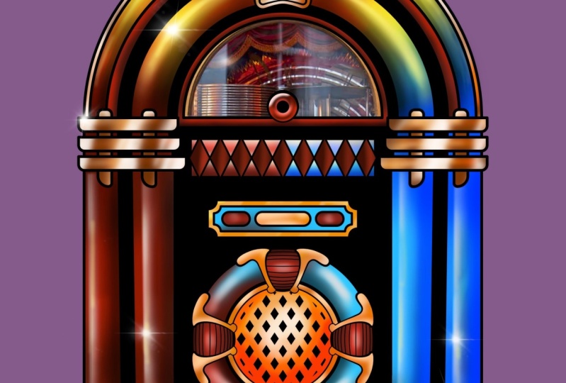
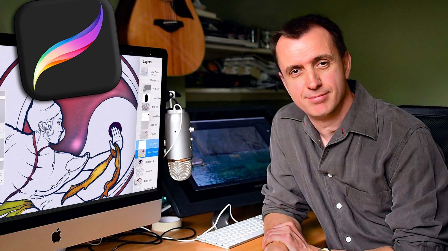
2. Project Time! Jukebox Jive!: Hello and welcome to this
section of the course. In the previous section, we were talking about
things like selections, clipping layers, layer masks. Well now I want us
to do an exercise together to practice
those some more. But also, I want to show you some practical usages for
layer blend modes plus a few things from the
adjustments menu before both of them get their own
dedicated set of videos. Okay, let's make a
start to do this. Let's come to import. I have mine stored
on my iCloud Drive. This is jukebox jive 01. This is available for you as a download if you
want to follow along. So just to give you
a quick preview, this is what we're
going to end up with by the end
of this tutorial. So let's get started. I will just pinch
in a little bit just so I can see
everything on my screen. And I'll come to my layers
panel and take a look. We have our top layer, layer one, that's our import. And all it is is a black
and white line artwork of one of those
old-fashioned jukeboxes. But straightaway, I've got
a little bit of a problem. I want to use that
artwork sitting on top of a whole load
of different colors. But the point is it's
just black and white. I want the black bits, but I
don't need the white bits. I need them to be invisible because low exposing
and welcome to my background color
and I changed that to say, fairly deep red. You can see this nothing
happening there. Now my background
color is deep red, but the layer one is
covering all that. I can't see that deep red
where I want to see deep red. But actually, that is a very
simple thing to change. Because if I come
to that little and sign just where I'm circling
now and I tap on it. Every layer has a number of
different layer blend mode. At the moment mine
is set to normal. But if I drag down a little bit, can you see how everything's
starting to change? I want to set mine to multiply. That is one of the darkened
layer blend modes. And what that means is
in very simple terms, anything which is black is
going to stay visible and anything which is white is
going to become invisible. Now, I can see my
background color and I can change that to what I want. Let's just change it
to a fairly neutral, fairly deep gray like that. Wow, Come on. Let's do what we're
supposed to do. Layer one is not a
very imaginative name, so I will change
that to Leinhardt, which is also not a
very imaginative name, but at least it tells me
what that layer is doing. Okay, so the next
thing to do is to block in the various
different areas. If you remember from a
previous part of the course, we had the Wu Siew image with martial artist Henri block,
the colors in there. We're going to be doing
the same thing here. So I'm not gonna
spend a lot of time doing this because you've
already seen how to do it. Just very briefly, I
will create a new layer. I will drag that underneath
my line art layer, counting my brush,
what do I need? Well, to block in, remember
we need a hard brush. So I will come with
hard air brush from the airbrushing brush that Let's choose a color at random, but somebody fairly priced, so you can see what I'm doing. And let's choose
something fairly vivid. This is going to change. But supposing I want to do these little bars
just at the side. If I come and I
zoom in and I put down my colors like this. One, you already know
how to do this or I'm not going to spend a
lot of time doing this. You have a choice. You can either color in these areas or for
a bit of practice, because you already
know how to do this. I've loaded up another file
before you call jukebox jive 0 to where I've
done it all for you. And if I open up
my layers panel, you can see I have line work and you have
four different layers, blue blocks, red blocks, yellow blocks, and well, it was green blocks,
but I decided to change the color to
a slightly deeper red. So maybe I should be consistent
with that and change that to red blocks. And let's make this so it's
consistent with what I call the before the line art. And you'll notice that the various different block layers, they're all certain
neutral blend mode. That's fine for me for now. And also, if I tap on the
icon throat blue blocks, for example, you can see
I've set it to alpha lock. And if you remember
with alpha lock, that means I can only draw on that layer where there was
already some color there. If there's any
transparent pixels, I can't draw on them. That will make it useful
for just containing the various different
paint strokes that I'm going to be doing. Alright, so let's
come to our gallery. Let's come to jukebox, jive CO2, swipe to the left, come to share, share, procreate image
format unless get that sent off to my iMac. That science and
that is ready to be uploaded to you so
you can download it. We can carry on with what
we're doing in the next video.
3. Block in Areas and Paint: All right, so I've got my file. If I come to my layers panel, you can see I have four
different block layers, blue, brown, yellow, and red. And I'll just point out
a couple of things. If I make my top line
art layer invisible, you notice when I
did my coloring in, it's all looking
rather blobby and rather untidy, but
that doesn't matter. It just makes sure I
went over the edges of my line art work so I don't
get any stray pixels. And if I turn on my
line art layer again, everything's suddenly
becomes all crisp and neat. Okay, let's make a
start with this. I'm on my blue blocks layer, and I want to create two different colors on two different sides
of my jukebox. I also want to get a little bit of a glass
effect with a kind of, it looks like sparkling
water on the inside of it. Okay, so let's make a start. Now I could create a new
layer like this and make this into a clipping mask so that anything I draw
on this new layer six, you'll only see the
pixels where there's already pixels on the
blue blocks layer. And if I show you this, I've got my paintbrush
by hard air brush is selected from when I was
blocking in and I have read now, last six are selected. And if I draw on that layer, you can see that I'm only making brushstrokes wherever
blue layer is selected. If I come here and I turn
off my clipping mask there, all my brushstrokes sitting on top of my blue blocks layer. If I make it into
a clipping mask again after they gets
masked out like that. But I know for this tutorial, There's a good
chance I'm going to create quite a few layers, so I want to do everything. I can't keep the
layer count down. This file doesn't get
too big to upload. And also some of you are
gonna have older iPads or so. I don't want anybody
running out of memory. So let's try and keep as
far as smallest possible. I will get rid of
that layer for now. I'm on my blue blocks
layer and supposing I wanted to select just a
certain part of the area. Well, I can always come to
this tab, my selections tab. You can see I have a number
of options at the bottom, I have automatic
freehand rectangle, an ellipse supposing I
come to automatic wall, that means is that if I tap on a certain area is
going to get selected. So if I come to say this
circle of blue at the bottom, I just tapped in
those four areas and the old becomes selected. And what that means is if I came to my paint brush, for example, I can paint just in
that area like this. And now now I'm trying to paint in that bit of blue
off to the side, those two blue vertical pillars. And I can't do anything. That's because selection, it does what it says on the tin. It just selects a
certain area so you can just do things in that area, are not worry about other areas. And I am going to undo that
because I don't need it. And if I want to
clear my selection, all I need to do is just tap on the Select icon
again and it's gone. Let's get back our line artwork. That's mainly what
selections are all about. But look, I want to
show you something. I'm gonna come to
my soft air brush. And supposing I want to select those two blue
pillars on the right. That's pretty easy. If I come to my
selections again, I've got automatic selected. There you go. I've
selected those areas. Now if I was to come to my
paint brush and sure enough, that's my God, my purse size, bigger and more opaque. I can draw in just those areas. Well, that's all very nice. And so I clear my
selection as well. Okay, That's lovely, great. But supposing I want to come
back to that area again. Well, okay, So let's
come to selections and and automatic is selected. I'll tap on the same area. What's happened? Why isn't the whole
area being selected? Well, the reason is when I use something like automatic
selection, for example, you tap on a certain area and then it goes
off searching for pixels that are the same
or very close in color, it will flood outwards into, it finds a boundary. In the case of this,
the boundary at found was that different area
of color, that red color. So it stops. Now because I've painted directly on
my blocks layer, that's starting to limit
what I can do with it. So if I just double-tap a
few times just to get rid of them on coffee, go there. For that reason, when
people are working, they want to keep their
blocking in layers as just that blocking in layers. And they don't want to
paint on them directly because you run into the
difficulties we've just seen. But like I said a
few minutes ago, I want to try and
limit the amount of layers I used for this. I'm going to use my
blocking in layers are putting down basic
areas of color. But then I'm going to use clipping layers on top to
show you different things. So for our blue blocks
layout or candlelight, the blue, but I want a different
color on the other side. So let's choose another color. I fancy some kind of
read a bit more of a hot red maybe around about there. For this, well, I could use my soft air brush
and gradually build up because I do want a gentle gradation from
one side to the other. But instead I want to come to my hard air brush
with my hard edge. You're going to make
my size very large. And I'm gonna draw. In this side like this. And I'm also going to come, and I'm going to
choose a yellow. So let's come to around about maybe somewhere
around there. And I'm going to draw
in yellow at the top, which so far is not brilliant
because I did want to soft gradation between the
red to the yellow to blue. And I am not getting
that at the moment. Well, I could come to my blend brush and start
trying to blend in, but there's a much quicker way. If I come to my adjustments, I'll come down to
this thing here. Gaussian blur. And the trick to this is to put your finger. It used to be at the
top of the screen now it's more say halfway down or just drag with your finger from the
left to the right. As you do, you start to see that bar at the top and you can see the further I drag it out, the most software more blended, a blur I get if I take it almost out
and nothing very hard, but as I drag it across software and software
and software until eventually I get something you'll rarely soft congregated, which is exactly
what I wanted there. That's to about 32%. And look at that
lovely smooth color. Let go off my paintbrush
to accept that. Okay, the next thing I want
some dark and light on this, so I'll come to my layers. My blue blocks is selected, and I'm going to
add another layer, and I'll set that to a
different blend mode. Well, first of all, I
want to concentrate on the darker areas. So I want one of the
dark and blend mode I'm gonna come to multiply. I'm also going to take
down the opacity down a little bit to around
about the halfway mark. And I'm going to choose
a fairly dark gray. My art brushes, I'll
choose soft air brush. I want this to be pretty
large and I want it to be low opacity so I can gradually build
up my brush strokes. Now the last thing, I only
want that color to appear, whether a pixels in
the blue blocks layer. So I tap and I came to clipping mask, and that
should help with that. Now let us see what
I can do with this. I'll start in the bottom right and are gradually
starts to build up like this. That's
looking okay. And also, I want to darken
the area just around the top, just where there's that little I think for
the actual jukebox, if they're gold color
or maybe just around the side bits just
on the other side. Down the bottom here. Now straightaway, do you
notice something with this? I just put down gray and yet
I am getting deeper blues, deeper reds, deeper yellows, which is kind of a green color. And that is because
my layer blend mode is set to multiply. Now, multiply, this is one
of the dark on blend modes. Let's just take a
look at some of the others and
experimental little bit. That's dark and that's
colored been an, OH, that's looking
quite interesting. I think prior to multiply, I'm getting maybe a
slightly richer tone there. What about Linear Burn? Maybe not color. Now, instead of multiplying, I want to choose Color
Burn because that's the first thing about layer
blend mode your experiment. And also because I set it
to around about halfway, I can now make it more subtle
by lowering the opacity. Or I can make it much more in your face by raising
the opacity. That's way too much. Let's take it to about again, around the halfway mark
That works for me. And my advice to you
when you're doing something like this is be bold. You can also fade the
layer afterwards. That's not a problem,
but quite often, people can be a little
bit timid with this, but there's no need to
be because if needs be, just turn the entire
layer off and it's gone, you can create a new
layer and start again, again with this layer
up further to be a little bit more graduated. So again, I'm gonna
come to Gausian blurb, do what I did before. Just blend the whole thing and so it's looking
at a lot softer. And then tap on my
adjustments icon again to commit to that. Now, while we're on this layer, I want to add some shade so that this whole thing looks a
little bit more cylindrical. Look if I come to
this red area here, make sure my layer is selected. Same brush, that's all fine. And I will make my
brush maybe a little bit more opaque like this, about 45% and make my
brush size a bit smaller. And I wanted to do just on the right-hand side of
both of those road tubes. So if I come like this
and I draw like this, you can see it's looking
a little bit well, my hand shuffled little bit. Let's try the other
side as well. And I'd like that to
be a bit smoother. Two-finger tap and
two-finger tap. Now I'm going to
draw a line again, but this time when I
finished my brush stroke, I'm just going to
leave my pen where it is and I'm not
going to move it off the surface of my iPad
up like this and white. At the top, do you see lying created if I can to Edit Shape, I get these two little dots. What I've got is
completely straight line. And by dragging those
two little dots around, I can move this line to
where ever I want it to be. This you can see
I can get just a little bit tiny bit of shading like this or it can
make it a little bit more about say there. And if I decide yeah,
I'm happy with that. We can just tap on my
brush icon and I can make another brushstroke on the
other side, like this. The same thing again, edit
my shape and I can drag that out at about the same
on the other side. Drag a line, edit shape around. Tap my brush and come. Edit shape. Move that to Y1. To be straightaway, I'm getting
a more of a 3D look. Now. Here's where it gets interesting
because that was fine. One had a line, but here I've got a huge curve or I will
come on, let's try it. I'll drag around like that. And oh, did my pen
work is not that good, is it not a problem? Two-finger tap to undo out. I will just repeat
what I did before. I will draw an arc and I
will hold my pen at the end. And I get are created. I can edit the shape
and I can move this to wherever I want. I've got three points. Look, I've got this
bit here which controls how our
key or not our key, that our kids, if English
is not your first language, the word archaea is
something I just made up. Okay, So don't worry about it. Again, I get a much smoother
transition like that, except that I'll make
my brush a little bit smaller for that slightly
thinner outer part. Drag around like this
are created Edit Shape. And sure enough, there you go. This is just making
my life so much easier and more precise. Upgraded shape. Take it where I want it to go. Remember size a bit bigger again and do this
bottom bit here. Co-created, edit the shape. Why do I want that? Top my brush once more to
accept it straightaway, I'm getting more of a
circular effect there. And again, I'm going
to pull, again, bear in mind when I do this, everything is on the same layer and I've already
blurred this one. So now I'm going to
be blurring a blur. I just have to be aware of that. Things don't get too blobby. It's a case of judging it. But anyway, let's move this. So I get bow there, I've got 7%. You might have
something different if you're following along. But it's up my
adjustment iconic GAN. But if we come to
our layers panel, everything's on that last six. In fact, come on, let's
do what I keep on nagging you to do and I'm not doing
myself, but I'll do it. Now. Let's rename it. What should we name it to? Chub shadows. I think that's a good point
to wrap up this video, I will see you in the next one.
4. Light & Shade with Blend Modes: Okay, so I've got my
nice colored tubes and I've got the
shading for my tubes, but it's all looking
a little bit dead. I'd like a little
bit more depth, maybe a little bit more
vibrance in those shadow areas. So my tube shadows is
set to color burn. But if you remember, I just use gray to create my darker areas. I think I can do maybe a
little bit more with this. So what I will do
is I will tap on my tube shadows layer and
I will come to alpha lock. So now if I paint over
those shadow areas, I'm just going to paint in the shallow areas are
not anywhere else. Then let's count on my brush. What brush you're using. Software push, that
should do the job. Okay, and I'm gonna put my finger just in
that blue area here. To sample that blue color. I will open up my color panel and I still want
an intense color, but I'm going to move a
little bit more towards the purply and rather
than cyan and blue. And I'm gonna make this
a fairly intense color. Now let's paint in that area
and we'll look at this. I'm getting a much
more attractive blue in those areas alike. This will, okay, What
about that yellow color? I'm gonna sample from
that yellow area. In fact, now you can see I just chose a color
from this region here. But instead, I'm gonna move a bit more towards
the orange area. Because when things
go in shadow, sometimes they take on a
slightly different hue. I want colorful for this. I've got that orange color. Let's see what that looks like when I painted into
the shadow areas and that is nice. You can see I'm getting a
much more attractive effect there now and just wondering, maybe make that a little bit
deeper in color like this. No, that's not gonna make
much of a difference there, but I will come to
my reds sample. My rights are for this. I want somebody a
little bit more towards the purple end of the reds. So I come to this
and why palette? And I'm gonna drag and
a little bit like this. I make this still intense, but a bit of a deeper color like this and see what
that looks like. That's looking more attractive, but it's still a
little bit too bright, I think so let's make it a
little bit dark and the like, but the short c'mon, let's make it very
intense because we're not applying colors
directly at the moments. That very intense deep purple is not going to be what
I see when I actually brush it down because
this is set to a different layer
blend mode like that. And those colors I've got
in those shadow areas, they're much stronger and much more vivid and
that's what I want. I mean, let's face it. This is an old-style jukebox
and subtle unrestrained. Not really. But look,
here's the nice thing. I'm liking the effect, but it could do with
being a bit darker. Well, do you remember
in the last lesson, I said my opacity to 50%. And this is a good example of why setting your
opacity to lower, especially in layer
blend mode is a good idea because
I can just come now, I just make the whole thing
more intense like that. Look, I took it to 63% and immediately the shadows
are getting darker. And when I could take it
all the way to a 100, in which case that's
looking, that's too strong. That's non-existent,
way too subtle. But now I'll do
the trick that you should get into because look, I'm wiggling in
my slides around. I bet you're looking at that little blue dot moving
around on the slider. And you may even be
looking at what, 57%, and now it's 66%. I'm looking in the wrong place. Look, just take it down to it's nice and subtle like this. Don't look at the slider. Look at the image. Look at the picture effecting. Don't look at the number. Don't look at the
slider and adjust this so you get the
effect you want. And I'm gonna say
around about there. Then I take my pan off the slider and just
out of curiosity, I'll look at the slider and
I've chosen 60% opacity. And the point I'm making
here is use your eyes, not the position of the slider and definitely not the numbers, not when you're going
through a visual effects. Okay. So I should say that has improved in the shadow
areas are looking much nicer. Now, what about the highlights? Because those tubes
are made out of, I don't think it's glass, maybe some kind of perspective
or something like that. So I need to add some
highlight areas. So I will create a new layer. And let's just do this
the most obvious way. I want some highlights in
certain areas, but not others. I need some way of isolating
the areas I paint. So supposing I come to these two tubes
like we did before. Well, if I come
to my selections, I was using automatic. Let's come to rectangle. And I'm in that mode
which I'm circling now, which means if I
drag out a box like this and maybe another one. Here, I now have
two boxes selected. And if I come to
what am I using? My soft air brush, Let's choose a straight
up white color. Let's make the opacity nice
and low so I can gradually build up brush
size, pretty large. Now, when I brush in, I can build up a lighter area just in those particular
areas which are selected. I am finding those moving
diagonal lines which show the outside of the selection
a little bit distracting. This is what you can do. Come to your wrench icon,
come to preferences. There can you see
right at the bottom, selection mask visibility
law can take that down to 0. The mask is still there. You just can't see it, which means it's not distracting you. And if I make my brush
size a bit smaller, I can create some highlights, maybe zoom out a little bit. Alum getting that
kind of an effect. Okay, that's all right. I suppose that's the
visibility so we can see what we're doing adult at one small on my selections
icon to lose that. And I have that lighter color. It's looking a little
bit flat to my liking. Let's change the
layer blend mode. Let's try one of the
lightened blend mode, like lightened, the
screen color dodge. Going to be very intense way by just go full screen for now. And I can play with
the opacity as before. Okay, that's okay for that. Straight up, straight down
because I have a simple box, but what about this area here? Well, okay, let's come to my selections will have an
ellipse selection there. And maybe if I drag out
a little bit light, that's a bit difficult to do. So I'll tap on clear
at the bottom. Zomato little bit,
maybe try doing that. No, that's not quite
there. Let's clear that. Let's try something about well, I could concern move and
remove things like this, but this is looking difficult. Okay, so let's clear that. Let's come to freehand
and zoom in on that area. Add mode. Let's come around
a little bit like this. Paint brush again,
make it bigger. And this is not ideal. If I tap on my
selection icon again, it's kind of working, but I had to rely on
my freehand skills which weren't so good in
that particular case. And I think the point I want to make is that
the selection tools, this one just here,
the selection tools, combined with the
transform tools, can be very effective
when you are sketching things out and maybe you want to alter the
position of a head so it's tilting
further back for that. Yeah, the selection tool, combined with the transform
tool can work well. And the selection tools
have been around for a very long time in decades. But when it comes to isolating certain areas of your picture. So you can paint without
going into other areas, which is an absolutely vital
skill with digital painting. Selections are a
little bit Stone Age. There's other ways to do it. There's better ways to do it. So let's take a look
at some of them. I will come back
to my layer seven and I will clear that out. And I'm going to set
the layer blend mode, for example, to overlay. Then I'm gonna come in
and choose a paint brush. I will choose my heart airbrush, medium hard air brush. Let's try that. So I have just
slightly soft edge, but it's still pretty hard. I'm going to come to my
color panel and I'm gonna come to value now because
I have white selected, the saturation is set to 0. I'm gonna take my
brightness value. I'm going to tap in there
and I'm going to enter 1130. Now I have a dead mid gray. The gray add 50 per cent. And if I quickly
backtrack, look, I'm gonna set my layer
blend mode to normal so you can see more
clearly what I'm doing. Then I'm gonna
come to this area. I've zoomed into this area. Now let's take a look
at my press size. I want the opacity to be
set to a 100% opaque. I want a definite line,
nothing transparent. For omega line that is too
thick, that's too wide. Let's make it a bit
thinner about there. I'll go with about that. And what I'll do is what
I did before I will come and I'll make a loan
from the bottom to the top, white until I get my Edit Shape. And I'm going to
move this around to about my paint brush and I'll
do the same thing again. Make line weight for
the edits, turn up, edit my shape, and move that
to about that. Tap my brush. Now we've already
seen this in action. We want to create
a curve like this. Edit my shape, like this, and I can move it
in place and I'm getting all the accuracy that I had when I was creating my
darker areas are differences. This is a digraph and it
has a hard edge, sap away. Now I think for this
thing will know, look, I'll tell
you what I'll do. I'll speed up just while
I do the other side. My brush size a little
bit thinner because that tube at the top is thinner. 16%. Let's try that again. Rod EFL do. Move it around so that it follows pretty closely the
outline of that tube that works for me and camera
to the other side away. Now I have my dead
mid gray lines, which at the moment, we're not looking too attractive, but Come to my layers panel. The mode is set to
normal layer blend mode and you've got these
dead mid gray. Now watch what happens
when I take this to one of the contrast
layer blend modes. Let's take the first
one, let's take overlay. I will look at that
everything has disappeared. If I make the layer visible, invisible again, it's
completely disappeared. That is because you have a
number of layer blend modes, which are called the
contrast layer blend modes. And what happens with those
is that anything which is a dead mid gray like
we've got disappears. Anything which is lighter than McCrae will make
anything underneath it appear to be a
lighter version of itself and anything
which is darker than McCrae will make stuff
underneath it appear to be a darker version of
its own local color. That sounds very complicated. Let's show you this in action. I will take my layer seven and I will stick on alpha lock. So I can only paint where those invisible gray
areas our outcome on let's name this,
let's call this. We'll call it overlay. I may change the layer blend
mode from overlay, but let's give it a try. I have dead mid gray, Let's come to my classic
and I will choose a lighter color like this. I'll come to my paint brush. For this, I'll use
my soft airbrush that's come down
to this area here. I pass the set too low so I can gradually build up my size. I will set to about 13%. And now when I start
to draw in this area, but because I'm painting
a lighter gray over that, I'm getting a lighter version of that red in the background. Now let's undo
that for a second. Unless you just choose
a straight white. Just make a couple of
brush strokes here. Now can you see that on
the other tube as well? But I'm starting to get
a light colors now. I'll make my brush size
larger, pasty lower. So I get more of a faded effect. I'm still getting a
sharp edge because there was a sharp page
to the gray underneath. But it can really start
to ride the size and the opacity and start to play some games with
this look at that, see, I get some nice highlights
in the shadow areas, which is what you
would see with glass. If I come to the top here. Look at that. I'm getting some nice little
glass-like highlights here, but they're all lighter
versions of the level of color, in this case, the yellow. Now just in case
you're wondering, if I switch to, let's try black. Brown here. I'm now getting darker versions of my black and I allege at a few streaks in
there like this, but I'm still getting some
of those dark reflections which I would expect to see inter-class area like this. Maybe here. Let's make this a bit bigger. And I can in some slightly darker
areas of the glass here. Let's switch back to white
and maybe a little bit faster now because while I've already explained
the general principle, so let's show you it in action. And I'm getting hard
edge, soft edge. And I can vary the amount
of water put down. Vary the effect like
maybe a little bit of a highlight down here. It's all local variations of the reds are the
yellows or the blues. You getting darker reds, lighter yellows, darker
and lighter blues. And that's a huge advantage when you're doing
work like this. I've said this to overlay, but you have a number of different contrasts,
layer blend mode. Let's go through a few of them. Soft light, which is
a bit more subtle. Hard i o, that's a
little bit too hard in some places because I painted this with the overlay in mind. Vivid light. That's giving
some interesting colors. Linear light again. But vivid light was interesting. Look, I'm gonna take
this back to overlay. And I'm going to
duplicate my layer, which immediately makes
things strongest. See that. But with this, I am going
to come to what was it? Vivid Light. And let's try it. The opacity down to 0, gradually dialing in some of the slightly stronger
tone or like this. And it's looking
a little bit too strong in one or two places. So this, what I'll do, I'll choose mid gray again.
What am I doing? Come out to be silly.
That's my mic. Great. It's in my history colors. Just rub circling. Now with this, we'll take a look at these blues
down the bottom. I like what they're
vivid light is doing in certain areas but not in others. I'll make this a bit smaller. And I can just paint out that vivid light area in certain areas just by
painting in that mid gray, I get to pick and choose how strongly affect is and where it
actually applied. That vivid light is
light overlay in that it is a contrast
layer blend mode. For any contrast
layer blend mode, mid gray mix things invisible. So I'm just making the effect of the vivid Light layer invisible
just in certain areas. Now that I've done that in
certain areas, can I capacity? I will do. Yes. Just to make a point,
but maybe I'll just come in and just fade out certain areas because it is just too strong in certain areas. But okay. Some
highlights for you.
5. Save & Load Selections: Okay, I think I'm starting
to build a little bit of a problem for myself because after I finished
the previous video, I thought, Well, okay, let's work with the
image some more so I can show people
what I've done. And I did that in
jukebox jive for, Let's come to our layers panel. And I did everything to
the blue blocks layer. I added another layer
called glitter there, just to give a little
bit of a pattern in a texture inside the tubes. And so counting up the various
different things I did, I've got for my
blue blocks layout, 1234567, different layers. And that is all
very well and good, but I also have my
brown blocks layer, my yellow blocks layer
on my red blocks layer. If I want the same
amount of detail and flexibility for
my other layers, that's seven times
428 different layers. And so depending upon
the size of my image, I might run out of memory before I can get
everything done. There's also the fact that
if I repeat the process, for example, with my
tube shadows layer, I'll end up with four
different layers, all in Colorbond
light blend mode, and they're all doing
the same thing. Also one I've got so many
layers in my layers panel. I'm going to be spending
a lot of time playing hunt the right layer.
Don't want to do that. And so what I'll do is I'll come back to
my gallery and I've created a new file which I will set up and then I
will send to you. And that is jukebox
jive 03 flattened. We're gonna go back to basics. Now if you remember the
whole reason we had four different blocks layers
were so that supposing, for example, I'm on
the blue blocks layer, I choose a paint brush from my airbrushing brush
set soft air brush, and I can paint in the blue and it won't
affect anywhere else. Let's make that just
a little bit of a brighter color cast
that black is just dead. And so it would be nice if all those blocks
were on one layer. And so what I can
do is I can come to my red blocks, merge that down. Now the red and the yellow
blocks are combined. I can merge them again and
I can merge down again. So all of my blocks
are all on one layer. Now you can see it still
has the Alpha Locks later, but now my problem is
there's not much point. We haven't blocked
in the first place because any brush stroke I make is going to go
across all of them. So this is what I'm gonna do. Okay, so what we're gonna
be doing is we are going to be using the selection tool, using the automatic selection to select various different parts, say all the blue areas. And then we're gonna come
to save and load and save the selection so that I can call up a selection whenever I want. But there is a subtle
problem with this. And I will show
you this if I come down to say this area here, just at the base, just where the blue tubes
meet that yellow area. If I take my yellow
blocks layer, they lower the opacity. Can you see I've got bits
of the blue block layer, which you can see when I
painted in the blue blocks, I went over my outline slightly just around that area
which I'm certainly now. But that was okay
because I added in my yellow blocks
layer over the top of that which mask that area, which if I'm using Alpha Lock and four separate block layers, that's really not a problem. But now I want to create
my selections and supposing I might my yellow
blocks area invisible. I come to my blue
blocks and I make a selection or come
to my selection tool, the automatic is selected and
I tapped just in that area. You can see those areas where
I overlap are now selected. Now, if I was painting, allow us to create a selection. I think all this is wonderful. This is really working. But if I was to paint
just in the area, can you see I would be affecting and I'll choose
a different color. Let's come to my
classic palette. I like to say green color. If I was to paint there,
yet started to see that green encroach
into the yellow area. It is a very subtle
gotcha, but it is there. So let's do something
about that. Tap to undo, get rid
of our selection, make a yellow blocks
that layer visible. Now before I make
all my selections, I do need to come and I need to merge all these
different layers down. So I'll take my red blocks and are merged them into
the yellow blocks layer. And I'll take that
layer and merge that down to the
brown blocks layer. And I'll take that and merge it down into the blue blocks layer. Now, when I came down
to the same area again, and I'll just make my
line art layer invisible. In fact, look, let's
lower the opacity. You can see now because I merge the layers down one
on top of the other, those rough edges are hidden
by my top Leinhardt area. So that's not a problem. But also because I
merged down the layers with the yellow
layer being merged down on top of the blue layer. I don't have that
overlap anymore. And I'm telling you this
now because you might be doing a project and thinking,
Okay, this is great. I can use selections
with a neural into that problem where one area
is bleeding into another. And you're not sure
why. That is, why. Now that's come to
my selection tool. And I want to select
all of the blue areas. For example, tap, tap, tap, tap anything you
see which is blue. Again, so fiddly bits here. Whoops, two-finger tap to undo that and type just
these areas here. I've noticed that if
you do make a mistake and you tap on a certain
area that you didn't want to and then you
undo it when you tap next to this little area
which I'm circling, that suddenly became unselected. That might be a little
bit of a glitch. Please just be aware of it. So let's do the other side. Yes, it can become
difficult because what I'm getting is the complementary
color of blue. So I definitely know I'm
selecting the blue areas, but it is a little bit
similar to that yellow color. Never mind. Okay. I'll just speed
up a little bit. I think that's all my
blue areas selected. So now what I do is I come
to save and load and I tap on the plus sign
where it says selections, tap on that and a half, selection, one
that is now saved. I can now come out of
my Selection tool, so nothing is selected. And I can go back in again, come back to my selection tool. Automatic is selected. All right, well let's do. Yellow is next. Just make sure it is selected. I'm not painting by
mistake and tap. Yeah, you can see it
chooses the opposite color, which in this case is blue. And that's not confusing, but stick with me. It's fairly quick to
select all of these areas. I think that's all
my yellow selected. So again, I come
to save and load. I tap again and I get selection to come out so that everything is
deselected. Come back in. Again. I've got my yellows
blues now what about my reds? A little bit here, watch
out for the tiny bits. Save that selection three. And I've got a bit
of a problem here. It turns out the red areas and the brown areas are so similar that they're both being selected at the same time. All right, well, let's
do something about that. Let's tap on say this red area here and odor,
it's flooded everything. But if I put my finger on my pencil anywhere
on the screen, maybe towards the right-hand
side and slide to the left, you can see my
selection threshold is going down like this. I'll take that down
to around 19.420%. I would clear by
tapping on the bottom. Let's try tapping again
and see what happens. Yeah, Now I've learned
my selection threshold. It's being fuzzier
about what it picks up. So now I can choose all my reds. I can save that selection three. Incidentally, if you are making these kinds of
selections and you make that mistake where
you select too much and then you
create a selection. All you need to do is
just slide for left and you have the option of
deleting that selection. I don't want to do that. So Slide back to the
right and tap once more on my selection icon to
de-select everything, then come back in and we just have the browns
to do now, don't we? That is all my
brows, I think, Yes, this one small save
and load up there. Now with everything deselected. Suppose I wanted to
work on the blue tubes. Now again, just come
back to my selections, come to save and load on what
was it selects you want. I tap on that, that
will get selected. I'll tap my paintbrush
to get ready to paint. And you can see just my
blue areas are selected. And then suppose you only
want to come back in, work on just the reds,
come save a load. I think that was selection
three, wasn't it? That selection three, tap my paintbrush and I'm
ready to start painting. Now, back into my layers panel. I have my blocks
all on one layer. But one of the main points
of having blocks as you can control your brush strokes so they don't float over
into other areas, which is always important
with digital painting. But in this case, I
don't need to have for lots of seven layers
all doing the same job. I can use the same length, isolate certain
areas by selecting, which means I can
have bigger files and also it just gets
less confusing. The only thing I would
do with this is look, if I come in close like this, those moving aligned to its show the outside area
of my selection. They are very distracting. So come to your wrench icon. And under the preferences,
you've got this one here, selection mask visibility,
right at the bottom. Now I'm gonna slide that down. I'll take my down
to around about, I guess between 10, 15% so that I can just
see the lines moving, which is gonna be important because I just want to be clear while I'm working which areas are selected in which aren't, but it's not distracting. I can make some
better choices about what my color or my values
next to another area. All right, So if I move
this off to the side, the thing that
remains for me to do now is to create some layers. And let's create some layers and use some layer blend modes. The first thing I did was
I made things darker. So I will tap on my little and call up my
layer blend modes. And just above the normal, these are all of the dark
and layer blend modes. I will set mine to color
burn because I seem to remember it gave us some
more attractive colors in the shadow areas. But I'll also take the opacity down to
around about the halfway, maybe just a little bit over. So that later on down
the line I can make the effect stronger
or less strong. Gonna rename this to dogs. And just in passing,
I should mention, you don't need to put all your darkening effect on one layer. You can have more than
one darker layer. It is a very common practice. You might do a lighter
shadows on one layer, your darker shadows and another, and you're very deep
shadows on another layer. So you'd have three
different dark and layers. I also want ally, which I will call
lights. For this. While in the previous videos, I used overlay where I put down a mid gray color that I
lock the layer and then anything lighter than
McCrae a page be lighter and everything darker than my gray appear
to be darker. Hopefully you remember that. But for this to make
things less confusing, I want one layer doing
one job, the darks layer. Its job is to make things
darker, the lights. It's job is to make
things lighter but loved. Let me show you if I
come and I choose it, That's more or less
than the gray paint on that area. Okay. Well, that's a makeGray. And if I was to take that too, the overlays, it will appear
to be pretty much invisible. But if I choose one of
the lighter blend modes, which are the ones just underneath an all blend mode
like lighting or screen. You can still see that great. That's because the
lighter blend modes work a bit differently. Look, if I clear this
layer set to screen, which is the lighter blend mode. If I choose a black like
this and I scribbled, you can't see anything. Because with a
lighter plan modes, anything which is black becomes invisible.
Look, I'll show you. If I change this back to
normal there that's black. If I change it to one of
the lighter blend modes, any of these black
becomes invisible. So I can use that to mask
out like I did using gray, but instead of using great, I just use black. Then I can alpha lock the layer until the light turns
on top of that. If that sounds confusing, you will see this in practice. But anyway, the set that to
screen for now that might change our lower the opacity again for the lighter colors. I'm gonna take it to around
about between 6570%. So I can still get
brighter colors because I want bright colors on
the glass, for example. So around about 70% is going to make things
brighter overall, but I can still nudge it
up a little bit more. So around about the 70% mark, I will up and clear that layer. And now I think the
best thing for me to do is to put down
those little areas, say on the glass, for example, where the highlights are. All know, in order to do that, I will come to normal or raise
the opacity up to maximum. So I can definitely see, yes, I'm doing black. I only want to paint
on the blue areas, so I will come to my
selections and save and load. Well, that was selection
one, wasn't it? That one there,
tuple my paintbrush, those areas are selected. Now I can do what I did before. Medium hard air brush. My width is about 41%. See what that looks like. Yeah, that works for me. Arc is created because I
held my pen on my layer, come to Edit Shape and do
what we did for the setup, an area I can mask. Then I can alpha
lock that layer, several layer blend mode
to screen so everything becomes invisible lower
the opacity like this. Choose, say a soft airbrush. Make my color light, make my pasty way low
brush, medium-size. And now I can do my highlights like I did
in the previous video. This is what I'm gonna do. I'm going to undo that. Take me back to where I worse or about 70% on normal and
fat now make it a 100%. I can definitely
see what I'm doing. I'll carry on doing this. I'll carry on masking out areas. Once I've done that, I
will take this file, I'll make it available
to you as a download. In the next lesson,
you can follow along, I'm sorry if this lesson seemed
rather dry and technical, but I've also tried
to teach you about workflow as well as the more creative stuff,
the more fun stuff. But what I find is
if I'm working on a project to all
this stuff first, setting up your blocks, put any lays that you think
you're going to need, like your dogs and
your light and you rename them and you set the opacity and you put down your masking because this
is all housekeeping. What I suggest you
do is divide up the boring housekeeping stuff like we're doing
now into one block. Then you do your creative
stuff and all the fun stuff and all your artistic decision
stuff in another block. Then if you think you need
to do more stuff like this, put that in another
block, and so on. Because it requires you to
think differently and it's very easy to get knocked out
of the creative headspace. We don't like it
when that happens, we want to be creative. And so it can lead to shortcuts and all of these
little things like, I can't be bothered to rename the layer because
I'll be creative. They start to add up
and that's when you start to get problems
like I've got layer 23, what's supposed to be on it. Anyway, I will
carry on with this, get it sent to you, and I will
see you in the next video.
6. Paint your Highlights: Okay, So here's what
I've been working on and this is available
for you as a download. I have my lights
layer that's got the various different
black lines which we're going to be
using as masking. This file is available
for you as a download, as a hopefully if
you load it up, you will see what I am
looking at right now. Okay. So last thing
before we start tap on the N on our lights lab, whenever we choose the opacity, what was it around
about 70% mark. And I'm going to change the
layer blend mode to screen. On last thing as well. I need
to alpha lock this layer. Okay, let's get started. I think I'll start by
doing the blue areas. We're gonna make sure my blue
blocks layer is selected. Because now this
blue blocks layer, I can use that left for
putting down base colors and then affect the darkness or lightness of them
with a layers on top. So let's come to US elections and
we can just save and load and selection one, that is all my blue areas. And then I'll come
to my paintbrush. I'll start putting
down some local areas of color now what do I have? Well, I want baby blue, Little bit deeper
around about hair. And for my brush, I'm using
airbrushing, soft air brush. I want it pretty large
for this opacity. Well, it can be about
halfway, that's fine. And I'll start putting in some different areas
of color or like this. I'll have blue on the one
side and I will have, well, let's try a red color, fairly light red color. On the other side. Let's
do what we did before. Let's try it. A little bit of
yellow suit maybe around about pretty bright, just around the top area. Now I do have some
other areas as well which I'd like
to concentrate. Pow1 have that doughnut shape. So I think for that, I
would like to have I'd like to have a lighter
version of that, blue on the one side, but my brush is
quite big for this. Maybe make it a little bit smaller so I have more control. And I want a lighter version, kind of pinky color. For
the right-hand side. They've made it a little bit of that spillover on the one side, sample my color on
the other side, or maybe just put this some of this blue
just on the bottom. I'll also bear in mind, I have a couple of extra blue areas
I could do with filling in. I will sample up pink
and output pink, just not little doughnut shape
at the top and maybe have a similar pink on one side
of their little diamonds. And sample that blue from
the bottom and put that on the left-hand
side. That will do. Now, let's come to add darks layer that is
set to color burn. I should get some fairly
saturated darker areas. I will solve them, I read, I will come up to
my colors again. I think I'll introduce
a bit of color, drifting hair just
to provide a bit of interest in the shadow areas, the dark areas, not
necessarily shadow. I'm going to choose a darker red and I'm gonna drift
this much more towards the purple and Lima
pretty low pass state, about what, around 20%. Let's see how this goes. And put in some shadow areas just on the side of
those red pipes, a little bit more at the bottom. Maybe I'll up the opacity
a little bit because I'm scrubbing quiet hard with this. Definitely want a bit where
that little gold area is, just where I'm drawing now, on the one side, maybe a little bit on the other. Thing that we'll do for that, sample, some of the
blue on the right. Make that a little bit darker and watch
light do with this. Try moving it a little
bit more towards cyan, a kind of a color. Let's just see what
happens with that. That works. Let's put a bit at the bottom, little bit on the sides. Your notes are not making these very, very straight lines. I want a little bit of
variation going on here. Definitely want some
shading around these bits, just around the Golden
areas towards the top. Not so keen on that, I will undo that brushstroke instead
for that yellow. Let's try little bit of this red and see what
that looks like. When I had a bit of shade.
Yeah, I like that effect. Getting a very orangey
kind of a shadow there. Let's put that at
the top as well. I've done that now
let us not forget the bits at the bottom. Let's take that pink. That's produce a deeper
version of that. And let's move that more
towards, more towards purple. Again. What does that look like? Quite like that. You know, some not being shy with
making things darker. Quite often when people
are putting in shading, they get a little
bit timid with this. Leave large areas of loci
color with not much shading. It tends not to work too well. And we've done it and actually. I'm finding that same colors working quite nicely for
the blue in this area. So I will go with that. Now let's just provide just
a little bit of interest. Just in this top area
where the diamonds are. What bouts little doughnut
shape at the top. I can go with that. Maybe make this just a little
bit darker still. We choose the size of my brush and add just
a little bit more. Just to get a slightly
3D effect there. Yes, I'm working quite a bit
faster than I normally do, but I need to try and keep you awake from that previous lesson. I think I'll give it Now. Are there any other blue
areas? Yes, there are. This area here. Choose a blue color in a few
bluer areas around here. Just scribble across a
little bit like this, makes them blue top. That's quite rough, but
give the journal I did add a little bit slightly deeper
blue in longitude areas just around these blood types. I'm going through a
bit of depth here. But listen, I think
that's probably enough for you to get
the general idea. Now, let's come
to a lights area. Now for this, I'm just going to choose a straight at White. Software brush is
still selected. Capacity. Nice and low size. What about 13% opacity
is going to be around, somewhere around the
course of bright mark. And let's come up
to this area here. If I just scribbled in
because that area is locked, you can see I'm
getting my highlights, but that is way too
much too strong. So I'll tap to undo that, maybe make precise a
little bit bigger. Started gently brushing on one side. Just to
get the highlights. I want this to be a
quite a sharp highlights on one side of
that masking area. But then gradually
fading away to try and get a little
bit of a class effect, blast or perspective
or whatever they use. These lovely old jukeboxes
that works there. Now let's try it
on the other side. The nice thing about it is
I can create my highlights, but that also sitting on top of those deeper shadow areas. So I can build up some really
quite complicated coloring and effect very, very quickly. Like if I come here
you can see my paint, that light that goes over
the top of my shadow area. That's come down to here
and see what we can draw little bit on
the other side. And let's not forget
our doughnut shapes at the bottom there's
a bit of black. I think I put a little bit
of a highlight, just hair. Yes, I did that. See now, can I just check all the other areas here
where we put highlights? Let me check that up into one lights layer
and I'm just going to change it from
screen back to normal. The blue section. Yeah, there's just a tiny bit just at the base of
those two pillars. And yes, that does look
weird, it doesn't hit, but if I take that back to
the screen, there you go. Now what about while I'm here, let's take a look at a few of the other lightened blend modes. Line Nope, screen. That's what we had. Color Dodge. That's given me some really
quite intense highlights. Work as well. Light color,
I'll never forget it. By the way, in the
videos following this, I'll be explaining what all those different
layer blend modes are that is coming up very soon. I think for this, I'm just
going to stay with screen.
7. Change Colors with Adjustments: Okay, so I've done
my blue areas. I've got those nice
multicolored tubes. What about those yellow areas? Which for the
original jukeboxes, they were either a kind
of a plastic is silver or a plastic eat gold effect
will go for plasticky gold. We will also make
this very simple because this is a
stylized drawing. Any way, I am not going
for ultra realistic here. I'm just going for a
stylized color effect. So my blue blocks layer where I put down my base
colors is selected. I'll come to my selections
and I've come to save and load and I will
choose selection to. That's where all
the yellows are. And come to my paintbrush. I wanted to change that
yellow is slightly so it's kind of a warm gold effect. And I could do that just by
painting with my paintbrush. Or I can give it to
my adjustments and choose Hue, Saturation
and Brightness. And if I tap on that, I get my three sliders
at the bottom and I can change my hue to
whatever color I want. I can change the saturation
to whatever I wanted, and I can change the brightness
to whatever I wanted. So let us see if I can get
kind of a goldfish effect. You can make it a
little bit brighter. Move this around. I guess that's fairly
yellow enough and quite saturated because
we're not going for subtle here and okay, that gives me my basic color. But just for the sake
of showing you this, let's come to this
little triangle I'm circling right now
and I'll tap on it. And now instead of affecting
the layer as a whole, I want to paint in
just certain areas. And so look, if I come in, zoom in a little bit
and I'll paint just in, say, this area just at the top. And can you see that the hue saturation
brightness adjustment is only affecting the areas
which I'm painting in. Again, I can move that around
to wherever I want it. I can make it the variety because these
are the priority areas. I do not need that
pink color though. Make it a little
bit more saturated and play around with the hue. Okay, that's a lighter
version of the yellow. I had to play around with
the hue a little bit more. Saturation. I can go with that. And I just put down
to the few areas of color and what brush I'm
I using my software box, that's fine, but I
wanted to reduce the opacity down by quite a bit. So I can gradually
build up this effect. Just around the top
of the keystone, just on one side and
maybe on the other side. I'll just it down in general, lightning areas.
Mustn't forget that. These bits, I want
to affect those, make it more on one
side than the other because the light is coming
in from the top left. So a little bit more
emphasis of the lights on the left-hand side because the light is coming from
the top left direction. Now, I will tap with one
finger anywhere on my screen. And I get this five choices. I'm gonna come to the top
one and tap on, apply. That has applied
my hue saturation, but it's still active. So that's come to the
top keystone effects. And I can repeat the same
process again this time, I want to give you
something a bit darker. Try and find the right cue. I want a fairly hear
about there maybe, because I'm just putting
down some base colors here. I also have my
lighten and darken layers on top just to
add to this effect. But I just wanted to show you this effect because
it's very useful. Being able to paint in your adjustment layer
exactly where you want it. A little bit down, a
little bit down here. If I zoom in a little bit, my brush size a bit smaller. Let's get some of
these buried areas where the light
wouldn't quite get to. Let's not forget some
of these areas here. I'm working up. Next speed here. I would normally take more time, but plenty of times before
you are on the clock, on the most important thing for me to do right now
is to show you the general technique
and you can take as much time as you like. I've done my local
areas of yellow, I will tap once more on my Adjustments Layer
icon to commit to that. And then I will come to my
account, my lights first, I'll add some highlights and
my brush is still selected, my soft air brush. Now I've got some highlights. Put it in there somewhere. So let's make my brush
size a bit smaller. I think they're quite tight. I've got some hair. And you see just in little bars, I put in some areas there, some on the other side, putting those in very fast. If I decide to those highlighted bit too sharp all
the way through, I can always come to my eraser. What is my eraser
again, soft airbrush, going to have to make
it pretty small, reduce the opacity and
then just gradually, let's just take this area here. Gradually just fade away. Just the areas where I want the highlight
to gradually fade out. You can play with this
as much as you want. Did you really do have that
amount of flexibility? All that rather boring like work we did in the
previous video, is where it pays off. In terms of all of flexibility for all
the things you can do. I know I've got some
highlights up here, so it's my paintbrush
down there. And I also have some bits
just at the top here. And as before, I can fade
things out wherever I want. And if I change my mind, I can always come back
to my apparent motion. It's paint them back in again. I know I've got some
highlights down here. You go. There's one
set of highlights. Another set. As before, where
I think it's too much to my eraser and
just erase back out. I can have a hard edge, add a soft edge.
Whatever I want. Do. I want to strengthen up
some of the dark areas of this gold that came to darks. Choose all, let's choose that darker color
I've already used. And let's just take a look. That's looking quite nice. It's a very, very warm red, but hey, it's working for me. Let's make sure there's bits in the background are well
hidden and maybe still a little bit on the underside
of these bars like this. A little bit around the top, a little bit here. Let's do the other side. A little bit at the top as well. Could do with having a
little bit more definition, I think a bit more
down the bottom. I will call that done
for the other bits. Well, actually I'd rather
do a little bit more on it, but time is marching on.
8. Import an Image and Finish: Okay, We did, they gold bits. Now what about there's just one or two little
red bits plus the brown. But let's take a look at
those selection to de-select. Selections again, save and load. Selection three. Yeah, that's just the reds,
the fairly deep reds. I want to do fairly
simple things with these because I'm getting so many colors
here at the moment that it's just going to
get wherever powered. So choose my paintbrush. I will just come straight to my dogs that is already
selected, That's good. I will just come and choose
my local color there. Just use my arrow
pushing for this. Let's make it a
little bit bigger. I just want to have one or two. The deeper areas here, get some nice deep breaths. Just this, but at
least I want this to be fairly restrained. Not any face. Also have these
things at the bottom. I'll make my brush a
little bit smaller. Just a local TV
color now for these, and make my brush a little
bit bigger just for the bottom area here. Selections, wonderful,
come to all these colors, but I'm painting or right in the area I want to
paint and nowhere else. Other red areas? No, I can't see
enough of my lights. I didn't put any masking areas there and the layer
is Alpha locked. I will just temporarily
take it out of Alpha Lock. Which sample? My
red color again. Can I get yes, I can. I can get a slightly rich, slightly lighter
red, deep shadows, slightly rich
highlights for this was all a little bit of light
coming out from underneath. That's all I really
wanted to do with the reds tapped to
de-select and come here. And finally choose this area. This was the browns area
wasn't confined blocks layer. What about this layer down here? I think for this, this was
originally a gold color, so I will choose some
of my gold color and choose some of
this deeper color because I have my lighter
layers are my dark layers. But there's no reason at all. Well, I can't just love with color just in
that area there. That look, I'll come to
my lights layer again, Alpha Lock is still
not selected. I'm just going to choose a
straight white, light yellow. I'm just gonna put lighted area. Simple as you like. While I'm here,
maybe I should put the alpha lock all of you
again for the lights. Now one thing I'm thinking is
that those little diamonds, maybe I'd like them to be just
a little bit out of focus. They're very sharp
at the moment. So this is what I'm gonna do. I want to come to
my line art layer, come to my adjustments. And I'm gonna come
to Gaussian blur. And I'm gonna do the Gaussian
blur using my pencil. And I'm going to just
draw in this area or we see how everything
suddenly blocked out. That's because my
Gaussian blur you can see at the top
is set to 60%. That is way too high. That is not a problem. I'm going to place my finger just close to where it says 60%. I'm circling it now. I don't want to
drag this way down. And you can see I can
ride the Guassian blur. Twenty-seven percent. That seems to work for me. I just want this to be
broken up a little bit and now I'm painting on them. We know this is the soft brush, but it's doing the
job quite nicely. Thank you very much. I like what that did. So I can either
single-phase top and apply, or I can just come and tap on my Adjustments menu
again in the top left. And that commits to that part. Now there's just one area
which I haven't colored in and that is that little
semicircle at the top. All I wanted to do something
a bit different with this. So I will come and our tap on my selections layer to
de-select everything. I am going to come to my darks layer and I'm
going to add a new layer. Then I want to come
to my wrench icon. It is selected and I'm
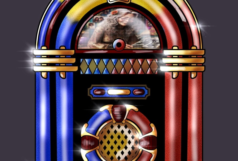
going to insert a file. Now I will upload
this for you as well. It's called jukebox image. Tap on that it imports. And you can see I have
a little image here. I just quickly not to gather just a composite of
two separate images. I'm going to resize it
by dragging the handles around and take it
just this area here. That will do for me. So
I will just tap once more on my transform
icon to fix that. The only problem
with it is I only wanted in that top semicircle, It's going to fall. So come back to my selections, come to save and load. I want selection for
again, don't type. There we go. That selection for selected in my layer is still selected. That layer five, which
is the imported image, I could come to my
eraser and take the opacity way up like
this and try and erase. But the problem
is, I want to get rid of everything on the
outside of that selection. So that is not working, not a problem. Let's come on. We will select again, but this time just where I'm circling it at the
bottom, it says invert. And if I tap on that, now everything on the outside of that semicircular selected. So now if I come back
to my Eraser tool, I can just erase just that area. These old jukeboxes
often used to have a little image just
in that window area. Now I quite like
what that's doing, but I want to show you
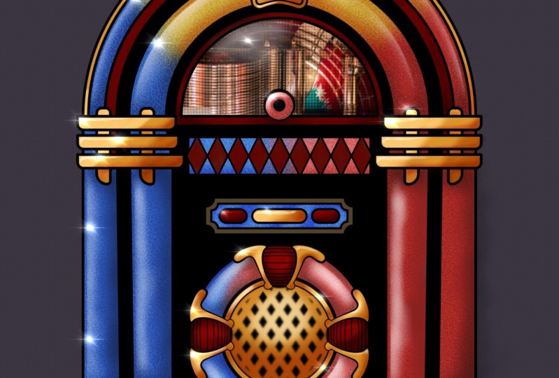
a few more things. So outcome and I will
duplicate that left. I don't think I
need my selections anymore without
layer five selected. Let's come to our adjustments. Let's try. Let's try halftime. Welcome to newspaper. And I can slide along with my finger anywhere
on the screen. And you can you see
how I get this kind of a newspaper half tone? I want to slide mine to
around about 10, 10% percent. I will tap on my
adjustments once more. And for this, instead of a
straight up normal blend mode, Let's try this with
one of the overlays. Yeah, when I do that, and especially if I lower the
opacity just a little bit, I'm getting a stylized effect. But the overlay means I'm
getting darker tones rather than just a straight
dead black for this lab. Let's see what else I can do. I'm gonna come to
my blue blocks lab. I am going to swipe to the left and I'm going
to duplicate it. I'm going to move this so it's sitting over the darks layer but underneath the lights lab. And I'm gonna come and I'm gonna select the what used
to be the blue areas. Now, the various different
types of selected, but I'm gonna come
to my adjustments again and I'm gonna
come to noise. And again, I can slide
anywhere from left to right. To add some noise to this. I want the noise to be bigger. Like this. Let's just have a
quick experiment around with this octaves. Okay, That seemed to work. Turbulence doesn't
seem to make much of a difference now what
about pillows or ridges? Now, I will go with clouds on the scale to be
quite large like this. And I will tap on my adjustments
icon to commit to that. Often inside these color
pipes you get litter. So you get all these
little sparkles of light. And that's what I'm going
for with this effect. But obviously that's
way too much. I think let's take
a look at this. The various blend mode. Again, I think similar
overlay, a bit harsh. Soft lights working
quite nicely. Hard light too much? No, I think for
this soft light and also maybe I'll just lower
it down a little bit. That's down to nothing
dial in the effect. I want about that. And I quite like that, but I don't want it everywhere. I think it works in certain
areas quite nicely, not so much in other areas. So I'll tap on my layer
and do anything else. Come on. Let's call it sparkles. And then our top again
and I'm going to come to mask because I want to
mask out certain areas. While I did that,
black was selected. My soft air brush is selected. I will just move past you so
I can build this up and I'll make my size what,
twenty-five percent. Now, let's take a look at this. I think it works at its best in some of
the lighter areas, not so much in the darker areas. I can paint it out
where I don't want it. By painting black
on my layer mask. I love the opacity a
little bit because time Rhody is moving
on. I can do that. And if I decide
well, you know what, I changed my mind, I
can just come to white. I can paint back in the
effect wherever I want. That's the advantage
of layer masks. And a little bit is nice. And it's little
doughnut shape nor so much in the shadow areas. I think it's at its best, whereas a little bit
of light showing through from the lighter layer. All right, So there
we go, sparkly bits. While I'm here as well, the lights lab, I am going
to turn off the alpha lock. Just choose a
straight white color. Again, my advice is started
and make it fairly large. And I just want to provide
a little bit of a highlight just on that picture of
the girl on the car. But I don't have that
particular region selected, so I will turn off
my selections, make the brush a little
bit of a highlight. Just here. Now it could keep
on going with this. But look, I'll just show
you one more effect. I'm gonna come right at the
top of my line art layer, and I'm going to add another
layer on top of that. I'll set the blend mode
to something like add, which is a very, very strong
lightened blend mode. Because in the luminance process that are discovered,
a nice thing. This one here, the flat, which already lightens
things up very much. I'll make it the
opacity download. What size I got
maybe about there. Actually, no, let's crank
up the opacity so there's nothing subtle about it
whatsoever. Look at that. I get little sparkly highlights which are gonna get just where the light is showing
how they can be white. This is not a subtle
image anyway, I can put little sparkly
highlights wherever I want, which provides just a nice it completely over
the top effect. I think I should
leave that up to you to decide how
completely over the top you want to be with this may personally, I'm having fun. Okay. I think it's time to
call hall with this. I would like to
carry on with it, but I think I've
done enough hair to show you the two things
I wanted to show you. Yes, selections, that's nice. It's nice to learn a
different workflow. But the main two things
I wanted to show you are some uses for the
various adjustments. You've seen hue saturation
and brightness. You've seen Gaussian
blurred, you see noise. But we will go through all
these various different ones. And the other thing I
showed you was how using various different
layer blend modes can really help the productivity
of your artwork. We had multiplied for
our line art layer, we were able to
make things darker but colorful using color burn. We were able to lie in various different areas
using our lights layer. And you can make things
darker and lighter by using things like overlay
or soft light. Because with layer blend modes, you can get all your various
different layers interacting with each other in all
kinds of creative ways that you just couldn't do by just
slapping down some paint on top of wad layer so it covers up whatever
is underneath. That's not the way a
layer blend modes work. They interact with
layers underneath, and we'll start talking about layer blend modes
in the next lesson.
9. Layer Blend Modes Introduction: Okay, let's take a look
at layer blend modes. I've mentioned
Blend Mode several times up until now
on the course, let's actually figure
out what they do. I have this image, it's
available as a download, but really all you
need to do is just follow along and
understand the concepts. Because I have two layers. I have my layer one, which is just a simple palette
with some colors on that. And on top of it,
I have a series of colored dots
going along the top. I have up dead mid gray circle and a white circle
along the middle. And on the bottom
I have a gradient that goes from black at one end, mid gray in the middle,
and white at the other. And at the moment this layer isn't a blend mode
called normal. And you can check that
because if you've come to your layers panel has a little n to the right
of the layer name, and the N stands for normal. If I tap on the end,
I get two things. I get the opacity of the layer, which you can alter
using the slider. But then you have a list
of all the blend modes that Procreate has
to offer instantly. These are the same
layer blend modes that you will find in just about any image editing
or digital art program. And if I put my
finger or my pen on that little blue bar with
normal anti-drug up or down, I change the layer blend mode. You can see when I do that, the look of those
pixels on the top layer changes depending upon
what's underneath. Now that is an
important point because and this is the most technical I want to get for this lecture. What procreate is
doing is looking at all the pixels on this layer and every pixel there has illuminance or brightness value. And so procreate convert all those brightness values
into a value between 0, which is black and
warm, which is white. And it does the same thing with everything
that's underneath. It could be one layer,
it could be many layers. And it takes all the
pixels there and converts them into
a value between 01. And so for every pixel that
you can see on your screen, There's two values between 01 or procreate or any other
image editing program. It program does
mathematical operations on the two values. That's why you get certain layer blend modes
are called multiply, for example, or ADH. And that gives you a
clue as to what kind of math procreate is doing to the top layer and
the layers below, like in the case of this pad, we'll take a look at
what's going on here. Everything suddenly
got brighter, much brighter in many cases, because procreate has
taken the brightness or the luminance values of
the layers underneath. And it's added the brightness
values of the layer on top. And you end up with this effect. You add two luminance
values together. You're gonna get something
which is brighter. And that's the way every
layer blend mode works. Okay, so that is as technical
as I wanted to get. But here are five things you'll want to know
about layer blend modes. Number one, any and every layer is always in
one of these blend modes. By default, that is normal, which is what we're on now. Number two, they usually work by changing the look of
the labors below them, but they don't permanently
alter the layer below them. Number three, you've
already seen it. A layer can be changed at any time to a different
layer blend mode. They aren't fixed in stone. Number for any new layer which
you import or you create starts out at a 100% opacity that is not fixed
in stone either. You count and you will change the opacity plenty of times. A number five, all
these layer blend modes which are looking very scary
at the moment and confusing, are actually divided up
into logical groups. And that is what
makes life easier. Let's start with
that last point. They are divided
up into groups and that's go through them
because in Procreate, you have a series of
blend modes called darker color, Linear
Burn color burn, darken or multiply, and they all do variations
of the same thing. They make things darker. So what are we on now? Well, at it, it
makes things darker. If I take this briefly
back to normal, take a look at the black, the mid gray, and
the white circle. If I change it to multiply. But why circled disappears? They may gray circle or yeah, you can see that it's
making things darker and the black circle remains black. If you take a look at that black to white
gradient at the bottom, you can see how things get progressively darker
for the image as a whole when you go from white to black on
this top layer. Now for things like photographs when you want to
make things darker, multiply is a very,
very popular choice. The darker, the gray, the dark of color underneath. But also take a look at my
colored dots on the top. Instead of being solid
colors like that, they're providing a
darker color cast to whatever is underneath. One of the reasons
this is popular is because this makes
things darker, but it doesn't saturate
the colors underneath. So you tend to get a fairly natural darkening
effect with a photo. But this is Procreate. This is an art program
where you might want more vibrant
shadows, for example, in which case, look
at Color Burn, especially that gray
dot in the middle. Let's do that again. Multiply color burn. You can see how the
darker areas have gotten much more
saturation in them. And actually that's quite
an attractive effect. Take a look at the
gradients at the bottom of what it's doing to
the paint underneath. And if he finally effect
a bit too strong, you can do what you should be doing with layer blend modes. Play with the opacity
of a layer to get just the amount of darkening that you want with
plenty of color. Also you have the other
darken blend modes. Darken the whites and the lighter grays of the
gradient just disappear. On the other end, you
only see the black, but in-between procreate
is figuring out which pixel is darker and
whichever one is darker, That's the one that gets shown. Then you have something
like Linear Burn, which is kind of a
halfway house in-between, multiply color burn because things are getting darker
but they're less saturated. Color burn, saturated,
Linear Burn, not as saturated as color burn, but more saturated than multiply the darkened layer
blend mode are all just doing variations
of the same thing. If you want to make parts
of your image darker, you've got a choice of all these different ways
of making things darker, preserving the details,
but with a whole load of different options as to how
saturated the darks get. Now if darker and it's
choosing the darker color, but you're getting
a little bit of play in-between this layer
on the bottom layer, you can pair that
with darker color and it's all or nothing. If you take a look at, say, look at that cyan dot. If I change that darker color
while the wood underneath is darker than science server
side completely disappears, but that white paint
is lighter than the science with darker color, you see the cyan that might be good for some
stylized images, but you tend not to use it
very much for natural effects. Okay, So that is all of the darker blend
modes that are doing the same thing but
in different ways. Then you have normal, then you have the
lightened blend mode and guess what they do. They make everything
underneath a lighter but in different ways too. For example, lighten
a lighter color while they're doing the opposite of what we were
just talking about, takes a look around, decide whichever pixel is
the lighter on, that's the one that
gets displayed. Lighten does something
similar but less intense when you're
doing photography. Screen is your friend because it makes
everything lighter, but it doesn't
really play around with the saturation too much. And so you tend to get more
real-world lightening screen, good for very realistic
paintings and photography. Compare that with color dodge, we'll color burn. A color dodge. They're twins. Color dodge is making
everything light, but also it's a much
more saturated effect. Compare that with AD will. All add is doing is just adding
the two different values of the two different
layers together so you get a very intense effect. Adh is useful when you
do some quite strong, almost burned out highlights. But one thing you do find with ad is that it gets brighter, very, very fast, so it can be
quite difficult to control. And so this is a good
time to give you another tip when using
lay-up lab notes. If you're using ad, you can always take
your layer blend mode down to around
about the 50% mark. And then you do your work on that layer because then
you have the option, I'm making the effect
more or less intense. And this is something
that a lot of people don't say about layers. And I find it a bit frustrating. Remember, every layer that you create starts out at a 100%. But if you're using
layer plant modes, that can be a good idea
to create a new layer, change the layer blend mode, and then take it
down to about 50%. Because then instead of
just reducing the effect, you can reduce it or you
can make it more intense. And that was gonna be
useful in the case of ad, might want to reduce it down to around 50% and then make your
brush quite transparent. That way you've got more
control and how you build up those pretty attractive,
bright highlights. Okay, so, so far we've
got through what, ten or 11 different
layer blend mode, but there's only a
couple of things they do make things darker or lighter, which is actually quite
easy to remember. And here's something
else which is easy. The next set of blend mode make things darker and lighter. They are the contrast
layer blend modes. And here's the
first one, overlay. Let's crank that up to maximum. So you can see the whole
effect and look at that. It's increasing the
contrast by making things darker or lighter. Interestingly, take a look at where the gray
circle used to be. It's disappeared. Every contrast layer blend
mode has that in common. Look, if I take this
back to normal, There's my mid gray square. And if I sample it
and come to a value, you can see the brightness
value is on 50%, the RGB values are on 12k, 12k and E122 also a
value of drain 0255. And if I go through the
different contrast blend modes, the mid gray always
stays invisible. If a pixel is
brighter than McCrae, things get
progressively lighter. And the opposite is true. If a pixel is darker
than my great things get progressively darker depending
on how the Alpha pixel is. Let's go back to overlay. It is a very widely
used blend mode. It is a combination of
multiply and screen. Now if you remember
me telling you, these are two blend
mode which are very popular when doing
real-world projects, things like
photographs because it gives a natural dark
and unnatural lights. So with overlay, you can get
a natural dark and light. The difference being
is you can still see the brightest whites
in the darkest dogs because overlay
is combination of a multiply at half strength
and screen at half strength. That's all it is, but
it's very, very useful. Okay, So at this point I could turn around
and say, Well look, take a layer, set it to overlay, do what we do first. Set it to around about 50%. Undo all your dark and light
work in this one layer. And then great,
you've got all your shading and audio
highlights on one layer. But when people are working, they tend to have say, a multiply layer
and a screen layer, for example, to do the darks on one layer and the
lights on another layer. For the simple reason
that you can control the opacity of the two
layers separately. So you don't end up with a
situation where you want the shadows to be
more intense by the highlights to
be less intense. Well, you can't do
that on one layer. You need two
separate layers with two separate plan modes to give that level of flexibility. Soft light pretty much
does the same thing, but it's a more gentle effect. Again, useful for
real-world stuff. Hard light, hard light
is similar to overlay, but it's more intense and you
can see the darkest darks and lightest lights completely obliterate everything
that's underneath. Whereas with something
like overlay, you still see the bits
which are underneath. Now Vivid Lights. Vivid Light is a mix of color. Dodge on Color Burn. So as things get darker, the colors get intense. And as things get lighter, colors also get intense. And you can see it again on my gradients at the
bottom and getting some really quite strong
colors that both in the shadows and the
highlights linear lights, it's doing something
similar to vivid Light. The colors don't
get as saturated, so that can give you some
nice painterly effects. Pin light is a mixture of the lightning dark
and blend modes. And it's one of those
blend modes that I don't use very often
because I'm not particularly happy
with what it's doing to the darker areas
of the lighter areas. Now Hard Mix is a bit
of a curious one. It's a variation of
linear light mode, but you end up with the image containing up to eight colors, red, green, blue, cyan, magenta, yellow,
black and white. So it's all the primaries, all the secondaries
plus black and white. But if you lower the opacity, you starts the other
colors sharing through. Maybe this is the kind
of thing that gives you quite a stylized effect which
you may be able to use, but not so much for many
different kinds of painting.
10. Applying our Layer Blend Modes: All right, those are the various
different overlay modes. Things get darker and
lighter. That's all they do. Underneath that you
have what I refer to as the slightly weird modes
and I'll go through them. But really, you very rarely used these unless you're going for a particular kind of effect. Difference. White inverts the color
to the base layer, black becomes invisible
and strange things happen, and strange things
happen in-between. Exclusion is similar
to difference. The difference is blending with 50% gray produces 50% gray. The subtract blending mode, subtract pixel values
from the base layer. This is the opposite
of the ad blend mode, and as you can see,
it's very drastic. This is one of those blend modes that's probably more useful when you drop the opacity
down to round about halfway. Do you work and then
have an experiment as to how intense or less intense you want the effect to get underneath that
you have divide, which is actually the
opposite effect of subtract. White has no effect. It's only as they'll
blend values get darker, does the result gets brighter. Which yeah, that's not
confusing to work with. That's it for this
particular group, it's known as the
inversion group or the subtraction group. And really these
very eradicate used. But underneath that, now
this stuff is interesting. You have the component group. These are the final for that
you have to worry about. Now to explain this, let's go
to our color palette again. And goodwill Audion value. Take a look at the top. You have hue, saturation and B for
brightness or luminosity. These are the
components that make up the final color
of every pixel. So remember that you're
looking at three components. Hue. Is it red, Is it orange? Is it cyan? Is it blue as it magenta
and so on and so forth. The other components are
how saturated as it. The other components,
how bright is it? Hue, Saturation, Brightness. If I go back to my panel, what every component
group does is it takes two other
components and gets those values on one layer and the one remaining component gets stuck on the other layer. Take for example, hue. Hue is giving me the
colors of the top layer. Look, if I just take this
back quickly to normal. For this, take a look at those
colored dots on the top. And the hue component is
going to be red, orange, yellow, green, cyan
blue, and purple. If I come down to hue, when you look at those
colored dots again, you're looking at a mix of
the hue of the top layer plus the luminosity and
the saturation of whatever is below
those circles. In normal blend mode, they start out pretty bright that when you take it the hue, because it's taking
the saturation of the layer underneath which
is not as saturated, they become less
saturated as a whole. And also because it's taking
the dark to light values. We'll take a look at
that spatula head. You're seeing tinted version
of a spatula head with a low saturation purple
because you're getting the hue of the top layer
with the saturation and the dark to light of the layer
underneath saturation, you've got the luminosity and the hue of the layer underneath, but the saturation of the top
layer or the blend layer. If you look at it, black, McCrae and white dot plus
the gradient at the bottom. While black and gray and
white are completely saturated so it desaturating
the colors underneath. Incidentally, one thing
I should point out, it looks like the gradient just around the midpoint or
slightly above mid points. It's not a 100% opaque. So are you seeing just a little
bit of the color peeping through my apologists for that in case it
was confusing you. That is just because there's a slight transparency
in that area. All right, Let's go into
color that keeps the hue and the saturation of
the top layer and gives it the brightness
of the layers below it. And so those top dots, because they're keeping
their saturation, appear to be much brighter. You can pair that with Hugh, where the saturation gets less. That's because with hue, you getting the saturation of the bottom layer with color, the differences you
get the saturation of the top lip instantly
saturation. If ever you want
to take a picture and you want to make
it black and white, adult layer and just flooded
with gray or black or white, any color as long
as it's desaturated and then change it to
saturation blend mode. And there you are, instant
black and white color. On the other hand, have you seen these photographs
where they take a very old black and white
photograph and then they color it in sometimes
very realistically, sometimes not so realistically. Well, That's how you do it. You import your black
and white photo, you add an empty layer on top. You take the blend mode
and you set it to color, add various different
colors to that layer. And those colors combine with the brightness of the
layer below and you get to color things in a very finally, you
have luminosity. This keeps the dark light values or the brightness
of the top layer, one we're working with. And it gives it a hue and
saturation of the layers below. What you're looking
at now is a dark to light values
of the top layer, but the hue and saturation
of the layer below. That is it. They are all divided
up into groups. You can opponent group, the weird group,
the contrast group. The lightness group, normal
and the darkness group. So in practice, you
decide whether you want to have darker effect, in which case you come here. Whether you want to
have lighter effects, in which case you
can to the bonds below whether you want
contrasty effect, in which case you
use these ones, you skip over these ones gives you don't
really like them. Or you want to
color in something. You might want to desaturate something or make things more saturated by applying more saturated colors
to the top layer. And as I said before, by default, things are normal. A lot of people get scared of layer blend modes because
they look confusing. But now you know that it's
just making things darker or lighter or more contrasty or coloring and things or
desaturating things, all the things that you want to do with a modern
digital art program. You may recognize
this image from part two of the appropriate
solid foundation series. It's called Wu Zu
masking and I'll include it here in case
you want to follow along. Take a look at these
little letters of all the layers
which are used to create the composite effect to all different
layer blend modes. Let's go through some of them. Take flip 01 that was
set to color dodge. And I can alter how intense
that is. At the top. You can see I'm getting some
quite interesting effects without highlighted at the top just by altering the opacity. It's always worth having a play there because
you might get something that you
quite like or you prefer to what you heard. But if I change that
around, the screen gears, a more natural effect
we spoke about this screen is useful
for real-world projects. Lighten, Color, Dodge, Add
gives a pretty intense effect, like we mentioned earlier. Okay, What about
clipped to Will? I did set that onto ad
for a strong highlight. I can reduce that down if I want or just keep
it where it is. What are our zeros? Three, that was the
darker areas there. I set that to
multiply on a 100%. But what about the
other blend modes? Darken. Oh, interesting. Color burn is given me a much more intense color
in the target areas. In fact, I think I prefer that, but Linear Burn or taffy color, dark color, note, Color Burn. I like what it's doing around
the top of the symbol, but I don't like what it's doing with a scarf around her hand. So maybe that our
preferred set to multiply for the
scarf or maybe create a new layer to Color Burn for
the shading on the symbol. Now what about the top Lab? Actually, if I set that to
normal, whereas normal, They're all that is is scanned piece of paper
which I played around with the values to make it
basically a mid gray with darker and lighter variations in their different
texture of the paper. Now on its own, it looks boring, but if I take that to one of the contrast layer blend mode or Member McRae gets invisible, but anything darker
or lighter on the top layer affects the brightness of things
on the layers underneath. And you can see
that overlay soft light and much more
gentle subtle effect, hard light or more
intensified, vivid light. That's really giving
a strong effect. Linear Light bit over the top. Maybe I'll take that down. But you can see that
all of these contrasts layer blend mode are basically
doing the same thing, but variations of
the same thing, penal light, hard mixed,
knew I didn't think so. But usually when I'm using the contrast
layer blend modes, I'll take the top three overlay, soft light, hard light, and I'll make my decisions
based off there. Now for me, overlay was the right choice for
that particular layer. But there you have it.
1234 different layers or with different
layer blend mode. All of which are going to
create the overall effect. And especially look just
something like this top one, the overlay, that's normal. It's set to overlay if I make
it invisible for a second, all of a sudden you get
a very smooth effect. Now imagine I wanted
to paint in all of those highlights and all
of those shaded areas, but at the same time creating that texture effect that I'm
getting from my top layer. That would be really
difficult to do. But just by putting on a layer and changing
the layer blend mode, I get that much more
natural effect. And it's an effect I like, but it's touch of
a button stuff. Or I will look, I've got the block 0 wall with
a shaded layer there. What I'll do is I'll
create another layer and I will clip that to the
blocks layer underneath. And let's change the
layer blend mode. Let's change it to something
like Let's try multiply. Maybe I wanted to reduce the
opacity down a little bit. For my brush. I've got hair brushing. I'll just use the
soft brush, my pasty. I'll lower the opacity
down to about halfway. Let's play with the
size a little bit. What I'll do is I will sample the exact same color that that
flying bit of the robe is. But now I will paint on this
layer using the same color. When I do look at that
because the layer blend mode is set to multiply things
like getting darker, because I'm taking the
one color and it's being somehow multiplied and have math done with the same color, which ends up with a
darker color. Like that. Then I think, well, okay,
multiplies working. What about another mode? Dark and no color burn? While this is exactly what
we were talking about, it's given me a more
saturated dark color and I do like that.
What about Linear Burn? Somewhere in-between? Color burn and multiply it. How go with color burn. Carry on painting with that. They've made my brush
size a bit smaller. Maybe put in one or two
shaded areas around here, maybe a little bit down here. I am working very fast with this because
I want to show you the principle rather than working hard for a
finished painting. Of course, remember
I had it set to 50%. So now I can play
around to all want a lesser effect or
more of an effect. If your layer blend
modes to around about the halfway mark and you have
that kind of flexibility. But now what I'm set to
color burn that about 50%. Alright, well I'll
add another layer. I will click that layer
to the block 01 layer. And this time maybe I'll
make something lighter. Let's set to screen,
for example, and take the opacity
down a little bit. I've got the same color. Let's see what
happens when I add this brush a little bit. And again, it's the same color, but in this particular
case, it's getting lighter. Make it a little bit smaller for a little bit of variation. And straightaway, I'm getting
an interesting effect. Now, if you remember, we were talking a short
while ago about layer masks. So I can always add
a mask to this. I will choose black, my brush size a bit smaller, I'll crank it up and I can alter look authors lighter areas by masking out certain areas
out a bit too far with that. So I will change to or white, ultimate personalized and I
can press the effect back in, getting just the start of a
slight suddenly silky effect. But one thing I can do
again is I come back to, well, let's take
this layer here, the original darkening layer, and I'll come to hue
saturation brightness on my entire layer and
play around with the hue. That's looking a
little bit, That's looking a little
bit more vibrance. I can change the
saturation as well, the overall brightness of it. So I'm combining the power of the layer blend modes to
I want a more subtle to, I want it more in your face. Along with the
opacity of the layer, along with clipping masks, along with layer
masks and altering using hue, saturation
and brightness. Some traditional artists
level the complaint against digital art that
it makes things too easy. And when you're looking
at something like this, you might be forgiven
for thinking, well, maybe they have a point, but as with any creative
thing that you do, which requires a toolset or what's going on in
between your ears. What's going on in
between your ears is the important thing that
decides whether you create something wonderful
or create something which just looks a
bit rubbish really. But layer blend mode, you just seen a little bit of the power of what they can do. And you've also seen how
straightforward they are. You take a walk around town, you'll see loads of photographs where there's all kinds of weird and wonderful
graphic effects they've done to the photographs. If you've ever wondered
how they do that stuff. Most of it is
variations of layer, blend modes, photography,
digital art, whatever. What would you get used to them? I want you to make them
part of your workflow along with the other tools
we've just discussed, the sky really is the limit as the amount of creative
things you can come up with. Okay, let's move on
to the next video.
11. Say Hello to Adjustments: Hello and welcome
to this tutorial. This file is called
peppers adjusted. If you went through
the section on color theory and using
the color panels, I'm sure you will
recognize this image. It is slightly different though. If I come to my
adjustments panel, I took all the various
different layers that made up the painting and I combine them all into one
layer called peppers merged. But we're talking
about adjustments. We have used the
adjustment layers several times up until now, but I thought it was
time to give the whole subject its own set
of dedicated videos. So in the top left where
I'm circling right now, that is my adjustments
panel icon. If I tap on it, my adjustments, if you're used to using
image editing programs, a lot of these names are
going to be very familiar. The reason I've decided to use quite a realistic painting is because the kind of effect I'm seeing here are
the kind of effect that I've seen
used most often in photographs with all
the complexities in detail and reflected
light and what have you. So I thought it would
be a good idea to use a pretty realistic painting
to demonstrate these effects. If I used a very
abstract painting, some of the things I'm going
to say here might get lost. The very first thing I
want to say is all of the adjustments you see
there are destructive, which sounds a
little bit dramatic, but there is a term which
you may or may not know called non-destructive
image editing. At a demonstration, I'm going
to quickly flip over to a desktop image editing program and show you exactly
what I mean. Okay, So I'm in a package
here called Affinity Photo. I could have used Photoshop. I could have used any one of a number of image
editing programs. But what I want to show you is the difference
between a package like this and procreate
as it is at the moment, I have adjustment layers. And if I come to HSL, we've got something very similar to this
inside Procreate. But with this look, I choose all my colors and I can move everything
around like this. This is pretty much exactly what you can
do inside Procreate. There is a little
bit more power in this and that you can target certain color bands and
try and move just them. You see how the
yellow pepper and part of the green pepper
is moving around. And if I move these
little sliders, I can really start to target, say the yellow pepper. But here's the thing I
really do want to show you. I have a separate
adjustment layer that will be saved with a file. And so at anytime, say six months to a
year down the line, whenever I can come in and I can turn this off at
the touch of a button. I can turn it on. I can
double-click again and I can adjust it again to what I want. Also, I can come in at anytime and alter
the opacity of it like this just to get a little bit or a little
bit more of the effect. I can also change the layer blend mode
to whatever I want. So this is an example of
non-destructive image editing. Okay, back in Procreate. Procreate does not have the adjustment layers
that you just saw. It has adjustments, but it doesn't have
adjustment layers. Once you make changes
using the adjustments, they are set in stone. If you decide later
that either you don't like the effect or you
wish you could adjust it. You can't, all you can do
is undo back to that point. And so because of that, here is the single
most important bit of advice I would give you
for all of the lectures to do with adjustments
come to your layers and whatever you want to use
the adjustment layers for, you slide to the left
and you duplicate. I cannot stress how
important that is. And you do your adjustments
on the duplicated layer. And from there, you can alter the opacity of the
adjusted layer. You can alter the
layer blend mode. You can do a lot of the
things that you could do with those adjustment
layers that you just saw. But you can't come back in and re-tweak the various
different sliders. Alright, well we have a
duplicated layer selected. Let's come to our
adjustment layers. Here's one you've seen before, hue saturation and
brightness on what you're looking at there is
quite new to Procreate. You have two options. You have either layer
or you have pencil. Let's look at layer first because it's the most
straightforward. I tap on that. And at the bottom I
get my three sliders. And if I come down
to my hue slider, put my finger or my pencil
on the little button. And if I move it around, I can alter the
hue or like this. I can also come to
saturation and I can turn it into screaming
in your face. Who isn't it vibrant? Or I can reduce the saturation until eventually I
get black and white. We'll make it a little
bit more muted. Autoharp back to where it was. As surprised us. I'll give you a three
guesses to what that does and make sure you
make one of those guesses. It makes things are
lighter or darker. There you go. Now, here's the thing where
I'm circling now. I'm going to single
thing Minitab. And I get a little
menu and you can see I have different
options there. What I want to do is
come down to the bottom one and reset my sliders. So then if I make
a complete mess and I'm not sure where I am, I can start again
or if I tap again, I'll come to cancel because
this time I want to come up to the same thing again,
hue saturation, brightness. But this time I'm
gonna come to pencil. What I do that take a look at the brush icon at the top
where I'm circling now. I'm tapping pants or now I get little sparkly
things happening. What that means is
that instead of applying this effect
to the entire layer, I can brush in the effect
only where I want it. So what brush do I
have at the moment? Fat nozzle? Yeah. Okay. Okay. With that, what sizes? It doesn't make it a
little bit bigger. And you notice how the hue, instead of being on 50%, which is the midway
point, is now on 30%. I think that is so that
when you do start painting, you immediately see
the difference. Look, if I came down
to my green paper and start brushing in, there. You go. Nice thing about
this is when I'm painting, I can alter my
settings on the fly. And then maybe I can alter
the size of my brush. Carry on painting down here. Speaking a bit bigger, lower the opacity and come
to this top area. And I can gradually height in that area rather
than all in one go. That's very nice. But here's another thing
which is really good as well. At the moment, I have
my brush slighted. What about if I
choose my eraser? I just tapped on
it and I'm getting the same little
sparkles around there. And if I choose, say, okay, we were in our
brushing, Let's try soft air. Brush. Size is about right for me, the opacity, I'll
take it fairly low. But now I can come to an area
of my painting and I can gradually you raise
the effect it as well. That is really nice. I didn't come to my smudge tool. Let's choose some old brush. Let's see what that does. I'll come to this
area I just erased. And if I scraped down, oh, look at this. This is nice. Not only can I choose
any color I want, which is really, really nice. Well, I've got it all. I can alter the hue,
saturation and brightness, and I can edit where there's various
different things are. In fact, with this,
I'm going a little bit off where I was talking
about at the moment. Willow charcoal, make
it a bit bigger. Take the opacity down and
just work on these edges. Because I'm wondering whether I could start to get, you know, how purpose, sometimes fate, though they change color in
various different areas. And I'm just wondering
whether we can achieve that effect really
quickly and flexibly. Doing this. All right, Well come
on, let's take a look. Well, originally it's green, it starts to drift a little
bit more to walk through the yellows and the oranges
and reds and what have you, I can alter the saturation
as much as I want. I'm starting to disappearance
my own head at the moment, so I won't carry on with this, but yeah, that's a
definite possibility. All I wanted to do was to show you how you can
brush on the effect and alter it on the fly and
smear it around and erase it. And that is a really
nice way to work. I want you to
decide you like it. Well, you can tap
again and I can apply that. Look at this. It's applied the effect, but the adjustment
is still active. Now it's saying to me, go on and try the same thing
on the yellow area. So I came to the yellow area. I can also hue, but
you notice that only my new brush strokes
are being altered. That kind of reddish color I put on the other paper
that staying the same. So this is a really nice, efficient way to work. I fancy oblique pepper. There you go. There's a blue pepper. Incidentally with this, if
I come to my layers panel, back kicks me out of
the Adjustments layer. But the reason I went here is to show you that anything which isn't a pepper or a stem
is transparent pixels. So I was making the point that once you get to the
transplant area, you're not going to be putting
down any more adjustments. Okay. So this video
was all about the main things I wanted
to say about adjustments. They will permanently alter
the look of your pixels. So you make a duplicate
of your layer. If your image is made up of
lots of different layers, the adjustments only work
on one layer at a time. It's not like adjustment layers, which we saw at the start
of this video because adjustment layers sit on top of everything
that's below them. This, it's only one
layer at a time. And so the workflow you
should follow is take all the layers that make up
the image that people see. And you duplicate
them and maybe put them inside the group
and duplicate the group, then you have to flatten the group so that you
have one layer of cold. Well, for example, peppers merged with everything
on that layer, but make sure you keep your
separate layers in a group underneath in case you
want to go back and edit the layers
separately later on. Before we get too deep into the adjustments and what
you can do with them, there is a new feature
inside procreate 5.2, which is very handy. And it does change the way you use the adjustment slightly. So let's show you
this thumbnail. I have the main Fox
layer selected and I will zoom in just
on the fox's head. Then I will come out, for example, I will
come to Gaussian blur. Now instead of having the option when I
select Gaussian Blur just underneath to have either lay all the pencil in
the middle of a top. I have the name
of the filter out plus slide to adjust, add. I can put a single thing
and drag from left or right anywhere to adjust
the entire layer. So supposing I want a
very low blur like that. But if I come to this little downward
triangle and tap on that, I have a choice,
layer or pencil, and the Gaussian blur is 2%. But if I come to the pencil, can you see all of
us and I've got 60% and let's choose a brush. Let's try a soft
air brush for this, Let's make the
opacity right up to the top and I'll reduce
the size of my brush. And now when I just come
to save the eye area, just the eye area
is now blurred at 60% and I can adjust
that as well. Tap anywhere on the main layer. And I'm sliding
from right to left. And you can see just
in the eye area, the blows getting bigger
or smaller like this. Now, when I come in tap, I can come back to
the lab and I can readjust the VAT as well. It looks like you have
to start from 0 there. You're blowing the layer on
top of another layer blur. And if I come to the pencil, it resets back to 60%. Okay, I will just double-tap to undo that a couple of times. The whole point is, you can adjust the entire
layer like this, and then you can come in
with the same Gaussian blur. You can adjust parts of
your layer as you see fit. This is a very welcomed
new addition to procreate. So as you see these
adjustments videos, just bear in mind this new
way of doing things inside Procreate five-point
to be like me, be happy about the new
workflow enhancements. Okay, let's move on.
12. Balance your Colors: Hello and welcome back. The first thing I'm
gonna do is come to my top layer where I was
showing the general principles. I will swipe left and I
will delete that layer. Then my peppers merged
layer, our practice, what I've been talking about, our swipe left duplicate
and I'll work on that. Lab beakers come
back to adjustments. The next one down from
hue saturation and brightness is color balance. And if I tap on that,
I'll do the whole layer. This is a super deluxe, more complicated version
of the adjustment we just looked at the
hue saturation and brightness adjustments that this initially is gonna
look confusing. You have three sliders here, and you can see cyan to red, magenta, green, yellow to blue. But not only that, you have a little symbol on
the right-hand side, like a little sunshine. And if I tap on that, you've actually got three
different groups of three sliders at the moment
we have highlights selected, but you will have mid tones
and you also have shadows. And each one of the shadows
mid tones and highlights, has its own set of these
three sliders to that nine sliders and all to get
completely confused about. But let me break
it down for you. Supposing I come to
the shadows first. Let's come to our
cyan and red slider, and let's move it around. See how things are altering, but they're being altered
in the shadow areas. Look if I make it
fairly extreme, look at the shadows on that
red pepper because that's probably the clearest
indication of what's going on. The shadow areas or the darker
parts of your picture is being affected by
the three sliders we have at the moment. Or what I did was I made my cyan red slider from about
midway towards the cyan, that is to say
away from the red. So I'm adding more
cyan into the shadows. All right, we'll look
how stick with that, because it's very
obvious what's going on. It just doesn't look very nice. And I'll come to the highlights. Maybe I'll come to my yellow, blue slider and
see what happens. They're not so obvious there because it yeah,
that's more obvious. Look at the highlights on the
other paper when I do this. See how they're
getting more green or getting more magenta. All of the lightest
beta of all kind of distinct shade or magenta, which is not that nice. But what about mid tones? Now when I move that around, you can see them midtones
off the pitcher or being adjusted in all kinds of
not very appealing ways. So I will single finger, tap and tap on, reset because when you're
using the color balance, you're having to
balance all the three sliders against each other, which is not easy
to start off with. And so chances are you might want to do quite a few resets. This is all very nice, but I haven't asked the most important question and that is, why is it setup like this? Why do you have separate
sliders for shadows, mid tones, and highlights? Why are they apparently
so random science or red, magenta degree in
what's that all about? Well, the reason
is color balance comes directly
from image editing programs where
you're dealing with photographs and when you're
taking a photograph, you have different
lighting conditions. All right, Well look,
I am going to make all these invisible and I'm
gonna create a new layer. And I'm going to have, oh,
let's have a blue ball. And let's choose airbrushing. Let's choose medium
hard airbrush. And there you go. There's my blue ball
and a blue ball sitting on a reddish
kind of carpet. There is a very warm
tungsten light. Make that a little bit
prior to show you. There's a very warm
tungsten light hair, which is shining
on the blue ball. Let's take our bowl layer
and let's Alpha lock it. Choose a soft air brush, make it low opacity. This is gonna be
very, very crude. But where that warm light
shines on that blue ball, you're gonna get a warmer
highlight just in that area. The color of the light is affecting the highlights
on that ball. What about the
shadow of that ball? Sitting on top of maroon carpet. So you're going to end up with a slightly red cast in the
shadow, areas like this. You've got your local
color. You're blue. In the highlighted area, you're gonna get a more
orangey version of that blue. And in the shadow area, you're going to
get a maroon color cast in the shadows
or the highlights. And the shadows
maybe different to the local color or that is
where color balance comes in. Because you have highlights,
midtones and shadows. And if you decide that the
shadows were too warm, for example, there are two red. For example, you take your cyan red slider
and you'd move away from them towards cyan to
get this kind of effect. Or here's a question. Why
is red opposite cyan? Let's come back to
our color wheel. Here you go. There's red. What is directly opposite
red on the color wheel. I will look at cyan. Let's take a look at yellow. What is directly opposite
yellow on the color wheel. I will look at that
kind of a blue color. What about magenta? What directly opposite that? Green. And so what you're looking at with
the color balance, or the opposite colors
on the color wheel. Cyan and red and magenta
and green, yellow and blue, that they're all complimentary
or opposite colors. And so if you want to take away a bit of red
from the shadows, you add its opposite color, you move more towards
it like that. And so from that point of view, all of a sudden, this
becomes very logical. And because you're working with different lights on your opiates may have different colors, shadows depending on
what's around them. It makes sense also
that you have shadows, midterms, and
highlights, but look, if I want to slightly
cooler shadows, would you saw me
do that with cyan, but also blue is
also a colder color. So hey, Let's try moving
the blue slider as well. And it's a combination of these six colors which are at
six different points around the color wheel by
combining a little bit of one slider and a little
bit of another slider. And maybe in a little
bit of the third slider. You can get any color
you want in the shadows, the mid tones, and
the highlights. And that is why
hue saturation and brightness is great
for overall changes. The color balance that will give you a huge
amount of control, nearly as much control as curves which are
sitting underneath. And we'll talk about those next.
13. Harness the Power of Curves: Okay, We're back. I deleted my old
layer and then I reduplicated my purpose merged layer so we can talk about the thing that's probably
going to mess with your head. Even more. Color balance, that is, curves. I'll do this on the
entire layer again. And I get this graph
at the bottom and at the side I have gamma
ray, green, and blue. All right, well let's take
a look at gamma first. Now you may remember inside that huge section on brushes
and how to alter them, I spoke about brush pressure and how we had rather a
similar graph there. But I will go through
the principal again. What you're looking
at, is it dark to light graph and on the bottom you have markings
at 2550, 7500%. That line along the bottom
is your before colors. I'm going up the side, you have your after
colors, 2550, 7500%. So what I'm gonna
do is I'm gonna put a little dot right in the
middle as much as possible, just by tapping with my
finger or my pencil. I can move that around
and we're going to push that dot up to there. And everything got brighter. What's happening? Well, all the pixels
which are 50 per cent bright allying at this
point here on my graph. If I reset all the pixels on this layer which are 50% bright, well, they realized
that I've just called it the Curves
Adjustment Layer. And so they go right
lads, come on, let's go and they travel up the graph until they
meet that line. And soon as they hit that line, they do a sharp left
and go to the edge of the graph and they read off the value that you
want them to be. Now at the moment, that
is 50% of the startup, 50% go up the line, go left, read off 50%. But if I put a point there
and I move up to 75%, now, all the pixels which are 50% bright travel up the line until they
get to the curve, take a sharp left and read
off a new value which is 75%. So all my pixels that
would have 50% bright. Now, 75% bright. But it's not just that because all the
pixels on this layer, which are seventy-five percent bright already, the same thing. They travel up until I hit my curve and they
read off a new value. And in the case of that, that's about what 90%
bright would you say? What about all the pixels
on this layer that starts at 25 per cent bright
while they travel up, read off their new reading. They are now about 3840% bright. Everything's got brighter, but by different amounts depending upon where they meet this curve to read
off their new value. And so the curve is a super
deluxe way of making things darker or lighter and rarely controlling the
individual areas. While I haven't
told you is, look, I've got this 1 and that's
wonderful, that's lovely. But I can also add
another point. I can alter that. This, what you're
looking at right now is called an S-shaped curve. That is a classic shape for
a curve advocates you've made the lights lighter
and the darks darker. It increases the
contrast of your picture because you could
alter these two, it really fine degree. For example, if I wanted
to make the shadows brighter to tease out a bit more detail from
the shadow areas. I could do that, but I don't want to make the
highlights any brighter, so I take my highlights
down like this. Here's a thing. I'll tap on reset
and I want to make my talks a little bit lighter so I get more
detail in the shadows. But you can see
when I do that it affects the whole curve. Everything's got lighter,
not just the darkest areas. So let's reset that. So now what I'll do is
I'll put a point right in the middle because I don't
want anything above 50%, right to be affected
just the darker areas. That is known as
an anchor point. And its whole purpose is
to stop the curve doing silly things where you don't
want it to do silly things. So now I come to my darker area. It doesn't have to be 25 or 50%. It can be anywhere on the curve. I make that a bit brighter. So far yet that's nice. But look at the problem I'm getting on the other
side of the curve as I move this control point up the curve on the
other side for line. In general, the steeper
the line of the curve, the more contrast you'll
get in that area. But also the shallow
where the curve is, the less contrast you get. And so what you're
getting now in the mid area where that
curve has gone very shallow, is much less contrast
than a half before, and that does not look nice. So I will reset again. I will put my control
point in the middle. I will also put
another control point towards the higher end. And now our rise up
the shadows a little bit by tapping, drying up. But you can see
that top control, 0.75% is controlling, occur from wiggling
around in the top area. When you're using
control points, often you need more than one. Because the thing about
curves as they are probably the single most powerful
adjustment you could have for altering the dark to
light values of your image. And that's in any
image editing program. But with that power
comes a price. They are difficult to
understand initially. Hopefully, you have
an idea about them now after my brilliant
explanation, but also it can be easy
to lose control of them. And so my advice to you is a
little movements like this. Sometimes you think, well that curve is practically
straight green. I want to make an adjustment
to the shadow areas, but I don't know if I
actually have, in which case. Come and tap again. And in the middle of
those five icons, you've got preview,
tap and hold on that. As long as you are
pressing your pencil or your finger on
the preview icon, you can look at your layer, but without the
adjustment applied. And when you take
your finger away, that's what it's going
to look like if I accept my settings now without
the adjustment, with the adjustment, do
that a few times and you start to get a clearer
idea of what you're doing. Well, okay, colon, Let's
move on with this. Let's move because maybe I'd
like some more highlights, but that's a bit too much of
a lighter areas selected. So I'll drag that
point down there and I'll add another point here. And I'll move that up. But also I'm going to push this point behind
it up a little bit. And you can see how I rarely, rarely targeting just
the highlighted area. C, I make huge changes just with small movements of the node
I'm choosing at the moment, these little dots,
they're called either points or control nodes, use whatever phrase you want. And I can readily
zone right in on the highlighted areas and make the various different
changes that I want to get the effect
I'm looking for. And instead of having
just a little slider which says make it brighter
or make it darker. I have six different
control points all affecting the look of this. This is why this is known
as a very surgical tool. By the way, those start
and then control points. Yeah, you can drag
those around as well. For a truly interesting effect, this reminds me of
what used to be called solarization techniques in
traditional film editing. And you get that rather interesting effects
because we've taken that start point
and we've pushed it higher than the point
to the right of it. So we're getting
inverted color changes. So if ever you wanted
to do a remake of 2001, a Space Odyssey. We'll take a look at this. Let's talk about point down. So far we've looked at curves as being something
that you can use to really precisely alter
the dark light values. But here's the thing. Not only do you have
your camera channel, you have separate
curves for your red, green, and blue channels. Supposing, I want to make the shadows a little bit cooler. Red is a warm color, so I can again add my control points. Incidentally, do you notice
when I'm tapping on my curve, I was trying to
tap on the 50% 75. But because of the way a pan
works or your finger works, that can often be
very difficult to do. And so when you use curves, you get something which is
a bit like a notch feature where you try and put down your curve rarely precisely
where you want it to go, so it doesn't affect anything. But because it's so hard
to do it precisely, you end up knocking
the curves slightly when you add a
point, you nudge it. Just be aware of that. But anyway, cooler shadows will read as a warm color
so I can lower the red value just in the shadow areas that
will make it cooler. But because I'm lowering one of the colors is also
getting a bit darker. But so when you
lower color light that sometimes you
have to come in and maybe be tweaked the
shadow areas like this. Or you can add in a little
bit more of a cooler color, light more green
is a cool color. Well, depending which queen
you're talking about. But maybe I can raise
the green in that area, which is making a huge
difference to that green pepper. I mean, look at that. What I'll do is I'll
move that node down. I'll take this node, I'll move that down, maybe
have another control node. Now I can target the green areas a little
bit more precisely. Let's take this
right way down here. There. Can you see that I'm able to control
the shadow areas much more effectively by
adding extra points. And of course, blue
is a cool color. But I'll come out. I think by now you're getting
the general principle. What's more? Let's take a look at preview. That's before, that's after white alter not only
the Gamma curve, but I've also altered
the red curve, the green curve, the blue curve. That's a really nice
amount of power. But then I've got red, green and blue work and
alternate dark and bright in different zones of
the blue channel or the green channel
or the red channel. Because if you're
working in RGB color, you have three channels, red, green, and blue.
But there you go. That is curves. Huge amount of editing power.
14. Gradient Maps: Okay, next up, we're going to be looking at something
called gradient maps. I should say at this point
I'm not going to go into much detail with all of the adjustments as
I have done so far. The reason I've gone into the detail with
things like color, balance and curves is because
they are very useful tools, but they can be
quite complicated to do other things like, for example, the glitch effect. Let's do that. Well, in the case of this, you slide your finger
or your pen along the top of your screen and
you get a little blue bar, which makes the effect
lesser or greater. That's what it says,
right up high. And then all you do
that is just alter the amount of block
size, the Zoom. Lot of this stuff is self-explanatory and
you just experiment around with it to get all kinds of nice and weird,
wonderful effects. So all you do is just
experiment and you don't need me to tell you
ought to do with that. What I'm concentrating upon the adjustments which
either need a bit of an explanation or in the
case of Gradient Map, have a little extra
feature that's going to prove useful
for you in your work. I think for this, just
to mix things up, I will use the pencil.
What do I have? Soft airbrush they'll do. And I can just paint onto
this area at the moment, I'm just getting a
fairly blank green. I'm using one of the
presets called gradients. And you can see it's selected
because it sticks out a little bit taller
than the other ones. But if I kept
something like blase, different effect,
what about neon? That's interesting. Yeah. Or mock-up. Oh, that's quite nice. That's taken my
red pepper and it turned into it looks
like an OPG in color, sorry, an eggplant color. And so basically what's
happening is you're getting different
kinds of gradients. That is why it's
called Gradient Map. Miss the EQ. Very nice. But things start getting
interesting with this when you come to this little
plus sign on the end. And you can get to define
your own gradients. And the moment you see
how the gradient with two little buttons on
either end while I can come to this one, and I can choose
any color I want, making it dark might be an idea, lets me quite colorful low. And I can come to the other end, tap on it, and I can
choose a gradient. From here. You can see I'm getting my
color transitioning from that yellow at one end down to a kind of a dark
brown or the other. But the nice thing
is I can also tap anywhere on my gradients
and create a new node. And I can turn that into
whatever color I want using any of the color methods
we've used in the past. So you have all that
flexibility. On one more thing. I can move the slider
around. I can control it. I can add another node
if I want, change that. It can get all kinds of
interesting effects like this. But I'm going to come to
Council for this because there's something I
wanted to show you at the start of this lecture, well above the
peppers merged layer, which I duplicate it. I've got this like
old watts, this for, well, if I turn it on, it's 20 things, black and white. What I've got here, if I change the
layer blend mode to normal is just plain gray layer. It could be like rate could be dark gray, it could be light, it could be black
because I changed the light blend mode data, one of the component blend
modes that could be color, it could be saturation,
could be hue, but it alters the same
thing because it's taking its color or its
information from the top layer. What I end up with is a
black and white image. Black and white. If you want to convert your images
to black and white. Well, this is one
way of doing it. I think I mentioned
that when we were talking about color blend modes, but rarely, It's a very simple and rather
crude way of doing it. Because when you're converting
to black and white, you taking away
all the color and all the saturation on
your left with one thing, the values that dark
to light values, I'd say finally, convert
black and white. I want much more control than this because that's looking
really kind of gray. I want more control
over how much of a highlight I get in there
or how deep the shadows are. This is just a little
bit too crude for me. So I want to turn that off. I'm going to select my
peppers marginal layer. I'm gonna come to
my gradient map again on my entire layer.
I don't want that to y. I'm going to create
a new gradient map. I have bluff on one end, I have white on the other end. I can take my slide is an, either an alter the
overall thoughts light, but also, I don't know, add a note here and I'm going to make this
pretty dark gray. I can make it any color I want, but I'm going to
make it a little bit darker to what it already is. I want to add another note here. Oh dear, that's not what I want, but I'll make that not white, but it just slightly off-white. Or maybe come to the one here. I make that a mid gray. Now I've got five nodes and I
can alter them. All I want. I can create a larger, more spread out highlights or a title more
focused highlights. I can alter the mid
gray around here. I can tease out the detail and the shadow
areas by altering this. Or I can make it a little bit darker and a little
bit more contrasty. But the point is, instead
of the computer science, to me write these ear
color values and these are your color values desaturated
by using that gray layer, such as saturation
layer blend mode or color layer blend mode. With this, I've got much, much more control over the dark to light of my
black and white image. And given that dark to light is the only thing I've got for
my black and white image. This is a level of
control I really want. If I decide that
this slider here, it's giving me just a
little bit too much dark. I can always come in and alter
the actual value of that so it's a little bit lighter
and slide it around. What I'm getting here is
much more control over my black and white images touched on using
the Gradient Map. And it has to be a
better way of working. Van just coloring
everything gray. Instead, you may
notice with this, I have a purpose,
but I have a layer. One is background layer. I'm getting colored
chateaus who did. But if I just turn on
my top layer again, I can take the
saturation out of there. But as you can see, if
I turn it on or off, because my black
and white layer, which I just created is already
completely desaturated. It doesn't affect the
look of that layer. That is gradient map. I will believe that
and I will delete that and I will duplicate
this because as I say, there was some things
here which I'll, you know what, I will go
through some of these. Let's do that in the next video.
15. Blur & Noise: Gaussian Blur. I've used this
before in several places. Hopefully by now you've got the general idea.
We tap on layer. This is probably the simplest
one to demonstrate that if you come to the top
left uncomfortable point and just underneath that
light gray area and slide gradually increase
the blur for that layer. This is fairly self-explanatory. If you take it too
far, the whole thing blows out completely. You can alter the affect
your heart's content. Let's cancel that
because we've seen it so many times. Motion Blur. Straightforward enough.
Look, you can see I can adjust the motion like this
is going side to side. But if I take my finger
and just place it, say in the top right of my
picture, I move that around. You can see I can use
my finger directly on the layer and I'm sliding diagonally from top-right
to bottom-left. If I was to do top-left to bottom-right, I get
the same effect, but this time you can see the motion that's great
for doing speed effects. So if I want to make this a
little bit bigger like this, then I might come and duplicate the layer so the effect
gets even stronger. Merge it down. And my particular
case I would add a mask. Choose some black. I have
software I selected. Let's make it nice and big. And then I can just hide the effects where I
don't want it at all. Down here. Maybe make my brush
a bit smaller and a bit less transparent and gradually put the effect
in where I want it. Now, what do you know? You've got instant and used in conjunction
with a Layer Mask, you get to control exactly where those speed lines appear. Let's get rid of
that and duplicate again because perspective
blur on the layer. Positional, put it there. Slide from the top. Things radiate outwards
from wherever you put your little dots. But instead of parallel lines like we have the speed blur, the lines radiating outwards from the point where you are, as opposed to a directional way. You can see I'm getting no perspective lines
on a certain point, but lines radiating outwards from wherever I put
my little dot thing. It's not radiating out from
absolutely everywhere though. Like if I put it about there, if you take a look
at the right edge, you're not getting
any direction lines, but they're radiating out
from the point where I now, okay, that's all I
really wanted to say about the direction lines. So I'll delete that and I will duplicate it again instead. Let's come down to noise. Noise is a nice one. I do like it. I will slide
along the top to adjust. And you can see I get a
noisy effect like this. This is one of those things where all you do is
experiment look, you can alter the scale. You can make it
bigger or smaller. Octaves. Makes the
actual noise pattern itself go to a final
detail and then you adjust the overall scale like
that. Turbulence. Let's make this bigger again. Turbulence. You can see how squiggly that particular
clouds noise gets. Have a little lightning sign at the bottom with a
couple of controls. Additive is turned
on at the moment. And you can see I'm only getting the noise on this layer where
they're already pixels. If I turn it off, you get an everywhere. And in fact, you
can see one or two stray pixels on this area which are not quite transparent. Oop, naughty me. And also make it a bit smaller because noise generally tends to work better when you
make it pretty small like this to get
a grainy effect. Suppose you could use it
for patterns as well. This is single-channel.
You're only getting monochrome or black and
white noise effects. If I turn that to
multi each other, red, green, and blue channels
is slightly offset. So you're getting colored
noise effectively. Lot of time people tend to stick with single-channel
unless maybe you wanted simulate
some color noise from a digital photograph
in the shadow areas. Not really sure why
it wants to do that. But anyway, we've been
looking at clouds, but you also have fellows, which is a different
kind of noise and rigid gluteus medius bit bigger. Ridges, billow, clouds. You just get different kinds. I'll say this down. So
the scale is very small. I'll stick with clouds and I think that's a little
bit much for me. So I can take that
down like this. One thing I do find
noise useful for though, is when you have a
very smooth area. Like for example, a lot of
people like to do some very, very slick Abishek
looking portraits, usually a very beautiful girls, but sometimes you want to
break up that rarely smooth, airbrushed look to make the skin look a
little bit more like skin we're using noise is a very straightforward
way of doing this. Now, make this a bit, they go a little bit more. So we're getting a
very strong effect. And I will apply that to
this layer because I can always reduce the effect
like this if I want. So now I have more control
because I'm combining this layer with a layer underneath where I
got this layer from. I duplicated it. I'll take it up to max again, zoom in a little bit. But what I will
do is I will then come to my Gaussian
gaussian engage in Blur. I call it gaussian blur. And I can blur those dots
a little bit like that. So I'm getting a much more of a softer, more mottled effect. So combining the
two filter together and doing things like
lowering the opacity, I can get some really
very subtle variations in texture using mixture
noise plus Gaussian Blur. And what about if I start using various different
effects like overlay? I'm getting a very soft, saturated, slightly
dabbled effect, which can be very attractive. Too much for you,
okay, not a problem. Lower the opacity
down to 0 and then do the sensible thing,
gradually dial in. The amount of effect
that you want. Also bear in mind as well. I've, I want the effects in a shadowy areas because
with digital photography, you do tend to get
noise and shadows. Well, I can always
come to my Layer Mask. Just mask out the effect in the areas where
I don't want it. At the moment that's
set to overlay, that's a little bit too strong, so I will just come to normal. So the overall
intensity like that, come back to my paintbrush, make it as big as I like, and I can take it out
of the shadowy areas. Sorry, the highlight area. Just leave it in the shadows. As much or as little as I want. And if I've gone too
far with that pepper, I can add it back in because
I'm using a layer mask. If I decided I like that. And I have all this
massive amount of control.
16. Sharpen! Clone! Dots! Bloom!: Okay, we are raising
our way through, hopefully giving you some
information a little bit more useful than what
the adjustment does, because there's all kinds
of practical applications. We've seen black and white. We can see how you can add
noise to your images in the shadow areas if you want or wherever you
want to add noise. Now sharpen. This is something
you do a lot if you're working with a raw
photography where you have to try and
sharpen up your image. Our account sharpen. I'll come into my layer
and I will zoom in on this area here because
you can see I have areas which are fairly
soft transitions, but I also have Wanted to
slightly sharp transitions. Take the bit I'm circling
now, that's fairly sharp. Now supposing, I want
to try and sharpen up my picture overall
is at the top, sharpen slide to adjust. So we do what we know how to do. Start in the top left
and drag sideways. And as I do, Karen, you see things appear to be
getting sharper while this is doing is what just about every sharpen algorithm
I can think of, does it looks for
borders on your image. Like for example, that
area I've just circled. Well, that's a border.
You've got a border between the dark tones
and the lighter tones. And when it finds a border, it increases the contrast
alone fat border. So if I take it
down a little bit, and that was it before. And also if you
take a look where the stem joins the
pepper, you can see, look if I zoom right in on that, you've got some
transitional pixels between the yellow of the pepper and the
green of the stem. Those transitional pixels are kind of a mixture of yellow,
a little bit of green. But if I raise the
shop and value again something
like nearly a 100%, it increases those contrasts
by deciding, well, that yellowy pixel with
a little bit of green, I want it to be either yellow
or I want it to be green. So it's forcing those
pixels to take on a more definite I've color or
tone. I want it does that. It means there's less pixels along the border
between the yellow of the paper and the
stem because you have that increased contrast
there along the border. That's what gives the
appearance of it being sharp. And if I take it down again, see much softer edges. This is a tricky one because
what you've probably already seen it supposing I wanted
to make to be sharper. I think great. Increase it. But as I do, procreate
gets a little bit happy with all the
borders that you can see. I'm sorry, I'm getting
this very busy effect. Look at this bit here. That used to be a
nice soft transition when it was lower like this. But as I increase
the sharpening, yes, it's sharpening the edges, but it's also Sharpening
everything else. I do have to say the sharpened
tool within procreate is quite crude compared to a lot of other image
editing programs. Because in other
editing programs, a good case in point being
Lightroom, for example, you can control how wide the
radius of the sharpeners, but also more importantly, you can let Lightroom know
how much of a board of a has to be before the sharpened
starts working its magic. So it can be very
selective about what it decides to sharpen
with Procreate. Know, it might be useful for sharpening up things like
Thoreau or stuff like that. But I would say beware of this one from a
distance like this. You thinking, Oh great, I'm
sharpening up the edges, but when you zoom
in, you start to realize you're getting
some problems there. So please be careful
with this one. Bloom. Again, this is a
photography thing. Sometimes when you take a photo, you might get blown
out highlights. And if they're soft, sit on a portrait or
something like that, that can also look nice. I will slide up and I'll make
it rarely quite intense. See what's happening
when I move my slider. The highlights, especially on that yellow
pepper getting a lot hotter. In fact, no, it's doing
all over the place. Look at the red pepper,
look at the green pepper. So I'll set it to stupid high. So I can just take a look at these sliders along
the bottom transition. That's deciding
while the start of the bloom effect is and where the end of the plume effect is. If I move it lower
than Procreate is getting a little bit happy
about how far it goes. I think the overall slider is a little bit too high
at the moment. Let's drag it down a
little bit like this. And transition a type
highlights set to max and a much more
diffuse, softer highlight. As you go low, the size, almost the overall
size of it, isn't it? Show tight controlled
learning outwards. A little bit of crossover in what the transition is doing
and what the size is doing. Now the burn that controls how much everything just blurs
out into one loan out color. He uses a fairly tastes me look what's happening when I
set it at that setting, I'm starting something
called banding. Where instead of getting
a smooth transition of color from one
area to the next, I'm getting a little it
looks like little bands. Look if I squiggle
around, can you see that? That's not a smooth
transition that is banding. It's possible to do if you set all your sliders in the
role-plays basically. But I do things like a love of the transition
or increased transition. It's a case of just having a fiddle around
with these effects. Fact that's quite a good point. I was there thinking, right, settle my sliders based
upon the green pepper. Yeah, I'll do. When I zoom out, look at the yellow pepper, who did for this command,
take the burndown. Definitely control
the transition, the size, roughly
where it wants it. And so you can control the highlights and
burnout the highlights. Look, delete that, duplicate the original
because we're nearly there. Glitch I already
showed you right at the beginning, halftone. Let's add it to the layer. Slide. A lot of talk to adjust and you get the
dotted color effect. It's like magazines, newspaper pictures where they use a series of dots of red, green, and blue to create
a color image like this, which you can control. Or black and white in
the case of newspaper. Now for this, if you wanted
to get a newspaper effect, then you'd have to also make the overall image black
and white as well. Because at the moment
you getting black dots on top of a colored surface,
which can look nice. But if you're going for
the newspaper effect, well remember the
gradient map where you can control
the dark to light. So you use that in conjunction
with this screen prints. It's just a different
kind of red, green, and blue effect.
Let's delete that. Let's duplicate that. Chromatic aberration
on the layer. And this is a slide at the
top which you use to adjust. If you look at that,
that can be nice for some fairly interesting effects along the borders of your image. You can control where it starts and stops with
your little slider. What chromatic aberration is
when you take a photograph, especially with something
like a telephoto lens or especially his zoom
lenses where zoomed out. If you were to take a
photograph of, for example, a branch against
the white sky or some leaves against
the white sky. Depending on how
good the lenses, the light coming
in is refracted by the lens of your
camera before it hits the camera sensor
and you take a photo. The thing is, as
most people know, different frequencies of
light refract differently. And if your zoom lens
is not that good, then because of the optics, you end up with kind of
a halo effect where you get a lot of light against
the fatty dark object, light leaves against
the sky, for example. Say you do get this
kind of effect where on one side you might get one
color of this halo effect. On, on the other side, you'll get a different
effect because different bands of
light refracting differently depending
on which side of the object the light
is coming through. Okay, maybe I'm over
explaining this, but the fact of the matter is, this effect is
probably more useful for creating kind
of neon effects. You can alter transition
on the falloff, look like this,
goofy looking for. And you also have
displaced as well. Where you're getting a
slightly more subdued affair, but nevertheless around
the edges of the object, you're getting kind of a halo, which you can control
using transparency. Liquefy. I have done a complete
video on Liquify. I'm not going to repeat it here. Instead, let's take a look at the clone because
this can be useful. That's a clone. And I have this little circle, I'm gonna drag that
circle right to where the top of that
green pepper is. If you notice, I've got my little blue
sparkly paint brush, which means I can select
any brush I want. I will just go with
medium airbrush for this, it's set to a 100%
opacity, fairly large. Now when I draw in a different
area of my painting, here, it's cloning the pixels
underwear I'm drawing. You can see my little
white circle moving around and it's cloning
them to another area. If I tap and hold, creates the polyline, editing, that that's gonna be
an absolute nightmare. But nevertheless, if
you drag a point, you can quickly pull
out the area like that. I think I'll tap to accept that, but I still have the
adjustment selected. And so if I come to another
area of my picture, put down the same thing. Now this is nice. But if I let go, you'll
notice that my little circle, which used to be directly above the very end of my green peppers now in a
slightly different areas. So now if I try drawing
in the exact same area, I just drew using the new source area and
look if I was to move it, say to this area here and try
and draw on the same area, I'm getting something
completely different. We come down to here. Yet part of the red. Now if I try starting
off in the same area. Okay, that's good
at snapping back. They're not snapping to the exact same area where
I want it to snap too. Because if you look at that
area where I've created, take this highlight from my
source area where I am now, you can see that hard I
think to separate areas. The clone stamp tool is not returning to its original point. If I came down to here, drawing that area.
And then start again. It's wherever the
source point is, that will be the new area
that you pick up from. What I'm telling you is, if supposing you've
painted some leaves in one area and you want
the same leaves in another area to save
yourself a bit of time. That makes sense. But you may find as
you're doing it, as you're picking up and
putting down your brush, you started to pick it
from different areas and you may not get
the effect you want. My advice is, if I come
to say the stem here, and I might approach it
a little bit smaller. Come down to the bottom right. As I paint. Try and do it in
one, go like this. So supposing, I just
want the stem like this. Okay, I've got that, but if I come to my eraser, I've suddenly being kicked
out of school. Okay. Let's get rid of
some of that red. It looks like okay,
yeah, I can erase it, but look, if I make everything
underneath invisible. I've just erased directly from the layer I was working on. That is the other thing about the clone stamp tool
look like this. Let's get rid of it. Let's duplicate the layer that's come down to clone again. In very many apps. Look, if I create a new layer, for example, I have
that selected. I come to the clone function. What you can see, I don't
have that little circle. That's because not
only pixels that, Let's come back to our layer. And if I come to clone, then I have my little source area. But the other problem is a lot of other image editing programs. You can choose pixels from
the layer I'm working on, but you can also put down
the pixels on a new layer, like for layer
four, for example. You can't do that
inside Procreate. I hope they give this kind of functionality in
a future updates, but right now we don't have it, which means you can't use all the benefits of
different layers. That is a bit of a shame, maybe will get sorted out. But if you take a look
at the adjustments, those are all the
adjustment layers are the ones which
are self-explanatory. I'll quickly run through
just to show you that there are things like
color balance curves, gradient map are going into
a bit more detail with them because it's more than just showing
you the controls. It's showing you the
kind of things you can do with them once you've been using them for awhile and you realize some of
the possibilities, but that is adjustment
all done and dusted. Let's move on.
17. The Liquify Tool: I want to show you
what I think is the secret weapon of
the digital artist. I think for this, I will come to my fido layer and I'll duplicate that bottom
layer invisible. I'll work on the dinosaur
they are instead, because look, if I come, I sketching my peppermint
and I come and I choose the same color. If there's something in here
which I'm not quite happy about and I want to adjust it
cell-like back of her head. I wanted to make it longer. Well, in the old days you'd have to draw something new here, maybe or about that bit. And there comes a certain point where you get a bit of a mess of eraser marks plus the sketch lines in
that particular area. Altogether, it doesn't
work very nicely. So I will double-tap
a few times to get rid of that instead. Well, we've already
seen how we can use the transform tool to warp or distort or increase or decrease various different
areas of your picture when you used in conjunction
with the Select tool. But I think this
is kind of hidden away and I think it should be
in a more prominent place. If you come to your
adjustments icon, that's where I'm circling now. In the top-left, I like tap. I'm hiding away practically
the bottom of the list, minding its own business is the liquefy adjustments up on that. And I get a whole lot
of buttons and sliders, a bottom, and you have seven different ways to
alter your paycheck. Let's take the one you're
probably going to use the most, the one I'm circling
now that is push. And I can adjust the
size of my brush. Pressure set to max, distortion of certain non
momentum has certain NADH. Now if I come to that area of the back of her head which
is sketching earlier. And I started pushing. You can see the
size of my brush. It is big, but look, it's taken the bathroom, the dinosaurs head and
it stretched things out. And then if I want to make my
brush a little bit smaller, maybe I want to
push the front of the snout forward a
little bit like this. Maybe I want to make
that horn bigger but it's raising some of
the surrounding areas. So I'll make my brush a
little bit smaller and just drag up the
tip of the whole. And so now instead
of me having to really sketch in certain
areas and arrays other areas, I can now take my
existing sketch lines or my finished lines and just
pull them around like this. This is amazing. This is a really, really
useful thing to have. And along with a
few other things which I've said in Procreate, you get liquefy in various different image
editing programs. And our programs, I think the Liquify tool within
procreate is one of the best, if not the best that
I've seen others. Onedrive a good reason for that. And that is in a lot of other programs because this
is a powerful function, requires a lot of
processing power. You get a separate window with just the way you're looking
at and to adjust it. So that can make things
a bit difficult to adjust one layer relative
to another layer, both procreate and you see all the layers and you just get the Liquify tool popping up and doing what
you wanted to do. Okay, so I will
come to reset just on the end where I'm circling and everything goes
back to normal. Let's take a look at
some of these tools. First of all, I'll
start off with a couple of golden
workflow rules. First thing is you
start off big, then you get smaller for the final adjustments like supposing I want that to
be a little bit nobly, I'll make it even smaller. My final adjustments like this make it really small to get the individual novels
and what have you, which maybe I want there,
an autopilot reset. The reason being is if I start off small and start to nurture, nurture, nurture like this. I'm getting some very
wobbly lines there. And then if I think,
well, actually I wanted it to be big on, I'll make it bigger than
those novels get dragged out. It is far better to
start off as large as is reasonably practical like this. And then go in and do things smaller and smaller and smaller. The other golden rule is if
you're going to use this, the bigger the dimensions
of your picture, the better the end
result is going to be. This image is fairly small. Let me just check. Welcome to reset.
And I'll come to my wrench icon and I'll tap on my Canvas icon crop and resize. Let's take a look
at my settings. Yet this is 5 thousand pixels, y by 2854 pixels up. That is large file size. And so I've got lots
of different pixels, just saying this area here
to make my distortions. Or if you have a
much smaller file, you've got less pixels. And so because you're pushing
and pulling them around and stretching things out in
compressing things in. Pretty soon, you're going
to start off with a rather blocky, unpleasant
looking effect. So if you're doing
something like construction, yeah, it's great. Look, let's come
against liquefy. In my slides, a certain
size ambiguous, it's a sketch, it
doesn't really matter. I'm getting a good line because this is a
large file size, but it doesn't really matter about the quality of that line. Let's tap on reset. But if I create a new layer and I will come to inking and
supposing I've got syrup. And let's choose something dark. It's not gonna be yeah. There you can see I've
got my fine line. Come to look at fine. Now. I started to push it around. Let's make it a
little bit smaller to look him a certain point
where it look at that. Once you push it beyond
a certain point, you're gonna get
certain distortions. That is not going to look nice if you have that
finished line layer, which I did in the
previous video where you draw over the top of your construction lines to create a nice character lines. So I think liquify, yes, you can use it on
more finished work, but if you do be careful of any crisp outlines
that you've got smoother areas of color which gradually transition
into each other. That's gonna be
less of a problem, the larger the file size
for lesser problem. But if you have a
fairly small file where not many pixels along the bottom and
going up the side. And you've got a lot
of crispy artwork and the Liquify tool may end up
giving you some problems. I will, it's up somewhere else and I will get rid
of that layer and come back to my fido layer,
zoom-out, come back. So I liquefied tool. Now at the moment, I'm
using the Push tool. That's probably the told you
we're going to use the most. Like it a little bit bigger. Let's take the end
of that tail and drag it up a little
bit like this. Now at the moment my
pressure is set to max, so I'll undo that and I'll make a light brush stroke and it gets a little bit of movement. If I come on, use my pencil, but this time I
press much harder, things get dragged out much
more. I will undo that. If I take my
pressure throughout, say well thirty-five percent, I'll make a similarly
hard brush stroke. Because the pressure
was set lower, even though I made a hard approach stroke
with more pressure, the whole thing moves much less. Personally. I find with that, I'll just normally leave it on max and just press
really lightly. If I want a little
bit of movement, then suddenly press
a lot harder. If I want more movements, distortion, I'll
leave just for now, but instead, I'll
come to momentum. That's a max. What that does is once you take
your pencil off, the momentum will carry
the brushstroke forward. So with the same area, Let's make it a bit bigger. I'm pressing harder and let go. Did you say carries on going a little bit beyond
I'll do that again. Pressure on, uh,
let go and let go. It starts to give the
brush a life of its own. And so once you tell
your pencil off, it'll carry on going
depending upon how much momentum
you have set that. I think, well, it's not that much useful what
we're doing now, it starts to become more useful when you're using things
like the twirl tools, which we'll take a look
at because I'll take the momentum down and
now I will choose, Let's try twirl, right? And I'll make my brush bigger. And I'll praise my brush just about where I'm
certainly now where those two little spikes that
he had at the tail join the tail and I'll take my
distortion down to none. Then. We'll look at that. The whole tail starts
twirling to the right. I'll tap on reset. And if I 12 volt left. Now, see if you can
guess what happens now. It 12 to the left. I will double tap to undo that and come back to 12, right? But this time I want to add
some distortion when I do it. Okay, So distortion, just crank it right to the top so you can see what's happening. I'm going to press light so it gradually applies the effect. You can see as it's twirling, it's also putting in various
different distortions. And if ever you've seen
a modeling exercise done in Procreate anything. Well, how did they do that? This is how they're doing it, is the distortion slider
in the Liquify tool. Let's tap to undo that. Let's take the distortion down a little bit more, quite a bit. And I'll do the
same thing again. So now we're getting
it twirling, but I'm just getting some
very light distortion added to the overall
twirl to the right. It's a case of riding these different sliders to
get the effect you want. Now if I wanted to get
really silly look, I'll take momentum right
over the distortion write-up and I'll say stop when I let go. Stop. You can see it's got a
life of its own and it's doing all kinds of weird
and wonderful things. Let's take momentum down
and distortion down. Tap to undo it again. Just very quickly. If I come to push, make my brush size a
bit smaller as well. You can see as I start to pull, I got a little bit
of distortion. Just pushing and pulling the
lines around the distortion. While it tends to have
a bit more effect when you're not
using the Push tool, when you're using
one of the others. So 12 right to the left, we've done pinch to unless
take distortion momentum, so they are off. So we just see the effect
pinches gonna be quite obvious. One, I made my brush
if I come to the eye and I just rested my
pencil against my iPad. And you can see it pulling everything in so
everything gets smaller. Tap to undo. Now, welcome to expand. And no, you're not gonna
get a price or guessing what happens next because
I'll come to the same area. And this time
everything gets bigger. Distortion is set for
this particular slider, which I didn't check, so I
will take that down. Then. Everything starts
to bulge outwards, which is giving my dinosaur bit more of a puppy dog
look, which are quite light. So I'll keep it. Alright, crystals,
There's no distortion. The moments by size
make it fairly large. Let's just try a random part of the diastolic is take his thigh and just draw along there. Can you see how I'm getting? Kind of crystalline type effect? Let's zoom in. That's quite nice, but
I'll tap to undo that. That's up the distortion a little bit and see what
happens with it now. Oh, now I'm starting to
get some nice effects. Not so much for
construction here, but if you wanted to create an interesting texture than
this is a nice way to do it. In fact, whoopee, unhappy. So I'm going to do
some more around here. Then I'd slide, you know what I like in some areas but I
don't like it in others. So rather than coming
to undo, look, I've got a little brush here and reconstruct brush distortion. Certain known momentum
is set to none. That's what I want
because I want control with this brush. My size, I'll make it
a little bit smaller. And now if I come to that whole
area which I've affected, and I'll start off just
around the friends. Let's make it a bit smaller. The reconstruct just takes the area that you're
brushing back to its original state before you called up the Liquify
brush in the first place. Need I say how useful this is? Because come on with
something like this, as well as being able to
push the lines around, which is a huge help for
construction drawing, sticking a bit of chaos in
with a twirl or the crystals. Why didn't you? Some
interesting effects. And so it's nice to be bold, but take for example that lead. Suppose you don't
want just the lead. Be unaffected. Well, I can just draw around where the lead is, a takeaway, the distortion just
from that area, which I think is pretty useful. Okay, I will reset it again because the one I haven't
taken a look at is edge. Let's make that a
little bit bigger. Now supposing I wanted parts of the world
to be much thinner, I'm going to come to that
languages at the back. I'll circle it now. And I'm going to draw
up and down with this. Can you see how it's pulling the two edges into
each other like this. If I undo that and
come slight aside, it's not really working. You have to draw along
the area where you want to pull the
edges in like this. And if I wanted to
come to the other leg, which is going more
horizontally but slightly down. You just want, You can see
what my brush is doing is just pulling things in as I draw
along the two parallel lines. But now I suppose
that's way too strong. Well, the brush I
haven't shown you is adjust and you get an amount slider at the
mode is set to max. Watch what happens to that leg when I take this slider
down from maximum. That was before I apply
the brush stroke. Now I can progressively apply for last
brushstrokes that I made. Anywhere between wherever
the top like this, nothing at all or anything
in-between, maybe like that. Then when you decide well, okay, That is absolutely fabulous. Just come to any other tool and you're ready to
start working again. When you are doing
what I was doing here, where you're
sketching out ideas, layers, your first friend, because you can put things
on different layers. You can duplicate a layer and work it up some
more and see if you like it so you can be bold and not worry about
messing things up. Selecting parts of
your layer like this, you can just
concentrate on those. That is also your friend. The transform tool
is going to help you some more like this. But then of equal
value for him to push. The Liquify tool is
your other friend. And just because it's tucked
away down in some menu, do not disregard it. Just be aware that it can
start to distort lines. But when it comes to working out the details of whatever
it is you're doing. This is a sketching revolution. If you are sketching
things out like this to construct or to work
out a composition. Please, please, please
use these tools. You are going to find
them so useful and it's going to transform
the way you work. All right, let's move
on to the next video.
 Simon Foster