Transcripts
1. Introduction: Imagine that. You could create bold and striking artwork with
just a few simple strokes. How does that sound? In this class, we'll dive into the power of bold black lines. Whether you want to loosen up, develop your unique style, or just want to have fun. This class will help
you explore exactly that with the power of
strong confident lines. Hi, I'm ta. I'm an artist and
educator from Germany, and I've helped thousands
of students improve their art and build confidence
in their creative pie. In this class, we're going to explore the magic of boat lines, a fantastic method for simplifying
without losing impact. Boat lines help us focus
on what's essential, make us think before
placing each stroke. And as a bonus, they
look super cool, too. Together, we'll create
four different projects that will train your eye, help you make bolder
artistic choices, and bring you closer to a style that feels natural
and personal to you. I'll even show you a
great procreate trick for creating seamless
repeat pattern. To take this class,
you'll need an iPad, an Apple pencil and basic
knowledge of Procreate. I've also prepared some helpful resources
to get you started. But don't worry if
you prefer to draw traditionally or using
any other digital tools. You can absolutely
follow along as well. So are you ready to simplify your art, explore both lines, and take another step towards
your unique artistic style? Then let's get started. I will see you in class.
2. Class Project: This class includes four
different projects, and you're welcome to
upload as many as you like. Whether you try just
one or all of them, sharing your work is a
great way to document your progress and get feedback from me and
your fellow students. To upload your project, simply head over to the
Projects and Resources tab and hit the submit
Project button. Here you can give
your project a title, share your thoughts or
experiences with us, and of course, you
can upload images. Please note, only
landscape format images can be uploaded
as a class cover. If you upload a
portrait mode image, Skillshare will crop
its top and bottom. That's no problem though. Here, below the project
description box, you can find the add
more content section. Just tap the photo icon and you can upload as
many images as you like. Don't forget to upload
the cropped cover image once more so we can see
it in all its glory. I'd love to see what you
create. Don't be shy. Let's fill the project
gallery with awesome artwork. In our next lesson, we'll
have a quick chat about the resources that come with my class. I'll see you there.
3. Resources: The class comes
with two resources, which we can find on
the skillchat.com website in the project
and Resources tab. Below the text box, we find the resource, which is a zip file. All we have to do now is just
tap this little box here. And we're going to
be asked if we want to load it. Yes, we do. And as soon as this
little arrow has bounced, we know the download
is complete. If you tap the arrow, you find the file up here
in the Downloads folder. So tap this file, which will take you to
the Downloads folder. And as you can see, I've
loaded a lot of stuff here. So all we need to do is tap this folder again
to unzip the file, and then we see the folder
here and we open it, and here you can find the goodies that
come with my class. We have the brush set and we
have the boat line watches. All we need to do now
is just tap each file, and it's going to be
imported into Procreate. Let's go back. And
tap the other file, which is also going to
be imported right away. That's the whole
magic. When you try to find your brush set and
your color palette now, all you need to do is go to the brush library and
scroll to the very top. And here you can find all
the newly added brush sets. Opposite to that, in
the palettes folder, you need to scroll
all the way down to the bottom to find
your file down there. Let's now have a look at
what the goodies include. First, we check
out the brush set, the bolt lines brush set. It comes with a sketcher, which acts as a pencil. Then we have a nice liner mono, which is basically just a
regular mono line brush, and then you can
find my mono liners, which I am very proud of. These are the brushes that mimic either a chisel or a
very thick marker, probably permanent marker, and they come with
different ends. We have one with a little bit of a straight end.
Let's try this out. As you can see, the
end is quite straight. As if you would use the chisel
and let me show you here, the white side of the chisel
and draw a straight line. The next one we have is
the monoliner soft end. Here you can see the end is
a little bit more rounded, which I personally prefer. Then we have then round end
with a very rounded end and this one mimics a regular
thick permanent marker tip. All the mono liners come
with a little bit of a streamline and they draw
really nice and flowy lines, which I really,
really like to use. There's just one thing
which I don't like and I couldn't find
a way to get rid of that is sometimes due to the
limitations in procreate, we won't be able with
the mono liners to make very sharp
ends and corners. That's the reason why I added the nice liner mono in case you don't like these
kind of bumps here. You just go and make it nicer and turn it
the way you want. I also use the nice
Lina mono as my eraser. This way, I can also
clean up the ends. Let's now have a
look at the colors. I've added in my color palette. I've added two blue tones. And a lighter value, then we have a nice bright red. Then we have green and a
light version of that one. We have a yellow
and a lighter hue. We have an orange. And of course, that can't be
missed in my color palette. That's a pink shade
and a lighter version, and two purple values here. I really love these
colors together, especially with the
contrasting black. I really think that looks
fantastic together. You're welcome to choose
the same colors as I do. But if you have your
own color palette or your own drawing style, please always go with
what you like best. That's it for the
class resources. Now let's move on
to the next lesson where we talk a little bit more about bold lines
in art history. I will see you there. Oh
4. Bold Lines in Art History: Before we start drawing, let's talk about bold
lines for a moment. Lines are one of the most basic yet powerful tools in art. They connect two points, define the shape of an object, and can create
movement and rhythm. Fun fact, the word
to outline literally means to describe something
visually using lines. Prove that you don't even need color or shading to
make an image work. But what makes boat
lines so special? Well, first of all, they take up quite some space. They demand our attention. They make us think
before we place each stroke because every
line really counts. And most importantly,
they help us to focus on what truly
matters in an image. No unnecessary details,
just the essentials. Artists have used boat lines
for thousands of years. Think of the earliest
known cave paintings, simple yet powerful
depictions of animals and human figures created with
strong deliberate strokes. They weren't just decorations. They were a way to communicate, to tell a story, to
capture movement, and life in its purest form. The same applies to ancient Egyptian murals,
Greek vase paintings, Aztec or Mayan gluves, Mori tattoos and
Japanese ukiyoi prints. Across cultures and centuries, bold lines have
been used to create art that is both
striking and timeless. Fast forward to modern times and artists like
Roy Lichtenstein, James Rizzi, and Keith Herring, they have taken bold lines
to a whole new level. They proved that with just
a few well placed strokes, you can create something iconic, full of life, and
instantly recognizable. That's exactly what we're going
to explore in this class. After a quick warm up, we'll dive into different
ways to simplify motifs and develop our own
unique style using bold lines. Sounds good. Then let's jump into the next lesson.
I will see you there.
5. Warm-Up: All right. So let's get started with a little warm up exercise. This is something I do quite often for a lot of good reasons. First of all, it helps me
to just get ready to draw. It warms up my muscles. It makes my hand loose. It also focuses my brain
in the right direction. But it also helps me to let go and just get my
creative juices flowing. It's very therapeutic
and mindful as well. So I really wanted to show you. We want to open a
new canvas for that. We can do that with
a plus sign here, top there in the corner. I like to go with a
four by five Canvas because in case I want to
share it on Instagram or so, this is the right format. I have mind set to
2000 by 2,500 pixel. If you do not have
that canvas yet, you can just easily create your own by tapping
the plus button. In my case, it is
2000 by 2,500 pixels. My DPI usually is at
300 and of course, then you can also give
your canvas a new name. Since I have mine already, I tap cancel here, and I just tap this one
to start this new canvas. All right. For this exercise, you can just pick any color. I like to start with a
medium blackish tone here, down there, doesn't
really matter. As long as it's dark, I like a lot of contrast
to start with as a brush, I'm going to pick my
mono liner soft end. That's the favorite of
mine for this exercise. And let's play a little
bit with the brush size. Yeah, we can go with
let's see what is it? With 16%. That should be fine. All right. And for this very therapeutic
and mindful exercise, I just want you to
fill the canvas with lines or simple shapes. It could be a spiral, it could be waves, it could be just straight
lines or dots, it's up to you. You can copy what I am doing. But of course, you can also let your own
creativity shine. Yeah, go with whatever
speaks to you. You also don't have to
start with a black. Just pick any color you like. It's just I might
want to build up with a few additional
contrasting colors. So Again, what we want to do is we want
to fill the canvas, and I want you to look out
for two important things. Make sure you spread
your shapes evenly. We don't want have
clusters here or there. We want the lines
spreading out evenly, and I also want you to
make sure that the spacing between your lines and
shapes in stays the same. It looks equal. That's the only thing you
need to look out for. Other than that, you can
completely let go and just draw whatever comes to your
mind or not even your mind, but just your hand. Let your hand move
the way it once. I'm just going to
start with kind of a maze shape and a spiral, and I want to draw a
circle in the center. And then from that, I
build up my illustration. I just make sure the spacing here is kind of the
same between my lines. I draw these kind of waves
or horizontal lines. Or maybe just
something like that. Some shakes don't even
have names for me, so I'm just going to go and draw whatever comes to my mind. And this is such a
mdful exercise for me. It helps me to create ideas, to just let go of whatever
stress fills my brain. And I am just having
such a wonderful time. I feel how much I calm
down during this process. Crescent shapes here. And the beauty of this exercise is it
doesn't have to be pretty. It doesn't have to be beautiful, although you got
to see it will be. The purpose is just
to make you happy, let go and get ready for our
next illustration exercise. So we need a little
bit more here. And why don't we add
something like this here? It can be kind of a maze. It can be just lines. You just go with whatever
floats out of your hand. I like to add some corners, as well as round shapes. It makes it very
interesting to look at and it just brings me
peace peace of mind. That's actually what I want to achieve with that exercise. And I felt quite often
when I don't know what to draw and I just
do this exercise, I feel all of a sudden I get so many ideas just because
I don't have to think, just because I am
completely letting go of whatever
stress is in myself, and that really is a very freeing and
happy making exercise. So we just need to fill
this kind of corner here. Just go there, and up
and make some changes and just fill in some variations of whatever
you think is missing, whatever you think
should be there. And here we go. So this canvas is
perfectly filled. Some lines are a
little bit wonky, but that's absolutely okay. We don't want to go anywhere
with this exercise. This is nothing that
you need to share. This is nothing where we
need to make money with. It's just an exercise to let go. But if you ask me, I
think it looks great. I just love to look at that. I just love to look at
these shapes and I find them so interesting and
it makes my eye wonder. That's how I came up with the idea to show you how to turn this kind of pattern
into a seamless repeat, which we're going to do
at the end of this class. You could go ahead and fill this canvas even more
by adding a new layer, for example, and just
pick a contrasting color. Let's go with this really
bright yellow tone here, and you could just
cover some lines here with a outline in
a contrasting color. Just to make your
hand flow even more. You get used to the brush, how it responds to
your movements. You can add a line
here in between. You could give this
dot here an outline. Here again, if we
want to go that way, the only thing we need to look
out for is a little bit of a balance to make sure that we spread this yellow
evenly on the canvas. I guess something
is missing here. Why don't we wrap this.in an outline and we could
go this way as well, this little angular spiral. And I guess I want
this wavy line here to have a little
bit of a yellow as well. That's another exercise. That's another possibility, how you can just
let your hand go. I'm pretty sure you can think of a gazillion of more
possibilities. What you could
also do to enhance this even further is you could add in between lines in a contrasting colors
like here with this red. Just go and add some
red dots in between. Just some red lines
here and there. Maybe a dot, maybe a curve. We could add some more. Why don't we go here. Here you can build up your pattern, your
fantasy variations. Here you can just build them up the way you
want them to look, the way it just makes you happy. We could continue this process
as long as we would like, but I guess you understood, and I hope you also felt
this kind of I don't know, satisfaction when filling a
canvas without any pressure, any stress to meet
a certain goal. So this is very freeing for me and I just
love this process. This is my go to warm up
exercise when I want to start drawing and also when
I don't know what to draw. And this always always gives me a bunch of new
ideas, a new direction. I discover a new
movement or I discover a new curve or way how
I hold my Apple pencil, whatever it is, it's every
time I swear to you. Now I can wait to move
on with the class. We will take a
deeper look at how to simplify our drawing motifs. Simplifying is one of the core skills for
any illustrator, especially if you want to create a stylized look rather
than a realistic one. I'll show you the techniques
I use in my own work. Let's jump into the next lesson. I will see you there.
6. How to Simplify: Drawing in this bold
style where lines take up quite a lot of space on this canvas here brings
some challenges. How can we make our
motive adible and ensure the viewer can instantly recognize
what's depicted? Which details are essential, which can be tweaked
or exaggerated, and what can be
left out entirely. Let's start with a very
simple object like a car. When I want to draw
something simplified, my first thought is always, what do I think of first
when I think of a car? What's a car's
essence, if you will. Let me pick a black u
first and the sketcher. Then I want to lay
down my answer. My answer is, and it can be
a different one for you, by the way, a car
has two wheels. It has a hood. A
windshield, a roof, a rear window, a trunk, and a bottom. That's a car? Yes, it's simplified. And yes, it looks like it was
drawn by a preschooler. This is not how I want
my car to look like. And here we are faced with another big problem
in an artist's work. By drawing from memory only, our brain often refers
back to a symbol to the symbol of a motif we
stored when we were a child. I have a whole class
addressing this, by the way. It's called Improve
drawing for good in case you want to check that out and work on your
drawing basics. But back to our problem here, A motif looks too childish. It is simplified. Yes. It's readable. Yes, but it's not really
stylish or quirky. Let me show you how I solve the problem of
simplifying with style. Firstly, I would find a
reference photo of a motif. Usually, I use Google images. Since I want to draw
a car in a side view, I'm going to fill that in too. All right. And then I'm just going
to scroll through what I see to find my reference. How about this one?
So let's pull up Procreate again and arrange
the screen side by side. Now, let me sketch
out what I see. I see that the front of the car kind of is a
little bit more slanted. And there is the bumper zingy, I don't know what it's
called in English. And then there are
lights as well. So the hood is kind of
a little bit rounded, and there's the windshield
and there's kind of like this part
here and the hood. And there's a line in
between the windows. Then we have oh, I'm running out of space. Let's Let's move the
car a little bit away. Okay. So and I also see that the window is a little
bit rounded over here. Okay, kind of on the same level. And then the trunk is also a little bit slanted
downwards and rounded as well. Here's here's a light. And here's the other thing, which is also a
little bit slanted. And then there's still some part underneath. Very interesting. Alright. And for the tires, we have like it's open. We can see the entire tire
and then go over here. It's as well the same as here. The tire is completely visible. Then here we have some parts underneath this
metal thing here, which you probably know how
it's called, and I don't. All right. So here we have the tires and the tire has the
thing in the center, and there's some holes, and there's even something
more in the center center. The same for the tire here, here with some holes all around and something
little up. All right. And then we have a door here and a handle to open
the door like this. Then we have this
line going across the entire car. Like this. Okay, if we look closely, we see that there's another tire behind covered from
the front tire and another one here as well. If we look even more closely, we see that there are
seats inside and we can also see through the window and see the windows
on the other side. Okay. I'm done with my reference and I can get rid of
the second screen now, we have more space
here in Procreate. Here's my car drawn
from reference. Looking at my sketch now, it's clear right away. There are way too many details. This is not how I can
draw it with both lines. Of course, there's way too much. My second step is
now to check and see which detail
can be left out. Let me add a layer on top. And turn down the opacity
of this one a little bit. Then I first want to go with just the outline because this is what I focus on drawing when
I draw with both lines. I focus on the
outline and I need the outline to show what I
want to depict right away. Let's go with the outline first. I think we only need this one, this one, this one, this one, and then we need the wheels and the bottom and the wheels, and here, there and back. Okay, I need to make the
decision if I want to have a line here between
the tires and the car, and if I want to
see windows or not. I guess I want to have
my line closed here. I think I also want
to have lights. Do we want to add windows?
I don't know yet. Let's see. Let's turn of
the sketch underneath. Does it look like a car? Yes, it looks like a car, but it's still kind of boring. It does not have any style yet. So in my next step, I want to go and exaggerate
the lines I have here. Maybe I want to tweak some
angles and maybe I want to distort or check if this angle has to be that way or if it can
be in a different way. Just simplify this is all we need to be able
to read. This is a car. It has two tires and
it has this main part. But now I want to depict that a little bit more with style. Again, let's turn
down the opacity now. And add a new layer on top. What I really like is
this angled line here. This is really cool.
I want to exaggerate that maybe let's try if we go down with the
hood a little bit. Then for the windshield
in the front, why don't we go really high up, draw the roof, and then go down again and maybe we make the
trunk a little bit smaller. How about this angle here? And then we close the
shape and we draw some tires that are not really round to give it a little
bit more character. Let's turn off the
sketch underneath. Oh, yeah. This is
definitely a car. It's getting somewhere. I just don't like the
downward lines here, so let's try one more time. Let's go turn down the
opacity of this sketch. What I really like is this
high roof situation here. And maybe it can slope
down a little bit, and then we go this way and have a little
bit more round shape here and another angle there to just add
more personality. And maybe the bottom doesn't
have to be completely flat. Maybe it's a little
bit rounded to just bring a little bit
more organic in it, and then we have the hood also facing down this way maybe. And let's go with our tires completely visible and maybe
not even touching the car. And I guess something
like the lights here, and I want to show that
they're on with these kind of lines in the back
and in the front. That looks great. I just
think it needs a window. And another one here maybe. Or how about we just
draw one window? No, that doesn't look good, too. So let's go this way. We draw one big one
and another one here. Do we need the circles
in the center? No, we don't actually, I don't like the tires, like, being detached
from the cars. So let's try one more time. Add another layer, turn down the opacity from this one.
And then we try again. So I think the overall shape of going down here
was kind of fun. Maybe the curve should
be a little bit smaller. You can have a round angle. And maybe here we can go with
a with a complete curve. And then we go this way. And we have the lights
here and the light there. And the car the tires like this. That's, this is what I do until I reach a
result that I like. I think this was the
sketch I like the most so far by looking at
the nails here. I guess I want to go from there once more. I like the shape. How about we completely
forget about perspective and draw
two lines two circles, right next to each other to
show two lamps in the front. And no lamp in the back. And then we have the
tires like this, like di wonky, and maybe
a circle in the center. Do I like that? I'm not sure. What about we draw the
tires a little bit smaller like this and a little bit
even more pointy. Oh, yes. I think this is a
car I really like. That's kind of cool. And the extra twist with having no perspective but
perspective by having the two lamps right next to
each other that can totally add to the attire feel and character of
your car. All right. So let's check and see how
that looks with bold lines. So I want to add a layer on top, turn down the opacity again, and then I move over to
my mono liner soft end. And I'm going to go, let's see. Yeah, let's go with a
very bold line to just make sure the shape
itself works. And yeah, we can
stick to our place. And now I just want to
follow the line here. I would probably
change this one here. That's a cool car,
reduced to the minimum, but it has a lot of personality. So to recap, as an artist, you are facing the
pitfall of drawing either too detailed
or too childlike, especially when drawing in
this style with bold lines. The solution is to first think of the key
features of your motif. Then draw from reference, and afterwards,
gradually simplifying, tweaking and exaggerating or distorting until we like the result and it
suits our style. I want you to practice that now with a very simple object. It could be a house,
a flower, a cup, a television, or whatever
else comes to your mind. Follow the steps we've just
covered in this lesson. Focus on the key features, draw from reference, leaving
out unnecessary details. Tweak, exaggerate, and distort. Let me close with
one last thought. When you see a very
simple looking artwork where everything
just makes sense, the artist has probably put a lot of work and
thought into it. And when it looks like you
could draw this in 5 minutes, you know now how much prep work the artist
had done to get there. And of course, the more
you practice these things, the better you get at it and the faster you will end up being. With that, let's move on to the next lesson where
we will practice a stylish simplification with a variety of animals.
I'll meet you there.
7. Animal Collection - Sketch: All right. Welcome back.
In this lesson now, we want to practice
simplifying and focusing on the essence of
our motif even further. I showed you a very
systematic method of simplifying in
the previous lesson, which is usually important
for a reduction step by step, and also for finding the balance between details and simplicity. But sometimes it's also
helpful to just let go and draw intuitively without a lot of
thinking or planning. This is where coincidence
kicks in often, and the coolest
things might happen. That's what we want
to do in this lesson. We want to fill a canvas with
a lot of different animals. I work you through the
entire progress and share all my thoughts
and decisions with you. But for this exercise, I first want you to
ditch a few things. Yeah. In this exercise, we don't need a perspective. No perspective allowed. We just need a very simple, simple front view
perspective. Nothing else. The second thing
we don't need for this exercise at
all is perfections. We don't want to be perfect, we want our drawings
to look stylish. That's all we need.
The third thing we need to get rid of is
drawing too realistic. We don't need any reality. We want it to look stylish and simplified and cool and fun. It's possible we might
leave even important body features out as long as we can
still recognize our motif. It might sound scary at first, but trust me, it will
give you so much freedom. With each new animal, I want you to focus on one or two key factors that
make clear what it is, and then you just draw it. We have an empty canvas here. It's again a four
by five canvas, 2000 by 2,500 pixel and
we just want to fill it, make sure we space
the animals evenly, and we're going to do that
with the sketcher brush. I want to start here in the top. I want to start and draw a dog. My dogs usually have floppy
ears, a pointy snout, then here, one leg, another leg, and here we
have a tail and back claws. Here we go. That's a dog. My eyes usually are
side by side because we don't need any perspective
and no reality either. Let's move on. How about
how about we draw a snake? A snake, for me, usually has a head up. Then it goes down. It has a little bump
here and it has a tail. Tota. And then back to the head. The head is usually a little bit bigger like this, a
little bit more round. Tota. That's a snake. It's clear two eye snakes to
each other, side by side. How about we draw a mouse? So when I think of a
mouse, I see ears, like big round ears
and a pointy nose and a long long tail. So let's try. So All right. Mm. We have a dog. Why don't we draw a cat, too? So we start with a head. A cat, of course, has a long tail and two pointy
ears. Alright, let's go. So, we have a dog,
we have a cat, and similar to that, we
could also draw a fox. How about we draw
a fox like this? So a fox has this bushy
tail and kind of a point, a pointy face. Let's draw a bird. Let's draw a flying bird. I like to draw birds when they fly that have the wings
kind of stretched. And since we don't want
to focus on perspective, we can just draw it one to the
top and one to the bottom. Let me show you. Oh, how about something cool? How about we draw a giraffe? Let's draw a giraffe. Because later on, I want to
draw a landscape with you, and then we need a giraffe and we can practice
that already. Okay, so it has horns. A giraffe has horns. And then it has kind
of, like, a roundish, but then pointy getting face
like this maybe two eyes. And obviously, a giraffe has a very long neck and one leg, another tummy, another
leg this way and done. Here we go. Perfect. Giraffe. If you want, you could even draw
some ears or so, but I think that's
too much detail. I'm not going to draw ears
to my animals in general. If I can see what it is, I don't need any ears. Crocodile is super
fun to draw as well. It has this long snout, of course, of course, then this kind of nose
singi situation here, then it's pretty flat here. It has a leg, one front
leg like this, maybe. Tummy, another leg. Like this. Then it has a very long tail. This is curved upwards and
goes back onto the back. And here we have the
head with one eye. No. Maybe we draw it
a little bit bigger. No, I want to have two
eyes side by side to have it stylisher Tata. Boom, this is for
sure a crocodile. Let's draw a little
chick. Here's some space. We can draw a chick like this, basically an oval,
a tummy, like this. And then we go into
the big right away. A. And maybe a wing here,
something like this. Tata. Finished. We
could give it two feet. Oh, how about we draw
penguin, a penguin. Alright. So let's
think about a penguin. My penguins has a beak
of course, then a head. It goes down in a very plump
body shape like this, maybe. W. And then it has a wing
here and a wing here. Tara. That's a perfect penguin. Let's clean up the
lines that I know what I drew later on. Maybe like this. This is how a pinguin looks
like to me, a fish. A fish is super simple. As a fish can be just like this. How about we draw a shark? A shark. A shark, of course, has this fin here. Of course, then it has a tail, maybe like this.
Kind of like this. Then it has a tummy and
another fin down here. Then it has it has kind of like a dangerous open mouth and boom, it's head, like this. How about we draw an octopus. Octopus is also very funny. It's basically just
this oval shape here and it has a lot
of long tentacles. Data. That's your octopus. Super simple. I actually
wanted to draw. I wanted to draw an elephant. So let's make sure we make some space here
for the elephant. H for my elephant, I need this kind of head
here, then a trunk. Then one bold leg, a tummy, another bold leg. Then we go up again like this. And then we have an
ear here, a huge one. And, of course, two eyes. How simple is that? Super simple, but everyone
can see this is an elephant. How about we draw a hippo? Let's draw a hippo. Alright. So, a hippo has this long
round snout, of course, and a pretty plum belly as well, like body as well, and
two very short legs. So right. Tata. Here we go. A very cute hippo is done. I guess our canvas is pretty much filled now
with funny animals. I think they look super
cute and stylish. In our next step, we want to do the linework with
our great brushes, and we will do that in our next video.
I'll see you there.
8. Animal Collection - Inking & Coloring: All right, time to focus
on our line work now, and this is going to be such
a cute poster later on. You'll see. So first, let's make sure
we are happy with all the placement
of our animals. I think I want to do
some more adjustments. I think we have a very nice
balance of animals here. They look super
cute and stylish, and I'm pretty sure this is
getting a really cool poster. What we need to do next is
we want to draw the lines, and I want you to
try to be as fluid, as organic as possible. If the lines are
wonky, no worries. If the lines are not
perfect, no worries. I want you to practice a
loose and free stroke. We need to turn down the
opacity of our sketch, then we don't get
too distracted, and then we're going
to add a new layer. For this exercise, why don't we just use the monolinertrat end? Okay. Let's check and see how
big we are with our lines. We are at maybe 14%. And I guess I want to
make sure I stay there. So I tap this little plus. So this brush size is saved now. And whenever I move it around, I can still go back to the initial brush size,
which is really handy. Let's start with our dog. As we said, we want to
practice fluid lines. So we go this way down, up meep and done. When I look at my canvas, I think this line might be
a little bit too thick. So I I think I'm going to go a little bit
smaller, about 10%. Let's hit the plus
button right away. Three finger swipe to erase, and then I'm going
to try it again. So fluid lines p
down tummy up, tail. And back. And the
eyes can be here. Maybe I want the eyes to be
like, really horizontal. Let's try it like this. Yes, I like that much better. Okay. That's my little doggie. Let's move on with our
little chick here. So we have a wing. We have a beak, and we have a tummy. Maybe one more try. Yep. Tata, one leg here, one leg there, one eye here. I think I need to go around with another brush because
the eyes are too jagged. I don't like that.
I want them to be, like, really perfectly round. Alright. Flowy lines, remember? So we're gonna go this way. Tata and one eye
here, one eye there. Next is out bird. So I'm going to go this way. Here's the tail. Here's the beak and back. And here we have its eyes. Tata So little kitty cat. Here we go up for the ear, here, up for the tail. Leg Tata Done. One eye here, one eye there. Okay, foxy. U, pointy, up again. No, I don't like that. I don't want a line between the body. Oops. I don't want a line
between the body and the head, so I want to draw
it differently. Let's do it again. Here, down, here we have the leg, tummy up, bushy tail. Let's try that once more.
I think I'm not happy with his Popo with his bottom. I think it must be straight up here with no curve.
So let's do it again. So up down 21 leg. Tammy. Here we go up again. And this time, I'm
not gonna close it. Tata and tada Here
are fox is done. Maybe maybe I'm not super satisfied with the
with the tail. But that doesn't matter
we can fix it quickly. So, this is much better. Okay, Fox done. Let's go to our. Let's go. Let's go and draw our hippo.
I really like the hippo. I'm going to think
about where I start because that's where I
have the lines meet. Let's start here.
So here's his head, and here's his back,
one leg, another leg. And here's the slouch. Tata Eyes and Nast travels. Ta. Very cute. Alright,
I stylish crocodile. Let's have it start
here on the back. Here's the head, the nose, one leg, another leg, and the pointy tail. And here we have the
eyes and a nostril. Do we even need a
nostril? No, we don't. The mousy here, let's
go with this huge ear. Tara A, A and the tail. Mouse done. Let's go
and draw the octopus. One, two, three, four. Now, let's do it again. I don't want the ends to meet. A giraffe or super cool
giraffe with its horns. And here are the yes. All right. And here's our
little fish, two yes. And here's the elephant. I notice the more I
let just go and draw our flowy lines without
thinking, it's like magic. It just makes that cool
coincidences happen, and they make it
look so much better. Here we have our fun penguin. So where do we start?
Maybe we start here. So Tada guint and the tummy. Of course. Here we go. And Shaki
is the last one. So the belly fin and mouth
and the back fin and done. Shark, done as well. Let's turn up the
sketch underneath. And we have such a cool
animal collection. So the next step is to
color our animals in. And another way of avoiding
to seem to be too realistic, we're going to draw them
in in very unusual colors. So what's forbidden
in this exercise is that the animal has
their usual color, which means the crocodile
can't be green, the giraffe can't be
yellow, and so on. So let's just have
fun coloring them in, and I'm going to do it by adding another layer and then drag and drop this layer underneath
our linework layer. And on this layer, I
just pick and choose random colors and
draw my animals in. You know what? I
call it octopus, but I meant jellyfish. How silly. Of course
I mean a jellyfish. Okay. That's it for now. Our animal collection poster
comes together nicely. The only thing that's
missing for me is the background seems
to be a bit boring. By just having a
white background, it's not that interesting. And in our next lesson, we're going to fill the
background with more bowed lines, and we're going to try out different ways to do that.
I will see you there.
9. Animal Collection - Background: In this lesson, we want to
check out how we can enhance our background that it looks super cool and stylish as well. But first of all, I think
I want to fix the eyes of our animals with my
nice liner mono brush. I'm going to go pick
that a black and make sure I'm on the
linework layer, which I am. Now I want to pick the
eraser and just make sure I'm going to draw nice
and round shaped eyes here. Oh, that's much better. It's also super fun to play
around whether you want the eyes more closely
together or further apart, and how that changed the overall look of your
animal. That's really cool. And here we go. All right. Back to our mono liners
trait and brush, and we're still here in our
saved brush size at 10%. So we have multiple options
to draw a background. And before we get started
with our background, I want to add a new layer
and have my background on a separate layer
that when I erase, when I'm not happy with it, I won't damage the
animals anymore. So we have a lot of different
options when it is about to give the background a
pattern or the negative space, the white space, a pattern. I like to fill it with just
simple black bold lines, which can be lines from top to bottom, from left to right. It could be dots, it basically can be any pattern you like.
You could even go. You could even go ahead and draw what we did
for our warm up, something like random lines
and shapes to fill in all three areas following the shape of the animals and just basically fill whatever
white space we have. That can look really cool, although it sometimes also
gets a little bit distractive. Just imagine the whole canvas
is filled with these lines. I'm just doing it roughly
now to show you what I mean. And it can also make
it a little bit too crowded maybe or
also too distracting. I think it is better if we have something like a more
calm background. So I think I want to go with just straight lines
from top to bottom, and then we check
how that looks. But again, you go
with your own taste, you do whatever you like best, and that is in general, for me, sometimes the most
time consuming part when I try out different
background pattern options. So I want to go with lines
from top down and to help me with kind of more or
less equally straight lines, I want to enable
the drawing assist, which we can find here under the wrench tool
Canvas drawing guide. It gives us just
a nice grid here, and that's all I need for now. What I'm going to do to fill the white space with a pattern. I'm just going to
follow the lines here. And I don't really care
if the lines get wonky. I just try to be more
or less evenly spaced out and fill lines in all the
white spaces that are here. You might want to go with a different pattern
that's totally up to you. Remember, you are the artist. You are the decision
maker about your artwork. And my style is not
necessarily yours. That's also very important. You could even think about
if you would want to go over the edge of your canvas. I think in this one, I
do not want to do that. But also, that's
totally up to you. And when drawing in this style, you see me a lot of having
going back and forth, erasing, adding another layer, turn off the opacity
of this one, and then try another
pattern until I find something really that really speaks to me that I
really want to keep. So this is usually
even more time consuming than drawing
the motifs themselves. One thing I want to mention is, I always leave a gap
where I get too close to the outline of the
animal because I think that kind of points even more, puts the motif even
more into the focus. What you see me doing here is sometimes when
there's a big gap between the end of
a line and where it should continue further down, just to make sure that I'm
kind of in the same axis, I follow this line in the air, and then I know where I need to start my line further down. And here we go. Our
illustration is done. I think it looks super
cute and super fun. I would print it out
and put it on a wall. It's really cute. It's even good enough to upload it to a
print on demand service. So what we practiced
in this lesson is not only creating a super fun
and colorful illustration. We also practiced our
intuitive drawing, our focusing on a
few main key factors that we need to picture
a certain motif. Simplified the shapes and we stayed super quirky and stylish. This is a great exercise
for any artist. It brings you back
to the roots and it enhances your
style portfolio. We also checked out a
few background options, and that is something we go into even further in
our next exercise. When we draw a cute landscape together in the same style,
I will see you there.
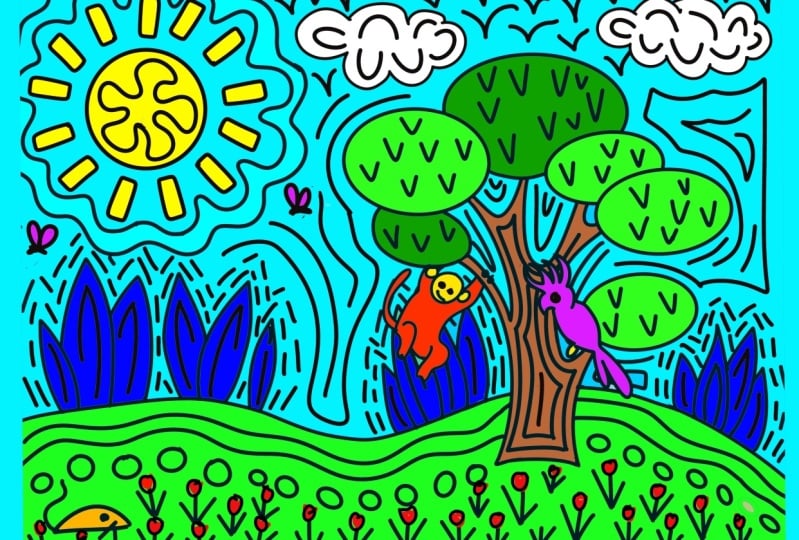
10. Project Landscape: And welcome back. In this lesson,
we're going to focus on a landscape composition. This is going to
show you that we can still create some
depth and dimension, even though we still draw with bold lines and stay
super simplified. As a motif, I thought
we're going to draw some savannah scene with a cue giraffe as a main
motif with a Nkacia tree, and maybe the Mount
Kilimanjaro in the background. We want to open up Google
Images one more time, and Google four
giraffe and acacia. These are the main trees
we see in a savanna, and I really like
how they look with their very white crown and the slim stem and this kind of triangle
here underneath. This is something
I really want to depict in our illustration. So we have the tree
and next to it, we have the giraffe. What's missing in this image
for me is in the background, the background is a
little bit too plain. That's why I would want to add the Mount Kilimanjaro there. Let's look at this
for a second because then we're going to pull
it out of the screen. The reason why I don't want
to keep my reference photos nearby is that it makes
me copy too much. I always try to focus on the image to memorize
some of the key factors I want to depict
in my illustration and then just get rid of it
and draw from my memory. This way, I avoid getting too
detailed and too realistic. Let's get going and start with our first composition
layout, super rough. I want the giraffe
to be my main focus, so I'm going to put
it here right in the center, like this. This is just a rough layout of how my composition is
supposed to look like. My horizon line it's
going to divide the canvas in one
third on the top and two thirds on the bottom
roughly like this. This is my horizon line. Then I want the
Kilimanjaro to be here, maybe even going out of
the picture a little bit. I wanted to have a snowy top. Then here in further back, there we have this acacia tree. And because it's a little bit and because it's a little bit, empty down here, we want
to add some plants. Maybe there's a bush here. And maybe there's another plant here with some huge leaves. So this is a rough layout
of our composition. Because we're using
the bolt lines, we can't get into too much detail and
we don't want to draw too many single items
there because that would overcrowd the canvas and it would be hard to
read for the viewer. So this is why it is enough. We have the focal point, basically in the center. We have the tree,
we have a mountain, and we have two bushes. Five different items
spread out on the canvas, and that's totally enough. Let's refine the sketch put
a layer on top and turn down this opacity from the first layer and then
refine what we see here. Maybe like this.
Could look cool, could also be too much. We will see. Now we
have this bush here. Then we're going to
have jirouf here. Oh, super cute. When depicting depth
in illustration, that means you put an item
in front of something else. But with our bold lines here, that can cause some
problems just because we don't want to have too many
lines meeting in one spot. Then it can be
difficult to understand where which item starts
and it can be too crowded. What I already see is
that my horizon line from the initial sketch meets the head of our giraffe and
that's too closely together. I'm going to put down our
horizon line a little bit to have some space between the giraffe's head
and our horizon line. Next, we need to make
sure that we still have a bit of the mountain peeking
out behind the giraffe, but that not all the lines are meeting here on the giraffe. Later on, when we ink
out our illustration, we want to leave
some space between the giraffe's head and here this mountain line to not have all the lines too
crowded too closely together. And then I see another problem. The tree here seems
to be way too big. It is kind of at the same
height as our mountaintop, and that looks just boring. So I want the tree to
just go up until here, maybe, and also only maybe
a little bit until here. Maybe we want to
start with a crown. And then in the center, I want to draw the sir. All right. I think
it. That's it. The giraffe is our focal point. We have a tree, we
have a mountain, and we have two plants
in the foreground. Yes, you're right, there
is a lot of free space, but we will fill that with
background pattern later on. I just think it's too
close to the giraffe, and I just want to fix some
of those curves here. L. Yeah, that's much better. Okay. So I think
in our next step, we can start inking out. And I want you to make
sure to practice what we've learned to just
go with flowy lines, don't think too much. Just drop and follow the
lines of your sketch. So we want to turn down
the opacity of this one. I think we don't need the
first sketch any longer. So I just tap the check mark
here to make it invisible. And then I want to add
another layer on top, and I'm going to pick
a new brush this time. I think I want to go with
a mono line or soft end. And let's see what's the size. No, that's way too thick. So let's go with
10% again. Okay. Okay, great. It
looks super cute. I'm I'm in love with
my giraffe already. I see that I've drawn the
line through the tree, and I guess that's
absolutely not what I want. To fix that, I'm going to add a new layer and I will
just draw the tree. We see the horizon line here goes right through
the stem of our tree, and now since it's on
a different layer, we can erase it pretty easily. I want to have some
space in between. I'm going to just erase
the end and I try to mimic the end of my mono
liner with the soft ends. Let me go back to this
layer with a tree. And here I also want to draw the mountain,
the Kilimanjaro. Now we see we can erase quite a lot without damaging
our wonderful giraffe. And then we only
need the plant here. All right. That looks good. I really like what I see. In our next step, we're going
to block out the colors, and we can do a little
bit of a housekeeping. We don't need two
linework layers, and since we did all
the erasing already, we can pinch these two together
to merge them into one. We also don't need the
sketch any longer, so we can turn that off. Now I want to add another layer underneath our
linework layer again. Here we're going to
block in all our colors. I want this illustration
to be super colorful. So I don't want to have any white spaces beside
the snowy mountaintop. I also don't want it to be
realistic a little bit, but not too much. I still want the
plants to be greenish, and I want the
ground to be yellow, but I also want
the sky, I think, to be orange to kind
of mimic a sunset. And I'm pretty sure I
want my giraffe in pink. So I think from its outline, from its shape and pattern, we can clearly see
this is a giraffe, so it doesn't matter
which color we give it. So. Alright, let's go. Oh, yes. Oh, I love it.
I'm already in love. I still don't know how
it looks when it's done, but I already love it. Okay, let's go further down. The mountain, I think, I want
the mountain to be blue. Spec and we can still see these are
two different items. They don't interfere. It's not too crowded. But because of the
color difference, we can clearly see this is a giraffe and the
mountain is behind. I like the stem a lot. It's so quirky. It's fun. It's super cool. You could not plan this. That's Okay, I guess this one, since we
have a light green up here, I want some light
green down there to just create a balanced
color distribution. And this one, I think I
want in a darker green. So now we need the giraffe, and I kept the best
part for last. It looks gorgeous already. It's just, you know, it's a little bit
boring because we have so many plain areas. In our next step,
we're going to add some more black lines
to create texture, to create interest,
and to have it just overall fancy and
super cool looking. Let's start with the mountain. I guess I want to draw
just some lines here. I also want to draw some loops down here
in the mountain to just indicate that it's not just a flat surface,
but it's bumpy. Yes, very cool. In our tree, I think I want to
follow the loops here. I already notice how much
more interest it creates. I guess in the sky, I just
want to have some lines. Overall, I try to keep
the spacing similar In the sky, I drew the lines in this direction to kind
of indicate the clouds. You know, the clouds are
not facing this way. Clouds are usually
white as well. So I think it only makes sense to have a sky
with horizontal lines. But you might see
that differently. That is totally up to you. Great. Oh, man, I
really love that. So it's only left here
to finish our plans. So let's try to see
if that looks good. If we draw the leaves veins or if we just
keep one line here, just one main vein. Hmm. Not sure. How about we draw
something like this? We want to be playful and have fantasy shapes. I
guess I like that. This is a problem here. So maybe like this. I like it a lot. What I would
probably do in my next step is to take my time and clean up some lines and
fill up some gaps. But overall, I think this has turned out really,
really, really well. All right. Let's
wrap this lesson up. We've learned that we
can still create depth, even though we have to
stay super simplified, even though we cannot
draw a lot of details, we still are able to depict that things are in the
background or in the foreground. Let's move on to
our next project, which is going to be the last
one where I will show you a fun way of how to make a seamless repeat pattern
with these boat lines. I will see you there. And
11. Let's Make a Pattern: And welcome back.
In this lesson, I'm going to show
you as promised, how to make a great pattern
with our boldline style. And first off, we
want to start with a custom template
for out pattern, which you can use for any
other pattern in the future. We're going to use a cool
function in Procreate itself to make pattern creating super
easy. Let's get started. I want to open a new
canvas and I'm going to go with my four by
five canvas again. Just to show you
a pattern doesn't necessarily have to be
square all the time. And to create our
Custom template, we need to fill the whole
canvas with any color. It doesn't really
matter. Let's go with light blue and just drop
it onto the canvas. The Canvas is completely filled. What we're going to
do now is we save certain sections of this canvas and I'm going to show
you how to do that. First of all, we need to
start with the arrow tool, tap one corner node, and now we want to shrink
our canvas by half. To have it really precise, we want to type in
the numbers 10, zero, zero in my case, and now it's just half
the size of our canvas. Of course, you could
go and just track it with snapping enabled.
Let me show you that. You could just grab
the corner node and pull it until the
yellow lines appear. But there sometimes can
be a little bit tricky, then we move it too fast or we move it too far and
it's not going to work. It's not going to have the
precise length and height. That's why I prefer using
the type in method. Okay, we can move on
to the next step. We want to help procreate memorize certain
areas of our canvas. In fact, it's the quadrants. We want them to remember. We're going to go to
our Layers panel, tab layer one, which is this
light blue rectangle here. And we tap Select. Now you see those gray lines all around just not
within our rectangle. Now we want to go to the save and load function
here in Procreate. By tapping that, there's
another pop up menu opening up, and now we just want to
tap the plus bottom. We can see here selection one. That's this area of the
canvas being saved. It's just a little bit sad. We can't rename this yet. We can only delete it
but not rename it. We need to make sure that
we remember selection one is always the top left
quadrant of our canvas. And now we want to go on moving our rectangle to each quadrant
and save this section. Let's go ahead, tap the arrow, move it to the other center, making sure we have snapping enabled and the
yellow line appears. Then we go to the layers panel, we tap Select again. We go to save and load, and we hit the Plus button. Now we have selection two saved, which is this quadrant
of our Canvas. Deselect, move the
rectangle down, go to the layers panel, tab select, save and load, plus button, and now we
have selection three. Again, deselect, move the
rectangle to our last quadrant. Layers panel, select
Save and load, and plus. Selection four is safe now. If you always go in the
same order in this case, clockwise all around
the quadrants, you will always know that
selection one is this quadrant, two, this, three, this and
four, that, and that's easy. That's all we need
to know. With that, our custom template is ready. Let's go back to the
gallery and give it a name. Because this is a template, we want to duplicate it
before we use it any further that we don't
damage the original, we select our custom
pattern template and then we hit Duplicate, tap the X, and now our duplicate
needs a different name. Okay. Let's open it up. All we need to do now is on
a separate layer, we want to create our
nice bold line pattern. But for that, I
think the light blue here is a very nice
background color. I'm going to just pull it up
because I like the color. This time, I'm not going
to work with black lines, but with white lines instead
just to show you the effect, which is really cool. On a new layer, Tata, new layer added with my monolina round and
brush this time selected. I just want to fill
the canvas with just some random
shapes and forms and lines as we did
in our first project. Let's go ahead and do that. While you're filling
your canvas, it's really important
that you don't touch the edges or go
beyond the edges. Oh Okay, my canvas is filled now and if you know
about pattern making, then you know we would
have to shift the canvas around to have the outside
edges meet in the center. In the traditional way, we would duplicate
our white lines and move it around
on the canvas, which can be tricky
because sometimes we don't have it snapped properly and then the ends would
not meet perfectly. This is what we created
our custom template for. Let me show you how
we go about it. First of all, let's open
the layers panel and swipe both layers to the
right to create a group. Now we want to select the group so that we move not
only one layer, but all the layers that
are in this group around. And for this technique, it is very important that we have this layer
here, layer one, which fills the entire
canvas because if you don't have any
pixels reaching all the borders of your canvas, Procreate won't copy everything
like the entire canvas, but just to the extent of the pixels that are the
farest to the sides. Let's go on with our
custom pattern template. First of all, I
want you to go to the selection tool to
this ribbon here, tap it. Tap safe and load, and now we tap on the
bottom here, selection one. You can't see anything yet. There's nothing really visible. But as soon as we tap
our move tool here, we see that only
our selection one is having this bounding box. This is what we are
working with now. I want you to tap down
here on the bottom, flip horizontal
and flip vertical. That's it. Now we
can deselect this. We can see it's
already looking weird. But bear with me. It's going
to make sense in a second. Let's go back to
the selection tool. Go to save and load,
selection two. Move tool, flip
horizontal, flip vertical. Great. Deselect. Selection tool. Save and load, selection three. Move tool, flip
horizontal flip vertical. Deselect. Again, selection tool, save and load, selection
four, finally. Move tool, flip
horizontal flip vertical. We shifted our white lines
around so that we have what earlier was the
outside here in the inside. This is what we can fill now to have no visible gaps
in our pattern. Super simple. Let's open the layers panel and go
back to our white layer. All we need to do is
now watch out that we don't go beyond
these edges anymore. Very important, since we
didn't draw any figure, we don't really see that our pattern right
now is upside down. What we're going to do
is we are on layer two, we go to the move
tool and you can either use flip horizontal
and vertical again, or you could also
tap rotate four times to have it
rotate 180 degrees. Now we can fill the
center cross here, which looks a bit empty. I want to make sure I'm erasing these obvious shapes that
mark the cross lines. I want to go over and
beyond the center. Okay. So our center is filled. Of course, we could have
put more effort in it, but I just want to show you the process I'm using usually. Now we want to check
if this is working. Let's open the layers
panel and swipe layer two. It's the layer with
our white lines to the left and then tap duplicate. Put this one out of the group, and then we add three
more duplicates. One, two until we
have four in total. Three. And four. All right. Now we're
going to just shrink these layers and see
how our pattern looks. I just want to make
this layer here invisible and then I'm going
to start with the top layer, go to the move tool and make sure snapping
is still enabled, then I'm just shrinking it by half until it
snaps into place. We can always see that
with the yellow lines, go on with the next layer, the second from the top and shrink until we
have the white lines. Oops. Here we go. And the third layer
from the top, we pull that down
in that direction, and the last layer, we pull that down in
that direction. Tada. Oh, this is so fun. And look, it works perfectly. All the ends are
meeting perfectly well, and it looks really cool. Quirky, hand drawn, and
a little bit wonky, and that gives it
so much character and style. Really cool. Now, let me show you real quick, another trick how you can change the colors
of your pattern. Obviously you could just change the color of layer one
with a light blue, but I like to keep my layers. I like to just add
layers on top. Since we only have
these few layers, there's no problem in
adding more layers. First, we can pinch
these together that we have the smaller version of our white lines on one layer. Then I would just add
another layer on top. And fill it with, I don't know. Let's go with pink tada. Then do not have any physical
changes on our white lines, I would just add
another layer on top and turn it into
a clipping mask. Then you can just fill
it with any color. How about we go purple
here? And that's it. A super simple way to recolor
your pattern for print on demand services
that you're able to offer a variety of different
color combinations. That's it for this lesson. You know now how to make a custom pattern template
in Procreate that helps you to create your
pattern seamlessly without shifting and moving
all these layers around. Now join me in the next video
where I'm going to show you other works I made with this bold line technique.
I will see you there.
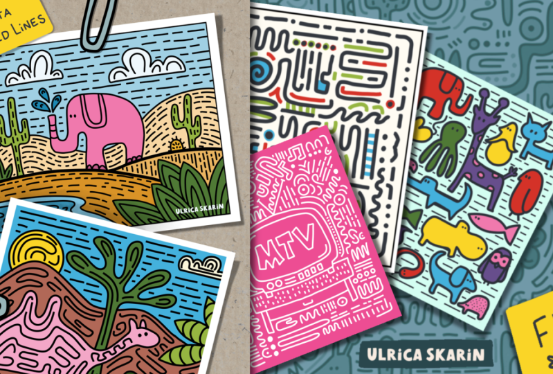
12. More Possibilities with Bold Lines: And, as promised, here are a few examples of my work with bold lines just to give you an idea of
all the possibilities this particular style offers. Maybe they'll even spark
some creative ideas in you. Let's start with this piece, which I call zebras and a dino. I especially love the shape of both the zebra and the dino. They are instantly recognizable
yet extremely simplified. The zig zag stripes
on the zebras add just enough texture so the plain background
doesn't feel empty at all. I also added a very
subtle shading effect by using a slightly darker line on the shadow side
of each animal, which adds a bit more
depth and interest. Next up is woman
with green hair. Here I wanted to explore a highly simplified approach
to drawing a portrait. I really like the
quirky arm shape and of course, her eyes. In this piece, I played
with negative space. Everything is filled
with color or linework, except for the letters, which makes them
stand out clearly. I had a lot of fun
experimenting with these crazy arm shapes
and the shirts patterns. I also use different
line weights which you might want
to try out yourself. This crocodile friend was
my entry for draw this in your style challenge by the wonderful Carlin
Creates on Instagram. My goal was to see if boat lines could
still tell a story, and I think the answer is yes. These three pieces were created as spicy Valentine's cards. I divided the canvas
into two areas, one for the motif, and
one for the lettering. I added a background pattern
only to the letters, so the main motif
would still stand out while keeping the
text equally interesting. Now here we have the
snowy mountains. I wanted to experiment
with whether we can still perceive soft rounded
shapes as mountains, even though they aren't pointy, triangular, or in
their natural color. According to my husband, the answer is yes, but I'll
let you decide for yourself. This piece was pure
color therapy for me. It's definitely pop art inspired but still
has my unique style. So many colors and
lovely shapes, it still makes me happy
every time I look at it. Next, I created a Picasso inspired portrait as
part of a class project. My goal was to use as
much color and pattern as possible while distorting
the facial features, yet keeping them recognizable. Balancing the
colors, patterns and the simplification process
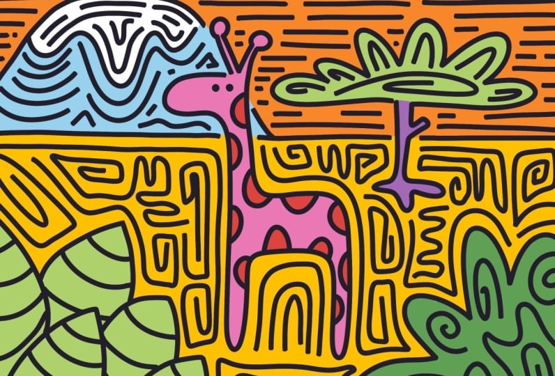
itself took quite some time. This spring inspired pattern
was an exercise in creating simplified flower shapes
that don't follow the tubical circle center
plus six petals formula. I came up with two different flower designs
that I still love. I highly recommend trying out the simplification
method from this class. You'll discover new
shapes and ways of drawing that will really
enhance your style. If you know me, you know I love a good
character collection. In this last piece, I stacked
a bunch of different cats. My goal was to keep them
visually similar while still giving each one its own
personality. Now it's your turn. Go and try it out for yourself. Remember, the pieces in this
lesson reflect my style. Yours will be something
completely different. Don't copy, let your
own creativity shine. Now it's time to join
me in the final lesson where we'll wrap up the
class. I'll see you there.
13. Wrap-Up: The Congratulations. You made it through
the class and I hope you've had as
much fun as I did. By now, you've learned how to simplify your artwork
using bold lines, focus on what really
matters in an image, and maybe even discovered a new direction for
your artistic style. Now it's your turn to
upload your class project. Whether it's just one
piece or all of them, I'd love to see
what you created. Sharing your work is
a great way to get feedback and connect
with other students. If you enjoyed this class, I'd really appreciate
a quick review. It helps me a lot and also let others know
what to expect. If you want to see more from me, make sure you follow me here and on social media for updates, new classes, and
more creative fun. Thanks for joining me. We'll see each other
in my next class. Happy creating.
 Jutta Schneider, Artist | Educator