Transcripts
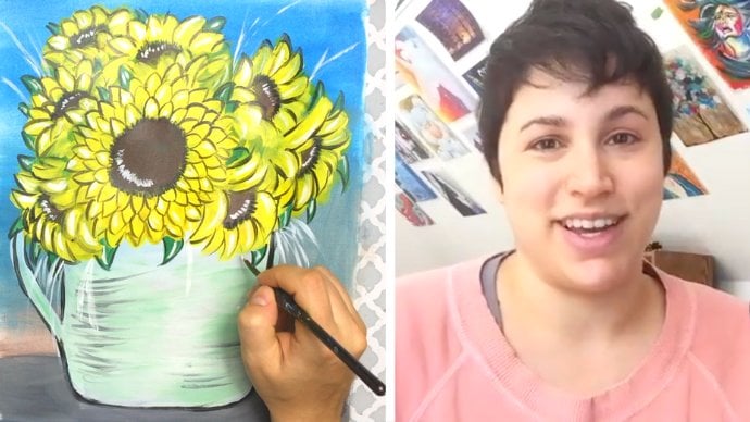
1. Magic of Color Intro: Hey there, welcome to the course all about color fundamentals. This is a course that's all about color mixing, color theory, and cracking the code on what makes a painting super eye-catching. Those of you who don't know me. My name is Amanda and I will be your instructor and painting buddy throughout this entire course. Holding your hand step-by-step throughout each and every single lesson. If you have ever struggled when it comes to choosing the right colors for your painting, you get overwhelmed at the prospect of color mixing or have 0 idea how to approach a painting when it comes to actually using color, you have come to the right place. This course is your step-by-step guide towards understanding the wide variety and world of color and how you can completely transform your paintings and a whole new way. Once you understand how color works, This course is broken up into key fundamental steps where you will follow along with me at every lesson, do painting demonstrations, and even end up with a couple of completed paintings made from acrylic paint. So it's important to do these lessons in secession because each lesson builds on the previous one and we'll include guided demonstrations helped further point of that lesson, we will culminate and put everything that we have learned from those lessons into the final painting and all see it come to life in this course, I have included a list of materials needed to complete the paintings, downloadable stencils to help fast-track your success and reference pictures to help you along with your paintings and demonstrations, you'll be learning how to do the following. How to use the color wheel, how to expertly mix colors with a limited palette. How to choose colors that go well together. Basic color terms at every artist should know how to create depth in a painting, how to get the most vibrant color mixes. How to break boring color of monotony and a painting and really make it stand out and how to create shadows and light using color and much, much more. I hope you are excited to dive into this course because I know I am. So with that being said, let's go ahead and get started.
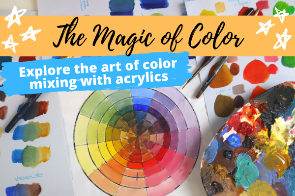
2. The Color Wheel: Your New Best Friend: Welcome back. And today we're gonna be talking about mastering the color wheel. If you've always struggled with the type of colors to choose how to mix colors or making colors that appear a lot more muddy. Using the color wheel and knowing how it works will really help you out in the long term. What is the big deal with the wheel? You see a lot of art is talking about the color wheel, making a big fuss out of it. But really, why is it that important to begin with? Well, one, the color wheel helps to display the relationship between colors on that wheel. And we're going to learn later in this lesson how that is actually illustrated. Number two, the color wheel is a handy reference tool for making color combinations. So if you need to make a palette and you really want it to pop, the color wheel is a really helpful guide and helping you choose those colors on only that. And this is one of my most favorite reasons. Understanding the color wheel doesn't require you to have to buy tons and tons of paints to get a good rainbow smattering of colors that you want. Really what you're going to learn here is that you'll just need three primary colors plus black and white to pretty much accomplished any sort of color that you want on the wheel. So when it comes to color, anything and everything we have ever seen in our lives that has a color to it. We have to thank the sun, the sun and therefore sunlight emits what we like to call white light. White light actually contains the entire color spectrum, all the colors that we have ever seen in our lives is contained in white light. So in the grand scheme of things when it comes to the color spectrum and all the colors that we see there. Here are the colors that we all know of today, at least by name. Red, orange, yellow, green, blue, indigo, and violet. Or if you remember the acronym Roy G Biv is a really great way for you to remember all the colors in the color spectrum. In the color spectrum, there is a continuous amount of color. That means it's, There's an unlimited on limited amount of colors that you can make. It's incredible. And what's interesting for us as artists is understanding how the color spectrum kinda works and how all the colors kind of meld into one another can help us really understand what color does for us. If we were to take this color spectrum and we were to connect the two ends where we see the red and the violet, and we were to connect them into a circle. This is how it would look. This is the entire color. We all with all the colors and in all its forms and more for practical reasons at anything else, you can further simplify that wheel to look something like this. So by doing it this way, by seeing the color wheel as we see it right now, it helps us isolate our primary colors and we'll go into our primary colors in just a second. So my point here being is there are so many colors in the color spectrum, it's almost impossible to capture all of those colors on the wheel. It's literally impossible. You will be here until you are 98 years old, trying to paint all of those colors and trying to capture at all, you want to use the color spectrum and therefore the color wheel as a guide into understanding how your colors are working for you. So I know I threw a lot at you just now, but the color wheel is super important to understand. In the next lesson, we're going to talk about what makes up the color wheel, as well as important color terms that you should know. I'll see you there.
3. What Makes up the Wheel + Color Terms: Welcome back. In this lesson, we're going to talk about what makes up the color wheel as well as the color terms that you should know. The first one major thing we're going to talk about is primary colors. And our primary colors on the wheel are red, blue, and yellow. And the reason why these are called primary colors is because these colors cannot be made by any other color on the color wheel. And not only that, you can take these paints and mix them with other primaries to create all the colors in the color spectrum. This is where it's really important because you don't have to buy tubes and tubes and tubes of extra paint in order to create a varied amount of colors. Not only that, like we mentioned before, you can mix all three of these primaries together to create black or dark colors. And like I mentioned before, right? If you mix all three colors, almost all of the colors that are reflected or subtracted. So that's why your eye perceives it as darker or black colors pay. So that's the first part of the color wheel. Second part are what we'd like to call the secondary colors. These are the colors that are produced by mixing parts of the primary colors. So for example, if you were to mix yellow and red together, you would get the color orange. And if you were to mix the color red and blue, you get the color purple or violet. And if you were to mix yellow and blue, you'd get green. So these would be considered our secondary colors. And the third part of the color wheel is what we like to call tertiary colors. And these colors are a result of mixing a primary with a secondary color, creating a tertiary or third type of color. So if you were to mix a red and orange together, you get a reddish orange. If you were to mix a red and purple together, you get a red purple. If you were to make a violet and a blue together, you'd get a blue violet. If you were to mix a blue and a green, you get a green-blue. If you were to mix a green and a yellow, you get a greenish yellow or yellow green. And if you were to mix a yellow with an orange, you get a yellow orange. And with these colors, you pretty much have made up your entire color wheel. So how interesting is that we went from just using three primary colors, red, yellow, and blue. And we ended up making this entire spectrum of color within the color wheel. That's how you can actually use just three colors in order to make a myriad of colors. So now let's take a step back from the color wheel for a second and just talk about several color terms themselves. I'd like for you to familiarize yourself with. The first term is hue. Hue just refers to the name of a color, red, green, orange, purple, blue, yellow. Hue is just the name of any color that you are familiar with on the color wheel. And hue can also be referred to as a flat color because it only refers to one type of color. Another term is color value, which just means it's the lightness or darkness of a hue or a color. So if you take a look at the color red here, you can see the various values of that hue going from the lightest red to the darkest red. And the other term is shade, which is a hue that is produced by adding black to it. So you can see here you have read starting on the left and the progression of it as you add more and more black to it until you've got all the way to the right, which is the darkest shade of red. Another term is Tint, which is a hue that is produced by just adding more and more white to that color. And another term is color saturation, which is how intense, vibrant, or bright a hue is. If you've ever looked at a painting and notice just how intensely bright or how intense that color is in general, that color was most likely deeply saturated. And what you're going to eventually learn will be doing demos of this obviously is that when you get a primary color or a color straight from the tube, it is most likely at its highest saturation. And the more you play with that color and mix with it, the less saturated it will become, which can work to your advantage if you're trying to do a more muted looking palette. So we'll do examples of this later on to show what I mean by that. The other term is tone, which is a hue that is produced by adding gray. And notice that this is not the same as shade, which you're adding black to it and it just slowly, the color becomes more black. In this case, the color is added with gray and it's slowly just becomes much more muted. And we're going to talk a little bit about what the differences between value and tone in a later lesson. So now that we've kinda settle this, how can we take, well, we just talked about here and actually use it to our advantage. What we're going to talk about that in the next lesson. See you there.
4. Choose Eye-Catching Color Palettes with the Wheel: Okay, great, So we've learned some terms. We learned about the color spectrum, we learned about subtractive colors. We learned about paint mixing and how our eye perceives those colors. Cool. But how does this really helped me? How does mean knowing the color wheel and all these terms really helped me in the long run. Well, first and foremost, the color wheel can actually help you choose your color palettes, AK, and assortment of colors that you put together that can help create a really cool aesthetic and lucky for us, the color wheel can help you choose various types of color palettes. So let's just take a look at several types. First one is using complimentary colors in your painting to really help create a pop effect in your artwork. So now complimentary color just refers to the color that is opposite the color that you're interested in. So we were looking at the color red, for example. The complimentary of the color red is green. And you can do this all over the color wheel, but complimentary of yellow could be purple. The complimentary of blue is orange. And what these colors can do for each other is make them pop. If you really want to create a painting that can really make it stand out and create a focal point. Probably want to choose complimentary palettes to help these colors stand out. In this example, I have an apple here that's surrounded by green apples and a green background. These colors are complimentary to one another. Therefore, the green of the Apple really, really pops out because green is really giving it that stage and vice versa, all the green of the apples and the green background or really accentuated because of the red apple. Another type of palette is a split complementary palette, meaning that instead of choosing the exact color opposite the wheel, you choose the two colors on either side of the complimentary color. We were looking at the color purple, for example. Instead of choosing its complimentary yellow, you would choose a two colors that are next to it, which are the yellow orange and the yellow green. Using those three colors together really helps you create this brilliant, brilliant landscape of color. You can even see in this photograph here of this flower, the green background juxtaposed to the purple and orange, orange hues of the inner portions of the flower and the petals really create this brilliant, brilliant work of composition, right? Your eyes completely drawn to the center of that flower. Your eyes is captivated and really pleased with what it's seeing, right? It's just creating this like good feels in your brain, good buzzing, right? And that's because of the color palette that's being used here. Another type of color palette is the triad colors, meaning you just draw a triangle and whatever, whatever parts of the points of the triangle that touch on the color wheel, those are the colors that you would use. So in this case here we have the primaries, right? We have blue, red, and yellow. Here's an example of a painting that actually uses those colors. Notice how brilliant it is, right? Notice just how vibrant and how, there's just so much motion that's happening in here, in this painting. Very interesting in other type of palette is the cross color. So you just draw an x. And those are the four colors that you would choose to work with on your palette. In this case, we have an example of an actual living creature that uses all of these colors on itself. And notice just how incredibly interesting this color palette looks. Another type is a right angle cross colors. Basically you're taking your taking the complementaries of two colors and working with that palette. You can see here that we have a bird that uses this same exact palette and just look how brilliant it is. It's just TO interesting. So not only are there complimentary colors, but there's also harmony or analogous colors. And really this is refers to colors that are next to each other on the wheel. So for example, here we have the yellow, green, yellow, and green that are all next to one another. If you were to use these colors altogether, it creates a very harmonious look to your paintings. So we have a picture here of a flower that's set against a green backdrop. It's got a very harmonious field to it, very balanced and the colors work really, really nicely together.
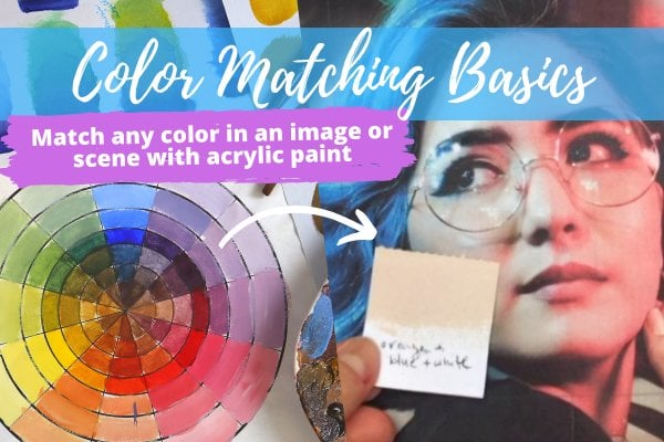
5. Color Mixing Explained Using the Color Wheel: Okay, So we saw color palettes and actually picking the colors you want to use for your works of art. So let's go into the whole power of color mixing when it comes to using the wheel hosts importantly, the primary colors, red, yellow, and blue. In the world of paint and physical media, it is actually really, really hard to get paint primaries that are exactly yellow and exactly Blue and exactly red. They are not pure. And this is because the colors in paint colors have a little bit of a color bias to them. Meaning each of the colors red, blue, and yellow tend to towards certain colors on the color wheel. So if we take a look at our continuous color spectrum, you'll see that in the middle of the color wheel is the color red. But in a lot of paint pigments, you'll find that there are some reds had tend a little more towards the orange is like a red orange, kind of like a scarlet red. And then you get some other reds, tend a little more towards the violet, kind of like a crimson red. And the same goes for yellow. You'd get yellows at ten, a little more towards the green is kind of like a lemon yellow versus more of the yellow oranges like a yellow ocher, then you get your blues where have a blue that kinda tends towards the more blue violet, like ultra marine blue. And then you get other types of blues at tend more towards the greens, like a cerulean blue. Okay, Cool, cool. So we saw the color wheel, we saw that colors have bias, but, so what, let's say we want to make the color purple, if you remember back in elementary school or even preschool, we knew that you just had to mix red and blue to make purple because we don't live in a perfect world where colors are exactly what they mean. We have to deal with colors that have certain biases. You have to choose between red, orange, or blue, violet, red violet and a blue-green. And combining these types of colors together will give you different looking purples. Purples may be vibrant, while others purples look super muddy. You want to get the most vibrant colors. The thing to do is look for paint colors that tend to bias towards the same part of the color wheel. So if you wanted to make the most vibrant purple, I'm going to want to grab a blue that is tending more towards the Violet's like an ultra marine. And I want to pick a red That's tending more towards the violet, like a crimson red. If I combine those two colors together, I'm going to get my most saturated, vibrant purple. Conversely, if I want to get the most muddy colors, if you know, for example, I want to really get a tone down looking purple. The thing I gotta do, find a blue that is tending more towards the green yellow side. And I got to find a read that's leaning more towards the orange, yellow side as well. And what ends up happening here is a very muddy, dark looking purple. So why did that happen? Because I chose two primary colors that were tending more towards the yellows. I therefore introduced a third color into the color mixing, which is the color yellow. When these three colors are combined, they will in fact form dark, muddy colors, or in some cases, the color black. When I choose the colors that tend more towards the violet, I'm going to get the best violates if I choose colors that tend to pull away from that part of the color wheel and introducing other colors into the mix. I'm definitely going to get a lot more muddy colors. Same thing happens if you're trying to make the color orange. You want to take reds that are kind of biasing towards the orange colors. And you want to take yellows that are biasing towards the orange colors. We put those two together, you get the most brilliant, brilliant orange color. If you want to make the color green, you want to choose yellows that are tending more towards the green side. You want to choose blues that are tending more towards the green side. This is kind of like the mind-blowing part because depending on the type of paint that you have, you might have, you might have a red color, but you have to pay attention to the type of red or the type of yellow are the type of blue that you have in your arsenal with all of these different types of primaries you can choose. You can come up with so many different types of wheels. So really, you can create a whole slew of color wheels with different types of primaries depending on how those primaries are biased. To. One takeaway here is if you want to avoid muddy looking colors, you want to mix colors that have the same color bias towards another color. Okay, So now that we've just gone through all that, you're probably just worried as to, Oh my gosh, do I even have the right paints for this? And am I going to have a terrible time using the paints? I already have? The answer is no. You'll be fine. For those of you that already have paint. You don't need to buy new tubes of paint really at the end of the day, it just comes down to how familiar you are with the paints and supplies that you already have. So if you've already spent money on a whole thing of paints, I don't recommend you having to scrap all those and buying new ones. What I do recommend though, is understanding what you already have and just work with it. If you already have a paint set, make your own color wheel, and observe the colors that you actually produce learned with the tools you already have. So for those of you that don't have any pain and are like Amanda, Please tell me the type of paints that I need for this. Here are my recommendations based on what we've seen here from the color spectrum, I would recommend getting six types of primaries. So what I would recommend is an orangey red, which is a cadmium red or vermilion red violet, which is a carmine or crimson, a blue violet, ultra marine blue. And you want to make sure that the ultramarine blue that you get is actually tending more towards the violet side. You want to blue green, which would be a truly inner Prussian blue, yellow green, which is a lemon yellow, yellow, orange, which is cadmium yellow or ocher. And you're also going to want to use Mars Black and titanium white. Titanium White I think is one of my most important things that I use when it comes to all my paintings, I always pie a huge bucket of titanium white because I use that a lot. It helps you with your color values. That helps you see you the type of color bias that you're using as well. And we'll be doing demos, of course of that. And Mars Black, because pop art, I like to make very high contrast drawings and paintings. So Mars Black really helps me get that high contrast. And lastly, another cool tip that you can use with your color wheel is using the complimentary color to tone down another color. Basically, if you need to desaturate a color, It's way too vibrant, way to brilliant, and you need to tone it down. You can actually just choose the colors complimentary. And it helps to really tone it down quite a bit. And it's really great if you want to do more subtle types of paintings. This is also fantastic. You want to use this for shadows are making mid-tones for your paintings as well. Say you have the color red and it's way too vibrant. You really want to tone it down just a little bit. So you would look at its complimentary, which is green. You add a little bit of green to that red just a little. And what ends up happening is you get a more toned down desaturated red. Okay? Conversely, if you were working with the color green and you wanted to desaturate it, you would just take a little bit of red. It would help you get a more desaturated tone down version of green. This is probably one of them number 1 tips that I have found from using paint and color mixing is the use of complimentary colors to help tone down. Okay, so now that we've gone through a whole, entire gist of how to use a color wheel. We're going to go ahead and make our very own color wheel. So I will see you in the next lesson.
6. Let's Make a Color Wheel Part I: All right, welcome back. And in this lesson we're going to do a guided demonstration on how to create a color wheel from scratch. So before we begin, I wanted to just highlight a few of the items we will be using to actually paint. So one is going to be a glass with some water in it. And usually I like to use like a mug or you, if you have a solo cup or plastic cup that works just as well, we're gonna be using a flat shader brush with this part. It's not too big. It's just the right size and some sort of pallet to put your paints on. Now, I actually use pallet paper. So it's just like reams of paper that have a very nice kinda like plastic surface on top. Paint and mix. It's really fantastic. It's also very easily disposable. If you don't have that, you can use a regular plate like Styrofoam plate is really good. Or if you have a pallet of any sort like this, you can also use that as well. But I've recently upgraded to pallet paper and I love it end once I've gathered all my supplies, I'm actually going to grab the color wheel that I have made. This is a template that you'll find in the course notes, so please be sure to check that out. We'll be using this for this exercise. You'll notice here that I have a very limited palette that I'm using. I'm going to be using a cadmium yellow medium hue. This is from the professional heavy body liquid texts collection. I'll be using an ultramarine blue, which is, which has more of a green shade to it. And I'm also going to be using a naphthalene crimson. So these are going to be the three basic primaries I'm going to be using. Now I know I mentioned when we talked about color biasing on the color spectrum, I'm not too worried about having, you know, an additional, an additional three set of colors because I'm going to make my own color wheel and figure out what colors I really have to work with and plan my painting around that. That's if you don't want to go ahead and buy more paints, obviously. But if you have extra spending money to abuse for buying paints, you can use that list that I showed you previously to add to your collection as well. I wanted to demonstrate to you the facets of color mixing and how they all kinda work together on the wheel. So I'm just going to grab my flat brush and we're going to go and put in our colors. Now, you'll notice that on the color wheel we have a lot of different rings, right? Because not only am I going to show you where we're going to be putting our colors, but I'm also going to be demonstrating to you color values, meaning how you can make a color go from light to dark, as well as saturation, how you can desaturated color. And I figured this would be a good example of doing that. What we're going to do is we're going to lay our colors on the third. We're going to lay all our primary colors anyways on the third middle ring here. Okay? And I think the way we're going to make this work is we'll first do our primaries and we're going to add in our secondary colors and then our tertiary colors. And then we're going to work with our color values and whatnot. Alright, so I'm gonna go grab my cadmium yellow. Yeah, let's do this is going to be the fourth ringing. They're actually right here. So I'm going to place that yellow. Okay, So I'm gonna give my brush a good rinse. Then I'm going to grab my blue when it comes to the primaries are all equally spaced away from each other so that there are three, separate it. So going to be right here. So we're going to place blue and grab red. And we're going to place read three over here, so they're all equally spaced away from each other. Okay, Beautiful. So we have just laid down our primary colors first things first, let's go ahead and make our secondary colors. So to do that, Let's start with our yellow and our blue. So we have yellow and we got blue here, and we got the middle color, that's going to be our secondary. Okay, so grab a little bit of blue, a little bit of yellow, and you can combine them together to get this pretty decent looking green. Now this is an example of a green That's not entirely like the most vibrant of green, right? And that's, and that has to do with the yellow that I used here. This here is a cadmium yellow medium hue. So it's not going to give me my most brilliant, it's, it's gonna give me a good green, but not the most brilliant green that I really look for. So I would probably need to find a yellow that is kinda leaning more towards the greens and the color spectrum. So maybe more like a lemon yellow. Lemon yellow will definitely get me there. But for now, I'm working with the palette that I have. So we're just going to use that and then we're going to do yellow and red. So I'm just gonna take a little bit of red and then take it equal, an equal amount of yellow. Notice that my orange here is pretty vibrant for the most part. I got a crimson here. And the NIH got that cadmium yellow, which is leaning a little towards the oranges. Because of that, I'm really going to get a nice brilliant orange gonna go put that in right there. Look at that orange. That is a nice, nice orange. We're going to go combine our red and our blue. Now this blue is a green shade, so it's probably not going to give me the most vibrant purple, but that's okay. Then I will put that in. Now let me tell you this is darker purple. It's definitely a lot more muddy. That's for sure because the blue that I'm using is tending more towards the green and the red I'm using is actually tending a little bit more towards the orange. So because of that, it's going to create a more muddy looking color. And so now let's go ahead and make our tertiary color. And if you remember, our tertiary color is a combination of a primary with a secondary. So all I'm gonna do is I'm going to grab my yellow, we're going to make a yellow green. So I'm gonna grab my yellow, that a bit more yellow to that. My paint is still little at. All right. So you've got like a yellowish green going on again, it's not like super, super brilliant. I think what this palette and we're going to get like really brilliant reds and oranges and stuff, but not so brilliant greens and purples. And I actually prove that by doing my own color wheel and figuring it out. So now we're going to use, we're going to make this color between the blue and the green is going to be a bluish-green. So that means it's going to be a bit more blue then yellow in this case, I take a lot of blue and I take a little bit of yellow. This hue Has bit more blue in it then this here, this who has been more yellow in it. And that's it, the cool part of the color wheel. You know, if you add one part of a color and you keep on going across the wheel, you're going to see more and more of it into just morphs. Let's go back over here and do an orangey yellow. So I'm going to take yellow, make sure it doesn't touch any other colors. And they take a little bit of red. Just a little. When it comes to making like a yellow orange, you wanted just work with yellow first and then maybe started playing with your, with your red a little bit, but not too much. Okay, now conversely, let's go over here. So this was our orange color and this is red. We're gonna make a red orange. And you remember, I'm just going to remake the color orange actually. And you can see two, I'm, I'm being very consistent with my color combos. This is the previous orange I made. It looks pretty much the same for the most part. So now I'm just going to add a bit more red to it because it's leaning more towards the red. Yeah, Wow, you can see how vibrant that is, right? Like this area here is really, really nice, very vibrant, very saturated. And now we got our red and violet. You put that together for a red violet. And this is, I'm able to do this because I'm starting to see how the color wheel works, right? I see the relationship between our red and Martin are blue makes this color. So all I know of his, I gotta do this color. I just have to add more red and less blue. And that's how I can get like violet red. So this is actually a very nice color. It's actually very pretty. And then lastly, we're going to combine violet and blue to make a blue violet. So this is our primary color wheel, right? This is using all the primary colors, secondary tertiaries. And this is only using the palette that I have, right? This is using these three colors and I ended up making this pretty varied looking color wheel.
7. Let's Make a Color Wheel Part II: Now what I want to show you using the color wheel to tone down these colors themselves, right? So we've got the color yellow here. And one thing that I want to do is I want to tone it down. I don't want this to be that vibrant of a yellow. So what I'm gonna do is I'm going to go opposite the color wheel. And I can see here that it's our violet color. So what I'm gonna do is I'm going to grab that, that yellow. Okay? And what I'm going to do is grab a little, little, little, little bit of that. Violet. Like I'm just going to that part where we made violet. And I'm just going to add a little. I don't want to do too much because a lot can go a long way, especially when it comes to the color or a yellow. So now you'll notice that that color really toned down a little bit. Now it's not as bright, but it's not completely like SAP desaturated either. It's just, it just went down and tone. Just going to add that color. Totally went down in tone. Now I'm going to add a bit more. What if, what happens if I add a bit more violet to that? Tones it down even more. So that's if I added a bit more violet to it. It isn't that interesting. Okay, now what if I really just decided to go to town and add violet? Just more and more violet color becomes really muddy. It pretty much turned like this brown color. The reason why it turned that colors, because at this point in the game, your primary color has pretty much combined with the other primary colors, red and blue. And what happens when you mix all of those primary colors together? You get like a mud, almost black, dark color. And the same thing happens for all these other colors, which is so incredibly fascinating. So that's how you can do one side of the wheel. We wanted to lighten up the color. We want it to lighten up the value. Well, all you have to do really is grab your titanium white, which I just have a goal adult right over here. We've got some weight. Take some my yellow. And I'm just going to combine it together, right? And then you just put that in. So that's how you can make a tint. Great for making highlights. Okay? So you've got your first ten right there. And all you gotta do is keep adding more white to create more of a lighter color. These are fantastic for, for tense, or if you want to lighten up a color and actually see it the true color. What's going on behind the scenes? And this is like almost at the White. Because if I keep on going up, it's just going to get wider until it gets just completely pure white so that you can see the progression of the values, right? This is when it's at its lightest for yellow and this is when it gets to its darkest, right? Conversely, you know, we can just use black or gray to make these colors look, look that dark. But if you're looking for natural tones, I recommend using the complimentary method instead of just adding straight up black or gray, you've got a lot more control. It looks a lot more natural, at least that's my opinion. So, but experiments, experiments it instead of using the complimentary color, try instead using black and see how your color changes over time and make that decision of whether that's how you wanna do it or not. I personally like doing it this way. Now what I would recommend for you to do is to fill in the rest of this color wheel using those same concepts. Alright, so here is my completed color wheel using only these three colors. So you can see that you have all of these color possibilities to play with when you just use these three primaries. So now I have a good understanding of my color range that I can do with just these three paints here. So take a look at the paints that you have and play with them and experiment. Make your own color wheel just like this and see the capabilities that your colors have. And what I would suggest is if you find yourself stuck, you have a color that it's just really not getting you where you need it to go, then you would consider buying maybe another type of primary color that tends more towards that color bias in order to get a more brilliant color. So I definitely, definitely, definitely recommend with whatever paints you have, play with them. Find out what color combinations you can make so that you can plan out your painting. So here's some takeaways to remember. One, the color wheel is comprised of primary colors that combined to form a myriad of colors, including the color black. Understanding the wheel can help you choose your palate colors and understand how to mix those colors. And also helps you understand where a color lies on the wheel, aka where the color is biased so that you can create the right mixes and create the most saturated or least muddy of colors. And when it comes to mixing any color, whether it be shade, tint, tone, or just mixing colors in general, color will usually become desaturated, create a natural midtone or shade with a color. All you gotta do is simply add a small amount of the complimentary color.
8. Color Temperature & Why it's Important: For this lesson, we're going to talk about color temperature. Now you're probably wondering, wait, color has a temperature as well. And yeah, it is actually very true. Now in the grand scheme of colors, there are two categories of color, temperature, warm and cold. So you're probably wondering what does warm and cold color really mean? Like how does that have a good temperature to it? Well, let's take some examples from nature itself. If you were to imagine a warm color, I want you to think about flames or fire. These particular objects have lots of hues of red, yellow, and oranges. And these colors are what we consider to be the warm colors because they just feel like they have heat associated with them. And when you think about colors that are cooler, you can think about water. Water is a great example of a cool temperature because it contains the colors of blues and greens and purples. So these are the two types of temperatures that you would normally deal with. So if you remember, we talked about in the previous lesson that colors all have their biases. Also another way of saying that colors have their own temperatures associated with them. So if you look at the primary color yellow, for instance, yellow has its own color biases towards green and orange can also say that a yellow that is tending more towards the green is a cooler color because it's starting to pull its way towards the blues, which we have established is considered a cool color versus a yellow, orange, which is pulling itself towards the oranges and the reds, which we did say was a warmer temperature. So when we talk about color bias, it kinda goes in tandem with color temperature depending on where that color likes to lean on the color wheel itself. The case of red, red orange is pulling towards yellow, which is considered a warm color. So red orange is a lot warmer than a red violet, which is trying to pull itself towards the blue. And if you look at a blue violet, it's pulling towards the violet. So therefore it's a lot colder versus a blue green which is trying to pull itself towards yellow. So therefore that is considered warmer. So if you want to look at the color wheel that we are familiar with and see what colors are more towards a cold versus what are more towards the warm. The warm colors would typically be this side of the color wheel, which would contain a lot more of the yellow, oranges and reds. And of course they'll cold colors would just be on the other end, which contain a lot more blues and purples and them. Now another really cool thing about color temperature is how they work on depth in your painting. So if you're working with a warm color, for example, those colors when working in tandem can help the painting appear a lot more active upfront in front of you versus cold, the temperature colors, they tend to recede. It's really great if you want to establish a background color and you want to show some things farther away in the picture, or you want it to appear a lot more distant, you would want to use more of a cool color palette. And if we just take a look at some paintings, I use color temperature palettes. If we take a look at this painting here, they use a lot of warm colors, right? We see a lot of yellows, a lot of reds, and a lot of oranges. And we do see smattering of green here and there. But for the most part, we see a lot of that, of that warmth activity. Conversely, we have another painting here that has used cool colors. Now, if you look at these paintings side-by-side, you definitely feel different, right? You look at the painting to the right. It just feels cold, edge feels wet, and it feels like it's very distant. But if you look at one to the left, you feel like you just feel the sun rays on your skin. You just empathetically can feel that and that's thanks to the colors. I think this is just a really cool exercise and understanding color temperatures, warm colors convey heightened emotion, passion, joy, and playfulness, among many others, cooler palettes tend to convey more of a calm, relaxed, refresh, meditative standpoint. So these are very good options for you on how you would like to choose your colors and whatnot. And not only that, you can mix and match warm and cool colors to really create a dynamic looking painting. So an in this painting you see lot of movement happening, right? You just feel that There's the coolness of the ocean and I feels like it's kind of far away. But then you see the warmth of the sun and the sky set against the coolness of the lighthouse itself. And it's just such a nice light, playful integration of both those temperatures. There are so many possibilities on how you can use color temperatures in your own paintings. So with that being said, here are some less than takeaways. The color wheel is comprised of both warm and cool colors. Even primary colors have their own biases towards being warm or cool, depending on where they lie on the color wheel itself, warm colors tend to imply energetic activity, passion, joy, playfulness, those types of emotions versus cool colors tend to, tend to recede in a painting and will help peer cold or calm depending on what you're trying to convey in the message. And using warm and cool colors in a painting can help you with your depth and conveyed those certain emotions that we talked about. So I hope this lesson was helpful for you and determining if you would like to use more warm or cool colors in your painting itself. I hope this was fun and I'll see you all in the next lesson.
9. The Difference Between Value and Tone: All right, Welcome back. In this lesson we're going to talk about the key differences between value and tone when it comes to paint, I know that this can be kinda confusing subject, and I've personally heard these two terms used back and forth all the time. So I just wanted to clear up some confusion and kind of do a little bit more of a deeper dive into the differences between these two terms. If you couldn't recall. When we talk about value, we're talking about the lightness or darkness of a hue or color. So as you can see here with the color red, you can see the lightest, which looks like a light paint going all the way to the darkest color would kinda like a maroon. So if you're looking to change the value of a color, you're looking to change how light or how dark it is. And then tone is referring to a hue that is produced by adding gray to it. So as you can see, when you have the color red, the more grays you add to it, the more it changes its tone. But I also wanted to add as well that tone, which is also known as a shade, is an attribute of color that is equivalent. The distance the color moves towards a neighboring color. Okay, So let's just take a step back and think about what that means. So basically, if you have the color red, for example, if you wish to change its tone, sometimes it could want to veer towards one side of the wheel and maybe have a purple tone to it. So that produces a red with a purple tone as represented by this color. But it can also shift more towards the yellows of the color wheel. You get a red with an orange tone to it. So basically you can have a color that has different tones to it depending on how it's moving towards a neighboring color on the color wheel or complimentary color. And of course, in addition to those tones, you can increase the range by varying the values of those tones as well. So you can see that you can vary the values as you can see what these tones by darkening it or making it lighter. So that's increasing the range of colors that you have available. And something that's very, very important to note. Adding different amounts of white and black to any color only changes its value, though, will not alter the tone. That's something to remember here. So basically this dark version of reddish purple and this light version of reddish purple are considered the same tone. But they have a different value because one is a much, much darker than the other. However, it comes from the same tone. So that's really, really important to remember as a distinction between tone and value. So be sure to keep this in mind as we progress throughout the course. I just wanted to pop in and add a little bit of a clarification as to the differences between what a value is versus what a tone is. That concludes this lesson. I'll see you on the next one.
10. The Color of an Object: Welcome back. In this lesson we're going to talk about the color of an object, what makes up an object's color? So after having examined some color theory, it's time to really get down to the more practical side. And I wanted to talk to you all about how to analyze the colors of objects in order to better understand the concept of color. So the color of objects is really determined by four key factors. One is the local color of the object, aka the color of the object itself too, is the tonal color resulting from the effects of light and shadows. Really, it's a series of varying tones of the object's own color. And then you have the reflected color, which is the color that is reflected from the surrounding objects around that object. And then the color of the intervening atmosphere. That's the color of the object based on how far or near it is to us. So if we wanted to look at this as an example, here's an orange that I took a picture of, and we wanted to look at what comprise the color of this orange. We first take a look at the four factors. One is the local color, which is the color of the object itself. And as you can see, the local color is what you would imagine is the color orange. Usually it's around the center of the object. And the way you would typically see a local color, it's lit from the front for a minimal shadows giving you the most reveal of color for that actual object. So if we take a look at that same orange and instead we move the light source to the side instead of to the front. You see more of a tonal color on that orange meeting the various tones of that object's local color. And you can see tonal color when it's lit from the side of the orange. And you can definitely see more of the shadows of your orange here. So you definitely see like the darkest parts of the orange as well as the lightest parts of the orange as well. So then you get the reflected color. If I were to take that orange and place it next to a green pepper, for example. You can actually see the color that is reflected from that pepper on our orange. You can see it right there on the shadow. It's very subtle. But you can tell that there is a green object that's next to that orange. And then another example, I place this orange next to a lemon. You can see that the orange of the orange has reflected onto the lemon here. So now the lemon is exhibiting the reflected color of the orange in its shadow. And so when you're painting or when you're considering the color of that object, that is something to pay attention to what's near it was reflecting off of it. And then lastly, is the color of the intervening atmosphere. So it's the color that you see that's based on how far or how near that object is to you. Objects that are closer to you appear much more vibrant and are much more warm in color versus objects that are way far away from you, which seemed to be cooler in color. And we're definitely going more into this and we're going to talk about how to portray depth in a painting. So why is knowing the color of objects so important? Well, first of all, it helps us understand what to look for when it comes to choosing colors for that object. But it's also much more practical when it comes to understanding the concept of how colors are and how they work. Okay, so be sure to keep these four factors in mind when you're thinking about creating colors for an object. That concludes this lesson and I will see you all in the next one.
11. How to Show Depth When Painting: Hey, welcome back. And in this lesson we're going to talk about how to show depth with colors in your painting. And basically this is a lesson on how you can turn a 2D object like a canvas into something that looks three-dimensional and has perspective. So when it comes to displaying depth in a painting, we first take a look at nature and what that kinda reveals to us. And there were many, many painters who after observing nature and how the color is kinda worked altogether, they actually came to the conclusion that colors can be used to help bring objects closer or to distance them and show that in a painting. And the way that this is done is with color temperature. And if you remember when we talked about color temperature, you have your warm colors like your reds, oranges, yellows, and you have your cool colors like your greens, blues, and purples. By using those categories of colors juxtaposed next to each other, you can achieve great depth in a painting. Cold colors tend to recede. They tend to go further away from us versus warm colors tend to help bring objects forward. If we take a look at the picture here, you can kinda see what I'm talking about. If you look in the foreground, aka the objects that appear closer to you, what color it is. It's like red and orange and yellows, right? So those colors are warm colors and they tend to look like they're coming at us like they're much closer to us. Now, fix your gaze to the background, to those mountains. Those colors are very, very cool types of colors. They start to have a purply blue haze to them. Going even further, they start to look more gray and then you get the blue of the sky and that looks like they're much, much further away from us. And as an added tip and something you'll see over and over again is that the color yellow nears and blue distances. So we tried to show depth in a painting. You may want to think about the yellows and the oranges and the reds would probably want to come first. So you can show that up front and center. And the more bluish colors, fabled distance that object away from you. And here's just another example of that same principle that we just talked about, right? You have the yellows of the wheat field here. And then as you progress towards the back, you start to see it has a bit more of an orange tinge to it, which then transitions to a green tinge, which then transitions to more of a bluish green, and then transitions to like a great blue. Again, you're showing depth by use of those warm and cold colors. And just to show this in a more simple way, even basic shapes, what color can show depth? Let me just demonstrate that for you. Let's say you have a rectangular yellow bar, and then we can vary the color, add a bit of orange to it, then we add some of that red to it. And then it starts to transition to a more cooler colors like violet, and then finally to like a blue color. So even though these are simple 2D rectangles, you're already seeing some form of depth being shown here, where the warm yellows and oranges and reds are in the foreground and the blues and violets are kind of in the background. You can see that progression of the warming from the warm colors for the coolest colors. And those yellows do appear much closer, and the blues appear much further from us. Now in addition to just warm and cool colors, there's also something very interesting that happens when it comes to depth in a painting. Especially when you're looking at a landscape concerning contrast and the atmosphere. And according to the German philosopher Hegel, who was very observant when it came to looking at landscapes. And just like the real-world made a note saying that the contrast of light and shadow is much more intense the nearer the object is to the painter. And at the same time the contours are sharper. And then he goes on further to say that the further away objects are, the more they tend to fade and lose their form because the contrast between light and shadow gradually disappears. And you can totally see this in this landscape example. If you look at the foreground where there's grass, the forms are very sharp, very crisp. And not only that colors are very vibrant. But then as you move your eye towards the mountains in the background, it starts to look duller. It looks faded, it loses a lot of its saturation and color, and also the differences between the color of the mountains to the sky itself. It loses a lot of it's contrasts. They start to blend together. So something to remember here, background colors will start to appear softer and duller versus foreground colors are much more vibrant and the forums are much more Chris. So these are just some things to keep in mind when you are trying to represent depth painting. And we're going to be doing an example with a full-blown painting towards the end of this course to put this into perspective and actually see how this all plays together when it comes to painting. But in the meanwhile, if you have some time, take a look at some landscape pictures, or even take a step outside and observe the different colors and contrasts that you see that are closer to you versus the objects that you see that are further away from you. What colors are they? How definite are there forms. These are just some things to keep in mind and to be aware of as you become more accustomed to using colors and representing depth with them. So that concludes the end of this lesson, and I will see you all in the next one.
12. How to Lighten a Color: Okay, welcome back. In this lesson we're going to talk about how to best lighten any color that you're looking to work with. Now if you're somebody that's just starting with acrylic painting, you may think that, oh, if I want to lighten a color, I'll just take whatever color I want, like a yellow, blue, or red and just add white to it and that will lighten the color. And I'll tell you that that is one way to actually lighten a color. However, using white can actually work against you in some circumstances, especially if you're looking to really naturally preserve the saturation of the color you're working with. A lot of painters tend to fall into this trap when they're using white to lighten the color that the color that they're trying to use becomes very grade and that desaturated and you just fall into what we like to call the great trap. Now, how does this happen exactly? So if we go back to the color wheel that we made previously, we can just show this by example. Let's say for example, we have the color red. You know that if you take the complimentary, which is green, It's going to become a more muddy, gray, brownish color. We pretty much already discovered that same goes with yellow. We add a little bit of purple. It becomes more and more money as it goes down and it tones down. And the more you keep adding the complimentary, the more muddy, the more it gets to a greater tone. And basically becomes more like a black color. If you add white to a mixture like that, we all know that white and black make a sort of gray color. So when you are trying to make a color mix and you want to add white to it, you do run that risk of that color that you're trying to achieve, becoming more gray because there is a lot more pigments you're introducing. And it's going to start to want to become a grayish color. So let's do a demo of this actually. You can see that I have here is scarlet red color. And if I were to add white to it, it does take a little bit of white. It starts to become this kind of rosy color. Kinda like cell which, you know, there's something wrong with that. There's nothing wrong with getting this color here. Absolutely not. And if we were to compare this to what it was before, that'll be the color it was before. So you can already see that the red that we just laid down this certain saturated pigment, when you add white to it, it does tend to desaturate that color. Okay. So the question is, how do you properly lighten a color? Like how can you go ahead and do that? Well, in the cases of greens, reds, and earth tones, for example, the best way to lighten those types of color combinations would be what the color yellow. Now, why yellow? Why is that a better medium? Better color to work with? Well, of all the colors, yellow is the most fragile color. It hollering power and its value ranges very limited, and it loses its essence as soon as it's mixed, but it also helps to emit the most light. Yellows. If you were to remember color, temperature, they're the brightest, the warm is the most vibrant colors on your, on your palate when you combine it with colors along the color wheel that are next to it. So like if you combine it with greens, if you combine them with oranges and reds, you actually will create very, very nice, saturated, lighter versions of those greens and reds and earth tones. So let's just take a look, see, and try to put this principle into action. Okay, So if we were to go back to the example, I just laid down a couple of things in my palette. I've put here a raw sienna, which is an earth tone. I got, I got the same scarlet red I worked with before. This one here is a cerulean blue so we can make our, so we can make our greens and then this is a lemon yellow. All right, So just for demo purposes is go back to the red here. So let me just grab some red and I want to lighten the color. So I take some red. And then I'm just going to take some yellow. And then I'm going to add it to the red. All right. Now, you already see. So let's put this side-by-side just like that. This is the red that has been lightened with the color yellow. And let me just juxtapose that with the original color of the scarlet red. So you can see a bit of a difference here already. You can see that the red, this is our original red. When it's been lightened with the yellow, it really helped maintain the sack, the saturation of that red. You didn't lose anything when you added yellow to it. But if you notice here, when we added white, it really bolded down and actually created more gray tones in that, in that red, as opposed to this which created more saturated tones. This is super important when you're working with your Canvas because if you're trying to get a multitude of colors, if you're trying to create a really nice saturated painting. You can run into a lot of issues by adding white to make it light, because it just turns into a gray mass. Basically, it loses a lot of its color character. That is, of course, unless that's what you're looking for, unless you wanted to be a more toned down representation by all means at white. But if you're looking to really achieve saturation, Consider a mixing your colors with yellows. So let's do another demo with another color. This time, let's make the color green. So I'm just going to take my cerulean blue, add my yellow. Okay, So that's gonna be, I'm gonna make a little bit more. Okay, so this is going to be our color green. Ok. Now, I'm going to put that right here. That's going to be our original color green. Now let's say for example, you want to lighten that green, that some yellow. Mix it in with your green. Just a little bit more yellow. And you're going to see, look at that. Okay, So now we lightened the screen. And it helped to create this really beautifully rich, saturated, lighter tone of green. And if I were to take that same green and just add white to it and see what happens. And this is if I added white. Okay? So you can see already this original green when it's lightened with yellow, supersaturated, when it's lightened with white, the same green lightened with white. It grays out. It becomes extremely desaturated, that it's pretty, it has a pastel looking color, basically the term for a color that's added with white. And it's really, really like, it's really like a pastel color. We like to call those Heikki colors. This is just the principle I wanted to show you here. If you're looking to get a lighter version of a color and you really want to lighten it up. Consider using yellow if, if balls next to it on the wheel. So this is perfect for earth tones. This is perfect for yellows, this is perfect for greens, and it's perfect for reds as well. So let's try this one more time with an earth tone. So we've got some raw sienna action right here. And then I'm going to grab some yellow and we'll lighten it up. Okay, So let's do that right here. So this is the lightened, raw sienna. This is the dark and CMA. Look at that contrast. Look at that. I lightened it with just yellow and you've still got very super nice saturated colors. If I were to do that with just white. So if I take white, take raw sienna, combine those together. Talk about what a difference. So you can see here, you've got a beautiful high key color when you combine it with white, but again, see more gray tones in it and goals and down, this maintains its rich, saturated color. Might be wondering, okay, but what about those other colors on the wheel that were not mentioned here? What if you want to lighten those colors like what if you want to lighten your blues, your purples in your crimson? How can you go ahead and do that? Well, you wouldn't necessarily do that with yellow because if you recall, right, if you look at the color wheel and you wanted to, Let's see, enlightened your purple and you add a yellow to it. It's a complimentary. So what's going to happen is it's going to tone down the color and introduce a gray tone to it. And that's completely opposite what we're trying to do here. So let's say, for example, you are dealing with the color violet and you want to lighten that color. How would you go about doing it? Well, you want to combine it with a color that's close to it on the color wheel. And by doing that, you create a much lighter version of that color without compromising its saturation. And if you would ask me, Well, man, of which side do you want? Well, it either side works. It just depends on your it just depends on your overall color palette and whether you're trying to get more of a cooler tone versus a warmer tone. So let's go ahead and do a demonstration. Let's say I've got the color purple, the violet. I actually just made this with my primary colors, red and blue. But just for demonstration purposes, if you have an actual tube of violet, you can go ahead and use that. But I just wanted to use my primaries like we did with our color wheel. So if we wanted to take the color purple and lightened that color, if we take a look at our color wheel, here are some options that we have. We can lighten it if we add more of like a red color to it. And let's say I wanted to add in more, more of a red to lighten it up. Let's see what happens. So some of that purple. Okay. So I added red, which is the which is the adjacent color. And I lightened it. And you keep creating that saturation, that deep, deep saturation. If I took that same purple, Let's say I wanted to add more blue to edges to see what the converse looks like. So take that purple and blue. So I'm gonna, I'm gonna put it on this side. Okay, So that creates another version of a lighter purple, but the bias is a little different. And if you remember what we talked about, color bias, color bias is when you see a color that's tending towards one side of the wheel versus the other. So if we had our purple right here, I added more blue. Obviously it's going to want to pull more towards the blue side, right? So it's a lighter purple, but it's pulling towards the blue. And then same goes with this shade of purple that's lightened with red. I added red, so it's going to want to pull more this way. It's wind to pull me this way towards the reds. So this has a red bias to it. So either way, you choose to add and lighten a color on the wheel, just be aware of where it's going to be pulling that color if you add more red to it. Obviously it's going to want to tend more towards the red versus blue. It's going to want to trend towards a blue. And if you remember from colored temperature, this is a much cooler color, then this red, purple here. This is much, much cooler. And so it just depends on what you're trying to do with your painting. If you want to have a lot of cooler tones and you want to lighten up that purple, add more, add blues to it, and that will help to lighten the purple and maintain a cool color temperature. Versus if you were to working with a more warm pallet. And you want to lighten that purple beer towards the reds. And then you're gonna get this really, really pretty, pretty color. And of course, if you wanted to just see what this purple would look like and use add white to it. Look at that. So you get a very, very toned down version of that purple sea compared to adding, compared to adding blue to adding red versus adding white. You can see the differences in saturation. Again, like I mentioned before, any color that we added with white, like this color, this color, this color, and this color, they're all considered high key colors. These are really great if you want to create a more washed out looking palette for your painting. Not, it's not a bad way to go. It's just something to be aware of. So this review, what we talked about when you want to lighten a color, you have to just refer to your wheel. If you're looking to lighten colors that are in the reds, oranges, greens, as well as earth tones. You can go ahead and use whatever yellow that you have or various forms of the yellows that you have on your arsenal to lighten those colors. And if you're looking to lighten colors that are more in the cooler ranges. So like your, your blues, your violence or crimson, the best way to lighten those colors is to choose colors that are adjacent to those colors on the color wheel. And that's how you can best lighten those colors. And in both situations, this creates the more saturated, lighter versions of those colors. I hope you learn a lot from this lesson. I'll see you all the next one.
13. How to Darken a Color: Welcome back. In this lesson, we're going to talk about how to properly darken colors. Now we covered a lot of this when we actually made our color wheel in a previous lesson. But I wanted to reiterate this a little bit more at and answer some of the questions that you may have about darkening of colors. Now, as a beginner artists store, as anybody that's just working with paint, you probably think, Oh, if I want to create a darker version of a color, I just think back to color values. I just add more black to that color. Well, it's not necessarily that simple because just like when we talked about adding white to a color, adding black to a color can actually not work very well in your favor when you're mixing, cause black pigment is so, it's so very powerful and very intense, they tend to overpower the colors that they are mixed with. So when you are actually using black, you really do want to take very, very little doses at a time. And I would go as far as to say, unless it's super necessary, you should avoid using black and any dark earth tones like burnt umber for the sole purpose of darkening a color. So long story short, never use black as a tonal color because black mix with other colors is extremely dangerous, agrees in Verdi's and alters your tongue. And actually here's a picture representation showing the use of black as a use of toning down a color, instead of using other methods like adding complimentary colors to tone down a color. Basically, what ends up happening is when you use black as tonal colors, you tend to lose a lot of the saturation of the color that you're working with and it just becomes overpowered with the color black. The colors just don't seem to pop out and just falls again into that gray trap that we talked about previously. So let's just do a few demos to show you what I mean by this. So if we were to take scarlet red and then I were to add a little bit of black to it, just a little bit and combine it. A little bit more black. It does tend to create a very muddy version of that red. I'm going to show you the before. Okay. So you take a red that was so deeply saturated at black to it and it just completely graze it out. And even with the color blue, we can show a demonstration of that as well. I'm going to take a blue color, cerulean, just make a little swatch. Then I were to add black to it just to see what happens. Okay. Sure. It makes a darker version of that blue. But you lose a lot of the saturation of that color and forget it. When you come, when it comes to yellow, you're going to probably just lose it altogether. With the yellowing going to just use a tiny pinch of black. It's very overpowering. And yellow, like we learned before, it tends to lose a lot of its color when combined. So you have to use the tiniest pinches. Alright? So these colors are pretty modified. They're not really popping out as a tonal value. So what are some ways you can go about darkening a color? Well, one way to do that is to use a gray color. There is a certain color type called Payne's gray that a lot of artists like to use. They're palette instead of using black because it is a lot more transparent and does not alter the mixture as much and in small amounts. When Payne's gray is mixed and small amounts with other colors, it does help creative range of grayish colors that maintain their strength despite being darkened. So we can just do a little demo of that. I just poured out. This is a cold gray that I have, but it's pretty similar to a Payne's gray. Just for demonstration purposes, I'm going to show you what this looks like. So if we were to take that blue we were working with and I were to add a grade to it and combine it and then go next to it. So you can see that that color has been slightly dark and I'm gonna put a little bit more gray so you can see more of a difference. All right, so you can already see that compared to this tone of blue, the original color of blue here. It's a really fun. When we added gray to it. It did darken. It, does dull it a little bit. But you're not looking at a blackish tone, that the black is not modifying the tone of the color at all. You still maintain a nice steady saturation. All right, Let's, let's do another demo with bread. Then we're gonna do a little bit of Payne's gray to that. Okay, look at that. So this this is our red with Payne's gray out into it. Look how much of a difference between those two colors are women's what black versus with gray. You can see that this is much more saturated. It's dark end compared to the original, but it still maintains a lot of that saturation that we're looking for. Let's try with yellow and a touch of gray. Tell me more touch. Going to be very careful when you with yellow. It's so it's such a fragile, weak pigment, right? When you add it in. Boom. Look at that. Okay. So you can already see compared to the original pigment, It's a much darker, yet it's not muddied by the black when you add just black. Of course, we all know that if you don't happen to have gray, to make gray, it's literally just adding white and black. So if you don't have a grade on hand, doing this with just the colors, white and black can help you get there. But just don't use straight up black to try to darken a color. We just demonstrated with Payne's gray, but there are other ways to darken a color. And you remember this when we did our color wheel. That is to add the complimentary of the color that you want to darken. So let's, for example, say we want to darken the color red. If we look at the color wheel, we know that if we want to darken the color red, just add bits of its complimentary green, and that will help to tone down and darken that color. So let's do a demo. So I'm going to take my scarlet red. And then I want to combine the colors. I want to make the color green with the palette that I have. So I'm just gonna take some cerulean blue tape, my lemon yellow, combine that to make green. That's pretty good. And just mix it with the red. Look at that. So this may have been a little too much green. That's fine. Just go back in with more red just to show the darkening. Right? And then you just go ahead and add that in. Now isn't that fantastic Look at this. So you created a, another dark inversion that color red. Now this time, we just did this with the complementary color of green. And just notice how rich, but it's darker in tone. This is now, let's say we wanna do blue, we want a dark and blue. If we go back to our color wheel, we've got the blue here, opposite of that is orange. So if they do work to combine blue with orange, with a little bit of orange, tone it down. What happens? This is going to be my cerulean blue right here. Memory is going to make the color orange, which is going to be a mix of yellow and red. Be able to follow them and add that to the cerulean blue. Only a little. We don't need that much. Okay? So you can already see a dark and hit. Okay, and then we go back here, add it in. Okay, so you can already see the greenish color. So that means I added a little bit too much yellow. So this probably needs a bit more red in it. Right there we have it. So you can see that this is a tone down version of that blue that we have here, just using the complimentary. One more demo. So if you wanted to take the color yellow and dark and that, we can go and look at its complimentary, which is purple. So let's go ahead and do that. Okay, so let's make the color purple and just take some cerulean, blue, scarlet, red. Combine those together. We get a nice purple. And then we're going to combine that with some yellow. And again, I don't want to put too much of that complimentary color. Just to show a little bit. Hey, and you add it in. There, you have it. So this is a dark inversion of that yellow. And you can see it's got a nice tone to it. Pretty good. Saturation, It's not muddied by black. You got some nice, It's almost like an earth tone. Then obviously almost looks like a raw sienna by doing that color mixture. But that's how you can get an effective dark and yellow. So just to reiterate a few things that we talked about here, unless you are doing it on purpose, I would ask you to avoid the use of black and burnt umber. The sole purpose of darkening, darkening a color. Avoid that. What you wanna do instead is either add a Payne's gray or some sort of gray mixture to darken up your colors or add a complimentary of that color that you're interested in mixing to create a darker tone of that color. And that's all there is to it. I hope you guys learned a lot from this lesson and I'll see you all the next one.
14. Darken with Earth Colors: Okay, welcome back. In this lesson, I want to talk about darkening with earth tones, particularly with the color blue. Now you're probably thinking, wait, if you combine earth tones with blue, How does that, that seems kind of weird and kind of like unnatural. But according to our color wheel, the two ranges are actually complimentary when you're dealing with earth tones, It's pretty much the complimentary, the colors blue or in that range of blues. And so when you combine blues with earth tones aid helped to create interesting gray tones at turned out to be very useful for shading or darkening other colors. And in addition to that, earth tones are generally used for reducing reds, yellows, and greens that are excessively saturated. So not only can you use it with blue, but you can also use it with reds, yellows, and greens and help too, desaturated. So it looks a bit more natural or to the tone that you want and not the earth tones or we're talking about today. I have here for that I wanted to present. One is raw sienna, burnt sienna, burnt umber, and yellow ocher. These are the four types of earth tones that I think are really fantastic, especially if you want to create more natural looking tones. Yellow ocher is considered to be very luminous and is often used for lightning or reducing the saturation of green colors. Raw sienna is a yellow brown that adds middle tones, a clean and transparent chestnut color. Burnt sienna is somewhat darker and a lot more reddish and it's used for darkening greys, greens and blues and other color like burnt umber, for example, is one of the more darker of the earth tones as very useful for creating dark shadows and darkening the previously mentioned earth tones. Now of course, if you don't actually have earth tones available in your kit or in your artist's palette. That's okay. Like we talked about what the color wheel all you got to do is just take the complimentary of that color and that's how you can get a nice tone to it. But if you happen to have earth tones in your kit, these are a really great, easy way to get more of a desaturated tone down version of a color without having to do extra mixing. So just for demo purposes, I just wanted to show you how we can use the er tones to desaturate the color blue, ultramarine blue. So I'm just going to take my color blue is put it down right here. Okay. So we already said that burnt sienna can help to dark in blues. So if I were to take some burnt sienna and add that to ultramarine blue. Wow, you can already see that just immediately darken it. Now that looks really cool. It just darken that blue right away. And you can always experiment 2. We can take ultramarine blue. We combine that with like raw sienna. So that's raw sienna. Green-blue. Combine that with a yellow ocher. You're probably get like a greenish color. Lou. Yes. That's definitely more on the green side. And then we do that with a burnt umber. Oh yeah. The darkest color of them all. It's like that. So you'd create really, really nice earth tones by using earth tones in addition to a primary color C. So you get a nice range of colors here. Now, what about the color yellow? And see what happens there? So if we take the color yellow right next to it as a swatch for comparison purposes, I started mixing. So let's, let's do yellow ocher first. This is a really great way to dark and yellows is a yellow ocher because of how close it is and in the wheel. So you get a nice darker version of that yellow. It's like that. Let's do another one. This time is too raw sienna. And see what happens. It says raw sienna. Look up earthy. These colors are very, very pretty. Let's do burnt sienna. Okay, Great. Finally a burnt umber. Very little pay and that's what the burnt umber. Now, let's do this with bread. So we've got red. Then let's combine that red, red with yellow ocher. You're probably gonna get like a more earthy yellow, orange color. Yup. Raw sienna. Help out with the burnt sienna. Get that nice dark and version of that red. And then of course, got that red. That burnt umber. Wow, look at that saturation. I do want to try with the color green, just for kicks. So we got green. And then let's take a burnt sienna. All right, and that really helps the darker, the color green. Look at that. So you get this really beautiful earth tone for green and compare it to the original color. Remember how we talked about green is just like unnatural when it comes straight out of the bottle. Dogs really nice. Okay. It's doing yellow ocher. You get another interesting, more natural-looking green with the yellow ocher, raw sienna. And this is a burnt umber. And again, a burnt umber. Burnt umber. Burnt umber is a really great way of just darkening all of your tones really. So just to review what we talked about here today, you can use earth tones like burnt umber, raw sienna, burnt sienna, and yellow ocher, too dark in your colors without having to use the color wheel to use complimentary colors. So you can use these earth tones too dark in your pigments if you would like to do that. But if you don't have the earth tones, but you happen to just have the three colors or the six primary colors are the color palette. All you need to do is just take the complimentary of that color. But I just wanted to show you how you can actually go ahead and darken colors using earth tones as well. Hope you guys enjoyed this lesson.
15. Creating Tones on a Palette: Okay, welcome back. And in this lesson we're going to talk about how to develop tones on a pallet. We're going to look into the technique used for mixing colors on a pallet. And I'm going to show you how to develop different tonalities of paint in a very quick, efficient manner. That most importantly, won't waste a great amount of paint that's at your, at your arsenal, nor wool take up a lot of space when you are done mixing. So as you can see her all my palette, I actually have the entire array of primary colors. The primary colors that each kind of tend towards different sides of the color wheel like we had talked about beforehand. I'm just going to use these for demonstration purposes to show you the different possibilities. So where this comes in handy is when you're looking to plan out your painting, you have the source and you're trying to figure out what kind of colors you can make. This is a really great way to figure out and plan out what colors I you can do using a base color. Not only that, it helps you create colors that have a certain harmony because they're all derived from one base color. So that being said, let's do a demo. So I'm just, I just grabbed an ordinary brush here and we're going to start out by making a base color. So whenever we're making our base color, the base paint should be mixed at the center of the palate and should be no larger than about two inches in diameter. It should be comprised of two to three colors at most. Okay. You don't want to be going crazy creating a base color that has like four or five different blends in it. It's craziness. You want to keep it as simple as possible, especially if you're working with a limited palette and to make all the surrounding tonalities, you're always going to be using a circular motion. Let's say for the sake of this example, I want to work with the color green. So let's make a, a cool green. So I'm just going to grab some of that. You'd lemon yellow. I'm going to put it into the center. I want to leave enough room around my palette, but I'm just going to dump that color there. And then I'm going to grab a cerulean blue and dump that color right on there. Okay? And then I'm kind of using a circular motion to help make this base color. Okay? So this is going to be the base color that I want to use for my upcoming painting. So I'm just going to make sure I have a good deal of that to use here. So this is kind of like your painting nucleus. It is the center by which you will be making all of the other tones of your painting. Now when you start mixing, it's important to make these satellite colors, the colors that come off of the base color. And this means instead of beginning in the center of the base mixture, you would just go ahead and make a new circle on the edge of that, of that base color. And all you really need to do is just take a little bit of that base color that you were just working with. Okay. So I'm just taking some over here and then you add whatever extra color and mix it into that circle. Let's say for example, I want to create a different tonality of this green. I want to, I want to kind of lighten it with some more yellow. So I'm gonna grab some yellow ocher. I'm just going to mix it in. I haven't interfered with my base color. Instead, I've made a new color, new tone that I can then refer to. Okay, so that's one circle. Let's make some more. I'm going to make another satellite. I'm just going to grab some more of that base color. Grab that bit of the base color right here. And then let's say I want to get a color that is a very toned-down version of this green, like, let's say a red for example. So I'm going to go grab some scarlet red. And it was added to the green. Okay, and this should help make a really nice brown color for us. So you're already starting to see, okay, cool. I can make, I can make this kind of brown color. That's the tonality that I can't achieve. Okay, so soon another satellite color here. We want to make it even bluer, right? You can go ahead and add more cerulean if you want. I have ultramarine blue here. So I just want to see where that's going to take me. So I'm just going to combine ultramarine blue with that base. A more bluish, cooler tone of that green. Again, I'm not interfering. I'm not taking a lot of paint from the center of the base color. I want to keep that as separate as possible or as men could, another satellite color right here. And this time, let's add some gray. Let's see. Say I want to darken this with some gray. Just add some gray to that. So I just made another satellite color that's different from the base. Okay, and let's do another satellite color. I'm going to do the base, the base color, and then let's hence crimson this time. Let's see what we can do with crimson. Okay? So that would be what that tonal color will look like. And of course, you can always go in with white and add some white tonality next to the satellite colors you just made. Just so you can see the re, the valid the color values that are possible. And always making sure to clean my brush afterwards. And I usually always do it to the side. Just so again, it conserves the satellite color as well. So I'm not losing it. So here we go. This is one example of how you could make tones based off a one base color here. So you can actually see the different tonalities that you can achieve by using that one base color. And you can make as many satellite colors as you want. You can draw and more earth tones into this. You can add in more variations of yellows and blues and reds. You can do as many as you want, but you always want to keep the center mixture on, touched. So in this way that you can preserve the color of the first mixture and safe paint, since it's better to work on the edge of the base mixture at a smaller scale than having to add paint to modify the entire base color. By the end, you have a mixture that can have three to four satellite colors or more with slight variations of the original color. This is especially great for planning a painting when you're trying to see, okay, I have, I have the limited palette. I only have this many colors to work with. What can I actually make with this and how can I plan this out? And what are my color varieties so that I can do here. So keep this method in mind as you're going about doing your next painting. That's the end of this lesson and I'll see you on the next.
16. Create Harmony with Color Families (+ DEMO): Okay, welcome back. In this lesson, we're going to talk about how to paint a painting with families of color. Now, if you're wondering what I mean when I say families of color, It's basically colors on the color wheel that are analogous or all next to each other. And you use that palette to create whatever it is you're creating on your painting. So in the case here for today, we're going to be painting a squid. So this is a mini lesson that was inspired from the book how to mix colors, the pocket art guide. I thought it was a very good exercise to show how to use analogous families of color to make a painting. And you don't have to use a ton of extra pigments to go ahead and get that done. So that's where we're going to be doing today. But this painting, I decided to just pull out an arsenal of paint tubes. I already had of colors that were analogous to one another. So I have here a crimson, red, rose, scarlet red, and orange, yellow and the yellow ocher in addition to titanium white and some cold gray, these are just going to help me with my tones and color values so that I can kind of get more range out of these colors here. And of course, if you don't have all these paint colors available, that's okay too. You don't need to have all these colors. In fact, if you just have a red and yellow, you can make more ranges of color as well. But I just wanted to show you for demo purposes, if you happen to have more colors, you can use, you can go ahead and use them for sensors. You're going to put in the structure of our squid. Now I made a traceable of the squid that we will be using for this lesson. So you can find that in the lesson notes. So you can download that and use that as a reference to transpose it onto your canvas. This Here's an 11 by 14 Canvas pad. So I have a tape down so it won't warp as I'm working. Okay. So I'm just going to put in the structure of the squid just still we can get an idea of where everything is. So I'm just going to grab a colored pencil I write here, this is just like a, like a scarlet red pencil. And I'm just very lightly going to sketch in our squid. You can just go ahead and use the traceable to get a rough outline of your squid. So I'm just gonna go ahead and put that in. It doesn't have to be perfect. Once again, this is a class on color theory, right? So we wanted to do this so that we can illustrate how to use colors in your paintings. And they're not necessarily focusing on making this extremely perfect, especially when it's a sketch. Okay, I think that looks pretty good for a sketch anyways. So we're going to leave it at that. So like I mentioned, these are the acrylic paints are we going to be using? It's on my palette paper so I can go ahead and just do my mixing on it. And for this I'm just going to use a half-inch flat wash brush and if I see the need for it, a number ten filbert brush, I don't wanna go too technical on brushes. I just wanted to show you the application of colors here. So we're just going to go ahead and get started. Remember to always have a jug of water as well as a towel so that you can clean up your messes and mix with your brushes. We're gonna go ahead and start with our half-inch flat wash brush. Good to put in some water. Get a nice inactivated. Okay. So we're just going to focus on the squid itself when it comes to our painting, I also included a reference picture of a squid so you can get an idea of the colors that are being used. But for the most part we're just going to try to think about okay, where, where it's shadows and where its light sources are. So first and foremost, I'm just going to think about what's the overall general color of our squid. And i'm, I'm determining that it's kind of like a mix of red and a little bit of that rose color. So I'm just gonna take my brush and dip it in both the red and the Rose and just mix up together. I think that it looks like a really nice color and a really nice color, actually. Maybe just a little bit more red. And just so I can get an idea of the color of the color satellites that I want to use. I'm just going to take a bit of color and a little bit of orange to it and see what happens. Yeah, like that. And when I add a yellow ocher, does that look like it's a really nice shade. Another area here that crimson. Well, that's really nice. Alright. Gray, does that look like That's really pretty coarse. White. Yeah, Very nice. Okay, so these are going to be all of the color harmonies and NB making for this painting here, these are what we'd like to call the satellite colors around a base color, which was that rose and scarlet red. Cool, I'm feeling good. Let's go for it. Okay. So we're just going to start off by painting in the color of our squid. This is what we like to call it the blocking of color. So what I'm just doing first is adding in a very transparent layer first. Just so I can kinda get the colors down. And then you kind of build on top of it. Now I'm not too concerned about making this part perfect. Think of this like a very loose color study. Doesn't have to be completely precise. Okay, I'm pretty happy with that. So next, I'm just going to refer to the reference picture of the squid. Just looking at areas of light and shadow, I'm going to assume that we have light coming in from this direction, their shadow on the underside here. So when it comes to using analogous colors and you want to get shadows, you just want to go for a color that's like a deeper darker tone than than what you have here. So just looking at my color satellites, I'm kinda liking this color combination, color combination, one of these two, you can go kinda crazy with this with analogous colors. It's always like a fun experiment to do, you know, yeah, I'm just going to use a bit of that crimson red combined with the base color to create a nice shade color. You want too much of my brush and I'm just going to go ahead and add that in. So I'm just going to add it into areas where I believe the light will not be hitting. So if the light is coming this way, the shadows will be probably around this area here. So on the underside here as well, as well as undersides of the tentacles. Even the parts with the tentacles kinda come together. There is a shadow there too. I'm just putting it there as well. Okay. And once you're pretty satisfied with the amount of shadows that you're adding. You can also add in the areas that are more encompassed in light. So I can go ahead and combine my oranges to go for the more lighter areas of R squared, right? And that's c. This is where we can have fun. So you're taking a more colorist approach at this time. You're actually just putting in colors that you, you were interpreting that you would like to see. It's not exactly what's there already. But you're kinda putting a little bit of your own spin to it, which I think is fun. So we can go ahead and add areas of orange, particularly to the more lighter sides of our squid. So instead of going where we did, the darker shades on the underside of the tentacles. Now on the top side of this kind of goals, you want to add some of that orange. Now I'm not completely saturating the whole thing with oranges, one splashes of orange here and there. That's the thing with colors, right? You're kind of building adding it as you go. You don't have to slather on layer upon layer. And just kind of playing, you're just free styling it at this point. So you already see that pop, those pops of color here. You're already seeing with a lot of tones playing. It's already got a lot of variety and a lot of like just cool things happening to it. Okay, And now we're gonna go ahead and add in a little bit of the yellow ocher to that base color. So you get it's another form of that orange that we were just working with. And we're just gonna go ahead and use that in juxtaposition with that other orange we're laying down. Now this one's seems to have like a more muddier tone. So this is going to act not more as a highlight, but kinda of like an in-between that that shade and that lighter color. I'm not putting it everywhere just in certain spots. And now I want to go in with the base color and with that gray, I'm going to get a more and more toned down shadow light version of that color so I can keep adding on to the Shadows. See I kind of go back and forth when it comes to my color layering and stuff. And that's okay. It just because you did one layer and then, you know, you're, you think you're done. No, you can continue on adding in layers here. So this is that base color combined with that gray. You can tell it you can get this really, really nice dark and tone. And again, I'm just going to go to the areas that are going to be encased in shadow. For the tentacles. Just building, building, building, building. So once again, I'm concentrating it in areas where there would be much shadow. Ok, and then we're just gonna go add in the pupils. So this, we're just going to be using the base color and with some white, really, really want to lighten that up. So go ahead and add that weight. Really, really, really, really lighten that up. And I could always move to my filbert brush. I want to for this part. So I can get a little bit more control. You don't have to. We're just going to put the eyeballs in. Just like so. Right here. Okay, awesome. And you know what juxtapose to all the other families of color that are next to it. These look like the eyes look a lot more white in comparison. So that just means you don't have to go with straight up white because actually that might be a little too contrasty. So just using your base color and incorporating that in your painting here actually who will help you out a lot. And then of course is he's got his pupils right. And I'm going to go back in with that base color and gray just to add in those darkest parts of his eyes. So we're just going to take those base colors, put them together, add some gray so you get a nice darker shade of that mixture. Cool, I like that. I'm just going to incorporate that on the edges here. Just like so. Awesome. And of course you can go back in with that darker shade if you want, and just keep on adding more areas of shade like around the eyes and be like like I'm doing here. Just to keep playing. And he's looking quite good as any. And you're probably wondering, can I use those combinations of white on other parts of our Squid? Of course you can. You can pretty much do anything you want, right? So if I wanted to, I can go back in with that mixture, add in my white so I can really lightened that value. I want to. Then I can just little bits to the edges. So that's where I'm kinda seeing a lot of reflected light is coming from the edges. But notice it's not straight up white. This is like a combination. All those colors that we are using in this painting. So it doesn't come out looking so weird and out of place. And I also use my fingers just to help me blend out some of those areas. So you can use just little bits of white here and there to kind of pumps with that color. You don't need to use a lot if you don't want to. And I just realized there's like a strip of color that's kind of missing. So I'm just going to go ahead and go back in with that with that darker form of orange, like this orange right here, which if I recall, we just use that bit of orange. Yeah. Yeah, right there. So really take some time and play around with this. Play around with the different colors that you can make in this color family. And just see what you can do if you want to add more and more oranges, go ahead, add more oranges. These are just the color choices that I'm making for mine. But you can go ahead and add a little bit more play. This is the whole point of this section here is just to show you the color possibilities that are, that are available to you. This by using color families in one side of the color wheel, you have so many options available to you. You're not just constricted to just using primaries all the time. And if you want to even whiten more of the eyes, just keep adding more white. Really, really lighten that color up. Okay, so that's how you can go about painting something just using analogous colors from your color wheel. I hope you guys enjoyed this lesson.
17. Painting not eye-catching? Try this! (+ DEMO): Okay, welcome back. In this lesson, we're going to talk about how to break up color monotony and your painting. So you can recall we made this squid when we're talking about how to paint with analogous color families. But I wanted to use the same example when it comes to breaking up that color monotony. So you can see here, if you recall, we worked with about five different sets of colors that were along the color wheel here. Okay, and we incorporated those colors into our painting to get a really decent looking squid that had a lot of colors from that family going on. But as you can see, it does seem a little bland. It's aren't really popping out of the canvas as much as I would like. So in order to break up the monotony of color and add some pop to it. We can go back to our color wheel and assess what colors we can use. So we talked about the color triads, which is if we choose a color that we use in our palette here. So if I were to choose a color like, I'm going to say our palette kind of web between here and here with our main color family. I'm going to choose just one color from that family we used. And from what I see here, if I choose this and I make a triangle, what I'm kinda seeing is like what I'm kinda seeing is like a violet for one triad color and like almost like a bluish green for the, for the other color. More or less. Okay, this is not an exact science, but this just kinda gives you an idea of how to make pops of color. So if I have this whole, entire color family to work with, I can go with a violet and even like a bluish green to help pop out those colors even more. So we're gonna go ahead and use those colors. And as you can see here, because we're going with a bluish green. I got cerulean blue and a lemon yellow will mix those together to get a really nice bluish-green. And then I have here a violet that I had straight from the tube. But you can also make it yourself with mixes of ultramarine blue and scarlet red. One of those mixtures would do just fine. So I'm just going to go ahead and mix up the yellow and the blue to make a nice bluish green Look at that. That's beautiful. Yeah, so this is perfect. So as you can see here, these two colors, when we add them to our octopus, is going to really give it some pop of color. And in fact, I think I might add a little bit more blue. So like I said, this is not an exact science. This just kinda helps you figure out where you want your colors to go and what you can, where you, where you can start with. I know I want a bluish green. So if I want more blue then green, I can do that. I just, I just know where to go to do it. Instead of being clueless right? There we go. That's a nice bluish green for me. All we have to do is just think about where we want to place these. And if you notice to the blue that I chose here is on the more cooler side of things, as well as that violet. And especially in comparison to the very warm colors that we chose for our palate when we made our squid. So I'm going to be thinking about these cool colors are going to be the shaded areas of the object. That's kinda what I'm starting to think about. Now. I'm just by looking at this. I think this purple is a bit more cooler than this blue, then this light shade of blue here. So what I'm thinking is I can do this for the background, the blue, and then I can do the purple for the shaded areas of our Squid. I think that'll be really fun. You can change this around. You can flip this around if you want. You can make the background purple and the shaded parts green, green, blue. That's purely up to you honestly, this is your painting. You can do whatever you want. It's just kinda how you want to play it, play with your colors. So it's going to take my 1.5 inch flat wash brush and dip it in that blue. And then I'm just going to add it to the background. So it's kind of like it gets floating in an ocean. And I'm really watering it down just so I can get the magnificence of that color and also use a lot of it and spread it out. It almost gives it like a watercolor effect, especially when you're working with acrylics. Lot of water can go a long way. And you can already see like wow, what a, what a pop of color. You can already see that squid is practically jumping off the canvas. And that incredible. Yeah, this looks freaking awesome. And again, we're not too concerned about making this look absolutely perfect. We're just, we're just playing with colors here. This is a color of fundamental horse. So we're trying to understand how the colors all play with one another. We're not exactly folks on making this picture perfect. But of course, what's really cool about this style too, is that it just has like an abstract look to it because it's so like loose. That's the definition of this kind of style where you're not so concerned about putting that much control on your brush strokes. It's got a loose style to it. And you can even, it actually transmits a certain, a certain energy to the painting. It gives it a flare. Magnificent. You know, it just for giggles, I even put some of the blue, like intersecting with the tentacles on the bottom. Do you already see like a purple tinge that starts to come up? So if you're kind of lacking some colors on your palette, you can always just use that other color and the triad mixed with that analogous color that you were working with. And it kind of works in your favor and giving you like that purple shade, at least in our situation, right? That's really cool. Actually, tips of the trade, right? Tricks, tips, tricks and tips. And then I go over some other areas with bullet with that blue if I wanted to be darker in some areas later in some areas, especially like against its skin or it's like body. I think I want the pigments to be a little darker. Excel. Okay? And then we can use that violet for the shades on its body. Now I'm just going to move on to a smaller brush, actually going to take some of that purple. I don't wanna take too much as a little band is going to think about some of the shaded areas of our octopus. So I'm thinking it's going to have some shaded areas like right around here, under its tentacle. And this is where you can really like play with your shadows, create more of a contrast if you'd like. You can even in case some of that back tentacles completely in that violet. And notice I'm not taking a lot of violet because I do want some of that color from underneath. There's still pop up. But it's doing its job really well and helping create a shade. Yeah, that's looking and something really good. Then can use, use my finger to just spread out that color if I really want to. Wow, it just a completely just changed the picture, right? It looks completely different now. This is absolutely popping with color. So there's tentacles underneath the rest of those chemicals. So I'm gonna do that pretty much completely in that violet. Hey, if you wanted to add more tentacles, go for it. And I'm just gonna go and now add into the shadowed areas on the head itself. And maybe add a little bit more water to thin this out so I can spread it out even more. So once again, just thinking about the shaded areas of our octopus netting that in wow. Completely different painting on together completely. Even to the darkest parts of the eyeball too. So I'm just kind of playing this fast and loose. Now I'm just going to add a few more tentacles because why not do that in that violet, a little bit bigger too. Compared to what we started with. You can already see that this just simply pops out the canvas. And we went from a monotonous looking squid with analogous colors as practically jumping out at us. So I hope you enjoyed this lesson and learned a lot from it.
18. Lights, Colors, & Shadows Oh My!: Welcome back. In this lesson, we're going to talk about light, shadows and color. And we're going to show how shadows, lights and colors all kinda play with each other. So you may have seen this if you're familiar withdrawing or just the forms of objects when it comes to light and shadows on an object. Wherever you have a light shining on an object, there will be light and darker areas of that object. So for example, this orange here, I have it lit from the top right corner. And because of that, it is casting light and shadow on the object as well as the surroundings of that object. So where the light is closest to the object, you'll see there'll be the lightest area, the area that is furthest away from the light casts a shadow. And in addition, you see a lot of tones of that orange coming into play. We actually did touch on this a little bit more when we talked about the color of objects. Okay, so that's all well and good. But when it comes to the context of color, how does this all fit? How do you represent light and shadow when it comes to color? Well, first of all, let's talk about how to represent shadow. I have heard a lot of questions concerning how do you make a proper shadow using just colors. And there is actually a technique developed by many, many painters over the years who have done lots of observations and came to a conclusion that when it comes to making shadows using color, it really does follow a simple formula. And that formula is as follows. When you want to make a shadow, you first would take the blue in the shadows and then you would mix in the local color in a darker tone. Plus you would mix in the complimentary color of the local color of that object, and that will give you the shadow color. So that kinda seems a little weird out of whack. You may not have heard of something like this. So let me further explain what this means. Okay, So imagine that you're seeing a landscape at dusk or when you're seeing an object, it doesn't have that much light on it. What colors, shadows do you see? If you take a look at this landscape here, and we kind of touched on this when we talked about depth and representing depth in a painting. So you can see that the shadows of the mountains, they kinda have a bluish tinge to them. And let's look at another example here. What shadow colors do you see? You can see that the trees and those mountains, again, they kind of display a bluish tone. And once again, if you take a look at those mountains at dusk, you can see that they all have this bluish tinge to them. So with that being said, when it comes to the reduction of light, it results in bluish light. This is something that has been observed and been proven over the years with a lot of painters who have come to see this phenomenon and have reflected that when it comes to their paintings. So in principle, what you can get out of this is that all shadows are blue. So when it comes to creating shadows, again, that formula is you take the blue from shadows, you add the local color and a darker tone. And then you add the complimentary color of the local color. And that gives you the shadow color, which I have circled here in the orange. So if we were looking at this orange as an example and we wanted to create the shadow area of that orange first what you would do is you would get the blue in the shadows. Okay, so I would take a blue and then I would mix in the local color of that object, which would be orange, but in a darker tone, it's not exactly the local color of the actual color of the orange itself. It's a darker tone of that orange. And then you would add the complimentary color of the local color. Now, since this is an orange color, the complimentary of that would typically be like a purple or a purple blue color. When you mix those three factors together, that will help produce a shadow color for your object. And of course, if you want to paint the lighter areas, you can either add white to the local color or lightened the local color with yellow. You remember when we talked about how to properly lighten a color, typically adding white will desaturate. Lightening with yellows actually does a lot better for you in this case. So that's how you would go about painting lighter areas. So I know this sounds a little weird, a little abstract. So in the next lesson, we're going to be doing a demo how to paint in shadows and light using color. So I'll see you all in that next lesson.
19. A Demo on Light & Shadow: Okay, welcome back. And in this lesson we're going to do a demo of shadows, lights, and how that all relates to color. So I just have here a pallet ready of the primary colors. I've got my scarlet red, my lemon yellow, my cerulean blue, my yellow ocher, and some white, just helping with my values. So this is going to be a demonstration of how you can use colors to make really good shadows depending on the color of the object, as well as making highlights or that lightest part of the object itself. So first and foremost, I want to start with an object that is the color green. You can think of like a lime or just like any green object. So what we're gonna do is I'm just gonna take a different colored pencil. And I'm just going to make a circle just to show where my, my general shape is going to be. And then once we have that, I'm just going to grab my filbert brush. So first and foremost, when we're thinking about making the shadow of a green object. Let's just first again, think about what the shadow of a green object is going to comprise of. So first and foremost, it's going to be the blue of, that is going to be the blue of the shadow. So we're gonna take somebody who's really in blue, put it right over here. So that's the first part of our shadow. And then next, it's going to be the toned-down version of the color green. So I'm just going to make the color green here and just to show you a little bit more excellent. So let's say, so let's say this is the color green are local color that we want to use. So we want a toned down version of that color. And you know, to make a tone down version of the color green, all you gotta do is just simply add a little bit of red to that mix to make it slightly tone down. I only took a little bit of red. Okay. Let's go a little bit more green. So that's a tone down version of that green. And then lastly, you want to take the complementary color of that local color. So that's going to be red. Okay? So these three colors here, putting together is going to be the shadow color for our green object. Okay? So we mix those altogether. I'm just going to give my brush a quick rinse. And then we're going to mix these altogether. Okay? Okay, and this gives us a, this gives us a pretty good-looking shade for us to work with. Shadow. Okay? And once you have that, then you can just go ahead and add in your shadow. So we're assuming that the light sources coming in from this direction, meaning this side will be lightest. This side will be darkest. So we'll lay down our shadows, will put it up the edge just like so. I like that it was using the filbert brush to get a nice rounded edge. And then I kinda just tapers off a little bit. So it kinda like half fill it. And then there's the cast shadow is going to be right here. Kind of like that. Okay. And then once you've laid down your shadow, you're pretty much ready to start adding in your local color, which is going to be that green that we've made previously. So you just add that right in here next to it. And you can blend it a little bit at the edges where the shadows meet. These will do you a lot of favors. Green up, nice blend. It's like that. Okay. So basically you've just made your shadows, you've made your local color. And then lastly, here's what I want to add in the highlights or the places where there's the lightest amount of shadow. Now if you recall, when you want to lighten a color, you don't necessarily always need to do that with white because it actually might dull the colour. And I want to keep this pretty nice and saturated. So all I'm gonna do is I'm just going to grab some yellow. Remember how we talked about yellow is a really good brighten her. I'm going to grab some lemon yellow. Mix it into that green, that local color. And then just going to add it right on the top portion right here, where there'll be light. Okay. And you can elect to just put a little bit of white just as that little light highlight point right here. For your lemon. And that's all you gotta do. Step back. Okay, so that's how you can go about making shadows and lights using color on a green object. So now let's try doing this with another color object. Let's say for example, we wanted to make a lemon, right? We want to do the color of a lemon. I'm gonna do that right over here actually. So I'm going to do an oval shape or a lemon. That's a good shape, I think. Cool. So here's how it's gonna go down. We'll talk, we'll just talk through it once again and how we make the shadow for our lemon. So to make the shadow of our lemon, we're going to need the blue of the shadow. So I'm going to grab some of that, certainly in blue. Then the second part is to add in the toned-down version of that yellow. So I'm going to grab some of that lemon yellow. And to do a tone down version of it, you just want to take the opposite color, which is a violet on the color wheel. So that's if you check our color wheel here, the opposite of yellow is a violet color. So, and just add a bit of violet to tone down that color. So I'm just going to make it with my blue and my red that I have here. That looks good. Okay. Let's go clean my brush up so I don't have a lot of that complimentary color. And then I'm going to combine that with the below. There we go. So that then just made a tone down version of that yellow. And then lastly, you're going to want the complimentary colors, so that's that purple that we made. Okay, So these three colors right next to each other are going to make the shadow for our yellow. So all you gotta do is mix them together. And of course you can adjust. If you feel like, you know, it doesn't quite look, look all right. You can just add tinges of whatever element, the complimentary or the blue of the shadow, whatever works to get, to get that nice color. But basically, I think, I think this color works. And the Mac color works really well. Okay, and then we're just going to repeat. We're going to assume once again the color, the light is coming from this direction, coming down from the right, going down. That means a lightest will be here, darkness will be other shadow cast. So we'll just add some of that shadow right here, a little bit over here. So we've got the cast shadow as well as the under shadow here. Okay, nice. And then you can go ahead and add in your local color, which is going to be that pure lemon yellow, which is added in. And I kind of go a little bit over the shadows, the shadows that we made. Two, so it has a nicer blend. Normally there's this really nice sense of realism. Now, you'll notice that this is actually a form of the value. This is actually a value painting where we're just really taking into account all the lights and shadows in a picture. This is the more classical approach to painting that we've seen in the past. We have famous painters like Leonardo da Vinci and Titian that do this method. And this is what they typically follow is doing this value painting format. Okay? So now that we've done that, we can also go ahead and add the highlights are that latest portion of that object. So since we're dealing with yellow, It's really tough to go any lighter than that because yellow is the brightest of all the pigments. So I'm just gonna take a little bit of white. Really lighten it up. Okay. And then I'm just going to it's going to add it right here. So there's a mix of that white with yellow to show the lighter portions. And then of course, I can always go with a dab of white, just pure white. And use my finger there. Just mix that up a little bit and we have it. Now one thing I actually wanted to mention as well, There's also usually if you really want to go a little bit more, if you want to really show the difference between the edge of the shape here to the cast shadow. You can actually emphasize that with the complimentary color of the local color right around the edge here. So we know that the complimentary of yellow is violet. And you don't need a lot of this. You don't really need a lot of this at all to be, to be honest with you. But I'm gonna take that violent. And then just to emphasize the, the separation between the line, the lemon and the shadow, I just added that complimentary color. And then I can just start wet it down just with my brush so it's not as apparent. So I hope some blended even more. Boom. How cool is that look? And then of course, I didn't do this with a line either, but we can show that. We can do that with red T2 for the, for the green. So once again, you can take a little bit of red. And then just gonna go with the edge just to show the separation. The separation between the the cast shadow and the under belly of that shape. And I clean my brush, wet it, and then I spread out that color even more. So it's just not as like shocking of a color. How cool is that, right? It looks really, really nice and it has a realism kinda look to it. Now, let's do another color. Let's do orange and orange objects so they get actual orange, right? So you can always refer to that reference picture of the orange that I had from our, from our lesson notes. But I'm just gonna do a general shape of an orange, a ball with an orange colored pencil. And then what we're gonna do is we're going to make the shadow color for our orange. So now once again, let's just break it down like we've been doing it before. So to make the shadow color of orange, we're going to need the blue of the shadow. So we've got blue and then we're going to need orange, but a toned-down version of that orange. So I'm going to make the color orange and do that with scarlet, red and a yellow ocher. And you know what? I'm going to put a little bit of lemon yellow and I'll put a little bit of lemon yellow, just help brighten that up. Give me that nice orange I'm looking for. There we go. So we've got that orange, but we want to tone it down. We know from our color chart that if you have an orange color, you would want to add just a little bit of blue to tone down that color. So I'm just going to take just a tiny bit of blue and add it to the orange so that tones it down. See how it just became a bit more brown. Okay, cool. And then you're going to want to take the complimentary color of orange, which we already established is blue. So in essence, this only needs two colors and you want to combine. All right, so once you've got that and you mix, then you end up, you end up with this kinda color. So let's go ahead and add our color shadow if you will. So just going to, once again, it's going to assume that we have a light coming in from this direction. So we have mostly shadow on the bottom portion here. Maybe a bit creeping on the top. And then we've got a cast shadow right underneath. You're going to add in as well. And I'm going to leave just going in and adding in my little bits of color if I wanted to. But I think I'm pretty happy with this. Great, Awesome. Okay. So once I have that will go in with our local color, which is the color orange. And it's going to go make that again using yellow ocher. Read lemon, yellow middle lists. Then we just go ahead and add it in. And again, I tried to go over where I did the shadow as well. So it adds a nicer blend the data to find looking orange. Okay, Awesome. We wanna do the highlights, right? So we'll take that local color. And because this is once again an orangey color, I want to experiment first by lightening it with lemon yellow. Okay, The yellows are one of your best and better bats when it comes to lightening a color, especially if you want to keep the saturation. So I'm just going to add a bit more lemon yellow. Yeah, that's good. Then we're going to add it right here. Just like that. So you can already see. It looks like the light is hitting this more head on. And then of course, just went that little hint of white. For the highlight, the highlight book whitest white paint to represent like the very lightest point on that orange. And then finally, we want to do that distinguish shadow between the cast, the shadow and the form here. We want to just show that, that it's there. So we wanted to the complimentary of orange, which is a blue. So I'm just going to grab blue. I'm just going to lay down the edge right here. And then see what my brush rinse it and then just blend in the edges. So it's not as contrasty. But you still see elements of it right there we have it. So this is how you can use shadows and light in relation to color. And also how you would do a classical value painting, which is done by the play of light and shadows and showing all of that on your painting. So I hope you had fun with this lesson. I will certainly did.
20. How to Approach Any Painting (and Not Freak Out!): Welcome back. In this lesson, we're going to talk about how to approach a painting and how that whole process looks like. So very soon we're going to be working on painting this very landscape. So I actually got this picture from the book, how to mix colors. I thought this would be a great picture for us to use as reference for this course. And also to illustrate the point of how do you approach a painting. So when you're approaching any painting, you want to think about first, the source that you're looking at. So when you're about ready to start painting, you want to have a plan in action. You want to have some sort of strategy so you can understand and feel out what it is that you have to do. What I always recommend for anyone is to have some sort of reference picture or some sort of reference that you are looking at as you are painting. Think there is a common misunderstanding that a lot of successful artists just paint from their minds. That's not always necessarily true. Yeah, sometimes that can happen. But a lot of artists like to use reference photos so that they can look back on it and refer to those colors. And go back and forth and make sure that they're kind of on the mark. So we're gonna do the same thing here. So here are just some several ways that you can study your reference picture. One is to identify two to three dominant colors that you see in the picture. The other is two. Then from those dominant color is determined what those tonal values of those dominant colors are so that you can properly shade and lighten. And then think about the composition, how everything is kinda put together. So these are the steps that I have personally taken when it comes to doing a painting. I first like to plan it out and study it before I even put brush to Canvas. And I always recommend that a good way to plan is on a separate piece of paper using oil pastels or colored pencils. So you can kind of get an idea of the types of colors you're going to want to use for the painting. So here's just my rendition with colored pencil of that scene, just planning it out and seeing what colors that I want to use. So if we're looking in the context of this painting, I just wanted to walk through the steps with you and we'll do that again when we actually do the painting project itself. But one, I identify the two to three dominant colors that I see in the painting. And from what I see here, the dominant colors that I do identify here are the green of the grass, grassy areas. I also see the reds of the barn, as well as the gray of the sky. Those are the three main colors that I see are just either repeated or just taking up a lot of space on the picture itself. So I've identified those three dominant colors then. From those three dominant colors, I think about their tonal values. I add two to three more colors to shade enlightened the other so I can kinda plan it out and think, Okay, when I have the reds I have like the deeper, I have the deeper reds to represent the shadows of the barn. And I also have a more like brownish red to represent like the not as darker shadows of the barn. And then with green, there's a lot more green in this picture, right? So I have a bit more variety of green to represent the more light and darker areas of the bushes and of the mountains and other grassy areas. And then I also have the greys of the sky that are in the background. And they do tend to go a little darker or a little lighter depending on where it is and something that we'll do when we're painting here that I also wanted to add is that these colors, these three main colors, the red, the green, and the gray, you tend to mix in some capacity. So it does create a color harmony in your painting. For example, the light gray of the sky eventually morphs into like the darker gray of the mountains, which then eventually morphs into the greenish areas of the field, which eventually morphs to the foreground green areas. And then of course you have your red barn, which does have some elements that green in it. And just talking through that progression, there is sort of a graduation of color. So that is something to keep in mind. That's what creates color harmony is they'll see mixes of those dominant colors within one another in small capacities throughout the entire painting. And we'll show that in full force when we do the entire painting ourselves in the next lesson. So now that you know the general approach to creating the painting, Let's actually go ahead and do a demonstration and paint this painting ourselves. I'll see you all in the next lesson.
21. Let's Paint a Red Barn Landscape: Okay, and welcome back to this lesson. We are going to be putting everything together that we have learned losses throughout this entire course and putting it into a landscape painting, we're going to combine the ideas of how to create depth in a painting, how to create tones on your palette, and how to apply those colors simultaneously together so that you create a really nice contrast, while at the same time creating harmonious blends and creating a cohesive looking scene for your final painting. This is very, very exciting and this is just a really great way for you to practice and hone your skills and to do this and get better and better with your colors. So what we have here is the borrowing scene that we had talked about from the previous lesson when we did our little bit of an analysis on the colors that we're seeing in the scene. I included a traceable as well as the reference picture that we are using for this painting demonstration. You can find that in the lesson notes. So what I did, I went ahead and did, was I just did a brief little sketch up on a acrylic pad, 11 by 14. You can always use a canvas. You can always use multimedia paper. Really, this is just a way for you to play around with your colors. Not necessarily get the right support if you're not quite ready for Canvas yet. That's totally okay. But what I went ahead and did was I just grabbed a gray colored pencil and just lightly sketched the general shapes of where I want my whole composition to be. And you'll recall when I talked about in the previous lesson, I also did a similar composition on another piece of paper to just kind of feel out the colors and see where everything goes. So having done that prior, I'm able to easily just go ahead and start to recognize the forms and shapes that I want to put on my final Support. So with that being said, we can just go ahead and get started. All right, so the acrylic paints we're going to be using for this landscape are going to be the main players that we have talked about when it comes to our primary colors and their biases. So I decided to include all those versions of those primaries, including gray. And I just added in some titanium white just to help with their color values. So just to reiterate what those colors are, we have a crimson, red, scarlet red, a cerulean blue, ultramarine blue, lemon yellow, yellow ocher, a cold gray, and then titanium white. And you'll, you'll notice and you're probably going to ask me right here and now, Amanda, this landscape has a lot of green in it. Why don't we have the color green? Like I said before, if you tend to like using the color green a lot day, you don't want to have to keep mixing it all the time. You can totally just get a tube of green paint, which I do have, but I just figured for the sake of showing you what we talked about on our color wheel and how we can just use those primary colors to make every color in the rainbow. I think this is a really great opportunity for us to flex that muscle here. So you can elect to use an actual green color from a green tube if you have it. If not, or if you wanted to just figure out how to play with colors and what they can do for you. I suggest starting with your primaries, your six primaries, and then go from there. So we're just going to first of all plan out the tones. So we have on our palette here and we kinda talked about this in the previous lesson, but we're actually going to put this into practical use. So if we're looking at our reference picture, you'll notice that there are three dominant colors that are taking over that entire painting or the entire picture that we were looking at. One we identified was the gray of the sky and the other one was the green of the landscape. And then the third was the yellow crimson of the barn. So those are the three dominant colors that we either see repeating or are just taking up a lot of real estate on that photo. So what we're going to do is we're going to make three nuclei and satellite color sets of each of those dominant colors and figure out the tones we want to make. Okay, So why don't we just go ahead and get started with that. Let's let's start with the color green, shall we? So I'm just going to grab some of that lemon yellow. I have a palette knife here to do the job so I don't end up drinking up a lot of paint with my brush. And then I'm going to grab some cerulean blue. Now, I'm going to look to make a more brighter green here. But we can always adjust and see based on what you see in the picture. The picture is calling for like a darker green. You're probably going to want to mix it with ultramarine blue so you can get a darker color. And if you remember when we talked about color bias, you'll understand what I mean by that. So we got got this kind of green. And remember the SAT, the nucleus color, the center base color that we're trying to make here cannot exceed more than two, more than three mixes of color. Because once you add more, it just gets really complicated and really hard to replicate. Okay? I'm thinking that this, maybe I can maybe makes up this base color a little bit more. I can maybe just add a tiny bit of ultramarine blue to this, just so I can make the base color itself a little darker. And just want to just want to get this right. Let's do maybe a tad. Maybe the town of more yellow. So this part is linked, the planning portion, you're trying to figure out what colors are going to work best in your painting, right? This is something I always suggest you do for every painting ever, is to kind of plan it out that way with these tones, okay? Actually, I'm going to lighten it even more with yellow. Okay, and now that's the green I'm looking for. I really, I really like how this, how this is coming out. In fact, I think I might just, I might be bringing my own rule here, but I just want to take a little bit of yellow ocher. Just a little bit because I really want to nail down that base color. All right. All right. I think we nailed that. I think that's the color I'm looking for. So this is going to be the base color for the grass. Okay? And then you'll also notice that our grass has some tones to it, right? There's some lighter areas of the grass and there are some darker areas. So we've got that, we've got the dominant color for our grass. Now. Let's just leave that alone for the meanwhile, let's go and decide the colors for the barn itself. So the barn, I think it's a mix between a scarlet red and a crimson. It's kind of playing between those two colors, to be honest with the O. So I'm going to add some crimson red to some scarlet red and mix those together. Oh yeah, I really like that. And that was pretty easy to release. A cheaper red link. The colored I'm looking for. That's nice. We have the color of the sky, which is a gray color, which I'm pretty much just going to say it's primarily this gray that's just water down significantly with Titanium White. Ok. Now notice I'm kind of leaving space in between all the base colors because we're going to be adding our tones and a second. All right, and I'm, I'm taking a look at the reference picture as I'm picking out these colors and try and understand how they're looking for the most part. Okay, but I'm pretty happy with this. So I think I nailed down the green of the grass, the route of the barn, at least for the base colors and the grant the sky. So these are going to be our dominant colors. And then once I've done that, I think I'm ready to now create my tones. So here's how we can go ahead and do this. Now, one thing I always stress with painters and at any painter will actually attest to this is when you're creating color harmonies. And especially when you're creating color harmony in a painting, you'll notice that our colors, the dominant colors, tend to have colors from the atmosphere or other colors in the picture within them. So that could mean that some of the green, we'll have a little bit of that sky gray in it in some aspects of this painting. And some of that red will have some aspects of that green somewhere in this painting. And that will help to connect all the colors here into one cohesive looking space. It's, it really is like kind of a weird concept when you say it out loud. But putting it in practice, you'll actually see that this makes a lot of sense. So let's begin insert making our tones. So we're looking at the green here. This is going to be the main color green, but obviously they are lighter versions of that green and there's darker versions of that green. So if we think about the color wheel, right, I always have that on hand. I haven't off to the side here. If we want to tone down the color of our green, we just want to go ahead and add a little bit of that red to tone it down. Now guess what? Because we already have a read dominant color. We can cheat and use a little bit of that red and creative tone, a satellite color that is right next to. That green. Okay. So I'm just going ahead and making another satellite color right next to that, to that base, dominant color of the green. Mixing in that red that we've determined would be the dominant color for the barn. Look at that, look at that green. So we just meet a very nice dark green here and I'm very happy with it actually. I think we're going to use that. That's perfect, beautiful scene I've colored transition, gorgeous. And then you'll notice that there are lighter parts of the grass as well. And we talked about lightening a color. We talked about you can add some yellow to it or you can lighten it with some white but white and gray it out a little bit. But in the case of this picture here, because the sky itself is so grayed out and the mountains in the background just become a lot more grayed out. We can probably sacrifice our, our saturation a little bit of the green by using a little bit of the gray from the sky. So I'm just going to shovel little bit off to the side here and make another satellite color with the green and the gray. A little bit more. Okay, so you're already starting to see a dulled down that green a little bit, which is fine. That's what we're that's what we're trying to go for. Okay. So yeah, that's looking like a nice that's looking like a very nice desaturated green. And now I'm also thinking to, maybe I can do another lighter version of that green, but maybe a little bit more saturated. So I'm just going to grab some of that yellow squash to the side a little bit. A little bit more, is going to make that eat that yellowy green. Look at that, see that difference. So that's, this is something if you want to play with another tone of green, this is how you can go ahead and do that. Okay, Awesome. And notice I'm only, this is only coming from one hue of green that I have created from the center. Okay. It's looking, it's looking good. I'm liking now this is going so far. And let's talk about depth-first, second, right? We've talked about creating depth in a painting. We also talked about, well, as the pictures tends to reseed, you said you tend to see more blues in the receding picture. So if we're looking at our mountains in our reference picture, for example, you'll see that those colors tend to be a little bit more bluish. And those greens tend to be a little bit more of a bluish side as well. So what I'm gonna do is I'm just going to make another tone. And their satellite off to the side. And I'm going to grab ultramarine blue just a little bit. I'm going to mix those two together. And not only that, we also talked about when colors are further away from us, they tend to look faded and more grade. So I might actually add a little bit more gray to that combination tone just so we can grayed out even further and make it look like it's further away from us and duller. See how we're combining all the principles we've learned. There we are, see that we're already starting to make a connection. So there we go. These are the four tones and the base color that I think I want to work with. Excellent. And you could always right next to these color combinations you've made, just so you don't forget. Okay, now, we've done that. Let's work on the barn colors. So there's an there's an area of the bar and that is very, very dark. So if we think about it, I wanted to tone down the red of the barn. So I'm thinking if I look at these color palettes here, it looks like mainly I would want to add a green to tone down that red. Okay, Perfect. Well, what I'm gonna do is I'm gonna grab some of the base color of that green. Now we made, I'm going to spread that over here, grab some of the base color of the red and mix. And this is where if you want to get an actual tube of green, so you don't have to keep remixing the green color. This is where the advantage comes in. But again, this is just for demonstration purposes to do just primary colors. It's a little, it's a little bit more involved. But if you're just starting out and you have a limited palette, especially if you don't have greens. This is the way you would do it. Here we go. Now we've got that nice, nice dark, darker tone of red. Okay. And I'm thinking too, maybe you just added a little bit more variety. We can add maybe like a purply tone to that red as well. So I'm going to grab some of that ultramarine blue. Combining with the red. That's if I want to make some like extremely darker areas. I can play with that a little bit. I think that looks nice. C, and I'm also kind of seeing different colors to that. You may want to accentuate a little bit more. Maybe you don't see it on the SR itself, but let's say you really want to accentuate the dark recesses of something. Or just how further away something is you can take liberties with that. You can actually say, Yeah, you know, I think I want to make that area that more of a purply tinge to it and may not be present in the photo. But that's that's an interpretation you're taking. So you're kind of like taking sort of Agha, a colorist approach in that sense. But you're still playing this, this is, this is your time to play with colors, right? Okay. So I think I'm pretty good with these two color varieties for the reds now is just go to the grace. Now, what I've noticed, especially in the background here, is that the mountains are different color than the sky. And I think the mountains have a little bit of a blue tinge to them. So what I'm gonna do is I'm going to make a satellite color off to the side. And then I'm going to grab a little bit of ultramarine blue. And then we're going to mix. Okay. So we got this color, like a blue gray that we're going to use for the mountains. Okay. So you already see that it's going to have a little bit of a difference from the gray of the sky. If you remember, the sky was just titanium white and cold gray. Now we're just adding blue was a tone to differentiate it from the mountains. And then of course, there are some areas that have green in it, but still maintain a lot of that gray. So I'm just going to remake that base color for a quick second. Let me just do that really quick. Okay. So I'm just going to grab one, make a satellite color off to the side. And then I'm going to grab it a little bit of that green. Okay? So I'm going to grab a little bit of that green in the center and the dominant color. Spread that right over here. And that's going to mix with the gray. Look at that. So you have a very, very toned-down version of that green. But in retrospect, you actually also have a grayish green that is going to represent how the mountains kind of gradually fade into the fields which gradually become the foreground. So that's how we're doing that. And I think I'm good. I think I'm good. I think I'm good for the most part. I think I have most of the colors that I want. I'll be it, I can always keep on mixing, getting different tones. But in terms of planning out the colors that I want for this piece, I think I pretty much nailed it down and have a good idea of where I want to put everything. So I always suggest when it comes to making your painting, first of all, start by planning out your tones. Make, figure out the dominant colors. And then from those dominant colors, figure out the satellite colors, those tones that you want in the painting. And as a trick of the trade and something that I find extremely helpful, you may want to consider using some of the other dominant colors to add as additional tones in your other satellite colors, just so that you can get a nice, harmonious mix of colors. If you look at this whole swatch here, you can see that they all go very, very nicely together because they have elements of each other in them. All right, so now that we've planned out the tones of our palettes, really, from here on out, it's just playtime. You really have planned out everything. And this is what I think to be the hardest part of painting is figuring out what color tones you want to use after you're done with that though, it's just a matter of placing everything and kind of lighting the colors flow together. So let's go ahead and have some fun, shall we? So the paint brushes that I have here for this painting is a three-quarter inch flat wash brush, a number ten shader brush. And this one is a number five. Number five round brush, as well as a number 0, detail round brush. This is not a course on proper acrylic painting brushes or anything like that. If you don't have these exact types of brushes, do not worry about it. We're here to play with colors and understand them better. So if you have brushes that are similar to this, or if you have one type of brush, hey, that's totally fine. What I would suggest if you, if I had to suggest one brush for this, try to get a brush that has some sort of flat side to it so that you can achieve a lot of broader strokes. That's really the only requirement that I have in terms of if I have to say get a brush, get this kind of brush, a flat brush would be fantastic for you. But in the meanwhile, let's go ahead and get started. So when it comes to painting anything, I always have a towel at the ready, as well as a cup of water, which now is a nice Shrek green because of our tones that we made earlier. But that's okay. I'm totally fine with that. It's pretty clean for the most part, but you can always start with clean water, no problem. So what we're gonna do is I'm going to start off by blocking in my colors. Aka I'm going to block in my sky color, block in my mountain colors, and block in the areas in the painting that I see that have a particular block of color as well as the barn. Okay. So let's go ahead and get started. I'm going to just dip my brush and some water. And then I'm going to dip it into the base color is the dominant color of our sky, which is that gray. And then I'm just going to go ahead and apply that color. Look at that. Looks fantastic. Like I said, you already planned out your colors. You already know pretty much what it is you have to do. It's just a matter of placing it now. And I'm also using a lot of water on my brush so I can spread out that paint even more. So I thin it out. And you don't end up using a ton of paint in the process. And of course, I'm not afraid to go into the mountains to when not need to be afraid. Okay. And remember we talked about how all these colors kind of blend together. So that's what we're doing. We're just, we're just blending. We're figuring things out. Alright, and that's the beauty of painting. You're just figuring things out. You're kind of feeling it as you go. Okay, so we've laid down essentially a block of color for the sky. Pay. Now let's do the mountains now we talked about the mountains. When I looked at the drawing, I was thinking, okay, I want to have a bluish tinge to those mountains. So we're gonna go into that blue gray that we made. And I'm just gonna go ahead and add that in. And of course there may come a time. And this always happens when we're painting where your colors dry out and you gotta make more. No problem. I actually, if you notice on my palette here, I actually wrote down what each base color is made out of, as well as what each tone is made from. So I can quickly remember and say, Yes, I remember. I added ultramarine blue to that to make that tone perfect. See, if you're just helping yourself out, really, That's, that's all I don't think of this. It's not cheating. You're just helping yourself. You're helping yourself out so you can figure out what to do next. Oh, yeah, look at that blue. Love it. So it's a subtle blue, totally grayed out, desaturated from the use of grave. But totally gets the job done. And notice how it looks pretty far away from us already, right? When it comes to the use of color, you've got to think of yourself like a magician. You're using optical illusion to give the appearance that something looks further away than it does or closer that it does. And all in all, on a 2D surface. Okay. That's always the mind-blowing part is whenever you're painting, you're trying to, or at least with this kind of painting, you're trying to convey depth. On a 2D surface. Alright? It's not, it's not always the easiest thing to do. And they can be very intimidating to some people. But it's really not that bad. You're just trying to play with colors. And now that you know what colors do and to choose to do that, you can easily accomplish it. Cool. Look at that. So we already, just by looking at the mountains and compared to the sky, we already can see that the sky is further back. The mountains are a little bit in front of it. Okay, simple trick of the light, honestly. All right, cool. And then I want to add some of the greens because you'll notice that there's some green from the reference picture in this area here. So I'm going to represent that. Okay? And what I'm gonna do first is I'm going to take that GRI, at that greenish great. That we made previously. And I'm just going to apply it towards the base of the mountain. Okay. And of course, I ever run out of that paint, that base paint. Just make the base again. And then we add some of that dominant green. Beautiful. Right? Now you'll notice something when I'm blocking in colors. Usually the first layer is the most transparent. It's the one that's going to give you the most coverage. And then as you add more and more layers, those layers become thicker and thicker. And that's just another kind of trick of the trade. That's just something that a lot of artists tend to do, is they build up, okay, when it comes to painting, there was this common misconception that the first layer is the final layer. That is certainly not true. In fact. In fact, there's very little instance of having a one layer painting. You're always constantly building on top of the first layer that you laid down. Okay? So I'm kinda laying down that green. And of course it looks a little splotchy against the mountains. So i'm I'm going back to that bluish-green or sorry, that bluish gray that we made earlier. They getting it up. And then I'm just going at the edges or ended the grass so I can create a nicer blend. All right. Usually aligned doing my blends when the colors are still a little wet. That's what gets you the best looking blends like of that. And of course I'm going to fix that area of the mountains here. So it's adult down even further. Look at that. Isn't that interesting? So you've definitely achieved more depth here because now you added the green witch a tad warmer than the blue. So already it's starting to pull this painting forward and it's receding some of the other objects just by you doing that. My brand. Okay. Now I'm kind of encroaching now on the bush area here where there's like those spires. Right? So I'm just going to make sure that I've accomplished what I came to do here with that lighter form of green. So I feel okay about that for now. Now. Let's start to think about the green of the landscape here. So from what I'm seeing, there's some patches That's a darker green or that's their main color of green, that's right here. Then there's a lighter form of green, then there's a darker form of green and then there's an even darker form of green and this bush here. Okay, so once again, let's go blog in that color. All right, so now I'm gonna go to our green base and satellite colors. I'm going to grab the middle color because that is our base, that is our dominant color that we are seeing primarily. And I'm just gonna go ahead and add this in. Really people. It's honestly once you've planned out your color, It's basically just putting it where do you think it goes? So I'm not going to paint the whole thing. This color green, just areas that I'm seeing this particular color appearing, right? This is where planning really comes into play here because now you're just thinking, oh yeah, there's some green in here, there's some green there. Let's just add those in, right? And of course I'm just gonna, I'm doing different brushstrokes to help me kinda break up the monotony of those strokes that I'm making. Let's do some here. I'm just looking fabulous already. These tooting my own horn over year, I was super nervous doing this painting when I first started. I totally understand if you're feeling super nervous till it's okay. Honestly, you're here to learn about color. You're here to learn about what it's doing for you. Okay? And it's acrylic paint. So I'm going to bite you in the butt. You can totally wait for it to dry and then go back over it again with another color. If you think you messed up until k. That's what acrylics or four hats will paint as for, paint is just a very forgiving medium. We often forget that especially acrylics, waiting hours and hours for it to dry. And here also the layer that you make can be covered if you need to. That's the beauty of acrylic paints. Right? So I'm just going to lay down, we talked about how this bush has some darker shadows associated with it. So I'm just going to lay down this area of the dominant green that I have. All right, and then let's lay down the lighter areas. I'm I'm seeing some lighter patches right around here. So we're going to go and look at the lighter areas that I've made. I believe it's this color here, which was we added a little bit of lemon yellow to that base green. And we added involved. There we go, See, see how much lighter it looks. About a bang and less because we added that lemon yellow, which is actually a better way of lightening the color green, as opposed to using just plain white. Because white we'll wash it out. Isn't a great win. All the lessons we learned is kinda come together. But you can already see the different tonalities. You can already see the rolling, the rolling portions of the hill where there is some light that hits on the ground versus others, right? Fantastic. Okay. And then there's areas on this bush here that are very dark as well as those trees that are here in the background. So we can just go ahead and fill those in. And I might switch brushes very soon just to help me with that part. But I'm going to go looking at the picture here. There is kinda like a mix between like the tone, the very toned-down version and the version that I added with ultramarine blue. Let me just go with the tone down version of the red first. And just go ahead and grab that and put that in here. It's not super apparent quite yet. That's because so that hasn't in fact dried up a little bit. So I'm just going to remake remake that color. It happens, it happens when you're painting, you know, you want to work a little bit at a time. You don't want to be using a ton of paint all at once because well, then you end up not having any more of that paint anymore than you guys will buy more. So it's like a trap. A lot of beginner artists kinda fall into. It's like, I need, like I need paint to do this, but I ran out. I need to buy more. Like I use it all up again. So it's just a matter of kind of tethering yourself using a little bit at a time and then adjusting as you see fit. I don't use a lot. I just I don't use a lot when I'm mixing. I kinda go little bit at a time so I can kind of feel out the colors. And then I kinda get a little bit more confident later on. There you go. See. So now we're adding in that darker area, that shadow, if you will. And you know, there's even another layer of shadow here. And that I think just, we need to, if we think about shadow, right? When we talked about the cult, the shadow of an object is made by using the blue of the blue of the shadow, the complimentary color, in addition to the toned-down version of that color. So we already have here that toned-down version of this color, green. But if we wanted to really get the shadow go and I'll just add a little bit of ultramarine blue. So I'm just gonna do that off to the side. A little bit of ultramarine blue. And then we talked about the complimentary of green, which is red. So I'm just going to grab some red. And voila, we've got a really, really, really good shadow for the green. Oh, I love it. Okay. And we just added in both baby. There it is. Okay. So if you don't remember that lesson, that was lesson where we talked about light shadow and how we establish that with color. So be sure to refer back to that lesson if you don't quite remember. But when you're trying to think of shadows and really trying to get a nice shadow for your object. It's always that formula which is the blue of the shadow, the complimentary color of that local color you're trying to darken. And the tone down version of that local color, mix those together, you get a really good-looking shadow. Okay? And What? I'm going to use that same shadow and I'm going to add in those bushes. So I'm just going to move down to a smaller brush. I think I might move down to my my round brush here. I'm just going to add in that color. Okay. Just putting it in. Just like so guys are seen as coming together. It really, it really starts to, you start to feel really good once it's all coming together, right? You feeling good. And I'm actually going back and forth between that toned version and tone down version of the green versus the shadow of the green. I'm going back and forth, right? I'm kind of looking at the reference picture, sussing it out. Right? Whatever makes the most sense to me. You kind of taking this as I go. And of course it's not our only layer, right? We're going to be adding more layers. We're just blocking in for the most part. Yeah. Okay. Beautiful. You know what, I'm going to go in with that, with that green. I'm gonna go in with that green mixed with ultramarine blue that has a darker blue to it. I think, I think that looks really good in this situation here, and I think I want to use that for our bushes. So this is our main color at our ultramarine blue to that. Boom, there it is. Okay. Oh yeah. That's that's what I'm looking for. Yeah. It was it was a little little too dull for me. I wanted to really make the trees pop out a little bit, right? And a being of it. Okay, so I'm just going to add a little bit of water just to help me get my colors to flow a little better. Beautiful. Alright, awesome. We're doing okay. And we feel, I'm feeling good. Excellent. You're probably like now. It's okay. This takes time, It takes practice. This is why we have traceable, right? We're practicing just because you're not, you're not quite getting it there yet. Doesn't mean that you're, that you're not learning, okay? It can be frustrating. But that's, that's painting for you. You'd have to kind of suss it out and feel things out and learn how you handle your paints and your brushes and your colors with your own palettes, right? Okay. So that's looking good. Looking all well, let's go to our bar now. Because I'm feeling good barring painting right here. I'm going to go back in with our three-quarter and flat wash brush and please make sure it's nicely washed. So now we're going to add in the base color of our barn, which we said was that mix between scarlet, red and crimson. Alright, so I'm gonna go ahead and add that. And oh, that's beautiful. Now if you remember from our color theory, we talked about how red is the complimentary of green. And if you look at how we added this red here, all it all of a sudden just pops against the green, right? It just, they just kinda springs to life at us because we are using that red, which is the complete complimentary of green. So when you look at the bar and the green pops, if you look at the green bar and pops, so cool how that can happen for us. Okay, and so what I'm making sure to do is essentially finishing off with a brush stroke that's more vertically inclined just to show an imitate the rafters on the barn itself. Okay. So not only can your paint, you know, get across color, but it also can get across feel of what something is made out of. Just based on the direction of your stroke. Just like that. Okay. And then we're gonna do the inside portion of that barn area. We'll be covering that in a second with another color, but just wanted to cover that. And then we've got this we've got these openings here. And I wouldn't worry about the areas where the barn meets the grass. We can always go back and later with the grass, can fix that up a little bit. The same here. Excellent. Okay, so that's a base color. Now, let's go ahead and add in the darker recesses of the bar and right, just looking at the reference picture, it's located in several areas, some that are up here, as well as the opening of the barn. So make sure we got that green up. Okay. So what the color I'm going to use as they're going to be. Again, our dominant base color is going to be that scarlet, red, and crimson. And then we're going to add green to tone it down. And if you remember, we're going to do that dominant green color that we were working with before. Now I'm just kinda grabbing it from the middle of that series of colors, which is not always the best idea. So maybe I'll just take a Nafion, wipe that off. Ideally, you want to take with a palette knife and transfer it over so that you're not contaminating colors. So let's not do what I just did. Okay, I'm just going to remake the color green here. And then have it, we said that with that red. So you get a really, really nice, deeper tone of red. Okay. And then I'm just going to add that into the openings of the barn. This area. And of course, I'm also seeing that, especially in the upper rafter areas, more purpley colors. So what I'm going to do here is once again, I think I'm going to go back to that tone that I made with the base color added in with a little bit of ultramarine blue to really like how it made that nice deeper purple. So we're going to go ahead and do that. She beautiful. Just going to add that to the tops top portions, those openings here. And then I was also some underneath the rooftop of those rafters. I'm here as well. You can always switch to a smaller brush if you so desire. Which I actually think right now. All right, fantastic. And then of course there's a side of a barn here that's going to be enveloped in shadow. So once again, it's going to grab that tone. Now something I do want to, uh, do want to point out, is this color here is almost a, is almost a shade like an actual shadow of this crimson red, right? Because if you take the complimentary of red, which is green, which we definitely, which we can definitely add in here. And then you take the blue in the shadows, which is definitely in here. So if I were to take green additive with the blue and the shadows, which we did with ultramarine. For the tone down version of that red, which again has a little bit of green in it. You're gonna get a really nice deep maroon, probably a little darker in tone than what we just did here with the ultramarine blue. But you can see that comparison here. It's almost, it's almost similar, but again, that just reiterates how to make shadows. So I'm going to use that here as well. And then you're going to see who's another but a shadow in that area of the window. All right, Fantastic. Okay. So for the most part, we've blocked out a decent amount here. And looking at the rooftop of that little that little lean too, as well as these areas here, I think we're going to just represent that with a nice very lightened gray. Okay. It's almost like the gray of the mountains more or less. But it's got like the tiniest hint of red, tiny, tiny hint. So I'm just going to grab that dominant color and put it in. I think that looks nice. And then you just add in the color. I'm using the number 10 shader brush now to put that in. And I'm just kind of following the actual silhouette of our barn. Okay. This part doesn't have to be perfect just yet. We're still, we're still playing around and mixing. And I'm just going to add a bit more white. I didn't even wash my brushes, add a bit more white to it. Then here's gonna do the trim of the barn itself. Okay. Not too concerned about this being super perfect just yet. We can still going to be adding more and more colors and shades on top of this, right? That's again, the beauty of acrylic paint is that ability to kind of like clean it up as you go. And then because of that white or white was going back over that rooftop, is adding more brushstrokes. Okay. So we've kind of established basically the blocking of our colors as well as major areas of color that have different tonalities, which is great. Now we can go in and add a bit more of the details that we're looking to do. So with that being said, I'm going to go back to our barn here because there are a few things that I kind of left out that I want to go back in and fix up. And we can put away our flat wash brush from this point onward unless you want to do more bigger areas. But I think we're going to work on the smaller brushes of the for, for this section. So just taking a look at our reference photo. I do notice that there is like shadowed areas in the underside of the barn here. So once again, if I want to work with the shadow of red, right? Just to reiterate what the shadow of red looks like. It's going to be the base color of red, slightly toned down with green. So there's that tone down version of red. Then you've got the, then you've got the blue of shadows, which here I'm using ultramarine blue. It kinda mixed with the part of my brush that's already soaked in that tone down version of red. So don't worry about that. And then you're going to take the complimentary of red, which is that green. Okay? And then you put them together. That gives you a nice shadow to work with. Okay? So I see that shadow is mainly mainly like underneath where the roof is here. So I just wanted to go ahead and establish that your reference photo where you're where you're seeing shadows and also seeing shadows on the edge of the cylinder and the roof area, as well as some of the edges. And I'm just lightly adding that color. And as well. Here. So now I'm just kind of layering on those colors that I'm seeing. So I'm just building, building, building. And I'm really seeing this area has a lot of shadow associated with it. So I'm going to try and build on one up is also a line going across like this. So you just want to pay attention to where you're seeing sh
 Amanda Rinaldi, Teaching you to Art with Confidence