Transcripts
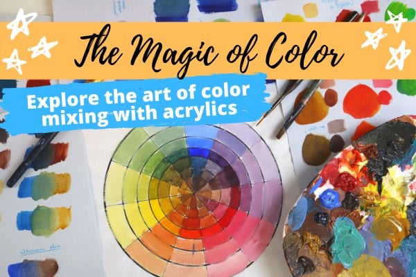
1. Welcome to the Class: Have you ever struggled to match a color from a photo or a landscape that you're trying to paint using acrylic paint? Or maybe you just can't figure out how to make that particular shade of blue, and it's driving you absolutely crazy. Resulting in a painting with colors that look really off, unnatural, unbalanced, and most of all just ruined the mood of your entire painting. Which is why my class, the color matching basics, will show you my easy method for color matching a photo, or a scene using your acrylic paint. Without having to buy a bazillion tubes of paint or need years of painting experience. Just get the right colors every single time. Hey there, my name is Amanda, also known as the buzzed artist, and I'm a self-taught artist, ready to show you the magical world of acrylic paint and how we can completely transform your world into a colorful, creative Haven. Because you deserve to express yourself, and I'm here to help you get there. Now, this class is a follow-up to my other Skillshare class, the magic of color, which goes more into the theory of color, and color terms. Before you hop onto this class, be sure to take that class first, so that you can better understand, and grasp the concepts that we cover in this class. In my color matching basics class, you'll get hands-on right away, by using a color wheel, and some easy color magic tips to replicate any color, on any image, or seen of your choosing. All you have to do is get a few basic supplies and follow along. If you're ready to make some awesome, colorfully, accurate paintings, and have all the future knowledge in your back pocket to slay all of your painting fears. Enroll in the class, and I will see you inside.
2. Supplies You'll Need: Hey there, welcome to the class. I'm so excited that you're here, and we're ready to begin in just a few minutes. I just want to go through a few of the supplies that you will be needing in order to do this class. One, you're going to want to make sure to take my Magic of Color class before you've taken this class. If you have not done that yet, please stop this class, take my Magic of Color class and come back to this class right here. You will thank me. Secondly, you will need an image. You can either use the image that I have provided in the class notes or an image of your own choosing. You're going to need acrylic paint, of course. Like I promised, we're not going to be using a lot of paint supplies. In fact, we're only going to start with three. Once you grasp the concepts, you can add more paints as you see fit. The colors are going to be using for this class will be a yellow, red, blue, as well as titanium white. But, of course, if you happen to have more variations of the primary colors, that's cool too, because I don't want this class to be super-complicated, and I want you to grasp the concepts that we're trying to learn here. As long as you have a red, yellow, and a blue, you should be good to go. You're going to need a piece of paper, preferably mixed media or canvas paper, anything that can help withstand against acrylic paint. You're also going to need a brush, preferably ones that put down large swaths of color in a short amount of time, so you're not doing it forever. For example, I'm using a 3/4 inch flat wash brush, but you can use any brush of your choosing. Lastly, you will need a color wheel. This color wheel is really important because we base a lot of our formula for creating the right color based on the color wheel. That's why I highly encourage you to take my magic of color class because I actually show you step by step how to make this specific type of color wheel so that you can use it for this class. That's all you need in order to get started with this class. Gather all of your materials, and I will see you in the next video
3. Color Matching Demo: Skin Tone: We're going to talk about how to do color matching. This actually comes in handy when you're looking at a reference picture. You look in the colors that you see and you want to use those for your actual painting. I'm going to show you how you can effectively do that using your color wheel that you've made previously and using the three primary colors. Part of this lesson's going to talk about how to make flesh tones. Now with our model here, she is Caucasian, so I'm going to be emulating her skin tone. But the theory I'm going to show you will apply to all flesh tones for different ethnic groups. You can use the same principles that I'm showing you here with color bias to adjust as you see fit for whatever model you are using. If you remember, I made this color wheel using my three Liquitex heavy body paints, ultramarine blue, cadmium yellow, and naphthol crimson as well as a little bit of titanium white just to help lighten up the colors. I also have some multimedia paper that I cut into squares. These will be our swatches where we can start to test the different formulas that we're coming up with our paints to see how close we are getting with our colors. We just take a look at our picture here, for example, we're going to start with skin tone. I'm going to take a look at our picture where I want to make that colors. I'm thinking this is going to be where I'm going to be comparing our swatches to make sure we're hitting the right color. Once I've chosen that, I go to our color wheel. I'm seeing from our color wheel here that this tint right here of orange is pretty close, it's a good starting point for us. What I'm going to do is I'm going to just take orange and I'm going to make a tint out of it and then we're going to start to compare and contrast. I'm just going to grab my three quarter inch flat wash brush, and then I'm just going to grab some red, I'm going to move these over, some reds and yellow. Then we're going to mix them to make a nice orange. Then once I've done that, I'm just going to take some white mix it, and then I'm just going to take my swatch, paint on top. This is my swatch. I'm going to put it against her skin tone. You can definitely see that this is not quite where I wanted to be yet. But I'm just going to take a look. Where do I see her skin color biasing. I see that this color here is just our orange but if I push it and take a look here, I'm seeing that her skin tone has a bit of blue in it. At least that's the bias that it's pulling me towards. I think I'm going to add some blue to the formula here and see where that takes me. Now, just to show you what I'm talking about here. We started right around here and I'm already seeing the complimentary is blue, that's going to really pull my skin tone down right around here somewhere. That matches with what I'm seeing and what the color wheel is telling me. We're going to take the tiniest dab of blue. I don't want to do too much because a little blue really goes a long way. Then I'm just going to do, just going to take my swatch. You can already see this is our first swatch that we did and this is our second. Already you see what a difference that is. We're going to go ahead, come back over here. It's getting closer for sure, getting a lot closer. Actually, what I'm going to do is I'm going to probably add a tad more red and maybe a little bit more of a white because that's where I've seen the color is pulling me. It's just a tad more red. I'm just going to go back here. Just a tiny bit more red. I'm just going to add a little bit more blue just to make sure I get a nice purple in there. Then once I got something, I'm going to go ahead add my white, then I'm going to swatch. Already you can see this is the first swatch we made. This is the second swatch we made, and this is our third. Already you get to see the variety of colors. If I take a look here, now we're getting a lot closer. I think I'm going to add a bit more blue to this, and I think it will be very close. Get bit more blue in there. This is also toning the color down, and that's what's happening here. We're going to swatch that. Once I got that swatch, we're going to take a look. I think I'm actually very happy with this color combo. What I'm going to do is I'm just going to write down the combo that I made, which was I made orange plus blue plus white. That's exactly the toneage that I'm looking for, beautiful. That's a really great tip for you as you can just make swatches and write down the formula you came up with to match. That's how you can go and make this flesh tone for your model. If you have someone who's got darker skin, obviously what you're going to want to do is use more complimentary colors to tone down the skin tone, and that's how you can hit more of those beautiful, darker colors for your model's face.
4. A Quick Tip about Skin Tone: Now, one other thing I do want to let you know about is that when it comes to making the skin tones, I do this a lot. I have to make skin tones all the time. What I found was easy to do was just buy a whole bottle of unbleached titanium white. Which you can see here, creates a really good base tone that we did it initially to make our tonal colors, and then you just add more colors into create a bias. This is applicable across all paints that you're ever using. If you find that over time you're just constantly making this certain mix of color and you need a lot of it, it would be a good investment for yourself to actually go buy a bottle of that paint mixer you're looking for. Because in the end, it's just going to save you a lot of steps. Then you can just go on and make your mix and go from there instead of having to use more of your other colors. I just end up buying it. If you want to make skin tones in the future and create a base, I really would recommend the unbleached titanium white color. This is Liquitex Heavy Body, they're fantastic. Really good base color to start making your skin tones.
5. Color Matching Demo: Hair Color: Now, let's say you want to color match her hair, for example. What I'm going to do is we're going to take the color wheel. We're just going to take a look where I see a similarity. I think I'm seeing the blue obviously is pretty close to what I'm seeing here. Let's just go ahead and make a blue swatch and compare and contrast. The swatch, just like so. Straight up blue and put it next to it. It's close. But where I'm seeing the color biasing. It looks more purple to me versus this blue, which looks like it has a bit more yellow in it. It's like pulling towards the greens. That's what I'm seeing. Maybe what I'll do is I'll just add a tad of yellow to this. Not too much, just a little, and really see if I can get a nice blue out of this. Take it, swatch it, all ready. I think this is actually pretty close to what I want. I'm already seeing that this is way toned down from the blue. But this is closer to what my model has. You feel like your model's hair is just not where you want it to be, you can totally play with her colors. You're not just constrained to what your model looks like. You know how to draw. You know how to paint. You just know how to make your colors. Use that. I think this is going to be a good color blue for us here. I make notes of how much yellow I put in just so I understand how to make this next time. That's how you can go ahead and actually do a color matching for your reference picture. I hope that was helpful.
6. A Deeper Dive into Color Bias Demo: Hey there and welcome to this lesson about color bias and how you can actually see it in action. If you recall from my magic of color class and we talked about the primary colors; red, blue, and yellow, we learned that no paint color that you buy is actually that pure color. You'll never get a yellow that's pure yellow, pure blue, or pure red. You're always going to get a variation of that color that leans a certain way on the color wheel and that lean is called a color bias. Why am I talking about color bias when it comes to color matching? Well, when you have to go pick your colors and figure out where your color needs to be, you have to understand the goal color that you're trying to make, where it's trying to lean or where it's leaning on the color wheel compared to the color that you have to work with. In an effort to dive a bit deeper into how to tell how your colors bias, I want to give you a brief demonstration using the six types of primary colors and show you how they all look different and how they all lean on the color wheel. This is just to help sharpen your skills a little bit more and better understand how you can go ahead and use color bias when it comes to matching any color in a scene or an image. With that being said, let's head on over to the desk. To further illustrate the example of how certain colors, certain primaries that you might be using may have some color bias to it, I want to go ahead and use our color wheel and do a color swatch test against some primary colors that I just had lying around here that had various biases to them. Here I have a lemon yellow. This one is yellow ocher. This is a scarlet red, crimson red, cerulean blue, ultramarine blue. Now, these are all considered within the primary color spectrum. But as you can see, they each have a little bias towards a specific color. We're going to go ahead and take a look as to what that looks like on the color wheel itself. Let's go ahead and start with lemon yellow. I'm going to just grab a little bit of lemon yellow and just to really highlight the color and really bring out what it really looks like, I add some white to it. It just helps us see where it goes. Here's my color swatch. If we go to our color wheel here and if I take a look at the lemon yellow and according to the wheel, is tending towards the greens. I'm already seeing that it's matching right around this area here. It is yellow. Absolutely, but it just wants to go this way. Let's take a look at another color. Let's give yellow ocher a try. We're going to grab some yellow ocher and grab some white to bring out the color a little bit. I'm going to swatch it. If I take the yellow ocher and I bring it over here, really seeing that it biases towards the reds and the oranges here. Compared to the lemon yellow, you can see that lemon yellow just wants to pull this way. The yellow ocher wants to pull this way because it contains more of that orange in it. Let's try scarlet, some white to it, swatch it. This one is our scarlet. We take a look where we have our red, which is right around here. Where do we see the pull happening? If I put it on this side of the color wheel, would that make more sense than if I put it on this side of the color wheel? Yeah, to be honest with you, I think it's pulling me a little more this way. I can definitely see that the colors are matching quite nicely. This scarlet color wants to pull me a little bit more towards the oranges here. Now let's check crimson, add white to it and I swatch. I got my crimson. I put it against the red of my color wheel. Now, where is it pulling me? I put it over here. No, it doesn't quite match. It doesn't quite look right. But if I put it over here, I can start to see that the crimson is picking up some of that purple that is in this part of the color wheel. I can sparely safely say that the crimson color biases towards the violets. Now let's head over to the blue. I'm going to grab my cerulean and I'm going to grab my white, then we're going to swatch. Here is my cerulean blue and I'm just going to place it against my blue. Where is this blue pulling me? Is it pulling me a little bit more towards the greens? Is it pulling me a little bit more towards the purples? If I go towards the purples, it doesn't quite look right, but I feel like I see green in here. It's pulling me a little this way. That's where I would place my cerulean. My cerulean is biasing a bit more towards the green end of the spectrum. Let's try ultramarine blue. Combine that with some white, swatch it. My ultramarine blue, if I'm taking a look at this, if I place it over by the green area, that doesn't look quite right. It almost looks like it's starting to oppose it. But if I go here, it starts to look pretty close to more of a purple hue. You see, you still have blue, but it's just slightly leaning a little towards this way on the color wheel itself. Obviously if you compare it to cerulean, cerulean definitely looks like it has more green in it than the ultramarine, which definitely has a bit more of a purple to it. Highly advise you play with this part, make color swatches, and use your color wheel in tandem with your swatches to understand where it is that your colors will lie. I hope you guys enjoyed this lesson and I'll be seeing you in the next one.
7. Conclusion + Next Steps: Now that we've covered those concepts, and walked through the process for looking at a photo or a scene, and picking up the colors using color bias, and the color wheel, go ahead, and replicate your own set of colors, either using the reference image that's provided or using an image of your own choosing. Be sure to post what your project looks like in the project section of this class, because I would love to see what you come up with, and how you go through your color matching process. I hope you enjoy this class, and learned just a little bit more on how to make colorfully amazing paintings. Happy arting.
 Amanda Rinaldi, Teaching you to Art with Confidence