Transcripts
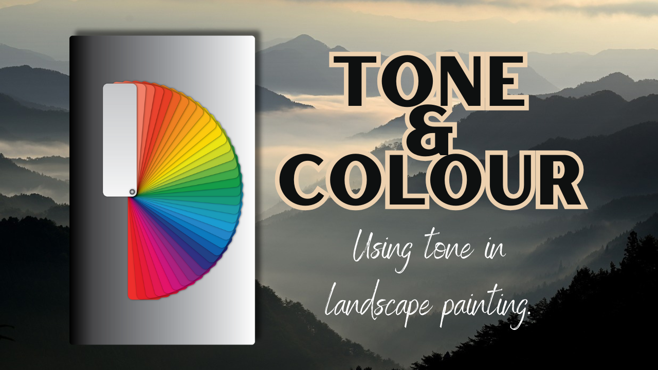
1. Introduction: Hello and welcome to
this skill share course. I'm Cali, a landscape artist based in Cumbria in the
Northwest of England, where I enjoy fell walking and painting the mountains
that we have here. This class is mostly for
beginners and we're going to be looking at color and tone and the difference
between the two, and also why tone is important when painting landscapes
to get some distance. We're going to do a very
quick and easy sketch in our sketchbook
using just one, a color of your choice. You can then go on to do
a more advanced project to paint one of the reference photographs that I've given you. Lots to learn about both color and tone, but in this class, we're going to keep
it very simple and just stick to the basics. To begin with, we need to
get our materials together.
2. What is Tone: As beginners, I think we're
often tempted by lots of lovely colors and we put the importance of color
above that of tone. What's the difference
between color and tone? These two images are the exact same photograph just with changing it
to black and white. Tone simply means
all the variations between white and black, all those different gray scales. In England, we
always refer to it as tone, but if
you're in America, you might hear this
referred to as value and we're just talking about
exactly the same thing. Now if you take a look at
these two photographs, you can see that some of the different colors
have the same tone. When we spend too much
time thinking about color and not enough time
thinking about tone, we can end up having a very flat looking landscape
with lots of the same tone. You can also find
that you don't have a lot of depth and
contrast in your painting.
3. Converting to Black & White: Color is very subjective and we all see it
very differently. Our eyes are different and we perceive it that little
bit differently. Bear that in mind
when you're painting that color isn't as important
as you think it is. You can have a little
bit of fun with color and choose different ones to what you actually seen as long as you try and keep
the tones the same. If we look at this image here, you might imagine
that the lake and the foreground are
very close in tone. But actually, if we convert
it to black and white, you can see that there
is a marked difference. Fact, if you look at the
grass in the foreground, you can see that it's almost as light as the snow
and the clouds. By converting to
black and white, we can really help
ourselves to understand the tones and look where we need to be dark and where
we need to be light. It can be very helpful in
finding a focal point as well because by putting
your darkest area near to your very lightest area, you're going to create
a little bit of drama and movement
in your painting. Don't be afraid to go very
dark and black in some areas. Quite often, we can be a little
bit tentative about using black and dark areas, but
they can really help, especially when placed against your lightest and
brightest whites to get things to be a little
bit more interesting. One tip I can give you
that's really handy is to use either your
smartphone or your tablet to take your photographs
or to download your photographs and you
can use all sorts of apps just to quickly convert them into black and white
and have a quick look at where those darkest
and lightest tones are and where your
similar tones are, they may be different
colors, but the same tone.
4. Sketchbook Exercise Part 1: Very often when we're
painting landscapes, you'll notice that
the tone is much less in the background than
it is in the foreground. We have those hazy skies
and distant hills. This is a really
good exercise that you could do quite quickly
in your sketchbook. I've used a Bockingford
sketchbook with 140 pounds not pressed paper. You can just use one color. I've used French ultramarine, but you can choose any color
you like to begin with, just make up several wells. You could do fewer
or more than I have, several wells with the same
amount of water in them. Then on the first well, add your really
nice thick color, then remove some of that color and add it into the second, remove some of the second
color into the third, the third into the fourth, by the time we get
to that fifth mix, it's really nice and
loose and watery. Like I say, you can go on, you could fill all
your wells up and make many more colors and
have many more layers. But just stick to the one
color and plenty of water to begin with so that
they're all the same in each well and add
that color to them.
5. Sketchbook Exercise Part 2: In this stage, we need to use the paints that we've
prepared in reverse order. Start with the last
one that you mix, which is the most watery and cover your sketchbook
page with that color. You might see on my sketchbook, I've taped it down at the edge with a little bit
of masking tape. You could also use a peg
or something like that. I'll stop it from warping when you're using
this much water. So always remember
which one you're on, so you're going in
reverse order and you're allowing each layer to
completely dry between. Between each of these mixes, walk away and leave
your paper to dry and don't
forget which color, which strength that you're on. Now this is
completely imaginary. If you wanted to, you
could do an actual scene, but don't forget this is
just a sketchbook practice for us to look at these tones. It doesn't have to be
a perfect drawing. When it comes to the foreground, it's very thick
paint that I've got. Yours might not be just
quite as thick as that. I did use it from the tube. You could also use
them from your pans. I did a bit of an
imaginary hedge at the end with a little
bit of a gait. Stick to the one color, keep these colors in reverse to
the way you mix them up. Don't forget which
one you're on, and the most important
thing is allow it to dry in between each layer. At the end, you can
see that just by using that one color with
varying amounts of water, you can get the distance. It's really showing the
distance in those hills. Of course, if you're
using oils or acrylics, you would be adding
white to the paint. Whereas here we're using
the white of the paper. The brush I'm using
is a size 12.
6. Your Landscape Project: All the colors we need in landscape painting, your greens, grays and browns, can be made from the
three primary colors. For your project,
I want you to take three primary colors from the paints that you've
got in your sets. One blue, one
yellow, and one red, it doesn't matter which ones, just your own personal
preference and the ones that you have
readily available to you. But no more colors, those three and the
white of the paper. Before you begin your project, you might want to
have a practice at mixing some of those
colors that you can see in the photograph in your
sketchbook and make some notes on some of the grays and browns that you can produce. When you want to go really dark, add a lot less water and
you can nearly get to black with plenty of nice dark blue and red and just a
bit of yellow in there. You may not get quite as dark as it is on
the picture there. The photograph
itself is slightly complicated compared to the little exercise
that we've just done, especially as you've
got lots of cloud and the light in the center
of the painting, sorry in the center
of the photograph, you can simplify
it. Don't feel you have to paint absolutely
everything that's there. This is another thing you need to think about as a beginner. You're creating a painting, you're creating a
piece of artwork, you're not slavishly
copying a photograph. The whole thing about
doing a landscape is you get the feel
for the landscape, you get that distance with the tone increasing
as you come forward, but you don't have
to worry about every little detail being
absolutely perfect. Just have some fun with
it and try and relax. Allow each layer
to dry in between. And start with those watery
mixes in the background. You may just need to add a
very tiny amount of color to the background
to where the sky and the furthest away hills are. There's very little
color in there, just a tiny touch and have a really good practice at mixing those because
some yellows, reds and blues are
stronger than others, and it's a bit like
mixing a cake. Sometimes you have
to add a little bit extra just to get the right mix. Do have a play and
make notes with your color mixing as you're
doing this exercise. Then when you've done it and you're happy with the results, if you could upload
that for us to see, that would be great. It's nice to see
everybody's work, not just for me but
for other people having a go as well
because you can give each other confidence
that way by sharing your work
and your ideas. I will, of course,
try and get you some feedback for that as
soon as I have the time. Take your time with
it. Always start by having a really good
study of the photograph. If you want, you can do
a very detailed drawing. Like I said, you don't have
to put all that detail in, but if you want, you can get those every single hill that
we've got there and take your time
doing a nice pencil drawing before you start. I would always recommend
as a beginner that you use a paper that's over 140 pounds in weight and that is a not
pressed paper and try and make sure that that sticks stuck down so that it's
not going to warp. The two brushes
I've used today are a size 12 round and
a size eight round. You may want to go smaller than that if you
want fine detail, but I feel that if you
use a bigger brush, you're going to worry less about the detail and be a little
bit more expressive. I really look forward
to seeing those.
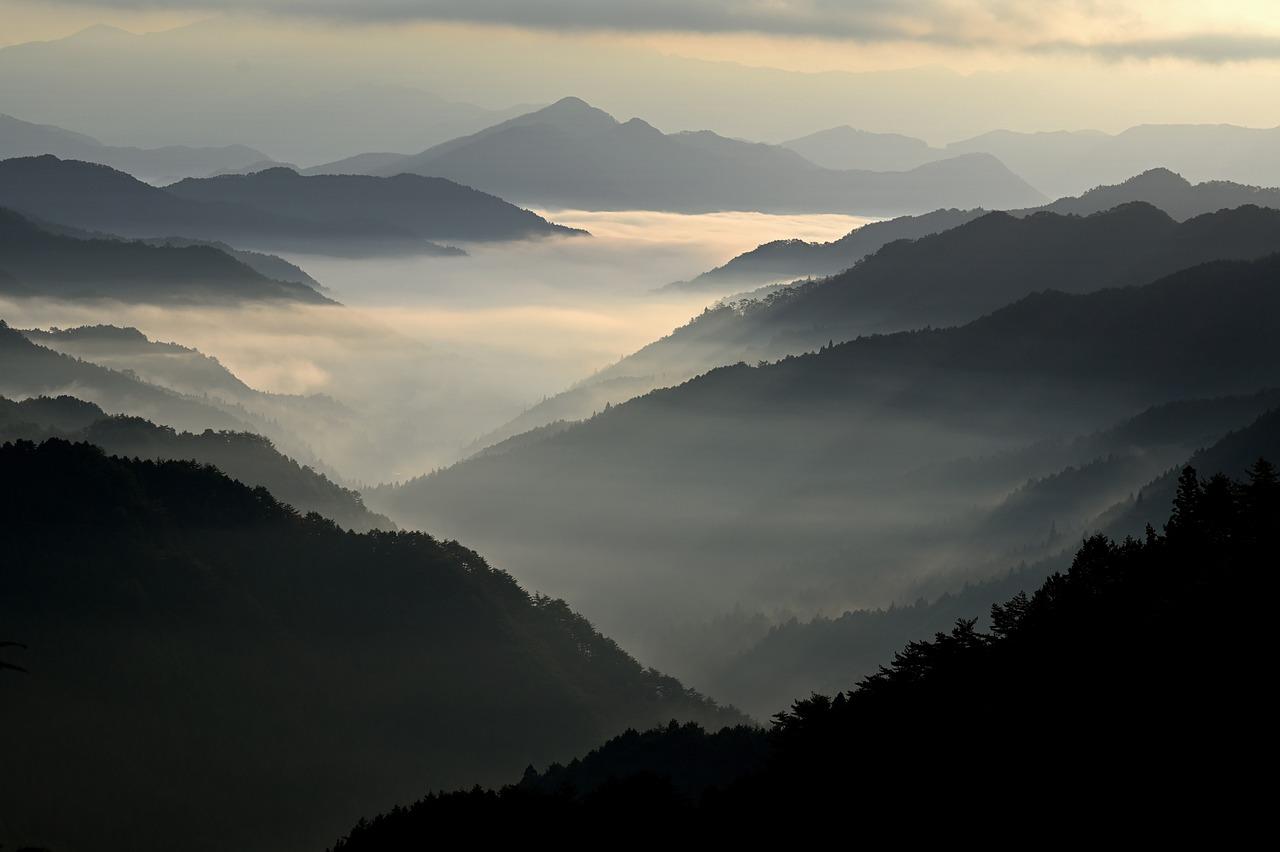
7. Conclusion: Conclusion, I know I've set
you quite a challenge there. This isn't the easiest of
photographs to work from, but it will be pushing you to think about using
those three colors to make those grays and to think about the tone rather
than the color too much. Don't actually
worry if the colors are not exactly the
same as the photograph, worry more about those tones and look back to what we
did in the sketchbook. I've included two
more photographs, one that we had a
look at earlier with the lake and another
one of a man walking. They'll also be in
the reference section and I've put those in
black and white too. With the one of the man walking, you can see how there's
much darker tones on him than there are in that furthest away hill and see how much
lighter that is. We can get the sense
of him walking away to that far away hill. So you may want to have
a go at those too. If you haven't got time now, do feel free to download those and have a go at them
another day because I think they are really
nice examples that you can work with for
looking at the tone. With the one with the
lake, we've got that very, very bright foreground
and the tones of the lake and the
midground are much more subtle and then
brightness of the snow. Have a go at those, quite
dramatic pictures if you get those darks and lights and every little
increment in between. Think of going from your darkest
black to your white with all those various grays in between the more of those
grays that you get in between, graduating it, you're going to get a much more
interesting picture. I'd like to say thank you very much for
taking this course. If you've got any
questions at all, you can ask me here on skill share or you can
ask me on Instagram, I'm always happy to chat to you there if you want to
send me a message. Other than that, I hope
you found this useful. It's very important to
think about tone as well as color and this is a good exercise for you
to practice from. I'll be back again soon
with another course. In the meantime,
you very much enjoy your own painting and
drawing. Bye bye.
 Cally Lawson, “Paint like no one is watching"