Transcripts
1. Introduction: Hello, and welcome to
my Skillshare course. I'm Cali, a landscape
artist bused in Cumbria, which is in the
northwest of England, where I enjoy
painting landscapes, and I also enjoy teaching
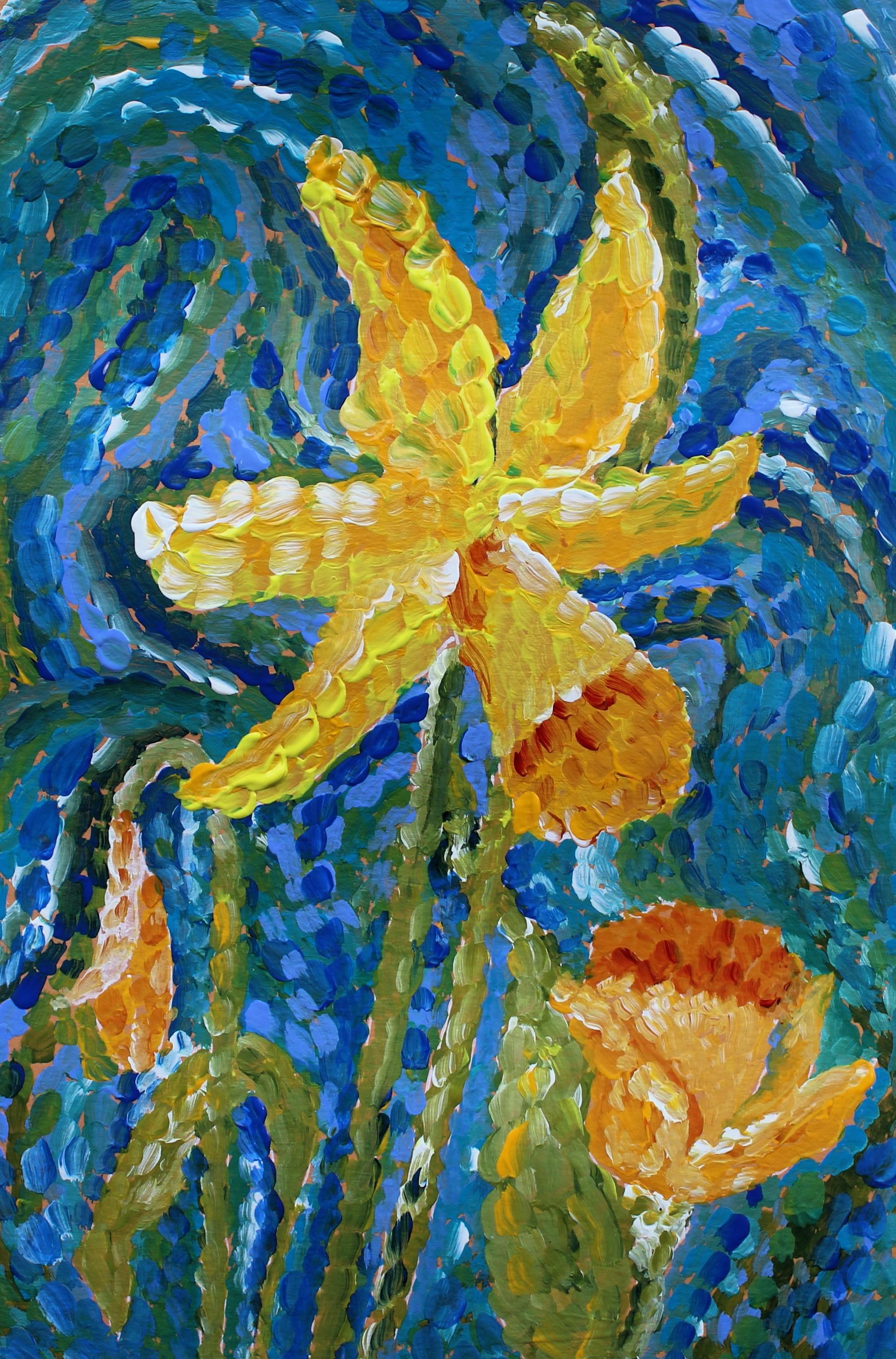
here on Skillshare. I like painting flowers, and I thought this time of
year it would be nice to paint some daffodils with some
really good bright colors. And using the style of vangoh. So using these shapes, these curves and curls with
lots of bright colors, using short dashes
with your paint. It's a very forgiving technique. It's easy to correct mistakes, and it's also very vibrant, and it gives you a lot
of sense of movement. The daffodils themselves
are quite a static flower. They've got a very
straight stem and they've got these
very bold trumpets. So they give us a feeling of being quite sturdy and static, and to get that interesting and get that
flowing and that movement, it's nice to use this style. So we could use this with
all sorts of subjects. I've used it before here, but it really does
lend itself to nature to get that
free flowing feel. So it's impressionistic.
It's not realistic. We don't want to go too much into the detail of
every single petal. We're just looking at
those basic forms and having a bit of fun with it and making something
nice and bright. So all you're gonna
need is a couple of brushes and your
acrylic paints. I'm using a mixed media powder, but you use whatever
you want. So yourself comfortable
somewhere nice to sit, get yourself a brew, and this is you can lose
yourself in this. It's really quite therapeutic. Once you've got the drawing
and you're starting to put those colors on
in those series of dashes in these lines and
swirls, time goes nowhere. You can really relax into it and don't think
about anything else. Don't worry about
anything else for a little time while
you're doing this. Okay. So I've put you a
list of the materials, and I've also given you some
photographs of daffodils, but you can use your imagination or you can use some actual
daffodils for reference.
2. Background Colour: Begin with, we're going
to use a colored ground. So a colored background
to everything that we're going to be putting
on over the top of that. So this is going to be
nearly all covered, and you might have one
or two little hints of this color showing through. The color that I've used is
a mix of titanium white, a zarine crimson
and cadmium yellow. But you use whatever you like. I often start with a
pinky or a peachy base, especially on my landscapes. Paper that I'm using
is a mixed media pad, which is a very handy pad, and it's nice and
smooth to work on, but don't feel that you have
to use the same surface. Any surface that's suitable for your acrylics
will do for this. So whether that's
board or canvas, whichever you prefer
is absolutely fine. So make a nice light color. Plenty of white in your color, something nice and bright for springtime behind the colours that we're going
to be putting on. Now, I've also used a margin, so I just did that
with the width of the ruler around the page, and this helps in a
few different ways. You can test your colors in
the margin if you'd like to. It makes it easier to photograph later or to cut out or to frame. So sometimes it's nice to
have a margin to work too. You're not going right to
the edge of the paper. So however you want to do
it, that's absolutely fine. But like I said, this
is a mixed media pad, and I've used those three colors very quickly mixed together. And now we need to
leave it to completely dry before we go
onto the next stage.
3. Drawing: A drawing, I would
recommend that you use a midtone to do
your drawing with. You can use either paint, you can use an acrylic pen. You could use a
watercolor pencil or you could use charcoal, or all sorts of
things that you can use to do your
actual drawing with. I've used an acrylic pen and
I've actually used white. The reason for me using white
is that it will show up to the camera and make it easier for you to see my
drawing process. But actually, white is not a good color to try
and cover up later on. You can use it if you
want, and it'll give a little highlight to
the edge of the flower, and if you're confident in your drawing, that's
absolutely fine. But a mid tone, something like an ochre is much easier
to cover up afterwards. So do a light drawing if you're worried about it
showing through afterwards, but don't forget with acrylics. The great thing is
we can paint over. So if your drawing isn't 100% as you would want
here at this stage, you can change things
as you go along. So we're going to be
drawing with the paint as we go along and we
can alter things. Now, I did my drawing completely
from the imagination. Well, not completely
a little bit from also looking
outside the window. And the thing is you
want your daffodils to be going maybe in
different directions, have some different sizes, maybe some different varieties. You might want to do
a bigger piece than me and include a lot more, like I say, more varieties, more sizes, and more
stage of the development. So some buds and some
just opening up, and it makes that
more interesting. So if you think about
Vango's sunflowers, he's got those at different
stages of the life cycle. So some are fully out, some are finished and, you
know, going to see. Do the same kind of thing
with your daffodils, have some buds and some emerging to make it more interesting
rather than having, you know, all the same if you have them all the same size and all the same stage of their coming out, it's going to be a
little bit more boring. Daffodils are quite
a static flower, in a way, because of
that big trumpet. And, you know, the way that
the petals are around. There isn't a lot of
movement in them in some ways because although they've got that little
bend in the neck, they've got very straight stems. So in order to get
some movement in, it's nice to get a little bit of curls in the petals
and things like that, but also the technique that we're going to use
is going to get that movement in that actually
isn't perhaps there in the actual flower
when you look at them because of how stiff
they are with those stems. So it's a nice way of making the whole composition a bit more interesting to get some
movement in your drawing. So there's all sorts
of things you can do. If you've not got any
daffodils in front of you or you're not confident to do it from the imagination, then of course, you can
either get some buy a bunch. I think they're about
a pound at the moment. I'm doing this in spring, or you can look at
some images online. So, you know, and they're
basically a trumpet shape. So once you've got that opening, um, of the ellipse shape, and you make that into a trumpet and then put the
petals around it. It's not really a
difficult shape to do once you get
into the hang of that. Just think of them
as that trumpet with those five petals round, and then add some
leaves and some stems. Okay. So think about
your composition, go nice and big, fill the
page up a little bit, but have fun with your drawing. I don't want to
see your drawings exactly like mine
or a copy of mine, don't you a little
bit of imagination, get some variety in there. Use some reference photos if you haven't got any
daffodils to hand.
4. Painting the background: It comes to the painting, I find a round brush and a synthetic
brush is probably best. And I used a number six
for the background and a slightly smaller one for
the flowers themselves. I started with the background.
You don't have to. You can do it in
any order you want, and that's the
beauty of acrylics, because you just leave an area to dry and then you can
go on to the next area. But I think it's nice to
leave the detail till last. Although we're not
doing a lot of detail. We don't want to
be do we want to keep it quite
abstract and just get those nice curves and
curls and lots of different colors in to get
a nice cheerful picture. So the colours I began
with in the back, I used three different blues, so I used cobalt. I used a light blue violet
and a brilliant blue. And I also used the camium yellow from before
and some white. So basically, the
background then became a mixture of blues and greens, so that we can imagine
it's either sky or sky coming through the trees
or in a field or whatever. So we've got a little bit of blue and a little bit of green there for the nice bright
spring sky and things. Okay, so if you do
the background first, like I said, you can do
it either way around, but I did the background first. And get some nice
curves and curls. Try and bring loop
the eye back into the painting so don't have all your curves going
out of the painting. If you wanted to, I just make it up as I go
along, which is fun. But if you wanted to, you could put some guidelines in for some of these swirls before
you started with your pencil. So just be careful, sort of remembering
which bits are leaves and flowers and
which bits of background, you know, don't go over
your drawing there, but that's the same with any
painting that we're doing. You know, we've
got to be mindful of where our drawing is. And don't be tempted
to get too detailed. Just have a bit of fun with
getting those lines in and then perhaps let it dry a little bit before you
go on to the next part.
5. Painting the flowers: Like I said, I did use a slightly smaller
brush for the flowers, but not too small, again, because we don't
want to get into that heavy lots of detail. We want to try and keep this
loose, very impressionistic. So impressionistic more
than abstract, really. So the same yellow again,
so the cobalt yellow, but then I added another yellow, which was yellow light hands don't feel you have got to
use the same colors as me, experiment with your colors
and have fun with them. I also introduced
the lizarin again, the one that we used
on the first layer, just to make some
oranges and things a bit of variety in the colors
of the daffodils. They're not all just
the same yellow. So I got a bit of
orange and a bit of two different colours
of yellow and then adding some white as well. The leaves themselves, again, we just use the same
greens that we already had on the plate and
tried to keep those. The reason that they
stand out separately to the background is more because
of where the lines are. If you find the getting
a little bit lost, you can go back into
your background, and I use that cobolt just
to put next to, you know, if you put the darker colors
next to your lighter colors, if you're losing
some of your lines. But again, it doesn't matter
if you have some lost edges, that's all part of it
being impressionistic, the light bouncing
around the painting. So yeah, don't be too
fussy about that. Just follow that drawing, and then you can come back
to it later if you want to sort of reinforce
some of those lines. So I did, you know, I followed the edges
of the petals with the white on the central flower. I made a little
bit more detail on the central flower than on the two ones below just to make the focus with a lot more of
that brighter yellow hansa and the white in that
one to make that one pop out a little bit
compared to the others. What I would suggest after
you've completed all that, you've done your background
and your flowers, I would leave it for a day, prop it up somewhere,
leave it to completely dry, and
then come back. And like I said, if
there's any lines that are working really well that maybe you
feel you need to add a little bit more
color to, you can do. If there are some areas you
feel tightening up next to the stems or the leaves
where you've just lost a bit of that shape,
you can do that as well. And if there's some of
that initial background showing through
too much that you don't want showing through, you can cover more
of that up as well. So with acrylt you can
just keep going over, but be careful not to overdo
it and end up spoiling it. So now is the time
just to leave it and let yourself come back to it
with fresh eyes another day.
6. Project: Your project, all
you really need to do is find yourself
some daffodils, either reference
photographs or some actual daffodils or use your
imagination because we've just got that trumpet and the petals, as I said before. So yeah, a nice
free, loose drawing. Think of making it nice big and bold,
covering that paper. And then having a lot
of fun with adding these colors in these
lines and swirls. And, you know, like I
said, in the introduction, what you want to be doing
is taking your mind off everything else and
just really relaxing into getting those colors down and using some
nice bright colors. So really quite a
therapeutic project. And you could
expand this and you could have a whole host
of different flowers, and you don't just have to
put one flower on the page. You could put different flowers together and make a bouquet. Your project is to do some
daffodils in this style. But if you wanted to
do a second project, I think it would be quite
nice to do a spring bouquet. So instead of doing
the three daffodils, you could get a bigger
piece of paper and do some daffodils mixed
with some tulips, some hyacinths, some blossom, anything that's out
together in spring. And that would
look really lovely to do a bouquet, as well. So if you want to do two
projects, instead of one, that's what I would suggest for the second half is
to expand it out, do a bigger piece with tulips and hyacinth and
everything else in there as well. Okay, so once you've done that,
if you want to upload it, I will get back to you, you know, when you
upload as soon as I can. Do just bear with me because some of us are on
different time zones. I've got a lot of you that
follow me in America. So obviously, it may be a day
later when I reply to you. But, yeah, I will get back
to you with my thoughts. And if you have any
questions, please do ask. Okay, so that's your project. I look forward to
seeing those uploaded. Don't forget in the references, you've got a list of materials, and you've also got
some nice pictures of some daffodils to work from.
7. Conclusion: To conclude, this is a
really easy technique to use once you
get going with it. You'll see I hardly
ever washed my brush. I just kept going mixing
those colors on the paper, letting the colors
merge and mush and do their own thing, you know, it turns out you get all these unexpected bits
of light and shadow and, you know, these nice
swirly patterns. So keep your colors nice
and bright, nice and crisp. I've used more colors
than I usually use, but, you know, it's
that time of you get all those different yellows
and oranges into your flour. So you could use this with
lots of different flowers. You could have a go at
something completely different. You could do some tulips
at this time of year, or if you're watching this
at another time of year, whatever flowers are in season
you can do in this style. I really enjoy doing it, and I hope you have too. If you have any questions,
please do let me know. I'm happy to answer
those as we go along. Just reach out to me
here on Skillshare. Or, of course, you can always message me over on Instagram, whichever is best for you, but I will get back
to you if you've got any questions about
the technique. Um, and I really look forward
to looking at what you do. It's always good to look at each other's work and
learn from that, too. Okay. So thank you very
much for joining me. I hope you've enjoyed this
as much as I have and get those nice spring bright
colors into your paintings. Bye for now, I'll
be back again soon.
 Cally Lawson, “Paint like no one is watching"