Transcripts
1. Introduction: Hello, and welcome to
my Skillshare course. I'm Cali, a landscape
artist based in Cumbria, which is in the
northwest of England. In this course, we're
going to be looking at doing artists copies and what we can learn
from them and how important they are to us
at any level of our art, whether we're a professional, whether we're a beginner,
whatever stage we're at, it's always useful to look
at other artists work, particularly looking back at the masters and seeing what
we can learn from them. So when we look at any painting, we can see have a feel for it, and whether we instantly
like it or not, that's all quite intuitive. But then when we look at
things more technically, with the things that we've
learned in courses like this, we can see what the artists themselves have used to
draw us into that image. So look at things like
their composition, look at things like
their color choices and the way that they use line. And there's all sorts
of other things we need to be looking
in there as well. Of course, we need to look at all the elements and
principles of design, which I will list here, something that we can go into more depth perhaps another time. But look at how that particular artist
has used those things to their advantage to draw
you into looking at that painting and what makes
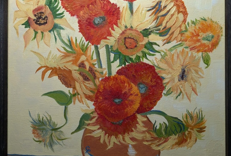
it a masterpiece, really. So with Vangogh, which is vangoh however you
want to pronounce it, what we're going to be
looking at today in this course is his use of
color with his sunflowers, the use of form, the use of
movement and rhythm really. And rhythm comes
in not just with moving your eye
around the painting by the way the
directions are going, but also with a little bit of vibration with the colors
of the paint as well. So if you think of things that are on the opposite side of the color wheel that
perhaps clash together, they can cause that, you know, a little
bit of movement and tension in the painting. So the only little touch of opposites in his sunflowers here is this tiny
little blue line. But of course, that
is opposite to the oranges and yellows
that we have predominantly. So most of the colors that
you're going to need to do some sunflowers are
going to be yellows, your oranges, those
touches of green, and then that tiny little
bit of blue or violet. So he did quite a few
sunflowers, sunflower paintings. He didn't do just one, but they've all got a lot in common. So we don't need to do exactly
the same composition as, you know, a complete
copy of his. We need to get the things that
he's got in common there. So he did the flowers at various stages of
the life cycle, which is something
people people who comment on him think is what he was getting at
with the life cycle. So we've got some that
have finished flowering, some that are in full flower, some that are in bud, some
that have lost petals. So that's something
that's common to his vases of sunflowers that
we need to take a look at. We don't need to copy
these exactly like I say, but we need to be looking
and thinking about what he's done and
getting a feel for it. And we can get lots of
reference photographs. I'll put some on here. I'll put some for you to
download off the Internet from free sites such as Pixel Bay
that are copyright free. Or if you've got sunflowers
at home, that's great. If you've got some
in a vase yourself, it's always really nice to
work from life if you can do. So I'm going on a
little bit now. I need to talk about what you're going to be doing in this class. So in this class, obviously,
we're going to do a complete painting
of some sunflowers. I'm going to be using
acrylic on a canvas paper. You can use whatever
medium you wanted to. Of course, Vincent Van
Gogh used oil on canvas. If you want to work in oil,
that's absolutely fine, but you can also work
in your watercolors. You can work in crayons, whatever you've got to
hand, whatever medium, don't feel you need to
go and buy anything specially because what we're
looking at is the line, the style, the color,
the composition. So whatever medium
you want to use, you're still going
to learn from it. So it doesn't matter that you're not using oils like he did, you're still going to learn
a lot from observing. And it's all about observation. When you're doing any painting, whether you're working
from life or from a photograph or
from your memory, it's what you have observed. And the more you look at these, the more you go back and
see different things. And sometimes it's quite nice to do the same image several times because I feel you get more into the subject and you absorb
more of what's going on. And each time, you'll see
something new in there. So what we really
need to do first is study, his paintings, have a look at the way
the lines are going, have a look at his
color choices, and then get those
colors together. So in the first
class in a moment, that's what we're going to do. We're going to get our colors together and get
ourselves settled down. So whenever you're working, whatever subject you're doing, you need to have a
comfortable space to work in. So comfortable, quiet, away from distractions and get all
your materials ready first, get your cup of tea
or coffee, whatever. So that when you
start, you're nice and relaxed and you've
got everything to hand, you're not having to rush off halfway through to
find something. So just spend five or 10 minutes getting a nice space to work in, getting all your
equipment together. Okay. So in a moment, we'll go on to the
first class and we'll talk about the color.
2. Colours: Or is a very subjective
thing in which I mean, we've all got our favorites and actually our eyes see
color differently. So I don't want
to dictate to you too much your color choices. And of course, you've got
to work with, like I said, the equipment that you have and the colors that you have
might be different to mine. So take a little bit of
time to think about what you're picking from what
you've got available. Now, if we look at his colors, they're much more
subtle yellows. So I'm not gone for
any bright yellows like cadmium yellow
or cadmium orange. I've not gone for the
really bright colors. I'm going for a little bit more subtle and natural coloring. So this one, I've
actually got two of the same color there because
this one's about to run out, but this is Turner's yellow. So that's an absolutely
gorgeous color. One I use a lot in my
landscape painting. So as you can see, it's
quite a subtle yellow. It's not too bright. And then a sienna, again, a nice subtle color,
nice earthy color. And my blues because
I'm going to need a blue to
make those greens. I don't tend to use
ready made greens. I tend to always mix my own. And I tend to work when I do my own paintings in
a limited palette, preferring to mix the
colors that I need rather than just picking
them off the shelf. So again, that's
entirely up to you, but I like to mix my own greens, so we need the blue to mix the greens and to be
like we talked before, that opposite color to give
us a bit of a contrast. Also used a fair bit of orange. So this one is quin
acridine burnt orange. Again, you can't really tell the color of it through
the plastic there, but that's a lovely color
that I use quite a lot. Then this is a new
color that I butts. Of course, we always like to use new colors that we've just got, and this one is called
light blue violet. As you can see, the ones
I use are liquitex, and these are soft
bodied acrylic, which basically means
they're a bit more free flowing and less thick than
the traditional acrylics. This one is titanium white. Again, the white you
use is your own choice, but this is just
to lighten areas, you know, to mix those
colors that we need. So you get together
for you yellows, some oranges and some blue and maybe a purple
if you want to, as well. Try and think about it being
subtle, being more earthy. If you haven't got a
more earthy yellow, if you've only got
the cadmium yellows, what you can do when you're
doing your mixing is add something from the opposite side of
the color wheel to it. So by just adding a
tiny touch of purple, something like a windsor
violet if you're using your watercolors to
your cadmium yellow. So just give that a try. If
you've got cadmium yellow, put a tiny touch
of a violet in it, and mix it, and
you'll see you'll get something more
subtle like this. So that's a good tip for you is to use whatever's on
the opposite side of the color wheel to kind of neutralize and knock
back a bright color. Okay, so if you get your
colors together now, and then we'll go on to talking
about doing the drawing.
3. Drawing part 1: Taken a piece of canvas
paper and taped it down to a board in a similar way that you would with
your watercolor paper. So whatever you're using, make sure that it's taped
down if it needs to be. Obviously, you might be using a thicker canvas or a board
where you don't need to. So this is the paper I'm using. You can see it's the
natural color on the back and then it's been
primed on the front, so it's ready primed,
and I've just taken this out of the pad and
popped it on there. So before you do that, you want to look at the shape. Of what you need your canvas or your piece of paper to be. If we look at these
two different ones, they're basically quite square, but just a little bit taller
this way than this way. So it's more or less square but just a little bit higher
in that direction. Would usually do my
drawing with a mid tone. Sometimes I use paint. Sometimes I use
acrylic paint pens. But today, I'm going to use charcoal just that it
shows up to the camera, so it's nice and dark
and it shows up to you. But you use whatever you
normally use to do your drawing, you can use a pencil,
you can use charcoal. You can use the paint itself, whatever works best for you use you're going to be
going over the top of it. Of course, if you're
using watercolor, you need a nice
delicate pencil line. So if we look at his
composition to begin with, one thing we notice is he's
really filling the canvas. So I'm going to just lightly draw on top of
his painting, actually. So if we look, we've got
just those two corners taken off the top there, and this is all going to fit into sort of a diamond shape. So you could even
put those lines on your paper to begin with, if you wanted to, but
bear that in mind, we've got this diamond shape. Everything's fitting into
there, but we're going right to the edge of the canvas
and right to the top, and the vase itself isn't too
far from the bottom either. So when you're
doing your drawing, do not leave a little bit of a sunflower drawing in the
middle and all of this space. We don't want that
all to be space. We want the flowers
to be right towards the edges and right to the top. So look at that first of all. Then look at this line. See where that comes. So
that's your halfway mark. So it's less than a
quarter of the way down. So we need to keep that in mind where this line is
quite a long way down, and we'll start with that line. They've actually
done it here for us, showed us how it's
slightly asymmetrical. So when something's
asymmetrical, just means it's slightly
off to one side. But when you've got
asymmetry like that, what you need to do is balance. So we talked earlier about elements and
principles of design. Those of you that are intermediate
or advanced painters, you'll understand what I mean with the elements
and principles, and balance is one of
those and we can have something called visual balance as well as actual balance. So actual balance
is where if you had this pot standing with too many flowers in and a
lot of weight at the top, the pot itself might tip over and the flowers
might go on the floor. So that's your actual balance where something is unbalanced. Visual balance is where the whole composition
looks balanced to the eye. So even though we've got more flowers going
off on this side, and we've got a shorter line
here than this line here, the visual balance is balanced because we've
got all this weight here. We've got one, two, three. We look at that flowers
right in the center of the painting in the
top of that pot that's making your brain
saying to your brain, it's balanced because we've
got this visual weight of these very solid shapes here. So this isn't a solid shape because he's got all
the petals going off. These are more solid shapes
that we've got there. Okay, so look at
all these things, spend a bit of time
looking before you start. So we can also see
we've got some flowers, some flowers, not sunflowers that are facing off to the side. One here is facing
off to the side. This one's losing a petal. All these lovely curls. Of course, he liked
to do his lines and his curves with his
paint, as well. So have a think about that. So we'll start by
putting this lining and then the pot itself
very simply drone pot. Nothing complicated about that.
4. Drawing part 2: You want to be very precise
and do exactly how he's done in the photograph
that you're working from, that's absolutely fine. But I think you learn
a little bit more. I think you develop your own
style and you loosen up and enjoy yourself more if you
don't tie yourself to that, if you just go with
a general feel and those general measurements, rather than obsessing about whether every little petal is in the same place that he's put
each little petal, you know, just get the feel for it, we'll get to use
the same colours, similar composition and
line and style of painting. But if one little petals
in the wrong place, don't obsess about it, you're supposed to be
enjoying yourself. So I'm going to start
with this line. Like I said, it's
quite low down here. I'm using this heavy black
so that it shows up to you. But like I say, if
you're using watercolor, you'll be using a nice
fine pencil line there. The pot itself is pretty central and it comes
a long way down. So probably to about there. You can't see the top, but
let's imagine you can, so it's about here somewhere. So it's less than halfway down. So we think about
halfway, it's about here. The top of the pots about here somewhere and isn't much
wider than the bottom, but it's going out a long way. It's a nice fat
curve and back in. Obviously, you're
gonna have a little bit more time than me to do your drawing and to think about where
all those lines are. The good thing about
charcoal is we can just get rid of that
now, and of course, you could do that
with your pencil, and then he's got this nice line where the color
changes on the pot. But it also gives us that feel
about the pot being round. And he's put his name there, which you can do that later
if you really want to. So we'll think about those
central flowers first of all. I say, you don't have
to copy exactly, but the first one is probably similar size to the
top of the pot. We've got one here. So think about using ellipses
to draw your flowers. So by an ellipse, I'm in a circle that's
maybe on its side. So get your arm moving, stand up to work, move
from your shoulder. If you draw like this
with your wrist and all this tension in your
wrist and everything tight, you're not going to get
an expressive painting. Moved work from your shoulder and keep moving your arm around. So another one here, perhaps. And then he's got one down here. And again, this is on its side. And we'll put the stem
in there coming over. And a little one here
that's a lovely curve stem. And we don't have to draw every leaf and things
at this point. We're just put in
the general shape. Like I said, we could
have put that line in. We'll do that of the shape I was talking about before all
fits into this diamond. Of course, we can get rid
of these lines later. So then we've got a nice
big one up here facing us. Another one slightly
at an angle. Work quickly if
you can, as well. Get that arm moving. Make sure we've got a stem for every flower because it's going to look a bit daft if there's more flowers than stems we've got another
one fitting in here. That one we talked about
earlier that's on its side, a funny shape one here that's
already falling in bits, and another one here. And then over this
side, we've got slightly more space between
this one and this one. And I've got two together there, kind of like a Okay. So like I said, don't worry about that being exactly right. Don't spend ages doing it. The less time you
spend doing it, the more spontaneity you're
going to have in there. Start with this line.
It makes it a lot easier and this line
here and your pot. So you've got those very
distinctive shapes, instantly recognizable
the shape of the pot and then fitting those
sunflowers in there. Okay.
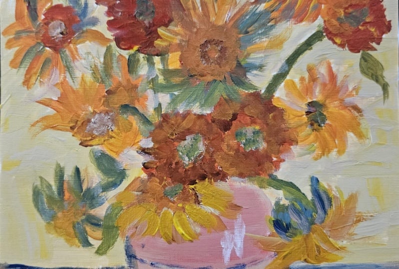
5. Background part 1: I'm going to go
with the colours of this one where he's got
this nice cream behind. You might like to do
something slightly different. In this one, he's got this
more green turquoise color. Now, I'm suspecting
with this one, he maybe did the background afterwards or could
have done it before, because, of course, it
doesn't matter with oils, you can go on top. But I suspect with this
one, he did it afterwards. I think because I'm going to use a lighter creamier colour, I'm going to do the
background first. So this color here
and this here, and I won't have it
exactly the same, but a nice light color so that the flowers show up against it. They're going to show up
against a color like this more. So again, that's entirely up
to you. But keep it subtle. Don't have it too,
you know, too bright. So I'm going to start
with this color, and we can go on top of it. Now, you might want to do
more in the way of drawing. You might want to put some of those centers in and
some of those petals in. But if we look at his work, he actually draws
with his paint. So we can see the
lines here of this on his hat and the
lines in his coat. The detail of the drawing is
coming in with his paint, not necessarily by doing lots of laborious
drawing to begin with. He did work quite quickly. So I think you need to try
and do that yourself as well in order to loosen up if you're
using acrylics and oils, try and stick to
some bigger brushes. Don't get into tiny
little detail. Try and keep it nice
and free and loose. Again, if you're
working in watercolors, you might want to do
a little bit more of the drawing with your pencil to get some of those
petals and things in. But if you're working
in oil and acrylic, I would suggest that you do
your drawing with your paint. Okay, so I'm going
to go ahead now and I'm going to mix
some of the yellow, the Turner's yellow that I had with some of my white paint, and I'm going to put
background on there, and I'll come back to you after we've done that once
you've finished your drawing and
your background. I
6. Background part 2: Look carefully at his paintings, it's not just one flat
color on the background. Some areas are slightly darker and some are slightly lighter. While I still got all
that on my plate, what I'm going to do is add
a tiny touch of white in some areas and perhaps
a little bit of the violet or something to make a darker color in other areas. And then I'll put
some brighter colors in to do the base here. I've kind of gone
around those flowers. What we could have
done, of course, was do the background first and
then do the drawing. You can do it that way
around if you want. If there are some areas later on that are background
that aren't flowers, we know what colors we've used. So it's a good idea to write down the colors that you've
used for your background. Then if you do need to add some later on, you can do that. But yeah, like I said, you
could have done it first. Maybe I should have
done it first. But, um, yeah, that
don't lose your drawing. Keep that drawing
there, and just put a little bit of
subtle differences in the background,
but not overdoing. You don't want to
be spending lots of time working on that background, just a little hint of light
and shade here and there, rather than distracting from the flowers with
too much fussiness.
7. Painting & Project: Okay, so I'm going to show you my plate and the colors
that I've mixed, and then we'll think about
where we're going next. You might want to
leave this stage to completely dry
before you carry on. Of course, if you're using
acrylics or watercolor, you can hurry that along
with the hair dryer, or you can just go
and have your lunch or a brew while it dries. Okay, so I started off with the background with the
Turner's yellow and the white to make that
nice cream color. To get the shadowy areas, I added a little
bit of the violet, to get the lighter areas, I added some of the white. And then when it came
down to the table, which we need to be a
completely different color, I added quinacridine orange and a little bit more of the yellow to make the table different. You'll see it's not all
one flat color because my brush picked up little bits of other colors while
we were on there, and that's good because we don't want it to be flat and boring. If you look at it, there's
some subtleties there. But if we were a
class particularly at a beginner's class and we
were doing a vase on a table, we would probably
be told to, um, ground that vase by putting
a shadow underneath. But if we look at his, there aren't really any shadows there. So look at what he's doing, not necessarily what you
would be doing at this point. There's no shadow there,
so don't put it there. I haven't put that violet line in there or blue line in there yet for that contrast because I want to wait
until that's dried. That's probably one of the last things that's
going to go in. When it comes to the flowers, we need to be mixing a
few different greens. We need some darker colors. You could use something like
a burnt sienna or again, keeping to the earth
colors or a burnt umber, or you can mix your own as I'm going to do by
using the blue and the orange together or
the blue and the raw sienna to make those
darker colors. By using a limited
palette you get harmony, again, going back
to your principles and elements of design. You get some harmony across
your painting by using a limited palette so you've got the same colors throughout, which is what he has done. Okay, so I'm going to go on now and carry on with the painting. I'm going to leave these colors on here for now and
add two them so I can add some
stronger yellow for the flowers and orange
for the flowers. And I can use some
of this yellow to mix some greens as well. And at some point, I will
give that a nice clean off and start again with my
colors, which is how I work. I go along, and then obviously with acrylics,
they dry quite quickly. So if they're starting to dry, I'll wash my plate and have
a bit of a start again, but I'll keep a note of the
colors that you've used. So keep a note of those
background colors and the colors of the
flowers in the mixes. And if there's a mix that
you particularly like, make a note of that you
might want to use it again another day in
another painting. So for your project, I want you to get, you know, a photograph or an image offline of one of Vang's
sunflower paintings. Also get together some images
of sunflowers themselves, individual ones, so you
can look at them in a bit more detail and study them so you get a feel for them
before you go into this. And then at the end, you
can upload the work you've done for us to take a look at, and I'll get back to you
with some feedback on your so I'm not going to go through the painting of
every single flower, but I will record it and I will come back and talk
to you in a moment. So what I want you
to be doing now is getting on with doing
that background, and then I think
we'll move on to the jar for the next bit of the painting and get some of that done before
we do the flowers.
8. Detail: You get to this stage and
you're reasonably happy with the drawing and the
painting that you've done, take a step back, leave
it for a little while, and then come back to it and think what you
might need to add. You might actually
want to go onto a slightly smaller brush at this point to put in
some of these lines. Of course, you like to
outline things you can see on this jacket here and
on some of the leaves, they're outlined, the
pot itself is outlined, and then we've got
this outline there. But just look very
carefully at this because these outlines
aren't all black. The dark, but they're
not necessarily black and they're different
colors in different places. So just take a little bit of a look at that and not
everything's outlined. The ones at the top aren't. There's just more on this
little one here and here, where there's more
definition in the leaf. So you might want
to get a slightly smaller brush just
to finish off. Look here, we've got a white on the front of the pot just to give the
sheen of the pot. And then, like I
said, we want to put that contrasting
color in as well. So at this stage, let it dry and then come and put these
bits of detail in. As you could see there, I
drew as I was going along, so I drew with the paints, and I was constantly
correcting myself. Now, this is something you
can do with acrylic and oil. It isn't something you
can do with watercolor. So with watercolor, you
need, like I said before, to get your drawing
down first and have more detail in than you need to with
acrylic and oil. And it's one of the reasons
I like working with acrylic because you can correct
yourself as you go along. And you'll see I did
that with a background. So I work quite quickly. You can see that color is still wet, that background color. So I had that there to correct around the flowers where
I needed more background. Could still do more to this. This is charcoal shown
in one or two places, and I could tighten
up the drawing. But I think at some point, you've got to decide to
leave it for the day because otherwise you
end up making a mess, you get too detailed, and then you lose some of that spontaneity from
working quite quickly. I hope you enjoy
having a go at that. Think first about
that diamond shape we talked about earlier. Get your drawing down and then continue drawing
with your paints. Stick to a few colors,
some nice oranges, yellows, and a blue, so you can mix those greens. I've got that little bit of
violet, and that was all. Think about the
colors of the pot, making it nice and subtle. And the outline, you can see two different colors
and not the same color all the way along so the main thing about
doing an artist's copy, like I said before,
is observation. Look, look, and look again. I can't emphasize that
enough because painting, and I've talked about this in other courses and
classes that I've done, painting is about an all art
is about using your eye. It's what your eyes doing,
not what your hands doing. So some people relate drawing
and painting to the hand. They're crafty and they've got, you know, the bone with the
fact that they can draw. That's a load of nonsense,
as far as I'm concerned. It is your eye
that is important. It's people that don't look that can't get
the drawing accurate. So look again, look at the size of each shape in comparison
to the next one. They're all pretty similar
sizes, these flowers, look at the way they're angled, have some angled in
different directions. And he was really
into line and curve. We've got the curve of the pot. We've got the curve
of the petals and the leaves, and, you know, there's so much movement
in his paintings that we need to try
and get that. Okay.
9. Conclusion: In conclusion, what
I want you to do is to have a go at this,
think about your drawing. Think about the use of
color and composition, and then you can upload your finished picture here for everyone to share
and have a look at. It's always nice to
look at each other's, and I will give you
feedback on those. And if you want to tag me on
Instagram, you can do that, as well, and I can have a
look at them over there. So take several images, have a look at Van
goo's own work, have a look at some images of some actual
sunflowers yourself, or if you've got
some in the garden, as I said earlier,
you can do that too. It's always great
to work from life. So once you've done this, if you wanted to do a second project, your second project
could be just put some flowers in a
vase, not sunflowers, any flowers in a
vase in front of sit comfortably at a nice distance so that your eye
isn't too strained, put the vase a little
distance in front of you and draw and paint something in this style once
you've done this one. So if you do this one and
then within a day or two, carry on and do another one, you'll feel really fresh
and relaxed into it, and you perhaps find
that your second one turns out nicer than your first one because you're not
as tight and you're not as worried about
what's happening. So try and loosen up, get really comfortable in
your seat and just have a go. So I've enjoyed doing this. There are things I
could tighten up. I could, you know,
some of the details, perhaps missing a little bit, I could tighten up
some of the drawing. But if I did that, I
might lose some of that spontaneity and
some of that movement. So it's always a
balancing act in art, whether you're going for that
detail or you're going for something a little bit more expressive, which I like to do. Okay, so let me know what
you think about that. Ask any questions you may have. You can ask me here
on Skillshare, or you can ask me on Instagram, and I will get back to
you as soon as possible. As you're going along with this, if you've got any questions, please do shout up and I
will help where I can. Thank you very much. I'll be
back again with you soon. Bye bye for now.
 Cally Lawson, “Paint like no one is watching"