Transcripts
1. Introduction : Hello, and welcome to
my Skillshare course. I'm Cali, a landscape
artist based in Cumbria, which is in the
northwest of England. In this course today, we're going to be looking
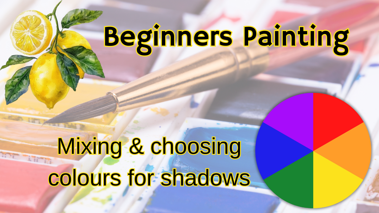
at a little bit of color theory regarding
choosing shadow colors. This applies to whatever
medium you're using. In my demonstration,
I'm going to be sketching using watercolor, but if you're using acrylic, oil, anything else, the
color theory is the same, so it doesn't matter what
medium you're working in today. Also, you don't have
to worry too much about your drawing
because I've chosen some very simple
shapes and I have put in the resources section the photographs for
you to work from, but they're all
very simple shapes. It's not the drawing that
we're thinking about today, it's the colors and
the color mixing getting used to those colors
so that we can then apply them to shadow colors in
our paintings as we go forward with more complicated
paintings in the future. It's something
you'll always have in the back of your
mind once you've learned it to create
those easy shadow colors. Course is suitable for beginners and maybe intermediates as well if you want to refresh your memory with regard
to color theory. Before we begin, before
you begin your project, I'm going to just
break it down into a few easy simple segments so that we can look at
everything individually, talking about those colors. I would suggest you
get yourself a drink and make yourself
comfortable and listen to the whole course
through before you actually get up and
do your projects. I'll explain to you
at the end what your projects are going
to be, but basically, they're going to be
making shadow colors in three different color
ways for an orange, a lemon, and an apple. Okay, so I'll go on to the next section where
we're going to talk about the complementary colors and
contrasting and opposites.
2. Opposites: Okay, so we hear all
sorts of terms in art, and when you're a beginner,
it can be quite daunting, especially if teachers using
a word that you're not familiar with and you maybe have to go and look that
up or whatever. But really, it's not
too complicated. You'll hear some people use the term complimentary colors. Some people might use the
word contrasting colors, but what we're talking
about is opposites. So those are opposite
on the color wheel. Now, once you get that and you know instinctively
which ones are opposite, especially as you go out from your secondary and
tertiary colors into a wider color wheel
as you progress, it's going to help you
with all sorts of things. Today we're talking
about shadow colors, but they can be used
in all sorts of ways just to tone each other down sometimes and things like that. Getting to know
what's opposite on the color wheel is
really important. I have a color wheel up
on the wall in my studio, and I would suggest
that you do that. I'd also suggest that
you make your own. We can print them off the
Internet or whatever. But when you make your own,
you remember things easier. Things stay in your
mind, I think, when you've actually physically sat and painted them yourself. So the basic opposites are the ones we
really need to know, your primary colors of
blue, red and yellow, you need to know their opposites and have them to
mind quite quickly. The opposite side of
the color wheel to blue is orange, red, the opposite is green and
yellow the opposite is violet. Now, red and green is a
particularly good one to know because if
you're like me, you enjoy doing landscapes. Quite often your greens can
be a little bit too green. By adding something
from the opposite side of the color wheel,
in this case, red to green, you end up knocking it back a little bit and making it
a bit more subtle. So that's not a shadow, but, you know, like I said, once you know those opposites, they're really, really handy. So if somebody mentions the word complimentary
or contrasting, that's what we're talking
about those opposites. They're complimentary
because like I said, when you mix them together, you can make a very subtle
colors out of them. When they're sat
next to each other, they can be quite contrasting and that can give
you some vibrancy. So how you use color is
something that you will get as you go along and
progress with your artworks. And as you gain more confidence, you perhaps use brighter colors together than you
might have done. Originally. I tend not to use colors that are
ultra realistic. I like bright colors, and color, you must always remember
this is subjective. We all have our favorites. We all see with our eyes
slightly differently. All our eyes are different
and our brains because it's our brain that translates
that image from the eye. So you may have somebody
sat next to you who's seen has the same thing in
front of them and you'll see a slightly different color. So if somebody's looking at your artwork and
saying, Oh, well, wasn't that color, it doesn't matter because you're
creating an artwork. You're not taking a photograph. So if that's the
color that you like, and if that's what you
enjoy using and you think it looks good
to you, then use it. It's what puts your
personality into your work. So be bright, be bold, but know the basic color theory. Okay, so I'll come back
in a minute and we're going to talk about what
your actual project is.
3. Project: Your actual project is to
do three small sketches. And your three sketches
should be of an orange, a lemon, and an apple. And I've put some
lovely photographs in the reference section for
you to have a look at. You don't need to
print them off. You can just look
at them on your monitor and work from there. Or, of course, you may have
those in your fruit bowl, and that's better if you do. If you've got an apple in
your fruit bowl at home, pop it in front of you on
the table and draw that. We always learn more
drawing from life, and you'll see the
shadows better. Just be careful.
Think about where the shadows are when
you're working from life. It's very different
to working from a photograph on your photograph, it's really obvious
where the shadows are. You can see them and
they're not moving. When you're at
home, for instance, if you may be in a kitchen, you may have two windows, two or three windows,
different light sources. You may have a light
source from above, you may have a light
reflecting off a mirror, you may have a lamp. So you're going to have light bouncing around the room and shadows in different places to really observe where
the shadows are and the shadows will move
as the day goes along and, you know, the light goes
around to a different window. So if you're taking a while
to do a drawing from life, sat perhaps in your
kitchen, for example, what I would suggest you do is if you've got a smartphone, take a quick photograph of it when you're starting
so you can see where the shadows are there because they will move
throughout the day, and then you might end up
getting a little bit confused. Okay, so your project, number one, your lemon. So with your lemon, the color
is predominantly yellow, and to make a shadow
color for yellow, you need to add violet. So something like a cadmium
yellow would be great. And adding something
like a windsor violet. But any nice bright yellow
with a violet is fine. Secondly, your apple is going
to be predominantly green, sometimes the green and red. So you're going to mix red and green for your shadow colors. And then with your orange, to make your shadow colors, you're going to be mixing in some blue. That's
what I want to see. At the end for you to hand
in is those three sketches. You could probably spend a little bit more
time than I have. I've just done a
very, very quick sketch to give you an idea
of what I'm talking about. But you can go a
bit more detailed, do a nice background. You could find a picture
of some lemons actually on a tree would be nice with perhaps a blue
background of the sky. And make it expand it out into a full painting
if you want to. If you don't want
to, just stick to three very simple
fruits, simple sketches. So how much you get out
of this is entirely up to you really, after
you've done them once, you might want to go on and
expand and do something else, or you might want to put all three into the same painting. So get a fruit ball and do a full painting of a
fruit ball would be nice. Okay. So that's um
your project one, two, three of those
three fruits.
4. Tips: As I said, you may
not be working in watercolor and the same
color theory applies. If you are working
in watercolor, of course, there are
two ways of working. One is wet and wet, one is wet on dry and
they're just as they sound. With wet in wet or wet on wet, you are applying wet paint
to paper that is already wet and that might be with water or it might be with paint
that's already there. Wet on dry is allowing each area to dry before you
add the next layer. For beginners, if you're
a little bit cautious, wet on dry is perhaps
a good way to start. But have some fun and have a practice at doing both types. So I started off with an initial sketch where
I was doing wet on dry. And then I've done a second one wet on wet at the
right hand side there. So these were just little quick five minute
things that I did. Like I said, you're going
to have more time to do a better drawing
and do you know, a bit more detail
with your shadows because you can build up the
layers, build up the layers, and don't go don't be too cautious about
going very, very dark. If there's an area underneath
your fruit where the light just can't get to and it's
very dark, get it dark. Then your lightest area, you might even have a
little bit of a highlight a white bit on the
shininess of the lemon. If your darkest area is very dark and your
lightest area is very light, and then you've got a
good range in between, you're going to get a
much more three D shape, but also a much more interesting
and exciting painting. So don't be frightened
to go dark. I could have gone much darker by building up the layers,
building up the layers. And with watercolor,
that means adding less water each time as well
to have a thicker paint.
5. Mixing : There are two ways you can
do these shadow colors. You can either mix
the two colors together on the palette, which makes a second color and then put that on as I did
in the first instance. So I let the yellow
of the lemon dry. I then mixed on my palette
the yellow with the violet, and then I put that on
as the shadow color. That works really well if
you want your painting, whatever you're doing to be much more natural and
more realistic looking. So this really depends
on your style. If you want to have a
little bit more fun with your complimentary
or opposite colors, instead of using
the shadow color by mixing it on
the palette first, you can mix it on the paper. So as you'll see in the little quick sketch I did on the right hand side
without any drawing, I put the yellow paint on, and whilst it was wet, I
put the violet into it. So exactly the same colors
on those two lemons, but you get a much
different effect because the violet stays separate and you can see it there as a
color in its own right, and I've gone nice and dark down the left hand
side of that lemon. I prefer the one on the right. You could have a play.
You could do both. You could try doing wet on dry, wet and wet and both these techniques of either mixing
the color on the palette, the two colors together to get this muted and
soft shadow color, or you can make your
shadows by mixing it on the paper by laying the
violet over the yellow. Now, if you're doing
it wet on dry, you could still use
that technique, so you can give that
an experiment as well. So get some scrap paper and have a bit of a play
with these colors. So you just need your
two colors there, your yellow and your violet. Obviously, I put the
leaves on the top. I actually went a little bit overboard with all those leaves, and they're not too
great, but there you go. I use red to make
that shadow color, obviously, the red
and the green. So the same thing
with your apple and your orange with your apple, put your green on, and then add your red or mix
that on the palate. Like I said, have a
good play with that.
6. Relax & Have Fun: So I look forward to
seeing your projects. I want you to listen
to this all the way through and really
thought about what those opposites are
and perhaps gone and made yourself a color wheel, then you can go ahead and do these three fruits and have fun with it and have
a play with it and just, you know, vary the mixes, vary the amount of
one color to the other to get darker or lighter. Or more on the yellow
side or more on the violet side
depending on your mix. I have to apologize. I'm
a little bit distracted. I'm just looking out
of the window now, and there's some of
this year's baby wrens up and down the fence, so they're always lovely
to see, aren't they? And I keep watching those. So, okay, so I'm looking forward to seeing what
you do with this. I haven't given you
much of a demonstration because you know I want you to just play with the
color, really. It's not about how
great the drawing is. Like I said before,
it doesn't matter. Nobody's seeing this. It's
an exercise in practice. If you don't just
keep practicing, somebody was saying
you've not going to be precious with your materials, with your paints,
with your paper. If you think that every
time you sit down, you've got to do a masterpiece, you're not going to progress. We need to sit down and
do a little exercises. Have fun, relax, put a date on it so that you know how
you're progressing. But don't feel that
you've got to do something perfect
every time because you learn so much more by just having a play with your
materials and your colors. So get sat down, do yourself a little
chart of the colors. If you find two colors, so a particular
yellow, for example, a particular violet that
you really like together that perhaps you
think would make a nice color for a
landscape or something, make a note of it, have
a little diary with notes in that you can have colors that you
particularly like. So when you upload them to me, I always do my very best
to get back to you as soon as I can with
some feedback. Yeah. So any questions
that you have, you can ask me that
as well there, and I will answer them for you.
7. Conclusion: So in conclusion, this is all about understanding your colors, getting to know your colors, and getting to memorize
that color wheel. Even if you want to work on the more abstract and
impressionistic side, I tend to be more
impressionistic with my colors. I don't get myself too worked up if they're not exactly as
what's in front of me, as long as they're believable. So that's a good word
in art, isn't it? Believable? Sometimes
we look at things, and, you know, that's
not believable. So it could be in completely the wrong
colors to what we think. But our eye still sees it as a convincing picture when things are working
well together, when the right colors
are sat next to each other and you've got the
right shadow colors there. So have a think about that and have a play
with that and have a bit of fun with using colors that you
wouldn't normally use. Have a look at your
palette now of your watercolors, if
that's what you're using. And have a look. It's easy
to see with watercolors. If you've bought a new tin of watercolors and you've had
them for a year or two, and there's some in
there that you've never used, and I bet there is. There's something there
that you've never used. Use those. Have a bit of fun with
those and think what's on the opposite color wheel on the opposite side
of the color wheel to those paints that are there
that you've never used and have a play
with them and see what nice colors you can
make and make notes. So when you upload your work, I'll, of course,
get back to you. And if you've got any
questions, put them on there, and I'll write a reply
to you as soon as I can. Just have fun with it,
enjoy yourself, relax. Don't worry about doing
a finished piece. We don't have to be doing
finished pieces every time. We've just got to enjoy
and learn as we go along. And this is all things you can carry forward to a bigger piece, a bigger landscape or something. And like I said, have a
go at that fruit ball. So I'd like to see that as well. If you've got time, you've
got your three fruits to do. And those of you
that have got time, have a go at doing a fruit ball, doing a full still
life composition, putting this together
what you've learned. Okay, I'll be back again
soon with another course. In the meantime, I want you
to really enjoy and relax, enjoy this little exercise
and enjoy any painting and drawing that you're doing at
the moment. Bye bye, Feno.
 Cally Lawson, “Paint like no one is watching"