Transcripts
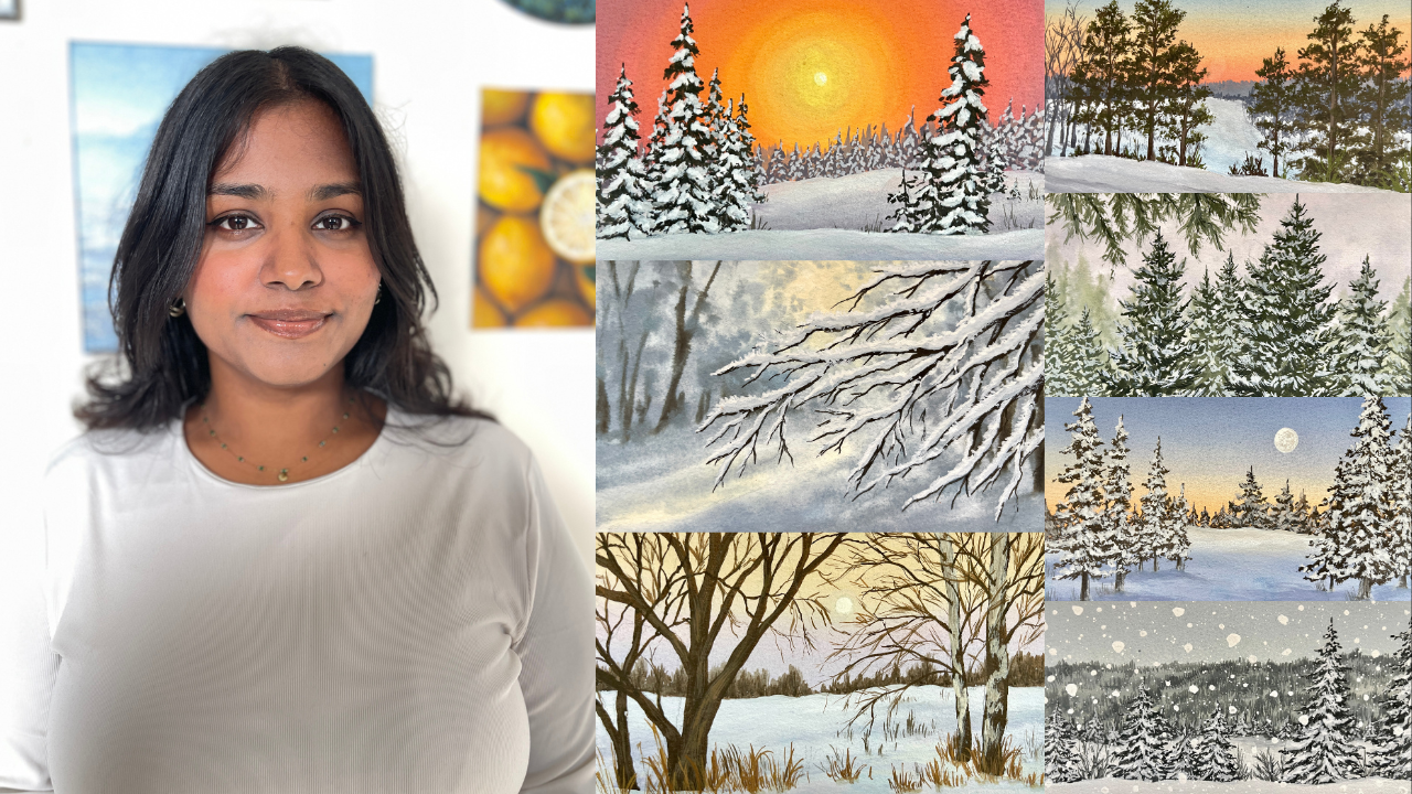
1. Welcome To The Class: Winter transforms the world into a canvas of soft whites
and silvery blues, where the snow blankets the ground and pine trees
can tall, dust and frost. The crisp and serene
beauty of the season creates a scene that
feels almost magical. Hi, I'm Pile, also known as the simply aesthetic
on social media. I'm an artist, an art educator, and a pro Skillshare
teacher based in India. For over four years, I've been painting and capturing different landscapes
using gouache, a medium that I'm deeply
passionate about. Today, I'd like to
welcome you all to my 20th Skillshare class where
we're going to dive into the beauty of the
winter season and paint seven beautiful
postcard paintings together. Before we begin with
the class projects, we'll discuss the art
materials that we need to the class and then do a deep dive into some
important quash techniques. We'll also learn how to paint
different types of trees, add intricate details, and build a skill needed to bring
those elements to life. We're going to explore a
bonus squash technique that will change your Bach scheme and take it to the next level. Then using all that knowledge, we'll create these
stunning winter postcards, scattering snowy landscapes and breathtaking winter sunsets. This class is designed for beginners and
intermediate artists, as I'll be explaining
everything in real time, providing you with in depth guidance and support so that you can follow along easily and skill confident every
step of the way. By the end of this class, you'll have seven
gorgeous paintings with you that you're
going to be so proud of. So what are you waiting for? Join me in this class, and let's explore the winter
season through Guash.
2. Class Overview: All right. I'm so excited you decided to join
me in this class. Before we move ahead, let me give you a quick overview about your projects and everything that you can expect
inside the course. The medium of choice for
today's class is Guash. Guauch is an opaque medium with the layering
capabilities of acrylics, and it can be easily reactivated using water just
like watercolors. It's a medium right in
between both of these. Guash has a beautiful
matte finish once it's dry because
of which it's very popular amongst artists because you can easily
digitize your work. When you're painting
with gauche, one thing to keep in mind is
that darker colors will dry lighter and the lighter colors
will sometimes dry darker, but it's all about practice and getting to know your medium. Overall gauche is a very
versatile medium because you can always go back and
fix your mistakes by just re wetting the surface. When you want
thinner consistency in gauche, you add water, but for lighter colors and to tone down the vibrancy
of the paint, you tend to add white. You can create so many
different variations of colors by just adding white. My last tip to you
would be to always make sure that you're using
freshly squeezed paint because gouache is
opaque and that way it retains that opaqueness
that it's very popular for. All right, let us talk
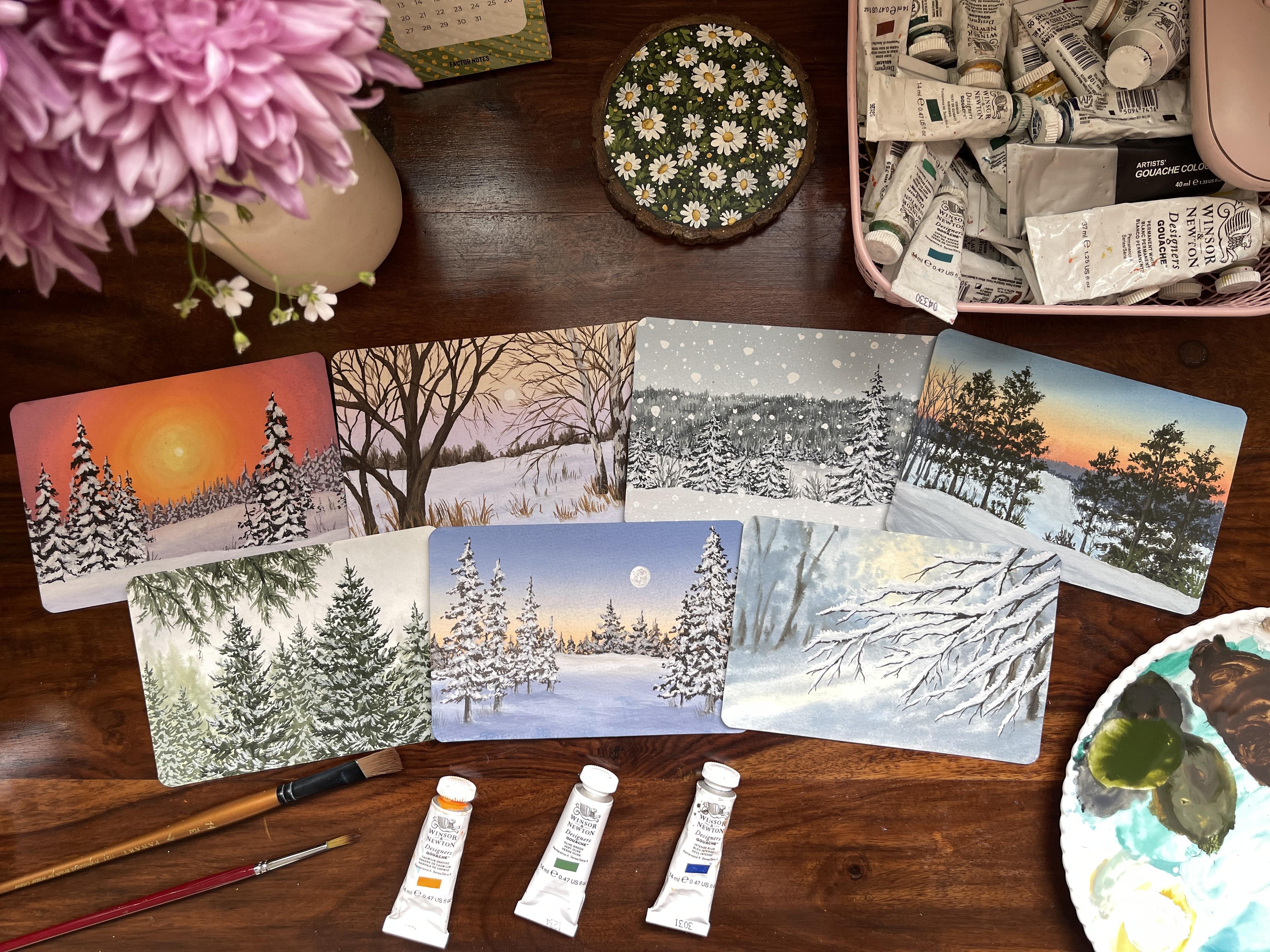
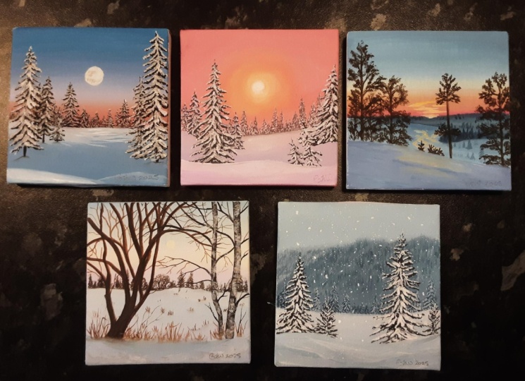
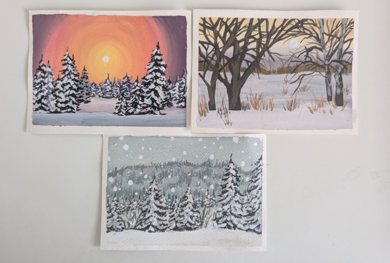
about our projects now. Alright, so here are your
seven class projects. Starting today,
every alternate day, I'll upload a class
project so that you have ample time to finish one
before the next one goes live, and you can take everything
at your own pace. Before we begin with
anything else in the class, we'll talk about the
art materials we need. So we'll cover paper,
paints, brushes, everything, and then dive into learning the
guash techniques. Now, this will give you
a really good idea about the different
techniques that we're going to be using for
the class projects. So we'll cover consistency,
blending, layering. And the bonus wet on
wet technique that is going to take your guash
game to the next level. I'm really excited to
actually teach you this technique because
when I discovered it, I was blown away with
the potential of Guash altogether
for my projects. After we're done
with the techniques, we'll talk about
some tree details. So we'll learn pine trees. We'll learn how to add
snow on our pine trees. We'll also practice
the Birch tree that we will use for one of our class projects
and also learn a lot more of how to
paint branches, how to add finer details
into our paintings and add more intricate details and bring our entire element to life
with our brush strokes. And using all our knowledge
that we have gathered so far, we will work on painting these
seven beautiful projects. I'm really excited to take
you on this journey with me. I have always been inspired
by nature and try to create classes based on the
seasons as we progress, and this is one of those courses where we
are going to dive into the winter season together and explore the beauty of it
one painting at a time. Anyway, this was my brief. I shall see you in
the next lesson.
3. Materials You'll Need: All right, so let us talk about all the art materials that I'll be using for today's class, starting off with the paints. So as you know,
we're going to be using gouache paints
for this class. So let's discuss the
brands that I'll be using. Over here, I have my
entire collection of gouache paints from the
brand Winthred Newton. So if you've been following
my classes for a while, you know, I always tend
to use these paints, and that is mostly
because it has this rich, creamy, nice and opaque consistency that I
absolutely love. So I'll be using most of
the shades from this brand. And along with that,
I have this tube of titanium white from
the brand Brustro. These two are the
only brands that I'll be using for today's class. You can use any tubes of uh paints that you
have with you. It can be tubes, tubs, or even jelly cups, the ones from HimeyO Mia himi
if that's what it's called. But anyways, this
is the brand that I'll be using for today's class. Now let's talk about the
other art materials. Alright, let's talk
about the paper next. Over here, I have
this watercolor paper from the brand Bao hung. I hope I'm pronouncing
that right. So this is a 300 GSM,
100% cotton paper. Now for gouache, you can use any watercolor paper
that you have with you. It's very versatile,
so you don't really need a very specific
paper to work with it. But I would suggest you
go for something that is above 250 GSM, at least. So my paper comes in
this cute postcard size, and it has this
wonderful light texture. It isn't heavily textured and it isn't particularly
smooth as well. It has a very, very
light texture on there. You can choose any size of
the paper that you want, but just make sure that since we're painting in
this landscape mode, you want to make sure that
the length of your paper is more than the height
of your paper, right? So that is just some
tip to keep in mind. Again, you don't have to
worry about the size. You can pick any
size that you want. But this is the paper that I will be using for this class. Again, ensuring that you can use any size of paper that
you want for this class. All right. Now that we've
covered our paper and paints, it's time for us to talk about what we'll
stick the paper on. So over here, I have
this little cardboard cut out that I'll be using
to tape my paper on. You can use any surface, make sure that you can
easily move it around and you're not sticking it
on the table as such. So just make sure that you
have something that is handy. Next, let's talk
about the brushes. Now for the brushes, you
will see me whip out a lot of flat brushes and
round brushes in particular. These are the brushes
that I'll be using. For the flat brushes,
make sure that you have one that is
slightly larger, so you can pick like
a size 14 or a size ten and a filbert brush as well. So this will come into your flat and filbert brush section. So I have size 14,
I have size nine, which actually looks
bigger than the 14, but these are the sizes
that I will be using. And you just want to
make sure that one is bigger and one is slightly
smaller than the other. And for the round brushes, I am going to be using a few detailing brushes
and a few round brushes. So for the round brushes, I
have size ten and size four. I'll be using this
for all, like, the medium details that I
have to add in my painting, and the size four will also use that for
the finer details. But these two are the
round brushes that I most often tend to pick out. Next, I have my detailing brush. Both of them are size zero. One comes to a really
nice fine tip. The other one has
been through a lot, so the bristles are
really spread apart. But we're going to
be using that to add texture and a lot of other
details in our paintings. And I'll show you how you do that in the next few lessons, but make sure that you have a few detailing brushes or any brush that comes
to really fine tip. Because that will help us
add all the finer details. Here's another example
of our spoiled brush. You can see how the
bristles are spread apart, and there was no
way to fix this. So I will be using this to kind of add a lot of
details into our painting. Alright, so make sure that you have any spoiled brush with you. If you don't, then that's
completely fine as well. You just have to work a little bit more on adding the details. But if you have a spoiled brush, you are going to be
golden with the textures. Alright, so we have
covered the main things, paper, paints and brushes. Next, let's talk about
the other stationary. We have pencil and eraser. That is very important
for the basic sketch. Next, I have a masking tape, and I'll be using the
masking tape to tape it on this cardboard
cutout that I have, and I'll show you how I tape my paper in the
upcoming lessons. All right, so that's
for the tape. Next, I have two jars of water. I always emphasize
that you need to have two jars of water because one will be for
rinsing the paint, and the other one is to
pick up fresh water or give your brush a double
rinse to ensure that you don't have any pigment
on your brushes. Next, we have a mixing palette. I'm using my ceramic
mixing palette because I love the feel of it. Feel free to use any
mixing palette that you have lying around
in your house. Lastly, I have this piece of cloth that I'll be using
to wipe my brushes. As you can see, it has been through a lot and needs
a bit of cleaning. But moving on, you can use tissues or clot to wipe
your brushes on there. Make sure that you have it
with you because you do tend to rinse your brushes a lot
and wipe down your brushes. Anyway, these are all the
art supplies that we need, gather them, and let's dive into the technique lesson next.
4. Techniques 1 : Consistency & Blending: Alright, let us talk about the different gauche
techniques in this lesson that will help us achieve these beautiful winter
landscape paintings. Now, whenever you're
painting with gauche, few techniques are very important to get
familiarized with. The first that we're
going to talk about in this lesson is consistency. Now, what is consistency? It is the ratio of water
and paint in your mix. So we're going to be
using a variety of different consistencies
for our painting, especially when it comes
to painting with quash, it's important to understand what consistency works
best for the blends. Alright, so here I
have my gastube. As you can see, when
I brush the tube, it has this really thick, creamy paste like consistency. With my dry flat brush, I'm just going to
mix whatever binder was in there and
create an even mix. You can see how thick and
butter like it looks. Let me swatch it out for you. If I load up my brush with this paint and apply, you know, a brushtrope, you can see how thick and how textured
the paint looks. Now, it's not that this
consistency doesn't work. It's just that we
use this consistency for adding dry brush textures. Now I'm adding a little
bit of water in my brush, just a tiny amount, and you can see it has
loosened up a bit, and this consistency
works really well for your foreground
layers because it is a lot more opaque, right? So you add that in a lot of your foreground elements
that you paint. Next, let us see what it looks
a little bit watered down. So over here, I've added a
tiny amount of water again. You can see how it's a
lot more easier to mix, and it looks a lot more
loose on my palate. Again, loading this up
and applying a layer. This time, you can see how
it's still nice and pigmented, but it has lost a little
bit of its opaqueness. Again, as I increase the
quantity of water in my mix, the lighter and the more shear
the color is going to be. So the more water you add, the more transparent your
gouache is going to become. And that is where it starts
behaving like watercolors. Now, it's not that
you cannot use the shear part of the
gouache consistency, you can, but it all depends on the type of painting
that you're doing. We have just written it down
directly from the tube. It has really nice and
thick consistency, which we use for a lot
of dry brush textures. So I've added some texture
on the tree trunks here. Again, I have some
more textures on the tree trunks and even to
act as the shadow of my tree, I've added that in So
the first consistency is what we use a lot for the
textures in uh paintings. Now the next second
and the third consistency that I showed you is the one that we
use for the blends. So the backgrounds tend to be in a little bit of a
lighter consistency. And for this blurred
out effect in the next technique lesson
that I'm going to teach you, we use the fourth consistency where it's a little
bit more watered down. I'll teach you more on
that, so don't worry. So again, for the blends, we're using the second
and third consistency where you want it to be nice and blendable and not too thick, but also not extremely
watered down. Now, we saw that when we
add water into the paint, it, you know, decreases the
opaqueness of our paints. So what do we do
when we want to add lighter colors or we want to make lighter
colors of a painting. Usually in watercolors,
we tend to add water, and then we get a lighter shade. But with gouache, we use white. So that is very important
to note that you want to make sure
that you're using white to create lighter colors. So I'm going to go ahead and all in some white on my palette. The first shade that
I'm going to make is with this viridiant color
that I have on my palette. You can use any shade. To this, I'm adding a
tiny amount of white, and you can see how the
color has lightened a bit, and you can also say that the color looks a
lot more opaque. So here, I'm swatching it
out for you and you can see how the shade is lighter as compared to
its original color. Now I'm adding a
little bit more white into the mix and
swatching it out for you. So the idea here
is that you want to maintain the consistency. So you can see how
as I add white, the paint might get thicker. The trick here is to
add a tiny amount of water to make it nice
and blendable to maintain the consistency in
case the paint is becoming thick and create
these lighter colors. Again, you want
to make sure that you're maintaining
the consistency of your paint when you're
adding more white into the mix and
swatching it out, you can create various
different tonal values of the same color by just adding a lot more
white into the mix. The more white you add, the lighter your
color is going to be. Of course, the color
shade changes a lot. It is not entirely light as the swatch before
or the color as is. The color will have
a lot of white, but this is a way in which we add or create lighter
colors of our mixes. So here we have the swatch car. I've written it down. The more white you add into the mix, the lighter your
color is going to be, and you still want to make
sure that you are maintaining the consistency by adding tiny amounts of water as you go. Over here, you can see how I've used very limited
color palettes, especially for this project. I'll be using very, very
limited color palettes, but I was still able to create a lot of variety of
different shades because I played around with the amount of white
that I was adding. Even here, I am using the
same color mix, but again, changing the amount of white
that I'll add into my mix, and that will help me create various different
shades and blends, especially when
you're painting snow. So the snow is not entirely
just white, right? You've got some shadows
in the mix as well. So you want to make sure that
you are blending colors and creating lighter shades of the same color mix
that you're using. Anyway, this is all we had to
talk about the consistency. Try it out for yourself. Next, we're going to
talk about blending. So over here, I'm
going to show you two different types of blending. So one blending is
going to be just creating a gradient
with a single color. So again, that will help you
understand how we create lighter shades of
the same color. So over here, we're doing
the second type of blending, which is blending between
two or three colors, right? So in our class projects, we'll be using these
two types of blending. So we want to make
sure that we have a hands on practice for that. So over here, I have
taken three colors out Prussian blue.
I've got orange. Next, I have yellow,
and, of course, I have white on my
palette from the foe. So we're going to be creating
two different blends, starting off with the blues. So over here, I have
my Prussian blue. I'm going to create
three different colors, let's say, three or
four different colors. So each time I create a different
puddle of my color mix, I'm going to add
more white into it. So you can see how
clearly there are three different shades of blue
on my palette right here. One is the paint as is. So I've just added a bit of water into my mix to
make it nice and blendable. And the rest to have
white in there. I'm just going to go ahead in this swift left and right
or to and fro motion. And as I've covered a bit of a section with
the darker blue, I'm going for the medium blue. Again, you want to
make sure that you're going in the swift
left and right motion, and you want to also make sure that you're being as
quick as possible. Not that it would
make that much of a difference because squash is easily reactivable if
that's even a word, but you can always reactivate
the paint and do it. But to create that seamless
blend between the colors, I would suggest you kind of
work a little bit quick, especially for the background,
and that will ensure that there is that
seamless blend between the three or four
colors that you're creating. Again, like I mentioned earlier, the idea for this
type of blend is to create a gradient in which you're going from dark to light you can also
go light to dark, that is completely your choice. Over here, I added a bit more
white for the fourth color. That's why I said
we're going to be using three or four
different colors. Again, going in
that swift to and fro motion and blending
the colors as I go. Here I laid out
those four colors right next to each
other as you can see, now, once you lay
down the color, I would suggest you clean your brush, give
it a double rinse, maybe load up the darker color at the top in case
you feel like, you know, it got lost along
the blending process. You can always go
back and add more. If not, you can
just go ahead with a damp brush and constantly
go in this to and fro motion. And what that ensures is
that you are going to again, create that seamless
blend between the colors where you just
move left and right, and then that ends up, you know, blending
the colors as you go. Anyway, over here we have
this beautiful gradient, so I'm going to let
this dry and then we'll have a closer look to how
the colors have dried out. All right, so here's what our
dried up blend looks like. If you notice very carefully, the colors have
lightened a bit, right? So that is something
when it comes to painting with gouache
that you have to keep in mind that your colors
will dry out to be lighter. So always keep
that into account. It is something that
comes naturally, especially when you practice
a lot with gouache, you will notice that
you get used to the fact that it does
lighten a little bit. But yeah, just
keep that in mind. Before we move on
to the next blend, let me show you one
very important thing, and I've also
emphasized this before. Always make sure that you're
keeping two jars of water. I always have two jars of water, and I would really
suggest that you have it with you as well. Alright, so let us move
on to the next blend. Over here, I have
my yellow paint, yellow and white mixed together. So I'm going to lay that
down at the bottom. Over here, I want to
show you what the blends between two or three or
more colors looks like. To my same yellow mix, I've added a bit of orange and white just to create
a lighter shade and not that deep color as
the orange is on its own. So here, again, going in
this to and fro motion, making sure that I blend it
with the yellow as I go. So again, make sure that
you are moving quick. If you feel like your brush
is drying as it will usually, then you just dampen your brush, add a tiny amount of water. And that will ensure
that you have this nice and damp
brush to work with. Over here, I'm stopping
with the orange and I've made my blue mix. You can create as dark
or as light as you want. I'm going for a medium blue, and I'm adding that at the top and then bringing it down in this to
and fro motion. Now, even over here, I'm going to bring
it down slowly, but then stop halfway and then use just white to make
the blends in my color. So you want to make sure
that you're creating sort of like a gradient,
even in the blues, because we have a
gradient with the yellow and orange
because they are, you know, closer to each
other on the color wheel. But with blue, we can't
really create that gradient, mixing it with orange. So that's when we add
white into the mixture. So whenever you blend
complimentary colors, you want to ensure
that you leave a little bit of space
so that you can lighten the blue and the orange together and have them
blend in with one another. Now, that will ensure
that you don't create a muddy color while
blending them together. Now that it is wrong,
for me, personally, I don't like that
muddiness in the sky. So I opt for just
blending them with white. You can even see here there was a harsh line between the
orange and the blue. So it isn't like you cannot
rectify it. You can. You can always add in a bit
of white into that border and then blend it with the orange slowly and then with
the blue again. So this will take a
little bit of a practice, especially when you want
to have seamless blends. I would really suggest that you try different color
combinations, especially with
complimentary colors. If not, you can
also try this blend with just colors
next to each other, so then you could go like
yellow to orange to like a deeper orange and then
maybe go into purple. You can just kind
of try and blend different colors together and give yourself a good practice. Now, this is something
that we'll use a lot in our craft projects. So make sure that you are playing around
with different colors, getting a hands on
experience on the blend so that when we move on
to our class projects, you are super confident
about your blends. Anyway, so we're going
to let this dry again. I feel like there's a little
bit of yellow missing. Let me just quickly add that in. All right. I think
I'm okay with this. We're going to let this dry
and have a closer look. All right, so these two
sections have dried. I've also written that the left one is using
a single color, the right one is using
two or more colors. Again, you will find a picture of these under
the resources part of this class in case
you want to have a closer look at that and just have that with
you for reference. All right, these were the
two techniques we covered. We covered consistency and blending in this
technique lesson one. So as you know, adding white into the color will give
you lighter shades. Adding water will take
away the opaqueness, and then we've got the
two beautiful blends. This is it for this lesson.
In the next lesson, we'll talk about the
next two techniques.
5. Techniques 2 : Layering & Wet on Wet: Alright, the next technique
that we're going to talk about in this
lesson is layering. Now, layering is the process of adding one layer
over the other, as the name suggests, right? So whenever you're
painting with quash, you generally tend to start with especially
for landscapes, actually with the sky, then
you have the middle layer, and then you have, like,
your foreground layer. So you're always working
in different layers. Even here, I have the sky, then you've got
the middle layer, and then you've got
the layer in front. So that is the concept
that we're always following for our landscape
paintings, right? So that is something
that we keep in mind. Over here, I'll show you how
we achieve that soft effect. That is going to be the
next part of this lesson. But again, let's talk
about how we layer with quash so that we don't end up reactivating the
background layer. Now, over here, one thing
to always keep in mind is that the consistency
plays a very important role. If you have a thicker
layer in the bottom, you are going to reactivate that because you
will add, let's say, a thick layer over on top, and then that ends up reactivating the
paints at the bottom. Again, like I said, gouache is a paint that gets
reactivated with water. So you want to always
ensure that you're working in a way that your background layers
don't reactivate. So for here I'm creating a block with a thick
consistency of paint. I wouldn't say this is
as thick as the tube as is the paint from
the tube as is. This one has a tiny
amount of water in there, but it's still pretty thick. This is not the
preferred consistency that I would like to work with, especially for my
background layers. I would be okay to work with
this by foreground layers, but not so much for
the background layers. Next block that I'm creating
is using the same paint, but I've added a little bit more of the water in the paint. So over here, it's
nice and blendable. It's not as thick. And you'll see it as
I apply it itself, that this isn't as thick
as the previous section. So again, I'm creating
another block. I'm going to show
you the examples on both and how your brush
strokes will have an effect if your
background layer is thick and if your
background layer is of a consistency, that would still retain
its opaqueness and not get reactivated as you
add a layer on top. So make sure that
you have two blocks and then let it dry completely. Alright, these two sections
have dried completely. So next, I'm going to
take a thinner brush. You can take any round brush, or I'm taking a round
brush over here. And I'm going to go ahead and make sure that
it's quite nice and dry and have a bit of white on your palette because I want to show this example with white. So I'm just going
to take my brush, mix it in with, you know, maybe green if you want to, or you can just use white as is. Now, the idea is on
that thicker layer, if I create a brushstroke, you can still see a little bit
of the background through. Now, this will
happen with white. White generally tends to
dry down a little bit. Less vibrant, I would say. Over here, we did mix a
little bit of the green in there or the viridian
color in there. But otherwise, even gauche or the titanium white gauche tends to dry down a
little bit lighter. Maybe you'll have to
layer at two times. But over here when I
create this brush doke, it reactivates the
background layer, and there's a lot more of the viridian color
peeking through. I'm just playing around
with different shapes here just to see what
shape reactivates it. I noticed that dragging my brush tends to
reactivate the paint. You can see how once it dries, it will appear a lot more
different then it will show a lot more of the
green from the background. Now on this section, I'm
going to do the same thing. I'm going to create
the same brushstrokes that I created in
the previous block. But over here you see
how the paint is a lot more opaque as compared
to the previous block. When your previous layer, like the block layer
here is not thick. When you layer over, it tends to retain its layer and not
get reactivated with water. When you're working with white, there are chances that you will have the color
peeking through, but in most cases, it will not, especially if your
background layer is a little bit lighter. The point of this whole exercise basically is that you
want to make sure that your background layer is of a thinner consistency
as compared to the layers that
you add over it. If your white is not drying
down to be nice and opaque, you might have to
layer it again. Once it dries, to get that
nice and opaque feel. But otherwise, this
is the basic concept. Let me write that
down for you and I'll show you what all of this means. All right, so I've
written everything down in bullet points. You can download this again from the resources section and
have a closer look at it. But now we're moving on
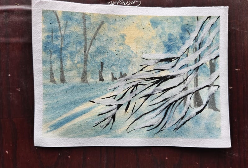
to the bonus technique that is the wet
on wet technique. Now, these are the two projects in which I'll be using
the wet on wet technique, especially for the background
blowed out effect. In this project, I have
got the pine trees in the background that I'll be using to show with
this technique. Right? You can see how
there's a blowed out effect. And over here, entirety of my background is done on
wet on wet technique. And once it dries, it creates
that soft blended effect, and then I've got
these harsh lines or the layer in front, which is the main point
of that class project. So anyway, let me show you how the wet on wet technique works. Now, this is very similar
to your watercolor wet on wet technique where you first go ahead with your flat brush or
a round brush or whatever, a larger size brush,
and you want to ensure that your surface is wet. So wet on wet technique,
as the name suggests, is the process of adding your wet paint onto
the wet surface. So you prep the surface
with water over here. Please don't mind that section. I actually absorbed
all the water. And this actually means that the sizing of my
paper has gone bad, and it's not going to
hold water as it should. So this is an old block of
paper that I was using, which ended up getting spoilt. So I decided to use that for any exercises and practice
that I was doing. But the concept will
remain the same, right? So we are going to just
prepar paper, add in water. And you can see, as I
create these brush strokes, Again, there isn't a lot
of water on my paint mix. If I add a lot more
water into my paint mix, the paint will spread out more. Again, very similar
to watercolors. Over here, I have, let's say, the third consistency that
I showed you earlier. So that's the
consistency that I have. So you can see how it kind of
blends with the background. It's creating this nice
soft effect as well. It's that soft nice blended
effect, and at the same time, I have a lot more control
over these brush strokes. Especially when we're going to be doing the project on top, as you can see the gray and yellow one where we want
to show there's a tree. I mean, there's a lot of trees, and then you've got the
little soft sunny glow in the middle and you've got
the shadow play happening. All of that is happening
on wet on wet technique, but at the same time,
my brush strokes are a lot more controlled. I can really tell where
the paint is going. I can guide it. But overall, I will be able to create
that blended effect. So I'm just sapping
my paints around, trying to create
like a structure, maybe an idea of a
forest that I have, and everything in my forest
is in the background. And you can do this
with any color. The idea is to learn the control over the paints
that you have, right? So do practice this
a little because you are going to be using this
in a final class project. The green one that
you see on the left or behind the
artwork that is on top, it's still a very little bit of this technique that is used. But the one in front, we're using that to create
the entire background. So do give this technique a try. Play around with different
consistencies, I would say. Try doing it with a
thicker consistency and see what happens
when you lay that on like a wet surface and then go with a medium
thicker consistency. Then go for a very, very thin consistency and see
how the paints react. That is very
important to know how your different paints
react to the wet surface. And overall, you will have
a bit more confidence in your brush strokes when you do it for the final
class project. Again, my sizing of the paper was a little bit spoiled
towards the left side, so it appeared a little bit different as I expected it to. But overall, again, like I said, the concept remains the same. And even with the wet
on wet technique, you can create a variety
of different brushstrokes. You can show trees,
you can show branches. You can show, you know, the foliage on your
trees in the background. You can create all
those brush strokes. Again, I would say, like, the control of the
paint and the water is what is the most important
part of this technique. So give it a try and see how your paints and different
consistencies react. Now, while this is drying, I'm going to go ahead and
take up some black paint. And the idea is, I
want to show you how that layering works. So once your section has
completely dried and you are sure that there is no water left on your paint
on your paper, sorry, not on the
paint on the paper, you can go ahead and layer anything that you wanted on top. I'm here creating a pine tree quickly with my grayish
color on my palette. You can create any shapes. And as you can see,
because this is a layer on top of the
background layer, this one retains a shape. It's nice and sharp. And, again, you can create any sort of shapes
that you want here. It isn't that you just have
to create a pine tree. Anything that you
add on top will be the focus point
of your artwork. So like I mentioned, whenever you're creating
a landscape painting, when you want the background
to be soft and blowed out, or you want to show some
elements at a distance, you can add brushstrokes on the wet sort of paint or
the wet section itself, whenever you're working on
the wet blends as well. When you do that, you create that nice soft blowed
out effect so that the foreground element is in focus and it stands
out a lot more. Like in this project,
if in Europe, got those pine trees
in a distance that shows those elements exist, but they are not the main
focus point of your artwork. All right, so this is going to really change your guash game. Do give it a practice,
and this is it. For the second technique lesson, we learned layering where we understood that we want
to make sure that you let each layer dry completely before you move on
to the next one and make sure that your background layer is
thinner than the other one. And for the wet
and wet, we learn how to create
blowed out effects. This is it for this lesson, and in the next lesson, we are going to learn
about the tree elements.
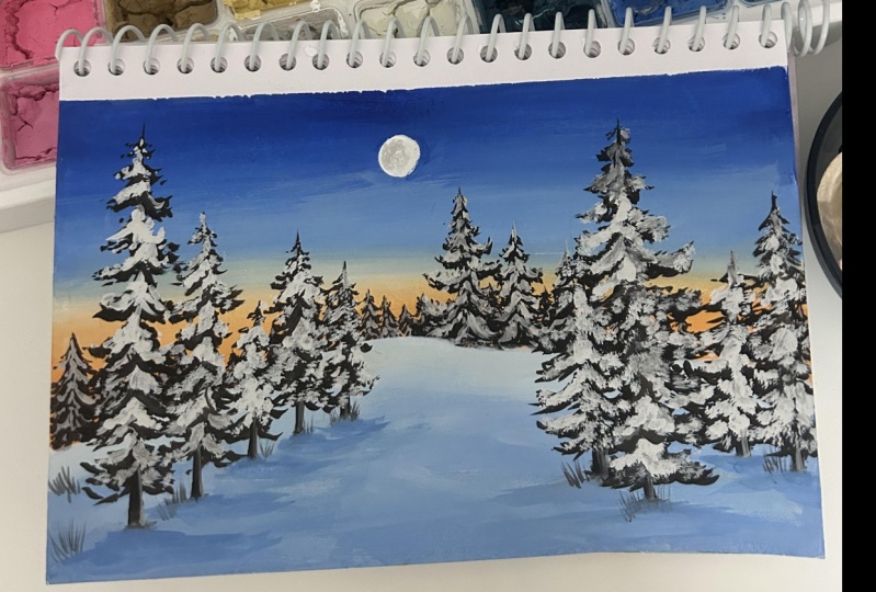
6. Exercise : Pine Trees & Snow Details: All right, let us talk about the pine trees and how to add snow details in this lesson. Now, for our class projects, we are going to be painting
a lot of pine trees, right? So as you can see, we've got a variety of different
examples of pine trees, especially these first
three that I lay out for you is the first option
that I'm going to show you. And these two, I'll show you a different
type of pine tree because the shape of it is slightly different than
the ones in these. So let me show you how
you create these type of tapered pine trees where the branches are kind
of moving downwards. All right, so let me show you a little bit of a skeleton
version of the tree. So let's say you have a
trunk for your pine tree. Is a quick sketch, right? And then you have
these branches of your pine trees
moving downwards. You can see how they have
this downward motion. So this is going to be
your skeleton of the tree, which means you've just got
the trunk and the branches. I'm just drawing it out for you. So this is the
shape of your tree. As you can see, each
branch that comes down and is laid right
below the other, the size of the
branches increase, and it kind of moves
more outwards. So this is going to
be the structure of this first pine tree
that you will be painting a lot in
this class project. Alright. Again, you can play around with
the shape of this. You can play around with the
number of branches that you add because in nature, you'll find these pine trees
in so many different ways, so many different styles, I would say types styles types. But overall, this is the
one that you're going for. I'm going to mix s brown, black, and green together just
to create this really deep brown, olive color. It isn't entirely olive. It's just, like, a really
deep, greenish brownish shade. Alright, so starting
off with the bottom, and then I'm going to apply
more pressure at the bottom. And as I release it upwards, I'm decreasing the pressure
that I apply on my brush. For your reference, over here, I'm using a size
four round brush. This is something that I have become very familiarized with, but if you're not confident
with such a thick brush, make sure that you size it down, maybe go for a size too. And kind of mimicking the
skeleton of my pine tree, I'm making these brush strokes. Now, they aren't really
well thought, I would say, I'm not really thinking
about the shape so much or obsessing about the
shape of my pine tree. I'm just keeping this one very, very simple thing in my head, and that is the structure. That is the skeleton
drawing of my pine tree. As you can see, you've
got these leaves kind of tapering outwards
and increasing in size, and they're very
randomly placed. And that is exactly what
I need to keep in mind. And once I'm done with
the overall structure, just to add in some finer
details for the pine needles, I'm going to go ahead
with a size zero brush, and I'm adding a few little
strokes at the bottom of my structure so that it looks
a little bit well defined. Now, again, if you can achieve
that with your size too, you can go ahead and
do that as well. I just prefer to size down
for this particular section. Let me give you a
closer view of what your branches actually look like so that when you're creating
that overall shape, it's easier for
you to imagine it. Let's say this is my branch. For the leaves, I'm going
to go ahead and create this very light outwards motion from the
center of my branch. Either it can move upwards
or it can move downwards. Again, let's say this one's moving towards the
left the branch. So my structure, again, is very, very coinciding with
the branch itself. It's not going in the
opposite direction. It is going and moving and flowing with the branch itself. So that is something
that you have to keep in mind when you're painting the leaves or
adding the pine needles. Again, this is a
very swift motion, very light handedly you do it. And as you release
your brush stroke, you kind of decrease
the pressure on it. If you've painted pine
trees in the past, I'm sure you are a pro at it, but this will be a really
good practice for you. Moving on to the next
type of pine tree. So in this pine tree, the base structure
remains the same. That is your trunk
remains the same, very similar to the one above. But over here, the branches
are moving upwards instead of flowing downwards
and tapering downwards. So over here, again, very
similar to the one on top. You've got your branches coming
out from the main trunk. This time, you want to make sure that you are slightly moving upwards and increasing the size of your branches
as they go down. Again, even in the one
above and the one below, one thing that I forgot to
mention is to always make sure that you are covering the center portion
of your trunk. So you don't want to just go left and right with
your brush strokes. You want to have some
in the middle as well. So let me show you examples of where we'll use
this type of tree. So you can see over
here, I've got the pine tree with
the base trunk, and then you have the
branches moving upwards. Very similar to that, we
have that in this as well. You've got branches
moving upwards, but this one is a
little bit more like a far off effect or a far
off visual of the pine tree. So I'm going to show
you both of them. Alright, so I'm going to create my mix of color with my brown, black, and a bit of green. So you can use any colors. You can just use black as well. I don't like to use black
directly into my painting, so I end up creating a
really deeper shade of, let's say, a brown or black mixed together or brown green
and black mixed together. So here, again, I've
created the main trunk. But this time very carefully, I'm creating these little shorter brush strokes
right next to each other and moving my
brush strokes upwards. And along with that, I'm making sure I'm also covering
the center portion of my tree so that the trunk doesn't look really
empty from the middle. I really you want to
ensure that you've got, you know, branches on the
left and the right side. But of course,
you're going to have a three dimensional
branch flow, right? It's not going to
be just towards the left or towards the right. So you always want to
ensure that you're filling up the center part
of the trunk as well. Again, over here, for example, that we have, you can see how the brush
strokes move upwards. Now, it's very similar to the brush stroke I
showed you above on the practice section or the close up view
that I showed you above. So you have this center portion, and then you're
releasing the short strokes right next to it, moving upwards or
downwards, right? But you're still following
the flow of the base. That is your main branch
that you're releasing. So it's all just a
combination of your tiny, tiny brush strokes together to just create the fuller
version of the tree. Again, this is
something that will require a bit of practice. So do like whip out all
the brushes that you have, practice creating thicker
and thinner strokes so that you have a
bit more control over your entire brush strokes and the way you can combine
them to create this tree. And for the bottom, I've added a few branches
just to show that there is something a branch
that came out and it's broken or it's going
to emerge out later. Just to create a bit more
definition into my tree. Again, you can see how I've made the center
portion of my tree fuller so that you cannot
really entirely see the trunk. Next type of pine tree that I'm going to show you very similar
to the same structure, just that the viewpoint is
a little bit further away. So for this one, again, the
structure remains the same. I'm going to go
ahead and release a few branches left and right, as you can see that
I've done here. Right? So just a
bunch of branches, again, increasing the
size as I go down. And adding a variety of
different branch sizes. And next, I'm going to
use my spoiled brush. So remember in my
materials lesson, I told you that if you
have a spoiled brush, you're going to be
golden because you can create these wonderful
textures with it. So this time, I'm trying to
show that there is a lot of foliage or the details of
the pine needles on my tree. Or you could just say,
if not entirely this being a pine tree with
those pine needles. It's still a tree, follows
a similar structure, and this time for the foliage, I have created a lot of tabs. If you don't have a brush
that looks like this, you might have to
a little bit sway around and create
a few extra taps to get this similar structure, or you can also use a
fan brush for this one, but I am using my spoiled brush. I'm sure you have a brush
lying around somewhere in the corner that is not
entirely intact in its shape, so you can use
that for this one. You can see how I've
created the flow of the foliage and then just to define the shape of my
tree a little bit more, I've gone ahead and added
a few more strokes around. Another thing that you'll notice very carefully here is I'm not thinking so much about
the shape. Right? I'm just having a
very light hand with my brush strokes and obviously a bit of
practice helps you to achieve the structure and the shape that
you want to do. So here you can see I've
created that upward motion, and I'm creating
these tiny strokes along the shape of my
base that is the branch, and that will give me
this fuller effect. So do practice this a
couple more times to have a hands on experience of creating
these brush strokes. You know, again, practicing
this lesson or doing this exercise lesson ensures that you feel a bit
more confident. Over here, I've showed
you those taps that it's kind of like
a close up version of the second pine
tree that I just drew. You have the main structure, and then you tap tap tap, make sure that you're holding your brush perpendicular
to the paper just to have more control over
the way the foliage moves. Another thing to keep
in mind is you see how I'm covering the center
portion of the branch. You always want to
ensure that you're doing that so that
you don't have a lot of empty
space in the middle and you don't want to
focus only on the sides. All right, so this is about
this type of pine tree. The next type of pine tree
that I am going to show you is the important one
that we need for this class, and that is the one with snow. So you have the structure, the main base of your
pine tree, the trunk. This is very similar to
the first one that we did. Only thing that changes is
you have a lot of snow on it. So these blobs, these
irregular shapes that you see me create
in the left and right, and also the center portion of my tree are the snow that
have fallen on the tree. And because it's this nice conical downward
motion of the tree, it has retained a
lot of the snow on the branches and
on the tree itself. And right below the snow, you've got these pine
needles peeking through. So this is just a
very, very rough, quick sketch of the pine
tree with snow on it. Obviously, you can
define it a lot better, especially when you're
doing your class projects. So I'm just quickly drawing it out just to show you
what the, you know, sketch of this tree looks like, and we're going to achieve this on our own with our paints. The first thing that
you're going to do is load up your round brush. I'm using my size for
arm brush here again, and I'm creating
that deep dark mix of brown and black
together for this one. And I have this nice
workable consistency, I would like to call
it, it's not too thick, but it's not too thin as well. Along using that paint, I have created my base structure and very similar
to the pine tree that I showed you above, you're going to go
ahead and create your structure of the pine tree. Again, if you feel like
your paint is too dry, make sure that you load
up a little bit of water and work with the
consistency of the paint. Then again, releasing these brush strokes to
the left and right, you can see how it has
that downward motion. Again, like I mentioned earlier, ensure that you're not
just going left and right, but you're also creating a few brush strokes in the middle. These middle ones
are going to be a bit more shorter because you want to give that illusion that it's facing towards you. All right. So go ahead
and create a pine tree. Again, this is going to be
a good practice of what we learned in the
first pine tree shape. And once you are done with
the base of the tree, for this one, I'm actually going to bring it
all the way down. So let me just quickly show
you you've got the base, and you are adding the brush strokes below the
branch that you just created. A few brush strokes on the top, but mostly focused at the
bottom of your branch. So you can see how
I've done this one. So I'm just going to give
you a close overview of the snow when I add
in on that as well. So we're going to let this dry completely before
we add the snow. Alright, so my tree here
has dried completely, and I am going to go ahead
and load up some white paint. So you're just going to add
your white paint with a tiny, tiny, tiny amount
of grain there. If you don't want to do if
you don't want to do that, you can just go ahead and
use your white paint as. Again, like I told you, the
white will dry down to be a little bit less opaque so
you might have to layer. So for this one, I'm just
going with my white paint, and I'm going to add that on top portions of my structure. So see how I have
that little bit of the pine tree shape
peeking through. So you want to
make sure that you do leave a little bit of space. So think about it in a way that when snow
falls on the tree, the top portions
of your branches, each branch will
retain the snow on it, and then obviously,
whatever structures below the snow is going
to be visible to you. Right? So that's the concept
that we're going with here. So I'm adding all on
the top portions of my structure and leaving a little bit of
space at the bottom. Again, notice very
carefully how I've not just added these brush
strokes left and right, but I've also added some kind of moving downwards
in the middle so that it creates that
illusion that it has fallen in the center
portion as well, and it's not just empty but
an overall full pine tree. Even on the branches that
I created on the side, you can see how added the snow.
And it's not just a blob. It has that little
downward stroke, very similar to the
pine tree brush stroke that you were
creating. All right. Now that we're done with
this, we are going to let this dry again
completely before we go ahead and add a second layer just to highlight
this a little bit more. All right, now that my structure
has dried up completely, I'm going to go ahead and
load up some more white on a smaller size brush
this time ensuring that I don't have any mix of
a different color in there. So make sure that you
double rinse your brush. And certain sections. I'm just going to pick out
certain branches and create these strokes just
to highlight and make my snow look a little
bit denser in those areas. Now, over here, I'm not really giving it
a lot of thought. I'm just going to go
ahead and pick out the areas that I want
and add the snow on it. But when you observe from a
reference image or if you are trying to paint from a landscape right
in front of you, you might have to see where
the light is coming from. This time, I'm just assuming the light is coming
from the top, so all the top areas
of the snow have a little bit more of that
highlighted effect in there. Anyway, I'm happy with the
way the highlights look. But one thing that you'll
notice is that a lot of my branches below
have been covered. So we're going to let
this try completely and define our tree
in the next step. Alright, so my snow
has completely dried. Again, make sure that
your snow has dried. So if you see these class
projects on the side, there is that visual that you've got these pine
trees in the back. So I just want to quickly show you the pine trees in the back. So these are very small pine
trees that you're creating, so it doesn't really matter what the shape of the pine
tree looks like. You just want to make
sure that it has that conical downward
motion to it. So you'll quickly create
a center portion and then just tap left
and right on it. And while that is drying, I'm just going to clean
my brush and load up some white with these tiny
very light handedly, I'm going to create the
structure of the snow on there. Again, this is going to be a
tree that is at a distance. You want to show that
it's a pine tree and you'll be adding that a
lot in our class project. So make sure that you practice this tinier version as well. Anyway, moving on to this one, I'm going to define
my tree here. And how I do that is you
want to show those branches peeking through
from all the snow that has fallen on it, right? So right now, it does
look like a blob. You can't really see the
definition of my tree. So load up your brush
with some paint. And right below each structure, you want to pick out
sections and create those short strokes that we
have practiced all this time. Or just tiny, tiny, tiny strokes just
to define the tree, just to bring out those little branches that
are peaking through, even though there is
snow fallen on it. And then this step, basically what it does here is, it gives that definition to the tree where like I mentioned, the snow when the snow falls, it falls on the top and you've got these branches
peaking through, your pine needles
peaking through. So it adds to that definition. Now, if you look very carefully, the tree looks a
lot more natural, a lot more like a tree with snow on it and not
just a blob in the back with black
and some blobs with white on top of it. Okay. So again, make out
those sections, define it a little
bit more along with the left and right
brushstrokes of my pine tree. I've added some in the middle
as well just to add in a bit of that three dimensional
effect on the tree. Again, do practice this
because this is going to give you a lot of practice
for your pine trees. There are going to
be so many pine trees that we are going to do in this class entirely with
all our class projects. So this will be a
really, really good practice for you to
gain more confidence. And the more number of
times that you do it, the more confident you're
going to be about adding these snow filled pine
trees in our painting. Anyway, once you're happy
with the overall look, you're going to let that dry and here are the trees that we
have practiced for this class. The entire trees
that we have done, one is the tree moving upwards, one with the branches
moving downwards, and then you've got the
tree with the snow on it. Again, do give it a try because this is going to be really
important for us. Along with the
overall structure. I've also mentioned
what each branch and those structures look like
with snow on it or just as is. So again, this is all about your brush,
your hand movements. So the more swift
you are with it, the more light you are with it, the more real like or life like your structure
is going to look. So do give it a try, practice this, and this is
it for this exercise lesson. I'll see you in the next
one where we're going to paint birch trees and
other tree details.
7. Exercise : Birch Trees & Other Tree Details : All right. So the next type of trees that I want
to talk about are these birch trees that we'll be adding in our class
project right here. And along with that, I
also want to show you a few tree details that will help you add more
details into your trees. So the one here is very similar to your pine tree detailing, but I'll still show
you an example of it. So we have a lot of
branches and a lot of tree details that
are not entirely fixated on a particular type of tree that we'll be adding. But before we move on to those, let's talk about
our birch trees. Now for the birch trees, the main structure is
that you have a trunk, which is not really white. You've got a fairly thin trunk. And from the trunks, you have these branches
moving upwards. So there are going to be a lot of details to our branches, but they all emerge
from the trunk, and along with that detail, you've got a lot of texture
on the trunk itself. You've got these white and these brown extras that you
have on your birch trees. So we are going to learn how you can achieve that when
you're painting with quash. Now, this is not entirely like an example or an exact
replica of our birch trees, but we're still
trying to capture the essence as much as we can. So you'll notice the branches
have that upward motion, so that is something that
we have to keep in mind. So over here, I'm mixing my brown paint and my
black paint together, and using my brush
with my roden brush, I'm adding pressure on my
brush and moving it upwards, trying to maintain like similar
thickness for my trunk. Obviously, you can have a
slightly irregular shape, but try to maintain
the thickness. Now, from my birch
tree from the center, I'm going to release
these main branches, I would like to
call them, right? So I'm going to release a few main branches right
next to each other, moving left and right, but
they are moving upwards, so that is something that
you want to keep in mind. And it's not just
a single branch. I'm adding a few details
in there as well. And one thing to
keep in mind for these branches are you're
trying to create a Y, right? Obviously, they're
moving upwards, but you have this Y shape,
especially right now. Let me give you a close up view, like a thicker branch and just a section of
the birch tree. So you've got the trunk and from the center or somewhere
on the side of the tree, you're going to have the
branches coming out. Again, you see how
this is like a Y. Again, there's a Y, and
then obviously you have, like a series of branches or
thinner branches coming out. So over here, you
can see how I'm very light with the pressure
that I have on my brush, very, very light pressure. So this is something
that you should practice before we go ahead
with our class projects. Now that the base has dry, let me show you how we
add the texture on tree. So for this, I'm using
my spoiled brush and my white paint. Now, I want a bit of
that grayish tone, so I've mixed it with the brown, a tiny, tiny bit so that
it's not entirely white. And now with a
thick consistency, this is where the
consistency one, the thick consistency comes into play because that helps us create that
texture that we need, that rough dry
brush texture that, you know, you can
use on your trees. So over here I'm just
brushing my brush, the bristles of my brush on the structure and creating
that textured effect. If you feel like your
paint is really thin, then you can load up some
paint and wipe it on the cloth to get rid of any excess paint
that you might have. All right. Let me
give you a view of the similar thing on the tree that is on
the left, as well. So again, I'm loading my paint. I think I load it up too much, so I'm just wiping it on my cloth and then
slightly brushing it across the shape that I want to create the texture that
we need for the tree. So this is something that you'll have to work with because the pressure that you apply on your brush plays a
very important role. Along with that,
even the consistency of the paint plays
an important role. So these are a few tips to keep in mind when
you're working with this. Again, very lightly, make
sure you're not applying too much pressure because if
you apply too much pressure, you might reactivate
the base paint as well. So very, very lightly, you want to go ahead and create that texture and then let it dry completely before we
go ahead and add in any highlights and
further details to this. All right. So my section
has dried here completely. So now what I'm going to
do is with my brown paint, I just want to bring in the branches to the
center of my tree, just to not show that
the branches are just emerging out of the left or
the right corner of the tree. But otherwise, they
are emerging from the center or it is
a part of the tree. So you want to kind of bring in those branches
inwards, not entirely. Don't let all your branches
come from the center, but still kind of bring
them inwards so that they seem to be connected
with the tree itself. And if you think you
are too much white, you can go ahead and add
in a few brown strokes just to bring in some
brown textures in there. Once you're done with
that, just with my brush, I've loaded some wine, and I'm adding a bit more
texture on the tree just to define or give a variation
of colors in it. So it's not just gray. There is a bit of that white
color in there as well. And you can also blend out those branches slightly
by adding a bit of that frosty white layer over it. Alright. Now that while now that this is drying or
while that is drying, said two things and you know, thought of two
things and blotted out both the words together. Anyway, while that is drying, you are going to create
these finer branches for which I'm using
my spoiled brush. Now, because my bristles
are spread apart, when I load up my brush with some paint and create
these branches, it tends to give me two or more of the similar
brush stroke, which makes my branches
appear fuller. Again, if you don't
have a spoiled brush, all you have to do is create multiple of these branches
of these finer branches. But otherwise, it's
the same process. Over here, I'm just
going to go ahead and add in some more branches again. Very lightly, play
around with the shape, make sure that you are getting each branch to be connected
with one another. Now, that is something
to keep in mind. But again, you can always play around with the shape
of the branches, flow them however you think or give them the direction
that you want to give them. This is the creative
freedom you have here, or if you're trying to observe a tree in reality and
then bring that to life, then you can observe how
those branches flow. And create your brush
strokes accordingly. I want these branches
to move upwards and just slightly move downwards
in some situations, so I'm just going to
bring those variations. But again, this is something that will
require a bit of practice because there is variations in the brush strokes in the amount of pressure that you're
applying on your brushes. So keep that in
mind. Anyway, this is it for the birch tree. You can see how we
were easily able to capture the essence of
my tree that we needed. Next, we're going to talk
about our normal trees. I would like to call them
normal trees because I really don't know the type
of tree that they are. So let's just say a normal tree, which has a lot of branches, a lot of trunks, tree trunks, and a lot of, like,
those main branches and sub branches coming out. Now, these can be in a lot of different shapes in a lot
of different structures. What if you're
seeing, you're trying to create the tree
based on that. And you're going to have a
lot of texture on your trunk. So it's not just one
smooth structure, right? You have a lot of textures. You have a lot of details. I feel like the tree trunk has so many details that if you
sat down to observe it, you know, it'll take you
forever to try and figure out how to capture those
details into your paintings. So, I mean, I feel that
way about all the trees because there are
so many details that you can add with trees. But then again, as an artist, you have the creative freedom to add the details you want and not add the details
that you don't want. So keeping that in mind, moving on with the structure. I've just created
some trunks and some finer branches
that I want to add. Now, I'm going to go ahead
with my size four brush, loading it up with some
black and brown paint just to create that
deep brown color. And for example, let's
say it's similar to the tree that I have on
the painting on the left. So starting off with a lot of pressure on my brush, right? So a lot of thick strokes, I'm going to go ahead and
apply a lot of pressure, as I move, I decrease the amount of pressure
that I'm adding. Now, this helps me create that seamless movement in my brush stroke so
that I don't have to constantly break my flow and create multiple different
stop points for my brush. But rather with one singular smooth flow
of my brush stroke, I'm able to create variations in the pressure and the sizing
of the brush stroke. I hope that is making sense. But if you're more
confident with breaking down your brush strokes,
feel free to do that. It's all about what
works for you, right? So over here, create the
shape that you want. The idea is to
practice the amount of pressure that you're
applying on your brushes. So once you're done with, let's say, the main branches. So this gives me the idea of, let's say, the main
structure of my tree. Now what I add on top is all going to be finer
branch details. While that section is drying, let me just quickly show you a close up view of my branch. So let's say this is the
structure that I want. So I start off with a more thicker
pressured brush stroke. And then as I release
it, I add very, very little pressure on
my brush, and this way, I'm able to create variations in my branches while maintaining
the same size for my brush. So if you're someone who do not like changing your
brush multiple times, I would suggest
that you practice this motion that is applying and releasing pressure while
maintaining a single stroke, and at the same time,
observe your trees, see all the details, and then try and create
structure similar to that. While this section is drying, let me quickly show you this other tree detail that
we'll be painting. So this one has, like, a
main branch and a lot of, like, leaf details around it. So for the base, I have starting off with
the main branch. Then it's potting weights, it's splitting into
multiple different branches and has multiple
different branches coming out from the
same structure. Again, creative freedom, feel free to make
it how you want it. There isn't much to do here. Once you're done with
the base structure, I'm going with my
spoiled size zero brush, and with the green color, I'm going to go ahead and create these multiple tinier strokes
coming from each branch. So you're going to pick
a section and you're going to have leaves on
the left and right side. Again, pick a section, leaves on the left
and right side. Now, they're not very you can see how they
don't go left and right straight like 90
degree to the branch itself. They have a downward
flow, right? So you want to always
maintain that downward flow, especially for creating
leaves like these. So you're picking
those sections and creating very, very
small strokes. Releasing your brush of the pressure as you
end each brush stroke. Again, it's all about
your hand movements. It's all about
creating that practice and getting used to your brushes and the
way they perform. Once you're done with
the darker color, I went and added a bit of white, and I'm creating a
few brush strokes with this lighter shade
of green as well. Again, that adds in a few more
details into my painting, a few different variations of the colors of the
leaves that you'll see. All right. Now that
you're done with this, this is an example of where we'll be using it, by the way. So you can go ahead and play
around with the shapes, create different
sections, create different parts of this tree, and try to add the details in. If you feel like you
added too much of the branch with the greens, you can always go ahead and add in a few details for the
branch with the brown on top and then cover it up with a bit of green on there as well. Anyway, here's a section. I'm happy with the
way that looks moving on to the tree that
we sketched out on top. Now, over here, I
want to release a few finer branches on there. So what I'm going to
do is go ahead with my spoiled brush and start creating different
separations for the branches. What I mean is you don't want a whole continuous
section of the branch. You want to start breaking
it in wits and points. So you have one structure, maybe that splits into two
and that splits into four, and then that splits into eight, you're going to create that
sort of flow in your tree. So whenever you notice trees, they're not entirely like
straight lines, right? They have a lot of
different flows on there, a lot of different directions
in which the branches move. And the more finer
branches that it has, the more fuller the tree
appears because that will have a lot of
leaves on top of it. That is the concept
that we're going with. So I've added a few
finer branch details. I'm not overdone this section,
but you get the idea. The more you add, the more fuller your tree
is going to look. Now the next thing that
we're going to focus on is the texture for the tree. Now, that is something
really important that we'll be applying on my trees
for this class project. So over here, I'm creating a
thick consistency of paint, which is the brown and
white mixed together. And using my spoiled cs, she can see I'm just
lightly dragging it very similar to
the birch trees and moving along the direction of the trunk that I have or the shape of the branch that I have. And this way, it helps me add a bit of texture into my tree, and it doesn't look
all that flat. Right? So when it's just as it's brown, it looks a bit flat. But when you create
this texture, it adds a bit of
definition into your tree. Now, this is one
shade that I use. You can also lighten it, slightly lighten it and add in a bit more texture on there just for
adding variations. Anyway, these are
the other two types of trees and branch
details that we have covered that we are going to be using very efficiently
in our class projects. So make sure that
you give this a try. Again, it's all about getting
to know your brushes, getting to know your paints
and how they perform, and getting a good swift
motion for your hands, and it's like a warm up exercise so that when you start
with your class projects, you feel a little bit
more confident about each brushstroke that you create while enjoying
the entire process. So always keep that in mind. Anyway, here we're done
with the exercise lesson. I will see you in the
first class project.
8. Project 1 Part 1 : Golden Forest: Come to your first
class project. Here's what we're
painting today. Let us talk about all the colors that I'm using for this one. So I have primary yellow. Next, I have cadmium
orange, Russian blue, olive green, burnt umber, ivory black, and titanium white. So let's talk about
the base first. So I have my paper taped down at the back of my
cardboard sheet, an extra piece of paper
for swatching out the colors and all the
colors on my palette. On the left top, you can see the reference image
that I'm using. It will be available under the project and
resources section in case you want to download it and have a look at it on your own. So the first thing
that I'm going to do is at the very
bottom of the paper, create this irregular shape, as we can see on the
left side as well. That is going to have
a lot of trees on top, which will be my foreground. Behind that, I have
another irregular shape, irregular land with
a lot of, like, blurred out lighter
pine trees in the background of that pine tree forest in the background. That's going to be
my middle ground. And then, obviously, for the
background, I have my sky. So I'm just going
to go ahead observe the reference image and roughly sketch out a few
trees that I see. Again, roughly and very lightly. Make sure that you're not making very thick or very
dark pencil strokes because you want to erase
it and paint over it. So do it very, very lightly. So here I have a very, very basic sketch because I just want to understand the
placement of a few things, and obviously I can change things or at least the shape
and size of my tree as I go. So this is going to
be my basic sketch. Let's start with the
painting process. So, like we learned, we are going to start
off with the background. Here I have my size
for round brush, and I'm going to
create a few shades. So first, I have my primary
yellow mixed with white. So again, a lighter
shade of that yellow. So here's a swatch of the
yellow that I'm using. The next color that I want
to make is an orange color. So I have my primary
yellow mixed with cadmium orange and
my white paint. So a lighter version of the oranges not entirely
that deep orange. So here's a swatch of the
mix of color that I want. Again, you can go
for similar shades. You don't have to
have the exact shade. Next, I have the red paint as well, which I
forgot to mention. This is primary red. So I have the primary
red on here as well. Just added a bit of that color in just to create that
deeper tone of orange. And I have mixed it with
orange and white, of course. But the next color that I
have is my primary red, mixed with Prussian blue to
create that purple color. So because I didn't want
a blue in there and I wanted a purple, I
went with this mix. If you have a purple shade, which is very close to
the one that I've mixed, feel free to use that as well. So these are the
four colors that I'll be using for
the background, and we want to blend all
these four colors together. So for this, I will be
using my flat brush as it provides me with
a little bit more of that blending ease, right? So first, I'm going ahead
with the yellow color. Again, I'm laying it out
with my round brush, but then again, blending is easier with your flat brushes. So I have laid out the yellow very close to the sum
that I sketched out. And after that, I
am going again, I did tell you that I would
pick out my flat brush. So I have my flat brush and I'm going to go ahead
and load up some orange, lay it in this circular form next to the yellow
that I just laid out, and you can either load up yellow and blend
it with the orange or just clean your brush, rinse it and just
with your damp brush, blend the orange
into the yellow. Over here, I am just focusing more on laying out the
color and slightly blending it into
one another before I go ahead with that
final blend for which I might be using my damp brush itself in case I don't
want to add any colors. So over here, I am
laying the colors out in this circular
motion just to create that effect that the blend of the colors is coming
from the center of the sun and because
of that light that is dispersing in the sky, the blend is, you know, it forms in that formation. So that's the idea that
I'm going with, right? So I have laid out that deeper
orange color next to it. Also, I have laid out and added a bit more pink
into the mix just to create another shade into that blend before it
blends into the purple. So for this, as you can see, I've added a bit
of pink, I mean, that red and white, which made the pink and blending it next to the orange
that I just laid out. And here's a swatch of
the pink that I've made. Five colors we're blending, which might seem like a lot, but it isn't actually because they're all just a
mix of one another, except for the
purple, of course. Just to make that transition from the orange to the purple, a bit seamless, we added
a bit of pink in there. Alright, now that we are done with the orange and pink part, I'm going to rinse my brush, make sure that my brush
is nice and clean, and add in the
purple on the side. So on both the left and
right side of my sheet, I'm going to go ahead
and add in the purple. Now, another thing that
you will notice right here is that the blend
looks all over the place. And that is because I'm focusing more on laying out the colors. That is quickly laying out the colors before I go
ahead and start blending. Again, I fell short
of the purple, so I've mixed a little bit
more of the same shade. One suggestion is to try and have more of the same color
mixed out on your palette so that it's easy when you start blending them because sometimes we might end up making a shade a bit too dark
or a bit too light. So it's good to have enough. Make sure that you're rinsing
your brush completely. And just with your damp brush, that is in your clean
a jar of water, you double rinse it, and just with fresh damp clean brush, you can start the
blending process, right? So I'm starting off
with the yellow first. So right in the center,
I'm adding the yellow, and you can see how
I move my brush in this circular motion just to create that blendy effect in
that circular blendy effect. Right? Or did I just say blendy? A blending is not even a word, but it's just, you know,
it's just an emotion. You're blending it in
that circular motion. Anyway, after the yellow, I've added a bit of
orange in there, again, blending it with the yellow, trying to create
that seamless blend. So this is very similar to the blending exercise
that we did in the techniques lesson where we blended yellow and
orange with the blue. But this time, we're blending it with a lot of different
colours in between. The idea being you're using a damp brush or
some fresh paint on your brush to make that
blend even and seamless. Again, wherever you feel
like your brush is trying, you can just add a tiny amount
of water in your brush. Make sure that it's
really, really insignificant amount of water because if it's a lot of water, then you end up moving
the paints, you know, like a little bit more than
you expect them to move. So just dampen your brush and
get back into the blending. And now, if you notice
very carefully, there is that seamless blend
coming through, right? You can see how seamlessly that yellow blends
into the orange. That is blending into the deeper orange and
pink on the side, and that is exactly
what we're going for. This might take a
bit of time a bit. Maybe you might not get
it even in the first try, but I'm actually confident
that you're going to do it. So I know you will, but in case you don't,
it's completely okay. You learn something and
then you can try again. So the idea, again, is that you have that seamless blend of
colors in your sky. So keep going back and
forth with the blends. If you've added too much of the purple, bring in the orange. I mean, the pink, blended in. If you think you
added too much of the orange and less
of the yellow, again, add in some yellow
and blend it together. So this is something that is
going to take a bit of time, so enjoy the process of blending all these colors
with one another seamlessly. And have that perfect blend of colors that you require
and are happy with. I felt like it could still use a bit of yellow
in the center. So I've gone ahead
and added that yellow in there with
my round brush, and then after
cleaning my brush, I'm going to go ahead and
blend it with the background. And the reason I
did this is because I have that white in the center, so I want to create that
glow effect a lot more. Anyway, once that is sort
of dry, slightly dry, you're going to go ahead and load up some white paint with your round brush and just
add that in the center, and that is going to be the sun. So there's a lot
of fog in the sky. There is this pretty
color in there, but that hazy effect creates this beautiful blend
of colors for you. All right, we're
going to let this dry and move on to the next step. Alright, now that this section
has completely dried up, it's time for us to add in those far off pine trees for which we're going to
create this grayish color. So I'm going to mix my brown
that is burnt umber with a tiny amount of black
and white in there, and I've added a bit of blue. But then this mix, I'm just going to discard
because it's too blue. So to the same mix, I've
added a bit of black, a bit of brown and white, and I'm also going to add
in a tiny amount of red in there so that this color is
gray, but at the same time, it's using those
similar shades that we have used in the background, so it creates that
harmony in the colors. So here's a swatch of the
shade that I'll be using for those background pine trees. So for this, I'm not really
going for the exact details. I'm also going to use
my size four brush. You can reduce the size and
go for a size too as well. So over here, the idea is to go ahead and start
creating these really, really fine uneven strokes. So you can see I'm creating these vertical lines
next to one another. And creating different
variations in those shapes. Now, the idea is
you don't want it to all look even, right? The sizes of the trees and
the wild is not all even. And because there is so much
of variations in the sizes, the beauty of the
landscape comes out more. So I'm just going to go ahead and start creating
these uneven strokes. Your brush strokes don't have
to exactly look like mine. Envision that you are looking
into this landscape and you've got a forest in
the background somewhere, and there are so many trees
laid out next to one another, and the heights of all
these trees are different. So that is the only vision
that I have right now, and I'm going to go ahead
and start creating this. Again, though that this painting is done using a reference image, we don't have to exactly
replicate that image. You can get inspired
from this and then add in your own touch
that we will be doing. We'll be changing
a lot of different aspects of this painting, changing the positions
of the trees, or adding a few
details on our own. So even though this is heavily inspired from
a reference image, you can add your own
touch to this. All right. So here, I'm just going to go ahead and using
the single color, just add in different variations
going left and right. You know, adding those different
variations in the sizes. Feel free to do this
however you want. But again, ensure
that the height of these trees are not
really, really small. You still want to give
them like, I would say, half an inch of height depending on the size of
your paper, of course. So here, I've just given them
a bit of height because I will be adding a few more
trees in front of it. I still want to be able to see these trees while I add
a layer in front of it. Anyway. So now that
I'm done with this, I'm happy with the
way this looks. I'm just going to blend
everything together, fill up any empty spaces
that I might see. And once I'm done with
this, I am going to let this layer completely dry
before we add anything on top. A while this is drying, I'll see you in the next
lesson where we are going to add further details
into our artwork.
9. Project 1 Part 2 : Golden Forest: Alright, so now
that the background layer has dried completely, it's time for us to add
another layer in front of it. So for this, I will be using
a deeper purple color. So I actually had
to practice this because it's almost sounds
like a tongue twister. So over here, I
have my black color into the same mix
that I used earlier. I've added a bit
of white in there, and I'm going to add
in a bit of brown and a bit of black again just
to deepen the color a bit. And then I'm going
to add a bit of blue and a bit of red color. So this is going to give
me this purple shade, but also it is a bit gray. So it's a grayish purple color. Alright, here's a
swatch of the shade. Now let's start making
the pine trees. Now, what is the idea? How are we going to
create these pine trees? Now, if you have done
the exercise lesson, you remember those
tiny pine trees I showed you how to create. This is exactly that. You're just going to start varying the size
of the pine trees. So you have the center
trunk and you'll add in a few brush
robes left and right and in the middle
so that you also cover the central
portion of the trunk. Keeping that in mind, go ahead and add a lot of variations
for these trees. You're going to
start from the left, go all the way to the right, and add all these different variations for the pine trees. Now you will see some of them are very close
to one another, so the entire structure
is not visible and some of them have a lot more
of the structure visible. Again, they're really fine,
they're really dense. This forest is really dense. At a distance, that's
how it appears, you're going to go ahead and add the bind trees accordingly. Now this process is
very repetitive. I'm just going to
speed up the next bit. If you want, you can reduce
the speed and paint along. I'm just going to shut
up so that I don't sound like a robot in the next bit. I'm going to increase the speed and finish this entire thing. All right, so we're almost
done with the entire section. You can see how I've added a lot of variations in
the size of my tree, and it looks really
nice and dense here. So going ahead and finishing
up with my last tree, as you can see, some of them, I don't even bother to
make that central line, and I just add a
few brushstrokes. Again, it's all about
practice and it's all about giving the dilution of that
forest in the background. So we're going to
let this dry and then add snow on top of it. All right. So now that
this section has dried, it's time for us to make
the shade for the snow. Now, into the same purple, the grayish purple that I use, I'm going to add white
to lighten up the color, and this will actually
just harmonize the shades that I'm using so that I don't end
up using a really, really harsh white for the snow. Instead, I have a color
that really goes with all the other shades that
I'm using in my painting. Now again, very similar to what we have done in
the exercise lesson. You pick out the areas and just add tiny tiny dots
left right and in the center of
the tree to give the illusion of your snow
falling on the tree. And for the areas
where you're not seeing the entirety of the tree, you can go ahead and just
add in a few finer strokes. Let me give you a
closer look at this. You can see I've added left, right, some in the middle. And as you can see, I'm
not really defining the entire structure or
doing it really perfectly. I'm just adding
these brush strokes to give the illusion
that there is snow or the forest in the
background is covered in snow. Again, it doesn't
have to be perfect. It just needs to look like
pine trees with snow on it. Again, make sure
that you are just paying attention into
the way the trees look. And adding your brush robes accordingly so that
it all goes together. Anyway, I am going to
increase the speed again. I'm just going to double
the speed so you can reduce the speed and watch
it if you want to just paint along with
me from the settings part under this video
that you might find. I'm just going to
keep quiet again because if you reduce the
speed and I am still talking, I might sound like a robot, so I'm just going to keep
quiet now and let you enjoy the process of
adding snow on your trees. Alright, so here we are
at the final part or the final few snow
covered pine tree, especially the ones
in the background. And as you can see, I really
like the way this looks. The snow is not really
harsh in your face. And as we add the snow on
the trees in front of it, it will look a lot better, and it'll make a lot
more sense then. But otherwise, you're just
going to let this dry now and then go ahead and start working on the snow that
is in the middle ground. So keeping the same
color in mind, that is, you remember the grayish
purple white that we used. I'm going to add
that on the top. And I'm just going
to cover this. One thing that I should have mentioned is to make
sure that you don't have a lot of the pigments of the sky coming
into your snow part. Even the wash is very blendable
and you can layer over, it sometimes still
peeks through. For the darker parts of my snow, I'm just using the darker, grayish purple tone
that we used earlier. And I'm just going to lay
that at the bottom and make sure that this will act
as the darker parts of my snow covered land. And on the top, I
have the white, and then using my flat brush, I will just blend
everything together. Like I mentioned in the
beginning parts of this class, I would have mentioned how the snow is not entirely white. So we really need to work on the different kind of grays that we use or
the darker and the lighter parts of the snow in order to bring
out the effect of snow and to add in the different variations
of the colors in there. So over here, I've used two
different types of grays, both have that purple
undertone in there. One is darker and one is slightly lighter than
the other. All right. I really like the way
this blend looks, so I'm going to let this dry. Alright, now that this section
has dried up completely, it's time for us to add in the pine trees in
the middle ground. So I have mixed cream, black and brown together, very similar to the color shade we mixed in the exercise lesson. So over here, I can
either actually sketch out the positioning of the tree or just
do it free hand. So I am going for a really, really medium sized tree, I would say, because
we're going to add bigger trees in front of it. So make sure that you're not
making really large trees, especially for this
particular section. So I've created
the trunk and I'm adding the brush strokes
just like how we practiced in our pine tree
lesson. Similar concept. Again, like I told you, you can vary the sizes, but the way in which you achieve them will
remain the same. So over here, I want to make
another pine tree right next to it while adding
variations in the height of it. So I'm just going to
go ahead and add in a few more inches to the tree
and make it appear taller. This will also give it the
illusion that this tree is in front of it or at a
distance in front of it. So this appears to be
closer to the observer. Again, very similar concepts. You're just going to
go ahead and create another pine tree right next to the one you painted earlier. I'm going to add
another one right here. I've left a bit of
distance between the two, and I'm going to
create this here. Now, there are times
that you might be a little bit unsure about
the positioning of the tree. In those cases, I would
suggest you take a pencil and just sketch out maybe the
position of the tree. So that you know exactly
where you want to add it. Right, on this part
of my painting, I just want to show a portion of the pine tree
peeking through. So let's assume
half of the tree is outside the paper and
half of it is inside. I've only painted half
of the pine tree. I'm also adding a
few little details, few tinier tree
structures in there, and we're going to let this
dry completely before we go ahead and start adding
snow details on them. Alright, now that this
section has dried completely, it's time for us to
start adding the snow. Now, the color of
my snow is a bit of white mixed into the
color of the snow before. So, in case you don't have it, you'll just create the
same mix of my black, brown, prussian blue, and primary red with a lot
more white this time. And you're going to go ahead and start tapping in the snow. Now, this is very similar to the exercise lesson that we did, and this is exactly why we did the exercise lesson so
that we have a hands on experience of creating these trees and it's not something that is
entirely new to us. Alright, so we're going to
go ahead and cover tree, ensuring that we have
left and right strokes, but also some strokes
in the middle, so that our tree appears to be fuller and not
just empty from the middle while having your brush strokes on the
left hand side of the trunk. So that is something
that you have to keep in mind when you're
painting pine trees. And we've already done
this in the past, so I'm sure you've got this and you know exactly what to do. The size of my pine
tree here is smaller, so the details are going to be lighter and smaller, as well. Lighter in the sense, you
don't have to really define every structure
perfectly, right? So you're just going
to lightly add in the snow details and then
you're going to let this dry. In case you've covered a lot of the background of the pine tree, you can always go ahead and add in more details
to this later on, which is just to define the
structure a little bit. To act as the shadow of my tree, I've just used a bit of
the darker purple color. I've added the shade and
then using a damp brush, I'm just going to blend
it into the background as well just to create a bit of
a light texture in there. It's not really a
deep dark texture, but a very light
blended texture on it. Anyway, we are going to
let this dry completely, and in the next lesson, we are going to paint our foreground trees and
add more details to it.
10. Project 1 Part 3 : Golden Forest: Alright. Now that
we're done with all the details in the background
and the middle ground, it's time for us to work on
the trees in the foreground. I'll be using the
same dark color that I've used for the trees
in the middle ground. Maybe you can increase
the amount of black or the brown that
you're adding in there, and you're going to start
painting your pine trees. Now, we have learned
how to create these pine trees in
the exercise lesson. So we're using the exact idea. That is the first type
of pine tree that we learned with the branches
moving downwards. I've also created vertical
lines to understand the positioning of my pine
trees so you can pause and, you know, draw them out as well. But the basic idea is to kind of place the pine trees in a way
that they lie in the center of the pine trees that are in the middle ground
so that you're not entirely covering the
entire structure. Alright. Moving on to the pine trees. So you're going to create your vertical line and have these brush tropes
going left and right. And if you notice
very carefully, I've also got these brush
strokes in the middle as well. Again, I'm repeating
myself here, but that is how you kind of have this imprint into your brain that whenever you're
painting pine trees, you want to make sure that you add enough new strokes
in the middle, which is going to
give your pine trees a very nice and fuller look. Right, always start
with the central trunk. This gives you the idea of
the height of the pine tree. You can always increase
it if you want. But otherwise, it gives you
the idea for the height, and then you can go ahead
and add in your branches and all those little details and increase the size of
these branches as you go. So all these branches
are moving downwards. They increase in size as we go. All right. That
is the main thing that we have to keep in mind. Again, this process
is very repetitive, so I'm just going to go ahead
and speed up the next bit. If you want, you can
reduce the speed and paint along with me just so
that it's easier for you. But again, like I've
mentioned earlier, the process is repetitive. You're just adding
different heights of these pine trees and
covering our foreground. A All right, so I'm just going to add a tinier or smaller
size of pine tree in the middle ground so
that it blends in because I felt like this section looked a little bit empty. So I'm just adding
that in there as well. But as you can see, we've got
variations of these trees. Some of them have finer details, especially the ones on the
right hand sections left most, the shorter ones, and
some of them have fuller and different sort
of variations, basically. Next with my spoiled brush, I'm just going to start adding these little twigs
at the bottom. So very, very finely, I'm just going to go ahead
and add a bit more texture into the ground because it's not just filled with pine trees. There are a little bit
more of these grass shapes that you might find in there. So I'm just adding a
bit more variation. So very lightly, go ahead and add them wherever
you feel like it, feel free to, you know, play around with where
you want to place them. Anyway, while this dries, let's go ahead and
create the mix for the snow and
start adding that in. Alright. Now that this
section has dried completely, it's time for us
to add this snow. This time, I've added a bit
more white into the same mix. So as you can see,
this one is a lot more brighter than
the snow colors that I have used for all the other pine trees
in the background. So I'm going to go
ahead and start adding these in so
again, very similar. Here's a swatch of
the snow by the way. Forgot to show that you. You can see how it is lighter than the ones that
we've used in the past. So again, very
similar to what we have learned in the
exercise lesson. You're going to
pick your sections and create these blobs left, right, and some in the center just to give
it that fuller effect. Also, keeping in mind that
you want to leave a bit of that space in the bottom so
that the tree peeks through. Now, the way in which you
actually add the snow, again, there can be a lot
of different variations. Sometimes with heavy snowfall, the amount of snow that the
tree retains is a lot more. And sometimes with
lighter snow falls, just a little bit
of snow appears. So for this one, we want to go with the illusion that there is there has been a
heavy snowfall, right? So the trees have thicker blobs of snow that it has retained. And that's why the
brushstroke that I'm adding for this one is
a lot more thicker. There's a lot more
bits for the snow. Right? It's the concept
remains the same. The way in which you add
it remains the same. The only thing that change the amount of snow
that I'm adding. This time, my brush
strokes appear to be a lot more
rounder in structure, and a lot more snow on
the tree, basically. Again, you're going
to do this for all the trees that we have
laid out in the foreground. So for the next bit, I will be increasing the speed slightly. So that, you know, we're
just repeating the step. If you want to slow it down, you can slow it down and
paint along with me. Otherwise, you know the concept, follow it along for all the remaining bits of the trees that you have
painted in your foreground. Alright, so now that we're
done with the snow part, it's time for us to
just go ahead and finish the ground that is
in the foreground as well. So I've just loaded my
brush with some white and created that gray stone
that we've used in the past. And for the bottom,
I'm going to be using that slight purply color
that we've used as well. So it's that gray purple
shade that we were using, which is a mix of my red, my blue, and a tiny bit of
white and black in there. So I'm just going to go
ahead and blend it with the white that I just
laid out in front. So this way, we're able
to create a depth in the snow and it's not
just plain Again, we have spoken about this. The snow is not
entirely just white. It has a lot of shadows. It has those bright highlights, and that's exactly how
you should be capturing snow with variations of
the way the sky looks. So the sky color plays a
very important role in how the shadows and the highlights of your snow are
going to look like. Anyway, I really like the way this looks while this is dry, let us talk about how
we'll add highlights into our pine trees
in the foreground. So as you can see, the color dries out to be a
little bit duller. I told you that titanium white will dull down when
it dries, right? So to kind of add that
highlight on top, the way in which
you make it more opaque and that pop of color. You want to add in
another layer of white. This time, I haven't mixed
that white with anything else. It's just pure white. And I'll just show
you a swatch of the color quickly. So
here's what it is. It barely shows because
it is entirely white. So I'm going to
go ahead and pick the top half, I would say, of all or most of the snow
bits that I've just added. And I'm going to go ahead and
add that in just to bring out the opaqueness of the
snow in that section. And also to bring out the
way in which this section stands out in the foreground
because you want to show that this is the main
highlight of your painting. Obviously, you've got that beautiful
glow in the background. You've got the middle ground, but this is your highlight. So repeat this process
for rest of the trees. I I Alright, I really like the way
the structure looks. I'm just going to redo the
foreground part again, which is the ground
in the front, and I'm just going to layer over just so that this one
looks a little bit more vibrant and opaque as compared to the ones
in the background. Obviously, the ones in the
background are opaque, too, but what I mean is that
it should stand out a little bit more than the
layer in the background. So I'm just going
to redo the bit. I have added purple in
the bottom half of it, and I've added white on top, and I'm just going to use
my flat brush and kind of blend these two
colors together. And once you're happy with it, you're going to let it dry. There's nothing much to do here. We've almost reached the
end of the painting, so now it's just time to kind of re evaluate things
and see if there are any finer details that I want to add or if there are any changes, or you can't really
make that many changes, but you can just add in to the details that
you've already created. Overall, this looks
spectacular for now, but the only thing
that I think that I want to add are these details. Of the branches right at the bottom of the
snow that I've added. So I feel like we've
covered a lot of those branches that we
created with the snow. So just to make it
stand out a little bit more and to bring out the shape of my tree
a little bit more, I'm just going to
go ahead and add in some tinier strokes
at the bottom, very similar to what we have learned in the exercise lesson. In case you are
feeling doubtful, you can just rewatch
the exercise lesson to understand exactly
what the concept is. Over here, I'm just picking
out each of the blocks that I've created off the
snow and right below it, I'm creating these lines just to show that these
are the branches peeking through from the section
and you can see how immediately the shape of my
tree stands out a lot more. It adds a bit of definition into that section or
that tree entirely. So these are just tiny
little things that you can do just to make your
trees stand out more, to add in a few extra
details in there. You could actually leave it
as is without adding this, but adding just a simple, few simple brush strokes changes your entire look of
the tree, right? So here, go ahead and add in those tinier details
and complete your tree. Alright, I'm really happy with the way the entire structure
of my foreground trees look. I love how adding
this tinier detail just made it stand
out a lot more. So we're going to let this dry and then see our final result. Right. So I'm going to peel this paper from the
cardboard sheet that I have in the background. You can see how I rolled
my tape and stuck my paper on it so that I can use the entire surface
for my painting. So let's have a
closer look at this. I absolutely love
this class project, especially for that
soft glow it has. Love the blends in the sky
that we were able to create, the pine trees in the foreground
and the middle ground. Everything just really
flows in with one another. I hope you enjoyed painting the first class project with me. Here's a sneak week of
your second class project, so I'll see you in that lesson.
11. Project 2 Part 1 : Winter Pastels: Here's your second
class project. I'm really excited
about this one. So let's talk about the
colors that I'll be using. So I have Prussian
blue, primary red, raw umber, burnt umber, ivory black, and titanium white. So I have my paper, my swatch paper, and the
colors ready with me. And on the left, you can see the reference
image that I'm painting from. So let's start with
this sketch first. So for this sketch, I'm going to start off
with the ground, right? So you can see how
there's a clear division between the sky and
the ground portion. So I'm roughly going
to sketch it out as well just to place
my horizon line. Again, you can see
how it's very uneven, so I'm not making
a straight line. I'm making that
uneven ground shape. In the background,
we've got these trees that have this little
soft blowed out effect. So I'm going to
teach you how to do that soft edges around your
forest in the background. And in the foreground, you've got these two
beautiful trees. I'm also creating a
section where I know where the partition or the placement of those trees are going to be. Then again, roughly sketching
out the tree as well. So on the left, you have
a normal looking tree, as I say, a normal looking tree. It has got these beautiful
branches and thick, sturdy branches as well. And on the right hand
side of our section, we've got this birch tree, which is so soft, so delicate. I love how it looks
these two sections, and it has these fine
branches, as you can see. So we'll capture the beauty of those fine branches
and the textures of the birch tree together. So you're going to
be very roughly sketching out your section. You don't really
need to get into the details and the
integrity of things. Just roughly sketch out the
placement of your elements. We also have the
moon in the middle, which is a very soft glow for the so once you're
done with the sketch, we are going to go ahead
and start painting. Now, let us talk
about the shades. So using my flat brush, I'm going to make
a bunch of shades. So first, I need this
pastel purple color. So this one has a lot of white because I want really light shades
for the background. I'm not going with
deep vibrant colors, but rather very pastel
looking shades. So first, I have the purple, which was a mix of primary
red and Prussian blue. Next, I'm making a
slightly pinker shade. It's still like a lilac color, but it has a lot more
of the white in there. So it's a very, very
light shade of colours. You can see how it's very different from
each other, right? One is purple, one is slighty
towards the pink side. Next, I'm taking my raw umber and mixing it with
white to create the soft yellow or a
soft brown pastel color. You can also use
your yellow ocher and not your burnt
umber for this one, and create this shade. To your yellow ocher,
you'll have to add a bit of red and
black to get the mix. But overall, you're just
looking for a pastel shade. Alright, now that I have
the colors with me, I can start painting
the background. So I'm starting off with
this deeper purple color at the bottom right
above the horizon. Make sure that you're
trying to maybe not go right into the
sketch that we made, which is below the Horizon line. Try to avoid that
as much as you can. So once you have the purple, I'm transitioning into that pastel pink that
I was talking about. Again, going in the swift
left and right motion, keeping in mind that you
want to work probably as quickly as you can so that you can blend
the colors together. If not, focus more on
placing the colors, and then you can always use
a damp brush to blend it. Before you blend in your yellow, make sure that your blue and pastel pink colors
have blended together. And then you can
go ahead and add that pastel orange not
orange pastel yellow that we made, right? So I'm really happy with the way the blend is coming
around over here. I was able to manage and blend these two colors seamlessly
with one another. And once I'm happy with that, I'm rinsing my brush, making sure I'm double
rinsing my brush, and then loading up
the yellow on there. So I'm mixing a bit
of white, again, a bit of yellow just
to get a deeper color, which is not really
a deeper color, but more of the color mix of the shade so that I don't
run out of the paint. All right, so I'm going
to go ahead again with this left and right motion and
blend everything together. So you can see how as the
paint is also drying, the color is getting a
bit lighter as compared to what it looked like when
we first laid it down. Alright, so over here,
I'm going back and forth. Actually, the whole
process is just to blend these three
colors together. So this might take
a little bit of time because you lay the colors. Sometimes it might look streaky
or patchy if you're not, you know, blending
quickly enough or if you don't have enough
water on your brush. So even if your consistency
of the paint is really thick, then you end up
getting these streaks. So you want to
make sure that the consistency is just right. It's not too watery, but
not too thick as well. And I'm really happy
with the blends, I'm going to let this dry, and then we shall add
further details to it. Right. So now that this
section has dried completely, I'm going to go ahead and
add the moon on there. For that, I'll be
using my round brush. I'm loading it up with
a little bit of white, and you can see the
shade that I have. It's pretty much plain white. Maybe it'll have a little
bit of that yellow color in there just so that
it blends in a bit. But as I swatch it, you
can't really see the color, and that is because it's mostly white or very, very light shade. So carefully with
my round brush, I'm going to go ahead
and create a circle. If you're not very confident
about your circle, you can always
sketch it out first and then go ahead and
add this on there. Very carefully making the circle while the paint is still wet, I'm going to rinse my brush, double rinse, tap off
the excess water. And with my damp brush, I'm going to go ahead
and soften the edges. Now, the goal for softening
the edges is to kind of create that glow
around the moon, right? So that's
the goal for us. We don't want a very harsh
moon resting on the surface. So we're going to
let this dry, and then we'll add another
layer over this. Alright, so now that
my moon has dried, you can see there's a
soft glow around it. And just to highlight the
center part of the moon again, I'm going ahead with
the second layer because the first layer tends to dry down a little bit less vibrant as you would expect it to be, especially with white. So the second layer really
brings in that pop of color. Alright, I really like
the way the moon looks. Right now, you can see there's a soft glow like the
one that we created, and then you've got these the second layer that
is going to bring out the vibrancy of your moon. Anyway, I really like the way this looks. We're
going to let this dry. And while I was
trying, let's create the next mix for the
trees in the background. So I'm mixing my
burnt umber with a tiny amount of
black and raw umber. So we're just going
for a really light brownish shade over here. So make sure that
you have enough of this paint because that's
going to be in the background. So here's a swatch of the color. And now using my round brush, I am going to go ahead and
create these vertical strokes. Now this is very similar
to the one that we did in the previous
class project, where we created these
vertical strokes of different sizes next
right next to each other. That kind of depicted those
trees in the background. If you're not comfortable
with the size four brush, you can also go for
a size zero brush or a smaller size brush. I went ahead and picked up my spoiled brush
because that would help me achieve a
little bit more texture for the background. And because these are not
entirely pine trees in the background and there are
like these different trees, so they have a lot more
branch details and that softer blowed out effect
that we want to create. So that so to achieve
that, actually, you will need your spoiled brush just to create a bit
more texture with it. But if you don't have that
one, you can just tone it down and bring it to a size two
instead of a size four. So the goal here
is to go ahead in this vertical motion and
create a variation in different sizes and make sure
that you're also filling the bottom part of the structure and the strokes
that you're creating. So you want to bring it
all the way down till your horizon line.
Vertical strokes. You can also create these
slide diagonal strokes to show that there are different variations
in the branches that, you know, one can see
at this distance. And it's not just vertical. You can give it slight
different angles to your brush strokes just to make this structure look a
lot more interesting. Again, it's all about trying to capture something that
you see in your own way. It doesn't have to look
exactly the way it looks in your reference image or the landscape
that you're seeing. You can change a few things
here and there and try to capture the viewpoint of
whatever you are seeing. And all the magic lies
in your brush strokes. So the more interesting
your brush strokes look, the more interesting your
painting is going to be. Anyway, I really like the
way this looks right now. I've also thinned down the
consistency of my paint, as you can see,
and I'm adding it right above the brush
strokes that I made. Now, the question lies,
why am I doing that? Why am I creating these
brush strokes with a really, really thin, transparent
consistency of paint? Now, you remember how I told you having a lot of water
in your paint is not wrong, but knowing where to apply
that is what is important. Over here, when I apply
it with the spilt brush, it creates that blowed out
effect for the background. And this is one way to do it. And this plays a
very important role, especially in smaller sections where you don't have to
add a lot of details. So for this one, just going
ahead with a damp brush or a thinner consistency
really helps bring out the softness
in the background. So I really like
the way this looks. So while this dries, we are going to go ahead and create a darker
mix of color. So again, this is
going to be a mix of my black and brown together. This time, it has
a little bit more, I would say black in there. As compared to the brown, and it's just a little bit more deeper shade of
color that we need. Alright. Now, with this color, what I'm going to do is
just create maybe trunks, just to define those
trees in the background. So you can see how I'm not creating a lot of
these brushstrokes. I'm leaving a few empty
spaces in between. And the goal for leaving these empty spaces in
between again is to try and create a bit more
interesting depth into the trees that we're
seeing at this distance. So you're going to
be doing this for all the trees that we have just laid out above
the horizon line. As you can see, these darker
colors really bring out that interesting detail in there without making it
look just flat. And I really like
the way this looks, you can add in the details as you go and progress
in your painting, and then let this dry. And in the next lesson, we're going to be painting
the foreground and the trees.
12. Project 2 Part 2 : Winter Pastels: All right, now that this
section has completely dried, it's time for us
to paint the snow in the area right below
the horizon line. For this, I'm making a
mix of a purple shade. So my primary red, Prussian blue and white mix. Now, you remember
how I told you in the previous class project that the snow is not entirely white. You need to capture the
colors that the snow has from the sky because
it mostly kind of absorbs that light or
color that you see. So for this, we have
to go with the color that is closest to the
ground or the horizon, and that is the purple shade. So I'm going for this purple
color using my flat brush. I am going to go
ahead, load it up, and apply it in
that entire area. Again, if you notice the
consistency of my paint is nice and blendable I would say, it's not entirely thick and
not entirely thin as well. So this is your moment
to kind of go above those sections that maybe went below the horizon
line very carefully. And if you think that
sections you missed, which were supposed to be in the area above
the horizon line, then you can cover those
sections with the snow as well. So I'm bringing this
all the way down till the section where
we sketched out where the tree is
going to be, right? So I'm bringing it all
the way till that area. And over here, you
can see I've left out that little space
because I want to add the tree and then
add snow again on it. So over here, if you
notice very carefully, the snow looks a little
bit flat because we've got that single color spread
across the entire section. Now, when the snow
falls, obviously, it does not create a
very flat surface, especially in these
uneven grounds that we're trying to
capture over here. So to bring out that unevenness, we'll go for a darker
tone of color. For this, what I'll do is
I will mix my red paint, which is my primary red color. So I'll mix primary red
with my Prussian blue. And we're basically trying
to create the same shade, but just in a deeper
value, right? So I've added white, blue, and my red together, and I've created this
purple shade, which is, again, very close
to the same color, but just a deeper value. And with my size
four round brush, I'm creating these
horizontal, uneven strokes. And when I say horizontal, they're not entirely
just horizontal strokes. They are uneven, and this way
it adds a bit of character. And along with the brush
strokes that I just laid out, I'm also blending it
with the background. So something to
keep in mind over here is that you
want to ensure that your background layer is wet so that when you lay
this layer of color, it blends in with the
background easily, and it just does not look like a dry brush texture
that you're adding. So you want to ensure
that you're doing this entire process while
the paint is still wet. If you ever feel like you added too much of the
darker tonal value, then you can add
the lighter shade and blend it with
the darker color. Anyway, I really like
the way this looks, so we are going to let this dry completely before moving
on to the next step. Alright, so now that this
section has completely dried, it's time for us to add
some texture on the ground. So for that, I'm using my spoiled brush just because it will give me a few
more brush strokes than the single strokes. And using the same brown color, I'm going to lightly make these small strokes just to show different grass or twig like elements in the background
and not just the trees. So you're going to make these really, really small strokes, and I'm going to bring it from the top and drag
it to the bottom. Now, you can do it in both ways. You can go from bottom up, which is you drag your brush upwards and bring it top
to bottom in which you will drag your brush
from the point A above the section that you want to make and you
bring it till the ground. I hope that's making sense.
Here's a closer look. Maybe I'll give you
a better idea of what I'm actually
trying to achieve here. So I can make these brush
strokes and you can see how this adds a little
bit more character into your ground and
not just let it be blank and just
plain and just have those trees in front that
we're going to create next. So go ahead and add these. Wherever you feel like
it, there is, again, no particular positioning
of these sections. I'm trying to focus
a little bit of these grass elements
around the trees that I will lay in front
of but then again, there is no exact particular
location that I'm going for. Once you're done with
the brush strokes, using my damp brush, I'm just going to roughly
blend it into the background, which is the snow covered land. Now, this isn't exactly like
blending it all the way. You're just kind of smoothening the edge of your brush strokes, and all you need to do
that is your damp brush. Once you're done with that,
I'm taking my pencil and I'm going to sketch out the
shape of my tree again. As, you know, gouache
is an opaque medium. So when you layer and
paint the background, you end up covering up
your pencil sketch, right? And that is why I also
emphasize in making very, very light sketches for your paintings because
in case you have a very, very deep sort of sketch,
you can't undo it. You can't erase it in case you don't like the
positioning of things. So make sure that you're very lightly making your sketches. So over here, again, you can look at the
reference image to understand the placement of the tree and sketch out
your trees accordingly. I already made the sketch, so I'm not really
emphasizing more on the positioning because I know exactly where
that needs to go. But in case you want
to have a closer look, you can pause the video and
sketch it along with me, or you can also download
the reference image just to see and understand the
positioning of your element. That is the tree
elements. So on the left, I've got a very
intricate detailed tree, and on the right, I
have two birch trees. And along with that,
in the bottom, I've got a lot of these
grass details that I'm roughly sketching out
if you don't do that. That's completely fine as well, because you can always add
the details as you go. And at the bottom, you
can see if we have this white space that is going to be covered
with snow again. So my focus is to paint the tree first and then add
the snow right below it, so that in case there is some sections of the
tree that I don't like, I can always just layer a
little bit of snow above it. Anyway. So I'm just sketching out the
branch details here. And once you're kind of happy with your sketch and
the way it looks, you can start painting it. For painting the tree here, I will be using my
size four round brush. Feel free to maybe use size two, if you prefer that more. So I'm going to mix my burnt umber along with my black paint. So I'm just going
to make sure that I carefully mix these
two colors together. And here's a swatch
of the shade. Now, the idea is to have a
nice deep shade of brown. And if you use the same color that you've used for
the background trees, then you might this layer
will not stand out more. So you want to make sure
that the color is a little bit deeper than the ones you've
used for the background. Once you're happy
with your color mix, you can start painting a tree. Now, the reason why
we sketched out the tree here is because this will ensure that you know exactly the placements
of your branches. In case you want
to go free hand, feel free to do that, as well. There is no right and
wrong in this painting. Right? So go ahead and
create your branches, follow the sketch along. I am going to focus and let
you, take your time with it. I'm not going to speed
up the process just because I want you
to enjoy this and see how the brush strokes are placed and not get
rushed into the process. Even though this
is a repetition of the process where you know
exactly what needs to be done, but I still just want
to give you guys the real time view of how
I make each brush stroke. So you can see how I start
off with the main trunk. And then I add branches next
to it and along with it, and you can also see
the positioning and the flow of these
branches that I release. So some of them move kind of
like angular and upwards. Some of them are more
separated from the main trunk. They move more towards the left. So straight up go
upward like this one. While leaving a little bit of space between the main trunk. So there are so many
different variations in which you can add your branches. Again, like I mentioned, there is no right and wrong in the way you make your
tree structure, right? We've learned a
few specifications of the trees that we
are going to achieve, especially with the pine
trees or the birch trees where you have a certain detail that
you need to bring out. And of course, all the trees have a lot of different details. But in positions where you don't want to add
a lot of details, you can always
just make the tree according to how you
want them to look. Okay. So go ahead, add in your trees and
just enjoy the process. Each brush stroke is going
to be so therapeutic. That's exactly how I feel
every time I'm painting trees because it's not just about creating your branches or creating a structure
that looks good. It's just about placing
those brush strokes. You can see how I just go up. I play around with the pressure that I apply on my brushes, and that plays such
an important role while you create
these brush strokes. Another thing if
you notice here is I am painting above a
layer in the background, but at the same time, I'm not reactivating that
base layer, right? You can see how this
layer is nice and opaque, but it's not reactivating
the base layer, which is very important. And this is exactly
what I was trying to explain in the
layering lesson. When if your background has a slightly thinner consistency as compared to the layer
that you will add over it, you will not reactivate
the base layer, and that is the trick to create beautiful
artworks with pooch where you're not reactivating
the base layer and you're able to layer multiple different layers
one over the other. So here you are. You've learned how to layer You know, correctly with quash. Anyway, I've created those
two birch trees on the side. You can see they're not
exactly in line with the snow structure that
we have at the bottom. There is a little bit
of space between them. So make sure that you are
leaving a tiny bit of space, and leaving the
tiny bit of space basically just creates
the illusion of depth into your painting
where you know the birch trees
are still further away from the observer as compared to the tree
that is on the left. Alright. Once the tree
structure is done, and drying almost, the next thing that
we are going to focus on is adding the snow. Before we go ahead and do that, I'm quickly going
to go ahead and add a few more branch details
for the tree on the left. Now, on the right, I have created the
main branches that I want the finer branches to emerge from for
the birch tree. But for the one on the left, I just felt like I could add in a few more branch details before we move on to the next step. So over here, I'm going to
go ahead and just create a few more branches
coming out from the main branches that
we just laid out. Again, the positioning
doesn't matter, create it according
to the way you want. And, you know, the flow that you want to
give to your trees. Now, one thing that
you notice here is the branches are kind
of overlapping, right? So you can't really
define which tree is in the front or which
regions in the back. Now, in situations like this, adding a second brushstroke over the trees that you want
in the front or even adding texture to your
tree really helps define the positioning of
each branch carefully. But right now just focus on creating your branches
and your flow, and we'll take care of the
texture in the next lesson. I'm really happy with
the way this looks, so I'm going to let this dry
and focus on the snow now. For the snow, I'm going
to use my flat brush, and the same color
that I've used, that purple color that we used mixed with white for the lighter
shade is what I'm using. Over here, I've added
some titanium white, and I'm going to use that
at the top of my section, making sure that I create that
unevenness in the ground. It's not just a straight line. And I'm covering any
white spaces that I have left from the
previous layers. So make sure that
you're covering every white space that you find. For the bottom part of the snow, I'm using that
deeper purple color, which are not entirely
deeper but a shade towards a deeper side as compared to the lighter color for
the snow that I'm using. And I'm going to apply
that and blend it in. Now, using a flat brush
here makes a lot of difference because it helps you blend those two
colors together, or at least it's my
preferred brush, especially when it comes
to blend something. You can see I've
loaded my darker color here and I'm adding it in positions where I want
to create a bit of depth and it's not
just plain white, and I'm just blending it with the background layer,
that is a lighter shade. Now, along with the snow, I'm using my round brush, and I'm loading up a little
bit of the lighter color and adding it right below
the birch trees and just covering up the end of the tree so that it
looks like it's blended in with the background
and not just lying there standing
without being blended in. For this, you can use
maybe a darker shade of the purple color or
even the lighter color. This also creates a bit of
texture on your ground. You know, it's very
similar to the one we did in the previous class
project as well, where we created a
bit of texture using our round brush and a thicker
consistency of our paint. Yes, you'll have to use a slightly thicker
consistency so that you're able to create that textured
look for that section. And once you're happy with
the way the texture looks, you are going to let
this entire layer dry. I'm really happy with the way this whole thing
is coming along, and this is it for this lesson. In the next lesson,
we will be adding more finer details and
textures into our tree.
13. Project 2 Part 3 : Winter Pastels: Right now it's
time for us to add in all the finer details into the painting to make
it pop more. So let's go. We are going to go ahead
with our white paint. I've added a bit of the
brown paint in there. So here's a swatch of the color. So first thing that
we're going to do is add the texture for
the birch tree. Now, you remember how we
use that white brown shade, and we went ahead with a
very thick consistency of paint that would help us
achieve that texture defect. That is exactly what we
are going to do here. So I've loaded my
brush with the paint, and very carefully I'm
adding this texture. Now, over here, I'm
focusing more on covering almost the entire bit of the
tree, especially at the top. And at the bottom, I'm leaving a few brown spaces in there. Now, don't worry if
you didn't leave those few brown spaces because
you can always go back and add in brown on top to create a little bit of texture and go back and forth between
the two colors. So very carefully, I've
added some texture, leaving a little bit
of the brown space. Now, over here, the
color is going to dry down to be a
little bit deeper. So to make the color a
little bit more stand out, I'm going with a
layer of white on it again and creating similar
textures on the tree. Now, like I mentioned, the white is going to dry down
to be a little bit duller, especially if you mix a
certain undertone for it, like the brown
that we used here. It will dry down a
little bit darker. So to make it stand out more, you'll have to layer it again. So you can see how
I'm adding texture on the tree using a thick
consistency of paint. All right, so now that I'm
done with the texture bit, I'm switching back to my
size four brush here, loading up the brown, and I'm bringing the branches towards the middle
of the tree so that they don't
look like they are standing and hanging
around from the side. So this is something that
we have already done and covered in the
exercise lesson. If you want an in depth explanation of how
we achieve that, feel free to revisit that
lesson and go through it again. Obviously, uh, you know, sometimes we might
forget a few tips and tricks that we have
already learned. It happens to me all the time, and sometimes I need
to revisit the lesson and understand why we made
the choices that we did. And that is exactly why we have those lessons so that
we are more aware of all the choices that
we're making for a particular
painting. All right. Now that I've done and added
those few branch details, I'm going to start focusing on adding a little bit more of those sub branches to the branches that I sketched
out in the previous lesson. Now, this is all about
going back and forth, understanding the
placement of the branch, and just going with
the flow, really. There's nothing much to really
think before you do here. You're just enjoying
the process. Now to add the finer
details into my tree, I'm going to switch back
to my size zero brush, which is a little bit spoiled, has his bristles spread apart, and I'm mixing my raw
sienna no, raw umber, not raw sienna, raw
umber in there, just to create a lighter
version of the color. Now, creating this
lighter version of the color will given
that illusion that this shade the details in your branches basically
are really fine. And that's why you create it using a lighter
shade of color. So you can easily see how
the shade is so light. It kind of blends in
with the darker color, and those branches are thicker. They're more stiffer. They're more they
have a lot more. You'll need a lot more strength to actually break
those branches. But for this one, it's really
fine. It's very delicate. And that's why you're using
a lighter shade of color. Now, over here, the
process is very repetitive where you
keep going back and forth and adding finer
details into your branches. Now there is a
chance that you will have the branches
overlap, so don't worry. You can always define it later. But right now just focus
on enjoying the process. If you feel like your tree needs a little bit more texture, go ahead and add
the texture using this particular color just so that the texture
appears to be a little bit more delicate than the texture that
we've already added with the deeper brown and
the white on the birch tree. I'm going to give you
a closer look right now just so that you
can see how I create these delicate structures and how the spilt brush plays
a very important role. You can see because it just loads up my
paint in a way that the bristles have two
or three pointy edges for me to create
my brush strokes. This way, it creates an illusion of two or
three more branches coming in from the
single brush stroke and it saves me a lot of time. So if you don't have
this, don't worry. If you don't have
a spoiled brush, you can always use
your single brush and add in finer details. It will just take you
a little extra effort. So just go in there, hang in there and
enjoy the process. In the next bit, I will
be increasing the speed, just giving you a heads up in case you want
to slow it down, feel free to slow it down
and paint along with me. And the only reason I'm doing this is because I've covered a lot of the section where I'm creating
these finer details. And for the next bit,
you're just repeating the process and covering up your entire birch tree with the tree on the right,
that is the birch tree. I will be adding finer details to the tree on the
left, as well, just to bring out
those delicate details in the trees before we move on to creating
any other textures and elements in our painting. So the process here
is very repetitive. Just enjoy every
brushstroke that you make, and I'll see you in a minute. My Alright, I'm really happy with
the way this looks. I love those delicate tree
details that we added. Now the next thing that
we are going to focus on is creating texture on the tree for which I am adding white into the same brown
mix that I was using, a tiny amount of black and
brown in there as well just to create a lighter shade with which I can
add the texture. Now, this is very similar to the exercise
lesson that we did. We're following the
same process here. So in case you're
forgetting, feel free to revisit
that lesson again. Using a thick
consistency of paint, in case you're loading
up a lot of paint, make sure that you brush it on your cloth to get rid
of these excess paint. And using a very dry brush, you're going to go
ahead and add texture. Now, over here, I'm focusing
more on the left side of each trunk or each section
of the tree that I'm taking. So I'm focusing more on
the left side of it. So you can see how carefully I add the texture on my tree. Again, remember how
I told you where you have a situation where the
trees are kind of overlapping, then adding the texture or a
second layer over it would really bring out the
positioning of the tree. So this is exactly
what we're doing. Over here, I want to show
that the tree that is on the right hand side,
the one that's bigger, is a tree that is closer and the one that is
slightly in front, even though they're kind of
positioned on an equal level. So keeping that in mind, you're
going to add the texture. So you can see I've
added a lot more texture on the tree that is on
the right hand side. And a lot more texture
on all the branches. Even the ones that
go all the way up, you're adding texture
and doing so will again, create the illusion that
that tree is in front. I really like the way the
textures have come out. Now the next thing that
I am going to focus on is creating any extra
details that I want. Now, in the reference image, you've got a lot of
this grass or little, you know, twig like details
is what I call them. For this, I'm using
my raw sienna. Again, I keep saying raw sienna. It's raw umber. I've added a bit
of white in there. As well, you can use your yellow ocher color for this and using my
spilt brush or a very, very thin brush, basically
a size zero brush, you are going to
create this structure. So go ahead and wash your brush towards the
left, towards the right, at different heights
of, you know, this element where you're
just releasing the brush, you know, from the
bottom to the top. So you go ahead and do that. To this, I've also
added a bit of my burnt umber just
to deepen the shade, and I'm going to go ahead
and create similar details. So like I mentioned, you
can either go from top to bottom or go
from bottom to top. That is, again,
personal preference, when you go from top to bottom, the top section is thicker, and as you release it, the
brush stroke gets thinner. When you go from bottom to top, you want to show that the
bottom portion is thicker, and as you release it, the
brush stroke gets thinner. So in a situation like this, adding a variation in
that brush stroke really helps bring out depth
into your painting. That is exactly what
I'm trying to say. If you're not comfortable
with your spoiled brush here, you can always switch
to your normal brush and have a little
bit more control over the way the
brush strokes go. Again, personal preference, feel free to add the
details as you want. There is no particular
ordo that I'm following. I'm just going to go ahead and add in details at the bottom, because, again, that snow part looked a little bit flat, right? So just to bring out the
details a little bit more, you can go ahead
and do this step. I'm really liking the way this whole thing is turning out. You've got not just
the tree in the front, but also these smaller
elements that kind of, you know, make all your details kind of blend into
one another, right? Your painting is
a composition of all these finer
brush strokes and all the details that
you add, right? So go ahead, look at your
picture, analyze it, see where you can add
those finer details and, you know, do the whole
thing accordingly. Once you're done
with the positioning of your grass shapes, then go ahead and use a dam brush to kind of blend
it into the background, very similar to what we did for the middle ground
brush shapes as well. So you just go ahead
with your damp brush and blend it in just so that the shape doesn't look
like it's just resting, you know, in one position and it doesn't know
where it belongs. So blending in or kind of
looks like smoothening out the edges really help bring out a lot of details
into your painting. Now, once you're done
with this section, take a step back, really,
take a step back. Look at your picture and see, are there any finer details
that I can add to it? Now, there is obviously a chance that you might
overdo this step, but in case you
feel like there is a certain area where you know, you could add a few more
of these delicate branches or a little bit more
texture on your birch tree. Maybe your white
dried down to be a little bit duller
than you expected. So this is a moment
where you really analyze your picture and take the steps to add in those finer
details before you say, Hey, I'm done with my painting. I have done everything that I was asked to do and
I'm happy with it. Basically, you're trying
to find the happiness and satisfaction into
your painting before you peel the tape
or peel it off from the cardboard or whatever
surface you've taped it on. I felt like I needed to add
in a few delicate branches, so I went ahead and did that, and I feel like I can say that I'm happy with the picture. Once your painting
completely dries, make sure you peel it carefully. And here I'm just
taking it off from the cardboard that I was,
you know, resting it on. And now let's have a closer look at our painting that
we worked so hard on. So let me just focus right here. Yeah. So here is our artwork. I really like the
way the trees look. They are so delicate. At the same time, they
are so strong and big. I love the blend in the sky. I love those trees at the
horizon, to be very honest. I love that soft
blowed out effect that we were able to create and those wonderful textures that we added into our painting.
Absolutely, love it. I hope you enjoyed painting this particular artwork with me. This is it for day two.
Here's a sneak peek of Day three or the
third class project, so I'll see you soon.
14. Project 3 Part 1 : Whispers of Snow: Welcome to your
third class project. Here's what we're
painting today. Let us talk about all the
colors that we're using. So I have ivory black,
viridian, Russian blue. Next, I have burnt umber
and titanium white. So I've pape down my paper
on my cardboard sheet take mentioned colors
out on my palette, and here's a reference
image that we're going to use for this
particular painting. So you can also
download this from the reference and resource
as part of this class. So over here, we are going to divide our sheet in three
different sections. So right here is going
to be my Horizon line. Now for the area above
the horizon line, you can see that there is a hill that is kind of like
blended and blurred out, and it has a lot of texture for the trees which
we'll have to achieve. So that's going to be
above the horizon line. For the area below
the horizon line, you have two different sections, one above which has the
smaller pine trees, which is basically those
pine trees at a distance. And in the foreground, you've got these tall pine trees again. These are closer
to the observer, so they are a lot more detailed. So we are basically
just going to roughly sketch everything out, looking at the reference image and understanding the
placement of each pine tree. Now, this does not have to be the exact replication of it. This is just for our reference
to get inspired from and understand the
composition of the landscape that we
are going to achieve. Once you're done with placing those vertical lines
for the pine trees, you can quickly go ahead and add in a few more details
for the branches. Again, it does not
have to be exact because it will get covered
up when we paint as gouache, you know, is an opaque layer. So just roughly sketching
out the branches also gives you an idea about the width
or the span of your tree. Once you're happy
with your sketch, we are going to dive into
the painting process. Alright, so we're going to
start off with the sky here, for which I'm taking
my size 18 flat brush, and I'm mixing a bit of black, Prussian blue and
white in there. So right now, I
feel like the color is a lot more towards
the blue side, and I am not looking
to go for that color. So I'm adding a bit more black into that and a lot more white. So this is the shade
that I'll be using. So you want the color
to not be very deep. We want it to be lighter so that as you progress downwards, we can add in more depth
into our painting. So here's a swatch of the color. I am going to go ahead and
add in a tiny more black. And correct the
shade that I want. So using this color and a larger size flat brush because we're just going to
create a gradient. We don't need to add a
lot of different shades. So using a bigger
size flat brush will ensure that you're able
to cover a larger area. Now the next shade that I'm
blending in is just white. So I've just loaded up
some white, and again, going in the swift
left and right motion, I'm going to ensure that I cover the entire
section of the sky. Now, the sky portion in this
painting is very little, so there's not a lot of
blending to be done. Just ensure that you
have these two colors, kind of creating
that mas gradient. And once you're done with
that, you're going to let it completely dry before
moving on to the next step. All right, now that this
section has completely dried, it's time for us to
move on to the hill. Now for the hill, I'll be using my round Brush to
create se layer. And the same gray
that I was using, I'm just going to add
in a bit of black, viridiant and blue in there. So the basic idea
is that we're going for a grayer shade for the base, which is not too deep. But not too light as well, because we want it to have the same mood that we're
creating for the sky. So over here, I'm
just going creating different mixes to find a color that will
really go with it. And I wanted to show
you this entire process because whenever
you're painting, it happens that you
don't end up creating the right shade in
the first try itself, and that happens to
everyone, even to me. So you can see how I've
created different shades, but I'm still not happy
with the color that I want. And I realized that I didn't have brown on my palette
so I added that in, and I'm loading it up
with a bit of brown, the same makes I'm loading up a little bit of brown in there. So let me show you these two
shades that I've created. This one is going to be the
color that I'll use for creating the texture of
those trees on my hill, and this is the
color that will be the base. Here's a swatch of it. You can see how they're
all different grays, the undervalue changes. So this one has a bit
more brown in there. And now using your flat
brush or your round brush, you can create the base layer. Over here, I'm using
my flat brush, and I'm going with
these vertical lines and just blending everything in. So if you don't want to create those vertical lines right
now, you don't have to. You can just focus on
creating the base layer, and then you can add the texture using your brush later on. But if you want to create that
uneven shape to your hill, you can go ahead and
create those vertical lines from now itself. So over here, if you notice, I'm just loading
up my down brush, and I'm really
focusing so much on creating a very
flat layer, right? So you can see, I'm not focusing on creating an opaque layer, and even blended layer. I like how there is
that unevenness. Some sections are a bit
thinner and a bit more translucent as compared to the other areas of
the scene hill. And that's exactly what
we're looking for. We don't want it to be
entirely just flat. So to achieve that, you can just add in a bit
of water on your brush and then spread it across kind
of using that wet on wet, but it's not entirely
wet on wet, right? So once you lay that down, using my size zero
spoiled brush, and while the paint
is still wet, I'm going to go ahead and
start adding the texture. So here, I'm creating
that deeper color. Again, I'm creating more
of that shade so that I have enough paint and I
don't run out of it as I, you know, add those txtures. So using my spoiled
brush, basically, the idea is to create multiple
different brush strokes while having single strokes. So because you're using a spoiled brush and
bristles are spread apart, it ends up creating multiple different strokes while you're creating single strokes, and you are going to pick out different sections and
have these vertical lines. So you can vary them in height. You can vary them slightly in the angles at
which you apply them. And the only reason I'm mentioning that you pick out different
sections and then go ahead and add these lines is
because you will end up with that unevenness of the layer of the trees or the textures for the trees that we're adding. If you end up creating them
in just one straight line, then it might look a
bit too symmetrical. So to avoid that effect, you can just go ahead and pick different areas, create
those vertical lines, move on to the next
completely different sections of your hill so that overall, when you finish this
entire section, you have different variations
of these vertical strokes. You'll watch me create various different
heights for them. I'm also playing
around with the color, so I don't have only
this deeper color that I'm laying the
vertical strokes with. I'm also lightening
it up a little bit with maybe just water
or maybe with a tiny, tiny amount of white in
there just so that I can bring that variation
in the color as well. So overall, when you finish
this entire section, your layer will not
look entirely flat. Let me also quickly give you a closer look at the brushstrokes that
I'm creating so that you can see the variations in the color and the way
the textures play around when you have a slightly translucent layer
and the deeper layers. You can see how I
pick different areas, work with those two
different colors. One is slightly lighter. So basically, it's a thinner thin down consistency
of the same shape. And obviously, you have
the deeper one as well, and I'm picking different area than laying the
texture on there. Now, there isn't an exact way in which you're
supposed to do this. Feel free to add
the texture as you want and play around with this
area as much as you want, because only a certain portion of this is going to be visible as we have the whole picture or the whole composition
of the painting done. Now, I'm going to speed
up the next bit because, again, this process
is very repetitive. There isn't an exact way in which you're
supposed to do this. So feel free to do
it how you want, and I'll see you in a minute. Alright, so you can
see how I've added and played around with the
two different colors, which is the lighter
one and the darker one. I am really happy with the
way this looks so far. There is something that
I could add to this, and that is adding those
darker tools for the trays. Now, this will again
depend on the way you've laid it down in case you
have too much of the light, then you can create these
vertical strokes with the darker color and play
around with the texture. Now I will be adding
some darker colors, and I'll show you how it looks. Alright, so I just played
around with the textures and added a little bit
of the darker colors and added a bit
of character into my hill so that there
are two different hills, as you can see, and that deeper color brought
in that transition. Once you're happy
with the trees, we're moving on to adding the
snow for the middle layer. So I'm adding titanium
white and mixing along a little bit
of the gray shade that we used earlier. So we're not going entirely
for a white shade, but rather a gray tone. Once you have that
shade that we need, which is a light gray color, you are going to load it
up on your flat brush. Apply it everywhere in the
middle layer that we have. Again, you can see how
I pick it up and create that uneven sort
of ground shape. There is an unevenness to it. It's not entirely straight line. So you're going to carefully
load up your paint and cover the entire section
using your flat brush. Make sure that you don't
leave in any streaks. And by streaks, I mean don't
leave any section unblended. In case you're adding any darker tones at the bottom part, make sure that you
blend it as well. I won't be adding that
much of a darker tone for this exact section
because we've got a lot of trees going to
be in front of this area. I have gone ahead and added a little bit of white at
the top, but that is it. I'm blending it with
the background, and then we're
going to let deslo completely dry before we
move on to the next step. Alright, now that this
layer has completely dried, it's time for us to
add the pine trees on the area above the horizon line. So for that, I'm going to be
using my smaller size brush, adding a bit of black into
the same deeper gray that we used for adding the
textures on the hill. So make sure that you blend
in the colors properly. And here's a swat of the
deeper gray that we're using. So to build more depth
into your painting, you'll constantly add little little black or whatever
darker shade that you're creating and you'll
increase the intensity and the total value of the color to bring in that depth
into your painting. Using my smaller size brush, I'm going to start creating these little pine
tree structures. They don't have to be
entirely perfect, again, because we're just
going to focus on the shape of
this tree more than the exact details
because these trees are at a distance and they don't
need to be entirely perfect. This is very similar
to the one that we have covered in
the exercise lesson, so keep that in mind, and I will be sparing
up the video in the next bit because this
entire process is repetitive. So make sure that you vary the sizes and add as many
pine trees as you want. O Alright, I'm really happy with the
way this has turned out. This is it for this lesson. In the next lesson,
we'll be painting the foreground trees and adding more details
into our painting.
15. Project 3 Part 2 : Whispers of Snow: Alright, so now that this
base layer has dried, it's time for us to add in
snow for which I've created this gray shade by adding white into the same color that
we use for the base layer. And using a size two or
a size zero brush, even, you can go ahead and
create these brushrokes to create the illusion of
snow on the pine trees. Now, this is very similar to the exercise lesson that
we covered where we learned how to create smaller pine trees and
add in your snow details. So make sure that you're
following the same concept. Where you're not
just going left and right in the placement
of your snow, but you're also
creating brush rooks in the middle so that you
have that full three dimensional or the whole
conical covering of your snow and not just based on the left and right
side of the tree. Now, one thing
that you will also notice is that I
add more details or I add more brushrokes to the pine trees that
are slightly taller. So this way, what happens
is that it creates an illusion that the
taller pine trees are slightly in front, due to which we're seeing
more brush strokes or the more snow details on them as compared to the
pine trees that are slightly in the back
and that are shorter. Let me give you a closer look at the viewpoint of how I
apply these brushstrokes. You can see how, let's say, the ones in the back
are smaller pine trees, so very, very rough details. I'm not really focusing entirely on the
shape of the tree, as you can see halfway done. This one's taller,
so I'm focusing a little bit more on
the brush strokes, trying to ensure that I have that flat out effect
of your pine tree. Again, these ones are shorter, so very little details, not really focusing
so much on them. Again, these are in
the background and you have a lot of tree
elements in front. So most of them do tend
to get covered up. So we're not really
fretting so much about the details that we add. Again, these are shorter, less details for the
snow has been added. The ones that are taller end up having a lot more details. So just something some little
little tips to keep in mind when you're working on adding snow for
your pine trees. So I'm just going
to go ahead and complete the first
lay of snow for all the trees that
I've created above the horizon line following the tips that I've
mentioned earlier. And once you're done
with that, we shall move on to highlighting a few trees. I am really happy with
the overall look for now. Now the next step is to
highlight a few trees for which I've added
a bit more white into the same color mix again, making the color lighter
by adding white in there. Here's a spotchf cache. You can see how it's still
gray but a bit lighter. Now, we're going to
pick out certain trees, especially the ones
that are taller. Again, like I mentioned, that those trees are slightly
closer to the observer. So adding a second layer of this particular
shade will ensure that that appears to be highlighted and brings in
that illusion of depth, even though we created
all the spine trees in the same layer above
the horizon line. Now we can pick the trees depending on the ones
that are taller for you. It doesn't really matter
which ones you highlight, ensure that you are
not highlighting all the tall ones and
just only a few of them. Once you're happy with
that, we'll focus on painting the trees
in the foreground. So now we're going to
focus on the cheese here, for which I've added
a bit more black into the same gray mix that
we've been using so far. I've also added a
bit of viridian, brown and blue in there. Again, this is all
entirely a mix of those different shades that we've used in
our painting so far, so it's not just black
that we're using. Right? Now, I'm using my
size four round brush here. Again, my size four
round brush comes to a really nice fine tip. Make sure that you are
using a brush that comes to a fine tip because it gives you a lot more control
over your brush does. Now, the idea here is to add in your pine trees
of different sizes. We all know, and we have
all done this so far. That is the process of
adding the pine trees. So the process here is the same. Everything that we've
covered so far in the exercise lesson are going to be applied for creating
the pine trees. So you're going with the
base layer first before we go ahead and add in
the snow on this section. Now, you can see how
I'm bringing the trees only to the baseline that
we've created, right? Because I want that section to have another layer
of snow later on. So I'm not bringing
my brush strokes all the way to the
bottom of the shed. One thing to keep
in mind is that you want to add
variations in your trees. So always make sure that you even though the
height difference between the two trees are not
significantly large, but you want to make sure that there is that height difference, so that there is that
variation in the sizes. Along with my pine trees, I'm also playing around
with different shapes. I'm adding a few
shrubs that are empty. There are no just the
skeleton part of the shrub, which means just those
little branches in there and it's not just pine
trees in the picture. So play around with it,
add different variations. Again, I'm not entirely following the
reference image as is, so you have liberty to add in the pine trees
however you want. As you know, I'll explain the
pine tree structure again. So you start off with
your center line, which is your trunk. With these fine brush
strokes moving left, right, and a kind of angloar
downward stroke for the branches that
are in the middle. So your pine trees don't have branches only left
and right, right? A lot of times, even when I
started painting pine trees, I was making this
mistake that I was covering my brush strokes
only on the left and right of the trunk and not having that fuller brush
stroke effect in the middle. And that would
make my pine trees look a little bit funny. So with years of practice, I just covered that I should actually add in a
few brush troops in the middle as well so that the center line that is the
trunk gets covered. And obviously, when
you're adding snow and other details to it, it
tends to get covered. But when you're just
creating a pine tree, as is, if you don't add those
center brush drops, your trees kind of
look weird and funny. So just another tip to keep in mind that you want to create brush drops in the
middle, as well. That will give your pine
tree that fuller effect. So go ahead, create your
pine trees however you want. I am not increasing
the speed here. Because I want you
all to observe how every step is
done in real time. I might not talk so much in
this section because again, this is a very
repetitive process. I'm playing around with
different heights. I might even change the
brush strokes a little bit and bring in
variations for the trees. Again, it's all personal choice. Do them however you want and
complete this entire step. If I think of another trip
in between, I shall speak. But overall, the process is
going to be repetiative. So just enjoy it as we progress. Or I'm bringing out a taller pine tree so you can see how I bring out
my brush to a really, really fine tip by twisting
my brush as I lift the paint. This ensures that I have a fine tip for these brush
strokes that I create, and it will give me a lot more control over each
brush stroke that I make. Again, you also want to
make sure that you're not loading up a lot of paint on your brush because that
will create this kind of bubbled effect and you might end up putting down a lot more paint than
necessary, right? So that is something to
keep in mind when you're painting and trying to
create redefined strokes. Again, you can notice how I create brush strokes
towards the left, adding those tinier
strokes for the branches, and then I'm adding a few brush strokes in the middle as well, and that gives my tree that fuller effect that
I was talking about. So similar process. You're going to cover
this entire tree, and I'll also be
adding actually, like, a half tree on the side just to show that this is
a continuation of a scene. And we are just looking at a small section of this
particular landscape. Oh, this another
thing that actually really brings out the beauty of a landscape painting is to not have all the
elements placed, like a full structure of the elements placed
in your painting. If you add in variations like maybe half a branch peeking through from the left
corner or the right corner, half a tree visible from the
right side of your painting, that gives that
beautiful effect. You know, you're looking
at a particular part of that scene and not just the
entire scene itself, right? So the scene could be endless, could be all around you, and you're just
looking at a tiny, tiny part of the scene. So you can see how I'm
just creating this branch. And adding a few details
in there just to bring the illusion that
this is a pine tree that is a lot more larger. It's a bit closer. But, you know, if I
were to move my camera, if I was capturing a
picture like this, if I would move my camera a
little bit towards the right, I might be able to capture
the whole pine tree itself. But right now, we just have a small portion of the
pine tree peeking through. So just another tip to make
your landscape paintings interesting by leaving a
little bit of the structures, you know, from the left or the right side of your painting. Now, this doesn't entirely have to be on the right side itself. You could have done
that on the left, and when you started
from the left as well. Pick a side and add
in a small section, that is going to elevate the whole composition
of your painting. At least in my opinion, that's how I do it, and I really like the way this
looks. It could differ. Different artists might differ to this and have a
different opinion, but this is what I
personally like and end up doing a lot whenever I'm
painting my landscape art works. Anyway, I really like
the overall structure of the pine trees that we've
added in the foreground. You're going to let
this dry completely. And then this is it
for this lesson. In the next lesson, we
will be adding snow on the tree and a lot more
snow in the painting.
16. Project 3 Part 3 : Whispers : All right. Now that the
section has completely dried, it's time for us
to add snow on it. So I'm adding a bit
more white into the same gray mix that I
was using for the snow. Again, you can see
it's a shade lighter than the ones that
we've used earlier. And that is to show that these structures are
closer to the observer, so the color of the snow is
slightly going to be lighter. And using a size four, size two or a size zero brush, whatever brush comes
to a fine zip for you, use that brush and
start adding snow. Again, very similar process
to the exercise lesson. We're just applying what
we've learned there. Into our paintings.
That is literally it. We're applying the same
concept of creating our snow, keeping a few things in mind, and that is to not cover
the entire brush stroke. Or the base layer
with snow itself and leaving a few of those
branches peeking through. Now, in case you do end up covering a lot with snow
that is completely fine, we do go over the
section and add in some finer details
to bring out, you know, the details for
your branches, basically. And that's completely okay in case you cover a lot of area. But try as much as
you can to not cover the entire tree with your snow itself so that you're still
able to see that there is snow on the tree and not
just branches in snow. Right, so just keep that in
mind and go ahead and cover this entire section because this process is very repetitive. I will be speeding up the
process here or the video here, just a small section of it, and then I'll slow
it down and come to the real time version of it. But again, this is
very repetitive, so I will be speeding it up in case you're not
comfortable with that. These please feel free to
lower the video speed so that you can see it in a
much slow down osire or like a dual time
or normal speed. Basically, you'll see
it at a normal speed. So make sure you do that in case you're not comfortable
with the fast speed. But if you've got it covered and you know exactly
what needs to be done, feel free to watch it
at that fast pace, cover up your paintings, and then we will come back
to the next step together. H All right, so you can see how I've
covered the entirety of my section with this gray color. I really like the way the overall composition
is turning out to be. You can see we've
got so much snow. The basic idea for this
artwork is to create a scene that has that snowfall in there
as a window painting. While this layer is
completely drying, let's go ahead and paint the ground portion
of this artwork. I am loading it up with a
little bit of white and a tiny amount of that gray
color that we're using. The idea is to cover up this entire section
with the lighter color, which is the slightly
whiter shade at the top, then you'll have the slight
gray color at the bottom. Now, the camera is not entirely picking up those shades
properly because again, there's so much gray and
white that is being used. But just know that I've used a lighter shade of white or lighter shade of
gray at the top, and the deeper shade
at the bottom. And using a flat brush, I have just proceeded
to blend them together. That is it that I'm
doing very similar to the middle ground section
that we did as well. And once you are happy
with the way it looks, you're going to let
this try and then we'll focus on highlighting
the snow paths. Alright, so now that
this layer has dried, it's time first to highlight
the snow on my trees. So I'm using a lighter
shade of gray. Now, this one's very,
very close to white. It might have a very tiny amount of that gray undertone
that we're looking for. And using a size
zero brush here, I'm highlighting my snow
details that I've added. So you can see how carefully
I'm just adding a layer of this brushtroke and we're not covering the entire
brush stroke. With this lighter shade, we still want to have that slightly gray snow
layer that we've added and we're just focusing
on highlighting certain branches with
this lighter color. So go ahead and
create a second layer for all the snow details
that you've just added. Here's a close up view of the brush stroke
that I'm applying, so you can see how I pick out certain branches and add in
very light brush strokes. I'm not entirely covering up the entire section
with this light color. We still need that gray
color to be in there, but I'm still picking up certain branches to highlight
the snow details on there. Now I'm not speeding
up the process here because sometimes it might get confusing as to where you would lay
your brush strokes, especially as a beginner,
where, you know, you want to make
sure that you know exactly why you make the
choices that you do. So you want to take your
time and observe that. And that is why I'm not
speeding up the process here. So over here, again, like
I've mentioned earlier, I'm just picking
out certain areas and adding the light
colors, and that is it. We're not thinking all, you know, every
brushstroke that we make. We're not really
thinking so much into it and just going ahead and adding the highlights in certain areas wherever
we feel like it. Literally, right now,
we're not focusing so much on the light
and shadow part of it, so you don't have to
really, you know, analyze every brushstroke
that you make. Now, once you're done
with the snow details, I'm also going to
go ahead and add in a few more lighter brush strokes to show for the plant elements, just to add in more
delicate branches in there. And to make that section
look a bit more fallow. And the reason why I'm doing
this is because a section looks a little bit empty and we're seeing too much of
that middle ground space. And to avoid seeing too much
of that middle ground space, I have added a few
more brushstrokes. Alright. Now that I'm happy
with the way this looks, the next step is to add in those finer details
for the branches, just to show that you're
able to save a you know, different branch
sections of your tree, and it doesn't look like
you've got only the black or the darker detail or
the base layer detail on the left and right
side of your tree. And there's nothing
in the middle because all of that area is
covered in snow. So to avoid that, you take
up your smaller size brush, load it up with the darker color which we use for the base, and you'll pick out certain
sections and add in the short short strokes to show that these are the details
for the branches again. In case you want an in depth explanation of how we
make these brush strokes, please feel free to refer
to the exercise lesson. And in case you have preferred exercise lesson and actually practice along with me, then this is going to be
a piece of cake for you because you know exactly
why we've done it. Also, if you've painted
the first class project, I'm sure you have a
clearer idea of how to achieve these brush strokes
and how to add the details. You don't have to really focus
on all the branch details. You just pick certain sections
and then add that in. Now this is something that
really comes very intuitively. I would say, especially as
you go and practice a lot. This is something
that will come to you as you will
not think so much. But as a beginner,
I understand it can feel a little bit confusing. So in those cases, you ruffle lesson and, you know, practice that one. So that when you're doing
these in your artworks, you feel a little bit confident about your brushstrokes
that you make. Once you're happy and done with this entire section of that is adding the details
for your pine trees, we will add and do the most fun part of this
painting, in my opinion. I was really happy
when I decided to add the snow in my
painting, basically. Just went ahead of myself and told you
what we're going to do. But that is adding the snow. I'm sure it was
obvious because you obviously saw the final artwork. That is the next thing
that we're going to do, and I'm really excited for it. But before we go on and do that, make sure that you are
quickly finishing up the process of adding the branch details
on your pine trees. We Alright, I'm really happy with
the overall composition for my base layer. That is, I'm going to
count all of this as the base layer
because we're going to add snow on top of it. So let it dry completely. And now that this section
has dried completely, I'm loading up my brush
with a lot of white. I'm not going to focus on
adding any other color in it. I'm going to let titanium white be titanium
white for this moment. In case you want a little
bit more of the color, make sure you squeeze up some more paint because
we are going for a consistency of paint
that is slightly thicker. Now, the thicker
your consistency is going to be the more opaque. Obviously, your titanium
white is going to look. You want to ensure that you have a nice
thick consistency, creamy consistency of paint, and then you're going to tap
it against another brush. So you can see you'll have the white paint splatter everywhere. So don't be afraid to make a
mess at your desk over here. Because you can easily
wipe this down with just water and a piece of
cloth. So don't worry. It's a bit of a
messy process here, but it's so much fun. I love love doing this, especially when you're adding snow or when you
have to show stars, or just a bit more of those
finer splatters everywhere. This has to be my favorite step. Anytime I have to add
this, I'm so happy. But yeah, go ahead and
enjoy this process, platter as many finer details
for the snow that you want. So this is the snow
that is further away. So these are all like the
smaller smaller tiny, tiny dots to show
the snow that are bigger and slightly closer
to the observer's viewpoint, you will load up the same paint and create different blobs. I'm saying blobs
because we're not focusing on creating
circles, okay? So make sure that you have variation in your brush stroke, and you're not just letting
it be a circle entirely. So just go ahead and add in these bigger snow details
everywhere in your artwork. Again, play around
with the shape, play around waist, the size. Don't let all the snow details that you add be the same size. So when you're looking
at the snow fall, the snow that is, you know, kind of closer to
your viewpoint are going to appear bigger in size, than the one that
are slightly away will obviously appear
slightly smaller. And then the ones far off in the background are going
to appear the finest. And that's why we created
the splatters first, and then we're
focusing on adding these blobs of different sizes. So keep that in mind
when you're adding this particular detail
in your painting. Alright, so I feel like I've
added a good amount of snow, but before I say that
I'm completely done, I'm going to let this dry and then have a final
look at my artwork. Alright, I feel like my artwork could use a little bit more of those medium sized lots just to make my snowfall look a
little bit more intense. So I'm going to go ahead and create a few more brushstrokes. But in case you're happy with
the way your artwork looks, please feel free to entirely skip a step and move
on to, you know, peeling your paper from this cardboard sheet that
you've taped it down on. I just personally feel like I could use a
little bit more. I'm going to go ahead
and add that in quickly. Can see how adding this medium
size plus stroke again, has created that intense
snowfall effect. Another thing, another tip
to keep in mind is you don't want all your blobs to be in
the center of your artwork, make some slightly
peeking through from the left and right side or
the edges of your paper, basically, just so
that it captures only a particular part of the
scene that you are seeing. Very similar to the pine
tree section that I was talking about, the same concept. Make sure that you're
not making circles only and just some
half circles as well. Once the section
completely dries, your layer completely dries, it's time for us to peel and
look at our final artwork. I'm going to peel my artwork. Make sure that I
remove the tapes, and here is my painting. Let's have a closer look at it. So here's the artwork. Absolutely logcat snowfall
scene that we just created, the hill in the background, the pine trees in the
foreground, obviously, the gorgeous gorgeous blobs
of snow that we just created. Absolutely stunning
piece of work. This is it for Project three. I'll see you in Project four.
17. Project 4 Part 1 : Frosted Susnet: Welcome to your
fourth class project. Here's what we're
painting today. Let us talk about the colors. So for the shades, I have
cadmium yellow, primary red, olive green, burnt umber, Prussian blue, ivory
black, and titanium white. So I've taken all the mentioned
colors on my palette. I've taped on my paper. I've also got my swatch
card ready for me, and we're going to start
off with the basic sketch. Now, as you can see in
the reference image, we've got this beautiful
sunset in the sky. And in the foreground, we've got those pine trees which
are at an elevation. And for the middle ground,
we've got a view of this beautiful set of pine trees in the background
and the snow on the ground. So for that first,
I'm going to sketch out sight of the horizon
line that I'm seeing. Now, the horizon line is not a straight line here because you are looking at it at a viewpoint where there is a three
dimensional field to it. So the pine trees extend and
come closer to the observer, especially towards
the right side or the right half of my sketch. So I'm going to roughly sketch a similar placement of the elements of the pine
trees in the background. So it's very minute. I would say in size,
it's very fine. We're just going to
achieve that by, you know, making
simple brush strokes. And for the foreground,
we've got this slant ground. So we are probably at a slope, looking at this
beautiful sunset. And right behind the slope, we've got a series
of pine trees. Now, these pine trees
are very similar to the second type of pine
trees I showed you where we achieve the textures for
the finer details of the pine needles by kind of tapping our spoiled brush
to create that texture. Along with those pine trees, we've also got a few empty trees on the side with
no leaves on them. So I'm going to quickly
sketch that out as well. So take a moment here, observe the reference
image and place your elements and your
sketch accordingly. Now, it doesn't have to
be a perfect sketch and make sure that you're
drawing everything lightly. Alright, now that
this sketch is done, let's start with the
painting process. I am going to be using
my flat brush to ensure that I get that seamless
blend between all the colors. So let's make the
shades that we need. Starting off with
my primary red, I am adding a little bit of my cadmium yellow in
there and a bit of white. So we want to get this
really pastel peachy color for the orange part in my sky. So make sure that
you go back and forth with the white
and the pigments of this orange and
yellow until you receive a color that looks
closer to the shade. Next color that I'm mixing is my cadmium yellow and white. And I've also add a tiny amount of this orange shade
in there as well. And here's a swatch
of the color. Now, before you move on to
creating the next shade, make sure that you
are double rinsing your brush because we're going
to be working with blue. And if you have any
yellow pigment in there, your mix is going to have green. So make sure that
you're double rinsing. To my blue, I've added white, and you can see how this is a very lighter version of
that russian blue color. And you can achieve these
beautiful pastel shades by just adding white in there, and that will total
tone the color of the actual shades
down. All right. Making sure that I double
rinse here again before I start loading up my brush
with some orange color. Another thing to keep in mind is that you want to
make sure that you have enough of these color
mixes that you're making. Otherwise, you'll run out of the particular shade in between your blending process
and your paints might dry quickly
on the artwork, that would make the
blending process a little bit harder for you. Make sure that you have
enough paint on your palette. We're going to start off
with this orange color and I'm going to go ahead and
apply particular shade right above the pine
trees or the hilly region that we have created as our sketch above
the horizon line. And I'm only applying a very thin area of my sky
with this orange color. And then I'm moving on
to the yellow shade. Now, we're going
to make sure that we blend these two colors together by going in this to and fro motion left to right, ensuring that the
yellow and the orange create that seamless
blend between each other. And once you're done
with laying the yellow and orange together and
are happy with the blend, we can move on to the blue. Now, before we move
ahead with the blue, you want to ensure that you are double rinsing your brush
because if you don't, then you will end up
creating a green mix. Now, over here, I'm going with this light blue at the top, and as I come down, I'm going to decrease
the intensity by adding a little bit more
of the white color in there. So as we bring the color down, this will blend into
the white that we will use to blend the yellow
and the blue together. Now, like I showed you
in the blending lesson, to create a blend between
your complimentary colors, you use white in there
just so that you don't end up creating a muddy mix while
blending them together. You can see how I've
left and a white band, and in that white band, I'm using the yellow I
mean, not the yellow color, the white color,
and I'm blending it with the yellow
and into the blue. So you'll have to go back and forth a little bit here just to see if you've added
too much of the white into the and you want to
intensify it slightly, especially at the top, you
can add a bit more blue, and you're going to slowly bring it down and blend
it with the white. And the same thing applies
for the yellow as well. So you'll have to go
back and forth until you create a seamless blend
between the orange, yellow, white, and the blue. So take your time with it, blend these colors together
until you're happy with it. I really like the blend here. It's also seamless. Before we move on
to the next step, you want to ensure that this
layer completely dries. Right now that this layer
has completely dried, it's time for us to work on the snow in the
middle ground, for which I'm loading
up some white paint, and I've added the
same blue mixture that we've used for the
sky and a tiny, tiny amount of black in there. It's like, very minute, right? And you have this mix of color. I'm going to quickly
swatch it for you so you can see how this is the
shade for the snow. And using my flat brush, I am going to spread
it across in the area, which is the land in
the middle ground. Right? So take up
your flat brush here, load it up with some paint, and you're going to carefully
apply it in this area. I'm also making
sure that I leave that space for that curve as the forest moves in into a
denser form towards the right. So over here as I
lay the color down, you can see it looks
a little bit flat. Now, what is it lacking
here for the depth? The thing that it lacks is
a deeper tone of color. So once you apply
this lighter color, I would suggest that you maybe switch to a round
brush here and you can add a bit of white into the same mix just to
create a lighter shade. And then similarly, you'll do that with a darker
color as well. So the area on the top of this section of where you're laying the paint will
be the lighter part. And I've added a little bit of the blue color in the same mix, and you can see how this
is a slightly darker color as compared to the snow
that we just laid out. And I'm quickly applying
that at the bottom, and I'm doing this while
the paint is still wet so that it can all seamlessly
blend into one another. Now, what this does is just
creates a little bit of a texture and depth
into your metal ground. And again, before we move
on to the next step, you want to make sure
that it completely dries. Right now that the
snow area has dried, it's time for us to move on to the details in
the middle ground. So for which I'm switching
to my round brush, and I've added a bit of black into the same Prussian
blue and white mix. Now, we want to create
a gray shade here. So I'm mixing
Prussian blue, black, white, and you can see how
this one is a very cool gray. Now, to warm it up a little bit, I've added a little amount
of my primary red in there. So you can see how this
color is like a warmer gray. It does have that purple
undertone in it because we've used our blue
and red together. And once you're happy
with the color, you can go ahead with
your round brush and start creating these
vertical strokes. Now, the idea here is to cover the entire
white space that you're seeing
between the sky and the snow area with
this particular shade. Now, at the top, I am adding the deeper color
and into the same mix, I've added a tiny
amount of white just so that there is a variation between two colors
when I lay it down. The vertical strokes are
with the deeper color. As I bring it down,
I've added a bit of that lighter shade and
I'm blending it together. You're going to use this method and complete the entire section. Right now, when you look at it, it will look a little bit flat because you've not added
any other details to this, and we're just
working on switching between the two colors and
creating a base layer. But once you're done with that, we will add in a
few more pine trees and a bit more texture
into this area. You can see how I'm not
making a flat brushstroke. I'm making these
vertical brushstrokes, which give the
illusion that you've got trees in the background, they're very fine, but
you're still seeing that unevenness in that area because of the different
heights of your tree. So keep that in mind when you're creating this particular
brushstroke in this area. And now that I've added the
darker tones at the top, I can switch to the slightly
lighter color and blend it across and cover
up this entire space. Alright, I'm really happy with the way the entire
structure looks. Make sure that you're
covering all white spaces in between and ensuring that you
have a nice plan between those two colors. And once you're happy with the way the base
structure looks, you are going to let this
layer completely dry. Alright, now that this
section has completely dried, I'm switching to a
very fine brush, which is my size zero brush. And the idea here is
to start creating those really fine pine trees in the bottom section of your structure that
you just created. So I'm mixing my brush in blue, black, just to create
a very intense color. And I've also added
red in there. So it's very similar to the
color that we just used, but this time it has a
lot less white in it, so you can see how
the color is a bit intense as compared to
the background layer. Using this particular shade, you're going to go
ahead and start creating smaller size pine tree. Now, the trick here to
get a really fine tip on your brushes is to
load up your paint and ensure that you twist it
on the palette itself a couple of times to get rid of any extra paint that
you might have. Now the way in which
my brush strokes will move here is
I'll start off with really fine vertical
brush strokes in the center of my painting, and as I progress
towards the right side, I will increase the size of
the pine trees that I add. What this does, it creates the illusion that the
section is coming closer or slightly closer
to the observer and it's not just
in a straight line. Over here, the process
is very repetitive. You're going to add a
bunch of pine trees. While focusing on increasing
the size of your pine trees. Now what I'm saying is
you don't have to create one like a really small one and the next
one really large. You have to make
sure that you're gradually increasing the
size of your pine tree. That is something that
you'll have to keep in mind. To add in a little
bit more texture in my painting, I'm
also adding very, very fine brush strokes
in the middle of my painting as well just to
show that there are trees. These similar trees
that we're seeing on the right side progress towards the center and move
towards the left as well. But since they are still
further away from the observer, he's not able to see a lot
more details in the painting. Go ahead and add, in
these pine trees. I'm not going to increase the
speed here because I want you to observe how I add these pine trees
and where I place them. Again, I'm not really
thinking so much. The only idea that
I have in mind is, I have to create
these pine trees and increase the size of
it as we progress. So keep that in mind and go
ahead and create a bunch of pine trees until you reach the very right side
of your painting. I'm really happy with the way this whole thing is
progressing, as you can see, the details in the pine trees
are standing out so much, and we can really
tell that, you know, this area is closer
to us because we're seeing a lot more details
in this particular section. So make sure that
you complete and reach all the way
towards the end. And this is it for this lesson. In the next lesson,
we'll be adding finer details and painting a lot more details in
the middle ground.
18. Project 4 Part 2 : Frosted Susnet: All right, now that I'm down with the section on the right, let's fill the section
on the left, as well, for which I'll be using my
same size zero round brush, and I'll add a bit more
water into my mix, and you can see how I have this beautiful
workable consistency. So it's not too thick, but at the same time,
it's not too thin. I do get nice opaque
brush strokes with this consistency.
All right. I'm going to create these
tiny, tiny vertical strokes, and as you can see, it creates that illusion that these
trees are in the background. I'm quickly going to add these brush strokes and
complete this portion as well. Along with the vertical
strokes, as you can see, I can create these variations in the sizes of the brush
strokes that I create. So it's not just vertical
strokes of the same size. You want to make
sure that you add a few taller ones and a few
shorter ones and that way, add in a little bit more of an interesting depth
into your painting. As you can see, the
leftmost section has a little bit more of those taller pine trees as compared to the
ones in the center. Alright, now that we
are done with this, now the next thing that
we're going to do is create some more texture and
details in our painting. So over here, I'm going to
add in a few more pine trees, especially on the
right hand side. So a little bit more further, I've left a bit more space between each pine tree
structure that I add. And this way, you know, some trees are forward, some trees are slightly
in the middle. And then obviously, you have the back layer along with it. You're going to add
these pine trees on the right hand side to add in more depth into the section. Now, most of the
area here is going to get covered with the trees
that we will add in front. But still, we're going to do
our best to create a little bit more of that texture and depth in the middle
ground as well. Along with the pine
trees, I'm also creating these short vertical strokes. For some interesting plant
details and a little bit more of a variation in the different elements
that we're seeing. So it's not just pine trees, but also this could be
probably a little fence that you're seeing or a little
shrub that you're seeing. You're not really sure what you're seeing at this distance, but you're still seeing
different elements right there. Go ahead and add that
in. Along with this. I'm also going to
teach you how you can create wonderful
textures on the ground. So what you can do
for that is switch to your spoiled brush or a brush that has its
bristles spread apart. And you're going to load
up paint on that brush, and you can just create
these vertical strokes, or you can just
kind of brush your, paintbrush that you have across the layer or the section that
you want to add texture. So over here, I'm just
creating vertical strokes or even strokes at different angles to add in a little
bit of texture. And you can see as I brush my paintbrush
across this area, it creates the
texture on the snow. You're not really entirely sure of what we're
seeing in that area, but this adds a
nice little depth into your painting and a few extra textures and
details in there. Along with the texture that
I just added very roughly, I'm also adding a few more
pine trees in this section so that the left area of my
painting doesn't look empty. Now, as I've mentioned, this area does get blocked out later on when we add
the trees in front of it, but we're still
going to do our best to add in a few details so that whatever empty space you
have between each tree, you don't see just a
blank layer behind it. You have a little bit more of that interesting
details in there. So go ahead and
complete these details. You can place the trees
however you want. There is no particular
positioning that we're going to follow for
sure. So play around with it. You want to change
the composition slightly, feel free to do that. If you want to add
in a few more trees wherever you feel like it,
you can do that, as well. So don't just focus on creating the painting
exactly like mine. If you want to go
back and observe the reference image, you
can do that as well. See where the details
are being put, see where the different textures are appearing in
your middle ground, and add your details
accordingly. Once you're happy
with all the details that you've added in this area, you're going to let this
section completely dry before we move on to adding
trees in the foreground. Alright, now that I'm done with details in
the middle ground, I'm going to create
the next shade, which I'll be using for the
trees on the left hand side. So I'm going to add
in my black paint. I'm switching to a
larger size brush here, which is my size four
brush compared to my size zero brush
that I was just using. So into my blue and black, I've added a tiny amount of red and a little bit of
the white paint as well. So you want a deeper
purple color for this. And, of course,
we're adding black to kind of tone down the color. So it's not just purple, but it has that
gray tone in there. So I've added my black. I'm also adding a tiny amount
of brown in there as well. So after I mix all
these shades together, let me just swatch the
color out for you. You can see how it has
that purple tone in it, but at the same time,
it is gray as well. So it's a deeper gray
that we're using. So here's a swatch of the color. Let's go ahead and
start adding trees. So for this, you can
use your finer brush, which is your size zero brush. Or if you want, you can
also switch to a size two, whatever you prefer the most. So we're going to go
ahead and start adding trees on the left hand
side of my painting. Now they're not exactly in line with the slope that
we've just created. I am going to, you know, give variations in
the positioning, so they're not also all going
to be in the same line. You're going to place
some slightly in the front and a few
slightly in the back. But even though we're
doing that variation, these trees are closer
to one another. So you can see how I'm
creating the main trunk, and then I'm releasing
a few branches, keeping in mind that
I don't want to add in a lot of those
delicate branches, and I'm focusing more
on just creating the outer structure of my tree. You can add as many
trees as you want. Try to keep them
in an odd number, maybe create five or seven,
whatever you feel like it. And I've mentioned earlier, you want to focus on creating the outer
structure of the tree. And once you're happy with the outer structure of the tree, you can add in a
few finer details. Along with the trees
all focused in the fuller structure in the
painting on the left side, you want to add in a
few branches peaking and from the outside of
the painting as well. So just to show that
there are trees, there are more trees
that we can view, but this is just a section of the scene that we're painting. I'm switching to
my spoiled brush to create the
delicate structures to my same paint that I was using the same
color that I was using. I've added a tiny amount
of white in there just to make the color appear a bit lighter and a little
bit more delicate. Now, over here, the branches are going to overlap
with one another, and it is completely okay. We're not going to focus
more on the section because we've got
a lot more trees that will come in front of it. So this is just a section will somewhere stay in
the middle, as well. So go ahead and create as many delicate details for
the branches as you'd like. Again, not going to confide you in just creating the
trees a certain way. Feel free to add the character that you
want for your trees. All trees are going to turn out to be beautiful in the end, and you don't have to fret
a lot on the details. Alright, I'm really happy with the way this section looks. Just to blend it out with
the background itself, you can add a bit more texture towards the trunk in the bottom. But overall, I'm happy
with the way this looks, so I'm going to let this dry. And the next thing that
we're going to do is create the positioning of the trunks for the trees that we
want in the foreground. So I'm going to have different
variations in the height, as you can see, I'm creating
these vertical lines. I might add maybe five or
seven of these trees and ensuring that you want to
have different heights so that not all your trees
have the same shape. Or rather the same
height structure to it. So I'm going to go ahead and create the vertical
lines along with which I will have a few more plant elements at the bottom. Now to create the trunk, I'm going to be using my
size for round brush, and I'm going to
go ahead and start with more pressure
at the bottom. And then as I go up, I
release the pressure. Now, you remember
when we were painting pine trees in the
exercise lesson, we created the trees with the branches
moving upwards, right? So this is exactly that tree. But do you remember we practiced the second type of that
tree where we were able to capture the branch details using our spoiled brush to
create that texture defect. This is the type of tree that we'll be
painting in this one. So you want to create the
base structure first, so you have the main trunk and the branches being released
on the left and right side. And for the center branches, we will add in
just a few taps in the middle to make our
tree appear fuller. So go ahead and add in those trees and add
in those branches. So I will be increasing the speed slightly in
the next part because this process is very repetitive and you're going to complete this for all the trees that
you have just guessed out, obviously varying the different heights that we have created. Alright. Now that we're done
with the base structure, I'm also going to
create a few details in the bottom just to add in
extra plant elements in there. So I'm creating just
vertical strokes and few brush strokes which kind of resemble your branch details, but with really, really
closer, smaller brush strokes. Now, you can create
these branches or the viewpoint of these
shrubs at the bottom, however you want, and you can position them
wherever you want. The only thing that
I'm focusing more on is that I don't want
them to be really large. I want them to be
shorter in height. So go ahead and add them
wherever you feel like it. There is no exact positioning
that I'm focusing on. And you can see how
my brush strokes are. They are vertical, but
they're also placed at different angles and
closer together. Once you're done with this
and you're happy with it, the next thing that
we're going to do is switch to our spoiled brush, and the color that we want for the details for the tree
that we're going to add is a mix of my olive green, my black, and a tiny, tiny amount of brown in there. So let me just swatch
this out for you. This is the color. It's a very, very deep green color. So using my spoiled brush, what we're going to
do is add texture and make our pine
trees appear fuller. Now, like I've
taught you earlier, this pine tree has its
branches moving up. And since we're seeing this
pine tree at a distance, we're not really going
to focus a lot on all the details of the
leaves that you're seeing or the pine needle
details that you're seeing. You're just going to tap in
and create that texture. So try and hold your brush
probably at an angle, or you can also hold it directly perpendicular to
the paper itself. And you're going to tap on these branches that
you've created. Keeping in mind that you make
the branch appear fuller. You don't really see
a lot of the shape of the branch that you've created and tap some in the
middle as well. So the next bit, I'm
going to increase the speed because the
process is repetitive. You're going to go
ahead and cover your entire structures for all the pine trees that
you've just created. Keeping in mind that
you want to tap, make the tree appear fuller, at the same time
preserving the shape of the branch and following along with the shape
of the branch. So go ahead and
enjoy this process. Take it slow, take
it at your own pace, and complete your painting. Alright, I'm really happy with the way this entire
structure has come along. Now, if you notice
very carefully, there is a bit of empty space, and there are a lot
of details that we can actually
add to the trees. But for now, I'm going
to focus more on completing the textures
for the tree over here, and I'm going to
complete it on my own. So this is it for this lesson. In the next lesson, we
are going to go ahead and add in a lot more finer
details into our painting.
19. Project 4 Part 3 : Frosted Susnet: Alright, so as you can see, I've completed this entire section. I went ahead and added a bit more texture on the right hand two
trees that you see. So I've bought in the textures all the way till the bottom. Now using a lighter
shade of green, which is into the same mix. I've added a bit more green, I'm going to go ahead and tap in some extra texture and try and make my
tree appear fuller, especially at the
top of my painting. Very carefully, you can
see, along with tabs, I'm kind of creating very, very short brush strokes here. And this way, it builds on
to the character of my tray. Now, since this is
an overhead view you might not entirely see how
these brush strokes are made, but I'll quickly give you a closer look at this so that it makes more sense as to how I'm laying these
brush strokes. So as you can see, tapping in these extra textures make my tree appear fuller
and a lot more detail. And since this color
is slightly lighter, it also adds a bit of depth
into your tree and does not make it look flat where you're just using a single
color for the leaves. So go ahead and tap in
wherever necessary. Now, this might be
different for you. So focus more on what your
tree looks like or what your structure looks like and add in this detail accordingly. And once you're happy
with the whole structure, we can move on to
adding the next detail. So go ahead and analyze your artwork and add in
the details as you go. All right. I'm really happy with the way the structure
looks so far, so I'm going to let this dry. And the next thing that
I am going to do is focus on adding a bit of
texture for the trunks. So for that, I'm mixing
my brown, black, and a little bit of
white together to create a lighter shade which I can use as the texture
for the trunk. So make sure that
the consistency of your paint is nice and thick. If you don't have a
thick consistency, you load up your
brush with the paint, ensure that you tap
off the extra paint on the cloth so that you're only left with very little
paint on the brush. And when you brush it across your structures that you
want to add the texture to, it will create this
broken dry brush effect. So that is the structure
that we're going for. So I'm just highlighting
the center part of my tree and creating
this structure. When you apply the
paint, it might appear lighter than needed. But in case that happens,
just let it dry. I will dry down to
be a bit darker. Now, as you can see, since
I highlighted the tree, the leaves that we just painted ended up being in the back. So to kind of merge
them together, I'm going back with the
green shade and adding in the texture just to
make my tree appear fuller again and not let the texture get in the way of making your tree
appear fuller. So go ahead and add
in a few extra tabs. Now, for a lighter shade of
green that I'm using here, I've added the sap green
or the olive green. Into the mix with black
and a bit of white. Using this color, I'm going
to go ahead and create a few more details at the
bottom where the shrubs lie. So you can just
release some grass like structures or maybe just have in a few little
shorter brush taps, where you can
create a little bit of texture in the bottom, just to show that there are
lighter colors being used, and it's not just all flat using maybe two or
three different colors. So go ahead and
highlight these areas of the shrubs in the bottom using this lighter
shade of green. Now, again, this might be
slightly different for you, ensure that you are also
seeing what your structure looks like before you go ahead
and add in these details. And once you're happy with the way the entire
structure looks, you're going to let
this dry completely, and then we're going
to paint the snow. Alright, now that
this area has dried, I'm just loading my brush
with a little bit of white and the same gray tone that we were using in the background. So going ahead with this color, I'm going to add in the
lighter shade at the top. And for the area
right below that, I will be adding a
bit more depth by increasing the intensity or the tormal value of the color. So you can see how we have
the lighter shade at the top, and I'm just quickly
ensuring that I cover up this entire space
with a single color. Then using the darker color, I'm going to go ahead and create these slopy shorter
brush strokes. Now, the idea is to flow along with the slope
that you have so that you create that unevenness in the snow that you're seeing. So it's not all just flat. There is a bit of depth
in the snow and you can achieve that with
the darker color. So I'm switching back to my
round brush here just to have a bit more control over the shorter brush strokes
that I apply. I've added a bit more
white at the top because I want that area to be
a lot more vibrant. And once I lay the
lighter colors, I'll focus on the darker colors. So again, placing that
in wherever necessary. Now, again, it doesn't have
to be entirely like mine. Just try and focus more
on the bottom part of your land where you
can add in the texture. And once you're happy with
the way you place the colors, one thing that you
can do is switch to maybe a flat brush to kind of ensure that they blend
into one another. If you want a more uneven
blend between these colors, I would suggest you
use your round brush itself to ensure that, you know, the edges are
kind of blended in. I feel like I've
added too much of the darker color for the texture or for
the depth of my snow. So using a lighter color, I'm just kind of adding that
in and blending it together. Now, this is, again, a very personal choice
that I'm making, analyzing and taking a decision to correct things as I go. But again, if you're
happy with the way how you've added the snow
texture for yourself, feel free to keep it as it is. Once I've blended
everything together, I'm going to add
in a bit more of the lighter color
for the top part of the ground and a little bit more of the darker color
for the texture. So I'm really happy with the way this entire section
has turned out so far. So I'm going to let this dry and then we'll add in a
few finer details. Alright, now that
everything has dried, you're going to take
a moment to analyze if there are certain things
that you want to add, maybe add in a few extra details or correct something
that you don't like. I felt like the trees on the left hand side
needed a bit of texture. So using a bit more
white into the same mix, I have added a light texture
using the dry brush method. And the next thing that I
want to do is create a bit of the lighter colors for the texture on
the land as well. So using my white shade, I'm adding a bit more texture
on the ground in here, especially at the top part of that slope that we're seeing. And along with the darker
texture that we have, adding a lighter texture also plays a very
important role. So very roughly, using
the dry brush method, I'm quickly adding in a bit more texture and
character into the slope. Now the next thing that I
want to focus on and would like to add details
to is the tray. So I'm mixing my black
and brown here together. So you can see how I have
this gorgeous olive green, deeper olive green color. And using my size
zero brush here, especially for the top
parts of my trees, I'm going to go ahead
with these finer taps just to bring out a little
bit more detail on the tree and just to make those
taps of the texture that I created to give it
a bit more shape and continuation between them. So I'm very lightly just
creating a few brush strokes. There aren't really
proper brush strokes, just little tabs
and trying to bring a continuation between
all the structures that we just were able to capture
using our spoiled brush. So go ahead and look at the nitty gritties
of the details, wherever you feel like you want to add something,
feel free to do. So if you're happy with how your painting looks and
you don't have to do this, you can completely skip
this part and move on to peeling your paper from the cardboard
that you taped it on. I'm just going to
go ahead and add in a few details wherever I
felt it could use those. And once you're done with it, and once I'm happy with it, I shall peel my paper. Alright, I'm really happy with
the overall structure now. So let me just peel it off, so as you can see, be
careful with this step. You might tear your
paper if you're not going slow and
steady with this. And once you have it off, you have your final
image right in front of you that you
worked so hard on creating. Let's have a closer look now. So as you can see, we've got this gorgeous blend in the sky. We were able to capture a lot of details in the middle ground, which did end up
getting covered up by a greater space,
but that's alright. It still shows that there are a lot of details in
the middle ground, and, of course,
you've got all the finer details in the foreground. I hope you enjoyed painting
this artwork and enjoyed the blending process and the techniques for the
trees in this one. This is it for Project four. Here's a sneak peek
of Project five, so I'll see you soon.
20. Project 5 Part 1 : Silent Pines: Welcome to your
fifth class project. Here's what we're
painting today. For the colors, I'll
be using viridian, olive green, ivory black,
and titanium white. Start with the sketch first. I've taped my paper,
taking the colors out, and using a pencil, we are going to outline every
element that we see. Now, over here, if you
notice very carefully, we've got the blurred out pine
forest in the background. And in the foreground,
we've got a lot of different variations and
sizes for the pine tree. So what I'm going to
do is first place the pine trees that
are in the foreground or that are a lot more
clearer to the viewpoint. And I'm roughly
sketching out also the placement of the pine trees that are in
the background. So there are a lot of
different variations in the sizes like
I've mentioned, you've got one kind of on the right hand side of the reference image
that is really large, has a lot more details. Then you've got some in the
back, and then obviously, you've got the foggy scene
in the extreme background, which we will actually achieve using a really fun technique. So go ahead and plan
out the positions. Obviously, things will slightly change because when you
layer over with quash, you might lose your sketch. So just lightly understand the placements of your
elements, and obviously, you can change things
and add up more as we start layering
our artwork. Along with the pine
trees in the foreground, we've also got detail of a branch peeking
through from top. So make sure that you are
adding that, as well. The details in your sketch
don't have to be exact and even the placements of the trees don't
have to be exact, make sure that
you're keeping that in mind that you're
not trying to recreate this reference
image bit by bit, but you're just getting inspired and understanding
the composition. I'll also be changing the color palette for the
class slightly because I feel like the colors in
the reference image are a lot more duller than
I want them to be, we'll play around
with the shades and make it a lot more greener. All right. Now that I'm
happy with the sketch, let's start with the
painting process. For the painting
of the background, we'll be using the
wet on wet technique. So let me just make
the shades first. For this guy, I
want a gray shade. So I'm mixing my white
and black together. And I'm also making
another shade on the side, which is a little bit lighter. So I'm going to work around with these two different shades. Maybe I'll make certain sections darker and then
certain areas lighter. So there are two different
grays that I'm using. Next, I'm mixing my olive green, along with a bit of black and a tiny amount of
viridian there as well. And it does have white, so you can see how the
shade looks right here. Let me swatch this
color out for you. So you want a color which
is closer to the shade. Again, if you don't
want to create this exact color palette, you can play around with your
own set of greens as well. Alright. So now the first step to do here is to
prep your paper. For which I'm going
to go ahead and just layer over the entire
surface with water. Nothing else, just
plain clean water. Make sure that your water
does not have a lot of pigment or any other
shade under there. You want it to be
nice and transparent. So you want to layer up the entire section with this color. And once you've covered
your paper with water, you can dive into performing your tricks with
the wet on wet technique. For placing my colors, I'll start off with the
lighter shade on top. I'm just roughly adding the lighter color using my
flat brush itself at the top. You can see I'm not
really focusing on that left and right motion. I'm just creating shorter
strokes and I want that unevenness in the sky
because it's a foggy scene. We don't want it to
be nice and flat. Along with that, I'll be adding this slightly darker gray shade where you can see
how I'm blending it. I'm not really going on
that left and right motion, but I'm letting the water that we've already laid
out do its magic and kind of make sure that the colors sort of
blend into one another. Now, using a lighter
shade of green first, into the same color mix that
I created for the green, I've added a bit more white, so you can see the
swatch of the color. And I'm going to go
ahead and start creating these pine trees that are
blurred out in the background. Now you can see how I'm using that workable consistency that I use for gouache generally. It could be slightly thin down, but it's not really
entirely watery and the colors end up being a little bit translucent.
That's it. It's not really runny. And you can see how
when I lay the paint, the water just blends in, and it's going to create that soft effect in the background. Now, you can see
how I'm creating these vertical brushstrokes
of different sizes. And once I'm actually happy
with the placement of it, I've covered majority
of that region, I'm going to switch
to the darker color and to add in a little bit more, kind of, I would say,
defined shapes to it. Once you're happy with
the lighter color, I'm going to take
the darker color, and I'm going to start creating the pine trees that
I usually would. I'm not really focusing
a lot on the details, so you can see how I just
start from the top and I create the brush strokes left and right, and some
in the center. And this creates the soft
effect for the pine trees, the foggy pine trees that
you know are pine trees, but you're not seeing
a lot of details for. So the water here and the wooden Wortechnique
here will do the magic. The trick is to ensure that
your paper remains wet. So if you reach a point where you feel like
your paper is drying, you can sprit a little bit using a spray bottle or
wait for the layer to completely dry before you go ahead and add another layer of water and repeat the process. If you add in water, while the paper
is like semi dry, that would create a
cauliflower effect and that does not look good
at the end of the day. So make sure that your section or your structure is completely wet before you go
ahead and add in extra details or add
in your brush strobes. All right, so I'm just
going to go ahead and add in a few pine trees. The sketch here plays an
important role because you'll know exactly
where to place this, so I'm focusing more on
the left and right corners of my painting. And once you're done with this, you are going to let your
painting completely dry. So what this ensures is that all of these
soft effects that you have in your artwork will
happen in a single layer, which is your wet on wet layer. And once you let
it completely dry, you're layering over it. So all the details for the background trees
that you want to add, this is your moment to add it. Once you're done,
you're going to let your painting
completely dry first. All right. Now that my section
has dried up completely, you can see how it
has that soft effect. The brush strokes have sort
of blended into one another, and now I'm going to switch to my size zero round brush here, and I'm adding a bit more of the olive green
and black color in there to create a shade that is deeper than the
previous layer. So you want to start building on your colors by adding a
bit more intensity to it. So also added a little
bit of radiant in there, so the color has gotten
a bit more deeper. And now using this color, you're going to go ahead and start adding more pine trees. Now, these pine trees
are very similar to the second type of pine
trees that we learned, where you have the base
structure, which is your trunk, and then all the details in your pine trees are
kind of moving upwards. So keep that in mind when you're creating
your brush strokes. You can also go for
the pine trees with its details moving
towards the bottom, which is the branches flaring
out towards the bottom. To change things a little
bit, to spice it up, maybe learn a lot of different elements instead
of keeping it the same, I went ahead with the pine tree with its branches
moving upwards. Again, personal choice. The reason here being that I wanted to make it a little bit more interesting than it
just moving downwards. And over here, you're
going to focus on creating a bunch of
different pine trees. Now these pine
trees, I would say, are in the middle tonal
value of the greens. So you've got a certain set
of greens in the background, and now you'll have
a certain set of green for this particular tree. Then I will deepen the intensity
of the colors when I go ahead and add in another set
of trees in front of it. This way you have that depth into your painting where you're intensifying the colors as it comes closer to the observer. As I mentioned earlier, we are going with the
process of creating a series of pine trees because this is a pine forest that
we're looking at, right? Over here, the process will
become very repetitive. Play around with the
shape of your tree. You can make some
thicker, some thinner. Obviously, you're going to
have different variations in the height of your
pine tree as well. So make sure that you're adding that particular detail
in there as well. Again, I'm not increasing the speed over here for
this particular video. I'm just going to let it be
as it so that you can enjoy the process of
creating these shapes, different shapes for
your pine trees. And when there is a bit we
is extremely repetitive, I might increase the speed,
but I will let you know beforehand so that you
can be prepared for it. Right. So I'm really liking
the way these two trees look. Now, I will show
you another way in which you can add
in a darker tree. Now, preferably, you
would want to do this once you've created the middle
layer for your pine trees, and then you have the
darker trees in front. But I'm just going
to quickly show that to you here as well. So I've just added
a bit more black My viridian and olive
grain into the mix, and you can see how
this is a darker shade of color and using a bigger size brush because
this tree is going to appear a lot taller as
compared to the other trees. So you want a little bit
more details in there. So this one is very similar to the watch
that I just showed you. Using this color, we're going
to start painting the tree. So you're going to start
off by understanding the height first by
creating your trunk. So I'm starting off
with the top part and then bringing it down. And as I bring it
down, I press more. That is to intensify or
to thicken the trunk. And from the top, I'm
going to start bringing or releasing these
branches moving upwards. So this is very similar to the one we've practiced before, where you want to
show that this is a close up view of your tree. This type of tree, you've got your branches moving upwards. And obviously,
you've got a lot of finer details of your tree
following that along. Now, if you notice
very carefully, I am not really creating
a stroke moving upwards, but rather I'm creating
a combination of shorter brush
strokes together to create that illusion of
the branch moving upwards. I also moved to a size
zero just to test it out, but I didn't like how
this ball brush created a lot more texture
than I wanted to. I felt like with a size four, I was getting a bit
more control on my brush stroke, so I
went ahead and did that. You can choose any
brush that you want. Maybe you feel like
the size four is too big for you and you
want to size down, feel free to do that, as well. The concept here being, again, you want to create pine trees with its branches
moving upwards. So you can see how I start
off with a base shape, and then I start
creating a series of these shorter
strokes left and right, assuming that there's
a center line which I'm supposed to follow. And this way, I can create multiple different
brush strokes. Really, there isn't a particular structure
that I'm following. You can see, not all the
branches look the same. They all look
different, but again, the shape of the pine
tree is preserved. And what I mean by that is it starts off with a smaller tip. As I bring the branches down, the size of it increases, so it gets flared
out a lot more. You can see how I'm
adding these details. Again, if you want to create a different style of pine trees, feel free to do that as well. This was my preferred choice, so I went ahead with
this particular shape. Now, another thing
to keep in mind is that we will be
layering this up. This particular layer that you're adding is not
the final layer. We will add in a
few lighter layers and we also show a little bit of the frosty effect
on our pine tree. So I'll teach you how
to do that as well. So don't focus so
much on the details. Obviously, you are
supposed to make your pine tree look fuller.
So do focus on that. But other than that, there'll be a lot more finer details that we'll be adding
to this later on. So once I'm done with this tree, I'm just going to show you how you can go back to those
trees in the background. Now, like I mentioned, you would want to
create the bigger trees after you're done creating
the trees in the background. So to move back to that, I've added a bit more
white into the paint mix, and I'm creating these trees. Now, this process
is very repetitive. So in the next few section
or the next few minutes, I will be increasing the speed. And when I get it back
to the normal speed, I will speak and let you know how the details are
that I've added. Over here, the process is
very repetitive, so enjoy it. All right, I'm really happy with the way this section
has turned out so far, along with all the
trees in front. I'm also adding a few trees peaking through the right
side of my painting in there. As you know, I really
like doing that just to make my artwork a little
bit more interesting. But once you're done adding all your pine tree details or replacing all
your pine trees, you're going to let this dry. And in the next lesson, we'll
add another pine tree in front and add in the
frosty tips on there. So I'll see you in
the next lesson.
21. Project 5 Part 2 : Silent Pines: Alright. Now that this
section has completely dried, it's time for us to add the frosted tip for
which I will be adding a lot more white into the same colour mix
that we've used so far. So I'm mixing my white, black. I've mixed a tiny amount of olive green and
viridian in there. So this will be the colour
mix that we're using. Let me quickly swatch
it out for you. Make sure that you're
mixing all the colours in together so that you have an even blend of the shade that you're
trying to achieve. Alright. As you can see, this is the shade that I'm using. It is a green gray shade. And I'm going to use
my size zero brush here just so that it gives me a little bit more control
over my brush strokes. And since the overhead view
does not give us a proper, you know, description of
how the brush strokes are, let me give you a closer look. So right above the base layer, just like how we learned in
the process of adding snow, very similar to that, we are going to go ahead and
create the structure. It's almost like adding another layer of the same pine tree details
that you added. But this time, the brush
strokes are a lot shorter and smaller so that you're still
able to see the base layer. So you don't want to entirely cover your base
layer and you want to ensure that you have the details peaking through,
but at the same time, you're creating shorter strokes following along the shape of your pine tree to bring out the effect of frost
on the pine needles. So you can see how carefully
I load up my brush. I make sure that I don't load
up so much of the paint, and I'm following the shape of my tree with very,
very short strokes. I'm not making long strokes. All my brush strokes, especially
for painting trees are a combination of shorter strokes moving in different directions. And you can see how I'm
flaring it slightly downwards, but also following
the shape of my tree. Along with these the
trees on the left side, I'll be doing the same
process for all my trees, leaving the taller
one in the middle. So again, moving on,
starting from the top, I'm going to go ahead and
start adding the details, following along the shape of my tree to bring out
the frosted tips. Now for the next bit, the
process is repetitive, so I will be
increasing the speed. If you're not comfortable
with that or you'd like to see a little bit more
details on how I've done it, please feel free to slow down the video slightly
so that you can watch it in real time
and follow along. So once I'm done covering
up this entire section, I shall get back to you
with the next steps. All right. Now that
I'm done adding the frosted tips on the trees
in the middle ground here, I'm going to go ahead and create another tree just like
the one on the left. So for this one, we will need
a darker shade of color, which matches that, right? So I'm going to go ahead and using my size for
brush, create the color. So I'm mixing my olive
green, viridian, black. Together, this time, it
has a lot more black because you want to go for a
deeper shade of the green. So making sure that
I mix these colors together properly before I go ahead and swatch it for you. I've also added a bit of that gray color that
we were using earlier. Into the mix, but not by a
lot, very, very slightly. This color is still towards the deeper side of
the green shade. Now I'm going to go ahead and load up my brush
with the color. Again, you can use whatever size of brush you're
comfortable with, be it size four or
size zero or size two. Now I'm going to go ahead
and just kind of add in a few details on
the left tree as well because I felt
like that tree could use a bit more of
the darker details. I felt like the color was a bit lighter than
I wanted it to. So I'm just roughly adding a few more details using
this darker color, focusing more on
the outer tips of my branches and only a few
in the center there as well. If you're happy with the
way your tree color is, then you don't have
to do this step. I just felt like mine was a little lighter than
I expected it to, so I'm just adding a few
more of the darker details. Once you're done with
that, we're going to start creating the tallest
tree in our painting. So starting off from the top, I'm bringing a line down, slightly increasing the
pressure as I bring it down. And then, again,
following the same step that we've done so far that is releasing the branches upwards and adding in
those finer details, I am going to go ahead
and complete the tree. Now, the structure of
the tree is kind of very similar to all the trees
that we've done so far. The only thing that
changes is the height, the thickness of the tree. Also maybe obviously because as you create the brush rooks, the branches will
appear different. So don't fret so much, you know how to achieve them. So just use what we've learned so far for creating this tree. I thought I'd mentioned
it again that you want to ensure that you are making the center portion of your
tree appear fuller because you won't just have branches on the left and right of your tree, but you'll have branches
in the middle as well, which are probably pointed
towards you, right? So for that exact reason, you want to make the center
portion appear fuller. Now, this process is repetitive, but I'm not increasing the
speed here because I want you to take a moment to
observe how the tree is, you know, created, what
each brush strokes are so that you can take it nice and slow and add this
tree into your painting. So just enjoy the process,
see how it's done. And taken all the way
in which you can add different brushstrokes to
create your pine trees. All right, so as you can see, I've bought the branch
details all the way down to the bottom because
as I mentioned earlier, we're only seeing a
particular part of the scene. We're not seeing
the whole picture, so we don't know what the
bottom of the tree looks like, so we're not going
to bring that in. Now, I'm happy with the tree, but I feel like I've added too
much of the left branches, and my right branches
are very shorter as compared to the left branches. So the proportion is
a little bit off. So to fix that, I'm going to move to my size
zero brush and add in a few more branch details and kind of elongate that structure so that it looks nice and even. It doesn't look a little
bit disproportionate. Alright, I'm happy with
the way this looks now, so I'm going to let this dry. And while that's drying
is dried already, the next thing that I'm
going to focus on is creating the tree,
peaking from the top. So the first thing that
I'm going to do is create the base structure
for the branch. Now, you remember how we learned this in the exercise
two lesson where we learned how to add
other branch details and other leaf details
into our painting. So this is exactly me
using the same method to create those trees or the branches actually
piking up from the top. So you're going to first create the structure for the branch, and then you're going to
start releasing the leaves. So make sure that you
have a base structure so that you know where and how to follow the shape along and
once you're done with that, you're going to switch to a
spoiled brush because that is going to give you
multiple different brush strokes at once, and you can cover the
entire section together. So, into the same green, I've added a bit of white in there that we've
used the darker green. I've added white to lighten it. And then using my spoiled brush, I'm going to release these
brush strokes towards the left and right hand
side of each branch. What that's going to do is
it's going to make the branch appear fuller and full
of these leaf details. So go ahead and load up your brush and complete
this entire structure. Again, you have to follow the same structure
for all the branches. So you can see how I load
up my paint on my brush, and then I start
releasing these details, moving left and right. So here's actually closer look at how the brush strokes move, and this ensures that your plant elements or
your branches look fuller. Now, you can go for the type
of leaves you want to add. Again, I'm giving you
the creative liberty here to pick the type
of leaves you want. I wanted these sort of
leaves, the longer leaves. I went ahead with this
structure, but again, feel free to play around with
this as much as you want. Go ahead and complete this, and once you're done
with this layer, we'll go ahead and add in some darker details or even lighter details
as we progress. All right. Now that I'm done creating these
brush strokes with this medium shade of
green that I've just used to add in a bit more
depth into this area, I'm going to go ahead
with a darker shade or a deeper shade
of the same green. So you can see how on the
right hand side on my palette, I have a deeper green, so I'll be using that to
create the brush strokes. Now one thing to keep in mind is when you want to create
these brush strokes, you don't want to
extend it all the way towards the outside
of your previous layer. Make sure that a little
bit of that area is peeking through
so that you've got that soft delicate edges on
the sides and you've got this deeper section or fuller section or a denser
section in the middle. In the next lesson,
we'll go ahead and add in a few finer details into this to just make it look a little bit more
fuller and delicate. All right. So you're
going to go ahead and quickly add in
these brush strokes. Again, depends on where you've laid it out
on your painting. It doesn't have to look
exactly like mine. All right, I'm really happy with the way the entire
structure looks. So this is it for this lesson. In the next lesson, we'll be adding all the finer details.
22. Project 5 Part 3 : Silent Pines: Alright, now that we are done with adding the tree on the top, the next thing that we
have to focus on is adding the frosted tips on the
trees in the front as well. So I'm going to
add in a bit more white into the same
colors we've used so far. So here's a swatch of the shade. This one is obviously
lighter than the colors that we've
used in the past. And using my size zero brush, I will be adding in
those frosted tips. Now this is very similar to the same step that
we've done in the past. You start off with
the top and you start releasing the
shorter brush rookes making sure that
you're still able to see the background color. So you don't want to cover
those shades entirely. Now, because this
tree is bigger, even the one on the left is big, this would mean that you
want to add a lot more of these short strokes to make the frosted tips into
your pine trees. So you want to ensure
that you're using a combination of
different brush strokes, but you want some to
follow along the shape, some to make it go downward, some to go make it upwards. And now that would
make more sense if you were able
to see and if you actually observe how
the brush strokes are laid out, again, like I told you earlier,
all my brush strokes for the trees are literally
just a combination of shorter strokes, and the only thing that I change is the direction
in which it goes. Now, this is something that really comes with
a lot of practice. Of observation of the trees. Looking at your
reference images as well plays a very important role
because you can really understand what the structure looks like and how
you can imitate those structures by
the brush strokes that you know and you learn
in this class, right? So, especially for the
ones in the middle, you can see how I've got
the brush strokes moving slightly upward at
different angles. And this way, the
tree looks three dimensional and not
just left and right. Let me give you a closer
view for the next tree. So using my size zero brush, I will start off from the top and then
slowly bring it down, and you can see how
my brush strokes follows along the shape of the tree and it's all just a combination
of shorter strokes, and it's going to
make the frosted tips and my tree appear fuller. If you want to take a moment, then I would suggest you pause, you observe how
the brush strokes look for the previous tree and how I'm making the brush strokes in
this particular tree. And this is something
that you will definitely learn by just observing
and taking your time with. So I have explained the
things that I needed to explain and tried to simplify
it as much as I can. Now, again, this is a structure which comes
with a lot of practice. So don't fret if you don't get these brush strokes right in your first try
because even for me, it has taken me
years of practice to get my hands used
to this movement. Initially, my hands
used to actually hurt because you're going so much
with this to and fro motion. It's almost like your
hands are vibrating, especially when you're creating these brush rooks for the tree. So this is something
that will come to you with practice and observing a lot
of different ways in which artists
paint their trees. Every artist finds their
way around, you know, different structures and how you can paint those structures. This is different for everyone. You might not find this
technique comfortable. Maybe you want to go with
a different technique. Maybe you want to actually have your own technique and the
own way in which you have, your hand movements to
create these brush strokes. Everything is good because
at the end of the day, it's your painting, and this is a process that is going to
take your time and practice. So just take it slow and enjoy the process
as much as you go. I haven't increased
the speed here because I wanted you to
take your time with this, observe how the
brushstrokes are placed and how I've added
the frosted tips. All right. I'm really happy
with the way this looks. I'm going to let this dry and by then we'll focus
on the next step, which is the process of adding your darker details
into the painting. Now, what does that mean? You've already added
the base layer, you've added the lighter layer. Now there are certain areas
in which you must have covered the base layer and you've added too much
of the frosted tips. Now, to get rid of
that and to bring out the details into your
tree a little bit more, we'll go with the
darker shade of freno. This is very similar. The base colors are similar
to your base layer. But to this, I've added
a bit more of the black, and very carefully using
your size zero brush, your size zero down brush, you can go ahead and add
in a few extra strokes, especially in the bottom
part of your branches. So this will bring out
a lot more details to make your tree look fuller. This might be a little bit difficult to catch
up right here. So I'm going to give you a
closer look at the structure. So here's a closer
look at the structure. And if you notice
very carefully, you can see how I'm focusing my brush strokes more towards the bottom part of
my branches, right? And a few more on the top. There isn't anything wrong in adding a few more branch
details at the top. Again, the main point of creating these brush strokes
with a darker color is to bring out more details into your painting and for it to
not look just flat with, let's say, you know, your medium layer or
your lighter layer, so a little bit of depth is also necessary into
your painting. So you can achieve that by, you know, adding your brush
strokes with a darker color. I'm going to go ahead and
repeat this process for the trees in front on
the other side as well. So I'm going to go
ahead and just create these shorter brush strokes just to make my
tree look fuller, add in a little bit more
depth into my structure. So this is again a combination
of the shorter strokes, and you can see how I'm
focusing more on the bottom of each branches just to bring out a little bit more of
that flared out effects, a little bit more of those
branch details in there. So along with adding
the shorter strokes on these particular trees
that are in the front, I will also add a few
in the background. So I will pick them. I will pick any few that I want. And when I say any few, I will pick the taller ones. And the reason behind that
is that you still want to show that those trees
are slightly in front. They're not entirely in front. They are in front of the
background trees, basically. So this way, you can add
in a lot more depth. You can pick anyone
that you want. Maybe you want to pick a tree on the left hand
side. Feel free to do that. You want to pick a tree in the middle. Feel
free to do that. So just pick the tree
that you want and add in your brushstrokes
with the darker color. Now, another reason for me to pick the one on the
right hand side is because I felt like
I added too much of the frosted tips for it, and a lot more of the
background got covered, which is the background
layer got covered. So just to bring out
those details again, I picked that particular tree. So just two more things or two
more tips to keep in mind. Anyway, now that I'm happy with structures
of the pine tree, the next thing that I'm
going to do is just highlight the branches a
little bit more at the top. So using this
deeper green shade, I'm going to go ahead
and redraw the branches, maybe add in a
little bit more of the branch details
wherever necessary. And just to bring out a little bit more depth into the structure
that we just painted. Once I'm done with the branches, I loaded up that medium shade
of green that I've used, and I'm going to go ahead and create a few more brush strokes. Again, I don't want the branches to just lie on top
of the leaves. So just to make everything
blend into one another, I'm adding a few strokes
with the medium green, and then using my
lighter green shade by just adding a little
bit more white into it. I've created a lighter
shade of green. I'm going to go ahead and
add in a few brush strokes. Now, these don't
have to be so many. These just have to be a few
strokes using this color because that's going to create a highlight into your
structure on top. So focus on the areas that you want to highlight a little bit. It doesn't have to be perfect. One thing that you'll
have to focus on that you want to cover a few
of the branches that you just created so
that the branches don't look like they
kind of rest on top. So this is the only finer detail I wanted to add
into my painting. Feel free to analyze
anything that you want to add or change into your artwork, maybe a few extra branch
details that you want to add, add in a few extra leaves. Now, this is something that is completely on your
personal choice. And once you're done
with it, we're going to peel the painting and
have a closer look. Here's a closer look
at your artwork. In this one, we
specifically learned to paint so many pine trees
and add variations in them. We also covered the important
veteran wet technique for that blurred out foggy
effect for the background, and we actually mixed so many
different shades of green. It's crazy how much you could do with just a few
shades on your palette. I hope you enjoyed painting your fifth class
project with me. He was a sneakbek
of your sixth one, so I'll see you in there.
23. Project 6 Part 1 : Moonlit Snow: Here's your six class project. Let us talk about all the
colors we'll be using. So I have Prussian
blue, primary red, cadmium orange, burnt umber, ivory black, and titanium white. All right, so I've taken the
colors out on my palette, taped down my paper, and you have the reference
image on the left. You can also download it through the project and resources
section of this class, and let us start with creating
our basic sketch here. So as you can see
in this sketch, we have got a beautiful
moonscape in the background. And by moonscape, I mean, you've got that
blend in the sky. The moon has risen. It's a beautiful winter moon. And in the foreground and the bottom part
of your painting, you've got these frosted
pine trees, right? So you can see how
all the leaves and the branches of your pine
tree has a lot of snow on it. So we're going to
start off by creating those two different sections
for the land first. I'm also placing
the moon carefully. What I mean by two
different sections is I have that one
uneven horizon line. I've created rough lines at the bottom just to understand
the placement of my trees. In the background, right
above the horizon line, I've got a series of pine
trees in there as well, for which you'll be varying
the sizes of it, right. So you'll be adding a lot
of different sizes of your pine trees which are
going to be covered with snow. And then kind of in
the middle ground, you've got a few
taller pine trees. And in the foreground, you've got, you could say, a couple of pine trees, maybe six or seven
that you can add. Again, varying the
different heights of it is going to add that
depth into your painting. So I'm roughly understanding the placement of where
these trees are going to go and the shape of my pine tree is going to be
the ones flared downwards. I'm not sketching that
detail out carefully. All right, so now that you're
happy with your sketch, you've understood
the composition, you can start with
the painting process. So the first thing that
I'm going to start off with is the sky. I also have my swatch card
on the left, as you can see, and using a flat brush, we're going to go ahead and make the color
blends that we need. Alright, so the first
color that I need for this artwork is an orange shade. So I'm going to take
my cadmium orange. I'm going to add a bit of white in there and then
mix these two colors together to create this
nice pastel orange color. Now, I wanted to tone
down the vibrancy of the cadmium orange which
comes as this time, I wanted a lighter shade
so added white in there. So here's a swatch
of that color. This is the shade
that we'll be using. All right. Now the
next color that we're going to make is the blue. So I'm going to mix
my Brushian blue going to rinse my brush
before I load up some red. So once I've rinsed my brush, I'm adding a bit
of red in there. Just to create
that purple shade, it needs to have that
red undertone in it. I'm mixing my blue
and my red together. I've also added white in there. Here's a swatch of the color. Now the next shade
that I want to make is a deeper tone of the same blend, which is my blue. It should have a
little bit of red in there and a tiny
amount of white, but a lot more of
the color pigments, which is your blue and red. Here's a swatch of
that color as well. We'll be using these
three shades as the base colors for
the blend in the sky. So using my flat brush, I'm going to go ahead and
quickly apply that in the top portion of my paper. So basically the
idea is to go from this deeper shade to
that lighter blue color, which will then
transition into white, which is going to be the section where we blend these
two colors together. That is the orange and the blue, and then that will
transition into the orange. So as you can see, I've
laid the deeper color, and then in this swift
left and right motion, I've added that lighter
color below it and ensuring that it kind of
blends in together well. Before we move on
to the next color. I'm also adding a tiny
amount of white into the mix again just to create a lighter shade of
the same color, and I'm adding that in and blending it in with
the background again. Once you're happy with
the blend between these two or three
different colors, which is your lighter shades
of the same purple colors, you're going to go ahead
and rinse your brush, make sure that you're double rinsing your brush
at this point, and wiping your brush to
get rid of any extra blues, and then you can
load up some orange on there and apply it at the bottom carefully going above the horizon line
that you've created. You're going to go
ahead and blend that in and then with a little bit of white in I'm going to go ahead and blend it
with the orange. Now, again, the idea is to
create a lighter shade, a transition shade
between the two colors. And now that you can
see these two shades of lie very close
to one another. So to apply that muddy mix, I'm going to apply some
white paint in the area. And blend it together. Now, the white is
basically going to make the transition
very seamless, and you will not
create any muddy mixes or colors that you don't want
for the blends in your sky. So the white shade, your
titanium white shade plays a very important role in this section to avoid the
creation of your muddy mixes. So sometimes you might have to load up a little bit more white, work a little bit extra to
create that seamless blend. So go ahead and blend these three colors together
until you're happy with the way your sky looks. Alright. Now that my blend for the sky
has dried, as you can see, I love how there's a
seamless transition between the colors here, and I like that so
much about this blend. Now, we're going to move
on to the next step, which is adding a pine
trees in the background. So I'm going to load
up a little bit of white to which I'll
add some burnt umber and black in there and
a tiny amount of white again until I come with
this deeper brown shade. Now, you don't want it
to be extremely dark. That's why we added a tiny
amount of white in there. Just to give it that
slight gray tone as well. So here's a swatch
of that color. It is still quite deep, but it's going to be
a lot less deeper than the layers that will
add in front for the trees. So using this particular color, you're going to go ahead and start creating these pine trees. Now you can switch
to a size two brush, a size zero brush if you're feeling more
comfortable with it. But basically, you need a brush that comes to a really fine. So we've done this in the past. We know exactly how
you're going to create the variations
in your pine trees. Make sure that you have them at different heights because that will add a lot more definition and depth into your painting and a lot more character
in there where you don't have all the trees looking like they
are the same size. So go ahead and create these pine trees on the entire section for the
area above the horizon line. You want to leave
a certain section, feel free to do that as well. I've just left a
little bit of space. I've created another
tree, you know, at a distance, but
I will be filling up that entire section
with trees again. I will be increasing
the speed here slightly because this entire
process is very repetitive, so make sure you
take your time and enjoy the process
as you proceed. All right, now that I'm done with laying the base
layer for the tree, the next thing that we have
to do is add the snow. Into the same mix, the same brown mix
that I was using. I've added black and a bit of white in there to
create this gray tone. And using a size
zero brush here, I'm going to go ahead and start adding the snow on my tree. Now, the idea to have a slightly
grayer tone for the snow is to give the illusion that these trees are at a distance. So you're not seeing
it really vibrant. Go ahead and add in
your snow as you can see how I make sure that I understand the
placements of the tree. So the ones that are taller will have the snow on all over, like the whole
structure of the tree. The ones that are
in the back will probably be visible only
at the top of the tree. And a few branches, but especially the ones in the
front which are taller, you'll have to make
the snow effect on the entirety of the tree. So very short brush
strokes, very, very light brush strokes, you're going to go ahead and add it on your tree all over. Again, the process
is very repetitive. We've also done this in a
few class projects before. So I'm sure you've actually got everything covered and you
know how to approach this. So go ahead and
enjoy the process, and I'll see you in a bit. Once you're done adding the
snow in the background layer, I want to create a few more
trees in the same layer, which are closer
to the observer, so they appear taller. For that, I'll be using a darker mix or a deeper
mix of my dark brown, which is a mix of my
burnt umber and black. Very carefully using
my size zero brush, I'm going to go ahead
and make the pine tree. This time, the
structure of the pine tree that I'm following is the one which has its
branches moving upwards. Now, you can either
make this type of tree or add in your own version of the pine tree, it
does not matter. Make sure that you're
enjoying the process and trusting the process
as you go because gouache can sometimes feel like it'll put you through stages in your painting where you will
not like what's going on. Trust the process and
enjoy as you proceed. Go ahead and create maybe
two or three more pine trees which are taller and they appear to be closer
to the observer, and again, play around with the shape and play around with the sizing of it and add in that variation
in your painting. I have gone ahead and added
two pine trees here because you're going to have a
lot more pine trees in the foreground as
we proceed ahead. Once you're happy
with it, you let it dry and in the next lesson, we'll be adding further
details into our painting.
24. Project 6 Part 2 : Moonlit Snow: Alright, now that the base
layer for this tree has dried, it's time for us to go ahead and add snow on there as well. So again, using
the same gray mix, I've added a bit more
white in there just so that I can lighten
the color slightly. And using this particular shade, I'm going to go ahead and add in the details for the snow. Now, again, we know
exactly how this is done. We've done this a
couple of times in the past in the previous
class projects. So go ahead and add in the
snow however you feel like it. Now, whenever you're painting something of a winter scene, and you're painting a series
of these winter scenes, lot of times you are capturing these landscapes which have a lot of pine trees
in there, right? So maybe after two
or three projects or two or three paintings, you start getting used to the structures
and the composition. And this actually is a time where practice plays a very
important role, right? So because you're painting
similar compositions, even though maybe the
color is different, the composition is
a bit different, but the overall idea, the overall subject
remains the same, right? So that's the
moment in which you actually get a lot of
practice out of it. Alright, I've added I've yapped a lot and I've added the snow. Now the next thing
that we are going to do is add the moon for
which I'm using just titanium wild and you
are going to place the moon somewhere on the
right hand side of paper. So it's not entirely on
the right hand side, it's from the center
slightly towards the right. So I'm going to go
ahead and create the circular shape
first before I go ahead and add in any details or the texture that
you see in the moon. Before I go ahead and add that, you're going to create
the circular shape. And then using a
smaller size brush, I'm going to go ahead and tap
the grayer color on there. You want to ensure
that you're doing this while the
paint is still dry. So that the deeper color and the base color kind of
blend into one another, and then you have the
soft effect in your moon. Otherwise, it looked like the texture is just
resting on the base layer. So ensure that you do this
while the paint is still wet. In case you're doing this
after the paint has dried, all you need is a
bit of water to make sure that you kind of
blend in the harsh edges. I really like the
way the moon looks. I've just added some simple
taps to create that texture, and the next thing
that we're going to do is paint the base
for the fkgrowd. So you remember how I told you, whenever you're painting snow, you kind of want to capture similar colors that you
see in your sky as well. So for the sky,
I've got a lot of, like, blues in there, like this purple color, right? So that'll exactly be the color that I use for the snow as well. Just different variations of it, some lighter areas and
some deeper areas, but you're kind of going
to use the same shade. So I've created this color. I've added a bit more of
the black undertone to it. So I've added a tiny
bit of black in. And then I'm blending it in, I've added a bit more white
into the same color to create a lighter shade and then
I'm blending that in again. I'm going to switch
to my Filbert brush here just to have a
smaller size brush. You can also use a smaller flat brush for this purpose here. It doesn't have to
be a filbert brush. I'm just going to use a
smaller size brush to make the blending process
a little bit more seamless and to be able to add a few more textures in case I feel like
adding it somewhere. So at the top, I'm using an even lighter shade,
as you can see, and then with the deeper shade, I'm just going to blend
these two colors together. So you'll be going
through a lot of this back and forth
moment between you know, your lighter shade
or darker shade and ensuring that you kind of
blend these colors together. So once you've added
maybe the darker colors, you can add in some
lighter shades and then blend that in and
vice versa, right? So make sure that you are adding variations and
depth into your painting. You remember how
we sketched out a second rough, uneven layer. And that was to show that that section is
maybe a little bit elevated due to which it has a little bit of that lighter
shine for the snow in there. So you can add that as well. At the top right below the horizon line since that a is elevated and it's
still further away, it is going to receive a lot more of that lighter
snow color in there, and then the ones
at the bottom will receive a little bit of
that depth in there. As you can see,
I'm also bringing the lighter color slightly downwards to create that
unevenness on the ground. I like the blend for
now, so I'm just going to let this
dry completely. And once the section has dried, it's time for us to sketch out the positioning of the tree. Now, as we know, wash is
an opaque medium, right? So once you layer a
couple of layers over it, you will lose your sketch. And that's why I
mentioned that you should always sketch lightly so that you don't end up with harsh lines that you can't undo. Over here, I'm going to place four trees on the left hand side from the center, as you can see, and each time I move towards
the center of my painting, I'm decreasing the height of it. On the right hand side,
maybe I'll create three. Maybe I'll create two.
That depends on my mood. But I think three
will look great. And on the left hand side, I've actually created five. So once you have your placements and the positioning
of your trees, it's time for us to start
painting the trees. For this, I'll be using a mix of my brown and black and
white color together. So I'm using black
brown and white in there just so that
I have a deeper color, but at the same time, it still has that gray
undertone in it. So here's a swatch of the
color that I'll be using. And using my size four brush
here for this purpose, I'm going to go ahead and
create the vertical line first. And since this tree is the tree that is closest
to the observer, this is going to be
appearing taller. That's why I reaches
all the way to the upper portion
of my painting. Now, using your
round brush here, you're going to go ahead
and add in details, and the details is going to be for the tree
that you want to achieve. Now, I've taught you maybe two or three different
types of pine trees, right, and a lot of different elements
for the other trees, but maybe two or three
different types of pine trees. But if you notice
very carefully, every time you make
a certain painting, the shape of your
pine tree changes. The way the branches flow
might change, might differ. And that is because there are so many different variations in which you can create
your pine trees. Your pine trees
don't have to look only like three types that
I've showed you, right? So over here in the
reference image, you can see how the pine trees are not flaring out that much. So that's why even
though I'm using the same concept and the same method for
creating the pine trees, my pine trees are not
flaring out that much. This is something that
I'm keeping in mind. So you can follow this structure or you can follow the things
that you've learned so far. You can also observe the
reference image and, you know, figure out how the
pine trees look there to create your brush
troops similarly. Feel free to add the pine trees. However you want, there is no particular way in which
we are adding this here. We have understood the
positioning of the pine trees. So as you move towards the
center of your painting, you're just going to
decrease the height of it and obviously the size
of your pine trees. But other than that, the entire
process remains the same. I'm not increasing the step here because I want
you to take a moment, observe how the shape
looks and how I'm kind of transitioning into
the different sizes and what my brush
strokes look like. So not increasing the speed, but I am going to keep
quiet and I'm going to let you enjoy this entire process
of painting the pine trees. H Once I'm done with my five pine trees
that I sketched out, the next thing that
you have to do is blend the trunks
to the background. So I'm using just
a damp brush here. I haven't loaded my
brush with any paint. I'm just using my damp brush
for blending it first. And then to add in a bit of
shadow into my painting, I'm using that deeper shade of the color that we
used for the snow, just a deeper shade of that. And using the dry
brush technique, I'm adding a bit of
texture in there. And then I'm also
using my damp brush to kind of blend it in
with the background. So as you can see,
this has created that beautiful shadow
effect in my painting. So these trees cast a
shadow on the snow, and we were able to capture that with very few simple steps, a damp brush, some deeper tone of the same snow color
that you've used, and obviously your the
color for the trunk. Basically, you blend that
in with snow as well. The next color
that I'm making is for the trees on the right
hand side of my painting. So this time, I'm going for
a slightly deeper shade of the brown color. So as you can see,
it's very similar to the color mix
for the left one. But this time it has
a little bit more of the black and brown
pigment in there. So here's a swatch of that
color just to give you a clearer idea of
what the shade looks like and what the shade difference between
them looks like. So over here again,
we're going to repeat the same process, similar to the left hand side. You create the
vertical line first, and then you start releasing your brushes left and right to create your branches
for the pine tree. So the next step is
very repetitive. I'm slightly increasing
the speed over here just so that
you can complete the entire section since it's all very repetitive and you've already kind of figured out how to create the shape
of your pine tree, right? So I'm going to
increase the speed, but you can take your time. If you want to reduce the speed, feel free to do that as well. For the next maybe 1 minute, the speed will be two X. You can reduce it
slightly and watch it in real time if you prefer. All right. Now that I'm
done placing the pine tree, the next step is to blend
it into the snow as well and also create a little bit of that shadow effect like we
did on the left hand side. So this is it for this lesson. In the next lesson, we'll be adding snow details
on our pine trees.
25. Project 6 Part 3 : Moonlit Snow: Alright, now it's
time for us to add in some more shadows for
the area below the tree. So I'm going to go ahead and use my filbert brush and that darker blue color
that we used for the snow. And I'm kind of using the dry brush technique here to create the
texture under there. So as you can see,
I'm just brushing it across roughly to create
that shadow effect. Now that I've laid
down the texture, I'm going to go ahead and
slightly blend it with the background for which
I've just cleaned my brush, and using a damp brush, I'm going to go with this
left and right motion to ensure that I've kind of blended the lower parts especially of my textures
with the background. Along with that,
I'm also creating a few grass shapes right under the tree, somewhere
wherever necessary. I'm really just going
with the flow here. I'm not thinking so much
so I've just added very, very light texture using
my filbert brush itself also because it comes to a really flared out
brush later on. So I could use that. You can use your finer
brush here as well. Once you're done with blending the textures with the background and also adding
your finer details for the grass shapes
under a tree, it's time for us to add
the snow on our tree. For which I'll be using
the same gray tone. But this time I've added a
lot more white in there. So here's a swatch of the color. It did get cut off
from the video, unfortunately, but
as you can see, the mix does have
that gray tone, and this is just a lighter
lighter version of that. So load your round
brush with that color, and you're going to start
adding the snow details. Now, the snow details are very similar to the ones we
have done in the past. We're going to
start from the top and create these brush strokes, kind of leaving certain
spaces in between so that you're still able to
see the background layer, and you're going to
complete the entire tree. Now, if you notice
very carefully, I kind of hold my brush
sort of perpendicular to the paper so that I have a lot more control
over my brush strokes, and only a small portion
or the tip of my brush touches the paper and
not the whole brush. This way, you have a
little bit more control over your brush strokes and you don't end up applying a lot of
pressure on your brushes, which ensures that
only the tip touches your paper and you're able to create these gorgeous
brush strokes, you know, for the
snow on the tree. Now, go ahead and complete the same process
for all your trees. So starting off from the top, creating shorter brush strokes. As you can see, a
lot of my oceans or my brush strokes are
done in a way that you're still able to see
the background layer. So make sure that you are
leaving certain areas and picking smaller sections and working with your brush
strokes accordingly. So now for the next bit, I
will be increasing the speed slightly because this is a
very repetitive process, and you're going to be
applying the same concept or the same step for all the trees that you
are seeing next to you. If it feels a little
too fast paced for you, make sure that you are reducing the speed and watching
it in real time so that you can follow along easily wherever you feel like there's
too much happening, right? So you have full liberty to slow it down and watch
it at your own pace. Right now, because again, it's
a very repetitive process, I will be slightly
increasing the speed, and I shall see you in a minute. Now that I'm done with the
base layer for the snow, I'm going to go ahead and add in a little bit more
texture for the shadow, I felt like I kind of got blended in with the background a lot more than I wanted it to. And I want that really dry
brush texture in there. So I'm going to go ahead with a smaller size
brush this time for a little bit more controlled
brush stroke so I have more liberty of picking up smaller sections because
I'm using a smaller brush. I'm going to go ahead
and add in the texture. Again, this is the dry brush
technique that I taught you, where you are using a slightly thicker consistency of paint, and that way you're able to create textures
on your painting. Once you're happy with
the way the texture look, if there are certain
areas where you feel like you would like to
blend it with the background, then just use your
damp brush and make sure that you're
not using a lot of water in there and
you blend it in. I wanted to add a tiny amount of lighter shade on there
as well just to show that this section is kind of elevated and it's creating that
lighter colors in there. So I'm just using a thick
consistency of white paint, and I'm adding that
as the texture. I'm also using my damp brush
to kind of blend it in, not entirely just
very, very roughly. So as you can see, I'm
using a filbert brush here with a damp brush and very, very little amount
of water on there. I'm just slightly ensuring that these colors
kind of blend in, and they don't have
those harsh edges. And I might redo this again just to create a little
bit more texture, but right now, the next
thing that I'm going to focus on is adding the
highlights to the snow. To the same gray mix, I'm adding a lot more
white here as you can see this watch of the
color almost looks white. Using this particular shade, I am going to go ahead and repeat the process of
adding snow on there. Now, what this does is it
highlights your areas. So you've got
certain sections in your painting where the snow is that receives
a lot more light, is a little bit more opaque. And that's why you're
seeing, you know, highlights or not highlights, but like a brighter version
of the snow that's on there. So go ahead and create
a few brushtrokes. Make sure that
you're not covering either the dark layer or that base layer or even
the gray layer completely, but you're just adding a few brushrokes over it to
highlight your sections. The process here is
very repetitive, but I'm going to let you
take your time with it. So make sure that
you're taking it slow, understanding your
brush strokes, understanding the placements, looking and observing how I
apply it because a lot more of the process of learning a
particular subject lies in, you know, observing
the brush strokes. Sometimes it doesn't
really have to make sense. But the minute you
see how it's done, you kind of make sense of
it on your own, right? I mean, that's just
how it works for me. And I know a lot
of you also face the same thing where if I
were to explain something, you know, it will make sense, but it won't make sense
as much as it does when you watch it
happen in front of you. Maybe it's just me who believes in observing
more than listening. But I would suggest if
you don't follow that, you should observe a little bit more and see how the
brush strokes are made. Anyway, enjoy this process
of adding highlights. We're not going to
overdo this step. So just make sure
that you're just adding a few highlights wherever necessary and complete
this entire section before we move on
to the next step. I really like the
way this looks, so I'm going to let this dry, and there are a
few finer details that I would like to
add in my painting. So the first thing
that I am going to do is I'm going to bring out
a few more branch details. So this is very similar
to the process in which I've taught you how you create your pine trees
with snow on there. So you have the base layer. You have the first
layer for the snow, you have the highlights
for the snow. And there are definitely
areas where you might have covered too much of the base layer with
the snow layer. So that's when you whip out your darker color
again and you add in your brush strokes rubber necessary so that you show
the details in the branches. So I've picked out the areas where there were very
little branch details, and I'm carefully adding tiny, tiny brush strokes to bring my branches speaking through the snow that has
fallen on them. So this is a time where
you look at your artwork, observe it and see where these
details are necessary for you because obviously
your brushtrokes are going to be different. The positioning of your snow
is going to be different. So you know the trick, but you have to apply
it based on how your brustrokes and your
structure of the tree looks. So take your moment here, complete this entire section, and once you're happy with it, we shall move on
to the next step. I'm really happy with the
way this looks right now, but there are a few things
that I would like to add. So the first thing
that I want to add is texture for the trunk. So I've just used a gray color and using the dry
brush technique, I'm making this vertical line
as a texture for the trunk. Once I'm done with the
texture for the trunk, I'm going to go ahead
with a damp brush and kind of just blend it in so that it's
not too textured. I would also like to
add a little bit of this lighter color for the
trunk as well and kind of show that these
lighter tones or maybe some lighter tones
for the snow kind of blends in with the ground. Adding a few few strokes, and again, these
are a lot textured, but just a few tiny
details that I wanted to add before we say that we're
done with the painting. I'm also using a dam brush
to kind of blend it into the background so that it doesn't just look
awkward standing there. Alright, once you're
done with it, you're going to
peel the paper from the cardboard sheet or
wherever you've taped it on. Let's have a closer look at
the artwork we just created. So here's your final result. This one is a lot more simple in terms of
its composition. You just have the blend and
you've got the pine trees, but still the colors
that we view, the way in which you add
the snow details for the ground and even
your pine trees were unique in their own way. We learned how we
could add shadows and textures under the tree as well. So I hope you enjoyed painting your sixth class
project with me. Here is a sneak peek of
your seventh class project, so I shall see you
in there soon.
26. Project 7 Part 1 : Frosted Trail: Here's your last and
final class project. Let us talk about all
the colors that we need. So I have Prussian blue, primary red, naples yellow. Next I have dike brown, ivory black, and titanium white. Let us start with the
basic sketch first. So you can see on the left, you have the reference
image that I'm using. You can also download this and keep it with
you as a reference. And you can see in
the reference image that we've got two different
things to work on. One is your background,
which is blurred out. So we'll have to achieve all of that on our wet
and wet techie. And in the foreground,
you've got these branches with snow on top. So for the background, I need to understand the placement
of my elements. So I've sketched out
the ground roughly. And on the left hand
side, you can see, I've got the trees, you can see the
trunks, you can see the snow that's there
on your branches. And on the right hand
side, similarly, you've got trees as well, and it's all gray, like a bluish gray
color in there. You've got those trees
in there as well. And in the center portion
and the ground portion, you can see the sun
shining through. So you need to understand
the placement of the area where the sun is
going to shine through. And then also on the ground, it creates the trail
or a path with the sun shining or peeking
through from the branches. And then you've got the
gray on the sides, right. So that is going to be
all the elements and all the colors that we have to place accordingly
in the background. And for the foreground, we've got these branches, which I'm very roughly
sketching out. Now before we move
on to painting this, make sure you kind
of erase your sketch slightly so that you don't
have a lot of harsh lines. Or just make sure that you're
sketching very lightly. I think we've got the placements of all the elements right. We can sketch out the
branches later again. So let us start with
the painting process. First thing that
we need to do is create the shape that we need in good quantity for the background especially,
and then we can move on. So I have my round brush
and my flat brush, which I'll be using simultaneously
wherever necessary. So first, just
create the colors. So I'm going to take
some black paint, a little bit of black, and
I'm adding white in there. So you can see how
it's just a gray shade to which I'm going to
add the undertone. So I have added a bit
of blue in there, and I misplaced and didn't
add red on my palette, so I'm quickly going to
add in some red in there. And then load up some red
and add it into the mix. Right now, it looks like a very dull version
of this gray color. So to brighten it up slightly and give it that blue undertone, I have added some more
Bussian blue in my mix. So you'll have to
go back and forth until you're happy with this
shade that you've created. So here's the color that I'll be using as the deeper
shade in my painting. Now I'm going to rinse my brush and make sure that I
double rinse my brush. And the next shade
that I'm mixing is my naples yellow with white. If you don't have this
particular shade, you can use the yellow
color that you have. Just make sure that
you're adding a lot of white in there
because we want a very, very light version
of the yellow shade. So it has to be very light,
so keep that in mind. The next shade that I'm
going to mix, again, make sure that you're double
rinsing your brush here. I'm mixing the same color again. So the same shades,
same set of colors, which is my black,
blue, red and white. And this time I'm going
for a color which is lighter than the previous
shade that we mixed. So make sure that
you're adding a little bit more of the white pigment into your mix and
here's a swatch of the color that
we'll be using. Now I'm going to further
lighten this color, into the same mix, I've added a little bit
more white pigment. And once you blend all
the colors together, here's a swatch of the
shade that we'll be using. You can see how
they're all variations of the same color mix. The only thing that changes
is the amount of white that I've added into my mix and that creates
your lighter colors. Now I'm going to switch
to my flat brush and load up some clear water, clean water on my brush and
apply it on my surface. Now, the goal is to achieve this entire layer for the
background using the wet on wet technique for which
you want to ensure that your background stays wet
for longer periods of time. So make sure that you're adding water evenly on your surface. Make sure that you don't have
any puddles or any sort of sections which accumulates a lot more water than
the other surface. Make sure that you
spread it evenly. For this, your flat brush
is going to help you out to make sure that
everything is nice and even. Once you are done with your
water layer and you're happy that your water has spread evenly, you're
going to start painting. For this, I'll be
using my round brush. I'm going to start off with
the lighter colors and then move to the darker colors and add more depth into my painting. I'm going to start off with
the yellow color first, which is a mix of my
naples yellow and white, and I'm going to
place it in areas where we had the sun
shining through. That is the center
portion of my painting and the sun falls on the ground and creates
that lighter tone. I've added that on the
ground section as well. Now, around the sun
because there is light, the branches or the snow that's around it is going
to appear lighter. So that's why I'm
starting off with the lighter bluish gray color, and I'm carefully going around the sun for that section, right? So you can see I'm carefully
just creating little tabs. We're just going with
little tabs right now. Once I'm happy with the
placement of the lighter colors, as you can see around the sun, now I can switch
to a deeper color. Now, I'm going to
do the same tabs. You can see how I'm creating different tabs and just
swirling my brush around. It doesn't have to be perfect, or if you're not following an exact sort of
brush stroke here. We're just trying to place the colors in their
designated spots. Once I'm done with
the middle color, I'm adding the deeper colors towards the side of my painting. This creates that variation
that in the center portion, the sun was peaking through, so we had the lighter colors. And then as we progress
towards the sides, you've got the darker
tones of the colors, which is the same shade, right? The only thing that changes is the amount of white that
we've added in there. Alright, so for this section, I focus more on the top. Once I'm happy with it,
I'm starting off with the middle color and applying
it on the ground as well. So as you can see, I'm covering up the lighter
colors around the sun. And with the deeper color,
I'm adding a lot more like these slanty
sloopy strokes. They're very uneven,
as you can see, they're not flat strokes, right? That's why your round brush
plays an important role here because it gives you those thick and thin variations. Now for this section
around the trail, you're going to have not just middle tone or
the lighter tone, you're going to have
some deeper tones. I've added that
in there as well. Once I'm happy with the
placements of the colors, we can progress into adding
more depth into our painting. For which I'm loading
up the darker color. And I'm adding it more towards the extreme left and the extreme right hand
side of my painting. I will add some towards the bottom portion and move it towards the middle
with these shorter strokes. Now, another thing to
keep in mind here is that you've got bigger strokes towards the sides and
towards the middle, I'm making shorter
strokes just to add in that variation of the trail
as well, that depth in there, that the center portion
is still further away, and the ones on the
left and right side are still closer
to the observer. Once I'm happy with the
placement of the darker colors, I can again move on to
my middle tones and my lighter colors
depending on where I feel that I could
add more color. Because this is wet and wet, your paints are going to
disperse and sometimes you will add a deeper
tone and then it gets lighter as
the paint spreads, so you can always load up
and add another layer over. So over here, I've added all the details for the different
grays in my background. Now the next thing
that I'm going to work for is the trunk and the branches for these trees and just to define it
a little bit more. So I'm going with a
mix of brushian blue, black, and a little bit more
of the brown color in there. So this is the colour that
we'll be using for the trunk. So it's just a deeper, deeper
shade of brown in there. So here's a swatch of the
color that I'll be using. And I'm also using
a finer brush here, which is my size
ford brush gives me a little bit more control over the brush
strokes that I make. Another thing that you'll
notice here is I'm still working on a wet surface. So my paper is still wet, and I'm sure this entire
process felt very fast. That is because you
want to ensure that you're working on the
surface while it's still wet so that all the brush strokes
that you're making kind of disperse and it creates
that soft glowy effect, and you don't have
any sharp lines. In case you end up with parts of your paper
getting dried quickly, I would suggest that you let the entire paper dry completely, and then you layer lightly
over with water again, and then you can add
in these details. So over here, I've added some branches just like
how we sketched out, you've got branches on the left and branches on the right. And along with these
finer branches, you've got the main trunk
coming down as well. And once you're happy with it, I am loading up some
more of the gray color, the middle tone of the gray or the deeper tone of the gray, and I'm tapping in there so
that it doesn't look like the trunk is resting on top
of your background layer. And this just creates that blend that you've
got the branches on top and the gray tone on top of your trunks that you
have sketched out now. Another thing that you will
notice here is there are certain areas that have ended up being lighter
than you expect. So over here, I'm
adding a little bit more of the deeper color, especially in the
areas right below the trunk because that is
going to cast a shadow, right? So I'm adding in
the shadow there. I'm also creating
an uneven ground for the trail that I see, adding in some more shadows
on the left side as well. Another thing that
I personally feel is that the center portion
looks a little bit too empty. So we can add in some more
details in the center as well, and you can do that by creating smaller tabs
like I have done here. So I have started off
with the middle tone, and I'm moving towards
the center of the sun, the area where the sun is, and then I've transitioned into the lighter blue color
that we were using. If you feel like too much of your yellow has gotten
covered, obviously, you can go back and add in some more yellow color in the middle and in
the trail, as well. Again, this is just
the moment for you to look at it, analyze, and wear and add in
the brushstrokes wherever you feel
like is necessary. Now, this will be different
for your painting, obviously, depending on the brush
strokes that you're making. And once you're happy with it, you're just going to let
this dry completely, and then you can move
on to the next step. I quickly added the brush
strokes wherever necessary, and I'm happy with the
way the background looks. I'm going
to let this dry. And in the next lesson, we'll be painting the elements
of our foreground, which is the branches.
27. Project 7 Part 2 : Frosted Trail: Alright. Now that the background
has completely dried, you can see how there's
that soft globe. Everything is blended in. It's all done in a single layer, and now it's time for us to bring out the element in focus, which is the branches that we see with the snow on top of it. So we're going to use our pencil here to quickly
sketch out the branches first. In case you don't
want to do the step, you can obviously go ahead and freestyle this whole thing. But if you're someone who likes a little bit more control over the placement of
your brush strokes, you can go ahead, take your pencil and sketch
out the branches. Now, you can look at
the reference image to understand how the
branches are flowing or just keep the basic
idea in your head that you've got the branches coming
from the right hand side, and it slowly comes
downwards and moves towards the left hand
side of your painting. That's just the basic idea. Again, you can add so
many different variations of the sizes of the
branches that you see, and that's exactly what
we'll do ahead as well, we'll play around
with the different sizes of the branches. Now, for the color
of the branch, I'm going to mix my ndiki
brown with black here. And if you don't
have ndiki brown, you can just use your
burnt umber with black. We're just going for
a really, really deep mix of brown here. And we're not using black directly because we don't
want it to be black, but rather a deep
shade of brown. Now, using my size for brush, I'm going to start
releasing these branches. So wherever I want the
branch to be thicker, I will apply more
pressure on the brush, and wherever I want the
branches to be thinner, I will slowly decrease
the pressure on my brush, and that will ensure that my branches come to
a really fine tip. You can see how I flow
with my brush strokes. I start with more pressure, and as I bring it downwards, I release the pressure, and that helps me create these really fine
lines for my branches. Now, obviously there is, I would say a slight limitation of how fine your brush
strokes can get, especially with a
size four brush. So if you are not getting
really fine branches, feel free to switch to a
size two, a size zero. Once I actually have the
placement of my main branches, I shall move to a
size zero brush, which will help me achieve even finer details
in these branches. But right now I'm
focusing more on the main branches and releasing, you know, sub branches
from the main branch. So you can see how you've
got one structure. One main branch, and then
that partitions into two, and then those two
branches again, part into two or four more. So that's how the transition of your branches
are going to be. So over here, the process
is very repetitive. Feel free to add in as
many branches as you want. And once you're happy with the main structure, like I said, you can switch to a smaller size brush because
this is going to ensure that you get even finer
details in your branches. And as you can see here, because the size of
my brush is smaller, I can achieve these
thin strokes, which can be a continuation of the branches that
I have laid earlier. So I'm just going to go ahead
and continue my branches with this finer brush and add
in all the finer details. So feel free to, you know, flow them however you want. There isn't an exact
structure that I'm following. I'm just going with the flow, keeping in mind that one
branch will part into two, and then that's how I'm going to create variations
in my branches. Alright, I'm really happy with
the way the branches look, so I'm going to let this
completely dry first. Alright, now that my layer
has completely dried, it's time for us to move
on to the next step, which is adding the
snow on my branches. So into the same blue gray mix that we were using
for the background, I'm going to add a lot
more white in there. Now, you might find this mix
somewhere on your palette. In case you don't, you can
mix these colors again, which is your Prussian
blue, black, red, and lots and lots
of white this time, just to create a lighter
version of the same color. So make sure that you have
this blend of shades. Blend of colors to have this
beautiful bluish gray color. Again, more towards
the lighter part of that particular color mix. Let me quickly swatch
it out for you. So here's a swatch of the
color that I'm using. You can see how it matches the shades that we've
used previously. But again, it's a lighter
version of the same color. So don't forget to add more white into your mix this time. Now, to add the snow, you can either use a
size two round brush or a size four round brush. The only trick here is
that you want to load up the right amount of
paint on your brush, and you're going to carefully
lay it over the branches that you've just painted
or just laid out below. So make sure that you're not
covering all the branches, but rather laying this layer over the branches that
you've just made. You can see how
you can still see the branches below this
snow layer, right? The snow is resting on
top of the branches, and it's not entirely
covering the branch. So carefully go ahead and
place the snow everywhere. Make sure that you're
also adding variation in the thickness of the
snow that you're laying. So the thicker branch will
have a lot more snow on it. The thinner and
the finer branches will have a lot
less snow on there. And then you can skip a few branches that are
straight up moving downwards because they are not going to be holding a lot of snow on there because the branch placement is moving a lot downwards, right? The one facing the extreme
bottom part of your paint. So the one that's more moving
towards the left hand side will have the snow and you can skip the ones
moving downwards. Again, analyze this based on the branches that
you have sketched out. I'm just going to
go ahead and lay the snow wherever
I feel like it, especially on the
branches that are moving towards the
left hand side. And once you're done with that, you will let this
layer completely dry before we go ahead and
add in further details. Keeping in mind that you're not covering your
branches entirely. It's okay because
sometimes you might end up covering the finer branches,
and that's completely fine. We can always go back and add in the deeper
color below it, but try to avoid it
as much as possible. All right, I'm really liking the way this has
turned out for now. So I'm going to let this
layer dry completely first before we add in the
finer details. All right. Now that the base
layer has dried, it's time for us to add
in lighter tones over it. So into the same mix of
color that I've used, and also one thing if you notice is the color has dried down to be duller and a little bit
deeper than what we expected. So to bring out the
lighter colors, I've added more white
into the same mix, and I'm going to go
ahead and lay this on the top half of the stroke
that I've just made. So what this does is lightens up and makes the section
a little bit more opaque and a little bit more brighter as compared to what it looks like right
now because it's slightly blending in
with the background. So we want to try and bring
out the opacity of the snow, make it stand out
a little bit more and not let it blend completely
into the background. So to do this, you'll add a
little bit more white into the same paint mix
and apply this in all the regions
where you have laid out your snow on it, right? So you're going to go ahead
and cover it entirely, make sure you're not
missing any sections. Instead, if you feel
like you missed out certain branches where
you should have added snow, feel free to go ahead and add a snow using this
color on there. All right, I really like
the way this is coming out. And once you're happy with
the way you've laid it out, make sure that you let it
dry completely. All right. Now that this layer
has dried completely, the next thing that I'm going
to focus on is bring out the branches wherever it's
gotten hidden by the snow. So using my size zero brush, I'm going to mix my
black and brown together basically to create the same
shade for the branches, and I'm going to
carefully outline the branches wherever I sort
of added more snow over it. This time, I ensuring
that I'm not going over the snow layer, but I'm slightly just focusing
more on the section below. And just kind of bringing
out the thickness of the branches and to ensure that it looks like
you've got something below the snow
that's there, right? And it's not just
snow, but you've got a little bit of the
branch peeking through. So again, this is something that you will have to analyze in your artwork and the way
your brush strokes look. And carefully, just
go ahead and add in this deeper color
wherever necessary. Now, as you can see here, bringing out this deeper part
of your branch and adding in those details has made this layer stand
out a lot more. So you can clearly
differentiate between the branches and where the
snow lays over it, right? But there is something
that is still missing. So we're going to finish
it off in this lesson, and in the next lesson, we'll add further details
into our snow. O.
28. Project 7 Part 3 : Frosted Trail: Alright, now that all my
layers have dried completely, it's time for us to bring out
the vibrancy for the snow. Into my yellow mix, I'm adding
a lot of white in there. So you can see I've
just added a tiny, tiny amount of yellow, which was in the background of
my palette as well. So I'm just re
wetting that surface. In case you don't
have it, just add the tiniest amount of yellow in there and a lot more of white. So it's a very, very, very
light shade of the color. Now, very carefully, I am
going to go ahead and start applying this on the top
portion of my snow layer. So again, for this, you can use a size zero brush or your
spoiled brush as well. I'm starting off with my
size zero brush here. So very carefully, I'm going to start with creating these tiny, tiny strokes on the top
portion of my snow. Now, the snow is not resting in the flat brush strokes
that we created earlier, but rather it's kind of moving out and standing out in
a lot of directions. And that's why this fine
brush stroke movement helps me add a little bit of texture and detail into my snow. Now, very carefully,
as you can see, I'm making these tiny, tiny brush strokes and focusing more on the top
part of the snow. Be very careful with the
amount of paint that you load up because sometimes if you end up loading up a lot of white, so then you'll create flops
which you don't want. So make sure that you
very carefully load up tiny amounts of
paints and create these tiny brush
strokes all over. Now, this process might take you some time because
it's very repetitive. We're really just going back and forth with loading
up your brush with this lighter color and adding
these tiny brush strokes in all the areas where you
have laid out the snow. So this is very time consuming, but it's something that
you'll enjoy a lot because these repetitive
pushrals really are so therapeutic overall because you don't have to really
think so much. You know exactly
what you have to do, and then it kind of becomes
like a mindless act. I don't know if it
works the same way for you, but for me, it does, especially when I'm
making trees or I've got these leaf details to add when I'm just
tapping my brush, and then it becomes a
very mindless thing. That also comes with a lot of practice because when
you practice a lot, you are so used to
the brush movements, so used to the
structure because you overall have an idea of
how your structure looks. So then your brain just kind of acts that way and you don't
have to think so much. So this is something
that happens with me. Let me know if that
happens with you as well, so you can post the
discussion down below, and let's actually
talk about this because I would really like to know if your brain kind of
functions in a similar manner. Anyway, right now, I'm
just going to go ahead and add these tiny
brush strokes all over. And once I'm done with this,
I'm going to let it dry, and then we'll see how it looks and if it needs
another layer over, just to make it a little
bit more brighter and maybe if we need to add a little bit more
texture into the snow. So go ahead and complete this
and I'll see you in a bit. H. Alright, I like the way this
looks for now, so I'm going to let this dry and then let's
have a look at it. Alright, now that this
section has dried, I feel like, again, it got a little bit duller than
I expected it to. So this time I'm just
loading up my spoiled brush, which is flared out in
different directions, and that's going to give me multiple different
brush strokes. And I'm just loading up that
brush with white colour. Plain titanium white,
nothing else in there. And I'm going to go ahead
and repeat the process. As you can see, I'm adding smaller brush
strokes all over. In case you don't want to go
all the way towards the end, you can focus more on the
branches which kind of lie over the area where the
sun is shining through. Now, this is going
to be the section, which is a little bit more
brighter because it has that sun or rays of
the sun falling on it. And that is why it's going to be a little bit more opaque, a little bit more brighter as compared to the areas
on the right hand side. So go ahead and add
in a little bit more of this texture with the
spoiled brush on top. Again, you're just
creating these tinier, smaller brush strokes
like we did previously. And once you're done with this, you're going to let it dry. Again, focus in the area where the sun rays are
falling on your branches, and you don't have to go all the way towards the
extreme right hand side. In case there are certain
branches that you missed, this is your time to go
ahead and add in tiny, tiny brush strokes over it. It doesn't have to
be really thick. But it can be really, really
fine just to show that those dips are frosted
and they have a very, very tiny amount of
snow or frost on there. Once you're happy with
the way it looks, you're going to let it dry. And then let's have a look at what the next
step is going to be. Alright, now the next step is to add in a bit more texture, a bit more snow details in the branches that we're
seeing that are exposed. So they're not just
going to be flat, right? They're going to have a little
bit more of the texture, a little bit more of
these finer snow details. So you can use your
dry brush method here to add in the texture
for these branches, especially on the
right hand side. And the ones on the
left hand side, you can also create these tiny, tiny tabs to show that there are little blobs of snow
in different regions, and it's not just flat snow that is resting on
top of the branch. That's how you can add
different variations into the snow details
that you're adding. I'm also going for these
tinier brush strokes right below wherever I felt like
there was too much of snow and very little
details for the branches. I'm just going to go ahead and create those details as well. So basically, now is the
time for you to analyze wherever you can add in finer details into
your paintings. Now, if this is something
that you're happy with and you're happy with
the way your painting looks, you totally don't
have to do this. You can stop right where you add a little bit of
texture on your branches. And other than
that, you're done. But if you want to add certain details where you
feel like maybe too much of the snow is resting on your
branches and you want to bring out the details for the
branches a little bit more, bring out the flow in your
branches a little bit. Now is your time to go ahead
and add in those details. Now, this will be different
for everyone, because, again, there are going to be different brush strokes
that you'll be making. But the idea will remain
the same where you want. To have that flow
in your branches, you want to have snow
on your branches and a lot of texture in there. So go ahead, analyze and take
your decisions accordingly. I'm actually going back and
forth with my detailing, so I added snow details. Then I moved on to adding a little bit of detail and
depth into the branches. And once I was done
with that, I'm going to go ahead and add in some
more details for the snow. So again, this is something
that you will have to analyze for your artwork and take the decisions
accordingly. So another thing that I've
done here is right in the bottom portion
where the snow is resting on the branches. I've added smaller
tabs just so that it creates that interesting
unevenness in there. And it's not flat that you've got your branches and the snow is just
resting flat on there. You know, because the surface
is very three dimensional, you've got the snow moving and covering the sides as well. So when you have
these little taps, it creates that interesting
structure into your painting. Once I was done with
that, I've again gone back to adding some
more branch details. So again, like I said, this is something
that you'll have to analyze and add the
details depending on your artwork until you're fully fulfilled and happy with the
way your structure looks. Alright. Now that my snow
layer has dried completely, I am not going to add any
more details to the snow. But one thing that I am
going to do here is add in a few finer branches from the main branches and the sub brranches
that we've had. And these branches are not
going to have any snow or frost on there because these are very delicate and very fine. So wherever necessary,
especially towards the end of the branch details that you have from beginning or
when you started, you know, with the snow
details and the painting. So from there, you
can just release a few finer branches,
wherever necessary. Again, it doesn't
have to be exactly at a particular spot. If you think that
there is a branch that could use a few extra
delicate branches, go ahead and add that in. But in case you don't
want to add this, feel free to skip
this step entirely. Alright, I'm really happy with the way the entire
structure has come out. Let us let this dry completely, and then we'll have
a closer look at it. Alright. Now that my
painting has dried, I'm going to carefully peel it off from the surface
that I've taped it on. Make sure that I get rid of the tape in the
background as well. And let's have a closer look at this creation
that we just made. So here's a closer
look at your artwork. As you can see, you've got various different shades of
blue gray in the background, and they're all blurred out. And in the foreground,
you've got these branches with snow on top. Where we were able to play
around with the light to bring out a little
bit more depth into the snow in the foreground. And then, again, the
background, honestly, is my favorite part of this
artwork because we were able to achieve all of that using the wet
on wet technique. I hope you enjoyed
painting this. This is it for this lesson. In the next lesson, we
shall hear my final.
29. Final Thoughts: And this is what you guys. We reached the end
of this class. I hope you enjoyed painting these seven Winter
postcards with me. I tried to make it as unique, simple, but at the same
time, fun as I could. I wanted you all to learn different color mixes,
different compositions, and the bonus squash technique
that you're going to be able to use in a lot of
different landscape paintings. If you enjoy the s course, don't forget to leave a
review under the class, and if you've painted
along with me, do share your projects with
me under the class as well. I would love to see all
your wonderful artworks. If you are sharing your
artworks on Instagram, do tag me at the
Simply aesthetic. I'll make sure to
share them with my followers and give it
a review there as well. If there are any
questions regarding quash or this class or
just art in general, make sure you reach out
to me under this class in the discussion section or on Instagram and I'll be there
to answer it for you. This is it from me now. I'll see you in the next
course soon. Bye bye.
 Payal Sinha, TheSimplyAesthetic- Artist & Educator