Transcripts
1. Welcome to the Class: Art for me is all about trying different
mediums and subjects. It's the process of stepping
out of your comfort zone to try something different and learn something
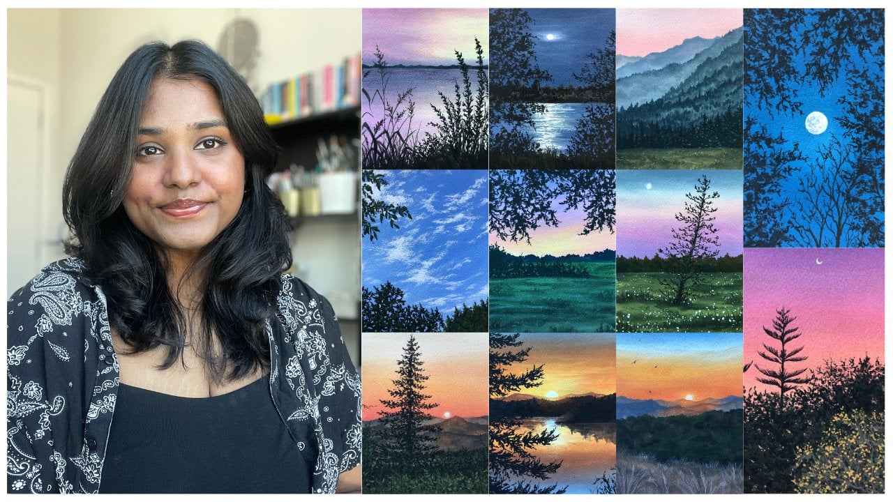
new along the way. Hi. My name is Bile. I'm an artist and art educator, and is skill share top teacher
based out of Den India. I'm also known as
Dippic on social media, but I'm constantly
sharing my love for art and bits about my life. I have been painting
for over six years now, and painting florals has
always been on my list. I'm absolutely fascinated
by the colors, shapes and textures
that you find in them, but at the same time, it
is quite intimidating. But if we approach the subject
with the right techniques, it is something that is so
therapeutic and fun to bate. That is why in this class, I decided to share my process with you
where we are going to be painting a water lily together using my
favorite medium wash. We'll start off by talking about the different art
materials that we need for this class and then dive into the sketch and composition
of a water lidy. We'll also be talking
about the color palette for this class where we will learn how to make
different color mixes using our basic shapes. We'll also talk about the
boh techniques and how to apply them in painting
lily pads and petals. Once we've gathered all
the basic knowledge, we'll dive into
painting class project. This class is packed with
so much information about wash as a medium because we're exploring this in
a lot more depth. At the same time,
we'll learn how to break down a reference
image into layers, so that it's easier
for us to observe the different details in it and bring it
to life on paper. Don't worry if you're a beginner because this is a
step by step guide, and I'm going to walk you
through the entire process of painting this coaches
water lily composition. At the end of this class, you'll have this
beautiful painting that you're going
to be so proud of. If this is something that
you found interesting, then join me in this class, and let's paint together.
2. Quick Overview: Awesome, I'm so excited you decided to join
me in this class. Before we begin, there are a few things that I would
like to share with you. First, there's going to
be a reference image. But I want you to know that I'll be there
to guide you through the entire process because the reference image can seem
a little bit intimidating. But the details that
you want to add and not add in your final
image depends on you. Always remember that that the reference image
can seem intimidating, but we are here to not
create a replica of it, but to create our
own versions of it. Secondly, under the project
and resources section, there are a few things
that are uploaded. First, you'll have
the reference image. Second, you'll have a basic
sketch, the final artworks, sketches under there in case you're not okay
with sketching, you can download
it and then trace it or you can download
it on I mean, print it out on a
watercolor paper. That works as well. But
it was easier for you. I just wanted to keep that
there as a reference as well. Thirdly, you'll find
the color palette, but I've mentioned the sates and the different mixes
that I've made. Lastly, you'll find
the gah technique, the sheet at which we'll paint the gah technique
that's there as well. Just a few resources that I wanted to share with
you before we begin. Thirdly, we're here to have fun. That's something that I always say whenever we're
painting something, it's all about the process
and not our final outcome. Make sure that you're
going slow if you feel like there's
too much happening. To many details are being added. Just leave it there,
come back the next day and start fresh. It's all about taking it slow, learning something
new and enjoying the journey of this
painting process. I believe this is it. Let's dive into the art material
lesson next.
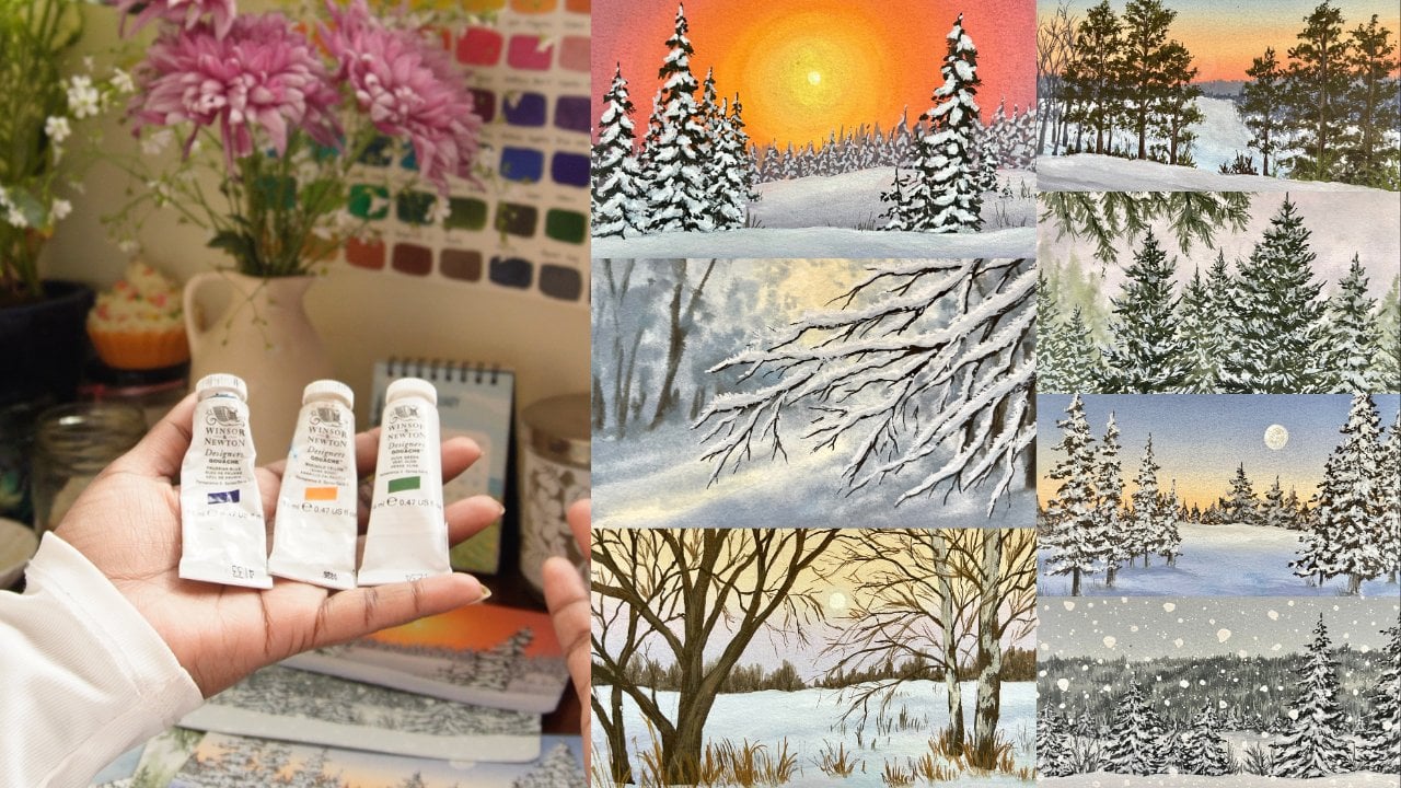
3. Materials Used: All right, Let's talk about all the different art
supplies that we need to have for us for
today's class, starting off with the paper. Now Guash as a
medium is not very picky about the type
of paper we're using. For today's class, I'll
be using my fabriano artistico 100% cotton
watercolor paper. You can use any thick 300 GSM paper that you
have with you. Me show you this texture
that this paper has. It has beautiful cold
pressed textures. It's not too grainy, but
not too smooth as well. For today's class, I
will be just splitting this in half because
it's a larger size. I'll be splitting it in
half for my class project. Feel free to use any size that you want to use
for your artwork. It's not compulsory for you to paint large or
paint, very small. Whatever works for
you, pick that size. Now, instead of this
particular paper, I also sometimes tend to use my Canson Heritage series paper or my Bockingford
watercolor paper. Now there are so many
options in the market, you can pick any
watercolor paper that you want for today's class
and any size as well. We're not picky about that. Along with the main
watercolor sheet, I have the small
sketch book with meet your normal 12160
GSM sketch book. You can use your normal
printer paper as well. This is just for us to practice the composition of
the water lily, which I will show you in
the upcoming lessons. But just keep some plain
papers with you for practice. Now the word on discussing
papers, let's talk paints. Now, if you've been
following me and my classes, you know how much I love the Windsor and Newton
gouache paints. I mean, they are absolutely creamy and no other
gouache paints come closer to the kind of experience that I have with the Winsor
and Newton paints. Along with the Winsor
Newton paints, I have my Brusto
titanium white with me. I really like the opaqueness
of the white from Brustros. But these other paints
that I'll be using. I'll talk more about
the shades that I'm using in the
upcoming lesson, which is the color
palette lesson. I'm not going to talk more about the colors and shades
that I'm using right now, but just for a reference, Winsor and Newton and Brusto titanium white is
all that I'm using. Coming to my brushes, I will be using very limited brushes of one flat brush to be
very honest with you. This is my size 12
pan art flat brush. Along with that, I have
two round brushes, which is size eight
and size four and one detailing size zero brush
for all the finer details. But these four brushes are the only four brushes
you will watch me use. Maybe I might just end
up using three as well. But these four brushes are
the main game for this class. Next, I have my ceramic plates to be very honest with
you. These are plates. They work really well for making my color mixes
because plastic ones have these little puddles, which I'm not really a fan of. So I tend to use ceramic plates or
cyamic mixing palettes. So I have two
different ones here. Along with that, I have
two jars of water. You know how important it is. One is your cleaning
one and one is just for your final rinse
or just to load up some fresh clean water. So make sure that you have
two jars of water with you at all times when
you're painting using. Now, these are all
the main supplies. Now let's talk about
the side supplies. Here I have this acrylic sheet. Now, this is on which I
will be taping my paper, just to have a nice, you know, mobile surface for
my paper to be on. Now the next thing that we
need is pain tape, of course. No tape is to tape down
your paper and make it have this little fixed
base on the acrylic sheet. Next, I have this
little piece of paper just for me to swatch the
colors on as I paint. You will watch me use that
in the project lessons. Lastly, you need to
have your scale, pencil, erasers, all your normal stationary
items with you. And this is pretty much
it for all the supplies. If you've been
painting with Quash, you have all of this
with you already. Gather them and I'll see you in the next
lesson where we're discussing the sketch and
composition of our watery.
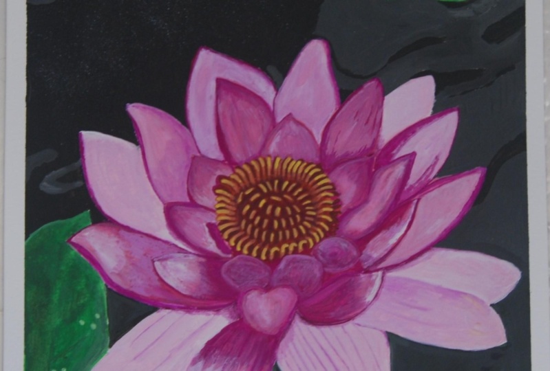
4. Sketch & Composition of Water Lily: A. A Let us work through the sketch and composition of our water lily and break it down into simple bits so that the
sketching process is easier. If you look at a water lily, you can clearly
see how we've got these differently sized petals. We're viewing them from a
different angle each time. All the petals are slightly different from one another
in terms of placements. But at the same time, the overall structure
remains the same. That is your pointed tip and
a broader bottom structure. Let's break this down in different petal
formats that we see. Looking at the bottommost petal, which is the outermost
petal of your flower. This one has a lot
more thicker size and it's a lot more
bigger in size. I'm going to start
off with this shape. I am going for a petal that's going towards
the left side. I have made that in a
particular direction, which is the left direction. And to show the depth and
the fold of my flower. What I'm going to do is create this line on the right
side of my structure. When we paint this, it creates that effect that there's
a fold in the flower. Similarly, let's take an
example that we have a petal that is slightly going
towards the top left. It's pointed towards the left and you can see how the top is pointed and the
bottom is broader. Again, I've created
that little four, where you just leave
a little bit of space and redraw the same shape. These petals are
examples for the ones that you're seeing straight
up in front of you. Then again, we've got some
bent towards the right side. Again, creating that
triangular conical shape and then creating that fold. The complicated ones
are the ones that are in front of you and at
the bottom most section. This one looks like
a rigged heart if I was to put that
in a simple shape. You can see how I've
created that structure. This creates the illusion
that the flower is bent towards you
in your direction or the viewpoint
viewer's direction. Okay. This one is the
ones on the right side. Bend still in front
of you, but bend. Again, it has a
different kind of shape. You will notice more about the different directions
and the types of petals and the
direction in which they're going basically by
observing the flowers. I want you to take a moment
and observe the flower. To create the main
shape of the flower, what we are going to do
is create a circle first. This is going to be
your outer circle. I'm going to just divide
that in four quadrants very lightly and right
above the center line, what I'm going to do is create the central circle which has
all the stamens in them. Not trying to dive into
the biology of a flower, but that's basically the
central portion of your flower. I'm creating a smaller
circle in the middle in which I will be
creating these tiny, tiny filaments, if I'm not wrong or the statements
to be very exact, that is the entire structure. These are very similar
to your petals, but a little bit more conical at the top and you'll be
creating this in a way that the ones on the left side will be
bent towards the left. The ones on the right will
be bent towards the right, the middle ones will be
pointed straight upwards, but I wouldn't want you to
point it exactly 90 degrees. Do give them a little
bit of a direction. The ones at the bottom of the
circle facing towards you. But then again, you
can just create them in these downward directions, almost like drawing little vs. But with a bent top. The ones in the middle,
the extremely middle ones, they are going to
be bent inwards. The outer structure is
getting bent outwards. These will be facing inwards. I hope that is making sense. If it's not, please do
watch how I'm doing it. I've done that very lightly
and added these shapes. Once I'm happy with
the way it looks. This is it for the
entire section for the inside of the flower. Now, when we're painting the outside structure
of the flower, it all depends on where
you'd like to start. A lot of times, the
most confusing part is where do I begin
my flower from. For me, what really
works is starting with the central part of the flower and then
building your flower, going with the petals outwards. So I'm going to start
with a petal inside. Now, if you look very carefully, these petals are very similar in shape to the outer
petals that you see, obviously because they
are the same flowers, but the size is pretty small. Another thing to keep in mind is the direction in
which they are going. It's very easy to create the
ones that are at the back, which is the top of the
central part of the flower. The ones at the bottom have a different
shape because these are slightly bent
towards the outside and By outside, I mean has that
three dimensional viewpoint. It's a bit tricky to show that, but it isn't possible. Obviously, you'll
have to observe this. You can see how I try to
place them in a way that I focus on the structure of the petal and where they
lie on the flower. You can also look at
different reference images of these water lilies or have that imagination
in front of you. Now, as an observer, I am looking at this flower, not straight in front of me. I am looking at it from
the top, but again, this flower opens up in a way so that it's still in front of
me if that's making sense. The viewpoint is
slightly from top. All the petals are
at the bottom will have a different shape. You can see how once I'm done
with the innermost petals, I am placing the
outermost petals. Again, keeping in mind that you want to play around
with this shape, you can make Certain petals
a little bit bigger, certain petals a little bit. You can displace them, but try to keep the size
a little bit similar. Over here, if you
look very carefully. The left most petal,
look a little bit larger as compared
to the right one. That's where you go in
and correct the shape. When you're in the sketching
process of this flower, you will keep going back
and forth and that's completely okay because you're trying to understand
the placement of it. Placement of these petals
is very important if you want to achieve a
structured flower. Now, whenever you're observing
any sort of flowers, for example, here we're
doing water lilies. It's very important
for us to break these shapes down in the
shapes that we know. Now what that means is, you want to look at circles
and triangles and rectangles. These are some basic
shapes that we know of. You want to try to
break them down in that way so that when you're observing and when you're placing these little
structures down, it's easier for you to
know where they would go. Now, for me, this water
lily looks like a star. It opens out like
a star it's got these bigger structures at
the outer part of my flower, and you've got these little
little petals on the inside. You can see how once I
just start playing around, I start adding the petals in the way that
I'm viewing them. You will be able to
play around with the shape of it
and get it right. Now, it's all about practice, and it's all about it might take you two or three tries
to get the exact shape right, and that's completely okay. As long as you are able to capture the structure and the
composition of the flower. I believe that I am pretty
much happy with the way the outside structure of my flowers look.
Inside structures. I apologize. The inside
structures of my flower looks. I'm going to go ahead and place all the petals that are on
the outside of my structure. Over here, I missed a petals. I'm going to quickly go
ahead and add that before I add the outermost petals. Again, adding making
a few changes in the petals where I'd like to see them a little bit more larger as compared
to how I place them. As I was saying, it
might take you some time to understand the
placement of your petals, the sizing of your petals. But as long as you are
observing the flower, observing the placement
of the petals, the sketching is going
to be a lot easier. If it's something that's
completely out of your leak. You are very scared or not
very confident about it. That's completely okay. I have uploaded the
final sketched version under the resources
section of this class, you can download it and you can trace it or you
can print it on a watercolor paper and do the entire painting
process and not do this part. That's completely okay as well. I wanted to give
the sketch a try as well because I believe I'm someone who's not extremely
confident with sketching, but it's something that we should all get out of a
comfort zone and try. That's exactly what
I'm doing here. Trying to just step out of
my comfort zone and create something that I probably
wouldn't normally. Again, we are o, that is something
to keep in mind, observing how each
of these petals are placed and then trying to recreate the structure and the composition of a
petal similarly on paper. And the base that
will help you do the entire structure or the entire sketch is the
outer drawing that you had. If you notice very
carefully here, my petals are going beyond
the circle that I made, and it's completely okay. That circle is only for our reference for us to understand where we'd
like to place them. Once we know what the outer
shell is going to be, we can go a little bit in
and out of our drawing. But you can see how the
petals are coming along. We are placing them
very carefully Another thing that
could really help you, another tip that
could really help you is understanding where the petals are starting
or where the start or the endpoint of each
side is going to be. If I can see that the
start of maybe the last most petal is from the tip of the
one in front of it, and it ends on the side of the other
one that is behind it. You're going to place it
in that similar manner. I hope all of this is making sense because the sketching
process is really something that comes a lot to you when you're
observing it on your own. All right. Over here, I'm just erasing
the outermost line that I drawn my reference line. I'm just erasing that. And then I'll go ahead and outline the entire
structure. All right. Now that I have erased
my reference line, you still have the time to
add in a few corrections. Maybe erase a few petals if you don't like
their placements, and then once you're
happy with it, you can finally go over it
and create your final sketch. Now, I'm only doing that
for this particular class. I don't want you to do that in your sketch for the painting. Be if your pencil
marks are really dark, then they might hinder with
your painting process. Although Guash is
an opaque medium, you still don't want to
have a really dark sketch. I on darkening my sketch and
going over with my pencil to final outcome so that you can see what the
final sketch looks like. But again, to keep in mind, you don't want to do that in your final class
project. Go ahead. Once you're happy
with your sketch, you're just going
to go ahead and outline the entire structure so that you know what
the final shape of your water lily looks like. Here's our final structure
of our water lily. Now again, if you remember
how we started off with two reference circles and built on these
petals one by one, starting from the inside. Remember two circles, circle is going to determine
where the sta lie and the outer structure
is to understand what the or the area of our
flower is going to be. So this is a way in which you can create your water lidies. Again, if you want to change the shape or the direction with which you're
viewing the flower. All you have to move is the central circle and that can act as your
reference image. Now over here, we learned to sketch from the
final painting, but in the class project, we will be sketching
our flower out from a reference image like
a real reference image, and we learn a lot more
about how we observe our flower in that
part of this class. This was your
sketch part. I will see you in the next lesson, where we are going to understand the color palette
for this class.
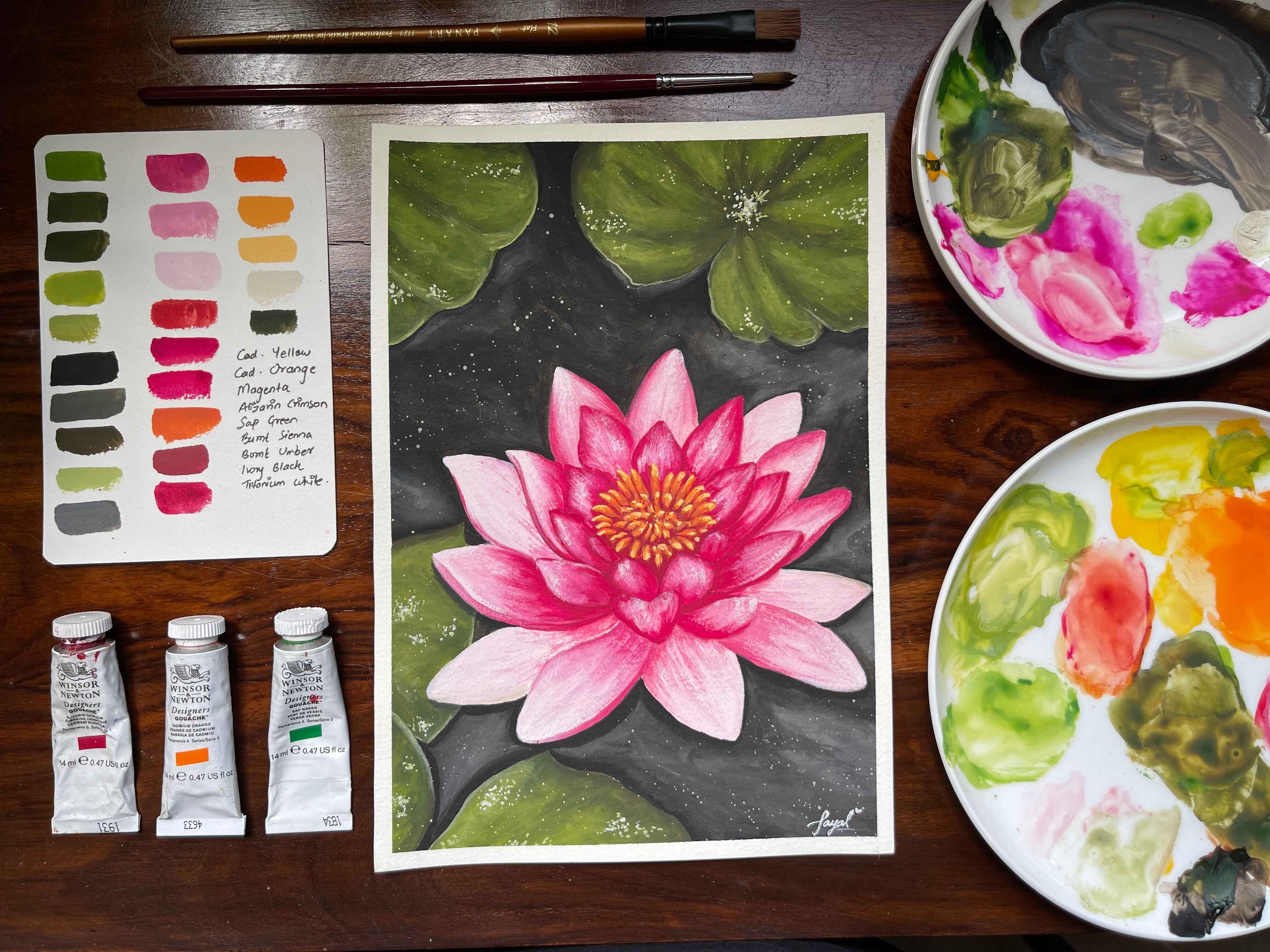
5. Colour Palette for the Class: Okay. Let's talk about the
color palette for this class. Now, in this class project, I will be mixing up various different shades from
a limited color palette, which means I'll be making
a lot of different colors, the total values of
different shades, mixing, let's say whites and
blacks and browns in them. I've got different
shades of greens. Similarly for the pinks, I've got different
shades of pinks, different deeper reds
that I've mixed, the orange, the lighter orange. All of those I have
mixed on my own, using our basic colors
that we find in palette. So let's talk about the
colors that I'm using first. Over here, the first
yellow color that I'll be using is cadmium
yellow color. This is all from Winsor
and Newton, by the way. This one's the
cadmium orange shade. Next, I have laserin
crimson color. So if you don't have
laser and crimson, you can use crimson
lake for the color. Now, these are the few oranges and yellows that I'm using. Next, let us talk about
the pink that I'm using. Now over here, I'm
using magenta color. If you don't have magenta, feel free to use your permanent rose
color in place for it. Next, I have burn
Ciena and burned. Next sap green. Sap green is the only green
color that I'll be using. I'll be making a lot
of different mixes. Now for the white, I have
the brusow titanium white, and for the black, I have ivory black from
Windsor and Newton. I'm going to take this
out on my palette and let's swatch this out. All the colors on my palette. What I am going to do is dip
my flat brush in the water. Load up a little bit of
water and create this mix. I will talk more about water
control in the next lesson. But for now, I'm just mixing a tiny amount of
water in my paint, and I'm going to
swatch it out for you. Now, one thing that
you will notice here is some colors will behave a little bit more opaque as compared
to the other colors. We will talk more about this in the next lesson and
how all of that works. But right now, we're
just going to be focusing on swatching
these colors. A tiny amount of water, a tiny amount of the
pigment or the paint, and you're going
to swatch it out. Now, make sure that you
are swatching it out and practicing this color
palette lesson so that you're able to understand the different color
mixes that you can make using the shades that
are available to you. That makes a lot
the entire process a lot more easier because you know the kind of pinks
you will achieve. Now, one thing that you
can do if you don't have a magenta color
is you can mix your crimson lake with your ultramarine blue to
achieve a pinker shade, which is similar to
the magenta color. If you don't have that,
use any pink shade that you have with you,
that's completely okay. I'm just quickly
swatching all the colors, the greens, the red, the browns. I'm just quickly
going to swatch it out and then label
it down for you. So Lastly, I have my
titanium white color, which you clearly cannot
see on the swatchcard, but titanium white is
very important color when you're trying to achieve
lighter shades using quash. These are the colors, the original shade that I'll
be using for this class. Let me label it down field. All right. Now we
have the names, you can see the exact
shades that I'll be using. And as you can see, we will be mixing a lot of different shades as you can see on
the swatch card. Let's make a few color
mixes out of these. Now, you can obviously
change the shade by the amount of certain color that you're
adding in them. But I'm going to give
you a few examples. The first swatch that I'm
going to create is a mix of my sap green color with a tiny amount of
ivory black in it. Very, very tiny amount of it, and you can see how this green has gotten deeper in color. You can see the
sap green on top, the original color on top, and you can see how this
shade is a lot more deeper. Now to make it a little
bit more deeper, you'll have to add more
black paint to it. This one sap green plus
a lot more ivory black. Again, to go deeper
in this color, you will add more black in them. If you want a different shade
that's a lot more deeper, you can just add a
bit more black to it. The next color that I'm going
to mix is going to be Sap green with a tiny amount
of burnt umber in there. It did have a bit
of black in there. You could say that it did
have a bit of black in there. You can say it's a mix
of Sap green burnt umber originally with a
tiny amount of black, which was remaining
on my palette. But originally, the
color that I want to make is Sap green
plus burnt umber. You can see how this one
has that brown undertone, the olive green undertone in it. The color is like an
olive green color. Achieve that by mixing Sap
green and burnt umber. Now if you want to create
brighter shades of green, I'm going to show you the mix
that I tend to use a lot, which is Sap green plus a
little bit of cadmium yellow. Now when you add a bit
more cadmium yellow, and if you want to make
an even brighter shade, the amount of cadmium yellow
you add will increase. Over here is Sab green
plus cadmium yellow, I would say in equal amounts, and you can see how the
green has brightened up. It has that beautiful
vibrant undertone to it. Now if I want to make
it even more brighter, I will add a lot more of
the cadmium yellow in it. Again, this mix is more towards the yellow side with greenish
undertone, I would say. So when you want to
work on lighter greens, you achieve that by adding
yellow and white in it. Now, over here, these colors, I would say, are the
two color mixes. But if I want a little bit
more opaque version of it and a lot more brighter version of it and lighter color of it, I will start adding
titanium white in this. The mix that I'm creating
over here, as you can see, is sap green, plus yellow,
plus titanium white. Clearly, it is a lot
more opaque and you use these shades for
highlighting your objects. For my lily pads, I'll be using a lot more of this particular mix to show
the lighter parts of it. Next mix that I want to
show you is just your plain Sap green with
titanium white. You can see how they
are clearly different. The shade above has that
yellowish color in it, and this one is
just you could see a pastel version
of your Sap green. These are the various
different greens that I'll be using
in my class project. Obviously, there will be deeper shades with more
blacks or browns in them. But somewhat the mixes
will remain the same. Just the quantity or the
level of it will change, that is the amount of
paint that I add in it. Next, let's talk about the pinks that I'll be using
for this class. Now, the mixes that
I'll be making is using my magenta and
laserin crimson color. Again, you can use the pinks
that are available with you. Keep a pink shade and a red
shade with you and white. That will be a very important
role, and obviously, you'll have burnt umber color with you to deepen the tone. Now, this mix is my magenta
color with my serine crimson. Now, magenta on its
own is very pink. I want my water lily to have
that reddish color in there. So that's why I'm mixing
magenta with zerine crimson. Next color that I'm
mixing is magenta with a lot more of the
laserin crimson color. You can clearly see how
this color has turned into a deeper red color, but it's obviously a little
bit pink in there as well. Now, if I add white to this mix, the color completely changes. It gets lighter and is a
bit more opaque as well. This mix is my magenta serin
crimson plus white color. I'll be using this
shade a lot for the backgrounds or to show the lighter parts
of my water lily. Let me show you what magenta with just plain
white looks like. Over here, I am mixing. You can mix any pink
with just white and you can see how this color
is a lot more lighter. It's just pink and white. You can also achieve that
by mixing red and white. You will achieve
like a pink color. But over here, I mix
magenta with white. Next, I'm going to show
you to deepen the color, which is your crimson color. I will mix my crimson with a little bit of the pink
color and burnt umber. Now for the darker
parts of my water lime, I will use this shade. Because this color is
a lot more deeper. You can achieve that by
mixing your magenta, alizarin crimson and
burnt umber color. And just taking some crimson and magenta on my palette because it gets over with
all these mixes. But this is the particular
shade that I'll be using for my deeper
parts of the water. Keep that in mind and make sure that you're creating
this swatch card or this color palette
class card for you so that you're able to refer
to it as you paint. The next mix that I
want to show you is magenta with your crimson
color and white color. These are all the deeper
shades, I would say. When you want to work
on the lighter colors or want to show more highlighted
versions of the color. I will mix white with crimson and magenta and a
lot more white. You have a very, very lighter
shade of pink that you can use to highlight the
portions of your water lily. Obviously to show the even
more brighter parts of it, you will add just tiny amount
of the pigments with white. So I'll show more
of that as we go. But these are a few pink
shades that you can make using your red, pink, and burnt umber, along with white wherever
you want lighter shades. A lot more variations of
these colors can be made as you tweak the amounts of pinks and reds and
browns that you add. Let's talk about the oranges in the color mixes
that are the making. The orange will be for the
statements of our flower. I have mixed cadmium
orange with white. Now this is going to
give you kind of like a pestle version of
the orange color because you've just mixed
plain titanum white in there. To have a color,
which is a little bit more vibrant, I would say, I will mix cadmium orange with
cadmium yellow and white. Just because I want that
opaque version of it, a lot more opaque version of it. I've added white in there, you can see how this color
is a little bit more deeper and a little bit more vibrant because it has that
yellow color in it. Now, if you want a
lighter shade of yellow, you can use Cadmium
yellow as is, but to just have a
lighter version of it, you can make Scabum
yellow with white, and you create this beautiful yellow color
that you can use for highlighting your stamens or to add the lighter
parts of your stamen. Now, again, if you want to add even more brighter color to it a little bit more highlight
to that particular shade, You are going to make cadmium yellow with a lot more white. You're tweaking the amount
of white that you add and you create this beautiful
lighter shade of yellow. Now, you can see how a
lot of variations of these shades can
be made just using our basic colors and just
tweaking the amount of whites or browns and blacks
that you're adding in there. Next, let us talk about the
grace that I'll be making. There's a lot of gray that
I'm making for the water bit. We've got three different
shades that I'll show you. First, being your ivory
black with burnt umber. Now the thing here is, I
don't want to make a color, which is plain black. I don't want to use plain
black in my painting, and that is why I'm mixing my ivory black with burnt umber. There's a lot more burnt umber and just a tiny amount of black in there for us to get this beautiful deep dark
shade for the water. Here is a swatch of the color. Next color that I will
show you is to just add a bit more white into the mix to create the
lighter parts of it. Now you can do the same with any blacks that you have
available with you. Again, tweaking the amount of white that you
add in there is going to create this beautiful
neutral gray for you. You've got your ivory black plus burnt umber and white, right? Next, let us talk about
how to get a white. That's a little bit more I
would say, lighter in color. A gray that is a lot
more lighter in color. So over here, I'm
mixing my same mix, which is ivory
black burnt lumber. This time, I'm adding a lot more white in there
and you can see how the color becomes a lot more
opaque as it was earlier. So these are the few shades that I'll be using
in this class. I'm just going to
label it down for you. And you can also download this from the project
and resources section, so you have a swatch card
or a mix card with you. We've covered different
greens, pinks, yellows, and all the different
grays that I'll be using. It really helps you have a reference when
you start painting, when you know the kind of colors that you have to
mix and achieve. I hope this was helpful for you, and I hope you're
going to create your own swatch card
for this class, and I'm so excited to see it. This is it for the
color palette lesson. In the next lesson,
we are going to talk about what
control in Guash, that is the consistency.
6. Water Control in Gouache: Let's talk about some
goch techniques. The one we're going to talk in this lesson is consistency. Now, consistency
is the amount of water and pigment that
you're adding in your paint, and it's also how you
learn the amount of water control or the kind
of water control you're supposed to have when you're
painting with ga. Now, we've got a few
different consistencies. You've got pea coffee, milk, cream, and butter consistencies that I've named on the left. I've written what it
signifies on the right, and we together are going to
switch these different mixes of paint and water together to understand how it performs. Now, when you are
painting with Gach, different colors have
different properties. I'll show you what it means
in the end of this lesson. But let's just pick any paint, pick up any shade that you want. And you can start creating these mixes
and these swatches. The first color
that I have picked up is my magenta color. I'm just going to
load up some water on my brush and just a
tiny amount of pigment. You can see how I've
just loaded very, very tiny amount of pigment. You can see how there is
a lot of water in my mix, very little paint, and it signifies your T
like consistency. When I watch this, the color is very transparent. It's almost like your
watercolors that you work with, because watercolors is
a transparent medium. This one is very, very
similar to watercolors. Not to the same x. I'm going
to add a bit more pigment. The water, the amount of
water remains the same. It just has a little
bit more pigment. You can see how it's
still transparent, but it has a lot more
pigment in there. This is going to be your
coffee like consistency. Now, to the same mix, if I was to reduce the amount of water and add a little bit
more pigment in there. I'm just going to clean my
brush and dry my brush, load up some more pigment in there and swatch my color mix. This one's again, a little
bit more pigmented. It is a bit I mean, the transparency is
reducing slightly, but you will notice how the black line is still
visible through my color. I'm just going to swatch
this out first and you can see how this one's a
lot more pigmented, you're seeing a lot more
of the color through. Now this consistency is what we will use for the
background mixes. Now, over here, the cream like consistency is
opaque and smooth. We tend to use this for, let's say the second
layers or when we are building on our layers. We tend to use this
consistency a lot because this is where you're
going to have a smooth mix, which is perfect for
painting with quash. And you will see this
beautiful opaque finish that quash is very,
very popular for. Now, over here, I've gone over the swatch a
couple of times, but the black line
is still visible. Now, that is because
the magenta color is a transparent color. Even though it's a quash,
it is transparent, and to make this color opaque, I'll have to add a bit
of white in there. Now, we don't have
to worry about that. I just wanted to bring it to
your attention that magenta is a transparent color and I'll show you how you can
identify these shades. The last consistency is
your butter consistency. Before this that
we've done swatched, that is your cream consistency. Sounds like a tongue
twister, consistency. Which is opaque and smoked. I'm just going to
take up some more magenta on my palette, which is directly from the tube. Whenever you're using
fresh paint squeezed from the tube without any water in
there, I've dried my brush. I haven't added any
water to the mix. This is when that is like the natural
consistency of guache, which is very buttery. It's not very smooth,
as you can see. As I'm brushing my
brush over the paper, as I rub it across the paper, you can see it
creates the texture. Now this texture is very useful to do the dry
brush technique. Whenever you want to
add texture and add a bit of highlights into your
painting using the texture, this is the consistency
that you will work with. You see a lot of the textures on my flower that is done using
the dry brush technique. Now, even though this is the thickest consistency
of my paint, you're still able to see the
black line shine through. Again, it is because the magenta color is
a transparent color. These are the different mixes, and that's how you control
the water by keeping these like food
items in your mind. You've got tea, coffee, milk, cream and butter. We generally tend to
use a lot of the milk, cream and butter consistency, but even coffee
consistency is useful just to kind of block
in your shades. Now, over here, I've also swatched the green
color in there. And you can see how
the green color like the different consistency gets more opaque as
we go at the bottom and the black line
is not visible. These are the colors. I'll show you exactly how you identify it. I'm going to take my magenta. This is Alizarin crimson color. You can see there is this
little symbol at the back which is a little square
and divided into two. You've got these are
three different shades, and I'll show you how it works. I've good magenta, crimson, and sap green in there. The first color that
we use magenta, you can see how the division is there and it's
completely white, which means this is
a transparent color. So if I have to make it
opaque, I have to add white. Next, you see half, which is semi transparent, and the sap green that I used naturally is an opaque color. Magenta to make it more opaque, you'll have to add a tiny
amount of white in there. This is how you're
able to identify the colors if they're
semi transparent, if they are
transparent or opaque. This is it from this lesson. I will see you in
the next one where we're discussing the
blending technique.
7. Blending Technique in Gouache: All right. So now that we have explored the
consistency technique, let's talk about the
blending and layering. In this lesson, we'll explore
the blending technique and the two different types
of blending technique that I'll be using a
lot in this class. So first, I'm going to
draw two different shapes. One is going to be my
lily pad shape, which is, again, looks like
a little pack man to be really honest with you. But I'm just going to
create this little inverted V. And a circular shape
around it very, very lightly. You can barely see
the sketch over here. But just create any shape. And the next shape that
I'm creating is to kind of resemble the petal. So I've just created a
little tier droppy shape for me on the right hand side. Again, this is to show the two different shapes and the two different blendings
that I'll be doing, okay? So the first plant
that I am going to do is going to be using the
wet on wet technique, which is very similar to
the wet on wet technique, to be honest with you, where you're using a thin consistency. I would say you're using
the coffee consistency, a consistency actually between the coffee and the consistency. I'm just going to take
my sap green color, and I've got a bunch of different mixes as you
can see on my palette, so you can take your
Sap green color, which is mixed with a little
bit of brown in there. And then I'm just going to
apply that very, very lightly. As you can see, the
consistency is quite thin, very transparent
paint on there right. You can clearly see
the background, which is your paper. So I'm just going to roughly add this color in and
layer this across. Now, I could either use a little bit more water on my brush and move
the paints around, or I can just layer this
entire with the same color. I've used water
to kind of create this lighter versions
in certain places. But once you add that in, process in which I will
take a darker mix. Over here, I've mixed my sap green and a little
bit of black in there. Then I'm just going to tap that in while the paint is still wet, and you can clearly see how the paint blends in with
the previous color, very, very similar
to water colors. Now, this works really well when you're just trying
to block in your colors, and this is one way of
blending your colors. Now, it's very different from the landscape painting classes that you might have
taken of mine. So over here, we're just adding different shapes and shades of color while the paint
is still wet so that we have time to
move the colors around. As it dries, it'll create a
blend and then you can layer over it and build on these
color blocked sections, which we will learn in
the layering technique. So this is one way of blending. The next way of
blending is very, very similar to
like layering over, but this is important for you to learn in the blending
technique itself. I have taken my pink color, which is my magenta, mixed with white and a
bit of red in there. Take any color that you want. Using my round brush, I am just going to go
ahead and layer and apply this all over without adding a lot
of water in my mix. I'm just going to
add that in and create a base layer
for me to work on. Added a bit of
water just to move the paints around and
making sure that I'm covering up the entire area of the shape that I drew. This
is what it looks like. I'm going to let this
dry first. All right. Now that this section has dried, I'm going to take my round brush and create a darker
version of the color in which I'm mixing
my laserin crimson with my magenta
color and a tiny, tiny amount of burnt
sienna in there. I'm going to go ahead and create these little lines moving along the direction
of the shape. I'm just kind of flicking
out these layers right in just to show
the depth that you will have in your painting. Right now, what it looks like is these strokes are resting
over your background. Without being blended in. Now, to blend that,
what you'll do is, you will rinse your brush, load up some fresh paint. And just with a clean brush, you will smoothen out the edges. What this does is
it kind of moves the pigment slightly
around the brush strokes, smooth out these harsh
edges that you have, and then kind of blends that color in with
the background. One thing to keep in
mind is you want to make sure that you are
rinsing your brush, drying off the extra
water each time you kind of brush your brush across these darker colors so that you don't end up
moving the paint a lot. You just want to kind
of smoothen it out. Now, when you want to
build on this, again, you will layer maybe one more time to bring out
the intensity of the colors, bring out the lighter shades, and then work with
the lighter colors. But this is the method in which you will blend your paint, which is just using water and your brush to
smoothen out the edges, and you can clearly
see how it looks. Beautiful, there's a bit of texture that's being
added in there. These are the two
different types of blending techniques that
you will use in this class. The next lesson, we are using the gauche consistency
and blending technique to learn more about laying.
8. Layering Technique in Gouache: All right, let's talk about the layering technique in guash, which is the process of adding
one layer over the other. In leering technique,
we start off with the thinnest consistency at the bottom where we
block in the colors, and then we kind of
build on it by adding maybe deeper colors and light colors and kind of
blending them together. We sort of saw that in the
blending technique where I showed you that we started off with the base light pink color, and then added a
deeper pink color and blended that
into the background. Earing technique is
very similar to that where you're working with
maybe three or four layers, especially for the
kind of painting that we're going to do today, and we build on that by laying one a set of
colors over the other, which is very similar to
the background color, and we add more contrast
into our painting, we add more deeper tones and lighter tones and
high light pits. I'm going to start off by
creating a lily pad first. Again, creating a V shape and a circular
structure around it. Pick up any shape that you want in any
direction that you want. This is just the one that I am going to pick for my example. Now the first layer that we
are going to create is very similar to the
blending technique that we learned
for the lily pad. I'm going to start off
with my sap green color. Add that in all over. So you add in some pigment, load up some water,
move the paint around, add in some more
pigment on your brush, ay that, move it around,
pick up some water. You're just creating
a rough base. The areas where I'm adding let's say
water are going to be the lighter sections
so that I don't want a lot of pigment in that area. Again, if you notice
very carefully, the consistency of my
paint is quite thin. I'm not using a very, very thick consistency
of paint here. Very light, thin consistency. I'm just going to lay
the paint right there, fill up the entire structure
using this particular color. Once I have that in to
place the darker colors, what I'm going to do is
rinse my brush and ot up some sap green and my burnt umber with a
bit of black in there, that I create this deeper
olive green color. Making a center at the dot
and creating these lines to show the deeper parts of
the veins on my lily bad. Again, adding this while
the paint is still wet so that there is this blooming
effect in our paints. I'm just going over
with a clean brush to blend that in
with the background. Now again, over here,
as I mentioned, we are just placing the colors and understanding where the colors
are going to be. All right. We're going
to let this dry. Now that this has
completely dried up, it's time for us to
go with layer two. In layer two, I want to define the darker parts of my lily pad. I'm starting off with the
mix of sap green and brown. And I'm going to layer
that on the edges first. So I'm going to layer
that on the edges and sort of bring that in as well. So I'm just outlining the structure and
slightly bringing it in, leaving a bit of place for me to add in the
lighter colors later. So I want darker
bits on the edges, and that are kind of moving
inwards towards the center. And then I want lighter bits. In between. I'll show
you how that works. I'm starting off with
the darker colors, placing that in. So
I've outlined it. Wherever I'd made those lines, I'm kind of creating
these little structures, little brush roofs,
bringing it towards the center of the lily pad. And you can see how we have these lighter bits in
there as well, right? So the background
color kind of lays out a fundamental
section for you two, add in the lighter colors. Now for the lighter colors, I'm mixing my white, sap green and a bit of yellow, placing that in all those
empty places that we saw. Now, the idea here is to add
that in and using our brush, we're going to blend
it all together. I've just added
the darker colors, and once I'm happy with
the placement of it, what I'm going to do
is I'm going to rinse my brush and just
using my brush, I'm going to blend the
colors in with each other. So if you feel like the
color is not moving, then you can just
add in some more of the taker or the light color
depending on what shade is not moving and blend
them in together. Now, over here, it has created a bit more definition,
as you can see. There is a bit
more definition in the structure of my Lilly
pad, but at the same time, it does look a little
bit funky and still not the perfect kind of
structure that we want. What we're going to do here is, I'm just going to
add in a bit more of the darker colors wherever
necessary and create this unevenness in the structure and blend that in
again and let it dry. Over here, the process of
doing this is very repetitive. You might have to go
maybe two or three times with the same
structure where you're adding darker colors
and lighter colors and blending that in
remember that you're only using your clean brush and water to do the
entire blending process. You add in the paint, but
to blend them together, try and use just your bruh, round brush, or flat brush, whatever brush you're
comfortable with. Over here, we're
using round brush. And before you go
ahead and start adding more colors to it or adding more details to it and just starting a whole
layer altogether. Make sure that your
paint is completely dry. I can add more colors over here right now
because the paint is still wet and I can
blend that in quickly. So here, I just mixed my sap
green and yellow together, just to bring in a little
bit more definition into the lighter parts
of my lily pad, and then I'm blending that
in with my clean brush. You can see how I wipe my brush and rinse my
brush and then wipe again to get rid of any extra darker colors that
we might have. If you note this very carefully, it's very similar to the blending technique
that we learn, the second blending
technique that we learned. We're going to let this try
and repeat the process again. Now that the section has dried, I'm just going to
speed up this process because it's just
a repetition of what we've done in the past, adding the darker colors, bringing that in you know, understanding the
placement of it. It's very similar
to the background. But this time we can see
how as we add this layer, the paint is again in your
creamy or milk consistency, a little bit between them. You add in the taker colors, blend that in and then add in your lighter colors and
understand the placements for it, and then blend them together. This process, as you can see, this is the third time we are
adding a layer over this, and you can see how
this section has become a lot more opaque, a lot more defined, and that's exactly what we want. I've added a bit
of just sap green towards the edges of
the lighter sections. Then using my clean brush, I'm just going to
blend everything together so that there is this beautiful
seamless blend between the darker colors and
the lighter colors. As I mentioned earlier, this process is a repetition of what we've done in
the previous layer. Just this time we're using a slightly thicker consistency. I wouldn't say thick, but a bit more creamier consistency to place the colors in
and blend them together. Clearly, this has made the lily pad a little
bit more defined. As you can see, we've got this beautiful crevices
of our lily pads, the darker color
towards the edges, and the lighter
colors in between. Just add in the
colors and blend them together until you're
happy with the blend. And then once you're
done with it, you are going to let it dry. I'm just going to
move the paints around a little bit here and there to create a
bit more definition. I've added a little bit more of the lighter colors again
to define the shape. And then I'm going
to let this dry completely before we go on and add the next
layer over it. Now that this has dry, let me show you how you can highlight and bring out more of the
lighter colors in your subject. Over here, I'm mixing
my green, my yellow, with a tiny amount
of white in there. I've added a bit of white
green and yellow again, creating this
beautiful lighter mix, the color that we want
to add highlights with. You want to make sure that
the color is lighter. I'm roughly going
to place that in the sections which have the
lighter colors in my subject, which is the sections
of my lily pad, and I'm focusing more towards the center and slightly
bringing it outward. I'm not adding the
entire section with the same color
because I just want to highlight
certain widths. Once I clean my brush, The thing you're going to
do is using your brush, just going to roughly blend
it out into the background. Very similar to the second type of blending that I showed you, that is exactly what we
are doing over here. Blending it with the
background so that we're not seeing a lot of
the harsh edges. It looks like the colors are
blended into the background, but at the same time, you are seeing the light the
color. All right. Now that the lighter colors are blended into the background. The next thing we will do is create a bit of texture
into our painting. Now, the texture is just to show the grainy parts
of our lily pad. Using a thick consistency
of the paint, which is very similar to the butter consistency
that I was talking about, I'm just going to
brush in some of the textures moving inwards
to the center of my lily pad. The texture is not a lot. It just creates a
light texture which I need and which is
perfect for my lily pad. Now, the next thing that
I am going to do is just create in a
few more highlights by tapping in these dots in the middle and certain
areas of my lily pad. Now, what does this signify? The idea that I'm
going with over here. It's just to show a
few water droplets, a few areas of my lily pad, which is capturing a lot of light and because of the
water on my lily pad, it's creating the
glowing effect. That's the idea that
I'm going in with. I'm just adding this very, very light green color
in certain areas. Once you add in the
lighter green colors, make sure that you are
rinsing your brush, and I'm going to
create a few taps with my white paint and
just just white paint. So I'm just going to
tap that in as well in the middle and just
a few other areas. Now the number of taps that you add using
the white color, make sure that is a
little bit lesser than the lighter green color that
you added in. All right. So this is the way in which you highlight layer and
you can see how we worked with multiple
layers to bring out the essence and the
beauty of our lily pad. That's exactly what we will be doing in our class
project as well. You're going to be working with multiple different layers, creating various different
shades, adding that in, blocking your colors, and highlighting the brighter parts. So we are going to be using all these different techniques
that we have learned. That is why I
decided to show you how those different
ah techniques can be applied in the elements that we're
painting in our class project. We've done the lily pads, did the petals,
learned how to layer, and how leering plays
a very important role when you're painting
certain subjects, especially the one that we're going to do in our
class project. I've also uploaded this under the project and resources
section to make sure you download it so that you
have this for your reference. And once now that
we've got gathered all of these beautiful
tips and tricks, let's focus on creating a final project in
the next lesson. I'll see you gather them, and let's begin painting.
9. Project Part 1 : Sketch: All right. Let us begin
our class projects. I've taped on my paper
on all four sides, taken all the colors out on my palette as mentioned earlier, and we're going to be sketching
from a reference image. You'll have the reference
image somewhere on the left side of the screen. I'll put that in there
and simultaneously, you can also download it from the project and resources
section so that you have that for your reference
as we are sketching it out. Again, taped on my paper. Let's begin the
sketching process. Here's a reference
image on the left. You can see how we have
this beautiful water lily, that is the main subject, and then you've got
these water lily pads. In the background as well. Now, very similar to the sketch and composition
of our water ing, we are going to first
create the outer circle. I have created a f sketch
on my paper so that this process is a
little bit more easier for me while filming, but I'll walk you
through all the steps. We start off with the
outer sketch first. Somewhere above the
half of the circle, you will create
another little oval, I would say, not circle. It's an oval, and
that is because the viewpoint of our water lily is in that particular way. You're looking at
it from a height. Now, the inside details, the statements, I am creating, trying to make it all inside the reference circle
that I've made, but you can put a
few outside as well. Like I taught you earlier
or as we discussed earlier, you can create the outer
ones protruding outwards, and the ones inside
going inwards. We've done that in the sketch
and composition lesson. This is just something
for you to add in there. Again, while painting, a
lot of these things change. Okay. Let's start
with the petals. Over here, I'm starting off
with the lower petals first. Focusing on the two lower
petals that are inside. The innermost petals
of my flower, I'm going to sketch
it out first. Then slowly, either you can move towards the left or
towards the right. Now, whenever you're sketching, a flower, any sort of flower. You want to focus where your starting point is going to be. For me, I started off with
the details in the center, and as I go, I'll start
adding the details. The way I'm doing
it is, I've created those two petals in the
middle and then I'm going left and right
simultaneously so that I know the way in which I'm
going to add these petals. We're going to create
the inner ones first, focusing very much on the structure that we're seeing in the reference
image as well. So I'm going to create all the inner ones which
are shorter in size, a little bit smaller and understand where
their placements is, and you're going to go around the entire circle
that you've made. Once you're done with that, you are going to understand
the placement for your other petals
or the petals in the next column or row. The next row rather not
column. The next column. Over here, I have that rigged heart shape petal that
we've learned earlier, and we're going to have
another petal on the side. You can see is the left petal on the inside that I'm trying
to create over here. Now, this is going to
be a little bit of a back and forth
process generally. We're trying to understand
the placements and create something similar to
the reference image or at least for the
composition of a flower. Keep observing the
reference image, download the reference
image and observe it, and then you can sketch it out. As you observe the petals, you can really
tell the direction in which they are facing, how you're going
to have the petals place them in a way that it looks composed as a flower and not going all
over the place. But the main thing that
you'll have to keep in mind is the reference
circle that you have. That really helps you
understand the placement and the entire area that
your flower is covering. Now that I'm done
with the lower ones in between these two petals, I'm going to add another petal. Keeping in mind the height
difference between them. You don't want to
create something that's extremely tall right
after the shorter ones. There has to be some
harmony between the petals, where it's just slowly
increasing in size. Now, these two petals has
another petal in between, which is even taller. You want to bring that
harmony in the sizes in a similar manner where you start off with the smallest one
and then build on it. Again, creating the
petal on the left side, bringing in that little
line for reference in between to show the
fold in my flower. Now, between these two, there is a petal that
I see in the back. I'm going to add that
in there as well. There might be times where you don't like the placement for it or you don't like what it looks like in the
reference image. You can slightly tweak things here and there and
that's completely okay. Right. Let's start off with
the petals in the next row. Right between these two
petals, I see a petal, which is moving towards a
lateral facing the left right. I'm going to create
that as well. Again, you can see how
I tried to keep it right under or inside the
reference circle that I made. Along with that, I'm creating the fold of my flower
just to put that in. Between these two, I
see another petal. Going to add that in.
Now you can see how this one slightly goes
outside the reference circle, and that's completely okay. It can go a little
bit here and there. Even in the reference image, you can see how this
one it's moving out of the main circle as
you would imagine it. I've added another petal
to the lower part of my water lily and not really happy with
the fold that I created. I'm just going to
erase that out. This looks okay. Now
between these two, there is another petal, so I'm going to add that in. Again, coming towards
the right side. You can see how there
is a little bit of a space constraint, I would say, but that's
completely okay. We'll try to fit
everything right in. Now, over here, there is a petal right behind
these two petals. I'm just going to add that in. Again, in between these two
petals, there is one here. Placed that in there as well. Now between these two,
there is another petal. I'm going to add that in
carefully. You can see. I'm always catching very
lightly so that when I erase, I don't have these harsh
lines and I can clearly rectify any mistakes
that I might see. All right. Coming
to the lower parts. We've got three more petals
to add to the lower part. I'm just going to add
another petal right here. I mean, one thing that you'll
have to keep in mind is the starting and the ending
point of your lines, and that really helps when you have a reference
in front of it. That's how we started with
the innermost petals so that we can understand
where one petal starts and where it ends. That really helps for you to know when you start with
the innermost petals. Now that I'm done with the basic sketch for my water lily, you can tweak a few petals here and there if you
think is necessary. But overall, I really
like the way this looks, any other shape formation
that we have to change, we can do it while
they're painting, like just a little
bit here and there, you can do that wileer painting. But overall, I'm
happy with this. This one, I believe, could be a bit more longer. I'm just going to
change the shape, tweak the shape a little bit, and even over here, I believe I could tweak
the shape a little bit. This looks good, just erasing any extra lines
that I might see, tweaking the shape here and
there. This really happens. Like I mentioned earlier, you will go back and forth
with your sketch until you're happy with the structure and the composition of
your water lily. The next thing that
we're adding are the parts of our lily pad. Now, in this particular class, lily pad is not really
our main focus. It's just there in
the background, so we're going to
be painting this. O main focus is to learn
how to paint water lilies. But at the same time, I
want you to know how you can mix different
greens and add them in your painting because
it really brings out a no flower is complete
without the greens around it. We're going to be
adding a little bit of the water lily pads
in there as well. On the left corner,
I see a water lily. I'm just going to add that in. I has these beautiful folds. It's not an even circle. I'm trying to capture that
fold in there as well. If you wish to not capture
it in that fold manner, then you can just leave it as
well. No need to add that. But I want to capture
that little fold in there and it will come out a lot more when you
start painting it. Anyway, I really like
this little fold. I'm seeing that a
couple of times, but it's such a cute fold. I can only imagine
what it's going to look like when you
start painting it. I'm adding a little bit or a part of the
water lily pad here. I'm just going to make sure that I bring in the continuity of the shape because it's
behind the water lily right. You want to make
sure that there is a continuity in the shape. Lastly, on top, we
have another leaf. This one is the largest leaf in this entire
painting, I would say, because it's covering a lot
more of the surface area, and you can really tell what the shape of your lily pad is. Over here, I'm going
to try and bring out the shape as I see in
my reference image. Now, over here, we
mainly focus on the composition of
a reference image as we're painting from it. That's our major
source of inspiration. You want to make
sure that you're understanding the
composition and placing your elements
in a similar manner. Again, it doesn't have
to be the exact copy, but you want to understand the composition and place
them in a similar manner. Anyway. I'm just
going to go tweak in a few things here and there
or erase any extra lines, reference lines that I might
have, and I don't need them. I'm just going to erase them. And tweak shapes here and there. Up until I feel like I'm satisfied with the
way my sketch looks. I have uploaded a
reference image of the sketch and
reference image, I mean just the black
and white version of the sketch under the project
and resources section, so you can download
it from there in case you don't want to do this
entire sketching process, and just start painting from
it if you paint print it on a watercolor paper
or trace it out. Anyway. This is it for
the sketch lesson. I will see you in the
next one when we start the painting process
with the leaves first.
10. Project Part 2 : Base Layer of Leaves: All right. Let's start
painting the sketch that we worked so
hard on creating. So I have taken out all the colors that
I've mentioned earlier, but focusing more
on green, yellow, which is sb green,
cadmium yellow, titanium white, Ivory black and burnt umber on my palette. All right, I've got
these five shades with me that I'll be working
on with for the leaves. Now, over here, we will be
making different mixes, we'll be making three
different tones, and then using it to kind
of block in our colors first like we've done in the
blending and laying lessons. Let's begin. Right, I will be using a combination of brushes
here to create this thing, which is my three brushes. I've got flat brush. Got a flat brush, and I've
got three round brushes, like I mentioned earlier. Starting off with the first mix. Over here, I'm mixing my sap green color
with a bit of yellow, just to get that vibrant
lighter green shade. Here's a swatch of the
color that I'll be using. Next, I've got a
mix of sap green, yellow, burnt umber, and a
tiny amount of black in there. This is going to act
as your medium tone. I will add a little bit of green maybe because I want this to be a little
bit more lighter, but here's a swatch of
that shade for now. I will add a bit more green to make it a little
bit more medium to. Now we need a darker tone. For that, I'm mixing
my yellow, sap green, burnt umber, and this time, I'll add a lot
more of the black. The quantity of black will be
more in the mix so that we get a deeper tone
of the green shade. Here's a swatch of
that color as well. Over here, you can see
how the medium tone and the dark tone really don't
show a lot of difference. That's why I've gone
ahead and added a bit more green so that there's a clear difference
between these two shades. All right, Let's start painting
using the three colors, starting off with all
the leaves first. Starting off with the left one, I am going to start loading up my lighter tone of the bruh, of the paint on my brush, and I'm going to apply it
in the entire surface. We don't really need
an even surface here. We don't need opaque
washes or anything. We are just placing the colors and kind of understanding where the deeper tones of the colors are going to be and where the lighter ones
are going to be. Of course, the lighter
ones change as we add layers over it and highlight
the lighter areas. But right now,
we're just creating a base wash. All right, I've taken my size four
round brush here and loading my deeper tone of the brush off the
color on my brush. I am going to add that in to show that there is a
fold in my leaf here and it's a little bit deeper
in color as compared to the different areas that
are receiving more light. Now, you might notice that the way in which I add the
colors is a bit different. They don't look like an exact replica of the color that you're seeing
on your reference image. That's completely okay, I really wanted to play
around with this and create my own versions of the areas which receive
light and dark, even though they're similar, but not an exact replica
of the reference image. For this particular lily bad, I have added the medium tone. Again, lightly just
brushing across, creating an even wash or a background wash
for this layer. And I've added a bit of water in places where I feel like the
brush is getting too dry, or the paint is getting dry. So I've just loaded my
brush, added a bit of water. And spreading the paint across. Again, we don't
need an even bush. Now, switching back to
my size f round brush, I'm creating a deeper
circle in the middle. The idea over here that
I'm going with is I want the area that is around
the lily pad to be deeper. Then you've got these veins moving from the center
moving outwards. That's exactly what
I am covering. Now this might not
entirely be similar in placement to what the
reference image shows, and that is completely okay. If you feel like you want to add a bit more details into your leaves from what the
reference image shows, please feel free to do that. I'm here to just guide you in the process of
creating something. Even when you finish this class, it's not just that you have a painting with
you of water lily, but you also understand how
you approach when you look at a real life reference image and how you bring that to life. Right, make sure that you
have two jars of water. I'm going to clean
my brush here. And with a clean brush, with just clean brush and a
bit of water on my brush, I am blending those
little layers of paint that I've added so that they kind of blend in
together and they don't look like just harsh
lines resting one, you know, next to each other. And you kind of want that
blend in them. All right. I'm going to do
the same thing for my lower leaves as
well so you can mix up your paints and create something very similar in
those lower bits as well. All right. I've just skipped
that process because it's a repetition of exactly
what we've been doing. For the top two. You
add the lighter color. Over here, I went with
the lighter color, and then with the deeper tone, you will add in some depth. Focusing majorly, I would say in the area towards the
edges of the shape that you've made because
you want to show that that touches the
water and there's a deeper tone of color in there and in areas that are
slightly elevated. I wouldn't say elevated, but slightly above the areas
that receive no color, no light, or lesser light, is the area that receives
a lot more light. And that's why it's
lighter in the shade. Over here if you notice, I am adding more
deeper tones because it's behind our lily pad, which means it's
going to receive a lot more a lot lesser light. Anyway, this is
what the base layer of your lily pad
would look like. In the next lesson, we'll
be adding for the details and bringing out the essence
of the shape together.
11. Project Part 3 : Layer 2 of Leaves: Now we're done with
the base layer, it's time for us to build on it. Now, very similar to the
layering lesson where I taught you that you need
to about two to three or maybe sometimes four
layers really bring out the depth in your subjects. I personally like
to do it that way, it really helps me build on
the object that I'm painting. But then again, it's a
personal preference. Over here, what I'm going
to do is make two mixes. I'll have a lighter
tone and a darker tone. The idea again
remains very similar. You can have two or
three different shades. The idea remains very similar to what you've done
in the base layer. We build on the layer
that we already have. The main reason that we
blocked in the colors in the previous part or in
the base layer is so that we have the exact areas or we know the exact areas where we want the lighter and the
darker colors to be. Over here, you can see how I'm able to differentiate between the sections where I
want the lighter colors with my lighter mix, and I've made three mixes. I've got the light, medium and dark tones. This time I've added
a bit more pigments. You can see how this is a
wonderful creamy consistency, and this is going to
allow me to be able to work with the gah paint
and make it opaque. I've added in the lighter
and the darker bits, and then using my flat
brush a clean brush. I'm just going to
clean it and clear it. Over here again, I can
go back and forth with the entire process where
I'm adding deeper colors whereever necessary and
then blending it in with my clean brush or even your normal brush that you're loading
the paint with. The only difference lies
is when you're blending with the brush that has
some pigment on it, you end up mixing and moving a lot of
color here and there. If you clean your
brush and then add it, you have better chances
of not really mixing them together and show that clear difference
between the shades. F here, I've added
some lighter tones and some darker tones and
then blended that in. I will similarly
do the same thing for the other areas as well. I'm starting off, I'm going
to clean my brush mainly, and then I'm going to load
my brush with some paint, making a really nice
darker tonal color, darker value of the color. Then you can see how this
ones a lot more premia. I'm going to go ahead and create those veins that
I was talking about. You can see how I'm curving my brush strokes as the shape of the leaf is going to be
in that circular manner. Then once I add that in, I'm going to clean my brush, and then just with
a lighter shade or a lighter consistency,
I'm going to add that in. Now I've added some medium
tones in my brush and I'm just going to blend the darker tones
into the background. Over here, what we
are trying to do is create a blend of
these three colors and be able to show
the difference in the different colors that
we see in our lily pad. Starting off with
the darker tones, then the medium tones, and then right in these sections which had the lighter color, I'm going to go ahead and
add in those lighter bits. It's between those two
veins where you'll have the lighter color
pop up a lot more. That's exactly what
I'm doing between those lines that I created, those areas are going to be the sections which
receive light. Once you block in your colors again or lay the
colors out again, you can just use your clean
brush and then clean it out. What I mean by that is,
just clean out the edges. If you believe that or when you're painting,
you feel that, maybe the darks have gotten
lost in the blending process, then you can add
that in to define the shape a little bit and
then blend it out again. As I've mentioned, this process is really a process of going back and forth a couple of times until you're happy with
the way the blend looks. There is no right
and wrong here, and I feel like I always
say this when I'm painting or teaching in my classes that there is no right and wrong
when it comes to this. You know the technique and the ideas to
just blend it out. Look at the reference image, see what sections
are inspiring you. See the areas that
receive light on it and the areas that are receiving the
darker tones in it. Then just build upon that. That's exactly what
we're doing here. We're building on the
light and darks as we seen the reference image and adding our own touch
along the way. Now the way down
with the top two, I am going to do
the same thing for the bottom lily pads as well. You go in with your lighter
color and then add in your medium tones and
then your darker tones. Keeping in mind that you
want the darker tones to be in areas that are closer to the water and to the edges of the lily pad
shape that we have. So you'll have to keep going
back and forth a couple of times until you are
happy with the blend. Here, again, the process
is very repetitive. You're just going
to go ahead with your lighter tones,
medium tones, and darker tones to create a nice blend between
the colors in there. I am really liking the
way this is turning out. By now, I assume
that you are getting familiar with the way in
which we're approaching this. Why I'm saying that is
because in the next part, I'm going to increase the speed a little bit because again, the process is just
a repetition of what we have done in this layer, but we're just going to let
this dry and build on it again once it's completely dry and repeat the
process this time, adding a little bit more of the lighter tones
in the process. If you want to paint along with me and you feel like
the speed is too, then you can reduce it by
0.5 and follow me along. It will slow the video down
for you to a normal speed. I assume if my math
is right. But yes. You're going to do that. You can reduce the speed or you can just watch me do it at two and
then follow me along. The process remains the same. You are adding the darker tones, then the lighter tones and
blending everything together for the textured
beautiful effect in pad. M M. Now that we are done
with the top there, you can see how
once it has dried, the color has gotten
a bit darker, and we're going to repeat the same step for
the bottom lily pad. The little bits of the lily
pad that we see in there. Go ahead with the darker
tones on the edges, bringing that in roughly, going ahead and adding our lighter tones
and blending that in with all the harsh edges are basically just blended in. Adding the lighter tones
and blending it together. Again, we're going to
repeat the process similarly for the
other bits as well, which is on the side. Now, for the other section, I will just tell you
there is something that you have to keep in mind because that section of the lily pad is behind the flower entirely. What really happens there is, there's going to be a lot more darker color variation
right there and we'll also have to add in
a bit of shadow that the flower is going to
cast on the lily pad. We'll do more of that when
we have the flower in place, and then we can add in those harsh definitive
shadow patterns. But yes, there's something
to keep in mind that in the one in the back which has the flower in
front of it directly, we'll have a bit more
of the darker color. You can see how we
have just gone ahead and added those lighter
colors in the middle and then have these
darker tonal value of our green towards the edges. Go to go and add that in and
then blend it with my brush. Repetitive process,
as I've mentioned, and very similar to the lesson that we just
covered in the layering bit, right where your layering
color one over the other. That's exactly what we're doing. And we're just blending
everything in. That's pretty much how
this entire process goes. I I can watch for the fact that
there are a lot of different layers that
we're working it, but it really brings out
the painting a lot more. It brings out all those
different color blends that you're seeing
in the even though they're like three colors. But it really adds to
the colors that you view as the final
picture is in place. Chap going ahead and
added a bit more of the darker tones in my
lily pad just to show that little difference
between the two lily pads because I felt like they
looked a little blended in. I just wanted to add
a bit more dark color to show the difference
between them. Anyway, I really like
the way this works. We're going to let this dry
and in the next lesson, we will be painting
the background for the water together.
12. Project Part 4 : Water & Water Lily Base Layer: All right. Now that we're
done with the leaves, and before we start
with the flowers, I want to create a base for the background,
that is the water. Now there are different shades that we're going to
be working with. Let me just swatch
it out for you. First, I'm just going to mix my black and my burnt
umber together. And this is going to be one
shade that we work with. Let me just swatch it
out for you. Here we go. This is one shade
that we're using. The next color that I'll
use is the same mix, but it has a bit
of white in there. You've got your burnt umber, your black, and a tiny
amount of white in there. Now there is a bit of green in my mix from the previous
blend that we made, but that's completely okay. You can also make a
separate blend if you want cleaner section of
your mixing palette. Anyway, I'm just going to go ahead and load up
my darker color. The basic idea again
over here is to create the background wash where we don't have to
do it perfectly. We're just adding the
colors in there and just blocking in the deeper
parts of the water. Using a flat brush. Again, process is very simple. You're just going to
tap it very randomly, making sure that you are
a bit careful around the edges because you don't
want to go into the green. With Gosh, one thing
that really helps is that you can lay your green over the black in case
you make any mistakes. But still, I would just
like for you to be a little bit careful
around the edges that you don't go in and cover any of the areas that you
have already painted. Along with some sections which have the deeper brown color. I would suggest that you add in your lighter
shades as well. I want a little bit of
lighter shades in between. One thing that I
wanted to do was define the shape of my lily
pad a little bit more, so I went in with
my round brush and added that in show that separation between
the two leaves. And towards the right side, I'm adding a bit of the
lighter gray color. Now, you might have
a question as to how I'm differentiating where I want the lighter gray and where
I want the deeper color. And to be very honest with you, I am looking at the
reference image over here, and if you look at it, you will see and notice how there is. There are these lighter bits or reflection of the
light on the water. But we're not really going into the depth of the reflection
that we're seeing, so we're just trying to capture it in whatever way we can. And that's why I've used the
lighter gray color here. It doesn't have to be perfect. But wherever you see
this lighter gray color in your reference image, we're just going to place your lighter gray color similarly. Again, it doesn't have to be perfect because
we're not working on the exact reflection of whatever light source is
reflecting on the water. We're just trying to capture the lighter and the deeper parts of the water just to show that
our lily pad and our lily, what a lily is on the water. All right, Jim, just going
to cover that in carefully, roughly and create your entire
mix for the background. All right. Now that the
background has tried, it's time for us to
move on to the flowers. I've taken my magenta,
my lasering crimson, my yellow shade,
my orange shade, my burnt sienna, burnt armber, and white color on my palette. That's on a different
palette altogether, just so that I don't end up mixing these two
colors together. We're going to start with
the painting process right here to block
in the colors and know which ones are lighter and which ones have a
deeper pink in them. Right. Let's create
three different pinks. First, I have my magenta color. I'm going to mix my
magenta with my laser and crimson in there and then
a little bit of white. You can see how this
pink is a lot deeper. I will switch the consistency
when I start painting. But just for your reference, this is the pink that I have. You can see it's a deeper pink. Next, into the same mix
and clean my brush. I've just loaded a bit of water
and added white in there. It's the same blend, magenta, laser and crimson and
a lot more white, and you can see how
it's lighter shape. Next again, slightly
cleaning my brush, same blend, and a lot
lot more white in there. This will give you an even
lighter shade of pink. Now we've got three
different shades of pink that we're working with. Now we're going
to start off with the lightest shade of pink and the lightest shade of pink are in the petals that are
in the background. The last row of petals, are the ones that are
the lightest in shade. I'm just going to roughly go
ahead with my round brush and add the lighter
shade of pink in there. Now, the consistency doesn't
have to be too creamy. We're still working with
the milk consistency, and you are going
to just load up your brush with some
water and some of the paint mix that you had and carefully fill up that area. If it's not even, it's completely fine, it
doesn't have to be even. There are certain petals in this flower that
are neither pink, like the lighter shade of pink, they're not entirely white. But they do have that
pinkish tone in there. That's why I'm adding pink and loading up some more
white on my brush, wherever I feel
like, it could use a little bit more of
the white paint. Again, you can see how
uneven my layer is. If it's uneven, it's
going to help you build up the layer
as we go because we will be making
at least 34 layers to this flower as well to add more highlights and preserve the lighter
areas that we see. Right. Now, if you
see very carefully, this time I'm going with
a medium tone of pink, and I'm going to clean my brush and load up some more white in the area and fill up the space because I want the
tip to be lighter. I can do that in the
next layer as well. But if I preserve it here, it'll be easier for
me to build on it. We're going to go ahead and do that to a lot of
different areas. A lot of different petals. Now over here, I
feel like I want to add a lot more of the
deeper pink in there. Then just using water, I'm going to bring it out and blend it
with the background. I could also use a little bit of the lighter tone of pink
and add that in there. Again, going back to clean my brush and take
the medium tone here, adding that in, and
then with water, I can just slightly blend it
in to create the base layer. Now, The reference that I'm using here is
our reference image, the actual photo that we're
trying to paint from. I take that as a reference. So you can really see
which areas are lighter, which areas are medium pinks. But if you don't want
to do that, obviously, you can just follow
me along because I am going to be adding my own
little touch in between. So here you can
see how I've added a lot more of the pinks
around the edges, and in the middle,
I'm just using my brush and a bit of
water to blend that in. So one thing that
you'll notice here is, as we come into the inner
rows of the petals, I am adding medium tones here, whereas in the outermost ones, I was using the
lightest pink color. As we move closer, we will intensify the shade. We make it a lot more pinker. As we add more layers over this, we can really differentiate between the different
shades of pink that we use. So here you can see I'm adding
the deeper tone of pink, placing the color
right in there. Carefully so that I'm in the drawing or the
sketch that I've made. Then just using my brush
and a bit of water, I'm going to blend it out. Just very roughly so
that the section is very uneven so that when I
build on in the next layer, I can still preserve the background color
and build on it. You'll be doing this for all your petals in a
very similar manner. The process remains the same. It is a bit of a
time taking process. I will not lie to you. It did take me like
two or three days to film the entire section
and also paint this, even the first time
when I tried it, it take me at least
two days to sit down like maybe 2 hours each
day to paint it because I was also figuring out how to break this down in a
more simple manner. When I was painting florals and trying it off
for the first time, I really is someone broke these elements down for
me so that it would be easier for me to paint and
understand what the thought processes and what goes behind creating your own versions
of these florals. Anyway, coming back
to the painting. We are reaching the inner
part of the petals. You can see here, what
I'm doing is outlining the structure
because that area is a lot more pinker even
in the reference image, and just using a bit of water, I am blending it inwards. You can see how
the center portion of the petals are a little bit lighter in color as compared
to the outer sections. You will be doing this a
lot more for the entirety of your petals that you see because most of them
are the inner petals. You're outlining and then
using your wet brush, just blending it in. One thing to keep in mind is you want to make sure that
the petal that is next to the petal that
you're working on has dried before you go ahead and
start doing this process. Otherwise, the colors
might blend in together. Just keep that thing in mind, that you want to let it
dry just a little bit, and then you can resume the process of painting the
petals that's next to it. I'm going to make some more of the paint and complete
all my petals. So the same process
has been followed. I am just outlining
and blending it in. Again, even if things
are wrong here, it's completely
fine because this is just your base
layer and there's a lot more building on that
we have to do on this layer. We're going to let this
dry. Now that this has dried is time for us to work with the layer
that is in the middle. That is your statement, the center part of my potteriny. I'm going to mix some burncana, with a little bit
of lyserin crimson. This is the mix that I get
is this deep red color. And I'm just going to
cover the center portion. Just watch of that, by the way, and I'm just going to cover the center portion of my
section with this color. Now, over here, when
you look at it, right now, it looks
a little bit odd. I'm going to lit you because
we haven't added the layers. We are going to be adding a
lot more deeper pink shade into the water dely as we build
on the layers. All right. I did forget to paint
one particular petal, so I'm just going
to quickly go ahead and complete that in
a similar manner, outline and then fill the center portion just
with the wet brush. The next color that I'm going to mix is my cadmium yellow color. I'm mixing it on the side, and I'm just going to add in and fill up all these empty
white spaces that I see, and it's okay if it blends
in with the red color. That is exactly what we want. The basic idea is
you're just creating a base layer for us to build on when we add in further
details into our water lily. Right at the bottom
of the stamen area, I want deeper red color. I've gone ahead and added red
on my brush and not yellow, and I'm adding that in, blending the entire section with the colors so that
I don't have a lot of empty white spaces once
this entire section dries, and if there are, I
can fill it up with the pinks and bring in the
petals a little bit lower. Right now you've just
blocked in all your colors. You know the petals are darker, you know the petals that
are lighter. All right. I really like the
way our base layer has turned out for
the water lily. A lot more layers
have to be added. We're also done with
the lily patch. In the next lesson, we'll add in further details
to our painting.
13. Project Part 5: More Details on Leaves: All right. In this lesson, what we are going
to do is add in the finer details on our leaves. As you can see, we have those placements for the lighter and the darker bits
on the leaves, but it could be a lot better
if we add in one final layer wherever we need to add some more whites and in sections where you want to
add in some more depth. O here, I'm creating my
dark green mix again, which is a mix of burnt umber, green, and my brown color. And I want to show that little curve that
I had sketched out. I'm just going to go
around and add in some darker colors in that area just to define it a
little bit better. I've created a
border there and I'm slightly bringing that color
in just to show the fold. I'm also adding a little bit of the darker colors in
different areas right there. Now I'm going to clean
my brush and I'm going to just blend it out
using my clean brush. Now the clean brush
is just going to help you not have
those harsh lines that you're seeing and will help to blend it in with
the background. It's such a down twister to sometimes say certain
words together. Blend it in together
with the background. Once you have the
darker colors in, as you can see, I'm just
rewetting the surface. What this does is with guage, which is easily reactivatable. I kind of helps you blend it in. All right, I really like
the way the darks look. Now, the next thing that
you are going to do is add in the lighter
color as well. So over here, I'm
going to add in some more white into the mix
so that I'm creating this light shade and
adding yellow and green together to create a
shade which looks like this. So it's a little
bit lighter than the colors that we were
using in the past. Now, over here,
what I want to do, is create this outline
especially around the edges, which receives a little
bit more of the light on the leave because of those different folds that
you're seeing in there. I'm just going to outline
it very, very lightly, leaving a little bit of the darker color in space
so that when I blend it in, It doesn't look like it's
too bright in there. You can see how over here
you've got these harsh lines. I'm just going to bring
it in slightly and add in some more brush
strokes which I can blend in with the
background to show that these are the lighter
bits of my leaf. Again, cleaning my brush, rinsing out the paint, and then using my clean brush
to blend it in. Now over here, it
might look like I have a lot of paint on my brush, and that is exactly
not what I'm doing. I have just water on my brush
and that's reactivating the base layer and helping
with the blending process. Now around those little strokes around the edges that I have, I am just carefully outlining and blending it
in with the background. Now once that dries, it will dry down to be darker and it won't be as vibrant or shiny as it looks as gas
dries down to be mat. We're just going to
carefully outline it, and this is what it looks like. Now, similarly, we'll do this
for the other leaf as well. Over here, what I am going
to do is rinse my brush, load up some light paint because I want to define
those lighter areas. All those sections are
in between the veins, I'm going to lightly
add in some of this lighter color just to bring out and make that section
pop up a lot more. Before we go ahead and
highlights in our section. So just adding that
in, leasing my bruh, tapping out the extra water, and with a clean bruh, I'm slightly blending the
color into the background. Again, repetitive process,
adding the color, and using your wet brush, you blend it into
the background. I'm happy with the way the
lighter bits have turned out. I'm just going to go
ahead and reactivate the darker color on my palette, and I am going to add it around the edges and define the
edges a little bit more. Carefully adding it
around the edges and bringing the color
in slightly so that it connects in with the c and also adding a bit of
the darker color around the center around
the left side of the t to highlight
or not highlight, just define the folds in Leaf properly. Then again, from the center, adding more
definition to the veins. Once you do that,
rinse your brush, I've just added a little
bit of details there. Not a lot of the darker
color has been added. Then I'm lightly blending
that in with the background. Again, your wet brush, your clean wet
brush, with a tiny, tiny amount of water is your best friend for
this entire step, but you can blend it with the background without
creating these harsh lines. But at the same time,
we're not adding too much water that you're reactivating the entire surface. We're just slightly
trying to blend that color in to
the color that's already beneath
it and around it. Anyway, just with
the clean brush, I am moving the paints
around in case I don't like the way they have dried down once I've done
the blending process. Now that I'm done
with a stop two, I'm going to repeat the process similarly in the bottom
section as well. With the darker color,
I will add that in, define the section,
bring the color in, blend it with the lighter color. I'm just creating
my mix right here, which is a mix of black, sap green, and my burnt umber. This time, this shade has a little bit more of
the brown color. I've added a bit
more brown so that I can define this a
little bit differently. I'm adding that on the edge, as you can see very carefully because the reference
immer shows that the leaf right here has
a little bit more of the brownish color
as the darker tone. I'm adding that in,
as you can see, it dries down to be Matt, p rinsing my brush
and then slightly blending that in
with the background. Now over here, honestly, you have so much room to play around with the kind of
darker tones you want to add, the lighter tones
you want to add. As I've mentioned earlier, there is no right and wrong. Just play around with it. See how you want to blend
the colors because this probably if you're painting a subject like this
for the first time, this is completely new to you, and The more you explore the way in
which your colors work, the way in which
your blends work, the way in which
your brushes work, more you'll understand how to approach the subject
in the future. Once I'm done with
the darker colors. Moving on to the lighter one, mix of sap green, yellow and white, defining
the lighter areas, as you can see, roughly
adding that in. I really don't define the
shape very perfectly. I'm just tapping it in, rinsing my brush and then slightly blending it in
with the background. That section appears to be
lighter once it dries down. Again, this is a repetition of something that we've done
for the top two leaves, and you're just going to repeat
the process here as well. All right, I'm really happy with the way this
has turned out. I'm going to let this dry and anther this section
has dried completely. I have created a lighter
mix for the green, which is lighter
than the light tone that we were using earlier. This is to work with the
highlights in your painting. What we're going to do is define certain areas and
use this to create those water droplet or the glistening effect that I was talking about in the
layering lesson. Now that I have
this mix with me. I am just going to
outline the areas where I added this light to color
around the edges of my leaf. I'm not going entirely
into the shape. I'm just lightly adding it in areas where I've
done that before, just so that when
I blend this in, I'm not entirely blending
it into the background, but just slightly
clearing out the edges. For this, I'm using my
size zero round brush, which helps me get more finer details and helps me have more
control over my brush. I've just blended that in, as you can see very, very lightly so that I'm preserving this
color right there, but the edges are not as sharp. This helps you have that
little fold in your leaf. Again, adding a few taps
in the center just to have that lighter highlighted
effect on my lily pad. And then loading my brush and
highlighting certain areas. Now the camera is covering that, but as I move my hand around, you can see how it looks. Highlighting that certain area, roughly, you can see how these
are broken brush strokes. They're not entirely
continuous brush strokes. Then once I add that in, I am just going to go ahead
and clear out the edges. I'm just creating some
taps in the middle. And then rinsing my
brush and clearing out the edges so that I don't
have these harsh lines. Now, this process is
very repetitive again. You're just highlighting
certain edges of your leaf and then
adding these taps in. Once I have cleared out and cleaned out the edges,
the sharp edges, I'm going to go
ahead and load up this lighted color
and tap in some dots. You can pick the
sections that you want to tap these dots on. If you confuse where to do it, then look at the
reference image, which area shines the
brightest to you, is the most
highlighted because of maybe some droplets
of water on there. You can go ahead and tap
that in in that area. I'm going to go ahead
and just clear out these edges before I go ahead and start
adding those taps. I'm just going to go ahead
and tap in certain areas. Now over here, I really haven't thought so
much or looked at the reference image a lot to really understand
the placement. I'm just going to go ahead and pick up areas where I want to add these taps in and
just add them in there. Again, no right and wrong, we're not copying or creating an exact replic
of our reference image. It doesn't have to
be exactly the same. Feel free to tap these
light green dots wherever you'd like. You'll be doing that
for all the leaves, just pick up certain areas
and tap that in there. All right. As you can see, I have tapped these dots in the bottom leaves as well on the bottom
lily pads as well. Then I'm going to go
ahead and just add in some more highlights in areas
where I feel are necessary. This again is a very
personal preference that you'd like to do. If you feel like this area could be a little bit
more highlighted. I feel like I could
add some more, feel free to go
ahead and do that. Again, personal choice, wherever you want to
add the highlights, go ahead and add that in. I am just tweaking certain
sections here and there, especially at the bottom
left corner, those leaves, I added more highlight to
separate them from one another so that they don't look like they are a single leaf. I'm going ahead done that in that area and blended
certain areas, whatever I felt like the
lines were still harsh once they had tried down. Sometimes when you're blending, it might not blend
into the background, you'll have to load up
some water into it again. Anyway, this is it
for this lesson. I really like the
way the leaves are standing out a lot more once
you've added the highlights. We're going to stop here for
now and in the next lesson, we'll add another layer
for the background.
14. Project Part 6 : Water Layer 2: All right, Let's go ahead and paint the background for
the water once again, just to bring out a little
bit more depth in it. I'm taking my flat brush, reactivating some of the
leftover paint on my palette. I'm going to mix my
black and brown, which is my burnt umber and
ivory black together to create this deep
almost black shade, but it's really a mix of
brown and black together. This time, I'm going with the creamy consistency
so that the paint lays out to be opaque and
not very translucent. That's something to keep in mind is the consistency
of your paints. I'm going for a creamy
consistency here. I'm going to add a tiny amount
of white in my next mix. I'm just going to keep it ready, which is going to be a
mix of the same colors, but this time it's grayer because I've added
white in there. I just need these two
mixes of colors with me before I start with the
entire painting process, which means just
laying out the colors. I'm going to go ahead and rinse my brush once I have
those two blends with me. And using my round brush here, just for more precision, I'm going to go ahead and outline the objects that
I'm seeing just so that I don't cover up or go inside the lines with my flat
brush because flat brush, I would not trust myself with the precision of it because I do not have a very,
very steady hand. Sometimes I feel that way. So I'm going with my
round brush here. And just covering
up the edges with the round brush with a
little bit more precision. Once I am happy with the
border around the object, I can just load my brush and apply paint all over the area. You can also see
how I'm loading up a little bit of water
just to make the paint more flowy and blend in with the background while reactivating
the base layer as well. Over here, the st is
entirely the same. We're just going to go carefully ad the edges and then blend it in with the background
and just cover up the entire section with mix. Very repetitive
process, I'm just going to speed up this part
a little bit because we're just covering
up our entire area with the deeper
paint mix that we've made together. All right. Now we're done with the section. We're going to this. Make sure that you're covering all little bits and
pieces using this color. And before we dive
into the next shade, you want to make sure
that this has come up. So now that the section
has completely dried. It's time for us to go ahead
with the lighter shade. Let me just show you a
swatch of the color, which is my gray color. I still believe
it's a bit darker, so I'm going to add
a tiny bit of white in there just to make it
a little bit lighter. Here's a swatch of what
the color looks like. It's just a tiny, tiny bit
lighter than the previous mix. Now over here, we're
trying to add in those lighter bits
into the water because right now
looks very flat. I'm just going to
outline certain areas where I want the light to
be hitting on the water, majorly around some of the
edges of my water lily bads, and Next around that aa. You can pick up the
sections that you want. I'm really not going with the exact sort of areas as we
see in the reference image, and these are just
little wigly lines just to show that unevenness that you see in
the water and how, because there might be a
slight movement in there, the shapes are not
really defined. Another thing that
you'll notice here is how all the shapes
that I'm making have this harsh line around the layer that we already have in the
background, correct? We'll have to blend this
with the previous layer, and we might have to redo
this bit by redo, I mean, just maybe adding some
darker areas as we proceed in the later lessons. But for now, what we're
focusing more on is placing the lights in the water and then blending it in
with the background. I'm just going to
pick up certain areas that I want around the flower, around the lily pads, around the edges of the lily pads that
I just catched out. You'll notice also how I leave a little bit
of gap between there because I want to show the darker parts
in there as well, which we can also do
as a separate layer. Right now, you just place the light colors using
your round brush. Once you are happy
with the placements, very randomly this
has been placed, I've just picked up all the areas that I
want to add that in. Once you're happy with
the way it looks, you are going to
clean your brush and start blending it in
with the background. Now what that means
is you want to reactivate the previous
layer and make sure that you don't have these harsh edges around the layer of paint
that you've just added. For this, make sure
that you're using a clean brush and clean water. You don't want to use the
muddy mixed water over here. You want to make sure that
you have the clean water. And the flat brush was
really not doing it for me, so I switched back
to my round brush, and you can see how with just
water and a clean brush, I'm blending it in with
the previous layer. Right now, I also
feel like we've added too much of
the lighter shade. So as I said, we will fix that later by adding
a little bit more of the darker colors in there
because I want to see what the dried up version
of this looks like. So over here, you're
just going to reactivate the paint and blend the edges with the background so that you don't have
these harsh lines. The process is very repetitive. I am just going to increase
the speed over here a bit because we're just blending this with the background layer. O that we're done with this section. What we are going
to do is create a darker mix to add the
shadows in your subject. Obviously, the objects that are on the water are
going to cast a bit of shadow on the water
surface below it. Carefully with my
size four on brush, I'm going to load up
this darker shade and create the shadow. You can see how I'm
adding a little bit of variation in the size or the thickness of
my shadow right. Certain areas are thicker, certain areas are thinner, so you want to bring
in that variation. If you are confused, With the sizing of the shadow. You can look at the
reference image to understand how the shadows
are placed on the water. But if not, we are
just going to add in the shadows right under the
lower part of our subject. We're not adding the shadow behind the top of
our water lily, but mostly on the
lower parts of it because that's the area
that's resting on the water, and you want to show the shadow play in that particular area. That's why I'm adding
it on the edges, right where the water lily pads also end on the
surface of the water. All right, I'm really happy with the way this
is turning out. Like I mentioned earlier, there are certain areas where I would like to add in a bit more
depth with the darker color. I'm just going to rub it
across the sections where I want that in and then using my brush, I
will blend it out. Now this might be very
different for your painting, so you'll have to make the judgment of where you want to add the
lights and the darks. Just using my clean brush, one thing that I am doing is blending the shadow
into the background. Just so that we don't have
these extremely harsh lines. We might have to
redo this section. I don't know if I've
mentioned this before, but we might have to redo this section once we are done
with the flower as well. Just because I feel like it
could use a different layer, but I want to see what the dried up portion of this looks like. Once this dries and once
we're done with the flower, we'll see if we need to add in some extra final changes
in certain areas. But right now at the top, I felt like we could use with a little bit more
of the darker colors. I've added that in and
I'm blending it out using just water
and my round brush. I'm really happy with the way this is turning out right now. I feel like we were able to capture a lot more
depth in the water as compared to the previous
blocking in layer. We might have to build this on, but let's see how we do after we paint the f. This
is for this lesson. In the next lesson, we are going to be adding
more details to.
15. Project Part 7 : Water Lily Layer 2: All right, let's
go ahead and start building the layers on
our water lily now, for which I will be using my size zero round brush along with my size four
round brush as well. The idea here is to kind of
bring out the whites and add in some deeper pinks
in areas where required. So I'm going to mix my
magenta color along with some sarin crimson
shade to create this n, beautiful deep pink color. And on the side, I have the same with a lot of white
in there so that I have a lighter pink color to work and the way in
which we're going to function is add in
the darker shades and then blend it
using the light color. I might have to use
both my brushes here just so that I can use
it for blending and laying the colors
simultaneously instead of going back and forth with
cleansing my brush a lot. Over here, you can see
how I've carefully outlined the petal first, and then using my brush. I'm just going to blend that in with just water, nothing
else, just water. And I'll also reactivate
the base paint that was from the previous layer so that it helps with
the blending process. Along with that, I
will add in some of the lighter pinks in the
middle because I want to show that the
center part of this petal is lighter as
compared to the sides. Now, where do I get this reference from is
from the reference image. When you look at the
reference image, you can clearly tell which petals are supposed to
have the darker colors, which ones have the
lighter colors and where the light
falls on our flower. That is something that
will really help you understand how to put
in those details. I would suggest that you do look at the reference image
when you're doing this, or you can just watch
me do the process, maybe paint a few petals, and then you can observe the reference image on your own and then add
those details because that is going to really help you understand how to
add those colors in. I can just tell you
how to blend it, where to add it and how to blend it and
bring out the effect. But if you're someone who's very passionate about
doing it on your own, then I would really really suggest that you look
at the reference image. Watch how I place the colors and blend it in and then
try and do it on your own because that is going to
be a great exercise for you in understanding how the colors are blended in this
particular part. Over here, think of this as a second layer that I'm adding. Again, You're outlining it and using your lighter
colors to blend it in with the background and
blend the darker color in. So that you have this
beautiful seamless blend. Then again, we can
build on the texture, maybe in the third layer or the fourth layer to really
bring out the highlights. Over here, I am building on the background
layer that we had laid out where we understood where the lighter pinks are and where the
darker pinks are. And this time we're adding
more light into that and then adding in some
deeper pinks along the side. What I am really focusing
on here, as I mentioned, is bringing out the
deeper pink tones and the lighter pink tones
and blending them together. The process again, is a
very repetitive process for all the petals. Again, what really helps is observing the reference
image because you have certain areas which has these beautiful folds
for the flower in there. So wherever you have
those floral folds, you will just use
your dark pink color, and that'll be darker than
the other pinks around it. You'll place that
and then you'll not entirely blend it in. Over here, I've created an
even lighter pink shade because I felt like
it was necessary for this particular petal, because this petal
is really light, even in the reference image. This one has a lot
more light falling on it and it's not as
pink as the other petals. I've created a shade,
which is still pink, but it's a lot more lighter in its total value and
it's a lot more white. All right. Another I'm
done with this one. I'm going to add in some light pinks in there
here and there. That medium pink tone
that we were using, I'm just adding that
in just that it doesn't look flat
and just white. I felt like this first
petal that we started out with needed a
bit more white, even the second one could use a little bit more of
the lighter color. I'm just adding that in
and with my size fo brush, I'm going to blend it with the background so that I
don't have these harsh lines. Again, another thing to keep
in mind is you want to make sure that the petal next to
it has dried completely. Before you start off with
the process, otherwise, the colors will blend
into one another, or like seep into the petals. You want the colors to blend, but in their individual petals
and not into one another. I hope that's making sense. All right. I'm just
blending that in carefully using my
size for brush here just so that I have
this seamless blend between these two
particular shades. Now, moving on to
the next petal, so I have differentiated
between my brushes. I'm going to use a
size zero brush to lay the colors and my size
brush to blend it in. Again, carefully, I'm laying out the lighter pink color here. Which is very close
to white because this particular petal also is white in the reference image, but it's not entirely white. It has a bit of pinkish
undertone in it. Then using my clean brush, I'm just going to blend it with the background
seamlessly so that it's not just flat and then add in a little bit
of the pinker tones. Under the petal that's before
it because it is going to cast some shadow on the
petal that's behind it. We will differentiate
this a lot more in the other upcoming
layers that we add. Over here, one more thing that I'm doing is
creating the fold. You can see how I've gone with that p and I've
added that fold in and I will not be
blending this with the background because you
want the fold to be prominent. Over here, you're going to be doing this for all the petals. I will increase the
speed here just slightly because the
process is very repetitive. Go ahead and do this
for all the petals. Wherever there's something
new that I'll be doing, I will come in and guide you. Oh. In the previous part, you saw
how I added the folds in, I wanted to add in the folds
before I went ahead and add the colors to blend it
that is inside the fold. Again, creating my deep pink
mix and my lighter pink mix, I'm going to walk you through this particular
petal just so that you can see how I
create the blend. We're here very carefully, outing the area below the petal that's in
front of it or above it. And adding in this darker
color because this is going to be casting a
lot more shadow in there, and then cleaning my brush and loading up some of the
lighter pink color. I'm just going to make the mix, add that in carefully. And then using my size for
brush, I'll blend it out. First, I'm laying
the colors right next to each other,
rinsing my brush, making sure I don't
have any pigment on there and just plain water, and then you can blend it in. You can see how the
paint moves around. You'll have to rinse
your brush a couple of times if you are working
with the darker color and moving towards the
lighter one because sometimes you end up
loading up the darker pink and not having the lighter color because
you blend that in. You'll have to be making sure that you're rinsing
your brush a couple of times or just adding a layer of white over and then
blending it again. The trick here is to
make sure that you're constantly leasing your brush. This is going to be
again a repetition of this process is going to be on all
your different petals, but this was a different type
of petal blend that we did. I just wanted to come in here and guide you
through the process. Over here, I've also gone
over the pink that was in the fold because there is a lighter pink at the top and it blends into the darker pink. I wanted to bring
that in as well. And I will highlight
this a lot more in the other layers just so that we can see that
difference between them. Let me show you
how we paint this petal, which is at the bottom. You will lay out your darker
pink here because the pink even in the
reference image is a lot deeper in this
particular section, creating the brush strokes in the direction or in the
fold the way the petal is, rinsing my brush, loading up some of the lighter
color in there. Making sure that I have a
beautiful creamy consistency of gash for this pot, and I'm going to lay it in the
lighter space of my petal, carefully going about the fold, and then once I
have laid it out, I'm going to clean my brush and blend it with the darker pink. Just with my clean brush
and a little bit of water, you will blend it in with the between the two different
shades that you have. Again, where you're laying
what color will play a very important role when you observe the reference image or observe the water
lily on your own. Because the process in which your blending
remains the same, but the way you're able to capture the colors is
what really matters, we have almost gone over it, how you're looking at
the reference image and placing the
lights and the darks, and then blending it together. This is the process
in which it works. Now, how you add
the details on you. You can follow me along
because I'll be building on this in multiple
different layers, adding more highlights,
adding more lighter toones. And trying to get this
pure full water lily to shine and be the
star of this painting. Now that I'm done with this one, we're going to do the
remaining of our petals. I'm just going to quickly
slightly increase the speed. But if you want me to go along with you and if you
think the speed is too fast, you can reduce it by 0.5 x and you would have it at
the normal speed. Anyway, let's go ahead
and paint more petals. Now we're going to work on our petals that are on the
inside, the inner petals. I'm creating a mix of my laserin crimson
and magenta color, so a deep pink color. This time you want the color
to be a lot more deeper. The way in which I
add this is I will outline the shape of
my petal and create the textured strokes moving inside towards the center
of my petal, for example. The idea here is
because I want to show a lot more texture in
this particular area, I want to show a more of the textures so I
can build on it with the lighter tones in the
upcoming layers that we do. I'm adding the lighter
pink in between here, and then I'm going to blend it with this deeper pink color and make sure that I have
this beautiful blend and beautiful textured effect. I'm just going to blend it
first just with water and make that brush stroke
very similar to the way in which I was
laying it earlier. You can see how it's
not just plain blend. There is a bit of
these brush strokes that are moving inwards, brush strokes that
are of flowing, and once they try, they will create a bit of
texture in there. All right. Moving on
to the next petal. I'm just going to make sure
that the one next to it has dried completely before I move ahead and
start with this one. We're going to
outline the petal, or you can just skip the petal next to it and move
on to the next one, leaving the one next to the petal that you
just worked on so that it has enough time to dry before you start
working on Again, outlining my structure
and creating this texture moving towards
the center of the flower. But at the same time, you
want to make sure that you are going along the
shape of the petal. The way the direction
in which it's facing, you want to bring in the brush strokes in a similar manner. Once you add in the
lighter color, again, create the textured effect moving towards the
center so that there's a beautiful
blend between the darker and the
lighter color. If you feel like you've
added too much of the light, then you can always go
back and add some more of the darker pink and blend it in. Moving on to the next
petal, Outline it, create that texture in with the brushtrokes moving in
the direction of the petal, and then with the lighter
color at that in and blend it out with just water so that you have
the seamless blend. Over here again, the
process is very repetitive. You're going to be doing
that for all the petals. I will increase the speed here, is the process. It's
just happening. You're just repeating the step the same step for
all the petals. You always have me as a reference here if
you ever feel Oh, I'm going too fast or a lot
of details are being added, and I'm so confused,
then you can slow down the video,
watch me do it. Look at the reference image
and make a comparison in how I've added it and how
the reference image looks. And then who knows
you might create your own version or your own
way of adding the details, which could be completely
different from the reference image and
the way in which I do it. And that's exactly
what we want to do. We want to just learn the
techniques and create our own versions of these
paintings. All right. This process again,
is very repetitive, so I'm going to
increase the speed, and I'll catch you when there's something new to show here. Mm. All I wanted to take a moment and show you
how I paint this particular petal since it's a petal
that's facing towards you. Here, you're going
to be outlining the entire shape that you
drew out or sketched out, and then in the middle, you'll add in the lighter
color and blend it out. Again, we can build on this, build on the lighter tones, and add more highlights as
we progress in the layers. But you can clearly see
how there's quite a bit of difference between the
previous layer and now. This one has a color in
there and as we move ahead, we'll add in more
color into our water. This is it for this lesson. I'll catch you in the next one, where we're adding details to the statement of the flower.
16. Project Part 8 : More Details on Water Lily: All right, Let's
go ahead and paint the statement part of
our flower right here. So I'm going to load up my size four round brush with
some sarin crimson, and I'm going to add in some burnt sienna in there just to get a deeper
deeper tone of red. So I might also add a bit of burnt umber in case
I want a deeper tone, but for I'm sticking to burnt umber and the
lizarn crimson together. The aa that I'm going to
focus more on is the bottom, if you're going to
divide this in a, then three fourth of the aa is going to be with this color. And then the top portion, I'll focus more with a
bit of an orangish color. So right now what we're focusing
more on is just building the base for the stamen section or for this internal
part of my water lily, so that when we build on it with layers ahead in the
upcoming lessons, it's easier for us to
understand the placements. So you can see how I'm not really working on
the shapes here. I'm just filling
up the base color. And be careful around the petals that you've
worked on before. The red color the red color
is going to focus more on the bottom part because
it's going to cast a lot of shadows in
this particular area. Then I'm going to
make a mix with my cadmium orange and the
previous shade that we've used, just a tiny amount of that. Over here, we are going to make those curves that
we had sketched out. You might end up with
a few empty spaces and that's completely okay because we'll fill
up that section when we add more details
into our petals. We'll add more deeper tones in that area and we
will cover it up. But you can see how I'm
creating that statement shape. And you can see more about how the statement shape is placed
from the reference image, but it's very similar to the sketch and composition
that we had learned earlier. So we created those
curves, right. So we're basically
just filling in those curves with
this orange color, and I'm still doing it even though the red hasn't
completely dried because I have a
lot more details to build on this section. So it's not that this is eight, and we're just
adding highlights. No, there is going to
be a bit more details that will build on in
the upcoming lessons, but for now, kind of
creating a base for it. You can see how the curves on the left are bent
towards the left. The curves on the
right, the stamens on the right are bent
towards the right, and the ones in the center
are facing inwards. Very similar to the sketch and composition that we discovered, but right now we are
just understanding the placements for it and
adding in this orange color. Now, once you see how the
orange color is laid out, you really can't tell the difference between
where one stamen ends and the other one
begins because it's just all blended
into one another. We'll bring that out a lot more when we do
the second layer. But before that, another
thing that we can do is create a bit of
partition between them. How you create that
partition between them is you start working
with the darker color. Once you're happy with the
orange that you've laid out, you can rinse your brush. And add that between
your two stamens. I'm going to mix
my burnt umbo and my sin crimson color with a bit of burnt Cena
in there as well. You can see how I'm
adding that just to define the shape of the
stamen a little bit more. As I do this, it really stands out a lot more
and you can really tell, there are deeper deeper. There's a deeper deeper
color inside and then the stamen that's outside is
receiving a lot more light, so it appears to be lighter. I've added that in
between the stamens just to differentiate and make them as individual shapes
instead of just being one log. You can do that by
just adding a bit of this deeper red
color between them. We're going to let this
dry and once that tries, and while that
dries will work on adding more layers
for our petals. All right. Let us go ahead and add in more texture
for our flowers, starting off with the
outermost petals. Over here, I'm going to be
creating a mix of paint that's between your butter consistency
and a creamy consistency. It's not entirely creamy, but it's not really buttery that it would create just
texture because we wanted to have a blend
between a textured effect and a a creamy consistency so that we're able
to blend that in. I'm starting off with
the lighter color. You can see how
I'm adding that in and brushing my brush
across the surface or the area very lightly
so that I get this beautiful texture
on the petal and then loading my brush up with some darker pinks
to add more depth into the section or into the petal and slightly
blending that in very, very lightly with
just my wet brush so that we're not having a lot of water on our brush nor paint. So that we get this
beautiful textured effect. If you feel like the blend
got rid of the texture, then you can always load
up some white and add in a bit of texture
on the petal again. You want to be
repeating this for all the petals where you start off with the
lighter color, and you can see where
the placement for the lighter color is from
the reference image, but we want to show more at
the tip of the petal and the sides have more
of your darker color, especially for the petals
that are on the outside. I'm just going to
carefully start working my way into trying
to build more of the lighter tones on the petals and also have the
textured effect because we're already
done with two layers for the background and now we want to start building
on the texture. Once we are done with the lighter colors in case you
want to add in some depth. You can always add
some texture with the darker color
in there as well. You've got this consistency, which is not very, very buttery. Again, keep that in mind. It is still a
creamy consistency, but just with a lot less water, and that helps you create a
bit of texture on your brush. If you want more control over the way in which you
lay your textures, then you can use a
smaller size brush because that will give
you more control over this particular
texture that you're adding in your smaller
areas for the petals. All right. So we're
going to be repeating that for all the petals, and this is going to take
a while so hang in there. And if you feel like you're
getting tired midway, then do take a break
and come back and start when you that you have the energy to start
adding details because adding details can
be a bit of a tedious tar, especially if that is not something that
you're used to and you're used to creating
paintings in one setting, then this could be a good way to learn about patients
because that's how it was for me that I learned
so much that it's okay if you're not able to create an entire painting
in one setting. And it's all about
adding details, the more details you add, the more beautiful your painting is going to turn out. All right. Moving on to this next petal, I've added some of the textures
with the darker color, even from the bottom
part of my petal, and then I'm going
to go ahead and add in some texture
with the lighter color, almost very, very
close to white. It just has a tiny
amount of pink in there. Starting from the tip,
bringing it down and bringing it and focusing more in the center part of my petal. You'll have to keep
going back and forth with this section where you maybe feel like you added too much darker color or
too much lighter color, you'll have to correct
and rectify as you go. Again, this is something that
requires a lot of patience, requires a lot of observation. And just the need to get
through this process. Anyway. Moving on to the
next petal, over here, we have a lot more of
the white petal rights. Over here, instead of adding textures with the white paint. I'm going to be
adding texture with the pink paint because I want the pink tone texture over here because we already
have the base as the white. Here I'm loading up I brush with some pink paint and brushing it very lightly to
create this texture. Especially since we're working
with a cold pressed paper, it helps us create beautiful
textures on our painting. Once you have the pink a, if you feel like there's
too much pink, then you can always go back and add some white in there as well. Again, this process
is repetitive, so we're going to
be doing that for a couple of petals. T Oh. All. Let's talk about this
particular petal where I am going to be adding a lot more texture with
pink and the white, which I have done for the
other petals as well. But this one, I believe
has a lot more of it. I'm going to go ahead and
load up my brush with some pink color that we've been using for the
deeper textures, and I'm going to go
ahead and create this brush stroke in a
way that it ends midway. Another thing to keep
in mind you don't want all your brush
strokes to be even. You can make some that are
longer than the other, that adds a lot of variation instead of it being
very symmetrical. All right. Now what we're going to do is we are going to go ahead
and load up some of the white paint and add in some texture using the white
paint in there as well. And make sure that you have a
consistency that is between your butter and
creamy consistency so that it's not
extremely textured, that you're not able to move your paint around,
but at the same time, it's not extremely
watery or creamy, that you're not able
to create textures. I hope that makes sense, right? And once you start
adding that in, you get the beautiful
textured effect, which are kind of resting
one above the other. It's not that all the
whites are above the pink, but at the same time, it's not that all the pinks
are above the white. So you want to create
a variation in which they kind of look very
seamlessly blended together. And by blended, I mean, not with water, but the way in which the
texture is added. You might do like pink and
then do few strokes of white and then go ahead and do a few strokes of pink as well. A lot of back and
forth. Similarly with the petal that's next to it, I felt like it could use a lot more of the white or texture, I have gone ahead and added
that in there as well. And this petal also could use a lot more of the white textures. I'm going to go ahead and
add that in there as well. So a lot more about
observation here, right? You are looking at your
composition and the way in which the colors are distributed
and the area that receives a lot more light
and what is darker, and then you're
adding the structure and your brush strokes
based on that. Anyway, this is it
for this lesson. In the next lesson, we'll add in more details to the petals
on the inside of the flower.
17. Project Part 9 : Adding Texture on Petals: All. Let's continue the process
of adding highlights and billing on the textures that we have been doing in the
previous lesson as well. That is adding your
lighter colors wherever the light fault or the lighter part of
the water lily petals are and the darker bits of it. We're going to be just observing as we see in the
reference image. If you're not going
to be doing that, then it's completely okay. You can just follow me along. You can see how I'm
adding lighter colors or the lightest color at
the top of the petal, that is the outer
part of the petal, and then the inner part where it meets the center
of the flower, you see darker colors. That's like the concept that
we are following right here. You might have to
keep going back and forth with the color mixes, just remember what the
ratio of the paint is. In certain areas,
we might have to add more darker
colors over here. What I'm doing is the mix
the color mix that I've made is a lot deeper
and I'm adding the texture using that particular shade
and you can see how I'm moving it across
the shape of my petal. If you are not happy with
the wave the textures look, you can always blend it out. Over here, I'm adding some
white textures from the top. One thing to keep in
mind is I want to add a white line or a white line that as as a separation
between the inside of the petal and the fold
that the petal creates, and the little curve
that's coming in. The inside of the petal
is definitely going to be lighter as
compared to the outside, which has the fold. You want to make
sure that you are adding a texture in
a similar manner. Again, if you feel
like you're not happy with the way the texture
looks immediately, you can always just
use a wet brush to blend it out and then add
the texture again over it. All right. Along
with the texture at the inside of the petal. I've also added some deeper
colors near the fold, and I'm going to
blend it out using my wet brush so that there is this beautiful transition
between the shade. We've got the lighter color at the top and I transitions into the deeper color as we go towards the
bottom of the petal. Again, this entire process is very repetitive
where we are adding the texture and then blending in out and building on earlier. Let's move on to the next
petal that's right next to it. Now, for this, I
believe we could add a little bit of
the deeper color as texture because
there's already a lot of the white
bits in there. That's exactly what
I'll do for that. But before we go
ahead and do that, I've just blended out the layer at the petal that is below it. Just because I wanted
a deeper shade as the blend right below in the
bottom part of the petal. Because again, I will
show you how we're adding the shadow for each
of these petals that is casting on one
another when we add a final layer over it
for the shadow bit. But right now we're focusing
more on the whites and the deeper colors that
needs to be added. Anyway. Right now, what I'm doing is
creating a darker mix and adding that into the bottom so that inside there
is a deeper color. Moving on to the next one, I am going to go ahead and outline this and
I've increased the speed here slightly just because there is a repetition
of the process. Over here, I've added a bit of the darker pink color
and with white, I'm going to add some
texture and blend it in Now, again, the entire process
is very repetitive, so in the speed slightly. But if you feel like
it's going too fast, you can always reduce
the speed and it should come back
to a normal speed if you reduce it by 0.5. We're just going to cover a few more petals and come
back to you when I'm doing something that is completely new or some tip that I need to share that you
need to keep in mind. The way in which I'm working on this particular petal again, is the fold, and near
the fold on the inside, I've added white strokes
and on the outside, you've got the deeper color, just so that the fold
really stands up. Now moving on to the petals
that are on the inside. Like I mentioned earlier, these petals are a
bit deeper in shade. The pink that you need to
mix needs to have a lot more of the red and
the pink blend, just so that the color is really intense in this
particular section. And the way in which I'm adding the color is very similar
to the previous time we added the layer
where you're making these brush strokes coming in, and then in the
middle, you have the white acting as
the textured bit, and you can slightly blend it with your wet brush
with the background. You're going to
be doing that for almost all the
petals on the inside where you're outlining
the outer section, and then adding whites in the
middle and blending it out just so that you
have this beautiful textured effect in your petal. You can see how with my brush, I'm just slightly
blending it in, creating these brush strokes, creates a little bit
of a texture in there. If you feel like
there's too much of the white or if there's
too much of the pink, you can alternate between the colors and make
it stand out more. Another thing that
you will keep in mind when you're doing
this is you want to fill up any white spaces that you've had because of the
statements in front of it. Just make sure that
you're covering up any of those white spaces. Again, I'm loading up the pink, making a nice blend, a nice mix on my brush, and I'm going to load it up, making sure that
it has that bit of a prime consistency so that
I can add those textures, and then bringing in those
brush strokes as you can see, filling up any of the extra
spaces as you can see, any of those spaces that I see in between the statements
that we made before. We're going to cover that
in with our rush tkes, leaving a little bit
of that white space. Then with my white paint, which is not entirely white. It has a bit of pink in there. I'm going to go ahead
and add the texture. This time the brush
is really dry. It creates a beautiful
textured effect. Then simultaneously, if
I need to blend it out, I can always add in some more
color or using a wet brush, I can blend it with
the background. Again, very similar to the
previous petal that we made. This format is what you'll be following
for all the petals that you're making on the
inside of the flower. Even the ones that
are on the top and even the ones that
are on the bottom. The process remains
the same, obviously, the direction in which
the petal is changes. For more references,
you can always observe the reference image, the actual flower
from the picture that you're painting
to understand how those details are portrayed and what details the flower has. You're going to mimic and try to bring that
to life on paper. It could be very
entirely different from the reference image
and even from mine. But this is the process
in which you make it. Like I've mentioned earlier, you need to know the techniques, and the way you
approach it entirely depends on how you
want it to be. Anyway, I'm going to be
increasing the speed from here on until I cover
most of the petals, and I'll catch you
in the last petal. Well, that was quite a process. Working and adding
layers to each one of these petals can be
very time consuming. That is why I've had to increase
the speed in the video. Because of the s's
class would be at least three to 4 hours
long or even longer. Because it took me so much time to add in all the details
in this painting. But at the same time,
these details are what really bring
out your artwork, and it makes it so
precious at the same time because there's so many
details that you're observing from a
reference image, trying to bring that
to life on paper. It is a time consuming
process, but at the same time, it's something that
you truly learn to enjoy once you have the basics with you and doesn't feel also confusing
about where do I begin? What do I So once you have that, this is a process
that's so enjoyable, so therapeutic because
all those details that you're seeing,
you're trying to, like, put that on paper from the
techniques that you know and you're trying to achieve
the blend in textures, those beautiful textures
that you see in a flower. You're trying to
achieve that on paper, and I think that so rewarding, even though it takes us a really long time to get
the whole thing done. Anyway, I hope you are sorted with all that
we've covered so far, which is adding the textures, adding those deeper tones, and adding the lighter
bits into your painting. As you can see, once
the pink has tried, and as the pink is drying, it brings out the intensity of the color and the flower looks so beautiful and it's
really coming to life, and we've got a bit more details to add into our painting. But I'm really liking the way
this is turning out for us. Anyway, I'm going to cover in the textures for
the last petal, which is on the right hand side. We've got quite a few
beautiful textured effect on our water lily. On the entirety of
our water lien, we've got a few
more details like I've mentioned that
we need to add. But this is eight for this part. We're going to let
this dry completely, and then we'll add
in more details. But before that, we'll add in the colors to the statement. This is it for this lesson
and in the next lesson, we'll be adding more details to the stamen part of our flower.
18. Project Part 10 : Details on Stamen: Let's go ahead and work in the central
part of our flower. For that, I have my yellow, orange, my red and burnt
umber on my palette. What I am going to do is load up some of
the orange color, that is the cadmium orange
color and mix a bit of white in it just so that it's lighter than the previous layer
that we added on it. I'm taking a bit of the burnt
sienna color on my brush, and I'm going to mix that
in with the orange as well. Here's a swatch of the shade
that we've just mixed. It's a mix of your orange, burnt sienna, and white. We're going to load up
this paint and start outlining the shapes that we had covered with
the orange before. You can see how carefully I am going over the shapes
because this time you want to be careful with
your brush strokes because you've already
done all the hard work in the background and you
don't want to create any few new shapes
that we might have to cover even though if
you do ashes opaque, there's nothing wrong with that. But just slightly try and be careful with the brush
strokes that you mix. Here you can see how
each of the parts of the statement gets highlighted
with a round brush. And it's going in the circular
direction all around and the ones in the center
are facing inwards. I'm just trying to bring
those brush strokes in a similar manner so that
they are facing inwards, and I'm making a
few tinier strokes and correcting the shapes
wherever necessary. Now, if you've caught
this lighter orange and it might not seem
as light right now, but once it dries, it will be a little bit more lighter
than it appears right now. Now the next thing that
I'm doing is cleaning my brush and the
ends of the stamen, I am blending it in with
the background just so that it doesn't look like this layer is just resting flat. On the previous layer
that we've had. Next, I've taken my red color, added a bit of burnt
umber in there, and I get this particular shade. It's a deep color, which I need to cover all the internal bits and add in a little bit more
depth into the section. Using this color,
I will cover up all those middle
spaces just so that there is a bit of the
deeper color in there. You can also add in some
more red and a bit of black in there just to get a color
that's even more deeper. All right. Once you have placed the color, make sure that you are
slightly blending out the ends of it so that it doesn't have any harsh nines and it's not entirely
visible for us. You want to make it
blended into one another. Next, I'm mixing a bit of my
orange color on my palette. To this, I am going
to go ahead and add in a tiny amount of white
that was already in there. This time it has a little bit more of the orange
color in there. Last time it had a
bit of burnt sienna. This time it's more orange. I'm going to add this at the tip of the brush strokes
that I made earlier. You're not going all the way. You're only focusing more
on the tip of it because I want the orange mostly focused
on the tip of the stamen. I'm adding it somewhat half it through the brush strokes
that we made earlier. Once you add that in, again, with your wet brush, you will just blend it
with the layer before it. You can see how there is a bit more definition that's coming in as we add more color over the previous
layers and you can clearly distinguish between
the shape of the statements. All right. What I'm going to do here is, I am going to add the orange and let it dry before we
do anything else. Now that this has dried,
I've made another mix, which is a mix of my
orange, yellow, and white. A lot more yellow and white and a tiny amount
of orange in there. This is the color that I get. Using my size f round brush, what I am going to
do is just highlight the tip of my stamen
using this color. You can see how it's only the first two
or 3 millimeters of the area that I'm
covering with this color. Just to highlight that particular
bit and show that yes, yellow is the color that's focused on the tip
of my statement. I'm also on the ones that
are on the inside bit. A little bit on those
as well along with the statements on the side and that is a center
part of our flower. Carefully adding that in
only focused on that tip. Once I'm done with that, I
am going to clean my brush, so rinse any pigment
on my brush. Using a wet brush, I am just going to go ahead and blend it with
the background color. Even the yellow, we are going to slightly blend it
with the background. So that it does look like a seamless blend
between the yellows, an orange, the deeper colors
that we added from before. Just using a wet brush, if you feel like you've
moved a lot of pigment, then you're just going to rinse your brush and just
for the clean brush. Clean wet brush is all you need to blend it with the background. I'm going to rinse
my brush again. This time, I'm going
to take a bit of the orange color and add that in areas where I feel
like I might have moved a bit of the
orange. Anyway. Next, color that I'm
making is a mix of more white into the yellow and the
orange color from before. This one is going to act like the highlight
of the entire thing. Here's a swatch of that color
that we're going to use. So you can see how it's a very, very light shade
of yellow right. That's what we're going to use. Again, this one
is going to cover even lesser surface
area as we did before because this is going
to be your main highlight. You can see how very carefully going around the sta, the shape, just to highlight each
and every section and each and every individual
stock, not even stock, I would call it
individual statement that we have made each
individual strand, and that really brings out the essence of the
entire structure together where you can tell. Each and every individual
stem away from one another. So you can tell which ones what. But over here, I do feel like I could add a bit of
the deeper color. But I'm just going to wait there and before I go
ahead and do that, I will blend in the yellow with the background just
slightly with my wet brush. I don't need anything else. I just need my clean wet brush so that I'm not moving a
lot of the pigment around. I'm letting the
pigment be as is, but I'm just blending
those harsh lines. Into one another
and so that there's a beautiful blend and
seamless blend between them. All you need is your wet brush, and you're going to go
ahead and blend it in. Ever so slightly,
don't move the pigment or the layer that you've
added around a lot. Anyway, I really like
the way this looks. Once this is done,
you're going to let this dry completely before
you do anything else. Now that this has
dried completely, it's time for us to add
in some deeper color. Over here, I've mixed my red paint with a bit of
burnt sienna this time, and I'm getting this deep
deep color that works perfectly for the inner parts
of this stamen section. If there is wherever there is a little bit of space that's
left that you could add, to distinguish between each
of these individual stocks, then you're going to go
ahead and add that in. This is going to help you separate these
sections from each other and bring out a little bit more definition
into your section. You're just going to go ahead
and add in tiny amounts of this deeper color between those individual statements
that you've made. Once you're happy with this,
we're going to let this dry and move on to the next bit, which is adding shadows
into your section. Now, to add shadows, one thing that really
works is, again, you're going to make
that deep red color, which is a mix of sarin
crimson and magenta. You're going to mix
that and to that, I've added a tiny
amount of burnt umber just to make the
color a lot more deeper. Let me just show
you a swatch of it. Here's a swatch of that
color that I'll be using. And using this color, we are going to go
ahead and add in some shadows and deeper
bits into our painting. You're going to make sure
that the consistency is like the milky consistency. I'm going to add that in areas
that receive shadow from, let's say the petal
that is above it. To blend it out slightly
into the background, I will be using a
clean wet brush. Around this particular petal, it use it has a bit of shadow. I'm adding that in and blending, adding brush dropes, and
blending it with my clean brush. Even here it could
use a little bit of shadow to bring out the separation between
each individual petal. You need to have
those shadows to be able to say what's in front
and what's in the back. Again, even if you notice very
carefully in a reference, image, you can clearly tell there is a difference
between the petals. You can tell which
ones in front, which ones at the back, which
one is casting a shadow. It's very important for us to add in those deeper
or deeper colors. I'm just going to individually
add these brush strokes and blend it into
the previous layer. You're going to go ahead and have two brushes at this time, one loaded with this deep paint, and one that is going
to help you blend it into the background,
which is just clean. It doesn't have anything on it. It's just a wet brush. If again, you feel
like you're loading a lot of pigment
on that wet brush, rinse it and just use
your damp brush for that. All right. So to create that separation
between the petals, you're going to look at
the reference image, and if you're not, then you're just
going to imagine the petals that are inside will cast a bit of shadow on the petals that are
in the next row, and that's how you're going
to go ahead and differentiate between these petals and add
in deeper colors in them. Even the colors that are Even
the petals that are behind it are going to be having some shadow from the petal
that is in front of it. Keep that in mind. Over here,
there is a petal above it. This particular
section is going to receive some deeper shade. I'm slightly going to
add that in and blend it into the previous layer
with my wet brush. Now, carefully loading my
brush with some paint. I'm going to rinse my brush
here and make a very, very thin consistency because this particular
area that I want to cover needs a thin de like
consistency for the shadows. Because it's very evident, but it's not blended
into the background. I want it to be very,
very light, and very, very gentle with
the way in which I add the shadow and be
very careful when I add the shadow in this
particular area because this shade is white. The shade of the leaf is white, and you want to be careful
in those particular areas. Even here, I'm very lightly going to add in some
of the pigment, and then using my wet brush, my damp brush, I am going to go ahead and blend it
into the background. You can see how I'm
being very gentle, very careful because you
don't want to reactivate or mess around with the textures that you've
worked on before. Over here, I added
just a tiny amount and then I'm going to blend
it with my damp brush. Sometimes it's not going to be very evident when it's wet. But once it dries, it
will have an effect. It will dry down to
be slightly darker. Now this is something
that will come to you to understand what colors dry lighter and what colors dry darker when it comes
to painting with quash. But give us some time and
you always want to make any sort of judgment once
your paint is entirely dry, especially when it comes to
painting with a. All right. I'm just going to go ahead
and outline even though folds a little bit just
so that there is a clear difference
between these folds, and you can really identify how the folds are and the way in
which they move. You don't want to outline
the entire fold because remember we added lighter
tones of the pink at the top. Always keep that in mind. You're just going to add
in those deeper colors, especially towards the
bottom of the petal. So I'm carefully
just adding that in, adding those deeper
colors in and blending that in with
the previous layer. You can also add
deeper colors in areas where you think on the
outside, you need to add it. Go ahead and add in some
deeper tones there as well. This is completely a
personal preference here, but the idea is to add in some deeper colors
in your painting. All right. This is
it for this lesson. I'll see you in the final
lesson for this class project, where we're adding
finer details.
19. Project Part 11 : Adding Final Details: All right. We're nearing the end, and what we're going
to do here is add in any final details that we
need to add in our painting. For now, the final details
that I'm going to work on is adding just white
highlights in my painting. You are going to pick
the section that receives the maximum amount
of light in your painting and add in the whites mice
buttery ture and that's going to create this
beautiful textured effect and highlights into
your painting. The more dry your brush is, the more texture you're
going to receive and the more natural your brush
draws are going to look. I'm going to focus more on
the tip as you can see, and I'm going very lightly. I'm not really adding
a lot of texture and a lot of highlights
in my painting because this is the highlights are something that you
only add in the areas that receives the maximum amount of light and it's the
shiniest part of your object. I'm just focusing very lightly on the
textures that I add. If I feel like there's too
much texture that I'm also, you can brush it across with your fingers just
to blend that in. I'm not using any water
here as you can see. I'm just using my dry brush and I'm adding the
textures accordingly. If you want to look and observe
from a reference image, please take some time
to see and notice where the lightest part of your
water lily is and you will see that in the image in the
reference image and you can add your highlights
accordingly. Take a moment, observe and
add in those highlights. It really helps you understand the way in which you're supposed to be placing
these highlights. Again, it doesn't have
to be exactly the same, or neither your painting is an exact replica of
the reference image. But again, when you observe it, you can clearly
distinguish where the lightest parts need to be. I am focusing more
on the tips around the folds in the central
part of the petal, especially in the
bottom as you can see. I'm focusing my highlights
mostly in those areas. And again, to keep in mind. It's a thick creamy consistency, thick buttery
consistency of my pain. I'm just adding textures in areas which needs more
white. I'm adding that in. But again, keeping in mind
that I'm very mindful about the way in which
I add these highlights. I'm not using any water to blend it in with any of
the previous layers. That's why you need
to be a little bit mindful about the way in
which you add the highlights. Anyway, this process again, requires you to observe
the reference image, understand where the
lighter parts are going to be and add in your
highlights accordingly. I'm just going to let you observe how I'm doing it
and wherever necessary, I'm also blending
it with my finger. But see how I do it and then add these highlights into
your painting accordingly. All right. I'm really happy with the way these highlights have made my
subjects stand out so much. That is why this is probably the last thing that
you do when you're painting that is adding in your highlights to make
your subjects stand out. I'm really happy with the
way the flower looks, but I feel like there's a
tiny tag that I can do. While this layer dries, let me just show you how you
can tweak that slightly. Over here, I have a mix of my lightest green
color along with gray, and I've added a lot more water into the mix so that's a very, very thin milky consistency. I'm adding that to the
bottom part of this petal just to show in that fold. Even in the reference image, this part of the
petal is a bit green. It has a slight flight
amount of grains. I'm not really going
to add so much of it. I'm just going to
slightly add that a and blend it using my brush. Again, if you don't want to do it, you don't have to do it. I just wanted to add that tiny, tiny amount of green in there. It was just me who wanted to add that particular
detail in there. Then I've also added
some white over it, a dry textured white over it, just to show that this
is not the final layer, the highlights the final layer. Anyway, I'm going
to clean my brush, and now we're going to
add in a few details for the leaves. Not much here. I've mixed my white paint with the lighter green that we
had added from before. Creating this mix, I
am going to go ahead. Let me just watch this color
out for you real quick. This is what the
color looks like. It's a very, very light green gray color, if
you'd like to call it. It's a very light green shade. I'm going to add in a bit
of water so that it's this beautiful,
workable consistency. And I am going to load up
my brush with this paint. Wherever we had those taps from earlier when we
were paint those leaves, you're going to create
a few more taps in those exact locations, but with this lighter color. And you're not going
to overdo this sep, you're not going
to have a lot more of this highlighted dots. You're going to preserve
the spaces from before, and you're just going to add a few highlighted
dots in this section. Make sure that
you're not overdoing this step because
sometimes there is this tendency that we end up overdoing a lot of
these finer details. This comes with when
you're painting a lot, you know, I think I need
to stop right here. But it's also very easy
to get carried away with all these different details that you see in a painting. That's why I also say
that whenever you're painting something that
has so many details, it's okay to take a break
and come back to it later once you've cleared
your head and you come back with a fresh
perspective so that you know, I think I needed to
stop right there, and I'm glad I took a break because it's always
very easy to get lost in all those details
that you find in nature and in your reference
images. All right. I've added all these
final taps as dots. Very few I'm not
overdoing this step. Once we're done with
that, we are going to let the section dry completely. All right. Just to create these final taps on my painting. What I'm going to do is load
up my brush with some paint and tap it against
another brush to create these really fine dots. Make sure that you're covering
your water lily while you're doing this with
maybe a tissue or a rough piece of paper
so that you don't end up splattering any
finer dots on them. You can see how I'm
struggling with my little rectangular paper trying to cover my water lily, but make sure that you are covering up your water
lily or your flower where the green
is not present so that you don't end up
splattering anything on there. But in case you do you do
end up with a few splatters. It's all right. You can always
blend it using your water. All right. Now the next thing
that we are going to do. Finally, is just work a
little bit on the water because I feel like it
looks a little bit messy. I'm just going to
reduce this step with the same gray that
we had used earlier. I'm going to define this
shape a little bit better. But by defining I mean, I'm just going to add
those lighter colors, wherever those lighter
colors were present. I'll also add in
some darker colors and then we're going to create a blend and hope that this looks a little bit less messier
than it is right now. So you can see how I'm
applying this gray color, very similar in those places where we had those grays from the other layer that we
had done on there as well. You're just going to
carefully add that in understanding the
placements of it. Here, honestly, I'm not really following the reference image. I'm just doing
something of my own, just to have a little bit
of that unevenness on the water and hoping that it looks and matches the
aesthetic of my painting. So yeah, this is exactly what I'm going
to go with randomly trying to add in
those lines just for the lighter bits of my painting. I can see how I've
added some right below the folds as well,
very, very carefully. And what I am going to do right now is once I'm done
with the lighter bits, I am going to go ahead and
add in the darker bits. I'm just carefully going around
those areas which require those lighter areas
on the water. Once I'm happy with
the way that looks, I am going to go ahead and
add in some darker bits. Now, in case you
didn't want to do the step, you don't have to. You can always just skip this if you were happy
with the background that you had created
from the previous layer, or you could just redo that step once more
and let that be. I felt like I needed
to redo the section, maybe adding some
more darker areas because I felt like this
looked a lot more gray. Like a lot more grayer than
how I wanted it to look. I'm just going to go ahead and add some darker
colors in there. The darker color is a mix of your plaque and
your brown color. I'm just going to spread that in between the spaces that had the gray just so that you are placing those
two colors together, and then we'll blend that in and hopefully everything
is going to look nice. Carefully adding the
darker colors in between the shape that we had
used or made earlier. We're adding that in filling up the sections because
you can see over here it looks a lot
more gray right. It could use a little
bit more of the black, darker color in there even
towards the left side in that section where there is a tiny tiny partition of the
water that you're seeing, even those eos, I could
add in a bit more black. I really like the way that I've added all the blacks
and the grays here. Now what I'm going to do
is just rinse my brush. You can use a flat brusher, you can use a round brusher
completely your choice. With my clean paint
or clean water, rather clean and clear water, I'm going to just
blend it together. Making sure that
I end up rinsing my brush each time I move
the pigments around. I'm going to speed up
the process here because we're just blending these
two colors together. But make sure that
you're ransing your brush each time you
move the pigments around. Once the previous
layer has tried up, it's time for us to add in the final shadows just to define the shape
a little bit more. I'm going to go ahead with
this deep black color, which is a mix of
black and brown shade. I'm going to create the shadow, especially around the edges
of the lower parts of the leaves and the petals
of our water lily. You can see how carefully
outlining this. We have done this in the
previous lesson as well. We're just repeating
that step and this time, making it a little
bit more defined, and then we will blend it
slightly with the background. But again, we are slightly
defining the shape here and the shadow that each of these petals
cast on the water. So we are focusing more on the lower parts of the
petals like I had told you, which touch the water,
not the top ones, because they're in
the air obviously, they're not going
to cast any shadow. Along with that, we
will focus more on the leaves on the top part. I've added some
more shadows here. We'll also add in some
shadows on the leaves on top, especially around the folds. You can see I'm
adding the shadows, understand the
placements for this. Similarly in your painting, you can add in the shadows. I'm also adding some on
the left of the sleave, some here at the bottom, leaving that little gray
space right under that. Then even around the fold here, I'm adding a bit of shadow
and around the fold here. All right. Once I'm
done adding the shadow, you can see how clear date
has these harsh lines. Using myth, clean
wet damp brush, I'm going to go ahead and clear out the edges just so that they are not that sharp and look like they are slightly blended
into the background. Again, very repetitive process. You're just going to do
that for all of them. Ensuring that your background
has slightly blended in the previous layer and you don't have
these harsh lines. I'm really happy with the
way this looks right now. We're going to let this dry. The last thing that
we are going to do is sp in a few splatters
on the water as well. What I have done here is created this gray
mix with white, your black and brown color, a lot more white this
time just so that it's a lot more gray. What I'm going to do here
is cover up my leaves. I'm just using my tissue. I'm going to cover
up the leaves and this rectangular piece of paper, and I'm going to splatter some
dots on the water as well, just to finer touches. You don't have to do it if you don't want to add
in any splutter. I feel like the splutters were calling me,
so I had to do it. But again, this is something
that's a personal choice. I wanted to add in some
splutters on the water. So I went ahead and did that. Again, personal choice, if you don't want to,
you don't have to. M. Once you're done
with this plata, you're going to let this dry
for a couple of minutes. Once your painting
has completely dried, it's time for us to
peel the tape off. You can see how I
peel it against the paper away from the paper so that I don't
end up tearing my painting. And bringing out
these beautiful edges the entire painting really
helps the painting up. I feel like I'm
such a big fan of these edges of these
tape down edges. I feel like your painting
looks so neat when you have these edges on there. I'm just carefully painting
the tape off and you can see how the painting really
stands out a lot more right. I am absolutely in
love with the way this or the final look
of this painting is. Honestly, I enjoyed the process of filming this for this class. So let's sign our
painting and have a closer look at all the details that we
were able to capture. All right. Let me bring
it up close and show you all the details that
we were able to capture together. Let me focus. If we were able to capture these beautiful textures
on the flower, the leaves, even the water, we
were able to capture some essence of the
different shades that we see on the water. But I absolutely love
the way the water ly looks with all those
different textures that we were adding together. I hope you enjoyed
painting along with me, and this is it for
the project lesson. I hope you're happy
about this painting. I will see you in the
next lesson where I share my final thoughts
about this class.
20. Final Thoughts: And this is a two guys. Thank you so much for
joining me in this class. I hope you enjoy the
painting process and learn something new about wash
and florals from this one. Let me know if you'd like to paint a different
flower next time, and I might make
this into a series. If you've painted along with me, don't forget to upload
your class projects under the project and resources
section of this class and leave a little review down for me
as well as it motivates me and helps me understand what
works for you guys as well. If you have any doubts and
questions about this class or Bosh as a medium or want
to talk about art in general, you can post it under
discussions under this class or DME personally on the
Simplesc on Instagram, and I'll be happy to
answer your questions. I believe this is
it from my side. I shall see you in the
next class soon. Bye bye.
 Payal Sinha, TheSimplyAesthetic- Artist & Educator