Transcripts
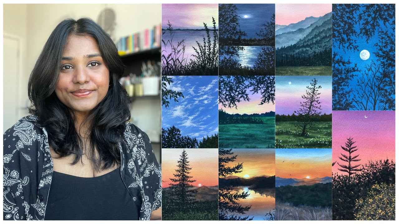
1. Introduction video: Hello, and welcome to the
class. My name is Pyle. I'm an artist art educator and a Skillshare top
teacher based in India. You might also know me as the simply aesthetic from Instagram, but I'm constantly sharing my love for art,
my other hobbies, and sneak peeks into any classes and workshops happening
online and offline. I've been painting with Guach
for over six years now, and one of my most
favorite parts about this journey is sharing everything that I discover about this medium with you
all through my classes. I have over 20 plus classes
here on Skillshare, all focused on simplifying the painting process and
helping you truly enjoy it. In this class, we're going
to learn how to paint this soft and beautiful
spring landscape together using gouache. The project is designed to
be big and friendly while also helping you build a strong understanding
about the medium. We'll start by understanding
how to simplify a reference image and break it down into manageable sections. Then we'll move on to choosing a cohesive color palette and understanding how colors
and values work together. As we begin painting, you will learn how to create smooth blends for your
sky and reflections, build depth using the
layering techniques, and gradually add details in your foliage and the flowers. We'll also focus on using different brush strokes
to create texture, especially in the foliage
and the grass areas. This class is not
just about painting every single detail
perfectly, but instead, we're focusing on capturing
the overall feel of the landscape in a more
loose and simplified way. The process involves a lot of layers and repetitive
brushstrokes, which makes this process
really meditative and calming. By the end of this class, you'll have this beautiful
spring landscape with you, but more importantly, you'll have a better
understanding of how to approach landscape
paintings using gouache, bid layers, and create
depth in your work. So if this is something that
you want to do this weekend, let's gather our supplies
and paint together.
2. Materials Used: Let us talk about
all the art supplies that we need for the project, starting off with
the paper first. So I'll be using the Bao hang
Academy watercolor paper. I hope I didn't
butcher the name. It's 300 GSM and 100% cotton. And the size that I have, the pad in which I have
is like an A four size. Let me show you the
texture that it has. So it's a cold press paper. It has this beautiful texture, helps a lot with blending, and I really, really
like the paper. I won't be using
the entire size. I'll cut it into half. So it's probably like an A five size that I'll
be working on, but feel free to choose whatever size that
you want to work on. This is just a
personal preference. Along with the paper
for the main project, I also like to keep
this little piece of paper for swatching all the colors out so that
I know what shades I'm mixing and how they look
next to each other. So you can also keep a scrap
piece of paper just so that you know your color mixes
when you start painting. Next, let's talk about the pats. You've been following
my classes for a while, you know how much I love Winsor
and Newton guachePaints, and that is the
brand that I like to use in their tube form. They only have tube forms. I will discuss more in
detail about the colors and the color palette
in the next lesson, but you can use whatever
guache paints that you have available with you
in jelly cups or tubes. Next, let's talk
about the brushes. So I like to generally keep a very limited set of
brushes for my projects. Here I have a flat brush, as you can see, and a
couple of round brushes. The flat brush that
I'm using here is in size 14 from
the brand pan art, and I have a couple of
brushes here that are round. One comes to a really fine tip, and one is slightly
more rounded. It does come to a fine tip, but not as much as
the one in the left. If you don't have
a fine tip brush, you can use a smaller
size brush because majorly we're using
that for detailing. So whatever size round
brushes that you have works, whatever you feel
comfortable with works. So you don't have
to specifically go for the size that I am. Over here, I actually
have a spoiled brush. This is one of my
favorite brushes to work with whenever I
want to create texture in my painting and create all these broken strokes
that we depict in foliage. So if you don't have a
brush that's like this, you can actually spoil one, which is not your
most favorite brush. Just press it on the paper,
and it will come to these. The bristles will basically get spread in
different directions, and it works beautifully
for creating texture, and it saves you a lot of time. I'll teach you how to apply that in the project
when we are painting. Yeah, these are all the
brushes that I need. Next, I have a mixing palette. I'm using a ceramic one. Feel free to use
whatever you have. Keep two jars of water
on dirty, once clean. So one you're majorly using
for rinsing your brush, and the other one is for the final rinse to get rid of any leftover
pigment in there. So always make sure you
have two jars of water. Next, I have a tissue
here to wipe my brush and get rid of any extra
water on my brush. Then I have a couple of
stationary items like a pencil, scale and a razor to help me sketch, you know,
our composition. I have a tape, so this is
our half an inch tape, and I'm going to
be taping this on an acrylic sheet
like this so that I have my paper taped
down perfectly. And yeah, these are all the
art supplies that we need. Gather them, and in
the next lesson, I'm going to teach
you how to simplify the composition and
our color palette.
3. Simplyfing Reference Image & a Colour Palette: H All right, so I'm going to start off by looking at our reference image. And before we start to
even think about painting, I want to understand
how to break down this scene in a way that
feels simple and manageable. What I'm going to do here is slightly reduce the opaqity on my iPad so that I can focus more on the shapes rather
than all the details. Now, when you look
at this image, instead of seeing
everything at once, I want you to start identifying
different sections. So here we can divide this
scene into three main parts. We've got the background, which includes the
mountains and the sky and all the elements that
are above the horizon line. And then we've got
the middle ground, which is where the water is along with all the reflections
that you're seeing. That is your middle
ground or the midground. And finally, we have
the foreground, which includes all the foliage, flowers, and the grass elements. Now, breaking the painting into these three sections
really helps simplify the process because instead of thinking of
everything at once, you can approach it
one layer at a time. Now let's take a closer look at the elements on each section. In the background, we've
got the mountain shape, and we've also got the sky
and the sun and everything. In the middle ground, you've got these land forms
or shore layers. Which are basically
just the strip of lands that sit between the water and the mountains,
and you can see them. You can identify the
trees as well that are in the middle ground so they appear shorter, as you can see here. I've also kind of
roughly made them out. And in the foreground, we've got all these flowers and
the dense foliage. So once you kind of start
identifying these elements, the scene kind of
becomes a little bit easier to understand
and approach. Another thing that
you'll notice is that the flowers are
bigger at the bottom, which is closer to the observer. Along with that,
you've got smaller, tinier flowers which
will just depict with tabs in the area that
is slightly above it. Yeah, this is the
way in which you'll break down the reference
image into layers. And now let's create a thumbnail sketch
so that it gives us an even better idea of how to compose the overall structure. I'm just going to start off by drawing a simple rectangle. Right, and I'm just going
to roughly place it. I don't need a scale for it because this is just
a thumbnail sketch. So I'm just going to
draw a rectangle. And within that, what
we'll do is we'll map out the elements
that we just identified. So this is not just about
placing all the details. It's about understanding
the placements and the composition
of the elements. So I started with
an horizon line, and then I'm going to
block in the mountains. That is the thing that I
see above the horizon line. And I'm also going
to place the sun somewhere in the right
side of the painting. Like if I were to divide
it on the right hand side, I have a little towards
the right hand side, I have the sun placement, and then I'm going to
block in the strip of kind of trees that you will see just right
above the horizon line. It's very, very tiny. Then I'm going to block in
the placements of the water, those shore layers that
I was talking about, just strip of land that you have here on the
right hand side. And I've also kind of
marked the reflection. So I don't forget to
create those reflections. And then I'm going to block in the other
elements that I see. So there's another strip of
land on the left hand side and that kind of
swirls in words like this and then comes
towards the area that has all the foliage and that area that is
closer to the observer. So one important
decision that I'm making here is actually what elements
that I want to include, and what are the elements that I want to kind of simplify. So when I start painting, I want to simplify the sky because it's a little
bit too dramatic. I don't want to approach
it that way right now. So I'm just going
to simplify that if there are different
layers that I want to form. So over here, I've
got the foreground, which looks very flat right now. So to kind of add more
drama and character in it, I'm going to divide that
into three separate layers. And the last layer, as you can see how I'm creating here is three
different sections. And the bottommost section of that area is where
the shadows will be and the top area is where more highlights
will be visible. And in the most bottomost layer, I'll be adding all the different flowers that you're seeing. And even in the reference
image when you see, you can see how
they are kind of in three different layers
and the bottom area has more shadows and
the top section of those foliage areas appear
to have more highlights. Another thing that
I want you to note here is that the era that is closest to the observer
will have more details, and you'll see more of the
foliage and everything. Next for adding the details
in the middle ground, so we've got the reflection of the mountain that is there. So I'm just going
to denote that with these horizontal
lines along with the reflection from the sun. So that is where you are able
to create the difference between what is the water and what is the sky
because otherwise, you've got very
similar colors, right, and you want to bring in
that differentiation. So you kind of bring
that with texture. So this is going to be my
basic thumbnail sketch. And once I have that in, I'm going to pick
my color palette which actually takes me
a moment to actually sit with my reference image and see what colors that I
see in the painting. So over here, I'm seeing a lot of warm colors for the sky. So I will be using cadmium
yellow, primary, red, burn Siana to mute
the color in the sky and obviously white to create lighter versions
of those shades. So these are going to be
the warm colors that I use in the sky and the
reflection in the water. Next, I've got the
mountains for which I'll be using Prussian
blue and black. Next, I have yellow ochre, burnt umbo, and sap green. And these are the colors
that I'll be using to create different shades of
greens in my paintings. And I'll show you how to
do that. It's really, really fun to actually learn so much more
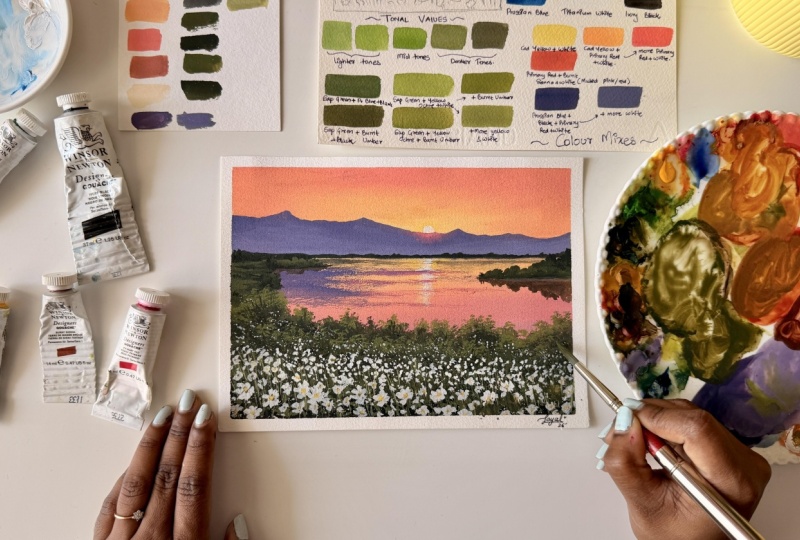
about colour mixing. Alright. Before we begin
with color mixing, let me swatch these
colors out for you and show you how
they look as is. So when you're
painting with gouache, you want to add a
little bit of water in there to make
the paint workable. So here's a swatch of
our cadmium yellow. Next, I have a swatch of the primary red color
that I'm using. If you don't have primary red, you can use your
crimson shade as well. Next, I've got sap green, so you can see how it's a
beautiful, warm, vibrant green. Next, I have yellow ochre, so I need to also introduce
all the earthy tones here. So I've got yellow
ochre, burnt sienna. Next, I have burnt umber. These are all different shades of browns that I'll be using. Next, I have Brussian blue. And then we need a
black and white. So here we have titanium white, and the last color
that I need on my palette is ivory black. So whenever I work with
my landscape paintings, I like to keep my colors very limited and mix my own shades so that all these shades
kind of feel more cohesive next to each
other in the painting. Now, instead of
using these colors directly in my painting
in their natural forms, I like to mix them
and try to form colors that are slightly more relatable next
to each other, and they don't look like just individual shades
being placed, right? So over here, if you notice, I have used a lot of
different shades of greens in different forms
like lighter greens, darker greens, some that
appear a little bit cooler, and some that are a
little bit warmer. And we can achieve
all these colors by just mixing what's on our
palette in different ratios, and I'm going to show
you how to do that. Over here, I'm going to create a tonal value scale starting off with the green
example that I'm doing. Usually, you do that
with black and white, but I want you to understand
with green as well. If into my sap green, which is the swatch that
I just made earlier, I add a little bit of white
color becomes lighter. You can see how light this looks compared to
sap green as is. And if I were to increase the value of white
into the same mix, I get a color that's
even lighter. That's how you create
lighter values of sap green by mixing
more white in there. Next, if I were to
take my sap green and add a little bit of
black in there, just a tiny, tiny amount, you can see how
this color obviously has deepened by a lot as compared to the swatch that's
next to it on the left. And you'll swatch off with
a tiny amount of black. And if I were to increase
the value of black, it becomes an even deeper shade. You can see how the same version of green has been created in different forms by just changing the value of black or white
that you add in there. So the middle one
is your mid tone, which is just the color as is. And to create lighter
tones, you add more white, and to create deeper tones, you add more black. This is just for a single shade, but you can also
mix blue or burnt umber to create deeper shades so that it just doesn't
look as flat, along with a bit of black. And to create lighter versions, you can create more
vibrancy in it just to bring out a little bit more
yellow side of the greens. So you can mix yellow
ochre to create that ozy warm green
that you see in nature. And next, I'm actually
going to show you how you can make
different shades of greens or pinks or yellows that you're
seeing in the sky. But overall, the idea will
always remain the same, where you kind of add more white or more of the yellows and different different
colors mixed together. But the idea to add black and
white will remain the same. I hope this kind of
has made some sense, but you will actually
know more about it when you start mixing these colors on your own and swatching them out
next to one another. Keeping the same logic in mind, let's mix a few shades. Over here, I've
mixed Prussian blue, black, and green together, and you can see how
this creates very deep, cool shade of green works perfectly for showing
far off trees. Next, I've added a bit
of burnt umber in there, and this works
beautifully when you want to create depth in your foliage. Next, I'm also swatching sap green, yellow
ochre and white, and you can see how this is
a very warm shade of green. That is just created by
mixing a few of these shades. And if you add burnt umber
in it, the shade kind of Slightly deepens, right? And you can also play around
with different ratios of yellow aqua that you add or bone tumber that you add or
black that you add. And honestly, I really
recommend doing this exercise because you
can create different shades. And the more you kind
of mix these colors, the better idea you
get of the kind of green that you want to
achieve in your paintings. And it's all done using the colors that you
have in your palette. So you're not really mixing
anything new or looking for a shade that matches the color that you want in your painting, but rather mixing the
shades that you have in your palette and then creating the kind of greens or
yellows that you want. Next, I want to show
you a couple of shades that we'll use
in the sky as well. So for the color that
we have around the sun, you've also got
these muted shades in the warm muted shades. We can all create that using the colors that
we have on our palette. So first, I have cadmium
yellow and white, and you can see how this is a
very warm but light yellow. Next, if I were to add cadmium yellow and primary
red and white together, you get an orange color
which is still softer because it has that
value of white in there. If I were to add more primary
red into that same mix, the color becomes more red, more towards the red
or the pink side. This way, you're able to
create and play around with the ratios depending on what shades that you
want for the sky. Next to mute that
color slightly, I am mixing primary
red, burnt sienna and white and it creates this muted shade of red or
pink that we need for the sky. I say pink because we've added that amount
of white in there. That's where the colors a
little bit lighter and softer. I love these colors for the sky. You can see we've used that for our sky here in
the final picture. Next for the mountains, I have mixed
Prussian blue, black primary red and white
to create kind of like a deep purple shade and use
a swatch of that color. And again, to lighten this mix, I will mix white in there. And as soon as I do that,
the color becomes lighter. So this is pretty
much the ways in which you play around
for different shades and create different
variations and actually practice ones before
you start painting. And this helps you get a better idea of the shades
that you'll be mixing. What's on your color palette. When two shades are mixed
together, what do you create? This class, we needed a lot of different shades of greens. For the sky, we needed a
lot of warm colors which we created using the reds and
yellows from our palette. And then, obviously, we create a lot of different
purples, as well. You can also add more variations
in the purple as well. I've just shown, too, the more white you add the color
will become lighter. And obviously, the
greens, as well, we created various
shades of greens. So I hope this exercise kind of helped you understand
the colors that you have in the palette and
what happens when you mix those colors and also helped break down the reference. As I mentioned earlier, if you don't have the same colors, you can obviously
use the shades that are closest to this
and are available with you and I'm sure
you'll be able to create mixes that
are sort of similar. Anyway, we're done
with this lesson, and let's start painting
our final class project.
4. Project Part 1 : Sketching & Painting the Sky and the River: All right. Let's start
with painting our project, and I've taped my paper on all four sides here,
as you can see, and I've also taken
the colors that I've mentioned earlier on my palette. So we're going to start
off with the sketch first and using my
scale and a pencil, I'm going to first
draw the horizon line. Now, what this does is
that it helps me separate the sky and the eras above it from the rest of the
elements in the painting. Right above the horizon line, like we were doing in
the thumbnail sketch, we saw the mountain range
and a few extra elements. So I'm going to place the
mountain range in right here, starting with a
little broader area in the left compared
to the right. Once I have that in place, I'm also going to
block in the areas for the distant trees that kind of sit right above
the horizon line. It's a very, very small mini
piece of space in that area. Next, I'm going to move to the area right below
the horizon line, and this is where the
midground layer begins. So here I'm just sketching
the shoreline layers first or the land forms that sit between the water
and the mountains. And then I start from the
left section and gradually bring the shapes
across downwards and then move into the elements that are in the
foreground and kind of map the space that have the
foliage and the flower area. And this is going to be the area or the elements that
are closest to us. So I'm just marking all the placement of
those areas for now. Also, I'm going to
go ahead and sketch the land mass on the
right hand side and also block in the reflection
of it just for my reference. You can choose not do this
in this step as well. And somewhere on
the left hand side, I'm also bringing the reflection for that land mass as well. Then in the center of my painting or slightly
towards the right of it, I'm going to mark my sun and the reflection
very, very lightly. I have to make sure that I don't overdo with the sketch here. And then I'm also
lightly marking where the texture as the reflection of the mountain range
is going to be, again, very lightly
because I don't want it to be visible once
I start painting. So make sure that your sketch
isn't too dark after all. Once you have this
sketch in place, we're going to start painting, and we're going to mix
a few shades first. So the first one is your
cadmium yellow with white. And into that same mix, I've added a little bit of red, and you can see
how it turns into this peachy orange color. Next, I'm going to
make another shade, which is going to have
a little bit more pink. So you can see how there is
a mix of my primary red, a tiny bit of yellow and white, and this creates this beautiful pink shade that I really like, and it goes along with the next, I'm also muting the
shade with a little bit of burnt sienna in
there into my mix. I've got primary red,
burnt sienna and white, and now I'm going
to start painting. I'm going to place
the yellow color. I'm just going to slightly
lighten the color as well, and I'm going to place
it in the era that is around the sun and I'm also creating these soft streaks that look like they radiate
outwards from the center. Then in the empty areas
that are around it, especially focusing in the
middle part of my sky portion, I'm going to add
the orange shade that we had mixed earlier. And I'm also ensuring
that I'm kind of blending it with the yellow
as I apply them. Make sure to leave that
center portion a little bit empty so that you can go
back to making it glow, even more with the yellow color. And right in the area above
the orange that I laid, I'm going to add the
pink shade, again, ensuring that I blend
everything as I go. It doesn't have to be
the most perfect blend, but you still want the
colors to kind of, you know, be blended so that
you don't have to overwork this area once
it completely dries. So you can see how I have the
sway in my brush movement, and along with that, I can also see the glow
around the sun. Next, I'm going with the muted color that I
had made earlier, and I'm going to only apply it in the outer edge
of my painting. So mostly towards the
left and right corners and a little bit on the top. Again, ensuring that
I kind of blend them into the colours
that I had just laid out. Now, if you want to bring out
more glow around the sun, I can go back with that light
yellow color that I mixed, and I'm going to start
blending everything together. Now, one tip to blending
and making the blend seem a little bit more
seamless is once you have the colors laid
out on your paper, you can go back with a damp brush or a little
bit more of the pigment, like the lightest pigment in your sky and just blend
everything together. I really like the
way the sky looks, so I'm going to let that dry
and move on to the lake bit. So over here, I'm going
to start by placing the light yellow right in the area where the reflection
of the sun would be, and I'm going to make that
in these horizontal strokes. And then around it, I'm going
to add the orange shade, again, making sure they kind
of blend into one another. Now, you can play around
with the brush strokes. If you apply your
brush movements to the thinner side
of your flat brush, you create a lot
more streaky effect. If you use the entirety
of your flat brush, you'll get more thicker and
that helps with blending. Now, right below the orange, I'm adding the pink, just
how it looks in the sky. But over here, I'm also giving more area to the blend
where the muted color is. Now that I have placed
all the colors, I'm going back and forth with
adding more pigment just to ensure that everything seamlessly blends
into one another. And you also have to
kind of ensure that the colors in your sky
and the water bit, the lake or the river bit kind of slightly match
one another, right? You don't want a completely
different mix of paint, so that's why I always suggest that you make enough
paint so that you're able to cover the sky and the lake portion together. Alright, I'm really happy with the way the
blend looks here, so I'm going to let it dry before we start adding details. Now that the base has dried, I'm going to switch
to my round brush, and I'm going to take a very, very light mix of yellow
to paint the sun. So I'm adding a lot
more white into that same yellow mix that
we had used earlier. And using this mix, I'm going to place
it around the sun. So here's a swatch
of that color, and I'm going to take this color and add it where the sun is. So the first idea is to actually place the color and
then slightly blend it, and then layer over this again. So I'm going to add in
the reflection as well, so you can see how I've
placed those two colors, and then using a
little bit of yellow, just yellow in there because I wanted to have that warm glow. I'm going to layer over and then blend it with a wet brush just so that it kind of
looks like it is one with the base layer, right? So you can see how I've
blended out the edges, and I'm going to
let this dry now. And once it's dried,
now that it's dried, I'm going to add a
little bit of white into that mix again just
to create a very, very light shade of yellow. I'm going to place it on the sun and create the reflections using some horizontal
short lines. So once I've covered the sun, I'm creating the short strokes, horizontal short strokes
of different sizes. So you can see how the ones right below is a little longer. And as I come lower down, I kind of decrease the
size of it, right? So it looks like a beautiful reflection right under the sun. Now, again, what we
need to do is blend the edges out using
some damp brush. You don't need any pigment, just a slightly
wet or damp brush. And I'm going to blend
the edges out so that it doesn't look really
as a layer standing over, but it kind of blends
in with the background. I really like this. I'm
going to let this dry now. Alright, now that
the sun has dried, it's time for us to
paint the mountains. And for the colour
mix, I am going to mix my Prussian blue with
some primary red, some black paint, and
some white paint, very, very tiny amount
of white in there. So the idea is to create this deeper purple shade first and then lighten
the shade as we go. So here's a swatch
of the purple that I'm going to be using
for the mountains. And I'm using my round
brush here as well, and I'm going to outline
the shape first. I'm not bringing the
color all the way down. I'm focusing more on creating the shapes of my
mountain range first. So you can see how
I have created different variations
with my brush strokes. Right, under the
sun, I'm leaving a little bit of gap
where the sketch was, so I'm leaving a little
bit of space so that I can add a little glow
around it later. And once I have made the overall structure
of my mountain range, I've added a little
bit of white into my same purple mix to create this lighter version
of the same color. Going to start applying that
with a little bit of water in my brush just so that
everything blends together. You can also switch to
a flat brush to cover more area and make sure that the blend is nice and seamless. You can see how I'm applying
the color here using my flat brush and I'm blending it with the darker
color that's above it. So make sure that you are blending those two
colors so that they don't look just like two different colors
next to one another, but they do kind of
look blended together. You can also use
a round brush to make the blending easy if
that's what you prefer. But the idea is to have
that nice misty effect in your mountain rage. Now while the paint
is still wet, you can also switch to
a round brush again. And over here, I'm
adding a little bit of yellow and a little
bit of red in there, and I'm going to apply it
in the area right under the sun because only a portion of that sun is visible, right? Not the entire sun is visible. So that is going to create this beautiful glow
around the mountains. And that's why I've added that
nice warm color in there. And using a damp brush, I'm going to blend
it into the purple. So you might have to go
back and forth a couple of times to get that
beautiful glow. While ensuring that
those two colors kind of merge with one another.
I really like this. I'm going to let this dry, and this is it for this lesson. In the next lesson,
we'll be adding further details in our painting.
5. Project Part 2 : Adding Reflections & Building Base Layer: All right. Now that our background
layer has dried completely, it's time for us to move
on to the next step. And in this part, we're going
to start adding textures in the water and begin blocking in the colors in our landscape. So over here, I'm
starting off by using the same color that we
used for the mountains, and I'm going to use this to create subtle reflections
in the water. As you can see in
the center area, I'm using something called
a dry brush technique where you have just pigment and not
enough water on your brush, and that creates these
broken uneven strokes that kind of mimic the
natural movement of water. Towards the left hand side, I'm using a slightly
smoother strokes so that the reflections
appear a little bit more defined and
cover more area. So here, I'm using a round brush to give me more control
over these strokes. Also, when you want to
create dry brush stroke, you want to ensure that there is not enough water
in your paint mix, whereas when you want to
create the smoother mix, you want to ensure
that you are adding enough water in there so
that it's creating smooth, opaque washes, just
like we can see here. And as soon as kind of like your water contain
or brush gets over, you'll go back to creating
these dry brush strokes. Now, towards the center of the area where the
reflection is going to be, I'm using that same red mix
that I used for the glow, and then going back with the
same dry brush technique, I'm going to create
these strokes. Now, what this does is that it creates the different
variations in the color, and that avoids the water and the reflections from
looking too flat, and it also adds a sense
of movement in there. So I really like the way
this looks right now. We're going to move
onto the trees that were above
the horizon line. So I'm going to create a mix
of green that is cooler. I'm going to mix
my sap green with a little bit of yellow that
was already on my palette, but it doesn't really
matter because I'm mixing sap green with blue. I've added russian
blue in there, and I'm also adding
tiny amounts of black so that the color
is nice and dark. So I'm going to quickly show you the color that I will be using. So it's a color that's
pretty much close to black, but it's not because
it's made using blue and green and just
a tiny amount of black. So now I'm going to go over with my round brush and
I'm going to create these different variations
in my brush strokes just to depict that these are trees
that are at a distance. So they're not entirely
as specific shapes, but just made using different heights in
my brush movements, and that creates the illusion
that there are a bunch of different trees at an extreme
distance from the observer. Alright. Now that the
paint is still wet, I'm going to use a damp
brush and I'm going to gently pull some of
that colour downwards. And what this does
is that it creates a very soft reflection
in the water, and the key here is to
keep it very subtle. We don't want sharp
lines or anything. We just want that light
indication of reflection. I'm also going to
add a little bit of white into that same color that we were using to
create this gray, and I'm going to
use that to create soft textures again using
the dry brush stroke. I'm not overdoing the step. I'm just very, very lightly
adding subtle textures in the water to show the reflection of these
trees on there as well. Once this layer dries, we are going to go ahead and refine some of the
reflections from the sun because a
lot of texture went over the center portion of the reflection
in the sun as well. I'm going to go back
with the white color. This time, I'm just using white. And I'm going to go over
the sun again just to outline in a little
bit more and just to provide a little bit
more glow in there. I'm also creating
horizontal strokes again. Again, I'm not
overdoing the step. I'm just lightly adding a few brush strokes to bring
back the reflection again. And once it has dried,
we're going to go ahead and create two
different shades of green. Now, this part is where
you start blocking in all the colors of the greens that you're
seeing in your painting. So the first mix is sap green, black, tiny amount of plaque and yellow occur for a
medium shade of green, and for the deeper
green, I'm mixing black Prussian blue and my sap green together to create this deeper
shade of green. So you just need two
shades of green right now. So I'm going to start
with a landmass, which is on the right hand
side in the middle ground, and I'm placing the darker green at the base of this
land mass first, and then I'm going to
layer the lighter green on top and kind of switch
between the two colors, allowing it to slightly kind
of blend with one another, while creating different
shapes to depict different sizes of the foliage and the trees that are
going to be there. Now, the reason why we're
using two shades of green here in this layer is because
we don't want you know, just one single color
of green everywhere. And if you use a
single shade of green, what it's going to do
is that it's going to make everything
look really flat. And that's where we're
working with two tonal values of the green. And this kind of helps
create depth and variation in the base layer also so that when you kind
of layer over this, you can go with lighter colors, and you don't have
to really work very, very hard to bring the colors
back in and to build depth. Always, when you're
blocking in the colors, you want to ensure that you're
blocking it in a way where you have the middle tones
and the deeper tones, and you leave some spaces
for the lighter tones as well so that it's easier
for you to build on it. So over here, you saw how I kept going back and forth
with the lighter or the medium shade of green and the deeper shade of green to create different variations
in the shapes as well. Next, I'm moving
to the landmass, which is on the left hand side, and I'm going to follow
that similar method. At the base, I'll be using
the deeper shade of green, and then I'll be adding
the medium shade of green around it
and just switching between the two so
that my surface right there doesn't
look really flat. You can also add a third
shade of green if you like, something that is slightly more lighter than
the middle tone. But right now I'm
just focusing on the two shades of green so
that in the next layer, I can add more green. Now over here, everything just honestly boils down
to playing around with the different
shades of greens and sometimes the choices
that I make when I'm painting are going to be very different from what
you're making. So instead of
actually following it step by step, just
the way I'm doing it, I like to just tell you why I'm taking this step so that you understand how to approach like a painting or
a reference image, which has a lot of foliage. So now that I've reached
my foreground part, I'm going to be switching
between the lights and darks because if I were to just use a single shade of green here, this entire foreground
layer would just look flat. So this specific area, which is my first section here, I'm using the deeper shade of green just so that you know, this area appears a
little bit darker, and then I can lure
lighter greens over this. Another thing that I'm
doing here is I'm using my spoiled brush,
not flat brush. I'm using my spoiled brush here, and what this does is
that it helps me create these broken strokes,
these uneven strokes. So if you have a brush that has bristles going
all over the place, this is the best
time to whip it out and use it because it's
going to, you know, create these broken, uneven
strokes that, honestly, to me, works perfectly
when you want to create foliage like the ones we're doing in this painting. So like I was
mentioning earlier, this is a section
where we're going to start building more
structure in the foreground, and that is why I'm
dividing this in layer. So the first layer
that you saw me add was all with the
darker shade of green. Right below it, I'm
going to, like, use a specific area, like just a small area, and I'm adding the medium
shade of green there. Then I'm switching back to
the darker shade of green, and then I will go back to
the lighter shade of green. So I might work, like, back
and forth here in, like, two, three layers of the
lights and the darker greens. Just so that there is a lot more depth and structure
created in this area, so that when I start adding
the lighter tones over it, I can easily divide
the section, right? So whenever you have a field
or something, you know, like a landscape of that sort, it's not entirely
one color, right? You'll have different
areas receiving more light and different
areas receiving more shadows. And that is exactly how we're
depicting this, as well. We're leaving certain
sections empty, not empty, but like light so that
we can layer over and create lighter brush drops over it and highlight
those bushes, and the shadow areas are
going to be kept underneath. So that the lighter areas of the areas in the
foliate section which are receiving light
appear a little bit more vibrant and stand
out a little bit more. So this step, honestly,
is very repetitive. I'm constantly going
back and forth between the two colors until I'm done
blocking my entire section. So really, if you don't want to divide your section
the way I am, you don't have to do
it in three layers. You can also do it
in just two layers, whatever feels comfortable
to you, right? Because this is your painting as well as much as it is mine. So you don't have to really
worry about perfection here. Use any spoiled brush. You can go in the tapping motion or round and round motions, whatever feels
comfortable to you, you can follow that motion as long as you're
blocking in the colors because that is going to
set the base for you to start adding more highlights
and details over it. If your base is blocked in
correctly or well enough, the lights will, like
I mentioned earlier, appear more vibrant
and more detail. Otherwise, it will
just look like detailed layers over something over like a base layer
that is really flat. So that's why this section
kind of really helps. Anyway, once you are done
covering your entire area, you're going to let this dry. This is what my
section looks like. You can see how it's
divided in three layers. As I can see, you've got the lights and doks
placed correctly. Once you're done with it,
you're going to let it dry. And in the next lesson, we'll start adding more
details to this.
6. Project Part 3 : Building Depth in the Foliage: All right. Now that our base
layer has dried completely, it's time for us
to start building depth and adding details
to our painting. And at this stage, everything will slowly start
coming together. So I'm starting off by adding reflections to the land
masses in the water, and I'm using a mix of
burnt umber and black. And over here, I've also ensured that my paint
is not too thick, but I want it to be
nice and a little bit lighter so that I can still see a little bit of
the color below it. Over here, while I'm
making the reflections, I'm kind of just mirroring the shape that is
above the land. So whatever the brush movements are or the shapes are above it, I'm similarly just mirroring
that same image downwards. And to create that
clear separation between the land above
and its reflection, I've added a bit more
white into that mix, and I'm just adding
this horizontal line. So it clearly just
separates them. Next, I'm going to go
ahead and start adding the details in the middle ground with two different
shades of green. So one's a darker shade
of green using sap green, black, and a little
bit of brown. And then there's
a lighter shade, which is slightly warmer
green using sap green, yellow ochre, and a
bit of burnt umber. So I'm going to start working on the landmasses in the
middle ground on the left. So using this lighter green, I'm going to start creating these soft horizontal
strokes across the surface, and these strokes kind of help introduce a bit of light
and texture into that area. And then I'm going to just
blend everything slightly with the base layer so
that everything kind of feels a
little bit cohesive. Once the section will dry, only then I will start adding my trees and
other details on it. So over here, you can
see how the lights have brought out the depth that we had in the
previous layer. Now that it has dried, I'm going to start adding
a few simple tree shapes. So I'm not over detailing
this area because this is a section that is still slightly away from the observer. So I'm just focusing
more on creating soft and small vertical forms or irregular shapes
that will be trees and foliage at a distance. And I also continue to add a few horizontal strokes
here and there to build more depth and show the shadow portion of
this middle ground. So again, like I mentioned, I'll be going back and forth between adding and
adjusting the lights and the shadows until I'm
kind of happy with the subject in the
middle ground, which are my trees and the lighter details
that I see in there. I'm also adding a bit of
lighter green on the top just to add a bit more
color to my trees so that they're just not looking flat with the deeper green shade
that we added earlier. Now, like I mentioned,
this is an area that is still further
away from the observer, so you don't really have
to overwork in this area, but just add adequate amount
of lights and darks in there so that this section
just doesn't feel really flat. I'm really happy with the
way this looks right now, and I'm going to switch back to my spoiled brush and use
the lighter grain and begin tapping over
the areas where I had placed my base layer of the
lighter grains earlier. Okay, so it's not entirely
just on the lighter green. So I'm starting off with
the left hand side. I'm just tapping and bringing in a little more light
into my section there. And then I'm going
to move towards the center of my painting
where I'm again tapping multiple times to create more foliage details over that darker layer that
we had added earlier. Now, you want to
ensure that you're not entirely covering
the darker layer. You still want some
of it visible, but you want to just add more greens and more
layers into that section. So this area is basically
very repetitive, okay? You're constantly doing the
same motions over and over, especially for the first
two lighter green layers that you're seeing over here, and then only you will start making
different brushstrokes. This process, like I mentioned,
is really repetitive. So take it slow. There
is no right or wrong. Your shapes can be different,
and they should be. They shouldn't be the exact
replica of what I am doing. So just enjoy the
process. Take it slow. You know what you are
supposed to do in, like, the area that
you're supposed to cover. So just ensure that you're
covering those areas. And even if you don't about it, because we can always go back and add more
depth in there, even after this layer as well. So over here, again,
like I mentioned, I'm just going to go over in this tapping motion
multiple times and create more
details and bring out more highlights and details
into my foliage layer. I honestly really tend
to enjoy this process because there's a little
thinking involved and a lot more of that repetitive motion helps me go into this I don't know, Zen mode where I'm just constantly going back and
forth in the same motion, and it's really
therapeutic in a way. I just had to put it out there. Anyway, if at all at any point, you feel like you've
added too much of the light because right
now when I see this, I feel a little bit of the depth that we had
earlier has gone. So I'm going to go back with my deeper shade of color
or the darker green, and I'm going to go back and tap in wherever I want to
bring the contrast back. Over here, I felt
like everything started looking a
little bit flat, right, because we had too much
of the light greens and those darker greens
that we had earlier. Has kind of
disappeared somewhere. So in case that happens, you don't have to
worry about it. You can always bring
the color back by tapping and bringing
the darker greens and introducing it again. And then once you layer over it, everything will kind
of seamlessly blend into one another again
and not look odd. So I felt like it needed
a little bit more depth, so I just added that in there. So again, like I mentioned, there's a lot of back and
forth that will happen here. Now I'm going to switch
back to my round brush and I'm doing so because I want a little bit more
defined details here. So in this section where
the flowers will be, I'm going to start
adding leaf and grass like strokes and
also their stems. So I'm just kind of using the flicking motions
of the brush to create these thin upward
strokes for the stem and some short, slightly
longer strokes. And this variation
kind of is going to help the leaves
look more natural. So we're just making little strokes in the left
side and the right side, and they're all very
different from one another. That is something
to keep in mind, because if all your brush
strokes look similar, then there won't be variation and it's going to look flat. And I always say
this that whenever you're painting
landscape paintings, you want to add as much
irregular shape as possible because there is no set pattern that we
are following here. So even for the leaves, I'm just kind of flicking my
brush in short motions on the left and right
side and just creating a bunch of leaves and
a stem in the middle. Most of it actually tends to get covered with the flowers
that will come on top, but it still makes
sense to just add that perfectly in this section
before we add flowers in there. So just feel free to add the shapes of your
leaves, however you want. Again, no right or wrong. This is really just for you to relax and play around here. I've also switched
to my spoiled brush again because I
wanted to create like these multiple long
strokes for the stem in the area on top
of this section. So this is the area
where all the, you know, flowers
are going to be. So that's why I've
gone ahead and added those longer strokes. And I've gone back and added a little bit more depth
into my foliage section. Like I mentioned, a lot of back and forth is
going to be happening for this area because mine ended up looking
a little bit flat, so I've gone ahead and
introduced a little bit of the deeper greens again and added more contrast
in our painting. But overall, I'm really liking the way this is coming along. I really like how
I can really tell the different foliage
areas over here, along with the different
greens that we have. And I've also added
a few stems using the darker green color just so that we don't have
all the stems looking, you know, similar or
of the similar shade. And I really like the way
this looks right now, so we're going to let
everything dry completely. And then in the next lesson, we'll be adding our flowers and the final details
in our painting.
7. Project Part 4 : Adding Flowers, Highlights & Final Details: Alright, let's go ahead
and add more details in the foliage and
paint our flowers. So for the green in the
foliage as the highlights, I'm using a mix of sap green, yellow ochre, and a little
bit of white in there. And I'm going to be using
my spoiled brush for this. Now, over here, I'm being a little bit more
selective when I'm adding the highlights as
these tapping strokes with my spoiled brush. And I'm making sure that I'm
not covering large areas, but I'm just slightly
tapping over certain sections to add
highlights in the foliage. And this step actually helps define the
foliage a little bit better and brings
out that contrast between the lights and shadows. So just take a moment here. To notice where you want
the highlights to be, I am focusing more on
the uppermost section of my foliage because
that's going to be the era that's receiving
the most amount of light. And that's why we worked
in multiple layers. And even in the previous step, we were bringing in the contrast again, which got covered, so that when we add
these highlights, we were really able to bring
out the details even better. So I'm just going to let
you have a moment here, really just add the foliage. Depending on the
areas that you have. And when you reach the
bottom section here, you can go with
these long strokes, and they can be done using a round brush if you
don't want to use it. I mean, don't want
to make this using your spoiled brush here. This is again just adding more details and highlights
in your foliage. So this is going to be depicted with the flowers that
will lay over this. So you can do this with the
lights like I am doing here, and then you can also
switch to your round brush and do the same step
with a deeper shade of green again just to
bring out more variation in the color so that everything just doesn't look too flat. So again, there's
a lot of back and forth happening here depending on the kind of choices
that you want to make and the details
that you want to add. So over here, I've
just gone ahead and added a few strokes
with a round brush, and these long
strokes are going to be depicted for the stem. So I'm really liking how
this darker stroke has added details and how everything in the
foliage looks right now. So we're going to
let this completely dry before we move
on to the next step. Now comes the part where we are going to start adding flowers. And for this, I've created
a mix of titanium white with a very tiny amount of
black and prussian blue. And that will give my
flowers a little of white, kind of muted color. And I'm going to start making these little tiny dots
using my round brush. Now, they're very
delicate because these flowers are further
away from the observer, and that's why they are
really, really tiny. You want to make
individual strokes with a round brush,
feel free to do that. And if you want a few
clusters of them, you can switch to
a spoiled brush and add the details accordingly. Again, there are no right
ways to approach this. You are free to do
it however you like. I have gone ahead and
combined both this method. When I say both these
methods are one where I've created clusters of
these white flowers using a spoiled brush, and one where I have added a few extra strokes using my round brush just to
add more variation. Because, again, the
spoiled brush is going to create clusters that look
very similar, right? So feel free to do
it however you want. You can see how I've left
that bottom section empty. That is where I want
to start adding more flowers and more
details later on. So I'm not going to be
adding anything right now. Once you're happy with the
way the flowers look here, we can start moving downwards. And as we move downwards, we are going to slowly
start increasing the size of the
flowers that we add. Even here, you can think of this area as a section
that is in the middle of the layer where you have the
most delicate tiny flowers and the bigger ones
at the bottom. So in this area,
you've got dots that are going to be varying
in different sizes, okay? So even though I'm
depicting them as dots and tabs with
my round brush, I'm trying to focus on the number or the amount of pressure that I'm
adding on my brush. So if I add more pressure, the dots are going
to appear bigger. And if I reduce the pressure, the dots are going
to appear smaller. So I'm just going to add
different variations of them. Make a couple of big ones
and then a couple of small ones just so
that everything looks kind of seamlessly blending
into one another rather than just blending or
being placed in patterns. And as I move further
lowermost section of my area, I'm going to start making
the flowers bigger. And this time, you can start creating slight defined shapes. So I'm loosely painting like five to six petal like forms
in different directions. Some of them can be defined
with like I mentioned, five to six petals, and some of them can be made using a very
irregular blob shape. And for me, these regular blob shapes add a little bit of, like, that natural effect. That's how I like
to approach this, especially for these
kind of landscapes when I haven't added way
too many details. And I'm just loosely painting
the subject with, you know, very few brush strokes
or very few colors. And, you know, with a
limited color palette, I like to keep things
very nice and loose. We feel free to add the flowers in
whatever way you choose. One thing that I would
mention is, like, I was saying earlier as well, you don't want all your
flowers to look the same. So make sure that you're
adding that variation, and that variation
kind of depicts that the flowers are phased
differently, right? So feel free to do
it however you want. I've gone ahead and
completed the section. As you can see, I've also added a few smaller tabs in
between the bigger flowers, again, just to
show them as buds. Once I'm done with that,
I'm going to start painting the stamen of my flowers using a mix of yellow ochre
and burnt umber. I'm going to add this in
the center of some of the larger flowers or most of the larger flowers and some of the smaller flowers
that you can see. And once that dries, you can add highlights on there. So right now, I'm
just placing it on all the flowers that I'm
seeing just to bring out more details into
the flower and for it to not look that flat. Once I'm done and done with the base layer
of the stamen part, I'm going to highlight
that by adding a bit more yellow and
white into the mix, and I'm just going to
add that on top again, making sure that
I'm not covering the entirety of my first
brush stroke that I laid out, almost half of it
so that it acts as a highlight over that section
that we had just made. And once you're done with that,
I'm going to go ahead and create a really light
green shade where I've just added more yellow and white into the same green
mix that I used earlier. And this way, we are
going to start adding a little bit more
details into my section. And I'm using a round
brush for this, a fine detail round brush to create these
stem like shapes. Just so that it looks like the flowers are not resting
on top of one layer, and they're kind of
seamlessly blending in. So you can just make
these stems right under some of the flowers
and you can overlap them. Don't worry about it
because we're going to layer over the flowers again. Once you're done with
the light green mix, you can go back with a
deeper green mix again, just to bring the color
variation in the stem as well. And you can see how
I'm laying this over the flowers as
well in case you know, there are some
flowers in the way. Once you're happy
with that structure, you can start highlighting this, and I'm using just pure
white for my flowers here. So I'm going to
highlight some of the flowers that are
already laid out, and I'm going to create
some more flowers on top wherever I
see an empty space. Now, I'm doing this
because if I were to just create my flowers
using a single color, then everything again
starts to look flat. The feeling that some flower is closer and some flour
is further back, some are casted under a shadow will go away if
I use a single colour. And that is why I've
used white over here. Just to make my flowers
pop a little bit more. So you can go ahead and
highlight some of the flowers or create a bunch of flowers
again wherever you feel. And you don't have to do it
only on the larger flowers. You can add a few tabs here
and there in between as well in the smaller
flower section as well. And once you're done with that, and once that layer dries, you can go back into
adding the stamen part of the flowers again
with the yellow color. Now, at this point, again, there's a lot of back
and forth that'll be happening depending
on how you've chosen to create the
sort of flower area. I'm really happy with the way
the flowers look right now, so I'm just going to
let everything dry. And then I'm going to bring a piece of paper or
tissues over because I want to create a few
splatters for adding a little bit of a whimsy
effect in my paintings, especially for
landscape paintings and these kind of floral
paintings I like to do that. So I just tap it against another brush and I
get these platters. And then I'm just going
back and forth a couple of times depending on the kind of details
that I want to add. And honestly, this is
the part where you can take a step back and
see what you like. If there's anything that
you want to enhance, you can go ahead and enhance it. If there are certain details
that you want to bring back, if there is a little bit of a contrast that's missing,
you can bring that in. You want to add highlights,
you can add that in. Anything that you missed
because I felt like a few of my flowers didn't
have the stamen part. So I've gone ahead and added
that or I'm highlighting a couple did not get the highlight in the first
time that I was adding it. So again, take a step back to just notice what
your painting needs. And once you're happy
with everything, you're just going
to let everything dry and then we'll
peel the tape off. Once everything has dried, it's time to peel the tape off, and this is honestly
my most favorite part because it's so satisfying. And something about
that white border around my painting
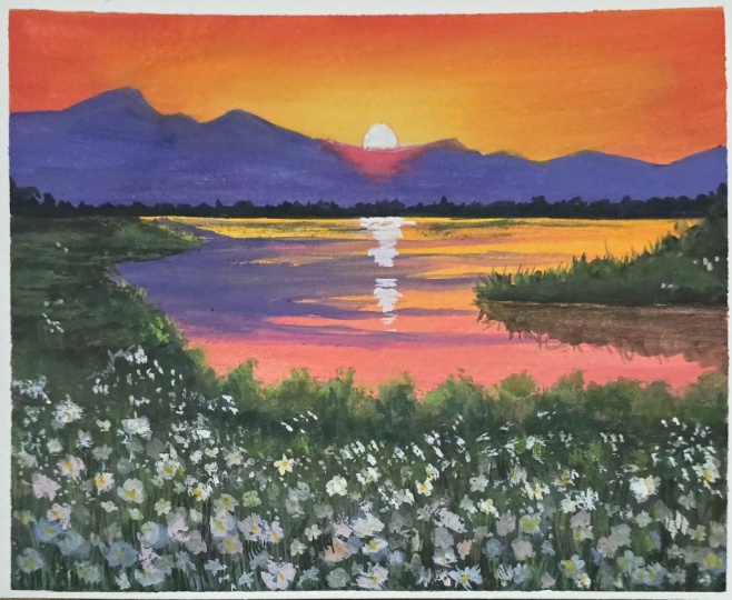
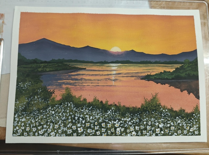
makes it look complete, and it makes me so happy. So this is your final painting. Let's have a closer
look at this and see how we've done and the details
that we were able to add. So if you look at this here, we've got beautiful glowing sun. We've got the mountain range. We've got beautiful land mosses. Foliage in the foreground with flowers and so many
different color play, but it was also very limited in terms of how many
colors we were using. So I hope you enjoyed
painting this process, and then I'll see you in
the next lesson because I'm going to be sharing my final thoughts about this class there.
8. Final Thoughts: And with that, we've reached
the end of this class, and I hope you enjoyed
painting along with me. More than anything, I hope
this class helped you feel a little bit more
comfortable with the medium, especially when it comes
to blending, layering, and adding details
in your work in a more simplified and
approachable way. If you've painted along with me, I would love to see
what you create. You can upload it under the project and resources
section of this class. And honestly, I love seeing different interpretations of
the same reference image. If you enjoyed this class, I would request you to leave
a little review down for me as this helps this
class reach more students, and I get to know exactly
what you enjoyed learning. If you're uploading your
work on Skillshare, you can tag me there at
the Simply aesthetic, because I would love
to see your work there as well and share it with my community to help
inspire other students as well. And this is it for
me from this class. Thank you so much
for joining me and painting along with me. I
will see you in the next one. Bye.
 Payal Sinha, TheSimplyAesthetic- Artist & Educator