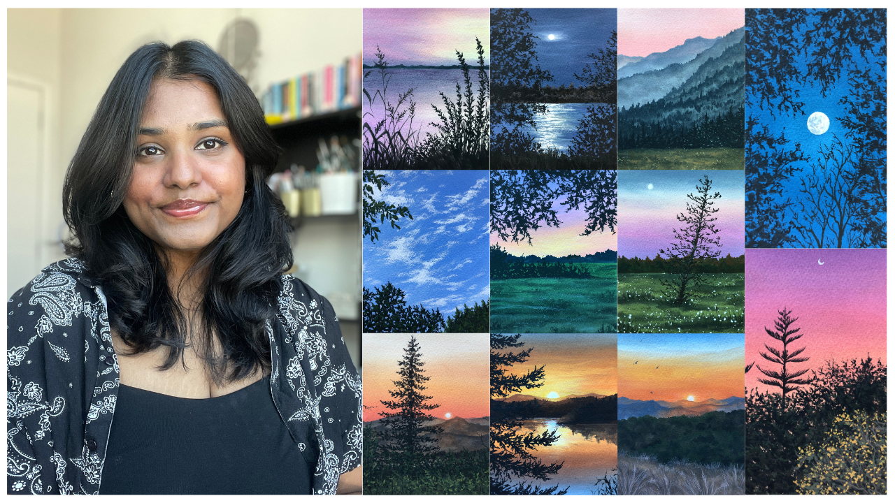
Transcripts
1. Welcome to the Class: The time I spend in my studio is my favorite time of the day. The whole process of
gathering my art supplies, working on an idea that
I have for a painting, or just sitting here
with my thoughts and observing things happen outside my window
brings me so much joy. For the past few months, I have been experiencing
a creative block. This has made me feel
so uninspired and demotivated to sit down
and create anything. This is a feeling
a lot of artists go through more
often than we think. It is completely okay if we find ourselves
in that situation. A little motivation
and push has helped me slowly come out of it and I'm still taking it
one day at a time. Hello everyone. My name is Pile. I'm an artist and art
educator and a skier, top teacher based in Para. If you're new here and
unfamiliar with my work, make sure you're following
me on Instagram at the Simple Esthetic where I'm constantly sharing
about my artworks, any upcoming classes
and workshops, and a little about
my daily life. In this class, I would
like to welcome you all on a ten day painting
adventure where we're going to be using my
favorite medium, Guash. The main goal for
this class is to take it one painting at
a time and give ourselves a little
push every day while learning something
new about color mixes, blends and compositions, and
enjoying the entire process. This class is designed for
people who are going through a creative block or want to
build a daily painting habit. If you're new to
the medium, uh, no. You're welcome here too, because everything in this class is explained in real time, which is like a little paint
along with me session. As I guide you through
the entire process, we'll start this
class off by knowing the right type of art supplies
you need to have with you when you're painting
with the medium wash. And then we'll dive into a few ph techniques that will help you understand
the medium better. Before we begin with day one, we will do a little
exercise lesson where we explore our brushes and
different brush strokes. Once you've gathered the basics, we'll start our
ten day challenge. We're starting today.
Every alternate day, I'll be uploading
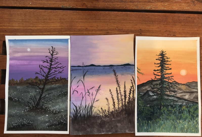
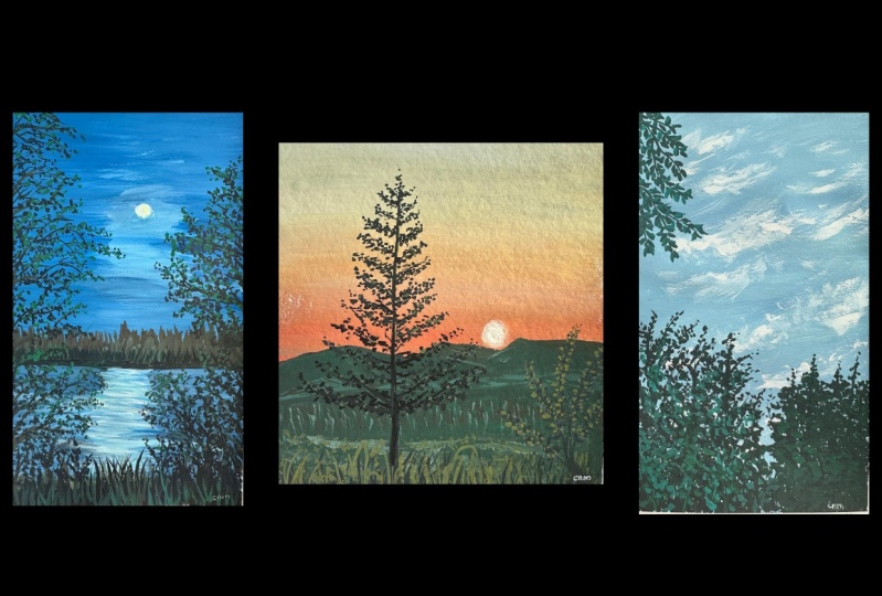
a class project. By the end of this class, you'll have ten
beautiful paintings with you that you can show
off to your friends and family and hopefully the confidence and motivation
to paint more. If this is something that
you find interesting, then join me in the class
and let's paint together. I will see you in
the next lesson.
2. Class Overview & Structure: I'm so happy you decided
to join me in this class. Before we begin, let me give you a quick overview
about the structure. We're going to start this
class off by talking about the art supplies that
you need to have with you when you're
painting with quash. And then dive into the
different techniques that will help you understand the full functionality
of the medium. Now if you're new to the medium or have forgotten what it is, make sure that
you're watching this lesson because we're going to be using a combination
of these techniques for our class projects. Next, there's an
exercise lesson where we're going to be
exploring our brushes and brush strokes to create
different plant elements that we'll be using in our class projects in
the foreground. Once we've gathered
all our basics, we're going to dive
into the first class project starting today. Every alternate day, I'll be
uploading a class project. And each class project takes about 30 to 40
minutes to finish. And you have ample
time to finish one before the next
one goes live. In this class, we're
not painting from a reference image
because I did not want to pressurize ourselves into the hundred details that
we might see in them. But I have uploaded
the final artworks for each day under the project
and resources section title, Project One, Project Two. So you can download
that so that you have a reference with you for the
composition of that day. Just because we all
like looking at what the final painting is
going to be right now. Before we begin each day, I will mention all
the colors that I'm using for that
particular painting. So you'll see a list pop up on the first
part of each day. And you can collect and
gather those colors, those shapes that I've
mentioned or you can go for shapes that you have with you
and are similar in nature. Next, if you're
painting along with me, don't forget to upload
your projects under the project and
resources section because I would love to see it, and I'm sure the other
students will love to see it. Let's motivate each
other and support each other and create a little
community under this class. Lastly, if you're here because you're going through
a creative block and are here to probably
form a daily painting habit, just make sure that you're
taking it one day at a time. Don't be so hard on yourself. Be kind, just show
up for that day. Some days, it might seem a little bit more difficult
than the other, but just show up for yourself. Maybe sit down for 2020, 5 minutes, and stop whenever you feel
like it's getting too much. And you can always continue based on when you
feel comfortable. All right, this is
it from my side. Let's dive into the materials
used in the next lesson.
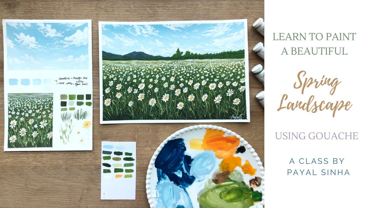
3. Art Materials Used: Let us discuss all
the art supplies that you need for this class. Starting off with the paper. Now for this class, I will
be using a sketch book. This is from the Brand Canson, which has the saunters
watercolor paper inside. It's an A five sketchbook
and has 300 GSM, 100% cotton cold pressed paper. Now, if you'd like to
not use a sketch book, please feel free to not
and blue sheets of paper, you can do that.
This is an A five. If you'd like to
split it and use six, please feel free to
do that as well. The sizing of the paper is
completely your choice. You don't have to
use a sketchbook or the exact size
that I'm painting on. Here's a glimpse
of our artworks. And the sketchbook has this beautiful grainy texture that I really enjoy painting on. Especially for the kind of
artworks that I do that is the landscape paintings
using the medium. So this is it about the paper. Again, Guash is very versatile, so you can literally paint on any paper and size
that you want. Next, let's talk
about the paints. If you've been following
my classes on skillshare, you know how much I love the designer wash from
Windsor and Newton. I'll be using those along with the titanium white from
the brand brews stroke. Feel free to use any brand
that you have with you. I'll also be mentioning
the colors that I'll be using before
each class project. In the beginning of the video, you'll see me list down
all the colors that I'll be using for that
particular project, so you know exactly the
colors that you need to pick out and keep with you before
you start the painting. So this is it for the paints. Moving on to the brushes. I'll be using these five
brushes for my painting. Starting off with
the flat brush. So I've got two sizes here, size ten and size 18. This helps me cover
larger surfaces and create the backgrounds and the
blends in the backgrounds. Next I've got two round brushes, so I've got size
zero and size four. You can see they do come
to a really fine tip, which gives me a lot of control over the kind of shapes that
I want for the details. And again, the last brush that
I have is a spoilt brush. As you can see, the bristles
are all over the place, but it creates this beautiful
texture when you're painting trees and the foliage
and details like that. We'll show you how to achieve that in the upcoming lessons. So we will cover that in
slight details where we know how to approach
those kind of elements. This is it about the brushes. Moving on to the palette. I am using a ceramic
mixing palette. Feel free to use any mixing
part that you have with you. It's completely
what we have next. We have two jars of water. This is something that's very
important as you can see. One nice and opaque and
one still slightly clear. So you'll be using the left
one for rinsing your brush. And the second one
is going to be for double rinsing so that you
get rid of any pigment that remains in your brush so that you're not
creating muddy mixtures. When you're trying
to mix your colors, do keep two jars
of water with you. Next I've got tissues. I'm just using your
normal kitchen towels and tissues that you have. I've got tape. This is
something very important, you need to tape down
your edges to create the beautiful sharp
edges around your paper. And lastly, you need your
basic stationary items, like scale, pencil eraser, to create the basic sketch of the composition that we're
going to achieve together. But overall, very simple list of supplies that
you need, gather them, and I shall see you in the next lesson
where we're going to be discussing the
gage techniques.
4. Brushing Over Gouache Techniques: Let's talk about some
guash techniques that are going to help you
understand the medium better. If you're familiar
with the medium, I'm sure you know
the techniques, but if you are new
to the medium, let me give you a quick overview
for the medium as well. Quash is a medium that's in between acrylics
and watercolors. It has the goodness and
properties of both of them. And how that is is because
you can re wet the surface. You can thin down
the consistency, use it like watercolors, but at the same time you can
make it nice and opaque. Layer darker colors
over lighter colors and lighter colors over darker
colors as you do for acrylics. So that's just like
the major difference between the two medium, between acrylics
and watercolors, and this is a combination
of both of those mediums. So let us talk about
some gach techniques, and as we go, I'll also
explain how wash works. Starting off with consistency, I have my flat brush
and I've taken some colors out on my palette. So basically, what
is consistency? It is the ratio between
the paint and the water. Let me show you how
that works here. I have a flat brush,
it's completely dry, no water whatsoever in my brush. And I'm going to dip that in
my freshly squeezed paint. Now, guash as, as without any water has this
buttery consistency. You'll immediately feel it when you dip your brush
in your paint. This consistency is the
thickest consistency that you can work with in guash. And you can use that
when you're trying to create dry brush strokes
and things like that. But it's not really a, something that we work
with when we are just painting *** from the
tube To make it workable, we add a little bit
of water in it. This helps us move the
paints around a lot easily, and this consistency
feels like milk. If I were to put it in some sort of thing that
you can relate with, and if I add more water in it, I would say it becomes like tea. Like a black tea consistency. So you would say it's watery, but it still has that kind of consistency in it where you
can move the paints around. Now, whenever you want to make the consistency thinner and
the more water you add in it, the more your paint starts
behaving like watercolor. You can clearly
see the difference where in the first watch, you could not see the paper through the layer of paint
that I added whatsoever. But now, as I add
more water in it, it started behaving
like watercolors. And the color has
definitely gotten lighter, but so has it lost its opacity? You can see how I'm
clearly able to see the paper through my paper
and through my paint. And this is very
transluscent, I would say. Right. So whenever
you're working with Gah, you want to make sure
that you're working with a second and third Swatch
that I showed you. Especially for the backgrounds
where you want to know, move the colors
around and create that nice opaquelaer,
the thickest one. The first one is for
the dry brush strokes. I will teach you how
you do all of that. And the last one
that I showed you, it's not like you cannot use it. You will be using it to show reflections and just
reflections on water. I'll show you again
how to use those, but these are some
different consistencies. Do swatch your paints out. This helps you understand
how your paint works and how you know the medium
looks and feels altogether. Now, as you notice, when we add water in our paint, it made it lose its opacity. So what do you do when you want to make a lighter color?
You add white in it. So here I've mixed
a white section, a little bit of white
in my blue paint, and you can see how the
opacity is maintained, the consistency of my
paint is maintained. I'm not seeing the paper
through the layer that I made, but it has gotten lighter. Now, in wash, when you want
to create a lighter color, you want to make sure
that you add white in it. The more white paint you
add in your paint mixture, the lighter the color
is going to be. Now one thing to keep in mind is you want
to make sure that you are maintaining the
consistency of your paint, which means you're
not adding more water in your mix or making
the mix very thick. It might happen that you might load up some white
paint and your paint, the mix starts
feeling a little bit thicker so you will
add a bit of water. But at the same
time, the basic idea is to make sure that
you are maintaining the consistency for all
these 34 swatches that I'll make you see how the consistency of the paint remains the same. There is no change
in the consistency, but the color is
getting lighter. Whereas if I was just supposed
to add water in my mix, that would hinder the obesity and my paint would start
behaving like watercolors. So this is where the major
difference comes in. And over here we use it like
acrylics, whereas, you know, to make a lighter color, we add white instead of adding
water, unlike watercolors. I hope that's making sense. So this is it about consistency. I hope you understood how consistency plays
an important role. And I'll tell you why that
plays a very important role as well because you'll be using
that in blending layering, you need to have
the basic concept of consistency and how it works so that the process of blending and layering
becomes easier for you. So like I said, do
swatch your paint out. That will give you a
better understanding of different water ratios in your paint and how
your paint is going to work before you begin with
the blending process. Now the next thing
that we're going to talk about is blending. And blending is basically
blending two colors together, 2345 as many numbers you want. Over here I have my paper. In three different sections, I've created three different
blocks to show you the first blending technique is between the colors that are on the same
side of the color. So let me give you
some examples. Over here, I have blended
pink with yellow. Over here we're
blending 34 colors. Over here, we've got
different shades of yellows and
orange blending in. Over here, we have a gradient of just blues or different
shades of blue and so on. We've got different examples. We're going to be using this
blending technique a lot in our class projects where we are creating the background
and just mixing colors, one or two colors together. So the first type of blending is going to be the
one where you're going to blend colors on a similar side of
the color wheel. Now why that is very important to keep in mind
is because you're not going to be making
that muddy mix or a complimentary color when
you're kind of blending those two complimentary
colors together so you'll not be making
any muddy mixtures, is what I'm trying to say here. Over here, I'm making
a mix of yellow and red together along
with a bit of white. And you can see how the
consistency of my paint is towards the T like consistency like I was mentioning earlier. When you look at
it, you know that this is the consistency
that I'll be working with a lot when I'm
creating my background. So I will not be making
it really thick. I want the layer to be light. And we'll talk
more about that in the layering technique,
why that is. So this is the
consistency of the paint. I'm going to use my flat
brush and just apply this paint at like one bottom one third of my section or the block that I've
created cleaning my brush, making sure I double rinse it. And next I'm going to go ahead and just spread
it out properly. I'm going to add a little bit of red into my paint and then create a color that's slightly darker than
the one I just applied. Now over here, we're starting off with a lighter
color and we're adding more pigment to make
the color appear darker. So it's the same puddle
of paint that I used, but over here as I move up, I'm adding more of the yellow and the red that is
making the orange appear more vibrant and a lot more darker as compared
to my first swatch. Now, over here, you
can see how the colors are just resting
next to each other. They have not been
blended into one another. To do the blending process, I'm just going to
rinse my brush and hold my brush kind of like
perpendicular to the paper. And just with my flat side
moving left and right, I'm going to blend
it with one another. Once I reach from
bottom to the top, I want to make sure that
I'm cleaning my brush, dabbing off the extra paint, and then moving from the top in this left and right motion, bringing it all the way down. When you're working with gas, it's very important to rinse
your brush and dry off the extra paint and water and making sure
that you double rinse. These are some things
to keep in mind. Now, this blend doesn't
have to be straight. You can blend it at
different angles. The process is going
to remain the same. The only thing that
will change is the angle at which
you are working. And you can see how this has created this beautiful gradient, where we're moving from
this lighter color to the darker color at the top. This can be done again with
various different shades. The process will
remain the same. Let's talk about the
next type of blend. All right, so this type of blending is where we're
going to be mixing two primary colors and
making sure that we don't create a secondary color or
get a muddy mix in between. So I'm going to start off with this lightish shade of yellow. So I'm going to mix
my yellow paint with white and see how the
consistency is maintained here. I'm not messing around with
the consistency of my paint. I'm going to go ahead
and add that at the bottom part of my section. And then I'm going
to clean my rush. Make sure that I'm double
rinsing and I'm going to go ahead and re wet the orange
that was on my palette. In case you want to use a
shade and it has dried, go ahead and add a bit of water. And if it gets too thin, then add a bit of paint to just maintain the
consistency of your paint. Now I'm just going to go ahead and add that orange and
now I'm going to re wet the blue section
that I've used for my earlier swatches and
add that at the top, leaving a little bit of
space in the middle. Now, if you have watched
my previous classes, you know how this type
of blending works. But we leave this
little space in between because we're going to be
adding white in that section. And that is going
to help us blend the colors with one another
without creating a muddy mix. Now double rinsing and
with just a damp brush, I'm going to start moving
the color upwards, re wetting the yellow. Blending that yellow
with the orange and then the orange
with the white paint. And I'm not moving
into the blue, I'm just moving and blending the orange
and white together. Cleaning my brush and starting
off from where I left off, moving in this left
and right motion and adding maybe a darker blue at the top if you feel like it, if your color has
got into a light between the blends of
white and blue together. And then with the damp
brush again moving in and blending everything
with one another. Moving in that to
and fro motion. Now over here, because we use a staining color that
is brush and blue, there are chances that you might see that harsh line in between where clearly you can
see where the blue swatch that I first
laid out rested. Now in case that happens, there are a few methods that
you can do to get rid of it. First is add more
white and move it upwards and downwards just to
create that seamless blend. So you'll have to have that trial and error method
where you're just okay, adjusting more blue, adjusting more white
might take a bit of time. In case that doesn't
work out for you, then you just let the
whole layer dry all over, make sure it's completely dry. And just repeat the process
that is layer another layer over it where you're adding the yellow orange
and the kind of blending everything
with one another. Over here I could
see that harsh line. So I'm just going in
that to and fro motion and ensuring that that
blue line just goes away. So I'm just adding
a bit more white, bit more orange, bit more blue. So you'll just have to keep
going back and forth with that until you get a
seamless blend here. I could still see a little
bit of those harsh lines. I'm adding more white where the harsh line
was adding more white. And just blending it in
and then making sure that that goes away as I add
more white into this. This comes with a
lot of practice. You'll have to ensure that you are creating
different types of blends so that when you are doing that on
your main painting, you're not stressing
out over it. And sometimes if that
happens you can always cover it up with the
elements in the foreground. That's completely okay as well. I really like the
way the blend looks, so I'm going to let this
completely dry and you can see how we've gotten
that blend from yellow, orange to the blue with
that white in the middle. We're going to let
this dry and talk about the third kind of blend. This third type of blend is basically something
that inspired me from the wet on wet
technique in watercolors. But over here, instead of
having like a wet surface, which you can
actually do that with a wet surface as well. I have taught that in
my previous classes, but over here we're not going to be talking about
that over here. I'm just talking about
how you can kind of mix two or three colors in the
same layer that you're adding. This works a lot in, let's say you want to
create these mountains in the background and
you want to show different tonal values
of the mountains. But you don't really
want to work, you know, at them separately. Because Guash is completely
different, right? It's not like watercolors. So you're kind of using
the watercolor concept here and just adding
different shades. You can also add more water to kind of lighten the
color as you go. So you can just do
so much with gash. I feel like there's so much
you can learn and just apply both knowledge you
have of acrylics and watercolors in it to just
create a mix of your own. So you can see over
here how when I just move the colors in
the same layer, it doesn't really
flow with the paint. And the water, like
water colors would do, if you add water in
it, it doesn't flow. But at the same time,
the edges are not harsh, which means it just blends in with the
previous color or the color next to it. They just bleed
into one another. But at the same time where
you lay a brush stroke, it rests there without really moving around
uncontrollably. This is like a
difference that you have between
watercolors and quash, where in watercolors it will
just flow into one another. But over here they rest but just bleed into each other nicely. Let me show you a few examples
where I've used this. I've used this in the
background here where I've got lighter browns blending in with the green or different
shades all at once. Next, I've also used that
in the mountains here. I've got some lighter
orange where the sun is, and then you've got the
deeper color next to it. And then I'll be
using that in a lot of mountain examples. And even over here where you can see different
shades of green, I've got lighter
green, darker green. And they're all
resting next to one another in that similar layer. So we're all using this
third type of blend here for creating
something like that. So this is all about blending. We've learned three
types of blending. Of course, you can do that at different angles like
I mentioned earlier. But the concept will
remain the same. We will be using blending
a lot in our artworks. So this is something
that you can practice, so you get a little
bit of practice before you start
with the painting. Now you're layering. You want to make sure that
the layer that you add over it is slightly thicker than the previous
layer over here. If you see, as soon as I
create a little leaf stroke, it reactivates the
paint below it. Now, this will also happen on the left side because
we're painting with white. If I was to do this
with a darker color, it wouldn't show up that much. Because it's white, it is
going to reactivate the paint. That is something
that will happen, especially when you're
painting with white. You will have to kind of
work in two layers at least, or use a very, very thick
consistency of paint. But at the same time, it
will be a lot lesser. In this section, it will not
reactivate as much as it did on the left side because the background layer
is slightly thinner. Either way, the
white is going to kind of let the background
color peek through it. And you'll have to
work in two layers, like I mentioned earlier, to make sure that the
white is nice and opaque. This is something
that happens again, like I mentioned,
with a darker color, it wouldn't show up that much. And you don't really
have to think so much into this right now, especially for this class, because we are working
with simple colors and very nice,
beautiful silhouettes. So we'll make sure that we're not in that situation
where we feel like, oh, si, the white is kind of reactivating the
paint in the background. In case that happens,
just make sure that white dries fully and you can just add another
layer over it to make it nice and opaque
like I did here. Now, once you're done with this, you can add a bunch
of different strokes and just play around and see how many layers it tastes for your white paint to
become nice and opaque. Again, it's all
about testing out your own paints while you're
doing these gage techniques, so that you understand and are familiar with
how your brushes and your paints work before
you go ahead and start painting
altogether in artwork. Right? So I'm just adding a
few more strokes here and you can see the difference between the two sections that I have. Now the next thing
that I want to show you is how when you brush, you know, with a
lot of pressure, it kind of reactivates
the paint. So that's something
that happens. So again, when
you're working with gas and you have a thick
layer in the background, you want to make
sure that you're not applying a lot of pressure. Now you remember how I show you that the thinnest
consistency that we use, we use it for glazing and showing like reflections
on the water. I will be using that
in my class projects, so you can see how when
I add this, it kind of, you know, the
background color peaks through the one that
I've already added. Now over here, when you do the same thing on
the thicker layer, what happens is it starts reactivating the paint a lot more than the right side. Let's say I'm going
to go ahead and create a bunch of strokes
over here and you can see how the orange
has been reactivated and it's moving along with the
color that I'm just adding. This will happen if you have a thicker layer
in the background. See how when I just brush my brush over and across the section with
a lighter consistency, it's reactivating the paint. Now, this will not happen or like it will be a lot lesser, I would say on the right side. Over here you can see I have used a thinner
consistency of paint. It's just that
there's a little bit more of the pigment tears. It looks different, but
you can see it is not reactivating as much
compared to this side, the same color I'm adding here. And you can see how
the orange has been reactivated and it's a
mess on the left side. You'll have to ensure that the background
layer that you're adding is of that milk
here t like consistency. Now here is all about the
things that we discovered. When you're working in layers, you want to make sure you've
got a thinner consistency in the background so
that when you're adding different layers over it, you're not reactivating
the paint. That is something
that happens and it takes a bit of practice
for you to get used to. We will be using
a combination of all these techniques that we are learning for our class projects. We've got consistency
blending and layering, and a combination of these are going to be used in
our class projects. For consistency,
you remember how you're going to be working with that milk or tea consistency. And the more water
you add into it, you get a lighter shade. I mean a thinner consistency. And for a lighter
shade you add white. Here you have three
different types of blending. You've got blending on the similar side of
the color wheel, where you don't have to
really think so much, you're just blending the
colors into one another. The next one being blending between two primary colors and trying to avoid that
muddy mix in the middle, we will be using a lot of
this type of blending. The third one is just blending a bunch of different
colors in the same layer so that when they dry they're
drying in one single layer. And lastly, if
we've got layering, main thing to keep
in mind is you want to use a thinner
consistency in the background so
that when you're adding a thick
consistency on top, you're not reactivating
the paint. So I'll show you how all of that works in a class projects, but in the next
lesson, let's talk about the different
brush strokes.
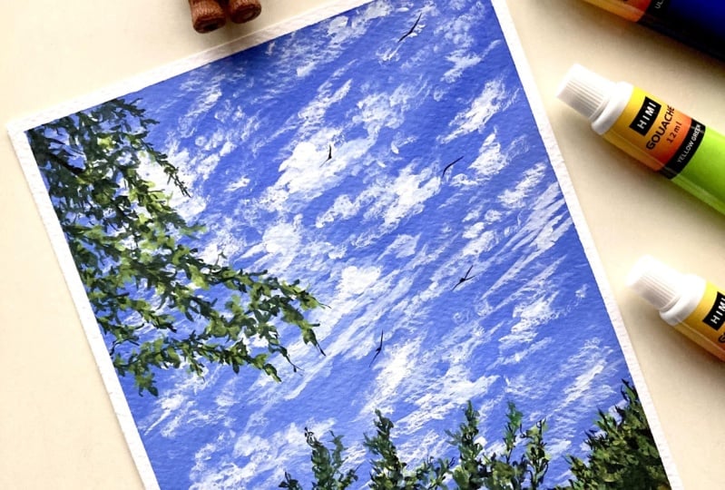
5. Exercise: Get to Know Your Brushes & Brush Strokes: Okay, so in this lesson
we're going to do a little bit of a
warm up exercise. Get to open our wrist, especially if you're painting
after a really long time. Rotate your wrists clockwise, anti clockwise, side to side. Just kind of do a warm up
exercise in your wrist. And then we'll also be learning
how to use our brushes. Get to know our
brushes and create these beautiful brush
strokes that are going to be used in
our class projects. So I'll be teaching you
how to create these reeds, these leaves, a bunch
of different trees. How to create those
foliage effects, little branches, and how to act those little details into
your paintings that we're going to be using in a lot of different places
in our foreground. So here are some
examples for it. I'm going to show you
how to create those. I try to keep it as simple as
possible so that we're not really stressing
out about trying to make it look a certain way. And we are rather enjoying the process and just
keeping it nice and simple, and flowy and slow. Let us talk about art brushes. On my palette, I have a
black paint taken out. The first two brushes that I'm going to show you are
these flat brushes. Now these flat brushes, I tend to use mostly for
the background washes. We've got the sky. If you're painting a lake,
you've got the lake. Whatever's happening
in the background, you'll see me create most of it with my flat brush. I'm just adding a little bit of water in my paint and
creating my beautiful, workable consistency
with the flat side. You can see that this is
the thickness of my brush. This is a size 18 brush overall with the maximum
pressure that I apply. This is the brush stroke
that I get. If I kind of tilt my brush, like
let's say make it 180-90 degree angle. This is the side brush
stroke that I get. Another brush stroke
that you can get is holding your brush
perpendicular to the paper, using the thinner
side of your brush. That's the kind of brush
stroke that you get. You can use a combination of these movements for
creating the background. Next, let us watch out
my size flat brush. Over here I have my brush
lowering it up with some paint. The thickest brush
stroke that I can get from the flatter
side is this. You can see there is
a big difference in the sizing of the brush next, If I tilt my brush sideways, this is the brush
stroke that I get. We don't generally tend to
use it sideways that much. But this is just to show you the difference in the thickness. If I were to hold my brush
perpendicular to the paper, this is the brush
stroke that I get. You can see how the perpendicular to
the paper remains the same in between
both the brushes. But if I hold it flat, there is a huge difference
in the size of my brush. So this one size 18,
this one size ten. I'll be using these
two flat brushes for creating any background bushes. Next, let us talk about
my size four brush. Over here, I have size
four and size zero. These are my round brushes. And I'm going to go
ahead and show you the different brush
strokes that you can create using your round brushes. Now this one is more
like a long round brush, so it comes to a
really nice fine tip, which can be used in
our finer details. The maximum pressure that
I apply in my brush, you can see that's the brush stroke that I get on the top. As I decrease the
pressure on my brush, you can see I can get these
beautiful thin strokes. And how do you control the
pressure that you're applying? I like to rest my wrist on the table and using the
smallest pinky finger, I like to change the different pressures that
I'm applying on my brush. It gives me more control over the pressure
that I'm applying. Now, this again, depends on how you feel and how you
tend to use your brushes completely your choice, the basic idea is to just change the pressure
that you're applying. Next, I'm going to show
you my size zero brush, which I tend to use a lot
for the finer details. This is the maximum pressure, so this is the brush stroke with the maximum pressure
on my brush. And you can see how as I decrease the pressure
on my brush, I get these beautiful
thin strokes. I can really like barely
touch my brush and create these thinner,
thinner strokes. Very fine details can be created using my
size zero brush. And I really love this thing about this brush that I have, that you can create these finer, finer details with very, very light pressure
on your brush. So hold your pinky, you know, change the different pressures that you're applying
and make sure that you're resting your
wrist on the table. That kind of gives me
more control over it. But then feel free to do it the way you like.
So these are the four brushes that I majorly
want to show you. The last brush that I want to talk about is the spoilt brush. This brush, I use a lot when I'm creating these foliage and I want to show leaves and details. But I don't really want to
work on individual strokes, so I just use this brush,
load it up with some paint, and just kind of tap, tap it wherever I want to
create a fuller foliage effect. Fuller leaves and details on the trees and
things like that. I tap it out using this brush and then using
my size zero brush. I tend to add finer details, which I'll show you next. This is a size zero
brush as well. You can obviously
have different sizes for different areas, but the size zero is the
one that I'm going to use. These other five brushes
that I'll be using. Again, I'll be using
a combination of these brushes to create
details in the background, in the foreground, all of it. Now let us talk about the different brush
strokes that you can use to create different
plant elements, right? So first I'm going to talk about this reed that I have here, or a wild flower, you could call it a bunch of
different things. So this one is going to be a combination of size
zero and size four. Again, you can use brushes depending on what's
more comfortable to you. I'll be using size
four and size is zero. First what I'm going to do
is take my size four brush, make sure that I have
a nice consistency of paint, very workable, movable, I'm able to
create a bunch of different strokes without
having my brush dry out. So the first thing
I'm going to do is I'm going to go ahead
and create a little warm up exercise where I'm just moving my brush in
different angles, applying different pressures,
making different strokes. I'm tapping in this one just you're going to
warm up and create a bunch of different
strokes before we go ahead and create those
plant elements itself. Now using a combination of
these little strokes and taps is what you use for
creating these plant elements. So that's why it's
important for you to go ahead and practice with your brush a little
bit before you go ahead and start
painting these elements. Now, try to create
some lines and strokes towards the
left, towards the right. And try to give it that shape where it feels like a fountain. I would say it's not really
curving out as much, but it's kind of
like a fountain. It's like a fan. Imagine a fawn. And then try to create a
bunch of different strokes. You can do the same with your
size zero brush as well. To create a bunch of curves, bunch of lines, bunch of slanty lines going
left, going right. Just to warm up your hands, you create those little taps. You can see how there's a difference in the
taps that you create. The sizing varies. This one gives you
a more idea of the way you want the
things to be, right? A bunch of taps,
a bunch of dots, a bunch of dragging lines. Short ones, tall ones. I'm just practicing here really
just warming up my hands, just creating a
bunch of strokes to understand my brushes better. Understand how much pressure I should be applying
in my brushes. Should I be applying
more pressure? What happens when I
apply more pressure? What happens when I
apply lighter pressure? What is the thickness of
the line that's getting? So all of these, you'll find out when you practice
it on your own. Now, my brushes
look a certain way, your brushes might
look a certain way. And that's why this exercise is important for us to, you know, understand our brushes,
get to know them, get to know our hands, get to know how much
pressure you're applying. Now over here, let's create
a few different strokes. So what I've done
here is created a slanty line and then added
a bunch of taps around it. As you can see,
they're all around it and they're going
left and right. Don't really focus more on the direction in
which they are moving. Let me give you a closer look. So I'm going to create
a slant line and then add a bunch of taps dots. Don't focus again, don't
focus on the shape. Focus more on creating a
bunch of taps around it. And you can see how slowly this resembles some plant
element that you might see. Could be a branch, could be something that you're
seeing on the trees, could be something that
you see on a shrub. So you've got the
slant line over here. I'm doing the same thing
with my size four brush. And you can clearly see the
difference in the strokes. This one's a lot
thicker as compared to the size Zto that I
was doing previously. And that's how you can vary the sizes where you want
to show thicker elements, you can use a size four. And wherever you want
to show finer details, you can use a size zero. Just create taps,
lines going left, lines going right, and just some random strokes around it. This is how you're
going to warm up and know a lot about your brushes. Just feel free to do
it however you want. In that section,
we're not really learning something,
we're just warming up. Now that we're done with
our warm up exercise, let's go ahead and create
a bunch of plant elements. The first one that
I am going to teach you is this Read again. It's going to be
a combination of your various warm up
strokes that you made. Again, we're not
focusing on trying to make our painting
look a certain way. And that is why in this class, we're not going to be painting
from reference images, and we're just going to
have fun with it first. Let's talk about this, read. For this, I'm using
my size zero brush. You can use your size four brush as well just to create
the background. Maybe for that little stem. I'm using size zero because
I want it to be fine. Now from there,
I'm going to start releasing strokes in
this left direction. And some taps on that, coming out towards the right.
And some taps on that. The basic idea to keep in
mind that it's going to have this conical shape. The base is going to be slightly increasing
as you go there, and the tip is going
to be very fine. That's how that shape comes in. Again, if you see very closely, I'm just tapping it from the left and right,
I'm releasing it. And you can see there is no definite shape
to this, right? We do not want it to have those definite shapes
for the leaves. I'm just going to
create a stroke upward. If I want to create
that leaf effect, I will bring it down. It can do that in different
directions as well. You can, you know,
drag your brush, apply pressure and then
release it for the grass. For these tall grass, you're
just going to go ahead and drag your brush in
different directions. So just a combination
of a bunch of different strokes to create an element that looks
like that, red. Let's talk about the
different kind of plant elements that's
right next to it, right? This is our first class project, so we have to be very
particular about understanding the shapes because first class project is
always so exciting. Now over here I'm going to
drag my brush over here. We're using the same concept with the read that
we did on the left. But over here,
these strokes that I'm taking out from the
left and right side, they're closer to one
another instead of having a little bit more of a
distance next to it, right? So this is like very closer
to one another, very compact. It's not creating
that conical shape, but rather it's following the structure that we just made. Just slightly
increasing, I would say the tip is still
a little bit shorter, but as you come down,
you're not making that drastic change in the size. And the way it spreads out, you can see how it's
very compact and it's just coming down following
the shape of the stem. And then you can just
add in a bunch of grass next to it just to
make it appear fuller. Again, when you create a bunch of these
elements together, it makes a huge difference. And you can also always play around with
the sizing of it, along with the strokes that you add on the left and right, you can add in some
in the middle just to make it look fuller. Next, let's talk
about this tree. Now, I'm not going to be
making that entire tree, I'm just going to show
you a small section of it and how I am
creating this shape. Now like I mentioned earlier, these taps can be done in
various different ways, in various different
shapes and sizes. It does not have to
look exactly like mine. I wanted to make sure that
this class does not focus more on creating something that
looks like a reference image, or creating something
from a reference image. But rather just look at a reference image
that's completely okay, but the way you create it, it's more about how
you imagine it to be and how you want it to lurk. And as you go, you're
not really applying that pressure on yourself to
make it look a certain way, but rather enjoying the process. Now for this, I have a very similar concept
to the read itself. Like I mentioned, everything
is interconnected here. It's very similar to the red. But the difference here is it's a tree now and it's
coming out more, it's spreading out more along with the left and
right branches that I have, creating these
shorter taps on it. Moving upwards just to show a bunch of
different maybe leaves, some sub branches that
you're not seeing in complete depth because
it's at a distance. And along with the left
and right strokes, you'd also make some in the middle to make
it appear fuller. Now you can see how I create a stroke moving
towards the right. And it slightly
moves upwards and then just a bunch of taps around it with very
light handedly. Again, like I told you, I'm not really
focusing on the way the shape looks or if it has
to look a particular way. I wouldn't even name this tree. I'm just enjoying the process of creating these strokes and
just adding these branches. Adding a bunch of sub branches and just creating taps around it and just warming up my hands and not focusing so
much on the final outcome. Just create a bunch
of different dots that are kindly kind of closer to one another and that will give
you the shape that you need. Next, let us talk
about a pine tree. Now, before we go ahead and
talk about a pine tree, I also want to show you a
different kind of tree. And that is your trees where you want to add foliage in it
and make it appear fuller. And how you can do that
with your spoilt brush. I want to show that before
we go ahead and talk about, you know, our pine trees
like stuff like that, where you've got branches
coming out from the left or the right side and you
want to just kind of show. That there are leaves
and you're not really seeing so much detail of it, but you know that it's fuller and it has a bunch
of leaves around it. For that, you'll basically
take your size foe brush or even your size zero
brush and you're going to create a basic
structure of the tree. It doesn't have to be a
perfect structure because you can create these leaves in
different places as well. But if you have just create a basic structure for the tree, a bunch of main branches and sub branches have
been put on my paper. Next, I'm going to
take my spoilt brush, load it up with some paint. Make sure that you're pressing
it down perpendicular, just to spread out the hair of your brush a little bit more. Then you're going to
just start tapping. Don't again, focus on
where to tap, how to tap. Just make sure that you're
with your spoil brush, just tapping in some foliage. Because the major details
come in when you go ahead and connect everything
using your round brush. Now over here, you can clearly
tell these are taps and it doesn't really
blend in that well. To blend everything and
add in some finer details, you go back with your
size zero brush. Wherever you see the ends of
these taps that you created, you're just going to add in some little branches and
some extra taps around it. And that's going to give you
that overall shape for it. It's going to enhance the
structure a little bit more. You can see a little bit of some extra extra dots
that you might see. And that's going to put the
entire structure together. Is that a way that I
would like to put it? It brings the entire
structure together. You can clearly see how these little details made
that major difference. Right earlier when I just created the
background and the taps, it kind of just looked
not in tune with one another and you
could clearly tell that there was a
difference between them. But now that I've added
a few of these strokes, you're able to see
some finer branches, some tinier leaves
and things like that. So you can just always
go back and, you know, create a connection between
all of them so that this entire composition
of this foliage and branches and leaves
kind of come together. So we will be using
this technique a lot, at least in like three
or four class projects. I would like to say where we are going ahead and just
stepping in and then creating these extra shapes around it and making
it appear fuller. So I really like this
technique, honestly. This is one of my favorite
ways of creating trees, especially when you're
working in silhouettes. You don't really have to focus so much on the entire detailing. All right, next let's talk about the pine trees that we'll
be making in our class now. Again, the pine tree concept, very similar to the tree and
the red that I showed you. Just that this one's a lot
more structured for here. I'm just creating a section
of my pine tree because I'm not creating a
whole long pine tree. And we'll start off by releasing these finer
strokes at the tip. And as you come down, you will be increasing
the size of your taps. So I'm just going to
have a branch come out, taps around it, branch come out to the left,
taps around it. Along with the taps
left and right. I'm creating some taps
in the middle as well so that it has that fuller effect. Don't forget to kind of tap a few bunch of strokes
in the middle as well. Otherwise you'll end
up with a tree that looks straight up and you'll see the stem
or the main trunk. And then you'll have left and
right strokes coming out, so you'll not see an
entire structure in it. So make sure that
you are creating some taps in the middle so
that it shows that, okay, this branch is coming
towards you, facing you, but you're not able to see that branch entirely
because of the trunk, but you're seeing the
leaves around it. I hope that's making
sense to you. So you can see over here how
I have a branch coming out. It curves down. Remember? See how it
curves down And then it moves up and then I've
got taps around it. Again, not focusing so much
on the way the tap looks. It's obviously going to
be thicker at the base. And as you know, the ends of it is going to
appear thinner. And you're just going to repeat the process all over the tree, like all the way
from top to bottom. And each time you
kind of come down, you're just going to slightly
increase the size of it. And you can make some of them in that same size where
the span is the same, but make sure that you're only slightly increasing
the span of it. Otherwise, you're going to
start off very small and you're going to end up
with a really wide tree. You do not want a really
wide tree to avoid that, you are going to make
sure that the way in which you increase
the sizing is very, very minute and fine. But overall, when you look
at it, you can tell, okay, there was a gradual increase
in the span of my trees. Now, along with this pine tree, I want to show you the
smaller version of it, how you can create the
smaller version of it. This one's slightly
bigger, obviously, you can go all the way
down and, you know, create a longer
taller structure. But for a smaller structure, we're going to be omitting
a lot of these details. So you just start from
the top and you've got these details coming
left and right and you can see howI'm not
really focusing on the leaves and the way the
structure looks a lot. I'm just going to focus more
on gradually increasing the size of these branches
going left and right. And I'm just creating a
bunch of taps around it. Just a bunch of strokes
around it is going to give you an effect
of a tree like this. Again, this one's going
to be in the background, so you're not going to be
seeing a lot of details for it. But when you look
at the painting, you know that it's a pine
tree in the background. Now, the next type of pine
tree is the one that we're using here in our class
project is just a part of it. This pine tree is probably
very close to the observer and he's only seeing a section of it in the view
that he has taken. For this, you will
create a stroke, a curve, like the one
that I've created. Imagine that you are going to create a pine tree
in this structure, but you're following
the structure of the curve that you've made. So you're releasing
these strokes around it and you are
following the curve. You're following the
structure and you're just creating a bunch of
strokes around it, curving in that same direction, and you're creating these taps so that they kind
of look spread out. This one I would say
looks very similar to those fake pine
trees that you get. The fake Christmas trees that
you get, the plastic ones. The structure looks
very similar to that, but again, it is inspired
from a real pine tree, right? So we're not really focusing
so much on the detailing, but trying to capture
the essence of what we see and what we observe. This is an example of
a part or a section of the pine tree and we'll
be using a combination of all these elements in
our class project. Now make sure that you
are practicing this, understanding your brushes,
warming up your hands, Warming up your wrists. Because honestly, when I
started with my first painting, I could feel a
strain in my hands. So this will happen to you. So make sure that you are
warming up your wrist, especially if you're painting
after a really long time, it might feel very different. And that is why this
warm up exercise is important just to
kind of, you know, bring back those memories from the past that you've had about
creating certain things. And then bring them back on
paper and just feel good. Have a little bit of familiarity about your structures before you go ahead with the painting. All right, now that we're done, I will see you in our first class project in
the next lesson.
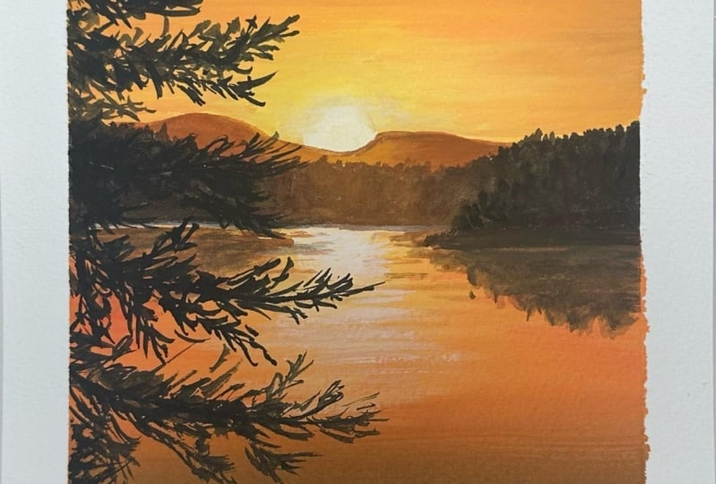
6. Project 1 Part 1 : By the Lake: Hello and welcome to your
first class project. Here's what you're
painting today. You can download the final
picture for your reference from the Project and Resources
section under this class. And I've also listed down all the colors
that I'm using for this particular project so
you can gather the shades that I've mentioned or the
ones that you have with you. And let's begin starting off
with the sketching process. So I've got everything
settled in. I've taped on my paper, taken the colors
out on my palette. Two charges of water paint, paper brushes, all
of it is ready. And let's begin with
this sketching process. So the first thing that we
are going to do is sketch out the basic composition of
what we're supposed to achieve from the final painting. If you take that fair reference or if you're just painting
along with paint, the first thing that
we're going to do is determine the horizon line. Somewhere around more
than half the paper, I would say is where you're going to go ahead
and create a line. Now the one third or the top
part is going to be the sky. Here you have the horizon line, and below that you've got the
lake and the other details. Let's just add all of that in. This gives us a
clear idea of where the horizon line is going to
be above the horizon line. I've got a hill at a
distance and it's really, really far away, so the
size is very small. Can you see how that height
of my hill is so small? So you're going to
go ahead and just create this irregular shape. Go up and down as you please
sketch it out as you please. The area above that
is going to be the sky below that is going to have the reflection of the sky somewhere on the bottom. Like leaving a
little bit of space, 1.5 inch or 2 " from the bottom. I'm going to have all
my plant elements in. You're going to have that
wildflower or the reed. I'm going to have a
bunch of different shapes that I've taught you from the practice lessons
or the exercise lesson. And we're just
going to be adding all those details in,
in the foreground. So this is going to be
a basic composition. I'm not sketching
everything out properly, especially the details
of the plant elements, because that's
something you do as you go and we just want to make sure that we're
covering everything in. Anyway, as Guash is an opaque medium, your
sketch is going to go, so you don't really
have to spend so much time in the
sketching process. So once you have your sketch in, let us start with the
painting process. So we're going to
start painting now. All right, so we're
going to start off with the Sky First. I'm taking my flat brush, my size ten flat brush. So that I have more control over the areas in which I'm supposed to be
applying the paints, and it helps me
cover smaller areas. The first mix of yellow
that I'm going to create is a mix of cadmium yellow with
a little bit of primary red. Very, very tiny amount of
primary red and white. And also notice how
the consistency of the paint is in that
milky consistency. Here's a swatch of the
color that I'm using. You can see the color
shade that I've mixed. It's very vibrant, but at the same time it's a very
light shade of yellow. And I'm going to add that in the right side of my painting, somewhere around the
middle, right side. You're going to go ahead
and add that color. Now, if you notice
very carefully, there are these streaks of blue. There is some pigment
left over in my brush. So that's why I
say make sure that you're cleaning your
brush properly. Next, I'm going to mix my yellow and red
together with white. This time a little bit
more red so you can see how I get this
pinkish peach color. I would say you're going to add that in right next
to the yellow. When you're blending
this, make sure that you are not applying a lot of pressure on
your brush very lightly. You're going to
spread that around. Because if you apply
a lot of pressure, you might just mix the yellow and the orange in a way
that you might not like. And we want the right section of our painting to have that
yellow effect, right? So just be a little bit careful. Very light handedly,
you're going to be doing the blending process next. I'm mixing red and blue with a little bit
of yellow and white. Very, very, very
tiny amount of it. So make sure that
you are just barely kind of touching your
brush to the paint. And once you have the mix, you're going to add that
on the left more section, again bringing it in. Now, if you notice
very carefully, I start from the left and as
I move towards the right, I'm just releasing my brush
very lightly releasing it. It is that to and fro
motion that I say, but over here we're just releasing towards the right
side so that we don't have that harsh blend and we're
just trying to get the paints to merge into one another if I were to put it,
but very lightly. Now that I have these colors in, I want to create a darker shade that I'll add at the bottom. I'm using a mix of blue. Black and a bit of red. This is a slightly darker
color as you can see. If it's too dark, you can
add in a little bit of white to get this
gray, bluish color. And you're going to add that at the very bottom of your sky. You can also add it
in the mountains. That's completely okay. Anyway, we'll be adding that layer over it so
it's completely okay. If it goes into your section, make sure that it is just
above your horizon line. Now that you have all
the colors in place, it's time for us to blend them. Because right now they're
just sitting next to one another without really
being blended in. What you're going to do is just create the colors that you did earlier and you're
going to start adding that again this time. Add in a little bit
more paint into your brush and just blend
everything into one another. Right now I've added the yellow. I'm moving it up,
ensuring that I'm also blending this light yellow
shade with that purple, grayish purple that I
added at the bottom. And you can see how it's just slightly blending
into the yellow. Once I've done that,
I'm going to create that pink shade that I had or that peachy
color that I had, which was a mix of
yellow and red together. The Swatch I've shown you here, you're going to add
that right next to it, in the middle of the painting, right the middle of the car, you're adding this peachy color. Again, blending it in very
lightly, very light handedly. If you think you're, you've
added too much of the pink, you can go back and
add some yellow in. That's the best
part about guash. It's very forgiving. You
can always go back and change things and move
your colors around. If you don't like a
particular color, like I felt like the
pink was too much, you can add a little
bit more blue. Make it more purple. Move the colors around,
change things a bit. We're here to have
fun. If you don't like the blend in the
way I've done it, feel free to do the blend in the way you would like to do it. Like I said, this class
is about getting back to your painting regimen or coming out of a creative block and there is no right and wrong. Your painting is going
to look good and you are just here to make
that effort towards, you know, showing
up for yourself and creating a painting. I really like the
way the blend looks. I can see that there is yellow, orange and there's
purple color blended in. If again, you don't
like something, you can always go back and
fix things here and there, change things here and there. I felt like, I mean, I had another look at
it and I'm like, okay, maybe I should be adding a
little bit more pink into my, you know, section in my sky. So I went ahead and added pink in the place where
there was a lot of purple. So I just wanted to add
a hint of pink there. Again, if it looks
like the paint, it's just sitting there and
you'd like to blend it. Move, Then all you have to do is clean your brush completely.
Just rinse your brush. Double rinse it to make sure
that you have no pigment. Tap off the extra paint
off and the water off. And just lightly
with your brush, with a damp brush, you're going to move the colors around. So I'm just using a damp
brush to move the colors. And right now I think I could say that I'm
really happy with it. I don't want to do
anything more and just wait for it to kind of
blend in and dry out, and then I'll make
my final judgment. But right now, I feel
like this looks good. The purple has been blended in. You've got the pinks,
you've got the orange, and you've also got that bright yellow in the right most
side of my painting. So we're going to
let this dry and then we'll move on
to the next step. Al, right now that this
section has completely dried, it's time for us to work on the elements that were
above the horizon line. For that, I'm going
to use my size four round brush and I'm
going to create a darker mix. I'm mixing my blue, that is Prussian blue
with my black paint. I'm just going to make
a darker color to show this mountain that
has at a distance. Mix them together, you'll get this color which is
very similar to indigo. And this is a swatch
of the color. You can see how it's nice and deep using this color. Go ahead. If your sketch has
been, you know, covered up and it's not visible, go ahead and sketch it out. Or you can just free handed
go with it, go with the flow, and just create your shape of the hill at the
distance however you like. There is no right
and wrong here. So I'm just going to make
sure that I carefully go above the shape of it,
how I want it to be. So I'm just, you
can see I'm just creating that line to kind of capture the entire shape and the structure
of my mountains. Once I'm done with
that, I'm just going to carefully cover up
the remaining spaces, make sure that I am
above the horizon line. Honestly, nothing's
going to really go wrong if you go below
the horizon line. Like I said, Guash is
very forgiving that way. But I just like to keep
my sections clear. So I'm just going to go
ahead and cover it up right above the horizon line and you can see how put
together this looks, how beautiful they said
effect of the mountains. You can always go ahead
and change the shape if you think you know you don't
like the way you've made it. Make more uphills
and downhills to it, and once you're happy with it, you are going to let
this dry completely. So I really like this, I'm
going to let this dry. And in the next
lesson we will be painting the lake and adding
the reflections to it.
7. Project 1 Part 2 : By the Lake: All right, so now
that we're done with painting everything that's
above the horizon line, it's time for us to
focus on the area below the horizon
line over here. You'll be seeing a
straight reflection of what's above
the horizon line. Along with that, we'll
be seeing more of the darker color
because we want to show the hill and the darker parts of the sky being
reflected on the lake. And then again, of course,
we have the yellow on the side and that little bit of orange and purple
that's blending in. So we have to show all of
that in the reflection. It doesn't have to be
perfect and exact, but we're just trying to
capture that similar sence that's above the
horizon line over here. Again, I will be using my size ten flat brush and I'm creating that darker purplish shade
that we have over here. I'm mixing red, a little bit
of blue and white together. And to this I will add a tiny
amount of black as well, so that I get that deeper
color that we see in the sky. We're going for that
slightly gray mix, adding a little bit of
black and you'll get this darker grayish color. So I'm just going to swatch
this out here for you. We've already seen the swatch, so we don't have to
swatch it again. But if you were to, you
can just test it out again to see if you're getting a
good color match over here. I'm just going to carefully
go ahead and apply that in. You can see how
the consistency of my paint is not very
thick because again, this is in the background, I do not need a
very thick layer. Go ahead and cover the area very carefully below
the horizon line. And just bring it down slightly like probably half an inch
you cover with this color, clean your brush completely. And then over here,
I'm going to mix my red paint with a little
bit of yellow paint and white paint to get that
orangish shade like a G color. I'm going to go ahead and
start blending that in. If you feel like your
paint is not blending in, you can always use water just to make it a little
bit more workable. And it's okay if
this the consistency of this paint is a little bit thinner because
you're going to go ahead and add another
layer over it. Or just once you're done
with placing all the colors, you can always go ahead
and add in more of the similar shades and blend it in like we did earlier
in the sky as well. So once I'm done
adding that orange, peach color, I'm going to go ahead with my lighter
yellow color. And I'm going to
spread that out. So I'm going to bring
it in, blend it out, very similar to how you've
done the sky above. You're just going to place the colors in a
similar manner so that you're getting that reflection
in place as you go. Once I'm done with the yellow and you can see
how I'm moving it from the right to the left
and I'm releasing my brush. Once I'm done with
the yellow side, I'm going to clean my brush. And then I'll add in that pink, purple color that you're seeing. And then you're just going to blend it in a similar manner. Now over here I'm
mixing my red with a little bit of
yellow and white. And then I'm adding
a little bit more of the red and blue in it. So I'm trying to
create a purple shade. So this is something that
you go back and forth with. You can add more red into
it to make it slightly more purple and a little
bit more blue if you want to make the purple
a little bit more intense. So I wanted to go
ahead with the pink first before I went
ahead with the purple. So the pink is a mix of your
red, white, and a tiny, tiny amount of blue
so that you get that pink but slightly
purplish color. I hope you're getting the
mix that I'm talking about. Once I'm done with that,
I'm adding the purple, the grayish purple that I use, and blending it in properly. And as you can see, as I mentioned earlier, you're going to go
ahead and just kind of blend everything
with each other. You'll be adding more of the
paint so it's completely okay if you are
not having a very, very thick even layer initially and you don't
need that thick even layer, you want the layer to be slightly lighter so that
when you layer over this, you do not end up creating a very the layering
mix that we learned. You're not ending up with a very thick layer
in the background. I'm going to go ahead and
add in a bit of purple. And I'm going to blend that with that peachy color that
I laid out next to it. And you can see how
I go from left and I release it towards
the right side, leaving a little
bit of space for that yellow to shine through. And I'm also blending it with that grayish color so that
there's an even blend. Once I'm done with
that, I'm cleaning my brush and just loading up my brush with a little bit of that yellow color and
going back and adding that in and blending it with
the colors next to it. So you'll have to keep
going back and forth with this until you end up
with a blend that you like. There might be places where you do not want to add any color, but you want to blend it
slightly in those places. What you do is you just go ahead and use a damp brush to
move the colors around. I wanted to bring the purple a little bit more further
down below my sketch. So I went ahead and just
bought it a little bit down in places where I felt
like it could use a little bit more of the color. I went ahead and added that. Then again, going back with my damp brush and mixing
the colors around until I find that I'm able to
capture the colors in a similar manner as they
appear to be in the sky. I felt like my lake reflection lagged a little bit
of the orange color. So I went ahead and added that. But right now, I feel
like we were able to capture the essence of the
sky on the lake as well. We've got the beautiful
blend that I like. Let's let this dry and then we'll move on
to the next step. Now that my layer has
completely dried up, it's time for us to add a little bit of
texture on my lake. Now, I'm not going
to go ahead and add all the details for the movement of the water and
things like that. I'm just going to add a bit of texture to show the reflection and slight color
variation on my lake. And we're going to
be focusing more on the details that we add
in the foreground, right? We're not really
focusing on a lot of details for the
background and we've got a lot of stuff happening in
the foreground at the bottom which ends up covering
major part of the lake. You really don't have to spend so much time trying to capture all the details
in the background. So for that reflection
or for that texture, I'm mixing my purple
with a little bit of blue and red and black. We're getting a deeper
purplish color. And what I'm going
to do here is I'm trying to create a mix that, again, is slightly thicker
than my usual mix over here. What you're going
to do is tap off the extra water that you might have and the
paint that you might have. You can see how when I
brushed across my tape, it's creating a bit of texture. You want to ensure that
you're not loading up a lot of paint and
very light handedly, you're just going to go
ahead and brush your, you know, move your
brush across the paper. And the cold pressed
texture of the paper is going to help you
achieve that beautiful, uneven texture, that dry brush
stroke in your painting. This is how you end up adding a little bit of texture
in the background. You can see how I load my brush. If I feel like I'm loading
up a lot of paint, I just go ahead and tap off
the extra or just brush it across the side where the tapes are so that the extra
paint is going off. And then brush it
across the painting. Just a little bit of texture
that I wanted to add. I really like the way the
texture looks right now. And while that's trying, let us sketch out are
foreground elements. Now, over here, if you would like to sketch
it out, please feel free. If you do not, it's okay. You can free hand the
whole thing as well. I'm just going to
place main elements. I've got these long reeds
where I want it to be, some grass shapes
where I want it to be. Along with that, I'm just
going to go ahead and just add the main stems in place so that it gives me a
basic idea of how I want my structure or
the composition to look. Of course, you can always go ahead and move
things differently. Add a few more in the places
that you feel are empty. But over here, we're just sketching this out
roughly to give ourselves a basic idea of how we want the
structure to be. Again, I don't want my
structure to look very flat, So I'm not going to
go ahead and create that ground space how it looks. Because I want it to
have that unevenness and flow along with the way I add the tall grass
and shapes like that. If I make it flat,
then it just ends up looking not going with the flow. I would say it would
just look like a layer just resting
over the flat surface. Just to avoid that, I'm going to go ahead
and not create that. In the next lesson, we will add all the details
in the foreground.
8. Project 1 Part 3 : By the Lake: All right, let's go ahead and start painting all the
details in the foreground. Here I have a mix of my
brown and black paint. So there's a lot more brown and just a tiny amount of black
to get this deep shade. It's very close to black, but I didn't want to
use black directly. That makes my paint
look very flat. To avoid that, I'm using
a mix of brown and black. And I'm using my size zero brush as it provides me more control over my brushes and the fine
details that I want to add. Right at the bottom, I want to add some leaves and some reeds that we practiced in the Get
to Know your brushes lesson. We are going to be
working in sections. You can see how first I know where the ground is
going to be and what it looks like and I'm just
going to go ahead and create a bunch of leaves and
these tall grass shapes. And then eventually as we
reach towards the bottom, we will fill that in more so you can create these
different shapes, these plant elements,
however you want to make and place
them however you want. This is something
in the foreground, give a different directions, make it go in different places. Play around with the
shapes of the leaves, play around with
the way it bends. This is all something that
should come or will come actually to you naturally
when you just sit down and paint where we're
not thinking so much. And that is why we're
not painting from a reference image because
I did not want us to feel very bound to make
it look a certain way or get lost in the details. Over here, you have the
full creative freedom of making these elements and making them flow
however you like. I'm going with
some shorter ones. At the leftmost section, we can see I've created
this half a section coming or like peeking
through the leftmost. And when I peel the tape off, you'll see how only a part of
it is shown in my painting. And I'm just going to
create a bunch in the left. And you can see how as
I reach the bottom, I'm creating a bunch
of tall grass shapes moving in different directions. And I'm bringing it down and filling up that entire section. Now over here, I'm using
a mix of brown and black. Over here, the quantity of
brown that I'm using is a lot more because I want a
slightly lighter, darker color. I hope that makes sense. And what I mean by that
is you don't want to use a very deep tonal value for
all the shapes that you make. When you add these
little variations, it, they're all dark, but they do appear different. That's the concept that
I'm going with in very, very easy terms, if I were to put it right so you'll
have different, different shades of
the darker color, You can achieve that
easily by varying the quantity of brown
that you add in your mix. Now, very carefully, I'm
making the stem first, bringing it all the way
up, and you can see how my movement is very
light, very gentle. I'm moving it upwards because
I want the tip to be very fine with very
light handed taps. I'm creating the shapes, those little taps coming in
from the left and right side, keeping in mind that it's
supposed to be conical. It needs to have
that. Like I say, all those shapes that
we're painting in this class resemble
the pine tree. For some reasons it has
a triangular shape. And you can see how as I
release it, each stem or the, each sub part that I'm releasing
for this reads longer. It is moving upwards, so you can see how
there is an angle play over here as well. And other than that, it's
all just small, tiny, fine taps Again,
you'll have to be careful with the pressure that you're applying on your brush. Make sure that you just
load up enough paint. You're not overloading your
brush with paint, otherwise, you're going to have bigger,
thicker blobs of paint. And you're going
to just get rid of the extra paint and very finely create these little tabs
along with those reed shapes. I'm making some leaves, I'm making some grass coming
in different directions. I'm making two different heads to the reed coming in
from the same stems. You can always play along
and add different things. Now, over here, the process
is very repetitive, right? So you can see how I'm creating these reeds flowing in
different directions. As I've mentioned earlier. Feel free to do that in
different directions. You don't have to stick
with the same direction. You can clearly see how I'm not even sticking
to my own sketch. This is something happens
to me all the time where I create a particular
sketch for like a branch or a tree coming in, picking in from the right
side, left side, whatever. And then I'll have that idea. And once I start
painting, I just deviate. That happens because when
you are in that flow, you end up thinking that, okay, this one looks better. Maybe the placement of a leaf here would
look much better. The branch moving this way
would look much better. This is something that
really just happens when you sit down to paint and
it's completely okay. We're here to have fun, right? Go ahead and create this red. As many as you want. And then as you come down you're going to
go ahead and create these tall grass shapes and then fill it in like we did in
that left most section. So once I reach that point, I will pin that out for
you so that you know, but whenever the process
is going to be repetitive, I'm going to keep
quiet and let you enjoy the process as you
paint along with me. Oh, oh. All right, so now that we're
done with the main shapes, it's time for us to
release some leaves. You remember how I told
you you have to apply pressure and whichever direction
in which you're moving, you will just tap your brush, apply the maximum pressure, and release it to
create that shape. This can go left,
it can go straight, it can move towards the right. There are so many different ways in which you can do that. Now, once we're done with that, once you're happy with the
number of leaves you've at it, you're going to go ahead
and load your brush, make these thicker grass shapes. And then as you bring it down, you're going to start filling up the bottommost section of the painting so that it
looks like a uneven ground. Along with the shape
that I'm creating. As you can see, I'm making sure that the ground
does not look very flat. You want to make sure
that the strokes that you're making does not have a very straight
line effect to it. If that's making sense, you
can see how it does look like it's very nicely
spread and very uneven. And of course, I'm making
some thicker strokes. And then as I release it, the strokes are getting lighter. I've added some more
grass here and there, some more leaves to
fill up the space. It's just coming from within. There's no thought behind this. I'm not trying to make
it look like something. I'm just, you know, going with the flow
and adding things as O and making that bottom
section look fuller. Now that we're done with let's say one third of the bottom, it's time for us to move
on to the next bit. So I'm going to be adding different variations for these plant elements
that we're seeing. So I don't want the
entire section to have just a similar
kind of reed. So I want to play around
with different elements. Now over here I'm
going to add in some tall grass shapes and then I could also add
some branches in there. And those little taps that we learned in
our practice lessons, you're just going to unevenly
create that kind of shape. Now over here, if
you pay attention, I am holding my brush
perpendicular to my paper. And that's why
you're not able to see those strokes
that I'm making. But if I were to put it
and explain it to you, what I'm doing here
is I'm just creating a few branch shapes and
creating these little taps. You can always split around with the shape and sizing of it. I am going to concentrate more on this little
section to not go all the way up like the
left section that you can see. I'm just creating
the smaller branch. These fine details just taps. There is literally
no structure to this and I'm just
going with the flow. I'm just filling the space in. That's the basic idea
that I have for this. Create a bunch of strokes, create a bunch of taps. And you're focusing more
on the top section of it. And as you reach to the bottom, just load your brush up with some paint and fill
that section in. And I'm also going
ahead and filling up any white empty spaces that
I might have left behind. And just moving it
around and you can see how I'm going in,
the circular motion, very random uneven motion so that my structure
does not look so flat. And I'm not creating
these straight lines, I'm also creating some
more of these branches and these little taps to fill
up this particular section. Go ahead and add them
however you like. As I've mentioned, there
is no order to this. And it's all about having fun. All right, so now
that we are done with more than half
of the foreground, it's time for us to
focus on the area that is towards the
right most you can see. Again, the size of it increases. We're going to have some
tall shapes come up here. I'm using mix of my
brown and black, very similar to the ones that
we've been using so far. Over here you can
see how I have added a tiny amount of black just
for that intense color. But again, majority
of it is still brown. Now over here, the shape that I'm going for is
something that I've already taught you
in the get to know your brushes and
brush trokes lesson. If you have missed that out, please make sure you
watch it because I do explain the examples of these brush trokes that I'm going
to be using and where I'm going to be using
in my class project. Now over here, the shape and the structure is very similar
to the read that you've made on the left
thing that changes here is it is not
spreading out as wide. And you're going from
the top all the way to the bottom of the
stem that you've made. And you're going to be following the structure of the curve. If you've made something
move towards the left, you will be following
that base structure and releasing these little
strokes left and right. But you can see how I'm not
increasing the span of it. It almost looks like it's the angle between these
strokes is very fine. Can you see how it's not
spreading out as much? These are a few things that
you'll have to keep in mind. But again, if you want
to go ahead and add those ads that you're seeing
in the leftmost section, please feel free to do that. Again, it's all about having fun and building
that creative habit. We're here to just create something at the end of the day, be it something that's
similar to mine, be it something that you have imagined and something
that's in between. A combination of both of those. We're here to have fun and enjoy the process of this
repetitive motion. Now you can add these shapes
as many times as you want. I will be adding
about 56 of those, and then I'll focus more on
adding the finer details. But over here, the process
is very depetaitive. I'm just going to keep quiet and let you paint along with me. Nothing extraordinary and new is happening here, honestly. It's just the repetition
of this shape and different sides and different angles
and different curves. That's the only thing
that's changing here. But the entire process
is very depetitive to fill up the bottom
section of it. Again, I'm creating these
long tall as shapes, Just some of them so that, that uneven ground
shape is coming into the play as
I bring it down. You can see how I'm just moving my brush across in the circular, random motion so that I end up filling that section and I'm not making it look very flat. That's something that I
have made sure to keep in mind that I don't want the
structure to look very flat. Go ahead and load up your brush and just make these
uneven shapes. At the rightmost
section of my painting, I'm going to create
a very similar shape to the ones that I have
been creating so far. But this one is a
little bit taller, which shows that maybe this
one's a little bit more closer to the observer and it appears to be a
little bit taller. But the entire structure
and shape of it is again, very similar to the
ones that we have been doing in that
rightmost section. Again, create the shape. The strokes do appear to be slightly bigger
because again, this one is closer to the observer and that's why
he sees it in that way. You can always play
around with the sizing of your brush strokes to bring
in that concept of depth. Even though your painting is too dimensional and it's
like a silhouette, you're not really adding
that many details. But at the same
time, you can bring that character and that sense of depth into your painting. All right, so if
you've almost reached the end of the entire
structure in the foreground, I'm just going to
go ahead and add in a few more strokes to
complete that section, you can add some of these
plant elements peaking in from the outside of your
painting surface as well. You can see how I have
some of these strokes created on the tape itself. And that actually brings in that beautiful
effect that, okay, you are capturing just a part of this whole scenery, right? When you click a picture, you only capture the section that you know you
want to capture. And obviously there
is a continuation of the entire section
towards the left, right, up and down, right. So when you create
these structures, coming in, slightly peeking in through the
left or the right. When you peel the tape off, it creates a beautiful
blend that, you know, It leads us to imagine
that there's more of this and we've just captured one particular
section of it. I hope that's making sense. Anyway, so I've reached
towards the end of it here just to
fill up the space. I am creating a bunch of tall grass shapes just so that
that area appears fuller. And so you can always add
these grass shapes to make it look fuller. So
now I'm done with this. I'm going to let this dry and
then see if I want to add some finer details in to
complete the painting. All right, so now
that this section has completely dried up, I am seeing a few white
spaces at that bottom middle, towards the right side. So I want to go ahead and
just create a bunch of tall grass shapes
and just add in some few strokes so
that it looks fuller. I'm also going to add
in some final strokes just to make, again, wherever I feel like
there is an empty space, I'm going to go ahead and
add in a bunch of grass, some leaves, and some
shapes around it. So that, again, the basic idea is to make your
structure look fuller. And wherever you feel like there's something
that's missing, something that looks empty, go ahead and create this. If you're happy with
your painting right now, you do not have to do this step. This is something that
I generally tend to do, is when I finish the painting, based on my idea, I have a look at it for a while. Once it dries and see that, okay, if there is something
that I should add, if maybe a few more branches might make this structure look a little bit more put together or if not, I'm
just going to let that be. So this is something that
I do towards the end to analyze it and I always
like doing that. There's always something
that you can add, some grass, a few, five or six strokes
of grass that you can add and make your painting
look more put together. Anyway, I went ahead and added my five or six strokes of grass, and I really like
the way this looks. So we're going to let
this dry. All right. So now that this section
has completely dried, I'm happy with the way
this looks right now. We are going to carefully make sure that we're
peeling the tape. Now, if your tape
peels off the paper, then I would suggest that
you just heat the section. You just use it dryer to kind
of heat the tape so that the adhesive kind of loosens and it's easier
for you to peel your tape. Mine does not have that problem, so I can just go ahead
and peel my tape. I do be a little
bit careful here because sometimes you end
up tearing a painting, and that is not fun. Be careful over here.
But other than that, just peel your tape off and
just look at those beautiful, clear, crisp edges
that we've gotten. Let's have a closer
look at our painting. I love the glow that we were able to capture
in this painting. That blend that we were able to work on together has
turned out so beautifully. I love the texture of the lake. I love everything that's
in the foreground. We've got a play of
different plant elements, so it does not look very
monotonous where you've just got one single element flowing from the left to right, and we've also got some peaking from the left and right side. So it shows that
we've just captured one particular section of
this beautiful landscape. All right, so this is it for
the first class project. Here's a glimpse of what's coming on a two.
So see you there.
9. Project 2 Part 1 : Pastel Sky: Hello and welcome to two. I hope you're excited to
paint along with me today. Here's the artwork
that we're painting, which you can download from the project and resources
section as a reference. And I've also listed down all the colors that I'm
using for this class. So let's gather that
and get started. All right, so I've
taped on my paper, I've taken out all the colors, as I mentioned in the previous
part that's on my palette. And we're going to start off
with the basic sketch first. So you're going to take
your scale and your pencil, and the first thing that
we're going to do is determine where the horizon
line is going to be. Somewhere around half of
the paper, I would say. A little bit below then half
of the paper because we want the majority of the
area to be for the sky. Somewhere below that, we
are going to draw a line. So you can see how I've
just divided the space up major portion for the sky and a little
bit for the ground. Now for the eros above
the horizon line, I am going to be
seeing a beautiful pestal sky with a little moon. And then right above
the horizon line, I'm seeing a bunch of trees. Okay? For example,
just so many trees come back at the horizon. I'm going to roughly
sketch that out. It does look like
a mountain here, but when we sit down and ain't, you'll see that
they are cluster of trees in the foreground. We're going to have
this beautiful tree as like the main object
in the foreground, right? I've shown you this picture. You can also download
the final image. That'll give you a better idea of what the composition
looks like. I'm not sketching out the tree entirely because it's all
going to get covered up. So we'll do that when we going to start painting the tree. And other than the tree
in the foreground, we've got some grass. We've got some flowers that we'll be tapping in using the, you know, tapping your brush, creating some splatter method. And then we'll do all of that, but that's the main
thing in the foreground. So you've got your tree, and you've got some grass and some flowers
in the foreground. So that's going to be a
basic composition and the basic sketche
that you need to have before we start painting. All right, now let's start
with the painting process. For the painting process, I'm going to start off
the sky first. Here I have my size ten flat brush because
I need to be mixing a bunch of different
colors so we don't need a wider brush in this area. A size ten works perfectly fine. I'm going to start off with
the purple color first, so I'm going to take
the purple color out on my palette because I feel
like I haven't mentioned it. No, I have taken the purple color out. I
have not taken yellow. I need a little bit of
yellow on my palette. So, we needed seven shades. Now I have all seven shades that I mentioned
earlier. All right. So I'm going to mix my
purple color first, which is a mix of
my Prussian blue and my primary red color. Now, this is going to
give me a purple shade. Now you can see our
purple is very dark, but when I add a
bit of white in it, it looks a lot more opaque. Now, you can obviously change
the value of the purple. That is, if you want
it more towards the red side or the blue side, you can change that by adding more red or blue
into your paint. I'm going for a purple that
is more towards the red side. Chickens have added
more red into my mix and I felt like this was
a little bit darker. So I'm adding a bit of white to kind of lighten
the color out. So here's a swatch of the paint. It's a very beautiful, I would say, lavender color. Right? I'm going with that
shade first, rinsing my brush, making sure I'm getting
rid of any extra blue or red that might
be on my brush. And loading up this color
and starting off by going in this left and right
motion at the bottom so you can see how I keep moving in this left
and right motion, making sure that I'm
covering everything. Now you've seen that
I've left a little bit of space above the horizon line, that it's completely
okay because, you know, we've got some other elements in that area and it's okay if you're not going to cover
that entire section. Either you can or you
can just leave it. As next, I have a pink color which is a mix of red and white. And I've added a little bit of the purple that I've
used from before just for that beautiful
transition to come into place. I've added a bit
of that color in. And then I'm blending it out again with the purple
that I laid out earlier. We're here just at that section where the intersection is between the pink and the purple. Keep going over that
a couple of times and the paint should just
blend into one another. Now into the pink, I have added a bit of yellow, and you can see how
it became a bit muddy because we
had blue in there. To avoid that,
make sure that you are making fresh set of paints, especially when you've got
two primary colors in, they might make a secondary
color or a muddy mix. So make sure that
you're careful of that. Next, I'm mixing yellow with a little bit of red and white. And here I get this
beautiful, light peach color. And I'm going to load my
brush with that paint and blend it out
into the pink color. Now you can see how
when I do that, you can see the
harsh lines, right? So to avoid that,
I'm just going to go ahead and use a damp brush. So make sure your
brush is clean. You can double rinse it
to ensure that you have no paint in your brush and
tap off the extra paint. And then you can always go
ahead and blend it out. That's one trick and the
way in which you do it. Next, I'm going
to add some blue. The blue mix that I've made
is a mix of Prussian blue, black, a little bit
of red and white. I'm just adding a
bunch of shades to get a blue that goes in with the entire vibe or the
color palette of the sky. I didn't want just prussian blue and white because I
would look very off. And that's why I've
added a bit of a very, very tiny amount
of red and black. I'm going to use the blending
with white method here because we've got a color
that still has yellow in it, so they might blend in together
and create a muddy mix. To avoid that, I'm going to make sure my brush is completely clean just using my white paint. I'm going to blend the ch color and the blue color together. You're going to go in this
left and right motion. Move upwards, slowly, move downwards and ensure that
you get a beautiful blend. Now if you feel like your
paints look very unblended, like over here, I can clearly
see that there is a bit of that PT color that's not
blended with the pink. Then I'm just going
to go ahead and use my damp brush
and move it around. The basic idea is to have this beautiful
blend in your sky, where one color just seamlessly transitions
into the other color. Now, blending can be a
very therapeutic process. I personally feel
like blending is such a therapeutic process where I'm just constantly going back and forth and just trying
to ensure that the color is mixed into one another and that's just
something that I enjoy. I mean, you could differ
from my thoughts, but I really find blending
very therapeutic. So you can see how
I'm just going back into the areas where
I've laid out the colors from before and now I'm
just moving left and right to ensure that I get this
beautiful, seamless blend. So that is something
that's important. You can always ret your surface and ensure that the blend
takes place properly. I really like the blend now, so let me let this try and then we'll move
on to the next step. All right, so another section
has completely dried up. It's time for us to move on to the other element
that we see here. I'm using my size four round
brush and we're going to focus on all the trees that
we're seeing at the distance. Now over here, we're going to mix two different shades First, just so that we have
two different colors to work with for a reference. And then we can go ahead and add lighter taco colors
as we please. Now over here, I'm going to
mix my burned Sana color. So I'm rolling up some
burned Sana on my palette, adding a tiny amount
of green into it, so you can see how
the consistency remains towards the milky side. I'm just going to go back
and forth with the color. So I'm adding a little
bit more brown, a little bit of green in there. And this is the mix that I get. It's still towards
the browner side, but it has that
green hint to it. The next color
that I'm mixing is my sap green with a
little bit of black. And you can add a little bit of brown in it so that you know that transition shade is in that same color
palette over here, I'm going with this color which
is a mix of my sap green, black, and my burnt Siena. Now, these two colors
are going to be used for adding various shades in the trees that I'm
seeing at the distance. And I'm going to start making
these vertical strokes. Can you see how I'm just going
with these vertical lines? As I'm done adding the details
for the vertical line, I'm just going to go ahead and start creating these
random shapes to fill up that entire section
up until the horizon line. Now over here I am, you can see transitioning between the browns
and the black. So I'm trying to
keep the brown at the top part of these vertical
strokes that I'm adding. And as I bring it down, I'm trying to make
vertical strokes, but I'm trying to make it
using the darker color. So this way we're going to add variations in our shades
with the lights and darks. I'm also adding a little bit of some strokes using
just black color, but I felt like
that was too dark. So I'm going to go back and
just add some browns in and you add that lighter
color into that area. So I'm just literally
just playing around with different shades of
browns and greens that I can add at the
distance so that I can just add some different color
variations in that area. If you're not
comfortable with this, feel free to just add
this section using a single color or make a
mountain at a distance. Feel free to change and switch things up
around as you please. You don't have to always stick to what I'm trying to tell you. Because this class
mostly is all about creating something
and focusing more on that rather than perfection and something that looks beautiful. We're
here to have fun. Anyway, so I'm just
going back and forth with the lights and darks. As you can see clearly, it does make a lot of difference
because you can pretty much see where the difference
in the color palm is in. You've got the top
parts which is lighter, especially when it dries, it will show up a lot more. I'm trying to keep my strokes vertical up until I
reach the bottom, And only at the bottom section. I'm carefully going in
these horizontal strokes to fill up the space. And if you'll notice
very carefully, the consistency of my
paint is in light, so that creates that uneven watercolory effect
when this dries. So you'll be seeing
some lighter parts and some darker parts come into play and it will
not look very flat. So this is some ways
in which you can just trick your wash paints
into trick them. They do have
watercolor tendencies, so you kind of use
them in that manner. Next, I'm adding a
lighter brown color. I've added a bit more
white into the mix. And I'm just adding some
vertical strokes to show some lighter colors in these trees that I'm
seeing at a distance. Now again, like I said, I'm just playing around with
the colors here. There is no do that.
I'm following, I'm just trying to pick up different sections as
per my imagination. And I'm going to go
ahead and add that in. I'm switching to
my size zero brush because it provides
me a little bit more of precision when I'm trying to lay
these strokes down. So you can see not only at the top section of my
shape that I've created, I'm also adding
some in the middle, some slightly at the bottom. So this way you kind of
ensure that there are different sections and clusters of trees as they are placed. And it's all not just
one single layer, right? And sometimes you
might feel like you've added too much
of the lighter color, what do I do then
you can go back and just add in
the darker color. And if in case it looks like
it's standing out a lot, then you can always
re vet that section slightly and ensure
that they kind of, you know, merge
into one another. I wouldn't say
blend, I would say merge because you just don't want the strokes
to stand out so much. I felt like there's
too much light color, light play happening
and I need to add a little bit of darker shades, have gone ahead and added that. And you can see how I'm adding this color at the bottom
section because I felt like it was too light and it looked a little bit flat. So I'm going ahead
and doing that. So this is what I meant where
you can always go back and forth with your
colors and just play around and add a
bunch of strokes. I really like the way this
is turning right now. Initially, like I said, it
starts off looking very flat. So you'll have to put
in a little bit of effort to go back and
forth with your colors, with your lighter colors
and darker colors to ensure that you are achieving
what you have in mind. It's very easy for it to not look like that
because it's squash. And unlike water colors where things just merge into
one another over here, you have to put
in that effort to achieve what you want to look and what you
want it to look like. All right? So just go
ahead and play around. Give it some lighter
colors, some darker colors. Lay them one over the other. If it doesn't look good, bring back the previous color. If you don't like any of it, just blend it all
in and start again. So you always have
the option to revet the surface and
start again if you don't like something, All right. I'm really liking the
way this is looking. I feel like it could use a little bit of the
lighter brown color. So I'm mixing burn Siena
with a bit of white. And as I lay that in I feel
like it's a little too white. So I'm just going to
go ahead and load up a little bit of green
into that and then, you know, add that
in and blend it out. So this is what I
mean when I say go back and fix things
if you don't like it, so you might not like a particular color that you lay down and it's
completely okay. It doesn't mean your
painting is drawing. You'll always find
ways to fix it. So I'm just adding
a bit of brown in my areas and overall, I'm actually really liking
the way this looks. So I'm going to try
and not overwork this entire section that much, and I'm going to just stop
right here and let this dry. Now, while that tries, I will
see you in the next lesson, where we are painting
the foreground elements.
10. Project 2 Part 2 : Pastel Sky: All right, so now
that we're done with the elements that are
above the horizon line, let's focus on the background for the area below
the horizon line. For that, I'm again using my flat brush itself and I'm
going to create a green mix. Now for this green mix,
I'm using my sap green. I'm adding a bit of white and a tiny amount
of black into it. So we're going for this
green that is not too dark. I'm going to add more white
to light in the color. So this is the mix that I get. It's black and a bit of white. So this is the
color that I have. Now, we're going to be using that for the
background all over, so you're going to
use a slightly, I would say milky consistency. It's not too thick but it's not too thin. It's
very workable. And using my flat brush, I'm just going to
go ahead and cover this entire section using
this particular shade. Now, why am I using
this particular shade is because I need
to add a lot of darker colors in
place as well to show the darker
parts of my ground. So you can see how
I'm just roughly adding this color everywhere. It's not very even. I'm not making sure that
the blend is very nice and flat and everything is kind of blended
into one another. That's not what I'm ensuring. I'm just making
sure that I cover this entire section roughly in these random horizontal
strokes everywhere, right? So now that we have
this color in, we are going to go
ahead and mix a bit of black into our paint
and a bit of green. Now we're going to go and
create this darker shade of color because we want to show the darker parts of this ground. Now you can see how if you
feel like it's too dark, then you can always go ahead
and add a bit of green. And you want to
do the step while your paint is still wet and
while your layer is still wet so that it just blend
in merges into one another. You remember that
section where I showed you the third type
of blend where you're just adding a bunch of different
colors while the paint is still wet so that it just
merges into one another. Like the wet on wet technique that happens in what colors? I'm switching to my round brush so that it gives me a
little bit more precision. And I'm focusing more on these vertical
strokes at the top. So it gives me this
grass like bushy effect. And obviously the lower part of it is a little bit more flat. So wherever you've
created this section, ensure that the tops have that bushy effect so
that once it dries, you have the opportunity to add strokes over it and add
more details over it. Along with these four large
sections that I've created. I'm also going to
go ahead and just brush this across, you know, areas a little bit
randomly so that you're still able to add
a little bit of depth. And it's not just these four
particular chunks where you're seeing the darker
parts on the ground. So I'm just roughly
blending that in very lightly over here instead of leaving the paint just as is. I'm kind of trying
to go back and forth and blend that with
the previous color. And this way it doesn't
look that flat. It's not like, it's
just sitting there. It kind of just merges in with the green color that we added. So now we've got this
rough section in the ground and you can always go back and just add things
wherever you feel like it. I felt like there was a little
bit of white spaces that I wanted to cover, so
I've added that in. All right. Now that
you're happy with this, we're going to let this dry and then sketch out and
work on our tree. Okay, so now that this
section has dried, let's go ahead and
sketch our tree out. Now, obviously, you can always just freehand
the whole situation. You don't have to sketch it out. I felt like over here, I wanted a particular shape for the tree and the vision that I had in mind that needed
a little bit of sketching. I've gone ahead and done that. So I'm going to
create the slightly slanty looking tree
and it's going to have these branches just like pine trees coming from
the left and right side. So I'm just sketching out the branches and you can see how there's a little bit of that
curve in my branch, right? It just curves upwards and then goes downwards and
then moves upwards again. That's the kind of concept that I have in mind
for this tree. So I'm just going to
roughly sketch that out. And as I go lower with my tree, it's the span of
the tree, right? The span of the branches,
It's increasing. And I wouldn't say it's
increasing by a lot, but there is still that
increase that you can see as it comes down at
the extreme bottom, I'm going to create a bunch of these crash shapes
and just a bunch of branches around it and make
sure that my tree is full. So this is something
that's really helpful when you're trying to create plant elements or just nature elements
in your trees. And sometimes when you
paint a lot of trees, you actually have an
idea in mind, okay? This is how I want it to look, and that is something that
just comes naturally to you. But if you are someone
who's new to this, you might need to sketch it out. And there's nothing
wrong in that, you can always sketch it out. It's good to actually sketch
it out and, you know, paint accordingly
so that you have a little bit more control over
what the shape looks like. All right, now that
I'm happy with this, let's go ahead and
start painting my tree. For this, I'll be using
my size zero brush. Okay? So the color
that I'm going to be using for this ray is going
to be a really dark shade. So I'm going to mix
my black color, so I'm going to add a bit
of water in it to make it workable to which I'm
adding my burnt CNA color. So basically the color
that I'm actually looking for is this
deep brown color. Like I said, we do not use black directly in our paintings. And we mix a darker
shade of color to kind of create that harmony between our paintings
so that, you know, it doesn't look like you've got, you did all that work in the background and
you've got a black, deep color just
resting on top of it. So you want to create that
harmony in your colors. So you go ahead and create
a mix that is dark, but at the same time it's using the shades that we've
used in your paintings. I'm going to go ahead and
start creating the main trunk. First, I'm carefully loading
my brush up with some pain. I'm going to bring that upwards. Have more control
over your hands here, because if you do not have
good control over your hands, you might not end up
with the desired shape, that fineness in your strokes. This is why you need
a lot of control. In this section, I'm just
carefully going to create the trunk and I'm just going to start following my structure. My structure as in the
sketch that I've created. So you're going to have
these steps coming in from the left and right once
you create in the branch. And these taps are just random
dots that I'm creating. Now, when I say dots, I do not entirely mean dots. A perfect circular dots. No. What I mean is these
dots are like little curves. Now, again, this could be
confusing to a lot of you. When you hear me say taps and
let me create these dots, is I'm really focusing
more on just dots. I'm creating these
very fine structures, very fine shapes
next to one another. And when it's all put together, it creates this beautiful
illusion of tiny leaves or tiny sub branches and just tiny details that
you can add to a tree. And if you notice
very carefully, I like to hold my brush
perpendicular to the paper. This provides me with a lot of control over the finer
strokes that I need to add, along with the structure that you're adding
on the left and the right side on the branches that are on the left
and right side. Don't forget to add in some of these taps in
the middle as well so that you bring in that
three dimensional view. And by three dimensional view, it means you've got branches
coming from the left, you've got branches
coming from the light, but you've also got branches coming straight
up at you, right? So you need to have some
details in the middle as well. You don't want your tree
to just look like it has two branches on the
left and right side. So let me just give
you a closer view of the strokes that you get a better idea of the
taps that I'm creating. All right, so here's
a closer view of these dots and these taps
that I keep talking about. You can see how I release the
branches on the right side, and then very carefully I'm adding in some taps on the left. I'm also adding in some
taps on the right, some in the middle. And the structure is not like the entire branches
are straight out. You can see how there's an
unevenness in my shape, right? And this is constant
to and fro motion. And I clearly remember
when I was painting for the first time or painting this particular artwork,
after a really long, I felt the strain in my hands because this to
and fro motion is something that I work whenever
I'm painting landscapes, I work with a lot. This hand movement is something that comes very naturally to me. And I can understand
that it might be a little bit tricky
for you to achieve a similar look because it's constant movement in my hands. It does make your hand, you feel that strain
in your wrist. And I did feel it because I was painting after almost what it felt like four months
or five months easily. So there was a lot of
strain in my hands. I was not able to endure this for really long
as I could before. I could clearly go out for like an hour using this
hand movement. But when I was painting
after a really long time, I felt that strain
and I was like, okay, I need to stop now
because I feel it hurts. It kind of hurts my wrist. Go slow in this step. You might feel a strain, so you can always
just take it slow and then come back to it
once you're done with it. One thing that you will notice in this brush strokes
that I'm adding is how all these little
taps that I keep talking about is slightly
moving upwards. Now that is something that I
wanted to do with this tree. Now again, as I've
mentioned before, there are so many ways in
which you can paint a tree. Not all trees look
exactly the same, right? And of course we're not
trying to name our tree, so you can always
play around with this shape and say that
your tree looks this way. If you feel like adding a tree, maybe going towards the
left, go ahead and do that. Maybe you want to
change the shape of the moon that I'll add.
Feel free to do that. I always say that you have
the creative freedom to change things in these
artworks that I teach you. Because you are not copying me, but you're learning from me. And you are going to paint
something which is probably your version of the same kind of artwork that
we're doing, right? You always have the
creative freedom to change things here and there. Now, over here, I'm just
going to go ahead and, you know, complete my trade. This is a very
repetitive process and there is no order to this. You're just following
your sketch and sometimes not following
your sketch because you can always change
things around and you might maybe want the branch to be slightly upwards
or slightly lower. It's completely okay.
And in this step, you're just going to focus
on painting the tree. This is a very
repetitive process, so I'm just going to
keep quiet for now. And once I reach the
bottom of the tree, I'll show you how to proceed and let that merge
into the background. All right, now that I've
reached the bottom of the tree, what I'm doing here is
just trying to create these branches moving upwards. Now you'll notice how these don't have a lot of these taps. And these shapes that I was
talking about and majorly focuses on these branch like
shapes emerging from it. Once I've added
that at the bottom, I'm going to go back and start
finishing up my tree now. You can always increase the
span slightly if you'd like, but I kept it shot at the
bottom because I wanted to add a bunch of these other grass like elements around
that particular area. So I've just left that
in so you can see how I'm adding these
little branches, trying to add different
elements around my tree so it doesn't look like the
tree is just resting on top and it's very flat again, I told you I'm going to tell
you how to merge that in. So you're just creating a bunch of different branches around it and going to complete the shape of the tree that
you initially sketched out. Now that I'm done with the
major part of the tree, I'm just going to go ahead and look at what the
shape looks like. And maybe add in a few
taps and few shapes and little details here and there just to make it appear a little bit more fuller, maybe try to bring in that transition
between the branches. Maybe a few more details
that you'd like. Overall, I'm really happy
with the way the tree looks. Like I mentioned, I'm
going to be adding a few details of the
grass at the bottom. I've gone ahead and done that. And to make our tree
look not so flat, I'm mixing a little bit of the darker color
that I was using for the tree with a
little bit of a white and using a slightly thicker
consistency of this. I'm going to brush that over towards the left
side of my tree, on that trunk that we have. Now, this dry brush
texture is going to add that unevenness
that you see in a tree. It's not going to look
just this dark shade, it's going to have
a bit of texture. And once it dries, it will
show up a little bit more. And I'm focusing more on the left side because I'm creating a tiny moon on the left
side of my painting. So the light is going to
be coming from there. And that's why you've got the texture towards
the left side. Now over here with my
size zero brush itself, I'm going to lower
up a little bit of white and add a tiny, tiny amount of water in
it to make it workable. And lowering it up carefully, we are going to create this tiny little circle so you can see how I'm creating
a tiny little circle. Now, you don't have to worry so much about the shape of it because we are going to re wet the surface
that's around it. How you do that
is you just clean your brush and
with a damp brush, you re wet the surface and you blend it with
the background. Now, I just wanted to slightly blend it with the background. If you feel like if it
still looks very harsh, then you can always
clean your brush and go back to it and clean the
edges out a little bit. And then I'm loading up a
little bit of white again and making sure that this
moon shows up a lot more. And then again, if you feel like you want to blend the edges out, you can go back to it
and using a damp brush, just move the paint around. And this where you
create that damp in shine around the sun
using the damp brush. Anyway, so we're
done with this part. In the next lesson
we are going to be adding further details
to our foreground.
11. Project 2 Part 3 : Pastel Sky: All right. So what
I've done here is I've actually used
my size zero brush and created these
grass like shapes on the darker parts of
the ground that we had. My phone did not
record this part, so I'm just explaining
what was being done. Here was a swatch of the color. It was a mix of green and black and a
little bit of brown. Just carefully, I have added
these grass shapes over now. You can add as many or
as little as you want. Once you're done with that, I am just using my round brush, my size four round brush, and I'm going to start
tapping these dots in. So I'm just going to go
back and create a bunch of grass shapes using
my darker color. So you can see how
I've added that. They're very randomly placed. We're not trying
to make it blend into the background or anything. It's just standing as a layer over and it's
completely okay. That was the kind of effect
I wanted it to have. Along with these grass shapes, I want to add a little bit
of texture on the ground. So I'm just making sure that the color is nicely mixed in. And using the dry brush stroke, that is very little
paint on my brush, very thick little
paint on my brush. I'm just lightly brushing
it over on the white or the lighter spaces of my ground, and it's creating this
beautiful texture on there. So you're just going
to go ahead and brush your dry brush over
the section and it's going to create a little bit
of texture in that section. And once you're done with that, you can always go back
and forth with this. You can add in some more, you can add in some
more grass shapes, a little bit more texture. So this is something about
personal preference over here. It doesn't have to be entirely exactly like how I am
doing it at the bottom. I wanted to add in some more of these grass shapes and try to
fill that up a little bit. And that's exactly
what I've done. I've added these grass shapes and then a little bit of
texture back and forth. Once I'm done with that, I am going to switch to
my size four round brush. Here's my size four round brush, and I'm going to use a mix of
my white paint with a tiny, tiny amount of blue, very, very, very light blue shade. Now this is just to kind of
make it not appear completely white and have a little bit of a tint to it using
my round brush. Wherever those little grass
shapes that I've created, I'm just going to add
in dots over it now. You don't have to add
it over all of them. You can leave some
of them as is. And on some of them you
can add the shape in. And you can also vary the size of these dots
that you're adding. So you can add in some bigger
ones, some smaller ones. This is again something that just happens as
you start painting. We're not putting a
lot of thought in it. Go ahead and start
adding these dots. Some bigger, some smaller. One thing that you'll
have to keep in mind, especially the ones that
are closer to us will appear to have all these
variations in the shapes. The ones that are in
the background will, you can have variations but they will still
have variations. In the smaller dots, the shapes are going to be very, very tiny, so that way you can bring in that
perception of depth. The ones that are closer
can have bigger dots, can have some smaller ones, but major bigger ones, the ones that are
in the background, will have even
tinier, tinier ones. Go ahead and add that
wherever you please. And once we're done with that, we will see what
our final touch ups can be in our painting. Now that I'm done with the dots, I'm going to just apply a paper over my section,
cover up the sky. And using my size
four arm brush, I'm just loading up my paint and tapping it against another brush to create these platters, just to have these white dots scatter around in
different areas. That's pretty much it. Once
you have these platters in, you're just going to stop right there and not overdo this. Once section completely dries, you are going to go ahead
and see where the final details or if there are any final details that
you would like to add. Now over here, I
feel like I could add a few more
details to the tree. So I'm just going to
go ahead and do that. Maybe add in some more grass
shapes wherever necessary. Now, this is again something that is a personal preference. If you feel like your entire structure looks well and good, then you don't have
to do any of this. You can just peel the
tape off directly. But in case you feel like, okay, there is something that
I would like to change, there's something
that I'd like to add. Then feel free to go ahead and make these little
tweaks here and there. I am really liking the
overall look of it. It just needed some
more work on the tree. So I went ahead and added some final strokes
around the tree, around the branches, and
more details for the leaves. And once I'm done with that, I actually really like
the way this looks. So I'm going to let this
dry completely and pay the tape off. All right. So now that my painting
has completely dried off, it's time for us
to peel the tape. Now, I'm going to peel
the tape against or away from the paper so that I'm not tearing up my painting. Again, make sure that you're careful with
your tape peels, because sometimes if your paper, especially with these
handmade papers, there are chances that you
might tear your painting. So just be careful around that. But it's not, you're just
going to go ahead and carefully peel the tape off and you'll have these beautiful, crisp edges, and your painting is going to pop up even more. Now let's have a closer
look at the painting. I am so in love with the
color palette of this class. I love how the
green nicely blends in with the colors in the sky. We've got this beautiful
tree that just stands out, there's a moon in
the background and all these little flowers
that are on the ground. It just gives you
that, you know, that pretty sunset during spring kind of
energy, I would say. I'm really happy with
the painting and I hope you enjoyed
painting along with me. This was it for day two
and here's a glimpse of what's coming in day
three. So see you soon.
12. Project 3 Part 1 : Mountain View: Hello and welcome to your
third class project. We're painting this
beautiful Mountain View. Today I've listed out all the colors that I'll be using for this
particular project. You can use shades that
are similar to this. Gather them and let's get
started with the process. All right, so I've
taped on my paper, here are all four sides. I've also taken out
all the colors that I've mentioned on my palette. So I've got all my
supplies ready. Now the first thing that
we'll be doing is determining the composition
and understanding what the basic painting idea is. Now the first thing that I
want to place is the Sun. If you look at the
final painting that you can download from the project and
resources section, if you look at it, I have
placed somewhere towards the middle and the right
side of my painting. That's exactly where I've
used my pro circle and placed a little circle,
a tinier circle. You can do this
freehand as well. You don't really have to
have a perfect circle. Now, once you have the
placement ready for the sun, again, you can apply it
anywhere you'd like. It doesn't have to be in
this particular area itself. My left section is going to have this beautiful tall pine tree, and that's why I've added my son majorly towards the right side. Now once I have that in place, I'm going to start creating
my series of mountains. Now I've had one come
out from the left, I have some in the middle, and then I've added
one in the right side. Now they're all overlapping, so once you are happy with what's front and
what's at the back, you can erase those lines. I'm just going to go
ahead and create a bunch of different series
of these mountains. I've got one at the back, and then if you
notice very carefully how bring them along is wherever I have like the
peak of my mountain, the one below that has that
more slanty towards it, so I'm not going
to have two peaks in the same area basically, that's the rule that
I'm going with here, because I want to show you the ones in front and you're going to have this
beautiful viewpoint of it. So you can just create
that however you like. There's no particular order
in which I'm following that. Please feel free to change it around and switch it around. Now in the foreground, I have this beautiful pine tree. Again, you don't really have to sketch out all the details because you know they do get covered when you're
painting the background. So it doesn't make sense for you to draw all the details out. But just to understand
the basic composition, you can just lightly
sketch it out. So I've got this beautiful tree in the foreground
and then I have a bunch of these little
plants that are around it. So shrubs that are
around my pine tree. So we'll be adding
all those details in the bottom part
of my painting. So this is going to be
my basic composition. Once you're happy
with the sketch, we're going to start with
the painting process. All right, so the first thing that we're going to start off is by painting and creating
the background for the sky. But before we go
ahead and do that, I'm erasing my son, the placement of my son, and my son actually
felt really large, so I went ahead and erased
that and added a tinier son in that intersection that I
have of those two mountains. Right. So I really like
that placement a lot more. So I went ahead and did that. You can always make
corrections here. I'm taking my flat brush and
we're going to start off by creating this beautiful gradient between the warm colors, right? So we're going to have
like an intense orange, slightly brownish
color at the bottom. And that goes on and gets
lighter as we go up. So here I'm creating
a mix of orange, red, white, and burnt sienna. So cadmium orange, primary red, burnt sienna, and white color. Now, white makes your paint
a little bit more opaque. And I really like adding that white color
in my paintings. So I'm going to go
ahead and do that. And again, if you ever feel like your colors are not as intense as
you want them to be, you can always go
back and fix it. So using this particular shade, as I swatched earlier, we are going to go ahead
and carefully apply that next to the sketch of
the mountains that we have. Now, nothing's going
to go wrong if you go inside the lines,
but just slightly, be careful over here
because we're going with a lighter consistency
for our mountains. Now you'll see more on that
as we start painting those. Now, once I have my
orange laid in to my same puddle of mix of
the colors that I have, I'm adding yellow
and white together. Now, there is very little
white in this mix. So it's a lot more intense,
vibrant yellow shade. And I'm going to
go ahead and load my brush and apply
that and blend it with the orange color first
before moving upwards. So this is something
that you have to keep in mind that
you want to try and blend the colors that are still wet and then
work your way up. Next, I'm giving my brush a really nice rinse and I'm loading my brush
with some white. And this time I'm creating a slightly lighter color as
compared to the one before. This is a lighter yellow color. Again, you can see
how I'm blending it in with the yellow first and making sure that I'm having this beautiful blend
of those two colors. And then I work my way up. You can work your way in
this left and right motion. With your brush, you're going
to start moving upwards. Like I mentioned earlier, you want the intensity of your colors to get
lighter as you move up. One way to do that is to
rinse your brush completely, give it a double rinse, and then move upwards. Now if you feel like you're
seeing any harsh lines, you can always go back with
a damp brush and fix that. But before we go ahead and
add any more corrections, let's go ahead and finish
the background first. Here I've added more
white into my mix. Again, it does have a
little bit of yellow, but it does have a lot more
white as compared to yellow. It's a very, very
lighter shade of yellow. I'm going to start
applying that and blending it in this
left and right motion, ensuring that I fill up that entire section with
this particular color. You can switch your brush and bring out the size 18 brush or a bigger brush for
this blending process because we are covering
a larger area, especially in the
top half of my sky. So you can whip out your larger brush and make the process a
little bit easier. All right, so now that I'm done applying all the
colors in place, I'm using my flat brush
and making sure that it's nice and damp before
I go ahead and start blending everything
into one another. Now again, as I
mentioned earlier, this flat brush is going to make the process a lot
easier for you. And you're going to be able to blend these colors a
lot easier because, of course, your
brush is bigger and we're going to be covering
a larger surface. And we do not have to blend
in primary colors here. We're just blending in colors on the same side of
the color wheel. So it's a lot easier for you to do this process
with a larger brush. I really like that gradient effect that we're
able to create. So we're going to
let this dry now, and once we're done with that, we will place our sun in. All right. So now that
my sky has dried, we can see how the color has
sort of intensified. Right? It's gotten deeper. So this is something that
happens with the quash. The colors tend to dry darker, especially the lighter colors. All right, now, for
the sun, not the moon. For the sun, I'm going
to go ahead and mix the light color that we used earlier for the top
part of the sky. So using this
color, I'm going to carefully place a circle. So I'm using my size
four round brush and ensuring that I'm
carefully making a tiny, tiny circle in the area that
I wanted the sun to be in. And once I place
that light color, using my yellow color, I'm going to go ahead and outline it very, very carefully. Once I'm done with that,
I'm going to dampen my brush and clean it and
just add white in the center. So we're doing it
in three steps. First you've got the
pale yellow color, then the vibrant yellow
color around it, and then the white
in the middle. This kind of creates that
glare around the sun. We don't want it to be flat, and that is why we're working
with different shades. I'm cleaning my brush
and I'm going to go ahead and add a bit
of yellow around it. And then completely
cleaning my brush and using a damp brush to kind of soften the edges and blend it
with the background. Now this is something that
takes a bit of practice. So if you're not sure with that, I would suggest
that you do this on scrap paper and kind of just understand how we're
working with this and how we're dampening the edges and blending with
the background. You just need a wet brush and kind of just smoothen
the edges out carefully and make sure that it blends into
the background. I really like the sun here, so we're going to stop and
move on to the mountains. Now for the mountains,
I'll be using my size four round brush because it provides me
a good enough area. And we can also
use a flat brush. So we're using a combination
of these two brushes. Now over here, I'm creating
a mix with my Prussian blue, a bit of burnt sienna and black. And I really want a
particular brown shade, but I don't want it to be
really like just bland, pure burn sy and brown. So I'm going to be mixing
a bunch of colors to create this great looking shade. So here I have the
color that I need for the background.
First mountain. I'm going to go ahead and use my flat brush here and
just make sure that I'm covering the areas that
are away from the sun. Why I said that is because that center portion where
the sun is going to be, I want to add a little bit
of like an orange color or a slightly more
vibrant brown color so that you can clearly tell
that the sun is creating that warmth color effect
in your mountains. You can see how I switched to my round brush and I'm
going to go ahead and apply that where the sun is trying
to pass the light on. Then all the areas
around it are going to be of the grayish
color that we just made. And using my round brush, I'm just going to blend
everything into one another. Now, another thing
that you notice me do here is the consistency of
the paint is very thin. You can see how it has that consistency
that I talk about. It's light and that
is why we're able to see a little bit of the
paper through the paint. And we can use that to
our benefit to create that uneven effect
in our painting and ensure that our layer does not look very flat, all right. I really like the way
the mountains look here. I'm going to let this dry before I move on to the next
set of mountains. Make sure that it's completely dry before you move
on to the next one. All right, Now that this
has completely dried up, it's time for me to move
on to the next one. Again, I'm creating my mix using my burnt CNN number with
a little bit of black, a bit of blue and white. Here's the shade
that I have, again. This beautiful grayish
brownish color is the one that I'll
be using this time. We're adding a little
bit more pigment and a little less white because we want it to slightly get darker as compared to the previous
layer that we had. You want to ensure that as the mountains go lower
or as you get closer, you're creating a deeper shade
just by a little amount, not by a drastic
deeper play of colors. Okay, so once we're done understanding what the
placement is going to be, I'm going to use a
mix of burnt sienna and orange for the section
that is in the middle. Here's a swatch of the
color that I'll be using. And I'm just going to fill the center portion in
covering up my entire sketch. Now, very lightly,
using my round brush, I am going to fill up
the entire section. And you can see how I move my brush in the circular manner. I'm ensuring that
it is not flat, so I don't really
want flat strokes. And to avoid doing that, you'll have to keep
moving your brush in this random motion so that you don't get
very flat layers. All right, once you're done
with placing the colors, you can always load
up your brush with some more paint and
fill up the section. And just move the colors and
place them however you like. You can always go
back and forth. Add in some more paint, move the colors around until you're happy with your layer. I really like the way
this section looks, this particular mountain looks. And once I'm done with that, I'm just going to kind of
add in a little bit of unevenness to the mountain and we're going to
let this dry now. Okay, so now that this section
has completely dried up, it's time for us to move
on to the next one. Now again, we will be
repeating the process, this time intensifying
the color slightly. So again, you're going
to be adding black. You're going to be adding
a tiny amount of blue, a bit of burnt sienna, and a tiniest amount of white. Not by a lot, just a tiny, tiny amount of white. So here's a swatch of the
color that I have mixed. Again, you can see how
it's slightly darker than the previous browns
that we've added. Now again, load your brush
with this particular shade. Carefully, go ahead and go across the sketch
that you created. Bring in a little
bit of unevenness to your section and cover your
area using this color. Now again, you can
do this entire process with just
your own brush. You don't have to keep
switching between the brushes. I just like switching
between my brushes, and that's why I went
ahead and did that here. Now again, bringing in the
brown and placing it right in the center where the
sun might be hitting the mountains just to bring
in a little bit of warmth. And then covering up
the entire section with the other color,
the darker color. Now again, the consistency of the paint is lighter
so that you're able to see a little bit of the
background through. We need that because
it has this beautiful, uneven effect and ensures that layer does not look very flat. I'm just using my flat
brush because it had a little bit of the pigment
from the darker color. Once I'm done adding
that, I'm going to let this dry and then we'll
move on to the next one. All right. So now that all
my three layers have Fred, it's time for me to
add the fourth one. This one's going to
be a lot darker, so I'm adding my black, blue brown together
and I'm creating this dark mix with
even tinier amount of white in my mixture. So I'll show you the
swatch of the color, but otherwise it's
just the same shade. Like it's a Sacco version
of the same color. So switching off
the swatch here, and I'm just going to go ahead and use my round
brush and create these vertical strokes like we did in the previous
class project. And we are going to go ahead
and add this layer in. Now this is going to be
really in the background. A lot of it will
get covered with our tree and all those shrub details that we'll be adding. So you really don't
have to work so hard to creating perfection. We just need a layer in
the background so that whatever white spaces or empty spaces that we might
have in the foreground, you still see a layer
in the background. So that's exactly what we need. And I'm not going
to bring this all the way till the bottom because major power of the
bottom section has a lot of the
trees and shrubs. Again, like I mentioned,
that we need to create, again, perfection
does not matter. We're just creating
a section so that whatever empty spaces
that we might have, you're still able to
see a layer through it. Now I've gone ahead and probably made half an inch of
this particular shade. Blending it out
till the background again doesn't make
much of a difference. I'm just filling up the
space and ensuring that I have a layer to show through. Anyway, I really like
the way this looks. I'm going to just let this dry now and then in the next lesson, we will be painting our pine tree and
adding further details.
13. Project 3 Part 2 : Mountain View: All right, now that we're done with a major part
of the background, we're going to start
focusing on the foreground. Now, in the foreground,
like I mentioned earlier, we have this beautiful
tall singular pine tree. So I'm just going to
sketch that out roughly. I'm still able to
see a little bit of my sketch through the
background and I'm just going to use that
as a reference and create a bunch of these
branches coming through. Now, if you're not very
confident about your pine tree, then I would suggest that you sketch it out and understand the placement for each
branch going left and right. Or you can just go with
it freehand, right? So I'm just not creating
a lot of sketch because I really like
switching things up as I go. But it does give me a basic idea of how my tree is going
to look or how tall it is going to be and what the extreme span of my
tree is going to be. Now I'm going to create
a mix of my sap, green, black, little
bit of burnt sienna. I'm not really using
black in my painting, but I'm creating a
dark mix of color that goes with all
the other shades that I've used in my painting. That's the color
that I mix, and you can see how it's a deep shade, very, very dark color. But it's again, used, you know, with the shades
that I've already used in my painting or will use. We've got green, brown
and black mixed together. Here's a swatch, the color, it's a really,
really deep shade, very close to black, but
not entirely black color. Now we're going to start with the painting process
for the tree. Now over here I'm using
my size zero brush. Because again, as we have been using this for the
past two class projects, you know how it gives me this beautiful fine strokes
wherever necessary, but at the same time
it does give me thicker strokes if I increase
the pressure on my brush. Now over here first what
I'm going to do is create the trunk of my pine tree and ensure that the tip of
the tree is very fine. Again, I'm just lightly brushing my tip of the brush over it so that I'm creating
these thin strokes. Now as I start creating these tabs towards the
left and right side, you can see how this tiny, tiny taps and dragging of my brush to create
these brush strokes. Now if you haven't
practiced this, then go back to the exercise
lesson and just have a look. I have explained how I am going to create
these brush strokes. I have explained that in
three different forms. You've got a normal
version of the tree, you've got a closer
version of it, and then you've got for
the mode version of it. So I've covered that slightly, but over here like I mentioned, I will be creating these strokes not only towards the left
side and the right side, you will be creating
some taps and you know, little brush strokes
in the middle as well, so that you're covering the center portion of
your tree as well. I have seen this
happen a lot of times. And honestly, I used to do the same thing when I was
just starting out with, you know, painting or whenever
I would see pine trees, I would just create
these brush strokes towards the left and
then towards the right, and my tree would just not
look like how I would see in an image or where I would see in a painting, it
would not look like that. And slowly with practice,
I figured out, okay, something that was
going wrong in my trees was that I was not creating these brush
strokes in the middle. So my tree just ended up
looking really empty. Again, this is
something that really comes with practice,
like I mentioned. So keep that in mind. Make sure that you're
adding some taps in the middle so that your
tree appears fuller. Now, this is a lengthy, long, repetitive process where we
are going to be increasing the span of the branches as
we start adding the next one. Now one thing that
you will see me do is I'm not
increasing it by a lot, but I'm just slightly
increasing it as we go. Now, I will be increasing
the speed of the video here because in the
next little section I will be increasing
it slightly. Because again, as I mentioned, it's a very repetitive,
long process. So I'm just going to keep quiet. The basic idea is that you
want to increase the span, add these different taps towards
the left and right side. You've got these
branches coming out, and you want to add
some little tiny, tiny taps and curves
around it so that you're making the pine tree
appear in your painting. And the reason why I'm increasing this is
because it's like a 13 or 14 minute long section of just me painting the tree. So I just wanted to trim
that shot a little bit, but if you'd like to
paint along with me, just decrease the speed by a little and you'll find me
going in your normal pace. And again, you can always
follow me along as you cook. Oh, oh. Oh. All right. So now that I've finished almost
half of the tree, I'm going to go ahead and
create a darker color which is a mix of green,
brown, and black. This time has a little bit more green and
black into the mix, so you can see how it's a
very nice and deep shade. Obviously, don't create a very, very deep color so that
it doesn't match with you or the strokes that
you were adding before. You want it just to get slightly darker than the one
that you were using. Now over here, we're
going to go ahead and use this color and
increase the span of our trees using this
shade as we come down. Now, you can also create bigger strokes here
because you've reached the bottom
and you want to cover the space a
little bit more. Over here you can see me
create these larger strokes. Now one thing that I
really like doing, especially when I have to
create these control strokes, is hold my brush perpendicular to the paper as it gives me a little bit more control
over the way my brushes move. Now this is something
that, again, is a personal preference. If you don't like it that way, you feel free to do it. How you are able to create
a particular stroke. So it doesn't matter how
you get to the goal, it just matters that you
reach the goal, right? You go ahead and create these
shapes however you like. Over here you'll
notice me create the brush drops while
increasing the span of my tree. So we're going to be
doing that exact step. You slightly increase
it and again, adding some taps in the
middle so that your tree appears fuller and just does not look like you have
branches coming left and right and
not in the middle. Always something to remember
when you're painting trees, especially when you're
trying to show like a trunk and you're trying
to show branches around it. Make sure that the branches just don't move left and right, but you have these
shorter strokes in the middle as well and these leaves in the
middle as well, so that you're able to cover those branches and
ensure that, okay, this is something
that's moving towards the observer and that is why
that section appears fuller. All right, now that I have
reached the bottom of the Sam, you're going to
go all the way to the bottom because again, we've got a bunch
of plant elements that have to be added
in that section. And we will leave that
particular area empty because it doesn't make
sense for us to add these brush strokes and
then cover it up later. All right, so we're
just going to make sure that we are
slightly covering up up until leaving a little
bit of space at the bottom. And then we can just
stop right there and we will focus on
the other details. Now the next step was not captured properly because
there was a bit of a clitch in my phone and the camera did not
focus on that step. So I had to remove
that from the edit. But over here what
I've done is I've used a mix of the same color
that I was using, a bit more green in it. And I've added a few
brush strokes at the top which looked like branches
and some plant elements. And I've covered the entire
section using my flat brush, using a round brush,
my size zero brush, I'm just creating a bunch of
caps so that I'm creating this texture and unevenness into that blend so
that once it dries, you can see some
sections that are slightly more darker
than the other. Now, this will not
entirely change the placements like you
really don't have to worry so much about where
you're placing them. You just place them randomly to create these unevenness
in the structure. The top portion of
this particular layer, as you can see, I've covered
all the white spaces. The top portion has a bunch of these leaf elements
and strokes that look. Like a little plants, you've got tiny branches
and stems like that. Now I'm using a spoilt brush here just to add
a bit of texture. You don't really
have to do that. I am honestly just
experimenting in this section and I'm creating
a bunch of unevenness. But this was something
that I didn't like, so I will go ahead
and correct that. But I wanted to use it
and put it in the video because we're always experimenting
and changing things. This is a part of our
painting journey, so we might not like something and we can always
go ahead and change that. Once this will dry completely, you will see how there is that unevenness in your
brush strokes. Make sure that your section
has completely dried. And once this dries, we will go ahead
and start adding a bit more details and the lighter shades of
green in our painting. All right, so now
I'm creating a mix of my green and black color. Now this one's a shade that is of this beautiful,
deep green color. I've added a bit of yellow in it as well to bring
in the warmth. So here I've swathed
the shade out for you. And what I am going to
do is use this color and add in some extra
branches and details. As a continuation for the strokes that
I've already added, Now I'm focusing more on the top section like of this entire black
space that you have. I'll be focusing more
on the top half of it because the bottom one has
a separate set of details. I hope that is making a
little sense over here. Ideally, what we're
trying to do is just add in a bunch of details of
different shades of green to show like the lighter
and darker parts of this complete section of this complete bushy
area which is filled with trees that
are very compacted, they are like very
close to one another. So you're really not
able to see a lot of difference in
what's placed where. All right. So that is
why you add in a lot of lighter and darker details to show that separation over here, you can think of it as creating
individual bushes where you've got a bunch of different branches and
leaves and taps around it. So you want to create
these individual shapes and as we add lighter
colors over it, you can bring out
the details more. I'm really just
focusing on that. I'm trying to create
branches slightly moving towards the left and then creating a bunch
of taps around it. Again, focusing towards
something that moves towards the right and adding a
bunch of details on it. This way you have more control
over what's going where. Once I'm done with the
right most section, I can move onto the one on the
left side and maybe add in some more branches
on the left side and a few more details
in that section. Now you will not be seeing a lot of difference
in the color here, because again, this shade
is darker, right in gas. This color is going
to dry out to be a little bit lighter
once it completely dries. So this difference
will be shown a lot more once my paint
has completely dried. Right now, you might be
thinking that this color looks exactly similar to the one
that you laid out earlier. What difference is
it going to make? What are we really adding here? But you will see once
it completely dries, how it makes a very
slight difference, it is going to try out to
be a little bit lighter and then you can always add
lighter colors over it, right? So I'm going to go ahead and start creating these branches. Like I said in the
previous stroke, that the base layer
that I added, I had just randomly, you know, made these shapes in the background and
filled in the color. But over here, we are
going to take our time and just kind of define the
shapes a little bit better. Wherever you felt,
wherever they are, just just random
shapes and looks like blobs and they don't
have a particular shape. You're going to
go ahead and just define it a little bit more. Add in a few branches. Again, this can look very different for you
and your painting. This might appear to be
a lot more different. The strokes are going
to be different, The placements are
going to be different. So you'll have to judge your own painting when you do this and then add these strokes. Again, as I've
mentioned earlier, we are going to be
focusing more only in the first half of
the foreground because the bottom section is going
to have a different set of greens and a different set of colors that we'll
add in together. So we are majorly focused on the details that I'm
adding around the tree, the pine tree, and the details that are in the top
part of the foreground. Now again, this will look
very different for you. Just don't stress out so much. There is nothing that we're not looking for
perfection, right? I've mentioned this
earlier as well. We're not looking
for perfection. We're not trying to make
it look like something. Your painting can look
very different than mine and we're not really
following or an image, right? So make sure that
you're just having fun. This is a repetitive process, so you're really
going to be working your wrist, working your hands, working your brush, drugs, and eventually you
will get a hang of it and you're just going
to enjoy the process. So I just tilted my painting here just to show you the difference
in the color that it looks. Can you see how
it's a little bit lighter and you can see
that glistening. And The wet paint. All right, so now that this
section has dried, you can see how it is
slightly lighter, right? And this time I've added
a bit more green and yellow to my mix
and I'm going to be using this particular shade and I'm going to add in
the lighter details. Like as I mentioned earlier
that we will be working in different layers and we'll start adding
lighter colors. And this was going
to define the shape of the layer that I've
added a little bit more. Now over here I'm going to go ahead with this light color. Again, if you've followed
my previous classes, you know the concept
that we focus more on that is 170% 50% rule. Where the base layer is, let's say 100% of the
brush strokes that I add. And then the green, the deeper green that I just added in the previous layer is almost like 70% So you're not
covering the entire area. You are leaving a little bit
of the background color in. But let's say you're covering
70 to 80% of the area. Right now we're focusing
more on 50% of the area. You can see how I'm making
the shorter strokes. I'm not covering everything. I am leaving a
little bit of space. So you're going to be seeing
a little bit of the black, you're going to be
seeing a little bit of the deeper green
that we added. And then of course, this layer is going to be added on top. When we add more layers, again, you'll be seeing a little bit more details and finer details. You're going to go ahead
and I am really just picking out different
sections and I'm adding these brush troops in sections so that once the
strides you're able to place where which shrub is or where which
plant element is. Now, like I said, they're all together, they're very compact, so you're not going to be
seeing a lot of difference in your structure and where the tree is going and
things like that. But at the same time, because
of these lighter strokes, you can bring about a little bit of differentiation between them. And again, it doesn't
have to be perfect, but still you'll be
able to see, okay, this one looks like a
particular tree element and the one next to it
is a separate tree, even though they are very compact and they
are very together. That's the idea that we have in mind and we are going
to proceed with this. My brush strokes
are not perfect. You can see how I'm
just tapping it around, creating a bunch of curves and dragging my brush with
these taps that I create. Again, I think mentioned
earlier that when I say taps, I don't mean dots, but I mean that pressing my
brush against the paper and just dragging it around to
create a few brush strokes. So I'm just going
to go ahead and add that in the top
half of my layer. As I have mentioned earlier, I'm going to be focusing on all those elements and picking out different sections and
adding the lighter color in. I can already tell
there is a difference. Now, one thing that
you will notice here is that because this
is a lighter color, once it dries, it will
appear a little bit darker. This is a very funny
thing about wash, and a lot of times my
students do tend to get confused as to what
color dries out, what shade, once you know
it's completely dry. And I always like to say that the darker colors will dry out to be lighter
a little bit, and the lighter colors
will dry out to be darker. Now, this is something
that you will need some time to get used
to because again, this is not something that you, if you're not familiar with it, it takes some time to
getting used to, you know, this little concept but you will eventually
get a hang of it. It's not that difficult. So yeah, now that I've
added all my brush strokes, I'm really liking the way
the structure is coming out. I am really happy with this particular area
that we've covered. So we're going to
let this dry and in the next lesson we will
continue this adventure.
14. Project 3 Part 3 : Mountain View: All right. So now that we
are done with three layers, that is including your background
layer for the elements, that is the plant elements. I have mixed a lighter
shade, which is again, a mix of my green yellow, a bit of black and white paint. So I've just gone ahead
and lightened the color by using a bit more yellow and a tiny amount of white
in there as well. This one's a very, very
nice and light shade. And now we are in that state where we're
going to go ahead and add some final touches
into this section. So this is going to be like the highlights of your section, that is your plant elements. Now again, as I would say that if you watched
my classes before, you know how I like to explain this section
where we're working in different percentages
and the percentages represent the brush strokes
that you're going to add. Right now, we're
focusing more on, I would say about 40 to 45% So you're just
going to be making that many strokes and
filling up the sections accordingly So that we're
able to see the dark color, we're able to see that
deep green shade, a few of the colors from
the previous strokes, and these are going to be
the highlights that you add. You're going to go
ahead and create these structures around the strokes that
you've already made. It's not like you're laying them over the previous
brush strokes, right? So you're not going to cover the entire section and you're just kind of going to go ahead and lay next to it just to add in some highlights in
that particular area. So you can see how
I'm just picking up the section and I'm creating
these extremely tiny, tiny strokes just to show
some highlights in that area. Okay, this section is
going to be a little bit brighter than the
sections around it, so that's how I pick it. Yeah, you're going
to be filling up this entire sections with these brush strokes
so that you can show the lighter parts
of your elements, add highlights to your elements, and you can clearly see how this one's shining a lot more. Now again, as this would dry, this is going to be a little bit darker once it's completely dry. So don't really worry if the color looks like it's
extremely light for you. It is going to dry down
a little bit darker. So yeah, we're going to go
ahead and cover this up again. This is a very repetitive
process and can look very different
for your painting. So just go ahead and
add these strokes. Focus on what you're
seeing in front of you. And do not focus on trying to create
something that's an exact replica, right? We're not focusing
on that. So just focus on your painting and how your brush strokes look and just add very, very fine strokes. We are not applying a lot of pressure on our brush
and we're focusing on getting these extremely
delicate brush strokes, right? And we're also working
with a size zero brush, so you just need a little bit of pressure
and we are good to go. So just be a little bit
controlled about your brush rooms and you're going to be
happy with the outcome. All right, so I really like
the way this is turning out. I am done with this section, so I'm just going
to let this dry and then we are going to
move on to the next bit. Now over here I'm
using a size of four or two spoilt brush and I'm going to mix my green
with a little bit of my brown and a little bit
of my white paint together. So I'm just creating this
nice light green mix that is going to be the
background and then we're going to add in
highlights over it. So that's why I told
you you just need to focus on the first
half of that section, because in the next
half, you'll be using a spoiled brush to
create these textures. Now for these textures, I like to hold my brush perpendicular to
the paper as it again, gives me a little bit
more control over it. And I'm dragging my
brush left and right, very lightly. All right? I mean to say lightly
because you need your brush strokes to stand
out as individual strokes. They're not placed
in a way that they look like something
that's more compact. To get that compact image
out of the picture, you're going to be
tapping very lightly. You're going to tap,
you're going to drag, you're going to be just moving your brush here and
there so you're able to create that effect in
this bottom most section. So we want to show a lot of these plant elements
close to one another. That's why we're not working on these individual details like we did for the previous one, but rather we're focusing
on just creating an illusion of what these shapes look like using a spoiled brush. This is going to provide
you with a lot of texture, a lot of just uneven
brush strokes. I really like doing this. I also like adding that with a bunch of different
shades so that we're able to play around with the colors
that we're adding. In our section, right
now, we're focusing on just the single
color which is green. I'm going to focus
and tap this in, in a way that I am covering
up all of that space, all of that black
space that we have. And what I mean by that is it's not like I'm making
it all green. You can see I'm adding taps
around that section and that just covers up that empty space that
we had left behind. Without any brush strokes, you're just going to go
ahead and just play around. You can create taps. You can try to make
these some branches, not trees but like branches. And tap in some leaves
around it and just work your way in these taps
that you'd like to create. Next, I'm adding a bit of
white and yellow into my mix. Let me just show you a
swatch of this color. Just going to switch it out here for you. This is the shade. You can see how light that is, right as compared to the
green that I just laid out. Now using my size zero brush, I'm going to go ahead and
add in these details. And I'm using my
size zero brush here because I want to show
these details a lot more. Now. Currently, I felt like
that color was too light. So we've added a bit
of green into it, just to add in that greener
color because they're shining out a lot more
as yellow over here. I'm just going to start
creating these tiny, tiny branches and having
some taps around. It's very similar to
the taps that you've probably used for
your pine tree, but just the positioning is
a little bit different here. We're just placing it differently instead
of like a pine tree. So you can always use these brush strokes
in different ways, even though they might
appear to be similar. But as you use it differently, they will just have a different
effect in your painting. So I'm just going to go
ahead and add that in now. I'm just creating
a mix of green and the brown color
together because I wanted a little bit
of a darker color. I didn't want that transition
to be just very light. I went ahead and I'm adding a bit of the darker
shade in there as well. It is a mix with
the previous color, but this one has a
little bit more brown in there and a tiny amount of
green in there as well. Again, I'm going to
go ahead and start tapping in these extra, you know, taps for
these branches and probably show some leaves. And just kind of bring
out a little bit more of a detailing section
in that area because, you know, it is looking, it was looking a little
bit flat, right? So when you add
these details with your size zero brush
or with a brush, with a brush that is
not a spoiled brush so that you have more
control over your section, you can go ahead
and just, you know, bring out or enhance the
area that you're working on, especially with plants and
especially with foliage. When you work with foliage,
you can always tap. And then if you want to enhance
the details a little bit, you can use your normal brush. And just bring out
a few more strokes outside just to
showcay this leaf. Okay. This is the
shape of the leaf, so that's how you work
around with your brushes. Anyway, this is a very
repetitive process. Again, it might look
different for years, so do not focus on working
on it exactly like mine. I was just here to
explain the concept in which I'm working over here. You can see how I
added that flat layer. I filled that in. I added a bunch of different
brush strokes. And again, I'm just using my size zero brush to add
in some extra details. Now, you could have
done the same thing in the background as well, and we're all here to
experiment, right? So we could have done
the same thing in the background as
well, but okay, we tried this in the
area that is in front of us and we did learn
something new that okay, you know, when you're working
on a section like that, we've got a lot of compact
foliage to work on together. You can use this
particular method, and it's not just for this, you can use that in a lot of places. And we will be using this
similar concept in a lot of different places in the
upcoming class project. Now I'm switching back to
my spoilt brush and with this color I'm just
going to add in some more texture
here and there. Just play around with it. Now that I've added details
with my size zero brush, made it a lot more profound and a lot more particular shapes that you might recognize. This one just for some
texture purposes, you can always go
ahead and just grass like strokes that you would make and just play
around with it. Tap in a few times
and go back and forth with your dunbrush
and add in the details. Now again, this is a very,
like I said, you know, a repetition of the entire step where you keep going
back and forth. See what you like, see
the weights turning out, and then you add
something that you want or like maybe change some certain things and maybe
add in a different color. This is all about
just the process of just going back and
forth with the thing. Now I'm making a mix which
is of a lighted green color. So I've got yellow, I've got green, and
I've got white. Now to this, I'm going to
go ahead and start adding some more highlights like we
did in the previous layer. This one has a lot more
lighter highlight, right? So I'm going to go ahead
and just use this color and create these little
taps as you can see, just to enhance that area. And show that, okay, this leaf is shining a little
bit brighter or receiving a little bit more light than the leaves
that are around it. And you can see
how these taps are not like the previous
ones, these are. More like just tapping a brush
and dragging it instead of trying to create like a
branch or an and tap it. In that type of brush, like a circular brush movement, This one's more like just pressing my brush and
moving it slightly. The shape, again,
is very random. There is no order
in these shapes. I wouldn't give them a
name because I'm really just tapping it however I want. I'm just trying to
create these shapes where you have that
image that, okay, this one is a
little bit brighter and this one's receiving a little bit more light
than the remaining area. And you've gone ahead and
added your highlights. Okay. So now that
we're done with this, the green section, honestly felt a little bit too, I would say green. I'm going to go ahead with this dark color
and I'm trying to create a brown color because I just finished my
brown on my palette. So I'm mixing my orange
with a little bit of black. And I'm going to go ahead and
just create a few branches to connect maybe the leaves that you've already
laid out there. And we're not adding
a lot of branches. Just a few strokes
to just fill up that section and bring
out a little bit of the darker details in. I'm not going to overdo this because it's very
easy to overdo this, but in case you do, you
can always go back and add in some extra greens and
highlights around it. Now, once I'm done with that, I'm just going to
add a few branches coming in from like the
outside of my paper. And it's moving towards
the left, right? It's coming in from
the right side and that's moving
towards the left. Just a few branch details. Probably something
again, which is outside my frame and it's just peeking into the frame
that I have currently. Just a few details.
Wherever you'd like. Once you're done with
that, we are going to stop and then we're
going to analyze it and maybe see if we want to add any further details to this. Now, I'm just going to
have a look and see. Okay, is there anything that I would like to change or is there anything that I would
like to add or am I just happy with
the way it looks? I wanted to go ahead and add in a few more details at the bottom which are of these little
branches and little twigs, details of little branches and crass like details
at the bottom. And I wanted to just
change the shape of these branches that I
added from the right side. Some few extra strokes in
the middle of my pine tree. So this is really
a step where you kind of take a step back
from your painting and look at it and analyze if you'd like to add in
some extra details or if there are a few strokes that you added
that are to put together. So you want to kind
of change that. And when they're put together,
what I mean by that, it's maybe you've
got too much of the light colors
placed together, too much of the highlights
placed together. So you want to kind of
bring that separation in. So this is a step
which is all about corrections and adding
things that we want. So I'm just going
to go ahead and add in a few extra strokes. Kind of like make my
pine trees stand out. Maybe add in a few extra
strokes where I felt I kind of neglected that
while I was painting it. So you're going to go ahead
and add in those details? All right, Now
that I'm done with this and my painting
is completely dried, I am going to paint
the tape off, which is my favorite step
of the entire process. Honestly, after I
finished painting, this step brings me the most joy as I can really see my
entire painting without, you know those paint
marks on the sides. And it's just that entire
white frame around it. It just makes your painting
stand out so much more. Anyway, let's have a closer
look at our painting. This one was a
little bit more time consuming than the usual. I would definitely
give you that, but I really like
the way this looks. It just makes me feel a
certain way about this. I really don't know.
I feel so happy. It was a good exercise for
our wrists, I would say. But I totally enjoyed the
composition of this painting. It was so much fun, and I hope you enjoyed painting
this one with me. I know it was a little
bit hard maybe, but you stuck around
and I'm so happy. Here's a sneak peek of
what's coming on day four. So I will see you soon.
15. Project 4 Part 1 : Cloudy Day: Hello and welcome
to your day four. This is the artwork that
we're going to paint today. So you can download
the final artwork from the Project and Resources
section for your reference. And I've also mentioned all the colors that
I'll be using. So gather them and let's begin. All right, so I have taped on my paper on all four sides here, taking the colors
out on my palette, as I mentioned in
the previous part. Now, over here, we
are going to create the basic composition
of our artwork. Now if you notice very
carefully in the final image, is that we've got a bunch of trees from the bottom
left and right. We've got two different
tree sections to work with. At the top, we've got some more branches and
leaves to work on, which are going to
be slightly bigger because they are a lot more
closer to the observer. And other than that,
all the remaining white spaces that we have, it's going to be for the clouds. So that's the basic composition. I'm not sketching
out everything very well because it's all
going to get covered. And we're going to dive right
into the painting process. Now over here I'm using my size 18 flat
brush because we're going to be covering
larger areas and we're not mixing a
lot of different shades, we're just using different
blues over here, I'm mixing my
ultramarine blue with a little bit of water
and white paint. And as you can see,
when I add the de, the color becomes a lot
more lighter, right? As compared to ultramarine
blue as is that you would have seen mix initially. Now, over here, I'm going to create this beautiful blue mix. Now I'm not going for
a really dark color. That's where we've
added white to kind of tone it down and I'm going to start blending in
this angular form now. Usually you must
have seen and we have actually worked on
going left to right, right, and we've only blended our colors
according to that. Now over here, what
I'm going to focus on is blending at an angle. Now you see how I'm bringing
it only halfway and moving back into the previous areas that
I was working with. And that is because
I need to be using a lighter shades of blue in the white space
that you're saying. So we're going to be
working with kind of different shades of blue
and blending them together. Now if you feel like your
brush is getting dry, then you can always
add a tiny amount of water to kind of loosen the consistency so that it makes the blending
process a lot easier. So see how I am bringing
all this color in, leaving that white space in the left section of my painting. And as I come towards that area, I am going to mix a little
bit more white into my paint. Now, make sure that
you're blending it all properly so that you have
an even blend of color. Using this lighter shade, I'm going to apply
apply it all in that area which is left on that white
space that I had left. Again, you're going to
be moving in this to and fro motion using
your flat brush. And this is where your
bigger flat brush plays a very important role
because you'll easily be able to cover a
larger surface with just a single brush and not have to keep
going back and forth. Or load a lot of
paint into your, like load your paint
brush many times. Now, over here, if you
notice very carefully, I feel like the color has lost that deep blue
that I was going for. Right. It does look very
bland and singular right now. So I'm going to go ahead
and take some more blue and white like create that darker shade that
I was working with. And I am going to use that
color and bring it in, so can you see how I
am bringing it in? Again, the paint
right here is wet. So this way you'll be able to
blend that in a lot easily. So you're moving in while
the paint is still wet. And if it was dry then
you can always just re wet the surface
and move along. But over here, my
main goal is to have a darker blue at the top and slightly towards the left.
Have a lighter bruise. You can go back and forth and create this until you're
happy with your blend. I like the blend here,
so I'm stopping. All right, so now that my section has
completely dried up, it's time for us
to add the clouds. Now for the clouds, I will
be using my filbard brush. Now if you don't have
a filbard brush, you can also use
a round brush for this section or a flat
brush for this section. I wouldn't suggest a flat
brush because you need that rounded edge for the shapes that I'm
going to create. But in case you don't have it, then just use your
normal round brush. Now over here I am mixing
my white paint with a tiny amount of water to
make it more workable. And you can see how
the consistency of my paint is really thick. It's almost very paste
like consistency. And that's the consistency you need when you're
working with clouds. And I've just
brushed it across to see if I am loading
up a lot of paint. So you want to make
sure that you're not loading a lot of paint here. Now the best part about
working with a Filbert brush, for me personally, is how you can create these
thinner strokes. If I apply the pressure
along the shape of my brush, I can get these
beautiful rounded edges. Now for adding the clouds, I am going to move very slowly. I want to determine the
positioning of my clouds. Now when I am painting clouds, I personally do not like to dive into all the details that
I might see in a cloud. And I like to just maybe observe the direction
in which they're moving or just the overall feel and kind of
like the shape of it. But I don't like to get into
the details for the clouds, especially when the main focus of my painting are not clouds. Or if I'm not painting
a fluffy cloud, I do not like to focus
on that over here. We're just going to try
and focus on spreading our clouds around our sky. Now basically that means
that we're trying to distribute our clouds and
work with different shapes. So you've got your
thinner strokes, which if you're
using a round brush, you'll be using it in a
way that you're using only the tip of your brush to get that kind
of brush stroke. But if you're using a
filbert brush like me, then you're going to be using the tip of your filbert brush. And whenever you want bigger
strokes of thicker strokes, you can just press down
on your brush a little bit and you'll be able to create that kind
of brush stroke. Now, I'm not going to focus more on the clouds that are
going to be at the bottom because that section is going
to get entirely covered with our foliage,
plant elements. So we're going to focus
more on the top part of it. Right over here,
I am just lightly brushing the tip of my brush
across and trying to create. So you saw how I created four or five different
sections first. And then I am kind of increasing the sizes wherever
necessary and that would be bigger sizes of the clouds are going to be at
the top of the painting and the ones that you're
seeing that are quite thinner and a little
bit more squished are going to be at the
bottom just to bring in that movement in your
clouds where you look like, okay, these clouds,
the ones at the top, appear bigger because they are kind of right above
our viewpoint. And the ones that are smaller
are slightly further away. So that's the kind of concept that we're going with right now. And once you create different sections and
blocks of these colors, I mean your clouds, not
colors of your clouds, you will be kind of
joining them together. And what I mean by
joining them is you will slightly extend the
shape as you move. So you can see how I
created the first block and now I'm just extending
my brush strokes. And then once I extend them
and kind of connect them, I can create another
bigger block there. So this is the way in which
I like to add clouds. So I start off very small with thinner brush rooks and
smaller brush rooks, and then I see okay,
where can I extend and move the clouds
and add bigger ones. Now obviously because
the main focus of our class is not clouds, so I'm not going to get
into the heavier details and things that
you should keep in mind when you are
painting clouds. So this is not all about clouds, but this is all about adding some cloud essence
into your painting. I hope that's making sense. We're not trying to create
perfect clouds because that is not the main focus
of our painting. Now along with your
bigger blocks of clouds, if you just take your brush
and rub it across your paper, right, what's going to happen is because especially if you're
using cold press paper, you will be creating this beautiful texture on your paper. And that is going to, you know, come because of the cold
press paper and of course, because your consistency
is really thick, you're going to be getting that cloud de,
textures, you know, the distributed clouds
which are not fluffy, but you do see the clouds
spread across the sky. To achieve that,
those kind of clouds, you can just take your brush, load it up with some paint, and lightly gently brush
it across your paper. And you'll be able to capture
that kind of a sense. It's not really fluffy,
it's not really dense, it's just floating across. So you're going to be working
in sections and trying to connect all these
shapes to one another. You can see how I am
just moving at an angle. Now again, this is one thing
that you'll notice as we reach the final outcome of
these clouds that we've added, is that I am working
slightly at an angle. I am not working
straight, right? And that also goes without
saying that it is moving across and along the
blend that we created. So we're going to let
this dry for now. And as it dries, the main focus is to make certain areas a
little bit more opaque. Now remember in the
technique lessons, I told you that white will dry down a little bit
lighter than you expect. Wherever you want to make the white a little bit more opaque, you'll have to go with
two layers now to show that fluffier or not fluffier but like denser
side of my clouds. I'm just going to make these
bigger blocks that I have, the shapes that are
much more defined. I am going to just
apply another layer of paint over it so that
once it dries down, that appears a little
bit more opaque. Now you can pick,
your sections are definitely going to look a
lot more different than mine. But also take time to analyze the shapes that you've
created and see if you'd like to change certain things about
the shape of the cloud. This is where you
will maybe add in a few extra brush strokes or make certain sections a
little bit more opaque. So you're going to
take your time and add the second layer over to make these sections more
opaque right now. And then look at it
and see if you'd like to add in a
few extra strokes. When I'm doing this step, I do tend to add in a few
extra floating clouds here and there just
to fill up the space. Or maybe make some floating
clouds that I have, a little bit more opaque, a little bit more defined. This is the step you're going
to be doing all of that. Go ahead, look at your painting
and make these changes. And make your clouds a
little bit more dense. All right. I'm
going to stop right now and let this
section completely dry. And once it dries, we'll add the plant details. I'll see you in the next lesson where
we'll be doing that.
16. Project 4 Part 2 : Cloudy Day: All right, to add the
details in my foreground. I'm using my size for
round brush and I am going to go ahead and start
making my first mix, which is going to be
of the black paint. I'm going to load up black
paint and a tiny amount of water to which I'll
add green color. Now you remember how
in the previous lesson we moved in percentages
of the brush. We are going to be applying that same concept here as well. This is going to be
the darkest color that I use for the background. Using the shade, I am
going to go load up my brush with this
particular color and add in these brush strokes. Now over here, we're trying to focus more on this section. Being like a cluster
of trees together, you're really not seeing any separation
between them, right? They are very, very
close to one another. So you're going to be making these trees in this
triangular shape, almost like these pine trees. And the shape is only going
to be visible at the top. And as you bring
it to the bottom, you are going to be connecting them and create that
as one single layer. So you can see how
I've done this. Here I have one single line
and diagonally I've got a few brush strokes
coming left and right to that particular line that
I just know created. And then I'm just going to
fill up that entire section again with this flat color. Just this black
color or dark color. You're going to
go ahead and just fill up that entire section. Now you can see how over here
we're really not able to differentiate which
tree is where, right? It just looks all as one. And that is exactly what
we want for this layer. This is going to be
our first base layer. And as we proceed, we'll add
in some more details to it, so you can also tweak the
shape around if you'd like. And once you're happy
with your shape, I am mixing a little
bit of my black, yellow green and a tiny
amount of white in it. So you can see Hama
making a very, very drastic change
in the color. I'm slowly going
to start moving. Now, over here is the time
when you will look at the shape and create these
little vertical strokes. And when I say vertical, they're not going
to be all straight, they are going to be
at an angle as well. I'm also doing this while
the paint is slightly wet. It's not really wet, but it is slightly damp. And there might be
sections where it might blend into one another and
that's completely okay. We're just creating
different shades of green and adding that in you can pick out
different sections. And what I mean by
sections is that may be a particular tree shape here and the tree
shape next to it, just trying to differentiate the different trees that
you might see, right? So that's the concept
that we're going with so that it doesn't
look all very flat. So you can see over here, you can tell that these are like a cluster of trees or like
a bunch of trees together. And you are going to just
create different shapes around it so that you know you can
distinguish between them. That's the basic concept of
what I'm trying to do here. Go ahead and create
these shapes. Obviously, they might
look different for you. I'm just here to tell you the concept behind
these things so that you can use them in the painting that you are
creating along with me. Once the section will dry, we'll go ahead and add
in some lighter details and highlights to this so that it shines up a little bit more. We'll be working step
by step over here, you can see how I've covered almost 70 to 80% of
the previous layer. You can still tell that there's
darker color beneath it, but I have used a lot of brush strokes over
this section, right? So go ahead and fill that up, and once you're happy with it, you let this dry or
while that's drying, you can mix up your
other color as well. So over here I am
going to move on and use my size zero round
brush and I am going to add a tiny amount of yellow
into my mixture along with green and a little bit more of the yellow shade so
that it shines up. And you know, it's lighter
than the previous color. And if it's not getting lighter, you can add in a tiny, tiny amount of white
in there as well. And I'm using my size zero
brush here because I want a lot more finer brush strokes. If you're able to achieve
those finer brush strokes with your size two or
size four brush itself, then feel free to use that. My basic idea is to have a little bit more
finer strokes and I'm focusing on adding these
brush strokes majorly focused towards the left side of these sections that
I have picked out. Because I want to show
that the light is coming out from the left
side of my painting. And that's why these strokes, these lighter colors or the
highlights for the section is concentrated more towards
the left side of my areas. So you're going to
go ahead pick out your sections and create
these brush strokes. Now, they might look
different for you. You can take some time and
observe how I am doing it and how I am defining the different areas and picking
out the different areas. Again, when I say left side, it doesn't mean that all of them have to be on
the left side itself. You cannot create a few brush
strokes towards the right. That is not what I mean.
You can create a few, but majority of them will be focused on the left
side of your area. All right, so go ahead and
complete that in and again, it will look different for
you, so don't be stressed. You're here to just
learn the process. Right now that I'm done with
the trees on the right side, I'm going to move on to creating the shapes for
the ones on the left. Now over here I'm using my
pencil and I'm going to create these branches and
majorly the trunk or just understand the
placement of these trees. One thing that you'll
notice me do here is I'm giving the
trees an angle. So it's not straight up, it's slightly moving towards
the right side, right? And I am just going to go ahead and create the
basic structure. It doesn't have to be perfect. I'm using my size four brush. I am going to make
the dark green mix, which is very similar to the ones that we have used
for the previous section. You're going to be
seeing how similar. That's right, it's
that exact same color. And you're going to
be using this for creating the base
structure over here. I'm using my size
four brush and I am going to get it to a
really nice and fine tip. Hold my brush almost like at an angle or perpendicular
to the paper. And you're going to create
the main structure. You've got your trunk in or the branches in and
those tinier branches in. But you're not really working on all the shapes right here, because we have to
add in a bunch of details and a bunch of leaves
in that section over here, I'm switching to my
size zero brush and I'm going to start creating
these tabs as you can see, how they are a lot bigger than your normal taps or the
thinner detailed taps, but we'll be varying
in between them. So you're going to be
adding some bigger details, some bigger dots, and then add in some tinier details
for the branches. Now over here, there was something that did not
strike me and that was that we could use a
spoilt brush to work with the foliage and then add
the details on later. Now this is something that happens when you're
making a painting. As you paint, you have
a realization that I could have achieved
it differently. Okay, so it did not strike me. So I'm not using that, I'm just using my round brush
for the details. But if you do have it and
you'd like to give it a try, then go ahead and take
your spoiled brush, load up the paint, and just start tapping
in areas where you want to create that
cluster of leaf effect. But if you don't want to and
you want to just, you know, go along with me, you can,
you can always do that. It is all about
personal preference. Now, over here, I am switching between the
different shapes, switching between the
different brushes. Wherever I want bigger details. Over here, I wanted to
add in some bigger taps. So I am just using
my size four brush. And you can see how
the brush strokes are a lot more thicker, right? And if I wanted thinner ones, I could have just, I can
just use my size zero brush. So you will be going back and forth a lot in this section. The basic idea is to fill up majority of the
section with these taps. Then we can always go back and add the details
and the intricacies in slightly so that they don't look just like splotches but
a little bit more detailed, especially at the
tip of the tree. At the top of it, you can
add tinier branches using your size zero brush and just play around
with the shape of it. Add the branches moving in different directions
and however you like, This is again going to look
very different for everybody. It's not going to look the same. And that's exactly what we want. We don't want to have different replicas of the same thing. I need you to add
your touch in it. So go ahead using your round
brush size to round brush. Go ahead and add in
details depending on however you like over here. We're just working on
a single color right now so it can look
a little bit flat. But we will add in all the
details a little bit lighter, green shades to it later. Right now, just go ahead, play around with the
shape and cover up this entire section using your
different sets of brushes. Oh, oh, oh, oh, oh, I'm actually really liking
the way this is coming along. You can still see a little bit of the sky through the section, so it's not like
that entire area is flat and black like
the one on the right. And that's why there
is that difference between the two
structures, right? This also brings in the
perception of distance, a little bit of that depth in a painting where you know
that the right section is still further away and the left one is still
slightly closer. And that is why we're seeing
these bigger strokes and a little bit more detail in that area as compared
to the right section. You're going to go ahead
and just cover this up up until you are happy and satisfied with the way it looks. I'm just going to add in
a few more brush strokes, but otherwise, I am really
liking the way this looks. So I'm going to let this
try and we'll continue this adventure in
the next lesson of adding further details to it.
17. Project 4 Part 3 : Cloudy Day: All right, now that we're
done with the base layer, I am mixing black and green together with a tiny
amount of yellow. Here's the swatch of the
color that I've mixed. So you can see how the
yellow is very, very little. It's still a very
deep shade of green. Now using my size zero brush, what I am going to
do here is cover up, Let's say 80% of all the brush
strokes that I have made. You still want to be
showing the previous color, but you're going to be
adding a layer over this. Now when you see it right now, you might feel like
it's not making much of a difference or it just
looks like the same shade. But once this is
going to dry down, it is going to appear
completely different. I mean, completely different
in the sense that it is going to dry down
a little bit lighter. Now, go ahead and create a bunch of strokes
using this color. We have done this in the past. Don't stress out so
much because there's no particular order in
which we're doing this. The only thing you
have to keep in mind is that you want
to cover let's say 80% of all the brush
strokes that you have already laid
down for yourself. Now I'm going to give you a closer look at my section so that you can
really tell what I'm doing. Because it is still a
very far off angle. Right? Let me bring you closer. All right, so here's
a closer look at these brush strokes
that I am creating. You can see how I'm
creating these taps. I'm also dragging my brush, almost creating
different sections of leaves and
structures like that. And it's not entirely just tap, dragging my brush, there are a bunch of dots
in there as well. Just play around with
different shapes and cover up the section. Now, when you see a
closer look at this, you can really tell that, okay, the color that I am applying
is definitely a lot different than it was appearing right from
the above angle, right? So it is completely different. It is a deeper shade of green, but it's definitely lighter than the previous brush
stroke that we laid out. So go ahead and create the
bunch of brush strokes, and once you're done
with that, you will be letting this entire area
completely dry off. Because you can see how
these brush strokes and these color blocks that I'm
creating are a bit thicker. So they might take a
bit of time to dry. But once you're done with
that, you will let it dry carefully and then
move on to the next color. Now over here for
the next color, I am going to be adding a
bit more green into my mix. Now you can see
how this color is completely lighter than the previous one that
we just applied. So you want to make sure
that you are creating a color that is
lighter as you go up. Now again, over here, we're focusing more on
trying to cover up, let's say 50% of our area. So we are going to keep that in mind before we start laying
out these brush strokes. Again, very similar to the way in which you
laid it out earlier. So you'll be dragging
your brush in certain places and some of them will have these
uneven shapes. Some dots and taps
and things like that. So just a bunch of different brush strokes laid out together. Now let me give you a closer
look at this as well. So here you can see how I'm laying out these
brush strokes. Again, keeping in
mind that you're not covering all of the greens
that you just laid out. You are going to
leave a little bit of that green color brush
strokes as well, so that you're able
to see all these three different shades
in your sections. You're going to be able to see the deepest shade
there. Now, this green. Right now, one thing that I am noticing is that once this
green is going to dry down, it is going to get a bit darker than I would
expect it to be. Let's see how this dries down. And then we will add in a few
extra strokes if necessary. But then again, it all
depends on how it dries down. So you can always give
yourself the time, look at it, analyze it, and see if it needs lighter shades or a whole
different layer over this. Again, wait for it to dry completely and then you
can make that judgment. So go ahead and add
these brush strokes and then we'll move
on to the next bit. All right, so I'm
really happy with the way this looks right now. I am going to let this dry and then we'll move on
to the next bit. So for the next
bit, I want to show a few branches speaking in
from the top left section. So I'm going to sketch my
branches out first, carefully. Now, over here for this section, I am going to be
a little bit more careful with the
shape of my leaves. I am going to define the shape of the leaves
because I want to show that this
particular section that we're seeing is a
lot closer to us. It's almost right above us, so we are seeing a
lot more details. And we're not just seeing
random brush strokes, so let's work on that. For this, I am going to, again, use my size zero brush itself. And I'm using this
darker green mix that I've used earlier. Now this is a mix between
that lighter shade that we added and the
darker shade that we added. Using this, I'm
carefully first going to outline the branch. Now over here, you just
make sure that you have a bit more control over
your brush strokes. Now to get that leaf effect. What I'm doing here is I'm creating the stapered
brush stroke. What I mean by that is I'm going to start off with a thin stroke, tap my brush and
then release it. And when you do that,
especially when you have a brush that comes to
a really fine tip, you will be able to create
these leave shapes, right? So you'll be able to
create that using a brush that comes to
a really fine tip. If you are not very confident about that and
you feel like, okay, I am not confident I'll create these good shapes or these
leaf shapes properly, then what you can
do is you can just outline a shape of a leaf
and then fill that in. It'll also be doing
a combination of that in here as well. Wherever I feel like the angle is a little bit
difficult to achieve, I will create the shape
of the leaf and then fill that section in so you can achieve this
in different ways. Whatever works for you
along with the leaves, the bigger leaves
that we're seeing, I will be creating
some smaller taps, just a few sub branches
and smaller details. And just filling up that
section so that it's not all looking the same. You're going to be
adding a little bit of different shapes
around it over here. I'm just going to go
ahead and fill up the top left section using
these brush strokes. Now you can add as many to as of these leaves that
you want or if you want to show a completely different type of branches and leaves or structures coming out from
the left if you feel like. Okay, no, I don't like this. I might do palm leaves,
go ahead and do that. Full freedom to change things here and there I went
with the structure because I really wanted to
try this particular shape of the leaf and see
how I can achieve it. You know, bring in a little
bit more details into my section rather than it just being taps like I generally do. So this is something that I always go back and forth with. I like to experiment,
I like to switch things up and that
is very important. Otherwise, you're just creating monotonous paintings
that require similar, you know, approach to it. Keep switching things up. Once you're done
with the base layer, with your darker color, I am adding a bit of
yellow into my me. Here's a swatch of the
color that I am using. We're going to go
ahead and start adding some lighter
colors to this. Right now it looks a
little bit flat, right? To lighten it, what I'm
going to do is I am going to cover up some of these shapes with this
lighter green color. And maybe go ahead and add in
some more leaves around it, some taps around it. And I'm just going to cover
top of some of the leaves, some of the leaves I'm
going to cover entirely. And this is just something that is coming to me
naturally, honestly. And I'm just creating some taps and adding in some extra
details around it. Major D. What you want to basically show here
is that you've got these lighter colors of these leaves
in there as well, along with the darker ones. And just adding
different variations of greens into your section. And like I mentioned, along with covering up
the leaves that you had, you can add in
some extra leaves, some taps, some branches with this lighter green
in there as well. So you're kind of
just covering up the section and adding
extra details as you go. I really like the way this
looks with my lighter green. As you can see, it
is going to dry down to be a little bit darker. So keep that in mind. Now I'm going to bring you
back to the normal view. I'm using a light green color. This is the one that
had a lot more yellow in it that we've used
earlier as well. Here's a swatch of the color. I've added a bit more
yellow into that mix. And let's go ahead and just highlight some
of the sections Again, like we did in the
previous part, you are just going
to add this light to green on some of your leaves. Again, focusing more on
the top of the leaf. Or if the leaf is
bending downwards, then the top section of that leaf that's
facing downwards. I hope that's making
sense because the light is coming
from the left section. I want to bring out these
light colors based on that. So we're focusing more on the top section of these leaves. So I'm going to go ahead and
add in these extra details, making sure that I'm not
overdoing the section. We just need to add a few
taps here and there as we go. All right, so I
really like the way this has turned out now. So let's let this dry right now. I'm just going to
have a look and see where the things
can be added. A few details that can be added. I felt like I could use a few more details in the branches that
I've added at the top. So I've gone ahead and use a darker color to add
in those details. I'm also using this
lighter green color to go ahead and add in some
highlights in my section. And remember how I told you this is something that
you do as you go. So once my layer had
completely dried, I felt like it could use a few strokes of even
lighter green color over it, especially focusing
more on the top part of my tree or the foliage
that I have created. So we're not going all
the way to the bottom, but we're almost going to from the top to like
half of that area. I'm still using my size
zero brush for this. Let me give you a closer
look of what I'm doing here. I am tapping my brush
strokes very lightly, very gently, and only
in certain places. I'm making sure that I don't overdo this step because I do not want to add a lot of
lighter shade in my area, specifically here, because this is still closer to us and maybe not receiving that same amount of light that the other
areas are receiving. And that is why, you know, it tends to look a
little bit darker. Keeping that concept in mind, I'm just going to add in a few brush strokes
here and there. And right now, this is something that might look
different to you. You might not need to add this. So feel free to not do
this step over here. I am pretty much satisfied
with the way this looks. A few more strokes, but I really like the way this
looks. So this. And I'm going to let that
dry right now. All right. Once your painting
is completely dry, you are going to
peel the tape off. Make sure that you
are peeling away from the paper so that you
don't dare your painting. This is something that's
very important and I will never not
emphasize enough on this because I have had that happen to me many
times and it was not a good feeling and I would not want any of
you to go through that. So make sure you're pulling
away from the paper and if your tape
is really sticky, you can just go
ahead and, you know, apply a hair dryer over it for a few minutes
and then peel it off. All right. Let's have a closer
look at our painting now. This one was a lot simpler. I inc I hope it was, you know, fun and not that challenging for you to
paint along with me. But I really like the way we've got this beautiful
blend in the sky. We've got some clouds
floating away, we've got a few foliage
details, not too much. Just enough covering
and providing that foreground effect into your painting. I
really like this. I hope you enjoyed
painting with me. Here's a sneak peek of what's coming on day five,
so I'll see you soon.
18. Project 5 Part 1 : Moonlit Lake: Hello and welcome to your
fifth class project. Here's what we're
painting today. You can download the final image from the project and
resources section. And I've also listed down
all the colors that I'm using over here so you can
gather the same shades. And let's begin. We're going to start off with the
sketch first now. Don't worry if you
don't have naples yellow in your palette. I will tell you how to
mix that shade as we go. But I've taken out all the
colors, as I mentioned. And we're going to start
off with the sketch first. So for the sketch, I am going to use my scale and determine
the horizon line. So if we've got
sections to work above the horizon line and sections to work below
the horizon line, right? So first we need
to determine that where is the horizon line? So let's go ahead and
somewhere at the half, like I would say, the sky area is still a lot more
than the water pit. I am going to draw a line. Now, there is a very, very
minute difference in the area. You would still say
it's half of the paper, but it's slightly below the half of the working
space that I have. Right above that, I'm
lightly sketching out like a bunch of
trees or just elements, foliage, elements
in that section. And we've got a moon
right in the center, and we're going to show all the reflection of the
moon on the water. And right at the bottom
for the foreground, we've got like a land space. So this is probably
like a lake view, right, that we're
approaching here. And you've got a bunch of
different trees and branches and things like
that to work with. We're not going to sketch
it out fully because, you know, it's all
going to get covered, so we're not working
on that entirely, but we're just going to
place certain branches and these elements to get a basic
idea of our composition. So we're going to start off by working on with
the sky, right? So you're just going
to roughly sketch out all the details
that you see. But again, a lot of it will get covered so you don't have to
really work on the details. So just roughly place
your composition in the lines and let's begin
with the painting process. Now for the painting process, I'm going to use my
sized and flat brush. And we basically want to create a shade that's really dark. And it's not just the
Prussian blue dark, but it's like deep
purplish grayish dark. Right? So I'm going to mix my primary
red with my Prussian blue. And you can see it
creates purple shade. And it creates this
beautiful deep purple shade. But I don't need that
purple color as it is. I want that grayness to
be in the color that that intense dark sky that we
generally see in the night. That's the shade that
I'm approaching, which is not entirely black. For that, I'm mixing my blue, my red, my white paint
and black paint. So you're going to be
going back and forth with the shades until you're
happy with the color. But we want to approach and mix a color which looks
something similar to this. Let me just give you a
swatch of the color. This is the shade that we
are trying to approach. This is a nice deep blue shade. But then again, like
as I mentioned, it's not just the
normal Prussian blue, deep, it has that grayness. It has that intense color
in it and it is going to dry down to be a little bit more darker than it
looks right now. Now over here, I'm going in this left and right motion and I'm leaving a little bit
of space in the middle. You can clearly see how I've left that space in the middle. And that's because around the area where the
sun is going to be, I want to bring in
a lighter color. Now to create this
lighter color, I'm just going to add white into the same color mix
that I'm using. As I add white, you can see how the color has become
a little bit lighter. And I'm just going to
use the shade and put it all in the middle
with white space was. And then blend it in with the colors in the shade
that is around it. Now you will go back
and forth again, dampen your brush if it feels
a little bit too rough. If you feel like you
are blending out a lot of the lighter colors
into the darker colors, then you can always load up the dark color and blend it in. It doesn't have to be the
perfect circle around the sun. We don't need that,
but we just need a lighter color around it. Now, I'm just going
to let that dry, and once that dries, we'll
move on to the next step. Obviously, you could perfect your blend here and
there if you'd like. But I like the way
the blend looks, so I just stopped right there. Now for the sun, I'm going to mix my naples yellow with white. Now, if you don't
have naples yellow, you are going to mix titanium white with your yellow color. And you start off
with the white color, which is the titanium
white color. And you're going to
add a little bit of yellow occur in it until
you're happy with the tint. So we want just this very, very light yellow color, right? It's not very yellow and it's
not just titanium white. It has that white tint in it. And I'm just going
to make that, sorry. The sun, the moon.
And I am going to Blend out the edges
using my damp brush. So you're going to
dampen your brush, move that harsh line around and blend it with the background so that creates this glowy effect. I'm also going in this horizontal
movement with my brush so that it blends in with the background
that we blend it. So you could see how in that the strokes were a
lot more horizontal, and that's why I blended it in that horizontal manner so that it blends in with
the background. I'm going to create another circle on the area
that I already covered. And again, I'm going
to clean my brush, make sure I have very
little water on my brush. And then blend the
edges around again. So this might take a
little bit of practice. A little bit of back and
forth until you're happy with the way in which you have
blended the edges out. Now this happens to me as well. I keep going back and forth
with my moon or the sun when I'm painting until I am
happy with the way it looks. It needs to have that kind
of glowy effect around it. That's exactly the thing
that we're going for Anyway. While that's drying,
let's go ahead and paint all the elements that is above the horizon line over here. I'm mixing maples yellow with a little bit of the black color. To this, I am going
to be adding a tiny, tiny amount of
burnt sienna in it. Okay? Now it's going to be a very tiny amount
of burnt sienna. And I'm basically
trying to approach like a deep brown color. And then I'm going to be adding
lighter colors above it. Now, once you're happy with
the shade that you've mixed, you are going to go ahead and start painting the background
trees in that area. Here's a swatch of the
color for your reference. Now using this shade, I am going to go ahead and start making these
vertical strokes. Just to have that
difference in the surface, in the way the
strokes look, right. You don't want it to
be just flat strokes. And that's why creating
these vertical strokes and then filling up
that area brings about a difference in height
and brings a little bit of character to the elements
that you have there. Now, again, I have not gone all the way till my
horizon line with my blend. So I want to make sure
that I'm not leaving any white spaces when
I make these trees. So just be a little bit
careful about that. Make sure that you
are not leaving any white spaces
in case you have not have not gone all the way with your color
till the horizon line. So you want to make sure
that you are covering up every white space
that you have. You can always play around with the way your trees
look at that distance. It can be a little bit
higher, a little bit lower. This is completely your choice. Now to this color, we've
added a bit of white. And I am going to go ahead and create some more of these
vertical strokes at the top. And then I'm going to add
some at the bottom as well. Now this is to show that the
moon is shining and creating these lighter strokes and lighter colors to the elements that are above the horizon line. So now I'm working
in two sections. One is the area that
is right at the top, and I've also picked a section below that, somewhere, half. And I'm creating a bunch of these vertical strokes and
varying the size as I go. So remember that when
you vary the size, you can create that difference
in the way the elements look and the way in which you're making each
of them stand out. So you can see how
I'm working in these two different
layers for the trees. Now you can create and
vary the size as you go. There is no obligation to
create it exactly how I do it. Now once you're done with
creating these strokes, I'm switching to my
side to round brush. To this, I've added
a bit of white. I'm adding a little
bit of brown, a little bit of yellow, and a little bit of black. I'm just mixing the color
again just to create a lighter version because I felt like I added too
much of the white. So I'm just going
back and deepening the shade so that it's
not just too vibrant. And now using my
smaller size brush, I'm going to create
a few more strokes, This time ensuring that
because it's the highlight, I am only making
very little strokes. So you don't want to
overdo this step. Be a little bit careful here and you're just going to make a few strokes just just
like a hint of it. So that you're adding that
touch of high light to it. Just to show that, yes,
the moon is slowing and adding a bit of character
to these trees and to the cluster and group of
trees that are standing there together above the
horizon line and receiving that
beautiful light on it. Again, you can play
around with the shape. You don't have to do it
exactly as I am doing it. Go ahead, create these strokes. You're working in two sections. You can clearly see now that
I'm adding these highlights, that there's differentiation
between the two layers. You've got some trees
that are further back. And then you've also
got a section that is right above the lake and right above the horizon line and you can totally distinguish
between the two. All right, so I'm really happy with the way the section looks, so I'm just going to
let this try and in the next lesson we will be
adding details to our leg.
19. Project 5 Part 2 : Moonlit Lake: All right, so before we go
ahead with the lake part, I want to redo the
moon a little bit. So I'm going to mix my
naples yellow with white. Again, if you don't
have naples yellow, you can just mix
a lot of white to your yellow occur until
you achieve this tint. And now using this shade, I'm going to go ahead
and redo the moon. I'm just applying that
circular shape first, cleaning my brass, making
sure I double rinse it. And then here's a
swatch of the color. By the way, this is the
shade that we're using, double rinsing my brush, and with just a damp brush, I'm going to go ahead and, you know, revet the edges. Now over here I want to add
that kind of glowy effect, especially in that
horizontal motion as well. So that's why very lightly, with just my damp brush, I'm going to go ahead and revet the surface and blend
it with the background. Now remember how I told you guash has the
watercolor properties. So this means that you can ret the surface and
blend everything in. It might look a little bit
weird initially because this part of the paint is wet and you're trying to
blend it with the background, you'll think it doesn't
match, but give it time. Once it dries, it
will all blend in. Well, once I'm done
with blending it out, I'm just adding
that circular shape again so that it
retains that structure. And once I'm done with it, I can add it and make it a
little bit more defined later. So we're just going
to let this dry now. You can see how, you know, you can see how there's a
difference in the color, right? A very drastic
difference in the color. But that's okay. We'll focus
on the lake bit first. Now, over here, using
my size ten flat brush, I am going to start bringing in the darker color
that is the same blue. So make sure that you are mixing the same blue and trying to get a color which is very
similar to your sky. Now right under the moon, we want to show that
there is a reflection. So I'm just putting my
scale to understand the placement where
the reflection of the moon is going
to be on my lake. And I am just leaving
that white space empty. And using my flat brush, I am bringing in the blue color. You can use the flat
side of the brush. You can hold it perpendicular
to the paper to get those thin strokes
coming in as well. But you have to leave a
little bit of space in there. Now, using that darker
gray color that I used for the plants on top, I'm just adding that
in right under. And just adding a darker mix of color in there as
well, Very lightly. Now I'm rinsing my brush, making sure I have
it really nice and clean for bringing in
these thin strokes in. So you can see how I'm
bringing these thin, thin, blue strokes inside. And I'm also covering up the area right where I
sketch the ground to be. Make sure you're double
rinsing your brush here. Again, taking up a little
bit of yellow occur. If you don't double
rinse your brush, you are going to be
creating a muddy mix. So you have to make sure that you are double drinsing
and ensuring that your brush is completely
free of any blue pigment. Right over here I am mixing my not Prussian Naples
yellow with white. And this is the
color that I get. And you can obviously intensify the color
a little bit here. But using this shade, I am going to
carefully fit that in, in all those white
spaces that I see. Now one thing that'll
happen here is you might create a
greenish mix in there. To avoid that, I'm not
adding any more pigment. But I'm just going to
clean my brush completely. And just with a damp brush, I'm going to try and
blend them together. Now there, because
we're mixing yellow, a shade of yellow
and blue together, it is going to happen that you create a mix that
does not go well, and it might look a little
bit here and there and muddy. To avoid that, you will
be using just your brush. You're not using
anything else and you are very lightly blinding. Can you see how I am
just, you know, brushing? This brush that I have, my flat brush across the paper, I'm not applying a lot of
pressure on my brush so that I don't lift a lot of the yellow and move a lot of
yellow into the blue. I'm just kind of, you know, getting that smooth finish
in there very lightly. And then I'm just going
to go ahead and add in the darker colors and
lighter colors around it. Now over here, I'm just going
to take my size zero brush. And using my thin brush, I'm going to define the
shape a little bit more. Now, this is going to give
me a lot more control over these brush strokes
that I am going to make. And be very careful
around the horizon line. I feel like I went a
little bit above that, but I can fix it with
the darker color. I'll bring that in and
get it covered up. So be a little bit careful
around those areas. You can switch between your round brushes
and flat brushes to kind of go ahead and
add these thinner strokes. Before we do that,
I'm just going to go ahead and cover that
space that I messed up, but I really like
the blend for now. I'm just going to let this
be because we've got a lot of details to add
over this, right? And You can just move
the colors a little bit here and there
so that you get that even finish and even blend in between all
these two colors. But I'm just going to let
this dry because I like this. And then we'll move on to
creating the moon again. You can see how once
this has dried, it has dried down to be a
little bit more darker. And we've also got a lot of
plant elements to work with. Before we go ahead and do that, let's just define the
moon a little bit. So I'm just going to
go ahead and make that circle a little
bit more profound. You can really tell
the moon is then it has that beautiful
glow around it. But again, I will just
go ahead and smooth out the edges slightly because I feel like there could be a little bit more
color around it, especially at the bottom. But you can just move
the colors around and make sure that you are happy
with the way it looks. So this is something
that will happen again. It depends a lot on the
way your artwork looks. Maybe you are happy with
the way the moon looks. I just felt like it could
use a little bit more color. So I went ahead and did that. Now what I'm going
to do is create the reflection for
the moon, right? For the reflection,
I am going to mix my yellow occur or my
naples yellow with white. And this is the
color that I get. You can see how it's
a little bit darker than the previous or the shade that we have
used for the moon. Just very, very,
slightly darker. Right. Using the shade, I am going to go ahead and
start making these lines, which is right under the moon, to act as the reflection. Now for this, you need
a very thin brush and a little bit of control
over your brush strokes. Along with that, you can
use the dry brush technique here to just slightly add
some texture in there. The consistency of my
paint is nice and thick so that in places when I just touch my brush
across the paper, it's going to create a
little bit of texture. Another thing you'll
notice me do here is I am not making just
lines that are long. I've got longer lines, I've got shorter lines,
I've got a few dots. And we're going to work
on this in layers, so you have this layer first. And then to add a little
bit more shine to it, I'm going to use white. And then just a lot
of a few more strokes of just pure titium white on top to just define it
a little bit more. So you can be working, you'll have to work on this in layers, especially because we
are going ahead with this lighter yellowish color. The blend in the
background should have a little bit of yellow
so you can see how it's very light in the
background, right? It's a very light
shade of yellow. It has a lot of blue
mixed to it for that. This is where you add
that character to it, add that shine to it. Using your oh, yellow color. Along with those lines, you can see how I am adding these, you know, dry brush strokes
to bring that very uneven, broken texture that you
really cannot achieve with your brush strokes
if you were to do it as you need to do the dry
brush technique for that. Because that texture
really adds a lot of character into
your reflections. I mean, that's how I see it. I really like the way that
texture effect comes in. I'm also going back
ahead with the moon and I'm adding this
particular color as the moon, so that kind of just,
you know, matches. You've got that beautiful
yellowish shade of the moon. But at the same
time you're having that kind of reflection
on the water as well. So I just wanted to match that. So you're going to play around
with the structure here. Another thing to keep
in mind is see how it's not even that
reflection is not even, you cannot really place that. Okay. It's like right
under the moon. So there is that
triangular effect? No, I mean it is in
a triangular effect. You can you define where the moon is shining and
creating that reflection, But at the same time I'm
bringing that brokenness in it. Some strokes are shorter, some strokes are longer. And that's how you bring in that unevenness
into your painting. It doesn't have to look
defined as a shape, obviously it is
defined as a shape. I am telling you that,
okay, right under the moon, in the rectangular section, you've got the reflection. But at the same time, when
I add these brush strokes, it's not really in that
particular manner. There is a little bit
of here and there. And they said
unevenness and there's no pattern that you can
define in it as well. You cannot say that,
okay, it's long strokes, then short strokes, then long strokes, then short strokes. And this is how that
unevenness comes in. So go ahead, add
a bit of texture. Along with your brush strokes, you can also extend some of these textures
that you add to the left and right sides
of your lake as well. And I really like the
way this is looking, so I'm going to add a bit more texture just here in there. Kind of move it around.
And then I'm just going to go ahead and use
my white paint here. Now, for this white
color that I'm using, I'm adding a little
bit of yellow in it. That is my naples yellow. Again, you can add
a very, very tiny amount of yellow occur in there. Very, very tiny amount. So you can see how here's
a source of the color. It's almost white, but it's
not pure titanium white. And using this, I'm
making a tiny circle for the moon just to add that
extreme glow in there. And then right under the moon, I'm going to go ahead and
add in a few highlights. Now, the number of brush
strokes that you add here is going to
be very little as compared to the one that you've
done for this reflection already using that darker
shade that you added before. Now over here, we're just trying to bring out the character
a little bit more. Highlight these strokes
a little bit more. Go ahead and use your
thin brush here, because you want very
defined brush strokes, you don't have a size to brush that gives you these
defined strokes. Then you can go a
little bit lower. You can use a size
zero or even lower. You're just here to add a
few highlights in there. Just a few strokes and it's
not going to be only lines. You can add in some
texture in there as well. Some dots just next to each
other to bring out that glow. This gives this beautiful
effect for your moon, creating this
reflection on the lake, and it's just glowing and it's creating this sparkly
effect on the water. Now again, it might
look different for you, so just follow your
painting and how it looks and add these
highlights in there. Depending on how you like it. I really like the
way this looks, so I'm done with the section and once this completely dries, it pretty much means
that we are done with our background details and now focusing on the foreground and the trees that
we have in front. Now I'm just going
to go ahead and define my ground space. The basic idea here
is I am going to have two shrubs or like tree
structures at the bottom. And then we'll have some coming
from the left and right. So I'm just going
to sketch this out. It might not be that clear. And that's also because I'm
not doing it that well. I'm just creating a
basic structure for me to give myself an idea of
what it's going to look like. You've got some left
in the left side and in the right side in the middle where you've
got the reflection, you're going to have
only a few brush strokes coming in, right? Just a few amount. So I'm
just going to go ahead and sketch these branches and then I'll show you how
to work on them. Now, again, as I said, it's not clear because
the paper is that dark. So I'm just going to tilt the sheet and show you
what it looks like. You can pause here and take a screenshot for a better idea. Or just pause in here and you can see how the brush
strokes look, right? So now that we have
our brush strokes, let's start with painting them. Okay, so for painting them, I'm going to use
my spoiled brush, my favorite spoiled brush, to create these kind
of textures to that. I'm going to mix my black paint with a little bit of
green and burn sienna. So as I've mentioned before, I'm not going to be using
black directly in my painting, so we mix a really, really dark shade to get
that kind of effect. So here's my spoilt brush, and you can see how the bristles are just all spread across. And that's exactly
what we need to this. I've added a little bit of
naples yellow and I'm just mixing the color until I'm really happy with
the way it looks. I'm just kind of intensifying the shade here a little bit. Using the spoilt brush, you can see again the
bristles all over the place. I'm going to go ahead and
start adding the texture. Now you could sketch out the branches first and then
go ahead and add the texture, or just go ahead
and start tapping the texture based on the
sketch that you have. Again, it doesn't
have to be perfect. That's the goal and that is why we're using a spoiled
brush to create that foliage and that
just filled out effect. And then we can define it
more with our round brush, which is a brush. Now over here, once I'm done
laying out the texture, I'm moving to my size
to brush and I'm going to go ahead and start defining it a little bit more. Start creating these
branches in there. Brush strokes around
it just so that you can tell what the
shape is going to be. So you just got
these tiny branches coming out and some few
details coming out. And then we're just going
to be actually repeating this whole step for literally every
structure that we have. Now, you can play
around with this. You could make this
a little bit taller, I felt like this one
looks good enough. Or I might change my
mind in the future. This is something that
will just come to you as you start
painting this structure. The basic idea is to fill up, you know, the top part of
the ground that we have. And along with that
we'll be doing some on the left and right side
coming from the top as well. Go ahead and fill
up the section, connect those textures that
you just laid out with one another so that they look like
they're all put together. You are going to go
ahead and repeat this step on the
right side as well. Again, add the texture,
tap, tap, tap. Based on the sketch
that you have, you can always play around change the structure as you go. This is my favorite step
for adding foliage, honestly, where I'm just tapping and it
creates that texture. And then I go ahead and add
for the details using my size to brush and then just add
those definitions to it. I'm going to go
ahead, tap, tap, tap. And then I'm just
going to connect them together using
my size two brush, just to bring out
a defined shape in them and create my structure. You're going to
be doing that for both left and the right side. Again, make sure that you are playing around with
the shape so that they don't look like
they are all just put together and very orderly. That's not what we
want, we want them to not have any order in there. I think I'm just going to
stop here for this lesson. In the next lesson, we
will continue this. We've got a lot more to do. We'll continue this
in the next lesson.
20. Project 5 Part 3 : Moonlit Lake: All right, so continuing
from where we left off, I'm going to go
ahead and just add a lot more defined
structures here. Just kind of connecting
my apps that I laid out. So that they don't
look like they're just random strokes
resting in the air. But they have that
connectivity to it. Now, how do you bring these
connectivity to these? Right? That's like something that might be running in your head, like how
do I connect them? So you're just going
to connect them with these little random strokes. Landom branches, fine branches. And just whenever you have
these steps around it, you're just going to kind of add a few leaf structures around it so that it looks like
a defined stroke. It looks intentional, right? That's how you bring that connectivity in
and it looks like, okay, yeah, it was meant
to look like this. So that's the goal here, to make these brush strokes that give you the effect
that you're looking for. Now let's focus on the branches that are coming from
the right side. Now, another way in which
you can create these kind of brush strokes is by making
your branches first. Now over here, you want to
go with this darker color. And that's why in the
background we wanted that slightly lighter
effect so that when we lay these
branches in front, they don't look like
they're just blending and straight with the
background that we have. That's where we added a lot more of the burn Sana
in the background. Now over here I'm going
to create these branches. You can see how very
lightly I am doing this, right very, very gently. I'm not making straight
brush strokes. They're all just, there is constant tap and
movement in my hands. Now, when I sat down to do it, after a really long time,
I realized that this was a little bit difficult
for me to pick on. And again, this is something that comes with a
lot of practice. So when you paint a
lot of these trees and branches and try to create
leaves and foliage around it, you end up picking
on this habit. And when I'm teaching these
to my students one on one, I realize that, you know, this is something
that's acquired. This is something that
comes to you with practice. So if you're not able to
create these structures, you know, just like
mine or you know, you might think that, okay, mine does not look
like the video that I'm following or whatever. Just know that this is something
that comes with practice and it doesn't have to look like mine.
Always remember that. But if you're trying to achieve something
that looks like that, keep practicing this movement. When you paint a
lot of these trees, you end up picking on it and you're able to create
these kind of effects. And so something that becomes like a muscle memory for you, so you really don't
have to try that hard. It will just come to you
as you start painting. Okay, so over here,
instead of doing the tap, I started creating
these structures that I was doing for
the bottom as well. Like just for the connectivity, it's just minus the taps. And once I'm done with
the connectivity, I'm using my spoiled brush
to add in some texture. You could either do it
the method that we did below or you could
do it like this. Again, we can always do a combination of
these two together. Over here, I just wanted a
little bit more defined, our structures a lot
more than these taps. That's why I decided to go
with just size to brush, to add it in a lot more
defined structures and elements in there, especially on the right side. And then on the left side, I'll show you how I approach it, but on the right side, just go ahead and create a
bunch of branches. Just let your imagination
flow through here. You don't have to
make it like mine, do it how you like it. I'm going to let this
dry on the right side. We're going to start
with the left section. Now, again, over here, what we'll do is I'm just going to make sure that I have a good, nice, workable
consistency of the paint. And first I am going
to just roughly sketch out or outline the
branches that I had drawn. Now, if you cannot see it
or if you had not drawn it, make sure you draw it this
way, at least you understand. Okay, My branches are
supposed to move, some are going downwards, some are slightly
moving upwards or what the basic composition
is and how you'd like for it to flow, right? And you can see
how I'm just very roughly drawing or outlining
this little section. Because after all of this
I have to create a lot of taps and then
eventually we are going to fill up this entire
left more section. We are not seeing
a lot of details with these leaves
and these taps, so you don't have to really
sketch it out that well. Now, going back with
my spoiled brush, I am going to go ahead and
start creating these taps. So this is the tap
structure that you want. You just want to
constantly tap, tap, tap. And you can see how that uneven, broken texture comes into play. And it looks beautiful. It looks like it
was so effortless, it was so easy for
you to just tap and add in a few details
and your trees ready again? This is how we create these kind of structures when we're
working with trees. So go ahead and tap it. You can follow the
structure that we have or the branches
that we have laid out, but don't try to, not just tap around those outlines, right? You want to fill up the section. So go ahead and fill it up. And then we can
always work around it and add in a few extra
taps or details as we go. So go ahead and tap and
fill up the entire section. Once you're done
with that, you are going to just do
what we did before, that is add defined lines
and connectivity in between all of these random
strokes that you've added or the random foliage brush
strokes that you have added. Now that I'm happy with
the way this looks, switching back to my size to brush or no,
this is size zero. I'm going to go ahead
and start creating this petiful
structure around it. I'm just going to go ahead and add in a little
bit more details, connectivity, a few extra
branches here and there. And just make this
entire structure look a lot more put together. Again, we're just repeating the step that we've done before. Go ahead, this might look again, different for you as you go. Just keep in mind that you're
trying to connect them. If you see any empty spaces, you can always go
back and add in some extra taps like
I'm doing here. Just to make your
structure look a lot more filled together
and put together. And you can always add in
a lot more details using your size zero brush or even a thinner
brush if you please. And, you know, make it
however you want so your tree can look the
way you want it to look. So go ahead and create
that and then I'll catch you once we
are done with this, because again, this is a
very repetitive process. All right, so I
really like the way this entire section looks. So now it's time for us to
work on the last section, which is the ground part. Now for this, I am using the same mix that
I've used earlier, but just to this I've added a
bit of more green in there. And using my size zero brush, I'm going to start making
these grass strokes. Now, you can do that with
a spoiled brush as well. So I'm just making
sure that I'm cleaning my brush and using
my spoiled brush. I'm just going to start making these strokes that
depict the grass shape. You can use a fan
brush here as well, and you can see that there
is a difference in the color between the one
that we've used in the background and the one
that we're laying out here. And that's exactly what we need. We need that difference
in the color. We don't want it to be
all the same shade. So that's why I've
gone ahead and added a bit more green in there. Now, since this is
just my first layer, I will be adding a lot
more details to this. That's why I'm just roughly
making this grass shape. You can always define it later. So again, as I've told you, you can do that
definition later on. Now to my green, I've
added a bit of black. And I'm just darkening the
shade a little bit more. And again, using
my spoil brush and this uneven brush row, you can see how I'm not
going left to right. It's like in this vertical
movement that I have in here. And using that, I've
just gone ahead and laid out the black right below
that greenish shade. Now with my size zero brush, I'm just going to go
ahead and start defining the top part of
that darker color that I've laid out with that green shade so
that it just blends in. Okay. And I'm also
adding some of these brush strokes at
the bottom and making sure that I actually
just fill up all those little white
spaces that I see. So that's your main
goal. Go ahead and fill all those white spaces in with your darker color and even your darker green shade
that you had just mixed. Now you can see how I hold my
brush very perpendicular to the paper for these
brush strokes that I get these controlled structures. Now, while this is drying, let's go ahead and make a lighter color into that
green that I just laid out, I'm going to add a bit of white. So here's a swatch
of that color, so you can see how
it's that grayish, greenish color, right? I would say it's a very, very gray but gray shade. But it has that green tint to it, and that's what we need. Now using this color, I'm
going to go ahead and add in a few extra strokes
on the top just to create those highlighted
grass structures and highlighted
sections of the ground. Now, you don't have to do a lot of these brush
strokes, just a few. You don't have to cover up your entire section
like we've done in the past or like work
in different layers. We're just trying to stick
to maybe two layers. Or maybe if you want, we
can do another layer later. But I think I'll stick to two. Let me give you a closer look because
I feel like you're not able to see these brush
strokes that I'm making. Here's a closer look. You can see how that color just blends into the background
that we already have. But once this dries, it is going to give you a
very lighter effect in there. You can see that it's just
kind of shining through. You can see these lighter
strokes and you can see how I'm just creating these brush strokes, moving
in different directions. You've got some moving
towards the left, some moving towards the right, and these are just ground and grass structures that we see. All right. I really like
the way this looks. So I'm just going to let this dry and then we'll move
on to the next step, which is analyzing and seeing. If I need to add any
more details in there, I felt like I felt, you know, I needed to add a few more
details at the bottom. So I'm going to go ahead and add those in just a
few tiny strokes. You're also going
to take a look at your foliage and all
those three elements that you have in the
background and see, okay, do I need
to add something? Do I need to define
something a little bit more? So this would be
your chance to kind of add in those corrections. Right now, I wouldn't
say corrections, These are like additions
to what you already have in there, honestly. If you are not able to see
this, just take a walk, come back after
like 5 minutes to your painting and
I'm sure you'll see something that you missed. When we look at a
painting for too long, we end up just so lost
in those details and we're not able to look at it
from a fresh perspective, Just take a walk, come back, and I'm definitely sure you will have this urge
to add something. Or if not good, you
don't have to do it. This is just a step of analyzing that I do for my paintings.
I'm happy with this. So we're going to let this dry, and once it's completely dry, we are going to peel
the tape off and see our beautiful
painting again. You know, this is
my favorite step. I love peeling my
tape off and seeing those beautiful white
edges around my painting. It just makes a painting pop so much more
and you're like, okay, it wasn't as bad as
I thought it was looking. Not like it looked
bad, but, you know, with those white edges you can really see the frame around it. Alright, let's have a closer
look at our painting. I feel like this was one
of my favorites from this class that we worked on, this class
that we're doing. I love that glow of the
moon, that reflection. We've got this beautiful
foliage around it and I mean just I'm thinking how beautiful it would
be to just sit here and observe something
that looks like this. All right, this was it day five. Here's a sneak. Ecop's coming
on day six, so see soon.
21. Project 6 Part 1 : Glowing Sunset: Hello and welcome to your
sixth class project. Here's what we're
painting today. You can download the
final image from the Project and resources
section for your reference. And I've also mentioned
all the colors that I'm using for this
particular class project. Here, gather your
shades and let's begin. All right, so I have
taken all the colors on my palette and I
also have taped on my paper on all four sides. So I've got all my
supplies ready. And let's begin with
the basic composition. Now, like I've
mentioned earlier, you can download the final image so that you have something
for your reference, but you can also
just follow me along and let's sketch what we
have to approach today. Now, right at the bottom, I'm creating this
uneven ground shape. Now this is going to
be the element that's in the foreground a
lot in the foreground. So we've got a lot of textures and plant elements to work
with in this section, and we'll try and
approach that in a very simple manner
so that we're creating this beautiful texture
here without having to do a lot of hard work
right above that again, I am creating another
uneven structure which almost resembles a hill. And we're going to be having
a series of hills over here. So I've got two to work with. And you can see how I'm trying to make the shape very uneven. Right? It's not very even. And that's exactly what we want. We don't want it
to be very flat, so just give it that up and down irregular shape when
you sketch this out. Now this is going to be
still somewhat in the front, so I would call that a section that we're painting
as a middle ground. And for the background
we have another series of mountains or hills
in the background. Now again, these are
going to be the ones that are really far away and
that's where you can see. I bring in that effect
in my sketch by just leaving a little bit of
area between the two. This where you can clearly
show a difference that, okay, these are really far away, so we're not seeing a very
close up version of these. Now, you can make them
however you want. Just remember that
you're giving it a very little space in
between the next one, the one after the
other, you leave a little bit of
area between them. And again, you can always
just play around with the shapes and how they
appear right above there. I've left a little
space for a tiny, tiny sun and then
you've got the sky. Now I'm just going to go
ahead and play around with these mountain shapes and hill
shapes just to feel okay, what can I add? What
else to remove? Once I'm happy with the sketch, we can start with the
painting process. You can tweak things
here and there as you'd like in this
particular section. I really like this so we can start with the painting process. All right, over here for
painting the background, I'm going to use my size ten flat brush because we're going to be working in a
bunch of different shades. Now the first color
that I'm mixing is going to be my orange color. So I've picked up some orange on my palette and I'm adding a
tiny amount of white in it. So I'm adding very little
white so that I'm still preserving that
vibrant orange shade. And I'm going to
go ahead and just carefully apply it
around the sun. Now I just can be slightly
careful around here. And then I'm just going to take my orange color and brush it across the remaining area that's around it into my orange. I'm going to add a
tiny amount of burned CNa in there so that I
have this deeper shade. It kind of just intensifies the orange color a
little bit more. And I'm going to apply that in again in this left
and right motion. I go ahead and fill
up that space. Now I'm switching to
my size round brush, size four round brush, and I'm adding a tiny amount of yellow and white
on my palette. And that's going to be
the color for the sun. So I'm just going
to cover up that, the drawing or the sketch of
the sun cleansing my brush and just using a damp
brush to mix it around. And I'm going to blend it with the orange that's already there, loading up some more of
the yellow and blending it in so that I have this nice, vibrant yellow color, especially around the
area where the sun is. And that transitions with
that orange that's around it, and that will
transition into the u, the other yellows
and the blue shades. Now I'm going to go ahead and just go back and
forth with the yellow here up until I have
this beautiful glow, especially in that
circular motion. Then I'm going to go back to my flat brush and add
in the orange color. Now having that circular shape around the sun will help you create that nice
glowy effect when you start creating
the sun later on, once that layer has
completely dried. Here's the yellow color. I'm just mixing it in. I'm just going to go
ahead and start blending it with the orange that
I laid out before. And then again, going in
this left and right motion, making sure I'm blending
everything with one another. Over here, you can
either use the color as is or if you feel like you've added enough pigment
on your paper, just cleanse your brush and use a damp brush to blend it in. I was happy with the blend between the orange
and the yellow. So I just loaded my brush
with a little bit of white. And I'm moving that yellow
shade slightly upwards. Now, you can always just lift
up a little bit of white on your brush and just directly start moving the colors around. But if not, you can always mix it with a bit of yellow
and then move it upwards. Now I'm mixing my Prussian blue with a bit of black
and white color. I'm creating this beautiful
grayish blue color to that. I've also added a tiny
amount of my primary red. Here's the color that
I get this color. I'll add it right at the top. Now this is blending
between two primary colors. It will mix and create
a secondary color and sometimes a very
muddy mix when it comes to these different shades that we've mixed together. To avoid that, make sure you're completely
rinsing your brush. Double rinsing your brush with, I've just loaded some white and a tiny amount of
water on my brush. I'm going to go back and
start blending it in. Now remember that Prussian
blue is a color that stains, So if you're not quick enough, you might have a little bit
of issue with blending it in. It's not something
that's not solvable, but it might give
you a hard time. So just try and be slightly
quick with the process, especially when you are playing with this blue
shade right over here. I'm just going to go ahead and just blend everything
into one another. I have a little bit
of orange right there that I can see from
the previous stroke. It has stained my
paper slightly. So I'm just going to go back and add in some yellow on top. And just blend everything in, make sure that that orange
is not that visible. This will require me to
go a little bit back and forth with my blend right now. I'm just going to go ahead
load up a little bit of that deep orange
shade that I added at the bottom because I felt like it just became all
yellow, yellow. So I went ahead and added that dark color and I'm
blending it in with the yellow. All right, our blend
is coming along. I really like the
way this looks. I'm going to go ahead and
add in a little bit of yellow right in that
area around the sun. And blend it in. Now I'm just forgetting about that circular shape and moving on with just
blending it as is. All right, so I really
like the blend. Let's let it dry now. All right, Now that this
section is completely dry, sky is completely dry, I'm going to go ahead and
start adding the sun. For that, I am going
to take my size for brush and with
this yellow color, I'm going to go ahead and first create this circular shape. All right, again, I'm
going to clean my brush. And I'm just going to try
and blend that yellow into the background slightly with
a damp brush. Nothing else? Just a damp brush. Now,
I'm going to add a mix of yellow and white and just
blend it with the background. Again, you're just using your damp brush
here, Nothing else. Now, with my white paint, I'm going to go ahead and
make sure that I'm adding a circle very carefully and you can see how there's
that glowy effect around it. Now, to make that boy effect
a little bit more prominent, I'm going to load
up some yellow, add it around the white
that we just laid out. And again, with a damp brush, just keep going back
and forth with this up until you create
that glow around it. Remember, you're not
using anything else, you're just using
your damp brush. Sometimes you might start
moving the colors a little bit here and there. In that situation, you
just make sure that you're constantly
cleaning your brush and giving it that double rings
so that you're not picking up a lot on the
background color and you're creating that nice
glow around the sun. All right? I really like the
way this is coming along. You can see that glowy
effect around the sun. And it might look
different, especially when it's wet because the
background is dry. So it might look like, okay, it looks completely different,
but just give it time. Once it dries, it
will layer down and it will get darker and
blend in with the background. I really like the sun now, so we're going to let this dry, and then once that dries, we'll paint all the mountains. All right, Let us start
painting the mountains. But before that, I'm
just going to sketch out the structure a
little bit better 'cause my sketch
got covered with the paint and son squashes
on opaque medium. Most of your sketches do
end up getting covered up. So I'm just going to
go ahead and sketch it out a little bit
better this time. A little bit properly this time. And you can always go ahead and tweak the shapes here and there, because this is like
a second chance that you have for changing things. A little bit over here, I've just sketched it out, just understanding the structure of these mountains that
I'm trying to achieve. And once I'm happy with that, we're going to start
off with the first one. Now again, it might
look different for you. So I'm just going to
explain the concept of what I'm trying to do here. Over here, I'm mixing my Prussian blue color with a
little bit of burnt sienna. And this is the color
that I get to which I'm adding a bit of black and white. So basically we're
trying to create this brownish grayish color. Okay? And I've also added
a bit of red in it. So this is the
color that I have. So you can see how it's not just a black and white kind of gray. It has a mix of all
the shades that we will be using in our painting, we have been using
in our painting. With my first color,
I'm going to go ahead and carefully just add that in the side in the area that's not
closer to the sun. And just blend it in
with the background. Now for the area that's closer to the sun because we do not want to create a very harsh
color in that section, we are going to leave it white. Now what I mean by leave it white is we're just using water to just slightly move that
gray color towards the sun. But in case you have covered that area with the
layer from the sky, you can just leave it as is. But if you haven't, you can just add up a little bit
of orange or yellow in that section and blend it with that gray that
you just laid out. You're going to let that dry and then we'll move
on to the next one. You can see how
because of the sun, there's that glowy
effect on the mountains, and that's why you're
not seeing it as a flat layer of color. Now, this will not apply to the areas that are
away from the sun. Whenever you reach an area
that's away from the sun, you're just going to apply
the color at the top and just load up a lot
of water on your brush. And just move the
color around so that you are creating this unevenness into
your mountains. Now, we have to do something similar in our third
class project. If you haven't attempted that, make sure that you
do because it's really fun way to create that uneven textures on your clouds or not your
clouds, your mountains. Now over here I'm
going to go ahead and for the left or
for the right one, rather with the mountains
that I've added, you can see how it comes closer to the area
that's around the sun. Again, I'm just adding a
little bit of yellow and blending it in with the
gray color that I added. This will take a little bit of going back and forth
because you'll have to rinse your brush
and then just using a damp brush move
the colors around. Now once that dries, you'll
move on to the next one. Now again, we are going to use this gray color in case
you're going a little bit, you're moving on to
the next one then you just increase the amount of
black that you add in it. So I've just slightly
added a little bit of black so you can see how this color is
completely different. It's a little bit deeper. And then carefully you
will bring it down. Once I have covered the
top layer of my mountain, I'm going to go ahead and create this brown mix which is a mix of burn sienna
and my orange color. And bring it in and
cover the area here. Now this area is again, closer to the mountain, that's why it has this
particular shade. Once I lay that color down, I'm just going to
use my brush and a little bit of water and just move all the colors around. We're using that second
type of blending, right? Or the third type of
blending that I taught you. Actually, if you haven't watched that, make
sure that you do. I am explaining how I
use this sort of wet on wet technique for gas to create that unevenness
in your structure. When I'm painting
hills and mountains, I make sure, especially when I'm not working
on a lot of details, this is how I like to create
that uneven effect in it because otherwise gach
makes it look very flat. To avoid that flat effect, I tend to use this
method where I add the color and then just using a thinner consistency
of the paint, I move it down and just blend it out and
create that sort of effect. Again, over here, area around the sun has that
brownish effect in it. And the area that's
away from it, you have the darker color. Now again, we have
that certain area which is closer to the sun. I'm going to go ahead and apply that orange color
in that section. And then with the darker color, you go ahead and fill up
the remaining of the space. This is what it ends
up looking like. Once it's dry, it will obviously create
a different kind of structure and color to it. It will get a little
bit more intensified. These are going to
be the mountains that are at a distance. When we move on to
the ones closer, we'll add in a
little bit more of the greener color in there. And we'll be approaching
that in the next lesson. I'll see you there where we're adding more details
to our mountains.
22. Project 6 Part 2 : Glowing Sunset: All right, now that we're done with most of the layers
in the background, let's work with the layers that I would say is in
the middle ground. Over here I am using my size fold brush and let's mix the colors that I'll
be using over here. We're trying to
have two or three different types of greens. One is going to be the green. That's the darkest green to which I'm mixing
my sap green, my black with a little
bit of burnt sienna. So you can see how deep
this shade is, right? It's a deep green color. So this is going to be one shade of green that you'll be using. Let me swatch this out for
you. Here's the color. It is very deep. Again, just it's a deeper greenish color. Next color that I'm mixing
is going to be the same. A little bit of the
previous mix to which I've added a bit of burn Siena, a bit of black, a bit of green, yellow, and a lot of yellow here. Here's a mix of the
color that I have. Again, this is going to be a slightly medium green that
I add when I start painting. I might go ahead and just create a third green in there just
to bring in some highlights, making more of the color
that I just mentioned. For the darker shade, I'm going to create
this nice loose mix of the color once I'm happy with the consistency
where the consistency is not very thick and it's
not really thin as well. It has that I would
say milky consistency. And I'm going to
go ahead and just cover up the first layer, the one that I have
just created right below the previous hill shapes or mountain shapes
that you have, and cover entire section
with this color. Now, the reason
why I say that you want the consistency
to be nice and loose is because
that is going to give the paint a
few extra minutes. You can go ahead and add in the lighter colors in the same layer using that
third blending technique, if you remember very clearly
in the technique lesson, and you're going to go ahead
and add in the lighter color without doing it
on a second layer and achieving it in
the same layer itself. Into my green mix that I added, I'm adding a bit more yellow. And using my spoilt brush. I'm just going to pick up certain sections and
add in these tabs. Now you can see clearly how these taps are very
uneven, right? I'm just picking up
different sections and leaving a little space
between each stroke. And what I mean by that is if I'm going to have a
look at it vertically, there's going to be a bit of
space between these strokes so that you're still able to see the darker color through it. If you feel like you've
added too much of the lighter shade or the
lighter green, go ahead, load up some darker color
and just fill that in between wherever those
darker spaces were. Now, this doesn't
have to be perfect. We're not working on
the details, you know, very evidently and we're not going to create
a lot of details. This is going to be somewhat
blended in the background so we don't have to have
that many details now. You cannot see that
difference very clearly flat. So I'm just moving my
paper here so that you're seeing how I'm
creating that effect. And let's take a closer
look at the section so you can see how
we've got darker green and lighter
green in this mix. Once that dries,
it's going to create this beautiful effect of
lights and darker shades. And basically you want to show all these different
trees that are there. And some of it is receiving, especially the ones on the
top are receiving more light, and the ones on the bottom are receiving lesser light on them. Now let's do the
second one together, or the second section together. Now over here I am using the similar shades that
I've used earlier. You can, again, always
intensify it a little bit by adding a tiny extra
amount of black into it. Here's a swatch of the color I have added a bit more black into just to give it
that intense effect. And with my loose brush
or with just, you know, loosely covering up this
section using this color, make sure that you're covering the entire section
with that color, with that loose,
milky consistency. And basically, once you
cover up the section, you always have the
option to move it around. Now over here, I've
added a bit of green into my mix so that the top portion has a tiny amount of this
green color in it. Here's a swatch of the color. This just means that
into my same mix, I've added a tiny
amount of green more, just so that it's not
just flat and black. It has that gradient
effect even though if it's all like blending
into one another. Once I have the
base layer ready, I'm going to switch back to
my spoiled brush load up, that yellow color
mix that I had. This yellow color mix is, again, very similar to the ones
that you've used earlier. You can always add in a
tiny amount of yellow more into the section and then
picking up different areas, I'm going to go ahead and tap in some lighter yellow color and just bring in that
high light into it. Again, these strokes are very loose and you're just
trying to show that the top area of these trees that are in this section are
receiving a lot more light. And that's why they appear to
be lighter green in color. And the bottom sections are obviously a lot more
shadows are inside there. And we can't really see the light green color placed
in there very properly. Again, if you feel like you added too much of
the lighter color, you can always go back and
add in the dark color in there to bring in some
depth into your mix. Now over here, I felt like
I added too much light. I'm adding a bit of dark and adding a bit
of light over it. So it's a process that you keep going
back and forth with, especially when you want to
add darker over the light. In case you do that, you
want to go ahead and add in a little bit
of light over so that it blends in properly
with the background. All right, so I'm really happy with the way this is looking. Very minimal effort,
I would say, is required to create this, but once you're done
with that, it has this beautiful effect around it. We're going to let this dry, and when I move my paper, you can clearly see how there's that difference in
the color, right? You've got the lighter shades, you've got the darker shades. And this makes a
lot more sense when you look at it from
another angle. Because if you're
looking at it too flat, you might not be able to tell the difference in the shades. All right, so now that
this layer has dried up, let me give you a
closer look at this. You can see how
we're clearly able to see the lighter greens
and the darker greens. Here's a closer look at it. You can tell the lighter green, the darker greens
that are there. And it has a beautiful
blend in there. This is it for this lesson. I will see in the
next lesson where we start adding details
to the foreground.
23. Project 6 Part 3 : Glowing Sunset: All right, let us work on the details that are
in the foreground and we're going to
first start that off by creating the
background layer. Now for that I'm going to
use my flat brush here. And to my green mix, I'm going to add a bit
of brown in there. And I'll be adding a bit
of white in there as well. We're trying to
create this greenish, I would say olive greenish, but lighter shade of that. And you're achieving that by adding a bit of brown and white into that already existing
green color that you had. Now if you don't
have that shade, it's a mix of yellow sap, green brown, and a
tiny amount of black. You're adding a bit of the
brown and the white color in there to intensify it and
make this particular shade. I'm going to cover the section entirely using this
shade that I have. Again, working with a slightly lighter
consistency so that the layer stays wet
a little bit longer. And it allows me time to just add in some extra details
in there as well. So you can see how when I have added this color and
I'm just leaving it, you know, bland, it does
look a little bit flat. To avoid that, I'm mixing
that dark green mix that we used earlier and I've added a bit of brown
into that color. Now using this shade, I am going to go ahead and
add in some strokes like this to create that
uneven texture and add in some
character to the ground. Now, your ground does not
look flat as it is, right? It does have that
unevenness in to it. So you've got some
areas that are above some area that is at the bottom because
it's not concrete, it has that unevenness. You're going to go ahead and cover the outline
a little bit with the darker shade and then
create these uneven strokes. Now, it can be horizontal, uneven strokes,
but we don't want it to be entirely very flat. And once you are done with
adding the darker column, you can also create this
grass like shape using your spoilt brush just to add in a bit of
texture in there. So I'm mixing a bit of
my brown and black, my burnt sienna, my black
and white paint together. And I'm just going to
go ahead and add in this uneven grass
like structure. So I'm just moving my
brush back and forth in different directions to
create that grass like shape. So you're going to
add smaller ones at the top and slightly
bigger ones at the bottom, and I'll show you
what it looks like. Once you're done with
this section over here. I'm using my size zero spoiled brush and I'm going
to go ahead and just add a different heights
of the texture and you can see how I have
picked up different areas. Right? So I have picked up
different particular sections and I'm adding this structure or this kind of
brush stroke in it. You're going to do the same. It might look different for you, so don't worry, just
trust the process. Go ahead and create
these uneven strokes. You're going to have very tiny, small ones, especially at that outline over
there at the back. And you're going to have
slightly medium ones in that middle layer. Let's just resume and even taller ones at the
layer in the bottom. That's how you bring
that variation into these brush
strokes that you have. Now again, it does look
very flat here because we haven't added a lot
of highlights in our area. We will be doing that. But make sure that you are
covering the bottom section properly so that
you know there's that flow in between
these brush strokes. So we're going to let this dry, and once that dries completely, here's what the final
outcome looks like. All right, so now that this
has completely dried up, it's time for us to add in like a second layer
over this, right? So I'm going to just
show you how you can enhance this and, you
know, work in layers. So this is very similar
to those brush strokes that we make for the
plants in the background. And we work with
like that 100% 70, 60% kind of rule. So here I am mixing the same shade that
I've used earlier. And to this I've added a bit
more of the white to kind of lighten the color so that it shows up
in the background. On the background
a little bit more. Let me give you a
closer look and show you how I add
these brush strokes. Now for the ones in the
background over here, again, I am using my spoiled
brush so that I can create a bunch of these
strokes at the same time. If you don't have a
brush that gives you these individual strokes
but like spread apart, then you can just
use your normal sized round brush
to create this. Or you can also use a fan brush. But you'll have to
be very controlled with these brush
strokes that you make. Over here, you can see
how the spoilt brush gives me these individual
brush strokes. But. It does provide a
bit more control. And it does not look very, I would say, put together. And these brushers are
overlapping one another, right? It does give me these
individual pretty strokes. And I can use this
brush for this purpose, but in case you don't have one that does this job for you, then you can just use
your normal round rush, a size zero round brush, and create this structure. Right now you're
going to go ahead and pick different sections, right? So you're going to
pick different areas, especially where you've added this darker color with
the previous layer. And you're going to
go ahead and add in a few brush strokes over it. That's exactly what
I'm doing here. I'm going ahead and adding
this brush stroke over the layer of the darker one that we had in the background. It might look different for you. Go ahead and follow your
structure and how it works, but this is the concept
that we're going with. We are following
the ones that we have created as a
background right now. We're just going to go ahead and add in lighter colors and then add in even lighter
ones as we proceed ahead. Go ahead and complete
this section first. All right, so I'm really happy with the way this layer looks. I'm just going to add
in a few extra strokes. But once we're done
with that, we're going to leave it to try. And then we'll add in a
lighter color over this. Now, over here,
while let's drying, let's a little bit
more white into the same color mix that we've been using for the
previous strokes. Adding more white is going
to lighten the color. Now we're going to
go ahead and add in a few extra control
strokes here. Act as the highlights that we add so you can add them again in the areas where
you've already added that second layer in
this time being a little bit more controlled and adding as many individual
strokes as you can. You can use your size
zero brush here. I'm just using my
spoilt brush again, because it gives me a bunch
of these strokes together, makes the process a lot
easier, I would say. And again, picking up different sections and
adding these brush strokes, make sure that they are not
all kind of like going, you know, bottom to top so
that it looks very angular. You want to give it
different directions. You want to make it all flowing. That's the idea that makes it appear a lot nicer
than just being, you know, vertically
standing up. Along with just these
grass like shapes. I'm just creating the
wildflower effect from the first class
project, if you remember. But very roughly, I would say I'm not really working
on a lot of details. I'm just roughly adding that in along with the
ones in the front. I've added a few strokes
in the background, and now I'm adding a bit
more white into my mix, again, lightening the
color a bit more. And I've added a tiny amount
of orange in there as well. Here's a swatch of the
color that I'm using here. And now I'm going
to go ahead and add in a few more
control strokes. Now this again, is
going to be almost like highlighting
that area a bit more. Along with just
your grass shapes. As I mentioned, I'm creating
that wildflower effect or that red defect from
the first project and just adding details. I'm really just playing
with the colors here, trying to add in a
few lighter details into my painting as I go. And trying to complete this section with
these lighter details. Again, they might look
different for you as you go and that's
completely okay. Just remember you're picking up different sections and adding the lighter color as you go. Now sometimes you
might feel like, oh, I went ahead, I
went overboard and I've added too much
of the lighter color. Then you can just go back with that darker
shade that you've used earlier as the base layer and add in a few
strokes with that, just to null down the lighter
colors that you've added, I'm really liking
the way the slokes. I'm just going to give it a few extra details because I felt like there was too much of that lighter color with that deeper green shade that
be used for the background. I'm going to go ahead and create a few extra
details here and there. Just with that darker color that I just tone it
down a little bit. It looks a lot light
in the section, so I'm just adding
a few extra details here and there and just
toning it down slightly. All right. I'm not going
to overdo this step. Just a few details
are more than enough to tone that light color
effect that we've added. They might not be needed for you because you've got yours
might look different, but I felt like I needed it, so I went ahead and added that. And then on top, I went ahead
with the lighter color just to cover those brush
strokes a little bit. Now the last thing that I
am going to do is just tap in a little bit of
this lighter color, the lightest shade
that we've used. Make sure that you are covering the remaining area where you
don't want this color to be. So I'm just covering that up. Just loading my round
brush with this and tapping it
against another brush to just create a few
splatters in this area. Don't overdo this,
it's very fun. I agree, but try to
not overdo this step. And once you're done with that, you will move on to adding the last detail into our
painting that is deep birds. Now I felt like the sky
loaded a little too empty to make a few
extra details in there. I am mixing my Prussian
blue color with a tiny amount of black in there. Not using black directly. Using a size zero brush, very fine tip brush.
You can go lower. If you don't have
a fine tip brush, you can go to size three
by zero or four by zero. I'm going to add in five birds. Make sure that these
birds that you're adding don't fly in the same direction. Basically, you can
see how I thinking, where should I add the next one? And different directions to this and different
wing shapes to this. Some flapping it across, some having their
wings slightly down, some having it all the way up. Some side views and front views, you can just play
around with that. You can also use a pen to
draw this out if you'd like. Once you're happy with
the way the birds look, you are going to
peel your tape off. Make sure that you're peeling
away from the paper so that you're not
tearing your painting. This one was a really fun
class project, I would say. We worked a lot with the colors. I honestly really
enjoyed painting those details for the
mountains specifically, especially the ones
in the middle with that dark and light green mix that we created and those birds were like the finishing
touch into our painting. Here's a closer look
of our final artwork. By the way, love that glow
that we were creating. A lot of practice with the wrist we had for
this class project. A lot of movements
that we learned. I hope you enjoyed painting
the sixth class project with me and I will see you in
the next class project. Here's a sneak peek of what's
coming in there, so see.
24. Project 7 Part 1 : Morning Sky: Hello and welcome to the
seventh class project. Here's what we're
painting today. The final artwork
is available for download from the Project
and resources section. And I've mentioned all the
shades that I'm using for this project here so you
can get these shades. And let's begin with the
sketching process here. I have taped out my paper, taken out all the supplies and colors as I've
mentioned earlier. And we're going to start
off with the sketch first. Now, for the sketch, as you
see in the final image, we've got to determine
the horizon line first. Somewhere about slightly
below half of the paper. I am going to go ahead and
make a line using my scale. Now this gives me
the areas to work above the horizon line
and the areas below. For the areas above, I've got these two forest or
trees at a distance. So I'm just going to
sketch that out randomly. All right? So I'm
just going to sketch that out right at the bottom. Somewhere like in the first
1 " below the horizon line. I've got a bunch of trees
to work on there as well. So I'm just roughly
sketching out a patch that kind of
places them there. Of course, I will change
them as we start painting. And we've got these hills
in the background as well and these trees in
the background as well. You're going to sketch
that out first. We've got a lot of grass and just plain land
at the bottom. From the top, you've
got these trees coming down that are going
to be in the picture. Now, I'm not going to
sketch everything out properly because you
know it gets covered. You'll have to, anyway, cover up all the details
and redraw it later. I'm not doing the
detailing that well, but just to give you an idea
that we'll have a bunch of trees coming out from the top that will
be in the picture. You all these elements
to work with. That is going to
be the composition above the horizon line. You've got your trees, your hills and details. And I'm just erasing my sketch slightly so that the pencil
marks are not very dark. We're going to start with
the painting process now. I'm going to use my
flat brush for this. And we're going
to try and create a blend between a bunch of
different colors for the sky. And we're not going
to blend straight. The first color
that I'm using is a mix of my cadmium yellow, my primary red and white paint. This is the shade that I get. You can obviously change the intensity and
play around with the intensity by
playing around with the yellow and the
red that you add. If you add more yellow,
you're going to get like a yellow, orange shade. And if you add more red,
you're going to have a shade that's a lot deeper.
So that's one shade. The next color
that I'm mixing is a mix of my cadmum
yellow and white. Here's a swatch of
that shade that I'm going to be
using for the sky. It's always good
to like swatch out your colors and just mix
them so that it gives you a basic idea of all the
colors that you need to make and what the quantity
is going to be next. I'm mixing my red
with my white paint, adding a tiny amount
of blue in there. I get this slightly pink color, which is slightly purple
as well. Deep purple. Next, if I increase the
intensity of my blue in there, I get a purple which is
more towards the blue side. Here's a swatch of that color. Now, again, if I wanted to go a little bit more
blue in that shade, I would increase the quantity
of blue in that mix. All right, let's
start painting now. I'm going to clean my brush, make sure that it's
nice and clean. And I'm going to
go ahead and using like my brush perpendicular
to the paper, I'm going to start
spreading the colors. So you can see how my brush
strokes are not flat, but they are these
thin strokes, right? So this is what happens when you use the paint perpendicular
to the paper. It's not just me using it flat or like perpendicular to the paper to
get thin strokes. I'm also going to be using
it on its flat side as well. So that I do the
blending process. You'll be constantly moving between the flatter side
and the thinner side. I'm just going to go
back and mix more of that orange color that we used earlier or that
pistel orange color, and add that in again, using the thin side of my brush, I'm going to bring it
in and make sure that everything is slightly
blending into one another. Even though it's not
perfectly blending in, it's just slightly
blending into one another. And we can always go back
with a damp brush to ensure that the blending process happens a lot more smoothly. Once I'm done with
my orangey color, here's a swatch of the
pink that I'm using. I'm going to go ahead
and add that in. This time I'm using
the flatter side. As you can see, I'm not
making thin strokes. I'm using more of
the flatter side and I'm blending it in again. You're just going to try and
move your brush at an angle. You're not blending it straight, like we used to do or we
have done in the past. This is at an angle. So make sure that you are blending it in that
similar manner. Now, over here, I've added
a bit of red and blue. This time increasing
the quantity of blue. Because I felt like both those shades looked very similar. I went ahead and added
more blue to get this bluish, purplish color, which is a mix of
my Prussian blue, my red, and my white paint. I'm just going to blend
that in with the pink. You can see how when my brush gets or starts to feel
a little bit dry, you can just use water. Just dampen your brush
slightly and you can go back and just smoothly start blending everything
into one another. You can see how I am blending
the sky at an angle. And as you change the angle, that's how you can change
the blend as well. If you were going left or right, you would get that
straight blend. If I'm going to blend
it at an angle, I'm going to get that
angular finish into the sky. Now I'm just going
to go back and forth with my colors and ensure that everything blends
into one another and I get this beautiful
finish for the sky. Now, this might look different as you start painting
and you'll have to go back and forth depending
on the colors that you have working
with you over here. What we're trying to achieve
basically, is that gradient. But instead of having like
a straightforward gradient, I would say there
are these streaks. You can see some
streaks of pink into the blue or like in
between the blue, you can see some
streaks of the pink in the orange or some
orange into the pink. So everything is just
blending into one another. But at the same time, they are not flat, like just straight
blends over here, I'm adding a bit of yellow and then I'm moving it in again, working at an angle
so that there's this movement and that
gradient in the sky. And I'm blending all the
colors into one another. Again, this is a
process that you keep going back and forth with depending on how
your blend looks. If it's all in any place you feel like your brush
is getting dry. As I mentioned earlier, all you'll have to do
is clean your brush and just dampen your brush
and start moving it in. You can go back and forth. I felt like adding a bit of
blue in between the pinks. So I'm going to go ahead and
add a few strokes in there and then blend it into
the previous colors. And just make sure that it's all merging into one another. And I'm not applying a lot
of pressure in my blends, I'm just leaving it very light. Whenever you're
blending these colors, all you have to do
is just very lightly move your brush very gently, brush across and quash
is just going to do its thing because your brush
is damp or slightly wet. It's going to help the colors move and blend into one another. I really like the blends between the pink and the
blue and the orange, but I just want to fix
or add a little bit more of the yellow at the
bottom and just blend that in. So I'm just going
to go ahead and add that and ensure that I have this beautiful transition in between the yellow and
the orange as well. Adding a bit of white into my mix and a tiny
amount of yellow, very, very tiny
amount of yellow. I'm going to add that
at the bottom and then blend that right in very gently. You can see how the
pressure I have on my brush is very light. I'm not, you know, applying a lot of pressure or vigorously trying to blend
everything into one another. I'm very gentle
with my brush robes and that's exactly how
you want it to be, especially when you're
blending with quash. All right, let's let this try and then we'll move
on to the next step. All right, so now that my
sky has completely dried up, it's time for us to add
the details that are above the horizon line for which I'm using my size four round brush. And I'm going to create
a mix of this bluish, dark blue gray color. And I'm mixing my Prussian
blue and black together, to which I will add a tiny, tiny amount of white. So I'm going to mix the black and blue together and then add a bit of white and a tiny amount of green
in there as well. So I'm just going
to make sure that everything is nice
and blended with one another so that I have
an even shade to work with. Here's a swatch of the color. It's a beautiful shade, almost resembles
the color indigo. And I'm going to go
ahead and start making these tiny strokes resembling the trees that are
there at a distance. You're just going to make these vertical strokes
first and then fill up the entire section
with just rounded strokes, however you want them to be. Make sure that you are bringing it all the way to
the horizon line. Again, I'm making a bunch of these vertical strokes of different sizes placed together. Once I bring it down, I'm
just going to cover and make the entire
section flat again, Even on the right side
and the left side. I'm going to repeat
the same process. I'm going to make the
bunch of strokes, rounded vertical strokes, and then bring it in and
cover the entire section. Now, the reason
why we didn't use a dark or a black color was because we've got these
trees that we'll be working on that are
in front of it. And if the colors kind of are too dark and they're
very similar in nature, there might be a clash
and you'll really not be able to tell a difference
between the two colors. It's better that you kind of have a shade that is slightly
lighter for the background. So when you have a darker color, it rests in the background. And the black color or the
darker color comes and forward and you can really tell the difference
between them. Now that I'm done with the
trees near the horizon, it's time for us to work on
the green, for the ground. Now to the same mix
that I created earlier, I'm adding a bit of sap green. So it's got a mix of black, it's got a mix of white. You've got sap green
and white in there. So I've just added a
lot of green in there. And I'm going to start
bringing the color down now. As I bring it down, I will
add a tiny amount of black in there so that as it
transitions to the bottom, you've got a darker shade
of green to work with. As I come down, I'm going to increase the quantity of black. I've also added a bit of
blue and sap green in there, so I get a deeper
shade of green. Again, going in this
left and right motion, I'm going to ensure that I cover the entire
section carefully. You want to make sure
that the consistency of your paint is not
too thick, right? So you want to keep the
consistency nice and loose. Again, as I bring it down, I'm adding a bit more
black into the section. And then just blend it right in, Make sure that you are doing
this a little bit quicker. Because if the paint dries, then you might have
to work a little bit extra with the
blending process. But if you're quick enough, you will not have to
do that over here. I have just spread
all the colors, the gradient of the
colors into one another. I've got a slightly
lighter green at the top and the darker
green at the bottom. Now to the same mix, I'm going to create a darker green mix
and I'm going to make a green shade that
is a mix of sap, green, prussian blue and
black using my round brush. I'm just going to
go ahead and create these horizontal
brush strokes, right? These brush strokes are going
to be just randomly spread. I'm trying to show the
difference in the, you've got some
shadows in the ground. And I'm also creating these
little vertical strokes to show the grass and the difference type of shapes that you might
see on a plane land. I'm not trying to do
a lot of work here. I'm trying to keep
it very simple. I'm trying to keep it very loose and that's
exactly what you want. You don't want to do a
lot of detailing here. We're not trying to
focus so much on that. I'm just very randomly
picking up sections, leaving a lot of the green that we added earlier in
there at the bottom, creating these little taps in the darker areas to show some grass that is
growing in that. And that's creating
a bit of depth in my ground again at the top, adding a bit of texture again, we're just trying to
keep it very nice and loose and work with
the textures here. All right, I really like this. I'm going to let this dry
and in the next lesson we'll be adding some details
to the ground together.
25. Project 7 Part 2 : Morning Sky: All right, so let us go ahead and add the trees
at the distance. Now this is still on the ground. That is the green part
that we just painted. So I'm just going to
roughly sketch out where the bottom part
of it is going to be. The color that I'm going to
mix is this dark green shade. I'm going to mix my black
color with my green shade. Make sure that the quantity of black that you add
is a little bit more so that you get this deep
green color to work with. Let me show you a
swatch of the color. You can see how this color
pretty much resembles black, but it's not really black. It's a deep green shade. Now, using my size
zero brush and holding my brush perpendicular
to the paper so that I have more control
over my brush strokes, I am going to start creating
a bunch of these strokes, just like how we have done in
the past to show trees that you've got these
branches and you've got some taps coming
left and right. You will create something
that's very similar to that. When you bring it all
the way to the bottom. You are going to be a
little bit more controlled in that section and
make it look flat. Not entirely flat, but
just slightly flat. I will be giving you a
close oview of this to show the different variations of these brush
strokes that I add. It's not going to be
entirely of the same height. You want to play around
with the different heights. And I keep adding these
circular brush strokes and in between little taps and try to show some
branches coming out. And then as I come
to the bottom, I try and make it
look flat again. Some little tiny taps
together just to show these trees because they
are still at a distance. You're not seeing
extreme details in them. As they come down, they start looking flat because
we just want to get a flatter surface and make them look a little
bit fuller at the bottom. Then again, repeat the cycle now to add variations
in your brush strokes. You want to make
sure that you are using a smaller size of brush, so that you are leaving these
tiny strokes in between. Then you also want to play around with the different
shapes in there. It's not going to be all flat. You want to make some
taller, some shorter. Play around with
different brush strokes. Once I'm done adding the
base of it right now, I kind of imagine that this
being as the base structure. And then I can go
ahead and add in some more details by making these tinier branches and branches and tinier details
coming out from these trees. So it's not just
thick brush strokes. Once I am done with the
base, as I mentioned, I'm going to bring it somewhere, you know, vertically, more
than half of the paper. And then start creating these tiny details
for the branches. Now you can really make
it however you like. It doesn't have to be entirely just like how I am making it. Add different variations as you please and complete this part. If you wish to not add this, feel free to do this as well. You don't have to create
it in that similar manner. I'm going to go ahead
and just create a bunch of branches coming
out from the top so that it does look like there
are some more details in my plant elements that are
not just tinier taps, right? So I'm just going
to release some of these tiny branches coming out from these brushes
that I just laid out. Along with that, I'm
just going to use a thicker consistency of
paint and add some texture right below it so
that it creates a shadow effect so it's not just flat and I'm
adding a bit of texture on the remaining
part of the ground as well. For this, you want
to ensure that your brush is only holding a thicker
consistency of paint. I've also made these
tinier taps in the areas where you know
the darker colors were. And along with
these tinier taps, I'm adding some texture
in there as well. So you're going to add
some texture and add in some tinier taps to show
these grass like shapes. It doesn't have to be perfect, so just tinier strokes
and then again, a lot of texture in there. I'm adding some at the
bottom because I felt like it looked a little
bit empty in that area. So I'm adding some tinier
strokes, and then again, and just brushing my brush across my paper to create
that textured effect. So we're not just going
to overdo the section, I'm adding very minimal
details for the ground. So I'm just going to
create these textures. And once I'm done with that, we're going to let this dry. Once it's dry, we are going
to create this mix of color, which is my green paint mixed with a little
bit of white in there, into that same puddle where
I've mixed the green. So it might have a little bit
of black in there as well. And I'm going to go
ahead and add in just some tinier strokes
for the plant elements. And then again, add in some texture with
this lighter color. Now it does not really
show up that much. And it doesn't have
to because we're just trying to play a
little with the texture. But still, if you feel like
it is not showing up at all, then you can add a little bit
of white into that again, and then use this
color to add in some texture in those remaining green
shapes that you have. You can create some grass shapes using this color as well, just to add in some tinier, smaller details in there. Once you're done with this, this step, you are going
to take a piece of paper, cover up this area up until the tree that
you just painted, and add a bit more of the
white color in your mix. Here's a swatch of
the color that I get. So it's a very
light green shade. And what I am going to do with
this color is go ahead and actually add a little bit of extra texture on the
ground using this shade, because I felt like it could use a bit more texture
with a lighter color. I've gone ahead and done that, concentrating this area more in those empty green spaces and not in the darker ones.
So keep that in mind. You want to focus this lighter
green in the areas where you've got the green from the previous layers and
not the darker color. I'm just adding some textures, you can see how this makes that beautiful unevenness
in the ground. And once you're
done with that, I am making the
consistency a little bit loose and then I'm
going to tap it against another brush to
create some splatters. It doesn't have to be
a lot, it's very fine. And that's exactly
how we want it. We don't want to
overdo the step. You're just going
to slightly add in some taps here and
there and make sure that you are creating these beautiful splatters
on your ground. Again, tapping it against
another brush and using a slightly thicker consistency. So you don't want
to make it very thin because otherwise
you'll get bigger blobs. The thicker your consistency is, the thinner or more fine your brush strokes
are going to be. I added more white into my mix. And just using this color, I'm adding a few more
taps so that there are two different shades of taps and splatters in my ground. Once I'm done with that,
I'm going to leave it and let it dry completely. In the next lesson,
we'll be painting the trees that are
emerging from the top.
26. Project 7 Part 3 : Morning Sky: All right, so that
you're done with everything that was to
do in the background, we are going to go ahead
and focus on the trees that are emerging from
the top using my pencil. First I'm going to sketch out the placement of these branches. Now you want to cover
three fourth of the sky area using these branches and these leaves that you might see in there. I'm sketching out
the main structure first just to understand where all the area of these
main branches is going to be. Then I'm going to mix my black paint with a
bit of brown paint. First, I'm loading up
my burnt umber color to which I'm adding
my black color. You've got burnt umber,
you've got black. And I'm going to mix these
two colors together. I might throw in there a little bit of green in there as well, but right now I'm
just leaving it to black and my brown color. And here's a mix of that shade. You are going to use
your size fold brush and very carefully sketch out what the
basic structure of your element is going to be. Initially, I started off
with trying to create these steps to fill
out the leaves, but I got a better idea midway, which was to use the spoilt
brush for the textures, which I think works amazing. I'm going to just sketch
out the branches first. Carefully, just understand what the flow of your
branch is going to be. Again, it can go in so
many different directions, it doesn't have to go
entirely like mine. You just want to assume like, imagine that you are standing under a tree
and this is your frame. You're looking at this
landscape and you've got this tree that is
coming from above you, and it's entering your frame, it's going to be
coming from top. And you're only seeing certain
parts of your branches. Once you are happy with the shape of your branch
that you just sketched out, you are going to start tapping your foliage or the leaves that you're seeing using
your spoilt brush. Really what I'm doing is just
creating a bunch of taps. If you are unsure where
my taps are going to be, then you can sketch
them out just to understand the placements
and go with the flow. I like to just really go
wherever I feel like it. It's just something that
comes to me naturally. Again, this is something that
comes to you with practice. And when you're doing a lot
of these landscape images, it's a lot easier for me to say that you
can put it anywhere. But I understand when you're somebody who paints a lot of landscapes or
are new to this, you might find
this intimidating. Just imagine that you are standing under a tree and
looking at a landscape. You just want it to
spread everywhere. And you wanted to kind of follow the structure of these branches that you just sketched out. Again, I only
sketched out a few of them and I painted over
only a few of them. If you'd like, you
can add in some more so that it gives you a better base for
all the details that you or wherever these
steps are going to be, it gives you a better
base to work with. Now for example, this right
section that I'm working on, you can see how I'm
kind of following the structure of that
base that I just created. I'm following the way in which those
branches were moving, and I also added
a few extra taps just hanging around
next to each other. And why I do that is why I add these taps just hanging
next to one another, is because after we
are done tapping, there are a lot of details
that we need to add. We're going to try and
connect them together. We're going to try and
see how to make them very nice and flowy and how
to make them look like. Yeah, they are coming from all 13 and they're not just random brush drugs
floating in the air. It's okay if you tap
in some that do not look connected to anything and they're just
floating in the air. Because later we will use
our size zero brush and kind of add in some
extra details in there and make sure that it creates that beautiful
connectivity. So right now, go ahead and tap. Tap away the branches and the leaves wherever
you want them to be. All right, so now
that we are done with all the taps or I am pretty
much happy with all the taps, I'm switching to my
size four brush. Now you can switch to
a size four brush, or you can switch to
a size zero brush. This is something that's
a personal preference. And the basic idea here
is to try and create these tinier taps emerging from the entire structure that you basically just created. Now, this is not
something that's entirely new because we have
done this in the past. We have done landscapes where we have created these similar
kind of brush strokes. So this is not entirely new, I would say very similar to that moonlit lake
structure that we had. The only difference
that comes is that, that we was from the ground up. This is from the top.
It's coming down. That's pretty much it. That's changing here.
The brush strokes, the way in which I had
these tinier details release a branch and then add in some tinier taps around it to show that these are
leaves on my branches. That's pretty much the same. Basically, you are going to do this for the
entire structure. Now this might look
very different for you because your tree is
going to look different, your taps are going to look different and that's
completely okay. We are going to create this,
what I've just taught you, the entire steps that
I've just showed you, You're going to create
that in your own way On your piece of paper or your
paper that you're working on, the painting that
you're working on. So just remember that you want to assume that you're
standing under a tree or like imagine that you're
standing under a tree and you're looking at these
branches floating by. And you are going to go ahead and create these taps in there. All right, so I am going
to go ahead and complete this entire section
and you can see how this is beautiful connectivity
that's coming in. Right? You've got
some tinier taps connecting all these structures
that we tapped in using our spoilt brush
decree that leave base and it does look
like a beautiful tree. I would not like to give
it a name of what tree this is going to be
because I honestly have no idea what this
tree is going to be. But in my imagination, I was seeing these branches come by in this particular way, and that's how I wanted
to proceed with this. If you'd like, you can
add more details into your trees or approach
it differently. Everyone has their
own preferences and that is completely okay. You might not want to
approach the tree and the structure that
I just painted in my way and that's
completely okay. You can add in
some more details, some extra details in there. And change the shape of
your leaves if you'd like, but this is something
that I wanted to go with and you know, I went with it. So feel free to
change things up, switch things around and
make them however you like. You can also look at
different reference images where maybe a tree is coming
somewhere from the top, coming down and is in the frame. And you can paint them
according to that. All right, I am really
liking the way this looks. It does appear a lot fuller. What I am going
to do is just add in some tiny tweaks
here and there, and then take a look at
this from a distance, because this really
happens when you are looking at a
painting for so long, you are so lost in
the details that you might miss certain things that you might want to
change over here. I felt like I could add in
some more finer details. I felt like those finer
details were missing. To do that, I'm switching to
my size zero brush so that I have a little bit more
control over my brush strokes. Using this brush, I'm
just going to add in some tinier branches coming out, just connecting some structures wherever I feel like
it's necessary. I'm not going to do
this entire structure and add tinier
details everywhere. So I'm just focusing on sections where I'd
like them to be. Now again, this is very,
it comes from within. This is something, when
you look at your painting, it just calls to you, right? So don't kind of force yourself to like look
at these details. This is something
that will naturally come to you as you paint. So go ahead and just look at
your painting and maybe see, okay, do I like this? Is there something that's
missing because of this happens a lot
often that you might pick on things
that, you know, look different when you go take a walk around the house and
you're like, okay, yeah, this is missing
from my painting, so that's when you can tweak
things here and there. So I felt like those finer
details were missing. So I went ahead and did that. And you can do the
same if you'd like. Anyway, I'm going to let this dry and then we are going to peel the tape off because we are pretty much done
with our painting. So make sure that you are
peeling away from the paper. Again, very important step, peeling away from the paper, ensuring that we are not tearing our painting because we
worked so hard on it. Now I can see how when
you peel the tape off, that frame comes in and
you can really tell, okay, this is what
it looks like. I am standing in this painting and this is the painting
that I worked on. I really like how this
painting has turned out. I love the sky, that color of grass, honestly. That's just something
that we have not worked on in this particular class. And I also love the
tree coming into play. I hope you enjoyed
painting this with me. This is it for this project. Here's a sneak peek
of what's coming on day eight. So see you soon.
27. Project 8 Part 1 : Full Moon Night: Hello and welcome to your
eighth class project. Here's what we're
painting today. You can download the
final image from the project and
resources section for your reference and gather the
colors that I've mentioned. On the right side, you can use the sheets
that I've mentioned or pick up something that's similar. All right, let's begin. So I've taped down my paper
on all four sides and taken the colors out on my palette as I've
mentioned earlier. And the first step that
we are going to do here is create the basic composition. Now since over here the basic
composition is very simple, and what I say
simple is we don't have to draw the horizon
line and things like that. We just need to understand what the placement of our
moon is going to be. Using my pro circle, I am just going
to sketch or make a circle just to place the moon somewhere in
the middle of my paper. Now basically from
all around the paper, I am going to have trees
emerging from this. Now what is this viewpoint
or what the composition is? It's almost like you're
standing under a bunch of trees and you're looking
straight up, okay? And you've got trees obviously coming
from your left side, from your right side,
somewhere from the top of your view and also from the
bottom in there as well. So you're going to have
trees coming from all around and we are trying to focus on keeping the moon
in the center. So this is somewhat going to be the composition of the
entire painting where you've got trees all around
and the moon in the center and obviously a
dark night sky to work on. Now, I'm not going to create
all these details for the branches because they're
going to get covered up. So we can always do that later. All right, so let's begin
with the painting process. Now, for the painting process, I am first going to
create the background. And you can either use your size ten brush or size 18 brush, because that will help you
cover up a larger surface. Now over here we are trying to create a shade which is
not just Prussian blue, but it's a mix of your Prussian
blue color with black. So you're going to
add in a tiny amount of black and you can see how it gives us that
indico shade to that. I've added white to
kind of lighten it, just very, very lightly. So here's a swatch
off the color. Now this is going to be, let's say, the darkest
color that we use. What we're trying to
do here is we want to create a gradient
where the area around the moon is going to be
slightly lighter compared to the area that's away from
where the moon is placed. The blending over here is going to be in this
circular manner. Can you see how I'm going in this circular manner
with my bigger brush? Now you want to keep the
consistency nice and thin. And by thin I don't mean really
light like water colors, but workable enough where
you're able to create a blend. It's nice and opaque. But at the same time, you're
able to move the colors and make sure that you are
mixing a lot of the paint, because we are using
a single color here. At least for now,
before we go ahead and start blending everything
into one another. And you want to make
sure that you have sufficient paint with you
on your palette to just cover up the entire surface
using this singled shade, I've gone ahead and
using my brush, I have covered up
the entire surface and you can see how
it's very uneven. Right? The mix is not very even, there's no gradient or even blends and we
don't want that. I'm going to load
up some more of the Prussian Blue and basically
create the mix again. And I'm going to go
ahead and cover up the entire area and make sure that it's nice
and evenly spread. Now over here, I felt like there was too much of
the black in there, so it started looking
very bluish gray. So I've added a bit of
Prussian blue in it to try to match the color
that we laid out earlier. Now you can see how the color on the paper is very
blue and the one that I've mixed out is a
little bit darker. And I felt like that could
be a better color to mix. Honestly, something that's
a little bit deeper rather than it just being a lot
more blue over here. I have used a slightly
thicker, workable consistency. So you can see how
my strokes are a lot more even and they have been spread very evenly
and it's Nyyn opaque. And you can really see
it as a flat layer. If you notice very carefully, I have left quite a bit of distance or surface area around the moon because
I want to go ahead and create a lighter color and that gradient
that I was talking about now for that I'm going to switch to my size ten brush, because again, I
need a little bit more precision over here. I'm going to use
my size ten brush, and I've just added a
bit more white into the same mix so that the
color is a bit lighter. Again, I am going to spread
this in a circular motion. Now you want to do this while
the paper is still wet, so that you have enough time to blend the colors
into one another. You need to be able to blend the colors and move the colors
and make sure that you're going in the circular
motion because you want to create that glowy
effect around the moon. Now this might take a couple of strokes because you will load up a bit of
the darker blue. So you'll have to go back and forth with cleaning
your brush and then making sure that you're getting rid of any of
the darker colors. And then blending it again. Over here, I'm using
my bigger brush and going in the
circular motion to make sure that I have a nice and
even glow around my moon. Now, I'm not going
to overdo this. I really like the
way this looks, so I'm going to let
this dry completely. All right, now that my
circle has completely dried, you can see how it
did get a bit darker. And that's exactly how
we wanted it to be. We wanted it to get a
little bit darker and not be too vibrant over here. What I've done is just
sketched out my moon again. So I've just used my pro circle and traced the
shape of the moon. And now using my size
four round brush, we are going to start
painting the moon. Now for this, I'm going to add my white paint with a bit
of the naples yellow color. Now if you don't
have naples yellow, you can just use your yellow occur with a lot
of white in there. Now you can see how because
my white had a bit of blue, the mix looks very uneven
and has gotten a bit muddy. So I'm just going
to make sure that my brush is completely clean, does not have any blue color. And I'm mixing the
same shade again. You can see how
it's clearly very different from the
previous color. Now, this is the
mix that I have. You've got your white
naples yellow and a tiny bit of the blue
that was left over. But if you don't have that, you don't have to put that in. Now, with my round brush, I am going to carefully
just make sure that I cover this one part of
the moon with that shade. And then lift my brush
again, clean it. And then make sure that
I go back in there and carefully outline the shape that I've just traced out. You might re wet the previous layer because we're going with a very
light color here. That might happen,
it's completely okay. If it does, you can always
just clean your brush, let it dry, and go for
a second layer over it. Now I can see how there is this darker bits and
some lighter bit. You can clearly tell
here that, you know, some areas are a little bit
more opaque than the others. And you want it to be like that because the
moon is not flat, white, or has that
yellow undertone to it. We don't want it to be flat. We want it to have a
bit of this unevenness, a bit of this character. Now I'm going to go
with this white color, just with the white
color outline, the top portions, and just
around that circular shape. And add in some
white taps in there. Now I'm going to
mix a bit of black into my white and
yellow mix that I had. So you're trying to
create a gray shade, basically using this gray shade. I'm just going to
tap it in between different areas of
the moon just to bring in the darker
parts of the moon. Now again, this is
not very visible, so we're going to let this
try and let's do it in the next layer. All right. So now that this moon base
layer has completely dried, what I'm going to do is again load up my brush
with some yellow. That is the naples
yellow with white mix. And I'm going to go ahead and redo this area so that the
moon looks nice and opaque. Because right now you can
slightly see a bit of the blue undertone from
that single layer. It is going to dry and show a bit of the color
in the background. And that's completely normal for especially lighter shade
that you're adding on gas. Again, especially
white right now, I'm going to go ahead and
outline the color first. And then using a mix of my black and a little
bit of naples yellow, we're trying to create
this gray shade. And it does have white in it. But this darker color,
I'm just going to create certain taps to show the
darker parts of the moon. Now. Again, it doesn't
have to be perfect. You're just going to tap it in. And because you've just layered
the lighter color over, you want it to slightly
blend into one another. And by blend, I mean just
roughly blend into one another. If it doesn't, you can just use your round brush,
damp round brush, and just smudge out the edges so that it nicely
blends into one another. Now this is something that you'll have to go back and forth with until you're happy with
the way the moon looks. I like the way the
moon looks right now. So I'm not going to overdo this. We're going to let this try, and in the next lesson we'll start adding the
details for the trees.
28. Project 8 Part 2 : Full Moon Night: All right, so now that we're
done with the background, it's time for us to
work on our trees. Now, over here you can either
sketch out the branches. Now let me just quickly show you the placements and
how it's going to be. So you've got some
coming from the left, slightly at an angle, moving upwards and towards the center of where the
moon is going to be. So you want to
think of it as like a circular way in which the
trees are going to be seen. And because it's a
square section of that circular area
that we're imagining, you're only seeing parts of it. So you want to think of it
like that, that you're, the moon is surrounded
by all these trees. So I'm not going to sketch
everything out perfectly. I'm going to create a mix of black green and a bit
of brown in there. So this is the mix that I get. This is going to
be the color that I'm going to work
with for the trees. You can make a lot of
this mix so that you have a sufficient amount
of this color with you. So now what I'm going
to do is basically go ahead and create a
bunch of branches. Now again, you will have the creative freedom to
do this however you like. It doesn't have to be exactly
the way I've done it. If you don't want
to do these trees, you can also show pine trees
from, you know, all around. They will be moving in that same circular manner
that I was telling you. That the moon is going to be
surrounded by these trees. You'll have to
keep that in mind. And your trees are not going
to be just straight up, especially when they're coming from the left and right sides. You don't want it to be
straight up or, you know, just kind of follow the
side of your paper, but rather follow
the composition. So with my size fold brush, I just sketched out or
painted all the branches. And now using my spoilt brush, holding my brush
perpendicular to the paper, I am going to go ahead
and create a bunch of these steps that are going to show that these are
the leaves on my trees. Now this is very similar to the previous class
project that we've done. If you watch that, you
know how we approached it. We're going to just
create these tabs. And later using our
size zero brush, we will add in some finer
details to it and make it look nice and proportionate
and not just crazy. We're going to go
ahead and create these tabs now for your foliage, especially where you trying to show these trees at a distance. I feel like this method works best especially for silhouettes. I would say it
works best because, you know, you are not putting in those individual strokes, but you're still able to
capture what the idea is or like what the thought behind your
trees are going to be. And there's not really a
lot of thought involved. You're just tapping and
enjoying the process and adding finer details later on to bring in that proportion
in your trees. So you can see how I
just created a bunch of these steps and now using
my size zero brush, I will go ahead and
kind of connect them. So let's have a
closer look at this. So I'm going to go ahead
and connect them and just bring out some finer branches
and details around it. Now these are just
small, tiny, delicate, dainty or taps that I create
very light handedly. Okay? You want to be very gentle, were very light handedly. You want to place
these brush strokes. They can go in
different directions. We're not trying to
determine the way in which the tree is flowing and things like
that or trying to, you know, beat our head
up for the details. That's not the focus. We're just trying to create
some dainty details around these tabs
that we created so that there is a proportion
between the trees. You're clearly able to say, okay, this branch
is moving this way. And this is not really something that I thought
of while I was doing it. Now, since our brain has
this way in which we can recognize patterns in our nature or like just the things
that we observe, your brain will automatically pick out these patterns and pick where and how the branch is
moving and where it's going. Since we also already
sketched out or painted where the branches or the way in which
the branch is moving, it was easier for
us to determine the shape or direction
in which it's going. Now the next color mix that
I have has a bit more of brown and green in there
other than the black color. So we're done with
the left section. I'm going to sketch
out what I want to do for the one in the middle. Now for the trees that
are in the middle, I'm going to focus on just creating branches.
A lot of branches. Because this tree is, let's
say slightly at a distance, we are going to show them as it's moving upward,
straight upwards. It's going to move
straight upwards. That slight color difference that we brought
in, once it dries, you can clearly tell the
difference between, okay, this tree slightly
at the background because it has that
lighter color in it. The ones that are closer
are going to have a deeper, darker shade in there. All right, now that
we're done with that, you are going to start creating these trees and branches and
trunks and things like that. Again, this is something that you can do
however you want. It's all about adding finer details into
your trees because this painting altogether
has so many of these details of the
branches and the leaves. And just we're going
back and forth and basically going all around our entire painting with trying to create
these kind of trees. And trying to imagine
what it would be like being in the middle of this forest, Being
surrounded by trees. Even if it's not a forest, maybe it's a park that we're in. We're surrounded by trees and we're looking up and somehow the moon is perfectly
placed in the center. This is where we have
a lot of imagination, we're able to think of this beautiful view and
then portray it on paper. That I think it's like a beautiful superpower
artists have that, especially like if
you're a painter, you have the power to portray the things
that you're seeing. And bring them on
paper and change certain things as you
go and make them look a little bit more polished instead of how they would
look in the real life, right? Maybe the tree is not
perfectly centered, but because it's a painting, we can put it right
in the center and just work around it
so that the trees and the elements that we've
got around the moon just place it perfectly
in the middle. And you've got all of us
surrounding the tree. All right, So I've
just gone ahead and created a bunch of these
branches and details. And you can see how I create these beautiful,
finer strokes. So I've got the main stem in, and then very delicately, I'm just going to
release these branches kind of like it's a
continuation of each other. So you don't want
really long branches, especially the thinner ones, the sub branches or
the finer details. You don't want very long details as you release your owner, slightly changed the
direction and just continue that and add in some
more branches around it. So you can just go ahead and
add as many as you want. Basically focusing
only in the center of this paper or the side that
we're working with, right? You can see how as my color
dryers or the paint dries, you can see how the brush
strokes in the middle appear to be lighter as compared to the ones I've used
on the left side. This is how you're able
to play around with your color by just
varying how much black, black you add into your color so you can
clearly differentiate. Okay, this one's a little
bit more darker and deeper. This one has that
brown touch to it. It's a little bit lighter. Now, this creating
these bunch of branches that I'm
just doing right now takes a bit of patience. So in case you're not
getting it to look perfect, don't worry, it will
not look perfect. Initially. It's all about
adding, being patient with it, and adding all these
finer branches around it so that it ends up looking a bit more polished
and a bit more pretty, I would say, and detailed, of course, because we're
not working with leaves. So it's not easy
for us to go ahead and just tap in
and call it a day. This one requires a
bit of your patience. And honestly, painting has
taught me a lot of patience because I always just
wanted to get done with it. So all these artworks have
really taught me, okay? You have to be patient with things if you
want it to look good. Anyway, now that we're done
with the center portion, I'm just going to
sketch out the branches on the right side,
again, very roughly. You don't have to sketch it out. If you don't want it, you can just go ahead and free
hand the whole thing. But I'd like to just catch out some of the branches just for a base idea before I go ahead and just paint
with my brush. Because I know eventually I'm going to be doing
what I want to do. But this way I just know, okay, this is how I'd like to proceed. Anyway, I'm going to move
to my size zero brush here. This time I'm going to add
a bit of brown into my mix. So a bit of brown and a bit
of black in there as well, and a tiny amount of green. Again, we're going for that
darker for this tree as well. You're going for that darker
mix rather than going for just the lighter mix if you've used for
the previous ones. Again, go ahead and
just mix the color. Make sure that you
have enough on your palette so that you can, you don't have to go ahead
and mix your colors again. All right, so I'm
going to go ahead and using my size zero brush, create the main branches first just to give
myself an idea. Okay, This is how
the structure looks. Again, it doesn't have to be perfect because most
of it gets covered with your apps and details
that you will add later on. But again, if you
notice very carefully, you can see how the branches
moves towards the moon. And they're at an angle,
they're not straight. And that's exactly
how we want it to be. You don't want it to look
straight because then otherwise it just
looks very flat. That viewpoint, that
curve that you need, that surround feeling that
you need around your moon, will not come right. So just make sure that you
are working at an angle. Thinking of this as a
circular painting and trying to create these
branches accordingly. Okay, Now that I have my
base structure ready, it's time for us to go ahead
and tap, tap, tap again. This entire process
is very repetitive, especially the only difference
was between the first and the second type of brush strokes and the
trees that we were adding. This one is very similar to
the first one that we did. So you're just going
to create a bunch of these taps and then
connect that later on. So go ahead, let your creativity flow and
tap your entire section, and then we'll
have a closer look and adding finer details. Again, don't worry about the placements and how
they're going to look, because you can
always change and alter things when you're
adding those finer details. One thing to keep
in mind is when I say don't worry about
where you place them, is you don't worry about it. But at the same time,
just don't go ahead and create some strokes
on the moon or just randomly place them
anywhere you want to be concentrated in those
that you've created. The bases, the branches
that you've sketched out, you want to be just
around that area, but you don't have to worry
about the placement of it. You can always place them, the brush strokes that you've
just laid out for the base. All right, go ahead
and tap as many as you want and then we'll
move on to the next step. All right, let's go ahead and
add in the finer details. Now that we're done tapping in all the foliage for our tree, again, we'll be using our
size zero brush here. Make sure that you dry your surface before you go
ahead and start doing this. Because sometimes you might
end up putting your hands, resting your hand
on the wet surface and you might just lift off
the paint. Don't do that. Let's make sure that it's
dry before you go ahead and start adding these finer
details over here. You're just going to
look at these taps, try to connect them
to one another, create these fine, delicate
branches around them. And overall, when you
do this entire step, it will look very put
together. That will happen. But again, you'll
have to be sure that, especially on the
outer structure that you have these steps in, you want to make
sure that you are creating these
tinier branches and just tinier details
around it so that it looks a little bit connected. You're going to be going ahead and doing this for
your painting, it might look very
different from mine. These steps will
appear different, and that's why it's important to know how you approach it, especially in the
outer structure. Start creating these tinier
strokes as branches and taps around it so that the overall structure looks
very well put together. All right, so I'm really happy with the way this is
looking right now. We didn't have to do
a lot of detailing, but at the same time there is that beautiful connectivity
in between these shapes. So this is it for this lesson. In the next lesson,
we'll go ahead and add in further details and
complete the painting.
29. Project 8 Part 3 : Full Moon Night: All right, so now
that we're done with almost half of our surface, we're going to go ahead and
focus on the top half of it. Now again, we are going to
sketch out the base first. This time we can see
how the branches are coming downward at an angle, again moving towards my moon. But they're not just coming
straight down from the top, they are coming at an angle. You cannot really see
the sketch here because the pencil is too
dark to be able to be shown or seen on
this background color. But go ahead and
just wait for me to sketch it out or
like paint the base first so that you have
a better idea of how I am or the way in which
the branches are moving. Again, very repetitive process. We create the base tap in
the leaves and then connect everything together to create the connectivity or make it look a little bit
more put together. Again, make sure that you
are making these branches at an angle because
that's going to change the way the
overall painting looks. Especially when we
peel the tape off. So they will be
coming at an angle. Just keep that in mind. All right, now that
down with the base, we are going to go
ahead and start tapping our leaves again. As I've mentioned earlier, the process is very depetitive. So you're just going
to go ahead and carefully tap and
make sure that you're covering this
particular half or to quarter right quarter of your painting with
your brush drugs. All right, so now
that you're almost done creating the base taps, we are going to let
this drive and then add in the dainty details
for which I will nicely flip my
sketchbook so that we have a better view of this particular area
that I'm working on. Then. Now using my
size zero brush, I am going to go ahead and start adding those
tinier details. Now. Again, start creating these fine brush strokes of
these taps and branches. And all of these details
are actually going to as you make your tree
look very put together. And don't get so lost in the details because
we've got so much of, I mean, because
we've worked on so many of these branches and
these repetitive strokes, it might kind of like make you feel like there's so much happening and you
might feel like, oh damn, this is like
a bit crazy with, you know, all of these brush
strokes looking the same. So we'll do a little thing in the end once we're done,
is we'll take a walk, we'll come back to the painting 5 minutes later and then just look at it and see
if there are any changes. With changes, I mean, just other details that you
might have to add. Some more tinier taps and branches that you
might have to add. Because you're working
with so much of this repetition
with brush strokes, sometimes we might not
see the things that are important for us to
notice while painting. This actually happens with
all the painting process. Sometimes we miss a few details. It's always good to come back to your painting after like
5 minutes or just focus on something else
so that you look at your painting with a
fresh perspective. Anyway, I really like the
way this section looks. Now we've just got one
more section to complete before we go ahead and just
add in any finer details. Now again, we are going to
focus on the left quadrant, I would say the
top left quadrant. Now over here, we've got these branches coming
from the left, moving towards the right, I would say towards the
center of the paper. And they're coming at an angle. Just remember the way in
which they are placed. Now, if you're not able to see, which I know you're
not able to see, the breast strokes
which is very light. I mean, the pencil strokes
are very light, so it's okay. Let me just draw the branches or the main
branches for you and then you can just sketch
out something similar on your painting and
then follow me along. So I've just mixed
the same color that I've been using all along. So again, make
sure that you have a lot of the color on
your palette so that you don't have to keep going back
and forth and mixing more especially for the section that you're working
and you don't want to get disturbed in between with
trying to mix more colors. Okay, so I'm going to go ahead and draw the branches in
the way I want it to be. So it's coming from
the left side or the left quadrant and it's kind of moving towards the mode. So you want to place the
branches in that same manner. Now, this might look
different for you because of the areas that you might have
covered, things like that. And it's completely okay. You can just alter things here and there and
move the branches in the way that you know
your painting looks. You just kind of just like
work around what you have. Anyway, now that I
have my base structure going back to the taps again, make sure that you are just tapping, tapping, and creating, and making these brush strokes to make your tree look
fuller and show that, okay, this tree has
a lot of leaves. And these tinier brush
strokes that would be, I wouldn't say it's
impossible to achieve. Obviously, it would be
a bit of a tedious task because you'd have
to tap so many times and create
this uneven detail, especially for the foliage part of it, and that's
why we're there. Spoiled brush technique
works really well. I'm just going to tap that in. I really like the
way the tap looks. Now I feel like there is
the beautiful connectivity between all the sections. Even if there isn't, we will try and make that
connectivity come in. Now that all the taps are done, we're going to go ahead
and add in the details. Now for these details, you want to just carefully
add your brush strokes. As you know, I have
flipped my sketch book. This is not the right
bottom quadrant, this is still the
top left quadrant. And still that
section, I've just flipped my sketchbook
upside down. Show you how I'm
adding the details. So over here again, you
are just going to go ahead and carefully add
in tinier branches, maybe make some of them longer, moving towards the moon
and things like that. Always you have the
creative freedom to change things and work around based
on how you want it to be. So over here, I just felt like a little bit of
extension would be nice. So I went ahead and extended that branch slightly
towards the moon, a little bit more
towards the moon. And then again, I'm going
to go ahead and add in some more details into
the section of the tree. Some fine branches, some taps, bringing in the connectivity between all the foliage
that we tapped, so that again, it doesn't
look all so crazy. Okay. So I am really liking the way in which this entire
section has turned out. Obviously we are adding some more tinier
details as vehicle. But once we are done
with this step, the thing that we're
going to do is we're going to stop here and we are going to
take a 510 minute, 15 minute, depends on how much break you'd like
from the painting. Take a small break and
come back to this. This is going to give you
a fresher perspective and then we'll be
able to pick out the sections where we might have missed adding a few
extra branches. I'm done with this,
I'm going to stop here and then take a
walk and come back. All right, so now that I'm
back from my little break, I just could pick out a few sections where I would like to add
some more details. So I'm just going to
go ahead and do that. I felt like, you know,
certain sections could use a few extra branches, a few better connectivity between the foliage
strokes that we just made. And just overall, you make it look a little
bit more refined. Maybe I might have missed
a few sections where I didn't go ahead and create those tinier branches
and details. So you'll be able
to pick this out when you have a
different viewer. You're like you take
a break and you come back and you'll
be able to see, oh, the section I didn't
do, I did not bring in any connectivity and I could
have added that detail in. It's always better to come
back to it, have a look, and then make those
little changes that we'd like to make or add those little brush
strokes that we might have missed and then we can go ahead and
peel the tape off. I'm just going to go
ahead and add the details wherever I felt were necessary. A bit more connectivity, a bit more refinement
in my brush strokes. And if you're done with it, you are going to let the section completely dry and then
we'll peel the tape off. All right. So now that my
painting has dried completely, it's time for me to
pail the tape off. And as you can see,
peeling the tape off just gives you that
beautiful white border. And then the painting just pops and you can really see
all the hard work and de tearing that you have done on your tree and your
entire painting that is, this almost looks like looking through the painting and
you're right in the painting. I mean, at least that's
how it makes me feel. Let's have a closer
look so you can see how you've caught
the moon in the center. There's a glue around it, which is a lot more
visible, I would say, when you look at
it in real life, than the camera, the way in
which it's capturing it. It looks a lot more
different in person and you've got these pureiful
trees around it. I really enjoyed painting this, especially for how fun and easy it was and how repetitive
the brush drugs were. All right. This was your
eighth class project. Here's a sneak pick of nine. So I'll see you
in the ninth one.
30. Project 9 Part 1 : Glowing Lake: Welcome to your
ninth class project. Here's what we're
painting today. It's a beautiful, warm sunset. Gather the colors that
I've mentioned on the right hand side,
very simple colors. We've just called six
shades to work with. Gather them, and let's begin. All right, so I've
taped down my paper on all four sides here and taken the colors
out on my palette. As I've mentioned, the
first thing that we are going to do is create the basic sketch for
the composition. Now if you've downloaded the final image from the
project and Resources section, this is going to
give you a reference of what the composition
looks like. So the first thing
that we're going to do is create the horizon line. Somewhere around the
half of the paper. We are going to make a line, divide our section right
above the horizon line. I'm going to sketch out trees or like a
hill at a distance. Let's, let's just go with
trees at a distance. Okay? I'm going to sketch them out in a way that
you've got trees first. Behind that, you've got
like a hill in view. I'm bringing in that
curve in the middle. Somewhere right
above that is where I want the sun or the glow
around the sun to be. Then I'm making the shape of the hill going up and
then coming down again. There's a dip in the center. We'll also be showing
the reflection of all the elements that are
above the horizon line. Now, somewhere like I would say like 0.5 millimeters below, I'm going to start
sketching another set of, it's like a hill,
like a ground, right? It's a hill, like a tiny, tiny hill and it's got these bunch of trees on it that we'll paint later as we go. And then we are going to go ahead and create the
reflection for it as well. So make sure that you're
marking the reflection in a way so that it's easier
for you to paint along. It has to match the shape
that is on the top, especially for this
little section. You've got this
bit of land space, it's this uneven ground. I wouldn't call it a hill. I said a hill earlier, but I don't think I would
call it a hill. It's just a ground, right? And you've got the reflection of the sun on the left side. I want to show just a part of
like a pine tree in place. Just one part of it, right? I don't have a lot of
details of the pine tree. We're not making the
entire pine tree. Just a bit of details of the
pine tree in the foreground. And we've also got
some grass and some other elements at
the bottom as well. Once you're done
with the sketch, make sure that your
sketch is not very dark. We want it to be light in case you sketch it
out a bit dark, go ahead and just rub it off lightly so that you
know the composition. But you know pencil strokes
are not that visible. All right, once you're
happy with the composition, we're going to start painting. So here I have my size ten flat brush loading up
with some white and yellow. So I'm going to mix all the
shades that I'll be using. I'll show you exactly
what I'm going with. So I've got the yellow
color to which I've added a bit of my white paint. And I've got these two
different shades of yellow. As you can see, one is a bit darker and one
is a bit lighter. On top, I'm mixing my yellow
color with a bit of orange. It's just the same
brush that I'm using, so you can tell it's a mix of my yellow, orange, and white. And at the bottom, I've also
mixed with the same brush. I have mixed my burnt umber with orange, yellow, and white. So just a darker, deeper shade and for which
I've used my brown color. So I'll be using these
shades of colors, especially for the sky and
then kind of work around depending on how I
want the color to be. Now the blue shade that
I've missed on my palette, I'm just going to quickly
have that on my palette. And let me switch
the colors out. Face first I have this
lighter yellowish color, so it's a mix of my
yellow and white. I want this color
to be very light. Next, I've got this
deeper yellow color. Make sure that you're
cleaning your brush. We're watching the color because you are definitely going to show the previous
color on your brush. Next, I have my orange color, and then I have my brown
or a deeper orange color. These are going to
be the warm colors that I use for the sky. I also need a bluish
grayish color for which I'm mixing
my brushian blue, my white paint and
black paint together. Now I'm going to tone it down by adding a lot of white into the mix so that
it's not that deep. I don't want the color to
be extremely blue and deep. I want it to be slightly light
so you can tone that down by just mixing your blue
color in there. All right. So now that we have an idea and swatch of all the
shades that I'll be using, I'm making sure
that I double rinse my brush and with the
first color that we have, which is the yellow and the. White color. I'm
going to go ahead and just mark where I
want the sun to be. Then around that, in this
curved motion with my brush, I'm going to go ahead and blend it with that lighter
yellow color. Now I'm going to start blending
in this curved manner. But then I'm going
to start making these flat brush
strokes as well. We basically want to create
this glow around our sun. And that is why I decided to go in that circular motion
for the brushstrokes. Next, I'm just loading
up some yellow paint, the yellow and white mix. And I'm applying it in the
bottom part of my sky. Now on the sides,
from the sides, I'm adding a bit of
this orange color. And then blending it in as well. It's going to be concentrated
more on the sides. We want to preserve the yellow
which is around the sun. And I'm going to bring the
orange in and then move it somewhere inwards on top. Once you have the orange in, I am going to lay out my brown. That is the deeper
color in there as well. Right now, you can see how
my blend is not perfected. It's very random. And I'm going to keep it
like that because I want to place my colors first and I
can always perfect this in, in the next layer
or once this dries, I can perfect it then as well. Now, over here, I am just blending these two
colors together. The reason I'm able to blend the brown and the blue
together is because it does not have a lot of
the concentration of the yellow and orange. But it has more of the brown
color when it blends in. It doesn't create a green shade. It's still doable. It's still something that you
can work with. Now, I'm just mixing a deeper
or browner color because I felt like I was not able to see a lot of brown
colors in there. So I'm going to
go ahead add that in and then start blending it. I'm blending it with the blue first so you can
see how there is this deep shade like mix that's happening in between
the blue and the brown. And that's okay when you want to create that for the
transition of the sky. Now with my clean brush, I'm going to go ahead
with the orange color. At that, start blending it
with the browns as well. And basically, now that we
have laid out all our colors, we are just going to go
ahead and make sure that all the colors are seamlessly
blending into one another. There are, like in the past
when we have painted this, we have gone color by color
and made sure you blend. And there's another
way to do it, that is what we're doing now. You lay out all the colors and then you can
always go back and blend it because guash is something that you can
reactivate with water. You always have the
opportunity to go back and blend things and
move the colors around. Over here, I'm going
to go ahead and make sure that I perfect
that circle around the sun and just create a
blend that I am happy with. Now basically around the sun or where the glue of
the sun is going to be, I'm creating these thin
strokes with my flat brush, so that I show that
glue around the sun. But at the same time,
that white color or the lighter color blends and create these
tiny strokes of, let's say, lighter colors
and maybe a cloud, like a streak of
cloud in the sky. Now I'm switching to
my round brush here, because again, it gives me a lot more control
over my brush strokes. And I'm going to go ahead and create the glue around the sun. I'm just creating
the circular shape and then blending it out with the background so that it
doesn't stand out so much. And then I'm creating these tiny horizontal strokes, you know, just laid out so that it's creating that texture in my sky. And it's not all
looking very flat. So this is something that you'll have to keep going
back and forth with until you are happy
with the way your sky looks. Now over here I am adding this, but I still feel like there is something that could
be done with the sky. And I'm just going
to go ahead and add some yellow, some white. Playing around with the
whole structure and seeing how I like it to look right. So once you're done
with your round brush, you can also switch to
your flat brush and do the blending process or
continue adding these details. With your round brush itself, the main focus is to create that circular glow
around the sun. All right, I am okay
with this right now, so I'm just going to let this
dry and see what I think about this. All right. So now that this has
completely dried up, there are a few things that I see that I would like to change. What I'm going to do is just redo the sun part again
and see how it goes. Now this might happen
as you start painting. You might not like the blend
that you've created or you feel like
something's missing and it's completely okay. You can always add a second
layer into painting. That's why we don't work with extremely thick consistencies in the background so that
it gives us enough time to see how it looks
when it's dried up. And then if there are
any changes to be made, you can always add
a slightly thinner, like the same consistency
of a second layer over it so that you are just
perfecting the blends. And since you have like a
background color to work with, that is the blend that you
have from the previous layer provides us a base and
then you just have to add in the colors that
you think are missing. So I'm just going to go ahead and apply the colors
in a similar manner. I might add a deeper
color in there for the browns because I
felt like once a dried, the brown was not very visible. So I'm going to be adding a slightly deeper color
for the browns. But then again, you are going to do it according
to how you like. I wanted the deeper
color for the browns. I went with a deeper
shade for it. So you can see how this one
is a little bit darker than the previous layer
that we added. Again, this one has a little bit more of the orange
undertone in it, right? So I've mixed my burnt
umber white and orange. And this Tama has a very little
amount of white in there. Once I have laid out
the colors, that is, I've just left to lay
out my blue color, the grayish blue
color, and blended in. Once you lay everything down, you can see how your background actually becomes a
little bit more vibrant. If you end up using a very thin consistency of paint for the
background color, then you might create a
layer that is a bit dull. This is something that
might happen if you use a slightly
thinner consistency. In case you like working
with that consistency, you can always go ahead and
add a second layer to bring out the vibrancy of your
blends that you're creating. Over here, you can see how
the second layer has made this blend that we have stand out a little
bit more over here. I added a bit of
orange on the sides. You've got your
browns on the side. And I'm just basically
repeating the same step again, trying to create that
broken glow around the sun. And then it can be in a
circular manner and it can also be in this
horizontal strokes, from the thin part of my brush, you've got these
horizontal strokes. You can see how I'm adding that very delicate strokes now. They might look very harsh when you lay them because
the paint is still wet. Once it dries down, it does look very different. If you are a bit
confused about that, you can always test it out on a sample paper and see
how it dries down. Now, once I have
all the colors in which was my yellow,
orange, browns, blues, everything blended
into one another, I'm just adding that white
color in the middle. And then using yellow around the rim of my
circle that I added. I've just blended that
white into the background. Again, adding the circle
for the sun in there. And then to blend it out, I'm just going to
use a damp brush. They can always
clean your brush. And just using your damp brush, you can add like
a rim around it. And blend your sun with
the background. All right? I really like the way
this blend looks. So I'm going to let this try. And in the next part we'll
be painting the lake.
31. Project 9 Part 2 : Glowing Lake: All right, not that
we're done with the elements right
above the horizon line, it's time for us to replicate the similar shades on our
leak as well over here. Before we go ahead and do that, I'm just going to use my white and yellow mix
to kind perfect the sun. Once I'm done adding
the circular shape with my damp brush, I will just brush out the
edge so that it smudges into the background and does not look like it's a whole
different layer standing alone. So you just want the edges
to kind of blend in. Now, right under the sun, I'm going to go ahead with the same color that
I made the sun with and create these horizontal strokes
Right next to that, I am just going to
go ahead and add the lighter yellow color again, we want to just cover up that entire area
with that shade. And once we have the
yellows in from the sides, we'll have the orange
color placed next to it. So again, we'll be doing
these in two layers, just like how we did
in the sky as well. We'll be working in two layers. So we're going to go ahead
and add the orange from the sides and then blend it
in with the light color. And you can see how I've left
this center space, right? So I will go ahead and affect
that as we go over here. I'm going to go ahead and
start adding a bit of the yellow color right under
the orange that we had. And then I'm creating
a mix of yellow, orange, and a little
bit of white. And I'm adding those
colors in as well. So we're going to, again,
as I've mentioned, replicate what's on top and get those similar shades
at the bottom as well. Once I'm playing around with
the yellow and oranges, it's time for us to add
in that brown color. That's exactly what I'm doing. I'm adding in the
brown color here, blending it in with the
orange that we had mixed. And once I'm done
with the brown shade, I will go ahead and clean my
brush and double rinse it, and then load up my
gray blue color. Add that in in this left and right motion and blend it with the brown color. Now, over here, if you notice the consistency is quite thin. It's not very
opaque, I would say. As much as you know, gash generally looks,
it's not that opaque. My blends is just kind
of all over the place. It's almost like just
placing my color in. So I've just locked all my shades and
I'm blending it out. Again, rinsing my brush as I go. And now with the lighter color, I'm going to go ahead and fill up that space in the middle, creating these
horizontal strokes to act as the reflection
of the sun. That glow, sparkle that
you see on the sun. I've gone ahead and added that, now I'm going to go ahead
and add in some yellow. Fill up those remaining
spaces that I might see. Maybe add in some little
bit of yellow because it looked a bit more
orange than yellow. Once I'm done with this,
I'm going to let this dry and then we'll see how
it looks in the next layer. All right, so now that
this layer has dried up, I really like the way it looks, but it needs a bit more work. I've loaded my brush with some white and yellow
mixture and creating these horizontal strokes to act as the reflection
from the sun. I've just created those strokes. Very thin, tiny, short, and long strokes under the sun. And now we're going to
go ahead and repeat the entire process like we've done in the past and
even for the sky, I'm going to go ahead
and add in some yellow around the whites
that I just laid out. Blend it in. You can mix it. And blend it with those
horizontal strokes that you just laid out. It's not like you cannot
move that around, you can. And I've added a bit of the orange color or
the deeper color around from the sides just to
bring in that deeper color. And then you're not bringing it all the way to the center, you're just kind of
stopping halfway. And then we are going to add in some orange again from the side. You're just playing
around with the color. See how your sky looks, and try to work in the shades
at the bottom as well. So we kind of bringing
that same essence of the colors that
you have on the top. And you're going to work
in that similar manner. So you're going to
place the colors in a similar manner as well. Especially over here
where you're not showing a lot of movement on the water. So you don't have to really
focus on the way in which the ocean is moving
or the lake is moving or the water body
in general is moving. So you're focusing
more on just trying to replicate what's on top and
bring it at the bottom. So that's exactly
what I'm doing. So I'm just placing all the
colors and you can see how in the second layer it really brings in the
opacity of your color. Right now, you know that
you're working with gas. You're not seeing
the background, you're not seeing the
paper layers are opaque. And that's exactly how you want it to be when you're
working with quash. So I'm just going to blend all the colors with one another. You know, go back
and forth, make sure That everything blends
into one another, is that seamless transition
between the orange, you've got browns, you've got
this beautiful blue shade. So you're just going to keep going back and forth with it. Now, using my round brush, I'm going to go ahead
and give myself a little bit more of definition. In the area right below the sun. Now you see how I'm
holding my brush. I'm just using the tip of my brush to create
these brush strokes. Just the tip. I'm not using
a lot of pressure here. Just very lightly creating these horizontal strokes to show that unevenness
in the reflection and just that sparkly effect. We'll add in a
little bit more of the color once this
layer dries completely. But before we go
ahead and do that, I'm just adding a bit of a very rough circle and
a few strokes around it. Right below where the sun is, now we're going to let this
entirely dry. All right. Now that this has dried up, you can see how the color, the intensity of that white
has kind of toned down. Right? And that is exactly
how we wanted it to be. Now I'm creating a mix of my
orange and my burnt umber. And this is going
to be the color that I use for the background, so the hill that is
in the background, I'll be using this shade now. Particularly this shade because it provides me with
a little bit more of that warmth and the
translucency that we need. And right in the middle
where the sun was, I'm using just orange. And blending it with the browns. Now I'm just blending it
with the browns and adding a bit more of that brown and
orange mix around the sides. Now over where the sun is, I just want that very light
color so that you can really see that the sun is
kind of glaring through it. And it's creating that
light color right where the area of the
sun is as it sets down. So that's the kind of effect
that we're looking for. So you're just going to go ahead and add in the brown colors, a little bit of yellow
and the oranges, and blend them into one another. And to blend them, all
you need is a damp brush. You don't really have
to use anything else. All right, once that dries, we'll move on to the plants or the trees that are at the area right above
the horizon line. For this, I'm going
to create a mix of black and brown together, a lot more of the brown
than the black color, so that you get this really
deep shade of brown. So here's a swatch of the color. It's almost looking black, but we want a really
deep shade of brown. Now over here, I'm going
to go ahead and use the shade to start making
these brush strokes. I'm going to go ahead and create these vertical brush strokes. As you can see, wearing
them in different heights. You've got some tall
ones, some short ones. Once you have the
placement of it, you can just use a
lot more pressure on your brush and basically fill out the entire
space with this color. Again, vertical,
vertical strokes add in all the vertical
strokes that you want. And once you have the placement of these vertical strokes, just use a little bit of water, load up the paint, and fill
up this entire section. Now if you notice
very carefully, I came in from the
sides and then like focusing more on
the left side and the right side in the center, I would want it to have that
lighter color in place. And that's why I'm ensuring that I'm going about this very carefully and make sure that you are placing the
horizon line properly. Once you have your darker color on the left and the right side, you are going to just bring it halfway in the
middle as well. Make sure that you're
cleaning your brush and then using a mix of my orange
and my brown color, I'm going to go ahead and
create these vertical strokes and fill up and connect them
with the previous color. So you're going to go
ahead and connect them. And now you can see how there is unevenness between them, right? So I'm just going
to go ahead and add some browns around it. And blend it with
the orange again, there is that unevenness. So now I'm just going to go ahead and load up some orange. And go ahead and create it
right next to the brown. So you'll have to
keep going back and forth until you have like this beautiful blend
between all these colors. I really like this. So I'm
just going to let this dry and then we'll move on
to the next step. All right. So now that my Er has
completely dried, I'm going to create this light
mix of this brown color, which is a mix of a bit of burnt umber and orange
color together. And I've also add a tiny
amount of black in there. And you can see how
the consistency of my paint is really thin. And that's exactly
how I want it. I want it to be thin, right? I don't want it to be that dark. And then I'm going to
go ahead and start creating these horizontal
strokes and kind of replicating almost the shape of what's above
the horizon line. We're not entirely
going to cover the shapes that well because we don't need
it to be that well. We're just going
to roughly create these horizontal
strokes to bring in some color and texture
into the area. I have gone ahead
and done this step with a bit of the
orange color in there. And then again, blending it with the background to create a
bit of a texture in there. It would almost act like
the dry brush stroke. Make sure that you're using your round brush for this because this is
going to give you a lot more control over your brush strokes
right under the sun. Using my round brush,
I'm going to create these horizontal strokes to show the reflection of the sun, a little bit more defined. You see that beautiful, sparkly water that you see. That's exactly how
you achieve that. Now again, going back
with this deeper color, cleansing my brush again, I'm going to keep going back and forth until I'm
happy with this. I've not done the reflection on the right hand side
because there we've got a bit of our plant elements or a little bit of the ground shape that we have to create. Now using my dry brush stroke, I'm going to add in
a bit of texture. This can be very roughly,
very lightly done. We're not following
the exact shape of what's above the ground, but we're just trying
to create some texture. Once we're done with that, I am going to go ahead and
create that dark mix again. This time this mix that I create is going to have a little
bit more of the black color. And it's again, a mix of my
brown color and black color. But this will have a
little bit more of the black shade in there because we want
our area to stand, you know, in front of
what's in the background, so it has to be slightly darker. Now using this color, I'm going to go ahead and
try and create tinier trees. I'm just creating these
bunch of taps and strokes, trying to vary them in between the sizes
that I add with them. They're like vertical
strokes itself. Like we've done in the past, but this time a little
bit more prominent, trying to show the
height difference in them a little bit better. Covering up until the
sketch that I just drafted. Again, bringing that in
slightly towards the bottom. You can see how they set
slope in my structure. Next, I'm going to
mix my brown and my orange color together
for that lighter shade. And I'm going to be using this particular shade
for my lighter color, right where the sun
hits the end of it, because you want to show
that the sun hits and creates this lighter
colored effect here. We're going to go
ahead and add in that lighter color in that area. I felt like it was still
a little bit brown, so I added a bit of
orange into my mix. And I'm just going to
blend this out and make sure that it all
merges into one another. So you can just use
your damp brush or load up some color and
make sure that, you know, everything is slightly
blending into one another and creating
this beautiful blend. Once that's done, we're
going to let this dry and then we are going to go ahead and using my size
zero brush and my white paint, I'm just going to
go ahead and create this line that defines that separation between my ground and separation between
my horizon lines, what's above the water
and what's below. I felt like it was
a little too white. So I've gone ahead with a bit of yellow and covered that in, so the line is a bit lighter. Now, using my size zero brush, I'm going to go ahead and
create the reflection. Now over here again,
we'll be using a slightly thinner
consistency of paint. So that it's not very thick and it's almost like that
glazed effect that you are creating where
you're also seeing the background color but not laying this extremely
opaque layer. And that's when you use this slightly thinner
consistency over here. I'm going to go ahead and copy the shape of the A structure that's above the land so that the reflection matches
what's above the water. Right? You want the reflection
to be in the same manner. It's okay if it's not entirely the same structure,
that's completely okay. We're not creating
the exact replica, but we're still trying to get in that similar shade and shape in. Once you're done with
that, using my brush, I'm creating these
horizontal strokes to differentiate between the
textures that we might have. And then you can
also go ahead with this lighter color to show a difference
between the ground. You can clearly
tell what's above the water and what's
the reflection of it. I'm also going to
go ahead and add in some little textures around
using my dry brush stroke. But I'm really
happy with the way the background looks right now, so we're going to let this dry. In the next lesson, we'll add in all the details
for our pine tree.
32. Project 9 Part 3 : Glowing Lake: All right, so now
we're moving on to the most repetitive process of this entire painting
that is creating the structure for the
pine trees, right? Like I mentioned earlier
in the composition, when we were sketching
out the composition, we, we're only showing a
part of the pine tree. Now I'm going to sketch out
those individual stems, right, that are coming out. So I'm just going to go
ahead and place them. You can see how there's
a curve in my stroke. It's not straight lines, there's a slight bend in them. I'm creating them
exactly like that. You can see how the size
or the length of it increases as we move on
to the next one, right? And for this I will be creating a mix of
my black and brown. So again, this is
going to be very similar to the previous
mix that we used, which is this deep
shade to this. I've also added a tiny
amount of blue in there. Just very tiny amount of blue. But again, it's very similar
to the previous shades. So I'm just going to
go ahead and put out a little bit of
burnt umber because I felt like that was
over on my palette. And now let's create the mix. Make sure that you
have enough of this mix with you before
you start painting, because you will
need a lot of this. The consistency of the paint is nice and milky. It's opaque. So when I lay the
brush strokes down, it's not going to
be translucent. So make sure that you are
creating your mix that way. Now we are going to bring out the strokes one after the other. Now if you have followed the practicing
your brushtroke lesson, you know I've taught how
you're creating the structure. The first thing you do is you release the main
stem From there, you release these tinier
brush strokes around it. You have the base structure,
almost like the tree, the structure of
the tree that we've been working on this time. We're using our size
zero brush for this. And it's almost like
you're fanning out these structures
from the main stem and it's not just
left and right. You are adding variations in your brush strokes
and you're also following along the structure that you have made or the
structure in which it flows. If it curves upwards, your brushtropesill
also slightly move upwards. So
keep that in mind. Let me give you a closer
view of this so that you get a better idea of how the brushstrokes are being placed. Here's a closer view. Here's a close up of
my brush strokes. You can see how after the
main stem is released, I'm just working in these
tinier sections with these little curves and these tabs and I'm kind
of releasing them, you know, like all around from the left and the right
side and also some in the middle so that you're not entirely seeing the
base structure. So remember that if you add
a few strokes in the middle, it kind of covers up that
main structure that you have. So you don't want to have
something that looks like a main stem and then you've got brush strokes around it. You want to kind
of make sure that you're very subtly covering it. So that's something
to keep in mind. Along with these bigger strokes, you're also adding
a few tinier ones, releasing them in the middle, kind of creating
a fuller effect. Now, one thing to keep
in mind over here is when you reach those stems
that are closer to the sun, you want to use a bit of
more brown into your mix. So that that color is a
little bit lighter and you're creating a little bit
of variations in this shade. You don't want it to
be just this deep, dark mix, but you want to have a lighter color
placed in there as well. So you can see how once
the base stem is out, I'm releasing some tines stems
around it and then tapping my brush to create variations of these pine
needles in that area. Again, this process
is very repetitive. This will pick you some time and there's nothing
new that's happening. Just really follow
what your heart says. Like I've mentioned, there is nothing new that's happening. We've practiced this
brush stroke in each brush stroke that you're adding or each section
that you're covering, it's just a repetition
of the previous one. And you're just
playing around with the size of it as you come down, you're going to slightly
increase the size of your brush strokes and make them appear a little bit fuller. This process, again,
as I've mentioned, is going to be very repetitive, so I'm just going
to keep quiet and let you enjoy this process. And wherever there is any
necessary tips to give you, I'll go ahead and do that. But right now our focus is
to create these pine shapes, pine tree structure that is just a part of it and
complete the entire section quickly. Want to come in
here and show you how I add the variation in the
color when you're transitioning from this darker color to the lighter color. Since we've reached this area, which is closer to the sun, I'm just going to clean my
brush and then I can create a mix of my burnt amber
and orange color together. And then just extend that
from the same stem and add a few brush around the sun with that color and then
load up the darker color. And proceed in a
similar manner as you would do generally just. A tip of that structure, you're going to add
that variation, but remaining everything
remains the same, you're just going to proceed
in that similar manner. You're releasing these
branches and then adding your brushtrokes around it
to make it look fuller. Again, if you want to brush
up over these brush strokes, I would suggest you just go back to the
practicing your brush stroke lesson from this class just to view how you
create this structure. You can just practice
this on a scrap paper, on a rough paper just so that your hands
have that movement. Because this is really
something that comes from, you know, a lot of practice. And you know, once your hand is used to these short movements, it's very easy for you to create these brush strokes where
you're not thinking so much, but you're also enjoying the
process and just letting your mind do its thing and
it's like a muscle memory. So that will just come to you. This needs a little
bit of practice. A little bit of
understanding initially. But again, with
practice, it will become something that's
very natural to you. And you'll be just whipping your hand hand with your brush set, which is creating these tinier brush strokes effortlessly. Again, over here you
can see how I've created that variation between the lighter to the darker color. And at the tip, I have
the lighter shade, which is a mix of my brown
and orange together. And when you look
at it right now, it might not look like there's a lot of difference
in the brush strokes, but once it dries, you
can clearly tell, okay, this bit is lighter and
this bit is a bit darker. That variation comes in
once it's completely dry. Again, like I've
mentioned earlier, this process is very repetitive. So I'm just going
to keep quiet and let you enjoy the process. I have not increased the
speed of other video, so it's almost like
just sit back. Watch me complete the section. You can pause if you'd like, Put some music in
the background, sip on some tea, and
just enjoy the process. And let's paint together. Again, nothing new and
different is happening. The brush dokes are
very repetitive, so there's nothing
much to explain but to just create
these brush jokes. All right, so we've almost reached the end
of our structure. If you not just
very carefully you can see how there
was a transition between the lengths
of these branches and how the brush rook slightly increased in
their size as well. Got a bit more fuller
and a bit more detailed, I would say in the sense
that you just a bit more of these pine needles are coming out in these
different directions. I'm really liking the way in
which the structure looks. Right now, I felt
like, you know, a little bit of
the right section looked a bit empty
because we only focused on a part of the
pine tree on the right side. I'm just going to create some grass shapes and just a few branches
just to show that. Okay. There were some plant
elements at the bottom. Now, over here, feel free
to add whatever you'd like. I'm just creating a bunch
of these grass shapes. Just broken brush
strokes, right? And just a few branches. Just tiny, dainty looking ones. You're not adding a lot of
thicker brustrops here, but just some tinier, small ones so that we're covering up that
section and adding a bit more character at the bottom of that
particular area. But overall, I'm really liking the way this looks as you know, and as I say always, that once you are done
with your painting, take a walk and come
back to it with a fresh vision, fresh mind. And you will see if
you'd like to add anything else to it before you go ahead and pay the tape off. So that's exactly what I am
going to do here as well. Once I'm done adding those
tinier branches at the bottom, I'm going to stop and take
a walk and then come back. All right, so now
that I'm back with a fresh set of ice
for this painting, I felt like there could be a few more details
that I could add. Nothing very extraordinary here. Obviously, we are just going
to go ahead and add in a few strokes to make certain branches look
a little bit fuller. Because sometimes we might miss the details or we might not like the way in
which they bend. So you can always go
back and just add in a few extra details
wherever necessary. Now, this might not
be the case for you, so it's not like you have
to do this step if you like the way yours look or if you'd like to not
add any changes, then that's completely okay. You do not have to
add in any changes. I felt like I could
use some changes. So I'm just going
to go ahead and add in some branches at the bottom. Make sure that there are
some fillers in between those individual branches
that we have as well. So that it doesn't
look very empty, it doesn't look very structured. And like how our eyes can
really recognize patterns, it shouldn't look like it's, there's a structure to this, there's a pattern to it. So you can add in some more
brush strokes in the middle, make it appear a
little bit fuller. A few more brush strokes
whenever necessary. So this is something that's
completely personal choice and the way we'd like to
proceed with our painting, I felt like my bottom structure was a bit all over the place. So I've gone ahead
and just added a few more structures to make it look a little
bit more defined. I'm adding a few tweaks wherever I feel like it needs
a few brush strokes. Again, completely your choice. If you'd want to add it. If you don't want to add it, you don't have to
follow this step. I am honestly, really happy with the way this
painting has turned out. And I'm just going to add
in a few more tweaks, but we're going to let this dry and then paint the tape off. All right. Now that my
painting has completely dried, I'm going to carefully
peel the tape off, moving away from
the paper so that I'm not tearing my painting. And you can see how, again, I say this every time, but once I peel the tape off, there's this beautiful
white border to that, and that makes your
painting pop a lot. You can see how all
those brush strokes and colors are off
from the tape. And you've got this
beautiful bodle. You have your painting. The hard work that
you've been doing for the past 40, 30, 40 minutes. Let's have a closer
look at our painting. So I really like the
warmth of this painting, the way I was able to capture the light of the
sun, the reflection. You've got this beautiful
part of a pine tree in our frame and you've got certain
elements which are like, so dainty, but also so pretty
when it's all together. So this is it for
your ninth one. Here's a sneak peek
of what's coming on day ten. So see you there.
33. Project 10 Part 1 : Dreamy Mountains: Welcome to your tenth
and final class project. Here's what we're
painting today. You can download the final image from the project and
resources section. And I've also mentioned all the colors that I'll be using, gather the shades,
and we're going to begin with the sketching
process. All right. So I've taped down my
paper on all four sides, and with my pencil, we
are going to sketch out the basic composition first. Now if you've downloaded
the final image, keep that with you
for reference. Now, over here, right above the base of the paper which is the tape where
my working spaces, I'm going to leave
about an inch of space and make the ground first. So this is going to
be my ground space, which we'll color in
right above this ground, the line that I've made. We're going to have a bunch of pine trees of different sizes. And we'll vary that as we start painting them right behind it. My idea is to have a
series of mountains that are visible to you and they're obviously
of different sizes. Right? I'm sketching out two which are still very shorter. And this is actually not going
to be the main mountain, this is going to be somewhat of the background that we're
going to work with. We will color that in and then
have trees in front of it. Right above that, I have
created a series of mountain gradually coming
down from the right side. Again, above that, playing
around with the shape, I have created another
structure which almost follows the same path, but gets narrower as we
reach towards the bottom. Again from the top, we are going to be following
a very similar path, Again starting from the
top and it's coming down. And as it gradually comes down, it gets narrower and stops
somewhere in the middle. Now to create the mountains that are visible on the left side, I am going to create
one from somewhere, half of the sky space and
then bring that up and then basically you can
add them as you want to go and just play
around with the shapes. This is what I wanted to work with where I have
a little bit more of the sky space on the left side as compared
to the right side. But you'll eventually
end up with maybe six or seven series of mountains that you
have in your painting. This is going to be
the basic composition. We're going to start off with painting the whole composition. I've erased the sketch lines a little bit and with
my size ten flat brush, we are going to start with
the color for the sky. I am mixing my primary red with a little bit of
yellow and white. It gives me this
beautiful peach color. And I want the sky to be pastel, so that's why I'm adding
a good amount of white in there to tone down the color. So this is a swatch of the
color that I'll be using, and we are going to go ahead
and add that on the top. Now if you want to make this a little bit more pinker as you go on the top, you
can do that as well. Just to gradually increase
the intensity of the color, I wanted to go ahead and create a lighter
shade on the top. I have gone ahead and added more white in my mix and now I'm going to go ahead and
color that area in again. We're blending it with
the darker color. As we move up, we have to follow the left
and right method, which is the to and fro blending method that we generally do. There's nothing new
that's happening here. Once you've laid those
two colors together, you can rinse your brush
completely. Double rinse it. And using just your damp brush, you can blend everything
together and ensure that you're getting a beautiful blend in
the area where the sky is. I wanted it to be a
little bit more pinker, so I went ahead and added a
bit more red into my mix. And I'm adding that
at the bottom, And then blending
it left and right. Once you're happy with
the blend for the sky, you're going to let everything dry and then we'll start
painting the mountains. Now the process of painting the mountains is very similar
to the ones that we have done before to my
same orange mix or the color for the
sky that we were using. I'm going to add a bit of black and blue in
there, just a tiny, tiny amount of it, and
it's going to give you this pretty pestel gray color. Using this shade, I
will go ahead and start painting the mountain
which is further back. That's going to
be the first one, that tiny one that
you sketched out. Once you lay the outline
of your mountain, you're just going to
clean your brush. And with the damp brush, bring the color down so that
there's that fogged out effect and that uneven effect in your mountains and it
does not look flat. And you'll be easily able to
do this if you're using that wet on wet technique for the mountains that
we've used before as well. So once you're happy with
the way your mountain looks, it needs to have that
unevenness in it, and that's exactly what
you're looking for. Once you're happy with
that, you're going to let that dry before moving
on to the next one. All right. Now that my
mountain has dried, you can see how the
bottom part is a little bit more sheer
as compared to the top. And that's how you work with the consistency to create
that kind of effect. Now into my same puddle
that I was using, I have mixed my black and
blue colors together, to which I've added
a tiny amount of red and orange and
white in there as well. So we're basically
just trying to mix the colors that we've
used for the sky and the Prussian blue and black color along with
white to create this gray. Now I wanted it to be
a little bit lighter, felt like it got a bit darker. So I've added white
to tone it down. So to create a lighter color, you will add white again with a slightly lighter
milky consistency. I'm going to outline the
shape of my mountain first. So that's very important. You need to outline the shape
that you want to follow. So that's exactly
what I'm doing here. In case you have
covered your sketch, you can go ahead and redraw the shapes that you
know you're working on, the right border and
the right shape of it. Once you are done with it, just load your
brush with a bit of water and start
bringing it down again, creating that unevenness
in your mountains. With just a lighter consistency, a thinner consistency of paint, you feel like it got a
little too light and thin. You can just add up
some more of the paint and blend it in together again. Once you're done with it,
you're going to let this dry before you move on
to the next mountain. All right, so now
that this has dried, it's time for us to move
on to the next one. I am going to add a tiny
amount of black and blue in there to create a color that's a bit deeper than
the previous one. Now I'm going to just
swatch it out for you and also show you a really
cool way in which you can repeat the same step for creating the
mountains instead of laying out the outline first and then filling
the colors in. Now one way in which
you can do this, first thing that you can do is actually outline the structure. Or you can just use a wet brush and kind of spread water
all over the surface. So you can see how I'm
just using my brush here. It had a bit of the pigment from the previous brush
load that I did. And I'm just outlining
the entire structure. And then I'm creating
these vertical strokes. And once I have that
wet surface, the paint, it's just going to flow
with wherever the water is. So it's almost like wet on wet technique for
the watercolors. If you are familiar with that, you know exactly how to approach this, but
in case you're not, you can follow the
first method or use this method in which you
kind of wet the surface, your working area, and then
you just load up your paint. This makes the consistency
really light and a lot easier for you to add this unevenness that
we're looking for. So you can see how I'm tapping
my color in certain areas. Certain areas appear to be a bit lighter as compared
to the other areas. And that's exactly what we need. We don't want the surface
to be really flat looking. We wanted to have a bit of
variation where you've got some darker colors in case you feel like you
either too much of the dark. Then just with your dry brush, you can load up the paint that's already there and then you
can create that unevenness. Once I'm happy with
the way this looks, I'm going to let this dry. I felt like certain areas
needed a bit of lighter colors. So again, like I said,
with your dry brush, you can just lift off the paint and it will create
that unevenness. I like the way this looks. So we're going to let this dry. And in the next lesson, we will continue our adventure for painting the mountains.
34. Project 10 Part 2 : Dreamy Mountains: All right, let's move on to the next set of
mountains, Silver. Here, I'm going to mix my Prussian blue with
black and white. And kind of make sure that I'm deepening the color, right? So the more black you add in it, the more grayer it's
going to appear. I felt like it looked
a little too blue, so I ended up adding a bit
of burnt CNI in there. But honestly, I did not like
the way the blend looked. So I'm just going to create
something different. So this time I'm
mixing my black color with a tiny amount
of blue, white. And to this I'm going to
add a tiny amount of red. I like this gray color. You'll always have
to experiment with the shades that you're
mixing until you find something that goes with
the colors that you've already used in the past for your previous brush
strokes and layers. And something that
still speaks that it's a deeper shade of the same
kind of mix over here. Again, going with a mix
of blue, black, red, and white, I am going to start creating these
vertical strokes. You can see how my
brushstrokes are not flat. I'm creating this variation
to show that maybe these mountains have a
bunch of trees on top. And I'm creating these
vertical strokes again, over here I'm going
with the method of outlining the section first with my brushstrokes and
then loading up my brush with some water and
creating that uneven shape. As you saw, I just lifted some water on my brush,
did not clean it, but rather just
loaded up water on there and then I'm just
spreading the base out. So the idea is to make sure that you're blending those
brush drugs that you initially laid along
with that you'll add in some darker taps
on your section, on your working
area and lift off the color wherever you
feel as necessary. You can just go back and
forth with the whole thing. Now, up until here,
our brushstrokes have been very simple. Where we've just added
some vertical strokes and added a bit of
texture on our mountains. But moving on, we will
increase the amount of textures that we're adding in variations that we're
adding over here. We were just creating just a single layer
where we are adding some darkness at
the top and then blending it out to create that
unevenness once it dries. We will add a few
more brush strokes here just to show that these are some trees in the background
and you're seeing some darker and lighter tones because of the
placements of trees, because they're close at us. Once you're done with that,
you're going to let that dry and you can see how
it looks once it dries. Now over here, I've increased the quantity of blue
and black in the mix. Again, similar mix. I've just increased the color
and made it darker again, starting off with these
vertical strokes. And you can see how as I
come closer to the bottom, I am increasing the size of
my vertical brush strokes. So the ones in the background, you can see a little
bit more just fine. It has a combination of
some flat strokes and some vertical
strokes to bring in that variation and
unevenness in there. But over here, these ones appear to be a little
bit more deeper. Again, loading up my
brush with some water, blending it in just to
create a base first. And then once we have
the base color in, we can go back and add in
some more vertical strokes in there to show the variations and the difference in the color. So again, you'll have some
depth in the mountains, you'll see some lighter areas. You'll see some vertical
strokes that will show that there are a
bunch of other trees. Because you've not only
got trees on the top, but you've got trees all
over the mountains, right? So that's how you bring in that variation in
your structure. My brush strokes
remain very similar. I would say I'm just
tapping them very randomly to create that
unevenness in that picture. Again, like I've
mentioned earlier, if you feel like you've added
too much of the darkness, you can always clean your brush. And with just your dry brush, you can lift off the paint
to create that variation. I like the way this looks now, so I'm going to let
this dry completely. All right, so now we're
moving on to the next layer. Again, I've kind of
made this color darker by increasing the value of
black and blue in there. It does have a tiny, tiny amount of white
so that you're still only gradually increasing
the value of the color, but it's not entirely
deep and dark. So that's why you need to
have a bit of white in there. Now we're going to start making these vertical brush strokes. Again, increasing them in
their size. All right? So you can see how the vertical
strokes that I'm making, the definition that I'm adding
appears to be a little bit more bigger as compared to the ones that are on top right. And this we're able
to add the variation in the viewpoint of
your pine trees. So basically what we're
trying to show with these vertical brush
strokes is that you've got a bunch of pine trees
on the mountains. And that's why they appear to be in these vertical strokes, because even though they
are still closer to you, they're not very visible. With all its details to us. Now what I've done here
is just gone ahead and basically what I'm
trying to do is create the basic
structure first. Quickly before I go ahead
and start adding any detail, I'm quickly adding these
vertical strokes and then just with a very light
consistency of paint, I'm ensuring that I cover
up the entire section, Just roughly covering
everything up. Once I have that,
I'm going to make some more of the deeper color, which is a mix of black and
blue and a bit of white, ensuring that I have a
very similar color mix to the ones that
I've used earlier. And now we're going to
perfect brush strokes. I'm going to start creating
these vertical strokes, making them a little bit more
prominent and structured. And along with these
dark colors that I'm adding on top of the mountain, or the shape of the
mountain that I have, I'm also adding some at
the bottom to kind of add variations in our structure. Now this shows that the
mountain is covered with trees. Trees are not only going to
appear on the top section, they're also going to appear all over your structure, right? And since the base color that we used using a thin
consistency of the paint, it's pretty obvious that
it must have dried by now because gush dries a lot
quicker than water colors. So it must have dried. In case
your structure has dried, I would suggest that you load up your paint with some
more of this paint, a very thin consistency of it. And cover up the
section so that it gives you a little
bit of working time. So that you can add in your vertical stros on there again. Once you have a wet
surface to work with, you can go ahead and start creating these
vertical strokes in different sections to
show the variation of trees that you
have in that area. Now you can see how I
have a little bit of section in the middle
that is lighter. So I've gone ahead and
just used my brush, covered it up, and
blended that in. Again, you can always go back
and forth with your area. Again, I'm adding some
more vertical strokes, just trying to add
a bit of texture in my section because I did
not like the way it looked. So you can always blend
everything in and then go back to perfect
your brush stroke. You have the option to, you know, work with
it as you please. If you don't like something
the way it looks, you can always go back and
correct it and fix it. You have the option to kind of rectify your mistakes
that you don't like. So now that I'm done adding
all the darker colors in, I'm going to let this
dry and then I will see how I look at it. All right. So I've also gone ahead and
added some brushstrokes on the mountain as a
second layer on top, just so that it would give me a little bit more
prominent brush strokes. So I've gone ahead
and done that. This was something
that came to me very, just randomly, where
I felt like, oh, I could add in some
brushstrokes as a second layer instead of it being
in one single layer. That is what I would
usually think. So I wanted to just do it
as two different layers, but I really like the
way it turned out. Now we've got an
even darker color, deeper color this time. Now when I tell you
that you need to add a bit of white
in your mix is because the final
structure that we add in our painting is going
to be the deepest one. So if you have a darker color
in the background itself, the last brush stroke or
the last layer that you're supposed to add in the
area might not be visible. Now over here, I have switched
to my size zero brush. And I'm trying to create a
bunch of brush strokes which kind of resemble tinier
pine trees, I would say. And that's mostly only at
the top of the structure. So like I said, we have a bunch of pine trees on our mountains, and as they come down, as they come closer
at the bottom, you'll be able to see them
a lot more prominently. And that's why your
brushstrokes will resemble these brushtrokes
a little bit more properly. We're here again. They
are very roughly placed, playing a lot with
the sizing of it. Some adding some tall
ones, some short ones. As I move towards the center, you can see how it
gradually comes down. We're still following
the structure of the slope that we had
created initially. The top has the shape of the top part of our pine
trees, I would say. But the bottom is kind of
just blended right in. Now, the reason why
I'm saying that you don't have to do it very perfectly at the bottom
is because you're going to add a bunch of pine
trees in front of this. So it makes no sense
for you to really perfect this area very well. So I've gone ahead and just added some more strokes on top, kind of just making the tip of this particular area
a little bit better. A few bold brush strokes with the structure and I'm
adding a bit of depth, kind of bringing
it down as well. Again, very random taps doesn't have to
follow any structure. I'm just trying to create
a bunch of scribbles in there so that once I lay the
pine trees in front of it, it kind of makes
up for this area. So you don't have to
perfectly do this because you're going to
add stuff in front of it. Once you are happy and
done with this area, which is your last area, the flight section will
just cover as a base layer. But once you're done with
this, you're going to let this dry and then we'll move on to adding the pine trees and
completing our painting.
35. Project 10 Part 3 : Dreamy Mountains: All right, so now
that we are done with almost the background, it's time for us to start
adding the pine trees for the area right above the ground for which I'm
going to create a mix, which is my black paint, to which I'll add
in a tiny amount of sap green and I will also
add my Prussian blue. And since I'm making this
mix on the previous puddle, it does have a tiny amount
of white in there as well. So you are going to
mix basically like a greenish dark color. So again, it's not
just black directly. You'll trying to create a
darker color which is a mix of a bunch of different shades. Now, over here as you can see, we've got an empty color, right? So initially I thought
you could just paint the trees and add the color, I mean, add the trees in front. But I realized that without
the background shade, it might look a little bit too awkward because you've
got a lot of white space. I've gone ahead
with my brush and just make sure that I've covered this section just roughly so that there is a background
color for it to rest on. Go ahead and just cover this
white space that you have. Think consistency of the same color mix that
you're going to use. Make sure that is a
thin consistency. Because you want this brush stroke that you're
going to lay to rest on top and if it's too
dark it might not show. You don't want it to be
really flat and dark. Just roughly cover that in
and let it dry. All right. So now that this
section has dried up, it's time for us to start
adding the pine trees now, again with the same mix, a little bit thicker mix. I'm going to go ahead and
start painting the pine trees. Now you can add the pine trees, depending on how may
you'd like them to be. I have shown how I've
painted these pine trees in my getting to know your brushes and
brushstrokes lesson. So go ahead and visit that in case you want to
refresh on that. But if you've practiced these brushstrokes right when you were watching that lesson, then I don't think you'll have to go ahead and
refresh your memory. But again, if you'd like to, please go ahead and rewatch it so that
you're creating pretty, pretty pine trees here. Basic idea is to create
variations in your heights. So you can see I've got this one vertical stroke that I will lay and I'm just releasing
different brush strokes on the left and right direction and they are kind of pointing upwards at an angle along with my brush strokes being on the left
and right side. I've added some
random strokes in the middle so that my
tree appears fuller. That is something that
you'll have to keep in mind, because if you don't add your brush strokes in
the middle as well, then your trees end up
looking a bit funky and might not look the desired way that you
want it to look. Once I have the structure
of one single tree, I can lay trees next to it, they don't have to
be the full trees. You can see how my
brushtrokes are very randomly placed because I'm not trying to create the
entire structure, but trying to fill
up that section. So wherever you're seeing them
a little bit more defined, I'm working on the brushtrokes
a lot better there. And otherwise I'm just
bringing it down and trying to cover up that area. Now, since they are
all the same shade, once they dry, they will look, you know, a single shade
when you lay them out. When the paint is half
wet and half dry, they might appear
to be of different colors, but don't worry. Once they dry, they will be
all flat and similar shade, so you'll not be
able to distinguish between your brush
strokes that properly. So go ahead and add a bunch of these pine trees of different sizes laying
next to each other. Now, over here, as you can see, when I start bringing it down, moving towards the left, the size of my pine trees
are decreasing, right. And when you make them decrease, it kind of shows the
variation that you are moving away
from the observer. These trees are kind
of moving away. That's where they
are not perfectly placed and you're not seeing them very detailed along with the ones that
I'm working on, which are on the
left half section. They will slightly
again increase in size so that it creates that
curve effect in your view. You can add them
however you want. This is the way in which I
chose to add my pine trees. Again, adding a few
brush strokes to fill in the background and then creating a bunch of pine trees on the left
most section as well. You can see over here
how they're just very randomly placed and
they are a bit shorter, but they're still increasing
in height as compared to the ones that I
laid out next to it. This way you add
the variation that these trees are
still further away from the observer and
that's where you're not seeing them in a lot
of these details. They are very broken and uneven and you're not
seeing them in detail, they appear to be further away. Once you're done with
that, you're going to let this dry and we're done with the areas that
are above the ground. Now for the ground,
I'm going to mix my sap green color with yellow
and brown color together. We're trying to create a
brownish greenish mix. Now, I added a bit
of black in there, but I felt like it got
a little too black. This, we will add as the
darker colors in my ground. Now, mixing a lighter shade, I am going to mix my sap green, my yellow shade, and
my sap green color. And this can be the
shade that we use for the entirety of my ground. Load up this color and
go ahead and cover up all the remaining space that you have on your painting. The last bits of your painting, you can see how I'm
just using this shade, a slightly thin
consistency of paint, and covering this entire
area with this color. Now, once you're done with laying it off that
lighter color, you are going to go ahead with that darker green mix that we
made earlier and add them, you know, in the areas
that are further away. And just pick up sections
and add them randomly. I'm using the thinner
part of my flat brush so that I have a bit more
control over these strokes. To get these tinier,
thinner brush strokes. You can also use your flat
brush or a round brush here, whatever you feel
is necessary and useful for you to create
your desired brush stroke. I've added a bit of white green
and brown shade in there. And I'm just going to go
ahead and add in some of these vertical strokes to kind of add variations in the ground. So the ground is
not flat, right? And because of
that, I'm creating these vertical strokes to create a bunch of
unevenness in it. The idea why we added the darker colors is again to show the variation
in the ground. You've got some areas that are a little bit
more up that's casting a shadow and areas that are lighter which are going to be the slightly flatter surface. I've gone ahead and added
that variation in going with the lighter color at the separation between
the trees and the ground. Again, I'm adding
this lighter shade on all the sections which
had the darker color in. Once I had added
the lighter colors, I felt like the dark
was blending in. I've gone ahead and added a few vertical strokes with
the dark color as well. To create the unevenness and the blend in the darker
areas of the ground. They can be very
randomly spread. It doesn't have to be perfect. Make sure that you are covering the base with this darker color. Once you peel the tape off, you have a really
pretty dark border and a space to work with. Now the reason why I'm creating these vertical
strokes is because I would like to lay some
flowers on that area. That's why I've got
those vertical strokes. Again, going with
the lighter color, adding in some textures
on the ground. Then you can see how
as it slowly dries up, it's appearing a bit lighter. Now that I'm done
with the background just randomly creating
these brush strokes, I'm going to stop right here
and let it completely dry. All right, now that my
section has completely dried, I'm using the same darker mix. I've added a bit more of black and green and
brown in there. And now you're going to
create these tinier strokes in the areas which
appear darker. Now this is these
tiny grass shapes on which you will
lay the flowers on. And those flowers are just really going to
appear as tiny dots. So you don't have to perfect
your brush strokes or just make them look
a certain way. Just try to create
these stems flowing in different directions,
almost like grass. You can go top to bottom. To create the brush stroke, I am going top to bottom. You can also go bottom to top. That will give you a more grass like effect on your sections. I've just added a few of those vertical strokes now
with my dry brush technique. I'm going to add in some
texture on the ground with a darker color just to create that uneven
textured effect. Once you are done with creating these vertical
strokes in your area, you're going to
clean your brush. And I'm going to mix my brown and yellow color together with a bit
of white in there. So that my flowers are
not just very vibrant. I don't want them to be vibrant. Here's a swatch of the
color that I'm using, which is a mix of white, yellow, and burnt sienna. And now using this mix, I am going to go ahead and splatter some
paint in my ground. First, tap it against
another brush or your fingers and
you're going to create these beautiful
splatters in your area. This is going to give it that
beautiful whimsical effect. Once you're done
with the splatters, you're going to let
this dry and then we will add in some flowers, just perfecting some areas. All right, so now that
this section has dried, I'm going to go ahead and add a tiny amount of white in there. And using my size four brush, because this is going
to give me a little bit perfect brush strokes. I'm going to go ahead and tap in some dots on all the
stems that I created. Now you can be a little bit bigger when you're
at the bottom and a little bit more
smaller when you're in the areas that are
a bit further away. Even if it's the same ground to bring in that variation
in your brushstrokes, the flowers that you make at the bottom are going to
appear a bit bigger. So be very, very delicate and fine with your
brush strokes. You don't want to create
huge or big flowers. These flowers are
really further away, so you just want to create certain dots and
complete the area. All right, now that I'm pretty much done
with my painting, I'm going to take one
final look and just see wherever I want to add
in a few more strokes. So over here I felt like the trees could be a
little bit better. So I'm going to go ahead and
perfect those brush strokes. Now when I'm painting, I do tend to kind of rush through
the process sometimes, but this is how you
feel in certain days. You just want to
get it over with. Some days you are
enjoying the process, some days you are a
little bit distracted, So you miss a certain steps. But that's completely okay until you finish the
painting, so I'm done. I'm happy with the
way this looks, so I'm going to peel the
tape off. All right? Make sure that your
painting has completely dried before you start
peeling the tape off. And make sure that you are
peeling away from the paper so that you don't end up
tearing your painting. All right. Now that
are tape has come off. I honestly, really like the
way this painting looks. It's always my
favorite thing to see my paintings without
the tape because the tape has a bunch
of paint on it. So it really just takes
away from the final look. But once the pape comes off, you have your beautiful
painting in front of you. Let's have a closer
look at this one. I love everything about
this composition. I love that we were able
to create this beautiful, different hues of grays. We've got the pine
trees, the crown, the delicate flowers,
that pastel sky. Honestly love everything about
this painting and I hope you enjoyed painting the last and final
class project with me. This is it for the
tenth class project. I will see you in the next
lesson for the final outrow.
36. Final Thoughts : This, is that you
guys, Thank you so much for joining
me in this class. I hope you had fun in
this ten day paint thing. Challenge, learn
something new and are so excited to flaunt your artworks to your
friends and family. If you've painted along with me, make sure that you are
applading your projects under the project and resources
section of this class. If you like this
class, make sure that you leave a
little review down for me because it helps this
class reach a wider audience. Of course, I always love
hearing your thoughts about the hard work and thought that I've
put into this class. It really motivates me to
keep going and creating more classes for you and challenges for you
that you can join. If you're not following
me on Instagram, make sure that you
are the handlers at the simple aesthetic and you
can always reach out to me here or on Instagram regarding any questions
that you have about the class or about art in general or about
quash or watercolors. Anything that you might have or just want to connect with me, you can always reach out to
me here or on Instagram. I think this is it from my side. I'm not going to take
any more of your time. I just hope you enjoyed
painting along with me, learn something new, and are just happy with
this class, okay? All right. This is it for me. I shall see you in the
next class soon. Bye bye.
 Payal Sinha, TheSimplyAesthetic- Artist & Educator